 Customer reviews are incredibly valuable to your company. Around 95% of customers say they read reviews before they make a purchase. Another 72% say that they won’t even consider buying your items until they’ve read the reviews associated with your business or product.
No matter how good your marketing and promotion strategies might be, your audience will always turn to other customers for a credible insight into what buying from your brand is really like. That’s why it’s so important to leverage as much social proof as you can.
Unfortunately, gathering reviews and displaying them correctly on your website can be challenging.
In this article, we’re going to look at what you can do to make your reviews stand out when you’re ready to display them online.
The Different Kinds of Review
Before we get into looking at all the different ways you can effectively display your reviews on your website, let’s get the basics out of the way.
There’s more than one type of review. Some are simply comments left on the bottom of your product pages by customers that were impressed by whatever you sold. Other reviews are available in the form of videos or badges. When you want your website to look as credible as possible, the best thing you can do is decide which types of reviews will have the most impact.
Ideally, you’ll want a combination of different review types to add depth to your site. Putting various kinds of reviews on your website increases your credibility while also boosting your SEO.
Here are your main options:
The Testimonial
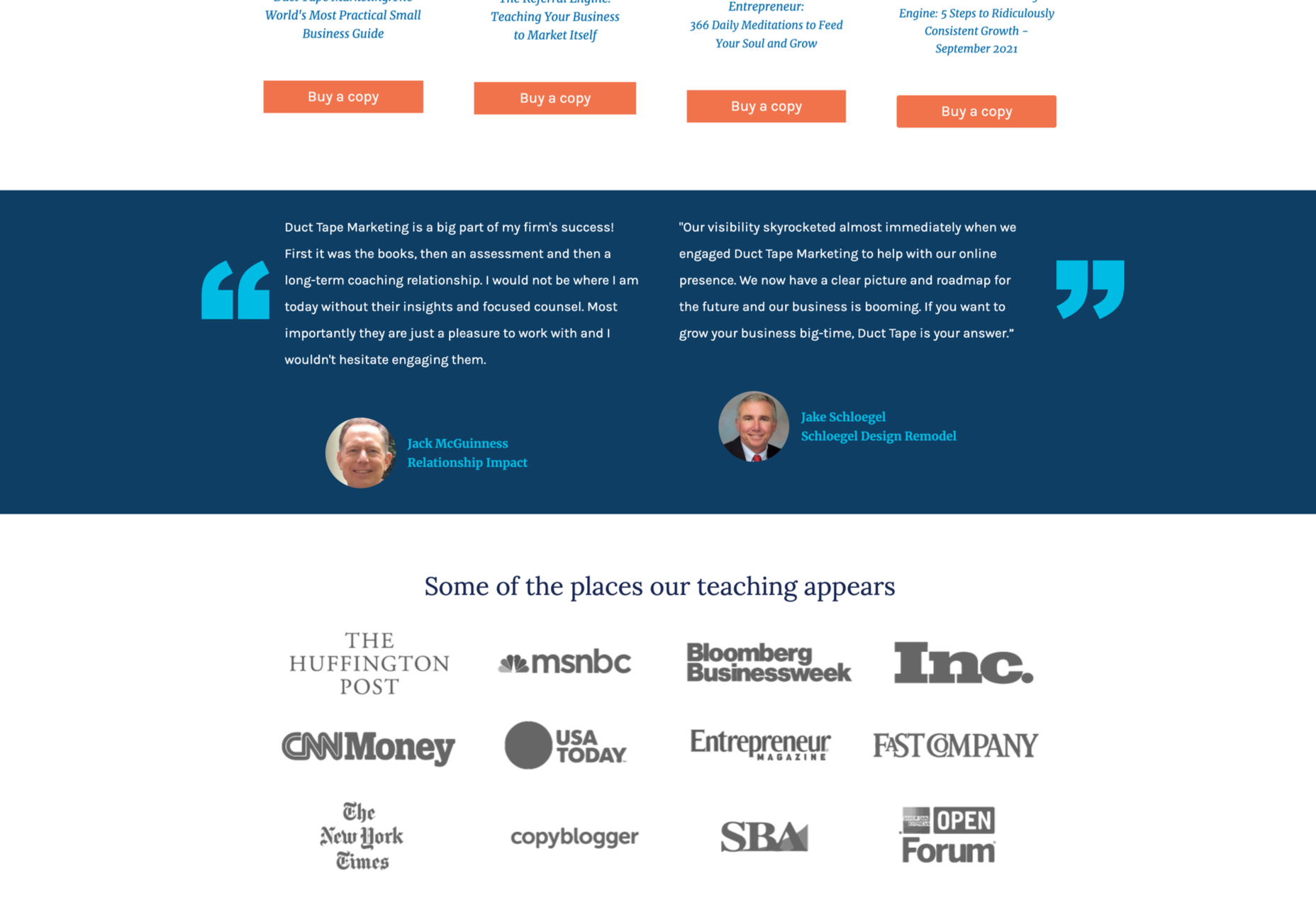
Testimonials are one of the most common types of review. Essentially, these are the messages shared by your customers that highlight the things they liked and didn’t like about your product. Testimonials often include a picture of the person leaving the message, and their name, to give them a greater sense of authenticity. You might also include a link to a website or case study with a testimonial to give it more depth.
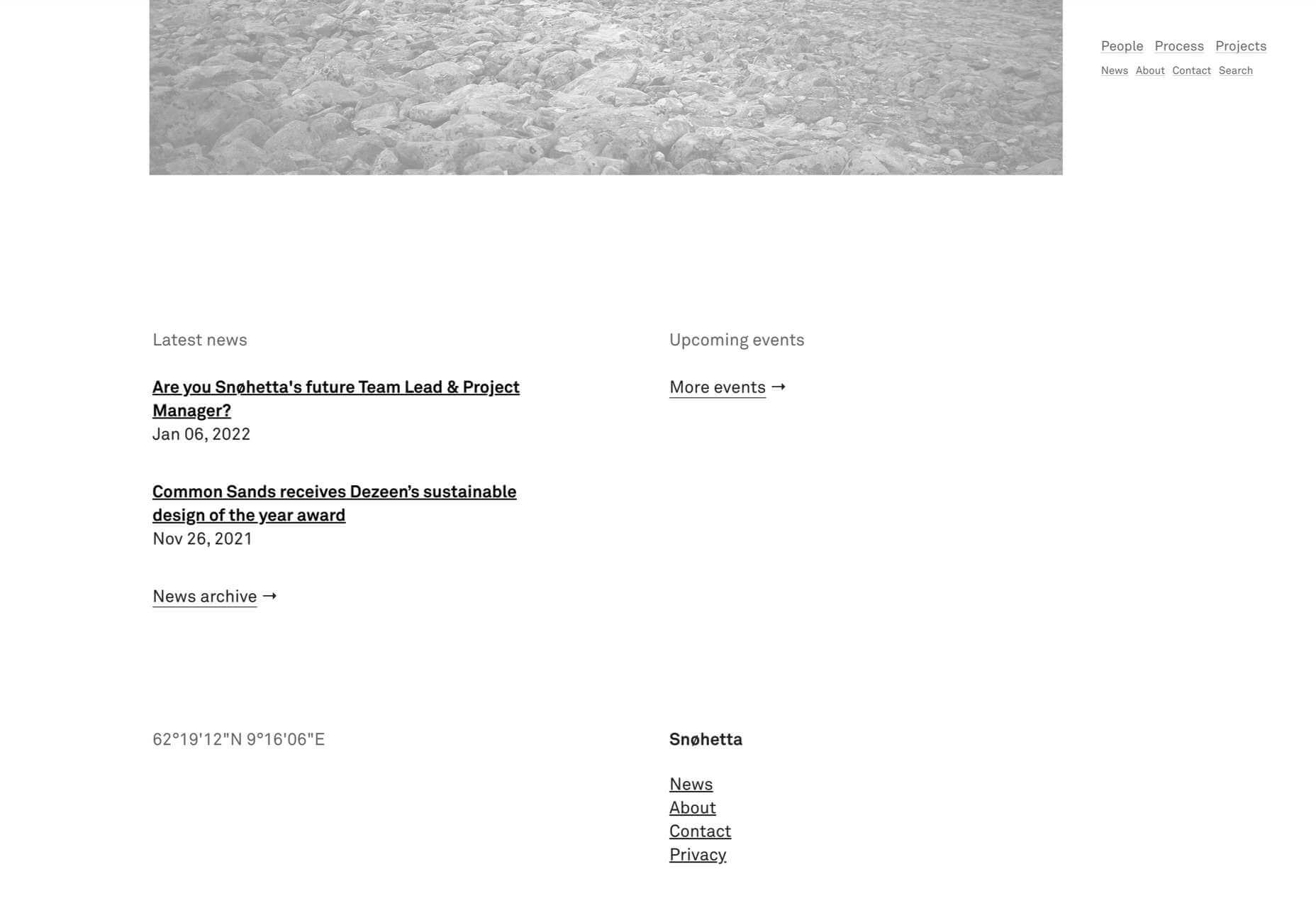
Most testimonials go at the bottom of pages. You can showcase these reviews on your home page to start generating credibility as soon as someone interacts with your brand. Alternatively, you could allow users to place their reviews on product pages. Here’s an example of what a testimonial might look like from ducttapemarketing.com:
Review Badges and Widgets
If your customers tend to leave reviews about your company on other sites, like Angie’s List or Yelp, then you can add a widget or badge to your website that makes it easier for other customers to find them. Sometimes, you’ll just include a small button on the bottom of a website pay that says, “find us on Yelp.” Other times, you can add your star rating too.
Some review sites will also give you the option to showcase the actual reviews in a widget that frequently updates with new messages.
If you’re only showing reviews from one third-party site on your website, it’s best to focus on Google reviews, as it’s one of the most recognizable options.
Provided that you’re using them correctly, badges and review widgets shouldn’t slow your website down too much, and many can be customized to suit the style of your site too. However, it’s essential to ensure that you don’t add too many widgets to your site if you want to avoid performance issues.
Case Studies
Case studies go beyond the basics of the standard review and provide potential leads with a tremendous amount of information about how you’ve previously interacted with other companies. With a case study, you’ll often create a structured document that demonstrates a customer’s problem and your strategies to overcome those issues.
Case studies often exist on their own pages, so you can go in-depth with sharing valuable information. For example, you’ll include an overview that introduces the customer you worked with and details on the outcomes you achieved together.
Although it’s much harder to interview customers for complete case studies and get all the statistics and numbers that make these reviews appealing, it’s often worth the effort. Particularly if you’re running a B2B company, case studies demonstrate the effort you go through to support your customers. They also act as proof of your success and set valuable expectations for customers. Here’s an example of a case study page by Fabrikbrands.com:
The Rating
If you’re just posting basic five-star ratings on your website or asking your customers to give you a number between one and ten for how positively they’d rate your service, then you can use a few handy automation tools to create one of these visuals.
All you need to do is add a little basic CSS to your website or use a star rating widget that automatically calculates your average score based on all of the reviews that you collect from customers.
Just make sure that your star ratings are positive not just on your website but on other review sites too. For instance, if you give yourself five stars by adjusting the CSS and then get three stars from Yell, customers will begin questioning your authenticity.
Notably, while star ratings grab customer attention, they are a little basic if you’re trying to convert people and convince them to buy an expensive product. Most customers will often need more information than a basic star rating can provide.
How to Display Reviews on Your Website
Now that you know what kind of reviews customers can leave about your product or brand, you can start exploring ways to display them on your website.
You could decide to let your reviews show up on other third-party sites and leave it at that. For instance, if you’re a hotel manager, you may know that your customers are already leaving reviews on Booking.com and TripAdvisor. However, leaving your audience to seek your reviews out for themselves means that they spend less time where you want them – on your website.
There’s also a risk that failing to add reviews to your site will make you look less credible. If you don’t own your rating or score, customers might wonder what you have to hide.
Fortunately, we’ve got some great options to help you get started.
1. Create a Testimonials Page
The first and perhaps most accessible option for showcasing your reviews and testimonials is to design a page where your customers can easily find all the information they need about your brand. Having a dedicated testimonials page can be a great way to demonstrate transparency as a brand and show your customers that you’re not hiding anything.
You could even add a form at the bottom of your testimonials page that allows other customers to leave their reviews and information. Just make sure that you have a CAPTCHA or another security measure in place to prevent people from spamming your site.
It makes sense to showcase some of your most positive reviews at the top of your page, so your customers see those first. However, it could also be a good idea to showcase some negative reviews alongside them. That’s because customers generally expect to see at least some negativity associated with your brand. If all your reviews are positive, they might assume that you’re hiding something.
When displaying your negative reviews, make sure you also show that you’ve responded to them and are working hard to address any issues. You can even publish the “thank you” you get from an unhappy customer after rectifying the problem.
2. Show Reviews in Your Website Header
The great thing about using reviews and testimonials on your website is that if you have a little coding knowledge and the correct information, you can display them wherever you choose. Most companies leave the reviews at the bottom of the website, but this could mean you’re missing out on an excellent opportunity to connect with your audience as soon as they visit you.
Having a positive review highlighted at the top of your page could immediately boost your credibility and give your audience a reason to keep reading. Remember that a picture of the person sharing the review and their name can make them look a lot more credible when you’re trying to build trust.
3. Add Some Reviews to Your About Us Page
It’s best not to hide your reviews somewhere your customers will have to search for them, but that doesn’t mean that you can’t scatter a few testimonials around other pages. A great way to give more credibility to your brand and your website is to create a sidebar on your “About Us” page or just showcase a handful of reviews underneath the description of your business.
Suppose you don’t want to show customer testimonials on your About Us page. In that case, you could always show different kinds of reviews, like badges that show your certification with certain industry bodies or awards and recognition you’ve received.
Showing that you’re connected with major industry groups and that you’ve been recognized in your sector is a kind of review in itself. It indicates that other people have already assessed your business and see you in a positive light.
Every review doesn’t necessarily have to come from your customers. Any business or person who can give more credibility to your business deserves some representation too!
4. Embed a Carousel on Your Site
As your business begins to grow, the number of regular reviews and testimonials you get from happy customers should start to skyrocket too. You might even get to a point where you’re not sure how to fit all the reviews you want to showcase onto the same page of your website. If you already have a dedicated “reviews” page where people can go to get more insights into your growing collection of social proof, try a carousel.
Carousels are a great and dynamic way to showcase customer reviews while getting your audience more involved with your website. Give them a button they can click so that they can browse through a broader range of reviews after they’ve seen the ones that show up straight away on your carousel. It’s also worth including a link nearby the carousel widget that the user can click to visit your review page or your company’s page on a dedicated review website.
If you want to go beyond putting carousels on your home page, remember that you can add them to your product pages and menus too. Online reviews impact around 67.7% of purchasing decisions, so it makes sense to put them somewhere your customers will see them when they’re figuring out whether or not they should hit the buy button.
5. Add Reviews to Your Social Media Ads
Reviews can be an excellent way to add an extra spark to your advertisements elsewhere in the digital landscape. Telling your audience on Facebook that you have the best steaks in the country is great – but it’s not going to make a significant impact on most of them. That’s because every business claims to be the best. Most of your clients expect you to speak well of yourself.
However, if you can combine an attractive image on social media with a quoted review from one of your happy customers, your ads will make more of an impact. You can include the quote from your customer in the text above your Facebook ad or create an image to display it instead.
Remember to add any hashtags and extra information that might make your ad more appealing and share it as often as you can with the right audience. Targeting your audience carefully towards people who are in the “consideration” stage of the buyer journey may help you to get more conversions.
While customers usually scroll past dozens of social media ads every day, a genuine statement from a real person still shakes up the status quo and grabs attention. Include a button below the ad so your customer can learn more about the product the customer is talking about.
6. Link to Reviews in Email Signatures
Finally, social media ads aren’t the only way to bring attention to your reviews outside of your website. If you want to get more external customers to go and check out your products or rediscover what your business is all about, you can add review links to your email signature too. These links can go directly to the case study or review pages on your website, reminding customers what it is that makes your service or product special. Alternatively, you can get dedicated signatures for your email that link to specific review sites too.
Showing your clients how many ratings you have on Yelp or how many stars your products have earned with Google Reviews gives every message you send a lot more credibility. Most email marketing software solutions make it relatively easy to add information like this to the footer of your email.
Remember, your signature shouldn’t take up too much space in your email, so don’t add any specific reviews from customers. A star rating and a link back to a page where consumers can get more information will spruce up your content without weighing down your emails.
Show Off Your Social Proof
Successfully collecting positive reviews that show your prospects how much customers love your company can be challenging enough. However, that’s just the first piece of the puzzle. Once you’ve got all those great reviews, you also need to show them off in the most effective way. From dedicated pages on your website to scrolling carousels and Facebook ads, there are a million ways to prove your credibility to your customers with testimonials.
Featured image via Pexels.
Source
The post How To Leverage Social Proof Successfully first appeared on Webdesigner Depot.

Source de l’article sur Webdesignerdepot

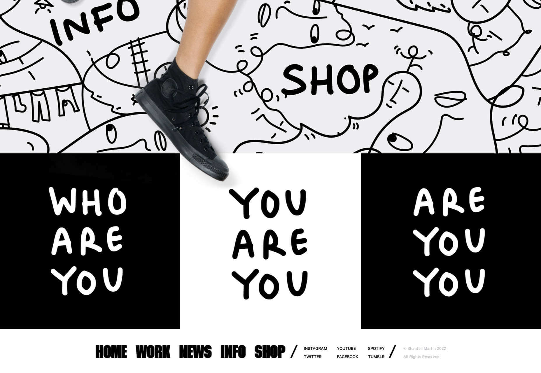
 If you want to know how well-dressed someone is, look at their shoes. Shoes tell you a lot about a person’s style, activities, and choices. We often choose clothes to deceive people about who we are — we want to be brighter, more successful, more relaxed, more adventurous than we actually are. But, our shoes paint an honest picture and offer endless insights into who the wearer is.


 The email channel is known for multiple advantages. It is convenient to implement practically, offers many options, and has a fantastic
 User Experience (UX) design and User Interface (UI) design are two terms people sometimes mistakenly use interchangeably. While aspects of each are interconnected, there are distinct differences between UI/UX design.
 There are a lot of factors that contribute to a


 With the holidays fast approaching, there are plenty of fun gifts for you in this roundup of new tools and resources for web designers. Make sure to share anything you find helpful with others to spread additional holiday cheer.


 As the year begins to wind down, there are still plenty of new and evolving website design trends going strong. Much of what you’ll see this month carries over from things we’ve been seeing all year but with fresh touches.


