The idea behind building a mobile app has been to offer a faster, easier, and innovative experience on various devices to users, doing away with their need to browse websites. However, in a bid to stay relevant to consumers amidst competition, companies try to bundle up a million features together rather than offer a full-proof and specific solution for a certain user need. Being overwhelmed with numerous unnecessary features and functionalities, an app poses various inhibitions to a great user experience. In this blog, we will take a look at how a micro-app can help enterprises solve this issue.
What is a Micro-App?
It is a web/mobile-based, a customized app built to enable end-users to perform a certain, narrowed-down function. Unlike a conventional mobile app, which is bundled with multiple features and pages, the micro-app is smaller in size, more consumer-oriented, and built to offer certain functionality, has an easy user interface, with a dynamic loading that bypasses the app store. For instance, a Personal Banking app has several functions, such as viewing the balance, getting mini statements, changing the ATM password, money transfers, etc. However, if you build a micro-app for this, it will accomplish only that specific task, such as getting transaction history.
https://ankaa-pmo.com/wp-content/uploads/2021/05/what-are-micro-apps-and-why-businesses-need-them.jpg375600Service comm.https://ankaa-pmo.com/wp-content/uploads/2017/04/Logo-Ankaa-engineering.pngService comm.2021-05-17 01:33:362021-05-17 01:33:36What Are Micro-apps and Why Businesses Need Them?
WordPress powers nearly 40% of all websites, thanks to its commitment to making publication possible for everyone, for free. Combined with premium plugins and themes, it’s possibly the ultimate tool for building attractive, unique, and feature-rich websites without any coding or design experience.
However, you do pay the price for this experience, with WordPress and its third-party products not always being built for performance – whether it’s page loading times or SEO.
Image optimization is a particularly big concern. Images are one, if not the largest, contributors to page weight, and it’s growing significantly by the year. So, while images are crucial for beautifying your website pages, they are also one of the biggest factors slowing it down.
In terms of image optimization, WordPress+Elementor brings very little to the table. WordPress core now comes with both responsive syntax and lazy-loading. Elementor itself also only comes with responsive syntax out-of-the-box. However, these are baseline techniques for image optimization that will deliver the bare minimum of improvements.
This means that, while Elementor makes it easy to design sweet-looking WordPress pages (with tonnes of creatively utilized images), you will probably pay the price when it comes to performance. But don’t worry. We will show you how to dramatically improve web performance by over 30 points on scoring tools like Google’s PageSpeed Insight.
Why Optimize Your Elementor Images with ImageEngine?
In general, image CDNs use various techniques to get image payloads as small as possible and deliver image content faster, all while minimizing the visual impact. ImageEngine is no different in that regard.
Firstly, ImageEngine, when used in auto mode, will apply all of the following optimizations that web performance tools like Google’s PageSpeed Insight recommend. For example:
Properly size images – ImageEngine automatically resizes images for optimal size-to-quality ratios depending on the screen size of the user device. ImageEngine supports Retina devices.
Efficiently encode images – Applies different rates of compression depending on the PPI of the user devices. For example, ImageEngine adapts and more aggressively compresses on higher PPI devices without losing visual quality.
Next-gen format conversion – Automatically converts images to the optimal next-gen format according to the browser, device, or OS. ImageEngine can convert images to WebP or JPEG-2000 as well as GIFs to MP4 or WebP. AVIF is also available in a manual directive mode.
Strip unnecessary metadata
While these features are standard for most image CDNs, ImageEngine is unique for its use of WURFL device detection. This gives ImageEngine much deeper insight into the user device accessing a website page and, by extension, its images. Using the screen size, resolution, PPI, etc., ImageEngine can make more intelligent decisions regarding how to reduce image payloads while maintaining visual quality.
This is why ImageEngine brands itself as an “intelligent, device-aware” image CDN and why it can reduce image payloads by as much as 80% (if not more).
ImageEngine also provides a proprietary CDN service to accelerate image delivery. The CDN consists of 20 globally positioned PoPs with the device-aware logic built-in. This allows you to deliver image content faster in different regions while also serving images straight from the cache with a ~98% hit ratio.
ImageEngine also supports Chrome’s save data setting. If someone has a slow connection or has activated this setting, ImageEngine will automatically compress image payloads even more, to provide a better user experience on slower connections.
How to Use ImageEngine with WordPress and Elementor
If you’re using WordPress and Elementor, then chances are you want to spend as little time on development and other technicalities as possible. Luckily, ImageEngine is a highly streamlined tool that requires little to no effort to integrate or maintain with a WordPress site.
Assuming you already have a WordPress website with Elementor, here are the step-by-step instructions to use ImageEngine:
Go to ImageEngine.io and sign up for a 30-day free trial.
Provide ImageEngine with the URL of the website you want to optimize.
Create an account (or sign up with your existing Google, GitHub, or ScientiaMobile account).
Provide ImageEngine with the current origin where your images are served from. If you upload images to your WordPress website as usual, then that means providing your WordPress website address again.
Finally, ImageEngine will generate an ImageEngine delivery address for you from where your optimized images will be served. This typically takes the form of: {randomstring}.cdn.imgeng.in. You can change the delivery address to something more meaningful from the dashboard, such as myimages.cdn.imgeng.in.
Now, to set up ImageEngine on your WordPress website:
Go to the WordPress dashboard and head to Plugins -> Add New.
Search for the “Image CDN” plugin by ImageEngine. When you find it, install and activate the plugin.
Go to Settings -> Image CDN. OK, so this is the ImageEngine plugin dashboard. To configure it, all you need to do is:
a. Copy the delivery address you got from ImageEngine above and paste it in the “Delivery Address” field.
b. Tick the “Enable ImageEngine” box.
That’s literally it. All images that you use on your WordPress/Elementor pages should now be served via the ImageEngine CDN already optimized.
ImageEngine is largely a “set-it-and-forget-it” tool. It will provide the best results in auto mode with no user input. However, you can override some of ImageEngine’s settings from the dashboard or by using URL directives to manipulate images.
For example, you can resize an image to 300 px width and convert it to WebP by changing the src attribute like this:
However, use this only when necessary, as doing so will limit ImageEngine’s adaptability under different conditions.
What Improvement Can You Expect?
Let’s see what results you can expect from using an image CDN to improve your page loading times.
For this, I created two identical WordPress pages using the Elementor theme. The one page purely relied on WordPress and Elementor, while I installed and set up ImageEngine for the other. The page had some galleries as well as full-size images:
The pages used many high-quality images, as you might expect to find on a professional photography gallery, photography blog, stock photo website, large e-commerce site, etc. I then ran page performance tests using Chrome’s built-in Lighthouse audit tool, choosing scores representing the average results I got for each page.
For thoroughness, I tested both the mobile and desktop performance. However, I focused on the mobile results as these showcase more of the image CDN’s responsive capabilities. Mobile traffic also accounts for the majority share of internet traffic and seems to be the focus for search engines going forward.
So, first of all, let’s see the mobile score for the page without ImageEngine:
As you can see, there was definitely a struggle to deliver the huge amount of image content. Google has shown that 53% of mobile users abandon a page that takes more than 3s to load. So, clearly, this page has major concerns when it comes to user experience and retaining traffic.
The desktop version fared much better, although it still left much to be desired:
When digging into the reasons behind the slowdown, we can identify the following problems:
Most of the issues related somehow to the size and weight of the images. As you can see, Lighthouse identified a 3.8 MB payload while the total image payload of the entire page was close to 40 MB.
Now, let’s see what kind of improvement ImageEngine can make to these issues by looking at the mobile score first:
So, as you can see, a major improvement of 30 points over the standard WordPress/Elementor page. The time to load images was cut down by roughly 80% across the key core web vital metrics, such as FCP, LCP, and the overall Speed Index.
In fact, we just reached that critical 3s milestone for the FCP (the largest element on the visible area of the page when it initially loads), which creates the impression that the page has finished loading and will help you retain a lot of mobile traffic.
The desktop score was also much higher, and there was further improvement across the key performance metrics.
If we look at the performance problems still present, we see that images are almost completely removed as a concern. We also managed to bring down the initial 3.8 MB payload to around 1.46 MB, which is a ~62% reduction:
An unfortunate side effect of using WordPress and WordPress plugins is that you will almost inevitably face a performance hit due to all the additional JavaScript and CSS. This is part of the reason why we didn’t see even larger improvements. That’s the price you pay for the convenience of using these tools.
That being said, the more images you have on your pages, and the larger their sizes, the more significant the improvement will be.
It’s also worth noting that lazy-loaded images were loaded markedly faster with ImageEngine if you quickly scroll down the page, again making for an improved user experience.
Thanks to its intelligent image compression, there was also no visible loss in image quality, as you can see from this comparison:
Conclusion
So, as you can see, we can achieve significant performance improvements on image-heavy websites by using the ImageEngine image CDN, despite inherent performance issues using a CMS. This will translate to happier users, better search engine rankings, and an overall more successful website.
The best part is that ImageEngine stays true to the key principles of WordPress. You don’t have to worry about any of the nuts and bolts on the inside. And, ImageEngine will automatically adjust automation strategies as needed, future-proofing you against having to occasionally rework images for optimization.
https://ankaa-pmo.com/wp-content/uploads/2021/05/create-beautiful-wordpress-pages-with-optimized-images-using-elementor-and-imageengine.jpg14082560Service comm.https://ankaa-pmo.com/wp-content/uploads/2017/04/Logo-Ankaa-engineering.pngService comm.2021-05-06 16:45:122021-05-06 16:45:12Create Beautiful WordPress Pages with Optimized Images Using Elementor and ImageEngine
At the dawn of the web-era, there was much focus on how environmentally friendly websites were: we’d chop down fewer trees, ship fewer products, and travel less for business.
And because the web was small, any negative impact it had was relatively small. But the Internet’s no longer small, and neither is the impact it has on the environment. The average website uses 211,000g of CO2 per year, watching a video online outputs an estimated 0.2g of CO2 per second, and a single email can cost 50g of CO2.
In the next four years, the tech industry as a whole may use up to 20% of the world’s electricity and be responsible for 5.5% of global CO2 emissions.
The good news is that because websites are viewed many times, even small improvements can multiply into real change.
1. Reduce Energy Consumption
Through electricity use, the Internet generates around the same CO2 as most major countries. That carbon comes from two sources: the devices we use to access the Internet and the servers that host our data.
Computers heat up, and when they heat up, they slow down. Servers are especially vulnerable and use extraordinary amounts of energy to keep cool and functional, which is why Microsoft keeps throwing servers into the sea.
Make It Faster
The faster your site, the less data is used to serve it, and the less carbon it’s outputting; it’s that simple.
Reduce the Number of Resources Used
Everything you load on your site has an impact. You might think that a tiny PNG is too small to really impact your carbon footprint, but over thousands of page loads, its impact is multiplied. Anything you can do to reduce the number of actual files requested will reduce your carbon output. You can use sites like Ecograder to estimate your own site’s CO2 output.
Optimize Images
If there’s one thing you can do to reduce the size of your site, the amount of data that needs to be sent over the Internet to serve your site, and the resulting speed, it’s optimizing your images.
Nothing reduces a site’s footprint like optimizing images. It’s easy and free to reduce the size of JPGs and PNGs with a service like TinyPNG. Offer WebP to any browser that will accept them; it will boost your Lighthouse score and improve your CO2 usage.
Lazy Load Images
Lazy loading images means images are loaded as they are required; images at the top of a page always load, images further down only load when the user scrolls to them; if the user doesn’t scroll to the bottom of the page, they don’t load, saving you CO2.
Reduce The Amount Of JavaScript You Use
Yes, JavaScript is awesome. Yes, it can be hugely beneficial to UX. And yes, it munches on energy like it’s candy.
When a web page loads, it’s done, the total cost is in. If JavaScript keeps running in the background, redrawing the screen based on user interaction — as is the case with a parallax site — the web page keeps using up energy on the device.
Choose a Sustainable Hosting Company
You can reduce the power needs of a site, but you can’t eliminate them. One simple step is to opt for a hosting company that gets its electricity from sustainable sources such as wind power or solar.
Low←Tech Magazine is powered by a server that runs on solar energy and carries a warning that it may go offline. But it’s possible to host both reliably and sustainably. Many web hosts outsource their actual server management, so they have no control over how those servers are powered, but there are plenty of exceptions that guarantee green web hosting. Google Cloud aims to be the cleanest in the cloud industry. For green web hosting, I always recommend the all-round superb Kualo.
2. Be Inclusive
One of the biggest issues with the EV (Electric Vehicle) movement is that we’re replacing cars earlier than we normally would in a rush to move to “clean” driving.
A new EV certainly outputs less than a gas-powered vehicle when driven the same distance. Combine increased use — because owners think they are driving cleanly — with the fact that a new EV has to be manufactured, the minerals for batteries have to be mined (in horrific conditions), and it then needs to be shipped to you, and EVs are not as friendly as they appear — so go ahead, buy that vintage Porsche it’s probably better for the environment than a Tesla.
Support Legacy Devices
The same issue that applies to cars applies to devices. Every time we rush ahead to support the latest iPhone, we leave older generations behind. A device can and should last longer than two years.
This is not to say that you shouldn’t embrace modern web standards. Technologies like CSS Grid are excellent at reducing markup size and speeding up sites. CSS Grid has been well supported for over four years, and even “legacy” devices can handle it. If you can keep a phone for an extra six months, the environmental cost of that phone is reduced by 20%.
3. Help Users Make Good Choices
More and more people are trying to make good choices. We’re eating a healthier, balanced diet. We’re recycling clothes. We’re traveling by bike, and on foot, instead of by car. People want to do the right thing, and they seek out companies that aid them.
Improve Navigation
Anything that you can do to make your content more findable will mean fewer page loads and therefore consume fewer resources.
By improving your information architecture, improving your search accuracy, and improving on-page signposts like bread crumbs and link text, you help users find content faster.
Feelgood Feedback
When the environmental impact of a user’s actions are quantifiable, let them know. Users who care will appreciate it, and users who don’t will ignore it.
Raileurope.com adds a note to any quotation letting you know how much carbon you’ve saved by traveling by train instead of flying.
Don’t Remove the Shipping Rate
Many ecommerce sites offer free shipping, especially above a certain order value; it’s a good way to encourage higher sales. But absorbing the shipping cost implies that there is no shipping. By highlighting the shipping costs, even if they’re not passed on to the customer, you remind them that there is an environmental cost and a financial cost.
You can absorb the shipping rate without implying there is no cost by adding the shipping and then explicitly deducting it as a discount.
Make it fast and usable, and you’ll also be making it energy efficient. Make it inclusive, and you’ll help the industry slow the ever-growing tendency to consume. Make it transparent, and you’ll help your users make good choices of their own. All of these things are not only good for the environment, but they also result in improved UX and SEO.
Have you ever wondered why we’re so amazed by motion? A moving image is more likely to grab your attention than a static one. Motion is exciting and attention-grabbing – plus, it allows us to access more information in a short space of time.
For a while now, companies have been experimenting with all kinds of motion and animation in their design choices. We’ve seen the rise of animated website backgrounds or live-playing videos instead of images on a home page. There are videos and 360-degree pictures on product pages to help people get a better view of certain items and immersive AR experiences on apps.
So why has the power of motion not made its way into the logo design landscape yet?
Sure, there are a few examples of animated logos out there, but they haven’t had the same long-lasting impact as animated websites. Perhaps that’s because people don’t have the right tools to bring their animated logos to life?
Today, we’re going to cover some top tips for live logo design.
1. Understand What “Live Logo” Means
An animated logo or live logo can be a powerful tool in a company’s branding strategy. Although there’s more to a company’s identity than its logo, it’s fair to say that logos make a huge difference to how we feel about brands and their identity.
A powerful logo can make an emotional connection with your target audience and help your brand to thrive in virtually any environment. Live logos, or animated logos, bring more attention to the brand image, by helping a customer to focus on the logo’s action. A live logo might tell a story about what the business does through motion, or just be eye-catching.
The level of animation varies depending on the designer, but it can go all the way from a short video presentation to a few simple moves. The Skype logo is an excellent example of something simple, that multiple designers have played with to great effect.
Today, there are plenty of open-access tools helping to create more immersive animated graphics in the logo design world. Additionally, the types of animation available are becoming more impressive all the time.
2. Explore the Types of Logo Animation
The next stage of properly leveraged live logos, is knowing what kinds of logo animation are available. There are plenty of different styles of animation to explore today, depending on the kind of impact you want to have.
For instance, sometimes the animation you choose will be connected to your business. A vehicle company might have a logo that seems to “drive” into the central space on the screen. An electricity company might choose a logo that pulses like an electric charge. This animated FedEx logo is an excellent example of how animation can show what a business does.
Options for animation might include:
Rotation: Make an emblem stand out by moving it to the sides or allowing it to move on its axis. Rotation gives a logo a sense of 3D space.
Appearance/Disappearance: You can make a logo grow on the screen by bringing to life one pixel at a time, or have it dissolve and disappear in a similar way.
Transformation: Your logo doesn’t have to start out in the shape it’s going to achieve. You might start with a seed that gradually grows into a tree-shaped logo for a gardening company, for example.
Replacement: Another great way to tell a story is to replace a graphic related to the company in question with the logo through an immersive animated experience.
3. Set Goals for the Live Logo
If you’re not sure what kind of animations to experiment with, then it’s a good idea to start with some solid goals. Your goals will give you a direction to move in with your logo choices. An animated logo can be a dynamic and modern way to present a brand to an audience, but it’s only going to be effective when implemented carefully.
Let’s look at some of the goals you can choose for your live logo:
Differentiation: While it’s true that animation and live content is gaining more attention lately, it’s still relatively new as an overall concept. With an animated logo, you could help a brand to create a more unique image for themselves, which sets them apart from the other organisations in the same space.
Storytelling: As mentioned above, animated logos can tell a story about what the company or product actually does. In this example for Firefox, for instance, the logo mimics a loading wheel to demonstrate a speedy internet browser.
Brand awareness: Dynamic logos and animations are more likely to capture your audience’s attention than static images. They’re also more of a novel experience, which means that customers might want to share them with other people too.
Memorability: Today’s customers are bombarded by hundreds, if not thousands of logos all the time. They need something special to convince them that one image deserves a spot at the front of their mind. Animation can help to make a business more memorable.
4. Do Your Research
Doing your own research is an excellent way to get some inspiration for a live logo or animation. Ideally, you’ll want to focus on the industry you’re already working in, as this will give you some guidance as to the kind of movement that can attract the most attention from the correct audience.
Watch as intros to brand videos and check out as many live logos as you can. Check out the kind of animations that people use in their videos when they’re showcasing products online. You can learn a lot about what works just by evaluating what other people have done before. Just be careful not to simply copy what you’ve found elsewhere.
The aim of your live animation should be to tell a unique story about the company
The aim of your live animation should be to tell a unique story about the company in question. If you’re not sure how to start with differentiating the image, check out the brand guidelines for the company in question. The guidelines that the company used to choose the right brand colors, fonts, and other visual assets can work just as well for your animation strategy.
Remember, the aim here is to tell a specific story, send a message, or evoke a certain emotion. Don’t make the mistake of designing something that looks cool but doesn’t have much of a purchase. Most human beings will naturally look for the meaning behind the content that they see. If there isn’t anything there, it’ll just lead to confusion.
5. Use Live Logos on Brand Websites
The most obvious way to begin experimenting with animated logos in web design, is to implement live logos into a client’s website. Some companies have a “welcome screen” for their site which uses an animation to introduce visitors to the home page and other navigation options. There are also brands out there who love the impact that animation can have but want to use it more subtly.
In these cases, live logos can be an excellent way to draw the eye to a specific spot on a website, perhaps the area just above the “contact” button that encourages a client to reach out. Crucially, to avoid weighing down the website and distracting visitors, companies and designers will need to make some important choices.
Although it might be tempting to keep the animation looping at all times, just in case someone misses the first round, this requires a lot of extra processing power. Too much animation also makes it harder for businesses to push the focus of their visitors to other points on the website, like landing pages for products, or testimonial pages.
Often, as with most innovative decisions in web-design, the best bet is usually to start small and work your way up. Don’t over-do it with animation on day one. See how the visitors to the website respond first.
6. Find the Right Balance
Animations in a live logo are there to grab attention quickly, and effectively. They shouldn’t go on for too long, or you risk overwhelming your audience before they have a chance to browse the rest of the website or check out other content. A live logo should only be active for a few seconds at most, and in that time, it needs to say something valuable.
Often, the best strategy is to start by building up curiosity, and getting your viewer engaged so that they’re keen to see more. Every frame will count to pull the customer in and make them feel connected to the brand in question.
Make sure that the logo animation is dynamic so that it doesn’t just capture the attention of the viewer but maintain their interest for the full time required. During the motion, the viewer’s brain should be working to figure out what’s going to happen next.
Just like most logo design and graphic animation strategies, the key to success is finding the right balance between clever experiences, and simplicity. You want to do something meaningful that earns your viewer’s attention, but you need to compete with the fact that attention spans are plummeting all the time.
7. Explore Logo Animation in Video
One of the best ways to use logo animation, is to draw interest for a company at the beginning of a video. Video is gaining incredible levels of popularity lately, particularly in a world where you can view video content almost anywhere. Companies are adding videos to their product pages, social media accounts, applications, websites, and so much more .
For the majority of companies, a live logo at the start of a video can help their brand to seem more professional. It’s a reminder to viewers of the brand that they’re learning about with that video content. Plus, a logo at the beginning of a piece of video content can also build on the consistency that companies attempt to create by using the same brand assets in various mediums online.
(Starting a video with an animated logo is great for presentation, but it can also be frustrating to customers in certain pieces of content where they’re looking for quick answers to questions. If an animated logo is more than a couple of seconds long, it may be better placed at the back of a video instead.)
With videos for news reports or announcements where you want to get straight to the point and generate excitement about a new product or service, it can be better to jump straight into action. Ending a video with a live logo keeps the brand image front of mind for the customer for longer, even after the message has ended. On the other hand, ending a video with a logo could increase the chances that customers miss the animation, because they click away from the content too quickly.
If you’re new to adding live logos into videos, consider experimenting with different strategies to see which works best. Different companies might get unique results.
8. Bring Logo Animation to the Real World
Another interesting option for live logo design, could be to step outside of the computer screen for a while. In today’s digitally transforming landscape, it’s becoming more common to see the real and digital worlds converging. Most events and trade-shows come with presentations that rely on digital content, like animated presentations and slide shows.
Depending on the signage solutions available at industry events, companies could even use an animated logo above their booth to draw attention in a cluttered environment. Around 48% of exhibitors agree that a more eye-catching stand or booth is often the most effective way to attract visitors and customers at an event.
Animation and live logos may have started life on the computer screen, but they can appear in much more diverse environments today. Offices could use a live logo in the reception room or lobby to make their on-premises environment more appealing. Retail locations could display ads on digital signage, followed by live logos that work to both separate messages, and keep shoppers entertained when they’re enjoying the bricks-and-mortar experience.
9. Include Live Logos in Brand Signatures
Remember, a live logo doesn’t just have to sit on a company’s app or website until someone discovers it. Sometimes, the right logo can also be a powerful way to “sign off” on a message from a brand or its management team. For instance, email remains to be one of the most valuable tools for business marketing and customer relationship building today.
It’s the third most influential source of content and news for a lot of B2B audiences, and yet, most companies aren’t taking full advantage of what their email marketing software solutions are capable of. If you can display gifs and animated videos in an email (which most software solutions can), then you can also add a live logo to the brand signature.
The important thing to remember is that if you’re going to be adding a signature to a lightweight thing, like an email, it needs to be lightweight too. Don’t make the live logo too long and complicated, or it might prevent the email from loading properly.
Outside of email, don’t forget to consider options for live logos in things like social media profile pictures too. According to experts, around 80% of companies use visual assets in their social media marketing. A live logo is a great way to go beyond the basics with a company’s imagery. Motion grabs attention, and video content is quickly gaining steam on a lot of social media platforms.
Embracing a New World of Live Animation
Designers are only just beginning to scratch the surface of what’s possible with animated logos. For many companies, live logos are an excellent way to capture audience attention and encourage engagement with a brand.
A live logo at the beginning of a video, at the start of an app loading screen, or even at the top of a website can differentiate a company and make them stand out. As technology continues to evolve, and customer expectations continue to expand, the options for live animation could continue to grow. You might even be able to infuse live logos with elements of VR and AR, to impart brand essence in a brand-new digital world.
If you haven’t begun experimenting with live logo design yet, now could be the time to start.
https://ankaa-pmo.com/wp-content/uploads/2021/04/9-tips-for-better-live-logo-design.png15292780Service comm.https://ankaa-pmo.com/wp-content/uploads/2017/04/Logo-Ankaa-engineering.pngService comm.2021-04-14 16:45:092021-04-14 16:45:099 Tips for Better Live Logo Design
Google has been talking about the Core Web Vitals tool and the Page Experience Update for about a year now.
With the update scheduled to roll out in May 2021, now is the time to make sure your websites are prepared for it. It’s taking a lot of the best practices Google has recommended over the years and making them an official part of the search algorithm, so not taking this seriously could negatively impact your sites’ rankings.
Today, we’re going to look at everything Google has told us about the update and how to use the Core Web Vitals tool to ensure your site rankings don’t drop once it rolls out.
What We Know About the Google Page Experience Update
Google first told us about the page experience update back in May 2020. Here’s what we know about the upcoming update:
Google’s Search Algorithm Will Change in May 2021
Although there’s no specific day given, we do know that the page experience update will go live sometime in May 2021.
The Goal is to Reduce Friction on the Web
It’s not as though user experience is something that designers and developers overlook when building websites. Heck, there’s an entire disciple of UX design dedicated to it.
That said, Google hasn’t taken too hard line of an approach in enforcing its page experience suggestions, like mobile-first design, removing intrusive pop-ups, or improving page speed. With this update, though, Google is now telling every site owner that performance, accessibility, technical best practices, and SEO must be built into their websites.
Of course, the goal isn’t to create more work on your side of things. Google believes that by encouraging developers to build better web experiences that consumers will experience less friction and businesses will be more profitable as a result.
The Update Will Include Older Signals
According to Google, the page experience update is going to combine a bunch of older signals with the new Core Web Vitals:
The Core Web Vitals tool will now merge all of that data we once had to gather from various Google apps. That’ll make it more convenient for designers and developers to improve the on-page experience across a variety of areas.
The Page Experience Algorithm Will Change Over Time
Per Google:
Because we continue to work on identifying and measuring aspects of page experience, we plan to incorporate more page experience signals on a yearly basis to both further align with evolving user expectations and increase the aspects of user experience that we can measure.
So, don’t expect this to be a one-and-done thing. You’ll have to rely on the Core Web Vitals tool, and pay close attention to updates out of Google, to ensure your sites are keeping up with Google’s page experience standards.
Your Other Google Apps Have Already Been Updated with Core Web Vitals
If you hadn’t noticed, Google has already updated its other apps in anticipation of the page experience update.
Here’s an example of how Lighthouse’s report on the Amazon website now looks:
By including these metrics within the tools you’re already using, you don’t necessarily have to add the Core Web Vitals tool to your growing toolbox. That said, there are some really valuable reports in there, so I’ll show you why you may want to add it anyway.
Google’s Top Stories Will Be Affected
In the past when someone did a news-related search on Google, they’d see “Top Stories” results like this one:
Until now, the only pages shown here were AMP-enabled ones.
Once the page experience update goes live, though, the AMP requirement is going away. So long as a page meets the page experience criteria along with Google News content policies, it can now rank in this section.
Google Search Results May Show a Page Experience Indicator
In the Top Stories example above, notice the AMP indicator I highlighted in yellow. Google is thinking about adding something similar to any search result that fulfills its page experience criteria.
While I think a small, eye-catching icon might draw a little more attention from Google users, I’m not sure if it’ll be that big of a deal to them. People working in this industry certainly know what that lightning bolt means, and we’ll also be the ones who recognize the page experience indicator, but I’m not convinced it’ll matter to users.
That said, this is something Google is thinking about rolling about, so it’s something to be aware of. At the very least, you can consider it a badge of honor when showing your websites to clients and prospects who want to see what you can do for them.
Content Is Still More Important Than Page Experience
Even if a website checks off all the page experience boxes, there’s no guarantee that it’ll start to rank better than websites that haven’t. The quality and value of the content on the page still matters greatly.
Using Core Web Vitals to Measure Page Experience
Alright, so let’s take a look at this Core Web Vitals tool. Here’s what the tool looks like when you enter the “Measure” tab:
It’s like most other Google analyzer tools. You enter the URL you want to audit and let the tool run. The results then spit out something that looks like this:
Core Web Vitals are graded on four categories:
Performance measures the loading speed, interactivity, and stability of the page.
Best Practices focus on the technical aspects of the page, including things like having an SSL certificate and making sure images fit within the parameters of the mobile screen.
SEO checks on the typical SEO signals like metadata, structured data, and so on.
Accessibility reports any issues with visitors not being able to see or access parts of the page.
If you scroll down just a little bit on the page, there’s more data available. It mainly has to deal with the technical stuff, like page speeds and unoptimized code:
Now, this isn’t really anything new. We can get this data about load time, interactivity, and content stability from Google’s other apps.
The real value is in the report, which you can access up top next to the date of your audit.
Open the report and you’ll find specific suggestions and pro tips to optimize each part of the page experience, like this SEO report:
Just like other Google tools, this one can teach you a lot about what makes one site more rankable than another. So, make sure you update your web design strategy going forward to integrate all of these ranking signals.
While you’ll have to do annual audits on your sites to see how much Google has changed the page experience signals, you’ll create less work for yourself if this baseline set of criteria are met with every site you build.
https://ankaa-pmo.com/wp-content/uploads/2021/04/get-ready-for-next-months-google-shakeup.png15292780Service comm.https://ankaa-pmo.com/wp-content/uploads/2017/04/Logo-Ankaa-engineering.pngService comm.2021-04-12 12:45:202021-04-12 12:45:20Get Ready For Next Month’s Google Shakeup
The ‘need for speed’ is an essential item on every website’s bucket list these days. And why not? Enhanced speed is directly responsible for converting traffic into paying clients.
Anyone in any industry wishes to boost their website’s loading speed, providing an improved user experience. Plus, don’t forget that escalated site speeds also escalates the website’s ranking to more competitive spots on the search engine result pages and improves core web vitals. So, how can this need for speed be achieved? The answer is image optimization.
What is Image Optimization?
Image optimization is a process of delivering superior-quality images in the appropriate format, size, and resolution while keeping them at a compressed size. Image optimization, if done right, improves not only a website’s performance but also certain other metrics like:
Page loading speed;
SEO ranking;
Conversion rate;
User engagement;
User experience;
Resource download time.
However, the image optimization process can be accelerated for better efficiency if some modern tips are followed. ImageEngine, with its years of experience in the image optimization industry, has cherry-picked some tips that can help businesses in the year 2021 and beyond.
Tips for Perfect Image Optimization in 2021
In this article, the top five tips to optimize images have been outlined to help you maximize business opportunities. All the tips included are backed by comprehensive research and years of experience in the image optimization industry.
The Right Format Matters
Selecting the right image format matters a lot in the optimization process because every format is meant to serve a specific requirement.
JPEG: Best for still images, real-world images, and complex coloring;
PNG: Best for web images like logos and flat images;
GIF: Best for low-resolution images, animated graphics, small icons, and simple images — however, it is not advisable to go with GIF format but rather use mp4 or a webp instead;
TIFF: Best for high-quality and large-size print graphics;
WebP: A modern image format that offers superior compression while maintaining great quality.
Choosing the right format reduces bandwidth consumption for an improved webpage loading speed. However, a new format has joined the club: AVIF, that covers all the above image formats’ good qualities and surpasses even WebP while maintaining an excellent compression ratio. AVIF provides almost 50% savings in size when compared to JPEG format.
Serving images in the next generation formats like WebP and AVIF is a trending practice these days.
Go for Image Compression
Once the correct format has been selected, it becomes important to reduce the images’ size through a compression method. There are two methods of compressing images:
Lossless compression: In this compression method, all the unnecessary metadata linked with the images is removed without degrading the quality. The metadata can be erased safely while exhibiting the images on a website or application.
Lossy compression: In this compression method, the quality of the image is slightly reduced to accomplish a smaller size. The file size obtained in lossy conversion is lower than lossless compression, however, a naked human eye cannot highlight the difference between the original image and the lossy compressed image.
Never Skip the CDN
Image optimization and image CDNs are a match made in heaven. Website images not only need to be optimized but have to be delivered fast and easily as well. An optimized image is of no use if it cannot be transported quickly. An image CDN (Content Delivery Network) takes care of this need. It makes the rapid delivery of optimized images possible by reducing the distance between the online visitors and the servers.
The global image CDN also serves a ton of other benefits like:
Enabling fast global reach via cloud acceleration;
Audience segmentation (based on device viewport) becomes easy;
It saves many costs by eliminating the need to invest in separate server providers in different parts of the world;
Pulls down the load on the server to achieve reduced delivery cost;
Secure storage capacity.
The carefully engineered image CDN from ImageEngine distinguishes itself from the rest with its unique features listed below:
The images are optimized to be delivered 30% faster than other CDNs in the market;
The images are automatically optimized to the relevant format as per the user’s viewport size;
The images can be delivered in next-generation formats such as AVIF and WebP;
The images delivered have reduced size (irrespective of the format) and outstanding quality at the same time;
ImageEngine’s extensive global CDN network provides support for HTTP, HTTP/2, WAF, and DDoS protection.
Set-up Browser Caching
The “Leverage Browser Caching” warning displays on the Google PageSpeed Insights tool when there is no caching rule in the place, or the expiration time has been set too low. In simple terms, the warning is a suggestion to improve website speed.
Browser caching instructs the visitor’s browser to save some specific files on the visitor’s local system instead of downloading them repeatedly. For example, a visitor needs to download the logo image of a website on the first visit. However, after every subsequent visit, such a visitor would load the logo file from the website’s local cache, provided that the browser caching has been enabled. The result? Faster loading because the visitor is no longer required to get everything from the website’s server directly. Browser caching can be used for images and many other types of files like statistical resources and object data.
There are many ways to leverage browser caching but simply adding the following lines of code to the .htaccess file is the most effective one:
Browser caching stores the images for a decided interval of time for easy and quick accessibility. A custom timeline or industry standards can be followed for this purpose. The timeline in the above-shared code snippet is one year.
The .htaccess file can be found with the help of an FTP program for connecting to the root directory of the website’s server.
Disable Hotlinking
Hotlinking means when an individual or business copies the URL of an image, which belongs to another website, and embeds it on their website. This results in the image being displayed as if it was an owned content. Hotlinking is a next-door neighbor of copyright infringement, but despite this fact, the practice is widespread. In many cases, hotlinking is unintentional, but it can cost the original owner of the image some money. It can even affect the website’s performance if a drain of the server’s resources happens.
Optimize for Flaky Connections
If a website has a lot of content and rich images to offer, but a portion of the users visiting the website doesn’t have a reliable internet connection, then this portion of visitors would not convert. This situation is no different than any lost business opportunity. Not all website visitors have access to fast and reliable internet facilities; therefore, it is recommended to optimize image content for spotty connections.
One trusted way of optimizing the images for slow connections is compressing the images appropriately in real-time. However, even before compressing the images, it is important to determine the network speed of users visiting the page and then categorizing them into buckets based on connection types like 4G, 3G, 2G, or slow 2G.
ButImageEngine simplifies the whole compression process. It fetches and optimizes the images in the right format, dimension, and quality directly from the URL and then delivers such images on the website’s front-end via global image CDN.
Handling Responsive Images
A lot of traffic arrives from mobile devices, and as such, it is important to have the perfect strategy for responsive images.
If vector-based images are being used, then using SVG format would be a great way to optimize them for any viewport without worrying about sizes because SVG images are resolution-independent.
Using media queries for background images or images that have been produced via CSS is the best way to display smaller images to mobile devices.
For inline images, techniques like the srcset attribute or the picture element can be used.
srcset attribute: This attribute can be implemented on the img element for defining the images at different sizes so that the browser can select the best option based on the device characteristics like width.
picture element: This is best to be used if different images are required to be displayed based on the device’s display size.
All the aforesaid discussed options offer different ways of displaying the optimized images to visitors depending on how they view the website. MDN’s responsive image guide and Google developer’s image guide can be referred to for learning more about responsive images and using picture elements or srcset attributes.
Responsive Images
Images are required to be responsive to deliver the right optimal image for every screen size. It enhances the user experience and reduces load time. According to the browser or device in which images are viewed, images of different sizes are displayed, such as full-size, thumbnail, or featured images. To create a responsive image, you need to have different versions of the image.
The problem is to optimize a high-resolution image that looks great with details while displaying it on mobile devices; details can be missed, so instead of shrinking the image details, consider cropping or scaling down the image for mobile devices.
Advantages of responsive images:
Improve the page loading speed;
Increase your reach through smartphone responsive design;
Increase conversion and sales rate with consistent user experience;
Reduce load over the server and server memory;
Boost conversations.
Client Hints
The fundamental of Client Hints is simple — the client through a device sends the server some hints regarding the requirement. The server with responsibility serves them with the right resource according to the hint. For example, with hints, browsers ask the server for 600px images for the device layout — the image to be served based on the requested parameter. Even if the client informs that data saver mode is enabled, the server delivers identical images of a lighter version. The browser and server interact through Client Hints, the job becomes readable, shorter with the same functionality.
Client Hints with ImageEngine
ImageEngine delivers images with the required – width, DPR, and Data Saver. The responsive images are created based on client hints about width and DPR and later cover the Data Saver client hint.
Optimize Images For Retina Displays
Apple coined the term “retina displays,” which display clear and densely packed pixels to provide perfect vision from an appropriate viewing distance. Now, most smartphones and desktops deliver users a high crispy viewing experience. Apple with Retina squeezed four times the pixels into the same space to create a density of 326 pixels per inch (PPI), making the displays smooth.
Why Optimize Images for Retina?
The average screen pixel density is quite low, so the web-based standard images need to include 72 PPI to cover a certain height and width.
We need to maintain the appropriate density of pixels. Otherwise, the image will cram or get stretched. As a result, a fuzzy image is created with jagged edges that distract the viewer from your brand. To solve the problem, Retina class displays came into the role. They increased image resolution, optimized high pixel density in small space, and even displayed images decently over large screens.
People these days browse from a different device; most users access images from smartphones rather than desktops. So you need to optimize the image for Retina displays.
Wrapping it up
There are many tips and tricks to optimize images, but of all these tips, using a CDN has proven to be the most effective and long-term solution for many businesses all across the globe. Image CDNs automate the optimization process for a business to focus on its core activities properly. The good thing is that it is not all expensive to integrate image CDN. It is easy to get started with and generates the results in a short space of time.
[– This is a sponsored post on behalf of ImageEngine –]
Welcome to our roundup of the best plugins for popular CMS, this month. We’re going to cover plugins built to enhance WordPress, Shopify, Craft CMS, and Joomla. Enjoy!
WordPress
Tutor LMS Elementor Addons
Tutor LMS Elementor Addons is a useful plugin that adds 25+ add-ons to the Elementor page builder. The plugin allows users to create custom styling and layouts for Tutor LMS courses. For this plugin to work effectively, you will have to install Tutor LMS and the Elementor Plugin. After activating all three plugins, you will be able to build single course pages using Elementor. Some of the Elementor Addons include course rating, course title, course author, course level, course duration, course thumbnail, course price, and lots more. The plugin can also be used to edit the look of your existing courses. The pro version of Elementor is not required to use this plugin. It has also been tested with top WordPress themes.
Quick Audio Player
Quick Audio Player is a customizable audio player for WordPress websites. The plugin is responsive and works with any WordPress theme. It runs seamlessly on all devices and major web browsers. Features of the plugin include an HTML5 audio player, live player editing, player poster image, rich control settings, player shortcode, player width customization, and player color customization. The player is available in different audio types including .mp3, .wav, and .ogg.
Simple Responsive WP Slider
Simple Responsive WP Slider is a lightweight slider plugin for WordPress. The plugin allows you to create and customize unlimited sliders for your website. You can use a shortcode or place the slider within Gutenberg blocks to add the slider to a webpage. Some of the features of the plugin include unlimited sliders and multiple sliders on each page. You can set custom configuration options for each slide, including the navigation and slider. Some of the basic configuration options for individual sliders include adding dots or arrows to the slides.
NutsForPress Images and Media
Images and Media is an essential plugin from NutsForPress that makes it easy to customize image and media files on WordPress. The plugin allows you to set the threshold size for images on your website and automatically resizes images that exceed that threshold upon uploading. It also allows users to set a JPEG compression level and will automatically compress JPEGs to meet that compression quality upon uploading. You can prevent GIFs from getting resized to avoid breaking their animation. The plugin can also bulk rebuild “alt title,” “description,” and “caption” for all uploaded media files. You can also bulk rebuild missing PDF preview images. They are seven custom thumbnail sizes to choose from. The plugin is fully compliant with WPML.
Ultimate Social Media Share
Ultimate Social Media Share is a lightweight and responsive plugin for WordPress that allows users to add social media share buttons and social media follow buttons to their site. The plugin is GDPR compliant and DSGVO compliant. The plugin does not collect any IP or personal data. You can insert the social buttons and icons in widgets or Gutenberg blocks. The plugin is free to use and supports 9 different languages. You can customize the plugin to suit your audience’s needs, and it is responsive on any screen, big or small. It is compatible with Gutenberg and Classic WordPress editors. Ultimate Social Media is compatible with WooCommerce, BBPress, BuddyPress, and all custom post types. You can choose from over 35 social media platforms. It is also free to use. The plugin’s social icons are Scalable Vector Graphics, meaning they are scalable to any screen size and load fast.
Wall Pricing Table
Wall Pricing Table plugin allows WordPress users to create pricing tables for their WordPress site. You can add the features of the different pricing plans and also display the price table anywhere on your site. The available fields on the pricing table are title, subtitle, price, button, and features(you can add as many as you want). You can differentiate each plan by color. The plugin is completely free to use.
Job App Manager
Job App Manager is a simple WordPress plugin that allows you to display a job application form on your website for candidates to apply with their details. A shortcode is used to display the form on any webpage on your site. After the user completes a form, they will receive a confirmation email. To find the submissions in the form, go to ‘All Submissions’ on the admin page. On the admin page, you can also search, filter, and delete forms. There is also a dashboard widget that shows the latest 5 form submissions.
Jetpack Boost
Jetpack Boost is a one-click optimization plugin that allows users to supercharge their WordPress site’s performance and SEO. Jetpack Boost is still pre-release software, so it’s advised to install the plugin on only production sites until version 1.01 is released. The pre-release version of the software has three powerful modules. The first module uses local critical CSS to generate optimized styles for your webpages. This will allow content to load faster on the screens of viewers. The second module defers non-essential Javascript. This means that the non-essential tasks show after the page loads, allowing important visual information to be seen sooner. The third module implements lazy image loading, so images load when they appear in the browser’s viewport. So if a viewer doesn’t scroll to the end of the webpage, images placed at the bottom of the page won’t load. This makes the website load faster.
Rsiltech Postcode Availability
Rsilitech postcode availability is a simple plugin that allows your customers to check shipping availability. All your customer needs to do is enter their postcode in the “check availability” section of the product details page. Other features include display delivery date in the product page, display shipping note on the product page, add postcode in the admin panel, edit postcode in the admin panel, and list postcode in the admin panel.
WPTD Video Popup
WPTD Video Popup is a simple video popup plugin for WordPress. The plugin supports both YouTube and Vimeo. Some of the plugin features include unlimited popups, retina ready, easy shortcodes for set up, and customizable width and height size for YouTube and Vimeo videos.
Easy Translate
Easy Translate allows you to translate your WordPress site into multiple languages. The plugin will translate everything on your site regardless of themes or plugin specifications. Easy Translate currently works with Polylang and WPML plugins. It uses the plugins to detect frontend language. It is easy to use and is compatible with all themes and plugins. You can translate your site to as many languages as you want. A unique feature of the plugin is that it can translate dynamic strings added by themes, WordPress, and plugins.
Shopify
ConvertOut Ambassadors
ConvertOut Ambassadors is a Shopify plugin that allows users to create an ambassador program in minutes. You don’t need any technical knowledge to get started. The plugin starts working minutes after installation. For every sale made, ConvertOut will track the commission it needs to pay to the ambassador. Payouts are made directly to the ambassador’s PayPal account.
Product Stories Convert Sales
Products Stories Convert Sale is a cool plugin that upgrades your website by giving it a trendy social network look. The plugin makes it fun and easy for customers to view products in your store. All your catalog will appear in carousel stories, just like Instagram feed stories. Coupons will also pop up in the stories to help increase sales. You will also receive real-time reports that will help you identify what your customers are interested in.
Advoz
Advoz is a Shopify plugin that allows experts to create high-quality Google, Facebook, and Instagram ads to promote your business. Once you set a weekly budget, you will receive a custom graphic or video on how the ads will run. The plugin will create ads that will drive quality leads to your store.
Craft CMS
Presence
Presence is a Craft plugin that displays the current users editing an entry. The users are displayed in the right sidebar settings when editing an entry. A default logo is set for users that do not have a profile image. Admins can review and approve the entries made.
Marketplace for Craft Commerce
Marketplace for Craft Commerce allows Craft users to turn their e-commerce sites into a marketplace. Users can add payees to products and also charge fees for your platform. You can charge a flat or percent fee. Payouts are handled via Stripe Connect.
Joomla
AA Youtube Subscribe Button
AA Youtube Subscribe Button is a Joomla module that allows you to show a Youtube subscribe button with your site’s subscriber number. It is easy to use and is fully responsive. It has cross-browser support and works with any template.
MyRealPin
MyRealPin provides a Pinterest-like look to your website. You can create your own pinboards and collaborate with friends. You can customize the Joomla extension to suit your needs.
AA Tiny Audio Player
AA Tiny Audio Player allows Joomla users to add an HTML5 audio player to their website. The extension comes with a responsive layout and supports animations. It works with .mp3, .ogg, and .wav video formats. It also works with all templates.
https://ankaa-pmo.com/wp-content/uploads/2021/02/top-new-cms-plugins-february-2021.jpg14082560Service comm.https://ankaa-pmo.com/wp-content/uploads/2017/04/Logo-Ankaa-engineering.pngService comm.2021-02-03 11:45:552021-02-03 11:45:55Top New CMS Plugins, February 2021
Animation is a fun and interesting way to bring life to a website. Used correctly, it can capture audience attention, make your website more engaging, and even improve your chances of delivering conversions for your clients.
Unfortunately, like many things in the web design world, it’s also easy to get too carried away with animation. As professional designers and developers, it’s up to us to find the line between making the most of animation on our website projects and creating a site that’s overwhelmed with too much activity.
Fortunately, by the time you’ve finished reading this article, you’ll have a deeper insight into how you can use animation in web design, without going too over the top.
Introducing Animation in Web Design
Animations are virtually everywhere on the web today.
In the past, when designers first discovered that they could embed movement into their websites, the amount of animation we saw was often higher than it needed to be. It wasn’t uncommon to find some websites running entirely on Flash, where every element could be animated.
Fortunately, the trends of modern web design have left those practices behind. These days, it’s a lot more common to make animation a part of the overall user experience, rather than focusing on them as a centerpiece attraction. For instance, you’ve probably noticed plenty of animated sliders showing off pictures in a gallery, or transition animations when people hover over a button.
Since it’s entirely possible to construct an entire website with no animations at all, the key to creating an engaging website today is making sure that every animation you use serves a specific purpose. Your animations should make a website more attractive, easier to use, and better for navigation. Add too many, and you could even risk slowing down a site.
So, where does it make sense to use animation for web design?
1. Loading Animations
One of the best ways to use animations in a website is to distract and delight users as a page loads. You can use the animation to deliver a unique experience, or even just highlight the playful nature of your brand. For instance, just check out this classic load animation called “Tightrope.”
You can also use things like particle animations to capture a customer’s attention and help your visitors relax when they visit a website. Particle animations can be interactive or non-interactive, and they’re a great way to stop visitors from feeling frustrated when a page takes too long to load.
A website by Edan Kwan called “Particle Love” shows you exactly what kind of experience you can create with real-time animations.
The more you can delight visitors with experiences that keep them engaged while the information they need is loading, the less likely people will be to hit the “back” button.
2. Microinteraction Animations
Microinteractions are quick and simple animations that come with specific use cases. Usually, this animation works to provide visual feedback and information when you interact with a specific element.
For instance, this microinteraction design from Colin Garven encourages users to enter their email address and password into a login field:
Ideally, the best way to use microinteractions is to make them as subtle as possible. These tools aren’t here to steal the spotlight from other information on the page. However, they can sometimes encourage your viewers to take the next stage in their conversion journey.
Animated microinteractions can be as complex or as basic as you choose. For instance, you could use them when:
Highlighting if a feature is switched on or off;
Letting users know when actions were successful (like sending a message in a contact form);
Showcasing important information, like prices on a table;
Animating icons on your site to encourage action;
Depending on your experience with animations, you can even find themes and plugins that come with options already built-in.
3. Dynamic Backgrounds
An animated background can be an excellent way to make your website stand out from the crowd. However, it’s important to remember that excessive animation has a habit of making your site slower and more clunky than it needs to be.
The animated background on the mystaticself.com website is fantastic for introducing customers to new information with a handy dynamic menu.
Often, the only reason that you should create your own dynamic background for a website, is if it’s going to improve your customer’s experience in some way.
Remember, ensure that the animations that you’re using on your website aren’t going to make any aspect of your site more difficult to use. Animated backgrounds need to offer a compliment to your existing website, rather than distracting customers from what they want to do.
Before you go all-in with your background animations, focus on animating small sections of an image, one piece at a time. You can also animate components with very small motions too.
4. Reveal Hidden Messages
Another excellent way to use animation in web design is to harness it for showcasing important information. For instance, a navigation menu is an important component in your website design, but it can also take up a lot of valuable space.
In some cases, a hidden menu that appears when a customer scrolls over a small box or icon could make a lot of sense. You can also think about animated drop-down menus if you’re working with a website that has a large number of pages.
The sections change color and move as you hover over them, making it easier to see exactly where you’re clicking.
It’s up to you exactly how creative you want to be when you’re playing with animated menus. The easiest option is often just to have a component that changes color or shape with a hover effect. However, you can also expose hidden menus and extra information too.
For instance, with some websites, you can create pictures that turn over to show information on the other side. That means that you could create an about page with pictures of team members, which flip to show biography information.
Just make sure that everything works smoothly, both on desktop and mobile.
5. Try Carousels
Finally, we come to perhaps the simplest and most popular way of using animation in web design. Carousels are a common component of almost every theme on the web today. They’re great for showing off useful information, such as what a website has to offer, or which deals are available.
When creating a carousel, you can either give your users control over how quickly an image transitions, or you can implement automatic movement. On the heathfield.co.uk website, the designer has added buttons to let you flip backwards and forwards between photos, while also ensuring that the animation is automatic.
Without the animation to show you the pictures sliding into space, the transitions between each picture would be instant – which is a little more jarring for viewers.
Sliders are such a common component of web design today that customers almost expect to see them on many websites. That means that you can enjoy a very effective experience if you want to avoid doing anything too dramatic with your websites.
You can use sliders for everything from showing off products, to displaying testimonials from customers and more. It’s a great way to compress a lot of useful information into one small space on a site.
Use Website Animation Carefully
The most important thing for most designers to remember with animation and web design is that it’s entirely possible to have too much of a good thing. When it comes to creating amazing designs for your clients, you can take advantage of animation to encourage more engagement and a unique experience. However, you shouldn’t allow yourself to go too over the top.
Rather than animating every aspect of a page to constantly grab visitor attention, think about how you can make the visitor experience more compelling with the right animation choices. If an entire page of animation on the background isn’t right for your target audience, perhaps custom animations on a navigation bar or a slider would be a good option instead.
At the same time, remember to make the most of the latest technologies on the market for adding animation to web design. A good combination of CSS3, JavaScript, and HTML5 often makes it easier to create more immersive, high-quality animations that users can interact with on desktop and mobile alike.
As we have discussed before, the PDF is the ideal file format for saving, sharing, and protecting documents, both small and large. Its high compatibility with most Operating Systems makes it popular amongst most users for sharing information with different parties. Furthermore, it provides a more static platform for working with important documents like contracts and manuals, as steps can be taken to prevent any unwanted access or editing to the file.
With large and highly complex files like this, however, different systems may have difficulty uploading, downloading, and reading the formatting for your document. This can lead to file corruption or increased loading times that can halt productivity. Thus, streamlining large PDF files can greatly benefit organizations that regularly use this format in day-to-day operations.
https://ankaa-pmo.com/wp-content/uploads/2020/12/how-to-optimize-a-pdf-in-java.jpg375600Service comm.https://ankaa-pmo.com/wp-content/uploads/2017/04/Logo-Ankaa-engineering.pngService comm.2020-12-04 21:12:452020-12-04 21:12:45How to Optimize a PDF in Java
Domain Authority (DA) is a ranking metric that predicts how well a site will rank online. It goes by a scale of 1 to 100 — the closer you are to 100, the better your odds of ranking in search engine result pages (SERPs), thus giving you more clicks.
To see how your site currently ranks, visit Moz’s free Link Explorer to test your DA. Just type your website URL in the search bar and click “Analyze”. Just remember: don’t kick yourself if your DA is smaller than 30 to 50. If you follow these 9 tips today, you’ll most definitely see your DA score improve.
1. Domain Name Age
You know that old saying, right? Wisdom comes with age. Well, guess what? The same is true for your domain name. If your domain name doesn’t have an ‘old’ age, then it’ll rank lower, and users online might not see your site as legitimate.
But with an older domain name, not only will users see your site as more legitimate, but it’ll also have a much higher DA score than younger domain names. In other words, every time you change your domain, you might be doing more harm than good to it, since you’re actually knocking down the credibility you’ve built up over the years by starting from scratch.
Therefore, pick an easy-to-remember domain name that’s not only relevant to your niche, but it’s also something that you’re willing to keep for a very long time.
2. On-Page Optimization
Then, it’s time to optimize all the following on your pages:
Code;
Content;
Site structure;
Metatags;
Other on-page elements (H1, Title tags, Image alt tag, Site architecture, etc.).
Improving your DA with optimization can make your site be more search-engine-friendly.
3. Create Great Content
Want to attract high-quality links from multiple domains in your niche? Good news! More attraction to your site comes from creating high-quality content that appeals to your target audience. Otherwise, poor-quality content will only scare people away.
So, in providing the best content possible, that will definitely help you improve your DA score (and even give you many additional SEO benefits).
4. Internal Link Improvement
Why worry about earning external links when your internal links need the most attention? Yes, focusing too much on external links can make you lose sight of linking internally.
So, why internal links? These links help nudge visitors to what they’re trying to look for on your website. In that way, visitors are getting the best user experience, while you reap the rewards of having an increased DA score.
5. Link Profile Clean-Up
Having a clean link profile is essential, since it helps you obtain and maintain a great DA score. So, to clean up your link profile, you must remove the bad links from it.
These tools help you figure out any inappropriate or unwanted links.
After the link audit is complete, contact the website owners to have them either delete the link or add the “nofollow tag” (devalues the link). If this doesn’t work, use the Google Disavow tool to remove said links from your profile.
6. Know Your Niche
When running a site, it’s important for you to be the expert in what you have to offer online – and your DA is no exception to this. Becoming an authoritative figure in your niche allows you to gain the confidence of readers, while providing expert advice to the community.
If you have amazing content (i.e. guest blogs on industry-related forums) and clever ways to engage your target audience, then people will see you as an authority to your niche. This not only enhances your brand, but also increases your DA score.
7. Be Mobile-Friendly
Nowadays, people are on their phones, tablets, etc. Whatever device that they can use on the go, they’ll use. In other words, mobile isn’t just the way of the future – it’s happening right now, outpacing laptops since 2014. So, if your website isn’t mobile-friendly yet, then now is the time to fix that!
If your website hasn’t been optimized for mobile use yet, not only will it hurt your search rankings (since Google favors mobile-friendly sites), but you’ll also lose out on users visiting your site to begin with.
So, go to Google’s Mobile-Friendly Test, and then run a test for your domain. Afterwards, Google will give you a detailed report of how mobile-friendly your site is, and what you can do to improve it.
8. Improve Page Speed
Let’s face it: No one likes to wait for a webpage to load; they want quick results. So, if your site isn’t loading fast enough, then users will get frustrated and most likely go to another site. So, why not improve your page speed?
First, find the cause of your website running slower than it should. You can do this by running your website through Google’s PageSpeed Insights; it’ll analyze the speed of your site. And then, it will identify some effective ways for you to make your site faster and consequently improve your DA score.
9. Utilize Social Media
Finally, it’s important to increase your social signals, when it comes to gaining more authority with your domain. While search engines like Google won’t insist that sites make social signals a priority to increase their rankings, site runners must still take advantage of social media to do the following:
Promote their sites;
Promote their products and services;
Tell people about any events and contests.
As a result, sites are more likely to get likes, shares, and tweets through social media, versus going solo in search engines.
Conclusion
Domain authority is extremely important for your site. First, DA allows you to analyze how well your website does in the search space. Plus, it allows you to compare the performance of your website with that of your rival sites, thus showing you where you stand in search engine results.
So, why not get your site thriving today by improving and maintaining your DA score today? Your site will thank you for it!
Paramètres des cookies et politique de confidentialité
Comment nous utilisons les cookies
Nous utilisons les cookies pour nous faire savoir quand vous visitez nos sites Web, comment vous interagissez avec nous, pour enrichir votre expérience utilisateur et pour personnaliser votre relation avec notre site Web.
Cliquez sur les différents titres de catégories pour en savoir plus. Vous pouvez également modifier certaines de vos préférences. Notez que le blocage de certains types de cookies peut avoir un impact sur votre expérience sur nos sites Web et les services que nous sommes en mesure d'offrir.
Cookies essentiels sur ce site
These cookies are strictly necessary to provide you with services available through our website and to use some of its features.
Because these cookies are strictly necessary to deliver the website, you cannot refuse them without impacting how our site functions. You can block or delete them by changing your browser settings and force blocking all cookies on this website.
Cookies Google Analytics
Ces cookies recueillent des renseignements qui sont utilisés sous forme agrégée pour nous aider à comprendre comment notre site Web est utilisé ou l'efficacité de nos campagnes de marketing, ou pour nous aider à personnaliser notre site Web et notre application pour vous afin d'améliorer votre expérience.
Si vous ne voulez pas que nous suivions votre visite sur notre site, vous pouvez désactiver le suivi dans votre navigateur ici :
Autres services
Nous utilisons également différents services externes comme Google Webfonts, Google Maps et les fournisseurs externes de vidéo. Comme ces fournisseurs peuvent collecter des données personnelles comme votre adresse IP, nous vous permettons de les bloquer ici. Veuillez noter que cela pourrait réduire considérablement la fonctionnalité et l'apparence de notre site. Les changements prendront effet une fois que vous aurez rechargé la page.
.
Paramètres de Google Webfont Settings :
Google Map :
Vimeo et Youtube :
Politique de confidentialité
Vous pouvez lire nos cookies et nos paramètres de confidentialité en détail sur la page suivante


 WordPress powers nearly 40% of all websites, thanks to its commitment to making publication possible for everyone, for free. Combined with premium plugins and themes, it’s possibly the ultimate tool for building attractive, unique, and feature-rich websites without any coding or design experience.
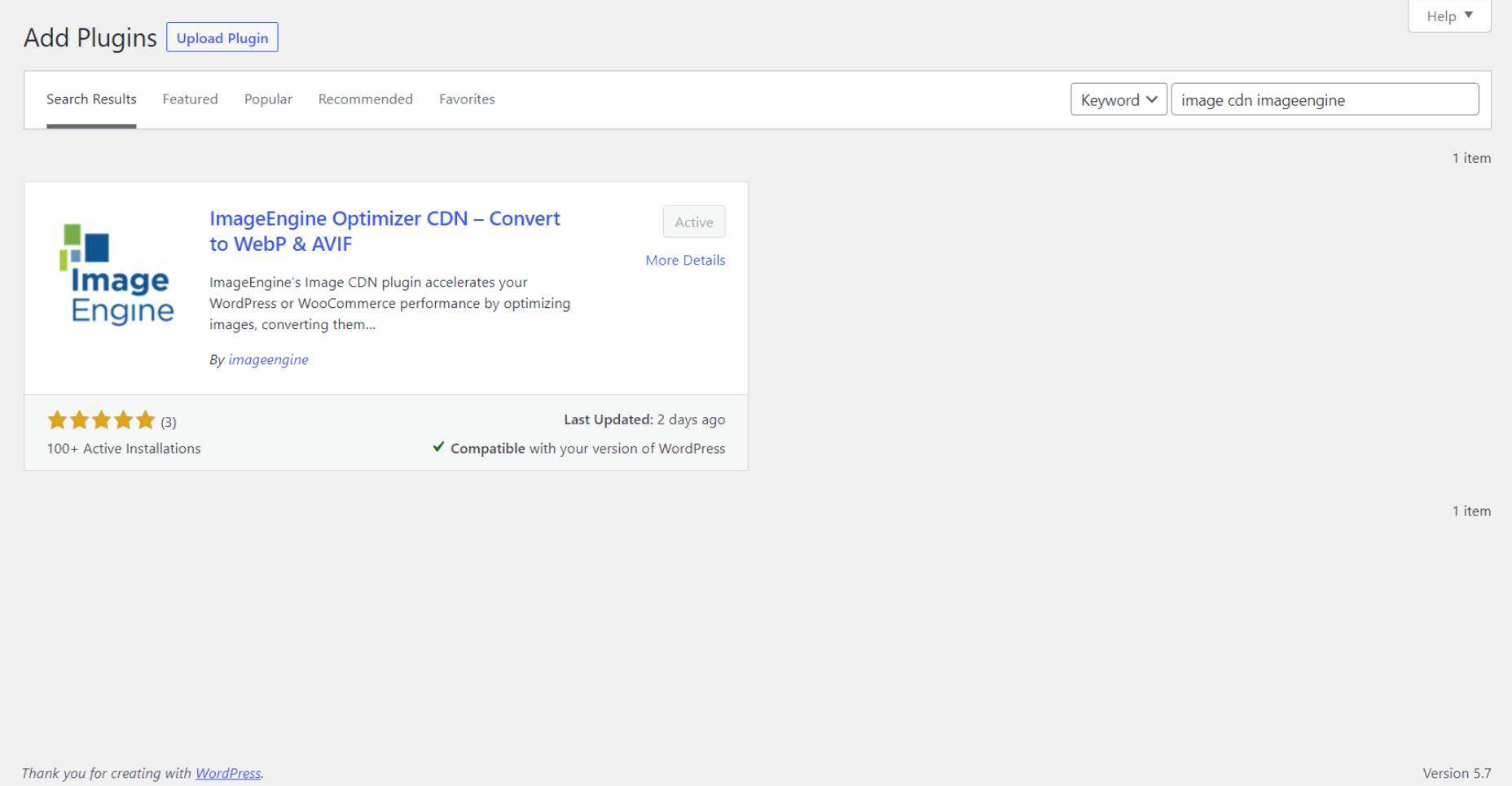
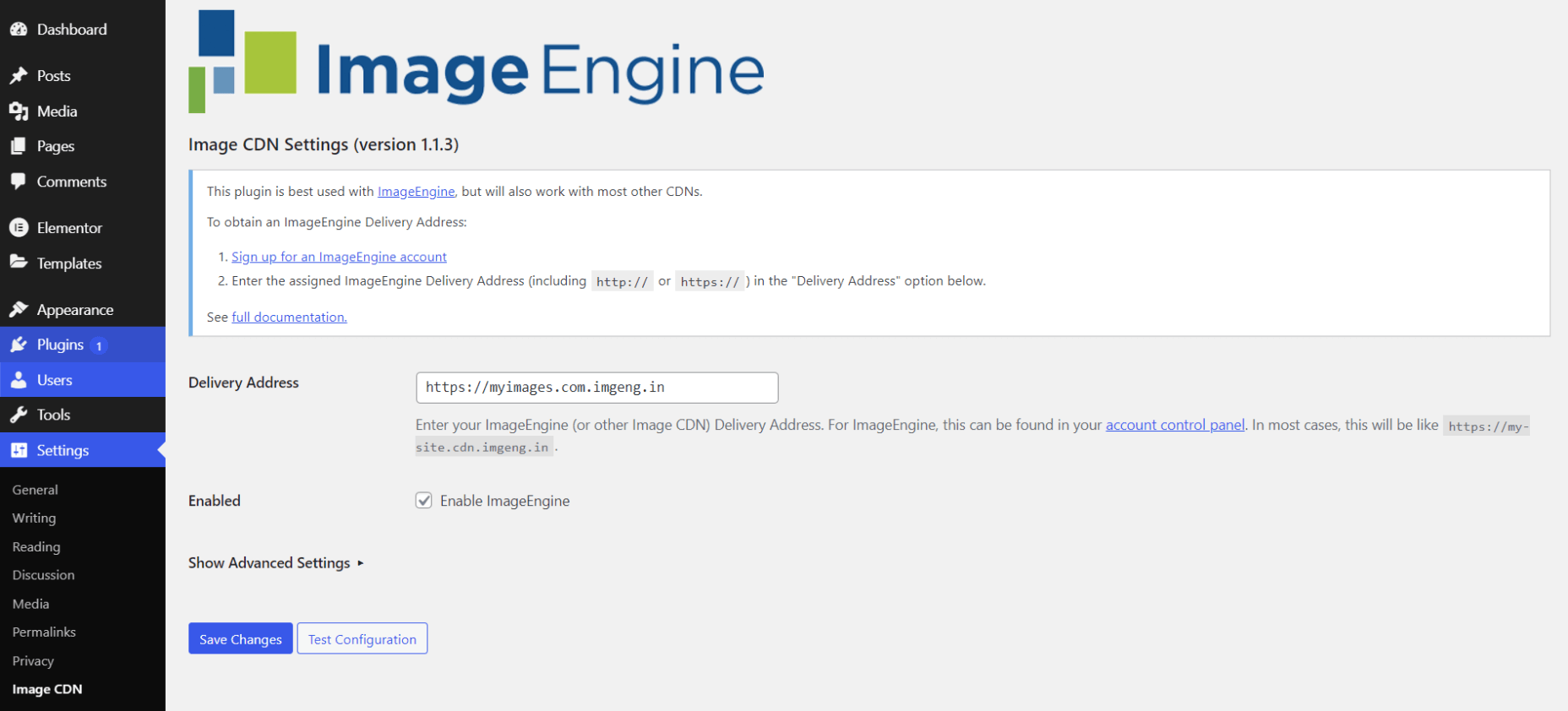
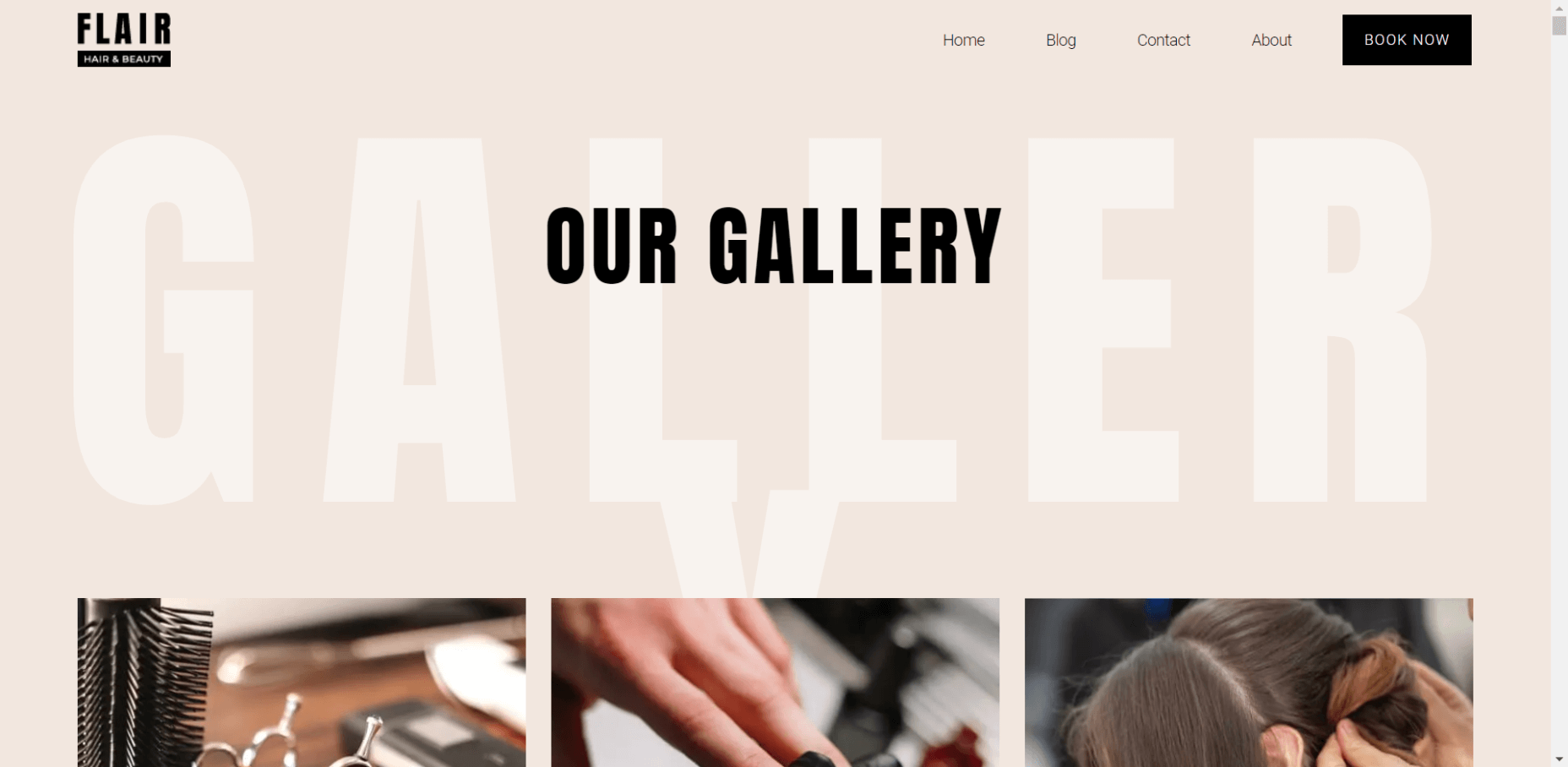
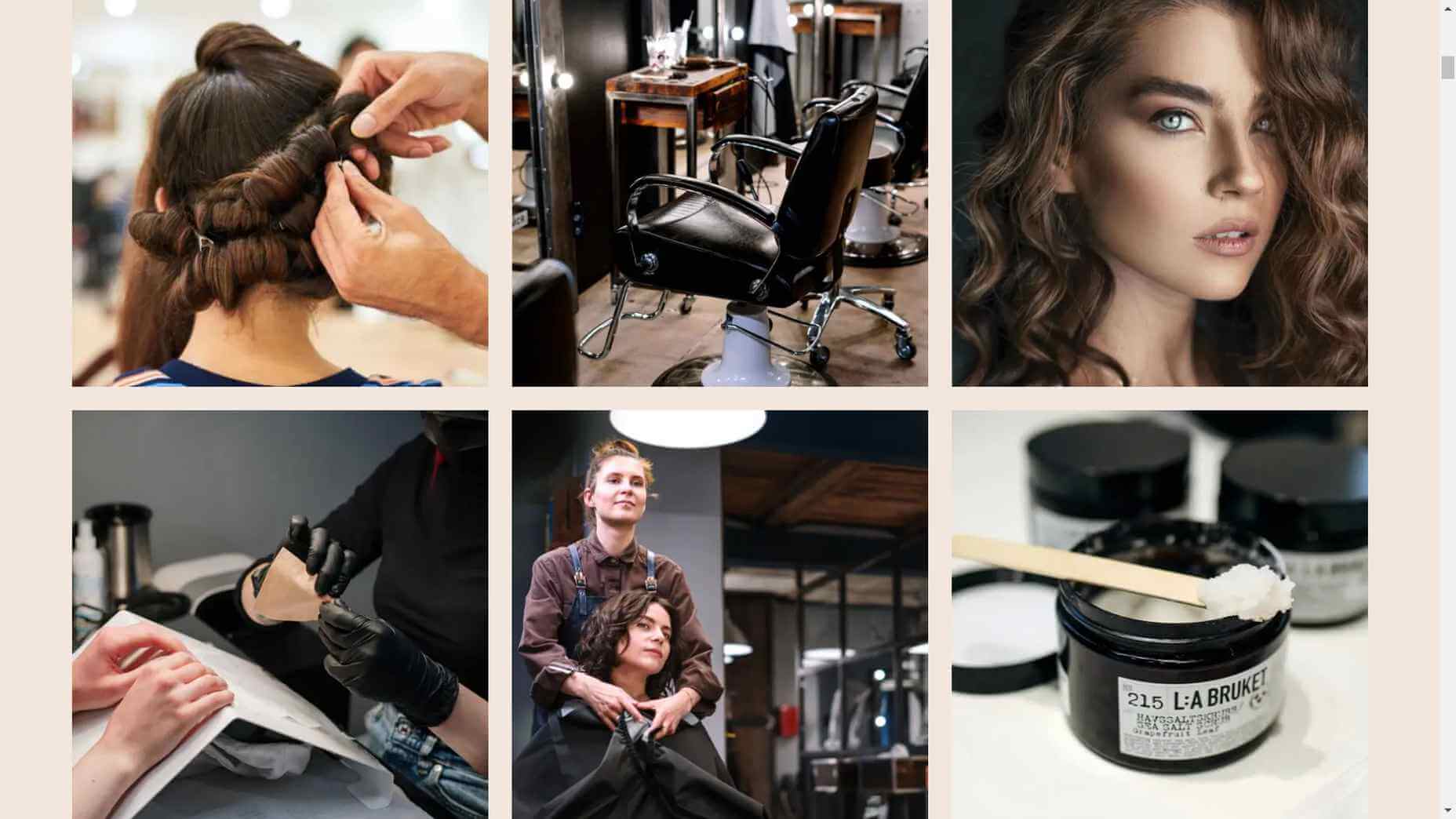

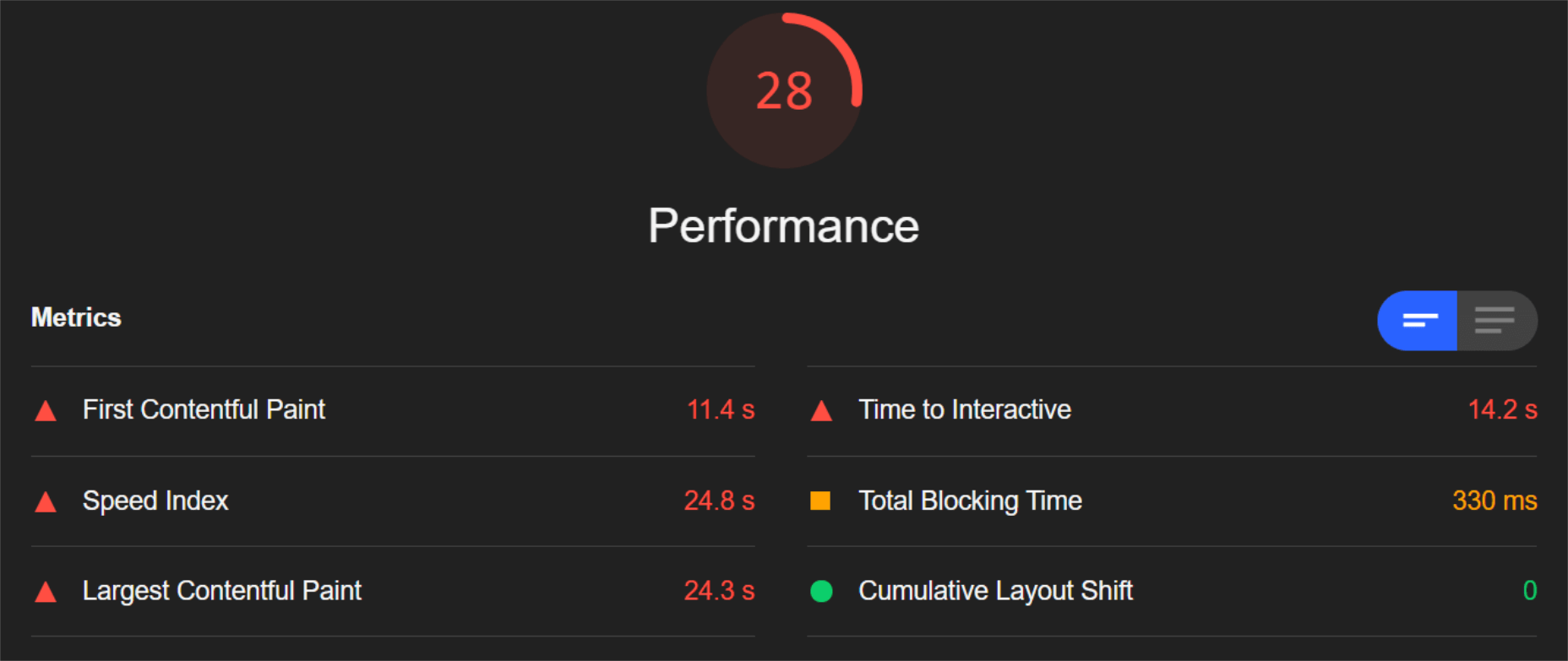
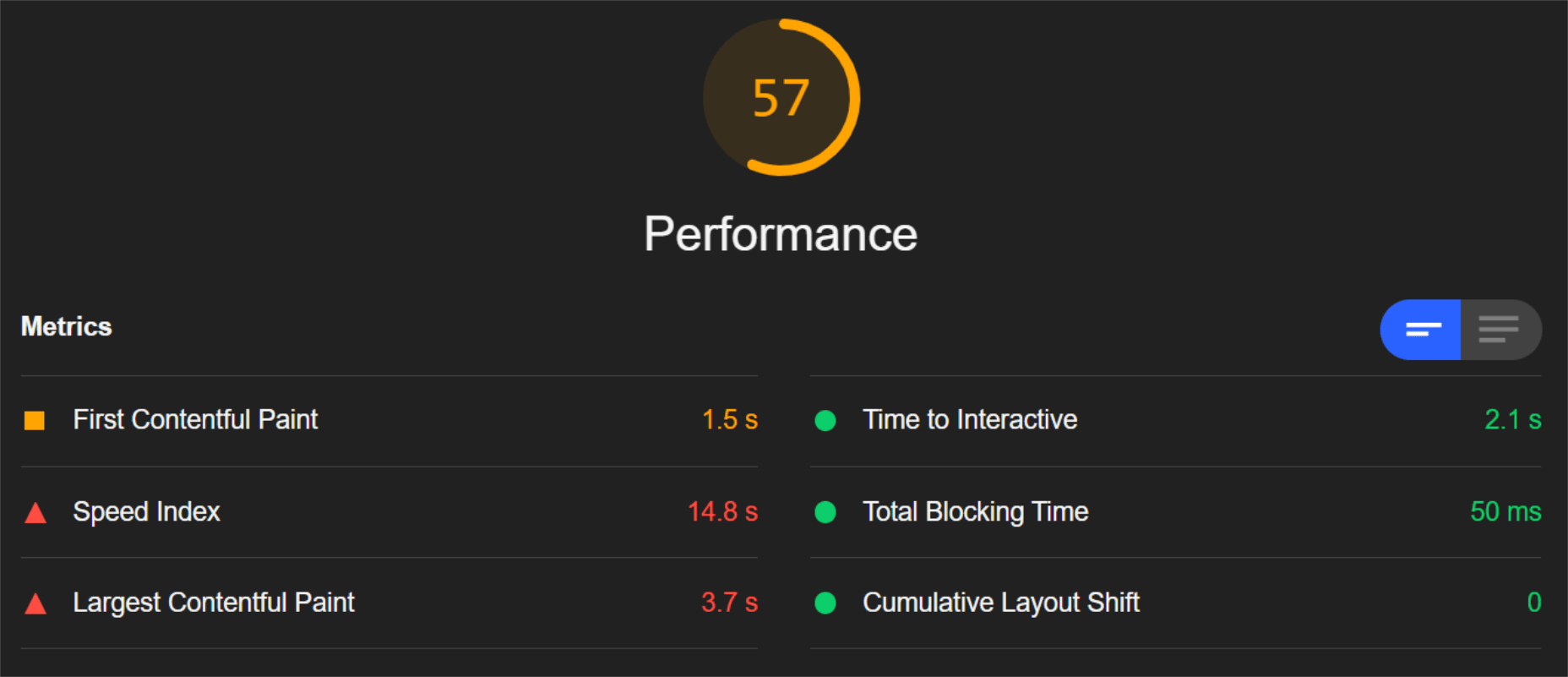
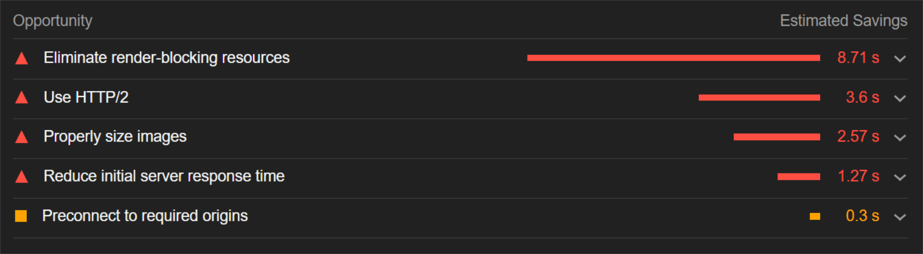
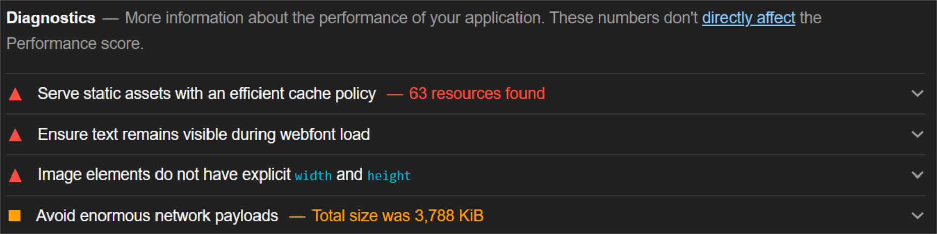
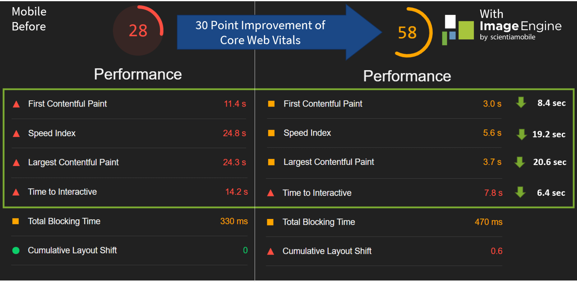
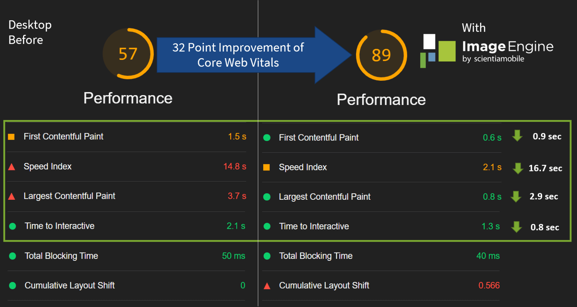
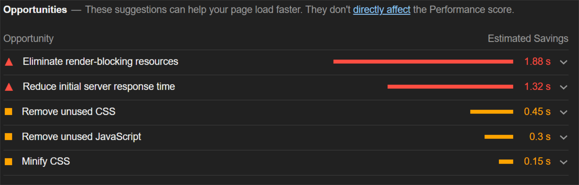
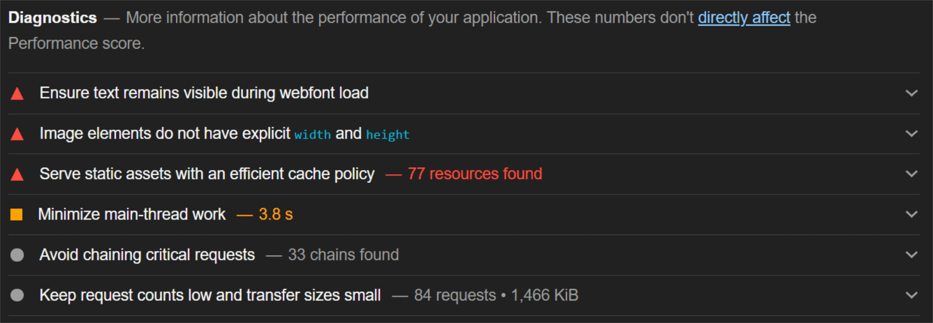


 At the dawn of the web-era, there was much focus on how environmentally friendly websites were: we’d chop down fewer trees, ship fewer products, and travel less for business.
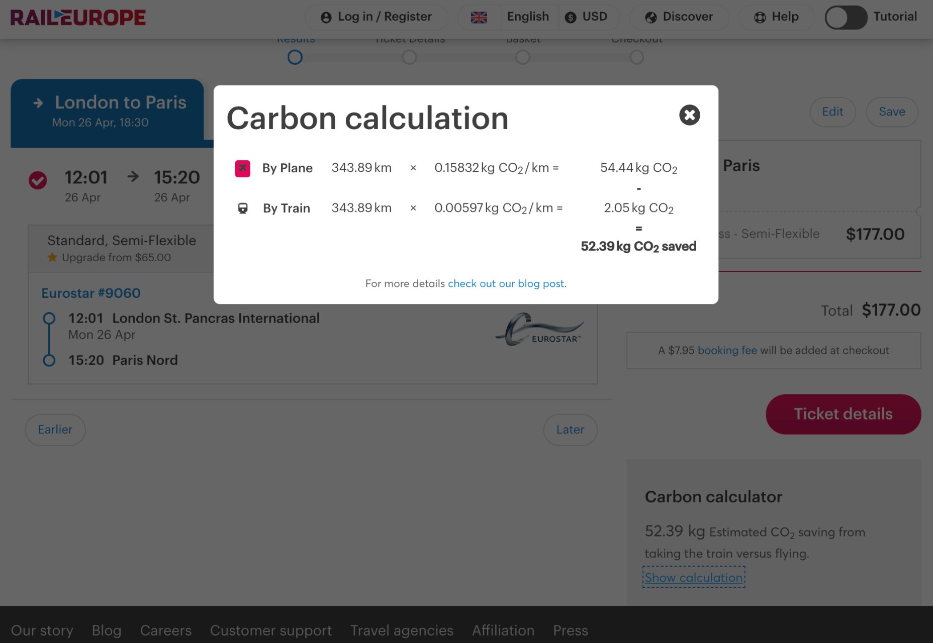
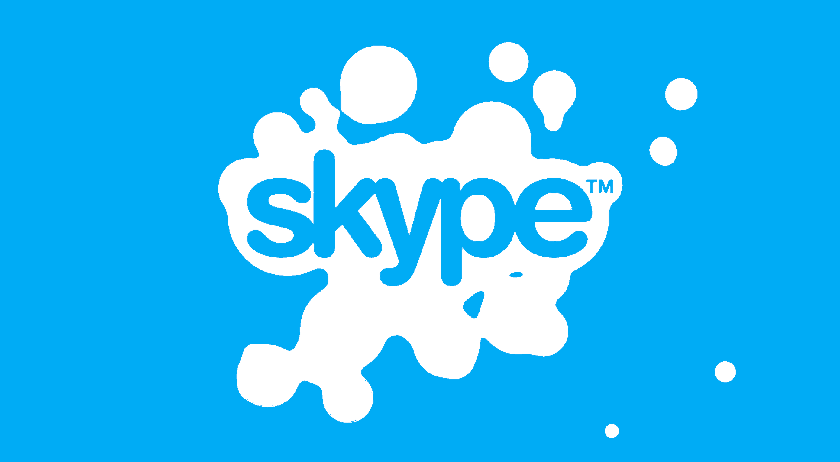 Have you ever wondered why we’re so amazed by motion? A moving image is more likely to grab your attention than a static one. Motion is exciting and attention-grabbing – plus, it allows us to access more information in a short space of time.

 Google has been talking about the Core Web Vitals tool and the Page Experience Update for about a year now.
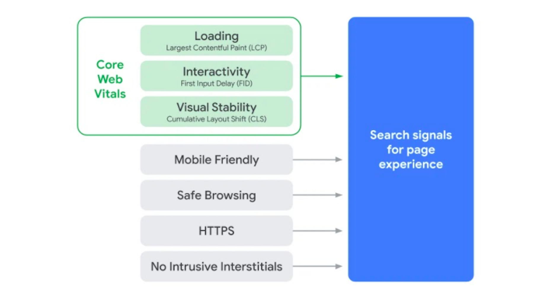
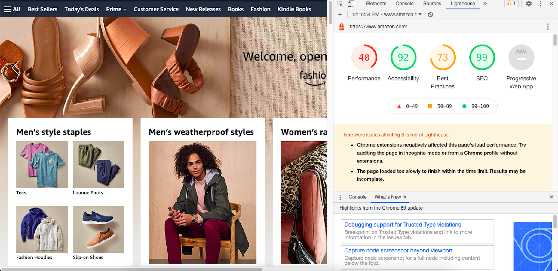
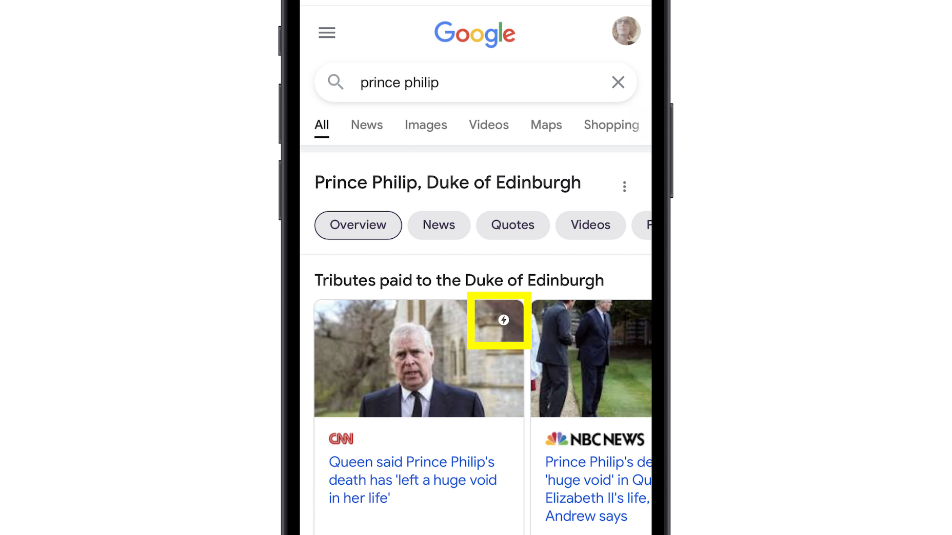
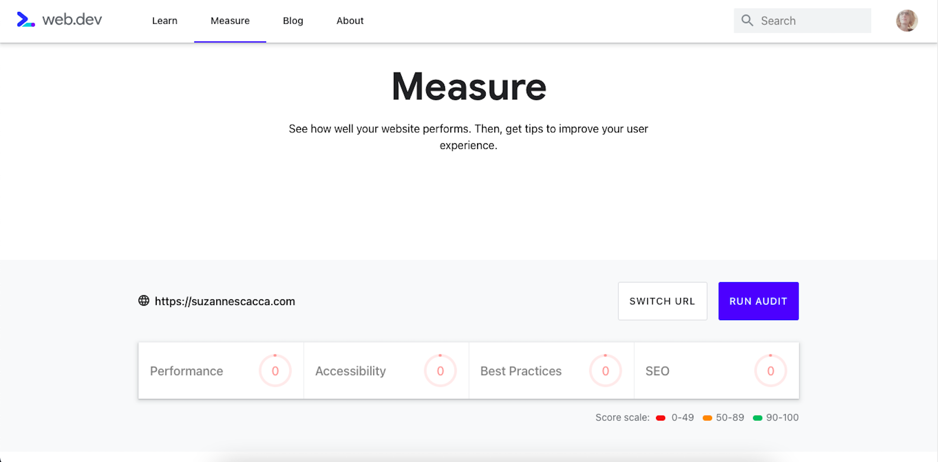
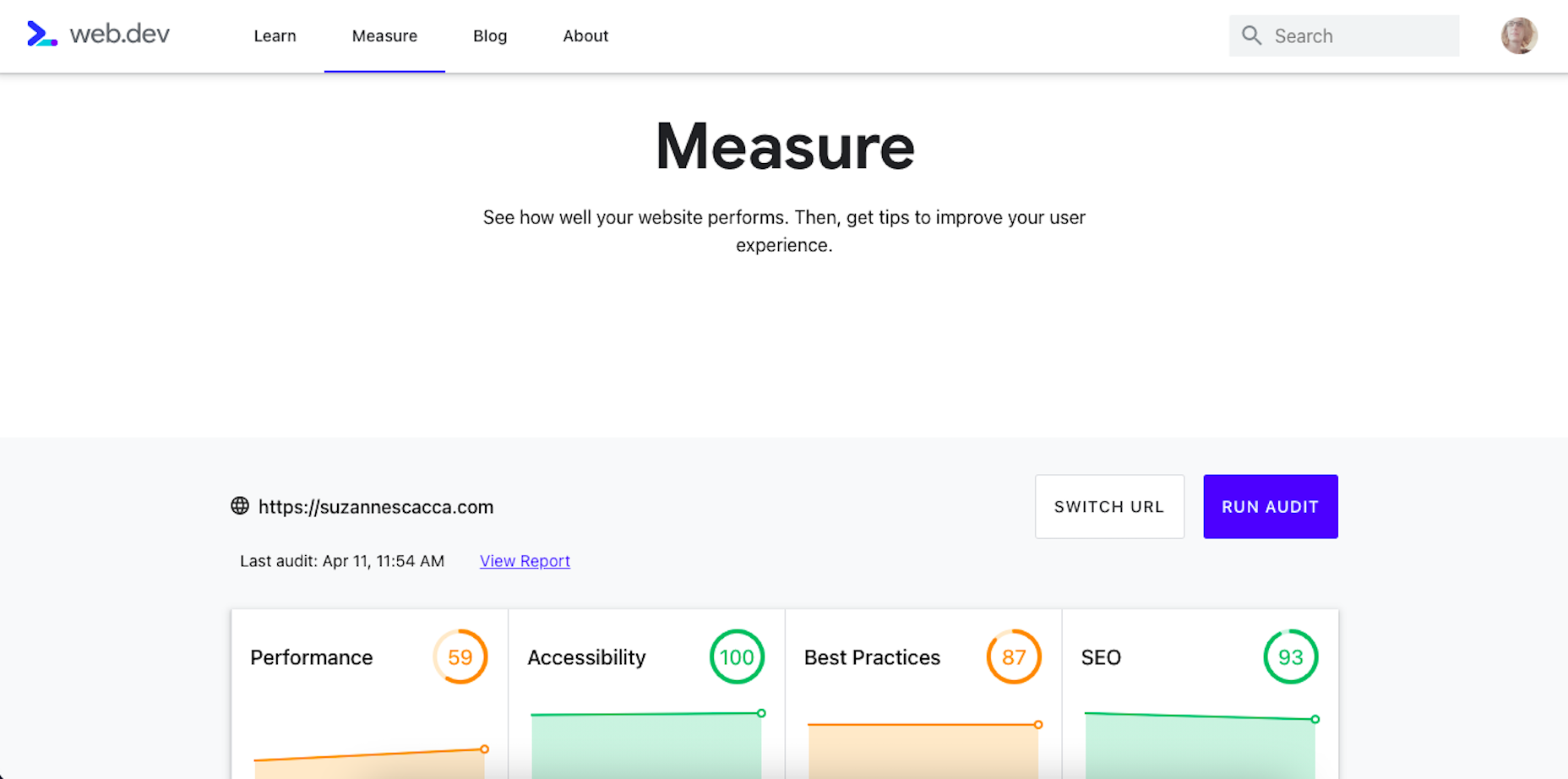
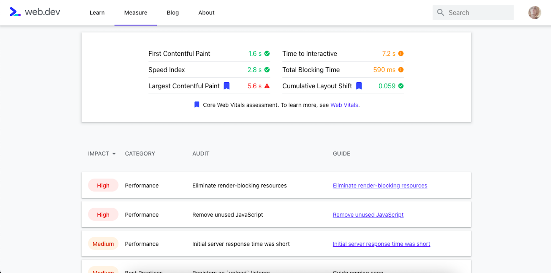
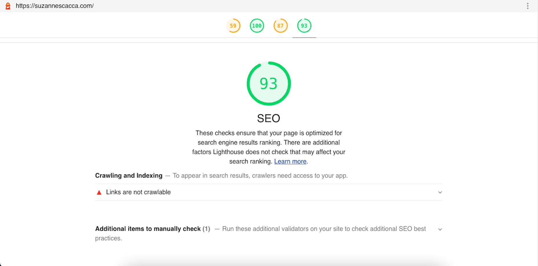

 The ‘need for speed’ is an essential item on every website’s bucket list these days. And why not? Enhanced speed is directly responsible for converting traffic into paying clients.
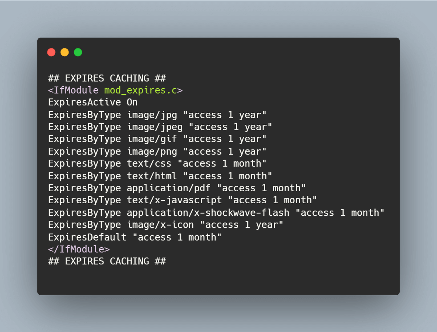

 Welcome to our roundup of the best plugins for popular CMS, this month. We’re going to cover plugins built to enhance WordPress, Shopify, Craft CMS, and Joomla. Enjoy!
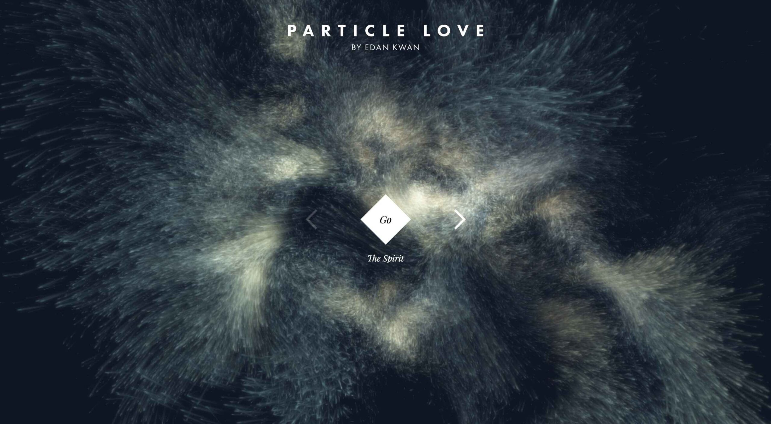 Animation is a fun and interesting way to bring life to a website. Used correctly, it can capture audience attention, make your website more engaging, and even improve your chances of delivering conversions for your clients.
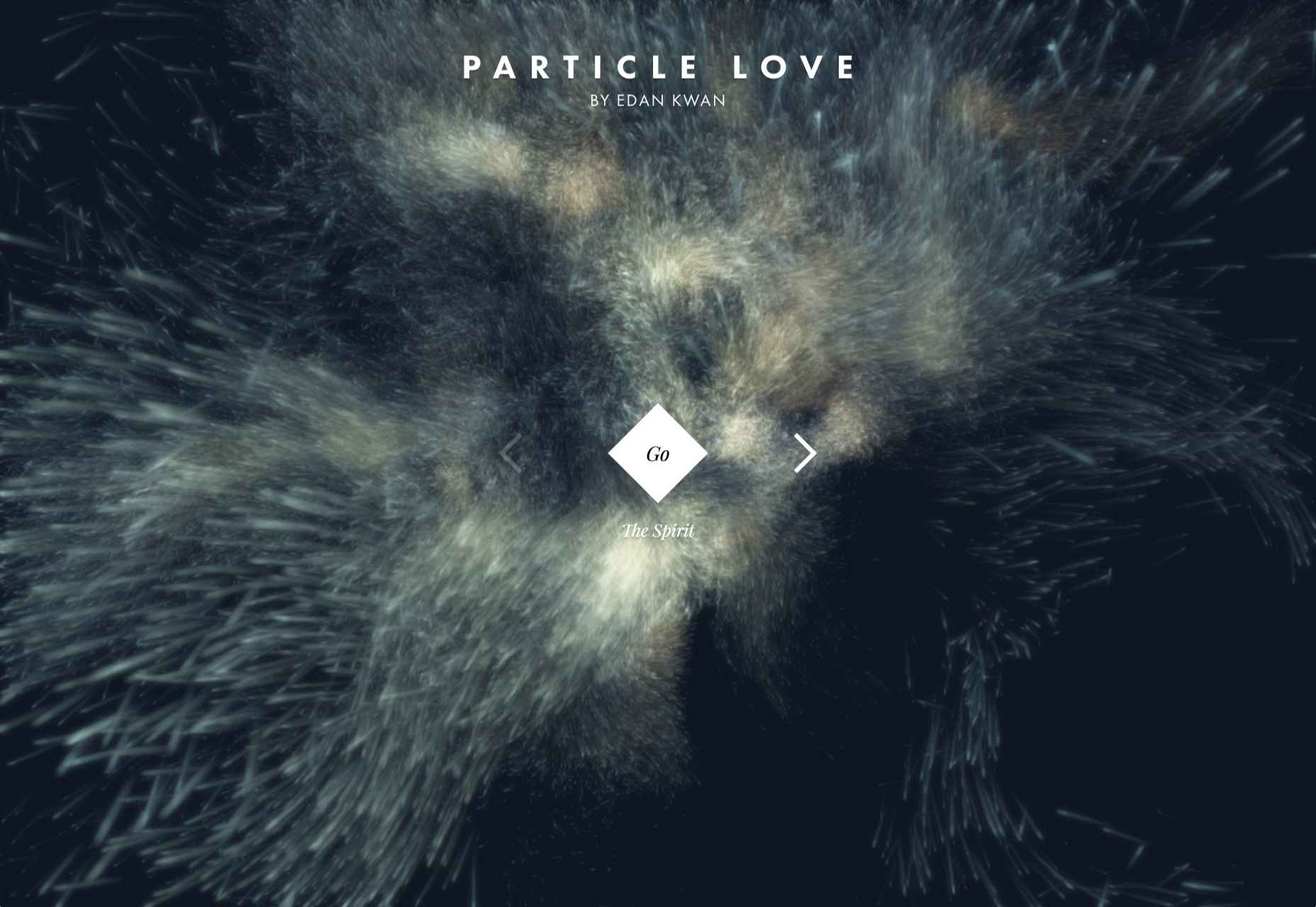
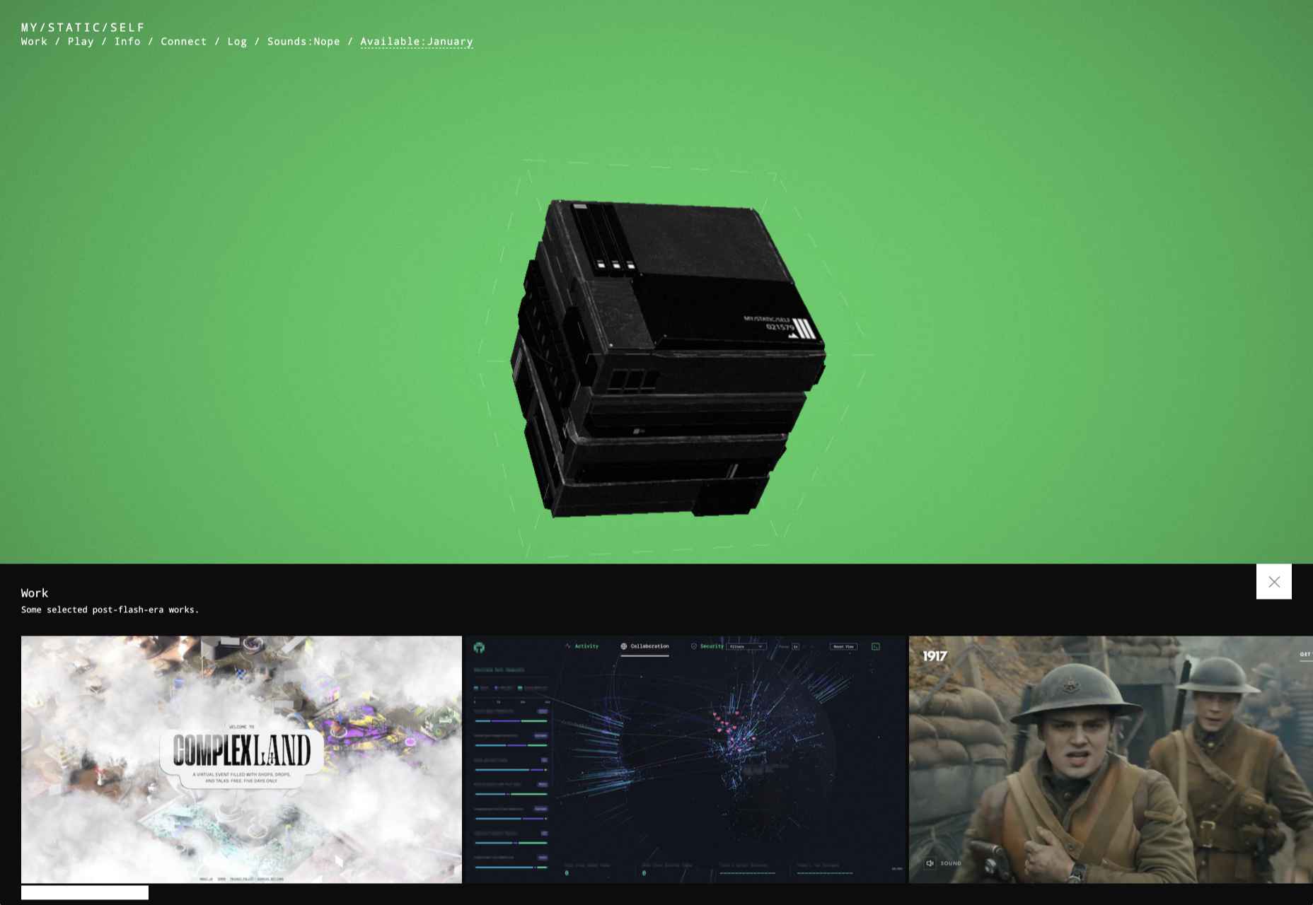


