Articles

SAP Manufacturing Execution s’invite sur les lignes d’assemblage du géant Airbus. Une solution qui permet de faciliter le travail des opérateurs, tout en améliorant les performances des lignes de production.

Airbus est un acteur bien connu dans le monde de l’aviation civile, avec plus de 12.600 avions livrés à ses clients. C’est aussi un acteur majeur dans le monde des hélicoptères (plus de 12.000 appareils assemblés), de la défense et de l’espace.

Avant la crise sanitaire, les livraisons étaient en forte croissance (+37 % sur 5 ans) et le carnet de commandes promettait du travail aux usines d’Airbus pour les 8,5 années à venir. L’arrivée du Coronavirus et son impact massif sur les déplacements par avion ont provoqué une chute massive des activités de la société. Si l’entreprise travaille déjà sur les avions de demain, avec par exemple des modèles à l’impact carbone réduit de 25 %, elle doit aussi optimiser sa production.

« Dans ce contexte d’adaptation rapide au changement, l’introduction d’un système de pilotage de la production (MES, pour Manufacturing Execution System) va être un élément clé de notre transformation », explique Alexandre Sizaret, Head of Production System Efficiency & Manufacturing Digitalisation, Airbus. Le projet a été lancé fin 2016, mais l’arrivée de la crise lui a donné un nouvel élan.

SAP et Sopra Steria à la manœuvre

SAP Manufacturing Execution (SAP ME) est aligné avec les principes du système d’information d’Airbus, AOS (Airbus Operating System) : standardisation des processus, management visuel, suivi et amélioration continus. Il vient naturellement compléter l’ERP et le PLM au sein des usines. Enfin, son interface utilisateur simple est adaptée aux opérateurs travaillant sur des chaînes de production.

Airbus veut répondre à plusieurs challenges au travers de SAP ME : l’organisation de la production (organisation des effectifs, allocation des ressources…) ; le pilotage de l’activité (lignes de production, séquences à exécuter et avancement des séquences) ; l’interfaçage avec l’opérateur (au travers de tablettes, voire de smartphones) ; le support (détection des problèmes et alerte du manager, de la maintenance ou d’autres fonctions support).

Un core model pour toutes les usines Airbus

Pour son projet, Airbus a opté pour une approche core model associant une équipe pluridisciplinaire et multifonctionnelle. « Nous avons mis tout le monde autour de la table – opérateurs, management, intervenants métiers et techniques – afin de mettre au point une unique solution adaptée à toutes les usines, dans tous les pays », explique Alexandre Sizaret.

Après les phases de cadrage et de maquettage, la construction de la solution a été réalisée, avec une mise en place des différentes fonctionnalités de manière incrémentale. Une première version a été déployée sur des usines pilotes volontaires. L’organisation a souhaité ensuite prendre un peu de recul pour identifier les sources d’irritation. Dans le même temps, une analyse a été menée sur l’utilisation du MES et l’adhésion aux processus proposés. « Nous avons voulu vérifier que l’outil répondait bien aux besoins exprimés et qu’il était correctement utilisé. » Une importante phase de consolidation avant le déploiement à grande échelle de SAP ME.

La solution est aujourd’hui présente sur l’ensemble des sites européens du groupe : 10 usines et 2 lignes d’assemblage final. Soit un total de 279 stations de production. 7700 personnes ont été formées, dont 5500 sont des utilisateurs réguliers de SAP Manufacturing Execution. Plus de 2,4 millions d’opérations ont été effectuées sur SAP ME au cours de l’année 2020. Pour tenir cette charge, le système est réparti sur quatre sites, selon un même core model.

Au sein des sites de production, des écrans géants ont été déployés, secondés par des tablettes, smartphones et équipements IoT (scanners, lecteurs de badges…). SAP ME interagit directement avec l’ERP SAP, que ce soit pour la qualité, la conformité, la gestion des aléas, la maintenance ou encore la logistique. Il interagit aussi avec le PLM. Il est ainsi possible de visualiser pièces et maquettes en 3D et de disposer d’instructions de montage détaillées.

Plus d’efficacité au quotidien

SAP Manufacturing Execution est vu par Airbus comme un facilitateur du travail des opérateurs. Mais aussi comme un élément clé pour mesurer, soutenir et améliorer les performances des lignes de production. « Parmi les bénéfices les plus visibles, nous constatons une réduction des temps de production, des déplacements des opérateurs, de la documentation de production et plus généralement du recours aux documents papier, constate Alexandre Sizaret. Un autre bénéfice, moins facilement mesurable, est l’amélioration des performances des lignes de production, au travers d’un meilleur pilotage et d’une meilleure réactivité face aux aléas. »

Le MES est un élément clé pour épauler la production au quotidien, mais aussi un socle qui va aider  à la démocratisation de nouvelles technologies, comme les jumeaux numériques ou la maintenance prédictive. « Nous souhaitons aller vers l’opérateur 4.0 en le connectant à la bonne information, au bon moment, au travers de technologies comme la réalité virtuelle, la réalité augmentée ou l’interaction vocale avec les solutions numériques. Nous voulons également nous servir de la puissance de la data pour améliorer les processus, détecter les bonnes pratiques et prévenir les aléas. C’est un changement de paradigme qui nous permettra de basculer de la réaction à l’anticipation. »


The post Airbus place SAP Manufacturing Execution au cœur de sa production appeared first on SAP France News.

Source de l’article sur sap.com

As a web designer, you face plenty of challenges, both good and bad. One of the bad ones is to suddenly find out that you’re either in danger of missing a client’s deadline or will be unable to meet it at all.

A missed deadline could be due to something beyond your control and no fault of your own. There are measures you can take to avoid what you do have control over. Such as not having the right design tool or design resources to do a task that has to be done.

An ounce of prevention can definitely be worth a pound of cure in this case. Before starting a project, make sure the tool or tools you will be using will be up to the task.

The 15 design tools presented here are the tops in their respective categories. You should be better able to handle whatever is thrown at you.

1. Be Theme

Its more than 200,000 sales to date have certainly established the BeTheme multipurpose WordPress theme as an all-time favorite among web designers.

In truth, “multipurpose” doesn’t do BeTheme justice. Users might argue that “all-purpose” would be a more accurate description.

Be’s 40+ core features give web designers plenty to work with in terms of page-building tools, design aids, design options, and special effects.

Most notably:

  • The Muffin Builder, which when used with other core features, makes building a website quick, easy, and coding-free;
  • The Admin Panel/Shortcode Generator combo gives all the flexibility designers need;
  • BeTheme’s 600+ customizable pre-built websites could well be the star of the show. They cover 30 business sectors and all the popular website types, they are customizable, responsive, and feature cool UX features, and they can get any project off to a rapid start.

Click on the banner to learn more about Be’s other core features.

2. Timezy Booking Software

Timezy will help you create a booking environment that works best for your business by allowing clients and customers to book your services as easily as possible. You can then integrate Timezy into your website to streamline and speed up your booking operation.

  • Clients and customers can book appointments online 24/7;
  • They can receive real-time email notifications and reminders;
  • Timezy can be integrated with Zoom;
  • You can reorder steps on the booking form to fit your needs;
  • Timezy can be used to manage employee assignments and schedules, vacations, and special days.

If you lack a website of your own, Timezy will provide you with a modern web page you can customize to fit your brand for clients to book appointments at any time.

3. wpDataTables

wpDataTables is the top-selling and most powerful WordPress table and chart-building plugin on the market. There are other good ones, but their table and chart-building capabilities quickly become inadequate as you go down the list of what wpDataTables can do that most others cannot.

wpDataTables key features and capabilities:

  • The ability to create interactive and responsive tables and charts;
  • The ability to create frontend editable and easily maintainable tables and charts;
  • The ability to rapidly process massive amounts of data that come in various formats and from various sources;
  • The ability to build tables and charts using real-time data.

You can also brighten up or improve a table or chart’s readability by highlighting or color-coding key information.

Click on the banner to find out more about what this plugin can do for you.

4. LayerSlider

LayerSlider is not for sliders only. This multipurpose WordPress tool can also be used to create eye-catching animations and engaging content.

  • Add a little spice to a stale website;
  • Create popups with stunning effects to interact better with visitors;
  • Avoid coding, since LayerSlider is drag and drop.

This popular design tool has been assisting web designers for nearly a decade and serves millions of active monthly users.

5. Amelia Booking Plugin

Amelia is a user-friendly WordPress booking plugin you can use to manage your appointments and events on a single platform.

  • Clients can instantly book, change, or cancel appointments online 24/7;
  • Employees and customers can manage meetings, appointments, and events from their own dashboards;
  • Amelia can be integrated with Zoom to conduct training or consultation sessions;
  • Amelia can also create packages of services with discounts and validity periods.

Amelia can service multiple business locations.

6. Uncode – Creative Multiuse & WooCommerce WordPress Theme

With its more than 80.000 sales to date, Uncode has become one of ThemeForest’s all-time best sellers.

  • You can create custom layouts and designs with Uncode’s Dynamic Content feature and use them as templates for category pages;
  • Uncode features the WooCommerce Product Builder, custom Checkout, Cart, My Account, Quick-View, etc.

Uncode has a comprehensive library of tutorial videos and a showcase of user-created websites that is well worth visiting.

7. Total WordPress Theme

Created with perfection in mind, Total is nonetheless an extremely user-friendly WordPress theme.

  • This drag and drop website building tool’s extreme flexibility allows users to create any type or style of website;
  • The WPBakery page builder is accompanied by an assortment of custom modules;
  • Total is RTL and Translation-ready and easily integrates with WooCommerce;
  • Total is developer-friendly.

Click on the banner to learn more.

8. Dr. Link Check

Dr. Link Check saves you the inconvenience of having to periodically conduct a manual search of your site for broken links.

Dr. Link Check inspects for:

  • Broken links and improper URL formatting;
  • Blacklisted malicious content links;
  • Websites that do not contain any valuable content, including ad-only sites.

Dr. Link Check publishes downloadable daily, weekly, or monthly reports.

9. Mobirise Website Builder

Mobirise is not only a top tool for creating fast, responsive, user-friendly websites. It also has the advantages of being offline. Mobirise is also free.

Factors that contribute to Mobirise’s excellent performance include:

  • Google Amp and Bootstrap 4 frameworks;
  • Professionally-crafted website templates, popups, sliders, and eCommerce features;
  • Mobirise is all drag and drop.

Click on the banner to download your very own copy.

10. 8b Website Builder

When a website builder is fast, free, responsive, user friendly, and Google-friendly as well, it is certainly worthy of consideration.

The 8b website builder:

  • Allows you to create websites at home or on the go on any device;
  • Features templates and website sections designed to get projects off to a rapid start;
  • It gives your site a Google ranking with a couple of clicks;
  • It can be hosted wherever you want.

Download your copy now.

11. WHATFONTIS

WhatFontIs, with its database of more than 700K commercial and free fonts and font-finding AI functionality enables you to identify fonts from images you upload.

This top-of-the-line font-finding tool:

  • Identifies an uploaded font 90% of the time;
  • Gives answers in seconds;
  • Identifies cursive fonts (the letters in the image must be separated);
  • Displays 60+ similar fonts for each uploaded image.

12. Litho – The Multipurpose HTML5 Template

Litho is a responsive multipurpose Bootstrap 4 HTML5 template that gives startups, design agencies, and other businesses an ideal website-building starting point.

Litho’s features include:

  • Cool selections of ready-made home pages, inner pages, and template blocks;
  • Page styles for portfolio, shop, and blogging sites;
  • Sliders, banners, forms, and other creative design elements.

Litho offers 5-star professional support.

13. XStore – The Most Customizable WooCommerce Theme Ever

XStore may be the best tool anyone could have at their fingertips when looking for a fast and easy way to create a high-performance eCommerce website –  for only $39.

XStore’s key features include:

  • 100+ customizable ready-to-go shops;
  • $500+ worth of premium WordPress plugins;
  • A Single Product builder and a Header builder.

14. Goodiewebsite

GOODIE’s web development platform assists clients who are eager to get a professionally-coded website quickly up and running.

GOODIE’s services focus on:

  • Web designers seeking a development partner;
  • Startups looking for ways to test their ideas and concepts;
  • Small businesses seeking an online presence or improvement of an existing one.

GOODIE’s specialties include 1-10 page, WordPress, and eCommerce websites.

15. Heroic Inbox

There are several excellent reasons for letting Heroic Inbox manage your business’s departmental email inboxes.

They include:

  • Encouraging efficient staff collaboration on email assignments and responses;
  • Helping staff members accomplish and maintain Inbox Zero status;
  • Tracking key team performance metrics.

Two key Heroic Inbox features are its smart workflows and a fast and friendly UI.

Every web designer owns a toolbox of tips and tricks they use in their website building projects. Even when a toolbox is superbly stocked, it is always challenging to keep it up to date. Doing so requires maintaining a knowledge of the latest and greatest web design resources and tools—some of which you may need to meet ever-changing industry demands.

This article features the top tools & resources for designers and agencies for 2021. Choosing one or more of them could not only help you stay on top of your game but could even make your day.

Source

The post 15 Useful Tools & Resources Worth Checking Out first appeared on Webdesigner Depot.


Source de l’article sur Webdesignerdepot

It’s February, and the spring sun is finally starting to peep through the winter clouds. While many of us are still largely restricted to our homes, the web has kept on growing.

We see a shift in attitude towards natural health, wellbeing, and sustainability, and these are now being branded less often as outliers and increasingly mainstream. We’re also seeing more and more color all the time, ranging from an emotional signifier in the background to being a functional element in its own right.

GOOD Meat

Gorgeous color in the background image and the scrolling narrative pull the user in on this site for lab ‘grown’ meat.

Hanwag 100 Years

This page celebrating 100 years of outdoor footwear company Hanweg uses a mix of illustrations and photographs to create a timeline marking the company’s highlights alongside what else was happening at the time. Any excuse to get Yoda in.

Gaffer

Gaffer describes itself as bridging the gap between football, music, fashion, and culture. The site has a glossy feel, with strong art direction and an easily navigable architecture.

Remember MLK

This rather beautifully made tribute to Martin Luther King uses some great typographic effects, and the variations, in contrast, create a layering of the different content elements.

Bonjour Agency

The home page for design agency Bonjour Paris uses sideways scrolling to give an overview of the whole site. There is a lot of content, but it doesn’t feel like waffle, and exploring the site is a pleasant experience in itself.

Wild Souls

Wild Souls is a Greek company that principally makes nut butters, tahini, and halva. The site is very colorful but warm, and the display type — Canela — has a slight softness to it that is appealing.

Nicolas Loureiro

This is a strong portfolio site for interactive and graphic designer Nicolas Loureiro. The work is front and center, and the navigation is pleasing.

Studio Nanna Lagerman

Studio Nanna Lagermann is a small interior design studio that works on private homes, public spaces, and set design. The site creates a feeling of space and calm. Colors are soft and neutral, and the type, although massive in places, is clean and sophisticated.

Aurelia Durand

Illustrator Aurelia Durand created her own typeface that she uses in her work, and it is used as the main display font here too. This site has a sense of joy about it that is hard to resist.

Archivio Mario Russo

This site documents the life and work of 20th-century Italian artist Mario Russo. The layout is thoughtful, and the text, while informative, doesn’t detract from the work being shown.

Gigantic Candy

Gigantic Candy makes vegan chocolate candy bars. The site is big, bold and lo-fi, and has a sense of fun to it.

dBodhi

dBodhi sells handcrafted furniture from Java, made from reclaimed teak and locally grown plant materials. The clean layout combined with a slight sepia tone on all the photography creates a feeling of quietness and nature.

Menu Durable

Menu Durable is a guide to creating healthier, sustainable food menus in Canadian healthcare facilities. There is a lot of information here, and it is well written and attractively presented with clear color coding.

Virgile Guinard

This is a lovely, simple portfolio site for photographer Virgile Guinard. By using blocks of color pulled from each photograph’s predominant color and only revealing each photograph on rollover, each image is allowed to stand out.

The Bold Type

This site for The Bold Type Hotel in Patra, Greece, is a boutique hotel website archetype, but it is done well. The pinky sand background color is a good choice, and the photographs are excellent.

NOR NORM

Nor Norm provide an office furniture subscription service. The site is clean with a feeling of light and space. There is a good balance between an overview of the process and details of the individual items available.

Ask Us For Ideas

At first glance, Ask Us For Ideas looks like a creative agency, but it is actually a creative broker, matching clients with agencies.

Prinoth Clean Motion

Prinoth has been making snow groomers since the 1960s, and this microsite is to mark the launch of their new hydrogen and electric versions. It is as slick and glossy as any luxury car website. And now I know what a snow groomer is.

Pschhh

Design agency Pschhh has embraced the use of circles, reflecting the sound of bubbles their name suggests.

CōLab

CōLab is a design and marketing firm. There is a great use of color and movement here, and you don’t really notice initially that there is no actual work on show.

Source

The post 20 Best New Websites, February 2021 first appeared on Webdesigner Depot.


Source de l’article sur Webdesignerdepot

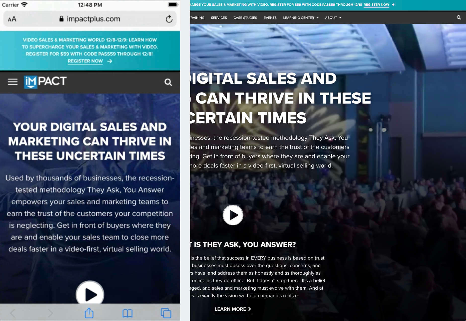
There are dozens of factors that influence the UX of your site, app, or game. Most of them are beyond your control; user connection speed, end-system resources, even browser technology is all out of your hands. So when you do have the opportunity to influence your project’s infrastructure, you should seize it.

The world’s fastest muscle car can’t perform at its best when traffic is gridlocked bumper to bumper; likewise, the most finely tuned website can’t meet its potential running on shared hosting.

If you want your website, application, or service to run quickly and securely, maximizing both UX and SEO, then you need to look at the bare metal servers from OVHcloud.

Bare Metal Performance

Bare metal (or dedicated) servers aren’t uncommon. Still, most hosts only offer a single type of server, expecting small startups to pay for resources at the same rate as global giants, which can make dedicated hosting prohibitively expensive.

OVHcloud is different; it offers a range of bare metal server products optimized for a wide variety of challenges. That means small startups can invest in fast, easily scalable solutions that meet the most demanding security requirements without breaking the bank.

Whatever your aims, there’s a different OVHcloud solution configured for you:

OVHcloud Rise

Rise is the perfect option for a website, or web app hosting. With its low entry-cost, Intel-powered performance, bundled DDoS protection, and simplified administration, Rise is the natural choice for your first step into bare metal servers.

OVHcloud Advance

To meet SMEs’ need for reliable infrastructure to run mission-critical applications, OVHcloud configured Advance. From in-house CRMs to web-facing SaaS products, Advance is a solid foundation upon which to build your business.

OVHcloud Storage

Storage is ideal for storing large amounts of data securely. Hosting data on standard servers is a colossal waste of resources; with OVHcloud’s Storage product you can host up to 504TB and seamlessly access it via a performance-tuned server.

OVHcloud Infrastructure

For large companies with thousands of employees, global non-profits, colleges, and even local governments, OVHcloud Infrastructure offers scalability and flexibility beyond the average dedicated server.

OVHcloud High-End

For web apps that are leveraging cutting edge technology like machine learning and big data, OVHcloud’s High-End product is a no-compromise custom solution, the humdinger of bare metal servers, with every conceivable option available.

OVHcloud Game

If you’re developing video games, then lightning-quick, reliable streaming servers are essential. OVHcloud’s Game product delivers the type of speed your customers demand, with massive performance gains over comparable bare metal servers.

How to Choose a Bare Metal Server

It’s easy to get bogged down in detail, especially if this is your first foray into bare metal servers.

But here’s the good news: every OVHcloud bare metal server is a massive boost in performance over shared web hosting. That’s because, with a dedicated server, all of the server’s resources are…dedicated; that is, you don’t have to share with anyone. Shared hosting is pot-luck: You might wind up on a server with thoughtful users who don’t eat up all the resources, and you might end up on a server with one selfish user who hogs the processes and compromises the security. With a bare metal server, that’s not an issue.

Choosing a bare metal server is a two-step process. The first step is to think about what you intend to use it for:

Are you going to store a lot of data? If so, think about OVHcloud’s Storage product. But a lot of data doesn’t mean a WordPress blog. Let’s say you’re a polling company, collating millions of records that you hope to analyze to predict political movement; that requires a lot of storage. On the other hand, all servers have some storage. OVHcloud’s Rise product comes with 500Gb and can be configured with more. So if you’re planning to host something the size of a blog, then OVHcloud’s Storage might be using a sledgehammer to crack a nut.

The second step is to ask how complex the operations you’re going to ask the server to perform will be:

Hitting up a database to retrieve some data is not a complex operation. Even something like a complex search isn’t too taxing. If that’s the kind of process you expect to perform, OVHcloud’s Rise is more than adequate. But if you’re manipulating large amounts of data, like resizing hundreds of raster images dynamically; or using facial recognition to search through millions of biometric data records; or even managing your advertising application serving millions of ads to sites across the web; in those cases, you need the sort of performance OVHcloud’s Infrastructure product delivers.

OVHcloud’s products are all scaleable. Its High-End bare metal server product is entirely customizable. Whatever you choose, and however your needs change over time, you can be confident you’re running the optimum server for your project.

Why Choose OVHcloud

There are a mind-boggling array of processors, and OS, and a seemingly infinite — and increasingly expensive — amount of hardware on offer on the web. OVHcloud radically simplifies running a bare metal server by delivering a range of popular packages, tailored for everyday uses, that are both customizable and scaleable.

What OVHcloud delivers is a clear choice, letting you choose the right server for your product.

Whether you need lighting fast response times to maximize your SEO or the space to store a digital archive of the world’s most important art, for reliability and choice, opt for OVHcloud bare metal servers.


[— This is a sponsored post on behalf of OVHcloud —]

Source

The post How to Choose a Bare Metal Server From OVHcloud first appeared on Webdesigner Depot.


Source de l’article sur Webdesignerdepot

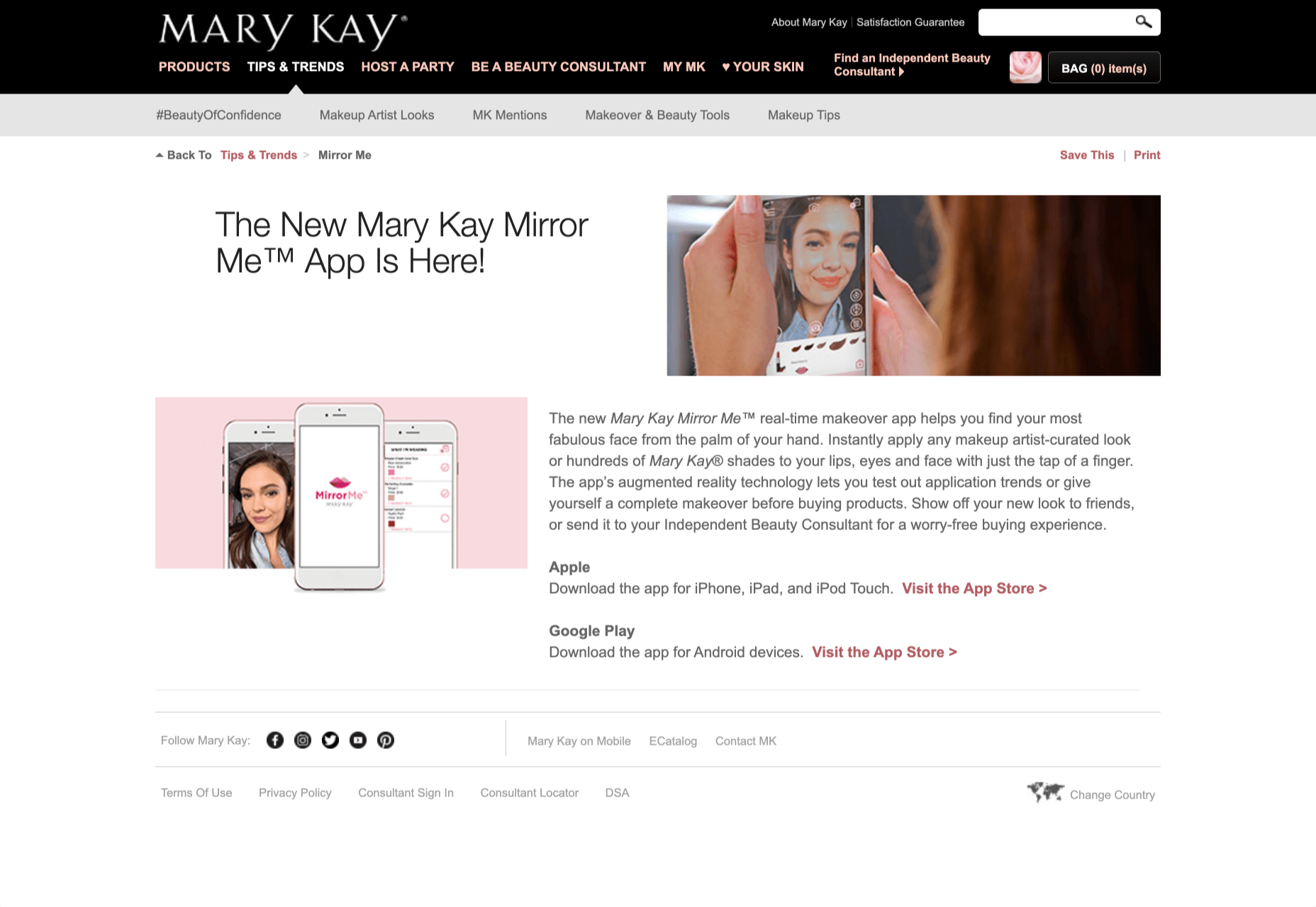
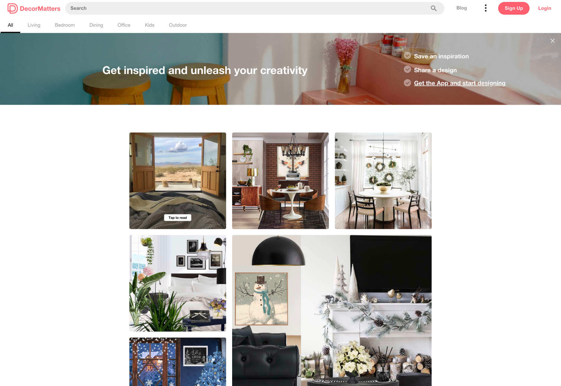
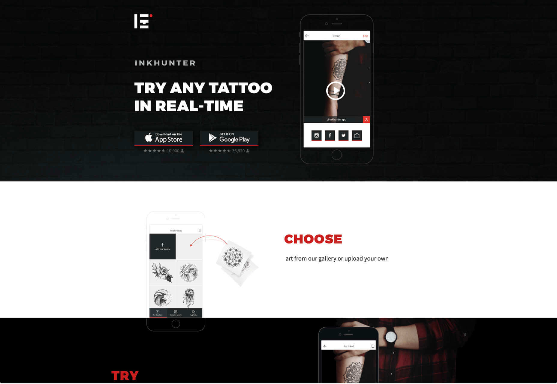
Over the years, experts have repeatedly discussed the possible impact of mixed realities on web design. Concepts like AR and VR are expected to have the potential to change the way that we interact with websites on a fundamental level.

Now that we’re in the year 2021, however, discussions about AR aren’t just observational anymore. The age of mixed-reality interfaces is here, in everything from Pokémon Go, to Snapchat filters.

The question is, how do web designers create incredible user experiences in a world where there are now multiple digital realities to consider?

The Benefits of Experimenting with AR

Before we look at some of the steps that web designers can take to enhance their projects with AR, it’s worth examining the benefits of interacting with augmented reality in the first place. 

While virtual reality replaces the typical world around us completely with digital components, AR augments it. This means that developers and designers need to learn how to thrive in an environment where the real world and the digital one work together. 

The most common AR application for website owners is to provide a solution for real-time and remote product visualization. Imagine being able to try on a pair of shoes before you buy them online. That’s a service that the Vyking brand can deliver by creating technology that “reinvents” the digital shopping experience. 

This test functionality plays a massive role in purchasing decisions. In a world where people can’t see a shade of make-up in person when they’re shopping online, or check how an item of furniture looks in their home, AR has a crucial role to play. 

In simple terms, AR helps shoppers to make more informed purchases. 

Here’s how you can use augmented reality to deliver incredible UX. 

1. Focus on Real-Time Feedback

Augmented reality is all about connecting the real world to the virtual world. 

Doing this provides users a unique experience – one that’s filled with real-time feedback that can deliver crucial and insightful information. For instance, an augmented reality system in a GPS app can calculate the average time before reaching a destination based on previous trips.

Another option is for an augmented reality to use solutions like face-mapping to help customers determine how a certain makeup product will look before they buy it. For instance, that’s the case for the Mary Kay Mirror Me app, which simplifies the process of shopping for make-up. 

When designing for AR, experts need to consider how they can provide customers with real-time information that they can use to make better purchasing decisions. 

2. Define input and output

Although you’ve probably performed similar exercises when designing for traditional websites and applications in the past, defining inputs and outputs of UX in AR environments can be tough.

Defining inputs and outputs allows you to determine which elements of an interface your user can actually interact with, in your interface. This gives you a better idea of what to “augment.” For instance, you might decide that physical gestures like a swipe of the hand will be essential for AR inputs. However, you’ll also need to consider how each mobile device offers different input possibilities. 

Outputs are a little simpler. For instance, you could offer a three-dimensional model of a product that your customers are interested in. Once you have that output, you can think about how the customer will interact with it by changing colors or position.

3. Embrace Customer-Friendly Performance

Another feature at the heart of AR applications is interactivity. 

Good designs in the augmented reality world need to be simple to access and use, otherwise customers will end up avoiding them. For instance, 60% of customers say they want to use AR when they’re shopping for furniture. However, they’re only going to use your app if it actually works. 

The Décor Matters website and app mix gamification with home decorating features that help customers get a better view of the home goods they’re planning on buying. The website even has inspiration pages available to help users find and try new design options with their AR technology. 

When designing for AR, think about how you can make your applications or technology as simple to use as possible, so customers actually want to interact with it. 

4. Address the Environment

In augmented and virtual reality applications, it’s important to remember that interfaces aren’t bound by physical screens. The viewport will move with the user, shifting perspectives in response. Most AR designers will use four different signifiers to describe AR environments:

  • Public environment: The entire body of the user is involved as a controller, like with the Xbox Kinect or Nintendo Wii;
  • Intimate environment: Where a user can be seated – often in a desktop environment;
  • Personal environment: AR on smartphones, mobile devices, and tablets, like Pokémon Go;
  • Private environments: Completely private spaces, such as with wearable technology like the Google Glass solution.

The environment that you’re designing for will be crucial for your project outcomes. Remember, spatial considerations need to be carefully considered when accounting for how users will interact with objects in a frame. 

5. Remember User Fatigue

Another thing to keep in mind when designing for AR technology is that user fatigue is likely to be a much more significant consideration. After all, people interact with websites and applications in a much more intimate and in-depth way when AR is involved. 

AR applications can often use the entire body of a customer as a controller. Because of this, designers need to be careful about exhausting interactions. High-effort and repetitive interactions could tire the user out mentally and physically, causing them to give up on the interaction. 

When designing, you’ll need to consider how you might over-stimulate the user with too many interaction-focused elements at once. Keep it simple.

6. Remember the Essential Principles of UX Design

Remember, just because you’re tapping into a relatively new technology doesn’t mean that you should abandon all the basic tenets of user experience design that you’ve come to understand over the years. Although UX is constantly evolving and changing, it’s always going to keep a few fundamental principles in mind. 

For instance, you’ll always strive to give users the best digital experience in exchange for the lowest amount of effort on their part. Additionally, you’ll need to think about how you can make end-users as comfortable as possible when they’re interacting with new types of technology on websites and apps. 

For instance, since AR is most commonly associated with gaming in the current environment, it might be a good idea to implement gamification concepts into your AR design. What can you do to make sure your customers are having fun?

For instance, Inkhunter is an app that allows users to try on tattoos just like using a filter on Snapchat. The experience feels familiar, comfortable, and exciting.

Unlocking the Potential of AR Web Design

Augmented Reality technology has come a long way over the years. Today, developers and designers can access simple plug-in tools like WordPress VR, allowing designers to upload 360-degree videos into WordPress sites and other unique web extensions. 

Augmented reality is becoming much more readily available on sites and apps of all shapes and sizes. Additionally, customers are accessing more ways to unlock AR’s power through everything from headsets to mobile interfaces. 

However, just like any new technology in the web design world, designers need to think carefully about how they will overcome the challenges in user experience that AR can present. For instance, though AR can offer more information for a customer and help them make purchasing decisions faster, there are also risks. For instance, add too many interactive features to a single website or application, and you could scare users off with too much information. 

In the short-term, web designers need to explore the new tools that are available to them and think about the customers they’re designing for. Only this way will we be able to make any considerable advances in the possibilities of AR. 

Are You Ready to Embrace AR?

Designing for augmented reality applications and websites can be an intimidating concept – even for seasoned designers. However, this is just another technology that creatives can use to drive better experiences for end-users. 

Learn how the latest technology works and get an insight into your customers’ needs, and you’ll be amazed at what you can accomplish in the AR world.

Source


Source de l’article sur Webdesignerdepot

De la conception à l’utilisation, le numérique permet de suivre l’ensemble du cycle de vie d’un produit. Mais aussi de transformer la relation entre le fournisseur et ses clients, en proposant des innovations comme le Product as a Service.

Le jumeau numérique est une réplique numérique d’un objet, processus ou système. Alimenté en temps réel par des données venant de son jumeau physique, le jumeau numérique permet de disposer d’informations clés sur le dispositif ou service simulé. L’apport de techniques de Machine Learning ouvre même les portes du prédictif.

De la simulation classique au jumeau numérique

L’utilisation de la simulation numérique et de modèles 3D n’est pas nouvelle, mais cet usage était auparavant limité aux bureaux d’études.

« Le jumeau numérique existe dans l’ingénierie depuis une bonne vingtaine d’années », confirme Denis Goudstikker, en charge du Business Development du PLM et du SLM chez Siemens Digital Industries Software. « Dans l’industrie automobile, la simulation numérique a permis de raccourcir le temps de mise sur le marché d’un nouveau véhicule. Il y a trente ans, on jetait 100 véhicules contre un mur pour pouvoir assurer un certain niveau de sécurité. Il y a vingt ans, on n’en jetait plus que 5, après en avoir jeté 5000 dans un autre mur… virtuel. » Une avancée qui s’est traduite par un meilleur niveau de sécurité et une accélération du processus de conception des voitures.

Avec le jumeau numérique, les barrières sont éliminées entre l’ingénierie, la production et la maintenance. Et même au-delà, puisque cette continuité numérique peut se prolonger hors des murs de l’entreprise.

« Le constructeur nous fournit des définitions numériques de son produit », témoigne Eric Miralles, CIO de SNOP, équipementier automobile de premier plan. « À partir de cette définition, nous fabriquons les outils qui vont nous permettre d’emboutir les tôles suivant ce cahier des charges. Il faut pour cela que la chaîne allant de la conception à la production soit numérisée. La modélisation numérique de l’ensemble de la chaîne permet d’avoir une maîtrise globale des processus. »

Le jumeau numérique offre également des opportunités après la phase de fabrication.

« Si le jumeau numérique est né dans le milieu industriel, la capacité de connecter de façon massive des objets distribués aux clients, au travers de l’IoT, permet de développer de nouveaux services, mais aussi de redéfinir la relation entre client et fournisseur », analyse Luca Ammassari, Group Deputy Chief Information Officer in charge of Applications chez Engie.

Quels usages clés pour les jumeaux numériques ?

De la conception d’un produit à son utilisation, en passant par la production, le jumeau numérique permet de suivre l’ensemble du cycle de vie d’un produit. Mais également de réduire le time to market de nouvelles offres, la simulation numérique permettant d’accélérer la conception, le test et l’industrialisation des produits.

« Le jumeau numérique permet de répondre à des enjeux économiques et de recherche d’efficacité dans la production, analyse Eric Miralles. Sa mise en place nécessite toutefois une transformation numérique, mais aussi une transformation des organisations et des hommes. Il faut savoir saisir cette nouvelle opportunité par étapes et accompagner les équipes dans ce changement. »

« Le jumeau numérique est également important pour identifier et comprendre le comportement du matériel, poursuit Denis Goudstikker. Et ainsi optimiser son design et sa maintenance. Analyser le comportement acoustique d’une turbine permet par exemple de détecter tout changement dans son fonctionnement. Des modèles prédictifs vont alors déterminer si et quand elle tombera en panne. »

Les usages dans le secteur de la maintenance commencent à devenir communs, « mais il y a une chose à laquelle on s’attendait moins : le packaging d’objets et de services, explique Luca Ammassari. Le constructeur d’une turbine va proposer avec son équipement des services prédictifs basés sur l’utilisation d’un jumeau numérique. Il va s’appuyer sur les informations issues de turbines installées dans le monde entier qui seront comparées en temps réel au comportement de votre turbine, pour vous donner des probabilités de défaillance ou de perte de performance. »

Oser le passage au jumeau numérique

Construire le jumeau numérique de l’ensemble d’une ligne de production n’est pas toujours possible. Certains équipements anciens, amortis sur des dizaines d’années, ne sont en effet pas équipés de capteurs et ne peuvent parfois pas l’être.

La bonne pratique consiste à avancer par étapes, sur des projets ciblés, au fort ROI. « Il faut mener ses projets selon une approche agile, par petits pas et construire ainsi progressivement de la compétence en interne, explique Luca Ammassari. Certains projets auront des résultats décevants, mais cela ne doit pas remettre en cause la démarche. »

Difficile de savoir de quoi demain sera fait en matière d’innovation, constate Luca Ammassari, « c’est pourquoi notre objectif est d’accompagner les entreprises en leur fournissant des fondations capables d’intégrer ces innovations. Notre but n’est pas de proposer des offres clé en mains, mais une plate-forme permettant de sortir de la supply chain classique pour créer un nouvel écosystème. »

Une logique de partenaires qui est essentielle pour Eric Miralles. « C’est cet assemblage de partenaires qui nous permettra de digitaliser l’ensemble de notre supply chain », confirme-t-il. Et de conclure : « La crise que nous traversons aujourd’hui est un accélérateur et il y a beaucoup d’opportunités, très positives, qui nous permettent d’accéder à ces innovations. »

The post Le jumeau numérique, facteur d’optimisation du cycle de vie des produits appeared first on SAP France News.

Source de l’article sur sap.com

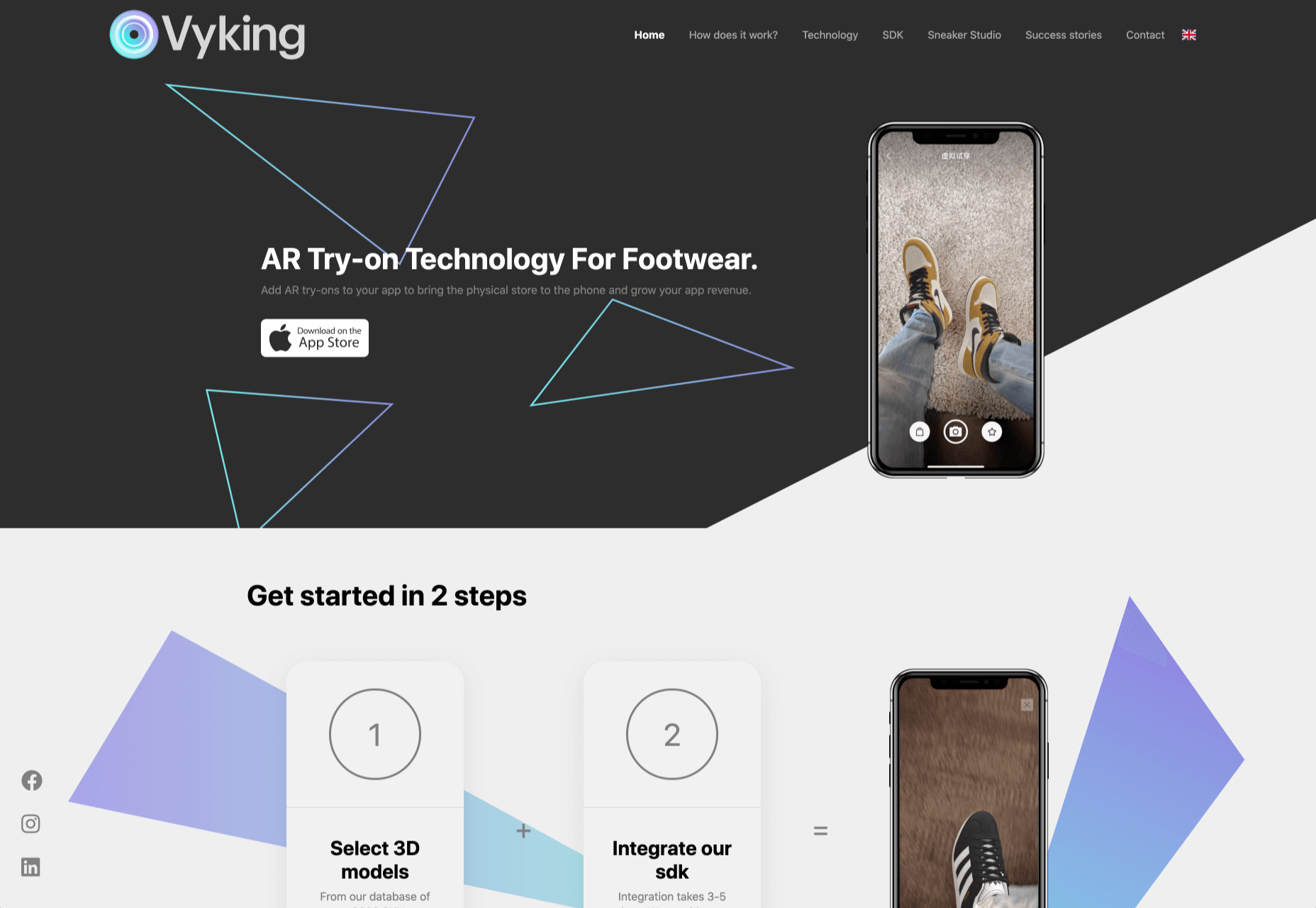
By the end of the year, the number of global smartphone users is expected to reach 3.5 billion. That’s a significant 9.3% increase over the last 12 months.

In a world where everyone is constantly connected to their mobile devices, it makes sense that web developers and designers would need to consider new rules for how they create engaging experiences. After all, most of us find browsing from our smartphones to be much more convenient than sitting down at a laptop each day.

With a little luck, you’re already taking steps to mobile optimize your website but standards are changing all the time. To make sure your website is up to scratch, here’s your guide to prioritizing your site for mobile, ready for the new year.

Understanding Mobile-First Design

The first step in updating your web design and development principles, is understanding the concept of mobile first design, and how it’s changed.

With a responsive website, you create something that adjusts to the screen size of any device; with a mobile-first site, you’re focusing first-and-foremost on the user experience that people get when they’re on mobile, taking that as your starting point, and building from there. Instead of building your website for the desktop and using mobile as an afterthought, you start with a consideration of mobile.

Even Google is highlighting the demand for this process lately, with the mobile-first indexing algorithm. If you can’t design for mobile-first, then you could risk your clients being unable to rise up the search engine ranks.

So, how do you get started?

1. Start With the Right Tools

Web developers and designers are nothing without a great toolkit.

The good news is that there are solutions out there that can help you to master the right skills for a mobile-focused user experience. For instance, Skeleton is excellent for small-scale projects that require fluid grids and minimal compiling.

Alternatively, Bootstrap can offer a one-size-fits-all solution for the front-end development for mobile devices. There’s a default grid system available, plenty of components, and JavaScript plugins to work with.

With the right tools, you can minimize and prioritize the content that’s most valuable for your website projects. This is crucial for maximizing website speed and creating clarity when it comes to content and imagery.

For instance, check out the ESPN website; it’s split into very easy-to-follow categories of content that are perfect for scrolling on a smartphone. The grid of videos makes it feel like you’re using a tool like YouTube.

2. Prioritize Mobile-First Elements

Once you have the right tools to assist you, it’s time to begin building your mobile-first website from the ground up. Rather than jumping straight into considerations of the latest design trends, it’s important to start with the foundations.

For instance, navigation within a mobile page is usually hidden under a hamburger button. However, you can take this concept to the next level too. For example, the Shojin mobile website only demonstrates the most important website options within the navigation bar to avoid overwhelming users.

The key here is to keep things as simple as possible, without restricting what your audience can do when they visit your website. Although you want to keep the number of interactive elements on your site small, you also need to ensure that those elements are easy to find and use.

All buttons and CTAs should be clear and tappable. Fonts need to be large enough to read from any screen, and your navigation system needs to be 100% simple, without slowing anything down.

On average, we recommend making all clickable elements at least 48 pixels in height.

3. Use Responsive Imagery and SVGs

Images are a crucial part of any website. They add context and appeal to your design. However, they can also seriously slow down your website if you’re not careful.

Remember, different devices have different demands when it comes to imagery. A desktop page may need a 1200px wide image, while a mobile-only needs the image to be 400px wide at most. The old way of making your images work was to load a large resolution image and use the same file on every platform. Unfortunately, this slows downloading time significantly.

Instead, it’s better to have at least two different versions of the same image for your mobile and desktop solutions. You can also consider SVG.

SVGs are incredibly scalable – more so than bitmaps. With SVG, you can ensure any icon or graphic continues to look sharp and clickable across all devices. Because these files are often smaller, your site loads quicker too! Hubspot is great at using SVGs.

Intricate illustrations are a massive component of HubSpot’s brand. If those images were saved as PNGs or other alternative files, then they would take forever to load. Because they’re all SVGs, you can enjoy the same consistent experience across desktop and mobile.

4. Get the Typography Right

It’s not just the big graphics and images that make a huge difference to your website when it comes to mobile-first design. You also need to think about the legibility and clarity of your website across all devices and platforms. If people can’t read the value proposition of the company that you’re designing for, you’re going to have a major problem.

Focus on making your content as easy to read as possible. Look into the typefaces that seem most appealing on a range of devices.

Remember to balance the body and heading font sizes for the device size too. You’ll need to ensure that the experience feels consistent and smooth as your users scroll through each page. Just take a look at the mobile version of the IMPACT website, for instance.

The headings aren’t as huge as they are on the desktop version of the website, and they’re displayed below, rather than above the featured image. However, this helps to give a more immediately eye-catching and structured experience to mobile users.

There’s even a handy “Search Engine Optimization” tag included, that users can click on if they want to find more related articles.

When it comes to typography, remember that it’s not just size and clarity that matter, but how things are structured throughout your website too. Your type should naturally guide your visitors along the page.

5. Master Available Device Features

Finally, on smartphones, you can accomplish a range of amazing things that you might not be able to do when using a desktop device. Your users can make calls, open apps, send messages, and more, all from within their mobile browser. They can also move their smartphone around a room, taking advantage of concepts like AR and VR.

Taking advantage of the unique capabilities that smartphone design can offer gives you a chance to get unique with your user experience.

Making the most of the mobile experience can be much simpler than you’d think. For instance, on a desktop site, you could list your phone number on a contact page. On a mobile site, the number can begin a call when clicked. You can also take the same approach with email addresses, and social media icons too.

Depending on how experimental you feel, there’s also plenty of opportunities to go above and beyond with your mobile features. You may decide to create a mobile app version of a website that your customers can download onto their phones.

Alternatively, you can look into things like AR technology. This could allow your users to practice placing items of furniture that they may be thinking of buying from an online retailer into their house, so they can see how well they work with their other interior design choices.

Making the Most of Mobile-First Design

Ultimately, having a responsive website that works on both mobile and desktop devices is mandatory in the modern world. However, going above and beyond with mobile-first design is a great way to get ahead of the game.

If you can focus on building a website that puts the experiences of mobile users first, then you can create something that’s much more likely to grab audience attention and deliver amazing experiences.

If nothing else, showing your clients that you have what it takes to design for mobile is an excellent way to ensure that you can gain as many new project opportunities as possible.

Source


Source de l’article sur Webdesignerdepot

As human beings, we like to think that we’re rational creatures.

We tell ourselves that we make our decisions based on fact and logic. However, that’s rarely the full truth. As much as we try to make choices guided by rationality, the truth is that we’re often highly emotional people, driven by the way that things make us feel.

So, what does that mean for a website designer?

Though designing a functional and logical website is important, it’s crucial not to forget about the emotional impact of each interaction that your customer has with the sites that you build.

Sites that don’t elicit any kind of emotional response aren’t just boring; they’re forgettable.

A forgettable website is poison to any website designer’s portfolio.

That’s why we’re going to introduce you to some easy ways to use emotion in your designs this year.

Getting to the Bottom of Emotion in Web Design

First, you need to understand the part that emotion plays in user decisions.

Don Norman’s book Emotional Design says that there are many things that designers can do to make their designs more emotional. Even something as simple as focusing on the aesthetic impact of your website can make it more likely that you’ll reach your audience on an emotional level.

One important thing to remember about emotional design, is that it’s not just about making your customers feel good. Emotion can be both positive and negative. Sometimes negative emotion is more impactful than positive feelings – it all depends on the kind of site you’re trying to create.

A website selling health products to customers needs to make that audience feel comfortable and confident that they’re buying a trustworthy item. However, it may also need to trigger small feelings of worry or concern in the audience about what might happen if they don’t buy.

Knowing how to walk that balance between positive and negative feelings is how a designer takes a simple website design and turns it into something incredible.

So, where do you get started?

Step 1: Use Visual Elements to Trigger Emotion

Visual elements are one of the easiest points to get started with when you’re designing for emotion. That’s because visuals are fantastic at drawing out feelings.

An animation can create an emotional connection with your audience by helping them to understand how your product works or making them laugh when they land on your page. A genuine photograph of your team working together can inspire trust and feelings of affinity.

One of the most common visual elements used to trigger emotion is color.

Shades like blue and green in the digital design world are more likely to drive feelings of calmness and comfort. On the other hand, red and yellow often encourage feelings of enthusiasm and happiness.

The way that you use color can make a massive difference to how users feel when they arrive on a website. For instance, the Barclay’s website would have been pretty boring if it was just a basic black and white screen. However, a banking site can’t afford to go over the top with animations or illustrations in most cases, as this can detract from its professional image.

Adding small patches of blue in a way that complements the brand’s color palette is a great way to generate feelings of trust. Combined with the image of a genuine real-life person, and calm tones, the bank instantly presents itself as something approachable and honest.

At the same time, the clear hierarchical layout of the bank’s website, with an easy-to-follow navigation bar, easy-to-read font, and clear headings and buttons comfort the customer. Users get exactly what they expect when they come to a financial website, and that makes users feel as though they’re in the right place.

Step 2: Create Engaging and Emotional Interactions

Visual elements are a great way to embed emotion into digital design. However, they’re just the first step. The emotional aspects of your web design choices should also appear throughout the interactions that customers have with the website.

A good interaction on a website or app needs to be simple and straightforward enough that users feel comfortable taking the next step in their journey. However, it also needs to drive the right emotional response from users too.

For instance, when you sign up for a free account trial from Box.com, you don’t just get a form full of information that you need to fill out.

Next to the form, you also get information about what you’re signing up for, complete with small checks next to each of the free features you’re getting. This helps to put the customer’s mind at ease and remind them that they’re in the right place.

The use of a box, including discount information next to the sign-up form also helps to make the interaction more emotional, by reminding customers that they’re getting something for free.

Every time a customer interacts with a website, there’s another opportunity to engage them on an emotional level. On the Firebox website, when a customer adds something to their cart, there’s a small animation on the cart icon that informs them that something is waiting for them.

When they click through to the checkout, they get instant information, including what they can do to “gift wrap” their item, and buttons showing the various payment options available.

Whenever you’re designing a page for a website, whether it’s the checkout page, a product page, or something else entirely, think about the interaction that the visitor is having at that moment. How can you ensure that each customer feels more comfortable, delighted, informed, or engaged?

Step 3: Leverage Microcopy and Detail to Express Emotions

Visuals are an excellent way to express emotions.

However, they’re not the only option.

As a designer, you’ll need to think about how you can combine web design with the use of microcopy to connect with customers on a deeper level.

Rather than drawing attention to tedious, dull, or impersonal instructions, notifications, and error messages on a site, how you can you make sure that everything on the website delivers the same emotional impact?

The simple addition of a tiny illustration is enough to provide a much more emotional experience to customers. Compelling micro copy and illustrations on 404 pages can also strengthen the connections that customers have with the sites they visit.

Just look at how Google added a dinosaur game to the page that customers are sent to when they don’t have an internet connection.

The right micro copy and interactions can instantly transform even a negative experience, like not being able to connect to the internet, into something emotionally engaging and positive.

When it comes to making an emotional connection between your customer and their end users, web designers need to remember that often the smallest details can make the biggest differences. Little extra features, like implementing a way for customers to have fun when their internet connections aren’t working, are the things that make websites more memorable from an emotional perspective.

Don’t Choose Emotion Over Functionality

Although emotional impact can be an essential aspect of a fantastic website design, it’s important not to get carried away. Adding too much to a website in the form of little extra graphics and unique interactions could end up weighing down a site and making it slow to load.

Although it’s valuable to think about how every interaction an end-user has with a website will make them feel, it’s important not to overlook the basics of web design when you’re at it. You’ll still need to ensure that the finishing design is easy to use, engaging, and attractive.

Pay attention to the basics of user experience design, and make sure that the extra emotional elements you’re infusing into your sites aren’t going to damage the experience that end-users get.

If you can get the blend right between emotional impact and functionality, then you could create the kind of website that audiences will never forget.

It pays to implement emotion into your design portfolio.

Source


Source de l’article sur Webdesignerdepot

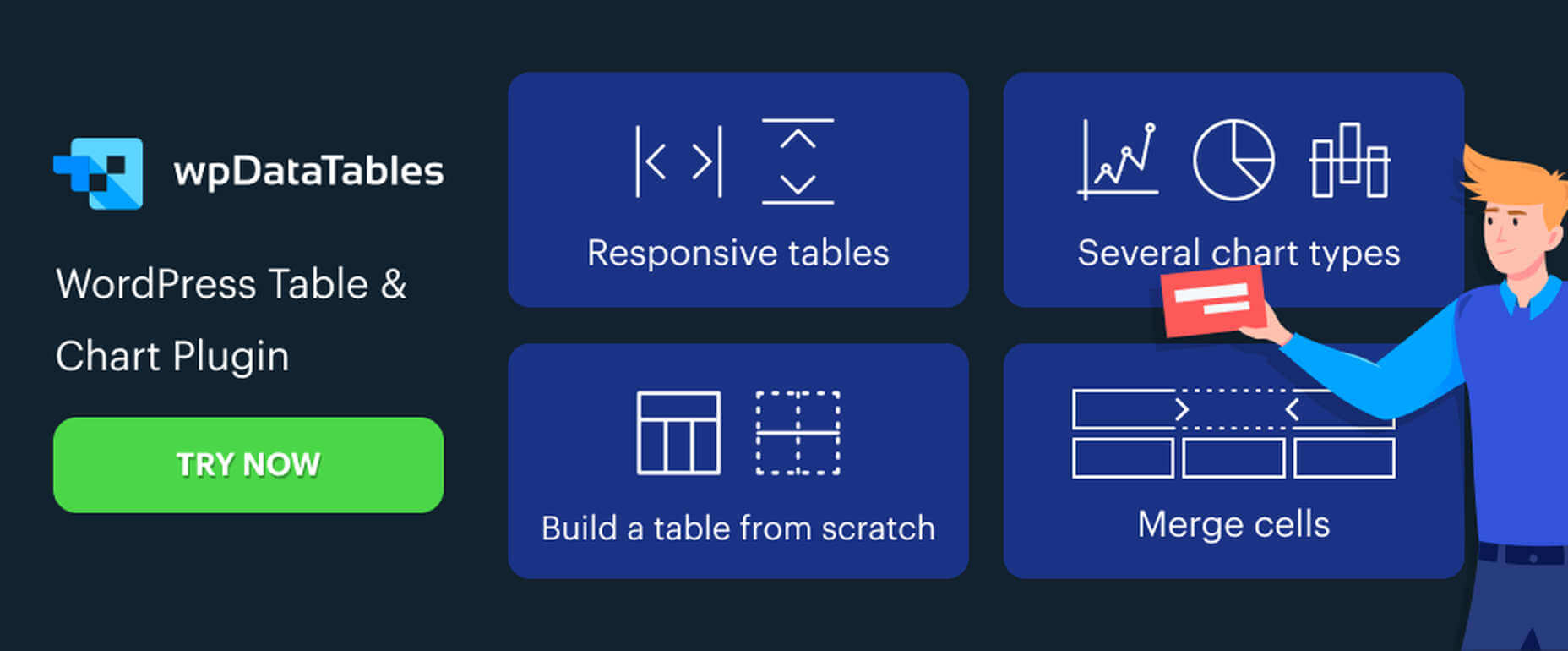
If you’re interested in a sneak peek of this year’s best Black Friday deals, stick around. You’ll find a few web designers’ favorites, including a stellar deal or two.

This year, more than a few of the popular retail outlets are shifting away from the traditional “camp out all night and bust open the doors when the store opens” shopping model. You might just prefer this less chaotic, ecommerce approach.

All of us are trying to adjust to what may eventually become a “new normal”. We may not like some aspects of this new normal, but there are bright spots as well.

More shoppers are likely going to shop online because of the coronavirus. That means you don’t have to fight the crowds while desperately attempting to socially distance. The shelves aren’t as apt to go bare, and shopping is easy, convenient, and safe.

1. Slider Revolution

You will find the Slider Revolution plugin incorporated in a host of WordPress theme tools and products. This premium plugin can in fact boast of more than 7 million users around the globe.

What you may not be aware of is that it is much more than just a WordPress slider. With it in your web design toolbox, you can in fact create just about anything you can imagine.

Expect to find:

  • A stunning selection of elements including sliders and carousels;
  • Attention-getting hero sections designed to make your home pages really stand out;
  • Single-page websites with layouts unlike anything you’ve seen before;
  • Modular structuring that allows you to rearrange and reuse sections however you choose and the ability to mix and match modules with any WordPress content;
  • Add-ons whose cutting edge features push the boundaries of web design possibilities.

There’s more of course. To celebrate Black Friday and Cyber Monday you can NOW get any Slider Revolution subscription plan or one-time payment at a 33% discount.

Just click on the banner and use the BLACKFRIDAY code at checkout.

2. Amelia

When done manually, booking and managing appointments can be tedious and subject to mistakes and errors. Amelia provides an automated booking process that is oh-so easy to work with and is error free; just what you need to help you acquire more happy customers.

Key features of Amelia’s fully responsive design include:

  • A dashboard system that enables you to track approved and pending appointments, booking changes, and revenue;
  • Zoom Integration, Google Calendar, and Outlook Calendar sync;
  • The ability to accept and easily manage recurring appointments that customers can schedule;
  • Front-end customer and employee appointment and event managing and backend appointment adding, editing, and rescheduling;
  • Email notifications for pending and approved appointments and events.

And much more that will save you loads of energy and a ton of time. Give Amelia a try, and if you like what you see (and you will), take advantage of the 30% Black Friday discount.

3. wpDataTables

wpDataTables 3.0, with its fresh, new look, gives you a host of different ways to generate attractive, customizable, and responsive tables and charts, and a host of different ways to present them.

  • Tables can be created from most data sources, the most common being MySQL query, PHP array, Google Spreadsheet, Excel files CSV files, and JSON and XML inputs;
  • A working knowledge of SQL is not required!
  • Addons include Gravity Forms, Formidable Forms, Report Builder, and Powerful Filter;
  • wpDataTables users can generate Tables and Charts quickly from massive amounts of data (saving hours of effort);
  • Tables and charts are customizable and maintainable (editable once placed in use);
  • Tables can be created manually if you wish.

Click on the banner now and take advantage of wpDataTables 30% Black Friday discount on all licenses and addons.

4. TheGem – Creative Multi-Purpose High-Performance WordPress Theme

In TheGem, the ultimate WordPress multipurpose toolbox, you will find:

  • A rich selection of 400+ premium pre-built multi-page and one-page websites, all available for Elementor and WPBakery page builders;
  • The ability to mix and match any of this demos, layouts and page sections to create your own unique look;
  • Extended WooCommerce layouts & tools for making online shops, which convert better;
  • TheGem Blocks: an ultimate tool for building webpages at the speed of light.

And much more. Just click on the banner and check this 5-star product out.

5. Mobirise Website Builder

Creating a Google-friendly can take time, unless you have Mobirise at your fingertips, in which case you have a number of helpful tools to speed things up.

  • No coding, it’s all drag and drop;
  • 3,600+ website templates are at your disposal plus sliders, popups, forms, and more;
  • Many eCommerce features, including a shopping cart;
  • Latest Google Amp and Bootstrap4;
  • You can download Mobirise for free.

And, because it’s Black Friday, everything is yours at a 94% discount!

6. Get Illustrations

Get Illustrations offers royalty free and landing page Illustrations ready to drag and drop into your web design. You’ll have access to:

  • An extensive library of 4000+ illustrations with more added every week;
  • A wealth of design formats, including AI, PNG, SVG, Figma, Adobe XD, and Sketch;
  • Free updates and new illustrations weekly (included in the bundle).

Click on the banner and use the Coupon Code BLACKDEAL for your 30% discount.

7. XStore | Responsive Multi-Purpose WooCommerce WordPress Theme

For anyone planning on creating an eCommerce store, the XStore name says it all. Key features you’ll find in this powerful and flexible WooCommerce theme include:

  • More than 95 good-to-go-shops plus a full AJAX shop to get you started;
  • 300+ pre-defined shop/page sections, a header builder, and a single product page builder;
  • Elementor, WPBakery and $510+ worth of premium plugins.

Click on the banner and sign up to become one of XStore’s 55,000+ happy customers.

8. Kalium – Creative Theme For Multiple Uses

Kalium is an easy-to-use, easily maintainable multipurpose theme for WordPress users that is always updated to use the latest WordPress standards.

  • Kalium provides its users with a host of professionally-designed pre-built demos and elements;
  • Many plugins such as: Slider Revolution, WPBakery, Elementor, Layer Slider, Advanced Custom Fields PRO, Product Filter for WooCommerce, Product Size Guide,WooCommerce and other premium plugins are included.

Kalium is responsive, GDPR compliant, and gives you full eCommerce and top-quality customer support. It has a 5-star rating after 36k sales on ThemeForest – seriously impressive!

***** 

If you hit the retail stores remember to social distance.

Or, if you would rather take a brief break from the demands of Covid-19, take advantage of one or more of the above ecommerce sales. As you can see, there are some excellent ones!


[– This is a sponsored post –]

Source


Source de l’article sur Webdesignerdepot