Articles

According to Klipfolio research, users spend on average 52 seconds on a webpage. With minimal time to impress, you must consider how to best help your consumers understand what your product or service does and why they should care about it. It’s not enough to describe your value – great landing pages will go the extra step and show this as well.

One powerful method to do this is by providing a real-life, responsive teaser to show what your product looks like, how it works, and what value it can create. This means incorporating specific elements from your functional, responsive product into the landing page. However, this should be a “mini-product experience” that users can experiment with rather than a freemium version of your product. If done well, the dynamics will pay off in captivating users for longer, increasing their consideration time, and driving your conversion rate as a result.

Building more dynamic landing pages through product experience can change the game completely. These are some strategies to consider.

“Ask & Alter” for Greater Personalization

“Ask & alter” is valuable for services with multiple potential value propositions for different audiences. The simple fix here is to have a pop-up box that asks the visitor which profile they are (and alternatively a few more questions). You can then trigger the page to alter according to their input, ensuring a more customized experience and increasing their chance of conversion. By doing this, you’re taking the onus off the consumer to figure out what’s relevant to them, eliminating any potential confusion.

A great example of this is the Penn Foster University website. It has a developed UX optimized for organizations, high school degree seekers, and upskillers alike. Each has an entirely different, carefully designed interface, matching the diverse needs of visitors. For example, while a high schooler might enjoy browsing the career pathways section, an upskiller is likely to search specific career fields. Such distinction is key to consider, as intentional and strategic user experience can raise conversion rates by as much as 400%.

Real-Time Demos to Hook the User

Real-time demos mean that you take a full instance or version of your product that is clickable and responsive and embed it into the flow of your landing page. This way, the user can get a quick “test drive,” and you easily communicate the value that would otherwise be abstract or difficult for the user to imagine or even visualize. Additionally, users always want to know how a product could personally impact them, and live demos offer them a hands-on experience.

Companies incorporating live demos have proven the power to engage a user’s curiosity and create a strong link with their products or services. Notion, for instance, uses a “templates” section with pre-built pages that can be easily opened and browsed through without needing to register or download anything. This product’s beauty lies in the simplicity and efficiency it offers, rather than overwhelming a user with a self-promotional copy. Even a simple live demo like that can help build considerable trust in the product and encourage users to make a high-value purchase.

Calculators Provide Value

Despite their simplicity, calculators can increase audience engagement by 38%. Their main benefit is undoubtedly providing a personalized solution to users’ actual needs and expectations. ROI and savings calculators can be particularly interesting, especially when they speak of value that isn’t easy to calculate or when the user wouldn’t intuitively know that there are savings to be had by using a particular product.

Butter Payment, uses this tool very effectively. As its customers necessarily don’t know they have an involuntary churn problem that is worth solving for, it uses a calculator on its site to demonstrate the problem and enumerate the value-add to potential customers.

HubSpot, too, has mastered the tool: Its Ad ROI Calculator visually presents the results that its software can bring. Then, HubSpot’s interactive website grader directs the user towards its comprehensive marketing offerings. It is this graphic visualization that companies must adopt to communicate real value.

The Charm of Experiential Interaction

Interactive design is said to drive the responsiveness and real-time interaction of a site through the roof. By incorporating an interactive or experiential page, even if it’s not directly on your landing page, you can craft a unique experience aimed at leaving a lasting, meaningful impression of your product or service.

Calm’s “Do Nothing for two minutes” is a simple yet effective way to show users the value of meditation in their daily life and lead them to download the app.

But it works great for consumer products, too: Nike’s Digital Foot Measurement tool is another excellent feature, allowing users to “try shoes on” with their cameras and scan their feet for the right measurement through AR.

Videos are Attention Magnets

Considering that viewers absorb some 95% of the message while watching videos, compared to only 10% when reading text, there’s no reason why you should avoid incorporating videos into your landing pages. Beyond that, videos can be incredibly straightforward: Insert a graphic illustration or real imagery to explain the product, show the step-by-step process, and convey value with raw, unfiltered footage.

Calendly, for example, has various videos on its landing page, including a 56-second, upbeat, colorful clip showing how simple it is to get started with the product.

Guiding GIFs to Visualize Product Features

As small animations, GIFs represent the perfect middle ground between images and videos. They allow you to show users the value your product adds, providing an engaging glimpse into the actual interface. The small scope of GIFs is both a limitation and a benefit: You can only show a particular feature of your product but can also focus on triggering an exact user emotion.

Grammarly, a grammar correction tool, relies on GIFs to give users a taste of their UX. With a quick overview of the product’s functionality across popular platforms, including email and social media, users can see exactly how the product can make their everyday lives easier. And by incorporating GIFs into the right side of the landing page, the scrolling experience of the user isn’t disrupted.

Interactive product experiences can both entertain and tackle pain points, adding dynamics to an otherwise static page. Particularly when customizing based on user attributes, the key benefit of these features is that the users engaging with them are likely the same people interested in the paid product. To ensure that the product experience doesn’t directly compete with the primary offering, clearly differentiate it and guide the user towards a direct call to action.

Source

The post The Case for Building More Dynamic Landing Pages first appeared on Webdesigner Depot.

Source de l’article sur Webdesignerdepot

Every day design fans submit incredible industry stories to our sister-site, Webdesigner News. Our colleagues sift through it, selecting the very best stories from the design, UX, tech, and development worlds and posting them live on the site.

The best way to keep up with the most important stories for web professionals is to subscribe to Webdesigner News or check out the site regularly. However, in case you missed a day this week, here’s a handy compilation of the top curated stories from the last seven days. Enjoy!

9 Often Overlooked Ways to Make Visitors & Google Love your Website

Accessibility Myths

How to Increase User Empathy and Build Better Products

Cccolor – Clean & Simple Color Picker for Web Designers

The State of UX in 2022

3 Essential Design Trends, December 2021

Vector UI 1.1 – Smart Design System for Figma

JavaScript Reduce Method Made Simple

Glitch Effect on Text in Pure CSS

2021 Design Tools Survey

Source

The post Popular Design News of the Week: November 29, 2021 – December 5, 2021 first appeared on Webdesigner Depot.

Source de l’article sur Webdesignerdepot

The Adobe PDF Embed API provides a simple way for web developers to display PDFs on their web pages. While browsers provide good support for rendering PDFs, they do so in an « out of context » manner that takes over the entire screen. The PDF Embed API however lets you place a PDF within your site’s layout, providing much better control over the position and size of the rendered document. This improved experience also provides deeper integration into the PDF viewer, letting developers listen for events and perform operations on the document. In this article, I’m going to demonstrate a simple, but hopefully really useful example of this.

Imagine a large document covering many pages, for example, a textbook. Your website users, potentially students, could work with the document over many weeks while school is in session. If the document is a few hundred pages long, it would be incredibly useful to remember where they were in the document when they start reading again. While a large PDF may have bookmarks, even then they could only be for chapters or other sections, not the exact page the user last read. Luckily, the Embed API provides a method to help with this. Let’s take a look!

Source de l’article sur DZONE

It’s normal to pull up sharp in front of a problem; after all, if there was a known solution, it wouldn’t be a problem. But knowing that it’s normal, doesn’t make encountering problems any less frustrating. So how do we avoid sitting in front of a UX problem for hours, achieving nothing?

That’s what creative problem solving is all about.

In this post, we’ll explore creative problem solving, and how it can help you as a UX designer. Then we’ll analyze how you can solve UX problems in a few, easy-to-remember steps. By the end of this article, you’ll have all the tips you need for UX problem-solving.

What is Creative Problem Solving?

Creative problem solving is a term developed by Alex Osborn, the founder of the Creative Education Foundation. In a nutshell, this term is about overcoming challenges in our work lives through innovative solutions. But, of course, such solutions vary by profession.

For UX designers, creative problem solving is about solving UX problems with efficient tactics, that work. And that’s precisely why UX problem solving is so essential because following a specific method can help us avoid getting stuck.

Whether you are a newbie or an experienced designer, you are probably focused on projects that require you to solve problems. If you have never had a problem before, you must be a superhero; for us mere mortals, here are the steps we need to follow to solve a UX problem:

UX Problem Solving in 5 Easy Steps

Delivering a great UX solution is influenced by two key parameters: user research and creative problem-solving. Suppose you have done your user research and are currently looking for an original solution to a problem. In this case, the methodology below will be handy:

1. Identify the UX Problem

I know this may sound obvious, but think about it. How many times have we lost days because we didn’t identify the real problem? If you are solving the wrong problem, it does not matter if your solution is original and innovative.

That’s why the first thing you need to do is think about the problem. Ask yourself what the real problem is, and then get to work solving it. Identifying the problem may take some time, but it will prove beneficial to your project in the long run.

2. Clarify the UX Problem

Now that you have identified the UX problem, it’s time to demystify it. In this step, you could create a user journey plan. It does not have to be perfect; some low-fidelity sketches are more than enough.

Set a timer and start visualizing your solution on paper. Remember, sketching is not about perfection or fine details. Once you have created a customer journey you are happy with, it’s time to move on to the next step.

3. Use Analytics

UX design isn’t about design per se. It’s also about numbers and data. This is why analytics are critical to UX problem-solving. Once you have gathered some data from users and competitors, it’s time to create patterns. This will help you better understand the problem and change your drafts accordingly.

Numbers and data alone can help you a lot if you combine them with an original idea. However, facts alone are not enough, and your original story will not be compelling without them. So what’s better than combining them?

4. Use Your Feedback

So you have come up with an innovative solution to the UX problem. You have successfully combined this idea with essential data. Unfortunately, your work is not yet done. 

The next step is equally important. Once you have polished your ideas, you should share them with colleagues and/or customers.

It’s not easy to get feedback for your UX mapping, but it’s very constructive and will ultimately make you a better designer.

5. Solve the Problem

The last step is also the most fun. Once you have listened to people’s feedback, you can redesign your original solution. Then you are just one step away from solving the UX problem. Now it’s time to digitally redesign your idea.

This is the step where fine details matter. Creating a high-fidelity wireframe is not easy, but most UX designers have the knowledge and tools to get it done.

UX Problem Solving: Useful Tips and Tricks

Be Methodical

In my opinion, this is the most useful tip when it comes to UX problem-solving. You do not always have to be in a hurry. In the early stages of a project, try not to get distracted by other problems. Focus on finding the real problem.

Once you are sure you have found it, you can move on to finding the best solution. Then move on to the next step and so on. It becomes clear that being methodical is a brilliant tactic.

UX Problem Solving is All about the Ecosystem

UX problem solving is not about fine details. So try to care less about the design and more about the ecosystem you want to create. That will help you gather all the data you need, from user opinions to analytics.

Low-Fidelity vs. High-Fidelity Wireframes

Starting with sketches and low-fidelity wireframes is a brilliant thing to do. Whenever I have tried to start a project directly with high-fidelity wireframes, I have gotten bogged down in details.

For this reason, pen and paper should be your best friends in UX problem-solving. Sketches help you explore different approaches and get the feedback you need.

Explore Different Tools/Approaches

When it comes to solving a UX problem, there is usually one efficient solution. But that is not always the case. In most cases, we have to consider different alternatives and identify more than one critical interaction.

For this reason, feedback is also crucial for UX problem-solving. Your colleagues and customers will help you find the best method. Try to accept criticism and be open when listening to feedback. This way, you will ensure that you will find the best possible solution.

Wrap Up

Solving a UX problem is not easy. However, if you identify the real problem and illustrate different approaches, you will be on the right track. Also, do not neglect to use the data and feedback you collect. The more tools you have in hand, the better UX designer you will be.


Featured image via Unsplash.

Source

The post Creative Problem Solving for UX Designers first appeared on Webdesigner Depot.

Source de l’article sur Webdesignerdepot

It’s a technique that we all love! PoC or Proof of Concept approach is a trend in software development to create a demo of a project in advance. It’s a fairly new method, especially when compared to old-school alternatives such as RFP (i.e. Request for Proposal).

However, the big question to address is “how essential is the PoC approach in SDLC?

Source de l’article sur DZONE

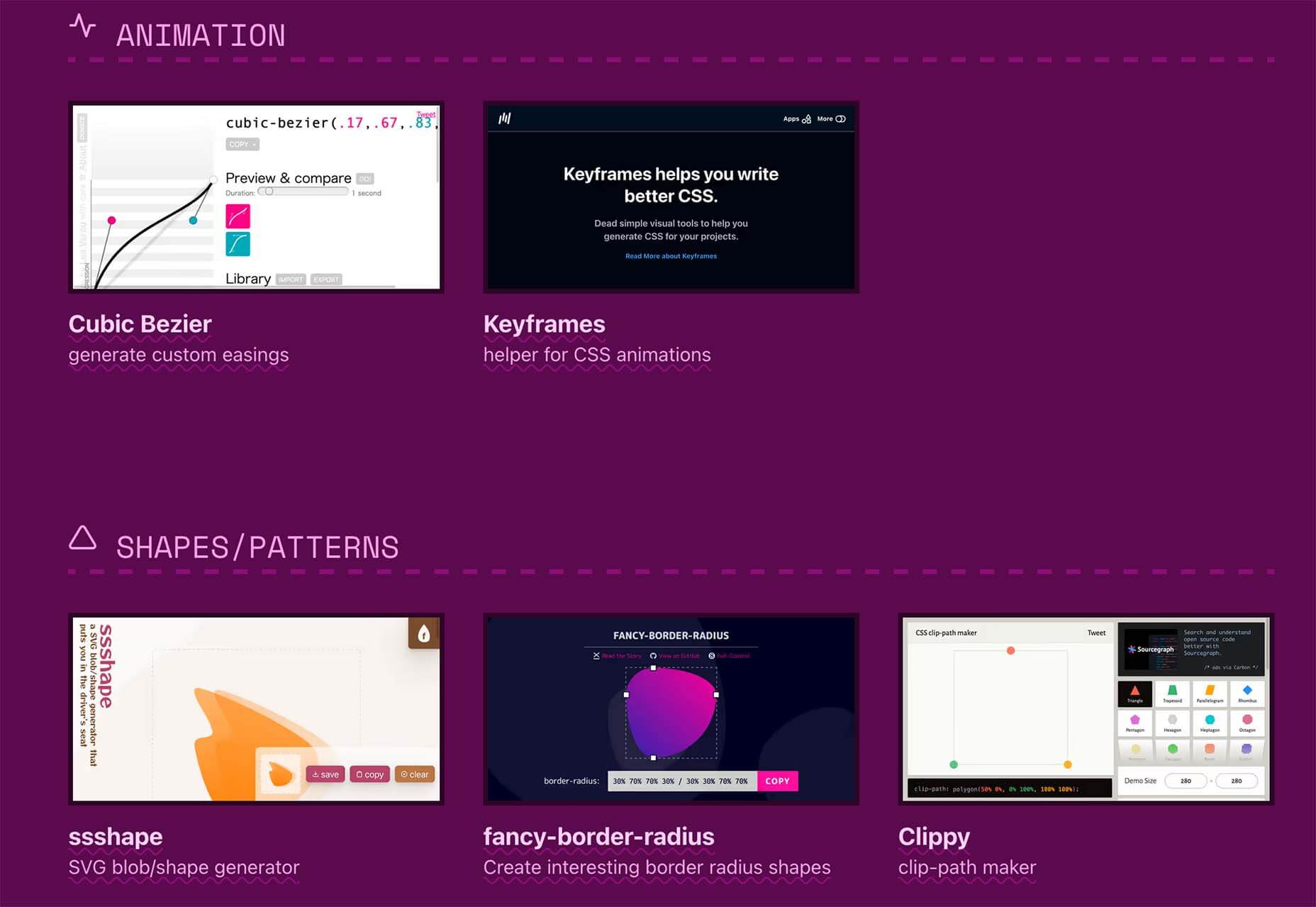
There are some spook-tacular finds in this month’s October collection of resources and tools for designers and developers. From interesting tools that can help in the design process to boo-tiful typefaces, there’s something for everyone here.

Here’s what is new for designers this month…

Atropos

Atropos is a lightweight, open-source JavaScript library to create touch-friendly, three-dimensional hover effects. The results are stunning and have a nice parallax style. Everything is highly configurable and customizable. It’s available for JavaScript, React, and Vue.js and has zero dependencies.

CSS Gradient Editor

CSS Gradient Editor helps you create the perfect gradient style – you can start from presets – that you can use in projects. Design a background, fill, or almost any other gradient element you might need, make adjustments or customizations, and then get the CSS with one click so you can use it right away.

Octopus.do

Octopus.do is a fast visual sitemap builder that lets you work in real-time using the content brick method. Share and collaborate in real-time and there’s no signup required to use it.

Pirsch Analytics

Pirsch Analytics is a privacy-friendly, open-source alternative to Google Analytics — lightweight, cookie-free, and easily integrated into any website or directly into your backend. It includes filters to see metrics in the way you want and light and dark modes.

Basic Pattern Repository

Basic Pattern Repository is a collection of simple SVG patterns for projects. Everything is rooted in a simple style to help push projects along quicker. You can get it via GitHub or as a Figma Library.

Blobr

Blobr is a way to get a branded API portal, manage access, and monitor usage all in one place. Customize everything to fit your brand and the tool grows as you do with the ability to increase or change capacity. Plus, it is easy to set up and free to use.

HEXplorer

HEXplorer helps you better understand something you use all the time – HEX colors. This pen by Rob DiMarzo shows how the values for different colors come together to provide greater comprehension when it comes to this color format.

CCCreate

CCCreate is a curated collection of tools and resources for web creators. It includes some tools that have been around for a while as well as some newbies. Everything is grouped and sorted by type of resources – color, icons, type, layouts, animation, shapes, docs, and miscellaneous so you can find what you are looking for faster.

Glass

Glass is a photo-sharing app for photographers. It’s a social network of sorts that lets you share images with the greater photography community without “likes.” Just great images.

Revolt

Revolt is a chat app that’s still in beta and designed for easy communication without having to download apps. It’s an open-source project that is customizable and with an intuitive and recognizable interface. The thing that’s different about this app is that it is built on a privacy-first model.

Doodle Ipsum

Doodle Ipsum is the illustrated version of placeholder elements. Customize your doodles, grab the code, and use them on your web prototypes, landing pages, or no-code tools.

Mechanic

Mechanic is an open-source framework that helps you create custom, web-based tools that export design assets in your browser. The best part is you can try it right on screen using the “poster generator.” If you like what you see, there’s plenty of documentation to help you along the way.

Medio Website Template

Medio is an agency-style website design template for Bootstrap 5. The layout is perfect for a design agency or marketing group but can be adjusted for almost any multi-purpose design. The free template includes a minimal design and includes features such as parallax, popup video, and more.

Tutorial: Simplifying Form Styles with Accent Color

This tutorial is a life-saver when it comes to using and understanding the new CSS accent-color property. This quick lesson will help make your life easier and is simple to use. It starts with setting an accent-color property on the root element and then applying it.

Houdini.how

Houdini.how is a worklet library that is full of CSS and code examples to help you work smarter. See how different elements look cross-browser and learn to adjust the code and put them together in just the way you want. Houdini is a set of low-level APIs that exposes parts of the CSS engine, giving developers the power to extend CSS by hooking into the styling and layout process of a browser’s rendering engine.

Chainstarters

Chainstarters is a powerful, rapid, Web3-enabled platform for software developers. It eliminates the burden of setting up and maintaining a secure and scalable infrastructure, allowing you to focus on creating amazing technology.

Web Vitals Robot

Web Vitals Robot is a search optimization tool that monitors SEO metrics for you – so you can prevent your business from disappearing from Google.

Searchable

Searchable is a unified search tool that looks at local, cloud storage, and apps to find the files you are looking for. It returns results in a jiffy with previews so you don’t have to open every file to find what you are looking for.

Athlone

Athlone is a fun serif with lots of personality. The free demo version includes a limited character set for personal use only and the full version has everything you need for fun display or branding with this typeface.

Capitana

Capitana is a Geometric Sans typeface with humanistic proportions and open apertures. This means that all shapes are constructed from basic forms, the circle, triangle, and square, and are designed according to the classic proportions of the Roman Antiqua. Distinct ascenders and pointed apexes with deep overshoot give it a cool beauty and classic elegance. It includes 784 characters per style in nine weights from Thin to Black, it offers both light and extremely heavy weights for striking headlines.

Colours

Colours is a funky script with just enough texture to keep it interesting. The free version includes a partial character set and is for personal use only.

Flexible

Flexible is a variable typeface that includes 18 styles in the family. It’s made for creativity and display use. This typeface is made for experimenting because there are so many things you can do with this single family.

Singo Sans Serif

Singo Sans Serif is a simple and strong typeface that would make an excellent display option. The free version is for personal use only. Fun fact: Singo means Lion in Indonesia, which is where the name of this strong font comes from.

Source

The post Exciting New Tools For Designers, October 2021 first appeared on Webdesigner Depot.


Source de l’article sur Webdesignerdepot

Content is the king of the digital world. This is an undisputed fact among marketers and business owners alike.

However, not all content is created equal. Interactive content is a more immersive form of marketing specifically intended for the digital age. Great for companies that need to develop deeper relationships with their audience. 

There are various kinds of interactive content for brands to explore these days. For example, you can create a poll where your customers vote for certain answers to questions. In addition, some companies hire developers to build immersive gaming experiences with prizes and rewards. 

Even standard content like blogs and articles can become more interactive with things like animations, buttons, and elements that ask visitors to do something. 

One of the most valuable forms of interactive content is the quiz. So, how can companies use quizzes to engage their audience effectively? Let’s find out…

The Benefits of Quizzes in Interactive Content

According to studies, 93% of marketers believe interactive content is extremely effective for educating and entertaining customers. Interactive content is meaningful because it’s engaging, and many marketers state that creating engaging content is one of their toughest challenges. 

In an environment where the average attention span is constantly dwindling, interactive content reduces the risk that your customer will end up being distracted by something else before they have a chance to convert on your website. 

Quizzes are an excellent form of interactive content, but many marketers don’t take full advantage of them yet. Quizzes, like some other forms of interactive content, can come in different styles. For example, you could have a personality quiz that tells your customer what kind of vegetable they would be. That might sound odd, but it helps to give your customer a sense of belonging, gives them a feeling of being understood, and offers entertainment. 

Some quizzes can answer questions for your customer. 

For instance, a quiz on “what to buy your dad for father’s day” is an excellent way to solve a customer’s problem while guiding them towards potential products that you sell. 

Z Gallerie, a retail company, launched a quiz called “What is your Z Gallerie Style personality?” The quiz offers a personalized recommendation experience on what to purchase for every current and potential customer. 

The personality quiz became a great way of bringing product recommendations to leads without being pushy. Z Gallerie could, therefore, consistently provide a unique experience to each customer based on their results. 

So, how do you make a quiz that’s really effective for your content marketing plan?

Step 1: Creating the Quiz

Quizzes are a kind of interactive content that can almost feel like a conversation with a brand. They’re an opportunity for you to show your audience how well you understand them. 

According to TryInteract, people take quizzes because they want to know themselves better or want to confirm what they think they already know about themselves. These content solutions solve problems, even if they’re handling a person’s curiosity about what kind of celebrity they’re most like. 

Before you start making your quiz, you need to know your goal and what you’re trying to do for your audience. If your goal is to get more people to feel more attuned to your company, you might need to create something that demonstrates how well you know your visitors.

The goal for the company is to demonstrate a deep knowledge of the industry and target market. If the quiz is helpful and informative, it adds to the brand’s credibility and makes it more likely that customers will want to continue purchasing.

Before you build your quiz, ask yourself:

  • What do you want to get out of your audience taking this quiz? (More conversions, better brand loyalty, improved engagement?)
  • Why would your audience want to take the quiz? (Is it relevant to their interests, will it give them some vital information?)

Knowing exactly what you and your audience should accomplish with the quiz will give you a good platform to begin building on. 

Step 2: Choose the Title and Quiz Type

Titles are important in any content marketing. 80% of readers decide whether to check out an article based on its title. The same process is common for people who want to decide whether they should take a quiz or not. 

There are a lot of great ways to pique your visitor’s attention with a quiz title. For instance, you could challenge your audience to prove their knowledge with the word “actually.” For instance, “How much do you actually know about Kale?” That kind of title immediately appeals to the competitive nature of the human being. 

Another great example of a challenging title is to tell your audience that they can’t do something. Buzzfeed did that with its millennial quiz. The great thing about this quiz title is that it speaks to the competitive nature of the reader but also gives that reader a chance to show that they belong to a specific community. 

Another option could be to ask a question and hope that curiosity will do the rest of the work for you. For instance, “Which celebrity chef are you most like?” The key to success here is understanding your audience and knowing exactly what they most want to know. 

Once you’ve figured out the title, choosing the kind of quiz you want to create is the next step. For instance, you can try:

  • Personality quizzes: People like hearing good things about themselves because of a psychological phenomenon called self-serving bias. A personality quiz that recognizes the features your customers like about themselves will make them feel happier and more connected to your brand.
  • The knowledge test: Commonly found on social media, these quizzes challenge a person’s knowledge on a specific subject. The benefit here is that your audience can learn something and share their knowledge with their friends for social points. This quiz from Unicef is an excellent example of the “knowledge” style quiz.

Step 3: Crafting Quiz Questions

Once you have a good idea of the kind of quiz you want to create and the title you’re going to put alongside it, you’ll need to begin bringing your interactive content to life. That means designing the right questions. 

Writing questions for a quiz is just like creating any excellent content. First, you need to keep your target audience in mind. Next, think about the kind of personality you’re trying to appeal to. Breathing some life into your quiz by injecting your unique sense of personality into it will be an excellent way to strengthen your bond with your customers. 

Other tips for making the most of your quiz questions include:

  • Use visuals in your questions: Having text-only questions is fine in some cases, but it’s worth looking into images too. Using pictures helps to keep things relevant and interesting and makes your quiz feel a lot more immersive. 
  • Don’t make questions too long: In-depth and complicated questions will only scare your audience away. Remember that they’re looking for something fun and lighthearted to do. This means that your questions should be as short as possible. 
  • Make it interesting: Don’t just ask basic questions like “what’s your favorite color” try to go beyond what your customers usually see on quizzes and make it relevant to the quiz topic. Again, this is your chance to show your audience how much you know.

Step 4: Creating Results That People Want to Share

If you want to design a quiz that really blows your audience away, then the results are one of the most important things to focus on. The results you offer your customers dictate whether they enjoy your quiz so much that they want to share it with other people. Creating share-worthy results is how you boost your chances of finding new customers and even going viral. 

So, how do you design results that people want to share? Start by helping your customers to feel positive about themselves. The results should make them feel like a better person or confirm the good things they already believe about themselves. Research tells us that positive emotions are more likely to promote sharing

For instance, this quiz from the PBS company makes people feel good by demonstrating that they know their books. This confirms a customer’s idea that they are well-read.

Using share-worthy images is another way to improve your chances of designing results that people want to share. You’ll need to use interesting pictures here that speak to your audience. Bright and entertaining pictures will make results more eye-catching on a social media feed. 

Don’t forget to include a call-to-action on your results page too. It’s always helpful to give your audience a nudge in the direction you want them to move in. Providing a call-to-action that asks your customers to share their results increases your chances of positive sharing behavior. 

Step 5: Know How to Distribute Your Quiz

Once you’ve put all of the essential components of your quiz together, the next step is ensuring you can distribute that quiz and share it with as many people as possible. For instance, you can promote your quiz on social media to reach more possible customers. Twitter and Facebook are always great places to get started but don’t be afraid to experiment elsewhere. 

Sharing snippets of the quiz experience in an Instagram Story could be a great way to generate engagement or posting a picture on your Instagram feed. 

When promoting your interactive content on social media, use an attractive image to highlight the experience and ensure you make that captivating headline stand out. Share both the caption and image with a shortened link to measure results. Shorter links are more likely to attract audience attention and encourage sharing later. If your links are too long, they can end up looking spammy or unprofessional. That’s not the image you want to build with your quiz content. 

If you need an extra boost for your quiz, promoting through Facebook advertising could be the ideal solution. Paid ads are a great way to get extra attention, but you need to choose your target audience carefully. Select your audience according to demographics, behaviors, connections, and locations. 

Remember that Facebook gives you plenty of opportunities to track down the kind of customers you want to speak to. Creating a custom audience could be a handy step too. This is always useful if you have a lot of information from an email list or a collection of contacts you’ve generated over time.

Step 6: Following Up on Your Quiz

Once you’ve successfully attracted people to your quiz experience, the next step is to follow up on the leads you’ve hopefully collected. When designing a quiz, it’s always a good idea to ask your customer for their email addresses before you give their results. This ensures that you can collect plenty of leads in the long term for nurturing purposes. 

Marketing company, The Foundation, designed a quiz that asked customers whether they had an entrepreneurial mindset. The quiz was based on an existing eBook offered by the company. The quiz, combined with a Facebook ad campaign, helped the business collect new leads to advertise their ebook. The Foundation managed to reduce its cost per lead from $6 to $3.80 using this method. 

When following up on your quiz experience, make sure that you get the tone right. The first thing you need to do is thank your audience for taking the quiz in the first place. After someone opts in and offers their email address, send a quick email that shares their results and says “thanks.” 

After a couple of days, you can follow up on your thank you email by asking your audience to retake the quiz or take a new one. Encourage these repeat customers to share their testimonials and gradually introduce more interesting content you have that’s connected to your quiz. For instance, if you create a quiz to determine whether someone has an entrepreneurial mind, you could advertise articles that cover similar topics. 

Finally, after regular engagement from your audience, you can begin to implement strategies that might convince your audience to purchase your products. This could mean showing off your entrepreneurial eBook, asking someone to sign up for a webinar, or something else entirely.

Don’t forget to track the performance of every quiz too. Examining metrics like click-through rates for your quiz advertisements and conversion rates will help you see which quizzes generate the most attention and action from your intended audience. 

Time to Add Quizzes to Your Interactive Content Strategy?

A content marketing strategy is one of the best ways to engage with your audience and strengthen your position in any industry. The right content demonstrates your knowledge, develops trust, and helps you to attract new customers. With interactive content, you can take the relationship you build with your audience to the next level. It’s your chance to engage with your customers and create an emotional relationship. 

Quizzes are one of the most effective forms of interactive content, and they’re also one of the easiest to implement into your existing strategy. It doesn’t take a lot of time or money to create a good quiz, and you can usually find tools online to help you with things like structure and formatting. You could even hire a professional to design a quiz for you. 

Once you’ve got the kind of quiz that’s really going to interest your target audience, the next step is distributing it in a way that generates as much attention as possible. Remember, you can advertise on social media and various other channels. However, it’s also helpful to pay attention to your options for helping do your promotion for you. For example, many customers will be more than happy to share quiz results that confirm the identity they’re trying to build online.


Featured image via Unsplash.

Source

The post How to Use Quizzes More Effectively in Interactive Content first appeared on Webdesigner Depot.


Source de l’article sur Webdesignerdepot

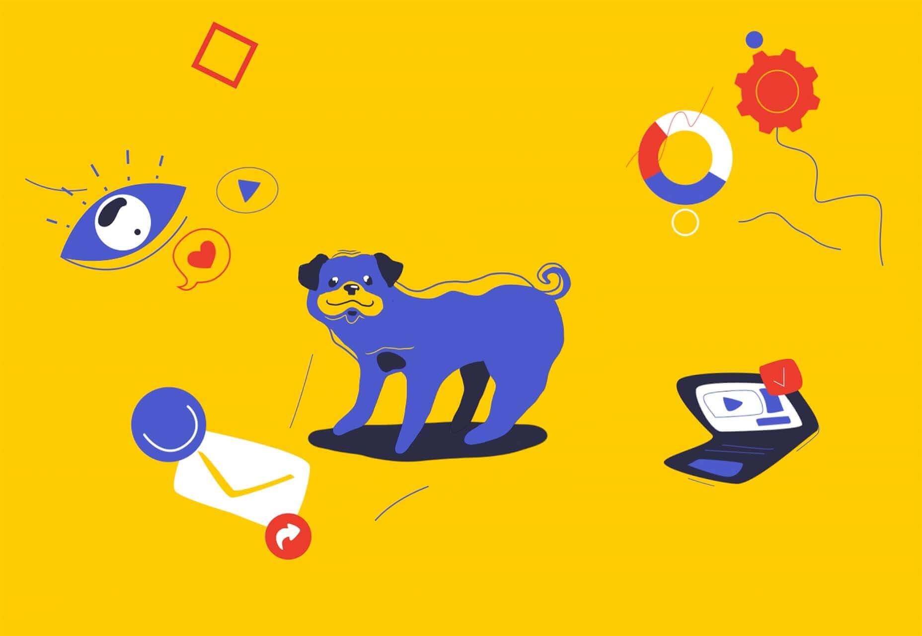
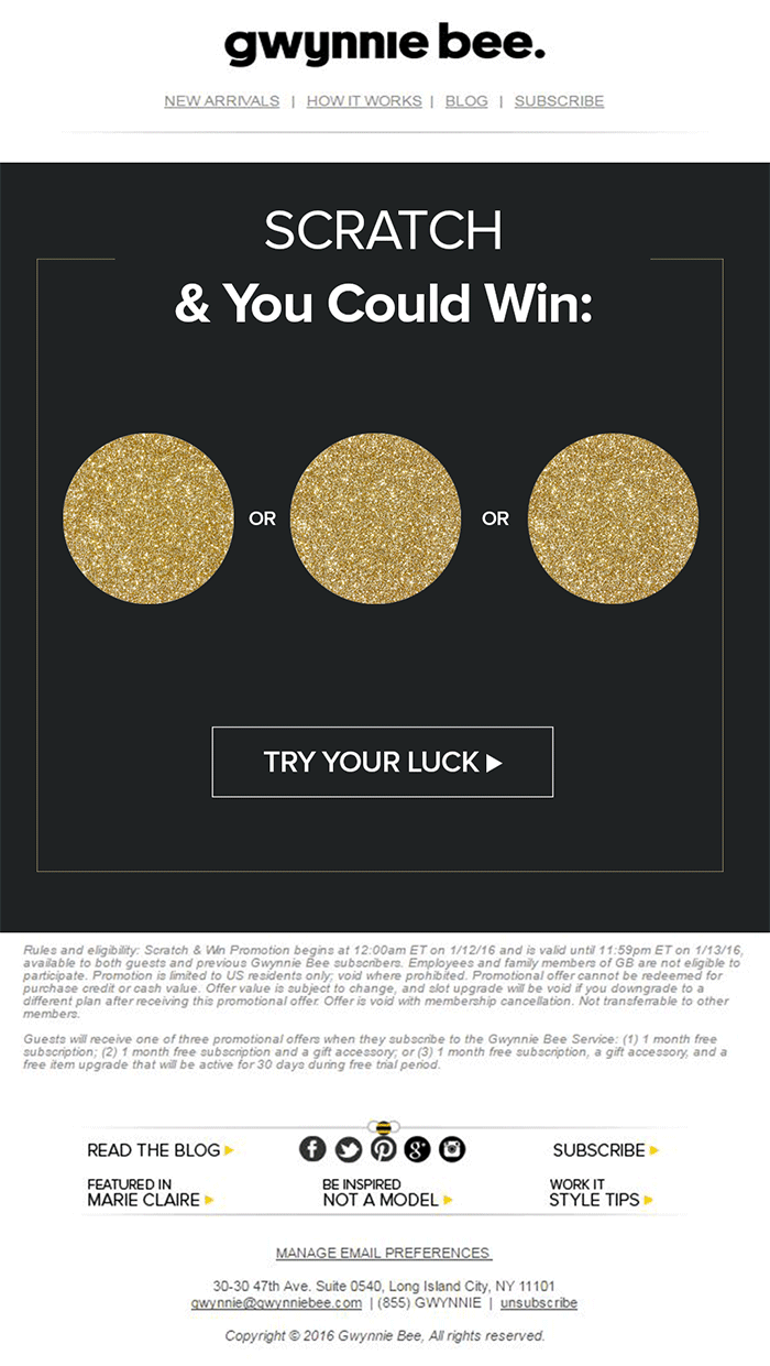
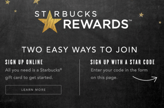
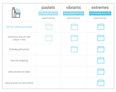
We all want a little more fun and games in our lives. So, why not add some gamification to your next interactive content campaign?

By 2025, the gamification market is expected to witness a massive 30.1% growth rate, with global sales revenue reaching around $32 billion

That’s because gamification adds more entertainment to the website experience and gets audiences engaged. The idea behind gamification is to bring game mechanics into the design of a website or piece of content. There are many different ways to do this. 

Some companies add hidden achievements and bonuses to their blogs that customers can collect by visiting every page and reading their content. Others allow readers to collect points for leaving comments or play games to win potential prizes. 

Used correctly, gamification is a fantastic way to connect with your audience and increase engagement levels. So, how can you use gamification in interactive content?

The Evolution of Gamification 

Elements of gamification have appeared in everything from marketing campaigns to web design and even eCommerce strategies. 

In 2014, an Apple App Store review of more than 100 health apps even found that gamification elements in applications led to greater participation and higher user ratings. In other words, customers are more likely to get involved with an activity that includes gamification components. 

While gamification can take on many different forms, the aim for most companies is to create an environment where customers can feel more invested in their interactions with the website. For example, if you win a point every time you comment on a blog post, and you can trade those points in for prizes, you have more of a desire to keep commenting. 

The promise of being able to “accomplish” things with pieces of interactive content and websites also appeals to the competitive part of our psychology that pushes us to keep doing things in exchange for the promise of a kind of reward. 

Many companies have generated a lot of enthusiasm for their brands through leaderboards, time events, and similar experiences. For example, just look at how popular McDonalds becomes each year when the monopoly game rolls out as part of the purchasing experience. 

People buy more items than they usually would during McDonald’s Monopoly just for the opportunity to win. This same boost in engagement benefits your content strategy too. 

6 Ways to Add Gamification to Your Content

There’s no one right way to gamify your website or your marketing content. The method you choose will depend heavily on your audience and the kind of experience they respond best to. 

The key to success is finding a way to grab your customer’s attention and hold onto it. Here are some of the tried and tested strategies to explore:

1. Create an Actual Game Experience 

When it comes to incorporating gamification into your website design and content, you don’t necessarily need to be clever. You can be extremely straightforward and just design an actual game. For instance, to help attract more people to the American Army, the US created a war simulator that potential applicants could play on Steam. 

The game aimed to introduce young people who might consider a career in the military to what that job might be like. If the kids liked what they saw on Steam, they could visit the military website and learn more. 

For companies who can’t afford to build an entire fully-featured game, something a little smaller can be just as engaging. For instance, rather than using a standard pop-up with a discount code to entice customers to buy the rental service, Gwynnie Bee created a scratch card. People could scratch the spaces using their smartphone or computer cursor and win money off. 

The great thing about the interactive content from Gwynnie Bee is that it encouraged potential visitors to connect with the business in a lucrative way. To use the scratch card, you first had to give your email address. This meant the company could build its email list while delighting consumers. 

When designing a game experience for your marketing campaign, remember:

  • Get the right support: Designing a great game is tough, particularly if you want something more complicated than a scratch card. Don’t take the risk of creating something that doesn’t work properly; hire a developer. 
  • Promote the experience: Make sure everyone knows about your new game. Share screenshots on social media and talk about it in your email campaigns. 
  • Focus on fun: Remember, games are supposed to be fun. Measure the reactions of your audience to ensure they’re having a good time. 

2. Design a Loyalty or Reward Program

Loyalty is one of the most valuable things your audience can give you. So why not reward them for it? Loyalty programs are fantastic tools for business growth and engagement. They give you a way to turn one-off clients into repeat customers and advocates for your brand. 

How you choose to reward your customers (and when) is up to you. Some companies might give customers points every time they share a post on social media or comment on a blog. This encourages more engagement with your brand. 

On the other hand, you might just let your customers earn rewards for every purchase they make. This is a strategy that Starbucks uses with its reward program.

As customers increase their spending with Starbucks, they get the reward of extra points that they can put towards future purchases. This keeps customers coming back for more and may even entice some clients to buy Starbucks when they otherwise wouldn’t. 

The oVertone company is another excellent example of a brand using gamified rewards with its marketing strategy. The loyalty program breaks down into tiers, where users can see how much they need to spend to ascend to the next level. New rewards and perks appear with each level. 

Remember, when building a loyalty program:

  • Make your customers feel special: Ensure that your audience feels good about being one of the lucky few in your loyalty program. Give discounts and offers they can’t get elsewhere.
  • Keep them informed: Make it easy for your customers to see what they need to do to get their next reward, so they keep coming back for more. 
  • Mix things up sometimes: To stop the experience from getting boring, roll out things like “double points” days and bonuses for your most active customers. 

3. Encourage Customer Interaction

The biggest benefit of gamification is that it encourages and increases customer interaction. You can give rewards to participants that comment on your blog posts, for instance, or share your posts on social. The customer benefits from the reward, while you get the advantage of a better business presence. 

Samsung drives interaction with gamification with a function on its website that allows customers to discuss issues and watch videos. The most active participants get a badge for their efforts. 

If your business structure requires a lot of engagement from your audience, then using gamification elements can encourage them to stick with you for longer rather than losing interest. For instance, language learning software Duolingo has a four-point gamification strategy for its users.

Duolingo knows that learning a new language takes a lot of time, so it asks users to set small specific goals instead. The smaller tasks bring users back regularly, and consistent users gain rewards. There’s even a progress bar to help you track your progress compared to other customers. 

Gamification gives your customers another reason to keep coming back and connecting with your brand. That makes a lot of sense for companies that rely on long-term relationships with customers, like Duolingo and other teaching brands, for instance. Remember:

  • Make it simple: People will only want to interact with your brand if it’s easy to do so. Make it clear what you want your customer to do and what they need to do next. 
  • Reward every action: Keep people coming back for more by rewarding them for their actions, even if it’s just with a gold star or digital sticker. 
  • Nudge inactive customers: If a client gets involved in your interactive content, then stops participating, send an email reminding them why they should come back. 

4. Run Contests and Offer Prizes

Probably one of the easiest ways to use gamification in your advertising campaigns is with a competition. Contests and competitions have been around since the dawn of business. They’re a useful way for companies to collect information from customers, particularly if you ask your clients to sign up to your site with an email address to get involved. 

Competitions are also a way to push your audience into doing positive things for your company. For instance, you could run a competition where consumers share a social media post and tag a friend to enter. Or you could have a competition that asks your clients to refer a friend to get involved. 

When KIND, a healthy snack company, wanted to connect with its customers and create a new product, it didn’t just do market research. Instead, the company created the “Raise the Bar” contest to let customers cast a vote for which flavor they wanted to see next.

When 123ContactForm wanted to engage its audience, it gave people the chance to win one of three platinum subscriptions for 6 months. 

Contests are naturally exciting and fun to take part in. They’re an opportunity to get your audience excited, and you don’t need to give anything huge away either. Just make sure that the prize you offer is something that your audience will be interested in. 

A few more pro tips include:

  • Generate hype first: Don’t just launch a contest out of nowhere; get people excited about the idea with announcement blogs, social media posts, and emails. 
  • Give people a lot of ways to get involved: If people can’t take part in the competition on social media, let them do something on your website instead. 
  • Follow up after the win: When someone does win something from your website, follow up with that winner and post pictures in the form of a blog/case study. This will generate more hype for your brand and get people excited about the next event. 

5. Get Your Audience Feeling Competitive

No matter how much they might deny it, most people are at least a little competitive. So when you’re implementing a gamification campaign into your content and marketing efforts, it pays to tap into that sense of competition. All you need to do is find a way to encourage your followers to compete. 

The best example of a company that did this particularly well is Nike. Nike and the Run Club app teamed up to motivate people to get involved with healthy activities. The app allowed users to customize and build their ideal training program based on their athletic level. 

At the same time, you could also win badges and trophies to share with your running community. The more you took part in challenges on the app, the more you could potentially win. 

The Fitbit application has a similar way of keeping customers engaged. When you download Fitbit, you can access information about your exercise strategies and potentially track your progress towards your goals. However, there are also measurable achievements to earn – like a badge when you first walk 500 miles. 

Users on Fitbit can also find their friends using the same app and compete with them in various challenges. 

To successfully add a competition to your gamification strategy, remember:

  • It needs to be social: People will be more inclined to get involved if they show off their achievements. So make sure that people can showcase their accomplishments. 
  • Make people want to win: There needs to be a reason to get to the top of the leaderboard. You might offer people discounts or exclusive prizes if they accomplish certain goals. 
  • Show progress: Prompt people to keep working on reaching their targets by showing them how close they are to success. 

6. Make Boring Content Seem More Interesting

Some content is naturally more engaging than others. If you want to showcase some important information or data, you might create a whitepaper or a report. Unfortunately, the result can be a relatively bland piece of content.

With elements of gamification, you can make the experience a lot more engaging and interesting. Sites like Daytum.com allow users to turn personal stats and information into charts that showcase information in engaging ways. You can allow your users to track their progress through the report and rack up points as they go. 

Adding subtle elements to otherwise clinical and less interesting information is a wonderful way to make the experience more exciting. The more enticed your customers are by your content, the more likely it is that you’ll sell them on your business. 

Gamify Your Marketing Strategy

Gamification isn’t a new concept, but it’s one that many companies and designers can begin to take advantage of these days. Thanks to more advanced browsers and smartphones, customers can more fully enjoy the interactive elements of websites and content campaigns. 

As your audience dives deeper into the digital world, they expect more unique experiences from you. Gamification can make any website or marketing experience more memorable. It’s time to take advantage. 

Source

The post 7 Ways to Use Gamification in Marketing Campaigns  first appeared on Webdesigner Depot.


Source de l’article sur Webdesignerdepot

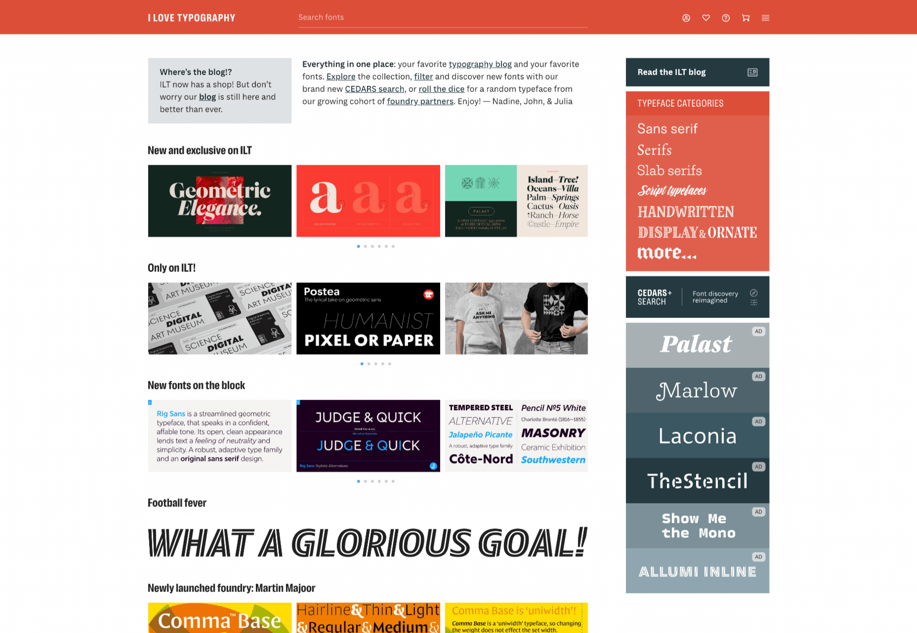
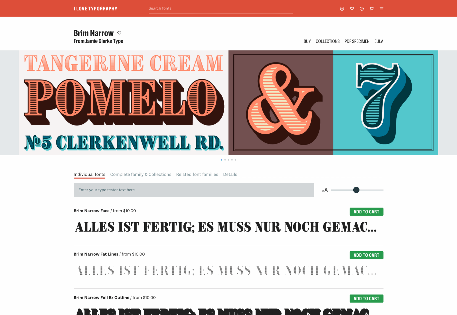
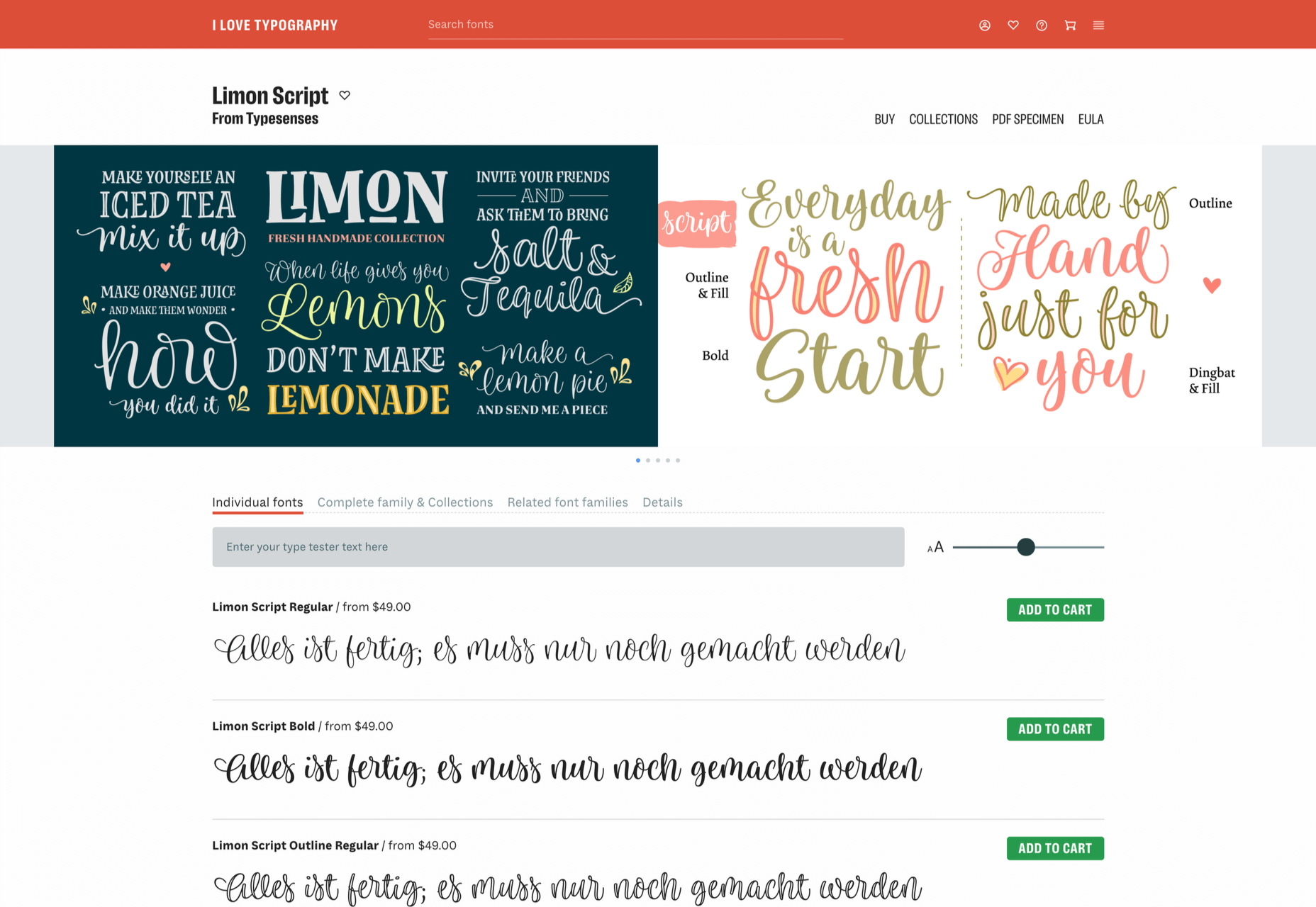
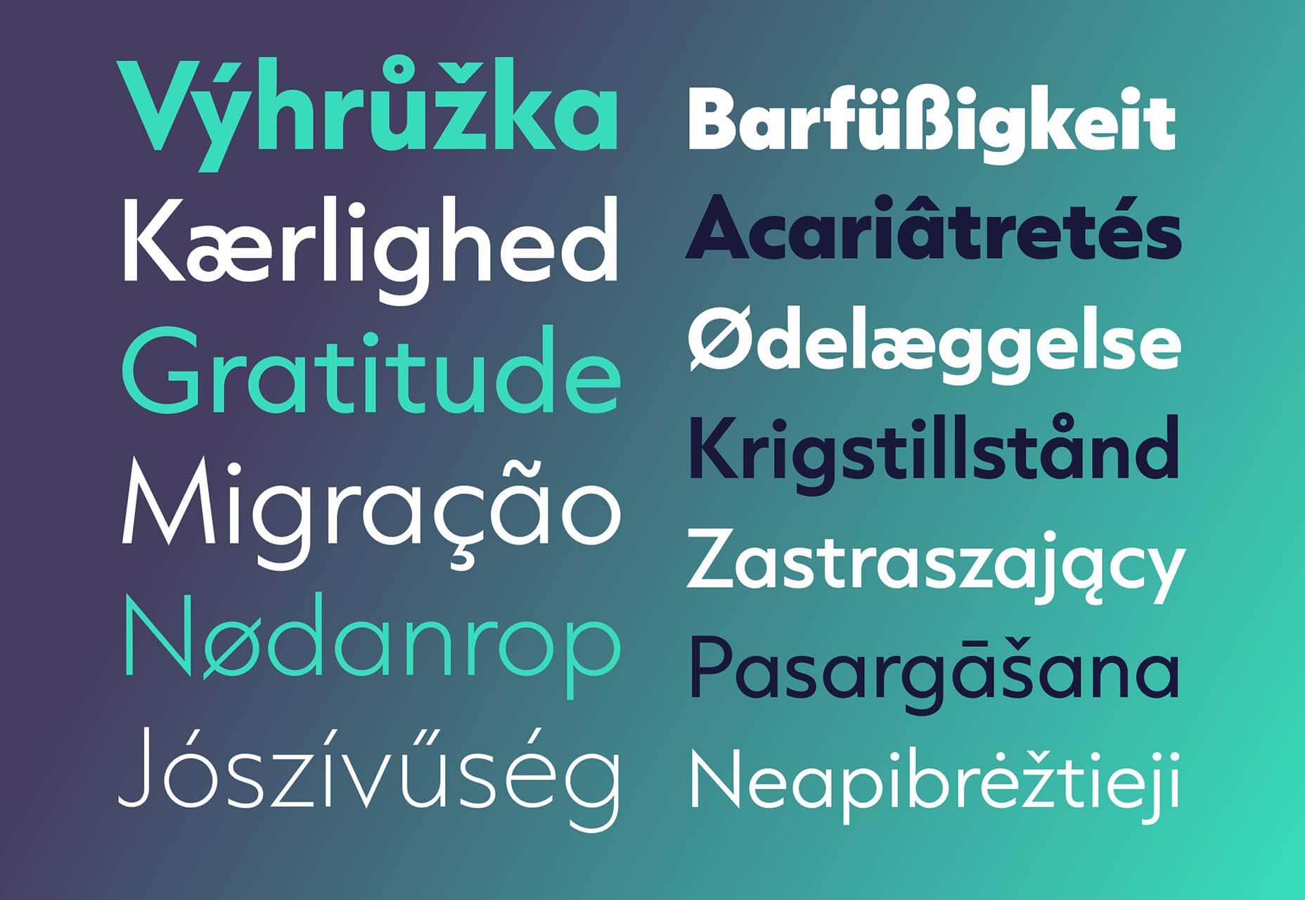
There is no shortage of places to buy fonts online, but the quality of what is on offer is variable, and the way of searching catalogs has remained largely unchanged since the first stores appeared decades ago.

I Love Typography — a popular source of news about typography and type design since 2007 — has stepped into the marketplace, starting by inviting some of the world’s top designers to contribute to its new store, resulting in 40 foundries joining the project and 15 new type families available at launch.

ILT’s boldest move is to step away from the traditionally shallow type categories and attempt to devise a system that drills down into the nuances of type design, all to aid discovery.

The approach is named CEDARS+, which is a method of describing the formal characteristics of a (mainly Latin) typeface based on the characteristics of the marks if made by a writing tool such as a pen or chisel.

CEDARS+ can be broken down as follows:

  • Contrast: the difference between the thickest and the thinnest strokes in a character. Permissible values range from ‘none’ through ‘medium’ to ‘extreme.’
  • Energy: the visual energy in the letterform. Values range from ‘calm’ to ‘lively’ and ‘very high.’
  • Details: with several sub-categories, details is a catch-all category that covers aspects such as how strokes end and intersect.
  • Axis: the angle at which the tool would be held to create the form. Axis uses degrees, with 90 degrees being a vertical axis.
  • Rhythm: covers both the tightness or looseness of letters varying from ‘very tight’ to ‘very loose, and the difference in width between the narrow and wide letters varying from ‘highly regular’ to ‘highly irregular.’
  • Structure: another catch-all category that covers the structure of loops with values such as ‘triangular’ and ‘oval,’ and the general construction, which can be ‘formal,’ ‘cursive,’ ‘organic,’ ‘layered,’ ‘stencil,’ or ‘modular.’
  • +: the plus covers several characteristics that don’t fit neatly into an acronym, including the shape of crossbars, and single or double storey ‘a’s and ‘g’s.

With a way to browse font families that is based on the feel of the design, rather than popularity (or alphabetical order!) ILT hopes to expose lesser-known designs and designers, and to encourage more creative typography on the web.

Source

The post I Love Typography Launches Font Store first appeared on Webdesigner Depot.


Source de l’article sur Webdesignerdepot


What is Deno?

Deno a pristine method to compose worker-side JavaScript. It solves many of the problems that Node does. It was created by the same person as Node. It uses the V8 JavaScript engine under the hood but the rest of the runtime is implemented in Rust and Typescript.

What Reason Does Deno Utilize Rust?

Deno may be a safe TypeScript run-time on Chrome V8. It had been initially written in Go and now has been revamped in Rust to remain far away from potential garbage collector issues. Deno is like Node js yet is centered around security. The rationale that Deno made was JavaScript. Significantly more horrendous than having a competitor who understands your thing back to front, Deno was made expressly to fix what Dahl saw due to the crucial weaknesses of NodeJs — including security issues, use of a centralized repository system (npm), and heavy tooling.

Source de l’article sur DZONE