Articles

A domain name is an essential element of every project, product, and company. It’s central to a brand and has a disproportionately large impact on user experience. Not only that, but it also impacts SEO and ultimately revenue.

Domain names are also one of the most commonly retailed elements in web technology, with most designers hoarding a small empire’s worth of domain names “just in case” the right side-project comes along.

Because so much of the information and advice on domain names is provided by companies selling domain names and is therefore not impartial, we wanted to bust some of the myths you’ll encounter.

Myth 1: Anyone Can Own a Domain Name

In fact, almost no one can own a domain name. As demonstrated by the (probably) annual renewal notices you receive, you are merely renting a domain name.

You pay a registrar, who registers the domain with ICANN (The Internet Corporation for Assigned Names and Numbers) — or an entity to whom ICANN has delegated the responsibility for a particular TLD.

Even when renting a domain, you do not have the right to use it; thousands of UK-based businesses have had .eu domains stripped from them as a result of being removed from the EU.

Myth 2: There’s a Perfect Domain For Every Project

Domains do not have inherent value; they acquire value over time.

25 years ago, if you were building a search engine, the ‘perfect’ domain might have been search.com, find.com, or perhaps look.com — the particularly cynical might have opted for webads.com. You almost certainly wouldn’t have registered google.com because it says nothing about search.

Any domain name can acquire value through longevity, SEO, and branding

google.com acquired its value through a simple, relentless branding strategy and a generous dollop of luck.

Any domain name can acquire value through longevity, SEO, and branding.

Myth 3: Your Domain Name Should Contain Keywords

If you’re at the point of registering a domain name, either your business is new, or your digital strategy is. In either case, you have hopefully carried out keyword research, but without a live site, your keyword research hasn’t been validated. In other words, you don’t know what your keywords are.

Even if you’re confident that you know exactly what your keywords should be at this time, your keywords may change. The pandemic has required most businesses to pivot to some degree. eatoutny.com isn’t much use if legal restrictions have forced you to switch to a delivery business — unless you’ve also registered eatinny.com.

Furthermore, in the area of ecommerce, customers tend to view keyword-heavy domain names as budget options because they are like generic-brand goods. It may be that your business will only ever be a budget option, but it’s not a wise business decision to restrict your options.

There is an SEO benefit to keywords in a domain, but it is minimal and will almost certainly vanish in the next few years — even for EMD (Exact Match Domains) — because it is too close to gaming the system.

Myth 4: You Don’t Need a .com

As frustrating as it may be to seek out a .com you’re happy with, nothing says “late to the party” like a .biz domain.

A .co extension is slightly better in some regions because the .co.** format is commonly used; .co.jp for example. However, .co tends to be typed as .com by users accustomed to the more common format.

nothing says “late to the party” like a .biz domain

It’s possible to opt for pun-based names using regionally specific TLDs like buy.it, or join.in. This kind of strategy will play havoc with your local search strategy because computers don’t understand puns; you’ll potentially do quite well in Italy or India, though.

If you’re registering a domain for a non-profit, then .org is perfectly acceptable. However, carefully consider whether a domain is worth the lost traffic if you can’t also register the .com (because people will type .com).

The one exception is industry-specific TLDs that communicate something about the domain’s contents to a target demographic. For example, .design is a great extension for designers, and .io is fine for an app if it targets developers (i.e., people who understand the joke). You should also register the .com if you can, and if you can’t, carefully consider whom you’re likely to be competing with for SERPs.

This is not to say that anything other than a .com is worthless, just worth less than the .com.

Myth 5: A Trademark Entitles You to Register a Domain

Trademark registration and domain registration are two entirely different processes, and one does not entitle you to the other. This has been legally challenged a few times and fails far more often than it succeeds.

Trademarks are rarely blanket registrations, which means the trademark owner needs to declare the industry in which it will operate; there was no enmity between Apple Inc. and Apple Corp Ltd. until the former moved into music publishing and no one could download the White Album onto their iPod.

There is, however, a limited value in registering a domain that has been trademarked elsewhere. Not least because you will be competing against their SEO, and if they’re big enough to trademark a name, they’ve probably grabbed the .com.

Myth 6: Premium Domains Are a Good Investment

Premium domains are domains that have been speculatively registered in the hope of attracting a huge resale fee. The process is commonly referred to as ‘domain squatting.’

Domain squatters bulk-register domains in the hope that one of them will be valuable to someone. As a result, they are forced to charge exorbitant fees to cover their losses; a premium domain will cost anything from 1000–100,000% of the actual registration cost.

Setting aside the cost — which would be better spent on marketing — premium domains often come with legacy issues, such as a troubled search engine history, that you do not want to inherit.

Myth 7: A Matching Handle Must be Available on Social Media

The business value of a social media account varies from company to company and from platform to platform. Even if it is valuable to you, numerous marketing strategies will accommodate a domain name: prepending with ‘use,’ or ‘get,’ or appending with ‘hq,’ for example.

More importantly, it’s unwise to allow a third-party to define your long-term brand identity; sure, Facebook is huge now, but then so was the T-Rex.

Myth 8: You Need a Domain Name

A domain name is an alias, nothing more. You don’t actually need a domain name — what you need is an IP address, which a domain name makes human-friendly.

Think of domain names as an accessibility issue; humans are less able to read IP addresses than computers, and domains bridge the gap. (See how helpful accessibility is?)

While a domain name is beneficial, question whether a sub-domain or even an IP address would do. Registering a domain is an exciting stage of a project that many people never get past, leaving themselves with a huge collection of domains that they pay an annual fee for, and never actually develop.

What Makes a Good Domain Name

Now we’ve dispelled some of the myths surrounding domain names, let’s look at the key characteristics shared by good domain names:

A Good Domain Name is Brandable

A brandable domain is non-generic. It’s the difference between a sticky-plaster and a band-aid. Unique is good, rare is acceptable, generic is a waste of money.

A Good Domain Name is Flexible

Keep it flexible. Don’t tie yourself to one market or one demographic. Your domain name needs to work now and fifty years in the future.

A Good Domain Name is Musical

Six to 12 characters and two to three syllables is the sweet spot. Names in that range have a musical rhythm our brains find it easier to retain and recall.

A Good Domain Name is Phonetic

There are 44 word sounds in the English language. Other languages have similar totals. If you use a domain name that is pronounced phonetically, it will be easy to communicate.

Source

The post 8 Domain Name Myths Every Web Designer Should Know first appeared on Webdesigner Depot.


Source de l’article sur Webdesignerdepot

There are many reasons you might be wanting to improve your design skills this year. Perhaps you have extra time on your hands and want to put it to good use. Or maybe you’re new to web design and finding that there’s a lot you still don’t know how to do. It could also be that you recognize that the web is changing, and your skills could use some refreshing to keep up.

Whatever the reason, there are many ways to level up your web design skills in 2021. Here are 12 ideas to get you started:

Tip 1: Niche Down If You Haven’t Already

Jack-of-all-trades designers might be able to say “yes” to everyone. However, they’re going to be stretched very thin as they attempt to strengthen every skill needed to keep up with demand.

It’s much easier to become a trusted designer and to improve your skills if you have a smaller and more specific skill set to develop.

Just keep in mind that niching down doesn’t necessarily mean focusing on a particular industry. For instance, you might choose to be a UX designer instead of a web designer. Or you might specialize in designing ecommerce websites instead of monetized blogs. Just find something that you’re passionate about and will be good at doing, and zero-in on the skills needed for it.

Tip 2: Play Around in the Sandbox

Local development environments are useful for staging websites, doing redesigns, and testing updates safely away from live sites. But you can also use them for experimenting with new design techniques, trends, templates, plugins, and more.

Local by Flywheel is the one I prefer to use:

Here’s a good exercise to start with:

Take a website you like — something you’ve looked at in awe and couldn’t imagine ever building on your own. Then, put yourself to the test. See if you can recreate it in your sandbox.

Don’t be hard on yourself if you don’t figure it out right away. Consult your resources and give yourself time to make sense of what’s going on and implement it with the available skills and tools.

Tip 3: Redesign One of Your First Projects

There’s always a clear evolution in a designer’s skill set, from the day they begin designing to the present day. And that’s a good thing. If your work doesn’t improve or change with time, then you’re going to have a lot of catching up to do when the stagnation begins to hurt your business.

Want to see how much progress you’ve made so far? Revisit one of your first projects and look at it with fresh eyes. I bet you’ll see a big change in how you design today from how you designed that site then.

Now, ask yourself what you would do differently. And then, go to your sandbox and do the redesign.

Tip 4: Work on a Passion Project

A friend of mine is taking a UX design course and needed some users to run through a prototype he created for the class. He could create anything he wanted, so he designed an app related to his other love: Music.

While he could’ve easily thrown together some carbon copy of Spotify or SoundCloud, he came up with a completely new concept. And it was really impressive, to the point where I urged him to put it into production and see if he could list it in the app stores.

I think it’s when we’re really passionate about something that we’re willing to push past our limits. So, carve out some time to tackle that passion project you’ve been toying around with and see where it takes you.

Tip 5: Share Your Designs on Dribbble and Ask for Feedback

One of the reasons UX designers do user testing is how valuable users’ raw input is. While it would be nice to think that design is a completely subjective matter, that isn’t really the case when usability becomes compromised due to design choices.

Understanding what users like and dislike is an important part of taking your design skills to the next level. And a good way to do that is to share your designs on Dribbble.

Here’s an example of UI8 asking for feedback:

Tip 6: Create a Design Toolbox

I’m a huge fan of automation and shortcuts powering things behind the scenes in business.

After all, one of the reasons you become a web designer is so you can design, right? When you’re bogged down with administrative and logistical tasks, that’s time spent away from doing what you enjoy.

One way in which you can streamline your backend processes is by putting together a design toolbox. Your preferred CMS. Flexible templates or apps you use from project to project. Website testing tools. And so on.

As you do this, it’ll force you to examine how you build websites. Are you really working as efficiently as possible? Are there newer apps or systems that’ll help you design better sites? And as you improve your design toolbox, you’ll improve your design skills.

Tip 7: Subscribe to Your Favorite Blogs

I have a hard time recommending this one, only because I’m reluctant to sign up for yet another newsletter. That said, I do see the value in subscribing to some blog newsletters as I don’t always remember to revisit their websites and check out the latest content.

What I’d suggest you do is pick one or two design blogs that have a good variety of content and publish regularly. And then pick one small business or freelance blog.

WebdesignerDepot, of course, is a good one to start with as it comes at a good frequency, recommends great reads from all around the web, and is fluff-free:

I’d also recommend signing up for one that’s focused on your niche as well as one for business.

As a freelancer, I’d vote for the Freelancers’ Union newsletter. There’s always something timely and useful in there.

Tip 8: Listen to a Podcast

I just adopted a second dog, so I’ve spent a lot more time on walks while house-training her. At first, I was stressed about it because it was time spent away from work. However, I started to fill that time with podcasts and found that it helped me work better for the rest of the day.

One reason is that I’ve been listening to work-related podcasts, which are always chock full of helpful tips. Another reason is that it gives my eyes a rest from looking at the screen so that when I come back 15 or so minutes later, I feel refreshed and ready to go.

Rebekah Carter has a good set of web design podcast recommendations to get you started.

Tip 9: Take a Free Online Design Course

There’s an overabundance of information online. If you want to brush up on CSS, there are hundreds of YouTube courses that cover it. If you want to learn how to use a new WordPress plugin, you’ll find dozens of great tutorials across various online course platforms, YouTube channels, and even people’s blogs.

There’s no need to go back to school to become a better designer. Here are five places where you’re bound to find free courses for web designers.

Tip 10: Read a Book on Design Principles or Theory

It’s easy to lose sight of design principles when your clients are clamoring for a website that will make them a lot of money, get them a lot of readers, and so on. Sure, you can design a UI and UX that works, but do you remember why the design choices you made are effective?

Choose a book — just one to start — that’ll help you reconnect with the roots of good web design. Not only will you get a good refresher on web design principles or design theory, but you might learn something brand new.

Here are some of my favorite books for web designers:

Tip 11: Find Your People

Now more than ever, finding a community of like-minded web designers, developers, or freelancers is important. It’s not just about having a group of people to vent to when clients drive you nuts (though that’s great, too).

It’s about finding a group that brings something new to the table and enriches your understanding of web design and what it means to be a web designer.

If you’re on Facebook or LinkedIn, start there. There are tons of web design and freelance groups that have productive discussions every day. If you prefer to meet up with local designers and developers, check out Meetup.

You may be surprised by how many groups there are and the kinds of meetups they have planned.

Tip 12: Attend a Virtual Conference

Did any of you attend a design conference last year? I did. I virtually attended Adobe MAX — from the comfort of my home, in my pajamas, for three days.

I scheduled my assignments around the sessions I wanted to attend and didn’t have to pick one over the other (i.e., “Do I make money or do I learn something new?”).

Some of the sessions showed us how to do more with Adobe’s tools, while some of them featured design and business leaders who shared personal insights on how to work more effectively. It was a great way to shake up my normal routine and to get a ton of information about the future of web design in a short period of time.

Which of These Tips Will You Use to Improve Your Design Skills?

Like I said before, there’s a lot you can do to improve your design skills. Just be careful not to overdo it.

Pick one or two things on this list to start with. If you have more time in your schedule and you’re excited about what you’ve learned so far, add a couple more.

Just take it slowly. Your brain will only be able to absorb so much at once. Plus, the last thing you want is to burn yourself out on skills training and not have the energy to complete your work.


Featured image via Unsplash.

Source

The post 12 Tips to Improve Your Web Design Skills in 2021 first appeared on Webdesigner Depot.


Source de l’article sur Webdesignerdepot

It’s February, and the spring sun is finally starting to peep through the winter clouds. While many of us are still largely restricted to our homes, the web has kept on growing.

We see a shift in attitude towards natural health, wellbeing, and sustainability, and these are now being branded less often as outliers and increasingly mainstream. We’re also seeing more and more color all the time, ranging from an emotional signifier in the background to being a functional element in its own right.

GOOD Meat

Gorgeous color in the background image and the scrolling narrative pull the user in on this site for lab ‘grown’ meat.

Hanwag 100 Years

This page celebrating 100 years of outdoor footwear company Hanweg uses a mix of illustrations and photographs to create a timeline marking the company’s highlights alongside what else was happening at the time. Any excuse to get Yoda in.

Gaffer

Gaffer describes itself as bridging the gap between football, music, fashion, and culture. The site has a glossy feel, with strong art direction and an easily navigable architecture.

Remember MLK

This rather beautifully made tribute to Martin Luther King uses some great typographic effects, and the variations, in contrast, create a layering of the different content elements.

Bonjour Agency

The home page for design agency Bonjour Paris uses sideways scrolling to give an overview of the whole site. There is a lot of content, but it doesn’t feel like waffle, and exploring the site is a pleasant experience in itself.

Wild Souls

Wild Souls is a Greek company that principally makes nut butters, tahini, and halva. The site is very colorful but warm, and the display type — Canela — has a slight softness to it that is appealing.

Nicolas Loureiro

This is a strong portfolio site for interactive and graphic designer Nicolas Loureiro. The work is front and center, and the navigation is pleasing.

Studio Nanna Lagerman

Studio Nanna Lagermann is a small interior design studio that works on private homes, public spaces, and set design. The site creates a feeling of space and calm. Colors are soft and neutral, and the type, although massive in places, is clean and sophisticated.

Aurelia Durand

Illustrator Aurelia Durand created her own typeface that she uses in her work, and it is used as the main display font here too. This site has a sense of joy about it that is hard to resist.

Archivio Mario Russo

This site documents the life and work of 20th-century Italian artist Mario Russo. The layout is thoughtful, and the text, while informative, doesn’t detract from the work being shown.

Gigantic Candy

Gigantic Candy makes vegan chocolate candy bars. The site is big, bold and lo-fi, and has a sense of fun to it.

dBodhi

dBodhi sells handcrafted furniture from Java, made from reclaimed teak and locally grown plant materials. The clean layout combined with a slight sepia tone on all the photography creates a feeling of quietness and nature.

Menu Durable

Menu Durable is a guide to creating healthier, sustainable food menus in Canadian healthcare facilities. There is a lot of information here, and it is well written and attractively presented with clear color coding.

Virgile Guinard

This is a lovely, simple portfolio site for photographer Virgile Guinard. By using blocks of color pulled from each photograph’s predominant color and only revealing each photograph on rollover, each image is allowed to stand out.

The Bold Type

This site for The Bold Type Hotel in Patra, Greece, is a boutique hotel website archetype, but it is done well. The pinky sand background color is a good choice, and the photographs are excellent.

NOR NORM

Nor Norm provide an office furniture subscription service. The site is clean with a feeling of light and space. There is a good balance between an overview of the process and details of the individual items available.

Ask Us For Ideas

At first glance, Ask Us For Ideas looks like a creative agency, but it is actually a creative broker, matching clients with agencies.

Prinoth Clean Motion

Prinoth has been making snow groomers since the 1960s, and this microsite is to mark the launch of their new hydrogen and electric versions. It is as slick and glossy as any luxury car website. And now I know what a snow groomer is.

Pschhh

Design agency Pschhh has embraced the use of circles, reflecting the sound of bubbles their name suggests.

CōLab

CōLab is a design and marketing firm. There is a great use of color and movement here, and you don’t really notice initially that there is no actual work on show.

Source

The post 20 Best New Websites, February 2021 first appeared on Webdesigner Depot.


Source de l’article sur Webdesignerdepot

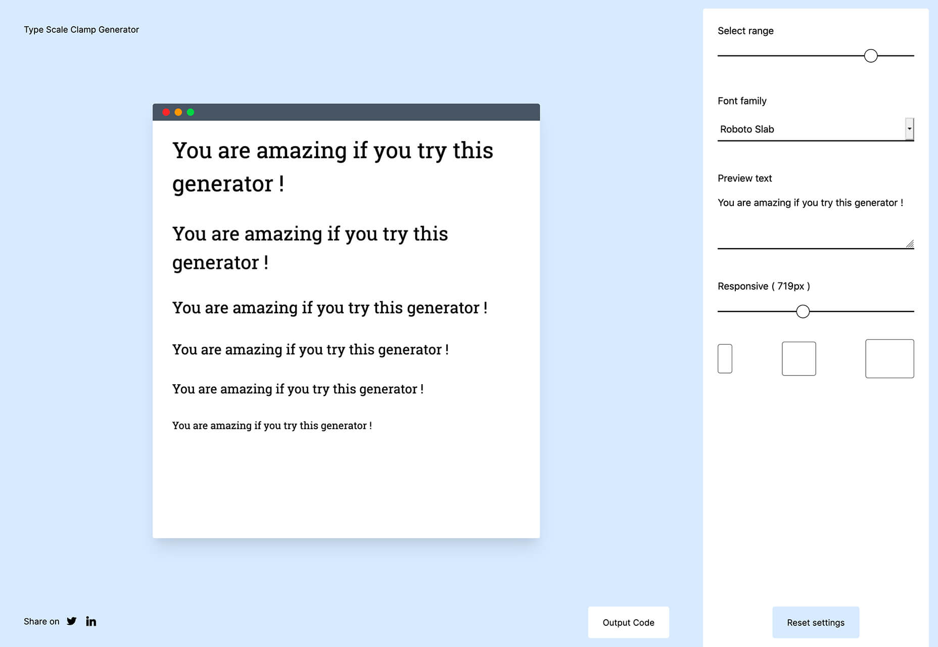
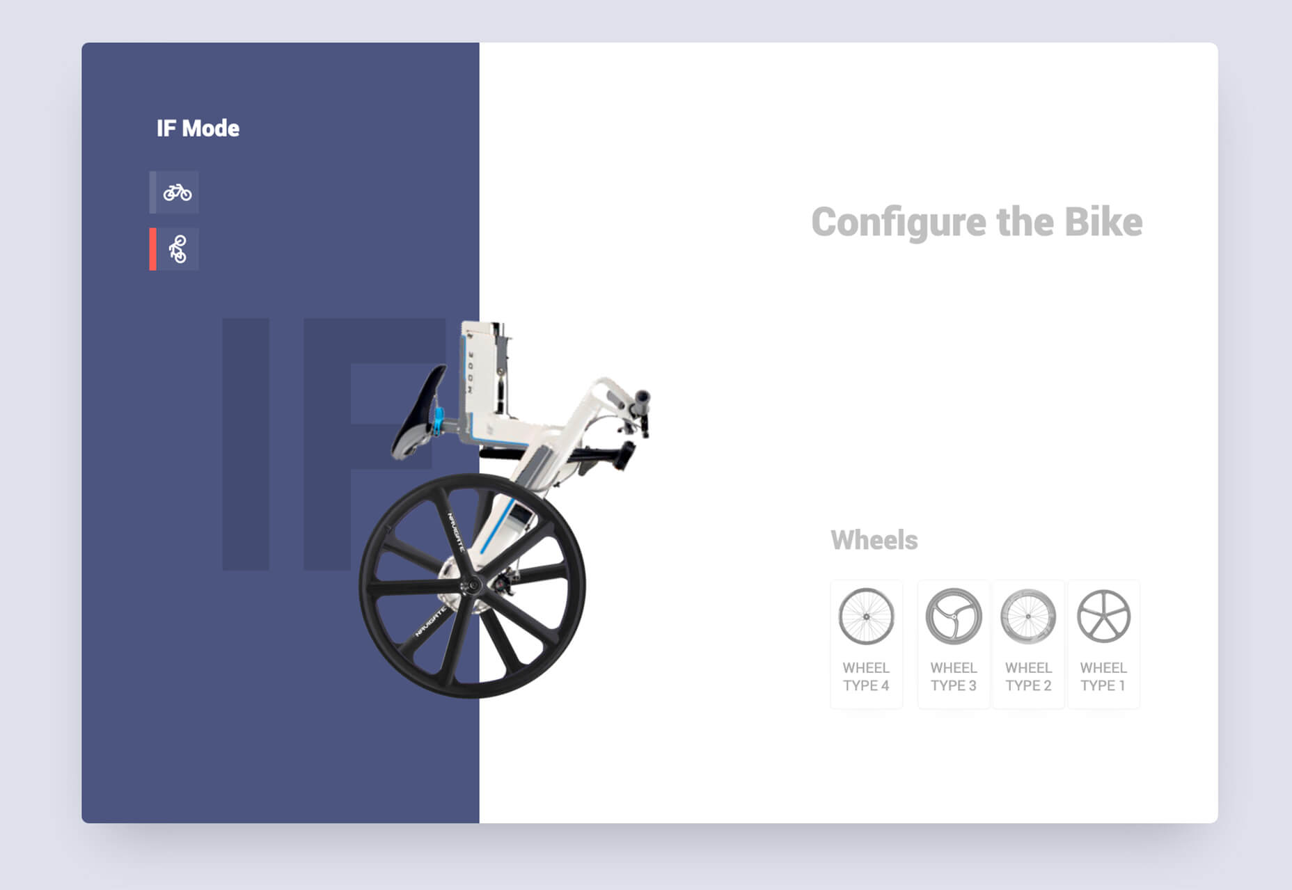
The new year is often packed with resolutions. Make the most of those goals and resolve to design better, faster, and more efficiently with some of these new tools and resources.

Here’s what new for designers this month.

Radix UI

Radix UI is an open-source UI component library for building high-quality, accessible design systems and web apps. It includes examples and guidelines for all kinds of user interface elements that provide guidance and really make you think about accessible website design. (And everything is usable!)

Froala Charts

Froala Charts is made to help you create data visualizations for web or mobile apps. Build any chart you can imagine – bar, line, area, heat map, sankey, radar, time series, and more. Plus, you can customize anything and everything, so it all matches your brand. This premium tool is enterprise-level and comes with a one-time license fee.

CSSfox

CSSfox is a collection of designs that you can use for inspiration. The curated community project includes posts, reviews, and award nominees and winners.

Pattern Generator

Pattern Generator is a tool to create seamless and royalty-free patterns that you can use in projects. Almost every element of the pattern design is customizable, and you can “shuffle” to get new style inspiration. Design a pattern you like and export it for use as a JPG, PNG, SVG, or CSS.

Type Scale Clamp Generator

Type Style Clamp Generator helps you create a visualize a typographic scale for web projects. Pick a font and determine a few other settings and see the scale right on the screen. You can even put in your own words to see how they would look. Then, flip to see how sizes appear on different devices. Find a scale you like and snag the code with a click.

Flowdash

Flowdash is a premium app that helps you build custom tools, data sets and streamline your business operations with one tool. Manage data and processes without code. The tool combines a spreadsheet’s familiarity with a visual workflow builder, plus built-in integrations to automate repetitive tasks so your team can focus on what matters.

Scale

Scale is a website that provides new and open-source illustrations that you can use for projects. Maybe the illustration generator’s neatest part is that you can change the color with just a click to match your brand. Then download the image as an SVG or PNG.

Pe•ple

Pe•ple is a tool that adds a “customizable community” to any website to help grow your fanbase and provide a boost to SEO. It allows you to integrate chat, commenting, emojis, and passwordless login, among other things.

K!sbag: Free Minimal Portfolio Template

K!sbag is a free minimal website template that’s made for portfolio sites. (Did you resolve to update yours in 2021?) It includes 6 pages in a ready-made HTML format and PSD.

Merico Build

Merico Build is like a fitness tracker for code. It uses contribution analytics to empower developers with insight dashboards and badges focused on self-improvement and career growth. Sign up with tools you already use – Github or Gitlab.

Automatic Social Share Images

Automatic Social Share Images solves a common website problem: Missing or broken images when posts or pages are shared on social media. This tutorial walks you through the code needed to create the right meta tags so that popular social media channels pick up the image you want for posts. The best part is this code helps you create a dynamic preview image, so you don’t have to make something special every single time.

Animated SVG Links

Animated SVG Links can add a little something special to your design. This pen is from Adam Kuhn and includes three different link styles.

Blush

Blush helps you create illustrations. With collections made by artists across the globe, there’s something for everyone and every project. All art is customizable, so you can play with variations to create something unique.

Palms

Palms is a set of 43 sets of hands to help illustrate projects. Each illustration is in a vector format and ready to use.

Tabbied

Tabbied allows you to create and customize patterns or artwork in a minimal style for various projects or backgrounds. Tinker with your artwork and patterns and then download a free, high-resolution version.

How to Create Animated Cards

How to Create Animated Cards is a great little tutorial by Johnny Simpson that uses WebGL and Three.js to create a style like those on Apple Music. The result is a stylish modern card style that you can follow along with the CodePen demo.

Bandero

Bandero is a fun slab with a rough texture and interesting letterforms. The character set is a little limited and is best-suited for display use.

Magilla

Magilla is a stunning modern serif with great lines and strokes. The premium typeface family has six styles, including an outline option.

Roadhouse

Roadhouse is one of those slab fonts that almost screams branding design. The type designer must have had this in mind, too, with stripe, bevel, inline, half fill, outline, drop extrude, and script options included. (This family is quite robust, or you can snag just one style.)

Street Art

Street Art is for those times when a graffiti style is all that will do. What’s nice about this option – free for personal use – is that the characters are highly readable.

Source

The post Exciting New Tools for Designers, January 2021 first appeared on Webdesigner Depot.


Source de l’article sur Webdesignerdepot

As we approach our first winter holiday season since the pandemic set in, the world could feel like a very scary place; there is a great deal of uncertainty about the future for businesses, for young people in education, for jobs, for travel. Celebrations are certainly going to be a lot quieter this year.

And yet, the web is far from showing doom and gloom. We’re seeing confidence and positivity in designs across the board. As businesses and people adapt to the demands of social distancing and WFH, we’re seeing a focus on simplifying, appreciating quality over quantity, taking better care of ourselves and our world, and making the most of our time. And this is reflected through design in a variety of ways: visually minimal style, pared down content, fresh colors, statement type, great photography, illustration.

There is confidence in abundance on the web. Enjoy…

Mammut Expedition Baikal

Mammut make outdoor clothing and equipment, and this microsite is for its Eiger Extreme collection. Stunning photographs of Swiss speed climber Dani Arnold climbing at Lake Baikal in Siberia are cleverly interspersed with details of the company’s products he can be seen wearing, along with links to buy. It feels natural, rather than forced.

Wavering Stripes

This a beautifully made site highlighting the experiences of people held in immigration detention centers in the US. The illustrations belie the grimness of the stories told — on the landing page there is a warning as to the nature of the content.

Juan Mora

Proof that holding pages don’t have to be boring, this ‘under construction’ site for interface designer Juan Mora is a far cry from the warning-barrier and stick-figures-at-work gifs of the web’s early days.

Cafecrema

Cafecrema’s simple, one page site creates the atmosphere of 1950s coffee shops through its illustration style, a jazz soundtrack, and a very mid-century modern color palette.

A N Other

Perfume brand A. N Other prioritises quality ingredients and materials, simplicity, craftsmanship, and the environment. Its website captures this perfectly, and invokes a sense of luxury as the result.

Puddle Sound

Puddle is an architectural and interior design company, who also do product and furniture design. For a Tokyo hotel project they created a vacuum tube amplifier, that is the subject of this site. It is as simple as can be with only the barest essential information, and with all attention focused on the product shots.

Hous

Hous Luxe Woningen are a Dutch company who build luxury homes. The high quality images, muted color scheme and generous use of white space in its website reflects this sense of luxury perfectly.

Who Cares?

Who Cares? is an interactive game designed to raise public awareness of endangered animal species. The illustration style is very pleasing, and there are some lovely little details in the animation and sound.

Ugly

This site for sparkling water company Ugly, uses bold, cartoonish typography and illustrated characters to add a lot of character to, well, water.

Glyphs

Glyphs font editor version 3 was released on 16th November. The accompanying site has a fresh feel, mainly due to its striking color scheme. The on scroll animation showcasing variable fonts is a nice touch.

Ruler Agency

Ruler Digital Agency uses color only in the images of work on its own site. Everything else is grayscale, even the images, which can be a really effective technique when it is used well, as it is here.

Zoë Pepper

Zoë Pepper is a collective of freelance brand strategists who work with early stage startups. The site is minimal without feeling empty, and utilises quirky illustration and scrolling animation to good effect.

Karst

Karst make notebooks using paper made from stone, and woodless pencils. Its site has a simple, clean feel with a muted, neutral color scheme that complements the colors of its notebook covers.

London Alley

London Alley is a production company who concentrate on music videos and advertising. Its site is simple and striking with plenty of video, and effective use of split screen.

LoveSeen

LoveSeen makes false eyelashes, and nothing else. The site has a fun, inclusive feel — more girl(and boy)friends together than glossy, high fashion magazine. It’s appealing and persuasive.

Chartogne-Taillet

This site for wine-growers Chartogne-Taillet uses illustration and an animated, ‘hand’ drawn map to create a sense of heritage, appropriate for a family with a long history of making wine in the Champagne region. It is reminiscent of a label on a good bottle of wine.

Refusi Studio

Refusi Studio is a design agency from Italy. This portfolio site is simple, with strong colors and big, statement typography. And a giant cartoon eye.

Yesterday, Today, Tomorrow

Yesterday, Today, Tomorrow is an interactive project from the National Film Board of Canada. It uses tweets to trace emotional ‘waves’ throughout the Covid-19 pandemic.

Boost

Boost is a gummy (chew) vitamin supplement for the immune system. Big type, big graphics and lots of orange and purple — the colors associated with vitamin C and antioxidants — make vitamins cool.

Philiber

Philiber is a meal delivery subscription service, available in urban centers in Quebec. The site is clean and modern, with a comforting color scheme and a nice mix of photography and flat style illustrations.

Source


Source de l’article sur Webdesignerdepot

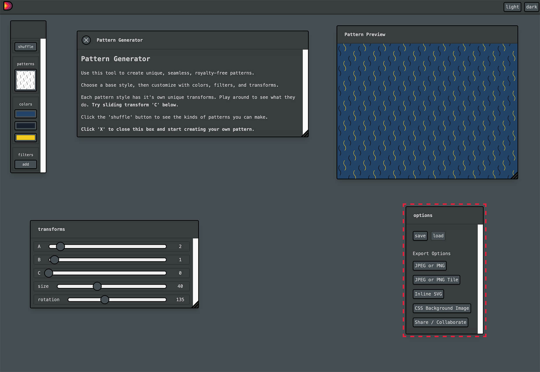
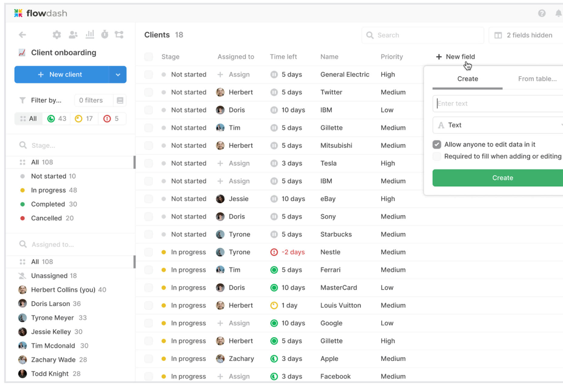
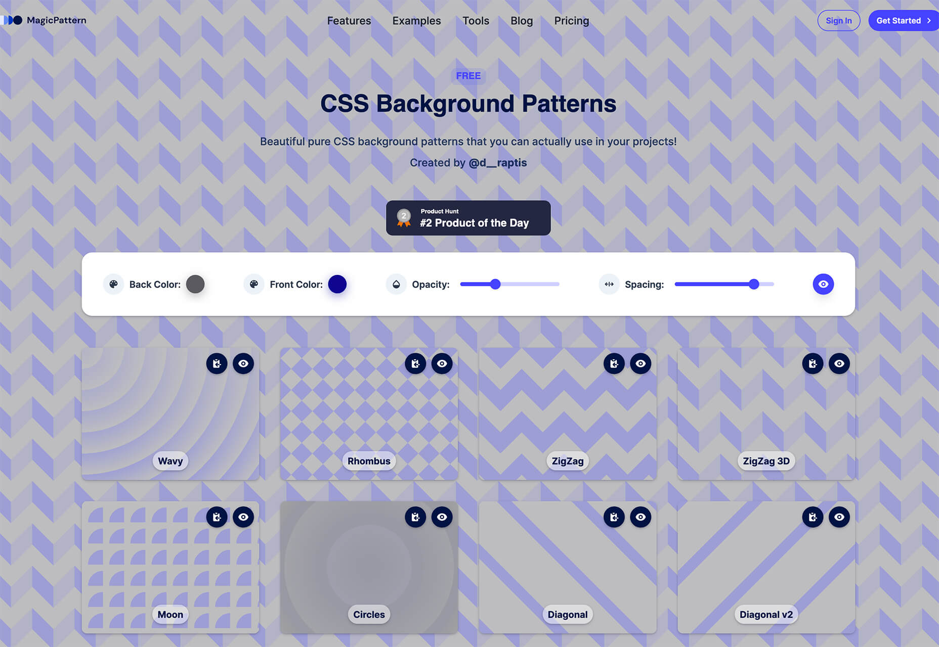
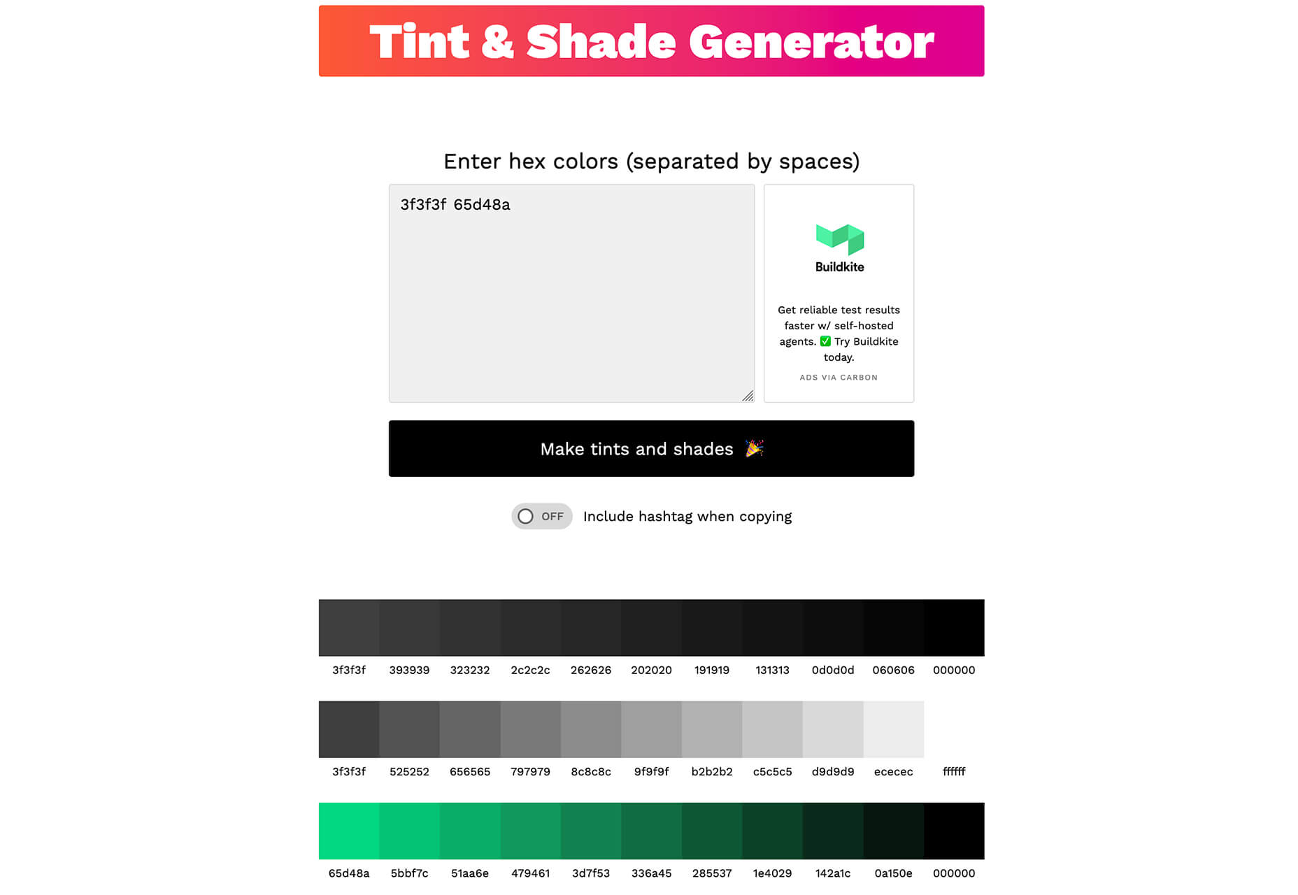
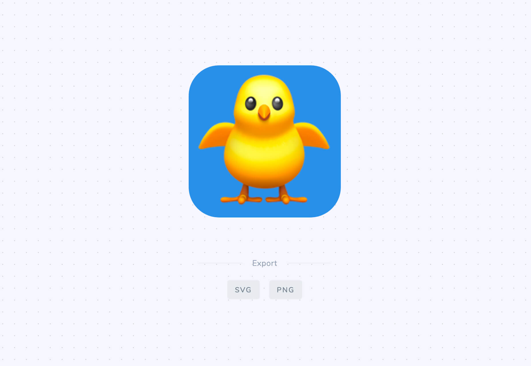
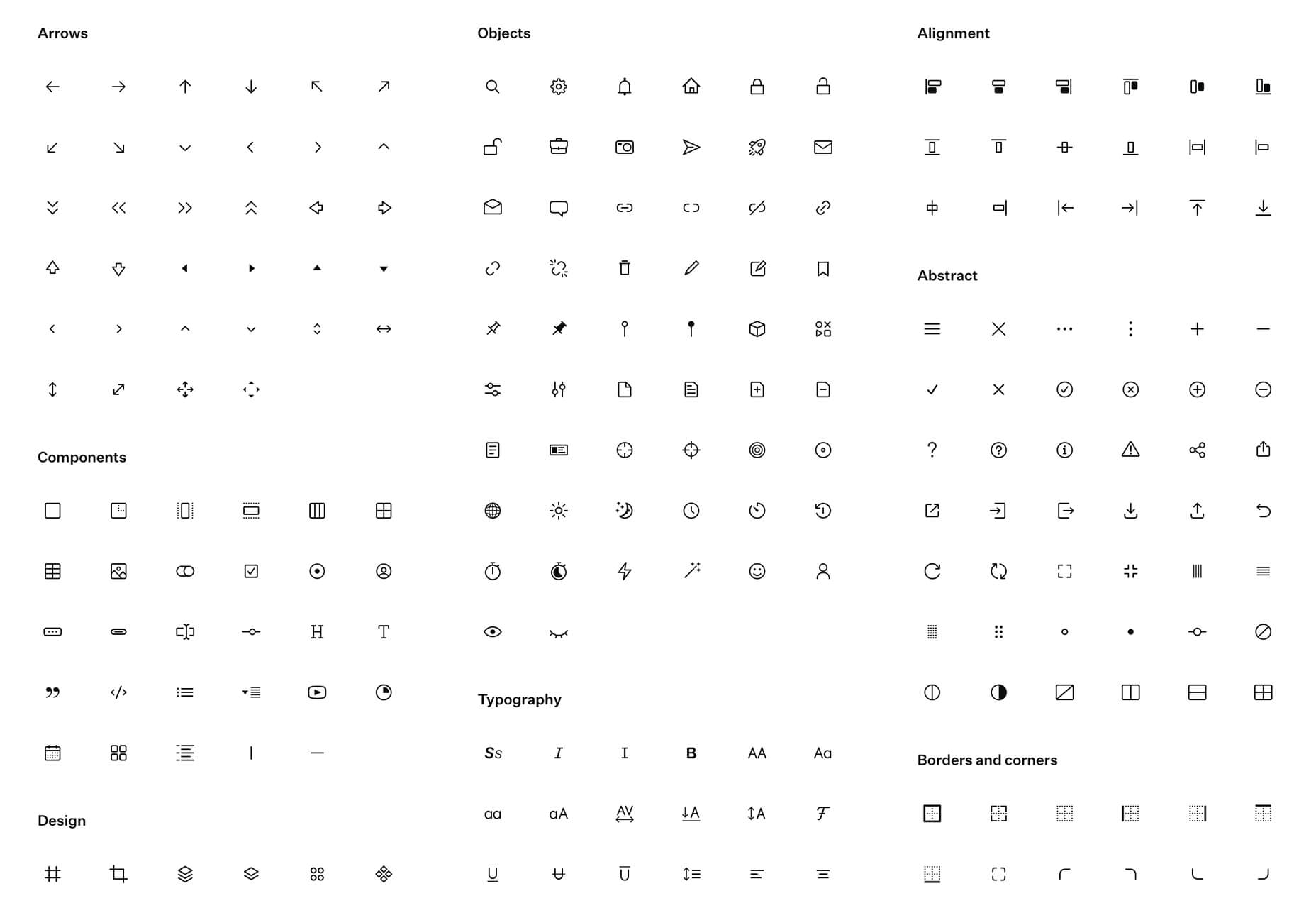
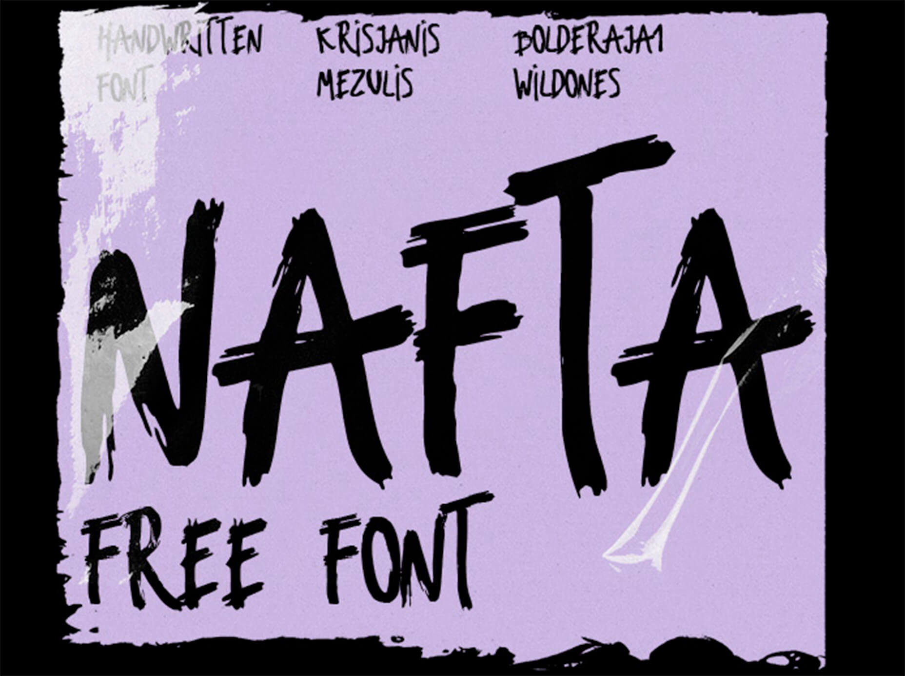
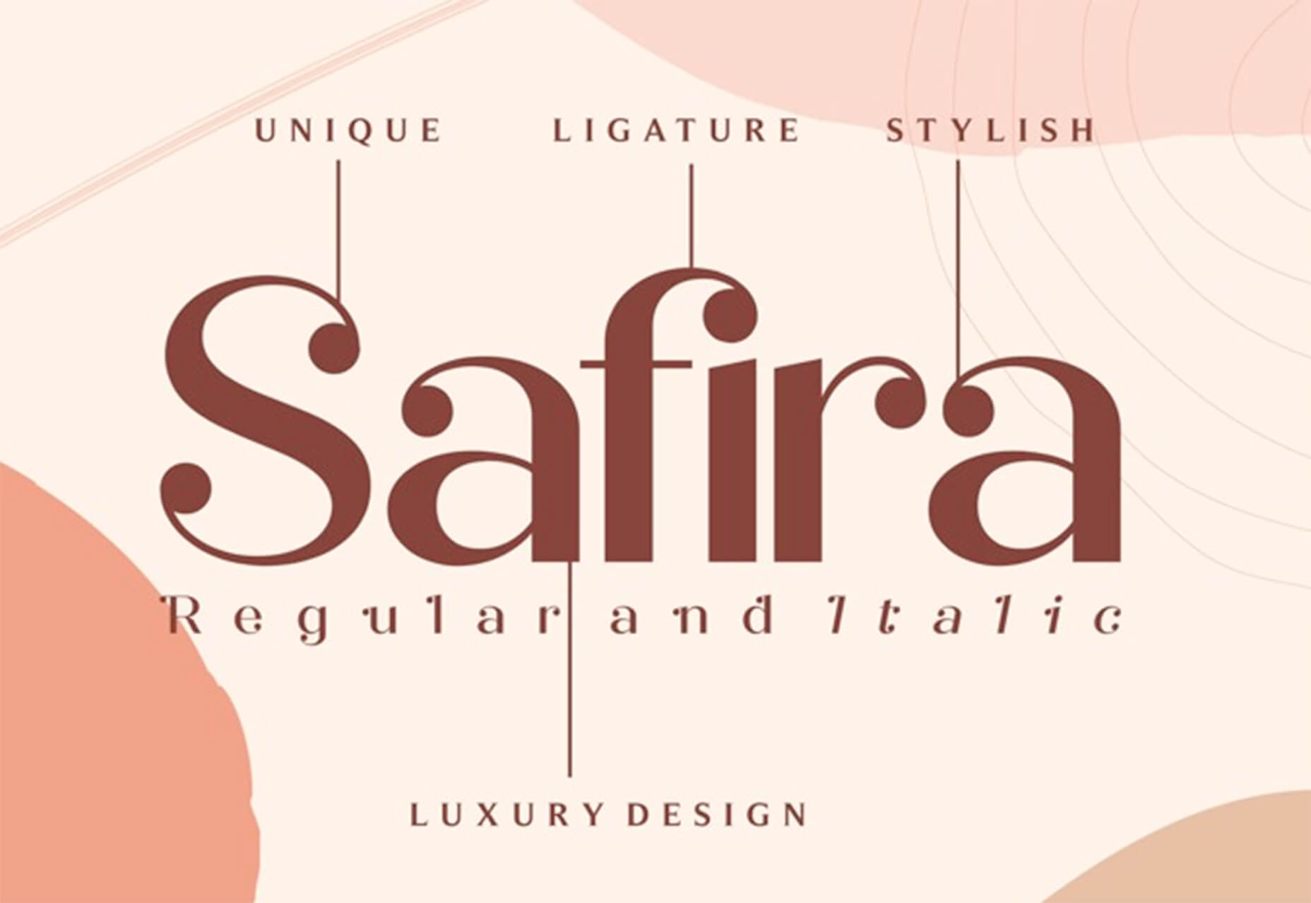
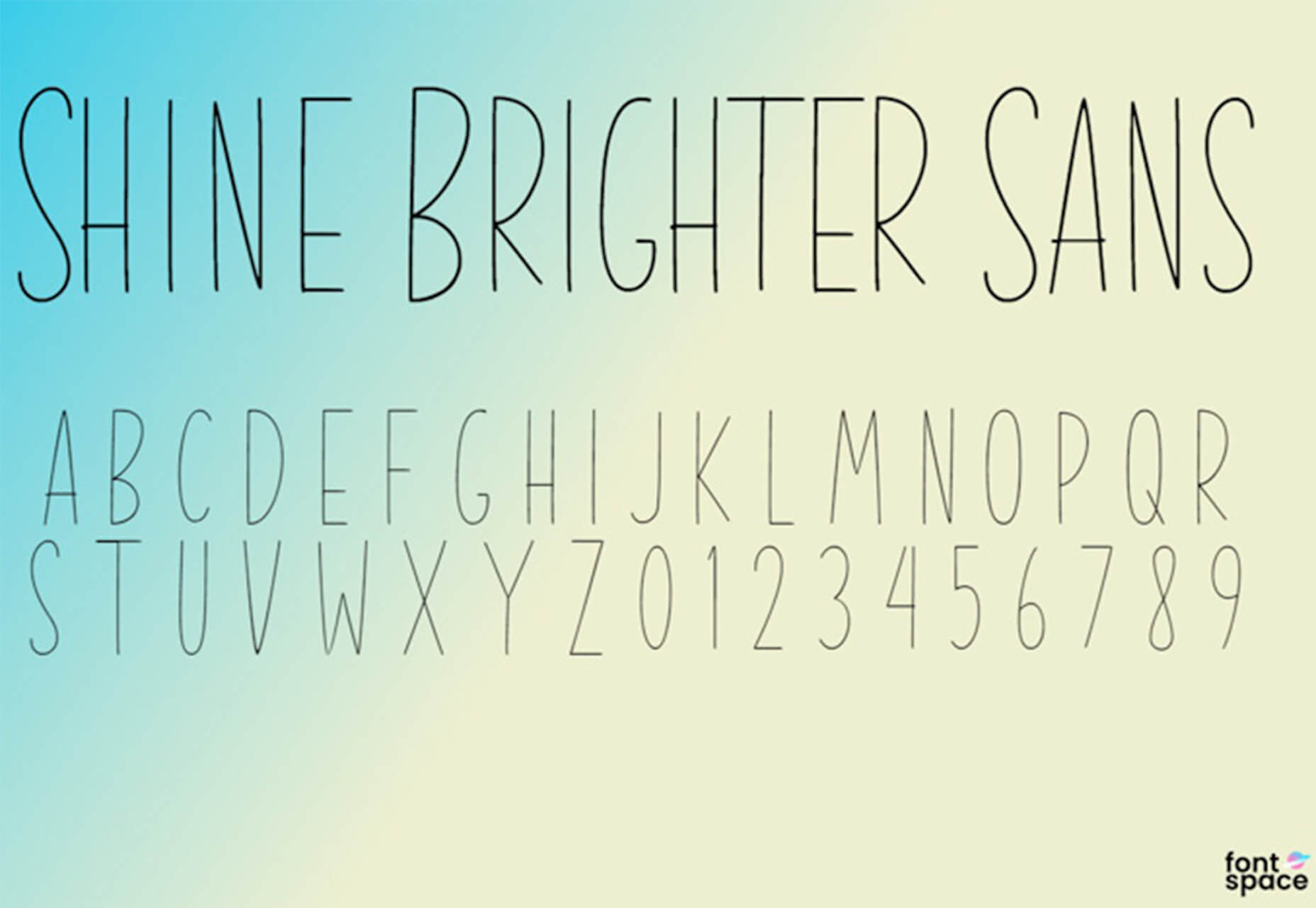
In the spirit of fall feasts, this month’s collection of tools and resources is a smorgasbord of sorts. You’ll find everything from web tools to icon libraries to animation tools to great free fonts. Let’s dig in.

Here’s what new for designers this month.

The Good Line-Height

The Good Line-Height is the tool you won’t be able to live without after using it a few times. The tool calculates the ideal line-height for every text size in a typographic scale so that everything always fits the baseline grid. Set the font size, multiplier, and grid row height to get started.

Link-to-QR

Link-to-QR makes creating quick codes a breeze. Paste in your link and the tool creates an immediate QR code that you can download or share. Pick a color and transparency, plus size, and you are done.

Quarkly

Quarkly allows you to create websites and web apps both using a mouse and typing code – you get all the pros of responsive editing, but can also open the code editor at any time and manually edit anything and it all synchronizes. The tool is built for design control and is in beta.

UnSpam.email

Unspam.email is an online spam tester tool for emails. Improve deliverability with the free email tester. The service analyzes the main aspects of an email and returns a spam score and predicts results with a heat map of your email newsletter.

Filmstrip

Filmstrip allows you to create or import keyframe animations, make adjustments, and export them for web playback. It’s a quick and easy tool for modern web animation.

CSS Background Patterns

CSS Background Patterns is packed with groovy designs that you can adjust and turn into just the right background for your web project. Set the colors, opacity, and spacing; then pick a pattern; preview it right on the screen; and then snag the CSS. You can also submit your own patterns.

Neonpad

Neonpad is a simple – but fun – plain text editor in neon colors. Switch hues for a different writing experience. Use it small or expand to full browser size.

Link Hover Animation

Link Hover Animation is a nifty twist on a hover state. The animation draws a circle around the link!

Tint and Shade Generator

Tint and Shade Generator helps you make the most of any hex color. Start with a base color palette and use it to generate complementary colors for gradients, borders, backgrounds, or shadows.

Pure CSS Product Card

Pure CSS Product Card by Adam Kuhn is a lovely example of an e-commerce design that you can learn from. The card is appealing and functional.

Free Favicon Maker

Free Favicon Maker allows you to create a simple SVG or PNG favicon in a few clicks. You can set a style that includes a letter or emoji, font and size, color, and edge type and you are ready to snag the HTML or download the SVG or PNG file.

Ultimate Free iOS Icon Pack

The Ultimate Free iOS Icon Pack is a collection of 100 minimal icons in an Apple style. With black and white version of each icon and original PSD files, you can create sleek icons for your iPhone screen in minutes. And it’s completely free! No email address or registration required.

Phosphor Icon Family

Phosphor is a flexible icon family for all the things you need icons for including diagrams and presentations. There are plenty of arrows, chats, circles, clocks, office elements, lists, business logos, and more. Everything is in a line style, filled, or with duotone color. Everything is free but donations are accepted.

3,000 Hands

3,000 Hands is a kit of hands that includes plenty of gestures and style in six skin tones and with 10 angles of every gesture. They have a 3D-ish shape and are in an easy to use PNG format. This kit has everything you need from a set of hand icons.

Radix Icons

Radix Icons is a set of 15px by 15px icons for tiny spaces. They are in a line style and are available in a variety of formats including Figma, Sketch, iconJar, SVG, npm installation, or GitHub.

Deepnote

Deepnote is a new kind of data science notebook. It is Jupyter-compatible with real-time collaboration and running in the cloud and designed for data science teams.

ZzFXM Tiny JavaScript Music Generator

ZzFXM is a tiny JavaScript function that generates stereo music tracks from patterns of note and instrument data. Instrument samples are created using a modified version of the super-tiny ZzFX sound generator by Frank Force. It is designed for size-limited productions.

Image Tiles Scroll Animation

Image Tiles Scroll Animation is a different type of scrolling pattern using Locomotive Scroll. The grid creates a smooth animation in a fun and modern style.

Bubbles

Bubbles is a Chrome extension that allows you to collaborate by clicking anywhere on your screen and then dropping a comment to start a conversation with anyone. This is a nice option for work from home teams.

Tyrus

Tyrus is a toolkit from the design team at Airbnb to help illustrators make the most out of their design businesses. It is broken into sections to help you with design briefs, originality, deadlines, and feedback.

PatchGirl

PatchGirl is an automated QA tool for developers. You can combine SQL and HTTP queries to build any possible state of your database.

Apparel

Apparel is a beautiful premium typeface family with plenty of versatility in a modern serif style. It is a contemporary, classy, and fresh serif typeface with a laid-back. Its medium-large x-height makes it ideal for headlines and brand identity design.

Christmas Story

Christmas Story is a nice solution if you are already starting to think ahead to holiday projects or cards. The long swashes and tails are elaborate and fun.

Nafta

Nafta is a fun handwriting style font that has a marker-style stroke. It’s a modern take on the popular Sharpie font. It includes all uppercase letters.

Safira

Safira is a wide and modern sans with ligatures and a stylish feel. The rounded ball terminals are especially elegant.

Shine Brighter Sans

Shine Brighter Sans is a super-thin sans-serif with a light attitude. The limited character set combined with its light weight is best for display use.

Source


Source de l’article sur Webdesignerdepot

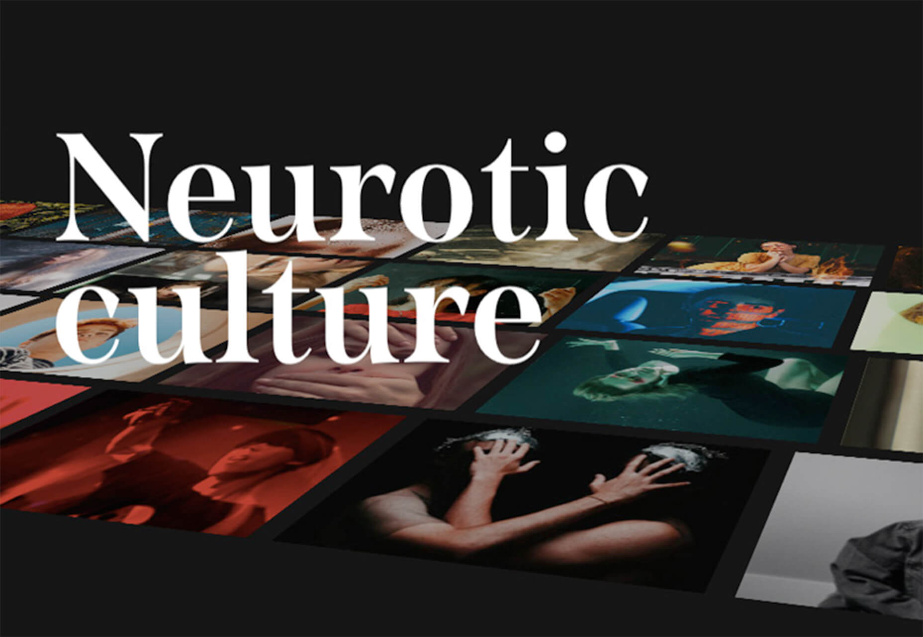
Artificial intelligence. Just hearing the phrase has been a trigger for many in the technology world since that creepy Haley Joel Osment film circa 2001. But more recently, artificial intelligence and machine learning strike fear into the hearts of skilled workers for an entirely different reason: job security, or lack thereof.
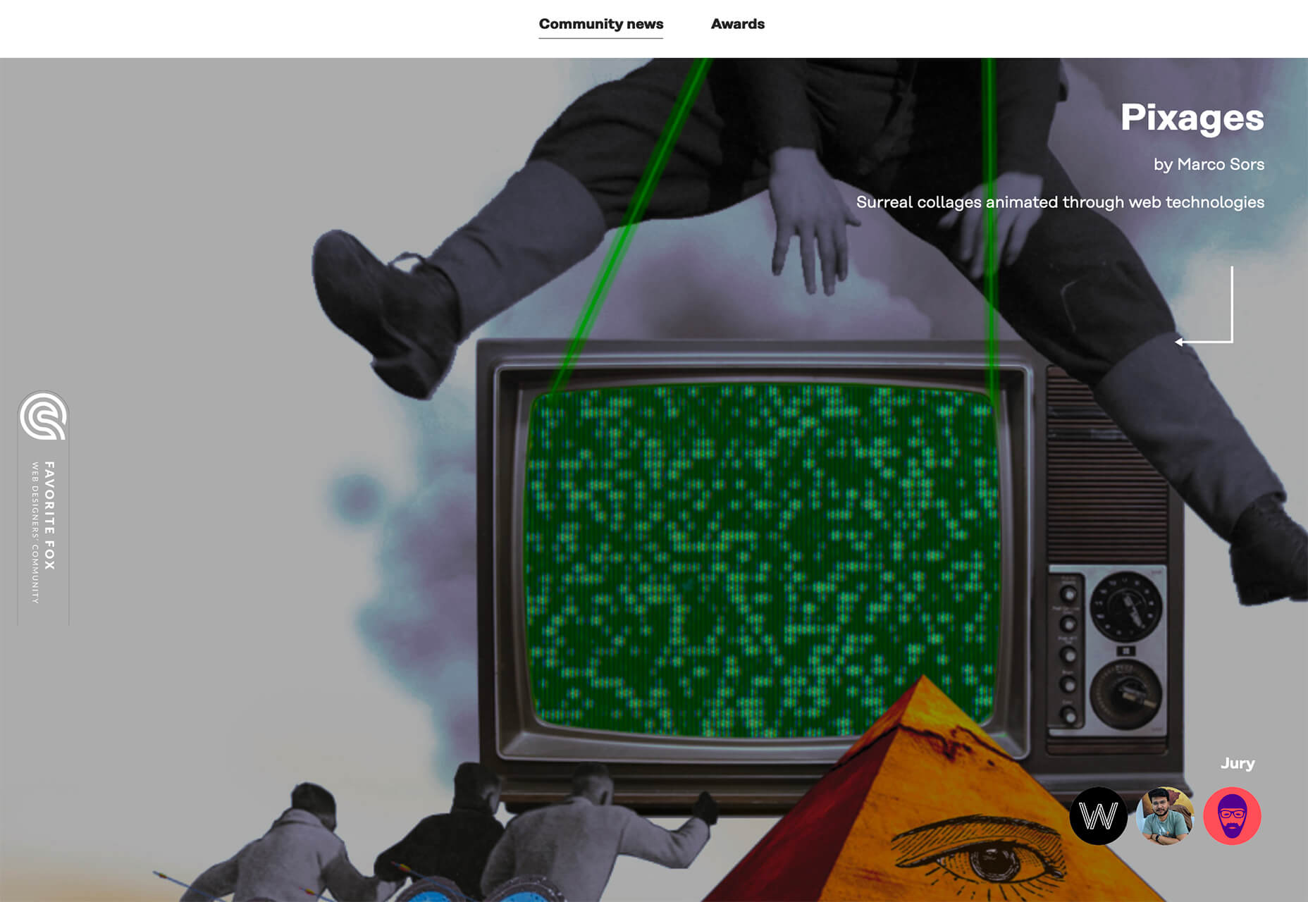
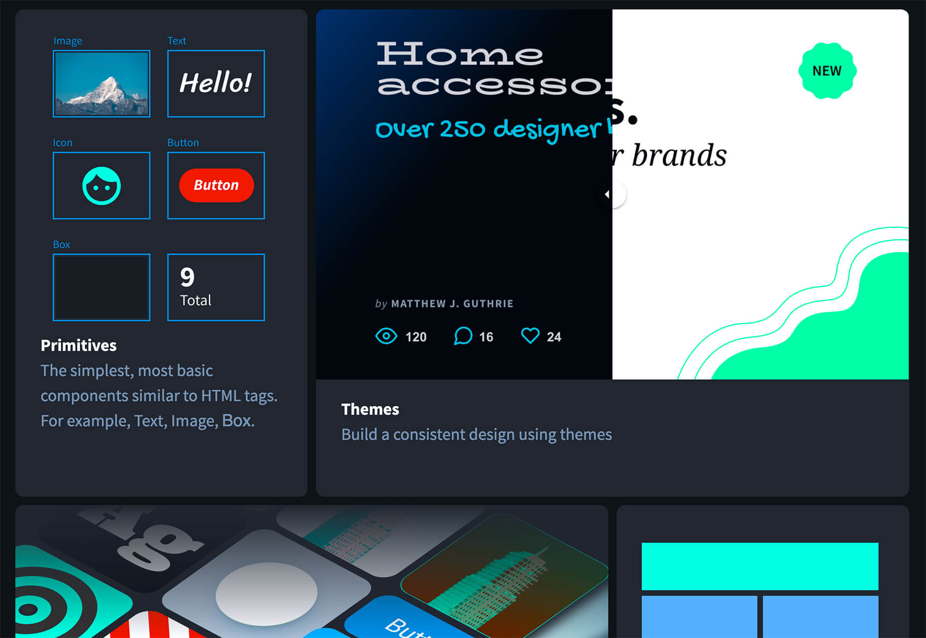
Smart-home devices, streaming services, self-checkouts, even Google searches are ways that artificial intelligence has seeped into everyday life, exemplifying the abilities of computers and machines to master both simple and complex tasks. In some instances, these technological advancements make our lives easier, but for some people, their proliferation has meant job loss and skill replacement. There’s no wonder that when artificial intelligence starts being mentioned along with web design and site creation, the spidey senses of designers all over the world start tingling.

designers think outside the box, something that AI just can’t do

But let’s get real about what AI and automation really mean for designers for a second. Talented designers with busy schedules should view these advancements as virtual assistants. For some small businesses on a limited budget, the websites that artificial intelligence can pump out might be fine…for a while. However, as businesses grow, change, require updating and customization to adapt to their customer base, the expertise of creative and talented designers will always be needed. Even the best AI that we see today is limited by evaluating, replicating, and revising what already exists. It may be able to mix 1,000 different color schemes into 10 million potential combinations, but great designers think outside the box, something that AI just can’t do.

In fact, rather than being scared of automation, designers ought to embrace automation and artificial intelligence as a way to unleash their creative thinking. Delegate repetitive, straightforward tasks to the right software, and suddenly you have time to bring your best ideas to the table and push the boundaries of your own innovation. 

Where AI has Failed in Design

The ultimate goal of artificial intelligence and automation in design work is a grand vision that has yet to be realised.

Consider the case of The Grid, which began as a crowdfunding campaign in 2014. The “revolutionary” product posed itself as an artificial intelligence solution for building thoughtfully, yet automatically, designed websites in five minutes. Research “Reviews of the Grid” in any search engine and you’ll be met with scathing criticism with only some small praise sprinkled in. Most of the initial users cite underwhelming results, the feeling of being duped by the Grid’s marketing tactics, nonsensical placement of text, and ultimately, the Grid being a complete waste of money for the resulting product. Even at the low cost of $100, compared to hiring a talented designer, most users felt their investment was wasted.

For the AI capabilities that exist now, most small business owners, or those looking to put together a simple website, are better off using drag and drop site builders (Wix, Squarespace, Weebly, etc) that have been around for ages. Even so, there are plenty of businesses still willing to hire designers to take this simple task off their plate due to a lack of technical expertise or lack of time. And let’s be honest, are there even enough talented (keyword here!) designers out there to keep up with the millions of websites created every year, without each one working themselves to death? 

Where Automation Shines for Designers

Fortunately for good designers, it appears for now that the days of artificial intelligence completely taking over their jobs is a fantasy. However, what AI and automation do offer designers is a solid starting point for success, eliminating much of the lower-level grunt work that most designers would rather skip anyway.

Even well-received AI website builders like Firedrop still require a basic eye for design and specialised knowledge to produce truly unique, high-converting, and user-friendly websites. Tools and practices that designers should adopt are the artificial intelligence and automation resources that will help them do their jobs better, faster, and leave them with more time to focus on project elements that AI cannot accomplish on its own.

Bridging the Gap Between Designers and Developers

Well-established brands are likely to already have design systems in place that guide the creation of new elements across their digital profiles whether on social media, various mobile apps, or different sections of a website. But even in large corporations — excepting those who have perfected the process — there’s often a breakdown between a designer’s vision and resulting product from the developers. It stems from the basic difference in how they each approach their work and the limitations of the systems they use.

While component libraries — or even full design systems for that matter — won’t reconcile every question, they provide both developers and designers a source of truth to work from that both parties can understand. Design collaboration tools like Invision and Visme, specifically, keep designers and developers on the same page with automated version saving and code-friendly workflows.  

Understanding the Consumer

I don’t suggest using artificial intelligence to produce content for your site

Digging into and understanding the behaviours and habits of site users is a relatively new component of site design, but offers invaluable insights. Tools like HotJar, Mouseflow, or Smartlook make it simple to see holes or leaks in your conversion funnels, detect which page elements users are interacting with, and which they’re not interested in to refine the look and feel of a page for maximum conversions. Even though these tools provide the data, it still takes a keen eye and understanding of design to implement the right changes to improve site performance.

Site content is another way that artificial intelligence has the potential to improve our understanding of customer behaviour and improve site performance for individual users. I don’t suggest using artificial intelligence to produce content for your site, no matter how much the results have improved. However, static landing pages or a single set of further reading recommendations are unlikely to appeal to the majority of site visitors. Artificial intelligence tools like CliClap and Personyze instantly collect and analyse consumer data to provide dynamic, personalised experiences that drive more leads and encourage conversions. Creative designers will also learn from this data to improve customer experience with other pages or elements throughout the site.

Removing Distracting, Time-Sucking Administrative Tasks

Because “artificial intelligence” has become a term with such negative connotations, we often overlook the simple way that AI actually makes our work lives better and easier. Machine learning in email filtering is a great example of this. Consider a simple interface like a Gmail inbox. We have the option to mark certain senders as spam or as important, and our inbox learns that type of communication is and isn’t useful to the user. Pandora, Spotify, Apple Music, and more all take cues from the user behaviour of liking a certain song, artists, or genre of music to build customised playlists. There are a myriad of ways that artificial intelligence and its branches of disciplines merge with our everyday lives. 

Some of the most useful automations for business, and especially for designers, are related to the administrative tasks that frequently take time away or distract from more pressing projects. A perfect example of automation that can relieve stress and cut down on mindless work is an email autoresponder. I’ve always found that having time blocked off in my calendar to tackle complex or important projects helps me to focus on the task at hand and be more efficient. In order to more effectively block out my time, closing my email and setting an autoresponder to reply to all incoming emails serves two purposes: 

  1. Lets those trying to get in touch with me know that I only check my email at certain times of the day and that my response may not be immediate — tempering their expectations of when they might hear from me.
  2. Relieves my personal stress of being tethered to my inbox, splitting my focus, and also saves the time of having to initially respond to each email individually. 

This is just one simple way to use automation in your email, although there are many others to explore.

While Zapier isn’t the only workflow automation service on the market, it’s probably the most well known. Workflow automation reduces time spent on mind-numbing, repetitive tasks and helps designers connect apps that might not natively work together. Do you keep a task list in Todoist? Set up a Zap, then create a task in Todoist anytime someone mentions you on Asana or assigns you a task in Trello.

This is especially helpful for freelance designers who work with multiple clients across various project management platforms. The potential for automation to relieve unnecessary mental overhead for designers is nearly limitless.

Don’t be Afraid of AI, Embrace It

The bottom line of this brief overview of artificial intelligence and automation in design is that this emerging technology isn’t something designers should be scared of. In fact, it’s something to welcome with open arms because ultimately it can make our jobs, and our lives, better. Leave the monotonous tasks of collecting and analysing huge amounts of data or administrative minutiae to the machines; they can handle it.

Save the interesting, creative, abstract work for the talented designers who can turn AI recommendations into unique and intuitive digital experiences. Making the relationship between artificial intelligence and design symbiotic will yield the best results for every entity involved: the business, the AI, and yes, even the designer.


Featured image via Unsplash.

Source


Source de l’article sur Webdesignerdepot


Agile 

AI

Big Data

Cloud

Database

DevOps

Integration

  • Mulesoft 4: Continuous Delivery/Deployment With Maven by Ashok S — This article is a great example of what we want every tutorial to look like on DZone. The main aim of this article is to provide a standard mechanism to release project artifacts and deploy to Anypoint Platform, from the local machine or configure in continuous delivery pipelines.
  • Integration With Social Media Platforms Series (Part 1) by Sravan Lingam — This article helps you to build a RESTful API through MuleSoft that integrates with LinkedIn and shares a post on behalf of one’s personal account. I like this article because, in the age of social media, it’s so important for businesses to be connected and integrated!

IoT

Java

Microservices

Open Source

Performance

  • What Is Big O Notation? by Huyen Pham — Aside from a silly name, this article is an example of an in-depth analysis on a little-spoken-about concept. In this article, take a look at a short guide to get to know Big O Notation and its usages.
  • Is Python the Future of Programming? by Shormisthsa Chatterjee — Where is programming going? This article attempts to answer this question in a well-rounded way. The author writes, "Python will be the language of the future. Testers will have to upgrade their skills and learn these languages to tame the AI and ML tools".

Security

Web Dev

  • A Better Way to Learn Python by Manas Dash: There’s so many resources available for learning Python — so many that it’s difficult to find a good and flexible place to start. Check out Manas’ curated list of courses, articles, projects, etc. to get your Python journey started today. 
  • Discovering Rust by Joaquin Caro: I’m a sucker for good Rust content, as there’s still so many gaps in what’s available. Joaquin does a great job of giving readers his perspective of the language’s features in a way that traditional docs just 

Source de l’article sur DZONE

There are an increasing number of organizations developing and/or using music composed in part or in full by AI technologies. In the beginning, many of those efforts were academic in nature, but a growing number of groups are attempting to make a business model of composing music. And while there are more people doing it now than there were a couple decades ago, the idea of computer-composed music is reasonably old. One of the first computer compositions I’m aware of was in 1957.

The majority of these systems are structured just as you would expect: a large collection of compositions representing a genre or an artist are used as training data, which create some sort of generative/predictive model. In the very earliest approaches, simple Markov chains were derived from the compositions.


Source de l’article sur DZONE (AI)