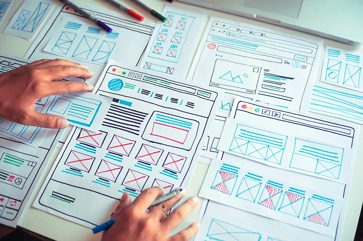
 Is sketching essential to UX and UI designers? Well, if you think of sketching as a way to explore problems and record potential solutions, then yes, it absolutely is.
One of the most challenging tasks of any design process is capturing the initial idea. We’ve all spent countless hours thinking through an innovative solution to a project, only to lose the idea again. It turns out that sketching is a brilliant solution to this problem.
In this guide, you’ll learn how to improve your UX designs using sketching as a tool. First, we’ll answer the question of how sketching benefits design, then we’ll look at the tools you need, and finally what an efficient sketching process looks like. By the end of this 3-minute read, you’ll have valuable new knowledge that will help you as a designer.
Why Sketching Is Important For Designers
When you start working on a project, it’s tempting to jump straight into high-resolution wireframes. But in doing so, you run the risk of spending hours on each little detail, only to discover that the overall concept doesn’t work.
Sketching — unlike drawing, which is about communicating an idea — is a free-flowing, process that allows you to get your ideas down on paper (yes, paper!) fast.
If there’s one thing you take away from this guide, let it be this: sketches aren’t for clients, or colleagues, or Dribbble, sketches are just for you. They’re a non-written way of rapidly making notes. Sketches will help you recall all the possible routes to consider.
Sketching is all about visualizing your ideas quickly and efficiently. When you’re sketching, you don’t have to worry about details, and you don’t have to worry about communicating with anyone else.
By sketching ideas without detail, you can quickly explore numerous solutions for a project. It’s fascinating how sketching can help you visualize an idea and revise it again and again along the way with minimal effort.
So, what revolutionary new tools do you need?
What Tools Do You Need For Sketching?
Designers love new tools, but when it comes to sketching there are relatively few, and you probably already have them to hand.
First, you’re going to need paper. A notebook is fine, it doesn’t have to be high-quality paper; in fact, you will probably feel freer and less restrained if you make sure that it is cheap.
You’ll need something to make a mark on the paper. A pencil is fine, as is a pen, a biro, and just about anything else. Don’t worry about an eraser, sketching isn’t about correcting mistakes, but you will need a sharpener if you’re using a pencil — never draw with a blunt pencil!
Whatever implement you choose, it’s a good idea to have a heavy marker, like a Sharpie, to pick out an important detail, and perhaps a fine pen to add small detail (if required).
Finally, make sure you have a timer to hand. A chess clock is perfect for an old-school aesthetic, but a timer on your phone is perfectly fine. The timer is to make sure you don’t spend too long on one sketch, so you don’t have time to get wrapped up in perfecting the details.
Sketching 101: A Step-by-Step Process
When you’ve been sketching for a while, you’ll discover your own process, and preferred methods. But for anyone new, here’s how to get started.
1. The Initial Idea
As with designing a wireframe, the most challenging step is getting started. Usually, at the beginning of a project, we are overwhelmed. This is because there are so many ideas, and we do not know where to start. For this reason, a detailed analysis of the project is essential.
You can start by thinking about the most important interactions you need to create. This way, you will find out the most important and exciting aspects of the project.
Since most of us get caught up in the fine details, it is beneficial to think of sketching as a brainstorming session. This session is simply about coming up with an innovative solution for a project and visualizing it.
It’s fine to have an idea that you’ll ultimately disregard. This is not the time to edit yourself.
2. Start Sketching
Take a piece of paper and use your sketching tool to divide it into six sections. Set your timer for 5 minutes and start drafting mockups for the first interaction.
Often, designers struggle with this step, and fall back on what they’re used to, i.e. wireframing and high-res mockups. If you find that you’re struggling to start sketching, start by making a mark on the paper; any mark at all. Then, make a second mark. With the third mark, try to position it in a way that says something to you about the project, by its size, weight, position — anything at all. Keep going, and before you know it you’ll have a complete sketch.
It’s vital that you do not exceed the time you give to yourself because sketching is not about fine details. The time is better spent exploring multiple ideas, even if those ideas only serve to confirm that the first idea was the most promising.
Repeating this step can be very valuable. Once you are happy with the results, you can move on to the next and final step.
3. Self-Editing
Unfortunately, you can not take away every concept you have outlined. This step is about choosing your most effective ideas and expanding on them.
Most designers want to create top-notch, detailed designs, and that’s fine. However, sketches are only really helpful for the early stages of a project, and creating perfect sketches in the first stages of a project may not be productive — in fact, it can be restrictive.
It’s often a good idea to combine some of your designs. Redraw them together, and once you’ve done that expand and refine them.
Improve Your Design With Sketching
It doesn’t matter if you think you’re bad at sketching — no one is going to see your sketches except you. Many of us would struggle to sing in public, but are absolutely fine singing in the shower.
Remember that sketching is not about your artistic skills; it’s about capturing an idea and expanding on it. After all, once you have your final design, you will recreate it digitally.
You don’t have to be an artist to be a designer. And since sketching can improve your UX designs, there are many reasons you should give it a try.
Once you’re comfortable with sketching, you’ll find it an invaluable tool for identifying sticking points in a project, and solving them before you reach the wireframe stage.
Featured image via Pexels.
The post How To Improve UX With Sketching first appeared on Webdesigner Depot.

 Every day design fans submit incredible industry stories to our sister-site,
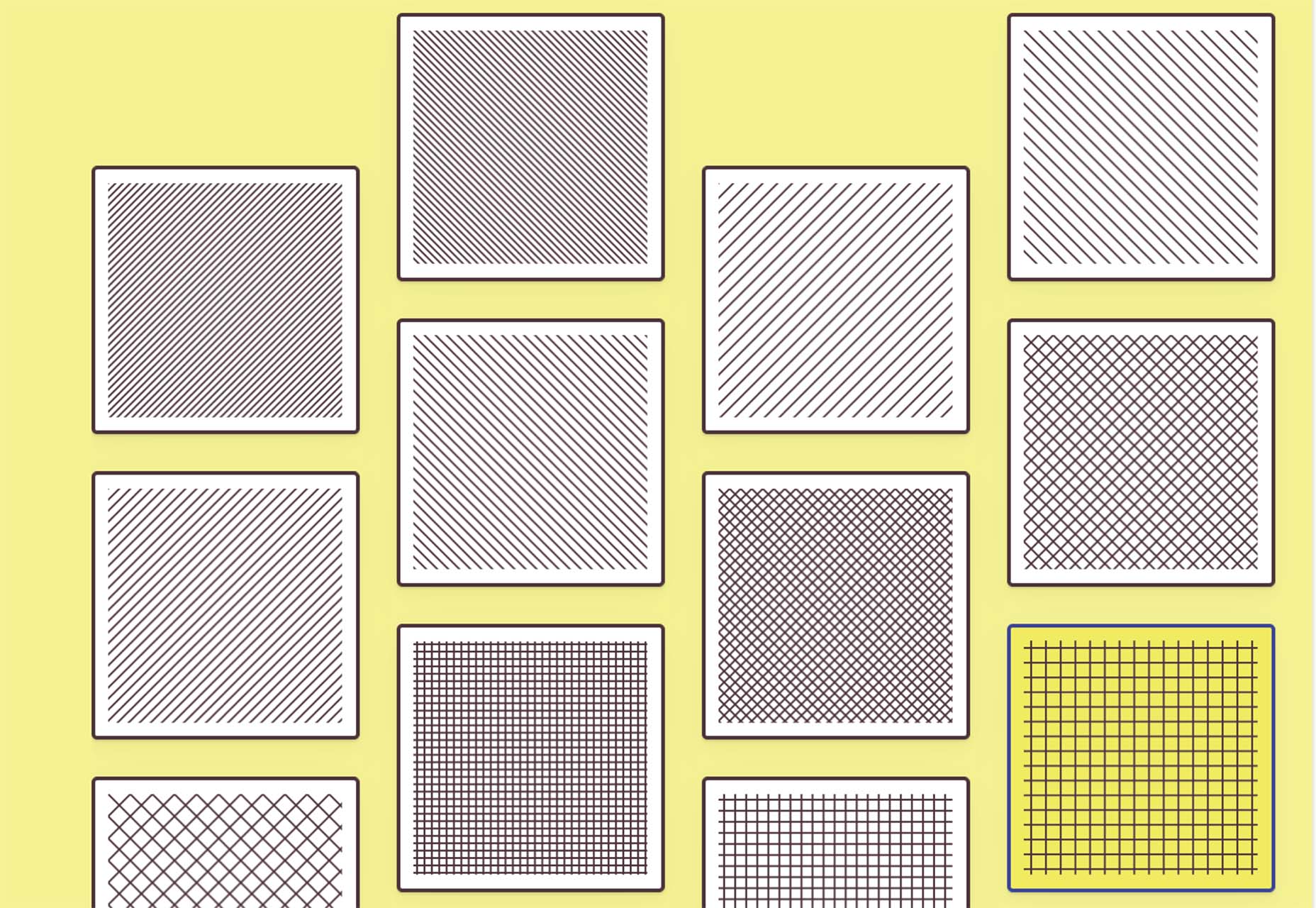


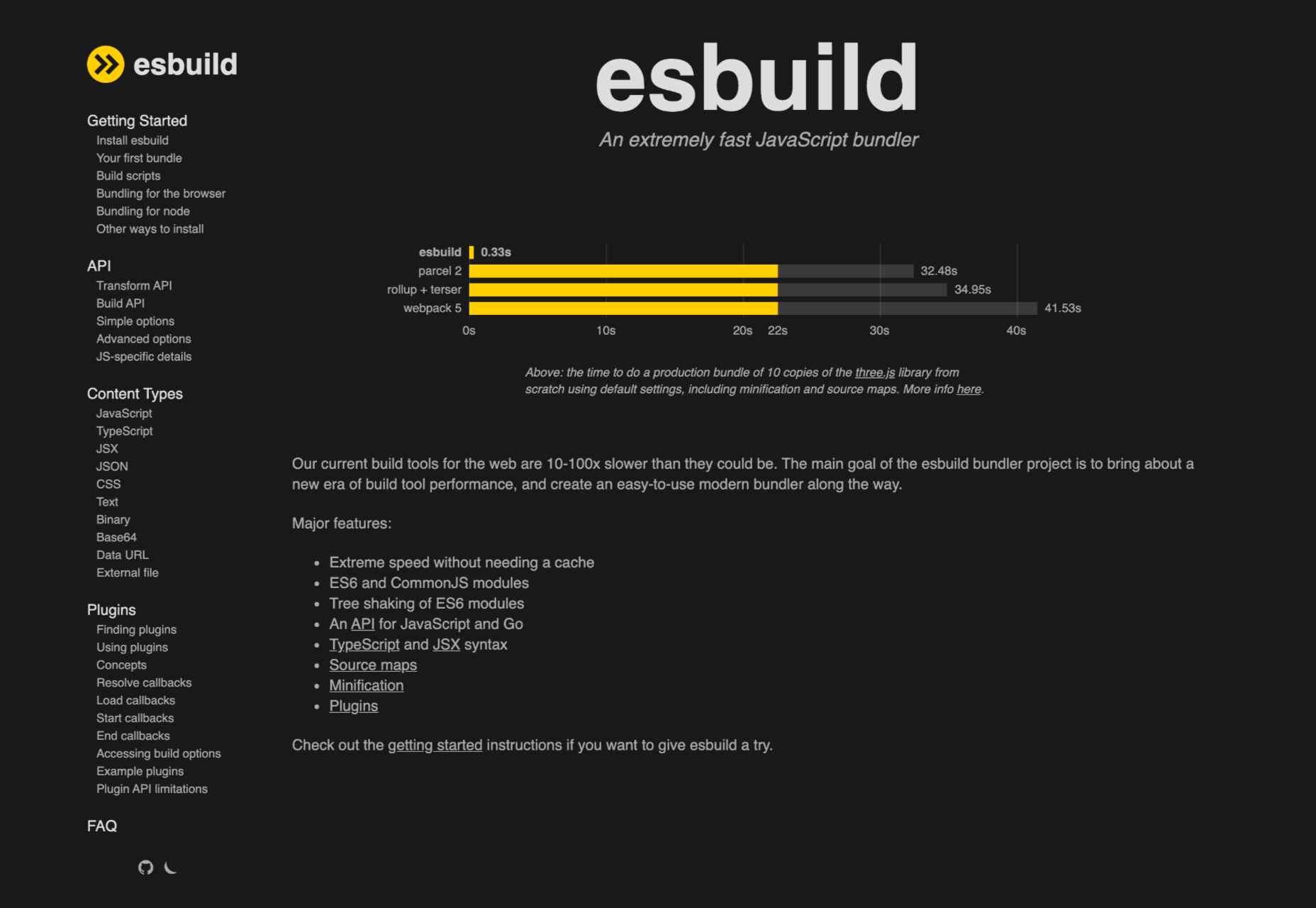

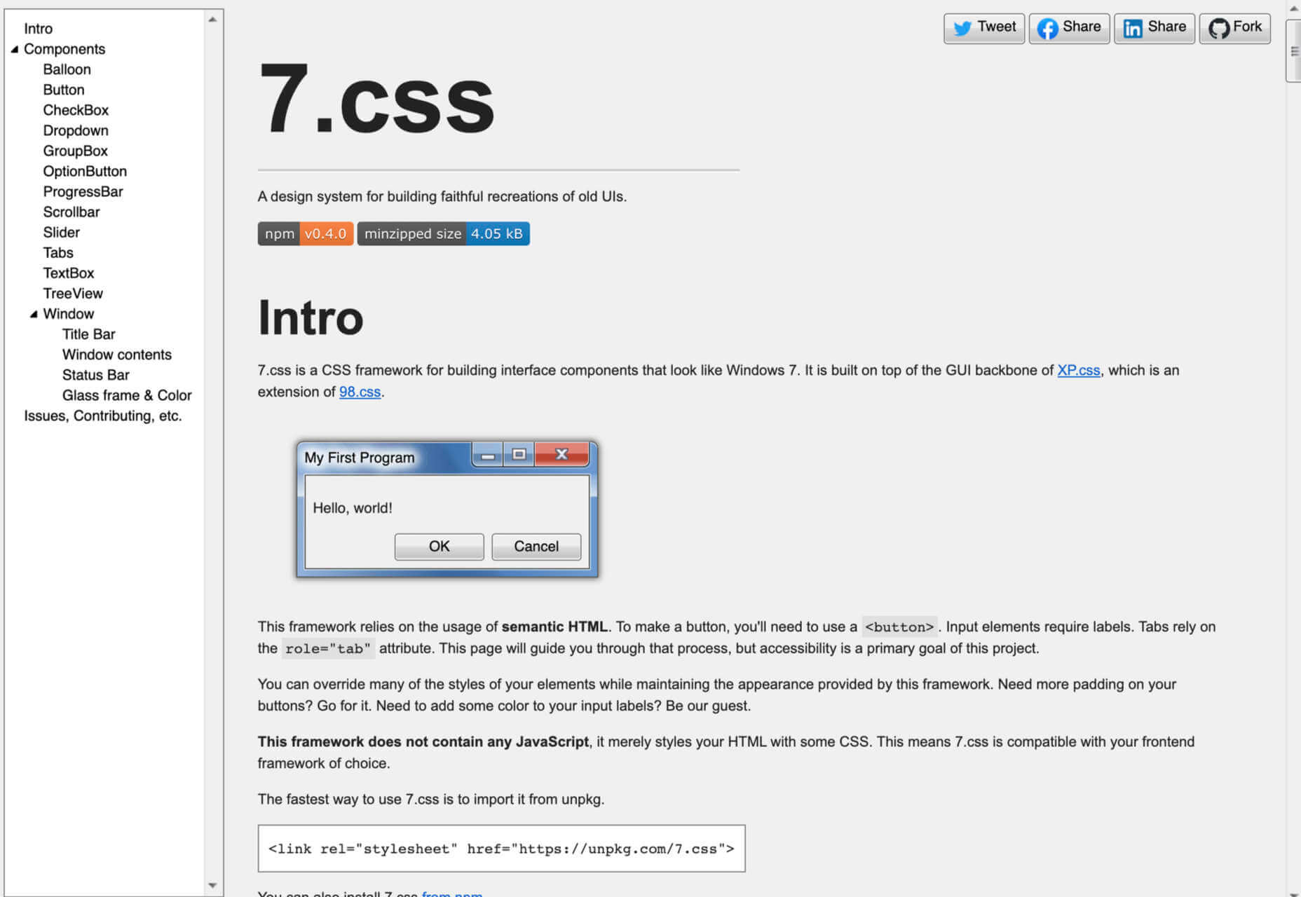
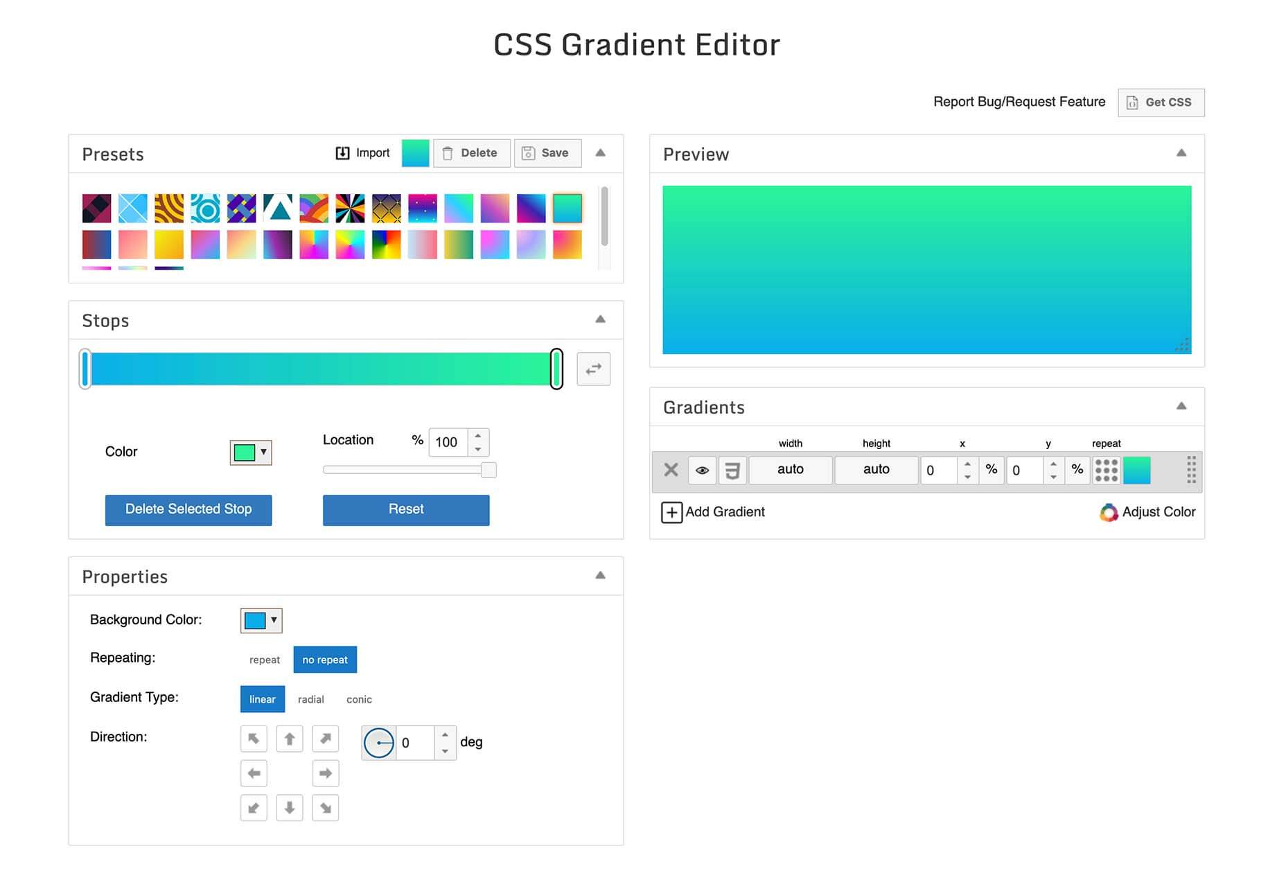
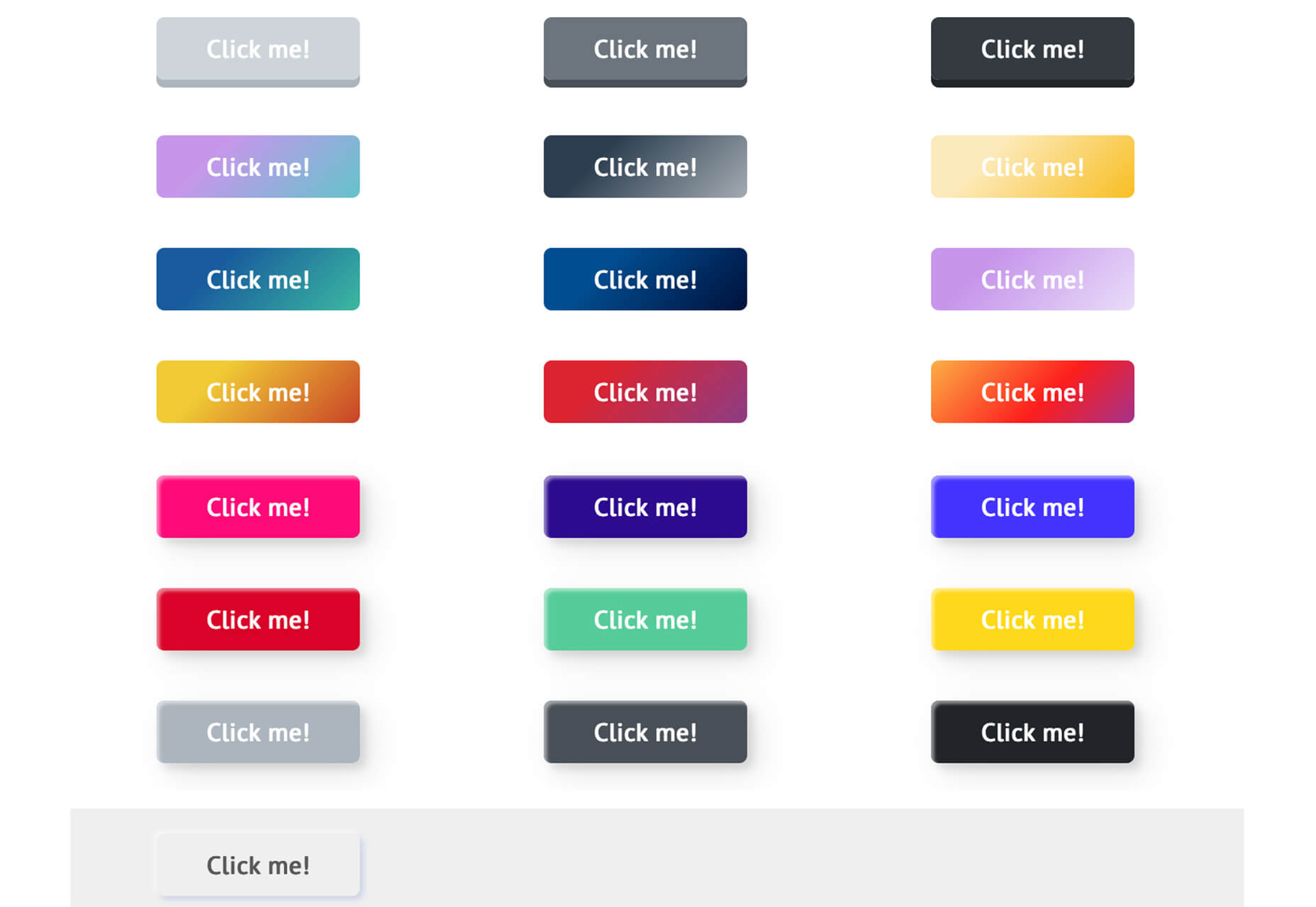
 There are some spook-tacular finds in this month’s October collection of resources and tools for designers and developers. From interesting tools that can help in the design process to boo-tiful typefaces, there’s something for everyone here.


 Every day design fans submit incredible industry stories to our sister-site,


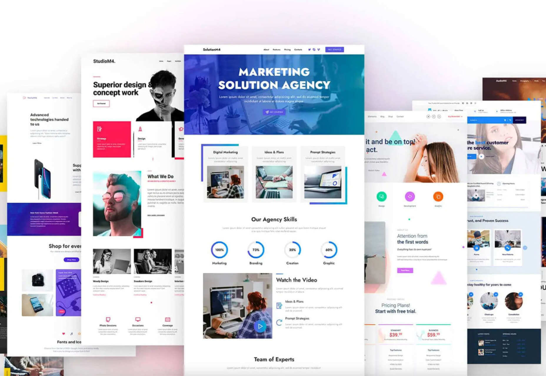
 Since school is back in session, this month’s roundup has a learning focus. In addition to tools, many of the resources include guides, tutorials, and cheat sheets to help make design work easier.
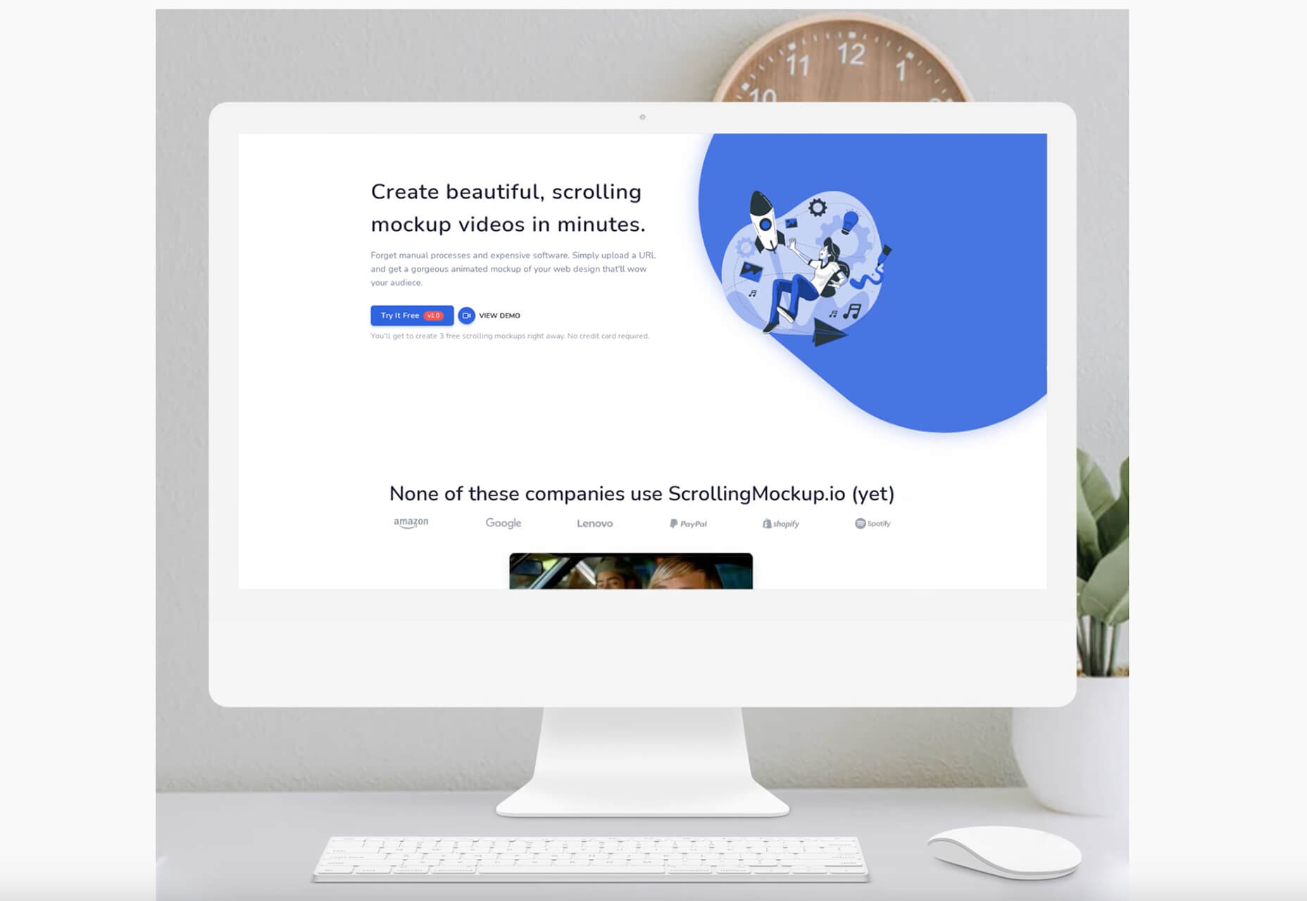


 Every day design fans submit incredible industry stories to our sister-site,


 Every day design fans submit incredible industry stories to our sister-site,


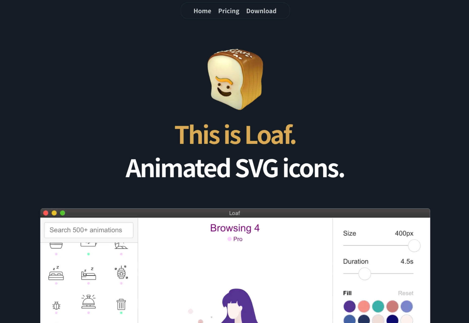
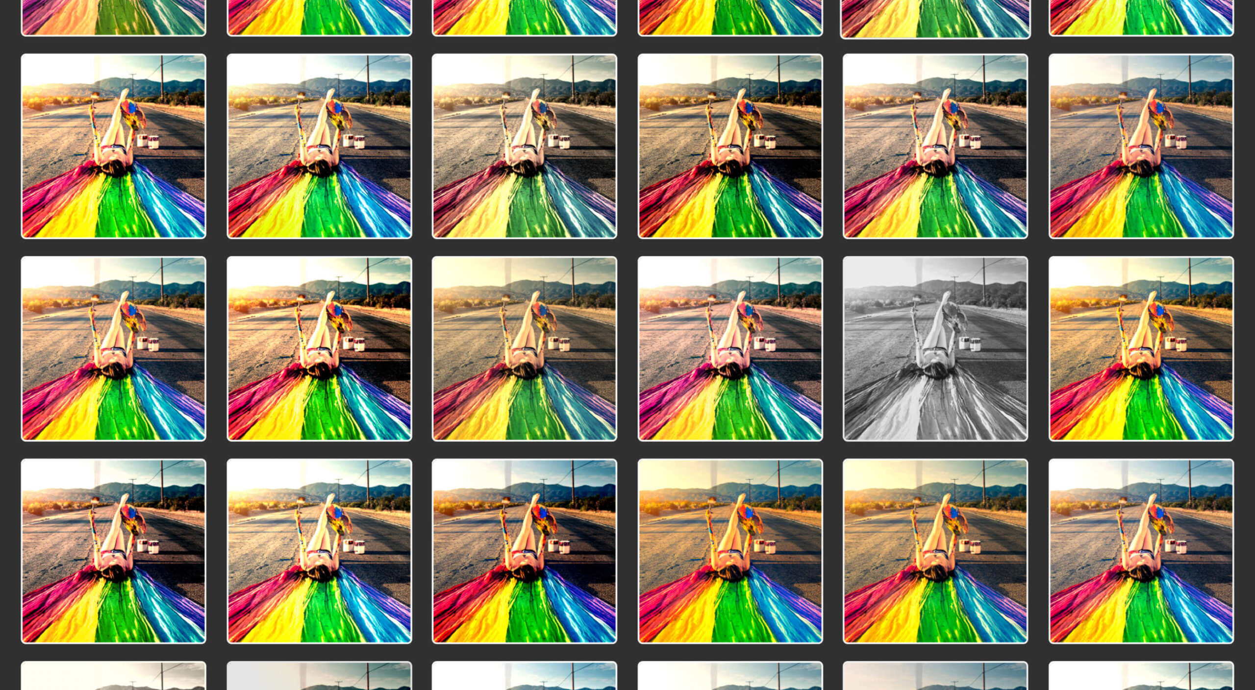
 The dog days of summer are here. From vacations to pool time, you might not be thinking about work that much. But there are still plenty of new tools and resources popping up to help you become a better or more efficient designer.


 Every day design fans submit incredible industry stories to our sister-site,