Articles

Personalization; it’s probably one of the most important design trends to emerge in recent years.

As consumers in all industries become more demanding, they’re increasingly searching for online experiences that are customized to suit their individual needs and expectations.

Today, personalization exists in virtually every digital interaction, from adverts on social media to PPC campaigns and email marketing efforts.

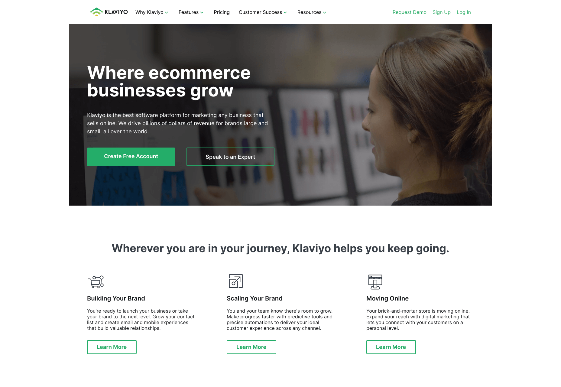
Used correctly, the manipulation of demographic, behavioral, and other in-depth user-data can help designers to create dynamic, highly customized content for each website user. At the same time, these unique websites ensure that designers really make an impact on behalf of their clients, outshining the competition and driving amazing results.

What is Hyper-Personalization?

Basic personalization in web design involves making changes to a design based on what you know about your client’s target audience.

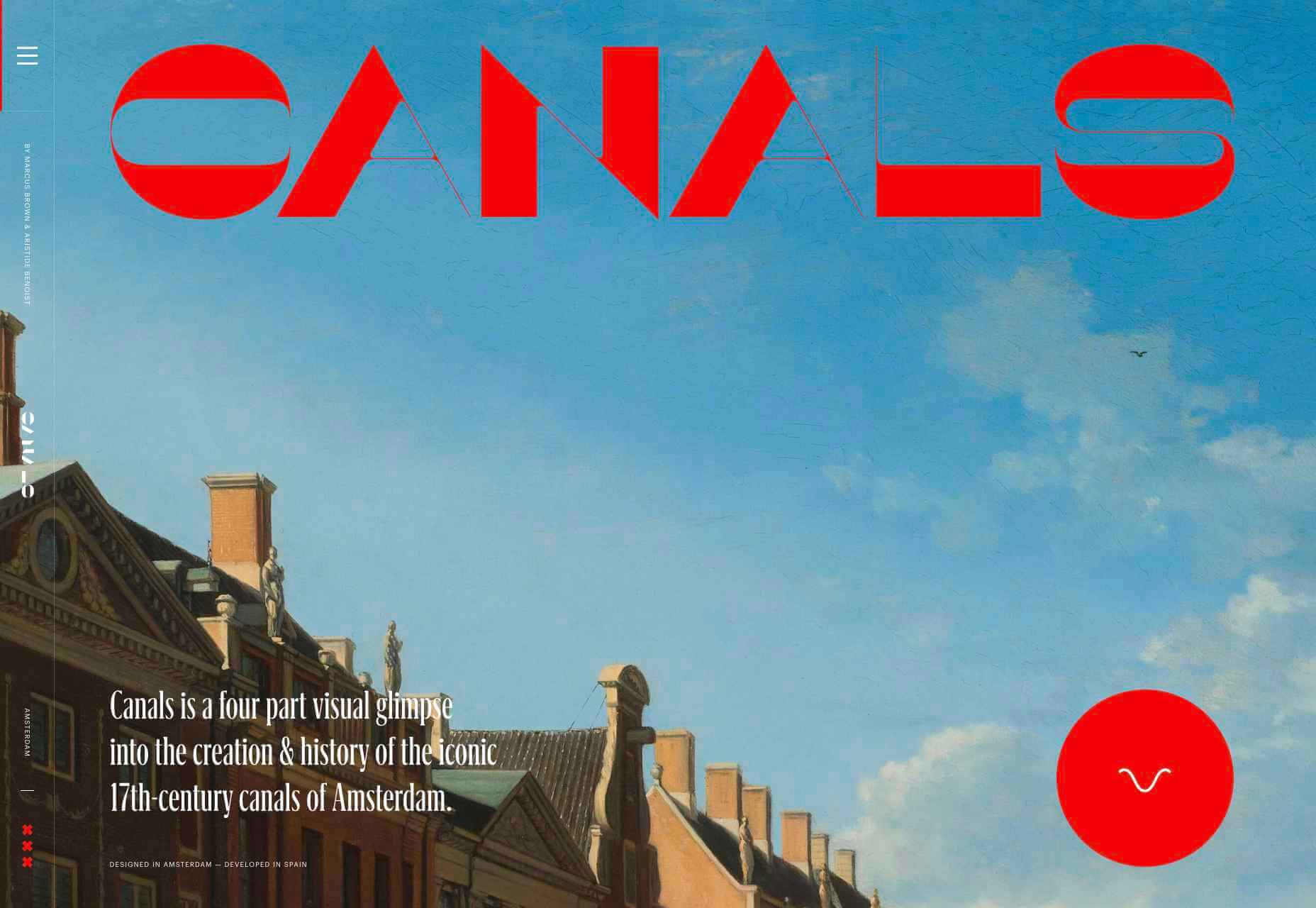
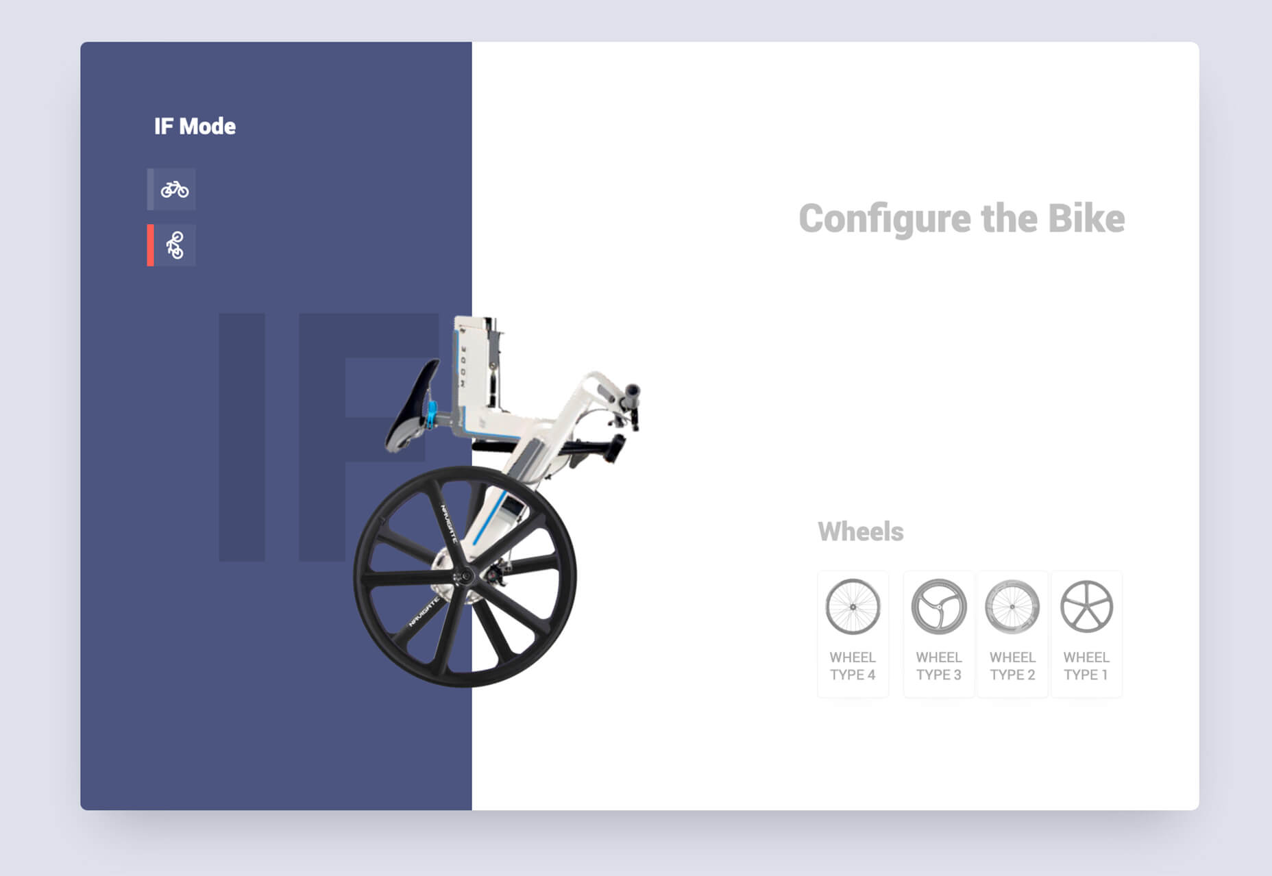
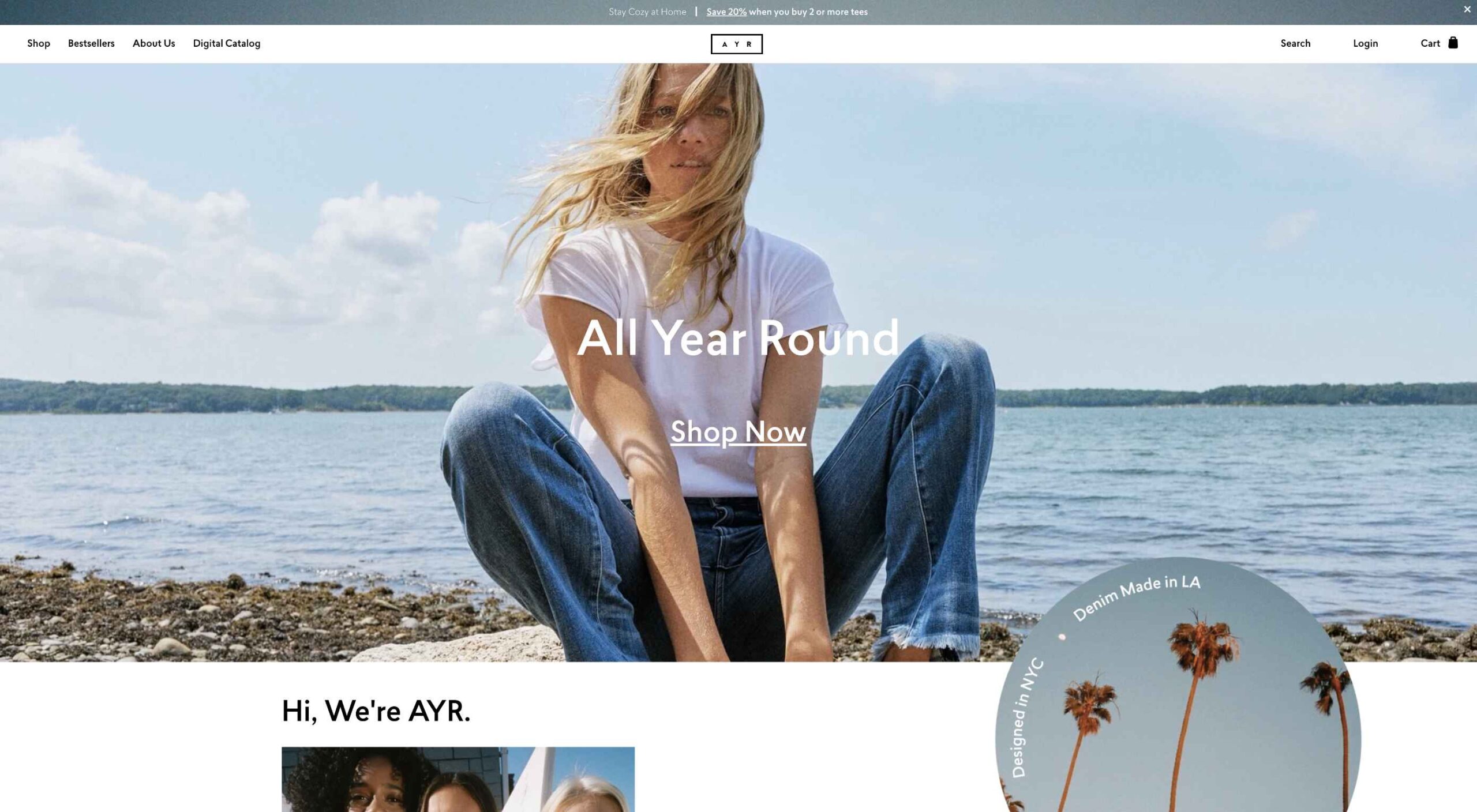
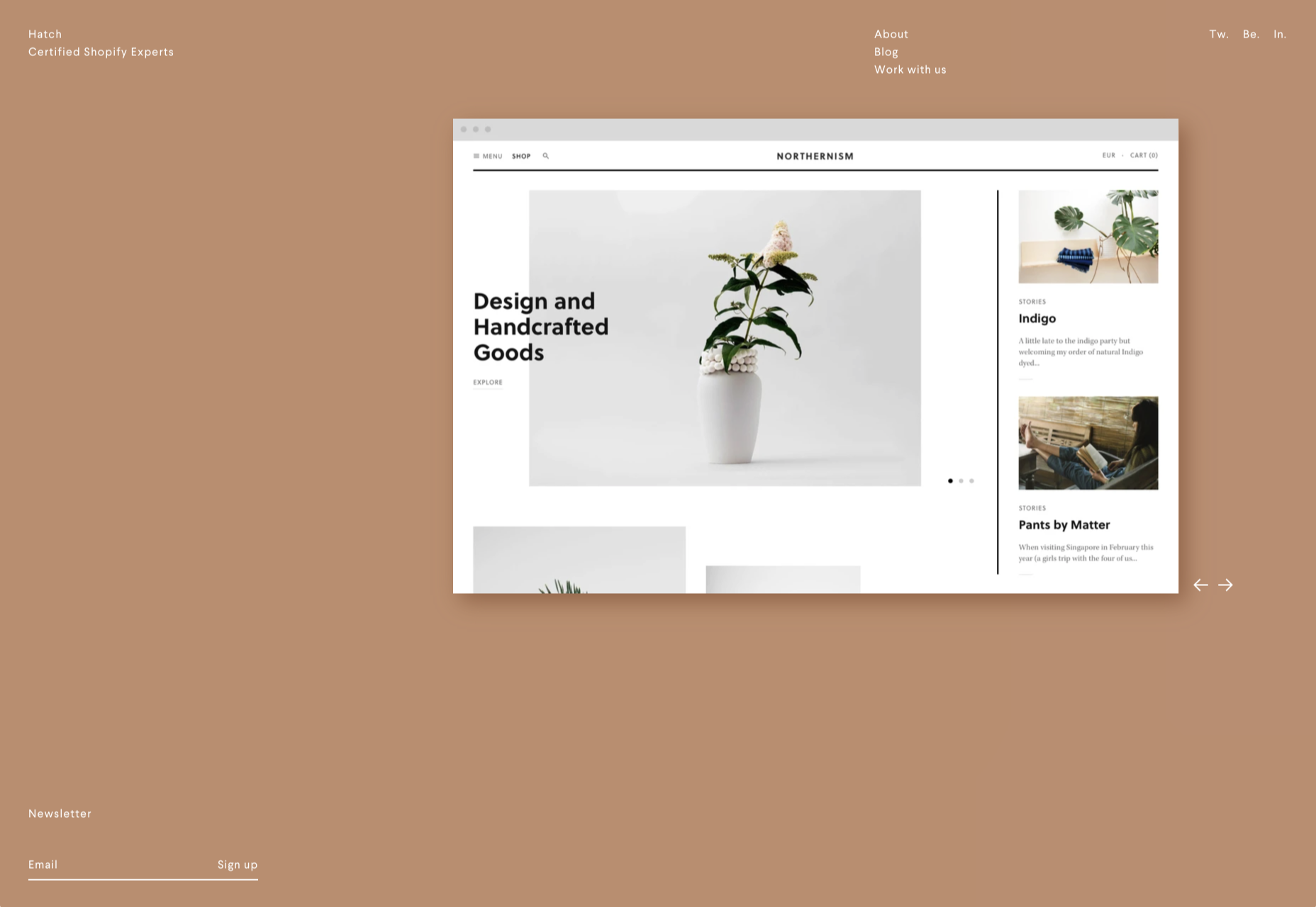
For instance, if you knew that you were designing for an audience that spends more time on their smartphone than their computer, you’d concentrate on building hyper-responsive experiences for small screens. For instance, the Canals-Amsterdam.nl website is specifically designed to support people using smartphones to swipe, tap, and scroll.

If you’re aware that your customer’s target market is other businesses, you might put more testimonials, free demo CTAs and other enticing components on the website to encourage investment.

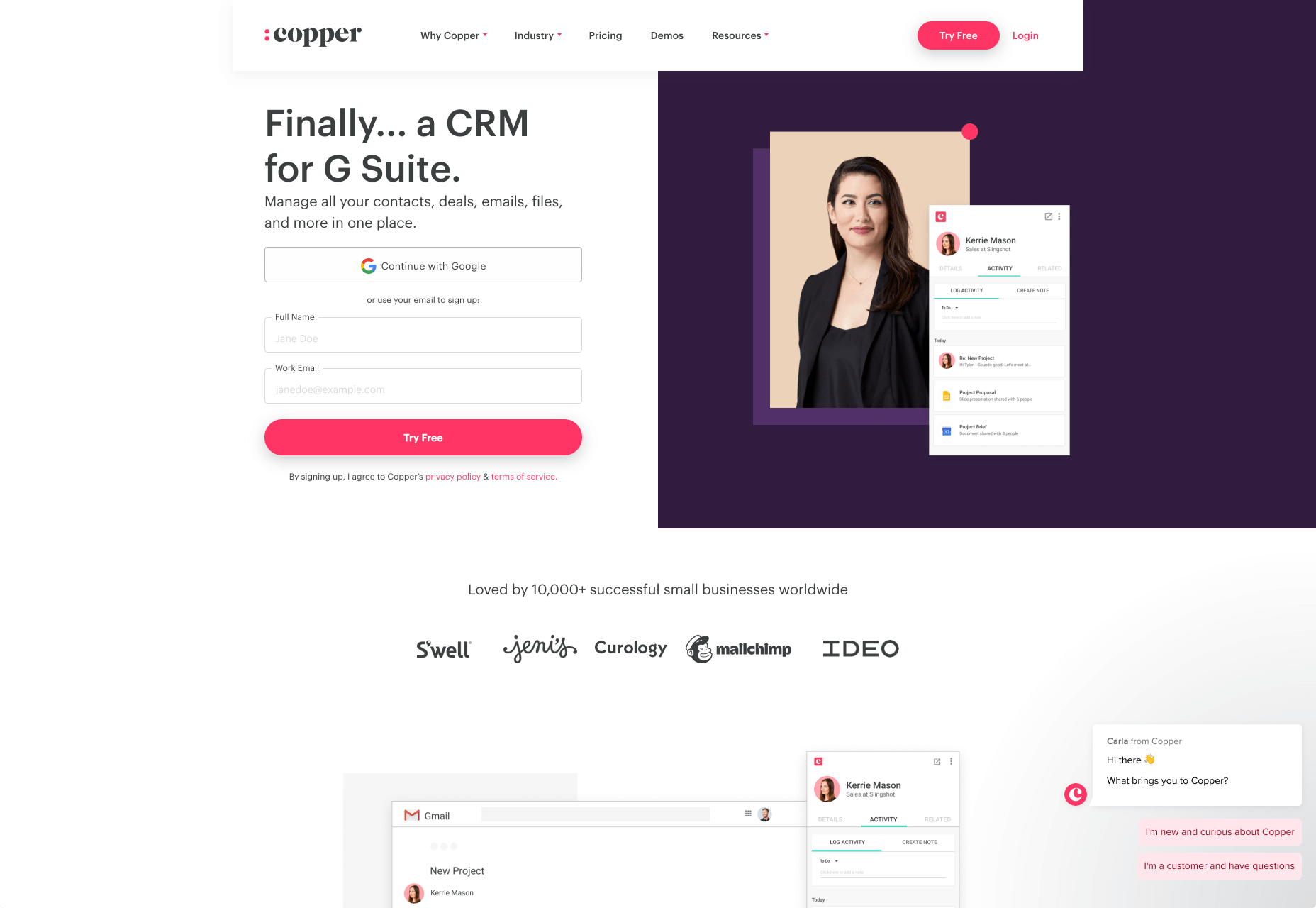
Hyper-Personalization is an emerging trend for 2020 that focuses on going beyond the basic understanding of a target audience, to look at genuine customer data. Hyper-personalization is all about leveraging in-depth omnichannel data to drive more advanced customer experiences on every page of a website.

For hyper-personalization to be genuinely effective, designers need access to virtually unlimited data, from CMS systems, sales teams, marketing experts, and more. When you have that data handy, you can use it to:

  • Design websites that showcase dynamic CTAs, featuring content relevant to each user;
  • Implement sign-in screens for customers vs. demo requests for new leads on home pages;
  • Showcase products similar to past pages when repeat customers return to a site.

Why is Hyper-Personalization Important?

Personalized experiences have always been important to the sales journey.

However, in an era where companies are constantly competing to grab user attention, you can’t just cater to your site designs to a group of people anymore. Increasingly, users are expecting specific interactive moments on websites, made just for them.

Amazon is an obvious example to consider here. As one of the world’s leading online shopping sites, Amazon’s efforts with website personalization are incredible. The Amazon website uses tools integrated into the back-end of the marketplace to watch everything a customer does on its platform.

As users browse through the website, the site jots down each category that you look at, and which items interest you. Thanks to this, Amazon can suggest which products you may be most interested in.

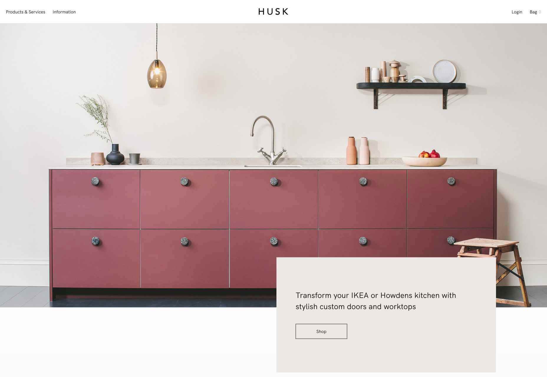
Websites like Madebyhusk also offer an incredible insight into hyper-personalization, allowing users to browse for the products that appeal to them based on in-depth filters like edging and color.

The result is a higher chance of conversion.

When customers feel as though they have complete control over their buyer journey, and that each step on that journey is tailored to them, they’re more likely to buy.

Better Converting CTAs

A call to action is an excellent way to move things along when you’re encouraging the buying process with your target audience.

Used correctly, your CTAs can encourage more than just cart conversions. They can also convince people to sign up for your newsletter via a subscription form, take a survey, or begin a free demo.

Regardless of the CTAs that you choose to implement, personalization will quickly make your requests more effective. According to studies, CTAs that are personalized are 202% more effective than generic alternatives.

For instance, Byhumankind.com uses a crucial statement: “Great personal care products don’t have to come at earth’s expense.” Followed by an engaging CTA to drive positive action from their audience. The company knows that they’re appealing to a customer interested in saving the planet, so they make the benefits of “Getting Started” obvious immediately.

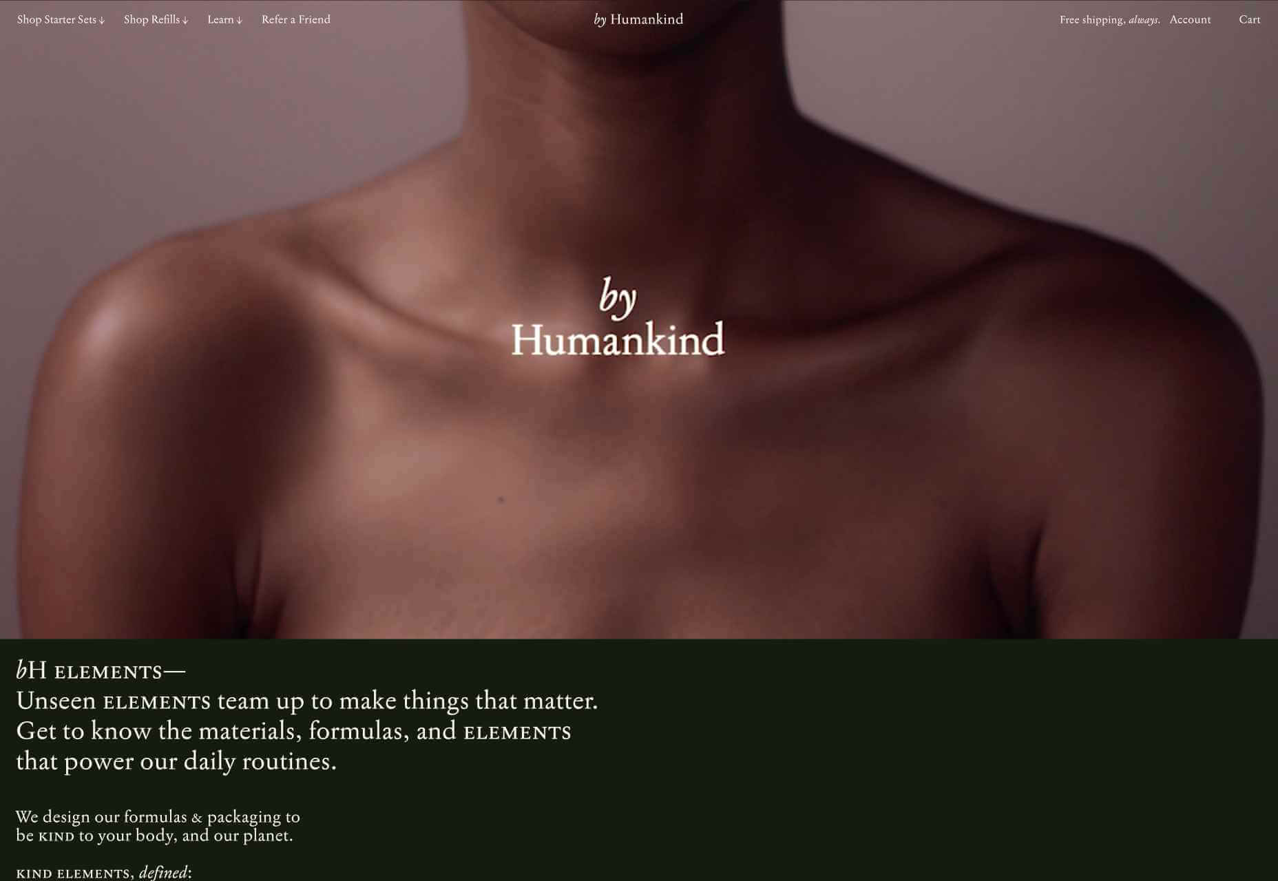
Using data provided by clients, designers can figure out exactly how to position CTAs and offers for customers. For instance, notice that Humankind has a green colored CTA button.

Most buttons take advantage of bold colors like red and orange, but the green shade for Humankind further highlights the nature-driven personality of the brand.

Relevant Product Recommendations

Repeat customers are infinitely more valuable than people who purchase just one item from your site.

However, convincing a standard customer to become a repeat client isn’t easy. Sometimes, clients need a push to determine what they want to buy next.

Fortunately, as a website designer, you can help with that. Using dynamic modules in the product pages of your customer’s website, you can show individual end-users what they might want to purchase next from a specific brand.

These dynamic modules can use information about what each customer has purchased in the past, to suggest a new product or service. Amazon do particularly well in this regard, leveraging a vast marketplace and treasure trove of information to make quality recommendations. But you don’t need to be designing a considerable website for a global business like Amazon to take advantage of dynamic suggestions. Any business with a focus on hyper-personalization can benefit from this strategy.

Increased Time on Site

Any form of personalization on a website can significantly improve the amount of time a customer spends in that digital environment.

Imagine walking into a restaurant that seems as though it was designed specifically for you. The décor, the seating arrangements, and even the menu are customized to your taste. You’re more likely to spend your time and money there than on any generic food place you find on the street.

The same rules apply to website design. The more hyper-personalized you can get with your client’s design, based on what you know about their customers, the easier it will be to keep customers engaged.

For instance, the WarnerMusic.no website entices visitors with various high-quality images of popular bands and artists, before providing them with endless information about the brand and what it does. The designer of this site knew that it needed to appeal to the visual demands of the audience first, before offering useful information like featured artist lists, News, and blog posts to keep the users on site.

Hyper personalization is all about figuring out what kind of end-user you’re designing for, so you can build the digital environment that’s more engaging and compelling to them. Some designers even create dynamic pages that change depending on whether a customer is a repeat client or a new visitor.

Improved Loyalty and Affinity

Finally, it’s human nature that we all want to spend time with the people that treat us best.

We all value excellent customer service, which is why customer experience is the most significant differentiating factor for any organization today.

Web-based personalization works in a similar way. When you use your design tools to make the site experience that you give to each visitor warm, individualized, and welcoming, then your clients are sure to see a boost in customer loyalty.

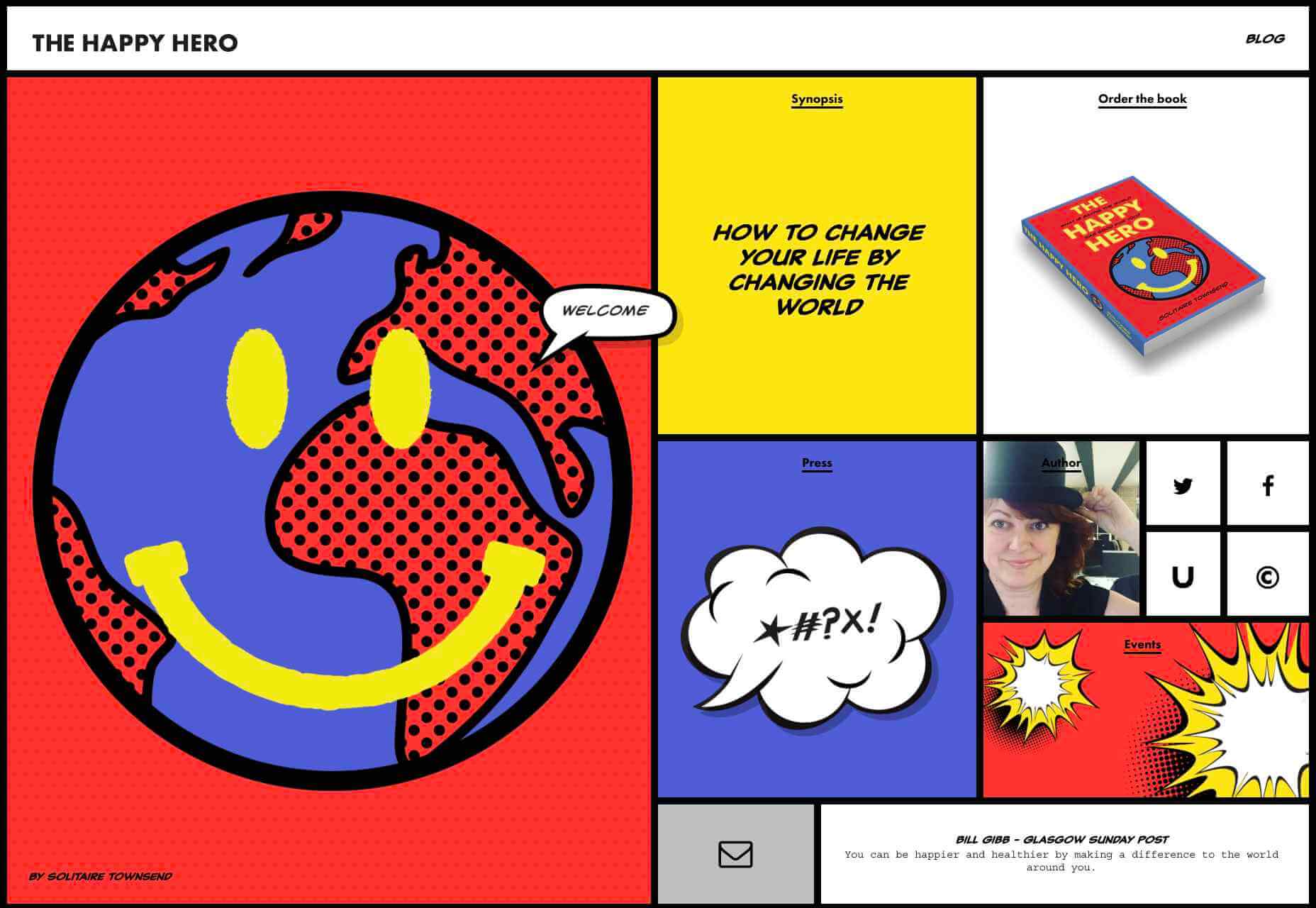
Around 89% of consumers say that they’ll only consider buying from brands that care about them. As a designer, you can convince every website visitor that they’re going to get the experience they deserve. Just look at how TheHappyHero.com instantly lets clients know that they can expect a fun and friendly interaction on every page.

Accessing useful data from the companies that you’re working with before you begin developing and designing a website could be the key to creating happier customers and higher conversions.

The more delighted end-users are with the experience that a website gives them, the happier that your client will be with you – increasing the impact of your design portfolio.

If you can create customer loyalty and affinity for your client, then you will be able to develop the same feelings between yourself and your client. This could mean that you earn more recommendations as a designer and build your position as a leader in the industry.

Hyper-Personalization is Crucial for 2021

As companies continue to worry about how they can safely use data without crossing the line when it comes to customer privacy, hyper-personalization has stayed just out of the mainstream. While it may be a while before we see every website designer starting their process with piles of in-depth data, it seems that we are heading in that direction.

Customers in 2021 and beyond will undoubtedly want a more advanced and customized experience from the brands that they interact with – particularly in an era where it’s becoming much easier to deliver meaningful moments online.

Source

Source de l’article sur Webdesignerdepot

Autre source / On the same theme

In the spirit of fall feasts, this month’s collection of tools and resources is a smorgasbord of sorts. You’ll find everything from web tools to icon libraries to animation tools to great free fonts. Let’s dig in.

Here’s what new for designers this month.

The Good Line-Height

The Good Line-Height is the tool you won’t be able to live without after using it a few times. The tool calculates the ideal line-height for every text size in a typographic scale so that everything always fits the baseline grid. Set the font size, multiplier, and grid row height to get started.

Link-to-QR

Link-to-QR makes creating quick codes a breeze. Paste in your link and the tool creates an immediate QR code that you can download or share. Pick a color and transparency, plus size, and you are done.

Quarkly

Quarkly allows you to create websites and web apps both using a mouse and typing code – you get all the pros of responsive editing, but can also open the code editor at any time and manually edit anything and it all synchronizes. The tool is built for design control and is in beta.

UnSpam.email

Unspam.email is an online spam tester tool for emails. Improve deliverability with the free email tester. The service analyzes the main aspects of an email and returns a spam score and predicts results with a heat map of your email newsletter.

Filmstrip

Filmstrip allows you to create or import keyframe animations, make adjustments, and export them for web playback. It’s a quick and easy tool for modern web animation.

CSS Background Patterns

CSS Background Patterns is packed with groovy designs that you can adjust and turn into just the right background for your web project. Set the colors, opacity, and spacing; then pick a pattern; preview it right on the screen; and then snag the CSS. You can also submit your own patterns.

Neonpad

Neonpad is a simple – but fun – plain text editor in neon colors. Switch hues for a different writing experience. Use it small or expand to full browser size.

Link Hover Animation

Link Hover Animation is a nifty twist on a hover state. The animation draws a circle around the link!

Tint and Shade Generator

Tint and Shade Generator helps you make the most of any hex color. Start with a base color palette and use it to generate complementary colors for gradients, borders, backgrounds, or shadows.

Pure CSS Product Card

Pure CSS Product Card by Adam Kuhn is a lovely example of an e-commerce design that you can learn from. The card is appealing and functional.

Free Favicon Maker

Free Favicon Maker allows you to create a simple SVG or PNG favicon in a few clicks. You can set a style that includes a letter or emoji, font and size, color, and edge type and you are ready to snag the HTML or download the SVG or PNG file.

Ultimate Free iOS Icon Pack

The Ultimate Free iOS Icon Pack is a collection of 100 minimal icons in an Apple style. With black and white version of each icon and original PSD files, you can create sleek icons for your iPhone screen in minutes. And it’s completely free! No email address or registration required.

Phosphor Icon Family

Phosphor is a flexible icon family for all the things you need icons for including diagrams and presentations. There are plenty of arrows, chats, circles, clocks, office elements, lists, business logos, and more. Everything is in a line style, filled, or with duotone color. Everything is free but donations are accepted.

3,000 Hands

3,000 Hands is a kit of hands that includes plenty of gestures and style in six skin tones and with 10 angles of every gesture. They have a 3D-ish shape and are in an easy to use PNG format. This kit has everything you need from a set of hand icons.

Radix Icons

Radix Icons is a set of 15px by 15px icons for tiny spaces. They are in a line style and are available in a variety of formats including Figma, Sketch, iconJar, SVG, npm installation, or GitHub.

Deepnote

Deepnote is a new kind of data science notebook. It is Jupyter-compatible with real-time collaboration and running in the cloud and designed for data science teams.

ZzFXM Tiny JavaScript Music Generator

ZzFXM is a tiny JavaScript function that generates stereo music tracks from patterns of note and instrument data. Instrument samples are created using a modified version of the super-tiny ZzFX sound generator by Frank Force. It is designed for size-limited productions.

Image Tiles Scroll Animation

Image Tiles Scroll Animation is a different type of scrolling pattern using Locomotive Scroll. The grid creates a smooth animation in a fun and modern style.

Bubbles

Bubbles is a Chrome extension that allows you to collaborate by clicking anywhere on your screen and then dropping a comment to start a conversation with anyone. This is a nice option for work from home teams.

Tyrus

Tyrus is a toolkit from the design team at Airbnb to help illustrators make the most out of their design businesses. It is broken into sections to help you with design briefs, originality, deadlines, and feedback.

PatchGirl

PatchGirl is an automated QA tool for developers. You can combine SQL and HTTP queries to build any possible state of your database.

Apparel

Apparel is a beautiful premium typeface family with plenty of versatility in a modern serif style. It is a contemporary, classy, and fresh serif typeface with a laid-back. Its medium-large x-height makes it ideal for headlines and brand identity design.

Christmas Story

Christmas Story is a nice solution if you are already starting to think ahead to holiday projects or cards. The long swashes and tails are elaborate and fun.

Nafta

Nafta is a fun handwriting style font that has a marker-style stroke. It’s a modern take on the popular Sharpie font. It includes all uppercase letters.

Safira

Safira is a wide and modern sans with ligatures and a stylish feel. The rounded ball terminals are especially elegant.

Shine Brighter Sans

Shine Brighter Sans is a super-thin sans-serif with a light attitude. The limited character set combined with its light weight is best for display use.

Source


Source de l’article sur Webdesignerdepot

Today, great design isn’t just about conveying the right amount of information in a certain number of pages. 
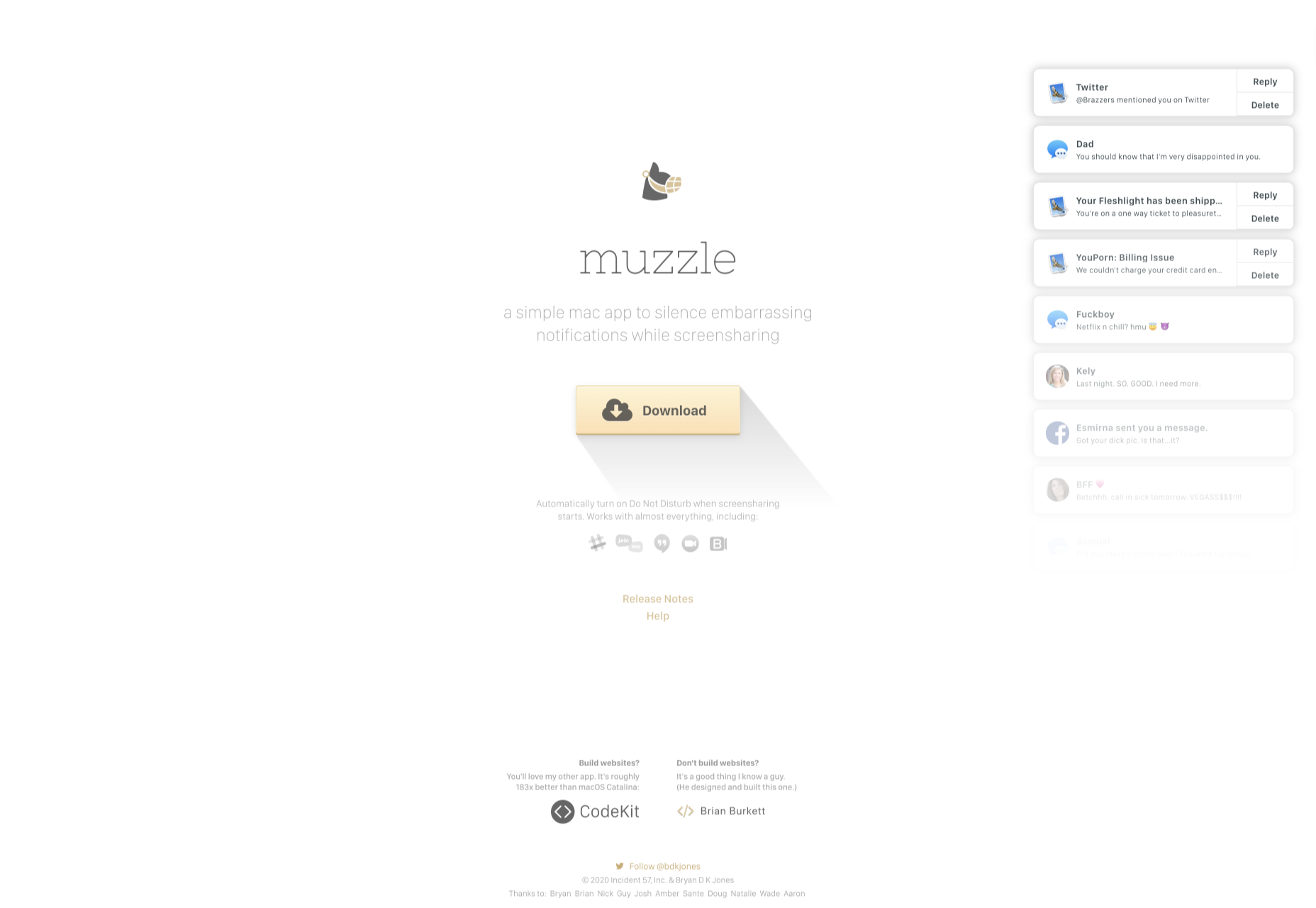
There’s more to creating the perfect website than experimenting with visuals and sound. Designers need to think carefully about how each element of their site impacts the overall user experience. 

After all, with billions of websites available to explore, it takes something truly immersive to convince your client’s audience that they should stay on their pages. The more convenient and attractive your websites are, the more likely it is that visitors will want to stick around. 

Minimalism, one of the more popular styles of web design from the last few years, can sometimes assist designers in making attractive and effective websites more functional.

The less clutter and confusion there is on a page, the easier it is to navigate. 

So, how do you embrace the benefits of functional minimalism?

Understanding Functional Minimalism

Many webs designers are convinced that minimalism is all about aesthetics. 

They see a website like Hugeinc.com and assume that the minimalist appearance is all about making the website as attractive as possible.

However, the underlying ideas of minimalism in web design go much deeper than this.  The history of minimalist design begins with Japanese culture. Japan has long focused on balancing simplicity and beauty with its architecture, interior design, and even graphic design. In the Western world, minimalism got its day in the sun in the web design environment, after customers endured years of cluttered and complicated web pages with difficult navigation, overwhelming information and clashing graphics. 

Designers began to experiment with the idea that less really could be more — particularly when it came to the digital landscape. 

The Functional Rules of Minimalist Web Design

For a while, minimalism was the most popular style for a website. During 2018, in particular, minimalist web design soared to the top of the designer demand list, as companies fell in love with a combination of white space, simple navigation and bold text. 

While now, there are other design trends stepping into the industry, designers can still benefit from exploring some of the essential rules of functional minimalism. After all, visual complexity has been proven to damage a person’s perception of a website

Additionally, a study conducted by the EyeQuant group found that a clean and simple design can lead to a lower bounce rate. Minimalism gives viewers less to contend with on a page, which can allow for a simpler and more straightforward experience. Additionally, a clean website can also drive additional benefits, including faster loading times, better responsivity between screen sizes and more.

Because you’re only using a few images and well-spaced text, you can even experiment with different strategies, like graphics and dynamic fonts. Look at the Manuel Rueda website, for instance, it’s a great example of how a minimalist design can be brimming with activity.

So, how can any designer use the principles of functional minimalism?

1. Focus on the Essentials

First, just like when designing a landing page, designers need to ensure that they’re concentrating only on the elements in the page that really need to be there.

This means removing anything on the website that doesn’t support the end-goals of the specific page that the viewer is using. Any pictures, background noise, buttons, or even navigation features that aren’t going to support the initial experience that the visitor needs, must go. 

Think about what’s going to distract your visitors from the things that are important and concentrate on giving everything a purpose. For instance, the Plus63.org website instantly introduces the visitors to the purpose of the website, then allows users to scroll down to get more information. The data is spread clearly through the home page, pulling the viewer into a story. 

2. Embrace the Positives of Negative Space

Negative space is one of the fundamental components of good minimalist web design. 

Every part of a good website doesn’t need to be filled with noise to make a difference. White, or negative space can help to give your viewer the room they need to fully understand the experience that they’re getting. 

From a functional perspective, it’s the difference between placing someone in an overflowing storage container and asking them to find what they need or placing them in a room where items are carefully spaced out, labelled, and waiting for discovery. 

The Hatchinc.co website uses negative space to ensure that information is easy to consume. You can find the different pages of the site easily, the social media buttons, and the newsletter subscription tool. Plus, you get a chance to see some of the work behind the site.

3. Make it Obvious

One of the biggest problems that consumers have encountered in recent years, is the concept of “choice overload”. 

Whether you’re in a store, or on a website, you’re never sure what to do first. Do you check out the blog posts on the site to learn more about the authority of the company? Do you visit the “About” page, to see where the brand come from? Do you head to their product pages?

As a designer, functional minimalism can help you to make it obvious what your audience should do next. As soon as you arrive on the AYR.com website, you’re not overwhelmed with choice. You can either head to your bag, “shop now”, or check the menu. 

Since the “Shop Now” CTA is the biggest and most compelling, the chances are that most visitors will click that first, increasing the company’s chance of conversions. 

4. Simplify the Navigation (But Don’t Hide It)

The AYR.com example above brings us to another concept of functional minimalism. 

While minimalism and simplicity aren’t always the same thing, they should go hand-in-hand. When you’re designing for functional minimalism, you should be concentrating on helping visitors to accomplish tasks as quickly and easily as possible, without distraction. 

That means that rather than overwhelming your audience with a huge selection of pages that they can visit at the top or side of the screen, it may be worth looking into simpler navigation options. A single menu icon that expands into a full list of items remains a popular design choice – particularly in the era of mobile web design. 

For instance, look at the simple menu on newvision-opticien.com.

With this basic approach, designers can ensure that visitors are more likely to click through to the pages that their clients want their customers to visit. They can still find what they need in the menu, but it’s not taking up space on the page, or distracting them. 

5. Set Great Expectations with the Top of the Screen

Functional minimalism can also help today’s designers to more quickly capture the attention of their visitors from the moment they click into a website. 

The content that’s visible at the top of the page for your visitors is what will encourage them to take the next step in their online experience. Make sure that you’re providing something that keeps your audience interested and gives them the information they need. 

That way, you’ll lower the risk of high bounce rates for your clients, while also taking advantage of minimalism’s ability to deliver quick access to information for your audience. 

At the top of the page, the Kerem.co website instantly introduces the visitor into what the website is all about, and what they should do next. 

You can even deliver more information in one chunk at the top of the page, without cluttering the environment, by using good UI animation. 

Consider implementing a slideshow of pictures that flip from one image to the next, or a font section that dynamically changes as your audience has chance to read each sentence. 

6. Use Functional Minimalism in the Right Spaces

Remember, functional minimalism isn’t just for home pages. 

Depending on what you want to accomplish for your client, you could also embed the components of minimalism into landing pages, portfolios, and squeeze pages too. 

After all, when there’s less clutter and confusion on a page to distract a potential audience, there’s a greater chance that your visitors will scroll to the bottom of the page and complete a conversion. For instance, look at how simple and attractive the Muzzleapp.com landing page is.

The page provides useful information and tells customers exactly what they need to do next. There’s no confusion, no complexity, and nothing to hold visitors back. 

Just be careful. While functional minimalism can be very useful, it won’t be right for every website. A lack of elements can be harmful to websites that rely heavily on content. That’s because low information density will force your user to scroll excessively for the content that they need. Using functional minimalism correctly requires a careful evaluation of where this technique will be the most suitable. 

Minimalism Can be Functional

A minimalist design isn’t just an aesthetic choice. The right aspects of minimalism can simplify interfaces on the web by eliminating unnecessary elements and reducing content that doesn’t support an end goal. 

The key is to ensure that you’re focusing on a combination of aesthetics and usability when creating the right design. An easy-to-navigate and beautiful website can be a powerful tool for any business.  

Source


Source de l’article sur Webdesignerdepot

This week, we take a look at API vulnerabilities in HashiCorp Vault, Azure App Services, and more. There is also an introductory video on finding information disclosure in JSON and XML API responses, and another cheat sheet and a webinar on OWASP API Security Top 10.

Vulnerability: HashiCorp Vault

Felix Wilhelm from Google’s Project Zero has written a very detailed write-up on an authentication bypass he found in the Amazon Web Services (AWS) and Google Cloud Platform (GCP) integration of HashiCorp Vault. As a central storage of credentials, Vault makes an attractive target for attackers, and therefore a vulnerability in it is also very bad news. Looking for the silver linings, this attack was definitely quite advanced, and thus not easily exploitable.

Source de l’article sur DZONE

Web design clients come from a
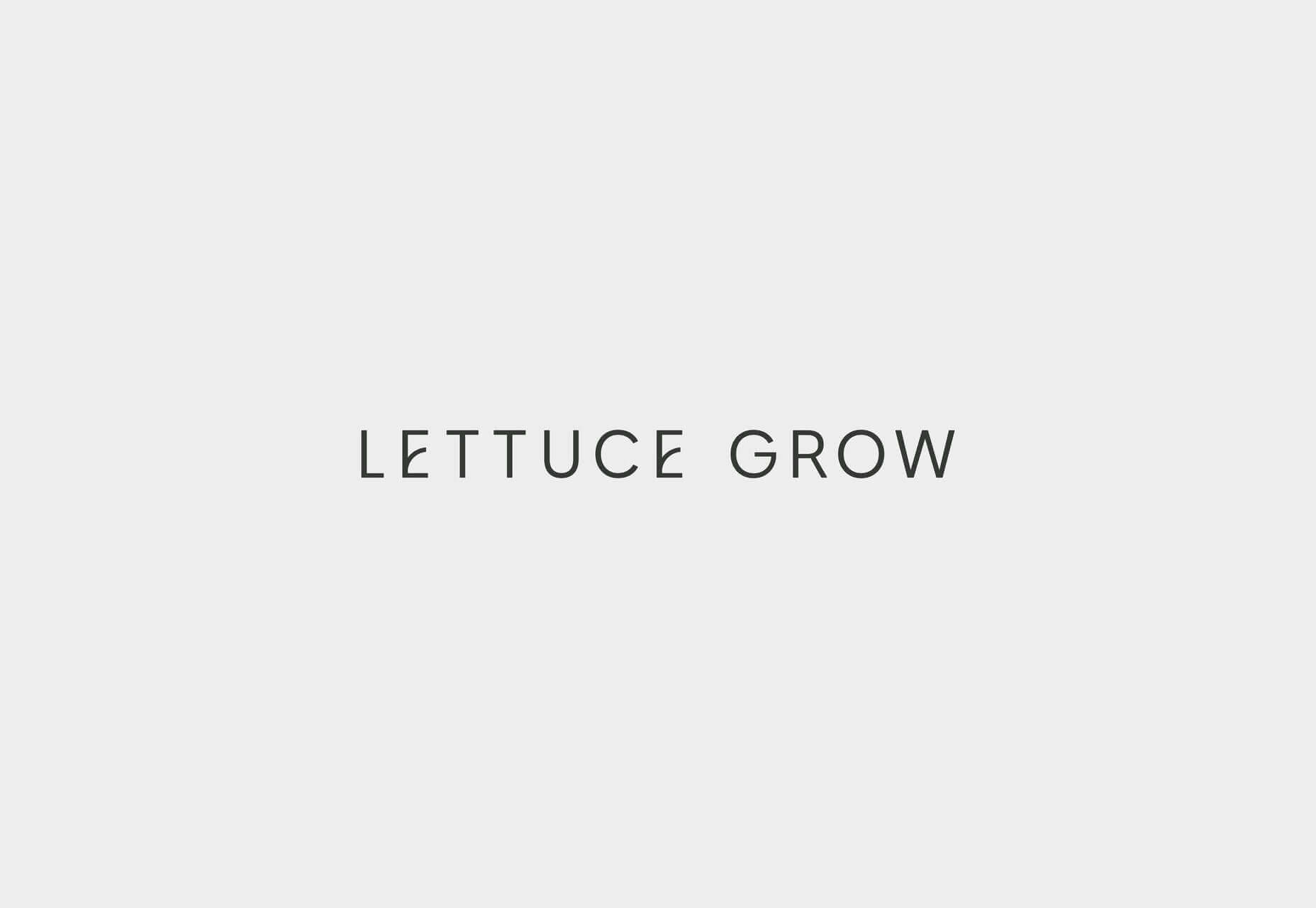
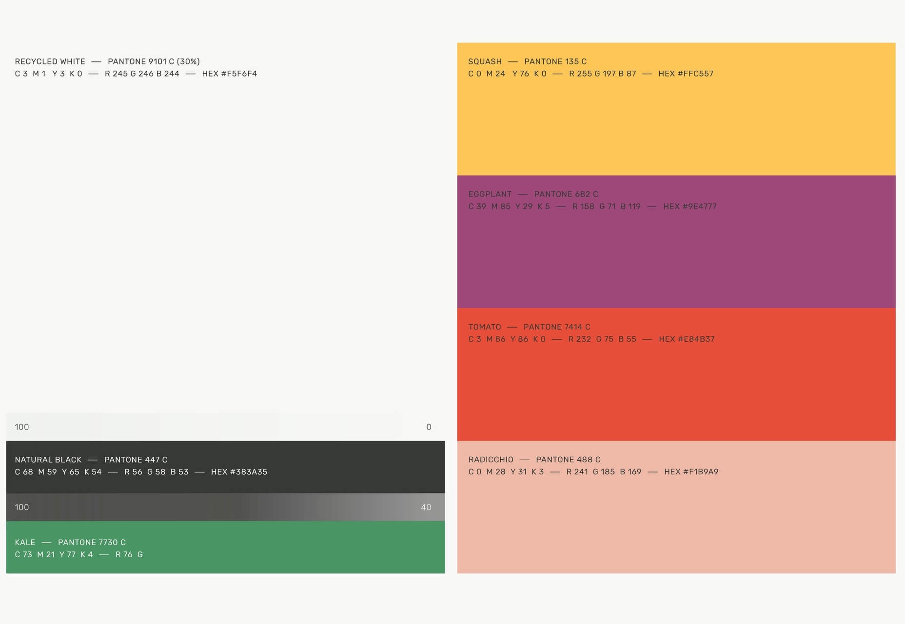
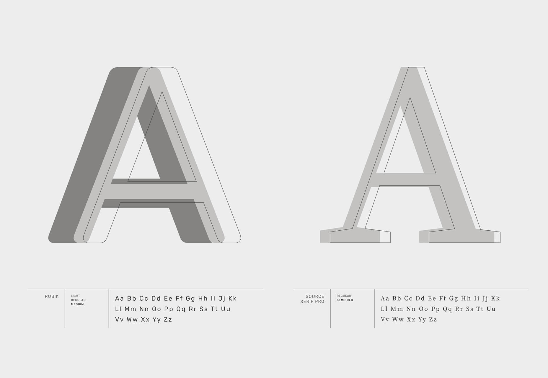
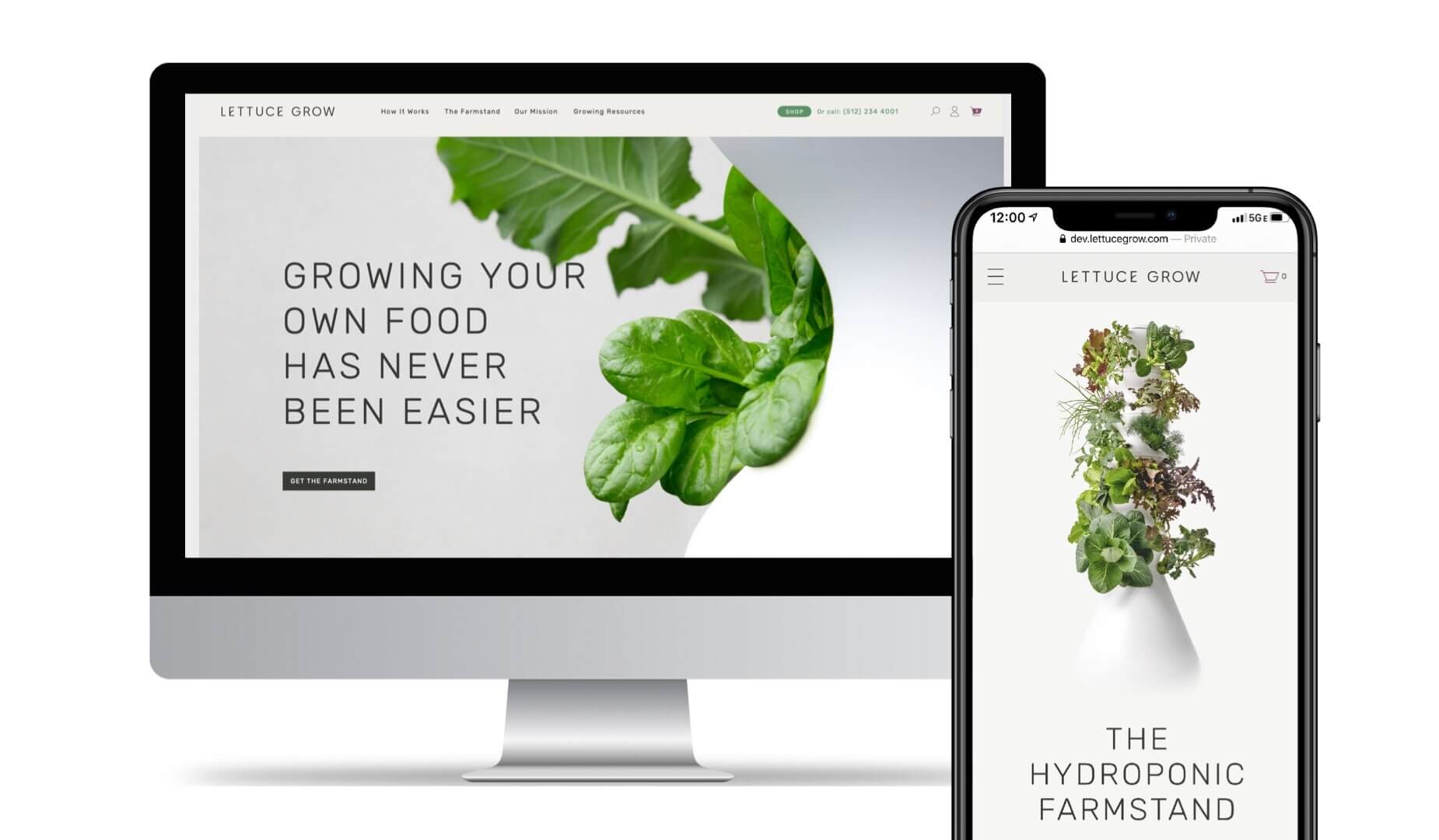
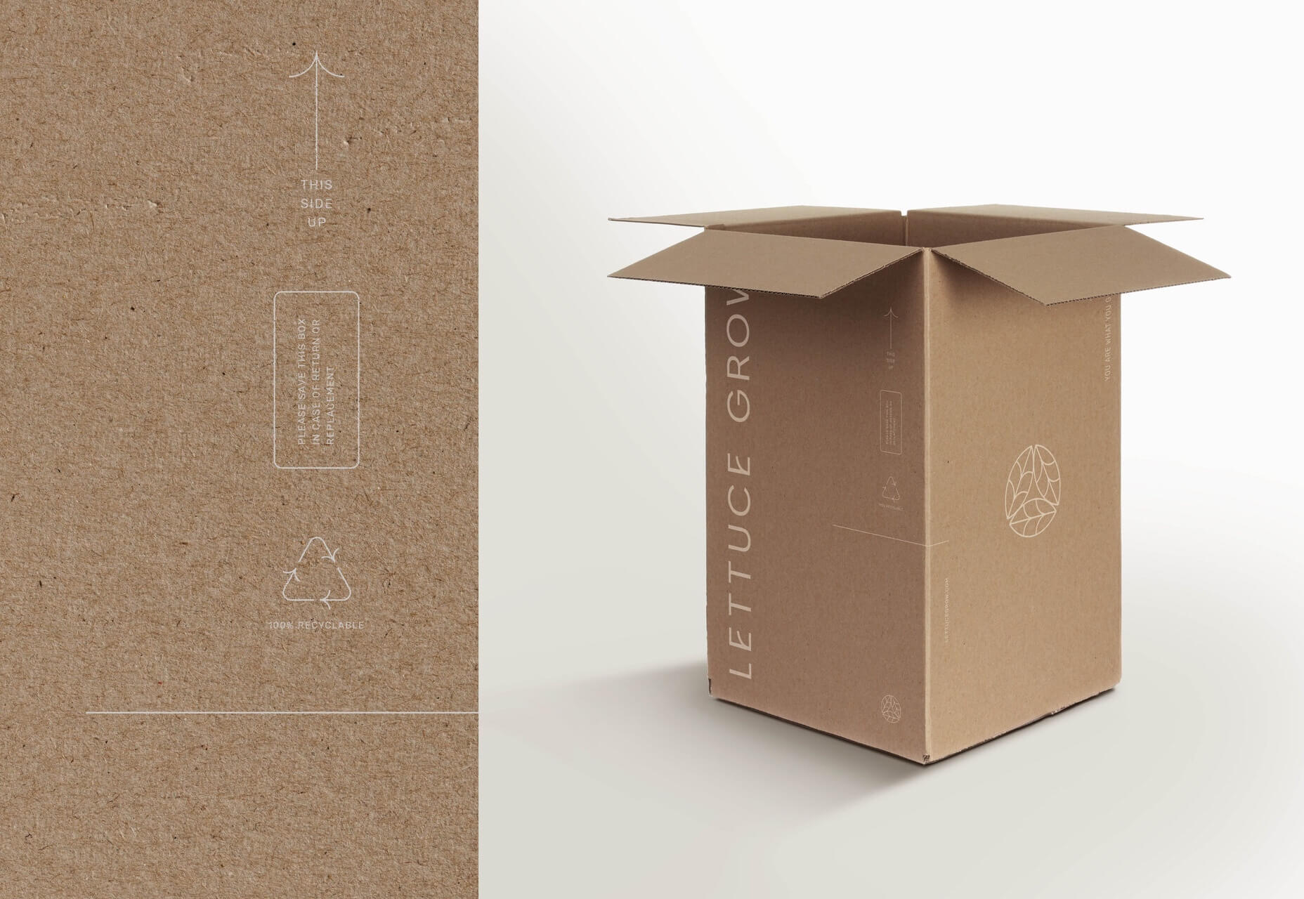
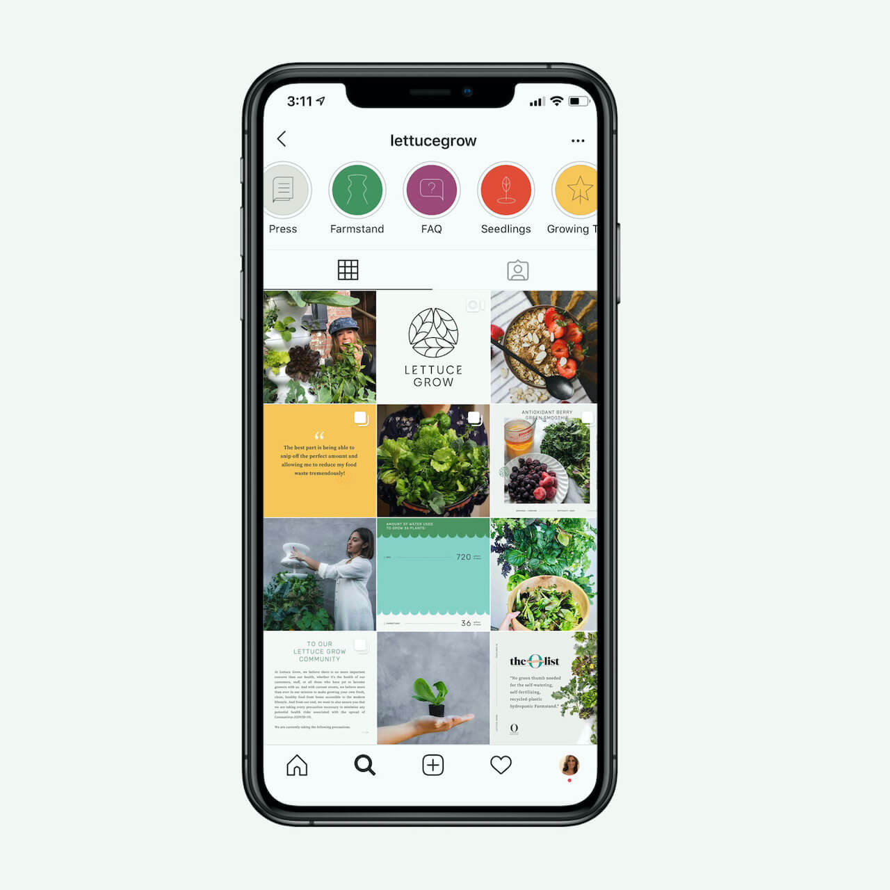
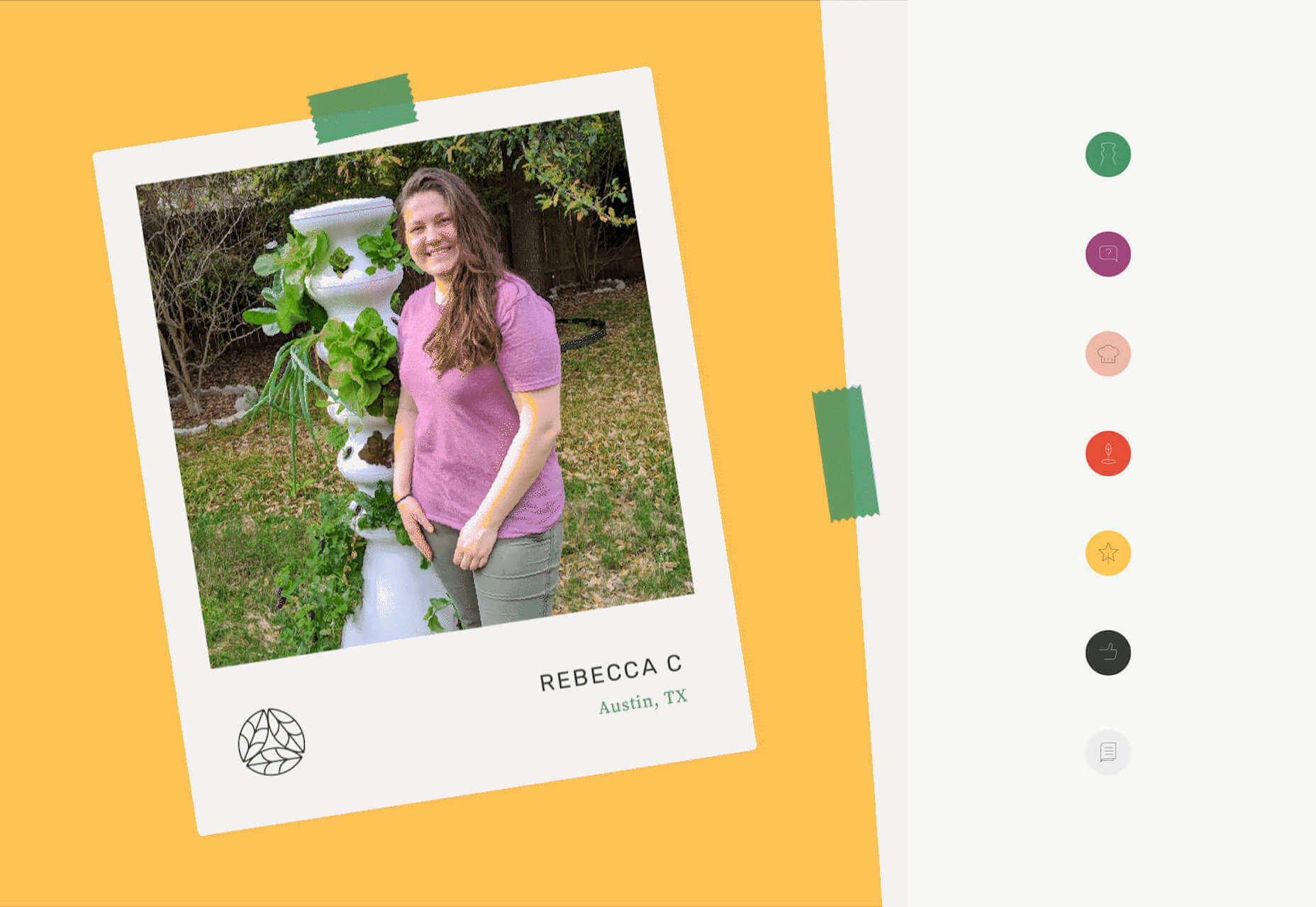
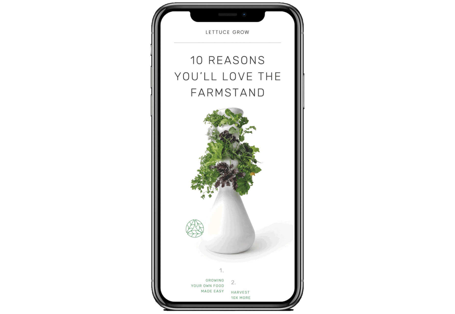
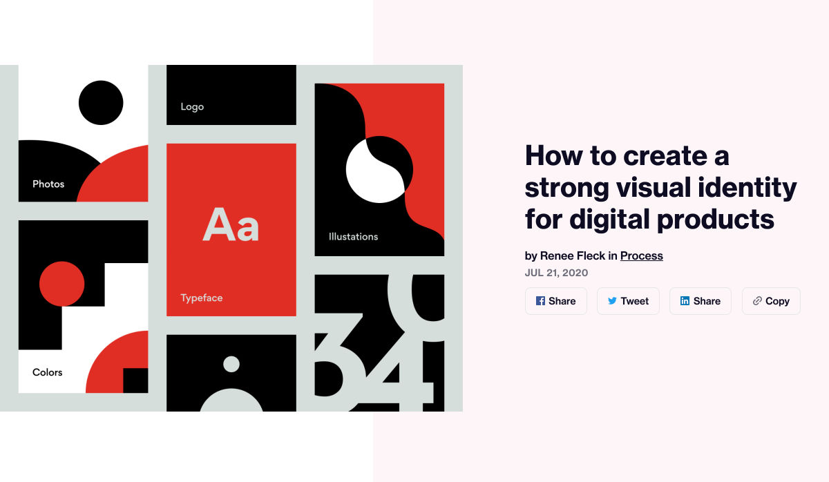
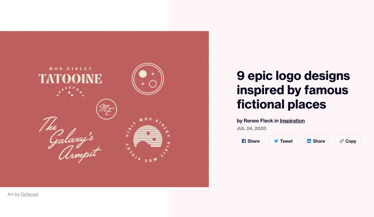
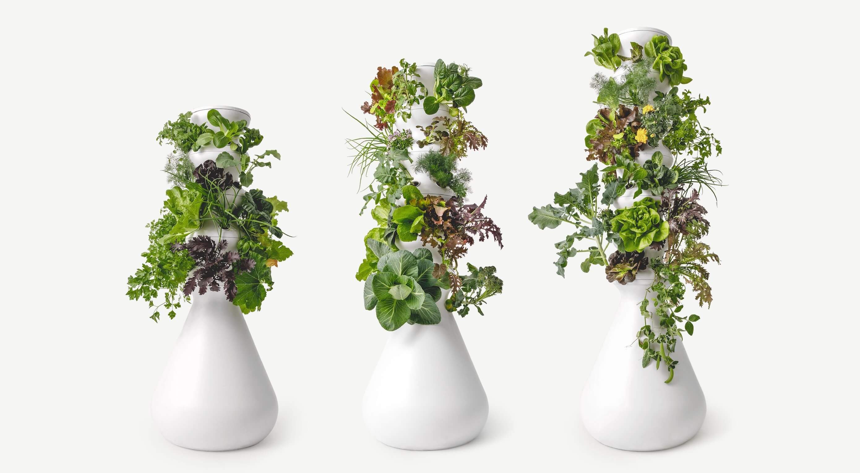
 wide variety of backgrounds. One day, you’ll be designing a portfolio website for a voiceover artist, the next you’ll be creating a comprehensive ecommerce site for a leading retailer. In an ideal world, you’ll get to a point where you eventually specialize in a niche. However, you’ll need to master both avenues first.

The more time you spend in this industry, the more you’ll learn that every client comes with their own unique requirements and challenges to consider. However, there’s a particularly huge divide between the kind of web design projects you do for B2B clients, and the ones you do for B2C customers.

Both B2B (Business to Business) and B2C (Business to Consumer) websites need to be clear, concise, and aesthetically pleasing. They should always have a strong focus on user experience, and they need to work consistently across devices. However, being aware of the difference between B2B and B2C projects will help you to deliver better results to your customers.

Defining the Differences Between B2B and B2C Sites

Some web design trends remain consistent in any environment.

Whether you’re creating a site for a hairdresser, or a leading SaaS company, you’ll need to deliver responsive design, intuitive navigation, and excellent site security.

Your process is unlikely to differ from B2B to B2C much in terms of project milestones, phases, prototyping and wire-framing. The differences that arise between B2B and B2C projects often come in the approach you take to building certain elements.

Let’s take a closer look at the things you might need to consider:

1. The Target Audience

In any design project, it’s always important to keep the end customer in mind. Knowing your client’s target audience will help you to create both an image and a tone of voice that appeals to the right people.

B2B Websites

With B2B websites, you’ll be speaking to a range of highly-educated individuals who already have a general knowledge of your service. The aim here will be to show the end-user how you can help them achieve better results. For instance, m.io highlights “syncing communication” so you can “effortlessly chat” with your team.

The language and content of the website is all about highlighting the key benefits of the products, and the kind of outcomes that they can deliver. The Nielsen Norman Group reports that there’s often a lot of discussion between decision-makers when they’re checking out a B2B website.  

Designers need to work harder at convincing B2B buyers that they’re making the right decision. This is particularly true when you’re selling something like a software subscription that requires a lot of long—term investment.

B2C Websites

On the other hand, while B2B customers make decisions based on logic, information, and well-explained benefits, B2C customers are more influenced by emotion. They want quick solutions to their problems, and the opportunity to purchase from a brand that “understands” them.

Look at the Firebox website, for instance. It instantly highlights an ongoing sale at the top of the homepage, addressing any concerns a customer might have about price. That combined with a quirky layout full of authentic photos and bright colors means that customers are more inclined to take action.

2. The Purpose

Another factor that can vary from B2C to B2B websites, is the motive behind a customer’s purchase. Knowing what’s pushing a target audience to interact with a brand will help you to create a website that appeals to specific goals.

B2B Websites

B2B websites often aim to solve expensive and time-consuming problems for companies. To sell a decision-maker on the validity of a solution, it’s important to thoroughly explain what the solution is, how it works, and how it addressees a specific pain point.

Look at the Zoom website for instance, they don’t just tell people that they offer video conferencing, they address the practical applications of the platform:

B2C Websites

Consumers are a lot easier to appeal to in terms of emotional impact, because many of them come to a website looking to fulfill an urgent need. Because of this, many web designers can take advantage of things like urgency and demand to encourage conversions. For instance, look at this website from TravelZoo. It takes advantage of a customer’s desire to get away:

A B2B website needs to focus on providing information that helps companies to make more confident decisions. What’s more, with B2B sites, decisions are often made by several stakeholders, while B2C sites ask a single person to make a choice. A B2C website needs to address immediate concerns and connect with customers on an emotional level. B2C buyers still want to do their research on products or services, but the turnaround is much quicker, and often requires less information.

3. The Design Elements (Visual Appearance)

Just as the focus of your website design and the audience that you’re creating the experience for can differ from B2B to B2C websites, the visual elements of the design might change too.

B2B Websites

In most cases, B2B websites are all about presenting a highly professional and respectable image. You’ll notice a lot of safe and clear choices when it comes to typography and imagery. It’s unusual to see a B2B website that takes risks with things like illustrations and animations.

Look at the Green Geeks website for instance. Everything is laid out to encourage clarity and understanding. Information is easy to find, and there are no other issues that might distract a customer.

B2C Websites

On the other hand, B2C websites can be a little more daring. With so many different options to choose from, and most customers buying out of a sense of urgency or sudden demand, designers are under pressure to capture attention quick. This means that it’s much more likely to see large pieces of eye-catching imagery on B2C sites, with very little text.

Movement, like slideshows and animations often play more of a role here. Additionally, there’s a good chance that you’ll be able to experiment more aggressively with color. Take a look at the Yotel website, for instance. There’s very little textual information here, but the appeal of the website is conveyed through sliding images:

4. Website Content

The way that information is conveyed on a B2B website is very different to the messages portrayed on a B2C site. Usually, everything from the language, to the amount of content that you use for these projects will differ drastically.

B2B Websites

When designing for a B2B website, you’ll need to be careful with content, as you’ll be speaking to a very mixed audience. If your site caters to different industries, you’ll need to ensure that you show authority, without using too much jargon. Some companies even create different pages on their site for specific customers. The aspin.co.uk website covers the benefits from a company, sale and integration perspective:

Rather than try to talk to all business owners about their differing communication pains, G-Suite anticipates its audience and creates pages for each.

B2C Websites

Alternatively, B2C websites can make things a little simpler. For instance, on glossybox.co.uk, there’s no need to provide a ton of information for different types of shopper, designers can appeal to one audience, i.e. the “beauty addict”:

In both B2B and B2C websites, the aim of the content should always be to answer any questions that the end user might have.

5. CTA Buttons

Call to Action buttons are often a crucial part of the web design journey. However, it’s sometimes difficult to determine where they should be placed, or how many buttons you need.

B2B Websites

Because the decision to buy something won’t always happen immediately with a B2B website, these kinds of sites often use a variety of CTAs. For instance, you might have a “Request a Quote” button at the top of a page, as well as a Sign in button.

On the Klaviyo site, for instance, you can request a demo, sign up or log in:

You can place CTAs lower on the page with B2B websites too, as it’s more likely that your customers will be scrolling through the site to collect more information before they decide to buy.

B2C Websites

On the other hand, with B2C websites, you usually don’t need to give your visitors as many options. A single option to “Add to Cart”, or perhaps an extra choice to “Add to Favorites” is all your user will need. Customers need to instantly see what they need to do next as soon as they arrive on a page:

On the Evil Hair website, you immediately see how to add a product to your cart.

Remember, the sales process is a lot quicker with B2C customers. This means that you need your CTA buttons to be front and center as soon as someone clicks on a page.

6. Contact Forms

In a similar vein, the way that you design your contact forms will also depend on the end-user that the website wants to appeal to. There’s a very different process for getting in touch on a B2B website, compared to a B2C site.

B2B Websites

B2B websites often require longer contact forms, as clients need to collect additional information about a prospect’s position in a company, and what that company does. B2B companies need to share things like what they’re looking for in a service, and how many users they have, so a sales team knows what kind of demonstration to give.

As with any strategy for contact form design, you should always only include the fields that your client needs and no more. If you demand too much from any client, you could send them running in the opposite direction. Check out this straightforward option from Ironpaper, for instance:

The form addresses as many relevant questions as possible without overwhelming the customer. Because the site handles things like design, it makes sense that they would ask for a link to the company’s existing website.

B2C Websites

On a B2C website, there are very different approaches to contact forms. You may have a dedicated contact form on your website where people can get in touch if they have any questions. A FAQ page where customers can serve themselves is another great way to help your client stand out from the competition. Check out this option from River Island, for instance:

On the other hand, you might implement pop-up contact forms into a website if your client wants to collect emails for email marketing. In that case, it’s important to make sure that you’re only asking for the information you need, and nothing more.

The easier it is to sign up for a newsletter, the more likely it is that customers will do it. Being able to enter their name and email address and nothing else will make the signup seem less tasking.

7. Search Bars and Navigation

Whether you’re designing for B2B or B2C companies, navigation will always be a critical concern. End users need to find it easy to track down the information that they need about a company, whether they’re looking for a particular product or a blog.

B2B Websites

On a B2B website, the search bar often takes up a lot less prominence than it does on a B2C site. That’s because all of the information that a client needs, and the buttons they need to take their next steps, are already visible front-and-center.

As a designer, it will be your job to push as many people to convert as possible, by making the purchasing journey the most appealing path for visitors. For instance, on the Copper website, the “Try Free” buttons are much easier to see than “Continue with Google” or “Login”:

With B2B sites, the focus is on a very specific goal. Although navigation still needs to be available, it doesn’t need to be as obvious as it is on a B2C site.

B2C Websites

On the other hand, most B2C websites offer a wide range of products, and they’re perfectly happy for their customers to purchase anything, as long as they eventually convert. Because of this, they make navigation a much more significant part of the customer journey.

The search bar is often presented at the very top of the screen where customers can see it immediately. Additionally, there may be multiple pages within certain product categories, so that customers can browse through the items they’re most interested in. For instance, look at the homepage on the IWoot website:

The navigation elements in B2C websites need to be a lot more obvious, because consumers are more likely to use them when they’re searching through their options.

8. Social Proof and Testimonials

Finally, social proof is one of the things that will work well for improving conversions on any kind of website. When your customers aren’t sure whether or not they should buy from you, a review or testimonial could be just the thing to push them over the edge.

B2B Websites

On a B2B website, the decision-making process takes a lot longer. Because of this, it’s worth including as much social proof as possible in every part of the website. Client testimonials, reviews and ratings, and even high-profile company logos make all the difference. Many B2B websites include a page dedicated to case studies highlighting the success of other brands.

Your client might even go as far as to ask for a page that highlights their awards and recognition or showcases comparison tables that pit their products against the competition.

For instance, Authority Hacker has a “what the pros say about us” section as social proof:

B2C Websites

With a consumer website, you can include consumer ratings and reviews wherever you like. However, it’s most likely that you’ll want to have a place where customers can see the reviews of other clients on the product pages themselves. On the EMP website the company gives users the option to click on the star review section to jump to a different space on the page where testimonials are listed. This ensures that customers don’t have to scroll through a lot of excess information if they just want to add an item straight to their cart.

Designing for B2B vs B2C

In the world of web design, no two customers are ever the same. While you’ll need to adapt your processes to suit each customer you interact with, you can set your expectations in advance by learning the differences between B2B and B2C strategies.


Featured images by Chris Ross Harris and Mike Kononov.

Source

p img {display:inline-block; margin-right:10px;}
.alignleft {float:left;}
p.showcase {clear:both;}
body#browserfriendly p, body#podcast p, div#emailbody p{margin:0;}

Source de l’article sur

This week, we check out how Microsoft Teams could be breached with a single GIF image sent in a chat, and Auth0 by changing the case of a single character.

In other news, a report on security issues in smart home hubs has been published, and a new online training on OAuth2.0 and OpenID Connect is available.

Source de l’article sur DZONE

This week, we check out a recent API vulnerability in Twitter. In addition, it looks like API vulnerabilities are a bit of a theme in apps by political parties: vulnerabilities were discovered in apps by Israel’s Likud and the Democratic Party in the USA. We also have two API security talks: one recorded and one upcoming webinar.

Vulnerability: Twitter

Twitter has disclosed a recent API exploit. The API endpoints to make finding friends in Twitter by their phone numbers easier were abused, possibly by state-sponsored actors, to mine accounts by mapping them to phone numbers. Detecting and throttling the exploit was hard because the phone numbers were not sequential and attackers used multiple accounts and IP addresses in their attacks.

Source de l’article sur DZONE