Articles

WordPress is a highly flexible content management system for website creation. A key reason for this flexibility is the wide variety of plugins available. You can add features and other improvements to your site.

The thousands of available useful WordPress plugins cover almost every feature for any type of website. Your website’s niche determines the kind of plugins you should have. There are some great WordPress plugins that every blog site needs; security, speed, SEO, and contact form, to name several.

The most effective WordPress websites create an enjoyable visitor experience. Whether you’re blogging about the latest fashion trends or selling products for your brand, you can enhance your website. Do it with one or more of these ten great WordPress plugins.

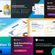
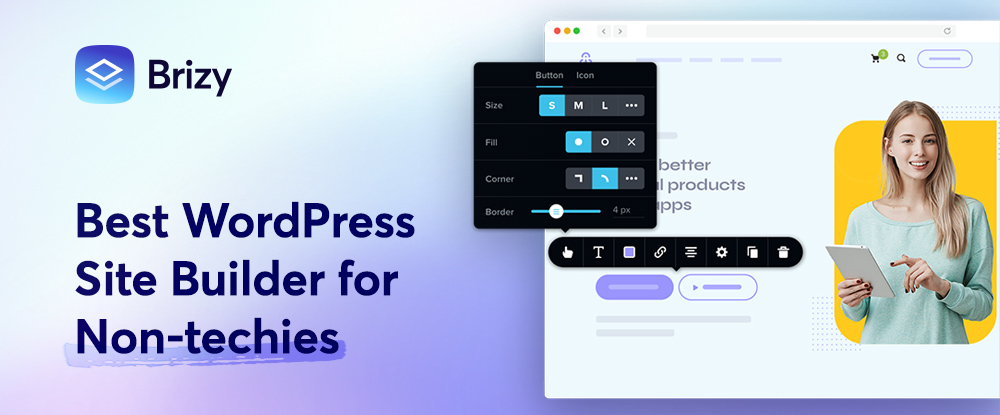
1. Brizy: The Best Website Builder for Non-techies

You might want to approach Brizy with caution because once you start using it, no other website theme builder you might try will ever seem as easy to use. Even better, you can download this WordPress website builder for non-techies (and for techies as well) for Free.

With the Brizy WordPress theme builder at your fingertips, you can –

  • build a brand new website or upgrade an existing one;
  • create dynamic templates for your blog and archive pages, headers, footers, custom pages, and more;
  • enjoy instant access to 150+ customer-friendly pre-made templates;
  • build your blog exactly as you envisioned it;
  • easily customize your WooCommerce shop site.

Brizy’s Theme Builder, Global Blocks, and Global Styling features are right at your fingertips, and WooCommerce integration is also included.

You can also choose the 100% White Label option if you wish to brand the Brizy Builder as your own. A Pro option is available.

Click on the banner to learn more about Brizy and download it free.

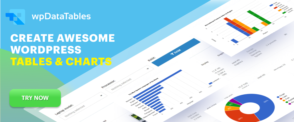
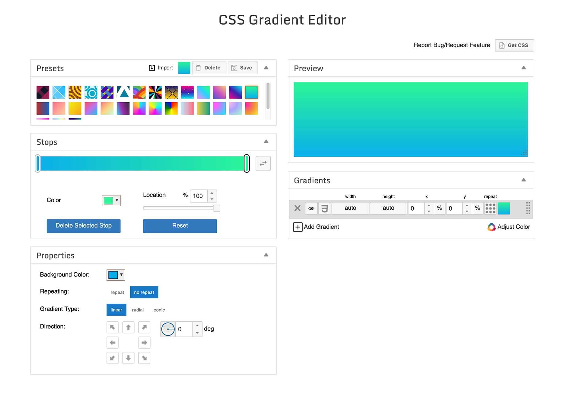
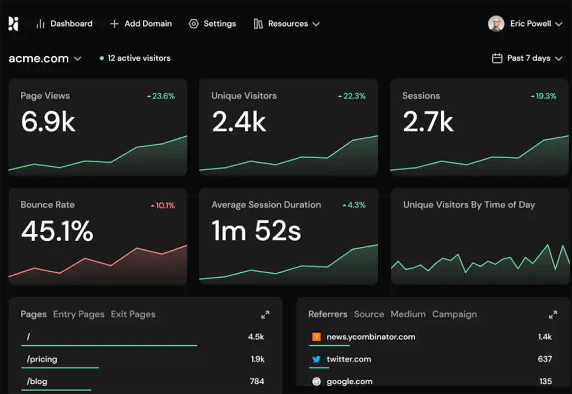
2. WpDataTables – WordPress tables plugin

While there are a host of good reasons for using wpDataTables, the main benefit is that it works with any WordPress theme, it can create a responsive table in minutes, and it requires no coding to use.

With this WordPress tables plugin, you can take advantage of a host of useful features that include –

  • four chart-building engines: Google Charts, Highcharts, Chart.js, and the new Apex Charts;
  • connecting to multiple database sources, e.g., MYSQL, MS SQL, and PostgreSQL;
  • fine-tuning a table or chart to make it responsive or editable and using conditional formatting to highlight critical data;
  • the ability to create tables from a nested JSON file;
  • and use dynamic single-cell shortcodes in many different options;
  • integration with Elementor, Divi, WPBakery, and Avada.

wpDataTables is a robust table and chart-building plugin that’s remarkably straightforward. Just click on the banner to learn more.

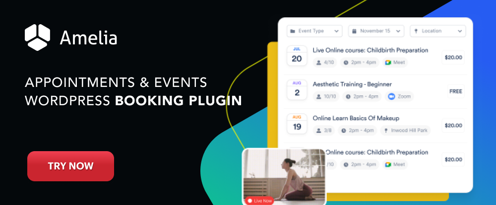
3. Amelia – WordPress booking plugin

Amelia is a WordPress booking plugin that can fully automate and streamline its appointment booking operations when added to a business’s WordPress site. This makes Amelia an excellent choice for beauty, healthcare, fitness, consulting, educational, and similar client-dependent businesses.

The Amelia plugin can –

  • manage an unlimited number of appointment bookings at multiple locations, and do so from a single platform and dashboard;
  • enable clients to book appointments online 24/7;
  • easily manage group appointments, package bookings, and events;
  • send notifications and reminders to clients via Email or SMS, and make payments online with PayPal, Stripe, Mollie, or Razor;
  • customize booking forms to match its host’s brand.

Click on the banner to find out more about how the Amelia WordPress plugin could be used to upgrade your business’s booking operations.

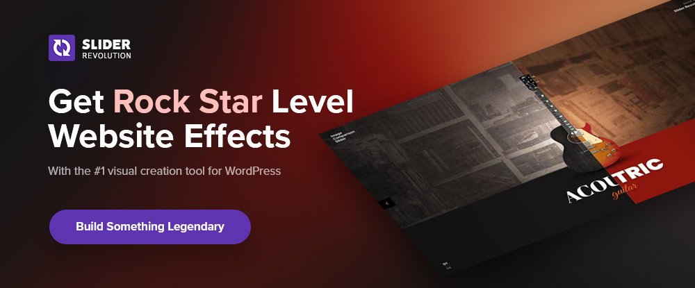
4. Slider Revolution – more than a WordPress slider plugin

Slider Revolution is a WordPress plugin that is more than just a slider plugin. It’s a highly popular plugin that designers rely on to create visuals they know their clients and customers will love.

Slider Revolution features –

  • 250+ website and slider templates designed to impress;
  • innovative website animation effects and other features that push the boundaries of what is possible in web design.

Slider Revolution is trusted by over 9 million users around the world.

5. WordLift – AI-powered SEO

Structured data helps your website speak the language of Google, and WordLift is the most innovative way to create one.

It is an AI-powered SEO tool that: 

  • adds structured data to your content;
  • creates a Knowledge Graph that makes it easier for Google to understand the relevance of pages, their relationship, and their value;
  • build up the expertise, authority, and trustworthiness of your website.

As a result, you get more organic traffic and audience engagement.

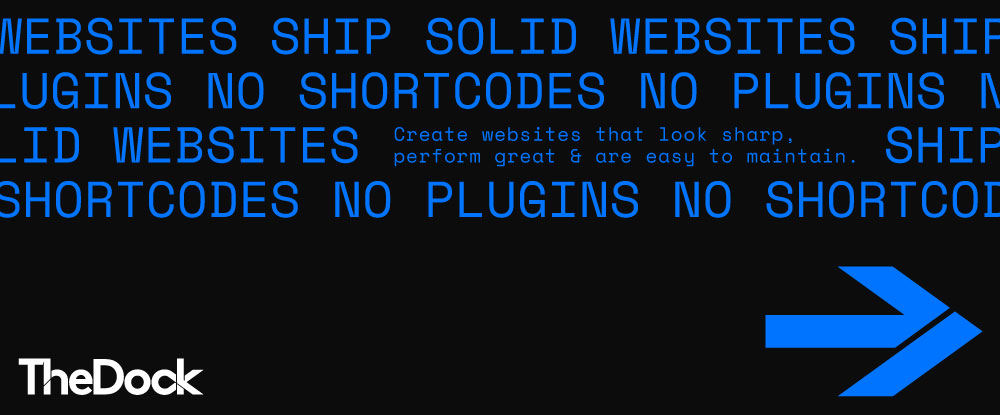
6. TheDock – Ship Solid Websites

TheDock is a design team-oriented WordPress theme builder that supports collaboration, speeds up website design, and helps to create sites that look sharp, perform great, and are easily maintained because of its –

  • custom Post Types and Custom Fields;
  • speedy page load;
  • flexible auto-adjusting layout system with UI components;
  • white-label builder for sharing access to TheDock if you want to;
  • built-in features that assure excellent security and easy maintenance.

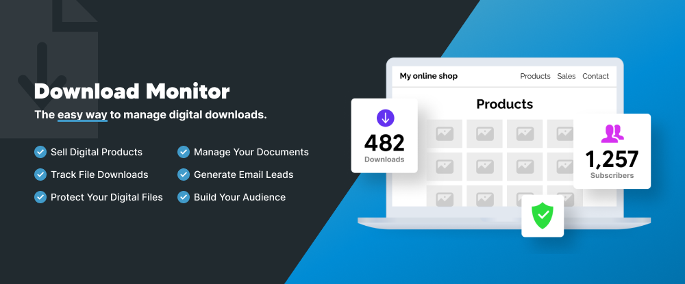
7. Download Monitor – Best WordPress Download Manager

Download Monitor is a WordPress downloads manager that can help you streamline your business operations without having to go through the process of setting up a complicated or costly tracking solution.

With the Download Monitor plugin, you can –

  • track any type of file download (ZIP, PPT, XSLX, PDF, etc.);
  • assemble aggregated file download statistics about different file download types;
  • establish access rules based on user roles and download quotas.

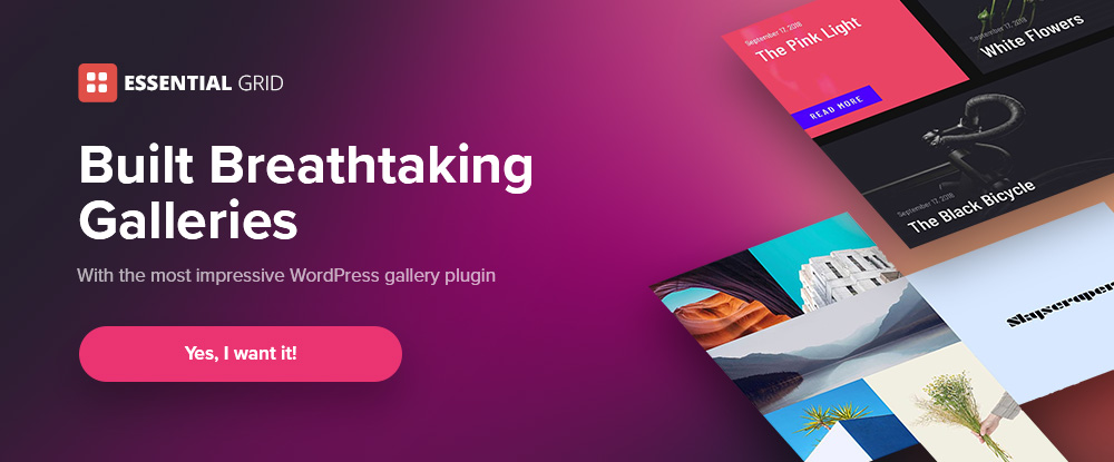
8. Essential Grid – best WordPress grid plugin

Essential Grid is, by all accounts, the best WordPress grid plugin on the market. Essential Grid makes it ever so easy to spice up your websites by using it to create superbly engaging and professional-looking galleries.

This WordPress plugin can give you –

  • stunning, fully customizable boxed and full-width to full-screen grid layout options and various grid designs;
  • responsive designs that enable you to control grid appearance on various devices;
  • access to social media content. 

9. LayerSlider – Best WordPress Slider Builder Plugin

LayerSlider is the best WordPress slider plugin, but it is not just for sliders. Create image galleries, popups, landing pages, animated page blocks, parallax and scroll scenes, and even full websites.

LayerSlider –

  • will fit your needs and is easy to use;
  • can spice up and add flair and style to an otherwise run-of-the-mill website;
  • supports any WordPress theme and page builder;
  • features 210+ highly customizable websites, slider, and popup templates.

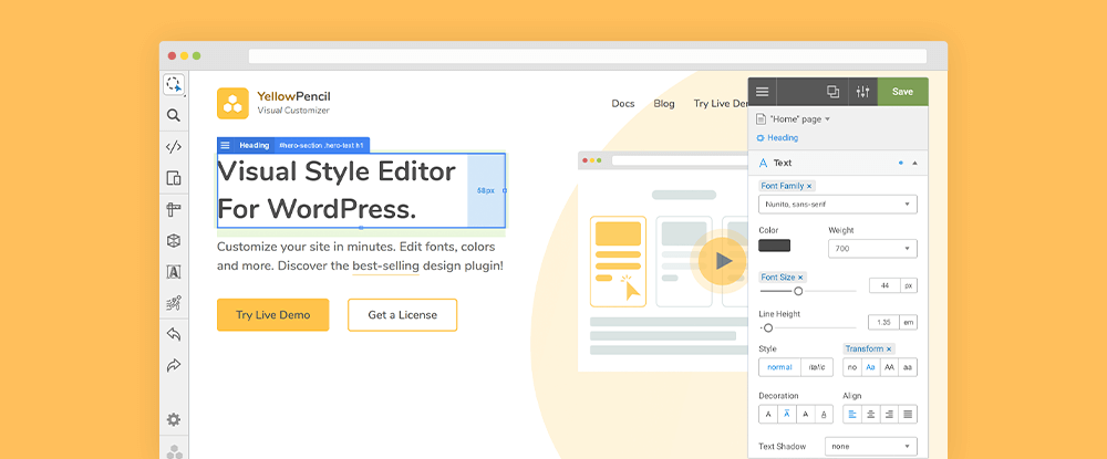
10. YellowPencil – Visual CSS Editor

YellowPencil is a visual CSS editor you can use to customize any WordPress site in minutes.

Key features include –

  • a complete visual editing interface that allows you to redesign a page with a few clicks;
  • a simple interface that does not require coding;
  • the capability to edit any font and any color;
  • the capability to visually edit a design element’s size, margin, and padding properties;
  • the ability to undo/redo mistakes.

*******

It is almost needless to tell any WordPress user how important plugins are for a website. A good WordPress plugin has the power to boost the success of your business online by adding a range of helpful features and functionality to your website.

In this article, we have shared our expert pick of 10 great WordPress plugins for your websites in 2023.


[– This is a sponsored post on behalf of BAW media –]

Source

The post 10 Great WordPress Plugins in 2023 first appeared on Webdesigner Depot.
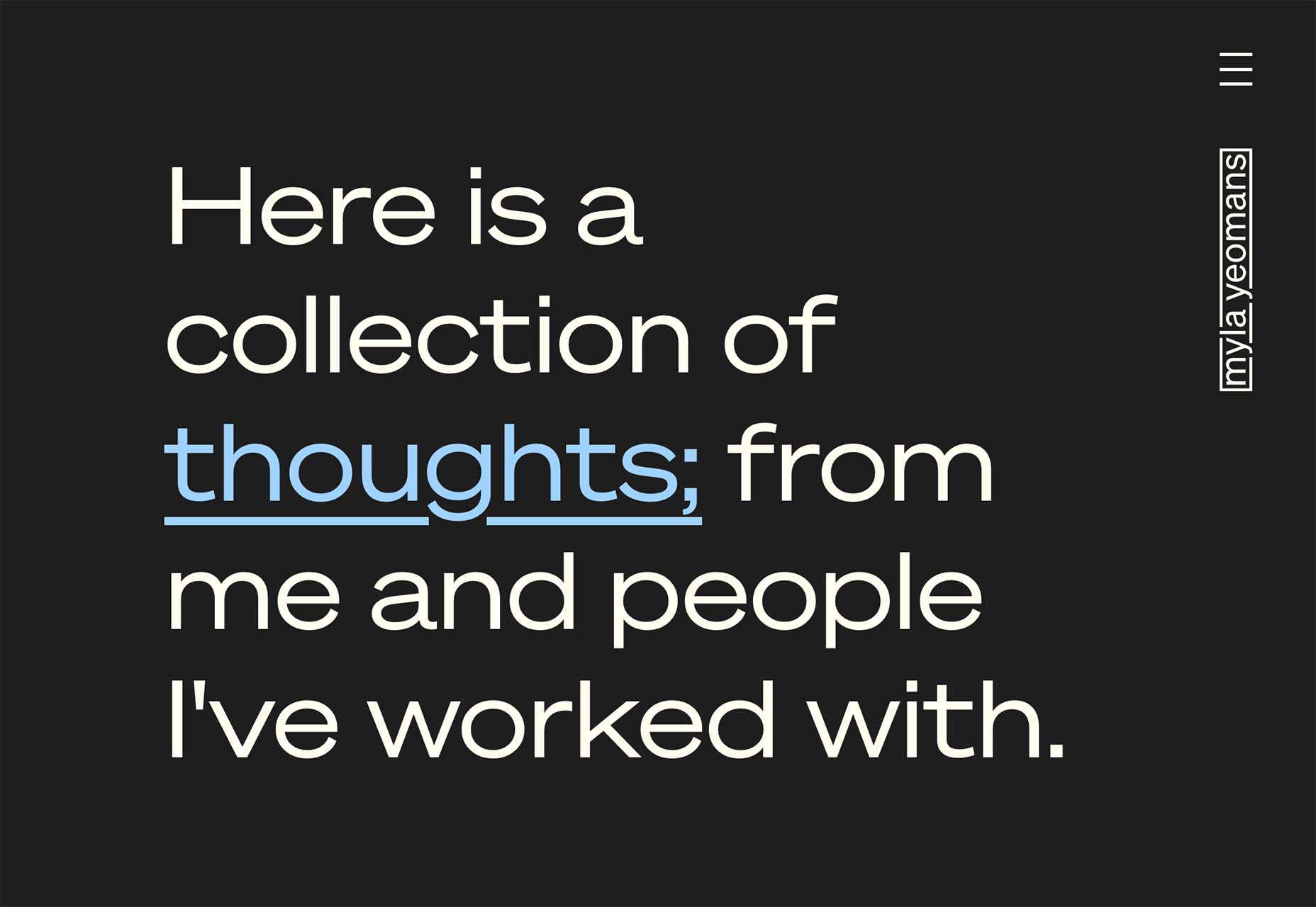
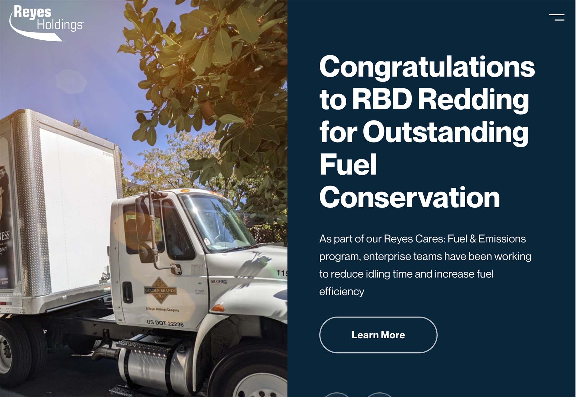
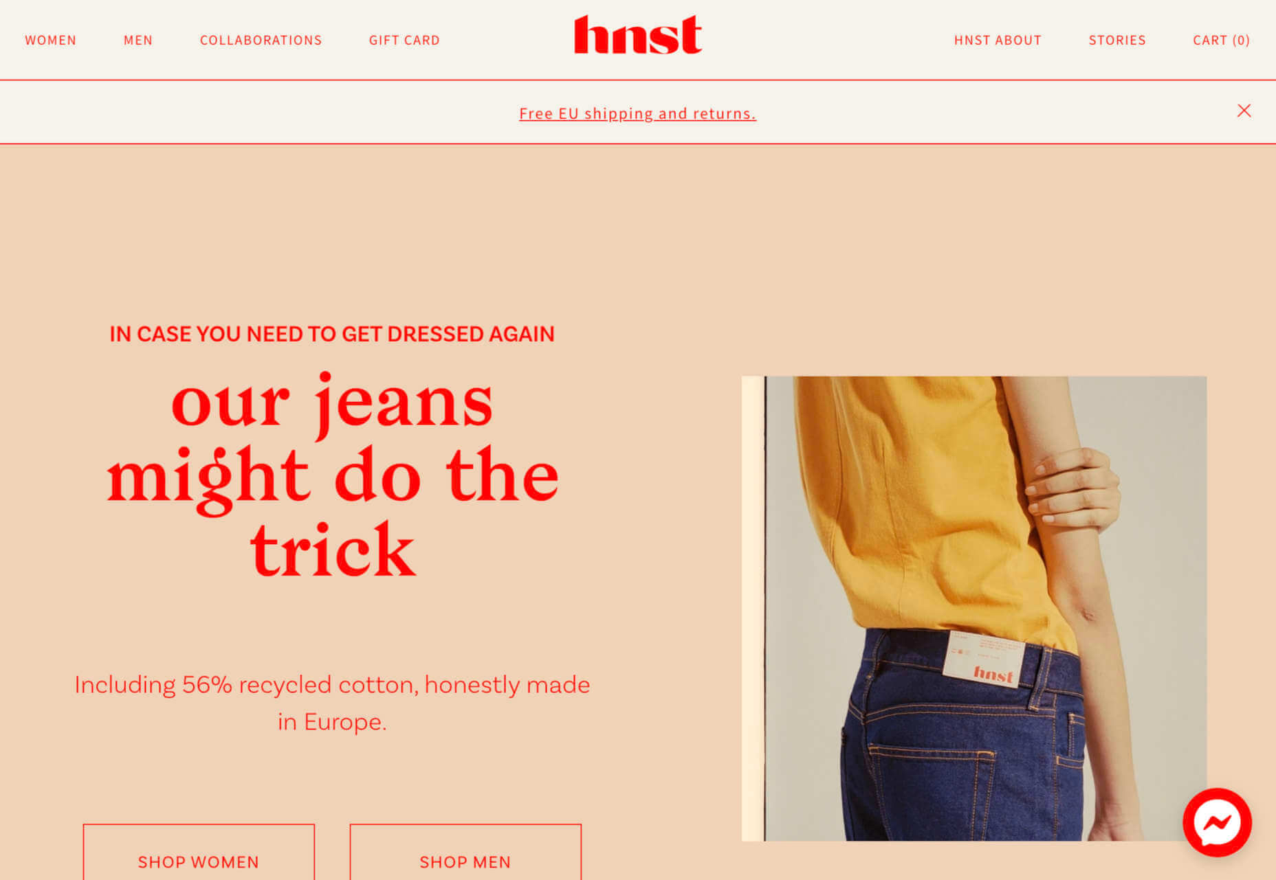
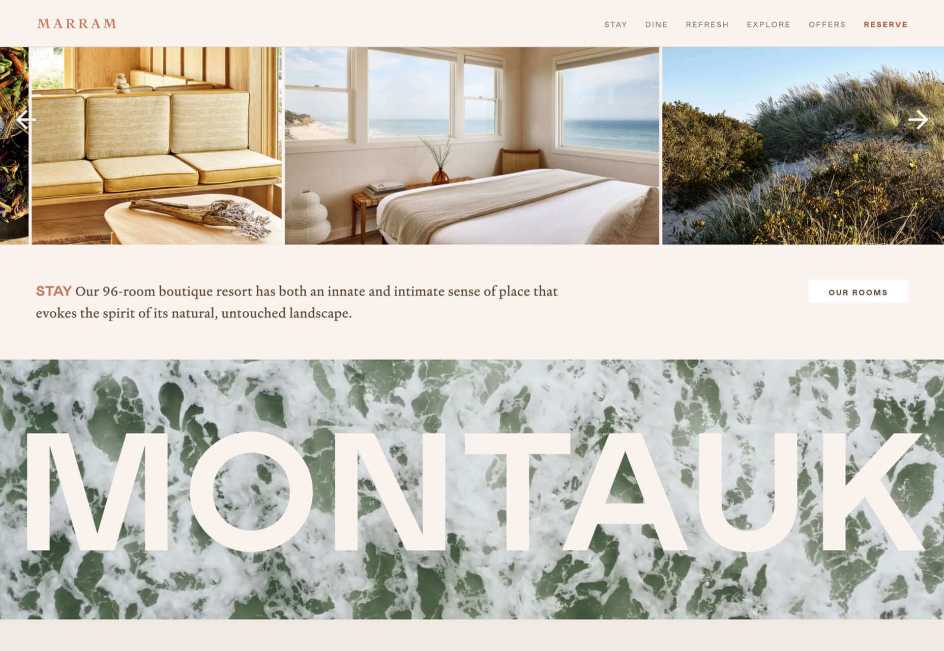
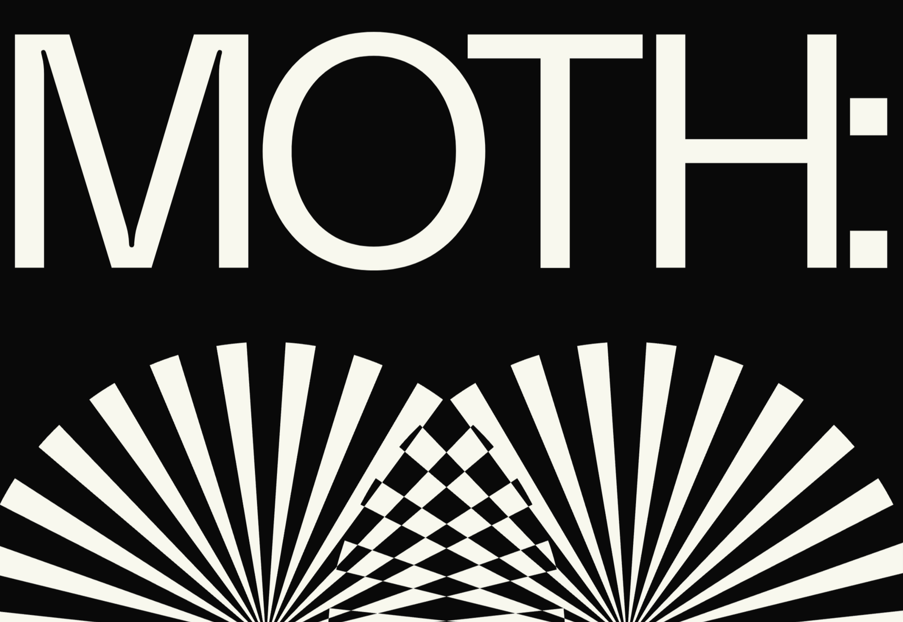
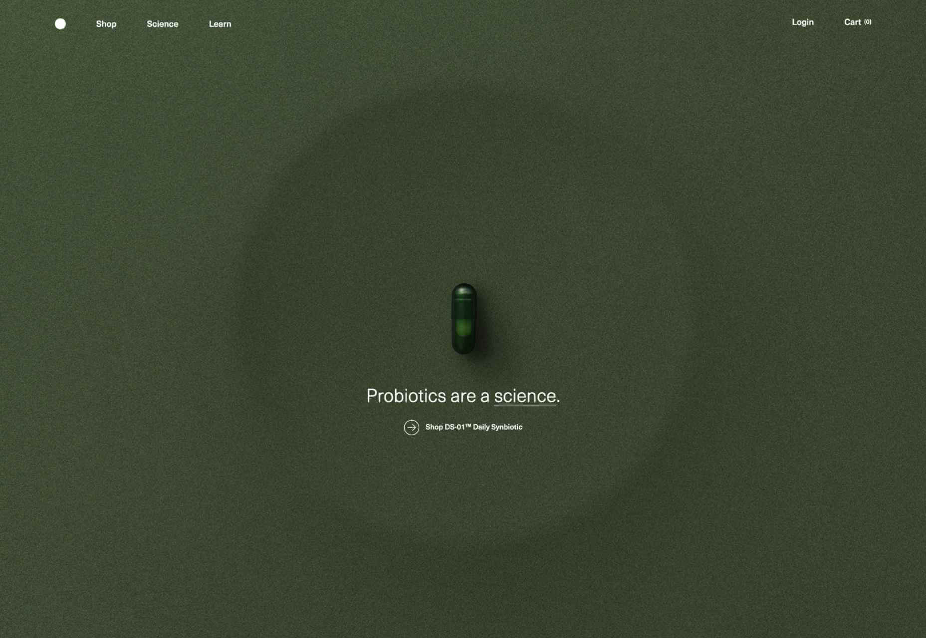
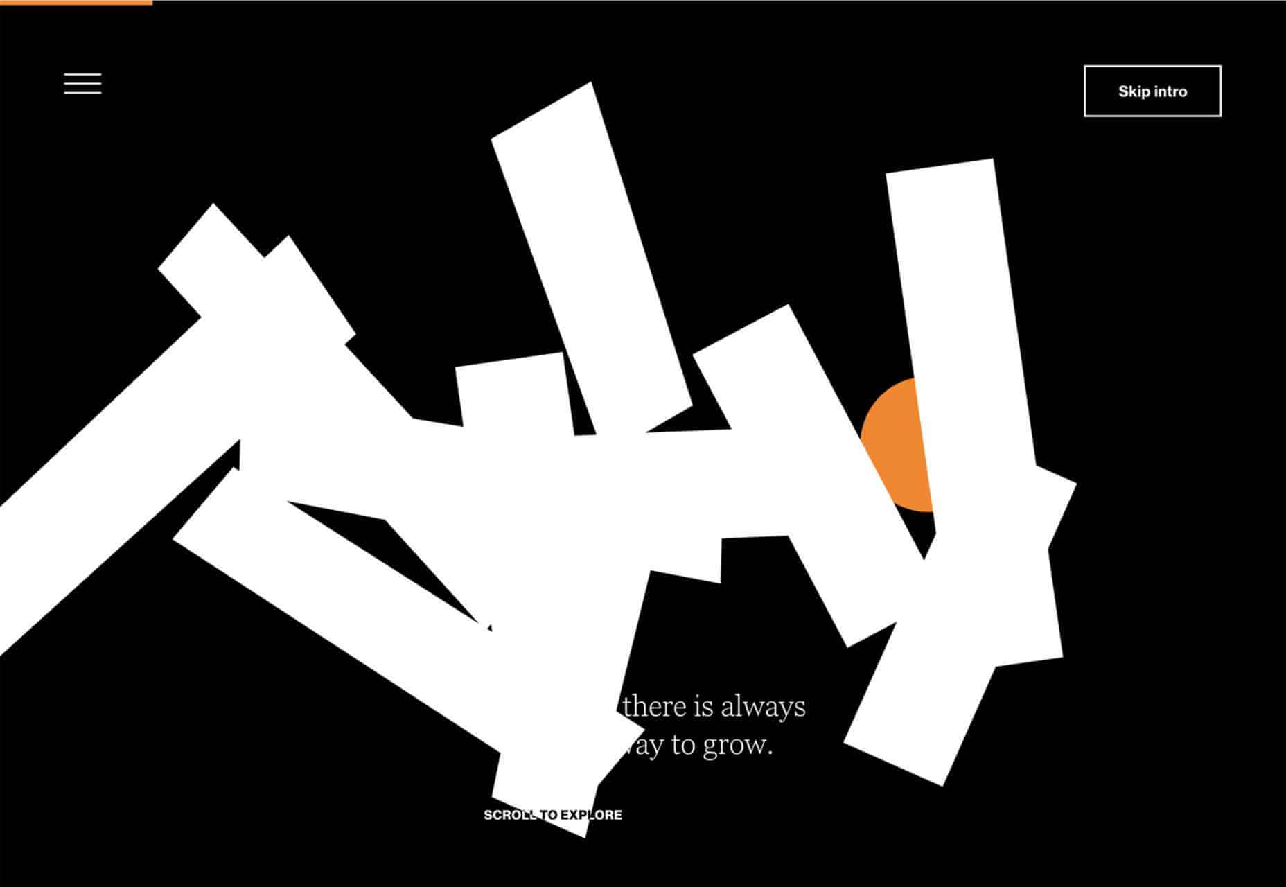
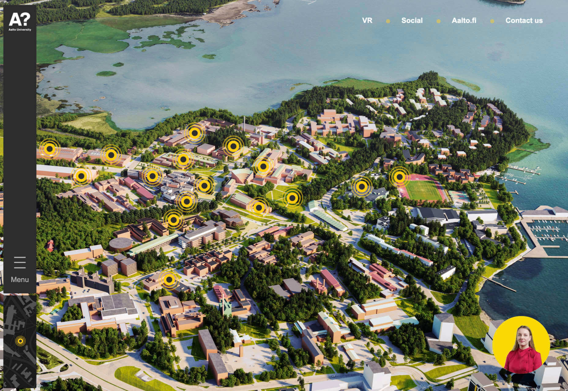
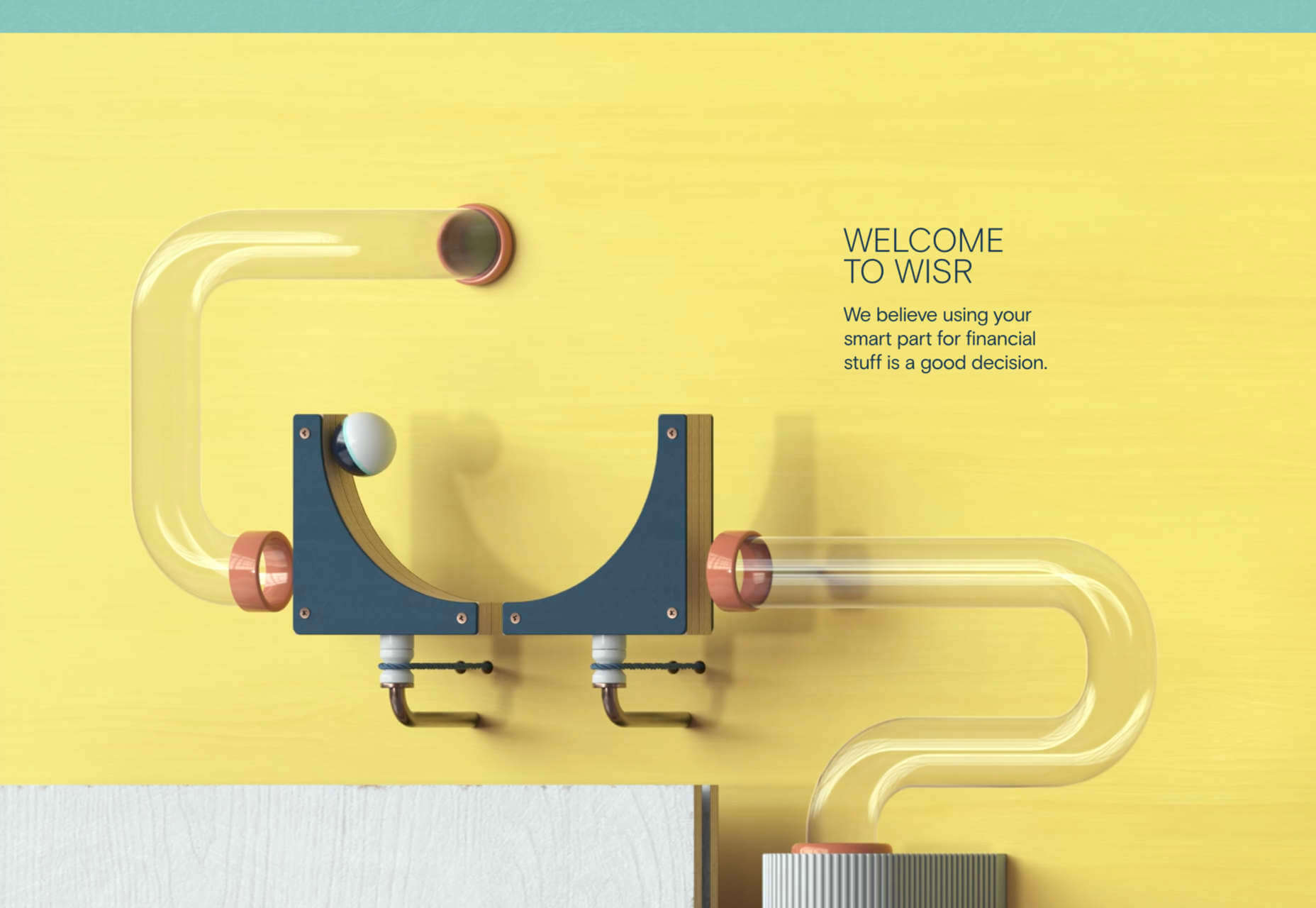
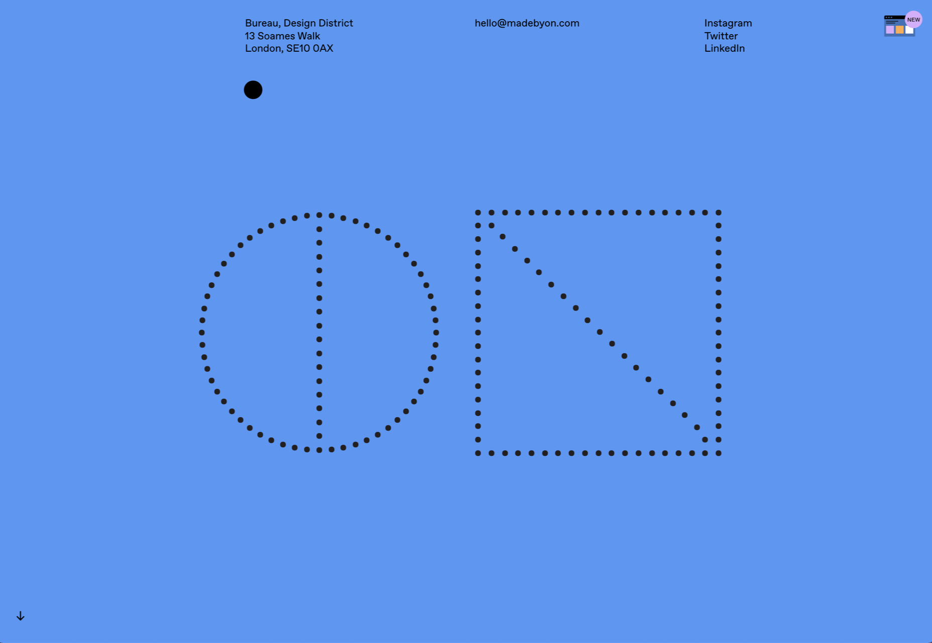
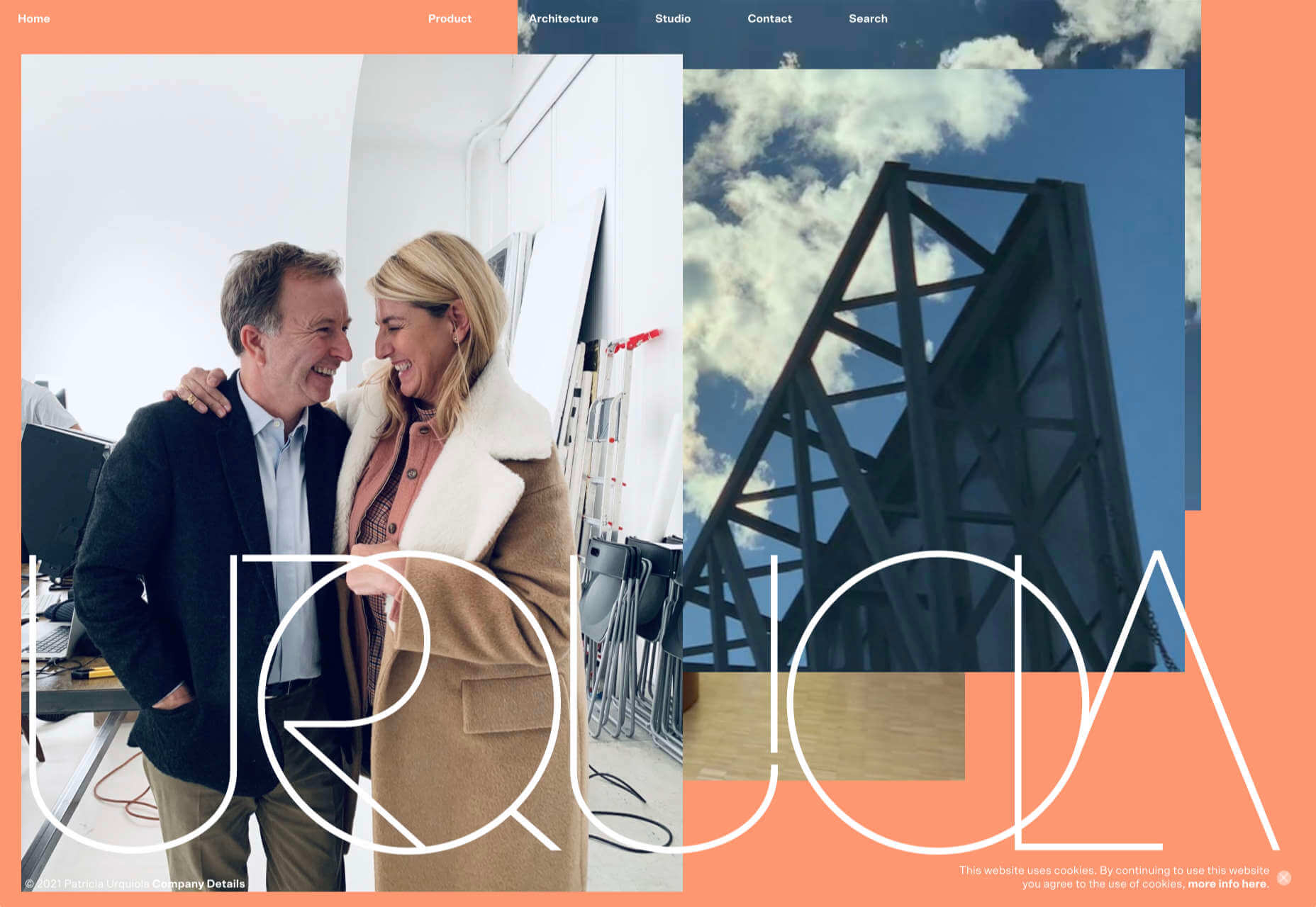
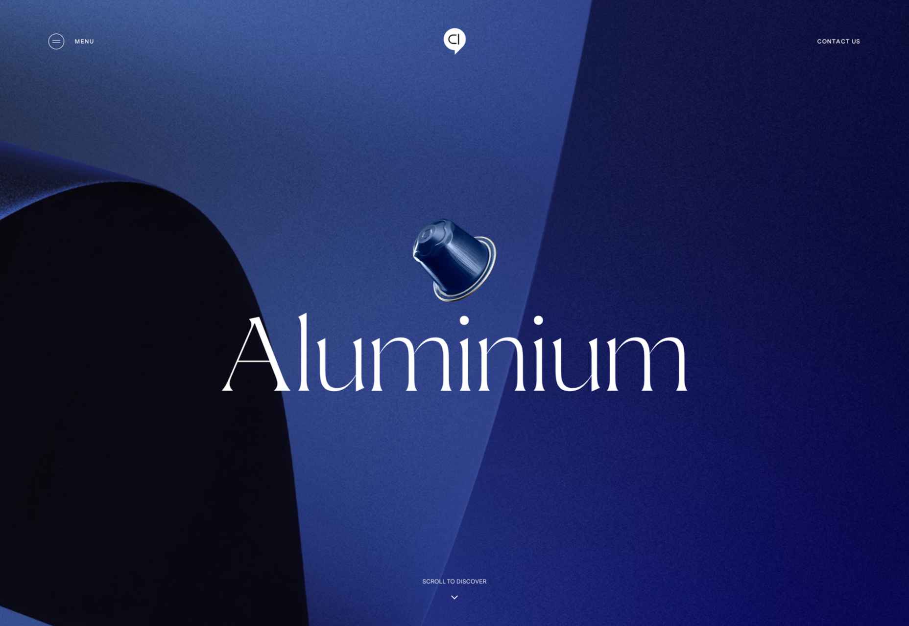
Source de l’article sur Webdesignerdepot

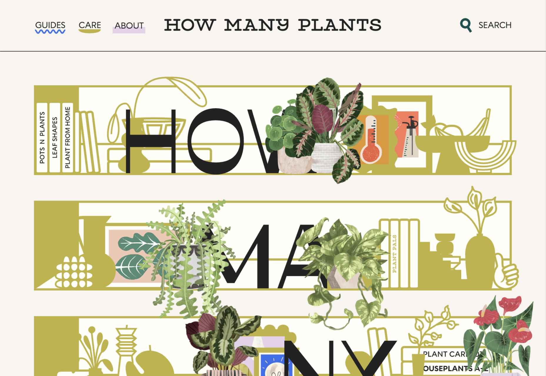
Every year, at this time, blogs like this one like to try and predict what’s going to happen in the year ahead. It’s a way of drawing a line under the archive and starting afresh. A rejuvenation that, as humans, we find life-affirming.

Ten years ago, I would have had high confidence in these predictions — after all I was eventually right about SVG adoption, even if it took a decade. But the last few years have shown that web design is tightly interwoven with the muggle world, and that world is anything but predictable.

So as we look at what might occur in the next year (or five), think of it less as a set of predictions and more as a wishlist.

Last Year’s Predictions

When I write this post every January, I like to keep myself honest by glancing back at the previous year’s predictions to gauge how accurate (or not) my predictions have been.

Last year I predicted the long-term trend for minimalism would end, WordPress would decline, cryptocurrency would go mainstream, and then hedged my bets by saying we’d make both more and fewer video calls.

Gradients, maximalism, and the nineties revival pulled us away from minimalism. It’s still popular, just not as dominant.

WordPress is still the biggest CMS in the world and will continue to be for some time. But the relentless grind of no-code site builders at the low end, and being outperformed by better CMS at the high end, mean that WordPress has passed its peak.

Over-inflated predictions for BitCoin reaching $100k by December 2021 turned out to be a damp squib. In the end, Bitcoin only tripled in value in 2021. However, with micro-tipping and major tech companies moving into the arena, it’s clear digital currency arrived in the public consciousness in 2021.

And how could I be wrong about more but also fewer video calls? So I’m calling that my first clean sweep ever. With that heady boast, let’s take a look at the next twelve months.

What Not to Expect in 2022

Do not expect the Metaverse to be significant in anything but marketing speak. Yes, the hardware is slowly becoming more available, but the Metaverse in 2022 is like playing an MMORPG on PS5: theoretically, great fun, until you discover that absolutely none of your friends can get their hands on a console.

Ignore the blog posts predicting a noughties-era retro trend. All those writers have done is looked at the nineties-era trend and added a decade. Fashions aren’t mathematical; they’re poetic. Retro happens when people find a period that rhymes with present-day hopes and fears. After the last couple of years, if we revisit a decade, it’s likely to be the late-forties.

Finally, don’t expect seismic change. Material design, parallax scrolling, and jQuery are still with us and are still valid choices under the right circumstances. Trends aren’t neat; they don’t start in January and conclude in December.

5 Web Design Predictions for 2022

Predictions tend to be self-fulfilling. So we’ve limited ourselves to five trends that we believe are either positive or, at worst harmless. Of course, there are no guarantees, but if these come to pass, we’ll be in good shape for 2023.

1. The Blockchain is Coming

Underpinning the cryptocurrency industry are blockchains. In simple terms, they’re a set of data that can be appended to but can’t be edited or deleted. Think of it as version control for data.

As with most technology, the first wave has been a way to make a fast buck. However, the exciting development is blockchain technology itself and the transformative nature of the approach. For example, Médecins Sans Frontières reportedly stores refugees’ medical records on the blockchain.

Imagine the Internet as a set of data, editable for a micro-fee, and freely accessed by anyone anywhere. Instead of millions of sites, a single, secure, autonomous source of truth. Someone somewhere’s working on it.

2. Positivity & Playfulness & A11y

Even before world events descended into an endless tirade of grim news, time was running out for dull, corporate, geometric sans-serif design.

We added gradients, we added personality, we embraced humor. And contrary to the established business logic, we still make money. Over the past few years, there have been extraordinary efforts by designers and developers to examine, test, and champion accessibility, and thanks to them, inclusive design is no longer reliant on the lowest common denominator.

In 2022 you can get experimental without obstructing 10%+ of your users.

3. Everything Green

Green is a fascinating color, the primary that isn’t (except in RGB, when it is).

Green has the same visual weight as blue, is substantially more flexible, and yet to date, has been radically underutilized in digital design.

Green has a prominent cultural association with the environment. At a time when tech companies are desperate to emphasize their ethical credentials, marketing companies will inevitably begin promoting a brand color shift to green as a quick fix for all those dumped chemicals, strip mines, and plastic-filled seas.

We’ve already seen earthy hues acquire popular appeal. At the other end of the vibrancy scale, neons are popular. Green spans both approaches with everything from calm sages to acidic neons.

In 2022, if you’re looking for a color to capture the moment, look to green.

4. Hero Text

A picture is supposed to be worth 1000 words, although I’m not sure anyone has actually tried to measure it. The problem is that sites increasingly rely on stock images, so the 1000 words that we’re getting may or may not accurately reflect 100% of our message.

In 2022, a handful of well-chosen words will be worth more than an image, with hero images taking a back seat to large hero text. This is aided by a number of minor trends, the most notable of which is the willingness of businesses to look beyond the geometric sans-serif to a more expressive form of typography.

Reading through the prediction posts on sites other than this, almost everyone agrees on large hero text replacing images, which virtually guarantees it won’t happen. Still, at the start of 2022, this seems to be the direction we’re taking.

5. Bring the Noise

One of the unexpected consequences of the past couple of years has been a renewed connection with nature. The effortless complexity in nature is endlessly engaging.

We’ve already begun to popularise gradients — there are no flat colors in nature — and the next logical step is the addition of noise.

In visual terms, noise is the grainy texture that sits so beautifully in vector illustrations. Noise has dipped in and out of trends for years, hampered a little by the leap in file size it creates. However, with WebP and Avif file types, noise is now usable on production sites.

Designing in 2022, when in doubt, throw some noise at it.


Featured image via Unsplash.

Source

The post 5 Big Web Design Predictions for 2022 first appeared on Webdesigner Depot.

Source de l’article sur Webdesignerdepot

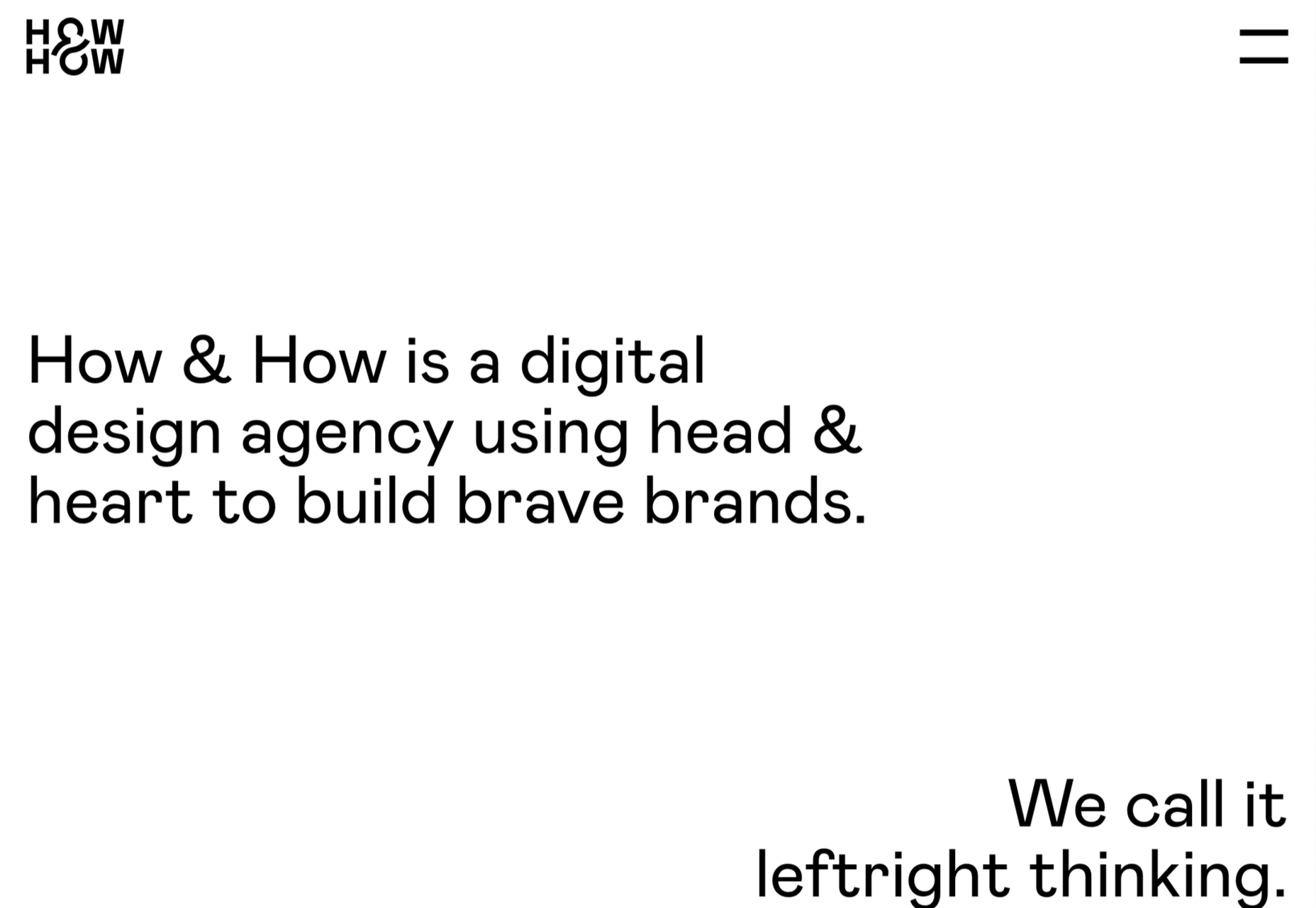
2021 has been both memorable and instantly forgettable. Pop stars were freed from modern-day servitude, some people tried to overthrow democracy, and we all vacationed at home.

Despite the weirdness of the times, the web kept growing, kept changing, and kept on pushing boundaries. We saw a wealth of new sites launch or relaunch with significant updates.

Here are the 50 best sites launched on the web this year. Enjoy!

Crusta C

In April, seafood company Crusta C cleverly used the simple logomark ‘C’ to apply a cutout video effect.

Slow

Slow is a collective of creatives aiming to implement slow movement principles. Its site reflects those aims, creating a sense of calm and deliberation.

hnst

2021 saw tons of brutalist-inspired design. hnst’s take on the style works thanks to the bright red in place of the standard black.

Marram

This site for boutique hotel Marram uses a soft color palette to create an impression of soft golden light and calm.

Levitate

In July, we loved this site for running-blade brand Levitate. The site is clean and light, with a sense of inherent motion in the photography.

Niarra Travel

There’s some beautiful photography on this site for eco-conscious, bespoke travel agency Niarra Travel.

Plunt.co

The core of this site for Plúnt is a combination chooser which feels pleasingly reminiscent of an animal flipbook.

Moth Drinks

Moth makes classic cocktails in a can. The striking black and white graphics and masking effects for its holding page stunned us back in March.

Seed

Selling supplements is hard; people are understandably skeptical. So this site for Seed packs in research and scientific information and avoids the hard-sell.

Wavemaker

Another excellent portfolio site in 2021, this time for creative media agency Wavemaker. The site is uber-confident while still being playful.

Wild Souls

Wild Souls makes nut butters, tahini, and other Greek delicacies. Its site is colorful and warm, and the site typography is soft and appealing.

JUST Egg

JUST Egg produces egg-like food from plant material. The huge photography and bold typography do a great job of making a new concept appealing.

Aalto University

One of the most popular designs of 2021 was Aalto University’s site with its in-depth campus tour. The simple navigation inspired several imitators.

Wisr

Scroll interactions were big in 2021, and Wisr features a Heath Robinson-style machine that ‘runs’ as the user scrolls down the page.

Cevitxef

This site for Cevitxef ceviche restaurant in Bilbao does a great job of making us hungry. Drama is created by oversized text, heavily-styled photography, and lots of movement.

On

The best digital agencies keep their own sites simple, like this site for On digital technology studio that uses black on light blue and adds infinite scrolling.

Acayaba + Rosenberg

We found Acayaba + Rosenberg’s use of architectural photography and subtle scrolling a pleasing browsing experience.

Madre

This site for home linen company Madre uses extraordinary fine-art style still-life photography to enrich a very simple site.

Hyperframe

“Show, don’t tell” is a well-worn mantra. Hyperframe’s site implements it by demonstrating the product’s major selling point on scroll.

Gemini

This exceptional WebGL experiment was built to show what’s possible in the technology. Have a play with the car; it’s a ground-breaking demo.

Felt

In 2021, collaborative mapping tool Felt launched in private beta. Its excellent site does a great job of creating interest while doubling as a recruitment notice.

imNativ

Not every project is exciting, but this excellent site for imNativ uses macro photography to great effect to promote upholstery fabric.

Websmith Studio

Excellently named Websmith Studio uses color to highlight, and the noise effect applied to the background adds subtle interest.

Singita

High-quality photography and a terracotta-based color scheme create an inviting ambiance for Singita, an African eco-tourism and conservation brand.

Fluff

A fullscreen background behind a mobile view for desktop? It sounds like a horrible idea, but this site for cosmetics brand Fluff pulls it off.

Chiwawa

This great site for Chiwawa cantina features wrestling masks, skeletons, and tone-on-tone color to create a lively and distinctly Mexican site.

Nothing

This site for Nothing’s ear(1) earbuds is packed with confidence. Appropriately, it looks even better on mobile.

Chérie Healey

Lots of experts have tried to tell us how to live our lives in the last couple of years, but Chérie Healey’s site manages to stay on the right side of positive without slipping into clichés.

Wayfinder

Wayfinder, a game about our connection to nature using generative code, AI, machine learning, and data mining, could not have been more 2021 if it tried.

Green Angel Syndicate

Not too many investment groups are thought of as ethical, but Green Angel Syndicate specializes in funding companies fighting climate change.

Tether

As the days got darker in the Northern hemisphere, we were wowed by this site for Tether, a cycle safety system using video and illustration to explain its clever approach to bike safety.

Patricia Urquiola

Back in January, we loved the new site for Patricia Urquiola design studio, thanks to its bright, bold colors that we thought inspired confidence.

Headup

Headup’s businesslike approach is created thanks to a pleasing color palette and geometric graphics.

Redwood Empire

For Earth Day on April 22nd, Redwood Empire Whiskey created a microsite promoting a competition styled to match their bottle labels.

GT Super

The one-pager for GT Super has a certain drama in keeping with the font itself and allows you to play around with the size, weight, and style.

Planet of Lana

Due for release in 2022, Planet of Lana is a game from Wishfully Studios, and its teaser page launched back in June has kept us intrigued ever since.

The Longest Road Out

This charming site for The Longest Road Out is a travel map and journal based on the creators’ road trip around Britain, Ireland, and the outlying islands.

Made Thought

Made Thought has a bold aesthetic and approach that explains its outstanding client list.

Miti Navi

Miti Navi makes extraordinary sailing boats. We were attracted to how its site presented a luxury product in an original way.

La Nouvelle

Another powerful digital design agency site was La Nouvelle’s, which used a combination of contrasting and complementary color combinations to catch the eye.

Caleño

Caleño makes non-alcoholic distilled spirits. They relaunched their website in March with bright, joyful colors that reflect the character of the brand.

Capsul’in — Aluminium

This demo site for a coffee pod manufacturer isn’t a site as such, but it demonstrates that even in 2022, there’s room for parallax scrolling.

How Many Plants

Everyone needs a few more houseplants, and How Many Plants is a great guide to how to own and look after them. The illustration style is friendly but efficient.

How & How

One of the most approachable design agency sites of 2021 was How & How’s. It keeps things light and clean, and effective.

The Hiring Chain

Part of a campaign encouraging businesses to employ talented people with Down Syndrome, The Hiring Chain website dispels myths with clearly presented facts.

Virgile Guinard

Back in February, we couldn’t get enough of photographer Virgile Guinard’s portfolio site. Blocks of color pulled from each image hide the image allowing you to focus on one image at a time.

Studio Nanna Lagerman

Studio Nanna Lagermann’s site excels at creating a sense of space and calm. The color palette is soft and neutral. The type is large but clean and sophisticated.

GOOD Meat

Veganism is a growing trend, and one of the sites promoting it with gorgeous colors is this site for lab ‘grown’ meat.

Mama Joyce Peppa Sauce

This one-page site for Mama Joyce Peppa Sauce is big and bold. Click almost anywhere, and two bottles of sauce go into your cart.

Ebb Dunedin

The site bucks the trend for luxury hotel design and instead is styled to complement its interiors. We could have done with time at this boutique hotel in 2021, maybe next year…

Source

The post 50 Best Websites of 2021 first appeared on Webdesigner Depot.

Source de l’article sur Webdesignerdepot

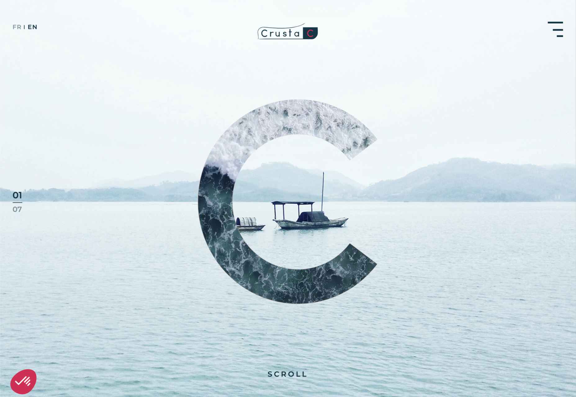
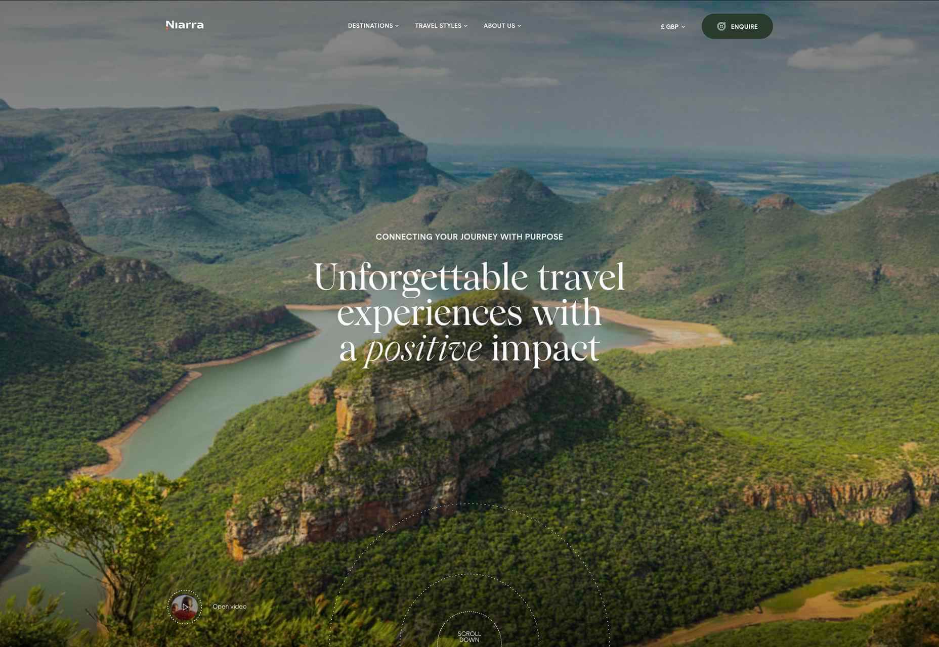
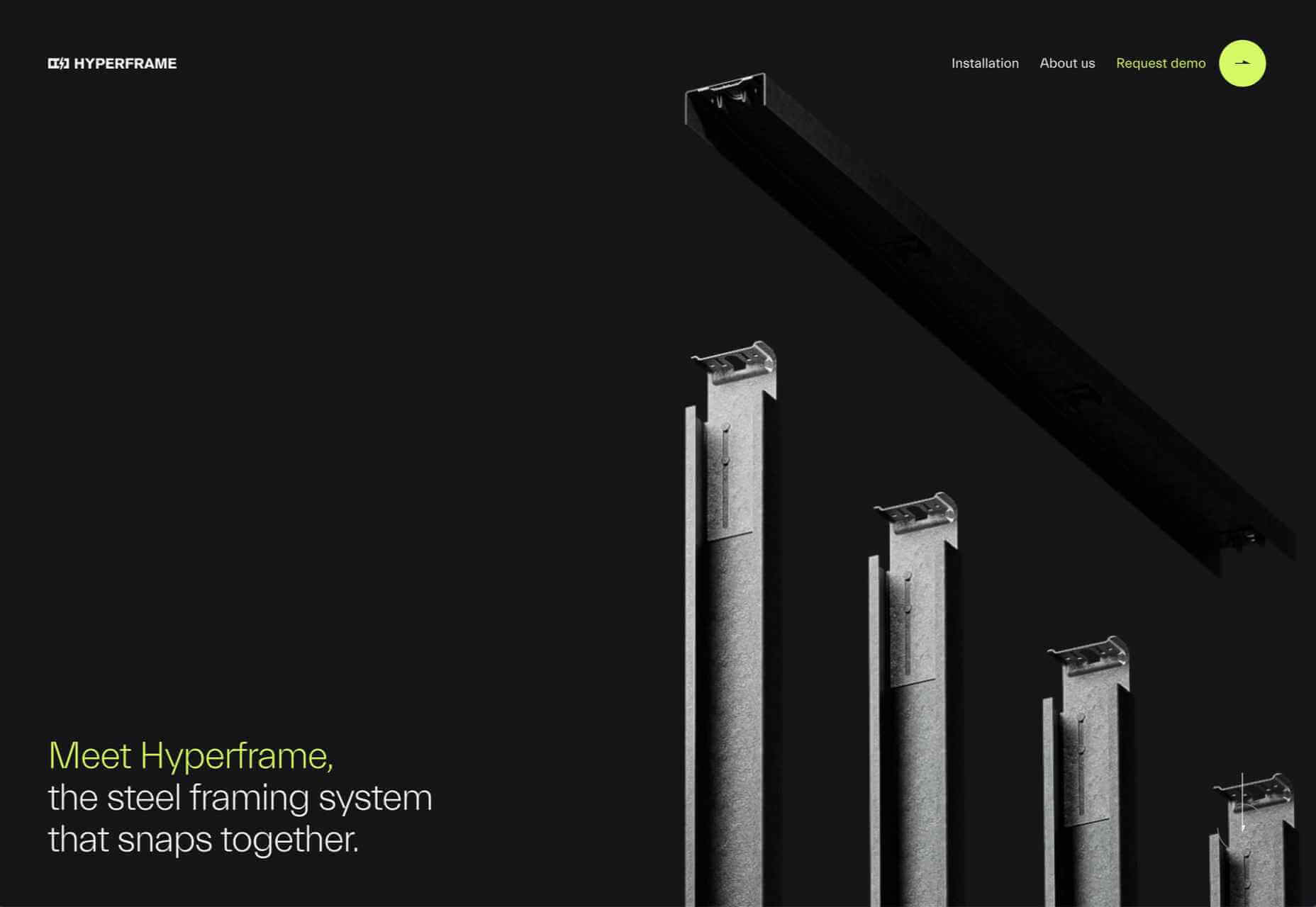
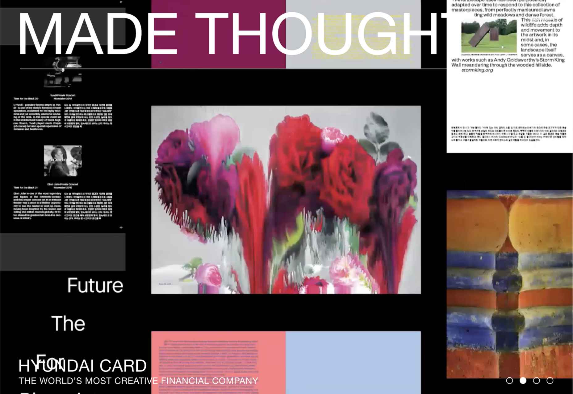
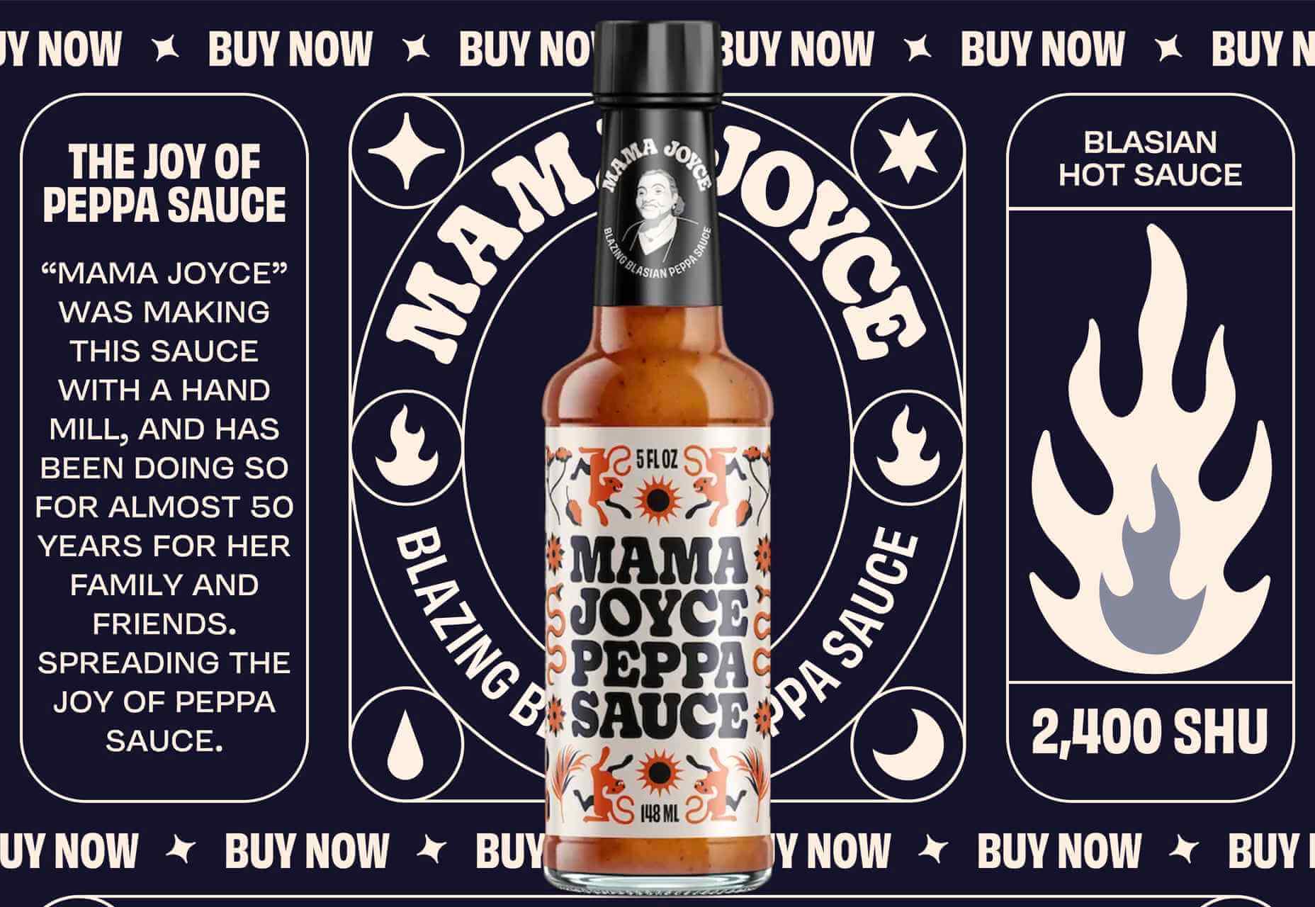
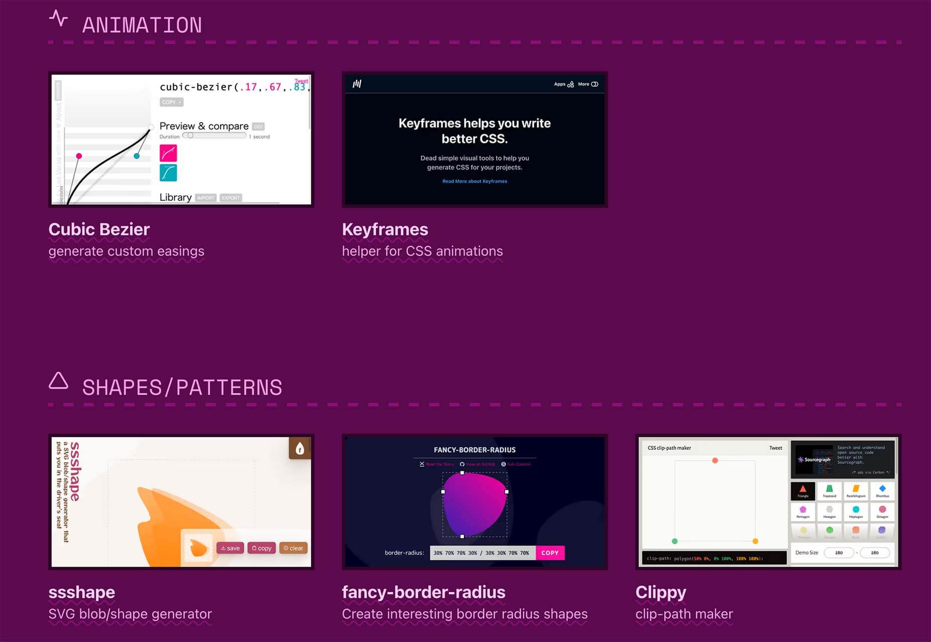
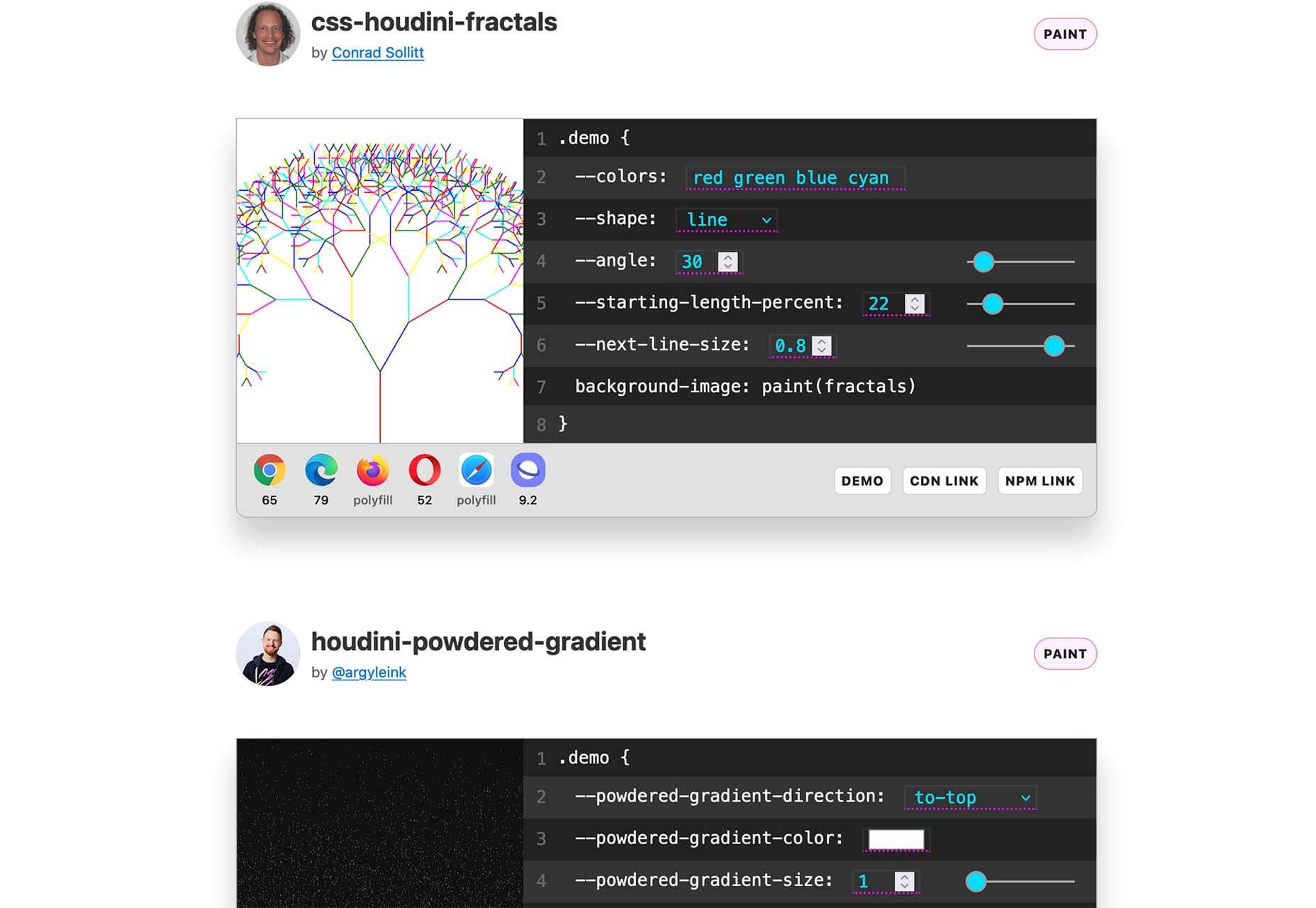
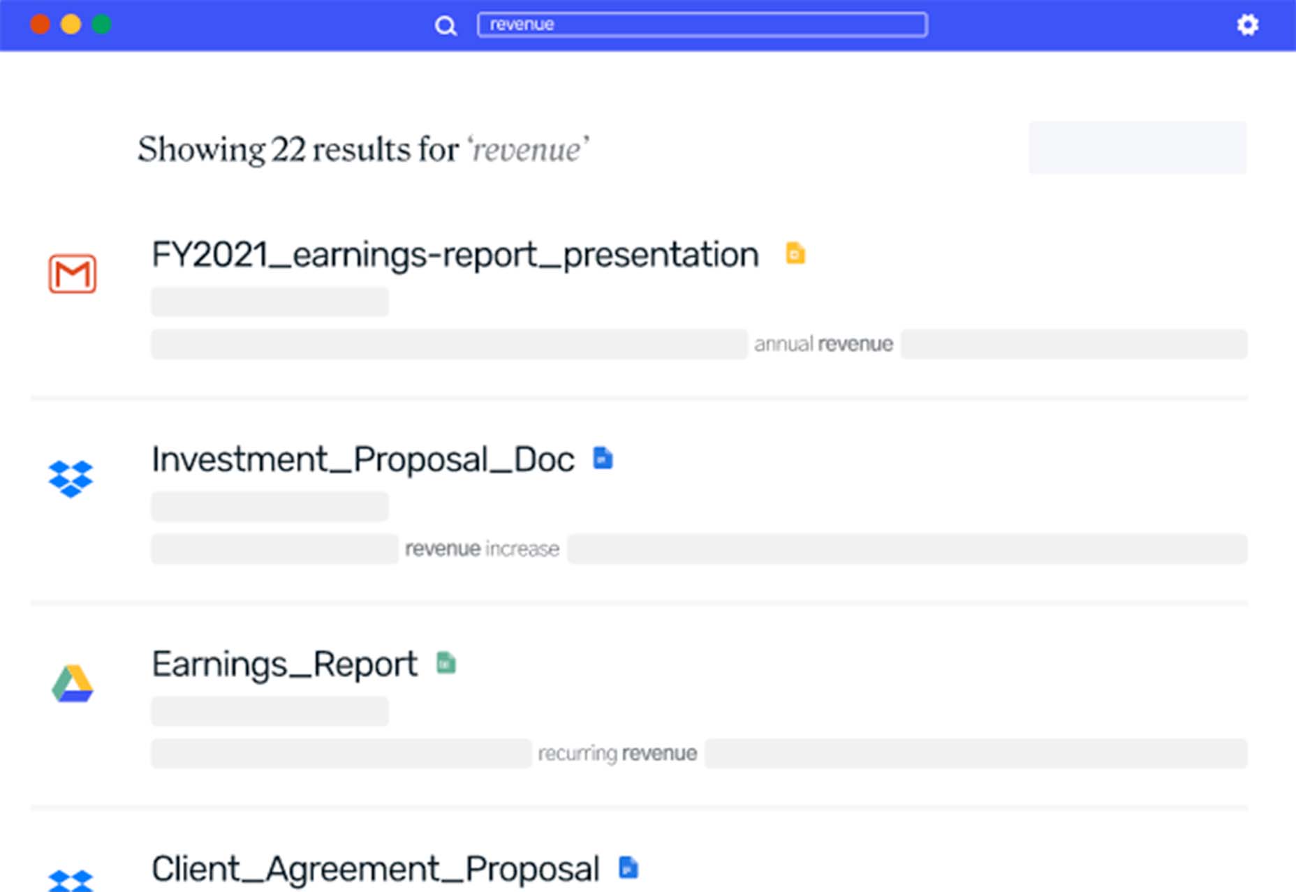
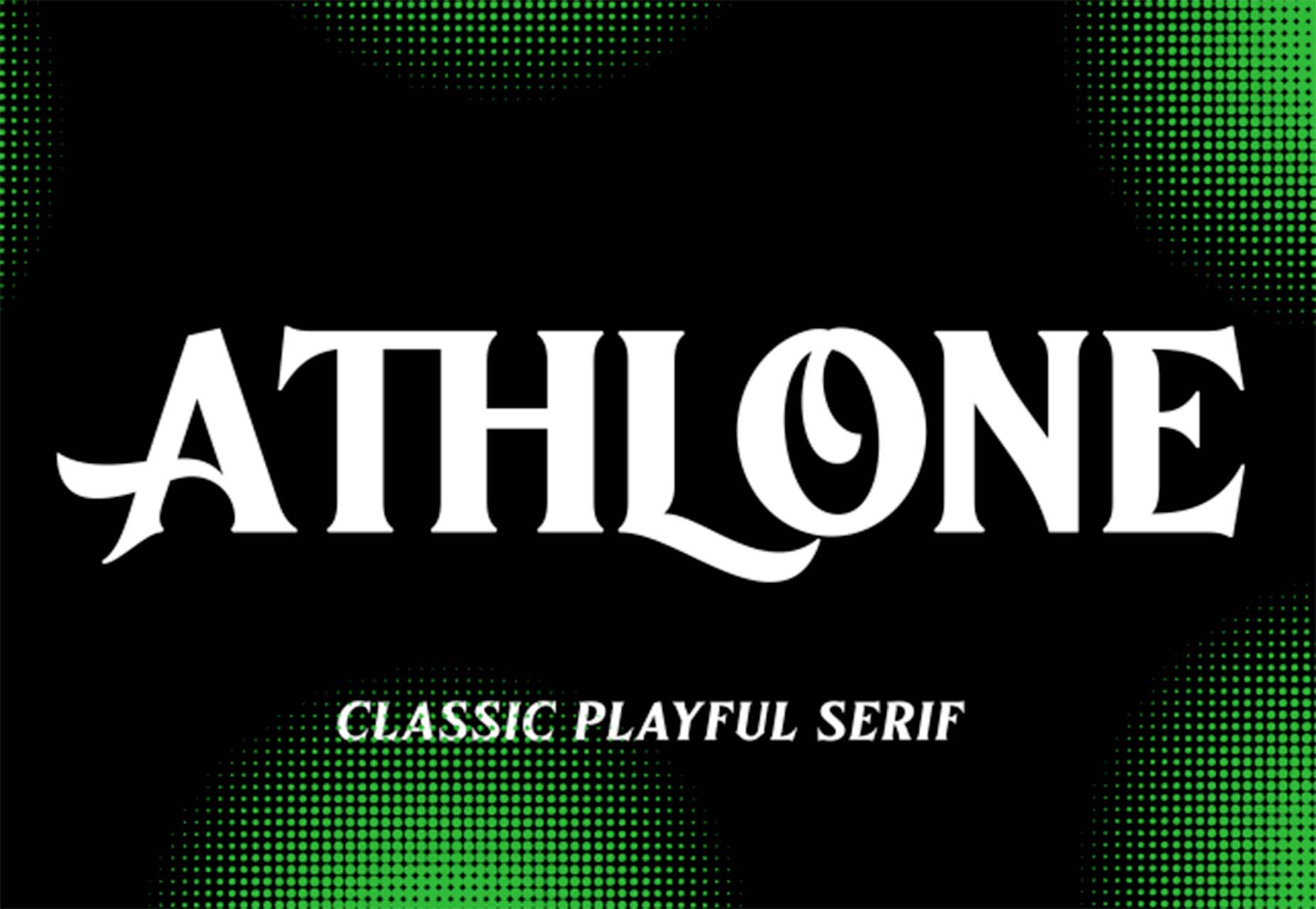
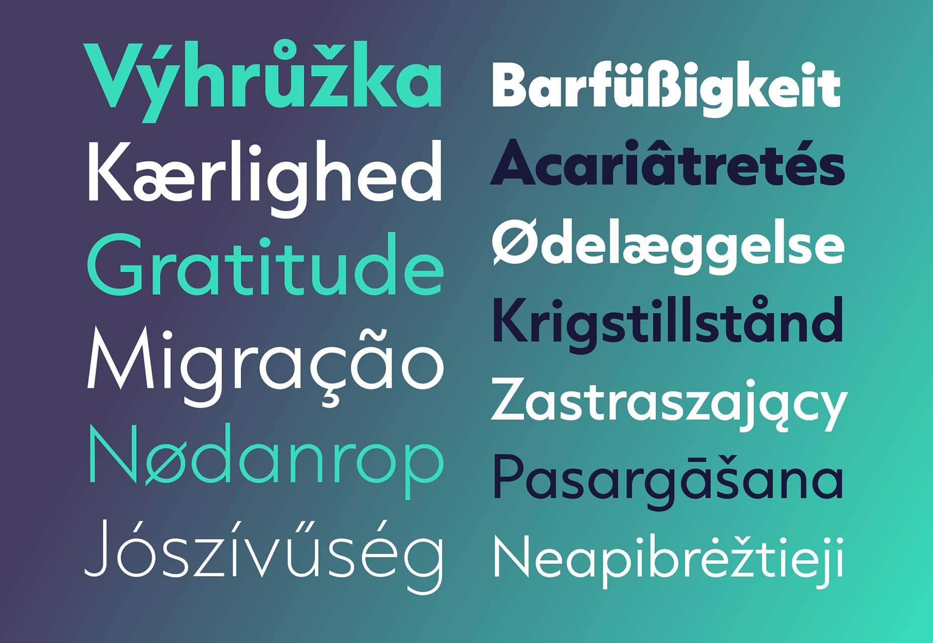
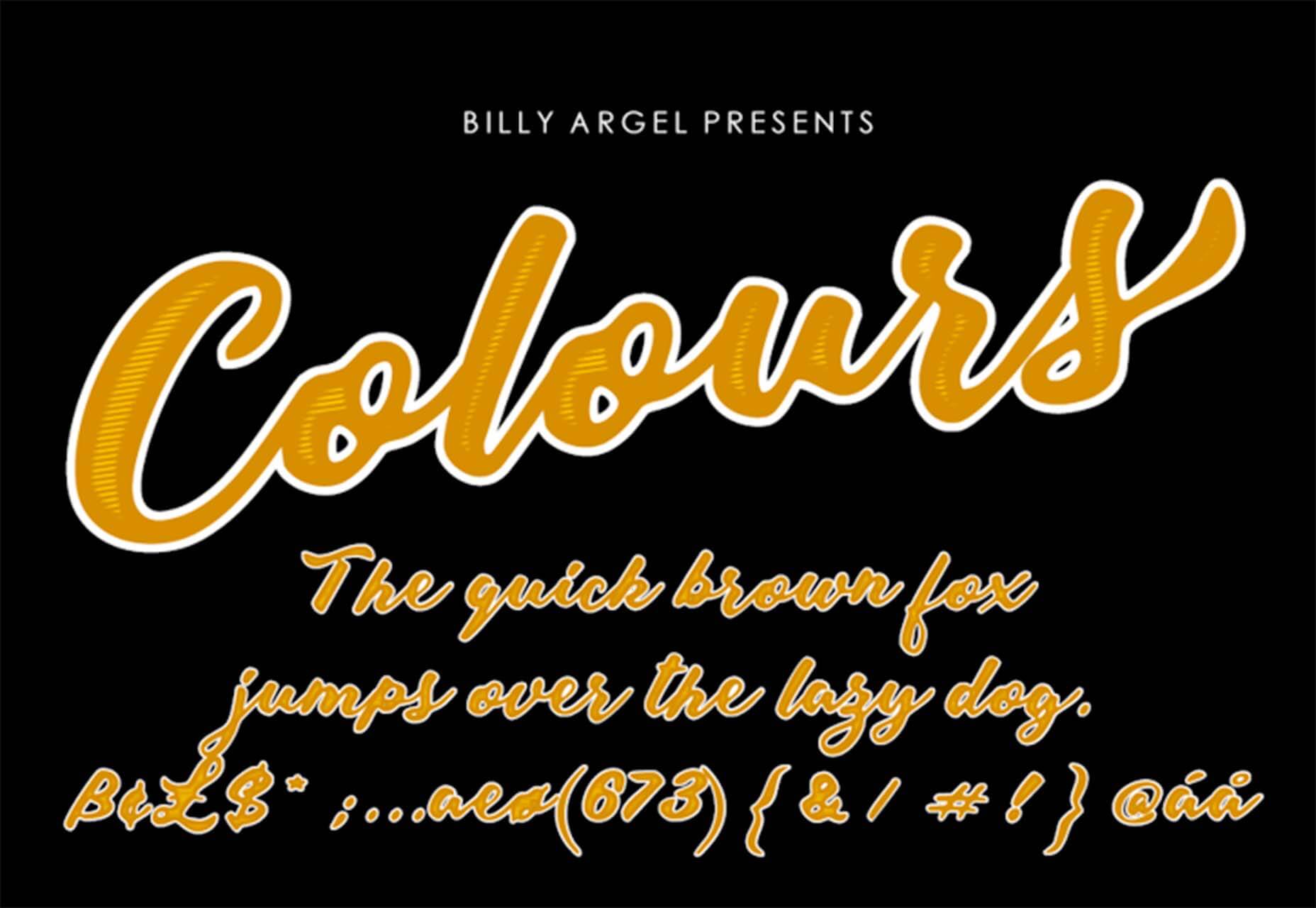
There are some spook-tacular finds in this month’s October collection of resources and tools for designers and developers. From interesting tools that can help in the design process to boo-tiful typefaces, there’s something for everyone here.

Here’s what is new for designers this month…

Atropos

Atropos is a lightweight, open-source JavaScript library to create touch-friendly, three-dimensional hover effects. The results are stunning and have a nice parallax style. Everything is highly configurable and customizable. It’s available for JavaScript, React, and Vue.js and has zero dependencies.

CSS Gradient Editor

CSS Gradient Editor helps you create the perfect gradient style – you can start from presets – that you can use in projects. Design a background, fill, or almost any other gradient element you might need, make adjustments or customizations, and then get the CSS with one click so you can use it right away.

Octopus.do

Octopus.do is a fast visual sitemap builder that lets you work in real-time using the content brick method. Share and collaborate in real-time and there’s no signup required to use it.

Pirsch Analytics

Pirsch Analytics is a privacy-friendly, open-source alternative to Google Analytics — lightweight, cookie-free, and easily integrated into any website or directly into your backend. It includes filters to see metrics in the way you want and light and dark modes.

Basic Pattern Repository

Basic Pattern Repository is a collection of simple SVG patterns for projects. Everything is rooted in a simple style to help push projects along quicker. You can get it via GitHub or as a Figma Library.

Blobr

Blobr is a way to get a branded API portal, manage access, and monitor usage all in one place. Customize everything to fit your brand and the tool grows as you do with the ability to increase or change capacity. Plus, it is easy to set up and free to use.

HEXplorer

HEXplorer helps you better understand something you use all the time – HEX colors. This pen by Rob DiMarzo shows how the values for different colors come together to provide greater comprehension when it comes to this color format.

CCCreate

CCCreate is a curated collection of tools and resources for web creators. It includes some tools that have been around for a while as well as some newbies. Everything is grouped and sorted by type of resources – color, icons, type, layouts, animation, shapes, docs, and miscellaneous so you can find what you are looking for faster.

Glass

Glass is a photo-sharing app for photographers. It’s a social network of sorts that lets you share images with the greater photography community without “likes.” Just great images.

Revolt

Revolt is a chat app that’s still in beta and designed for easy communication without having to download apps. It’s an open-source project that is customizable and with an intuitive and recognizable interface. The thing that’s different about this app is that it is built on a privacy-first model.

Doodle Ipsum

Doodle Ipsum is the illustrated version of placeholder elements. Customize your doodles, grab the code, and use them on your web prototypes, landing pages, or no-code tools.

Mechanic

Mechanic is an open-source framework that helps you create custom, web-based tools that export design assets in your browser. The best part is you can try it right on screen using the “poster generator.” If you like what you see, there’s plenty of documentation to help you along the way.

Medio Website Template

Medio is an agency-style website design template for Bootstrap 5. The layout is perfect for a design agency or marketing group but can be adjusted for almost any multi-purpose design. The free template includes a minimal design and includes features such as parallax, popup video, and more.

Tutorial: Simplifying Form Styles with Accent Color

This tutorial is a life-saver when it comes to using and understanding the new CSS accent-color property. This quick lesson will help make your life easier and is simple to use. It starts with setting an accent-color property on the root element and then applying it.

Houdini.how

Houdini.how is a worklet library that is full of CSS and code examples to help you work smarter. See how different elements look cross-browser and learn to adjust the code and put them together in just the way you want. Houdini is a set of low-level APIs that exposes parts of the CSS engine, giving developers the power to extend CSS by hooking into the styling and layout process of a browser’s rendering engine.

Chainstarters

Chainstarters is a powerful, rapid, Web3-enabled platform for software developers. It eliminates the burden of setting up and maintaining a secure and scalable infrastructure, allowing you to focus on creating amazing technology.

Web Vitals Robot

Web Vitals Robot is a search optimization tool that monitors SEO metrics for you – so you can prevent your business from disappearing from Google.

Searchable

Searchable is a unified search tool that looks at local, cloud storage, and apps to find the files you are looking for. It returns results in a jiffy with previews so you don’t have to open every file to find what you are looking for.

Athlone

Athlone is a fun serif with lots of personality. The free demo version includes a limited character set for personal use only and the full version has everything you need for fun display or branding with this typeface.

Capitana

Capitana is a Geometric Sans typeface with humanistic proportions and open apertures. This means that all shapes are constructed from basic forms, the circle, triangle, and square, and are designed according to the classic proportions of the Roman Antiqua. Distinct ascenders and pointed apexes with deep overshoot give it a cool beauty and classic elegance. It includes 784 characters per style in nine weights from Thin to Black, it offers both light and extremely heavy weights for striking headlines.

Colours

Colours is a funky script with just enough texture to keep it interesting. The free version includes a partial character set and is for personal use only.

Flexible

Flexible is a variable typeface that includes 18 styles in the family. It’s made for creativity and display use. This typeface is made for experimenting because there are so many things you can do with this single family.

Singo Sans Serif

Singo Sans Serif is a simple and strong typeface that would make an excellent display option. The free version is for personal use only. Fun fact: Singo means Lion in Indonesia, which is where the name of this strong font comes from.

Source

The post Exciting New Tools For Designers, October 2021 first appeared on Webdesigner Depot.


Source de l’article sur Webdesignerdepot

Every day design fans submit incredible industry stories to our sister-site, Webdesigner News. Our colleagues sift through it, selecting the very best stories from the design, UX, tech, and development worlds and posting them live on the site.

The best way to keep up with the most important stories for web professionals is to subscribe to Webdesigner News or check out the site regularly. However, in case you missed a day this week, here’s a handy compilation of the top curated stories from the last seven days. Enjoy!

The 17 Best WordPress Alternatives (Open-Source & Hosted)

Essential CSS Concepts Every Designer Should Know

Kable – The Better Way to Build Subscription Partnerships

35+ CSS Glow Effects (Free Code + Demos)

3 Essential Design Trends, July 2021

The Anatomy of a Web Page: 14 Basic Elements

How To Build Better UI Designs With layout Grids

User Inyerface – A Worst-Practice UI Experiment

10 CSS & JavaScript Snippets for Creating the Parallax Scrolling Effect

5 Ways To Achieve A Human-Centered Web Design

Source

The post Popular Design News of the Week: July 5 2021 – July 11, 2021 first appeared on Webdesigner Depot.


Source de l’article sur Webdesignerdepot

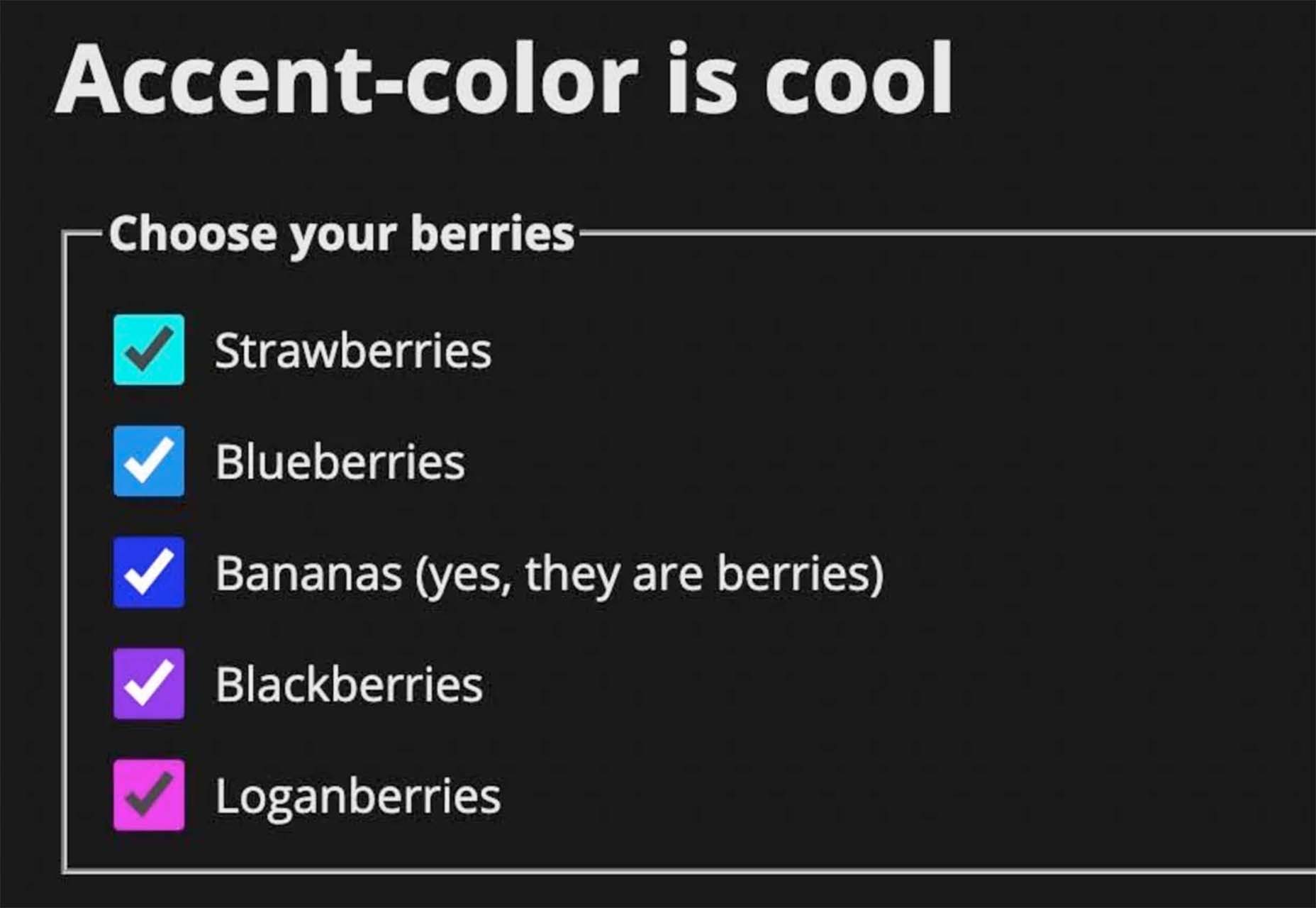
Parallax is a term that is applied loosely and frequently in the world of web design. As a trend, it has been popular and unpopular in equal measures for some time. However, it’s still one of the most valuable tools for animation in the digital world.

Parallax creates an illusion of depth when scrolling, a timeless effect that still has lots of value in the web design world.

Sure, parallax has its issues, from problems with usability, to concerns with mobile responsivity — but it’s also an interesting way to make a website stand out when done correctly.

Let’s take a closer look at some of the ways that parallax scrolling still works in 2021…

1. Parallax Tells A Story

Let’s start simple. 

One of the most effective ways to use parallax scrolling in the modern age is to tell a story. Today’s consumers want to have an emotional connection with the brands they buy from – now more than ever. Five years ago, studies showed that around 80% of customers want brands to tell stories, and that trend remains consistent to this day.

In the age of digital consumerism, where people can’t get to know a company in person through face-to-face interactions with its salespeople, companies need new ways to connect with their clients. Telling brand-driven stories is a way to highlight that your company is more than just a faceless entity – it’s something with real soul. 

Let’s look at the “Recap After Use” website, a portfolio belonging to the innovative Louie Sellers. This website showcases Louie’s skills with attention-grabbing visuals, including a parallax animation that makes it looks like Louie is drawing the page as you scroll through it.

This is the kind of exceptional animation that makes parallax scrolling more compelling. The animation isn’t there to make a visual difference to the page – it tells you something more about the person behind the website and what they can do.

2. Parallax Increases Website Visit Times

If a website effectively tells a story with parallax animation, you can also bet that’s going to keep customers or readers on a page for longer. Reducing bounce rate by increasing engagement is one of the main goals of any web designer. (Bounce rates, of course, refer to the percentage of site visitors that hit the back button after just seeing the first page of your website.)

While some people argue that parallax websites can hurt your SEO rankings if they slow down your site, there’s also the argument that the lack of a visually engaging page can harm SEO. Bounce rates drag down your ranking and make it harder to get audience attention. 

A parallax animation that tells a story and engages your audience through carefully delivered information is a great way to keep people around – even just for a little longer than usual. For instance, if you check out Alex Dram’s portfolio page here, you’ll see several shapes coming together during the parallax scrolling animation.

The shapes merge to tell a story about the visual experiences that Alex can create for customers. It’s a way to draw the eye and connect with the viewer without just writing about what you do through text. 

3. Parallax Develops Credibility

There’s a reason why both examples of parallax scrolling we’ve looked at so far are from creative portfolios. Parallax scrolling, with its excellent storytelling capabilities, is great for demonstrating your credibility as a digital expert. Basically, it’s a version of “showing” and not “telling” customers about your skills. 

You can tell someone that you know how to use tricky techniques like parallax animation correctly, but they’re less likely to believe you that way. If you can show that you have the skills to create something amazing, that’s more engaging. 

The OK Alpha team is a great company to reference when it comes to sensational design. This company seems to always be on the cutting edge of the latest trends, whether it’s bold typography or bright colors. To add to the impact of their website, the company has combined parallax effects into the mix to make everything more immersive as you scroll. 

This is a beautiful example of how companies in the design landscape can use techniques like parallax scrolling to show what they’re capable of. 

4. Parallax Makes Information More Fun

Most of us are naturally visual learners. We like to consume information in a way that’s refreshingly eye-catching and attractive. That’s why visual content generally earns more social shares and attention than written content. With parallax scrolling, companies that want to deliver valuable information and educational content to their audience can do so effectively.

Rather than just scrolling through a page and seeing lots of text, your customers can see images and graphs come to life alongside the blocks of text they’re reading. It’s like adding video demonstrations next to a textbook to help people better understand what they’re reading about. 

Look at the Web Design and Art History microsite from Webflow as an example. The company wants you to understand how web design and art have evolved over the years, but it doesn’t want to deliver that information in a boring format. The bright graphics and parallax animation work together to give you a more contextual, meaningful experience.

5. Parallax Replicates Another Medium

What if you could remind someone of their experience when reading a book or watching a video while telling them about a video or a novel? Parallax scrolling and animation can help with that. It’s a way of making your website feel like a video presentation or slideshow without the added components of implementing video players into your back end. 

Parallax scrolling also has another slight benefit over a standard video-based website. On a website that uses a video for a background, the video often plays automatically. This means that your visitors can’t control how quickly the video plays. 

On the other hand, parallax animations driven by scrolling action allow your customer to collect information at a pace that suits them. Take a look at the Story of the Goonies website, for instance. This stunning parallax site introduces you to the details you need to know about the movie in a way that makes it feel like the intro to a film.

The great thing about the parallax on this site is that the slow video-style design also gives you a dose of nostalgia – which ties in perfectly with the movie. 

6. Parallax Is More Memorable

What’s the main reason any designer does anything special to a website? To make it stand out, of course. Web design is all about conveying the unique essence of a brand, business, or entity in a way that’s going to make that client unforgettable. Although parallax isn’t as novel as it once was, it can still be a way to make your site stand out – if it’s used correctly. 

The key to success with parallax scrolling for memorability is making it smart. The layout needs to feel simple and intuitive. Everything needs to work well together, from the lightly shifting font to the various parallax effects that work together to draw the viewer’s eye (and attention). 

A great example comes from Jomor Design – another designer with a portfolio that really grabs your focus from the first second. The layout is beautifully done, with plenty of mini moments for engagement and interactions throughout. As you scroll through the site, you get a better idea of what the designer is all about. The little moments of animation make the whole experience so much more memorable. 

When your site is more memorable and engaging than that of your competition, you can drive many major benefits for your brand, including an improved bounce rate.

What To Remember When Using Parallax

Parallax is just like any other design technique. There are ways you can do it wonderfully, which engage and delight your audience. However, there are also a lot of areas where you can easily go wrong. When using any design element, the main thing to remember is that the primary focus should always be your users’ experiences. Parallax shouldn’t just be a way to show off your design knowledge. It’s just another feature that you can use to create an amazing website. 

Remember that user experience and visual appeal need to work perfectly together for parallax to work. If scrolling through the page is practically impossible for people on a mobile device, then you’re not going to get the results you want. If it’s difficult to take in the message you’re trying to send because the content is moving too quickly, again, your users will suffer. 

Remember the following tips:

  • Simple is better: Reduce the amount of content and visual elements on your page whenever you can. The less information there is to capture your customer’s attention, the less likely it is that you’re going to end up with a problem. 
  • Compress file sizes: Make sure that you’re not reducing the speed of your website by creating a huge single page with tons of high-quality images. You’re going to need to use the smallest possible file sizes. 
  • Check responsiveness: Make sure that the parallax effect works just as well on your smartphone or tablet as it would on a desktop. As more people move their browsing experiences into their palms, you can’t afford to ignore responsivity. 
  • Find the “wow”: Look at these examples of parallax websites. Every one stands out because it does something special with the scrolling effect. If you’re going to be using this strategy with your website, you need to make sure it’s worth the effort. Don’t just follow the same guidelines as everything else. Find the idea that’s going to make people take notice.

Source

The post 6 Ways Parallax Still Works in 2021  first appeared on Webdesigner Depot.


Source de l’article sur Webdesignerdepot