
 The email channel is known for multiple advantages. It is convenient to implement practically, offers many options, and has a fantastic ROI of up to 4200%.
But we also face problems, the most disappointing of which is people ignore emails, not performing the desired action, or worst of all unsubscribing. Why does it happen?
The web is constantly progressing. It offers many tools like modern HTML template builders, ESP services, and other digital assistants that help us at all stages. But even the best tools are not enough; the secret of success still rests with us.
In this post we’ll cover the 7 cardinal sins of email marketing, to help you avoid them.
1. Being Too Late
I can define this mistake as probably the worst. It’s worse than broken links, incorrect dates, or prices. Even more harmful than ugly design.
We lose a lot when postponing email strategy implementation. Beginners often focus all their attention on the content, social media activities, SEO issues… All that is important, right. But ignoring email campaigns is a hard fail.
Thousands of visitors never come again to your website. In other words, they leave the very first levels of the marketing funnel. While regular emailing keeps them engaged and prevents churn.
So delays here are only profitable for competitors. Don’t wait until you collect “enough” contacts. Start as soon as possible.
Frequency matters too. Don’t bomb people with emails; it annoys and causes unsubscribes. Email frequency is an individual parameter depending on many factors.
2. Disregarding Clients’ Expectations
A fundamental axiom: people unsubscribe when emails are irrelevant. The same goes for neglected expectations. Even the best content with next-gen features won’t save the situation.
I mentioned the email frequency a bit above. Notice that if you announce the weekly emails but send them every day, this is an example of ignoring expectations. Be honest with readers.
Another typical issue is off-topic. If your subscribers are waiting for content related to smartphones, send them newsletters about smartphones, not dresses or domestic turtles :)
But in some cases, getting off-topic can be good. It all depends on the target audience, actual situation, and communication style.
3. Bad Segmentation
Once again, relevance is vital. So we must avoid generic emails. Instead, especially if your contact list is extensive enough, apply all the possible parameters: age, gender, location, customers history, etc.
Where to get the respective data? A typical solution is to use update preferences forms in emails or on the website. Let clients choose the topics that are interesting for them.
Use surveys, sign-in forms, AI-based techniques of segmentation… Smart algorithms are great helpers that track clients’ behavior and then process the data for segmentation purposes.
The better we know our subscribers, the deeper we segment the contact list. It allows sending precisely targeted newsletters to respective segments.
4. Insufficient Personalization
As Hubspot stats say, personalized emails’ open rate is 26% higher, and their click-through rate is 14% better. But even besides index data, poor personalization is just nonsense today.
Clients are looking for content that matches their preferences, so marketers have to consider these expectations. Segmentation and dynamic range are essential here, but they are not the only techniques.
Everything is much more sophisticated here, in addition to personalized subjects and content. Another solution is to generate recommendations that include the previously browsed products.
AI-powered automation comes to help. Machines will upgrade the classical personalization to the next level called hyper-personalization.
5. Underestimating Mobile-Friendliness
It’s simply unacceptable to send non-responsive emails today. With so many people opening email on different devices, this is a huge fail.
The modern world is full of gadgets and devices. Email has been opened on smartphones more frequently than on desktop PCs and notebooks in recent years. Up to 70% of readers will read messages on mobiles very soon. No wonder that responsivity turned into a mobile priority.
Regarding layout and design, there are no problems: modern template editors are featured with automated responsivity. But mobile-first means not only layout/design adjustment for mobiles, full-width buttons, or larger fonts. We have to work with content too. Don’t overwrite text remember that recipients read inbox emails on the run.
Just imagine yourself reading emails in the cafe or cab. And ask yourself: is everything convenient? Would you take the desired action on the run?
6. Non-Professional Approach
People are quite skeptical of new brands. We need to do our best to attract them. So everything must be done professionally.
The best solution: be a perfectionist. If newsletters look amateurish, they are likely to repel.
Being amateurish will also ruin your brand identity and reduce customers’ trust. Pay close attention to design, stick to your corporate style, analyze each detail in the context of overall harmony.
7. Overlooking Tests and Improvements
Testing is vital. Before sending an email campaign, check it via Litmus or Email on Acid to be sure that message looks just as planned. These tools allow testing email rendering by +90 combinations of email clients, devices, and OS.
Knowledge is power. Always try and test your marketing strategies. Are you satisfied with your actual performance? Run A/B tests and focus on the most significant wins and failures.
Summing Up
Of course, threats are not limited to these seven failures. The last piece of advice: never ignore trends.
Accessibility? Don’t forget about clients with special requirements. Get whitelisted and incorporate these technologies in your campaigns.
And constantly strive for perfection. With this doctrine, you’ll win!
Featured image via Pexels.
The post 7 Worst Fails in Email Marketing first appeared on Webdesigner Depot.

 It’s normal to pull up sharp in front of a problem; after all, if there was a known solution, it wouldn’t be a problem. But knowing that it’s normal, doesn’t make encountering problems any less frustrating. So how do we avoid sitting in front of a UX problem for hours, achieving nothing?
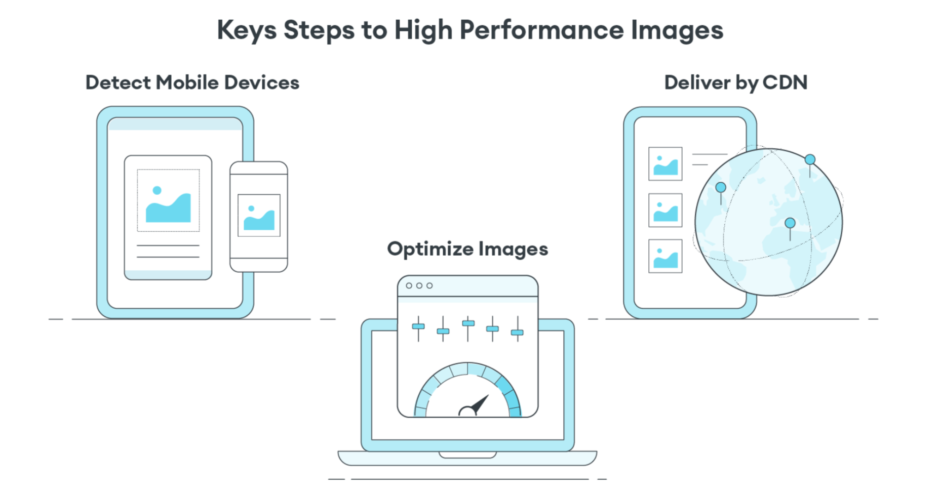
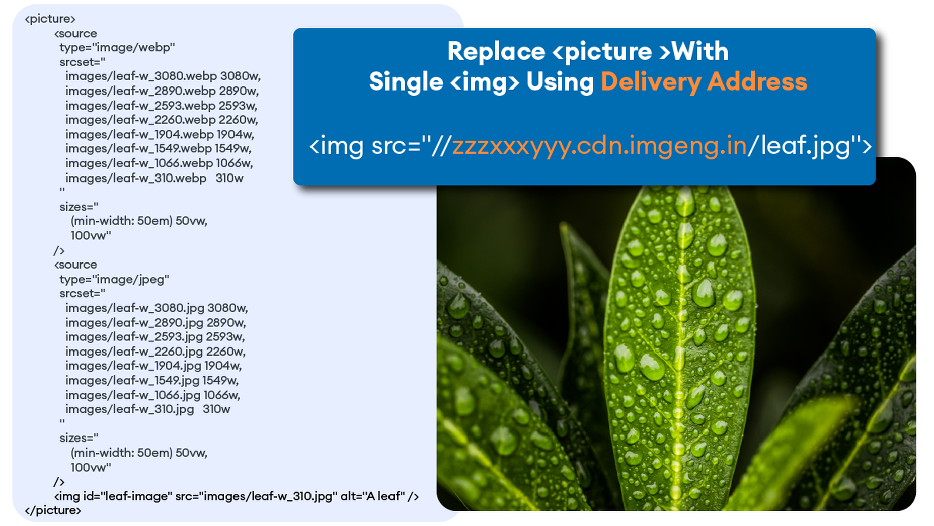
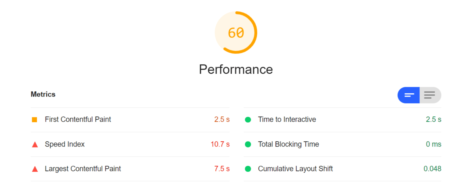
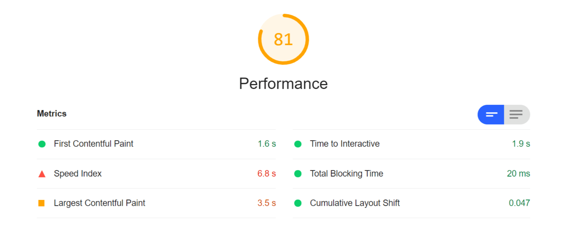
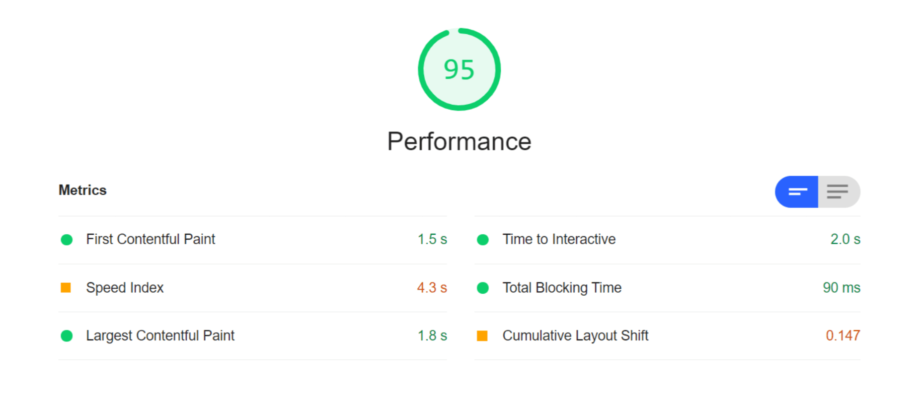
 Many websites today use some type of traditional Content Delivery Network (CDN), which means improvements in website load times, decreases in bandwidth, and better redundancy and security. But not everything is optimized, specifically when it comes to images, and image CDNs can help with that!
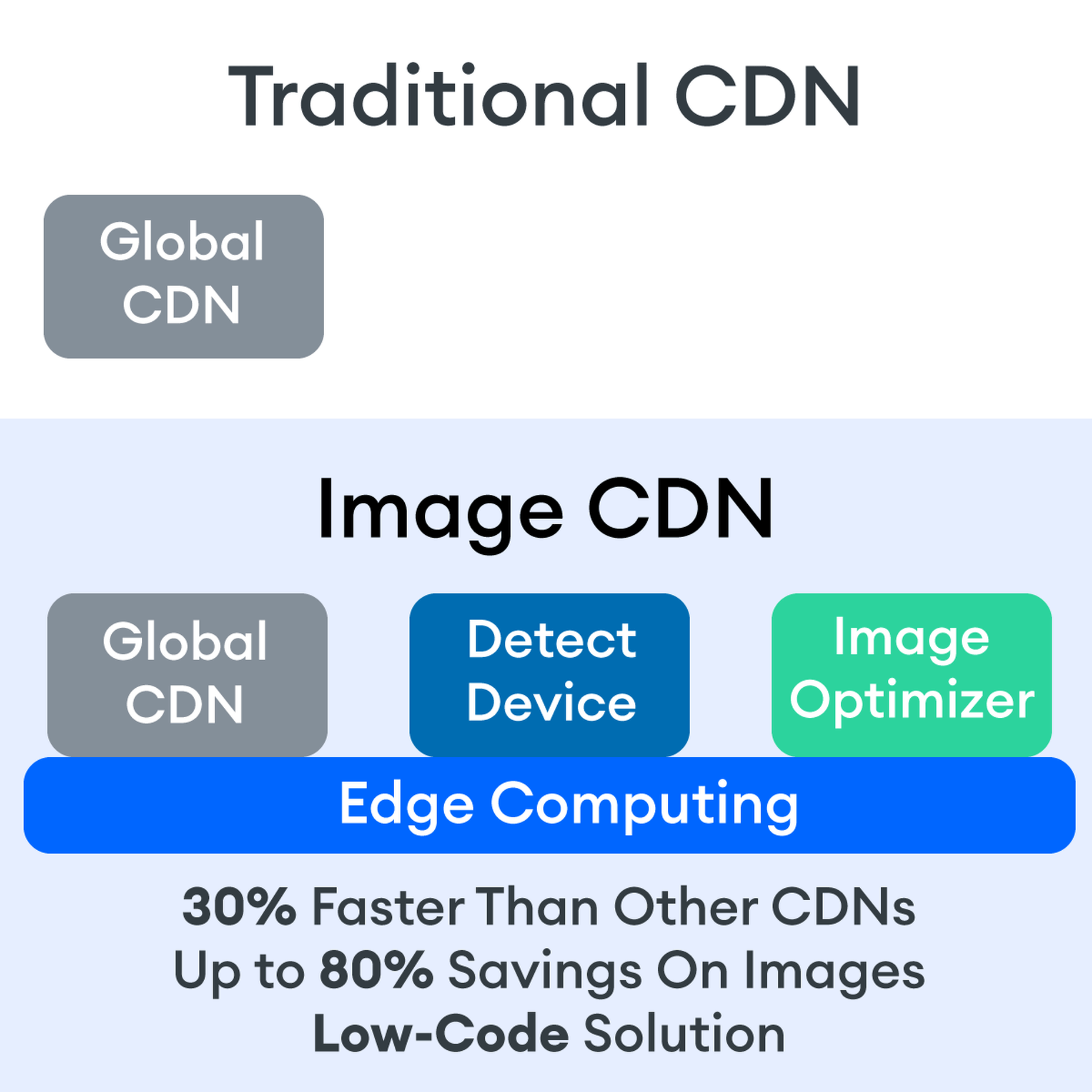


 The headless CMS trend is gaining traction growing at over 20% annually. The driving force behind the headless CMS trend is developer’s increasing need for flexibility and control. Using the headless CMS’s API, front-end developers can use JavaScript frameworks like React, Vue, or Angular to quickly deploy content and designs in various web pages and apps.
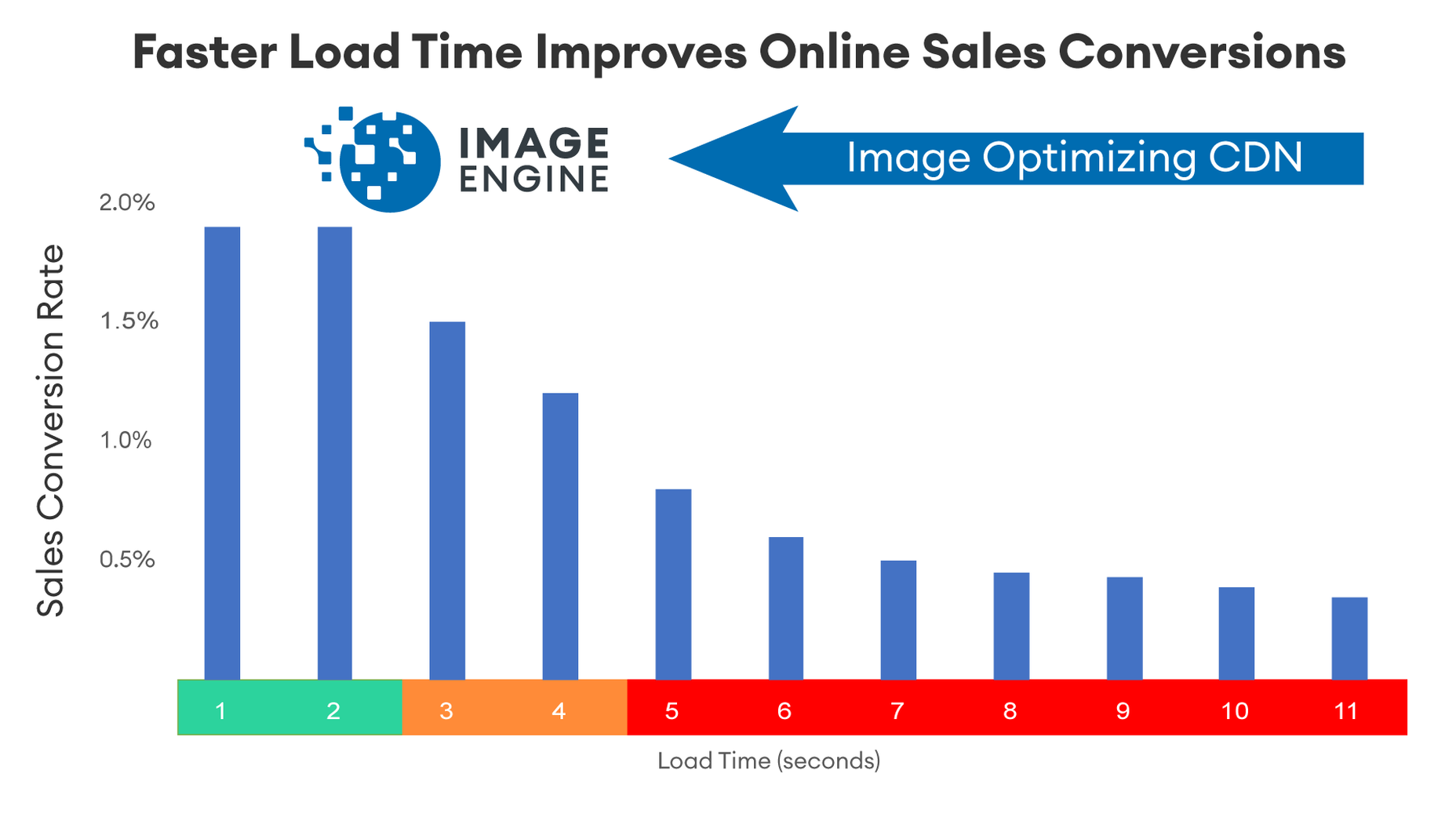


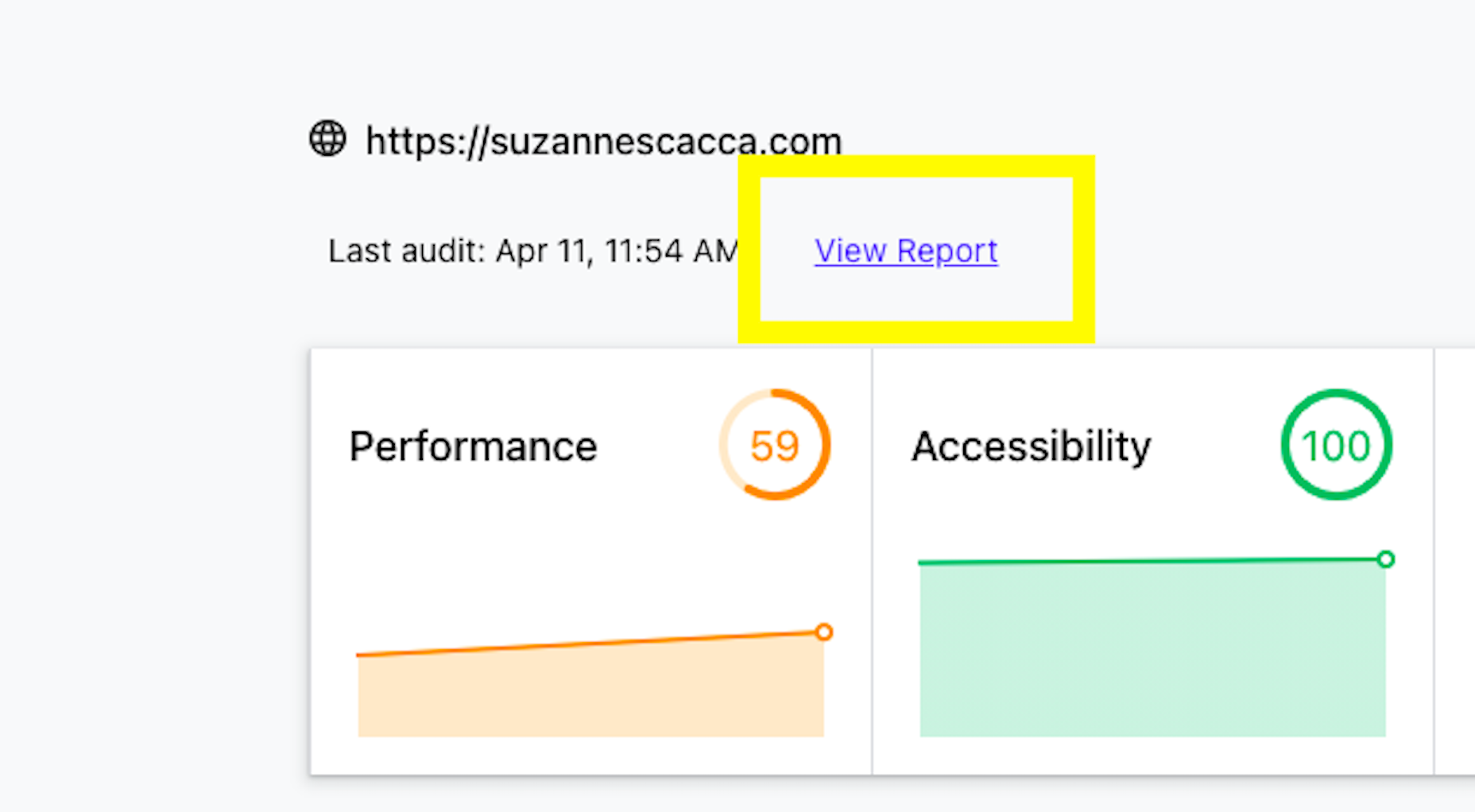
 Asset management and website performance optimization are two of those unavoidable headaches faced by every website owner.
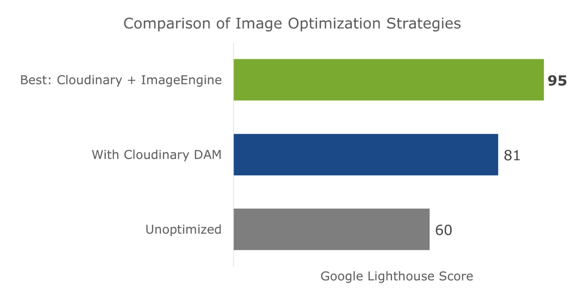


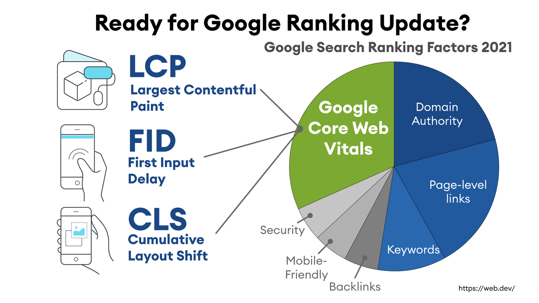
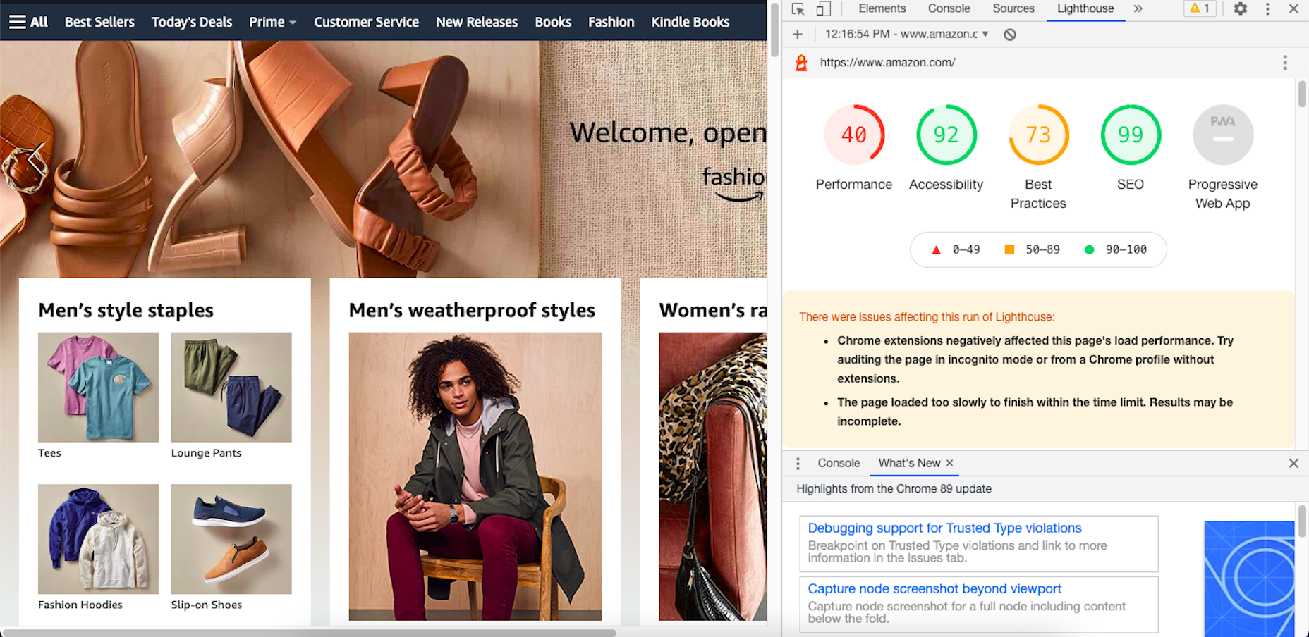
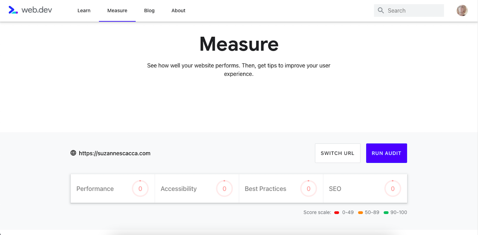
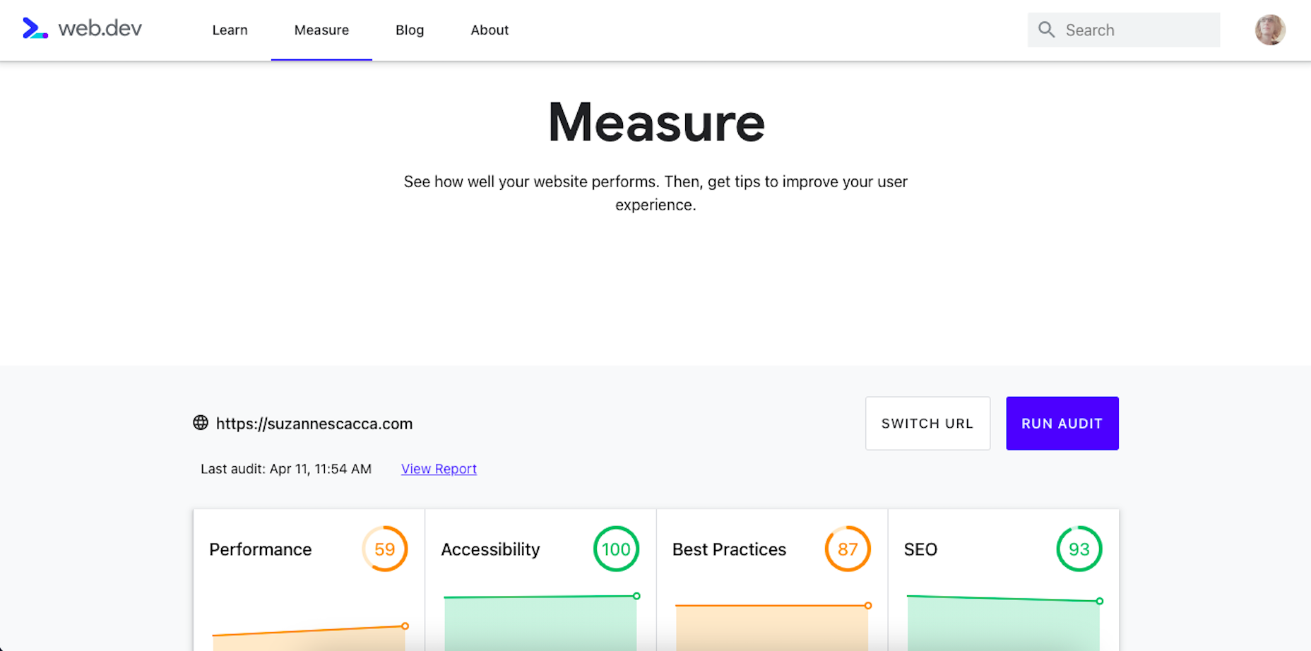
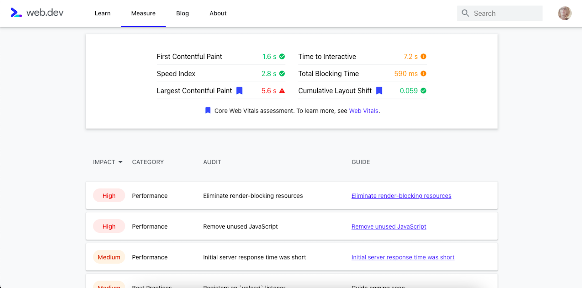
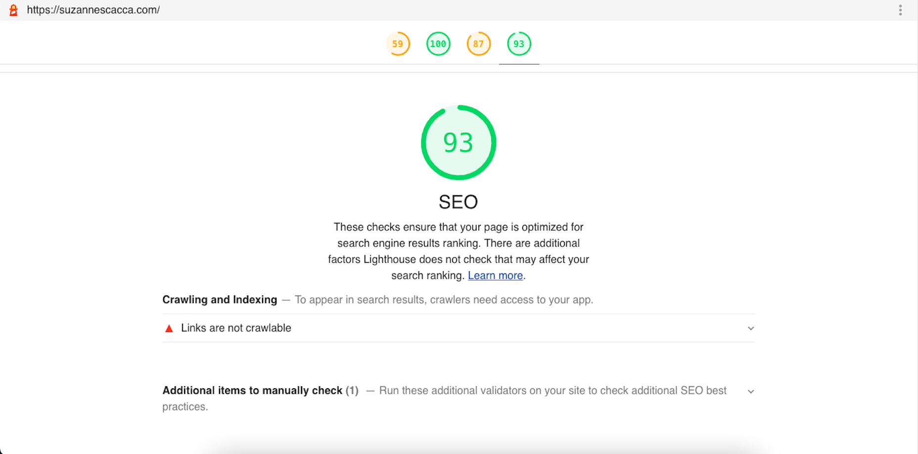
 Google has been talking about the Core Web Vitals tool and the Page Experience Update for about a year now.
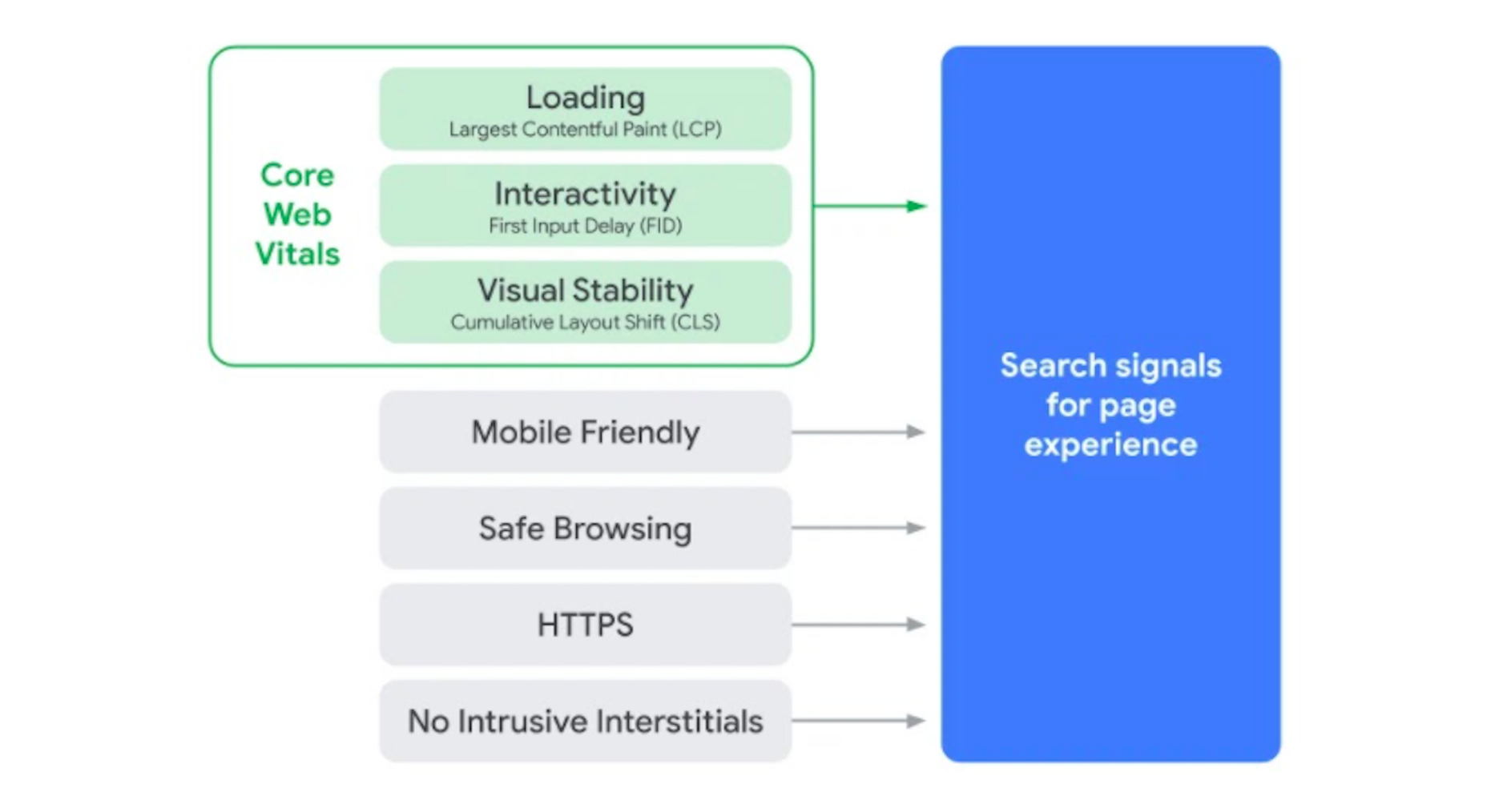