 If you want to know how well-dressed someone is, look at their shoes. Shoes tell you a lot about a person’s style, activities, and choices. We often choose clothes to deceive people about who we are — we want to be brighter, more successful, more relaxed, more adventurous than we actually are. But, our shoes paint an honest picture and offer endless insights into who the wearer is.
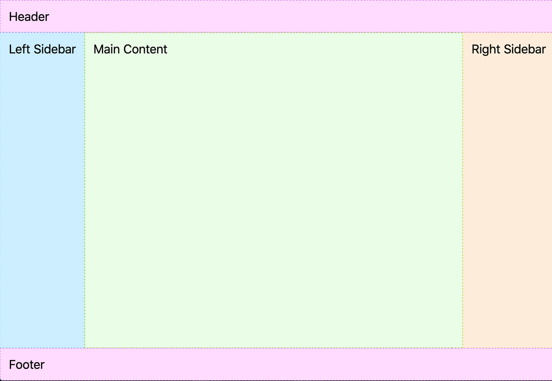
Like shoes, website footers help us see the core of the entity behind the site. A footer is both functional and brand-specific, and it often sets the tone for the entire site.
I’ve heard it argued that there are two types of designer: those who start with the footer and those who don’t. Regardless of how true you hold that statement, it’s undeniable that the footer is one of the most undervalued elements on any site — if you’ve ever run an eye-tracking test, you’ll know how frequently customers scroll straight to the bottom of your page.
Perhaps because it is undervalued and therefore under-designed by designers, the footer has developed some established design patterns: It is a consistent, site-wide catch-all bar; it tends to contain utility links; visually, it acts as a closure to the page information.
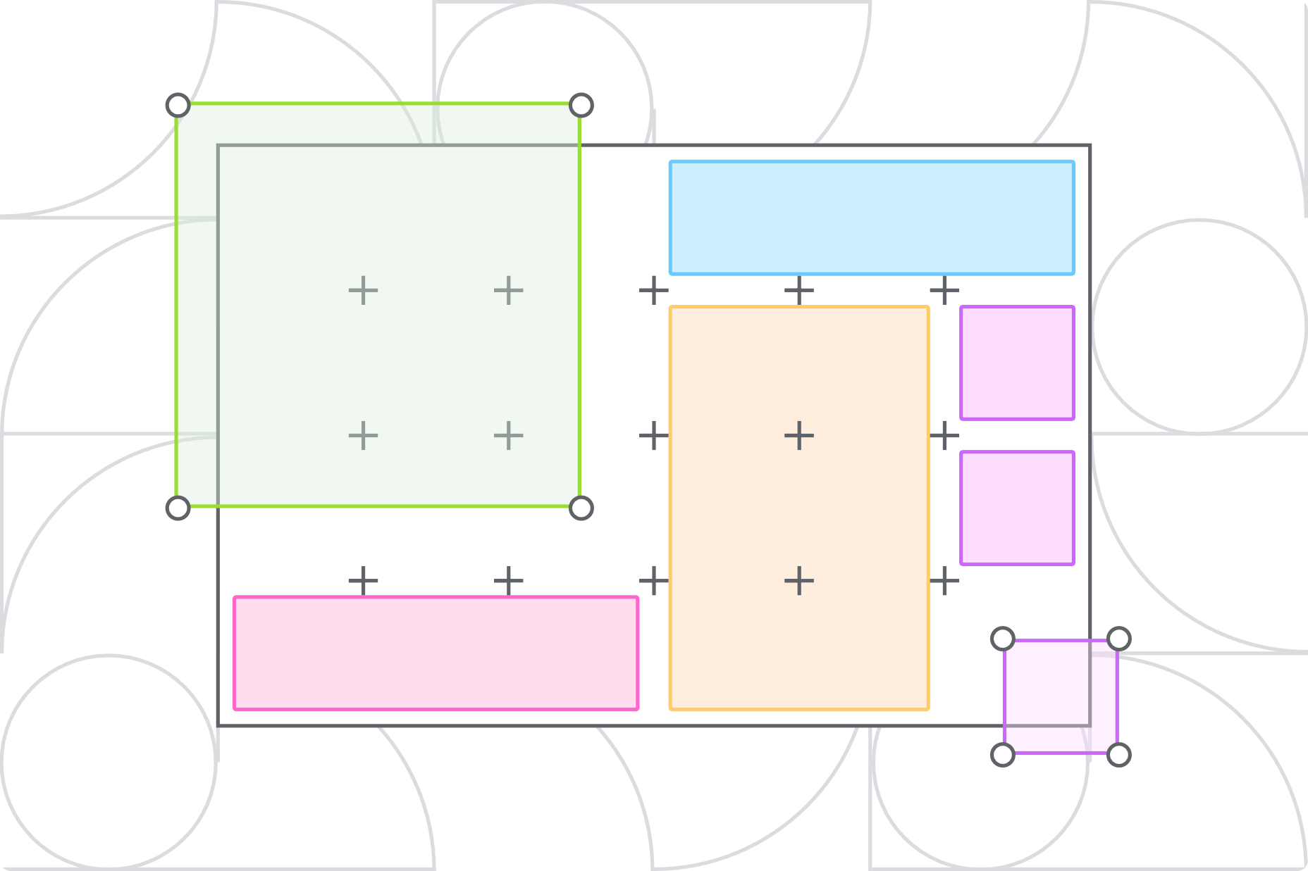
The Anatomy of a Great Footer
Your footer should be consistent, predictable, and, above all, not so small that it’s illegible.
Footers vary depending on the target audience and the goals of the site. What suits one project may not suit another, but there are common elements that you need to have a good reason to exclude.
1. Add Your Logo
A logo in your footer is an excellent way to tie the page together and remind users of the site they’re browsing. In addition, it can be a helpful link back to your homepage (for when the user is lost and wants to start over).
If your design warrants it, the logo can be smaller or a variation. Find some way to fit it in, even if you already have your logo in a sticky header — it’s a good baseline for mobile experiences.
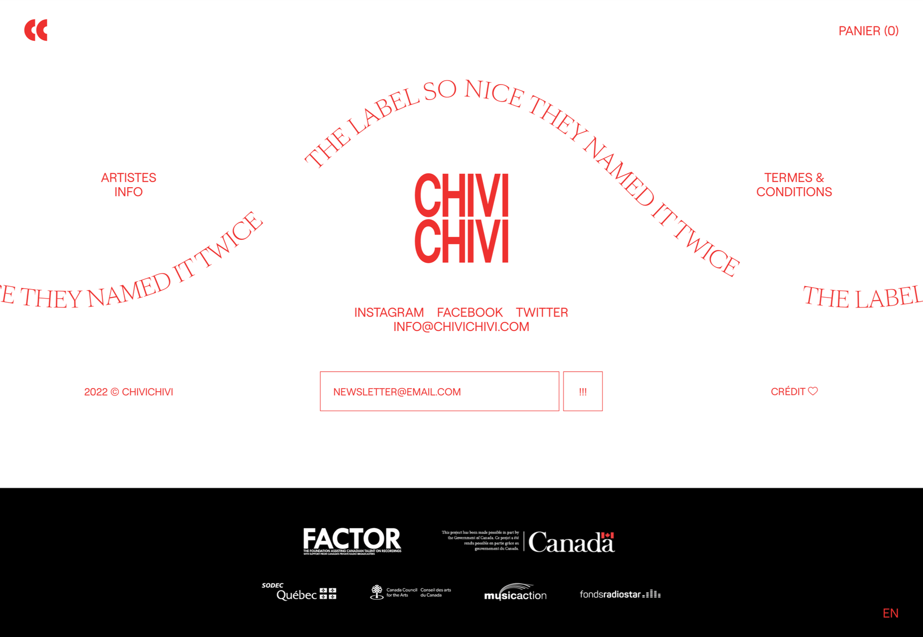
Chivi Chivi uses a monogram in place of its primary logo and reserves the main logotype for its footer.
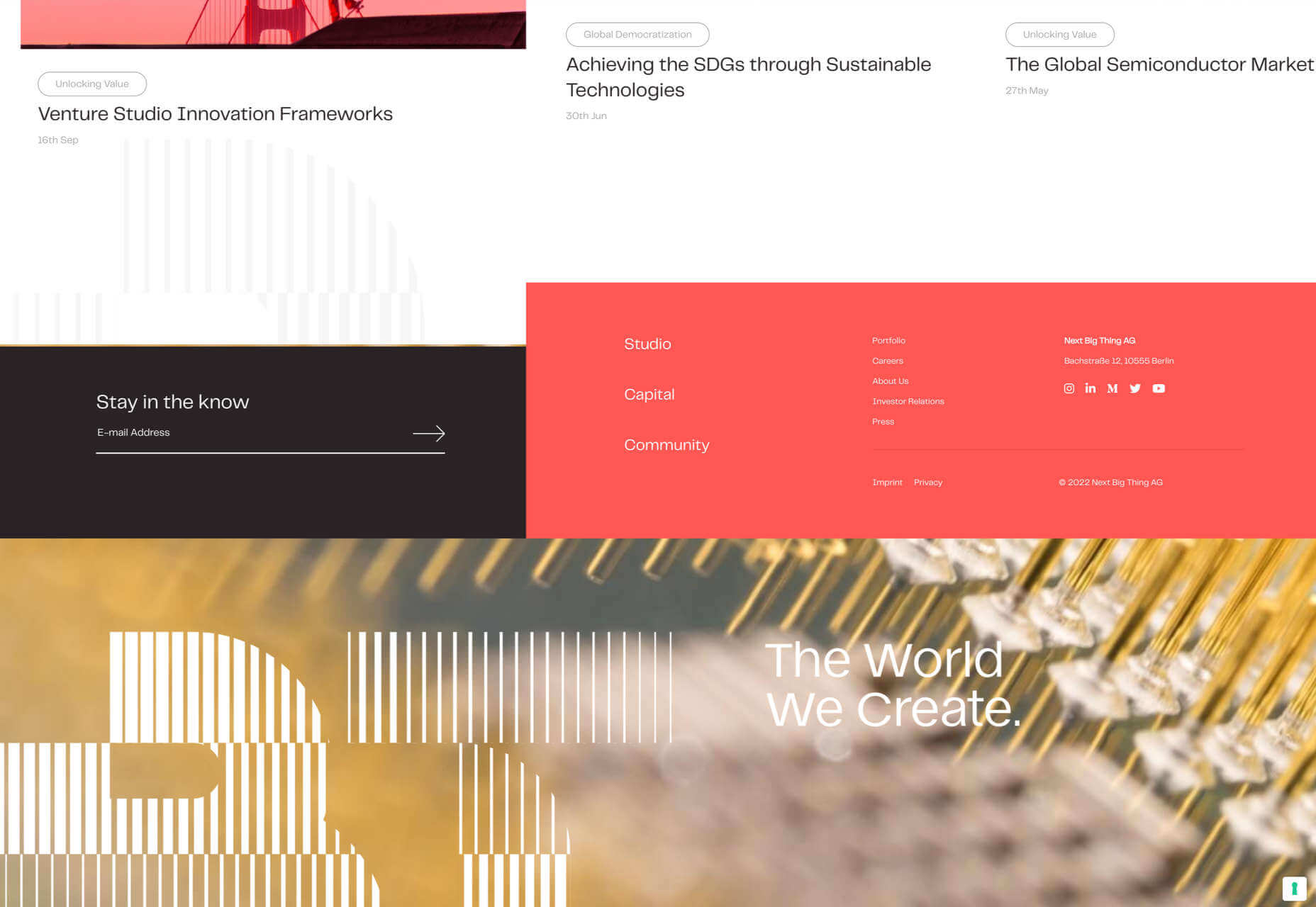
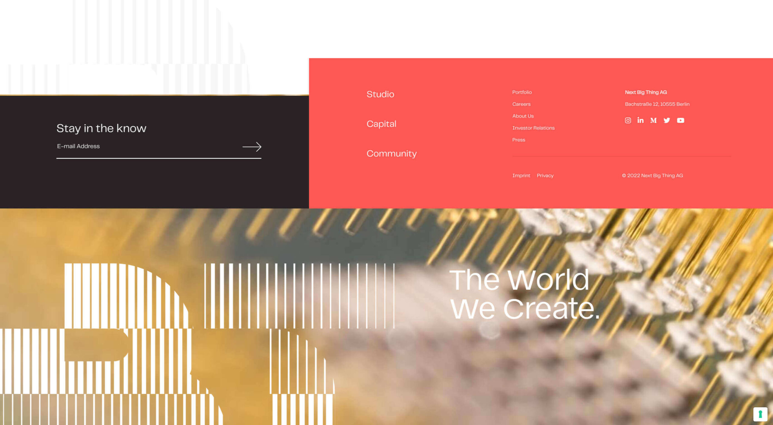
Next Big Thing repeats its logo in the footer in a decorative and engaging way.
2. Include a CTA
Every page on your site should have some form of call to action (CTA) to guide the user through your site, preferably along your sales funnel. In addition to page-specific CTA, include a CTA in your footer.
Because your footer will be identical across multiple pages, the CTA needs to be an action that is relevant to every page (even the terms or privacy statement).
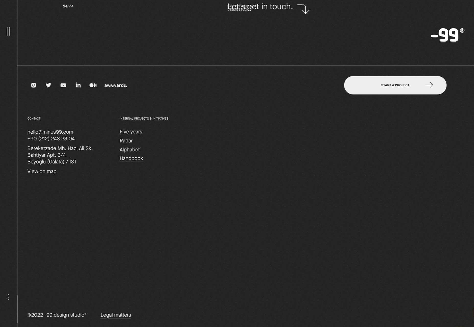
-99 has a nice big ‘Start a Project’ CTA to draw potential clients into a conversation.
The most common footer CTA is a newsletter sign-up, but if you’re running a site with a free trial or a subscription, adding a sign-up form for those services is also beneficial.
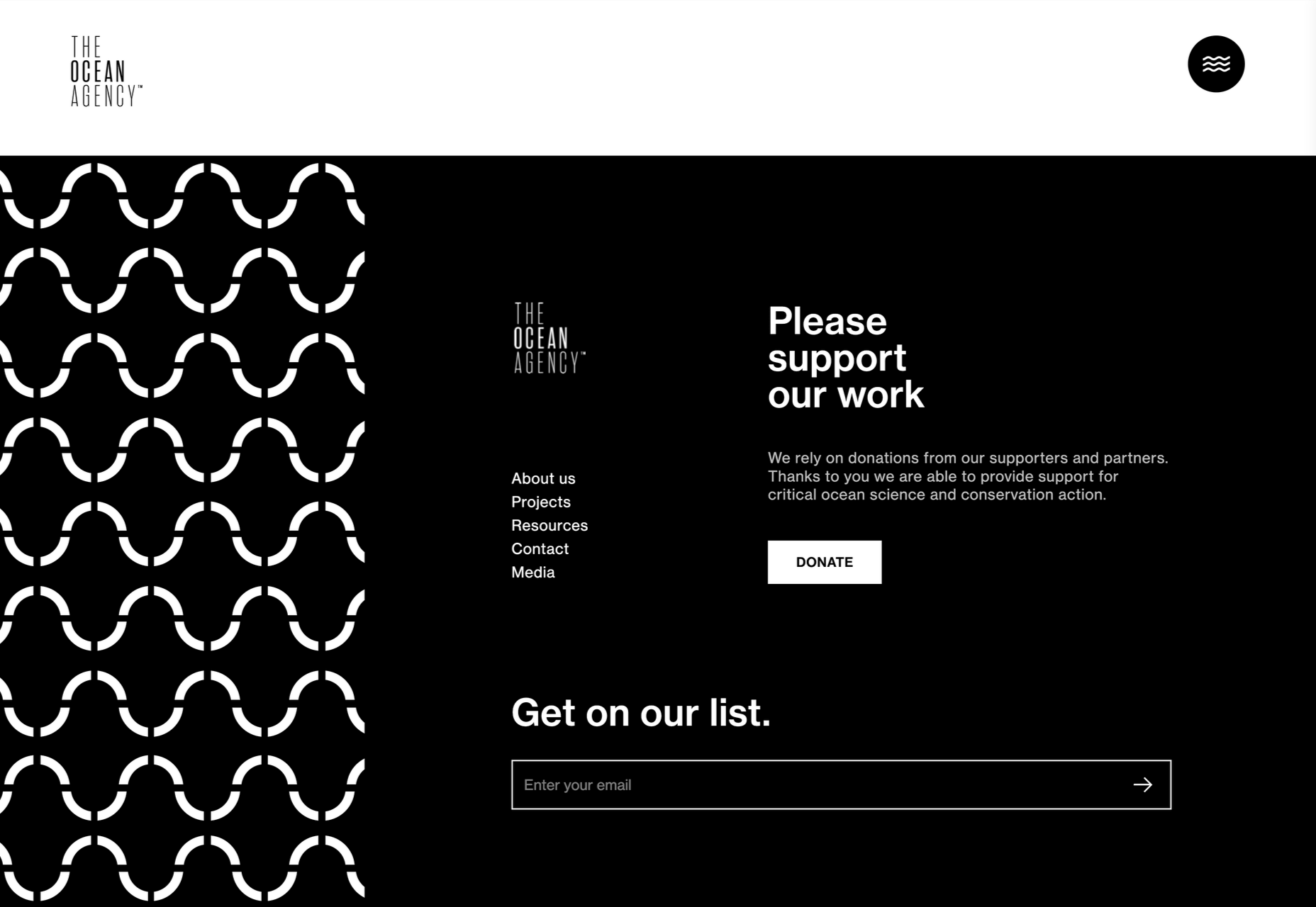
The Ocean Agency asks you to donate or sign up to its email list.
3. The Legal Bit
In many cases, you don’t need legal notices on your site; too often, published online terms just reiterate the statuary rights the law already grants a user. (The exception is if you’re operating internationally when statuary rights are variable.)
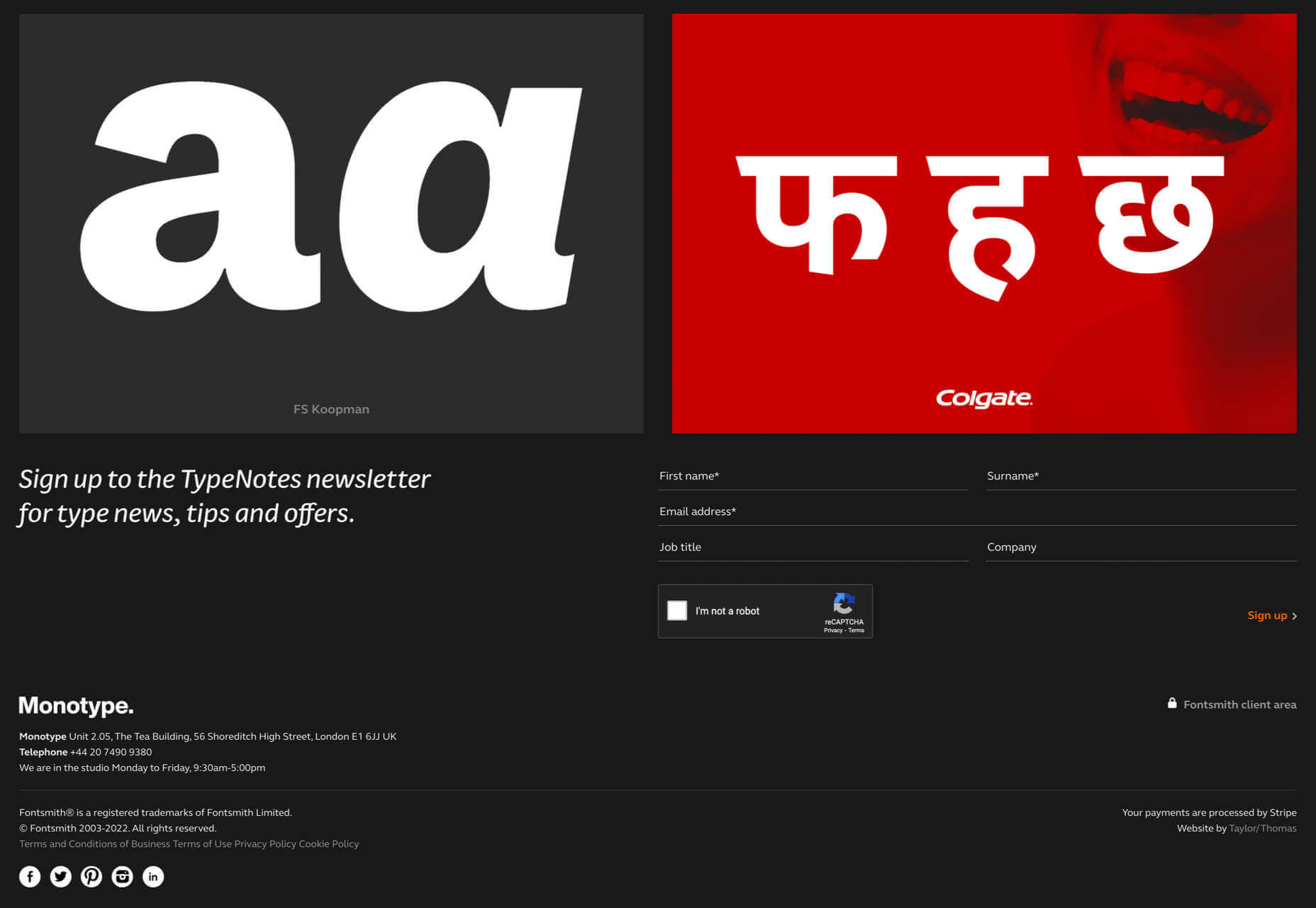
Fontsmith takes the opportunity to let us know its parent company.
If you’re collecting a user’s information, even via analytics, then you need a privacy policy, and the footer is a good catch-all place to link to it — just make sure you also link to it alongside any forms that gather information.
If you’re designing a site for a highly-regulated industry, like pharmaceuticals, or gambling, then a liability disclaimer may be advisable. If your client is certified or holds a professional membership, that should be included in the footer.
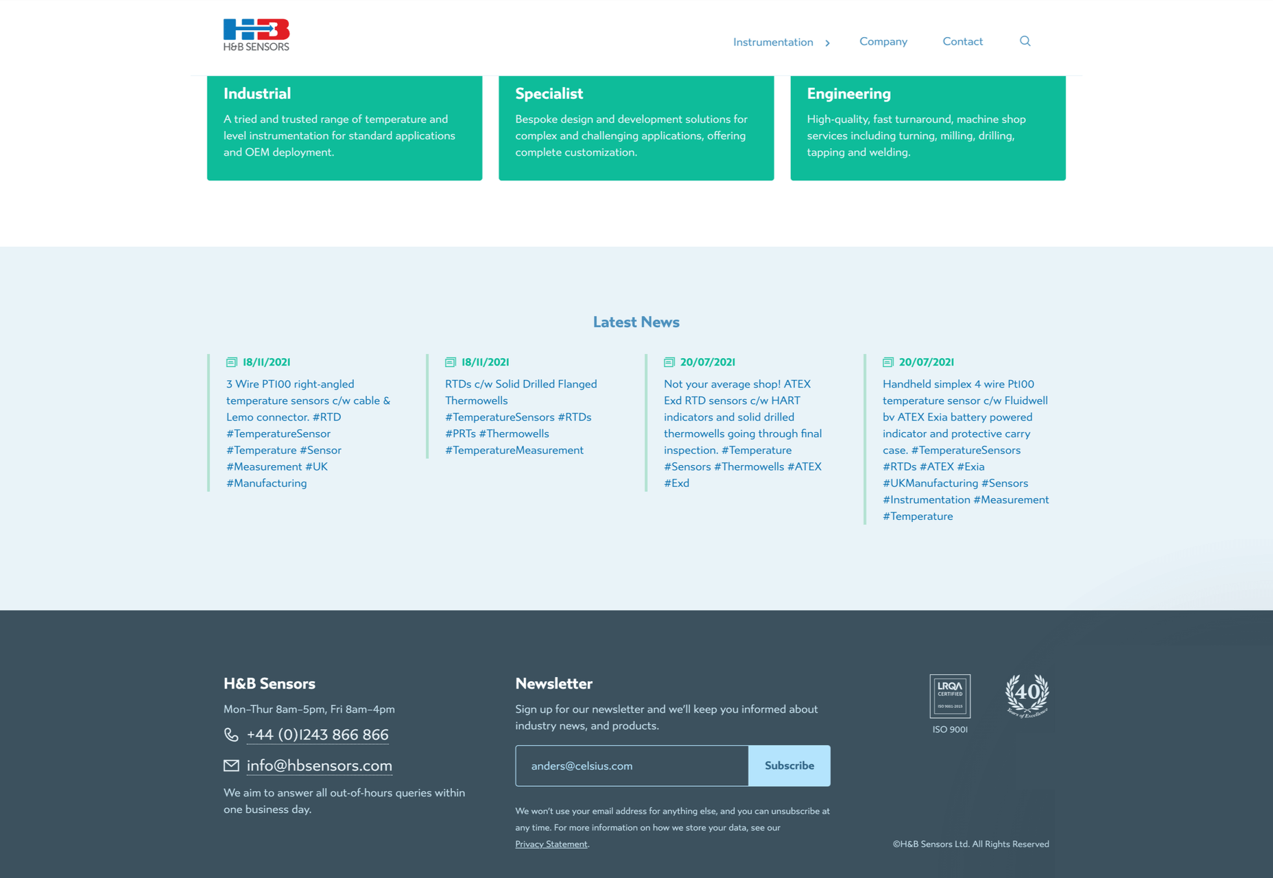
H&B Sensors includes an ISO certification in its footer.
Almost everyone includes a copyright notice in their footer, even though a website copyright notice is all but unenforceable.
The real value of these elements is to lend credibility to the company.
4. Useful Links Only
There is a tendency among some designers to treat the footer like a mega-menu and list every page on the site. If a user is confused enough by your main menu to need a footer link, dozens of links won’t clarify things for them, but a few carefully selected links can be beneficial.
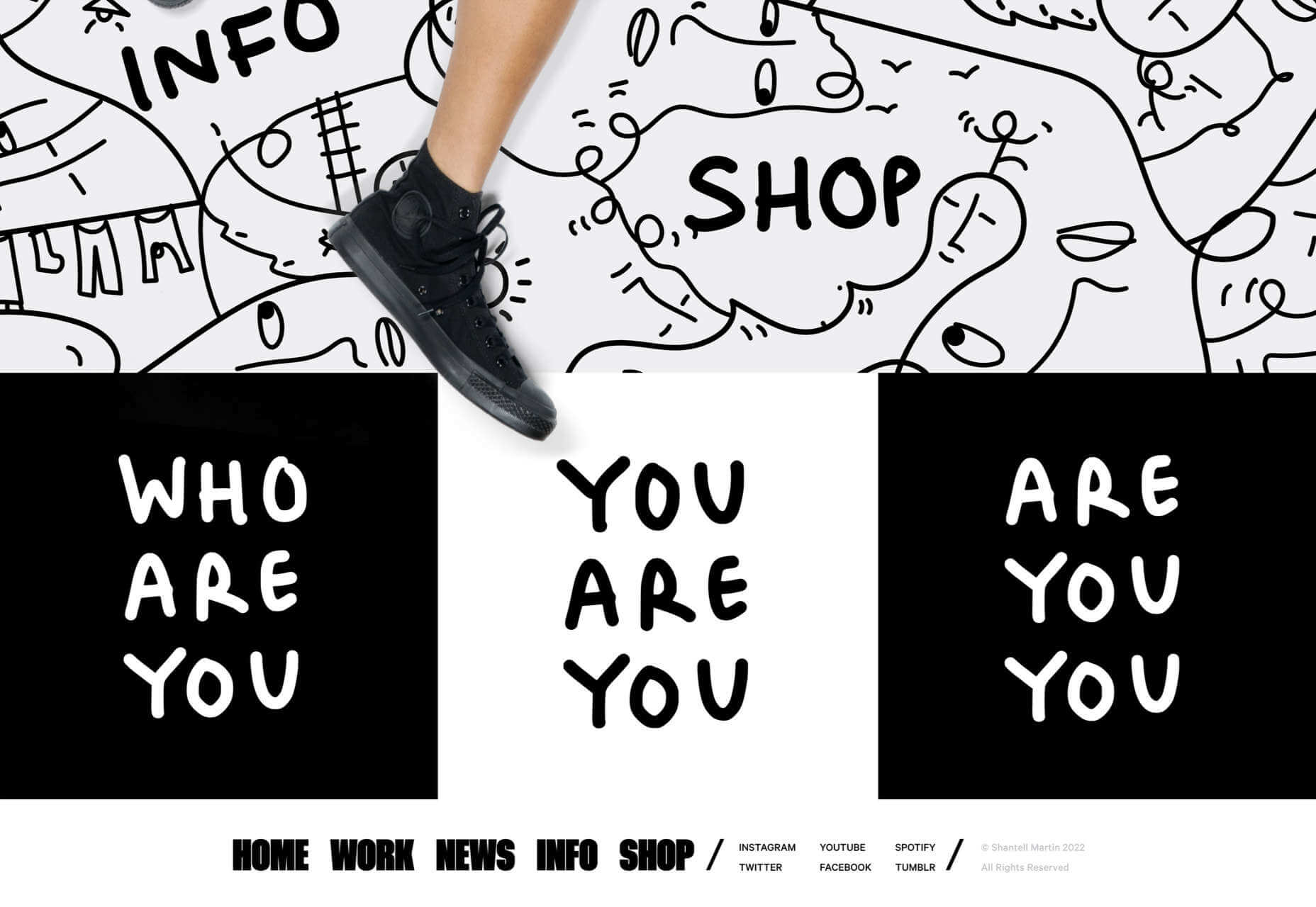
Shantell Martin uses doormat navigation to help anyone who missed the main navigation.
Generally, sites have two kinds of links: sales and utility. Sales links point at content with a brand voice, like product pages and blog posts. Utility links point at informational content that is fact-based, such as your returns policy or details of your graduate program. Typically, sales links suit primary navigation, and utility links fit footers.
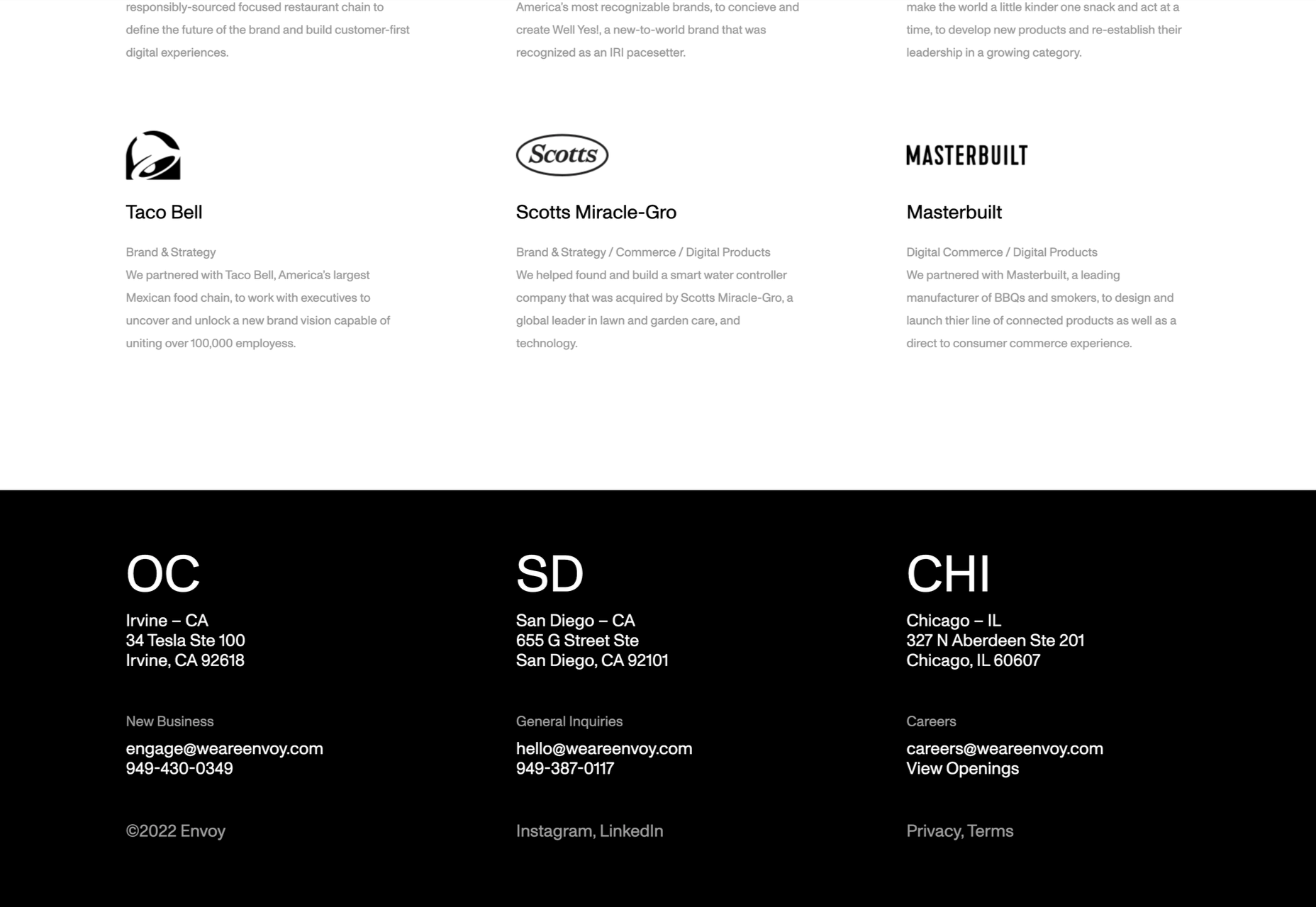
Envoy includes a link to current openings at the company.
5. Contact Information
Offering users a real-world point of contact has two benefits: your local SEO can be boosted; users feel an increased sense of trust.
Even if they never use them, customers like to see a phone number, opening hours, and even a map to a physical location. These things feel inherently more reliable because we assume that someone, somewhere, has vetted brick-and-mortar businesses.
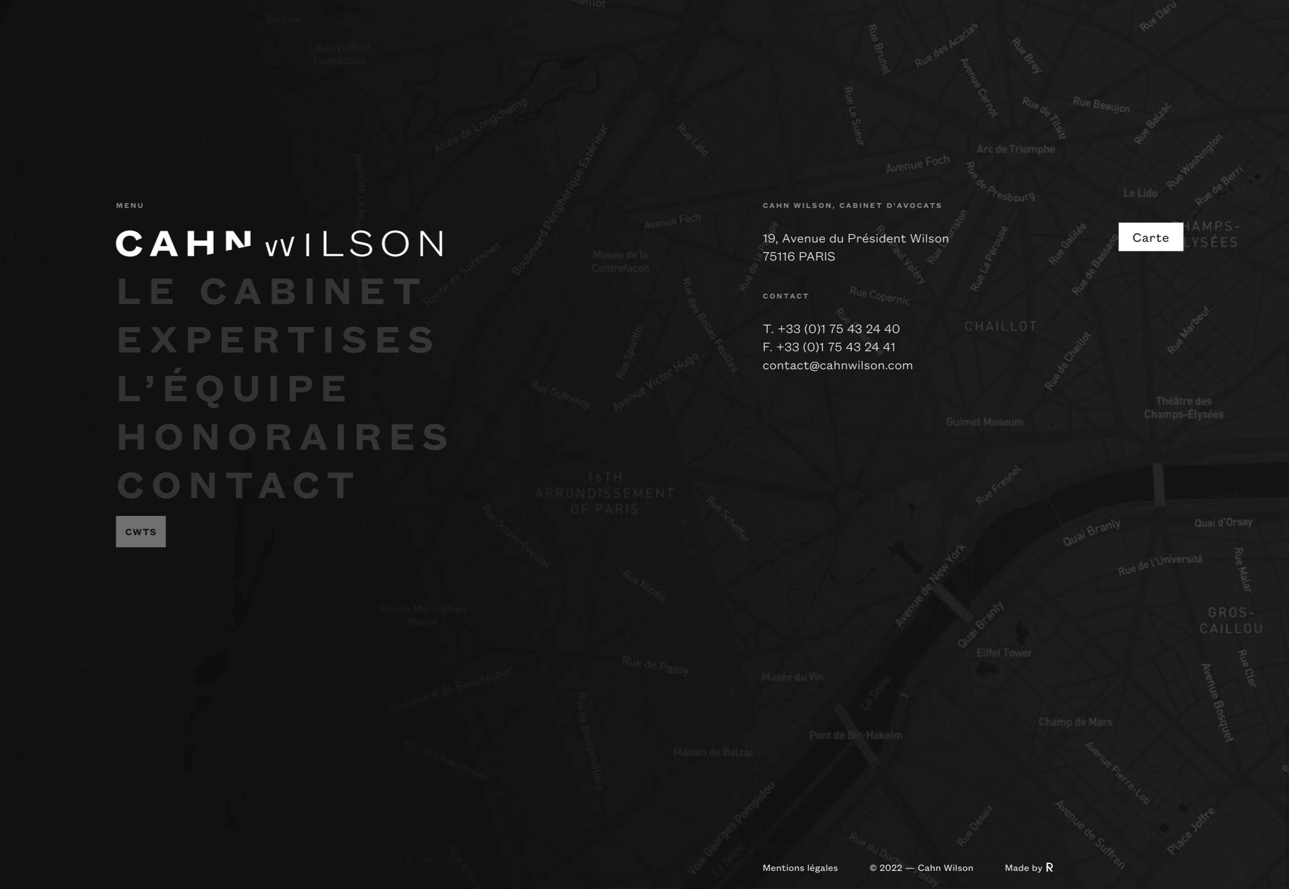
Cahn Wilson includes a map to make it absolutely clear they have a physical location.
If possible, let users know how long it usually takes you to respond to queries — be honest, better to underpromise and over-deliver than the reverse.
If you’re maintaining social media accounts, then adding them to your footer is a great way to include them on your page without siphoning users off to other sites. (Only link to social media accounts you regularly update.)
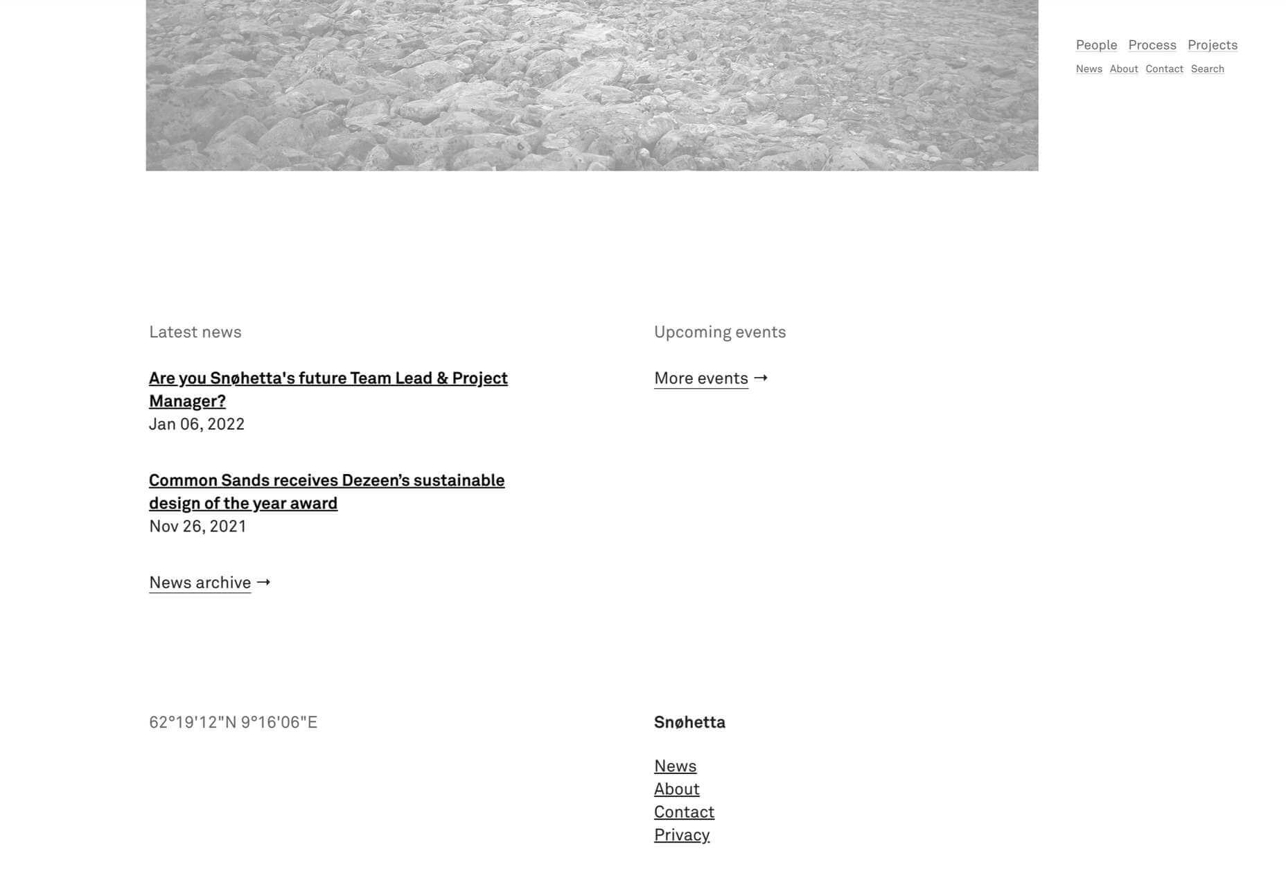
Snohetta takes the contact information to the extreme by providing longitude and latitude.
The post 5 Must-Have Elements of a Successful Footer in 2022 first appeared on Webdesigner Depot.


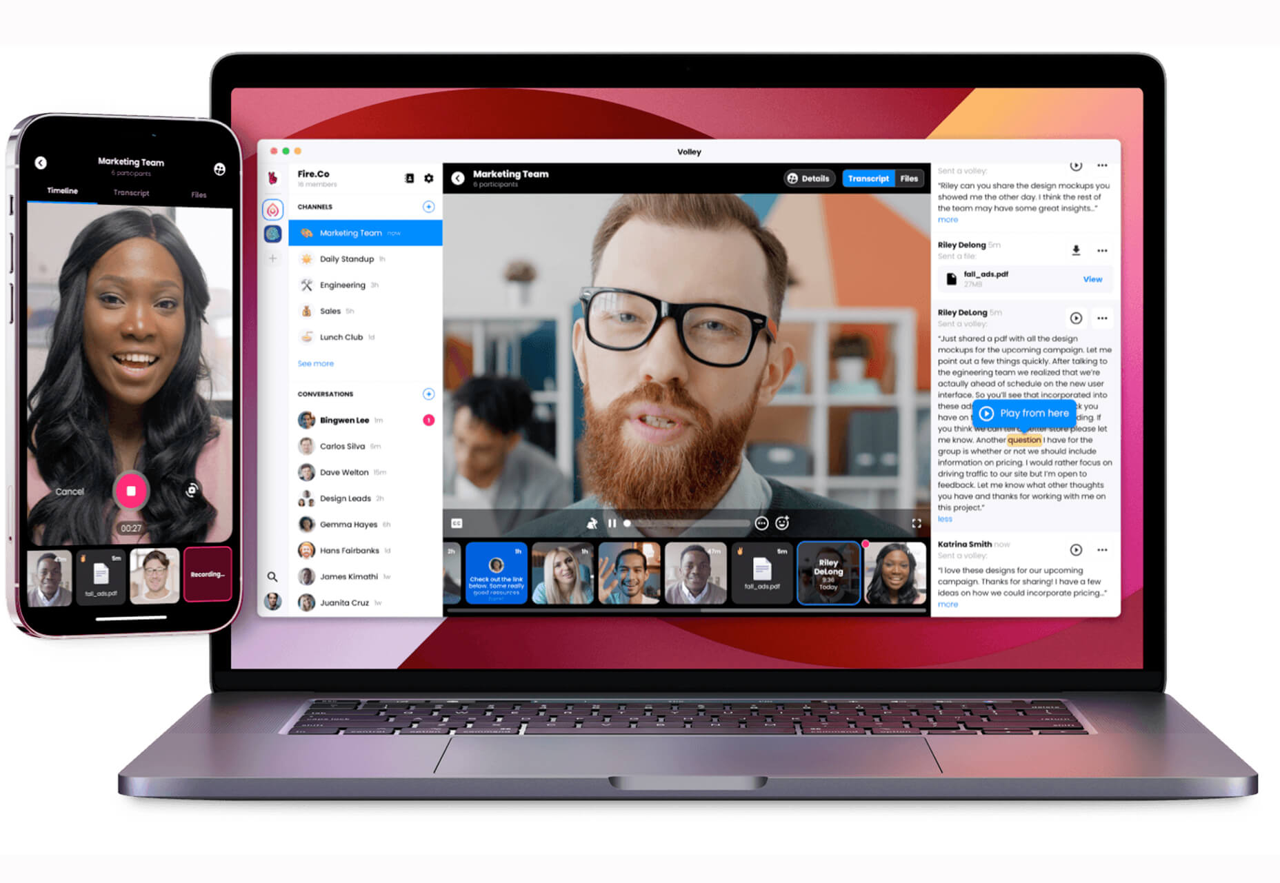
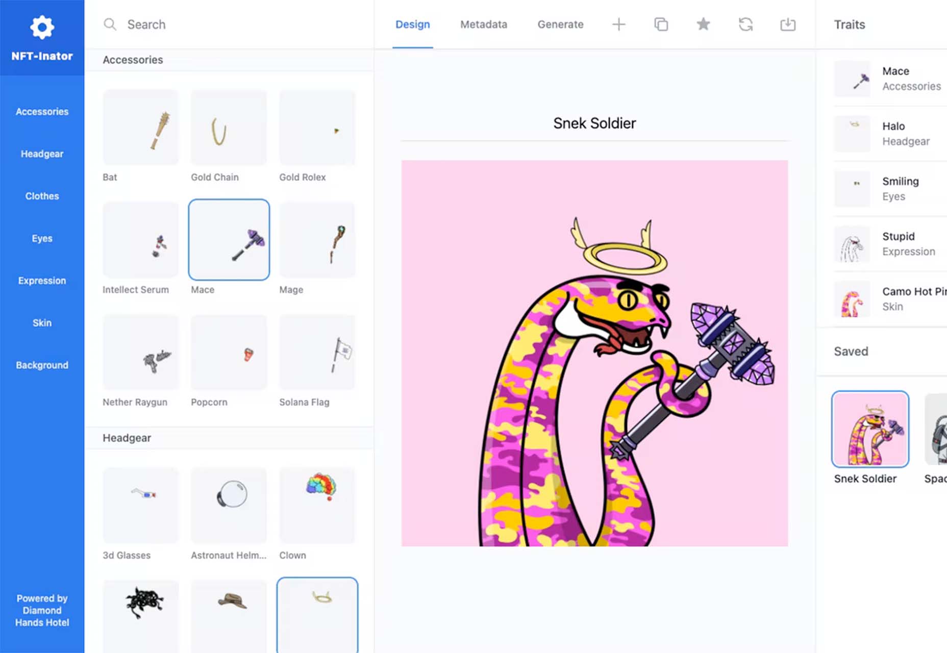
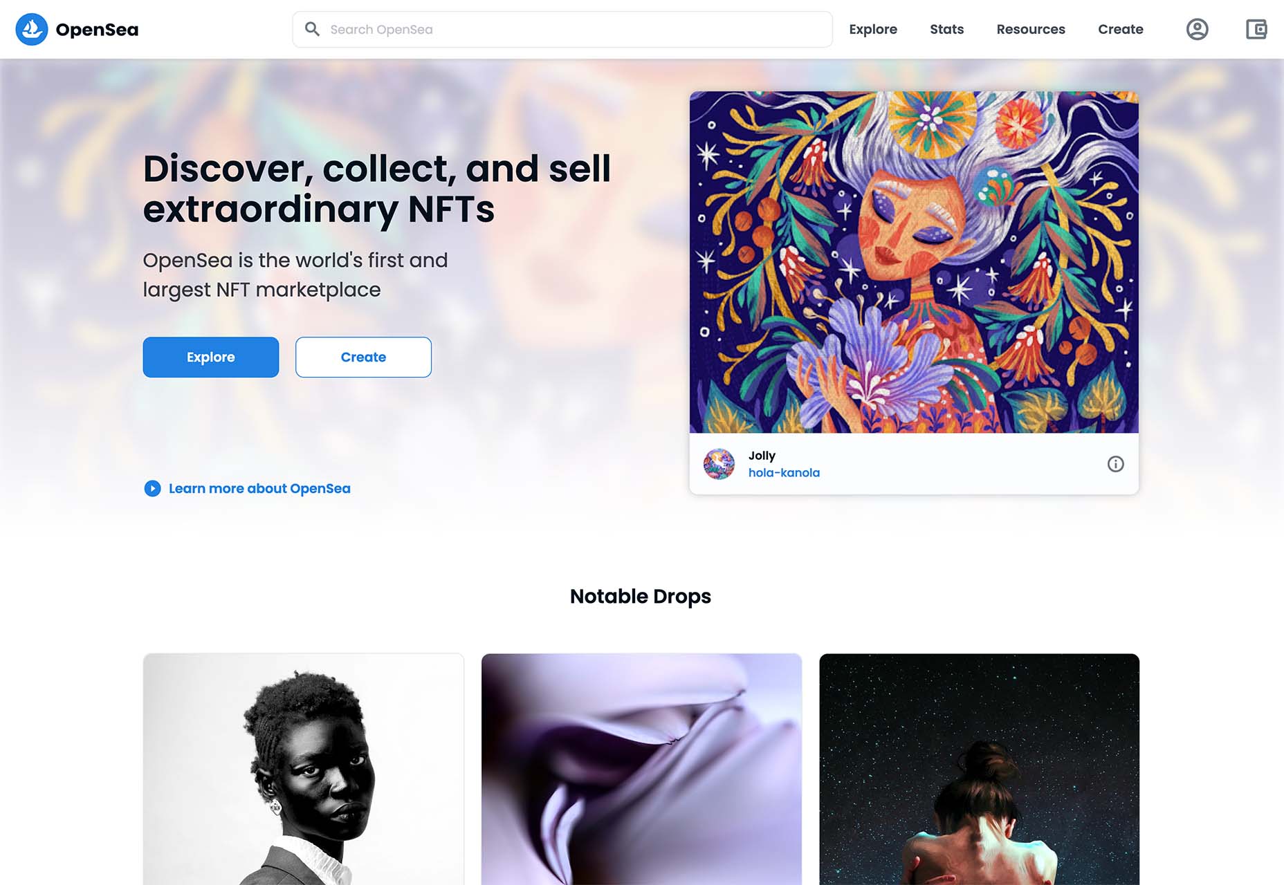
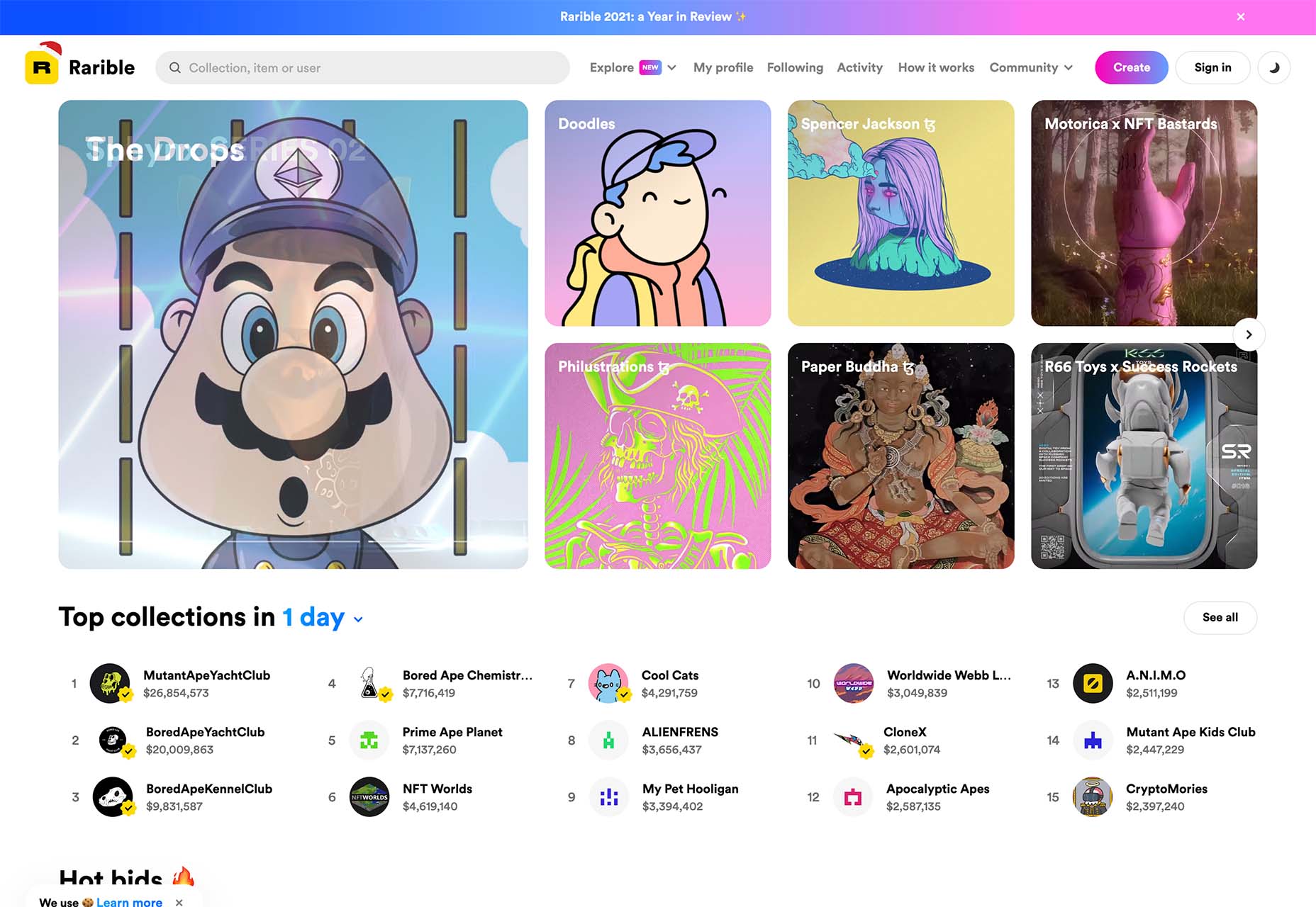
 One of the most talked-about digital elements of the new year leads our roundup of tools and resources this month – NFTs. The NFT landscape seems to be exploding right now and that includes tools for designers to get in on the game as well.
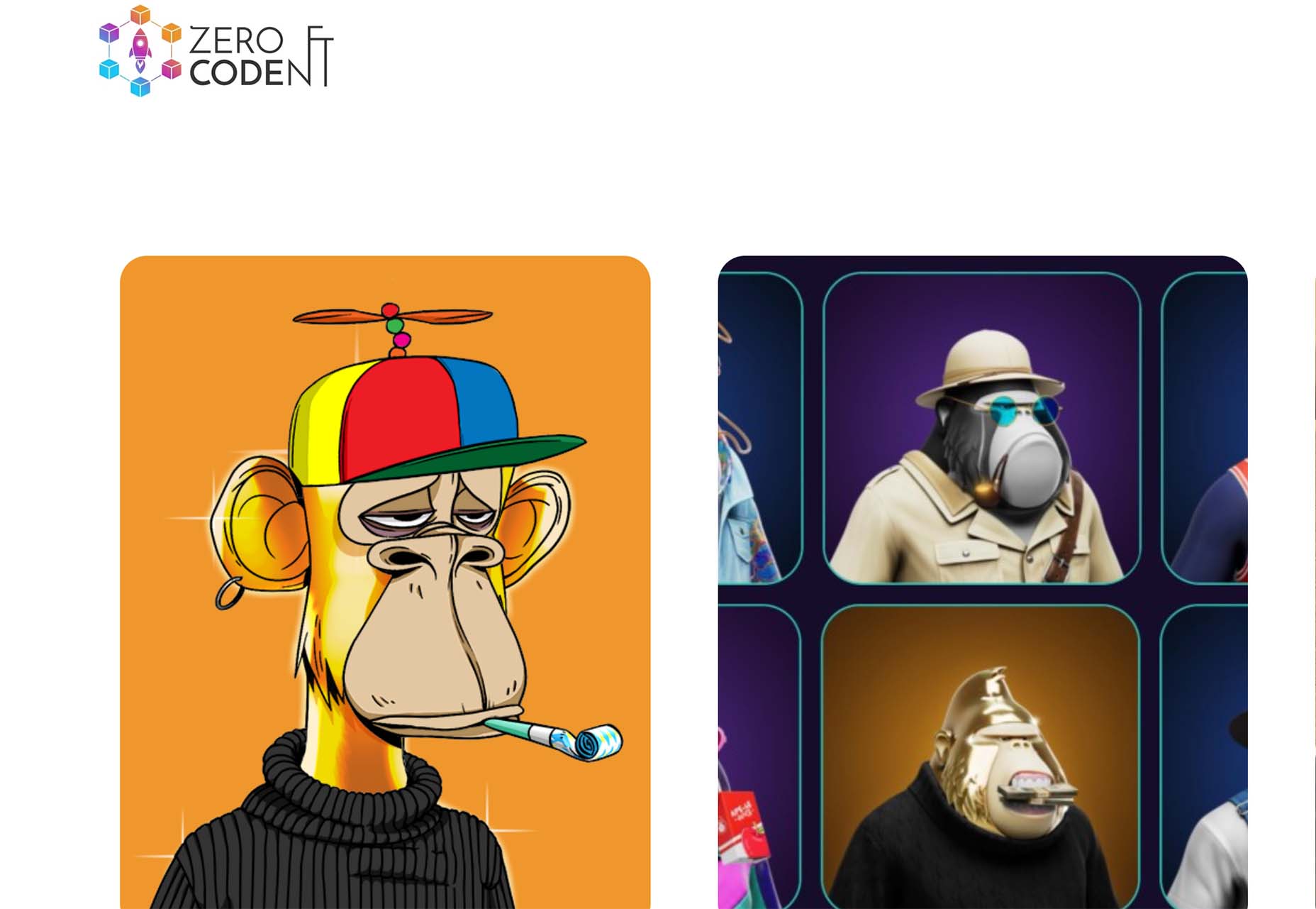


 Picture a dark office, blinds drawn. Picture a UX designer smoking a cigar. See the light filtered through the smoke whipped to fog by a spinning ceiling fan. Watch as the UX designer sits at a desk and considers the website.
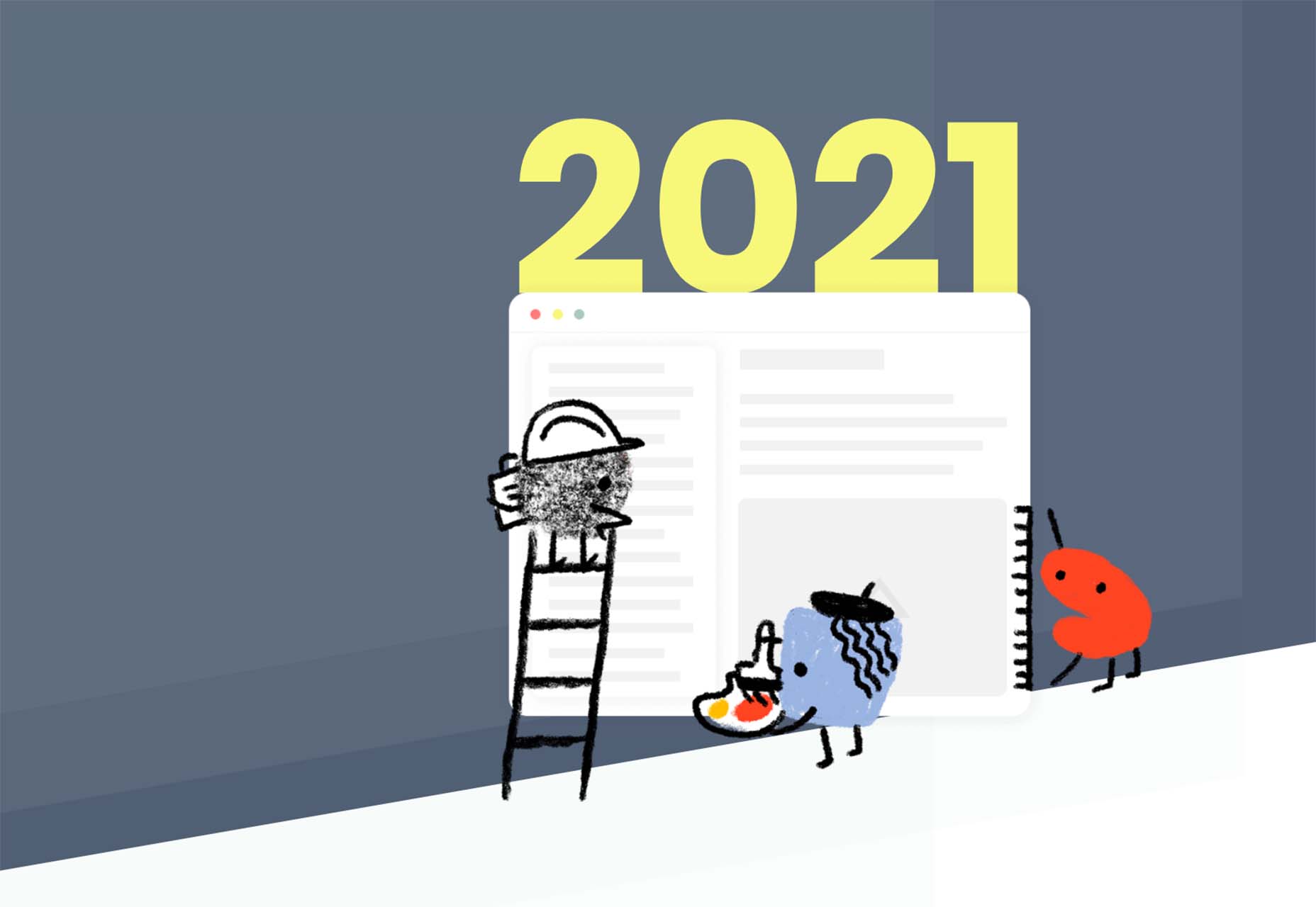
 Happy New Year, fabulous new website design trends!
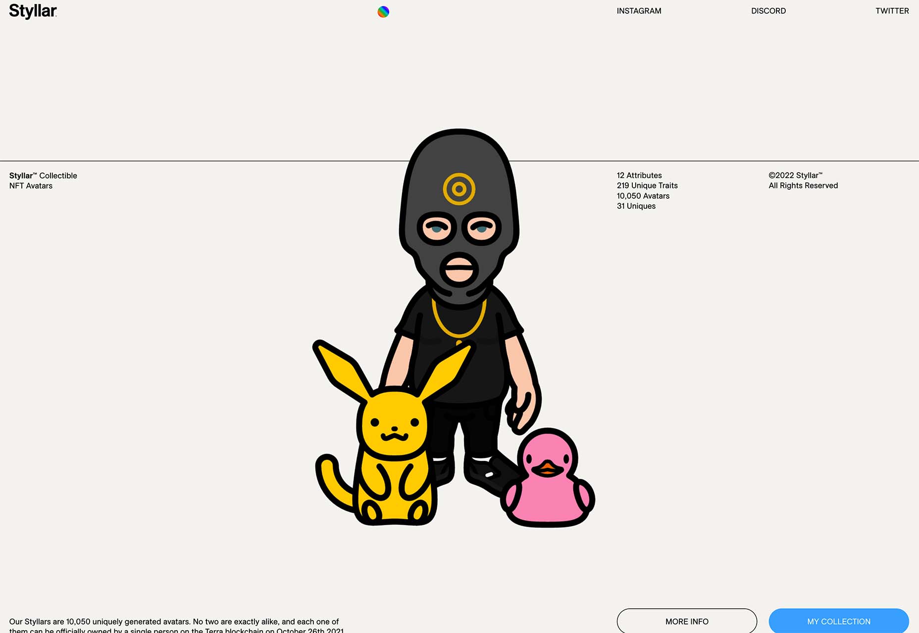


 Every day design fans submit incredible industry stories to our sister-site,


 It’s normal to pull up sharp in front of a problem; after all, if there was a known solution, it wouldn’t be a problem. But knowing that it’s normal, doesn’t make encountering problems any less frustrating. So how do we avoid sitting in front of a UX problem for hours, achieving nothing?
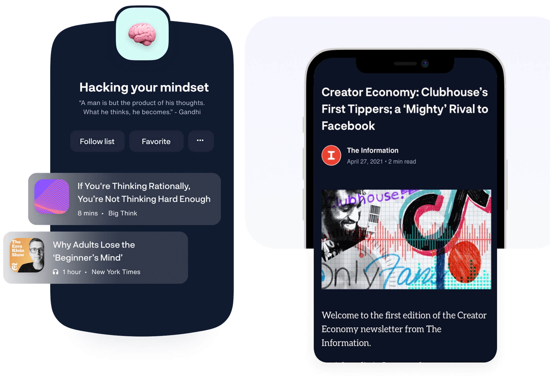
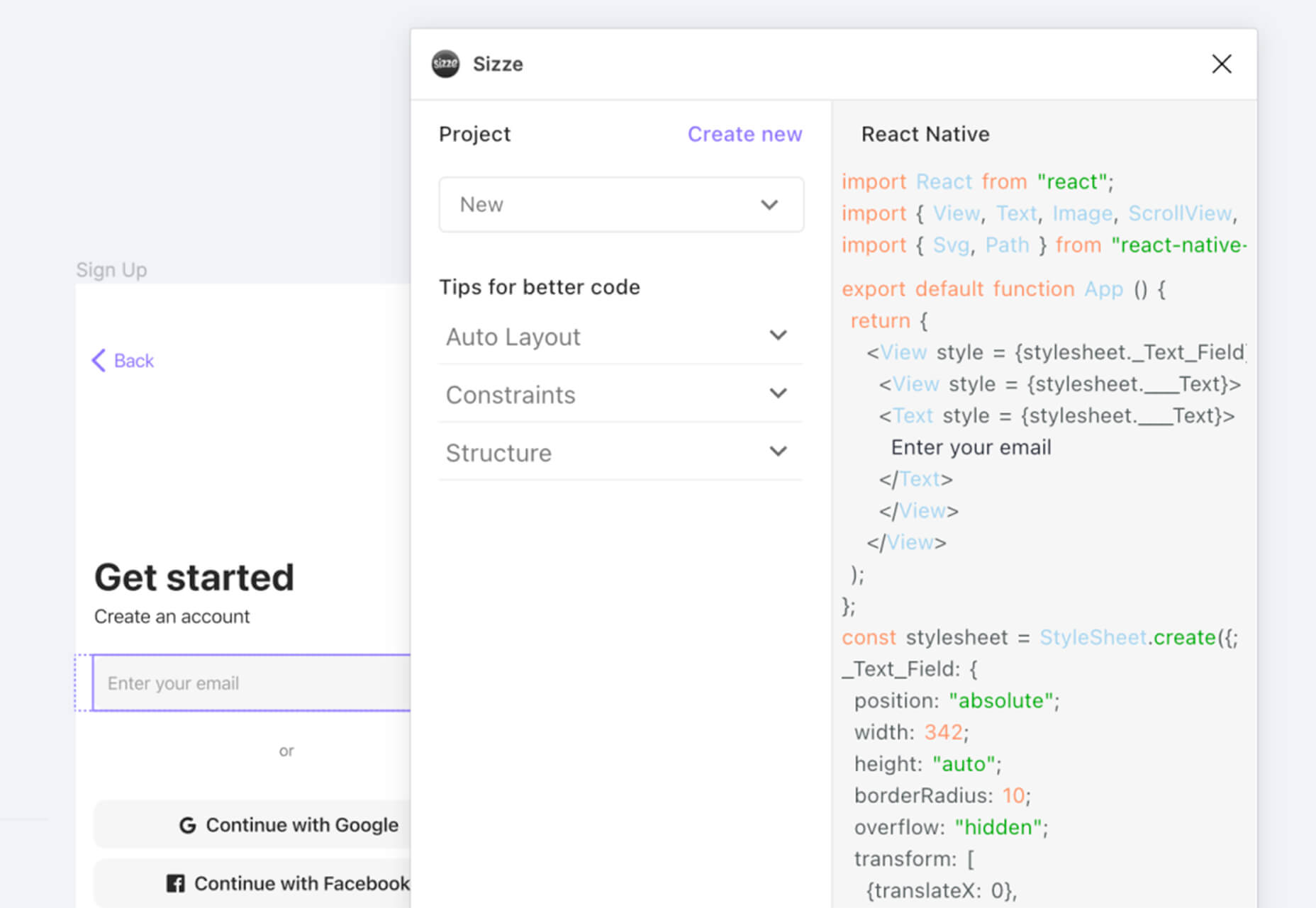
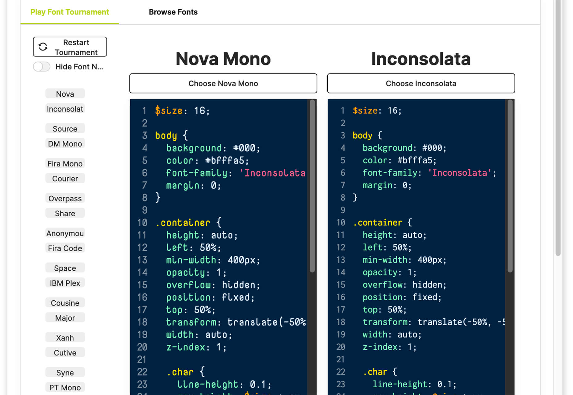
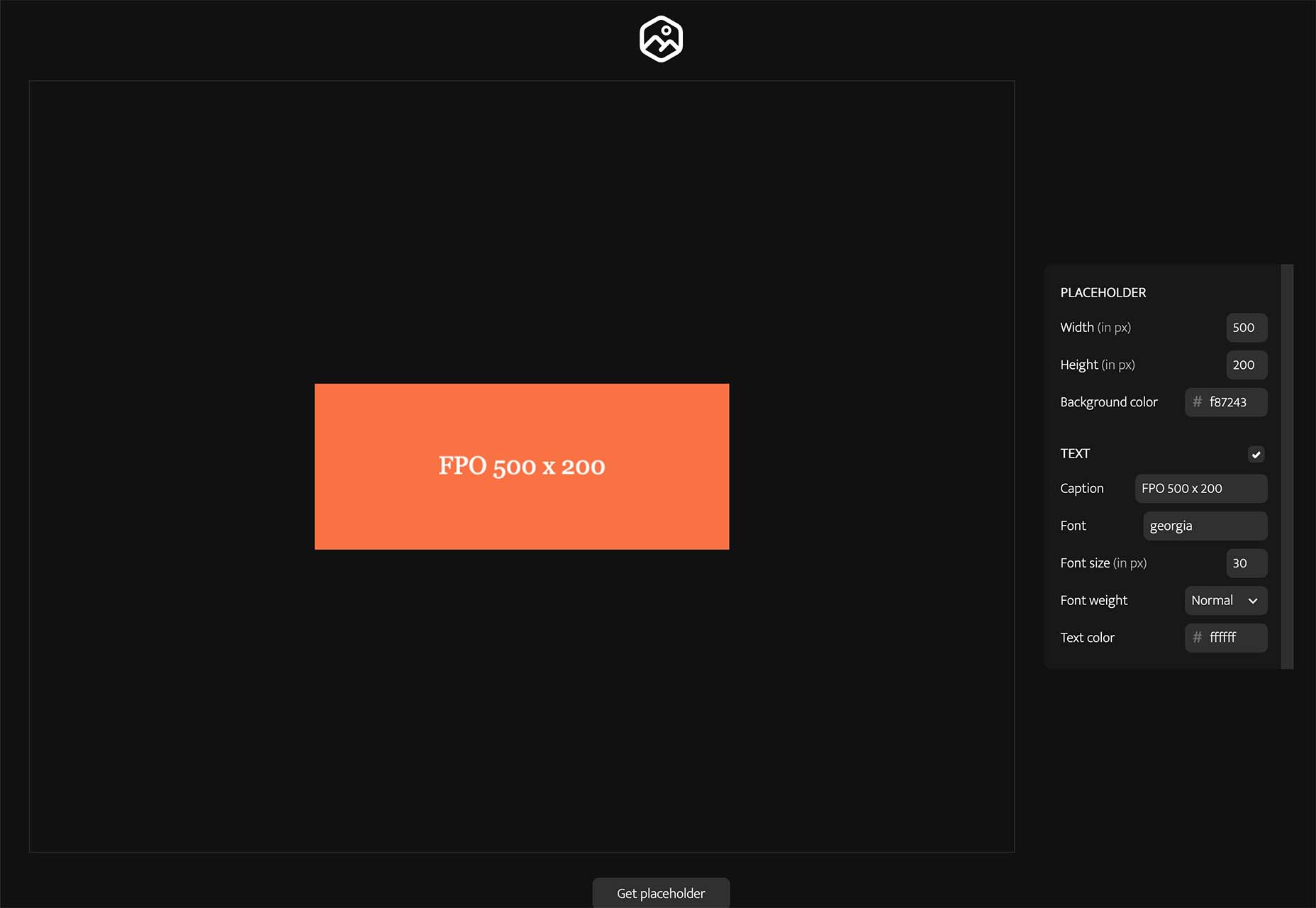
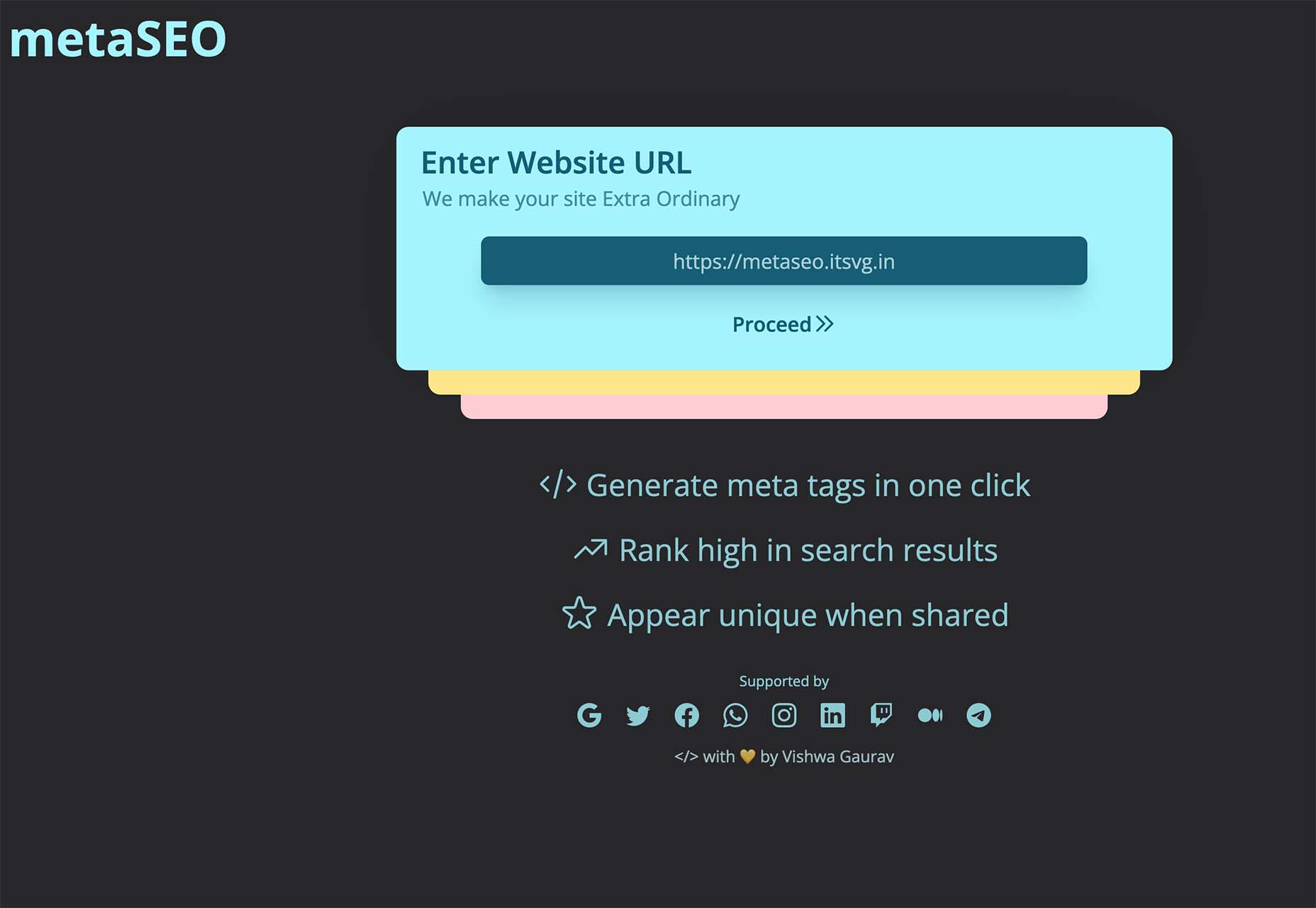
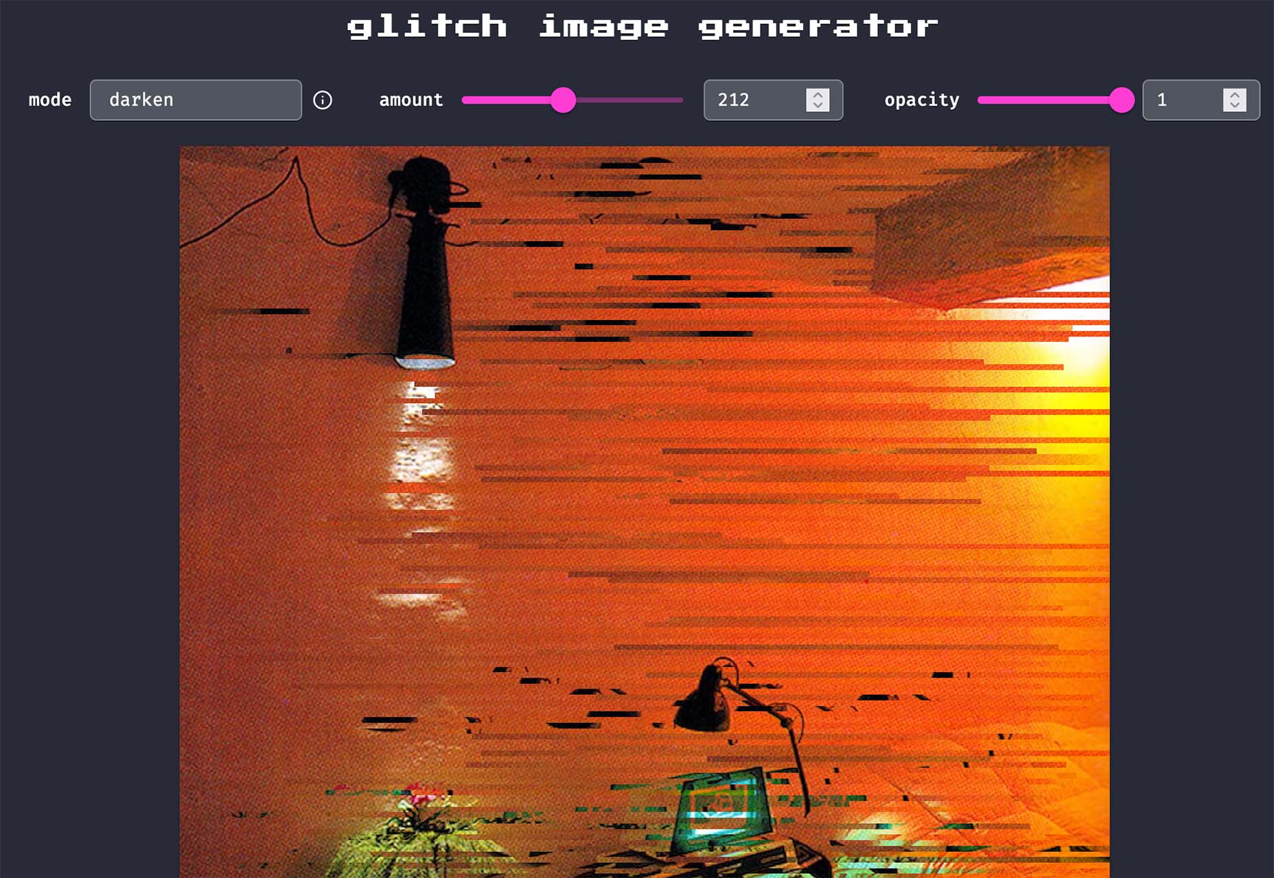
 With the holidays fast approaching, there are plenty of fun gifts for you in this roundup of new tools and resources for web designers. Make sure to share anything you find helpful with others to spread additional holiday cheer.