
 From dev tools to productivity to a little bit of fun with sudoku, this month’s collection of new tools is packed with something for everyone.
Here’s what new for designers this month.
May’s Top Picks
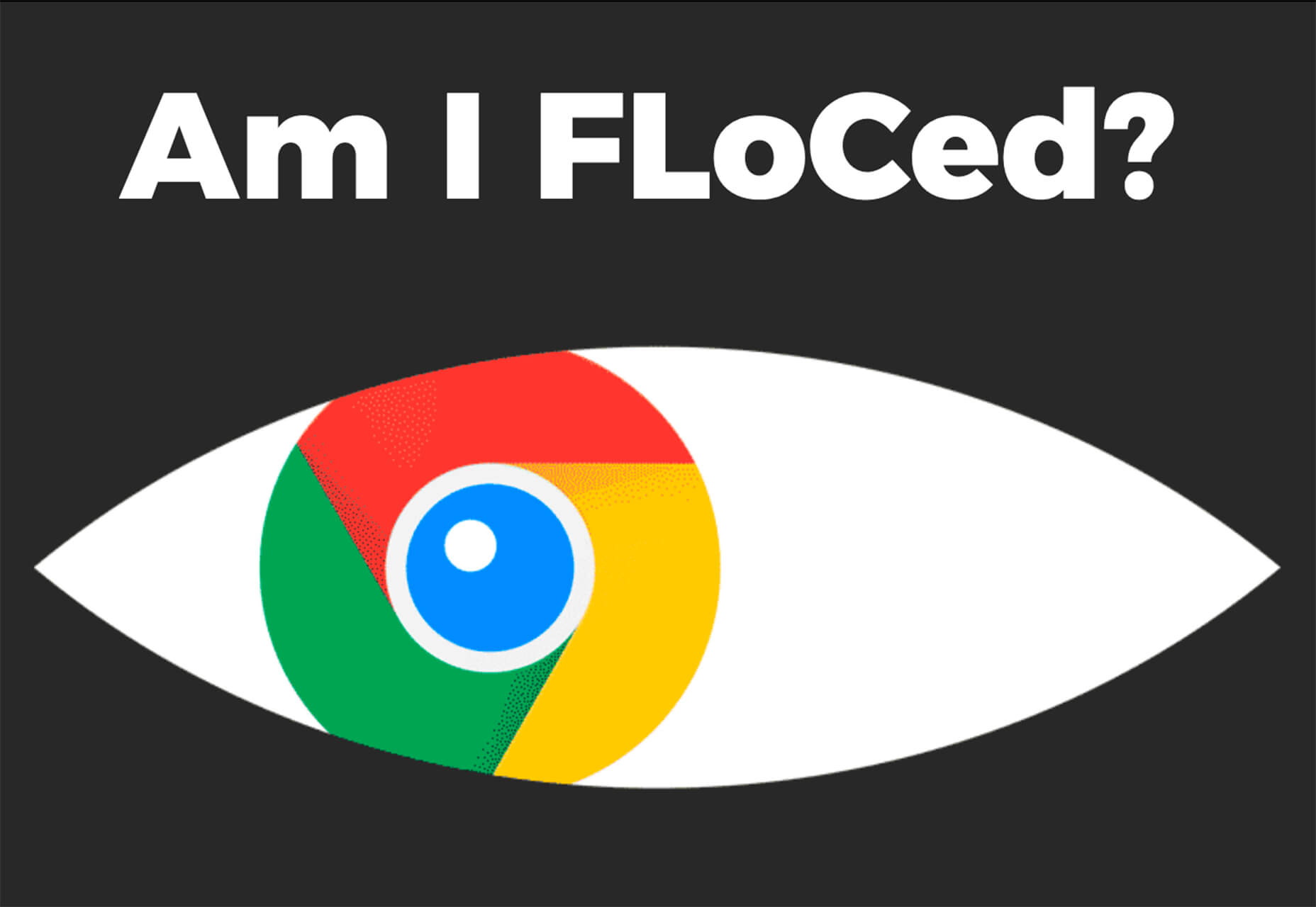
Am I FLoCed?
Am I FLoCed? Is a tool to see if you are part of a Google Chrome origin trial. It tests a new tracking feature called Federated Learning of Cohorts (FLoC). According to Google, the trial currently affects 0.5% of users in selected regions, including Australia, Brazil, Canada, India, Indonesia, Japan, Mexico, New Zealand, the Philippines, and the United States. The page will try to detect whether you’ve been made a guinea pig in Google’s ad-tech experiment.
According to the designers of Am I FloCed: “FLoC runs in your browser. It uses your browsing history from the past week to assign you to a group with other ‘similar’ people around the world. Each group receives a label, called a FLoC ID, which is supposed to capture meaningful information about your habits and interests. FLoC then displays this label to everyone you interact with on the web. This makes it easier to identify you with browser fingerprinting, and it gives trackers a head start on profiling you.”
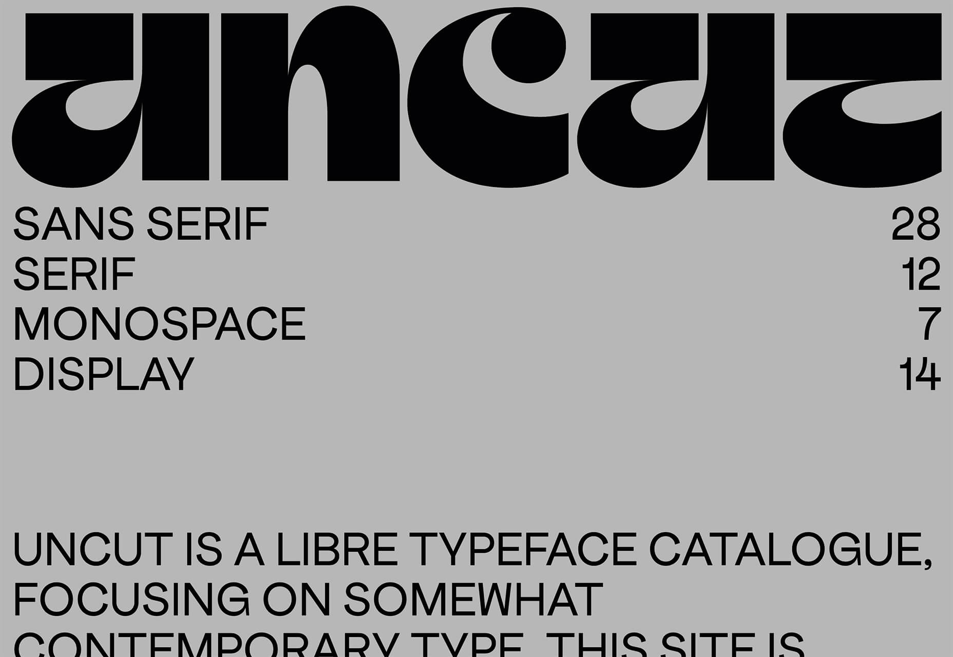
Uncut
Uncut is a Libre typeface catalog that just got started in April. It features contemporary typefaces and styles and is set to be updated regularly. Sort by sans serif, serif, monospace, or display typefaces. Plus, you can submit a typeface for inclusion.
Dashblock
Dashblock allows you to build automations without coding. Use it to create visual automations, or turn blocks into use-cases. (It is a premium tool, but comes with a 14-day free trial to test it out.)
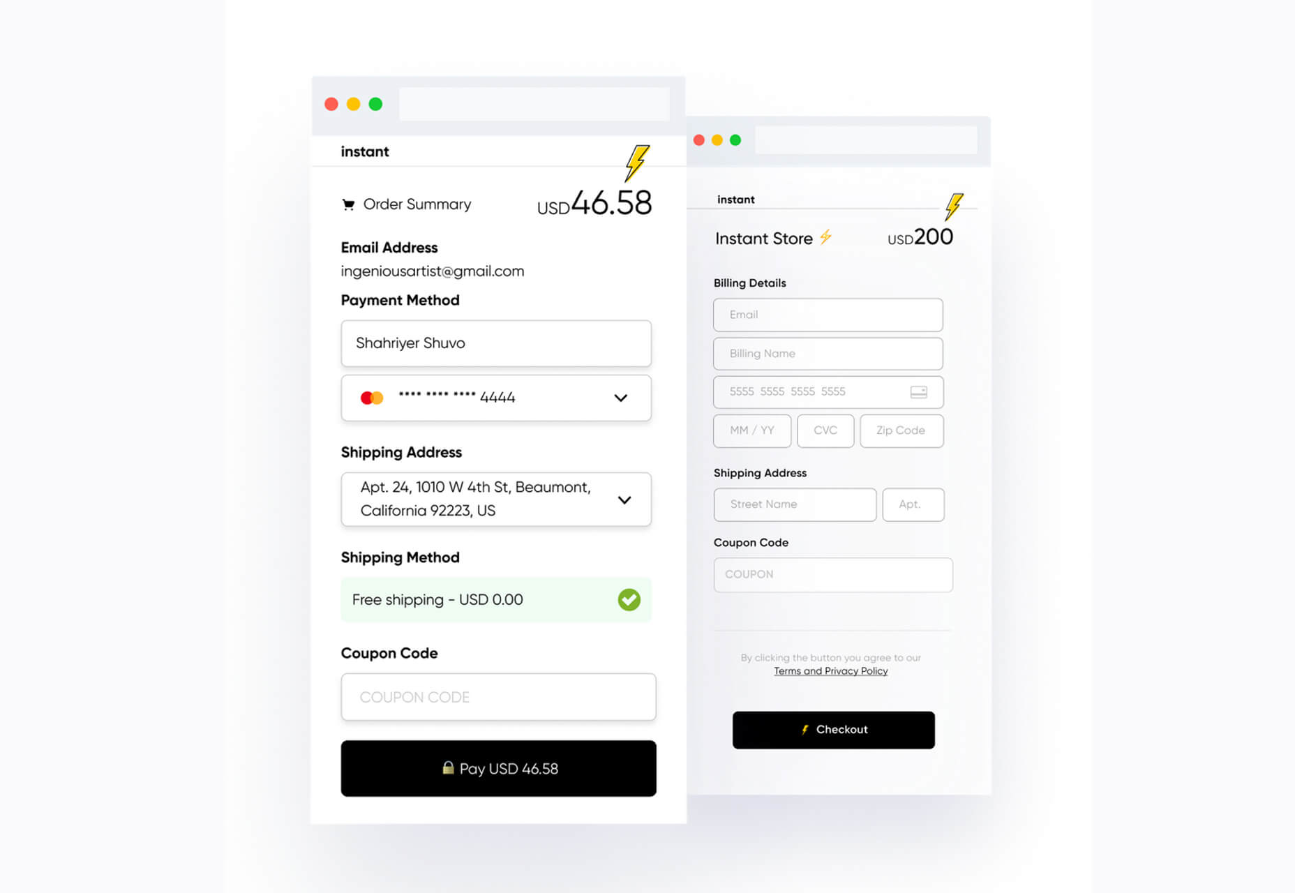
Instant
Instant is a fast and secure one-click checkout tool that works with WooCommerce. Users fill out a short form the first time they shop and then join the network to enable instant, frictionless, 1-click checkouts without passwords. It makes shopping easier and cuts abandoned carts.
5 Image Tools
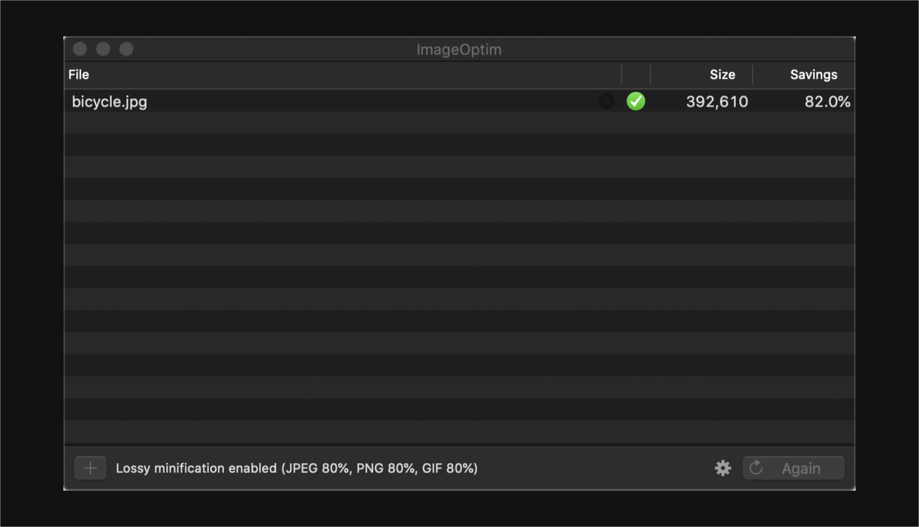
Triangula
Triangula uses a modified genetic algorithm to triangulate images. It works best with images smaller than 3000px and with fewer than 3000 points, typically producing an optimal result within a couple of minutes. The result is a nifty-looking image.

Content-Aware Image Resizing in Javascript
Content-Aware Image Resizing in Javascript solves that problem with images where you have a photo but it just doesn’t quite fit. A crop doesn’t work because you lose important information. The carver slices and cuts photos to give you the image elements you want in the size you want them. It’s probably a good idea to read through the tutorial before jumping into the open-source code on GitHub.

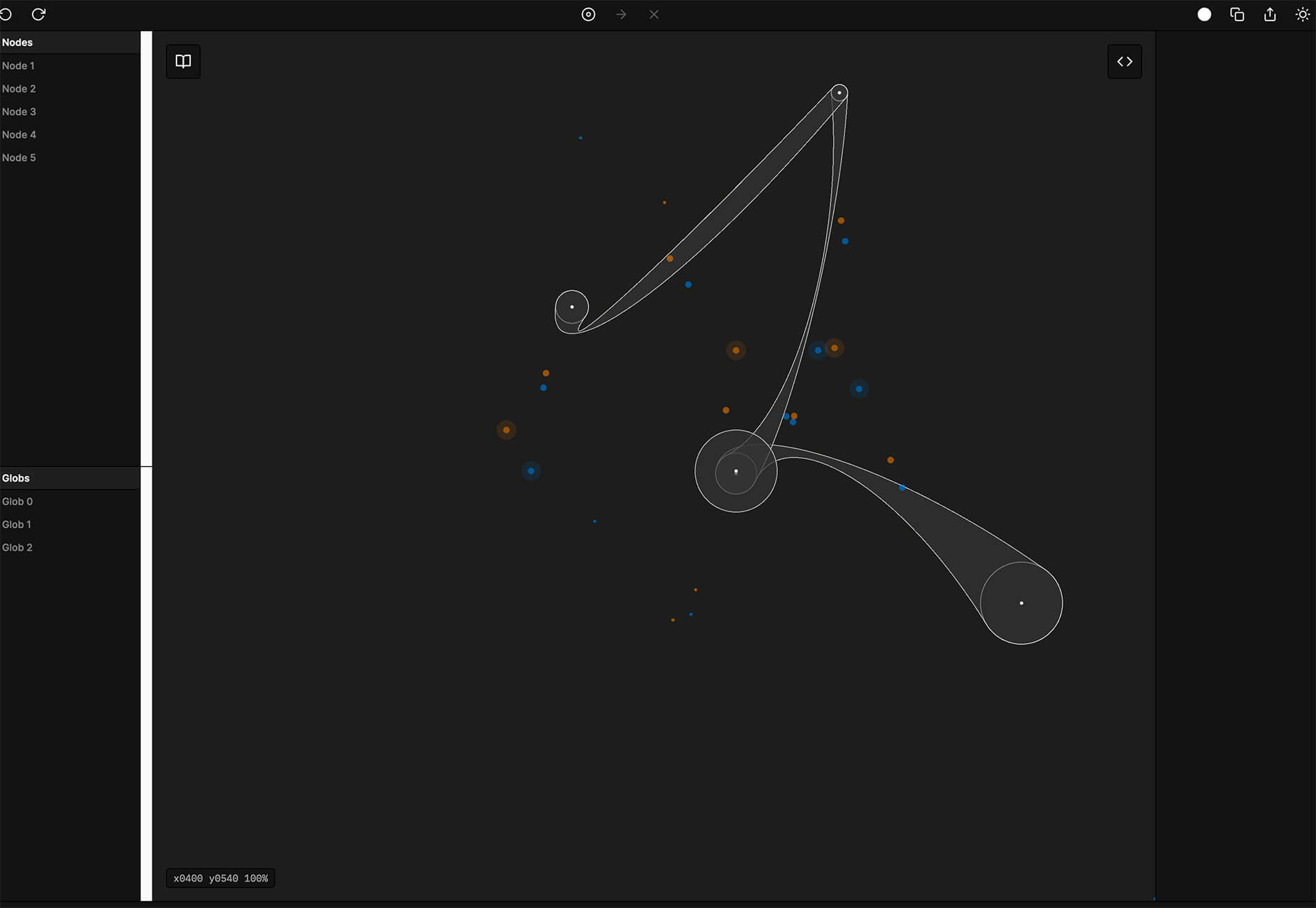
Globs Design
Globs Design uses toggles and drag and drop to help you create funky shapes and fills that you can save in SVG format for projects.
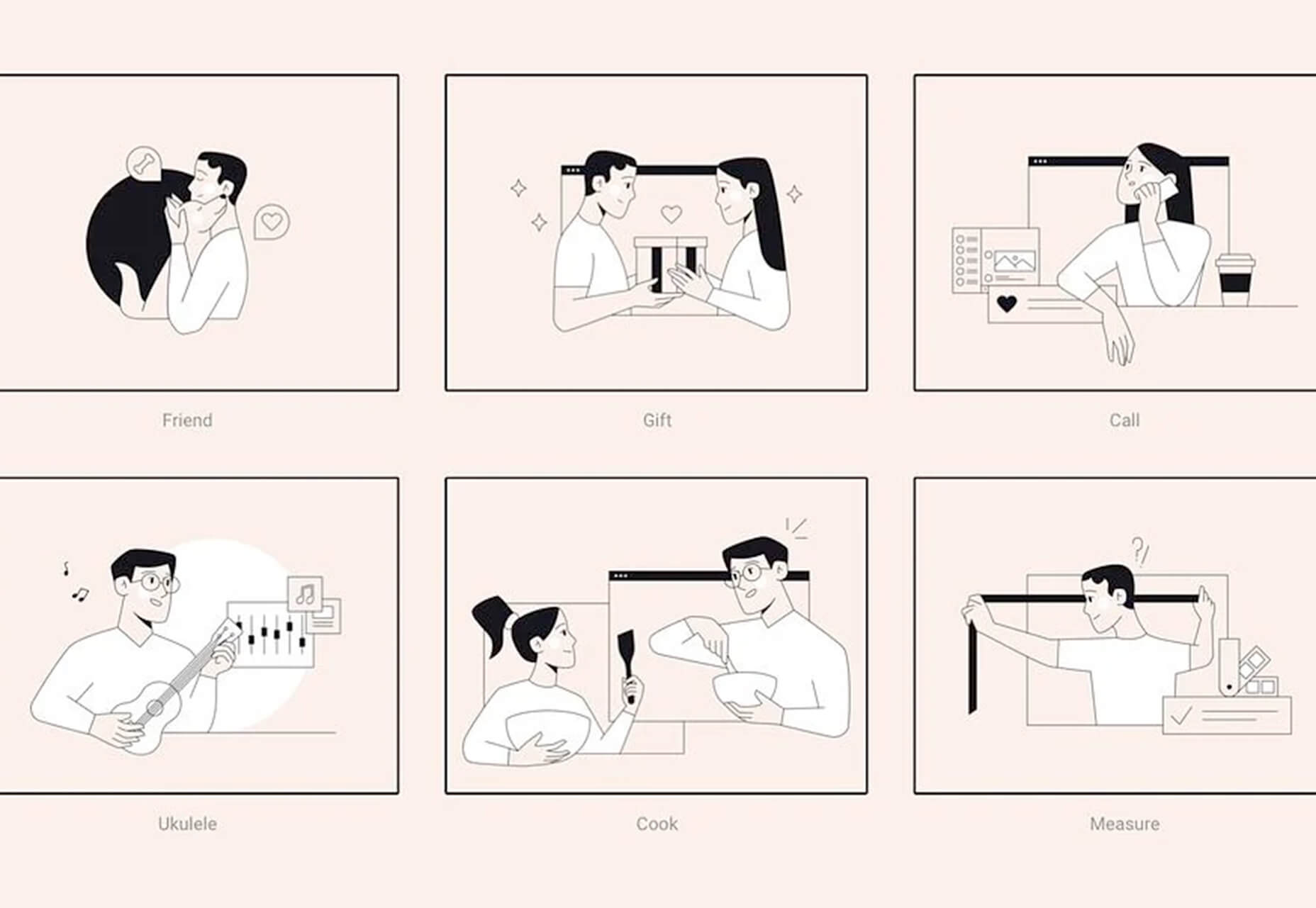
Root Illustrations
Root Illustrations is a stylish set of people-based illustrations that you can customize to create scenes for your projects. Construct a scene and then snag your set of vector graphics that also work with Sketch and Figma. The set includes 24 characters, more than 100 details, and the ability to change colors and styles.
Make Your Photo 16×9
Make Your Photo 16×9 is as simple as it sounds. It is a cropping tool that allows you to upload any shape of photo – even vertical – and pick options to fill the space to make it fit the standard 16×9 aspect ratio.

6 Dev Tools
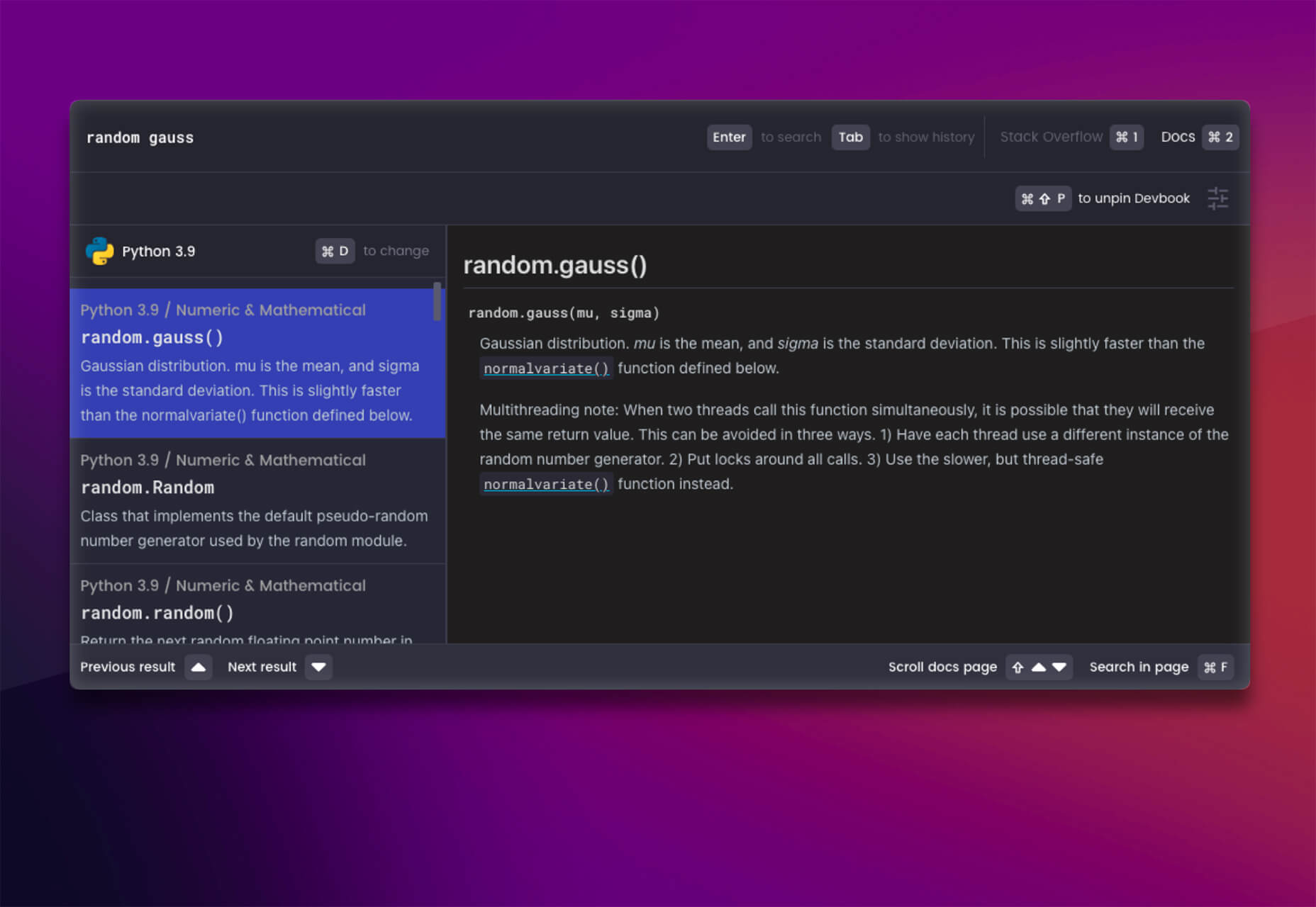
Devbook
Devbook is a search engine for developers that helps them to find the resources they need and answer their questions faster. Fast, accessible right from a code editor, and fully controllable with just a keyboard.
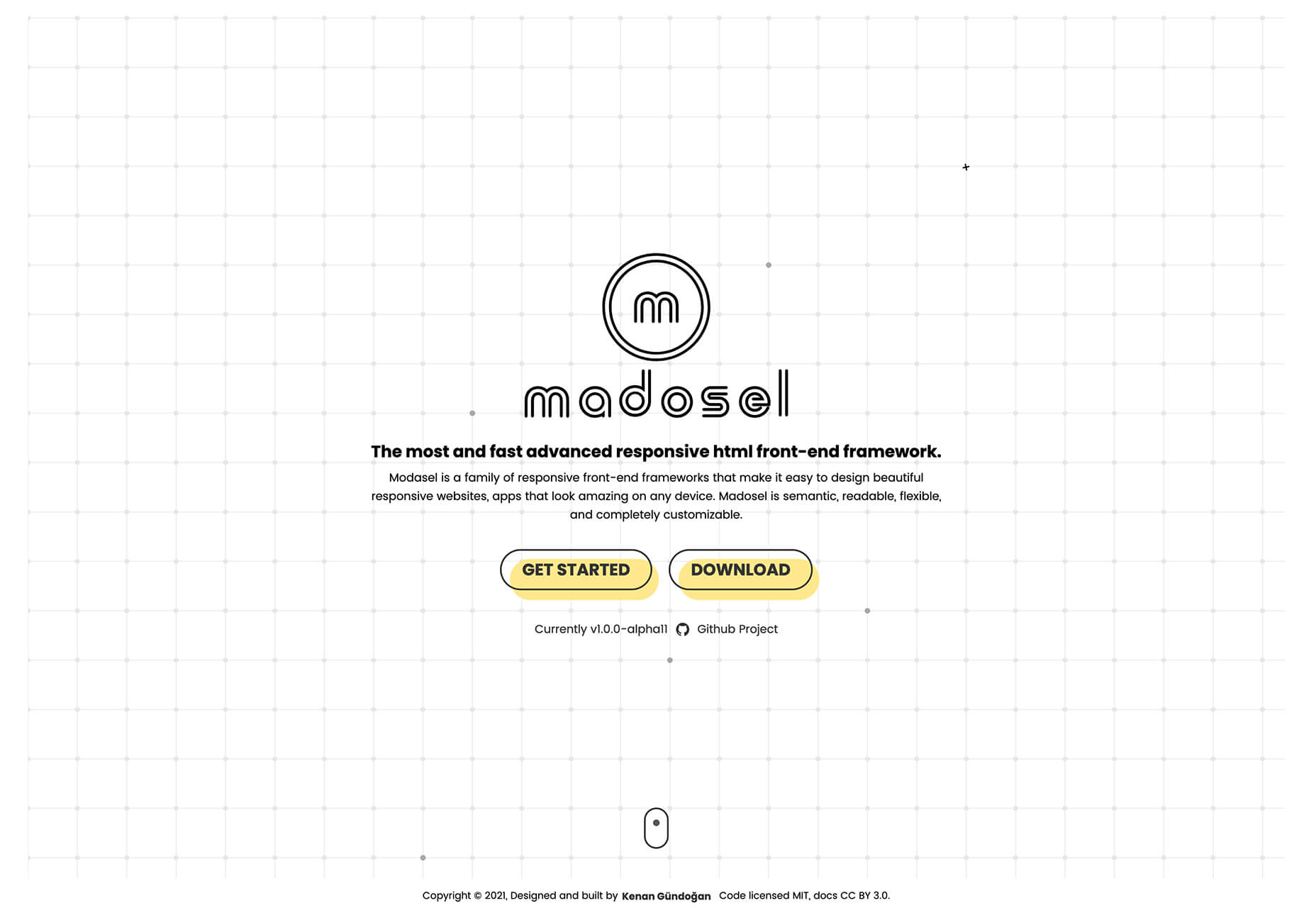
Madosel
Madosel is a fast, advanced responsive HTML front-end framework that’s in an alpha version. The open-source tool is made to create websites and apps that look great on any device. Plus, it is semantic, readable, flexible, and customizable.
Say Hello to CSS Container Queries
Say Hello to CSS Container Queries helps solve a problem with media queries and smart stacking of elements. CSS Container Queries allow you to make a fluid component that adjusts based on the parent element and everything is independent of viewport width. This post takes you through everything you need to do to implement this yourself.
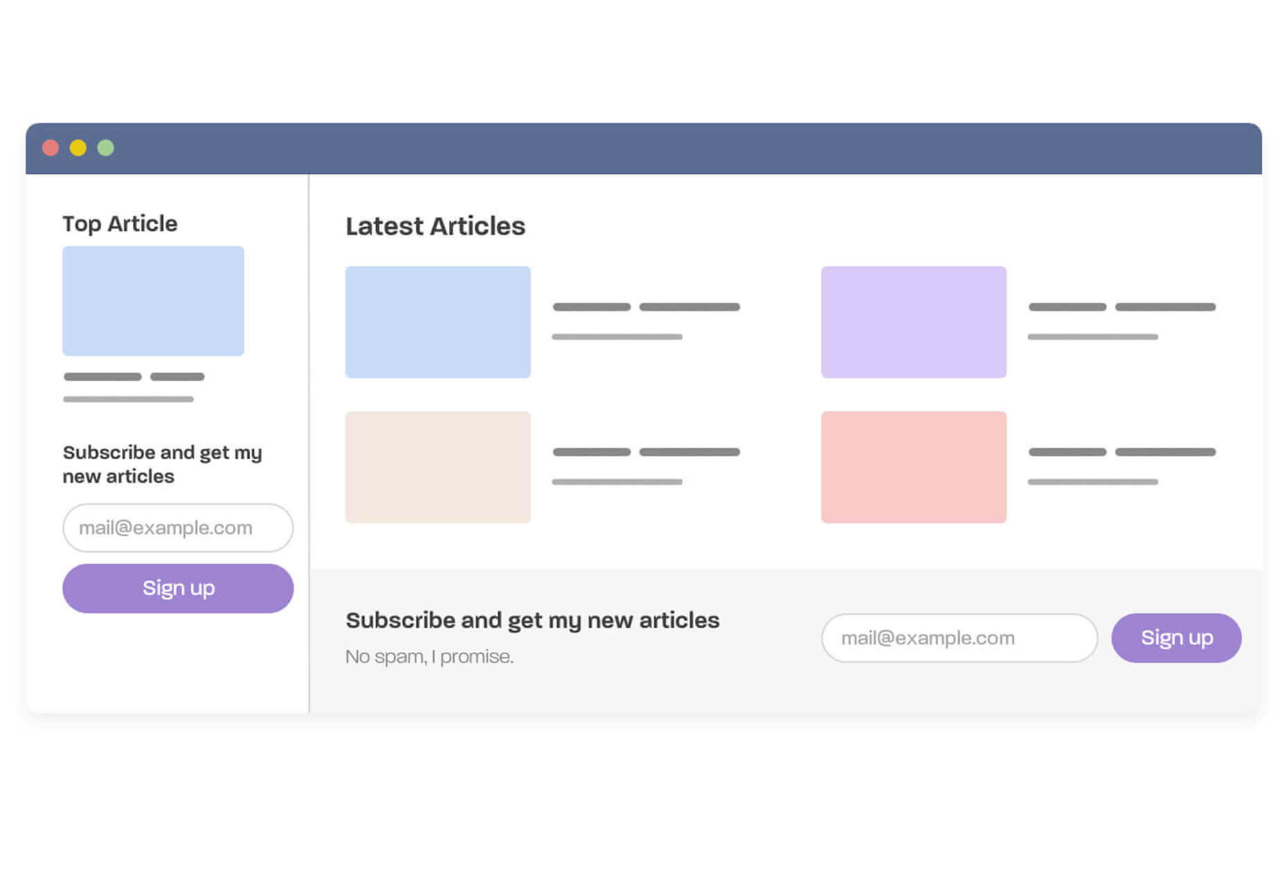
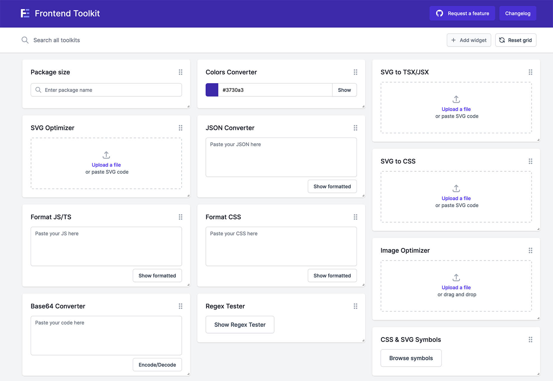
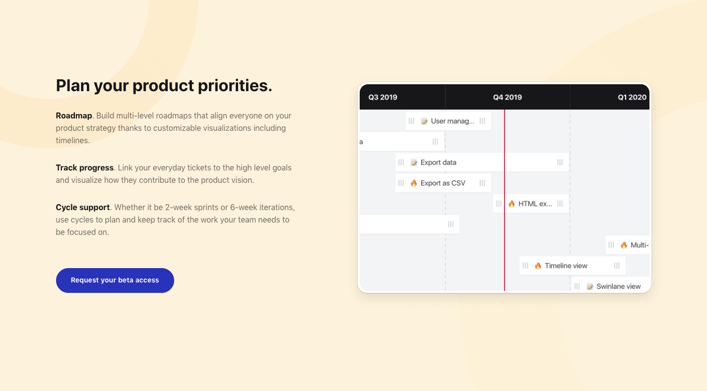
Frontend Toolkit
Frontend Toolkit is a customizable dashboard that you can use to keep up with recurring tasks. It’s one of those little tools that can speed up workflows.
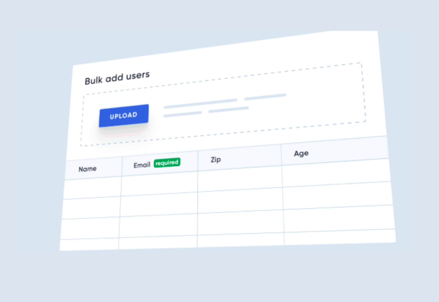
Flatfile
Flatfile is a production-ready importer for SaaS applications. It allows you to auto-format customer spreadsheets without manual cleaning of data and you can do it all without a CSV parser. The tool also includes an elegant UI component to guide users through the process.
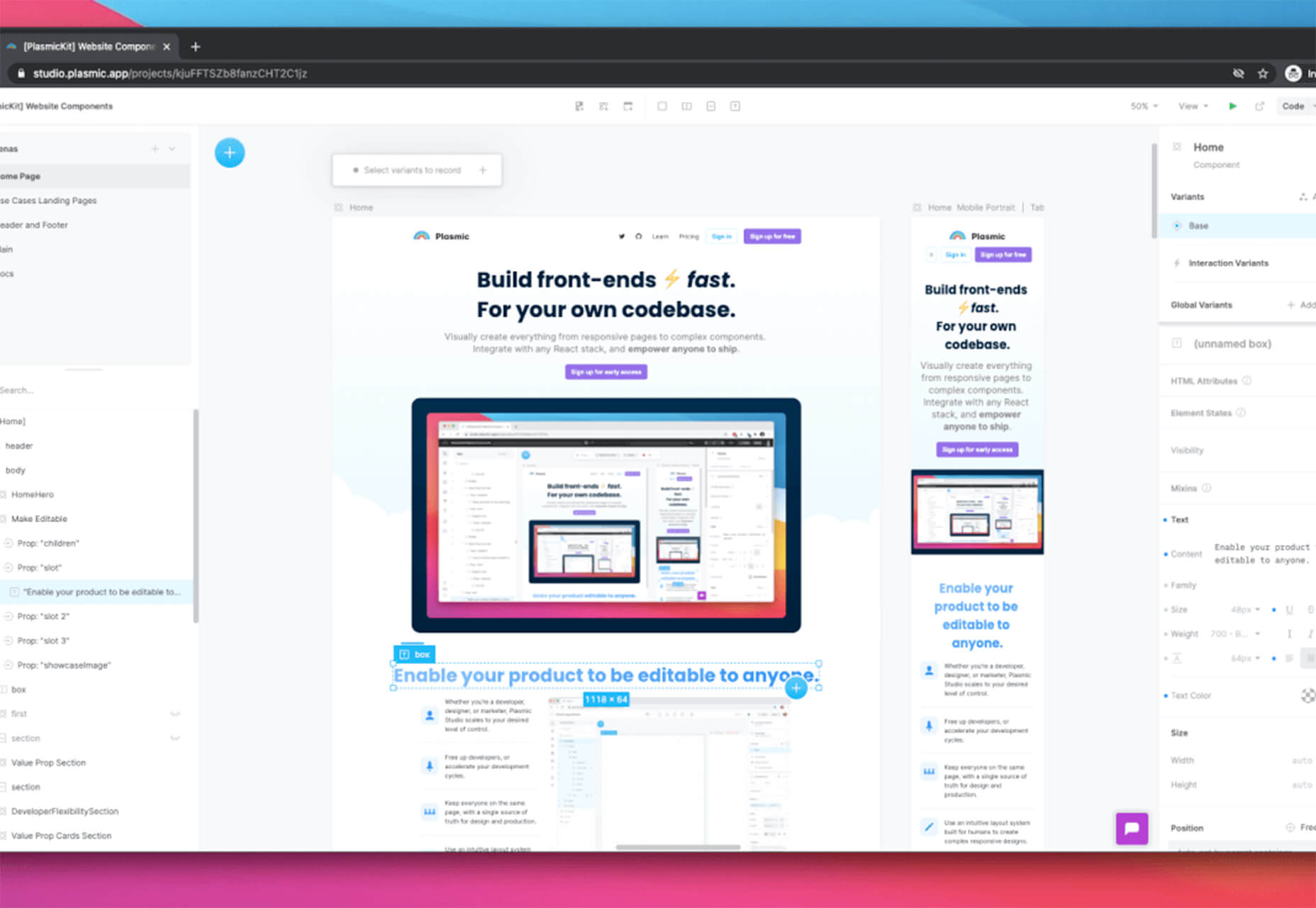
Plasmic
Plasmic is a visual website builder that works with your codebase. It’s designed to speed up development with developers focusing on code (not pixel pushing) and allows non-developers to publish pages and content. The premium tool works with any hosting, CMS, or framework and you can adapt it by the component, section, or page.
2 Productivity Tools
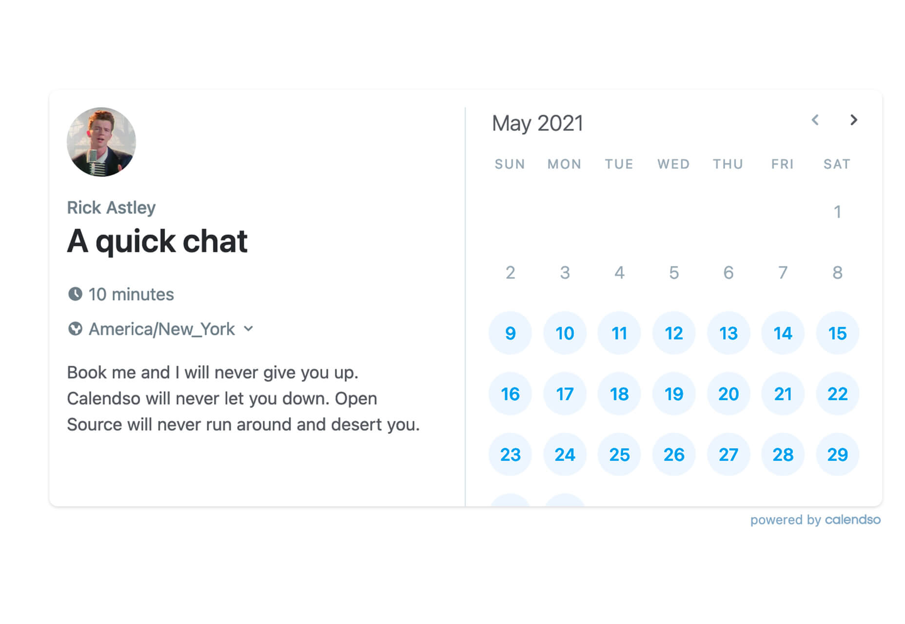
Calendso
Calendso is an open-source calendar scheduling tool. It’s flexible with the ability to host it yourself or with the makers of the calendar. It is API-driven and allows you to control events and information. The interface is simple and sleek and can integrate into your website.
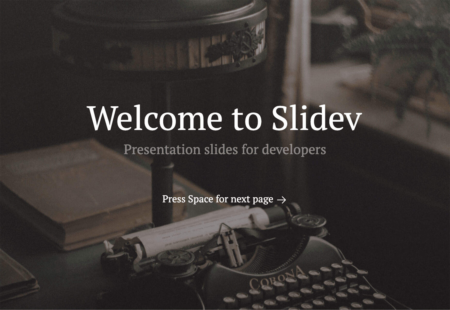
Slidev
Slidev is a set of presentation slides for developers. What’s different about this presentation deck is that you can write slides in a single markdown file with themes, code blocks, and interactive components.
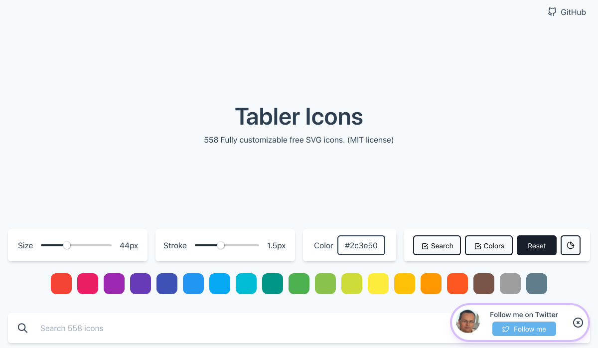
4 Icons and UI Kits
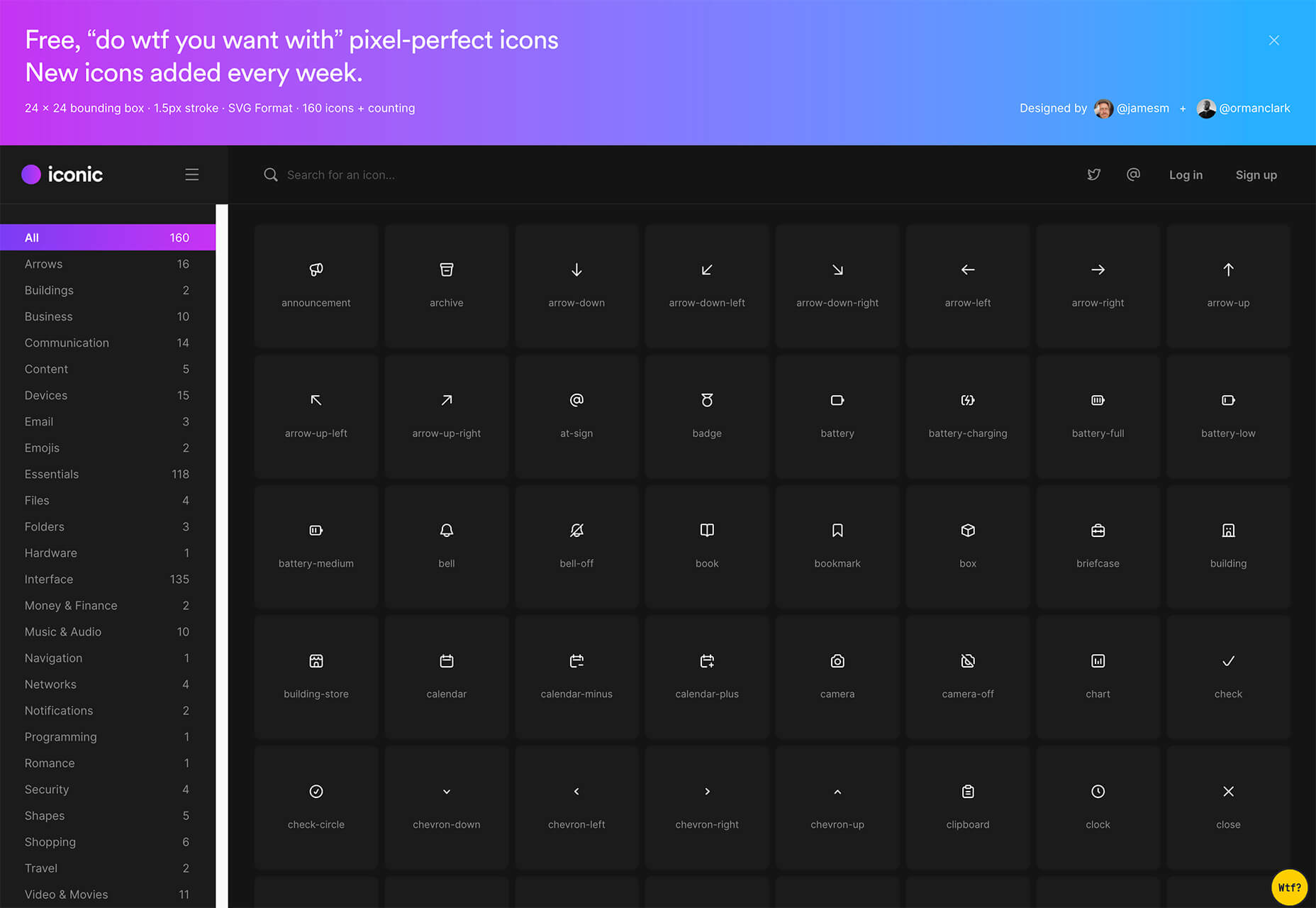
Iconic
Iconic is a set of pixel-perfect icons that gets updated each week. The collection of 24×24 px elements in SVG format contains 160 icons and counting. The simple style is easy to implement and you can search for just what you need by category.
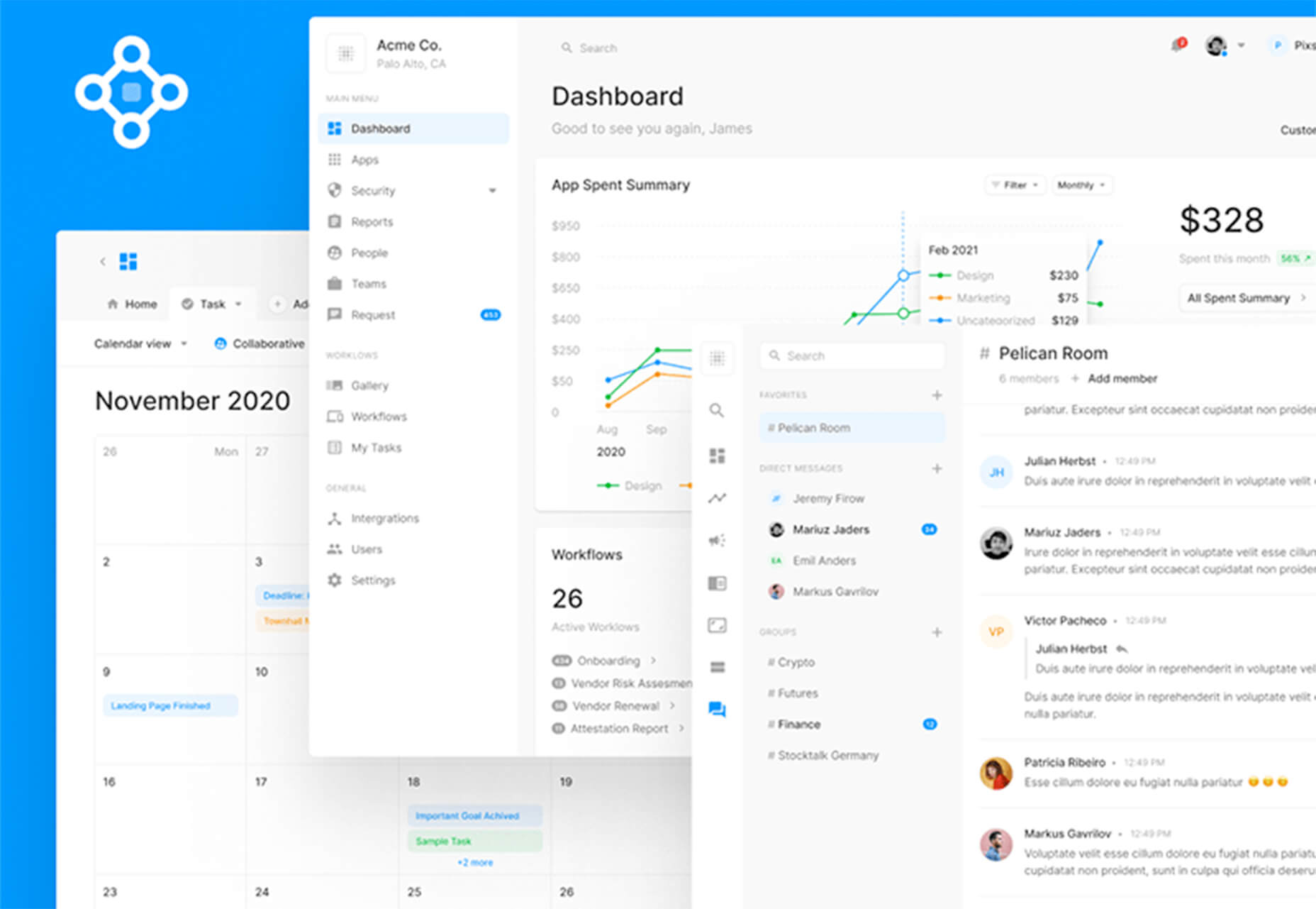
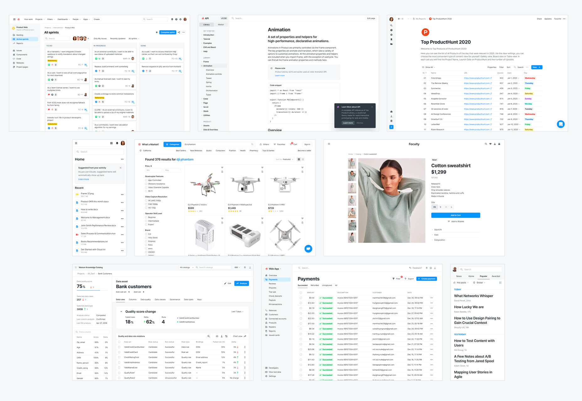
5 Dashboard Templates for Figma
5 Dashboard Templates for Figma is a set of free ready-made screens with light and dark modes for each that you can use with components such as calendars, charts, tables, and more. The free elements are a preview of a larger premium Figma set if you like how they look and work.
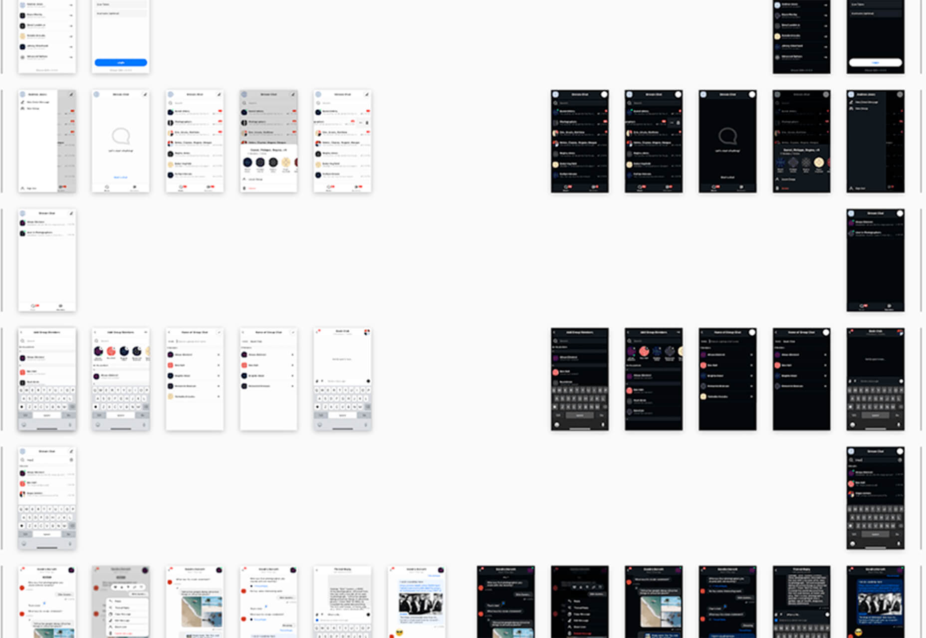
Free Mobile Chat UI Kit
Free Mobile Chat UI Kit is a tool of components for Sketch, Figma, and Adobe XD that includes more than 50 messaging screens with light and dark modes.
Stratum UI Design Kit
Stratum UI Design Kit is a collection of more than 9,000 consistent elements for Figma. It’s packed with elements and tools that make this premium UI kit a tool that gets projects moving quickly.
4 Type Tools and Fresh Fonts
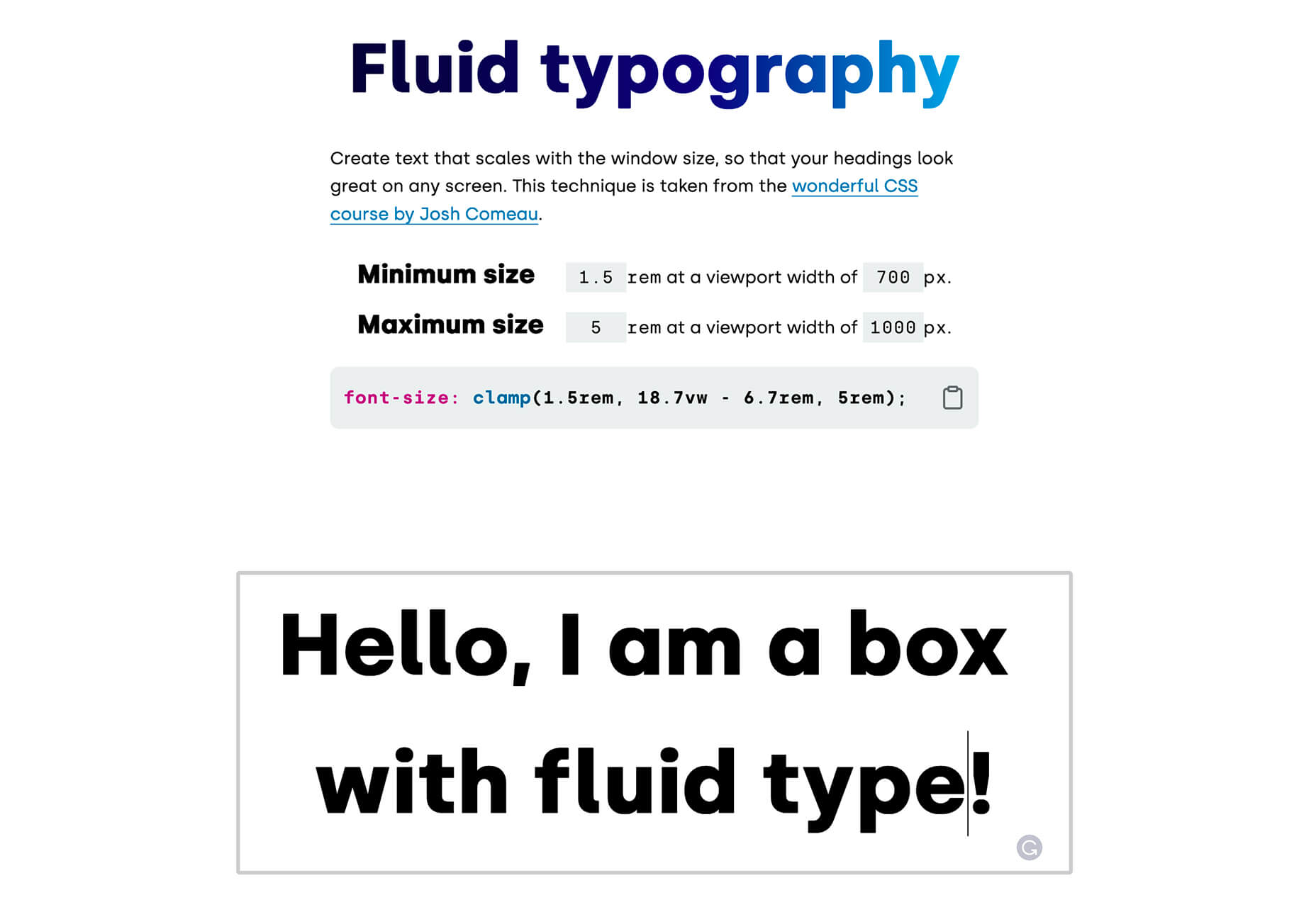
Fluid Typography
Fluid Typography is a nifty tool that allows you to test headings in any size at different viewports to ensure it looks great everywhere. Then you can copy the CSS and use it in your projects.
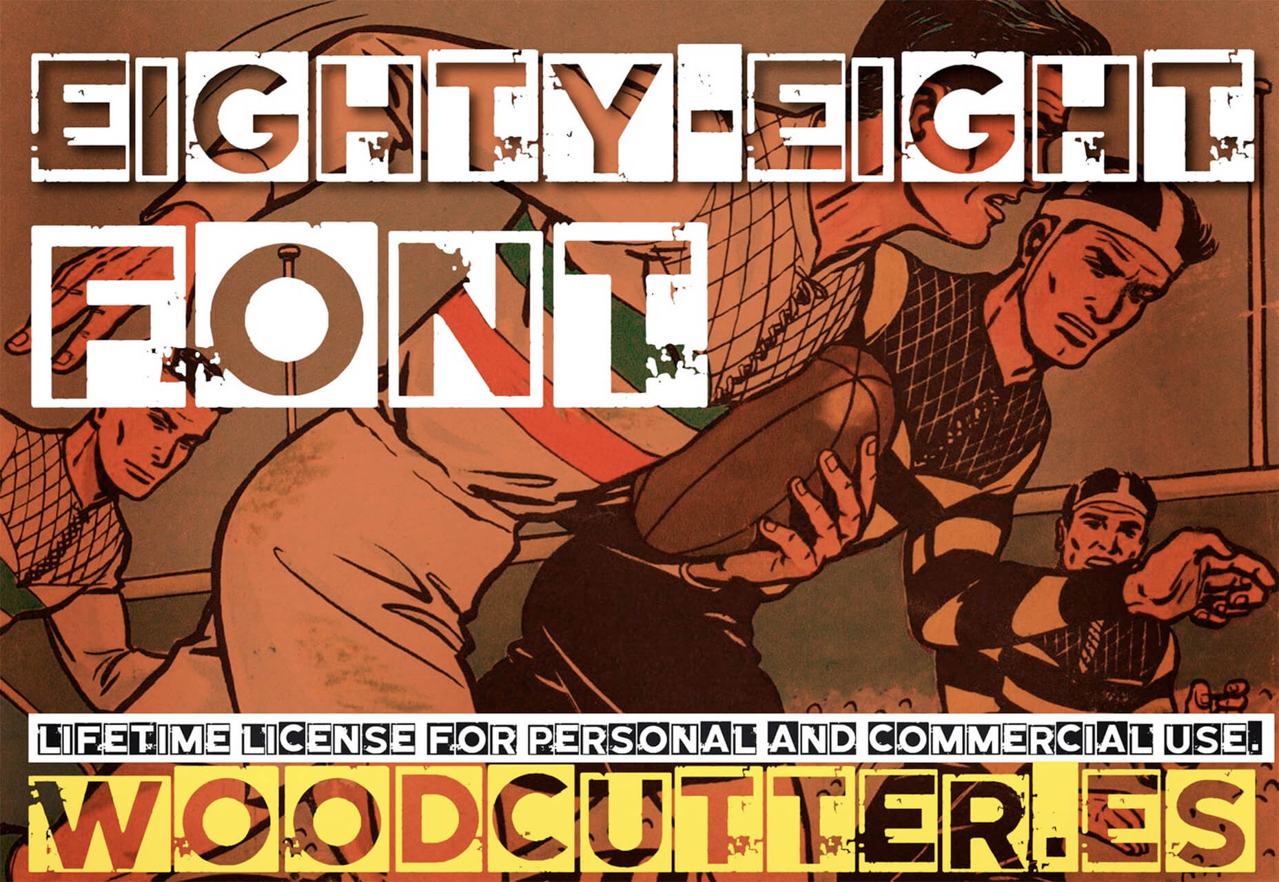
Eighty-Eight
Eighty-Eight is a funky block-style typeface for display use.
Harmonique
Harmonique is a robust typeface family with lovely serifs and alternates. It’s a type family of two styles that work in harmony together to add distinction and personality to your own typographic compositions. Harmonique’s low contrast forms have the appeal of a humanist sans serif typeface.
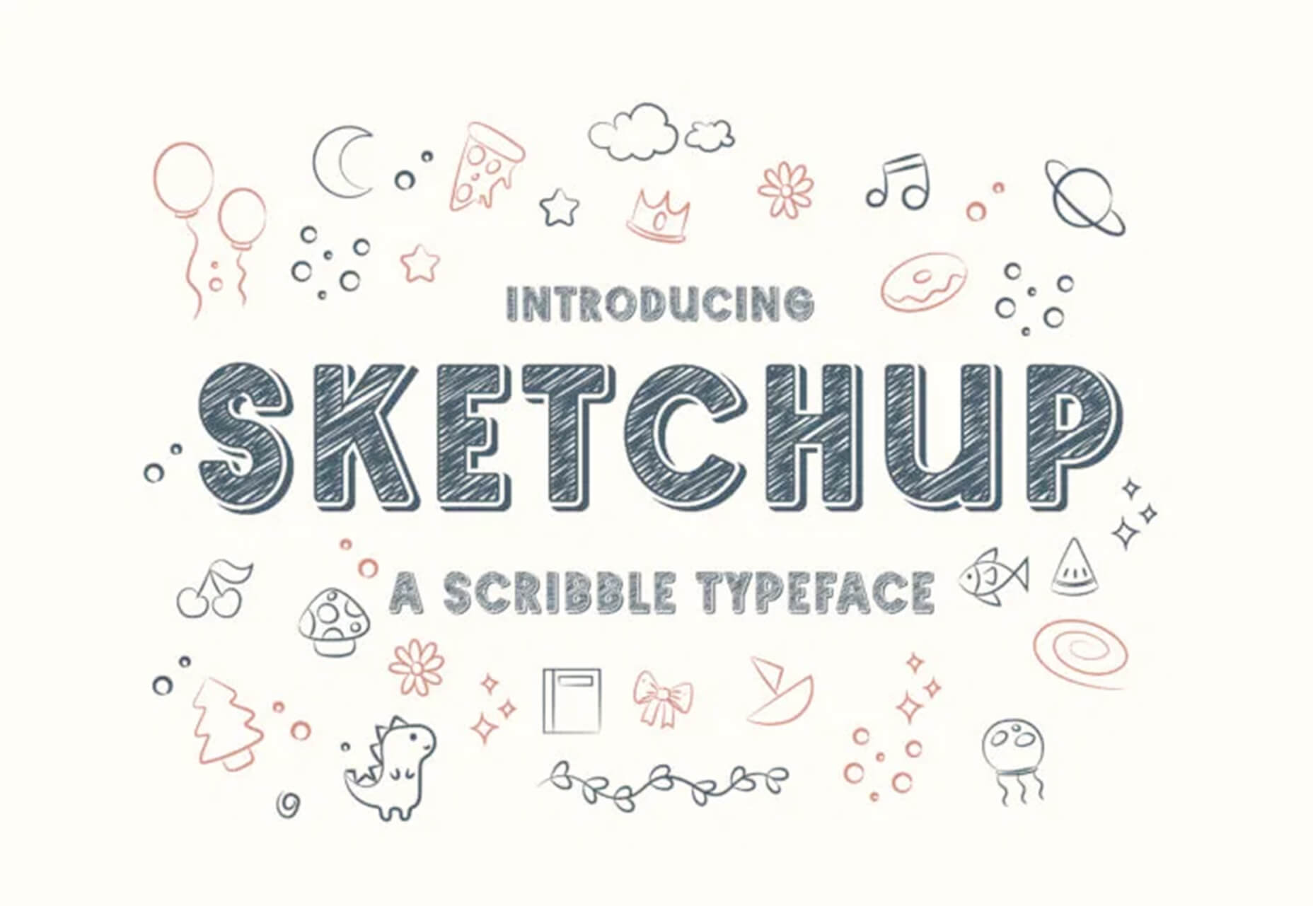
Sketchup
Sketchup is a charming display typeface that has a nice pen style. The free version has a limited character set.
Just for Fun
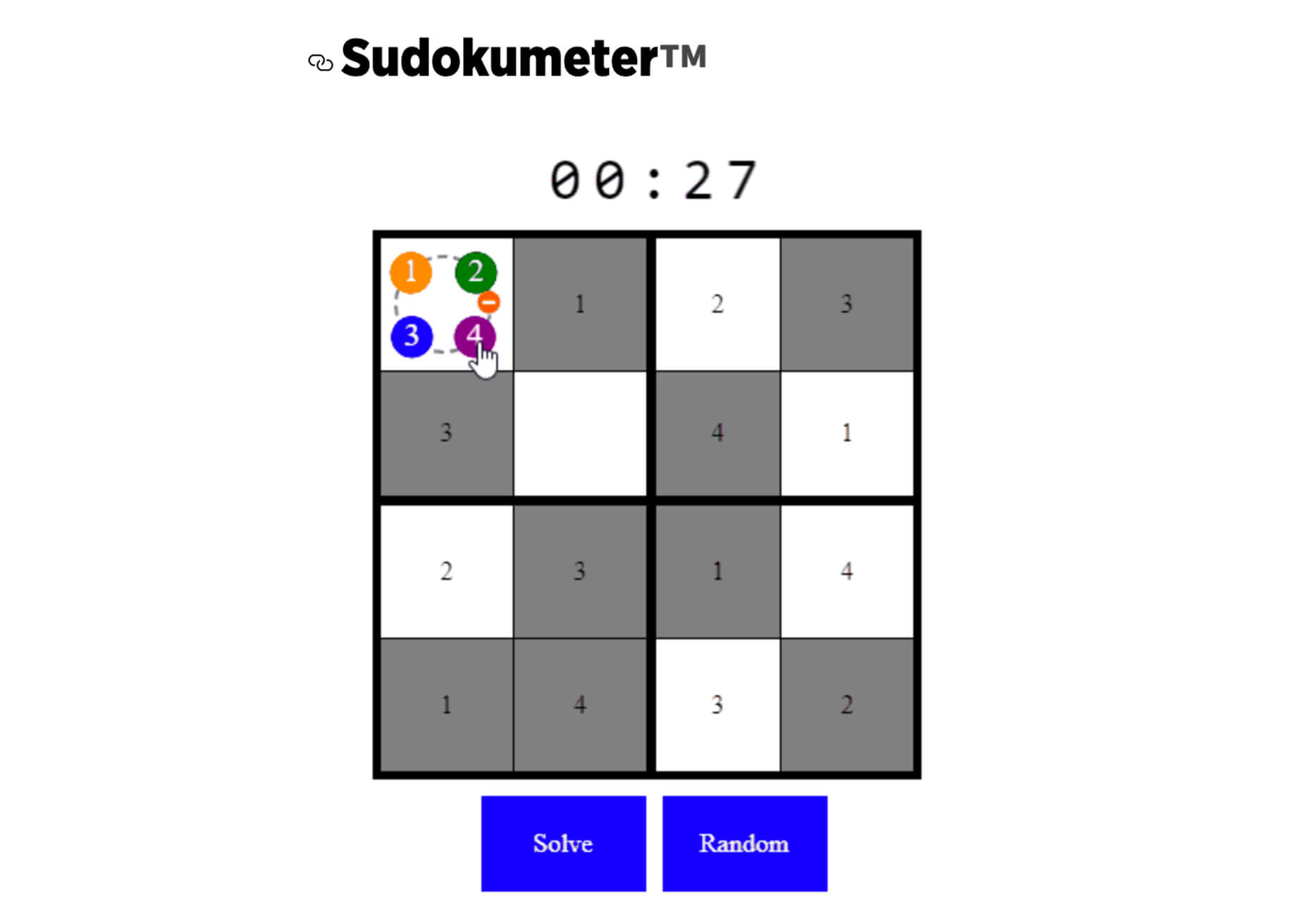
Generating and Solving Sudokus in CSS
Generating and Solving Sudokus in CSS by Lee Meyer for CSS-Tricks is a fun deep dive into using CSS for something you might not expect. It’s a complicated – but fun – look at some of the things CSS can do with plenty of code snippets. The final result is a solvable puzzle with 16 squares.
The post 26 Exciting New Tools For Designers, May 2021 first appeared on Webdesigner Depot.
 Have you ever wondered why we’re so amazed by motion? A moving image is more likely to grab your attention than a static one. Motion is exciting and attention-grabbing – plus, it allows us to access more information in a short space of time.


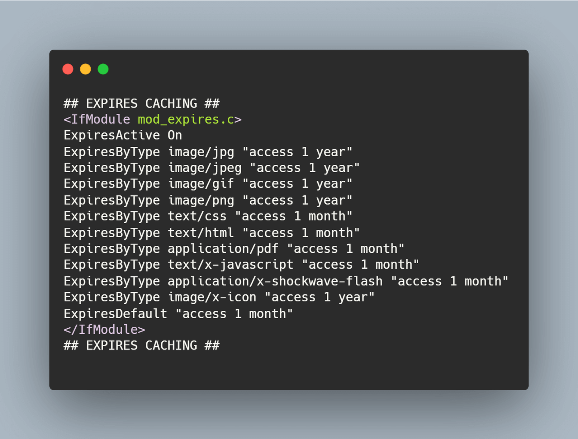
 The ‘need for speed’ is an essential item on every website’s bucket list these days. And why not? Enhanced speed is directly responsible for converting traffic into paying clients.

 Every week users submit a lot of interesting stuff on our sister site Webdesigner News, highlighting great content from around the web that can be of interest to web designers.

 Every week users submit a lot of interesting stuff on our sister site Webdesigner News, highlighting great content from around the web that can be of interest to web designers.
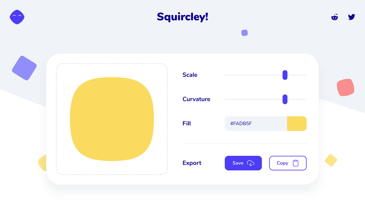


 You’ve been working away at your latest design project, and the client has given the go-ahead on your lovingly created digital concepts. Now it’s time to bring those designs to life, and you have a developer queued up to do just that.
