Articles

A design portfolio is an excellent way to demonstrate your skills as a freelancer. As a web designer, you compete with millions of other web designers. Therefore, you must have a strong portfolio to land a high-paying web designing job in such a competitive space. A strong portfolio sets you apart from others. Having no clients, however, can make it challenging to get your portfolio noticed and build up any momentum.

People typically build portfolios from projects they do for clients. Hence, it seems unlikely for a new web designer without clients to have a strong portfolio. However, it’s attainable. You can build a design portfolio with no clients, and you’ll find out how in this post.

What Makes A Good Design Portfolio?

A good portfolio should display your best work, as most clients want to see your best. However, your best work may not be client work. In addition, what’s more, important than displaying your best work is showing your versatility.

Being a versatile web designer will land you more jobs than being an expert in just one type of web design. Notably, you don’t need to have many clients to be versatile in web design. Instead, you become versatile by taking on different projects.

A good design portfolio should include professional recommendations. Testimonials from previous clients are valuable here, but anyone can recommend you. It could be a web designer friend, collaborator, or even your tutor.

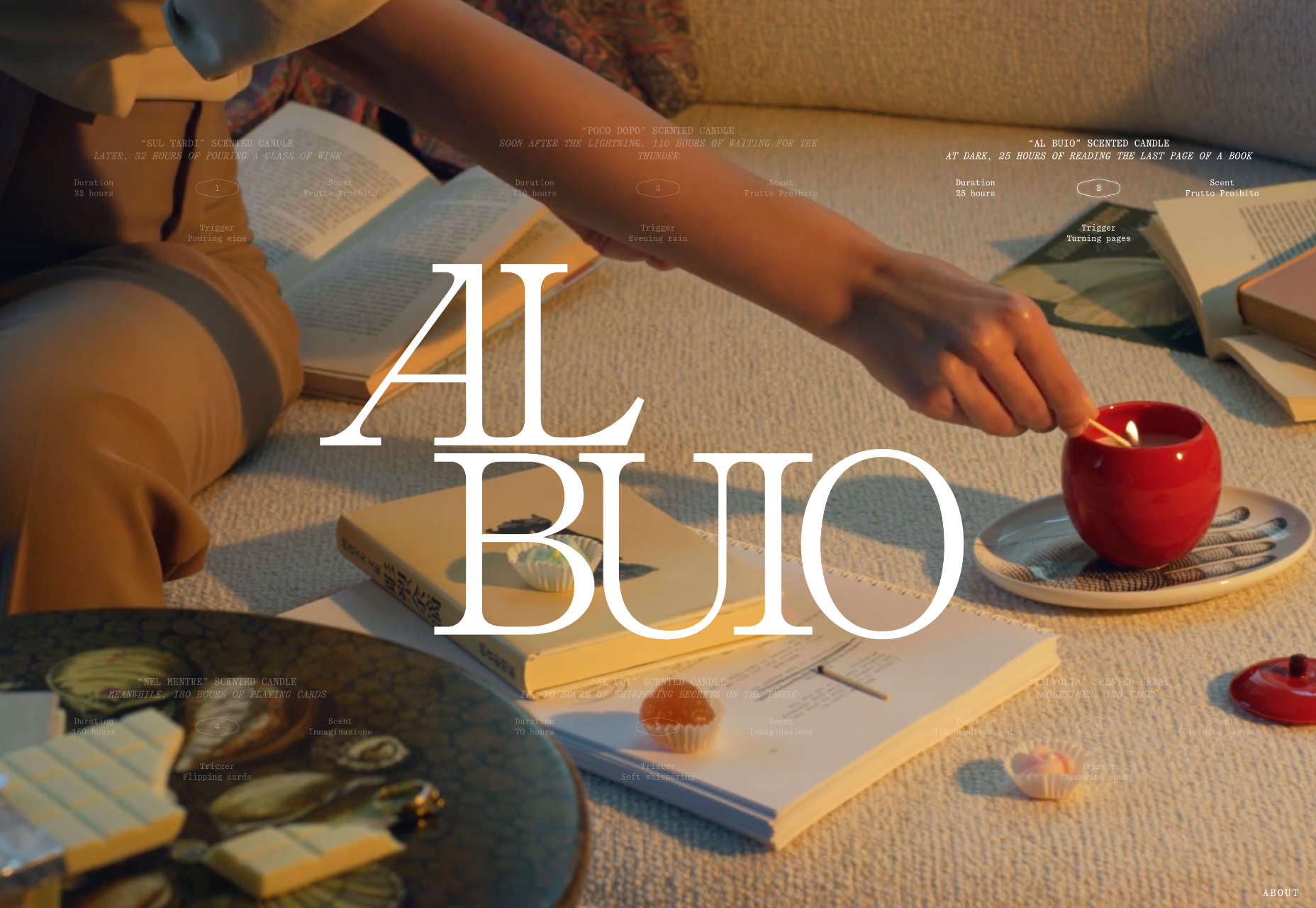
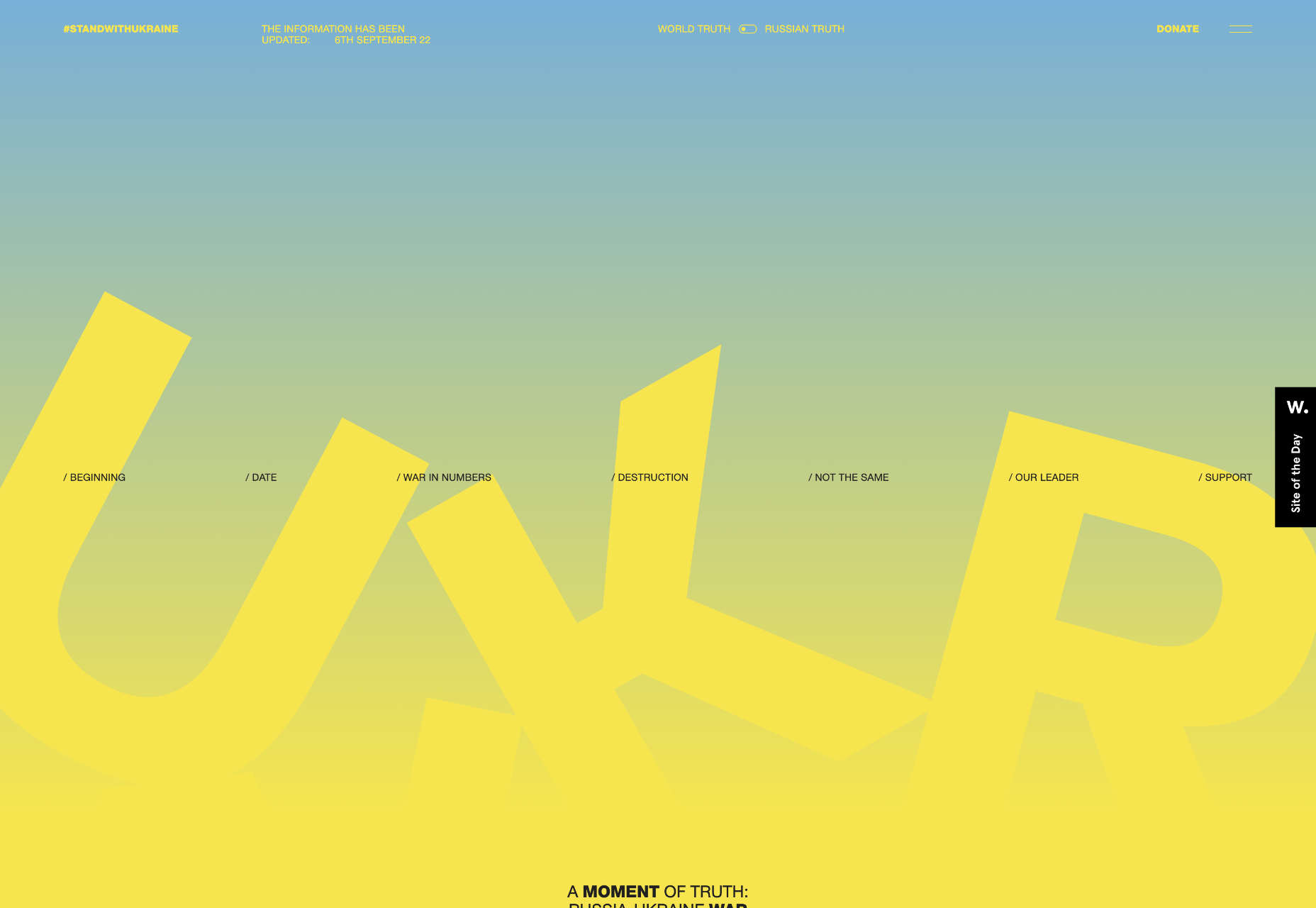
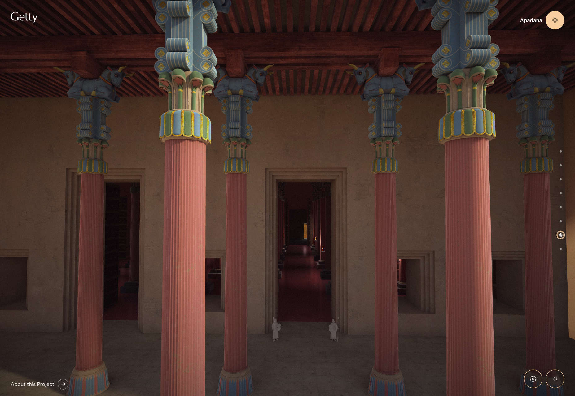
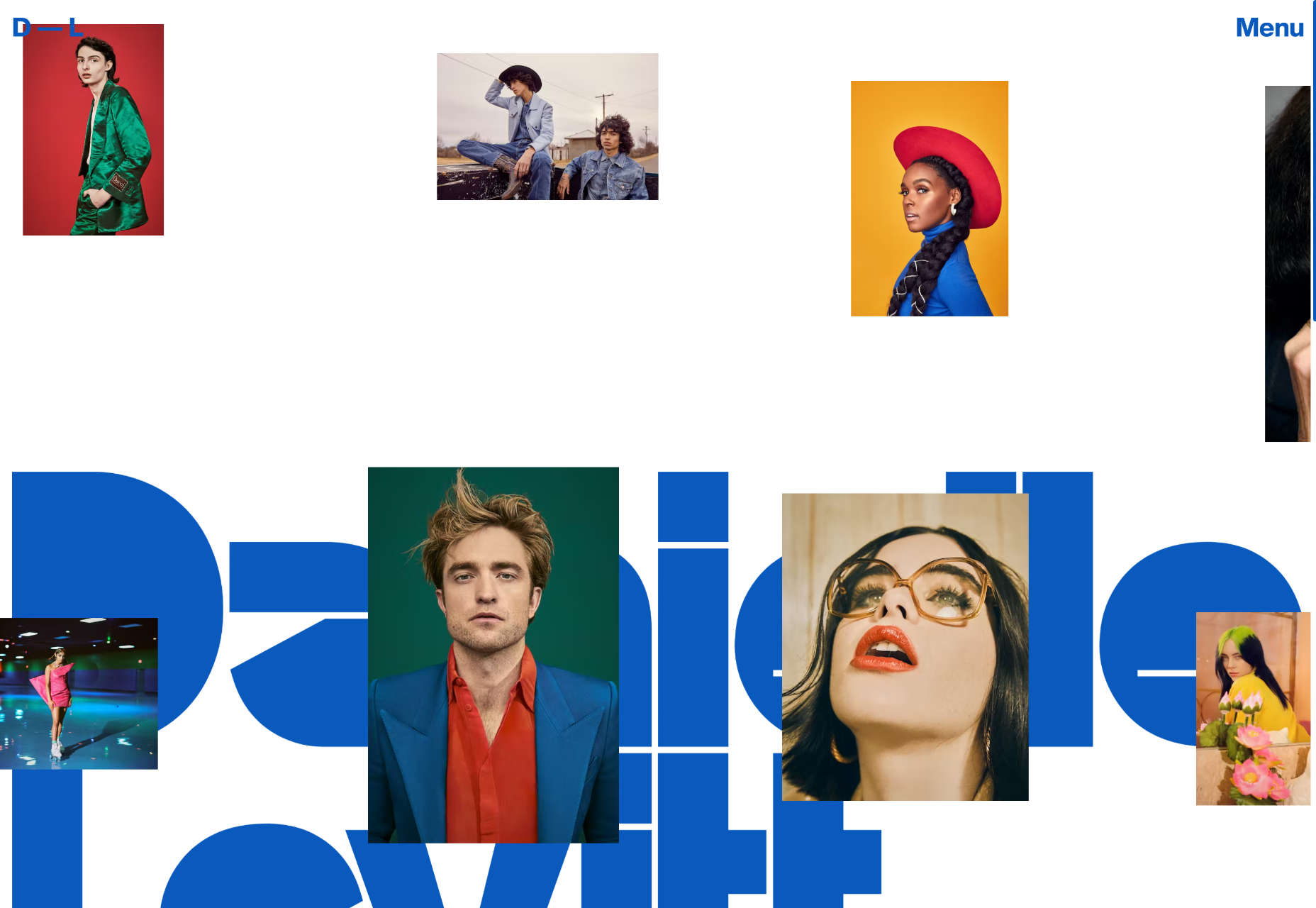
Furthermore, a good portfolio should feature non-client work; even if you have thousands of past clients, featuring personal projects is still ideal. It shows your growth as a web designer isn’t limited to what clients ask you to do.

Many other factors constitute a good portfolio, but these points are the most important regarding showing your skill. You can build a portfolio that includes them even if you have no clients.

How To Build A Design Portfolio With Zero Clients

You can try all or some of these methods to build a design portfolio if you have no clients.

1. Take On Design Challenges

A simple way to build a strong web design portfolio is by competing in challenges. It’s helpful whether you have clients or not.

Winning a design challenge is like finishing at the top of the class. It demonstrates that you’re the best web designer in the room and the type of web designer clients want to hire. Generally, taking on design challenges will help sharpen your skills.

You can partake in competitions arranged by renowned web design communities. You can find such competitions on websites like 99designs and Design Crowd. More often than not, winning a web design challenge will land you a job.

2. Carry Out Personal Projects

Carrying out personal projects is similar to competing in challenges. However, in this case, you’re challenging yourself.

Have you ever had a unique idea for a website? Don’t wait until a client asks you to build such a website. Instead, you can begin the project on your own. Then, if you succeed, you can proudly display the project in your portfolio.

When you get clients, you wouldn’t need to convince them that you can handle such tasks; the personal project is a testament to it.

You can carry out as many personal projects as you envisage, no matter how simple or complex. Furthermore, you don’t always have to complete them. Even failed personal projects can be part of your portfolio.

3. Clone Websites

When most clients contact you, they’ll want you to create a website similar to some existing website. You can give yourself a head start by cloning some popular websites and featuring the projects in a portfolio.

Your ability to build a replica of a professional website from scratch shows expertise. In addition, you most likely won’t get a 100% match with the original version. Your version may have improvements that subsequent clients would appreciate.

Furthermore, some website designers specialize in cloning. Suppose you plan to provide such services to clients. In that case, displaying your previously cloned website projects is all you need to create a strong portfolio.

4. Create Websites for Family and Friends

Your family and friends are potential clients. Hence, you can offer to build websites for them, even if it is for free. Afterward, you should include the work in your portfolio.

If your friend or relative has an offline business, for example, you could offer to build a website to give them an online presence.

Even if they eventually don’t use the website, you can include it as a demo project in your portfolio.

5. Get Inspiration From Others

You’re not the only web designer with no clients who wants to build a strong portfolio. Therefore, you can draw inspiration from others.

Dribbble, the social networking platform for designers, is among the best options you have. Dribbble allows you to find thousands of new and veteran web designers with varying portfolios.

You can scan the portfolios, examine the content, and try to replicate what you can in yours. Furthermore, you can even build a portfolio directly on Dribbble.

Bottom Line

Not having clients shouldn’t discourage you as a new web designer. You can still build a strong design portfolio with the methods discussed in this article.

After creating your portfolio, you can then use it to secure jobs. Subsequently, you can update the portfolio with your best client work.


Featured image by storyset on Freepik.

Source

The post How To Build A Design Portfolio With Zero Clients first appeared on Webdesigner Depot.

Source de l’article sur Webdesignerdepot

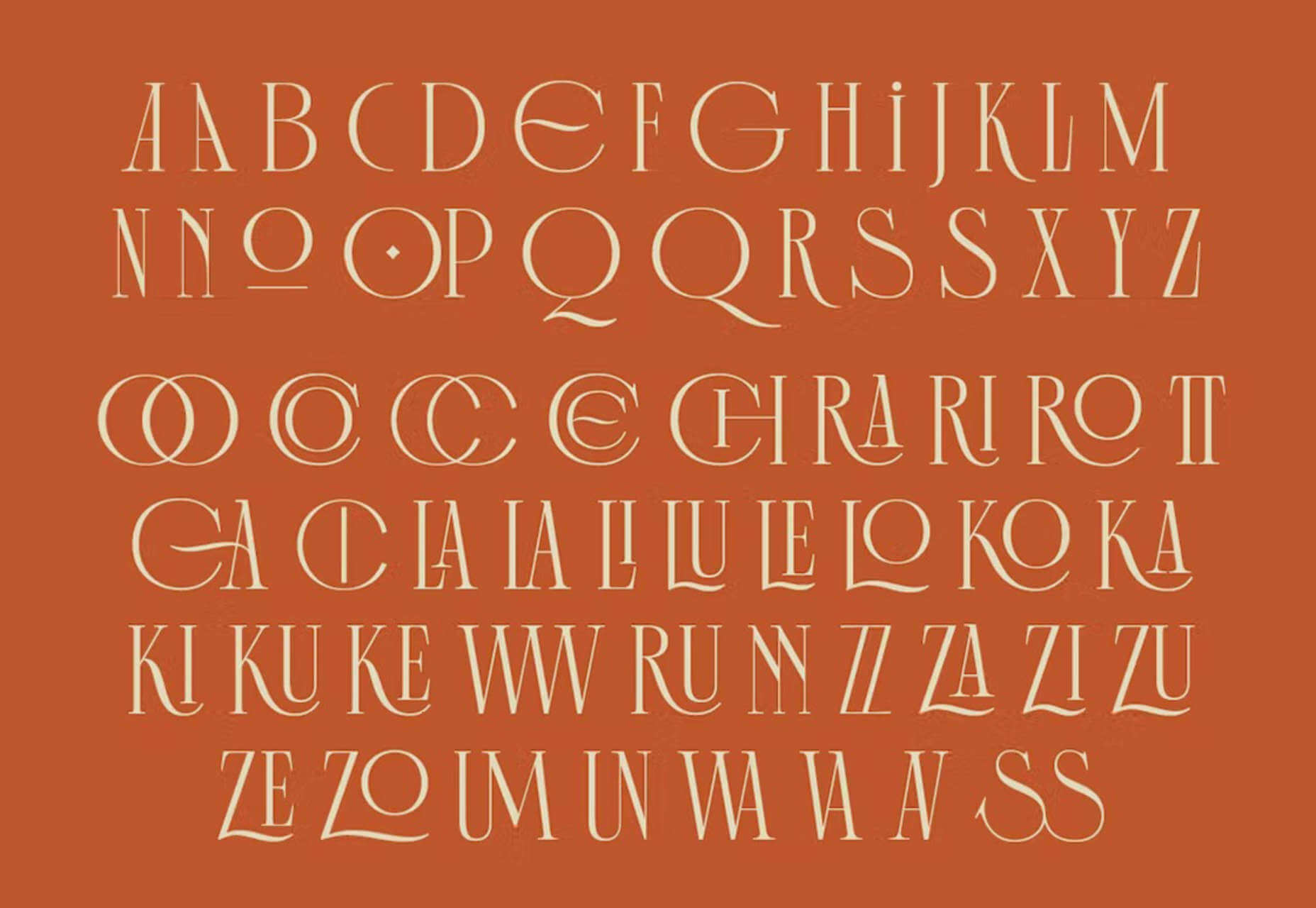
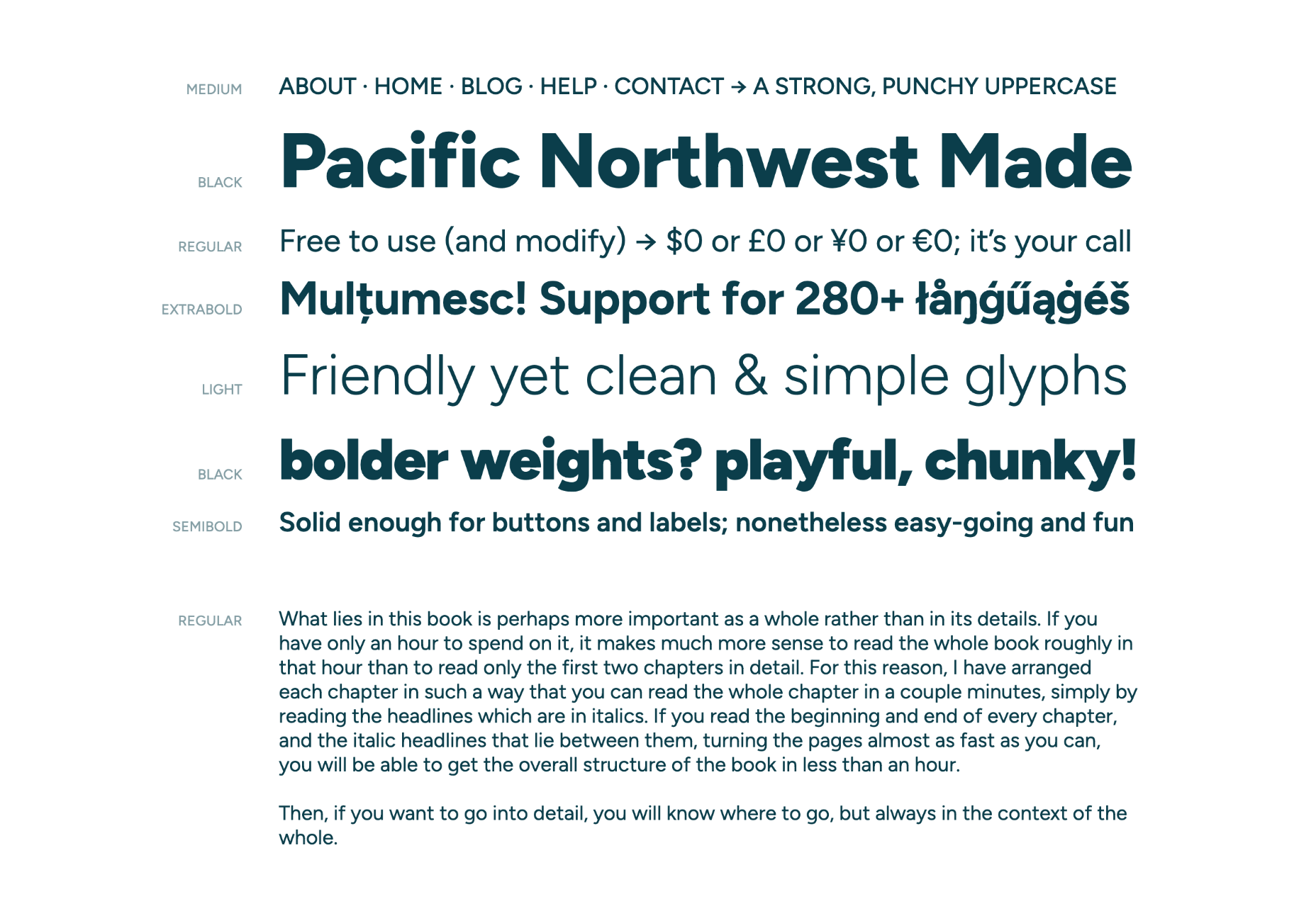
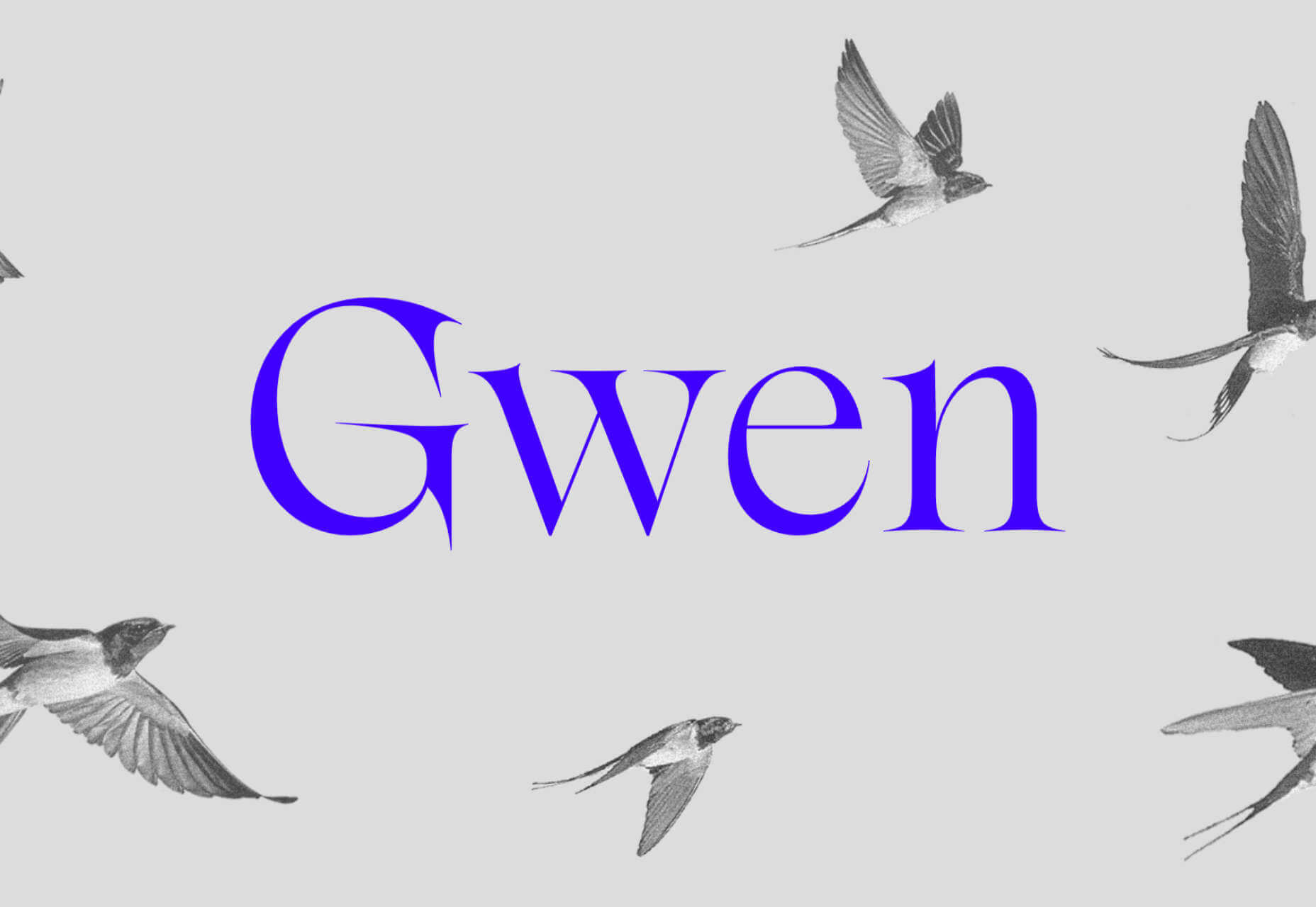
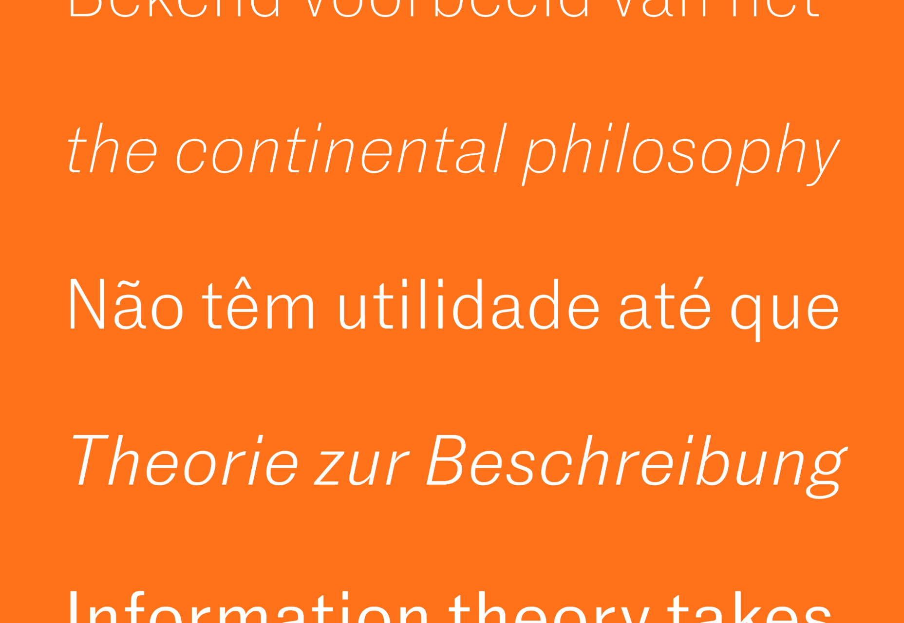
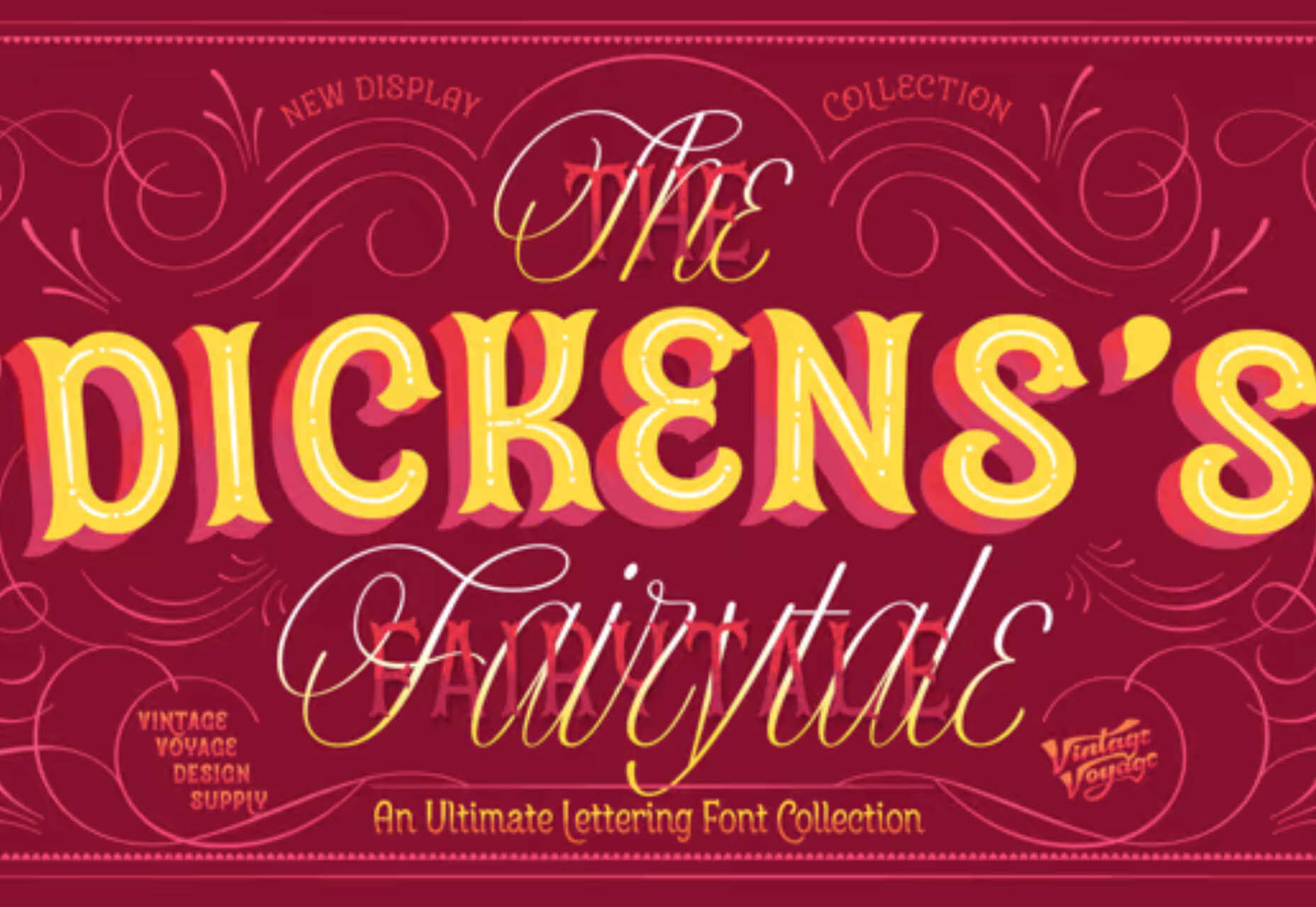
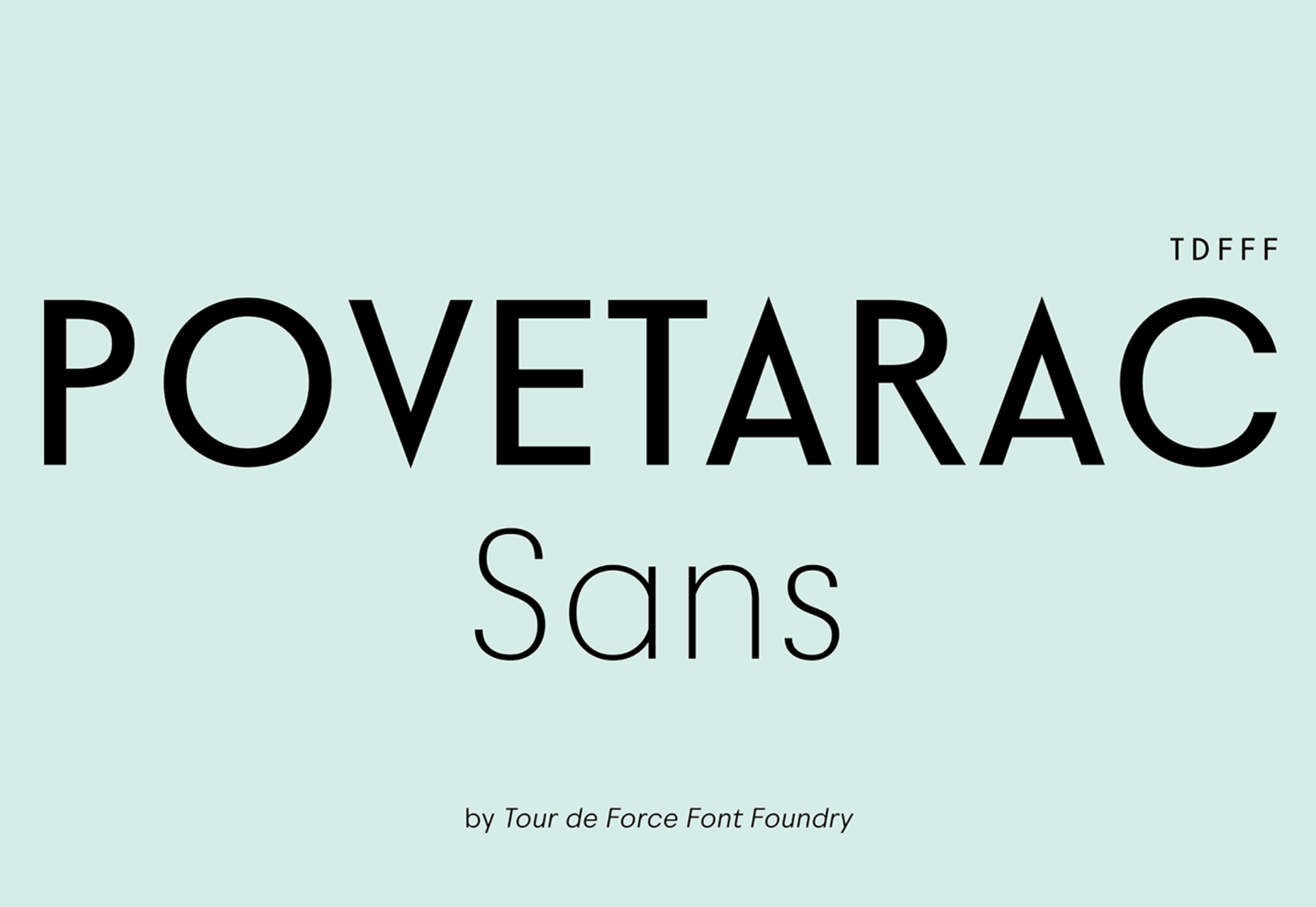
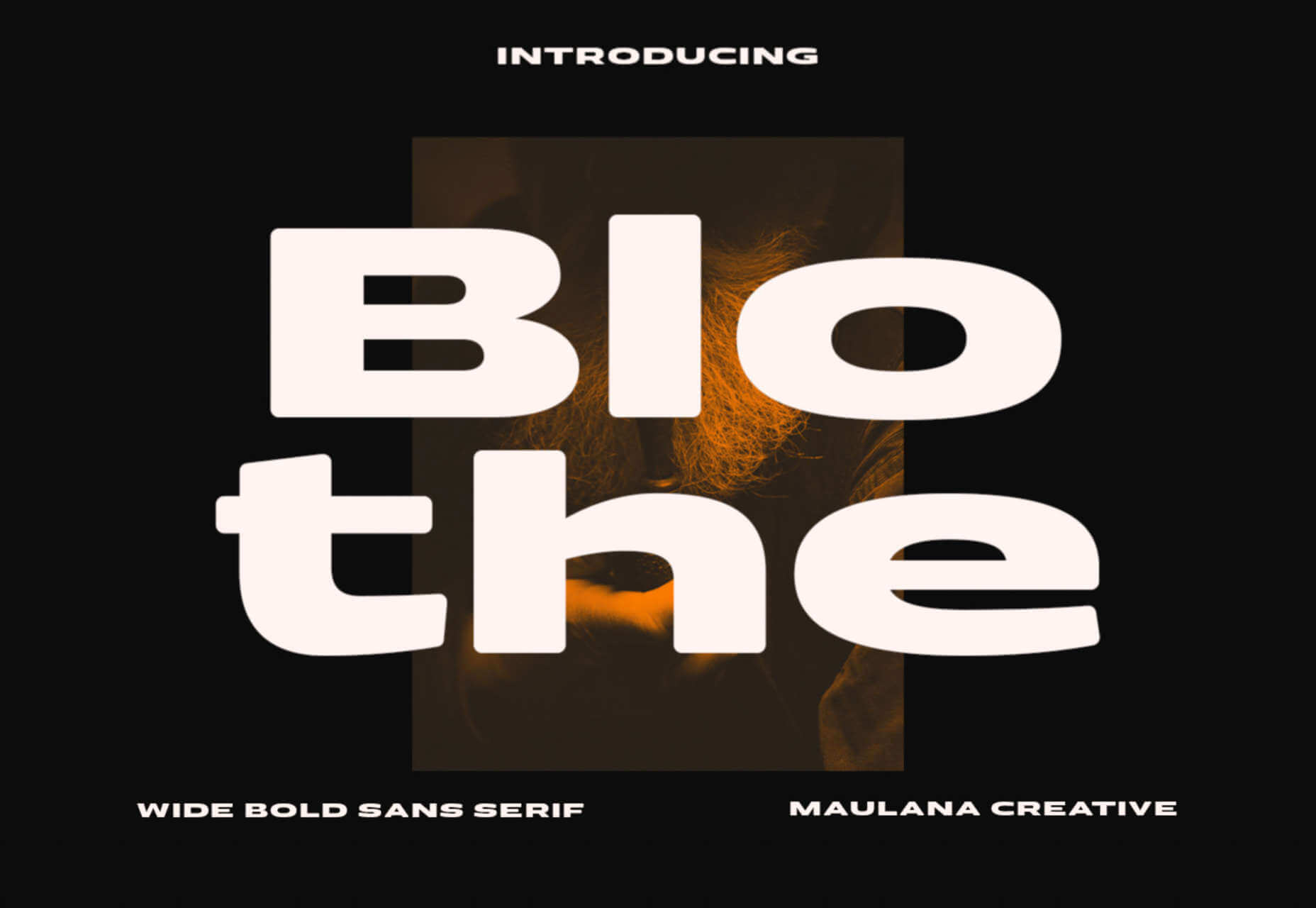
Each month we publish this roundup of the best new fonts for designers to help you find new ways of packing personality into your designs.

In October’s edition, you’ll find a number of revivals and a ton of vintage inspiration, all wrapped up with a modern twist. After years of geometric sans-serifs, a few decorative flourishes are more than welcome. Enjoy!

The Future

The Future and its accompanying monospace The Future Mono is a homage to the classic Futura. The Future is a great revision of classic forms, and The Future Mono is a blend of Western Modernism and Japanese typographic styles.

Rapidissima

Rapida and Rapidissima began as part of a master’s course at the Royal Academy of Art in Den Haag. While Rapida is a careful, usable serif with lots of thoughtful details, Rapidissima is a visually exciting exploration of speed.

Aiglon

Aiglon is a pseudo-geometrics sans-serif with beautiful proportions. It draws inspiration from 20th-century architectural lettering. It’s a tremendous alternative to Gotham for those looking for a more European aesthetic.

Raskal Oner Write

Raskal Oner Write is a script font for designers that don’t want a script font. All of the classic feel of handwritten letters is here, but the construction is entirely original. Contextual alternatives combine to create the visual look of lettering.

Grostino

Grostino is an elegant display typeface. The enormous contrast in width between its rounded glyphs and its square glyphs adds enormous personality. It’s ideal for branding projects that need to evoke classicism.

Figtree

Figtree is a highly usable sans-serif packed with practical features, including fractions, monospaced numbers, and scientific inferiors. It’s both minimal and friendly, making it an ideal choice for corporate design systems. It’s free to download.

Gills & Co

Gills & Co is a modern serif that draws inspiration from Art Nouveau to create beautiful finials and ligatures. It works really well as a logotype and for packaging.

Catalog

Catalog is a sturdy, easy-to-use serif with thick slab serifs. It has a simplified shape and is easily readable on lower-resolution screens. It features an unusual lowercase g, which adds visual interest to passages of text.

Kreol Display

Kreol Display is a didone typeface with some interesting details that raise it above similar designs. The lowercase ‘a’ and the uppercase ‘R’ are particularly pleasing.

Gwen

Gwen is a typeface family that includes a highly characteristic display face and a more subtle text face. There are seven different weights, and it is available as a variable font.

Benogi

Benogi is a display font run through with wave-like forms. The ’70s aesthetic is continued in the proportion of the glyphs. It’s a great option for health and beauty product branding.

Marcin Antique

Marcin Antique is inspired by early French grotesque typefaces. It has just been reissued with new widths, additional weights, and redrawn italics, making it an even more usable sans-serif.

VVDS The Dickens Tale

It’s horrifying to say it, but yes, the holiday season is just weeks away. If you’re preparing marketing material with a heritage feel, then check out The Dickens Tale, it’s as classic as candy canes and Peanuts reruns.

Povetarac Sans

Povetarac Sans is a workhorse of a sans-serif that performs well as both display and running text. Inspired by vintage designs, it comes with six weights and supports fractions.

Blothe

Blothe is a fabulously chunky display face that is drawn wide, thick, and rounded. Use it at huge sizes to make the most of its weighty presence.

Source

The post 15 Best New Fonts, October 2022 first appeared on Webdesigner Depot.

Source de l’article sur Webdesignerdepot

Jakob Nielsen’s How Users Read on the Web is 25 years old this week, and one glance at an eye-tracking study will tell you its key observations are still relevant today.

Simply put, users don’t read a web page; they scan it for individual words and sentences.

A typical pattern shown in eye-tracking reports is that users will rapidly scan a page, scrolling down to do so. Then either hit the back button and pump your bounce rate, or scroll to the top and re-engage with the content.

Even when content, volume, and quality tick all the user’s boxes, and they choose to stay on your site, they still don’t read; they scan; a slightly deeper scan, but still a scan.

As a result, it’s vital to design websites to be easily scannable, both in a split-second scan to decide if your page is worth the reader’s time and on a second or third pass.

Clarify the Page’s Purpose Immediately

Every page should have a primary goal. The majority of the time, that goal is embodied in a CTA (Call to Action).

The good news is, if your SEO (Search Engine Optimisation) has gone to plan, your goal (i.e., to sell something) and your user’s goal (i.e., to buy something) will align. By clarifying the page’s purpose, you can show the user that your goals align.

You can be experimental if you’re an established company and the user knows what to expect. But if you’re new to the market or have a lower profile, you need to conform to established design patterns. This means that a SaaS should look like a SaaS, a store should look like a store, and a blog should look like a blog.

Including your CTA above the fold — which in the context of the web, means the user doesn’t have to interact to see it. Doing so makes it easier for the user to progress and clearly tells the user what you are offering.

The landing page for next month’s Webflow Conf 2022 clarifies the page’s content, with a clear CTA above the fold.

Employ a Visual Hierarchy

The Von Restorff effect states that the more something stands out, the more likely we are to notice and remember it.

Visual hierarchies are excellent for guiding a user through content. HTML has the h1–h7 heading levels — although, in reality, only h1–h4 are much use — which gives you several levels of heading that can be scanned by different readers scanning at different rates.

For example, we know that subheadings have little impact if a user diligently reads the page from top to bottom, but they are excellent for catching the eye of skim readers.

Amnesty uses very a very simple hierarchy, the only change for its subheading being increased weight. But it is enough to catch the user’s eye.

You can also create visual hierarchies with other forms of contrast; weight and color are often employed in addition to size. For accessibility and inclusive design, it’s wise to combine visual indicators when creating a hierarchy; for example, headings are usually larger, bolder, and colored.

Use Negative Space

Imagine a person standing in a crowd. Let’s say they’re wearing a red and white striped jumper and a red and white bobble hat — pretty distinctive. But if there are hundreds of other characters around them, they might be hard to spot.

Now imagine the same person dressed the same, standing on their own. How long will it take you to spot them? Even without the stripy outfit, it’s not much of a challenge.

Elements in isolation are not only easier to spot, but they pull the eye because the negative space (sometimes referred to as white space) around them creates contrast.

When using negative space, the key is to give elements enough room to breathe and attract the eye without giving them so much room that they are disassociated from the rest of your content.

Across its site, Moheim uses negative space to highlight UI elements while grouping associated content.

Use F Patterns

Users scan a page using either an F-pattern or a Z-pattern.

Because users scan your page in predictable ways, we can employ layouts that cater to this tendency.

Designers have been aware of F and Z patterns for some time, and because they’ve been used for so long, they may be self-fulfilling, with users being trained to scan a page in this fashion. However, both patterns are similar to how eyes travel from line to line in horizontal writing systems.

Whatever the cause, by placing key content along these paths, you increase the chance of capturing a user’s attention.

Kamil Barczentewicz uses a beautiful, natural layout that also conforms to a classic F pattern.

Include Images with Faces

Images are a great way of conveying brand values and making a site engaging. But when it comes to catching the eye of a user scanning your design, the best images include faces.

For example, a testimonial with an image of the customer will catch the eye more than a text-only testimonial.

The Awwwards Conference uses an animated computer with a face to capture attention. And large images of speakers making eye contact.

This is almost certainly due to social conditioning; we see a face, and we engage with it to see if it is a threat or not. Most of us naturally look to expressions of emotion to understand situations, and the distinction between a real-life person and an image hasn’t made its way into our mental programming yet.

You don’t need to use photos. Illustrations are fine. The key is to ensure there is a face in the image. That’s why illustrations of characters perform so well.

Copy Print Design

Print design is centuries older than the web, and many print applications, from newspapers to advertising, developed design elements to catch the eye of readers scanning the design.

Subheadings, lists, blockquotes, and pull quotes all catch the eye. Introductory paragraphs in a larger size or even italics draw users into the text. Shorter paragraphs encourage users to keep reading.

Horizontal rules used to delineate sections of text act as a break on eyes traveling over content with momentum. They are a good way of catching a scan-reader who is losing interest.

You can use a horizontal rule or break up your layout with bands of color that divide content sections.

Omono uses horizontal bands to highlight different sections of content.

Mass, Not Weight

We often discuss design elements as having weight; font-weight is the thickness of strokes.

But it is more helpful to think of design elements as having mass; mass creates gravity, pulling a user’s eye towards them.

The trick is to design elements with enough mass to attract the user‘s eye when scanning at speed without forcing the user to change how they engage with your content.


Featured image via Pexels.

Source

The post How To Make Your Designs Scannable (And Why You Should) first appeared on Webdesigner Depot.

Source de l’article sur Webdesignerdepot

Aujourd’hui, et pour la première fois depuis des dizaines d’années, l’inflation est devenue une question centrale dans les entreprises. Les taux ayant atteint des records historiques dans la plupart des pays développés, les chefs d’entreprise s’appuient sur le dernier rapport économique mensuel et sur des perspectives assez floues pour prendre leurs décisions : réduction de la production, augmentation des prix, recherche de nouveaux fournisseurs.

Mais quelle que soit la situation des pays – forte hausse, baisse spectaculaire, ou apparente stabilité –, l’inflation entraîne des conséquences de toutes sortes qui varient selon le secteur d’activité, le pays et la conception de la supply chain. Il existe un risque de manque de liquidités nécessaires à la fluidité des opérations. Les actions bancaires centralisées sur les taux d’intérêt peuvent faciliter ou restreindre les activités de prêt et d’emprunt à court terme. Même les défis liés à la supply chain peuvent s’atténuer ou s’intensifier selon la fluctuation des coûts et l’évolution des coûts du stock disponible.

Il n’existe pas d’outil financier simple ou magique que les entreprises peuvent utiliser pour contourner le problème de l’inflation, mais les technologies intelligentes peuvent y contribuer. Les outils tels que l’intelligence artificielle (IA) et l’analytique prédictive aident les entreprises à anticiper et à voir leurs opérations dans leur globalité, à simuler et anticiper les imprévus, et à orienter leurs modèles économiques selon les besoins. Mais surtout, elles disposent de nombreuses options pour comprendre les circonstances économiques, prévoir l’impact, prendre des mesures à court terme, et établir des structures pour consolider leur position.

Voici trois domaines clés dans lesquels ces types de technologies peuvent aider les entreprises à comprendre l’impact des défis de l’inflation, à agir vite et à préparer l’avenir.

Des mouvements de trésorerie en toute intelligence et confiance

La valeur globale de l’argent et des actifs est vouée à diminuer ; plus tôt une entreprise aura des liquidités, plus tôt elle pourra réaliser plus de choses. Pour atténuer ce risque, les entreprises doivent prendre conscience de l’impact potentiel de divers scénarios : hausse des prix des marchandises, pénurie de matières premières, etc. Fortes de ces connaissances, elles doivent pouvoir faire des prévisions de trésorerie complètes et claires, et créer des stratégies flexibles pouvant être ajustées pour gérer efficacement les manques ou excès de trésorerie.

Grâce aux solutions de gestion du fonds de roulement de Taulia, qui font aujourd’hui partie de SAP, les directeurs financiers guident au mieux leur entreprise. Ils peuvent choisir d’ajuster les stratégies de comptabilité clients et fournisseurs, ou d’exploiter la ligne de crédit au plus faible coût disponible de leur établissement bancaire. De plus, des outils financiers, par exemple pour la gestion des escomptes dynamiques et le financement de la supply chain, peuvent débloquer des actifs circulants.

Les solutions de gestion des actifs circulants rendent avec précision les conditions d’inflation au moyen de prévisions basées sur l’IA et de vues mises à jour, toujours à la disposition des planificateurs d’entreprise. De la planification et de la simulation à la sélection des alternatives de financement et des processus de contrôle adéquats, ces fonctions travaillent de manière synchrone
pour offrir une coordination efficace des mouvements de trésorerie, à partir d’une source de confiance unique, parfaitement intégrée à toute l’entreprise.

Toute décision, finalement, concerne les mouvements de trésorerie, et la combinaison d’informations exhaustives et en temps réel, de possibilités générées automatiquement, et d’insights prédictifs, peut aider les entreprises à prendre en toute confiance les meilleures décisions. Et, alors que leur valeur évolue au fil du temps, il sera possible d’acheter et de gérer les marchandises et actifs au prix d’origine, moyennant des coûts de détention inférieurs au taux d’inflation.

Limiter l’exposition aux différences mondiales

Les pays ont rarement les mêmes taux d’inflation, mais l’augmentation des prix des marchandises entraîne inévitablement une hausse des coûts des matières premières. Et dans les pays où l’inflation est plus élevée ou instable, les devises peuvent se déprécier rapidement, provoquant des taux de change record.

Ces fluctuations économiques mondiales peuvent être particulièrement risquées pour les entreprises qui ont emprunté du capital pour profiter des faibles taux d’intérêt ces dernières années. L’inflation est déjà en train d’éroder leur stratégie de remboursement prévue pour les prêts en cours. Et en cas d’une plus forte instabilité dans une autre région, les pressions sur les coûts pourraient encore s’aggraver, les marges se resserrer et l’accès aux liquidités diminuer.

Grâce à l’application SAP Treasury and Risk Management, les responsables de la trésorerie et les directeurs financiers peuvent surveiller les positions de risque, l’évolution des prix des marchandises, et les taux de conversion des devises, même en temps de grande instabilité économique. Ils peuvent développer des stratégies de comptabilité de couverture conformes à l’aide d’une piste d’audit complète, tout en respectant les réglementations telles que le Règlement sur l’infrastructure du marché (EMIR) et la dernière version des Normes internationales d’information financière (IFRS 9).

Les équipes de gestion de la trésorerie peuvent aussi obtenir plus d’insights pour faire face à la dette et gérer les investissements plus efficacement. La solution SAP Treasury and Risk Management offre des informations telles que la trésorerie disponible, des risques liés aux soldes et le retour sur investissement, et surveille les investissements par rapport aux éventuelles fluctuations du taux d’intérêt. En outre, les opérations d’emprunt et de prêt tout au long de la vie d’un prêt peuvent être saisies, analysées et déclarées au fur et à mesure.


Intervenez vite aujourd’hui pour préparer votre avenir

Lorsque les coûts d’ingénierie et de production de produits manufacturés augmentent, les entreprises doivent décider de réduire leurs marges ou de répercuter ces coûts supplémentaires sur le client. C’est un choix difficile, surtout lorsque les consommateurs trouvent déjà les prix très élevés.

En intégrant les solutions SAP Digital Supply Chain à SAP Business Network, les entreprises d’achats, d’approvisionnement et de logistique obtiennent les insights dont ils ont besoin pour générer plus de revenus de chaque dépense et optimiser la réduction des coûts. Ensemble, elles peuvent effectuer des simulations et analyses par simulation pour identifier et engager les partenaires commerciaux capables de gérer les situations émergentes, telles que la hausse de la production, et de réduire encore davantage les pertes financières et matérielles.

Bien sûr, pour gérer efficacement les risques inflationnistes, les entreprises doivent avoir accès aux données adéquates pour prendre des décisions et faire avancer leur supply chain. La combinaison de SAP Digital Supply Chain et de SAP Business Network permet aux entreprises de gérer les ressources de manière plus stratégique afin d’augmenter la productivité, de réduire les coûts d’exploitation et de permettre aux collaborateurs de se consacrer à des tâches plus stratégiques. De plus, les entreprises peuvent éviter les retards et interruptions de la supply chain pour prévenir les pertes de revenus, et éviter les coûts imprévus grâce à une visibilité sur la capacité des stocks et de la production, la maintenance des actifs et les processus logistiques.

Exploiter une position financière solide

Compte tenu des récentes inflations, il est très important pour survivre de comprendre et de gérer les risques financiers dans la supply chain. Et les entreprises capables de progresser et de prendre les bonnes décisions au bon moment sont celles qui disposent d’une visibilité claire sur leurs données et processus relatifs aux achats, à supply chain et à la logistique.

Pour de nombreuses entreprises dans le monde, les solutions SAP sont déjà l’un des moyens les plus efficaces de protéger leur solidité financière en période d’inflation. Elles continueront d’ailleurs à alléger leurs défis au fur et à mesure que leur portefeuille évolue afin de répondre aux besoins d’une économie en mutation et d’un environnement compétitif.

En savoir plus : https://www.sap.com/france/products/erp/s4hana.html

Article de Neil Krefsky, Eamon Ida, Haresh Chhaya, Max Hendrickx25 août 2022

Neil Krefsky est directeur du marketing produits pour la gestion des finances et des risques chez SAP.

Haresh Chhaya est responsable des solutions pour la gestion de la trésorerie et des fonds de roulement chez SAP.

Max Hendrickx est directeur principal du centre d’excellence pour la gestion du fonds de roulement chez SAP.

Eamon Ida est directeur du marketing pour les solutions dédiées aux réseaux d’entreprises chez SAP

The post Trois façons de relever les défis de l’inflation grâce à la technologie appeared first on SAP France News.

Source de l’article sur sap.com

SCM est un industriel indépendant né de la cession de la filiale oil and gas du groupe américain TE Connectivity. Suite à cette transaction, l’entreprise sarthoise avait un an pour basculer vers son propre ERP. Elle a opté pour une offre cloud SAP S/4HANA aux fonctionnalités resserrées sur l’essentiel, afin de tenir des délais de mise en place particulièrement courts. Avec l’aide des équipes de delaware, SCM a atteint ses objectifs en à peine 6 mois.

Une société presque centenaire, qui retrouve son indépendance

Systèmes et Connectique du Mans – SCM – conçoit, produit, teste, livre et installe des connecteurs électriques de puissance et optiques adaptés à des environnements extrêmes de corrosion, température et pression. La société travaille principalement pour des acteurs du secteur pétrolier et gazier (elle équipe notamment des plates-formes d’extraction en mer), mais également des clients des secteurs de la défense, du transport ferroviaire et de l’aéronautique. Elle s’appuie sur un site industriel moderne de 14.400 m². SCM emploie aujourd’hui environ 140 personnes pour un chiffre d’affaires annuel de 20 millions d’euros.

L’histoire de SCM est intimement liée à celle de CKB (Carier Kheops Bac), entreprise reprise en 2012 par TE Connectivity. Lorsque le groupe américain annonce la délocalisation des activités de sa filiale, les salariés reprennent la main, avec le lancement de SCM en avril 2021. La filiale oil and gas de TE Connectivity utilisait l’ERP SAP ECC 6 du groupe. Suite à la cession d’actif, SCM disposait d’une année pour mettre en place son propre ERP.

Autre contrainte, la nécessité de basculer d’un système SAP conçu pour une multinationale et massivement customisé vers une solution plus simple, adaptée à une ETI française. Le tout dans un contexte de fin de vie programmée de SAP ECC.

Un projet mené à bien dans des délais records

Sur les conseils de SAP et de l’intégrateur delaware, SCM opte pour une migration vers une solution SAP cloud de dernière génération, au travers de l’offre RISE with SAP S/4HANA. Le projet démarre le 22 septembre 2021. Afin de limiter la conduite du changement, l’entreprise choisit de rester dans un premier temps en SAP GUI, comme le permet l’offre RISE with SAP S/4HANA. Les impacts du changement d’ERP sont ainsi minimisés. Un important travail de nettoyage des données a également été mené, afin de se concentrer sur les seules informations nécessaires au fonctionnement de la nouvelle structure.

Le démarrage du nouveau système a été effectif le 26 mars 2022, après seulement 6 mois de travaux. SCM a pu commencer à utiliser immédiatement son ERP SAP S/4HANA : émission des premières factures, enregistrement des réceptions de produits et des mouvements de stock, saisie des validations de qualité, etc. Aucun incident majeur n’a été remonté depuis ce lancement express de la solution SAP S/4HANA en mode cloud.

Satisfait de l’accompagnement proposé par delaware tout au long du projet, SCM a décidé de lui confier la tierce maintenance applicative de son ERP pour les 15 prochains mois. Dans un premier temps, la société s’appuiera sur cette TMA pour stabiliser son système d’information SAP et lui apporter quelques premières améliorations.

« Nous sommes passés d’un groupe international disposant de 90 sites dans le monde à une entreprise industrielle sarthoise d’un peu plus de 100 personnes. Il nous fallait un ERP adapté à ce nouveau contexte : une solution plus simple, capable d’aller à l’essentiel. Au cours du projet, nous avons pris le temps de déterminer quelles fonctionnalités nous étaient vraiment utiles et lesquelles étaient de l’ordre du confort (des sujets que nous étudierons ultérieurement) ce qui nous a permis de mettre en place notre nouvel ERP dans des délais particulièrement courts, » témoigne Frédéric Kleindienst, président de SCM.

« SCM est l’exemple d’une entreprise qui souhaite bénéficier de la force d’un ERP tel que celui de SAP sans y ajouter les contraintes. La nouvelle version S/4HANA Cloud de SAP est adaptée aux PME/ETI car elle allie une couverture fonctionnelle standard riche et une simplicité de gestion et d’utilisation de par son prisme SAAS. La binôme SAP – delaware permet de faire bénéficier à SCM d’un système reconnu partout dans le monde tout en y ajoutant la flexibilité et la réactivité attendues par une PME/ETI. C’est le modèle SAP tel que nous le définissons pour les 15 prochaines années à venir » déclare Lahcen Binoumar, Head of General Business, SAP France.

« Ce projet était un énorme challenge. Nous avons réussi à basculer vers l’ERP SAP S/4HANA en seulement 6 mois, alors qu’il faut habituellement entre 10 et 12 mois. Nous avons pu compter sur les équipes de delaware, qui nous ont accompagnés tout au long de ce projet, mais aussi sur nos équipes internes et nos utilisateurs, particulièrement matures sur l’environnement SAP. Afin de tenir les délais, nous avons opté pour un ERP resserré, que nous améliorerons par la suite, en lui ajoutant des fonctionnalités qui nous permettront de travailler encore plus confortablement, » détaille Mickaël Medard, directeur de programme, et supply chain Management, SCM

« Nous avons su mettre en place une solution de pointe, dans des délais particulièrement courts. Nous entretenons des relations étroites avec nos clients, afin de mieux comprendre leurs besoins et de leur apporter un service de qualité. La symbiose a ici été parfaite entre nos équipes, celles de SAP et de SCM. En optant pour l’offre RISE with SAP S/4HANA, la bascule vers le cloud a par ailleurs été grandement simplifiée, SAP devenant le point de contact unique pour la contractualisation, la mise à disposition et le maintien en conditions opérationnelles des infrastructures cloud, » résume Fatsah Nasri, chef de projet et Aymeric Fosset, Partner, delaware France.

The post delaware delaware accompagne SCM dans son adoption de l’ERP intelligent SAP S/4HANA en mode cloud appeared first on SAP France News.

Source de l’article sur sap.com

The design world fluctuates back and forth, swerving between love and hate for different design trends. Sometimes we see a wide range of approaches, and sometimes designers all hop on the same idea.

This month, the web is dominated by animation. Designers are cramming in motion in unexpected ways. And it’s fun to explore. Here are 20 of the best new sites on the web this month. Enjoy!

Bannach

Bannach is a German furniture brand. Its products are colorful and geometric, so it makes sense that when you scroll down to the collection, the thumbnails begin as pixel blocks and animate into product photography.

Fornasetti Profumi

Fornasetti Profumi takes a different approach to motion. It uses video to emphasize stillness to promote the calming qualities of its candle products.

The Other Side of Truth

The Other Side of Truth is a superb exercise in utilizing the web for a cause. It presents facts on the Russia-Ukraine war, but the standout feature is the toggle switch that, instead of light mode-dark mode, toggles facts and Russian state propaganda.

Glasfurd & Walker

Glasfurd & Walker is a portfolio site for a design agency. So far, so standard. However, it sets itself apart because it’s slightly bigger than the browser and swerves left and right with your mouse movement.

Sirup 5th Anniversary

Sirup is a Japanese singer-songwriter, and to celebrate the fifth anniversary of his first hit single, his record company has put together this awesome maximalist micro-site that uses type, motion, and art direction to capture his style.

Fitzjohn’s

Fitzjohn’s is a slick site for a new apartment complex in the Hampstead area of London. It uses a refreshing modern color palette and calming animation to take the edge off the frankly ludicrous price tag.

Persepolis Reimagined

Persepolis Reimagined is an awe-inspiring WebGL tour through one of the most important cities in ancient Iran. Make sure you tour it on a large screen. It’s hard not to be wide-eyed with wonder.

JaM Cellars

JaM Cellars is a Californian wine brand that’s pitching to bachelorette parties. With names like Butter, and Sugar, it’s not the most sophisticated tipple, but yellow, we love a yellow site.

Danielle Levitt

This portfolio site for film director and photographer Danielle Levitt features samples of her best work scrolling past the viewport. There’s a clever switch of thumbnail and background color when you scroll down to the contact details.

Propel

From total color energy to Apple-levels of minimalism: Propel is a slick, animate-on-scroll site for a marine motor brand selling an outboard and inboard motor. The animated masks on the images are a nice subtle touch.

Standards

Standards is a site for a SaaS that helps organizations create, maintain, and share brand guidelines. It uses subtle animation, video of its UI, and compelling copy to sell its approach.

Chris Carruthers

The portfolio site for Chris Carruthers is deliberately self-indulgent with scrolling text, clipped images, and scroll-jacking, but it’s also delightful to peruse.

Theodore Ellison Designs

We don’t often see colored glass in real life, but the play of light on stained glass is beautiful. This site for Theodore Ellison Designs uses video to bring the effect to the web.

Owomaniya!

The Owomaniya report for 2022 uncovers the state of gender diversity in the Indian entertainment industry. Presented in the style of infographics, the information is brought to life by animation.

Meetings

Meetings is a French events company. Its site uses an animated collage approach to showcase its services, and animated text to pull you into its content.

Blakeney

Blakeney invests in African companies on behalf of institutional investors. Its site is typical of the financial industry, but it uses animation to lift it to a higher level of interest.

Becklyn

Becklyn is a digital design agency. Its portfolio site uses animated text, expanding image masks, and video to guide us through its site and app design approach.

Cabi

Cabi is a brand of Japanese condiments with a typically Japanese feeling site. Bright colors, a slowly scrolling slideshow of dishes, and editorial to pack shot hover effects are a great introduction to the brand.

Slantis

Slantis provides building information modeling to architecture and infrastructure providers. Its site uses animation to showcase the types of content it produces for clients.

July Fund

July Fund is a venture capital project. It takes an entirely different approach than its competitors by adopting a chaotic but enjoyable card-based design.

Source

The post 20 Best New Websites, October 2022 first appeared on Webdesigner Depot.

Source de l’article sur Webdesignerdepot

Paris, le 19 septembre 2022 – SAP SE (NYSE : SAP) a lancé l’édition 2023 de son programme d’accélération de start-ups axé sur le futur du Retail and Consumer Products. Pour cette 8ème édition de SAP.iO Foundry Paris, 12 start-ups internationales ont été sélectionnées par un jury composé d’experts SAP, de partenaires, de clients et de fonds d’investissement. Ces start-ups ont été reconnues comme étant précurseur sur ce thème de “Future of Retail and Consumer Products ”, un thème plus que jamais d’actualité avec les bouleversements des usages et du parcours client observé durant la crise sanitaire, et qui résulte de l’accélération de la numérisation de toutes les entreprises.

SAP.iO Foundry Paris, véritable incubateur de SAP en France, a déjà aidé plus de 65 start-ups à développer leur business ou leur solution. En quatre ans, SAP a atteint l’objectif fixé avec le gouvernement français visant à soutenir l’économie des start-ups lors sur sommet #ChooseFrance.

Ce nouveau programme a pour objectif de proposer aux entreprises du Retail et Consumer Products un accompagnement de leur stratégie digitale, grâce aux solutions de ces 12 start-ups, au rythme de l’évolution technologique autour de deux enjeux clés :

  • Proposer à leurs clients une expérience d’achat améliorée et différenciante
  • Assurer la traçabilité et l’authenticité de leurs produits

Odilia von Zitzewitz, Interim Lead SAP.iO Foundry Paris déclare : “SAP.iO est un accélérateur de start-ups formidable et engagé. Pour cette édition, l’accent a été mis sur le Retail laissant place à des innovations de choix, et qui répondent aux enjeux prédominants des acteurs de ce secteur clé. Nous sommes très fiers d’accompagner cette nouvelle promotion de start-ups !”

Au cours des 5 prochains mois, les start-ups auront accès à un mentorat personnalisé de la part des dirigeants de SAP France, à une exposition à la technologie SAP® et aux interfaces de programmation d’applications (API), ainsi qu’à des opportunités de collaboration avec des clients SAP du monde entier.

Les start-ups suivantes participent au programme SAP.iO Foundry Paris :

Sorga Technology

La mission de Sorga Technologie est d’accompagner les marques retail dans leur innovation digitale en proposant une solution à faible consommation d’énergie assurant la transparence et la traçabilité de leurs produits

https://sorga.org/

Arianee

La mission d’Arianee est de fournir aux entreprises des solutions simples pour établir des relations directes avec les consommateurs, respectueuses des données des utilisateurs et indépendantes des grandes plateformes technologiques.

https://www.arianee.org


CollectID

CollectID permet de garantir l’authenticité d’un produit, l’amélioration de l’expérience phygitale, ou encore l’établissement d’un canal de communication direct entre les marques . Une solution qui garantit l’authenticité et l’unicité des produits tout en rapprochant les marques de leurs clients.

https://www.collectid.com/

DIAKSE

Diakse développe et commercialise une solution de création de showrooms virtuels dans le métavers avec un objectif : permettre aux marques de mieux communiquer sur leurs produits et ainsi les aider à augmenter leurs ventes.

www.diakse.com


Foodetective

Foodetective est une plateforme de gestion et une infrastructure (API) de l’industrie F&B. Les entreprises utilisent Foodetective pour automatiser leurs opérations, simplifier leur administration, augmenter leurs revenus en ligne et accélérer les nouvelles opportunités commerciales. business.foodetective.co

LIVEBUY GmbH

LIVEBUY est une solution d’achat en direct pour les détaillants leaders du marché,

qui fournit à la fois la technologie et les bons créateurs pour construire une plateforme de contenu réussie au sein des boutiques en ligne.

https://www.livebuy.io/


Priceloop

Priceloop a développé une IA permettant de faciliter et d’automatiser les processus de tarification, proposant les meilleurs prix en tenant compte de tous les paramètres essentiels.

https://priceloop.ai/


Replika Software

Le logiciel Replika est une solution de vente sociale clé en main. Replika permet aux marques d’activer un réseau de vendeurs sociaux avec une entreprise clé en main pour inspirer sur les médias sociaux, vendre en ligne et se connecter avec les clients.

www.replikasoftware.com


Shopreme GmbH

Shopreme GmbH Développe notamment une technologie appelée « Scan & Go » qui transpose les avantages des achats en ligne dans les vrais magasins (rapidité, facilité de paiement, recommandations personnalisées, listes de course partagées…).

https://www.shopreme.com/


SmartPixels

SmartPixels fournit un outil de configuation et de visualisation de produits en 3D, l’objectif est d’aider les marques de mode et de luxe à créer des expériences personnalisées et interactives en ligne et en magasin.

https://www.smartpixels.fr/


SMARTZER LTD

La plateforme de Smartzer est utilisée par les marques pour transformer leurs vidéos et leurs flux en direct en expériences interactives et exploitables, ce qui leur permet d’obtenir un retour sur investissement direct du contenu et de mesurer les données détaillées des interactions vidéo.

www.smartzer.com


YZR

YZR automatise et accélère tous les projets de données textuelles de ses clients grâce à une solution puissante basée sur le traitement automatique des langues.

https://www.yzr.ai/en/

The post SAP.iO Foundry Paris lance la nouvelle édition de son programme consacré aux start-ups sur le thème de « Futur of Retail » appeared first on SAP France News.

Source de l’article sur sap.com

User Experience is a crucial consideration for any web developer or designer; the only way to ensure that you’re delivering a successful website is to ensure that the end-user or customer will feel comfortable using it. 

A strong user experience increases your client’s chances of successful audience engagement and conversions.

What you might not realize, however, is that the strategies you use to enhance UX as a web developer or designer can also influence how the search engines respond to a website. 

Though many designers assume that SEO (Search Engine Optimization) is the work of a copywriter or content producer, there are design elements to consider too. 

After all, the definition of optimization is “the action of making the best version of a resource.”

So, how are UX and SEO connected?

Adding UX to a Successful SEO Strategy

SEO used to be easy. To stand out on the search results, you just needed to stuff a page full of as many keywords and phrases as possible. Now, it’s a little more complicated. 

Leaders in search engine development, like Google and Bing, know that they need to offer their customers excellent experiences to keep them. In this new experience-focused landscape, SEO and UX share common goals. 

Search engines don’t just want to provide customers with any answers to their questions. Instead, Google and its competitors are using everything from artificial intelligence to machine learning algorithms to ensure that search results are accurate, relevant, and engaging. 

In the same way, user experience is about providing users with easy access to the information and resources they want. 

Now that SEO is a multi-disciplined approach, UX is just one of the essential tools that makes it possible for developers to optimize their websites properly. 

Where UX Developers Influence SEO 

There are plenty of connections between UX and site indexability

We all know that since 2018, site speed has become a crucial ranking factor for companies in search of better search results. As a developer, it’s up to you to ensure that there aren’t too many elements weighing a website down that would prevent it from delivering fast results. 

Bounce rate is another critical factor in search engine ranking algorithms. When customers click on a website, Google wants to see that they get the answers they want. If your navigation is difficult to understand, or the correct information isn’t easy to see on a page, end-users will just hit the back button. 

Let’s take a closer look at how developers can influence SEO with their UX strategies. 

1. Site Navigation and Ease of Use

It’s no secret that today’s digital consumers crave easy-to-use sites.

A complex website with pages ranking for different terms might seem like an excellent idea for SEO. However, from a UX perspective, the easier it is to navigate your website, the more your end-users will benefit. 

According to a study from Ahrefs, well-optimized pages that rank for several keywords can be more beneficial than dozens of pages ranking for similar terms. At the same time, if the search engines have difficulty crawling all your pages due to a poor site navigation strategy, then some pages won’t get indexed. 

So, how do you improve navigation and SEO at once? Follow the proper structure for your site first, categories and subcategories on the retail page help customers find exactly what they need. A solid internal linking structure allows the crawlers to examine your website and index each essential page individually.

Keep navigation simple when designing a website for both UX and SEO potential. 

2. User-Friendly Page Layouts

There are countless cases where poor layout design and formatting disrupts SEO potential. For example, cluttering a page with too much information makes it tougher to read and index. At the same time, if your pages aren’t attractive and easy to navigate, customers are more likely to hit the back button. 

If customers come to a website and immediately leave it again, this tells the search engines that they’re not finding what they need on those pages. That means Google will bump you to a lower position on the SERPs. 

So, how do you make your layouts more UX and SEO-friendly?

  • Get your category pages right: Say you’re creating a blog page for your client. They want to list all of their blogs on one main page while linking to separate locations for each article. A design that puts a large chunk of content from each blog on the main page can be problematic for UX and SEO. It means your customers have to scroll further to find what they need. At the same time, the search engines never know which words to rank that main page for. On the other hand, listing blogs on smaller cards, as Fabrik does in this example, makes sorting through content easier. 
  • Leverage headers and tags: Your customers and the search engines habitually “scan” your pages. When trying to improve UX and SEO simultaneously, you must ensure that it’s easy to find crucial information quickly. Header 1 or H1 tags can help by showing your audience your website’s critical sections. Title tags also give search engines more information on the term you want to rank for. Organizing your content into a structure that draws the eye down the page also means your customers are more likely to stay on your website for longer. That shows the search engines that you have quality, relevant content. 
  • Make the most of images and videos: Visual media isn’t just an excellent way to engage your audience. With videos and pictures, you can convey more vital information in a quick and convenient format. This leads to greater satisfaction from your audience from a UX perspective. However, visual content is also great for SEO. You can optimize every image with alt text and meta descriptions. That means you have a higher chance of ranking both in the main search results and the image searches on Google. 

3. Using Search Data to Inform Site Architecture

Today, SEO is less about building hundreds of landing pages for individual queries. Now, it’s more important to take a simple, de-cluttered approach with your website. SEO can determine what kind of architecture you need to create for a successful website. 

For instance, say you wanted to rank for eCommerce SEO. There are tons of related words that connect to that primary search term. Rather than making dozens of different pages that try to rank for distinct phrases, you can cover a lot of other ideas at once with a larger, more detailed piece of content. 

If a topic is too big to cover everything on a single page, then you might decide to create something called “pillar” content out of your main terms. This involves using one main page where you discuss all of the topics you will cover. Then, you design several smaller sub-pages that link back to that central pillar. 

Once again, this helps the search engines to navigate your website and index your pages while assisting the customers in finding the correct information. At the same time, you combine more pages on a website and remove anything that might be detracting from your site’s authority or not offering enough value. 

4. Improving Website SERP Listings

It’s easy to forget as a developer that a customer’s first experience with a website won’t always happen on that site’s homepage. Usually, when your customers are looking for solutions to a problem, they’ll find your website on the search engine results instead. 

This means that you need to ensure that you make the right impression here:

There are a few ways that developers can ensure the search engine listings they create for their clients are up to scratch. For instance, a reasonable title tag for each page that includes appropriate keywords is excellent for SEO and UX. A title tag lets your customers know they’re in the right place and helps them find the information they need. 

Remember, around eight out of ten users on search engines say that they’ll click a title if it’s compelling. 

Another component you have control over as a developer or designer is the “rich snippet.” Rich snippets are the informative chunks of content that Google adds to a search listing to help it stand out. You can use rich snippet plugins on a website to tell Google what kind of extra information you want to include on a page. 

For instance, you might want a company’s ratings to show up on your search results, so customers can see how trustworthy they are:

5. Local Business Rankings

When you’re creating a website for a company, it’s easy to forget about local rankings. We see the digital world as a way of reaching countless people worldwide. Local orders are easier to overlook when you have a global scope to work with. 

However, as a developer, you can boost a company’s chances of attracting the right local audience and boosting its credibility. For instance, you can start by ensuring that the correct directory information appears on your client’s website and social media profiles.

Another option is to create dedicated location pages for each area the company serves. This will make it easier for clients to find the contact details they need for their specific location. 

At the same time, pages that have been carefully optimized to rank for specific locations will earn more attention, specifically from search engines. The more of the search engine landscape your client can cover, the more chances they have to attract new customers and leads. 

Combing SEO and UX

In a world where experience is crucial for every business, it’s no wonder that UX and SEO are blending more closely together. There are a lot of areas where SEO and UX work in harmony together if you know where to find them. Improving your client’s SEO ranking with UX doesn’t just mean ensuring that their pages load quickly anymore. 

Simple strategies, like making sure a call-to-action button is clickable on a mobile page, can simultaneously boost a website’s UX potential and SEO performance. At the same time, adding images and alt text to a website provides search engines with more information while adding context to your content. 

The key to success is understanding how SEO and UX work together. If you look at SEO and UX as part of the same comprehensive strategy to give end-users a better online experience, achieving the right design goals is much easier. 

Of course, just like any strategy, it’s also worth making sure that you take the time to track the results of your UX and SEO campaigns. Examine which systems help you, and examine customers from an SEO perspective with design and development strategies.


Features image by gstudioimagen on Freepik

Source

The post 5 Ways That UX Developers Influence SEO  first appeared on Webdesigner Depot.

Source de l’article sur Webdesignerdepot

java.lang.String#intern() is an interesting function in Java. When used in the right place, it has the potential to reduce the overall memory consumption of your application by eliminating duplicate strings in your application. To learn how the intern() function works, you may refer to this blog. In this post let’s discuss the performance impact of using java.lang.String#intern() function in your application.

Intern() Function Demo

To study the performance behaviour of the intern() method, we created these two simple programs:

Source de l’article sur DZONE

There were mixed reactions on Thursday morning when Adobe announced it had acquired Figma.

Excited press releases extolling the benefits of the “collaboration” followed the news. Dylan Field, founder and CEO of Figma, said: “There is a huge opportunity for us to accelerate the growth and innovation of the Figma platform with access to Adobe’s technology…”

The reaction from the design community has been a little less enthusiastic.

The problem for the design industry is that we’ve been here before. The acquisition of Macromedia followed a period in which Adobe tried to compete, failed to update its legacy code, lost the battle, and purchased the victor. You only need to look at the number of former Macromedia products in Adobe’s stable (zero) to see where Figma’s heading.

Figma has grown faster than any of its rivals in the last eight years. It is, of course, easier to grow when you start at zero. But there’s no denying Figma is a well-managed business and probably a good investment — if not worth the $20bn that Adobe reportedly paid.

Figma’s technology will give Adobe a leg-up in the collaborative design stakes, where it is clearly lacking. And Adobe’s resources will iron out some of the kinks in Figma, especially around typography, which is, if we’re honest, a bit hacky in places.

Adobe will provide a good home (we hope) for the Figma team, who will have the opportunity for career advancement in a much wider pool of development teams.

And, of course, Figma’s annual revenue will begin to trickle into Adobe’s vault — although it may be some time before it makes a dent in that $20bn hole.

But Adobe didn’t buy Figma for its business model, collaborative technology, team, or revenue stream. Adobe bought Figma’s users, all four million of them.

Adobe‘s approach to design software is upselling. It lures you in with free apps, and when you’re engaged, it integrates them with other parts of its ecosystem until suddenly, without meaning to, you’ve agreed to a Creative Cloud subscription.

Adobe was losing customers to a competitor. And more importantly, due to Figma’s free-use approach for individuals, it was losing young customers to a competitor. If it hadn’t bought Figma, Adobe would have needed to invest heavily in its own products while providing them to freelancers for free; that isn’t viable for a company with as many commitments as Adobe.

Yes, it is entirely accurate to say that competition drives innovation, and with fewer competing apps, there is less need for companies like Adobe to build high-quality, reliable products. However, it is also true to say that a lack of competition creates opportunities for new apps.

Somewhere out there, in a dorm room, or a basement, or on a kitchen table, someone is working on Adobe’s next big acquisition. It’s probably an AR design app; we need a few more of those.

For Figma, the next 12 months will be bright as Adobe works to retain the customers it’s bought. Within five years, you’ll probably need an Adobe Fonts subscription and a Photoshop plugin to use Figma. In ten years, it will be stored in a code archive next to Freehand.

Some designers will turn to Sketch; others will turn to Affinity; some will shrug and keep using Figma; others will shrug and keep using XD.

If an app is intrinsic to your design work, it’s probably time to switch apps. Your skills are transferable. I’ve switched apps many times; some I loved, some I just needed. I’ve never encountered an app that improved my work, although plenty have improved my mood while working.

Figma took a great approach and will continue to be great until it isn’t. Tools come and go, Adobe’s acquisitions team, it appears, is eternal.


Featured image uses photos by Afrika ufundi, Andrea Piacquadio, Andrea Piacquadio, Anna Tarazevich, cottonbro, fauxels, Ketut Subiyanto, Mikhail Nilov, Moose Photos, Pavel Danilyuk, Pavel Danilyuk, Polina Tankilevitch, Tima Miroshnichenko.

Source

The post Adobe Has Acquired You first appeared on Webdesigner Depot.

Source de l’article sur Webdesignerdepot