
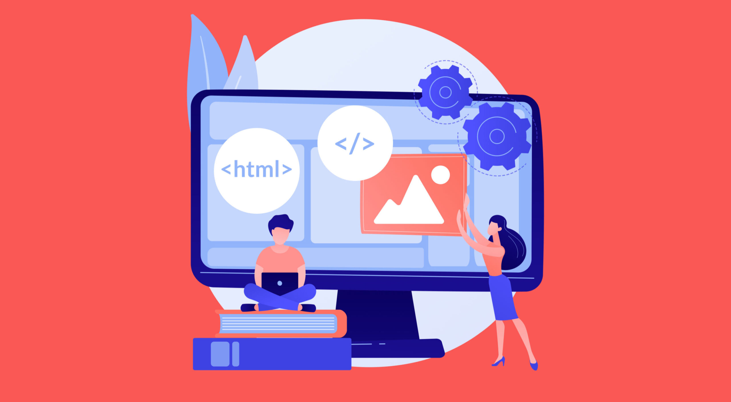
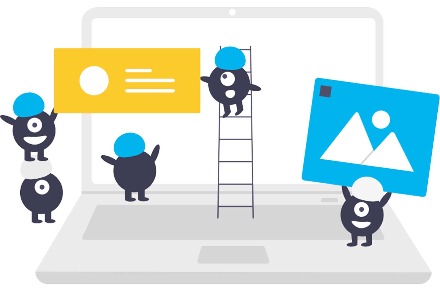
 Learning how to design an MVP webpage or website could be one of the best things you can do as a site creator in today’s digital world.
In a fast-paced landscape, where customer preferences and technology are constantly changing, most companies don’t have time to dedicate months or years to each web project. The longer you take to complete your website, the more likely your creation will be outdated by the time you hit “publish.” That’s why countless creators are beginning to take a different approach.
To avoid wasting time, money, and effort on something that doesn’t deliver a significant return on investment, designers are now building “Minimum Viable Products,” or “MVPs.”
Here’s what you need to know about creating your MVP webpage.
What is MVP Web Design?
Typically, the “MVP” development process is most common in the app or software creation world. It refers to when a developer builds the simplest version of a technology capable of achieving specific goals. For instance, if a company wanted to create an ecommerce app, they would design a simple tool capable of listing products, enabling payments, and tracking orders.
After launching the MVP product, the company or developer would check to ensure it had the right impact on the target market and generated positive results. Using feedback and analytics, the developer would then begin to add new features one at a time.
MVP design aims to ensure you’re developing the best, most valuable product for your audience while getting your solution to market as quickly as possible.
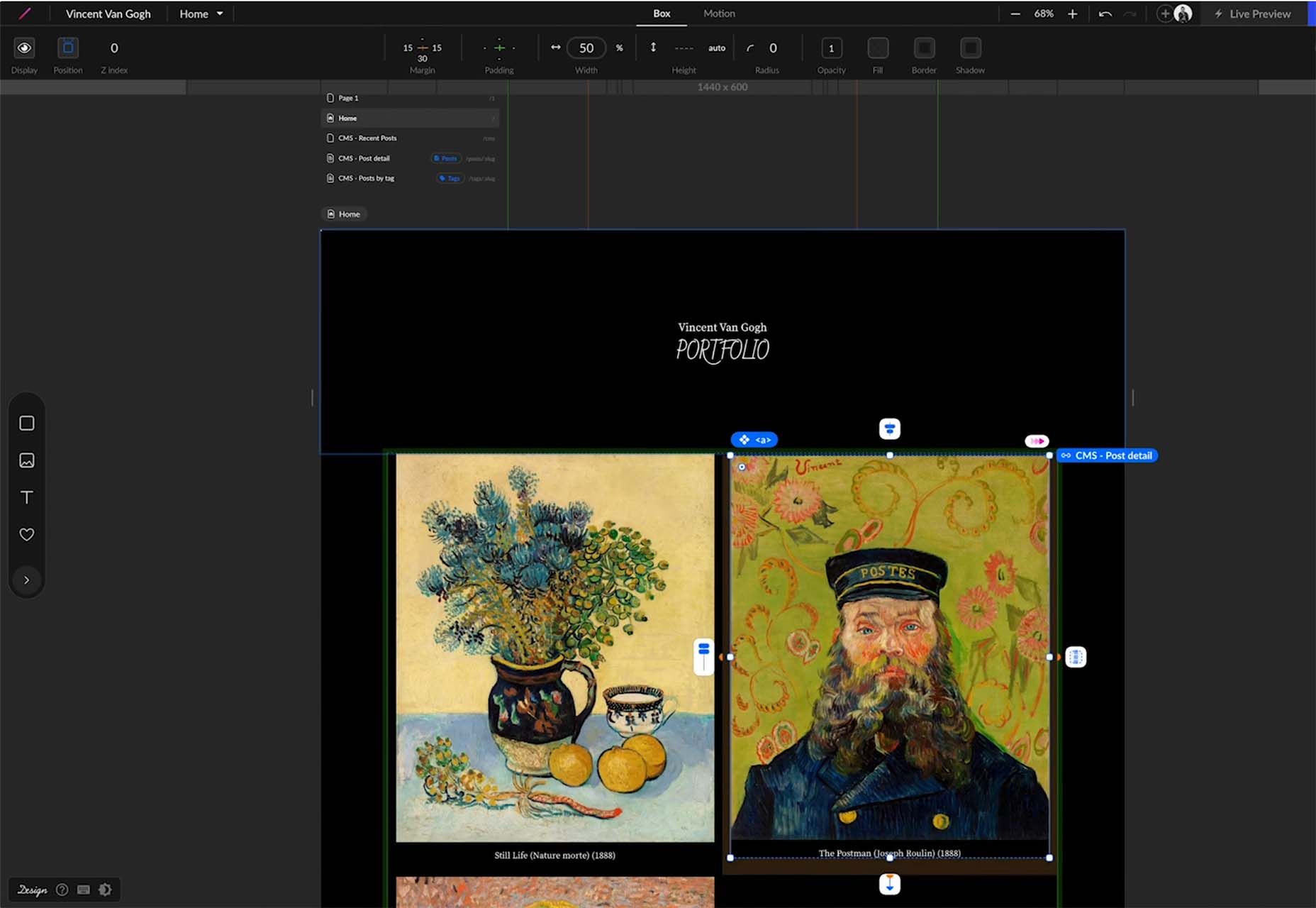
The same strategy in MVP app and software design can also apply to website creation. Rather than building a highly complicated website with multiple features straightaway, the designer would focus on creating a single page equipped with the essential elements.
For instance, instead of building an entire site for your online course, you may develop a single-page website where customers can learn about the system, sign up, and pay for their membership. The great thing about an MVP web page is it allows companies to start advertising their solution, product, or service quickly, with the minimum initial investment.
How to Create an MVP Web Page
Creating an MVP web page is similar to designing any Minimum Viable Product. Throughout the project, the focus will be on keeping the development process simple while collecting as much feedback as possible.
Here’s how you’d get started with an MVP web page.
Step 1: Planning
Planning is an important stage in any web design project. It’s particularly crucial in the MVP landscape, where you need to define the most critical features of your webpage or website to ensure it’s “viable” for your needs. The initial planning stage can sometimes be the lengthiest part of the process, depending on the amount of research you need to do.
For the most part, web designers and companies will begin by conducting market research. This means examining crucial concepts intended to drive your strategy, such as:
- Your target audience: Who are you trying to target with this web page, and what will they need from your site? A user persona can be helpful if you don’t already have one.
- Competitors: Who are your main competitors in this space, and what do their web pages offer? Which features do you need to replicate or avoid?
- Goal setting: What is the main objective of this web page? What do you need it to do, and what might it need to accomplish in the future?
The key to MVP web page planning is ensuring you look holistically at your project without thinking too far ahead. The site you create should be capable of scaling and expanding in the future, but it shouldn’t have too many features from day one.
Step 2: Creating Your Feature List
Once you’ve done your research and formed the foundations of your plan, it’s time to list all the features your MVP web page needs to have. Unfortunately, this is where the process can get a little complicated. It’s easy to start adding capabilities and components that aren’t necessary to make your site more exciting or competitive.
As worrying as it can feel to release a very basic web page, remember your focus is on rapid growth and development. With this in mind, concentrate on narrowing your feature lists down into:
- Initial must-have capabilities: First, decide what your web page can’t thrive without. If the primary goal of your page is to sell software subscriptions, then you’ll need to implement tools for collecting member information and payments.
- Next stage functionality: Consider the features you might add once you’ve confirmed your webpage is effective. This will allow you to ensure you’re creating a platform that can expand to suit future needs.
- Possible future requirements: You can also list features that might be helpful in the future but don’t necessarily need to be implemented immediately. For instance, if you’re selling an online course, you might create a separate page where people can sign up to learn about future lessons.
Step 3: Finding the Right Software
Next, you’ll need to decide how to build your web page. There are several options available to today’s designers. An open-source solution is usually the best route for designers who need to create something specific from scratch. However, if the factor that makes your solution “viable” is unique, you may need access to code to bring your idea to life.
Alternatively, if you’re building a basic webpage capable of something like collecting customer email addresses or facilitating transactions, you might be able to use an off-the-shelf tool. CMS services for web designers can reduce the work and expense involved in creating a minimum viable product.
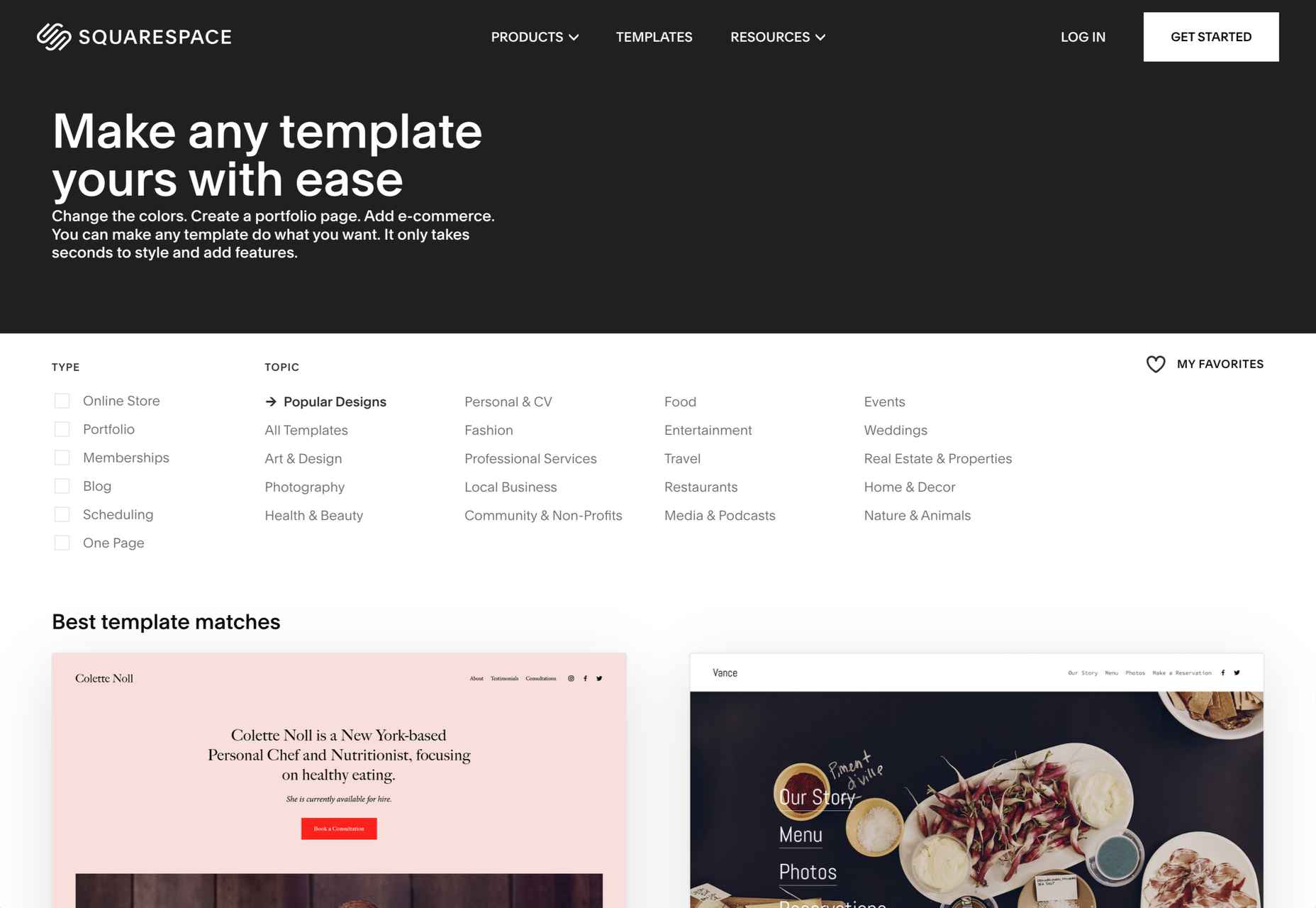
For instance, you might use a tool like Wix or Squarespace to edit a pre-existing template and simply drag-and-drop the features you need into the right places. On the other hand, if you’re planning on adding more functionality to your site down the line, it’s worth checking if any builder you will use has the right level of flexibility. Many tools will allow you access to code, advanced features, and essential module-based building functions.
Step 4: Implement Your Analytics
One of the essential parts of an MVP workflow is feedback. When you roll out your MVP, you’ll be looking for insights, guidance, and analytics to help you decide what your next steps are going to be. As a result, MVP workflows are based heavily on experimentation.
This means you’re going to need the right analytical tools in place to track crucial information. You can implement tools for collecting customer feedback directly. It’s also worth having a system in place for tracking metrics like:
- Conversion rate;
- Traffic numbers;
- User behavior;
- Most used/least used features;
- Technical site performance;
- Bounce rate;
- Average time spent on the page.
While Google Analytics is one of the most popular tools for collecting insights in the MVP website design world, various other options are available. You can even find tools with in-built heatmaps to see how people navigate your site more effectively.
It’s also worth having A/B testing components in place. This will allow you to test the different “new” features you add to your web pages over time and examine how they influence your conversions and support your goals. For example, you can use A/B testing to explore the impact of everything from CTA button colors to webpage copy and offers.
Creating Your MVP Web Page
In the fast-paced web development and design world, the old-fashioned and slow approach to designing web pages is growing increasingly less common. Instead, an MVP strategy may be the best bet for companies looking to go to market faster, collect insights from their target audience, and accelerate growth.
Though getting used to this design strategy initially can be challenging, it can save you significant time, resources, and money in the long term.
HTML vector created by vectorjuice – www.freepik.com
The post How to Design an MVP Web Page first appeared on Webdesigner Depot.

 Are you a creative person looking for the perfect career path to take? If so, there are not many more creative professions than that of a web designer.
 Do you find yourself stuck when finding new web design clients? Whether you own a web design company or work as a freelancer, expanding your audience and attracting clients can be challenging.
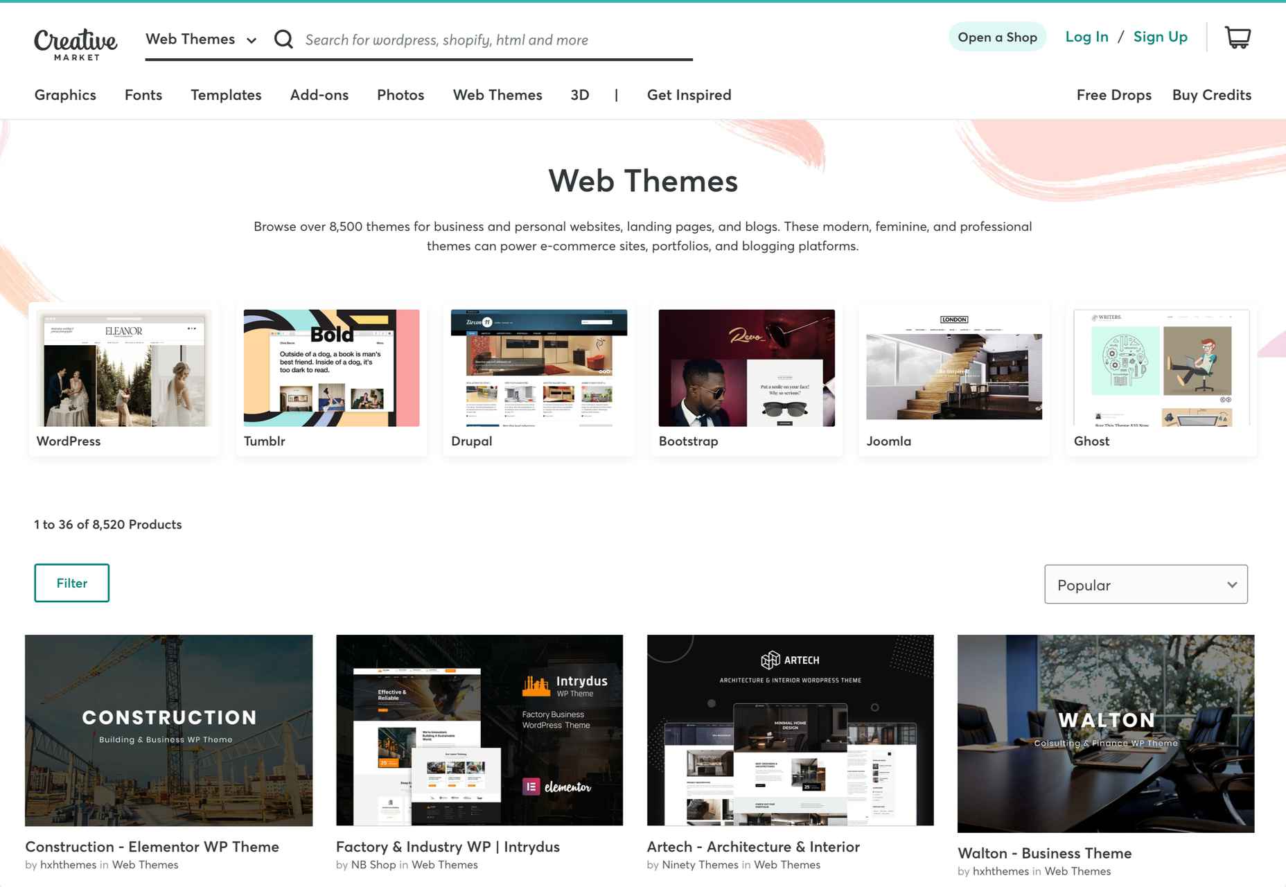
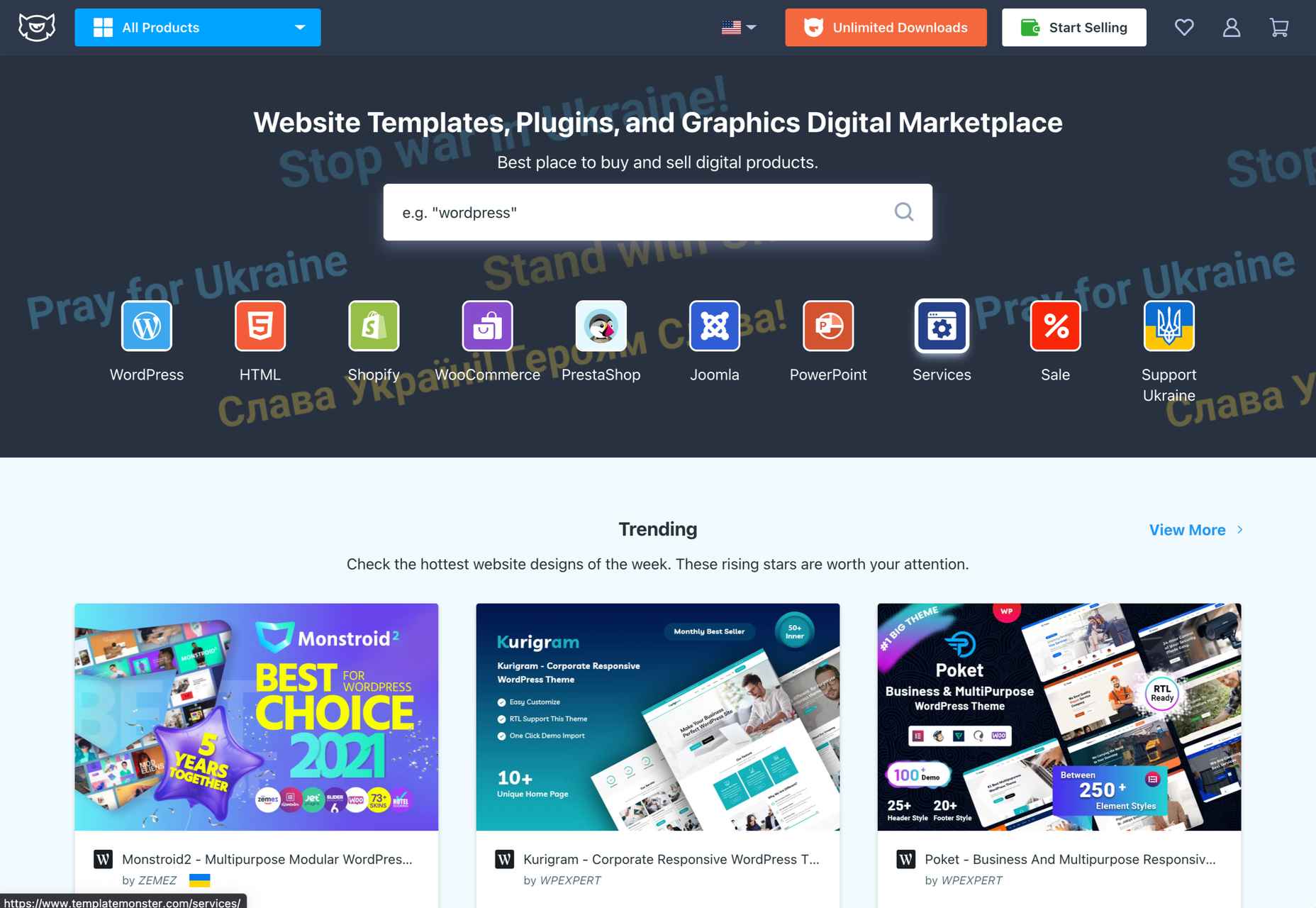
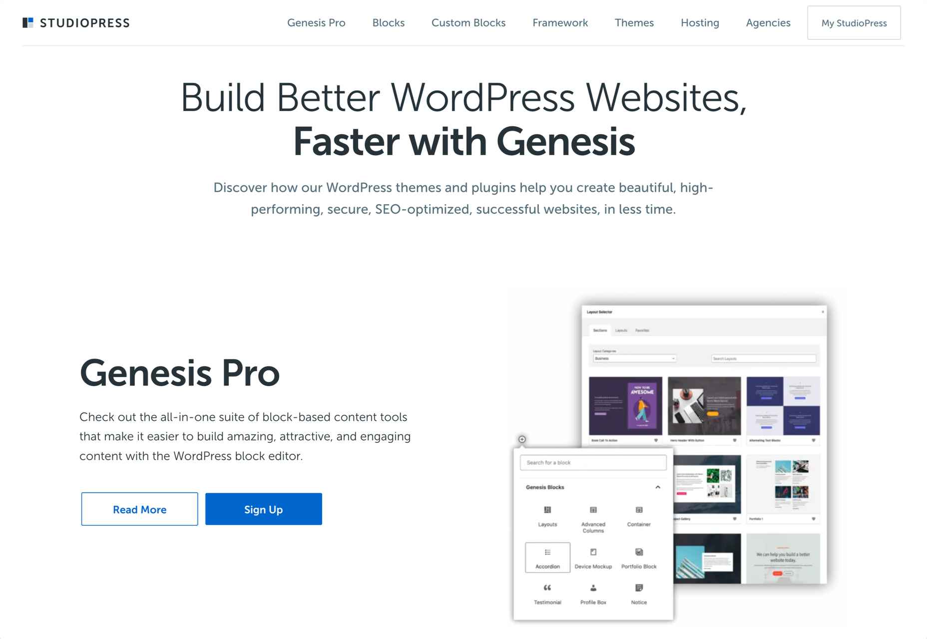
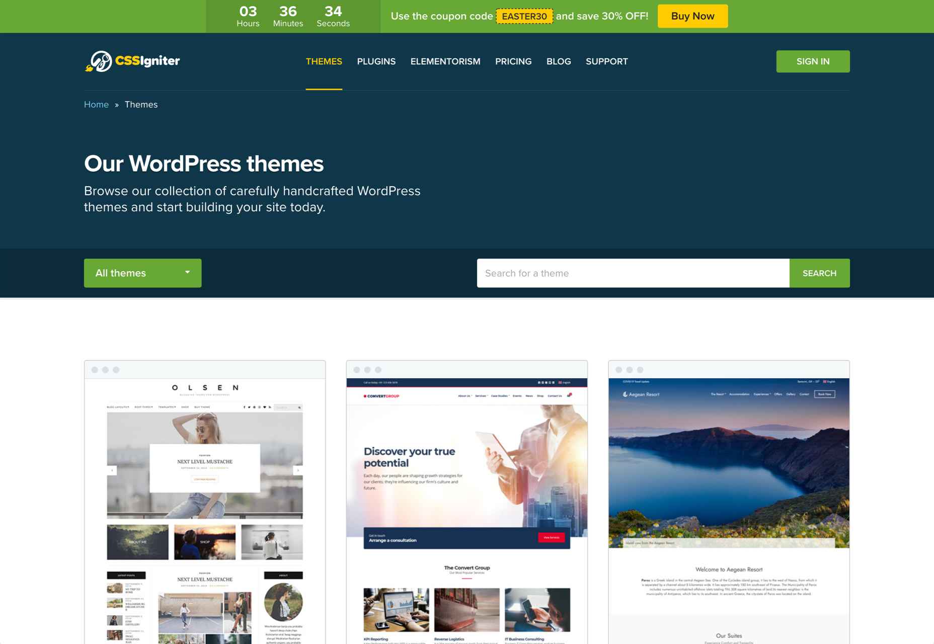
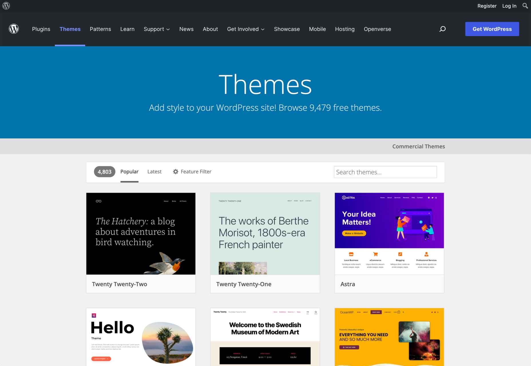
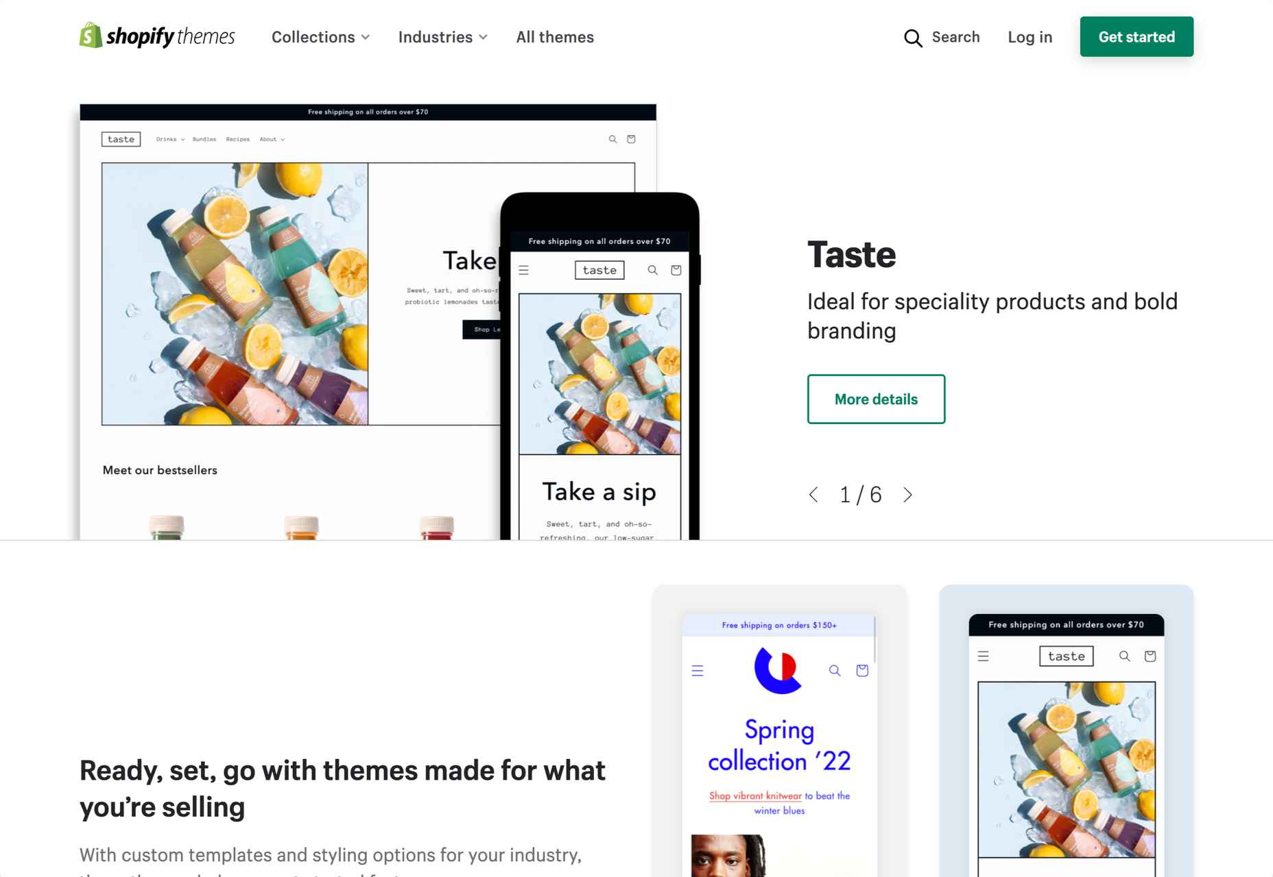
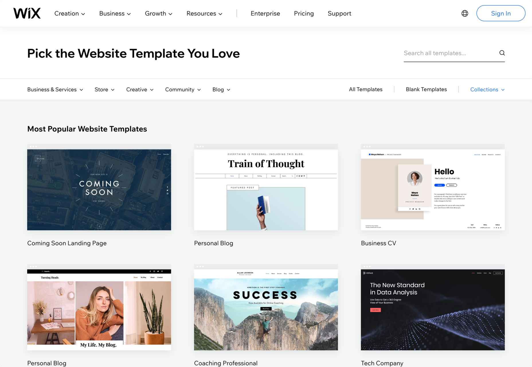
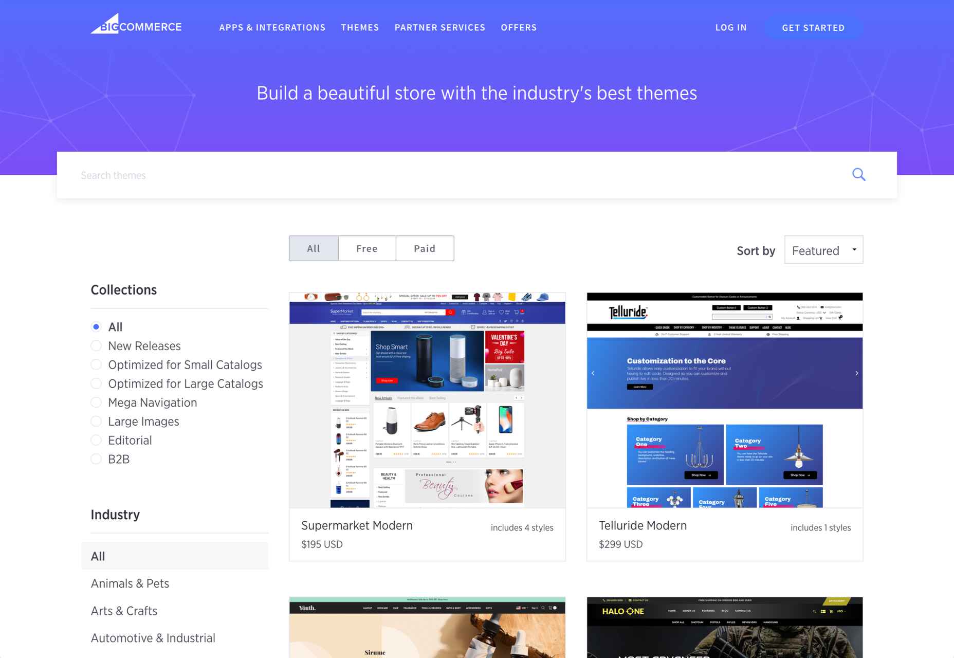
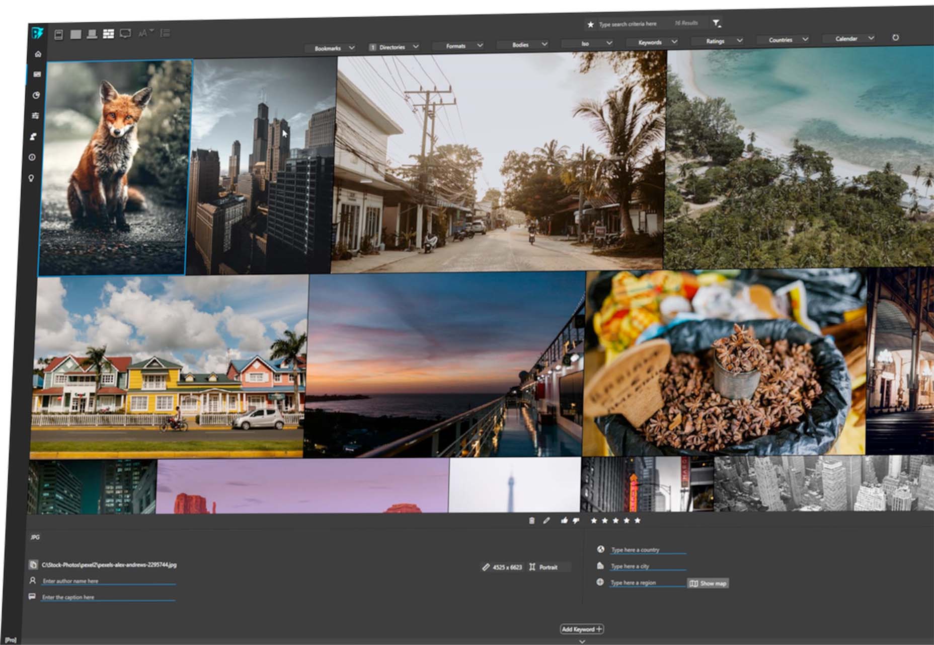
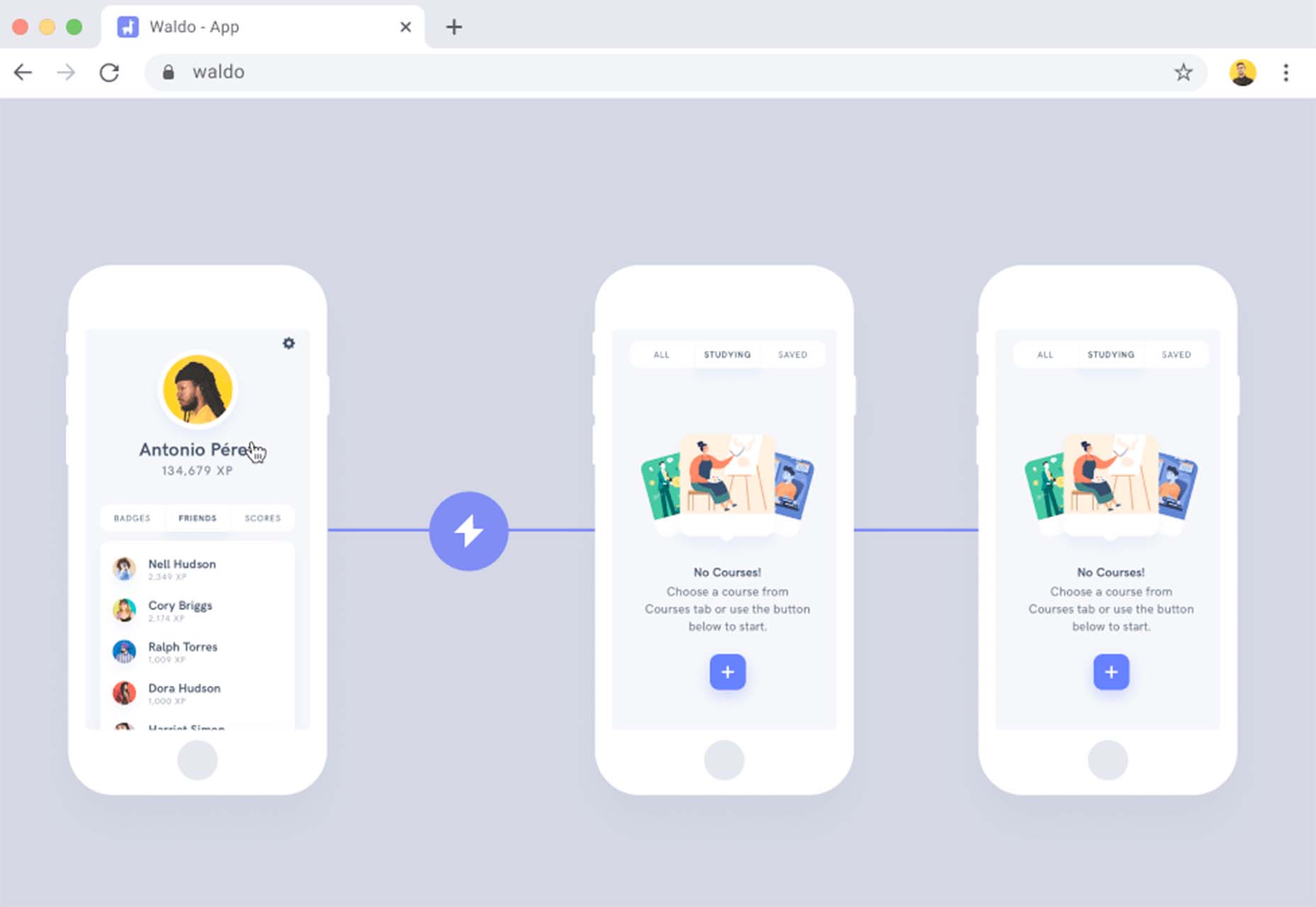
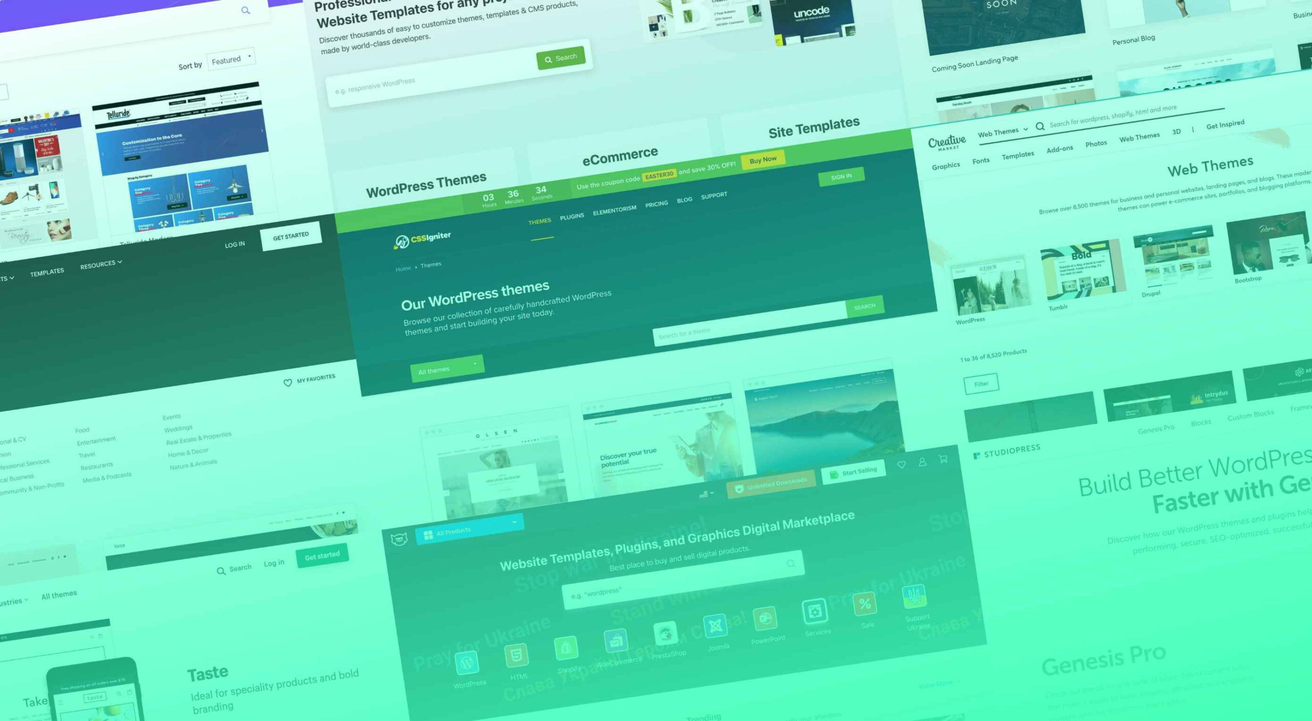 Whether you are a designer looking for the best themes for your clients or a new website/blog owner, there are numerous theme marketplaces to cover your needs.
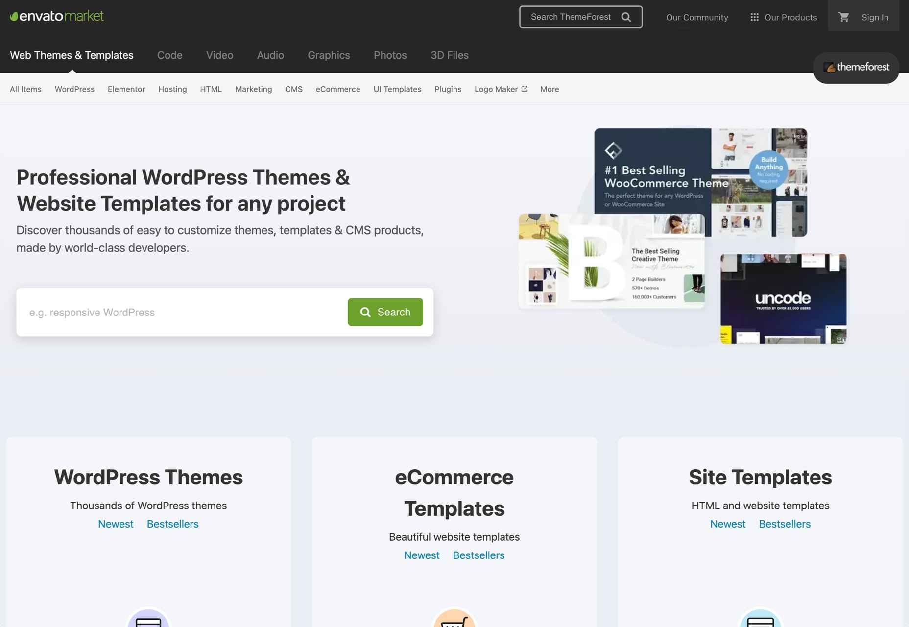
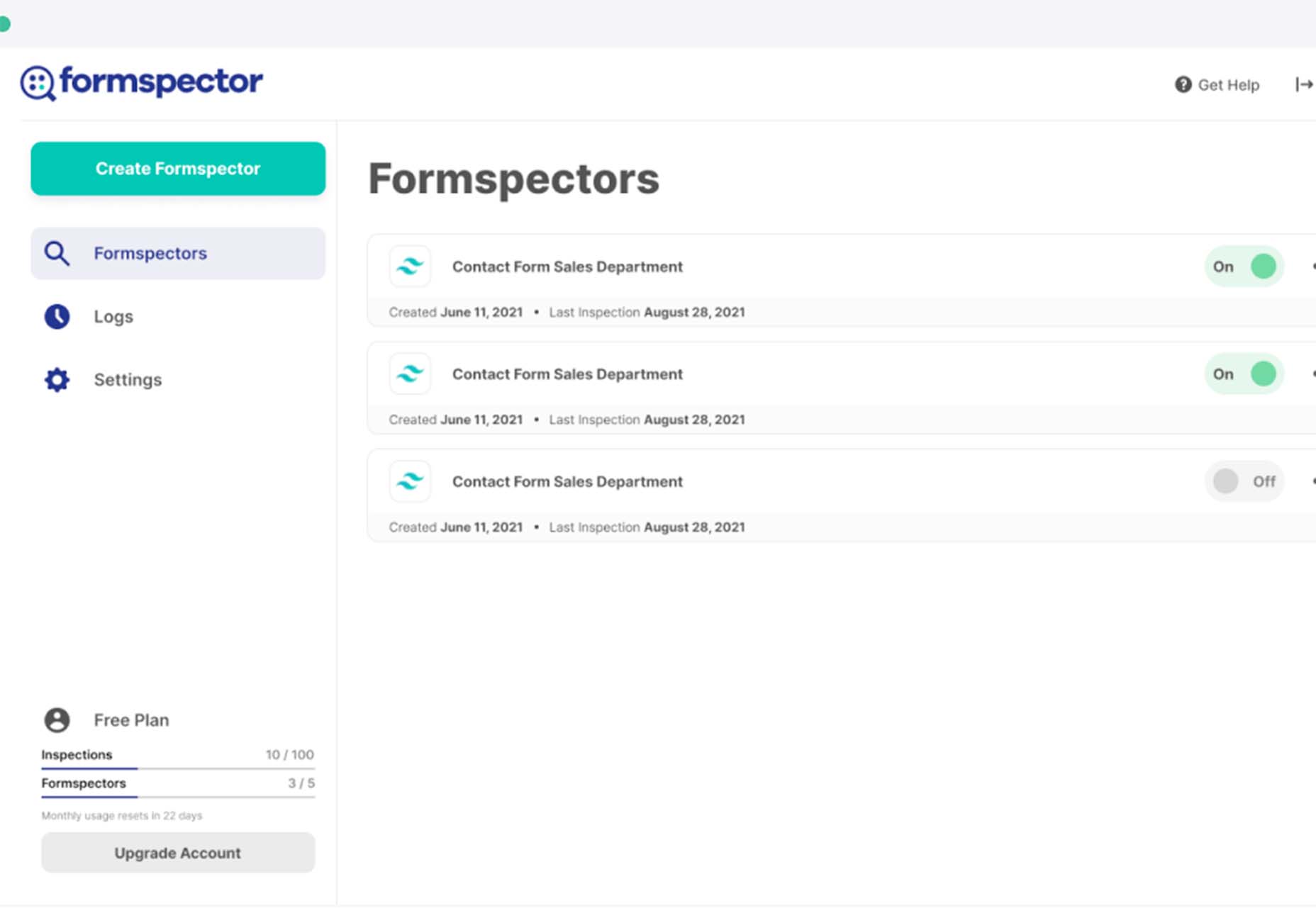
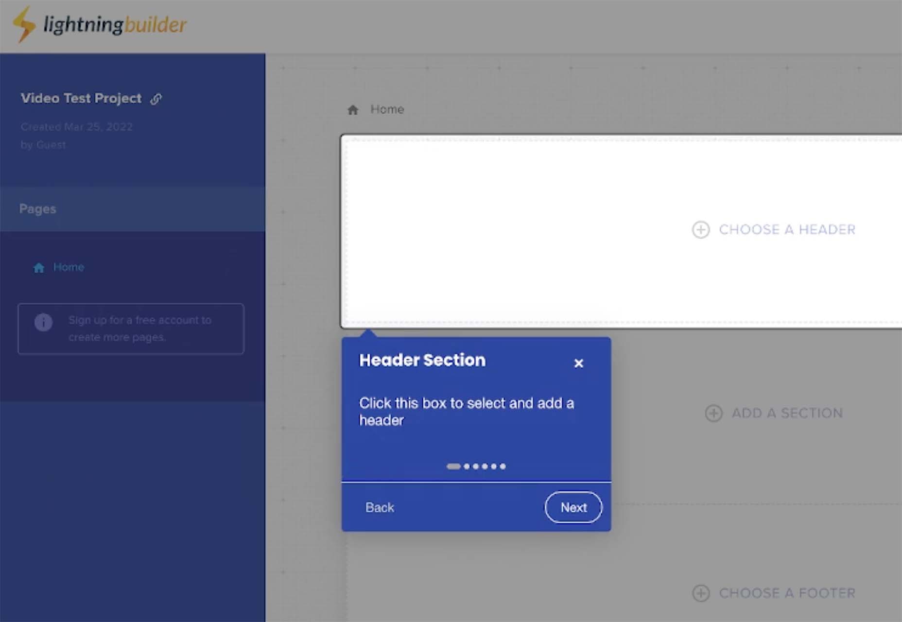
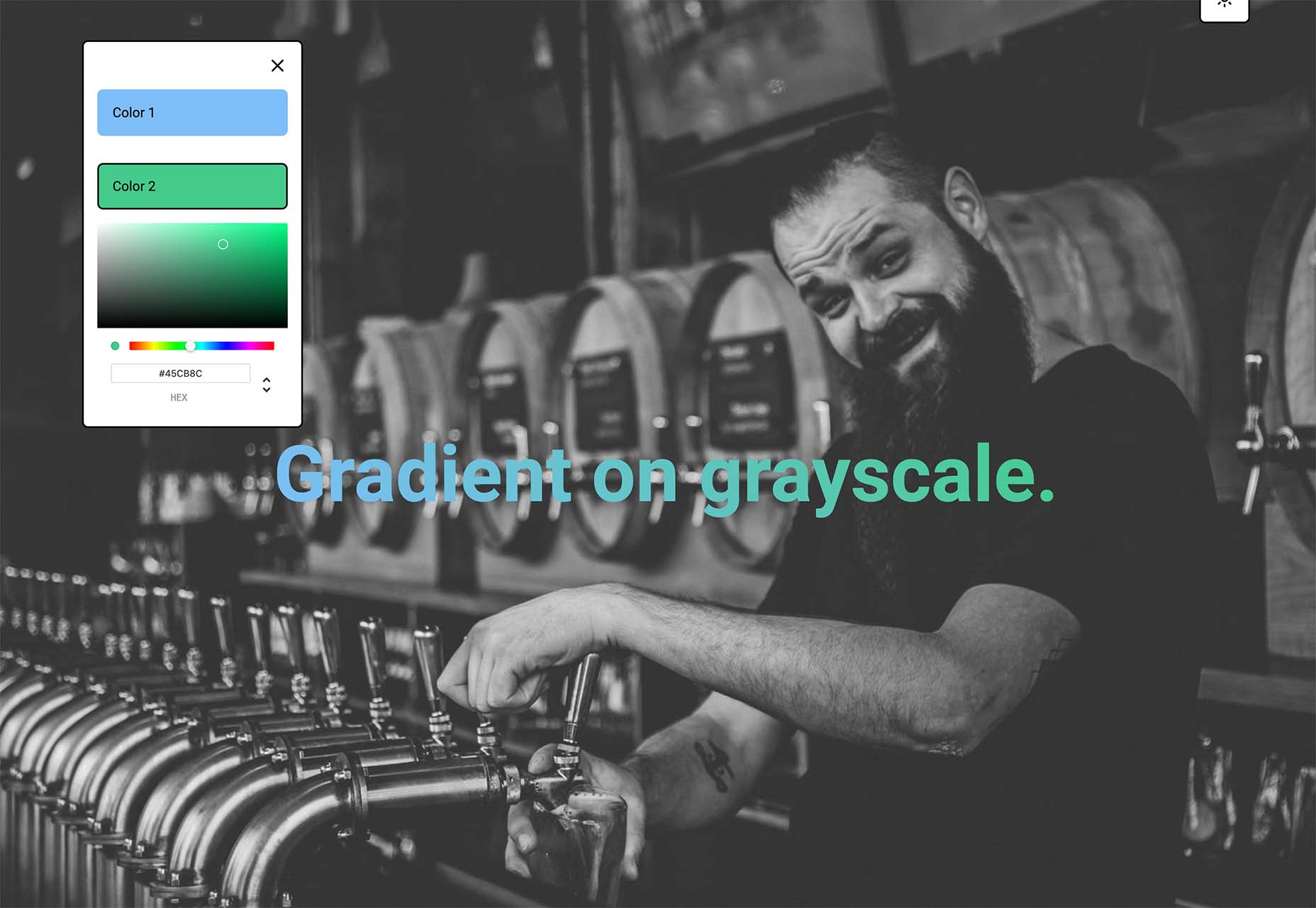
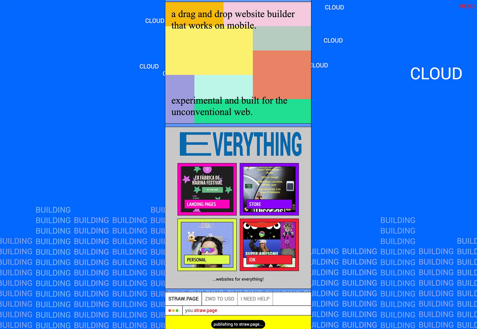
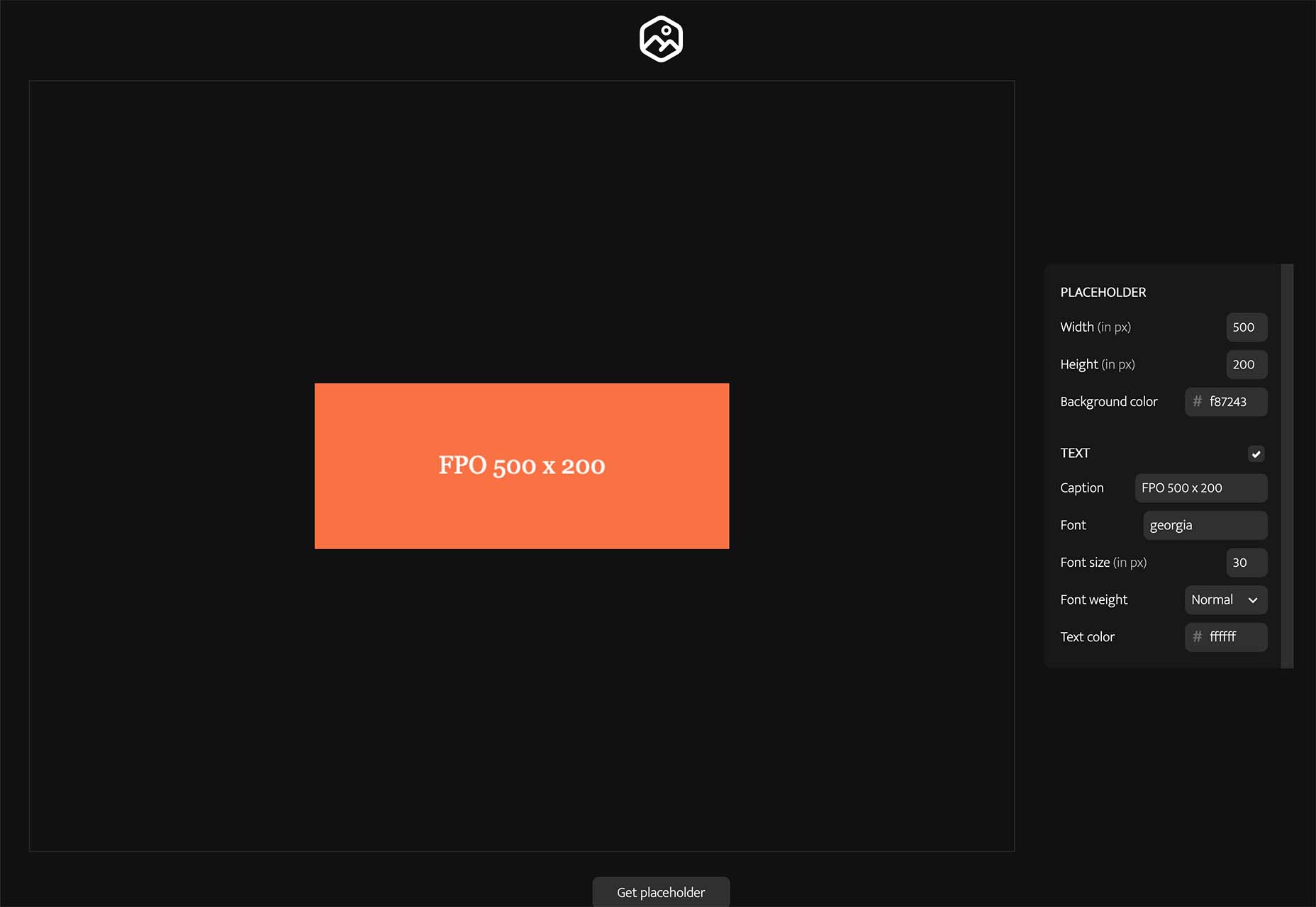
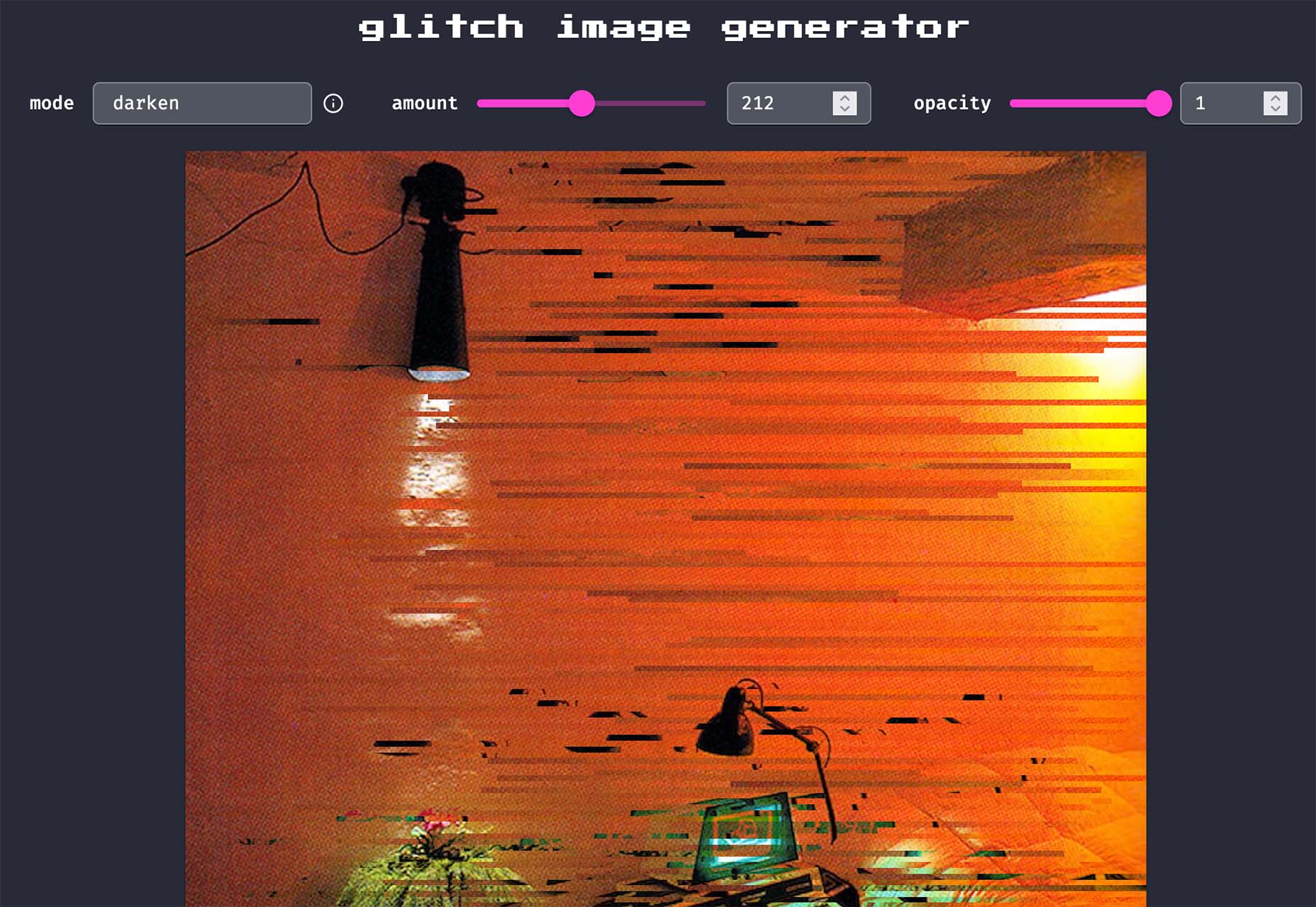
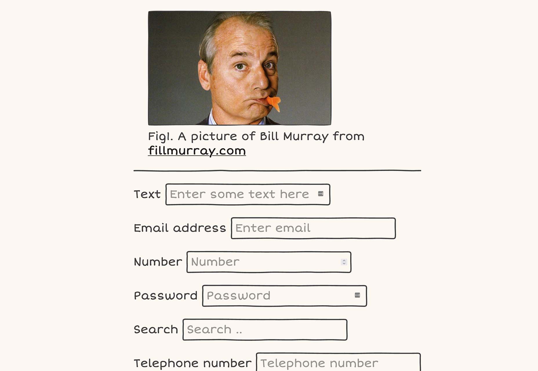
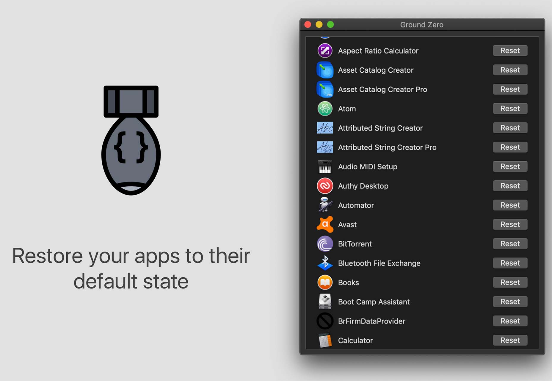
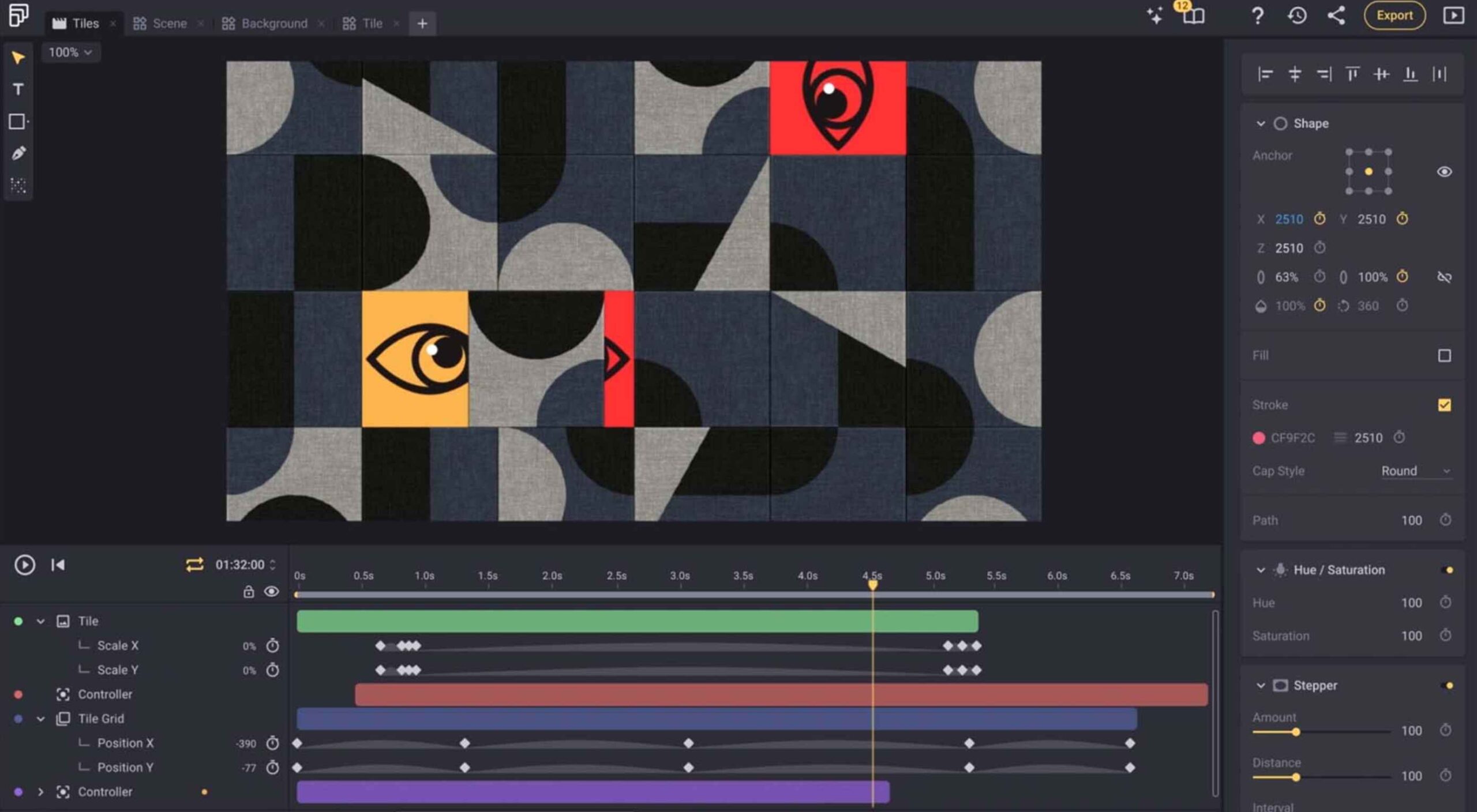
 Bored with the same old design tools? There are plenty of new toys to experiment with, from fun divots to functional design tools that could become your new go-to’s.


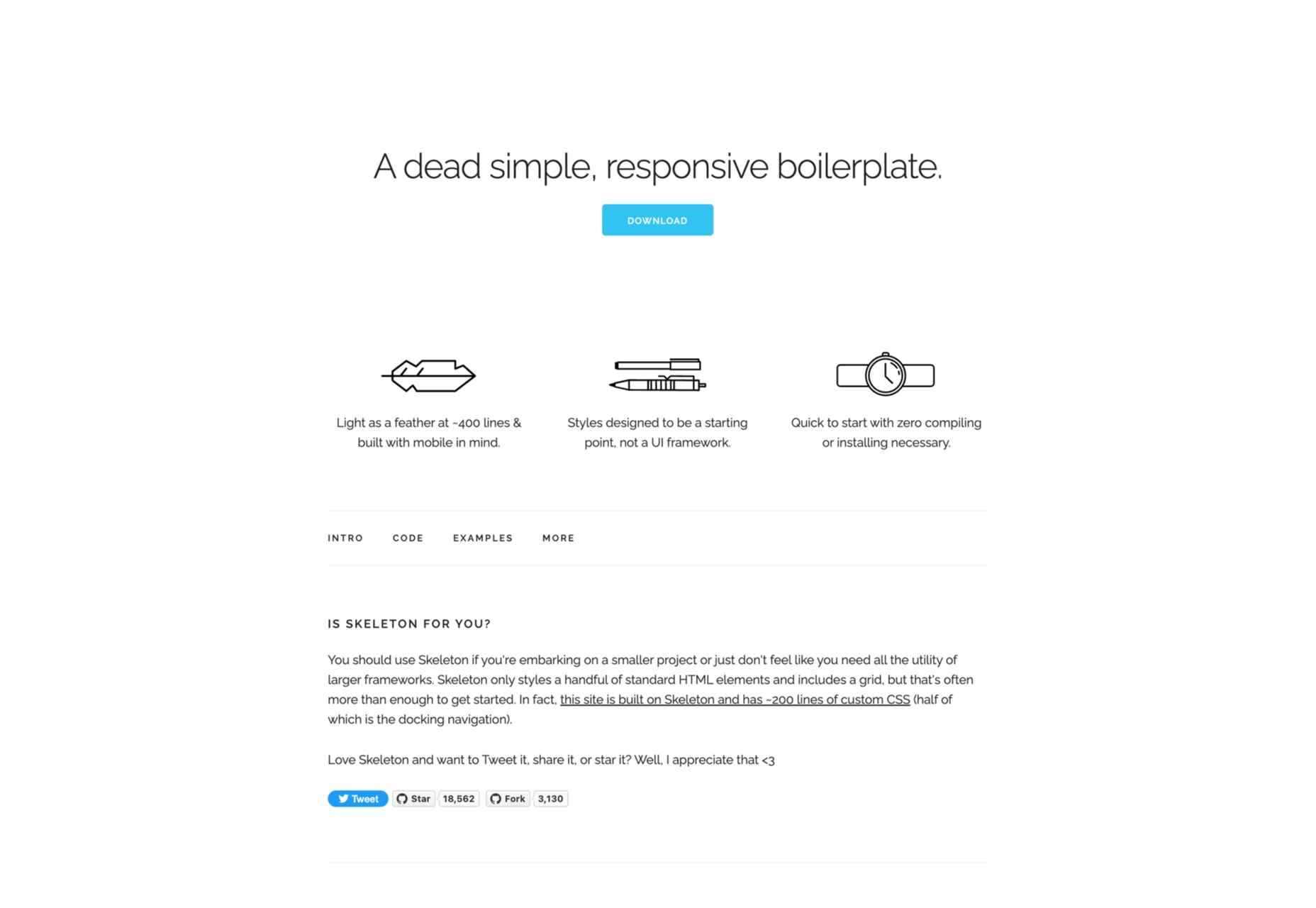
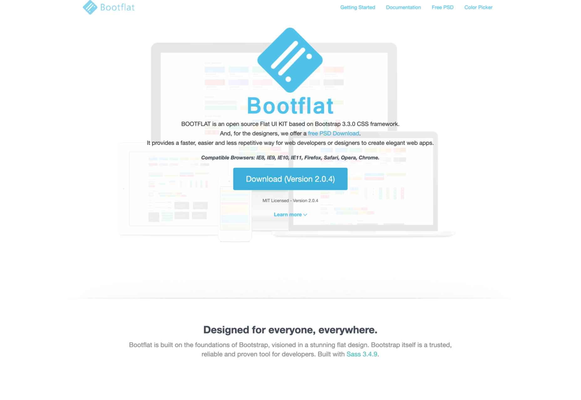
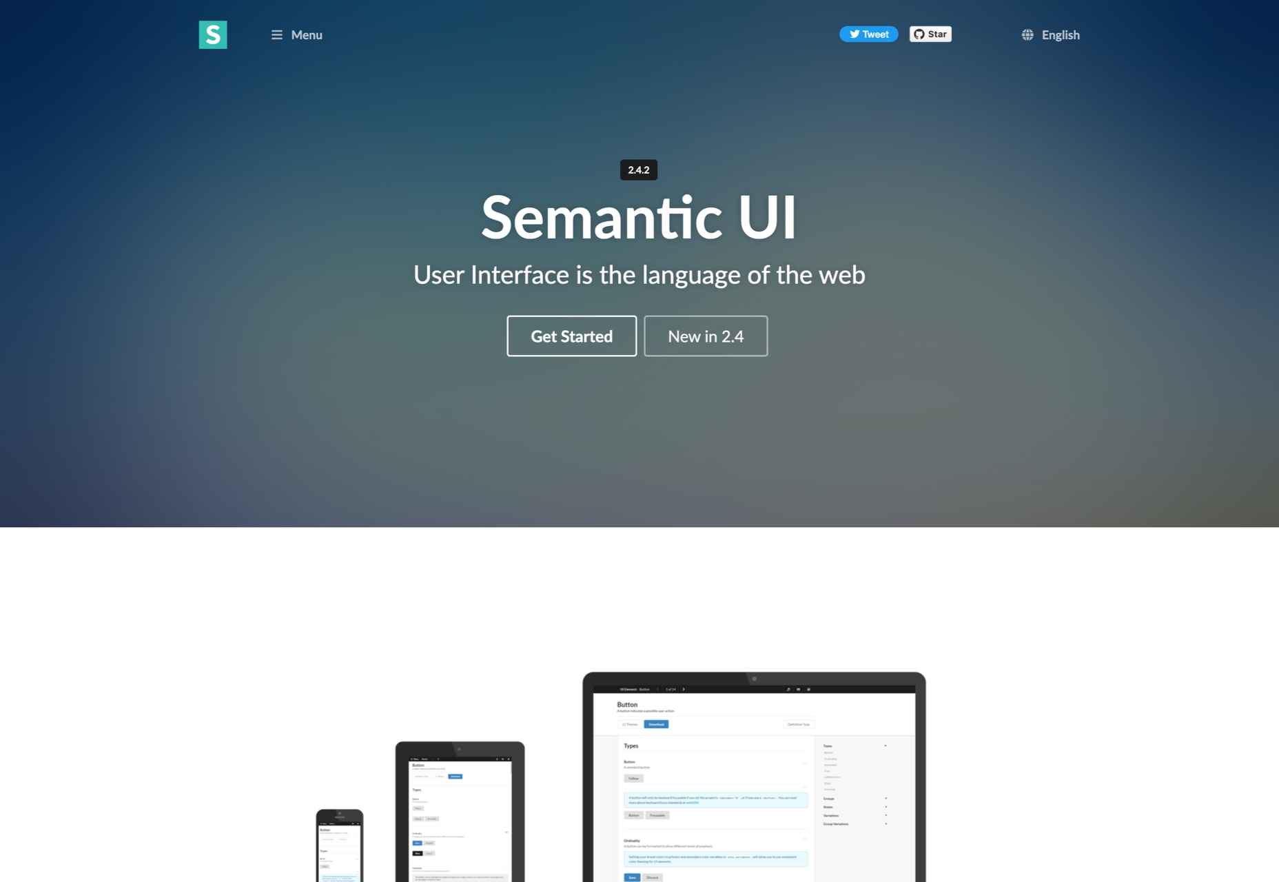
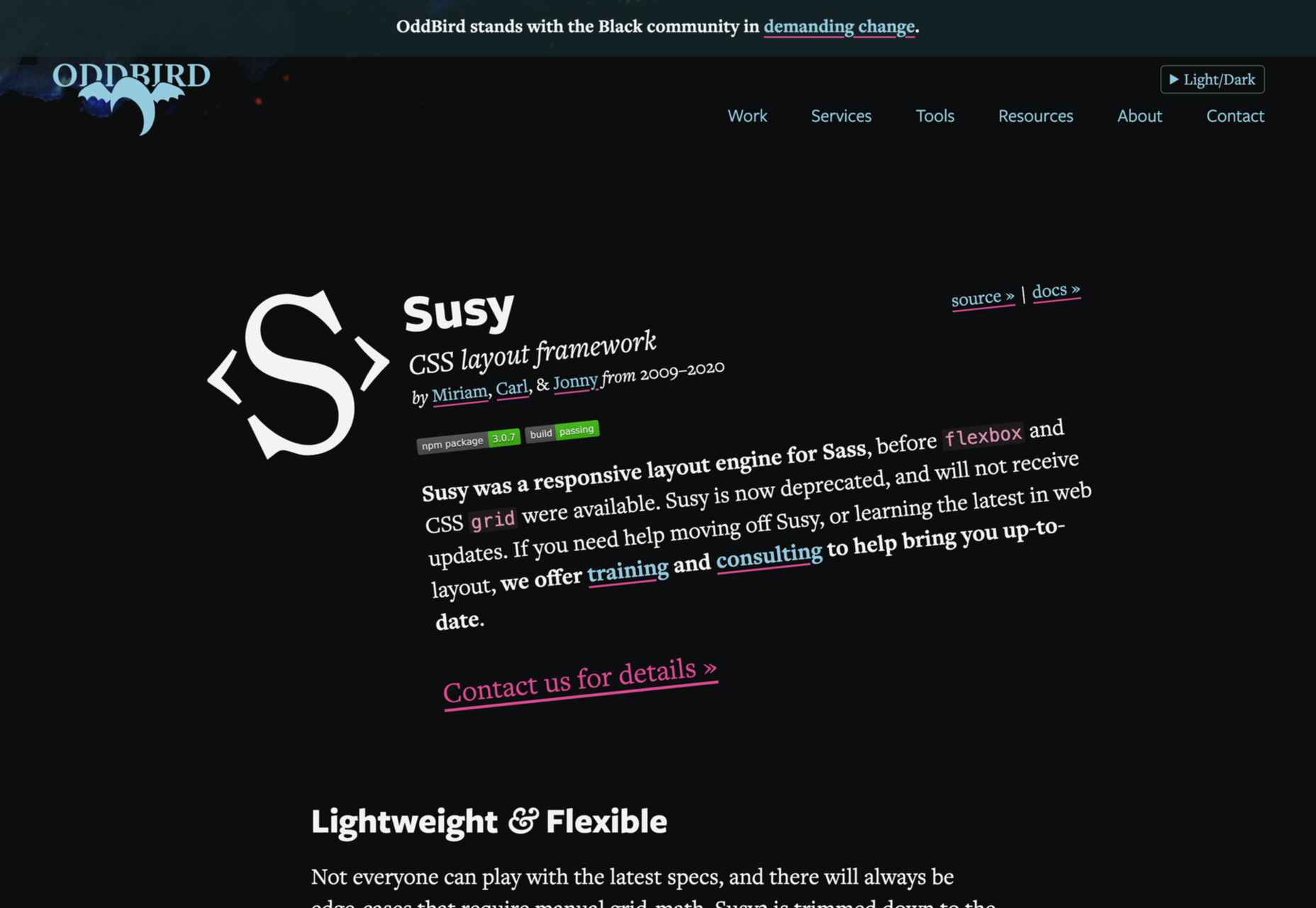
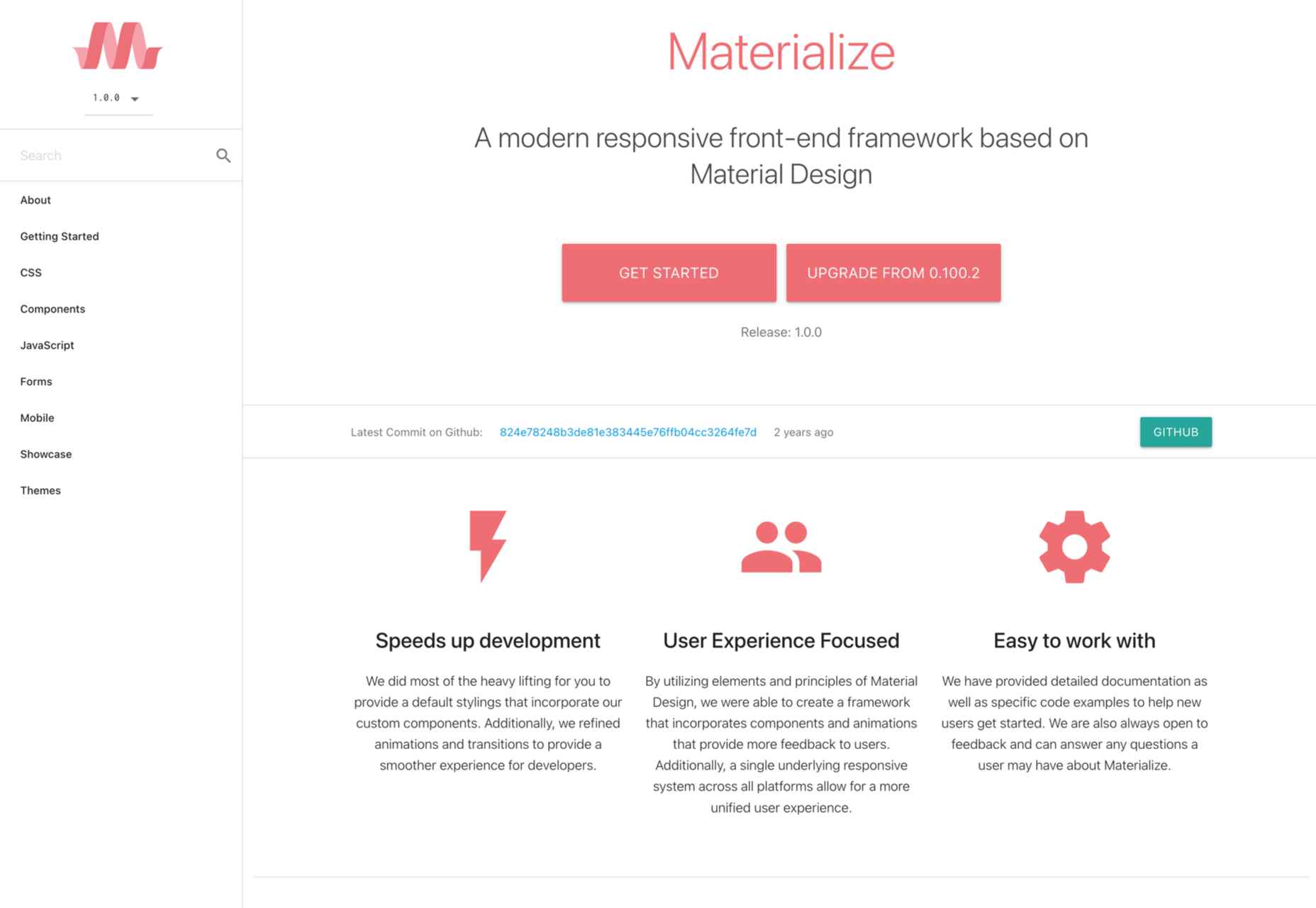
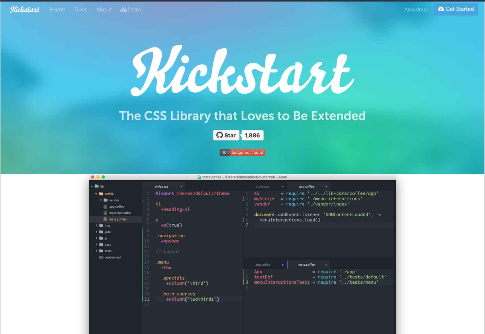
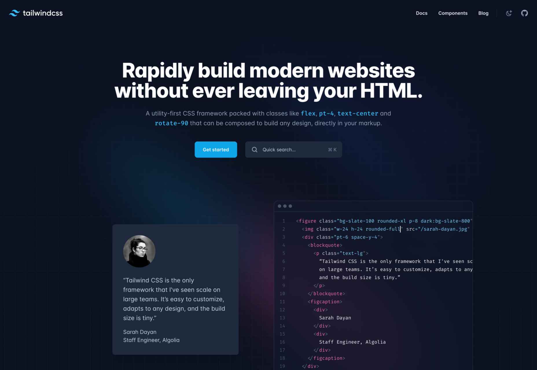
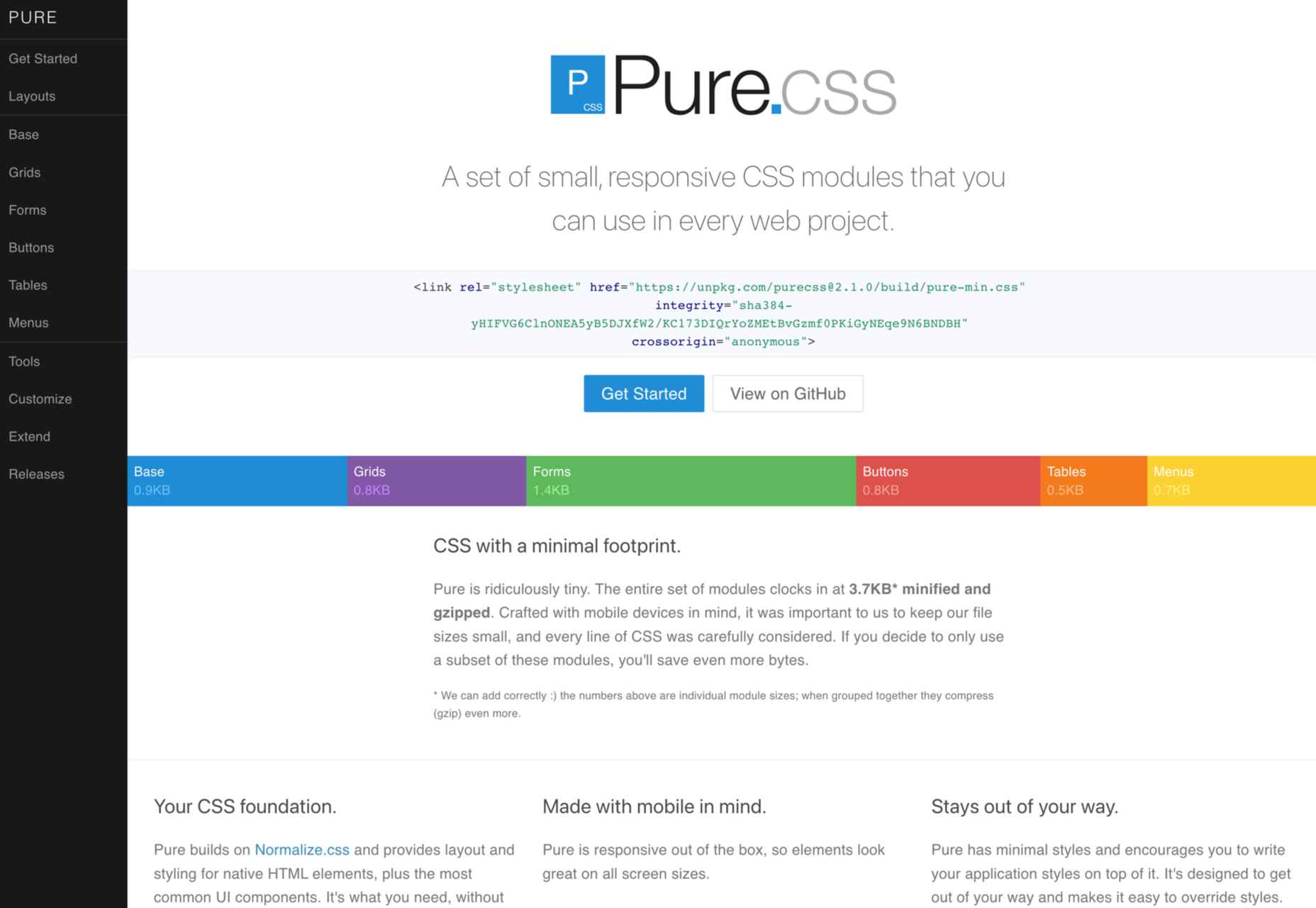
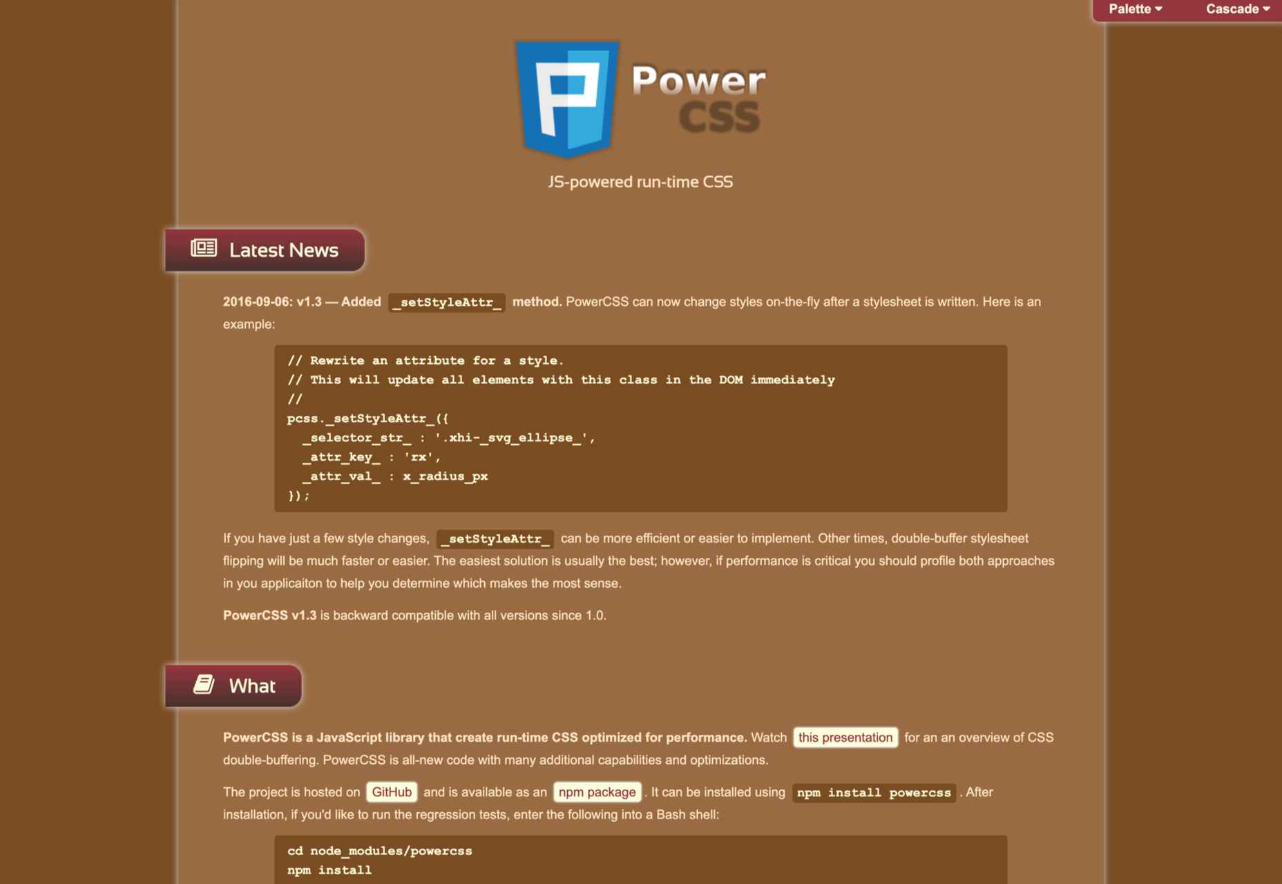
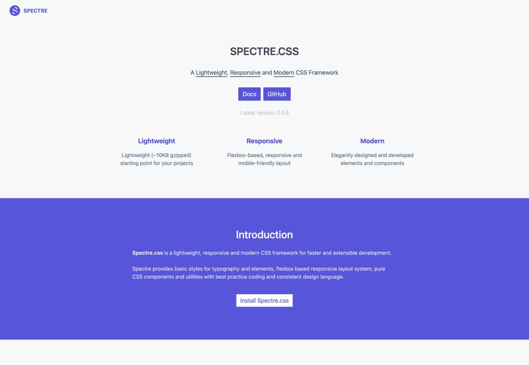
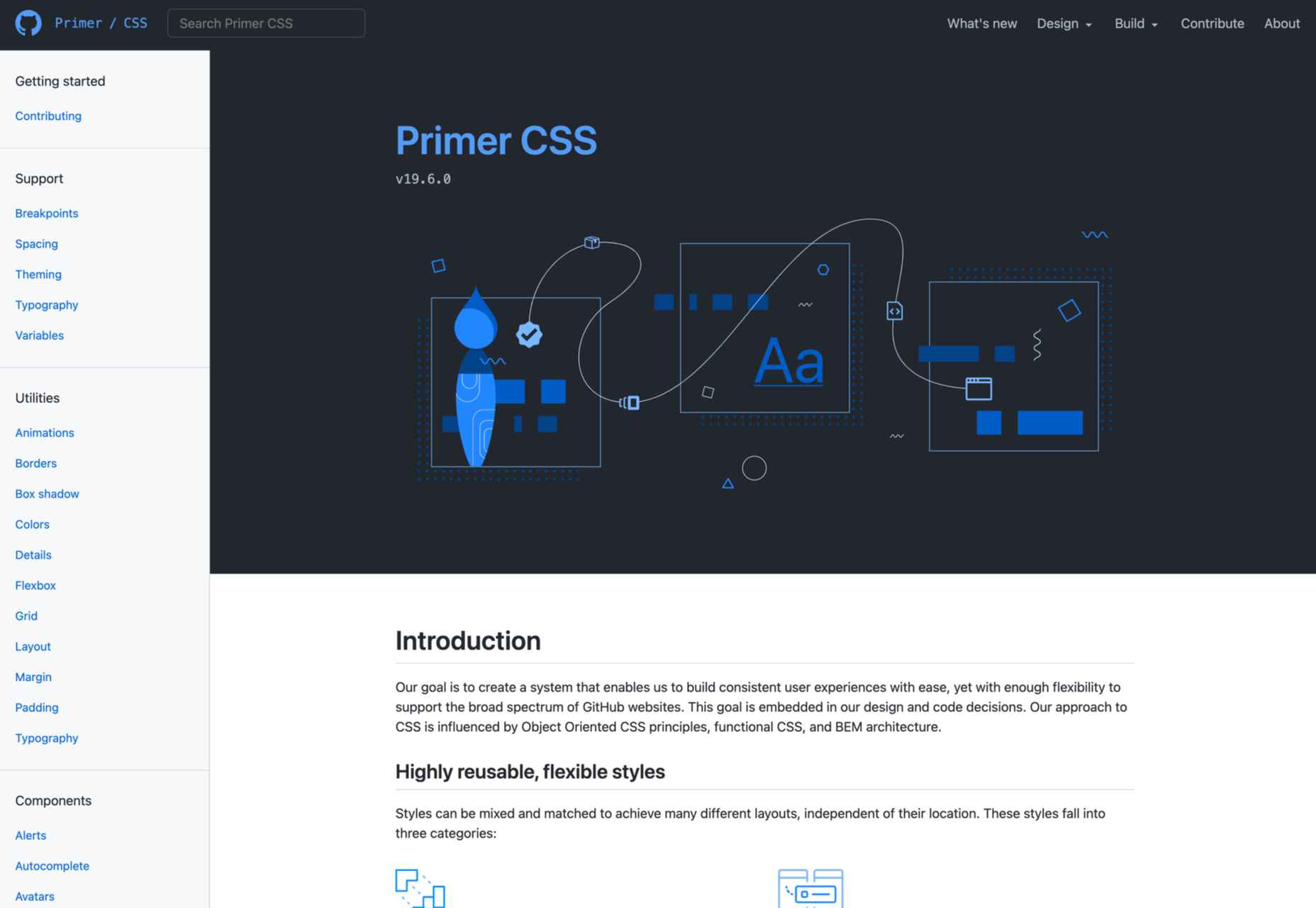
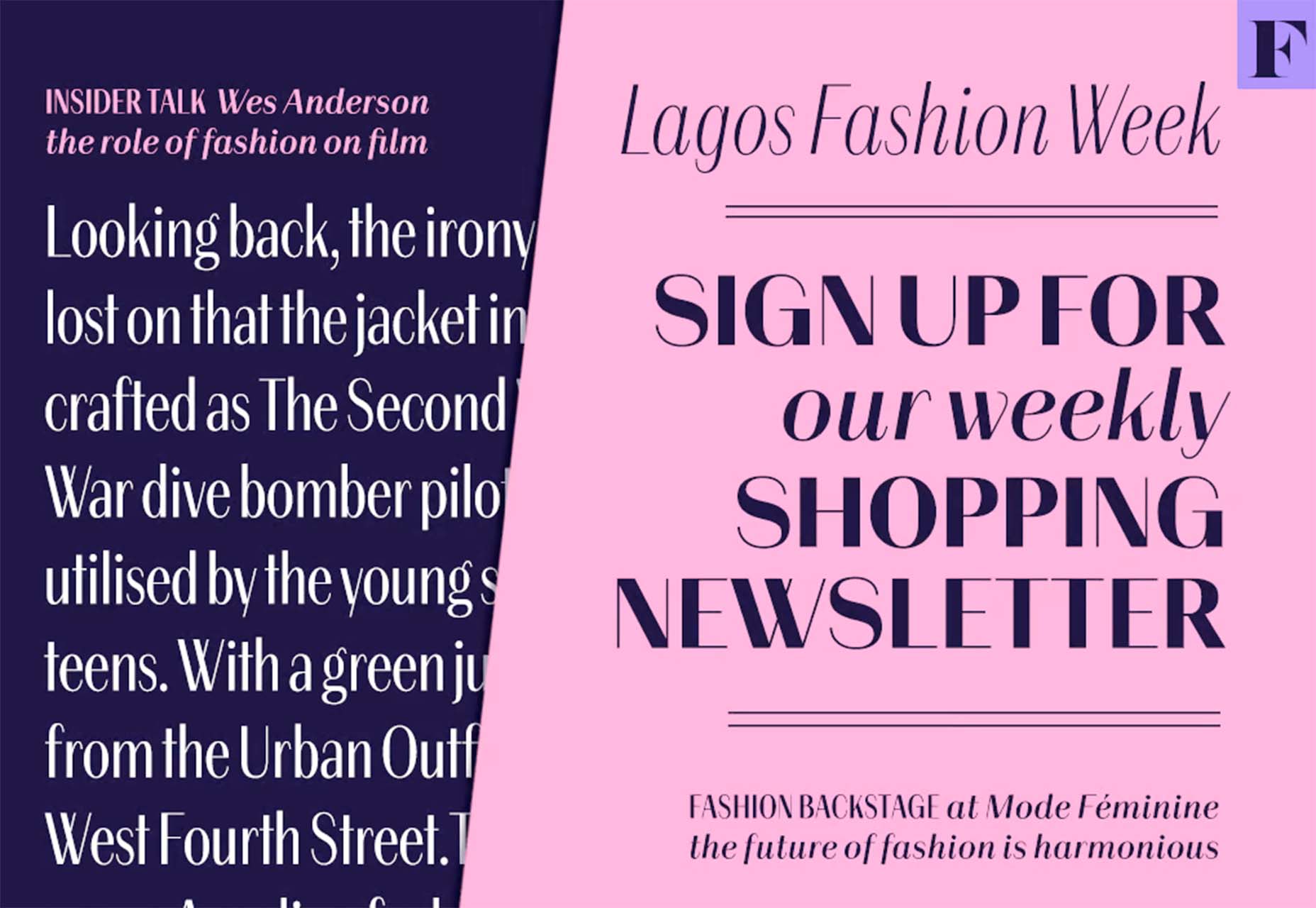
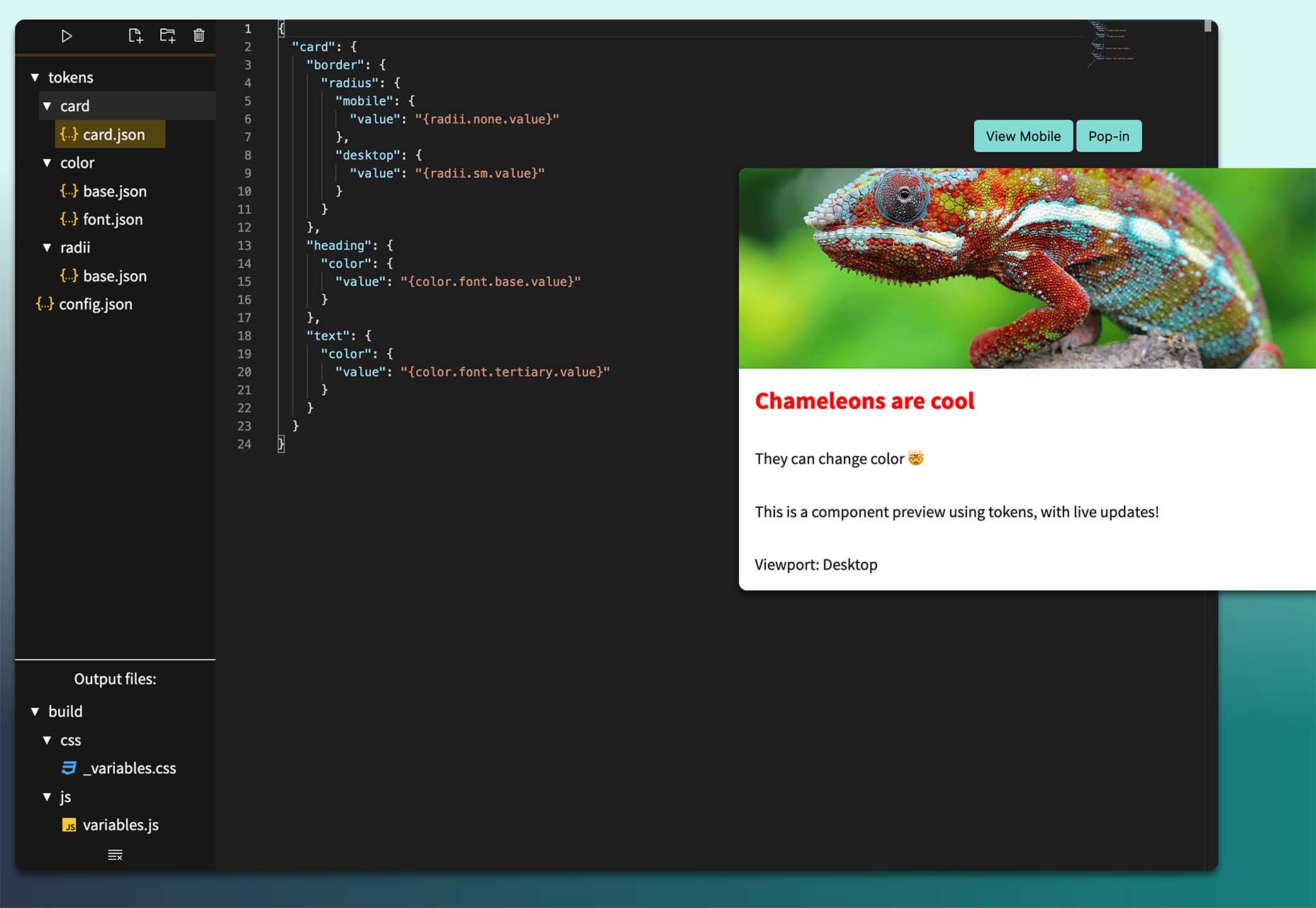
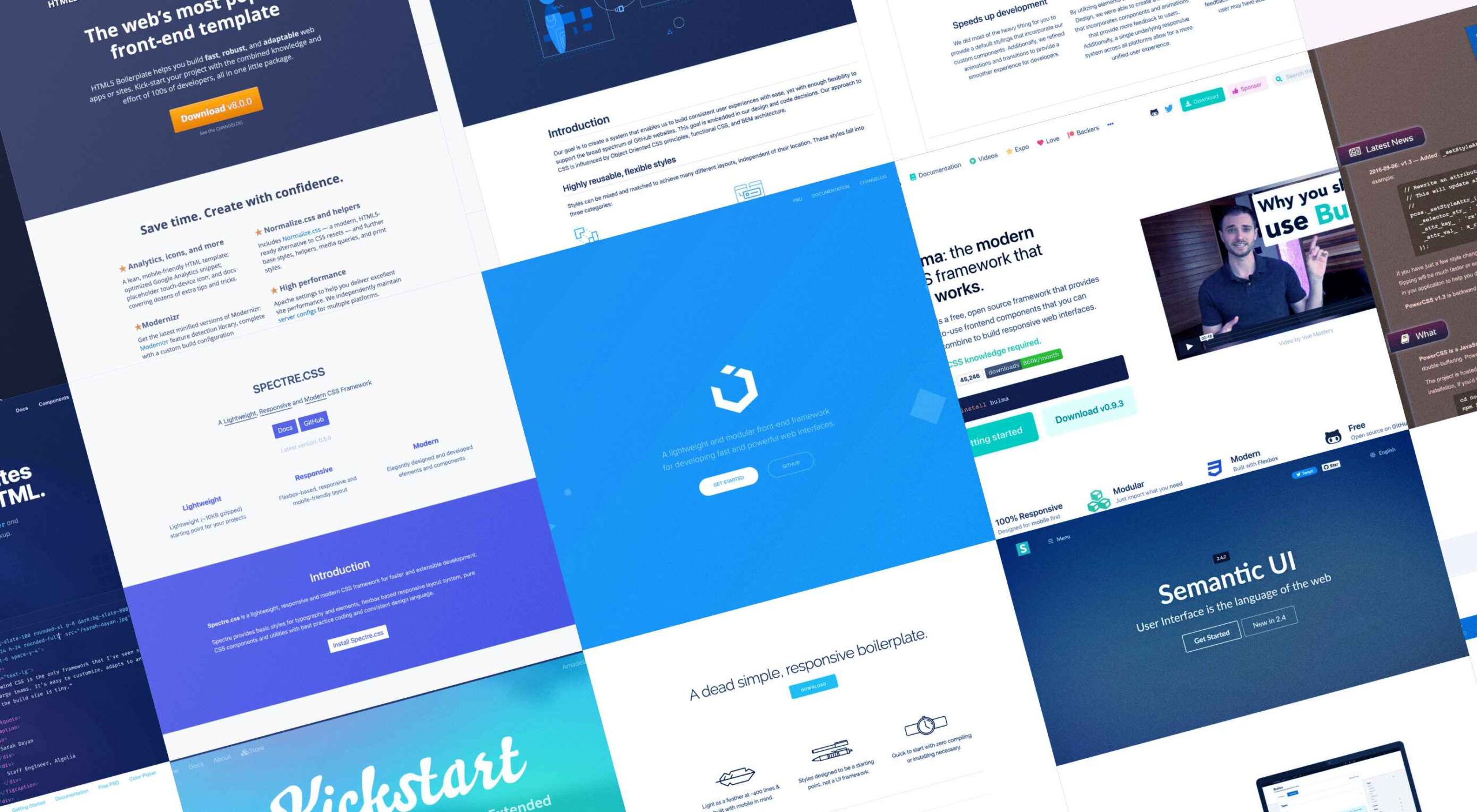 Whether you are a CSS expert or a front-end beginner, using the right CSS framework is crucial for your daily tasks. There are numerous frameworks whose ultimate goal is the same: helping developers target multiple screens, in the simplest possible way.
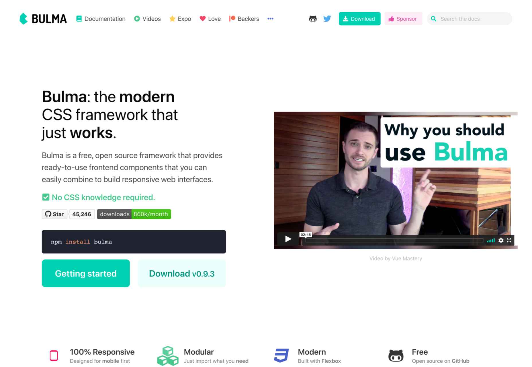

 The email channel is known for multiple advantages. It is convenient to implement practically, offers many options, and has a fantastic
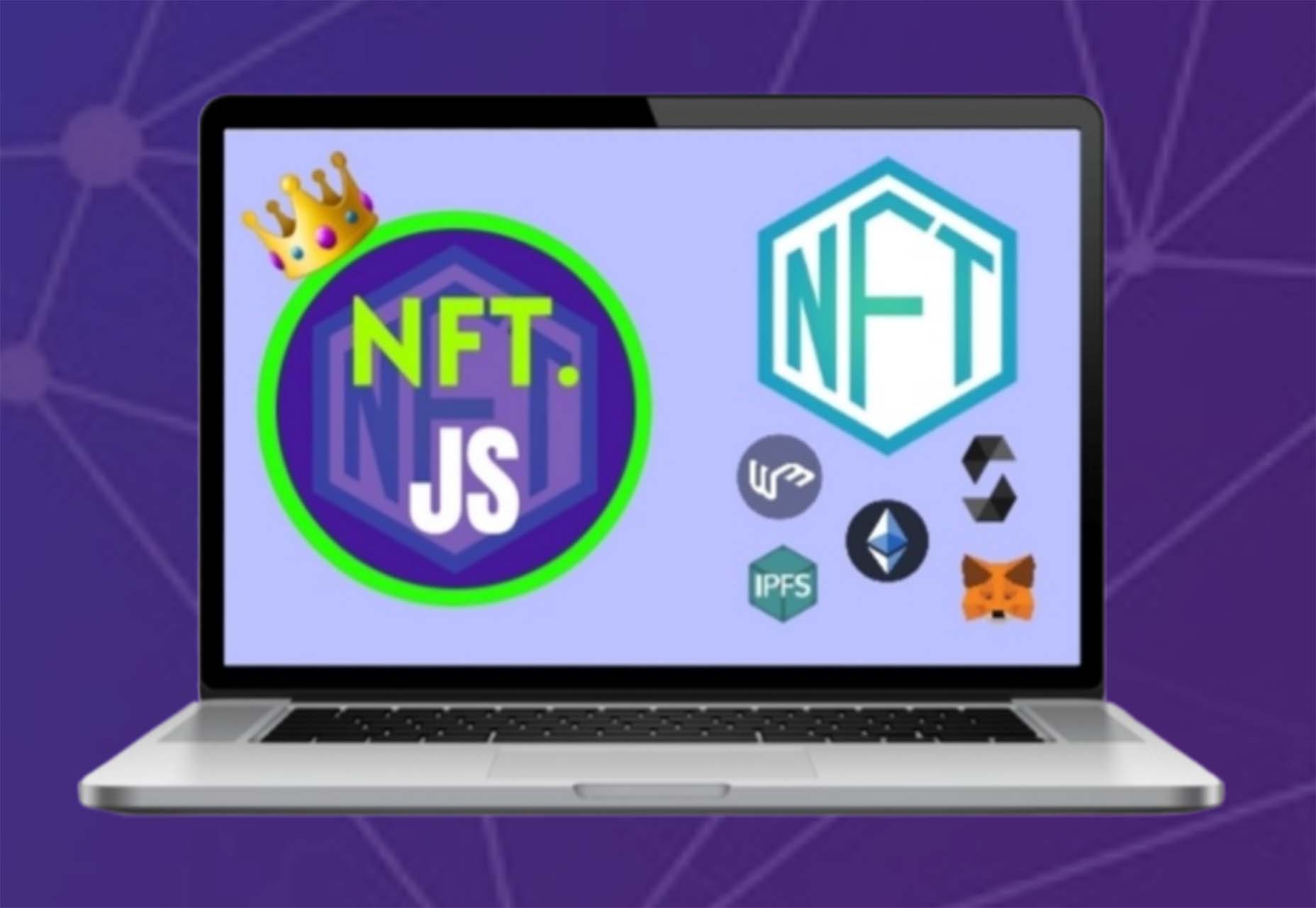
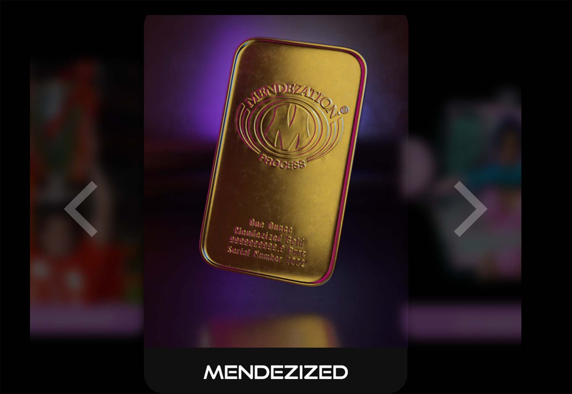
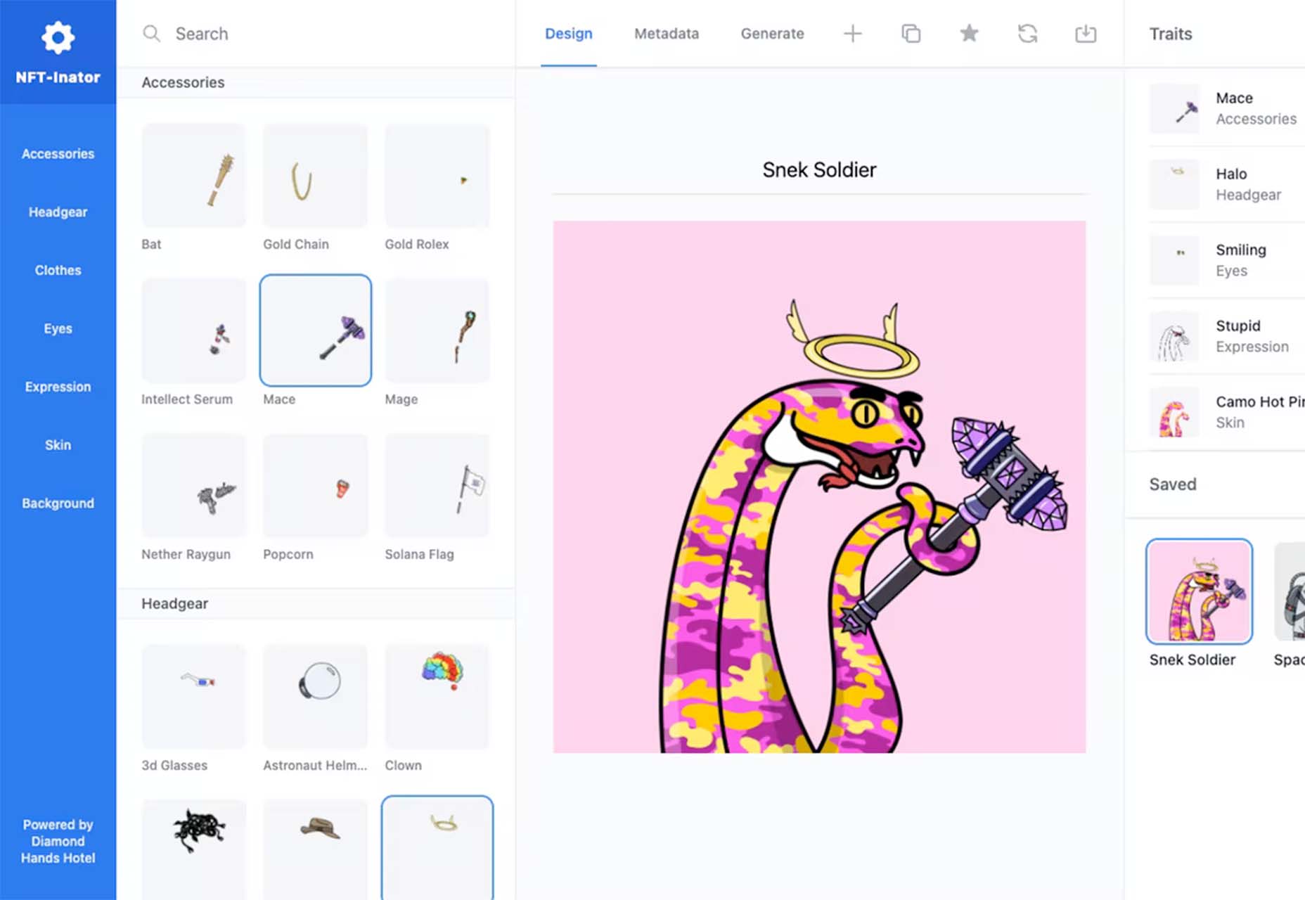
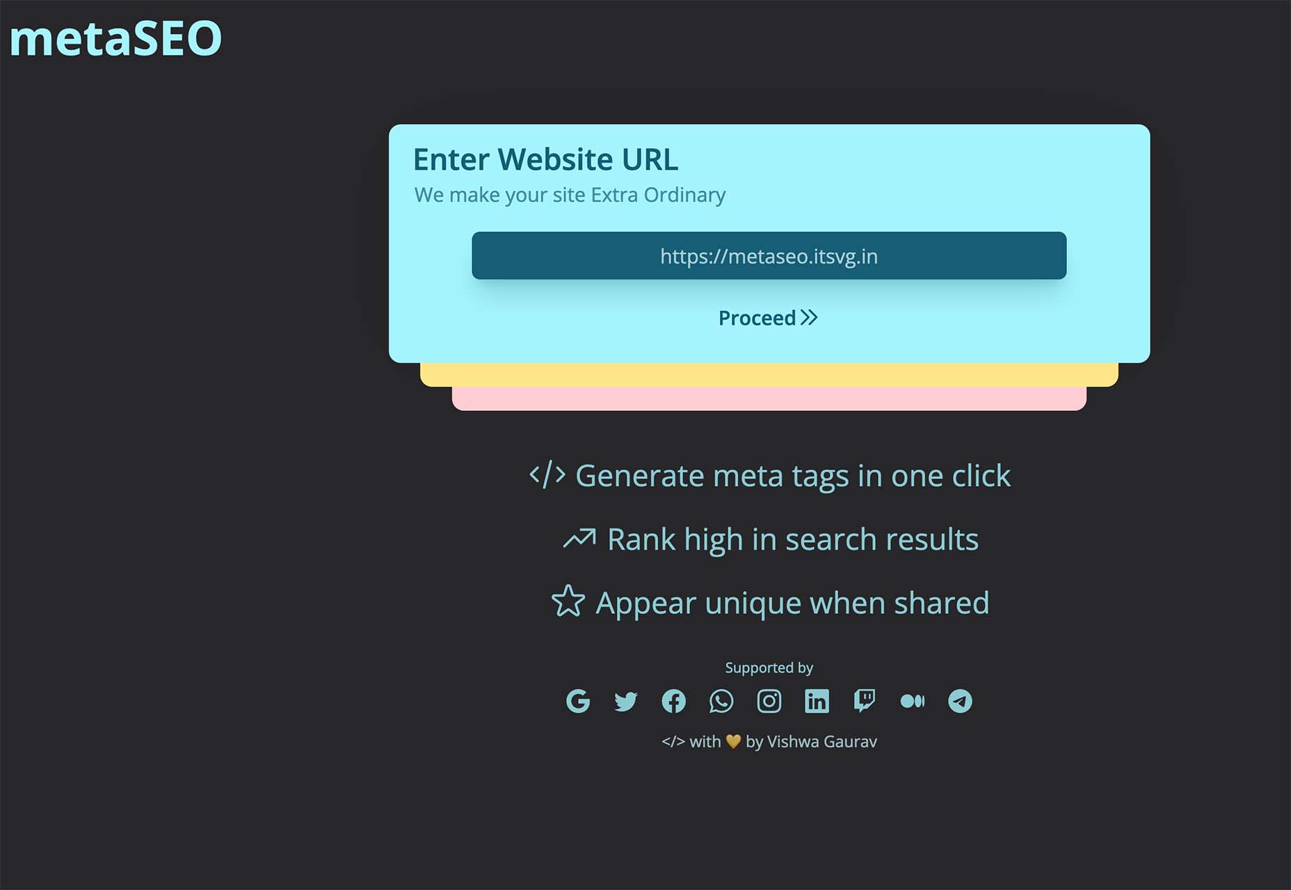
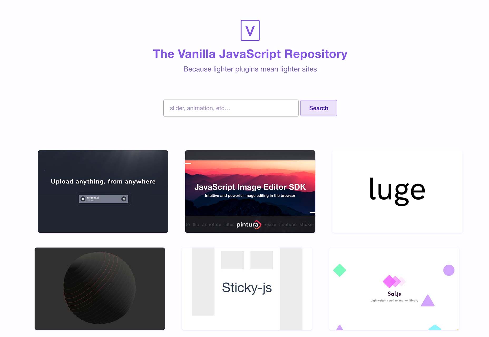
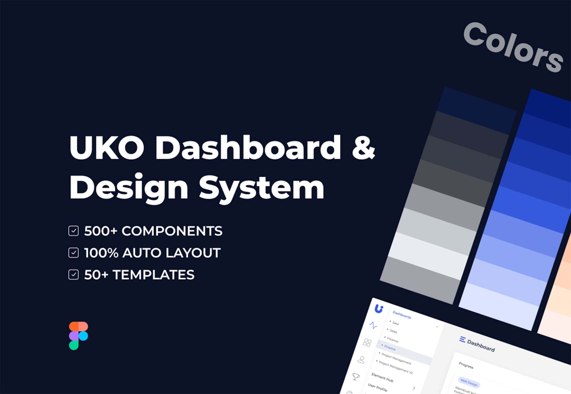
 One of the most talked-about digital elements of the new year leads our roundup of tools and resources this month – NFTs. The NFT landscape seems to be exploding right now and that includes tools for designers to get in on the game as well.
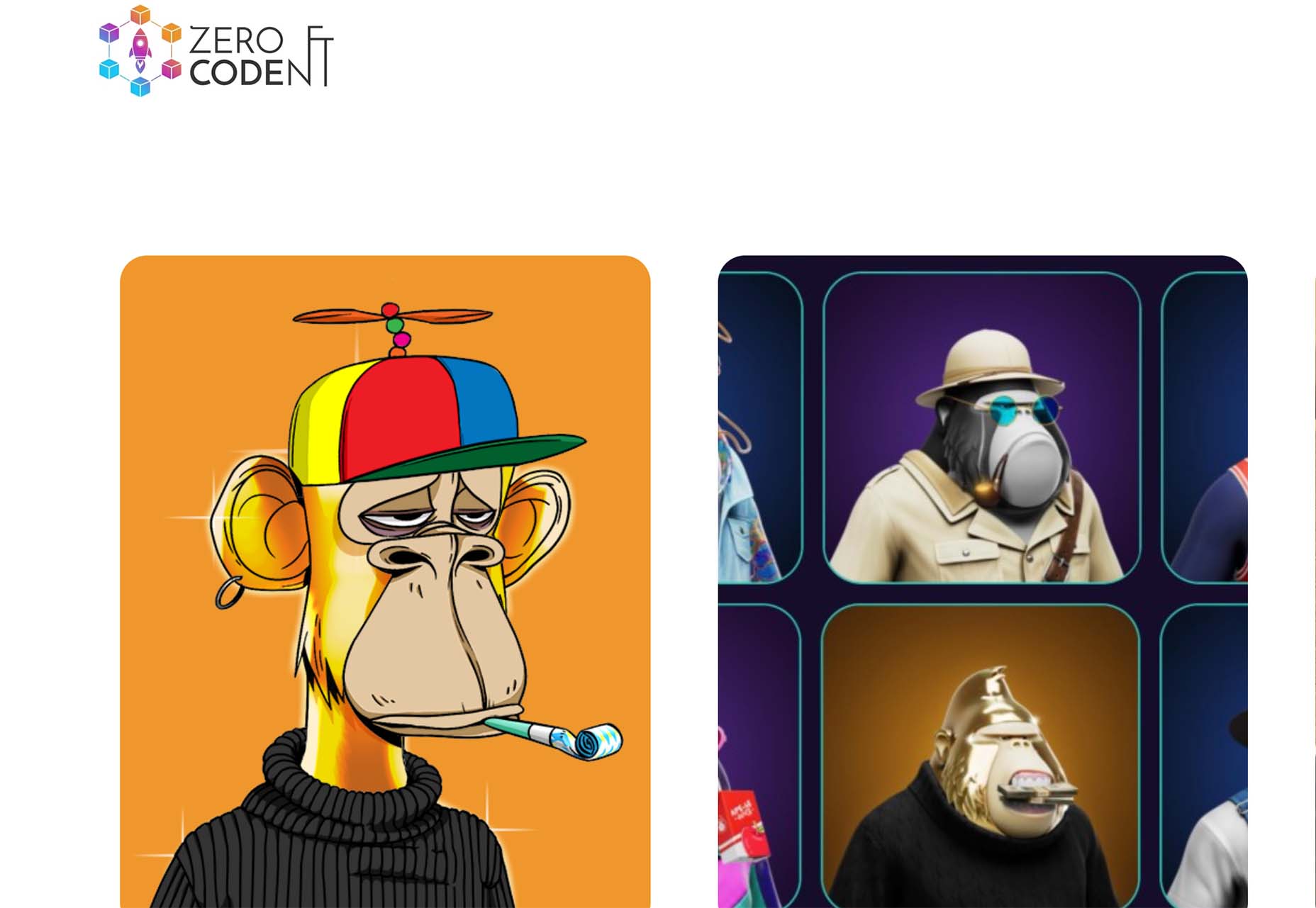


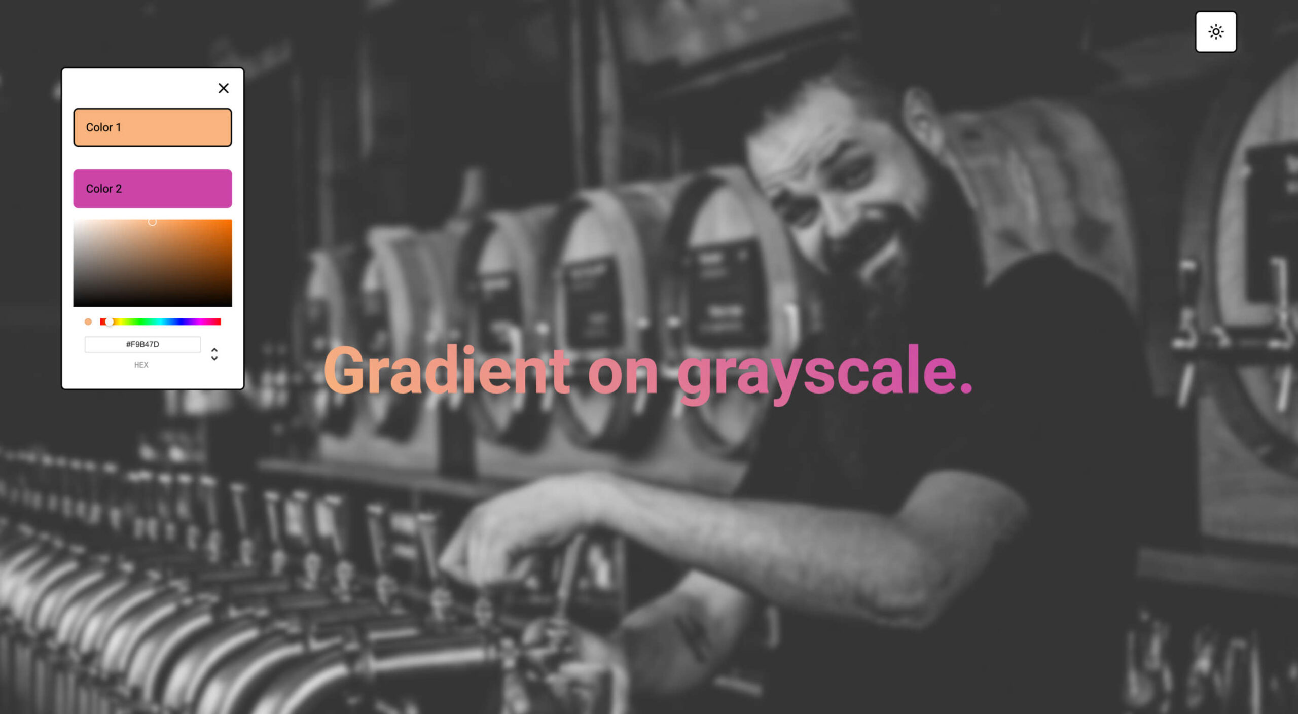
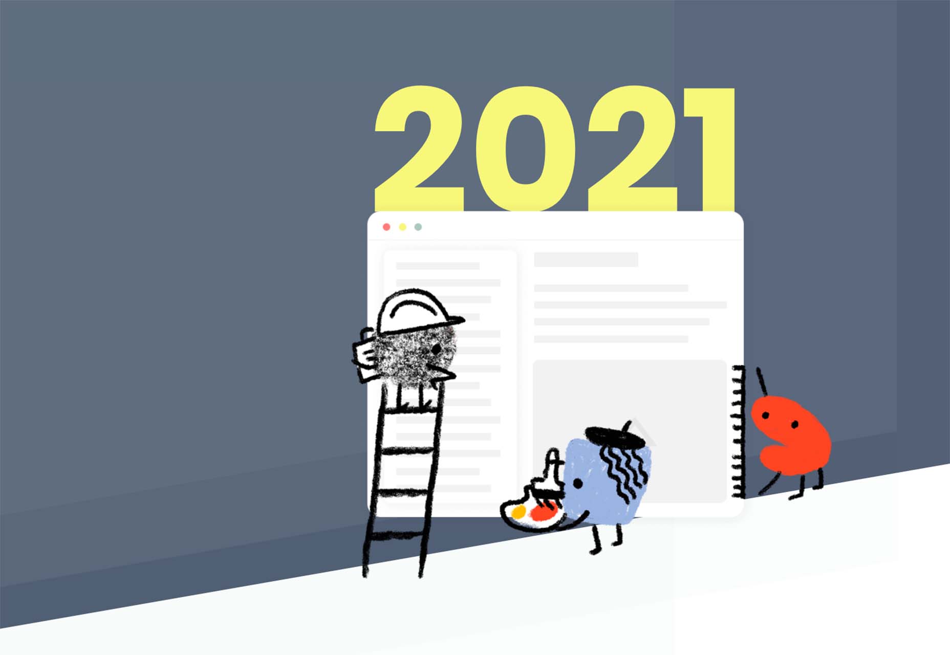
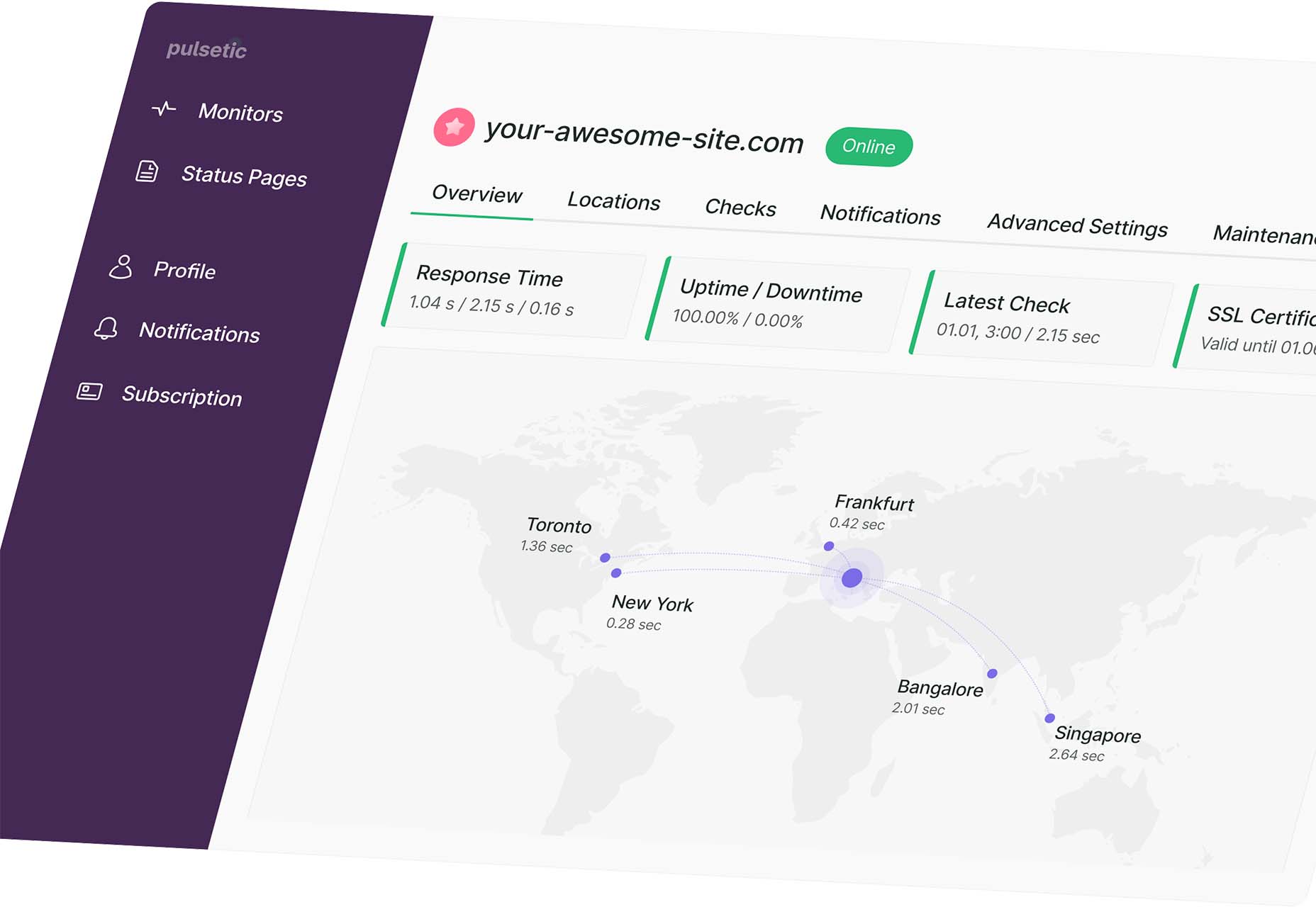
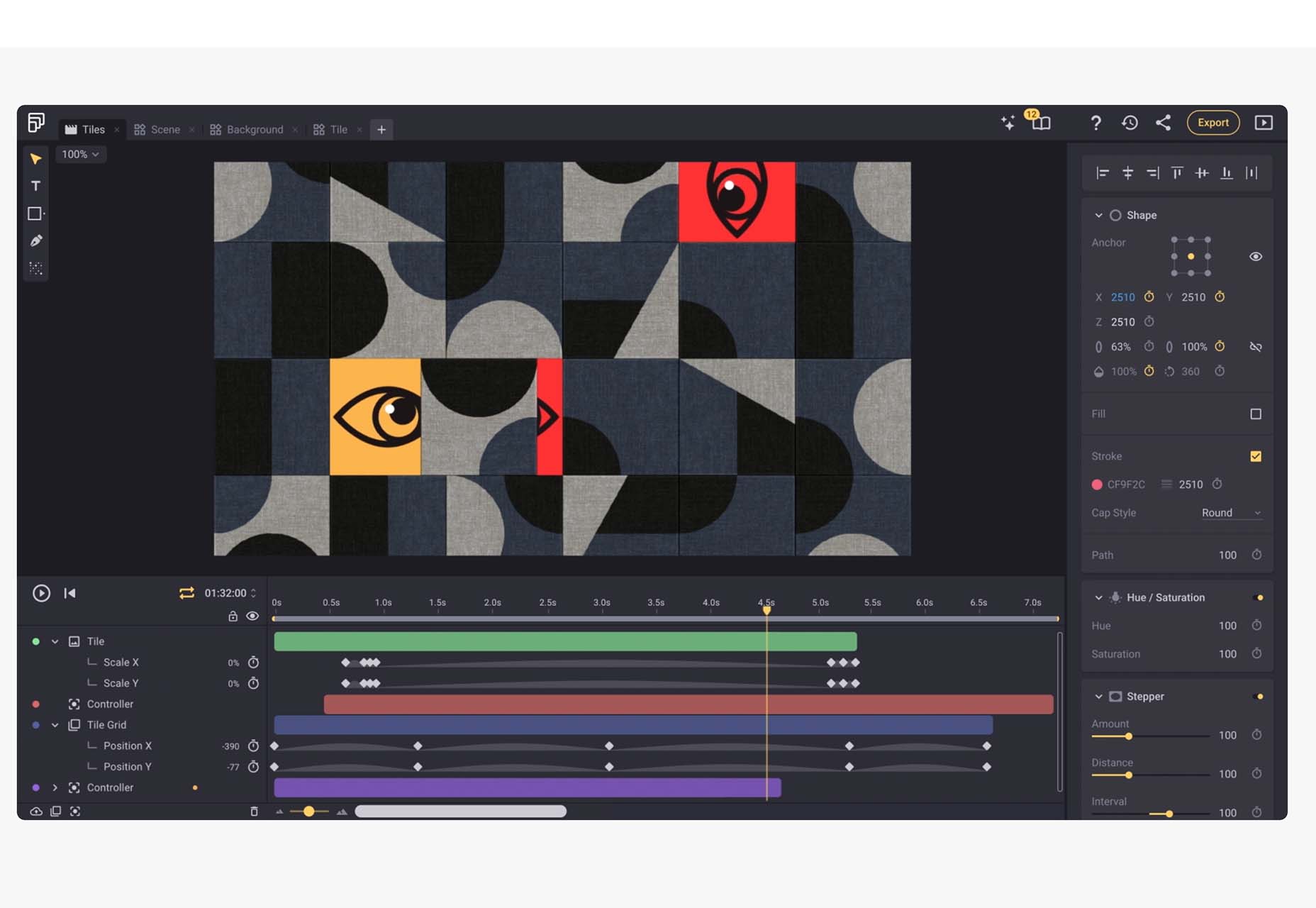
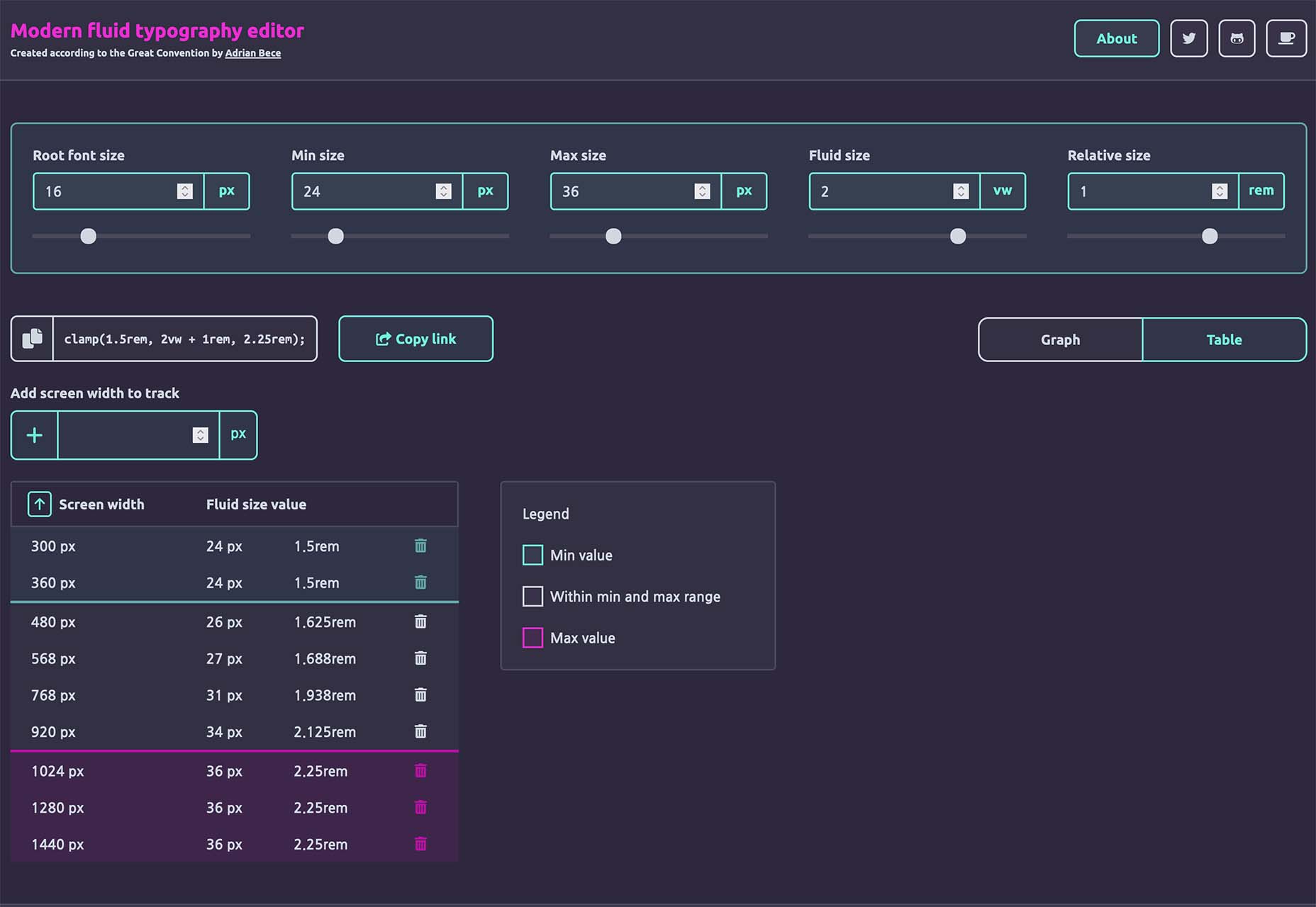
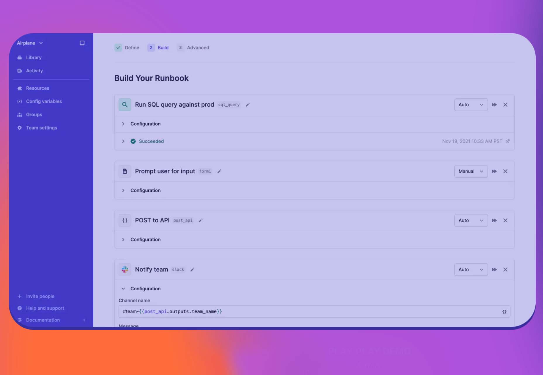
 The year’s winding down as everyone segues into a much-needed holiday R&R. But that doesn’t mean there aren’t some awesome new tools and resources for website design projects.
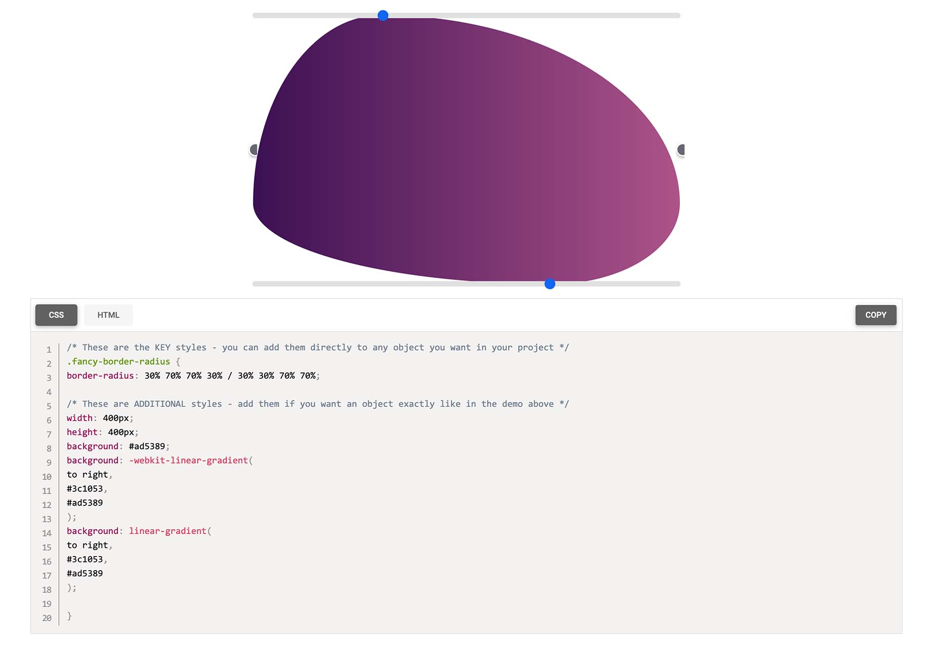
