Articles

The email channel is known for multiple advantages. It is convenient to implement practically, offers many options, and has a fantastic ROI of up to 4200%.

But we also face problems, the most disappointing of which is people ignore emails, not performing the desired action, or worst of all unsubscribing. Why does it happen?

The web is constantly progressing. It offers many tools like modern HTML template builders, ESP services, and other digital assistants that help us at all stages. But even the best tools are not enough; the secret of success still rests with us.

In this post we’ll cover the 7 cardinal sins of email marketing, to help you avoid them.

1. Being Too Late

I can define this mistake as probably the worst. It’s worse than broken links, incorrect dates, or prices. Even more harmful than ugly design.

We lose a lot when postponing email strategy implementation. Beginners often focus all their attention on the content, social media activities, SEO issues… All that is important, right. But ignoring email campaigns is a hard fail.

Thousands of visitors never come again to your website. In other words, they leave the very first levels of the marketing funnel. While regular emailing keeps them engaged and prevents churn.

So delays here are only profitable for competitors. Don’t wait until you collect “enough” contacts. Start as soon as possible. 

Frequency matters too. Don’t bomb people with emails; it annoys and causes unsubscribes. Email frequency is an individual parameter depending on many factors.

2. Disregarding Clients’ Expectations

A fundamental axiom: people unsubscribe when emails are irrelevant. The same goes for neglected expectations. Even the best content with next-gen features won’t save the situation.

I mentioned the email frequency a bit above. Notice that if you announce the weekly emails but send them every day, this is an example of ignoring expectations. Be honest with readers.

Another typical issue is off-topic. If your subscribers are waiting for content related to smartphones, send them newsletters about smartphones, not dresses or domestic turtles :)

But in some cases, getting off-topic can be good. It all depends on the target audience, actual situation, and communication style. 

3. Bad Segmentation 

Once again, relevance is vital. So we must avoid generic emails. Instead, especially if your contact list is extensive enough, apply all the possible parameters: age, gender, location, customers history, etc.

Where to get the respective data? A typical solution is to use update preferences forms in emails or on the website. Let clients choose the topics that are interesting for them.

Use surveys, sign-in forms, AI-based techniques of segmentation… Smart algorithms are great helpers that track clients’ behavior and then process the data for segmentation purposes. 

The better we know our subscribers, the deeper we segment the contact list. It allows sending precisely targeted newsletters to respective segments.

4. Insufficient Personalization 

As Hubspot stats say, personalized emails’ open rate is 26% higher, and their click-through rate is 14% better. But even besides index data, poor personalization is just nonsense today.

Clients are looking for content that matches their preferences, so marketers have to consider these expectations. Segmentation and dynamic range are essential here, but they are not the only techniques.

Everything is much more sophisticated here, in addition to personalized subjects and content. Another solution is to generate recommendations that include the previously browsed products.

AI-powered automation comes to help. Machines will upgrade the classical personalization to the next level called hyper-personalization.

5. Underestimating Mobile-Friendliness 

It’s simply unacceptable to send non-responsive emails today. With so many people opening email on different devices, this is a huge fail.

The modern world is full of gadgets and devices. Email has been opened on smartphones more frequently than on desktop PCs and notebooks in recent years. Up to 70% of readers will read messages on mobiles very soon. No wonder that responsivity turned into a mobile priority.

Regarding layout and design, there are no problems: modern template editors are featured with automated responsivity. But mobile-first means not only layout/design adjustment for mobiles, full-width buttons, or larger fonts. We have to work with content too. Don’t overwrite text remember that recipients read inbox emails on the run. 

Just imagine yourself reading emails in the cafe or cab. And ask yourself: is everything convenient? Would you take the desired action on the run?

6. Non-Professional Approach 

People are quite skeptical of new brands. We need to do our best to attract them. So everything must be done professionally.

The best solution: be a perfectionist. If newsletters look amateurish, they are likely to repel.  

Being amateurish will also ruin your brand identity and reduce customers’ trust. Pay close attention to design, stick to your corporate style, analyze each detail in the context of overall harmony.

7. Overlooking Tests and Improvements 

Testing is vital. Before sending an email campaign, check it via Litmus or Email on Acid to be sure that message looks just as planned. These tools allow testing email rendering by +90 combinations of email clients, devices, and OS.

Knowledge is power. Always try and test your marketing strategies. Are you satisfied with your actual performance? Run A/B tests and focus on the most significant wins and failures. 

Summing Up

Of course, threats are not limited to these seven failures. The last piece of advice: never ignore trends. 

Accessibility? Don’t forget about clients with special requirements. Get whitelisted and incorporate these technologies in your campaigns.

And constantly strive for perfection. With this doctrine, you’ll win!


Featured image via Pexels.

Source

The post 7 Worst Fails in Email Marketing first appeared on Webdesigner Depot.

Source de l’article sur Webdesignerdepot

User Experience (UX) design and User Interface (UI) design are two terms people sometimes mistakenly use interchangeably. While aspects of each are interconnected, there are distinct differences between UI/UX design.

According to Internet Live Stats, there are over 1.9 billion websites, but not all are active at the same time. No matter how you slice it, there’s a lot of competition to grab and keep user attention. Good UX is just part of the equation. For a genuinely stellar site, you must also offer an excellent interface.

Learning the ins and outs of good UI and UX requires a bit of knowledge of how the two differ and what works. Although they weave in and out of the same design, they are different.

What Is the Biggest Difference Between Good UX and UI?

UI is the functionality of the design and what users see. How do they interact with various elements? UX is more the way things come together — both visual and interactive features — to create a feel for the user. You can certainly see why people confuse the two as they both apply to interacting with a website or app.

Top design firms often have team members specializing in each discipline. However, UX designers are also aware of UI, and UI designers are also mindful of UX. How can you ensure you’re offering excellent UI/UX design while covering the full spectrum of requirements for each?

Ensuring Effective UX Design

Good UX design increases conversion rates by 400% or more. The site visitor walks away feeling understood and not frustrated. What are some of the most important aspects of good UX design?

1. Create a Good Structure

What is the hierarchy of your site? What is the first thing the user sees when they pull it up? How do they navigate from one page to the next? A well-designed website classifies different aspects of the page, and new content naturally falls into the appropriate category as it grows.

When creating a structure for your site, think about how it might expand in the next five years. You want the hierarchy to work from day one, but you also want to think through significant shifts in the content you might see down the road.

Even your navigational hierarchy should accommodate new areas easily. Plan for the unexpected, so you know how to work it into the overall design when you must.

2. Choose Beautiful Aesthetics

You have a few seconds to make an excellent impression on your site visitors. Take the time to make sure your design functions and is visually appealing. Your color palette should work, images should be crisp and relevant, and typography should be readable and engaging.

Step back from your computer and look at your design from a distance. Does anything stand out that isn’t pleasing to the eye? Get feedback from visitors about what they like and dislike. Since the focus is on user experience, your best source of constructive criticism is from your target audience. Listen to their concerns and ideas.

3. Communicate With Site Visitors

Most experts agree that users want an element of interactivity on sites and apps. People want to know you hear them and get a response. Some ideas include adding a live chat option to your site or engaging in SMS customer support.

Put yourself in their shoes. A customer may visit your site for the first time, having never heard of your brand. They have no reason to trust you or that you’ll follow through on your promises. Potential leads may have a few questions before parting with their hard-earned dollars.

Adding various ways to communicate shows them you’ll be there should they have a problem. It’s much easier to trust a company when you know you can phone, engage in live chat or shoot off an email and get an almost immediate response.

4. Add Clear Direction

Excellent UX is intuitive. You should add calls to action (CTAs) and images pointing the user where they should go next. You can use graphics of arrows, people looking or pointing toward the next step, words, or CTA buttons.

Get feedback on how clear the directions are and tweak them as needed. The user should never have to stop and ponder what to do next. Everything on the page should guide them toward the ultimate goal.

5. Break Down Complex Data

Every industry has complicated data that is difficult for non-experts to understand. Part of good UX is breaking down complex information and sharing it in a simplified way.

One example might be the registration process. Instead of just showing text, a good UX designer would number the steps. Visualizations help add to understanding.

Embracing Effective UI Design

User Interface impacts UX and involves how the design works. The UI designer thinks through visitor expectations and then creates an interface that isn’t frustrating. UI works within the framework of a website to develop functional features. User experience isn’t the complete focus of UI, but it does tie into the planning phases. What are some elements of good UI design?

1. Set Standards

For a design to have good UI, it must perform as expected. Have you ever clicked on a button, and nothing happened? Determine how you want things to work and the minimum acceptable standards for your site.

For example, what happens when someone clicks on a link or button? How does the user know their action created the expected result? Consistency is crucial to how a site performs.

2. Choose the Right Colors

While UX designers look at the emotional impact of various colors, UI designers look at whether the shades match branding and how well the different ones contrast for readability and usability. UI/UX design often bridges a single designer’s work, so the employee ensures everything works as intended, both emotionally and functionally.

You may work with another designer to make the site aesthetically pleasing while also tapping into the emotions driving users. For example, some people love blue, so a blue button can have positive results.

UX and UI designers utilize split testing to see which users respond best to. Then, make adjustments as indicated by how site visitors respond.

3. Focus on Cognitive Matters

According to the Interaction Design Foundation, people can only retain around five things in their short-term memory. Designers should work with recognition instead, as users tend to rely on cues to find what they need.

UI designers may develop an intuitive navigation system and then use the same cues on every page, such as placement, color, and language. Users can then recognize the system without having to memorize it.

4. Prevent Errors

Your job is to ensure errors are kept to a minimum when designing a website or app. One of the most significant parts of a designer’s job is testing and retesting.

Think about all the potential problems a user might run into, such as broken links, images not showing, or incomplete actions. How can you keep those problems from occurring in the first place?

Error prevention is particularly vital when designing software as a service (SaaS) or apps. Users grow frustrated quickly and will find another solution rather than troubleshooting an issue. You’re much better off avoiding the error in the first place.

How Do UX and UI Work Together?

You’ve likely already figured out how closely UX and UI entwine to create a usable experience. The UX designer pays attention to function and interactivity, and the UI designer thinks through how the interface looks.

UX pays attention to the flow of the website and where users start, go next and end up. On the other end, UI figures out how the elements look to the viewer and where everything is placed.

The UX team may decide to add an extra button to the page. The UI team must determine where to place it, if any sizing needs must occur, and how it impacts usability on desktop and mobile devices.

Although each has a different function, user experience and user interface must work together to create a usable site the target audience responds to. You can’t have excellent UX without excellent UI, and vice versa. The best designers consider both and implement them to their fullest potential.


Featured image via Pexels.

Source

The post What’s the Difference Between Good UI and Good UX? first appeared on Webdesigner Depot.

Source de l’article sur Webdesignerdepot

Few things are more important to a web designer or developer’s chances of success than having the proper workflow. The term “workflow” applies to the set of standardized steps you or your company uses to create, test, and deploy designs or products.

Over the years, as development processes have evolved, so too have the workflows experts use to bring their ideas to life. The MVP workflow, or “Minimum Viable Product” strategy, is one of the most popular options in 2022.

Here’s what you need to know about the MVP workflow and how it differs from some of the other standard workflows developers may be used to.

What is the Designer/Developer Workflow?

As mentioned above, the designer/developer workflow is a series of steps used by experts in the web design world to achieve a creative goal. The process includes the steps taken to start a project, evolve it, and finish it. Since software is never developed without tools, the technology you’ll access throughout the development process is also considered in most workflows.

An example of a standard development workflow might look like this:

  • Scaffolding: This is the stage wherein you start your new web project, creating a git repo, downloading libraries, preparing file structures, and completing other tasks to make sure your product is ready to roll out into the world.
  • Develop: This is where you’ll spend most of your time writing code for your application or website. The development process may include various specific tools and support from other staff members.
  • Test: In this stage, you examine the functionality of your code to determine if everything works as it should. If there are errors or issues, you can go back and develop fixes to the potential problems. Your code may go through the development/test process several times before you can move to the next stage.
  • Integrate: This is when you merge the code for your part of the development process with the rest of the team. You can also integrate your code into websites and existing apps at this point. If you’re working solo, you can skip this process.
  • Optimize: You prepare all your assets for use on a production server during the optimization stage. Files are generally optimized to ensure your visitors can view your site easily or access your applications with ease.
  • Deploy: In the deployment stage, developers push code and assets up into the server and allow for changes to be viewed by the public.

What is MVP? (Minimum Viable Product)

Now you know what a developer workflow looks like, you can begin to assess the concept of the “MVP” workflow. The term “MVP” stands for Minimum Viable Product.

The idea of “Minimum Viable Product” applies to a range of industries, from education to healthcare and government entities. This term comes from lean start-up practices and focuses heavily on the value of learning and changing during the development process.

When you adapt your workflow to focus on an MVP, you’re essentially adjusting your focus to a point where you can create a stripped-back version of something new – like an app or a website. The MVP is built just with the core features (the minimum), so you can bring the idea to market and test it as quickly as possible.

For instance, if your goal were to create an attractive new website for a client, an MVP would focus on implementing the crucial initial tools, and nothing else. While you may create checkout pages, product pages, and other aspects of the site, you wouldn’t populate it with content or start experimenting with bonus widgets and apps.

So, how does this offer a better alternative to the standard workflow?

Simply put, an MVP workflow is quick, agile, and easy. The idea is you can validate key concepts with speed, fail quickly, and learn just as fast. Rather than having to build an entire app and almost start over from scratch every time you find an error, you can race through the iteration and development process.

MVP workflows are also highly appealing to start-ups and entrepreneurs hoping to validate ideas without a massive amount of upfront investment.

Examples of MVP Workflows

Still confused? The easiest way to understand how an MVP workflow works is to look at an example.

Let’s start with a conceptual example. Say you were building a voice transcription service for businesses. The desired features of this product might include the ability to download transcription, translate them into different languages, and integrate them into AI analytics tools.

However, using the MVP approach, you wouldn’t try to accomplish all of your goals with your software at once. Instead, you’d focus on something simple first – like the ability to download the transcripts. Once you confirm you can do that, you can start a new workflow for the next most important feature for the app.

One excellent example of a company with an MVP approach is Airbnb. The entrepreneurs behind this unicorn company, Joe Gebbia and Brian Chesky, didn’t have a lot of cash to build a business with at first. They had to use their own apartment to validate the idea of creating a website where people could share their available “space” in a home or apartment with the public.

To begin, Airbnb only created a very basic website, published photos of their property, and waited to see the results. After discovering people were genuinely interested in renting another person’s home, the company was able to begin experimenting with new ideas to make a site where people could list their properties for travelers.

The Pros and Cons of an MVP Workflow

There are a lot of benefits to the MVP workflow – particularly when it comes to gaining agility and developing new products quickly. However, there are downsides too.

Pros

  • With an MVP approach, you can maximize your learning opportunities and create a more innovative, successful product at speed. You get to test every step of the way.
  • You release iterations or versions of your product quickly, which means you discover problems faster, allowing you to quickly solve these issues.
  • You build on the benefits of customer fans, “evangelists” in the marketplace who are keen to help your product or service grow.
  • An MVP gives you more freedom to try out unique ideas and “risks” you might otherwise avoid with a traditional workflow.
  • Because you’re focusing on creating only the “minimum viable product,” you don’t have to spend a fortune on initially setting up your workflows.

Cons

  • Agile work with an MVP flow requires a lot of effort in collecting constant feedback from customers and releasing iterations.
  • You’ll need to dedicate yourself to releasing many small and frequent product releases on a tight schedule.
  • You might have to revise the functionality of your product or app a number of times.

Creating Your MVP Workflow

If you believe an MVP workflow might be effective for you, the first step is defining your “Minimum Viable Product.” The app, website, or product you design needs to align with your team’s strategic goals, so think about what your company is trying to achieve at this moment – before you get started. If you have limited resources, or specific purposes, like improving your reputation as a reliable company, now might not be the right time to develop a new MVP.

Ask what purpose your minimum viable product will serve and what kind of market you’re going to be targeting. You’ll need to know your target customer to help you test the quality and performance of each iteration of your MVP. Once you know what your ideal “product” is, ask yourself what the most important features will be.

You can base these decisions on things like:

  • User research
  • Competitive analysis
  • Feedback from your audience

For example, if you’re producing an AI chatbot that helps companies to sort through customer inquiries, the most important “initial feature” may be the ability to integrate that bot into existing websites and apps owned by the company.

MVP Approach Guidelines

Once you have your hierarchy of most valuable features for your minimum viable product, you can translate this into an action plan for development. Remember, although you’re focusing on the “minimum” in development, your product still needs to be “viable.” In other words, it still needs to allow your customer to achieve a specific goal.

  • Review your features: Reviewing your prioritized product requirements and the minimum level of functionality you can deliver with each of these “features.” You need to ensure you’re still providing value to your customer with anything you produce.
  • Build your solution: Build your minimum set of features for the product or service. Remember to build only what is required. You can use methodologies like the agile or waterfall method to help guide your team during this process.
  • Validate your solution: Release your offering into the market, and ensure you have tools in place to gather feedback from early adopters. Use beta programs, focus groups, and market interviews to understand how your solution works for your customers and where you can improve on your current offer.
  • Release new iterations: Based on what you learn from your target audience, release improvements to your product quickly. Use your validation strategies to collect information from your audience with each release.
  • Review again: Go back to your product requirements and desired features and start the process over again, this time focusing on the next most valuable functionality. Over time, the value of your minimum viable product will increase.

Using the MVP Workflow Approach

While the MVP workflow approach might not be the right solution for every development or design team, it can work very effectively in the right circumstances. The MVP approach doesn’t minimize the importance of understanding market problems and delivering value. Instead, the focus is on delivering quick value that gradually increases and evolves over time.

As many developers and designers know, the most useful form of product validation in most cases is real-world validation. When your customers have had an opportunity to use a product on a day-to-day basis, they can provide much more effective feedback.

Just keep in mind that committing to the MVP approach also means changing your workflow and committing to iterations – otherwise, other features may never be completed. You’ll need to be willing to work quickly and in small bursts without getting too heavily caught up in one feature or functionality.


Featured image via Pexels.

Source

The post How to Get Started with the MVP Workflow first appeared on Webdesigner Depot.

Source de l’article sur Webdesignerdepot

Picture a dark office, blinds drawn. Picture a UX designer smoking a cigar. See the light filtered through the smoke whipped to fog by a spinning ceiling fan. Watch as the UX designer sits at a desk and considers the website.

The UX designer has devised a series of tests to determine if a green button is better than a red button. One of them involves tipping a tortoise onto its back. He looks the website over carefully and says, “Describe in single words, only the good things that come to mind about your mother.”

The website pauses, sweating under pressure, then replies, “Let me tell you about my mother…”

BLAM! The website pulls the trigger of an unseen gun, and the UX designer collapses, leaving the project to be rebuilt from scratch in Material by Harrison Ford, with overuse of Post-its delegated to Edward James Olmos.

Who Does UX Testing Actually Serve?

In the past’s bleak dystopian future (1982’s Blade Runner was set in 2019) no one benefitted from asking the wrong questions. And little has changed.

Designing any test to verify UX is fraught with as many complications as administering the test. Questions are skewed by bias, conscious or otherwise, and competing agendas. Even with something as apparently simple as a split test, the potential for distortion is immense.

When planned by a designer, a UX test offers little benefit to a client; the benefit is to the designer, who can then say their ideas are validated (or not).

Imagine hiring a developer to code a website, only to discover that the developer didn’t know CSS and expected to be paid to learn it before completing the work. You would hire someone else because that developer isn’t qualified.

From a client’s perspective, a UX designer should know, through experience, whether a green button is better than a red button. Designing an elaborate test to split-test the button color serves little purpose other than indemnifying the designer against mistakes.

The ROI of UX Testing

It’s widely accepted that there is substantial ROI (Return On Investment) from UX testing. We’ve all heard apocryphal stories about sites that split-tested their checkout and improved retention by 5%.

I’m going to go out on a limb and say that without user testing, that site could have improved its checkout retention by 4.9% simply by hiring a competent, experienced designer. But what about the remaining 0.1%? Well, for most sites, 0.1% represents very little profit. And the cost of recovering it via testing far exceeds the benefits.

When a company the size of Amazon, Netflix, Spotify, or Google split tests a website, it can afford to allocate $25k for user testing because it stands to gain 0.1%, and that represents far more than $25k. To meet the same 0.1% improvement, a small business has to design and run the same tests, incurring the same costs. But in the case of a small business, $25k could eat up all of its profits.

UX testing almost always works. But it is only profitable at scale.

If a good UI designer with a grounding in UX can improve checkout retention by 4.9%, tripling the project budget for just 0.1% more is a tough sell. Bluntly, that $25k is better spent on advertising.

What UX Designers Can Learn From Psychiatry

We all have the tendency to think we’re unique. It’s a survival trait attributed to our prehistoric brain. That belief in uniqueness is particularly strong in highly competitive people. We all think our site, our side-project, our approach are original. And we’re all wrong.

When a psychiatrist sits down with a patient, they have two immediate goals: categorize that patient into an established diagnosis, and assess the severity of the condition. It may be that the patient is depressed or anxious or even suffering from a potentially more debilitating condition like schizophrenia. What the psychiatrist is not trying to do, is define a new illness.

Occasionally — perhaps once per decade — a genuinely unusual patient will present themselves, and a new form of illness is considered. New treatments are found and tested. These treatments are rarely developed on behalf of individual patients; doctors work with grants from governments, medical schools, or the pharmaceutical industry and publish their results.

The vast majority of websites face similar problems. They deal with similar demographics, work within a similar culture, and deal with similar technology. As such, they can be categorized in the same manner a psychiatrist categorizes patients.

The key to delivering successful UX solutions is not UX testing in individual cases, but rather UX research, examining similar projects, and cribbing their solutions. If you categorize a project accurately, you’ll find a solution readily available.

Replacing User Testing With UX Best Practices

Your client doesn’t need to pay for UX testing to benefit from it. Enterprise sites, government sites, and even personal projects will test UX patterns. Sites like Shopify or Stripe will user-test their checkout processes at scale and enable companies to benefit from the results by adopting their platforms.

If you’re currently testing designs for small business, one of two things is true: either you’re wasting your client’s money investigating a problem someone else has already solved, or you’re designing something so original that it has no precedent (and you probably shouldn’t be).

Designers should be opinionated. Designers should know UX best practices and how they apply to a range of scenarios. Designers should be capable of making an educated guess. Designers should be self-validating.

Once or twice in your career, you may find a legitimate need to test something. However, the vast majority of the time, the correct answer is to tip the tortoise back onto its feet and choose whichever color button has the higher contrast.

Featured image: Still of Brion James in Blade Runner. Copyright Warner Bros. Entertainment

Source

The post The Case Against UX Testing first appeared on Webdesigner Depot.

Source de l’article sur Webdesignerdepot


A Short Background

I characterize myself as a slothful engineer due to the specificity of my behavior: rather than duplicating, mentioning different issues in my project, and setting up new appliances to be more efficient, I would be grateful for the opportunity and get back on my way.

My first job as a professional started in the entertainment industry where I had to do my projects really quickly before the deadline was over; moreover, it was not possible to use high-end tools or spend a lot of time researching and integrating peculiar properties. That is the reason why I decided to spend some overtime hours researching and showing my teammates how a few specific tools could improve the process, and show how to have a greater impact in solving technical problems.

Source de l’article sur DZONE

Maps are a fascinating method for delivering content. At their best, they can create an intuitive way of presenting information and interacting with it. This is the advantage that digital maps, through mobile apps and websites, have over print maps and images where no interactivity is possible.

But it’s important to understand that more data ≠ better experiences. We all now have so much data available to us through multiple services that, arguably, the greatest challenge isn’t sourcing information but filtering it out. We can only handle so much information input before we become overloaded. This issue risks being omnipresent with maps. There are so many potential points of interest on a map that it’s essential to be clear about what needs to be exposed to users.

Also, UX design, map design, and user interface are all critical. While maps can be a powerful way of drawing people in, if end-users feel that you didn’t even consider the visual design, they’ll ‘bounce off’ your site or app in moments.

Common Use Cases

When are maps useful, and what problems do they solve? Let’s dive right into the most common use cases for maps used in web design.

Navigation and Direction

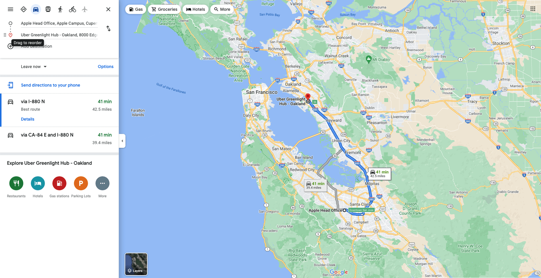
Like Google Maps shows, navigation and direction are arguably the classic case study for interactive maps. You are in one place and need to get to another. You can enter your destination, your current location, and the map will present suggestions for getting there. You can select the method of travel and adjust desired departure or arrival times. But you need to understand first what functionality your users need. How these options are exposed to users is a critical piece of UX design.

Also, if users are searching for options such as somewhere to eat, it’s not so straightforward. Then, how your map handles panning in real-time as users swipe around a city is going to be a big issue.

Showing Relationships and Trends Geographically

This is something that you’ll see in every election in any western country. We’re all used to seeing maps that give us a state-of-play for which state or seat is held by which party. Then, we might see projections based on voter intentions and projected voting swings deriving from that. Then, exit poll data can be projected with the map updated on an ongoing basis until the final result is confirmed.

The capability to do this is essential because if a static map were used, it’d be out of date any time a new poll was released. Also, voting intentions can change over a campaign, so such maps need to be dynamic. Of course, such maps are only as accurate as the available data, as the US 2016 election map showed.

Show Points of Interest

As mentioned previously, there’s a lot of data that can be exposed to map users. However, that doesn’t automatically mean that it should be. Usability is key. For example, when you look at a map, you’ll typically first see key points of interest. Which points of interest are going to be presented to you can vary.

One variant is zoom level. If your map is currently showing an entire city, the level of detail the map presents is deliberately limited. You’ll see districts, large roads, or geographic features such as rivers. If more detailed information were presented, users on mobile devices, in particular, would be overwhelmed. Even at this level, you’ll notice typography differences. These can include the city name being in bold or the names of different areas in capital letters. So the level of detail is coupled with the scale of the map. Zooming in a few notches will expose significant points of interest, such as museums. Zooming in to specific districts will reveal restaurants, coffee shops, and universities. This visual hierarchy is a critical way of managing the exposed level of information.

But information is still being abstracted away. It’s not until you tap on the museum that you’ll see information on opening hours and busy times. This is also typically presented with user photos and reviews. Context is also taken into account, so you’ll start to see local hotels and restaurants. So it’s not just individual points of interest that are important, but the connections between them.

6 Tips For Improving Interactive Maps

What are the challenges of creating effective maps, and how do people address the data overload problem? We’ll answer this question and go over the must-know aspects of map creation.

1. Ensure Security and Brand Trust

GDPR or General Data Protection Regulation. This is a critically important European law that extends a wide range of legal protection to European citizens regarding personal data. It’s not possible here to cover the full extent of the law, but here are some quick key points:

  • Consent is required for the processing of personal data; it cannot be assumed
  • You need to have a retention policy for information that’s capable of identifying people

Be aware that the latter doesn’t just cover commercial purposes. Research students have to submit GDPR forms that address what kind of data they’re sourcing and how they’ll be retaining it.

But the most crucial context is commercial. If a business suffers a data breach, it can be fined up to 20 million euros or 4% of annual worldwide turnover in the preceding financial year, whichever is greater. Therefore, any business storing data that could identify their customers will need to assess risk and compliance. Remember: it’s 4% of worldwide turnover, not EU turnover.

Also, anything of your business that you expose to your customers or users is an extension of your brand. Therefore, you need to assess your maps for brand compliance too. If you have primary brand colors and your map doesn’t abide by them, that’s a very poor look. Source the color hex codes directly from your brand team and involve them in design.

2. Use the Appropriate Type of Map

It’s also important to consider what type of map is most appropriate for your use case. Think carefully about what your users need, what you’re trying to communicate, what information you need to present, and how best to present it.

For example, points of interest style maps in a tourist app will be way more helpful than heat maps: people want to know where something is, key data like opening hours, and how to get there. A heat map showing the number of visitors to each attraction or area of a city is unlikely to be useful to tourists. However, it could be useful to the attractions themselves to map their visitors by heat map over time. This could help larger museums chart which exhibits are most popular.

Transport for London is charting passenger movement on the London Underground by detecting when a device with Wi-Fi comes into range and then passes out of range. They’re using this to understand overall user journeys and movements within individual stations to better manage disruptions.

3. Avoid Pop-Ups

It should go without saying by now that auto pop-ups are despised. It doesn’t matter what they’re doing or what they’re offering; an unwanted pop-up can only get in the way. The level of impact is even greater on a phone where pop-ups take up even more screen space.

Given this, many users close them without even reading them. So if you’re using pop-ups, don’t kid yourself. You’re likely just irritating users and increasing the likelihood that they’ll ‘bounce off’ or uninstall.

4. Avoid Auto-Geolocation

Auto-geolocation sounds incredibly convenient but can result in some real problems. For example, if there are any bugs with auto-geolocation, you could get false results. If someone connects through public building Wi-Fi, you could get false results. If they’re connecting through a VPN then, unless you get the user’s IP address and check if it’s the exit portal of a VPN, you could get false results.

The problem is most significant with mobile maps. If a map user is looking at a points of interest map, they likely have a specific and immediate use. This means it’s in their best to get the most accurate results possible. So why not just ask them?

Precision and Accuracy

These terms have specific meanings in geolocation. ‘Precision’ is the exactness of the data. ‘Accuracy’ is how closely the information on a map matches the real world. So you want precision and accuracy to be spot on, or data risks losing value. This applies not just to the gathering of data but to the representation of it. For example, if you have street-level data but your maps don’t present individual streets, then any representation of data on that map is likely to have poor accuracy. That map might succeed in abstracting irrelevant information but presenting an imprecise and inaccurate view.

5. Avoid Map Legends as Much as Possible

In many cases, primarily points-of-interest maps, they’re just not needed anymore. An essential part of user experience design isn’t just visual hierarchy but information hierarchy. You can mouse over on a desktop or laptop to get the essentials of a location, e.g., the museum’s name and its opening hours. On a mobile device, you can tap on that location to get the essentials, and you can tap on another location to move on; you don’t even have to press back. Given that, a legend would get in the way. So this simple piece of information design solves information overload issues.

As with all rules, there are exceptions. A good one is a heat map where a density of what’s being measured needs to be communicated. It doesn’t matter what the data is; it just needs to be something where mapping provides greater insight, especially if it informs decision-making. Sales is an excellent example for a national or multinational company. Of course, weather forecasting can make use of literal heat maps.

6. Accessibility Compliance

Not everyone has perfect eyesight. Even if someone has excellent vision, they could still be colorblind (8% of men and 0.5% of women are). Given that, take the W3C’s accessibility standards into account and treat them as a baseline or minimum barrier to entry for compliance. You shouldn’t feel good about the possibility of excluding 8% of your potential audience or customers. Ensure you keep your UX designers involved and don’t shy away from creating senior-friendly web designs.

Put simply: imagine if you could appeal to a new demographic that’s not catered to. If your competitors ignore them, you could give them a real reason to choose you instead by taking some straightforward steps. If your competitors are catering to them, you also need to. If you don’t, you’re just giving potential customers a big reason to ignore you.

Conclusions

The key takeaway is that there’s far more to creating good maps than just good cartography. That can be critical, too, though this may vary depending on the use case.

This will be a team effort because your map will involve data sets, design decisions, and, yes, cartography. You’re going to need to involve brand and IT too. So think about design principles and development methodologies.

First and foremost, what are your users’ needs? If you haven’t done any user research or taken the time to understand the customer journey, are you adding anything or getting in the way? It’s easy to see the department that requested the map as stakeholders, but you should probably view your users as stakeholders too.

This sounds complex, but as you hopefully now appreciate, a map is probably more complicated than you thought.


Featured image via Pexels.

Source

The post The UX of Maps in Web Design first appeared on Webdesigner Depot.

Source de l’article sur Webdesignerdepot

Modern data-driven applications are based on various data sources and complex data stacks that require well-designed frameworks to deliver operational efficiency and business insights. Data pipelines allow organizations to automate information extraction from distributed sources while consolidating data into high-performance storage for centralized access. In this Refcard, we delve into the fundamentals of a data pipeline and the problems it solves for modern enterprises, along with its benefits and challenges.
Source de l’article sur DZONE

Message and Event payload validation has been a rather thorny problem ever since extensible data structures (XML, JSON, YAML…) started to be used at scale. In fact, very little progress has been made since the good old days of DTDs. Schema definition languages such as XML-schema, json-schema, or even the OpenAPI schema are unfamiliar to most developers and often result in a rather anemic validation set of rules, leading to a perceived low value, and therefore a lack of interest. 

There are three key problems in a schema architecture: 

Source de l’article sur DZONE

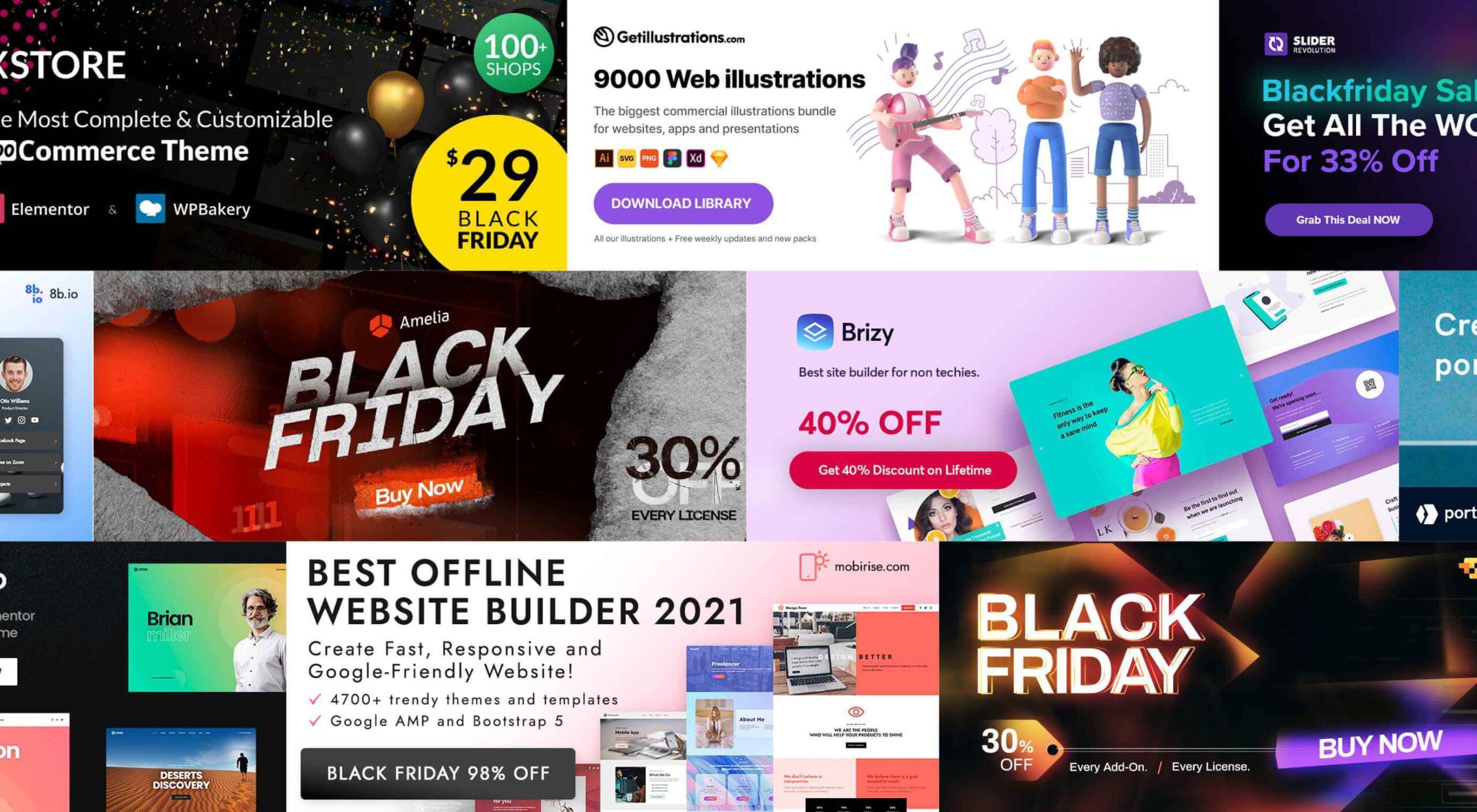
It’s that time again. Black Friday. November 26, to be exact. And the many enticing deals you’ve been looking forward to at this time of the year are here as well.
There are three types of Black Friday shoppers. Those who are successful because they have prepared. Those who are successful because they got lucky. And, those who let some good deals simply slip away.

Your best bet, of course, is to be prepared, which is the purpose of this guide.

As you go down this list, you’ll find discounts, some pretty amazing offers, a few surprises perhaps – and plenty of inspiration.

We’ve been keeping close tabs on the various Black Friday discounts and promotions, and we’ve corralled the best of the bunch for you.

Starting with:

1. Brizy – The No-Code Website Builder For Non-Techies

Brizy is a fast and easy-to-use website builder for designers and agencies. Take advantage of Brizy’s Black Friday special and tap into the skills of a team that has been creating website-building tools for over 11 years.

This premier website builder gets better with each update.

  • Web designers can choose between Brizy for WordPress and the Brizy Cloud website builder, which includes hosting;
  • Agencies can choose among several white-label options;
  • Brizy brings power to the novice; use the pre-made designs or start with a blank page and let the imagination be the guide.

Black Friday is a time to take advantage of great deals, and this year is no different.

  • Big discounts are available on Brizy’s white label agency plans;
  • Participate at no cost to win a MacBook PRO;
  • Partner perks and discounts;
  • And exclusive new designs.

Design or coding experience is not a requirement to use Brizy’s drag and drop visual builder.

Click on the banner to take advantage of these great Black Friday specials.

2. Portfoliobox

A 50% discount on any portfolio website builder would seem like a good deal. On the other hand, getting one at 50% off that enables you to quickly create a portfolio website that reflects your creative personality and will truly set you apart from the crowd is definitely worth taking advantage of.

Portfoliobox offers:

  • Mix and match templates to help achieve a unique look;
  • Powerful eCommerce functionality built right into the platform;
  • Safe and secure private client galleries;
  • An included Domain (custom domain with Pro plans);
  • Fantastic 24/7 support to keep problems to a minimum;
  • Affordable, transparent pricing plans that let you know what you are getting before you buy.

Click on the banner to find out more about this fast, affordable, and easy to work with a portfolio website builder for creatives.

3. wpDataTables

wpDataTables is a popular, power-packed plugin that can manage vast amounts of data in seconds and organize it to build a table or chart the way you want.

  • wpDataTables and charts are responsive, customizable, and easy to edit and maintain;
  • wpDataTables readily accepts data from a variety of data sources, from multiple database connections, and in the most used formats;
  • Tables and charts can be configured to nicely blend in with other website content and a website’s overall design, plus it is easy to add spice to a table or chart by using colors, adjusting font sizes, and highlighting key data using conditional formatting.

wpDataTables features Elementor and Gutenberg integration, provides the ability to connect WordPress tables with Google API, allows cascade data filtering, and much more.

Click on the banner to take advantage of the 30% off Black Friday special.

4. Amelia WordPress Booking Plugin

Amelia can be a genuine time and money saver for a variety of business types. Amelia automates and streamlines a business’s booking process.

  • Amelia relieves business owners and managers from the task of managing multiple appointments and events;
  • Clients and customers love the ability to make and manage their appointments 24/7;
  • Bookings and events are managed from a single platform, even when multiple locations are involved.

Annual and lifetime subscriptions are available.

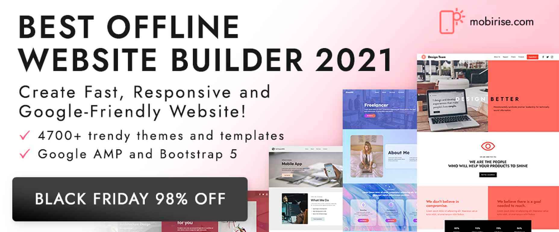
5. Mobirise Free Website Builder

As it is an offline builder, Mobirise does not tie you to any platform, you can host it anywhere, and you have total control over creating the website you have in mind.

Mobirise:

  • is drag and drop and easy and simple use;
  • is based on the latest Google AMP or Bootstrap 5, so your site will be mobile-friendly and crazy fast;
  • comes with eCommerce, huge selections of themes, blocks and templates, and a shopping cart.

Mobirise is free for both personal and commercial use.

6. Slider Revolution

There is a difference between an “interesting” website and one whose WOW effects cause it to stand far above the competition.

Slider Revolution specializes in WOW effects that can take any website to the next level, and it can be yours on Black Friday at a 33% discount on all licenses.

The Slider Revolution package includes:

  • Innovative templates and add-ons;
  • Advanced automation and special effects tools.

Grab the Black Friday offer now.

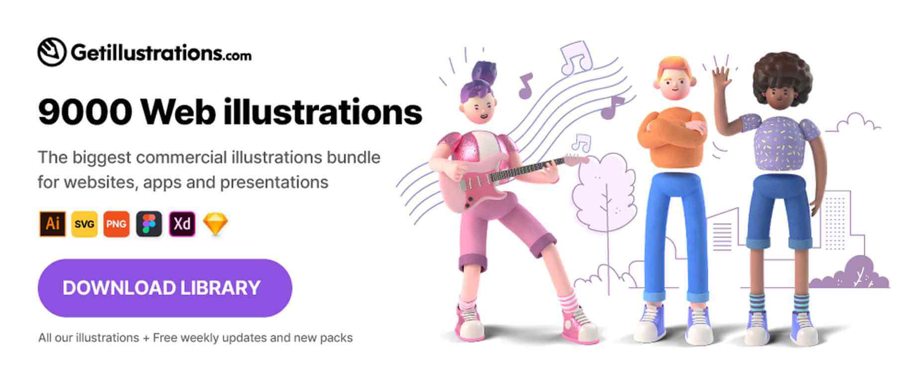
7. Getillustrations Bundle – Commercial illustrations for the web

Digital illustrations help attract attention to and pique interest in your website.

Getillustrations.com features a package of more than 9000 commercial web and app illustrations in a wide range of topics.

  • This package features all the design formats you’re likely to need, e.g., Ai, SVG, PNG, Figma, Sketch, and more;
  • Great illustrations to spice up landing pages are included.

The package is available at a 25% discount. Use coupon code EliteDesingers25.

8. Litho – Multipurpose Elementor WordPress Theme

Litho is a creative, modern, and highly customizable theme that can be used for any type of business niche as well as for creating eCommerce, blog, and portfolio websites.

This multipurpose Elementor WordPress theme’s features include –

  • 36+ ready home pages, 200+ creative elements, and a 300+ template library;
  • One-click demo import;
  • Top loading speed and SEO result capabilities.

Litho also features detailed online documentation and top-of-the-line customer support.

9. 8bio – Linktree Alternative

Instagram and TikTok enthusiasts, take note!

With the 8bio tool at your fingertips, you can add a clickable URL to your social media platform profiles so visitors can visit your website, product page, or any other important page.

8bio offers:

  • Beautiful skins and catchy animated backgrounds;
  • The ability to link to your own domain or to *.8b.io;
  • Powerful SEO and tracking options.

The 8bio tool can also be used for your Twitter, Facebook, and YouTube posts.

10. XStore – Highly Customizable WordPress WooCommerce Theme

XStore is designed to work with the best page builders on the market and is fully compatible with the Elementor and WPBakery builders.

The XStore package includes

  • $510 worth of carefully handpicked Premium Plugins for WooCommerce;
  • More than 110+ awesome Prebuilt Shops;
  • A built-in AMP for WooCommerce, a Full Ajax Shop, multi-vendor support, and much more.

Become one of XStore’s more than 60,000+ happy customers by taking advantage of the Black Friday special.

Knowing that it’s the early bird that gets the worm, we’ve worked hard to place before you and your fellow website designers and agencies this enticing selection of the best Black Friday offers.

You will no doubt find some of the products familiar. A few might not be. In either case, the opportunities are here for you to get some great deals on some premier products.

Happy shopping!

Source

The post Live Now: Top 10 Black Friday 2021 Deals for Designers and Agencies first appeared on Webdesigner Depot.

Source de l’article sur Webdesignerdepot

It’s normal to pull up sharp in front of a problem; after all, if there was a known solution, it wouldn’t be a problem. But knowing that it’s normal, doesn’t make encountering problems any less frustrating. So how do we avoid sitting in front of a UX problem for hours, achieving nothing?

That’s what creative problem solving is all about.

In this post, we’ll explore creative problem solving, and how it can help you as a UX designer. Then we’ll analyze how you can solve UX problems in a few, easy-to-remember steps. By the end of this article, you’ll have all the tips you need for UX problem-solving.

What is Creative Problem Solving?

Creative problem solving is a term developed by Alex Osborn, the founder of the Creative Education Foundation. In a nutshell, this term is about overcoming challenges in our work lives through innovative solutions. But, of course, such solutions vary by profession.

For UX designers, creative problem solving is about solving UX problems with efficient tactics, that work. And that’s precisely why UX problem solving is so essential because following a specific method can help us avoid getting stuck.

Whether you are a newbie or an experienced designer, you are probably focused on projects that require you to solve problems. If you have never had a problem before, you must be a superhero; for us mere mortals, here are the steps we need to follow to solve a UX problem:

UX Problem Solving in 5 Easy Steps

Delivering a great UX solution is influenced by two key parameters: user research and creative problem-solving. Suppose you have done your user research and are currently looking for an original solution to a problem. In this case, the methodology below will be handy:

1. Identify the UX Problem

I know this may sound obvious, but think about it. How many times have we lost days because we didn’t identify the real problem? If you are solving the wrong problem, it does not matter if your solution is original and innovative.

That’s why the first thing you need to do is think about the problem. Ask yourself what the real problem is, and then get to work solving it. Identifying the problem may take some time, but it will prove beneficial to your project in the long run.

2. Clarify the UX Problem

Now that you have identified the UX problem, it’s time to demystify it. In this step, you could create a user journey plan. It does not have to be perfect; some low-fidelity sketches are more than enough.

Set a timer and start visualizing your solution on paper. Remember, sketching is not about perfection or fine details. Once you have created a customer journey you are happy with, it’s time to move on to the next step.

3. Use Analytics

UX design isn’t about design per se. It’s also about numbers and data. This is why analytics are critical to UX problem-solving. Once you have gathered some data from users and competitors, it’s time to create patterns. This will help you better understand the problem and change your drafts accordingly.

Numbers and data alone can help you a lot if you combine them with an original idea. However, facts alone are not enough, and your original story will not be compelling without them. So what’s better than combining them?

4. Use Your Feedback

So you have come up with an innovative solution to the UX problem. You have successfully combined this idea with essential data. Unfortunately, your work is not yet done. 

The next step is equally important. Once you have polished your ideas, you should share them with colleagues and/or customers.

It’s not easy to get feedback for your UX mapping, but it’s very constructive and will ultimately make you a better designer.

5. Solve the Problem

The last step is also the most fun. Once you have listened to people’s feedback, you can redesign your original solution. Then you are just one step away from solving the UX problem. Now it’s time to digitally redesign your idea.

This is the step where fine details matter. Creating a high-fidelity wireframe is not easy, but most UX designers have the knowledge and tools to get it done.

UX Problem Solving: Useful Tips and Tricks

Be Methodical

In my opinion, this is the most useful tip when it comes to UX problem-solving. You do not always have to be in a hurry. In the early stages of a project, try not to get distracted by other problems. Focus on finding the real problem.

Once you are sure you have found it, you can move on to finding the best solution. Then move on to the next step and so on. It becomes clear that being methodical is a brilliant tactic.

UX Problem Solving is All about the Ecosystem

UX problem solving is not about fine details. So try to care less about the design and more about the ecosystem you want to create. That will help you gather all the data you need, from user opinions to analytics.

Low-Fidelity vs. High-Fidelity Wireframes

Starting with sketches and low-fidelity wireframes is a brilliant thing to do. Whenever I have tried to start a project directly with high-fidelity wireframes, I have gotten bogged down in details.

For this reason, pen and paper should be your best friends in UX problem-solving. Sketches help you explore different approaches and get the feedback you need.

Explore Different Tools/Approaches

When it comes to solving a UX problem, there is usually one efficient solution. But that is not always the case. In most cases, we have to consider different alternatives and identify more than one critical interaction.

For this reason, feedback is also crucial for UX problem-solving. Your colleagues and customers will help you find the best method. Try to accept criticism and be open when listening to feedback. This way, you will ensure that you will find the best possible solution.

Wrap Up

Solving a UX problem is not easy. However, if you identify the real problem and illustrate different approaches, you will be on the right track. Also, do not neglect to use the data and feedback you collect. The more tools you have in hand, the better UX designer you will be.


Featured image via Unsplash.

Source

The post Creative Problem Solving for UX Designers first appeared on Webdesigner Depot.

Source de l’article sur Webdesignerdepot