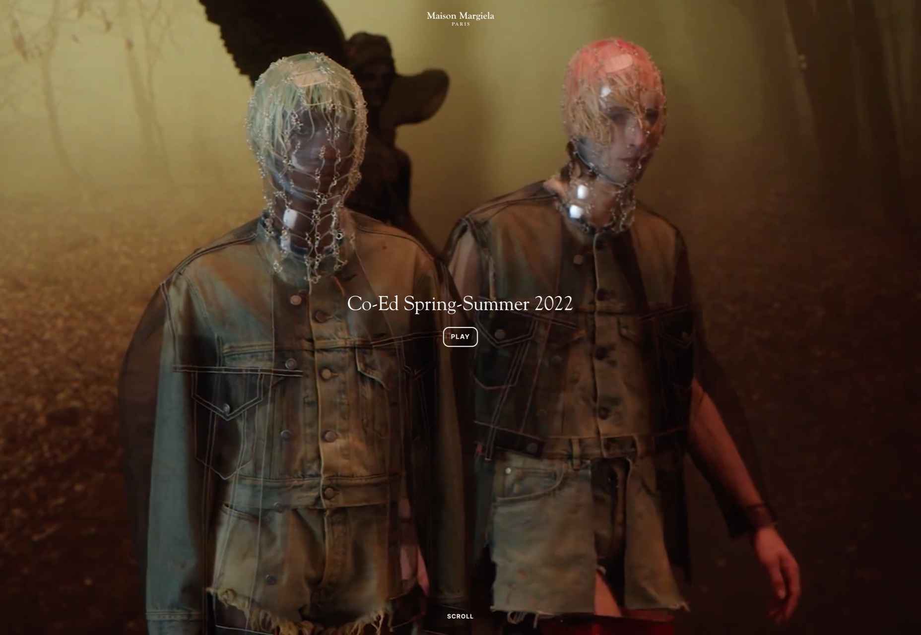
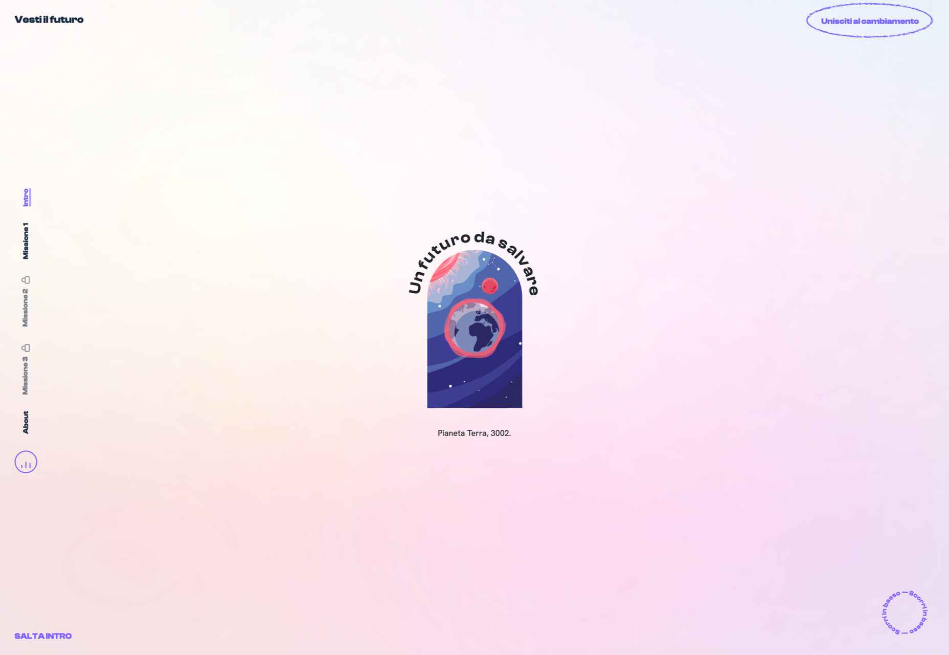
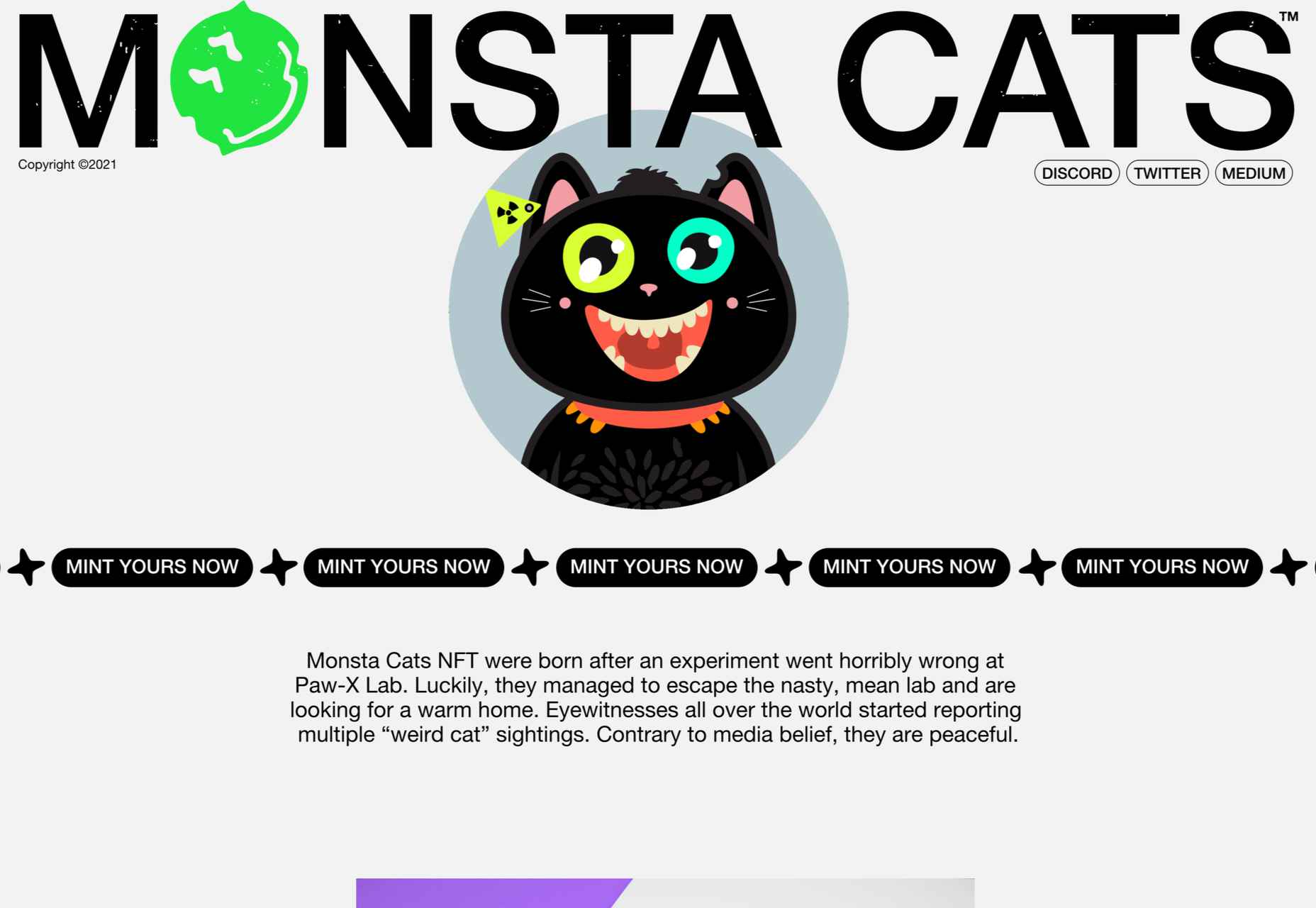
 2021 has been both memorable and instantly forgettable. Pop stars were freed from modern-day servitude, some people tried to overthrow democracy, and we all vacationed at home.
Despite the weirdness of the times, the web kept growing, kept changing, and kept on pushing boundaries. We saw a wealth of new sites launch or relaunch with significant updates.
Here are the 50 best sites launched on the web this year. Enjoy!
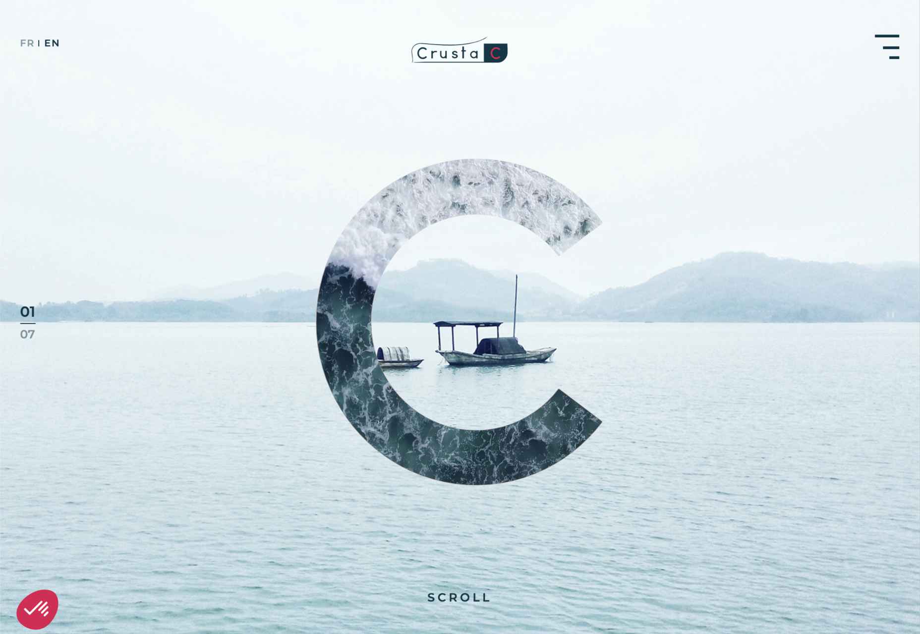
Crusta C
In April, seafood company Crusta C cleverly used the simple logomark ‘C’ to apply a cutout video effect.
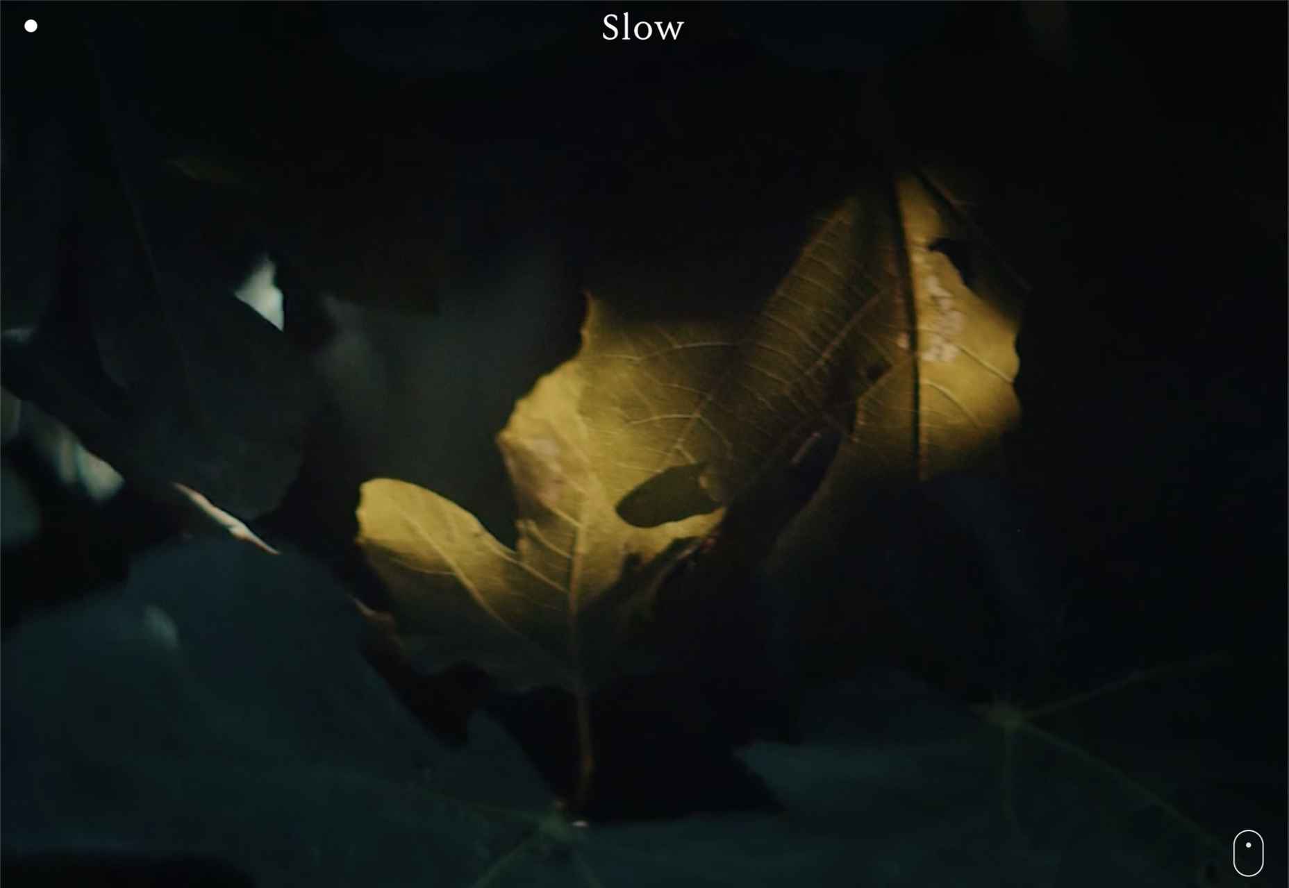
Slow
Slow is a collective of creatives aiming to implement slow movement principles. Its site reflects those aims, creating a sense of calm and deliberation.
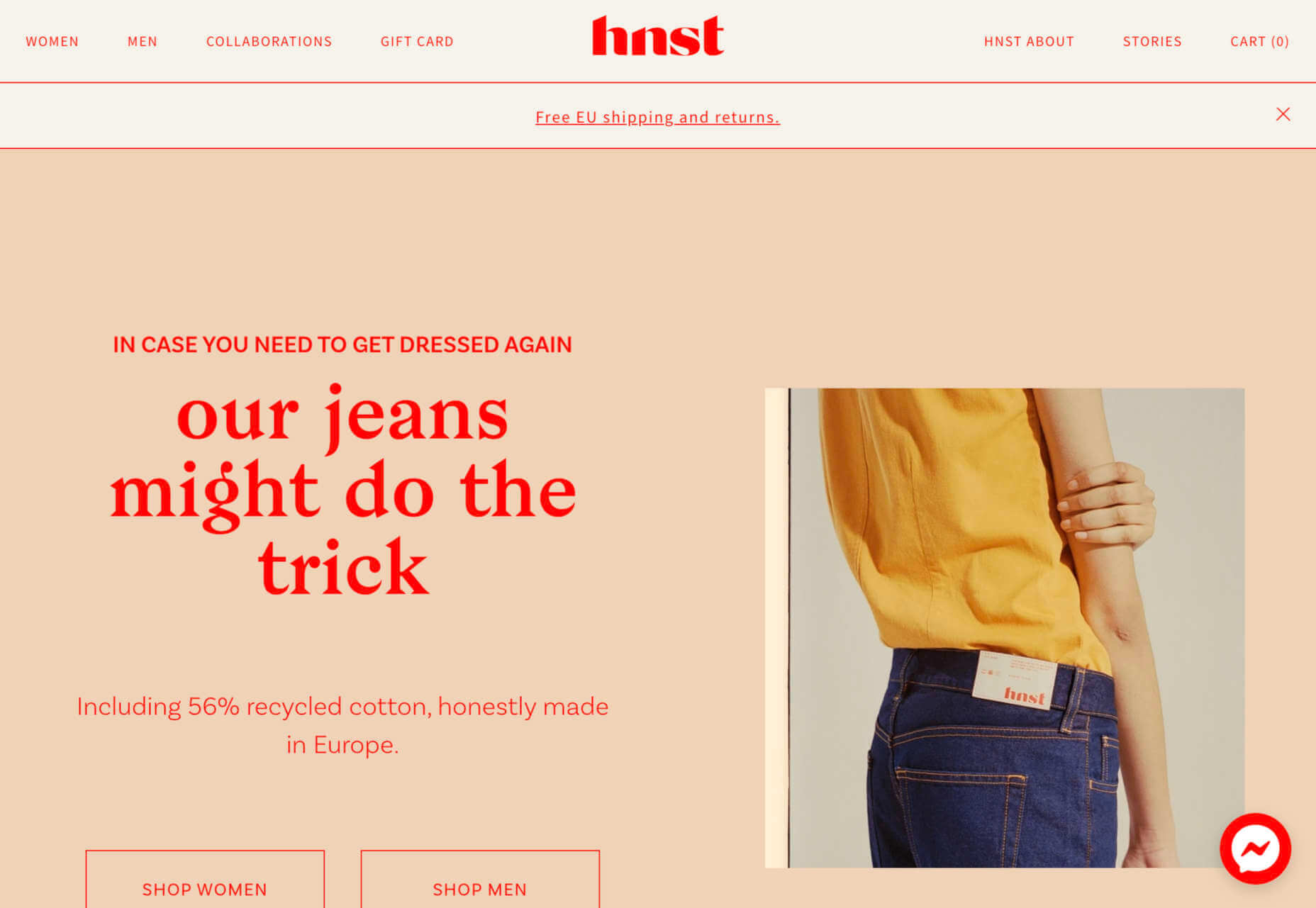
hnst
2021 saw tons of brutalist-inspired design. hnst’s take on the style works thanks to the bright red in place of the standard black.
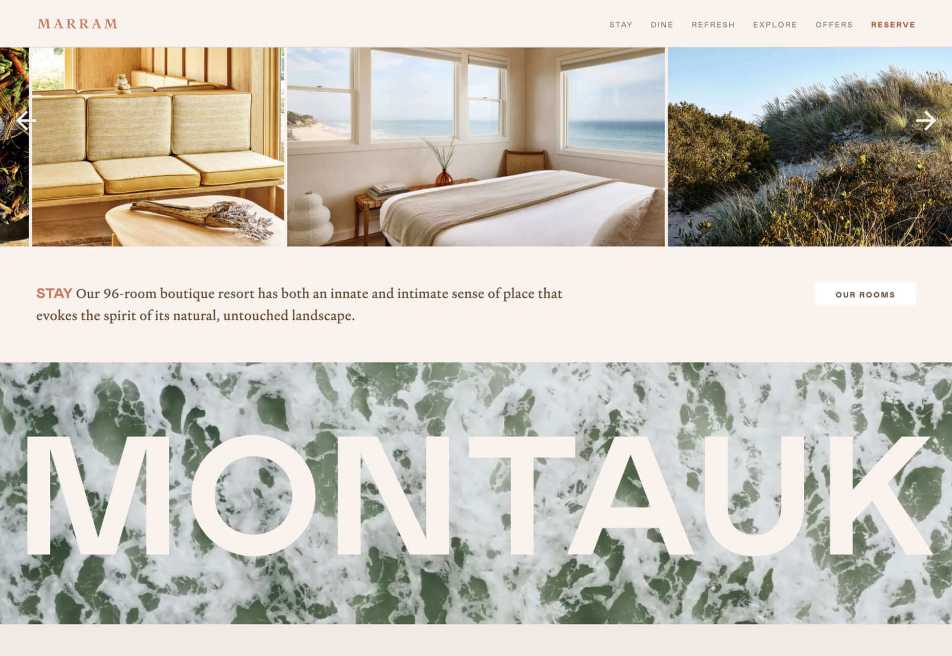
Marram
This site for boutique hotel Marram uses a soft color palette to create an impression of soft golden light and calm.
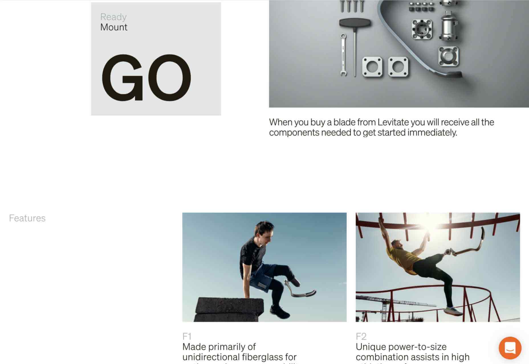
Levitate
In July, we loved this site for running-blade brand Levitate. The site is clean and light, with a sense of inherent motion in the photography.
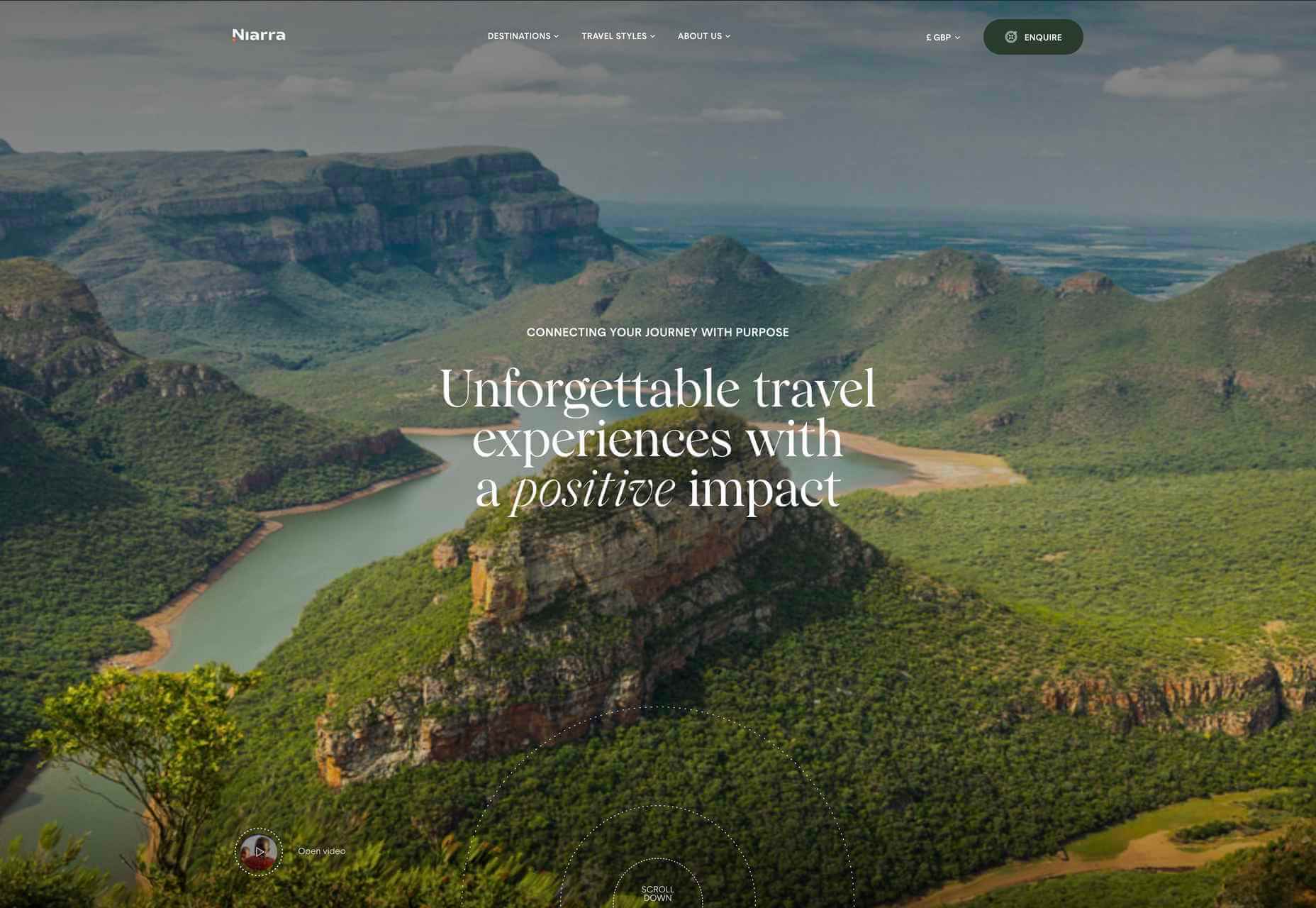
Niarra Travel
There’s some beautiful photography on this site for eco-conscious, bespoke travel agency Niarra Travel.
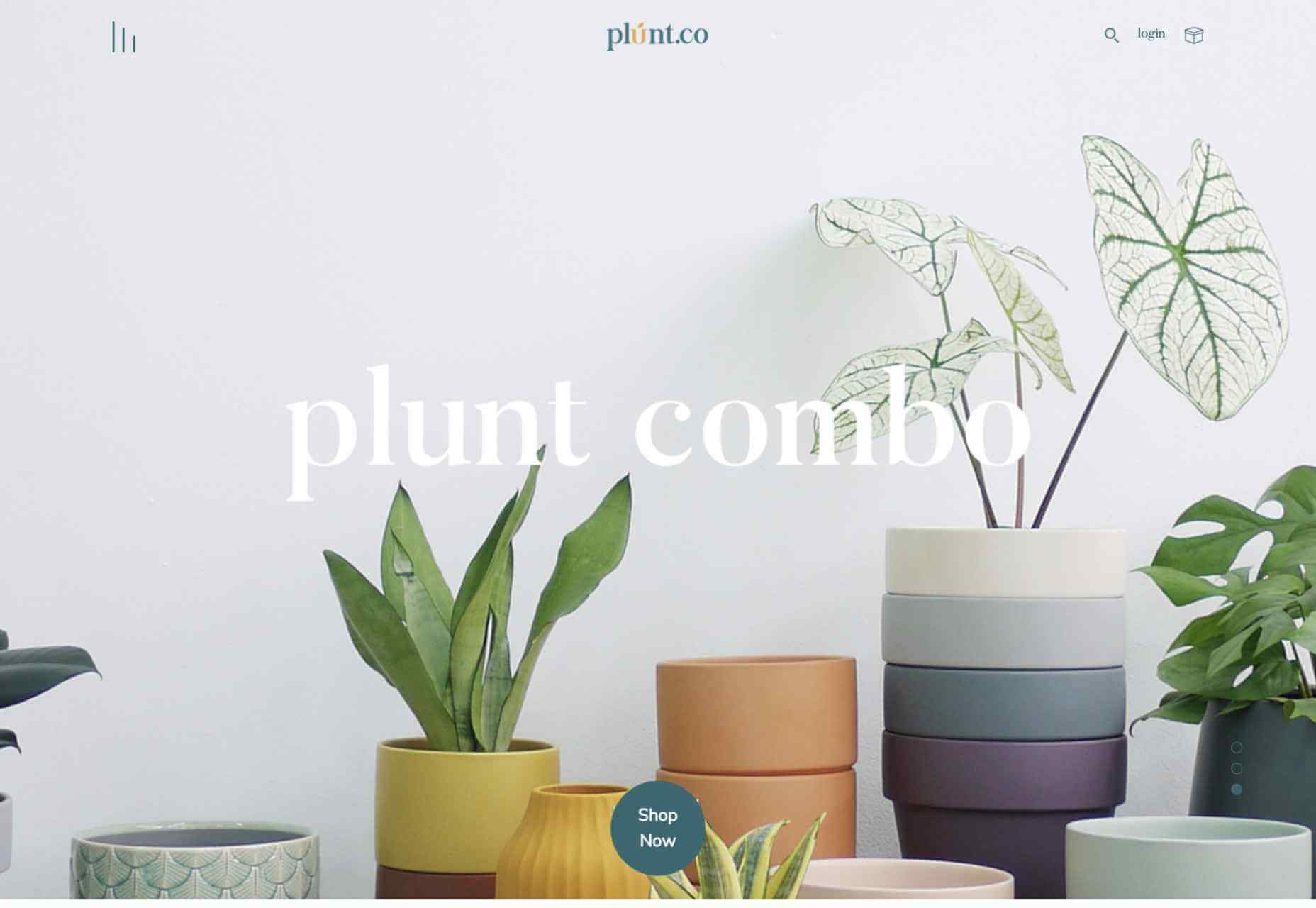
Plunt.co
The core of this site for Plúnt is a combination chooser which feels pleasingly reminiscent of an animal flipbook.
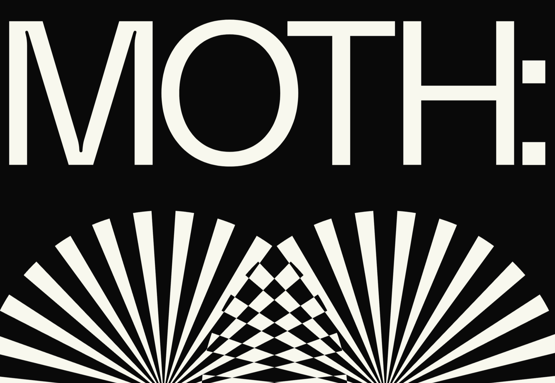
Moth Drinks
Moth makes classic cocktails in a can. The striking black and white graphics and masking effects for its holding page stunned us back in March.
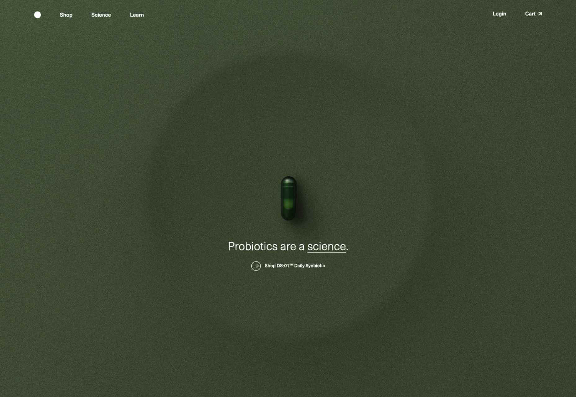
Seed
Selling supplements is hard; people are understandably skeptical. So this site for Seed packs in research and scientific information and avoids the hard-sell.
Wavemaker
Another excellent portfolio site in 2021, this time for creative media agency Wavemaker. The site is uber-confident while still being playful.
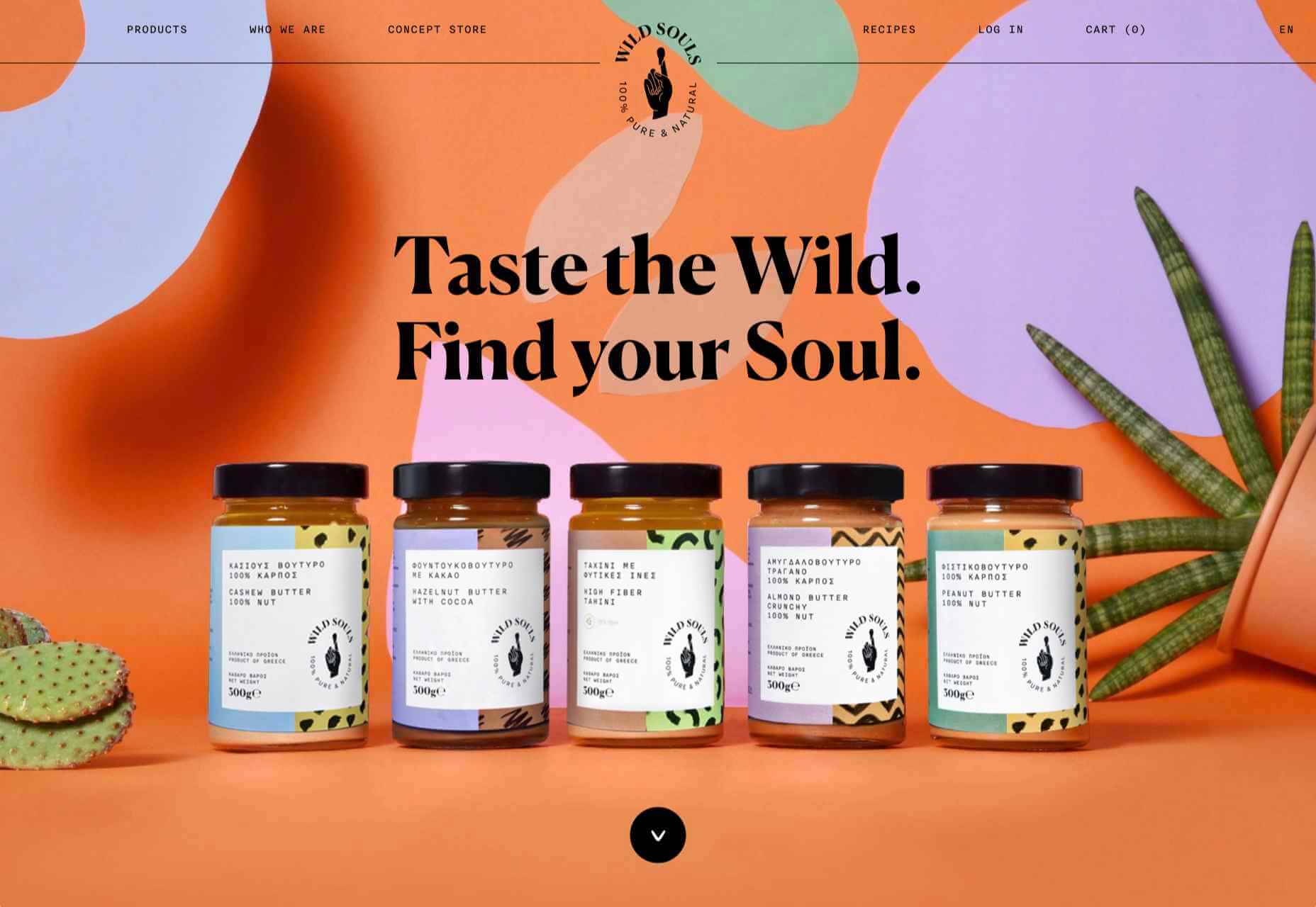
Wild Souls
Wild Souls makes nut butters, tahini, and other Greek delicacies. Its site is colorful and warm, and the site typography is soft and appealing.
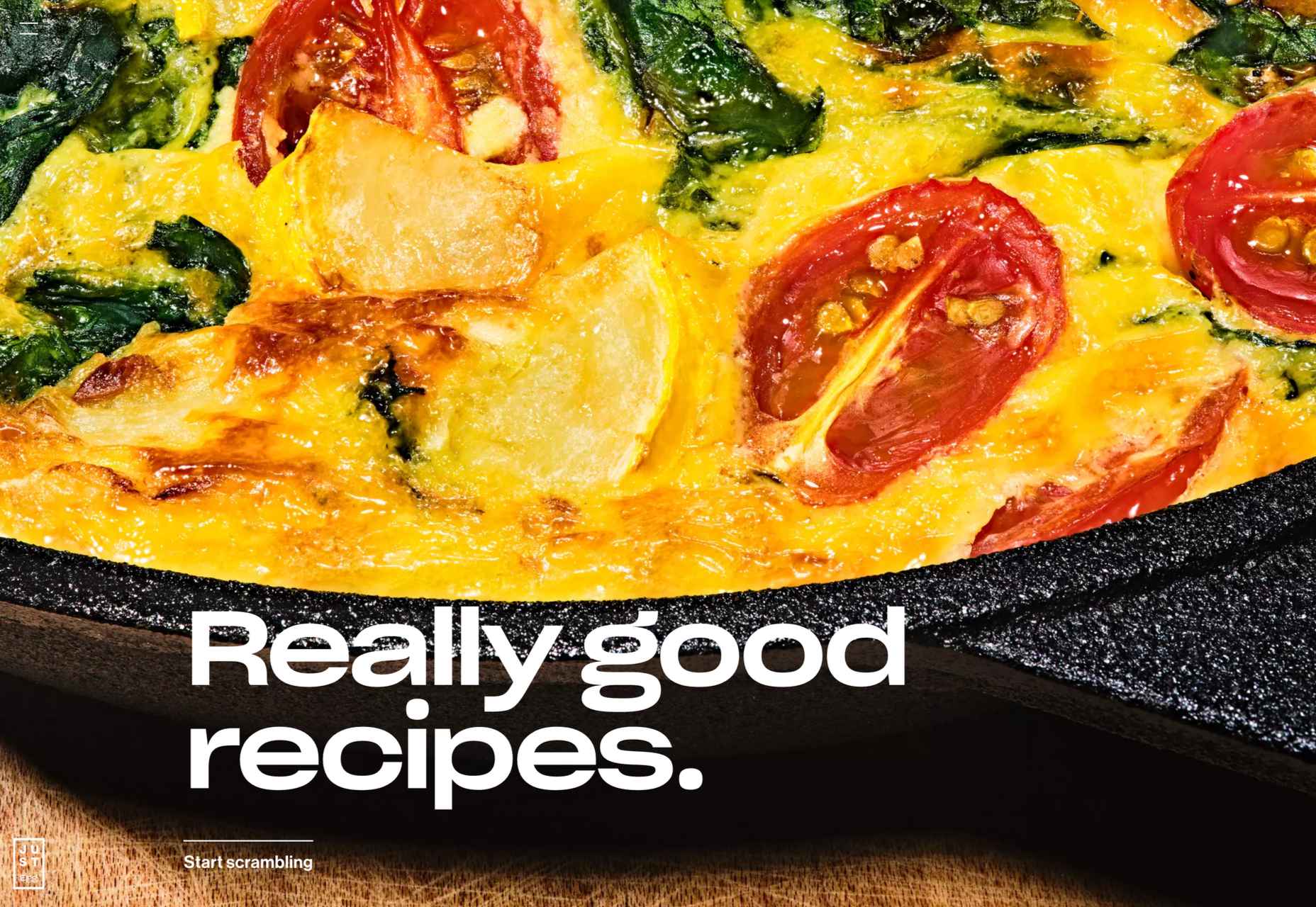
JUST Egg
JUST Egg produces egg-like food from plant material. The huge photography and bold typography do a great job of making a new concept appealing.
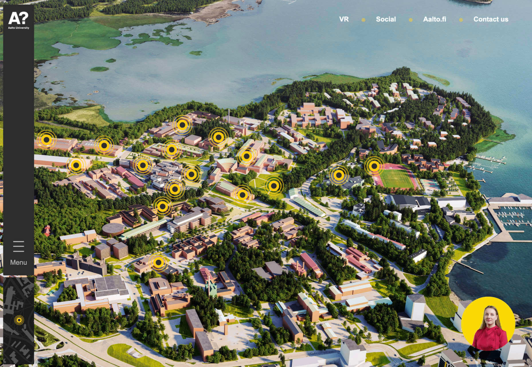
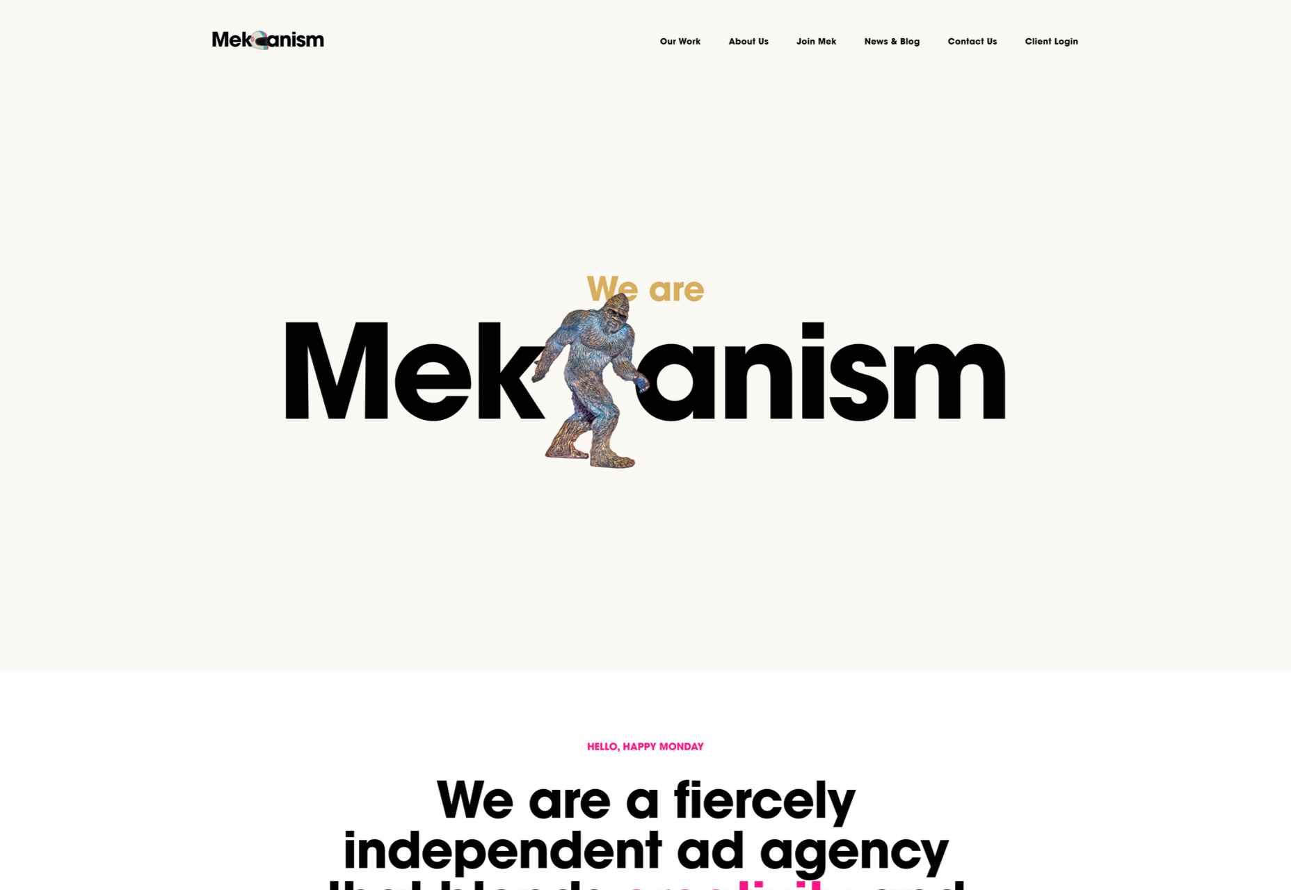
Aalto University
One of the most popular designs of 2021 was Aalto University’s site with its in-depth campus tour. The simple navigation inspired several imitators.
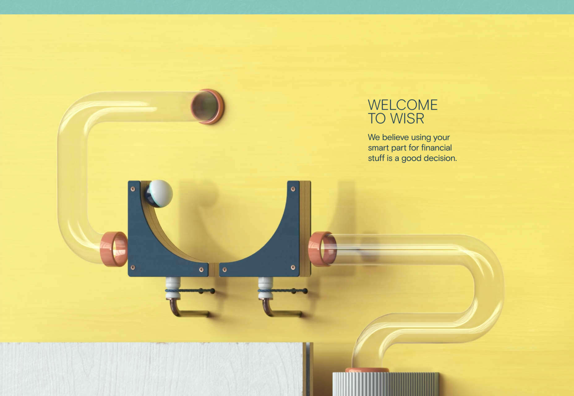
Wisr
Scroll interactions were big in 2021, and Wisr features a Heath Robinson-style machine that ‘runs’ as the user scrolls down the page.
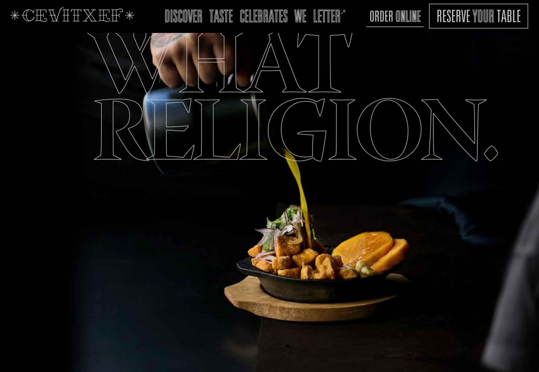
Cevitxef
This site for Cevitxef ceviche restaurant in Bilbao does a great job of making us hungry. Drama is created by oversized text, heavily-styled photography, and lots of movement.
On
The best digital agencies keep their own sites simple, like this site for On digital technology studio that uses black on light blue and adds infinite scrolling.
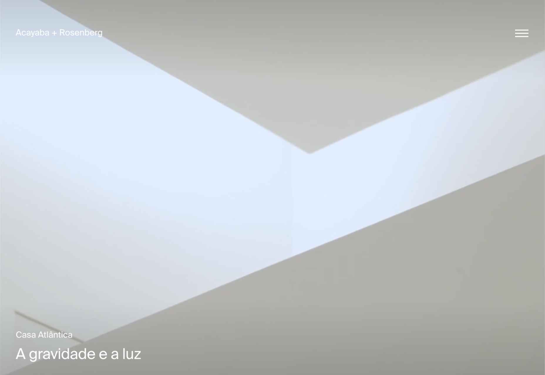
Acayaba + Rosenberg
We found Acayaba + Rosenberg’s use of architectural photography and subtle scrolling a pleasing browsing experience.
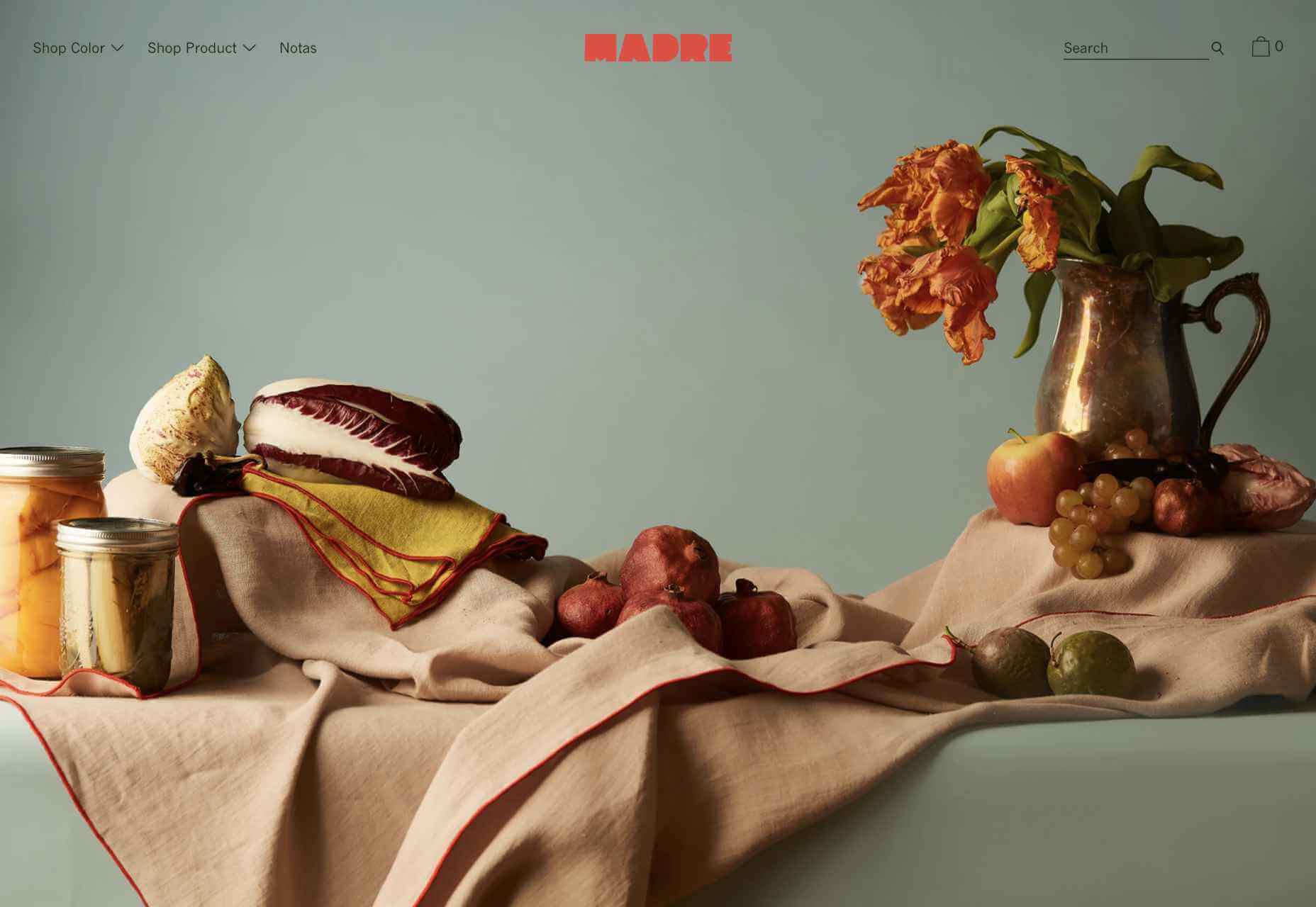
Madre
This site for home linen company Madre uses extraordinary fine-art style still-life photography to enrich a very simple site.
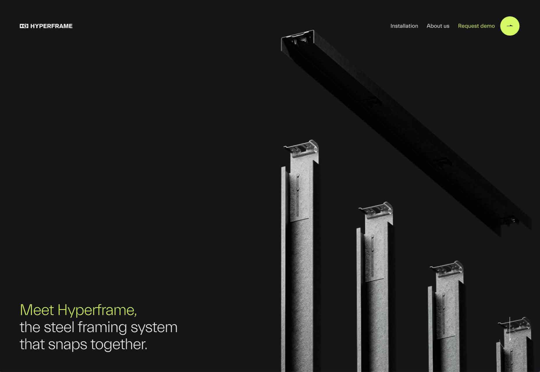
Hyperframe
“Show, don’t tell” is a well-worn mantra. Hyperframe’s site implements it by demonstrating the product’s major selling point on scroll.
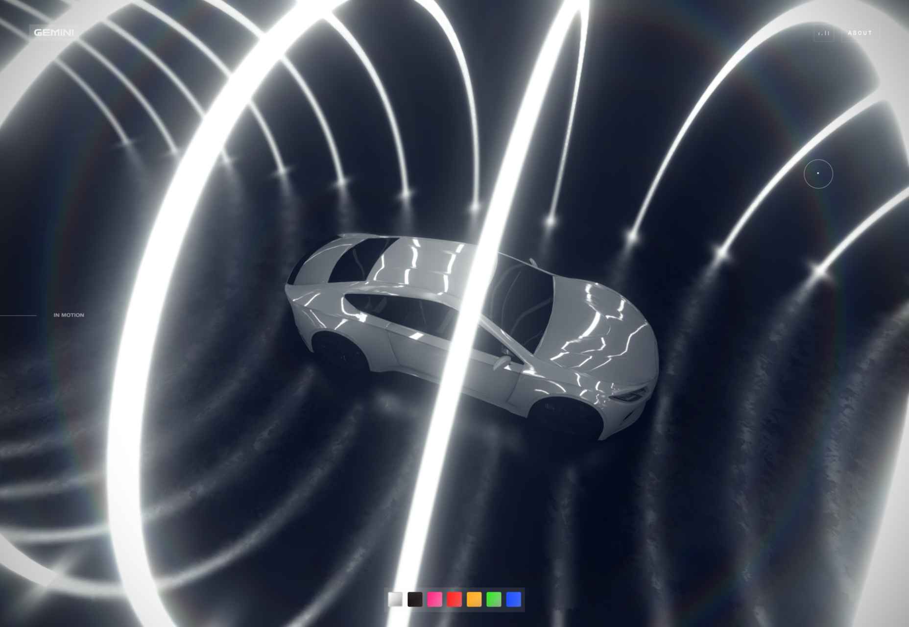
Gemini
This exceptional WebGL experiment was built to show what’s possible in the technology. Have a play with the car; it’s a ground-breaking demo.
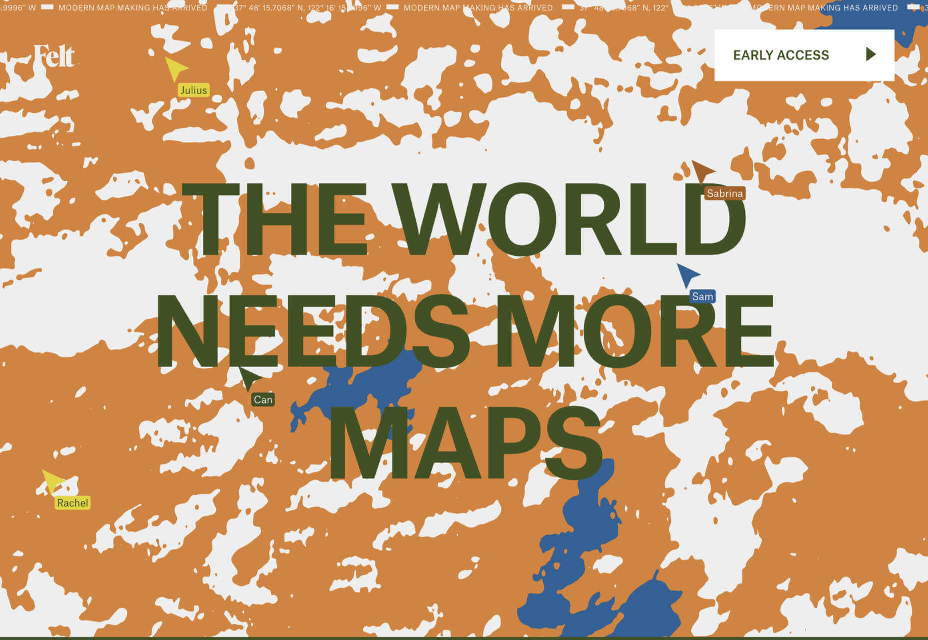
Felt
In 2021, collaborative mapping tool Felt launched in private beta. Its excellent site does a great job of creating interest while doubling as a recruitment notice.
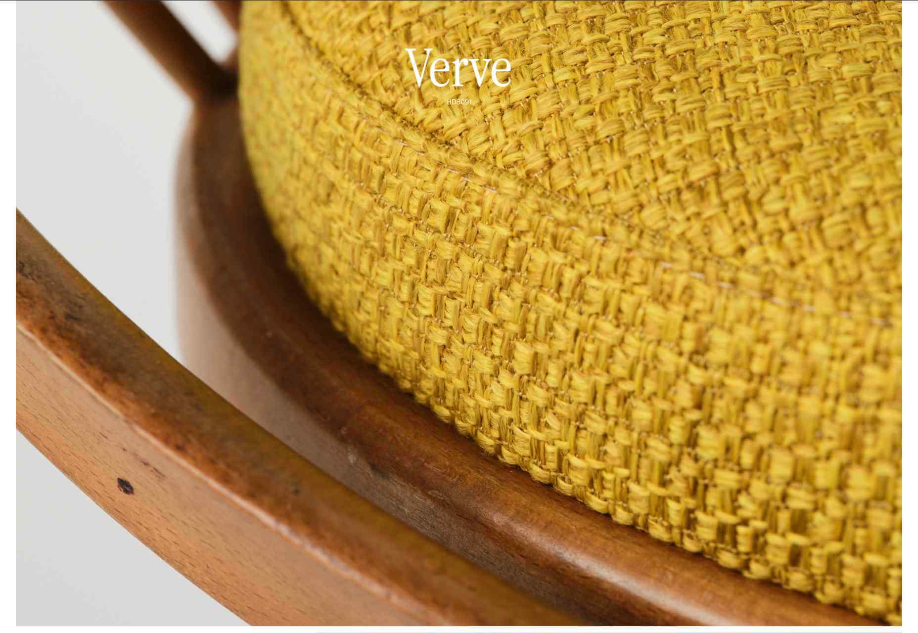
imNativ
Not every project is exciting, but this excellent site for imNativ uses macro photography to great effect to promote upholstery fabric.
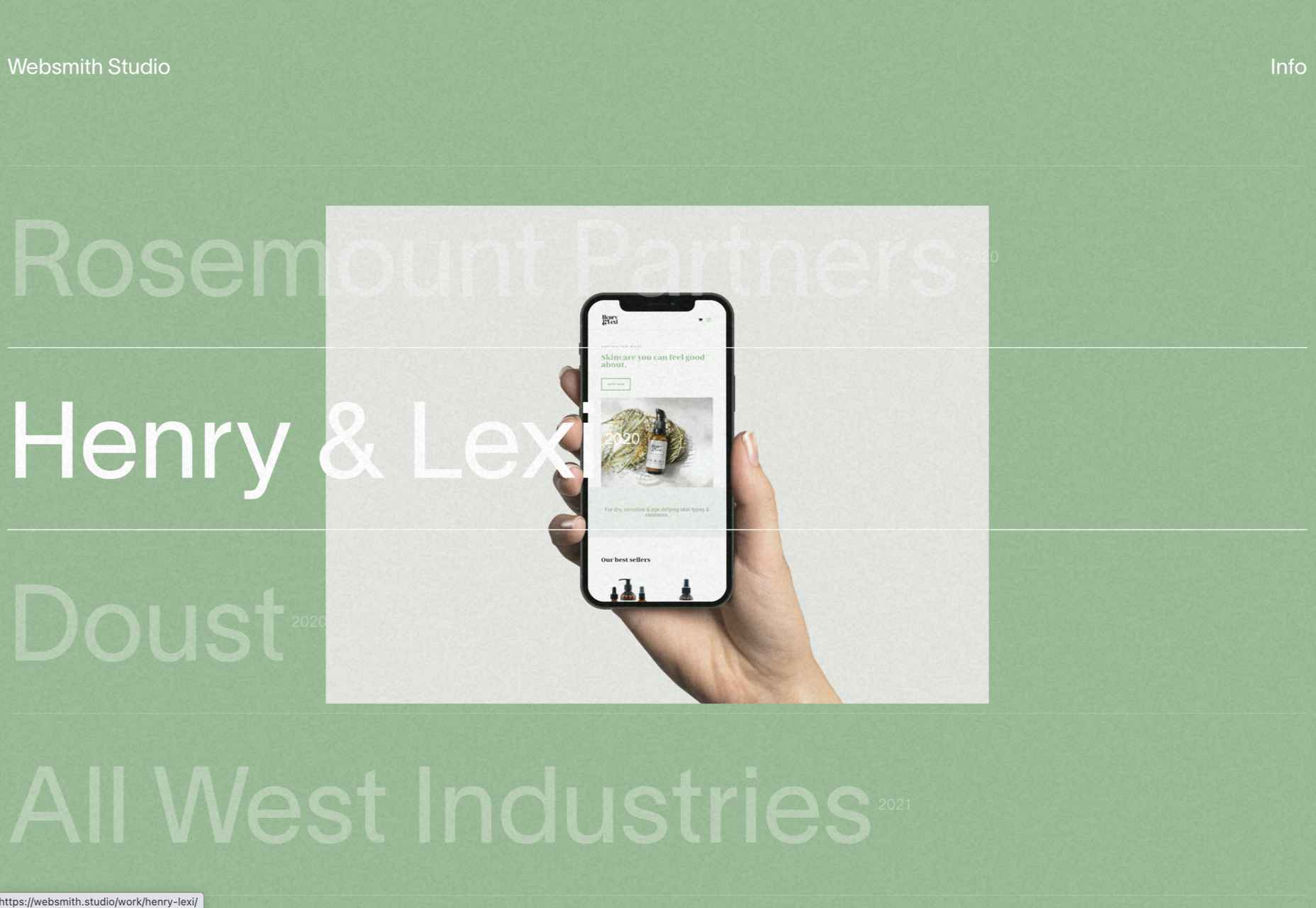
Websmith Studio
Excellently named Websmith Studio uses color to highlight, and the noise effect applied to the background adds subtle interest.
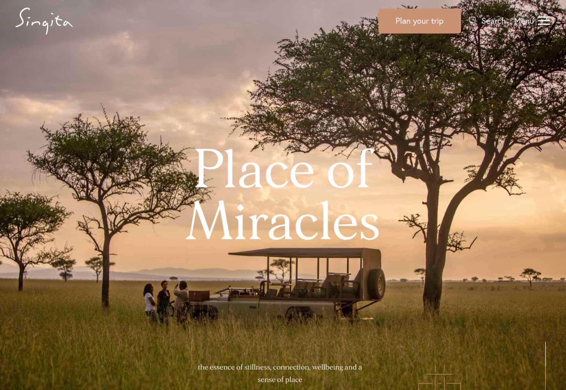
Singita
High-quality photography and a terracotta-based color scheme create an inviting ambiance for Singita, an African eco-tourism and conservation brand.
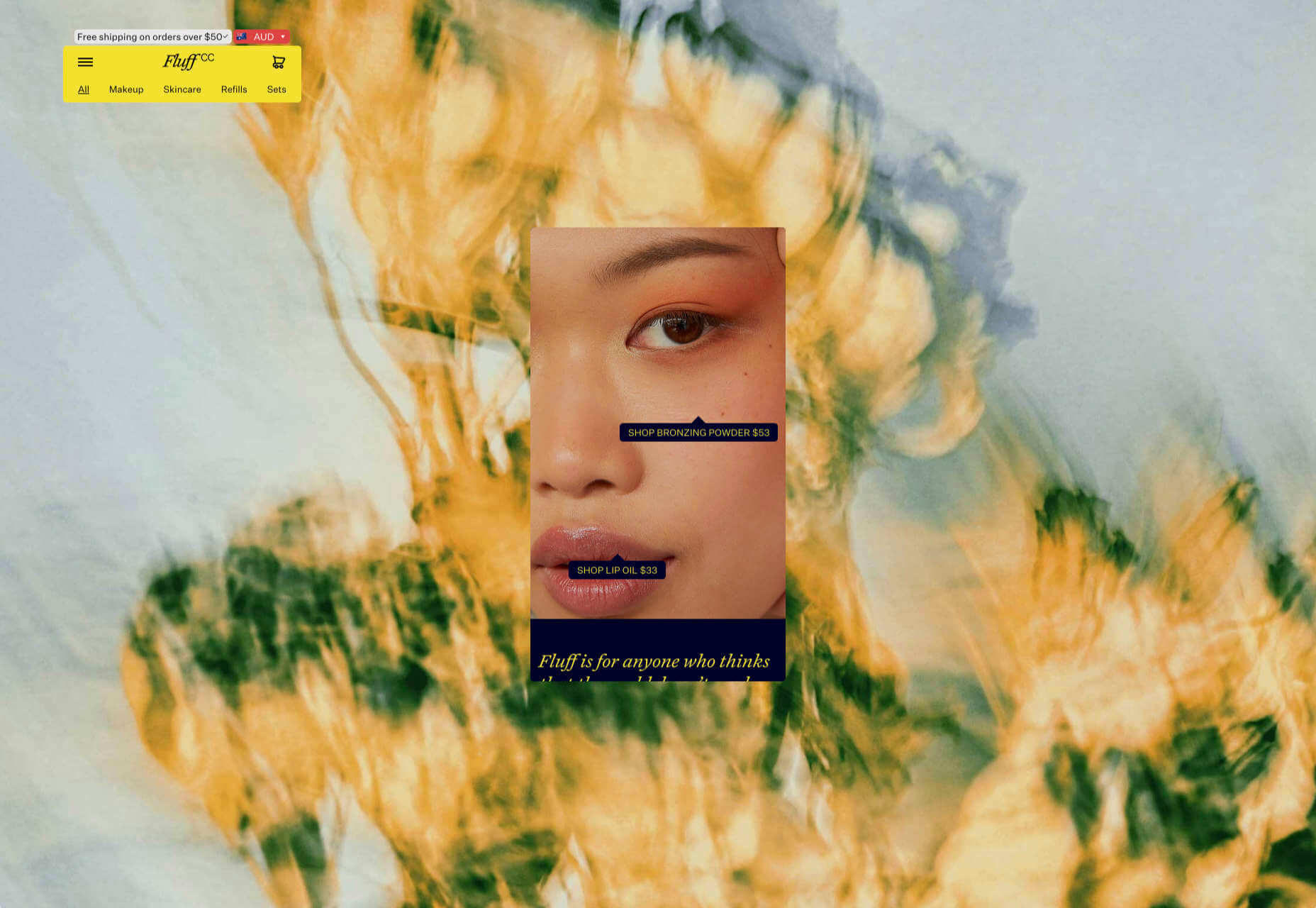
Fluff
A fullscreen background behind a mobile view for desktop? It sounds like a horrible idea, but this site for cosmetics brand Fluff pulls it off.
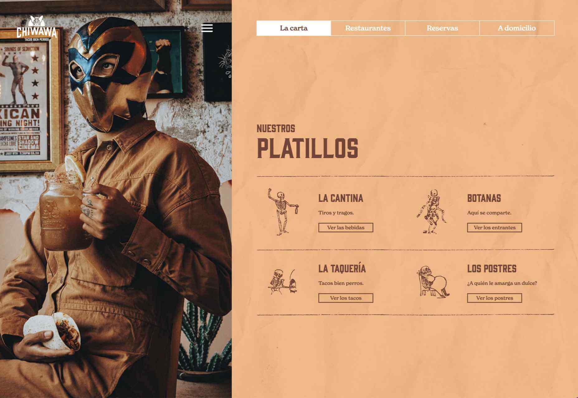
Chiwawa
This great site for Chiwawa cantina features wrestling masks, skeletons, and tone-on-tone color to create a lively and distinctly Mexican site.
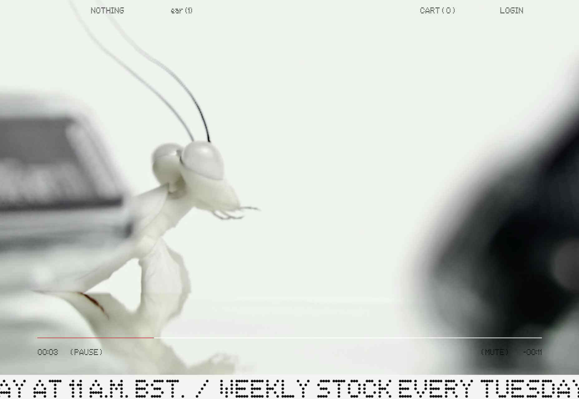
Nothing
This site for Nothing’s ear(1) earbuds is packed with confidence. Appropriately, it looks even better on mobile.
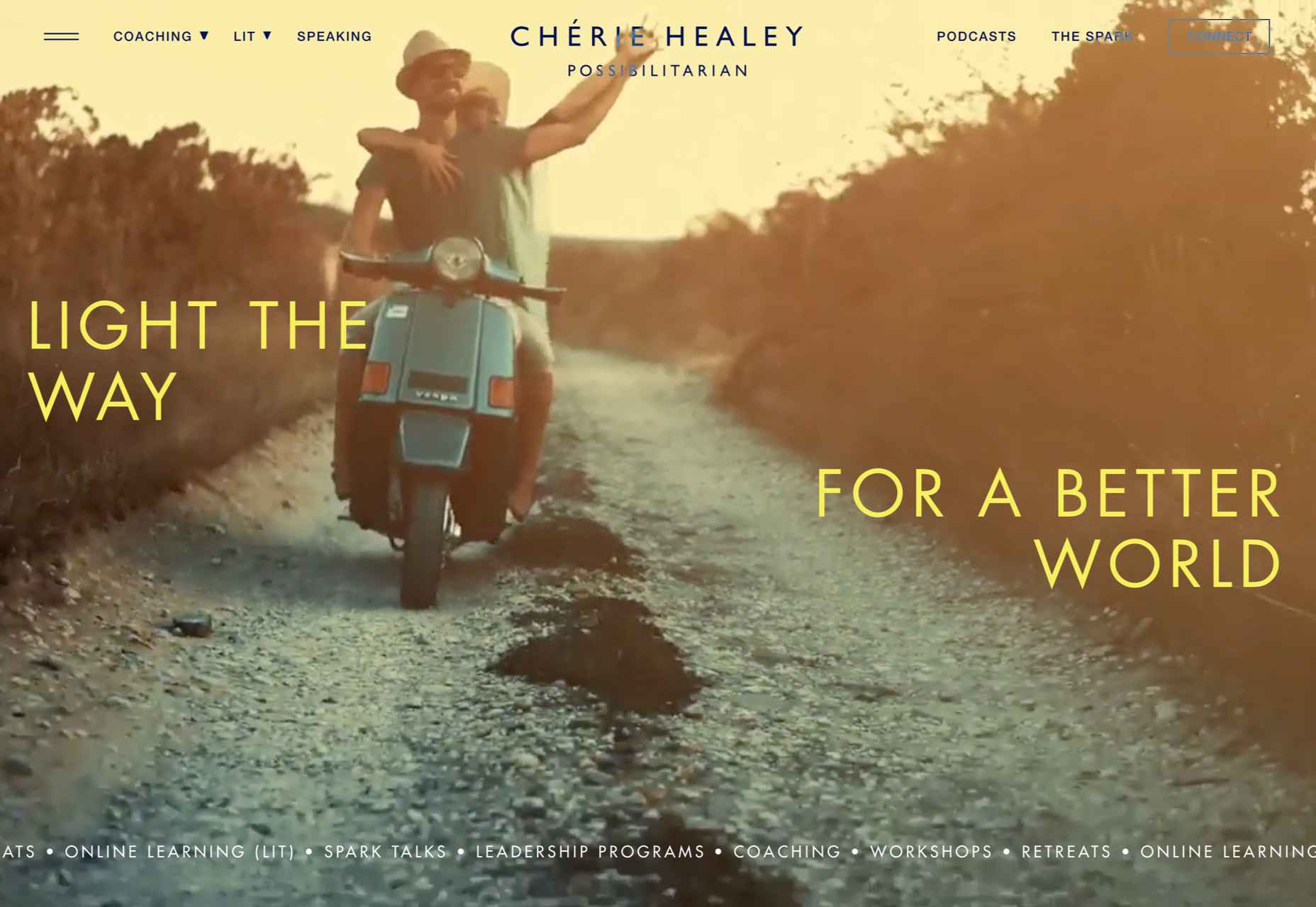
Chérie Healey
Lots of experts have tried to tell us how to live our lives in the last couple of years, but Chérie Healey’s site manages to stay on the right side of positive without slipping into clichés.
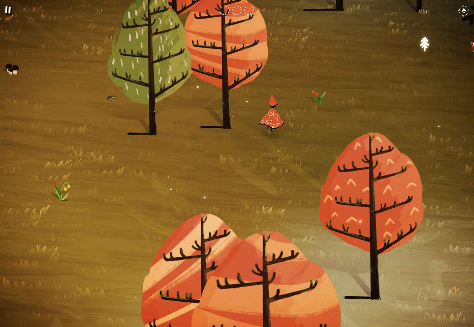
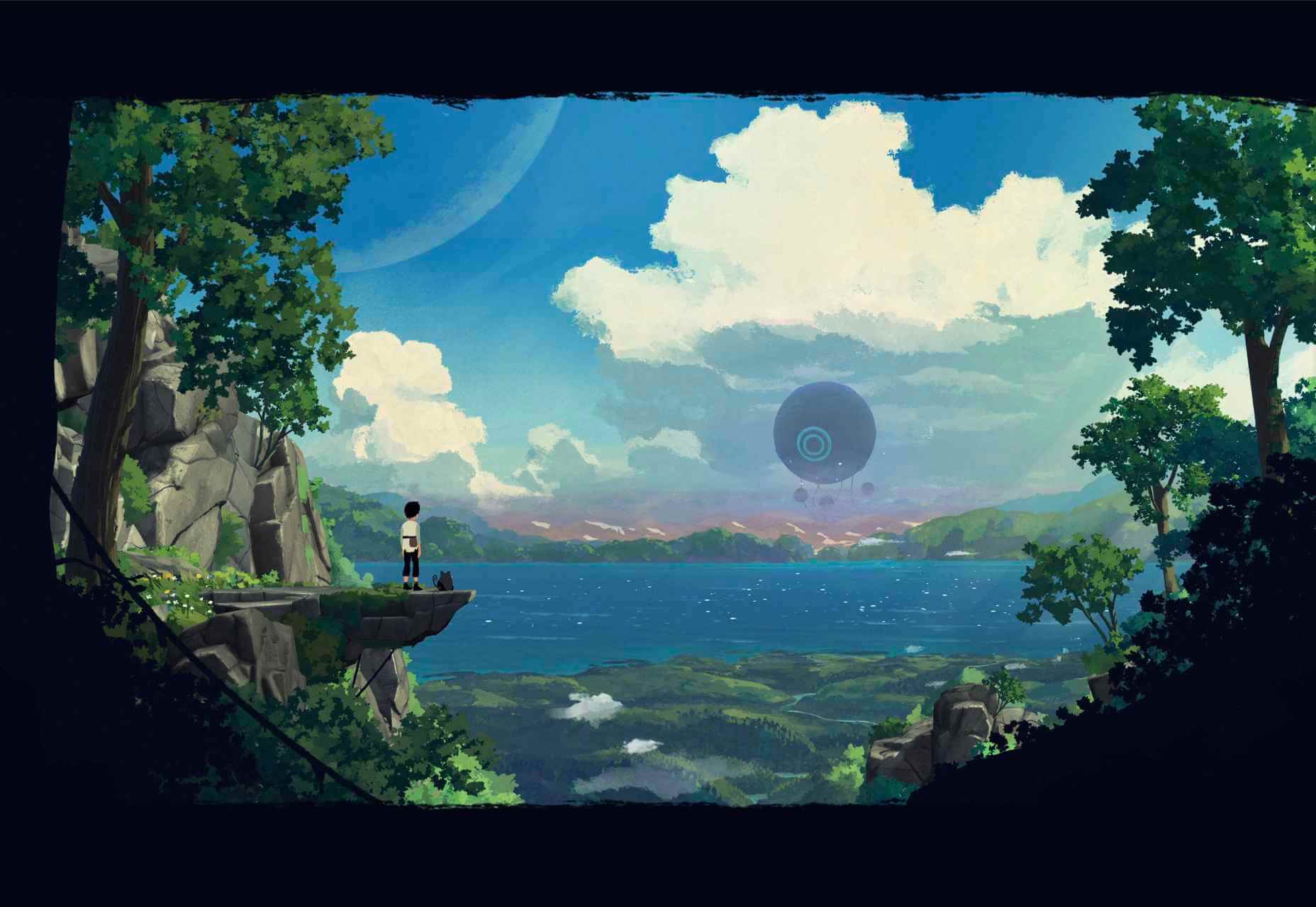
Wayfinder
Wayfinder, a game about our connection to nature using generative code, AI, machine learning, and data mining, could not have been more 2021 if it tried.
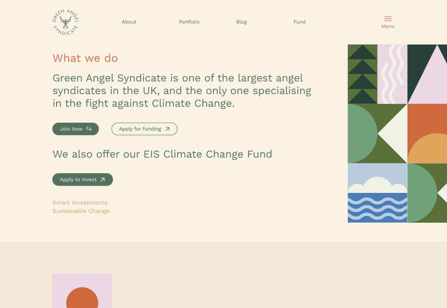
Green Angel Syndicate
Not too many investment groups are thought of as ethical, but Green Angel Syndicate specializes in funding companies fighting climate change.
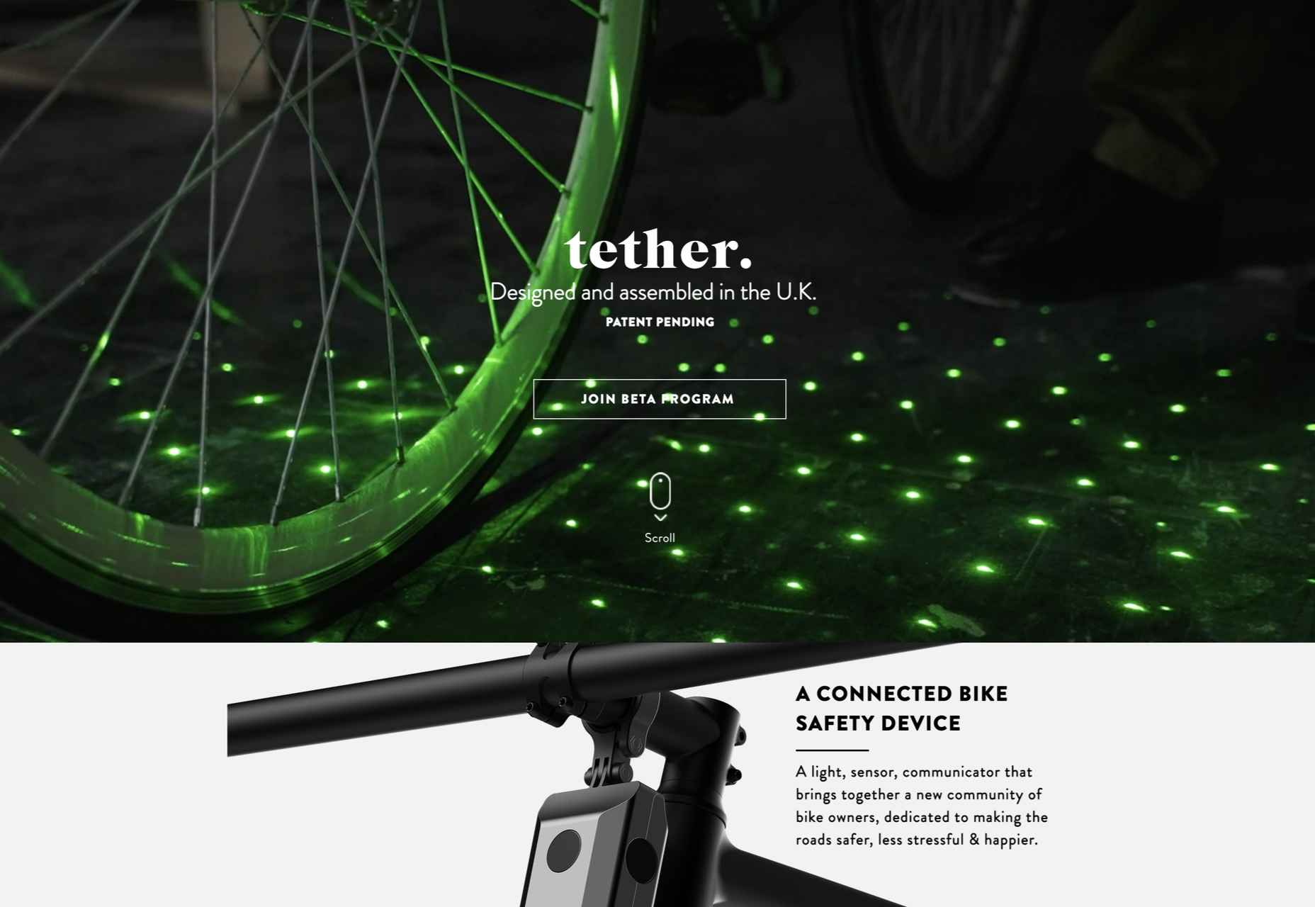
Tether
As the days got darker in the Northern hemisphere, we were wowed by this site for Tether, a cycle safety system using video and illustration to explain its clever approach to bike safety.
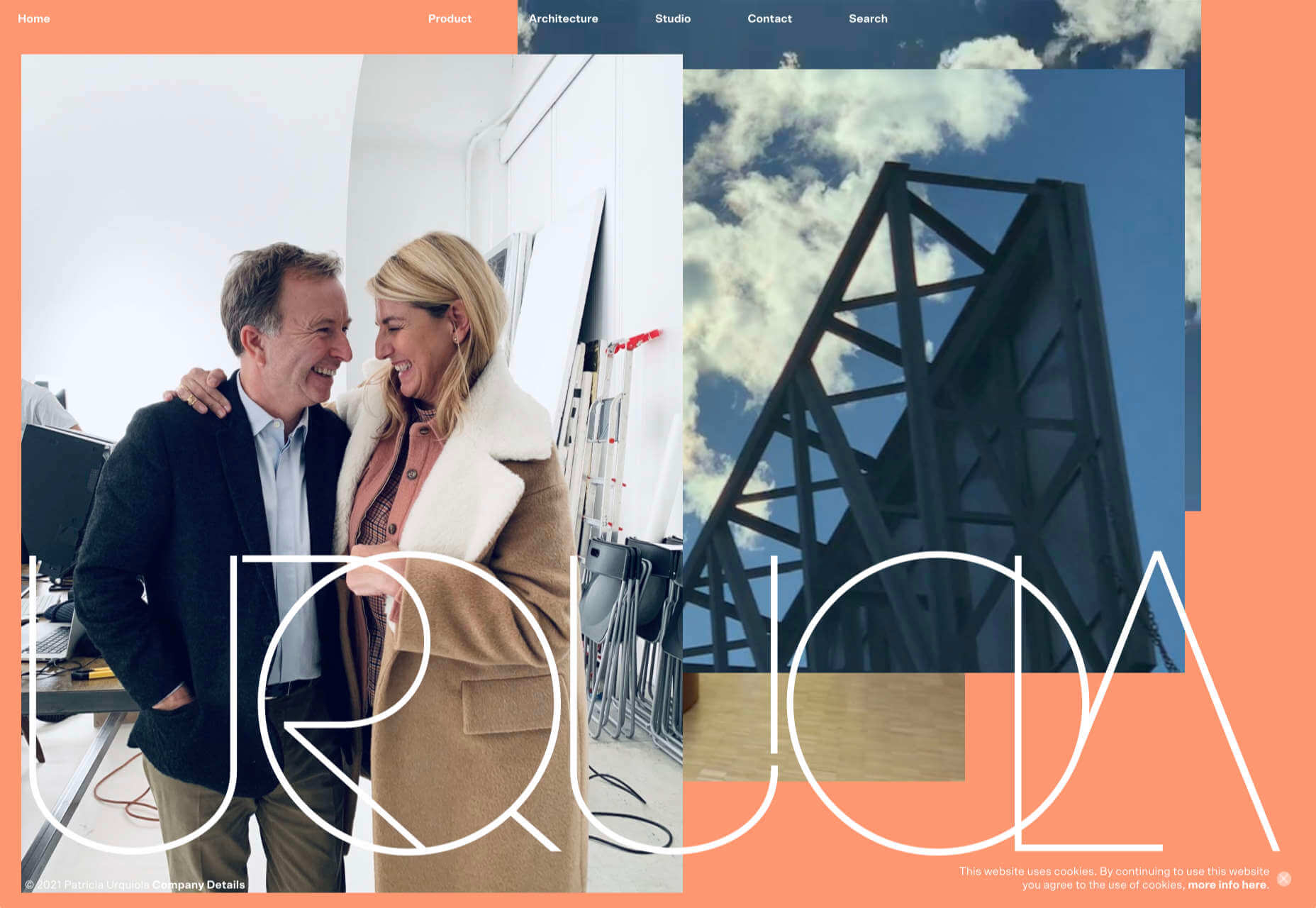
Patricia Urquiola
Back in January, we loved the new site for Patricia Urquiola design studio, thanks to its bright, bold colors that we thought inspired confidence.
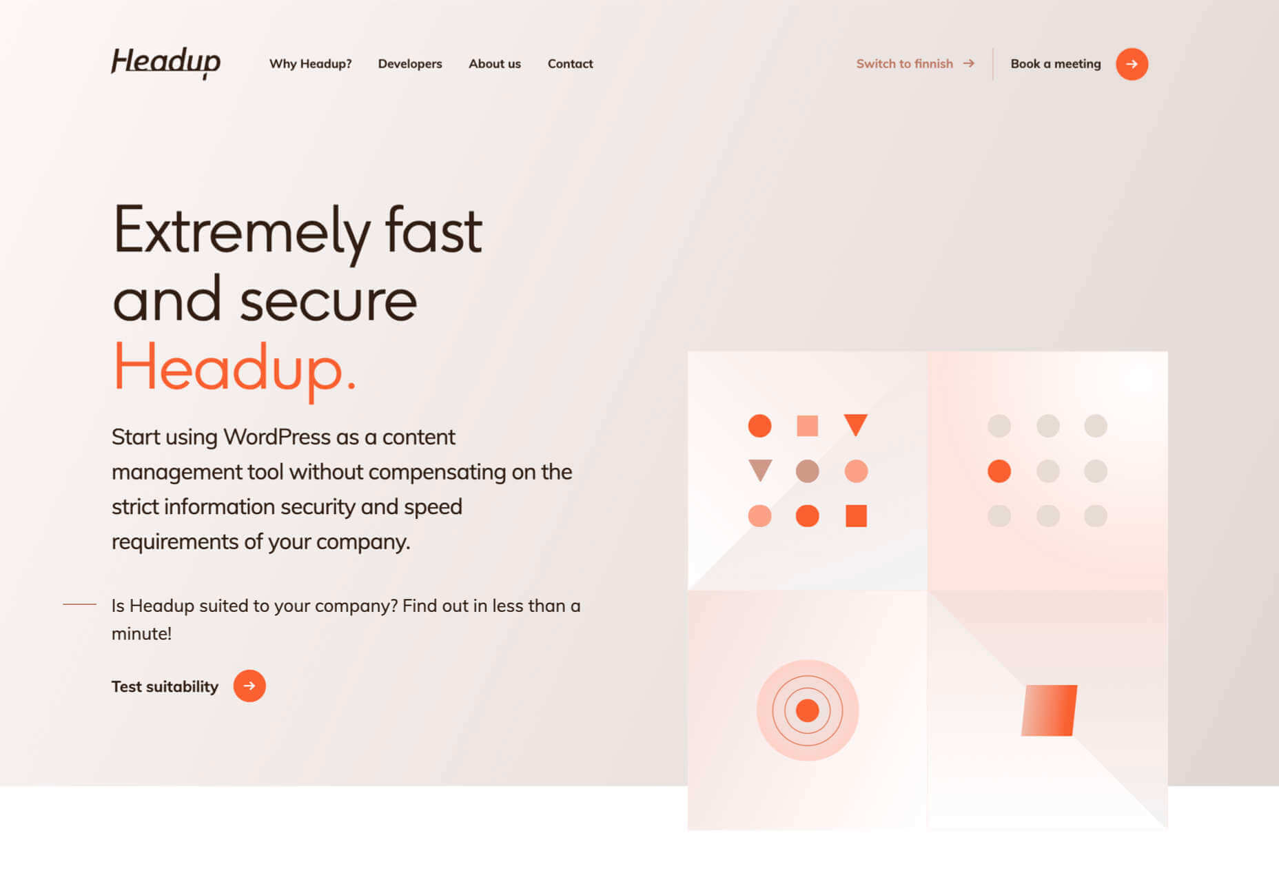
Headup
Headup’s businesslike approach is created thanks to a pleasing color palette and geometric graphics.
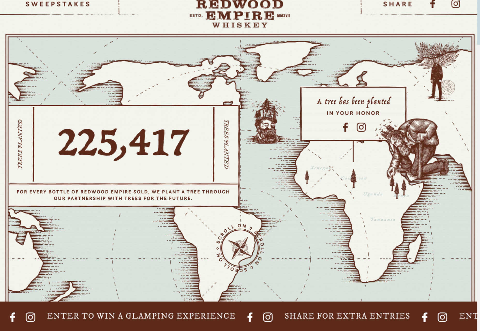
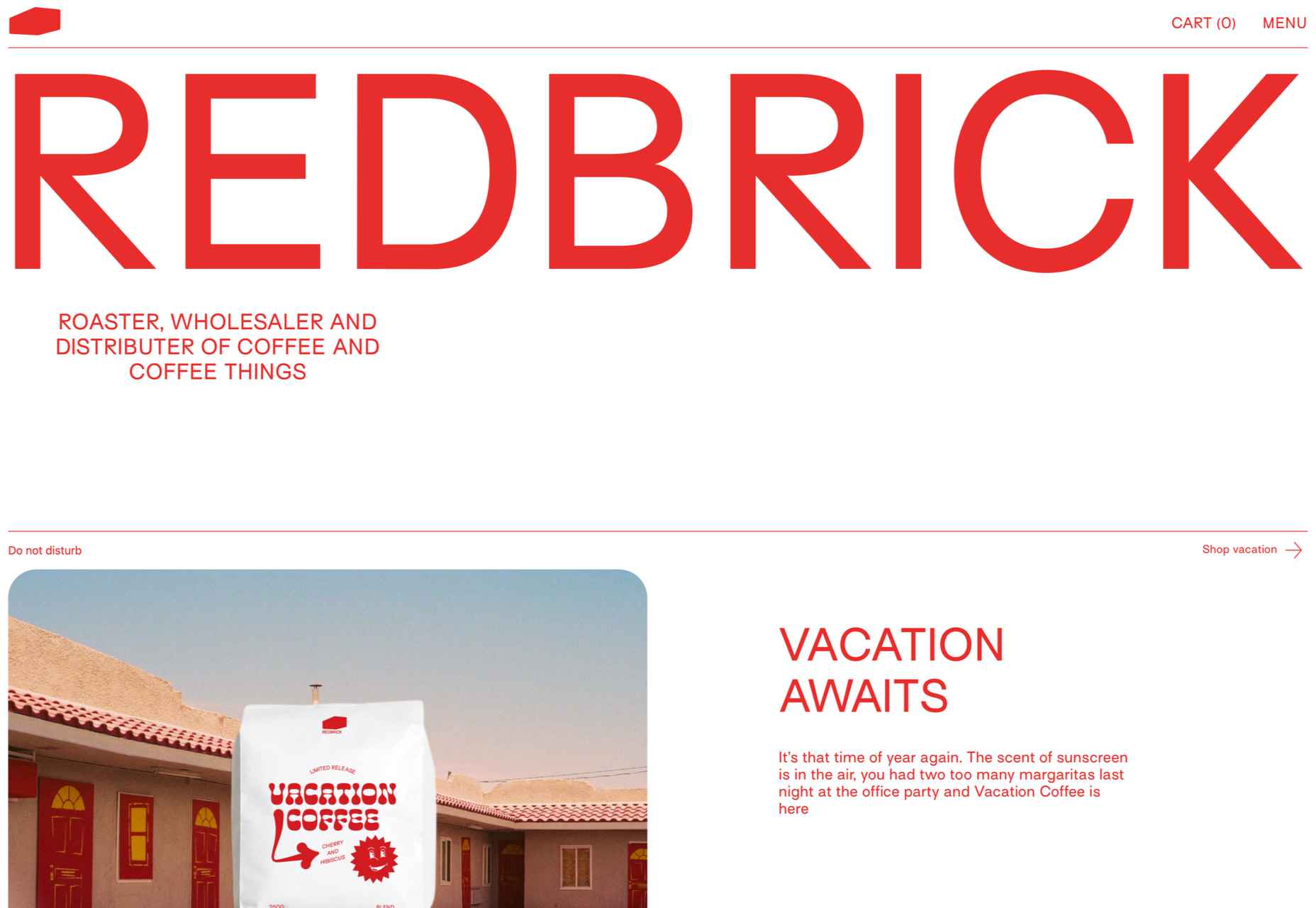
Redwood Empire
For Earth Day on April 22nd, Redwood Empire Whiskey created a microsite promoting a competition styled to match their bottle labels.
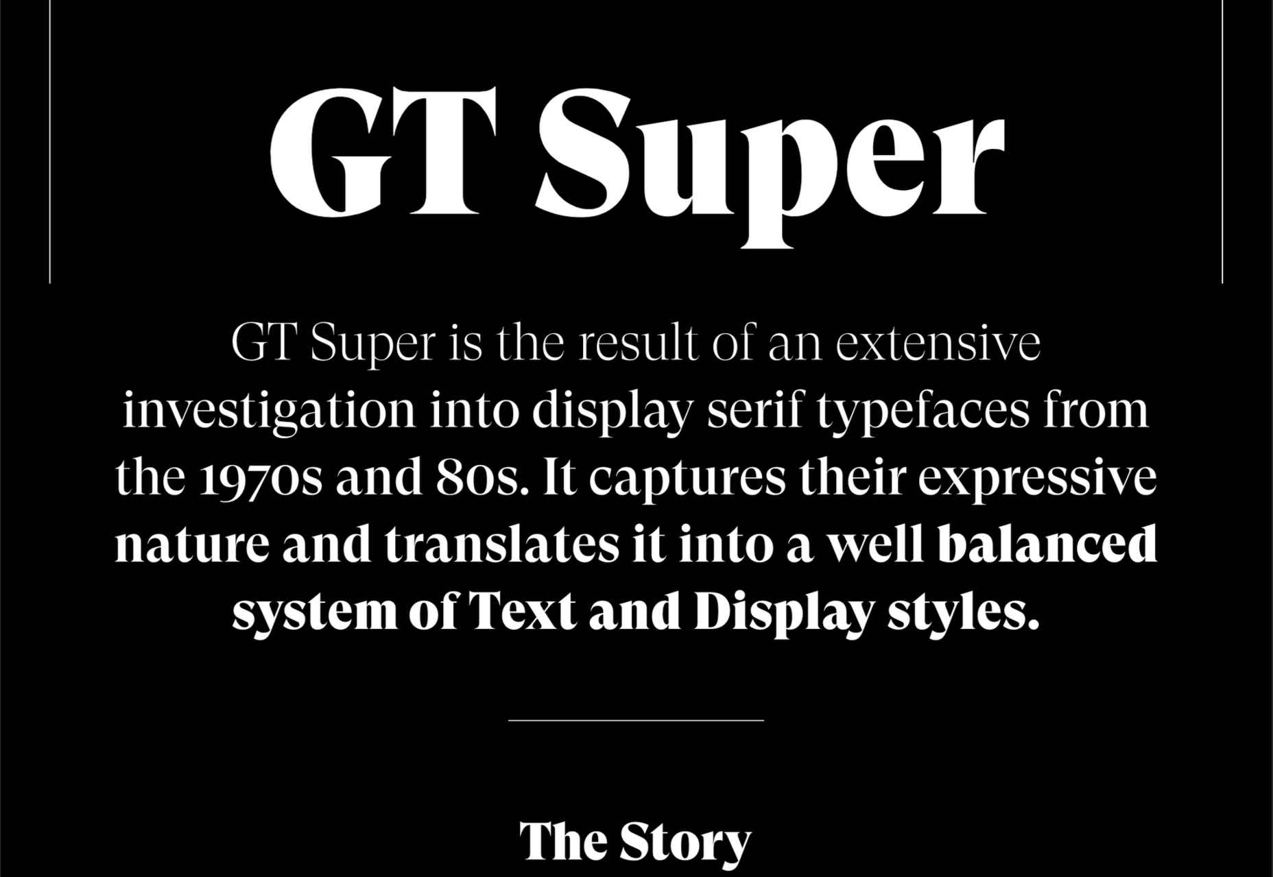
GT Super
The one-pager for GT Super has a certain drama in keeping with the font itself and allows you to play around with the size, weight, and style.
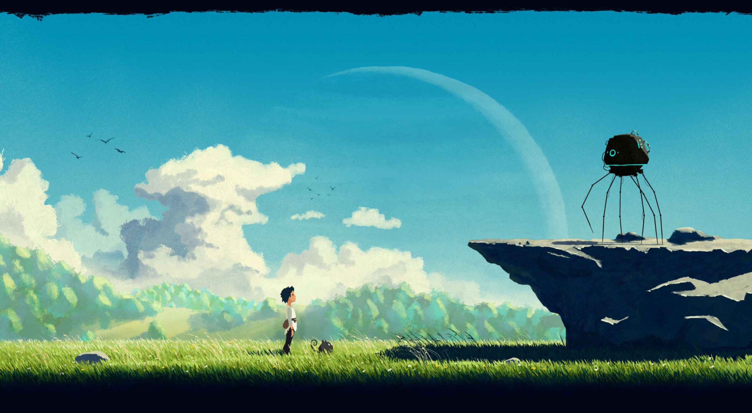
Planet of Lana
Due for release in 2022, Planet of Lana is a game from Wishfully Studios, and its teaser page launched back in June has kept us intrigued ever since.
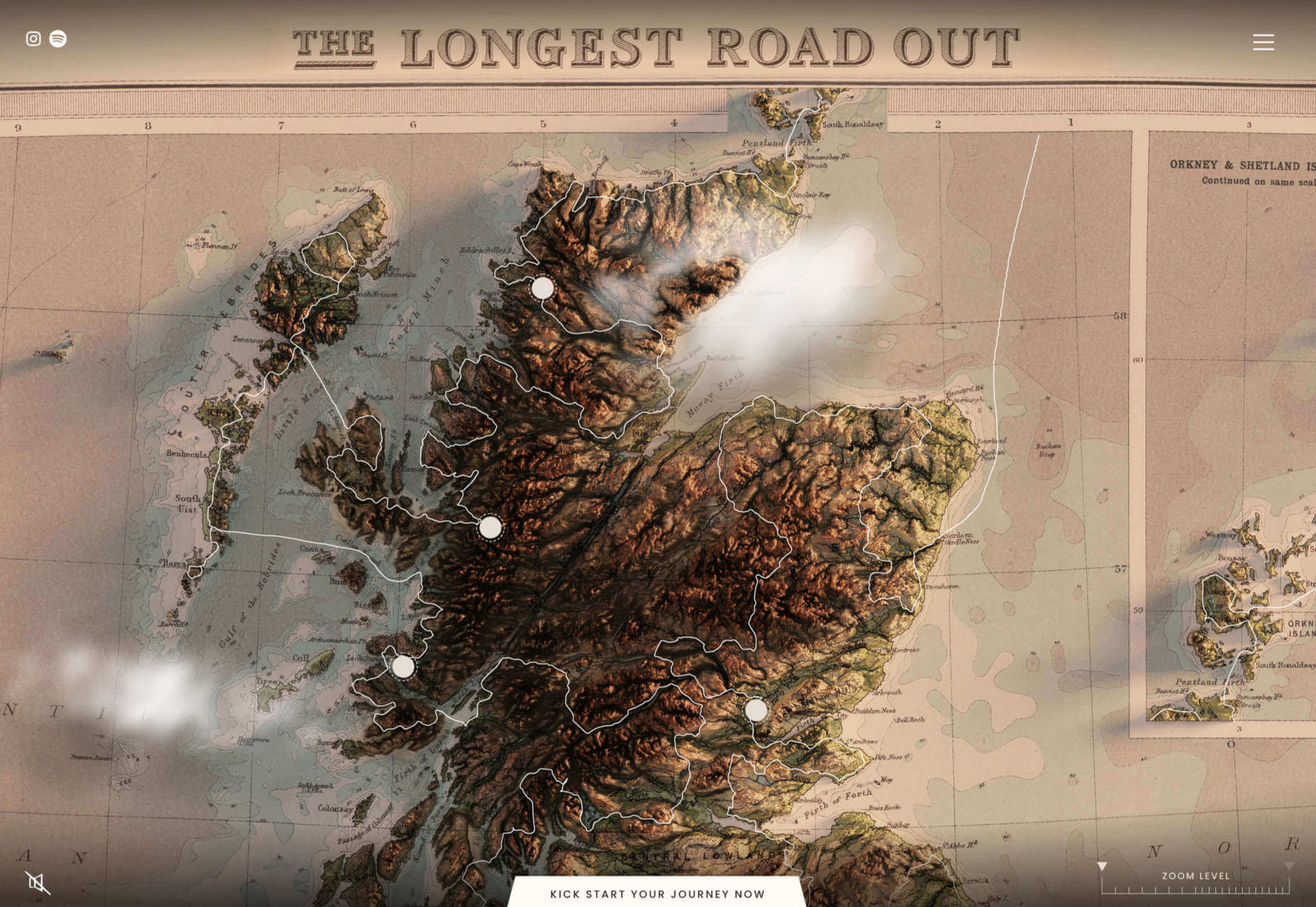
The Longest Road Out
This charming site for The Longest Road Out is a travel map and journal based on the creators’ road trip around Britain, Ireland, and the outlying islands.
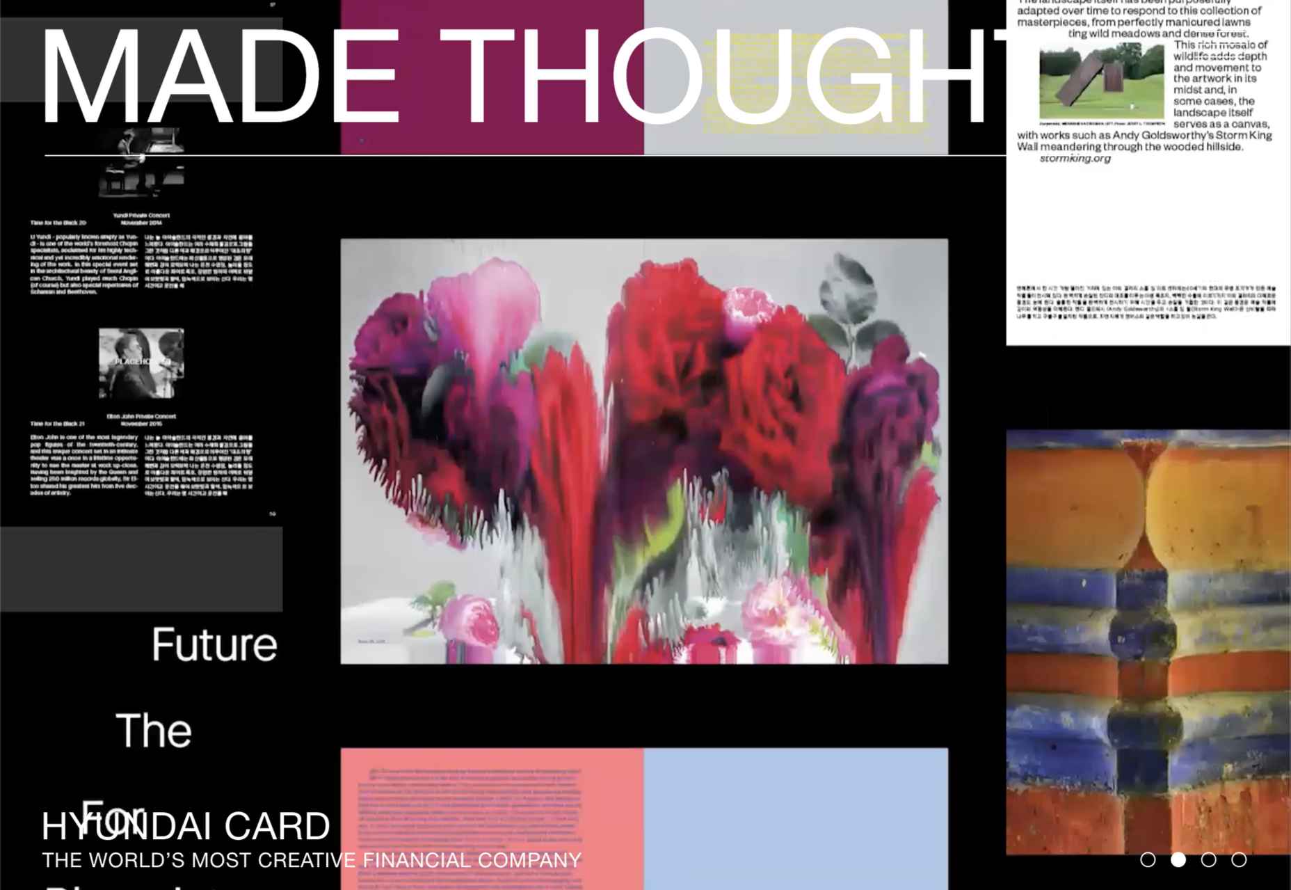
Made Thought
Made Thought has a bold aesthetic and approach that explains its outstanding client list.
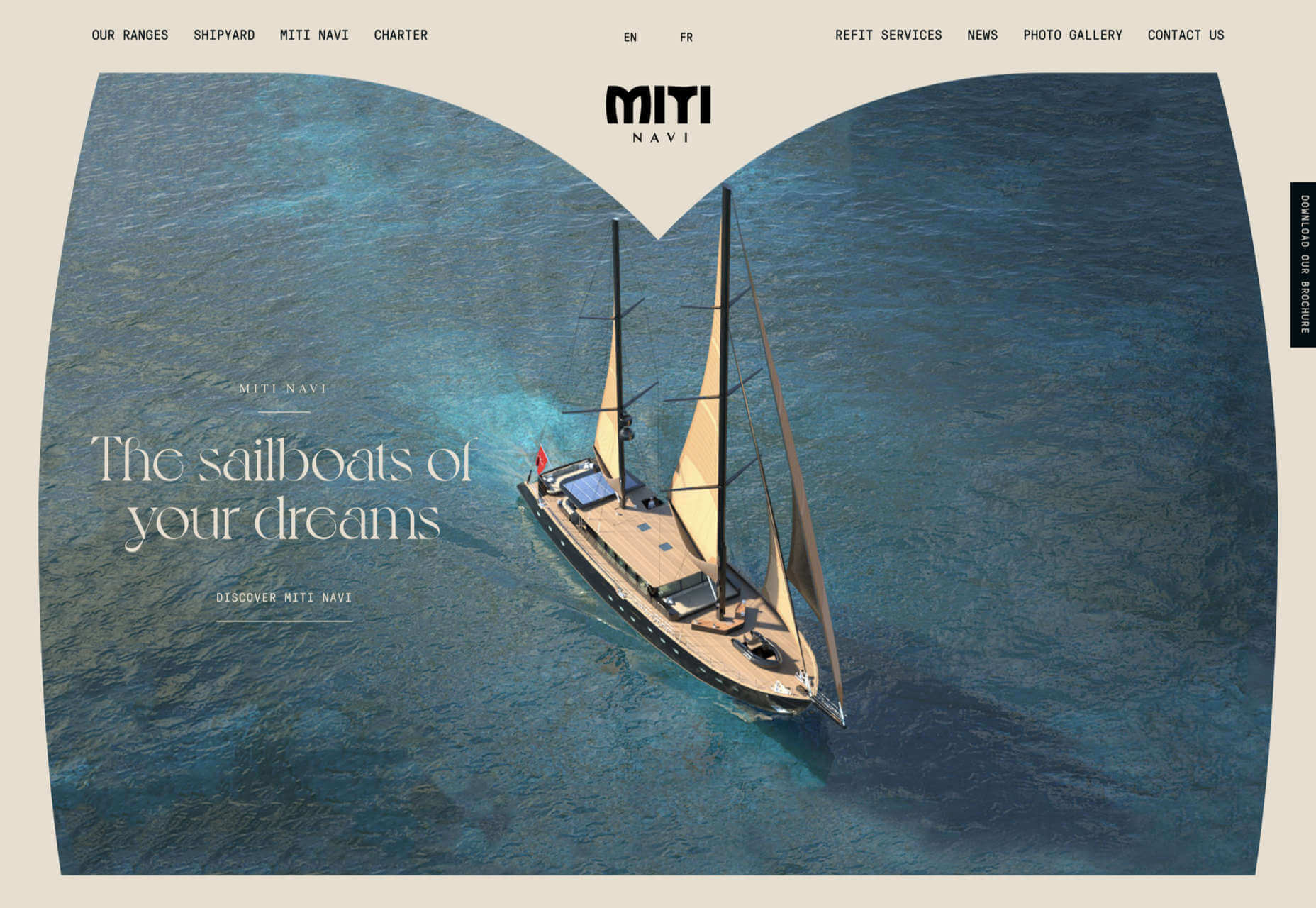
Miti Navi
Miti Navi makes extraordinary sailing boats. We were attracted to how its site presented a luxury product in an original way.
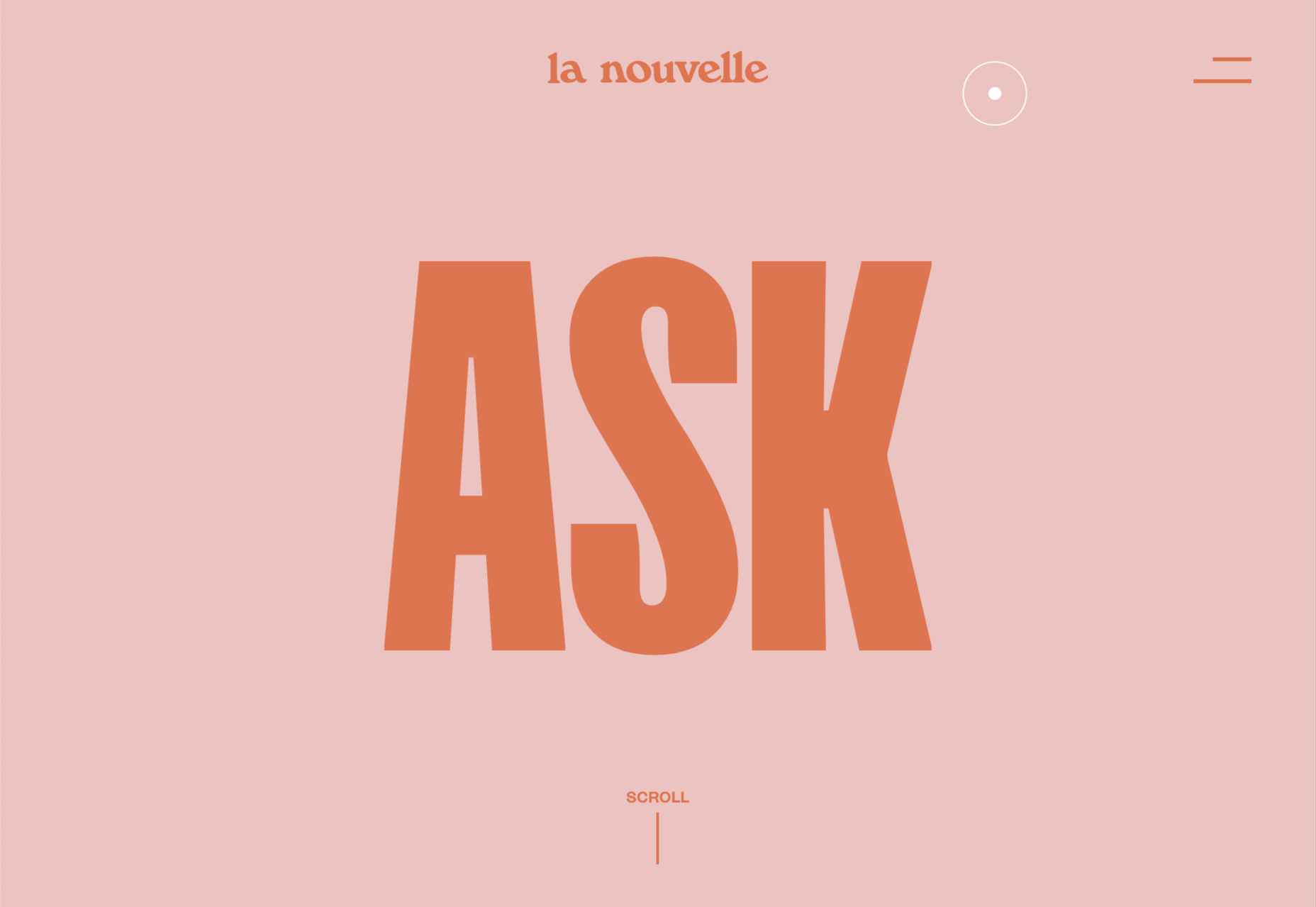
La Nouvelle
Another powerful digital design agency site was La Nouvelle’s, which used a combination of contrasting and complementary color combinations to catch the eye.
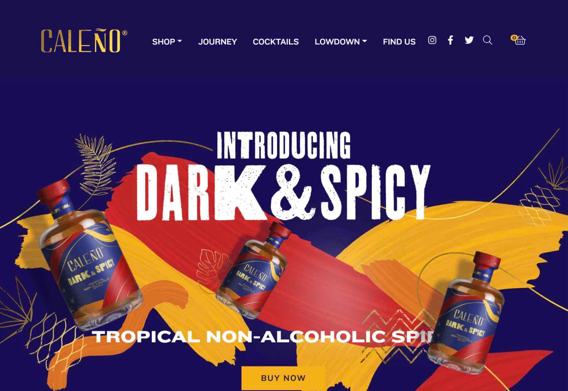
Caleño
Caleño makes non-alcoholic distilled spirits. They relaunched their website in March with bright, joyful colors that reflect the character of the brand.
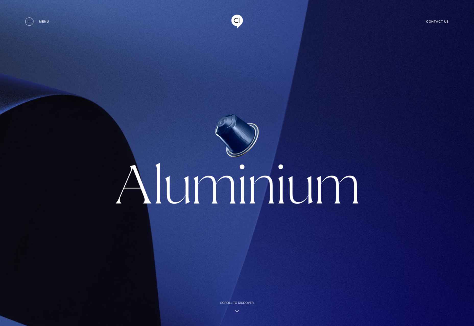
Capsul’in — Aluminium
This demo site for a coffee pod manufacturer isn’t a site as such, but it demonstrates that even in 2022, there’s room for parallax scrolling.
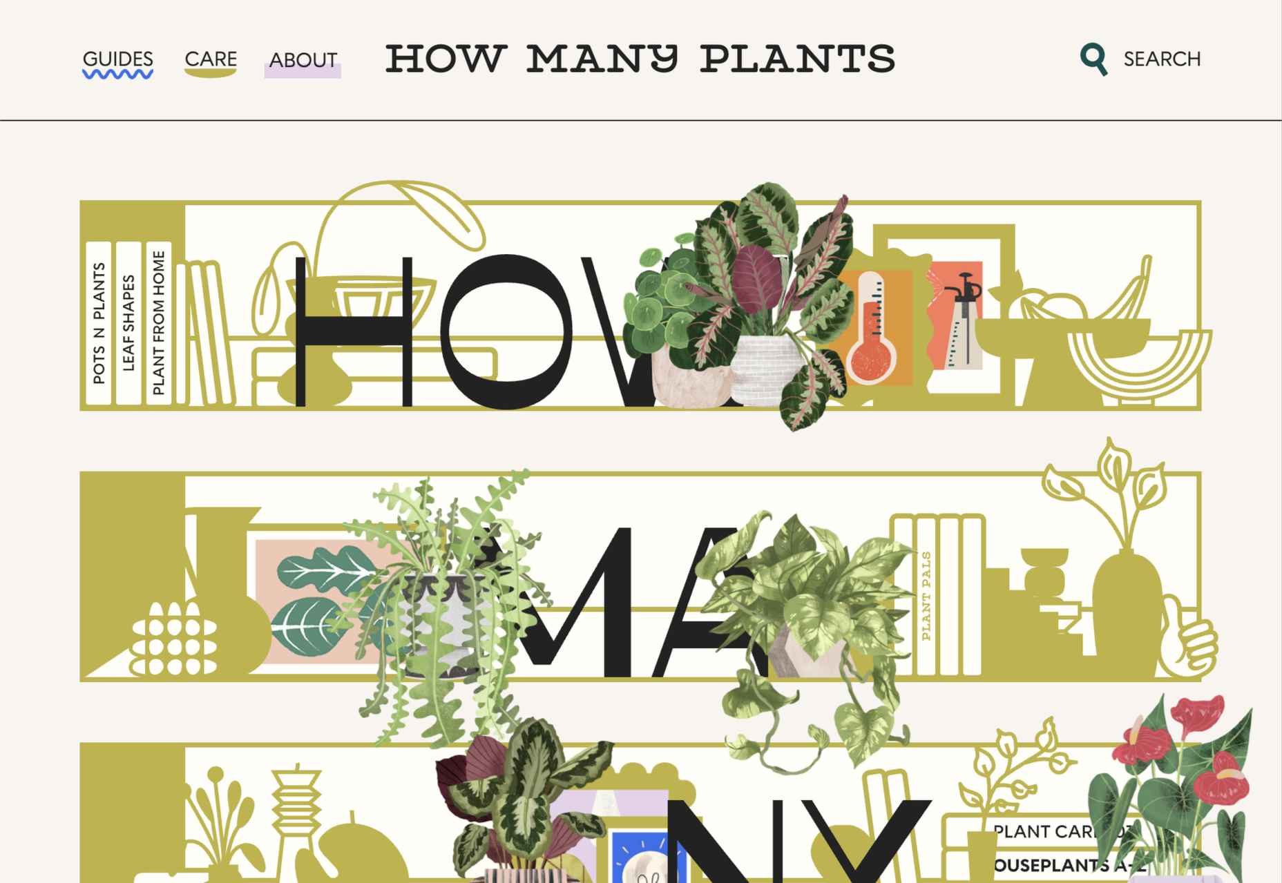
How Many Plants
Everyone needs a few more houseplants, and How Many Plants is a great guide to how to own and look after them. The illustration style is friendly but efficient.
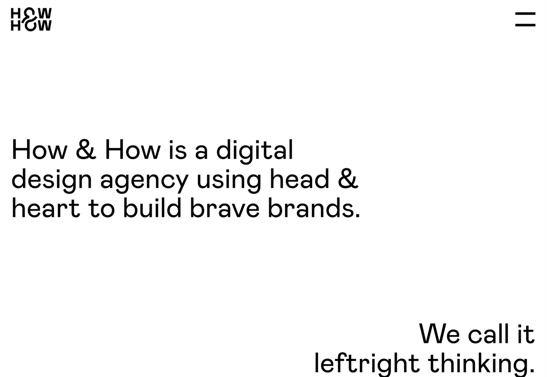
How & How
One of the most approachable design agency sites of 2021 was How & How’s. It keeps things light and clean, and effective.
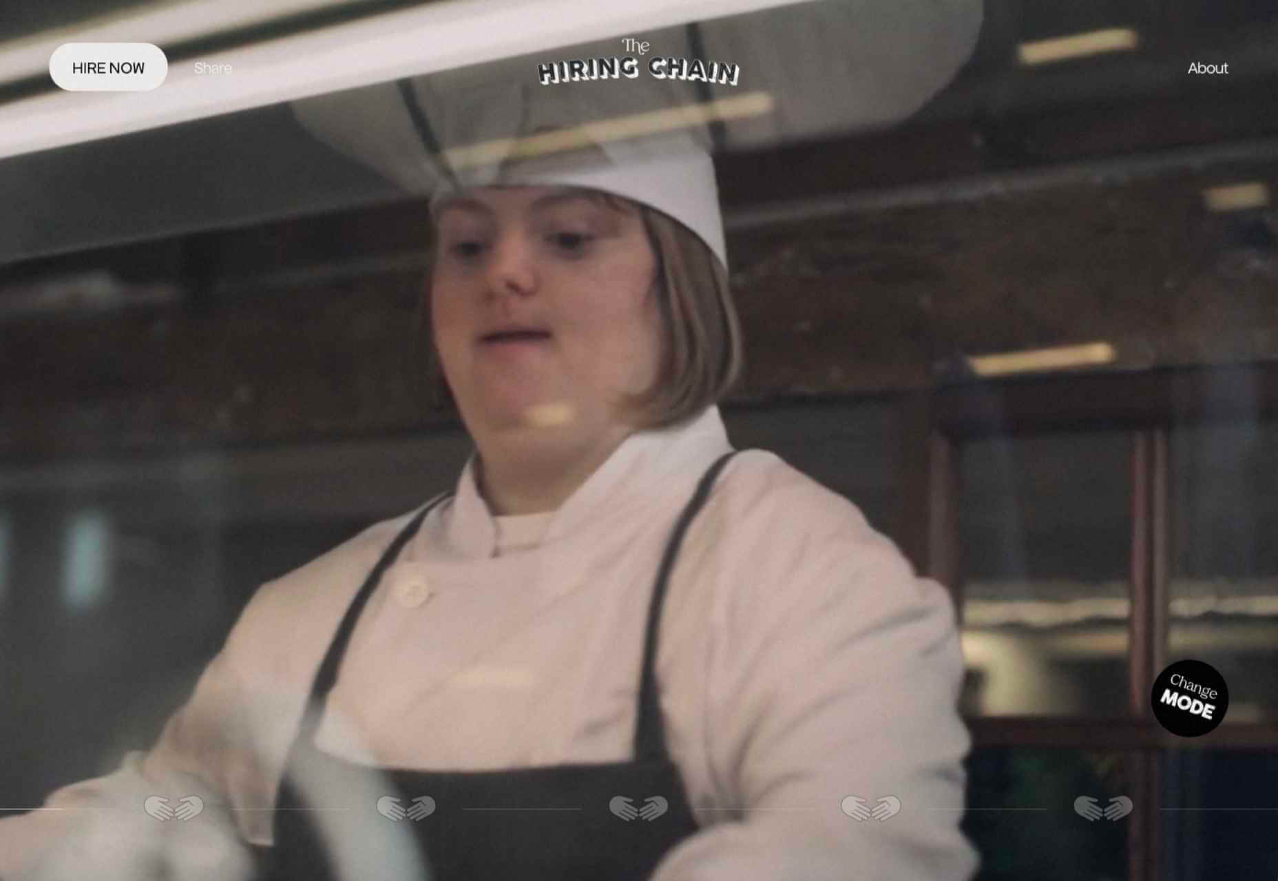
The Hiring Chain
Part of a campaign encouraging businesses to employ talented people with Down Syndrome, The Hiring Chain website dispels myths with clearly presented facts.
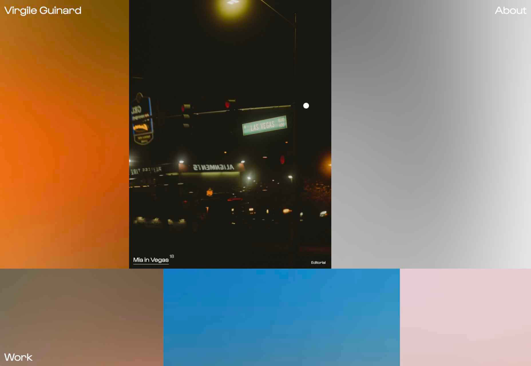
Virgile Guinard
Back in February, we couldn’t get enough of photographer Virgile Guinard’s portfolio site. Blocks of color pulled from each image hide the image allowing you to focus on one image at a time.
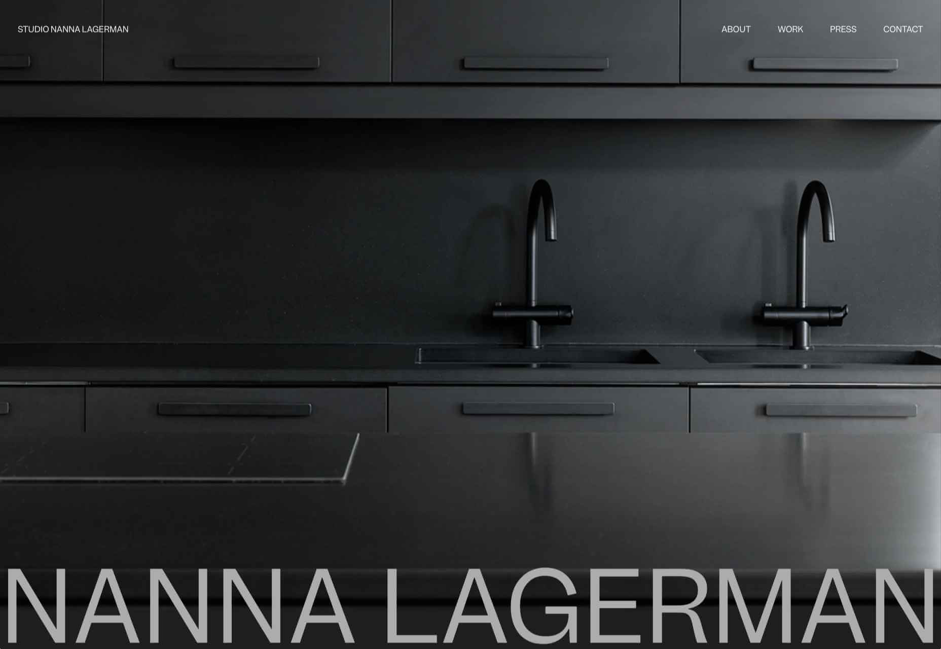
Studio Nanna Lagerman
Studio Nanna Lagermann’s site excels at creating a sense of space and calm. The color palette is soft and neutral. The type is large but clean and sophisticated.
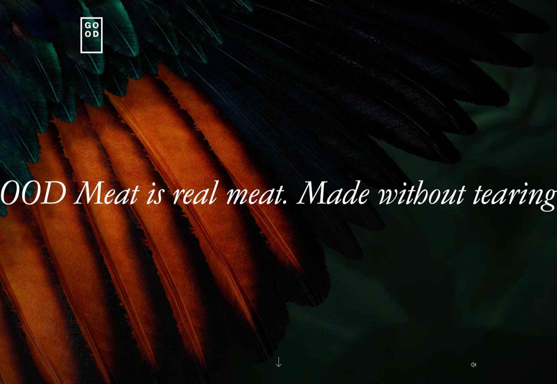
GOOD Meat
Veganism is a growing trend, and one of the sites promoting it with gorgeous colors is this site for lab ‘grown’ meat.
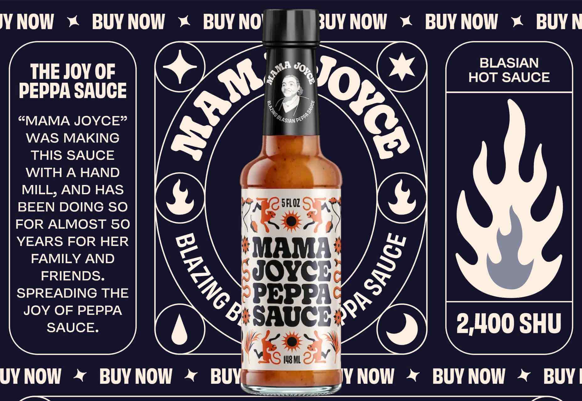
Mama Joyce Peppa Sauce
This one-page site for Mama Joyce Peppa Sauce is big and bold. Click almost anywhere, and two bottles of sauce go into your cart.
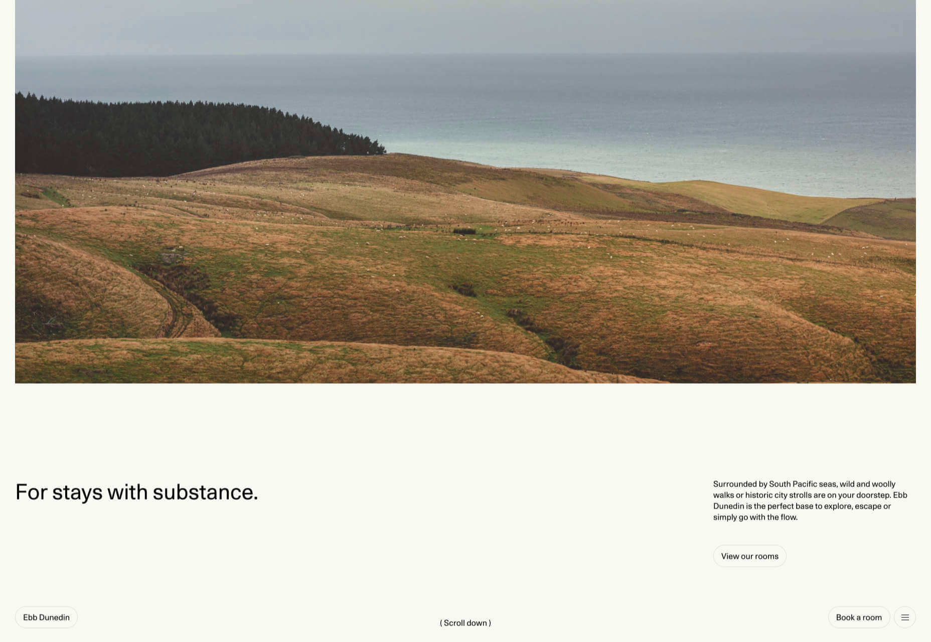
Ebb Dunedin
The site bucks the trend for luxury hotel design and instead is styled to complement its interiors. We could have done with time at this boutique hotel in 2021, maybe next year…
Source
The post 50 Best Websites of 2021 first appeared on Webdesigner Depot.
Source de l’article sur Webdesignerdepot
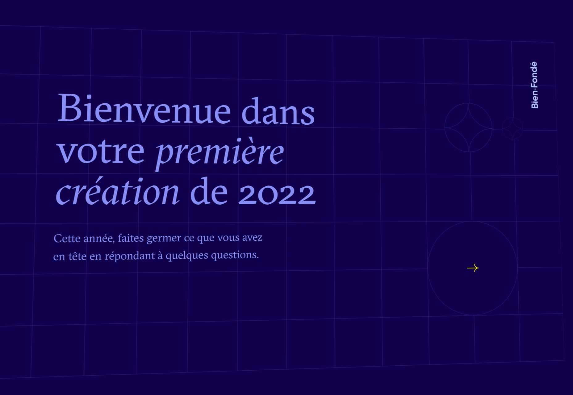
 So here we are, in a brand spanking new year—time for looking forward with fresh ideas and renewed hope for the year ahead. We are kicking off 2022 with a mixed bag and, we hope, something for everyone.
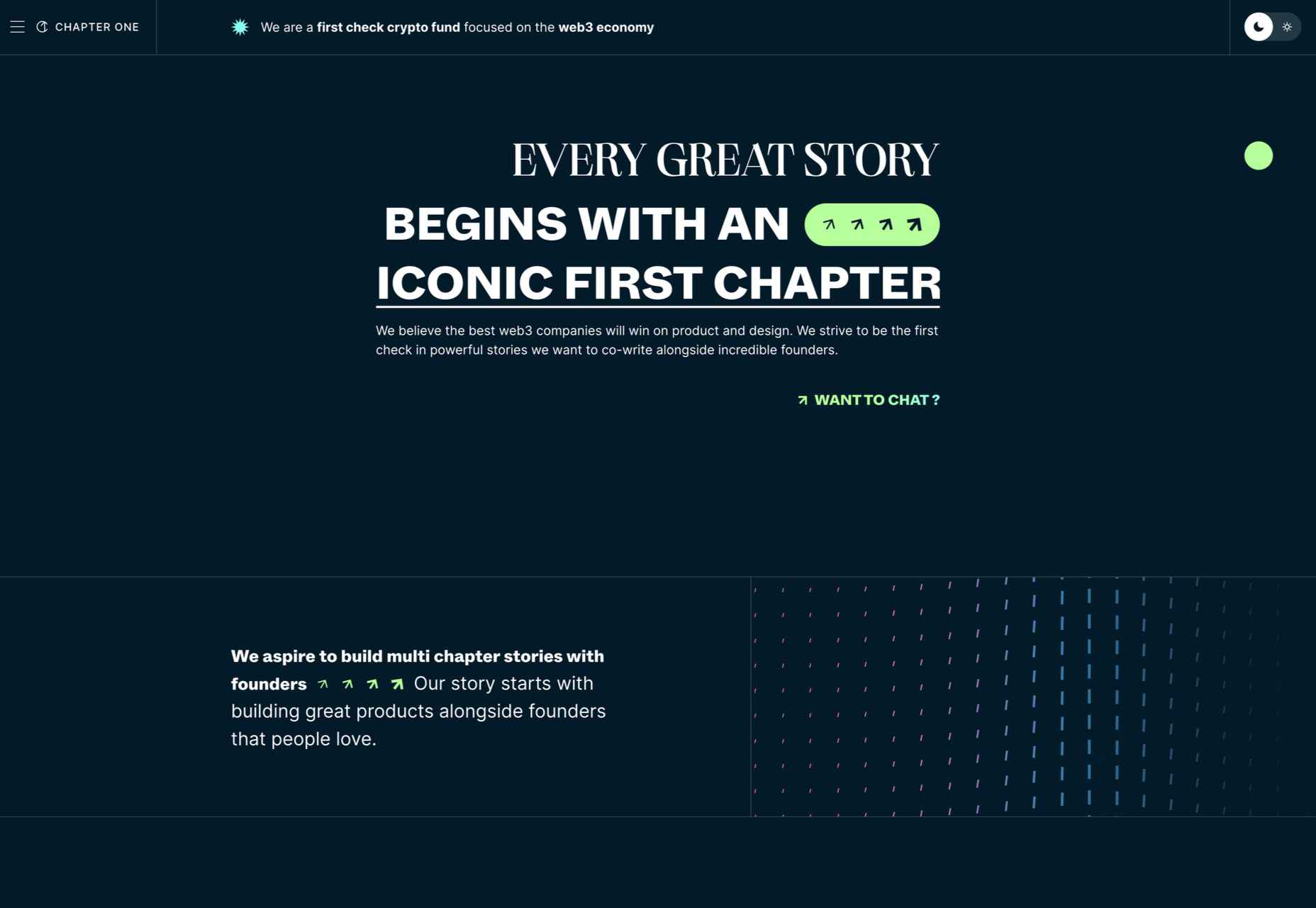
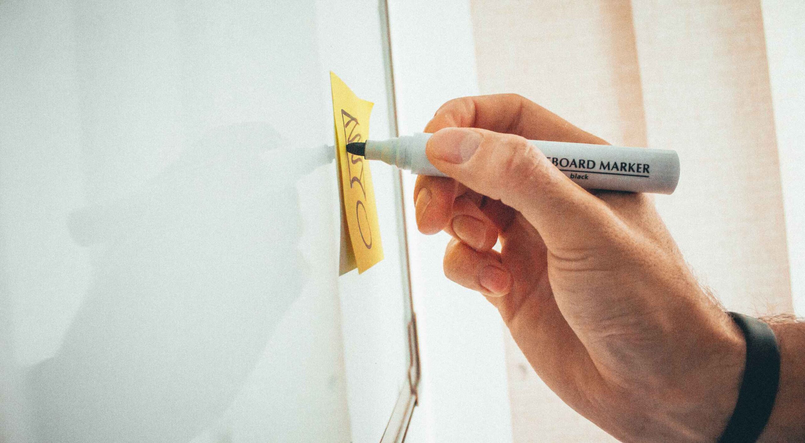 Few things are more important to a web designer or developer’s chances of success than having the proper workflow. The term “workflow” applies to the set of standardized steps you or your company uses to create, test, and deploy designs or products.
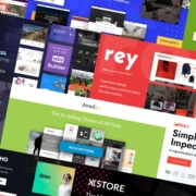
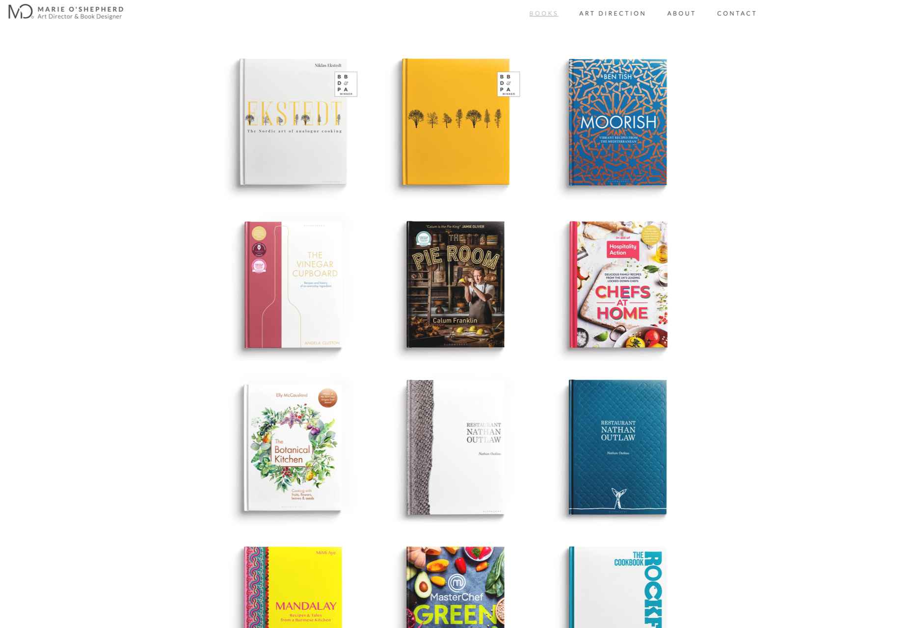
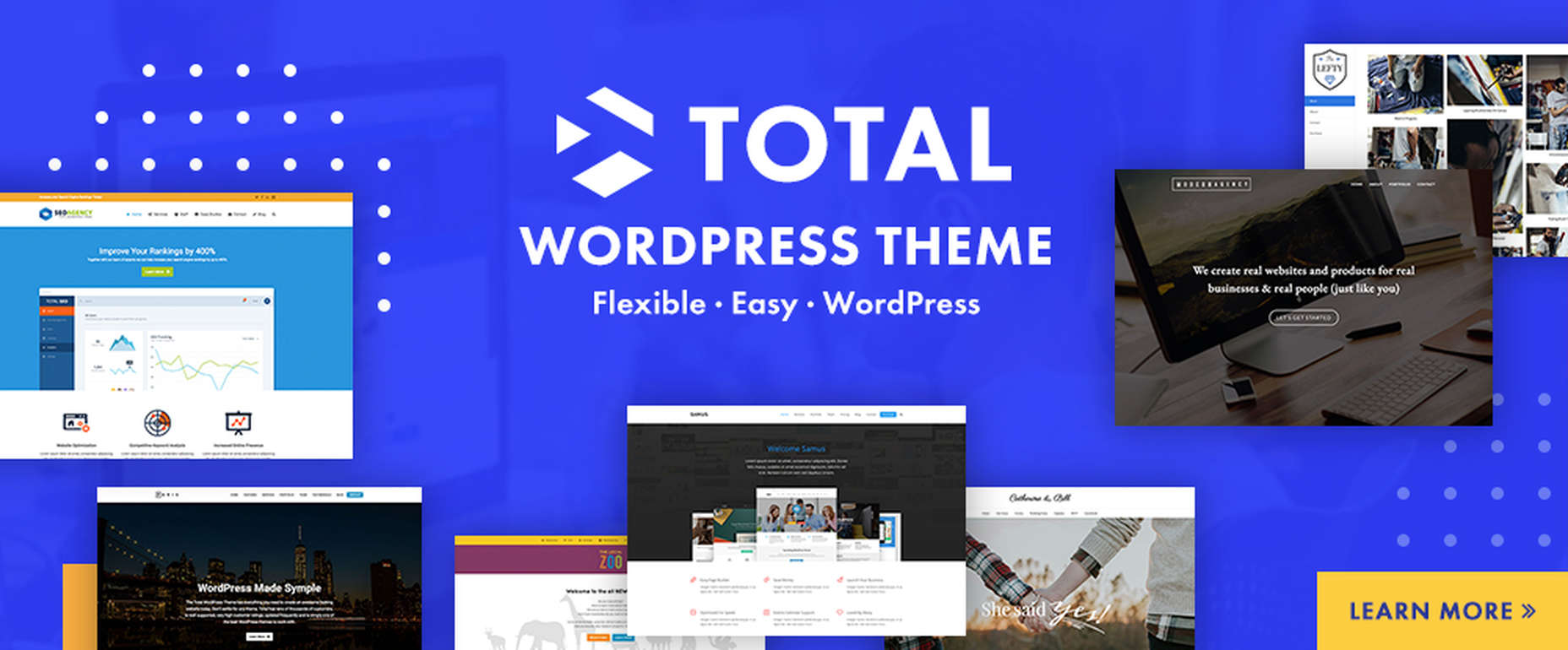
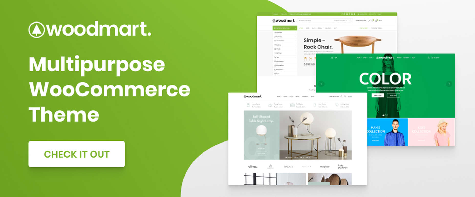
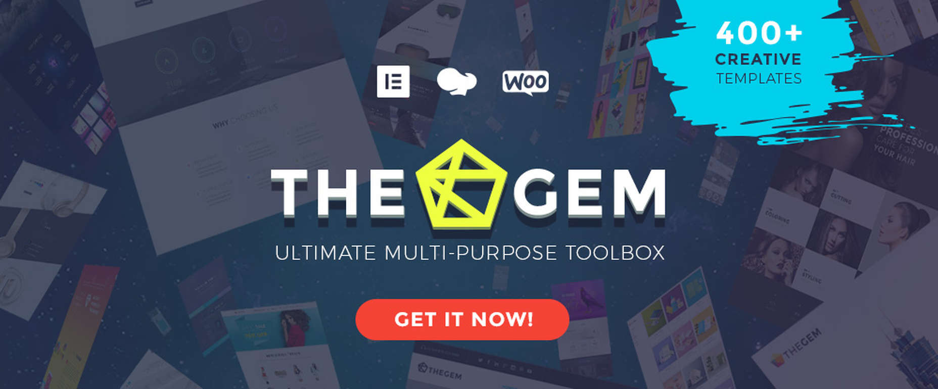
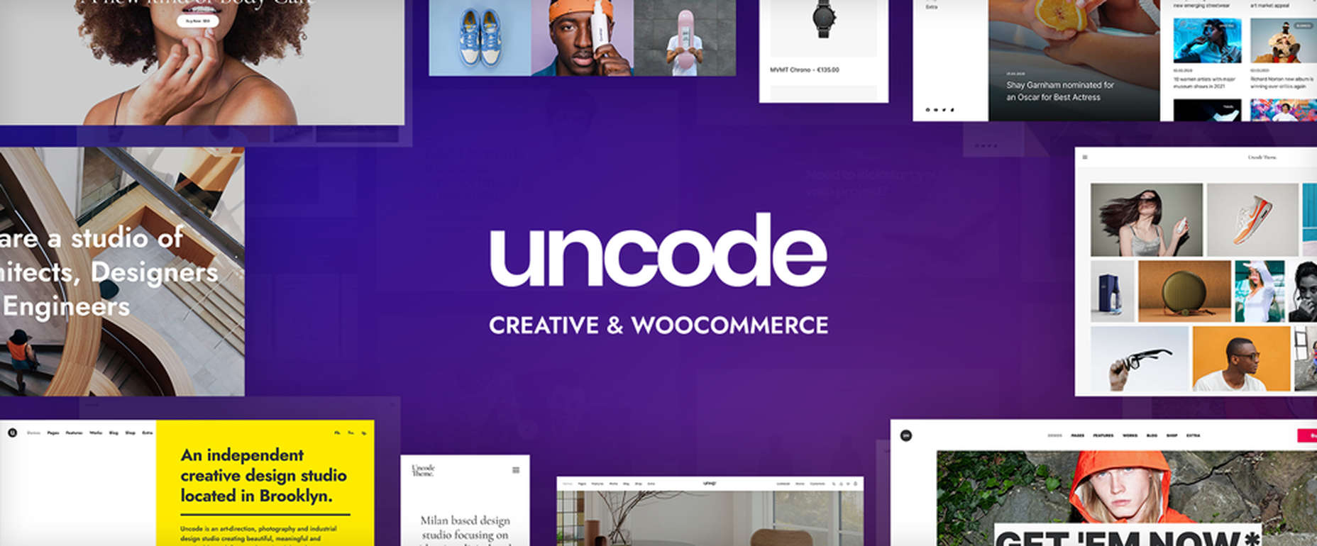
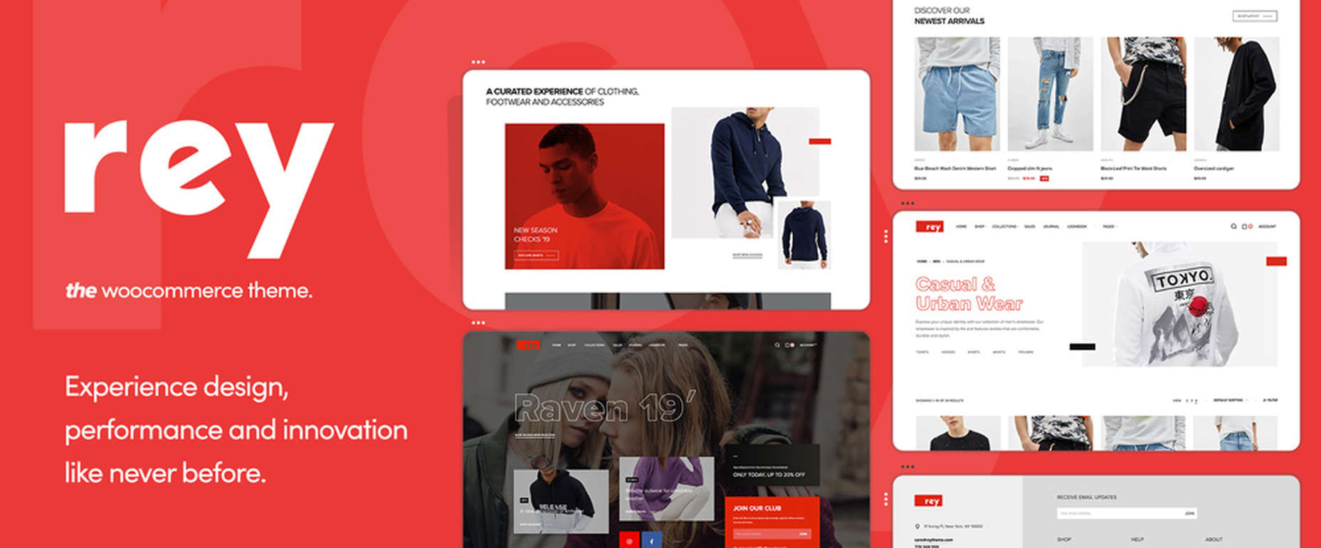
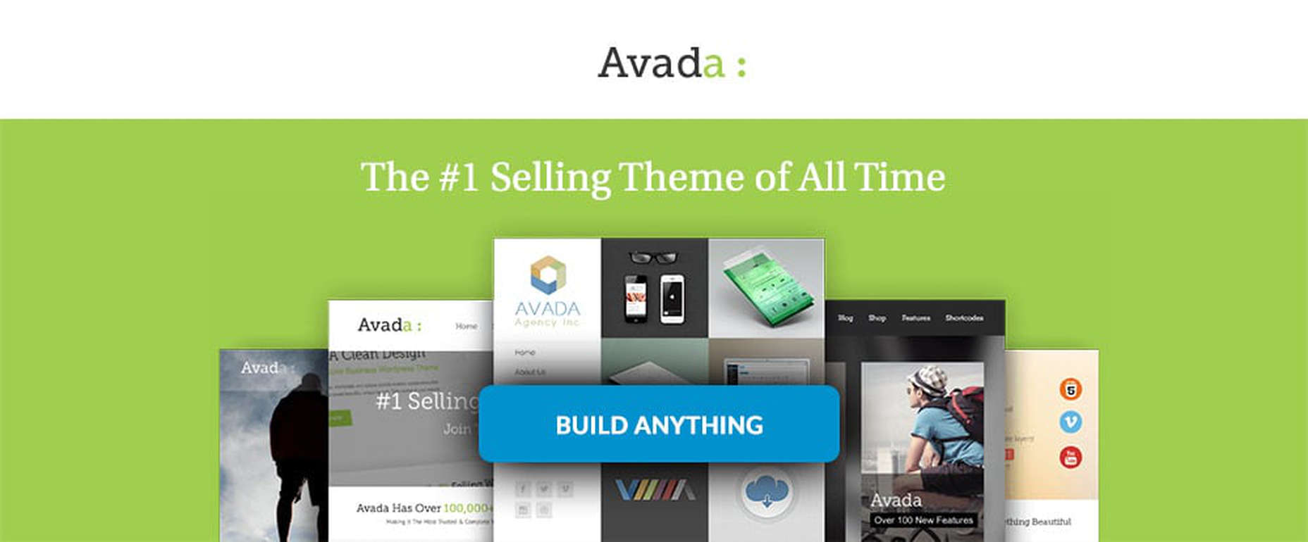
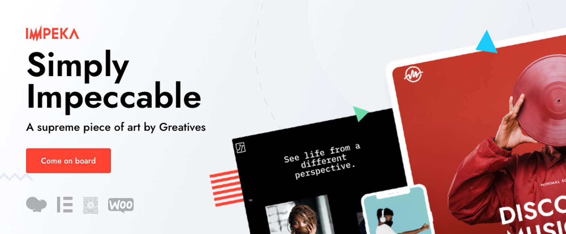
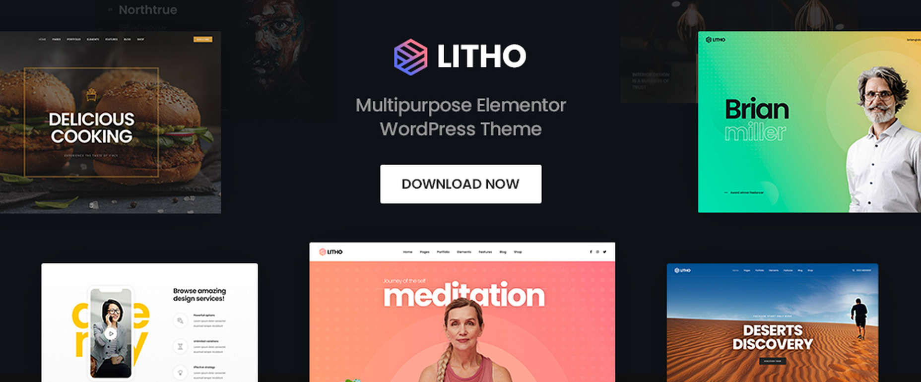
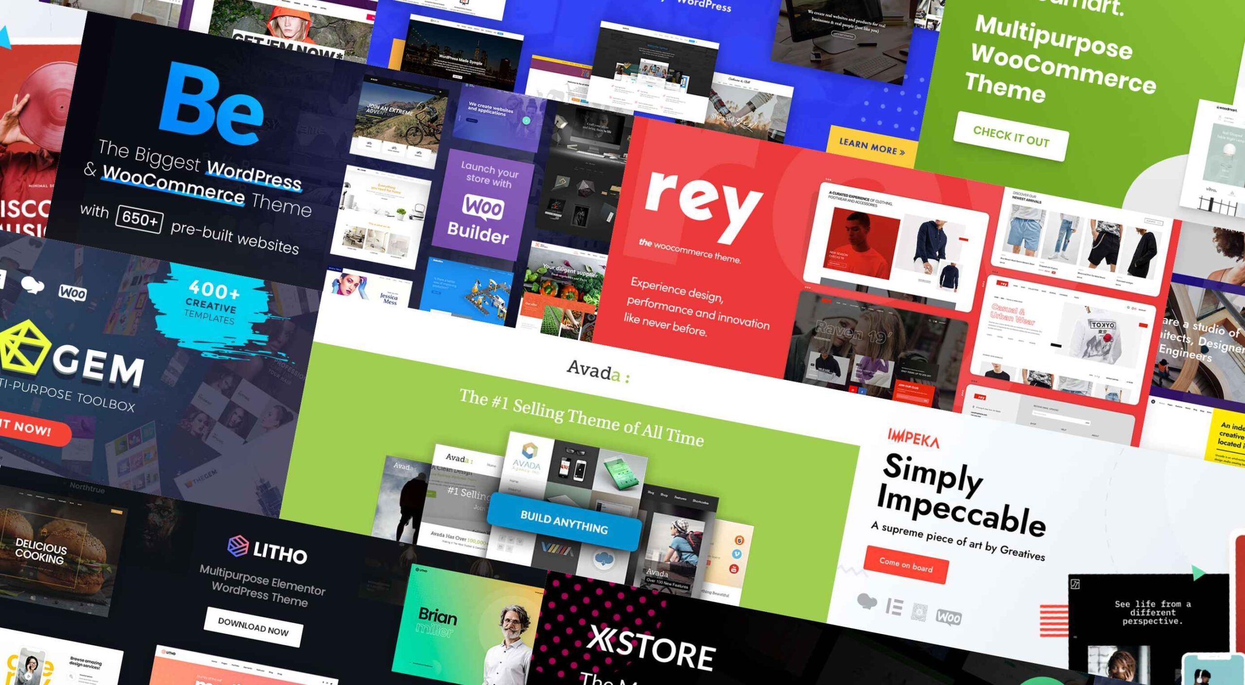 If you’re looking for a WordPress theme for your 2022 projects, it never hurts to see what the experts consider to be the best of the bunch. That’s not to say that experts don’t have their favorites. They often do, and we are no different.
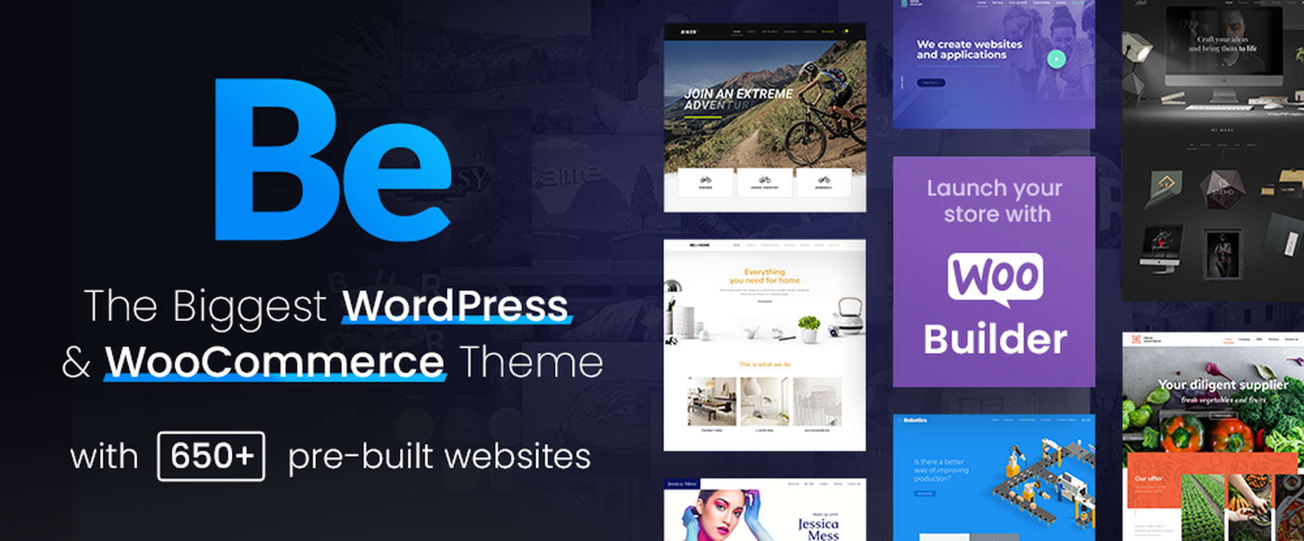


 There are a lot of factors that contribute to a


 Many people believe that UX design is all about creating slick, engaging images and top-notch user flows. While those things have their merits, UX designers do much more than that.
 According to Klipfolio research, users spend on average
