 There are so many things to think about when first starting a business. What will your business offer? How will this differ from existing solutions? Who will benefit most from your offering? And why are you so passionate about this?
If you haven’t done so yet, work through this exercise to come up with your brand identity and business name.
Once you’ve figured out your brand identity, you have to create a visual identity — also referred to as brand imagery — to go along with it.
While you could easily throw together visual elements that speak to you, your goal should be to choose visuals that resonate with your audience. So, building your visual identity is going to require some work.
In the following post, we’re going to look at how your brand’s visual style can give off certain signals to those who encounter it (and how to use those to your advantage). We’ll also break down what you need, to piece together your visual identity.
The Power of Visual Identity
Each of the design choices you make that website visitors, social media followers, and customers can see will impact how they approach your brand. Are you a fun-loving company that caters to a younger crowd? Do you create high-tech products that solve serious global problems? Are you a successful entrepreneur who’s reshaping the way we talk to one another?
When done right, our brand visuals convey our brand’s personality, values, and mission without having to use any words.
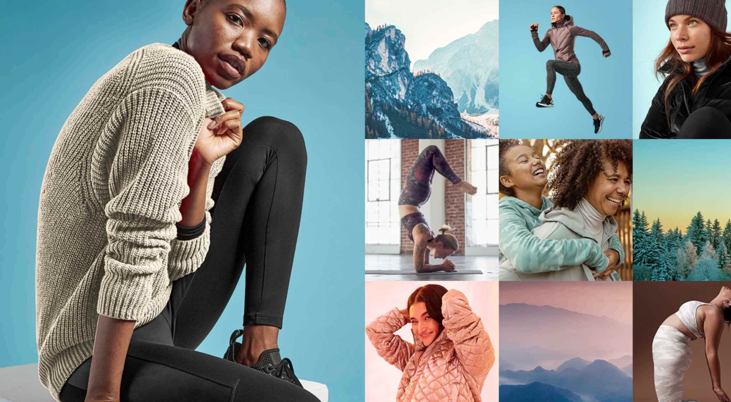
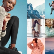
Think about your favorite clothing brand. What do you picture? Let’s use Athleta as an example.
The logo is probably the first visual element that comes to my mind:

The grey radial shape is one I’m very familiar with. It’s on their website, their social media, and it’s usually imprinted somewhere on their clothing.
The second thing I think about when I think of Athleta is its physical imagery:
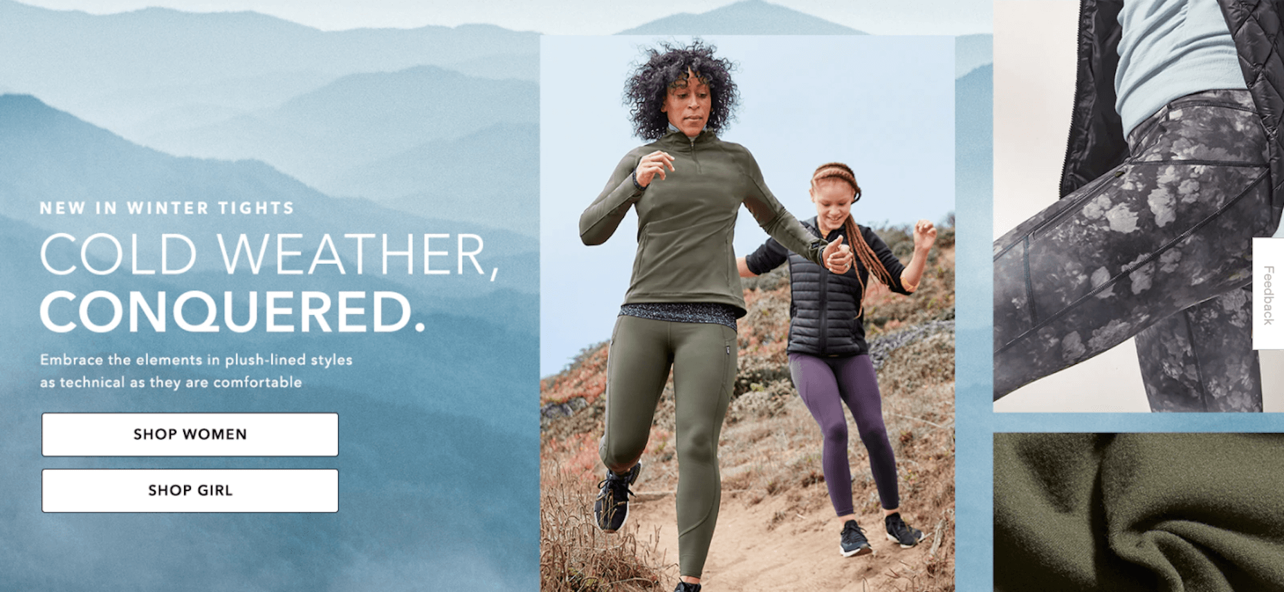
Rather than include images of the clothing on its own, there’s often someone wearing Athleta clothes while hiking along a trail, walking on a beach, or working out in a studio.
There’s so much that just these two visual elements tell us about this brand:
- Athleta targets active female consumers; we see this in its images and CTAs. The fine touches and shape of the logo may suggest this as well.
- Athleta creates understated but highly functional clothing; we see this in the product photos as well as in the brand’s use of neutral colors and fonts across its designs.
- Athleta’s mission is to help customers have a healthier and more balanced life; we see this in its product photos, but we also get a sense of this from the simple symmetric structure of the logo.
There are overt ways to use visuals in your branding (usually through your choice of photos or illustrations). But there are also ways to subtly convey more about your company, what it does, and for whom you work through your choice of colors, fonts, structure, and more.
How to Create a Visual Identity for Your Brand
Let’s walk through each of the elements you need to pull together to create your visual identity:
The Color Palette
Like with everything else in business, you’re here to give your audience something they need, so they have to be at the forefront of your decisions — including which colors you put into your brand’s palette.
So, where do you start in choosing a color palette for your site and other marketing channels?
Let’s take a systematic approach.
1. Choose a Primary Color
Go to the Canva color meanings and symbolism tool.
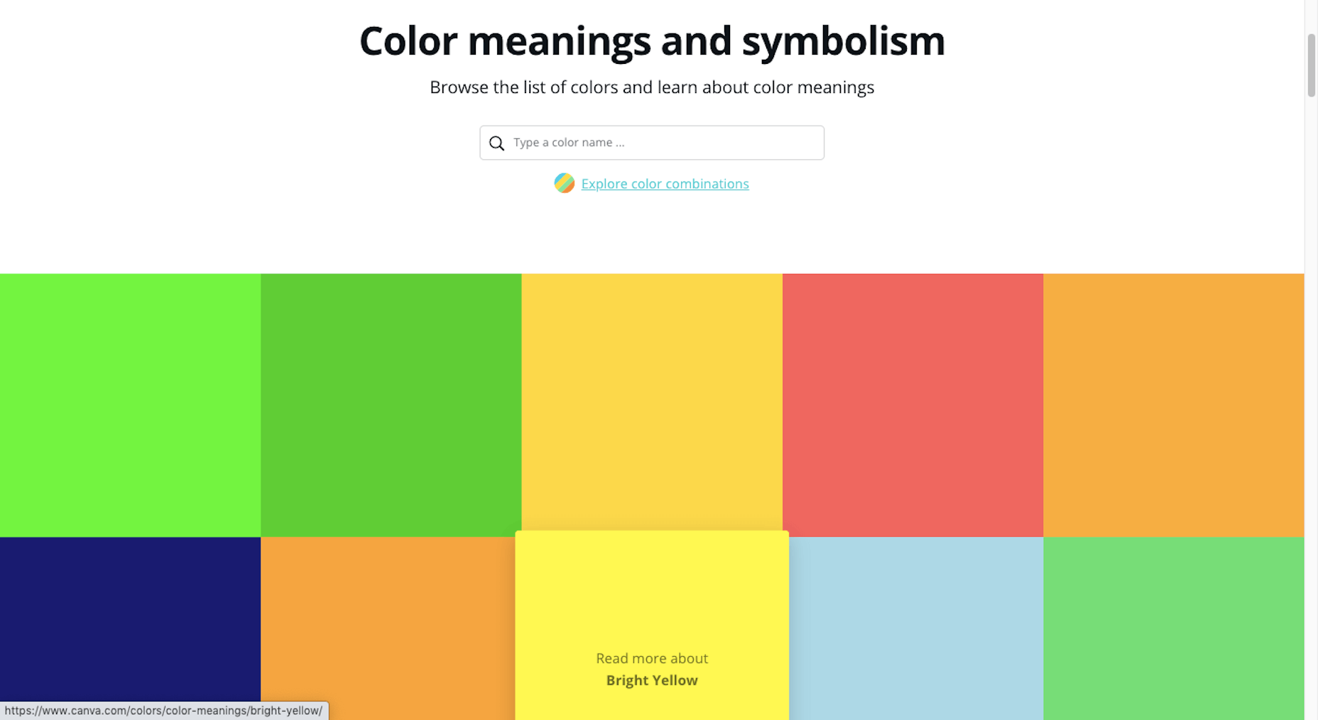
Have a look through the colors and find one that feels good to you. Open up the page and read more about what the color means:
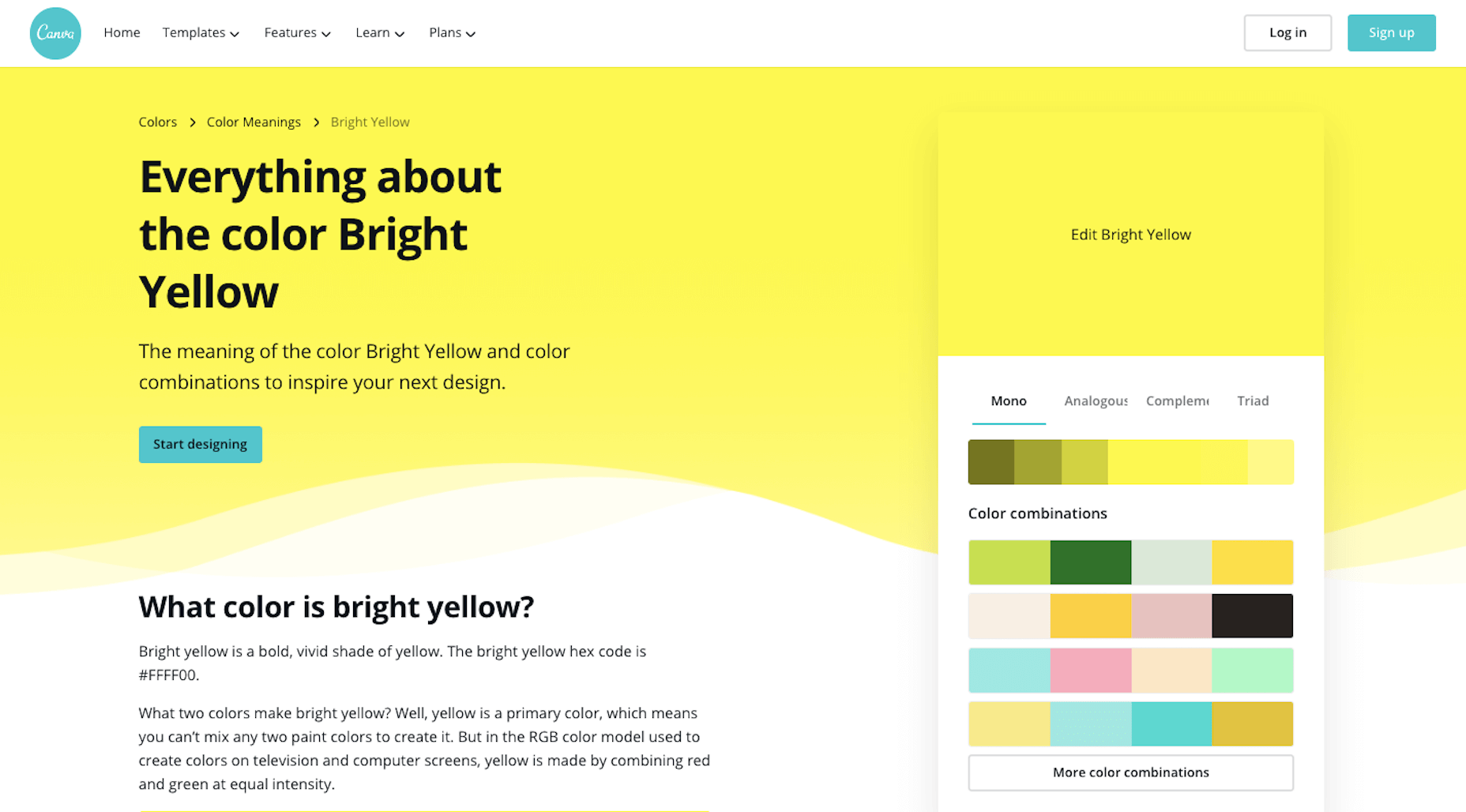
You’ll find the following on each page:
- A brief history on the color;
- How it’s been used by people over the years;
- What it’s symbolized over the years and around the world;
- How to use the psychology of the color to affect people (i.e. your audience);
- Alternate shades and colors if this particular one doesn’t send the right signals;
- Colors that pair nicely with this one.
While it’s important to consider how colors evoke different emotions, it shouldn’t be the only driving force. Your primary focus should be to choose colors that positively affect the user experience. In other words, you don’t want them to get in the way or distract prospects from getting to know your brand and eventually converting.
2. Create a Full Color Palette
Once you’ve picked a primary color, you need to come up with a color palette. You’ll want one or two colors to use in your logo and a full color palette for your website and other branded channels.
You can use Canva’s palette suggestions (in the top-right corner of the color page) to create a basic color palette.
For something a little more robust, use Material Design Palette:
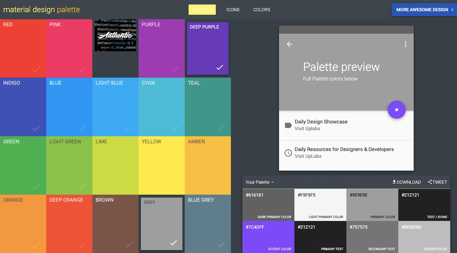
Color options are a bit limited, but it does a good job of spelling out where you should use each color. You can then adjust the color palette as you see fit.
Typography
The design and pairing of your fonts can greatly impact the way people respond to your brand and the words you’ve written about it.
So, the goal with typography is to make your words easy to read while also giving hints about your company’s personality and style.
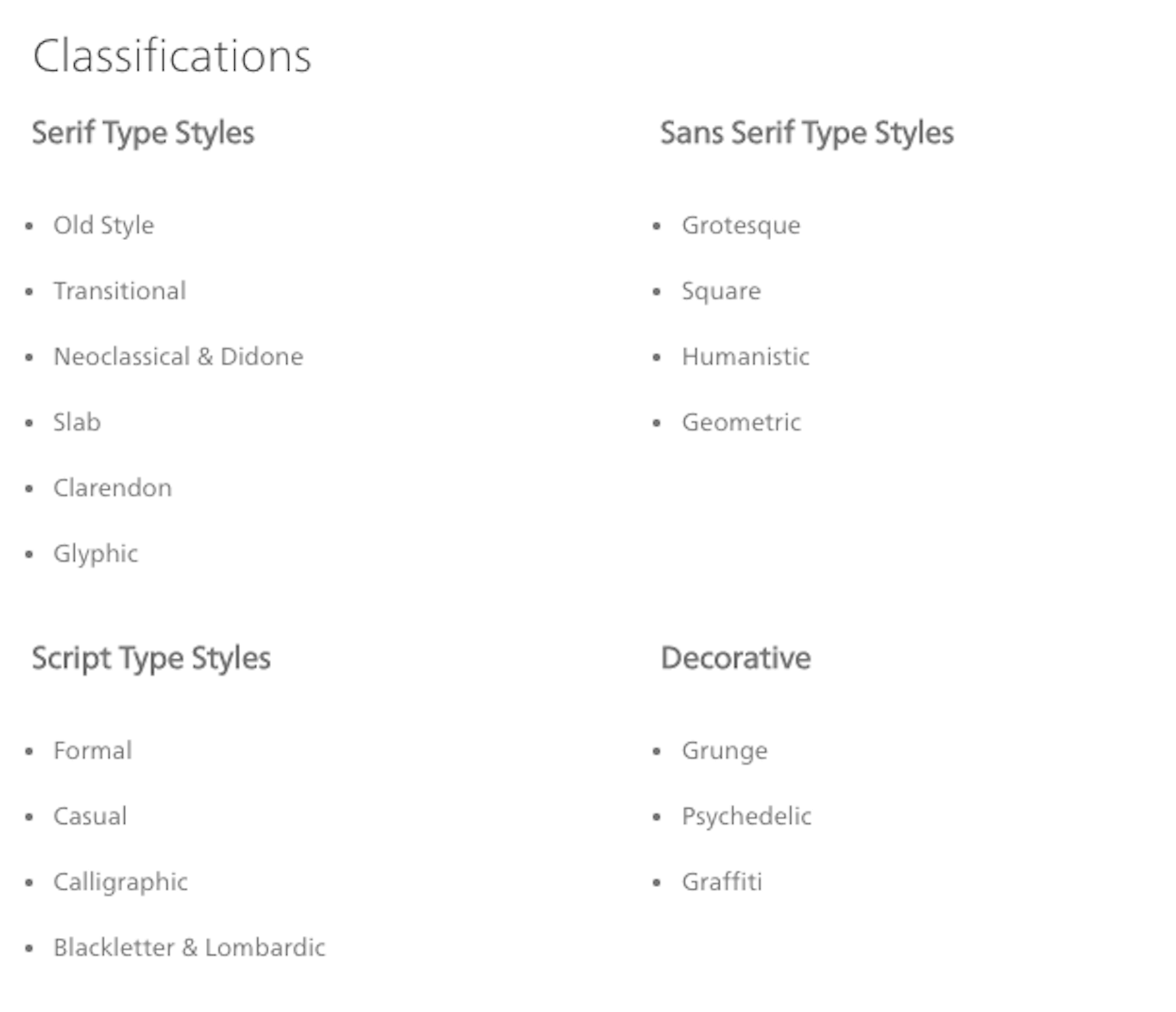
1. Understand Font Styles
Figure out what style of font goes best with your brand identity.
This is the simplest way to categorize fonts:
- Sans serif: These are simple fonts without any “feet” (lines at the ends of letters).
- Serif: These are more traditional-looking fonts (the kinds you see in literature and newspapers) with feet.
- Script: These are cursive and curly fonts that mimic handwriting.
- Display: These are fonts designed specifically to appear in logos, hero images, and advertising because of their large, bold styling.
- Monospaced: These are fonts with characters that comprise the same amount of horizontal space, often resembling typewritten text.
You can break these down even further and really get to the root of the style. Fonts.com has a great explainer page on each of these classifications:
Here are some sources to help you find fonts for your brand:
2. Settle on Two or Three Fonts
Choose two or three fonts for your brand. Max. Anything more than that will create a distracting and overwhelming interface for your audience.
You’ll need:
- A font for your header text. It needs to look good in big sizes, be easy to read, and easy to identify from other text when scanning through a page or document.
- A font for your body text. It needs to look good in small sizes (16 pixels and up) and be highly legible.
- Optional: A font for your logo and hero images. It wouldn’t stray too far from the style of your headers, but if you need something a bit more decorative or unique, you can use a different font family for this.
If you find that you need more variety in your fonts to create a clearer hierarchy on the page or to call out certain elements, use superfamilies with dozens or even over a hundred different styles. That way, your users’ eyes won’t get fatigued from having to switch between too many font types.
3. Learn Font Pairing Rules
To pair fonts, use styles that contrast yet complement one another. Ultimately, you want the pairing of your fonts to send a cohesive message to your audience.
For example, a sans serif header and serif body are a common way to combine fonts. Like this pairing of Fira Sans and Merriweather from the FontPair website:
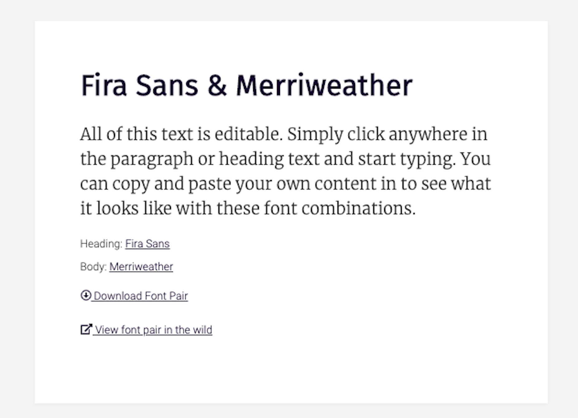
This modern-looking duo sends the message that: “Your comfort is priority #1 for us. Take your time reading and enjoy.”
There are tons of ways to make varying styles play off one another while sending the right signals to your audience: A safe serif with a retro cursive header font to come off as a playful, yet professional brand; a futuristic header and a neutral sans serif body font to give your product pages a very techy feel; and so on…
Once you have one or two fonts you like the vibe of, use FontPair to track down a good complement to the one you want to use.
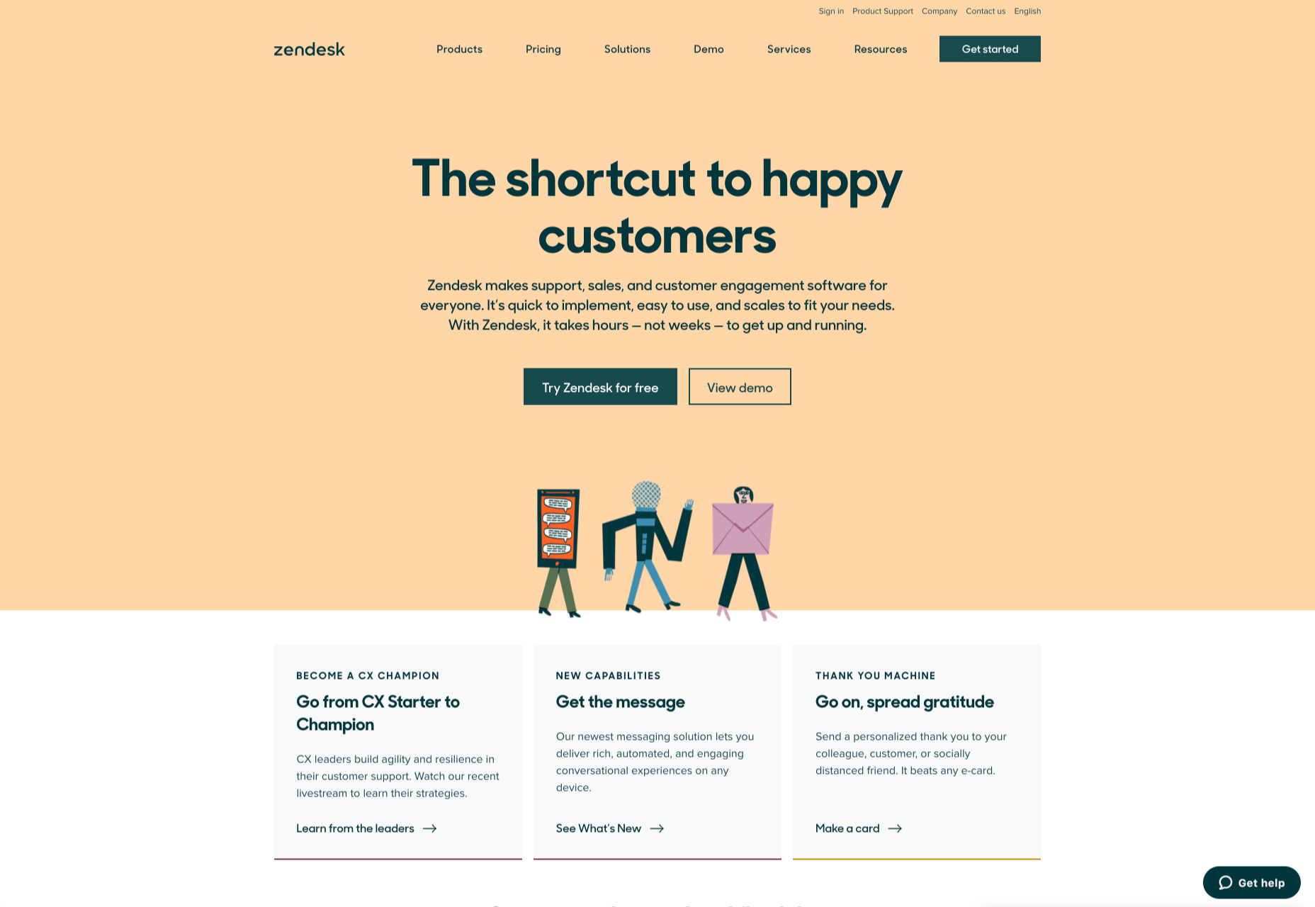
Imagery
We can use this as a blanket category for any visual content you might use in your branding:
- Photos
- Videos
- Illustrations
- Icons
- Backgrounds
- Textures
- Animations or GIFs
But just because there’s all this content to use, that doesn’t mean it should all appear on the same site to represent the same brand. You’ll want to narrow it down based on your company’s personality and how the style of imagery fits with it.
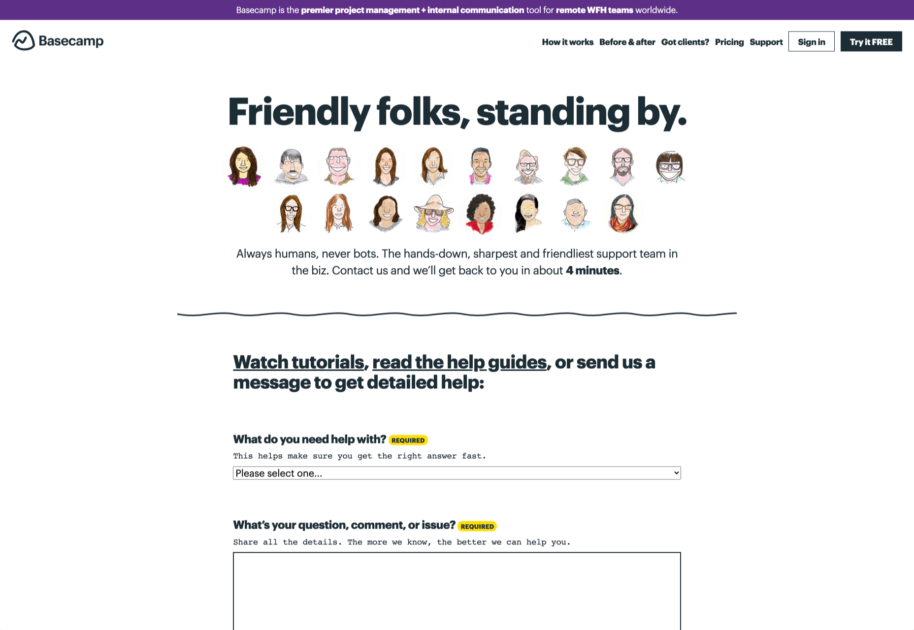
1. Photos vs. Illustrations
You can alter your brand’s voice and style based on the kind of imagery you use.
For instance, tech companies like Stripe often use illustration in their brand designs:
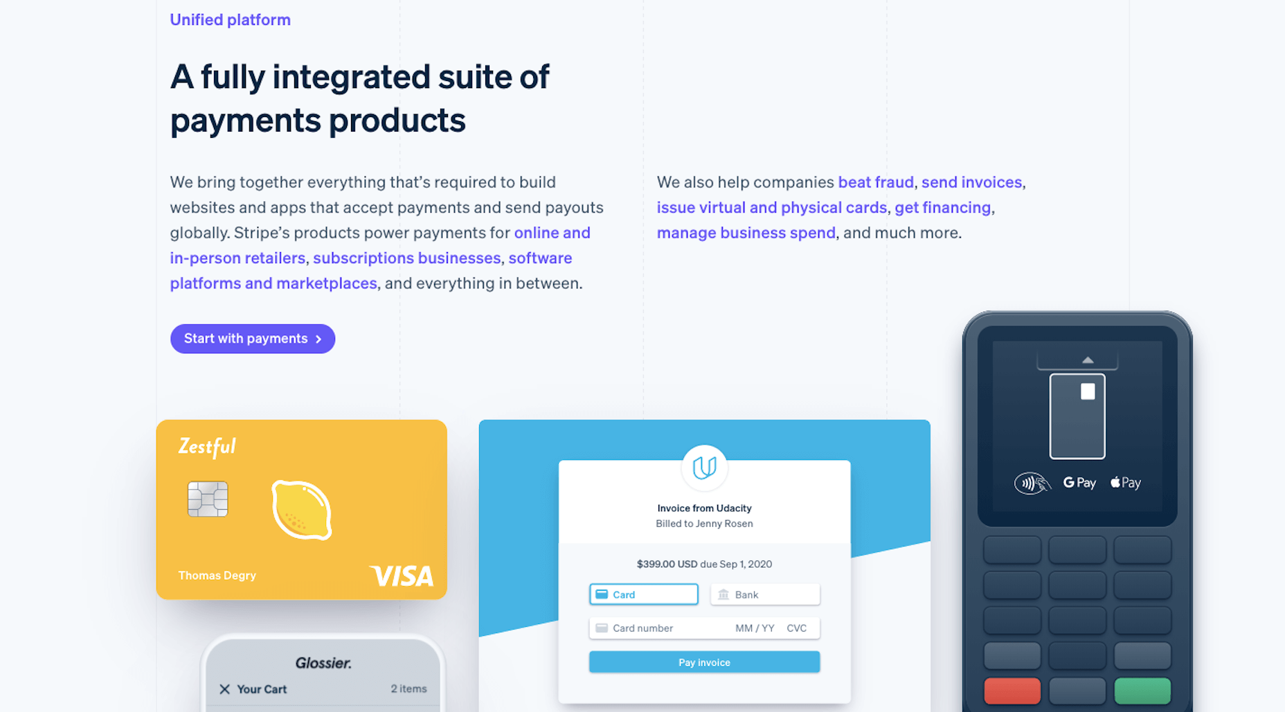
Even though SaaS companies sell one type of product, their audiences are usually quite vast, so it would be hard to find photos that represent everyone. And it’s not like users are focused on their relationships with the people behind the scenes. These companies put technology into the hands of their users, so it’s best to let the product shine and not the people. This opens up the door for some fun and creative possibilities with illustrations.
That said, choosing photos over illustrations doesn’t completely bar you from using vector graphics and icons. You can mix-and-match those visuals so long as they blend well with one another. What you don’t want to do is to mix two very different styles that say different things about your brand at once.
To decide what’s best for your brand, approach this from your users’ point-of-view. What kind of visuals will help them connect to your brand and what you sell?
2. Style
It’s not just the type of image you use that impacts your brand identity. It’s the style you apply to those visuals that can transform your visuals, putting visitors in a different time, place, or headspace.
Will you apply a filter to give your photos a similar look and feel?
Will you place each of your product photos against the same backdrop for a uniform look?
Will you use a completely new style of imagery for one of your product lines the way Apple has done for the iPhone 12?
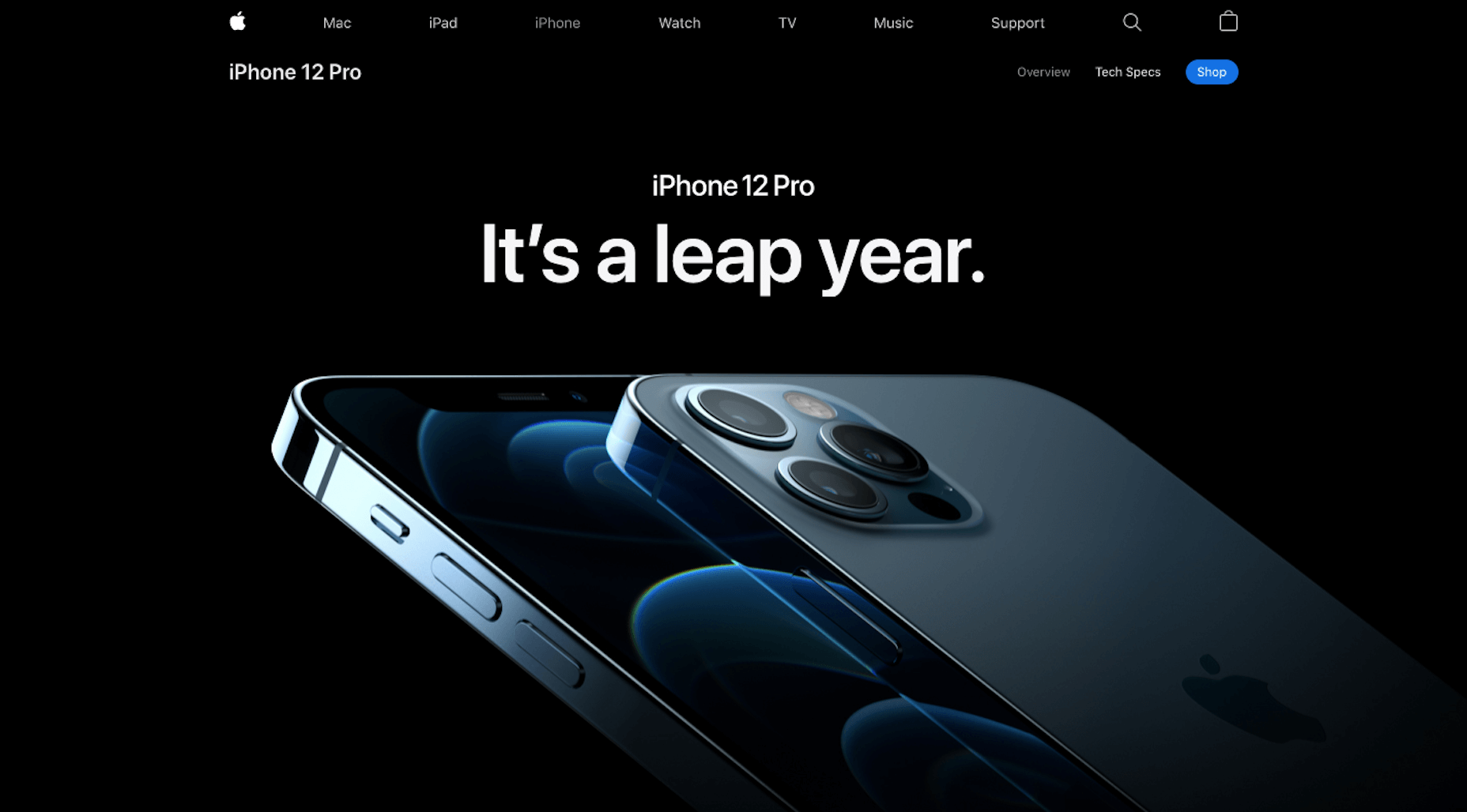
There’s nothing wrong with using out-of-the-box imagery. However, if they don’t give off quite the right tone, don’t be afraid to use your design skills to make adjustments and cater them to your own style.
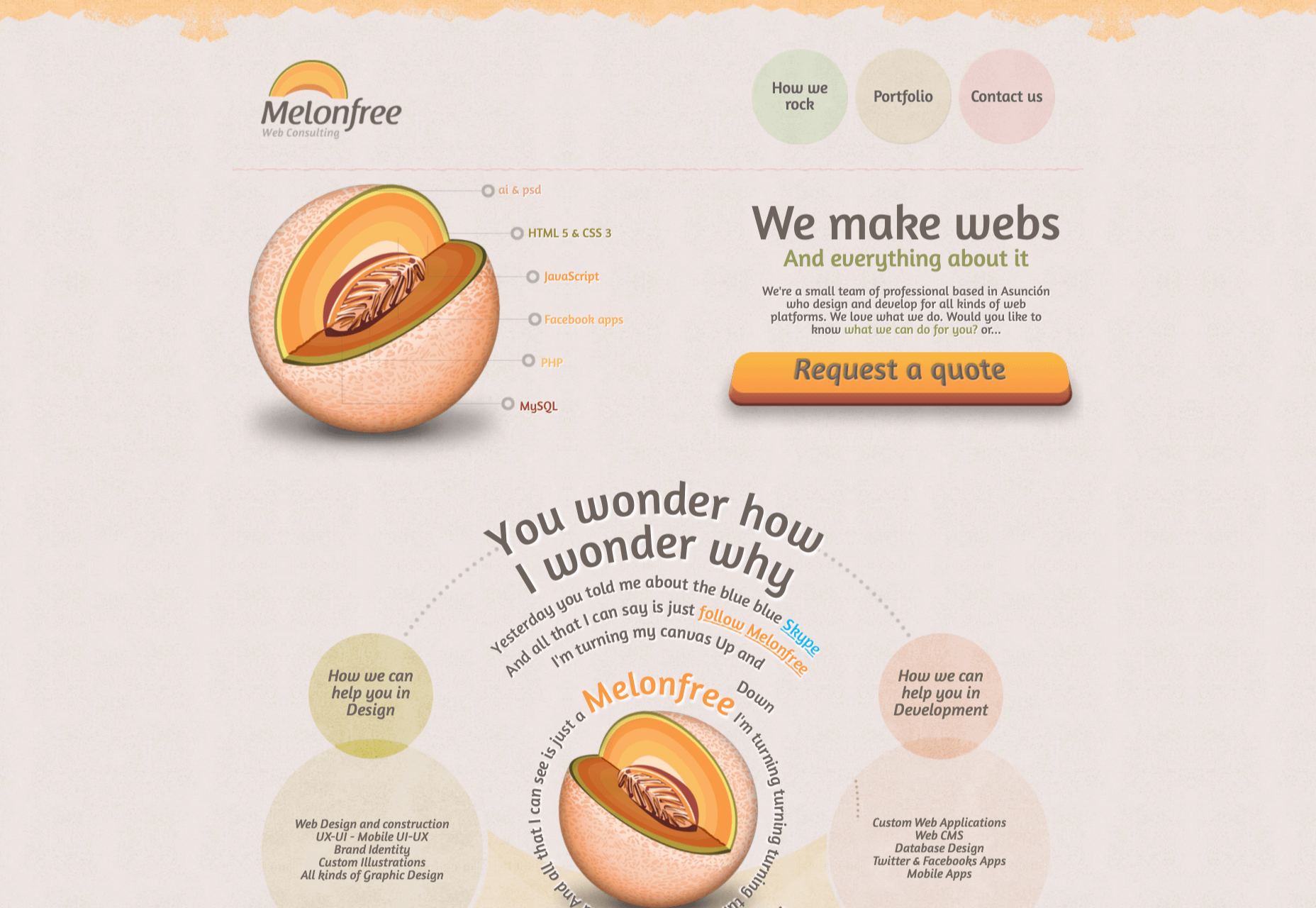
Logo
Your logo is the last of the visual elements you’ll need to invest some time in. The good news is that you’ve already done most of the legwork:
- You’ve defined your brand’s identity.
- You’ve given your business a name.
- You’ve selected the main visual components that will represent your brand: colors, fonts, and images.
That’s really all you need to create a logo that is relevant, unique, attractive, potent, and memorable.
That and a way to bring it all together. You have a few options.
Option #1: If you’re a graphic designer, you can create your own from-scratch.
Option #2: If you want help getting started, you can use a tool like Wix Logo Maker:
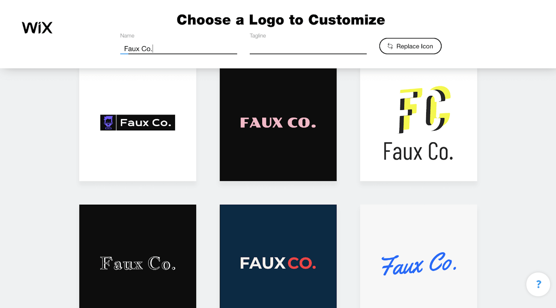
You’ll fill out a short questionnaire and then receive dozens of pre-made logos to start with. You’ll later have the chance to customize the design to your liking.
Option #3: You can hire someone to design a totally custom logo.
Wrapping Up
In the next post in this three-part series, we’re going to look at the next step:
Getting your business online.
We’ll take everything you’ve done so far in coming up with a business name, brand identity, and now visual identity, and put it towards your website and the marketing channels that are best for your business.
Source

Source de l’article sur Webdesignerdepot

 The end of the year tends to be busy for a variety of reasons and it can limit some of the freshness we see in designs during much of the year. Regardless, there are a few trending design elements.


 As human beings, we like to think that we’re rational creatures.

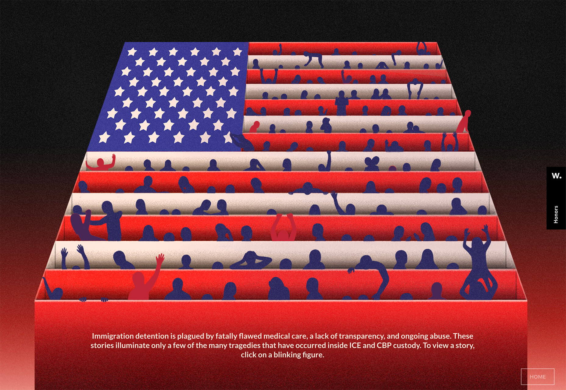
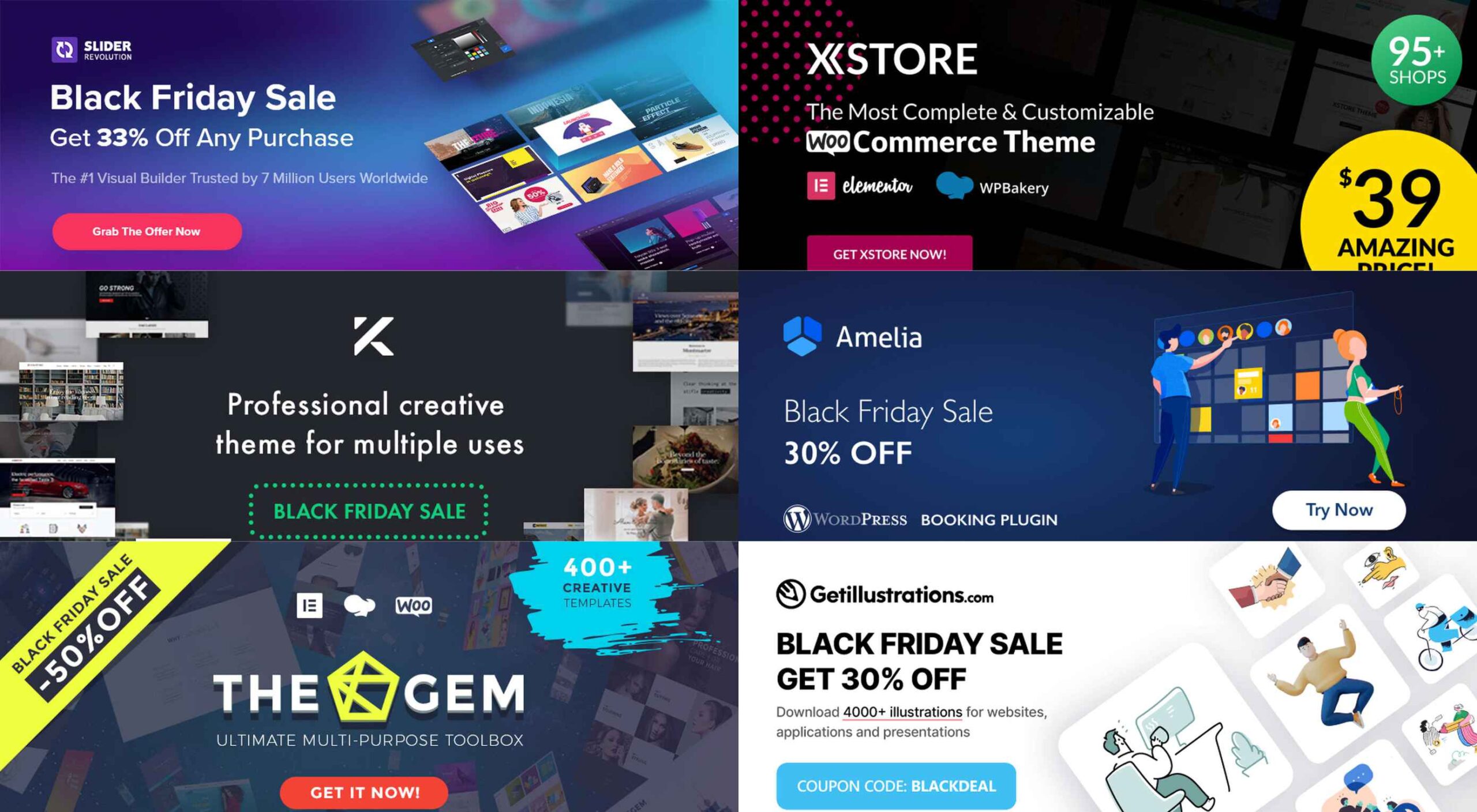 If you’re interested in a sneak peek of this year’s best Black Friday deals, stick around. You’ll find a few web designers’ favorites, including a stellar deal or two.


 As we approach our first winter holiday season since the pandemic set in, the world could feel like a very scary place; there is a great deal of uncertainty about the future for businesses, for young people in education, for jobs, for travel. Celebrations are certainly going to be a lot quieter this year.


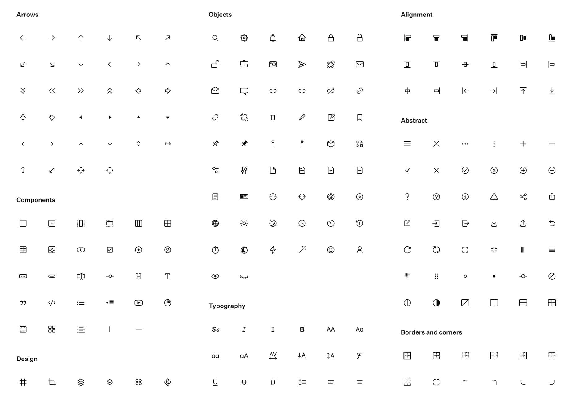
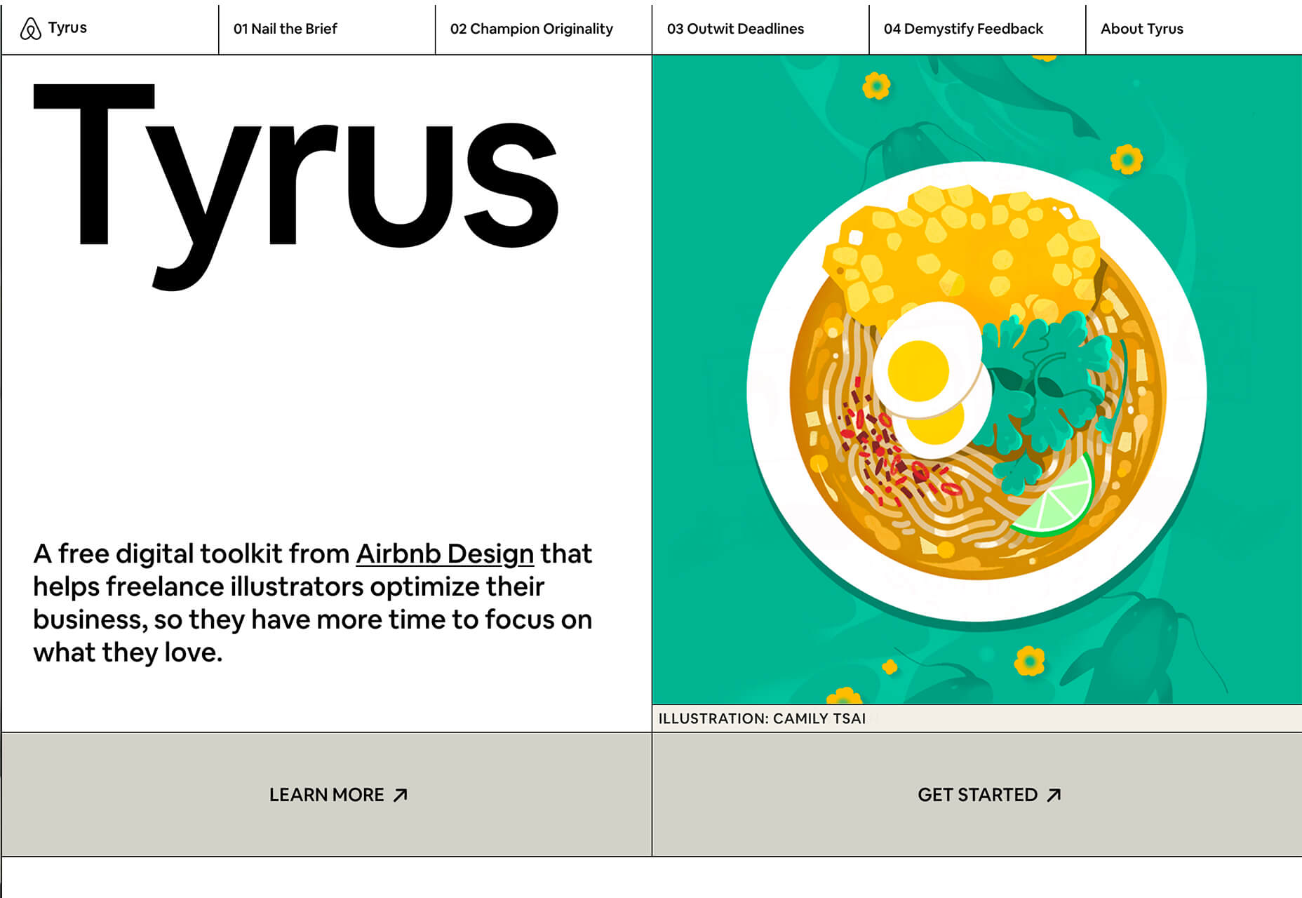
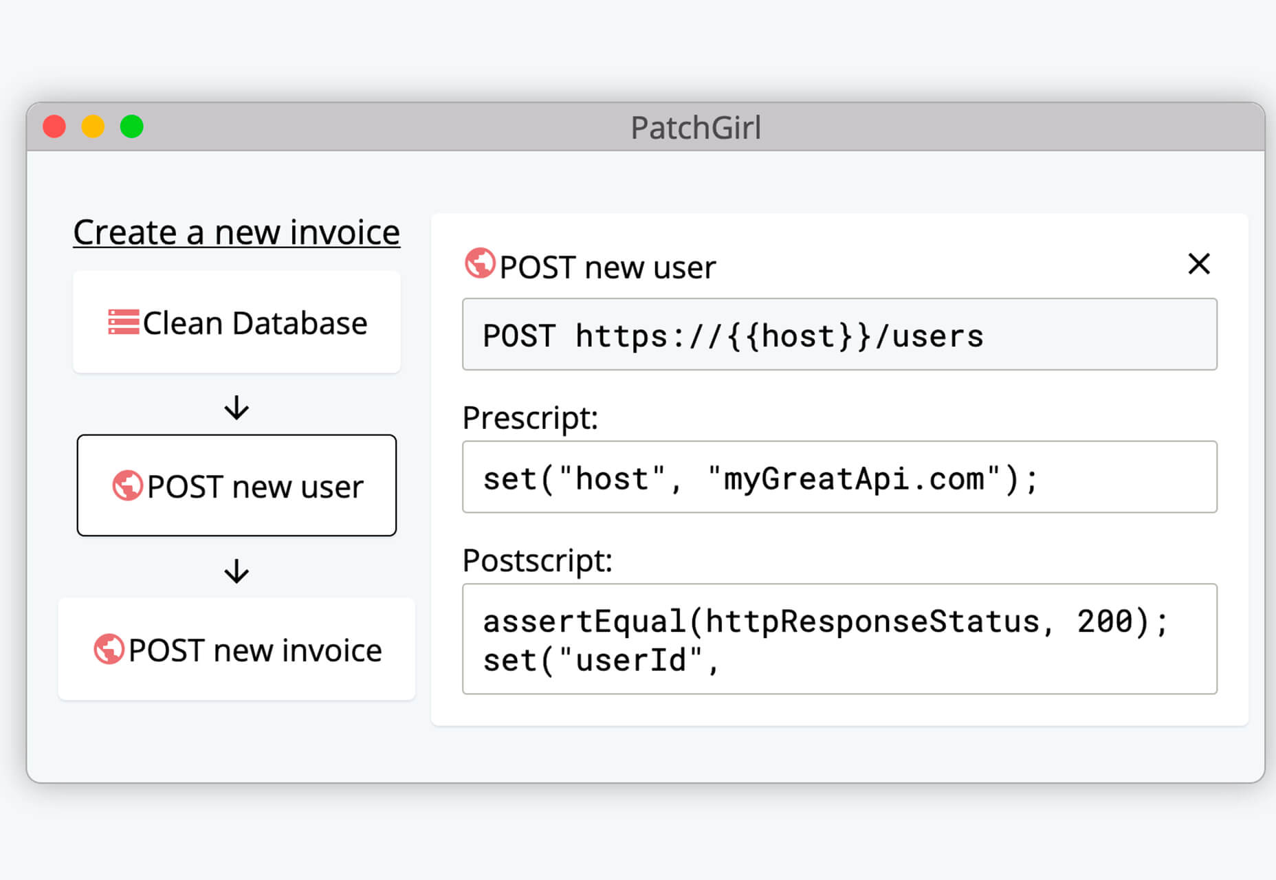
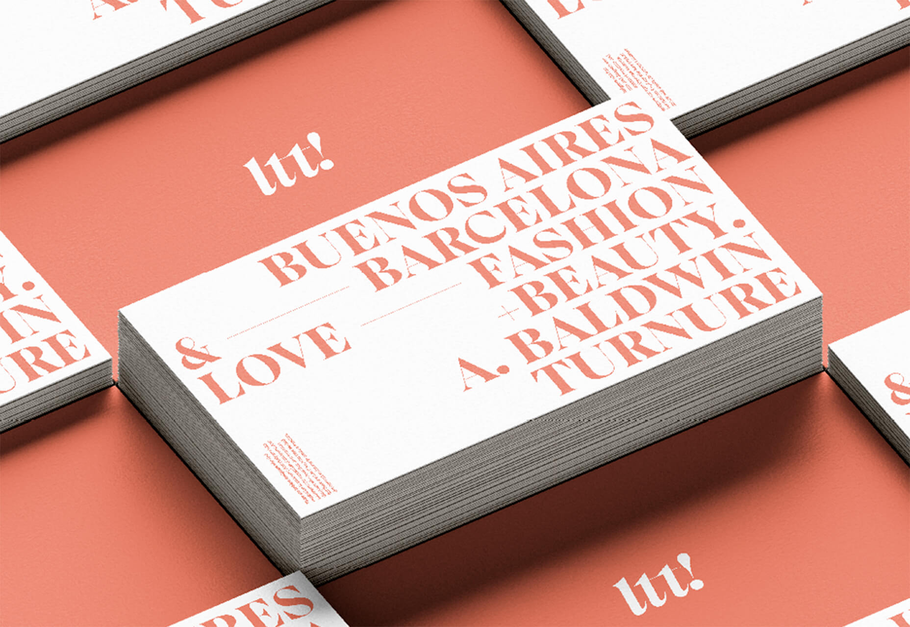
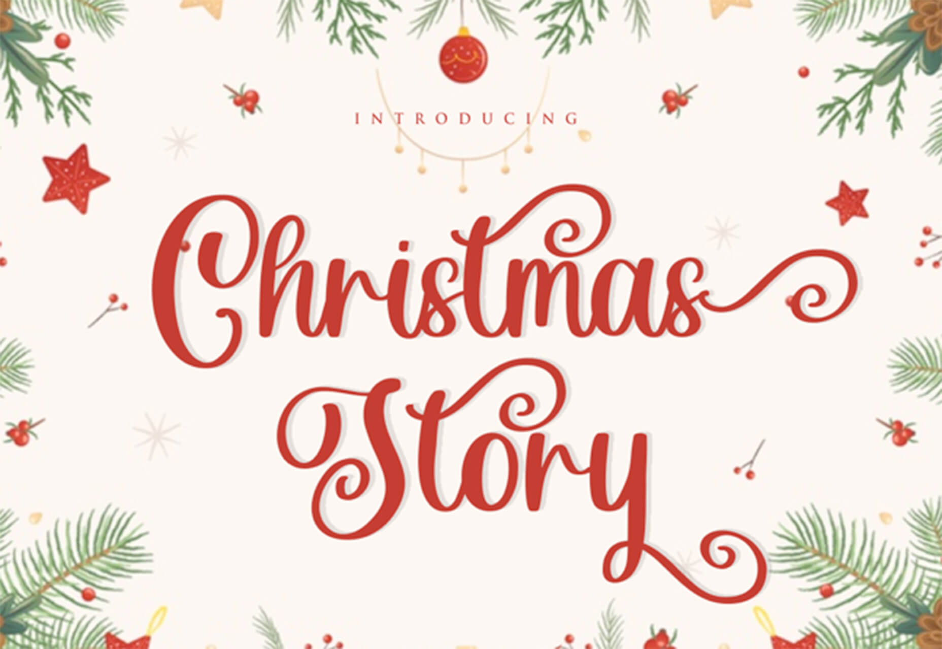
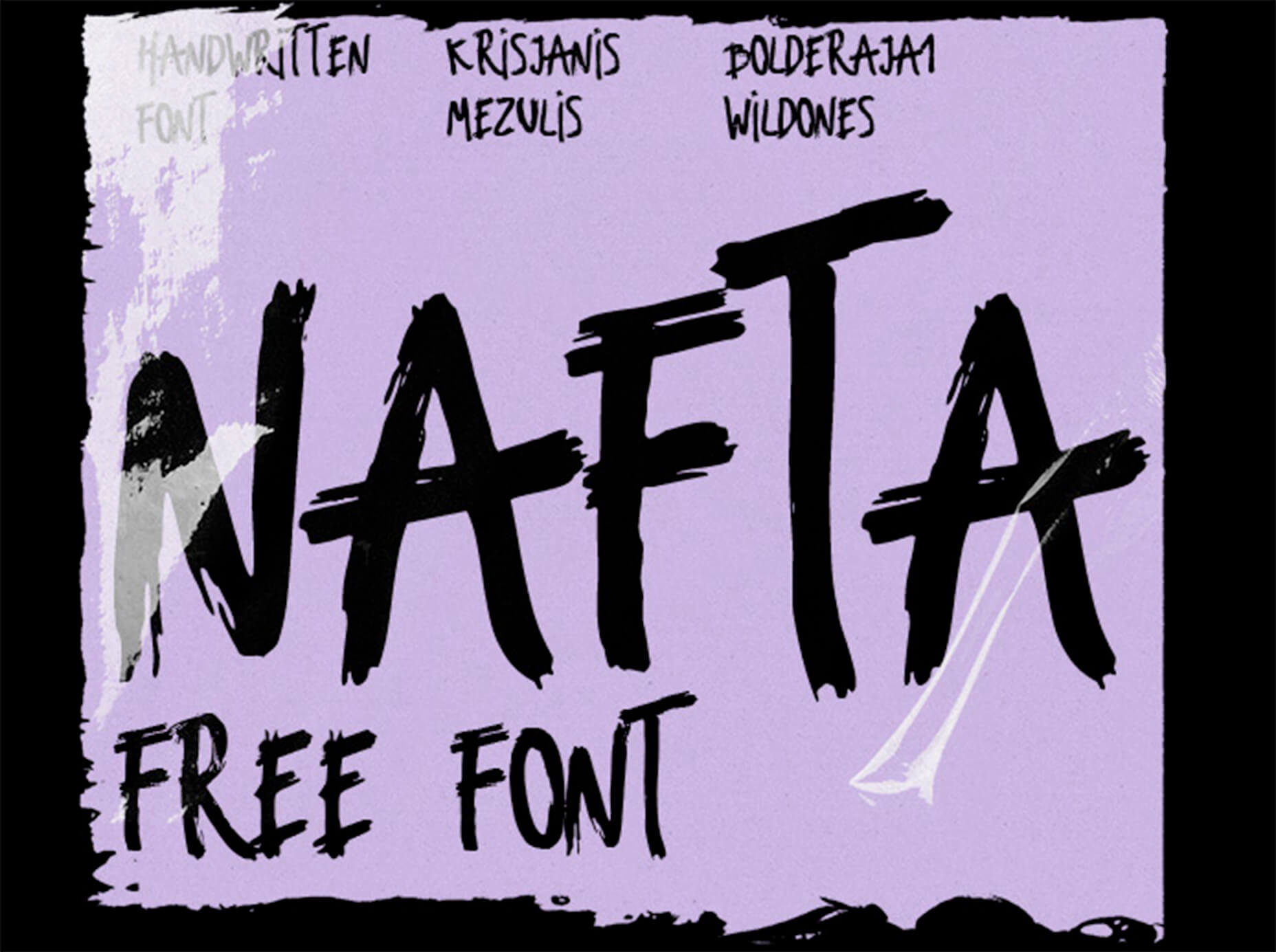
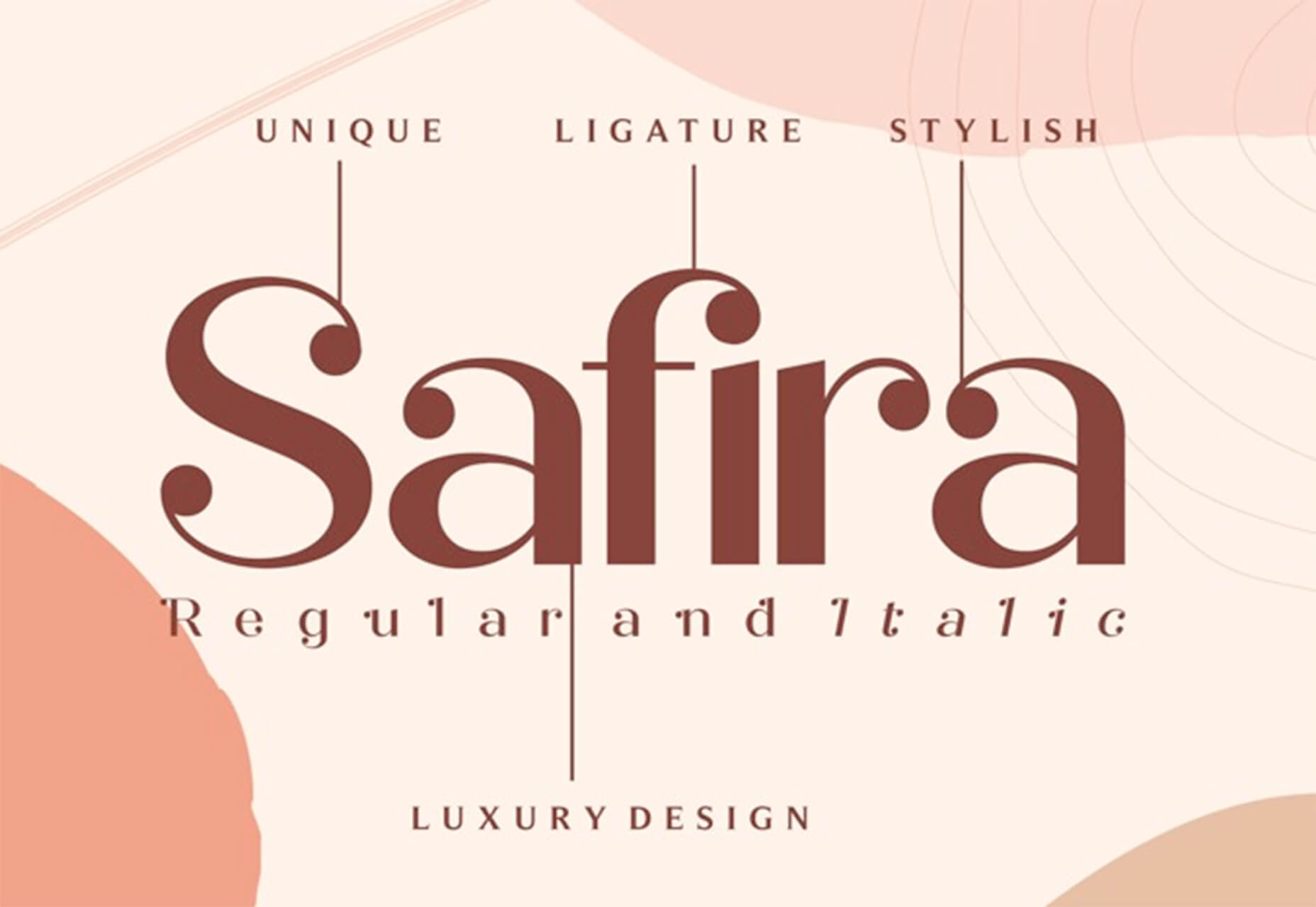
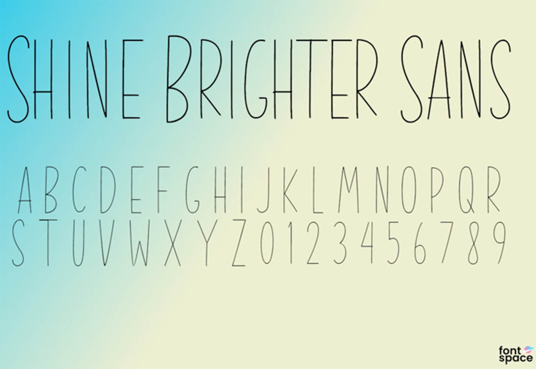
 In the spirit of fall feasts, this month’s collection of tools and resources is a smorgasbord of sorts. You’ll find everything from web tools to icon libraries to animation tools to great free fonts. Let’s dig in.


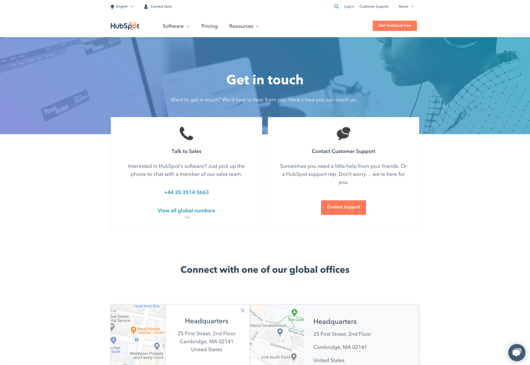
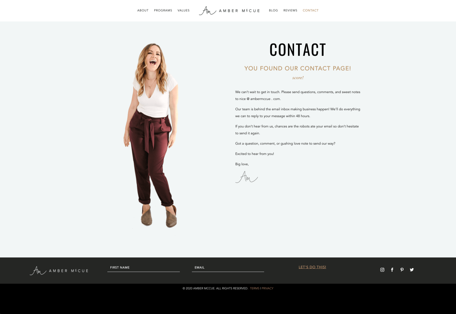
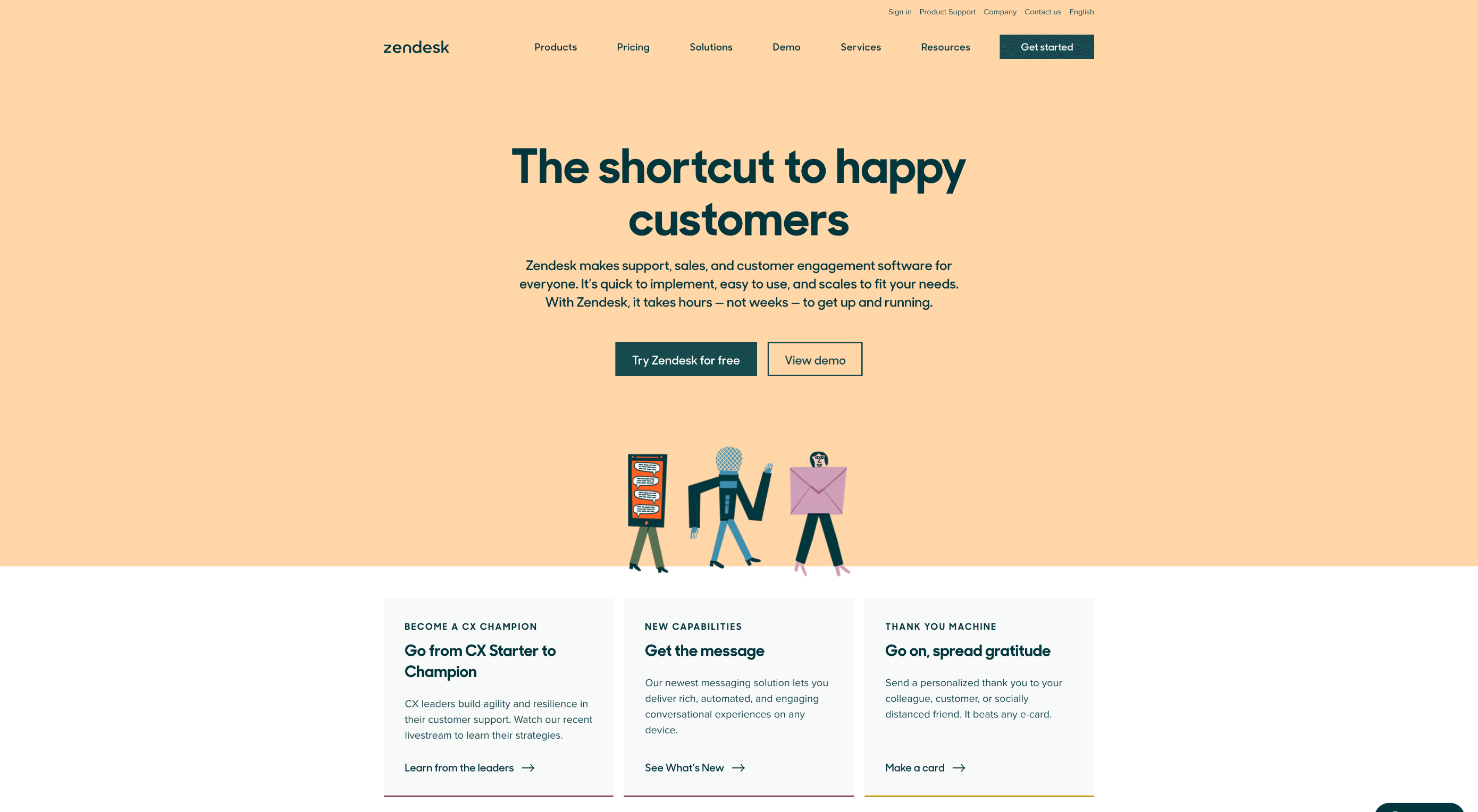 How can your customer reach you? If a client arrives on your website after searching on Google, what can they do to take the next step in a relationship with your brand, without buying anything?
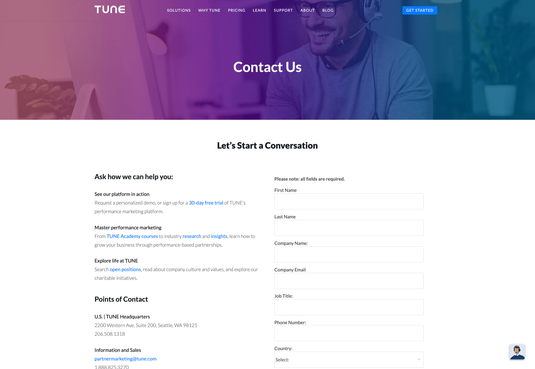

 When it comes to compliance, website developers need to keep their eyes on more than just ADA regulations and Section 508. Privacy laws are a big consideration and decisions on how to build privacy into a website start with architects.