 Whether you are a CSS expert or a front-end beginner, using the right CSS framework is crucial for your daily tasks. There are numerous frameworks whose ultimate goal is the same: helping developers target multiple screens, in the simplest possible way.
This is why Bootstrap is by far the most popular framework on the market. All developers have heard of Bootstrap, and more than 80% of them say they are happy using it.
But that doesn’t mean that there aren’t some great alternatives if you’re willing to shop around. Bootstrap won’t be top dog forever, and there are numerous new lightweight and powerful CSS frameworks.
If you are bored of coding with Bootstrap and Foundation and tired of using complex CSS rules, this list is for you.
From frameworks that take a pure CSS approach to minimalist frameworks with fully customizable themes, nothing is left out. Let’s get started…
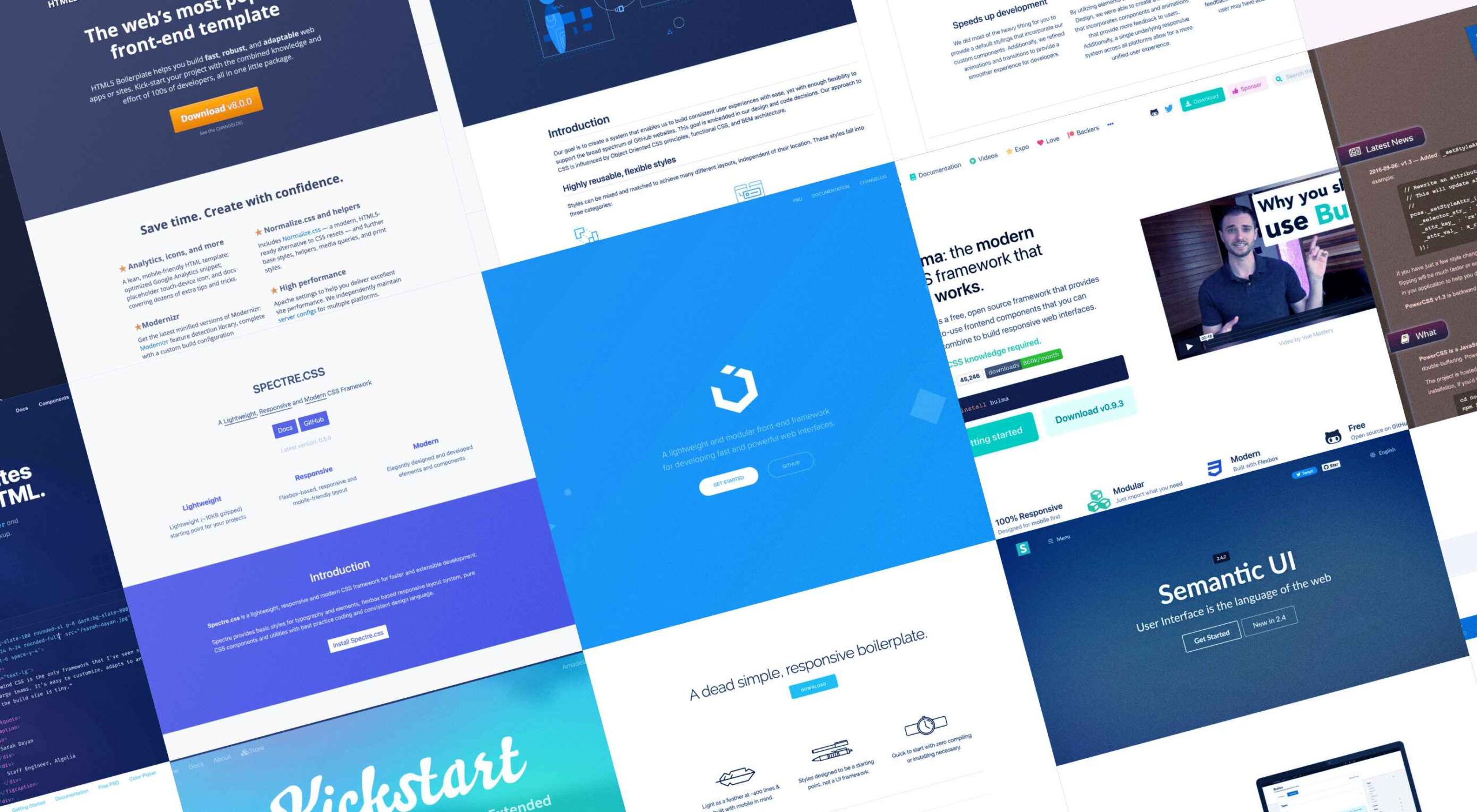
1. Bulma
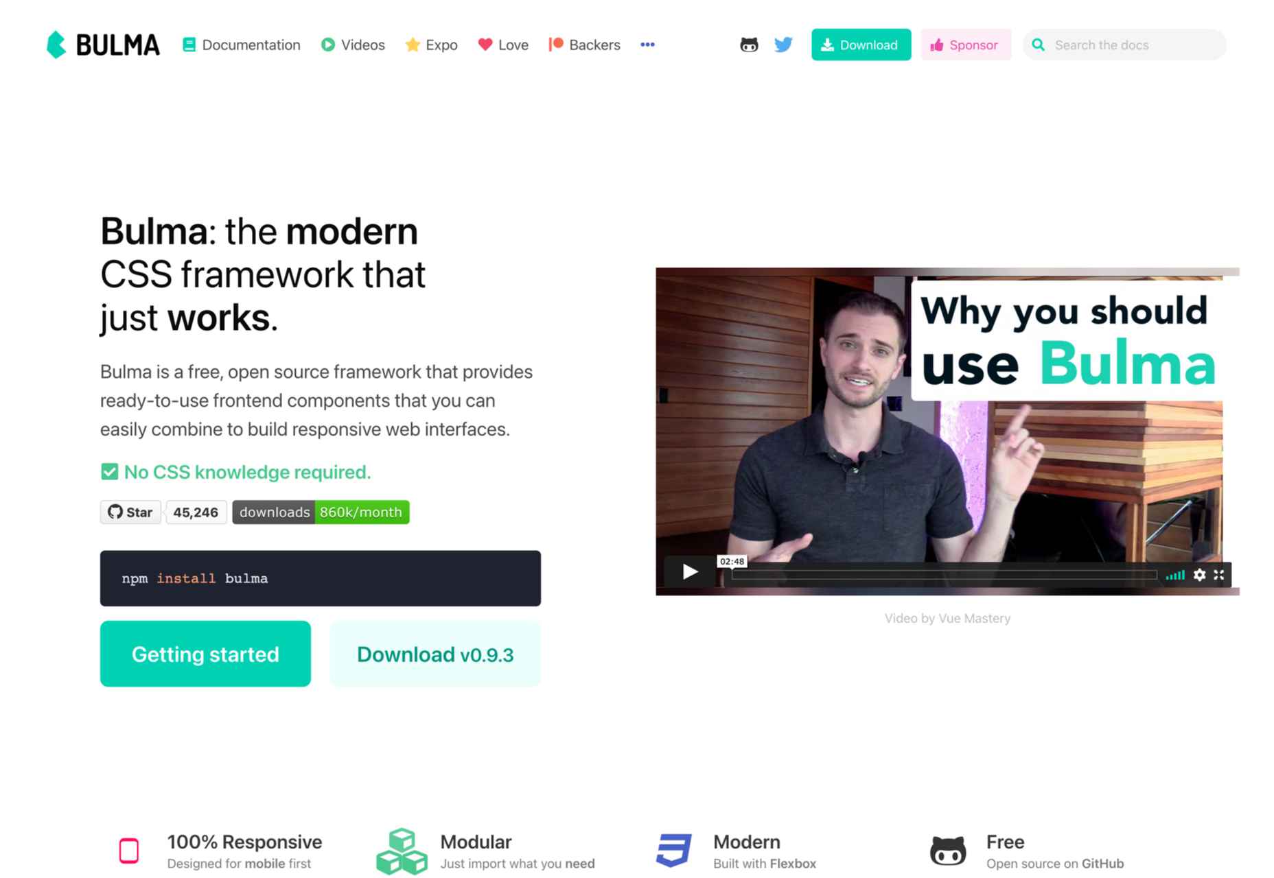
Bulma is one of the most popular alternatives to Bootstrap and Foundation. It is an entirely free, open-source CSS framework that does not have a steep learning curve. No prior CSS knowledge is required to use Bulma.
When you add the variety of colors, responsiveness, and clean flexbox-based grid it offers, it’s no wonder Bulma is becoming more popular every day. Bulma is a well-documented framework that you should definitely try out.
2. UIkit
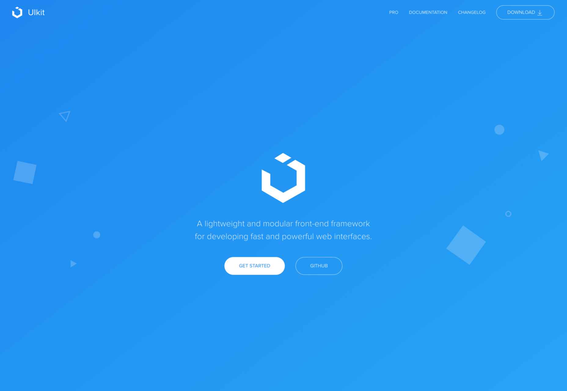
If you’re looking for a lightweight yet powerful CSS framework that can be wired with HTML and JS, Ulkit is for you. It fully supports right to left languages and has one of the best icon libraries out there.
Keep in mind that Ulkit is also easy to use. All in all, Ulkit is an excellent Bootstrap alternative that is perfect for designing web layouts for desktop and mobile screens.
3. HTML5 Boilerplate
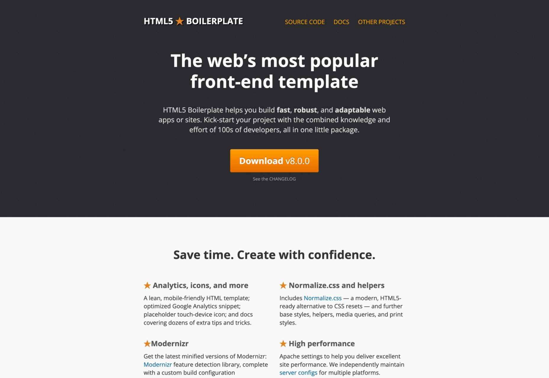
Even though Bootstrap is relatively easy to learn, it is much more than just a front-end template. So what if you need a fully compatible JavaScript, CSS3, and HTML5 template? In this case, HTML5 Boilerplate is a good choice.
Of course, since it’s a template, this framework does not include layouts and component modules. However, if you need a reliable CSS template that offers extensive documentation, HTML5 Boilerplate is a great solution.
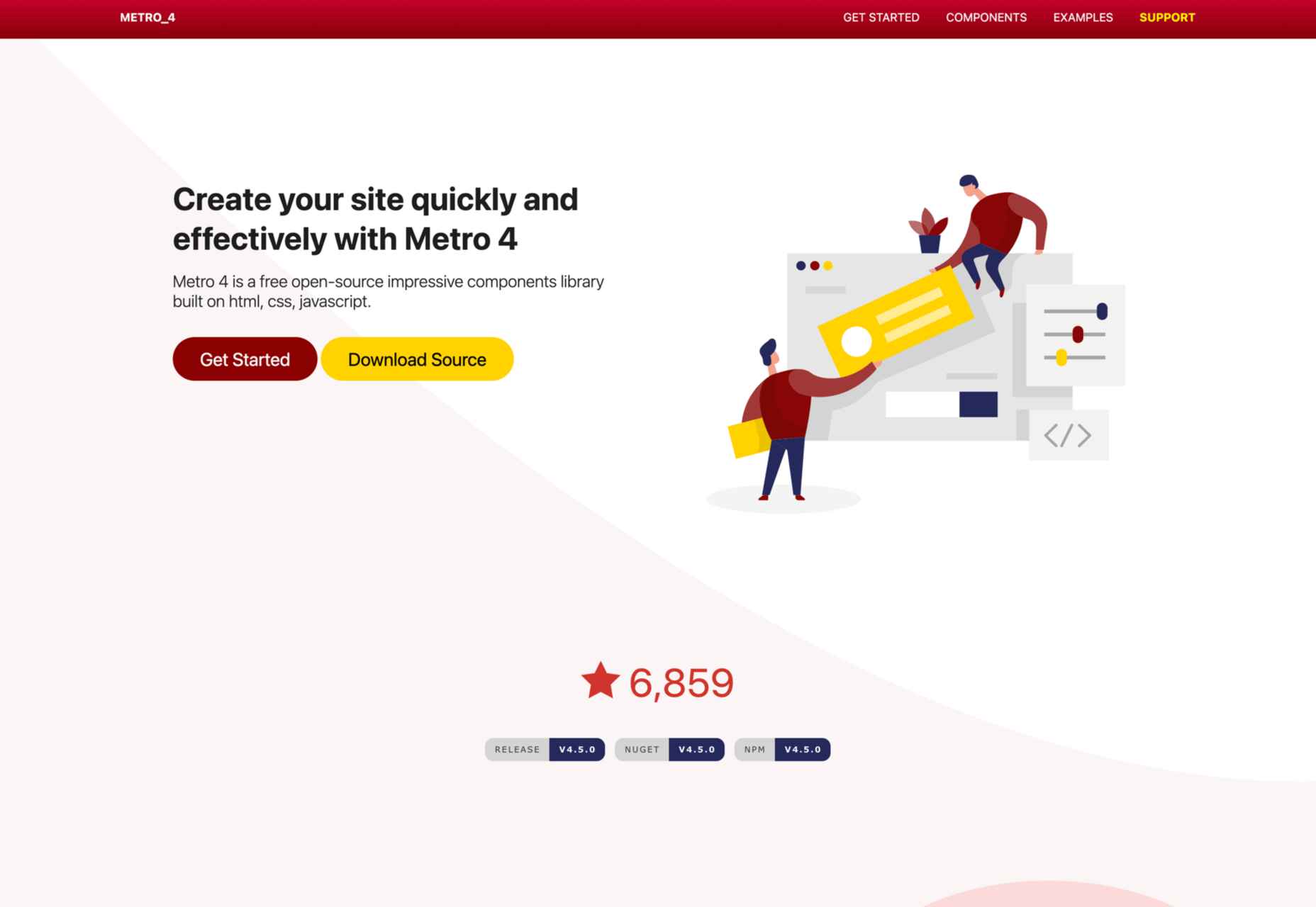
4. Metro UI
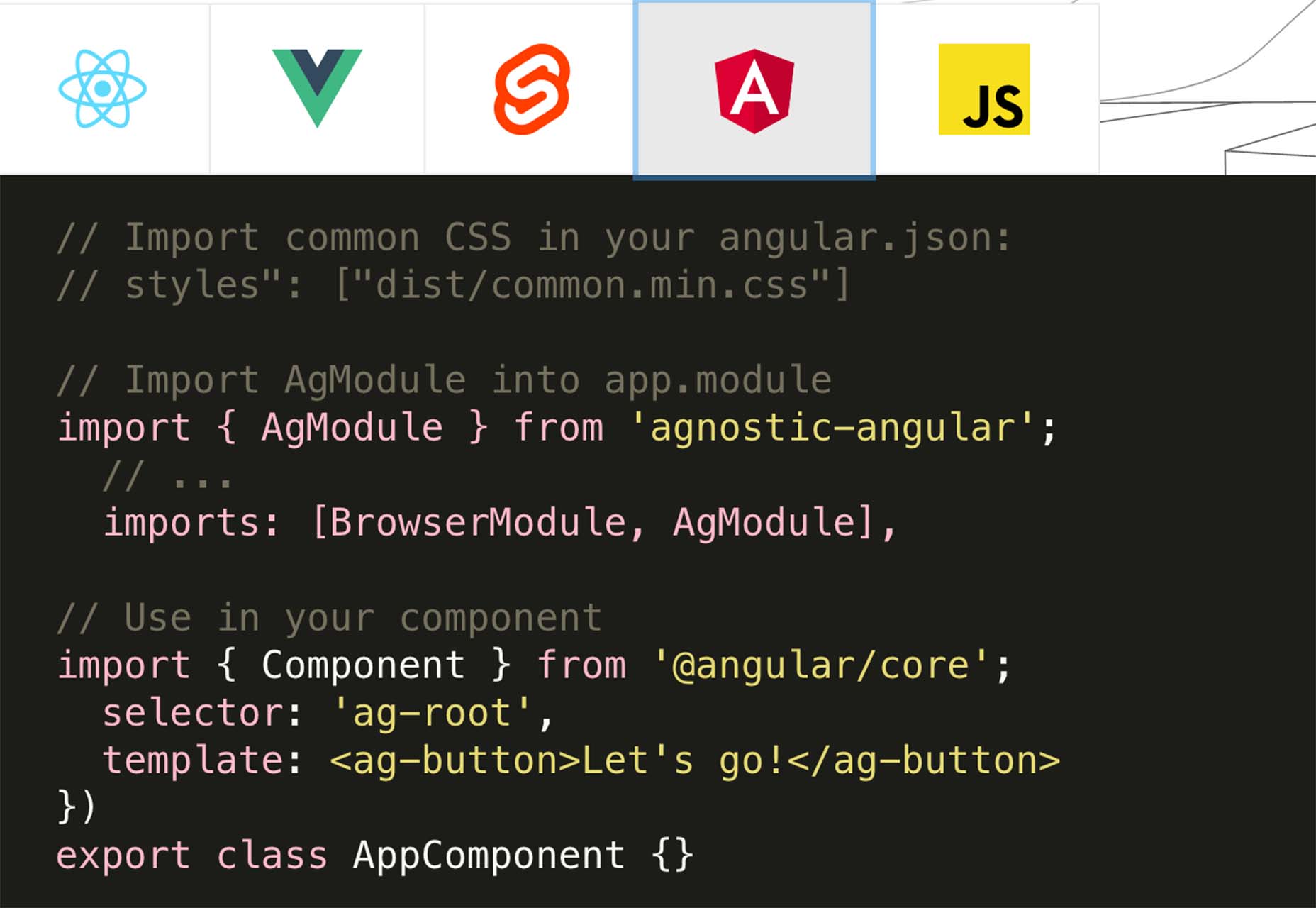
Metro UI is one of the most flexible CSS frameworks on the market. This front-end framework can be easily combined with JavaScript-based frameworks like Angular, React, etc.
We found Metro UI to be an excellent open-source CSS framework and a great alternative to Foundation during our testing.
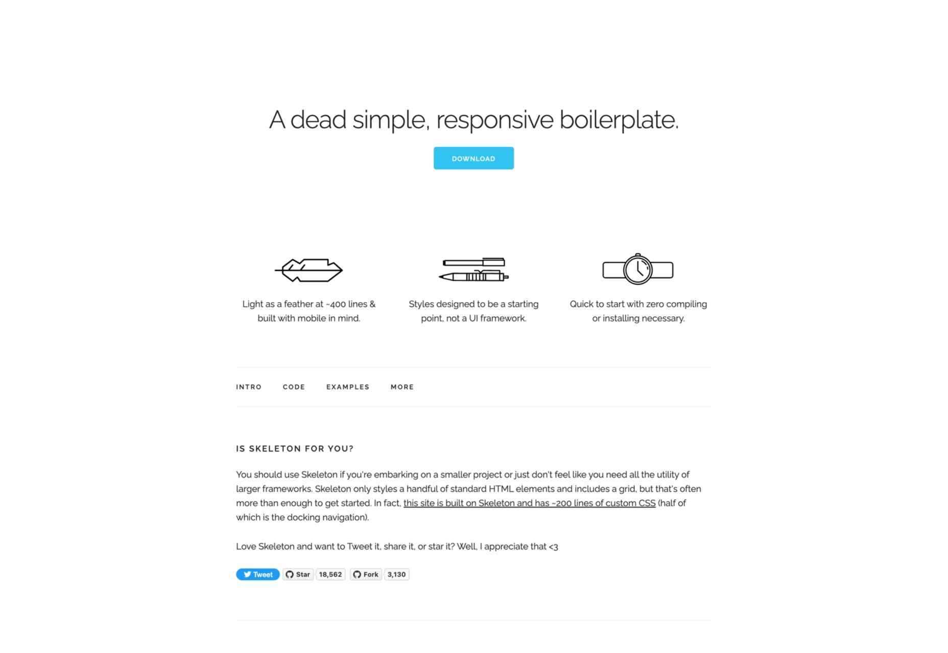
5. Skeleton
As a two-in-one solution, Skeleton quickly made it on our list. This is both a boilerplate and a comprehensive CSS framework. We enjoyed customizing its 12-column grid during our testing, and we found out that it has virtually no learning curve.
The automatic width resizing works like a charm, and the syntax is fully responsive. This is why we consider Skeleton to be an excellent Bootstrap alternative.
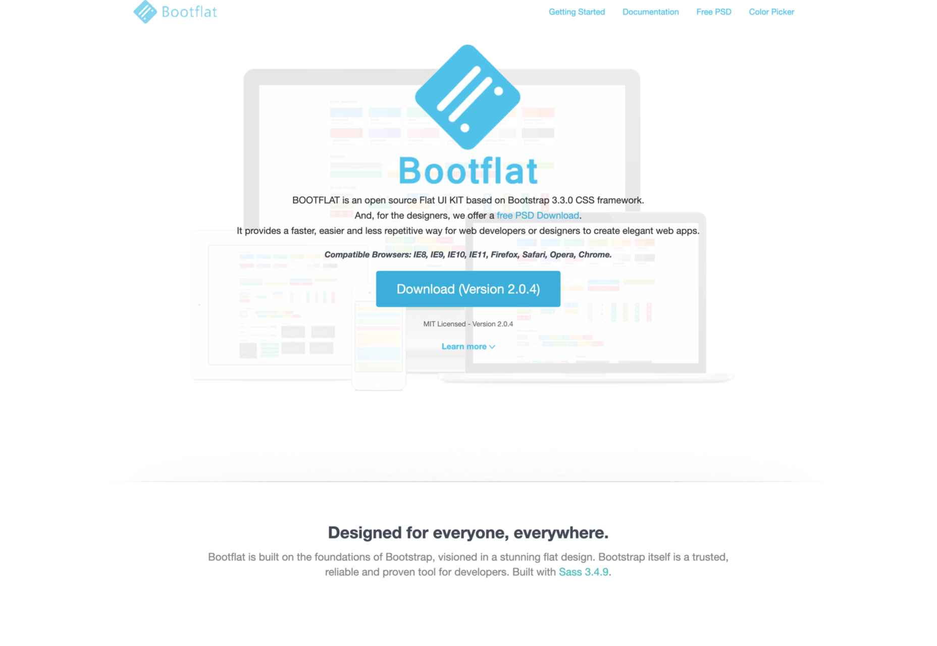
6. Bootflat
If you are looking for a quick way to create a web app, Bootflat is the framework you need. Bootflat’s components are built with CSS3 and HTML5, and the framework offers a comprehensive panel of color schemes for you to choose from.
Bootflat looks and acts like a simplified version of Bootstrap. However, that doesn’t mean that this CSS framework isn’t scalable and robust. On the contrary, you can fully manipulate the size and performance of the web designs you create.
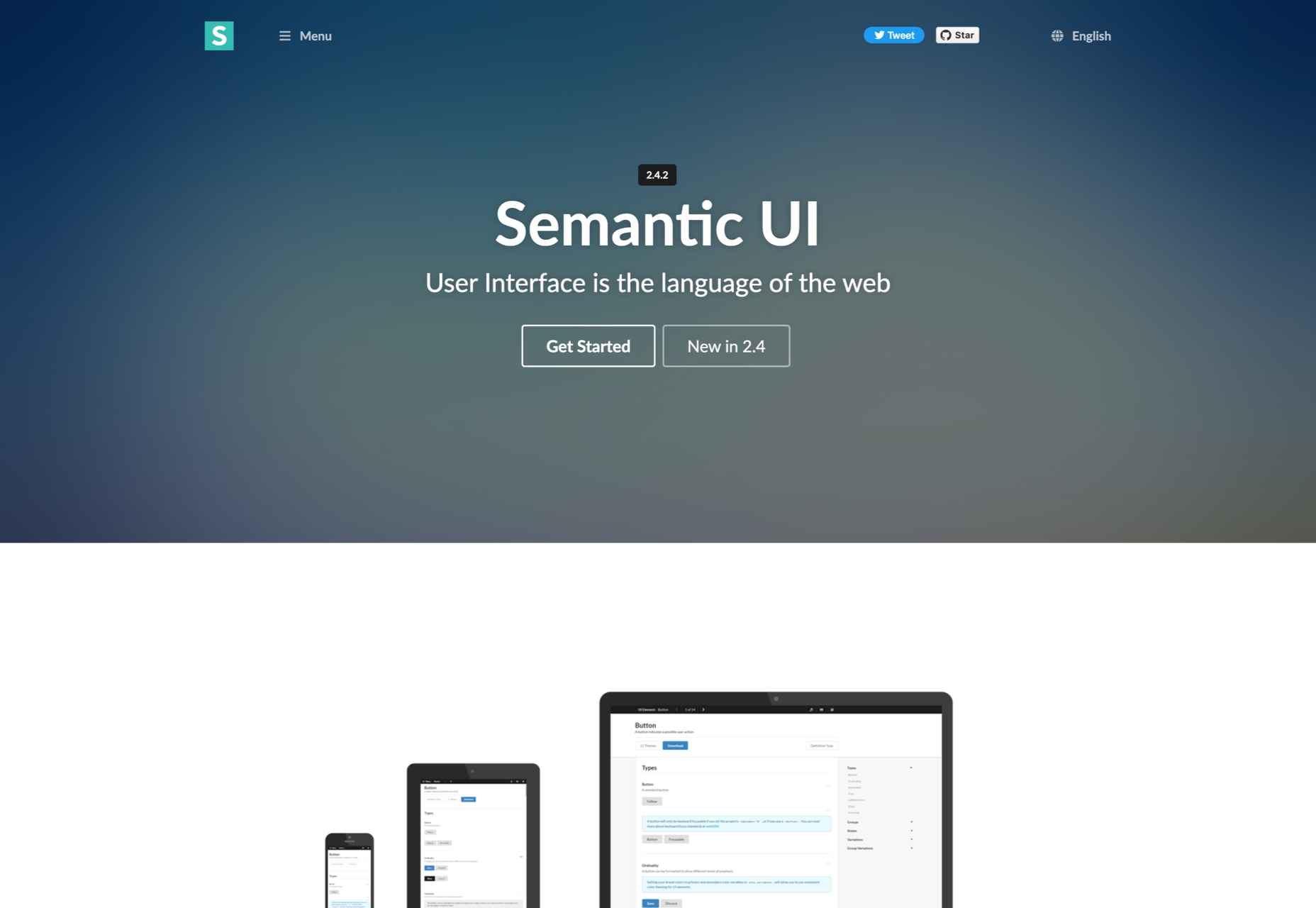
7. Semantic UI
If you exclude the fact that Semantic UI doesn’t have the utility classes Bootstrap offers, it is a comprehensive CSS framework that you should try. The best Semantic feature allows you to write HTML code without using BEM methodologies.
So, if you need a framework that will help you write readable codes in minutes, Semantic is the one for you.
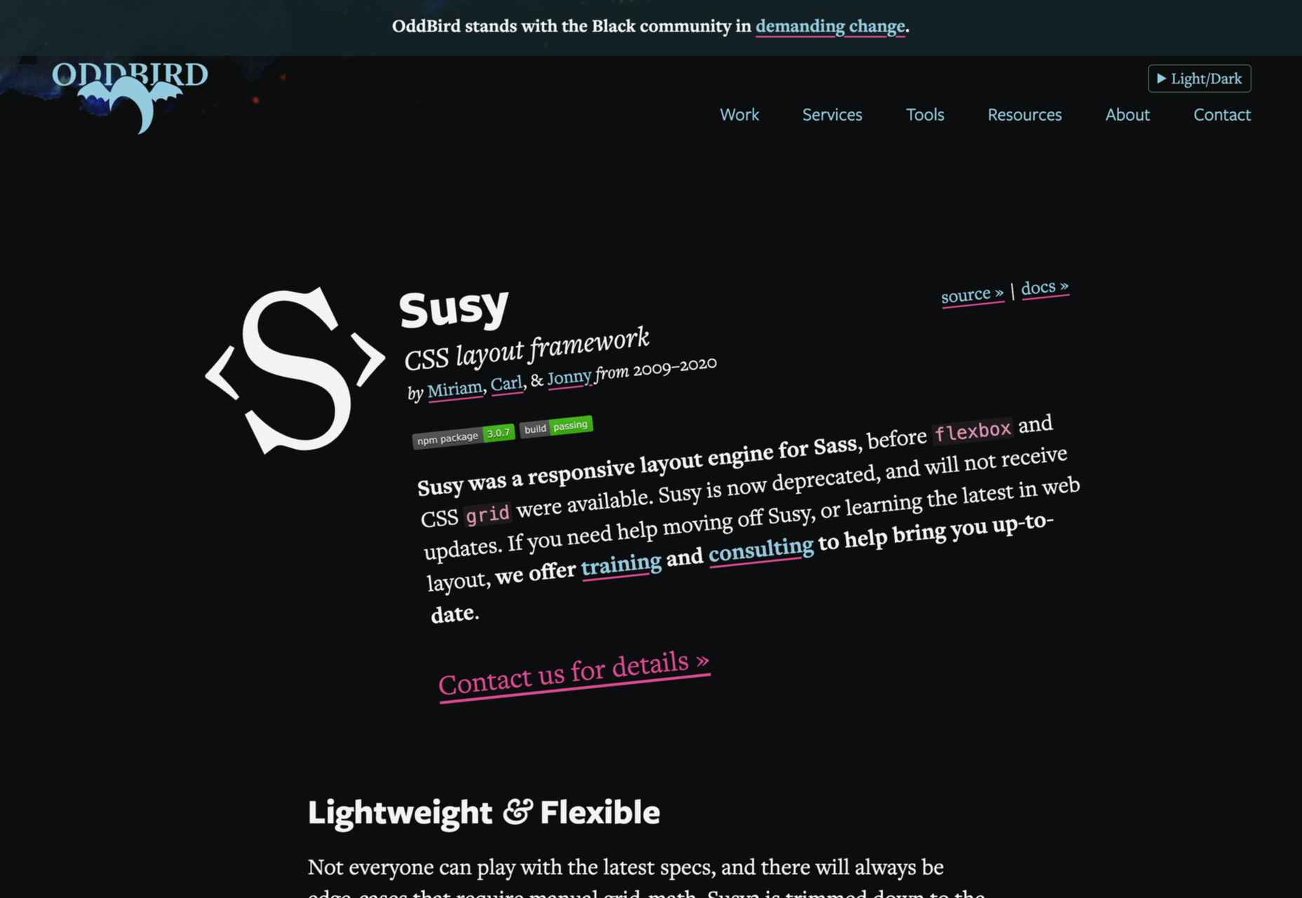
8. Susy
We know that most developers nowadays use flexbox and native CSS grids. Still, there’s nothing better than Susy if you need a grid system that supports legacy browsers. Although Susy is no longer maintained, it is one of the most flexible old-school grid systems.
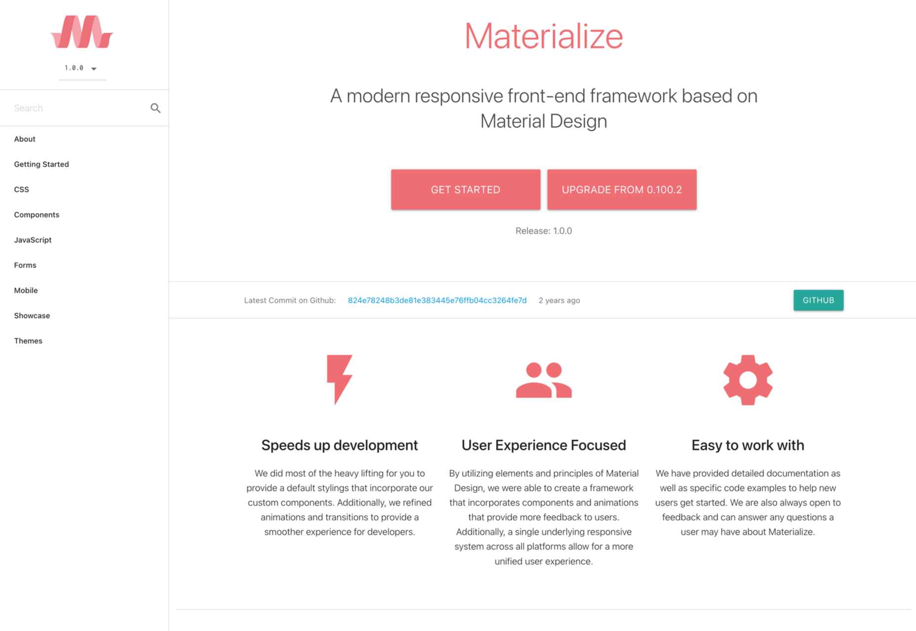
9. Materialize
Like most CSS frameworks on this list, Materialize is built with HTML, CSS, and JavaScript.
It’s specifically designed to help you develop faster using a standard template and customizable components. As the name suggests, Materialize is based on the basic principles of Material Design.
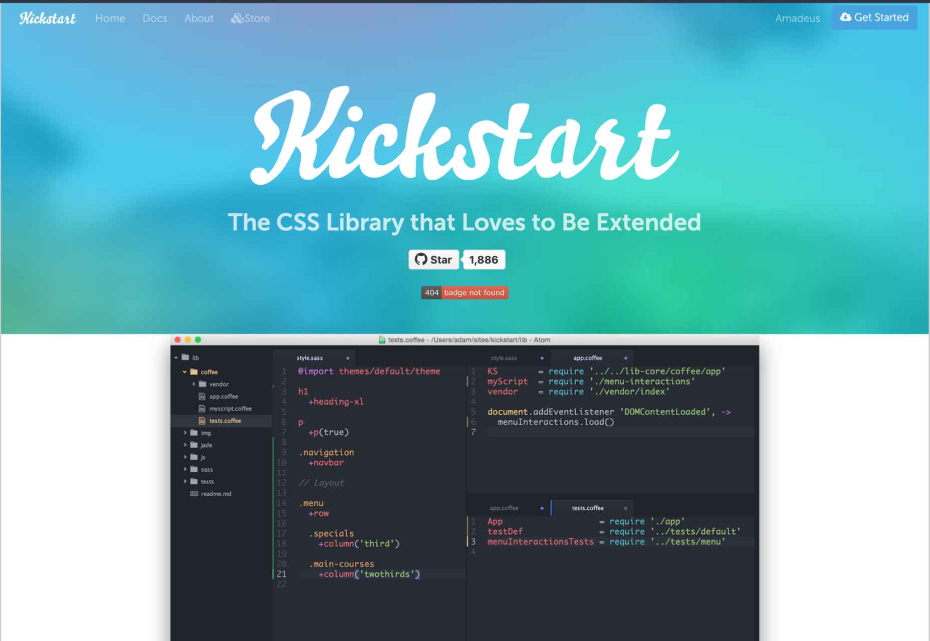
10. Kickstart
If you need a lightweight alternative to Bootstrap, Kickstart is the CSS library for you. A great thing about Kickstart is that it doesn’t require jQuery which makes it very small.
Of course, like a pruned version of Bootstrap, this CSS framework isn’t as robust. Still, this is an excellent choice for those who need a UI framework and a comprehensive boilerplate library.
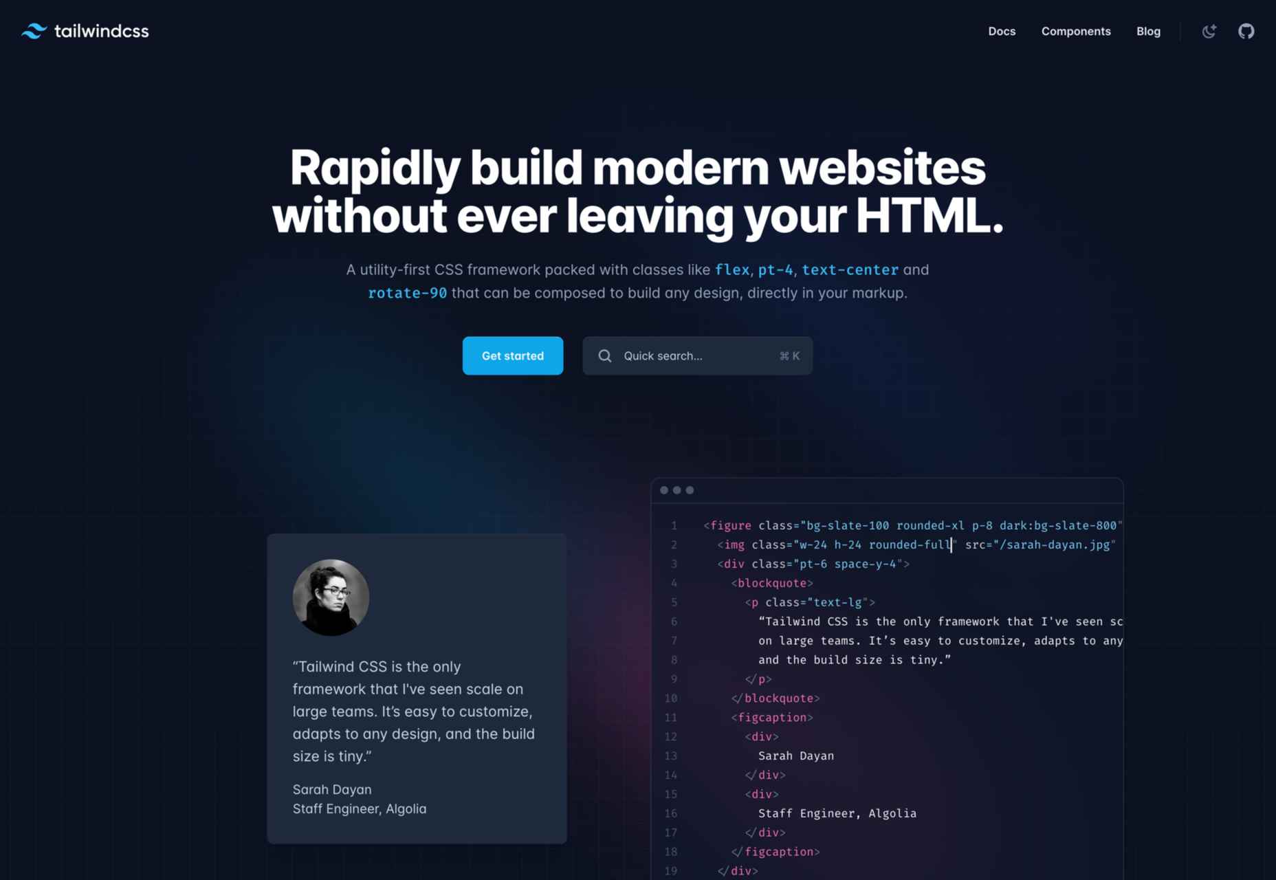
11. Tailwind CSS
With a fast styling process and the ultimate freedom it provides, Tailwind is extremely popular among some developers. This is a utility-first, front-end framework that is fully responsive and stable.
Unfortunately, Tailwind CSS requires some time to learn, and it is not the most flexible choice when it comes to revising CSS rules.
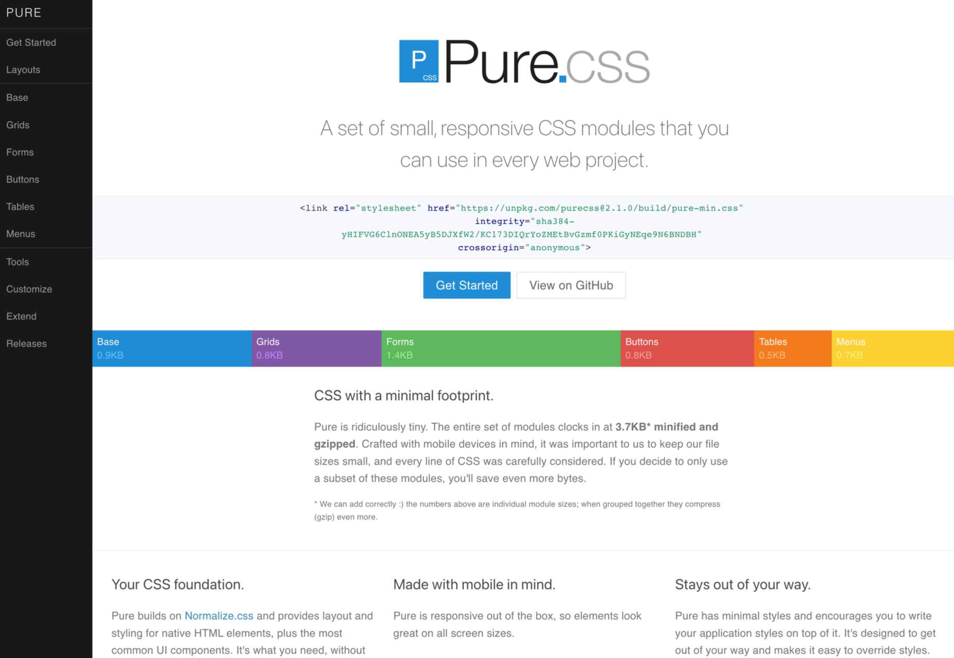
12. Pure CSS
Yahoo specially developed Pure CSS to help developers create fully responsive web pages.
We consider Pure a minimalist alternative to Bootstrap that offers every module a beginner needs (navigation menu, grid, tables, etc.).
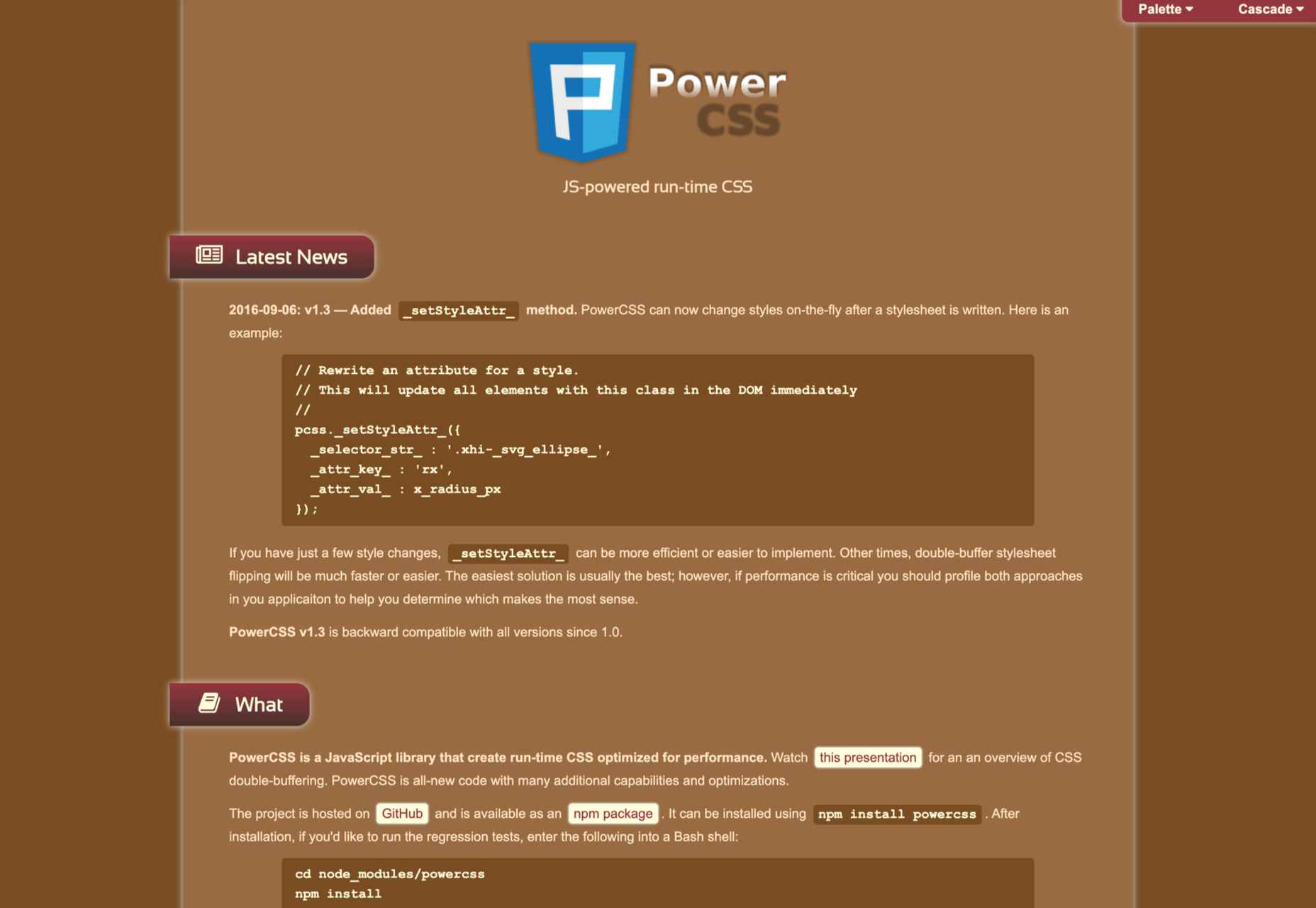
13. PowertoCSS
PowertoCSS is on this list for a good reason. This is an ultimately responsive CSS framework that you can use to create grids and scale web apps on any platform.
PowertoCSS is based on Modular Architecture and Scalable when it comes to design.
Unlike other CSS frameworks, PowertoCSS is very lightweight, beginner-friendly, and comes with detailed documentation.
The coding process is simple, and we found the learning curve to be shallow.
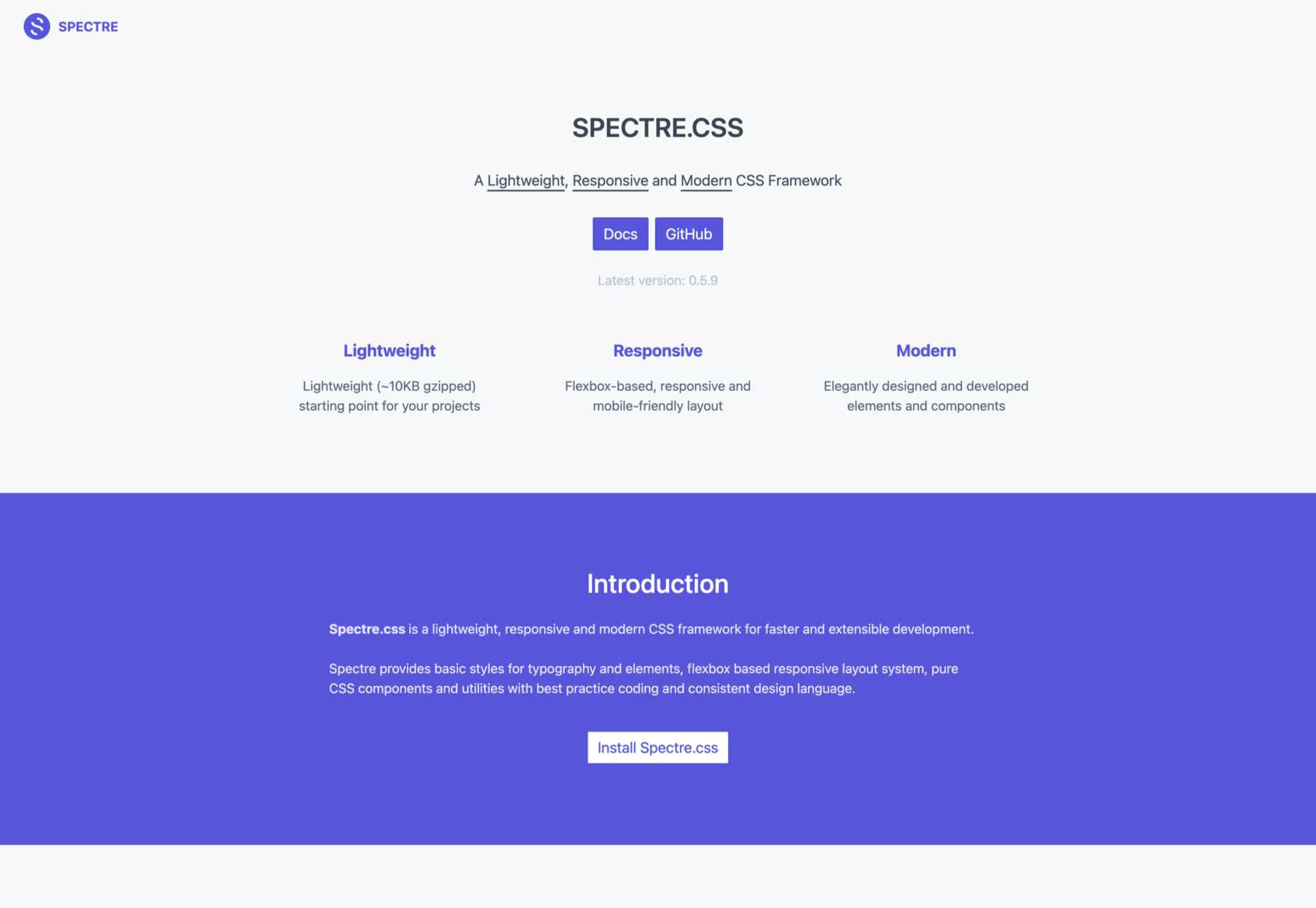
14. Spectre
Spectre is one of the most flexible and lightweight CSS frameworks we tested for this article.
It has a modern (flexbox) layout system; it is fully customizable and allows you to get quick, attractive results.
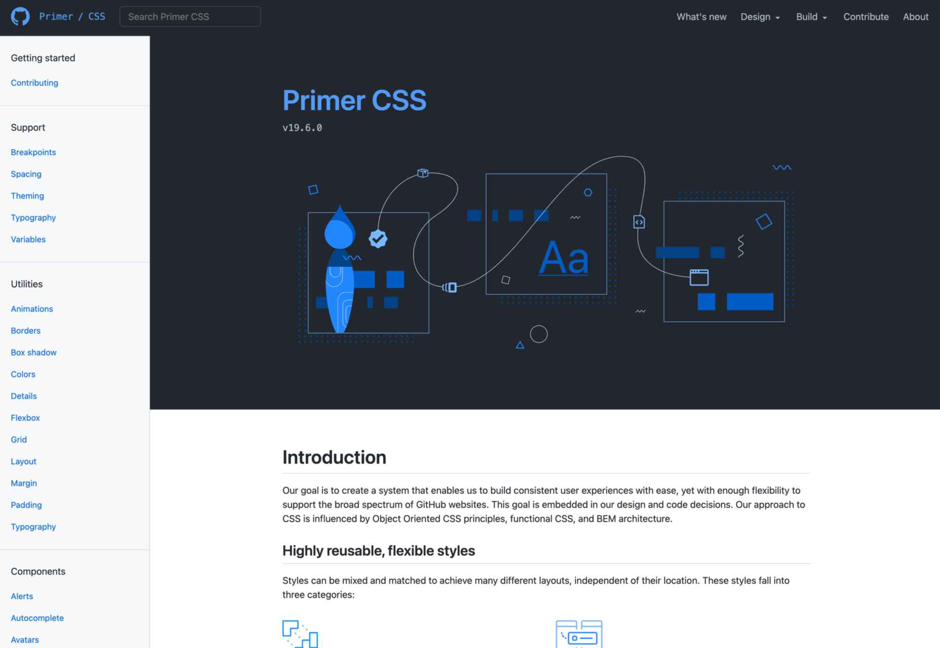
15. Primer
Our last suggestion is Primer, a great open-source CSS framework.
To be precise, Primer is more of a design system that lets you use a BEM CSS framework and create your projects quickly and efficiently.
So, even though Primer is not a CSS framework in the strict sense, it will help you use React and Figma components, icons, and advanced documentation to unify all of that.
Wrap Up
Choosing the right CSS framework is not easy. It all depends on your personal needs and preferences as a front-end developer.
Although Bootstrap and Foundation are still the most popular frameworks, many of the alternatives presented above will continue to gain popularity for good reasons.
Source
The post 15 Best CSS Frameworks: Professional Bootstrap and Foundation Alternatives first appeared on Webdesigner Depot.
Source de l’article sur Webdesignerdepot
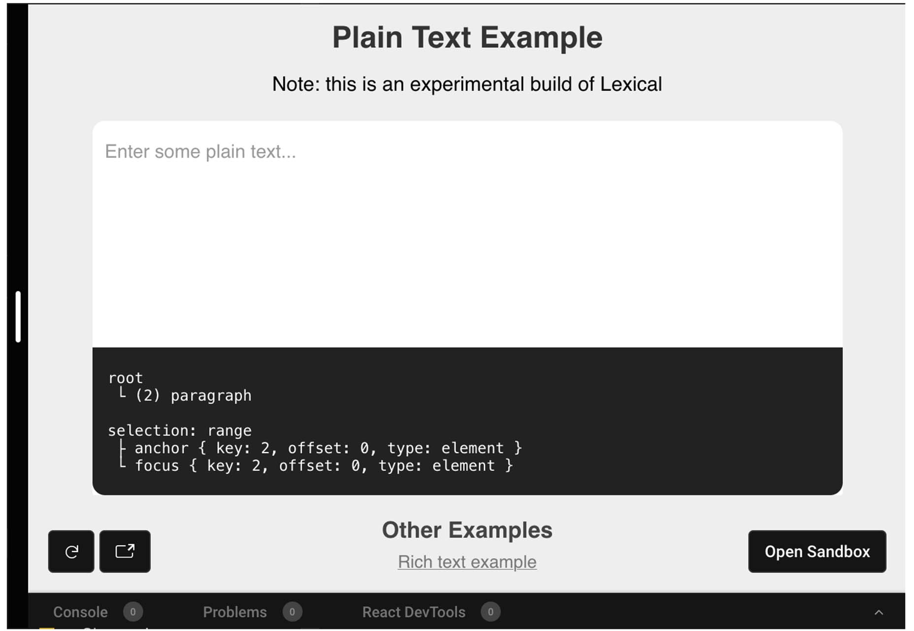
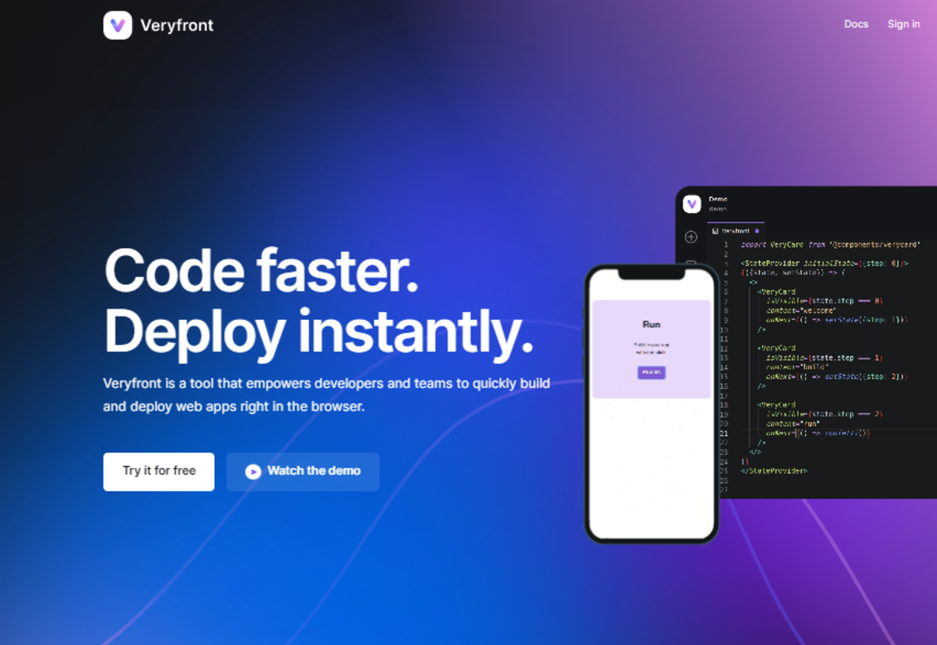
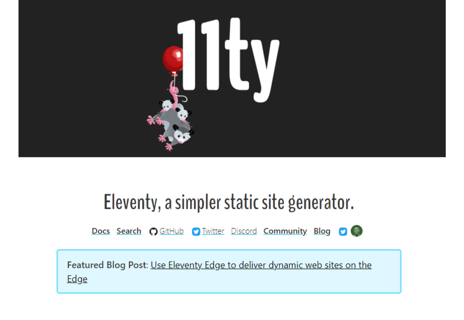
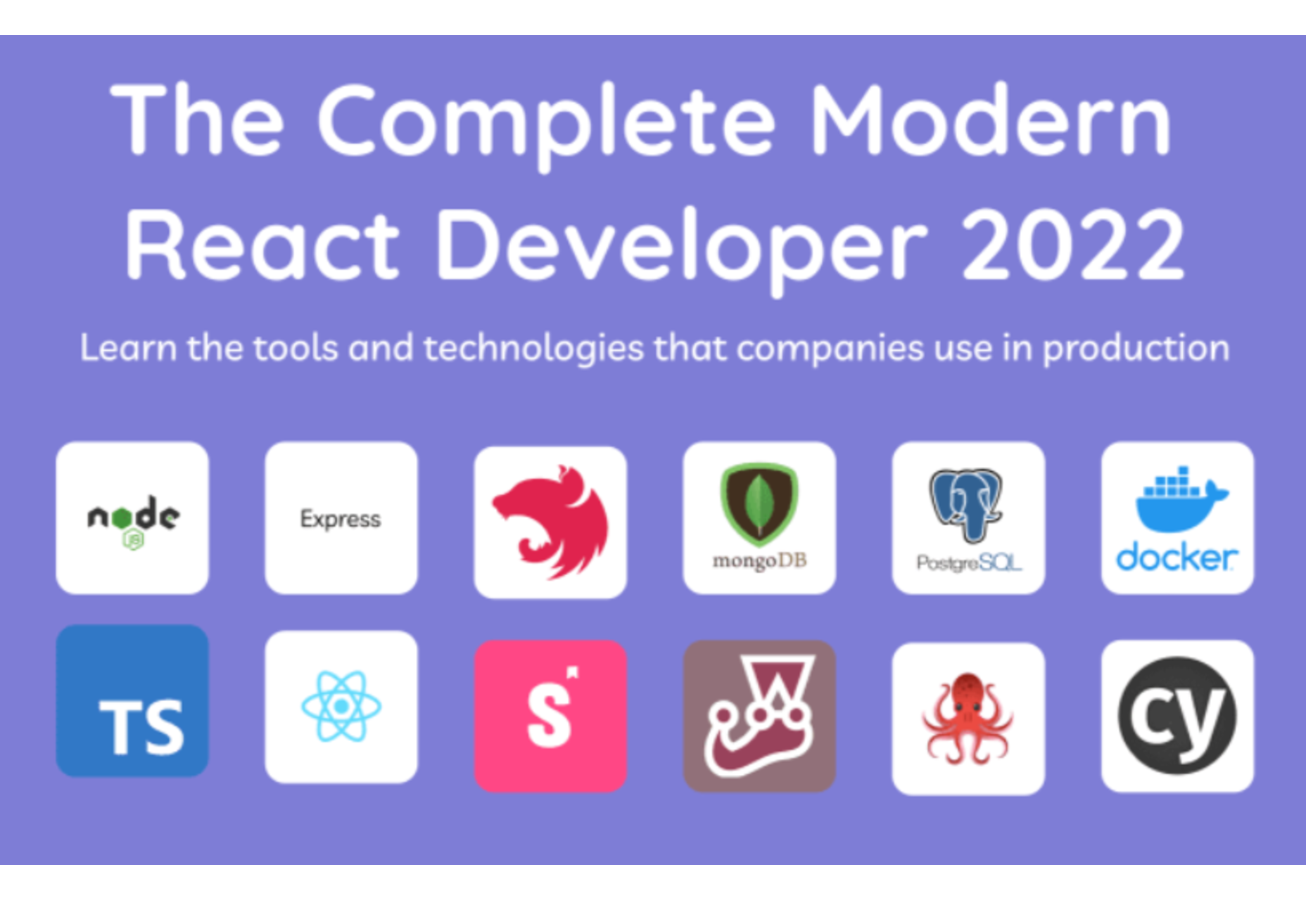
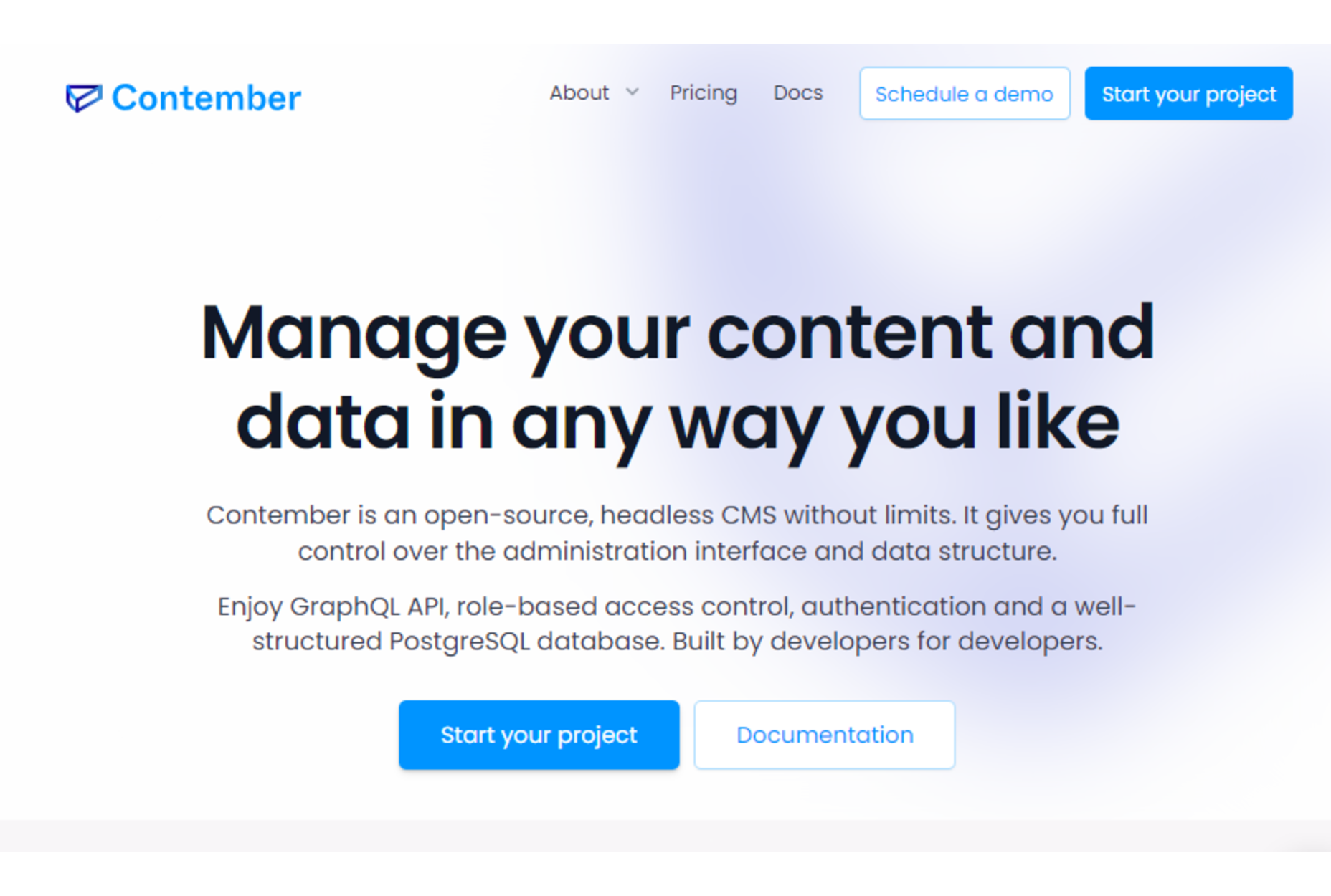
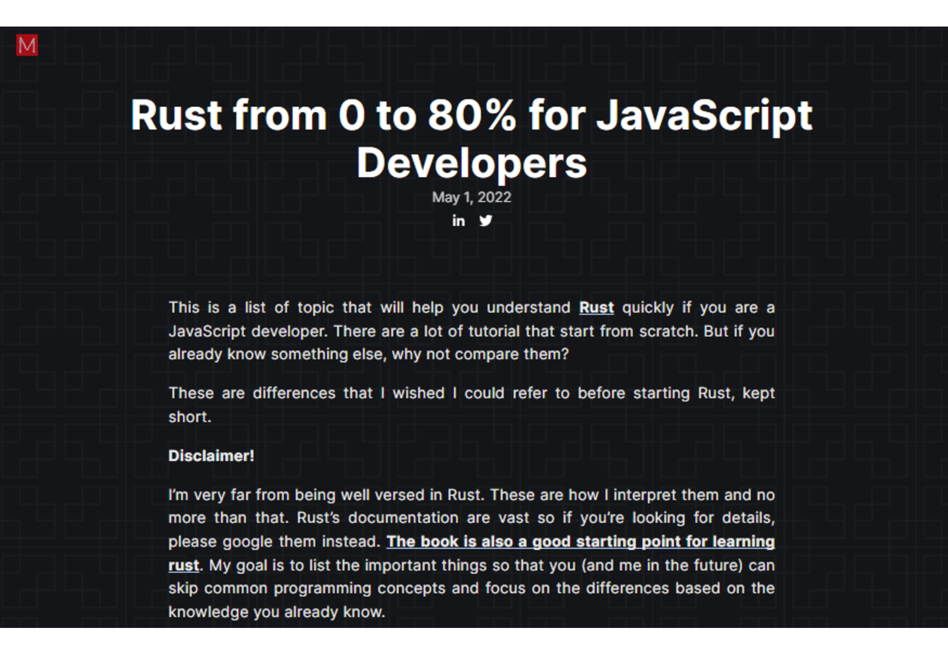
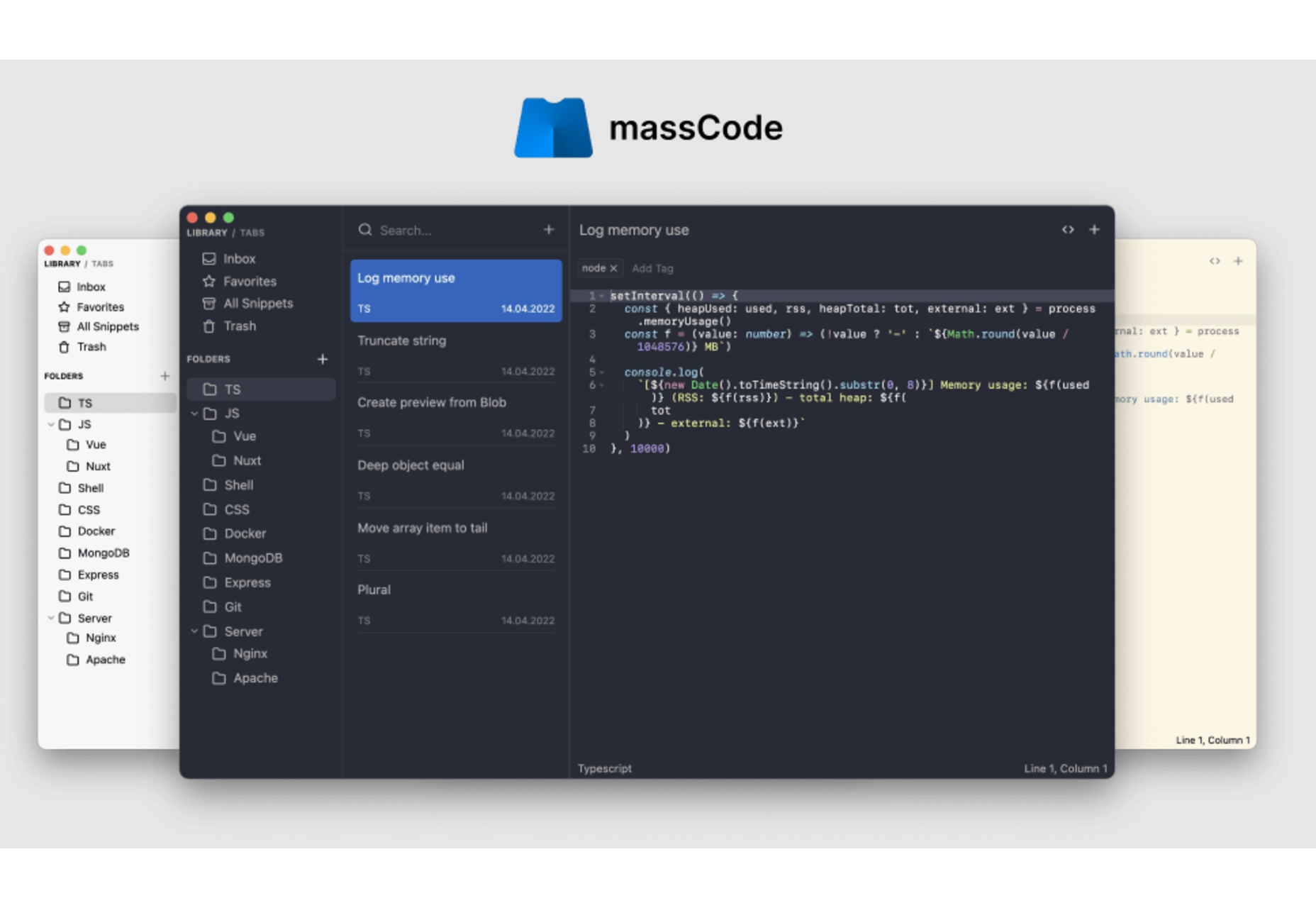
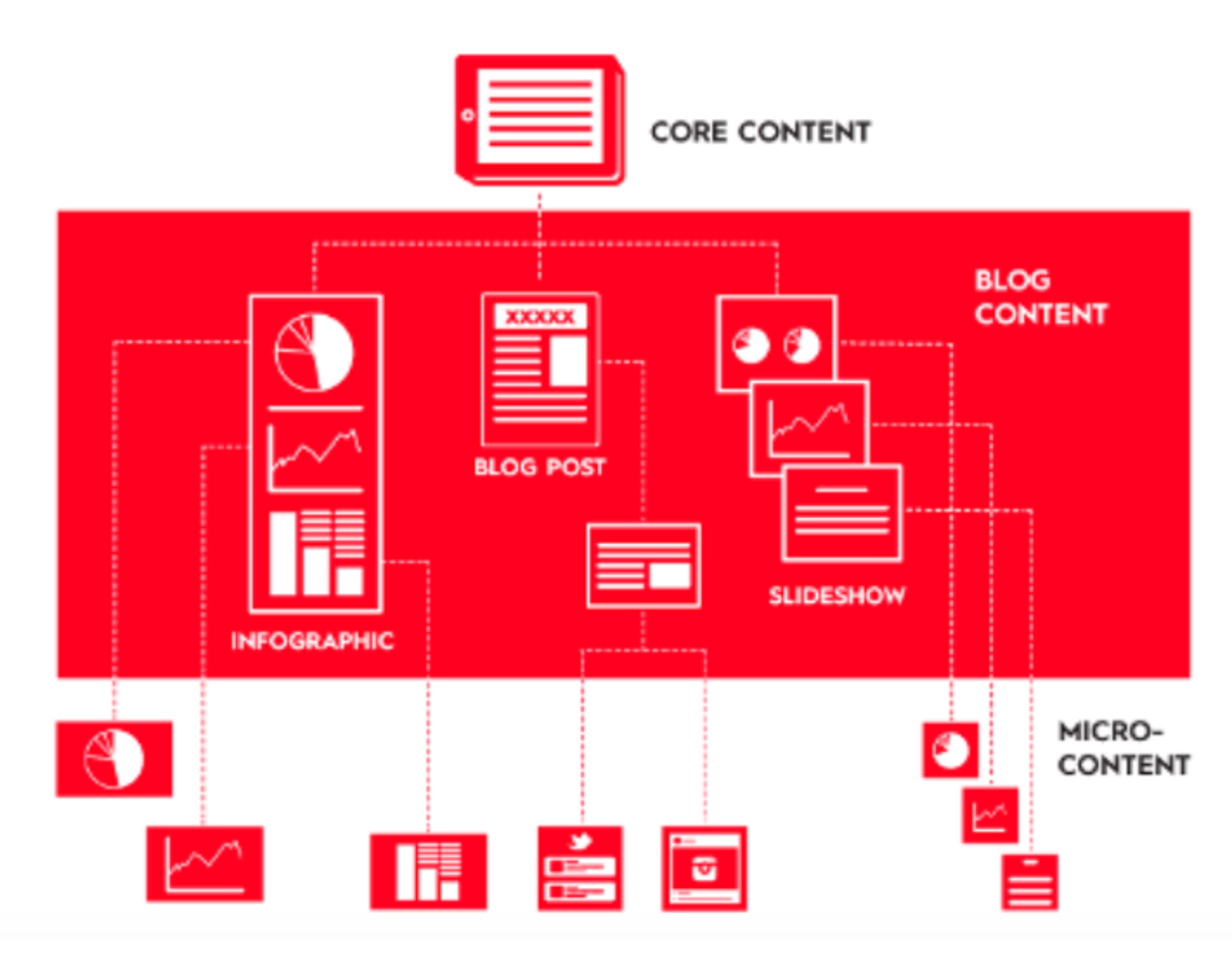
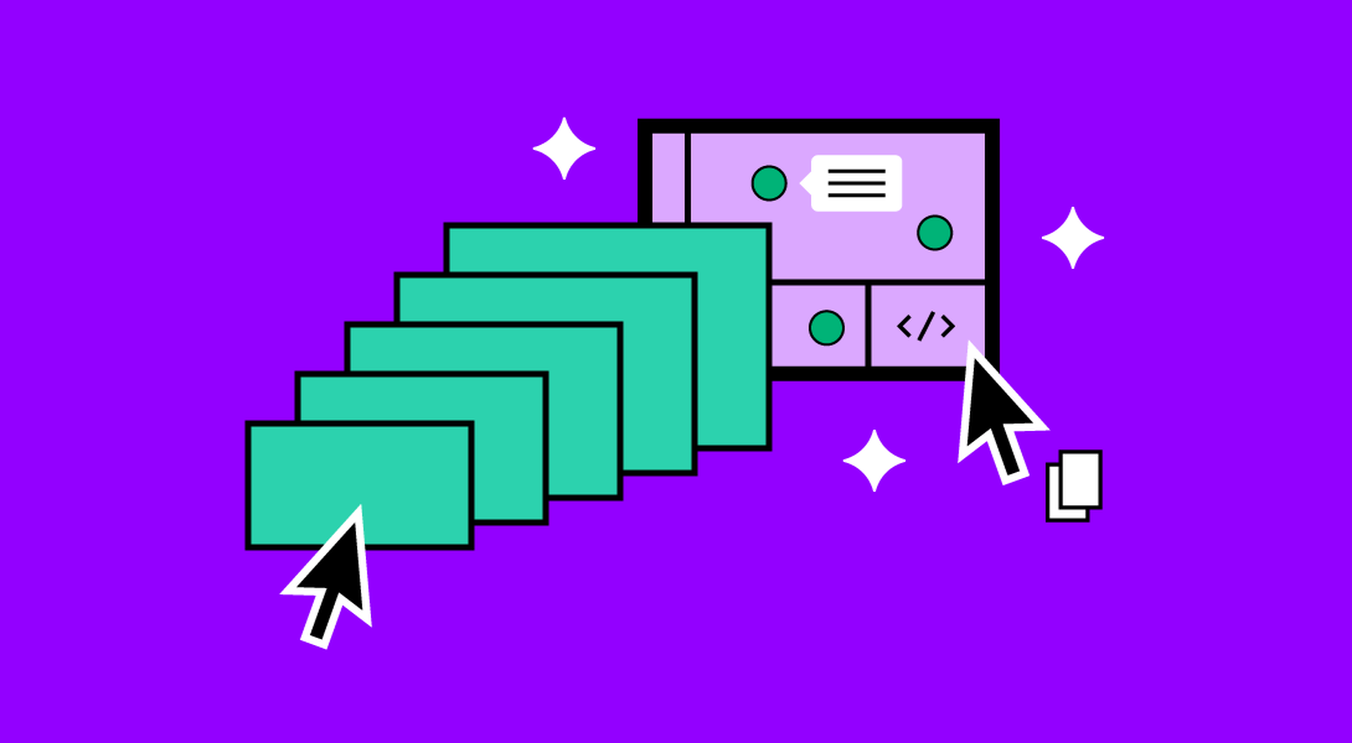
 The underlying theme of this month’s collection of new tools and resources is development. Almost every tool here makes dev a little easier, quicker, or plain fun. There are a few great tutorials in the mix to help you get into the spirit of trying new things and techniques.


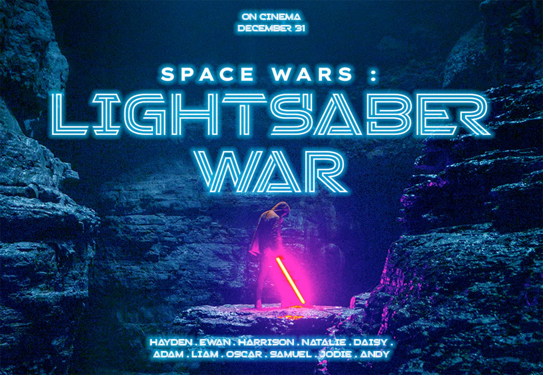
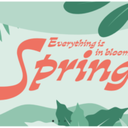
 Every day design fans submit incredible industry stories to our sister-site, Webdesigner News. Our colleagues sift through it, selecting the very best stories from the design, UX, tech, and development worlds and posting them live on the site.
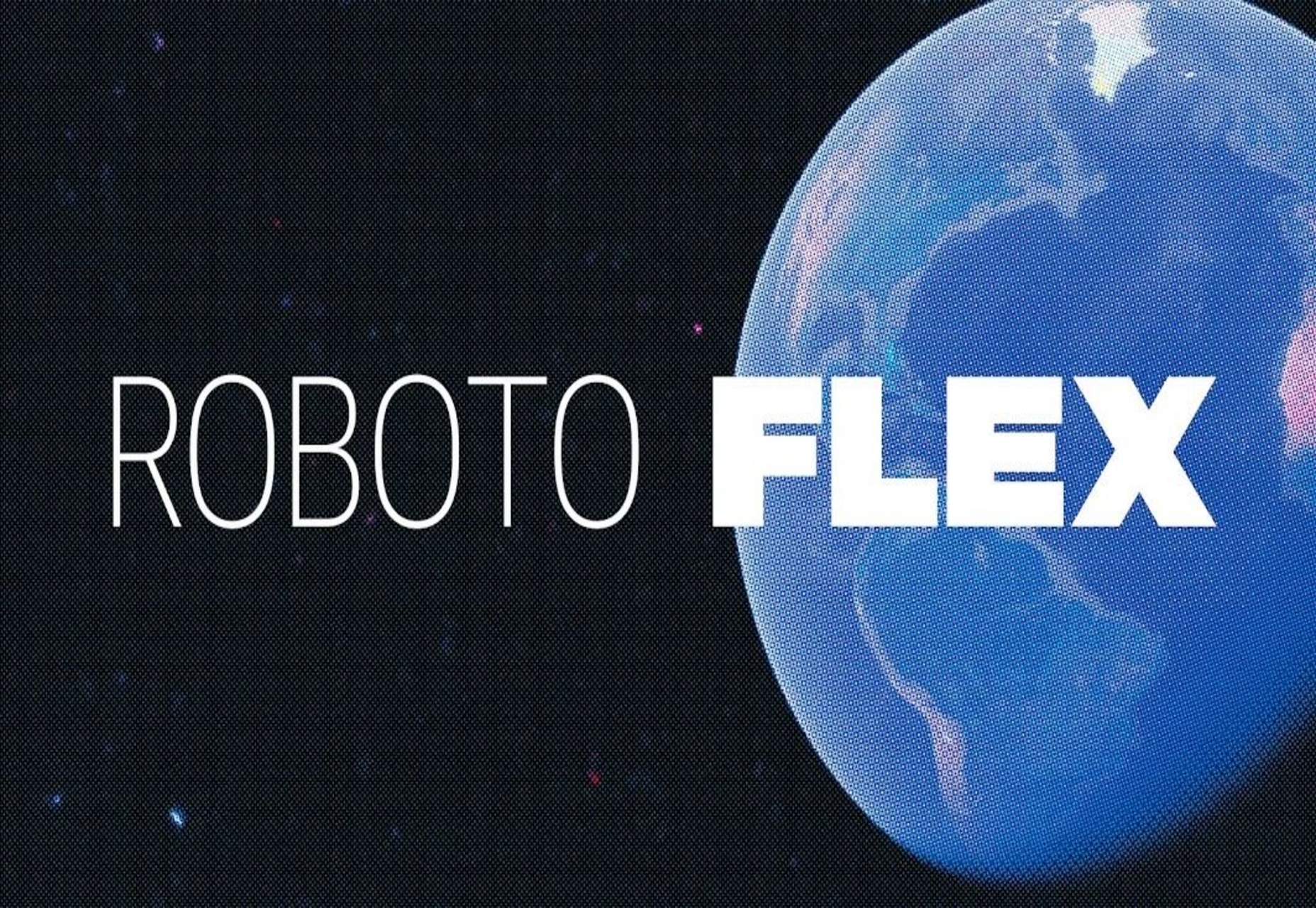


 Every day design fans submit incredible industry stories to our sister-site, Webdesigner News. Our colleagues sift through it, selecting the very best stories from the design, UX, tech, and development worlds and posting them live on the site.
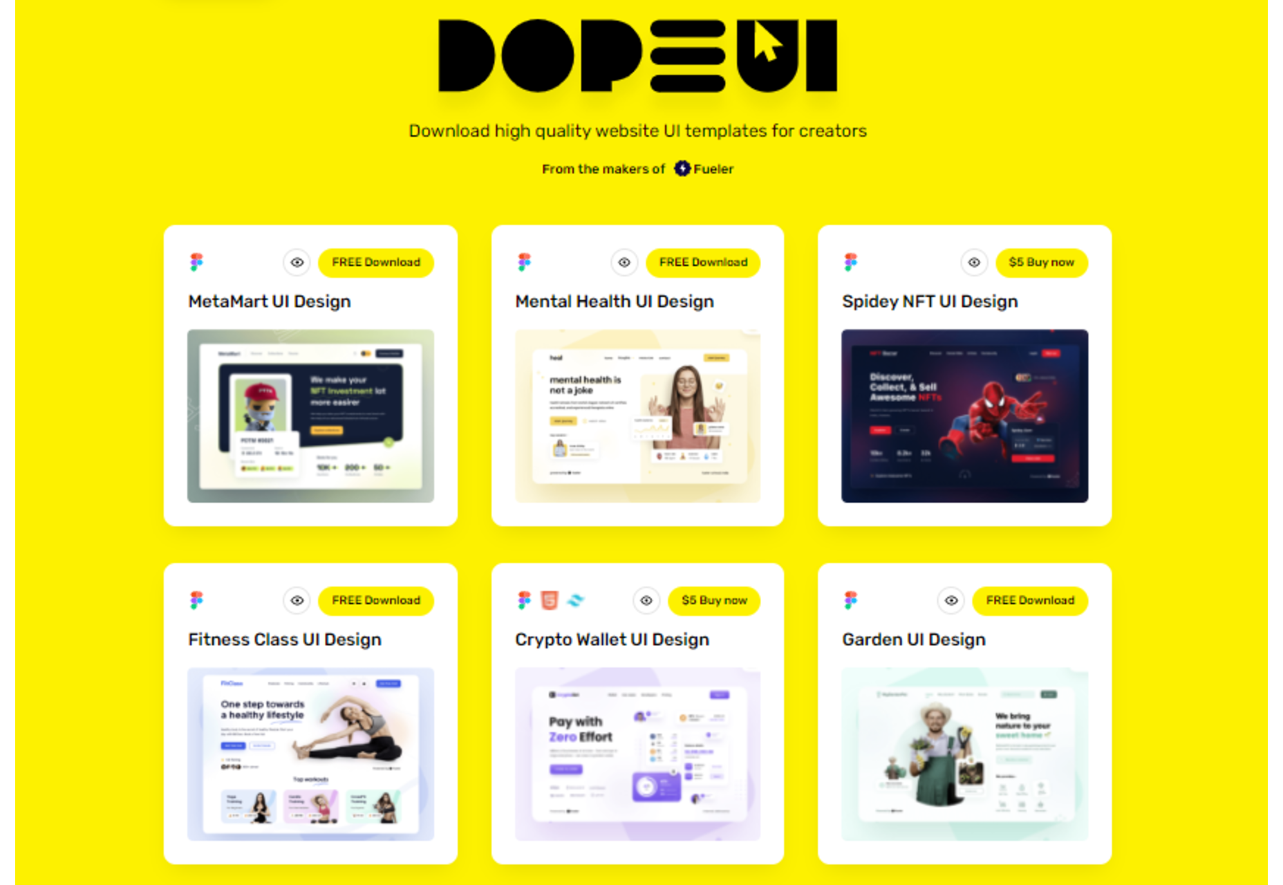


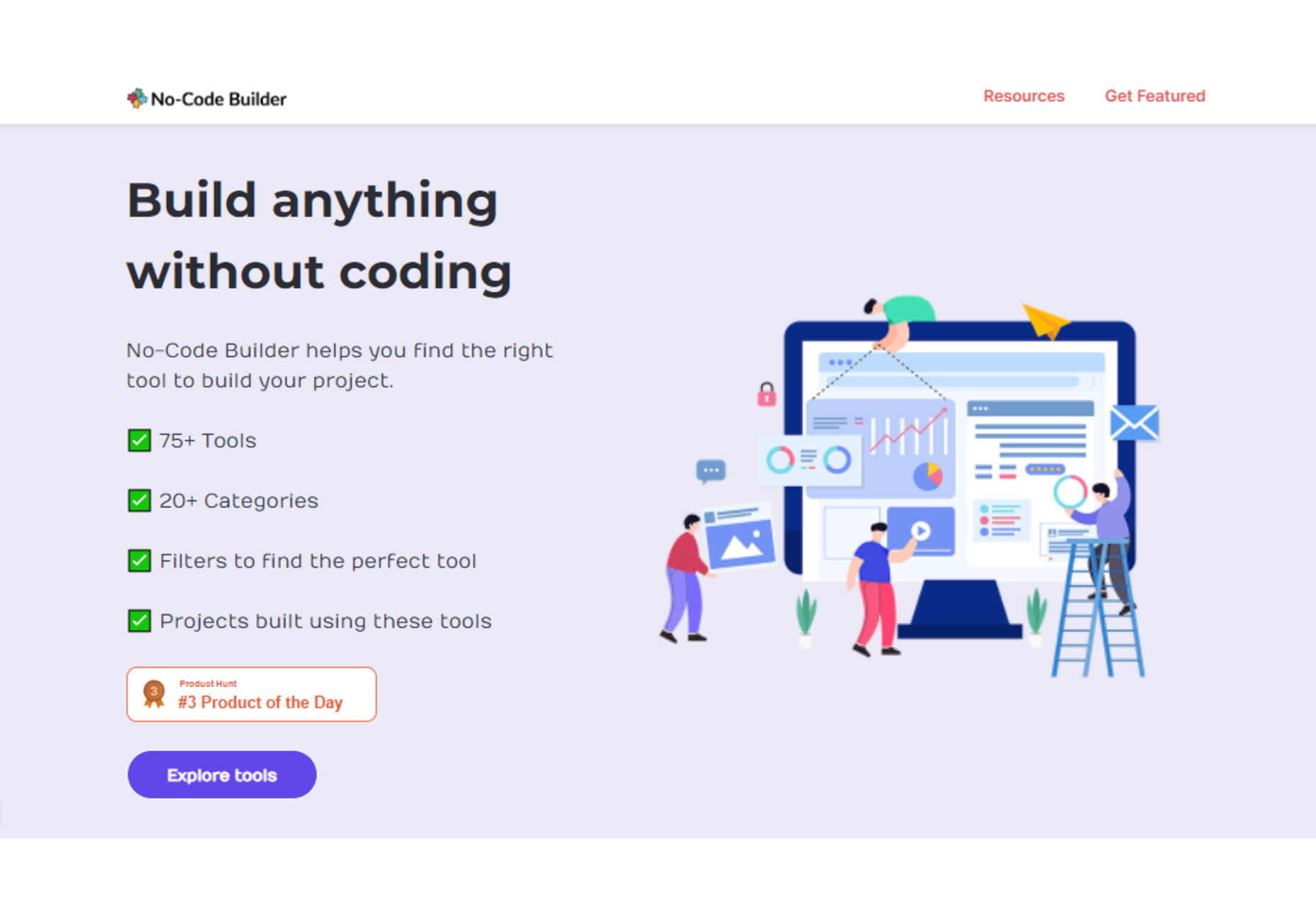

 Every day design fans submit incredible industry stories to our sister-site,
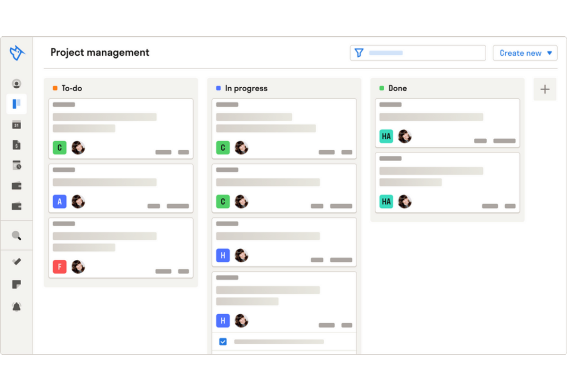


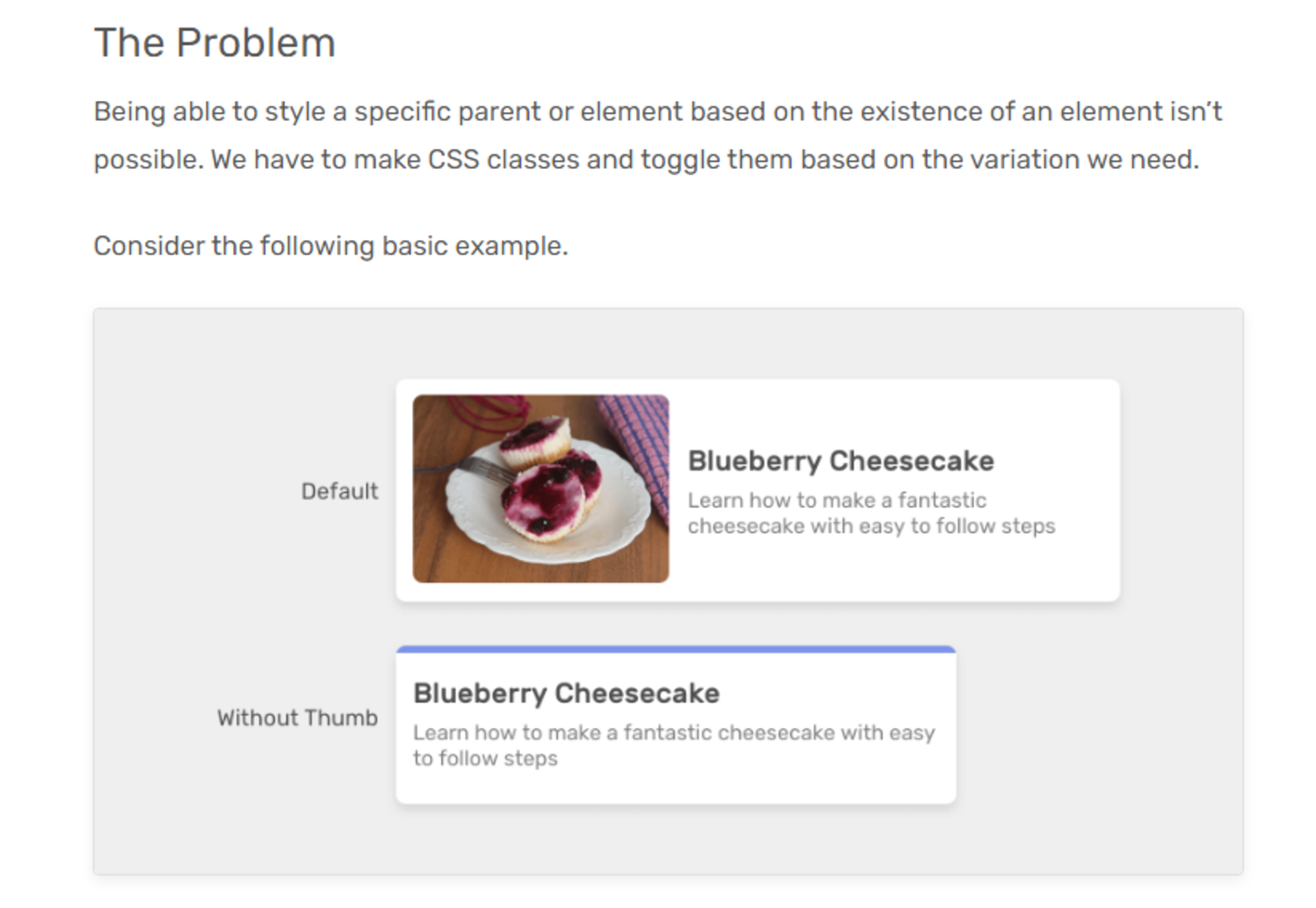

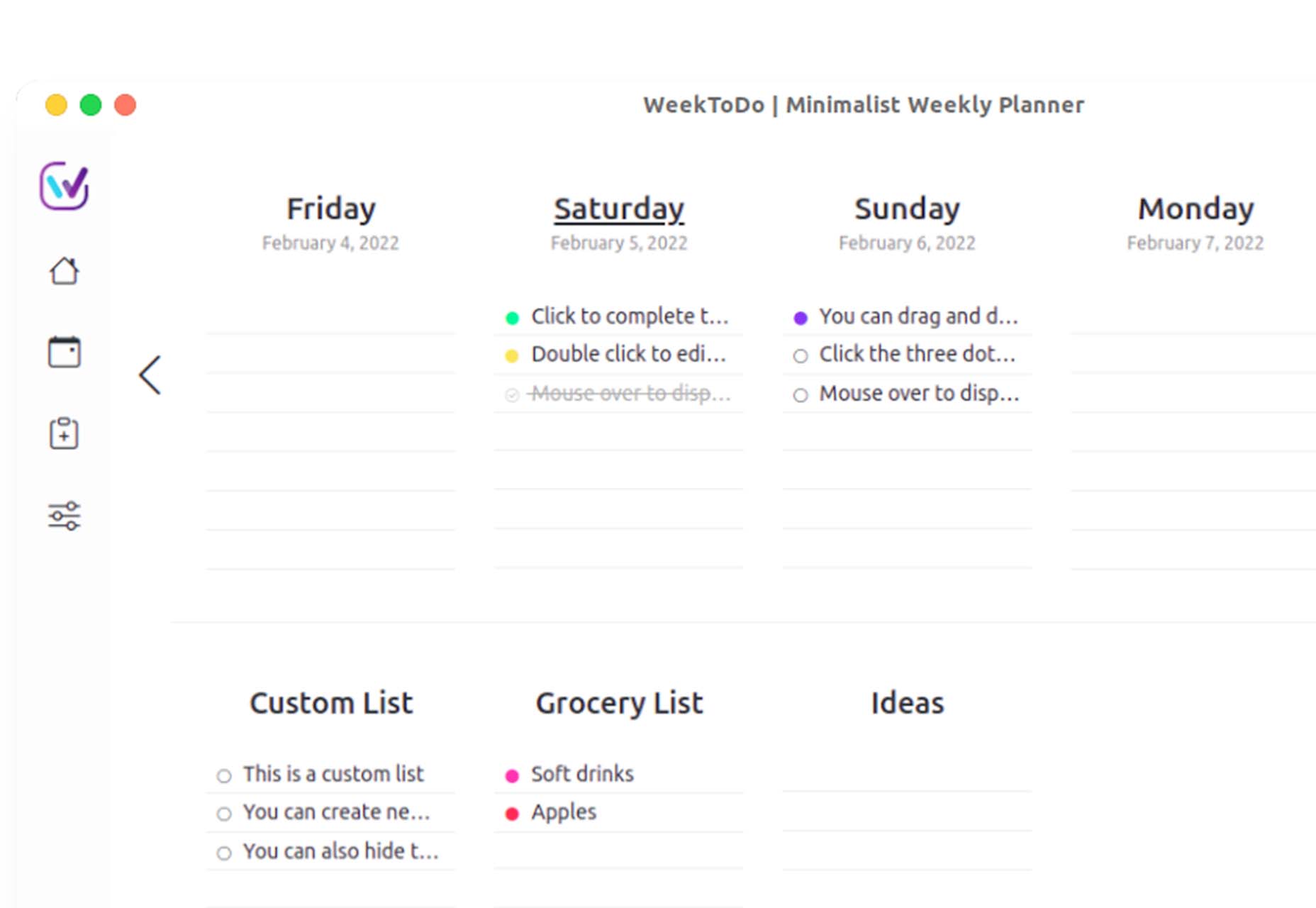
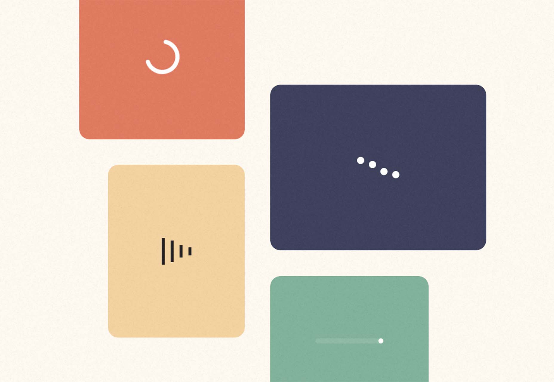
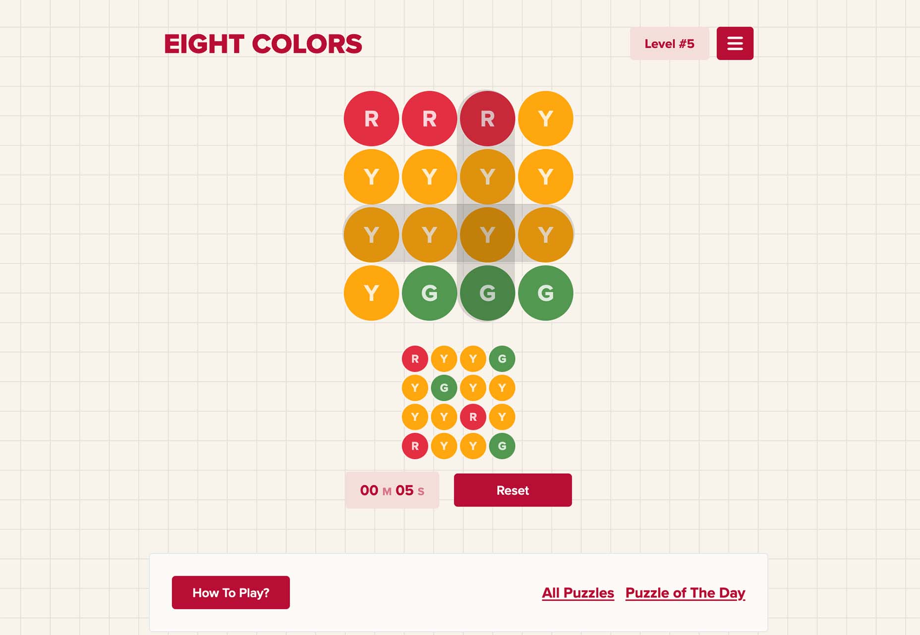
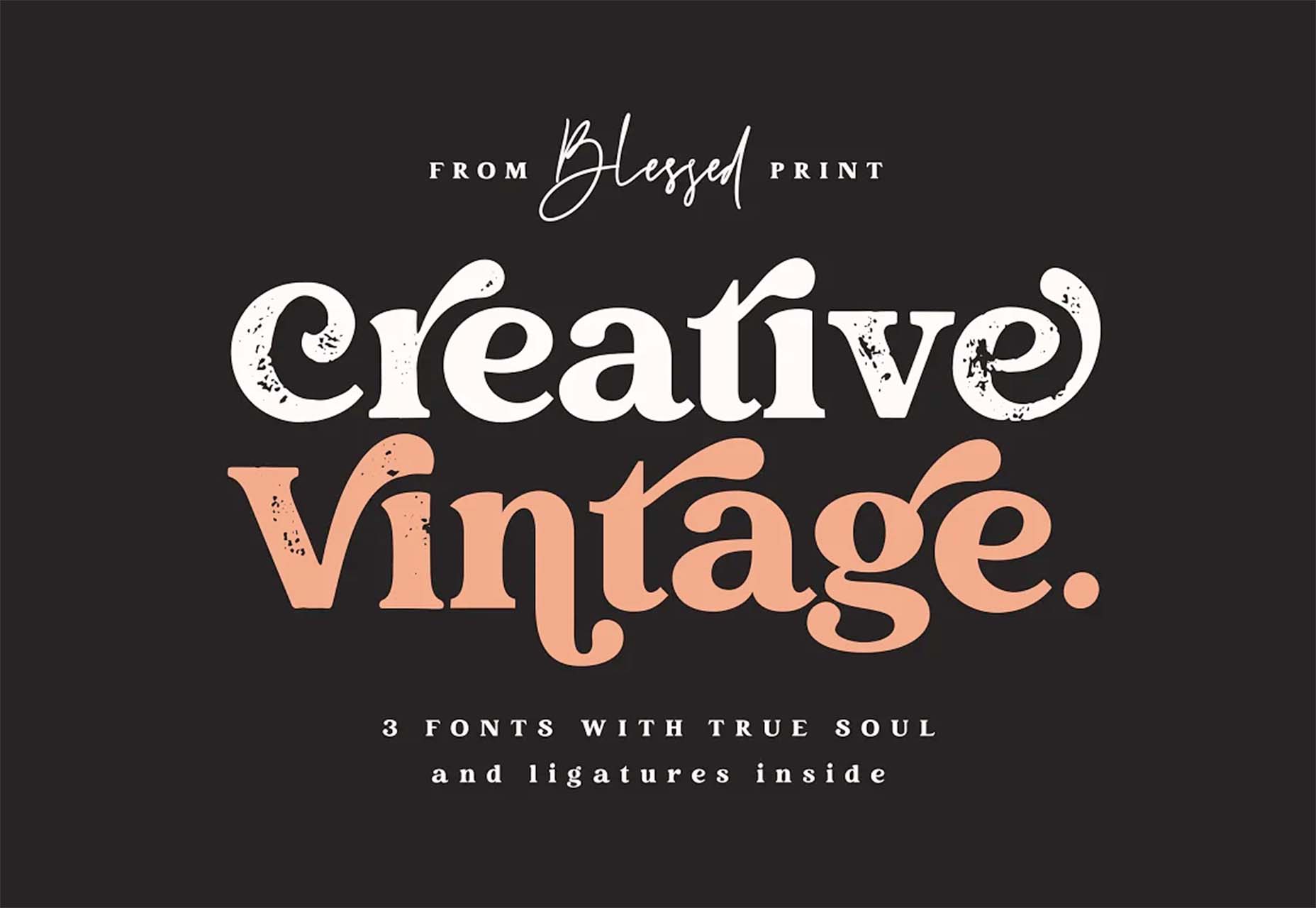
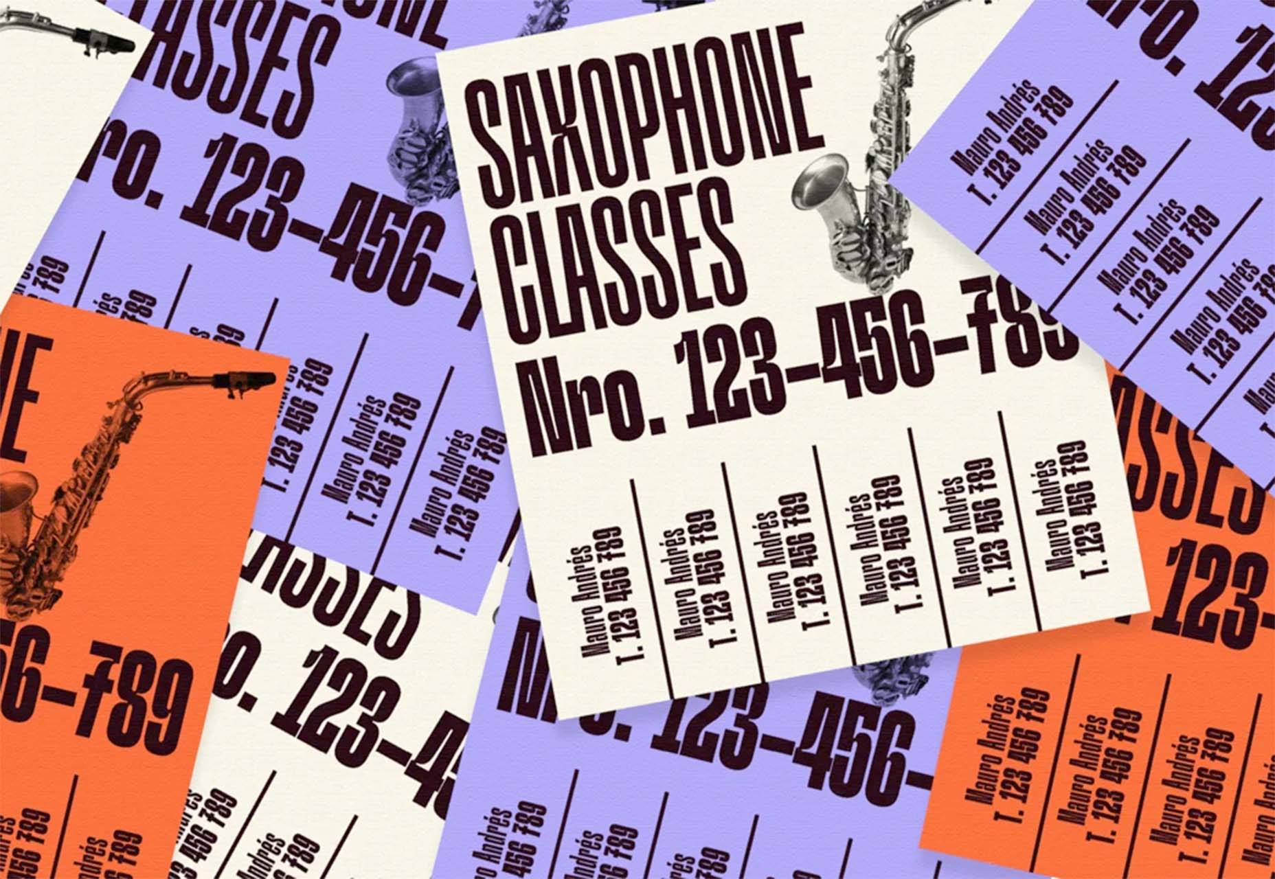
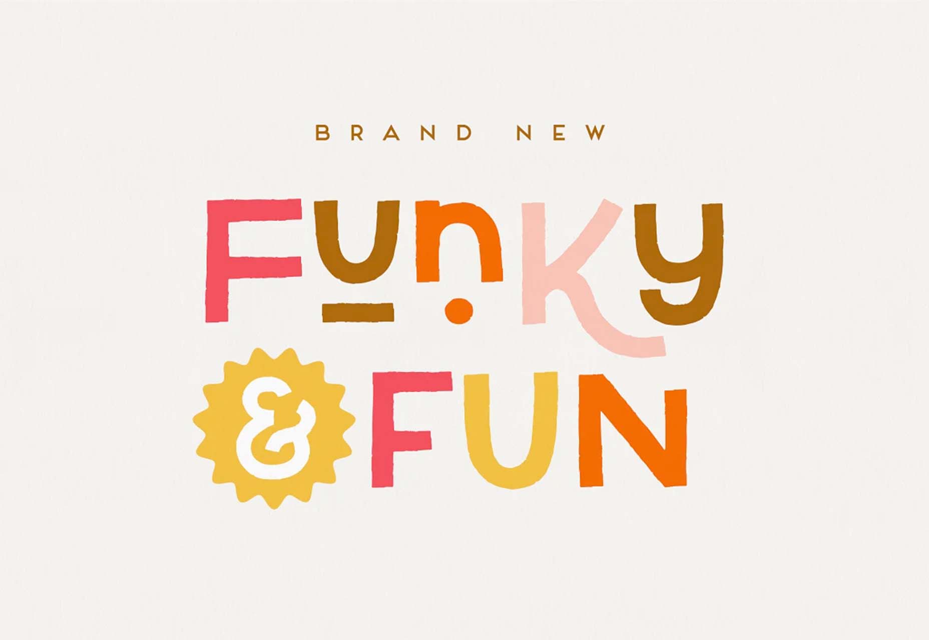
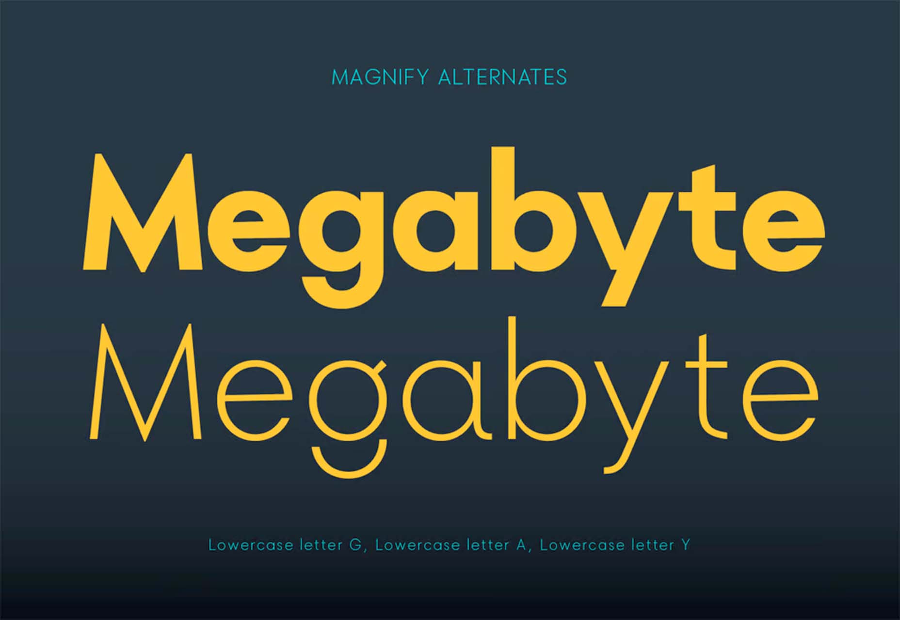
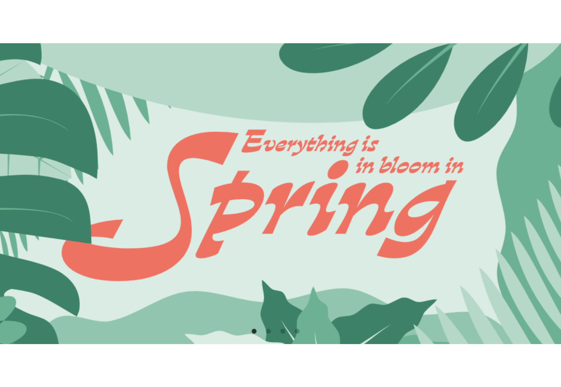
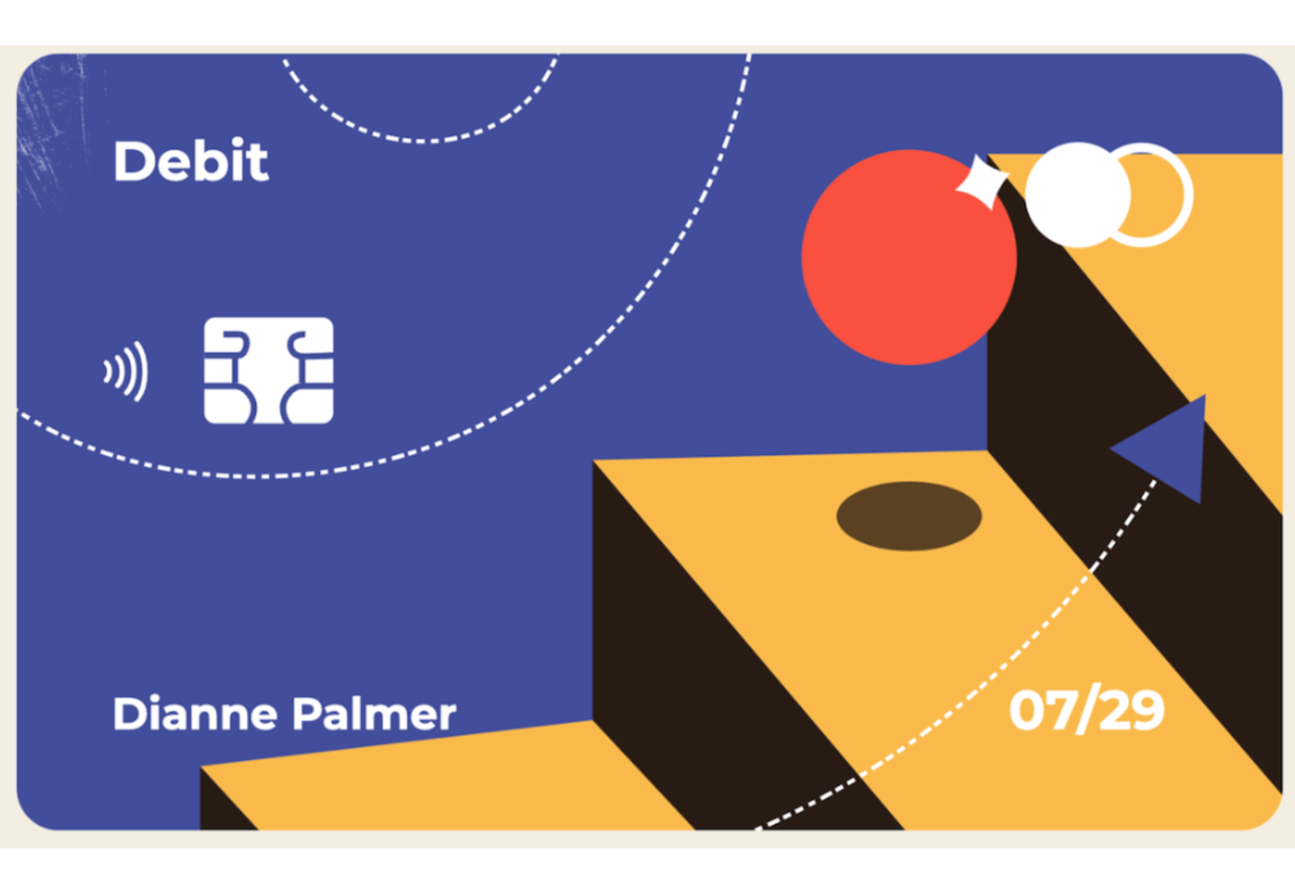
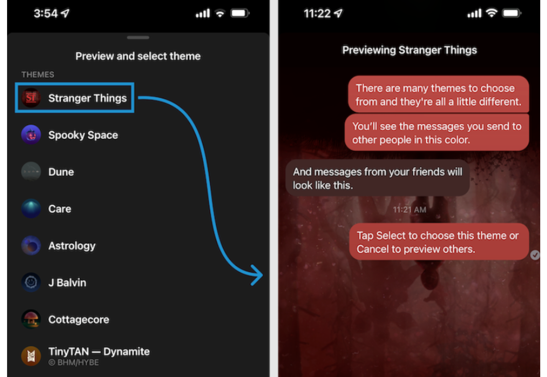
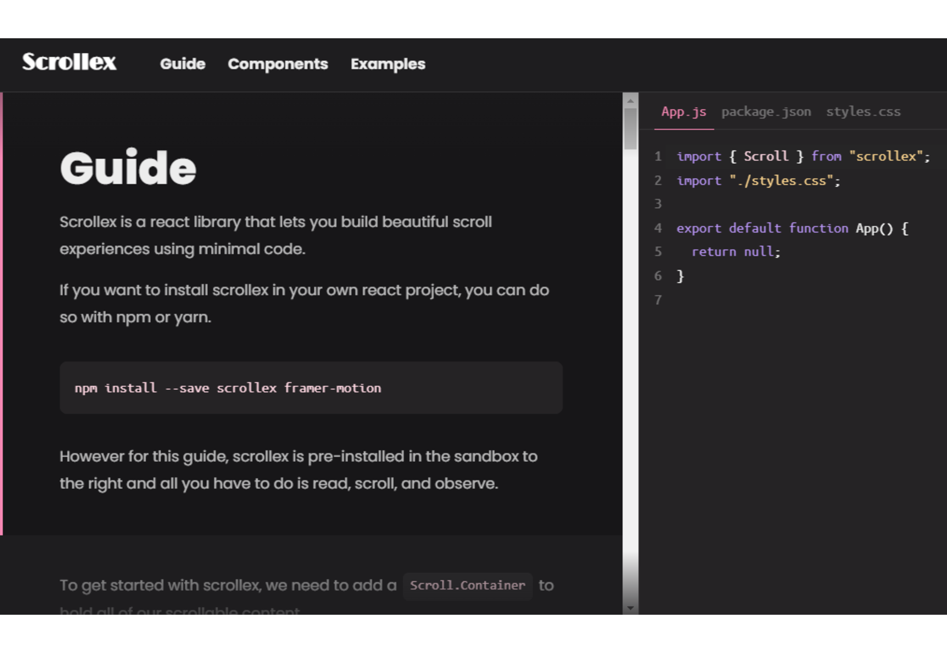
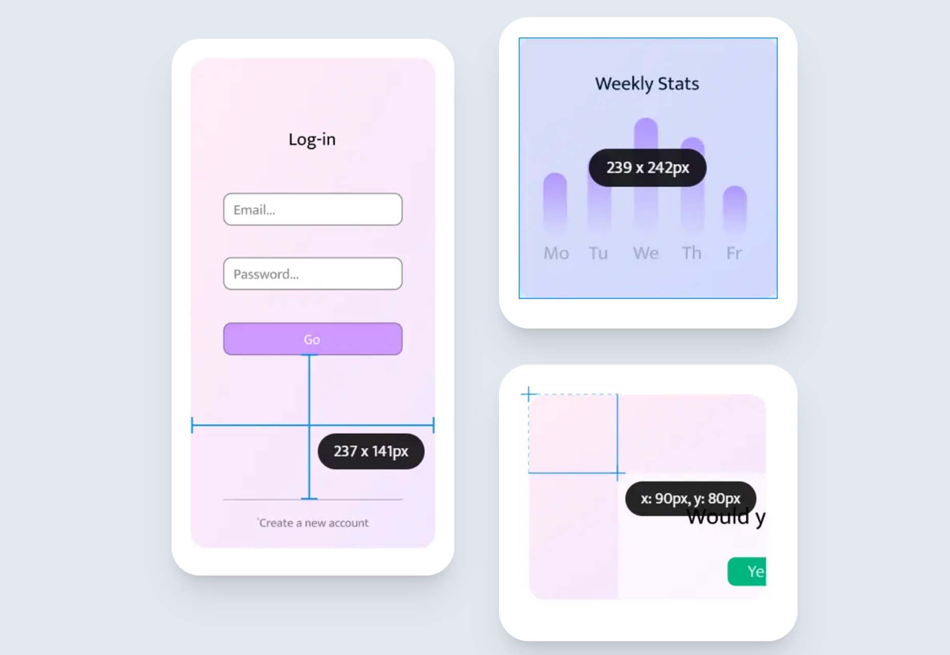
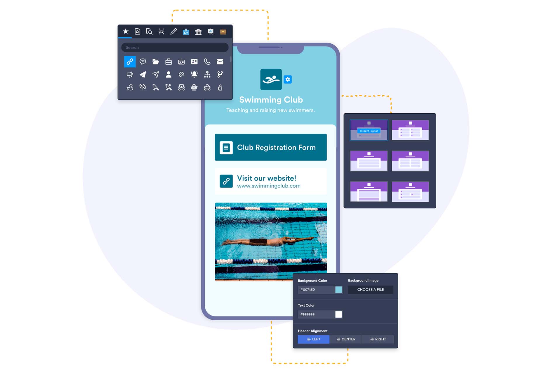
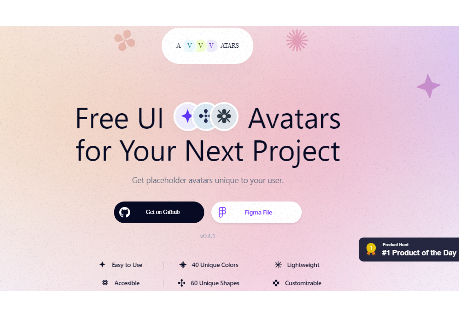
 Bored with the same old design tools? There are plenty of new toys to experiment with, from fun divots to functional design tools that could become your new go-to’s.


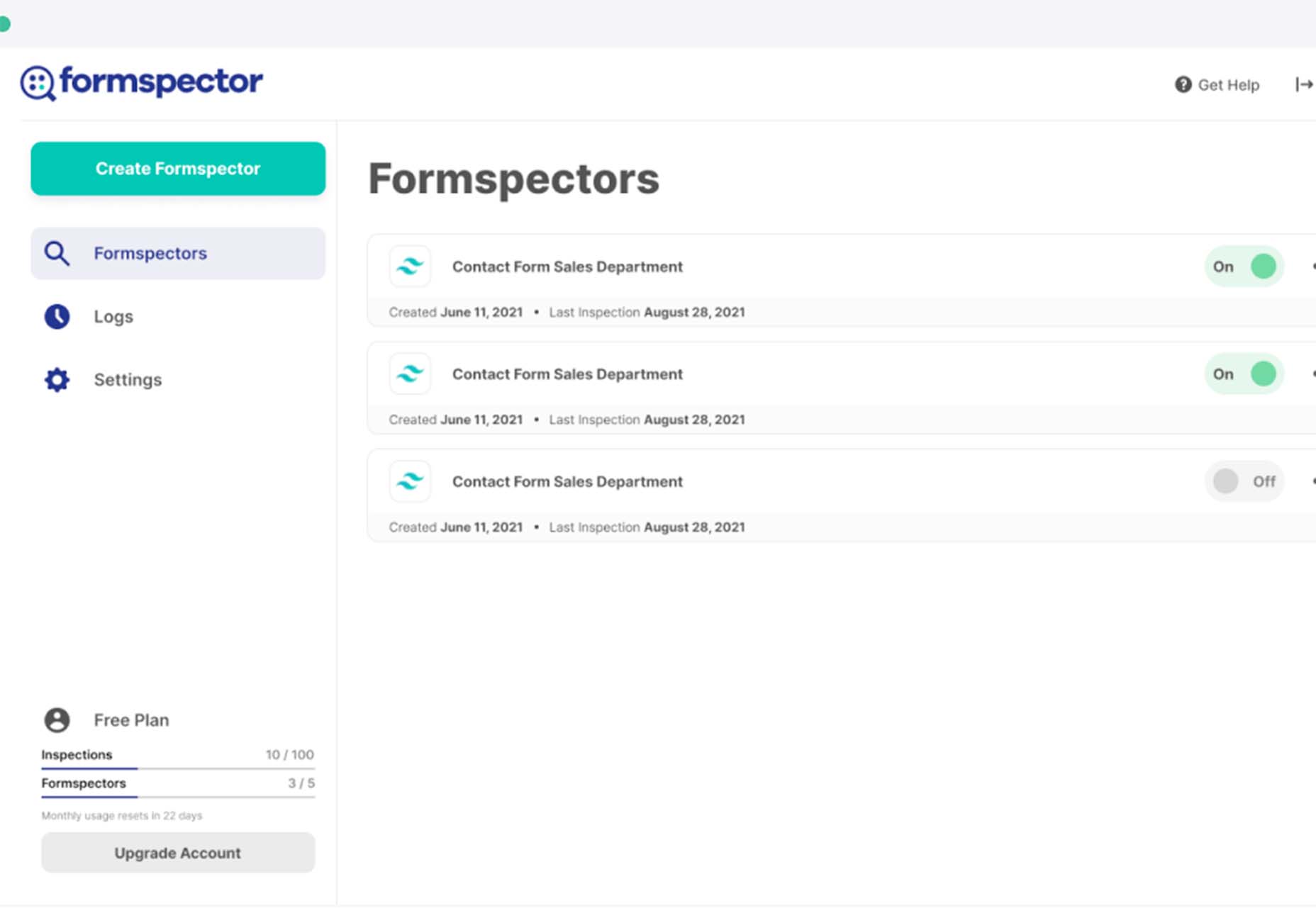
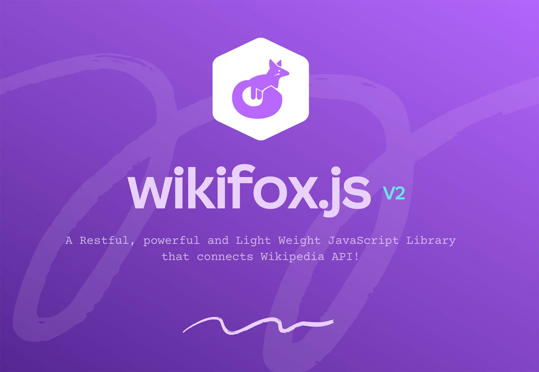
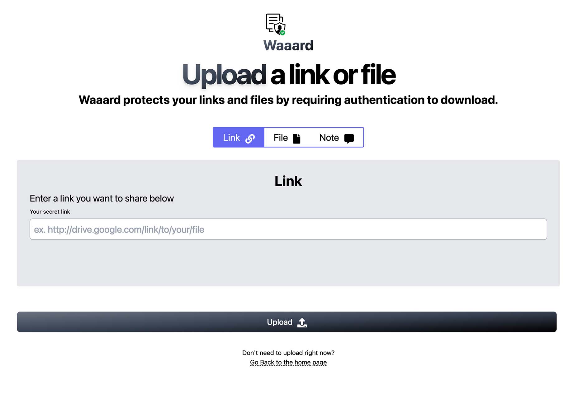

 Every day design fans submit incredible industry stories to our sister-site, Webdesigner News. Our colleagues sift through it, selecting the very best stories from the design, UX, tech, and development worlds and posting them live on the site.


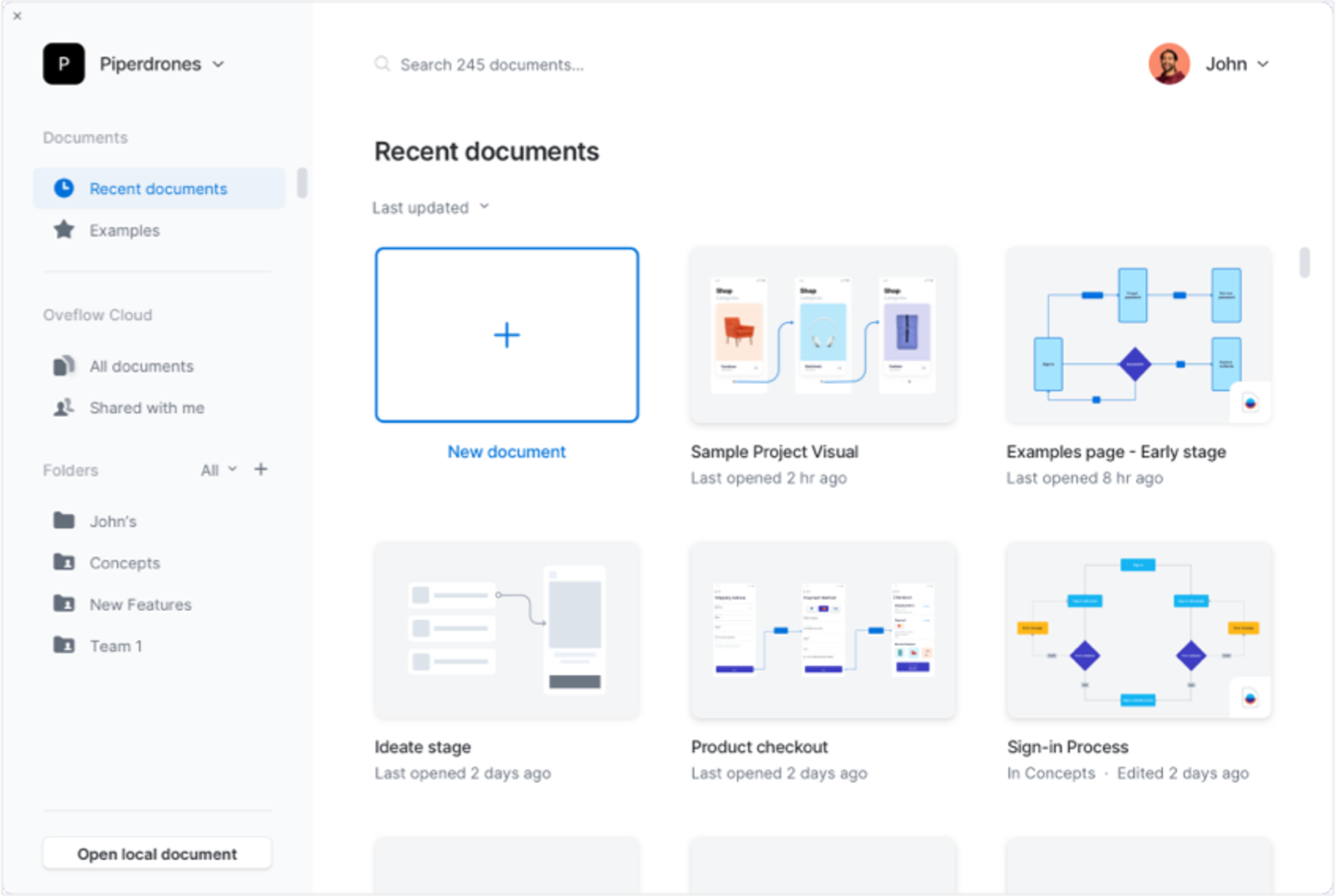

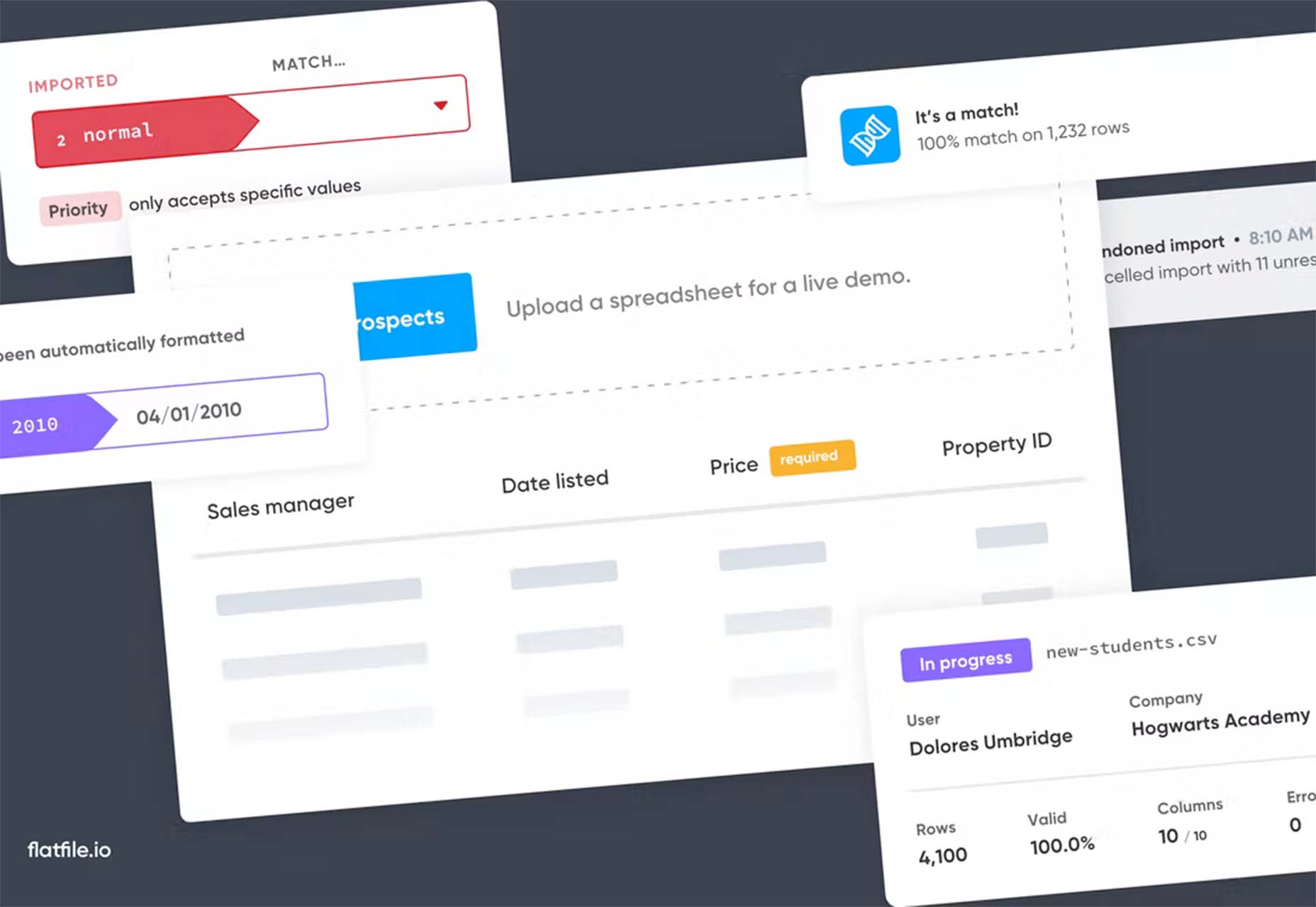
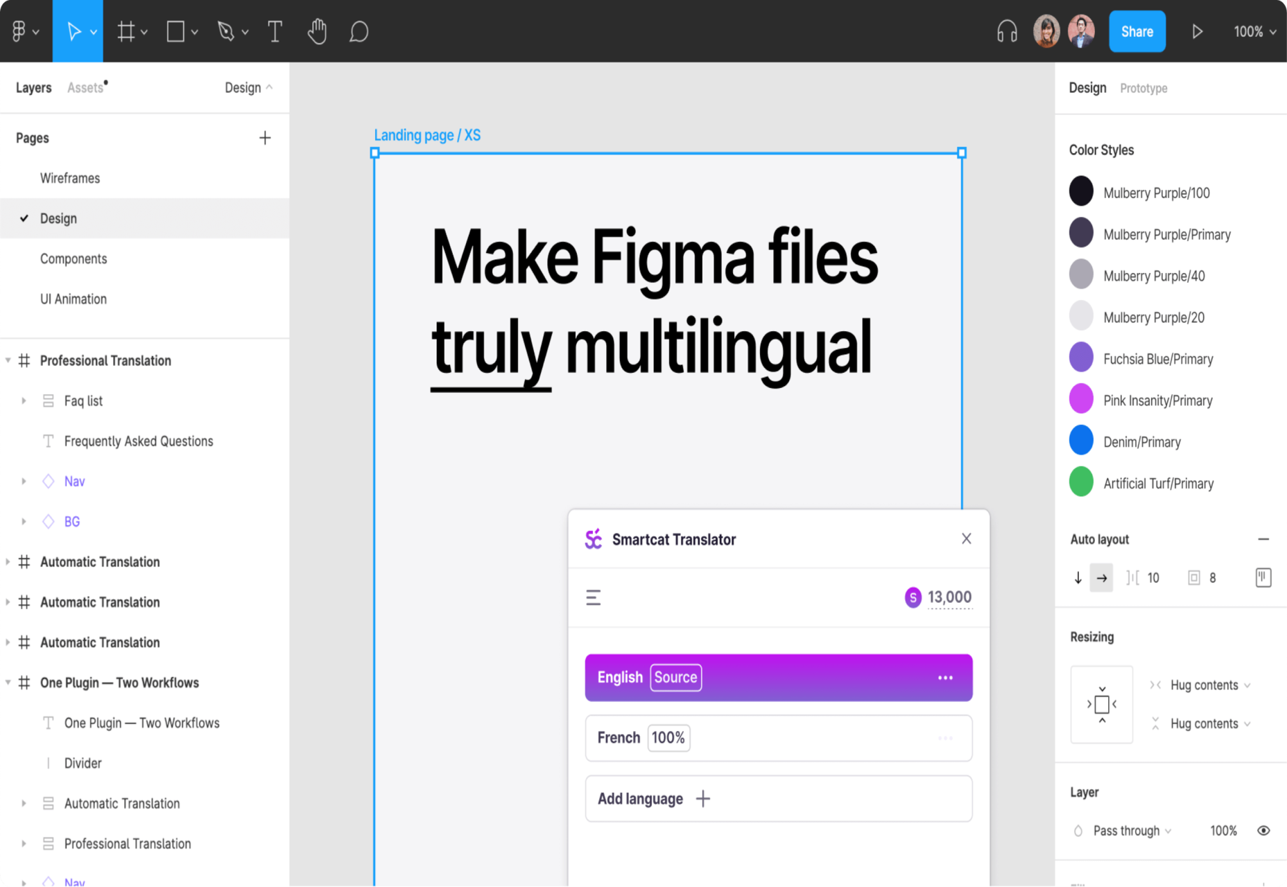
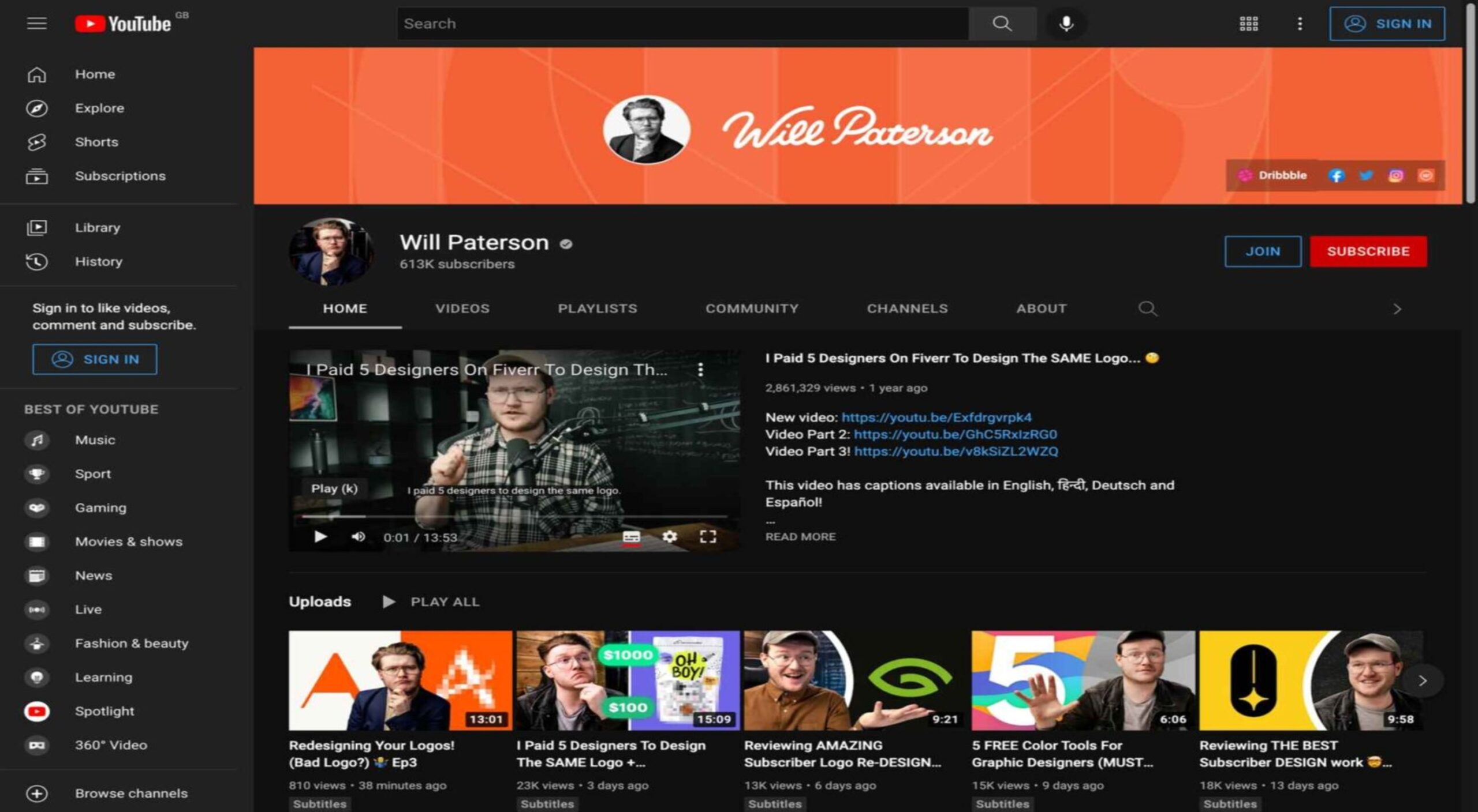
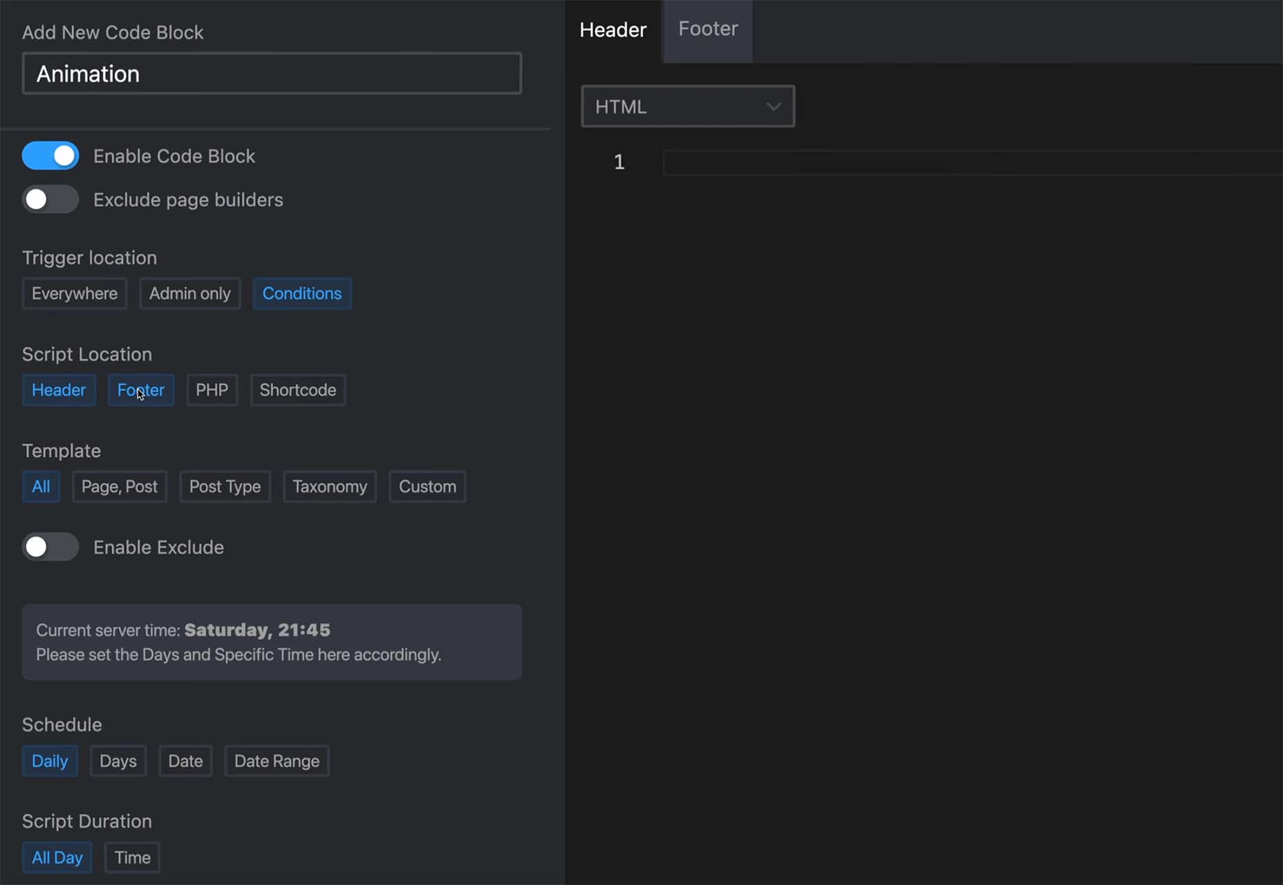
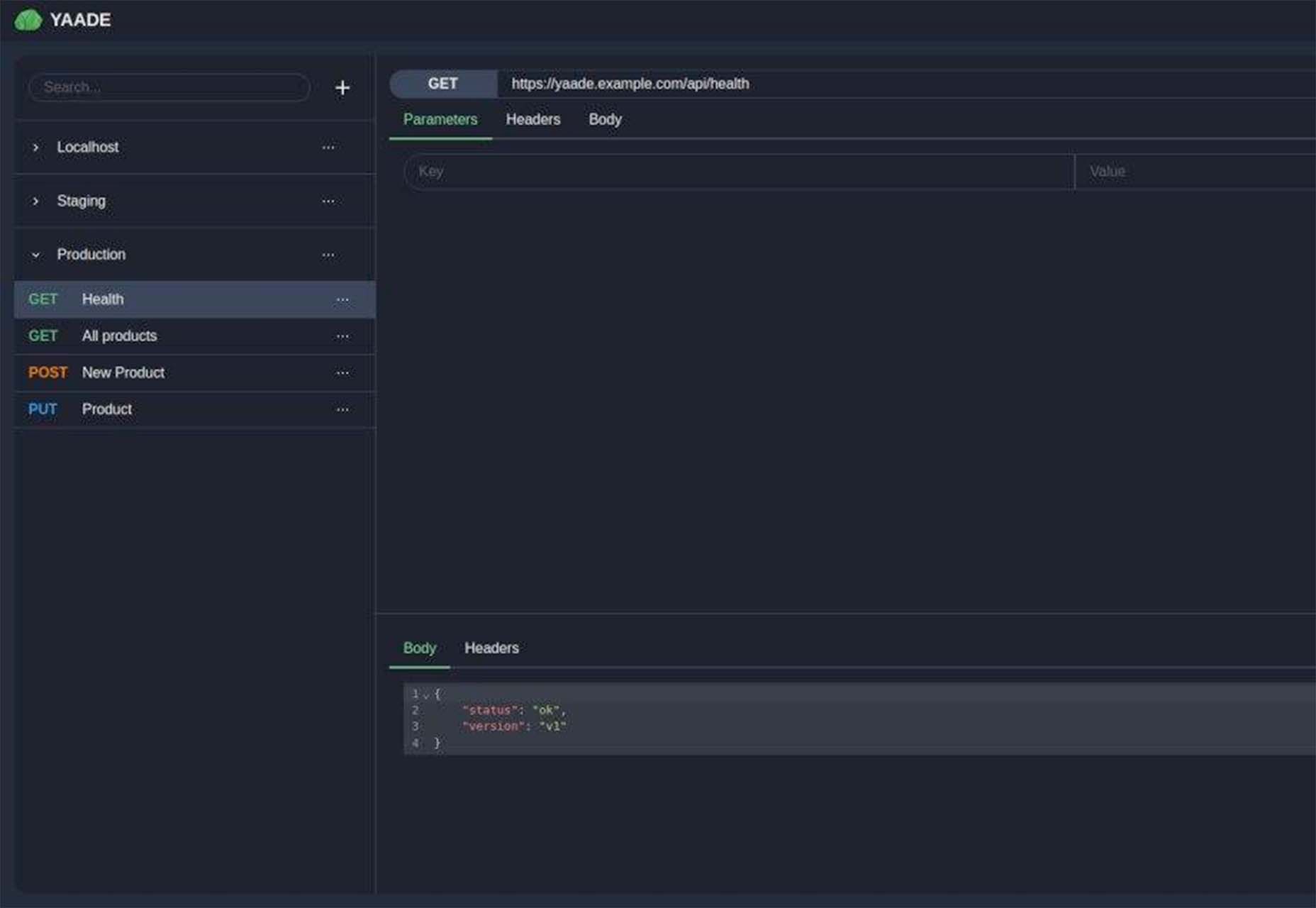
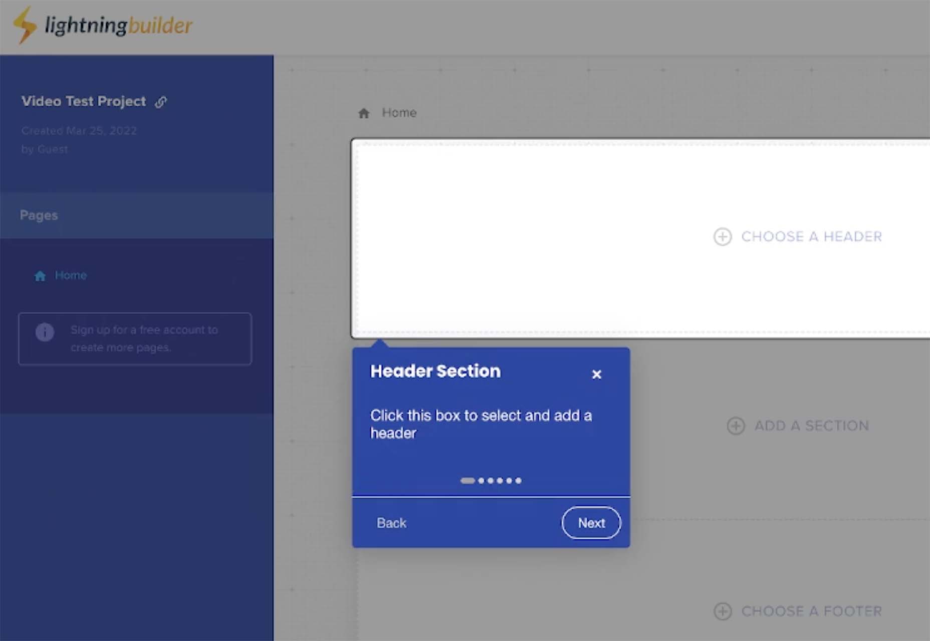
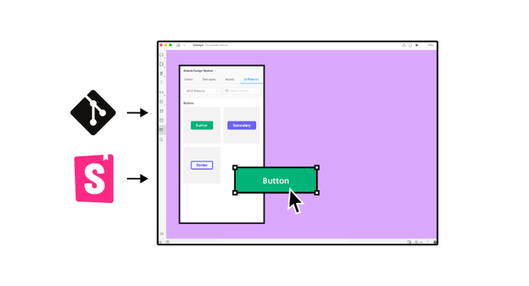
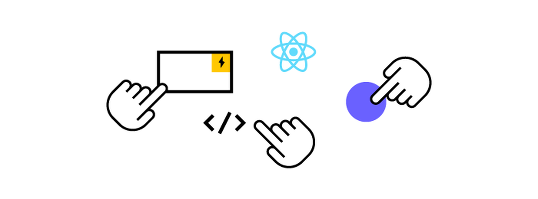
 It’s something every design team dreams about – a better design process and handoff procedure. Your design team is not alone if you are looking for a better solution.


