Articles

There are a lot of dark, retro vibes trending in website design right now. Although there are still some light projects popping up – including a pastel trend below – a lot of what we are seeing has a quite moody feel.

Here’s what’s trending in design this month.

Pastel Color Palettes

Let’s start with the trend with a lighter feel – pastel color palettes. While much of the web is trending toward dark aesthetics, there’s a segment that’s going in the exact opposite direction. Those sites feature soft, pastel color palettes that serve as a balance to all the super dark websites out there.

One thing about this website design trend is that it jumps out because of the stark contrast with all of the dark color palettes out there.

Each of these designs seems to use a pastel color palette as the basis for a background. A blur effect is paired with the colors to use pastels in a way that has a natural feel without appearing too feminine or light.

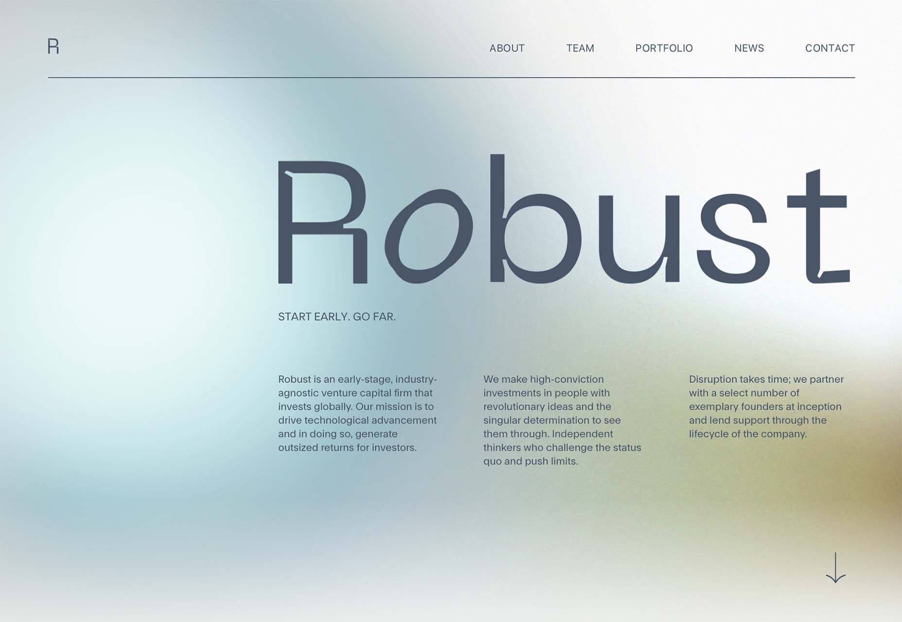
Robust uses blue and earth tones for a pastel background that feels modern and strong when paired with the hard-edged headline font.

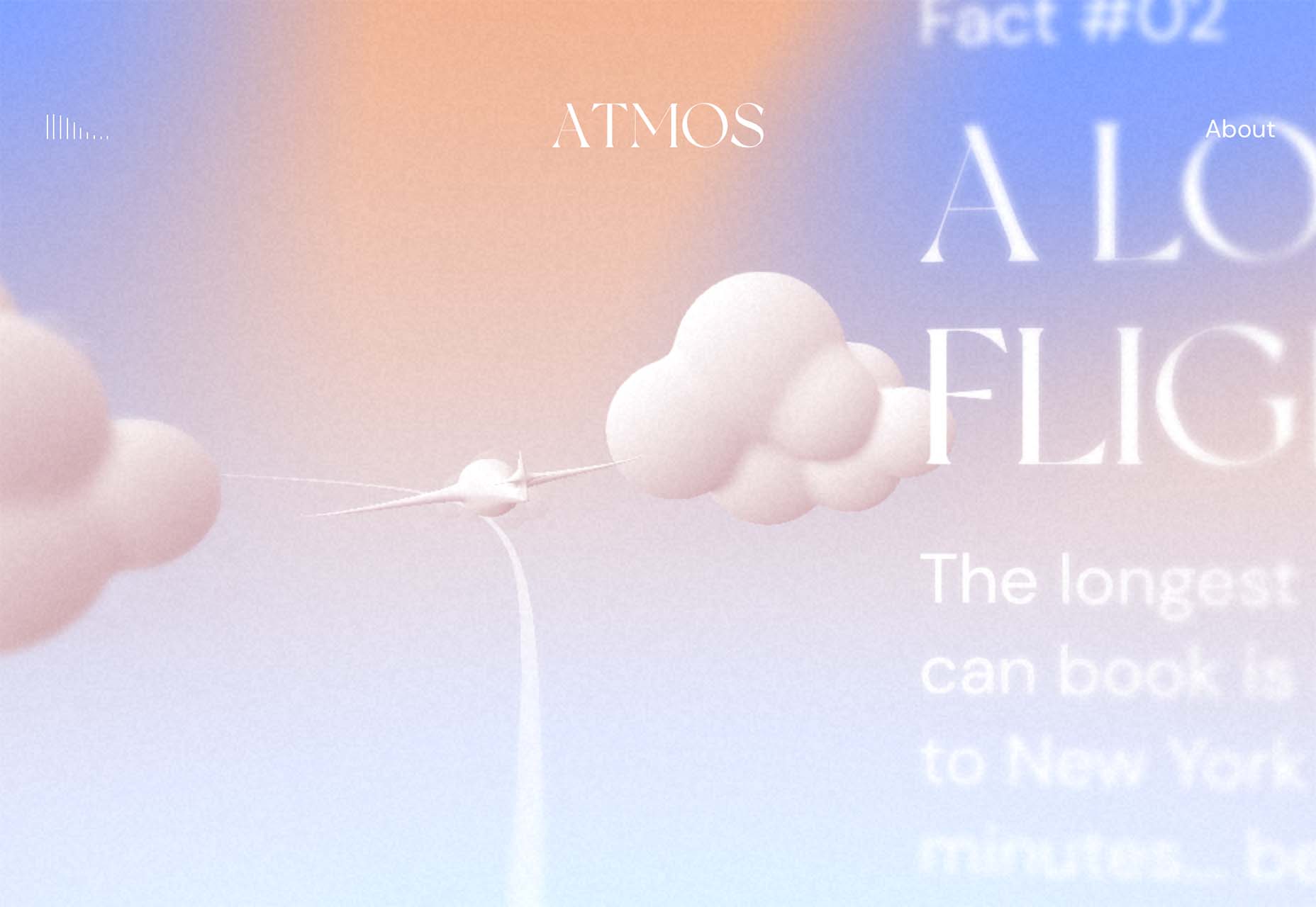
Atmos uses a light pastel theme that takes you through the clouds with blues, and pinks, and purples. The pastel color scheme works well with the content which is airline-themed and makes you feel like you are flying through the sky. The colors are also soft enough to provide an easy reading experience.

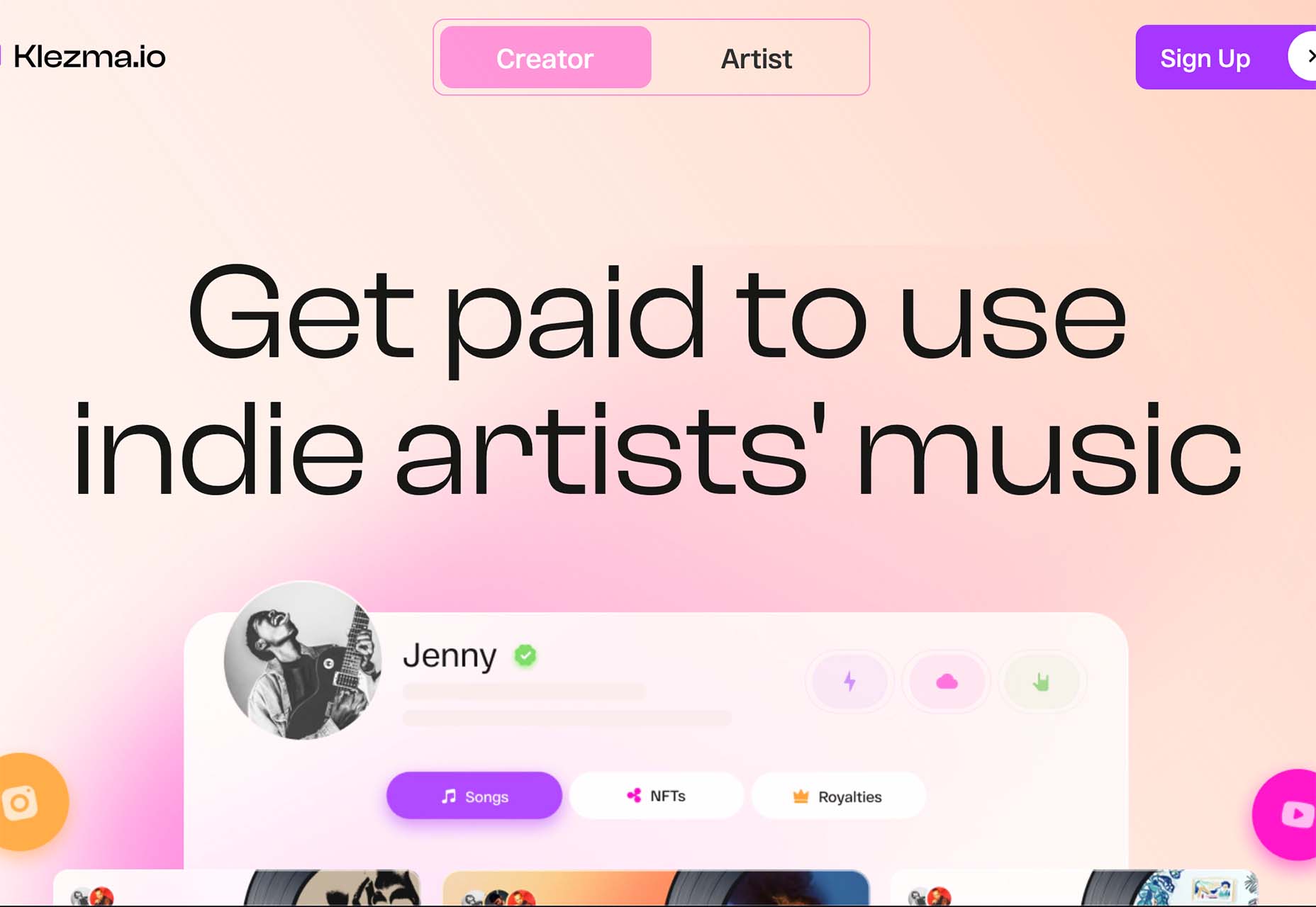
Klezma is another design with the same pastel background with graduated color. The peach tones are fairly neutral and give plenty of room to the content.

Fonts with a Distinct Retro Look

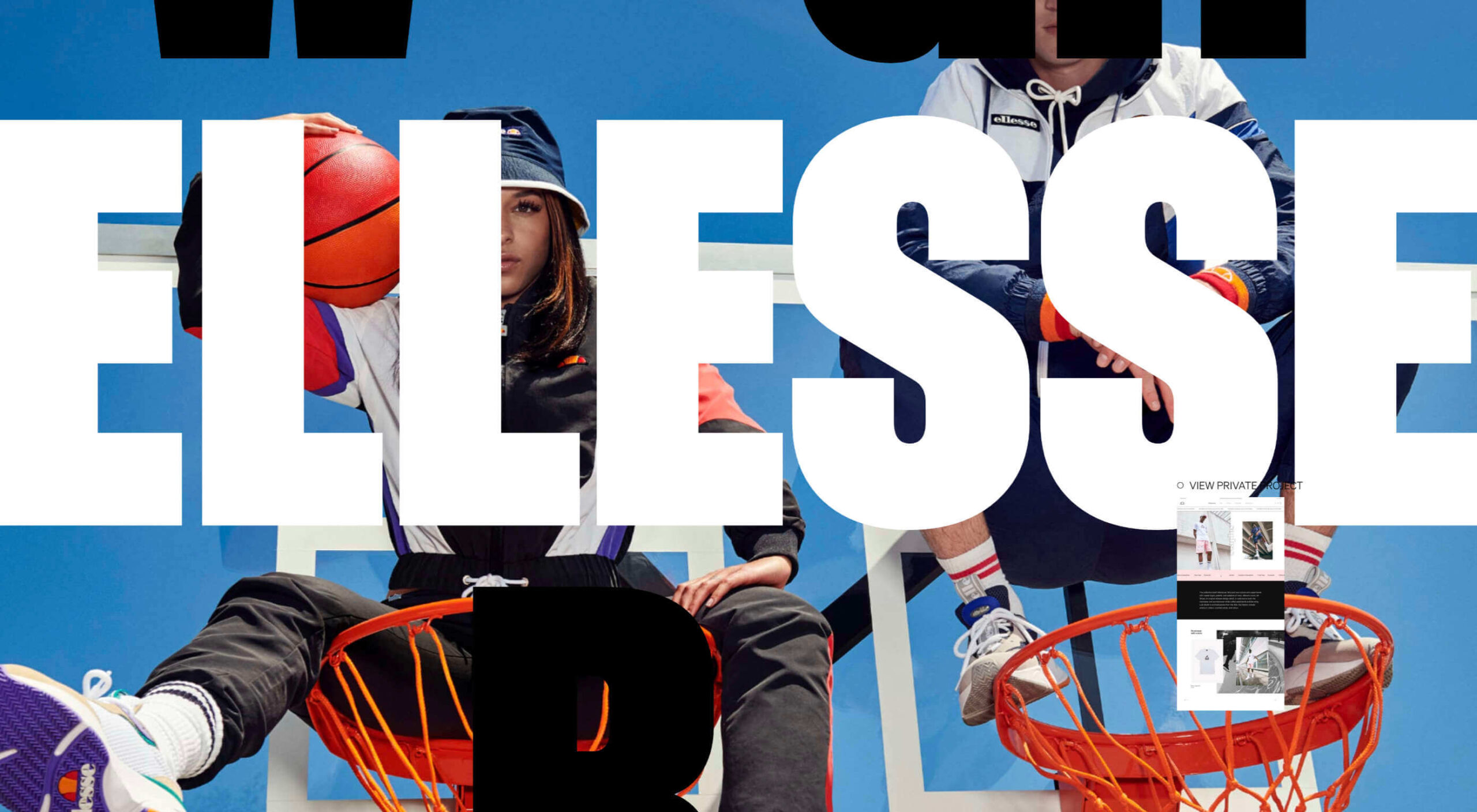
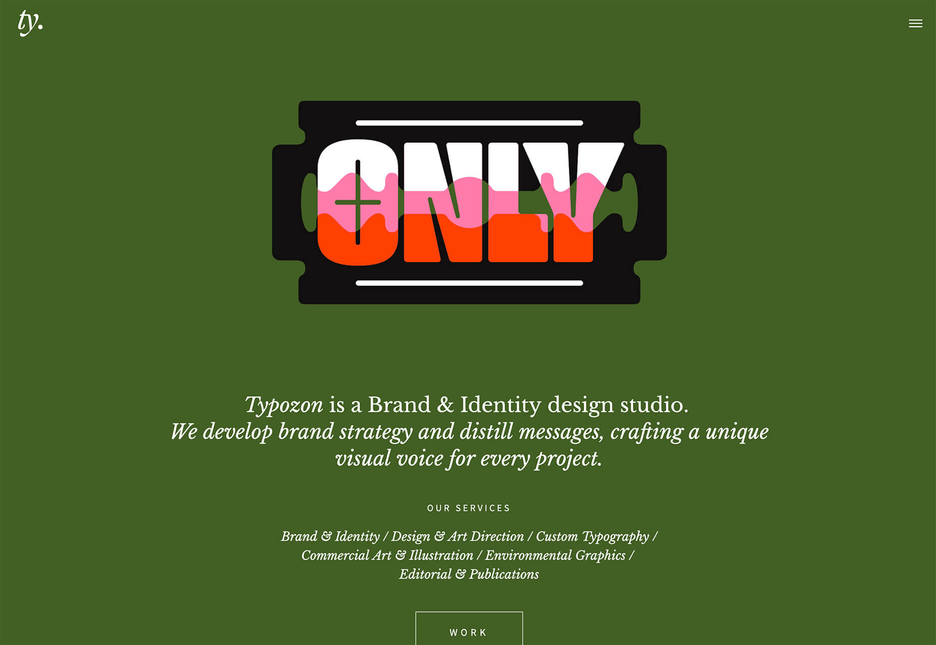
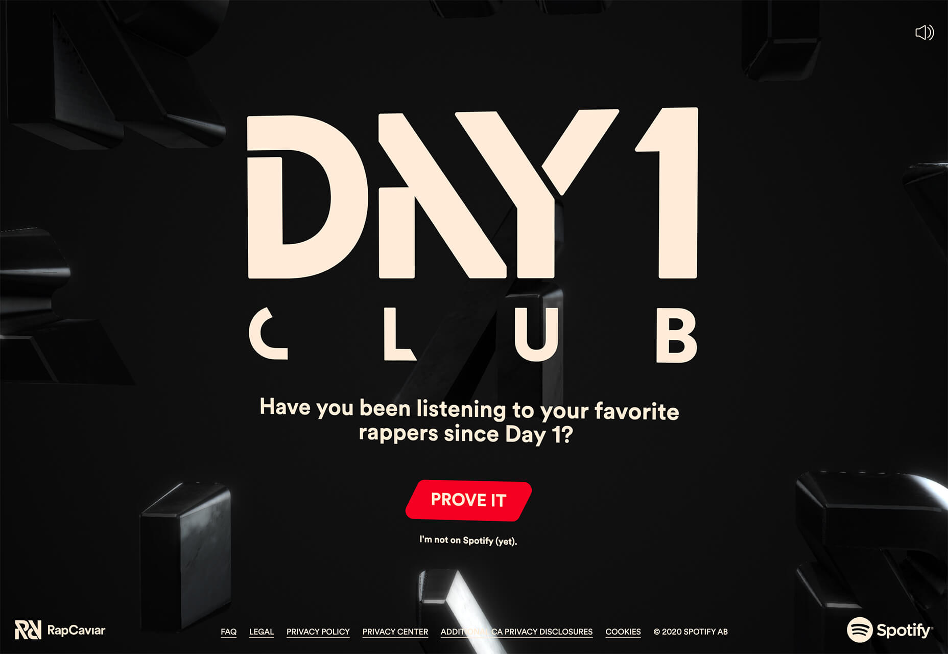
Every one of these websites uses a typeface with a similar look and feel. This retro headline style is trending in a major way.

The best way to use this design element is for short words. This typeface design isn’t meant for a lot of words or when readability is a high priority.

This style is all about creating a specific kind of vibe for your website. The typefaces in this trend have a quite retro look and feel with an almost 1960s or ’70s feel to them. The rest of the design mimics this feel as well with colors and surrounding elements that contribute to the overall look.

A couple of common elements here include the use of all capitals font sets and letterforms that include odd shapes and lines.

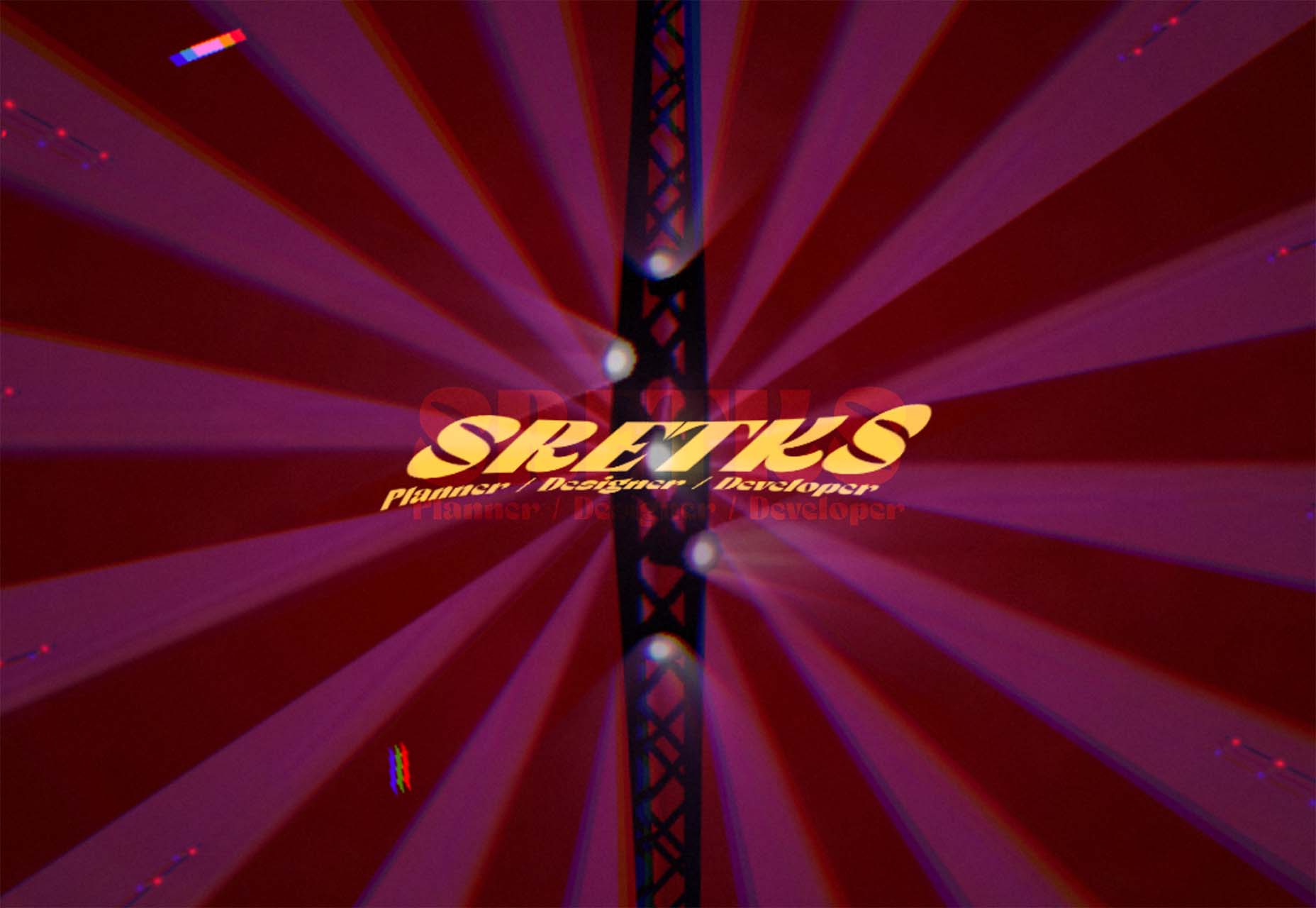
Sretks not only uses a retro typeface but bends and twists it a bit too to add to the old-school feel. The background color helps add to the groovy vibe.

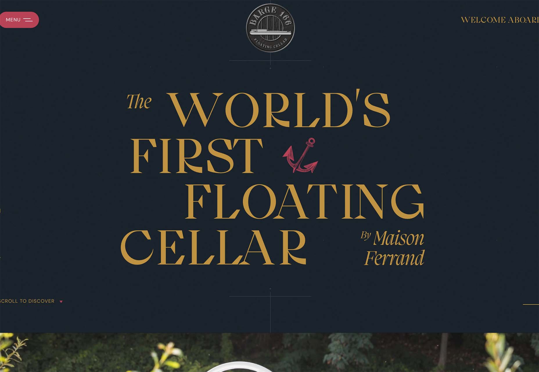
Barge 166 uses a retro typeface with the same design feel as the other examples but with a sharper, more serif-style edge. It’s easier to read but still carries a retro look and feel. Use a typeface similar to this if you want to capture that retro font style for a trending look while maintaining as much readability as possible. This option works best for multiple lines of words in a large size.

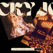
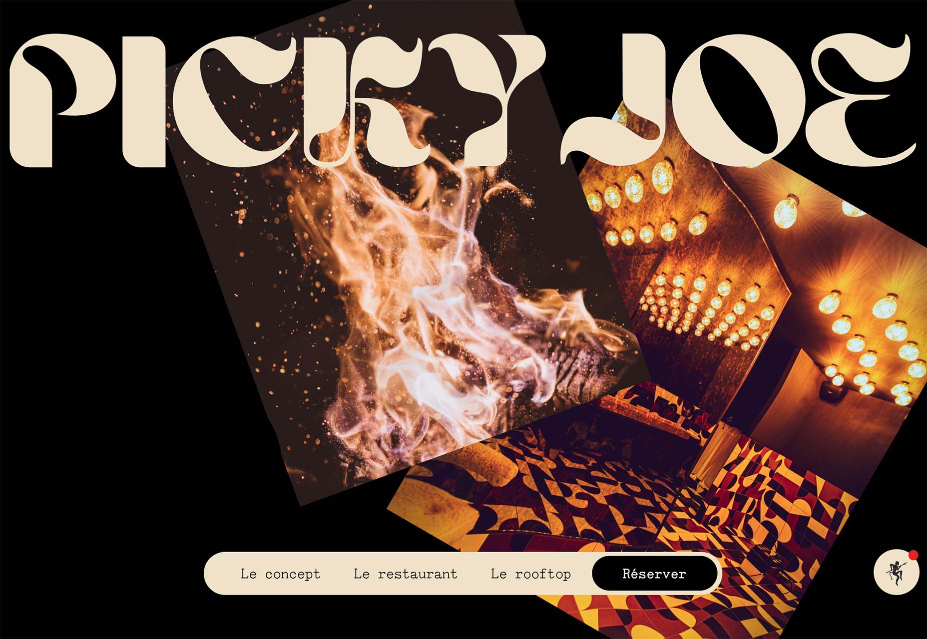
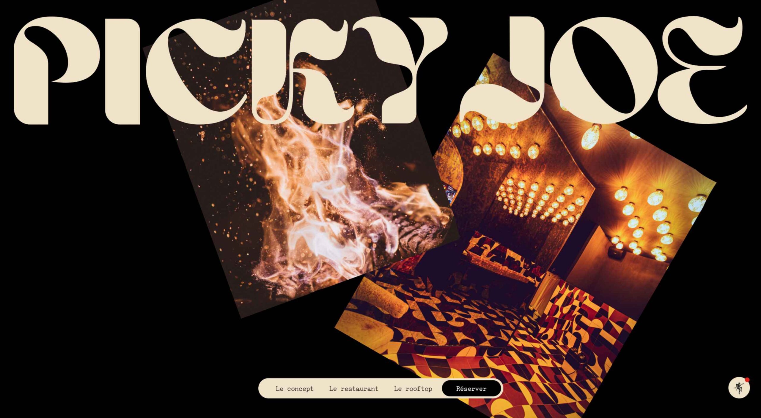
Picky Joe uses a retro typeface with rounded letters and a bit of a tilt to the characters to create a distinct feel. This is definitely a style that has to be used sparingly but can be a fun option, depending on the content of your website design.

Dark “Product” Sites

Dark mode design is probably the biggest design trend of 2022. Everywhere you look, websites are using dark color palettes and styles. Designers are creating more projects with a dark/light toggle so users can control their experience.

This visual concept is carried over to website designs that feature products as well. This is one of the last places the dark aesthetic had not touched. It’s been a bit of an unwritten rule that product images should be on white or light backgrounds to help make them easy to see and inspect digitally.

This design trend bucks that idea and features products on dark backgrounds – some with so little contrast that you almost have a hard time seeing the products. (Maybe these brands are banking on the idea that you already know them or are selling a lifestyle product.)

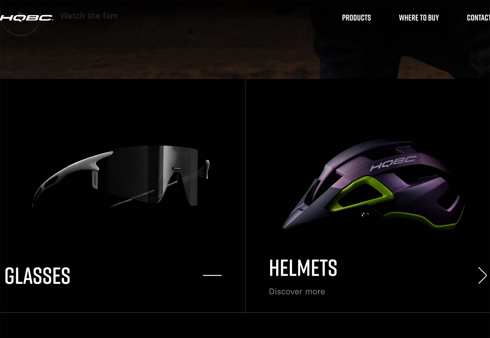
HQBC sells bike accessories such as glasses and helmets and the site has a sleek look and feel. You know it is cool from the second you land on it. The question though – is there enough visual information with the dark background to help you make a purchase? This design probably works because it only encourages you to find a physical location to make a purchase rather than buy online.

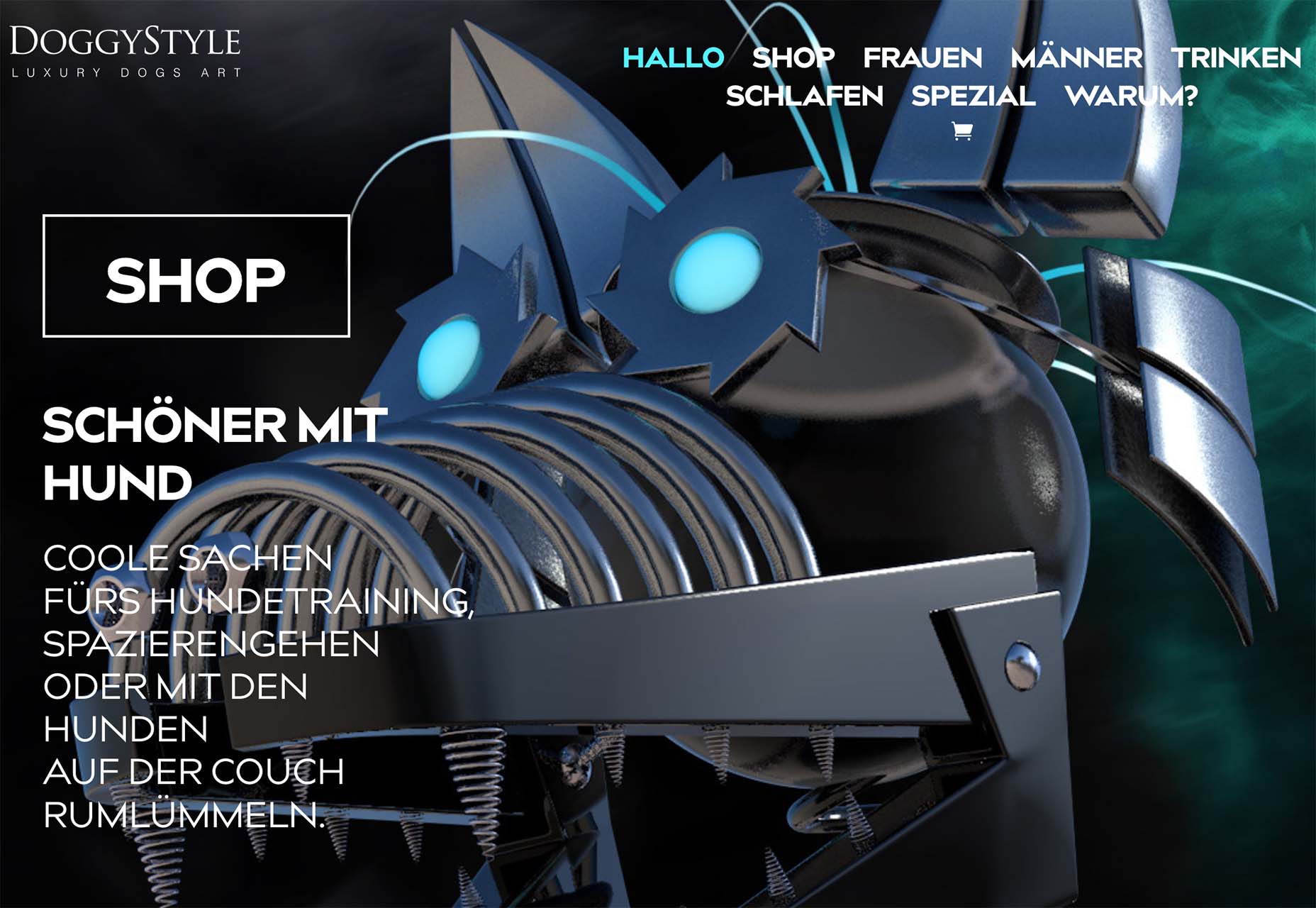
Doggystyle Shop also banks on the idea of you knowing the shopping experience or brand when you arrive. What the design does do though is put products on white backgrounds after you have clicked through far enough to make a commitment to buy. This helps you see the product well one final time before making a purchase. (The challenge is that it is three to four clicks in for the most part.)

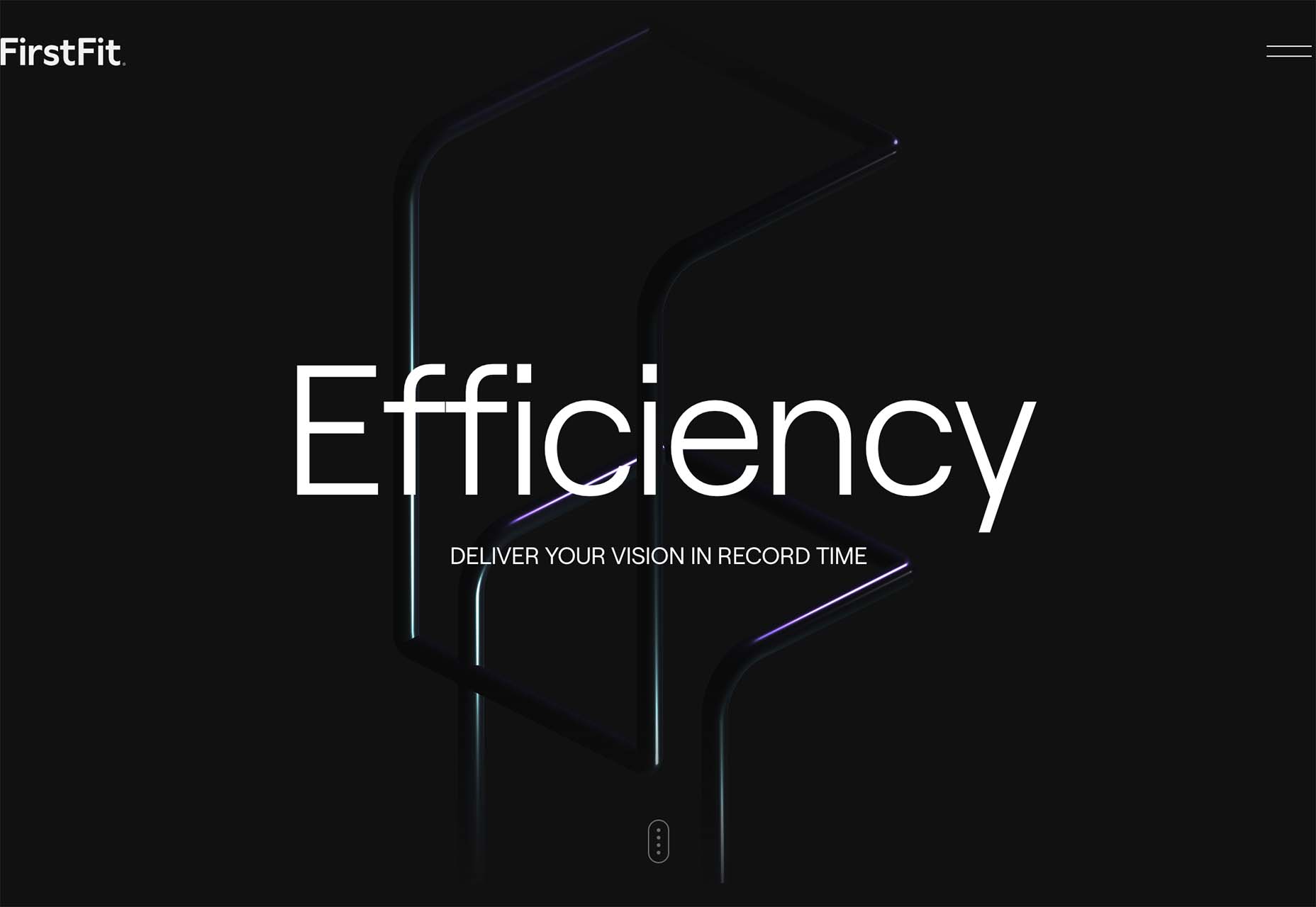
FirstFit uses the design trend in a way that’s similar to the first example. They are showing a product, but not actually trying to convert sales on the website. Other links take you to more product information and content – using a lighter background and color scheme – and the dark background with the product serves mostly as a highly visual landing page that will help entice users to learn more. When it comes to dark mode and products, this seems to be the best option for most website designs.

Conclusion

The state of the world around us and our emotions can play hard into websites and other design projects. Some of the darker elements that are popular now may be a reflection of that or it could be more of a lean into dark mode schemes.

Either way, the web has a pretty dark feel right now.

Source

The post 3 Essential Design Trends, July 2022 first appeared on Webdesigner Depot.

Source de l’article sur Webdesignerdepot

Does it ever cross your mind that praise can be negative? I guess not. After all, it looks harmless and seems to be quite effective. Conventional wisdom says that if you praise people, they are motivated to do better.
People who have been praised throughout their life by their well-meaning parents, friends, and teachers for their talent and smartness or those who have experienced extreme focus on talent and smartness throughout their childhood learn to value only intelligence. No wonder when these people enter the workforce, they continue to seek approval and demand praise every step of the way.
Every opportunity is a measure of their intelligence — do I look smart, how will I be judged, what if others find my ideas dumb. With a single-minded focus on validating themselves, all their actions are rooted in establishing their worth. Every mistake hurts their reputation and every failure is a reflection of their competence. They care less about learning and more about proving themselves. Their sense of morality sometimes takes a hit as they resort to brutal behaviors — demeaning others by yelling, insulting, controlling, or taking undue credit — all in an attempt to boost their self-esteem.
Carol Dweck, professor of Psychology at Stanford University summarised this unfortunate reality from Morgan McCall’s book High Flyers:

People often like the things that work against their growth. . . . People like to use their strengths . . . to achieve quick, dramatic results, even if . . . they aren’t developing the new skills they will need later on. People like to believe they are as good as everyone says . . . and not take their weaknesses as seriously as they might. People don’t like to hear bad news or get criticism. . . . There is tremendous risk . . . in leaving what one does well to attempt to master something new.

What Do Organizations Do with Such People?

They feed and promote this mindset. They praise people for their brilliant ideas conveying the message “we value talent and smartness.” They shower people with rewards and bonuses for their achievements communicating to everyone else around “all we care about is success.”
What happens when these people take on a leadership role? Their mindset of valuing brilliance above everything else amplifies leading to disastrous results. History is full of leadership fiascos with great promises that turned out to be the biggest disasters. This article from Malcolm Gladwell in The New Yorker is as valid now as it was 18 years ago. Describing the talent mindset at Enron and the consultants at McKinsey who wandered the hallways at the company’s headquarters, he points out “They were there looking for people who had the talent to think outside the box. It never occurred to them that, if everyone had to think outside the box, maybe it was the box that needed fixing.”
He also talks about the impact of an environment that values innate talent and what happens when times get tough and that self-image is threatened “They have difficulty with the consequences. They will not take the remedial course. They will not stand up to investors and the public and admit that they were wrong. They’d sooner lie.”
Really, is praising people for their intelligence and achievements the only way to develop people who will be the leaders of tomorrow? Is there a better way out?
What if we praised people for their hard work, for their ability to persist despite failures and setbacks, for taking initiatives to build new skills, for standing up to their mistakes, for believing in their growth, and implementing the right strategies to overcome their shortcomings. What does this kind of praise tell them?
It tells them the value of effort in building abilities. It teaches them the importance of implementing the right strategies to solve problems. It encourages them to seek help to make progress on their task. It creates a passion for learning that’s not driven by the need to look smart, but with a desire to cultivate skills, to stretch themselves to grow.
When these people take on leadership positions, this mindset guides them to put the well-being of the company and its people before their own needs, to place value on teamwork over individual accomplishment, and to foster growth and development of their people.

As growth-minded leaders, they start with a belief in human potential and development — both their own and other people’s. Instead of using the company as a vehicle for their greatness, they use it as an engine of growth — for themselves, the employees, and the company as a whole.
– Carol Dweck

Unlike leaders who pull their companies down with their focus on brilliance, these leaders lead their companies into greatness and gratitude filled in their own hearts and those of the people around them.
Choose your praise carefully as you will see the tremendous benefits in praising for growth over brilliance.

When Leaders Focus on Brilliance

They live in a world of personal greatness and entitlement, vie for labels, and will do anything to boost their image. Instead of building a long-lasting company, they spend time and money on enhancing their image.
With the constant need for validation, they use people in the company to feed their egos and showcase their superiority. Everything is about pleasing the boss. They surround themselves with people who boost their self-esteem. Agreement earns them admiration and disagreement is an attack on their intelligence. Instead of hearing people out, they punish dissent and shut people down.
They pounce at the less talented for their lack of intelligence and find those who are more talented than they are as threatening. They mistreat employees, yell, insult, control and abuse them into their way of doing things. They feel better about themselves by making other people feel worse. Employees worry about being judged all the time. When people are ridiculed for mistakes, they soon learn to keep their heads down, stop putting their critical thinking skills to use, and give in to groupthink.
Their belief in their superiority blinds them to see reality. They turn a blind eye to complaints, ignore warning signs, and fire people who tell them what they don’t want to hear. Their decision-making criteria are based on what would make them look good as opposed to what’s good for the company long term.

What happens when a leader refuses to confront the brutal facts? “The minute a leader allows himself to become the primary reality people worry about, rather than reality being the primary reality, you have a recipe for mediocrity, or worse. This is one of the key reasons why less charismatic leaders often produce better long-term results than their more charismatic counterparts.
– Jim Collins

Since success and failure are a part of their identity — success means they are smart and failure means they are not — they find excuses and blame others for failures instead of taking personal responsibility. Instead of investing in the future growth of their company, they play safe with fear of failure, become less responsive to challenges from competition, go with what’s tried and tested, and refuse to take risks. Why take up the challenge that can hurt their reputation? On the other extreme, they may not shy away from crossing ethical boundaries to beat the competition at all costs. Success is what they are after and it doesn’t matter how they get it.
With more focus on talent and less on potential, they do not invest in mentoring and coaching employees. Instead of putting practices in place to develop employees and help them collaborate together, they make them compete against each other.
Carol Dweck sums up their brilliant mindset “My genius not only defines and validates me. It defines and validates the company. It is what creates value. My genius is profit. Wow!”

When Leaders Focus on Growth

They operate with a learning mode. They don’t claim to be genius but promise to invest in development, their own development, and the development of their people. The drive and enthusiasm to grow their companies make them adopt long-term strategies over short-term tactics. They aren’t in the game to boost their ego or establish their self-esteem. It’s the pure joy of shaping the future of their company that excites and motivates them. More than prestige, they are in it for the challenge.
They understand that the path to success goes through failure. Why lose the opportunity that can drive their future growth? So instead of hiding behind their failures, they face them head-on. Failures don’t define their competence, they are glaring moments of self-reflection. They are opportunities to build skills, explore possibilities, experiment, and invest in the promise of a better future.
They lead with vulnerability. They accept mistakes to shift the focus in the organization from hiding mistakes to finding solutions. When they don’t know something, instead of pretending to hide their ignorance, they say “I don’t know”. These three powerful words show humility and self-confidence. To make decisions, they invite others to share their opinion which promotes the culture of constructive criticism. Since they do not connect their identity to their opinion, more value is placed on seeking the right answers which require open disagreements and championing flexibility of opinion over their sense of righteousness.
Difficult situations make them uncomfortable, no doubt. Instead of letting their discomfort get in the way of meaningful conversations, they embrace it. They choose to look past their discomfort in the value that these discussions provide — saving a lot of time that can be wasted due to stress and anxiety that comes from misalignment of expectations and lack of clarity of purpose.
They are tough but compassionate. They do not shy away from giving critical feedback while also challenging the people in their organization to step outside their comfort zone. They empower people to make decisions with the right channels of feedback to assist in better decision-making in the organization.
Leaders with the growth mindset operate with what Lou Gerstner, who turned IBM’s fortunes around by saving it from near bankruptcy said “Hierarchy means very little to me. Let’s put together in meetings the people who can help solve a problem, regardless of position.” Not blinded by reality, they focus on finding solutions that will push their company forward. This requires keeping an open eye to change in market trends, identifying and investing in future growth areas, and taking calculated risks.
With a focus on potential and growth, they invest in identifying and building future skills of the organization — skills that will be useful during difficult circumstances giving them an advantage over the competition. They foster productivity through coaching and mentoring, place value on teamwork by encouraging collaboration and defining shared measures of success.
Warren Bennis, a scholar, author, and widely regarded as a pioneer of the contemporary field of Leadership studies, writes in Organizing Genius:

Leaders are people who believe so passionately that they can seduce other people into sharing their dream.

His most admirable view on leadership says:

Good leaders make people feel that they’re at the very heart of things, not at the periphery. Everyone feels that he or she makes a difference to the success of the organisation. When that happens people feel centred and that gives their work meaning.

What kind of leaders think like this — those focused on brilliance or the ones driven by growth?
Previously published here.

Source de l’article sur DZONE
March is that time of year where the feeling of newness starts, from the first Spring days to fresh design projects. These trends are no exception, with fun new takes on some classic concepts.
Circles are always popular, but the top trend is an animated take on the traditional element; plus, fun pink and purple color palettes and a few faux split screen designs round out trending styles.

Here’s what’s trending in design this month.

Circle Animations

Circles are one of those shapes that never leave the design sphere. They have a lot of classical meaning and are flexible in terms of design options.

Designers are having a lot of fun with this shape right now. From animations to text circles to image frames, they seem to be all over the place.

More recently trending is more circle-shaped animations. This trend maintains a circle’s properties as a unified and harmonious element with movement to create more engagement and make you look at the design just a little bit more.

Each of these examples uses circles in a different but equally interesting – and animated – way.

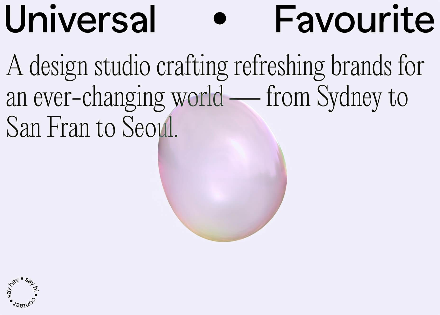
Universal Favourite uses a circular blob. It’s almost like a giant bubble. It wiggles and flows, and stretches within the space without any help from the user. It has a smoothly quality that makes you want to stare at it. The color here helps, with the circle and background not having an immense amount of contrast. Also, note the cute little circle button in the bottom corner.

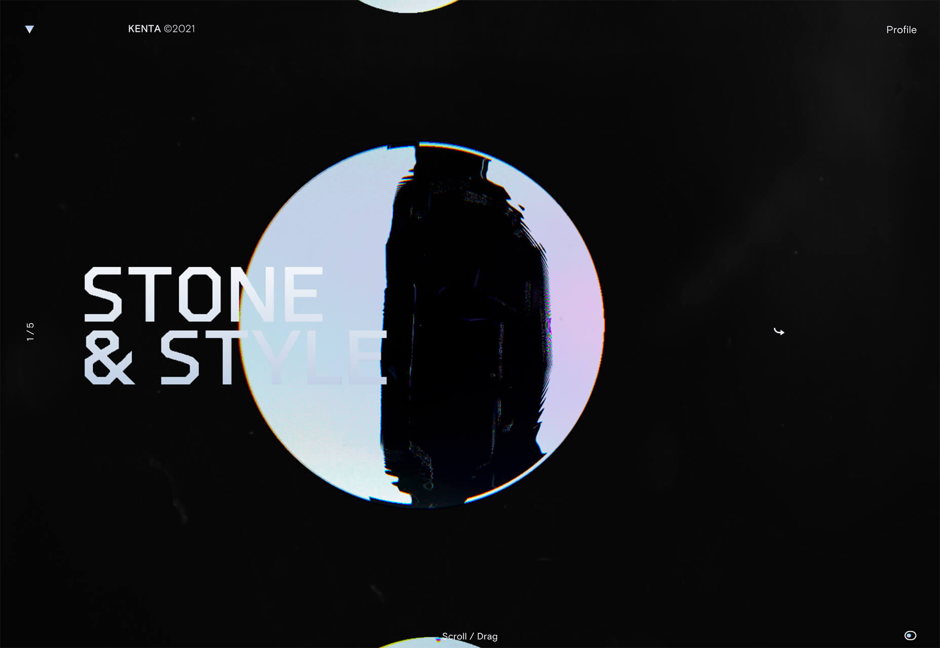
Kenta Toshikura put most of the subtle animation for this design inside the circle. With a hover state, the entire circle moves on the screen with a second layer of animation, and the cursor is also a circle that hops around the black background.

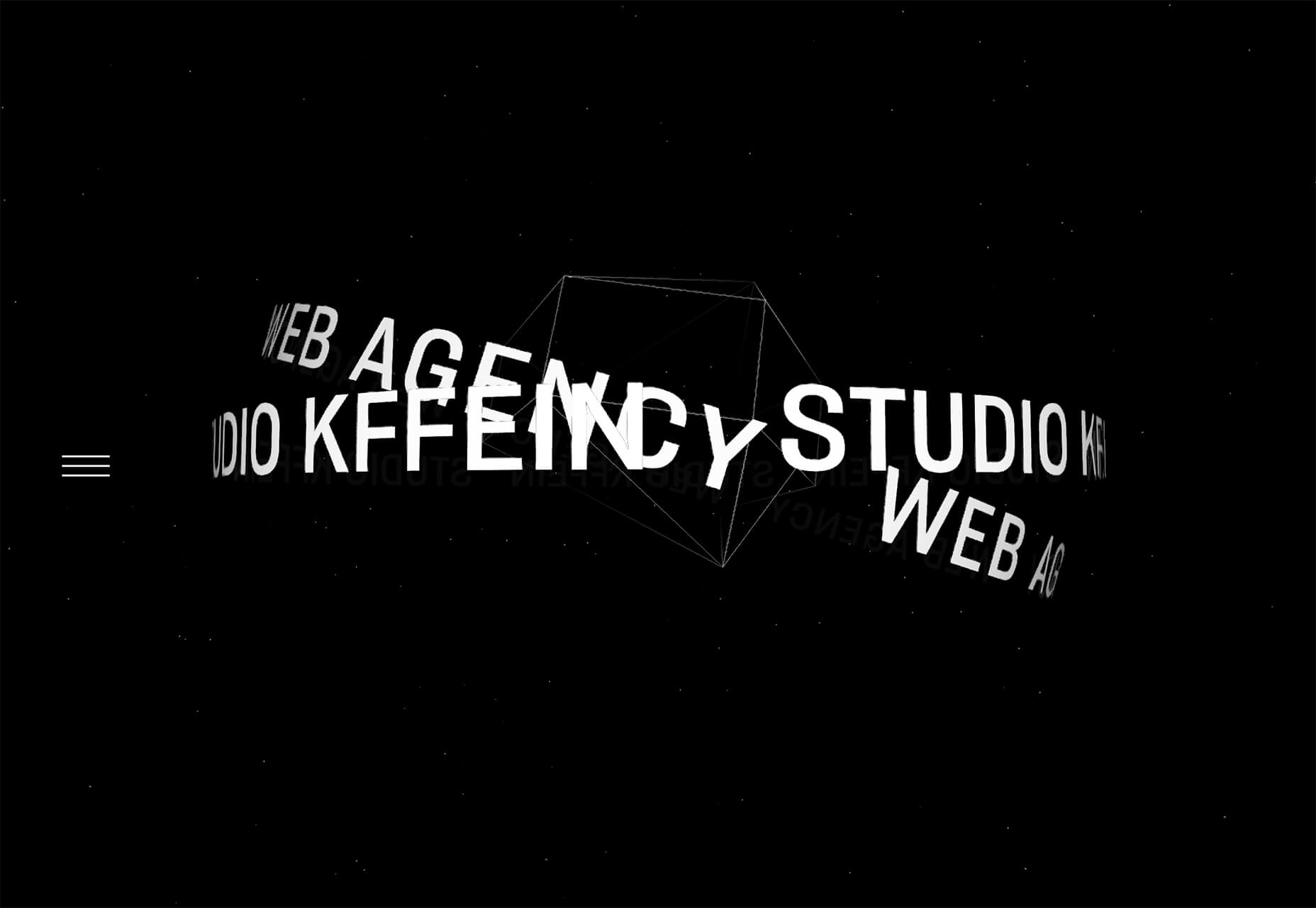
Kffein takes a totally different approach with a circle made from the primary test elements. Identifying website information rotates in a circle around another geo shape on the main plane. Not only is there a circular animation, but an almost three-dimensional effect that happens due to the way elements are layered here.


Pink and Purple Palettes

The prevalent pink and purple color combination isn’t for everyone – although you wouldn’t know it from the number of designs using similar colors.

This bright combination almost screams “spring” and has a lightness to it that almost seems to lift the mood of any project. (Maybe color selection is a reflection of how we all want to feel.)

What’s nice about these colors is that they flow into one another nicely. They can also be expanded to fall into neighboring hues on the color wheel, such as red from pink and blue from purple.

Maybe the most popular use of this color pair is as a gradient. You can find pink to purple everywhere, from background gradients to image overlays to buttons and user interface elements. There’s no lack of use here.

Each of these examples shows opportunities with this color combination.

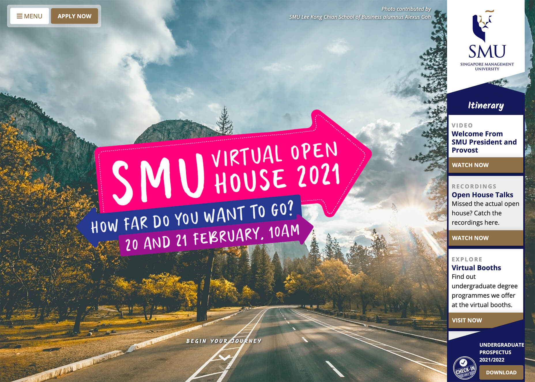
SMU uses bright pink, blue, and purple to create a giant “road sign” in the design that jumps out from the rest of the project. The sign almost seems out of place and doesn’t fit as part of the normal color palette. This is what draw you right to it.

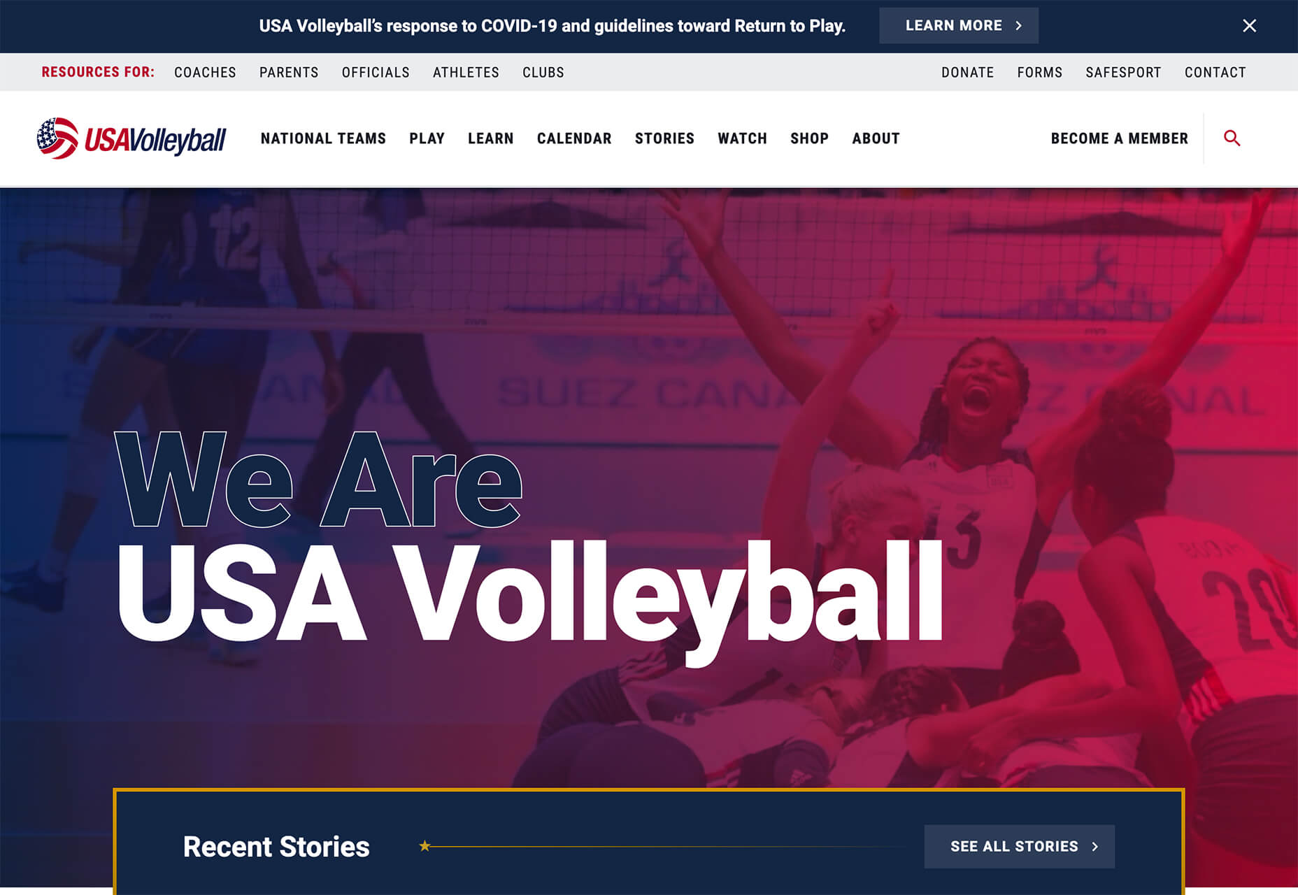
USA Volleyball uses the popular gradient option and extends the pink to the purple palette to hints of blue and red. What’s great about this design is that it uses a super trend element and color option and makes it work with their current color palette. You can almost imagine the design conversation when someone wanted to use a pink to purple gradient for a brand that features red, white, and blue. The gamble paid off, and it works beautifully without being off-brand.

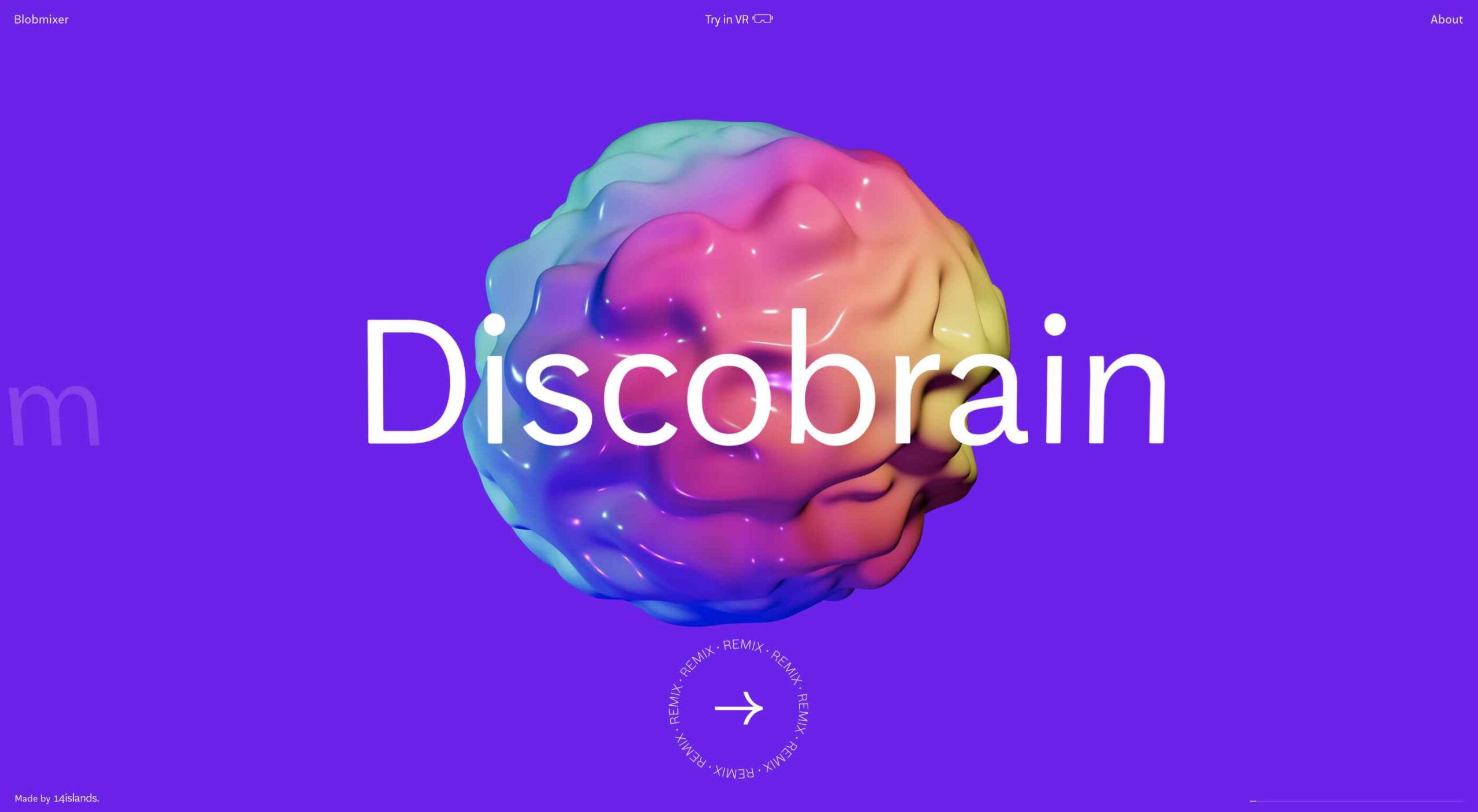
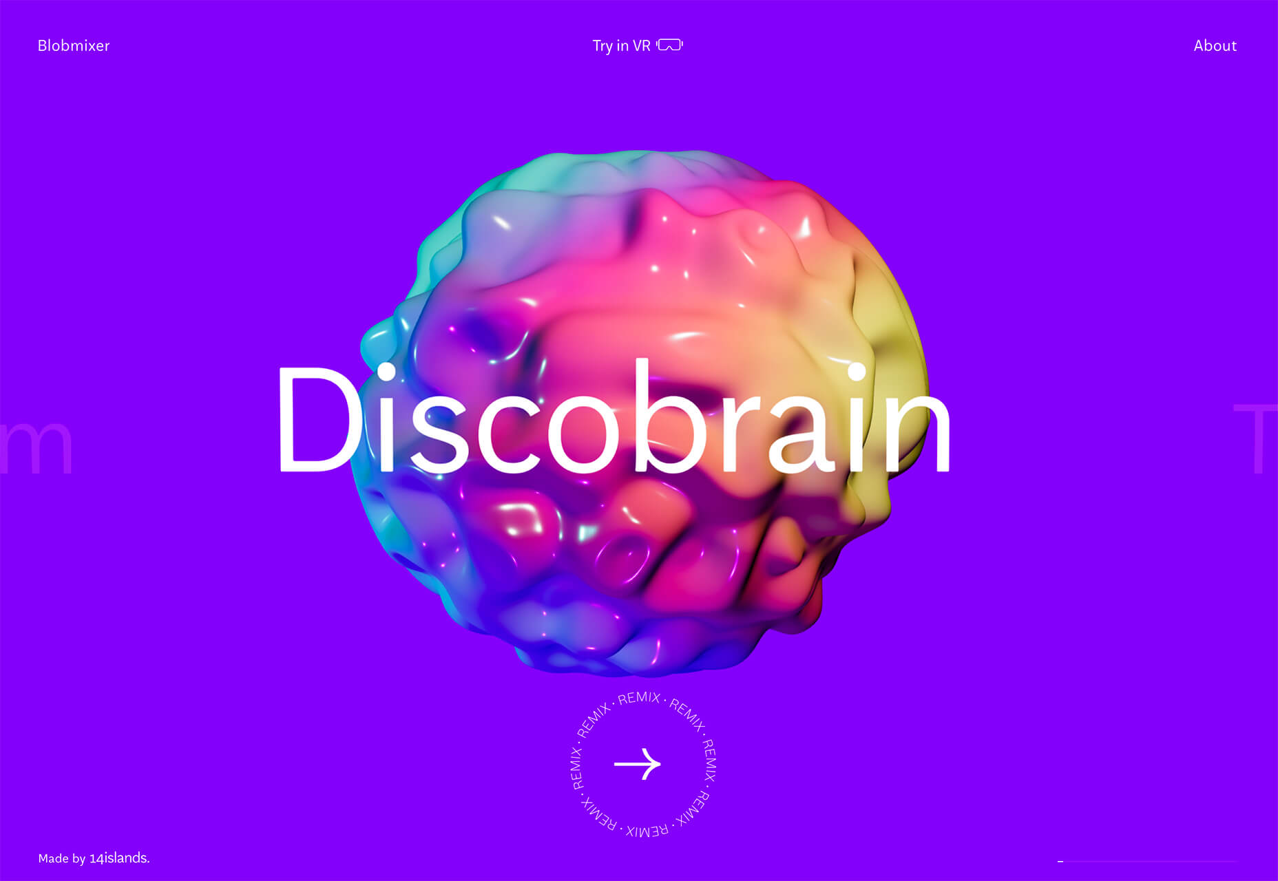
Blobmixer uses purple, pink, and a few other bright colors – note the animated circles, too – to draw users into the design. The entire project is a fun, customizable experience that you can play with, and the color choices are what make you interested enough to try. This design also offers a great example of tactile animation and elements that feel real even when you interact with them using a mouse on the screen.


Faux Split Screens

Split-screen designs were a huge trend for about two years. The aesthetic was also functional for content that required a this or that choice on the part of users.

Now, we see the design elements but without the function. (Maybe because it just looks nice and creates a sense of balance without a symmetrical design.)

These projects look like they might offer multiple gateways to content, but there is only one call to action on the dual-screen aside from navigation elements.

What this design option does is help draw the eyes across the screen. One side will immediately appeal to you, and when done well, you’ll feel a subtle push of pull from the color, text, and images to look at the other side as well.

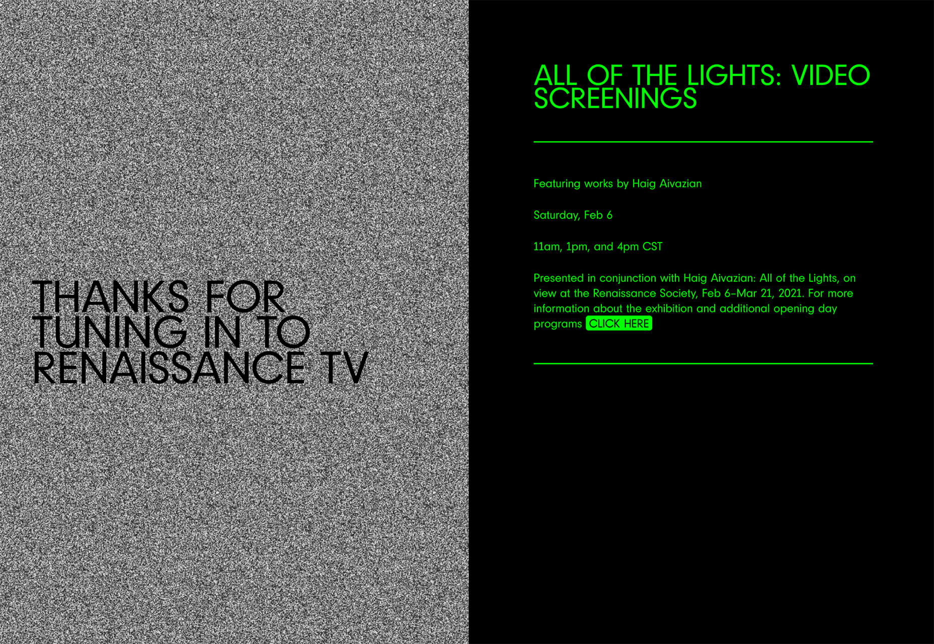
Renaissance TV does it with heavy animation with “dancing dots” from an old TV that doesn’t work. But then you need to look at the green text to understand what is happening.

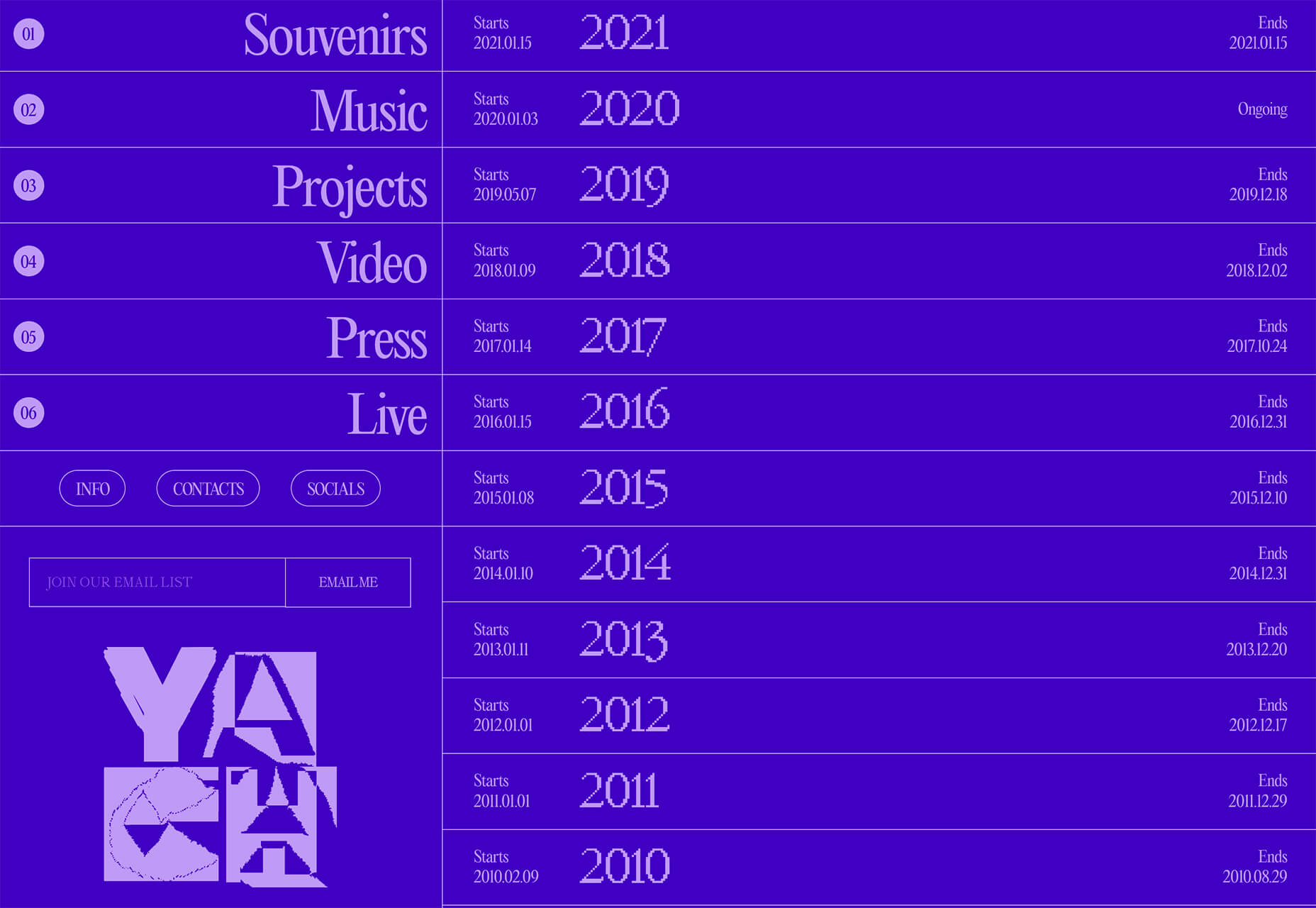
Yacht uses text weight and space to push the eyes across the screen. Almost everyone will go to the heavier areas first and then gaze across the screen through blocks of space to the final small text on the right side. And it all happens in a fraction of seconds.

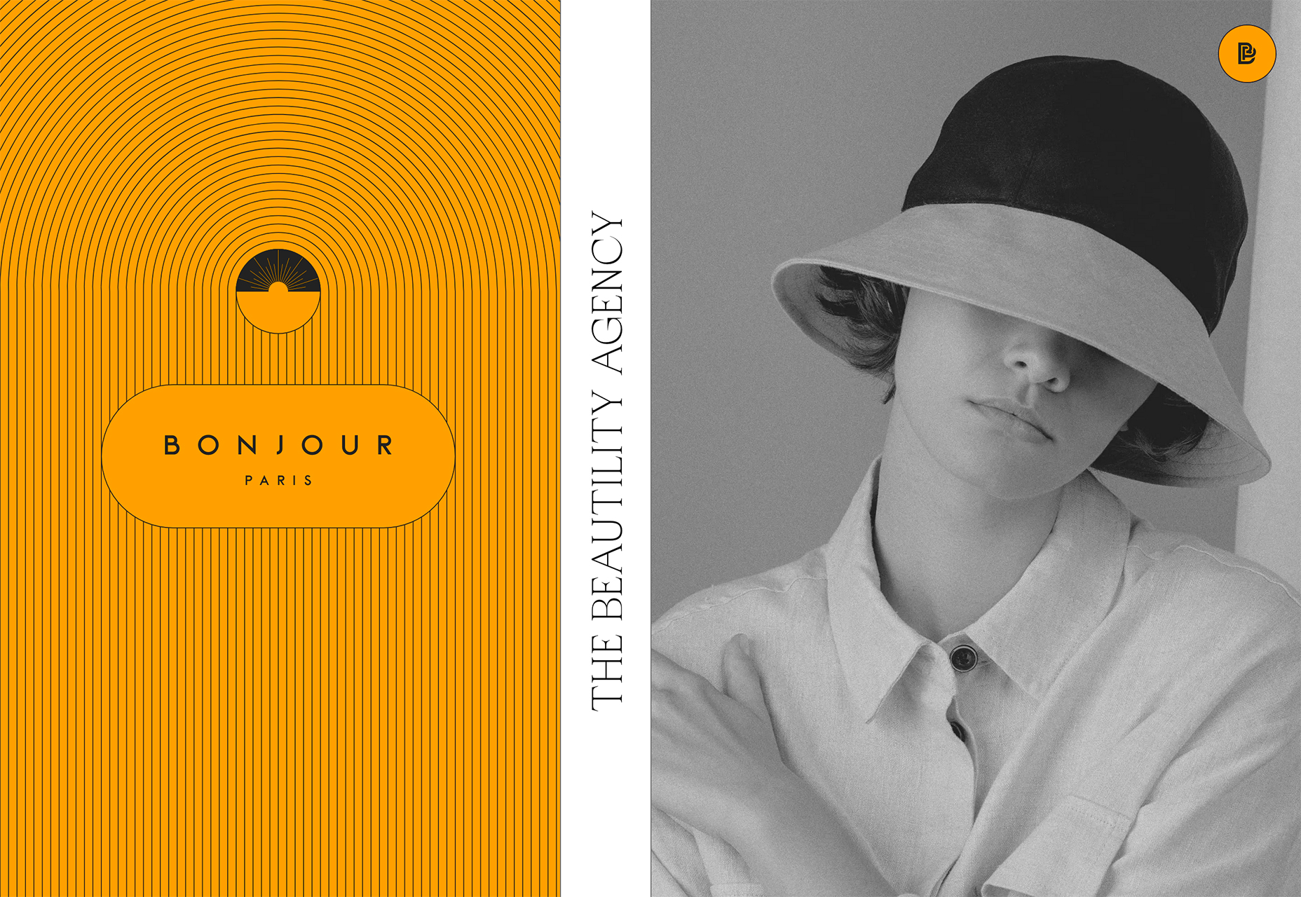
Bonjour Paris pairs bold color with black and white images. You may look at either side first, depending on personal preference, but the other half of the screen is necessary for a complete understanding of the website.


Conclusion

While all of these design trends are evident in new and recent projects, the use of pink and purple color palettes – particularly with a gradient – seems to be everywhere you look. These color choices are popular and come in a lot of forms.

Maybe the most obvious is with brighter pink and purple gradients, but other variations are also trending. It’s definitely one to watch in the longer term.

Source

The post 3 Essential Design Trends, March 2021 first appeared on Webdesigner Depot.


Source de l’article sur Webdesignerdepot

This month we’re going big and bold. Oversized type, strong colors, in-your-face layouts, and little touches of playfulness exude confidence and make a statement. There are some quieter moments too, with thoughtful illustration and more gentle use of color. Animation still features strongly in the details, with circles proving popular in rollover effects. Enjoy.
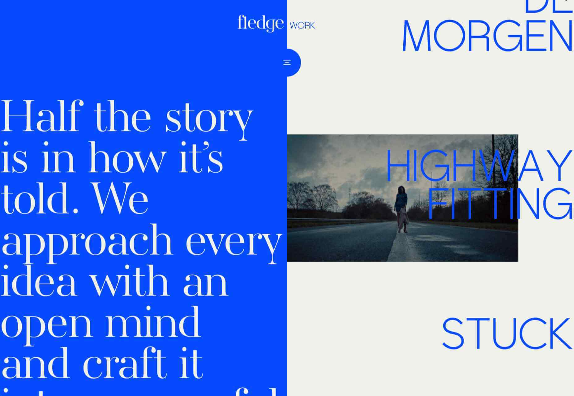
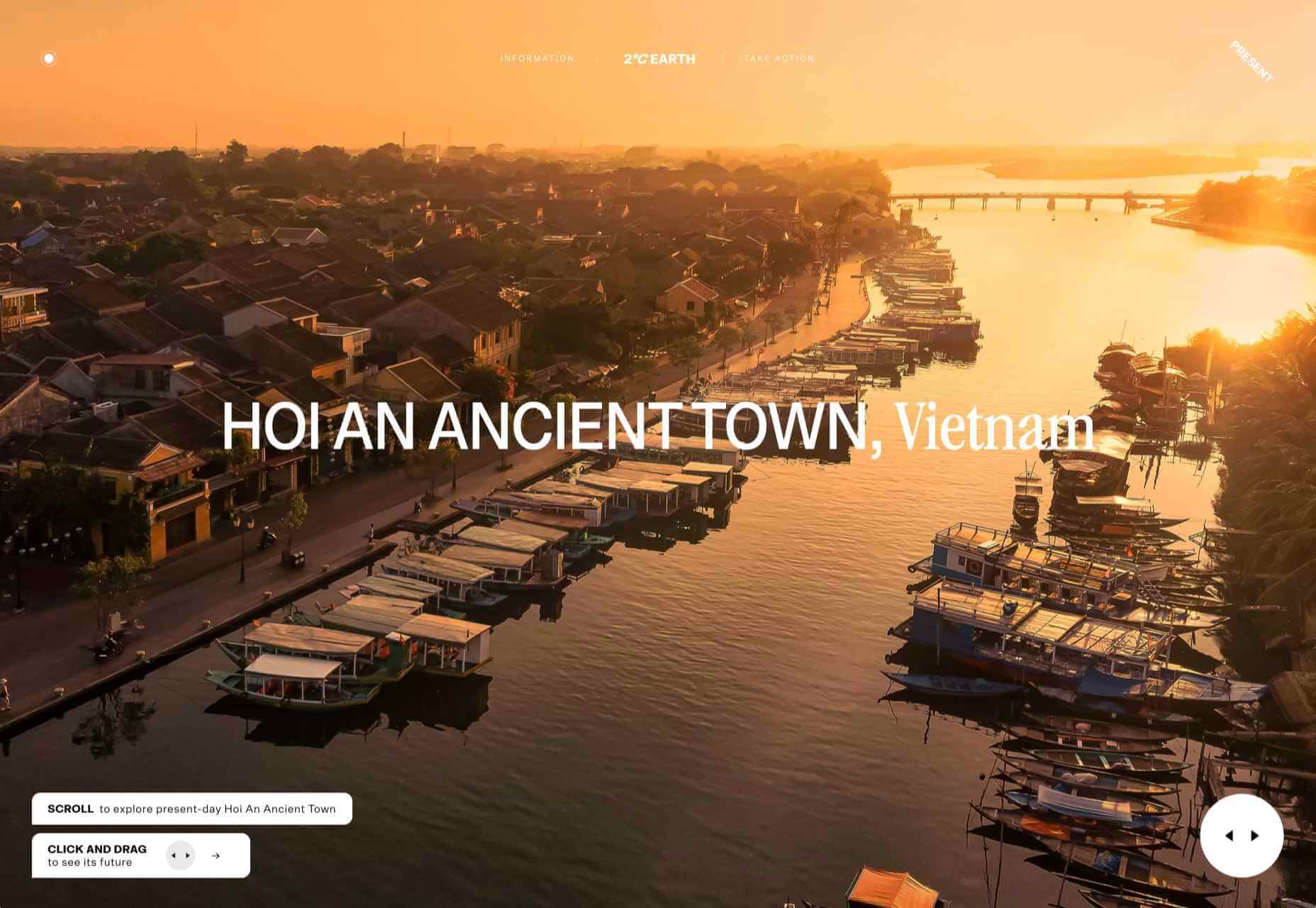
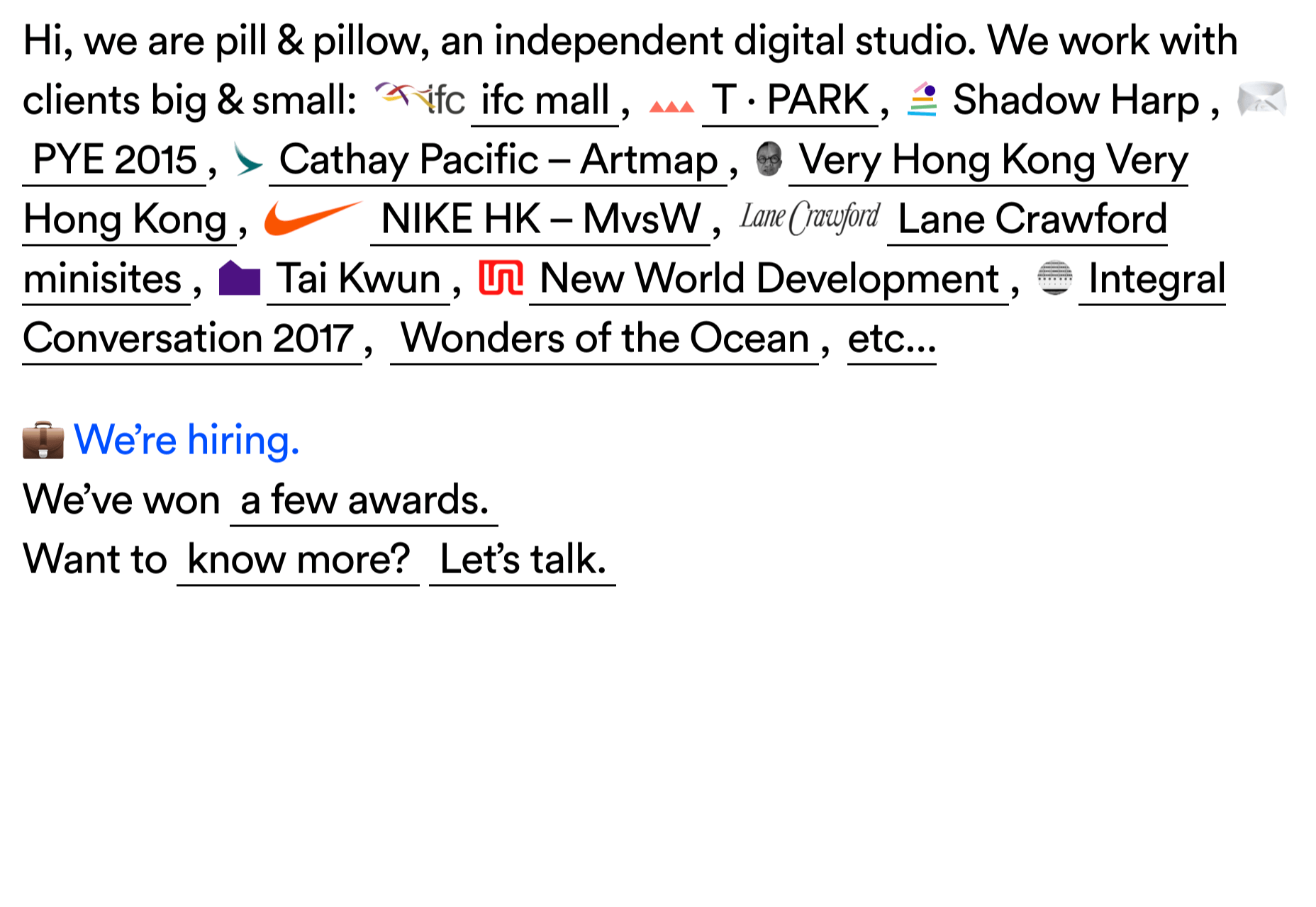
Fledge

Fledge is a film production company based in Belgium. Their site uses split screen with looped text scrolling in opposite directions on each side. A minimal color palette adds extra punch.

2ºC Earth

2ºC Earth is a beautiful and also scary website that explores the effects of rising global temperatures by focusing on 5 specific locations. Some stunning photography and subtle use of sound take you to these locations as they are now, then show what they could become. The experience is both immersive and unsettling.

pill&pillow

Unlike many digital studios who use the design of their own site to demonstrate their skills, pill&pillow have taken a very basic approach. It is very self-assured, and it works. Random colored strikethroughs on visited links add a nice touch of playfulness.

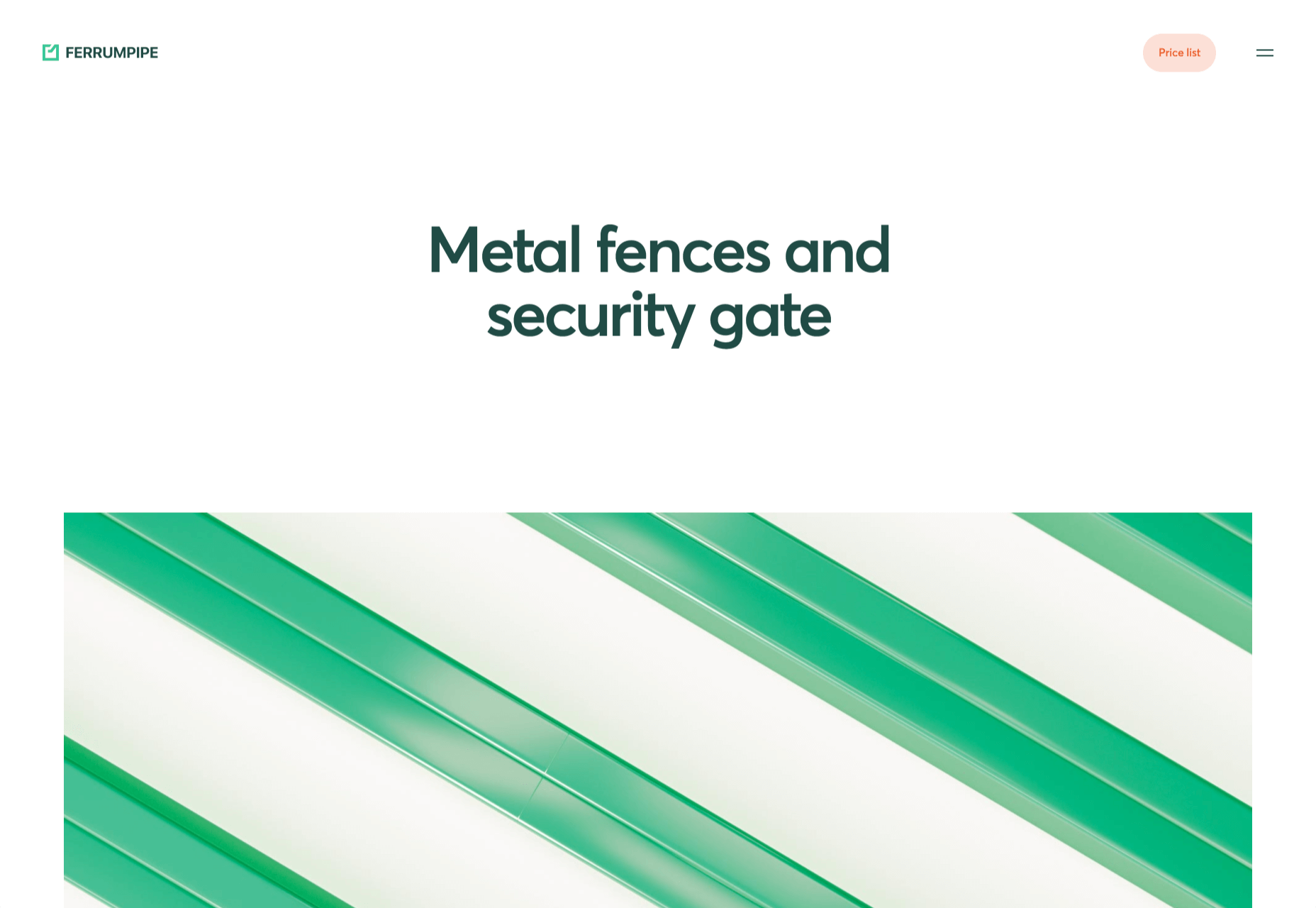
Ferrum Pipe

Metal fencing is not the most interesting of subjects to most of us, but this site for Ferrum Pipe is surprisingly appealing. On scroll animation and some off-grid image layout brings life to what would normally be, well, a bit dull.

Lucciano’s

With its focus on mouth-watering photography and videography, the site for gelato makers Luccianos, will have you checking your freezer for any leftover salted caramel or stracciatella. The zoom on rollover is a nice effect, and the use of circles with ice cream color backgrounds for rollover text reinforces the gelato theme.

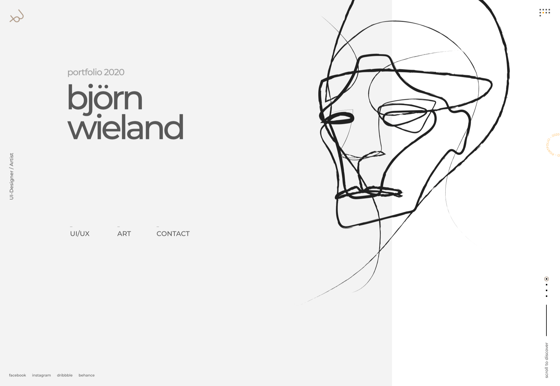
Björn Wieland

UI designer and artist Björn Wieland has created a portfolio site with a simple, relaxed feel and pleasing transitions. It feels simple, but behind the scenes there is quite a lot going on.

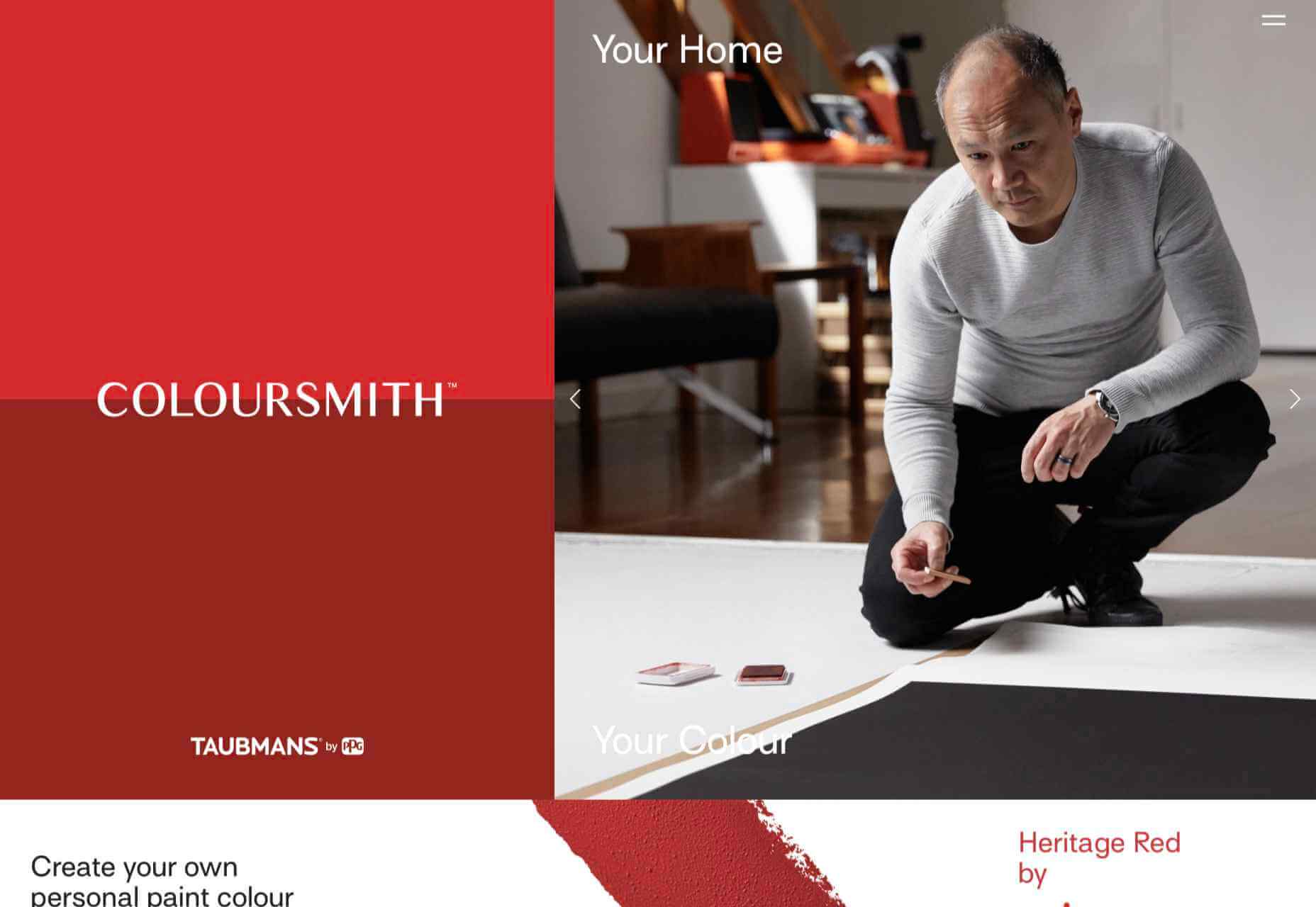
Coloursmith

Coloursmith is a tool from Taubmans paint company which allows you to create a custom paint color by uploading a photo. You name your color and can add a story, then you order a test pot. colors are presented well, in different light and with suggestions for complementary colors.

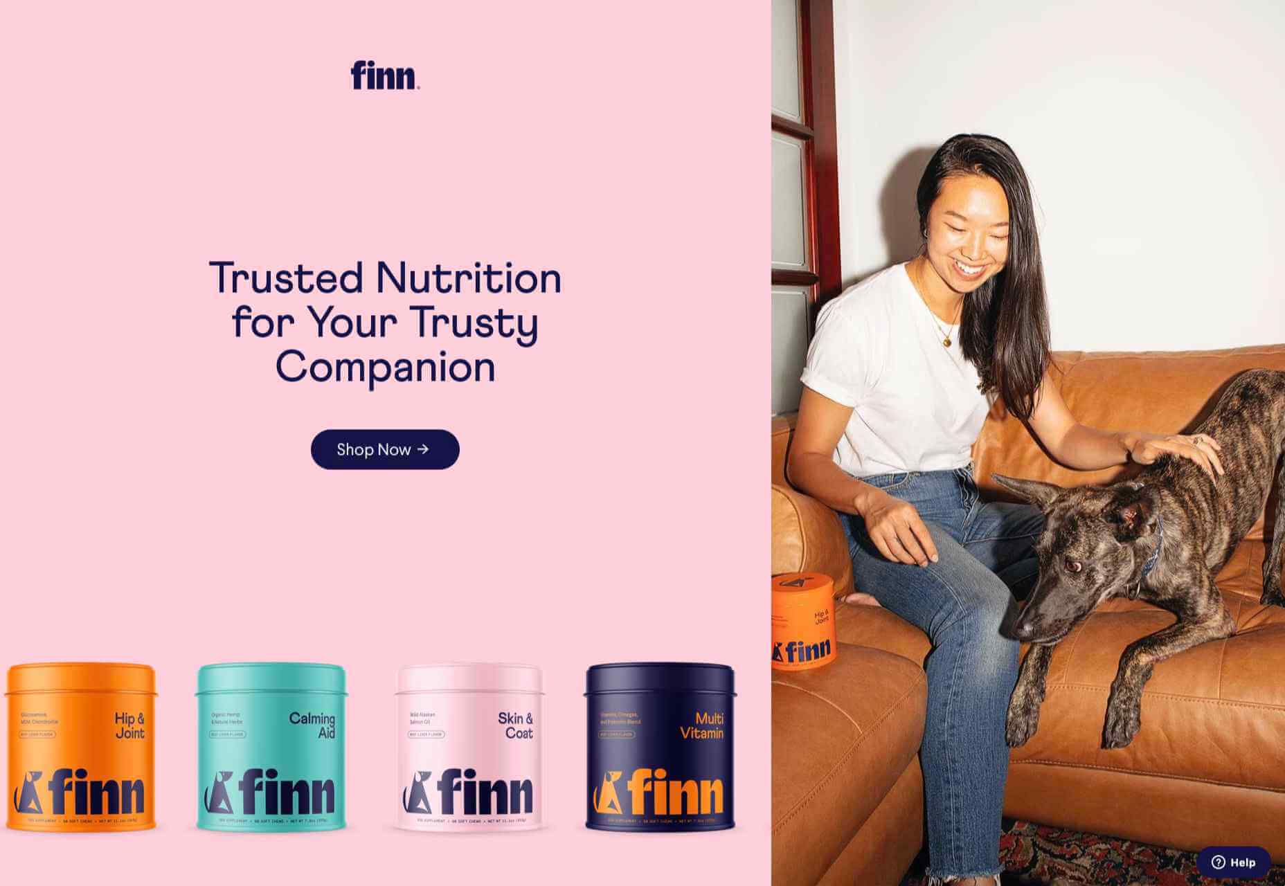
Finn 

Finn make diet supplements for dogs. Their site is fun, modern and clean. Bright colors and an illustration that manages to be cute but not too cutesy make a bold impression.

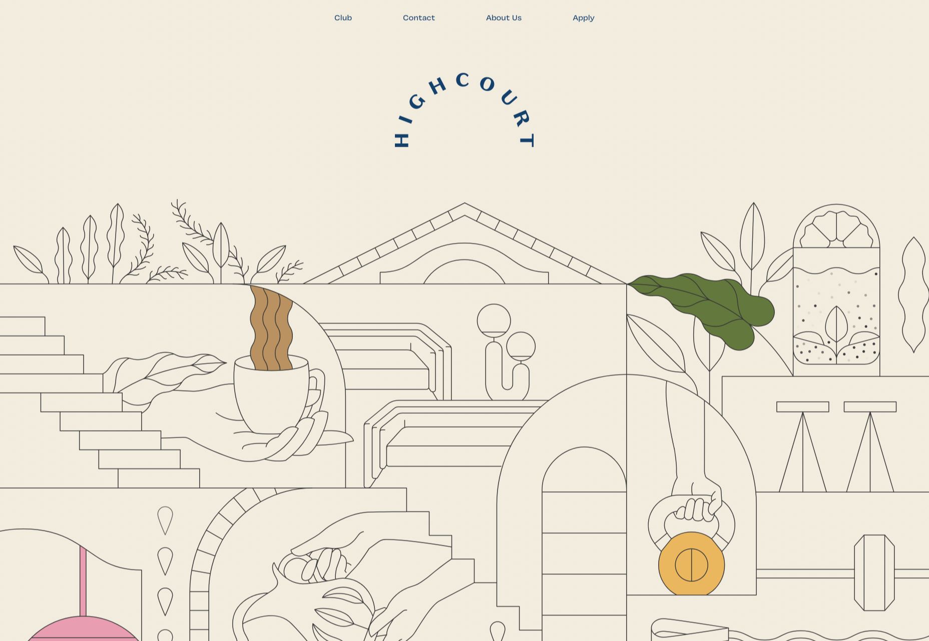
Highcourt

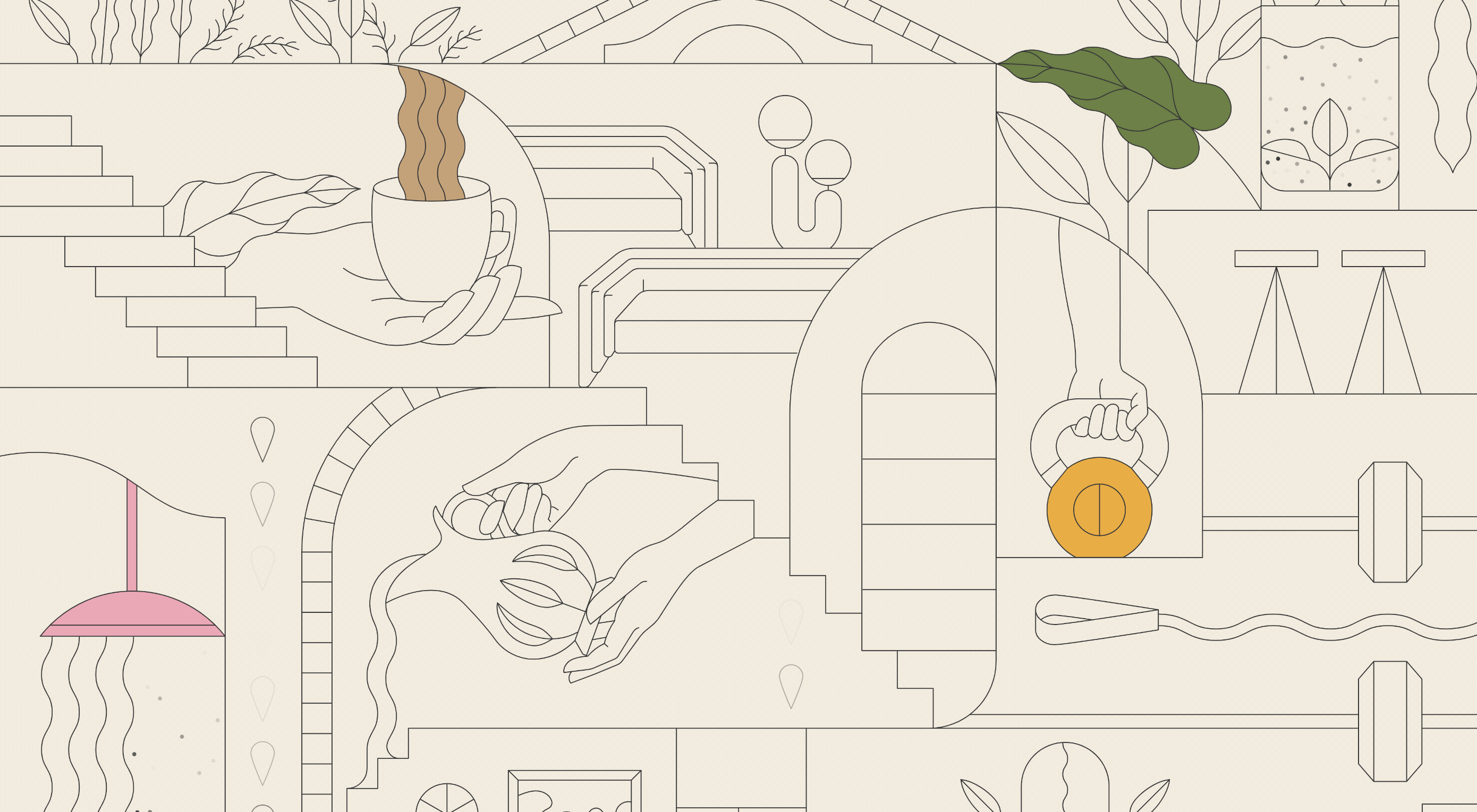
Highcourt is a new private membership leisure club set to open in New York in spring 2021. Dark blue text on cream gives a softer edge than black on white. The background color changes on scroll are pleasing, and simple line illustrations with occasional gentle animation add to the overall sense of calm.

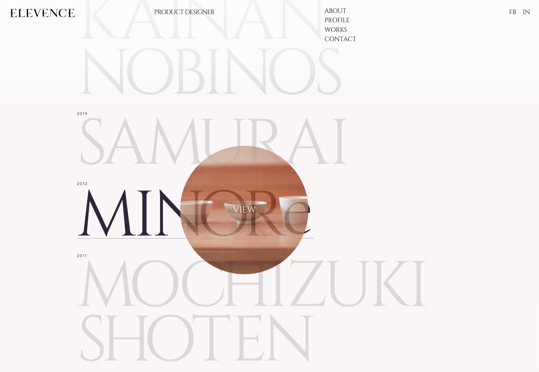
Elevence

Elevence is the company of product designer Kazuo Kobayashi. The site uses only black, white, and grays allowing the color photos of his work to really stand out. Circular thumbnails are used to good effect, appearing on rollover.

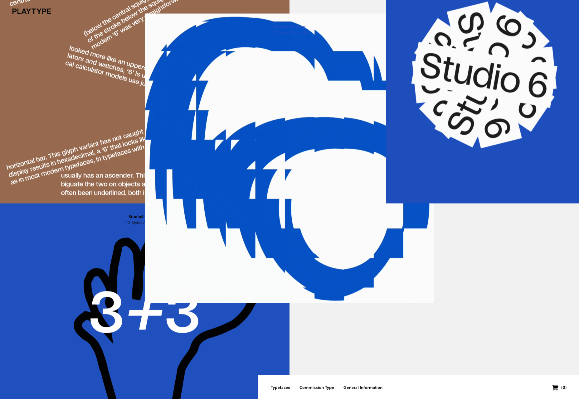
Playtype

Playtype is a Danish type foundry whose site seems to fit their name. It has a playful, almost chaotic feel, with bright blocks of color and occasional animation. Some pretty nice typefaces too.

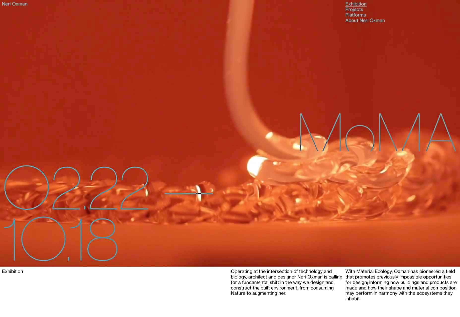
Neri Oxman 

Neri Oxman is many things: architect, scientist, engineer, inventor, and designer. This site feels like a really beautiful coffee table art book that you want to pick up and look through every so often. There are some nice details too, like the lens ‘reveal’ effect on rollover in a few places.

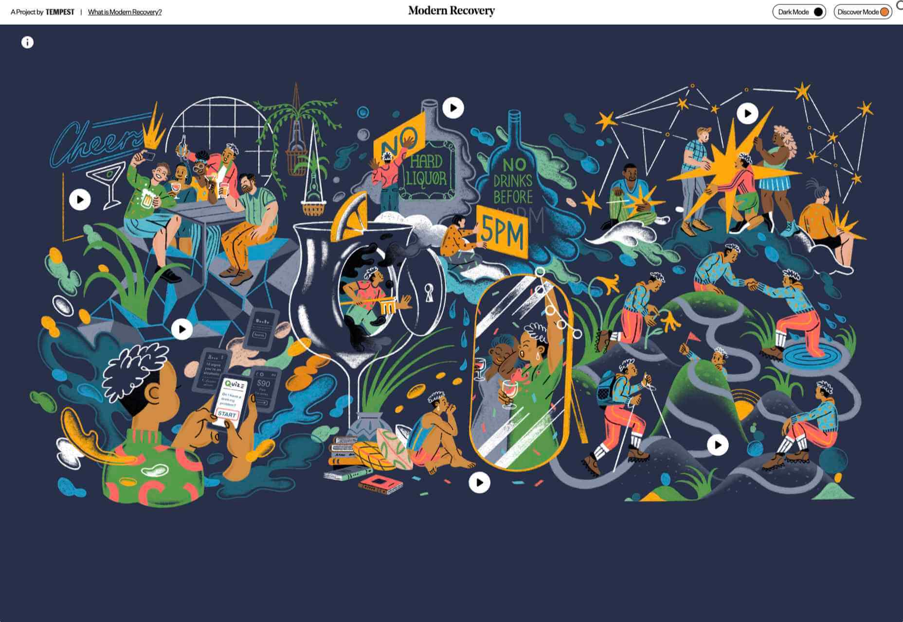
Modern Recovery

Modern Recovery is a project by sobriety program Tempest. The interactive illustration encourages exploration, to discover different stages of recovery from alcohol abuse and insights from others who have followed the program. The aim is to change our social attitudes towards alcohol and not drinking.

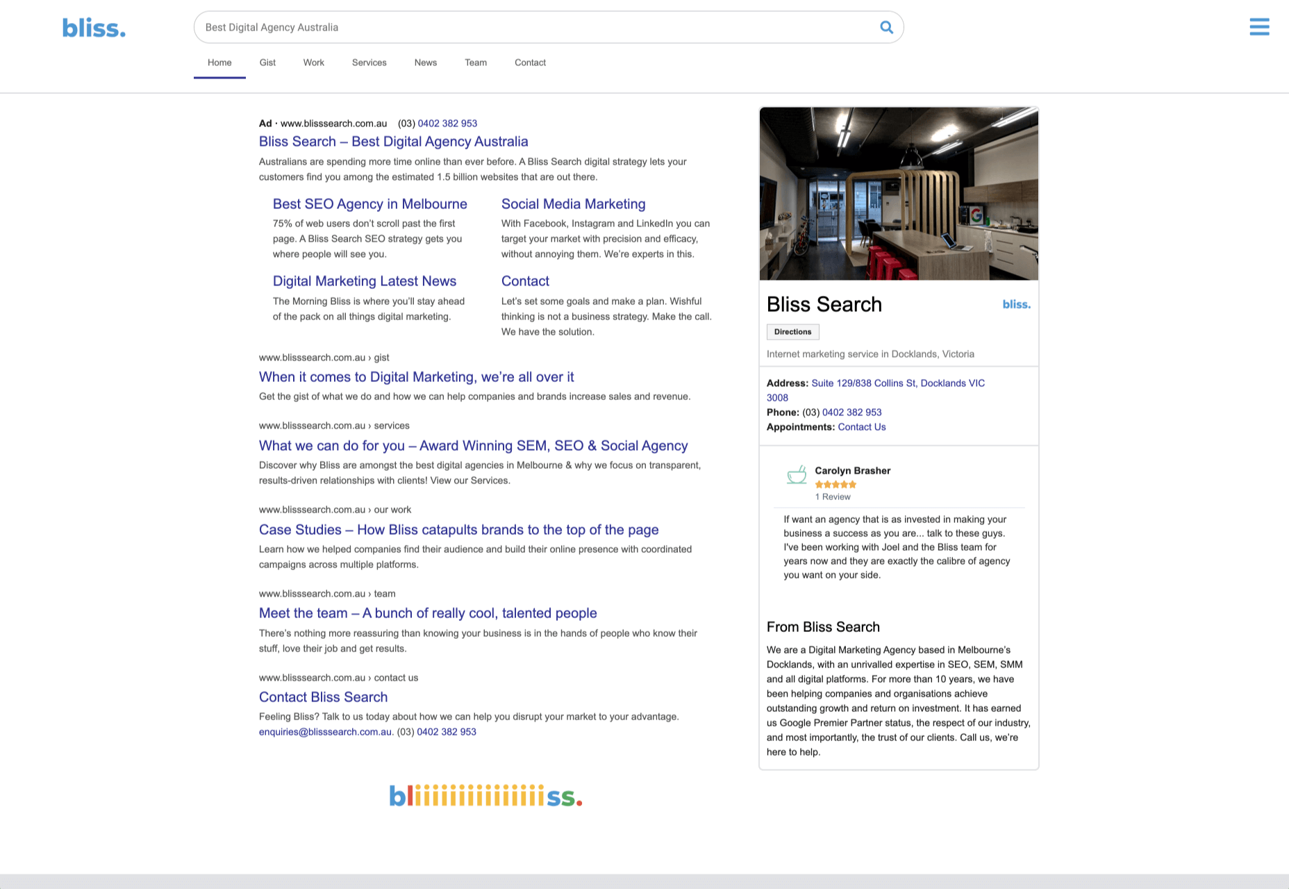
Bliss

Have you clicked on the link to visit Bliss Search? Yes, the link is correct, no you haven’t been redirected to a Google search results page. This Australian digital marketing company have copied the appearance of different well-known sites for their pages — Google, Instagram, LinkedIn, Tinder all make an appearance. The humor in this approach shows confidence, and makes it memorable.

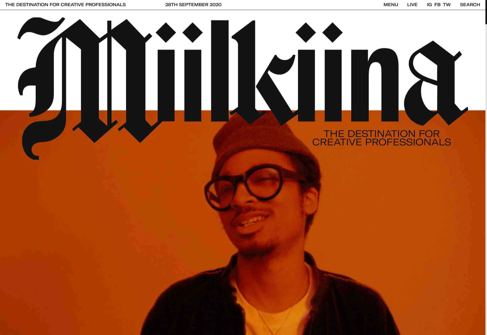
Miilkiina

Miilkiina describe themselves as a digital media space and creative agency. Punchy typography, with great use of blackletter, well chosen images, and a strong header video give this home page an in-your-face edge.

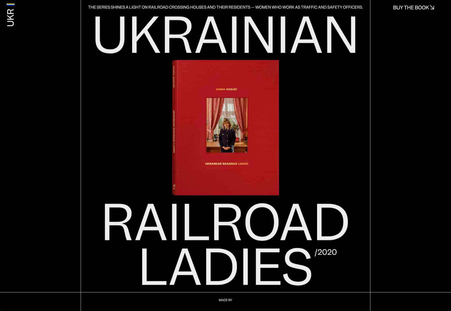
Ukrainian Railroad Ladies

Ukrainian Railroad Ladies is a book by photographer Sasha Maslov. Its subjects are the, mostly, women who work as traffic controllers and safety officers at railroad crossings in Ukraine. It’s a simple site — outsized type, black and white, basic image grid, only very brief text — but it is effective in its simplicity.

Una Europa

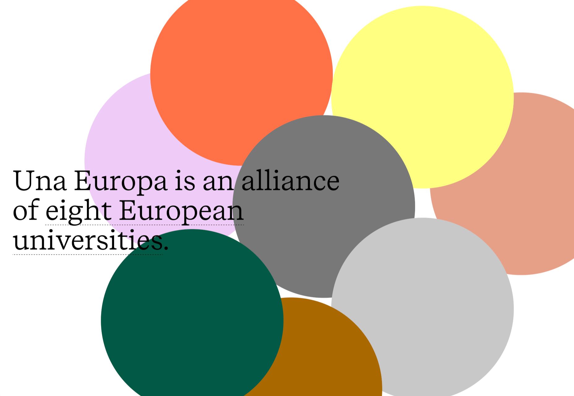
Una Europa is an alliance of 8 European universities with the aim of offering joint research and study programs. There is some playful scrolling behavior with geometric shapes moving and changing color that enlivens what could otherwise be quite a dry site.

Bureau Cool

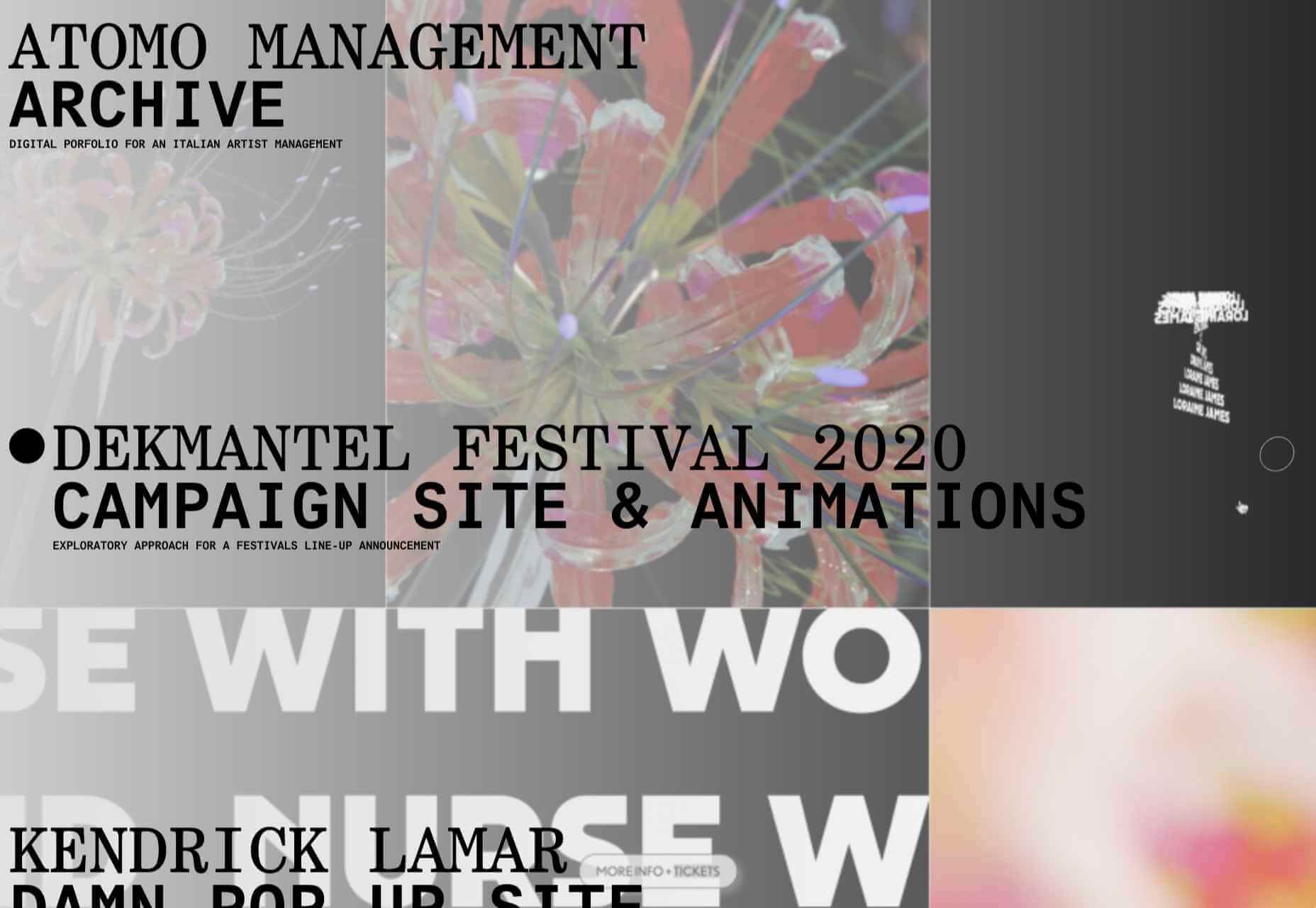
There’s a bit of an old school feel about the site of digital design studio Bureau Cool, with its recent traffic animation. The changing backgrounds on scroll are a nice touch.

Gridspace

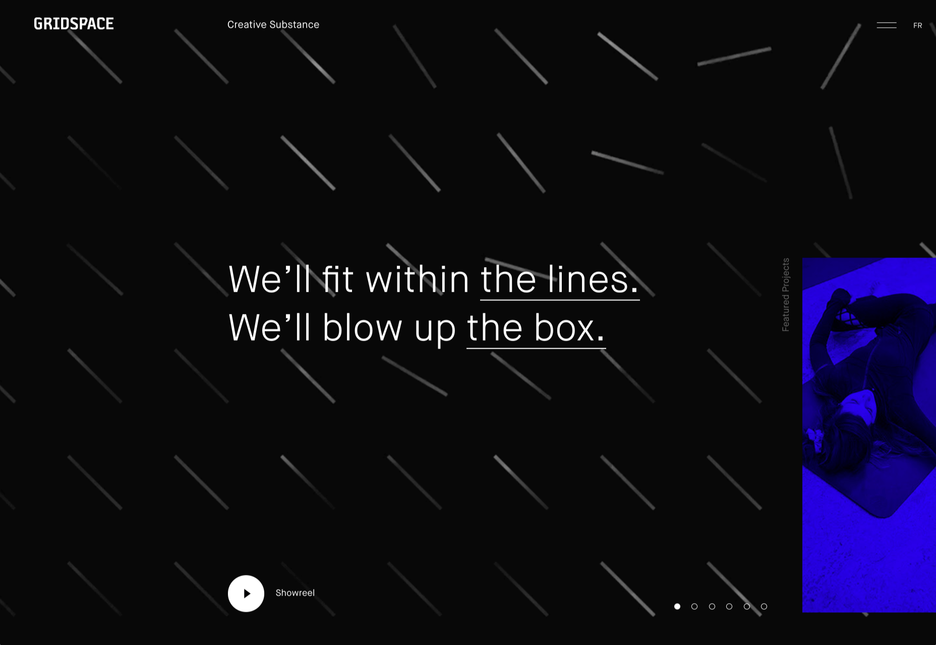
Gridspace is a multimedia entertainment studio based in Montreal, and their website is a visual feast. Lots of movement, lots of video, some good use of sideways scrolling.

Nolii

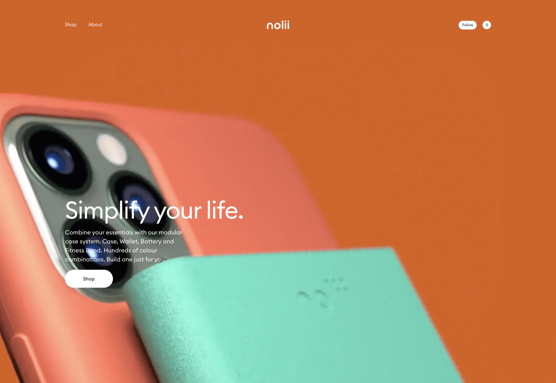
Nolii make cases and accessories for iPhone that work together. The sorbet color palette complements the product colors and the block layout provides a visual reflection of the interlocking of the different products.

Source


Source de l’article sur Webdesignerdepot

A Question and Answer session with guests: 

Micronaut is an open-source, JVM-based framework for building full-stack, modular, easily testable microservice and serverless applications. Unlike reflection-based IoC frameworks that load and cache reflection data for every single field, method, and constructor in your code, with Micronaut, your application startup time and memory consumption are not bound to the size of your codebase. Micronaut’s cloud support is built right in, including support for common discovery services, distributed tracing tools, and cloud runtimes. 

Source de l’article sur DZONE