

Navigation is one of the most essential elements of a website.
It provides a high-level overview of what visitors will find there (which also happens to be good for SEO). It helps visitors orient themselves so they can get around the site quickly. Plus, it enables them to take quick action like visiting their cart or searching the site.
As a web designer, you have to make sure the website navigation is designed so that visitors can get the most from it.
Today, we’re going to look at five things to keep in mind when you’re designing website navigation. We’ll include examples from BeTheme so you can see what these best practices look like.
How to Design Great Website Navigation (With Examples)
It’s easy to take the website navigation for granted. So long as it appears at the top of the site, contains the links to your most important pages, and is uncluttered, that’s all you need to worry about as a designer. Right?
Not really.
Because navigation has such an important job to play, it has to be designed with care. Here’s what you need to know:
Tip #1: Make the Logo Prominent
The logo is essentially the digital face of a company. Not only does it represent them on their website, but it also represents them on other platforms — social media, online forums, email signatures, and so on.
Because of this, the logo plays a vital role in building brand recognition, trust, and loyalty.
To maximize the brand-building powers of the logo, it needs to be correctly placed, sized, and spaced in the header of the website. Here are some general rules to follow:
1. Link: Link the logo to the Home page.
2. Placement: Place it in the top-left corner whenever possible (according to research from NNG). If you want to place it in the center, make sure there’s a Home link in the top-left corner.
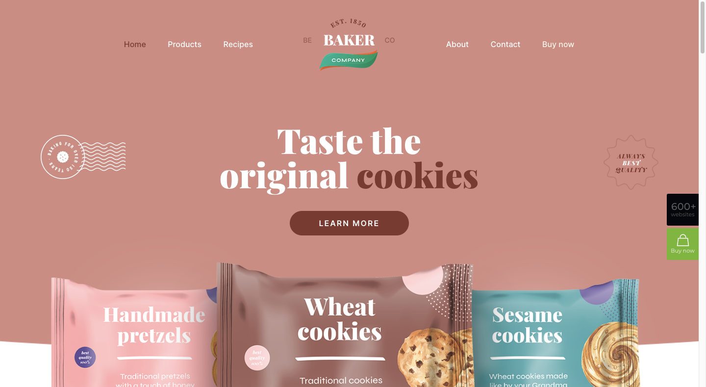
The BeBaker 3 pre-built site uses this alternative logo placement:
3. Size: Size it so that every detail is easy to see and read. The ideal sizes are 250px x 100px for rectangular logos and 160px x 160px for square ones, though it all depends on how much room you want to give your navigation links to breathe.
For instance, the BeDentist 4 logo is 166px x 60px:
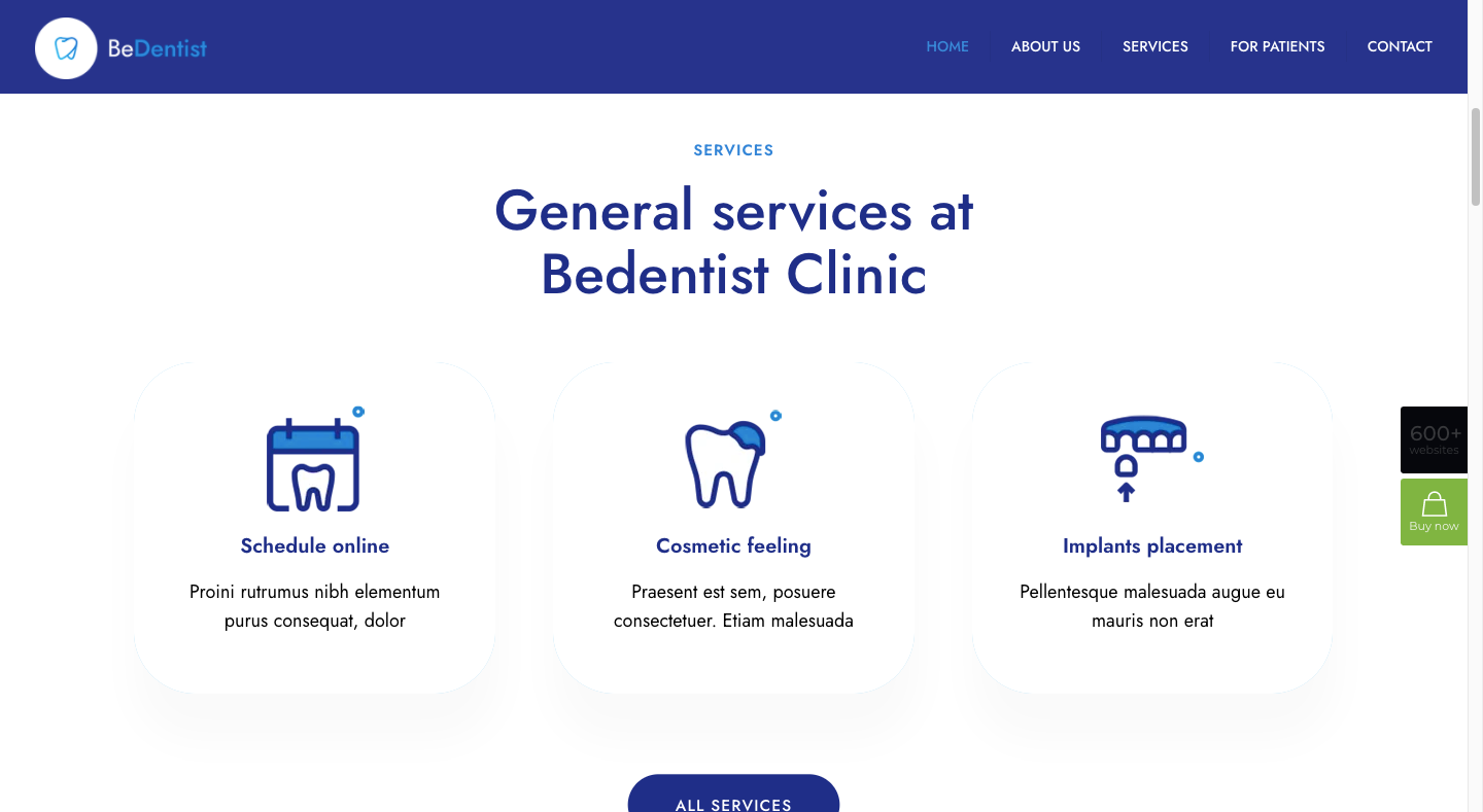
Making the logo any bigger than that without increasing the font size of the header would create too much space around the navigation. So, it’s a bit of a game of balance. If you go with a bigger logo, make sure it doesn’t create so much space that your links drown in it.
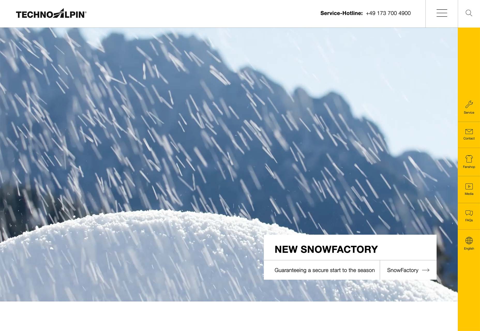
Tip #2: Make the Header Sticky
Websites often have a lot to share with visitors. So as not to overwhelm them with content that reads like pages from a book or magazine, we design them in sections and with plentiful white space in between.
As such, web pages can grow quite long.
That’s not the problem, though. So long as the information shared is relevant, visitors will gladly comb through it. The issue is the effort required to scroll back to the top when they’re done — especially if they’re viewing the site on a smartphone.
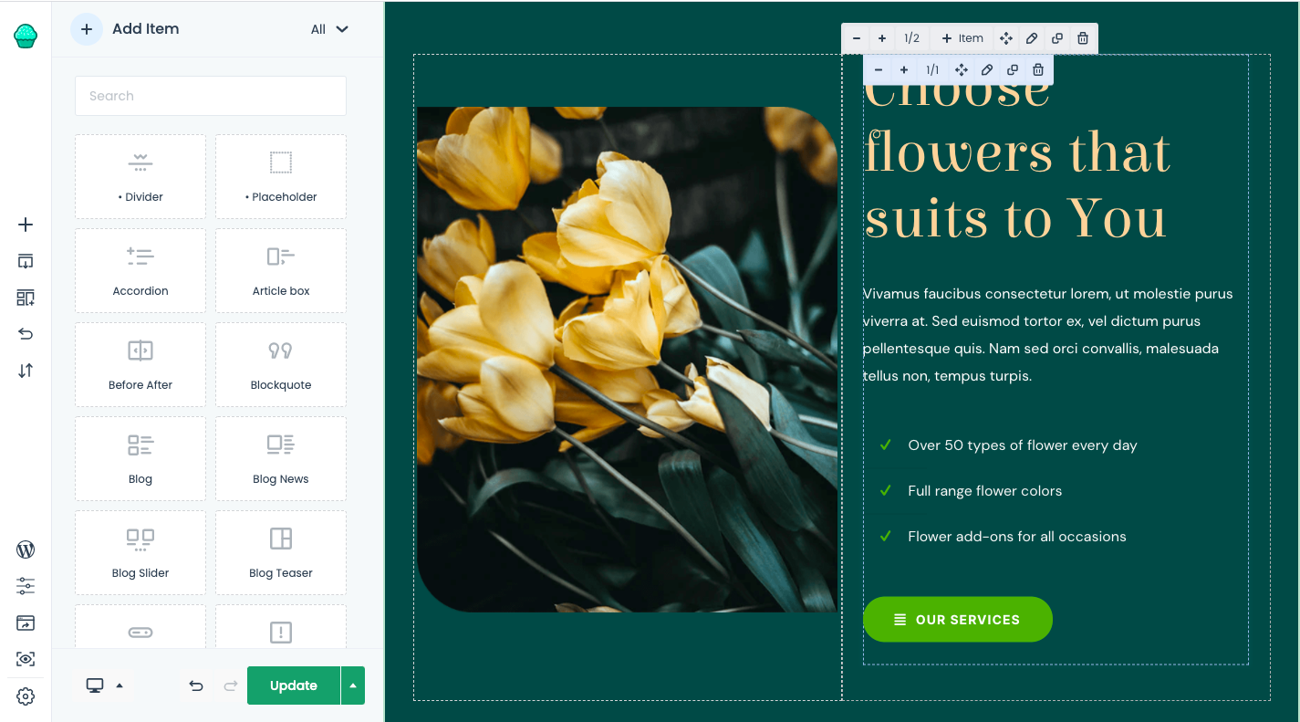
The sticky header offers a solution to this problem. It doesn’t just stick to the top of the page, either. Watch how the title on the BePizza 5 one-page site transforms:
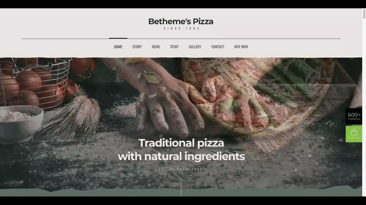
As the visitor scrolls down the page, the uniquely designed navigation bar shrinks up. Although it’s much smaller, it’s still usable.
As an alternative, you can use sticky left-aligned navigation as the Cottage 2 pre-built site does:
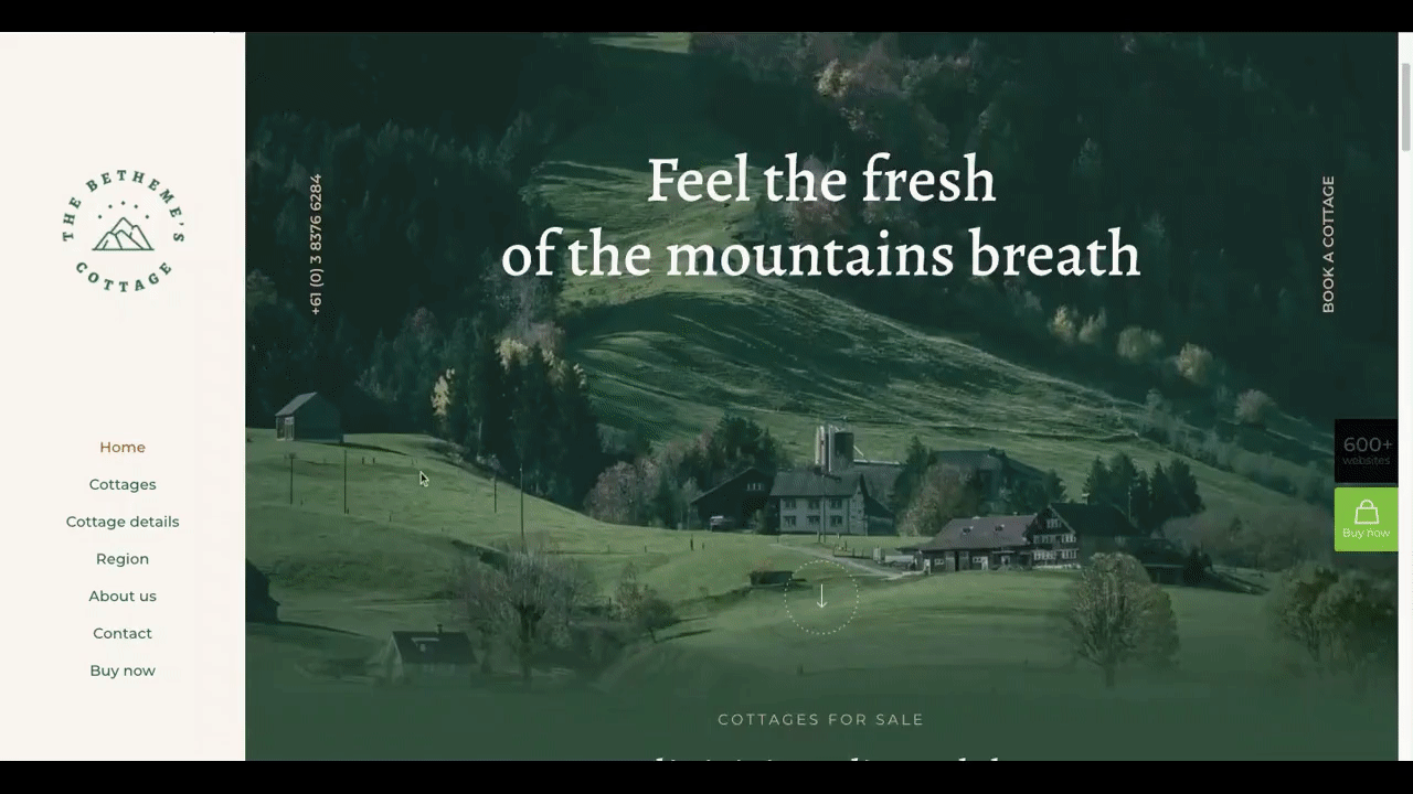
The logo is still in a good spot, the navigation links remain visible at all times, and it doesn’t take away too much space from the main content.
Tip #3: Highlight the Current Page the Visitor Is On
Even if you’re designing a smaller website, it’s always helpful to let visitors know what page they’re looking at.
The top of the page may provide clues as to where they are, but a visible marker in the navigation would offer a quicker reference point. And the more quickly they figure out where they are, the faster they can visit unexplored areas of the site.
There are several ways to highlight a visitor’s location in the navigation. It depends on what your branding and design style calls for.
With BeTheme, you have plenty of options. For instance, you can see here in the Be Ebook 3 navigation that the text color changes from black to blue for the current page:

Another way to add a subtle highlight to the navigation would be to place a colored line beneath the current page.
The Nursing Home pre-built site, on the other hand, uses a more prominent highlight style:

For a site targeted at older users, placing a block of color around the current page links makes a lot of sense as it’ll be impossible to miss.
Tip #4: Only Use Recognizable Icons
Iconography can be a useful element in web design. Usually, we pair it with text labels to visually communicate or explain what the particular point is about. However, we can also use icons as standalone elements in place of text labels.
Designers have to be careful when using standalone icons in the navigation, though. There are only a couple dozen icons that are universally recognizable — most of which have no place in the navigation.
The ones you can place up there can more or less be found in the BeDietShop pre-built site:

There are four navigation icons here:
- User profile for account settings
- Heart for likes or favorites
- Shopping bag for the cart/bag page
- Magnifying glass for search
There are some other icons you use in the navigation, but they tend to be on more specialized sites (like ecommerce and international).
Icons can provide a tremendous navigational shortcut. Just be careful which ones you use. If the majority, if not all, of your visitors, know what they are, it could make your navigation harder to use.
Tip #5: Organize Mega Menus, So They’re Easy to Peruse
Larger websites, in general, can take some time to organize. The website navigation needs to reflect this careful system of organization, too.
The mega menu has long been the navigation design used on websites with more than a dozen links and numerous levels of pages. And it’s effective, just so long as it’s well-organized.
To organize a mega menu, you can use design tactics similar to the ones you’d use to organize your web pages:
- Bolded headers
- Columns for related pages
- Images to highlight important pages
You can see some of these tactics used in the Betheme Store mega menu:
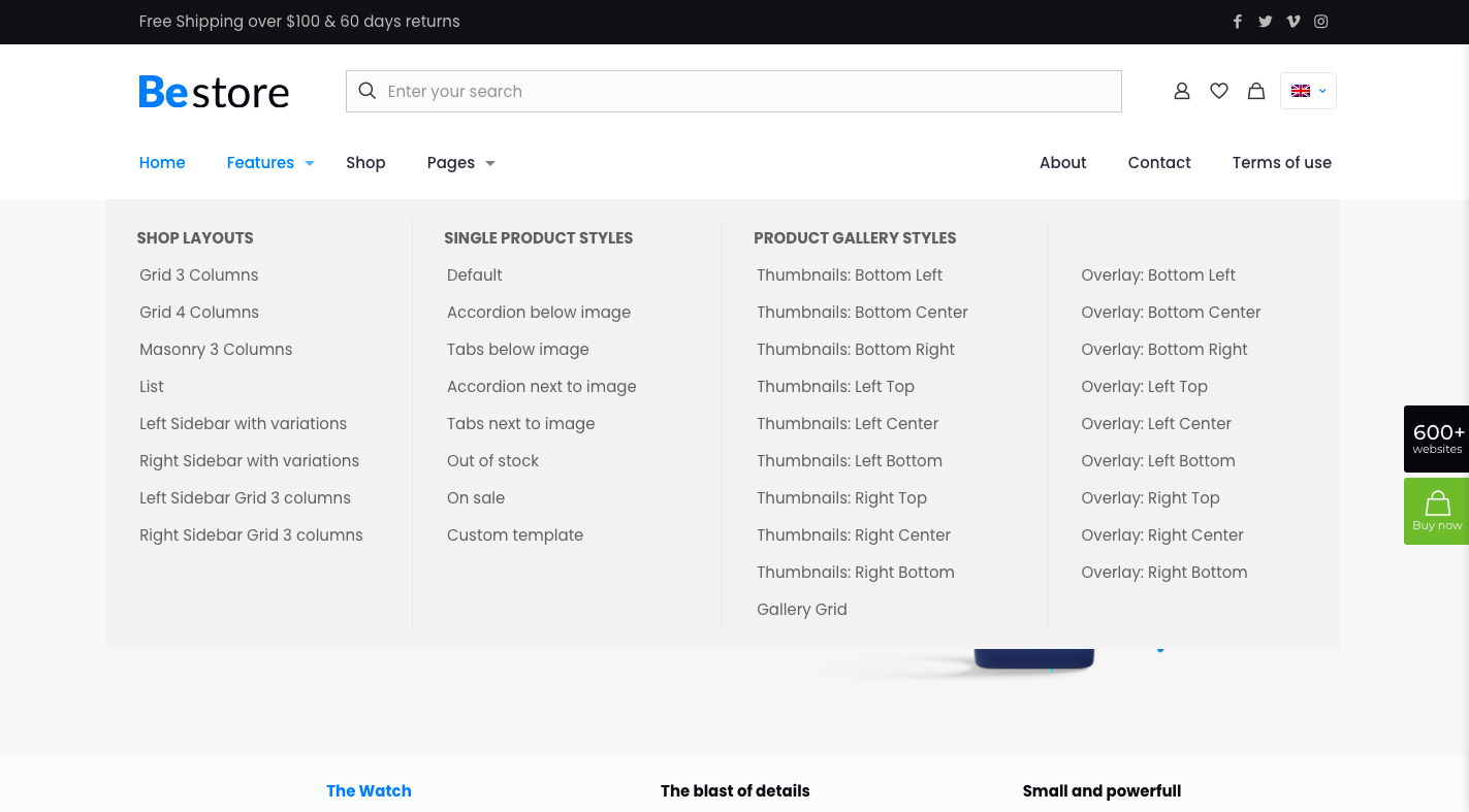
The headers and columns make it easier for visitors to scan through the various categories and pages available.
If a mega menu feels too cumbersome for your site, that’s okay. Websites with thousands of pages might be difficult to keep organized, even with a mega menu structure.
As an alternative, you can design a more traditional single-level navigation and then turn the search page into a navigational tool through the use of filters and sorting as BeClothingstore does:
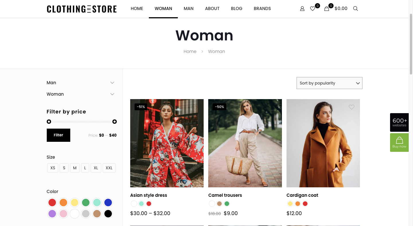
This type of website “navigation” can reduce the overwhelm or anxiety people feel when too many options are displayed at once.
Make Navigation Work for Your Visitors with BeTheme
Without website navigation, visitors would have a lot of work to find pathways to the other information and conversion points on your site. That said, putting a row of navigation links at the top (or on the side) of your site isn’t enough.
Take time to design your navigation so that it improves the discovery of your content and speeds up visitor movement around your site.
The easiest way to get great-looking and highly usable navigation up and running is to start with one of BeTheme’s pre-built sites. Not only are they built using the best practices mentioned above, but they’re also customizable, so you can mix-and-match styles and make them totally your own!
This is a sponsored post on behalf of BeTheme
The post 5 Tips for Designing Great Website Navigation first appeared on Webdesigner Depot.

 As the year begins to wind down, there are still plenty of new and evolving website design trends going strong. Much of what you’ll see this month carries over from things we’ve been seeing all year but with fresh touches.
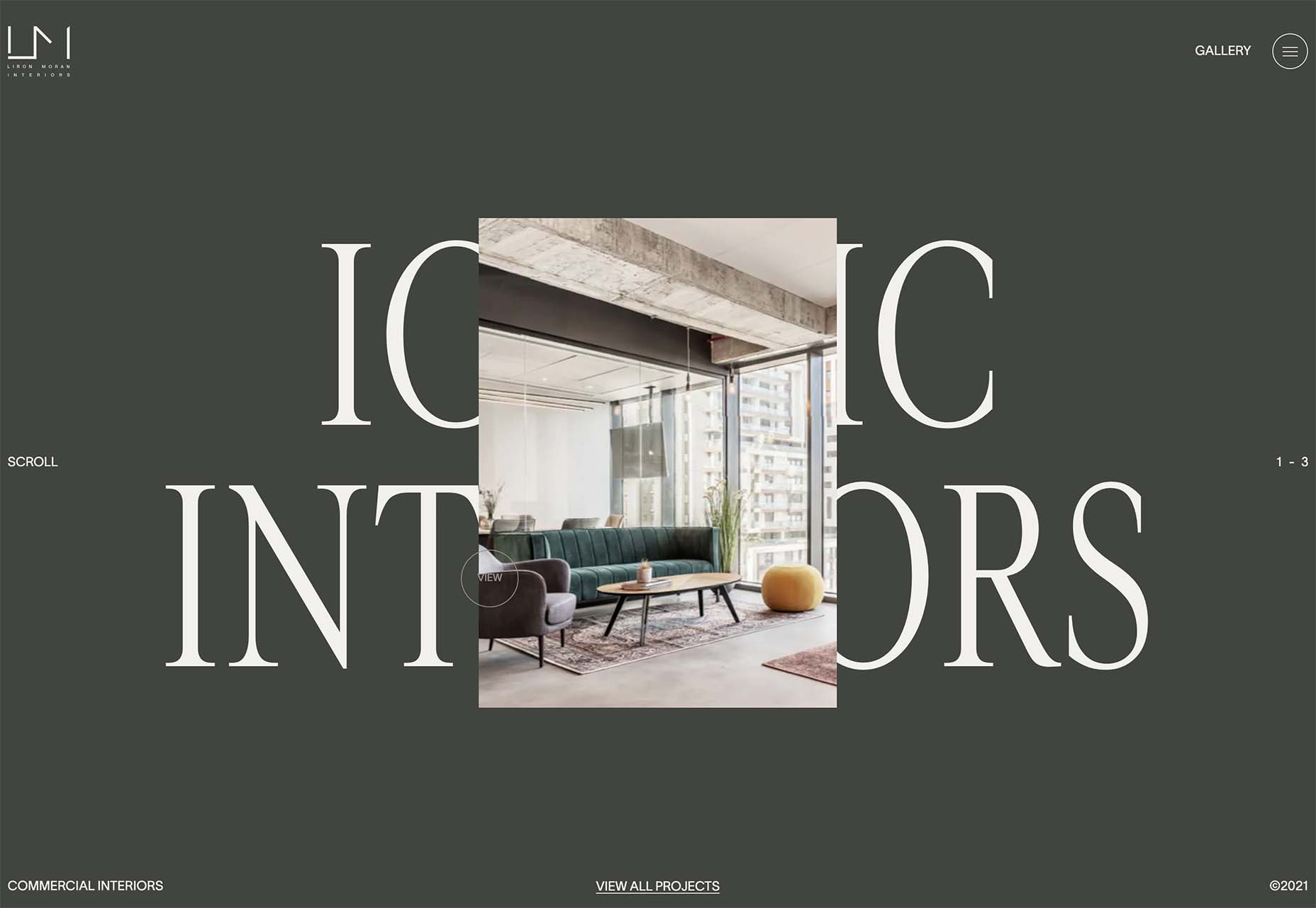
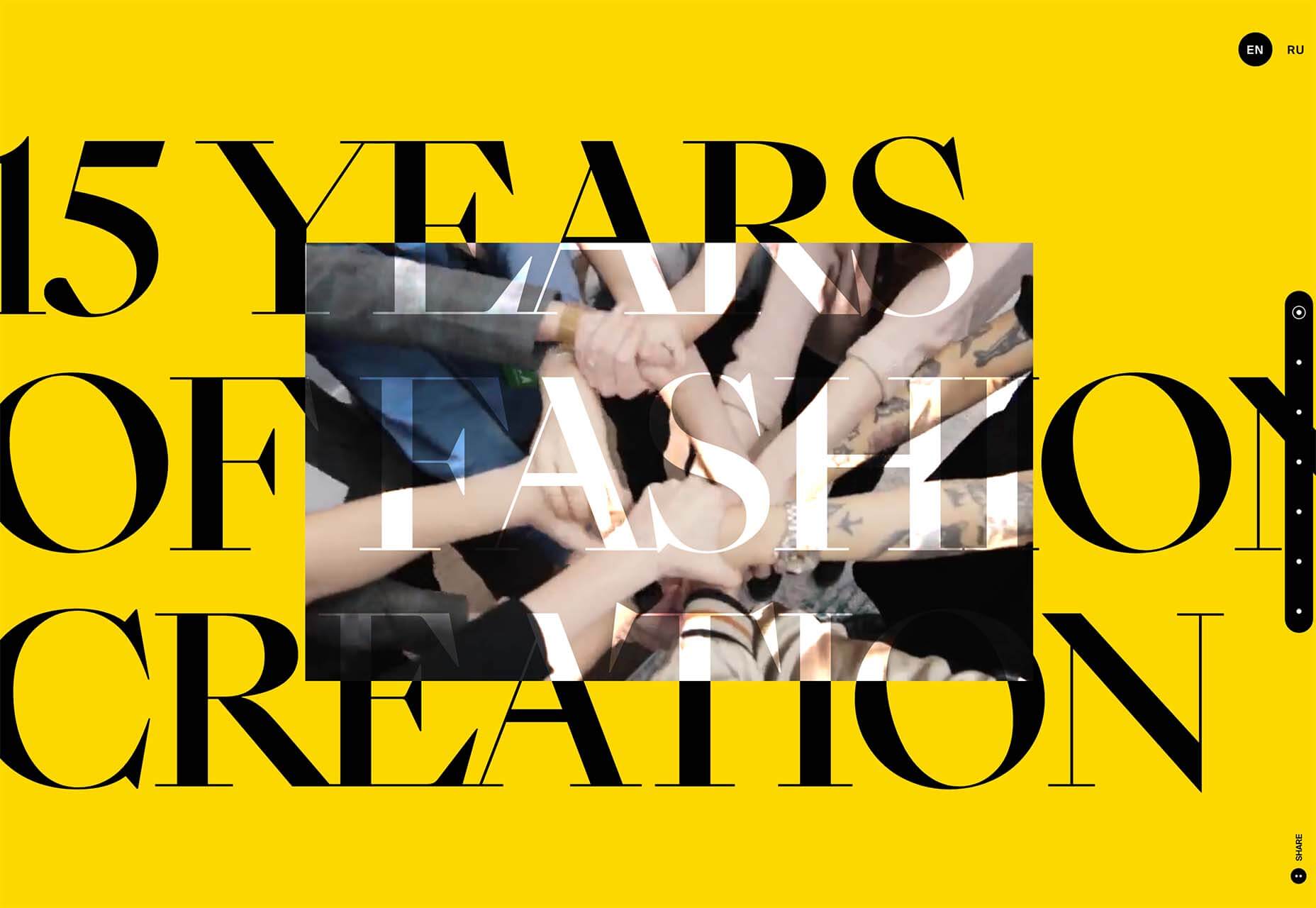

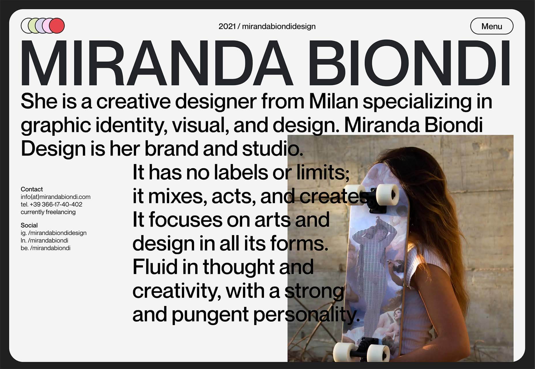
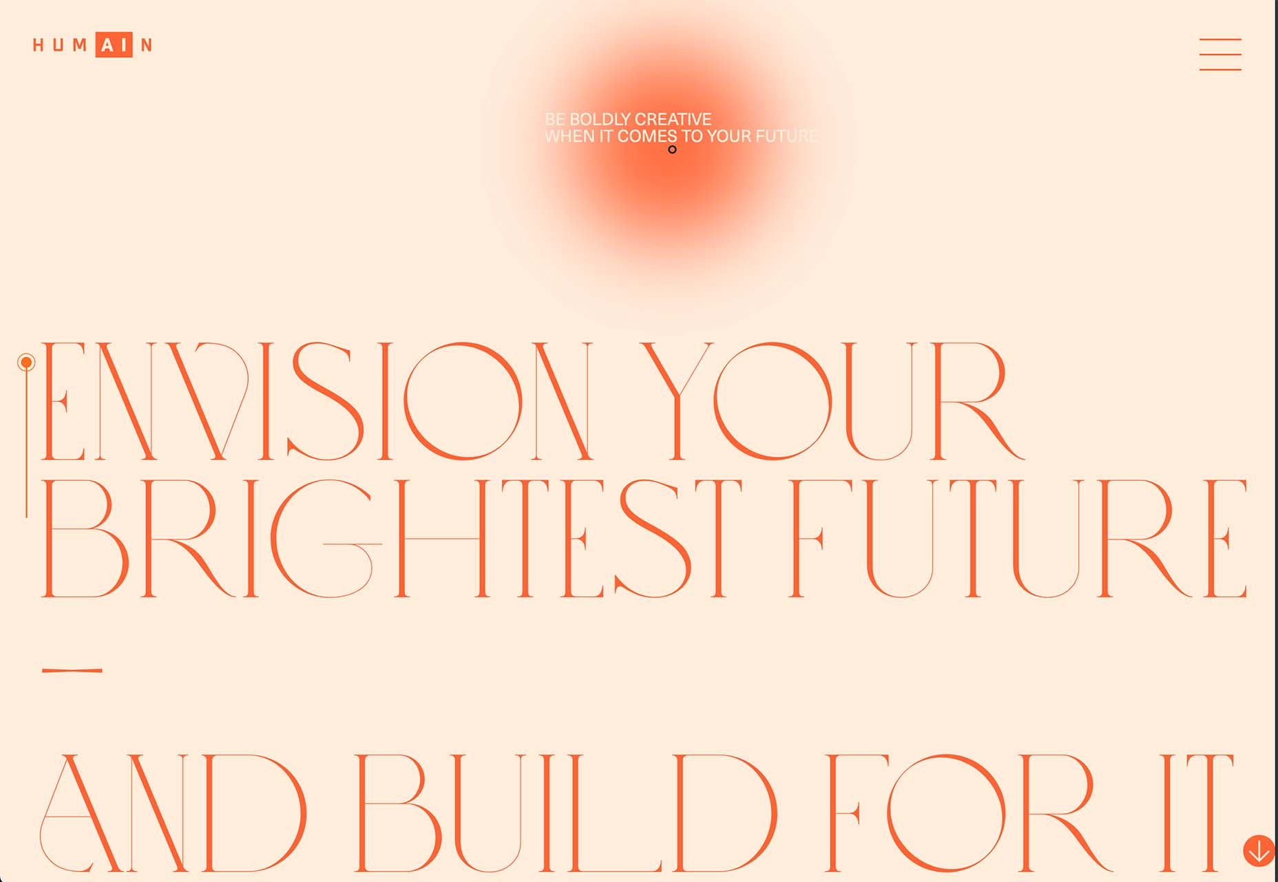
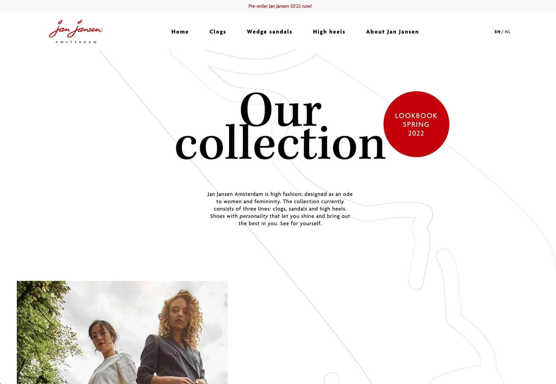
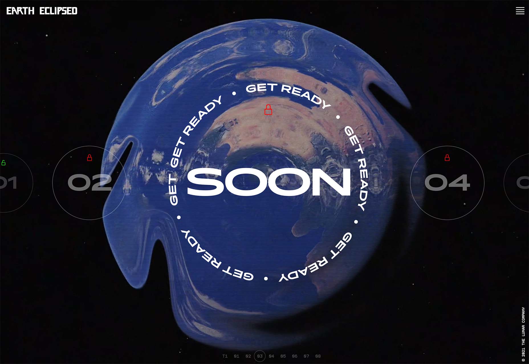
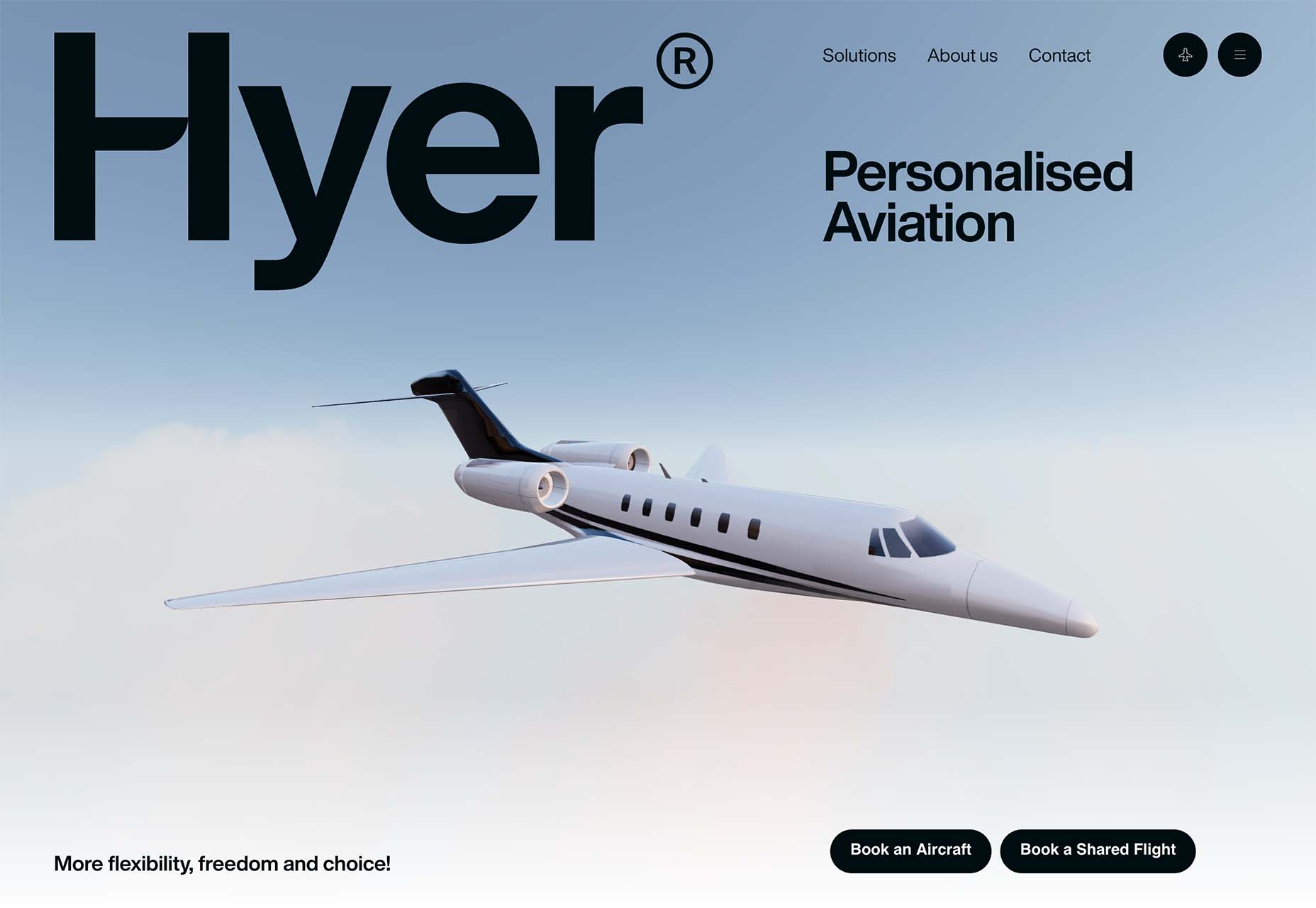
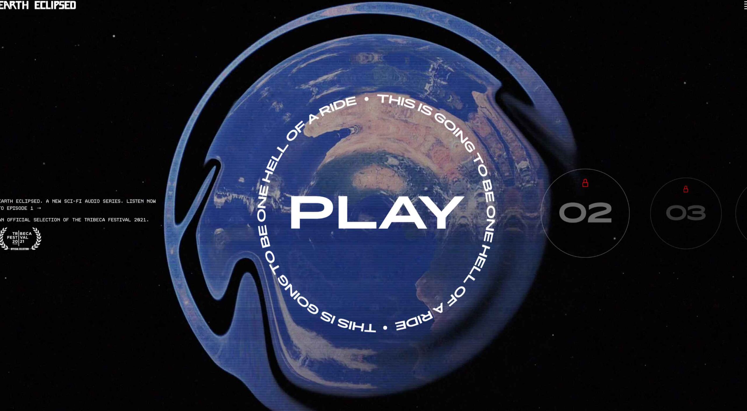 Design trends on top of design trends. This theme of this month’s collection is trends that seem to build on each other. These examples use multiple trends listed here: hero typography, round buttons, and big branding.
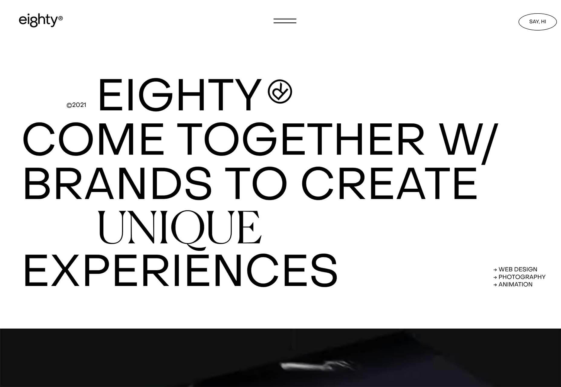


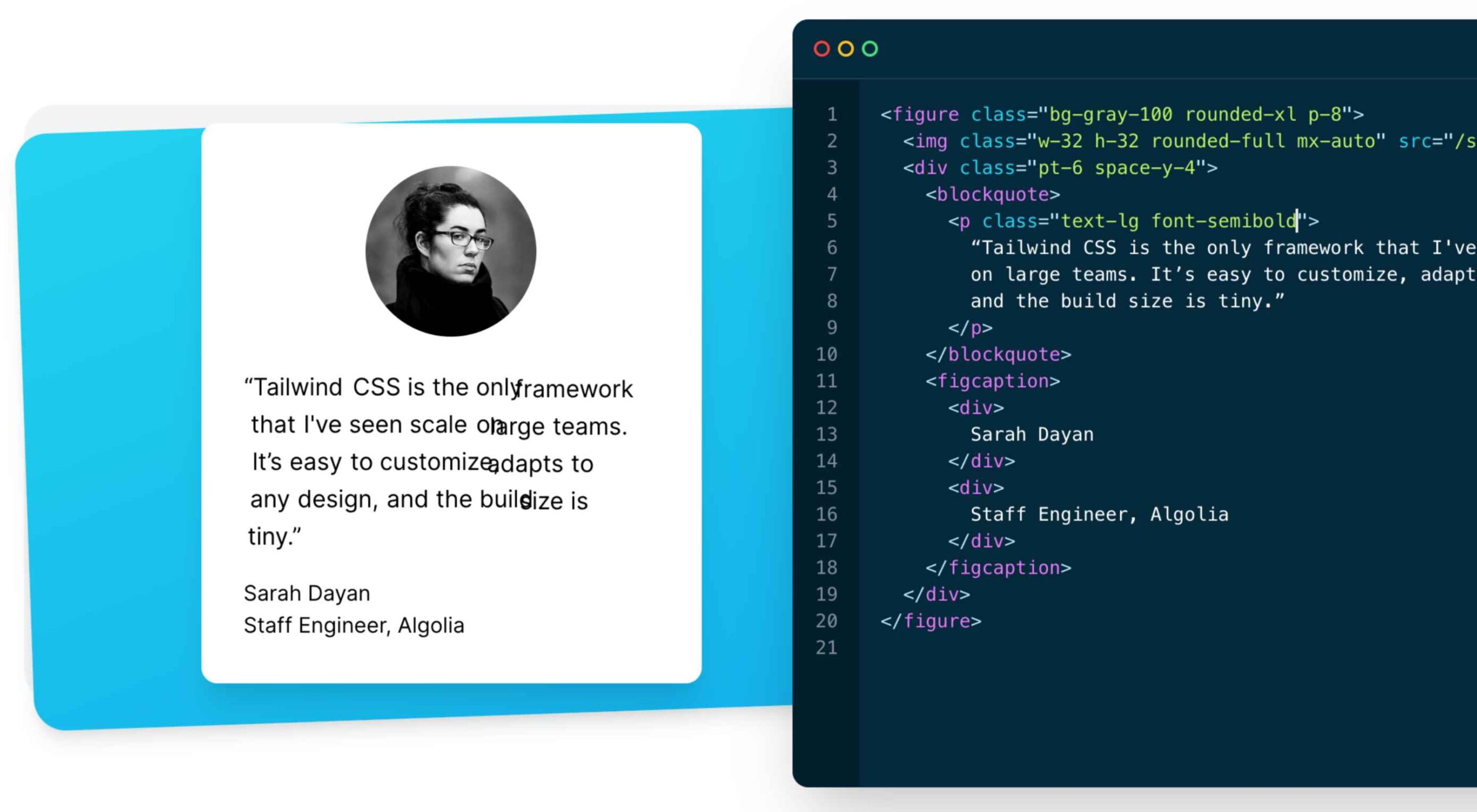 As a utility-first CSS framework,
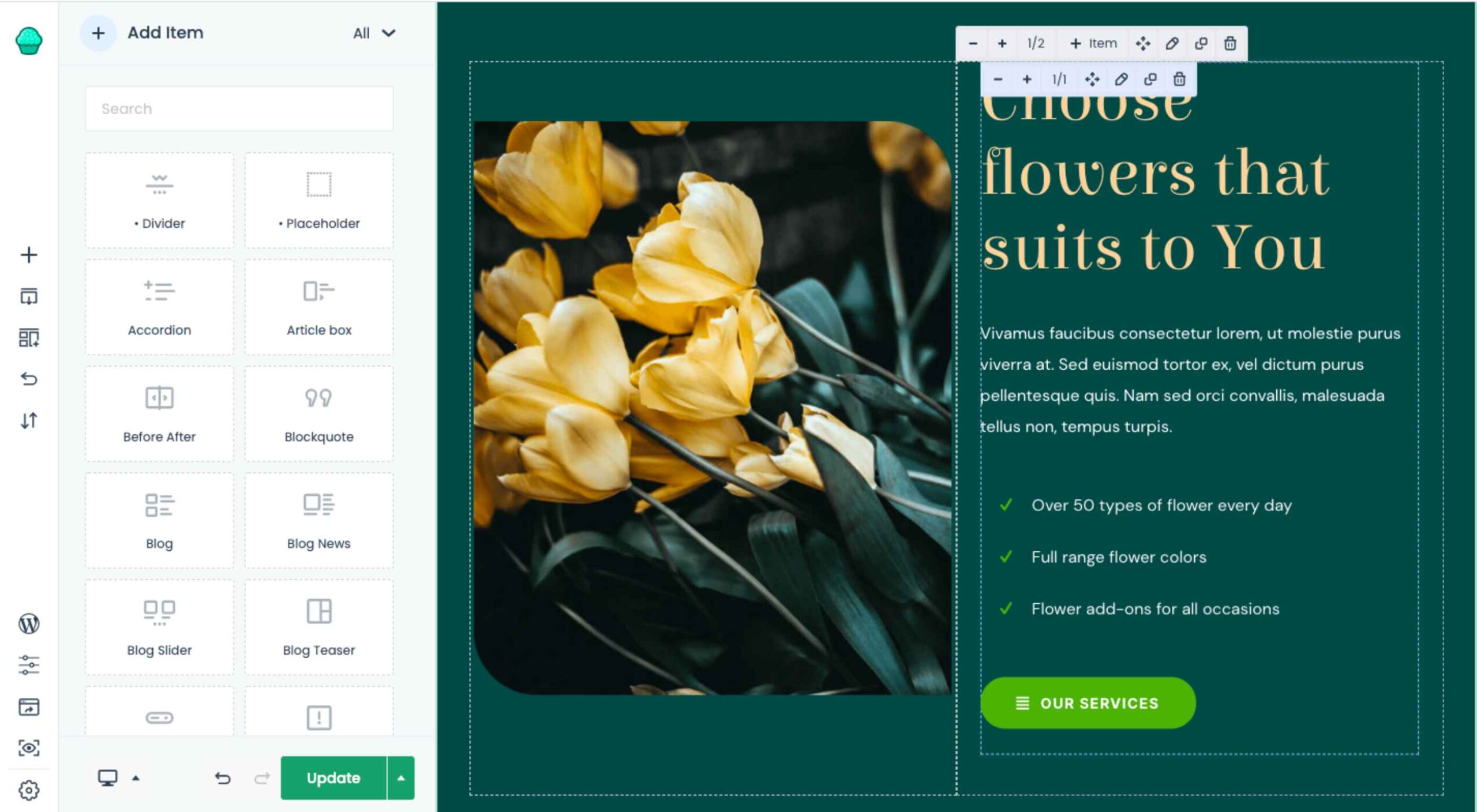 The WordPress themes and plugins you choose for your clients’ sites don’t just impact how the interface looks or how well it works. They also impact your ability to build them.
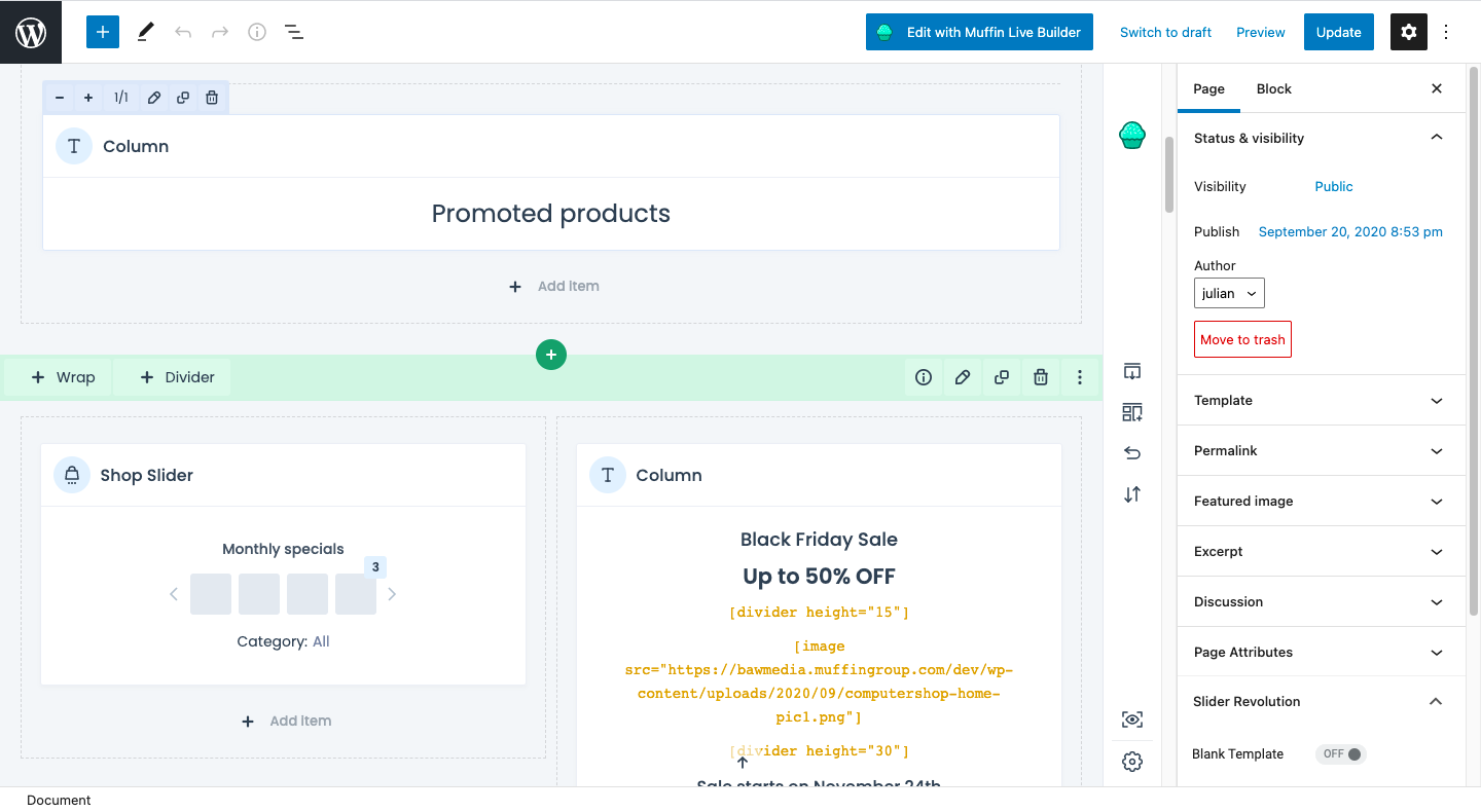


 In the information age, time is a valuable commodity and something people don’t want to spend too much of. As a result, the average visitor only reads about


 Choosing to work for free, pro bono, gratis, without charge is something that most of us find ourselves doing at one time or another. Whether we’re filling a hole in our portfolio, there’s a friend or relative we feel beholden to, or because there’s an opportunity to aid a cause we value.

 Sometimes the designs that make the most impact do a lot of unexpected things and break some of the most tried and true rules of visual theory.


 On June 29th,