 Web accessibility is important for two reasons:
- Being ADA & WCAG compliant is required by law (we’ll explain this further) so if your website isn’t compliant, you can get sued.
- It allows people with disabilities to browse your website, which increases your potential audience and it is the decent thing to do.
In this accessiBe review, we’ll cover:
How Does accessiBe Work
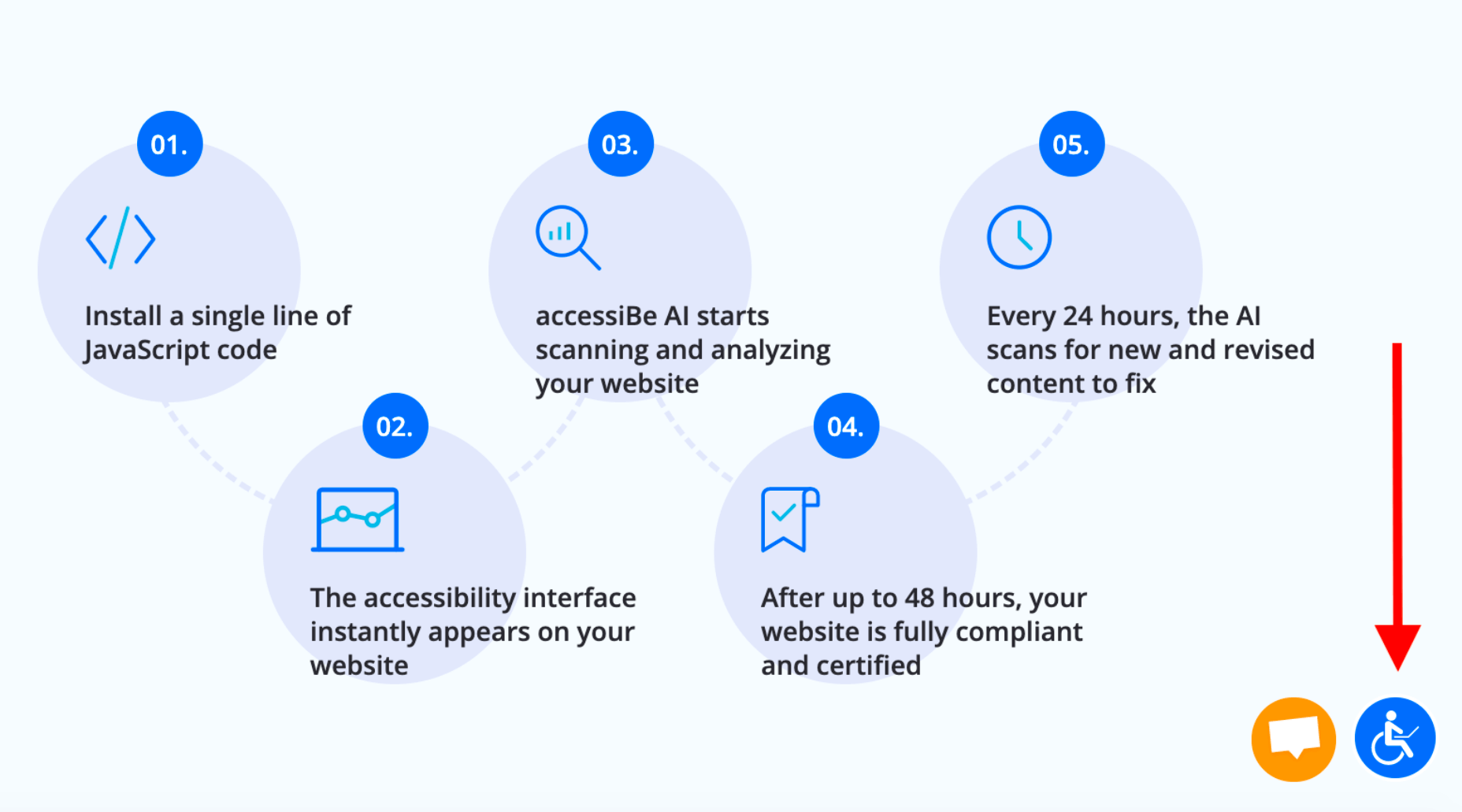
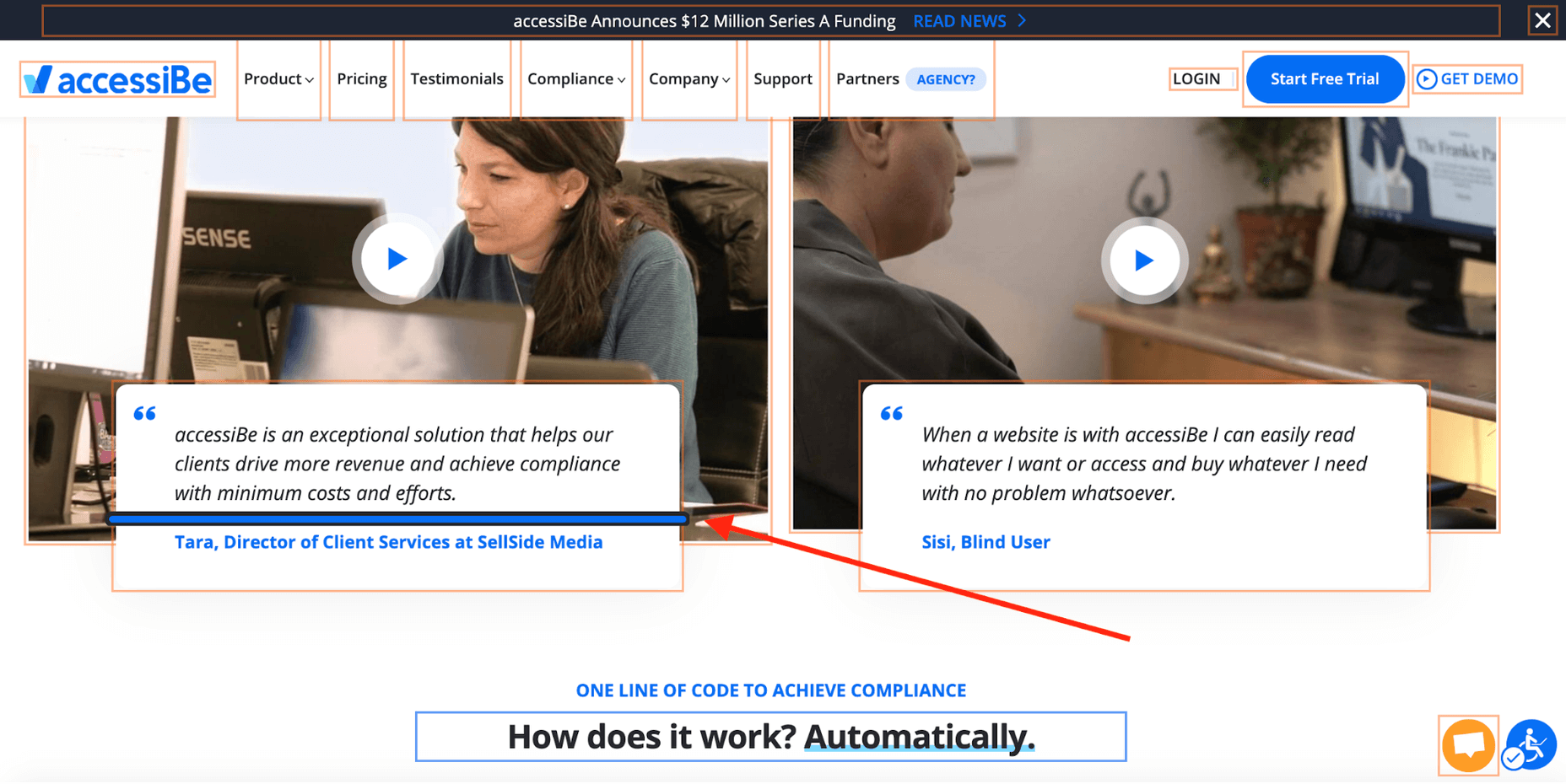
accessiBe is an automated solution that combines two applications to achieve full compliance.
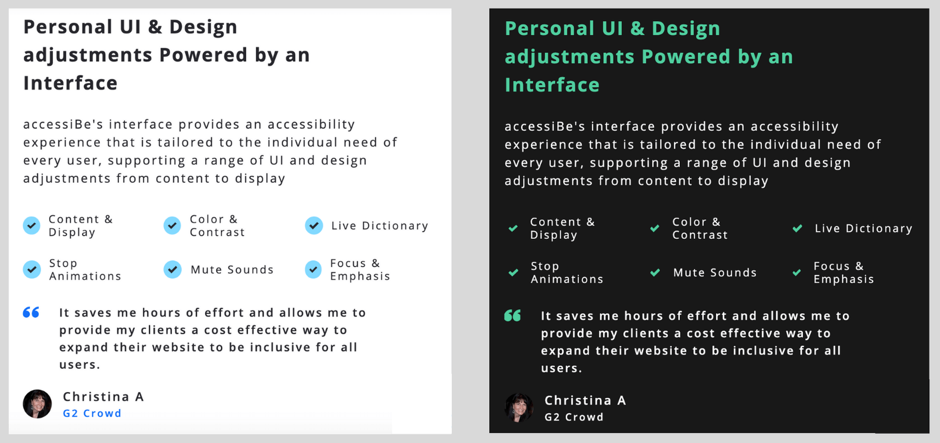
Foreground application: the accessibility interface. This is the accessibility menu that allows users with disabilities to adjust the various UI and design elements on your website so it meets their unique needs.
Background application: proprietary AI technology that’s responsible for the ‘heavy lifting’, screen-reader, and keyboard navigation optimization.
The combination of these two applications is unique for accessiBe for a few reasons. While most available accessibility solutions offer just one of the two or rely on manual remediation, accessiBe checks both boxes and does it in a fully automated way.
Additionally, and most importantly, accessiBe continuously scans your website, every 24 hours, identifying and fixing new accessibility issues as they arise. Websites are dynamic – meaning, keep updating constantly with new content, pages, images and so on; being ADA and WCAG compliant is an ongoing concern, not a one-time fix.
How to Install and Setup accessiBe
You install accessiBe by inserting a single line of code on your website.
From your end, that’s all it takes.
The first thing that happens is that the accessibility interface appears on your website. The menu is available via the accessibility icon (that also appears automatically.)
Source: accessiBe website
Next, the AI application scans and analyzes your website for accessibility issues and compatibility with screen-readers and keyboard navigation requirements and fixes them. This automated process takes 48 hours.
Once the initial 48 hours have elapsed, your website is compliant.
From here on, accessiBe automatically scans your website every 24 hours to identify and fix new accessibility issues as they arise due to website updates.
Why Ongoing Compliance is Important
We’ve mentioned this already, but it’s important to stress this point.
Whether you have an e-commerce website or a company website, you keep updating and changing your website; new items go up for sale, new videos and content pieces are added. Every addition or removal from your website has the potential of creating accessibility gaps (like missing alt text for images.)
By continuously scanning and fixing your website, accessiBe ensures that you stay compliant. An accessibility audit remediates your website for the specific point in time the audit took place. Meaning, you’ll need to audit your website periodically to remain compliant, which is a costly affair. With accessiBe you don’t need to worry about this.
accessiBe Front End Features – The Accessibility Interface
The accessiBe accessibility interface (the menu that is available for users) is installed automatically on your website once you insert the line of code. Let’s look at the various features that are available for people with disabilities.
Accessibility Profiles Explained
First, it allows you to choose from a pre-defined set of profiles optimized for various disability needs:
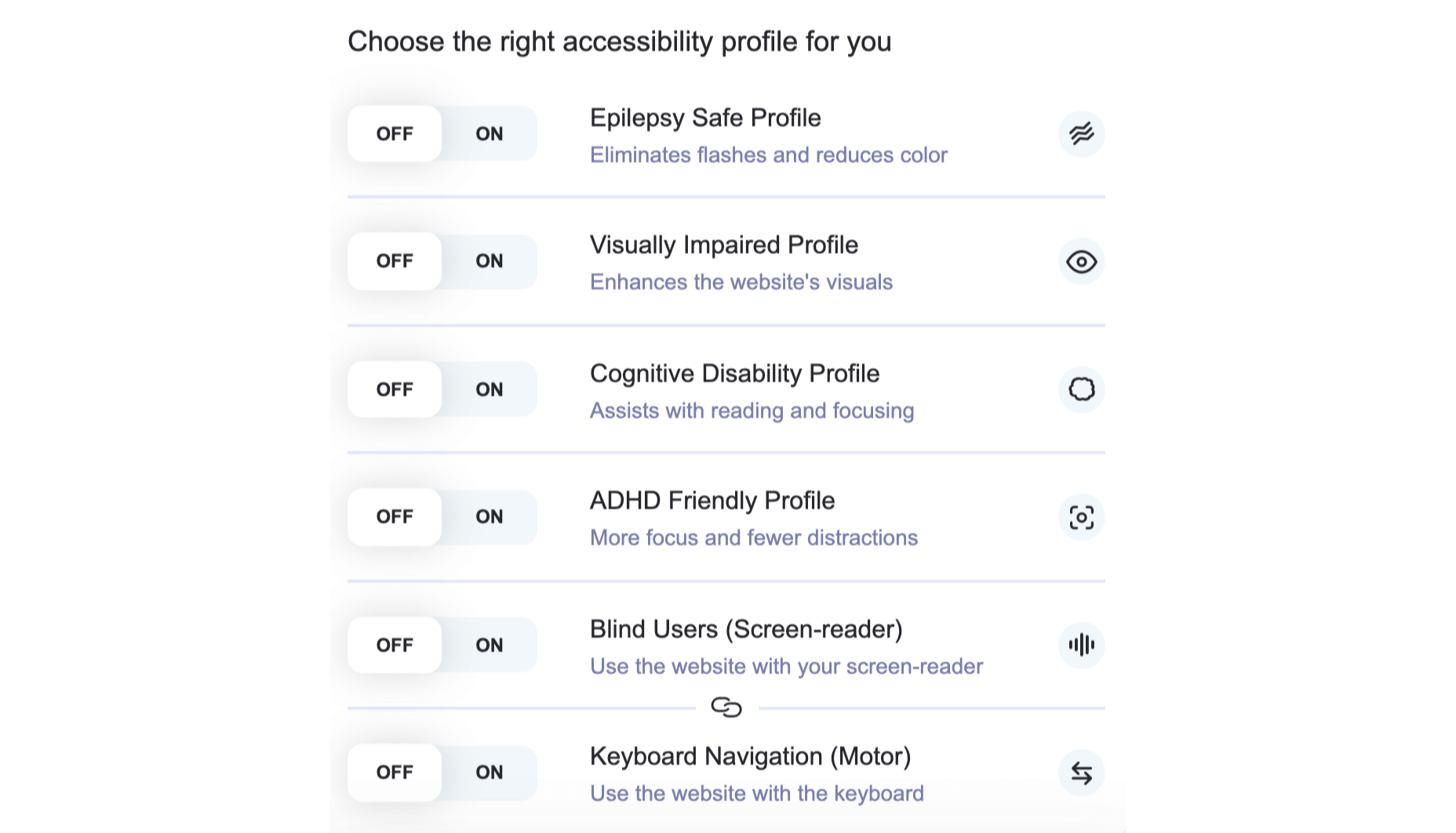
When one of the profiles is selected, the required adjustments are instantly applied to your entire website.
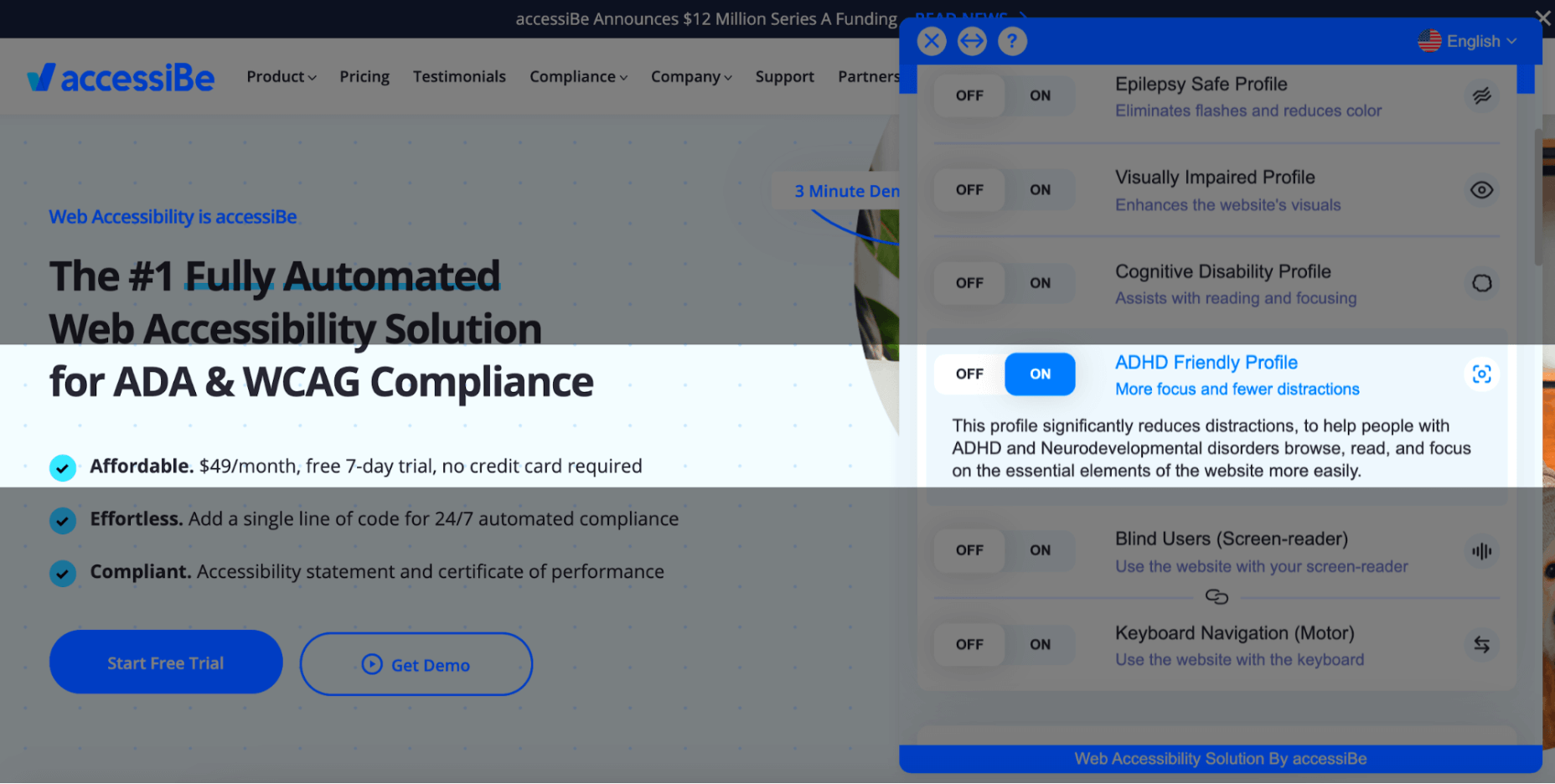
For example, The ADHD Friendly Profile creates a reading mark that follows your mouse movements that diminish distractions and allows better focus:
The Cognitive Disability Profile frames all the elements in bounding boxes and adds an ‘reading cursor’ that acts as your mouse to allow enhanced orientation:
Each of the predefined profiles includes a suite of features that target the unique accessibility needs of the disability; the Epilepsy Safe Profile prevents videos from playing automatically, dims all the colors on your website and eliminates flashing and blinking animations; the Visually Impaired Profile enhances all your website’s visuals, enlarges all fonts to allow most visual impairments conditions (degrading eyesight, tunnel vision, cataract, glaucoma and more) to be able to browse your website with ease.
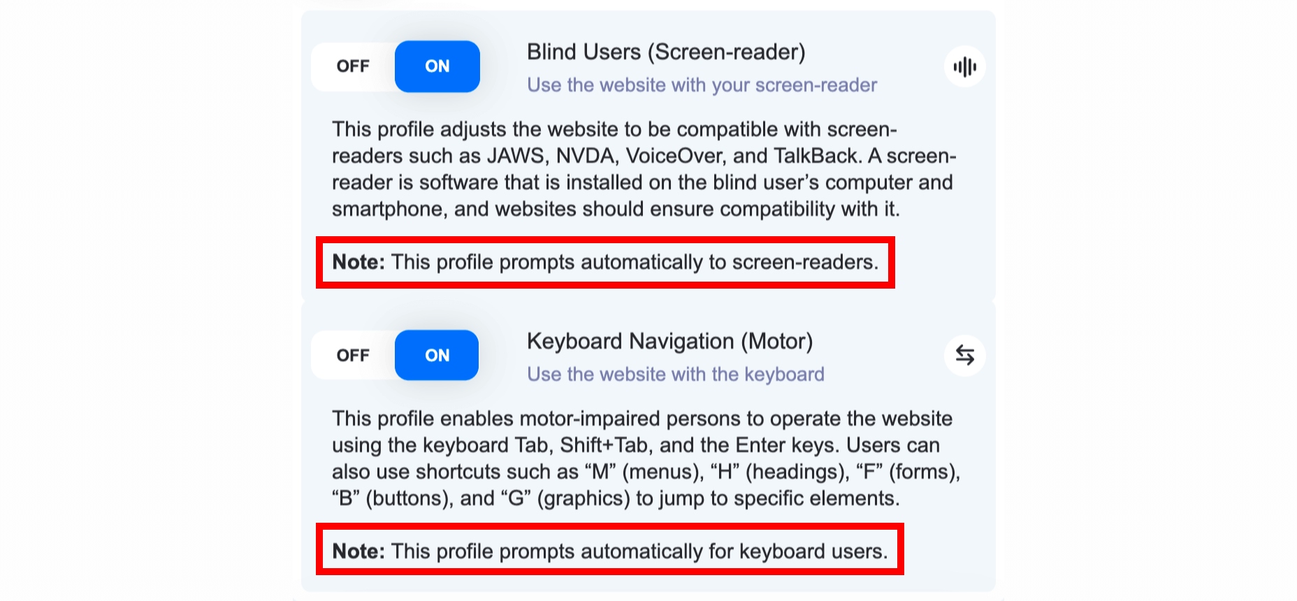
The last two profiles, Blind Users and Keyboard Navigation, work in unison. They allow blind and motor-impaired individuals to browse and use your website as they are used to, through screen-readers and keyboard functionality, respectively.
Two things need to be mentioned here:
- Blind individuals have screen-readers installed on their computers in the OS-level, meaning, on the hard drive of the computer. They use them to navigate the internet by having the software read for them every text that appears on the screen. As can be seen in the screenshot above, the Blind User profile is ‘launched’ automatically once accessiBe detects that the user is using a screen-reader. This is a crucial functionality since obviously blind users aren’t able to locate the accessibility icon.
- The same goes for individuals that are using the keyboard instead of a mouse to navigate the web, both the motor-impaired and the blind. accessiBe detects and automatically enables keyboard navigation on your website.
On top of the predefined accessibility profiles, accessiBe’s interface allows for further adjustments that can be controlled specifically to allow a personalized browsing experience according to the user’s needs. Let’s look at these adjustments.
Accessibility Content Adjustments Explained
The content adjustments allow you to control every aspect of the written content on your website. The menu looks like this:
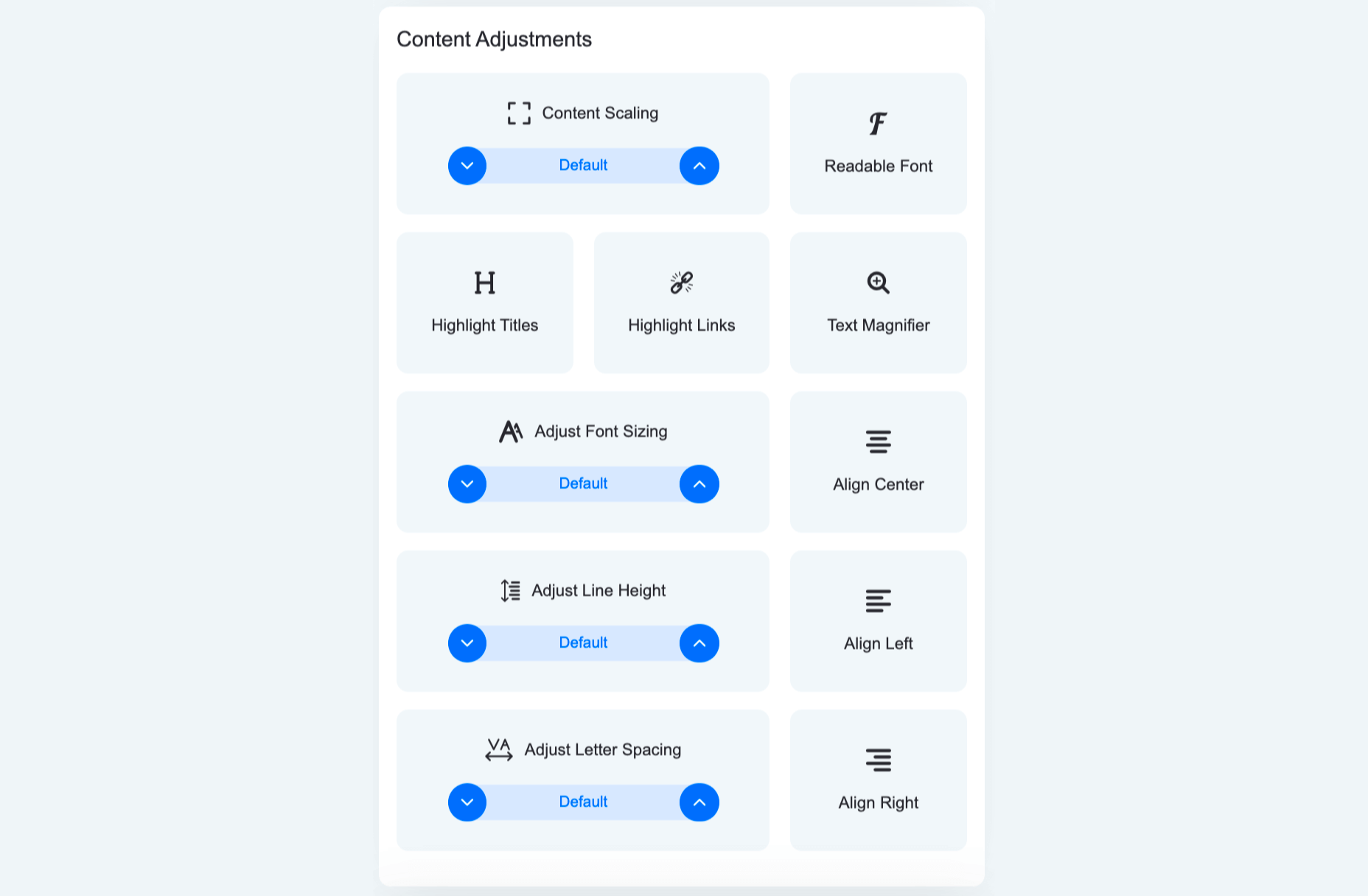
Each of these elements allows for granular control of the way content, or text, is presented. From altering the entire website’s text to a readable, sans-serif font that is easier to follow, to highlighting titles and links, to adjusting font size, the spacing between lines and letters and using a text magnifier that follows your cursor on the screen.
Here’s how it looks with Highlight Titles and Highlight Links turned on:

You can see all the links are highlighted with an orange bounding box while all titles are highlighted with a blue bounding box.
Accessibility Color Adjustments Explained
The color adjustments allows users to control every aspect of the color scheme on the website:
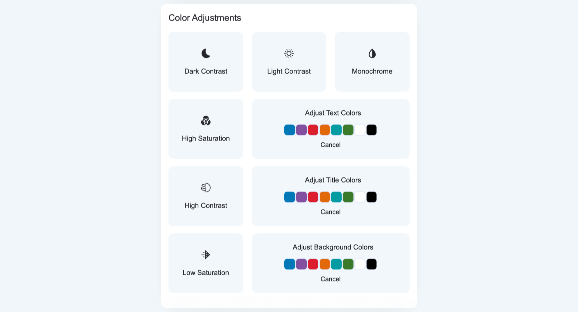
From adjusting contrast and saturation, to switching the entire website to a monochrome color scheme, to adjusting textual elements and background colors. Let’s look at a few examples.
Here’s a side-by-side of default appearance and the Dark Contrast adjustment turned on:
And here’s how it looks with the Monochrome adjustment turned on:
Accessibility Orientation Adjustments Explained
The orientation adjustments allow full control of ‘distractions’ that make it hard for individuals with epilepsy, ADHD, and cognitive disability to browse the web:
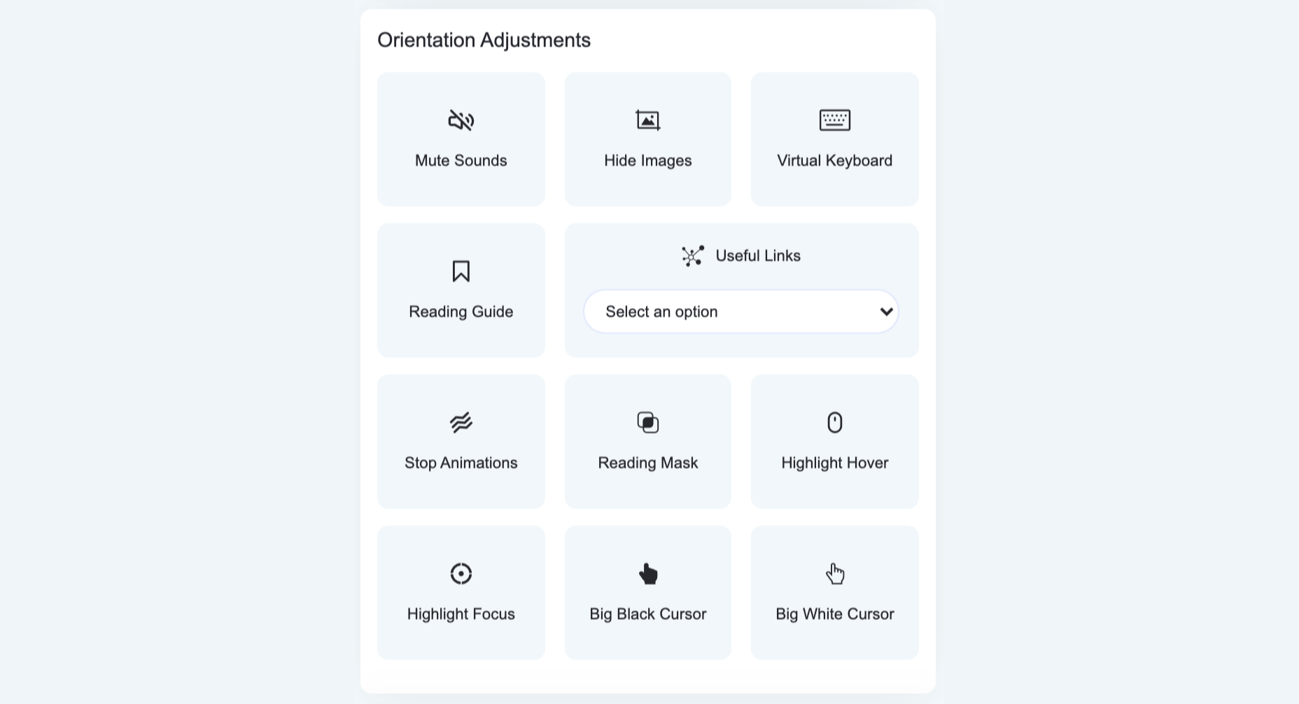
As such, the orientation adjustments allow users to mute sound, hide images, stop animations and additional ‘focus’ features such as an enlarged cursor and reading assistance that highlights the text being read.
Here’s how the Remove Images adjustment works:
accessiBe Back End Features
Unlike ‘accessibility plugins’ (more on that later) accessiBe provides a comprehensive back end treatment to your website – automated, AI-powered analysis of compatibility with accessibility requirements and fixing of the elements that need adjustment.
It should be noted that 70% of the WCAG compliance requirements deal with screen-reader and keyboard navigation compatibility and all these requirements are not answered by installing an accessibility interface widget that merely makes UI and design adjustments.
For example, an accessibility widget will enable you to enlarge the font on your website, to adjust the saturation or to highlight links, but it won’t enable a blind individual to differentiate between a shopping cart icon and a checkout icon, nor will it enable a motor impaired individual to easily navigate a menu.
This is a crucial consideration to make when choosing a web accessibility solution. Being WCAG compliant is a YES / NO situation. Your website is either compliant or it’s not, there is no middle ground here.
accessiBe’s back end features come to solve and answer all these compatibility issues that enable full screen-reader and keyboard navigation functionalities.
Screen Reader Compatibility Explained
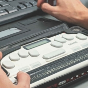
Screen Reader is a software for blind individuals to use computers and browse the web. As the name suggests, the software reads aloud what is seen on the screen for blind individuals.
The screen reader software is installed on the computer. But in order for it to work with websites, the website needs to be compatible with the software. To achieve compatibility with screen reader software, WCAG requires that a website should adhere to a set of attributes called Accessible Rich Internet Applications (ARIA) that are installed within the website’s code, allowing it to ‘communicate’ with the screen reader.
Let’s take social icons as an example. We are all familiar with those icons – Facebook, Twitter, Instagram – they are instantly recognizable for us visually. A screen reader software doesn’t actually ‘see’ elements on the screen, rather it scans the website’s code to understand what appears on the screen. As such, a Facebook icon code simply says ‘link’ and has the URL that directs the user when clicking the link.
So with a website that isn’t compatible with a screen reader, that doesn’t have ARIA tags implemented, the screen reader will read to the blind person “link” for the Facebook icon; not very helpful, is it?
When ARIA tags are implemented, additional information is added to the Facebook icon – and any other visual link on the website – that describes what is the link. So the screen reader will read to the blind person “Facebook link”.
It’s not difficult to imagine the scope and effort of the work needed in order to implement ARIA tags on your entire website.
Keyboard Navigation Compatibility Explained
Keyboard navigation means that motor-impaired individuals are using their computers only through their keyboard, rather than a mouse. Scrolling, clicking links and menu buttons, opening and closing tabs – everything is done using designated keys.
There are many issues relating to keyboard navigation as today’s websites are highly complex, layered with content elements, and react dynamically to user behavior. Any element of the website must be compatible to allow full keyboard navigation.
Let’s look at a popup as an example.
Popups can be triggered for a variety of reasons. For mouse users, it is a simple occurrence; you can bring the cursor to the area of the popup, click on one of the fields to input details or click the X to close the popup.
But how do you handle the popup using only the keyboard? How do you differentiate between ‘regular’ functionalities of the website and that of the popup? How do you ‘shift the focus’ of the keystrokes to a layered element? You need to allow unique keystrokes to operate the popup, keystrokes that are activated only when a popup appears.
It’s one example of the many challenges making your website compatible with keyboard navigation. The list of WCAG requirements for compatibility with keyboard navigation is a long one, and understandably so as it needs to enable motor-impaired individuals to navigate your website with the same ease as the rest of us using a mouse.
How accessiBe’s Background Processing Achieves Screen Reader and Keyboard Navigation Compatibility
Without getting too technical, what accessiBe does is scan the entire code of your website and adds keyboard functionalities and ARIA tags to various elements on your website directly. It won’t interfere with your site’s code, but rather add an additional ‘layer’.
accessiBe’s AI ‘learned’ all of ARIA’s tags and keyboard functionalities required by WCAG and when scanning your website’s code implements all the required adjustments to achieve full compliance.
How accessiBe Makes Menus Accessible
Menus are a good example for understanding what the accessiBe background processing does and the benefits it provides.
We recognize menus on websites instantly, because we saw thousands and thousands of them. We know how they look, we know what their functionality is, and we know where to hover and click in order to reach the various pages of the website.
But if you remember, we said that screen readers don’t ‘look’ at the screen, but rather scan the site’s code to understand structure, identify links and read them aloud with all the text that appears on the page.
So menus are coded as a list structure, because in a way they are. A screen reader will announce a menu as a list, which might be confusing for a blind user. Additionally, many menus have drop-down sub-menus, accessible via a hover or by clicking a little triangle. Without proper ARIA tagging, a screen reader will miss the sub-menu.
What accessiBe does is adding readable tags for every element in the menu so a screen reader will recognize and announce each element properly. The ‘list’ code structure will get a “menu” tag, and the sub-menu will get a tag for ‘sub-menu’, thus allowing the blind individual to utilize the full functionality of the website.
Additionally, accessiBe alternates the tags on-the-fly while the site is being browsed. Once a sub-menu has been opened, a tag that says “sub-menu open” will be added to indicate to the screen reader what has happened, and will be changed with the tag “sub-menu close” once the sub-menu has been closed.
Image Recognition
One of the key elements of accessibility compliance with screen readers is to provide accurate alternative descriptions for images, known as alt text.
accessiBe utilizes various image, object and character recognition technologies (OCR and Iris) to provide highly descriptive and accurate depictions of images displayed on the website. Without adding screen-reader compatible alt tags to images a blind individual would simply not be aware of the existence of images, and miss out on the information usually displayed on images.
Let’s look at the following banner images from an e-commerce website:

As you can see, valuable information is communicated via the images – sales and discounts – the kind of information any shopper would want to know.
This is the descriptive text that accessiBe’s AI assigned to these images, completely automated with no human intervention (from left to right):
- Image contains: shopping, shorts, woman, ashion; image text: extra 50% off shorts
- Image contains: shopping, red top, woman, jeans, fashion; image text: 50% off bottoms
- Image contains: shopping, blue jumpsuit, woman, fashion, bed, ; image text: 50% off jumpsuits & rompers
- Image contains: shopping, shoes, ocean, woman, fashion; image text: 50% off shoes
Again, doing this kind of work for the hundreds to thousands of images that are displayed on every e-commerce website requires a lot of time and effort. accessiBe achieves this in a completely automated way, and every image added to your website instantly gets its alt text.
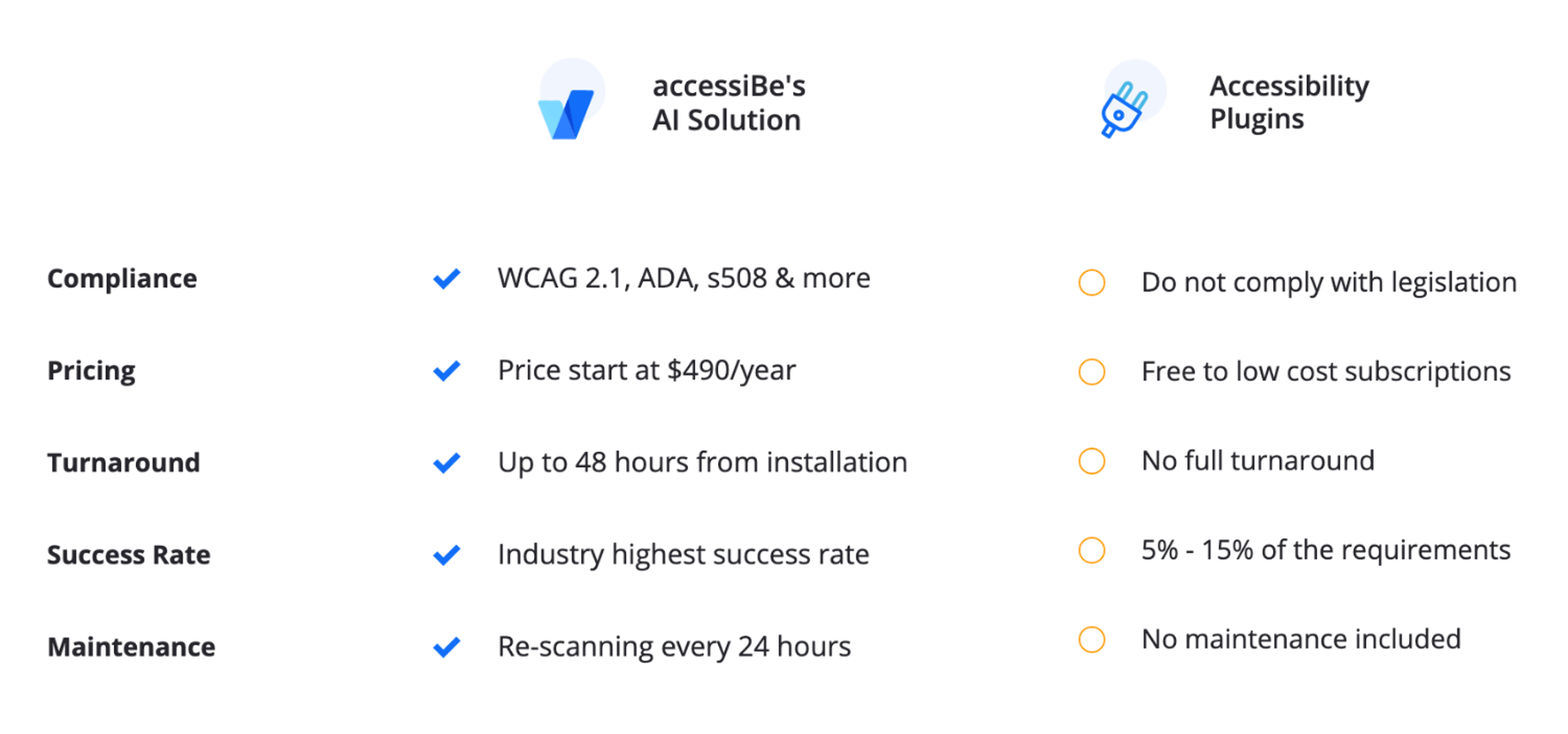
Comparison of accessiBe with Accessibility Plugins
There are many web accessibility plugins out there. They offer a ‘quick fix’ for ADA and WCAG compliance – add an accessibility menu and you’re done.
As tempting as it may sound, the distinction between an accessibility menu and being fully compliant must be made.
As we’ve mentioned earlier, there are two parallel tasks that need to handle in order to achieve ADA and WCAG compliance:
- Front end – UI and design adjustments, achieved by the Accessibility Interface (the visible menu for content, font, color and orientation adjustments)
- Back end – screen-reader and keyboard navigation compatibility, achieved by implementing ARIA tags and further code adjustments
Reminder: 70% of accessibility compliance requirements deal with back end adjustments, meaning, screen-readers, and keyboard navigation compatibility.
Accessibility plugins, whether free or paid, only answer the front-end requirements. Meaning, after installing an accessibility plugin, you are just 30% compliant. Since accessibility compliance is not a scale (you don’t ‘get points’ for making it halfway through) you’ll need to turn to an additional provider to do the back end work.
accessiBe, on the other hand, provides a full accessibility compliance solution, covering both UI and design requirements through the accessibility interface AND screen-reader and keyboard navigation compatibility requirements through it’s automated AI technology that analyzes and makes adjustments in the code-level of the website.
Benefits of Using accessiBe Over Accessibility Plugins
- Achieving complete accessibility compliance
- Dealing with a single provider, rather than two or more
- Cost-efficiency (manual audit and remediation service are expensive)
- Complete compatibility with screen-readers and keyboard navigation
- Enabling true accessibility to individuals with disabilities
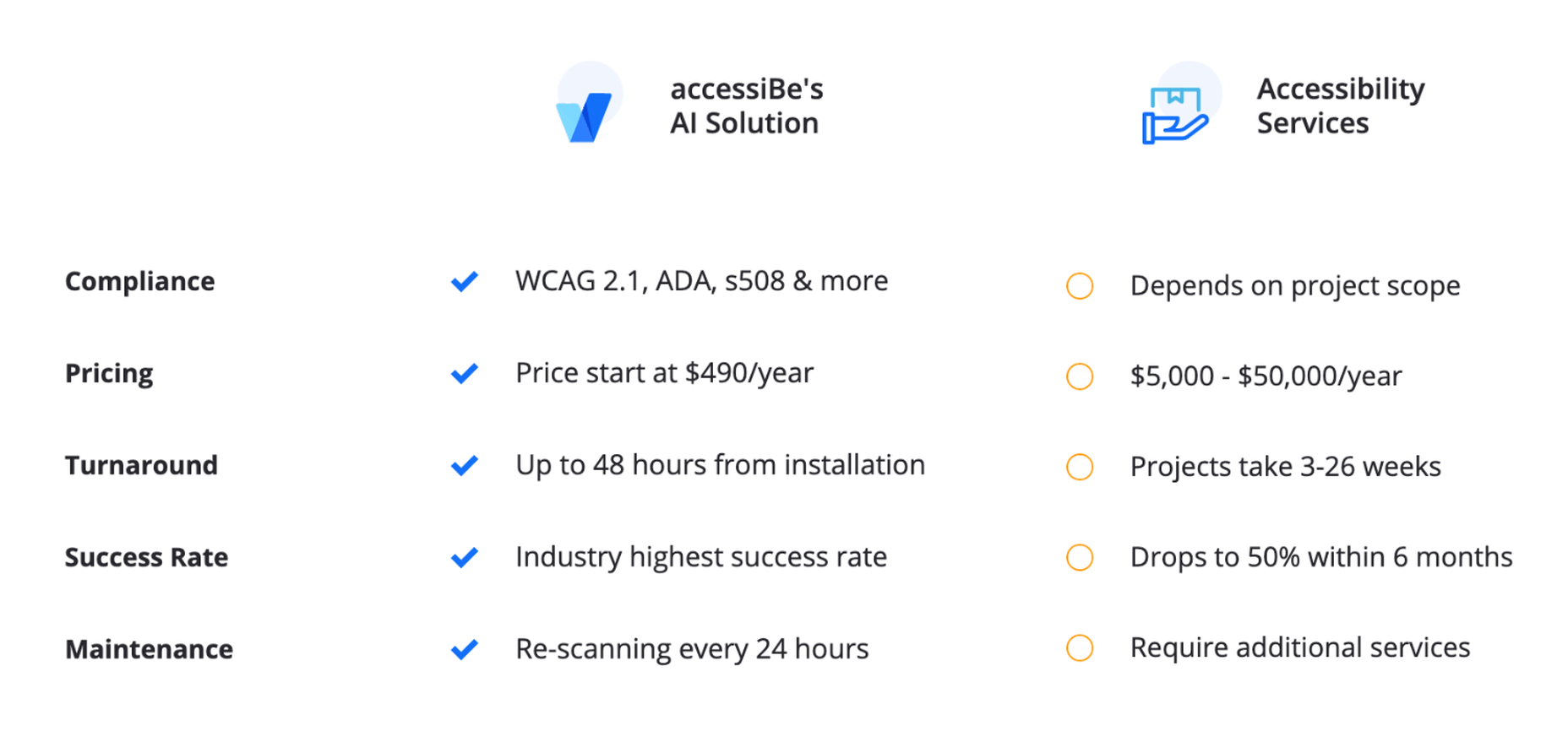
Comparison of accessiBe with Manual Accessibility Services
Manual accessibility services can help you achieve full accessibility compliance, but it comes with two major disclaimers:
- You’ll still need an additional solution for an accessibility interface, which the service companies don’t provide
- The compliance achieved is for the point in time the audit and remediation were performed. Let’s explain this point further.
Companies that offer a manual accessibility service assign a team of accessibility experts to do an audit of your website. The result of this audit is a lengthy document detailing all the accessibility faults that your website has. It is a valuable document as it gives you a precise depiction of what needs to be fixed in order to achieve compliance.
From here there are two possible paths:
You can either take the audit results to your development team and have them remediate your website accordingly.
Or, some of the service companies offer a remediation service, meaning, they’ll assign their own engineers to manually make the necessary changes in your website. Needless to say this extra service isn’t given for free.
In both cases, you are looking at a process that takes weeks if not months (depending on the number of pages your website has.)
Additionally, since it is a manual process done by experts, it comes with a hefty price tag.
But most importantly, the audit and remediation hold for the time they were done. Unless you have a 100% static website, meaning, you do not make any changes to your website – never add or remove products, never update content – the ‘effect’ of the audit and remediation fades away with time.
Since the process was manual, any changes you make to your website must be handled manually accessibility-wise. You added a new banner with a link to items on sale, you’ll need to go into the code and add ARIA tags. You added a new image, you’ll need to go into the code and add alt text compatible with screen-readers. And so on.
Some of the manual accessibility service companies offer maintenance services as well. They will periodically audit your website (manually) and provide a remediation document that will need to be implemented (manually) either by your development team or by theirs for an additional cost.
These costs add up. Having your website audited and remediated for compliance on an ongoing basis takes time, effort, and money. But you don’t have a choice. Being ADA and WCAG compliant is an ongoing task, since websites are dynamic and being updated regularly.
accessiBe, on the other hand, offers a 100% automated and ongoing compliance solution. The initial audit and remediation process is carried out – with no human intervention – in 48 hours (compared to weeks or months by a manual provider). Then, your website is scanned every 24 hours to identify and fix accessibility issues using accessiBe AI technology. Meaning, compliance maintenance is constantly carried out ‘in the background’ keeping you ADA & WCAG compliant at all times.
Which brings us to another crucial point regarding manual accessibility services. They make it extremely hard for you to scale up. Every business has a constant aim to grow, but with a manual accessibility service, scalability becomes a pain point. The more you grow the more time, effort and money you need to put in to remain compliant. You want to add another section to your website, you want to launch an additional website? Using a manual accessibility service will hold you back. You’ll need to account for additional time before going live to manually enable accessibility and additional funds. For fast-moving companies, time becomes a serious burden.
Since accessiBe offers an automated and ongoing accessibility solution, scalability is not an issue.
Benefits of Using accessiBe Over Manual Accessibility Services
- Time-efficient
- Cost-effective
- 100% automated
- Ongoing compliance
- Infinite scale
- Single provider for full compliance (front end and back end)
How to Check Your Web Accessibility Compliance Level
Before you get started on your path to being ADA & WCAG compliant it’s important to understand the current state of accessibility your website provides.
Obviously, if you’ve never taken any steps to make your website accessible to individuals with disabilities, there’s no need for this – your website isn’t accessible in any way.
This is actually highly important if you have taken steps to make your website accessible, like for example, installing one of the accessibility plugins. You might be under the impression that by doing so your website is both compliant and accessible to individuals with disabilities.
There’s a simple and quick way to face the accessibility reality.
accessiBe offers a free, automated compliance audit tool available online named aCe. It uses accessiBe AI technology to scan your site, detect accessibility issues and provide quite a detailed report on the various elements that impact your website’s accessibility, and those include:
- General score
- Clickables
- Titles
- Orientation
- Menus
- Graphics
- Forms
- Documents
- Readability
- Carousels
- Tables
Each of these elements is given a score and some explanations to the specific issues that need attention within the context of these elements.
In addition to gaining a compliance audit with the remediation steps needed to be taken in order to fix these issues, aCe gives you a very clear idea of where you stand and what needs your attention in order to achieve compliance.
We gave it a try. We ran a website that has installed one of the accessibility plugins (which was recognized, by name, by the aCe audit tool) and the results cement the point that these plugins aren’t comprehensive enough of a solution for true ADA & WCAG compliance.
Here are the results:
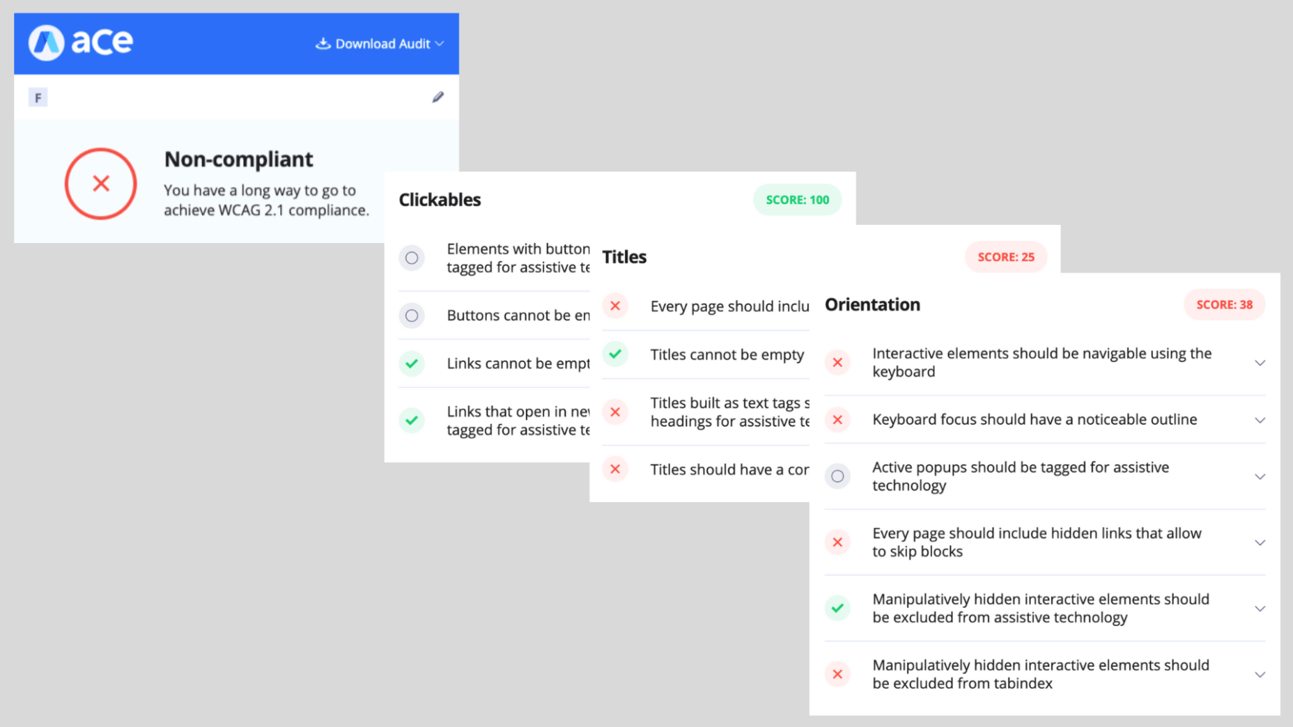
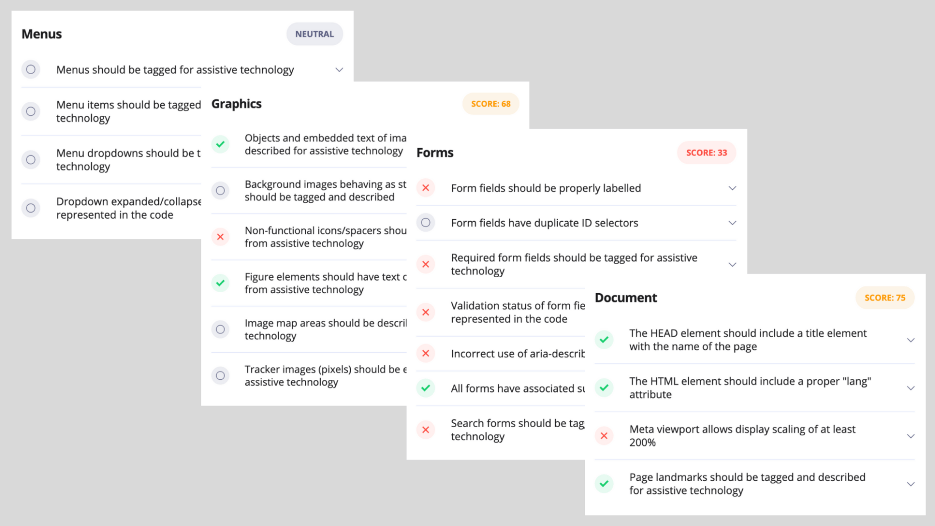
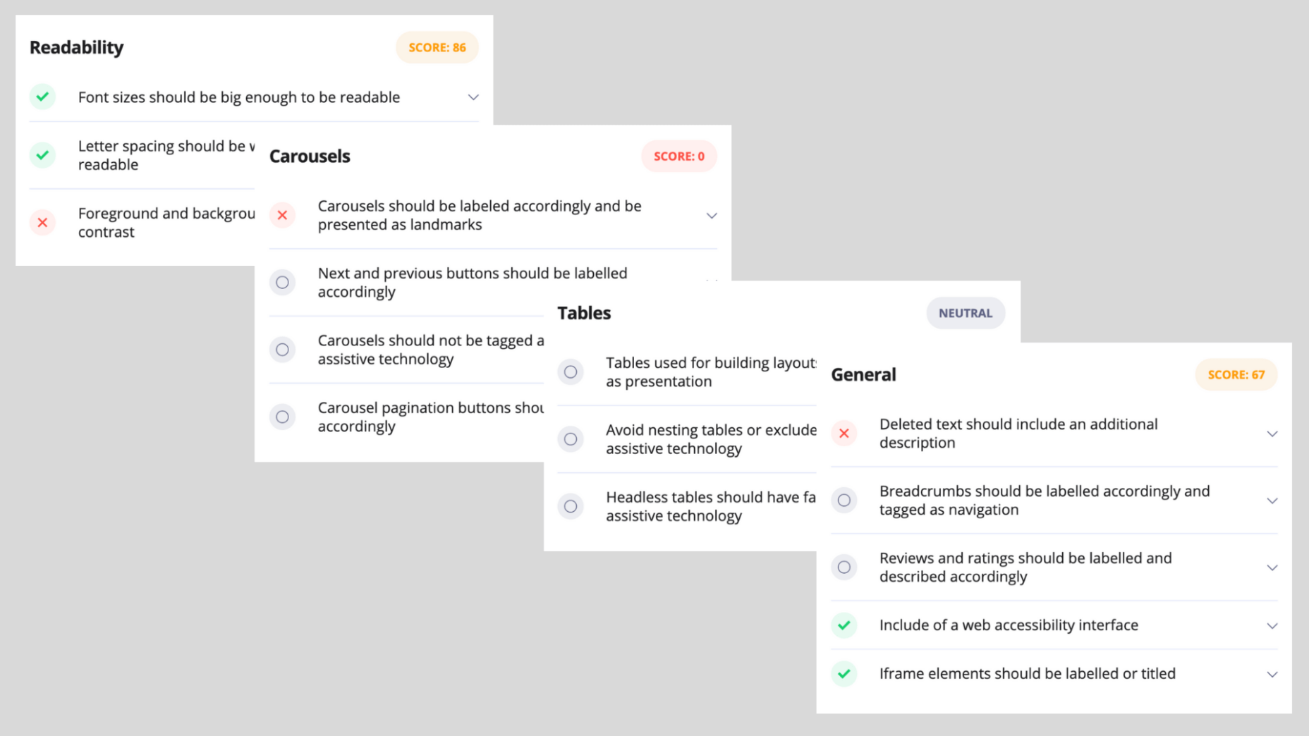
As can be expected, the UI and design side got relatively high scores, due to the accessibility plugin installed on the website, but anything that has to do with back end compatibility with screen readers and keyboard navigation got a failing score.
Conclusion
accessiBe is an automated and comprehensive web accessibility solution that achieves ongoing compliance with ADA and WCAG regulations for your website.
It offers a unique combination of front end and back end compatibility, meaning, it provides an end-to-end solution for both user-facing accessibility interface, and compatibility with screen readers and keyboard navigation.
The solution offered by accessiBe is a no-touch, no-code, continuous compliance utilizing proprietary AI technology that audits and remediates your website.
It is by far one of the most affordable web accessibility solutions, starting at $490 for websites with up to 1,000 unique pages.
When compared to accessibility plugins, accessiBe’s offering is robust and comprehensive, delivering full compliance that plugins aren’t able to.
When compared to accessibility manual services, accessiBe offers a speedy and automated audit and remediation process compared to the lengthy, manual and highly expensive offering of the service companies. Additionally, accessiBe, unlike accessibility manual services, delivers ongoing compliance and the ability to scale with ease and speed.
The combination of AI-based audit and remediation, the most comprehensive accessibility interface on the market, ongoing compliance, scalability, and a highly affordable plan makes accessiBe stand out from the competition by offering a unique end-to-end solution for achieving ADA and WCAG compliance in a fast and simple way.
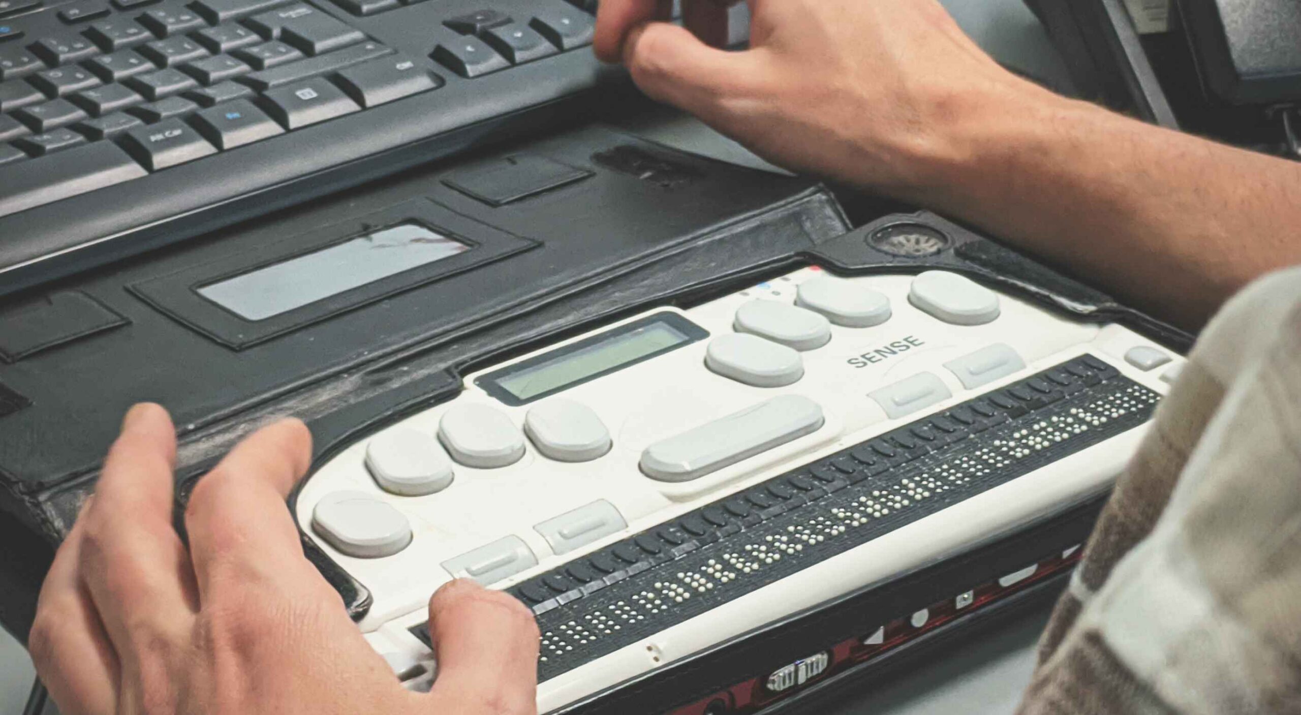
Featured image via Unsplash.
Source de l’article sur Webdesignerdepot
 Every week users submit a lot of interesting stuff on our sister site Webdesigner News, highlighting great content from around the web that can be of interest to web designers.


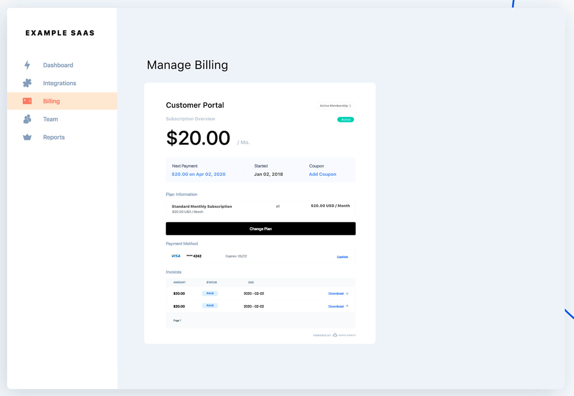
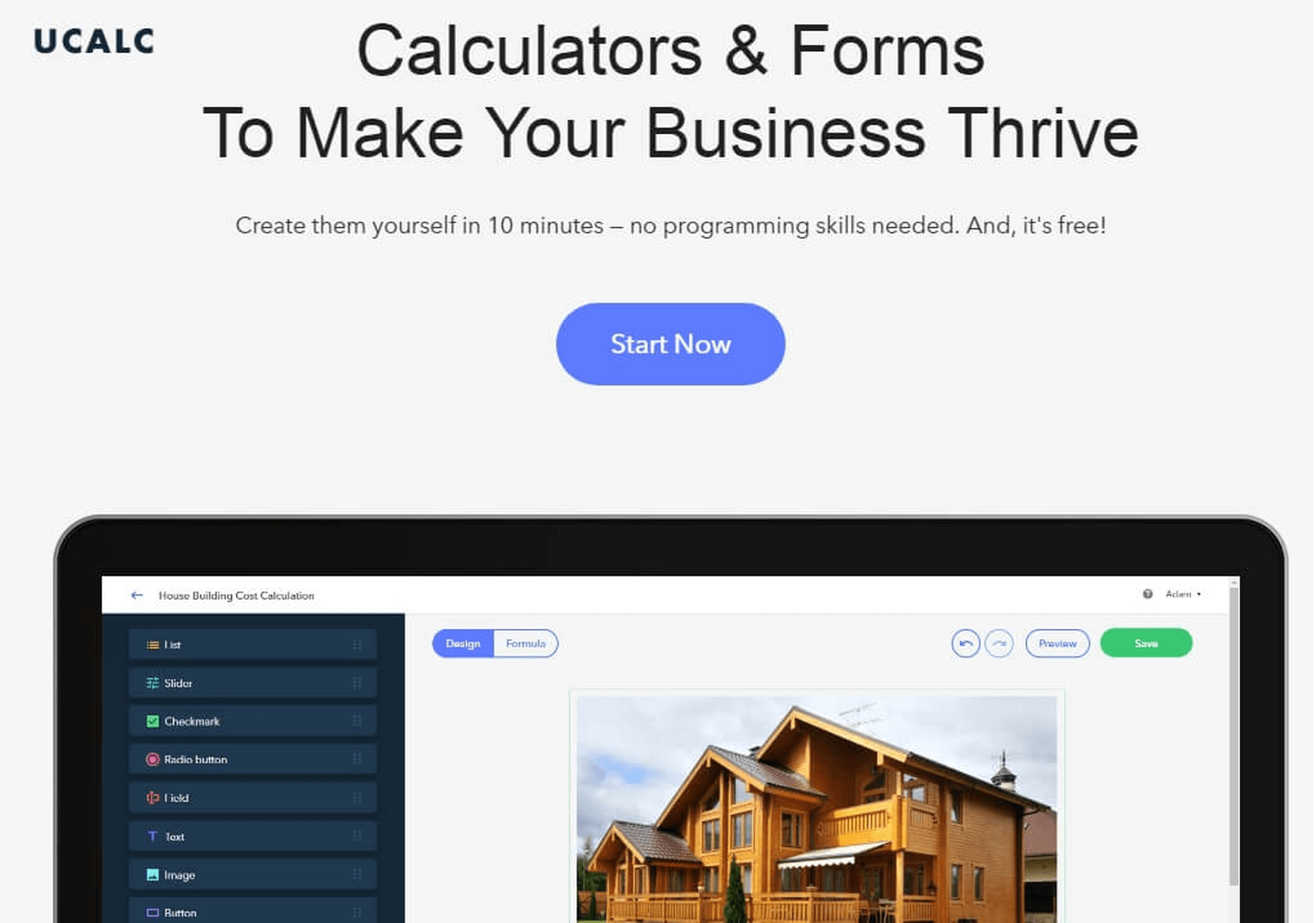
 There are so many things to think about when first starting a business. What will your business offer? How will this differ from existing solutions? Who will benefit most from your offering? And why are you so passionate about this?

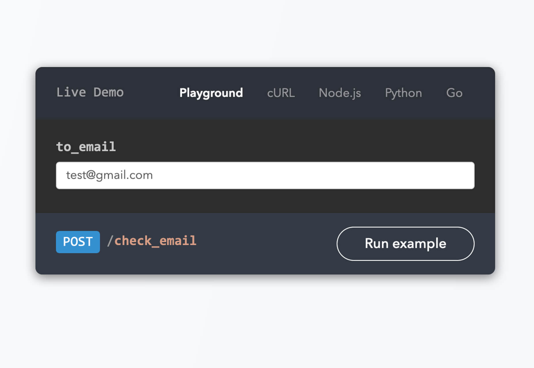
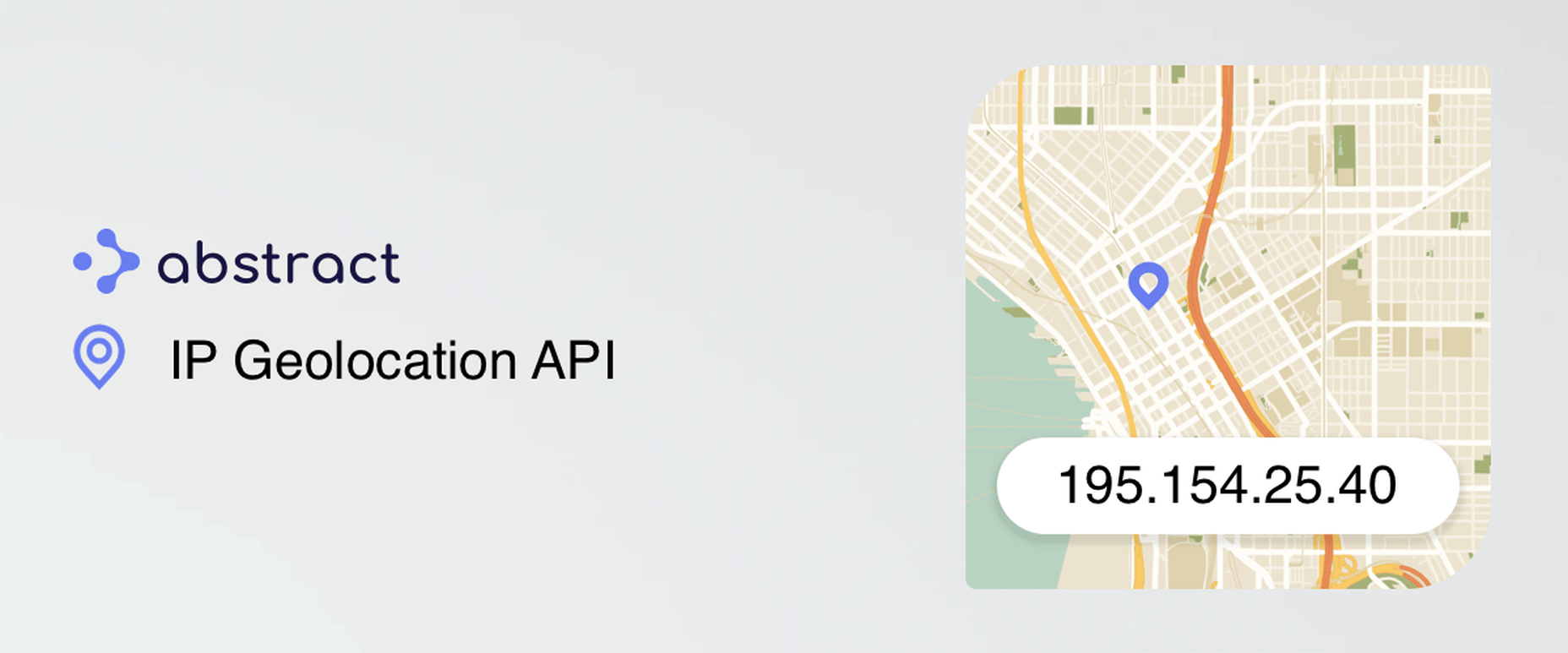
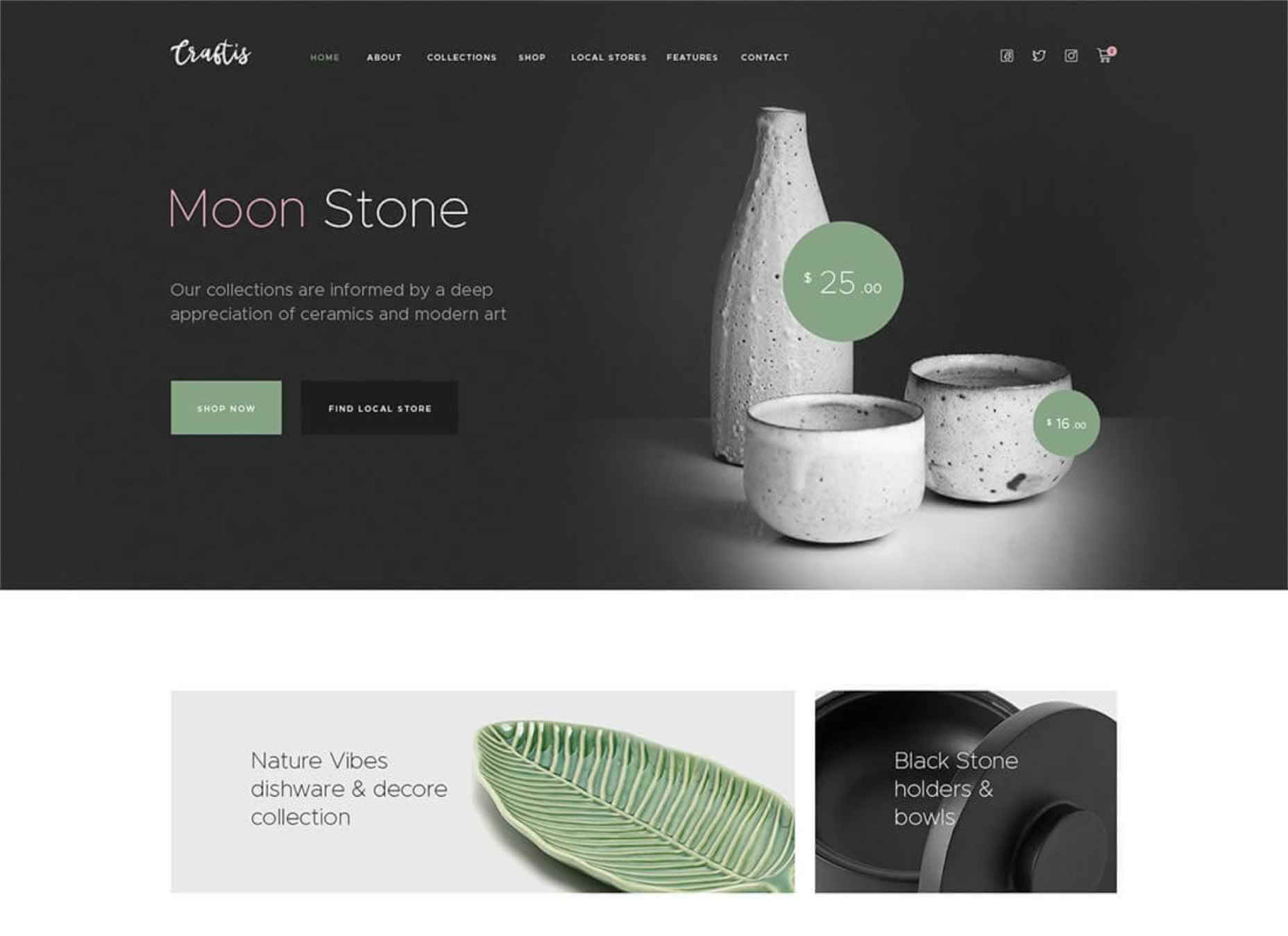
 This month’s collection of new tools, resources, and freebies for designers is a smorgasbord of sorts. You’ll find everything from useful APIs to icons to tutorials to fonts.


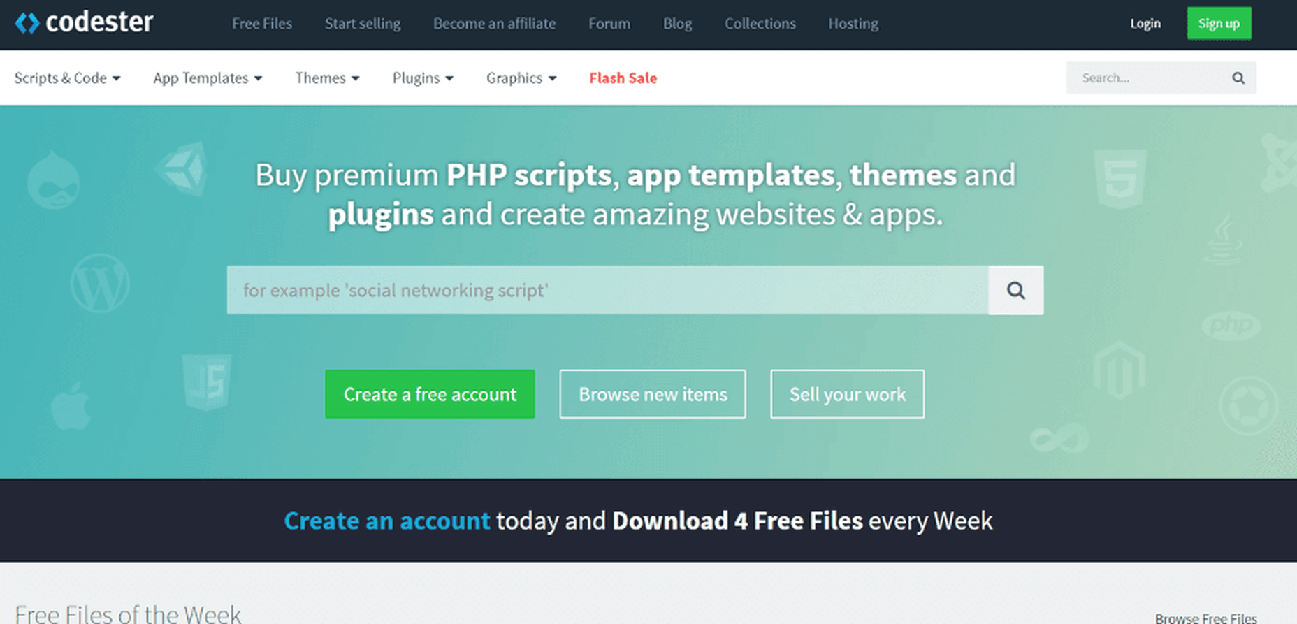
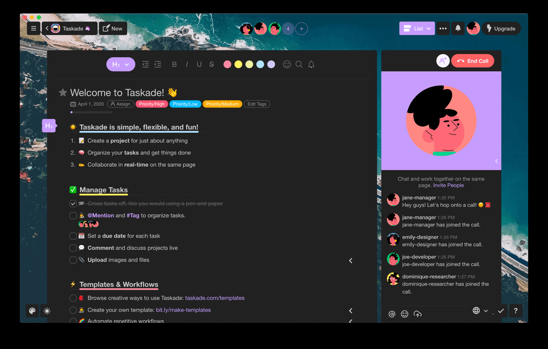
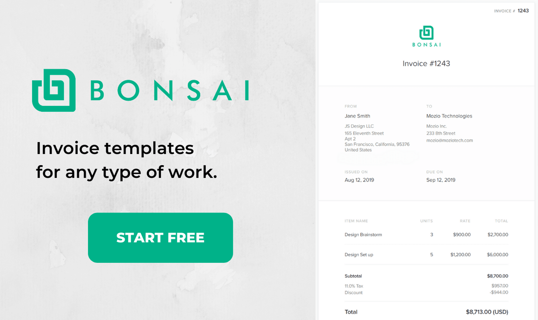
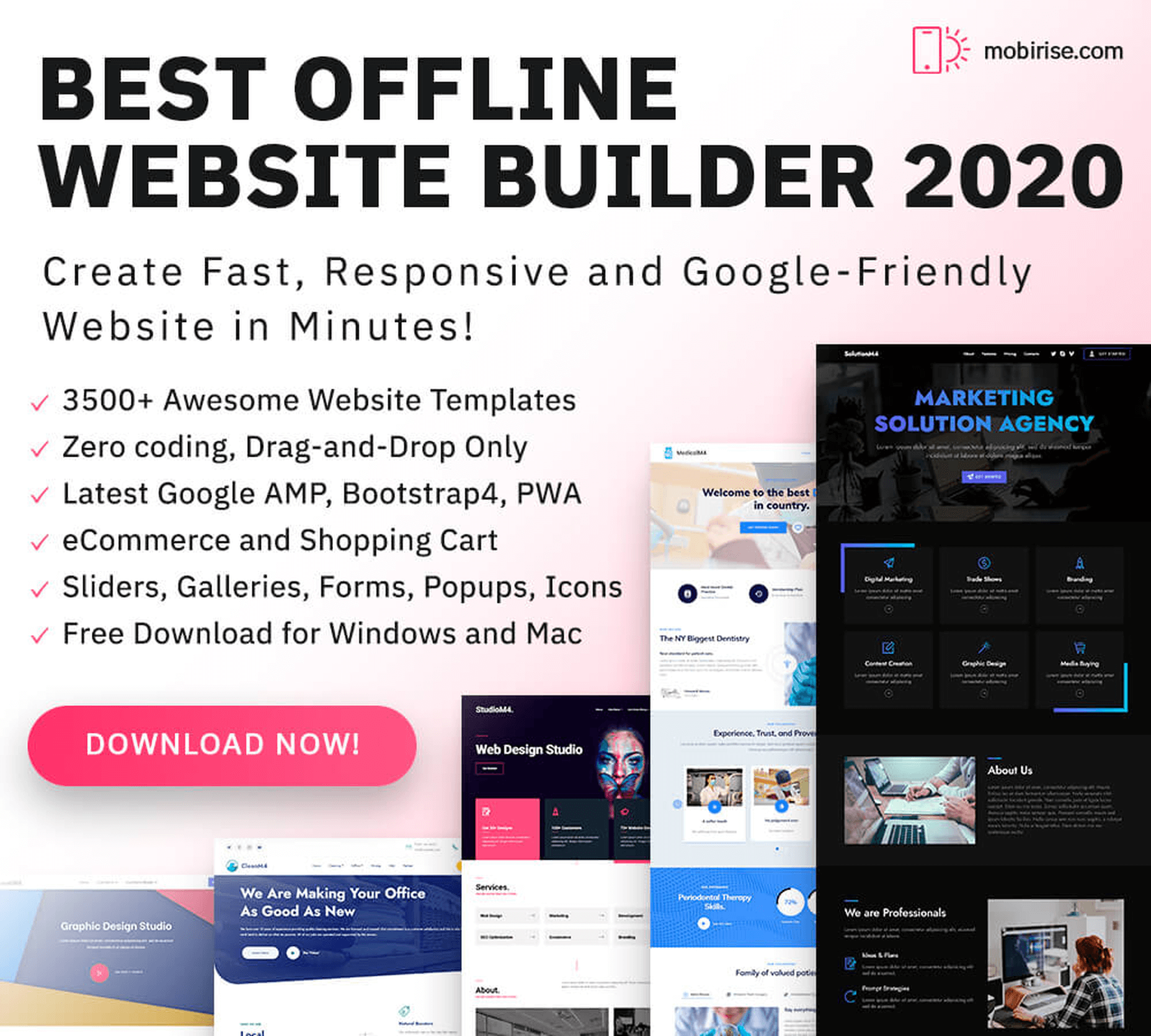
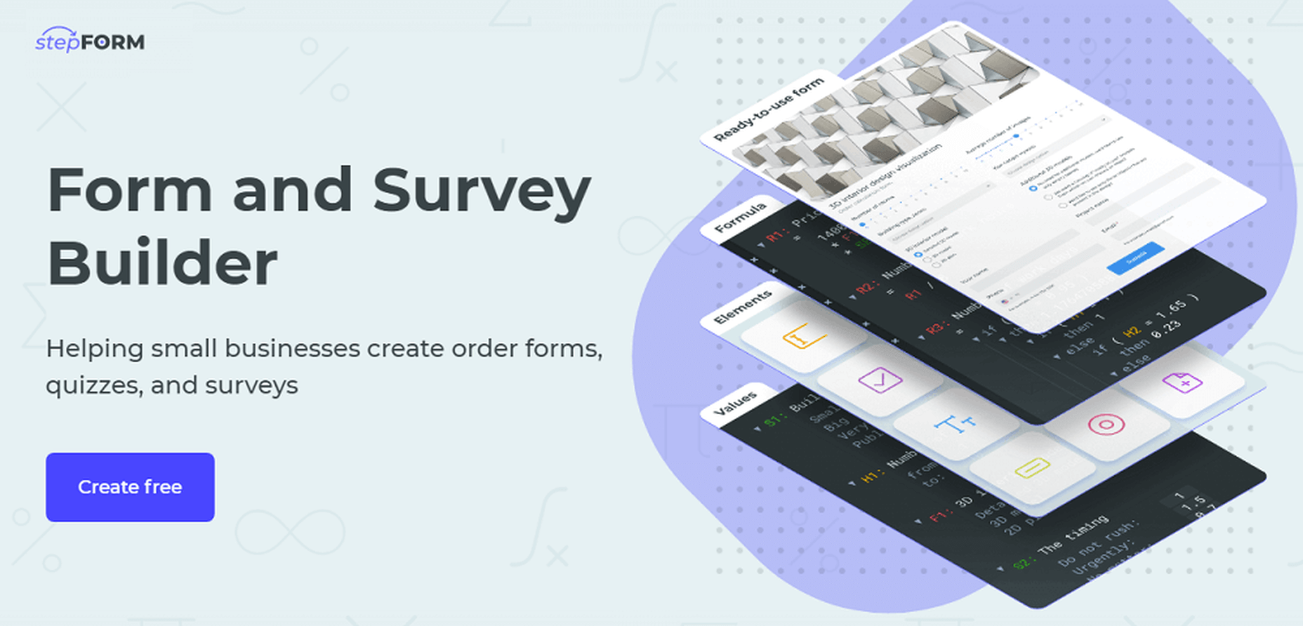
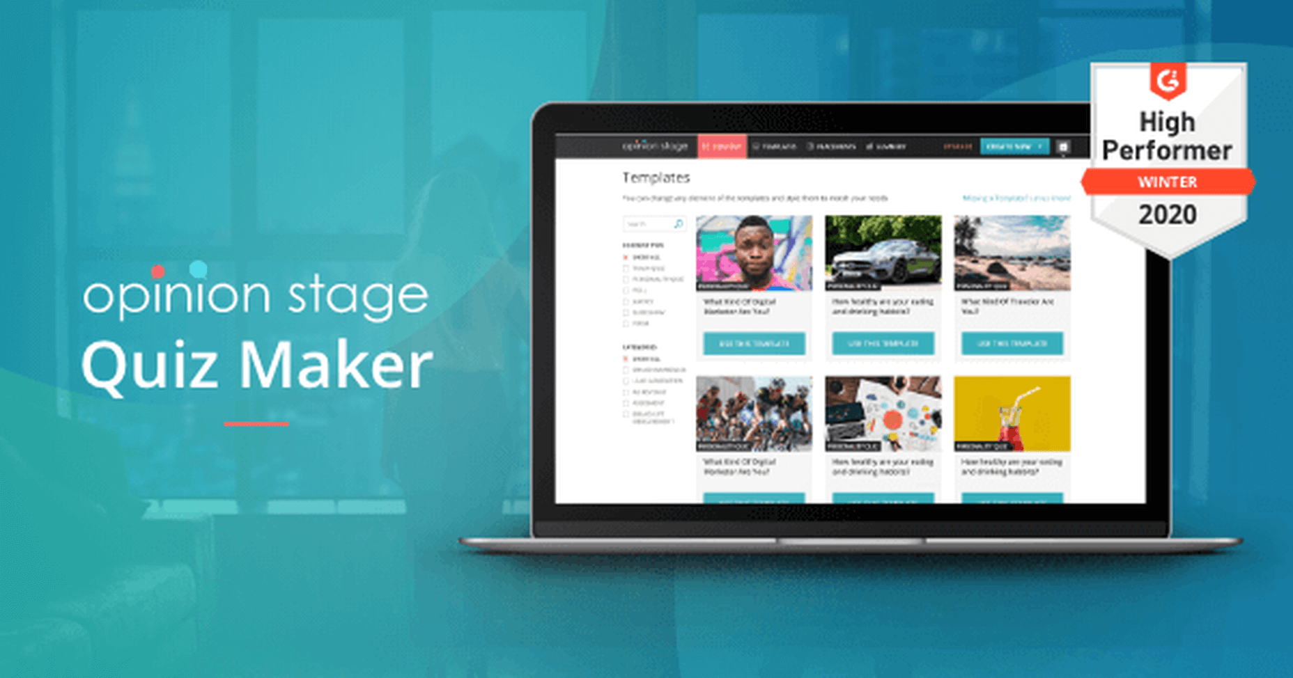
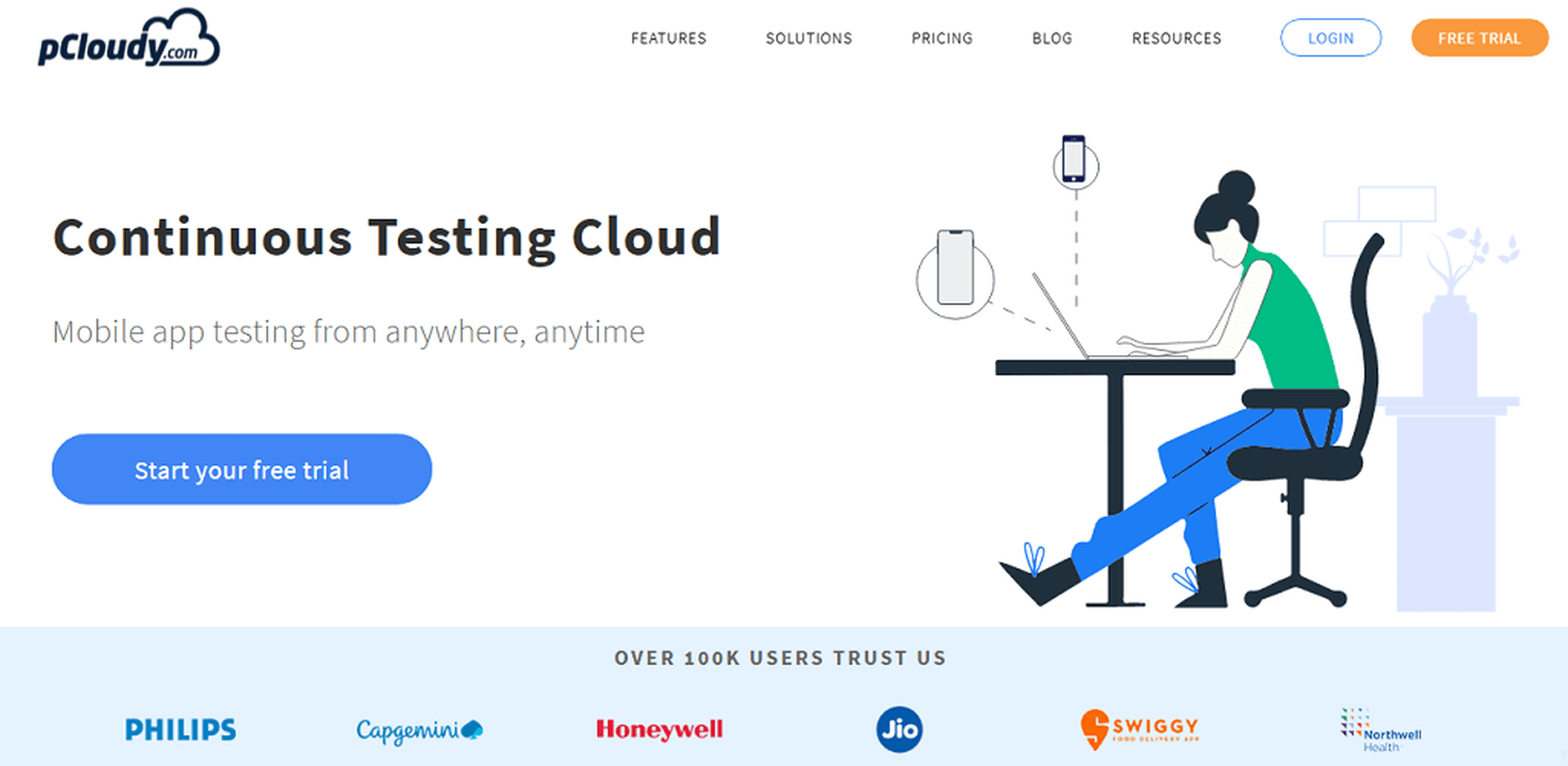
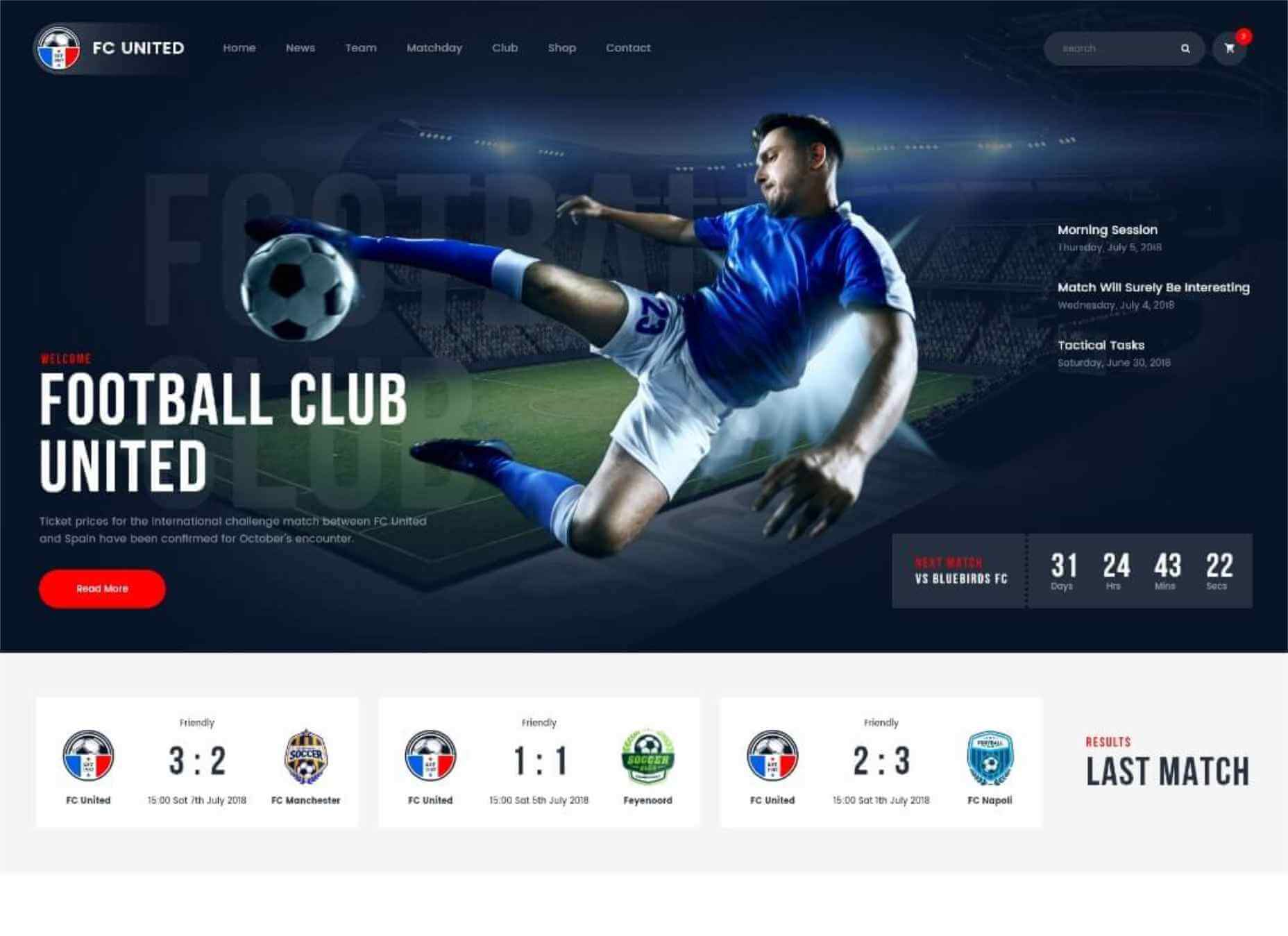
 In this article you will find the most appreciated web solutions of 2020.
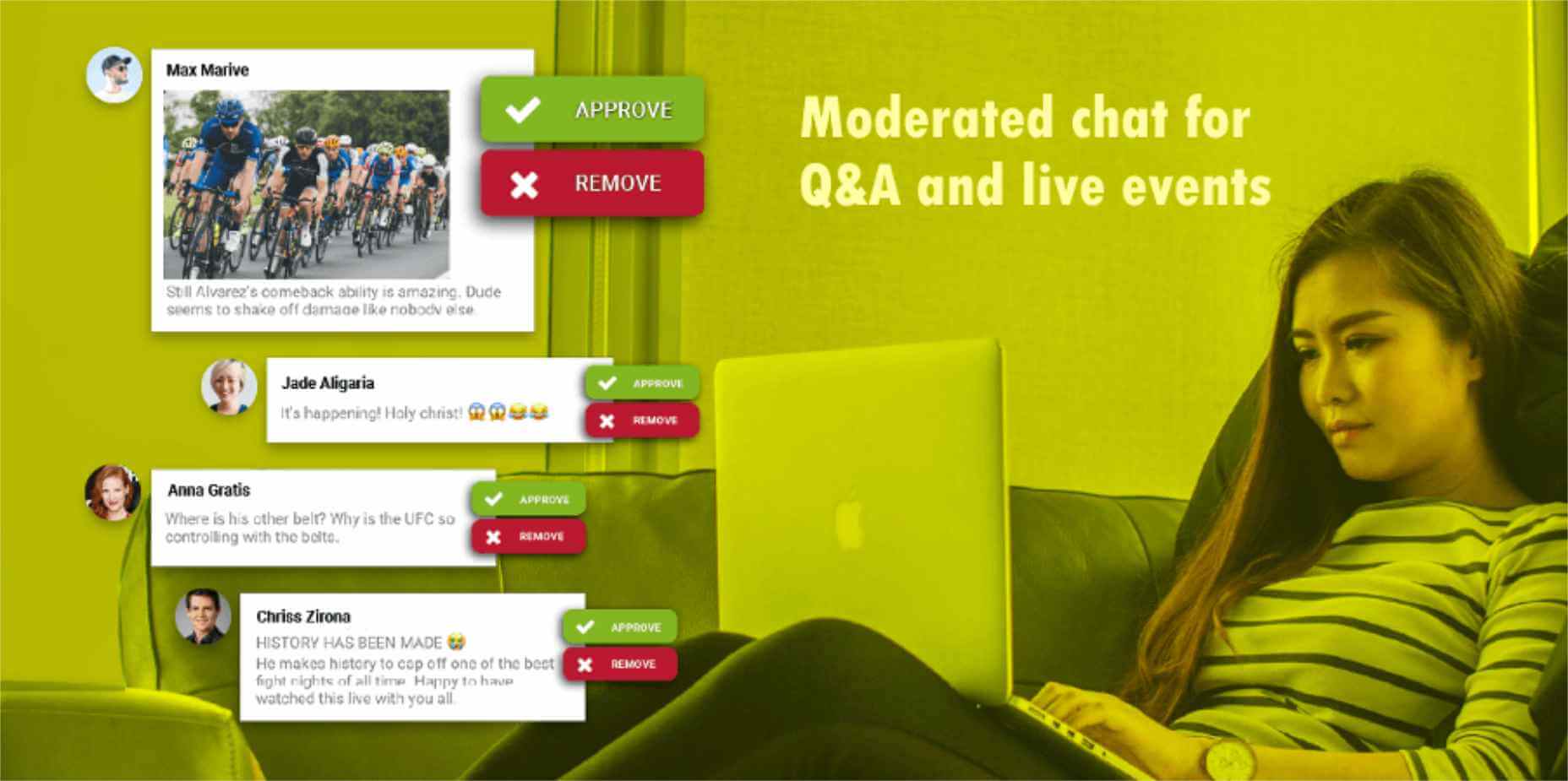
 The common theme in this month’s collection of new tools and resources is “things that help you show off your work.” Many of these tools are made to help you better web products or apps or showcase designs with others.


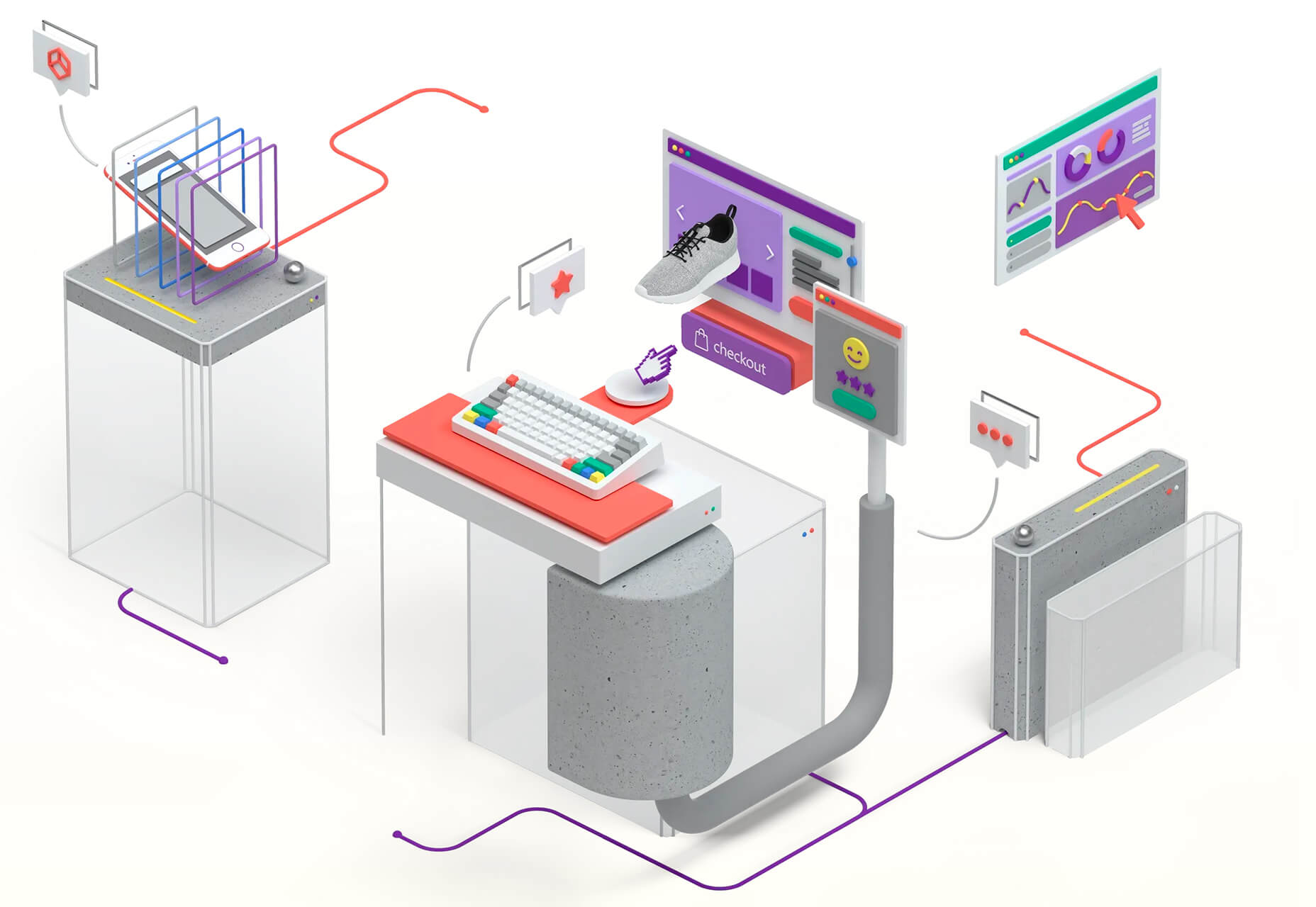
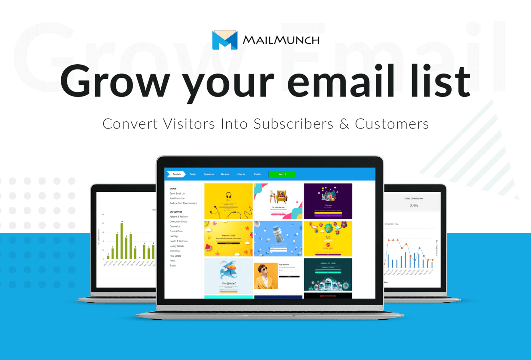
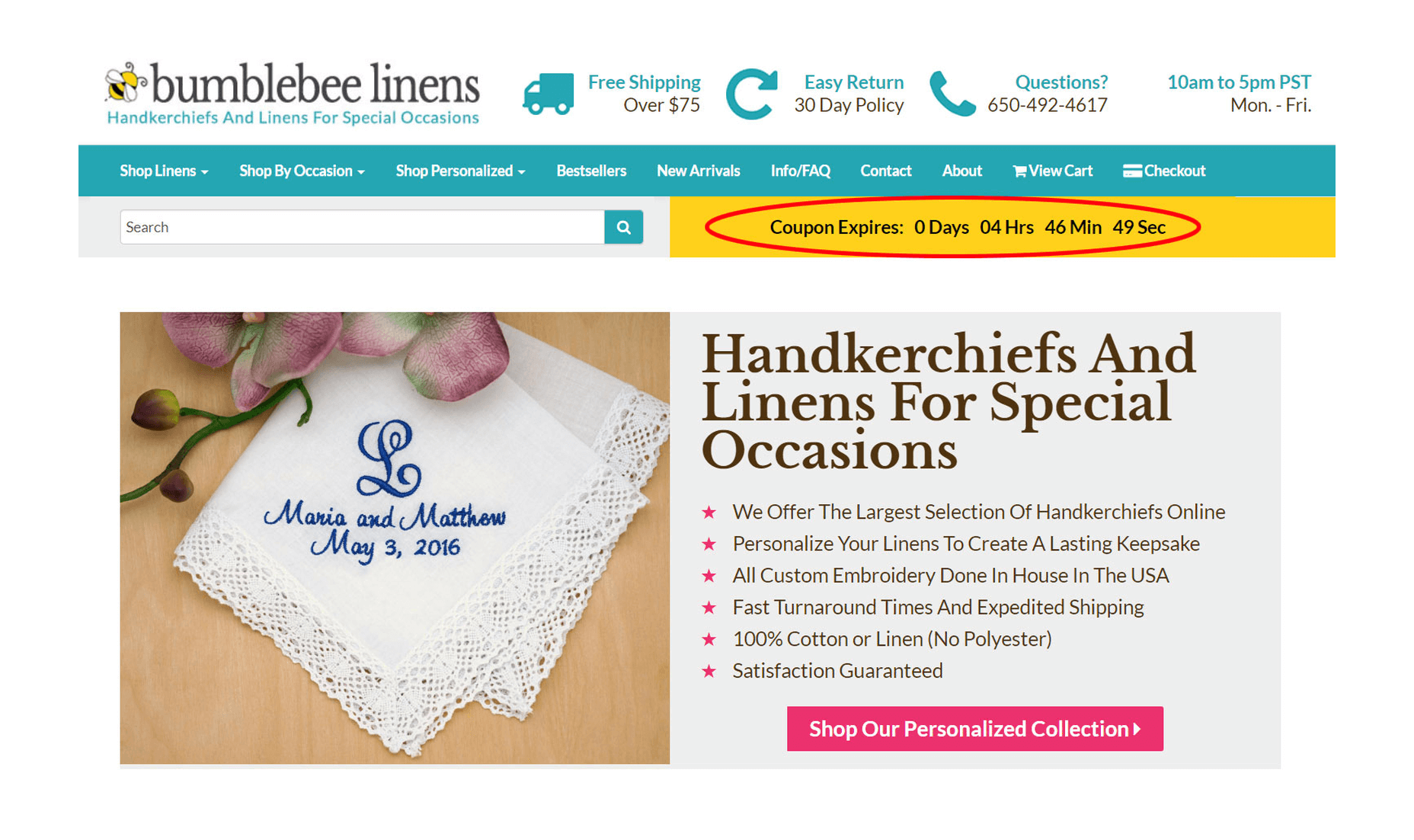
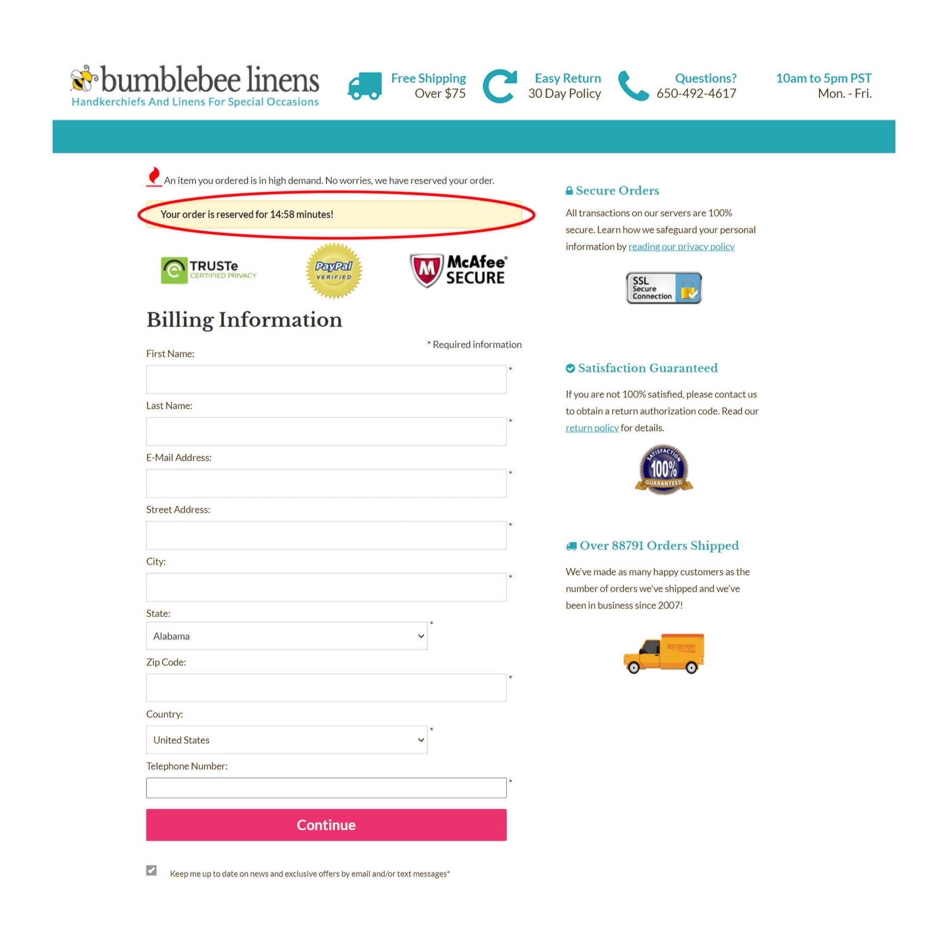
 When it comes to increasing sales for your ecommerce store, there are 3 levers you can pull: You can increase your average order value; You can increase the amount of traffic to your site; You can increase your conversion rate.

 Web design clients come from a


