Articles

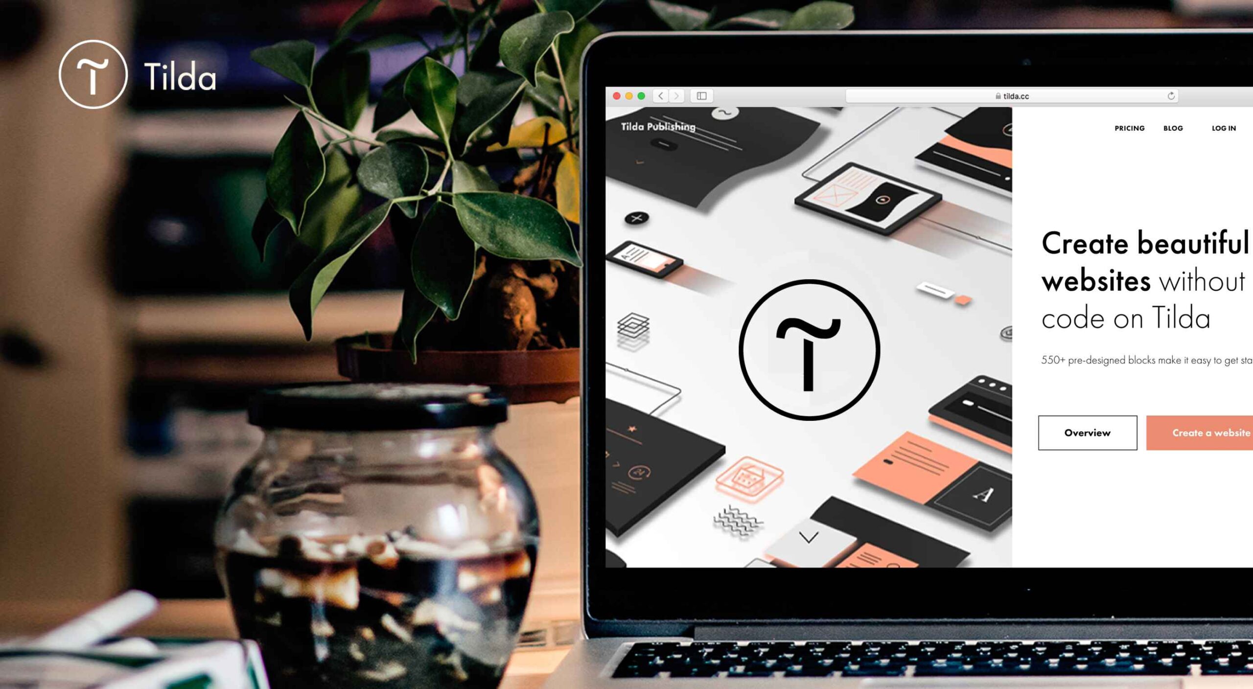
Tilda website builder combines everything we liked so much about constructors when we were kids – you can experiment, test out and build myriads of new creative ideas out of ready-to-use blocks. Tilda is that type of constructor that allows you to own your creative process and create pretty much any website: landing page, business website, online store, online course with members area, blog, portfolio, or event promo page.

Founded seven years ago, Tilda is a website builder that completely revamped the way we create websites. Tilda has been the first website builder to introduce block mechanics that allows users to create websites out of pre-designed pieces. This breakthrough technology allowed all users – not only designers – to create professional-looking websites. Just like in kid constructors, you can drag-and-drop and mix-and-match blocks on Tilda to let your creativity flow and build a dazzling website, at extraordinary speed. 

When you ask designers why they love Tilda, they usually say it’s because the platform provides the ultimate balance between choosing from templates and being able to fully customize and create from scratch to bring any creative idea to life. Here’s what else they say:

Tilda has been a game-changer for us. It allows our team to quickly spin up new web pages, make edits, and ship new programs. We left WordPress for Tilda and after being with Tilda for 2 years, I don’t ever want to go back.

~ Andy Page, Executive Director, Forge.

I built my first website in 2001. Since then I’ve used countless platforms and website builders for customer websites and my own business. Tilda is the perfect combination of ease of use with powerful features at an unbeatable value.

~ Robby Fowler, Branding and Marketing Strategist, robbyf.com & The Brand ED Podcast.

Let’s dive deeper into core functionalities you can leverage on Tilda. 

#1 Cut Corners With 550+ Pre-Designed Blocks And 210+ Ready-Made Templates

The beauty of Tilda is that it provides 550+ blocks in the ever-growing Block Library designed by professional designers. Thus, you can quickly build a website out of pre-designed blocks that encompass virtually all elements you might need for your website: menu, about us page, features, contact, pricing, etc. 

Customizing each block is a breeze with Tilda: You can drag-and-drop images, edit text right in the layout, alter block height, background color, padding, select the style of buttons, use custom fonts, and assign ready-made animation effects to specific parts of it. Also, Tilda provides a built-in free image library with 600K+ images, so you can find images that are just right for you without leaving Tilda, add them to your website with just one click, and use them for free.

Finally, all blocks fit together so well that it’s almost impossible to create a bad design on Tilda – even if you are a stranger to website building.
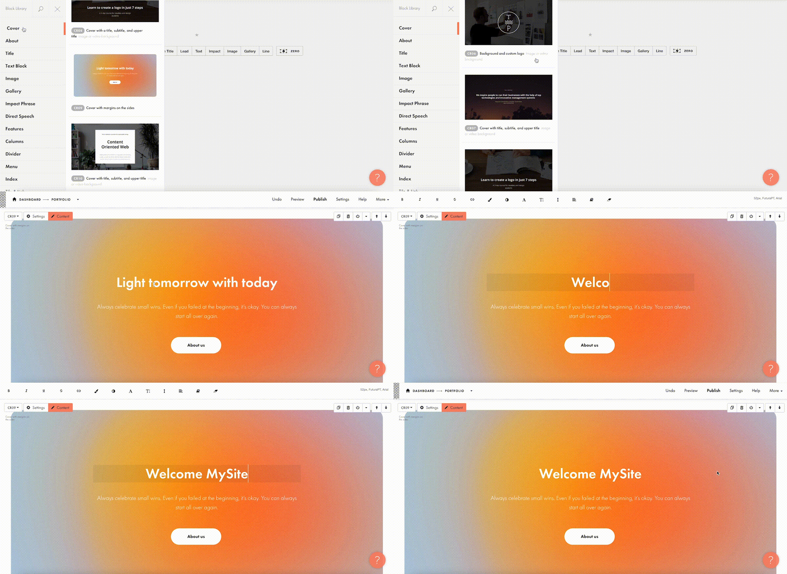
For a quick take-off, you can use 210+ ready-made templates for different kinds of websites and projects: online stores, landing pages, webinar promo pages, multimedia articles, blogs, and more. Each template is a sample of modern web design and consists of blocks. It means that templates don’t limit your creativity: you can modify them to your liking by playing with settings, adding extra or removing existing blocks, and embedding images and text. 
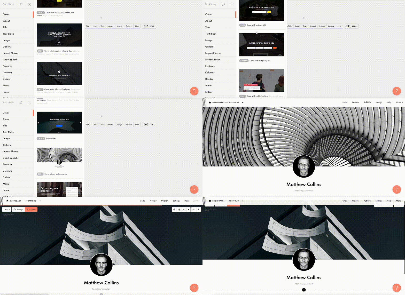
Each of the templates and blocks covers over 90% of use cases you’ll ever require and is mobile-ready, meaning that your website will look great on desktop computers, tablets, and smartphones by default.

#2 Jazz Up Your Site With Zero Block: Professional Editor For Web Designers 

To better meet the demands of a creative brief and unleash your creativity, you can use Tilda’s secret weapon called Zero Block. It is a tool for creating uniquely designed blocks on Tilda.

You can control each element of the block, including text, image, button, or background, and decide on their position, size, and screen resolution on which they’ll appear. For example, you can work with layers to create depth with overlay and opacity techniques or set a transparency level on any element and shadow effects below them. Additionally, you can also insert HTML code to add more complex elements, such as calendars, paywall, comments, social media posts, and so much more.  
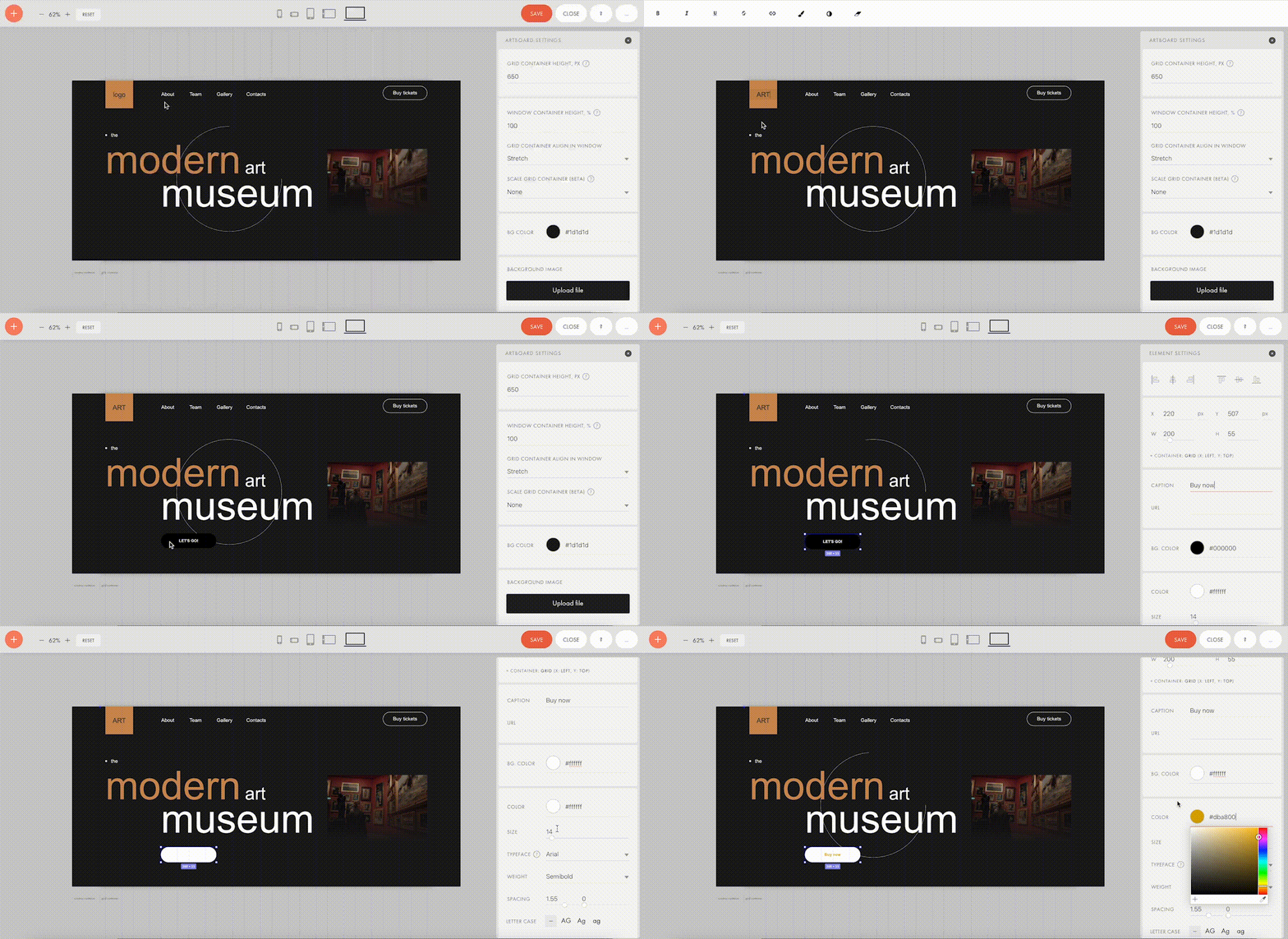
Finally, Zero Block allows you to fool around with basic and more advanced step-by-step animation for a more individual look. Here’re some animation examples that you can make on Tilda:

Animation on scroll (position of elements is changing on scroll).
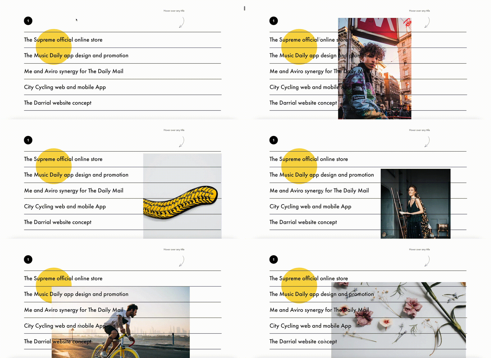
Trigger animation (animation is triggered when pointing at or clicking on an object).

Infinite scrolling text.

#3 Import Designs From Figma To Tilda In Minutes

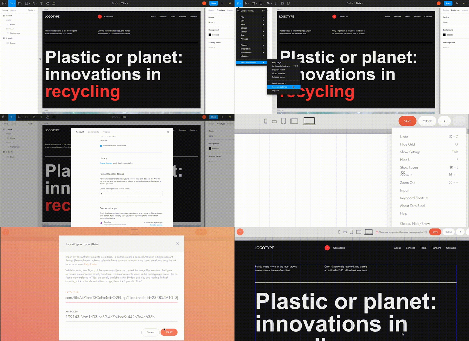
Creators love using Figma for prototyping, but when you have to transfer every element and rebuild your website design from scratch – that’s what’s killing the party. With Tilda, you can easily turn your static designs into an interactive website in no time. 

All it takes is to prepare your Figma design for import with a few easy steps, paste the Figma API token and your layout URL to Tilda, click import and let the magic happen. Once your design is imported, you can bring your project online just by clicking publish.
#4. Make Search Engines Love Your Website With Built-In SEO Optimization

Thanks to the consecutive positioning of blocks on the page, websites designed on Tilda are automatically indexed well by search engines. There is also a set of SEO parameters you can fine-tune right inside the platform to ensure that your web pages rank high even if you don’t have an SEO specialist in-house. These parameters include the title tag, description and keywords meta tags, reader-friendly URLs, H1, H2, and H3 header tags, alt text for images, and easily customizable social media snippets. 

As an additional value, Tilda provides an SEO Assistant that will show you what errors are affecting the indexing of your website and will help test the website for compliance with the search engines’ main recommendations.

#5. Turn Visitors Into Clients

Tilda gives you the power to set up data capture forms and integrate them with 20+ data capture services, such as Google Sheets, Trello, Notion, Salesforce, Monday.com, etc., to ensure seamless lead generation.

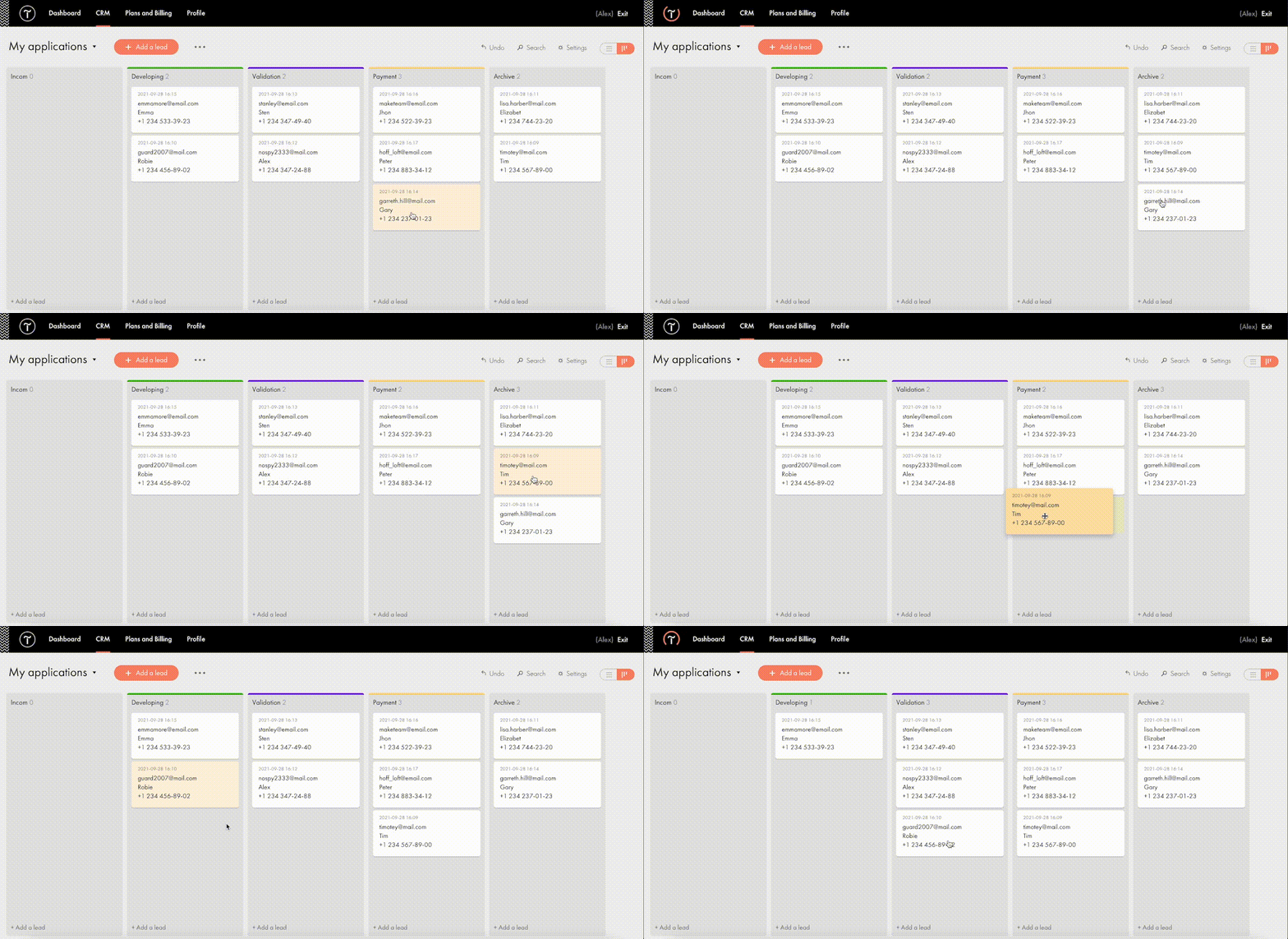
For more fun, Tilda developed its CRM to manage your leads better and keep your business organized right inside of a website builder. This is a very easy-to-use tool that automatically adds leads from forms and allows you to manually add leads you captured outside of the website. There is a kanban board that gives you an overall view of how leads are moving through your sales funnel and allows you to move leads between stages easily.
#6. Build A Powerful Online Store In One Day

Tilda provides a set of convenient features to create a remarkable online shopping experience. The platform gives you the power to sell online using ready-made templates or build an online store completely from scratch, add a shopping cart and connect a payment system of choice — Stripe, PayPal, 2Checkout, etc. — to accept online payments in any currency.

If you are looking to run a large ecommerce business, you should also consider Tilda. Thanks to the built-in Product Catalog, you can add up to 5000 items, import and export products in CSV files, easily manage stock, orders, and keep track of store stats.
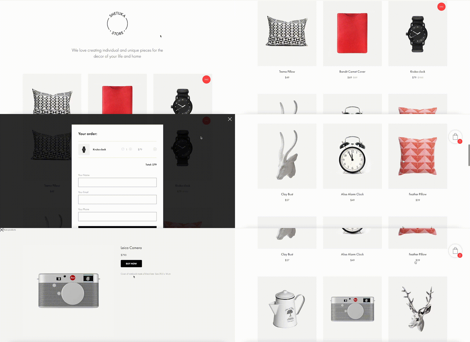
And thanks to adaptive design, your store will look good across all devices, including tablets and smartphones. 

#7. Bring Your Project Online For Free

Tilda offers three subscription plans: Free, Personal ($10/month with annual subscription), and Business ($20/month with annual subscription). When you sign up for Tilda, you get a lifetime free account. It allows you to publish a website with a free subdomain and gives you access to a selection of blocks and a limited number of features that offer enough to create an impressive website. 

Personal and Business tariffs allow more advanced options, such as connecting custom domains, adding HTML code, receiving payments, and embedding data collection forms. The business plan also allows users to export their website and create five websites (while personal and free plans allow one website per account). 

To discover all features and templates on Tilda, activate a two-week free trial – no credit card required.

Source

The post Tilda – The Website Builder That Disrupted The Way We Create Websites first appeared on Webdesigner Depot.


Source de l’article sur Webdesignerdepot

PageSpeed Insights is a free performance measurement tool provided by Google. It analyzes the contents of a web page for desktop and mobile devices. It provides a single number score (from 1 to 100) that summarizes several underlying metrics that measure performance. If you have not run PageSpeed Insights on your website, then you should stop and do it now. It’s an important indicator of how Google scores and ranks your site.

If your PageSpeed Insights score is below 80, don’t panic. You are not alone. Many websites are not optimized for performance. The good news is that you can take steps that should immediately improve your score.

You will notice that PageSpeed Insights highlights issues that cause slow page loading. However, you might need more guidance to resolve these issues. Below, we walk you through how to resolve four common issues related to images. We also show you how ImageEngine, an image CDN, can simplify, automate, and deliver the best image optimization solution possible.

Performance Drives Google SEO Rankings

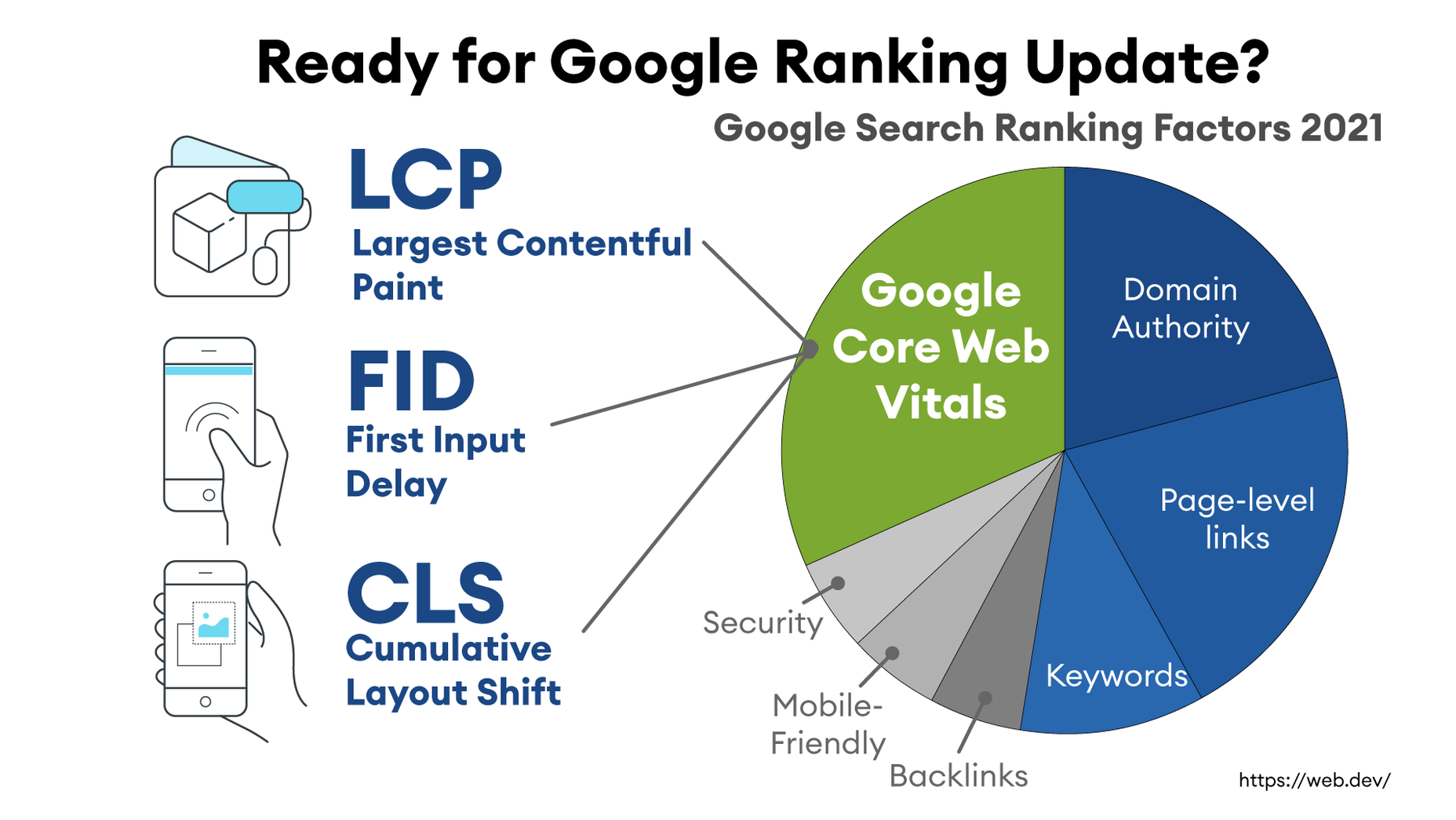
Why does the PageSpeed Insights score and performance matter? Isn’t SEO ranking all about content relevance, backlinks, and domain authority? Yes, but now performance matters more than it did a year ago. Starting in 2021, Google added performance metrics to the factors that impact search engine rankings. In a market where websites are constantly jockeying to match their competition’s pages (for content relevance, keywords, and other SEO issues), performance is making a difference in keyword search engine rankings.

What Are Core Web Vitals Metrics?

PageSpeed Insights relies on a set of performance metrics called Core Web Vitals. These metrics are:

Largest Contentful Paint (LCP): Measures the render time (in seconds) of the largest image or text block visible within the viewport, relative to when the page first started loading. Typically, the largest image is the hero image at the top of pages.

First Input Delay (FID): Measures the time from when a user first interacts with a page (i.e. when they click a link, tap on a button, or use a custom JavaScript-powered control) to the time when the browser is actually able to begin processing event handlers in response to that interaction.

Cumulative Layout Shift (CLS): Measures the layout shift that occurs any time a visible element changes its position from one rendered frame to the next.

Images and JavaScript are the Main Culprits

PageSpeed Insights breaks down problems into categories based upon how they impact these Core Web Vitals metrics. The top two reasons why you might have a low score are driven by JavaScript and images.

JavaScript issues are usually related to code that either blocks or delays page loading. For example, lazy-loading images might involve JavaScript that blocks loading. As a rule of thumb, do not use a third-party JavaScript library to manage image loading. These libraries frequently break the browser’s built-in image loading features. Lazy-loading may make above-the-fold images load slower (longer LCP) because the browser starts the download later and because the browser first has to execute the JavaScript.

Another JavaScript issue involves code that is large or unnecessary for the page. In other words, code bloat. There are good resources for resolving these issues on the web. However, in this blog, we will focus on image problems.

Images are a major contributor to poor performance. The average website payload is 2MB in 2021, and 50% of that is images. Frequently, images are larger than they need to be and can be optimized for size with no impact on quality…if you do it right.

Four Image Issues Highlighted by PageSpeed Insights

Largest Contentful Paint is the primary metric impacted by images. PageSpeed Insights frequently recommends the following four pieces of advice:

  1. Serve images in next-gen formats.
  2. Efficiently encode images.
  3. Properly size images.
  4. Avoid enormous network payloads.

That advice seems straightforward. Google provides some great advice on how to deal with images in its dev community. It can be summarized in the following steps:

  • Select the appropriate file format.
  • Apply the appropriate image compression.
  • Apply the right display size.
  • Render the image.
  • Write responsive image code to select the right variant of the image.

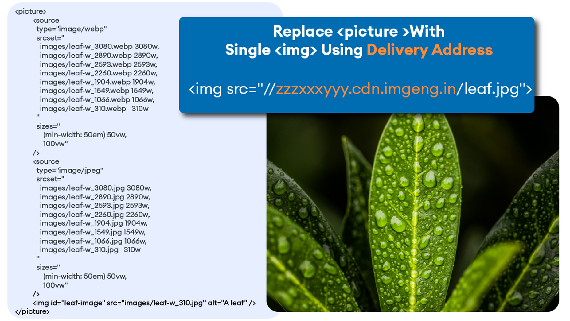
We call Google’s process the “Build-Time Responsive Syntax” approach. If you have a relatively static website where you don’t generate new pages or switch out images frequently, then you can probably live with this approach. However, if you have a large and dynamic site with many images, then you will quickly feel the pain of this approach. Google itself stresses that developers should seek to automate this image process. Why? Because the process has some serious workflow drawbacks:

  • Adds storage requirements due to a large increase in image variants.
  • Increases code bloat and introduces more code complexity.
  • Requires developers’ time and effort to create variants and implement responsiveness.
  • Requires logic to account for different browser’s support for next-gen image formats.
  • Doesn’t adapt to different contexts. It relies on best-guess (breakpoints) of what device visits the web page.
  • Needs a separate CDN to further increase delivery speeds.
  • Requires ongoing maintenance to adapt to new devices, breakpoints, image formats, markets, and practices.

Key Steps to Achieving High-Performance Images

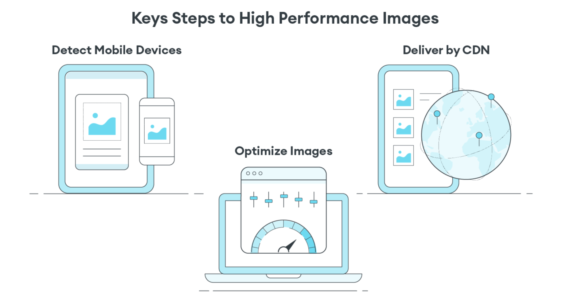
Instead of using the Build-Time Responsive Syntax approach, an automated image CDN solution can address all of the image issues raised by PageSpeed Insights. The key steps of an image CDN that you should look for are:

  1. Detect Mobile Devices: Detection of a website visitor’s device model and its technical capabilities. These include: OS version, browser version, screen pixel density, screen resolution width and height, support for next-gen image and video formats. This is where ImageEngine is unique in the market. ImageEngine uses true mobile device detection to further improve image optimization. It has a huge impact on the effectiveness of the image optimization process.
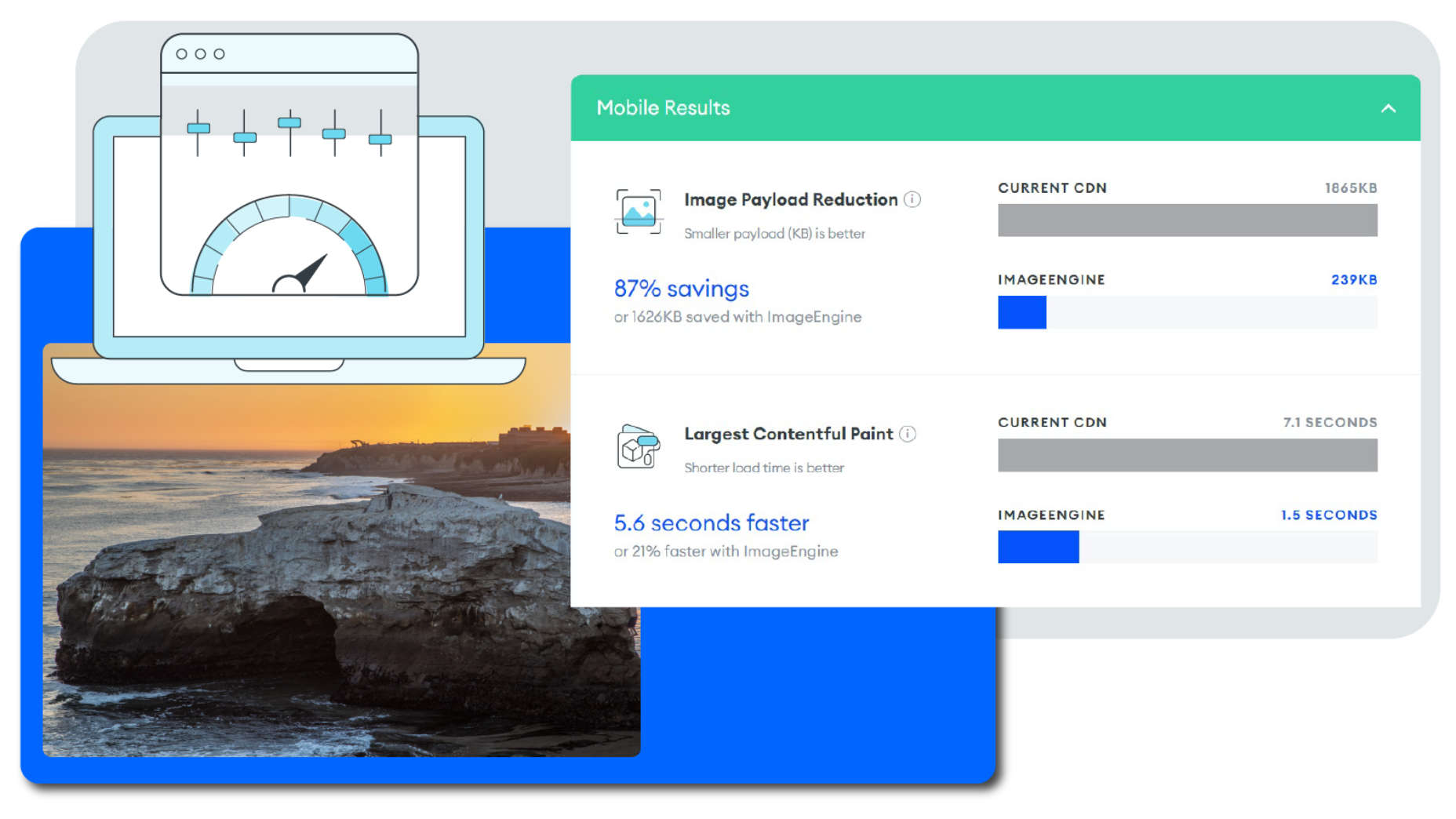
  2. Optimize Images: An image CDN will leverage the device’s parameters to automatically resize, compress and convert large original images into optimized images with next-generation file formats, like WebP and AVIF. Frequently, an image CDN like ImageEngine will reduce the image payload by up to 80%.
  3. Deliver by CDN: Image CDNs like ImageEngine have edge servers strategically positioned around the globe. By pushing optimized images closer to requesting customers and delivering them immediately from the cache, it often provides a 50% faster web page download time than traditional CDNs.

Easy Integration Process for Image CDN

After signing up for an ImageEngine account and free trial, you will receive a Delivery Address. After adjusting your <img /> elements to include the Delivery Address, ImageEngine will start to pull the original images from your website (no need to move or upload them), automatically optimize them, and deliver them.

You can automate the addition of the Delivery Address to the img src tag by using plug-ins for WordPress and Magento. Developers can also use ImageEngine’s React, Vue, or Angular JavaScript frameworks to simplify the process.

Additionally, there are many ways to simplify implementation via adjustments to templates for many CMS and eCommerce platforms.

Results: Improved Performance, Better SEO

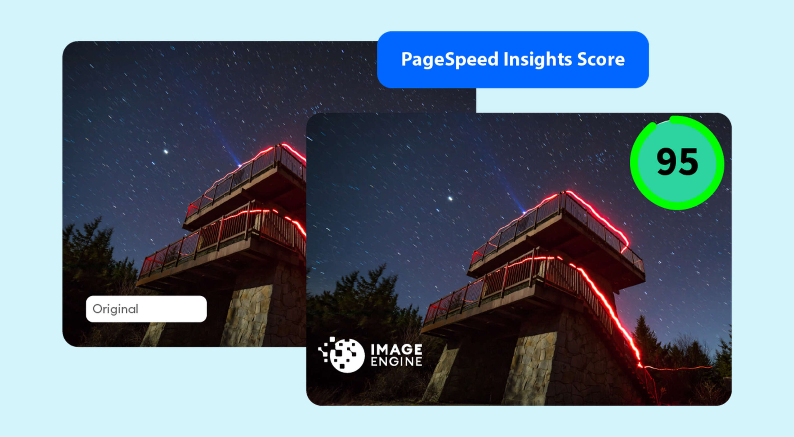
Most ImageEngine users see a huge improvement in LCP metrics, and consequently, a big improvement in the overall PageSpeed Insights score. ImageEngine provides a free demo analysis of your images before and after image optimization. In many cases, developers see improvements of many seconds on their LCP and Speed Index.

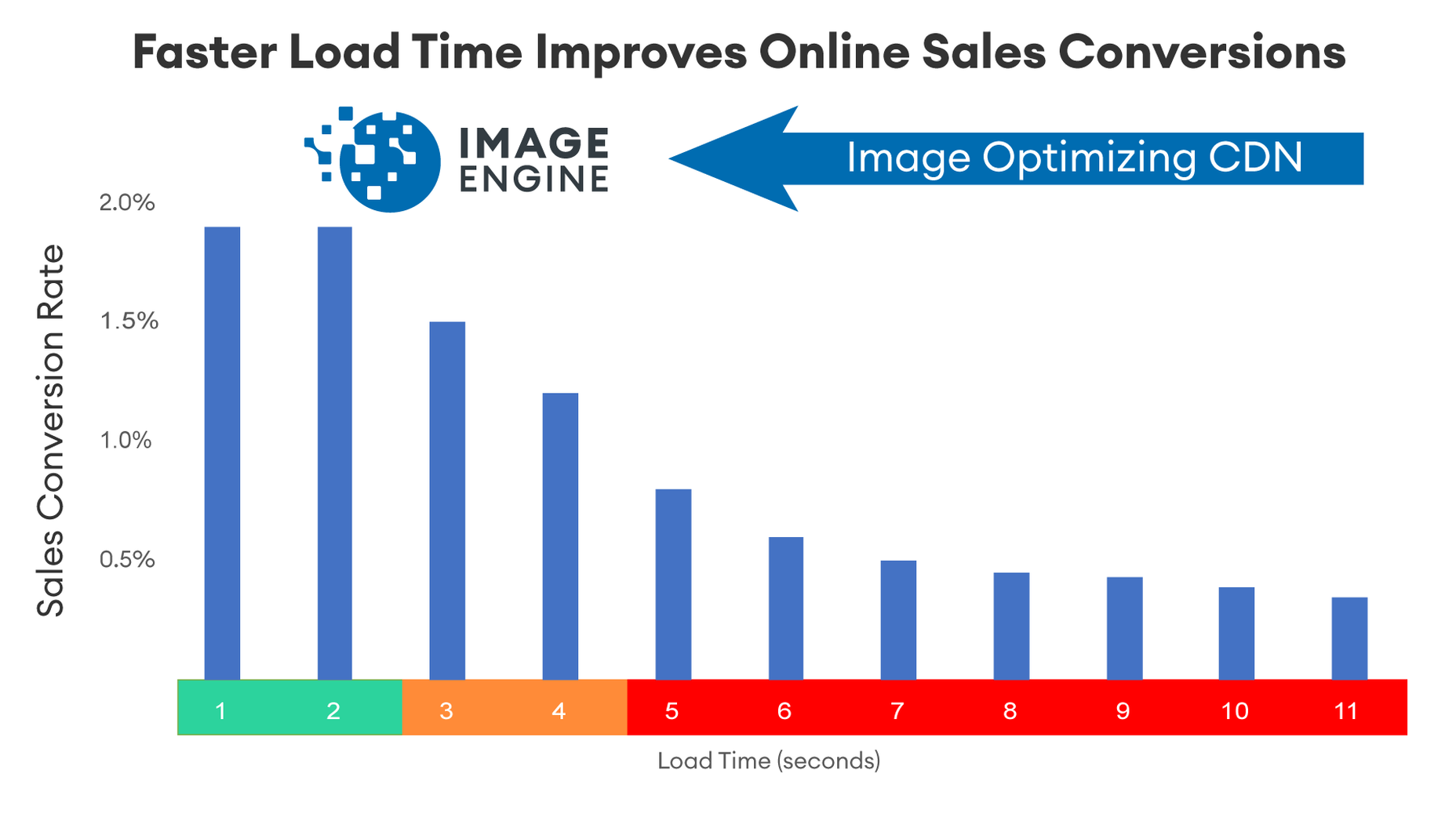
In summary, performance drives higher search rankings, and better UX, and increases website conversions for eCommerce. The steps you take to improve your image performance will pay for themselves in more sales and conversions, streamlined workflow, and lower CDN delivery costs.

Source

The post 4 Steps to Improve PageSpeed Insights Score and SEO first appeared on Webdesigner Depot.


Source de l’article sur Webdesignerdepot

Feedback is one of the most valuable resources for any business. Informative messages from your customers can tell you a lot about your company. They’re a way to check that your service strategies are paying off and a chance to learn which parts of your product need an upgrade.
Reviews and testimonials can also help you better understand your audience and the kind of solutions they’re looking for with your brand. 

Solid feedback is also how you improve your chances of gaining more customers in the long term. Brands with superior customer service generate about 5.7 times more revenue than their competitors. 

Of course, before you can begin tackling challenges like pulling trends from feedback or using your reviews to upgrade your business, you have one essential task to consider: How are you going to collect the valuable information your customers have to share?

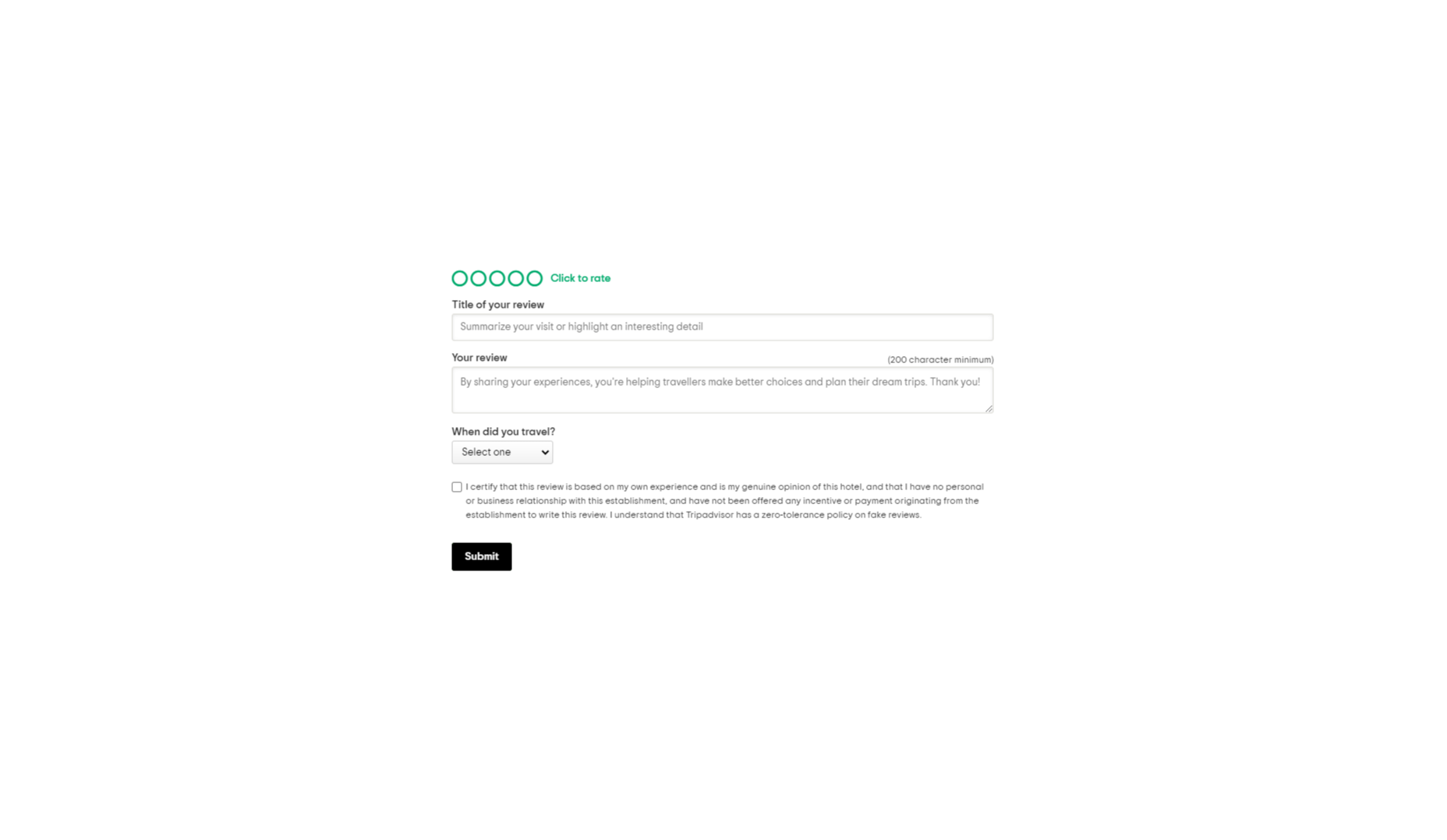
There are a lot of options to choose from. You can reach out to clients individually with email messages or set up a feedback form on your website. You could even consider working with a review site to give your audience more options. 

Today, we will look at the steps you can take to collect customer feedback the right way.

Unlocking the Benefits of Customer Feedback

Customer feedback is the information and input shared by your community. It provides a behind-the-scenes view of people’s interactions with your team and shows you where you need to focus on beginning driving new opportunities. 

Customer feedback becomes a guiding compass for your organization when used correctly. It shows you what you’re getting right and wrong from your customer’s perspective. Positive feedback can even become part of your marketing campaigns. User-generated content in the form of reviews and testimonials makes for excellent tools to encourage new people to purchase your products. 

Case studies and in-depth reviews from your clients can also help generate trust among potential customers, so you’re more likely to earn crucial sales. 

Only around 3% of customers say that they find marketers and salespeople “trustworthy.” This means that no matter how good your marketing messages might be, you’re only going to be able to accomplish so much with the claims you make about your brand. Ultimately, your clients will turn to other customers like them to determine who they should buy from.

On average, buyers read around seven reviews before they’ll even consider trusting a business. 

The good news is that around two-thirds of customers will share their personal information with a brand. Clients are happy to provide feedback in the right circumstances. It’s your job to ensure that the process is as easy as possible for your customers.

So, how do you get customer reviews?

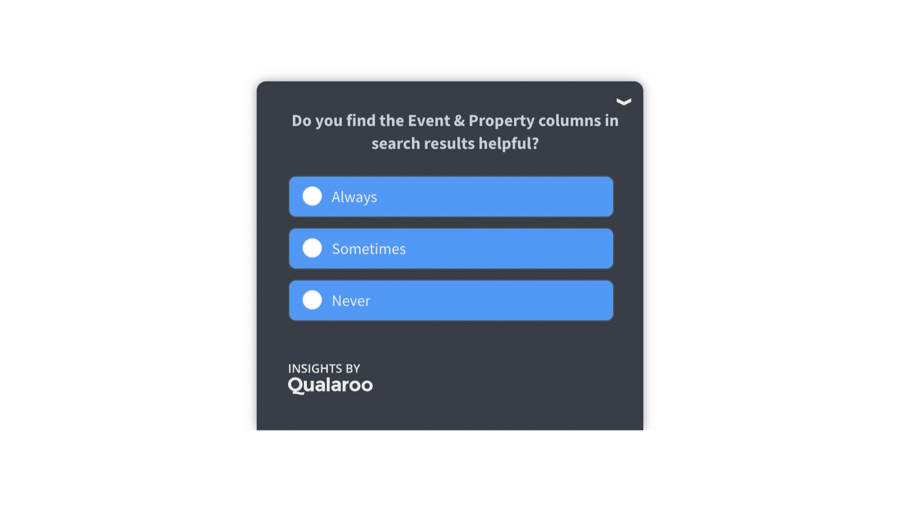
1. Design an Effective Feedback Survey

The most obvious way to encourage feedback from your customers is to ask for it. Unfortunately, designing a good customer survey isn’t always as simple as it seems. 

On the one hand, you’re keen to gather as much information as possible from your customer, which could mean that you want to ask many questions. On the other hand, asking too many questions could easily scare your audience away. 

To improve your audience’s chances of actually sharing information, keep the feedback requests as simple as possible.

One or two questions at a time should be enough to give you some helpful information about customer preferences and expectations. When choosing what to include in your survey, remember:

  • Only ask essential questions: If the answer to a question isn’t going to help you achieve your goals, don’t ask it. You don’t need to know someone’s age if you want to know if they had a good experience with your service reps. Keep it relevant. 
  • Make the questions thoughtful: Yes or no questions are great for collecting quick information. However, if you want more valuable feedback, leave your queries open-ended, and give customers room to explain themselves. 
  • Use rating scales: If your customer doesn’t have time to respond to a question in your survey with a complete answer, a rating scale can give you some helpful insights with minimal effort from the client. 

Ensure none of the questions on your survey are leading or loaded. Customers don’t want to feel like you’re answering questions for them. It might also be worth showing your audience how much you value their data with a quick response. Hilton Hotels always responds to any adverse reactions to surveys within days of receiving the information. 

Customers can even see how their reviews contribute to the overall rating of the business. 

2. Master Your Emails and Customer Contact Forms

Email is one of the easiest and most effective ways to gather customer feedback. Because this is a standard support channel for most businesses, there are plenty of opportunities to generate feedback. 

The first step in using emails for feedback is to send a message thanking your customer for their recent interaction with you. If someone purchased a product from your company, immediately follow up to let them know you appreciate their custom. A couple of days after, when your customer has had a chance to use your product or service, that’s when you follow up with your feedback request. 

Ideally, your email request should be as short and straightforward as possible, with a clear call to action that tells your customer what to do next. This example from Papier keeps things as detailed as possible.

If you want to boost your chances of engagement, you can add elements to your email that might encourage a positive response, for instance:

  • Remind them of what they bought: Remind your customer of the item they purchased with a picture and a bit of information. Highlight the key features and benefits of that product, so they have some inspiration on what to write about in their review. 
  • Offer them a reward: If you want to boost your chances of your customers doing something for you, you need to offer something in return. This could be a discount on their next order, a chance of winning something, or even just free shipping on their next purchase. 
  • Personalize the message: Make your customer feel special by personalizing the message. Use their name and reference their previous interactions with your company. If they’ve been with your business for a while, mention that in the email.  

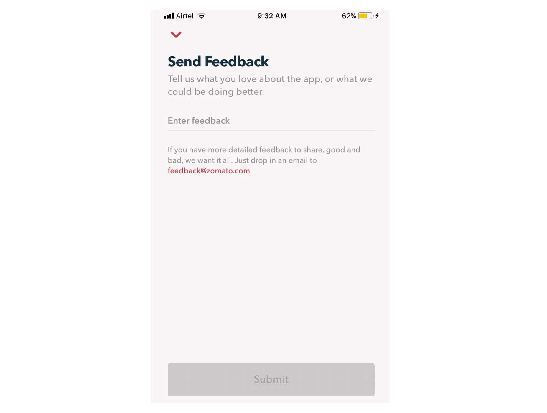
Remember, many of your customers are likely to check their emails on the go. That means that giving feedback should be as simple as possible, regardless of the tech your customer is using. For instance, in this Zomato example, users can choose to drop an email to the company or send feedback straight from the app. 

3. Create App Usability Tests

If you want some in-depth insights into your company, and your business processes, then a usability test could be the best way to generate valuable feedback. If you have your app, ask your customer to submit some information right there and then, after they’ve finished using the service. The great thing about this kind of input is it’s fresh.

Unlike other customer reviews that might come a day or two after your customer has used a product, usability tests allow you to get feedback at the moment. There’s a much better chance that you’re going to get some relevant and detailed responses here. 

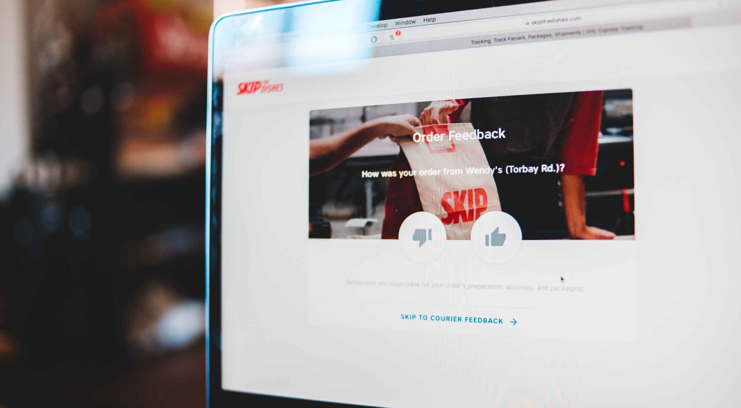
For instance, in this Skype lab feedback request, customers can tick boxes for any video or audio issues they had and leave a starred review. 

If there’s extra information to share, the customer can tap on the comment box to elaborate. However, they don’t need to do this part unless they want to. 

With usability tests, it’s a good idea to focus on a few key things that you want to learn about. For instance, Skype’s example above demonstrates that the company wants to check at least five user experience issues for both video and audio. 

Giving your customers options that they can choose from reduces the amount of work they need to put into leaving a review. It also means that you can get actionable information on which parts of your app or site need the most improvement. 

You can get the same kind of instant feedback on your website, too, mainly if you’re using a live chat app for customer service. 

Live chat is quickly becoming an essential part of the customer experience environment because it’s fast, easy to use, and efficient. It’s also highly affordable for most companies, thanks to evolving technology. Set up your Live Chat app to immediately request a review from your customer when the interaction is over.

For instance, SiteGround asks customers to rate their service provider with a picture of the employee they spoke to. The image lets the customer see that they were talking to a real person, which improves the relationship with the company. The statement about feedback improving the customer service and support that SiteGround can offer shows the customer how valuable their reviews are. 

4. Conduct Customer Interviews

Conducting a customer interview is a lot like sending out a survey. The main difference is that you ask the client to engage in a much more in-depth conversation. Usually, these interviews will be the initial research required for a published case study on a B2B website. 

Reaching out to valuable and loyal customers can give you a fantastic source of in-depth information to learn from. You’ll need to make sure that you have a good relationship with the customer in question before you attempt this, however. Most one-time clients won’t want to get involved with a time-consuming interview. 

Look at your CRM technology and find out who your most impressive VIP customers are. Reach out to them with a request for feedback, and make sure you offer something in return. For instance, tell them that you’d like to interview for a case study that you can display on your website. If they’re happy for you to do this, you can reward them with a discount on their next purchase or some gifts. 

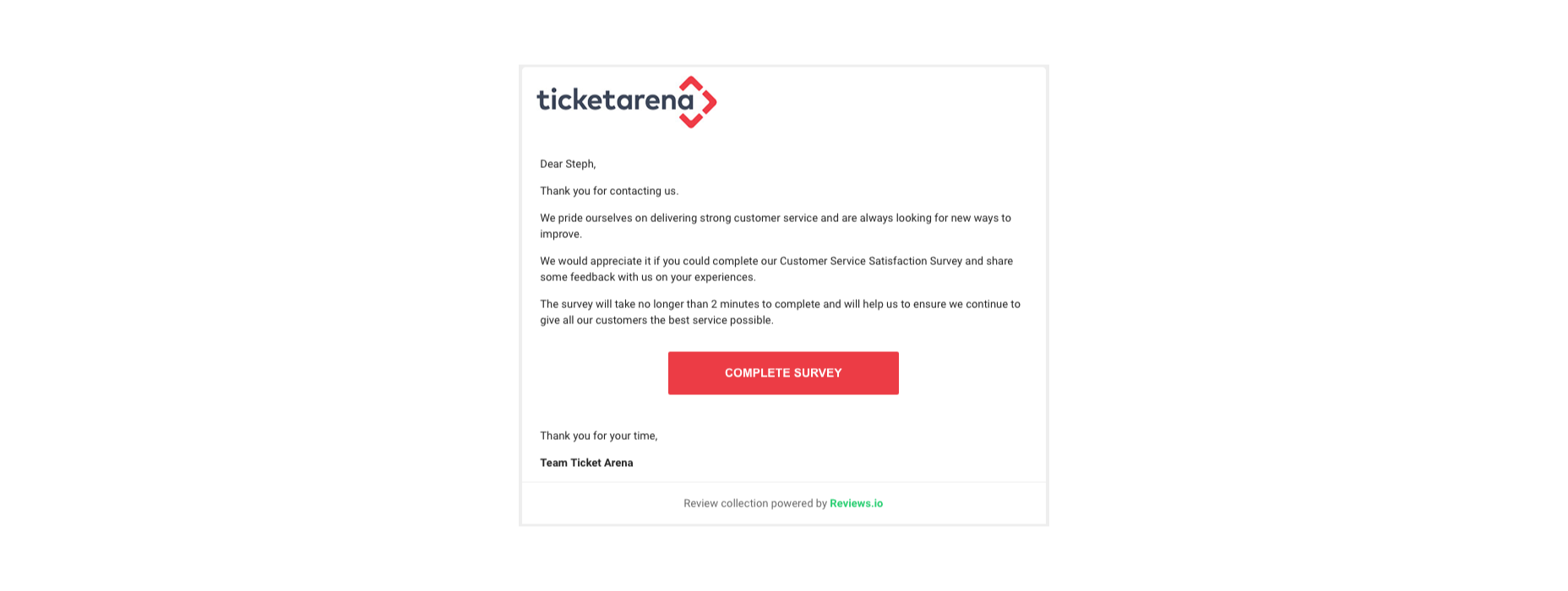
You could also follow up with a customer who recently contacted your team for an interview, like Ticket Arena does here. With this message, they promise the customer that their insights will make the customer experience better for future clients:

When requesting long-form qualitative feedback, remember to think through your questions carefully. In-depth stories from customers bring nuance and color to your quantitative data. They could even guide your business to making some crucial future decisions. 

When talking to your customers:

  • Start with an open-ended dialogue: Remember that open-ended questions are crucial to get as much detail as possible from your customers. These queries give your customers more flexibility to cover the details of their experiences.
  • Get more specific as you go: Start with simple questions, then build on them as your conversation evolves. Use the things you learn from your customers to dive into topics that are relevant to them. For instance, if a customer mentions your live chat app, go into a deeper discussion about the channels they prefer to use. 
  • Practice active listening: Make sure that you’re open and receptive to the information you’re given. Actively listen to customers, even if you’re not in the same room, by acknowledging what they say and providing valuable responses. 

5. Use Social Media

Sometimes, people are reluctant to give feedback for your business on your website because they’re not in the frame of mind. When customers come to your site, there’s a good chance they’re looking for information from you or want to check out a new product. 

They’re probably not in the right mood to start sharing their opinions. 

However, if you capture your customers on social media, there’s a good chance they’ll be feeling a lot more talkative. After all, social media platforms are where most customers discuss their issues with companies, talk about purchases with friends, and make their voices heard. 

Simply paying attention to when people talk about your company on social media can give you a lot of helpful feedback. Social listening tools allow you to collect post information every time someone mentions your business name or product. 

Alternatively, you can actively use the tools on social media to gather data from customers. For instance, Instagram has its own “poll” feature on Stories that allows companies to collect opinions. 

If you’re collecting feedback on social media, remember that you shouldn’t be asking any questions that are too complicated. Although people are more willing to share their opinions on social, they’re still looking for a relatively laid-back and casual experience.

Polls, where people can vote for their preferences with a single click, are more likely to garner engagement than a post asking people to tell you about the best purchasing experience they ever had with your brand. 

If you do want to encourage more in-depth feedback, the best option is to promise a reward in return for your follower’s effort. 

Make the experience fun by transforming it into a competition. 

For instance, ask your customers to share their favorite story involving your brand for a chance to win an impressive prize. You can ask each customer to tag their response with a branded hashtag so that relevant answers are easier to find. You could even add users to tag their friends in their posts too, to increase brand reach while you collect feedback:

With gifts and rewards to incentivize them, people will be much more likely to interact with your brand and put effort into the reviews they leave. You could even gather some user-generated content to put into your subsequent ad campaigns. 

6. Create a Dedicated Website Page

Finally, if you want to make it as simple as possible for people to leave feedback on your website and for you to collect all of that information into one space, then create a review page on your website. This can double up as social proof for people who need additional evidence to buy from your brand. 

A review page could be as simple as a page on your website listing the latest comments that your customers have left. You can include a form at the bottom of the page where people can add their thoughts. Just make sure that you carefully review these posts before they’re submitted to your website if you want to prevent spam from getting through. 

You could also create a case study or portfolio page that showcases the work you’ve done with other companies like Fabrik Brands does here:

At the bottom of each case study, give your customers a unique email address they can reach out to if they want to be featured as your following case study. Or include a contact form where people can get in touch to discuss their own experiences. 

Having a dedicated review, case study, or testimonial page on your website could be enough to inspire more feedback from your customers. It’s also a fantastic way to demonstrate how credible your company is to potential buyers. 

Still, Struggling? Take the Customer Out of the Equation

If, even with all the suggestions above, you still can’t seem to convince your audience to give you some decent feedback, then take them out of the equation. You can learn things about your audience without asking them for information. Google Analytics and other tools will give you valuable insights into which of your blog pages get the most engagement and how many people click on individual buttons throughout your site. 

These fundamental insights might not be as good as valuable, contextual feedback from your audience, but they’re an excellent way to start figuring out how to invest in your future growth. 

Remember, feedback of any kind – even if it’s just statistics and numbers – gives your business the ability to grow and make informed decisions.

Gather as much feedback as you can, and make sure you use it!


Featured image via Pexels.

Source

The post 6 Tips for Collecting Customer Feedback (The Right Way) first appeared on Webdesigner Depot.


Source de l’article sur Webdesignerdepot

Not so long ago, customers only had a couple of ways to interact with brands. 
If you had an issue with a product or service, you could reach out through the customer service phone number or send an email. Occasionally, sites would introduce dedicated forms on their website that allowed consumers to send support tickets straight to the service desk – but that was it.

The problem with this kind of service was all the waiting. 

Send an email or ticket, and you have no idea when the company is going to get back to you. Customers end up refreshing their inbox all day, waiting for a response. Call the company, and 9 times out of 10, you’ll be placed on hold. You can’t exactly do much when you’re stuck listening to hold music, so customers are gradually getting more frustrated as they wait for a response. 

Fortunately, the evolving digital age has introduced a new solution: live chat.

Transforming Your CX With Live Chat

Live chat is a quick and convenient way for your customers to contact your business and get a response immediately. The result is happier clients, better customer satisfaction scores, and even opportunities for bigger sales. 

More than 41% of customers say they expect to see live chat on a site. 

Even if you don’t have an agent on hand to answer a chat message immediately, you can create an automated system that notifies your customer when someone is available. That means they can go and do other things while they’re waiting for a response. Live chat solutions with bots can even allow your customers to fix problems for themselves. That’s pretty convenient!

Widgets equipped with answers to commonly asked questions can automatically deal with customer queries or help them find solutions to their problems before passing them over to an agent. This means that your customer gets a solution faster, and your agents don’t have as much pressure to deal with. It’s a win-win – as long as you get it right. 

Unfortunately, a lot of companies don’t know how to implement live chat experiences correctly. 

Kayako’s study into 400 customers found that 47% couldn’t remember the last time they’d had a positive experience through a live chat tool.  

How to Upgrade Live Chat CX

The evidence shows that customers love the idea of live chat, but the reality of how businesses implement this technology isn’t always ideal. 

However, since 86% of customers say they’re willing to spend more on a better customer experience, it’s worth figuring out what separates a good live chat interaction from a bad one. 

1. Set Expectations Instantly

Setting the right expectations is crucial if you want to generate better satisfaction for your customers at a later date. When customers know what to expect from your live chat strategy, they can also make more informed decisions about which support channels they’re going to use, and whether they want to hang around for someone to answer their messages. 

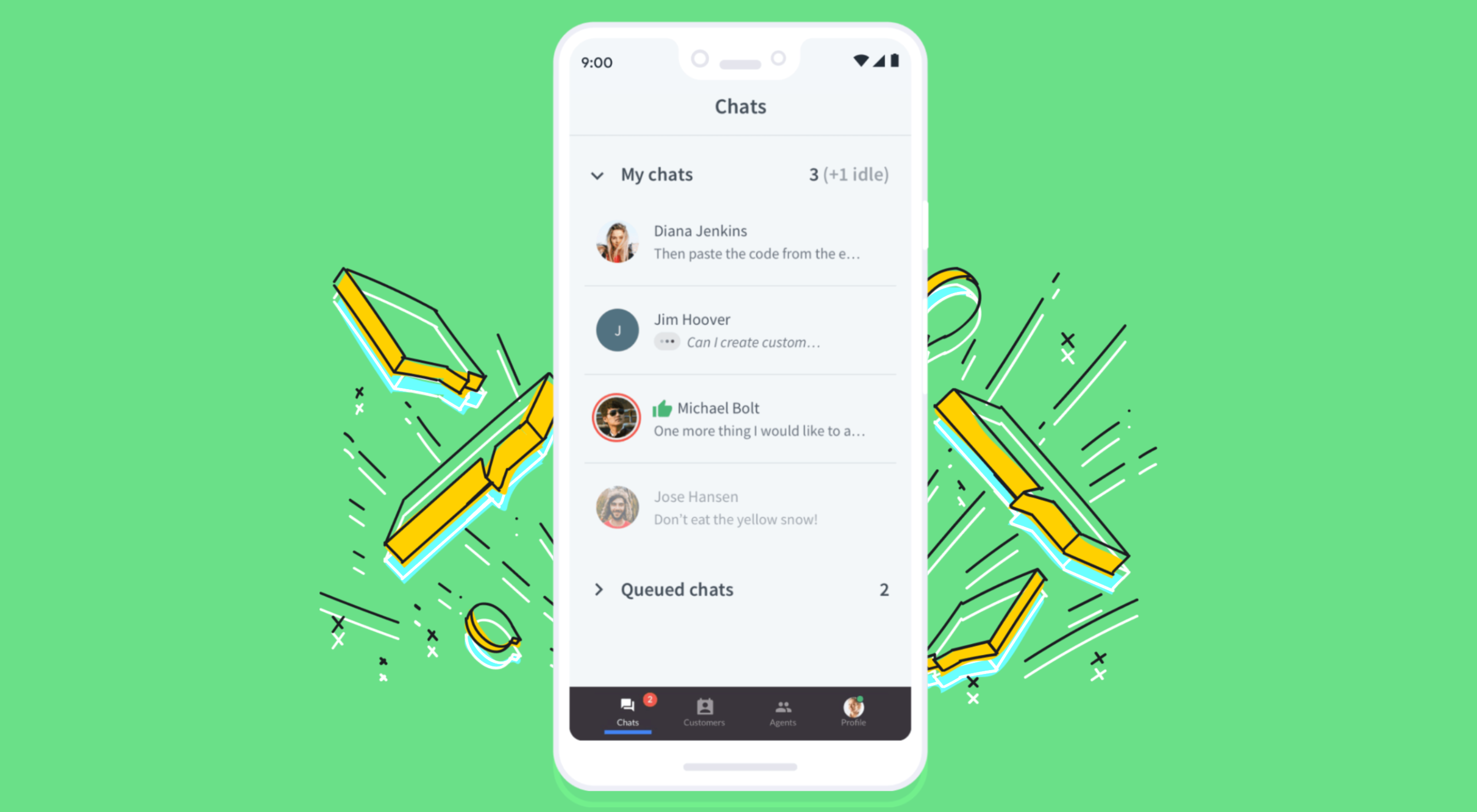
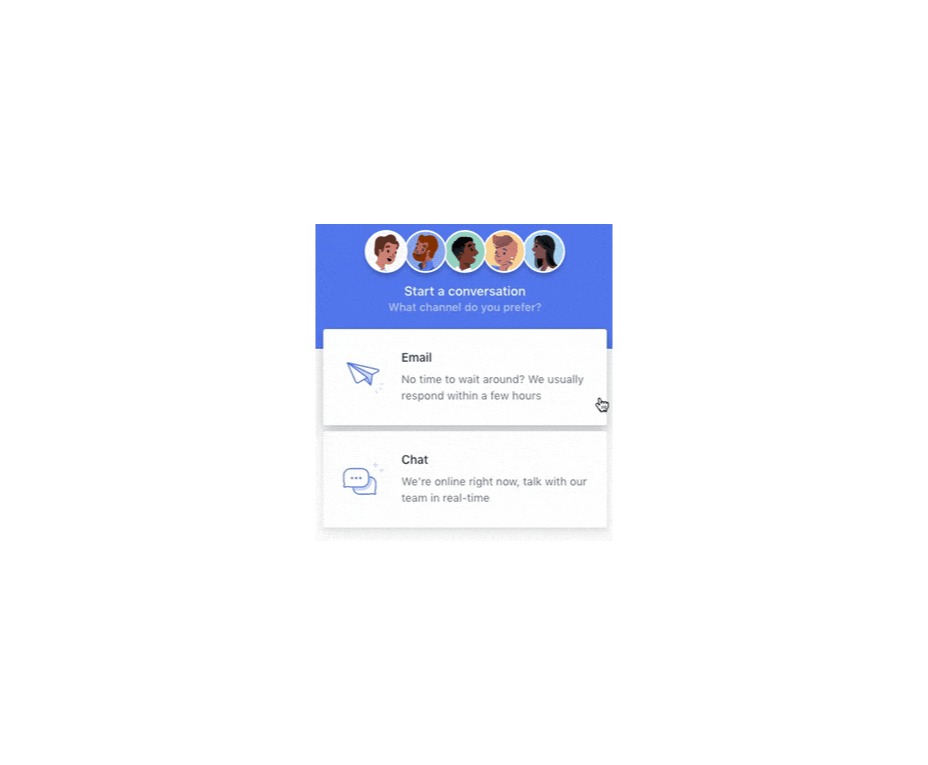
The first thing you should do is showcase your agent’s availability. In this example from Help Scout, you can see whether the team is active, online, and ready to talk. The company also sets expectations for how quickly you can get an email response if you don’t want to chat.

Other ways to set expectations include:

  • Showing your opening hours: List when team members are usually available to answer questions if you’re not currently online. 
  • Topics: Offer your customers some topics that they can ask about or use the welcome message on your chat tool to direct your customers to an FAQ page. 
  • Restrictions: If there’s anything you can’t deal with over live chat, like changing a customer’s password, let them know in advance so they don’t waste time.

2. Leverage Pre-Chat Forms

Pre-chat forms are some of the most important parts of the live chat experience. They ask your customer to explain their issue to your chatbot so that they can be directed towards the right agent. Using these forms correctly ensures that your agent has all the information they need to solve a problem fast. 

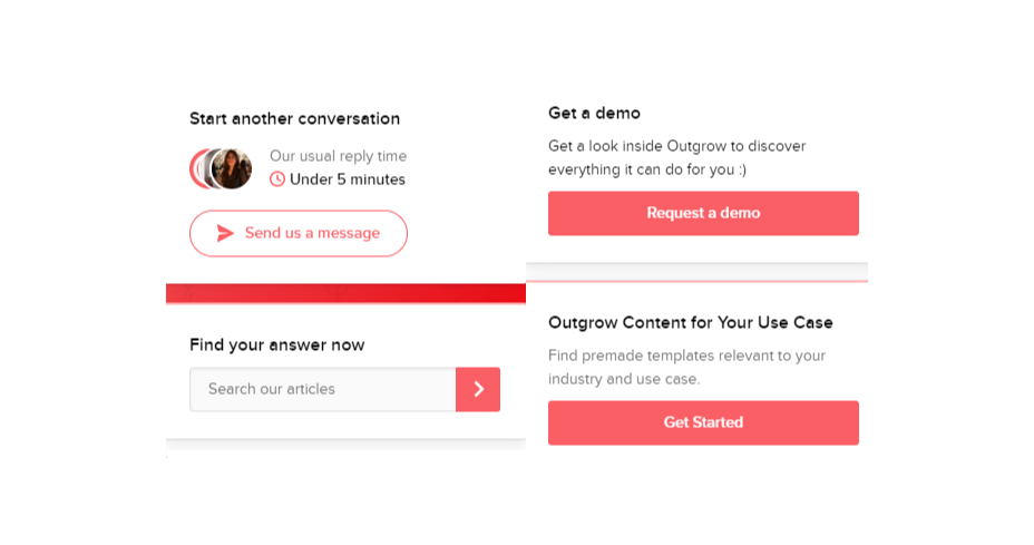
You can even set up automated systems that direct customers to different agents and teams based on their needs. For instance, the live chat app on Outgrow.co gives customers the option to fill out different forms depending on whether they want answers to a question, a demo, or something else.

The button you click on dictates which professional you’ll get through to. Although filling out a form can seem like an extra friction point for your customer at first, it helps to streamline the customer journey. After all, if you can direct the customer to the right agent the first time, there are fewer chances that they’ll need to explain their issue to various different people. 

Here are a few things you can ask for in the live chat form to make it more effective:

  • The customer’s name: This will help to personalize the conversation. It could also be an opportunity to track down any background information you have about an existing customer and the orders that they may want to speak to you about.
  • An email address: Having an email address will allow you to bring up a customer’s record on your CRM. It also means that you can send any information that the customer needs to their email inbox at the end of the conversation.
  • A brief explanation: Ask your customers to share what they’re reaching out to you about and use keywords in their message to assign the chat to the right agent or professional. You could even add a drop-down menu of topics for them to choose from. 

Remember, don’t ask for too much information straight away, or you’ll risk your clients feeling that the service experience is too complicated. 

3. Make Sure It Works Everywhere

We’ve reached the point now where every customer expects a brand’s website to be responsive on any device. Most web-building templates automatically work on mobile tablets and smartphones. Additionally, it’s becoming increasingly easy for companies to transform their website and online store experiences into dedicated apps too. 

However, while most businesses know that their site needs to be responsive, they often forget about the mobile element when it comes to live chat. If your live chat function is only available on the web browser version of your website, then this is going to end up making your mobile customers pretty unhappy. They don’t want to have to stop browsing on their phone just to connect with you. 

Ideally, you’ll want to create a separate component for your mobile app where your customers can easily access the same live chat functions they’d have on your browser-based site.

If you’re just offering live chat through a mobile version of your website, make sure that it’s easy for your customer to click into the chat section and send messages without accidentally ending up on a different tab or page. It might also be worth setting up functions that allow your chat app to send push notifications to your customer’s phone whenever they get a new message. 

Being able to put their smartphone down or switch to another app while they wait for a response will provide a much more intuitive experience for your audience. 

4. Make Sure You Support All the Right Languages

You’d think that this CX tip for live chat would be obvious, but it’s shocking how many companies fail to offer support for all the languages that their customers might use. If you’re selling your products throughout the world, and you know you have customers in China, then it doesn’t make much sense to only offer live chat in English. 

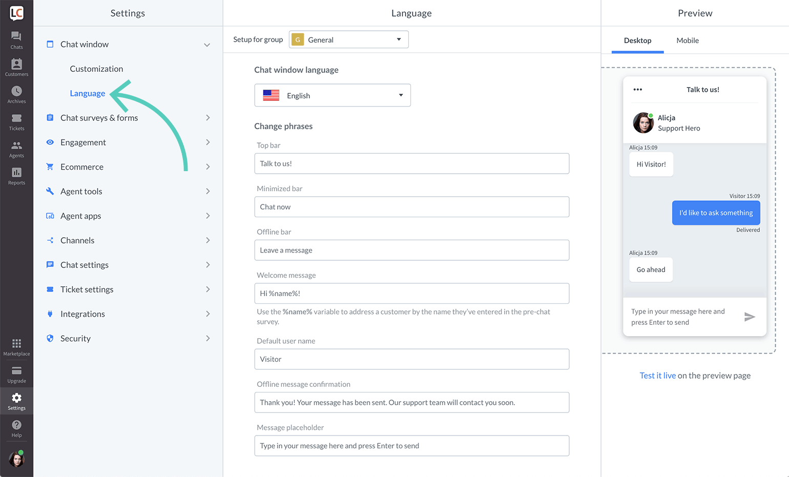
Some of the available live chat apps on the market today come with features that allow you to automatically translate languages when your agents are talking to foreign customers. For instance, LiveChat currently supports 45 languages

If you’re creating your own chat app from scratch, then you’re going to need to work with your developer or designer to make sure that the right languages are supported. Remember, you don’t have to cover everything, but at least make sure that you can connect with the most common groups of customers in your CRM. 

Ensure that if you are using multiple languages, your customers know how to switch to their preferred option too. Usually, the best way to do this is with a drop-down menu. You could also use little flag icons of the countries that you support. 

5. Find Ways to Reduce First Response Time

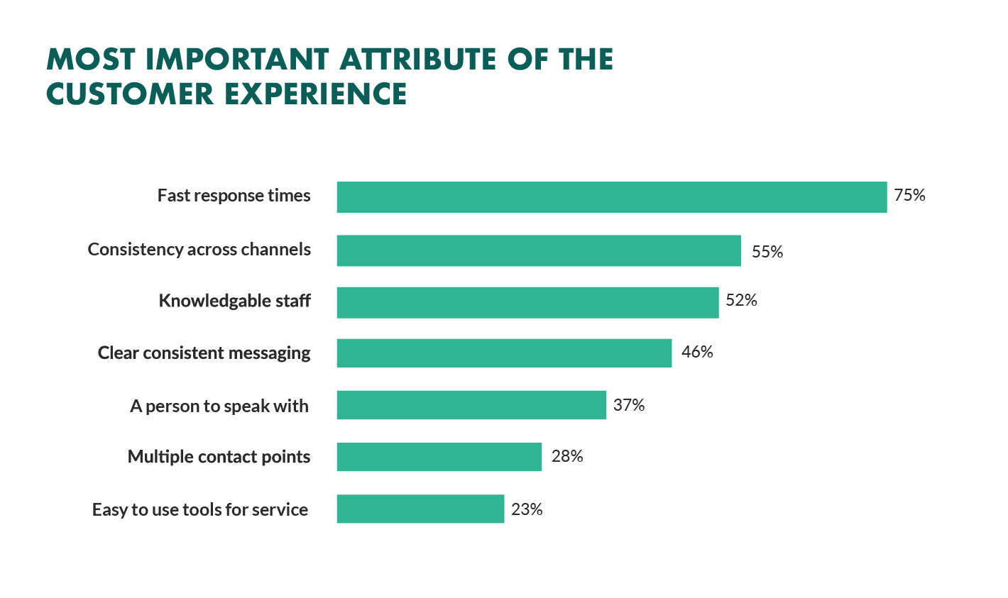
Speed is probably one of the biggest advantages of live chat, and the main reason that customers like it so much. According to the CMO council, fast response time is the number one thing that a customer looks at when measuring satisfaction. 

While you might not be able to have someone on-hand to answer your customers 24/7, you can improve the way they perceive your load times in a variety of ways. For instance, start by making it clear when your people are online to talk to your customers. Setting expectations on when you’ll be available to immediately respond should help to avoid frustration.

  • Keep all chats in the same place for agents: Having a combined contact center solution on the back-end makes responding to queries much easier for your agents. If they can see all of your brand’s live chat, social, and email conversations in one place, they don’t have to waste time jumping between different platforms and tabs. 
  • Set routing queues: Use an automated system to send every message you get to the most appropriate agent available. You can intelligently route conversations based on the issues that your customers have or the things they want to discuss. It’s also worth ensuring that your system prioritizes routing conversations to the first agent available. 
  • Send notifications: Make sure that you set your live chat system up to send push notifications to agents when a new message is waiting. It’s also with notifying your customer when they have a response, just in case they’ve switched to another tab. 

The notifications you send to your agents could come with access to a customer’s CRM file, so that your agent can go into a conversation with the context they need. Agents that instantly get context on a conversation don’t have to waste as much time tracking down the right information. Giving your agents context also means that they don’t have to ask repetitive questions, which could annoy your customer. 

6. Make the Chat Experience On-Brand

Every company wants to give their customer a slick experience with live chat. The solution you build needs to be easy to use, and responsive across every device. However, it also needs to be something that your customer associates with your brand. 

Companies generally have a lot of options for how a live chat window can look. You can adjust the appearance to suit your brand by picking specific colors, tweaking button shapes, and even changing the available fonts. 

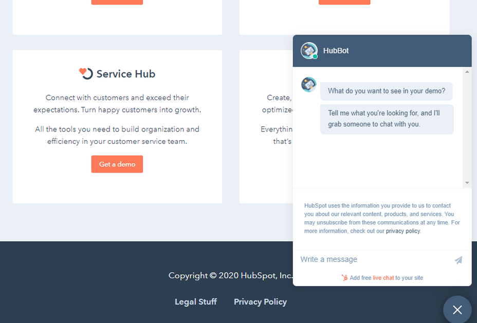
Working the visual elements of your brand into the design of the live chat experience is the best way to make your customers feel comfortable and confident that they’re dealing with your company. For instance, Hubspot uses matching colors, rounded edges on chat bubbles, and even a fun illustration to make their chat experience more “branded.”

Remember, when you’re creating a Live Chat experience that’s “on brand”, it’s also a good idea to think about things like voice and tone. Infusing live chat with the unique personality of your brand will make the experience more memorable. 

If you usually stick with informal language and use a lot of slang, then it makes sense to continue that in live chat – even when you’re sending automated messages. To make sure your brand identity really shines through:

  • Write scripts for your automated messages in your brand’s tone of voice
  • Write guidance scripts for employees that highlight your tone for agents
  • Provide training on brand tone of voice for your support team
  • Encourage support agents to connect with customers on a personal level
  • Remember to set guidelines on how to use things like gifs, slang, and emojis too!

7. Make a Checklist For Security and Tech Issues

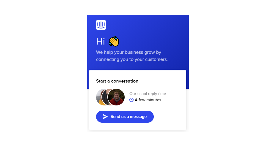
One of the most significant things that will affect the experience your customer has with your live chat service, is technical and security issues. Choose the right developer or designer to help with your app, and the risk of problems dwindle. You can also address the issue of having to constantly maintain, check, and update your live chat experience by using a pre-existing solution, like Intercom.

No matter how you choose to approach live chat, these are the things you’ll need to check for most:

  • Page load times: Page load times are crucial for user experience and SEO, so you should be taking them seriously already. Check your web chat software isn’t dragging down the performance of your page or causing unnecessary problems.
  • Cross-channel conversations: If your website has various subdomains, make sure that moving through these in chat won’t mean you lose the session. Customers don’t want to have to repeat themselves!
  • Functionality with browsers: Your chat app needs to work just as well on every browser and operating system – including mobile devices. 
  • Data management: Under things like GDPR, you need to ensure that you’re controlling user information safely. Ensure you have a DPA in place, and make sure that your web channel doesn’t affect any PCI-DSS compliance systems you have in place. Your chat solution may need to automatically mask credit card information, for instance.

Time to Enhance Your Live Chat Strategy

Ultimately, whether you like it or not, your customers love live chat technology, and they’re not going to stop looking for it on your website. Today’s consumers expect you to serve their interests by delivering customer support on the channels that they choose. Unfortunately, most companies just aren’t living up to expectations.

Following the tips above could help you to transform the way that you interact with your clients and improve your chances of better satisfaction overall.

Source

The post 7 Tips for Transforming CX with Live Chat first appeared on Webdesigner Depot.


Source de l’article sur Webdesignerdepot

We all want a little more fun and games in our lives. So, why not add some gamification to your next interactive content campaign?
By 2025, the gamification market is expected to witness a massive 30.1% growth rate, with global sales revenue reaching around $32 billion

That’s because gamification adds more entertainment to the website experience and gets audiences engaged. The idea behind gamification is to bring game mechanics into the design of a website or piece of content. There are many different ways to do this. 

Some companies add hidden achievements and bonuses to their blogs that customers can collect by visiting every page and reading their content. Others allow readers to collect points for leaving comments or play games to win potential prizes. 

Used correctly, gamification is a fantastic way to connect with your audience and increase engagement levels. So, how can you use gamification in interactive content?

The Evolution of Gamification 

Elements of gamification have appeared in everything from marketing campaigns to web design and even eCommerce strategies. 

In 2014, an Apple App Store review of more than 100 health apps even found that gamification elements in applications led to greater participation and higher user ratings. In other words, customers are more likely to get involved with an activity that includes gamification components. 

While gamification can take on many different forms, the aim for most companies is to create an environment where customers can feel more invested in their interactions with the website. For example, if you win a point every time you comment on a blog post, and you can trade those points in for prizes, you have more of a desire to keep commenting. 

The promise of being able to “accomplish” things with pieces of interactive content and websites also appeals to the competitive part of our psychology that pushes us to keep doing things in exchange for the promise of a kind of reward. 

Many companies have generated a lot of enthusiasm for their brands through leaderboards, time events, and similar experiences. For example, just look at how popular McDonalds becomes each year when the monopoly game rolls out as part of the purchasing experience. 

People buy more items than they usually would during McDonald’s Monopoly just for the opportunity to win. This same boost in engagement benefits your content strategy too. 

6 Ways to Add Gamification to Your Content

There’s no one right way to gamify your website or your marketing content. The method you choose will depend heavily on your audience and the kind of experience they respond best to. 

The key to success is finding a way to grab your customer’s attention and hold onto it. Here are some of the tried and tested strategies to explore:

1. Create an Actual Game Experience 

When it comes to incorporating gamification into your website design and content, you don’t necessarily need to be clever. You can be extremely straightforward and just design an actual game. For instance, to help attract more people to the American Army, the US created a war simulator that potential applicants could play on Steam. 

The game aimed to introduce young people who might consider a career in the military to what that job might be like. If the kids liked what they saw on Steam, they could visit the military website and learn more. 

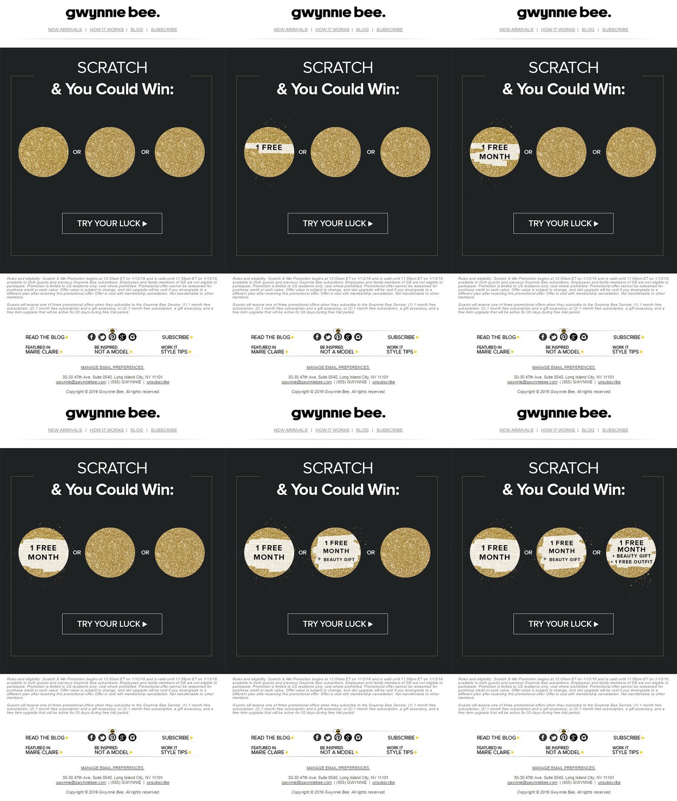
For companies who can’t afford to build an entire fully-featured game, something a little smaller can be just as engaging. For instance, rather than using a standard pop-up with a discount code to entice customers to buy the rental service, Gwynnie Bee created a scratch card. People could scratch the spaces using their smartphone or computer cursor and win money off. 

The great thing about the interactive content from Gwynnie Bee is that it encouraged potential visitors to connect with the business in a lucrative way. To use the scratch card, you first had to give your email address. This meant the company could build its email list while delighting consumers. 

When designing a game experience for your marketing campaign, remember:

  • Get the right support: Designing a great game is tough, particularly if you want something more complicated than a scratch card. Don’t take the risk of creating something that doesn’t work properly; hire a developer. 
  • Promote the experience: Make sure everyone knows about your new game. Share screenshots on social media and talk about it in your email campaigns. 
  • Focus on fun: Remember, games are supposed to be fun. Measure the reactions of your audience to ensure they’re having a good time. 

2. Design a Loyalty or Reward Program

Loyalty is one of the most valuable things your audience can give you. So why not reward them for it? Loyalty programs are fantastic tools for business growth and engagement. They give you a way to turn one-off clients into repeat customers and advocates for your brand. 

How you choose to reward your customers (and when) is up to you. Some companies might give customers points every time they share a post on social media or comment on a blog. This encourages more engagement with your brand. 

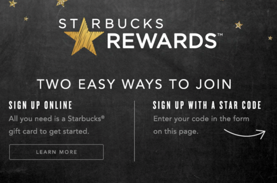
On the other hand, you might just let your customers earn rewards for every purchase they make. This is a strategy that Starbucks uses with its reward program.

As customers increase their spending with Starbucks, they get the reward of extra points that they can put towards future purchases. This keeps customers coming back for more and may even entice some clients to buy Starbucks when they otherwise wouldn’t. 

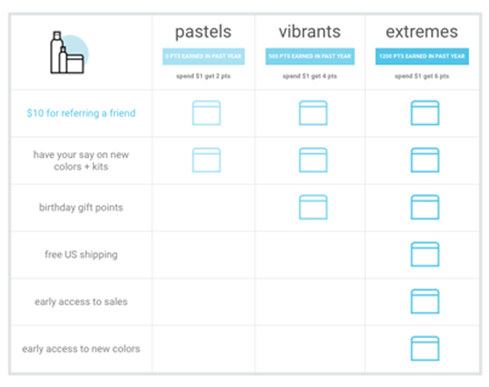
The oVertone company is another excellent example of a brand using gamified rewards with its marketing strategy. The loyalty program breaks down into tiers, where users can see how much they need to spend to ascend to the next level. New rewards and perks appear with each level. 

Remember, when building a loyalty program:

  • Make your customers feel special: Ensure that your audience feels good about being one of the lucky few in your loyalty program. Give discounts and offers they can’t get elsewhere.
  • Keep them informed: Make it easy for your customers to see what they need to do to get their next reward, so they keep coming back for more. 
  • Mix things up sometimes: To stop the experience from getting boring, roll out things like “double points” days and bonuses for your most active customers. 

3. Encourage Customer Interaction

The biggest benefit of gamification is that it encourages and increases customer interaction. You can give rewards to participants that comment on your blog posts, for instance, or share your posts on social. The customer benefits from the reward, while you get the advantage of a better business presence. 

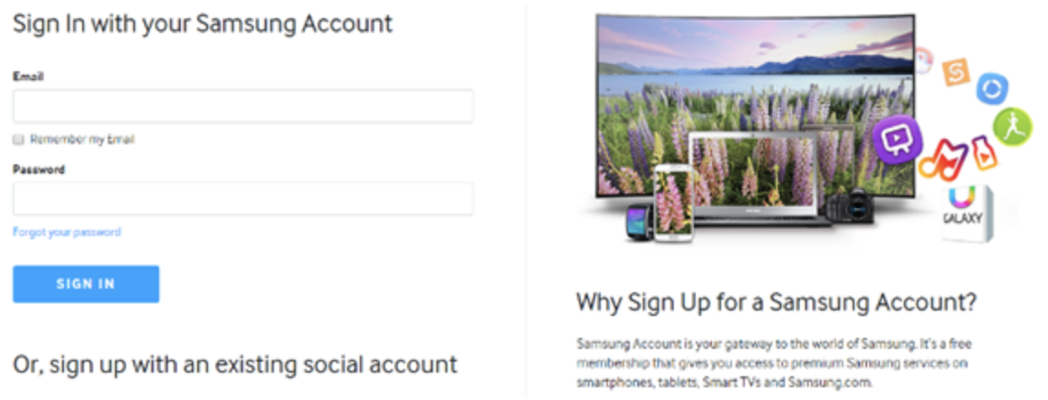
Samsung drives interaction with gamification with a function on its website that allows customers to discuss issues and watch videos. The most active participants get a badge for their efforts. 

If your business structure requires a lot of engagement from your audience, then using gamification elements can encourage them to stick with you for longer rather than losing interest. For instance, language learning software Duolingo has a four-point gamification strategy for its users.

Duolingo knows that learning a new language takes a lot of time, so it asks users to set small specific goals instead. The smaller tasks bring users back regularly, and consistent users gain rewards. There’s even a progress bar to help you track your progress compared to other customers. 

Gamification gives your customers another reason to keep coming back and connecting with your brand. That makes a lot of sense for companies that rely on long-term relationships with customers, like Duolingo and other teaching brands, for instance. Remember:

  • Make it simple: People will only want to interact with your brand if it’s easy to do so. Make it clear what you want your customer to do and what they need to do next. 
  • Reward every action: Keep people coming back for more by rewarding them for their actions, even if it’s just with a gold star or digital sticker. 
  • Nudge inactive customers: If a client gets involved in your interactive content, then stops participating, send an email reminding them why they should come back. 

4. Run Contests and Offer Prizes

Probably one of the easiest ways to use gamification in your advertising campaigns is with a competition. Contests and competitions have been around since the dawn of business. They’re a useful way for companies to collect information from customers, particularly if you ask your clients to sign up to your site with an email address to get involved. 

Competitions are also a way to push your audience into doing positive things for your company. For instance, you could run a competition where consumers share a social media post and tag a friend to enter. Or you could have a competition that asks your clients to refer a friend to get involved. 

When KIND, a healthy snack company, wanted to connect with its customers and create a new product, it didn’t just do market research. Instead, the company created the “Raise the Bar” contest to let customers cast a vote for which flavor they wanted to see next.

When 123ContactForm wanted to engage its audience, it gave people the chance to win one of three platinum subscriptions for 6 months. 

Contests are naturally exciting and fun to take part in. They’re an opportunity to get your audience excited, and you don’t need to give anything huge away either. Just make sure that the prize you offer is something that your audience will be interested in. 

A few more pro tips include:

  • Generate hype first: Don’t just launch a contest out of nowhere; get people excited about the idea with announcement blogs, social media posts, and emails. 
  • Give people a lot of ways to get involved: If people can’t take part in the competition on social media, let them do something on your website instead. 
  • Follow up after the win: When someone does win something from your website, follow up with that winner and post pictures in the form of a blog/case study. This will generate more hype for your brand and get people excited about the next event. 

5. Get Your Audience Feeling Competitive

No matter how much they might deny it, most people are at least a little competitive. So when you’re implementing a gamification campaign into your content and marketing efforts, it pays to tap into that sense of competition. All you need to do is find a way to encourage your followers to compete. 

The best example of a company that did this particularly well is Nike. Nike and the Run Club app teamed up to motivate people to get involved with healthy activities. The app allowed users to customize and build their ideal training program based on their athletic level. 

At the same time, you could also win badges and trophies to share with your running community. The more you took part in challenges on the app, the more you could potentially win. 

The Fitbit application has a similar way of keeping customers engaged. When you download Fitbit, you can access information about your exercise strategies and potentially track your progress towards your goals. However, there are also measurable achievements to earn – like a badge when you first walk 500 miles. 

Users on Fitbit can also find their friends using the same app and compete with them in various challenges. 

To successfully add a competition to your gamification strategy, remember:

  • It needs to be social: People will be more inclined to get involved if they show off their achievements. So make sure that people can showcase their accomplishments. 
  • Make people want to win: There needs to be a reason to get to the top of the leaderboard. You might offer people discounts or exclusive prizes if they accomplish certain goals. 
  • Show progress: Prompt people to keep working on reaching their targets by showing them how close they are to success. 

6. Make Boring Content Seem More Interesting

Some content is naturally more engaging than others. If you want to showcase some important information or data, you might create a whitepaper or a report. Unfortunately, the result can be a relatively bland piece of content.

With elements of gamification, you can make the experience a lot more engaging and interesting. Sites like Daytum.com allow users to turn personal stats and information into charts that showcase information in engaging ways. You can allow your users to track their progress through the report and rack up points as they go. 

Adding subtle elements to otherwise clinical and less interesting information is a wonderful way to make the experience more exciting. The more enticed your customers are by your content, the more likely it is that you’ll sell them on your business. 

Gamify Your Marketing Strategy

Gamification isn’t a new concept, but it’s one that many companies and designers can begin to take advantage of these days. Thanks to more advanced browsers and smartphones, customers can more fully enjoy the interactive elements of websites and content campaigns. 

As your audience dives deeper into the digital world, they expect more unique experiences from you. Gamification can make any website or marketing experience more memorable. It’s time to take advantage. 

Source

The post 7 Ways to Use Gamification in Marketing Campaigns  first appeared on Webdesigner Depot.


Source de l’article sur Webdesignerdepot

According to a recent Hubspot survey, more than 85% of marketers believe video content is essential for any marketing strategy. This percentage is more than 20% higher than in 2016.

Understanding why this is the case is not hard. Modern digital marketing is all about engaging with your audience and sharing personal stories. And there’s simply no better way to do that than video content.

Videos are engaging for people of all ages and less boring than other types of content. However, it’s not easy to create or optimize video content. That’s why we have created a list of the top 10 video content tips and tricks you should follow.

Top 10 Tips and Tricks to Succeed in Video Content Marketing 

Whether you are an influencer, blogger, or business owner, video content is important for promoting your services or products. The following tips will help you improve your video content strategies.

Plus, you can apply these tactics across all websites and platforms: from your website or YouTube channel to social media platforms like Instagram or Twitter.

1. Utilize Video SEO

Contrary to what many believe, SEO does not only apply to written content. In fact, video SEO is just as important for drawing organic traffic to your website or social network account.

You can achieve this in several ways. When you upload a new video, you need to consider things like keywords, tags, file names, and descriptions. However, this is only part of what you can do to optimize your videos for SEO purposes.

There are plenty of video SEO guides for beginners that can help you improve your online presence through your video content. 

2. Identify Your Goals and the Scope of Your Videos

As with written and visual content in general, it is critical to identify your business goals for video content. This is one of the first things you should think about when launching a new video content campaign.

Think about what you want to achieve. For example, do you need to generate new customer leads or expand your audience? Considering the reach of your videos can help you stand out from your competitors.

When it comes to video content, planning is key. For this reason, setting the goals of your strategy should be a priority.

3. Schedule Your Video Content

While it’s important to set goals, no video content strategy will work without consistency. Planning your video content is the best way to be consistent when creating, uploading, and promoting.

There are many online apps and tools that can help you organize your video content strategy. For example, scheduling tools like Buffer or MeetEdgar can help you keep everything organized and save time uploading your videos.

In addition to these social media scheduling tools, you can also use apps like Trello to help you organize your content creation in general.

4. Use Premade Material like Instagram Templates

If you are a professional video creator or video editor, you’ll have no problem creating top-notch video content. But what happens if you have no experience with video content at all?

Luckily, there are plenty of tools out there to make your life easier. For example, if you want to create video stories for Instagram, you can use captivating pre-made Instagram templates.

Editing such templates using software like Photoshop can save you both time and money. However, if you do not have Photoshop experience, you can also create videos using simple online editors like Canva

5. Make Your Videos Engaging and Emotional

There are a few tips we would like to share when it comes to the content of videos. An important thing to keep in mind is that your videos should always be engaging. If you don’t try to engage with your audience through your videos, there is a big chance of failure. 

Therefore, whether you own a personal blog or an enormous corporate website, your video content should connect you emotionally with your audience. Adding a personal feel to your videos is a fantastic approach to consider. 

By doing so, your customers/readers will feel the need to engage by sharing their stories with you.  

6. Create Educational and Relevant Video Content

There are a few tips we’d like to share with you when it comes to video content. One important thing to keep in mind is that your videos should always be engaging. If you are not trying to engage your audience through your videos, there is a high chance of failure.

Whether you have a personal blog or a huge corporate website, your video content should connect emotionally with your audience. Adding a personal touch to your videos is an excellent approach to consider.

This way, your customers/readers will feel the need to engage by sharing their stories with you.

7. Implement CTAs

Calls to action are one of the most effective marketing strategies for written content. Although most websites only include CTAs on the homepage, it’s a brilliant thing to also use them in blog posts, videos, and visual content in general.

You should let your customers know how they can interact with your brand. For example, let them know about your website or how they can follow you on social media for more information.

CTAs are the best way to keep your customers and ultimately increase your conversion rates.

8. Focus on Storytelling

Videos that focus on sales often bore viewers. For this reason, you should add some value to your video content. Creating videos that act like stories is a great thing to do.

When you tell a personal story, your customers can better understand your brand and how it can help them. Remember, storytelling makes your content more engaging and interesting.

9. Promote your Content

Say you have developed a great video content strategy and have already created some top-notch videos. What should be your next step? Well, maximizing your target audience is a smart approach.

You can achieve this by promoting your videos on platforms like Facebook, YouTube, Instagram, etc. Another smart move is to incorporate your video content into other content like blog posts, your website, etc.

10. Occasionally Evaluate your Video Content Strategy

Since you have already established your goals and the scope of your videos, you know exactly what you want to achieve with your video content strategy. Therefore, it’s important to evaluate how your plan is working. If you are happy with the analytics of your videos, that’s great.

If not, you can always consider what’s going wrong. For example, maybe you need to promote your videos better or include more CTAs.

Wrap Up

In this article, we analyzed how important video content has become for marketing. For this reason, implementing videos into your marketing strategies is a great thing to do.

If you follow the tips and tricks above, you will increase your video content strategy’s chances of success.


Featured image via Unsplash.

Source

The post 10 Tips to Help Video Content Succeed in 2021 first appeared on Webdesigner Depot.


Source de l’article sur Webdesignerdepot

Landing pages are crucial for conversions. User-friendly landing pages rank higher in the search engines and generate the maximum leads.

Interestingly, user behavior changes every year, and new website design trends should be kept in mind to continue acquiring sales from your existing landing pages.

If your high-performing landing pages in 2019 have suddenly started underperforming in 2021, then it is a clear indication that your landing pages need a strategic revamp to record higher conversions.

Landing page revisions are necessary for reduced bounce rate, more visitor time on the page, and better user actions.

This article will discuss some of the top web design trends of 2021 that brands have adopted to revamp their landing page designs. You can learn from the trends and apply your own custom design intelligence to redesign your landing pages for 2022 and convert the maximum number of visitors.

Let’s begin…

Why Landing Page Design Is Crucial For Conversions

Landing pages are the first stop on your consumers’ online buying journey and the first chance to put an impression.

People on the internet are becoming less patient. It takes only about 50 milliseconds for a visitor to form an opinion about a brand and decide whether they want to stay or leave the website.

Convincing modern customers to buy products or fill up query forms on a landing page is not easy with traditional website elements.

In 2021, it is now harder to impress visitors landing on your website than in 2019. Keeping in mind the audience of 2021 and beyond, an ideal landing page should be user-friendly, engaging, innovative and should encourage users to take action.

Here are some of the top reasons why landing page design is so crucial for conversions:

  • You get barely 7 seconds to create a strong impression. It is a time span in which visitors roughly scan the page and make their decisions.
  • Publishing 40+ effective landing pages at regular intervals can generate 12X more leads.
  • The average conversion rate from the landing page across all industries is only 2.35%.
  • Using the right types of targeting and testing can boost landing page conversion rates by up to 300%.

Considering the above stats, it can be easily said that a landing page has to be impressive and quick enough to impact the visitors positively.

7 High Converting Landing Pages & Lessons You Can Learn From Each

Below are some of the best high-converting landing pages, which were just updated recently in 2021. For each page, we list a lesson you can learn to inspire your next design revision in 2021 and ahead:

Example #1 – Replace Boring Customer Info Forms With An Interactive Quiz

Landing Page: Nextiva’s Unified Communications Readiness Quiz Landing Page

Industry: Voice Over IP software

Conversion Measured By: Leads fill out a form if they are interested

Redesign focus: Improve the quantity and quality of leads

Solution: Substitute online form with an interactive quiz

In 2019 and even 2020, many businesses were practicing the trend of including a customer form on their landing pages as a call to action to initiate a quick customer action.

The customer information form was useful for businesses because it helped them generate quick leads. However, at the same time, there was no real reason pushing the customer to fill in the lead forms especially if it consisted of more than 2-3 fields.

Nextiva used its creativity to replace boring lead forms with interactive quizzes. In its 2021 page design, the company added a quiz for visitors to participate in.

The aim is to have interactive pages to keep visitors engaged and persuade them to stay on the page.

Here are the comparisons of both the designs:

2019

2021

Key Takeaways:

  • The 2021 landing page now has a free Unified Communications Readiness Quiz that allows business owners to fill the form interactively. Adding a quiz with the number of pages mentioned at the top tells the user how many steps are left to complete the quiz, making their waiting time easier.
  • The background image is replaced with communication icons to simplify the message of the kind of services they offer.
  • The page looks neater and appears to be easier to scan at a glance.

Example #2 – Emphasize Strong Visuals and Copy that Stresses on Product Details

Landing Page: Western Rise Homepage Variation

Industry: Ecommerce

Conversion Measured By: Apparel purchase

Major redesign focus: Improve the number of leads

Solution: Improve the copy and visuals

Western Rise, a clothing eCommerce company, realized the importance of having impressive images and detailed product information on its landing page.

The 2021 page replaced ordinary product images with strong visuals of the models wearing Western Rise clothing. Also, the product image includes extensive product details, which were missing on the older page.

Here is a clear comparison of the 2019 vs. 2021 landing pages of Western Rise:

2019

2021

Key Takeaways:

  • The new landing page has a powerful headline – Performance Clothing for Travel, Work, and Play. In just a couple of words, the brand tells everything about itself. ‘Performance Clothing’ is their unique selling proposition (USP) that tells the customers that their product is durable. Besides, the caption ‘Travel, Work, and Play’ tells what the product is about. Modern customers like products that fulfill a particular need, and Western Rise made it easier for the users to realize the importance of their products which fulfilled their specific needs.
  • The bold visuals in the new page capture contemporary shots of the models that put a strong impression on the audience. Every image is clicked mindfully to explain the style and quality of the Western Rise clothing line.
  • The products displayed on the new page include every minor detail and feature that often other clothing brands ignore, such as the specialty of the product, occasions to wear, and weight other than colors, fabric, fitting, etc.

Example #3 – Use Strong Social Proof To Increase Conversions

Page: Aura Save 50% Landing Page

Industry: Identity Theft Software

Conversion Measured By: Online registration or an inbound call

Major redesign focus: Improve the number of signups

Solution: Add strong social proof

It is a known fact that social proof on sales pages is essential for increased conversions. But in 2021, the importance of social proof has gone too far.

Aura is an identity theft protection service that aims to build trust with its prospective customers when they first browse their landing page. Take a look at how Aura displays customer reviews above the fold to catch user’s attention.

Unlike others, Aura combined the rating stars and the review to prove customer satisfaction and emphasize their expertise in the field.

BONUS:

Another example of using strong social proof is the Exploding Topics newsletter landing page.

Exploding Topics is a newsletter with a pro subscription for content marketers and anyone interested in trending topics about any topic. It’s an excellent example that uses a lot of social proof on landing pages that give something away for free, like a weekly newsletter or an eBook.

If you could notice, the latest landing page below has multiple forms of social proof on a single page. First, they feature a list of brands that trust Exploding Topics. Secondly, they quote Wired Magazine founder Kevin Kelly’s feedback, followed by the logos and tweets praising the newsletter.

Key Takeaways:

  • Exploding Topics uses several different types of social proof that appeal to different demographics.
  • Their “trusted by” logos of world-renowned companies stand out to potential B2B subscribers.
  • Kevin Kelly’s quote is catching the attention of tech-savvy readers.
  • Despite packing the page with social proof, the opt-in form is still well above the fold. It is the best landing page practice that applies to nearly all pages.
  • The landing page uses actually embedded tweets (not screenshots), which help demonstrate that the tweets are legit.

While Exploding Topics have smartly used social proof on its page, the ideas of leveraging social proof are not limited to this only.

Example #4 – Focus On Visually Appealing Above the Fold Content

Landing Page: Perfect Keto Homepage Variation

Industry: Supplements

Conversion Measured By: Online purchase

Major redesign focus: Improve the number of purchases

Solution: Improve Above The Fold Content

Above the fold content greatly impacts customer’s decision-making. Perfect Keto lacked that appeal on its 2019 landing page design.

Hence, the 2021 design was revamped with better visuals and more professional looks.

The 2021 page received major changes in above-the-fold content, such as the top menu bar with the brand name not losing the user’s attention anymore and an additional menu bar giving a quick overview of what the brand offers.

The older page did have many social proofs, but those were limited to customers only. The 2021 design also highlighted the publications where the brand appeared, which proved exceptional in building customer trust.

Take a look at the two landing pages of Perfect Keto in 2019 and 2021:

2019

2021

Key Takeaways:

  • The 2021 landing page heading is more compelling because it clearly conveys what their product is all about. The older page was missing the actual purpose of the product.
  • An additional section on the new page to educate customers about the Keto diet and how to start it helps visitors understand the product even better.
  • The inclusion of a product image above the fold attracts user attention and makes the product trustworthy. People now know what they will be buying right at first sight of the page.
  • The new page proudly displays the products featured in the publications, such as Women’s Health, Healthline, Reader’s Digest, and Popsugar, which again helped customers trust the brand.
  • The page also features a video of the Perfect Keto founder that is brilliantly working in gaining visitor’s attention and faith.

Example #5 – Make The Call to Action More Compelling

Landing Page: Zendesk HelpDesk Softwage Landing Page

Industry: SaaS

Conversion Measured By: Online registration

Major redesign focus: Improve the number of registrations through the website

Solution: Make The CTA More Compelling

Zendesk did a clever job by replacing the sign-up form with a single button. On the older page, it was unclear to the user if the company has a trial option for free unless they move to linked pages. Such confusions often resulted in traffic bounces.

Adding the start free trial button on the 2021 page makes it easier for the users to understand that the product comes with a free trial. At the time, it helps the user take quick action.

Similarly, the ‘Get started’ button at the top was replaced with ‘Free trial’ with the same intention.

Moreover, chat support was added to guide users at any stage of the buyer journey. Live chats are vital to help visitors better understand the product and move a step ahead in the customer journey.

Take a look at below two images:

2019

2021

Key Takeaways

  • The CTA buttons have more actionable text and look more prominent.
  • The color choice for the button is in contrast with the background but matches the page theme.
  • The older page missed sales support, which is included in the new page for a better customer experience.
  • The tabs in the menu bar were reduced to four to make the page simple to use for users.

Example #6 – Use Contrast To Highlight Specific Copy On The Page

Landing Page: GetResponse Website Building Landing Page

Industry: Online Software

Conversion Measured By: Online signup

Major redesign focus: Improve the number of signups

Solution: Use contrast around important copy on the page

GetResponse focuses on attracting visitors’ attention towards the offerings from their business. Starting from above the fold section, the landing page highlights the texts that are important and need the visitors’ attention.

The infographic on the landing page is the next thing that promises to grab user attention while beautifully describing how this website builder works and is useful to the user.

Key Takeaways:

  • The text highlighted on the landing page draws the user’s attention towards what the business has to offer or unique selling points.
  • The infographics briefly explain the working of the tool in an easy-to-understand manner.
  • The Yellow color is used prominently on the landing page to attract user attention and persuades users to try the tool by listing its advantages.

Summary

Landing pages provide the first opportunity to create an impression in the minds of the consumers. A well-structured and mindfully designed page sets the right tone for your brand message and encourages users to choose your business.

However, the strategy for landing pages needs innovations from time to time for better results. The examples and tips shared above prove how landing pages in 2019 have seen significant improvement in 2021.

In the coming year, use these ideas to create landing pages that influence customer decisions and encourage them to take quick actions.

Source

The post 7 Landing Pages Comparisons To Improve Your Conversions in 2022 first appeared on Webdesigner Depot.


Source de l’article sur Webdesignerdepot