Articles

Many markets are saturated with competition; it’s no surprise that customers are expecting top-of-the-line experiences. Businesses must keep up with these ever-changing demands to remain competitive and drive forward.

One way to ensure customers have positive experiences is to take a look at your website. Your website is like your digital headquarters, where customers can browse through products or services, have frequently asked questions answered, and be able to reach you if they need direct support.

Making a site user-friendly and customer-centric will assist businesses while they work to build a loyal customer base. Customer happiness is more important now than ever and has the potential to make or break your business. We all know that happier customers spend more, and delighted customers will always come back for more.

Let’s explore some ways you can level up the customer experience on your website to foster customer loyalty and retention, as well as garner brand advocates for your business.

How Important Is CX?

As a site manager, your goal should be to meet customers’ needs. Creating a website is no simple task but can transform CX (customer experience).

Suppose a customer visits your site only to see a buffering symbol or a lag on their desktop or mobile device. This wouldn’t make for a positive experience, would it?

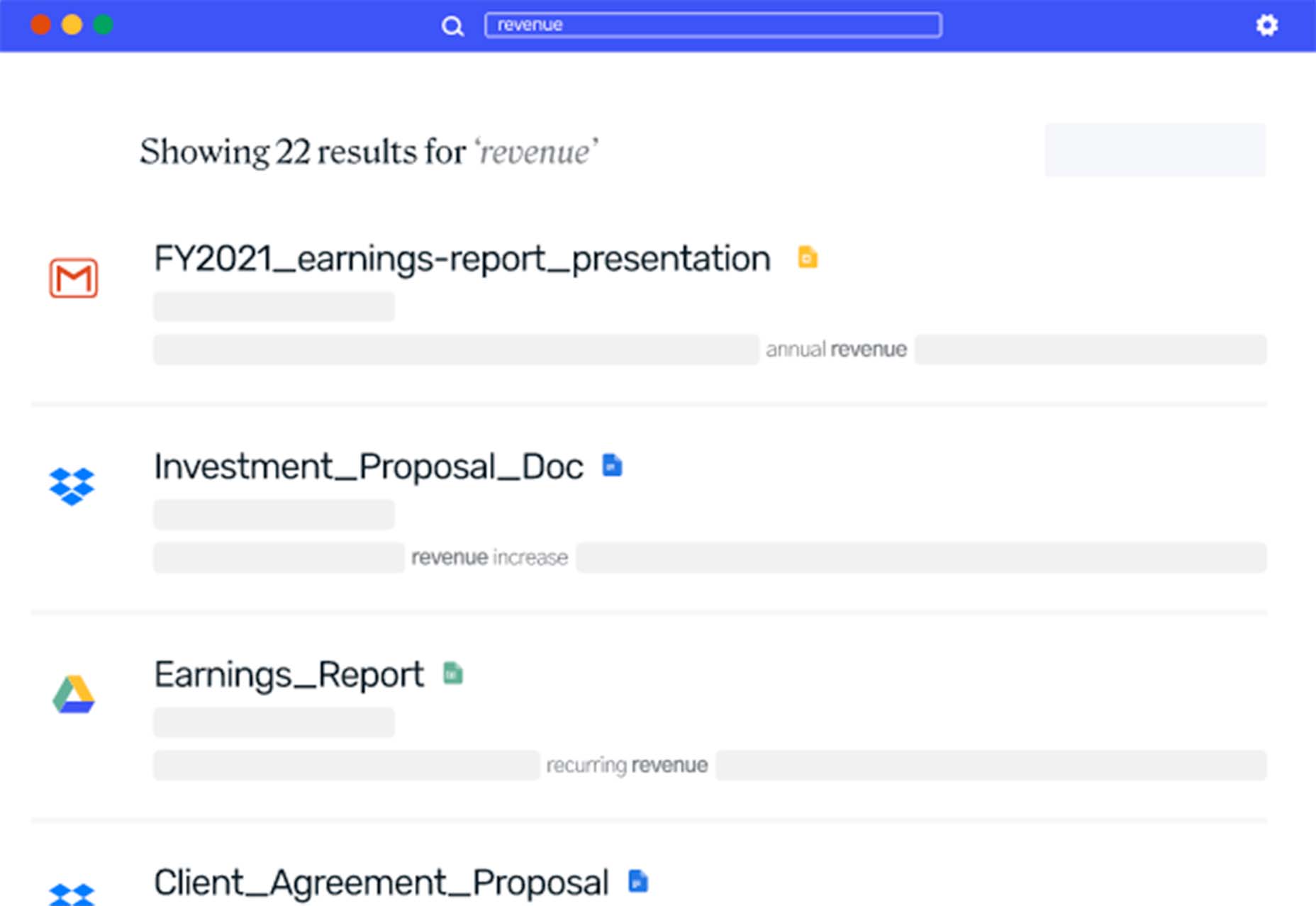
When customers have to spend extra time navigating your website to find what they’re looking for, it can directly lead to site abandonment, where customers leave the site before browsing. It’s vital to consistently monitor your website metrics to see if abandonment rates impact your overall traffic.

Customers who have enjoyable experiences browsing through your site are more likely to appreciate your brand and strongly consider purchasing whatever offerings you have.

Additionally, positive customer reviews can help your business gain new customers — word-of-mouth marketing is still relevant in 2021’s digital marketing landscape. Earning those 5-star reviews can help other potential customers see that they too could have a positive experience with your brand.

As you can see, CX is just as important as the products or services you offer, so keep that in mind as you set out on the journey to improve your website to advocate for your customer base.

Below, we’ll cover some of the most important elements and features of a strong business site so you can implement them.

Valuable Features to Include on Your Website

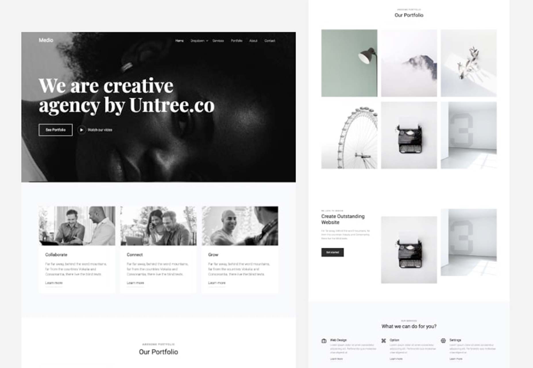
The features of your website are the foundation of your business. One of the best parts of building a killer website is that you can get as creative as you’d like with all of the features at your disposal.

Whether you use WordPress or another platform to host your website, you can always explore other paid services or offerings online to bring your site to the next level.

For example, the WooCommerce WordPress extension allows e-commerce sites to improve the overall appearance of their site, add customizations and, generally speaking, create a high-quality e-commerce store.

Below are some examples of elements you should consider incorporating into your web design. Offering these features will surely keep your site visible, relevant, and attractive to all types of customers.

1. Add Personalization

Every type of customer can benefit from a personalized experience, and it helps you turn them into loyal customers.

Personalization is becoming more prevalent in web design, whether it’s including past products they’ve viewed on your landing page or making it simple for them to log in to their account.

Maybe you allow your customers to create a wishlist, just as Amazon does. You could also make personalized deals or recommendations for your customers based on their past purchases or search history. When customers see this level of personalization, it may influence their purchasing decisions and make it simpler for them to order products.

2. Include Compelling and Unique Content

Every professional in the digital marketing space knows that content is king. The companies that include the most compelling content garner the most attention and increase the number of customers who make up their customer base. Here are some examples of what your content should look like:

  • Comprehensive
  • Useful
  • Accurate
  • Visually appealing
  • Helpful
  • A direct answer to a search engine query

By following these descriptions, your content will improve. Whether it’s a blog post or a photo or video, quality content is a driving factor in your user engagement. It helps to support your SEO strategy and will undoubtedly keep customers coming back.

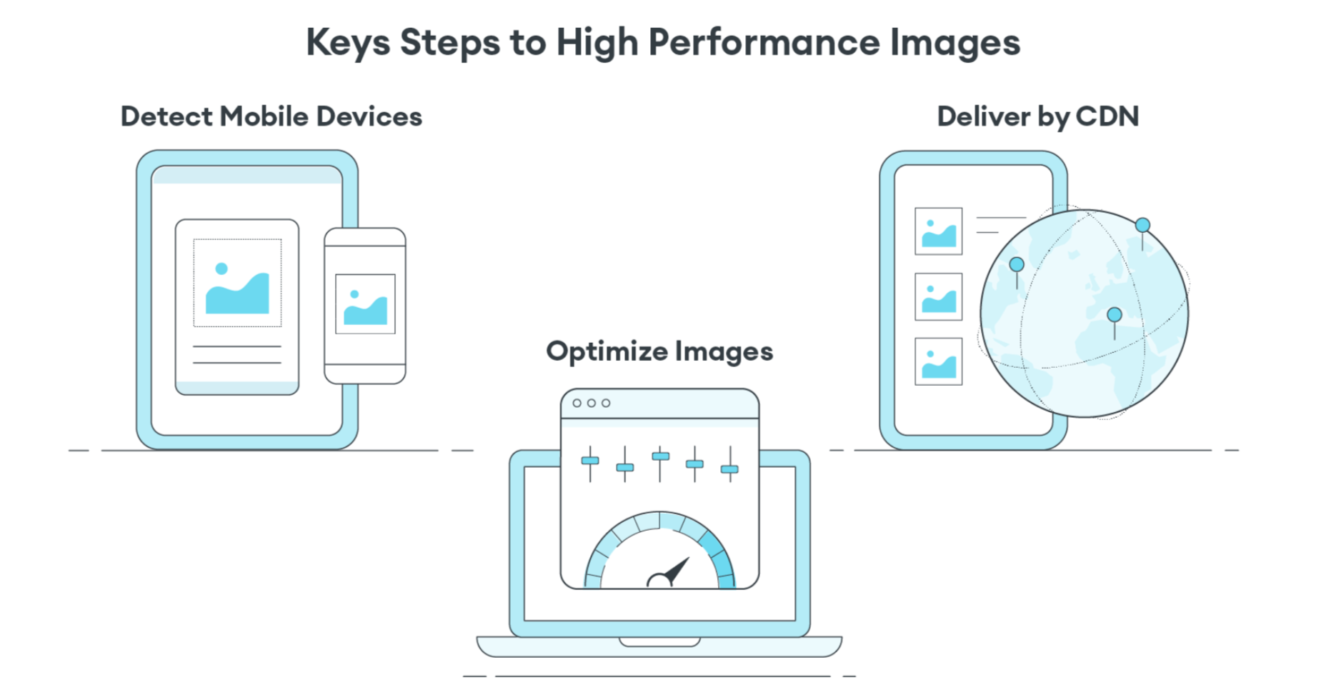
3. Prioritize Speed and Usability

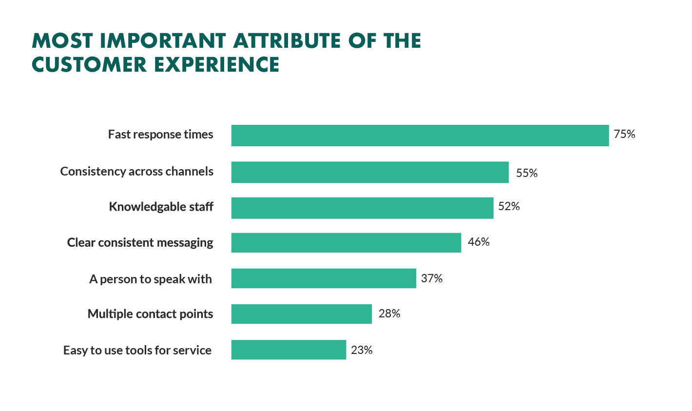
Because technology is an integral part of most people’s lives, customers expect to visit a fast, reliable website. No longer will customers wait patiently for a site to load. The dreaded buffering symbol is a clear indicator that your business is not taking customer experience into account.

It’s critical to create a website that loads quickly and is easy to use. Avoid organizing any tabs in a confusing way. Ensure that your website is visually attractive without overwhelming color schemes or photos that take up too much space.

Go for a more modern, contemporary look that’s easy on the eyes. Customers will appreciate this and will likely spend more time browsing your various website pages.

4. Focus on Navigation

Users should be able to access any page on your website with ease. They shouldn’t have to search for the right drop-down menu or type into the search bar unless they’re searching for a specific product or service.

The majority of users on a site, 70% to be exact, spend most of their time navigating freely without using the search bar. This should tell you how vital good navigation is to your business website. Placing menus on the top of your site is common practice — if you would rather place your drop-down menu somewhere else, make sure you’re putting it in a section where it’s easy to find.

Put yourself in your customers’ shoes. See what types of designs you can incorporate into your site to elevate UX and make browsing simple.

5. Make Sharing Simple

One of the best ways to grow your customer advocates is by leveraging your existing customers. Your customers should be able to easily send your product or service descriptions to their friends and family.

Rather than copying a link, include a share feature. If something on your site is worth sharing with other potential customers, make it easy for them to send it.

Social sharing plays a significant role in digital marketing — it helps to garner organic traffic to your website. You can reach a larger number of people than originally intended, which is the most important benefit to reap by making it easy to share links from your site.

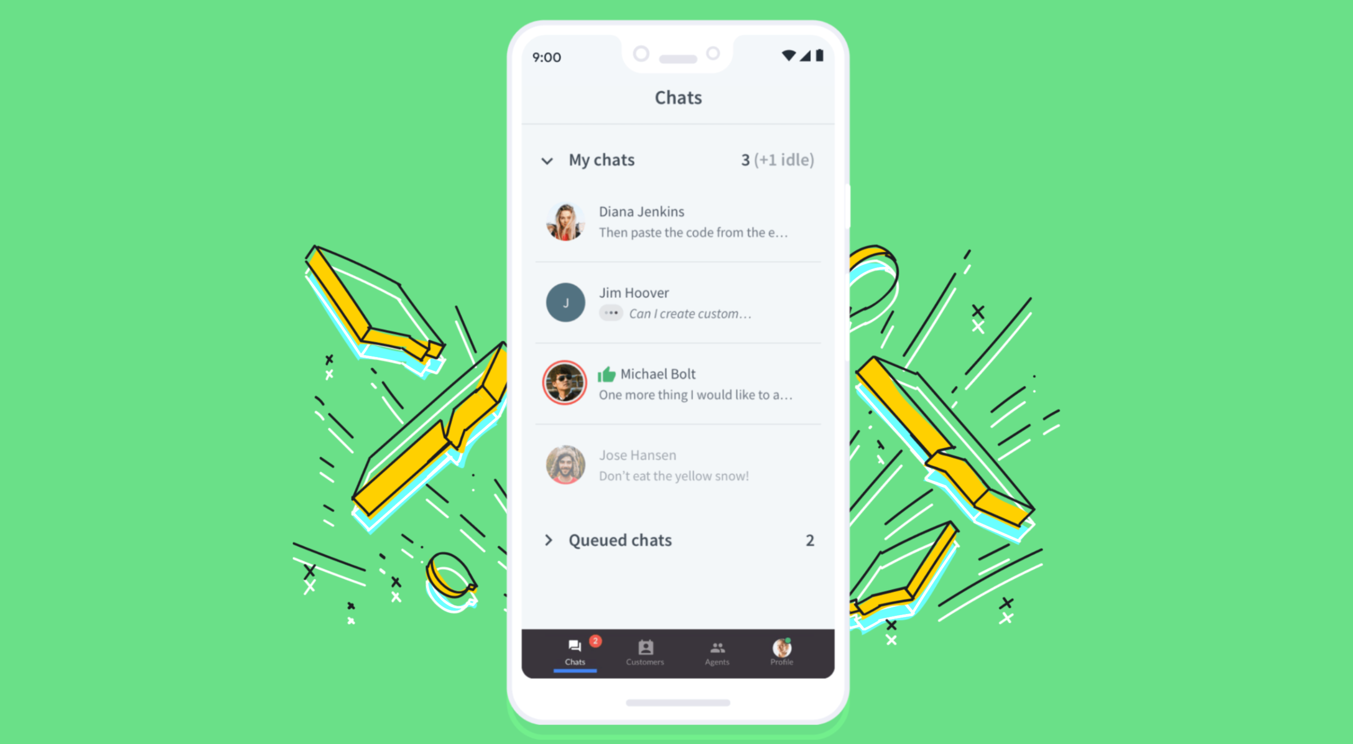
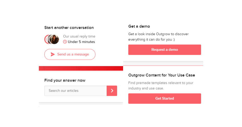
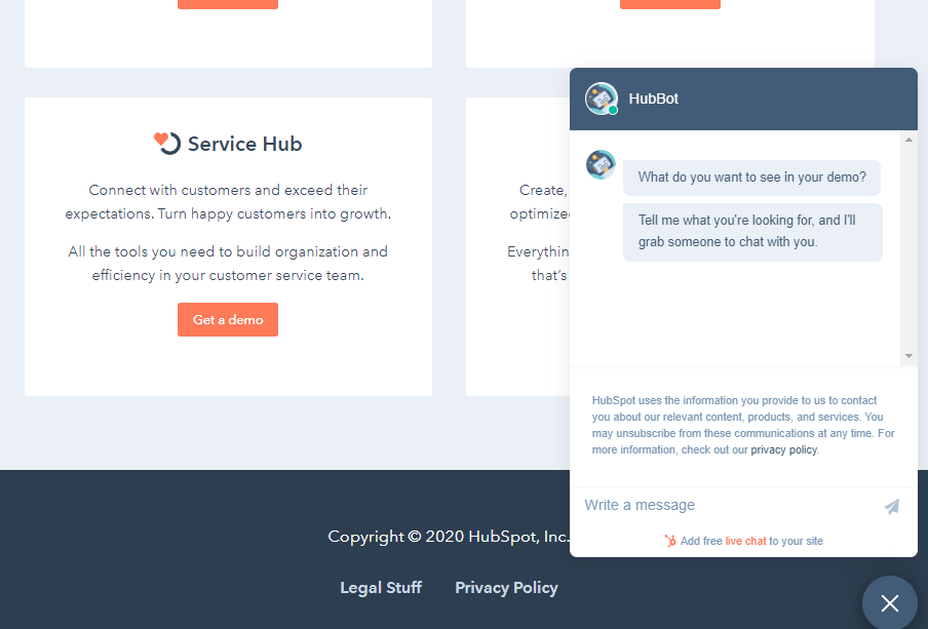
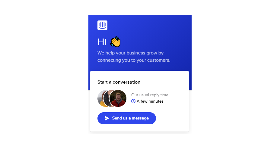
6. Incorporate Chatbots

Offering customer support by using chatbots is something major companies are incorporating into their website designs.

Suppose your customer is trying to complete a purchase but runs into a problem with a coupon they’d like to use. Rather than wait on hold on the phone or for an email in their inbox a few days later, an automated chatbot can step in and assist them.

Chatbots are on the rise, and it’ll be critical for your business to include them on your site. Proactive web actions can increase your site’s conversion rates and improve the overall customer experience.

7. Allow Customer Feedback

It shouldn’t come as a surprise that allowing your customers to share their experience with your brand can help you better understand them and the solutions they’re looking for from you.

Did you know that brands with superior customer service can generate 5.7 times more revenue than their competitors? When you’re in touch with your audience, you’re better able to include features they want and need to have a positive experience. By taking advantage of customer feedback, you can make necessary changes to your site to better serve your customers.

Advocate for Your Customer Base

All of the examples listed above can help elevate your site and improve the overall experience for existing and potential customers. Isn’t that the goal of any business, regardless of industry?

To serve your customers effectively means they’ll feel valued and come back for more. Whether that’s ordering more products or requesting more services, you’ll see the benefits of including the elements we’ve covered in this post.

As a recap, here are some steps you can take to advocate for your loyal customers:

  1. Add personalization
  2. Include unique content
  3. Make your site fast and usable
  4. Provide easy navigation
  5. Allow for easy sharing
  6. Leverage chatbots
  7. Be open to feedback

Overall, customer experience will become more important in the future as customer expectations change. Standing out from your competitors is no longer an option but a necessity. So many markets are struggling to do just that — so if you’re able to offer unique features on your site, it could potentially draw more customers in and drive them to purchase.


Featured image via Unsplash.

Source

The post 7 Simple Ways to Boost Your Website’s CX first appeared on Webdesigner Depot.


Source de l’article sur Webdesignerdepot

There are some spook-tacular finds in this month’s October collection of resources and tools for designers and developers. From interesting tools that can help in the design process to boo-tiful typefaces, there’s something for everyone here.

Here’s what is new for designers this month…

Atropos

Atropos is a lightweight, open-source JavaScript library to create touch-friendly, three-dimensional hover effects. The results are stunning and have a nice parallax style. Everything is highly configurable and customizable. It’s available for JavaScript, React, and Vue.js and has zero dependencies.

CSS Gradient Editor

CSS Gradient Editor helps you create the perfect gradient style – you can start from presets – that you can use in projects. Design a background, fill, or almost any other gradient element you might need, make adjustments or customizations, and then get the CSS with one click so you can use it right away.

Octopus.do

Octopus.do is a fast visual sitemap builder that lets you work in real-time using the content brick method. Share and collaborate in real-time and there’s no signup required to use it.

Pirsch Analytics

Pirsch Analytics is a privacy-friendly, open-source alternative to Google Analytics — lightweight, cookie-free, and easily integrated into any website or directly into your backend. It includes filters to see metrics in the way you want and light and dark modes.

Basic Pattern Repository

Basic Pattern Repository is a collection of simple SVG patterns for projects. Everything is rooted in a simple style to help push projects along quicker. You can get it via GitHub or as a Figma Library.

Blobr

Blobr is a way to get a branded API portal, manage access, and monitor usage all in one place. Customize everything to fit your brand and the tool grows as you do with the ability to increase or change capacity. Plus, it is easy to set up and free to use.

HEXplorer

HEXplorer helps you better understand something you use all the time – HEX colors. This pen by Rob DiMarzo shows how the values for different colors come together to provide greater comprehension when it comes to this color format.

CCCreate

CCCreate is a curated collection of tools and resources for web creators. It includes some tools that have been around for a while as well as some newbies. Everything is grouped and sorted by type of resources – color, icons, type, layouts, animation, shapes, docs, and miscellaneous so you can find what you are looking for faster.

Glass

Glass is a photo-sharing app for photographers. It’s a social network of sorts that lets you share images with the greater photography community without “likes.” Just great images.

Revolt

Revolt is a chat app that’s still in beta and designed for easy communication without having to download apps. It’s an open-source project that is customizable and with an intuitive and recognizable interface. The thing that’s different about this app is that it is built on a privacy-first model.

Doodle Ipsum

Doodle Ipsum is the illustrated version of placeholder elements. Customize your doodles, grab the code, and use them on your web prototypes, landing pages, or no-code tools.

Mechanic

Mechanic is an open-source framework that helps you create custom, web-based tools that export design assets in your browser. The best part is you can try it right on screen using the “poster generator.” If you like what you see, there’s plenty of documentation to help you along the way.

Medio Website Template

Medio is an agency-style website design template for Bootstrap 5. The layout is perfect for a design agency or marketing group but can be adjusted for almost any multi-purpose design. The free template includes a minimal design and includes features such as parallax, popup video, and more.

Tutorial: Simplifying Form Styles with Accent Color

This tutorial is a life-saver when it comes to using and understanding the new CSS accent-color property. This quick lesson will help make your life easier and is simple to use. It starts with setting an accent-color property on the root element and then applying it.

Houdini.how

Houdini.how is a worklet library that is full of CSS and code examples to help you work smarter. See how different elements look cross-browser and learn to adjust the code and put them together in just the way you want. Houdini is a set of low-level APIs that exposes parts of the CSS engine, giving developers the power to extend CSS by hooking into the styling and layout process of a browser’s rendering engine.

Chainstarters

Chainstarters is a powerful, rapid, Web3-enabled platform for software developers. It eliminates the burden of setting up and maintaining a secure and scalable infrastructure, allowing you to focus on creating amazing technology.

Web Vitals Robot

Web Vitals Robot is a search optimization tool that monitors SEO metrics for you – so you can prevent your business from disappearing from Google.

Searchable

Searchable is a unified search tool that looks at local, cloud storage, and apps to find the files you are looking for. It returns results in a jiffy with previews so you don’t have to open every file to find what you are looking for.

Athlone

Athlone is a fun serif with lots of personality. The free demo version includes a limited character set for personal use only and the full version has everything you need for fun display or branding with this typeface.

Capitana

Capitana is a Geometric Sans typeface with humanistic proportions and open apertures. This means that all shapes are constructed from basic forms, the circle, triangle, and square, and are designed according to the classic proportions of the Roman Antiqua. Distinct ascenders and pointed apexes with deep overshoot give it a cool beauty and classic elegance. It includes 784 characters per style in nine weights from Thin to Black, it offers both light and extremely heavy weights for striking headlines.

Colours

Colours is a funky script with just enough texture to keep it interesting. The free version includes a partial character set and is for personal use only.

Flexible

Flexible is a variable typeface that includes 18 styles in the family. It’s made for creativity and display use. This typeface is made for experimenting because there are so many things you can do with this single family.

Singo Sans Serif

Singo Sans Serif is a simple and strong typeface that would make an excellent display option. The free version is for personal use only. Fun fact: Singo means Lion in Indonesia, which is where the name of this strong font comes from.

Source

The post Exciting New Tools For Designers, October 2021 first appeared on Webdesigner Depot.


Source de l’article sur Webdesignerdepot

User experience is one of the most important principles of web design. There’s no doubt that you focus on UX with every page you design on the web, whether it’s a portfolio, a profile page, or an entire website. 

Unfortunately, what many experts forget is that UX doesn’t just apply to digital pages. That means that you need to discover the right UX strategies for everything from your website homepages to your email marketing messages and even your listings on Google. 

Today, we’re going to explore ways you can apply UX principles to your client’s image on search engines. 

Why Your Search Engine Listing Matters

Let’s start with the basics…

89% of customers start their purchasing process with a search engine. 

That means that whether you’re creating a portfolio to sell your services or building a website for a client, the first connection a customer has with your design isn’t on the homepage.

Developers and designers know that first impressions count when it comes to succeeding online. However, they assume that those first impressions happen on a social media channel, a landing page, or a home page. 

The truth is that most of the time, you’re driving a specific experience for an end-user before you even realize it. Before you can wow an audience with a beautiful site design or a fantastic CTA offer, you need to convince them to click on your Google link.

Just as UX on a website is all about giving your audience what they need in an informed and strategic manner, UX in search engine results works the same way. 

How to Make Your Search Listing Stand Out with UX

So, how do you begin to apply the principles of UX to your Google Search results?

It’s much easier than you’d think. 

Step 1: Show Immediate Value 

Delivering an excellent experience on a website often means providing end-users with the information they need as quickly as possible. Imagine designing a landing page; you wouldn’t want your audience to scroll forever to find what they need. Instead, you’d make sure that the value of the page was immediately apparent. 

When creating an image for your search engine listing, you’ll need to take the same approach. This often means thinking carefully about two things:

  • Your headline
  • Your meta description

Around 8 out of 10 users say that they’ll click a title if it’s compelling. That means that before you do anything else to improve your SEO strategy, you need to make sure that the title of your web page is going to grab the audience’s attention. 

The best titles deliver instant value.

Immediately, these titles tell the audience exactly what they’re going to get when they click onto the page. The promise drives action, while clarity highlights the informed nature of the brand. 

The great thing about using an excellent title for a page is that it doesn’t matter where you’re ranked on the search results. Whether you’re number 2 or number 5, your customers will click if they find something they want. 

It’s just like using a CTA on a landing page. Make sure your titles are:

  • Informative: Show your audience value immediately
  • Optimized for mobile: Remember, your audience might not see your full title on some screens. That means that you need to make the initial words count.
  • Easy to read: Keep it short, simple, and straightforward. Speak the end-user’s language

Step 2: Build Trust with Your URLs

Trust factors are another essential part of good UX

When designing a website for a new brand, you know that it’s your job to make visitors feel at ease. Even in today’s digital world, many customers won’t feel comfortable giving their money or details to a new company. 

Within the website that you design, you can implement things like trust symbols, reviews, and testimonials to enhance brand credibility. In the search engines, it all starts with your URL. 

Search-friendly URLs that highlight the nature of the page will put your audience’s mind at ease. When they click on a page about “What is SEO” in the SERPs, they want to see an URL that matches, not a bunch of numbers and symbols

Use search-friendly permalink structures to make your listing seem more authoritative. This will increase the chances of your customer clicking through to a page and make them more likely to share the link with friends. 

Once you decide on a link structure, make sure that it stays consistent throughout the entire site. If a link doesn’t appear to match the rest of the URLs that your audience sees for your website, they may think they’re on the wrong page. That increases your bounce rate. 

Step 3: Be Informative with Your Meta Description

To deliver excellent UX on a website, you ensure that your visitor can find all the answers to their most pressing questions as quickly as possible. This includes providing the right information on each page and using the correct navigational structure to support a visitor’s journey. 

In the SERPs, you can deliver that same informative experience with a meta description. Although meta descriptions often get ignored, they can provide a lot of value and help you or your client make the right first impression. 

To master your meta descriptions:

  • Use the full 160 characters: Make the most of your meta description by providing as much useful information as you can within that small space. 
  • Include a CTA: Just as CTAs help guide customers through the pages on a website, they can assist with pulling in clicks on the SERPs. A call to action like “read about the” or “click here” makes sense when you’re boosting your search image. 
  • Focus on value: Concentrate on providing your customers with an insight into what’s in it for them if they click on your listing.

Don’t forget that adding keywords to your meta description is often helpful too. Keywords will boost your chances of a higher ranking, but they’ll also show your audience that they’re looking at the right result. 

Step 4: Draw the Eye with Rich Snippets

You’ve probably noticed that the search engine result pages have changed quite a bit in the last couple of years. As Google strives to make results more relevant and informative, we’ve seen the rise of things like rich snippets. Rich snippets are excellent for telling your audience where to look. 

On a website, you would use design elements, like contrasting colors and animation, to pull your audience’s attention to a specific space. In search engines, rich snippets can drive the same outcomes. The difference is that instead of telling a visitor what to do next on a page, you’re telling them to click on your site, not a competitor’s. 

When Google introduced rich snippets, it wanted to provide administrators with a way of showcasing their best content. Rich snippets are most commonly used today on product and contact pages because they can show off reviews. 

Install a rich snippet plugin into your site if you’re a WordPress user or your client is. When you enter the content that you need into the website, use the drop-down menu in your Rich snippet tool to configure the snippet.

Ideally, you’ll want to aim for the full, rich snippet if you want to stand out at the top of the search results. Most featured snippets have both text and an image. You need to access both of these by writing great content and combining it with a relevant image. 

Step 5: Provide Diversity (Take Up More of the Results)

As a website designer or developer, you’ll know that different people will often be drawn to different things. Some of your visitors might immediately see a set of bullet-points and use them to search for the answer to their question. Other visitors will want pictures or videos to guide them. So, how do you deliver that kind of diversity in the SERPS?

The easiest option is to aim to take up more of the search result pages. Google now delivers a bunch of different ways for customers to get the answers they crave. When you search for “How to use Google my Business” on Google, you’ll see links to blogs, as well as a list of YouTube Videos and the “People Also Ask” section. 

Making sure that you or a client has different content rankings for the same keywords can significantly improve any customer’s experience on the search engines. Often, the process of spreading your image out across the SERPs is as simple as creating some different kinds of content. 

To access the benefits of video, ask your client to create YouTube videos for some of their most commonly asked questions or most covered topics. If you’re helping with SEO marketing for your client, then make sure they have an FAQ page or a way of answering questions quickly and concisely on articles, so they’re more likely to appear in “People Also Ask”.

Step 6: Add Authority with Google My Business

Speaking of Google My Business, that’s another excellent tool for improving UX in the search results. It allows business owners to manage how information appears in the search results. 

With this service, you can manage a company’s position on Google maps, the Knowledge Graph, and any online reviews. Establishing a company’s location is one of the most important things you can do to help audiences find a business quickly. Remember, half of the customers that do a local search on a smartphone end up visiting the store within the same day. 

Start by setting up the Google Business listing for yourself or your client. All you need to do is hit the “Start Now” button and fill out every relevant field offered by Google. The more information you can add to Google My Business, the more your listing will stand out. Make sure you:

  • Choose a category for a business, like “Grocery store.”
  • Load up high-quality and high-resolution images
  • Ensure your information matches on every platform
  • Use a local number for contact
  • Encourage reviews to give your listing a five-star rating

Taking advantage of a Google My Business listing will ensure that your audience has all the information they need to make an informed decision about your company before they click through to the site. This means that you or your client gets more warm leads and fewer people stumbling onto your website that might not want to buy from you. 

Step 7: Use Structured Data Markup to Answer Questions

If you’re already using rich snippets in your Google listings, you should also have a plan for structured schema markup. Schema markup on Google tells the search engines what your data means. This means that you can add extra information to your listings that will more accurately guide your customers to the support they need. 

Providing additional schema markup information to your listings gives them an extra finishing touch to ensure that they stand out from the competition. For example, you might add something like a “product price” to a product page or information about the product’s availability.

Alternatively, you could provide the people who see a search result with other options. This could be an excellent option if you’re concerned that some of the people who might come across your listing might need slightly different information. 

For instance, you can ask Google to list other pages along with your search results that customers can “jump to” if they need additional insights.

Baking structured data into your design process when you’re working on a website does many positive things. First, it makes the search engine’s job easier so that you can ensure that you or your client ranks higher. Additionally, it means that your web listings will be more thorough and valuable.

Since UX is all about giving your audience the best possible experience with a brand, that starts with making sure they get the information they need in the search results. 

Constantly Improve and Experiment

Remember, as you begin to embed elements of UX into your search engine listings, it’s essential to be aware of relevant evolutions. Ultimately, the needs of any audience can change very rapidly. Paying attention to your customers and what kind of links they click on the most will provide you with lots of valuable data. You can use Google analytics to A/B test things like titles, pictures, featured snippets, and other things that may affect UX. 

At the same time, it’s worth noting that the Google search algorithms are constantly changing too. Running split tests on different pages will give you an insight into what your customers want. However, you’ll need to keep an eye on the latest documentation about Google Search if you want to avoid falling behind the competition. 

Like most aspects of exceptional UX, mastering your SERP position isn’t a “set it and forget it” strategy. Instead, you’ll need to work on constantly expanding your knowledge if you want to show clients that you can combine UX and SEO effectively. 

Make sure you have plenty of tools set up to offer reports and insights into the kind of changes that you may need to make to align with search engine expectations. 

Making the Most of UX in the SERPS

It’s easy to forget that there’s more to UX than making your buttons clickable on mobile devices or ensuring that scrolling feels smooth. For a designer or developer to deliver excellent UX for a brand, they need to consider every interaction that a company and customer has. 

This means starting with the way a website appears when it’s listed on the search engines most of the time. Getting your SEO listing right doesn’t just boost your chances of a good ranking. This strategy also improves your reputation with your audience and delivers more meaningful moments in the buyer journey. 

Don’t underestimate the power of UX in SERPs. 


Featured image via Pexels.

Source

The post 7 UX Principles to Boost SERPs first appeared on Webdesigner Depot.


Source de l’article sur Webdesignerdepot

PageSpeed Insights is a free performance measurement tool provided by Google. It analyzes the contents of a web page for desktop and mobile devices. It provides a single number score (from 1 to 100) that summarizes several underlying metrics that measure performance. If you have not run PageSpeed Insights on your website, then you should stop and do it now. It’s an important indicator of how Google scores and ranks your site.

If your PageSpeed Insights score is below 80, don’t panic. You are not alone. Many websites are not optimized for performance. The good news is that you can take steps that should immediately improve your score.

You will notice that PageSpeed Insights highlights issues that cause slow page loading. However, you might need more guidance to resolve these issues. Below, we walk you through how to resolve four common issues related to images. We also show you how ImageEngine, an image CDN, can simplify, automate, and deliver the best image optimization solution possible.

Performance Drives Google SEO Rankings

Why does the PageSpeed Insights score and performance matter? Isn’t SEO ranking all about content relevance, backlinks, and domain authority? Yes, but now performance matters more than it did a year ago. Starting in 2021, Google added performance metrics to the factors that impact search engine rankings. In a market where websites are constantly jockeying to match their competition’s pages (for content relevance, keywords, and other SEO issues), performance is making a difference in keyword search engine rankings.

What Are Core Web Vitals Metrics?

PageSpeed Insights relies on a set of performance metrics called Core Web Vitals. These metrics are:

Largest Contentful Paint (LCP): Measures the render time (in seconds) of the largest image or text block visible within the viewport, relative to when the page first started loading. Typically, the largest image is the hero image at the top of pages.

First Input Delay (FID): Measures the time from when a user first interacts with a page (i.e. when they click a link, tap on a button, or use a custom JavaScript-powered control) to the time when the browser is actually able to begin processing event handlers in response to that interaction.

Cumulative Layout Shift (CLS): Measures the layout shift that occurs any time a visible element changes its position from one rendered frame to the next.

Images and JavaScript are the Main Culprits

PageSpeed Insights breaks down problems into categories based upon how they impact these Core Web Vitals metrics. The top two reasons why you might have a low score are driven by JavaScript and images.

JavaScript issues are usually related to code that either blocks or delays page loading. For example, lazy-loading images might involve JavaScript that blocks loading. As a rule of thumb, do not use a third-party JavaScript library to manage image loading. These libraries frequently break the browser’s built-in image loading features. Lazy-loading may make above-the-fold images load slower (longer LCP) because the browser starts the download later and because the browser first has to execute the JavaScript.

Another JavaScript issue involves code that is large or unnecessary for the page. In other words, code bloat. There are good resources for resolving these issues on the web. However, in this blog, we will focus on image problems.

Images are a major contributor to poor performance. The average website payload is 2MB in 2021, and 50% of that is images. Frequently, images are larger than they need to be and can be optimized for size with no impact on quality…if you do it right.

Four Image Issues Highlighted by PageSpeed Insights

Largest Contentful Paint is the primary metric impacted by images. PageSpeed Insights frequently recommends the following four pieces of advice:

  1. Serve images in next-gen formats.
  2. Efficiently encode images.
  3. Properly size images.
  4. Avoid enormous network payloads.

That advice seems straightforward. Google provides some great advice on how to deal with images in its dev community. It can be summarized in the following steps:

  • Select the appropriate file format.
  • Apply the appropriate image compression.
  • Apply the right display size.
  • Render the image.
  • Write responsive image code to select the right variant of the image.

We call Google’s process the “Build-Time Responsive Syntax” approach. If you have a relatively static website where you don’t generate new pages or switch out images frequently, then you can probably live with this approach. However, if you have a large and dynamic site with many images, then you will quickly feel the pain of this approach. Google itself stresses that developers should seek to automate this image process. Why? Because the process has some serious workflow drawbacks:

  • Adds storage requirements due to a large increase in image variants.
  • Increases code bloat and introduces more code complexity.
  • Requires developers’ time and effort to create variants and implement responsiveness.
  • Requires logic to account for different browser’s support for next-gen image formats.
  • Doesn’t adapt to different contexts. It relies on best-guess (breakpoints) of what device visits the web page.
  • Needs a separate CDN to further increase delivery speeds.
  • Requires ongoing maintenance to adapt to new devices, breakpoints, image formats, markets, and practices.

Key Steps to Achieving High-Performance Images

Instead of using the Build-Time Responsive Syntax approach, an automated image CDN solution can address all of the image issues raised by PageSpeed Insights. The key steps of an image CDN that you should look for are:

  1. Detect Mobile Devices: Detection of a website visitor’s device model and its technical capabilities. These include: OS version, browser version, screen pixel density, screen resolution width and height, support for next-gen image and video formats. This is where ImageEngine is unique in the market. ImageEngine uses true mobile device detection to further improve image optimization. It has a huge impact on the effectiveness of the image optimization process.
  2. Optimize Images: An image CDN will leverage the device’s parameters to automatically resize, compress and convert large original images into optimized images with next-generation file formats, like WebP and AVIF. Frequently, an image CDN like ImageEngine will reduce the image payload by up to 80%.
  3. Deliver by CDN: Image CDNs like ImageEngine have edge servers strategically positioned around the globe. By pushing optimized images closer to requesting customers and delivering them immediately from the cache, it often provides a 50% faster web page download time than traditional CDNs.

Easy Integration Process for Image CDN

After signing up for an ImageEngine account and free trial, you will receive a Delivery Address. After adjusting your <img /> elements to include the Delivery Address, ImageEngine will start to pull the original images from your website (no need to move or upload them), automatically optimize them, and deliver them.

You can automate the addition of the Delivery Address to the img src tag by using plug-ins for WordPress and Magento. Developers can also use ImageEngine’s React, Vue, or Angular JavaScript frameworks to simplify the process.

Additionally, there are many ways to simplify implementation via adjustments to templates for many CMS and eCommerce platforms.

Results: Improved Performance, Better SEO

Most ImageEngine users see a huge improvement in LCP metrics, and consequently, a big improvement in the overall PageSpeed Insights score. ImageEngine provides a free demo analysis of your images before and after image optimization. In many cases, developers see improvements of many seconds on their LCP and Speed Index.

In summary, performance drives higher search rankings, and better UX, and increases website conversions for eCommerce. The steps you take to improve your image performance will pay for themselves in more sales and conversions, streamlined workflow, and lower CDN delivery costs.

Source

The post 4 Steps to Improve PageSpeed Insights Score and SEO first appeared on Webdesigner Depot.


Source de l’article sur Webdesignerdepot

Not so long ago, customers only had a couple of ways to interact with brands. 

If you had an issue with a product or service, you could reach out through the customer service phone number or send an email. Occasionally, sites would introduce dedicated forms on their website that allowed consumers to send support tickets straight to the service desk – but that was it.

The problem with this kind of service was all the waiting. 

Send an email or ticket, and you have no idea when the company is going to get back to you. Customers end up refreshing their inbox all day, waiting for a response. Call the company, and 9 times out of 10, you’ll be placed on hold. You can’t exactly do much when you’re stuck listening to hold music, so customers are gradually getting more frustrated as they wait for a response. 

Fortunately, the evolving digital age has introduced a new solution: live chat.

Transforming Your CX With Live Chat

Live chat is a quick and convenient way for your customers to contact your business and get a response immediately. The result is happier clients, better customer satisfaction scores, and even opportunities for bigger sales. 

More than 41% of customers say they expect to see live chat on a site. 

Even if you don’t have an agent on hand to answer a chat message immediately, you can create an automated system that notifies your customer when someone is available. That means they can go and do other things while they’re waiting for a response. Live chat solutions with bots can even allow your customers to fix problems for themselves. That’s pretty convenient!

Widgets equipped with answers to commonly asked questions can automatically deal with customer queries or help them find solutions to their problems before passing them over to an agent. This means that your customer gets a solution faster, and your agents don’t have as much pressure to deal with. It’s a win-win – as long as you get it right. 

Unfortunately, a lot of companies don’t know how to implement live chat experiences correctly. 

Kayako’s study into 400 customers found that 47% couldn’t remember the last time they’d had a positive experience through a live chat tool.  

How to Upgrade Live Chat CX

The evidence shows that customers love the idea of live chat, but the reality of how businesses implement this technology isn’t always ideal. 

However, since 86% of customers say they’re willing to spend more on a better customer experience, it’s worth figuring out what separates a good live chat interaction from a bad one. 

1. Set Expectations Instantly

Setting the right expectations is crucial if you want to generate better satisfaction for your customers at a later date. When customers know what to expect from your live chat strategy, they can also make more informed decisions about which support channels they’re going to use, and whether they want to hang around for someone to answer their messages. 

The first thing you should do is showcase your agent’s availability. In this example from Help Scout, you can see whether the team is active, online, and ready to talk. The company also sets expectations for how quickly you can get an email response if you don’t want to chat.

Other ways to set expectations include:

  • Showing your opening hours: List when team members are usually available to answer questions if you’re not currently online. 
  • Topics: Offer your customers some topics that they can ask about or use the welcome message on your chat tool to direct your customers to an FAQ page. 
  • Restrictions: If there’s anything you can’t deal with over live chat, like changing a customer’s password, let them know in advance so they don’t waste time.

2. Leverage Pre-Chat Forms

Pre-chat forms are some of the most important parts of the live chat experience. They ask your customer to explain their issue to your chatbot so that they can be directed towards the right agent. Using these forms correctly ensures that your agent has all the information they need to solve a problem fast. 

You can even set up automated systems that direct customers to different agents and teams based on their needs. For instance, the live chat app on Outgrow.co gives customers the option to fill out different forms depending on whether they want answers to a question, a demo, or something else.

The button you click on dictates which professional you’ll get through to. Although filling out a form can seem like an extra friction point for your customer at first, it helps to streamline the customer journey. After all, if you can direct the customer to the right agent the first time, there are fewer chances that they’ll need to explain their issue to various different people. 

Here are a few things you can ask for in the live chat form to make it more effective:

  • The customer’s name: This will help to personalize the conversation. It could also be an opportunity to track down any background information you have about an existing customer and the orders that they may want to speak to you about.
  • An email address: Having an email address will allow you to bring up a customer’s record on your CRM. It also means that you can send any information that the customer needs to their email inbox at the end of the conversation.
  • A brief explanation: Ask your customers to share what they’re reaching out to you about and use keywords in their message to assign the chat to the right agent or professional. You could even add a drop-down menu of topics for them to choose from. 

Remember, don’t ask for too much information straight away, or you’ll risk your clients feeling that the service experience is too complicated. 

3. Make Sure It Works Everywhere

We’ve reached the point now where every customer expects a brand’s website to be responsive on any device. Most web-building templates automatically work on mobile tablets and smartphones. Additionally, it’s becoming increasingly easy for companies to transform their website and online store experiences into dedicated apps too. 

However, while most businesses know that their site needs to be responsive, they often forget about the mobile element when it comes to live chat. If your live chat function is only available on the web browser version of your website, then this is going to end up making your mobile customers pretty unhappy. They don’t want to have to stop browsing on their phone just to connect with you. 

Ideally, you’ll want to create a separate component for your mobile app where your customers can easily access the same live chat functions they’d have on your browser-based site.

If you’re just offering live chat through a mobile version of your website, make sure that it’s easy for your customer to click into the chat section and send messages without accidentally ending up on a different tab or page. It might also be worth setting up functions that allow your chat app to send push notifications to your customer’s phone whenever they get a new message. 

Being able to put their smartphone down or switch to another app while they wait for a response will provide a much more intuitive experience for your audience. 

4. Make Sure You Support All the Right Languages

You’d think that this CX tip for live chat would be obvious, but it’s shocking how many companies fail to offer support for all the languages that their customers might use. If you’re selling your products throughout the world, and you know you have customers in China, then it doesn’t make much sense to only offer live chat in English. 

Some of the available live chat apps on the market today come with features that allow you to automatically translate languages when your agents are talking to foreign customers. For instance, LiveChat currently supports 45 languages

If you’re creating your own chat app from scratch, then you’re going to need to work with your developer or designer to make sure that the right languages are supported. Remember, you don’t have to cover everything, but at least make sure that you can connect with the most common groups of customers in your CRM. 

Ensure that if you are using multiple languages, your customers know how to switch to their preferred option too. Usually, the best way to do this is with a drop-down menu. You could also use little flag icons of the countries that you support. 

5. Find Ways to Reduce First Response Time

Speed is probably one of the biggest advantages of live chat, and the main reason that customers like it so much. According to the CMO council, fast response time is the number one thing that a customer looks at when measuring satisfaction. 

While you might not be able to have someone on-hand to answer your customers 24/7, you can improve the way they perceive your load times in a variety of ways. For instance, start by making it clear when your people are online to talk to your customers. Setting expectations on when you’ll be available to immediately respond should help to avoid frustration.

  • Keep all chats in the same place for agents: Having a combined contact center solution on the back-end makes responding to queries much easier for your agents. If they can see all of your brand’s live chat, social, and email conversations in one place, they don’t have to waste time jumping between different platforms and tabs. 
  • Set routing queues: Use an automated system to send every message you get to the most appropriate agent available. You can intelligently route conversations based on the issues that your customers have or the things they want to discuss. It’s also worth ensuring that your system prioritizes routing conversations to the first agent available. 
  • Send notifications: Make sure that you set your live chat system up to send push notifications to agents when a new message is waiting. It’s also with notifying your customer when they have a response, just in case they’ve switched to another tab. 

The notifications you send to your agents could come with access to a customer’s CRM file, so that your agent can go into a conversation with the context they need. Agents that instantly get context on a conversation don’t have to waste as much time tracking down the right information. Giving your agents context also means that they don’t have to ask repetitive questions, which could annoy your customer. 

6. Make the Chat Experience On-Brand

Every company wants to give their customer a slick experience with live chat. The solution you build needs to be easy to use, and responsive across every device. However, it also needs to be something that your customer associates with your brand. 

Companies generally have a lot of options for how a live chat window can look. You can adjust the appearance to suit your brand by picking specific colors, tweaking button shapes, and even changing the available fonts. 

Working the visual elements of your brand into the design of the live chat experience is the best way to make your customers feel comfortable and confident that they’re dealing with your company. For instance, Hubspot uses matching colors, rounded edges on chat bubbles, and even a fun illustration to make their chat experience more “branded.”

Remember, when you’re creating a Live Chat experience that’s “on brand”, it’s also a good idea to think about things like voice and tone. Infusing live chat with the unique personality of your brand will make the experience more memorable. 

If you usually stick with informal language and use a lot of slang, then it makes sense to continue that in live chat – even when you’re sending automated messages. To make sure your brand identity really shines through:

  • Write scripts for your automated messages in your brand’s tone of voice
  • Write guidance scripts for employees that highlight your tone for agents
  • Provide training on brand tone of voice for your support team
  • Encourage support agents to connect with customers on a personal level
  • Remember to set guidelines on how to use things like gifs, slang, and emojis too!

7. Make a Checklist For Security and Tech Issues

One of the most significant things that will affect the experience your customer has with your live chat service, is technical and security issues. Choose the right developer or designer to help with your app, and the risk of problems dwindle. You can also address the issue of having to constantly maintain, check, and update your live chat experience by using a pre-existing solution, like Intercom.

No matter how you choose to approach live chat, these are the things you’ll need to check for most:

  • Page load times: Page load times are crucial for user experience and SEO, so you should be taking them seriously already. Check your web chat software isn’t dragging down the performance of your page or causing unnecessary problems.
  • Cross-channel conversations: If your website has various subdomains, make sure that moving through these in chat won’t mean you lose the session. Customers don’t want to have to repeat themselves!
  • Functionality with browsers: Your chat app needs to work just as well on every browser and operating system – including mobile devices. 
  • Data management: Under things like GDPR, you need to ensure that you’re controlling user information safely. Ensure you have a DPA in place, and make sure that your web channel doesn’t affect any PCI-DSS compliance systems you have in place. Your chat solution may need to automatically mask credit card information, for instance.

Time to Enhance Your Live Chat Strategy

Ultimately, whether you like it or not, your customers love live chat technology, and they’re not going to stop looking for it on your website. Today’s consumers expect you to serve their interests by delivering customer support on the channels that they choose. Unfortunately, most companies just aren’t living up to expectations.

Following the tips above could help you to transform the way that you interact with your clients and improve your chances of better satisfaction overall.

Source

The post 7 Tips for Transforming CX with Live Chat first appeared on Webdesigner Depot.


Source de l’article sur Webdesignerdepot

According to a recent Hubspot survey, more than 85% of marketers believe video content is essential for any marketing strategy. This percentage is more than 20% higher than in 2016.

Understanding why this is the case is not hard. Modern digital marketing is all about engaging with your audience and sharing personal stories. And there’s simply no better way to do that than video content.

Videos are engaging for people of all ages and less boring than other types of content. However, it’s not easy to create or optimize video content. That’s why we have created a list of the top 10 video content tips and tricks you should follow.

Top 10 Tips and Tricks to Succeed in Video Content Marketing 

Whether you are an influencer, blogger, or business owner, video content is important for promoting your services or products. The following tips will help you improve your video content strategies.

Plus, you can apply these tactics across all websites and platforms: from your website or YouTube channel to social media platforms like Instagram or Twitter.

1. Utilize Video SEO

Contrary to what many believe, SEO does not only apply to written content. In fact, video SEO is just as important for drawing organic traffic to your website or social network account.

You can achieve this in several ways. When you upload a new video, you need to consider things like keywords, tags, file names, and descriptions. However, this is only part of what you can do to optimize your videos for SEO purposes.

There are plenty of video SEO guides for beginners that can help you improve your online presence through your video content. 

2. Identify Your Goals and the Scope of Your Videos

As with written and visual content in general, it is critical to identify your business goals for video content. This is one of the first things you should think about when launching a new video content campaign.

Think about what you want to achieve. For example, do you need to generate new customer leads or expand your audience? Considering the reach of your videos can help you stand out from your competitors.

When it comes to video content, planning is key. For this reason, setting the goals of your strategy should be a priority.

3. Schedule Your Video Content

While it’s important to set goals, no video content strategy will work without consistency. Planning your video content is the best way to be consistent when creating, uploading, and promoting.

There are many online apps and tools that can help you organize your video content strategy. For example, scheduling tools like Buffer or MeetEdgar can help you keep everything organized and save time uploading your videos.

In addition to these social media scheduling tools, you can also use apps like Trello to help you organize your content creation in general.

4. Use Premade Material like Instagram Templates

If you are a professional video creator or video editor, you’ll have no problem creating top-notch video content. But what happens if you have no experience with video content at all?

Luckily, there are plenty of tools out there to make your life easier. For example, if you want to create video stories for Instagram, you can use captivating pre-made Instagram templates.

Editing such templates using software like Photoshop can save you both time and money. However, if you do not have Photoshop experience, you can also create videos using simple online editors like Canva

5. Make Your Videos Engaging and Emotional

There are a few tips we would like to share when it comes to the content of videos. An important thing to keep in mind is that your videos should always be engaging. If you don’t try to engage with your audience through your videos, there is a big chance of failure. 

Therefore, whether you own a personal blog or an enormous corporate website, your video content should connect you emotionally with your audience. Adding a personal feel to your videos is a fantastic approach to consider. 

By doing so, your customers/readers will feel the need to engage by sharing their stories with you.  

6. Create Educational and Relevant Video Content

There are a few tips we’d like to share with you when it comes to video content. One important thing to keep in mind is that your videos should always be engaging. If you are not trying to engage your audience through your videos, there is a high chance of failure.

Whether you have a personal blog or a huge corporate website, your video content should connect emotionally with your audience. Adding a personal touch to your videos is an excellent approach to consider.

This way, your customers/readers will feel the need to engage by sharing their stories with you.

7. Implement CTAs

Calls to action are one of the most effective marketing strategies for written content. Although most websites only include CTAs on the homepage, it’s a brilliant thing to also use them in blog posts, videos, and visual content in general.

You should let your customers know how they can interact with your brand. For example, let them know about your website or how they can follow you on social media for more information.

CTAs are the best way to keep your customers and ultimately increase your conversion rates.

8. Focus on Storytelling

Videos that focus on sales often bore viewers. For this reason, you should add some value to your video content. Creating videos that act like stories is a great thing to do.

When you tell a personal story, your customers can better understand your brand and how it can help them. Remember, storytelling makes your content more engaging and interesting.

9. Promote your Content

Say you have developed a great video content strategy and have already created some top-notch videos. What should be your next step? Well, maximizing your target audience is a smart approach.

You can achieve this by promoting your videos on platforms like Facebook, YouTube, Instagram, etc. Another smart move is to incorporate your video content into other content like blog posts, your website, etc.

10. Occasionally Evaluate your Video Content Strategy

Since you have already established your goals and the scope of your videos, you know exactly what you want to achieve with your video content strategy. Therefore, it’s important to evaluate how your plan is working. If you are happy with the analytics of your videos, that’s great.

If not, you can always consider what’s going wrong. For example, maybe you need to promote your videos better or include more CTAs.

Wrap Up

In this article, we analyzed how important video content has become for marketing. For this reason, implementing videos into your marketing strategies is a great thing to do.

If you follow the tips and tricks above, you will increase your video content strategy’s chances of success.


Featured image via Unsplash.

Source

The post 10 Tips to Help Video Content Succeed in 2021 first appeared on Webdesigner Depot.


Source de l’article sur Webdesignerdepot

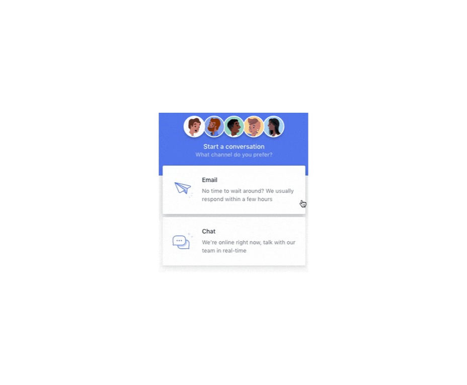
In the information age, time is a valuable commodity and something people don’t want to spend too much of. As a result, the average visitor only reads about 20% of the content of a page

For web designers and developers, that means a few things: first, you need to ensure that the web pages you create are as engaging as possible; secondly, you need to find a way of making the critical information on any page stand out; thirdly, every modern designer needs to create assets that are easy for today’s fast-paced customers to use. 

Making websites more scannable is how you do your part as a designer to ensure that the customers who come to a page get the quick and convenient experiences they need. 

So, how do designers embrace scannability?

Designing for Scannability: An Introduction

At first glance, the concept of creating a website for scannability is strange. 

Most designers start their projects with the aim of making customers stay on a page for as long as possible. So it’s odd to think that you would want to make it simple for end-users to skip from one page to another on a website in a matter of seconds. 

However, scannability isn’t just about delivering information and getting users off a page. When sites are scannable, they make it quicker and easier for customers to slide down the purchasing funnel. A quicker and more convenient customer journey leads to a stronger user experience and more conversions. 

Look at Netflix, for instance. It doesn’t give interested users a ton of information on its homepage. Instead, the key USPs of the product are laid out bright and bold in the middle of the screen, along with one simple call to action: Get Started.

Designing for scannability means making it easy for users on a page to glance at a screen and instantly access all the information they need to take the next step in their buyer journey. 

There’s no needless scrolling or wondering what to do next. 

According to analyst Jacob Nielsen, scannability is essential because people look for specific things on every page they visit. 

Customers don’t read through web pages word by word. Instead, they scan through the content, plucking information out that serves their requirements. 

Questions to Ask When Designing for Scannability

So, how do you know if your web pages are scannable?

Start by asking the following questions:

  • What’s the intent of the people who arrive on this page?
  • What kind of information needs to be conveyed instantly?
  • Can the visitor see the next step in their journey immediately?

For instance, when someone arrives on the Evernote homepage, you can assume that they want to:

  • Find out about Evernote
  • Learn how to sign up
  • Jump to other pages to find out about features, and contact details

That’s why the designer behind the Evernote website placed an immediate piece of useful information at the top of the page: “Tame your work, organize your life” tells customers exactly what the entire product is all about. The brief paragraph of information underneath can provide a few more details if customers need it, then there’s an immediate call to action: Sign up for free. 

Not only does the call to action tell users what to do next, but it tells them the most important information they need straight away: it’s free. 

Scannable pages like this are useful because:

  • They help users complete their tasks quicker: Whether you want to sign up or learn more about the product, everything you need is available instantly, with no scrolling required. 
  • The bounce rate is reduced. Customers don’t get confused and hit the back button. That’s good for your client’s SEO and their bottom line. 
  • The website looks and feels more credible: Because customers get all the answers to their questions immediately, they’re more likely to trust the website. 

So, what are some of the best things you can do to make your sites as scannable as possible?

Use Visual Hierarchy

Visual hierarchy is a way of organizing the content on your website in a way that adheres to how people use the website. For instance, if you land on a blog page, you expect to see the headline first, maybe some information about the writer, and any other essential information, followed by the body content. 

Although it’s tempting for designers to try and surprise users with new visual strategies, the best way to make your content more scannable is to give end-users precisely what they expect. 

If you’re not sure what a page should look like, try checking out the competition. 

One of the most obvious visual hierarchy rules is that the main navigation should always go at the top of the page. 

Customers will expect to look at the top of the page to find navigation. They don’t want to have to scroll through your website, searching for a way to get to another page. If you want to make it as easy as possible for end-users to jump from one page to another, you can pin the navigation bar to the page so that it stays with users as they scroll. 

Maintain Negative Space

White space, negative space, or whatever you call it – is the part of your design that’s left empty. 

White space is crucial because it gives all of the objects on your page some much-needed breathing room. Without enough negative space on your pages, it’s impossible to embrace scannability because there’s too much information for a customer to take in at once. 

For instance, notice how there are big gaps of space between every element on a Forbes website post. A proper amount of negative space on your site ensures that users can quickly take in chunks of information and use that information to decide what to do next. 

To ensure there’s enough negative space on your website pages, ask yourself what the key elements visitors will notice when they come to a website. The essential items should be:

  • A title or header to confirm that the user is in the right place
  • A CTA that shows your user what to do next
  • A navigation header or menu
  • Critical information includes an introduction to what a page is about or an excerpt from the blog post they’re about to read. 
  • A visual component: A picture or image that gives context to the page. 

Anything else can usually be removed. So, for instance, if Forbes wanted to make the page above more scannable, they could easily remove the ads and social media sharing buttons.

Make the Next Step Obvious

Every page on a website exists in a hierarchy within the customer journey. 

A homepage leads customers to product pages, which leads to a checkout page, which connects to a thank-you page that sends the visitor back to another product page, and so on. 

When designing for scannability, it’s crucial to make the next step in the journey as obvious as possible. Usually, this means placing the call to action “above the fold,” where the customer can see it immediately.

Ideally, scannable pages should have just one CTA. This will stop your audience members from being confused or overwhelmed by choice. 

However, if you’ve got multiple CTAs, think about the average customer’s journey and what they’ll want access to first.

If those buttons don’t appeal to the customer, they can scroll a little further and see other “next step” options, like shopping for “self-isolation essentials” or browsing other popular product categories:

Test Every Page

Testing for scannability means examining every page and making sure that it’s as easy as possible for customers to move through the buying process as fast as they want to. 

Visit each page you design in a buyer journey and ask how quickly it would take end-users to get from point A to point B and beyond. Here are some of the common issues that might slow the customer’s journey and harm scannability:

  • Readability: Is the font legible? Is it large enough to read on all screens, including mobile devices? Legibility in the design world measures how quickly and intuitively your users can distinguish what’s going on any page. Remember that the color of the background, the amount of negative space around copy blocks, and even font pairing can impact the readability of the content. Show your pages to multiple people and time how long it takes for them to grasp the message that you’re trying to convey. 
  • Fluff: Fluff and extra features can make your pages more intriguing, but they can also slow users down. For instance, one picture at the top of a blog page can add context to the article. A slideshow of pictures stops the customer from progressing and keeps them stuck at the top of the page for longer. 
  • Words instead of numbers: According to Nielsen, eye-tracking studies show that numerals often stop the wandering eye. Numbers are compact and more regularly associated with statistics and facts, so they’re more likely to grab attention. If you want to get important points across to end users fast, use numbers, not words. 

Creating Scannable Pages

Scannability is becoming an increasingly important concept in today’s busy landscape. 

Now that more customers are browsing websites from their smartphones or checking out products on the move, designers need to think more carefully about adjusting to this agile environment. 

Scannable pages that move visitors along the buying cycle and into the next stage of the funnel will deliver better results for your clients, and therefore better outcomes for you. 

Source

The post Quick Ways to Make a Webpage More Scannable first appeared on Webdesigner Depot.


Source de l’article sur Webdesignerdepot

Choosing to work for free, pro bono, gratis, without charge is something that most of us find ourselves doing at one time or another. Whether we’re filling a hole in our portfolio, there’s a friend or relative we feel beholden to, or because there’s an opportunity to aid a cause we value.

Recently, I agreed to take on some work, free of charge, for a charity whose goals I share. Because it’s a cause I believe in, I enjoyed the idea of being able to contribute in a more meaningful way than donating money. But my initial goodwill rapidly diminished as the project spiraled out of control, leaving me resenting the time I spent on it.

No one should feel obliged to give away their time for free, but if you do choose to, there are rules you can apply to ensure that everything runs smoothly and you’re left with a positive experience.

1. Be Specific in What You’re Donating

The most obvious problem with working pro bono is that there is no correlation between cost and value.

Budget reins in project ambitions in a regular designer-client relationship; the more you ask for, the more it costs. Everyone encounters clients who want an ecommerce store “just like Amazon,” only to then rapidly downscale their plans when the actual development cost of a site on that scale is made clear.

working pro bono…there is no correlation between cost and value

But when there is no development budget, ambitions quickly escalate. Clients do not necessarily understand the work involved, and if they’re not footing the bill, there’s no incentive to learn.

As the professional, you need to guide them. Set limits on what you’re expecting to donate, and use that to frame what is reasonably achievable.

“I’m donating 40 hours of my time, which normally costs $3000.” Or, “I’m donating my SEO package, which is enough to meet your initial goals as discussed.” They are both perfectly fine.

The purpose is not to highlight your generosity; it’s to establish clear boundaries to prevent scope creep.

2. They’re Not Doing You a Favour

Any client who suggests that their project will be good for your portfolio or gain you “exposure” knows they’re underpaying you. When you hear it from a pro bono client, walk away immediately.

The client needs to understand you are donating your expertise, not because you need to, not because you’re expecting something in return, but because you’re an awesome human being who wants to make the world a little better.

A client who thinks you’re getting something out of the arrangement does not understand your commercial value and will treat you as a novice. Your evidence will become guesses, your decisions will become suggestions, and the client will have little faith in the project outcome.

Clients, whether paying or not, need guidance. If they don’t respect you and believe in your guidance, they will start to cast around for other opinions to the detriment of the project outcome and your relationship.

This brings us neatly on to…

3. Everyone’s an Expert

Q. What’s the difference between an amateur and a professional? A. Professionals get paid.

You’re not getting paid, so in the client’s eyes, you’re now an amateur. Hey, guess what? Their 12-year-old daughter is an amateur too, and her views are now equally valid.

When you’re working pro bono, you can expect a lot of “help.” You’ll find that someone’s niece is planning to major in graphic design…when she graduates high school…in four years. You’ll find that someone’s partner has a hiking blog, read an SEO article, and is happy to “give it a try.” You may even find that the client themselves fancies a career switch to web design and doesn’t think it looks too hard.

Shut that **** down immediately. Smile, be gracious. Explain that, of course, you’re happy for contributions, and then avoid them like the coronavirus.

You’re donating a professional service that you’ve spent years developing, and you’re donating it to a cause that you value. You’re not there to increase someone’s chance of getting into college or to distract someone from their boring day job. If you do want to mentor people, there are places you can do that.

Everyone Actually Is An Expert

The nature of pro bono work is that more often than not, the people involved actually are experts. The simple truth is that people who aren’t experts in something tend to be in low-paying employment and are too busy trying not to be in low-paying employment to donate their time.

Like you, the people volunteering their time are doing so because they can afford to. For example, you may find that the organization’s head of accounts spends Monday–Friday as a tax advisor; the head of outreach is a project manager at a construction firm; the head of safeguarding is a school teacher.

People bring transferable skills to pro bono roles. Be sensitive to the fact that just as you are an expert in your professional context, so may they be. Simply not being an expert in design does not make them an idiot.

4. Do Not Foot the Bill

It’s tempting to simply donate everything to do with the project: the domain name’s going to cost $10? Well, it’s only $10; hosting’s $5/month? Well, it’s not too arduous to set up a small space on your own server.

imparting your experience sets the organization up for future success

However, when you give everything away, the client doesn’t understand the cost or value they’re receiving. As a professional, it’s part of your job to educate the client on the costs of a project like this; imparting your experience sets the organization up for future success.

Be clear at the start of the project that the client will be responsible for all expenses.

If you wish to — and you should not feel obliged — you are always free to make a financial donation equivalent to the expenses.

5. Stick to Office Hours

When you agree to do pro bono design work, the chances are that you know the person or organization you’re doing the work for. There’s almost always a personal connection of some kind, which means that the person or organization doesn’t see you in the professional context that normal clients see.

All good clients will respect the fact that you don’t answer emails on a Sunday morning. Not so the charity client. Not only will the charity client assume that you’re available outside of office hours, they may even think they are doing you a favor by not disturbing you during your regular office hours.

It’s important that you find some downtime outside of work to live your life. If you don’t want your evening out with friends to descend into an impromptu planning meeting (you don’t), set clear boundaries about when and how you’re prepared to work on the project.

Unless you’re self-employed, you can’t donate time when you should be working; what you can do is append pro bono work to your paid employment — do an hour after work, on weekday evenings, for example.

If you are literally doing this in your spare time, then allocate a specific time slot, such as a Saturday afternoon, and stick to it.

7. Stick to the Plan, and the Deadline

It is a universal truth that projects run better when there’s a structured approach. It doesn’t matter if it’s lean, agile, waterfall, or whatever you want to dub it. What matters is that you have a plan that works for you and is suitable for the project goals.

A structured approach, especially one that includes a timeline, will combat most disruptions. On the project I was working on recently, I was preparing for final sign-off when one volunteer announced it was time to “start thinking about what pages we need on the site.” 🤨

Discipline is crucial in pro bono work because different stakeholders will have different levels of commitment; some people will be full-time volunteers, others will be donating an hour per week. What matters is that the project that you are responsible for runs on your schedule.

8. You Have Zero Availability

Non-profits tend to talk to one another. When your friends and family see what you’ve done for Joe’s startup, they will start having ideas of their own. The client you’re completed the project for will have other projects lined up. When you aren’t charging, there’s no shortage of clients.

be prepared to say, “no,” at some point

Before you agree to do any pro bono work at all, be prepared to say “no,” at some point.

The simplest way out is to say you have zero availability: you’re already booked up with paying work, or your boss has let you know she needs you for overtime next month.

Don’t feel bad about it. It’s probably true. There are only so many hours in the day, and even if you do have some time to spare, doesn’t your partner, dog, or social life deserve some attention?

There’s No Profit In Non-Profits

Working for free is not transactional. It probably won’t benefit your portfolio. It definitely won’t lead to paying work. Any skills or experience you acquire probably won’t be transferable. (It might give you the topic for a blog post.)

If the work were meant to benefit you, it would be called personalis bono.

Nevertheless, many of us will find ourselves agreeing to do pro bono work, either out of obligation or idealism. It’s not something to shy away from; changing the world — whether for a group or an individual — is a noble pursuit.

The key is that while you will not profit, neither should you suffer a loss. Volunteering your time, skills, and experience should be a sustainable process. One that you will not come to regret.


Featured image via Unsplash.

Source

The post How to Work for Free Without Wrecking Your Career first appeared on Webdesigner Depot.


Source de l’article sur Webdesignerdepot