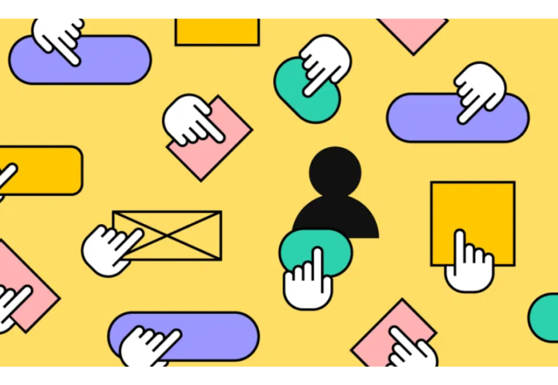
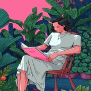
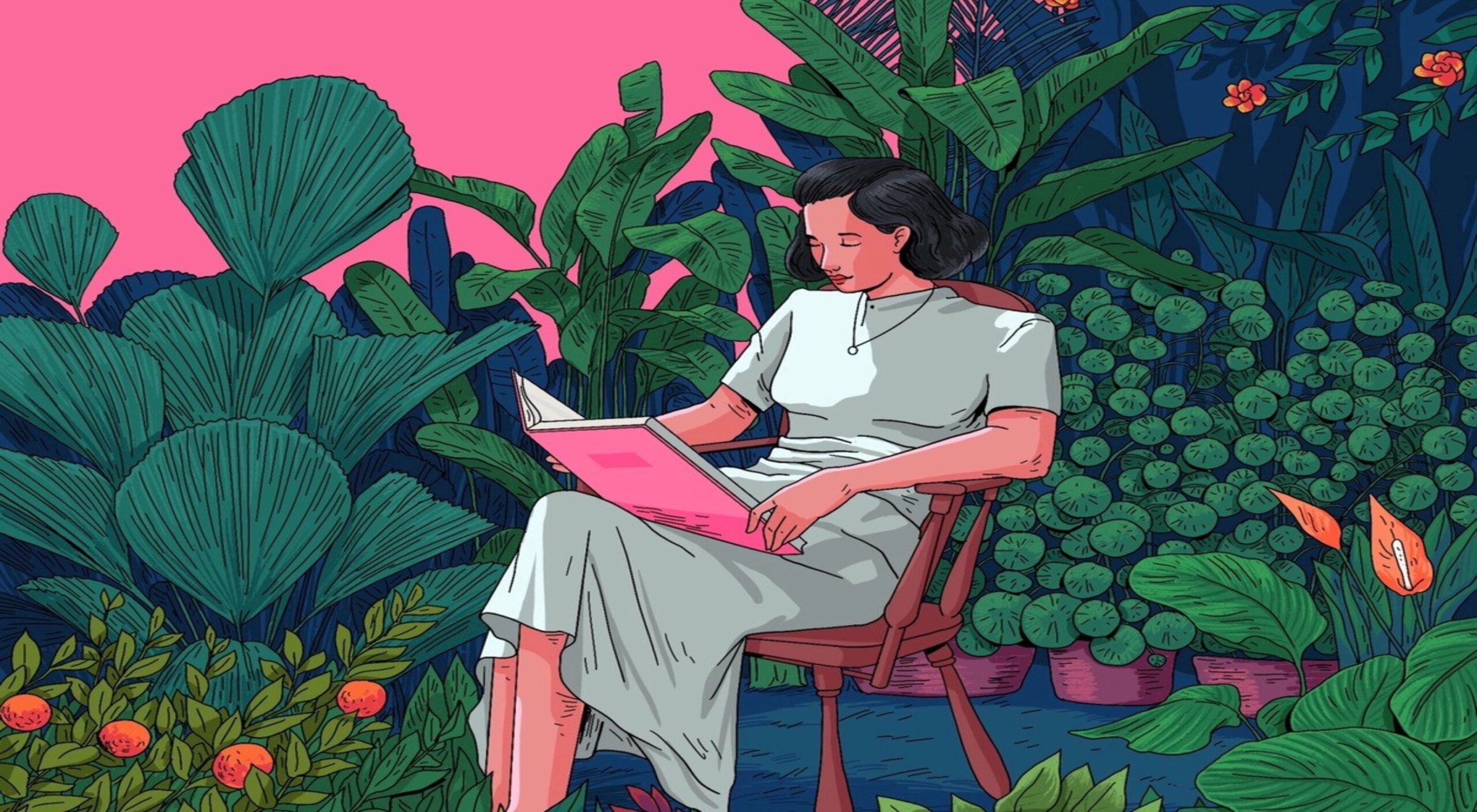
 We all know that psychology is a powerful tool. When used correctly, it can influence and persuade people to take action. In the world of web design, this is extremely important.
If you want to create an effective website that converts visitors into customers, you need to leverage web design psychology. Keep reading to find out more.
What Is Web Design Psychology?
Your website design shouldn’t just make your website pretty. It should impress your visitors, hold their attention, and lead them to action.
That’s where web design psychology comes in. Each color, typeface, and space has a psychological significance, helping people connect to your website. These elements trigger subconscious reactions, which you must leverage to get that desired action.
It takes seconds for people to decide whether your website has all the choices and information you need. Web design psychology helps you, the designer, understand these subconscious processes and how to harness them.
The Benefits of Using Psychology in Web Design
The primary benefit of leveraging psychology in web design is talking to people in their language. It’s also talking in your language and finding common ground. That’s how you can build trust.
You want to use familiar colors and patterns, elements that make you stand out but also connect to people. You need visitors to understand what your website is about and where they can get more info quickly. Then, you have to push the right triggers. Comic Sans, for example, is a superb trigger, and we’ll discuss it below. Color, space, and lines also create a specific impact on how people perceive your website.
More importantly, all these elements set the tone for visitors’ engagement with your website.
How to Use Psychology in Web Design
Now you understand why knowing the basics of human psychology is essential in web design. Let’s see how you can leverage it!
1. Arrangement
Gestalt psychology shows how these elements below influence your visitors:
- Similarity — people perceive similar objects as the same or at least part of the same concept.
- Proximity — things close to each other are perceived as part of the same group.
- Continuity — you want your visitor’s gaze to move naturally from one element to another.
- Closure — an object that’s not entirely closed is still perceived as a whole because people’s brains will always fill in the gaps.
- Figure and ground — people simplify images into the main objects they’re looking at (the figure) and the other elements (background).
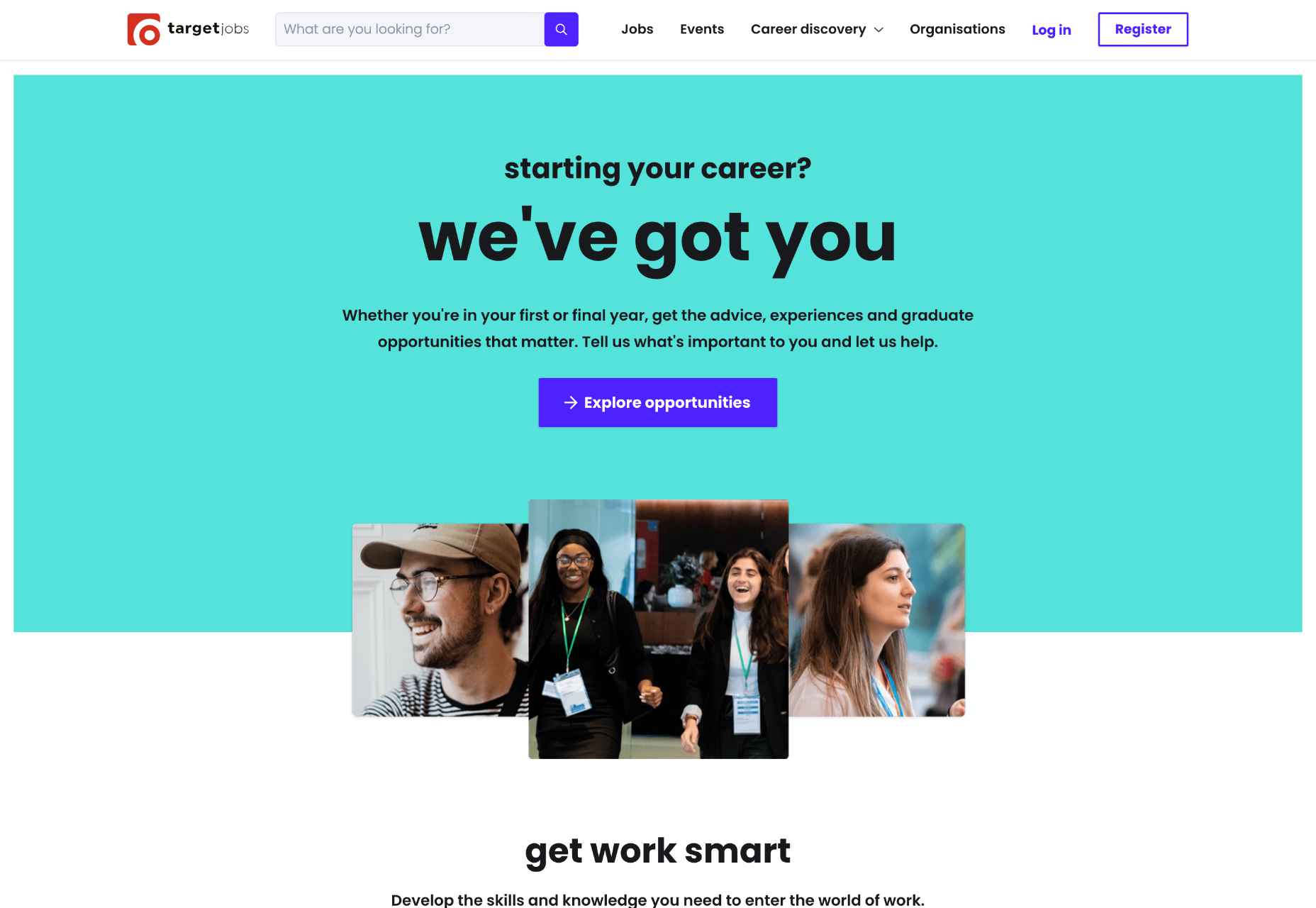
The Target Jobs website is an excellent example here because:
- Similar objects are grouped: notice how the first three images show happy young people in diverse professional environments. This placement suggests that Target can help anyone find their dream job.
- These pictures are placed near specific keywords: the young people laughing are placed right next to the CTA “Explore opportunities.” Thus, Target Jobs is associated with your happiness and your future chances.
- The colors, font, and spaces enable a smooth transition: users are directed to keep scrolling down, going from one section of the webpage to the next. Also, notice how each section has its own theme, centered on Target Jobs’ benefits.
- The contrasting colors (orange, white, purple, etc.) leverage the figure-and-ground technique: therefore, focusing on one section makes the others become part of the background. The benefit here is that your attention isn’t split into a million pieces; you can focus on one thing at a time and understand what Target Jobs is trying to tell you.
2. Shapes
Each shape has a different subconscious association:
- Triangles and squares represent professionalism, strength, and power.
- Circles, ovals, and ellipses symbolize relationships, love, and unity.
- Horizontal lines give a sensation of calm and community.
- Vertical lines represent strength and action.
Just look at the AT&T website. Everything showcases community and tranquility, from the round logo to the horizontal lines delimiting each section.
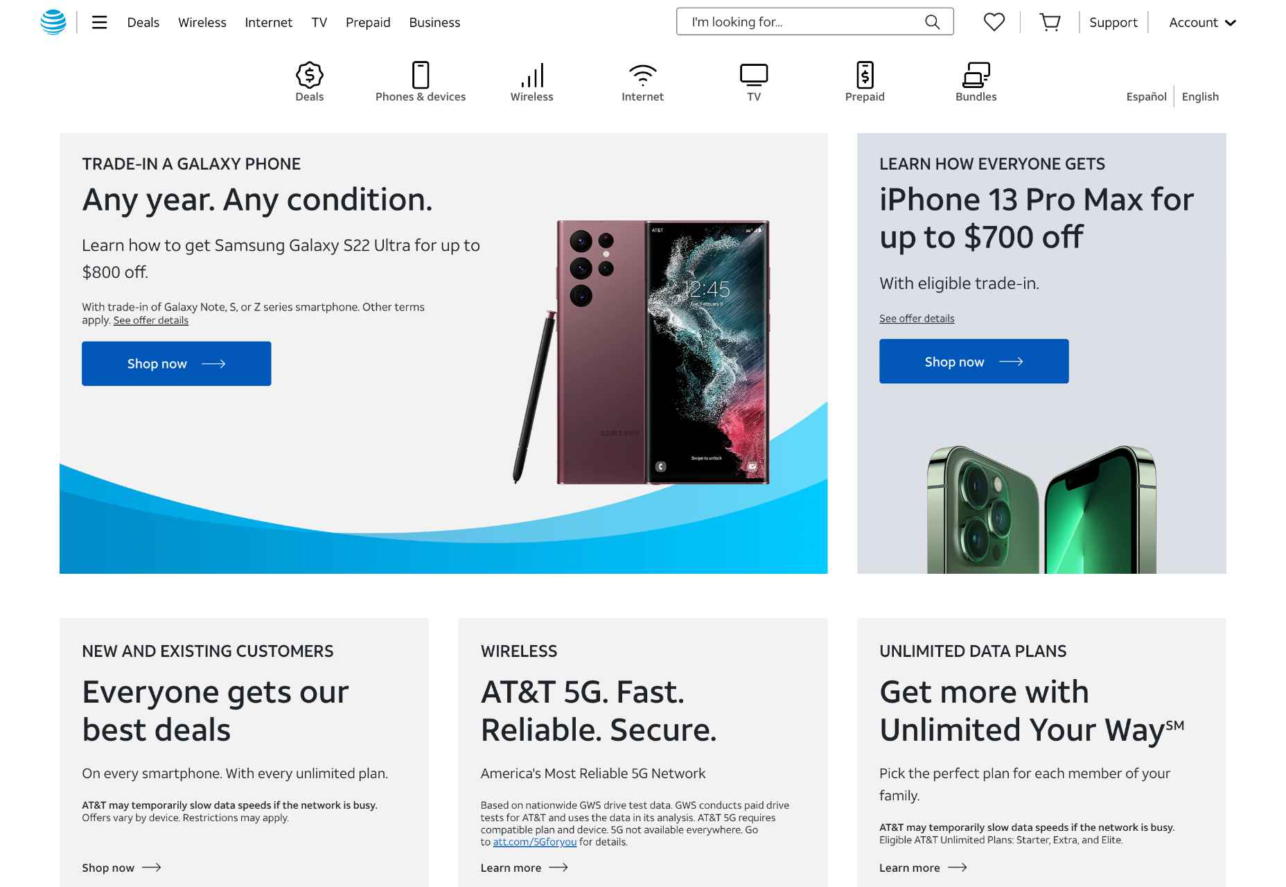
But this website is anything but dull. Notice how each CTA button (“learn more,” “enroll now”) is followed by a tiny arrow. This shape uses a square angle split into two acute angles by the arrow’s body. As such, although small, the arrow suggests action and strength. Besides, the sections are arranged in squares, again a symbol of decision and power.
3. Space
No matter what industry your business is part of, space is essential in web design. Don’t clutter your web pages even if your natural impulse is squeezing in as much information as possible.
Use plenty of white space and try to have a minimalistic approach. Identify the unique selling point on each page and help people focus on that.
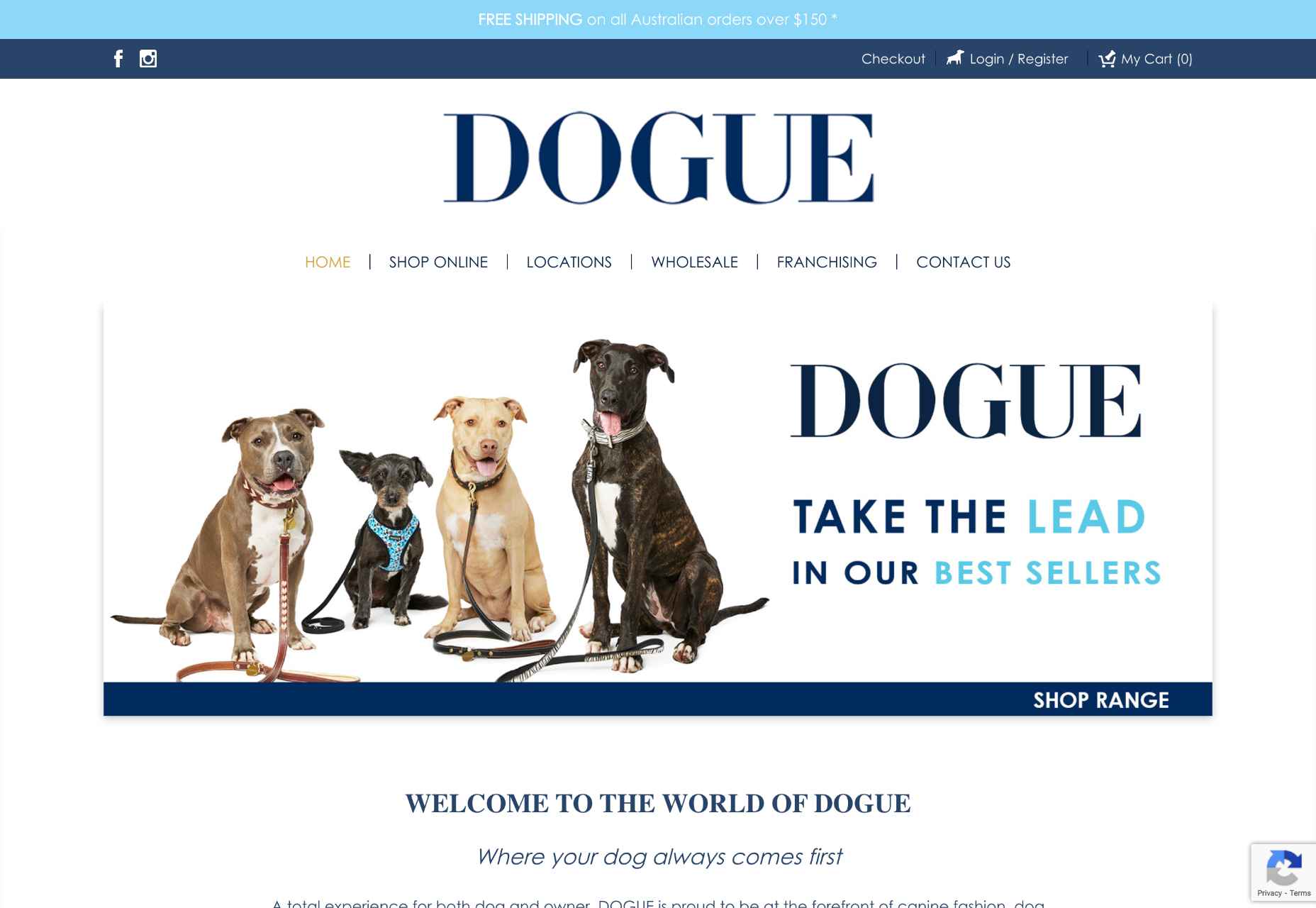
Check out the DOGUE webpage. White spaces separate each essential element, so each section is presented clearly. The first thing you notice is the title and the image with the happy dogs. Then, your gaze moves to the slogan on the right-hand side. After that, you notice the sections below that huge “Dogue.” The next part of the website highlights the company’s services (e.g., groom, dine, play, etc.). Notice how each service is represented through a quick, easy-to-get keyword. Besides, the images depict these keywords perfectly. Even better, these images have whitish-grey backgrounds that blend with the white spaces between them. So although the website is more crowded than others, you won’t perceive it as messy or unclear.
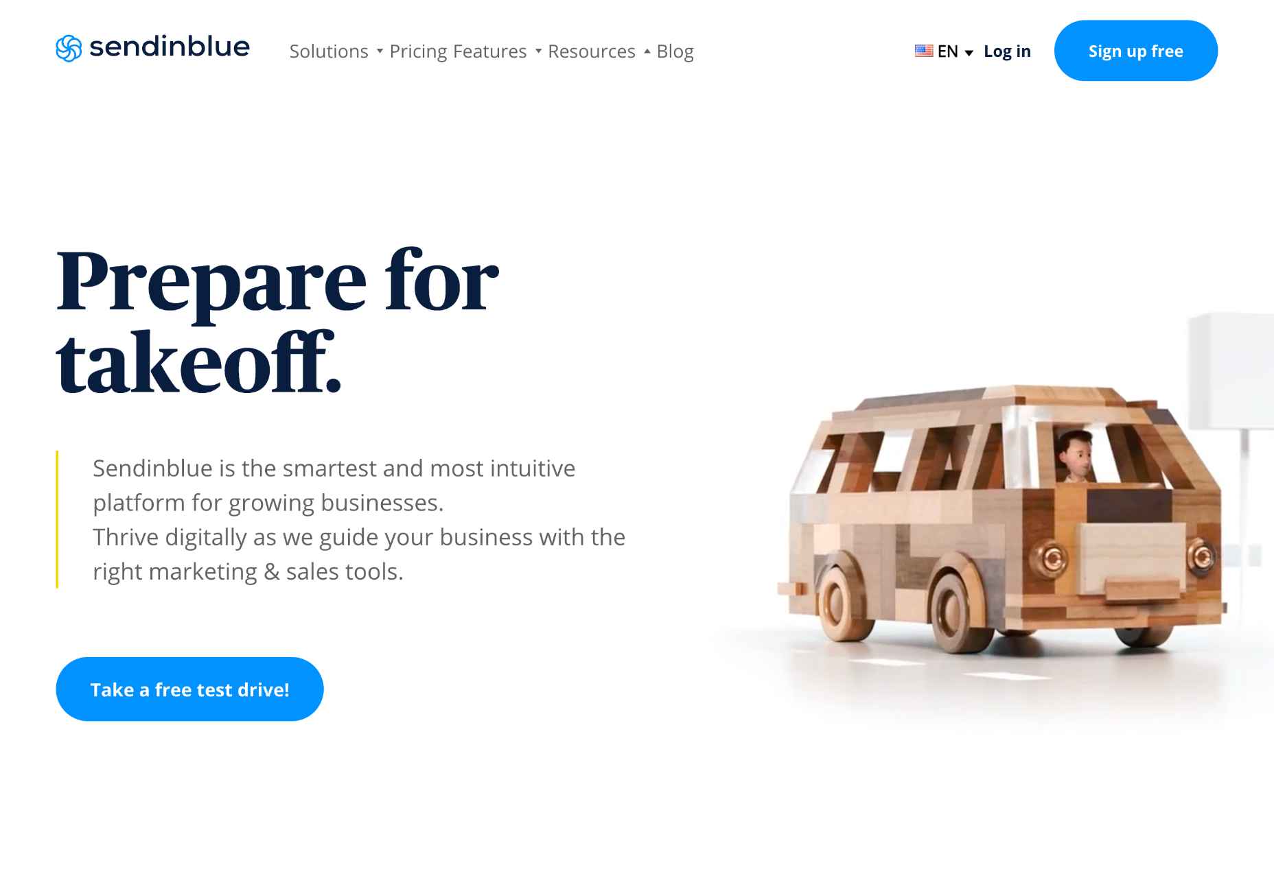
SendInBlue, an email marketing service, uses a similar white space approach to their design, and it works great because website visitors can find what they want with much more ease, and it generally looks much cleaner.
4. Color
The right colors can attract attention, maintain interest and even lead to action. Besides, color increases brand recognition by 80%.
Here’s the bare minimum you have to consider:
- Your purpose — what do you want visitors to do when they land on your page? For example, if you want visitors to fill out a form, you might want to use a color that stands out and is easy to see. Although blue is the safest choice because it’s most liked, red elicits more action.
- Your audience — cultures have different associations with color. For example, in the Western world, white represents purity. However, white is associated with death and mourning in Asia.
- The mood you want to create — do you want your website to be professional? Relaxing and calming? Exciting and energetic? How do you want your brand to be perceived?
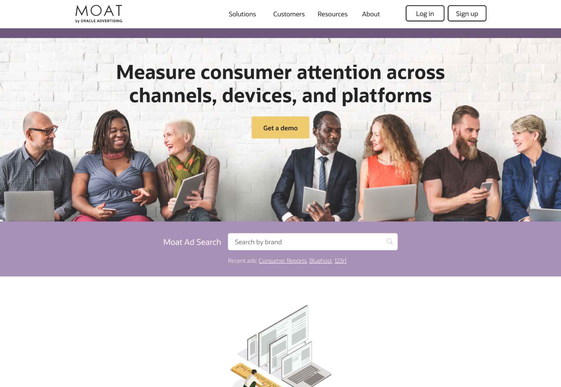
The Moat front page is a fantastic example of color:
- The purple and orange create a delicious contrast that points visitors in the right direction. Notice how each CTA is orange — an action-eliciting color.
- Purple suggests calmness, bravery, and wisdom. It’s an excellent hue for your background because it’s so stabilizing.
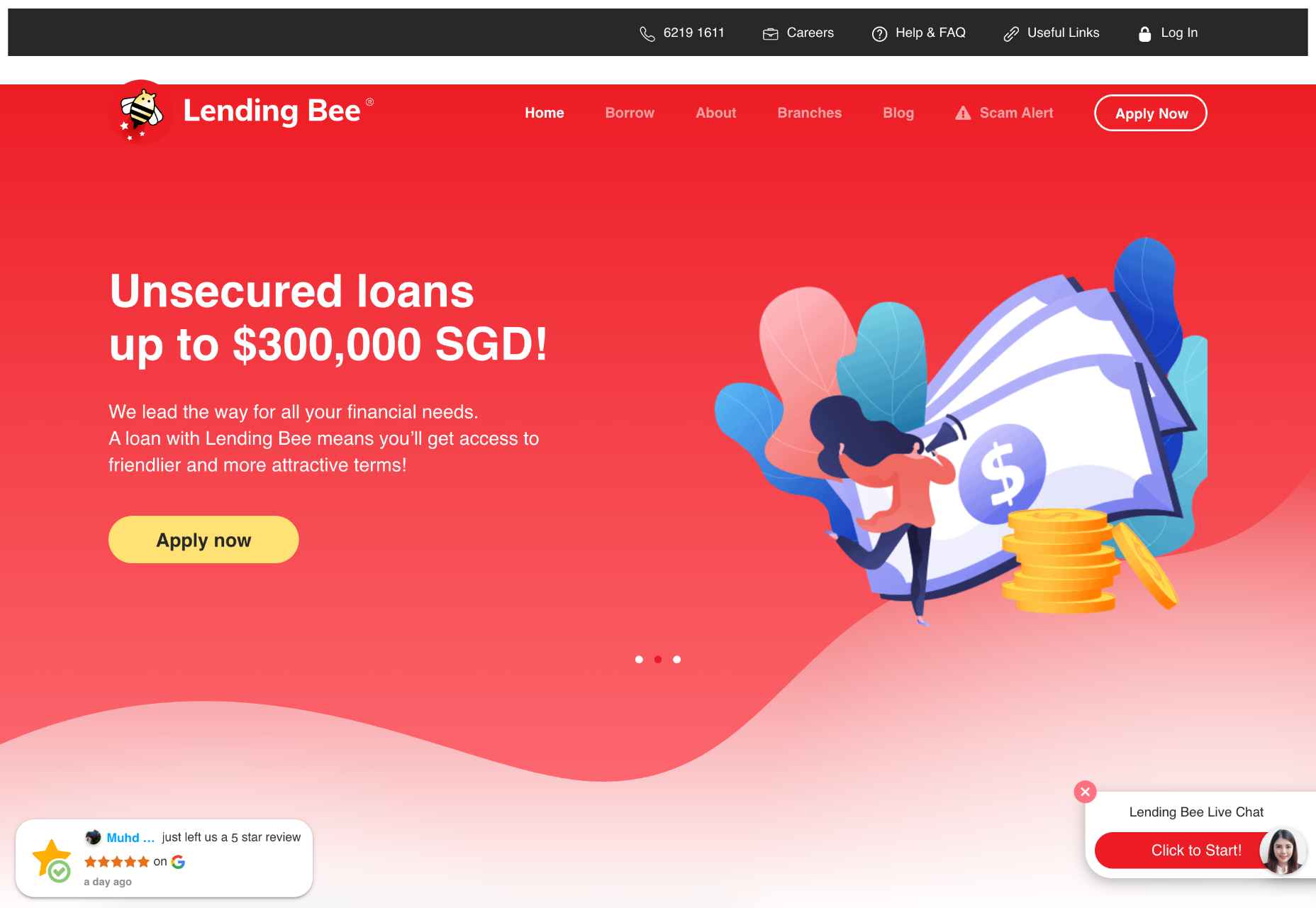
Lending Bee Singapore uses color and white space to showcase user-generated content on its webpage:
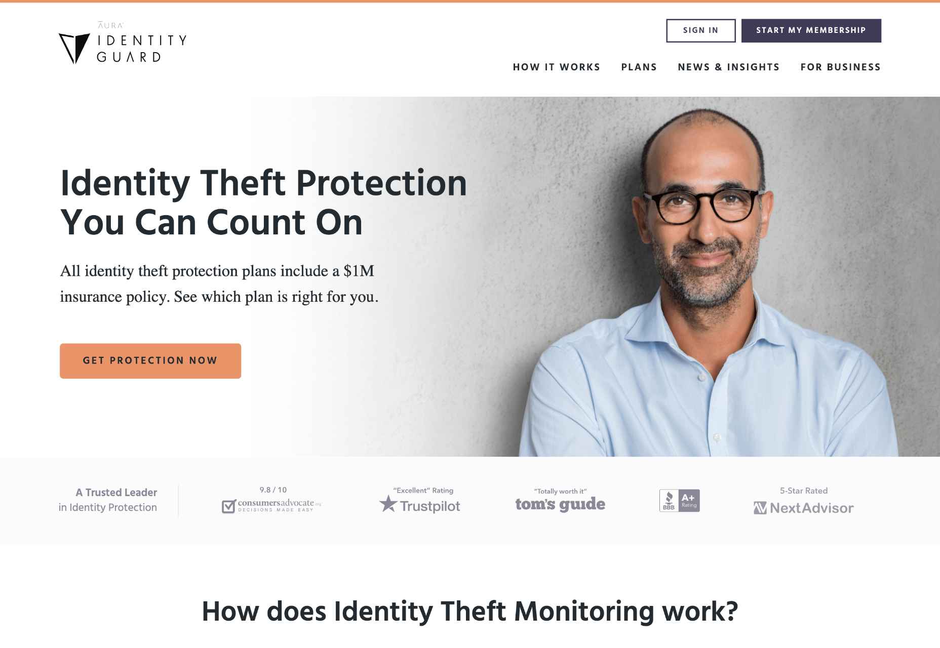
Another excellent example of combining different colors to build trust is Identity Guard’s website, which provides identity theft protection services. As you can see on the website, they use a minimalistic white color combined with green, which is the official color at Trustpilot (one of the most popular review directories). This color selection helps to highlight the veracity of reviews along with the mention that these reviews are taken from Trustpilot.
5. Typefaces
A good web design is like a good outfit: it should be eye-catching but not too over the top.
The same is true of typefaces.
While a website should use various typefaces to add interest, it’s essential to use them in moderation. Too many different typefaces can be overwhelming and make your site look cluttered.
Instead, focus on using a few critical typefaces throughout your site, and use variations (like bold or italics) to add visual interest. For example, you might want to use a serif typeface for your headlines and a sans serif typeface for your body text.
Beyond simply looking good, fonts can also be used to guide users towards taking specific actions. For example, Sans-serif fonts like Arial or Helvetica are generally considered to be more readable online, making them a good choice for body text. On the other hand, scripts and decorative fonts are better suited for headlines or calls to action, as they help draw attention to essential elements on the page.
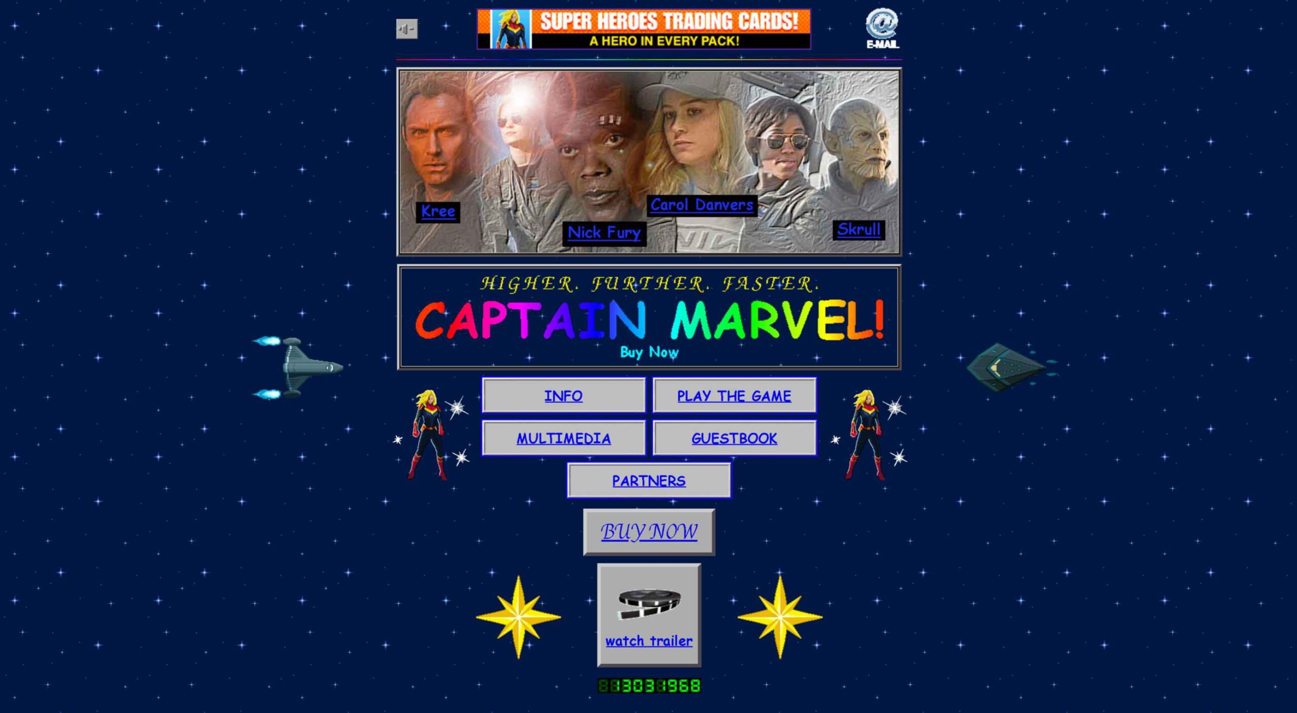
Marvel’s Captain Marvel page looks like something a 10-year-old would have designed in the 1990s. This web page is horrible from the glitters, gifs, crowded space, and the abominable Comic Sans typeface.
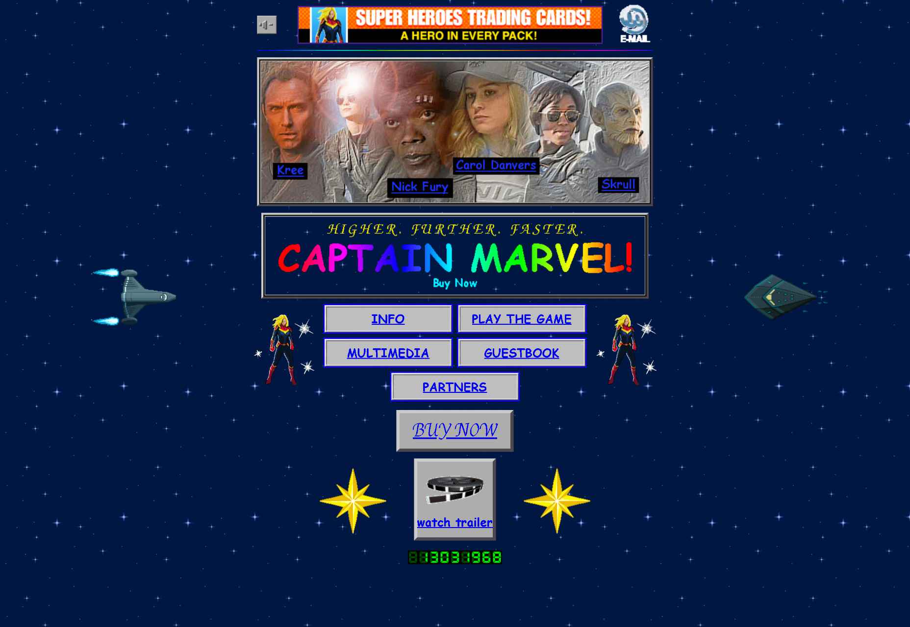
And that’s the point; avoiding plot-spoilers, Captain Marvel is linked to the 90s, and the retro look is part of that message. The moral of the webpage is that sometimes you have to be brave and break the rules if you want to convey a certain feeling to your audience. Marvel manages to do that with its simple design that acts as a time machine into the long-long-loooong past nineties.
Wrap Up
If you want to keep your website visitors’ attention, maintain interest and lead to action, it’s essential to use the design principles above. By leveraging space, typefaces, arrangement, shapes, and colors in your web design, you can create a website that is both visually appealing and effective at getting your message across.
However, these principles are just guidelines. You should stay brave and use your intuition. Remember that the point of web design is speaking to your audience using their language.
The post Psychology in Web Design: How to Use it Right first appeared on Webdesigner Depot.
 Designing for user experiences is what all designers do. UX is often thought of as the preserve of app or web designers; however, even a print designer laying out a magazine anticipates reader reaction to the scale of type, the placement of adverts, and the art direction of successive stories.
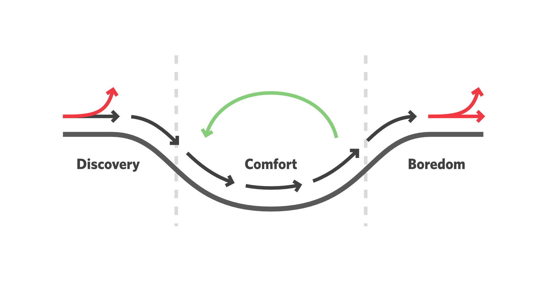
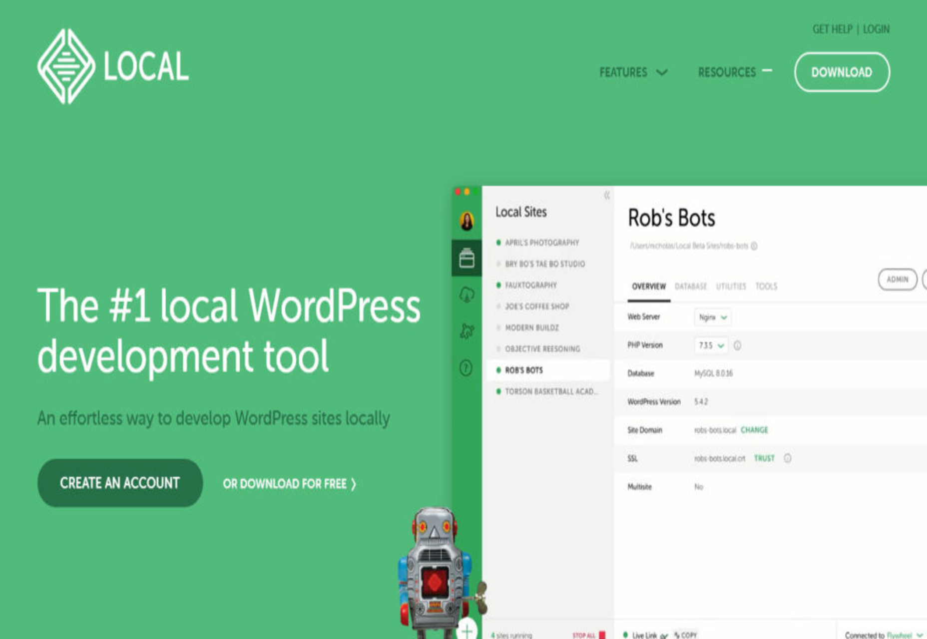
 Every day design fans submit incredible industry stories to our sister-site, Webdesigner News. Our colleagues sift through it, selecting the very best stories from the design, UX, tech, and development worlds and posting them live on the site.

 Every day design fans submit incredible industry stories to our sister-site,
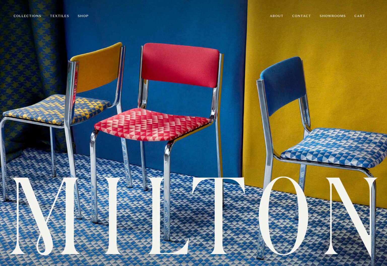

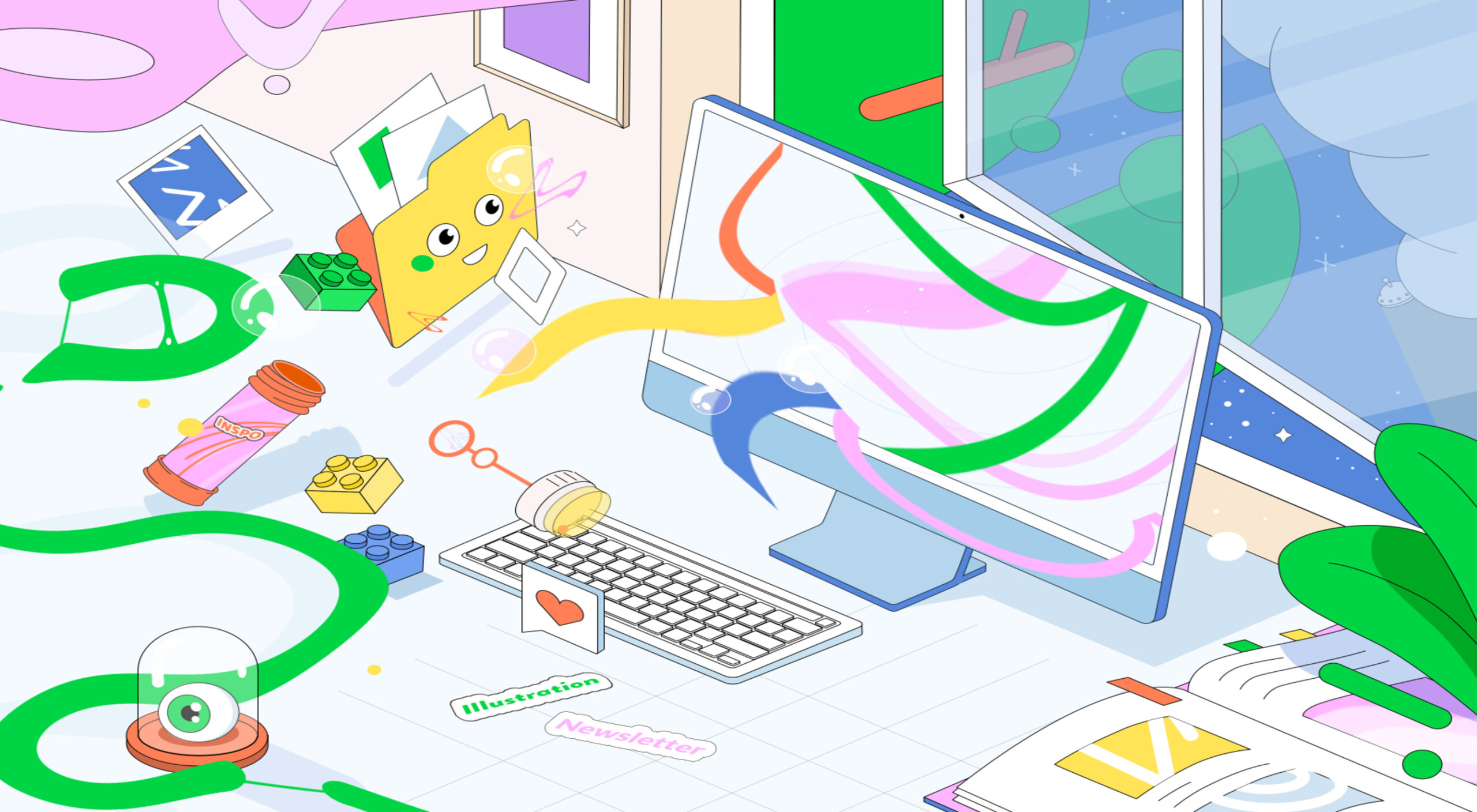
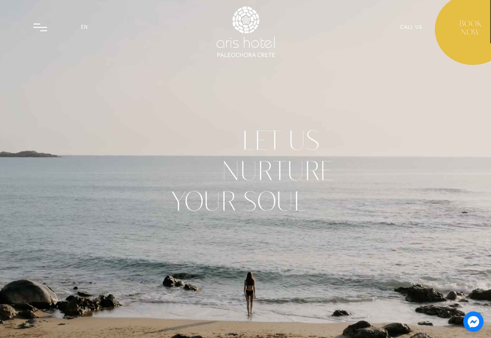
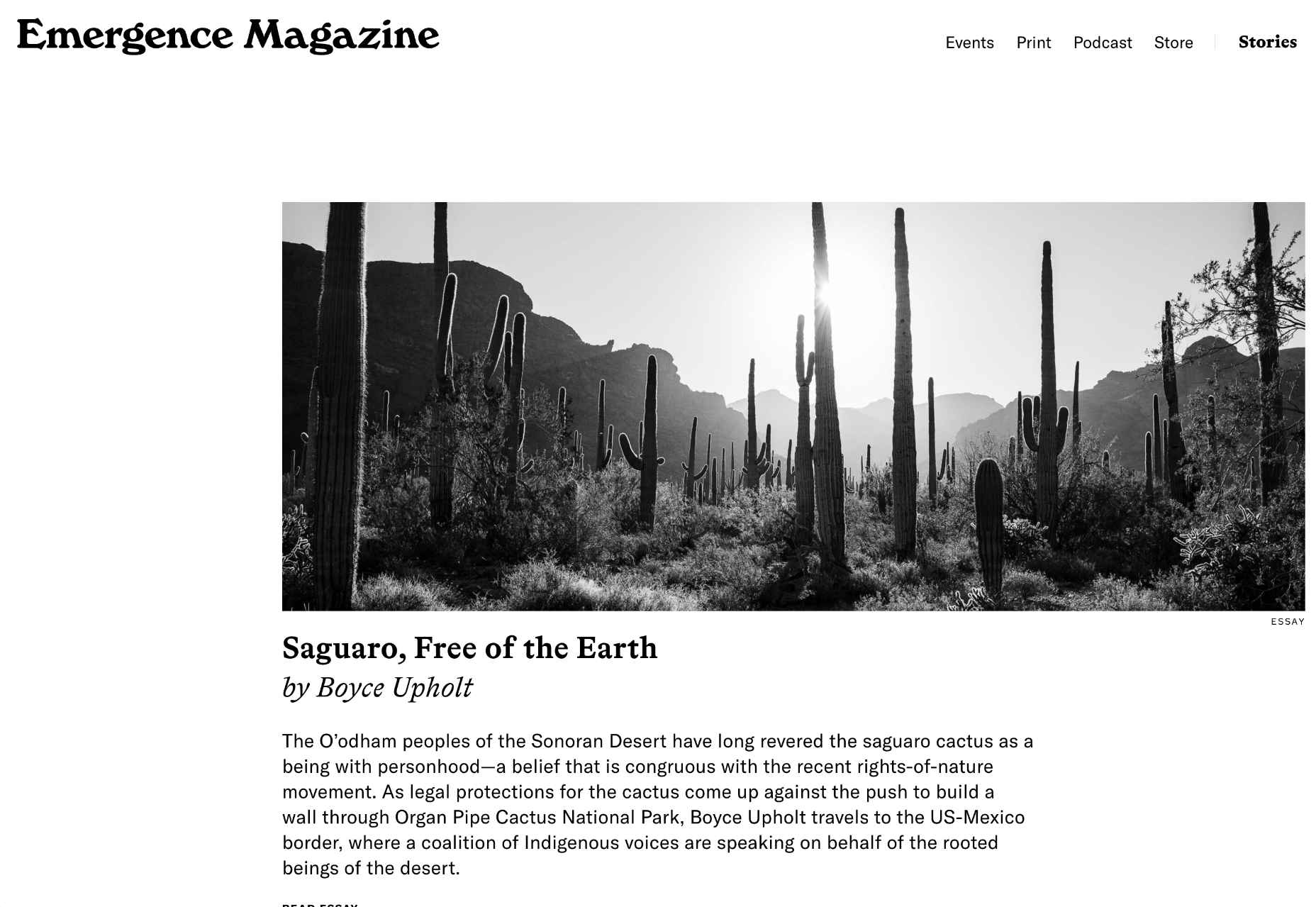
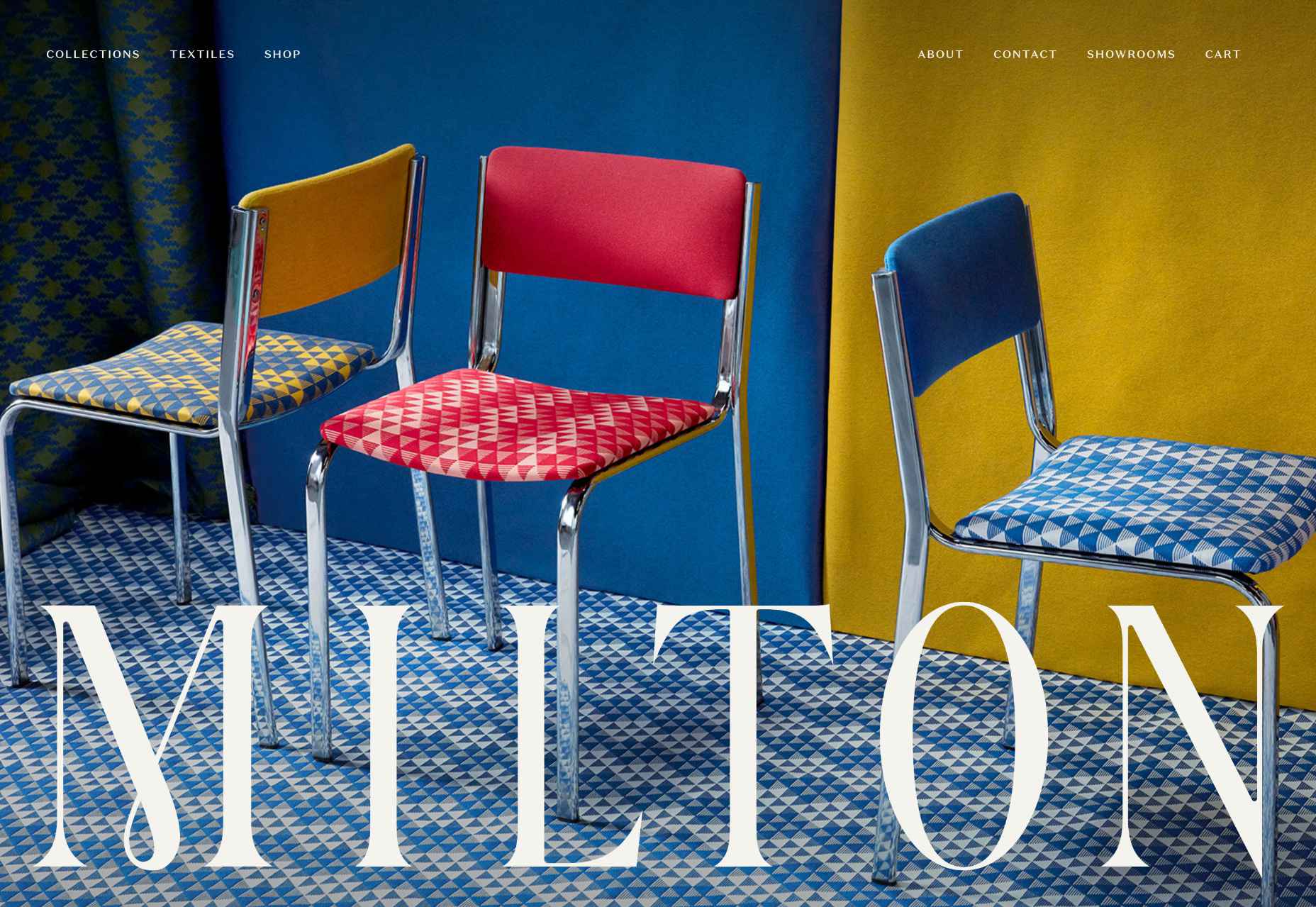
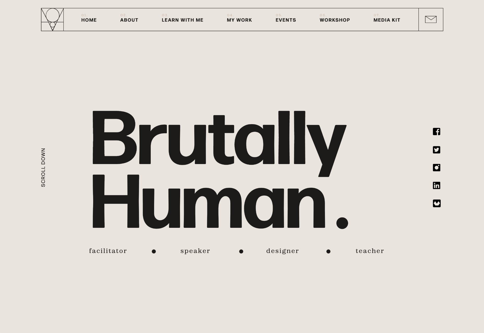
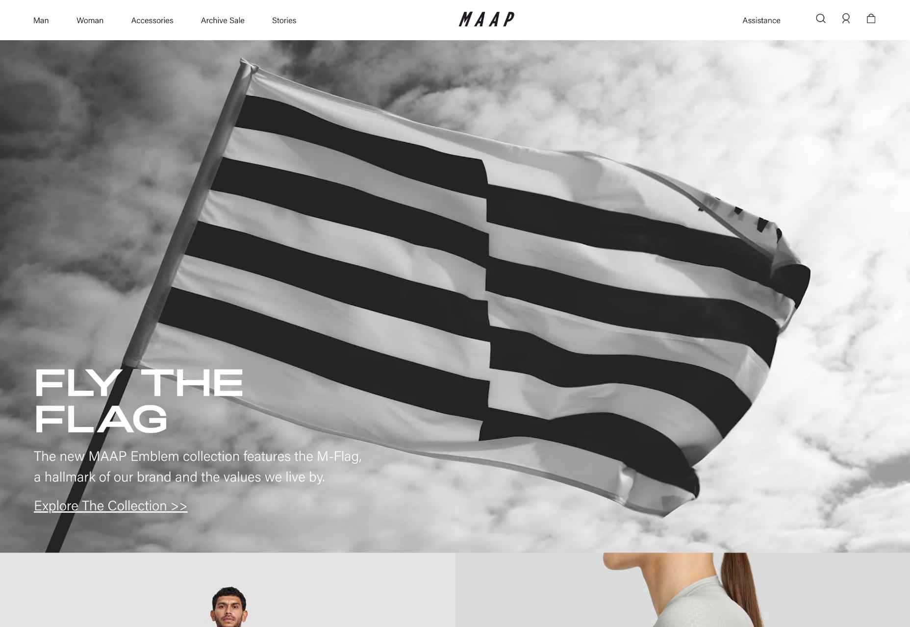
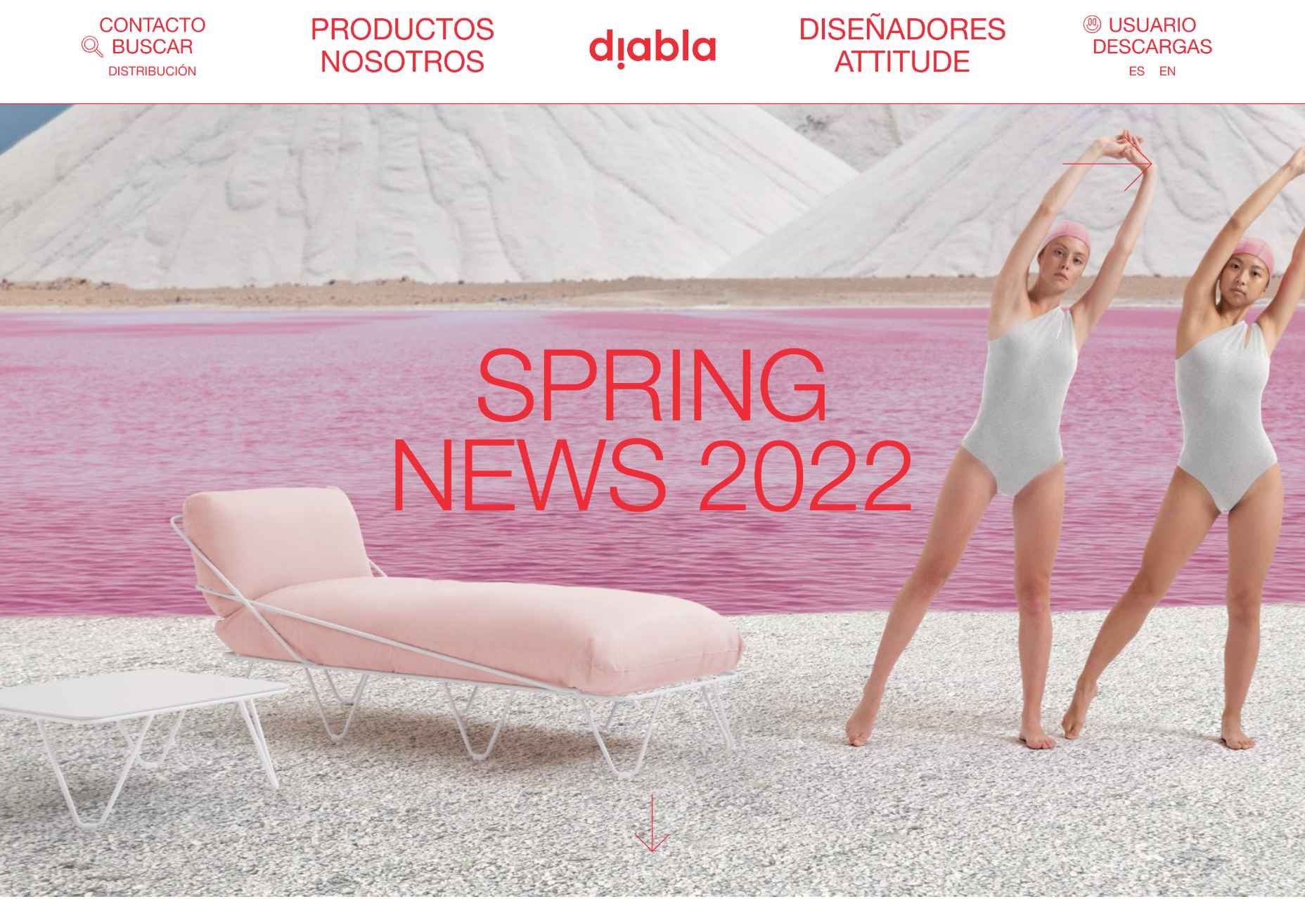
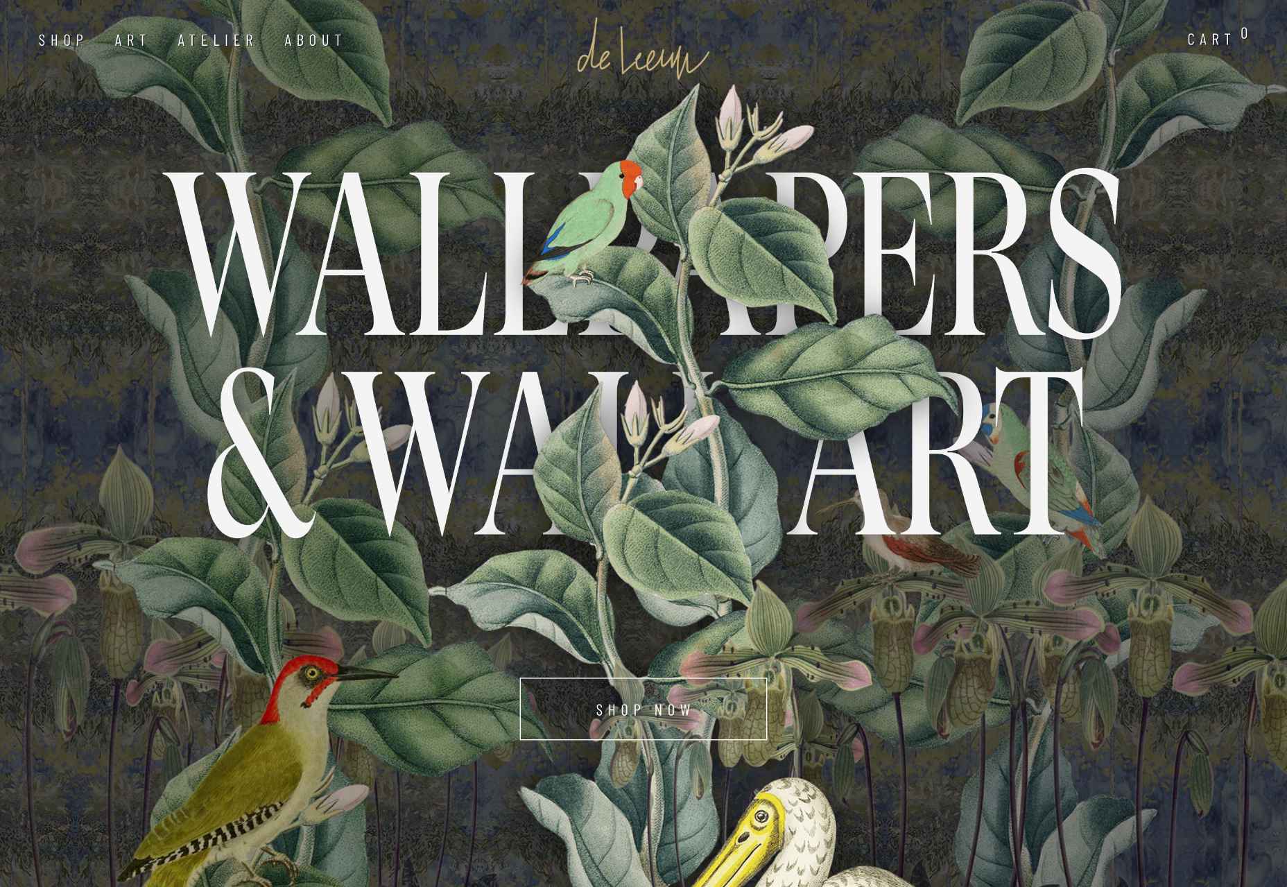
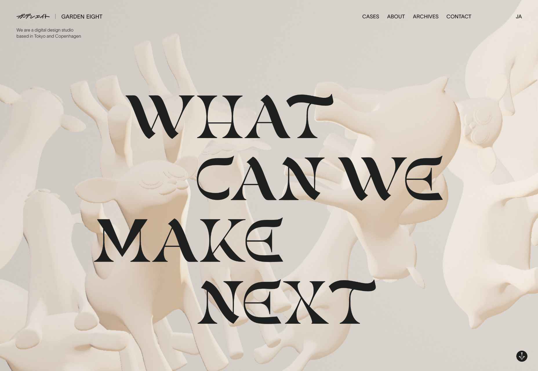
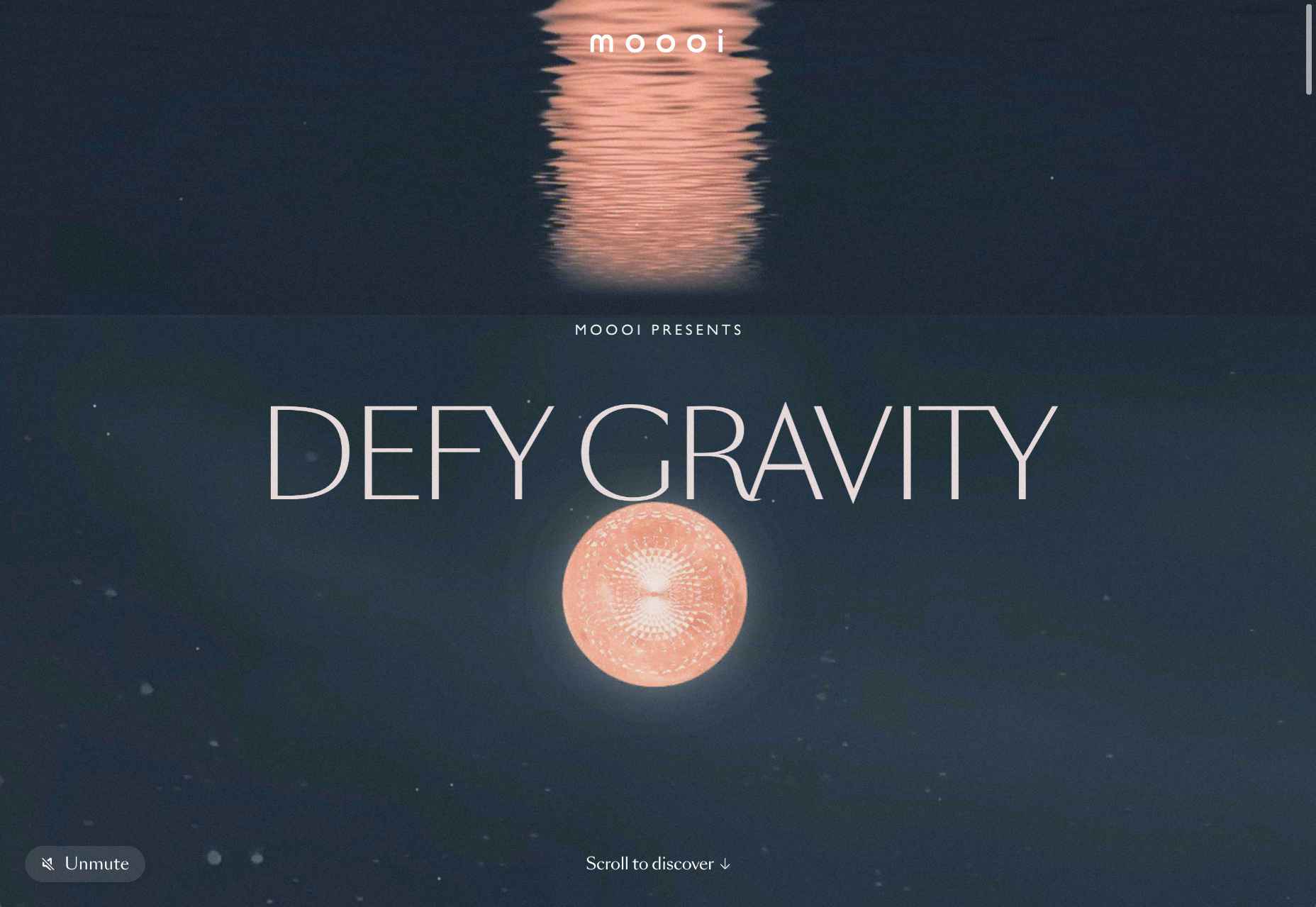
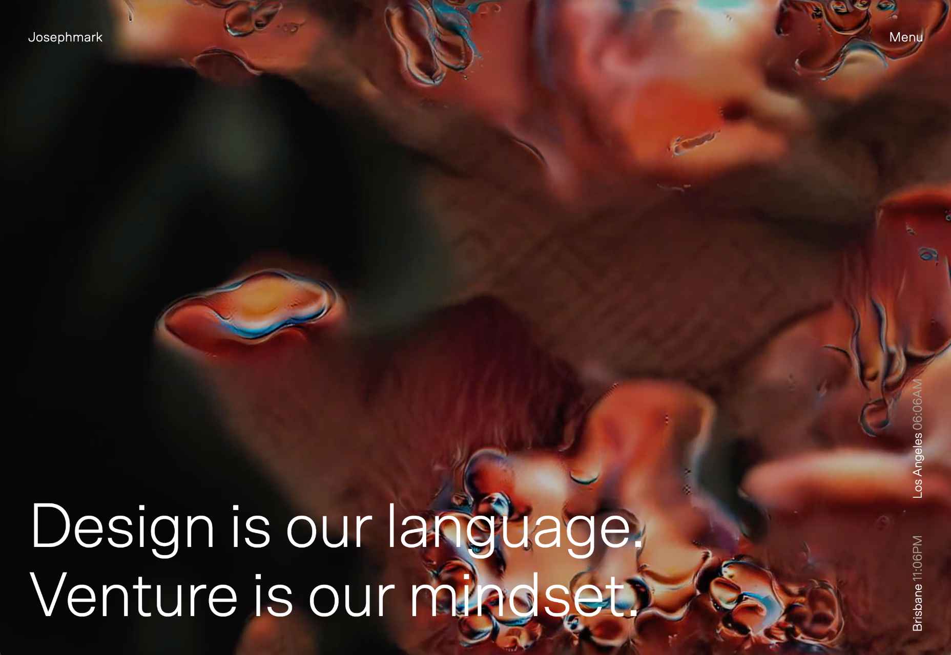
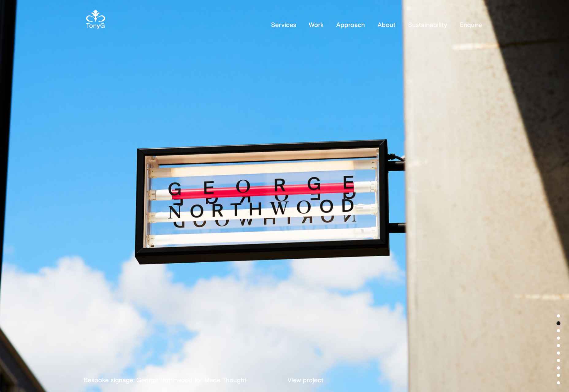
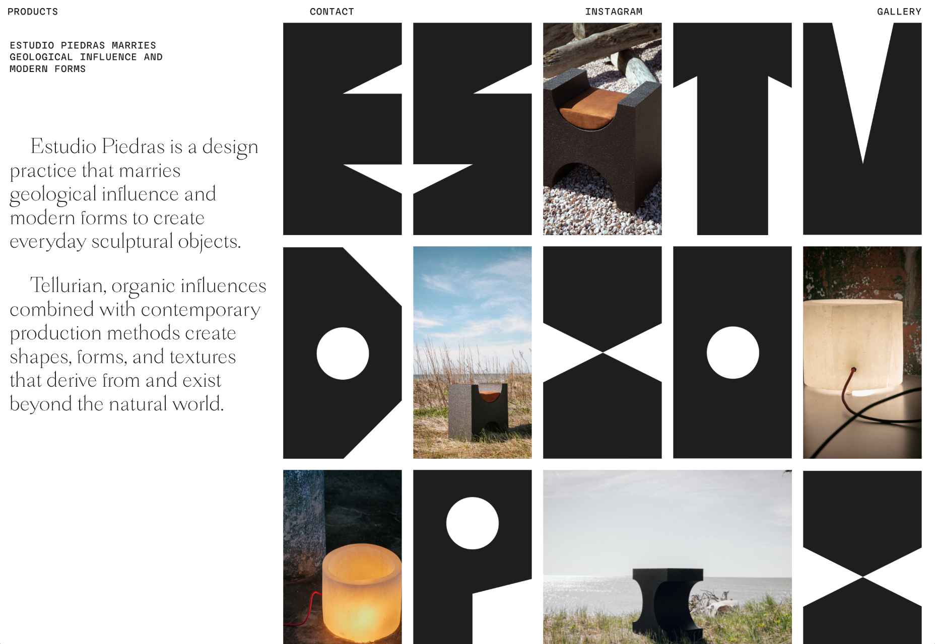
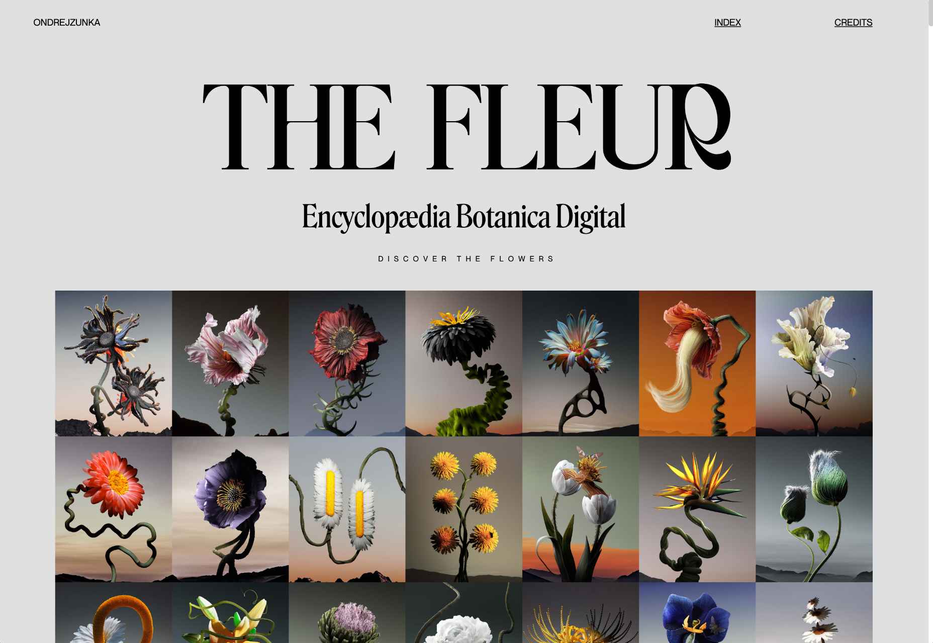
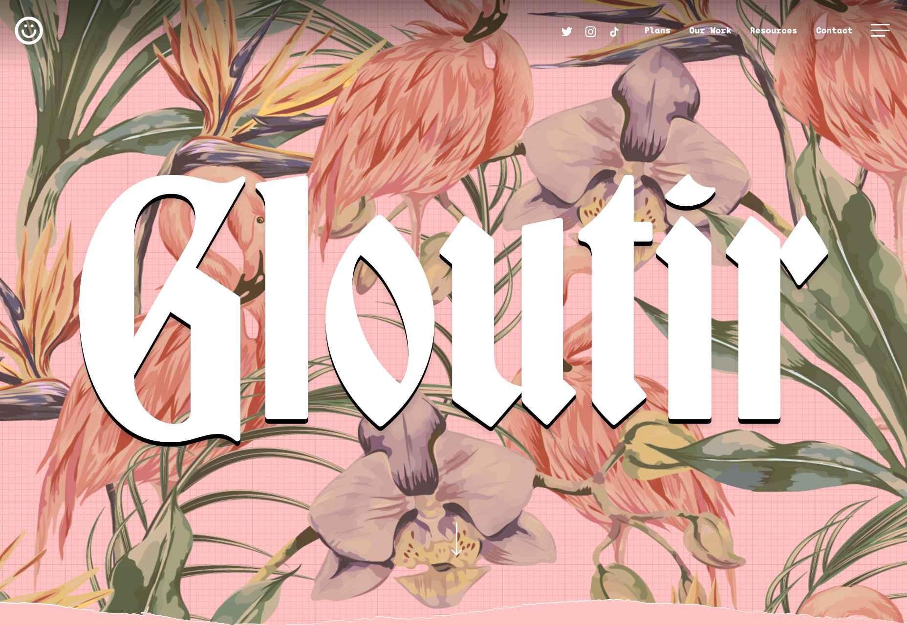
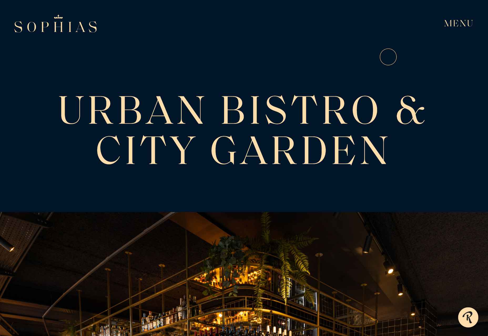
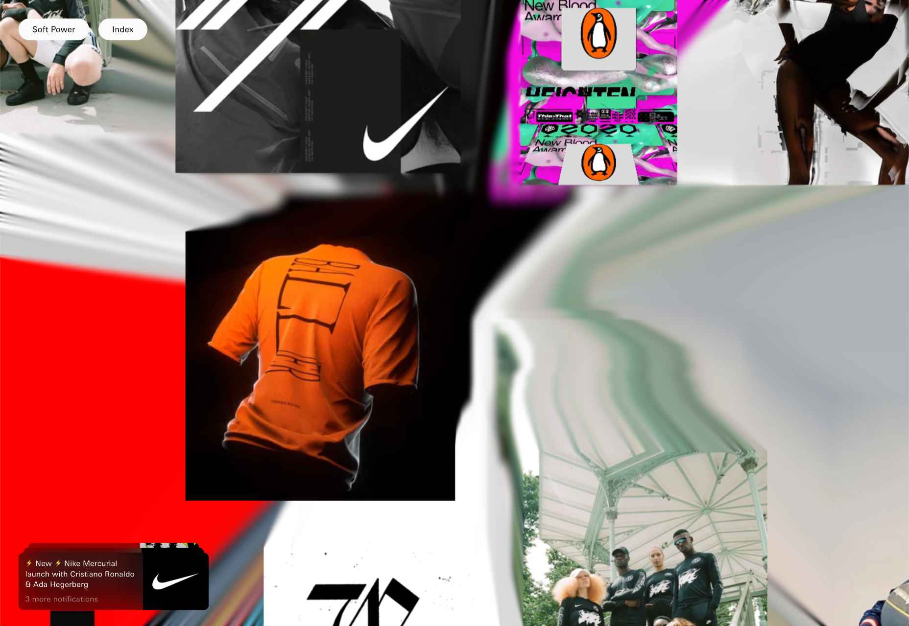
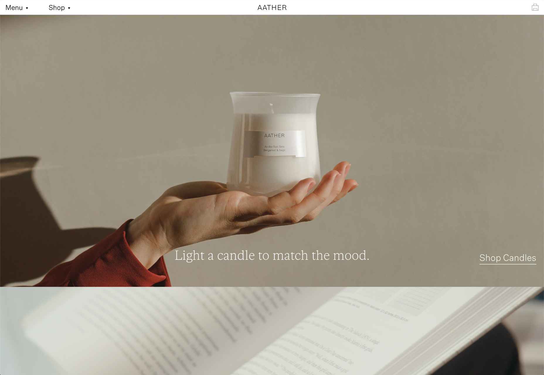
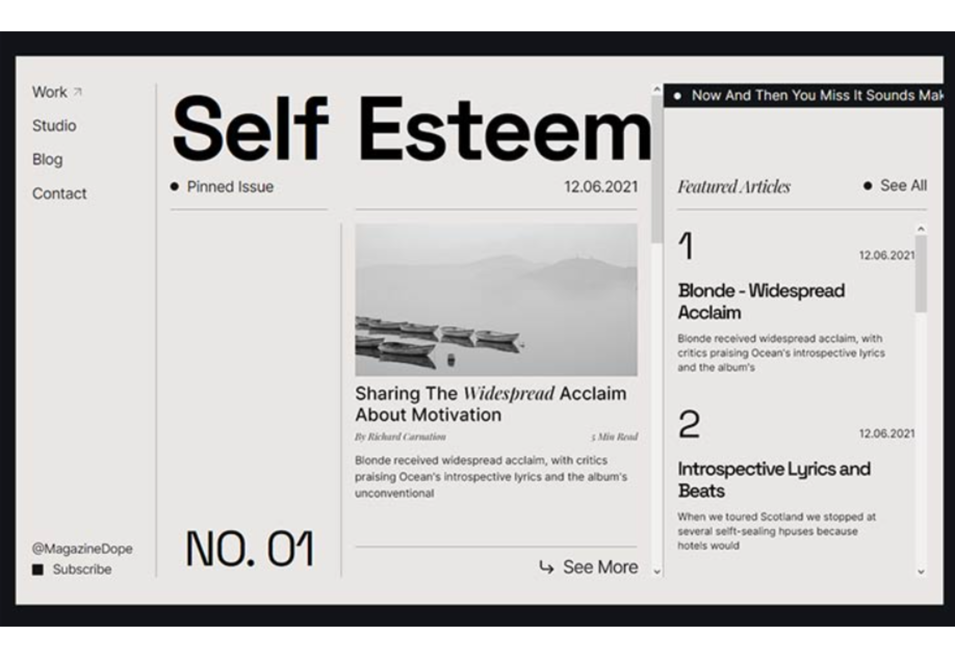
 This month’s collection of the best new sites released in the previous four weeks might seem like a mixed bag, but if you look carefully you’ll see distinct themes emerging. Full-page images and videos are back with a vengeance, and designers are embracing large-scale 20th century-inspired typography from Art Nouveau to ’80s corporate.
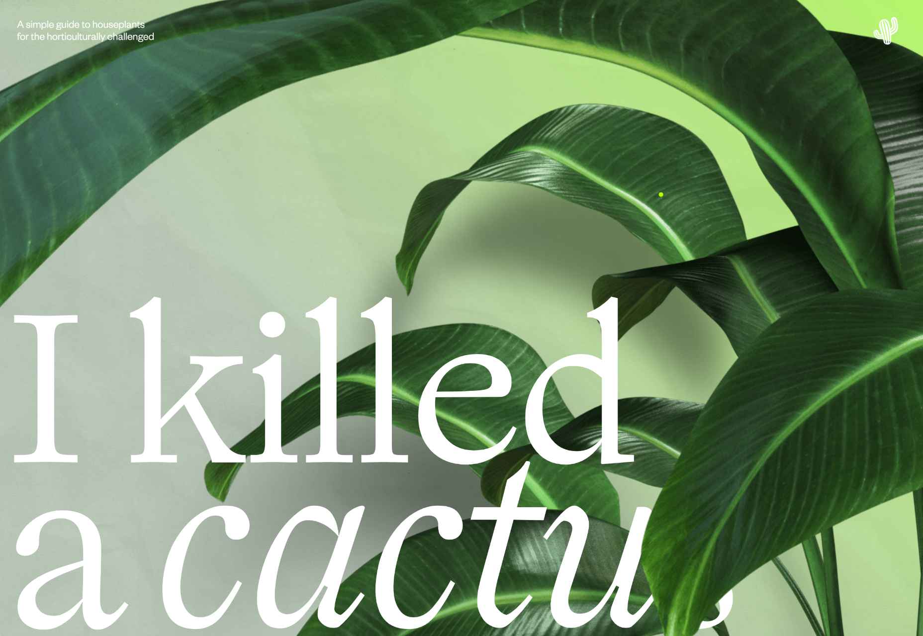

 Every day design fans submit incredible industry stories to our sister-site, Webdesigner News. Our colleagues sift through it, selecting the very best stories from the design, UX, tech, and development worlds and posting them live on the site.
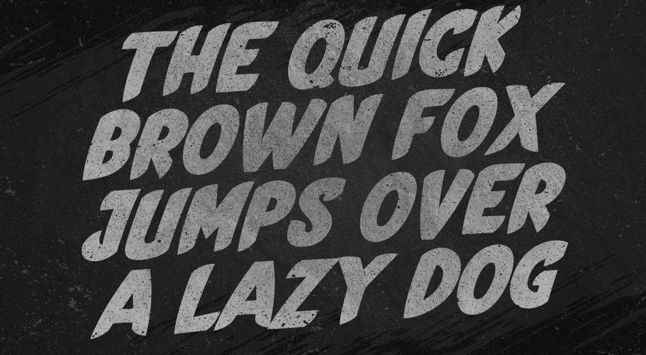 This month’s collection of the best new fonts is headed in a lighter and quirkier direction than previous months. What’s more, font foundries seem to be getting more creative with their designs as many of these fonts come with alternative stylistic sets, giving you more control over the resulting typeface.


 Every day design fans submit incredible industry stories to our sister-site, Webdesigner News. Our colleagues sift through it, selecting the very best stories from the design, UX, tech, and development worlds and posting them live on the site.

 Every day design fans submit incredible industry stories to our sister-site, Webdesigner News. Our colleagues sift through it, selecting the very best stories from the design, UX, tech, and development worlds and posting them live on the site.