Articles

  • Ouvert à 2 000 candidats de niveau BEP à bac + 5
  • 80 % d’entre eux devraient ainsi retrouver un emploi à l’issue de la formation au sein de grands groupes (clients installés SAP en France) ou d’Entreprises de Services du Numérique en recherche de compétences SAP.
  • Un dispositif pour supporter l’emploi en France et pallier au manque de compétences fonctionnelles et techniques sur le marché du travail.

Paris, le 22 septembre 2020 – Partant du constat que 40% des employeurs européens ont des difficultés à trouver des profils compétents et experts en informatique, équivalent à environ 500 000 emplois non pourvus, SAP a lancé, en France, son programme de formation People to Work destiné aux demandeurs d’emploi en démarrant par une initiative engagée avec Fitec, acteur majeur de la formation métier de l´ingénierie pédagogique et de la formation Tutorée à distance. Un programme qui a fait ses preuves en Allemagne depuis plus de 20 ans et qui permet à plusieurs milliers de demandeurs d’emploi d’accéder à un emploi rapidement grâce à des formations certifiantes SAP.

Une formation qualifiante et certifiée pour booster sa carrière

Le programme People to Work de SAP permet à des personnes en recherche d’emploi de compléter leurs compétences, se former et obtenir la certification SAP pour faire la différence lors des actions de recherche d’emploi. Il s’adresse à des candidats de niveau BEP à bac + 5 issus des domaines métiers de l’administration des ventes, achats, logistique, comptabilité et contrôle de gestion.

L’initiative propose des programmes individuels et personnalisés de 90h de formation autour des solutions « Ventes & Achats » et « Comptabilité Fournisseurs et Clients » de SAP. Les formations sont dispensées à distance et reposent sur des systèmes de formation SAP dernier cri et des formateurs certifiés SAP qui jouent un rôle important sur la qualité du programme. Chaque semaine, le stagiaire fait un point avec son coach personnel pour revenir sur la semaine écoulée. Ces formations permettent de bénéficier d’une certification SAP, celle de consultant, niveau Associates, et celle d’utilisateur.

Former 2000 demandeurs d’emplois en en France d’ici la fin de l’année

Initié il y a quelques mois en Ile de France, le programme est désormais accessible de tous au niveau national. Depuis sa mise en place, plus de 500 personnes ont bénéficié du programme. SAP et Fitec comptent dès aujourd’hui accélérer la cadence pour former au total 2000 personnes d’ici fin 2020.

People to Work certifie chaque année 25 000 personnes en recherche d’emploi à travers le monde et près de 80% d’entre-deux trouvent un emploi une fois la formation terminée. Le programme vise également à réduire le nombre de personnes vivant dans l’extrême pauvreté mais aussi à contribuer aux cinq objectifs de développement durable établis par les Nations Unies.

Pour en savoir plus et s’inscrire il suffit d’aller sur MonTuteur.fr de Fitec et d’aller sur l’espace SAP.

« Le programme People to Work est une chance pour des milliers de personnes en France de se doter d’une formation qualifiante et de nouvelles compétences pour changer de voie ou simplement trouver plus rapidement un travail qualifié. Désormais déployé sur l’ensemble du territoire, il va pouvoir bénéficier au plus grand nombre. J’espère que cette démarche rencontrera le même succès qu’en Allemagne où elle a été lancée initialement », précise Gérald Karsenti, président de SAP France.

Suite à une demande croissante, SAP et le groupe FITEC proposent également des formations pour ses solutions de gestion des ressources humaines SAP SuccessFactors et de marketing, vente et relation client SAP Customer Experience, montrant une évolution des profils recherchés par les entreprises. DEVENEZ by Fitec propose des programmes longs de 200h à 400h pour des candidats de niveau bac + 3 à 5 souhaitant occuper un poste de consultant SAP, dans le cadre de parcours reskiling et Up’skiling.

A propos de SAP

La stratégie de SAP vise à aider chaque organisation à fonctionner en “entreprise intelligente”. En tant que leader du marché des logiciels d’application d’entreprise, nous aidons les entreprises de toutes tailles et de tous secteurs à opérer au mieux : 77 % des transactions commerciales mondiales entrent en contact avec un système SAP®. Nos technologies de Machine Learning, d’Internet des objets (IoT) et d’analytique avancées aident nos clients à transformer leurs activités en “entreprises intelligentes”. SAP permet aux personnes et aux organisations d’avoir une vision approfondie de leur business et favorise la collaboration afin qu’elles puissent garder une longueur d’avance sur leurs concurrents. Nous simplifions la technologie afin que les entreprises puissent utiliser nos logiciels comme elles le souhaitent – sans interruption. Notre suite d’applications et de services de bout en bout permet aux clients privés et publics de 25 secteurs d’activité dans le monde de fonctionner de manière rentable, de s’adapter en permanence et de faire la différence. Avec son réseau mondial de clients, partenaires, employés et leaders d’opinion, SAP aide le monde à mieux fonctionner et à améliorer la vie de chacun. Pour plus d’informations, visitez le site www.sap.com .

A propos de FITEC

Partenaire formation de SAP depuis plus de 13 ans, deux départements au sein du groupe FITEC œuvrent en étroite collaboration avec SAP en France et en Allemagne dans le cadre du programme SAP People to Work :

DEVENEZ by Fitec programme longs de 200h à 400h pour des candidats de niveau bac + 3 à 5 souhaitant occuper un poste de Consultant Fonctionnel SAP S4/HANA Transformation Digitale, dans le cadre de parcours reskiling et Up’skiling.

MonTuteur by Fitec, programmes Individuels et personnalisés de 90h pour des candidats de niveau BEP à bac + 5 issus des domaines métiers de l’administration des ventes, achats, logistique, comptabilité et contrôle de gestion souhaitant compléter leurs compétences, se former et obtenir la certification SAP pour faire la différence lors des actions de recherche d’emplois. https://vimeo.com/456830760/484f0239d4

En lien avec le Covid19, Le groupe FITEC propose également aux entreprises et candidats qui le souhaitent des programmes de Up’skiling entièrement pris en charge pour les salariés.

Contacts presse :

Daniel MARGATO, Directeur Communication : 06 64 25 38 08 – daniel.margato@sap.com
Sylvain Drillon : 06 44 71 35 68 – presse-sap@publicisconsultants.com
SAP Press Room; press@sap.com

Veuillez tenir compte de notre politique de confidentialité. Si vous avez reçu cette alerte de presse dans votre courriel et que vous souhaitez vous désabonner de notre liste d’envoi, veuillez communiquer avec presse-sap@publicisconsultants.com et écrire Désabonnement dans la ligne Objet.

The post SAP et le groupe FITEC vont former plusieurs milliers de personnes en recherche d’emploi en France aux technologies SAP en 2020 appeared first on SAP France News.

Source de l’article sur sap.com

Every week users submit a lot of interesting stuff on our sister site Webdesigner News, highlighting great content from around the web that can be of interest to web designers.

The best way to keep track of all the great stories and news being posted is simply to check out the Webdesigner News site, however, in case you missed some here’s a quick and useful compilation of the most popular designer news that we curated from the past week.

The Beginner’s Guide to Responsive Web Design in 2020


Frontendor – HTML Templates and Blocks to Help Build Beautiful Websites


Why these Developer Job Titles are Ridiculous and Shouldn’t Exist


Emblemicons – Open-Source Free to Use Library of 1000+ Beautiful Icons


Disrespectful Design – Users Aren’t Stupid or Lazy


Welcome to your Bland New World


Playing with Fonts


The 50 Best Fonts for Creating Stunning Logos


How HTTPS Works


Nova – Beautiful, Fast, Flexible, Native Mac Code Editor


How to Be a Great Email Designer: Essential Tools


10 UX Lessons I Learned Building my Product from Scratch


5 Fears that Creatives Must Overcome


Introducing Mono Icons


From Posters to the Web: The Link Between Print and Digital Design


Designing SaaS Products In 2020


User Experience: What Is, its Guidelines and How to Apply it on your Website


The Evolution of the Google Sign up Form: 2005 → 2020


Principles for Naming a Brand


How to Choose the Right Website Fonts


Design Principles: What, Why, and How


5 Basic Types of Images in Web Design


Documenting is Designing: How Documentation Drives Better Design Outcomes


How to Create Dreamy Color Blurs in Adobe Illustrator


The Entrepreneur Vs the Linchpin: Which Type of Designer are You?


Want more? No problem! Keep track of top design news from around the web with Webdesigner News.

Source


Source de l’article sur Webdesignerdepot

As a freelance web developer, how many clients do you get from your website? If you’re like most, you’re probably lucky to get one client every 2-3 months. Unfortunately, that’s very common.

These days it’s not enough just to be a web developer if you want to make really good money. You have to be able to differentiate yourself in the marketplace to get more opportunities. If you can do this successfully, I’m 100% sure that it will help you win more projects and charge higher rates.

So today I’d like to share with you a little bit of my own story. In the last 4 months, I was able to position myself as a specialist with my personal site that ultimately helped me win more projects and get better clients.

The Importance of Niching Down

The first thing that I would invite you to do is to shift your thinking a little bit.

If you want to be a high-paid professional (especially if you’re a freelancer), you need to learn how to market and sell yourself. And the first rule of marketing is to identify your target audience and the result that you help them achieve.

I can’t over emphasize the importance of this.

You need to know exactly who you help and the outcome that you provide. That is ultimately what you get paid for. So you need to define your ideal client.

My suggestion is to pick a market segment that you would love to work with, that has the money to afford you and (ideally) those that have already done some projects for. Once you have identified your target market, you need to create your positioning statement. Your positioning statement should immediately tell who you help and what results you help them achieve.

Here is a formula that you can use to create your positioning statement:

I help __ (target audience) __ do (build/achieve/overcome) ___ (problem that you help them solve).

For example: I help startup SaaS companies build highly converting websites. You can go even narrower if you want, but this is already much better than just saying, “I’m a web developer.”

If your positioning statement is “I help startup SaaS companies build highly converting websites” it can still be narrowed down and improved. As you gain more experience and work with more clients, you can refine it to something like: “I help healthcare SaaS companies build highly converting websites.”

Now imagine if a SaaS startup founder from a healthcare niche came to your site and saw that positioning statement vs a very generic one like “I’m a web developer”. How much easier would it be for you to differentiate yourself and gain a huge advantage over your competitors in the marketplace?

4 Elements of a Perfect Landing Page

“I am passionate about coding, I have 10+ years of experience, client satisfaction is my main goal…” 

Have you ever seen statements like that on someone’s portfolio site? Or maybe it even says that on your own site. From my experience, statements like that don’t really help you convert site visitors into customers.

If you personally go to a company’s website, what would you like to see yourself as a visitor? Somebody saying how good they are, or to find out if they can be a good fit to solve your problem? I think that most of the time the latter is what you’re after. That’s what other people usually go to your website for; they want to know how you can help them solve their problems.

For instance, take a look at this section from Tom Hirst’s website:

As you can see, this immediately helps the visitors understand if Tom is a good fit for them or not. He doesn’t just boast about how good he is, but rather helps the client understand what problems he can solve for them. Another important part here is that Tom doesn’t use a lot of technical terms. Since a lot of his visitors may be not as tech-savvy as he is, there is no point in confusing them with technical jargon. The more you can speak their language – the easier it will be for you to build trust and connection that will later help you during the sales process.

Let me tell you a bit about the 4 parts of my site that I think have contributed significantly to having me win more projects. The 4 elements are problem, solution, proof, and call to action. Let me go over them 1 by 1 and explain why they’re important.

1. Problem

A good way to start your landing page sales letter is by identifying the problem of the client. If you know their pain points and you mention them, you should be able to hook them into reading your copy. And a well-written copy plays a significant role in persuading your visitors to take the next action.

2. Solution

Once you have mentioned their problem, you need to present them with a solution that you provide. You need to show them how working with you can solve their problems. Whatever their problems are, you have to show them that you understand them and can help solve them.

That’s what UX designer Matt Oplinski is doing on his website is doing. He knows that his clients might need help with 3 types of projects: Digital Products, Marketing Websites or Mobile Apps. For example, the clients who are seeking a redesign of their website may have an issue with their current conversion rates. And that’s exactly what Matthew lists in the middle section under “Custom Marketing Website” headline. I would even argue that he may have been a bit more specific with the solutions that he can offer.

The main takeaway here is that it’s important to be very specific with the result that you can help your clients achieve. The more accurate it is, the better it is going to convert.

3. Social Proof

Social proof plays an extremely important role in converting a lead into a customer. When someone comes to your site, they don’t know if they can trust you. If they were to spend one, two, five, ten or even more thousand dollars – they need to feel comfortable with you. They need to have at least some level of trust. That’s why they want to see as many signs as possible that you’re trustworthy.

Social proof obviously can come in many different forms. The most popular and important ones, in my opinion, are case studies with results that you’ve produced and testimonials. They will be absolutely crucial to persuade your clients and be able to differentiate yourself from others.

Here is a good example from Bill Erickson’s site:

Ideally, your testimonials should showcase a particular business goal that you’ve helped your client to achieve. But even if you don’t have those, you can use ordinary testimonials that your clients give you. That alone is better than no testimonials at all.

4. Call to Action

Last but not least you should have a single call to action on your site. Most likely it will be a button to contact you, or book a call with you.

In my opinion, it’s important to have a single call to action because if you give people too many options they will not be so focused on taking an action that you actually want them to take.

I also suggest that you have a call to action button at least 2-3 times on the page: one on the first screen where you have your positioning statement and/or your offer, and one at the very bottom of the page so that when they finish reading they don’t need to go back to the top to take action. Having another call to action in the middle of your page is also a good idea. My advice would be to add it after you’ve described the problem, your solution and presented yourself as someone who can help your leads with their problems.

Results

I started niching down and created my own website four months ago. Being a member of multiple freelance platforms, I’ve been fortunate enough to get enough leads in my target market to test out my strategy. So far the results are pretty amazing.

It has become a lot easier for me to win projects, get clients that respect my knowledge, and my process. Besides that, I’ve been able to significantly increase my rates for my work. A great thing about working with similar projects every time is that you automate and streamline a lot of things, improve your delivery process and become much more efficient. You can even create a productized service. This is something that is very hard to achieve if you’re constantly working on custom projects that have different requirements and involve different technologies.

To be completely transparent, I’m still in the process of building my authority in the niche, polishing my offer and gaining experience. I still have a long way to go. What I can certainly say today is that it has been one of the best decisions in my professional career.

To become a high paying professional in your industry you have to do things differently. Today I tried to show you one of the ways that you can improve your career or freelancing business fast. It probably won’t happen overnight, but in a matter of a few months you can be so much ahead of your competition if you deploy some of the strategies that I’ve shared with you today.

I really hope that this article has helped you gain some perspective and you will start to consider doing a similar thing that I did to achieve amazing results.


Featured image via Unsplash.

Source


Source de l’article sur Webdesignerdepot

Smart design choices can help reduce the fatigue and frustration people would otherwise feel when using the web.

There are a lot of ways web designers can minimize distractions, information overload, and analysis paralysis. For instance, designing with abundant white space, shorter snippets of text, and calming color palettes all work.

One-page websites might be another design choice worth exploring.

When done right, a single-page website could be very useful in creating a simpler and more welcoming environment for today’s overwhelmed consumers.

With its diminutive structure, it would leave a unique and memorable impression on visitors. What’s more, a well-crafted one-page website would provide visitors with a clean, narrow, and logical pathway to conversion.

For those of you who use BeTheme’s pre-built sites (or are thinking about adopting them for your next site), there’s good news. In addition to the great selection of traditionally structured sites available, Be also has single-page websites for you to work with.

So, the technical aspects you’d need to master to get the one-page formula right are already taken care of.

Let’s have a look at some of the features that make single-page websites shine and how you can design them:

1. Give Visitors a Succinct Journey Through the Website and Brand’s Story

The typical business websites you design include pages like Home, About, and Contact, as well as pages that explain the company’s services or sell their products. Unless you’re building really long sales landing pages, there’s usually about 400 to 600 words on each page.

That’s still a lot of content for your visitors to get through and it can make perusing a single website an overwhelming experience. Imagine how they feel about reading through all that content when they have to do it multiple times when comparing other websites and options.

In some cases, this multi-page website structure is overkill. The information you’d otherwise fill a full page with can easily be edited down to fit a single pane or block on a one-page website and still be as useful.

Like how design and development studio Pixel Lab does it:

Pixel Lab

Notice how all the key points are hit in a concise and visually attractive manner:

  • The Featured Work portfolio
  • The About Us introduction
  • The FAQs
  • The contact form

The BeCV pre-built site is built in a similar manner (and for a similar purpose, too):

BeCV

Just remember to keep a sticky navigation bar present at all times so visitors know exactly how much content there is on the page.

2. Opt For a Non-Traditional Navigation for a Uniquely Memorable Experience

Typically, the rule is that website navigation should follow one of two patterns:

  • Logo on the left, navigation links on the right.
  • Logo on the left, hamburger menu storing the navigation on the right (for mobile or desktop).

There are a number of reasons why this layout is beneficial. Ultimately, it comes down to the predictability and comfort of having a navigation be right where visitors expect it, no matter where they end up on your website.

However, with a single-page website, this is one of those rules you can bend, so long as you have a way to keep the navigation ever-present and easy to use.

There are some great examples of one-page sites that have done this, usually opting for a stylized left-aligned sidebar that contains links to the various parts of the page. Purple Orange is just one of them:

Purple Orange

And you can use a Be pre-built site like BeHairdresser to create a similar navigation for your website:

BeHairdresser

If you’re trying to make a bold brand stand out, this is a neat layout option to experiment with.

3. Tell a More Visually Striking Story

One of the problems with building a website with WordPress is that you always have to worry about how your design decisions affect speed. Even once the code is optimized, images are usually the low-hanging fruit that have to be dealt with.

But when your website only contains one page, this means images aren’t as much of a problem (so long as you compress and resize them). It’s only when you continue to add pages, products, and galleries that you have to scale back your visual content.

So, if your brand has a strong visual identity and you want the website to show that off through images, a one-page website is a great place to do it.

Just remember to keep a good balance between text and images as Vodka A does:

Vodka A

There’s no reason for a liquor distribution company to mince words when the elegant product photos effectively communicate to consumers what it’s all about.

In fact, this image-heavy, single-page style would work well for any vendor selling a small inventory of products: food, beverages, subscription boxes, health and beauty products, etc. And you can use the pre-built BeBistro to carefully craft it:

BeBistro

4. Turn a Complex Business Idea or Offering into Something Simple to Understand

When a company sells a technical or complex solution to consumers, it can be a real struggle to explain what it does and why they should buy it.

But here’s the thing: Consumers don’t really care about all that technical stuff. Even if you were to explain how an app worked or how you use a software like Sketch or WordPress to design a website, their eyes would glaze over.

What matters most to them is that you have an effective and affordable solution that they can trust. So, why bog them down with page after page of technical specs and sales jargon?

A one-page website enables you to simplify even the most complex of solutions.

Take Critical TechWorks, for instance. It offers an advanced technological solution for the automobile industry…and, yet, this is all it needs to explain the technology at work:

Critical Techworks

If your website’s visitors are more concerned with the outcomes rather than the “how”, you’d do well to make the website and content as easy to digest as possible. And you can use a pre-built site like BeCourse to do that:

BeCourse

Notice how both of these sites take visitors through a small handful of sections (pages) before delivering them to the main attraction: the contact or sign-up form.

5. Capture Leads and Sales at Different Stages of the Sales Funnel

Some of your visitors will be brand new to the site and need more information before they pull the trigger. Others will already have a good idea of what they’re getting into and just need one small push to get them to take action.

With a single-page website, you can design each section to cater to the different kinds of leads and prospects that arrive there.

The top sections should be introductory in nature, providing new visitors with information they need to decide if this is an option worth pursuing. The sections further below should drill down into the remaining questions or concerns that interested prospects have.

Regardless of which section they’re looking at, your one-page site will have CTA buttons built in along the way that drive them to conversion the second they’re ready.

This will enable your site to always be prepared to convert leads, whether visitors read the first two sections or make their way through all of them until they reach the conversion point (e.g. a contact form, a checkout page, etc.).

You’ll find a nice example of this on the Cycle website, with CTAs strategically placed along the single-page’s design:

Cycle

BePersonalTrainer is a good pre-built site option if you want to ensure that you include a CTA button at the perfect stopping points throughout your page:

BePersonalTrainer

You won’t find them at the bottom of every section, but that’s okay. You just need them whenever your visitors are seriously thinking about taking action.

What Should You Build: A Multi-Page or One-Page Website?

Although a single-page website won’t work for larger websites (especially in ecommerce), it could work well for business websites that are on the smaller side to begin with.

By centralizing all of that information into a single page, you’ll create a fresh experience that wows visitors with how succinct yet powerful both the message and offering are.

Just be careful. Many single-page websites are poorly done (which is probably why they fell out of fashion for a while).

Remember: This is not your chance to throw web design rules out the window. In fact, this will be an opportunity to clear out the fluff and the clutter that’s accumulated over the years and to return to a more scaled-back and classic approach to design.

And with the help of Be’s pre-built one-page websites, it won’t require much work on your part to make that happen.


[– This is a sponsored post on behalf of BeTheme –]

Source


Source de l’article sur Webdesignerdepot

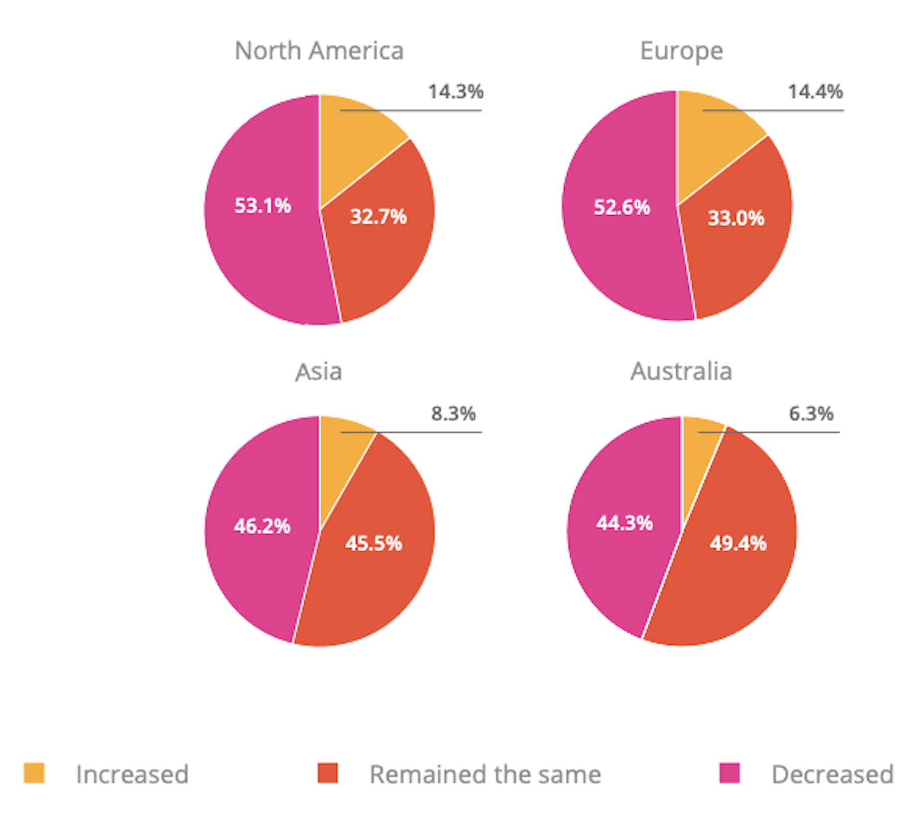
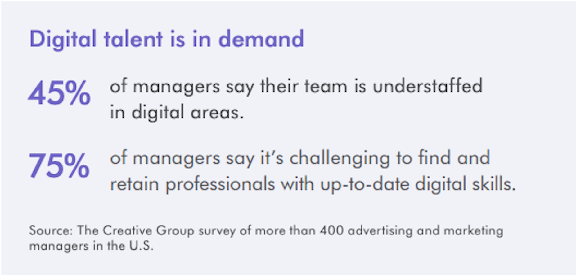
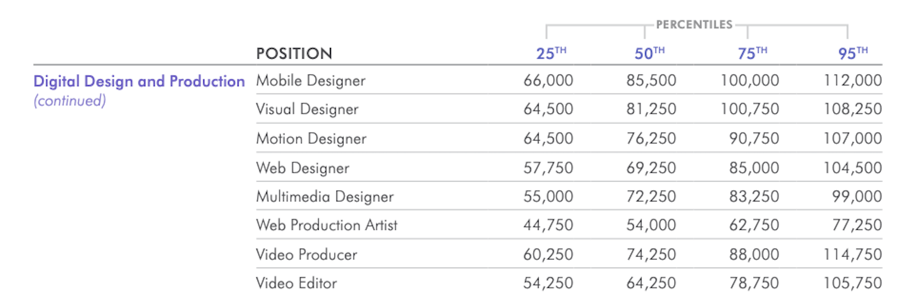
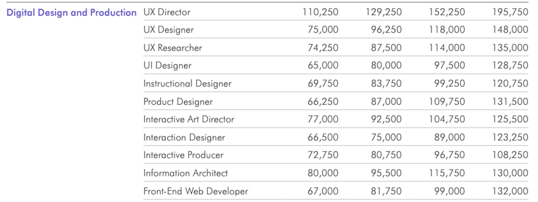
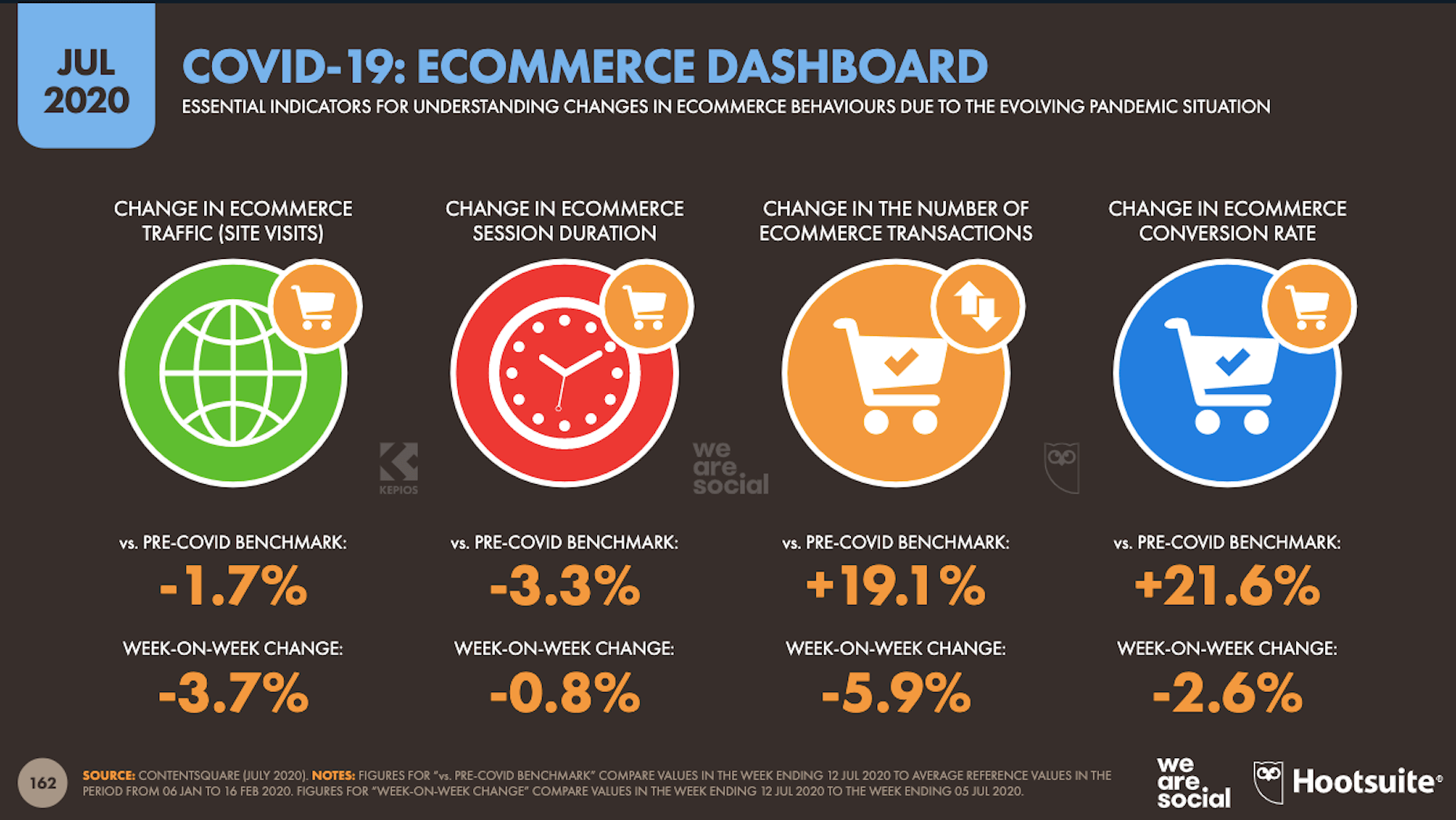
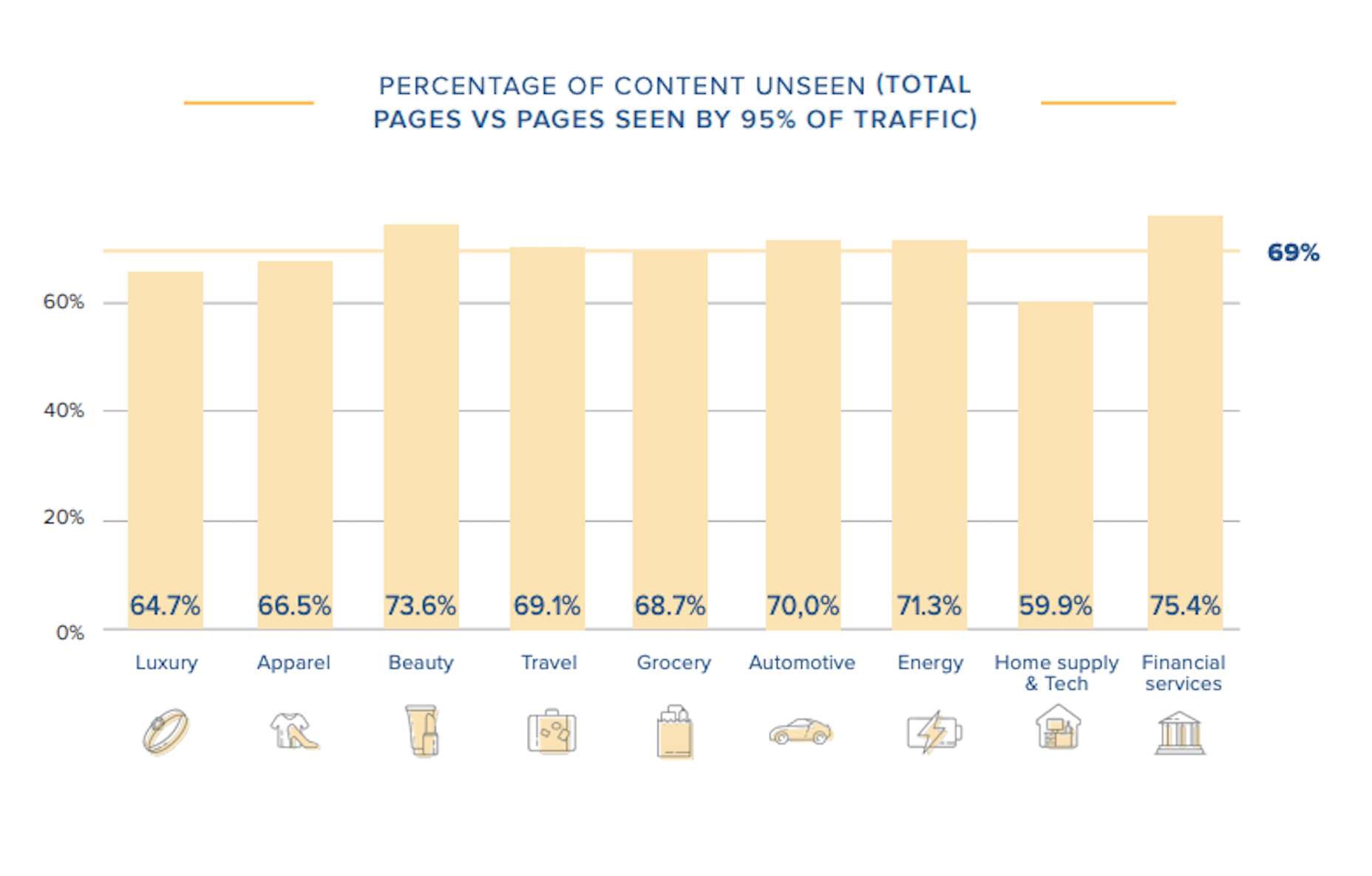
In today’s look at the latest research for web designers, we’re going to look at studies and reports from Payoneer, Robert Half, Hootsuite, and Contentsquare to see what they have to say about things like:

  • Current freelancer demand
  • Web designer earning potential
  • A change in ecommerce shopping trends
  • Unseen content rates

1. There’s Light At the End of the COVID-19 Tunnel for Freelancers

Payoneer’s The State of Freelancing During COVID-19 had to take a different approach to reporting on the freelancer workforce than in years passed.

Here’s why:

When 1000+ freelancers around the globe were asked how demand for their services changed during COVID-19, this was the response:

Less than 17% of freelancers experienced an increase in demand for their services and less than 23% saw demand remain the same.

An overwhelming majority of freelancers experienced a shrink in demand, with nearly 29% saying it slightly decreased while almost 32% said it greatly decreased.

However, the data collected wasn’t just assessed on a global scale. Payoneer also looked at freelancing demand trends in various parts of the world:

Notice the differences between Asia and Australia (who were hit with COVID-19 earlier) and North America and Europe (where the pandemic arrived a little later).

It appears as though Asian and Australian freelancers are, economically speaking, already starting to feel the effects of recovery from the pandemic with demand working in their favor.

So, if you’re feeling like there’s no end to the hardships you’ve faced during COVID-19, and were considering dropping your prices, hold on for just a little bit longer. Freelancers are starting to feel optimistic about demand for their services increasing. If you go devaluing yourself now, it’ll be hard to return to where you were before COVID-19 when things get back to normal.

2. Robert Half’s Salary Guide Breaks Down the Earning Potential for Web Designers

On a related note, let’s talk about demand from the employer’s point of view.

According to Robert Half’s 2020 Salary Guide for creative marketing professionals, there’s big demand for digital talent:

So, that’s number one. We know that almost 50% of hiring managers feel as though their digital teams are inadequately staffed. That’s good news for web designers.

However, these same managers complain about creative marketing professionals’ lack of up-to-date skills as the biggest barrier to hiring or retaining them. Although the report doesn’t say so, I’m going to assume this refers both to employees as well as contractors.

This should be a no-brainer. By keeping up with the latest web design trends and techniques, you can make top-dollar for your services — and hold onto those valuable client relationships for a long time.

According to the report, this is how much you stand to earn working in web design (in the U.S.) today:

If you’re eyeballing those salaries in the 95th percentile, then you know what you need to do. Hiring managers have spoken up about what’s holding them back from hiring.

For those of you who feel as though you’ve gone as far as you can as a web designer, it might be worth exploring a new specialty. Like one of the following:

As you can see, designers in the UI, UX, and interactive space (along with web developers) have the opportunity to make more money, even earlier on in their careers. You may also find that more job opportunities are available as you move into these niches (because of less competition), which might cut down on any demand issues you’ve been experiencing because of COVID-19.

3. Hootsuite’s Digital 2020 Report Reveals an Interesting Trend in Ecommerce

Hootsuite’s Digital 2020 report is always a great resource for learning about social media marketing trends. That said, that’s not why I read it.

It’s for hidden gems like these:

It’s no surprise that we’re seeing changes in retail and ecommerce during COVID-19. What is a surprise, however, is how consumers’ online shopping habits have changed.

Here’s what we’re seeing when we compare 2020 ecommerce data with the pre-COVID benchmarks:

Site visits are 1.7% lower than expected. That would make sense considering how budget-conscious consumers are right now. It likely keeps them from going on unnecessary shopping sprees.

Session durations are 3.3% lower. This could be related to fewer site visits. It might also indicate greater consumer confidence. If they come to a website with a plan for what they need to buy, they’re going to take a straight line to conversion instead of spending time window shopping that prolongs their session.

The number of transactions is 19.1% higher and the conversion rate is 21.6% higher. Considering shoppers aren’t spending as much time with ecommerce websites, this point suggests that there’s a massive shift happening from in-store shopping to online shopping.

If that’s the case (even if consumers are currently spending less money), that means web designers need to set their sights on the ecommerce space. With the holiday shopping season expected to start sooner rather than later this year, now is the time to get in there and make sure these sites provide as streamlined an experience as possible.

4. Contentsquare Studies the Unseen Content Rates By Industry

Contentsquare analyzed more than 7 billion user sessions globally to create the 2020 Digital Experience Benchmarks report.

There’s some interesting data in here about website traffic and conversion trends, but what I find the most valuable is the breakdown by industry.

It was this chart, in particular, that really caught my eye:

According to Contentsquare’s data, between 60% and 75% of a website’s content is unseen. Some industries fare better than others, like home supplies and luxury retailer websites, but the numbers still aren’t flattering.

For example, what does it mean when consumers miss 75% of a financial service provider’s content?

Does this mean that the financial advisory content — which I’m assuming comprises the bulk of the pages on the site — is useless or irrelevant? Or perhaps it’s an issue of discoverability since blog content and other resources often take a backseat to service and product promotion?

What about ecommerce brands in the apparel or beauty space?

If two-thirds of their pages are unseen, does that mean their websites are overrun with obsolete inventory? Or, again, is it an issue of navigability and discoverability around the store?

As a web designer, I’d suggest performing your own unseen content analysis on the websites you’ve built. If over 60% of your pages never get any views, you’re going to have to decide what to do with them:

Option 1: Fix the navigation or search function so people can actually find these unseen pages.

Option 2: Remove them from the site and make room for content your visitors actually find valuable.

Wrap-Up

As you encounter research and reports online — whether it’s written specifically for web designers or other creative professionals — spend some time looking for hidden gems.

As you can see above, there’s a ton of relevant research for web designers out there, even if it’s hiding behind the mask of a larger issue or matter. And it’s this data that will help you get a leg up on the competition since it’ll get you thinking about your business and your approach to design in different ways.

Source


Source de l’article sur Webdesignerdepot

Every week users submit a lot of interesting stuff on our sister site Webdesigner News, highlighting great content from around the web that can be of interest to web designers.

The best way to keep track of all the great stories and news being posted is simply to check out the Webdesigner News site, however, in case you missed some here’s a quick and useful compilation of the most popular designer news that we curated from the past week.

UX Design for Navigation Menus


How to Choose UI Colors for Mobile and Web Design Wisely


A Step-By-Step Guide to Create your own WordPress Theme


HTML5 Canvas Cheat Sheet [PDF]


Beyond Media Queries: Using Newer HTML & CSS Features for Responsive Designs


The Power of not Messing Around


Tailwind Ink: AI Color Palette Generator for Tailwindcss


Resumey.Pro – Save Time and Effort on Designing your Resume Using Markdown


The Ultimate List of YouTube Channels to Boost your Web Dev’t and Programming Skills


10 Google Font Combinations for Inspiration


Everything You Need to Know About WordPress 5.5


How to Create Stronger Layouts with the 8pt Grid


TEDx Talk: Good UX is a Problem


All the Ways to Make a Web Component


Landing Page 101: How to Design a Landing Page that Converts


30 Free HTML and CSS Book Effects and UI Design


A Guide to Design System Models


15 Designer Curated Color Palettes to Inspire your Next Project


My Thoughts About Editors in 2020


The Napoleon Technique: Postponing Things to Increase Productivity


Announcing TypeScript 4.0


Un-Cancelling 2020: Virtual Conferences for Designers


How to Manage Stress as a Developer


Explaining UX Design to a 5-year-old


How to Win Over Skeptics with Qualitative Research


Want more? No problem! Keep track of top design news from around the web with Webdesigner News.

Source


Source de l’article sur Webdesignerdepot

Voice is one aspect of technology that is getting bigger and bigger, and showing little sign of relenting. In fact, 2019 data revealed that 22% of UK households owned a voice-controlled digital home assistant device such as an Amazon Echo or Google home. This is double the figure recorded in 2017 and it is predicted that over the next five years nearly 50% of all homes will have one. Smart home adoption rates are increasing, and it shows how voice control is something we are all becoming more accustomed to.

With these high figures, does it follow that voice should be something web designers build into sites? Or is it merely a gimmick that will die out and render sites with hardware and complex design issues? You only have to look at the failed introduction of Google glass to see that certain technological advancements don’t always have the outcome that might be expected.

Multiple Voices

One of the first issues with voice is establishing whether you want sites to recognise everyone’s voices, or just those who have registered. If you’re using the site in a crowded room will it pick up on snippets of conversation from others and think these are instructions? Google Home has a feature whereby you have to register your voice with its app to use more personalised features such as the shopping list. Is this the sort of thing websites would need?

Accents

The implementation of voice is complex, not only does it need to understand certain languages (such as English), but all the accents and variations too. With 160 English dialects alone, that is a lot that the technology needs to understand – not including mispronunciations, slang, and colloquialisms. Also, if a site is used all over the world (which many are) how many languages will it need to know?

Privacy Issues

if there are clips of your voice out there on the web…it can easily be imitated

If a website involves a feature such as online shopping or other functions which require sensitive details to be input, this could put people off using voice. Users need to know where this saved data is being stored, how it will be used and if it is secure. In 2018, HMRC had signed up about 6.7 million people to its voice ID service and HSBC said over 10,000 were registering each week. This shows many trust the service, but experts say that if there are clips of your voice out there on the web (such as in a podcast) it can easily be imitated. Bringing with it security and privacy issues.

According to futurologist Dr Ian Pearson, who invented the text message back in 1991, it won’t be long until we can complete a financial transaction with just a few words and a gesture. This can be a time-saver for things such as online shopping, but we need to ensure there are the correct security steps in place.

Users Don’t Talk The Way They Type

When speaking we tend to use shortened and more colloquial language as opposed to when we type. The voice function on a website will need to be able to adapt for this. One example is if you are filling in a form or comment box by voice for a website, you will need to tell it what to punctuate, letting it know where to add a comma, exclamation mark etc.

Website Processes Need to be Simpler

With the web as we use it now, we often browse through pages, reading other snippets of information before clicking through to the page we want. With voice recognition it will cut out these middle steps. For example, if you are looking for a recipe of something specific, you will just say the command “Show me the … recipe” and it will take you straight there. This direct access to what we are looking for could lead to a simplification of websites.

Regular Updates

With websites as they are now, they need updates semi-regularly, depending on how they are built, how complex they are, and what features we have built into them. A voice-based site will need updating regularly, whether to add new words or processes or to keep up with the fast-adapting technology. It might end up being quite a complex process.

Mistrust

While there are more of us now than ever using voice control via tech such as Alexa, Google, and Siri, there is still a level of mistrust over it. It’s still not quite clear where data is being stored, if it is being stored, and how easy it could be to abuse.

Larger Storage and Bandwidth

If a site is built for voice, will it utilise a ready-built plugin or will it have its own software built by developers? Will this feature require a greater amount of storage and bandwidth to cope with it? These are further factors to consider when thinking of the future of implementing voice to websites.

We Still Don’t Know Where It Will Go

Voice technology while working in some respects, is still a bit of a grey area when it comes to future use. Will it be the next big thing as many have predicted, or will it simply die down?

Look at Google Glass – highlighted as the big new technology, they soon died down and were eventually discontinued. Smart watches were another thing. You can see their initial downfall by reading an article published in 2017 about smartwatches – how major smartwatch makers such as Apple and Samsung rushed into the market before the technology was ready and they subsequently failed. Motorola exited the smartwatch market, Pebble and Jawbone shut down and Fitbit sold 2.3 million fewer devices than in their previous quarter. It was perceived as being a fad. However, fast forward to 2020 and more people than ever are wearing and using smartwatches. The smartwatch market was valued at shipment volumes of 47.34 million in 2019 and is expected to reach 117.51 by 2025, reaching a growth of 15.4 over the next five years.

Will voice follow a similar trend?

No More Impulse Buying

People enjoy browsing websites and many businesses rely on user’s impulse buying and ask their websites to be designed to reflect this. With voice taking you directly to the page’s users want to find, will they bypass these potential selling traps and just buy what they want – rather than added extras? Will it end up being a negative for businesses and see users not as satisfied for the experience?

Voiceless Still Matters

You will also have to remember that not all devices might work with voice, or people might be browsing somewhere where voice cannot be used. This means in the design process it needs to work both for voice instruction and manual use. It needs to work just as well for both to ensure the customer journey isn’t affected.

There are many ways voice can affect how we design websites in the upcoming future. It’s important to take note of market trends and usage – seeing how people use voice and thinking of the customer journey. It’s vital we don’t forget the end goals of websites – whether it’s to inform or to sell, the implementation of voice needs to assist this process not make it harder.


Featured image via Unsplash.

Source


Source de l’article sur Webdesignerdepot

Un état d’esprit axé sur le client signifie qu’il faut constamment penser non seulement à votre client, mais aussi aux clients de vos clients – et à tous leurs employés. C’est ce que pense avant tout Martin Mrugal, responsable mondial de Customer First chez SAP.

« Pendant la pandémie COVID-19, les entreprises ont prouvé l’une après l’autre que la sécurité de leurs employés, le service aux clients et les engagements envers les parties prenantes sont des priorités absolues », dit-il. « C’est notre travail de défendre passionnément nos clients en leur fournissant les meilleurs outils, services et inspirations pour les aider à remplir leurs obligations et à s’épanouir dans le processus ».

A Customer First Mindset

Click the button below to load the content from YouTube.

A Customer First Mindset


Mrugal a partagé avec les clients des histoires incroyables sur les nombreux résultats positifs obtenus par les clients qui ont un partenariat solide avec SAP.

Faurecia, un équipementier automobile mondial, s’est d’abord concentré sur la protection de ses employés, puis a renforcé ses liquidités pour rassurer les parties prenantes : l’entreprise pourrait faire face à tous les défis posés par la crise. Il a également saisi l’occasion de développer la résilience de sa chaîne d’approvisionnement et d’accélérer la neutralité en matière de CO2 grâce à l’achat d’énergie et d’acier décarbonisés. Malgré le blocage, Faurecia a rassemblé plus de 1 000 fournisseurs en ligne afin d’assurer conjointement la continuité de la chaîne d’approvisionnement et de s’assurer qu’ils sont prêts pour la reprise.

Le géant suisse du commerce de détail Coop a utilisé un nouvel outil de prévision pour s’assurer que les rayons des supermarchés étaient bien approvisionnés afin que les clients puissent s’approvisionner. Il a également transféré temporairement des employés de ses secteurs d’activité non alimentaires, qui ont été fermés pendant la crise, pour travailler dans des entrepôts et des centres de distribution en sous-effectif.

Lamb Weston, un fournisseur nord-américain de produits à base de pommes de terre, a renforcé les pratiques sanitaires sur tous ses sites et n’a autorisé que les visites critiques dans ses usines de fabrication pour éviter la propagation du virus. Elle a également optimisé les stocks, permettant à l’entreprise de transférer les fournitures aux épiceries qui avaient besoin de plus de produits à base de pommes de terre.

« Ce ne sont là que quelques exemples de la manière dont les clients de SAP se concentrent sur leurs employés et leurs entreprises », explique M. Mrugal. « Nous constatons que tout le monde, partout dans le monde, est confronté aux mêmes défis, sous une forme ou une autre. Maintenant plus que jamais, nous augmentons notre niveau d’engagement et nous pensons de manière créative pour accroître notre collaboration et notre connectivité avec les clients par le biais d’engagements virtuels et numériques ».

Interrogé sur son rôle, M. Mrugal explique que « Le client d’abord » est à la fois un état d’esprit, un modèle d’engagement et une organisation construite autour de meilleurs engagements avec les clients – le tout réuni en un seul.

« La véritable mesure du succès de SAP est le succès de nos clients. Ce concept est inscrit dans notre ADN », dit-il en racontant l’histoire d’un représentant commercial de SAP qui a aidé un client à localiser 500 lits d’hôpital en 30 minutes pour un hôpital de fortune à New York au plus fort de la pandémie. « Le représentant a reçu un appel d’un fournisseur, Ram Tool Construction Supply, qui aidait un entrepreneur à construire l’hôpital. Le représentant de SAP a utilisé l’outil SAP Ariba Discovery pour répondre rapidement au besoin ».

M. Mrugal note que depuis que SAP a donné aux clients un accès gratuit à SAP Ariba Start Sourcing à la mi-mars 2020, les affichages des acheteurs sur ce site ont augmenté de 58 % et les réponses des fournisseurs de 404 % par rapport à la période du 1er janvier au 9 mars 2020.

La fourniture de logiciels gratuits est l’un des moyens par lesquels SAP démontre que ses clients sont au premier plan. SAP offre également à ses clients un accès gratuit à plusieurs solutions clés de SAP et de Qualtrics.

« Les clients profitent de nos offres gratuites », a déclaré M. Mrugal. « Qualtrics leur permet de sonder et de prendre le pouls de leurs employés pour s’assurer qu’ils sont vraiment en sécurité. C’est primordial dans l’environnement actuel ».

M. Mrugal a un mantra de trois mesures essentielles que les organisations doivent prendre pour survivre avec succès à la crise. La santé et la sécurité des employés, des clients et des communautés figurent en tête de liste.

Ensuite, une communication claire et cohérente est essentielle. Selon M. Mrugal, il est essentiel de garder les lignes ouvertes avec les clients et de rester connecté : « Nous devons comprendre en temps réel où nos équipes ou nos clients ont des préoccupations, et nous devons y répondre immédiatement ».

Enfin, M. Mrugal estime que le maintien de la continuité garantit que le niveau d’engagement de SAP ne diminue pas ; il affirme plutôt que SAP change la qualité – et pas seulement la quantité – de son engagement avec les clients.

« Dans de nombreux cas, nous sommes encore plus engagés avec nos clients que jamais auparavant alors que nous traversons ensemble cette période inhabituelle », déclare le dirigeant de longue date de SAP, qui pense que le rôle de son organisation continuera à évoluer à mesure que les besoins de SAP et de ses clients continueront à se transformer.

Une chose, cependant, ne changera jamais : le client sera toujours au centre de nos préoccupations.


Publié initialement en anglais sur news.sap.com

The post Le client d’abord, un état d’esprit et un mantra pour la réussite appeared first on SAP France News.

Source de l’article sur sap.com