Articles

And it does this 24 hours a day, 7 days a week, 52 weeks a year without ever asking for a pay raise.

But this is true only if your website landing page is designed well, maintained, and optimized to the gills. The art and science of a flawless landing page is beyond the scope of a single article, but we can start with helping you spot seven of the most common – and damaging – trouble spots.

1. Unclear Value Statement

Typically, new visitors to your page will only stay on it 3 to 15 seconds before they get distracted. In that span of time, you must offer a clear and visible reason to stick around and interact with the page.

That reason is your value statement. What value do your readers get in exchange for the time you ask them to spend? High-quality content is a must (and hopefully a given), but you also need to pull them in so they experience that content.

Does your landing page do that? If yes, great! If no, you should fix that. If you’re not sure, ask yourself:

  • Is there a compelling, visible headline that expresses the end benefits clearly and succinctly?
  • Is there a subheadline explaining your offering in more detail?
  • Are there supporting graphics that pull the eye toward your headline and subheadline?

If there aren’t, add them now.

2. Poor Signposting

Your landing page isn’t just there to be pretty. It’s meant to convince people to take action. If you don’t make it easy to find your call to action, most viewers won’t look for it.

deliver enough value to make it worth the hassle

You must make it clear — in as succinct and efficient terms as possible — why the action you want a reader to take will deliver enough value to make it worth the hassle. Tell them, in words that stand out from the rest of the page, what you want them to do next and what they’ll receive for doing so.

Improving your signposting stats by asking yourself the following questions:

  • Do you have a clear understanding of what the next step in a visitor’s customer journey should be?
  • Is it easy to find and take that step on your website?
  • Does your copy make a clear and compelling argument in favor of taking that step?

If you can answer yes to all three questions, your signposting is likely good (or at least good enough for now). If not, now you know what you have to do to improve it.

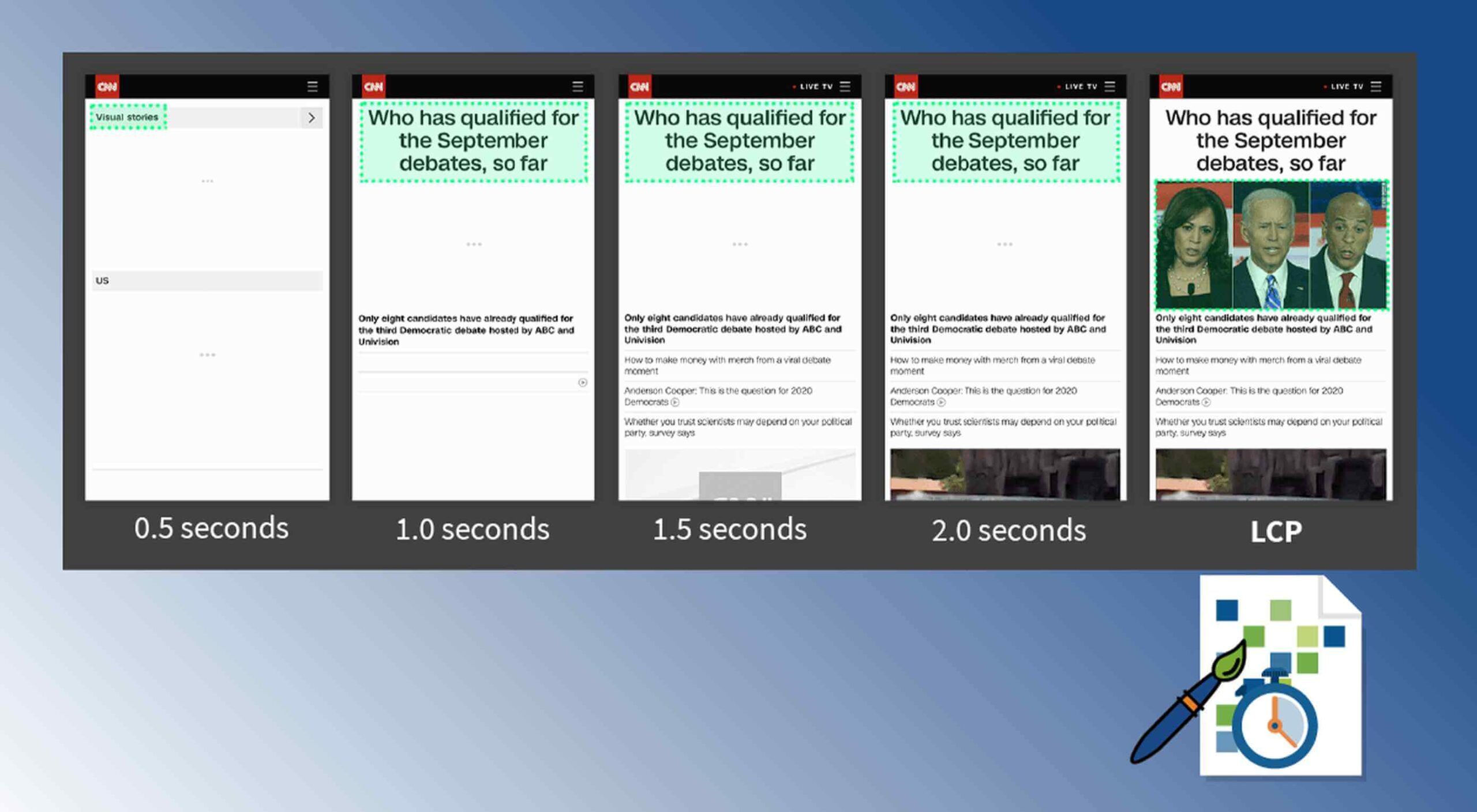
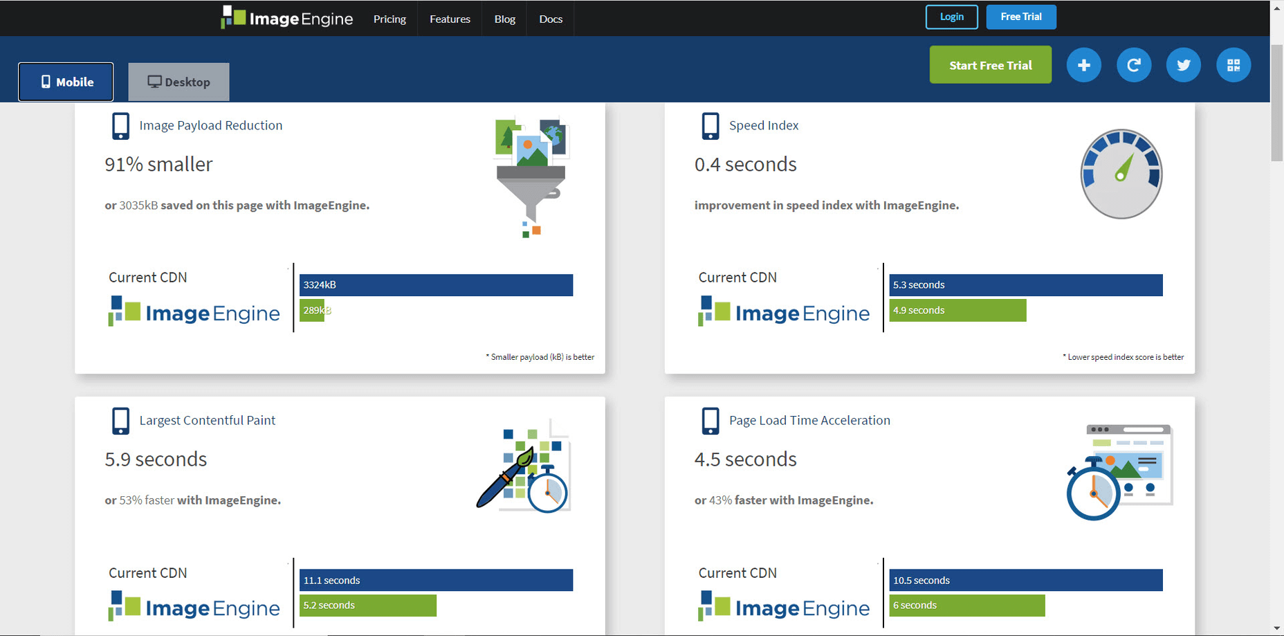
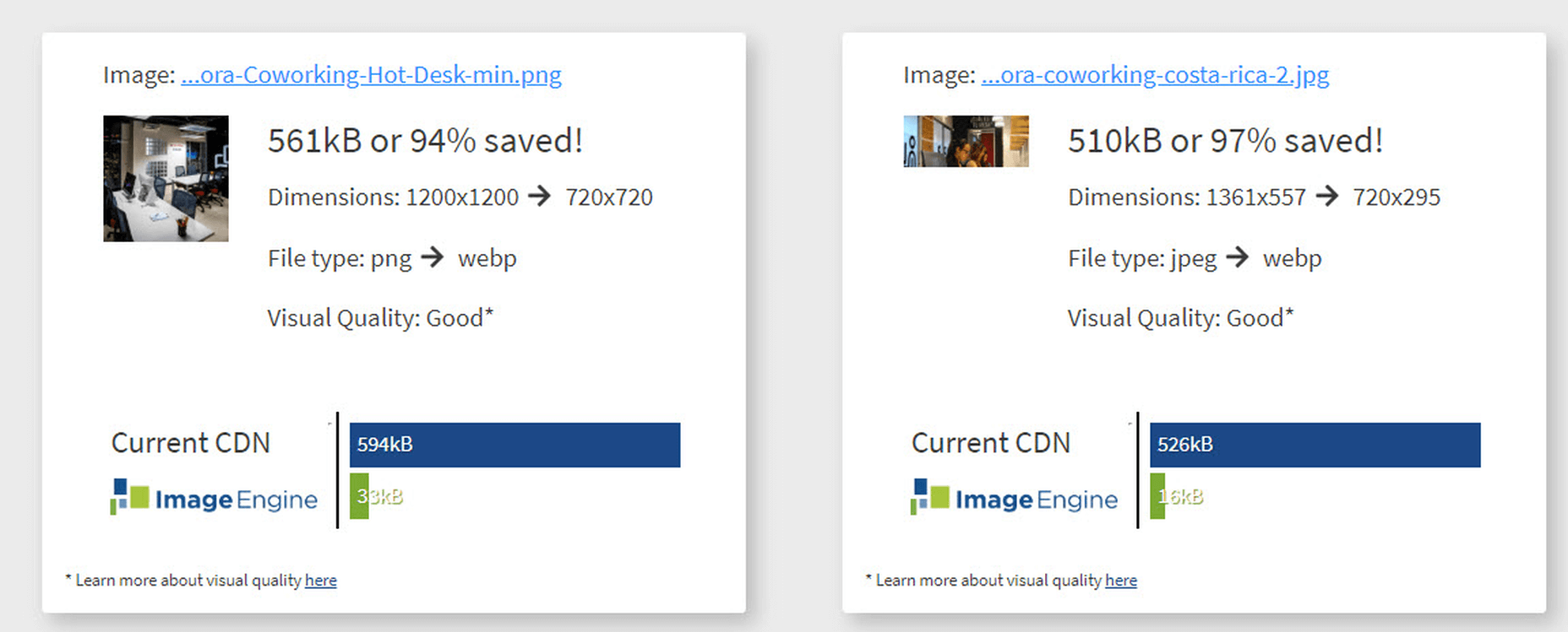
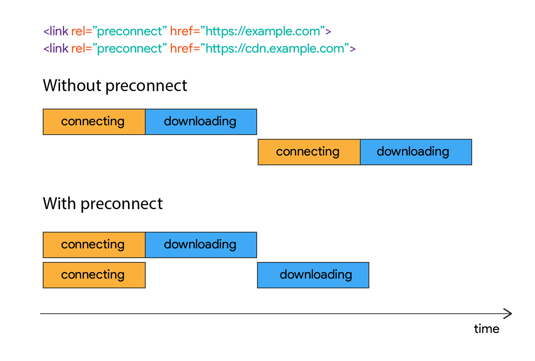
3. Slow Loading Time

Remember that 3 to 15-second maximum time limit we mentioned earlier? That span includes time spent waiting for your landing page to load, and every microsecond of that wait increases a reader’s likelihood of bailing on the whole thing. You must get your loading time to be as quick as possible.

Viewers who exit your landing page early – including while still waiting for it to load – increase your site’s bounce rate. Higher bounce rates reduce your rankings on Google and other search engines, meaning a page that loads too slowly not only impresses fewer viewers, but it also gets fewer viewers overall.

Improving your loading time is usually a job for your tech team or whoever in the office is responsible for overseeing your hosting service. That said, here are a few of the most important ways to optimize this important factor:

  • Optimize image size, file format, and compression;
  • Clean up your database by deleting saved drafts, old revisions, unused plugins, and similar virtual detritus;
  • Confirm that your WordPress theme (if applicable) is optimized for quick loading;
  • Use a content distribution network for file storage;
  • Analyze server response time with your hosting service, and work with them to reduce it;
  • Install tools that leverage browser caching;
  • Fix all your broken links;
  • Remove all render-blocking from JavaScript;
  • Reduce the number of redirects necessary to reach your page;
  • Optimize your code, especially in CSS, JavaScript, and HTML;
  • Enable file compression — except for on images;
  • Replace all PHP content with HTML wherever possible.

This is technical, detailed work, but it’s important. If you don’t have team members up to these tasks, it can be worth hiring an outside consulting company to do it for you.

4. Only One Landing Page

You have a good idea of your ideal customer’s hopes, fears, pain points, demographics, likes and dislikes, and other important information. If you have several different types of customers, you can’t use the same landing page for each of your customer groups. Each group has different characteristics that will prompt them to follow your call to action, so you don’t want to offer just one landing page.

Similarly, you also probably have more than one product or set of content and offerings to generate sales. Having only one landing page can lose leads because the page is only optimized for one of those products or content sets.

Ideally, you should have a unique landing page with a tailored offer for each of your customer models that would send those individuals to each of the products and content sets. An ad for professionals in their 30s making over $50,000 a year would lead to a landing page built for them, while an ad for heads of households working from home would lead to a landing page built for them.

Yes, that means a company with three profiles and four content sets would need 12 landing pages. And yes, it’s worth that kind of effort.

5. Insufficient Visuals

“A picture is worth 1,000 words” is ancient wisdom, but it’s far from true in the internet world – it’s actually worth more. A quick look at social media and blog performance will tell you many people will look at, enjoy, and share a photo or video, but not many will read an entire 1,000-word post on the same topic.

How well your landing page performs depends on the images you use and how you present them. Does your page’s layout conform to the best practices of visual web design:

  • Including images that emotionally reinforce the value expressions of your product’s core benefits;
  • Containing sufficient white space to not be intimidating;
  • Providing data images to indicate the worth of what you do;
  • Using visual design cues to lead the eye toward your conversion points;
  • Applying color gradients to highlight offers and your call to action;
  • Using infographics to replace the dreaded “wall of text”.

If you can say yes for half of these things, carry on. If not, this point may be among the better places to start with a landing page redesign.

6. Asking For Too Much, Too Soon

Craft a custom calls to action that meet all levels of interest, need, and desire

Not every landing page visitor is created equal. Some are hardcore fans and experts in what you do, ready for a 10,000-word white paper that dives deeply into the research supporting your use case. Others might have heard about your industry on an Instagram page and want to know the basics of what you do.

There’s nothing worse than going to a website and being asked for all of your personal information right away. If your call to action requires too much knowledge, too deep a commitment, or even too much personal information, consider scaling back. Otherwise, you risk turning away potential customers.

Better yet, go back to No. 5 above and build a new landing page for beginners and early-stage leads. Craft a custom calls to action that meet all levels of interest, need, and desire.

7. No Trust Elements

Offering some type of authentic customer referral or testimonial is important. It all boils down to the same thing: telling those who read your landing page that other people already like what you do and how you do it.

Examples of effective modern trust elements include:

  • Quotes from positive reviews next to a photo of the reviewer;
  • Screenshots of social media posts praising your company or product;
  • Short video interviews of happy clients;
  • Blurbs for industry thought leaders approving of you;
  • Images portraying business credentials and certifications;
  • Links to positive press coverage;
  • Logos of known business customers who buy and trust your brand.

Final Thought: What’s Next?

There isn’t one guaranteed way to turn a landing page from something full of holes into something perfect. But first, run an audit of your landing page using this list as a guide. Note which errors are there. Next, sort them in order of what takes the least time to fix to what takes the most time to fix.

Then, fix them in that order. We find that getting the quick fixes done builds excitement and momentum, whereas starting with a harder fix can mire down the whole process.

If none of these errors exist on your landing page, congratulations. There’s still lots of work to do on your website and content marketing, but it’s not among these rookie mistakes.


Featured image via Pexels.

Source


Source de l’article sur Webdesignerdepot

We live in an era of reliability where users depend on having consistent access to services. When choosing between competing services, no feature is more important to users than reliability. But what does reliability mean?

To answer this question, we’ll break down reliability in terms of other metrics within reliability engineering: availability and maintainability. Distinguishing these terms isn’t a matter of semantics. Understanding the differences can help you better prioritize development efforts towards customer happiness.

Source de l’article sur DZONE

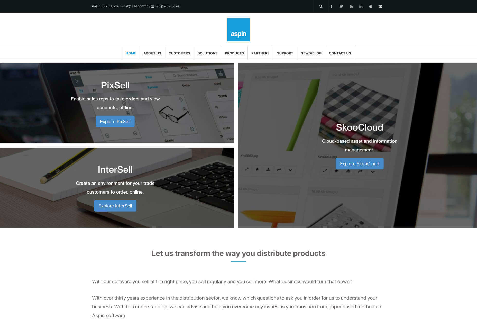
As a freelance web developer, how many clients do you get from your website? If you’re like most, you’re probably lucky to get one client every 2-3 months. Unfortunately, that’s very common.

These days it’s not enough just to be a web developer if you want to make really good money. You have to be able to differentiate yourself in the marketplace to get more opportunities. If you can do this successfully, I’m 100% sure that it will help you win more projects and charge higher rates.

So today I’d like to share with you a little bit of my own story. In the last 4 months, I was able to position myself as a specialist with my personal site that ultimately helped me win more projects and get better clients.

The Importance of Niching Down

The first thing that I would invite you to do is to shift your thinking a little bit.

If you want to be a high-paid professional (especially if you’re a freelancer), you need to learn how to market and sell yourself. And the first rule of marketing is to identify your target audience and the result that you help them achieve.

I can’t over emphasize the importance of this.

You need to know exactly who you help and the outcome that you provide. That is ultimately what you get paid for. So you need to define your ideal client.

My suggestion is to pick a market segment that you would love to work with, that has the money to afford you and (ideally) those that have already done some projects for. Once you have identified your target market, you need to create your positioning statement. Your positioning statement should immediately tell who you help and what results you help them achieve.

Here is a formula that you can use to create your positioning statement:

I help __ (target audience) __ do (build/achieve/overcome) ___ (problem that you help them solve).

For example: I help startup SaaS companies build highly converting websites. You can go even narrower if you want, but this is already much better than just saying, “I’m a web developer.”

If your positioning statement is “I help startup SaaS companies build highly converting websites” it can still be narrowed down and improved. As you gain more experience and work with more clients, you can refine it to something like: “I help healthcare SaaS companies build highly converting websites.”

Now imagine if a SaaS startup founder from a healthcare niche came to your site and saw that positioning statement vs a very generic one like “I’m a web developer”. How much easier would it be for you to differentiate yourself and gain a huge advantage over your competitors in the marketplace?

4 Elements of a Perfect Landing Page

“I am passionate about coding, I have 10+ years of experience, client satisfaction is my main goal…” 

Have you ever seen statements like that on someone’s portfolio site? Or maybe it even says that on your own site. From my experience, statements like that don’t really help you convert site visitors into customers.

If you personally go to a company’s website, what would you like to see yourself as a visitor? Somebody saying how good they are, or to find out if they can be a good fit to solve your problem? I think that most of the time the latter is what you’re after. That’s what other people usually go to your website for; they want to know how you can help them solve their problems.

For instance, take a look at this section from Tom Hirst’s website:

As you can see, this immediately helps the visitors understand if Tom is a good fit for them or not. He doesn’t just boast about how good he is, but rather helps the client understand what problems he can solve for them. Another important part here is that Tom doesn’t use a lot of technical terms. Since a lot of his visitors may be not as tech-savvy as he is, there is no point in confusing them with technical jargon. The more you can speak their language – the easier it will be for you to build trust and connection that will later help you during the sales process.

Let me tell you a bit about the 4 parts of my site that I think have contributed significantly to having me win more projects. The 4 elements are problem, solution, proof, and call to action. Let me go over them 1 by 1 and explain why they’re important.

1. Problem

A good way to start your landing page sales letter is by identifying the problem of the client. If you know their pain points and you mention them, you should be able to hook them into reading your copy. And a well-written copy plays a significant role in persuading your visitors to take the next action.

2. Solution

Once you have mentioned their problem, you need to present them with a solution that you provide. You need to show them how working with you can solve their problems. Whatever their problems are, you have to show them that you understand them and can help solve them.

That’s what UX designer Matt Oplinski is doing on his website is doing. He knows that his clients might need help with 3 types of projects: Digital Products, Marketing Websites or Mobile Apps. For example, the clients who are seeking a redesign of their website may have an issue with their current conversion rates. And that’s exactly what Matthew lists in the middle section under “Custom Marketing Website” headline. I would even argue that he may have been a bit more specific with the solutions that he can offer.

The main takeaway here is that it’s important to be very specific with the result that you can help your clients achieve. The more accurate it is, the better it is going to convert.

3. Social Proof

Social proof plays an extremely important role in converting a lead into a customer. When someone comes to your site, they don’t know if they can trust you. If they were to spend one, two, five, ten or even more thousand dollars – they need to feel comfortable with you. They need to have at least some level of trust. That’s why they want to see as many signs as possible that you’re trustworthy.

Social proof obviously can come in many different forms. The most popular and important ones, in my opinion, are case studies with results that you’ve produced and testimonials. They will be absolutely crucial to persuade your clients and be able to differentiate yourself from others.

Here is a good example from Bill Erickson’s site:

Ideally, your testimonials should showcase a particular business goal that you’ve helped your client to achieve. But even if you don’t have those, you can use ordinary testimonials that your clients give you. That alone is better than no testimonials at all.

4. Call to Action

Last but not least you should have a single call to action on your site. Most likely it will be a button to contact you, or book a call with you.

In my opinion, it’s important to have a single call to action because if you give people too many options they will not be so focused on taking an action that you actually want them to take.

I also suggest that you have a call to action button at least 2-3 times on the page: one on the first screen where you have your positioning statement and/or your offer, and one at the very bottom of the page so that when they finish reading they don’t need to go back to the top to take action. Having another call to action in the middle of your page is also a good idea. My advice would be to add it after you’ve described the problem, your solution and presented yourself as someone who can help your leads with their problems.

Results

I started niching down and created my own website four months ago. Being a member of multiple freelance platforms, I’ve been fortunate enough to get enough leads in my target market to test out my strategy. So far the results are pretty amazing.

It has become a lot easier for me to win projects, get clients that respect my knowledge, and my process. Besides that, I’ve been able to significantly increase my rates for my work. A great thing about working with similar projects every time is that you automate and streamline a lot of things, improve your delivery process and become much more efficient. You can even create a productized service. This is something that is very hard to achieve if you’re constantly working on custom projects that have different requirements and involve different technologies.

To be completely transparent, I’m still in the process of building my authority in the niche, polishing my offer and gaining experience. I still have a long way to go. What I can certainly say today is that it has been one of the best decisions in my professional career.

To become a high paying professional in your industry you have to do things differently. Today I tried to show you one of the ways that you can improve your career or freelancing business fast. It probably won’t happen overnight, but in a matter of a few months you can be so much ahead of your competition if you deploy some of the strategies that I’ve shared with you today.

I really hope that this article has helped you gain some perspective and you will start to consider doing a similar thing that I did to achieve amazing results.


Featured image via Unsplash.

Source


Source de l’article sur Webdesignerdepot

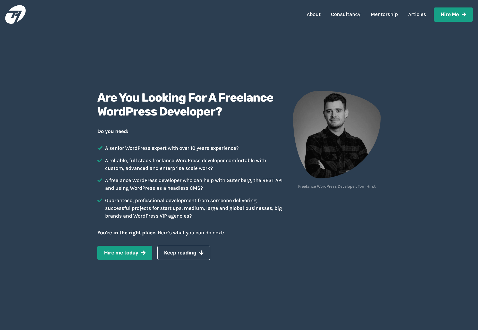
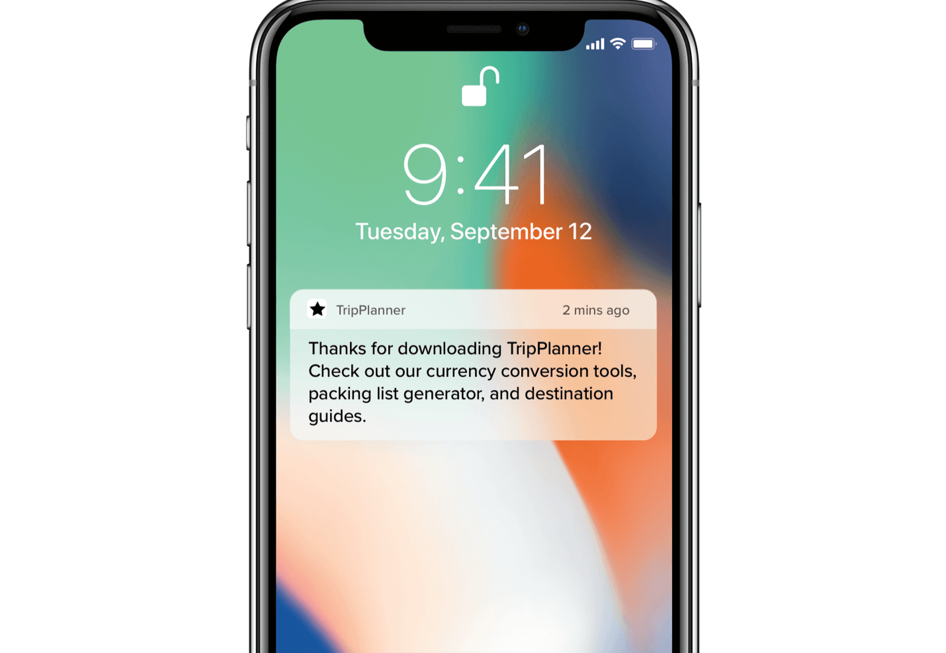
To understand why user onboarding is such an indispensable tool, we need to empathize with the people using our products; we all come from different backgrounds and cultures, we make different assumptions, and we see the world differently.

User onboarding helps mitigate these differences by making your product’s learning curve less steep.

However, companies often make unfortunate mistakes that hinder user experience and cause frustration. In today’s article, we’ll take a look at eight ways companies ruin their products’ onboarding process.

Let’s dive right in, shall we?

1. No User Onboarding at all

As a part of the team that created a product, you’ve probably spent hundreds of hours going over its features and the most minute detail. Naturally, you know the product like the back of your hand. The user does not.

Naturally, you know the product like the back of your hand. The user does not

We may believe that the app we’ve worked on is straightforward and that user onboarding is probably overkill — but that’s almost never the case. Guiding our users through a product will help with retention, conversion, and their overall satisfaction.

However, there are very rare cases when you can do without user onboarding, here are a few:

  • Your product is too straightforward to cause any confusion;
  • Your product has a formulaic structure, similar to that of other products’ in your category, i.e., social media or e-commerce;
  • Your product relies heavily on Google or iOS design guidelines with common design patterns;
  • Your product is too complex (enterprise or business-oriented) — in such cases, users need special training, rather than just an onboarding;

2. Assuming That Users “Get It”

 One of the vital UX mottos we should always be mindful of is that “we are not our users.” When onboarding them, we always need to assume that they’re at square one. We should communicate with them as if they have no prior knowledge of our product, its terminology, and the way it works.

Providing freshly-registered users with highly contextual information will most likely confuse them. As a result, this will render your attempts to create a helpful onboarding process useless.  

3. Onboarding Users on a Single Touchpoint

it’s tempting to brainstorm which features should make it into the onboarding, then design and code them; that’s a very bad idea

The main problem with the previous point is that it’s too contextual for new users. However, providing no context altogether can be problematic as well. This is commonly found in onboarding processes that focus on a single touchpoint while leaving out the rest of the product.

By choosing to inform users of our product’s features, we force them to detour from their “normal” course of action. This comes at the cost of the user’s frustration.

Since we’re asking people to pay this price, it’s best to provide them with information that will also help them navigate the entire product. As a result, this will decrease the number of times we’ll have to distract them from their ordinary flow.

4. Forcing Users Through Onboarding

We’ve previously mentioned that we mustn’t assume that users have any background knowledge about our products.

The opposite argument can be made — experienced users don’t need a basic onboarding process. It will most likely frustrate them, and it won’t provide them with any real value. Also, forcing users through this process will most likely take the onboarding frustration to a whole other level.

This is why it’s essential that we allow them to skip the parts they don’t find useful. This way, we’ll address the knowledge gaps of the people who really want it and need it.

5. Onboarding Based Purely on Assumptions

This is yet another point that’s implicit in “we are not our users”. Oftentimes, it’s tempting to brainstorm which features should make it into the onboarding, then design and code them; that’s a very bad idea.

Here’s what every designer should do instead:

  • Do user interviews: You should conduct these before having anything designed; user interviews will help you shortlist and prioritize features in terms of their significance, so that the onboarding is focused around the features that matter most.
  • Do usability testing: Once you have a good idea of what features your users consider most important, design onboarding that reflects that; having completed your design, make sure to conduct at least 5 usability testing sessions with users, so that you can make sure that your design works.

6. Just Letting Users Quit

While we shouldn’t force people to go through onboarding, it doesn’t mean we shouldn’t nudge them in the right direction.

find that sweet spot between being front of mind and annoying

People choose not to onboard for many reasons, but showing them around will benefit both parties. Therefore, it’s never wrong to remind them that they can always resume onboarding via email or push notifications (unless you’re too pushy). Make sure to find that sweet spot between being front of mind and annoying. 

Similarly, these two mediums are a great way to deliver valuable information as well.

Here’s a great example of an onboarding email from InVision:

And here’s a clever notification from TripPlanner:

Source: clevertap.com

7. Asking For Too Much Information

We need to always be mindful of the fact that the product’s spokesperson should act as a guide during onboarding. Its goal at the very beginning is to build trust.

We can ask for small favors when we’ve built a solid and lasting relationship

Not only is asking for too much information from the get-go unproductive, but it will also undermine the trust that the user already gave us.

It’s best to abstain from asking freshly-registered users for their credit card information. Nearly 100% of businesses care about profits — and there’s no shame in it. However, today’s most successful companies make money by providing users with value. So it’s best to stimulate users to share their financial data in subtler ways while focusing on customer experience.

The same can be said about subjecting the people using your service to extensive questionnaires. At the first steps of our interaction, it’s all about giving and gaining trust. We can ask for small favors when we’ve built a solid and lasting relationship.

8. Onboarding for the Sake of Onboarding

While there are dozens of reasons why you should guide your users through your product, it needs to be done well. A pointless onboarding process that doesn’t provide users with value is more frustrating than the lack thereof.

Onboarding can be a bit frustrating at times. Pointless onboarding will just raise eyebrows. It will slow users down and disengage them, which is exactly the opposite of what we want.

Conclusion

The process of introducing your users to your product is one of the factors that will define its success.

A critical aspect of user onboarding that we need to always take into account is value. Is this detour from our user’s ordinary course of action valuable to them? Will this improve their experience with the product?

Onboarding demands careful and continuous tailoring. Once perfected, this process will help you win new users’ hearts and help you build brand loyalty.


Featured image via Unsplash.

Source


Source de l’article sur Webdesignerdepot

It’s no secret that the senior population is growing. By 2030, people over the age of 65 are predicted to make up 20.6% of the population of the US. 

Around the world, people are living longer and remaining more active in the later years of their lives. What’s more, despite what you might have heard in the past, seniors aren’t as wary of the internet as they used to be. In 2019, the Pew Research institute revealed that 73% of people over the age of 65 were connected to the web. 

So, what does that mean for web designers?

your main focus needs to be on ability…people age differently

Well, first of all, it’s time for all of us to start thinking about user experience from different perspectives. We need to stop expecting our audiences to be made up entirely of iPhone-using millennials and start thinking about the needs of seniors too. After all, designing websites for seniors opens you up to a wide selection of potential visitors in the future.

What’s more, according to the US Census Bureau, people over the age of 65 generally have the highest household wealth figures of any age group. That’s a big deal. 

So, how do you adapt UX for seniors?

Creating Senior-Friendly Web Designs

When it comes to designing websites and applications for seniors, your main focus needs to be on ability. Age is just a number, and people age differently. 

That means that one person in their 70s might have no problem browsing through Netflix to watch the latest shows, while someone else wouldn’t be able to tell you what ‘streaming’ means. 

Rather than worrying specifically about age, think about how different people in older age groups might have different requirements when it comes to things like movement control, hearing, vision, and even device bias. 

Get the Visual Elements Right

Vision loss is by far the most common disability reported by elderly individuals in the US. Around one in six people over the age of 70 have some manner of visual impairment. That’s why UI designers need to think carefully about visual accessibility when creating the right websites. 

For instance, text and button sizes should always be kept large. Anything that needs to be read or clicked needs to be scaled up, to ensure that everyone can see the information clearly. For instance, on the Sandinmysuitcase.com website, you’ll find clear typography, combined with big buttons that tell you to “Start Here” so you know exactly what to do next.

Remember to stick to icons that are clearly labelled wherever possible. Stay away from anything that your customers might not understand. “Start Here” is easier to read and understand than “Submit”. 

It’s also worth sticking to the color and contrast guidelines laid out by basic UX design when you’re creating something for optimal visibility.  Colors that are too close together might create a nice pastel or gradient effect on a website – but they’ll also make things difficult to read. 

Concentrate on Usability

Over the age of 55, motor skills and coordination can begin to decline for some people. These changes make it harder for people to interact with complex UIs. The mouse on a computer can be a particular problem for people with diminishing motor skills – as can the touchscreen of a tablet or smartphone. 

When you’re working on the perfect UX, think about how you can make things as easy to click as possible for people who have a hard time hitting their targets. For instance, in this website for people traveling over the age of 50, you’ll see not only fantastic large font choices but big buttons that are descriptive and easy to understand too: “Click here to start planning your trip”:

The scrollbar can also be a bit of a problem for people with impaired motor skills. Because of this, it’s best to keep your focus on designing above the fold. Make sure that users don’t need to scroll far to find the information that they need and keep scrollbars simple in terms of their look and feel.

While you’re working on usability, remember that it will be important to keep interactions to a minimum wherever possible. Where you can engage younger audiences with double-taps, swiping and scrolling, it’s much easier to connect with seniors through simple one-tap interactions. The less actions your user needs to take to reach their goals, the better. 

Deliver Smooth Navigation 

Navigating from point A to B on your website needs to be as simple as seamless as possible. Remember, crowded pages on your websites and apps are often overwhelming – even for younger browsers. Seniors are generally just searching for “must know” information, so they don’t want anything to get in their way as they navigate through their website. 

As you work on your site or app design, ask yourself if every element on the page absolutely has to be there. If it doesn’t deliver value, then get rid of it. 

Additionally, remember that seniors don’t always have the best memories and concentration levels. That means that they need your navigation experience to be as simple as possible. Basic horizontal menu bars that show everything at once are often a good idea – even if they’re not very exciting.

Look at this helpful navigation experience from RetireMove.com, for instance. Everything you need is located at the top of the page, and you can even just enter your postcode to get started:

Cognitive decline happens regularly with age. Although not all older adults will have issues with their memory and concentration, it’s important to be prepared for an audience that might process information a little more slowly. It’s worth double-checking that your viewer’s attention isn’t being diverted to multiple parts of the page at once.

Get to the Point Quickly

While younger generations have quickly implemented technology into every aspect of their lives, older consumers use tech a little differently. These people don’t want to spend forever fiddling around with different parts of your website. They want to get the answers to their questions as quickly and easily as possible. 

Applications that are complicated or difficult to access are usually instantly rejected by seniors. Even if you’ve offered everything that we’ve covered above, from seamless navigation to minimalist design, you still won’t get the interactions you’re looking for if older adults don’t consider your design to be useful. 

Because of this, you need to highlight the point of a website or application to your seniors as quickly as possible. Avoid worrying about things like gifs, animations and gamification. Instead, focus on making sure that your designs are useful and simple. 

For instance, from the moment your senior user arrives on a web page, they should have instant access to clear instructions on how to use the application or service, and what they need to do next. Keep in mind that this is particularly important when you’re creating mobile apps, as apps are still a relatively new concept to older generations. 

On the “When They Get Older” website, you can instantly find the information you need in a well-organized navigation bar that’s labelled clearly:

A clear interface like this, combined with simple, step-by-step guidance that shows elderly individuals how to get the information that they want is the key to keeping these users coming back for more. 

Bringing a Mature Perspective to Web Design

These days, most designers focus heavily on younger audiences when creating websites and apps. After all, it’s these users that allow us to experiment more with the latest tools and concepts, like augmented reality, artificial intelligence, and robust animations. 

However, there’s still a market out there for the seniors of the world that want more opportunities to get online. This audience often goes ignored and under-served. However, as the value of older consumers grows, and their ability to interact online increases, you’ll find that more businesses begin to search for web designers who can provide immersive experiences for a more mature audience. 

The steps above will give you an excellent insight into how you can start designing for a different kind of customer base. However, remember that the best way to make sure that you’re delivering the right solution for any customer, is to test. User testing will provide you with the exclusive insights that you need to determine whether your senior UX is really working, or whether you’re still struggling to get into the shoes of an older user. 


Featured image via Unsplash.

Source


Source de l’article sur Webdesignerdepot

As a web designer, you’re constantly being bombarded with messages that tell you to acquire new skills, try new tools, and keep on hustling.

But if you’re constantly changing things up, does it do the opposite of what you originally set out to do? In other words, if you always have to start over, is it possible to ever really achieve anything?

I think it ultimately depends on why you’re making the change.

When Change Is the Right Move for Web Designers

One of the reasons I despise New Year’s resolutions is because it’s change for the sake of change:

It’s a new year, so it’s time to get all hyped up about this one thing I need to change about myself!

There’s a reason why so many resolutions fail by February. When you force a change, it’s really hard to stay invested in it, especially if it’s something you’ve chosen to do because everyone else has.

Change should be driven by necessity.

That said, when it comes time to make changes as a web designer, is it ever really necessary? Or are you learning new skills, trying new tools, or switching up your client list simply because it’s what you believe you have to do?

It’s important to be open to change, but you should only invest your time, money, or effort when it’s the absolute right move for you. Here are some ways you’ll know when that’s the case:

Learn New Skills To…

…Round Out the Basics

If you’re a new designer and there are gaps in your education and training (and I don’t mean formally, just in general), then there’s no reason to hesitate in spending time to acquire those skills.

This doesn’t just go for basic skills as a web designer or as a coder. This also goes for skills you need to become a successful freelancer.

…Add Evergreen Skills to Future-Proof Your Position

As you move up in your career, you’ll eventually find other skills worth learning. Just make sure they’ll help you move the needle.

The best way to do that is to focus on acquiring evergreen skills that’ll always be useful to you, no matter what stage you’re at in your career or how the design landscape changes. They should also go beyond the average skill set of a designer, so they help you stand out further from the pack.

… Create a Better Situation for Yourself

The web is constantly evolving, which means that your responsibilities and skills as a web designer will have to change in order to adapt. Whenever one of these shake-ups occurs, you should either be ready to master the needed skill right away or, better yet, have been working on it beforehand.

Take, Google’s mobile-first indexing, for instance. It announced it was going to be making this shift years before website rankings were impacted. Designers had plenty of time to not only learn what was needed to design for the mobile-first web, but to get all their existing clients’ sites in shape for it.

Adopt New Tools When…

…Your Existing Ones Are Slowing You Down

If you’re doing a lot of things from-scratch (like writing emails to clients or creating contracts), that’s a good sign your toolbox needs some improvement.

As a web designer, you should be focused on creating, not on the tedious details involved in running a business or communicating with clients. That’s just not a good use of your time. A lot of this stuff can easily be automated with tools and templates.

…You’re Turning Down Business

In some cases, it’s the right thing to say “no” to prospective clients — like when they’re a bad fit or can’t afford your rates. However, there are other times when you desperately want to be able to say “yes”, but you don’t have the capacity for the job or you’re unable to cover the full scope of what they need.

This is where new tools come in handy. For instance, let’s say you’ve been approached by a ecommerce company that not only wants you to build a new store, but also needs it fully optimized for search (it’s not the first time this has happened either). Rather than turn something like that down, you may find that the addition of an SEO tool to your toolbox is all you need to be able to say “yes”.

…You Have Extra Room in Your Budget

Obviously, you don’t want to throw away money on a bunch of tools simply because a ton of people are talking about them. But you’ll eventually get to a point where the tools that served you well in the first year of business need to be replaced.

If you get to a point where you have extra time to experiment and there’s room in your budget for upgraded tools, go ahead and assess what you currently have and test out replacement solutions that will help you work better, faster, and smarter.

Look for New Business Opportunities If…

…You’re Not Doing Well

“Well” here is subjective. For instance:

  • If you’re not doing well financially, you probably need to look for more clients;
  • If you’re not doing well in terms of how you get along with clients, you should explore a niche that’s a better fit;
  • If you’re not happy with your job because burnout and stress have overtaken your life, then you might consider exploring other avenues of work.

When something has been amiss for awhile, the last thing you should do is lean into it and hope it gets better.

…The Web is Changing

Notice a trend here? Each of these changes (skills, tools, and now business opportunities) is often driven by the fact that the web is always changing. And as the web changes, you have to be ready to evolve.

In terms of business opportunities, what you’ll realistically need to do is look for new kinds of design work as technologies make your job obsolete. Take website builders like Wix or Shopify, for example. As business owners and entrepreneurs take it upon themselves to build their own websites, more and more web designers will need to find other kinds of clients and jobs to take on.

…You Want to Diversify Your Income

This is something many web designers are doing already as they’ve discovered how beneficial it is to have predictable recurring revenue streams.

But even if you’ve already found one way to diversify and stabilize your income (like by offering website maintenance services), you may become interested in exploring other opportunities along the way. If you have the capacity to pursue them, then go for it.

Is Change a Good Idea?

As you can see, change can be a very good thing for a web designer, their business, and their clients. However, there should be a very good reason for the change and you need to prepare yourself for how it’s going to impact what you’re doing now before implementing it. No amount of change can happen without some level of sacrifice.


Featured image via Unsplash.

Source


Source de l’article sur Webdesignerdepot

As the great Mark Twain once wrote in response to reading his own obituary in May of 1897 , "reports of my death have been greatly exaggerated." Fast forward nearly a hundred years to 1995, and a Finnish computer scientist named Tatu Ylönen created a secure transport protocol known simply as Secure Shell (SSH). What do these things have to do with each other? Nothing, aside from perception.

In its most practical terms, SSH enables users to establish a secure, remote connection with a Linux-based machine via a Command Line Interface (CLI). SSH is the de facto standard for secure server access, and has survived the test of time, despite a significant shift in how infrastructure is operated in the cloud.

Source de l’article sur DZONE

Contentful; Webster’s Dictionary defines “contentful” as… not found. Clearly someone made up this word, but that is not necessarily a bad thing.

The world of user experience metrics is moving quickly, so new terminology is needed. Largest Contentful Paint (LCP) is one of a number of metrics measuring the render time of content on a web page.

What is Largest Contentful Paint?

Google defines LCP as “the render time of the largest content element visible within the viewport.” For what we are talking about in this blog, we will consider “content” to be an image, typically a JPEG or PNG file. In most cases, “largest” points to a hero image that is “above the fold” and is one of the first images people will notice when loading the page. Applying optimization to this largest content is critical to improving LCP.

It is probably more instructive to view LCP relative to other metrics. For example, First Contentful Paint (FCP) and Visually Complete book end LCP.

Each metric has its pros and cons, but LCP is a happy medium. LCP marks when web page loading starts to have a substantial impact on user experience.

In Google’s opinion, to provide a good user experience, LCP should occur within 2.5 seconds of when the page first starts loading. Poor values are anything greater than 4 seconds.

How Does Largest Contentful Paint Impact Lighthouse Scores and SEO?

LCP is now part of several “Core Web Vitals” scores that Google will measure in its ranking algorithm. Each of the Core Web Vitals represents a distinct facet of the user experience, is measurable in the field, and reflects the real-world experience of a critical user-centric outcome.

In the case of the overall Google Lighthouse score, LCP represents 25% weighting on the performance score of Lighthouse version 6.0. This makes LCP the most important Core Web Vitals metric in determining the performance score.

While Google has indicated that content is still the most important factor in SEO ranking, a better user experience (as measured by Core Web Vitals) will generate higher rankings in a crowded field. If there are many websites competing for the top search engine spots, then Largest Contentful Paint will play a critical factor in rankings.

How to Improve Largest Contentful Paint

Now that you know that LCP is important, what can you do to improve it by making content load faster? Google provides a number of suggestions, but the most effective technique is to optimize content for the device requesting it.

For example, a website includes an 800kb JPEG image that is intended for high resolution desktops. On a smartphone, that would be optimized down to less than 100kb, with no perceptible impact on quality. LCP can improve by more than 60% — or several seconds — through this single optimization.

Find Savings in Largest Contentful Paint by using Image Speed Test

Image Speed Test is a great tool offered by ImageEngine.io that provides an analysis of LCP improvement opportunities. Just paste in the URL of the web page you are interested in optimizing, and the test will show you:

  • Image Payload Reduction
  • Speed Index
  • Largest Contentful Paint
  • Page Load Time (Visually Complete)

It also provides a video of the web page loading with and without optimizations. Finally, it analyses each image to provide an estimate of payload savings. In this case, the “largest content” on the page is this image. With optimizations, the image payload is reduced by 94%. That delivers a huge improvement in LCP.

How Does ImageEngine Improve LCP

ImageEngine is an image content delivery network (CDN) service that makes image optimization simple. Basically, for each image on the page, the image CDN will:

  1. Detect the device model requesting the web page;
  2. Optimize the image in terms of size, compression, image format;
  3. Deliver via a CDN edge server that is geographically closest to the user.

ImageEngine improves web performance for every image on the page, including the largest. You can learn more about ImageEngine here, and also sign up for a free trial.

Best Practices: Preconnect

In addition to using an image CDN like ImageEngine, a few other best practices can improve LCP. Using the resource hints to provide a preconnect for your content can streamline the download process.

For example, putting the following link statement in the HTML will accelerate the download process. The link statement will make the browser connect to the third party as early as possible so that download can start sooner. ImageEngine’s optimizations make each image download smaller and faster, but preconnect save time in the connection phase.

Best Practices: Minimize Blocking JavaScript and CSS

When JavaScript or CSS is “blocking” it means that the browser needs to parse and execute CSS and JavaScript in order to paint the final state of the page in the viewport.

Any website today relies heavily on both JavaScript and CSS, which means that it is almost impossible to avoid some render blocking resources. On a general note: be careful with what kind of CSS and JavaScript is referenced inside the <head> element. Make sure that only the strictly necessary resources are loaded in <head>. The rest can be deferred or loaded asynchronously.

When looking to improve the LCP specifically, there are some practices worth looking into more deeply.

Inline Critical CSS

It is not an easy task, but if the browser can avoid making a request to get the CSS needed to render the critical part of the page – usually the “above the fold” part – the LCP is likely to occur earlier. Also you will avoid content shifting around and maybe even a Flash of Unstyled Content (FOUC).

The critical CSS — the CSS needed by the browser to set up the structure and important styles of the part of the page shown above the fold — should in-inlined. This inlined CSS may also refer to background images, which of course should also be served by an Image CDN.

Do Not Use JavaScript to (lazy) Load Images

Many modern browsers natively support lazy loading, without the use of JavaScript. Because images usually are heavily involved in the performance of LCP, it is best practice to leave image loading to the browser and avoid adding JavaScript in order to lazy load images.

Lazy loading driven by JavaScript will add additional latency if the browser first has to load and parse JavaScript, then wait for it to execute, and then render images. This practice will also break the pre-parser in the browser.

If an image CDN is used to optimize images, then the benefits of lazy loading become much smaller. Especially large hero images that are above the fold have a large impact on LCP and will not benefit from being lazy loaded with JavaScript. It is best not to make JavaScript a blocking issue for rendering images, but rather rely on the browser’s own ability to select which images should be lazy loaded.


[– This is a sponsored post on behalf of ImageEngine –]

Source


Source de l’article sur Webdesignerdepot

                                                      Gradient Descent v/s Normal Equation

In this article, we will see the actual difference between gradient descent and the normal equation in a practical approach. Most of the newbie machine learning enthusiasts learn about gradient descent during the linear regression and move further without even knowing about the most underestimated Normal Equation that is far less complex and provides very good results for small to medium size datasets.

If you are new to machine learning, or not familiar with a normal equation or gradient descent, don’t worry I’ll try my best to explain these in layman’s terms. So, I will start by explaining a little about the regression problem.

Source de l’article sur DZONE

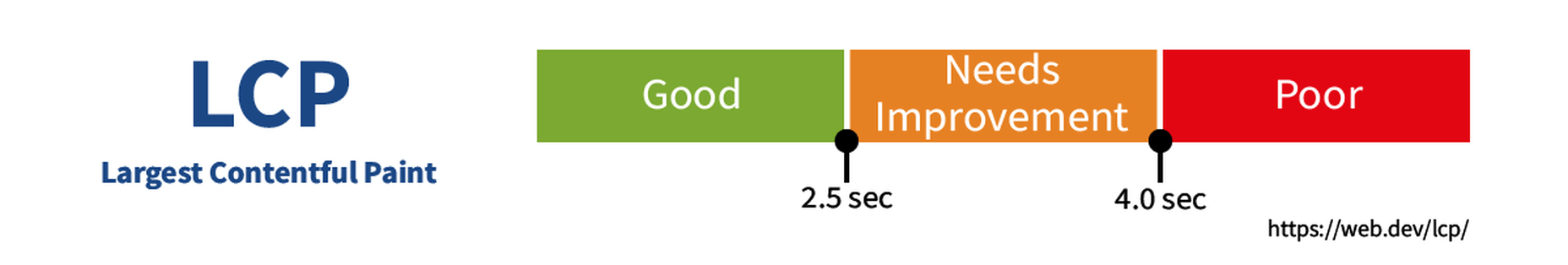
Web design clients come from a wide variety of backgrounds. One day, you’ll be designing a portfolio website for a voiceover artist, the next you’ll be creating a comprehensive ecommerce site for a leading retailer. In an ideal world, you’ll get to a point where you eventually specialize in a niche. However, you’ll need to master both avenues first.

The more time you spend in this industry, the more you’ll learn that every client comes with their own unique requirements and challenges to consider. However, there’s a particularly huge divide between the kind of web design projects you do for B2B clients, and the ones you do for B2C customers.

Both B2B (Business to Business) and B2C (Business to Consumer) websites need to be clear, concise, and aesthetically pleasing. They should always have a strong focus on user experience, and they need to work consistently across devices. However, being aware of the difference between B2B and B2C projects will help you to deliver better results to your customers.

Defining the Differences Between B2B and B2C Sites

Some web design trends remain consistent in any environment.

Whether you’re creating a site for a hairdresser, or a leading SaaS company, you’ll need to deliver responsive design, intuitive navigation, and excellent site security.

Your process is unlikely to differ from B2B to B2C much in terms of project milestones, phases, prototyping and wire-framing. The differences that arise between B2B and B2C projects often come in the approach you take to building certain elements.

Let’s take a closer look at the things you might need to consider:

1. The Target Audience

In any design project, it’s always important to keep the end customer in mind. Knowing your client’s target audience will help you to create both an image and a tone of voice that appeals to the right people.

B2B Websites

With B2B websites, you’ll be speaking to a range of highly-educated individuals who already have a general knowledge of your service. The aim here will be to show the end-user how you can help them achieve better results. For instance, m.io highlights “syncing communication” so you can “effortlessly chat” with your team.

The language and content of the website is all about highlighting the key benefits of the products, and the kind of outcomes that they can deliver. The Nielsen Norman Group reports that there’s often a lot of discussion between decision-makers when they’re checking out a B2B website.  

Designers need to work harder at convincing B2B buyers that they’re making the right decision. This is particularly true when you’re selling something like a software subscription that requires a lot of long—term investment.

B2C Websites

On the other hand, while B2B customers make decisions based on logic, information, and well-explained benefits, B2C customers are more influenced by emotion. They want quick solutions to their problems, and the opportunity to purchase from a brand that “understands” them.

Look at the Firebox website, for instance. It instantly highlights an ongoing sale at the top of the homepage, addressing any concerns a customer might have about price. That combined with a quirky layout full of authentic photos and bright colors means that customers are more inclined to take action.

2. The Purpose

Another factor that can vary from B2C to B2B websites, is the motive behind a customer’s purchase. Knowing what’s pushing a target audience to interact with a brand will help you to create a website that appeals to specific goals.

B2B Websites

B2B websites often aim to solve expensive and time-consuming problems for companies. To sell a decision-maker on the validity of a solution, it’s important to thoroughly explain what the solution is, how it works, and how it addressees a specific pain point.

Look at the Zoom website for instance, they don’t just tell people that they offer video conferencing, they address the practical applications of the platform:

B2C Websites

Consumers are a lot easier to appeal to in terms of emotional impact, because many of them come to a website looking to fulfill an urgent need. Because of this, many web designers can take advantage of things like urgency and demand to encourage conversions. For instance, look at this website from TravelZoo. It takes advantage of a customer’s desire to get away:

A B2B website needs to focus on providing information that helps companies to make more confident decisions. What’s more, with B2B sites, decisions are often made by several stakeholders, while B2C sites ask a single person to make a choice. A B2C website needs to address immediate concerns and connect with customers on an emotional level. B2C buyers still want to do their research on products or services, but the turnaround is much quicker, and often requires less information.

3. The Design Elements (Visual Appearance)

Just as the focus of your website design and the audience that you’re creating the experience for can differ from B2B to B2C websites, the visual elements of the design might change too.

B2B Websites

In most cases, B2B websites are all about presenting a highly professional and respectable image. You’ll notice a lot of safe and clear choices when it comes to typography and imagery. It’s unusual to see a B2B website that takes risks with things like illustrations and animations.

Look at the Green Geeks website for instance. Everything is laid out to encourage clarity and understanding. Information is easy to find, and there are no other issues that might distract a customer.

B2C Websites

On the other hand, B2C websites can be a little more daring. With so many different options to choose from, and most customers buying out of a sense of urgency or sudden demand, designers are under pressure to capture attention quick. This means that it’s much more likely to see large pieces of eye-catching imagery on B2C sites, with very little text.

Movement, like slideshows and animations often play more of a role here. Additionally, there’s a good chance that you’ll be able to experiment more aggressively with color. Take a look at the Yotel website, for instance. There’s very little textual information here, but the appeal of the website is conveyed through sliding images:

4. Website Content

The way that information is conveyed on a B2B website is very different to the messages portrayed on a B2C site. Usually, everything from the language, to the amount of content that you use for these projects will differ drastically.

B2B Websites

When designing for a B2B website, you’ll need to be careful with content, as you’ll be speaking to a very mixed audience. If your site caters to different industries, you’ll need to ensure that you show authority, without using too much jargon. Some companies even create different pages on their site for specific customers. The aspin.co.uk website covers the benefits from a company, sale and integration perspective:

Rather than try to talk to all business owners about their differing communication pains, G-Suite anticipates its audience and creates pages for each.

B2C Websites

Alternatively, B2C websites can make things a little simpler. For instance, on glossybox.co.uk, there’s no need to provide a ton of information for different types of shopper, designers can appeal to one audience, i.e. the “beauty addict”:

In both B2B and B2C websites, the aim of the content should always be to answer any questions that the end user might have.

5. CTA Buttons

Call to Action buttons are often a crucial part of the web design journey. However, it’s sometimes difficult to determine where they should be placed, or how many buttons you need.

B2B Websites

Because the decision to buy something won’t always happen immediately with a B2B website, these kinds of sites often use a variety of CTAs. For instance, you might have a “Request a Quote” button at the top of a page, as well as a Sign in button.

On the Klaviyo site, for instance, you can request a demo, sign up or log in:

You can place CTAs lower on the page with B2B websites too, as it’s more likely that your customers will be scrolling through the site to collect more information before they decide to buy.

B2C Websites

On the other hand, with B2C websites, you usually don’t need to give your visitors as many options. A single option to “Add to Cart”, or perhaps an extra choice to “Add to Favorites” is all your user will need. Customers need to instantly see what they need to do next as soon as they arrive on a page:

On the Evil Hair website, you immediately see how to add a product to your cart.

Remember, the sales process is a lot quicker with B2C customers. This means that you need your CTA buttons to be front and center as soon as someone clicks on a page.

6. Contact Forms

In a similar vein, the way that you design your contact forms will also depend on the end-user that the website wants to appeal to. There’s a very different process for getting in touch on a B2B website, compared to a B2C site.

B2B Websites

B2B websites often require longer contact forms, as clients need to collect additional information about a prospect’s position in a company, and what that company does. B2B companies need to share things like what they’re looking for in a service, and how many users they have, so a sales team knows what kind of demonstration to give.

As with any strategy for contact form design, you should always only include the fields that your client needs and no more. If you demand too much from any client, you could send them running in the opposite direction. Check out this straightforward option from Ironpaper, for instance:

The form addresses as many relevant questions as possible without overwhelming the customer. Because the site handles things like design, it makes sense that they would ask for a link to the company’s existing website.

B2C Websites

On a B2C website, there are very different approaches to contact forms. You may have a dedicated contact form on your website where people can get in touch if they have any questions. A FAQ page where customers can serve themselves is another great way to help your client stand out from the competition. Check out this option from River Island, for instance:

On the other hand, you might implement pop-up contact forms into a website if your client wants to collect emails for email marketing. In that case, it’s important to make sure that you’re only asking for the information you need, and nothing more.

The easier it is to sign up for a newsletter, the more likely it is that customers will do it. Being able to enter their name and email address and nothing else will make the signup seem less tasking.

7. Search Bars and Navigation

Whether you’re designing for B2B or B2C companies, navigation will always be a critical concern. End users need to find it easy to track down the information that they need about a company, whether they’re looking for a particular product or a blog.

B2B Websites

On a B2B website, the search bar often takes up a lot less prominence than it does on a B2C site. That’s because all of the information that a client needs, and the buttons they need to take their next steps, are already visible front-and-center.

As a designer, it will be your job to push as many people to convert as possible, by making the purchasing journey the most appealing path for visitors. For instance, on the Copper website, the “Try Free” buttons are much easier to see than “Continue with Google” or “Login”:

With B2B sites, the focus is on a very specific goal. Although navigation still needs to be available, it doesn’t need to be as obvious as it is on a B2C site.

B2C Websites

On the other hand, most B2C websites offer a wide range of products, and they’re perfectly happy for their customers to purchase anything, as long as they eventually convert. Because of this, they make navigation a much more significant part of the customer journey.

The search bar is often presented at the very top of the screen where customers can see it immediately. Additionally, there may be multiple pages within certain product categories, so that customers can browse through the items they’re most interested in. For instance, look at the homepage on the IWoot website:

The navigation elements in B2C websites need to be a lot more obvious, because consumers are more likely to use them when they’re searching through their options.

8. Social Proof and Testimonials

Finally, social proof is one of the things that will work well for improving conversions on any kind of website. When your customers aren’t sure whether or not they should buy from you, a review or testimonial could be just the thing to push them over the edge.

B2B Websites

On a B2B website, the decision-making process takes a lot longer. Because of this, it’s worth including as much social proof as possible in every part of the website. Client testimonials, reviews and ratings, and even high-profile company logos make all the difference. Many B2B websites include a page dedicated to case studies highlighting the success of other brands.

Your client might even go as far as to ask for a page that highlights their awards and recognition or showcases comparison tables that pit their products against the competition.

For instance, Authority Hacker has a “what the pros say about us” section as social proof:

B2C Websites

With a consumer website, you can include consumer ratings and reviews wherever you like. However, it’s most likely that you’ll want to have a place where customers can see the reviews of other clients on the product pages themselves. On the EMP website the company gives users the option to click on the star review section to jump to a different space on the page where testimonials are listed. This ensures that customers don’t have to scroll through a lot of excess information if they just want to add an item straight to their cart.

Designing for B2B vs B2C

In the world of web design, no two customers are ever the same. While you’ll need to adapt your processes to suit each customer you interact with, you can set your expectations in advance by learning the differences between B2B and B2C strategies.


Featured images by Chris Ross Harris and Mike Kononov.

Source

p img {display:inline-block; margin-right:10px;}
.alignleft {float:left;}
p.showcase {clear:both;}
body#browserfriendly p, body#podcast p, div#emailbody p{margin:0;}

Source de l’article sur