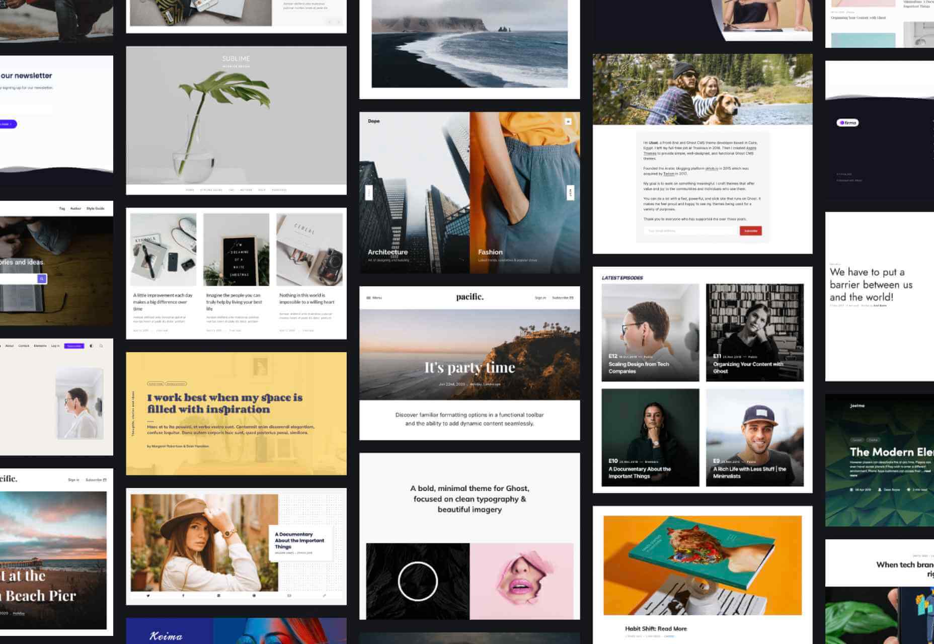
 Every designer has their own preferred strategy for collecting resources. Some pluck brushes, fonts, and templates from different “stock photo sites” and public marketplaces. Others collect graphics from swipe files and forums around the web.
The never-ending desire for themes, visual content, and graphical components has prompted an influx of “design packages” to appear around the web. These all-in-one bundles, ranging from Envato Elements to Elegant Themes, promise a selection of valuable creative content in exchange for a single fee or monthly subscription.
If you’ve been planning to seek out a few of these high-value subscriptions yourself, you’re in the right place! Today, we’re going to talk about some of the top designer resources available on the market.
1. Envato Elements
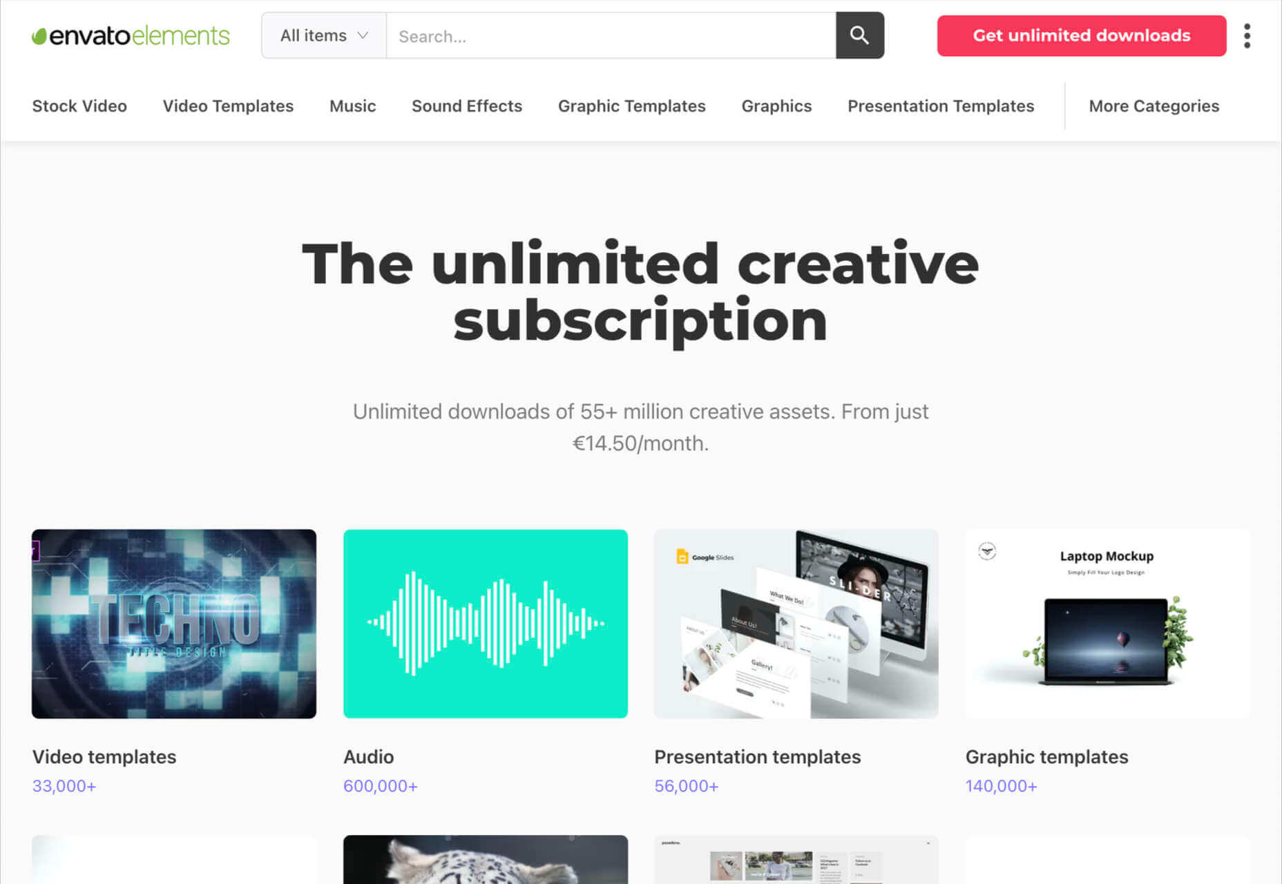
Probably the best-known of all the designer resource marketplaces, Envato Elements advertises itself as the unlimited creative subscription. On this website, you’ll be able to access around 54 million creative assets through a single subscription. There are endless resources to unlock here, ranging from templates for your graphics to video templates, audio, and stock photos.
Unlike most marketplaces, Envato gives you peace of mind by promising only the highest quality designs and graphics. Your content comes with quality assurance, and there are many PSD elements on the site, too, including stationery and web design templates, mock-ups, and more. Categories for your creative content include:
- Stock photos
- Video templates
- Music
- Sound effects
- Graphic templates
- Graphic designs
- Presentation templates
- Fonts
- Photos
- Web templates
- Add-ons
- CMS templates
- WordPress resources
- 3D content
Pricing: Pricing starts at only $16.50 per month, and this gives you unlimited access to everything on the site, including millions of digital assets and stock photos. You’ll also be able to use various courses and tutorials on the website too.
2. Elegant Themes
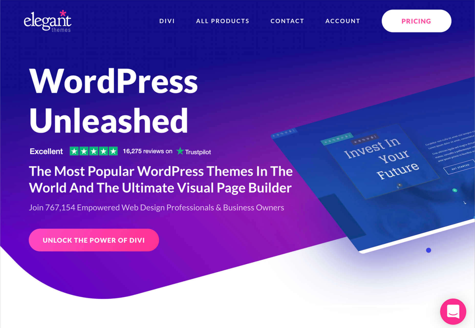
Elegant Themes is an all-in-one creative resource for website themes. The solution offers you access to some of the most popular WordPress themes worldwide.
You’ll also get access to a visual page builder as part of the kit. When you sign up for the Elegant Themes subscription, you get access to all of the resources within, including the Divi page builder and WordPress theme, Extra, Monarch, Bloom, and more. If you’re a site builder or work on building pages for clients, this is a must-have subscription.
Elegant themes are currently the go-to resource for more than 750,000 people. It’s also home to some of the highest-rated themes around. Features include:
- Divi WordPress page builder
- Endless WordPress themes
- Page editing tools
- Monarch, Bloom, and Extra
- Hundreds of website packs
- Lifetime premium support
- Unlimited website usage
You can either pay for yearly access with Elegant Themes or pay a one-off price for lifetime access. For most, the lifetime option is likely to be a pretty appealing one. You don’t have to worry about renewing your subscription this way.
3. Template Monster
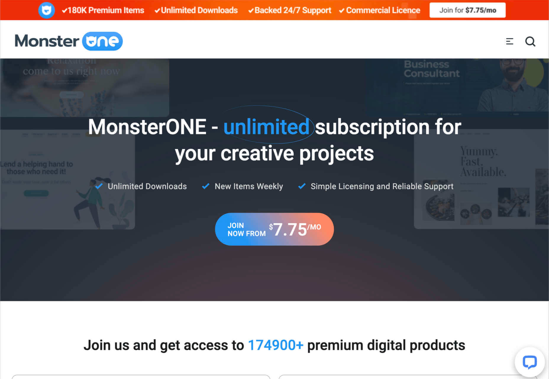
Template Monster offers the “ONE” web development membership, perfect for creative professionals. The MonsterONE offering is a complete unlimited subscription for all of your creative needs, with access to unlimited downloads, new weekly items, and simple licensing. You also get plenty of support from the Template Monster Team.
A goldmine for anyone who needs to upgrade their selection of video and photo assets, graphic templates, HTML templates, or anything else, Template Monster is packed full of amazing resources for any project. You can also find new products from fresh contributors all the time, so the value of your membership is constantly increasing.
Features include:
- HTML templates
- Presentation templates
- CMS templates
- Graphic templates
- Video assets
- 3D models
- Audio assets
- WordPress themes and plugins
Pricing starts at a tiny $6.90 per month, with a slight discount if you pay yearly. The lowest-cost package gives you access to all of your graphic and design assets, but you won’t get any eCommerce or WordPress themes. However, if you upgrade to the all-in-one package at $14.95 per month, you get a more extensive range of resources.
4. Creative Market
Creative Market is another one of those amazing all-in-one environments for creatives and designers. This marketplace is supplied by thousands of independent artists from around the globe, each offering a host of top-quality designs and resources. You’ll find photos, graphics, templates, fonts, web themes, and countless other tools on the Creative Market.
If you’re looking for sheer size, it’s hard to find another company that competes with the Creative Market package. There are literally millions of ready-to-use products available, including Instagram templates, textures, and procreate brushes.
You’ll have access to 3D content for your immersive website designs and a host of purchasing products. Although there’s no “subscription model” per-se for this marketplace, you can invest in a credit plan that allows you to set how much you spend on your assets each month.
Features include:
- Millions of creative products
- Huge selection of independent designers
- Brushes, textures, templates
- Fonts and web content available
- Huge selection of stock photos
- Convenient credit plan
The individual purchasing plan is likely to appeal more to people just beginning to test Creative Market for the first time. However, if you want a subscription experience, we’d recommend using the credit plan to estimate how many credits you’ll need each month.

5. Adobe Stock
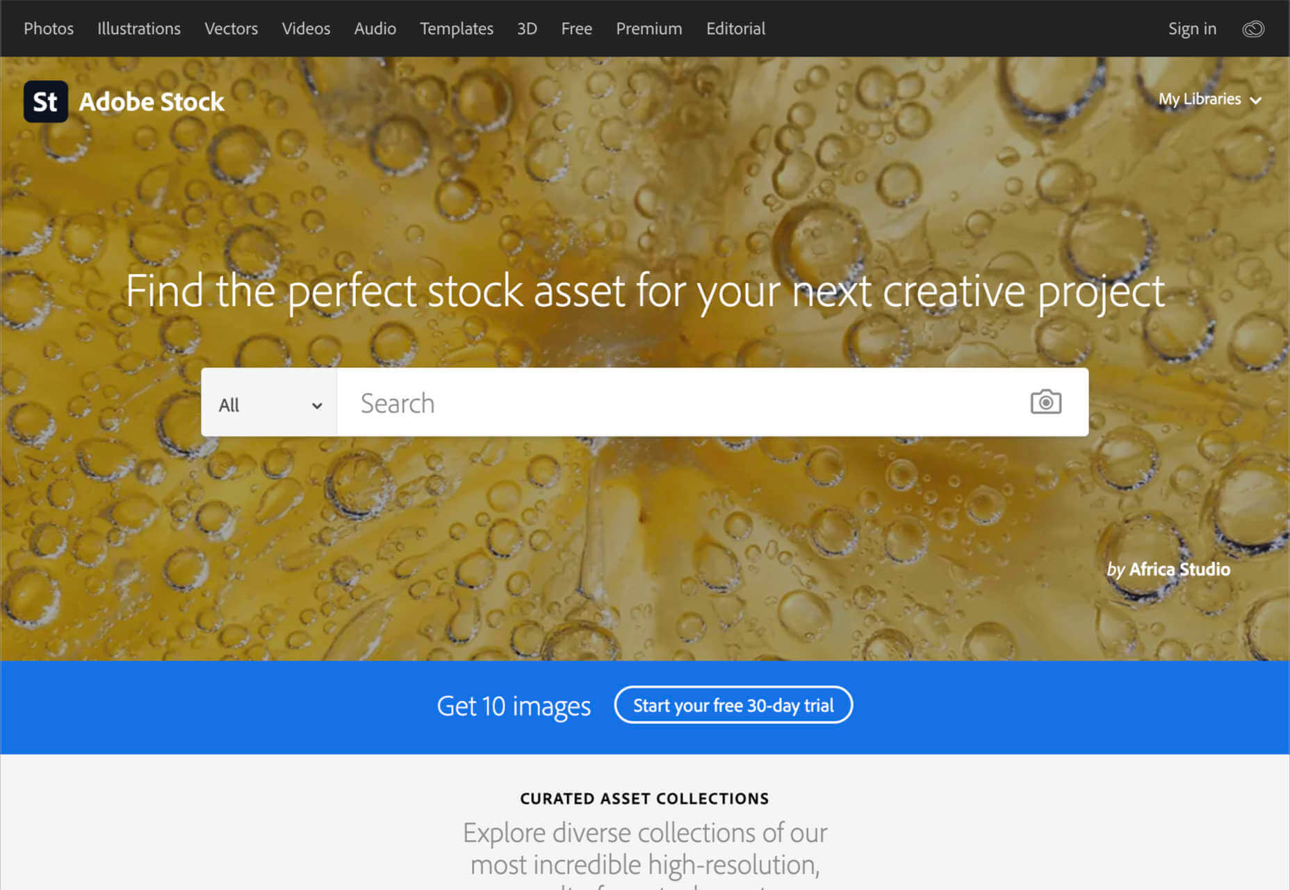
All web designers know Adobe. The chances are that no matter what kind of creative work you do, you’ve developed a few skills with an Adobe product, from Photoshop to Lightroom. Adobe Stock is also one of the leading platforms for images on any topic.
Although Adobe Stock doesn’t compete with other marketplaces in terms of versatility, it still stands out as one of the main resources for designers. There are hundreds of millions of stock images, videos, editorial content, and vectors. You can also access a premium collection of custom content and 3D resources too. The great thing about Adobe stock is that you can easily create your own libraries and download content into your Adobe software. Resources include:
- Stock photos
- Premium images
- 3D content
- Vectors and brushes
- Stock video footage
- Royalty-free templates
- Vector art and illustrations
- Stock music and audio
- Integration with Adobe software
Adobe Stock is a little pricier than some of the other marketplaces available today, but it’s still pretty impressive. You’ll pay around $29.99 per month for 10 assets per month, or you can access a full annual plan at $199.99 per month. The amount you pay will depend on the quality of the resources that you want to download.
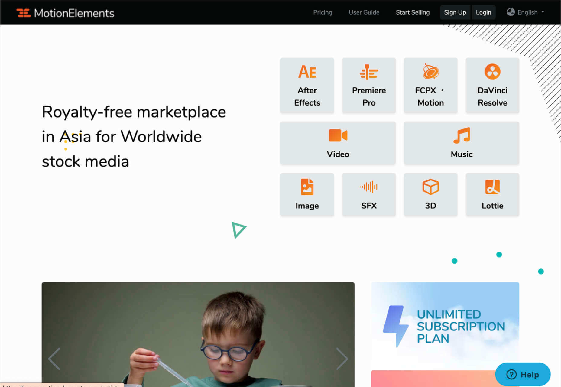
6. Motion Elements
If Elegant Themes is the go-to resource for designers searching for WordPress themes and web design solutions, Motion Elements is the top choice for “motion” content. Here, you’ll find videos, SFX content, images, music, 3D solutions, and so much more.
Though it’s located in Asia, Motion Elements is available worldwide. The marketplace offers a monthly subscription plan wherever you can download unlimited products to suit your needs. There are tons of resources to choose from here, including After Effects elements, tools for Lottie, Premiere Pro, FCPX motion, DaVinci Resolve, and more.
Features include:
- After Effects elements
- Premier Pro resources
- FCPX Motion
- DaVinci Resolve
- Video and audio content
- Stock images
- SFX resources
- 3D content
Pricing starts at $16.50 per month for an unlimited annual plan. This means that you can download as much as you like without having to pay any more. There is a small discount if you pay for a full year of access in one go.
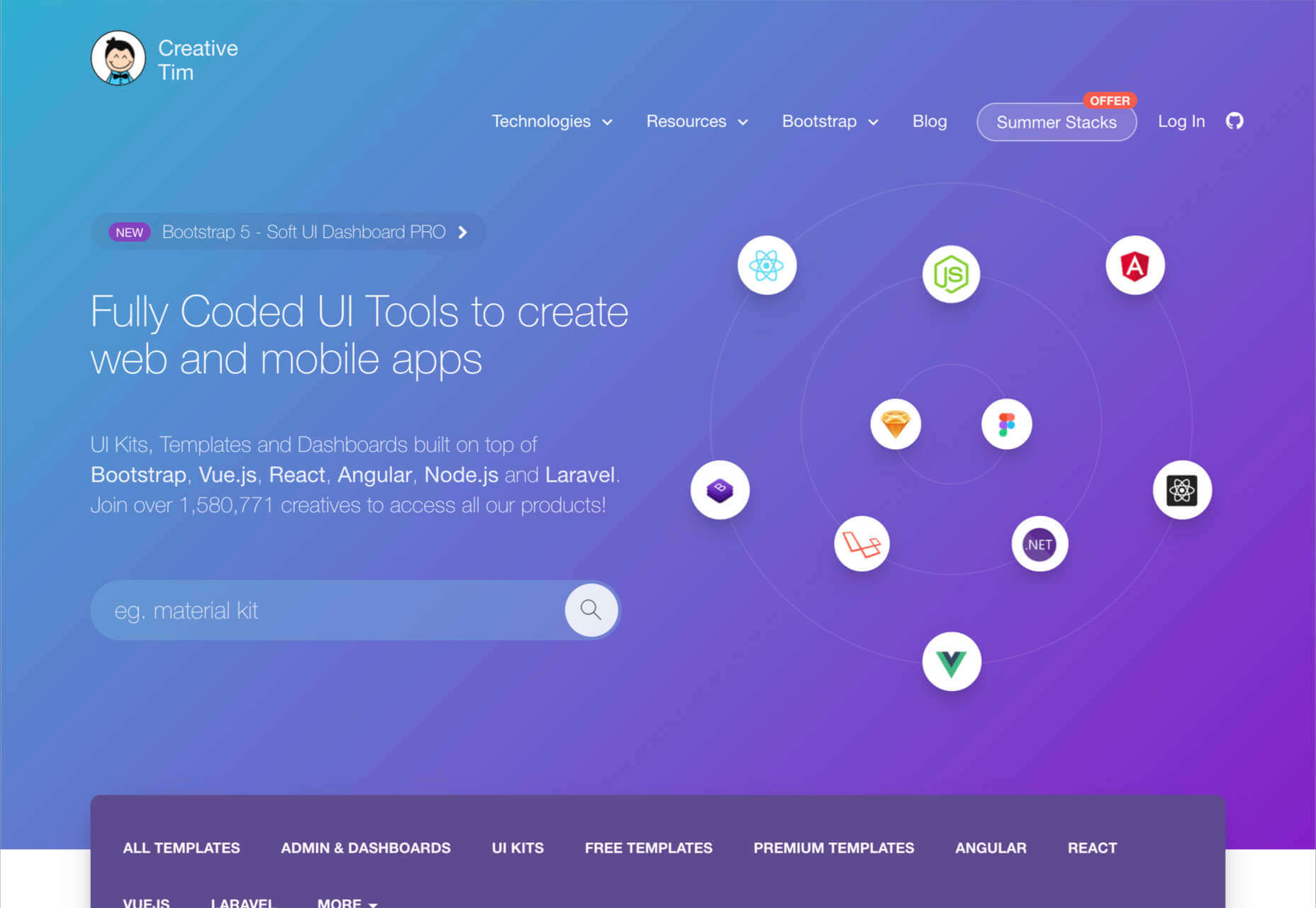
7. Creative Tim
Simple but effective, Creative Tim is an amazing resource for front-end and back-end content bundles. You get fully coded UI tools here that can help you create various mobile and web apps and a huge selection of dashboards and templates. If you’re the kind of designer who likes working on top of things like Bootstrap, React, Angular, Laravel, Node.js, and more, then Creative Tim has you covered.
This is one of the more technical creative resource packages that we’ve looked at so far, but it has a lot of value to offer. That’s probably why there are already more than 1.5 million people using the service. You can search through administration dashboards, UI kits, premium templates, free content, and design systems. Of course, everything is easy to access too. Features include:
- Frontend design technologies for endless platforms
- Soft design, light design, paper design, and more
- Bootstrap content
- Resources and third-party tools
- Complete design and web kits
- UI kits and templates
- Admin and dashboard templates
There’s a free version of Creative Tim available for beginners if you want to keep your costs low, but it’s generally much better to sign up for the premium subscription. You can also purchase kits and templates on a one-off basis if you prefer to start small. However, the best prices generally come from buying the bundles from Creative Tim’s subscription side.
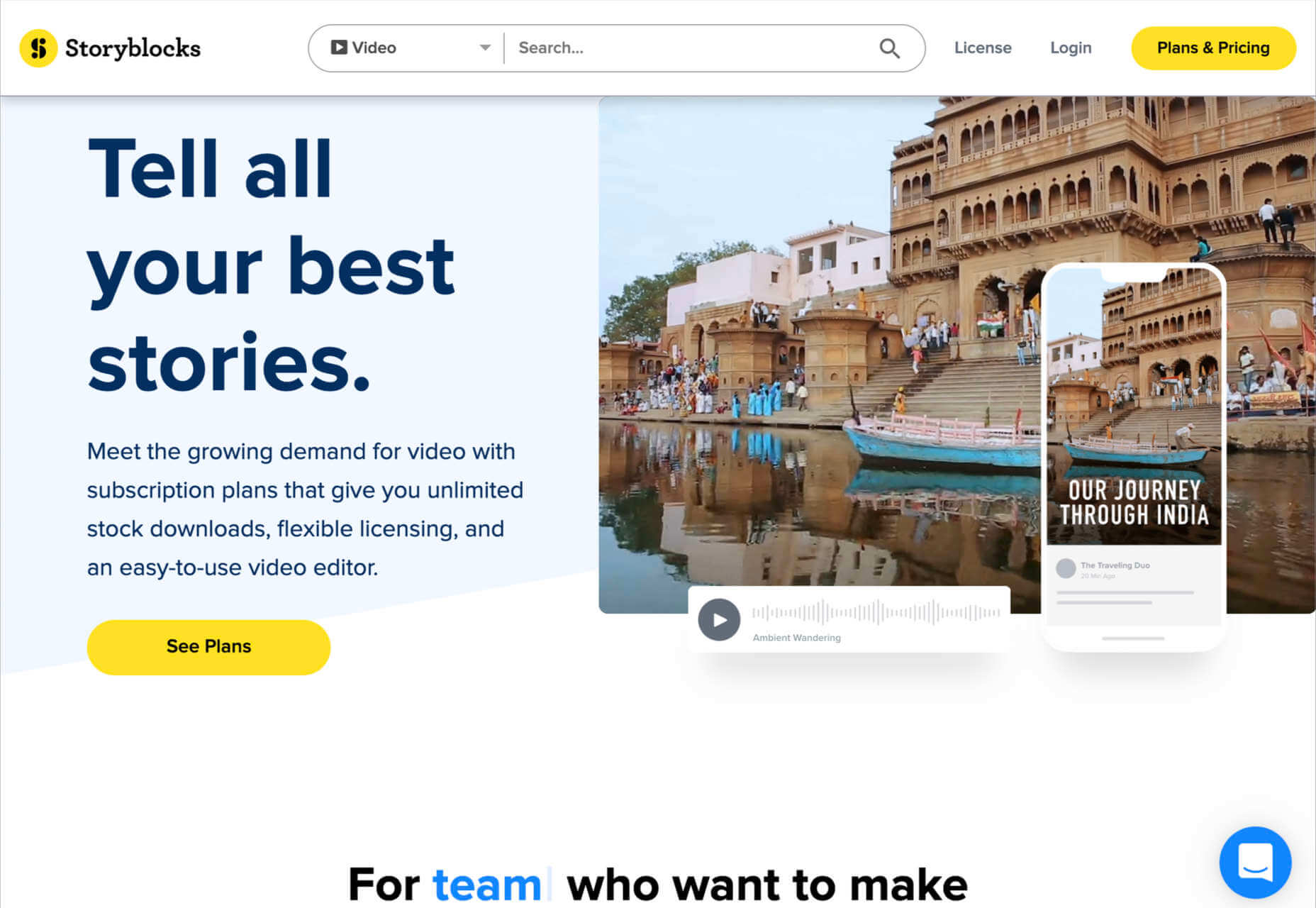
8. Storyblocks
Similar in style to Motion Elements, Storyblocks is a creative design resource for any designer getting involved with the video world. This website is home to some of the best free-to-use videos around, with simple licensing available at a click. Aside from high-quality videos and templates, you also get audio and sound effects as part of your subscription and images or illustrations.
The unlimited access pass gives you all the resources you might want, from 4K and HD footage to music and sound effects, After Effects templates, and photos, vectors, or illustrations. You can also export a host of your own video projects with access to the Maker video editor, which allows you to make various changes to your custom video content. Features include:
- HD and 4K video footage
- After Effects Templates
- Sound Effects and Music
- Photos, Illustrations, and Vectors
- Unlimited video exports
- Video editor access
- Licensing support
The standard all-access plan from Storyblocks starts at a very affordable £39 per month for all of the content you might want. In addition, everything you get here is unlimited, so you don’t have to worry about running out of credits. There’s also an enterprise option available if you want to share access to resources with your team.
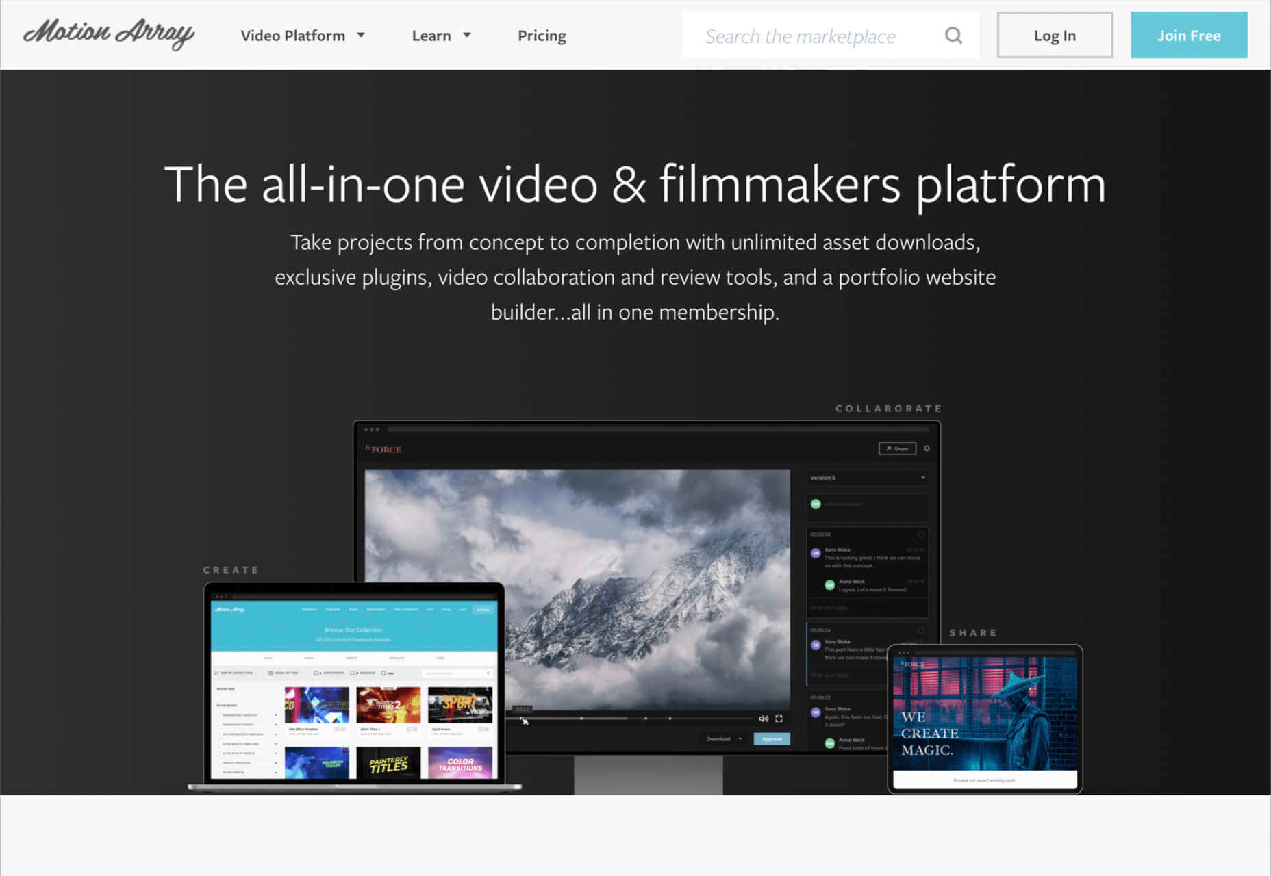
9. Motion Array
Motion Array is an all-in-one video creation platform for those with an eye for visual content. This fantastic resource center is packed full of valuable tools, from Da Vinci Resolve templates to Adobe Premier Pro Content. As part of your subscription payment, you’ll get endless presets, audio effects, plugins, video footage, tutorials, and more.
Though a little more expensive than some of the other premier subscription services on the market, Motion Array does offer a lot of content that you can’t get anywhere else. There’s an unlimited marketplace constantly updating with access to royalty-free footage, stock photos, music, and sound effects. You also get plugins built for Premiere Pro. Features include:
- Adobe Exchange elements
- Final Cut Pro and DaVinci resolve templates
- Royalty-free music and sound effects
- Stock footage and video
- Photos and images
- Time-saving integrations with your favorite apps
- Portfolio site builder
- Stock media requests
There’s a free subscription option for Motion Array, which you won’t find from most alternatives. This only gives you access to some basic stock photos and assets, but it’s a nice way to start. When you are ready to upgrade, you can pay $29.99 per month for the full stock media library, as well as requests for custom media assets and exclusive plugins.
Start Stocking Up on Designer Resources
As a designer or creative professional, keeping a constant stack of resources available is crucial to your ongoing productivity. Fortunately, there are tons of premium marketplaces out there today, making it easier to access everything you need.
Whether you’re looking for full UI kits and templates, or you want some free-to-use images and videos for the website content you’re creating, there’s something for everyone. With most monthly subscription services available at a highly affordable price, you could even sign up for multiple sites at once.
Source
The post 9 Amazing Design-Resource Package Sites first appeared on Webdesigner Depot.

Source de l’article sur Webdesignerdepot

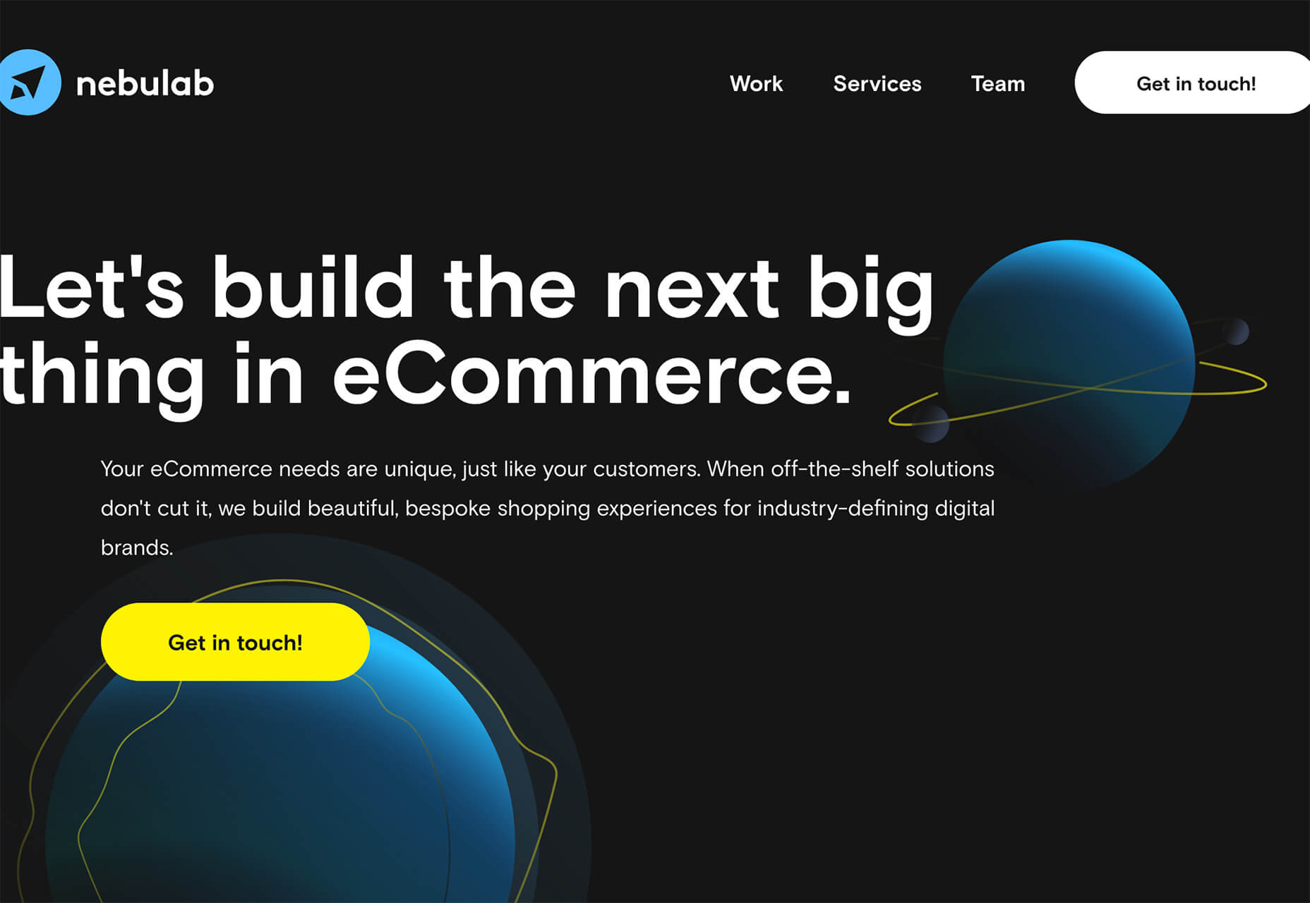
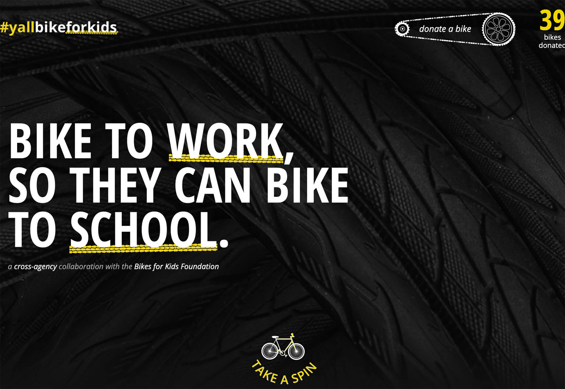
 This month, you will either love or hate the featured design trends.


 Every day design fans submit incredible industry stories to our sister-site,


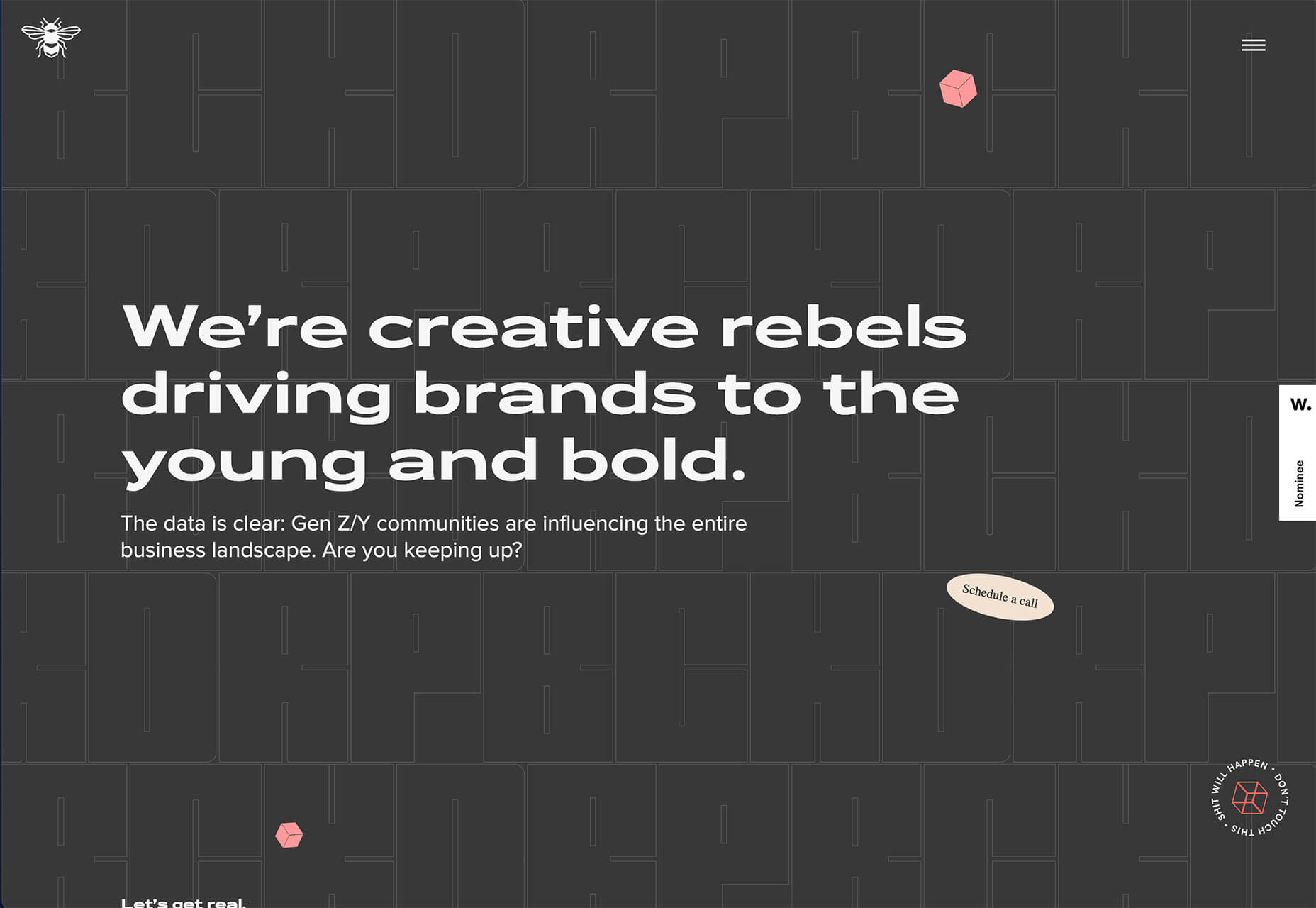
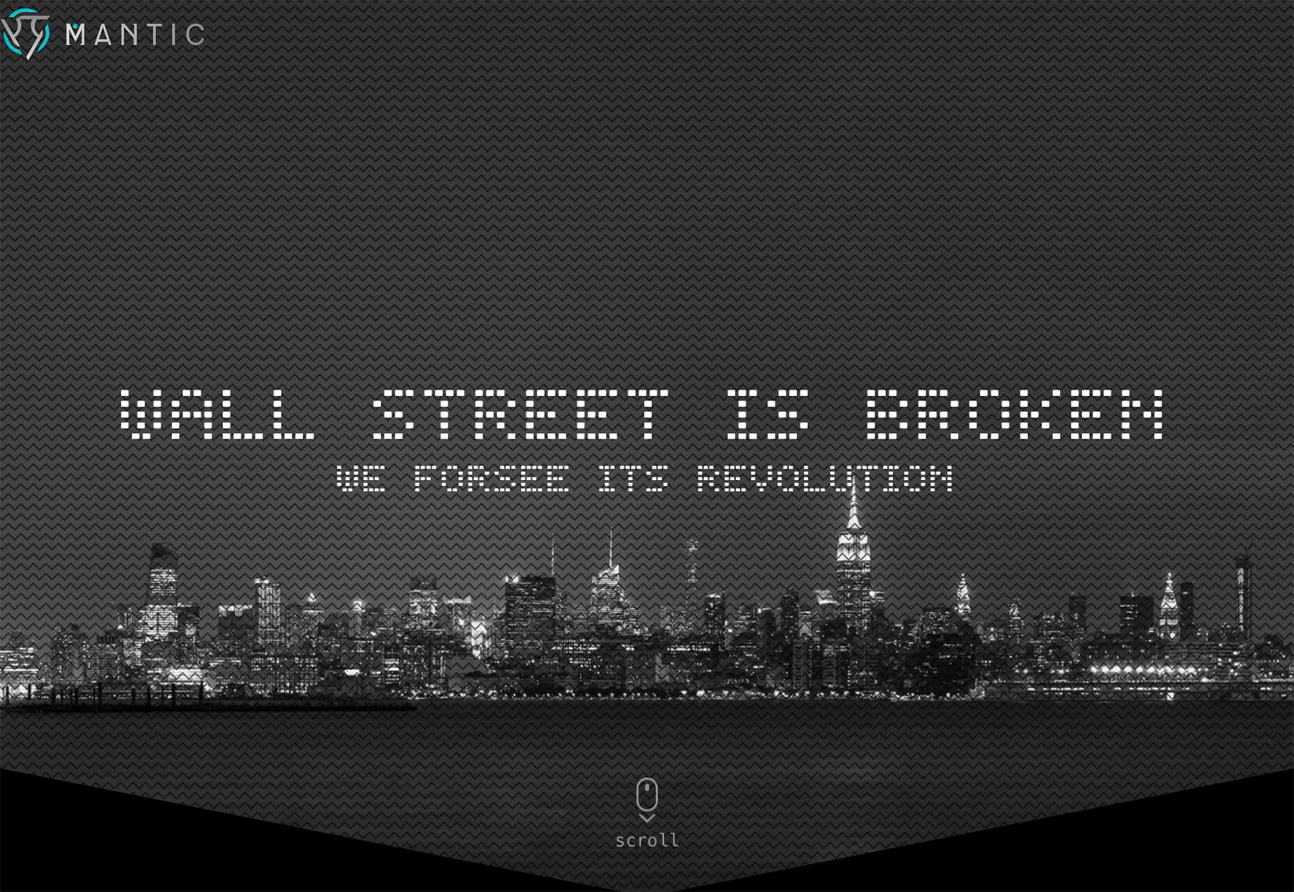
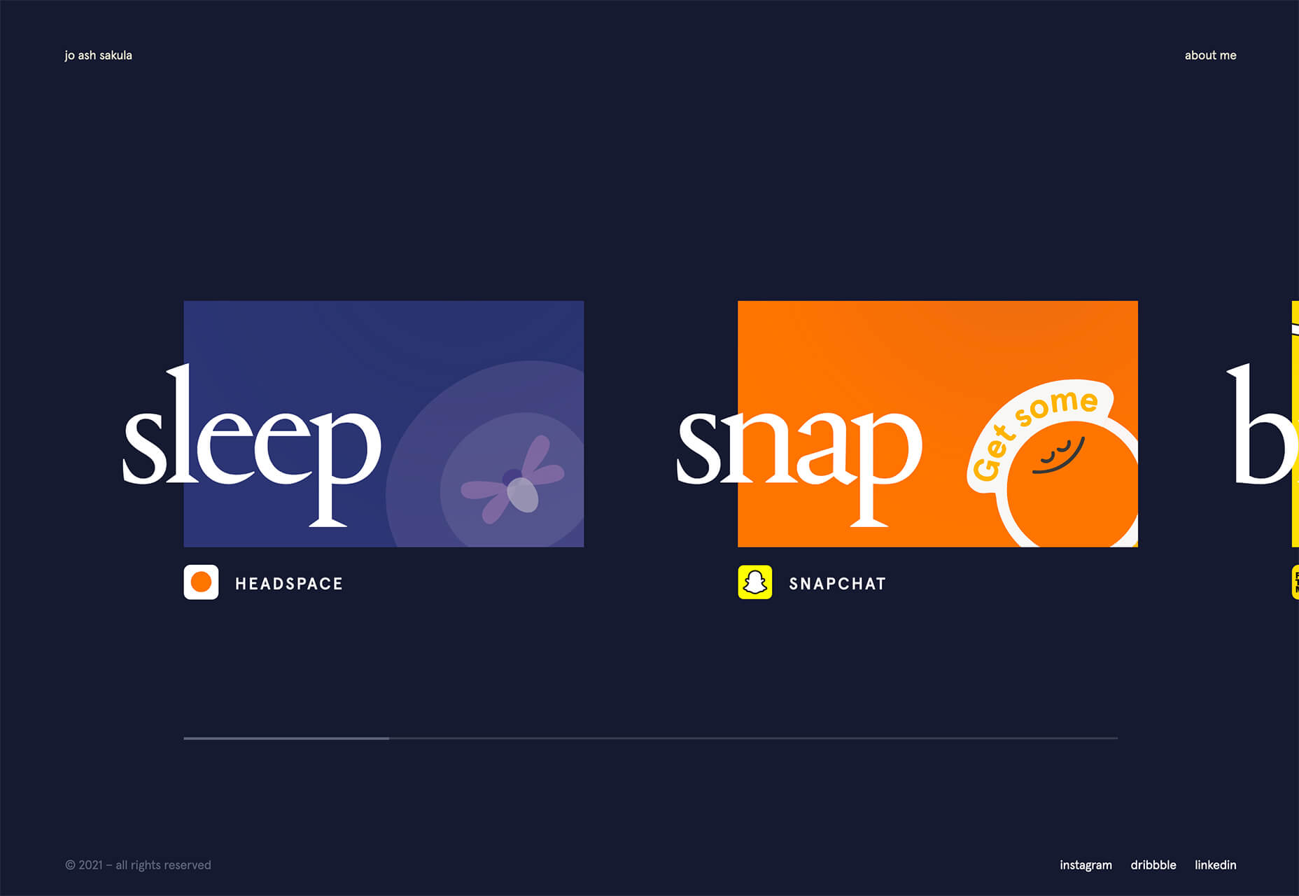
 If you are feeling like me right now, you have mixed emotions about the world in general. And this is translating into a pretty distinct design trend that’s happening almost across the board: Websites aren’t using many images of people right now.
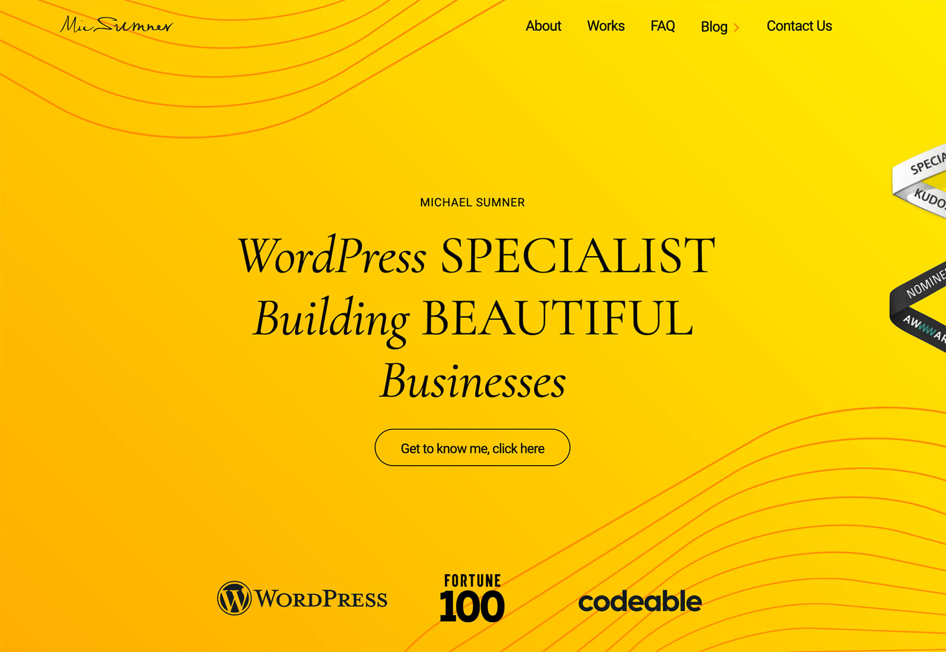

 WordPress powers nearly 40% of all websites, thanks to its commitment to making publication possible for everyone, for free. Combined with premium plugins and themes, it’s possibly the ultimate tool for building attractive, unique, and feature-rich websites without any coding or design experience.
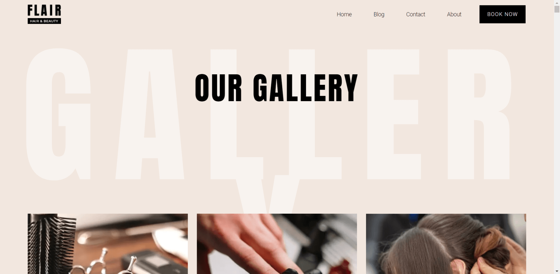

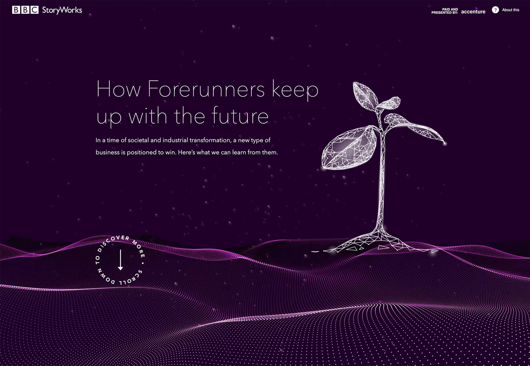
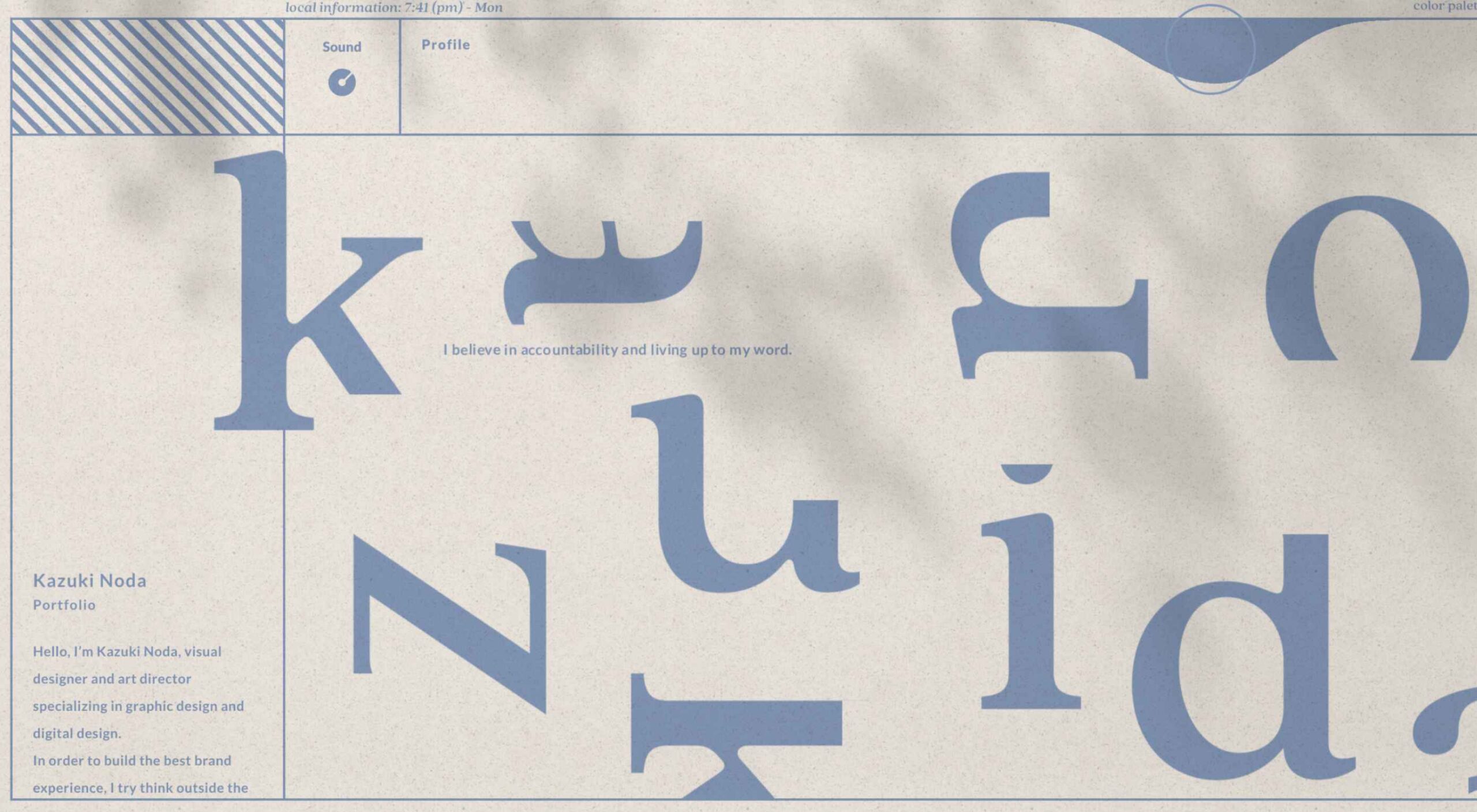
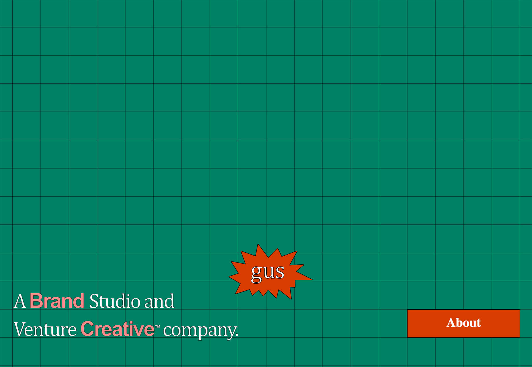
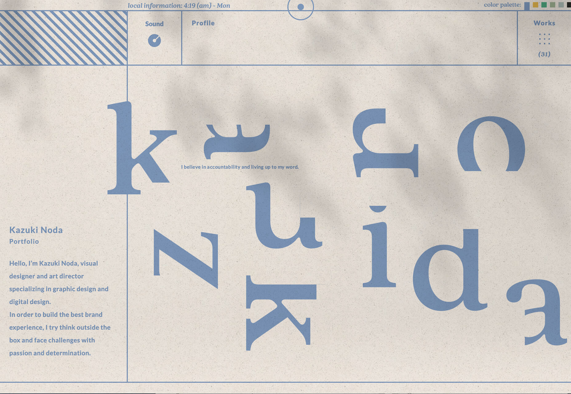
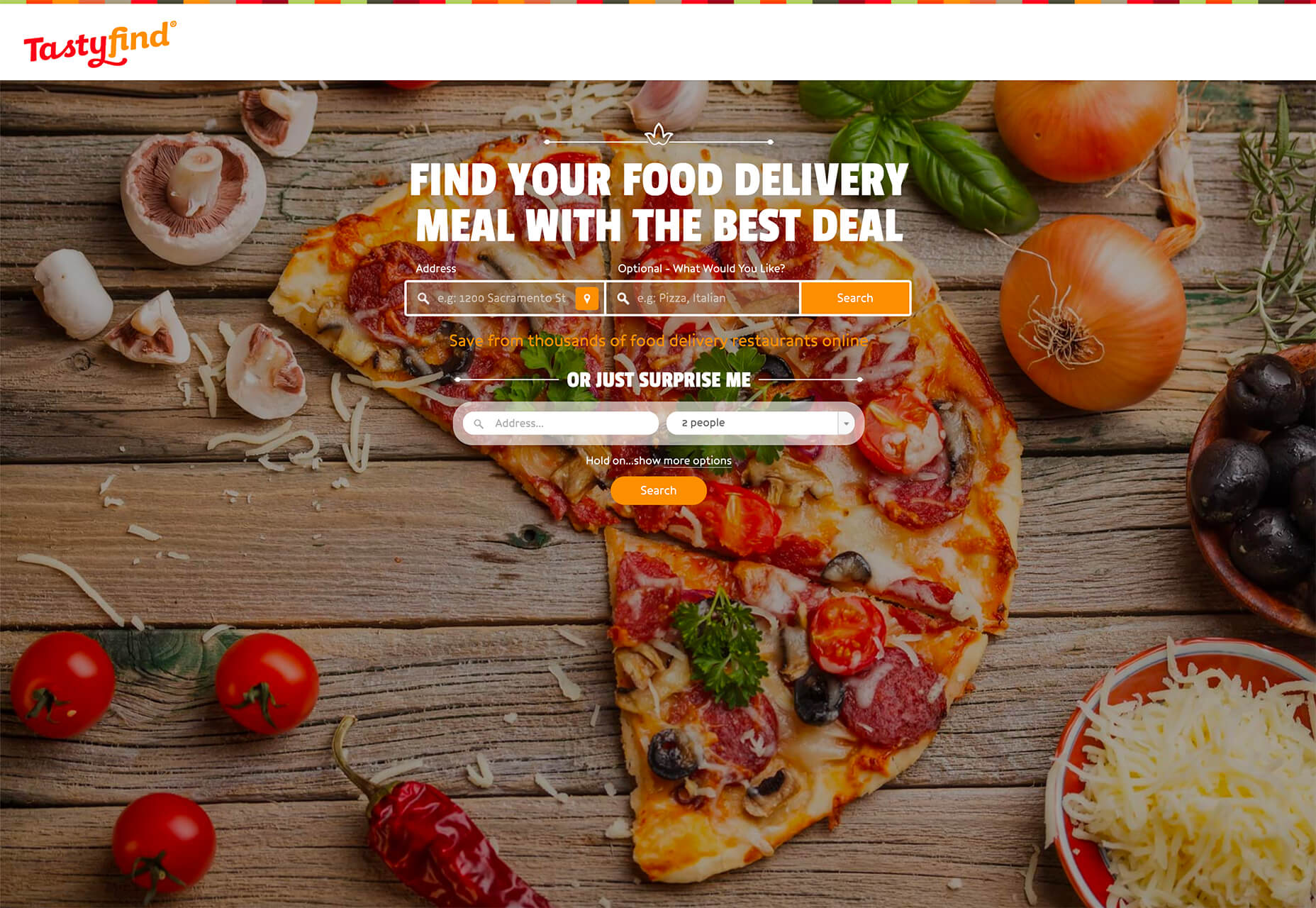
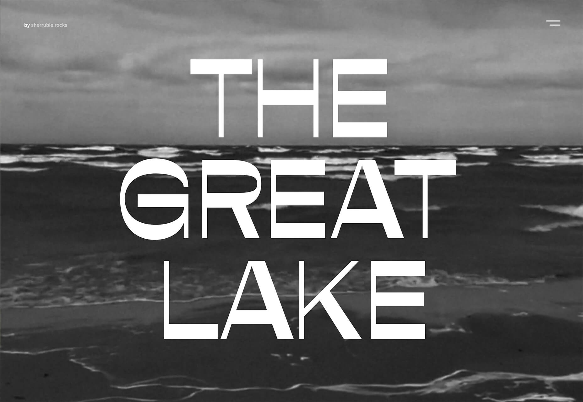
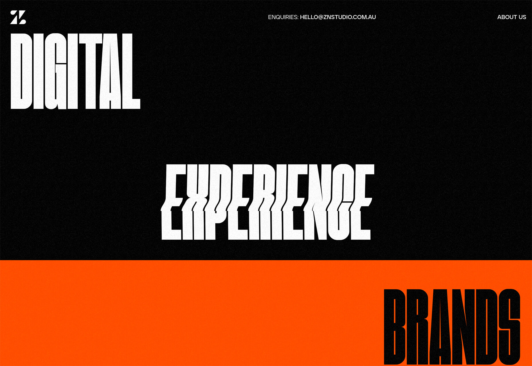
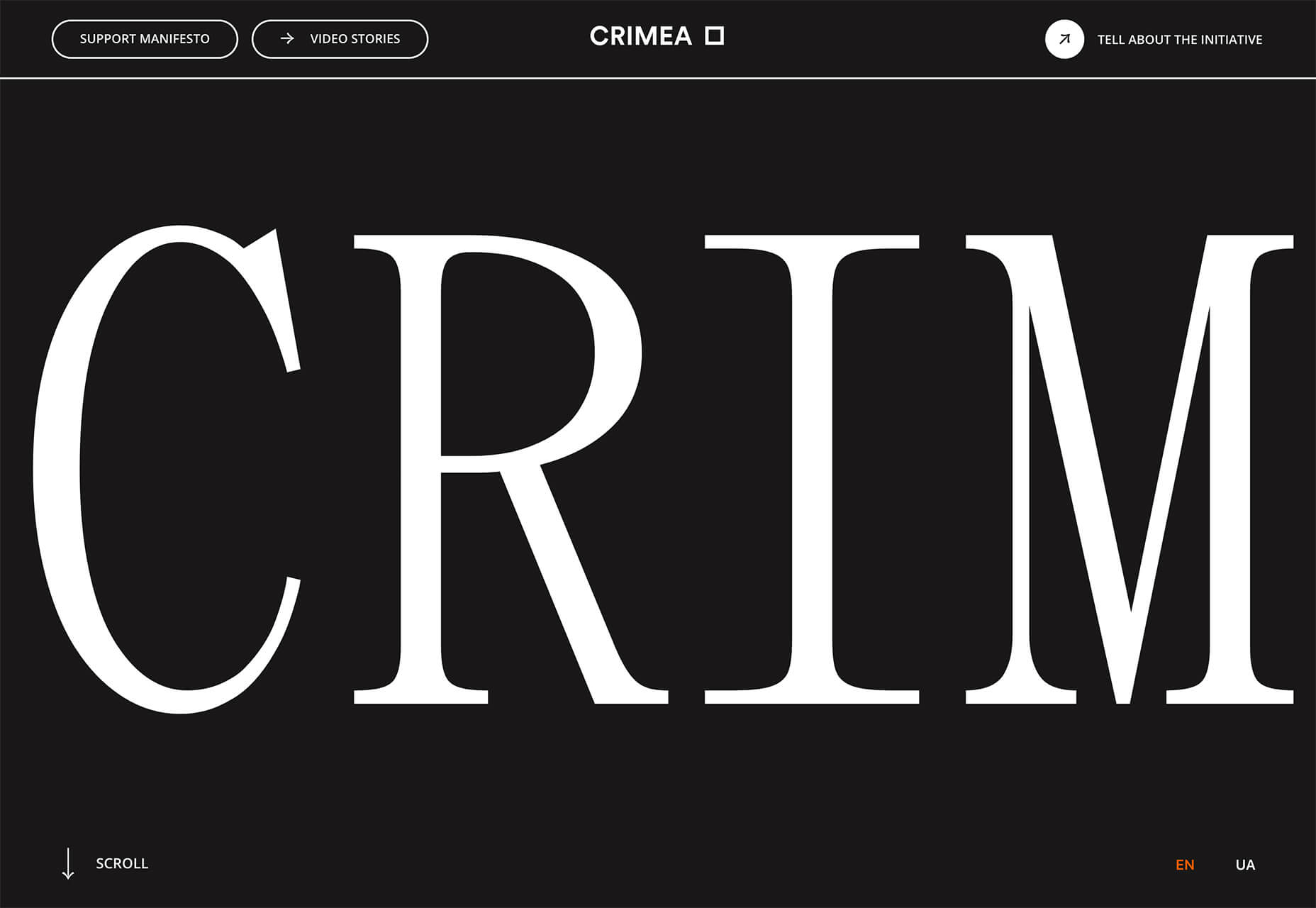
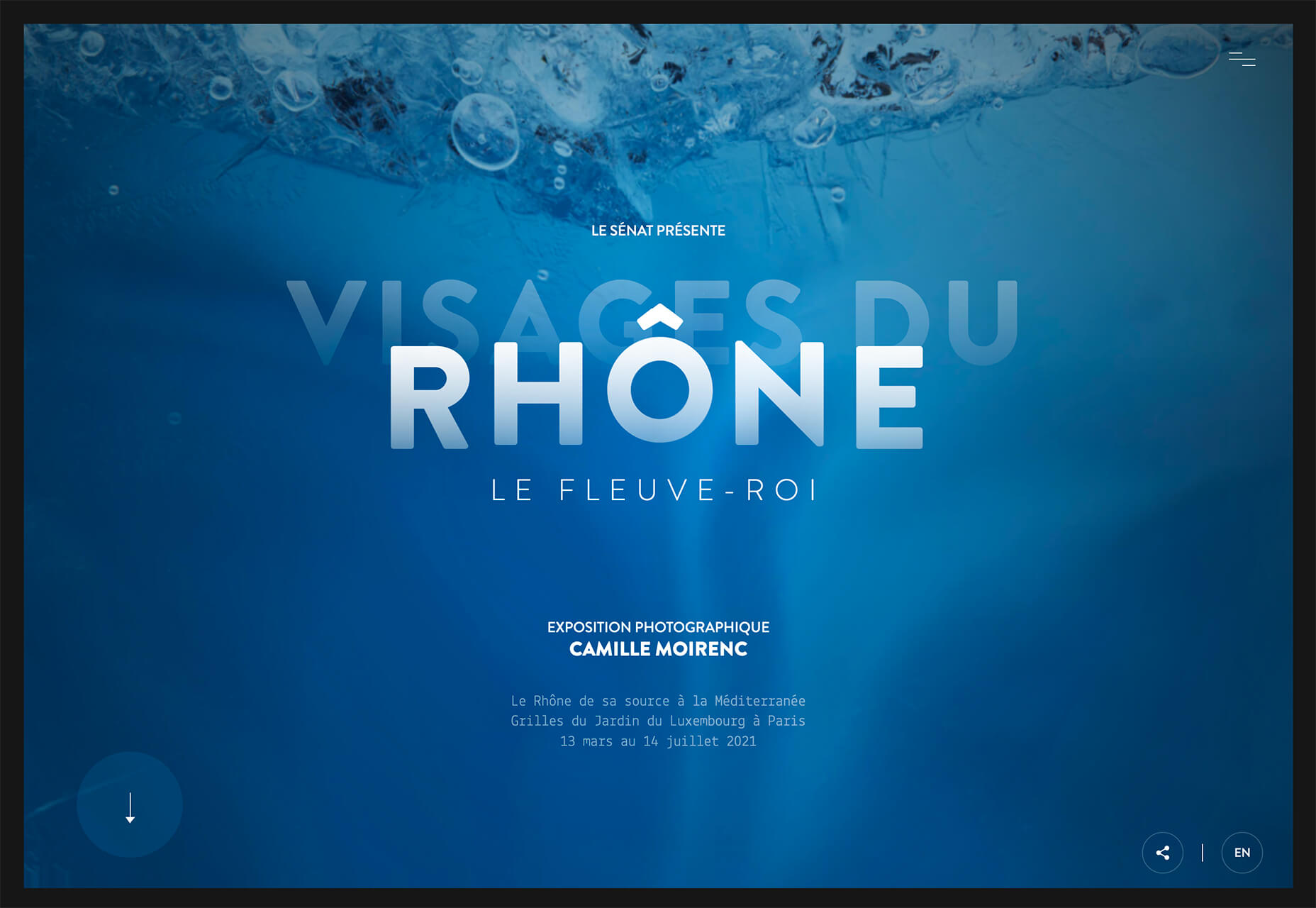
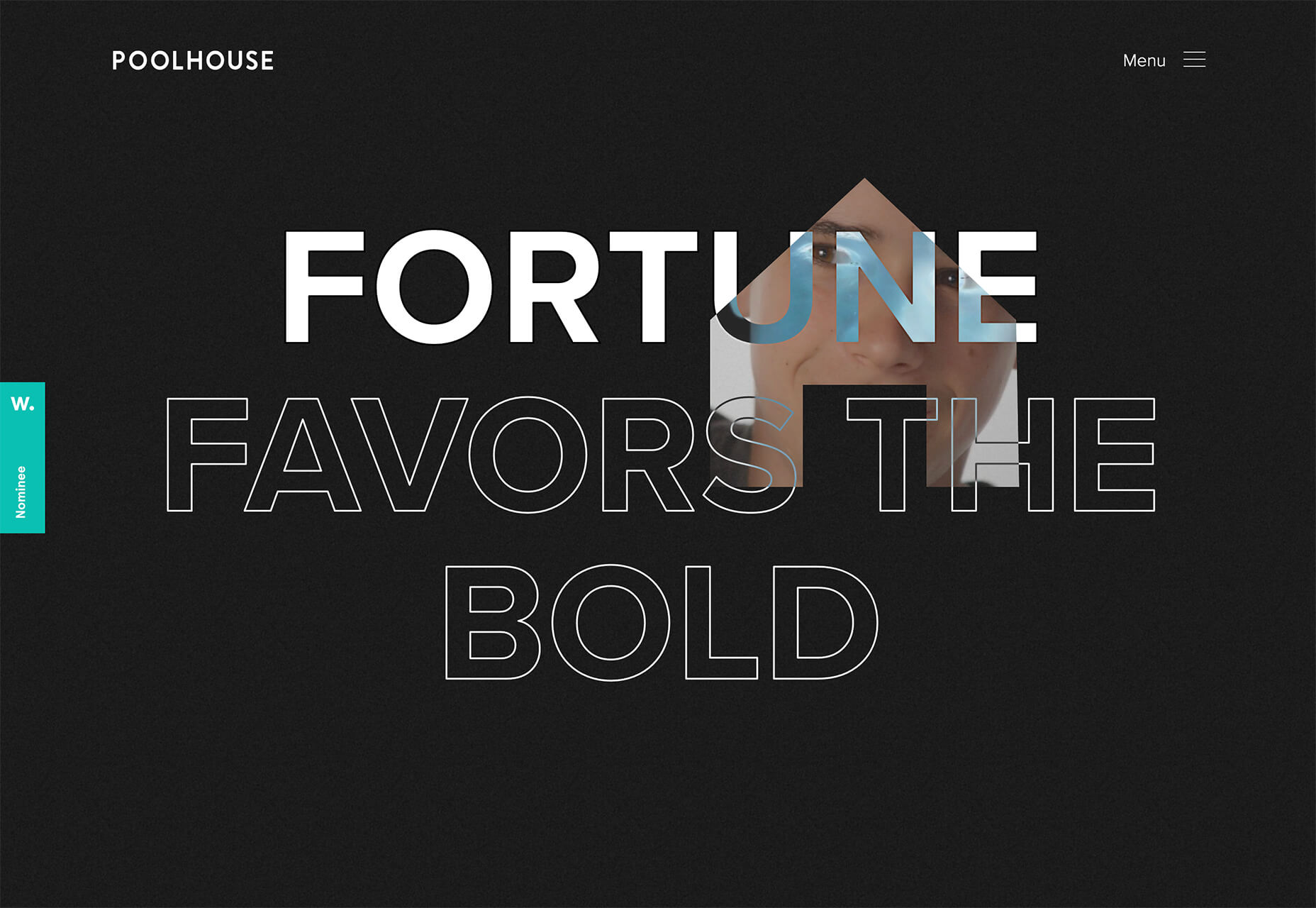
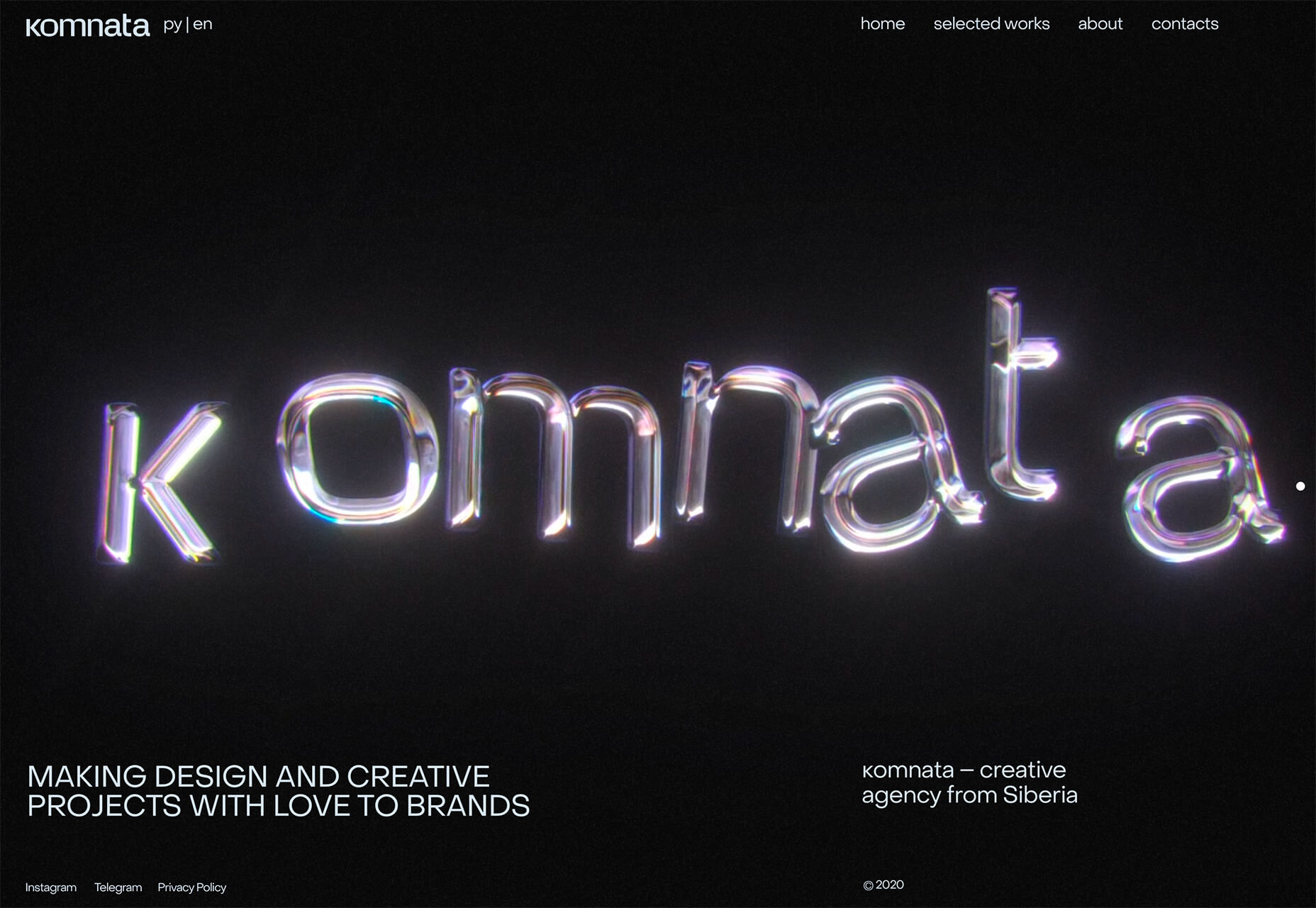
 Spring and fresh designs are in the air. This month, it’s obvious that designers are feeling creative with new and interesting concepts that range from a new style for cards, homepage experimentation with multiple entry points or calls to action, and risky typography options.
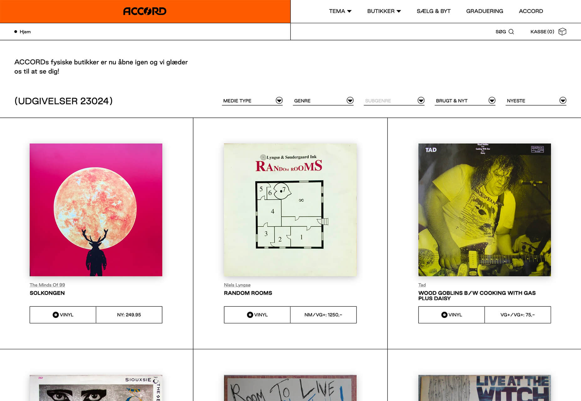
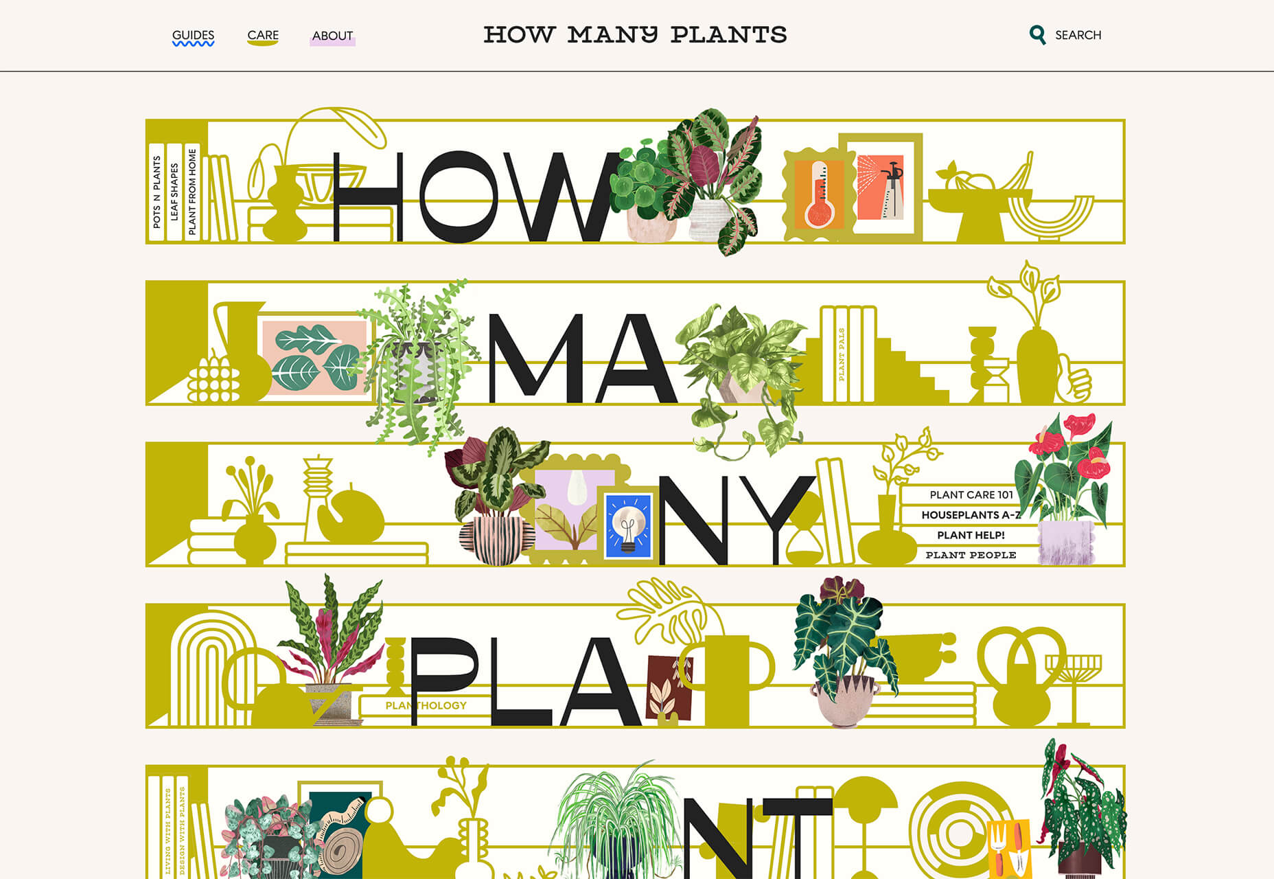

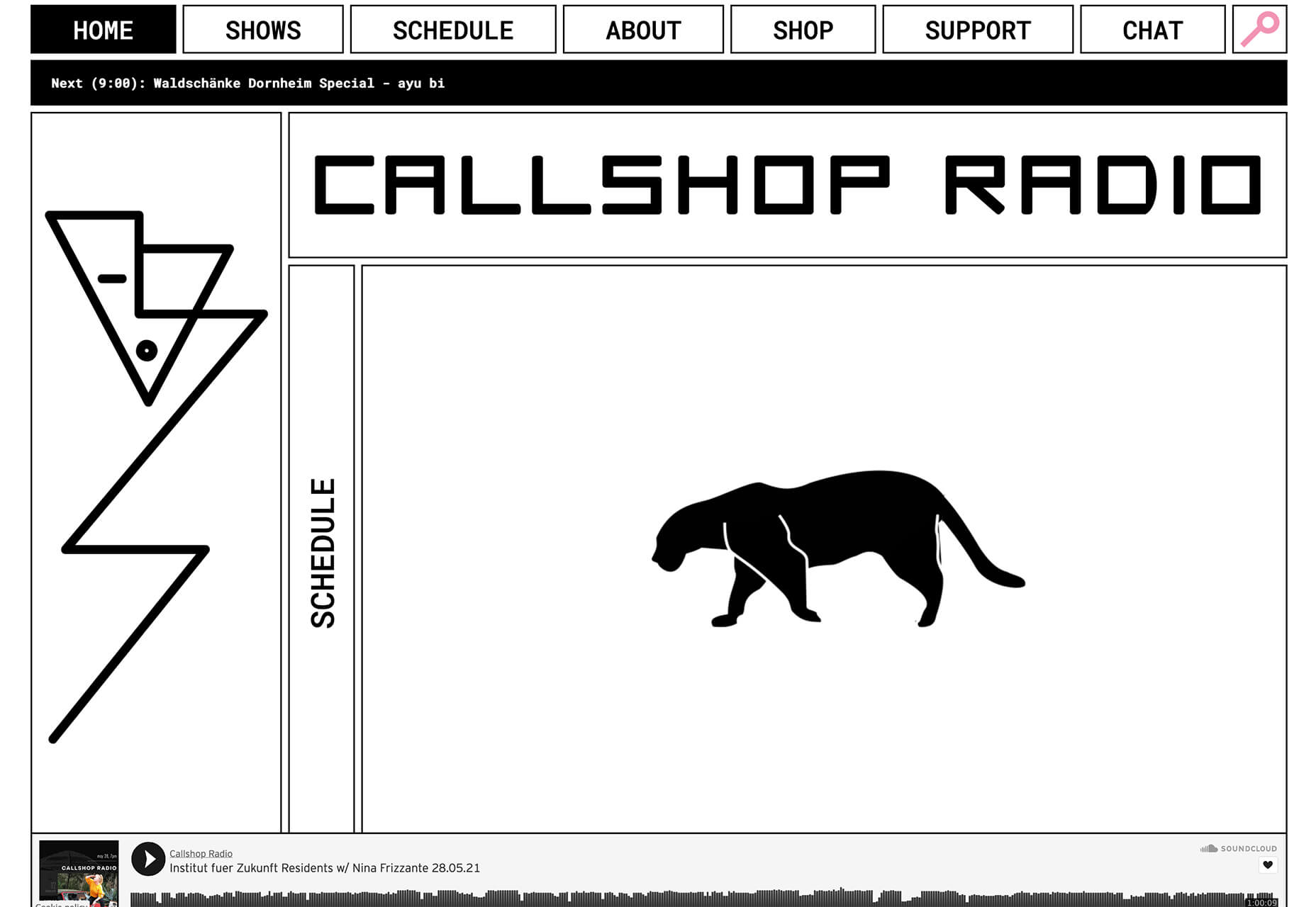
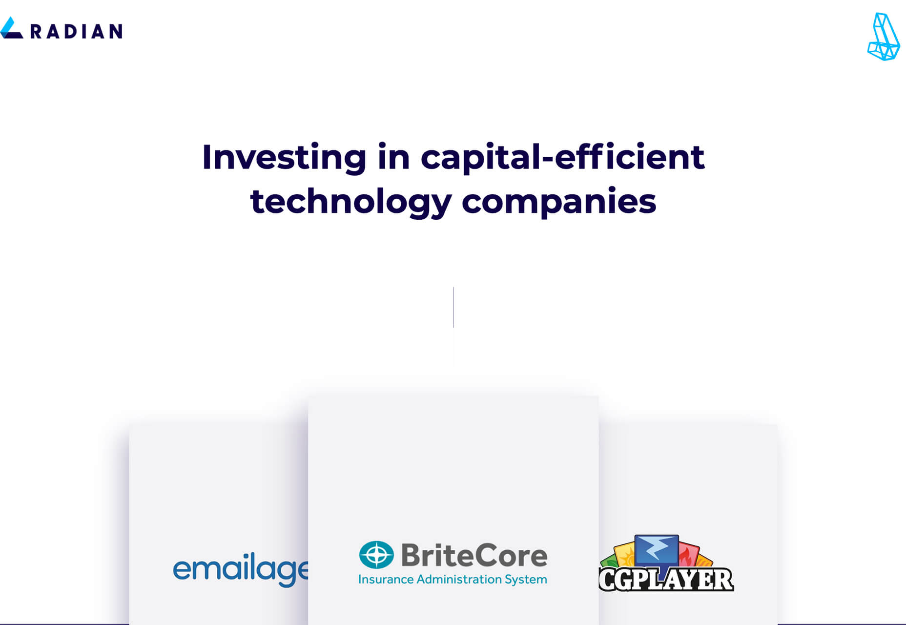
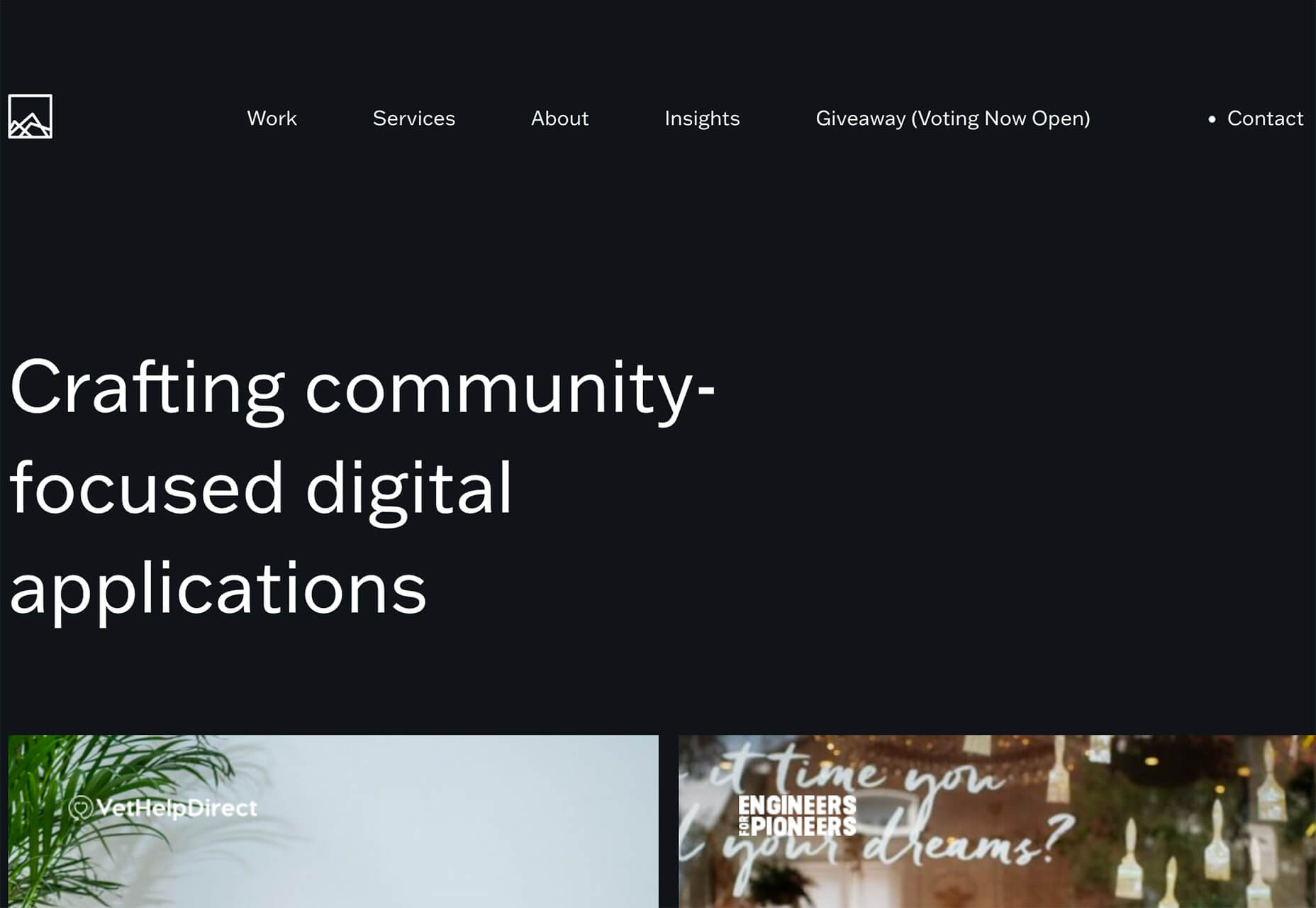
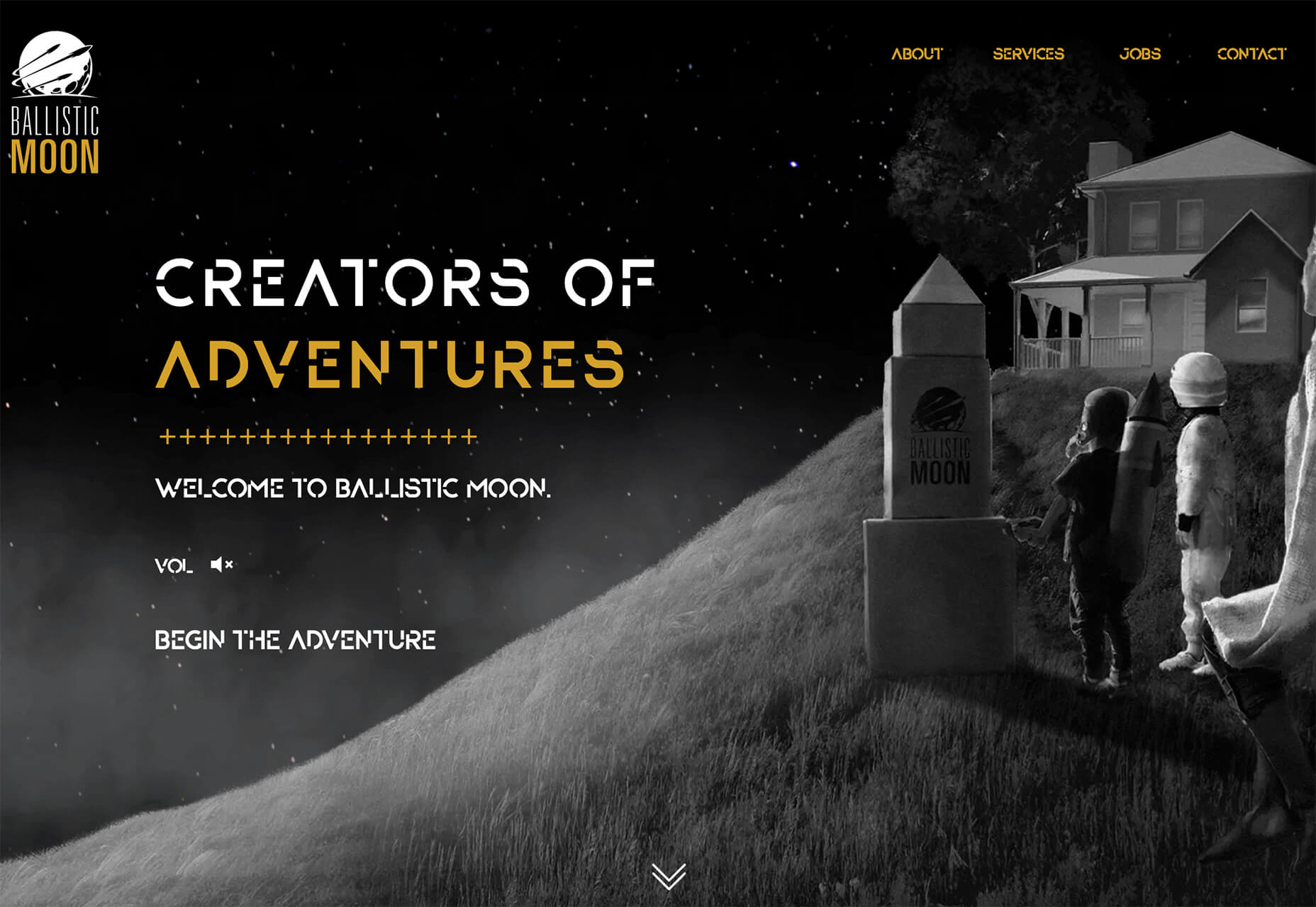
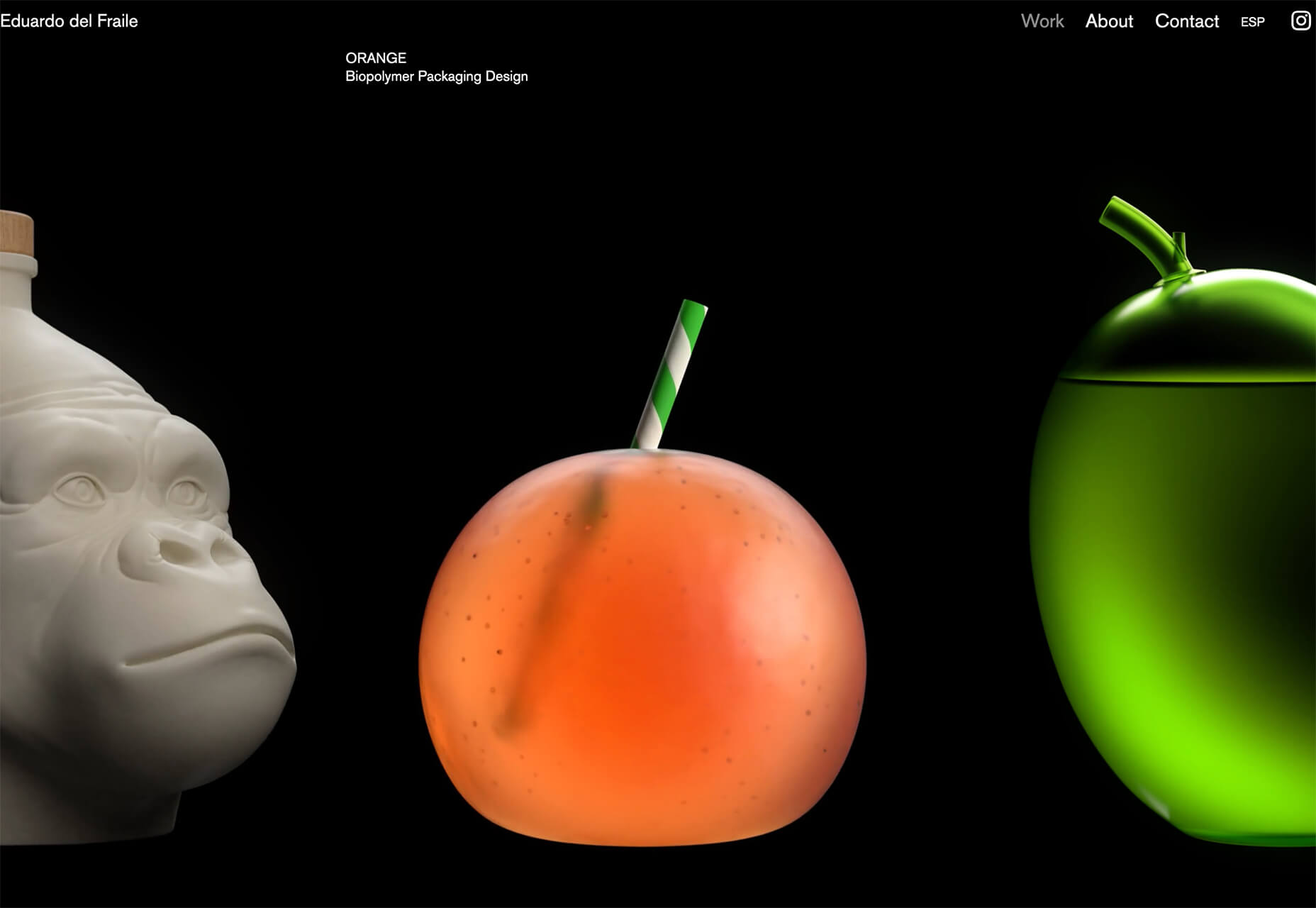
 The best thing about writing about website design trends each month is looking at all the great sites that are being developed. Designers are stretching creatively and exploring new techniques and ways of doing things all the time.
 As a web designer, you face plenty of challenges, both good and bad. One of the bad ones is to suddenly find out that you’re either in danger of missing a client’s deadline or will be unable to meet it at all.

 We’ve been
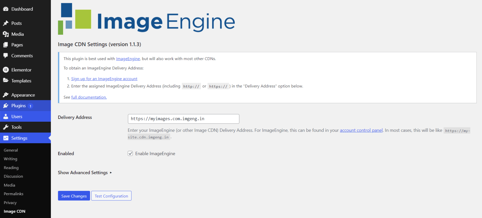
 If you like to build websites with WordPress, then you’re in for a treat.