Articles

Théorie du débogage

La théorie du débogage est une méthode pour identifier et corriger les erreurs dans un système informatique. Elle permet d’améliorer la qualité et la fiabilité des logiciels.

## Dans le paysage du développement logiciel, les bogues font partie inévitable du voyage et le débogage, bien qu’il soit parfois frustrant, fait partie intégrante du processus. Il n’y a pas d’échappatoire à cette vérité et plus nous l’acceptons tôt, plus nous maîtriserons l’art du débogage.

Dans le paysage du développement logiciel, les bogues font partie inévitable du voyage et le débogage, bien qu’il soit parfois frustrant, fait partie intégrante du processus. Il n’y a pas d’échappatoire à cette vérité et plus nous l’embrassons tôt, plus nous pouvons maîtriser l’art du débogage. Dans les prochains articles de cette série, je vais expliquer la théorie peu connue derrière le débogage. Nous connaissons tous la pratique du débogage (dans une certaine mesure), mais il y a aussi une base théorique que la plupart d’entre nous n’ont jamais apprise à l’université (je n’en suis pas sûr). Comprendre cette théorie vous aidera à appliquer une approche plus méthodique à la résolution des problèmes et améliorera votre compréhension de votre code.

Le débogage est une forme de codage qui consiste à trouver et à corriger les erreurs dans le code source. Il est essentiel pour le développement de logiciels réussi et peut prendre des formes variées, allant de la recherche de bogues à la recherche de performances et à l’optimisation. Le débogage est un processus itératif qui commence par la détection d’un bogue et se termine par sa résolution. La première étape consiste à identifier le bogue et à en comprendre la cause. Une fois que vous avez identifié le bogue, vous pouvez commencer à le résoudre en modifiant le code source. Vous pouvez également utiliser des outils de débogage pour vous aider à trouver et à corriger les erreurs. Les outils de débogage peuvent inclure des outils de surveillance des performances, des outils de profilage et des outils de surveillance des mémoires. Une fois que vous avez corrigé le bogue, vous devez tester le code pour vous assurer qu’il fonctionne correctement.

Le débogage est un processus complexe et exigeant qui peut prendre beaucoup de temps et d’efforts pour être maîtrisé. Il est important de comprendre les principes fondamentaux du débogage afin d’être en mesure de trouver et de résoudre rapidement les bogues. Il est également important d’utiliser des outils appropriés pour vous aider à trouver et à corriger les erreurs plus rapidement. Enfin, il est important de tester le code après chaque modification pour s’assurer qu’il fonctionne correctement. Le débogage peut être difficile et frustrant, mais c’est une compétence essentielle pour tout développeur de logiciels qui souhaite créer des applications robustes et fiables.

Source de l’article sur DZONE

UX laws are an invaluable tool, providing guidelines for designers that ensure we don’t have to continually reinvent the wheel when crafting experiences for the web.

However, UX laws tend to be devised by scientists and psychologists — people who are more than comfortable with the exceptions and allowances of academic language. By the time they filter down to us in the trenches, the language has invariably been over-simplified, and the wisdom behind the idea diluted.

Today we’re going to look at seven well-known and commonly cited rules of UX design that too many designers get wrong.

1. Jakob’s Law

Jakob’s Law, named for the UX researcher Jakob Nielsen, states that users spend most of their time on other sites and as a result prefer sites that work the same way as the sites they already know.

Jakob’s Law has often been used to limit experimentation and encourage the adoption of common design patterns in the name of usability.

However, the word ‘prefer’ is hugely loaded. While it’s true that a user will more easily understand a familiar design pattern, they do not necessarily prefer familiar experiences.

It has been widely proved that new experiences boost our mood and that new experiences improve our memory. If your goal is a memorable site that leaves users with a positive impression, introducing novelty is a sound decision.

2. Goal Gradient Hypothesis

The Goal Gradient Hypothesis assumes that the closer users are to their goal, the more likely they are to complete it.

It’s an attractive theory, especially in e-commerce, where it is often used to justify simplifying the initial purchase process and postponing complexity to move users along the funnel — a typical example is leaving shipping charges until the final step.

However, anyone who has studied e-commerce analytics will know that cart abandonment is a huge issue. In North America, shopping cart abandonment is as high as 74%.

We don’t always know what the user’s goals are, and they may not match ours. It may be that users are treating your shopping cart as a bookmark feature, it may be that they have a last-minute change of heart, or they may be horrified by the shipping charges.

While providing a user with an indication of their progress is demonstrably helpful, artificially inflating their proximity to your preferred goal may actually hinder conversions.

3. Miller’s Law

Never in the whole of human history has any scientific statement been as misunderstood as Miller’s Law.

Miller’s Law states that an average person can only hold seven, plus or minus two (i.e., 5–9) items in their working memory. This has frequently been used to restrict UI navigation to no more than five items.

However, Miller’s Law does not apply to items being displayed. While it’s true that too many options can lead to choice paralysis, a human being is capable of considering more than nine different items.

Miller’s Law only applies to UI elements like carousels, which have been widely discredited for other reasons.

4. Aesthetic-Usability Effect

Edmund Burke once said, “Beauty is the promise of happiness.” That belief is central to the Aesthetic-Usability Effect, which posits that users expect aesthetically pleasing designs to be more usable.

Designers often use this as a justification for grey-on-grey text, slick animations, and minimal navigation.

Critical to understanding this is that just because users expect a design to be usable does not mean that it is or that they will find it so. Expectations can quickly be dashed, and disappointment often compounds negative experiences.

5. Peak-End Rule

The Peak-End Rule states that users judge an experience based on how they felt at the peak and the end, rather than an average of the experience.

Designers commonly use the Peak-End Rule to focus design resources on the primary goal of each experience (e.g. adding an item to a cart) and the closing experience (e.g. paying for the item).

However, while the Peak-End Law is perfectly valid, it cannot apply to open experiences like websites when it is impossible to identify a user’s starting or ending point.

Additionally, it is easy to see every interaction on a website as a peak and even easier to make assumptions as to which peak is most important. As such, while designing for peaks is attractive, it’s more important to design for exceptions.

6. Fitts’ Law

In the 1950s, Paul Fitts demonstrated that the distance to, and size of a target, affect the error rate of selecting that target. In other words, it’s harder to tap a small button and exponentially harder to tap a small button that is further away.

UX designers commonly apply this law when considering mobile breakpoints due to the relatively small viewport. However, mobile viewports tend not to be large enough for any distance to affect tap accuracy.

Fitts’ Law can be applied to desktop breakpoints, as the distances on a large monitor can be enough to have an impact. However, the majority of large viewports use a mouse, which allows for positional corrections before tapping.

Tappable targets should be large enough to be easily selected, spaced sufficiently, and tab-selection should be enabled. But distance has minimal impact on web design.

7. Occam’s Razor

No collection of UX laws would be complete without Occam’s Razor; unfortunately, this is another law that is commonly misapplied.

Occam’s Razor states that given any choice, the option with the least assumptions (note: not necessarily the simplest, as it is often misquoted) is the correct choice.

In an industry in which we have numerous options to test, measure, and analyze our user interfaces, you shouldn’t need to make assumptions. Even when we don’t need extensive UX testing, we can make decisions based on other designers’ findings.

Occam’s Razor is a classic design trap: the key to avoiding it is to recognize that it’s not your assumptions that matter, it’s the users’. As such, Occam’s Razor applies to a user’s experience, not a design process.

Source

The post 7 UX Laws You’Re Probably Getting Wrong first appeared on Webdesigner Depot.

Source de l’article sur Webdesignerdepot

Are you a creative person looking for the perfect career path to take? If so, there are not many more creative professions than that of a web designer.

However, becoming a web designer can be challenging, especially if you do not know where to start. For example, do you need to attend college to become a web designer? And what kind of computer and software do you need to own to be successful as a web designer?

This guide aims to answer all these questions and show you the steps you need to follow to build a career in web design.

Web Designer: Main Skills and Responsibilities

Generally speaking, a web designer is a professional who creates, manages, and maintains content for the web. Nothing is left out from designing pages and visual elements via programming languages and creating user-friendly websites.

Web Designer (Hard and Soft) Skills:

  • UX, UI, and visual design knowledge (web fonts, colors, etc.)
  • Management of design software (e.g., Adobe Photoshop)
  • Coding knowledge (HTML, CSS, JavaScript, etc.)
  • Time management
  • Communication skills
  • Problem-solving and teamwork skills
  • Research skills

Web Designer Responsibilities:

  • Plan and create web pages
  • Design appealing layouts
  • Use codes to create user-friendly pages
  • Ability to meet deadlines
  • Listen and advise clients
  • Able to work as part of a team and effectively solve occurring problems
  • Analyze the client’s niche, explore new web design opportunities/ innovative digital marketing approaches

If you feel overwhelmed reading this table, don’t be! You do not have to master all of the above skills. No one expects you to either. Becoming a top-notch web designer takes some dedication, but ultimately it’s nothing more than a series of steps. Let’s dive deeper into them.

Becoming a Web Designer: 7 Essential Steps

1. Gaining the Knowledge Needed: Theory and Certifications

Let’s start with the most common question, “Do I need to go to college to become a web designer?” Research shows that more than 65% of web designers are self-taught (fully or partially). Of course, that does not mean you can jump into design from the start.

Instead, we recommend that you learn some essential web design elements and how to use them in your future projects. This includes UX (user experience), UI (user interface), protocols, and patterns. The same goes for technical knowledge like programming languages, frameworks, and design software.

2. Developing Certain Skills

So, there are numerous aspects you can explore regarding technical skills. To be specific, your first steps in web design include developing the following skills: 

  1. Theory and certifications: Learning the theory to understand how the web and the market work
  2. Web design tools: Finding the web design tools you need to start designing (.e.g Webflow, Sketch, Figma). This will allow you to learn how to prototype web design mock-ups.
  3. Graphic design tools: Becoming familiar with software like Photoshop, Illustrator, etc.
  4. Programming languages: Especially if you think of becoming a freelance web designer, you should at least learn how to use fundamental languages (HTML, JavaScript, CSS).
  5. SEO (Search Engine Optimization): Learning how to optimize your web pages to rank on search engines is crucial.  

3. Mastering Web Design Software 

What software do you need as a beginner to start creating web designs? There are numerous apps that will help you gradually enter the fascinating world of web design. 

When it comes to CMS platforms, WordPress is by far the most popular in the market. The good thing about WordPress is that it is very beginner-friendly and comes with thousands of pre-built themes and plugins that you can use when creating a website.

But the same is true for InVision Studio. Unlike WordPress, InVision Studio is specifically designed to help web designers prototype and design a website. Finally, when it comes to graphic design software, we recommend you start with Photoshop (for creating visual samples and prints) and Sketch (for UI designs). 

4. Learning How Much Computing Power you Need

Although online CMS platforms like WordPress do not require special hardware, that’s not true for web design and graphic design software. To be precise, both InVision Studio and Photoshop have quite demanding system requirements. 

Still, a mid-range desktop or an entry-level gaming laptop can easily handle such applications. You need a reliable CPU, 8 GB RAM, and a dedicated graphics card.

I find working with two screens perfect when it comes to prototyping. You do not need to spend thousands of dollars to buy a laptop or desktop for web design.

5. Practice, Practice, and Practice

As with any other profession, practice makes perfect in web design. Therefore, the good idea is to get involved with personal web design projects before you start seeking clients or applying for job offers. This way, you can gradually acquire the technical skills you need.

Also, by working on some personal projects first, you can build a professional portfolio.

6. Creating a Professional Portfolio

If you want to draw attention to your talent, you should have a comprehensive portfolio as a web designer. This way, potential customers to trust you by having a look at your work and previous experience.

When creating a portfolio, make sure to showcase all aspects of your work and make it user-friendly. In other words, think of your online portfolio representing your talent and treat it accordingly.

7. Choosing the Web Designer Type That Best Suits Your Needs and Preferences

Last but not least, before working as a web designer, you should know that there are three main types of web designers: Freelance web designers, Agency web designers, and In-house web designers.

If you prefer to be self-employed and believe that you have the required soft skills, freelancing is probably the best path.

On the other hand, working for an agency or a company is usually easier (especially for beginners) and will provide you with a stable income. But, in the end, it all depends on your needs and preferences.

Wrap Up

Being a web designer can be an exciting career. As long as you have the necessary dedication and willingness, nothing will stand in your way.

Learning different aspects of the profession and mastering specific software will only make you better. All you need to do is respond positively to (and ask for) incoming feedback and practice!


Featured image via Pexels.

Source

The post How To Take Your First Steps in Web Design first appeared on Webdesigner Depot.

Source de l’article sur Webdesignerdepot

As a UX designer, you get to work on creative, rewarding, even life-changing projects. It’s an industry with flexible working and countless opportunities. All this, and you get paid well too.

It doesn’t matter if you’re not a creative prodigy, or a tech grandmaster; you can learn to become a UX designer with the right mindset, a few tools you pick up along the way, and some committed learning.

By the time you’ve finished reading this post, you’ll be well on your way to designing your new career.

You can do this, let’s get started…

What is a Career in UX like?

Every career is different, but generally speaking, a UX designer works on making a user’s interaction with a product or service (normally websites) as intuitive as possible.

Just as a golf architect designs the layout of a golf course to flow through greens, tees, and holes, with buggy paths for access, and the odd bunker to add a challenge; so a UX designer creates the optimum experience for a site. A golf architect doesn’t need to reinvent the game of golf, and neither does a UX designer need to reinvent websites.

A golf architect will not design a course with a 360-degree sand bunker surrounding a tee (well, they might, but they really really shouldn’t), or a hole too small for a golf ball. In the same way as a UX designer, you’re not going to design an ecommerce site with a cart in the bottom left, a non-existent search feature, or hidden pricing.

The best thing about being a UX designer is that you don’t need to spend years in formal education to get qualified. The flipside is that if you want to be a great UX designer, it’s not a walk in the park.

Every designer is different, but some of the main traits of successful UX designers are: an enjoyment of problem-solving; good listening skills; curiosity; open-mindedness; attention to detail; creativity; communication skills; process-driven; and adaptability.

Before committing to this career path, check out a few podcasts, and read a few blog posts, to dip your toe in the water.

Still interested? Excellent, the next step is…

Getting Certified as a UX Designer

UX design is a practical skill. It’s all well and good knowing the theory, but without practice putting the theory into action no one will give you a chance to prove what you can do. So how do you get practical experience? You get certified, and there are three popular options: online, in-person training, or self-taught.

A good UX syllabus will include portfolio-building projects, tool mastery, networking opportunities, and even 1-2-1 mentorship. As well as learning the fundamentals of UX, you’ll cover user research and strategy, analysis, UI design, and more.

Option A: Online Course

Online courses tend to be much easier on the bank balance, as well as being flexible, which means you can fit them around your current job. You can work at your own pace, and in many cases choose modules that interest you, once you’ve completed the basic introduction.

There are many online course providers, including Coursera, Udemy, Skillshare, and Career Foundry.

Whatever option you choose, it is a good idea to get as broad a perspective as possible, so consider following more than one course — perhaps mix and match a paid course with a free one.

Option B: In-Person Training

This could be a university course, or a local boot camp where you physically sit in with an instructor and classmates.

This is more expensive, but it provides benefits that nothing else does. Firstly, you’ll have classmates you can bounce ideas off, collaborate with, keep motivated, inspired, and accountable. You can also get real-time, intensive coaching and advice from someone who’s been there, done that, bought the T-shirt (and redesigned it so it fits better).

Seach local boot camps and workshops, check out workshops at local conferences, and ask your local college what courses they offer.

Option C: Self-Taught

Being self-taught is the cheapest of all options. Work at your own pace, where, and when you want to. Watch YouTube videos, read blogs, garner information anywhere you can find it.

This option involves a lot of stumbling around in the dark. The biggest challenge is that you don’t know what it is that you don’t know. For this reason, it can pay to follow the syllabus of a local college course, even if you’re not enrolled and don’t attend lectures.

In reality, all education is self-taught to an extent, even the most prescribed courses need self-motivation.

Some of the most in-demand UX designers in the world are self-taught, so why not? Start exploring UX blogs like Nielsen Norman Group articles, Google Design,  UX Planet, and UX Matters.

Mastering UX Tools

Recruiters and hiring managers will seek your technical ability and your experience using popular tools from user research, to wireframing, to prototyping. When you get your first job in UX, the tools you use will be determined by your project manager, so it’s a good idea to have a passing familiarity with the most popular. These will include Maze, Userzoom, Sketch, XD, Figma, Marvel, and Hotjar.

If you’re following a guided course you should get an introduction to at least a couple of important tools. Once you understand one, you can probably pick the others up quite quickly… because, after all… they should be intuitive.

You do not need to know how to code, but understanding the roles, and restrictions of HTML, CSS, and JavaScript is very beneficial. When you get your first UX job, you’ll need to be able to talk about how technologies fit into the plan.

Building a UX Portfolio

Your portfolio is your résumé. The golden ticket. The silver bullet. Amassing a content-rich portfolio is paramount. You don’t need a real-world job to build your portfolio, and you should already have content to add from your course.

You need to demonstrate knowledge of UX tools and processes (what future employers will look for). Case studies that incorporate research, problem-solving, strategy, imagination, and (if possible) results are the best way to do this.

There are a variety of ways of building a portfolio, but the best is taking a real website, and redesigning it. Don’t worry if your first few projects aren’t the best; as long as you demonstrate improvement and growth, that counts for something.

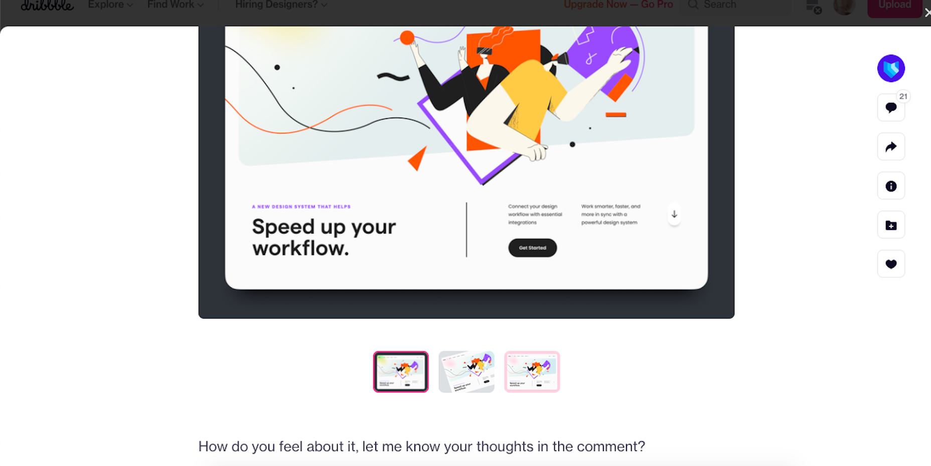
You can showcase your portfolio on sites such as Behance, Dribbble, or preferably create your website.

Landing Your First Job in UX

Start combing the job boards to see which companies are looking for UX designers. There’s a global shortage of qualified UX designers, so if you can’t find anything you’re looking in the wrong place! Make sure your whole network, from your Mom’s hairdresser to the barista at your favorite coffee place know that you’re looking; you never know where a good lead will come from.

Some companies are looking for UX skills as part of other roles. Others are looking for full-time UXers.

Don’t be disheartened if “Junior UX Designer” positions require 2 years of experience; HR just throws this in as a pre-filter. If you think you can do the job, apply anyway, if your portfolio’s good you might get an interview regardless, and if you get an interview they think you’re worth taking the time to meet.

If you don’t get the job, don’t be downhearted. Remember: every time someone else gets a job, that’s one less person you’re competing with for the next job.

Quick Prep on Some Common UX Interview Questions:

  • What’s your interpretation of a UX Designer?
  • What has inspired you to become a UX Designer?
  • How do you take constructive feedback and non-constructive feedback?
  • Who, or what companies, do you look up to in this industry, and why?
  • What’s your process with a new project?

Good Luck!

So, now you know what it takes to get into the field, it’s time to start applying yourself to this newfound and richly rewarding career. As the great writer Anton Chekov said, “Knowledge is of no value unless you put it into practice.” So get out there and practice, practice, practice. Add and add and add to your portfolio.

To become a UX Designer, enroll in a great course, build your portfolio, network, apply for roles, and always be learning. Always be open to new ideas and suggestions. There’s a lot of leg work, but the juice will be worth the squeeze.

Featured image via Unsplash.

The post How to Kickstart Your UX Career in 2022 first appeared on Webdesigner Depot.

Source de l’article sur Webdesignerdepot

_____________________________________________

Another excellent guide to help people to prepare for job interviews to give them the best possible chances of success and not make some common mistakes can be find here : https://www.ireviews.com/interview-resources/

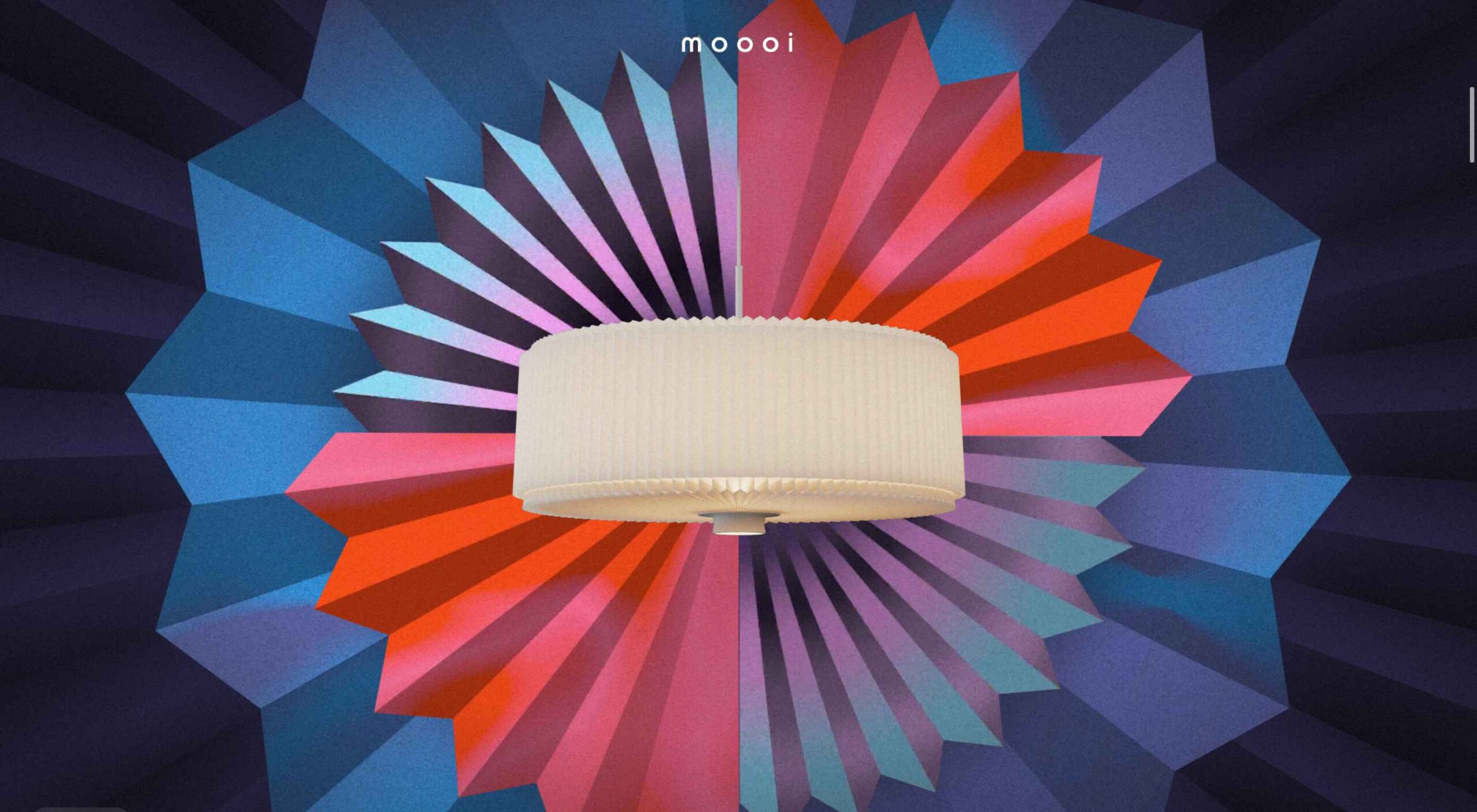
Welcome to this month’s round up of what has caught our eye on the web. As it’s November we’re going to help chase those winter blues away with some color.

Color does so much of the heavy lifting in visual design. It can create a mood, reinforce a brand identity, establish a hierarchy, differentiate sections, highlight type or reduce it; color even makes a statement by its absence.

Good use of color isn’t just about getting the most appropriate color scheme for the subject, it’s also about how much color to use, and where to use it. In this collection we’ve included a range of use examples from bright and full of color, to restrained with subtle tones. Enjoy!

Toboggang

There’s a pleasing UPA cartoon feel to the colors and type in this compact portfolio site.

On

On digital technology studio keep things simple with a black on light blue, and infinite scrolling.

re_

A pleasing mix of reds, greens, pinks, and golds liven up a simple grid layout for re_ package free grocery store.

LA Art Box

This site for LA Art Box makes great use of horizontal scrolling and animated transitions.

JYZ Design

Strong color and geometric shapes create a vibrant feel for JYZ Design’s company site.

Hyperframe

Hyperframe’s site takes on board the ‘show, don’t tell’ theory by cleverly using on scroll animation to demonstrate its product’s major selling point.

Rebecca Atwood

Rebecca Atwood’s site combines product shots with a color scheme that reflects the aesthetic of her designs.

Natural Paint Co.

For any paint company, displaying the available colors is a central function of their site. Natural Paint Co. do a really nice job of this with an interactive picker that changes the background color of the window.

Piaule Catskill

Beautiful photography and minimal text do a great job of selling the experience of Piaule Catskill cabins, and the horizontal scrolling on desktop adds extra focus. I found myself looking up flights to New York…

Rose Delights

There is a vintage, hand made quality to the mix of video and photographs on Rose’s home page, that creates a sense of warmth. The transparent mail list sign up is nicely non-invasive.

Voila

This site for Voila instant coffee creates a modern feel with fresh pastel colors balanced by a grounding dark blue.

Chiwawa

Wrestling masks, skeletons and lots of tone on tone color makes this a lively and appealing site for Chiwawa cantina.

HI(NY)

Keeping the rest of the design elements minimal here allows the movement of content areas not become cluttered and fussy feeling.

Think Tank Team

The divided square motif on the Think Tank Team homepage is a nice visual metaphor for building blocks coming together to create a whole.

Just Egg

Lots of yellow, and food close ups in the what part of Just Egg’s site is bold and confident. But the how section with its scrolling animation is the really good bit.

Moooi Paper Play

Although not a standalone site, this is a very pleasing animation centred around a particular product from Moooi.

Maersk Upside

Logistics giant Maersk have added a more user-friendly and visually engaging section to their corporate site, with use cases and real case studies.

Sol’ace

The color palette for Sol’ace furniture is has been carefully chosen to reflect the idea of luxury and natural materials.

Terra

A good mixture of standalone product shots and styled photographs works well here. The navigation options–shop by type, material or collection–have been well thought out too.

Thanxiety

And finally, for our readers in the US, Thanxiety is a carefully chosen collection of conversation topics to help avoid any uncomfortable silences, or family rows, around the dinner table at Thanksgiving. (And maybe the rest of us could use it on other holidays…)

Source

The post 20 Best New Websites, November 2021 first appeared on Webdesigner Depot.

Source de l’article sur Webdesignerdepot

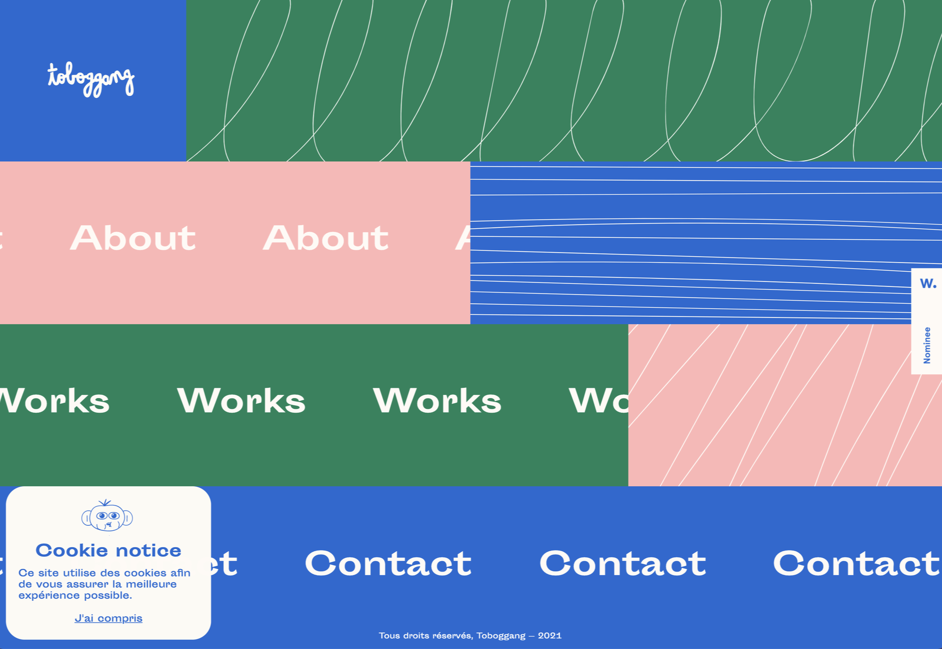
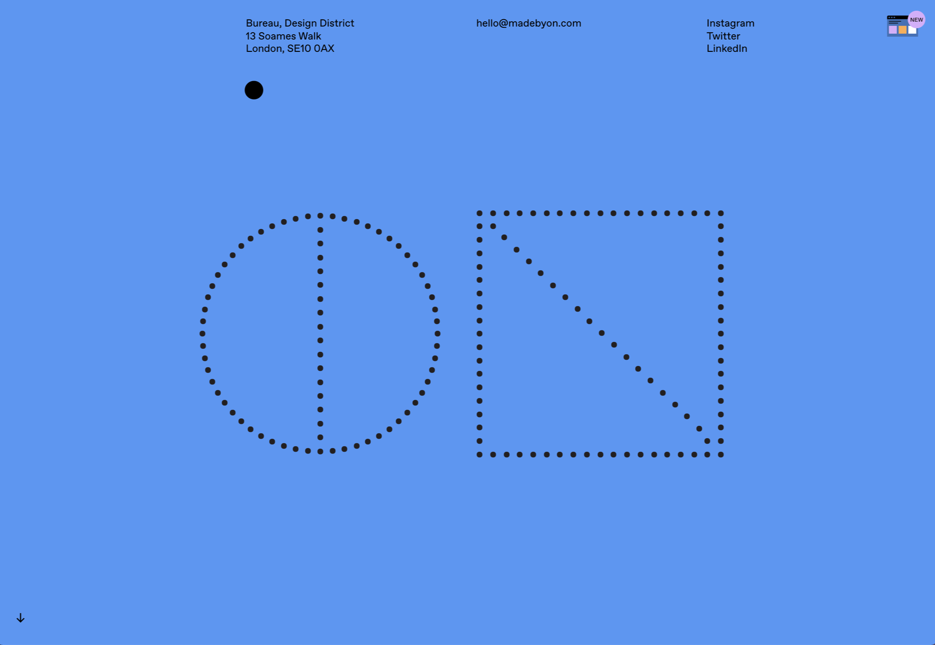
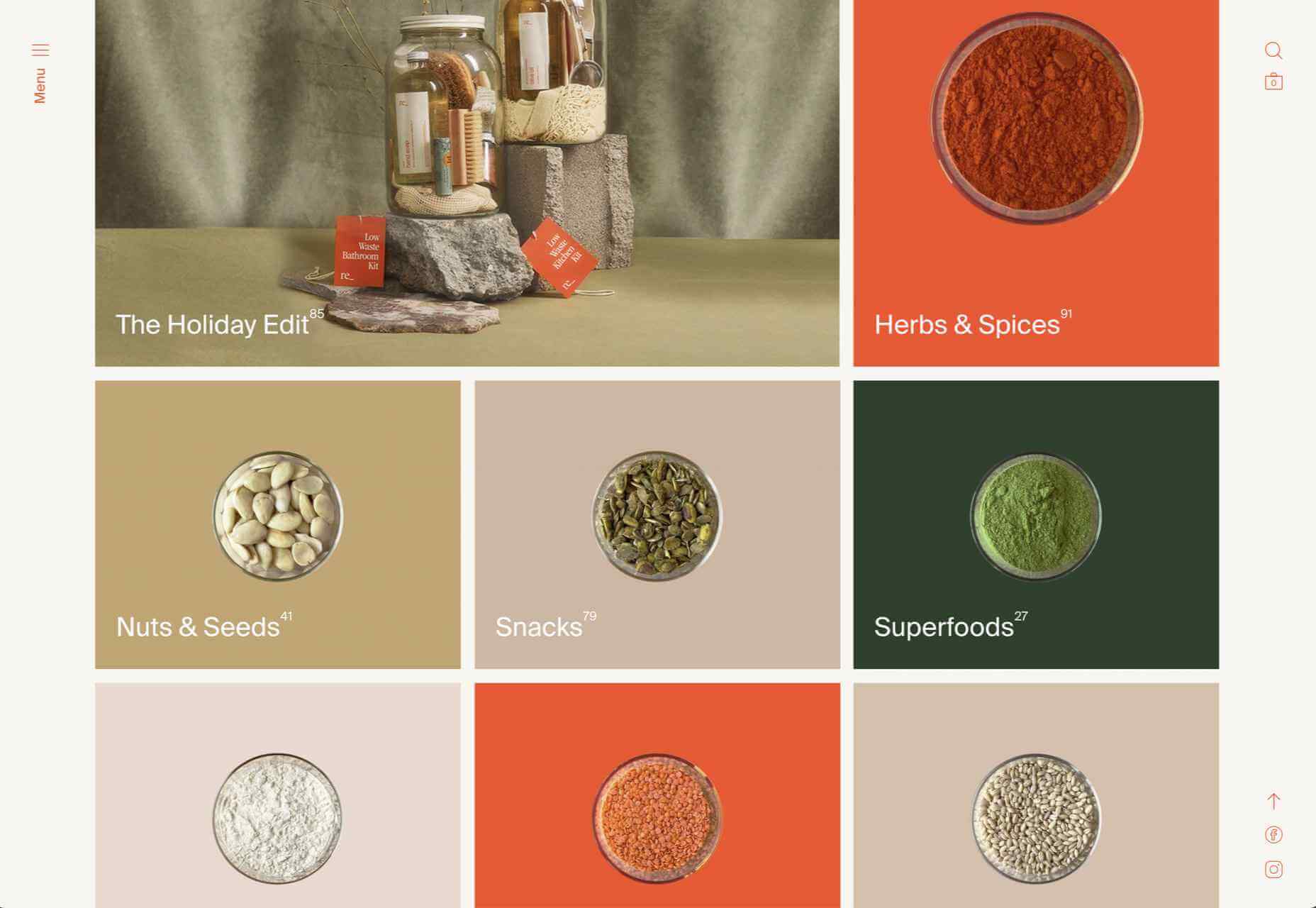
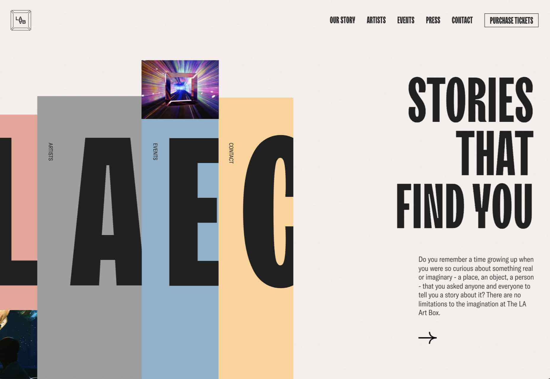
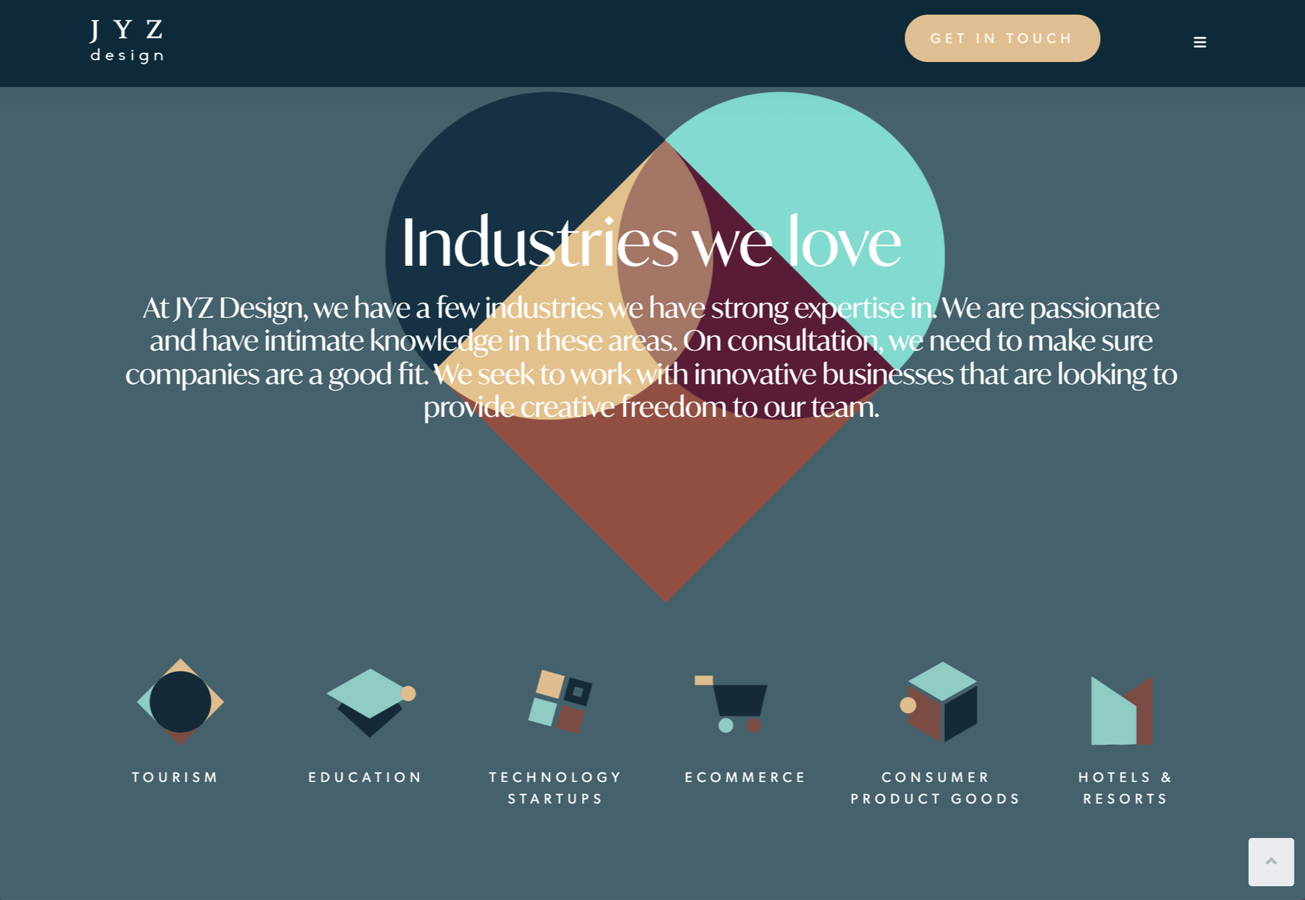
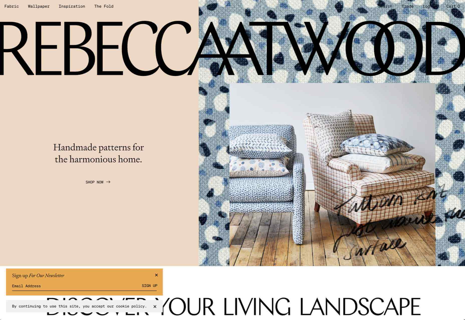
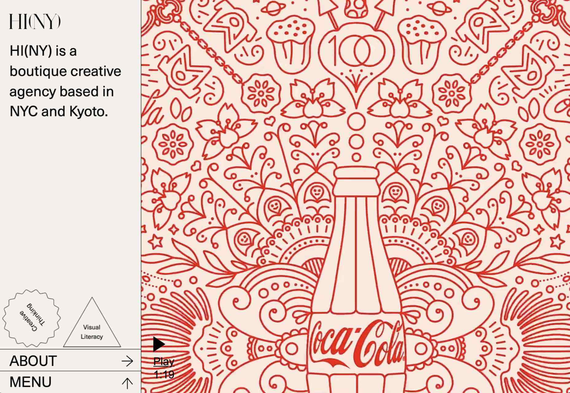
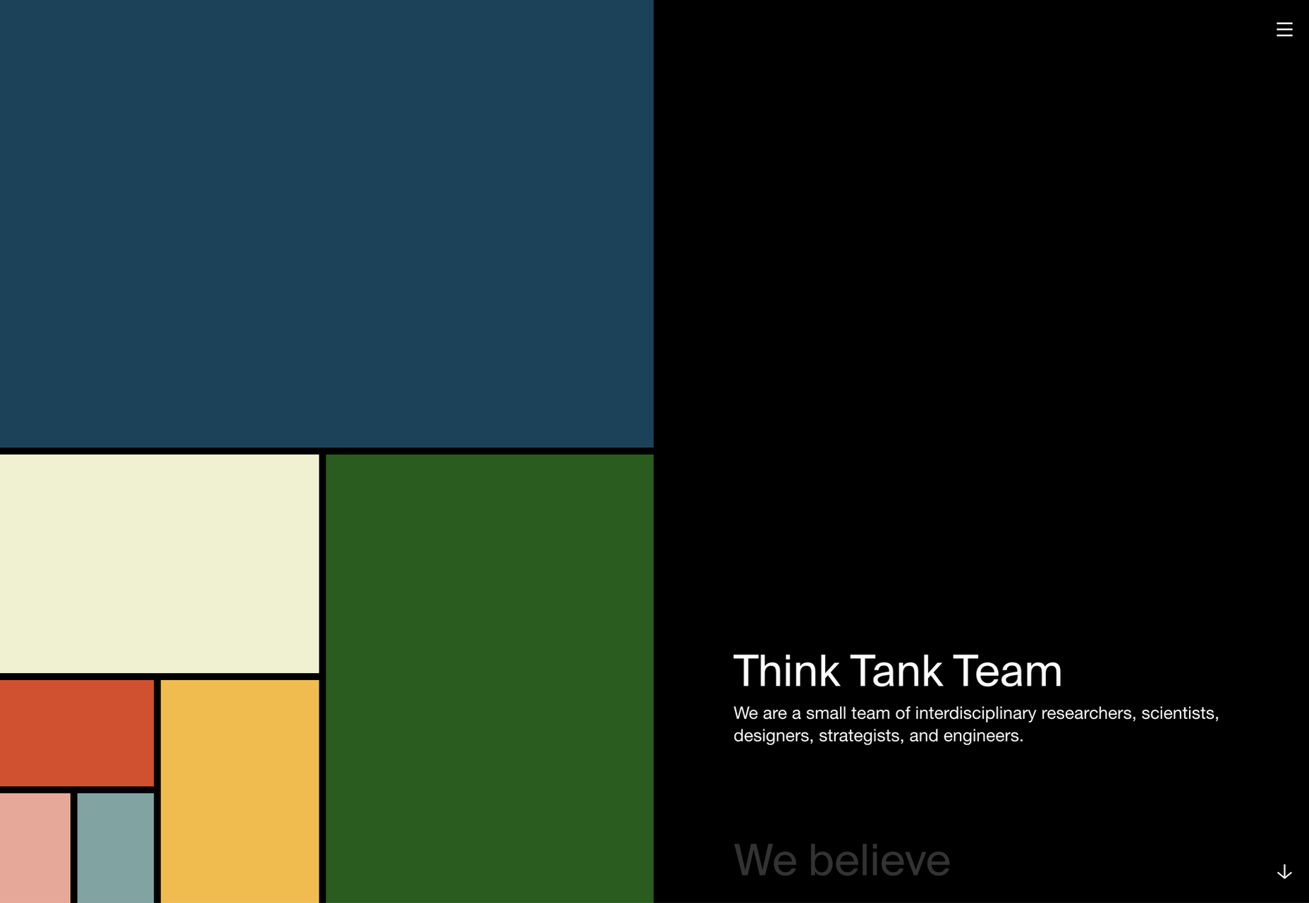
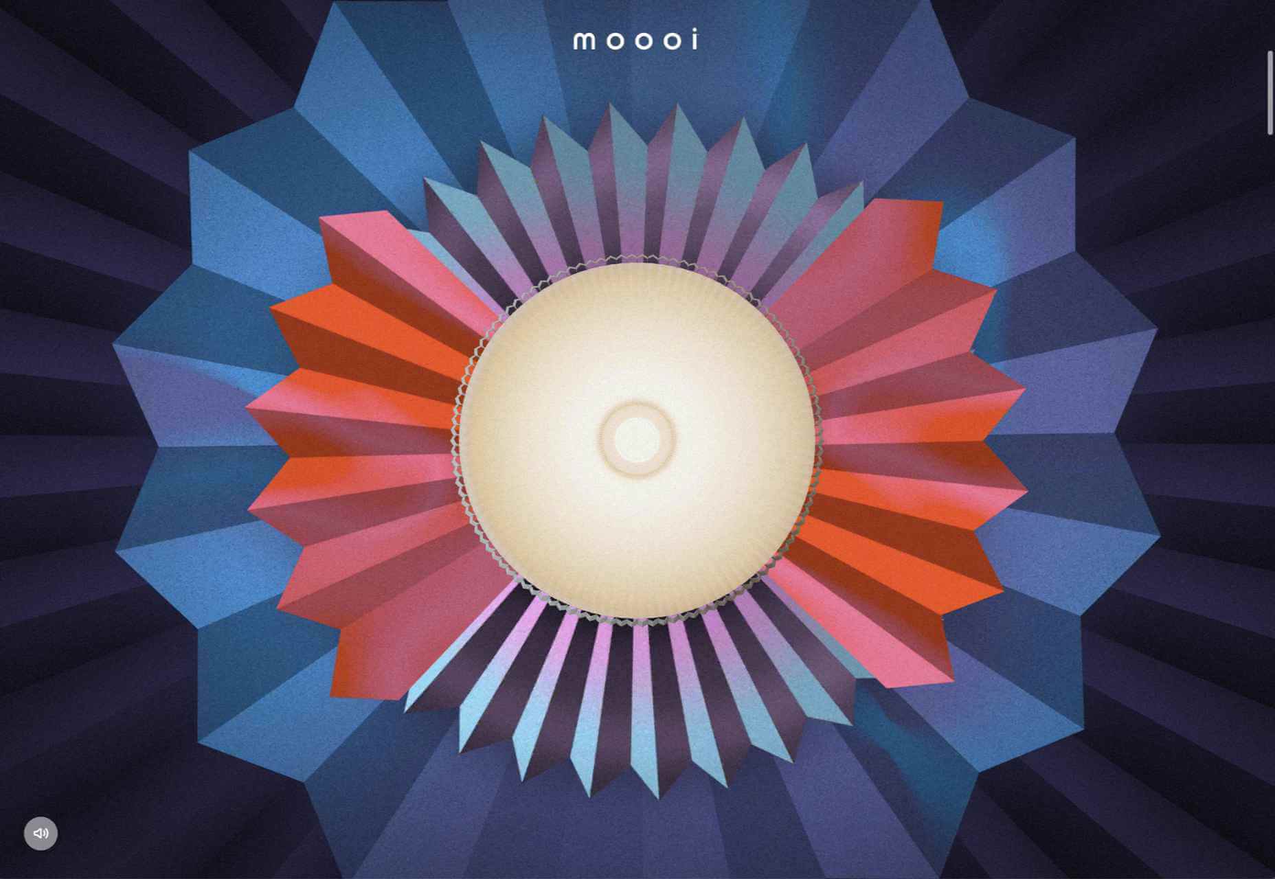
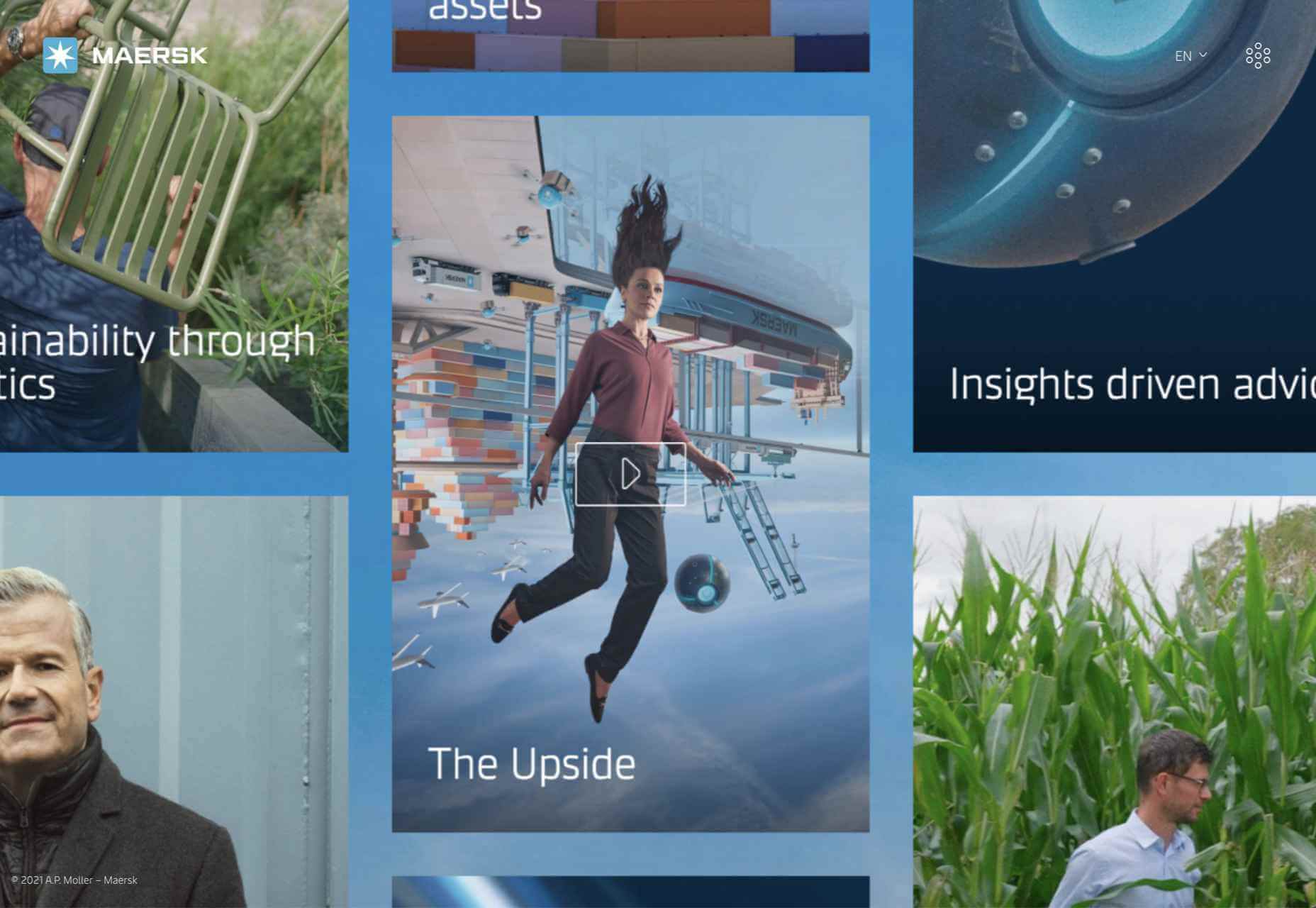
Sometimes the designs that make the most impact do a lot of unexpected things and break some of the most tried and true rules of visual theory.

Sometimes these design elements work brilliantly, and other times they are fleeting or fall flat. This month all of the examples here seem to break some conventional design rules. Here’s what’s trending in design this month…

1. Alternative Homepage Image/Video Crops

This trend breaks some traditional standards and is pretty refreshing – alternative homepage crops for images and video.

The full screen or 16:9 aspect ratio is out the window with vertical and square options that prove you can do more with your photo collection.

What’s great about this trend is that it’s super attention-getting because of the interesting use of space and imagery. Almost any design without the full-width hero header will grab your attention because it is different. These examples prove that point, and each design does it differently.

Now here’s the challenge: You have to make sure that this style has a solid fallback for mobile so that the result is equally impressive.

Janmaat Fotografie does a great job accounting for interesting photo shapes and flips the script on mobile. (Rather than what you might expect with text then photos because of the desktop placement, the photo stack uses the same shape and layering and is above the text on mobile.) The result is phenomenal.

N3 uses a very vertical image in an almost split-screen style design. It’s a sharp contrast to many of the other split screens we are accustomed to with an equal divide. The distinct shape of the image is interesting and intriguing. It’s definitely not a shape we see in website design frequently.

Bounce uses a similar split-screen effect in the opposite manner as the example above, with the tall, vertical space as an “empty” area and the right side filled with a square video. The shapes help push and pull your eyes across the screen to look at all of the elements and take in the overall design. It’s one of those ideas that if you only talked about it, you might talk yourself out of it, but here, it’s pretty striking.


2. On-Screen “Stickers”

Stickers are a design trend that has made its way from social media to website design.

These website stickers break design rules because they cover content or seem to be put on the canvas haphazardly. And that’s why they are so attention-getting!

The benefit to these stickers is that they can highlight specific items or content or help focus a call to action.

Friesday uses stickers in conjunction with hover effects to keep users interacting with the design. Multiple stickers can even pop onto the screen in the same location. The animation is simple and fun and feels like a digital sticker book.

August Eighth uses a center sticker as a call to action. It’s a true focal point in the center of the screen with an almost three-dimensional effect that lifts it off the background video. It’s a borderline dark pattern since the only way to get the box off the screen is to click through to the shopping part of the website.

EasyGreen has a bright yellow sticker in the bottom corner that feels almost like the sticker on a piece of fruit. This style and placement work well for the content and product featured. It’s bringing the digital and real-world a little closer with this design element.


3. Breaking Design “Rules”

The third trend this month is kind of a catch-all for general rule-breaking. While the other trends show certain design elements that aren’t the norm, each of these examples really tosses everything you traditionally think about design out the window. (And that’s ok.)

The trick to a rule-breaking design is that it has to be focused and simple enough to keep users interested and provide intuitive elements that tell them how to interact with the design. It’s a delicate balance.

Here’s how these sites do just that.

Supercontinent has a lot going on. At least four typefaces on the screen at a time, movement (using different shapes and aspect ratios), overlapping elements, hidden navigation, and you may even find a few more broken rules if you look closely. And somehow, it still works.

What’s pulling this design together is a key unbroken rule – the chaos is rooted in a grid system that keeps it all somewhat organized. Plus, there’s plenty of white space to keep elements from feeling crowded and overwhelming.

Source of Plastic Waste combines elements in unexpected ways. There’s no real navigation; the site is just a continuous scroll. That’s a big website usability rule broken right out of the gate. There are other design elements as well, from the “header”/logo moving to the top right corner to the almost over-designed transparent box for text elements. There are a lot of scroll elements and actions happening and layers of text on text in some of the screens.

But here’s the thing about this design. As many rules as it breaks, the story is interesting enough to keep you scrolling. The question is, how long and how far do you go without getting lost or confused.

The Debris of Attention is designed to show “bad design” with elements that are frustrating and annoying on websites. The gamified design allows you to hover on each element to remove it and clean up the design.

While this site breaks the rules on purpose, it is still an experiment in how long a user will hang on with so many visual effects happening at once.


Conclusion

While most of the time, people think about “breaking the rules” as a bad thing, that’s not always true in the design space. Sometimes breaking the rules can result in an unexpected delight.

The challenge is to make sure that when you break the rules, the design is still usable, functional, and understandable. If so, you’ve found a winning combination.

Source

The post 3 Essential Design Trends, August 2021 first appeared on Webdesigner Depot.


Source de l’article sur Webdesignerdepot

So, really, you’re in the business of designing websites for your clients’ audiences.

But how do you ensure you get it right? You could take what your client tells you at face value, but that’s only going to scrape the surface of who their audience is.

What you need to do is figure out how consumers think and why they respond to websites the way they do. A lot of this is already explained to us by psychology principles.

Once you memorize them, you’ll be able to design user journeys that get visitors to respond exactly as you and your client want them to.

15 Psychology Principles to Use in Web Design

We as humans think certain ways, and your design should cater to those underlying thought processes and natural responses.

Below are 15 psychology principles that’ll help you design better, more intuitive digital experiences for your end-users:

1. Aesthetics-Usability Effect

The Aesthetics-Usability Effect suggests that people equate more attractive interfaces with more usable ones. In other words, a good, modern, responsive design should always be your starting point.

2. Color Psychology

Color psychology tells us about color’s influence over how something is perceived. With color so strongly tied to emotion, you can do a lot to affect how visitors perceive a website and the brand behind it.

3. Psychology of Shapes

Just as a color has the ability to affect someone’s perception of a brand or the content they’re looking at, so too do individual shapes used within an interface. Each shape — circles, squares, triangles, hexagons, and polygons — has a unique psychological association.

4. Gestalt Principles

Gestalt Principles are a way for humans to make sense of chaotic data presented to them. So, rather than see a bunch of text, images, and space, the human brain recognizes patterns to simplify complexity.

About half a dozen principles are associated with this theory, and they’re related to factors like symmetry, similarity, and proximity.

5. Mere-Exposure Effect / Jakob’s Law

The Mere-Exposure Effect, or Familiarity Principle, suggests that people are more likely to prefer things that seem familiar.

Jakob’s Law applies this psychology specifically to the internet user experience. It suggests that users expect your website to work the same way as the other sites they spend their time on.

6. Von Restorff Effect

The Von Restorff Effect, or Isolation Effect, describes what happens when someone is exposed to identical stimuli, and then a unique element is introduced to the fold. It’s the outlier that will most effectively grab their attention.

7. Selective Disregard

Selective disregard is a type of “blindness” users develop to anything seemingly irrelevant to their main goal. This often occurs when a design or marketing trend grows stale — like websites that use the exact same cookie consent banner.

8. Hick’s Law

Hick’s Law states that the number of choices a person has to make will increase the amount of time it takes to make a decision.

This is a fundamental principle to pay attention to on ecommerce sites as you want to speed up the decision-making process, not slow it down.

9. Loss Aversion

Loss Aversion states that decision-making is more commonly driven by avoiding losses than acquiring gains.

If your website or the content within it gives visitors any reason not to trust it or feel confident in taking action, you’re more likely to see high abandonment rates than conversions.

10. Paradox of Choice

The Paradox of Choice is a response to the problem posited by Hick’s Law. It suggests that the reduction of choices makes consumers feel less anxious, which, in turn, increases confidence and satisfaction with purchases.

If your site suffers from high cart abandonment or product returns, the paradox of choice would be a useful principle to leverage.

11. Miller’s Law

Miller’s Law, also referred to as Cognitive Load Theory, has to do with memory capacity. On average, people can only have about seven items stored in their working memory at any given time.

This psychology principle encourages the reduction of options and the general reduction of content to improve focus and decision-making capabilities.

12. Feedback

Feedback is one of the principles of learning and plays a big part in interaction design.

Feedback is what designers use to tell people when they’ve made progress towards a goal or achieved it. You can also use it to teach visitors how a website will respond to their actions, which encourages faster and more confident engagements with your website.

13. Extrinsic Motivation

There are two types of motivation. Intrinsic motivation is an internal one, whereas extrinsic is external.

It’s Extrinsic Motivation that plays a role in getting users to complete more tasks online. As a designer, you have to make sure these kinds of “rewards” are obvious.

14. Social Proof

Not so much a psychological principle as it is a psychological phenomenon, Social Proof or Influence, suggests that people will copy the actions of the masses. It also refers to the assumption that the truth lies with the majority.

This is why customer reviews, client testimonials, and user-generated content have become so useful on websites.

15. Peak-End Rule

The Peak-End Rule states that people will judge an experience based on their very first and last impressions of it. This is somewhat related to the Serial Position Effect, whereby people will remember the first and last items in a group.

So, this is something to remember when you build out the top and bottom of each page as well as the start and expected end to the user journey.

Wrap-Up

Want to build better websites? Then, you need to design from the end users’ perspective.

The best place to start is with psychology principles, as they’ll tell you how most consumers think and what motivates them to respond. If you understand this inherent cause-and-effect relationship, you can design websites that elicit the right kind of response from your visitors.

Source

The post 15 Psychology Principles Every Designer Should Know first appeared on Webdesigner Depot.


Source de l’article sur Webdesignerdepot

There are many reasons you might be wanting to improve your design skills this year. Perhaps you have extra time on your hands and want to put it to good use. Or maybe you’re new to web design and finding that there’s a lot you still don’t know how to do. It could also be that you recognize that the web is changing, and your skills could use some refreshing to keep up.

Whatever the reason, there are many ways to level up your web design skills in 2021. Here are 12 ideas to get you started:

Tip 1: Niche Down If You Haven’t Already

Jack-of-all-trades designers might be able to say “yes” to everyone. However, they’re going to be stretched very thin as they attempt to strengthen every skill needed to keep up with demand.

It’s much easier to become a trusted designer and to improve your skills if you have a smaller and more specific skill set to develop.

Just keep in mind that niching down doesn’t necessarily mean focusing on a particular industry. For instance, you might choose to be a UX designer instead of a web designer. Or you might specialize in designing ecommerce websites instead of monetized blogs. Just find something that you’re passionate about and will be good at doing, and zero-in on the skills needed for it.

Tip 2: Play Around in the Sandbox

Local development environments are useful for staging websites, doing redesigns, and testing updates safely away from live sites. But you can also use them for experimenting with new design techniques, trends, templates, plugins, and more.

Local by Flywheel is the one I prefer to use:

Here’s a good exercise to start with:

Take a website you like — something you’ve looked at in awe and couldn’t imagine ever building on your own. Then, put yourself to the test. See if you can recreate it in your sandbox.

Don’t be hard on yourself if you don’t figure it out right away. Consult your resources and give yourself time to make sense of what’s going on and implement it with the available skills and tools.

Tip 3: Redesign One of Your First Projects

There’s always a clear evolution in a designer’s skill set, from the day they begin designing to the present day. And that’s a good thing. If your work doesn’t improve or change with time, then you’re going to have a lot of catching up to do when the stagnation begins to hurt your business.

Want to see how much progress you’ve made so far? Revisit one of your first projects and look at it with fresh eyes. I bet you’ll see a big change in how you design today from how you designed that site then.

Now, ask yourself what you would do differently. And then, go to your sandbox and do the redesign.

Tip 4: Work on a Passion Project

A friend of mine is taking a UX design course and needed some users to run through a prototype he created for the class. He could create anything he wanted, so he designed an app related to his other love: Music.

While he could’ve easily thrown together some carbon copy of Spotify or SoundCloud, he came up with a completely new concept. And it was really impressive, to the point where I urged him to put it into production and see if he could list it in the app stores.

I think it’s when we’re really passionate about something that we’re willing to push past our limits. So, carve out some time to tackle that passion project you’ve been toying around with and see where it takes you.

Tip 5: Share Your Designs on Dribbble and Ask for Feedback

One of the reasons UX designers do user testing is how valuable users’ raw input is. While it would be nice to think that design is a completely subjective matter, that isn’t really the case when usability becomes compromised due to design choices.

Understanding what users like and dislike is an important part of taking your design skills to the next level. And a good way to do that is to share your designs on Dribbble.

Here’s an example of UI8 asking for feedback:

Tip 6: Create a Design Toolbox

I’m a huge fan of automation and shortcuts powering things behind the scenes in business.

After all, one of the reasons you become a web designer is so you can design, right? When you’re bogged down with administrative and logistical tasks, that’s time spent away from doing what you enjoy.

One way in which you can streamline your backend processes is by putting together a design toolbox. Your preferred CMS. Flexible templates or apps you use from project to project. Website testing tools. And so on.

As you do this, it’ll force you to examine how you build websites. Are you really working as efficiently as possible? Are there newer apps or systems that’ll help you design better sites? And as you improve your design toolbox, you’ll improve your design skills.

Tip 7: Subscribe to Your Favorite Blogs

I have a hard time recommending this one, only because I’m reluctant to sign up for yet another newsletter. That said, I do see the value in subscribing to some blog newsletters as I don’t always remember to revisit their websites and check out the latest content.

What I’d suggest you do is pick one or two design blogs that have a good variety of content and publish regularly. And then pick one small business or freelance blog.

WebdesignerDepot, of course, is a good one to start with as it comes at a good frequency, recommends great reads from all around the web, and is fluff-free:

I’d also recommend signing up for one that’s focused on your niche as well as one for business.

As a freelancer, I’d vote for the Freelancers’ Union newsletter. There’s always something timely and useful in there.

Tip 8: Listen to a Podcast

I just adopted a second dog, so I’ve spent a lot more time on walks while house-training her. At first, I was stressed about it because it was time spent away from work. However, I started to fill that time with podcasts and found that it helped me work better for the rest of the day.

One reason is that I’ve been listening to work-related podcasts, which are always chock full of helpful tips. Another reason is that it gives my eyes a rest from looking at the screen so that when I come back 15 or so minutes later, I feel refreshed and ready to go.

Rebekah Carter has a good set of web design podcast recommendations to get you started.

Tip 9: Take a Free Online Design Course

There’s an overabundance of information online. If you want to brush up on CSS, there are hundreds of YouTube courses that cover it. If you want to learn how to use a new WordPress plugin, you’ll find dozens of great tutorials across various online course platforms, YouTube channels, and even people’s blogs.

There’s no need to go back to school to become a better designer. Here are five places where you’re bound to find free courses for web designers.

Tip 10: Read a Book on Design Principles or Theory

It’s easy to lose sight of design principles when your clients are clamoring for a website that will make them a lot of money, get them a lot of readers, and so on. Sure, you can design a UI and UX that works, but do you remember why the design choices you made are effective?

Choose a book — just one to start — that’ll help you reconnect with the roots of good web design. Not only will you get a good refresher on web design principles or design theory, but you might learn something brand new.

Here are some of my favorite books for web designers:

Tip 11: Find Your People

Now more than ever, finding a community of like-minded web designers, developers, or freelancers is important. It’s not just about having a group of people to vent to when clients drive you nuts (though that’s great, too).

It’s about finding a group that brings something new to the table and enriches your understanding of web design and what it means to be a web designer.

If you’re on Facebook or LinkedIn, start there. There are tons of web design and freelance groups that have productive discussions every day. If you prefer to meet up with local designers and developers, check out Meetup.

You may be surprised by how many groups there are and the kinds of meetups they have planned.

Tip 12: Attend a Virtual Conference

Did any of you attend a design conference last year? I did. I virtually attended Adobe MAX — from the comfort of my home, in my pajamas, for three days.

I scheduled my assignments around the sessions I wanted to attend and didn’t have to pick one over the other (i.e., “Do I make money or do I learn something new?”).

Some of the sessions showed us how to do more with Adobe’s tools, while some of them featured design and business leaders who shared personal insights on how to work more effectively. It was a great way to shake up my normal routine and to get a ton of information about the future of web design in a short period of time.

Which of These Tips Will You Use to Improve Your Design Skills?

Like I said before, there’s a lot you can do to improve your design skills. Just be careful not to overdo it.

Pick one or two things on this list to start with. If you have more time in your schedule and you’re excited about what you’ve learned so far, add a couple more.

Just take it slowly. Your brain will only be able to absorb so much at once. Plus, the last thing you want is to burn yourself out on skills training and not have the energy to complete your work.


Featured image via Unsplash.

Source

The post 12 Tips to Improve Your Web Design Skills in 2021 first appeared on Webdesigner Depot.


Source de l’article sur Webdesignerdepot

Load Average‘ is an age-old metric reported in various operating systems. It’s often assumed as a metric to indicate the CPU demand only. However, that is not the case. ‘Load Average’ not only indicates CPU demand, but also the I/O demand (i.e., network read/write, file read/write, disk read/write). To prove this theory, we conducted this simple case study.

Load Average Study

To validate this theory, we leveraged BuggyApp. BuggyApp is an open-source Java project that can simulate various performance problems. When you launch BuggyApp with the following arguments, it will cause high disk I/O operations on the host.

Source de l’article sur DZONE