Articles

The dog days of summer are here. From vacations to pool time, you might not be thinking about work that much. But there are still plenty of new tools and resources popping up to help you become a better or more efficient designer.

Here’s what new for designers this month.

Haikei

Haikei is a web app that you can use to generate SVG shapes, backgrounds, and patterns in a web-based editor that you can use with any design tool or workflow process. Everything is customizable and it is free with access to 15 generator functions. (Additional templates and generators will be available when the pro plan is released later.)

Pixelhunter

Pixelhunter is a smart image resizer for social media platforms. It recognizes objects and crops pictures automatically. It supports 102 sizes and is free to use.

Compo

Compo is an Apple app that allows you to play with shapes and colors and create compositions on your own. You can see shapes and colors like the Bauhaus masters, creating from a blank canvas or shuffling in more creative ways. You can move, rotate, copy, overlap, and adjust shapes and colors to suit your style. Available for iPad and iPhone.

Backlight

Backlight is an all-in-one design system platform that allows you to build code and reference sites in a space where designers and developers can work together. It has a series of “starter kits” to help you with the technology you use from React to Chakra to Tailwindcss. It’s designed to be collaborative with everything in one place and integrates into your workflows. The tool is just launching and you can request early access to learn more.

Multi Color Text With CSS

Multi Color Text With CSS is pure fun. Check out the pen by Shireen Taj.

Mega Creator

Mega Creator is an online graphic design tool that helps you create images, icons, illustrations, backgrounds, and more for a number of uses. It has templates that are sized for common uses such as social media. You can upload your own elements to work with (free) or use including graphic assets for a fee.

Noloco

Noloco is a no-code solution for designers to build web apps. You can start building for free and design almost anything you can dream up from a set of drag-and-drop ready-made blocks. (And it will work across all screen sizes.)

Tinter

Tinter is a tiny web tool to generate color variations of images. The tool also generates monochrome colors of images with multiple variants, without hampering the quality of the image.

Radix Colors

Radix Colors is an accessible, open-source color system for designing gorgeous websites and apps. It includes 28 color scales with 12 steps each and includes support for dark mode as well as matching transparencies.

WP Cost Calculator

WP Cost Calculator is a smart, simple tool that allows you to easily create price estimation forms. It’s perfect for a number of industries that use online pricing.
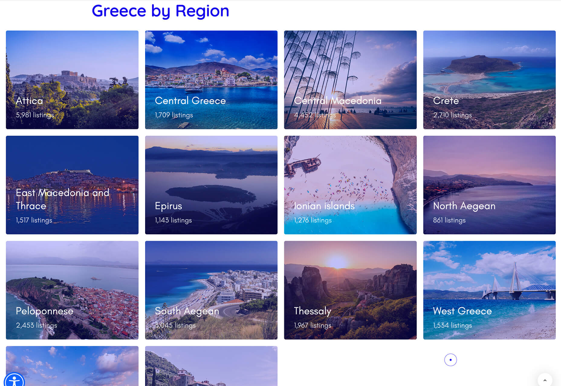
TraveledMap

TraveledMap allows you to create customizable maps thanks to the use of markers, routes, and photos, which you can share or add to your website or blog. This tool is made for travelers and tourism pros.

Glyph Neue Icons

Glyph Neue Icons is a collection of 1,500 icons in SVG and PNG format. (They are free with a link.) Icons come in plenty of categories and styles for all types of use.

Streamline Icons

Streamline Icons is a set of thousands of icons in 12 different styles and themes that you can use for projects. They work through the Streamline app or a plugin for Figma, Sketch, or Adobe XD.

Health Icons

Health Icons is a set of free, open-source health icons for personal or commercial projects. They include filled and outline styles that are editable. There are more than 800 icons in the collection.

OMG, SVG Favicons FTW!

OMG, SVG Favicons FTW! Is a look at the benefits of using SVG favicons in web projects. It also examines some of the challenges – such as browsers support – with code snippets to help you get started.

Aspect Ratio in CSS

Aspect Ratio in CSS explores a design concept we talk about a lot in other places, but not so much with CSS. This piece by Ahmad Shadeed takes a look at how you can go beyond the “padding hack” and use native aspect ratio support in CSS to maintain image height and width ratios in responsive design.

Fight Kick

Fight Kick is a bold font with a lot of personality. The free demo version has 249 characters and is for personal use only.

Glow Better

Glow Better is a beautiful premium typeface with a pair of options – a serif and script. Both contain letterforms with swashes and tails that are delightful.

Huggable Hedgehogs

Huggable Hedgehogs is a playful font that’s perfect for children’s projects. Everything has a mono-height in the all uppercase typeface.

Monice

Monice is a rounded sans serif with thick lines and high readability. It includes bold, regular, and italic styles with free (demo, personal) and commercial options.

Rustica

Rustica is a robust premium typeface with 20 styles and family options. It has slim curves and an easy-to-read character set that would work for almost any use. It also supports 219 languages.

Source

The post Exciting New Tools for Designers, July 2021 first appeared on Webdesigner Depot.


Source de l’article sur Webdesignerdepot

This month, you will either love or hate the featured design trends.

The common theme among them is a strong design element that can create distinct emotional connections. They range from interesting monotone color choices to brutalist examples to AI-inspired faces and design elements.

Here’s what’s trending in design this month.

1. Interesting Monotone Color Palettes

Monotone color palettes aren’t something that we usually call a trending design theme because mono patterns are almost always in style. What makes these monotone website designs interesting is color choice.

The trend is to use a pretty unconventional color choice for monotone color palettes. For example, would you start the design process thinking of an all-mauve, canary yellow, or purple aesthetic?

For most designers, those probably aren’t the first choices. But, conversely, the outcome of those decisions is rather stunning in each of the examples below, whether you love the color choices or not.

What works (and what might fall short) with each of these trending examples:

Wookmama: This mauve color scheme might be the first one you’ve encountered? It uses varying hues that are pretty in-your-face. It works because the concept behind the website is to create custom color schemes. The challenge lies in contrast and that there’s not a lot of distinction between hues in the mono scheme.

BBC Storyworks: The deep purple color palette with pinkish highlights is bright and readable, despite the dark background. White text and elements with smooth animation bring out the regality of the color choice. The challenge with this color is that purple often has strong emotional associations for individuals (good and bad), and you don’t know what “baggage” users might bring to the design.

Yellow Pony: This design is incredibly bright and has some brutalist undertones. What makes this color choice work is that it stops you in your tracks. You can’t help but look at the bright yellow and oddly-colored pony. The challenge, like with Wookmama, is contrast. There’s also a lot going on here with the bright color.


2. Fairly Brutal Black and White

Brutalism and brutalist design themes seem to keep ebbing and flowing. Understandably, it seems like, as a whole, designers can’t quite decide how they feel about this overall visual theme.

This trio of fairly brutal designs shares more than starkness in technique. They also feature distinct black and white color schemes and animation.

Put it all together, and the overall theme is maybe more “fairly brutal” than straight brutalist, re-emphasizing the hesitancy with the trend.

What’s nice about each of these designs is that they feel special and content-focused. This is a little in contrast with some other brutalist designs that are so stark and harsh that it can be hard to figure out what you are supposed to do with the website or what information is most important.

The other interesting thing here is that while all three websites have a similar design theme, they are nothing alike. (Personally, I find this type of brutalism and the included animation a lot easier to understand and digest. It uses the harsh feeling that you want to associate with the style but adds an element of comprehension that’s incredibly valuable.)

Callshop Radio uses an almost magazine theme style, block design with big buttons, a simple animation, and flash of color.

BCKDRP features a more subtle richer, almost black background with blocky type and accented color without the harshness often associated with brutal styles.

Vision Get Wild may be the closest to true brutalism, but the animated element in the center of the screen has a simple softness that lightens the entire feel.


3. Futuristic Faces

The final trending design element this month is a fun take on faces. There’s a movement happening with a futuristic or artificial intelligence/cyborg-inspired look to the people featured in the designs.

It’s hard to say where this design inspiration is coming from, but it is fun to look at with so many ways to play the style. The other commonality seems to be the dominant use of female faces.

These computer-generated images start with photos that are brightened and smoothed so that all imperfections are lost. The faces have no lines, color that might not look 100% natural, and enhanced features that may or may not be realistic.

You aren’t quite sure if you are looking at a face from a video game or image in many instances.

The types of websites that are using this design trend are similar in content and fashion, art, gaming, portfolios, and AI themes, among the most popular.

The true common thread is imagination. This type of design element can’t come to fruition without a strong vision and the ability to see the vision through creation.

These examples use progressively more futuristic variations of the trend:

HueLe Museum: The least AI-looking of the examples, has imagery with super bright light on faces to remove lines and imperfections so that the models almost the look of mannequins.

Jenny Lin: The portfolio design shows the designer in a style representing her work with a headshot that features an augmented reality, or digital design feel with an almost plastic-looking, on-the-verge of cartoon style.

Ruby9100m: The imagery here is full-on futuristic. From coloring to facial features to an almost Frankenstein-pieced-together look, nothing about this image insists on reality. (Did you notice the blue hand?)


Conclusion

This month’s design trends are a lesson in experimentation and evolution of other visual concepts. They also create an immediate impact on you in terms of emotion because of strong design choices.

Trends like these tend to come and go quickly; nevertheless, it will be interesting to see how they evolve.

Source

The post 3 Essential Design Trends, July 2021 first appeared on Webdesigner Depot.


Source de l’article sur Webdesignerdepot

Inclusive design is often mistaken for accessibility, or even used as an interchangeable term, which is a good indication that most designers don’t know what it means.

Accessibility is a process that seeks to mitigate issues in a design that is not sufficiently universal; inclusive design increases the universality of the design. In real-world terms, an accessible building may replace its front steps with a ramp; an inclusive building is constructed at the same level as the sidewalk.

Accessibility is concerned with objective, measurable improvements. It’s a UI concern. Inclusive design is subjective, more difficult to measure, and is a UX concern. By designing inclusively, we extend our designs to the widest possible user group and contribute to a better society. Here are three ways to get started.

1. You’re the Edge Case

When designing, it’s normal to assume that we are normal. After all, we are the center of our experience of the world. Everything from our preferences to our empathy stems from our individual place in time and space.

When we use the term “edge case,” what we’re referring to is a minority experience, a way of using our design that is uncommon or distinct from our own expectations.

But what would happen if we treat ourselves as the edge case? What if all of the experiences that we deem to be minority experiences are actually the core, common user experience of our design?

If we start from the position that we are the one out-of-step with the design, that most people will not think or act as we do, then we’re eliminating thousands of biased decisions about how our design should be.

Draw From Life

It has always surprised me that in Europe’s dark ages — ranging from the decline of the Roman empire to the Proto-Renaissance — it didn’t occur to anyone to draw from life. Artists drew things the way they thought they should look, which is why so many Byzantine icons of the infant Jesus look like a middle-aged blonde man that has been shrunk.

It’s important to draw from real life as much as possible. That means abandoning personas — which are by definition under-representative and frequently loaded with bias — and engaging with actual users. Most of all, it means taking a step back and opening your eyes.

2. Stop Making Inclusive Design Part of Your Practice

Inclusive design cannot be a part of your practice; it’s an all-encompassing attitude. Your design practice must be inclusive. At least, it should aspire to be…

As human beings, we are biased—all of us. The reason for that is that bias — be it racism, misogyny, nationalism, homophobia, or anything else — is cultural. And we all exist within society. We’re all bombarded with information that reinforces those biases every day.

Accept that you have biases and that your biases will pull your design work away from the inclusive solution you aspire to. But equally, accept that by acknowledging your biases you’re limiting the influence they have over your decision-making.

Do Not Require Users to Self-Identify

It’s divisive and abusive to partition users into groups, especially when the act of doing so perpetuates bias.

One of the most encouraging developments of the last decade has been the introduction of the answer “prefer not to say” in response to personal questions about race, gender, status, and so forth. But if “prefer not to say” is a valid option, in other words if you don’t actually need to know, then why ask at all?

Beware Occam’s Razor

Occam’s Razor is an often misquoted idea that (to paraphrase) states that when making a decision, the one with the least assumptions is the correct choice.

The problem is that Occam’s Razor implies that there is a ‘correct’ decision. But in fact, inclusive design benefits most from a flexible UI and a high tolerance for deviation.

If you can identify the assumptions in a design decision sufficiently to count them, then you’re best served by testing, not comparing, those assumptions.

3. Design Flexibility Into Everything

There is no such thing as a “natural normal,” but there is “perceived normal.” Much of our behavior is governed by the experiences we’ve had since we were very young. Despite existing somewhere on a scale of ability and preference, most of us have inched towards what we have been told is a “normal” range all our lives.

However, it is a physiological fact that every characteristic exists somewhere on a spectrum. There are no black and whites; it’s all grey.

When we design a site or app, we tend to silo certain characteristics into one. Someone who is visually impaired is treated to the same ‘solution’ as someone who is blind, even though visual impairment can range from screen reflections on a sunny day to someone who was born without optic nerves.

There are people who have lost their sight through degeneration or accident and will be able to make visual connections based on remembered visuals. Other people have never seen anything and their conscious mental process isn’t figurative at all.

To accommodate the full gamut of possible interactions with our design, we need to design to a scale, not with absolute values. This means thinking less about set colors and sizes and more in terms of contrast and scale.

Avoid Communicating in Color

Few areas are more indicative of a spectrum of experiences than color.

Color is instantly problematic for designers because quite apart from color blindness, color has deeply personal associations.

Over the last couple of decades, it’s been repeatedly proven that it is contrast, not hue, that increases engagement. Green does not always mean go; red does not always mean stop.

Color involves so many biases and assumptions that it’s simply better to work with contrast than select the ‘right’ hue.

Bigger Typography (Sometimes)

In the first draft of this article, I wrote that increasing the scale of your typography was always good.

My rationale was that some users will benefit from larger type, and zero users will be hindered by it. But that’s not true. Larger type means fewer lines per viewport, which means more scrolling; not a problem for some users, but potentially an issue for those with motor control issues.

That was one of my biases right there.

Congratulations, You’re Now An Inclusive Designer

Good design is self-aware in origin and unselfconscious in execution.

Inclusive design isn’t about enabling access for everyone; it’s about designing for a user experience that is welcoming and respectful. Every one of your users should feel not just enabled but validated.

Inclusive design isn’t a series of items on a checklist; it’s an ideal, like harmony or beauty, that we may struggle to achieve but that we should strive for nonetheless.


Image via Pexels.

Source

The post 3 Ways to Design More Inclusively first appeared on Webdesigner Depot.


Source de l’article sur Webdesignerdepot

Does it ever cross your mind that praise can be negative? I guess not. After all, it looks harmless and seems to be quite effective. Conventional wisdom says that if you praise people, they are motivated to do better.
People who have been praised throughout their life by their well-meaning parents, friends, and teachers for their talent and smartness or those who have experienced extreme focus on talent and smartness throughout their childhood learn to value only intelligence. No wonder when these people enter the workforce, they continue to seek approval and demand praise every step of the way.
Every opportunity is a measure of their intelligence — do I look smart, how will I be judged, what if others find my ideas dumb. With a single-minded focus on validating themselves, all their actions are rooted in establishing their worth. Every mistake hurts their reputation and every failure is a reflection of their competence. They care less about learning and more about proving themselves. Their sense of morality sometimes takes a hit as they resort to brutal behaviors — demeaning others by yelling, insulting, controlling, or taking undue credit — all in an attempt to boost their self-esteem.
Carol Dweck, professor of Psychology at Stanford University summarised this unfortunate reality from Morgan McCall’s book High Flyers:

People often like the things that work against their growth. . . . People like to use their strengths . . . to achieve quick, dramatic results, even if . . . they aren’t developing the new skills they will need later on. People like to believe they are as good as everyone says . . . and not take their weaknesses as seriously as they might. People don’t like to hear bad news or get criticism. . . . There is tremendous risk . . . in leaving what one does well to attempt to master something new.

What Do Organizations Do with Such People?

They feed and promote this mindset. They praise people for their brilliant ideas conveying the message “we value talent and smartness.” They shower people with rewards and bonuses for their achievements communicating to everyone else around “all we care about is success.”
What happens when these people take on a leadership role? Their mindset of valuing brilliance above everything else amplifies leading to disastrous results. History is full of leadership fiascos with great promises that turned out to be the biggest disasters. This article from Malcolm Gladwell in The New Yorker is as valid now as it was 18 years ago. Describing the talent mindset at Enron and the consultants at McKinsey who wandered the hallways at the company’s headquarters, he points out “They were there looking for people who had the talent to think outside the box. It never occurred to them that, if everyone had to think outside the box, maybe it was the box that needed fixing.”
He also talks about the impact of an environment that values innate talent and what happens when times get tough and that self-image is threatened “They have difficulty with the consequences. They will not take the remedial course. They will not stand up to investors and the public and admit that they were wrong. They’d sooner lie.”
Really, is praising people for their intelligence and achievements the only way to develop people who will be the leaders of tomorrow? Is there a better way out?
What if we praised people for their hard work, for their ability to persist despite failures and setbacks, for taking initiatives to build new skills, for standing up to their mistakes, for believing in their growth, and implementing the right strategies to overcome their shortcomings. What does this kind of praise tell them?
It tells them the value of effort in building abilities. It teaches them the importance of implementing the right strategies to solve problems. It encourages them to seek help to make progress on their task. It creates a passion for learning that’s not driven by the need to look smart, but with a desire to cultivate skills, to stretch themselves to grow.
When these people take on leadership positions, this mindset guides them to put the well-being of the company and its people before their own needs, to place value on teamwork over individual accomplishment, and to foster growth and development of their people.

As growth-minded leaders, they start with a belief in human potential and development — both their own and other people’s. Instead of using the company as a vehicle for their greatness, they use it as an engine of growth — for themselves, the employees, and the company as a whole.
– Carol Dweck

Unlike leaders who pull their companies down with their focus on brilliance, these leaders lead their companies into greatness and gratitude filled in their own hearts and those of the people around them.
Choose your praise carefully as you will see the tremendous benefits in praising for growth over brilliance.

When Leaders Focus on Brilliance

They live in a world of personal greatness and entitlement, vie for labels, and will do anything to boost their image. Instead of building a long-lasting company, they spend time and money on enhancing their image.
With the constant need for validation, they use people in the company to feed their egos and showcase their superiority. Everything is about pleasing the boss. They surround themselves with people who boost their self-esteem. Agreement earns them admiration and disagreement is an attack on their intelligence. Instead of hearing people out, they punish dissent and shut people down.
They pounce at the less talented for their lack of intelligence and find those who are more talented than they are as threatening. They mistreat employees, yell, insult, control and abuse them into their way of doing things. They feel better about themselves by making other people feel worse. Employees worry about being judged all the time. When people are ridiculed for mistakes, they soon learn to keep their heads down, stop putting their critical thinking skills to use, and give in to groupthink.
Their belief in their superiority blinds them to see reality. They turn a blind eye to complaints, ignore warning signs, and fire people who tell them what they don’t want to hear. Their decision-making criteria are based on what would make them look good as opposed to what’s good for the company long term.

What happens when a leader refuses to confront the brutal facts? “The minute a leader allows himself to become the primary reality people worry about, rather than reality being the primary reality, you have a recipe for mediocrity, or worse. This is one of the key reasons why less charismatic leaders often produce better long-term results than their more charismatic counterparts.
– Jim Collins

Since success and failure are a part of their identity — success means they are smart and failure means they are not — they find excuses and blame others for failures instead of taking personal responsibility. Instead of investing in the future growth of their company, they play safe with fear of failure, become less responsive to challenges from competition, go with what’s tried and tested, and refuse to take risks. Why take up the challenge that can hurt their reputation? On the other extreme, they may not shy away from crossing ethical boundaries to beat the competition at all costs. Success is what they are after and it doesn’t matter how they get it.
With more focus on talent and less on potential, they do not invest in mentoring and coaching employees. Instead of putting practices in place to develop employees and help them collaborate together, they make them compete against each other.
Carol Dweck sums up their brilliant mindset “My genius not only defines and validates me. It defines and validates the company. It is what creates value. My genius is profit. Wow!”

When Leaders Focus on Growth

They operate with a learning mode. They don’t claim to be genius but promise to invest in development, their own development, and the development of their people. The drive and enthusiasm to grow their companies make them adopt long-term strategies over short-term tactics. They aren’t in the game to boost their ego or establish their self-esteem. It’s the pure joy of shaping the future of their company that excites and motivates them. More than prestige, they are in it for the challenge.
They understand that the path to success goes through failure. Why lose the opportunity that can drive their future growth? So instead of hiding behind their failures, they face them head-on. Failures don’t define their competence, they are glaring moments of self-reflection. They are opportunities to build skills, explore possibilities, experiment, and invest in the promise of a better future.
They lead with vulnerability. They accept mistakes to shift the focus in the organization from hiding mistakes to finding solutions. When they don’t know something, instead of pretending to hide their ignorance, they say “I don’t know”. These three powerful words show humility and self-confidence. To make decisions, they invite others to share their opinion which promotes the culture of constructive criticism. Since they do not connect their identity to their opinion, more value is placed on seeking the right answers which require open disagreements and championing flexibility of opinion over their sense of righteousness.
Difficult situations make them uncomfortable, no doubt. Instead of letting their discomfort get in the way of meaningful conversations, they embrace it. They choose to look past their discomfort in the value that these discussions provide — saving a lot of time that can be wasted due to stress and anxiety that comes from misalignment of expectations and lack of clarity of purpose.
They are tough but compassionate. They do not shy away from giving critical feedback while also challenging the people in their organization to step outside their comfort zone. They empower people to make decisions with the right channels of feedback to assist in better decision-making in the organization.
Leaders with the growth mindset operate with what Lou Gerstner, who turned IBM’s fortunes around by saving it from near bankruptcy said “Hierarchy means very little to me. Let’s put together in meetings the people who can help solve a problem, regardless of position.” Not blinded by reality, they focus on finding solutions that will push their company forward. This requires keeping an open eye to change in market trends, identifying and investing in future growth areas, and taking calculated risks.
With a focus on potential and growth, they invest in identifying and building future skills of the organization — skills that will be useful during difficult circumstances giving them an advantage over the competition. They foster productivity through coaching and mentoring, place value on teamwork by encouraging collaboration and defining shared measures of success.
Warren Bennis, a scholar, author, and widely regarded as a pioneer of the contemporary field of Leadership studies, writes in Organizing Genius:

Leaders are people who believe so passionately that they can seduce other people into sharing their dream.

His most admirable view on leadership says:

Good leaders make people feel that they’re at the very heart of things, not at the periphery. Everyone feels that he or she makes a difference to the success of the organisation. When that happens people feel centred and that gives their work meaning.

What kind of leaders think like this — those focused on brilliance or the ones driven by growth?
Previously published here.

Source de l’article sur DZONE

User experience design is something that most of us associate with websites. But why isn’t it something we extend beyond the website?

Here’s why I ask this:

As a consumer, it’s so rare that your only interaction with a brand is through its website. Take an ecommerce site, for example. You buy a product from it, and then what happens?

  • You get a confirmation email;
  • You get another email when the package ships;
  • You might get another email or SMS notification when the package is delivered;
  • You retrieve the package and open it;
  • You open up your purchase and use it.

These are all an extension of that initial user experience on the site. If there’s just one hiccup along the way, it could easily erode the trust and happiness you felt after quickly finding and buying what you needed on the site.

So, what I’d like to do today is look at 10 areas where UX design should extend beyond the website to ensure that the frictionless experience started there remains untarnished.

Extending UX Design Beyond the Website

As a web designer, you might be thinking that this part of the user experience doesn’t fall under the umbrella of your responsibilities. And you may be right about that.

For brands to truly be successful and profitable, someone needs to carefully examine the bigger picture and ensure that the user experience is flawless no matter how far away from the site it is. At the very least, you should share the UX research and strategy you do for a client’s site so their team can ensure it carries over to other areas of the business.

Here are some things to think about:

1. Mobile App

It’s not uncommon for websites to have mobile app counterparts these days. The layout doesn’t need to be identical since mobile users tend to behave differently than those on desktop.

That said, an app shouldn’t force users accustomed to the desktop experience to re-learn how to navigate or engage with the brand. So, the branding, UI design, speed, security, and navigation all need to be on par with what’s already been established in terms of usability.

2. Email

Most websites have a direct connection to email. For example, blog newsletters, purchase confirmation emails, and lead generation follow-ups all start on the website.

Consumers are well aware that when they hand over their email address, they will receive an email in return. In many cases, those emails are welcomed when they’re done right. But if something feels off, that bridge could easily burn between brand and consumer.

To preserve the UX, emails should come with the following:

  • The same branding and visual style as the website;
  • A personalized subject line, greeting, or offer;
  • Consistent messaging as the site, especially when it comes to the CTA.

Another thing to remember is that email isn’t the time to inject dark patterns into the experience. So, the “Unsubscribe” option should be in an easy-to-spot area and a sharply contrasting font color.

3. Social Media

Social media is another channel that’s commonly connected to a website. While you can’t control the aesthetics of social media websites themselves, the visuals and messaging in posts need to be on-brand.

That means that things like memes and emojis — which are popular means of communication on social — should only be used if they’re normally part of the brand identity. If not, you’ll need to find other ways to communicate engagingly.

Another part of the user experience to think about is customer support. Social media is a lot like going into a store. If someone has an issue with what they bought or the service they received, there will be many people around to witness the complaint. Social media only amplifies that — so the quality of customer care needs to be consistent with how the brand handles it everywhere else.

4. SMS

Not every brand will need to be connected to customers via text messaging. eCommerce companies, news sites, and personal services providers likely will, though.

However a brand uses SMS, the same UX guidelines apply here as they do across all other channels:

  • Keep messages concise;
  • Make sure they’re relevant and valuable;
  • Use branded messaging and design;
  • Don’t abuse the privilege and send too many;
  • Make it easy to opt out.

Basically, if you can’t make it a valuable extension of the brand’s offering, don’t use it.

5. Phone

Any website that publishes its phone number should expect to receive calls from prospects and customers. While there’s nothing to design here visually, the experience of getting on the phone with a company should be consistent with what they experience elsewhere.

One way to do this is to design an easy-to-follow routing system. It should be simple for callers to figure out which number to choose. What’s more, there should be no endless loops. If a caller has exhausted the options, they should be immediately directed to a representative.

Another way to ensure consistency is to adhere to a script — that goes for call centers for enterprises as well as the local lawyer’s office. Every caller should be greeted with the same tone and handled in the same manner (depending on the situation, of course).

6. Ads

There are a lot of places where brands can advertise these days:

  • Google search;
  • Social media;
  • Ad networks;
  • TV;
  • Radio;
  • Podcasts;
  • Blogs;
  • Billboards;
  • Direct mail.

When designing an ad campaign, there should be consistent messaging, aesthetics (when relevant), and CTAs presented. If branding isn’t consistent from ad to ad, there may be a delay in consumers recognizing the brand or its offer. Or, worse, not recognizing it at all.

7. Packaging

For brands that sell products, you have to think about how the packaging will impact the user experience. There are two types of packages to consider, too.

The first is the product’s own packaging. Branding should be clear as day and consistent with the site they bought it from.

It should also be easy to open. There’s nothing more frustrating than finally getting your purchase, only to realize you need tools to get it out of the packaging.

You also have to think about packaging for products that get shipped.

The product should fit well within the packaging. A too-roomy package will feel downright wasteful. So will excessive bubble wrap and paper filler.

Having a shipping label present in the package is also important. If the website makes it easy to make a purchase, the package should offer a convenient way to return the product if they’re not happy.

8. Product

The product itself has to align with the expectations set by the website.

Take the example of a SaaS. You’ve built an awesome landing page and mobile app store page to promote it. It looks great, it loads fast, and it’s easy to get around. But if the SaaS itself is ugly, disorganized, slow, or otherwise just clunky, all of the work you did to market it will end up being just false advertising.

So, make sure the expectations set before and during purchase naturally carry over to the experience with the product.

9. Business Exterior

For brick-and-mortar companies, the business’s exterior matters just as much as what happens inside it.

The most obvious thing to focus on is the aesthetics of the building. Does it look attractive? Is it in a safe area? Is there clear signage around it? Is it easy to find?

But you also have to think about user experiences that take place outside of the building. For example, there’s now a rise in curbside pickup. There are tons of things that can affect how happy the customer is with the experience — like if the pickup area is hard to find, there are never enough spots or the associates who deliver the orders always seem to be in a foul mood.

The business’s exterior should always set a good impression for what takes place inside.

10. Business Interior

Here are some things to think about when it comes to “designing” business interiors for a good UX:

  • Decor;
  • Layout;
  • Signage;
  • Furnishings;
  • Product discoverability;
  • Availability (of products or people);
  • Quality of customer service;
  • Checkout process.

It doesn’t matter what the company does — whether it’s a large retailer like Walmart or your own freelance design business. If a business’s establishment doesn’t look good, operate flawlessly, or provide a good person-to-person experience, it’s going to be very hard to get people to return.

So, all those things you do to design a streamlined website journey should be applied to a bricks-and-mortar business’s interior.

Wrapping Up

Depending on the types of companies you build sites for, some of the channels and suggestions above might not be relevant. Hopefully, this has got you thinking about other ways you (and your clients) can extend the UX design and strategy from the website.

If you can maintain the high-quality user experience from channel to channel, your clients’ brands will get more business, grow their profitability, and see a rise in loyalty, too.


Featured image via Pexels.

Source

The post UX Design Doesn’t End With Your Website first appeared on Webdesigner Depot.


Source de l’article sur Webdesignerdepot

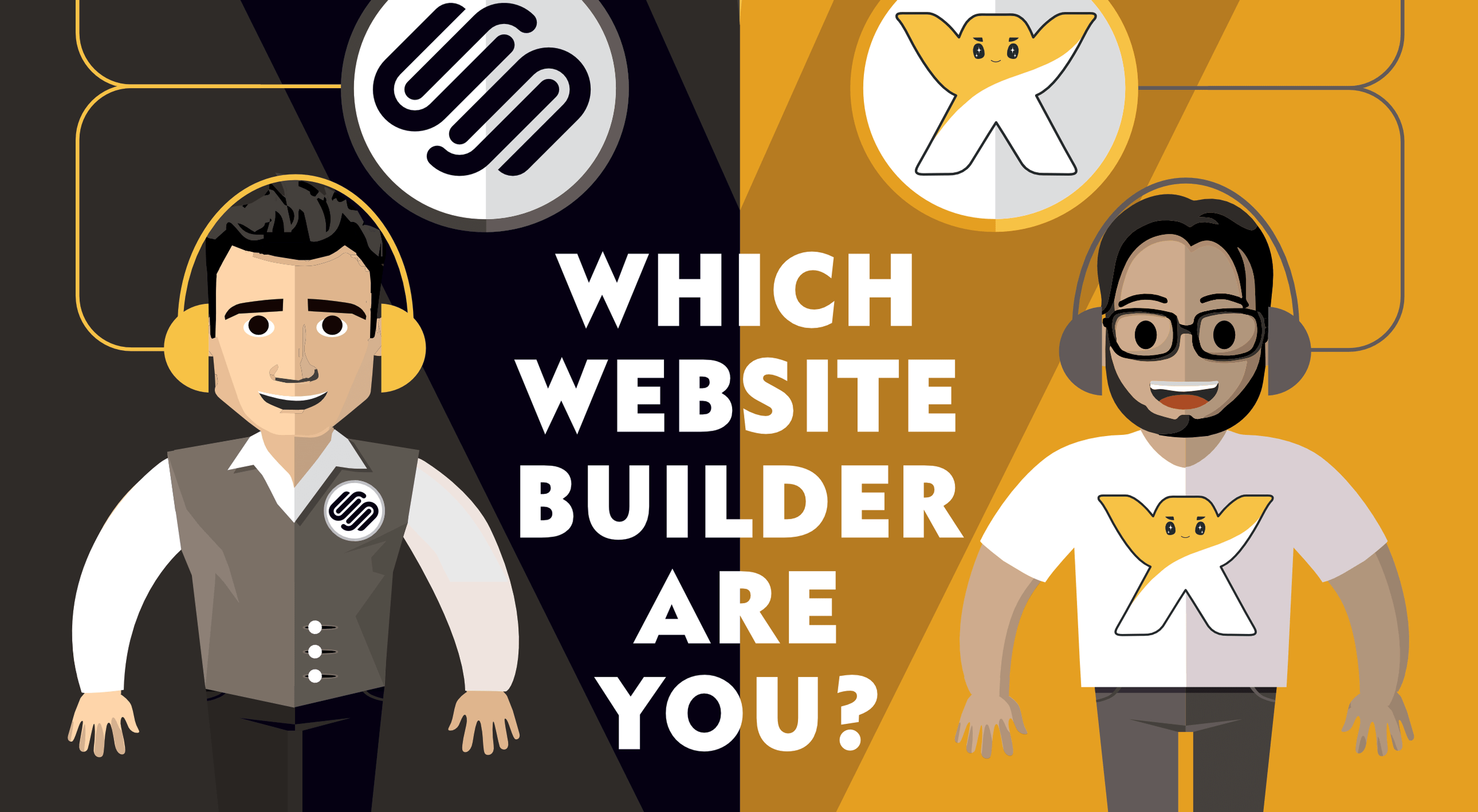
Are you thinking of building a website with a site builder but find yourself confused by the dizzying array of options? Well, puzzle no more because we’ve put together this great infographic to cut to the heart of the question: Which is better for you, Squarespace or Wix?

Each of these site-building giants is ideal for a particular type of person, but which is best suited to your next project? Do you need total creative freedom? How about a large amount of bandwidth to share content? Would you like to rely on AI? Or, is ecommerce the most important thing for you?

Check out our infographic to determine which one of these options is right for you.

Source

The post Infographic: Squarespace Vs Wix first appeared on Webdesigner Depot.


Source de l’article sur Webdesignerdepot

Sometimes you just don’t give a damn anymore. Possibly the only thing worse than designer’s block is designer’s apathy: that sinking feeling you get when you realize that you just don’t care about this particular piece of work anymore is disheartening.

The dread of going back to it is paralyzing.

There are many reasons you can stop caring about your work. Maybe you’ve just done the same thing too many times in a row. Maybe your client is insisting on asking for things you know won’t work for them. Maybe something much more important just happened in your life, and you’ve got bigger things to worry about. You could be discouraged by the apparent ‘sameness’ of bandwagon-hopping designs.

I’ve been not caring about my work ever since I was first asked to pick up my toys

Whatever the reason, we all experience times when we know exactly what we have to do… we just don’t care.

I’m something of an expert on this phenomenon. I’ve been not caring about my work ever since I was first asked to pick up my toys. Worse, I have the attention span of a goldfish, even now.

Web design is different. When I discovered it, it was new, exciting, and I could do it on the computer. I loved it, and I still do. Writing code that makes design happen in a browser window will never get old for me.

But even so, sometimes, a particular project will make me want to throw up my hands in exasperation and play video games ‘til Judgement Day. I’d welcome Skynet with tacos and RPGs.

So what do we do about it? First, answer this question: who is the project for?

For A Client

If the project is for a client, it’s just gotta get done. There’s no way around that. You made a commitment. You’re going to follow through and give it your best possible effort because you’re a professional. Anything less would be wrong.

However, that doesn’t mean you have to just power through with only coffee and misery for company. There are things you can do to make the work easier on yourself. The less miserable you are while you work, the better quality you can deliver.

For Yourself

There are a couple of schools of thought here. The first is that it’s perfectly fine to give up on personal projects when you stop caring. I mean, it’s your free time. Why spend it on something you don’t care about?

On the other hand, is a commitment made to yourself any less important than a commitment made to someone else? Many people seem to be perfectly fine with breaking promises to themselves when they’d never willingly do that to a client. Is that wrong?

I usually buy myself a drink and forgive myself, but it’s worth thinking about.

The deciding factor for me is whether my personal project will have any sort of lasting benefit. If whatever I’m designing, writing, or making counts as a long-term investment in my career or quality of life, then it absolutely has to get done, even when I’m not feeling it. Otherwise, I call it a learning experience and move on.

How To Power Through

So, for whatever reason — whether because you have to, or you want to — you’re gonna power through. Here are five ways to do it in style:

1. Start

The hardest part of doing work you don’t care about is starting. This is when you’ll be tempted to procrastinate until the last minute. Try not to.

2. Switch To A Different Part Of The Project

If you can safely (without causing problems) work on a different aspect of the project for a while, try that. The mere variety, the break from the work in front of you before, can boost your morale.

Indeed, working on a different part of the project can give you ideas of getting the most troubling bits done faster or more easily.

3. Do Something Old In A New Way

This one has its pros and cons.

Pro: You can look at this project as a chance to try out a new grid framework, script, code editor, or another tool of some kind. Injecting the process of discovery into an otherwise boring project can make it a lot more fun and even make you look forward to working on it.

Con: You’ll need to plan for extra hours and use some version control; because bringing a new tool or process into play is almost guaranteed to make something interesting go wrong — when this happens, you probably shouldn’t bill the client for the extra hours spent on StackOverflow.

4) Make Like Aziz Ansari And Treat Yo’self

Celebrate the milestones of your project. Don’t celebrate with video games if you need to get any more work done that day. That can go very wrong. But do celebrate. Reward yourself because you’re doing something difficult.

Have a snack. Give yourself a round of applause. Whatever it takes, make yourself look forward.

5) Outsource It

As a last resort, you can always outsource the project to someone else. Just make sure it’s someone you can trust to deliver the same quality of work you would normally provide yourself. Make sure to check it over before handing it off to a client.

Alternatively, you could just outsource the bits of the work that you don’t like. Either way, this is a risky strategy because whoever you outsource to might experience delays or, ironically, not care about the project.

Conclusion

You can do it! I believe in you. The really, really boring projects can seem like huge sinkholes of sadness, but they don’t last forever.


Featured image via Pexels.

Source

The post How To Power Through Designer Apathy first appeared on Webdesigner Depot.


Source de l’article sur Webdesignerdepot

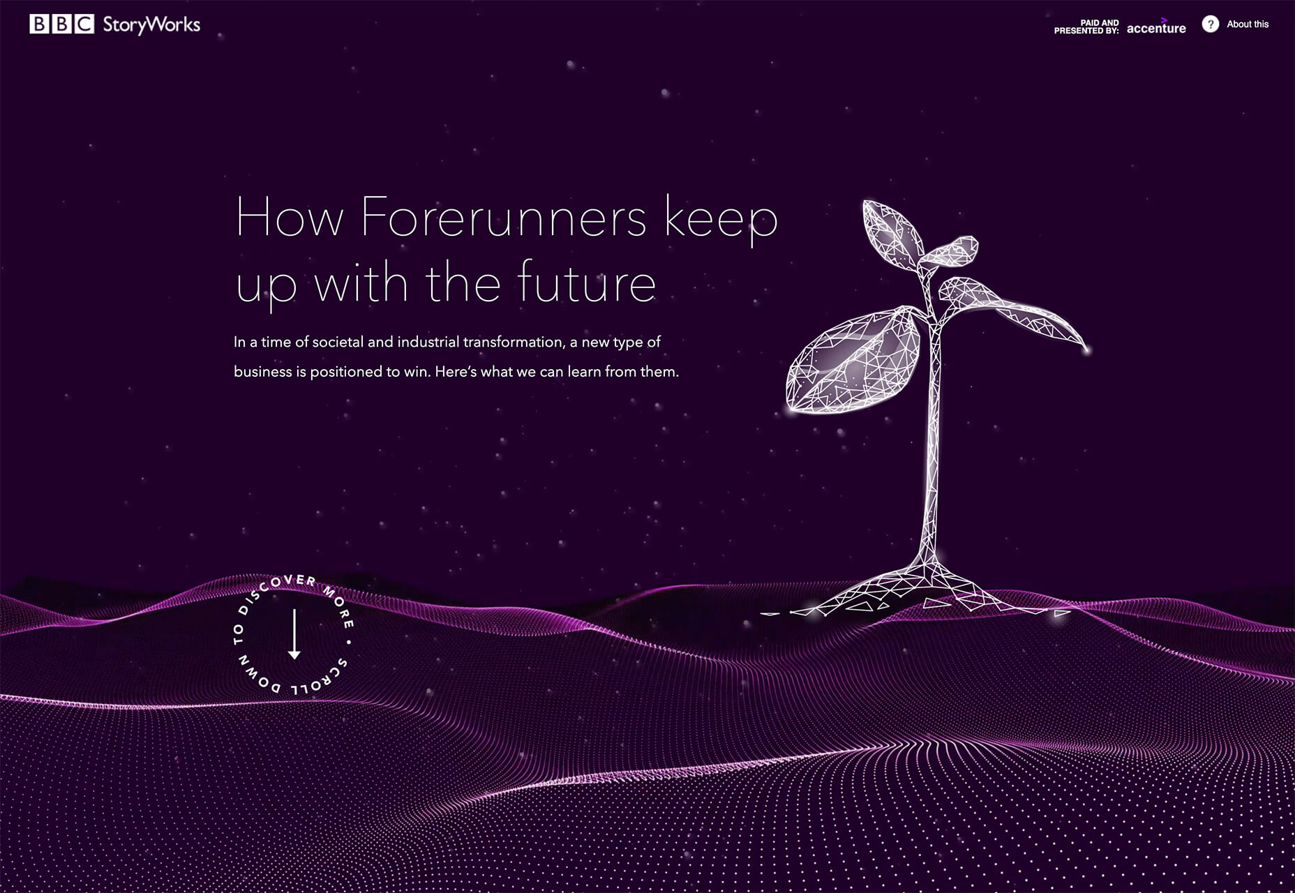
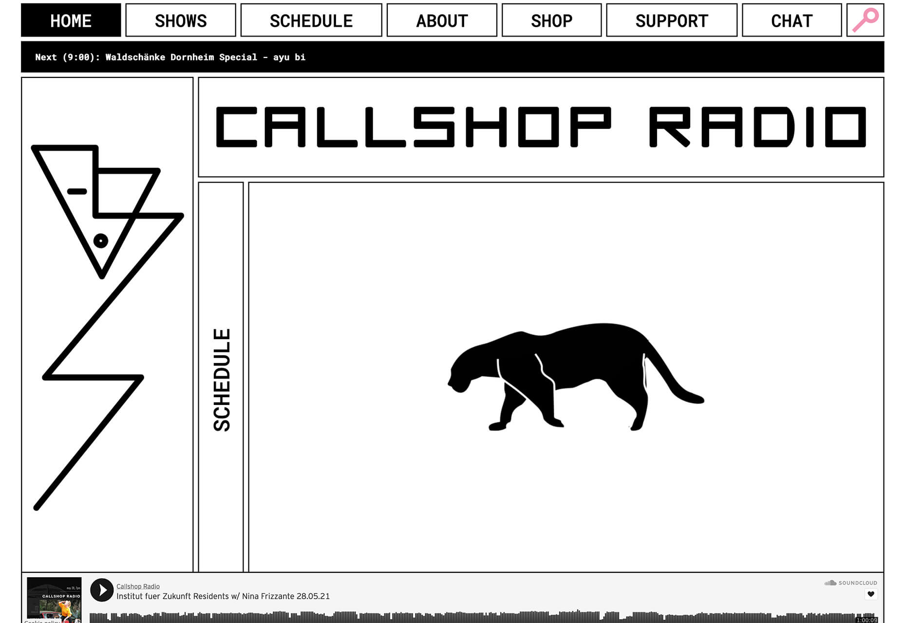
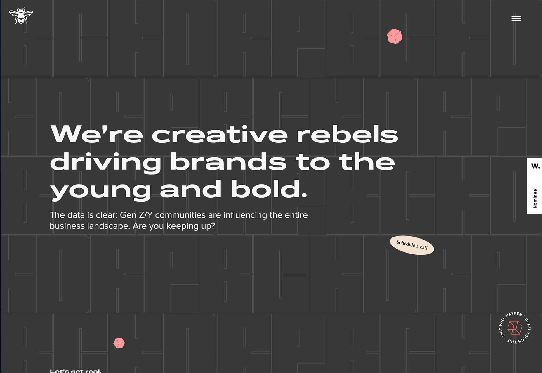
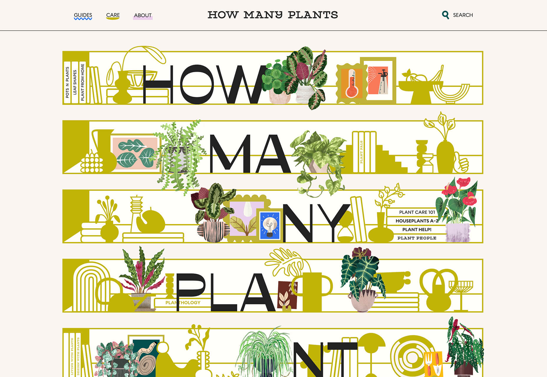
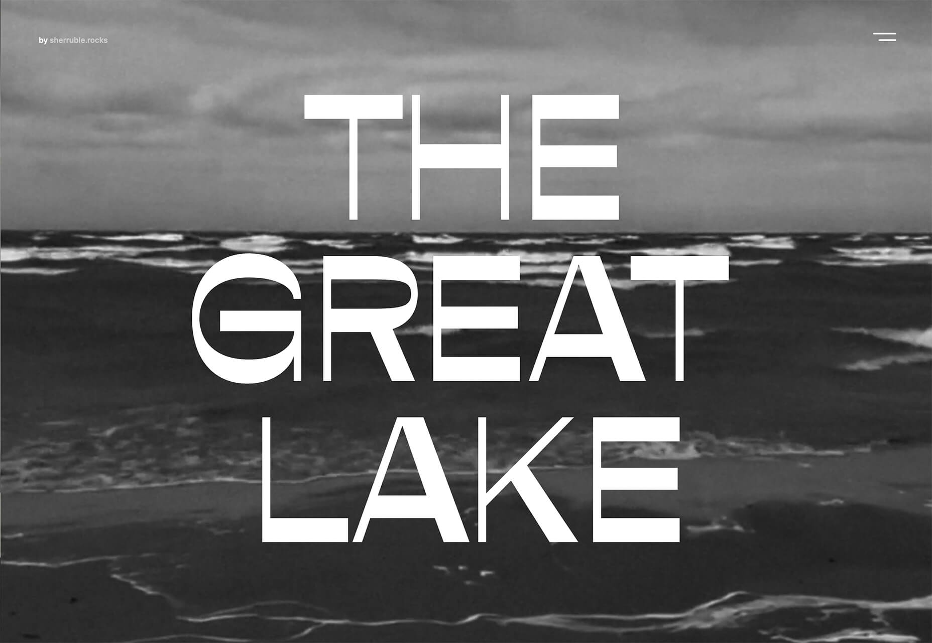
Spring and fresh designs are in the air. This month, it’s obvious that designers are feeling creative with new and interesting concepts that range from a new style for cards, homepage experimentation with multiple entry points or calls to action, and risky typography options.

Here’s what’s trending in design this month.

1. “Flat” Cards

Card-style design elements that allow users to click through to other content aren’t new, but the design of these cards is fresh and interesting.

Rather than more heavily designed cards with shadows and layers of content, flat styles are trending. Expect this trend to explode thanks to usage by Google for a shopping experience page.

The Google example below is interesting because Google’s Material Design guidelines are what helped card-style elements grow in popularity previously. However, those cards did include more layers, color options, buttons inside the cards, and shadows.

Today’s trending cards are completely flat. And beautiful.

Each of these websites does it in a slightly different way.

Heartcore, a consumer technology VC company, uses a series of flat cards as a navigation element to help users find their way through the website. Each features a bright color background with an illustration and a simple text block.

Each card has a nice hover state where only the illustration zooms inside the card frame. This is an interesting effect because it is exactly the opposite of the previous iteration of cards, which zoomed the entire card as a hover state.

Google Shopping uses that whole card bounce hover state (plus a not-so-flat shadow) for each card. The initial design is sleek with the pairing of white and image cards with simple text in each. You are enticed to click around to see what happens.

Click on Greece is a travel website design that uses simple cards with a minimal color and text overlay. The consistency of these cards makes the design pop and the beauty of the images draw you in. Each card also has a hover state with a darker color mask to guide navigation and make text elements easier to read.

2. Multiple Homepage Entry Points

For a long time, designers have been working off the philosophy that the homepage should have one direct entry point, creating a direct funnel for the user experience.

These designs throw that idea out the window, with multiple entry points and click elements.

You can think of it as the “create your own adventure” option for these designs.

It can be a risky concept if you are diving into analytics to pay attention to user paths. You want to make sure you know what choices users are making so that you can help them on the journey to the content and information that you want them to get from the visit.

But this type of design scheme does feel somewhat personalized, putting the user in more control.

Parcouse Epicuriens uses three flat card-style elements to help users pick what they want to see from the home page. There’s no other button or direct call to action, which is somewhat uncommon in today’s website design landscape. Users have to pick from one of the cards, scroll, or enter using the hamburger menu icon.

Tasty Find uses search options to help users start their journey. What’s interesting here are the choices – search for the food you want, pick something random, or (in the small print) find even more options. Users get three choices to begin their journey with the website.

What’s interesting is how simple this complex user journey looks. The design is easy to digest, but so many options could overwhelm users. This is one of those situations where you have to watch return search data and information and weigh the risk versus the reward of so much choice. It’ll be interesting to watch this design over time and see if the options decrease in number.

Accord also has several levels of user engagement opportunity. Option 1: Every block contains a click element. Option 2: Use the search at the top to narrow choices. This is an interesting configuration as the homepage for an e-commerce website because they get right to product selection and shopping without a softer sell or introduction.

3. Risky Typography

Typographic risk has been an ongoing theme for a little while. Designers are embracing experimental and novelty typefaces to stand out in the cluttered website space. Sometimes it works beautifully, and other times, it can fall short.

Here, each of these trending website designs uses a risky typography treatment. The risks are a little different for each design, from readability to comprehension to font delivery.

How Many Plants has duel typography risks: A funky typeface paired with odd word breaks. Interestingly enough, readability isn’t as big of a concern as you might think. This is likely because there aren’t many words, and they are short. Plus, the imagery ties in nicely.

Do you notice a similarity between How Many Plants and The Great Lake? The typography has the same style with a blocky, slab, sans serif with alternating thick and thin strokes. (It’s the same font.)

The risk in the typography design for The Great Lake isn’t in the homepage display, although you might wonder what the design is about. It is carrying this font throughout the design. While it looks great large and with only a few words, it gets a little more difficult the more you see it. This type of mental reading weight can be difficult for visitors over time, creating an element of risk.

Zmaslo uses an interesting typeface with a liquid effect on top of an unusual word. That combination of text elements makes you think hard to read the homepage, despite its neat looks. The risk here is weighing visual interest against comprehension. Depending on the audience, this risk can be worth the chance.

Conclusion

Spring always seems to be that time of year where designers start thinking about new, fresh design elements. That might explain some of the “riskier” design choices and experimentation here.

Regardless of the motivation, it is always fun to see the creative stretch happen. It can be even more interesting to see what elements from these trends continue to grow in the coming months.

Source

The post 3 Essential Design Trends, May 2021 first appeared on Webdesigner Depot.


Source de l’article sur Webdesignerdepot

In this post, you will learn how to execute penetration tests with OWASP Zed Attack Proxy (ZAP). ZAP is a free web app scanner which can be used for security testing purposes.

1. Introduction

When you are developing an application, security must be addressed. It cannot be ignored anymore nowadays. Security must be taken into account starting from initial development and not thinking about it when you want to deploy to production for the first time. Often you will notice that adding security to your application at a later stage in development, will take a lot of time. It is better to take security into account from the beginning, this will save you from some painful headaches. You probably have some security experts inside of your company, so let them participate from the start when a new application needs to be developed. Nevertheless, you will also need to verify whether your developed application is secure. Penetration tests can help you with that. OWASP Zed Attack Proxy (ZAP) is a tool which can help you execute penetration tests for your application. In this post, you will learn how to setup ZAP and execute tests with the desktop client of ZAP. You will also need a preferably vulnerable application. For this purposes, Webgoat of OWASP will be used. In case you do not know what Webgoat is, you can read a previous post first. It might be a little bit outdated because Webgoat has been improved since then, but it will give you a good impression of what Webgoat is. It is advised to disconnect from the internet when using Webgoat because it may expose your machine to attacks.

Source de l’article sur DZONE

Ten years ago, people began talking about the “Independent Web.” Although we don’t commonly use the term anymore, that doesn’t mean that it’s not still as vital a topic of discussion today as it was a decade ago.

Today, I want to look at where the term came from, what it refers to today, and why it’s something that all of us in business, marketing, and web design should be thinking about.

What Is The Independent Web?

The Independent Web is a term that was coined back in 2010 by John Battelle.

In “Identity and The Independent Web,” Battelle broaches the subject of internet users losing control of their data, privacy, and decision-making to the likes of social media and search engines.

“When we’re ‘on’ Facebook, Google, or Twitter, we’re plugged into an infrastructure that locks onto us, serving us content and commerce in an automated but increasingly sophisticated fashion. Sure, we navigate around, in control of our experience, but the fact is, the choices provided to us as we navigate are increasingly driven by algorithms modeled on the service’s understanding of our identity.”

That’s the Dependent Web.

This is how Battelle explains the Independent Web:

“There is another part of the web, one where I can stroll a bit more at my own pace, and discover new territory, rather than have territory matched to a presumed identity. And that is the land of the Independent Web.”

In 2010, this referred to websites, search engines, and apps where users and their activity were not tracked. But a lot has changed since then, and many websites that were once safe to peruse without interference or manipulation are no longer.

What Happens When the Dependent Web Takes Over?

Nothing good.

I take that back. It’s not fair to make a blanket statement about Dependent Web platforms and sites. Users can certainly benefit from sharing some of their data with them.

Take Facebook, for instance. Since its creation, it’s enabled people to connect with long-lost friends, stay in touch with distant relatives, enable freelance professionals like ourselves to find like-minded communities, etc.

The same goes for websites and apps that track and use visitor data. Consumers are more than willing to share relevant data with companies so long as they benefit from the resulting personalized experiences.

But the Dependent Web also has a darker side. There are many ways that the Dependent Web costs consumers and businesses control over important things like:

Behavior

If you’ve seen The Social Dilemma, then you know that platforms like Facebook and Google profit from selling their users to advertisers.

That’s right. They’re not just selling user data. They’re selling users themselves. If the algorithms can change the way users behave, these platforms and their advertisers get to cash in big time.

Many websites and apps are also guilty of using manipulation to force users to behave how they want them to.

Personal Data

This one is well-known thanks to the GDPR in the EU and the CCPA in California. Despite these initiatives to protect user data and privacy, the exploitation of personal data on the web remains a huge public concern in recent years.

Content and Branding

This isn’t relevant to websites so much as it is to social media platforms and Google.

Dependent Web platforms ultimately dictate who sees your content and when. And while they’re more than happy to benefit from the traffic and engagement this content brings to their platforms, they’re just as happy to censor or pull down content as they please, just as Skillshare did in 2019 when it deleted half of its courses without telling its course creators.

What’s more, while social media and search engines have become the place to market our businesses, some of our branding gets lost when entering such oversaturated environments.

Income

When algorithms get updated, many businesses often feel the negative effects almost immediately.

For example, Facebook updated its algorithm in 2018 to prioritize “meaningful content.” This pushed out organic business content and pulled regular user content to the top of the heap.

This, in turn, forced businesses to have to pay-to-play if they wanted to use Facebook as a viable marketing platform.

Access

The Dependent Web doesn’t just impact individuals’ experiences. It can have far-reaching effects when one company provides a critical service to a large portion of the population.

We saw this happen in November when AWS went down.

It wasn’t just Amazon’s servers that went down, though. It took out apps and sites like:

  • 1Password
  • Adobe Spark
  • Capital Gazette
  • Coinbase
  • Glassdoor
  • Roku
  • The Washington Post

And there’s absolutely nothing that these businesses or their users could do but sit around and wait… because Amazon hosts a substantial portion of the web.

Innovation

When consumers and businesses become dependent on platforms that predominantly control the way we live and work, it’s difficult for us to stand up for the little guys trying to carve out innovative pathways.

And that’s exactly what we see happen time and time again with Big Tech’s buy-and-kill tactics.

As a result, we really lose the option to choose what we use to improve our lives and our businesses. And innovative thinkers lose the ability to bring much-needed changes to the world because Big Tech wants to own the vast majority of data and users.

How Can We Take Back Control From The Dependent Web?

Many things are happening right now that are trying to push consumers and businesses towards a more Independent Web:

Consumer Privacy Protection: GDPR and CCPA empower consumers to control where their data goes and what it’s used for.

Big Tech Regulations: The Senate held tech regulation hearings with Facebook’s and Twitters’s CEOs.

Public Awareness Initiatives: Films like The Social Dilemma bring greater awareness to what’s happening on social media.

Ad Blocker Adoption: Adblocker usage is at an all-time high.

Private Search Engine Usage: Although Google dominates search engine market share, people are starting to use private search engines like Duck Duck Go.

Private Browsing Growth: Over 60% of the global population is aware of what private browsing is (i.e., incognito mode), and roughly 35% use it when surfing the web.

Self-hosted and Open Source CMS Popularity: The IndieWeb community encourages people to move away from Dependent platforms and build their own websites and communities. This is something that Matt Mullenweg, the founder of WordPress, talked about back in 2012.

“The Internet needs a strong, independent platform for those of us who don’t want to be at the mercy of someone else’s domain. I like to think that if we didn’t create WordPress something else that looks a lot like it would exist. I think Open Source is kind of like our Bill of Rights. It’s our Constitution. If we’re not true to that, nothing else matters.”

As web designers, this is something that should really speak to you, especially if you’ve ever met a lead or client who didn’t understand why they needed a website when they could just advertise on Facebook or Instagram.

A Decentralized Web: Perhaps the most promising of all these initiatives are Solid and Inrupt, which were launched in 2018 by the creator of the Web, Tim Berners-Lee.

As Berners-Lee explained on the Inrupt blog in 2020:

”The Web was always meant to be a platform for creativity, collaboration, and free invention — but that’s not what we are seeing today. Today, business transformation is hampered by different parts of one’s life being managed by different silos, each of which looks after one vertical slice of life, but where the users and teams can’t get the insight from connecting that data. Meanwhile, that data is exploited by the silo in question, leading to increasing, very reasonable, public skepticism about how personal data is being misused. That in turn has led to increasingly complex data regulations.”

This is something we should all keep a close eye on. Consumers and businesses alike are becoming wary of the Dependent Web.

Who better than the creator of the web to lead us towards the Independent Web where we can protect our data and better control our experience?


Featured Image via Pexels.

Source

The post What Is The Independent Web And Does It Matter In 2021? first appeared on Webdesigner Depot.


Source de l’article sur Webdesignerdepot