Articles

We are continuing with our interview series (previously we have interviewed Diego Ojeda – Android Lead at Apiumhub)  and today we have a QA interview with Serhii Zabolennyi – QA Automation engineer at Apiumhub.

In this interview, Serhii shares his insights and recommendations on how to grow as a QA engineer and talks about his top lessons learned in the industry.

Source de l’article sur DZONE

Businesses rely on designers to help them build the perfect relationship with visitors.

After all, as much as companies may wish it wasn’t true, many consumers still judge a book by its cover. A website that fails to prioritize concepts like trust and transparency could instantly lose the confidence of its target audience. 

As a designer, it can be tempting to focus on figuring out ways of convincing an audience to convert or give up their money instantly. However, while design experts know how to enhance conversions, they also understand how important it is to make sure that customers feel confident in a website.

Here’s what you need to know about cultivating confidence in user experiences.

How Does Transparency Affect Confidence? 

In a survey conducted in 2016, 94% of consumers stated that they would happily be loyal to a fully transparent brand. As customers continue to search for more honest and reliable companies, the demand for transparency in UX will likely continue. 

As a web designer, you can’t force a company to share all vital information with its clients. However, you can use your design knowledge to help the honesty of a company stand out.

Here are some other strategies that designers can use to build transparency for their clients. 

Create an Eye-Catching “About” Page

One of the first things that today’s businesses need to be honest about if they want to delight their customers is their people. 

For instance, creating a page where your client can highlight the nature of the products that they sell is an excellent first start. Maurele has a beautifully designed “About” page to tell its customers everything they need to know about the business. 
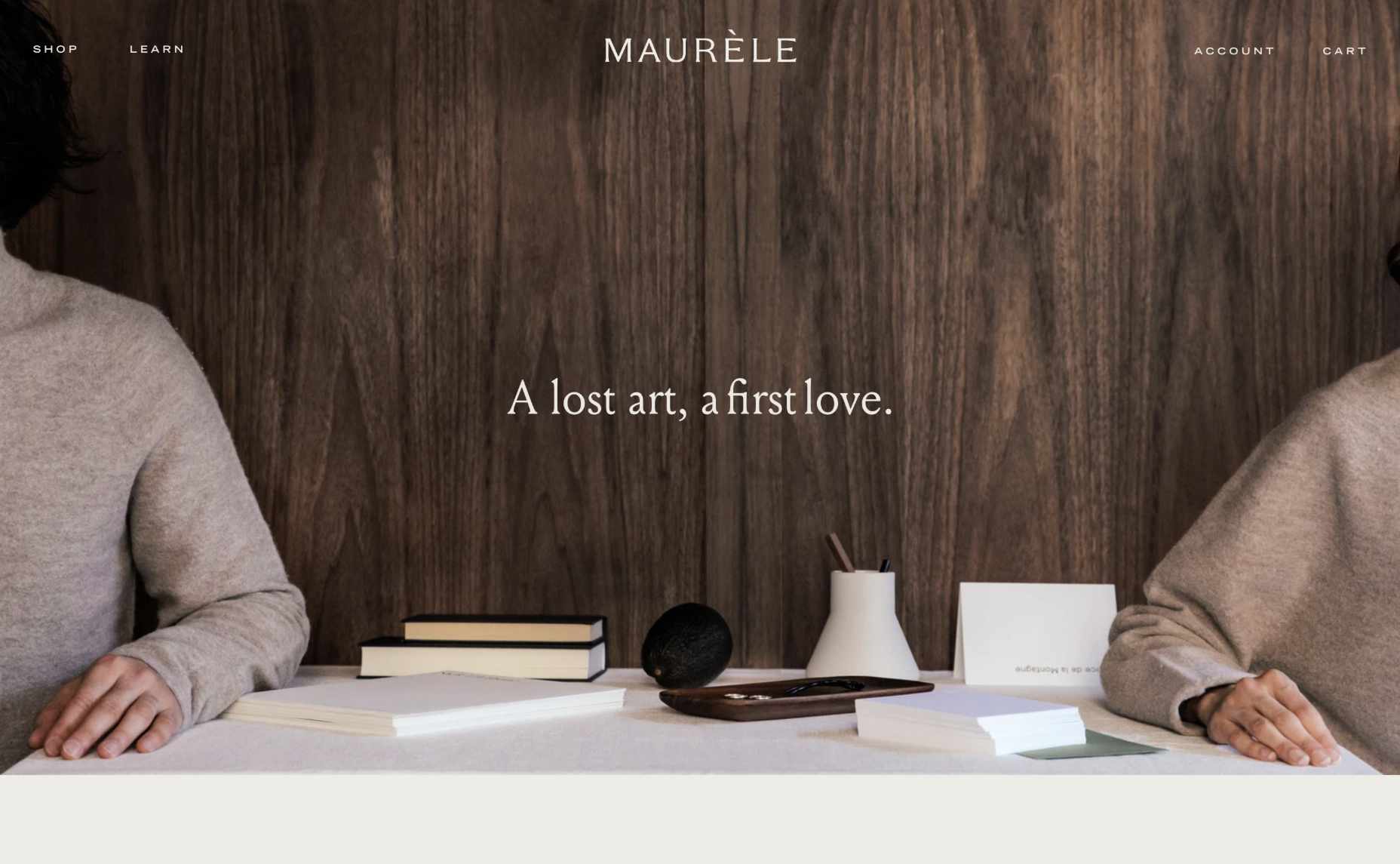
At the same time, drawing attention to the footer where customers can check things like the terms and policies of the website or FAQs that answer their most common questions is another fantastic way to build transparency. 

Giving a brand a human face makes it easier for that company to establish lasting connections. That’s why designers should always prioritize using real, authentic images over stock photos where possible. For example, a large feature image on an “About” page that addresses the company’s unique nature makes it easier to connect with a target audience. 

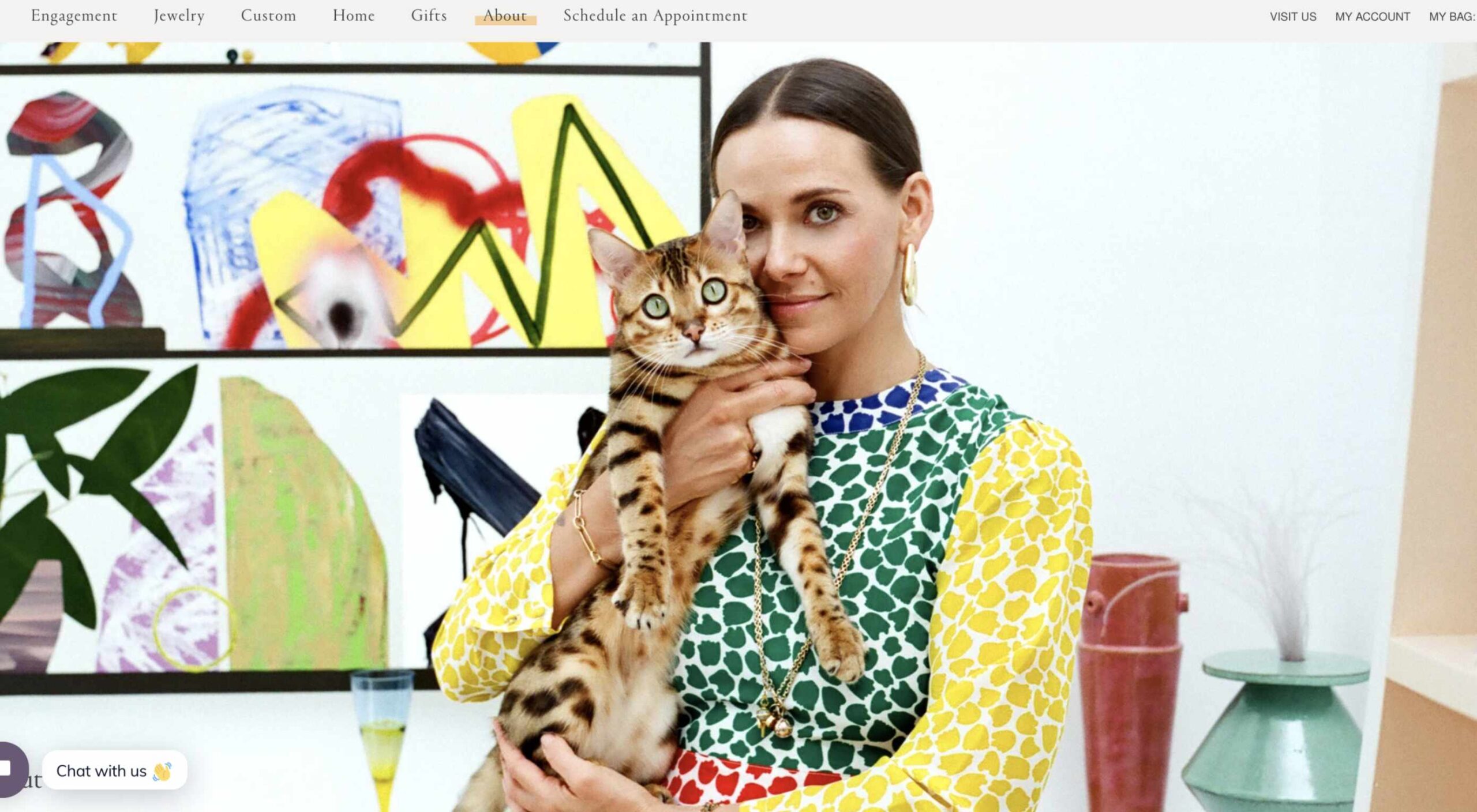
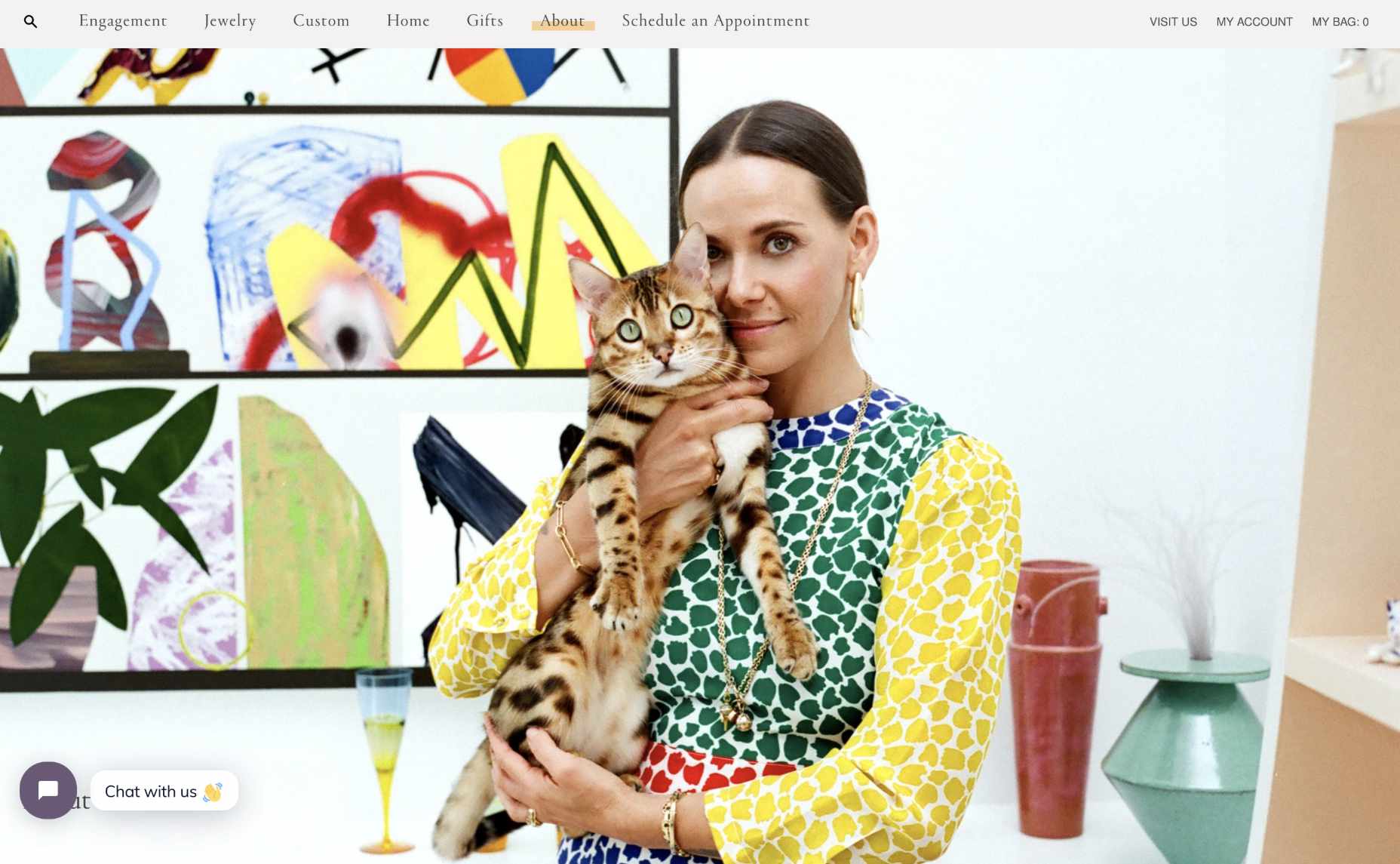
Make sure that there’s plenty of space on the “About” page to introduce significant members of staff that can give a face and personality to both the website and the brand. For instance, Mociun.com uses a fantastic hero image of a person with her cat.
Add Space for Testimonials and Customers

While you don’t need to post a customer’s entire consumer list online to prove that they’re a reputable company, it is worth highlighting some of their clients. No one wants to be the first person online to trust a new website. Testimonials and reviews from other people are how you add instant confidence to any experience. 

For designers, social proof can come in a lot of different formats. For instance, if you’re building a website for a company that sells directly to other businesses, you could add pictures of the logos of the brands that the company has worked with. Alternatively, for a B2C brand, basic reviews and quotes will often work wonders. For instance, there’s a list of great reviews included on the product pages of the PlaySuperlative.com website.

Unless customers leave comments directly on the web page themselves, remind your customer that they need to get permission from the client to use their quotes on any web page. 

Additionally, remember that adding pictures and names to testimonials where possible can sometimes make them more believable. 

Tell Your Client’s Story

When building a website for a client, there are many different things that you’ll need to think about. For instance, you need to focus on the company’s USP or whatever makes them unique. You’ll also need to ensure that clients have all the information they need to make purchases easily. 

At the same time, it’s important not to go over the top with too many features. Simplicity is often the key to good UX. 

Where possible, however, if you want to boost confidence for your client, it’s a good idea to highlight their unique motives and vision as a business. Ask the company that you’re designing for what their mission is. Do they want to transform the way people communicate and collaborate like Trello? Do they want to fill the world with information, like Google?

Focusing on the unique ambitions of the business, beyond the desire to make money, makes them seem more three-dimensional and real. 

Highlight Security

Use your skills to ensure that certain aspects of safety and security stand out for your client. For instance, notice how Fetching Fields instantly pulls attention to the fact that they’re using certified and organic, human-grade wellness solutions.
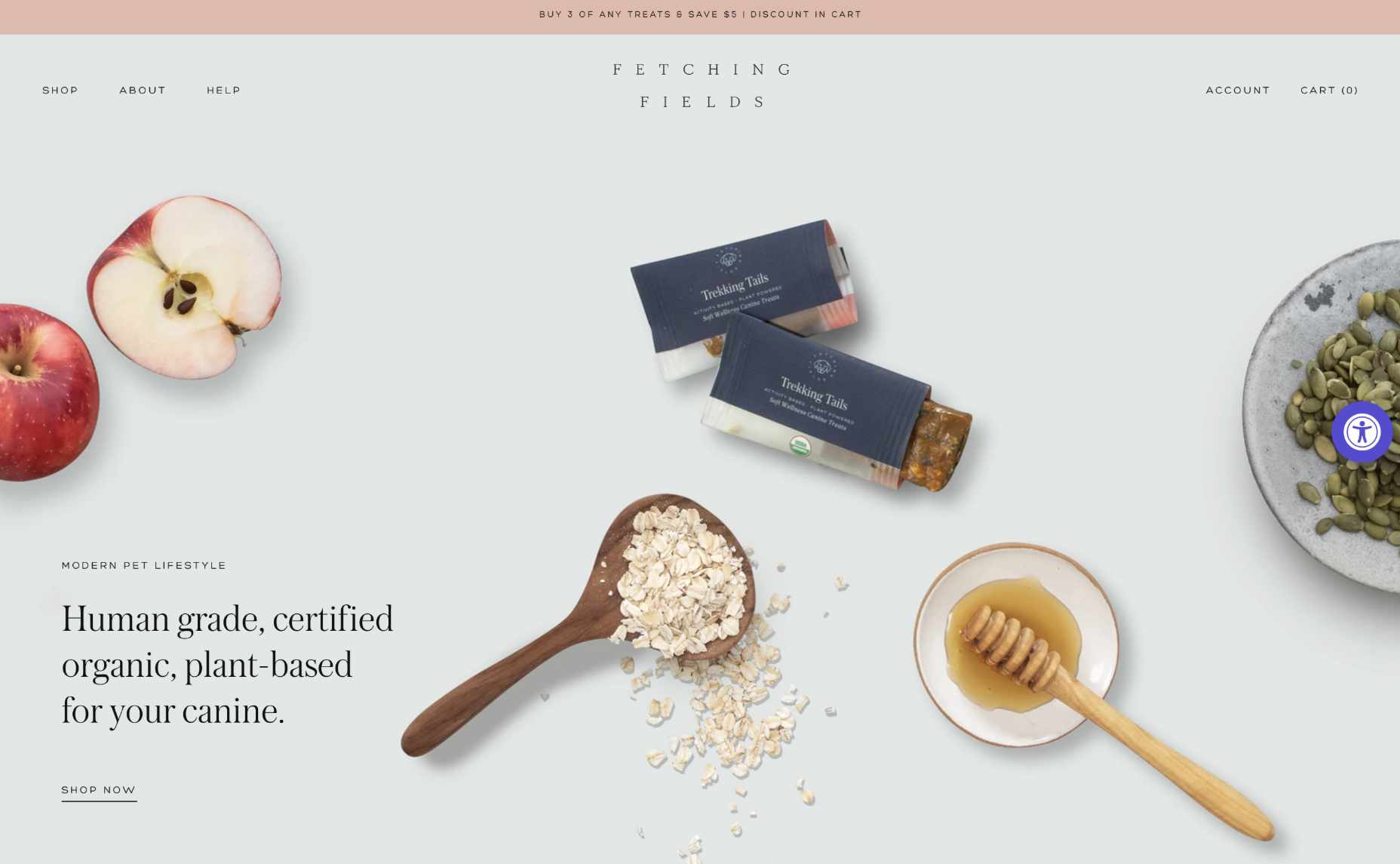
Other steps you can take include making sure there’s an SSL certificate installed to cement the website’s safety. Additionally, if your customer has any badges or certifications that can highlight their security strategies, it may be a good idea to include those too.

If your customer takes payments online, you can use several secure website seals to boost confidence. For instance, showing that you’re “Verified by Visa” or using Mastercard Secure Code is a wonderful choice. 

Make Sure Visitors Can Find Contact Information

As a website designer, one of the best things you can do for your customer is making sure that they have excellent navigation, complete with easy-to-find information. 

On any website, innovative navigation ensures that an audience can find the pages they need to make sure that they feel as comfortable as possible, making their purchases. 

Make it easy for visitors on a website to track down useful insights about the products they want to buy or the kind of services available from the company in question. Additionally, if your client has any FAQ pages or additional resources, make sure that customers will have no trouble tracking those down. 

The example above from Petersham Nurseries makes it easy for clients to find everything they need on the website, thanks to a convenient vertical navigation bar. 
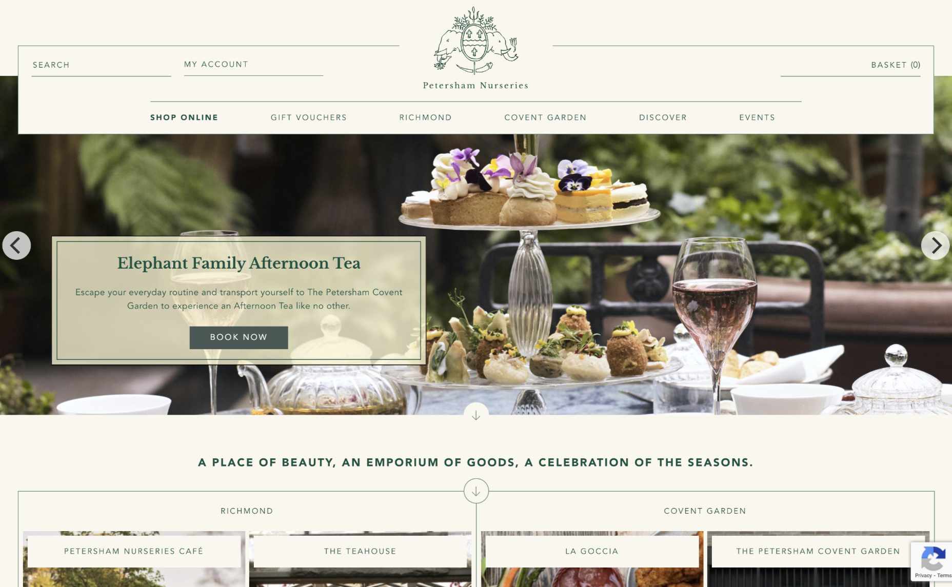
Remember, one piece of information that should always be as easy as possible to find for your customers should be the contact page. A contact page shows that the business is willing to answer any questions a client might have via many channels. 

List a physical street address and phone number for the website where possible, or at the very least include an email address where people can get in touch. 

Make Sure Pricing is Clear

Finally, if you want to ensure that visitors can trust your client’s website, you need to avoid hiding any critical information with fine print or content hidden in the website’s footer. When designing product pages or service information, make sure that you’re as transparent as possible about the company’s pricing. 

You don’t want a customer to wait until they click through into the checkout page to discover that they have to spend a fortune on postage and packaging. And, no one purchasing a service wants to wait until they’ve got their credit card out to discover that they’re going to be paying extra for things like set-up fees. 

According to Jakob Nielsen, one of the top mistakes anyone can make on a website is not listing their pricing as clearly as possible. 

As tempting as it may be to hide certain expenses and send customers through to the checkout page faster, avoid any opportunity to hide information about costs. 

Designing for Confidence

Ultimately, many different things can make a website stand out today. 

Designers can experiment with unique strategies like dynamic loading and video-based backgrounds. You might even decide to explore new styles with the right company or adapt certain pages to take advantage of things like 5G and new connectivity options. 

However, before you can begin exploring new opportunities on any website, one of the most important things you can do is ensure that you get the foundations of the website’s credibility right. Take an approach to design that focuses on transparency and trust first, and the rest will naturally fall into place. 

In a world where consumers are less trusting of brands than ever before, people who design for transparency will be sure to stand out from the crowd. Don’t underestimate the power of embracing trust for your clients in 2020. 

Source

The post Cultivating Customer Confidence with UX first appeared on Webdesigner Depot.


Source de l’article sur Webdesignerdepot

Sometimes the designs that make the most impact do a lot of unexpected things and break some of the most tried and true rules of visual theory.

Sometimes these design elements work brilliantly, and other times they are fleeting or fall flat. This month all of the examples here seem to break some conventional design rules. Here’s what’s trending in design this month…

1. Alternative Homepage Image/Video Crops

This trend breaks some traditional standards and is pretty refreshing – alternative homepage crops for images and video.

The full screen or 16:9 aspect ratio is out the window with vertical and square options that prove you can do more with your photo collection.

What’s great about this trend is that it’s super attention-getting because of the interesting use of space and imagery. Almost any design without the full-width hero header will grab your attention because it is different. These examples prove that point, and each design does it differently.

Now here’s the challenge: You have to make sure that this style has a solid fallback for mobile so that the result is equally impressive.

Janmaat Fotografie does a great job accounting for interesting photo shapes and flips the script on mobile. (Rather than what you might expect with text then photos because of the desktop placement, the photo stack uses the same shape and layering and is above the text on mobile.) The result is phenomenal.

N3 uses a very vertical image in an almost split-screen style design. It’s a sharp contrast to many of the other split screens we are accustomed to with an equal divide. The distinct shape of the image is interesting and intriguing. It’s definitely not a shape we see in website design frequently.

Bounce uses a similar split-screen effect in the opposite manner as the example above, with the tall, vertical space as an “empty” area and the right side filled with a square video. The shapes help push and pull your eyes across the screen to look at all of the elements and take in the overall design. It’s one of those ideas that if you only talked about it, you might talk yourself out of it, but here, it’s pretty striking.


2. On-Screen “Stickers”

Stickers are a design trend that has made its way from social media to website design.

These website stickers break design rules because they cover content or seem to be put on the canvas haphazardly. And that’s why they are so attention-getting!

The benefit to these stickers is that they can highlight specific items or content or help focus a call to action.

Friesday uses stickers in conjunction with hover effects to keep users interacting with the design. Multiple stickers can even pop onto the screen in the same location. The animation is simple and fun and feels like a digital sticker book.

August Eighth uses a center sticker as a call to action. It’s a true focal point in the center of the screen with an almost three-dimensional effect that lifts it off the background video. It’s a borderline dark pattern since the only way to get the box off the screen is to click through to the shopping part of the website.

EasyGreen has a bright yellow sticker in the bottom corner that feels almost like the sticker on a piece of fruit. This style and placement work well for the content and product featured. It’s bringing the digital and real-world a little closer with this design element.


3. Breaking Design “Rules”

The third trend this month is kind of a catch-all for general rule-breaking. While the other trends show certain design elements that aren’t the norm, each of these examples really tosses everything you traditionally think about design out the window. (And that’s ok.)

The trick to a rule-breaking design is that it has to be focused and simple enough to keep users interested and provide intuitive elements that tell them how to interact with the design. It’s a delicate balance.

Here’s how these sites do just that.

Supercontinent has a lot going on. At least four typefaces on the screen at a time, movement (using different shapes and aspect ratios), overlapping elements, hidden navigation, and you may even find a few more broken rules if you look closely. And somehow, it still works.

What’s pulling this design together is a key unbroken rule – the chaos is rooted in a grid system that keeps it all somewhat organized. Plus, there’s plenty of white space to keep elements from feeling crowded and overwhelming.

Source of Plastic Waste combines elements in unexpected ways. There’s no real navigation; the site is just a continuous scroll. That’s a big website usability rule broken right out of the gate. There are other design elements as well, from the “header”/logo moving to the top right corner to the almost over-designed transparent box for text elements. There are a lot of scroll elements and actions happening and layers of text on text in some of the screens.

But here’s the thing about this design. As many rules as it breaks, the story is interesting enough to keep you scrolling. The question is, how long and how far do you go without getting lost or confused.

The Debris of Attention is designed to show “bad design” with elements that are frustrating and annoying on websites. The gamified design allows you to hover on each element to remove it and clean up the design.

While this site breaks the rules on purpose, it is still an experiment in how long a user will hang on with so many visual effects happening at once.


Conclusion

While most of the time, people think about “breaking the rules” as a bad thing, that’s not always true in the design space. Sometimes breaking the rules can result in an unexpected delight.

The challenge is to make sure that when you break the rules, the design is still usable, functional, and understandable. If so, you’ve found a winning combination.

Source

The post 3 Essential Design Trends, August 2021 first appeared on Webdesigner Depot.


Source de l’article sur Webdesignerdepot

With the advancement and growth in technology and the arrival of DevOps and Agile, the software testing industry is witnessing numerous changes. Software Testing has traversed a long path from manual testing to record-and-playback sophisticated testing tools, then to test automation, and now to codeless automated testing.

World Quality Report 2020–2021 states that not having advanced programming know-how and expertise is considered one of the critical challenges when applying automated testing to Agile projects. We could perhaps state that the development of codeless testing tools is a promising solution to the challenge.

Source de l’article sur DZONE

Microservices have crafted highly flexible and adaptable IT infrastructures. Microservices is a unique software development approach that concentrates on creating single-function modules that work jointly to execute the same tasks. It enables you to alter only one service, without modifying the rest of the infrastructure. In simple words, one can easily deploy and change every service without affecting the functional facets of other applications or services. Instead of following an old monolithic architecture (sole app with manifold functions), testers and developers use this microservice approach to build independent modules for every function.

However, the microservice architecture can also make an app extra complicated, particularly when we add several functionalities. Likewise, testing the combined functionality of numerous services is a lot more complicated due to the distributed nature of the app. As microservices follow a dissimilar architecture, we also require an exceptional strategy for testing microservices. In this article, we will explore different tools for testing microservice applications. Testing microservices can assist us in eradicating several issues by avoiding a domino effect. 

Source de l’article sur DZONE

The photograph is always looking to capture picture-perfect images with creating memories. Using smartphones cameras offers great optics with high-resolution and sharp results. Today photographers are increasing as they click high-quality images with excellent resolution. If you’re a beginner and want to click masterpiece, the best we could recommend is to go for the best photo editing app for iPhone and Android to create a great visual strategy.

One can also choose a product photography course to include photographic techniques and explain the best photo editing apps they should use. After you pick the best photo editing app, make sure it offers a comprehensive set of tools that make your photos shine.

Source de l’article sur DZONE

Productivity is a crowded space, with countless apps and services promising to make your life and business easier and more profitable. Of all the apps that make that promise, very few deliver, but we’ve found one that does: Taskade.

Flexible Planning With Taskade

Every problem is unique, and part of what defines us as creative professionals is the different ways we approach problems. What suits one person in one situation doesn’t suit another in another. This is where many planning apps fall down: they adopt one singular approach and expect users to fit around the app.

Taskade is different. Like the love-child of Trello, Notion, and Slack, Taskade uses a template approach to create a flexible planning system that you can use in whatever way you prefer.

When you open up Taskade, you’ll see some quick options: ‘blank,’ ‘weekly planner,’ ‘meeting agenda,’ and so forth. But there’s also a ‘more’ option that will give you access to the hundreds of templates Taskade supplies. There are dozens of template categories, and each category contains multiple templates that you can use to drive your planning process.

Whether you’re looking for a task list for launching on Product Hunt, a design system checklist, or a project scrum board, you’ll find the template ready and waiting for you.

If none of the predesigned options are right for the task at hand, Taskade gives you the option to create your own template from the basic building blocks of boards, actions, mind maps, charts, and lists.

Team Collaboration With Taskade

One of Taskade’s main strengths is its ability to work equally well for individuals and teams.

It makes sense when you’re evaluating a product that you do it on your own. But we encourage you to bring team members on board early in the trial because it’s when working with teams that Taskade really excels as a collaborative tool.

Once you’ve created a new planning project, you can invite your team, either by email or — if they’re already registered — by tagging them with their Taskade username.

You can assign tasks to individuals or multiple individuals (a much better option than the free-for-all you find in some to-do apps). You can also set deadlines for tasks so that everyone knows what the schedule is.

Team Chat on Taskade

Another area that Taskade excels for teams is the built-in real-time live chat. You can communicate with team members right in the project instead of jumping onto Slack or email.

For teams working remotely, or even just multi-tasking throughout the day, it’s a great way of ensuring that everyone has the information they need. As a result, mistakes are minimized, and best of all, there’s a written record that can be referred back to at any time.

Chat can be sent to the whole team, or direct messaged to an individual, so you don’t need to worry about filling up everyone’s notifications with messages that don’t apply to them.

Project Management With Taskade

If you’re working on a single project, then you probably know exactly where it is at all times. But for anyone working on multiple projects, it can be hard to keep track of everything. So Taskade has several different options for project managers.

The Mindmap section is one of the most useful parts of Taskade because it gives you a complete overview of everything in your project. You can see what has been completed and how much time it took — that way, you can assess how viable the timeline for your other tasks is.

Another great feature of Taskade is the activity feed. When one of your team makes a change to a project, it will pop up in your activity feed, and the next time you log in, you’ll see the status of your projects with a single glance.

Multi-Platform

One of our favorite aspects of Taskade is that it works equally well across different platforms. As well as the desktop web app, you’ll also find native apps in the iOS app store and the Android play store.

Syncing your account over different apps is awesome because ideas often occur at inconvenient times — on your commute, walking the dog. Even when you’re at your desk, it’s much handier to grab your phone and make notes than it is to switch to your browser and visit a site.

Easy Registration

If you’re feeling the pressure of a bulging inbox, or to-do lists on multiple post-its, then the last thing you need is another complex, confusing task to add to the pile.

Taskade is super-easy to get started with. Just click the ‘Sign up’ link in the top right of the site, and you’ll have three options: Sign up with Google, sign up with your email, or you can continue as a guest.

If you’re not sold yet, then continue as a guest — essentially a free trial — you can sign in properly later once your curiosity is satisfied.

Free to Use

Taskade is free to use on a limited basis. The free plan comes with 500Mb of storage and a maximum 25Mb file size. You can create individual tasks or whole projects, workflows, and custom templates and share tasks and projects with your team. That’s enough to help you make the most of Taskade for $0.

If you find that the generous free plan isn’t quite enough, paid plans start at just $5 per month. The paid plan gives you unlimited storage and bumps the maximum file size up to 250Mb. You have the same core features as the free plan; it’s just that they’re unlimited, which means you can do even more planning. In addition, the paid plan adds some handy extra features that are great time-savers, such as sorting tasks, creating repeat tasks, and bulk assigning tasks. Just look at how Taskade compares to similar tools.

Most professionals will get along with the free plan just fine, but $5 per month for unlimited storage is a great deal. On top of that, you have future premium features to look forward to, including a project revision history and a calendar view.

You can sign up to Taskade for free now, as a guest, with your email, or with Google.


[– This is a sponsored post on behalf of Taskade –]

Source

The post Collaborative Task Management with Taskade first appeared on Webdesigner Depot.


Source de l’article sur Webdesignerdepot

AWS is known to be a high-performance, scalable computing infrastructure, which more and more organizations are adapting to modernize their IT. However, one must be aware that no system is secure enough to ensure business continuity! Hence, you must have some kind of plan in place for your disaster recovery. With this article, we aim to discuss the top three disaster recovery (DR) scenarios that show the use of AWS:

  1. Backup and restore
  2. Pilot light for simple recovery into AWS
  3. Multi-site solution

Amazon Web Services (AWS) enables you to operate each of these three examples of DR strategies in a cost-effective manner. However, it’s also essential to note that these are only examples of potential approaches. Variations and combinations of these are also possible.

Source de l’article sur DZONE

Every day design fans submit incredible industry stories to our sister-site, Webdesigner News. Our colleagues sift through it, selecting the very best stories from the design, UX, tech, and development worlds and posting them live on the site.

The best way to keep up with the most important stories for web professionals is to subscribe to Webdesigner News or check out the site regularly. However, in case you missed a day this week, here’s a handy compilation of the top curated stories from the last seven days. Enjoy!

The Best Olympic Logos of all Time

16 CSS Backdrop-Filter Examples

9 Must-Install Craft CMS Plugins

Adobe Reveals the World’s Favourite Emojis in 2021

14 Must-See Graphic Design Movies You Should Watch

Desech: No-Code Visual HTML/CSS Editor

Of Course We Can Make a CSS-Only Clock

8 CSS & JavaScript Code Snippets for Creating Realistic Animation

What is a Headless CMS and What Does it Mean For SEO?

OOP is Dead. Wait, Really?

Source

The post Popular Design News of the Week: July 19 2021 – July 25, 2021 first appeared on Webdesigner Depot.


Source de l’article sur Webdesignerdepot