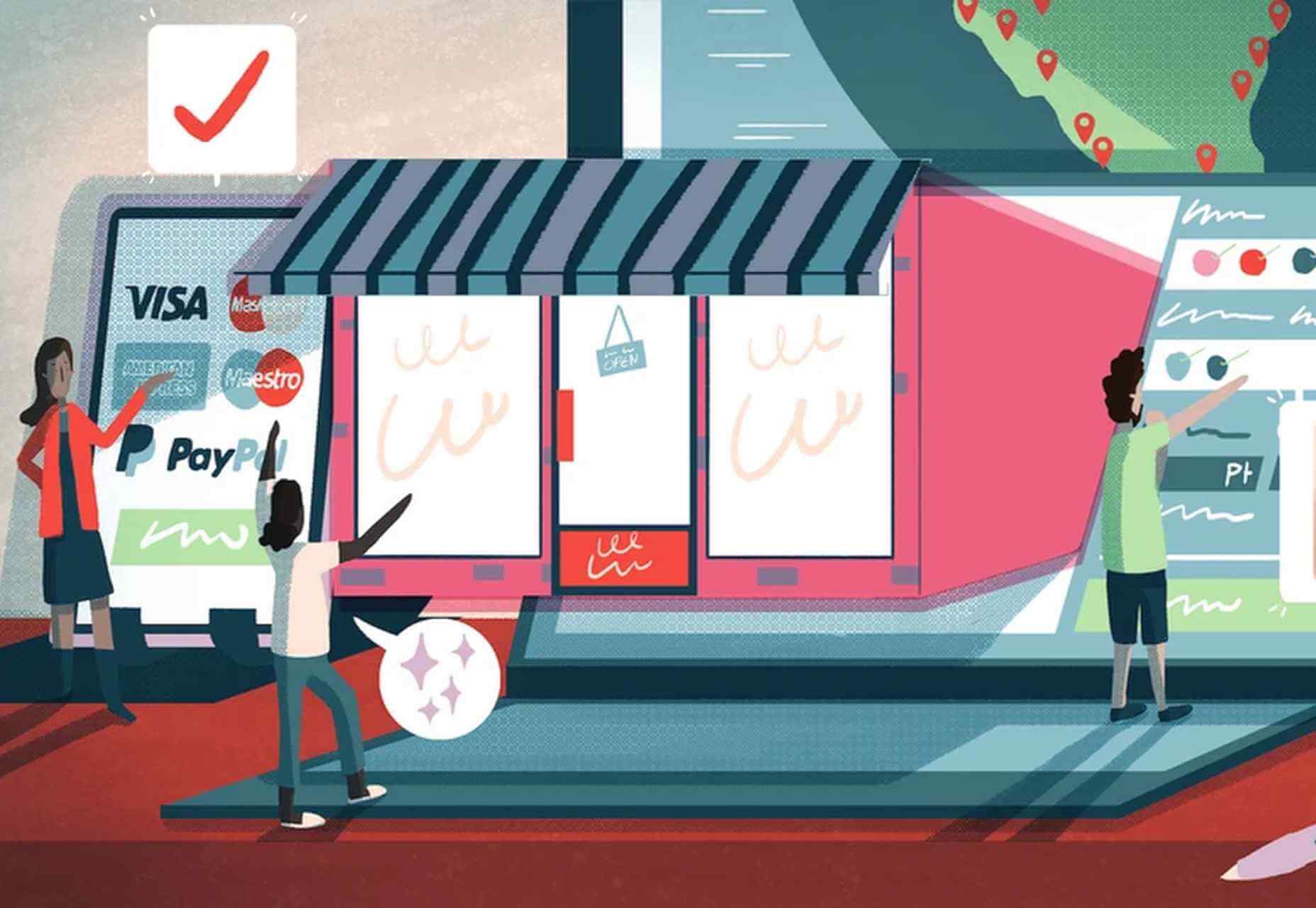
 There are some interesting shake-ups on the horizon for ecommerce: Experiential shopping, Virt-ical worlds, Au naturale models.
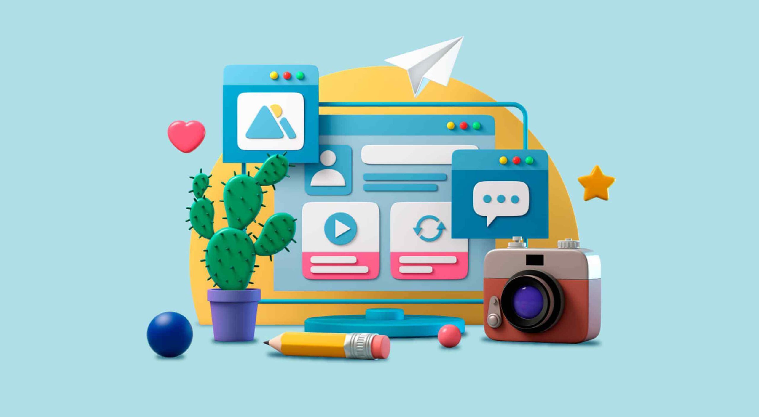
We’re starting to see signs of them already — many of them spurred on thanks to the events of 2020. Below, we’re going to explore what’s going on with these new ecommerce trends and technologies and take a look at a bunch of sites that are setting really cool examples for each.
1. Experiential Shopping
With many stores, either closed to in-person shopping during the pandemic or their capacities severely limited, online shopping and BOPIS became much more attractive options for consumers.
That said, buying something like a pair of jeans or a new pair of glasses is much different than the pack of toilet paper someone’s bought for years. There are just some things you have to try to know if you’re going to like it and make sure it fits.
Augmented reality and other immersive shopping tools are bringing those “try-on” capabilities to people’s homes.
There are a number of technologies built specifically for this purpose:
Obsess is a particularly noteworthy one. It’s an ecommerce platform that enables retailers to build virtually immersive shopping experiences. Charlotte Tilbury is one such retailer that is taking advantage of it.
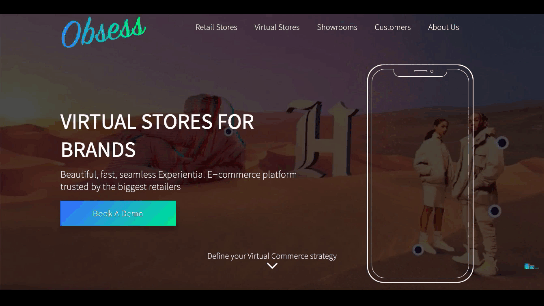
At the end of 2020, Obsess announced that it had received $3.4 million in seed funding, so expect to see more Obsess-powered ecommerce sites and apps.
ByondXR is another platform that empowers brands to design immersive experiences for online shoppers:
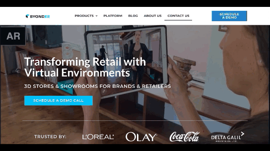
Retailers like Lancome, Procter & Gamble, and Calvin Klein have used ByondXR’s immersive commerce technology.
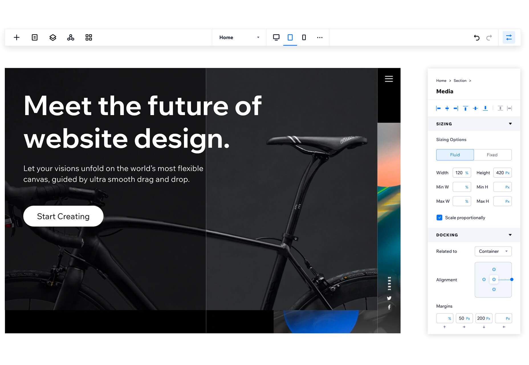
Another option is offered by Matterport:
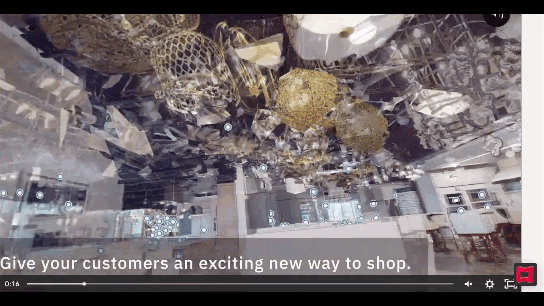
This technology is interesting as you’re not just creating a virtual store. You can also design a 3D model of a brick-and-mortar shop that in-store shoppers can use to get in and out quickly.
2. Virt-ical Worlds
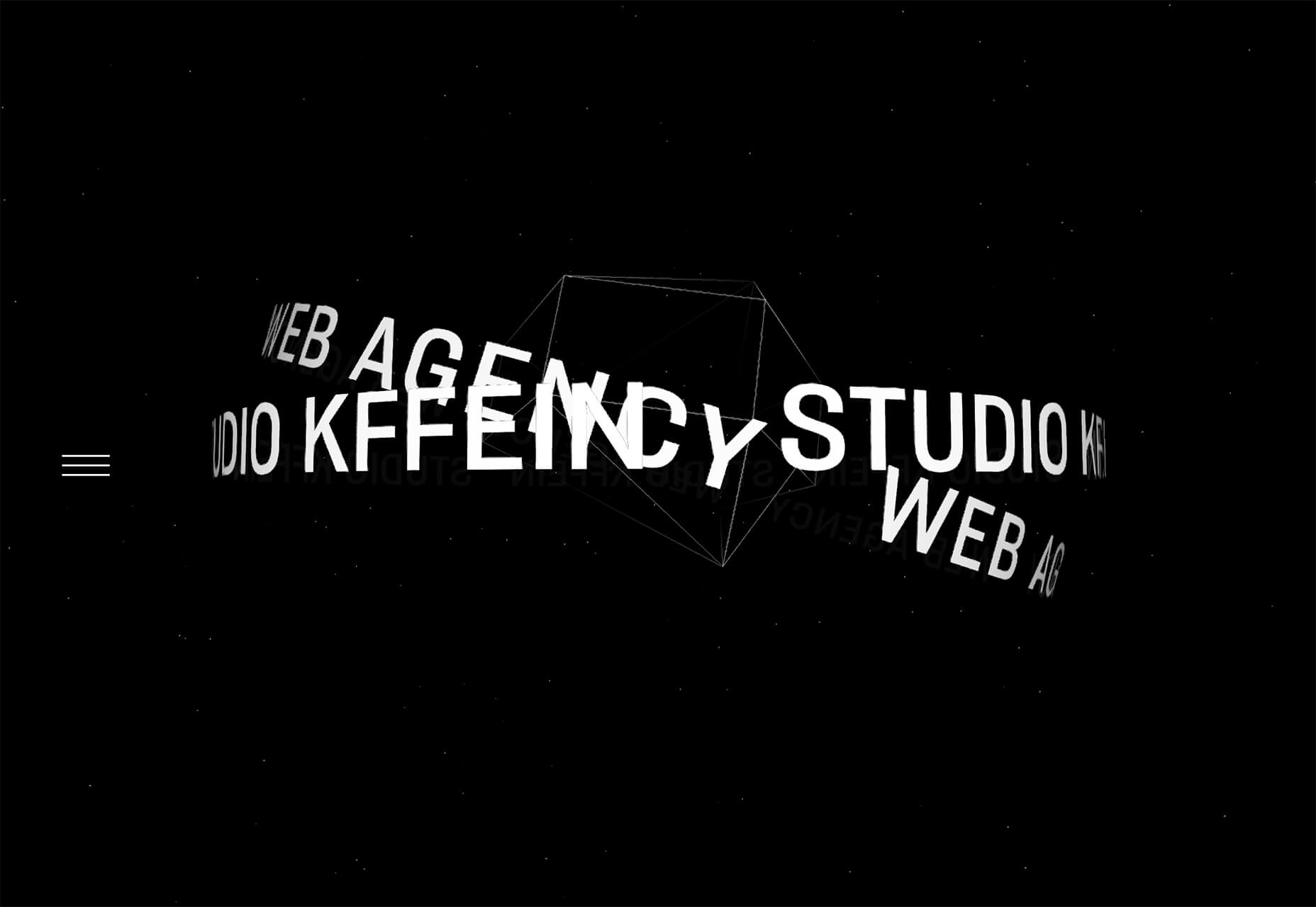
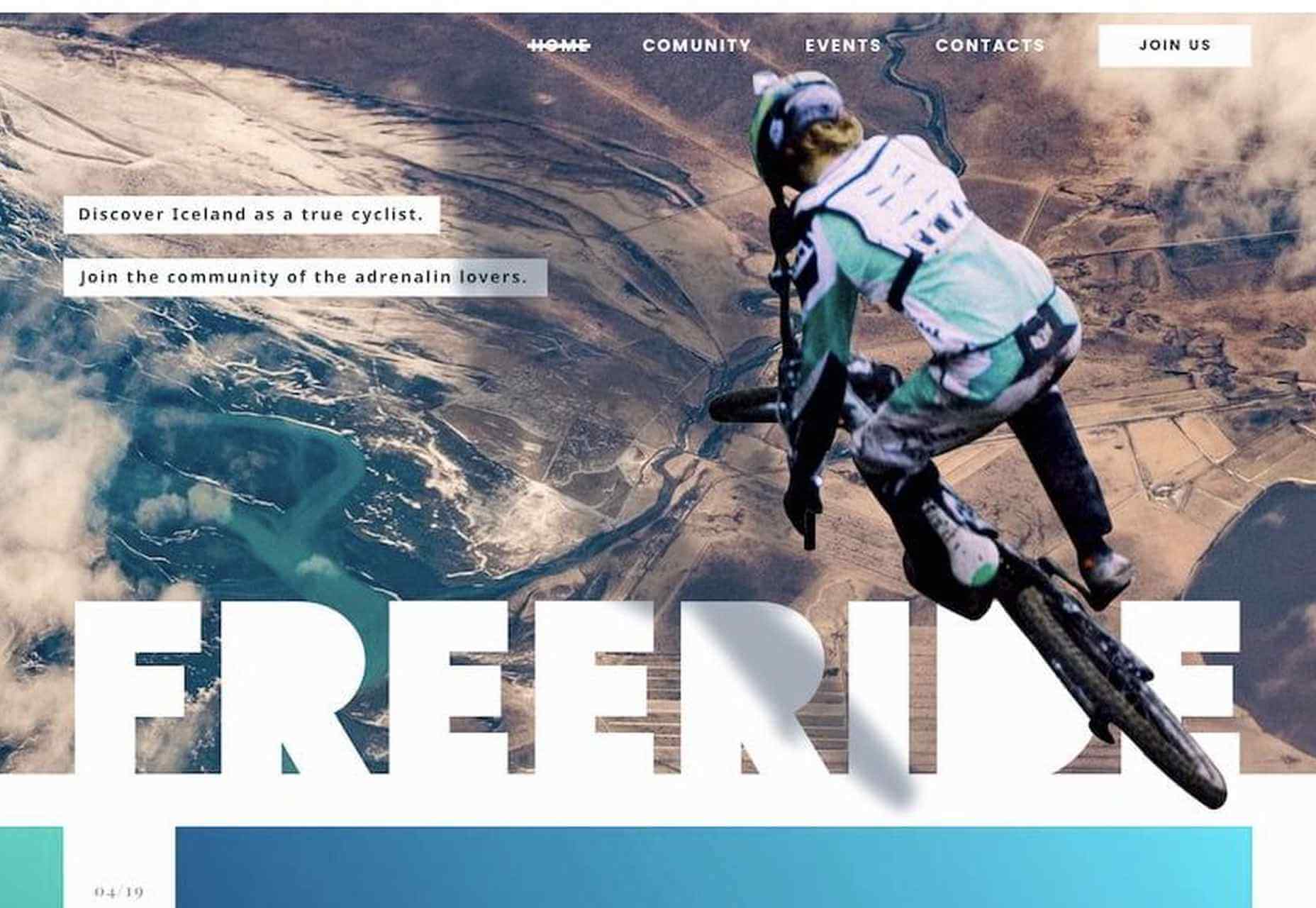
There’s a new trend brewing, and we see it most commonly on websites for fresh and youthful brands. I wouldn’t say it’s nostalgic design, per se, though there are certainly some elements reminiscent of the bold, in-your-face style of the web in the late ‘90s and early ‘00s.
No, I think what we see here is a creative reimagining of our world.
With so many people having spent time in their homes and with their faces glued to screens, there’s been a blurring between our VIRTual and physICAL worlds. This new web design trend is one I’m going to call the Virt-ical World. While parts of these sites look like the websites we’ve designed in years past, there are motion, color, and sizing elements that feel more like a trippy virtual simulation.
Let’s look at some examples.
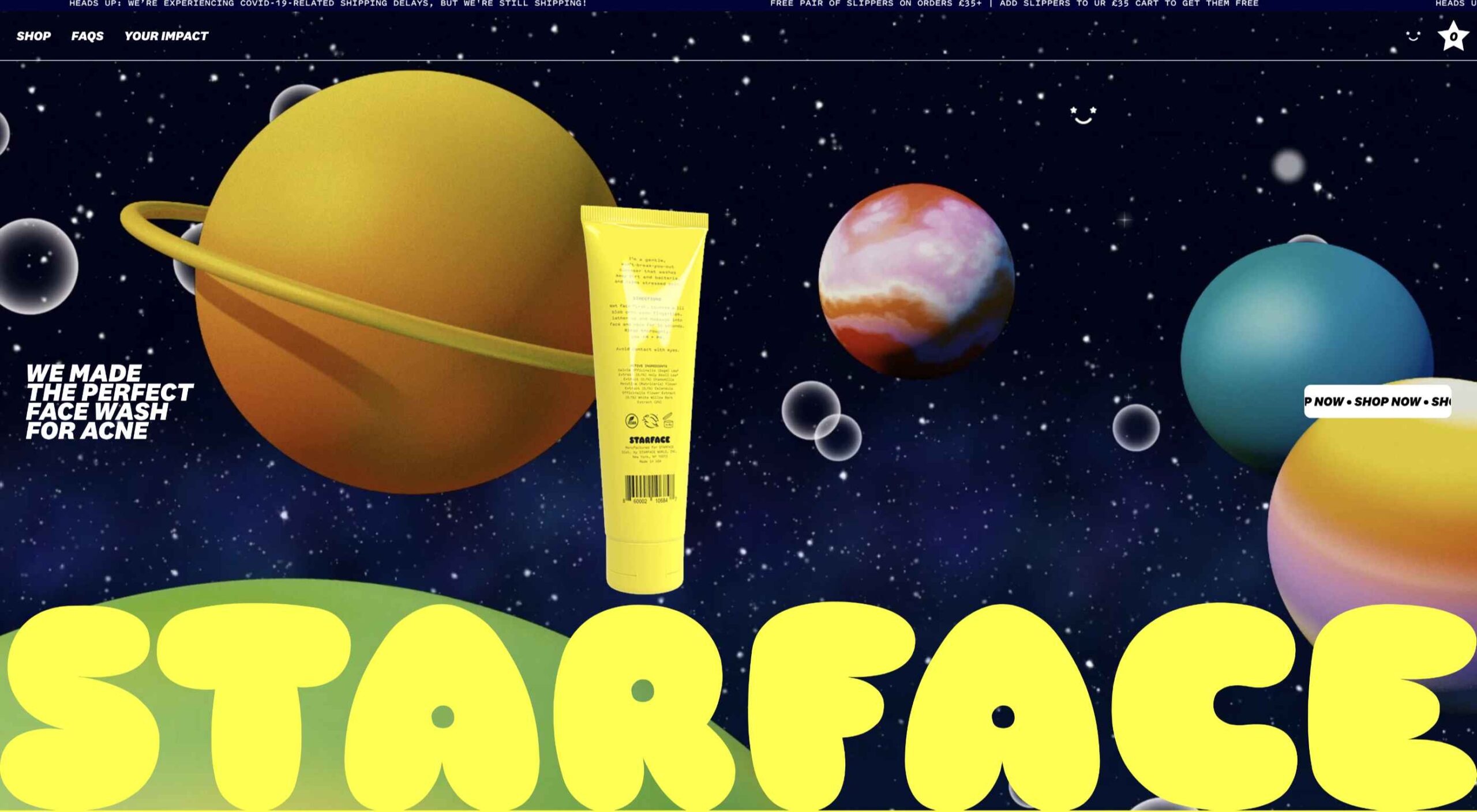
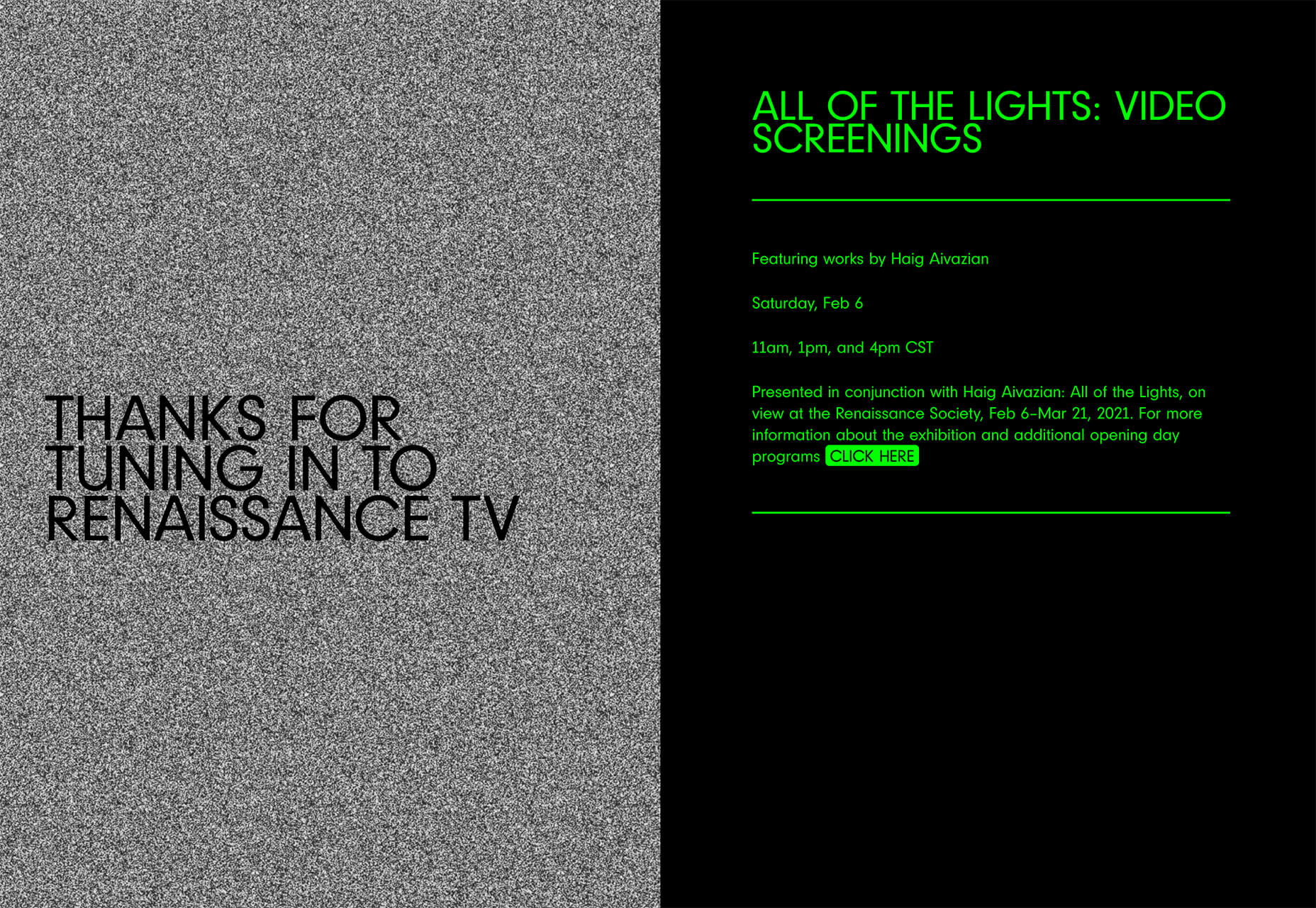
Starface is a company that creates acne-fighting products.
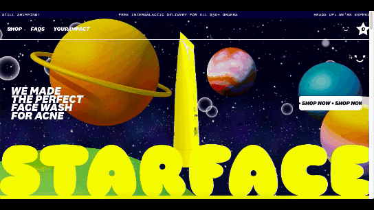
This is one of the more experimental designs in this set of examples. Still, it’s one that shows us how far the boundaries can be pushed without totally compromising the online shopping experience.
Billie is another company having fun with this trend. I’d say this is on the opposite end of the spectrum.
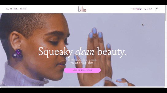
For the most part, this ecommerce site looks similar to other small retailer sites. However, the fun, candy-colored palette, the bobbing products, and the color shifts add a somewhat surreal element to the design.
Catching THEO is another ecommerce brand playing around with this Virt-ical World.
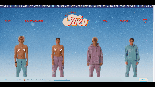
See what I mean by this style feeling somewhat nostalgic? Thankfully, this site commits to today’s good, clean, responsive design while only using some of the more fun and quirky elements from the past.
Au Naturale Models
When I talk about au naturale models, I’m really referring to the makeup-less faces, relaxed hairstyles, and casual apparel that we’re seeing ecommerce models don these days.
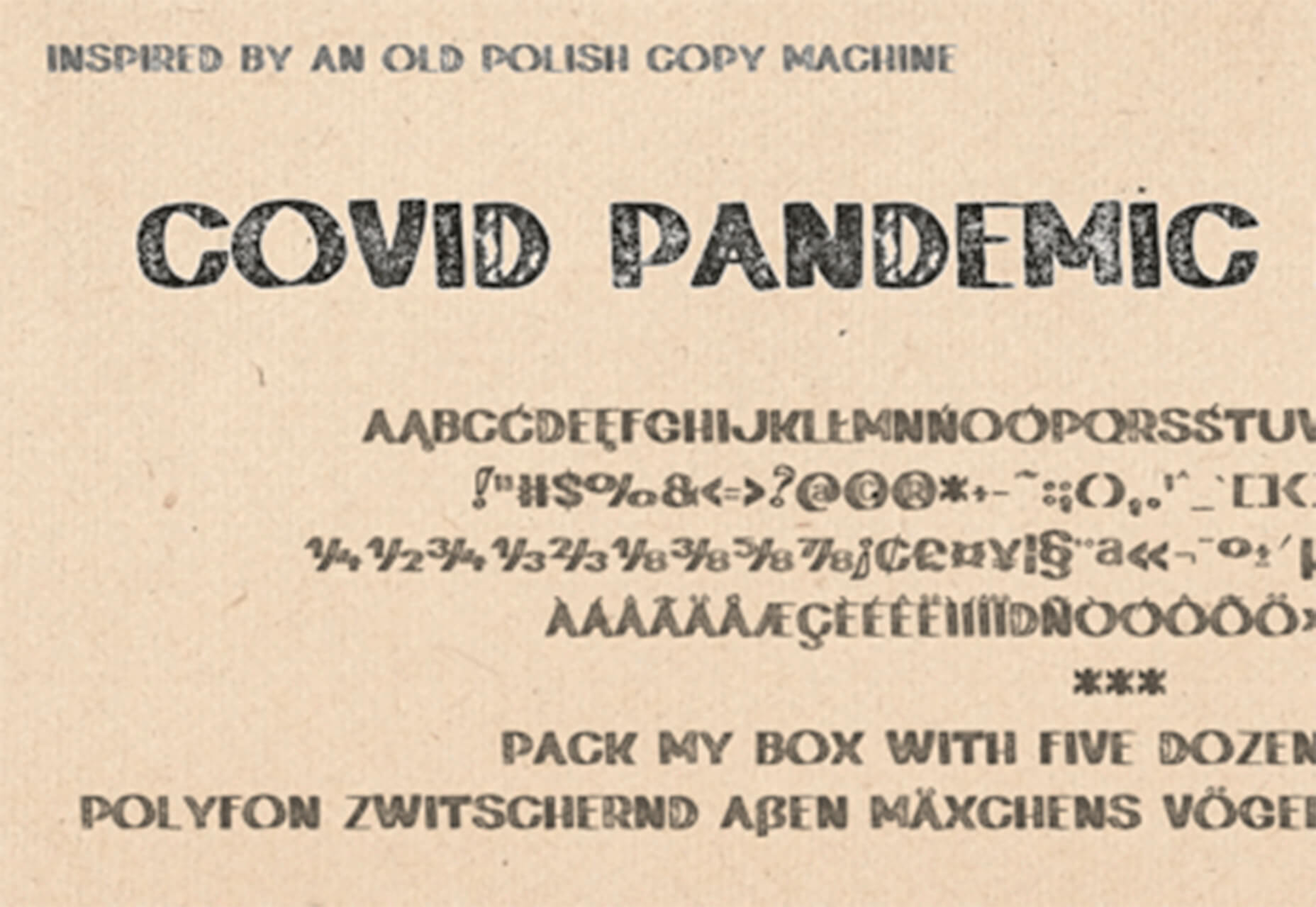
I think it’s safe to say we have the pandemic to thank for this. And it’s not just because many of us took a more casual approach to getting dressed during the week. It’s also because the pandemic wiped away the glitz and glamour from many of our lives.
I don’t know about you, but it was kind of nice seeing fewer Instagram influencers flaunting their luxurious lifestyles and more real people rocking their matching pajama sets. I think brands have sensed this change in mood over the last year, and they’re now putting forward their own simple and casual styles for us to connect to.
There are tons of ecommerce websites we’re seeing this on in 2021.
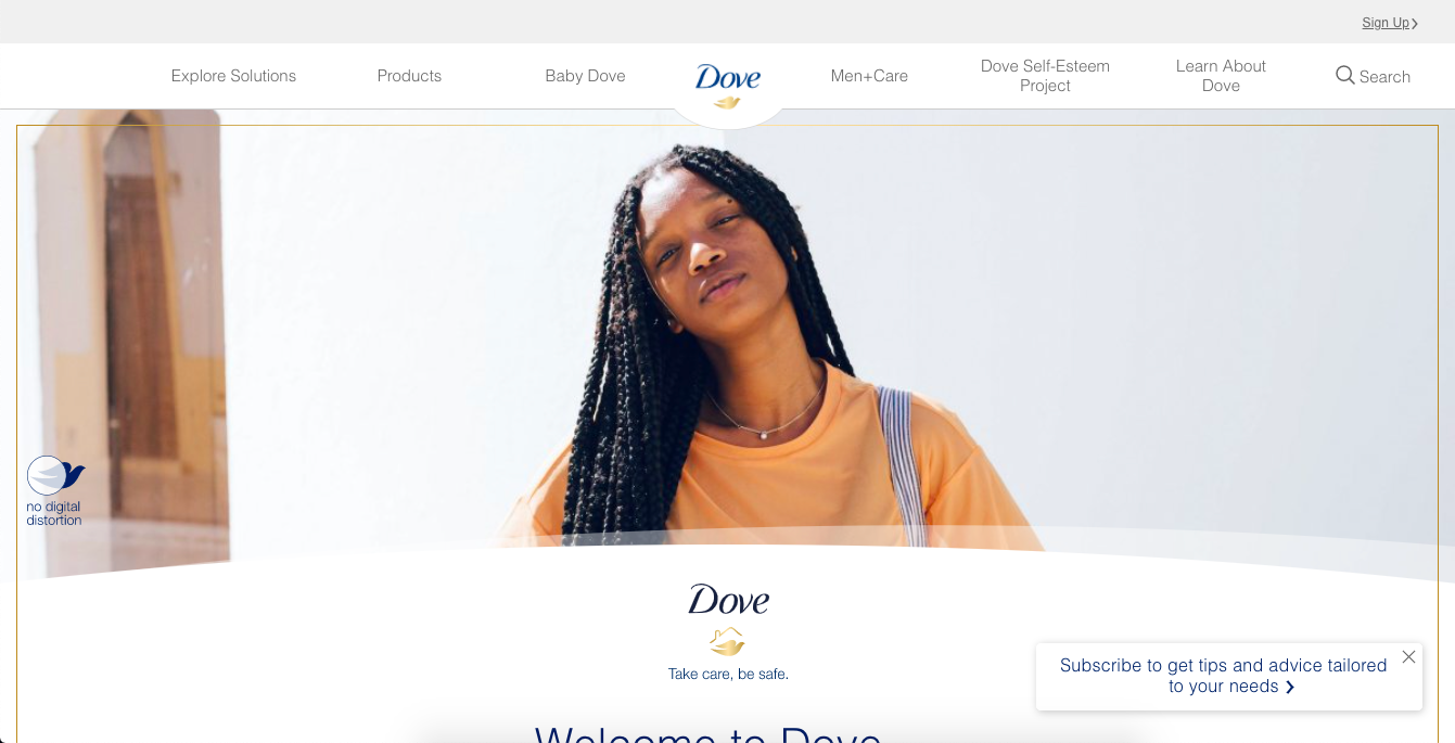
Here’s Dove’s homepage, where they specifically call attention to the lack of digital distortion in the photo:
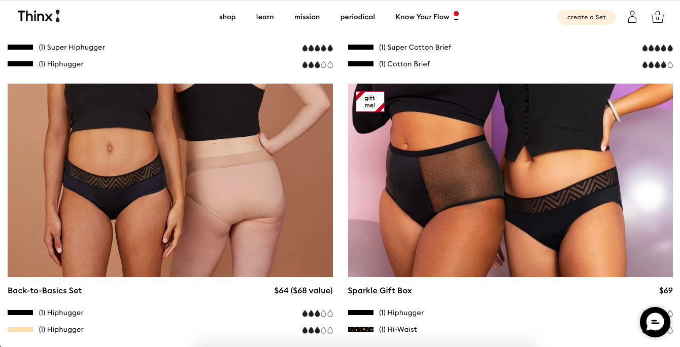
Thinx also uses more natural and realistic-looking models to show off its undergarment products:
Madison Reed takes a unique approach with this trend:
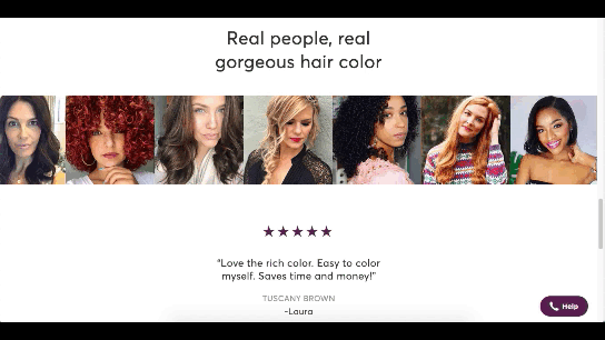
While the hair color brand does a great job of using diverse models around the site, it also has this scrolling bar showing off its customers’ very natural and real faces.
Wrap-Up
It feels like ecommerce trends and technologies are changing at a rapid pace these days. To help you stay on top of what’s new in ecommerce, stay tuned to this blog for more interesting news and changes to the landscape.
Source
The post What’s New in Ecommerce, February 2021 first appeared on Webdesigner Depot.

Source de l’article sur Webdesignerdepot


 Everyday design fans submit incredible industry stories to our sister-site,


 In
In 
 Everyday design fans submit incredible industry stories to our sister-site,


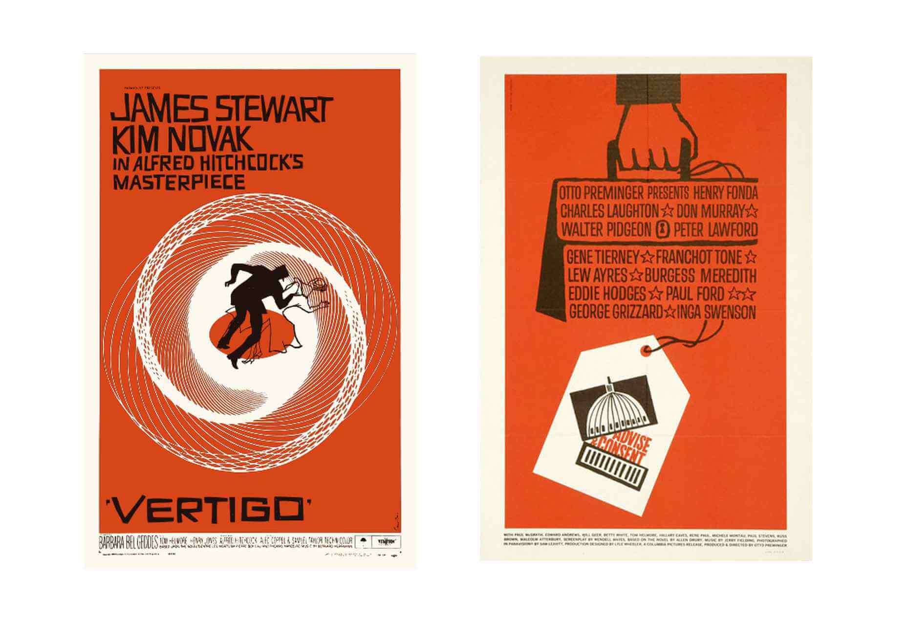
 Design is on a loop; it goes round and round, repeating the same ideas, and revisiting the same problems. If you want to know what will happen in design tomorrow, take a look at yesterday.
 If you like to build websites with WordPress, then you’re in for a treat.
 Everyday design fans submit incredible industry stories to our sister-site,

 We’re going to try something a little different this month; with this roundup of tools and resources for designers, we’re going to pick a few of our favorites and group everything else in a manner that makes it even easier to find elements that will work for you, and your projects, right now.