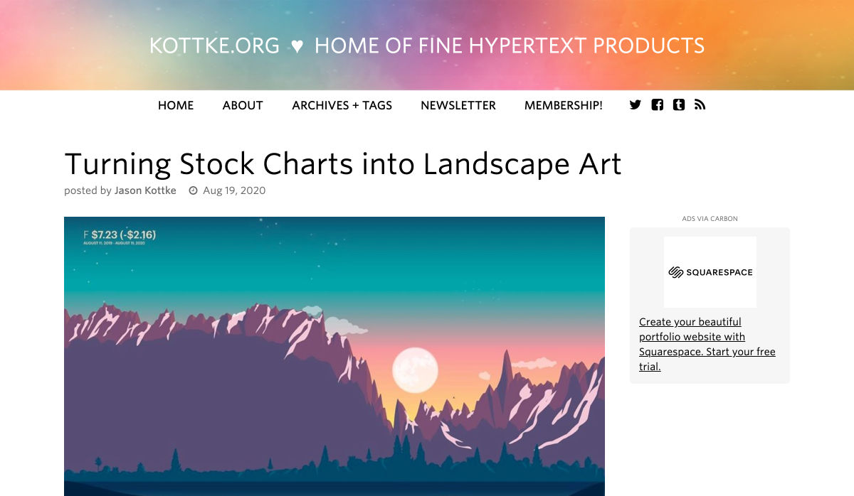
 In this article you will find the most appreciated web solutions of 2020.
To create this list we took into account the following considerations: The popularity of the product or the service; How many users it has; How many times it was downloaded or installed; The level of efficiency; What you get for your money.
You’ll find WordPress themes and plugins, an affordable logo design contest, logo creators, website builders, web development services, and even more. Let’s get started…
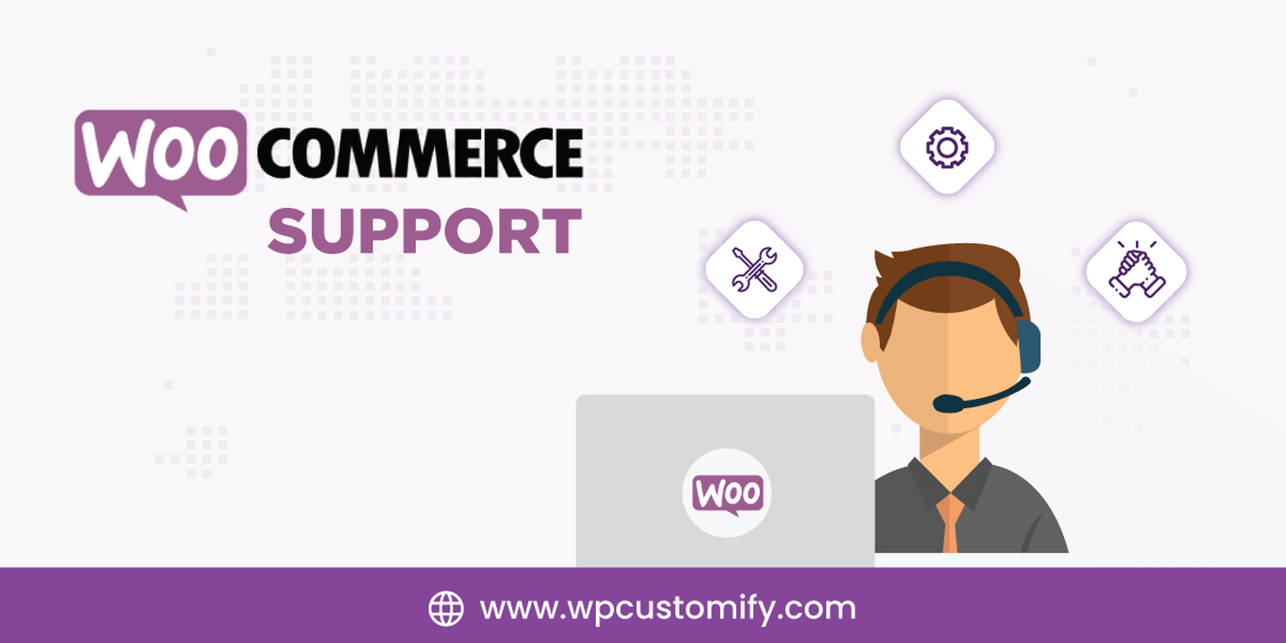
1. WooCommerce Support
WooCommerce is the most popular e-commerce plugin for WordPress, being used by all kind of merchants, both small and large companies.
WPcustomify is 100% focused on WooCommerce, having huge experience. They will help you with everything you need:
- WooCommerce Plugin Integration
- Configuration Support
- Support Services
Get in touch with them and let the experts manage all the issues and errors of your WooCommerce. Make the best out of your store, and help it get more traffic and convert better, by using the experience of WPcustomify.
2. actiTIME
Design and development projects require a high degree of precision and organization. To meet desired goals on time and budget, teams should adhere to initial estimates and deadlines impeccably. Besides, to be efficient and productive, they need to manage tasks and monitor progress in a systematic way.
actiTIME can assist developers and their managers in attaining these objectives effortlessly. As a high-quality and user-friendly timesheet app, it allows users to keep a detailed record of hours spent on multiple tasks and, in this way, collect data for consequent client billing and invoicing, as well as performance and productivity analysis.
However, actiTIME is more than just another time tracker – it includes powerful project management functionality that can help you:
- Manage project scope by adding new tasks and creating a detailed work breakdown;
- Allocate tasks to different team members;
- Set up estimates, deadlines and budgets;
- Review current work progress and modify task statuses on the Kanban board or in a simple list format;
- Receive notifications whenever the risk of cost and time overrun arises.
actiTIME’s flexibility makes it an excellent choice for both individuals and teams of any size. The tool can be configured to meet varying management needs and integrated with many other useful apps through Zapier or API. In addition, you can always use the actiTIME timer through the Chrome extension in Jira, Github and GitLab, which will allow you to track hours without any distractions from the primary work process. Sign up for a free actiTIME trial and bring your productivity to the next level.

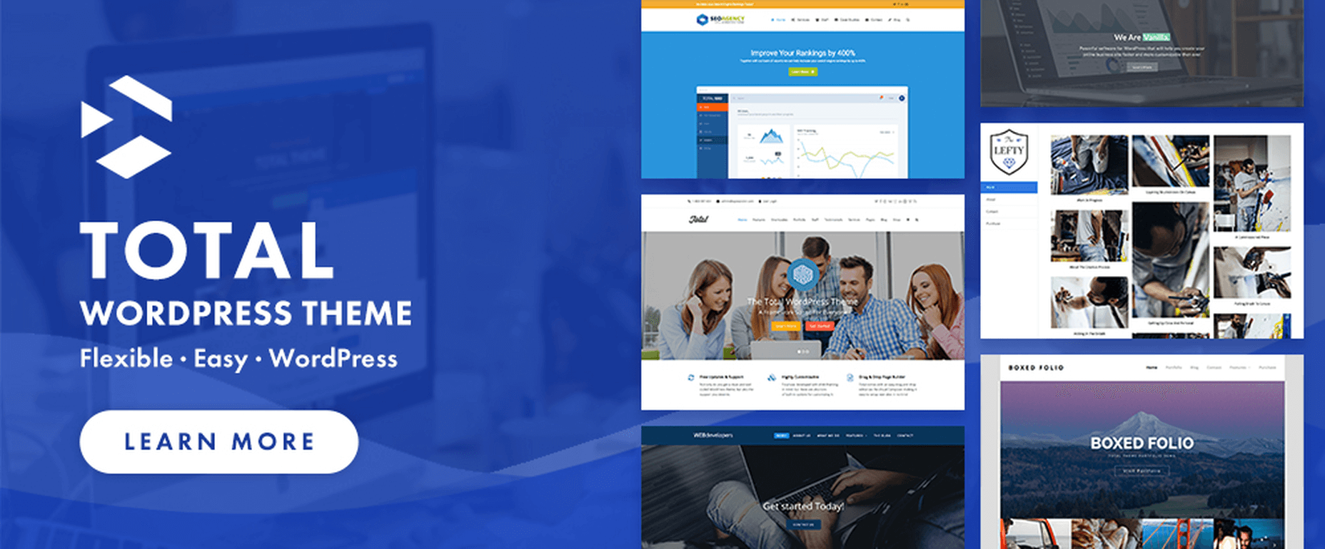
3. Total
Total is one of the most complete WordPress theme that you can buy in 2020, being filled with 80+ builder modules, 40+ premade demos that you can install with 1-click, and over 500+ styling options.
This theme has over 43k happy users and it is used by some of the best websites in the world.
This theme is developed and maintained by WordPress experts that have been a part of the WP community for over 10 years.
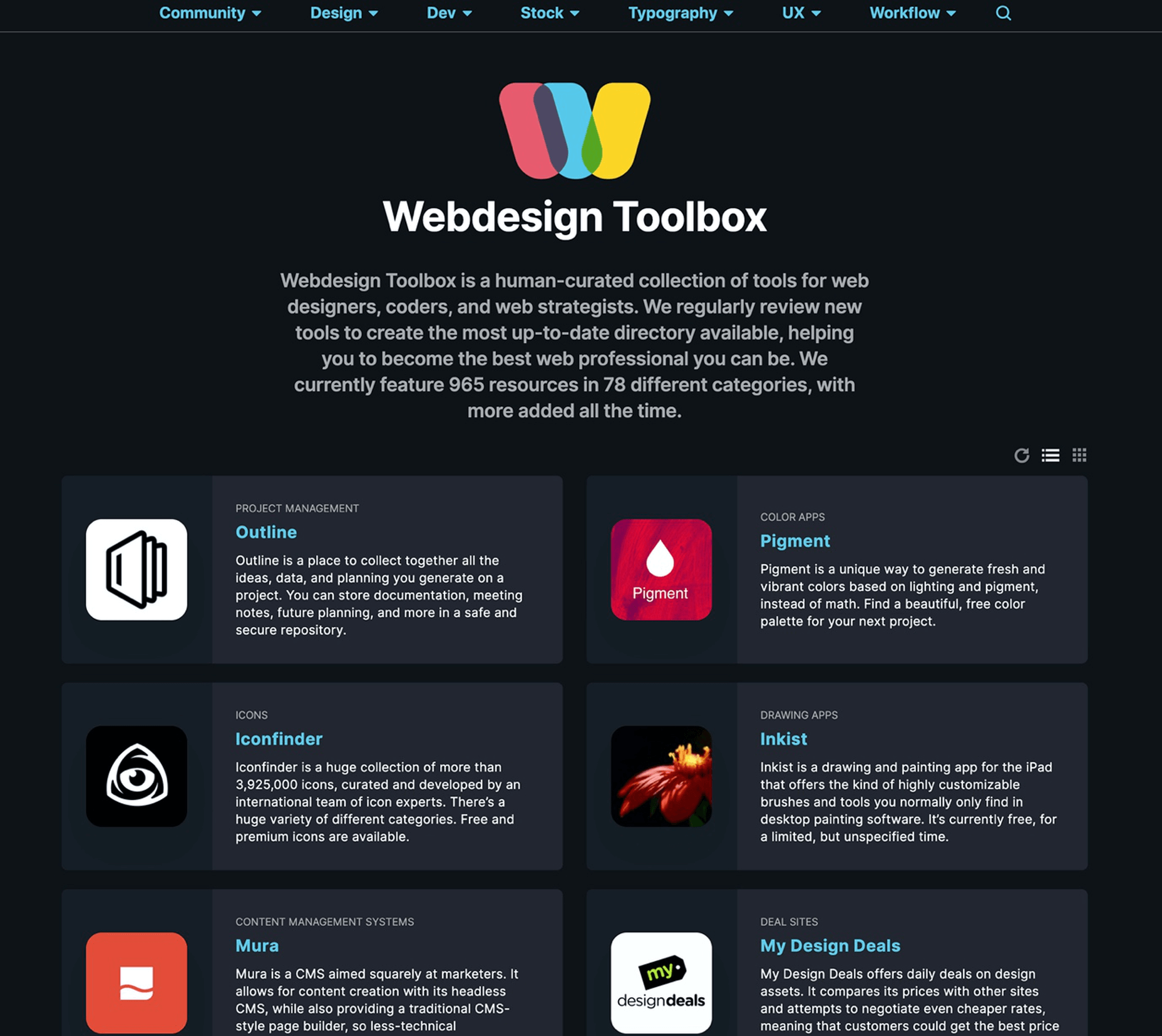
4. Webdesign Toolbox
Webdesign Toolbox will become a web design tools encyclopedia, currently featuring 965 resources in 78 different categories. Everybody was waiting for such a place and now it is live and heavily updated each month.
I just found out about this place and I can say that it is super. Having all the tools and services in a single place, very well categorized is super helpful. Now you don’t have to lose time on search engines and on ads (who pays more will get in front), you have everything at your disposal, in front of you.
Using Webdesign Toolbox is super simple to find the right web tools and services, just browse the website.
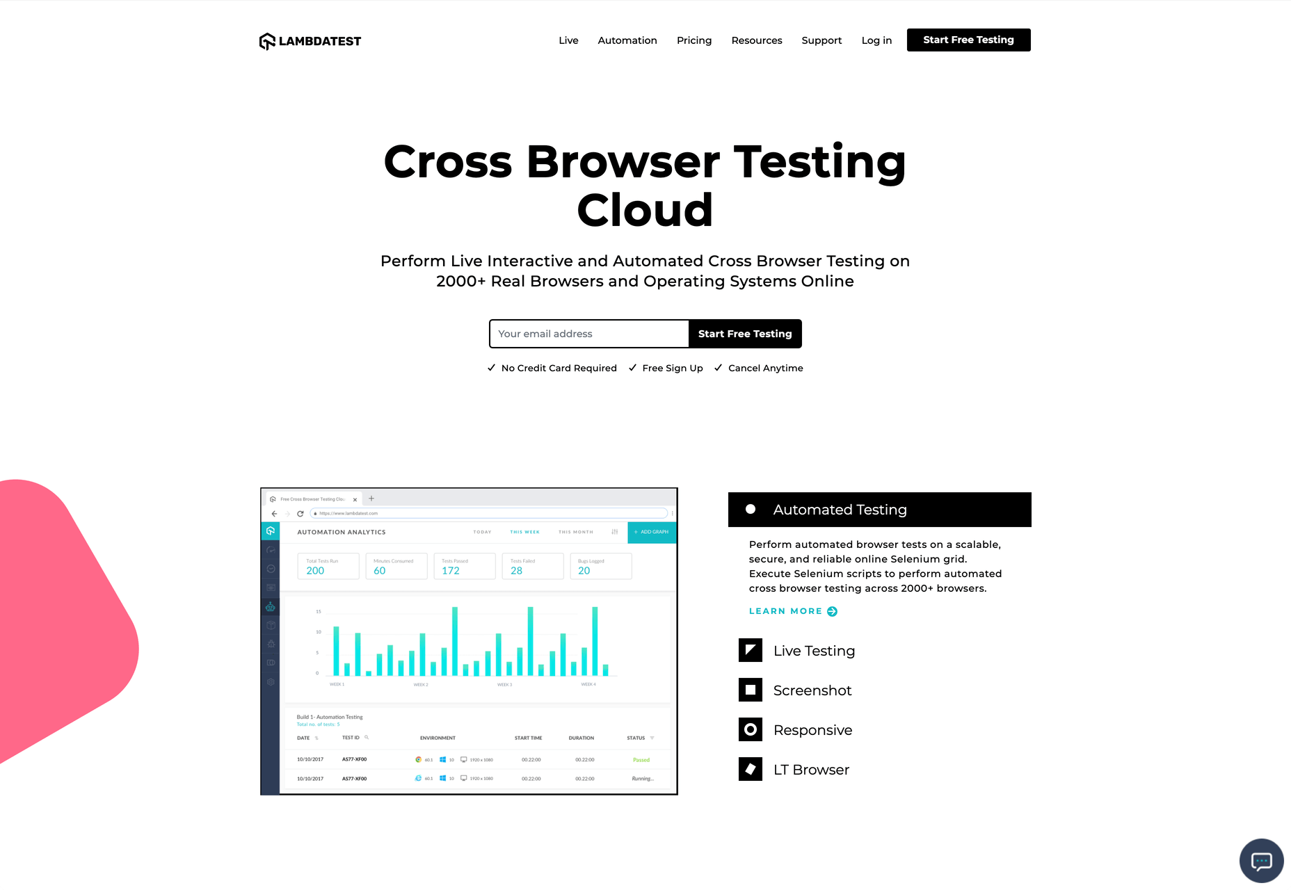
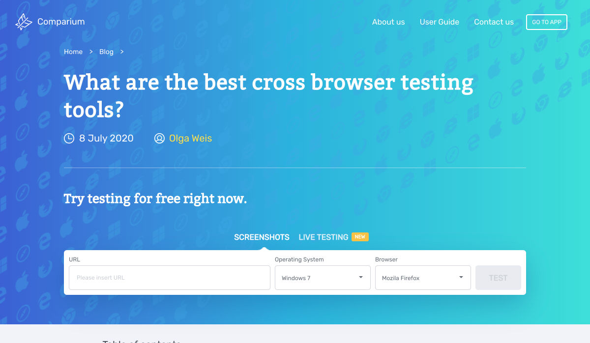
5. TestingBot
Trusted by some of the most innovative companies in the world (Microsoft, Disney, FOX, Grammarly, and many others), and with over 8 year’s experience in this market, TestingBot is a super solution that you can use for automated and manual testing.
It supports cross browser testing, live testing, real device testing, and tons of other things.
Start a free trial and see TestingBot in action.

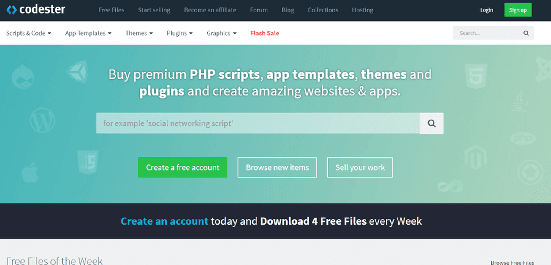
6. Codester
Codester is a huge marketplace where designers and developers will find tens of thousands of premium PHP scripts, websites templates, apps, plugins, and much more.
Always check the flash sale section where hugely discounted items are being sold.
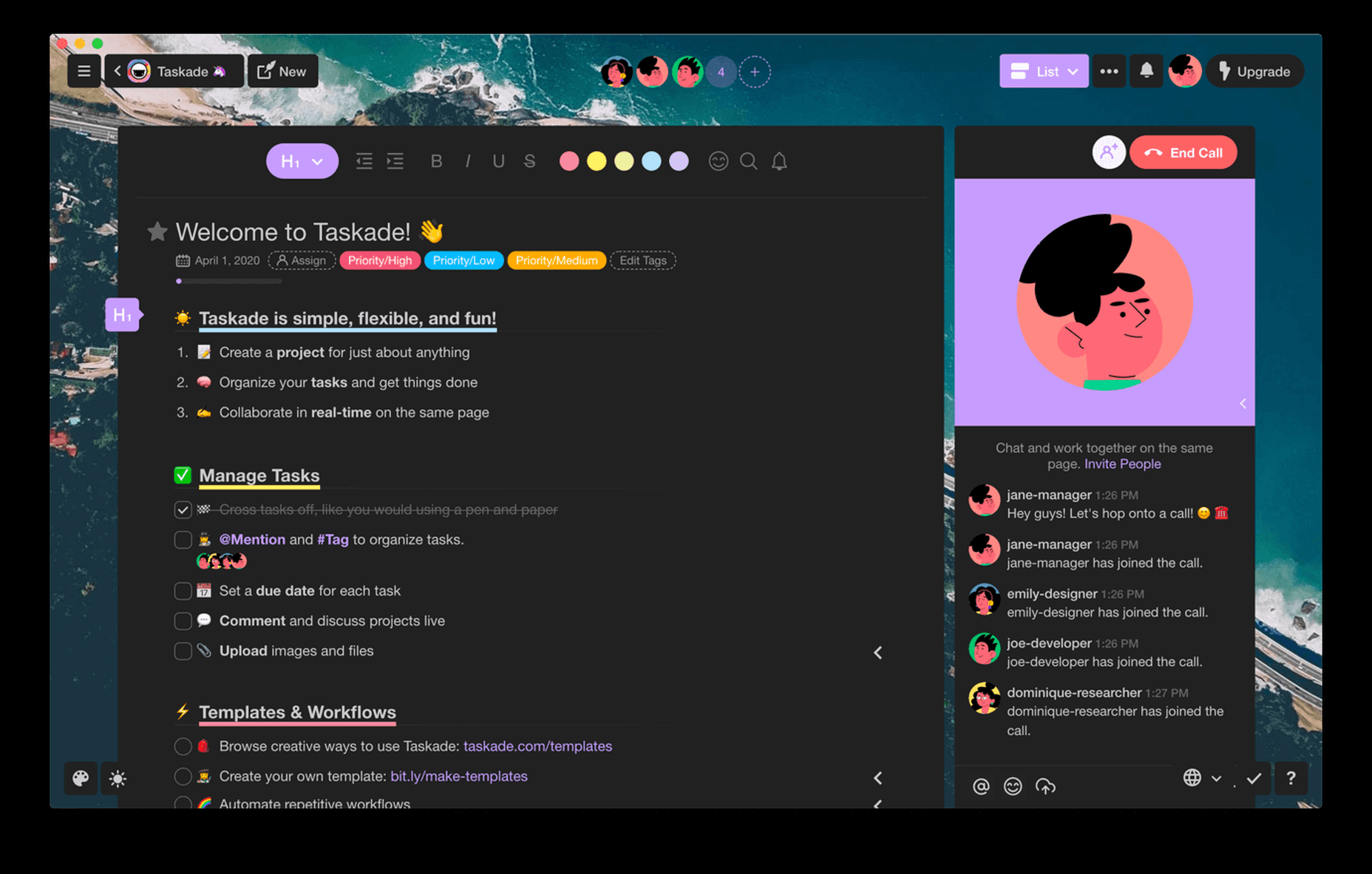
7. Taskade
Taskade is a super technologically advanced remote workspace (works from anywhere where there’s an internet connection) that you and your team can use for chatting, organizing, and getting things done.
You can build a workspace from scratch using the included editor, use a ready-made templates, or edit the one you want.
This collaboration platform is free to use for 10 projects.
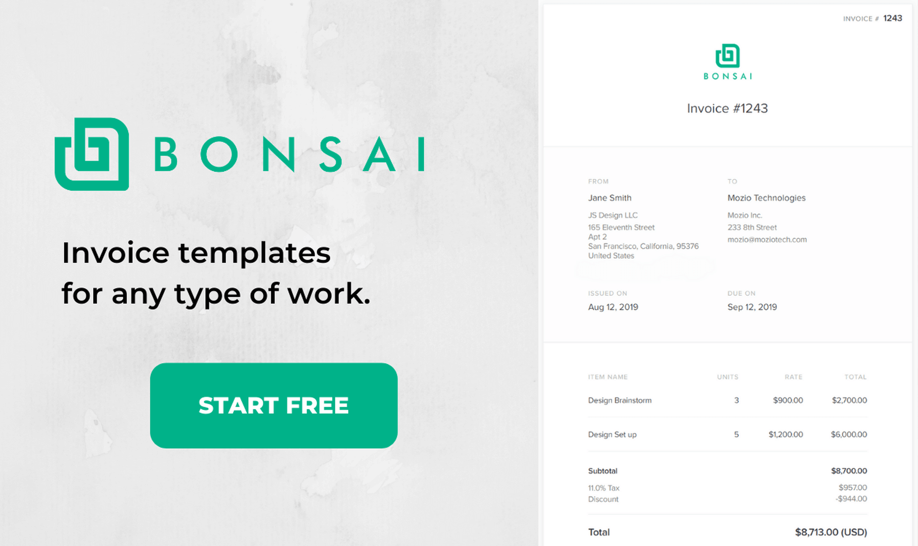
8. Bonsai Invoice Templates
Bonsai is a the best suite of software for freelancers, being the top choice of tens of thousands of freelancers from all over the world.
They help you with everything you need, and they even provide invoice templates for freelance professionals – designer, developer, writer, marketer, contractor, consultant, photographer, etc.
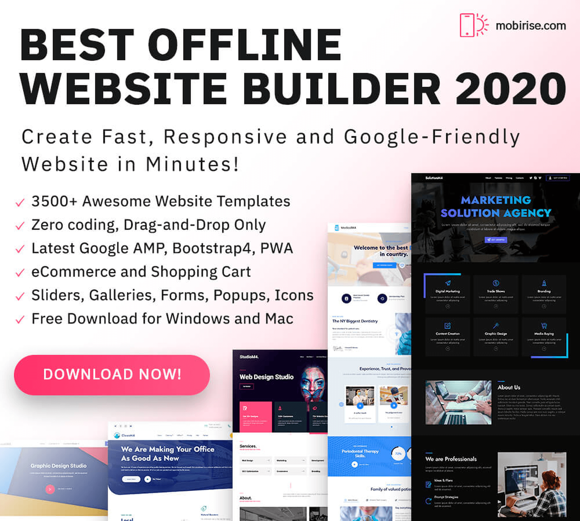
9. Mobirise
Mobirise is the most powerful offline website builder in 2020, being loaded with 3500+ awesome website templates, with sliders, galleries, forms, popups, icons, and even more.
Use it to create a unique website, no coding or design skills needed.
10. Goodie
Goodie was created by a team of experts that have super experience in the web development world.
This service is used mostly by web designers that need a reliable web development partner, and by customers that need to amplify their online presence.

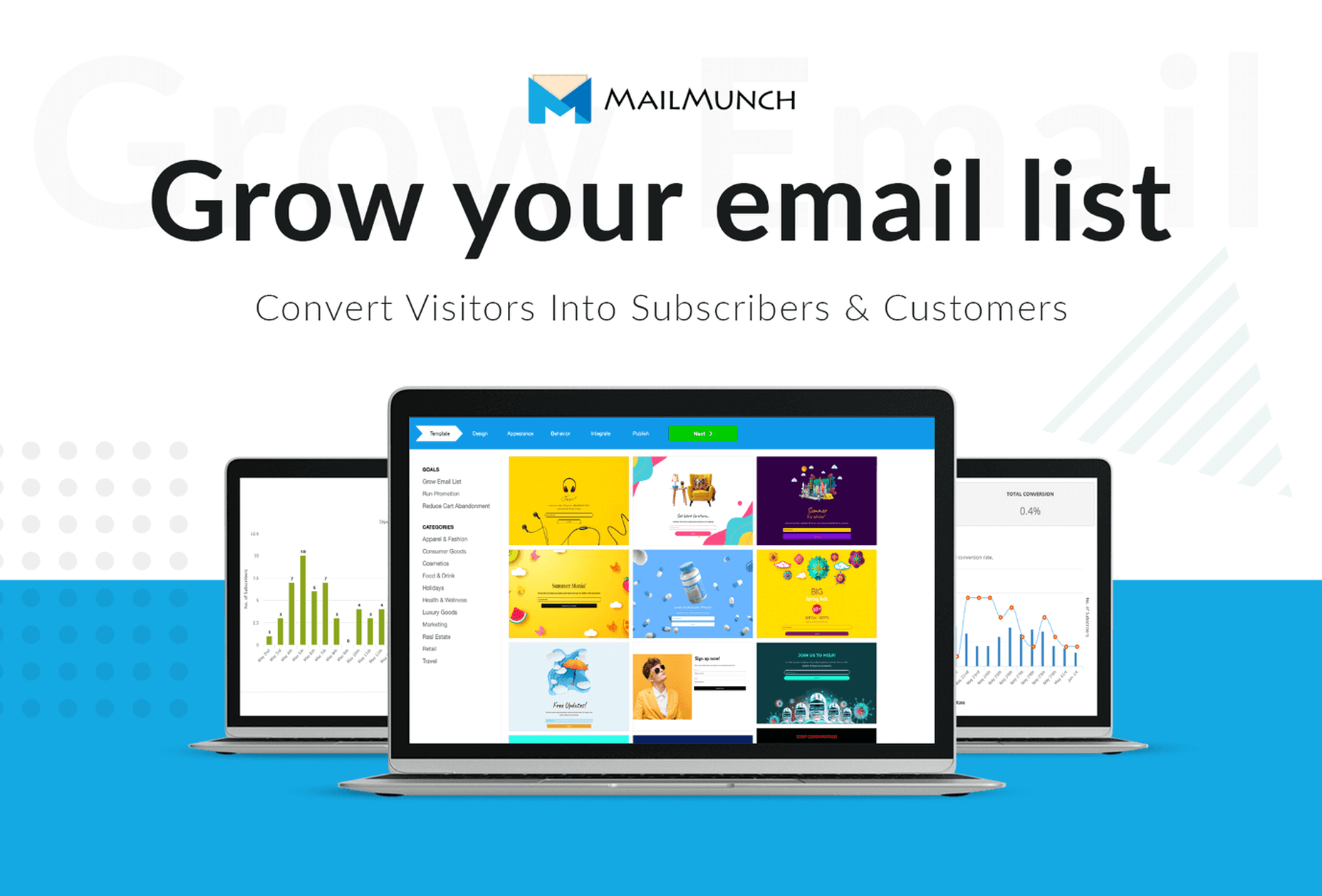
11. MailMunch
MailMunch helps you create eye-catching forms and landing pages in seconds – no coding or design skills required!
It is quick to set up, easy to learn, and packs a punch with built-in email marketing features and integrations with any email marketing service of your choice.
Boost conversions by up to 400% with this complete lead generation software.
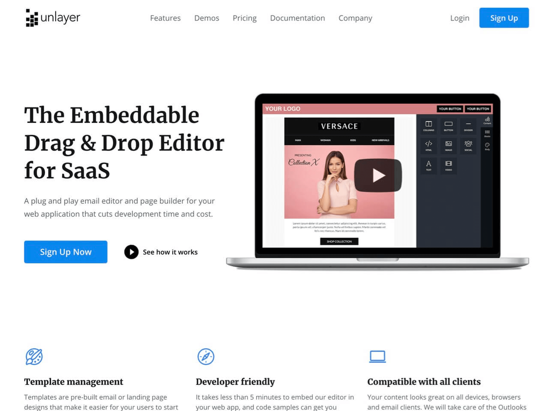
12. Email Template Builder
You want to let your website visitors create awesome emails and pages directly on your website? With Unlayer it is possible and it is super simple to implement this feature on your website.
This plug and play email editor and page builder can be embedded it in 5 minutes on your website.
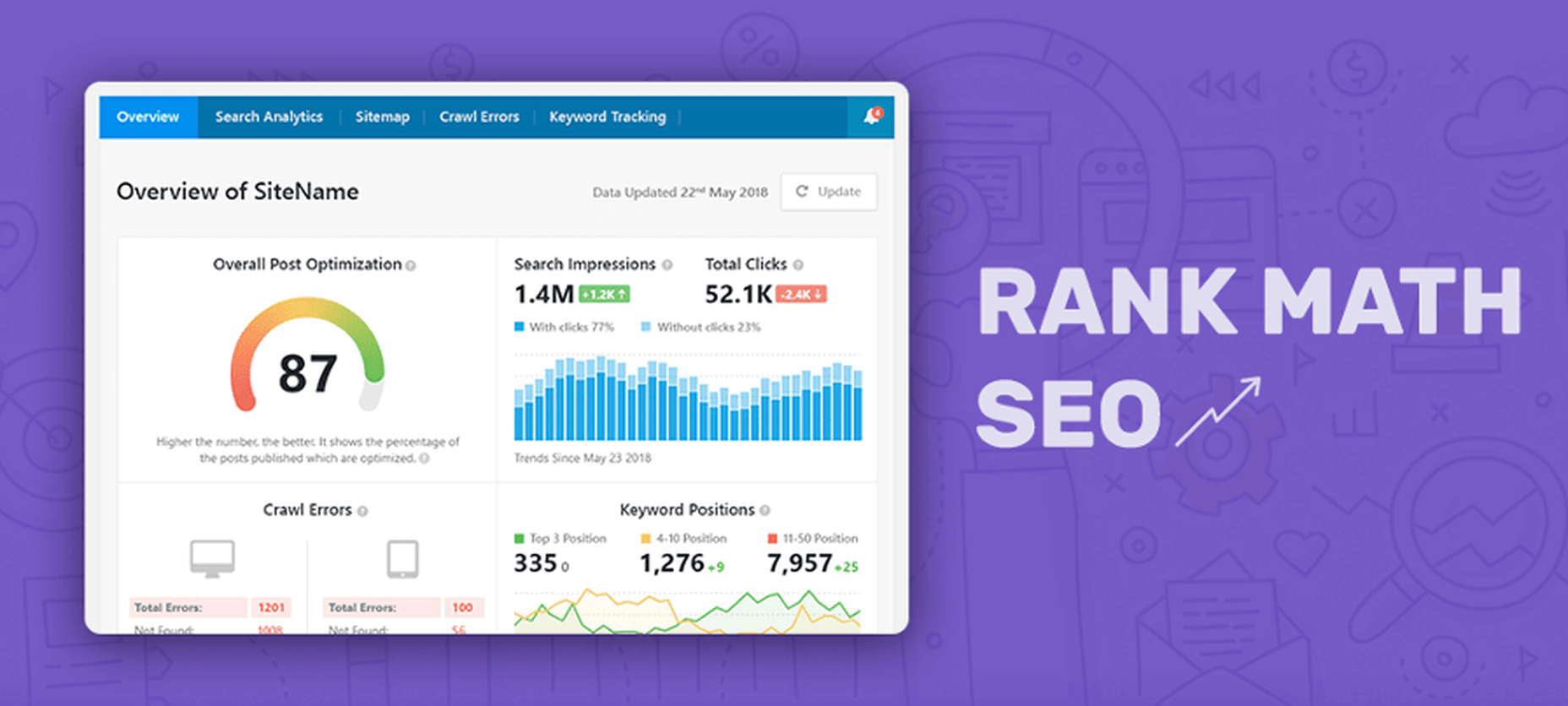
13. Rank Math SEO
Every WordPress website needs a powerful SEO plugin to take care of it. There is a huge difference between these plugins, some being extremely efficient.
One such efficient SEO plugin is Rank Math. This free WordPress plugin will make your website rank higher and get more traffic from your existing content.
Get it now, after a basic configuration the plugin runs autonomously.
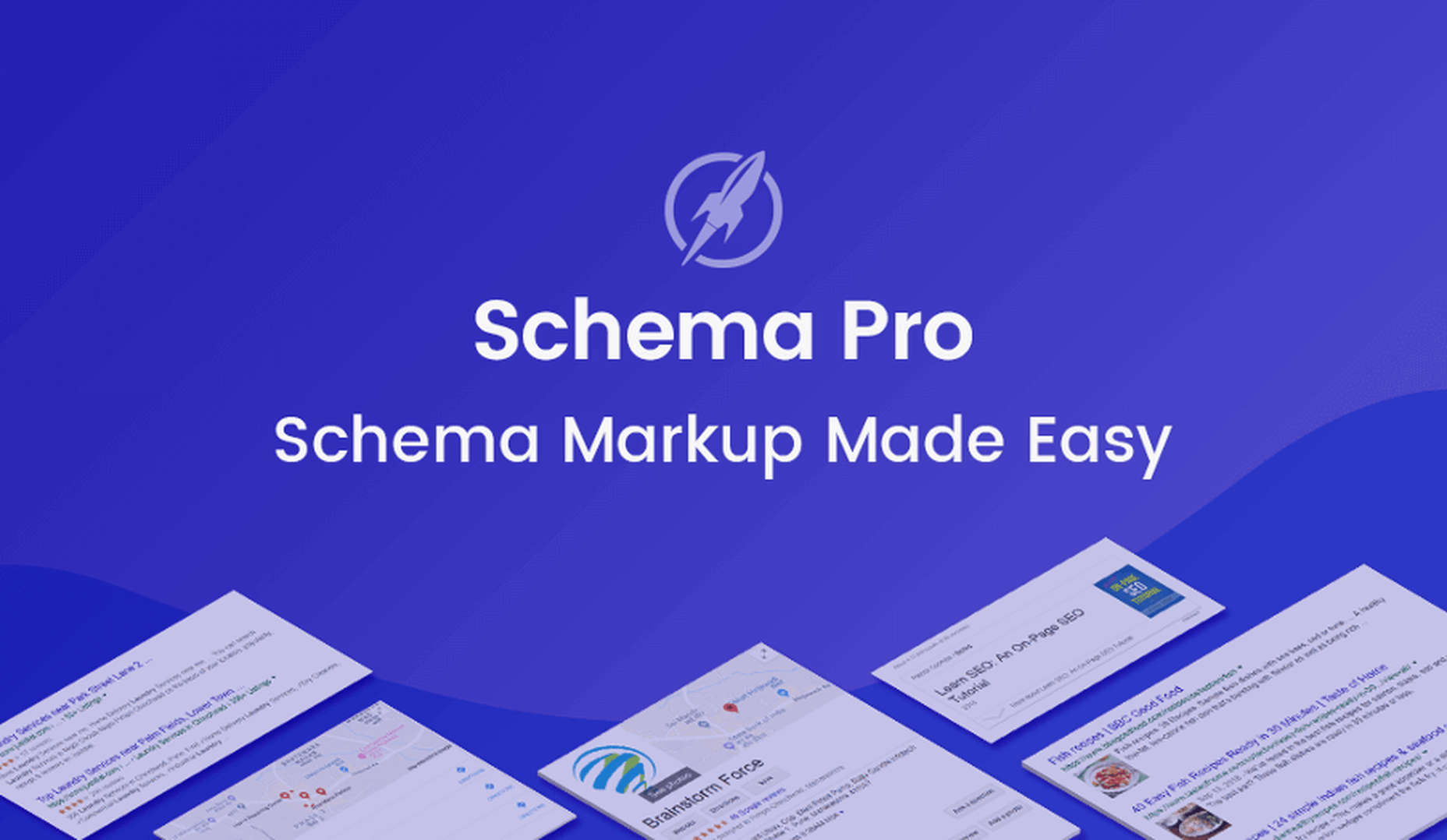
14. Schema Pro
Schema markups will make your website rank higher and get more traffic. To quickly add them, use Schema Pro. You press 1 button, and you select all the pages on which you want the schema markups to be added. It is so simple.
15. Landingi
Landingi is a brilliant landing page builder that will help you create awesome designs with no experience, no coding skills and no design ideas.
Create a landing page that converts and which is engaging, with Landingi is a simple task for everybody.

16. CollectiveRay
CollectiveRay is specialized in providing super in-depth tutorials and articles for WordPress, hosting, themes, tools, and all kind of platforms.
You should always browse it whenever you are looking for detailed and accurate information about all kinds of stuff.
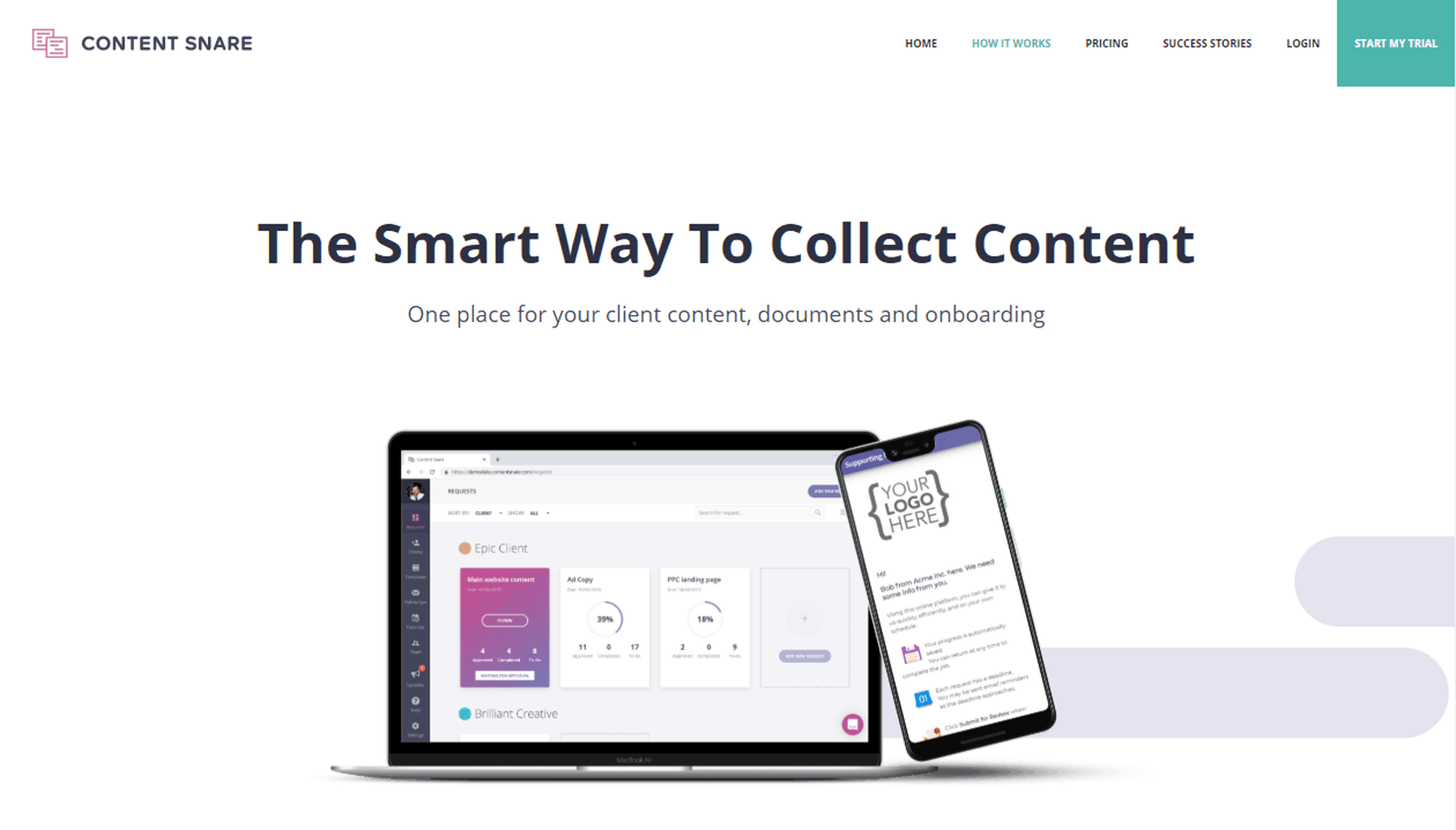
17. ContentSnare
ContentSnare is the smart way to collect content. Why is that? Because it is an automated service that will help you quickly gather content from your customers and partners, without losing time on this aspect of your business.
Configure it in a few minutes and right after ContentSnare will be on autopilot, collecting materials in your place.
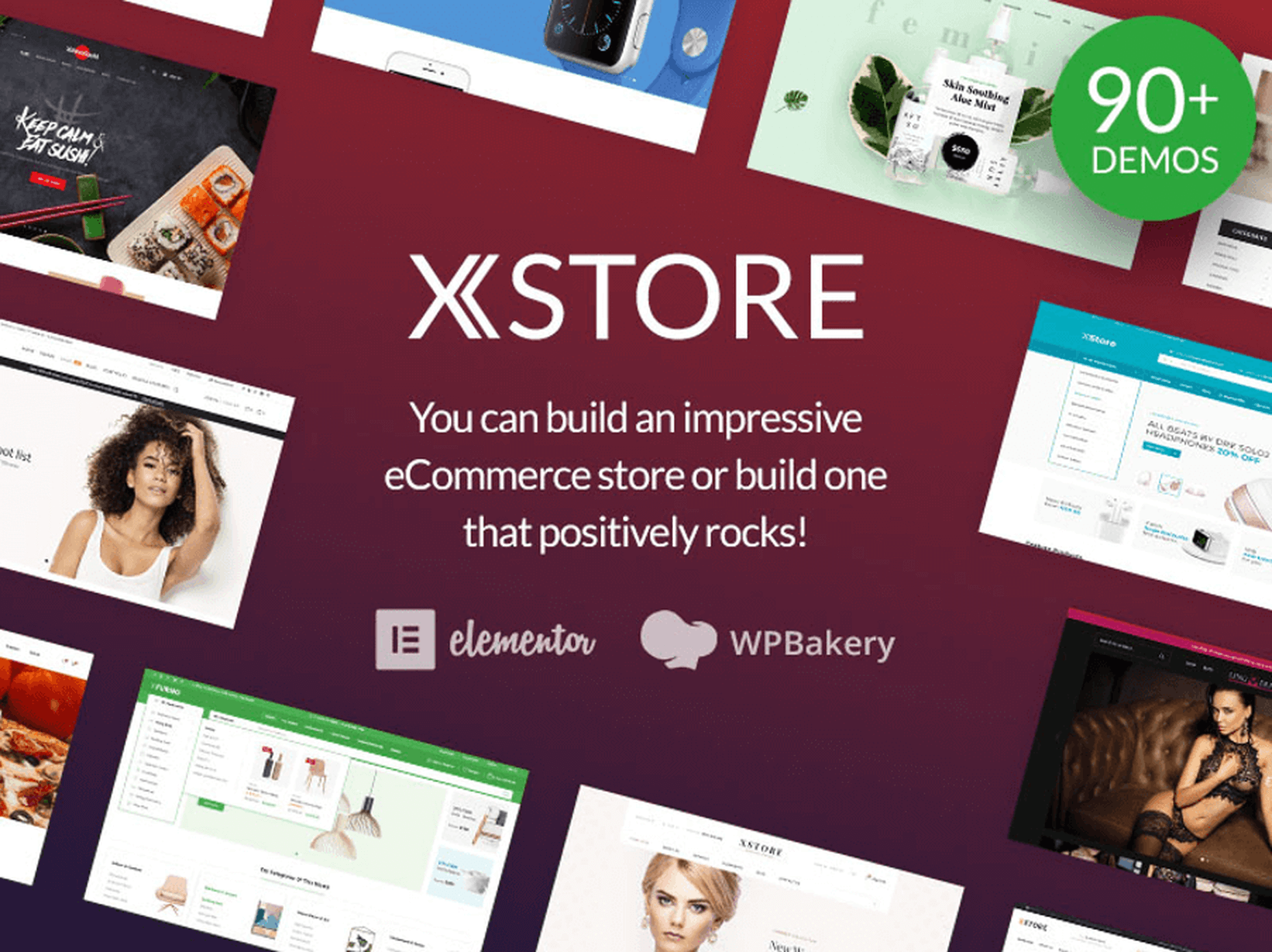
18. XStore – The King-Size WooCommerce Theme
XSTORE is the most complete WooCommerce theme that you can get in 2020. It has included over 90 shop designs, and it also includes several plugins that are worth $407.
Get it now and build a high converting store.
19. FixRunner
FixRunner is your personal WordPress support team that will take care of your website 24/7.
They offer several services:
- One-time fix – As the name says, they will fix a problem that you encounter on your WordPress website.
- Several packages for WordPress support and maintenance
- Speed optimization service
- Custom development
- Malware removal
- Site upgrade
- White label for agencies
Let the experts help you with everything you need so your WordPress website can get the best conversion rates.

20. Heroic Table of Contents Plugin
Heroic Table of Contents is the easiest way to add a table of contents to your WordPress website.
Are you using tables of contents? Everybody loves them, in articles and on websites.
Get your website to the next level with Heroic Table Of Contents, it’s free.
21. WrapPixel
WrapPixel is a popular name in the React templates world. They offer high-quality themes that look awesome and which are lightning fast.
Browse WrapPixel and pick what you need for your projects.
22. Pixpa
Pixpa is a professional website builder that people use to create all-in-one websites: a store, a blog, and a client gallery.
The editor is filled with tons of designs and elements, and it is super simple to use.

23. Astra
Astra is the fastest growing theme of all time, having almost 1 million users.
Why does everybody love Astra? Because it has pixel-perfect included designs, it is fast, SEO optimized, it is simple to use and configure, and it is optimized for conversions.

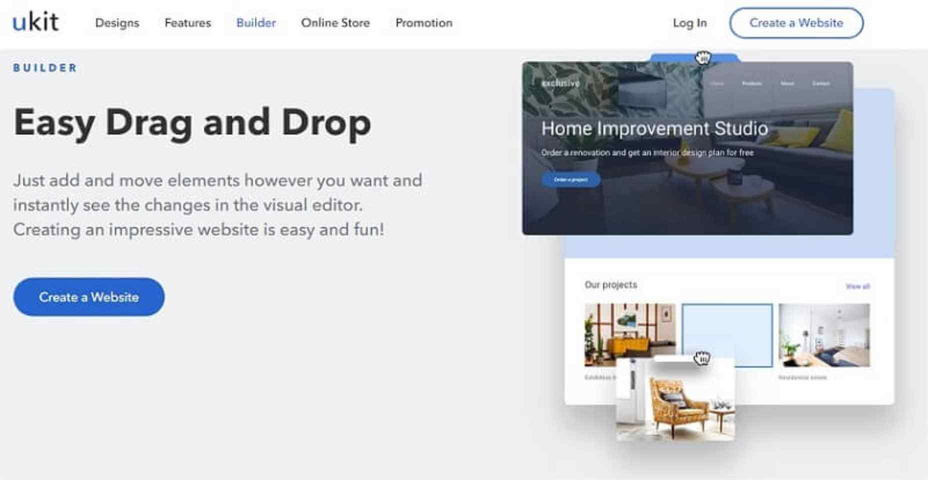
24. uKit
Meet a very affordable and convenient website builder uKit. It allows you to quickly kickstart your online presence. Prices start from 2.5 USD/month, you get a stable hosting, unlimited storage space, and a free technical domain. Lots of colorful up-to-date templates, responsive technical support, and the ability to connect your external domain. You can try it for free on a 14-day trial – no credit card required.
25. Fotor Online Photo Editor
Fotor is an online photo editor that is used by tens of thousands of web designers, online entrepreneurs, marketers, and people that have an online presence. Creating graphics and pictures that are engaging and converting is simple with Fotor, no need to have any design skills.
The interface will guide you every moment.
You can use Fotor also as a background remover.

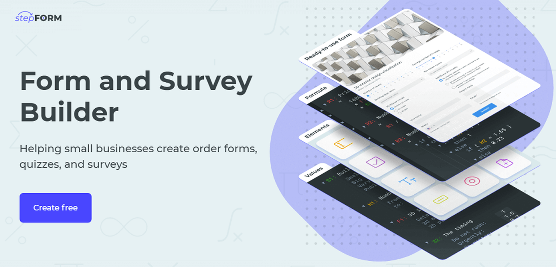
26. stepFORM
stepFORM is a first-class freemium service for building forms, quizzes, and various online surveys. The whole process becomes seamless and takes a few minutes because due to the visual intuitive interface no programming skills are needed. With stepFORM, you can add a calc to your website, enable online payments, manage your orders with built-in CRM, and more. Try it out today! Free!
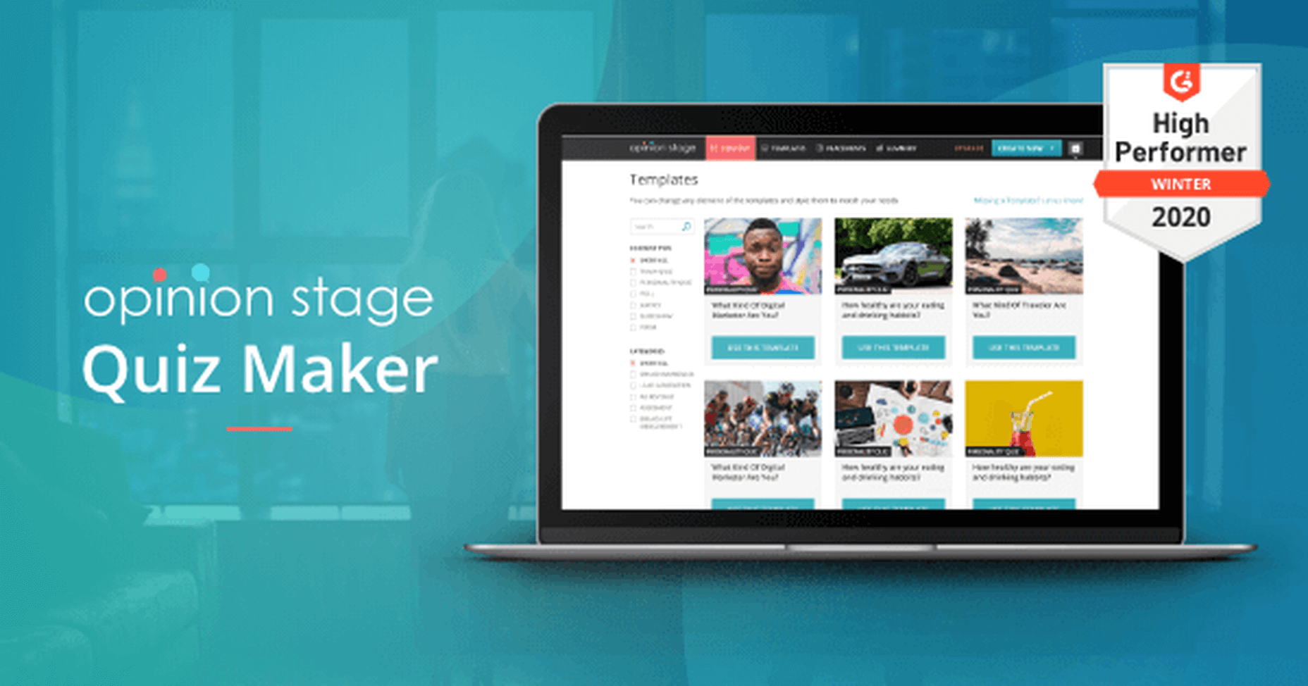
27. Opinion Stage Facebook Quiz
OpinionStage is a brilliant quiz maker that you can use with zero experience and zero design skills to create high-engaging quizzes.
Use the included editor and the beautiful elements to start designing your own content.
28. SuperbWebsiteBuilders.com
SuperbWebsiteBuilders.com focuses on reviewing and comparing website builders that refer to various business niches and make it possible to cover a broad spectrum of web design tasks. This information will be of great help to users looking for a professional web building platform to adhere to their needs. The resource also contains ratings and examples of websites created with popular website builders.

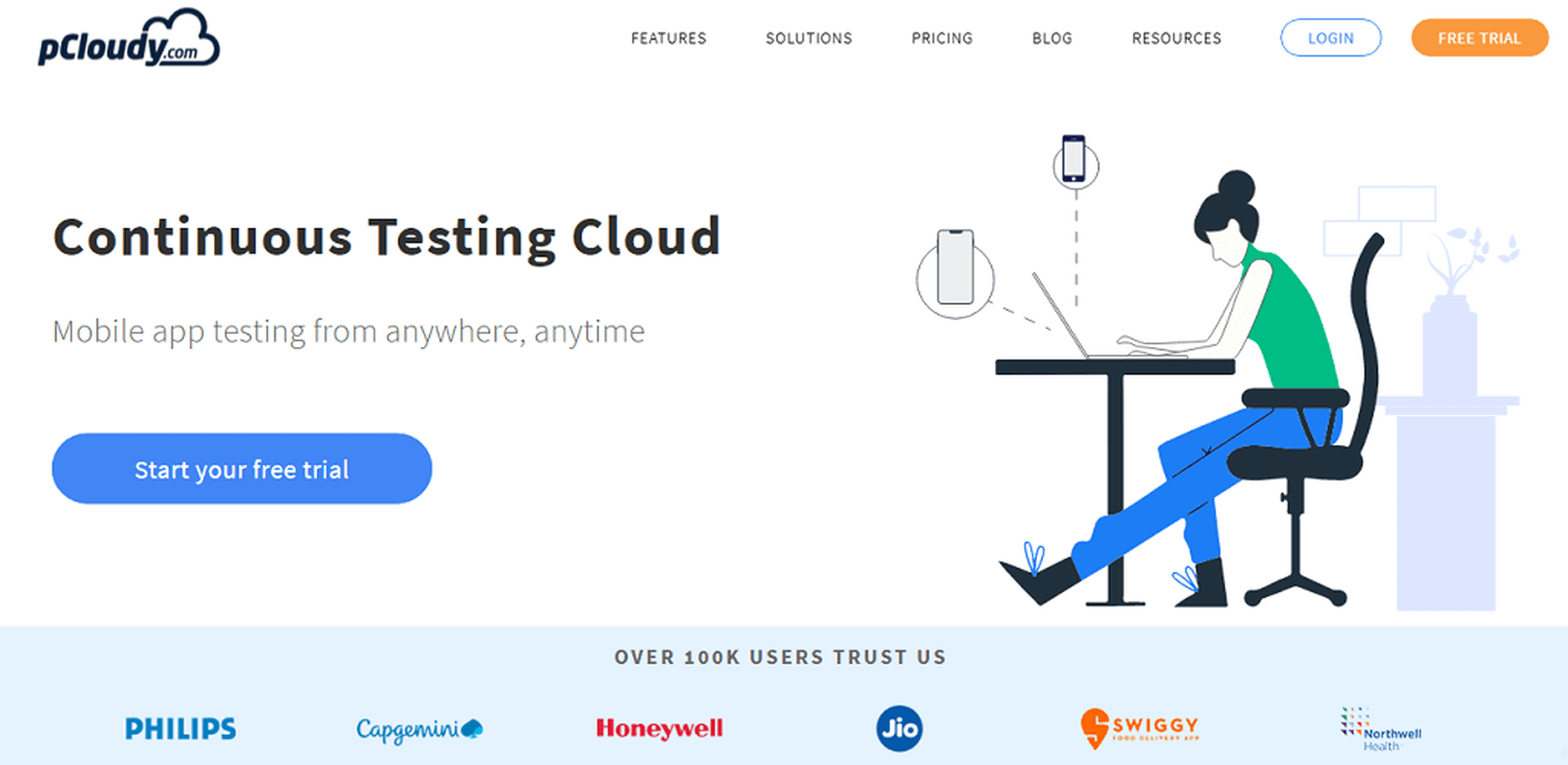
29. pCloudy
pCloudy is the right service to use for mobile app testing from anywhere and anytime. It has over 100k happy users and it is used by top companies like Philips, Honeywell and Jio.
Start a free trial to see pCloudy in action.
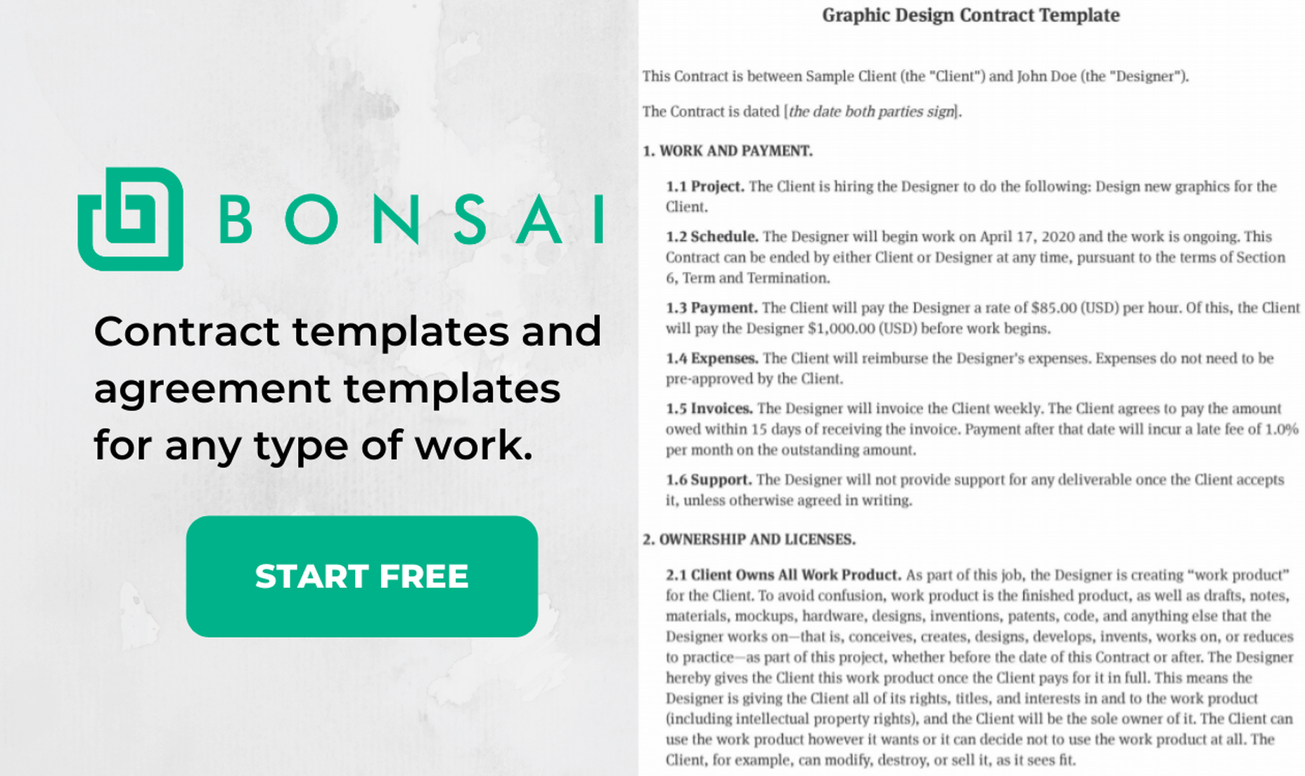
30. Bonsai Contract Templates
Bonsai is offering contract templates that will help you save time and look like a huge corporation.
You will find tons of templates to choose from, you will have the possibility to e-sign the contracts, and use automated reminders. It is super simple to use Bonsai for generating the right contracts for your projects.
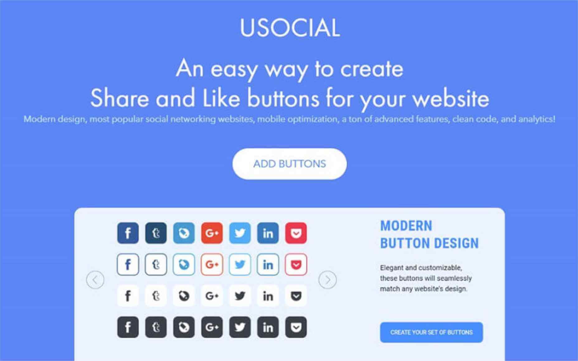
31. uSocial
uSocial is an elegant, lightweight social media icon design tool. Don’t waste time on manual assembling of icons or ordering them from freelancers – now you can design them yourself with uSocial. Make them float, follow the user as they scroll, or simply make them bigger and/or styled in the theme of your website.
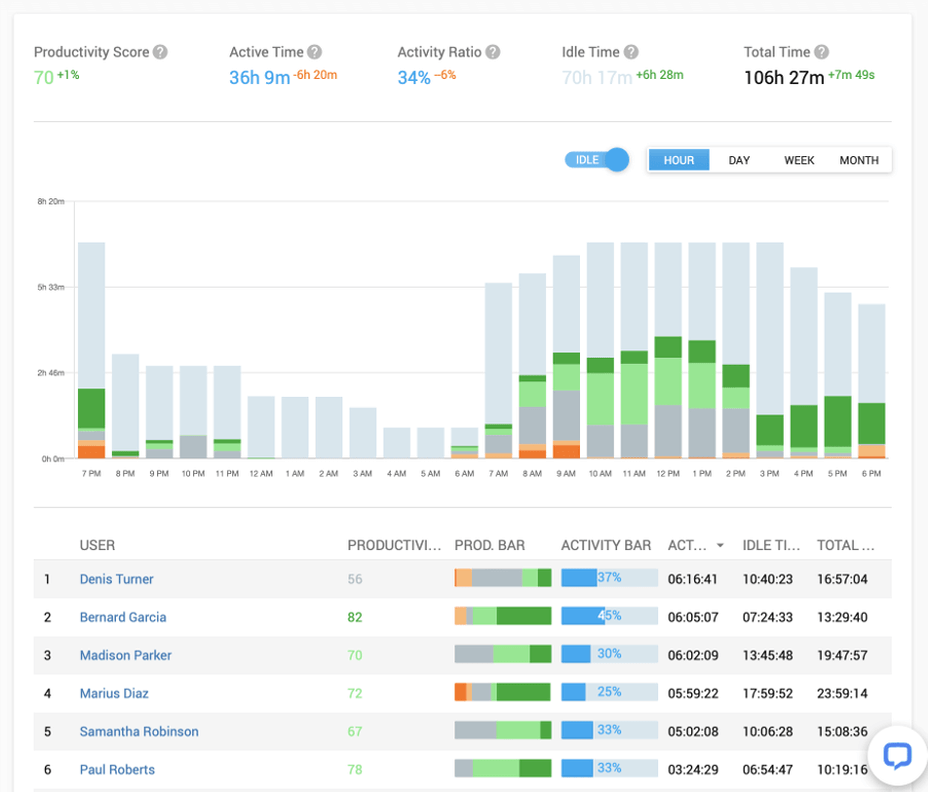
32. Controlio
Controlio will help you monitor your employees’ PC activity from anywhere, being the first choice of both small companies and enterprises.
Improve your company security and productivity by using this technologically-advanced software.
Start a free 14-day trial to see Controlio in action.
33. Wix2WP.Pro
Wix2WP.Pro is the all-in-one website migration platform that makes it possible to successfully transfer Wix-powered websites to WordPress. The service is a perfect solution for newbies as well as for web design pros, who lack time to handle the migration process independently. They employ qualified pros, who are ready to tackle all the special nuances of the website transfer procedure with precise attention to details.

34. WhatFontIs
WhatFontIs is the best font finder that you can use in 2020 to identify fonts for free, from any picture and from any website (or email).
This is the only software that has a huge database (over 620k indexed fonts) and which can identify both free and paid fonts, including Google Fonts.
Identify fonts like pros with WhatFontIs.

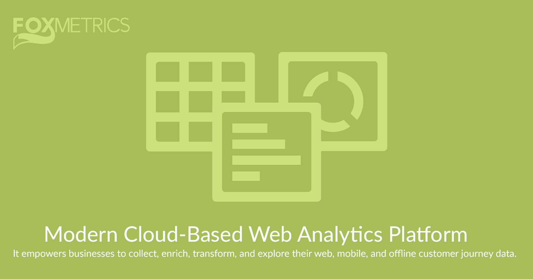
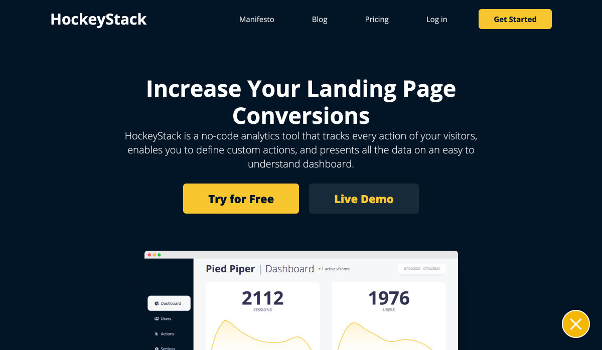
35. FoxMetrics
FoxMetrics is a super smart cloud-based web analytics platform that empowers businesses to collect, enrich, transform, and explore their mobile, web, and offline customer journey data.
It is much better than everything else.
36. Creative Tim
Creative Tim creates some of the best React, Vuejs, Angular themes, UI Kits, and elements.
They offer both free and paid stuff, take a look on what they offer. Once you use a Creative Tim product, you never go elsewhere.

37. SiteBuilders.PRO
When it comes to moving your website from one website builder or CMS to another, hiring the best SiteBuilders.Pro specialists will surely be an advantage. The platform has rich experience in transferring websites between popular web design systems. What they offer is text and graphic content transfer, web store data import, manual design replication along with SEO, web design and copywriting services.

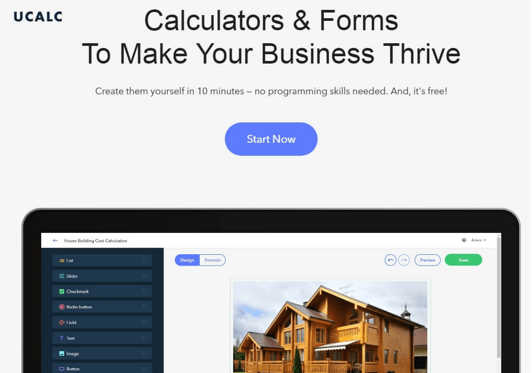
38. uCalc
uCalc is a real catch for those who don’t want to splash out on a developer or web designer to build a calculator or form for their website. The service provides you a library of attractive thematic templates and basic elements that you can add, delete, modify, and duplicate. Plus, you can connect the form/calculator with CRM systems. Try it out for yourself!
39. UPQODE
UPQODE is an eCommerce development agency based in the US. The company offers cost-effective services for all types of businesses. They use Shopify, WordPress and Woocommerce platforms to design user-friendly websites.
In addition to this, the agency offers digital marketing services. These include Google Ads setup, social media advertising, conversion optimization, online store optimization and eCommerce SEO solutions.
UPQODE comprises a team of experts who offer support services for eCommerce platforms with complex functionalities.

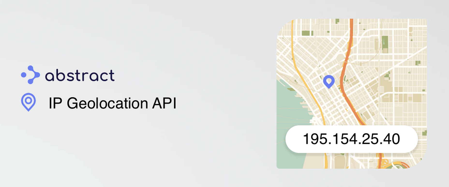
40. IP Geolocation API
Abstract is an online tool that will help you get the location of any IP with a word-class API serving city, region, country and lat/long data.
There are over 10,000 developers using Abstrat’s APIs because:
- It is easy to implement and maintain
- It has speed and it can scale
- This tool has reliable uptime and great support
41. Moderated group chat for live Q&A and Web Events
RumbleTalk will help you add a moderated chat on your website for free, in no time. The platform is filled with tons of features that you will love.

42. WordPressToWix.PRO
WordPressToWix.PRO focuses on ensuring easy, convenient and fast website transfer from WordPress to Wix. The platform also offers quality project promotion and preservation of search engine positions upon the completion of the task. The team of proficient web designers will gladly assist you with all the steps of the procedure, ensuring a top notch result.

43. uCoz
Get your online presence started with uCoz – a time-tested website builder that already powers millions of websites worldwide. It gives you the complete control over the code, and yet simplicity of the visual editor and a solid pre-built base. It offers you full creative freedom. Create the website of your dreams now, and for free with uCoz!

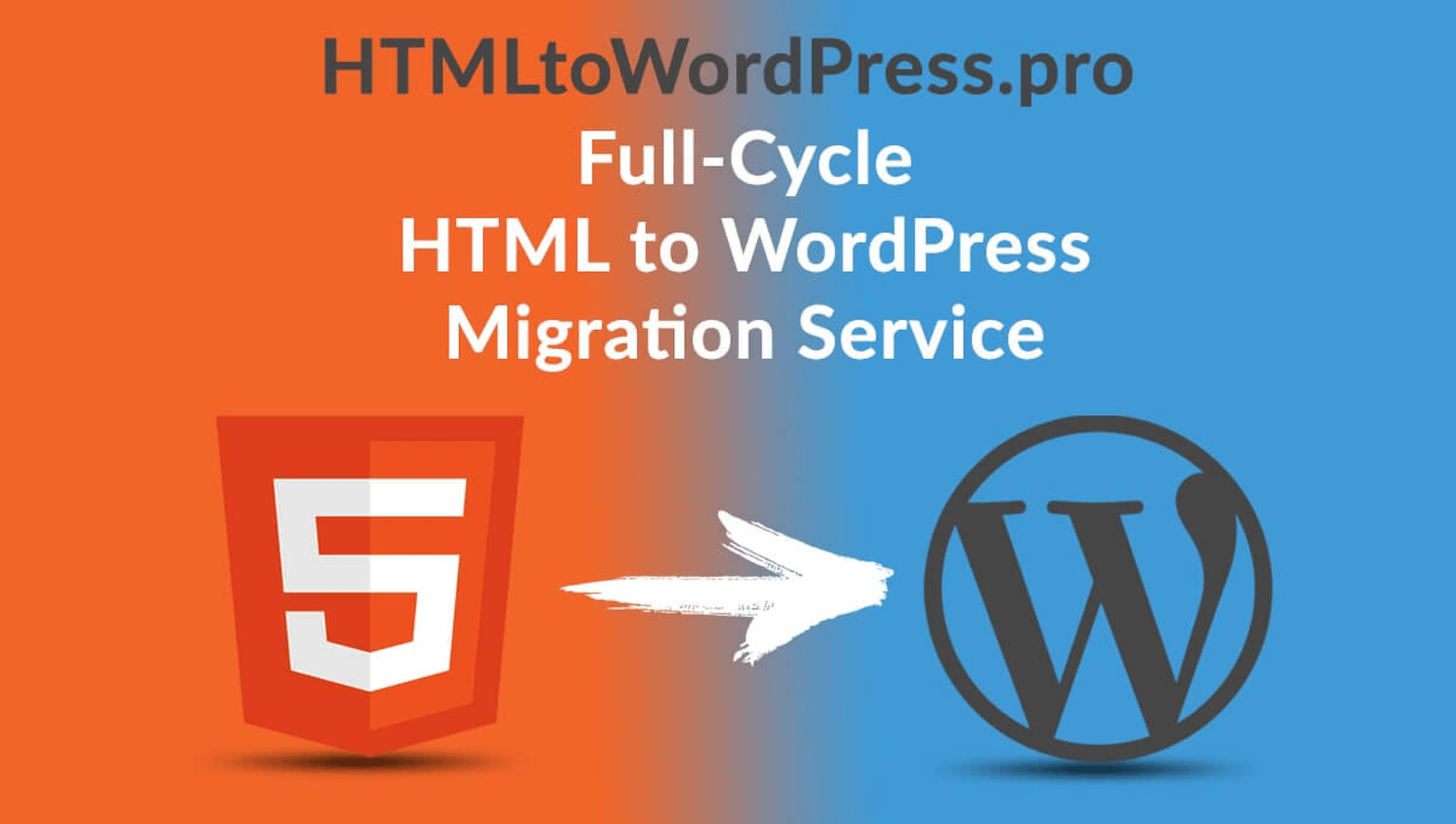
44. HTMLtoWordPress.PRO
When it comes to reliable, safe and professional HTML to WordPress website migration, it makes sense to contact HTMLtoWordPress.PRO experts. This is a team of professionals, who possess niche-specific knowledge and can boast years of expertise. This guarantees a safe and quick result that matches up to client requirements.
45. Blabber
Downloading the Blabber WordPress theme, you get an all-inclusive pack of tools and designs apt for the launch of a blog, online magazine, newspaper, or any other content-rich online resource. This is an ever-growing WordPress theme. It features a collection of 20+ homepage demos, which a new design added to the collection every week. The theme is fully based on the Elementor page builder and features full compatibility with a variety of WordPress plugins. It’s easy to set up the Blabber theme even if you are not a design or coding expert. The theme offers a rich selection of ready-to-go page sand layout styles, which you may adjust according to your specific demands.

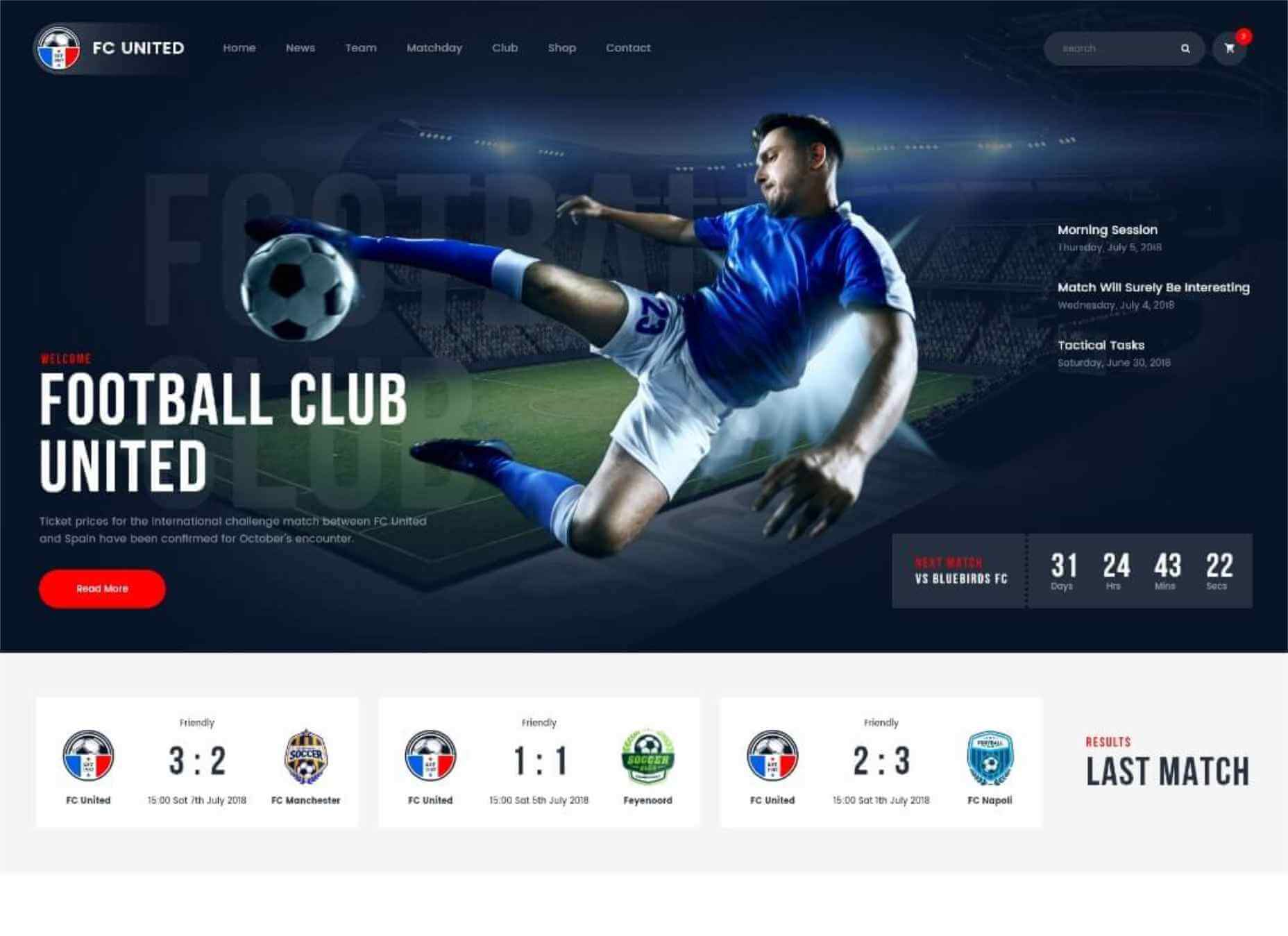
46. FC United
If you are looking for a ready-made WordPress theme that can become a rock-solid foundation for your sports-related website, then FC United will handle this job perfectly well. The theme is ready to be used for the launch of football and soccer clubs, as well as basketball and NFL web projects. The multi-functional layout of the theme includes all tools and features that you may need for the launch of a professional sports website. This includes match reports, league tables, team and player profiles with stats, outstanding galleries and shortcodes, and more. Whenever it’s needed, the theme can be enhanced with the eCommerce features owing to its full compatibility with WooCommerce.
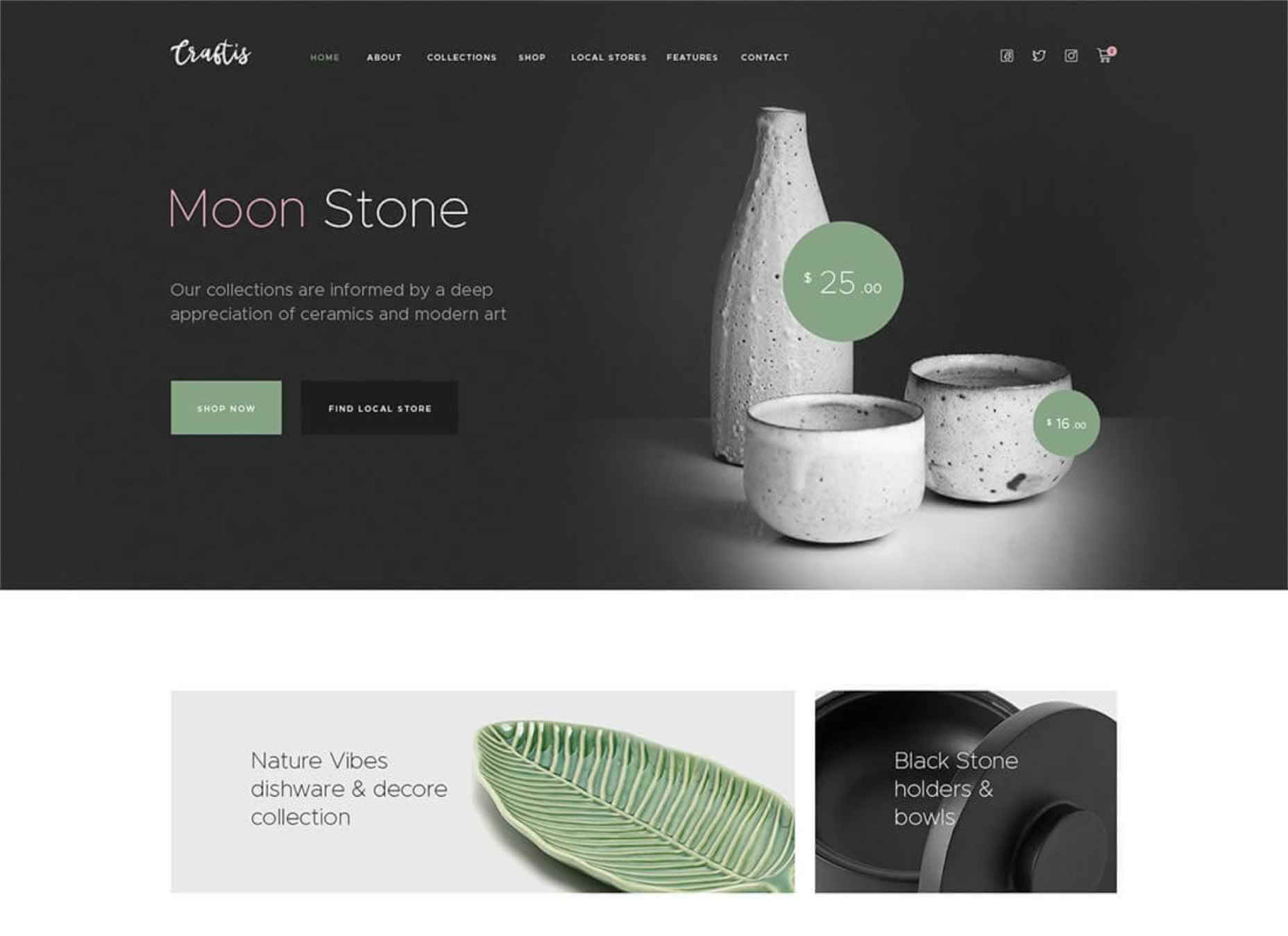
47. Craftis
If you are looking forward to launching handcraft services and goods websites, then Craftis WordPress theme will perfectly suit for this purpose. This is a multi-functional ready-made design featuring a collection of 10+ homepage demos under the hood. The theme is compatible with the Elementor page builder, which lets you apply all the necessary changes to the pre-built page in the intuitive visual mode. The theme also features a selection of ready-made pages that are suited for many different purposes. Using the Craftis theme, you may start selling online without any difficulties. The theme is also compatible with the Elegro Crypto Payment plugin that is perfectly suited for the launch of web stores.
Conclusion
There are lots of super-efficient and easy to use tools in this article. Make a schedule starting with today and start testing them.
Many times, simple solutions like this ai logo maker can make wonders for your website. Take your time to see these solutions in action.
[– This is a sponsored post on behalf of Mekanism –]
Source

Source de l’article sur Webdesignerdepot

 Every week users submit a lot of interesting stuff on our sister site Webdesigner News, highlighting great content from around the web that can be of interest to web designers.


 The common theme in this month’s collection of new tools and resources is “things that help you show off your work.” Many of these tools are made to help you better web products or apps or showcase designs with others.


 Every week users submit a lot of interesting stuff on our sister site Webdesigner News, highlighting great content from around the web that can be of interest to web designers.


 Every week users submit a lot of interesting stuff on our sister site Webdesigner News, highlighting great content from around the web that can be of interest to web designers.


 It’s no secret that the senior population is growing. By 2030, people over the age of 65 are predicted to make up


 Every week users submit a lot of interesting stuff on our sister site Webdesigner News, highlighting great content from around the web that can be of interest to web designers.


 I think of a creative practice as a combination of an approach (a design philosophy) and a series of techniques (craft skills); a good tool facilitates a technique, which in turn supports an approach.


 Every week users submit a lot of interesting stuff on our sister site Webdesigner News, highlighting great content from around the web that can be of interest to web designers.


 Every week users submit a lot of interesting stuff on our sister site Webdesigner News, highlighting great content from around the web that can be of interest to web designers.


