Articles

In application development, microservices is an architectural style where larger applications are structured as a collection of smaller, independent, yet interconnected services. While this allows for highly maintainable and testable applications (as each service can be maintained independent of the larger application), the problem with this method is the inherent complexity of interactions between microservices. It can be difficult for developers and team members to visualize how these microservices are connected to each other. We have been looking for ways to produce architectural diagrams that illustrate these interactions. We found that GraphViz helped us to solve part of this problem, as it can take the microservices structure of an application in the DOT language and convert it into a PNG format. However, we wanted this process to be even more user-friendly and more automatic, so that the user would not have to manually generate a DOT file of their microservices architecture. 

In-Browser Tool

As we could not find such a tool, we decided to create one ourselves. We decided that the most user-friendly interface would be to create an in-browser tool that allows the user to upload a jar  file containing a packaged service, and to have an image automatically rendered. This article discusses how we went about creating this tool and includes an example of what happens « behind the scenes » of this interface. 

Source de l’article sur DZONE

There are a lot of dark, retro vibes trending in website design right now. Although there are still some light projects popping up – including a pastel trend below – a lot of what we are seeing has a quite moody feel.

Here’s what’s trending in design this month.

Pastel Color Palettes

Let’s start with the trend with a lighter feel – pastel color palettes. While much of the web is trending toward dark aesthetics, there’s a segment that’s going in the exact opposite direction. Those sites feature soft, pastel color palettes that serve as a balance to all the super dark websites out there.

One thing about this website design trend is that it jumps out because of the stark contrast with all of the dark color palettes out there.

Each of these designs seems to use a pastel color palette as the basis for a background. A blur effect is paired with the colors to use pastels in a way that has a natural feel without appearing too feminine or light.

Robust uses blue and earth tones for a pastel background that feels modern and strong when paired with the hard-edged headline font.

Atmos uses a light pastel theme that takes you through the clouds with blues, and pinks, and purples. The pastel color scheme works well with the content which is airline-themed and makes you feel like you are flying through the sky. The colors are also soft enough to provide an easy reading experience.

Klezma is another design with the same pastel background with graduated color. The peach tones are fairly neutral and give plenty of room to the content.

Fonts with a Distinct Retro Look

Every one of these websites uses a typeface with a similar look and feel. This retro headline style is trending in a major way.

The best way to use this design element is for short words. This typeface design isn’t meant for a lot of words or when readability is a high priority.

This style is all about creating a specific kind of vibe for your website. The typefaces in this trend have a quite retro look and feel with an almost 1960s or ’70s feel to them. The rest of the design mimics this feel as well with colors and surrounding elements that contribute to the overall look.

A couple of common elements here include the use of all capitals font sets and letterforms that include odd shapes and lines.

Sretks not only uses a retro typeface but bends and twists it a bit too to add to the old-school feel. The background color helps add to the groovy vibe.

Barge 166 uses a retro typeface with the same design feel as the other examples but with a sharper, more serif-style edge. It’s easier to read but still carries a retro look and feel. Use a typeface similar to this if you want to capture that retro font style for a trending look while maintaining as much readability as possible. This option works best for multiple lines of words in a large size.

Picky Joe uses a retro typeface with rounded letters and a bit of a tilt to the characters to create a distinct feel. This is definitely a style that has to be used sparingly but can be a fun option, depending on the content of your website design.

Dark “Product” Sites

Dark mode design is probably the biggest design trend of 2022. Everywhere you look, websites are using dark color palettes and styles. Designers are creating more projects with a dark/light toggle so users can control their experience.

This visual concept is carried over to website designs that feature products as well. This is one of the last places the dark aesthetic had not touched. It’s been a bit of an unwritten rule that product images should be on white or light backgrounds to help make them easy to see and inspect digitally.

This design trend bucks that idea and features products on dark backgrounds – some with so little contrast that you almost have a hard time seeing the products. (Maybe these brands are banking on the idea that you already know them or are selling a lifestyle product.)

HQBC sells bike accessories such as glasses and helmets and the site has a sleek look and feel. You know it is cool from the second you land on it. The question though – is there enough visual information with the dark background to help you make a purchase? This design probably works because it only encourages you to find a physical location to make a purchase rather than buy online.

Doggystyle Shop also banks on the idea of you knowing the shopping experience or brand when you arrive. What the design does do though is put products on white backgrounds after you have clicked through far enough to make a commitment to buy. This helps you see the product well one final time before making a purchase. (The challenge is that it is three to four clicks in for the most part.)

FirstFit uses the design trend in a way that’s similar to the first example. They are showing a product, but not actually trying to convert sales on the website. Other links take you to more product information and content – using a lighter background and color scheme – and the dark background with the product serves mostly as a highly visual landing page that will help entice users to learn more. When it comes to dark mode and products, this seems to be the best option for most website designs.

Conclusion

The state of the world around us and our emotions can play hard into websites and other design projects. Some of the darker elements that are popular now may be a reflection of that or it could be more of a lean into dark mode schemes.

Either way, the web has a pretty dark feel right now.

Source

The post 3 Essential Design Trends, July 2022 first appeared on Webdesigner Depot.

Source de l’article sur Webdesignerdepot

The General Data Protection Regulation (GDPR) was big news for companies when it came into effect in 2018. It aimed to put more controls on how organizations manage the personal data of their EU-based users. Since the law’s enactment in 2018, some US states, such as California and Virginia, followed suit and passed their own data privacy laws for their respective residents. Companies that do business in those regions now have to ensure they comply with these legal requirements.

This post is the third in a series about what developers need to keep in mind when sorting out security and compliance for their application. The first article in this series covered how to build security for user communications, the second was about compliance certifications and regulations for SaaS apps, and this one is all about GDPR and customer communications. GDPR and similar regulations cover all communications from a company to its customers and prospects, including marketing and transactional notifications. If you are considering sending notifications to the users of your SaaS application, whether via email, push, or a Slack bot, you need to keep GDPR in mind when building your service.

Source de l’article sur DZONE

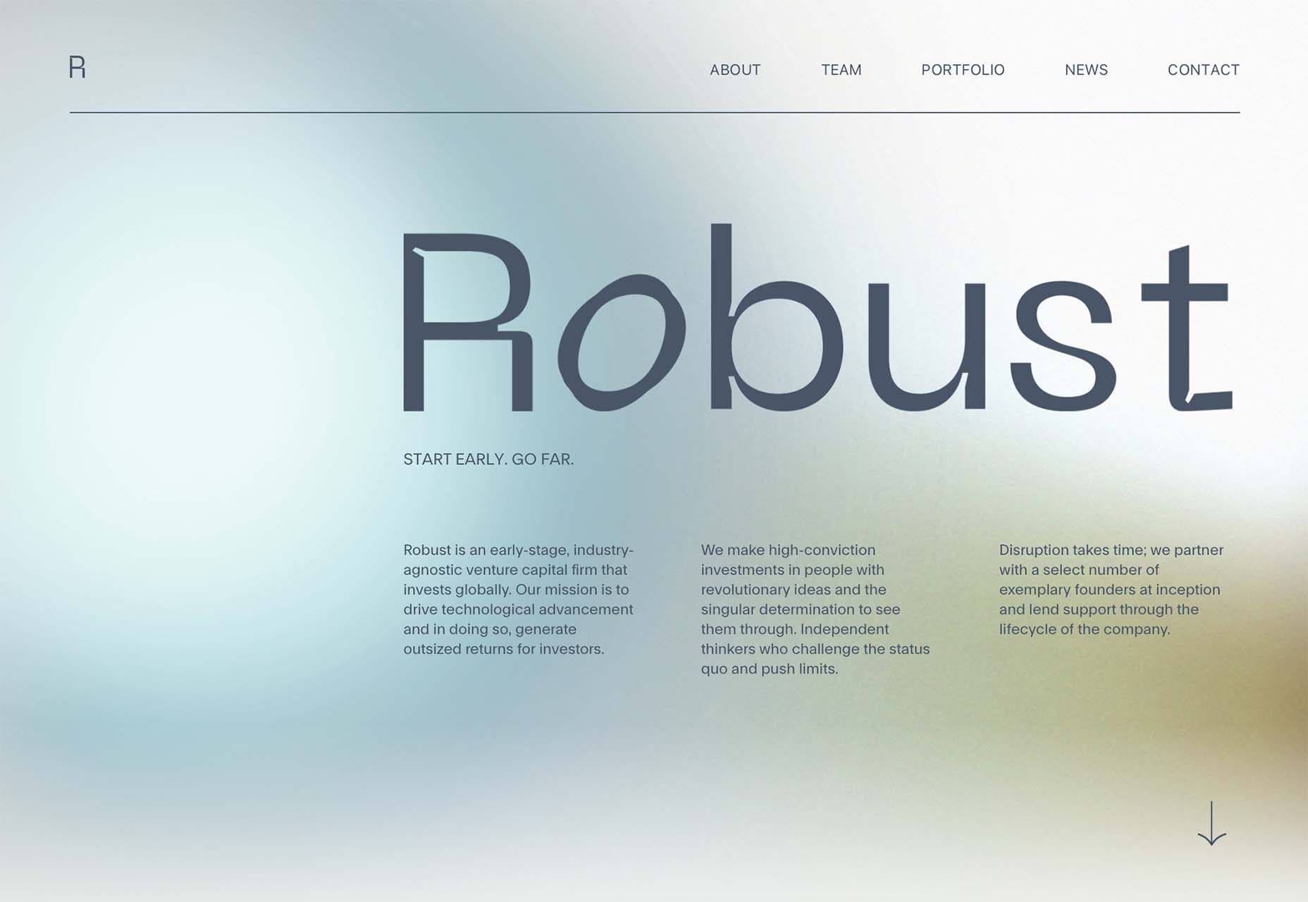
The hardest part of designing websites for a living is setting your prices. Setting a fair price for your services is something that nearly all of us struggle with.

If you’re lucky, you’re part of an agency that has experienced design leads who can assess projects objectively. But if you’re a freelancer — or if you’re one of those design leads — you have to set your own rate.

It’s a challenge to find a sweet spot in the market. You want to be competitive or you’ll price yourself out of jobs. But you also want to be able to live the lifestyle you aspire to.

The truth is there is always someone cheaper. There is always someone who believes the ‘exposure’ myth and will do a project for free. You can’t compete on price, and you really shouldn’t try. If you have been competing on price, you are almost certainly undercharging for web design. Where you should compete, is on quality and results.

When you’re no longer competing on price, you can put your rates up.

How Much Do You Charge for Web Design Services?

To find out what most professional designers charge, we’re asking you to answer the following two questions (anonymously).

We’d like to know how much you charge for web design services per hour. (We don’t necessarily recommend you charge by the hour, but with projects varying in scope this is the best way to compare pricing.)

Because the value of the dollar varies a great deal — $1 goes a lot further in Patagonia than it does in Norway — we’d also like to know how much you charge per hour as a percentage of your monthly housing cost (your rent or mortgage).

Remember, most experts in the field agree: No matter how much you’re charging for web design services, you’re probably undercharging. Perhaps it’s time to put your prices up.


Featured image via Pexels.

Source

The post Are You Undercharging for Web Design Services? first appeared on Webdesigner Depot.

Source de l’article sur Webdesignerdepot

Over the years, I’ve been in various discussions regarding the benefits of clean architecture, best practices, techniques such as code reviews, unit tests, etc., and I think to some degree, most of us are aligned on the reasons behind it. Having a clean architecture or code-base not only makes your development team happier, but it has a far-reaching impact on the business itself.

In this post, we will learn about NDepend, which is described on their website as the following:

Source de l’article sur DZONE

UX laws are an invaluable tool, providing guidelines for designers that ensure we don’t have to continually reinvent the wheel when crafting experiences for the web.

However, UX laws tend to be devised by scientists and psychologists — people who are more than comfortable with the exceptions and allowances of academic language. By the time they filter down to us in the trenches, the language has invariably been over-simplified, and the wisdom behind the idea diluted.

Today we’re going to look at seven well-known and commonly cited rules of UX design that too many designers get wrong.

1. Jakob’s Law

Jakob’s Law, named for the UX researcher Jakob Nielsen, states that users spend most of their time on other sites and as a result prefer sites that work the same way as the sites they already know.

Jakob’s Law has often been used to limit experimentation and encourage the adoption of common design patterns in the name of usability.

However, the word ‘prefer’ is hugely loaded. While it’s true that a user will more easily understand a familiar design pattern, they do not necessarily prefer familiar experiences.

It has been widely proved that new experiences boost our mood and that new experiences improve our memory. If your goal is a memorable site that leaves users with a positive impression, introducing novelty is a sound decision.

2. Goal Gradient Hypothesis

The Goal Gradient Hypothesis assumes that the closer users are to their goal, the more likely they are to complete it.

It’s an attractive theory, especially in e-commerce, where it is often used to justify simplifying the initial purchase process and postponing complexity to move users along the funnel — a typical example is leaving shipping charges until the final step.

However, anyone who has studied e-commerce analytics will know that cart abandonment is a huge issue. In North America, shopping cart abandonment is as high as 74%.

We don’t always know what the user’s goals are, and they may not match ours. It may be that users are treating your shopping cart as a bookmark feature, it may be that they have a last-minute change of heart, or they may be horrified by the shipping charges.

While providing a user with an indication of their progress is demonstrably helpful, artificially inflating their proximity to your preferred goal may actually hinder conversions.

3. Miller’s Law

Never in the whole of human history has any scientific statement been as misunderstood as Miller’s Law.

Miller’s Law states that an average person can only hold seven, plus or minus two (i.e., 5–9) items in their working memory. This has frequently been used to restrict UI navigation to no more than five items.

However, Miller’s Law does not apply to items being displayed. While it’s true that too many options can lead to choice paralysis, a human being is capable of considering more than nine different items.

Miller’s Law only applies to UI elements like carousels, which have been widely discredited for other reasons.

4. Aesthetic-Usability Effect

Edmund Burke once said, “Beauty is the promise of happiness.” That belief is central to the Aesthetic-Usability Effect, which posits that users expect aesthetically pleasing designs to be more usable.

Designers often use this as a justification for grey-on-grey text, slick animations, and minimal navigation.

Critical to understanding this is that just because users expect a design to be usable does not mean that it is or that they will find it so. Expectations can quickly be dashed, and disappointment often compounds negative experiences.

5. Peak-End Rule

The Peak-End Rule states that users judge an experience based on how they felt at the peak and the end, rather than an average of the experience.

Designers commonly use the Peak-End Rule to focus design resources on the primary goal of each experience (e.g. adding an item to a cart) and the closing experience (e.g. paying for the item).

However, while the Peak-End Law is perfectly valid, it cannot apply to open experiences like websites when it is impossible to identify a user’s starting or ending point.

Additionally, it is easy to see every interaction on a website as a peak and even easier to make assumptions as to which peak is most important. As such, while designing for peaks is attractive, it’s more important to design for exceptions.

6. Fitts’ Law

In the 1950s, Paul Fitts demonstrated that the distance to, and size of a target, affect the error rate of selecting that target. In other words, it’s harder to tap a small button and exponentially harder to tap a small button that is further away.

UX designers commonly apply this law when considering mobile breakpoints due to the relatively small viewport. However, mobile viewports tend not to be large enough for any distance to affect tap accuracy.

Fitts’ Law can be applied to desktop breakpoints, as the distances on a large monitor can be enough to have an impact. However, the majority of large viewports use a mouse, which allows for positional corrections before tapping.

Tappable targets should be large enough to be easily selected, spaced sufficiently, and tab-selection should be enabled. But distance has minimal impact on web design.

7. Occam’s Razor

No collection of UX laws would be complete without Occam’s Razor; unfortunately, this is another law that is commonly misapplied.

Occam’s Razor states that given any choice, the option with the least assumptions (note: not necessarily the simplest, as it is often misquoted) is the correct choice.

In an industry in which we have numerous options to test, measure, and analyze our user interfaces, you shouldn’t need to make assumptions. Even when we don’t need extensive UX testing, we can make decisions based on other designers’ findings.

Occam’s Razor is a classic design trap: the key to avoiding it is to recognize that it’s not your assumptions that matter, it’s the users’. As such, Occam’s Razor applies to a user’s experience, not a design process.

Source

The post 7 UX Laws You’Re Probably Getting Wrong first appeared on Webdesigner Depot.

Source de l’article sur Webdesignerdepot

Moving from studying design into the big wide world of web design is a daunting process. It’s a competitive and dynamic industry that’s growing all the time. It’s estimated that between 2020 and 2030, web designer jobs in the US will increase by 13%. One of the most challenging aspects of starting a career in web design is getting hired, especially as a freelancer. 

The first thing that most clients and agencies look for is usually your level of professional experience. They want to work with someone who, while perhaps not a veteran, has at least a few years of experience. This can lead to a lot of frustration for new designers. After all, how are you supposed to get experience if nobody hires you? 

Moreover, clients and agencies miss out on promising candidates when they pass up on skilled designers just because they don’t have experience. 

Here’s why we should all give zero-experience designers a chance.

1. Price

Professional web design doesn’t come cheap, and for a good reason. Most freelancers who have been in the business for many years have built a solid reputation for themselves and have no shortage of work. Web design agencies have a higher degree of accountability and a quality guarantee, which is why hiring their services can cost more. 

If you’re looking to get design work done on a tight budget, you’ll have better luck contacting someone with little or no experience. However, they’re most likely looking to build up their portfolio and will gladly offer you competitive rates.

2. No Experience Doesn’t Mean No Skill

Clients often assume that anything produced by an inexperienced designer will be sub-par or unusable. While it is true that an extensive portfolio is a good sign, it isn’t the only reason to hire someone. 

New web designers may not be as well versed in business, but many of them are still highly skilled and motivated individuals with a lot to offer. 

Whether self-taught or college graduates, they have devoted countless hours to becoming good at what they do. Instead of passing on a zero-experience candidate, give them a chance to show you what they can do with a mock-up. If you’re still dubious, then go with someone else. But you never know what someone has to offer until you put them to the test.

3. They Will Prioritize Your Job

As we’ve already established, finding work as a fresh-faced web designer can be challenging. This means that those with little to no experience are more likely to have time to devote entirely to your project, as they won’t be splitting their focus.

Agencies and well-established freelancers usually juggle several different projects at a time, meaning they will take longer to produce a result. If they happen to be working on a higher-paying job simultaneously with yours, you can guess which one they’ll prioritize. 

It’s always comforting to know that the person handling your design work is focused on you and you alone. You know your project won’t be on the back burner or forgotten about. 

4. You Will Foster Loyalty

This applies more to big web design agencies. New designers know their lack of experience counts against them, even for entry-level positions. If you choose to look past that and hire them anyway, they won’t forget it in a hurry. 

Once you’ve hired them, you have all the time in the world to help them learn the ropes. Include them in projects headed up by more experienced designers, give them lower priority jobs, and create an environment where their technical skills can flourish. 

Everyone has to start somewhere, and you can bet that they will remember who decided to give them an opportunity when nobody else would. A few years later, when they’ve found their feet in the industry, you’ll have a skilled, experienced designer with something you can’t buy: loyalty. 

5. They’re Eager to Learn

Industry veterans eventually become somewhat set in their ways. They develop their unique style and way of doing things, and while this isn’t bad, it’s different from someone freshly entering the industry for the first time. 

New designers are ‌much more eager to take instruction and expand their repertoire according to your needs. They have the time, energy, and motivation to learn new skills and may have a different approach to projects simply because they have not yet learned otherwise.

6. No Project Is Too Small

Not every job is going to be massive and high paying. People need web designers for small business sites, event pages, small ad campaigns, and other similar projects. Established designers looking for bigger fish will often pass up these kinds of jobs. But they are ideal for new designers who need to build their portfolio website.

On the other hand, new designers will usually take any opportunity to make money and gain experience. If your project isn’t massively complex or high stakes, use it as an opportunity to give someone a chance to showcase their skills. 

7. Everyone Starts Somewhere

No designer starts their career with experience, and many work in other design-related jobs for some time before they begin to do what they’re genuinely passionate about. Industries that make it hard for entry-level professionals to find work often discourage them from pursuing their goals. While philanthropy might not be high on the list of priorities for clients or agencies who want the best in the business, it’s always good to remember that growing industry means recognizing potential. 

Not every newbie will ‌be a prodigy. But without people out there willing to give them a chance, even the most gifted designer will eventually lose heart. 

Summary

In short, experience isn’t everything. While it is a vital asset to any designer, there is certainly room in the industry to allow those with potential to grow. 

So, next time you’re looking for new hires or someone to take on a freelance gig, remember what it’s like to be the new guy and consider hiring someone less experienced. You will sometimes find the brightest gems where you least expect them.


Featured image via Pexels.

Source

The post Why Zero Experience Designers Need A Chance first appeared on Webdesigner Depot.

Source de l’article sur Webdesignerdepot

We want to make the Dev Interrupted podcast a vital, enjoyable part of your week. Please take 2 minutes and answer our new Listener Survey. It lets us know a bit about you, what you want from Dev Interrupted and what you want from podcasts in general!

This article was written exclusively for Dev Interrupted by Max Kolomaznik

Source de l’article sur DZONE

We want to make the Dev Interrupted podcast a vital, enjoyable part of your week. Please take 2 minutes and answer our new Listener Survey. It lets us know a bit about you, what you want from Dev Interrupted and what you want from podcasts in general! 

Almost every single company we talk to focuses on having their engineering teams solve problems.

Source de l’article sur DZONE

The dreaded part of every site reliability engineer’s (SRE) job eventually: capacity planning. You know, the dance between all the stakeholders when deploying your applications. Did engineering really simulate the right load and do we understand how the application scales? Did product managers accurately estimate the amount of usage? Did we make architectural decisions that will keep us from meeting our SLA goals? And then the question that everyone will have to answer eventually: how much is this going to cost? This forces SREs to assume the roles of engineer, accountant, and fortune teller.

The large cloud providers understood this a long time ago and so the term “cloud economics” was coined. Essentially this means: rent everything and only pay for what you need. I would say this message worked because we all love some cloud. It’s not a fad either. SREs can eliminate a lot of the downside when the initial infrastructure capacity discussion was maybe a little off. Being wrong is no longer devastating. Just add more of what you need and in the best cases, the services scale themselves — giving everyone a nice night’s sleep. All this without provisioning a server, which gave rise to the term “serverless.”

Source de l’article sur DZONE