Articles

Nothing breathes life into your designs like the typefaces you choose, so every month, we put together this roundup of the best new fonts we’ve found online.

This month, a distinctly medieval aesthetic permeates some of the designs. You’ll find plenty of rebellion in fonts that break the rules for fun. And as always, we’ve included some excellent practical options. Enjoy!

Arnika

Arnika is a relaxed typeface with much more character than typical sans-serifs. Its strokes flare to the point that it’s almost a serif, and the oversized x-height gives it an almost medieval sensibility. There are four weights crying out to be used in a branding project.

Nosi

Nosi is an irreverent typeface that does an excellent job of evoking the spirit of music fanzines, French cinema, and teenage dramas. It’s a great choice for editorial display work if used sparingly.

Parabole

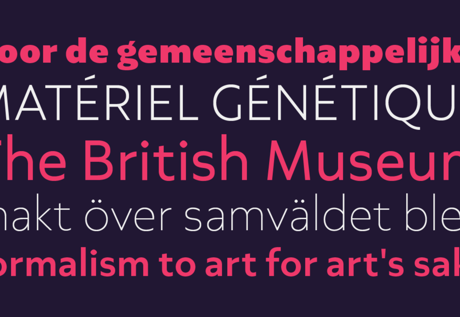
Parabole Display is what happens when you join the wrong points on your outlines: outer curves become inner curves creating an engaging and very usable display font. Parabole Text is the simplified sans-serif. It’s an exciting pairing for editorial work.

Rizoma

There aren’t enough new serif fonts, perhaps because they are harder to draw than the more popular sans-serif. Rizoma is a welcome exception. Based on Roman inscription letters, it is confident, modern, and highly usable.

Guacheva

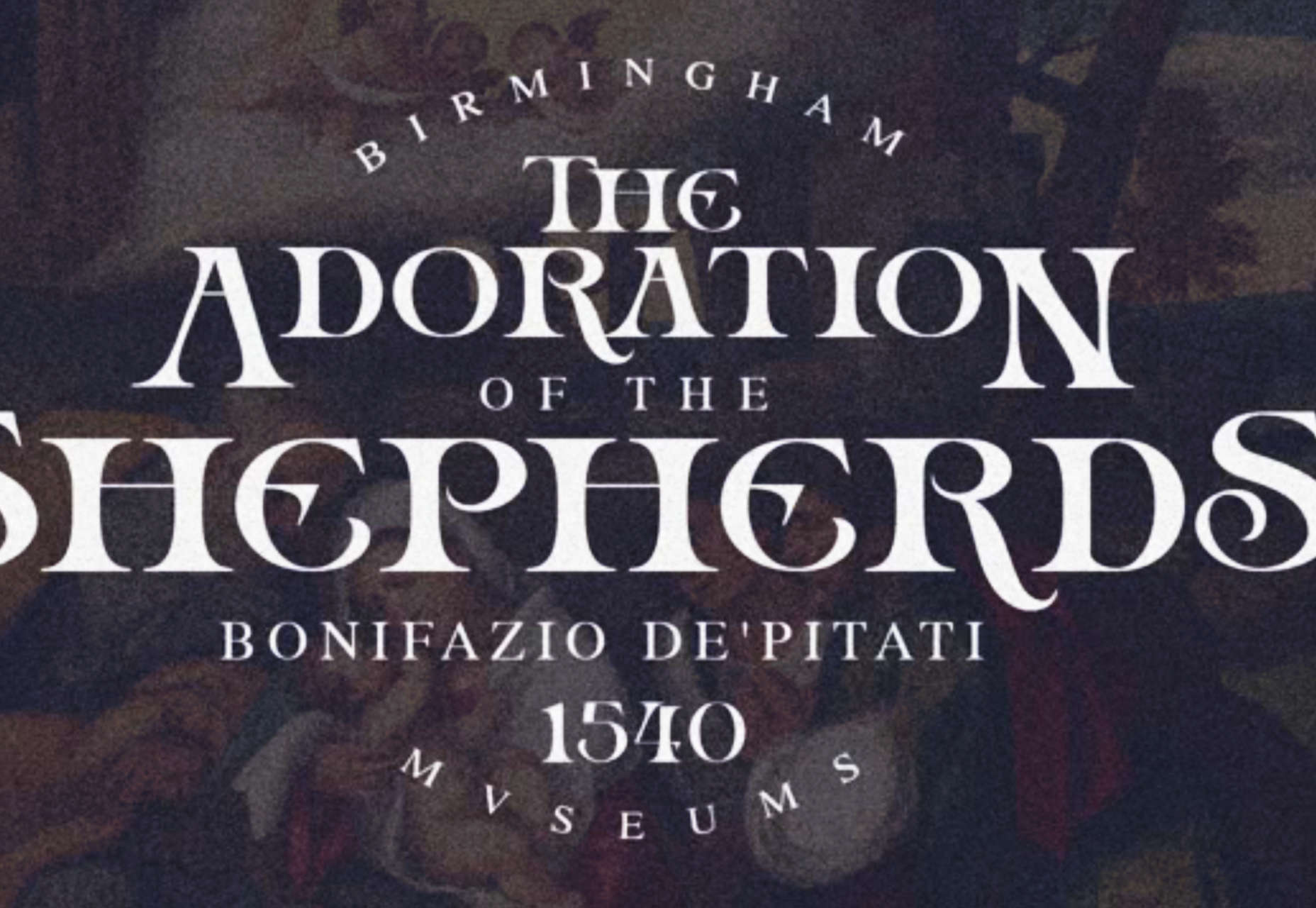
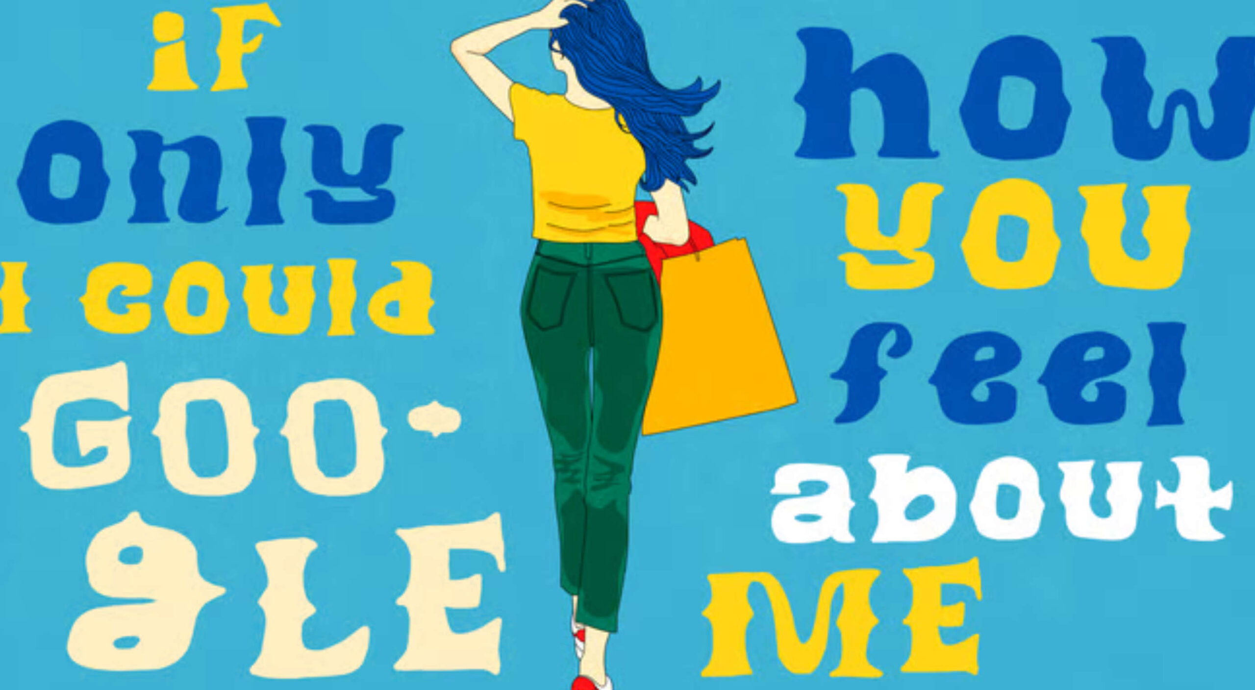
If you’re shopping for a festive typeface and want to avoid the usual brush scripts, look at Guacheva. The all-caps serif is elegant and feminine, with a clear sense of calligraphy.

Axios Pro

Axios Pro is a good solid workhorse of a sans-serif. Based on early 20th-century grotesques, it will feel familiar to anyone interested in western architectural type design. It’s available in 10 weights and two variable fonts, with extensive OpenType support.

GT Pressura

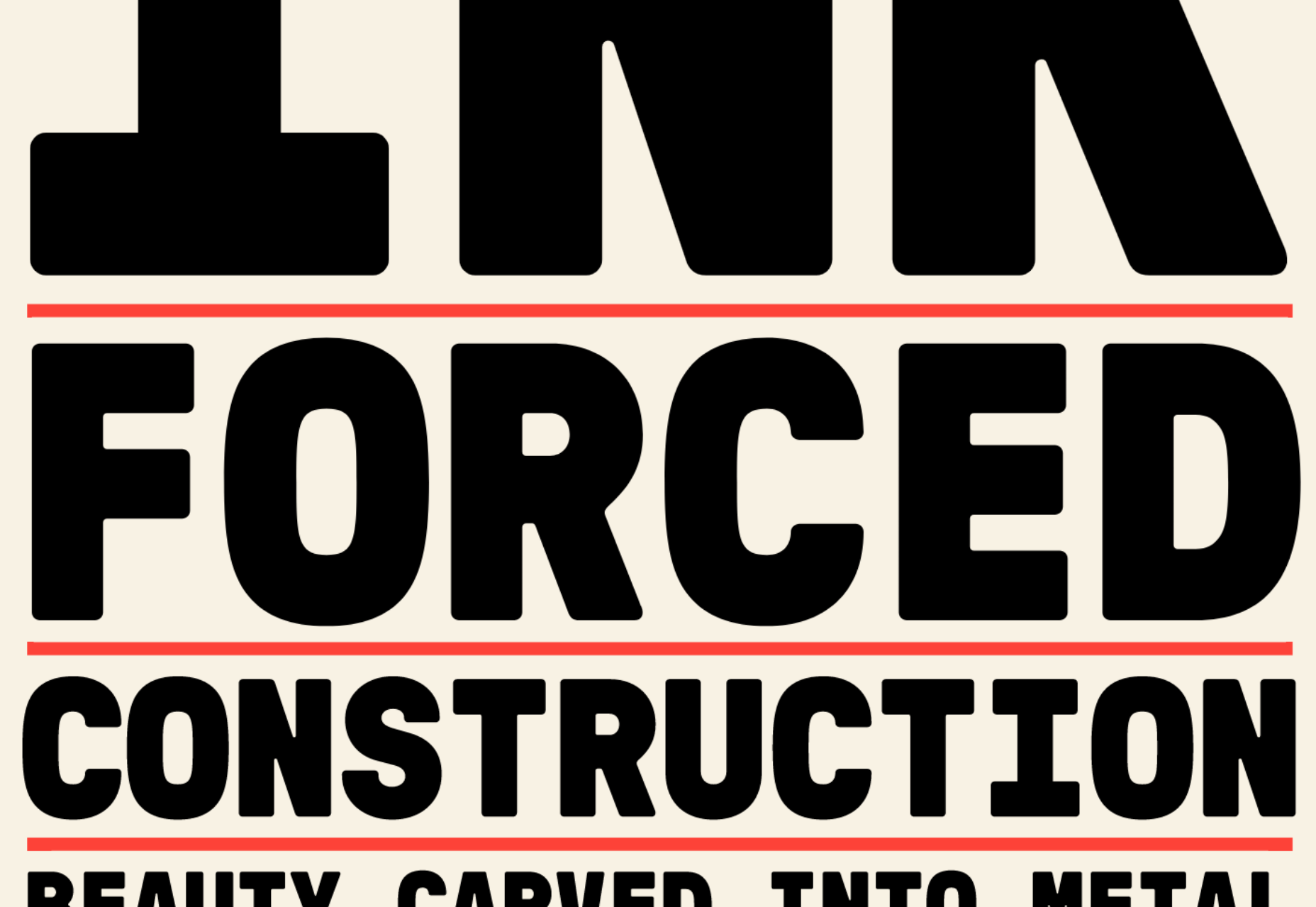
GT Pressura brings the warmth of print to the web by simulating the effect of ink spreading over paper. The subtle rounding of the sans typeface adds a unique visual interest to the mono, standard, and extended fonts.

Galdy

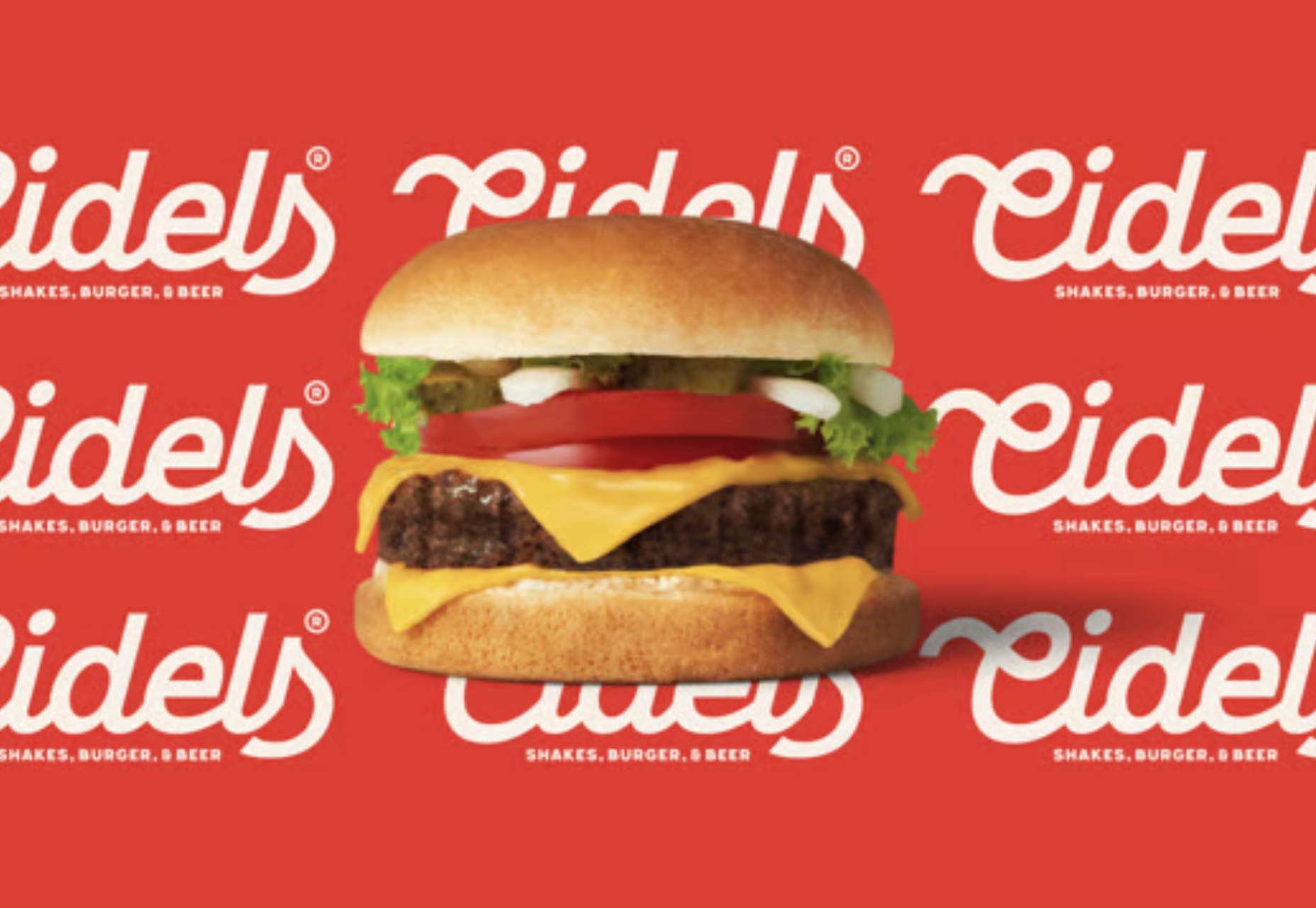
Script fonts are almost always based on a brush or a pen, traced into vectors. So it’s refreshing to see Galdy, a refined retro script. With a distinctly americana feel, it’s perfect for branding projects.

Nitido

Nitido is a humanist sans-serif typeface designed as a companion for Nitida. It is an expertly realized font family with seven weights and seven accompanying italics. As a result, it‘s ideally suited to corporate design work.

Kinckq

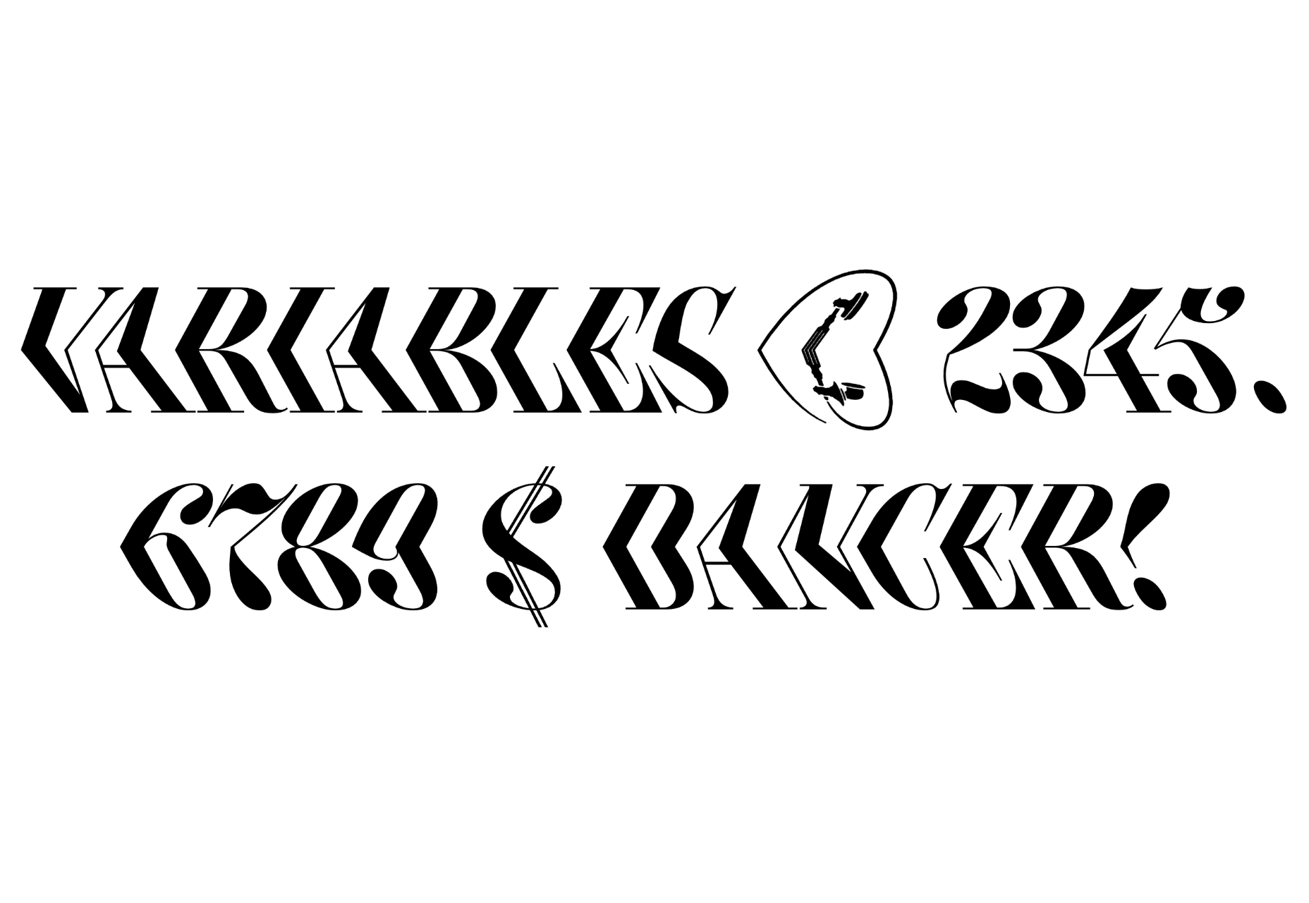
Kinckq is an intriguing experiment with variable font techniques. Inspired by a 19th-century woodcut font, Kinckq is a didone that bends through its middle, creating a 3D effect that’s made for large sizes.

Broger

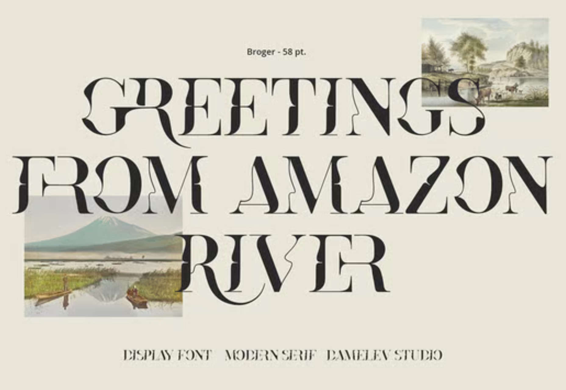
Broger is another distorted typeface, this time twisting shapes and tying them together with elegant ligatures. It’s an excellent choice for branding in the health & beauty market.

Charte Mono

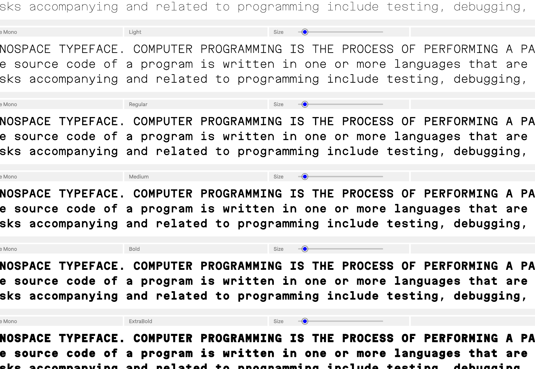
Charte Mono is another attempt to solve the unsolvable — the Latin alphabet is not monosized. However, when resolved as well as Charte Mono, monospaced fonts are excellent for user interface design, charts, and signage systems.

Lini

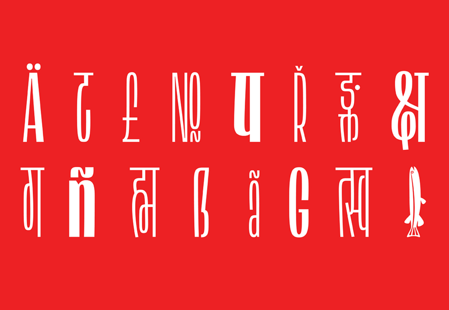
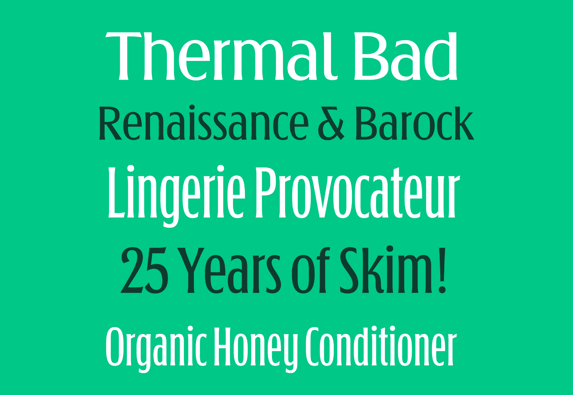
Lini is designed to be as compressed as possible while remaining highly legible. It supports Latin and Devanagari languages and works equally well in both forms. Lini is still in beta but is already award-winning.

Rotulo Variable

Rotulo is a variable font with huge contrast between its thick and thin strokes. Inspired by hand-lettering on signs, it’s a chunky option for branding or display type on websites.

Bouuuuuh

OK, so we’re a month late for Halloween, but Bouuuuuh is still worth a mention. Its cartoonish shapes are perfect for poster design, T-shirts, brand design, and, yes, next year’s Halloween marketing.

Source

The post 15 Best New Fonts, November 2022 first appeared on Webdesigner Depot.

Source de l’article sur Webdesignerdepot

This month’s collection of the best new fonts is headed in a lighter and quirkier direction than previous months. What’s more, font foundries seem to be getting more creative with their designs as many of these fonts come with alternative stylistic sets, giving you more control over the resulting typeface.

If you’re looking for some fun new fonts to spice up your web designs with, start here:

1. Beauty Rose

Beauty Rose is a whimsical script font that can add a touch of romance and warmth to header text and hero images. It would also look great when promoting holidays and events like Mother’s Day, Valentine’s Day, and weddings.

2. Black Sharp

Black Sharp is a bold display font that works equally well for website logos as it does for physical products (e.g., signage, packaging, book covers, etc.). What’s especially neat about this font is how it transforms when you change its texture. It takes on a very different tone with a grainy look instead of a shiny one, for instance.

3. Goat & Qalvigo

Goat & Qalvigo is a classic serif font with a modern twist. While many of the examples provided by the type designer show off the funky side of the font, thanks to the additional ligatures and alternative styles, you can always use the regular character sets. Either way, you’ll have a classy new font to use all over your website.

4. Happy Comic

Happy Comic is a font filled with personality. Looking at it makes me think of a goofy cartoon character or maybe even an older Adam Sandler movie. This would be a good font for branding lighthearted and humorous brands or publications.

5. Helsa Display

Helsa Display is a slim and compact serif. While serifs usually work pretty well for paragraph text, this one belongs in headlines and sub-headlines because of how thin the characters are. It also has a bit of a dark side (see the examples at the link to see what I mean), so reserve this font for boundary-pushing brands and personalities.

6. Lab Antiqua Variable

Lab Antiqua is a font that took years to create. The most recent release for this font family is called Lab Antiqua Variable. Like other variable fonts, Lab Antiqua will effortlessly transition through a range of font sizes without losing the characteristics that make this serif font so unique.

7. Monomorium

Monomorium is a monospaced typeface with open apertures and a flowing style. In addition, this quirky font comes with additional ligatures, stylistic alternates, parentheses, and more, depending on how fun or buttoned-up you want it to look.

8. Neumond

Neumond is a serif font that pushes the boundaries of legibility. This font gives you the ability to equip the characters with razor-sharp lines, overlap the letters, and push them towards extreme angles. If you have a brand that’s challenging the norm, a font like this that does the same will go really well with it.

9. Pratico Slab UI

Pratico Slab UI is a slab serif font that would add strength and character to the text of a website. You can also experiment with the weight and size if you’re looking for a not-so-boring but highly legible header font.

10. PT Nature

PT Nature is an exciting collection of script fonts. While they all technically belong to the PT Nature family, each font is modeled after different people’s handwriting. So this font family could be really useful if you use a lot of script fonts in your work. Or if you want to make one site and brand look like it has multiple personalities.

11. Rosehot Typeface

Rosehot Typeface is a pretty font that straddles the line between serif and sans serif. With its elegant curves, unexpected twists, and additional angles, this font would beautifully elevate designs for high-end retailers, fashionistas, and others with luxury offerings or services.

12. Shorai Sans

Shorai Sans is a sans serif font inspired by both calligraphic brushstrokes as well as geometric outlines. You can use it to style Latin text as well as Japanese. The font’s creators suggest pairing it with Avenir Next for greater harmony in your designs.

13. Shoutyperson

Shoutyperson is a bold all-caps font. Because of the grungy, stenciled style of the font, it’s not really applicable for many projects. That said, Shoutyperson would be an effective font choice for military, ammunition companies, or brands or personalities associated with a strict, regimented lifestyle (like personal trainers).

14. Simple Farmhouse

Simple Farmhouse is a basic handwriting font that’s highly legible. It resembles the style of writing you’d use to jot down notes on a whiteboard or in a notebook, so it would work well for brands that want to convey a casual and low-key vibe.

15. Sweet Pancakes

Sweet Pancakes is a fun font with full-bodied characters. Most of the examples provided frame the font against food, so this could be used on restaurant websites or food blogs. However, that’s not to say it couldn’t be used elsewhere. It’s a lighthearted and easy-to-read font, so it could just as well be used to style websites and branding for companies and personalities with a bubbly personality and/or positive mission.

Source

The post 15 Best New Fonts, April 2022 first appeared on Webdesigner Depot.
Source de l’article sur Webdesignerdepot

Rather than spring cleaning, do some spring “shopping” for tools that will make your design life easier. Packed with free options this month, this list is crammed full of tools and elements that you can use in your work every day.

Here’s what new for designers this month:

April’s Top Picks

Charts.css

Charts.css makes creating beautiful online charts that much easier. It’s a modern CSS framework that uses CSS utility classes to style HTML elements as charts. It’s accessible, customizable, responsive, and open source. There’s a quick start option and available source code to work with.

Haikei SVG Generator

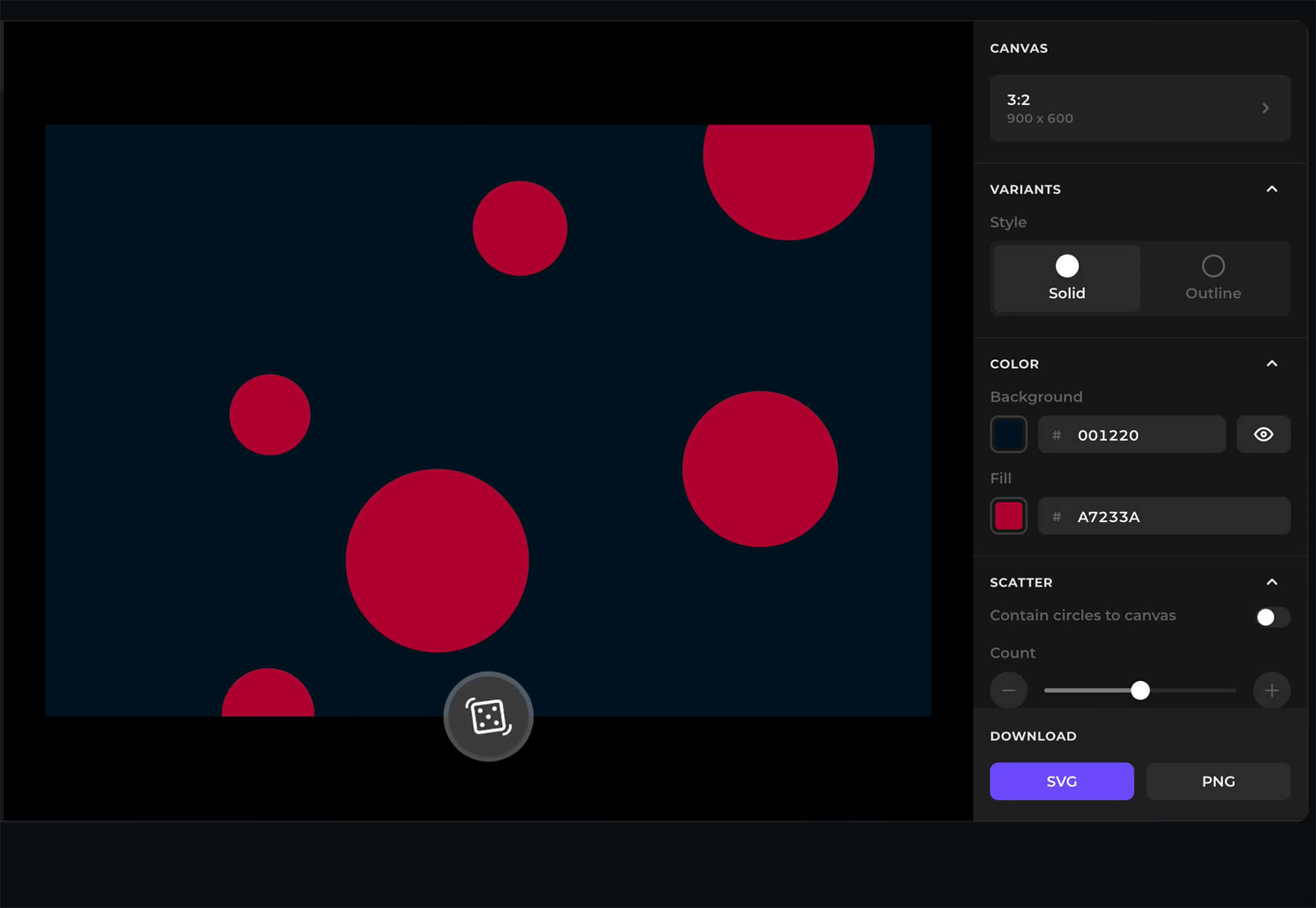
Haikei is a web app that helps you generate SVG shapes, backgrounds, and patterns in all types of shapes to use in projects. Everything can be exported into the tools you are already using for easy integration, and every element is customizable. The tool is free right now – no credit card needed – and you get access to 15 generators and can export in SVG and PNG format. A premium option is on the way, and you can sign up to get notified for access.

Fluid Space Calculator

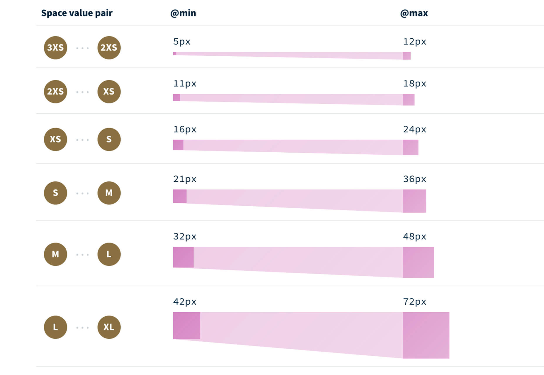
Fluid Space Calculator helps you create a related space system and export the CSS to implement it. The calculator allows you to add space value pairs and multipliers and see the impact on the screen before snagging the related code. It’s great for determining how things will look in different viewports and for creating custom space pairs.

Night Eye WordPress Plugin

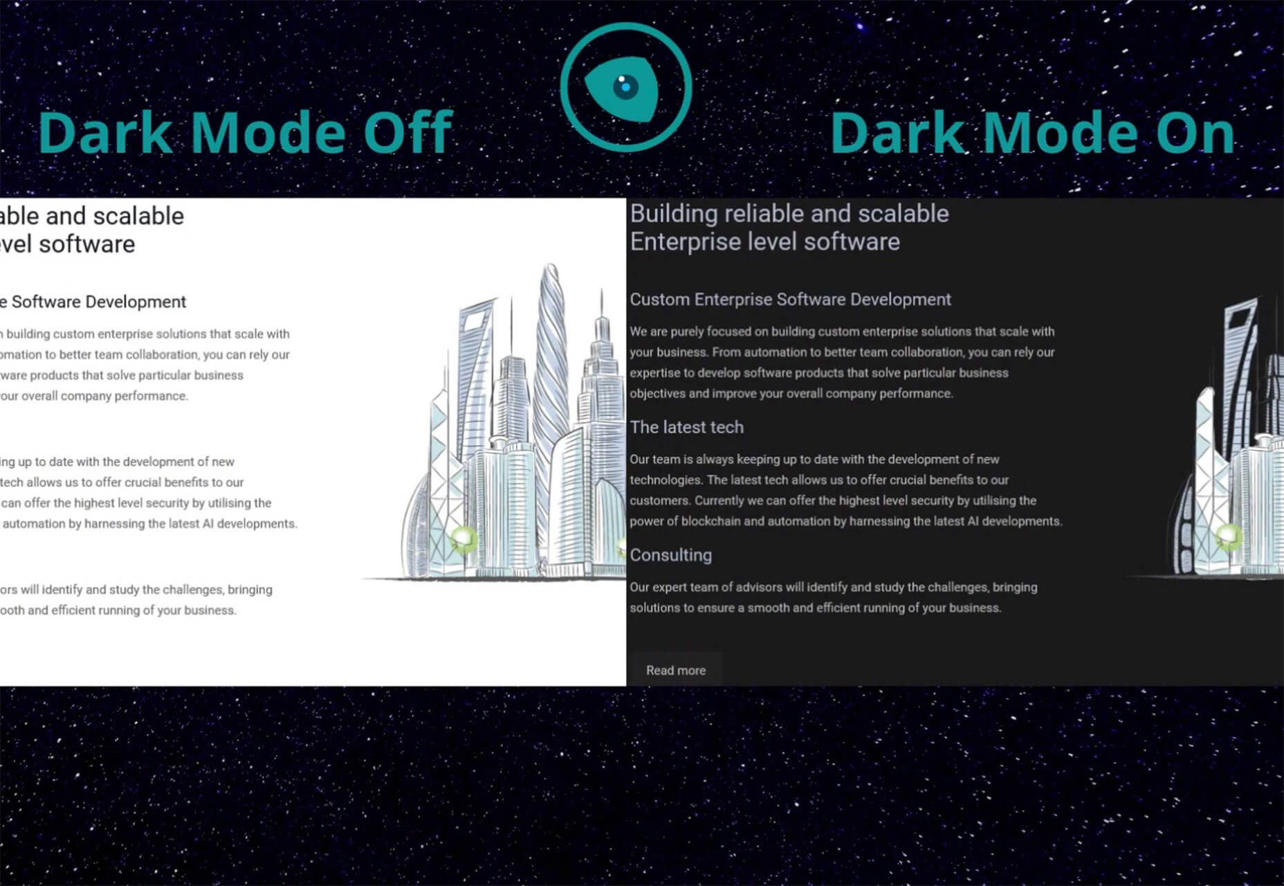
Night Eye WordPress Plugin helps you create a dark mode option for your WordPress website with ease. It’s completely customizable, schedulable, and one of those things that users are starting to expect. The plugin has free and paid versions – the only difference is a link to credit the developer.

3 Productivity Boosters

Macro

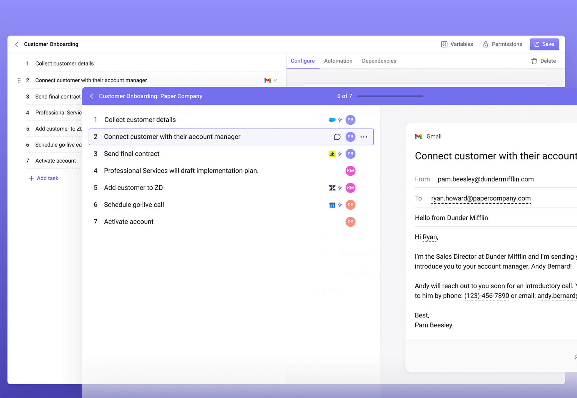
Macro is a supercharged checklist app for recurring processes. It’s designed to help teams document, assign, track, and automate for maximum efficiency. Now is the time to test this tool because it is free in public beta.

Writex.io

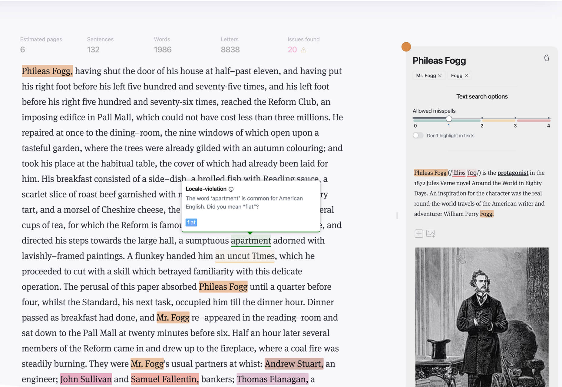
Writex.io is a free writing app that uses AI and smart features to help you write more efficiently. It can check readability as you write, make suggestions, check spelling, and allows you to work with versioning. All the settings are customizable, so you can get help and suggestions when you want them and avoid things you don’t want.

Taloflow

Taloflow, which is in beta, is a tool that helps you find the top cloud and dev tools for your use case. This is designed to be a time-saving solution to finding the right infrastructure and API products for your work.

8 Kits with Illustrations and User Interface Elements

Skribbl

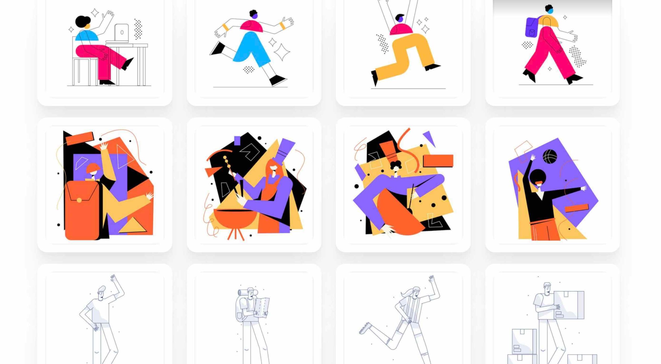
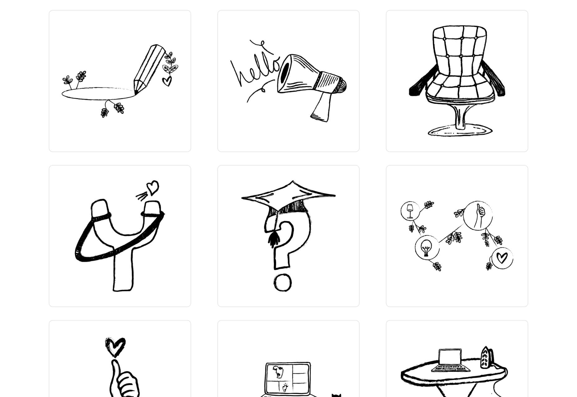
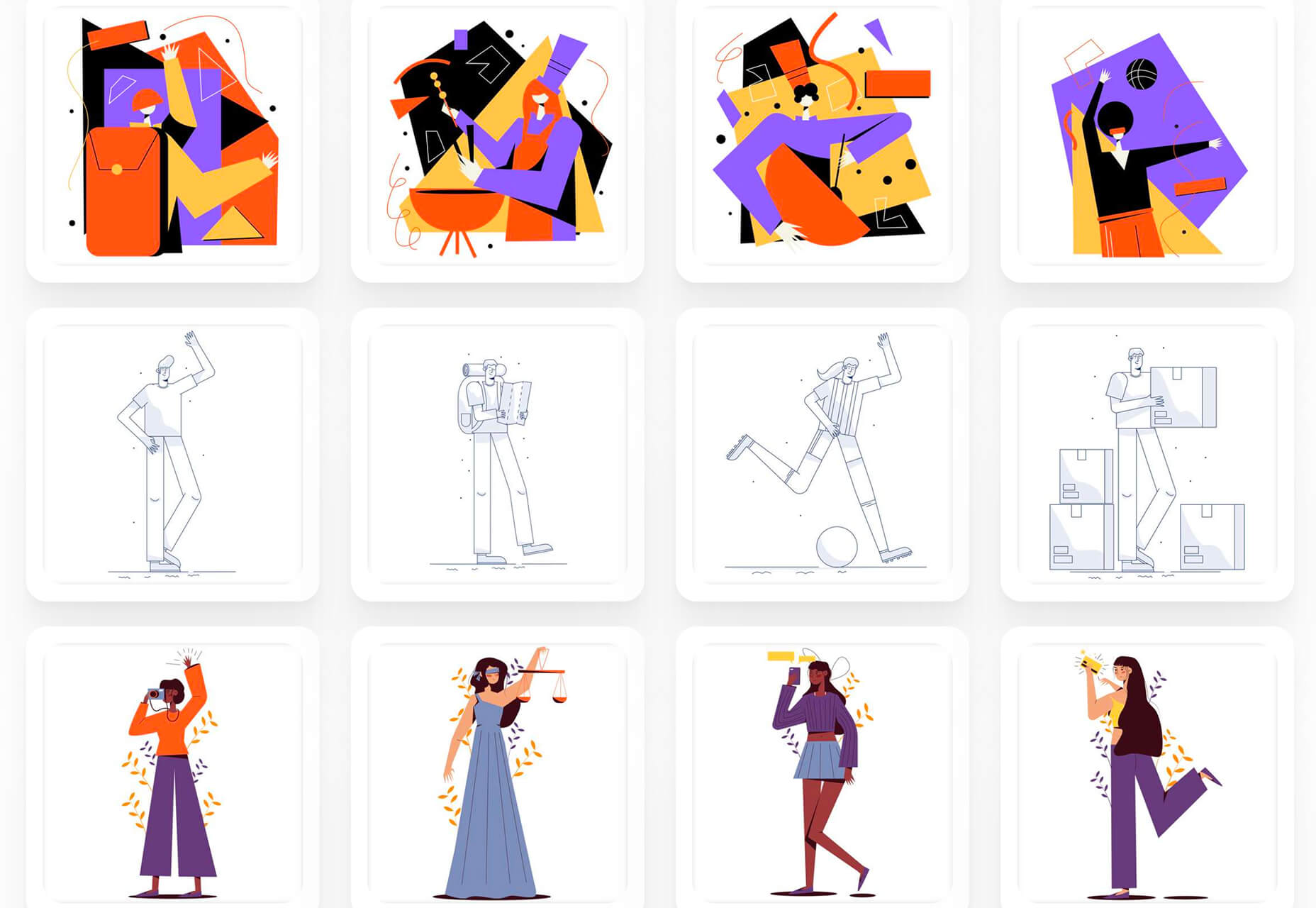
Skribbl is a collection of free, hand-drawn illustrations in a light and fun style. The black and white sketches are friendly, and the collection keeps growing. Plus, the illustrators are allowing them to be used free for any use.

Mobile Chat Kit

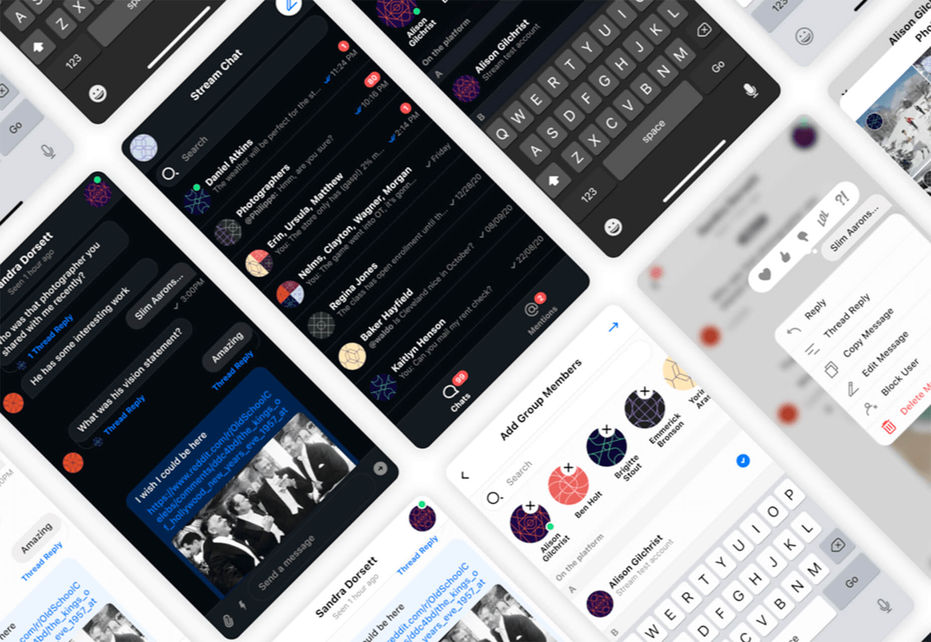
Mobile Chat Kit is a free starter kit for building apps in Figma, Sketch, and Adobe XD. It includes more than 50 screen options with mapped-out flows for a quick-start project.

Flowchart.fun

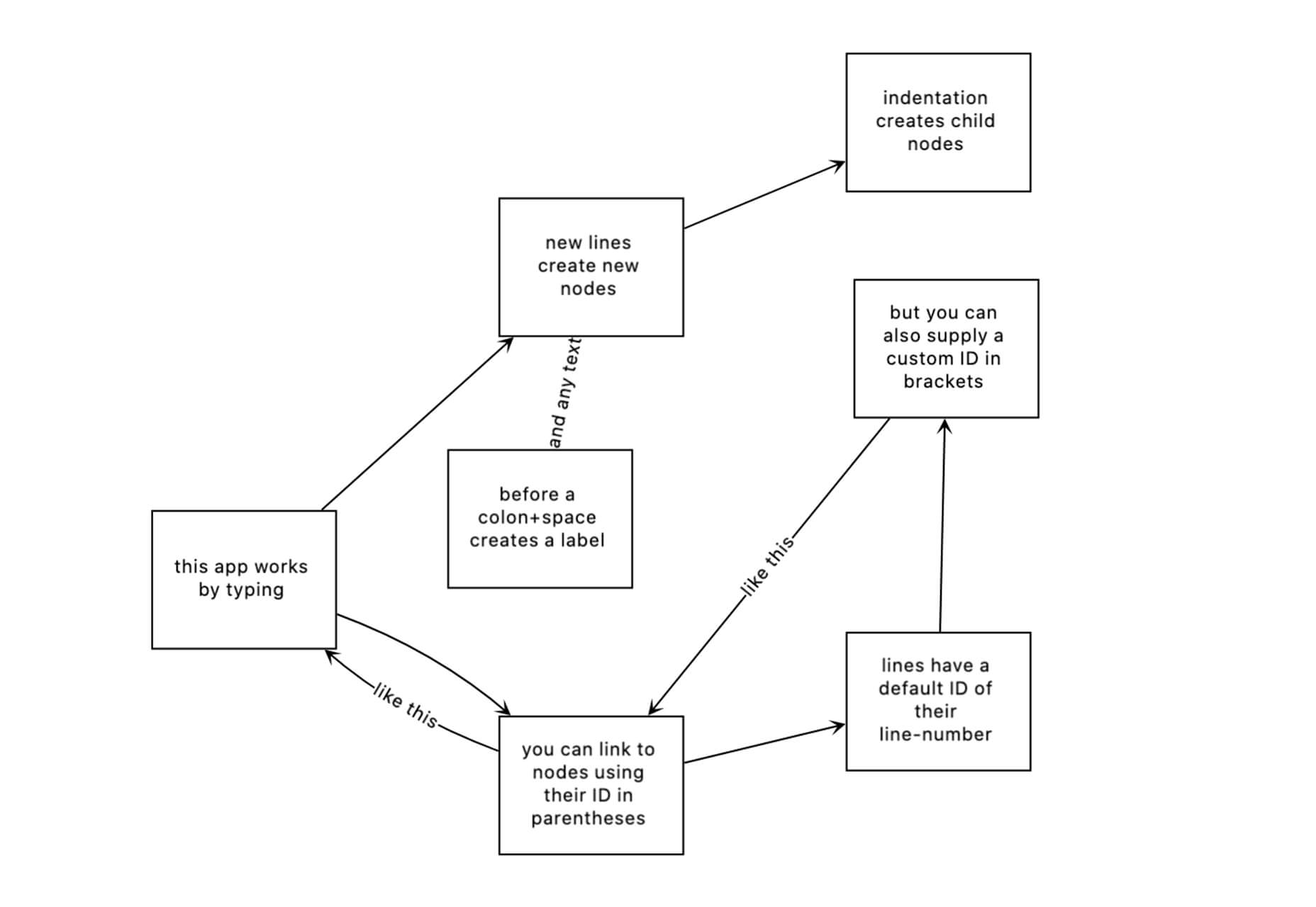
Flowchart.fun is exactly what the name implies. The app allows you to type, create nodes, and link elements to develop simple flow charts quickly. Then you can alter shape and size with drag and drop. Export it for use as an SVG, JPG, or PNG.

Shuffle

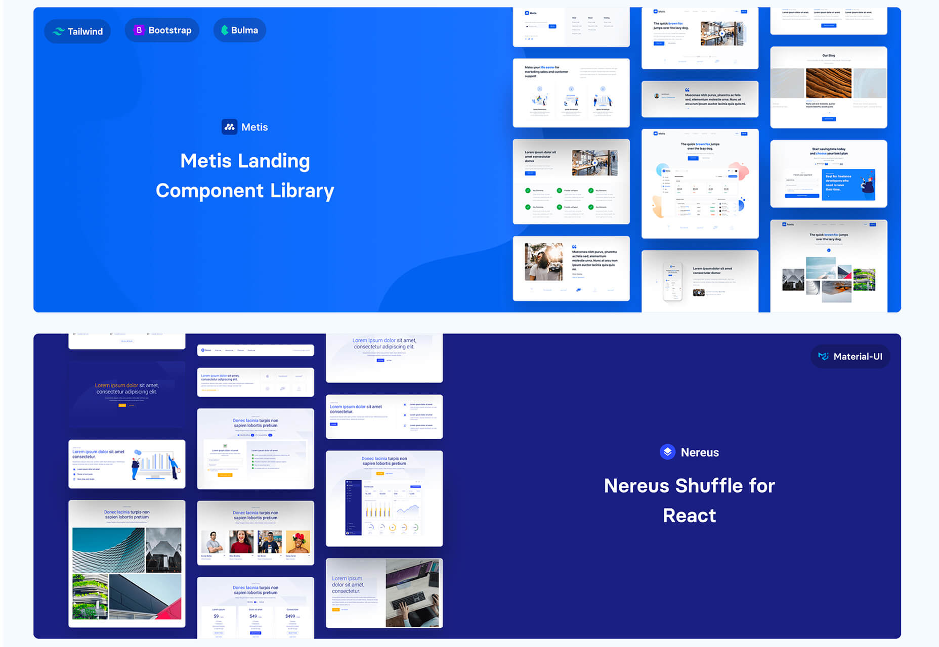
Shuffle is a marketplace packed with UI libraries to help you with a variety of digital projects. There are more than 1,500 pre-built components to choose from with professional designs. This premium tool comes with a monthly subscription or lifetime license.

Cryptocurrency 3D Pack

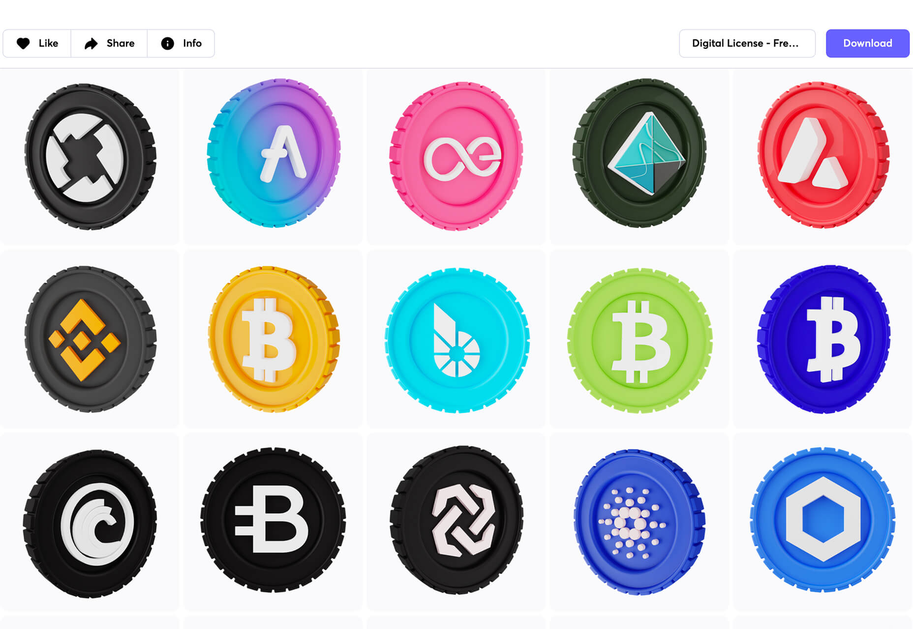
Cryptocurrency 3D Pack is a set of icons with fun colors in three-dimensional shapes that you can use to represent different crypto elements. The pack includes 55 #D icons in PNG and BLEND formats.

Stratum UI Kit for Figma

Stratum UI Kit for Figma includes nine free screens that are ready to use. Options include API documentation, Kanban, document, data dashboard, ecommerce product list, ecommerce product options, payments spreadsheet, cloud storage, and newsfeed.

Conic.css

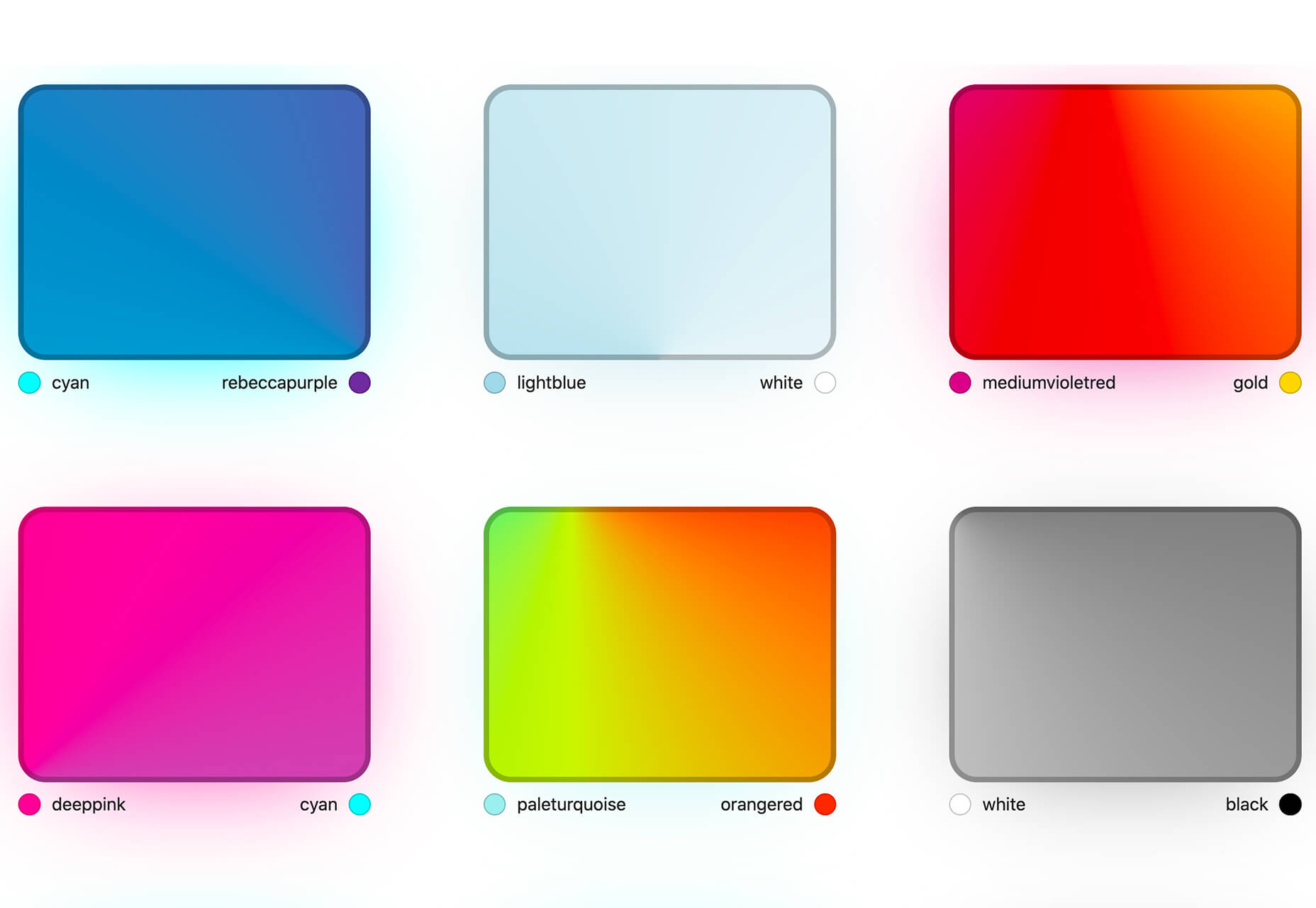
Conic.css is a collection of simple gradients that you can browse and then click to copy the code into your CSS to use them in projects. It’s quick and easy while using trendy color options.

Artify Illustrations

Artify Illustrations is a Figma plugin that allows you to access more than 5,000 SVG and PNG illustrations within the app. It’s got a built-in search feature, everything is high-resolution, and the huge library includes various styles.

2 Tutorials

A Complete Guide to Accessible Front-End Components

A Complete Guide to Accessible Front-End Components is an amazingly comprehensive guide from Smashing Magazine with everything you need to know about accessible components. From tabs to tables to toggles to tooltips, you’ll find it all here and learn how to use it the right way.

Grid CheatSheet in 2021

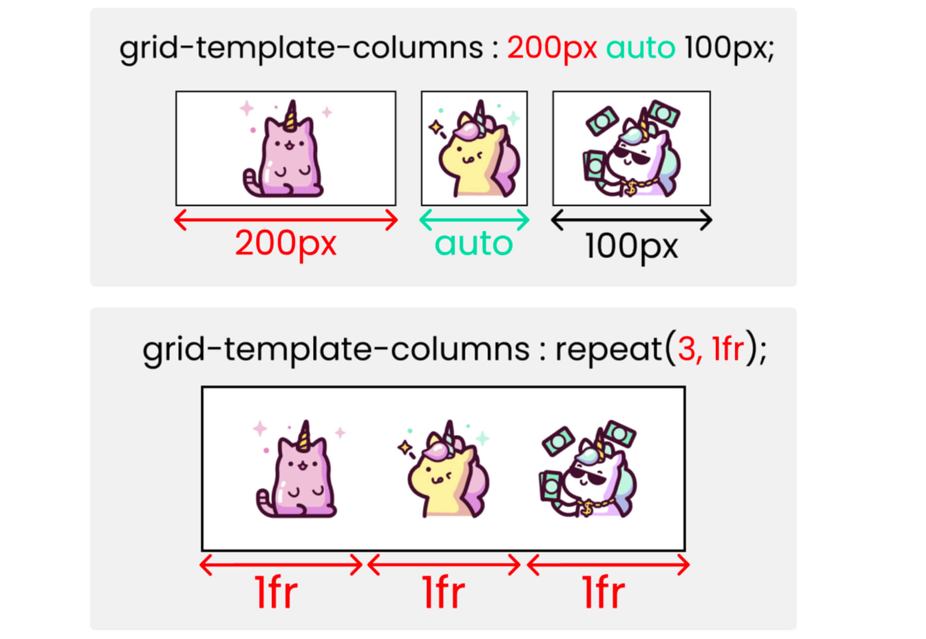
Grid CheatSheet in 2021 is a useful guide of everything you can do with CSS Grid. Plus, it has plenty of fun illustrations and an accompanying video.

8 Fresh and Fun Fonts

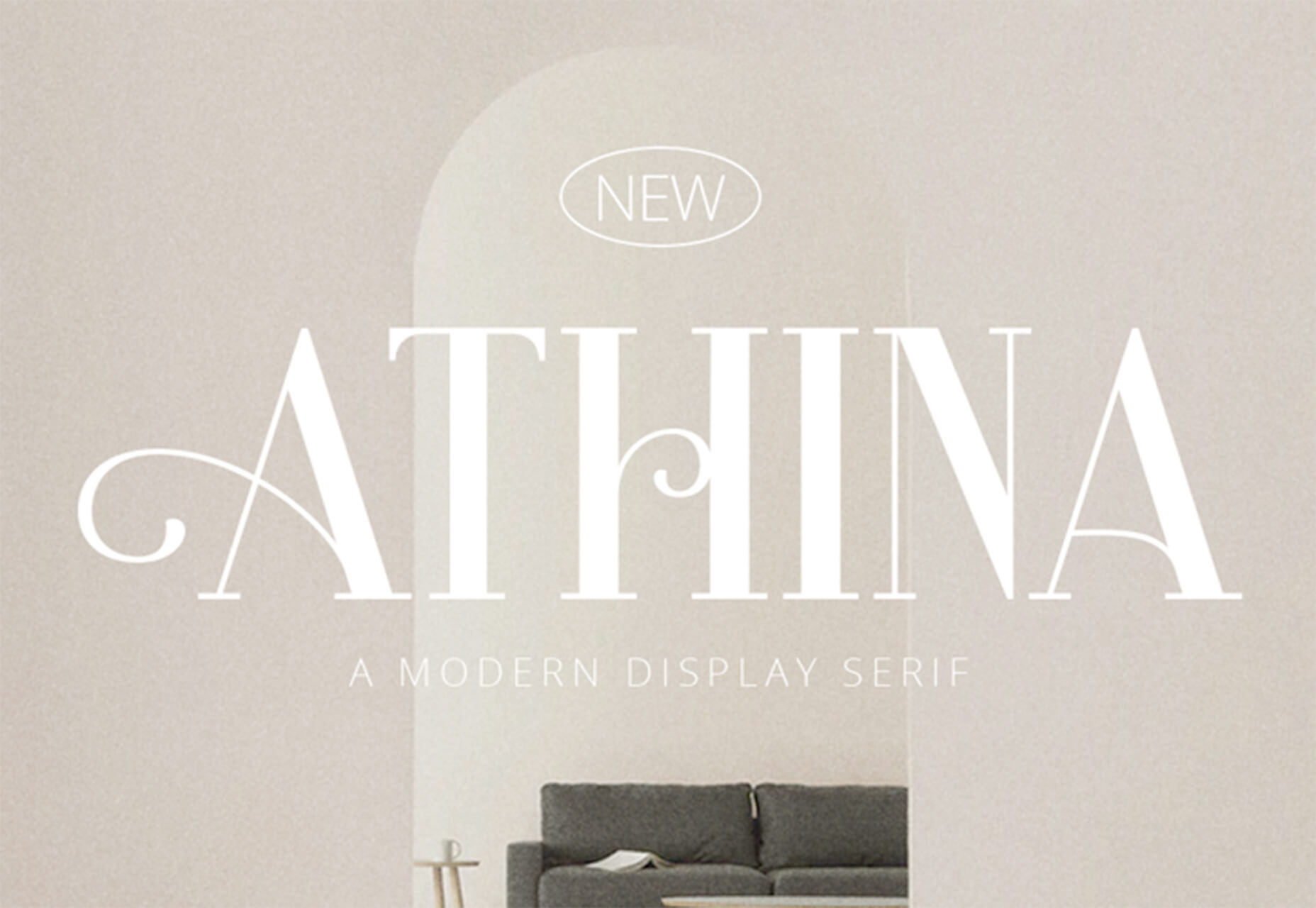
Athina

Athina is a modern display serif with beautiful connector strokes. The free version is a demo, and there’s a full family that you can buy.

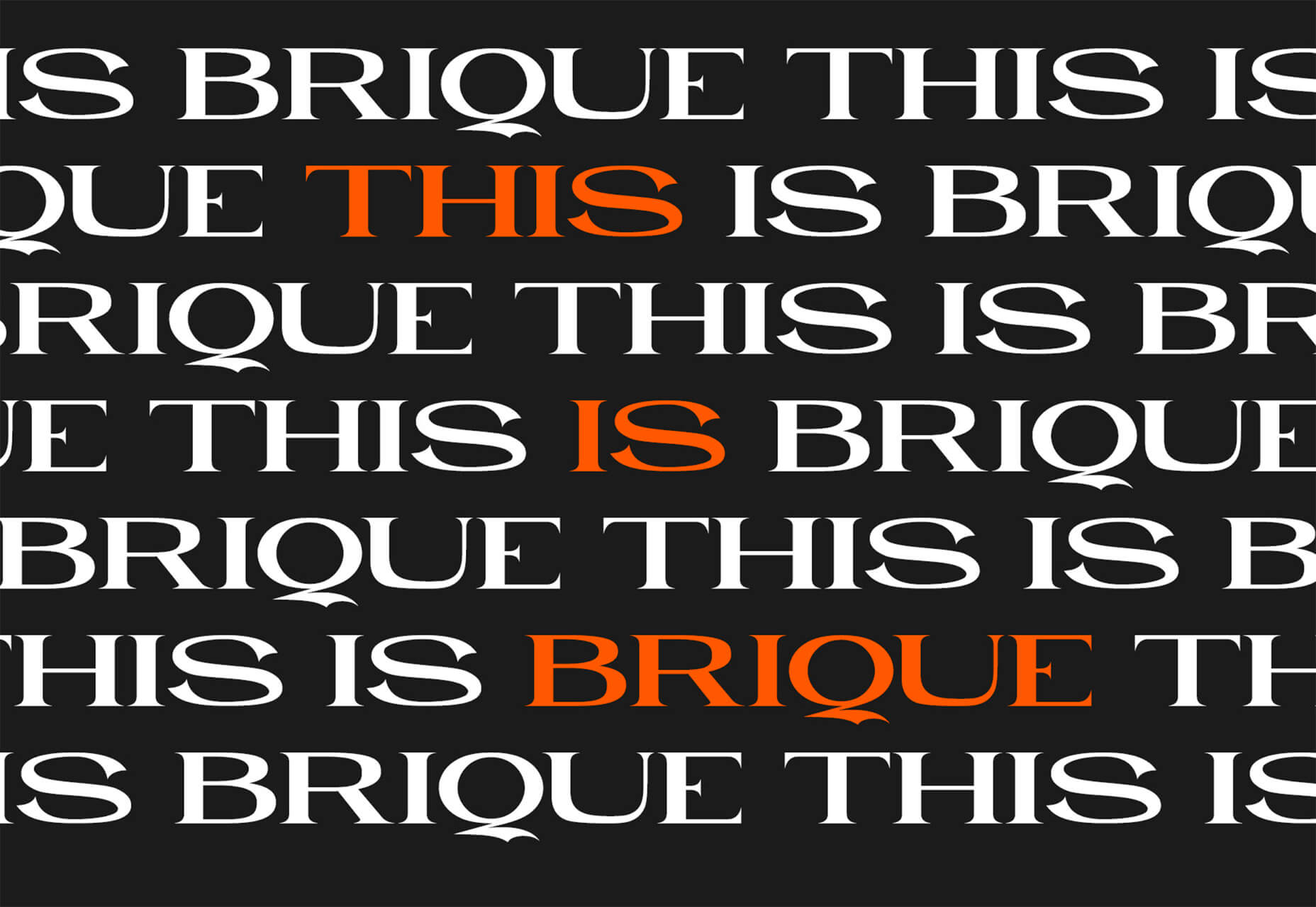
Brique

Brique is a free (personal and commercial) display font with a wide stance and uppercase character set. The letters have a lot of personality and a readable configuration.

Code Next

Code Next is a great geometric sans serif with a full family of styles. Including two variable fonts. It’s highly readable and would work for almost any application.

Inter

Inter is a simple and functional sense serif family with everything from extra light to heavy weights. The extra character personality makes this a fun and functional font option.

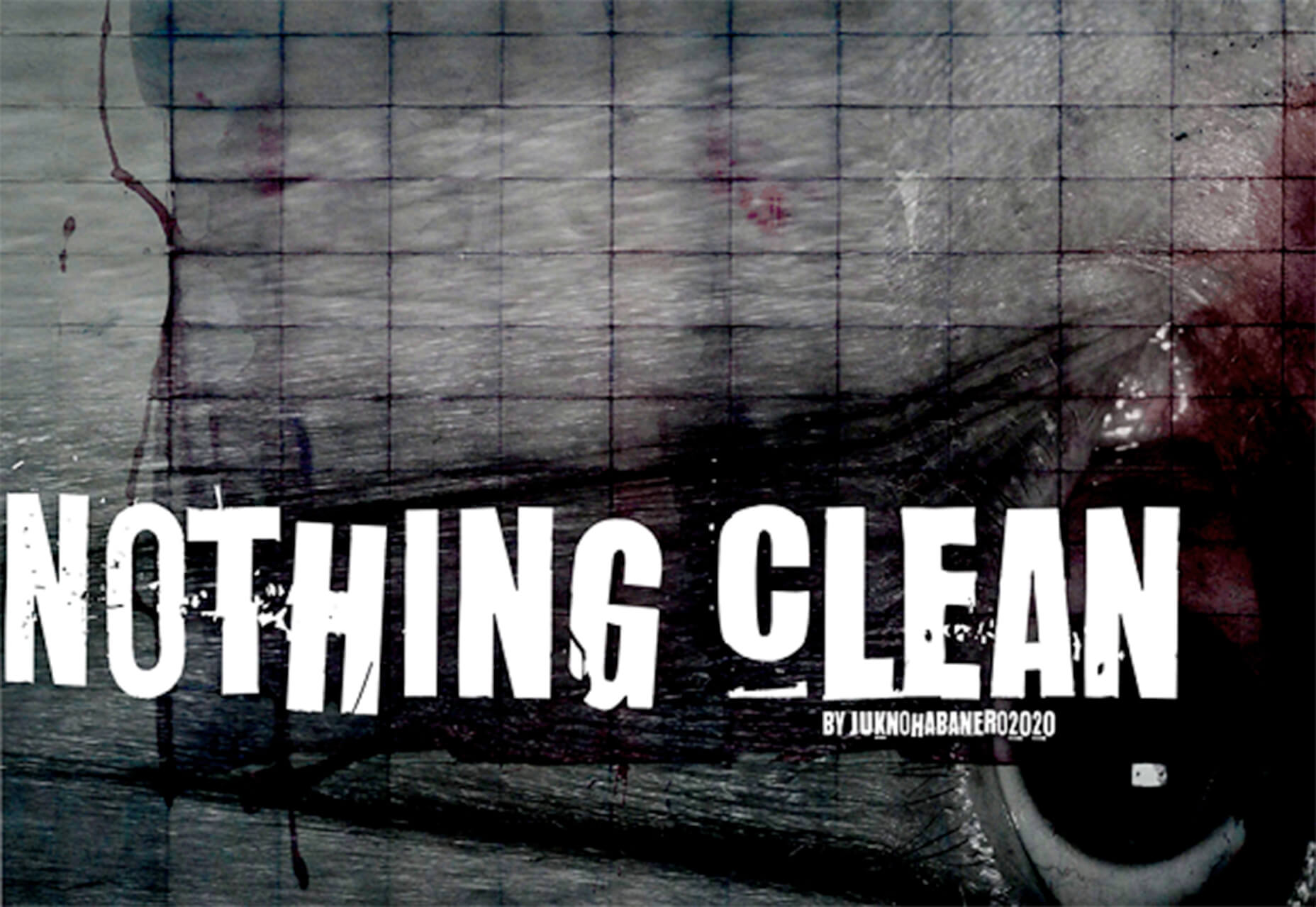
Nothing Clean

Nothing Clean is a fun grunge-type option. It’s an all uppercase character set with alternates.

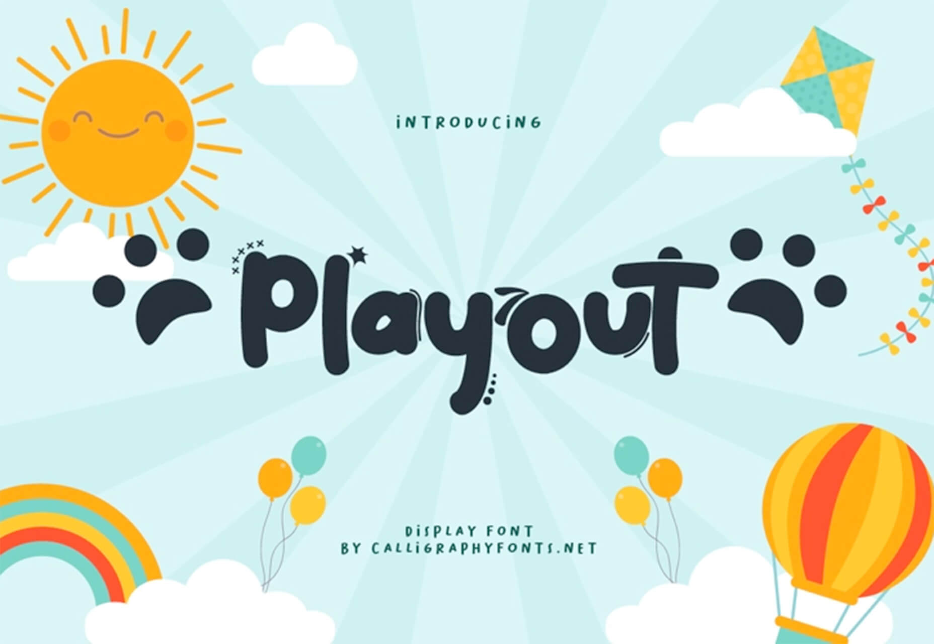
Playout

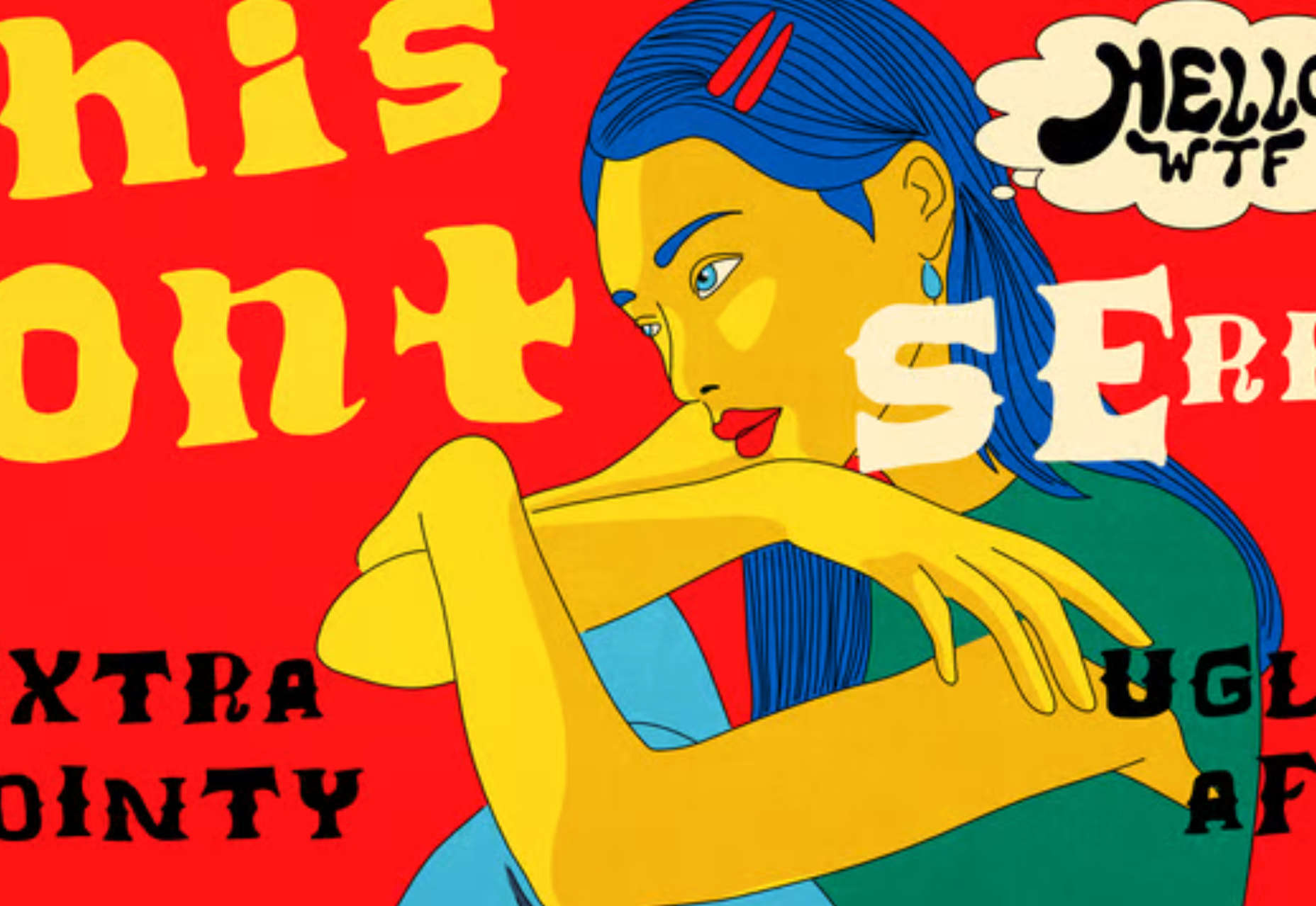
Playout is a fun, hand-drawn style typeface with interesting glyphs and alternate characters. The most fun feature might be the pawprint characters in the demo set.

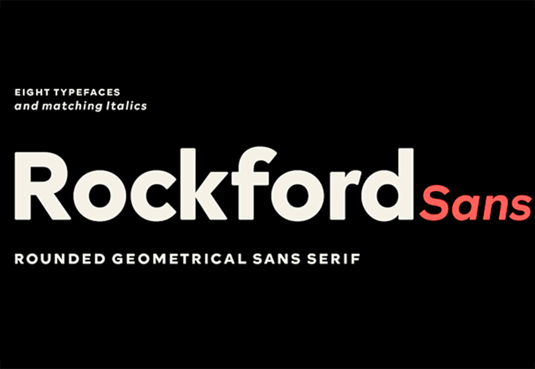
Rockford Sans

Rockford Sans is a geometric typeface with subtly rounded edges. It has eight weights and italics. With its large x-height and round features, it’s legible and friendly. It’s suited to cover a wide variety of tasks from editorial to brand design and advertising.

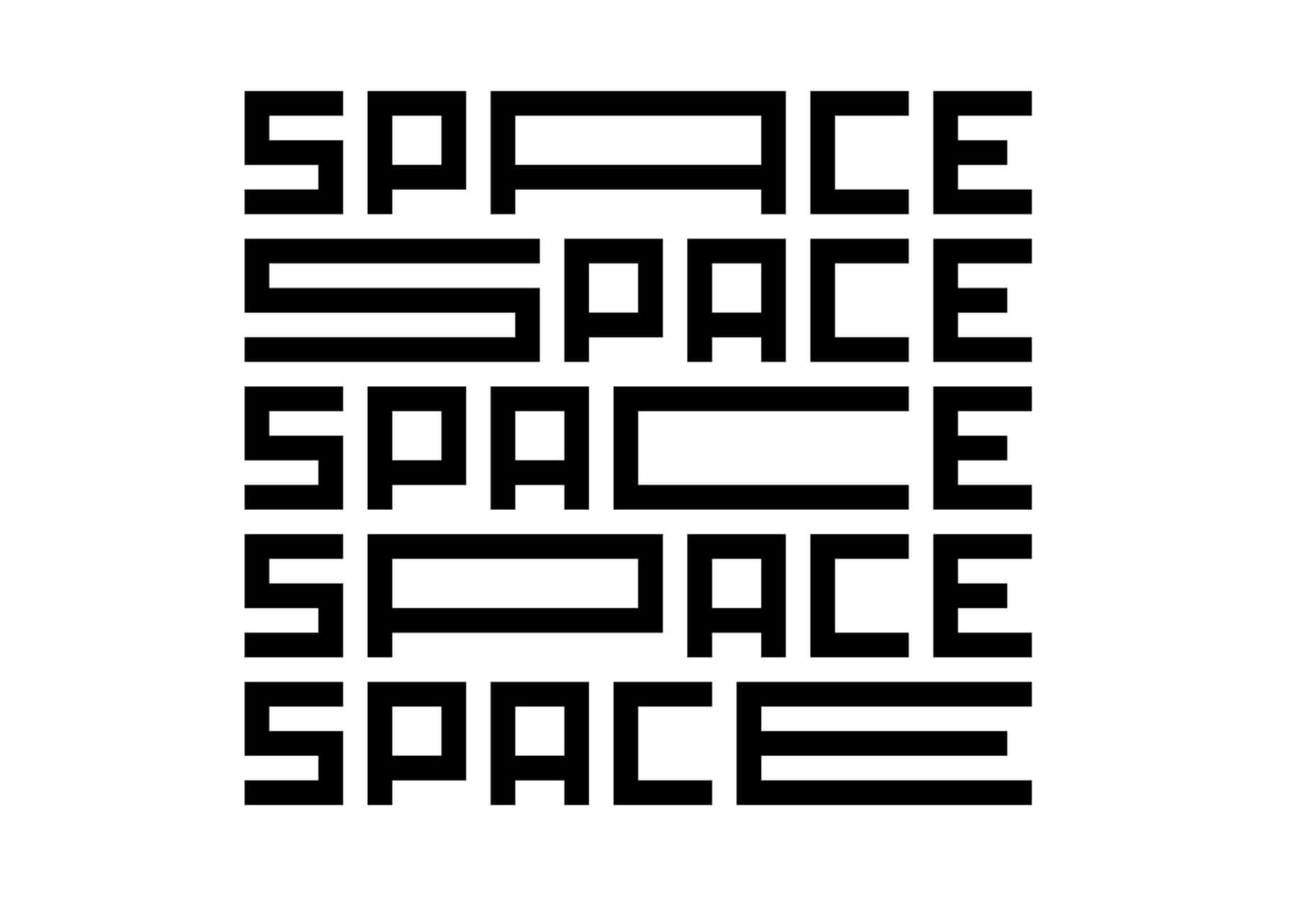
SpaceType

SpaceType is a fun and funky typeface in regular and expanded styles. The stretched letterforms make interesting alternates for display purposes.

Source

The post 25 Exciting New Tools For Designers, April 2021 first appeared on Webdesigner Depot.

Source de l’article sur Webdesignerdepot

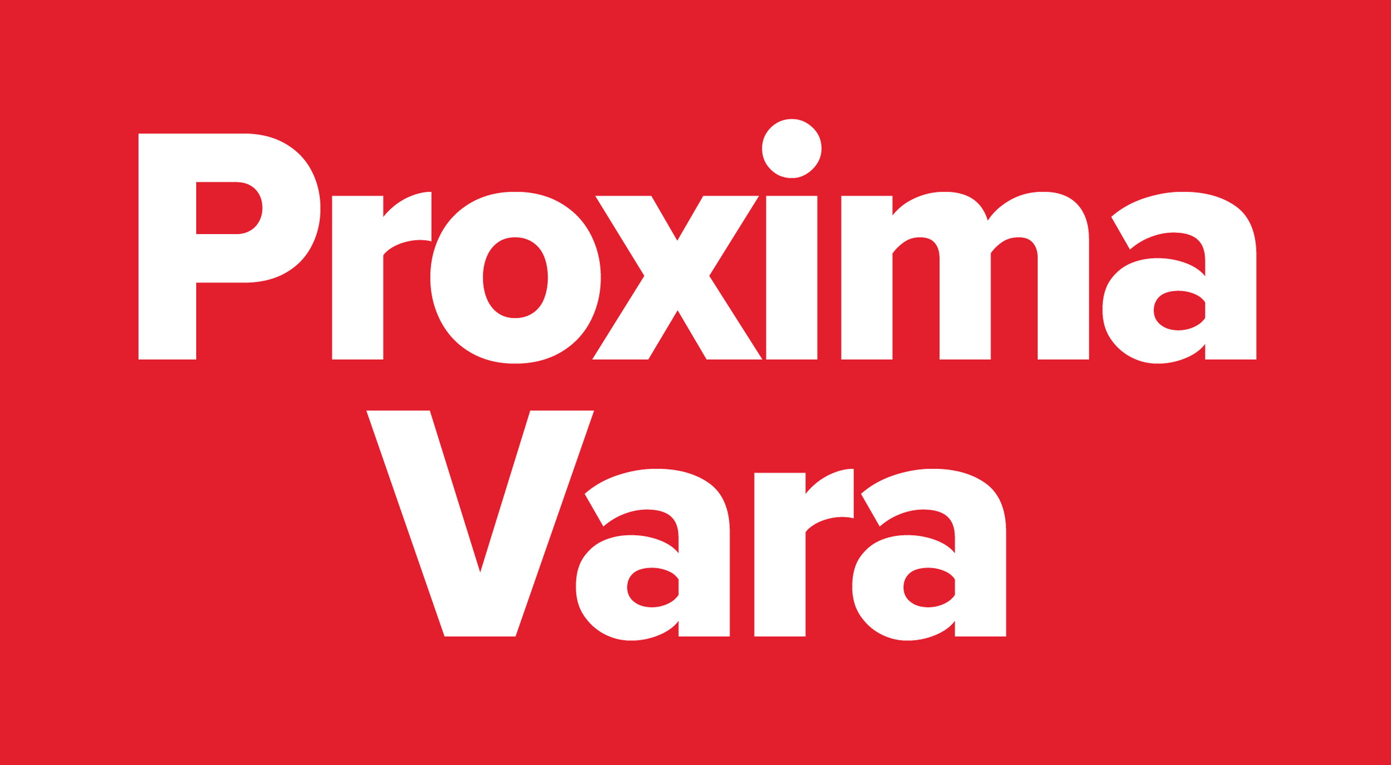
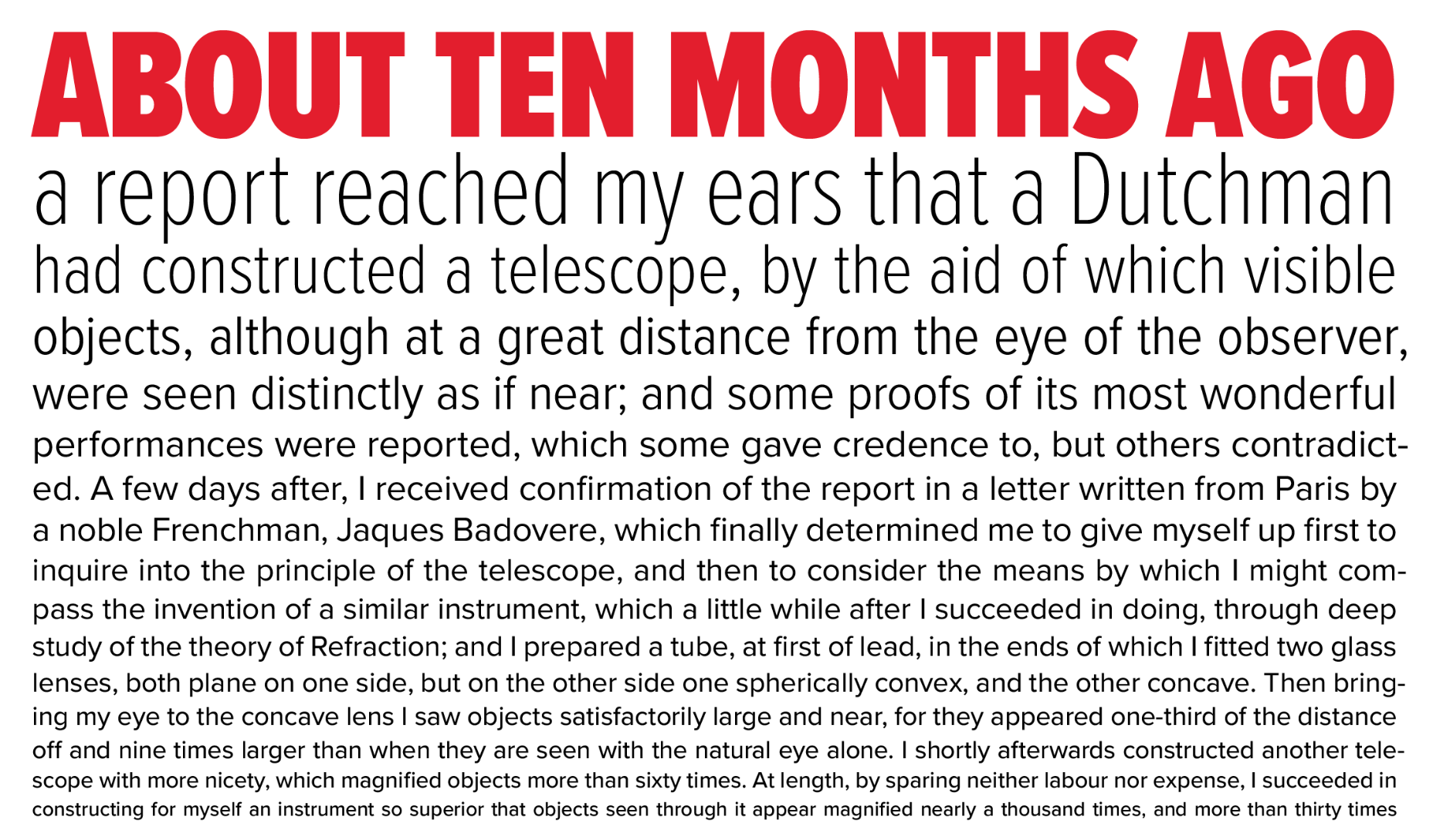
Proxima Vara, a variable font version of the enormously popular Proxima Nova type family, has just been released.

Designers love Proxima Nova for the simplicity of its letterforms, its wonderful rhythm, and its generous x-height that all combine to produce a highly legible, modern typeface — that also happens to be cheaper to deploy than many similar designs.

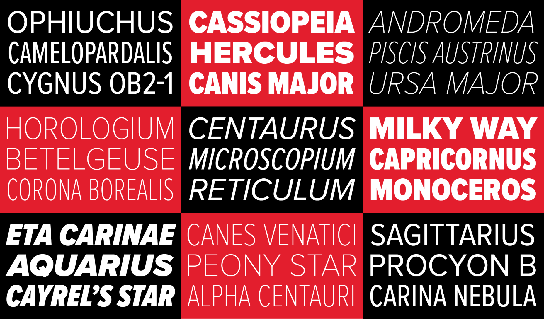
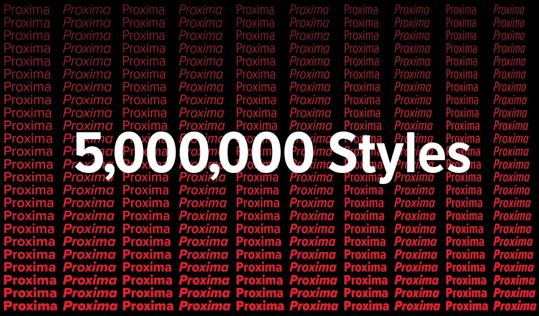
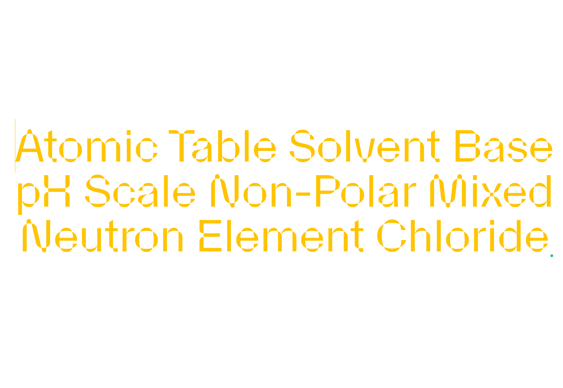
The variable version allows designers to tweak the weight from 100–900, the width from a condensed 50% to a wide 100%, and the slant from 0–12.5 degrees. In total, there are 5,000,000 styles available.

Because it’s a variable font, Proxima Vara delivers all of those styles in a single file that is only moderately larger than a single Proxima Nova style.

Proxima Nova has been a go-to font for designers for over a decade. Commonality had stripped away some of its shine, but the addition of a new variable edition promises to re-popularise its use.

Try out Proxima Vara on its microsite; it’s available to download from $99.


Source

The post Proxima Vara Font Released first appeared on Webdesigner Depot.

Source de l’article sur Webdesignerdepot

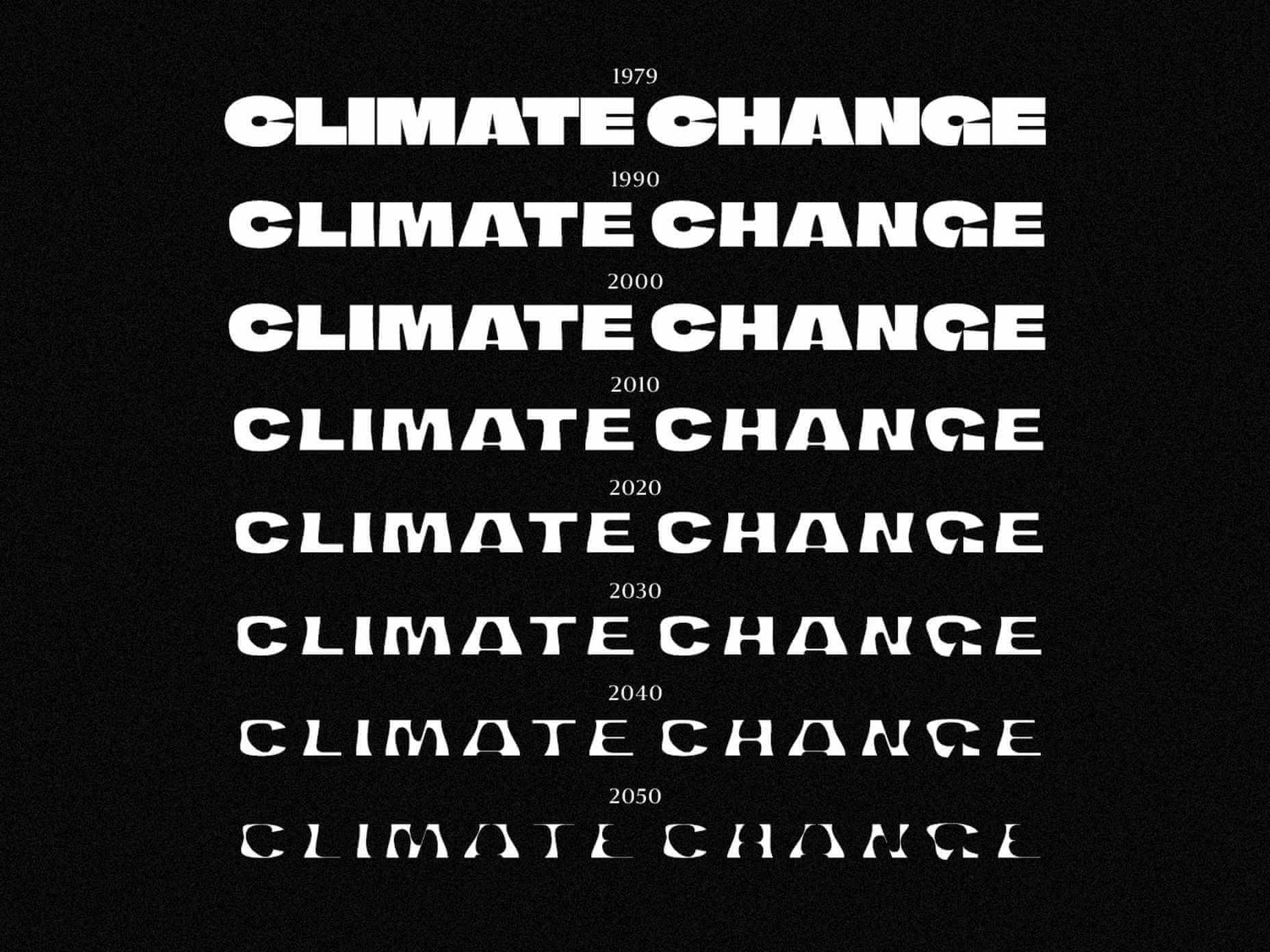
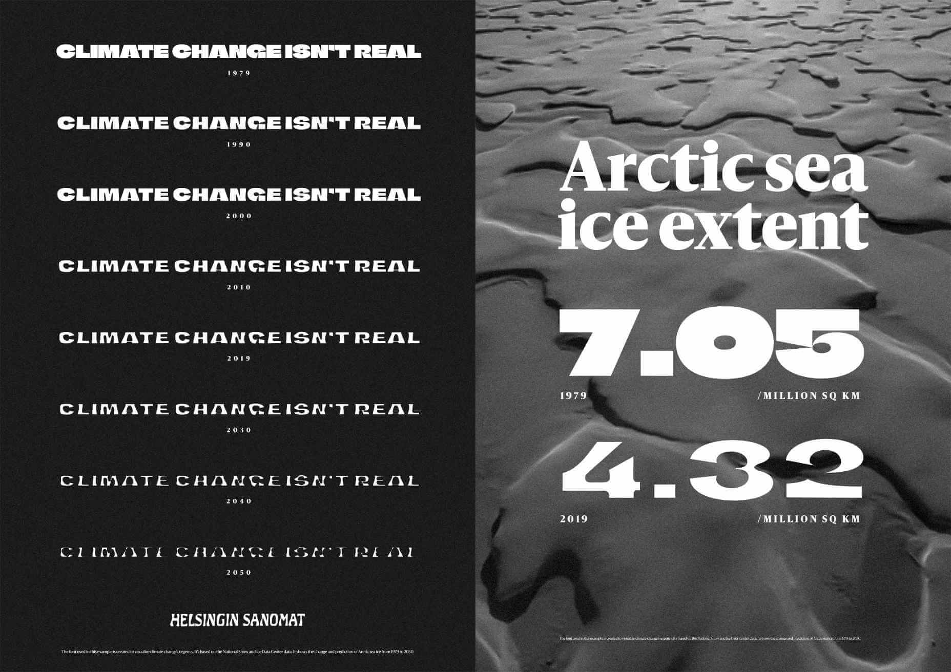
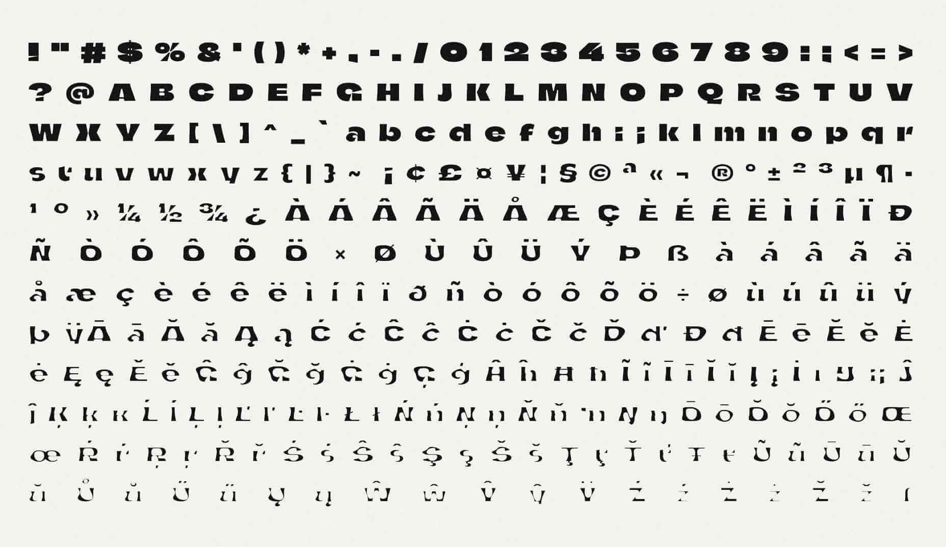
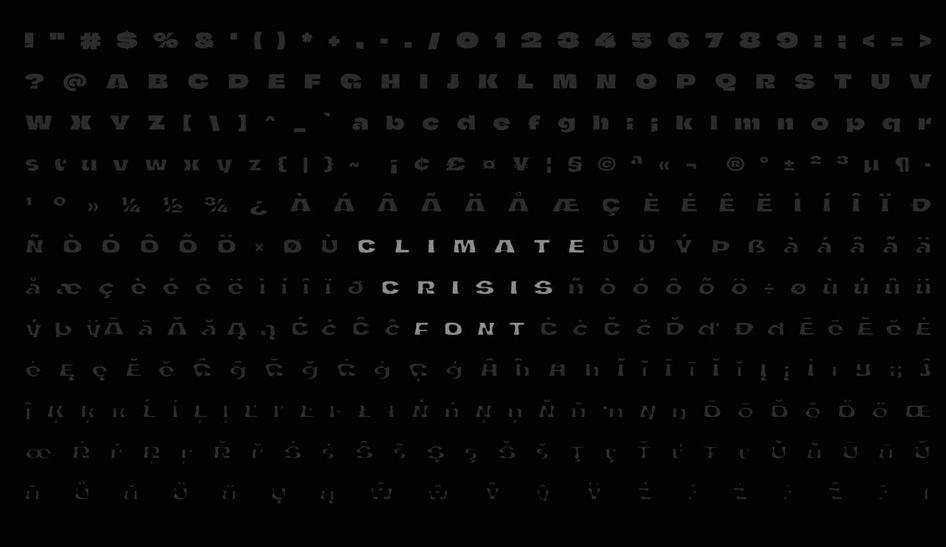
Finnish newspaper Helsingin Sanomat has developed a variable font, that is designed to make the effects of human-driven climate change tangible in a simple graphical form.

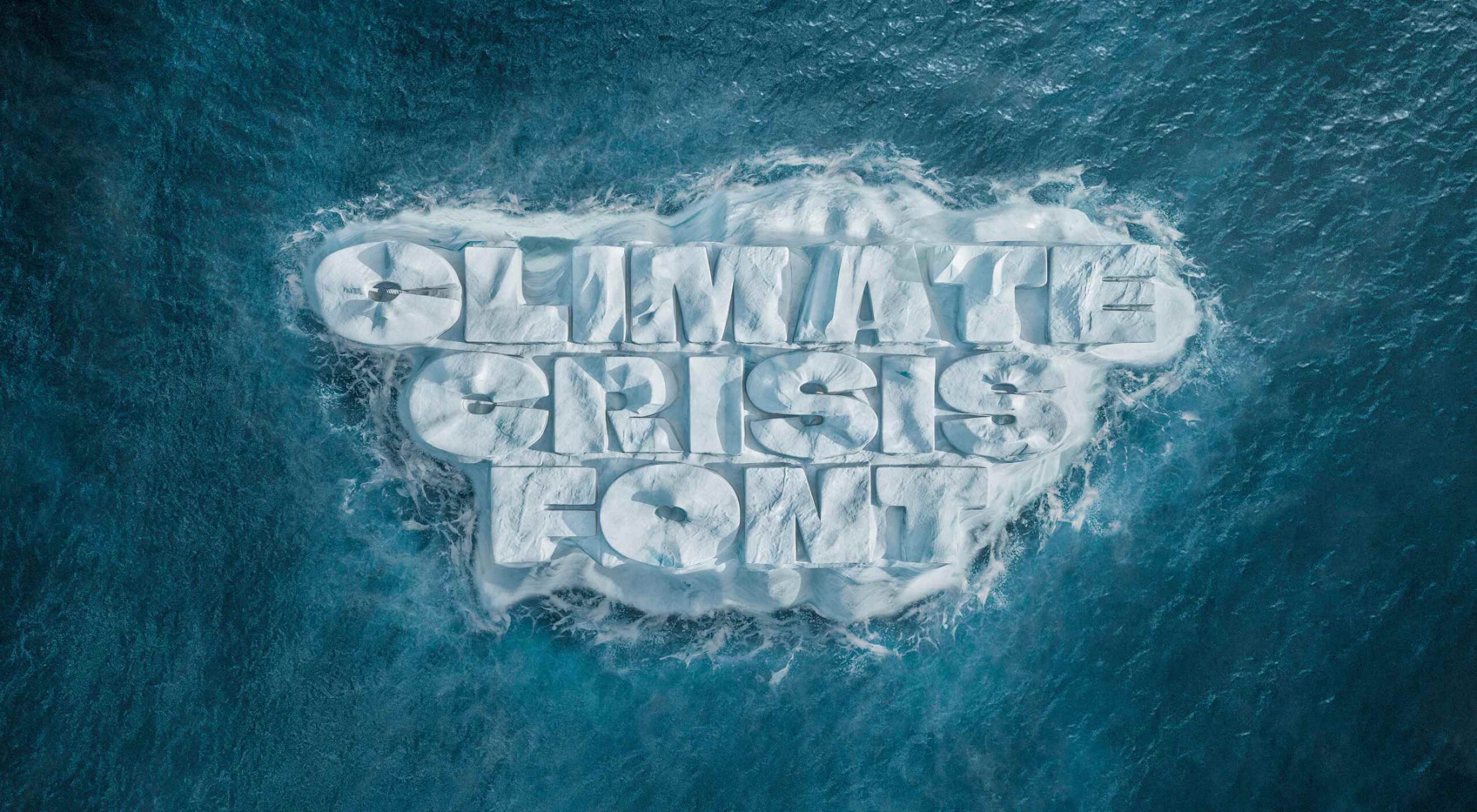
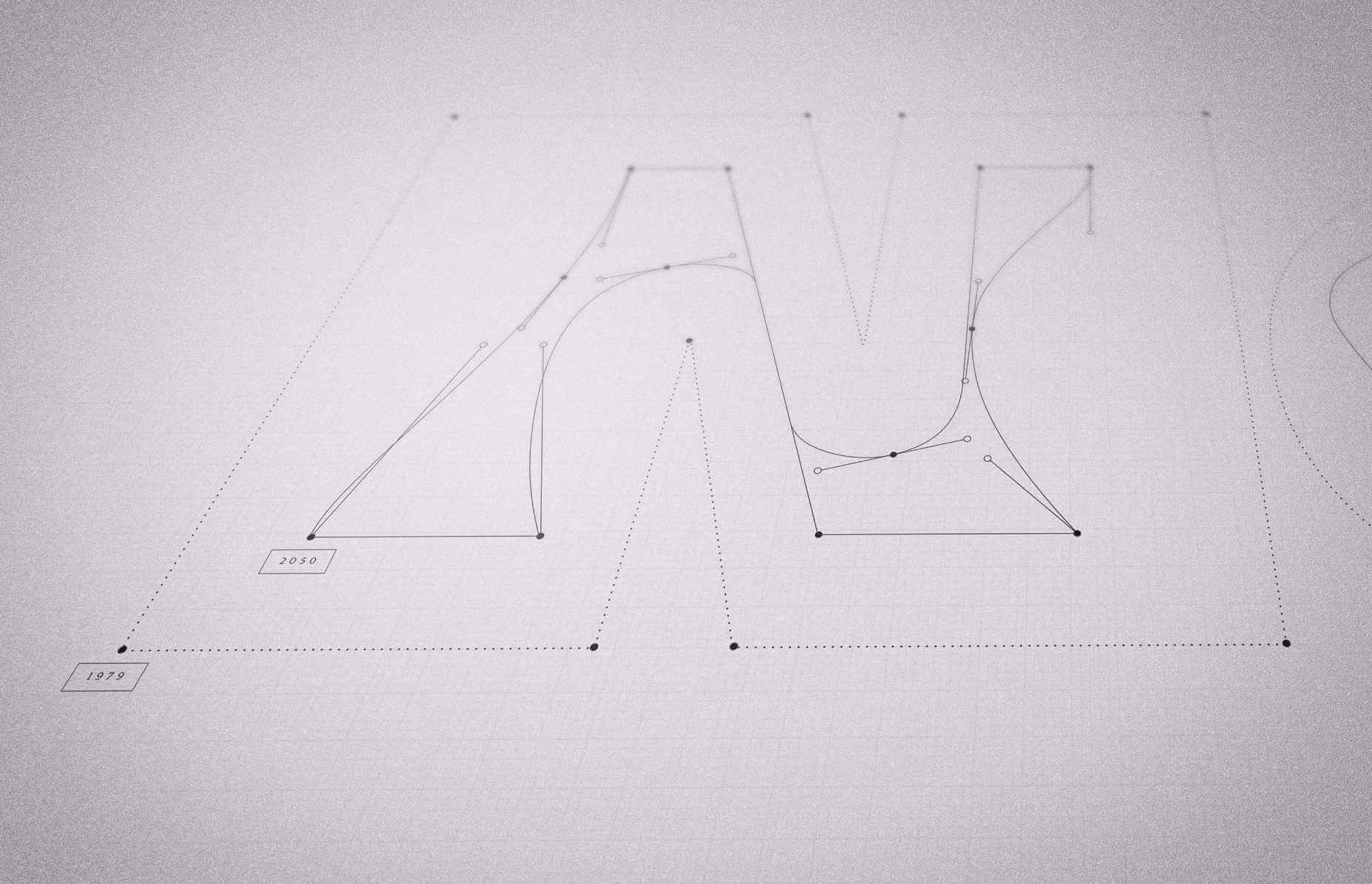
Whereas most type designers use variable font techniques to embed a range of weights in a single font file, the team — lead by Helsingin Sanomat’s art director Tuomas Jääskeläinen, and typographer Eino Korkala — used the technique to “melt” the typeface.

In the design process, we tried out countless letter shapes and styles, only to find that most of them visualized the disaster right in the earliest stages of the transformation. That’s something we wanted to avoid because unlike a global pandemic, climate change is a crisis that sneaks up on us.

— Tuomas Jääskeläinen

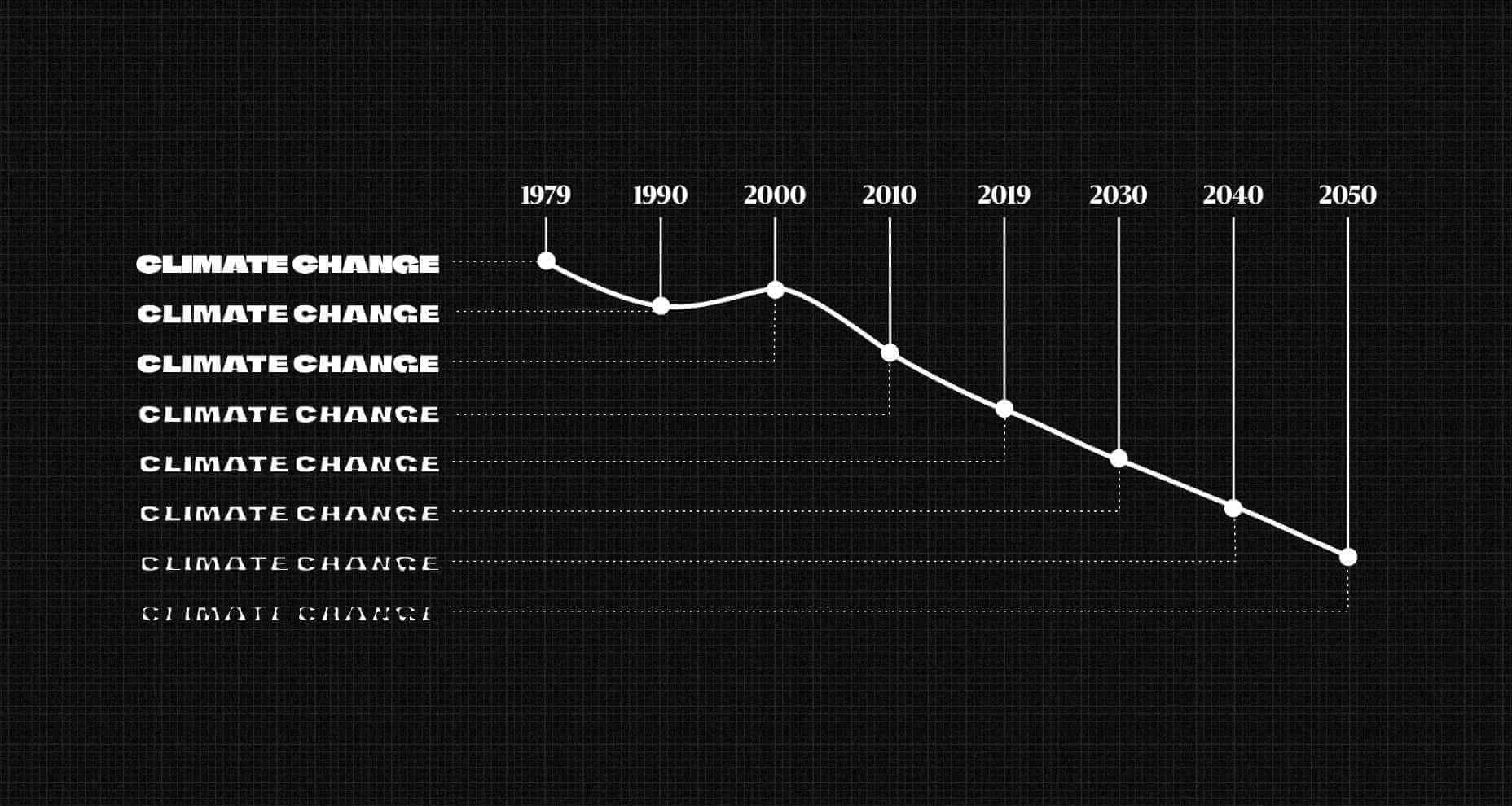
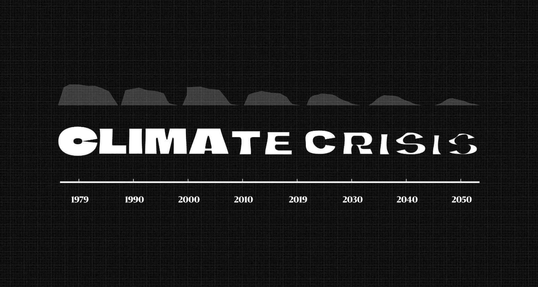
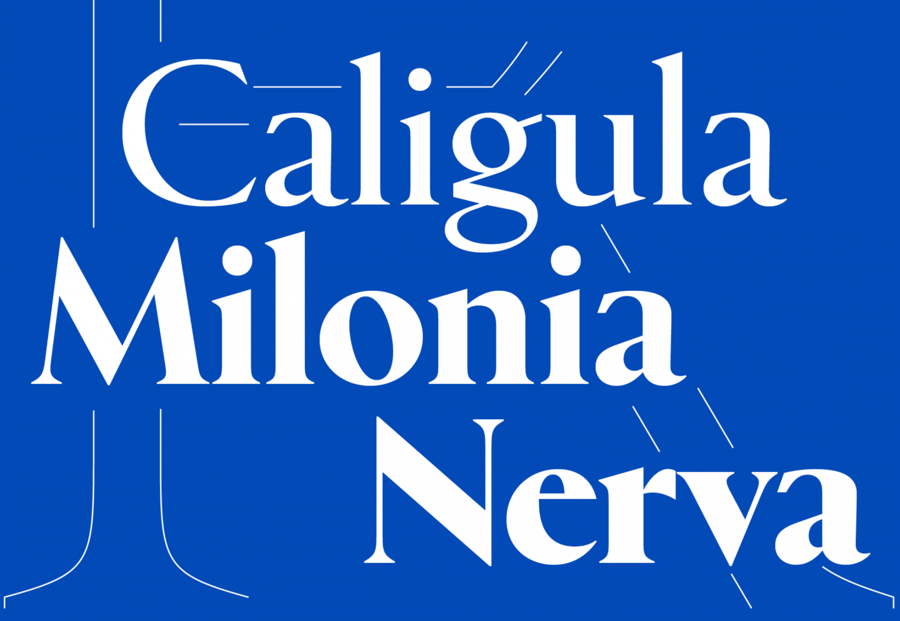
The default typeface represents the volume of Arctic sea ice in 1979 (when records began). It’s a rather beautiful, chiseled, chunky sans-serif, with cut-aways that open up counters to give it a modern appeal. As you move through the years towards 2050 the shapes appear to melt away, to the point that they’re barely legible.

Set the scale to 2021 and you’ll see an already dramatic loss of Arctic sea ice, and the resulting desalination of the ocean.

As depressing as these outlines are, they aren’t an estimate. The typeface’s outlines precisely match real data — there was an unexpected uptick in Arctic sea ice in 2000, and that’s reflected in the font.

The historical data is taken from the NSIDC (The US National Snow and Ice Data Center) and the predictive data comes from the IPCC (The Intergovernmental Panel on Climate Change).

We hope that using the font helps people see the urgency of climate change in a more tangible form – it is a call for action.

— Tuomas Jääskeläinen

You can download the font for free, for personal or commercial work.

Source

The post Variable Font Reveals The Full Horror of The Climate Crisis first appeared on Webdesigner Depot.

Source de l’article sur Webdesignerdepot