Articles

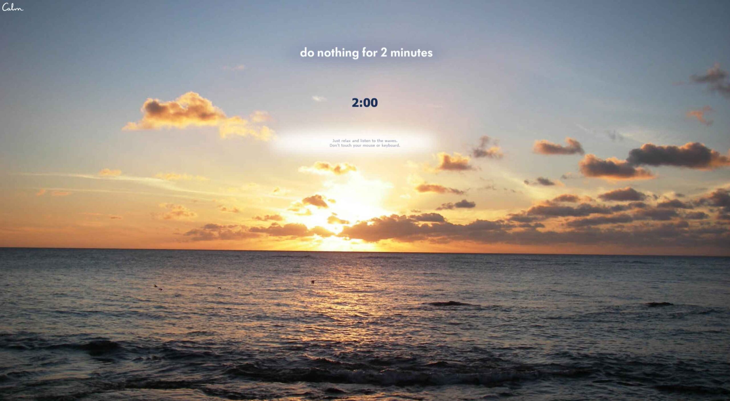
This month all of our web design trends have a common theme – imagery. Whether it’s seasonal or just coincidence, there’s a shift in the styles and types of images on many designs right now. One thing that might push these design trends is a relaxation of COVID-spurred rules worldwide or even fatigue from the pandemic.

Here’s what’s trending in design this month.

1. Little Images Everywhere

The jury is still out on whether we love or hate this design trend – tiny images (and videos) everywhere.

The thing that’s nice is there is a lot to see and interact with. The thing that’s challenging is that these designs can feel a bit unbalanced and all over the place.

Most of these designs feature four or more images or videos at a time. That can be a lot for a user to digest when we are accustomed to having just one thing to look at in the hero area.

Those four or more images then include all of the other user interface elements that you would expect on the page – navigation, large headline, secondary text, scroll, or engagement interaction. It can be a lot to decipher.

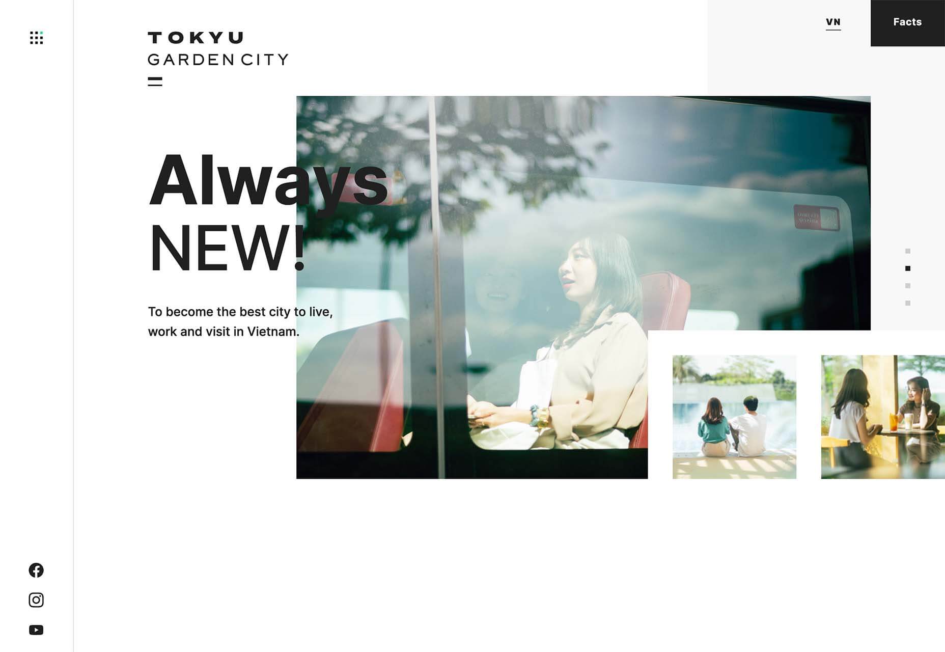
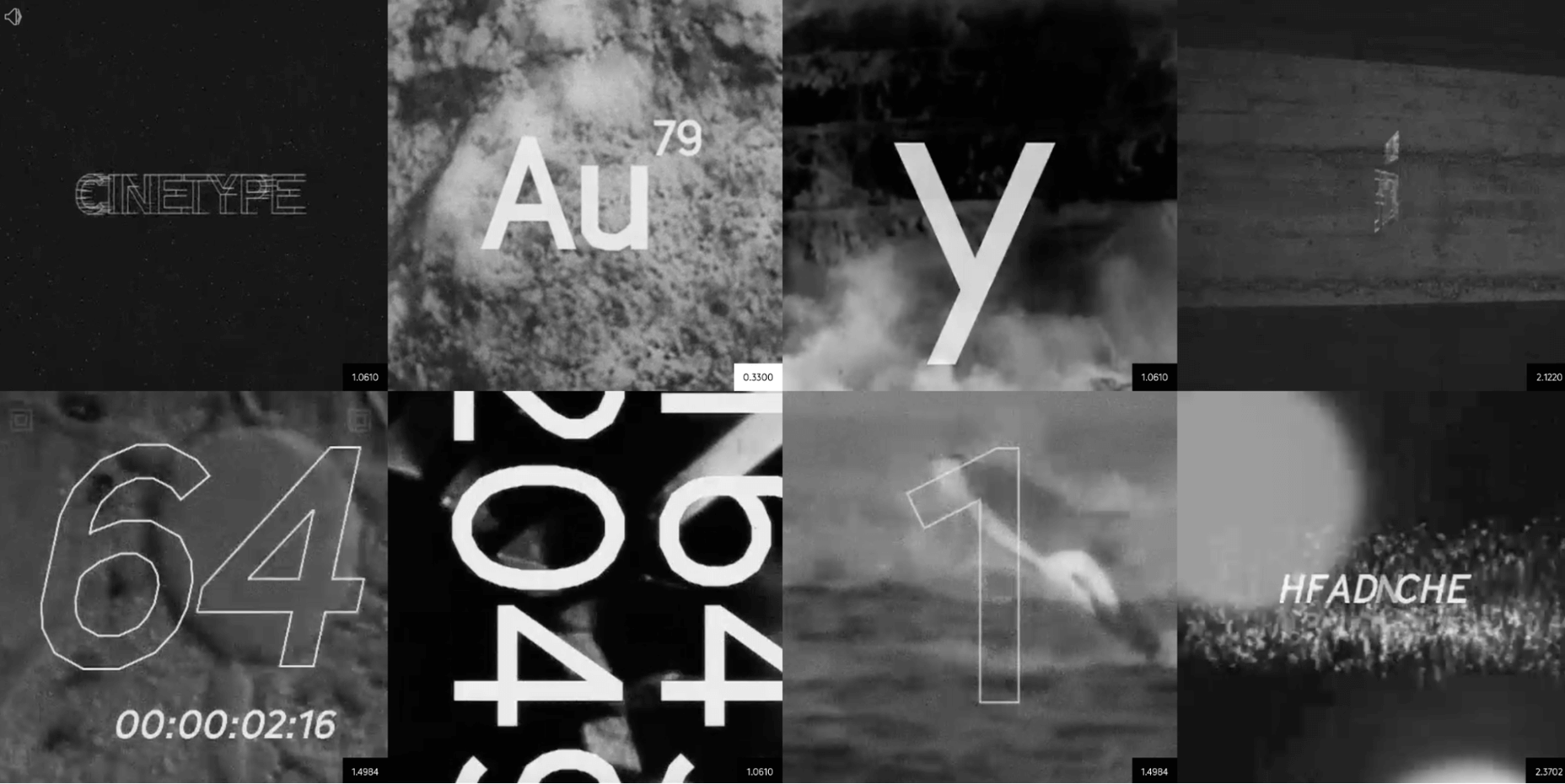
Tokyu Garden City does it with a mix of still and moving images with sliders and other animations. The images are always changing and moving, and there’s constantly something new to look at with movement at the top and bottom of the screen.

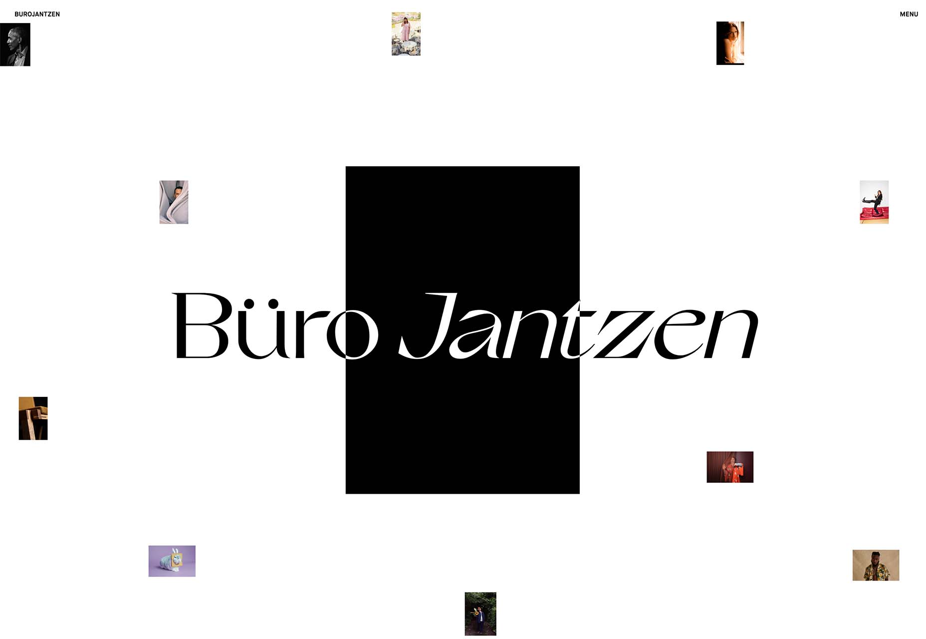
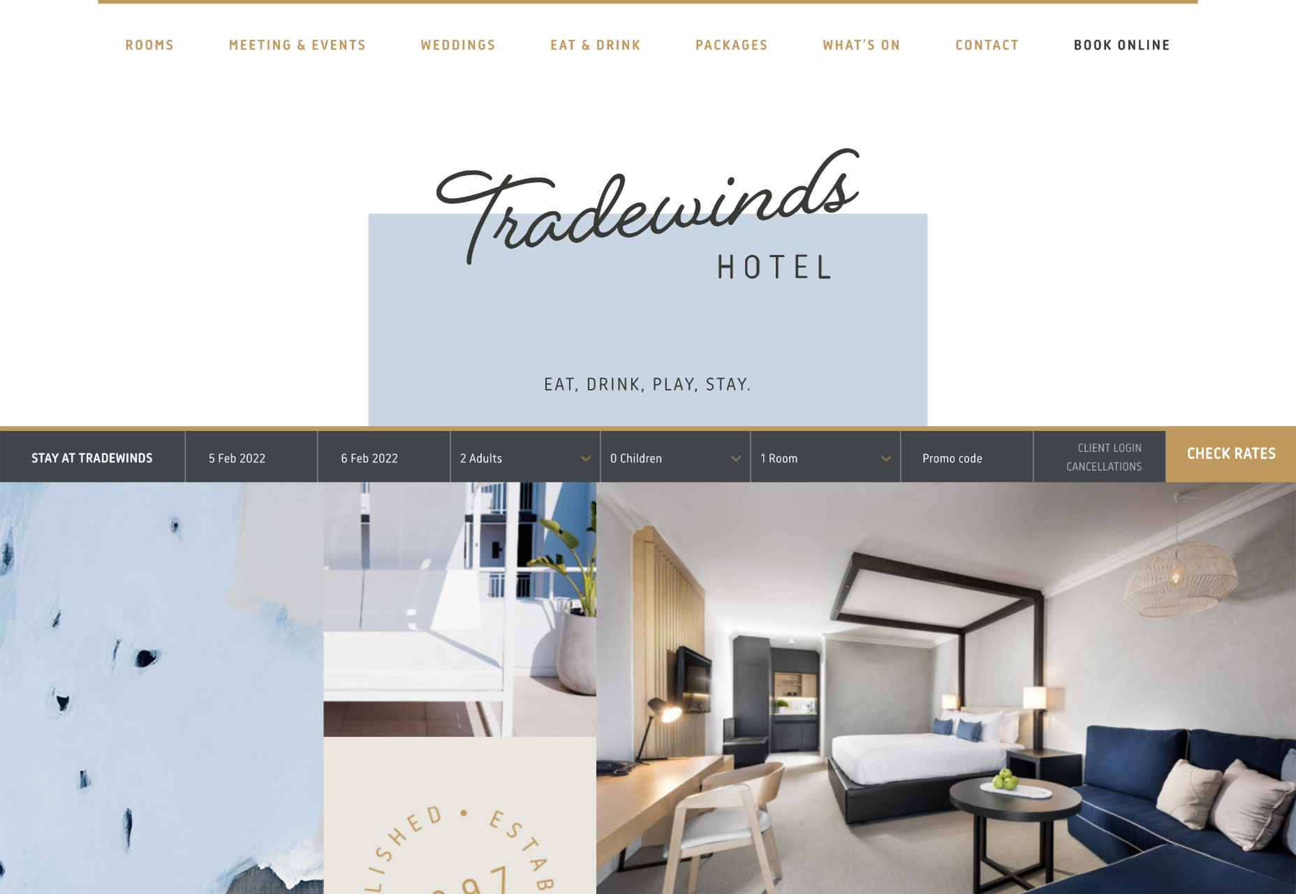
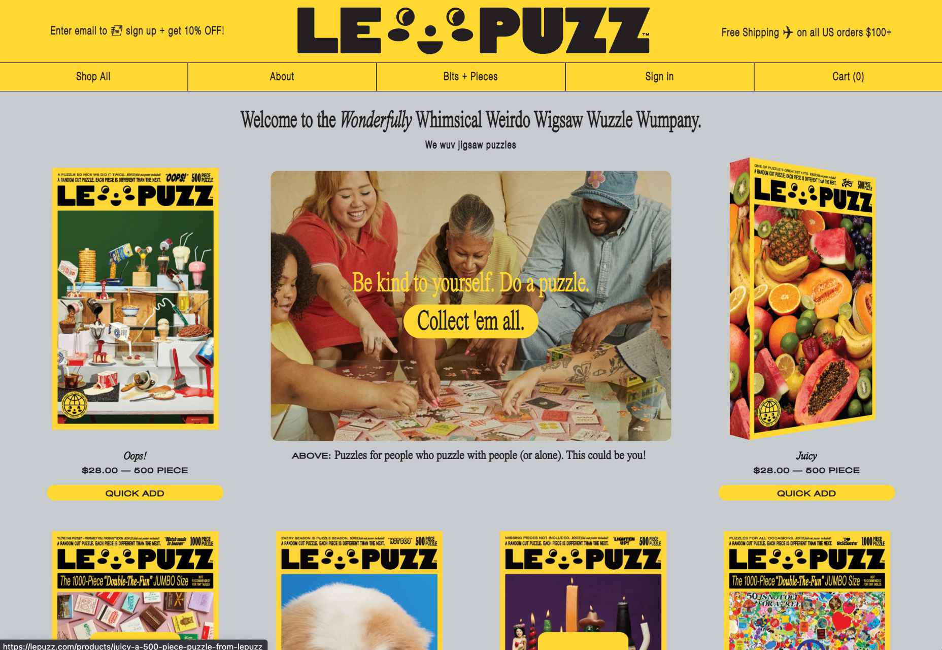
Buro Jantzen takes the tiny image idea to an extreme with ten images on the homepage. And every one is smaller than a postage stamp. There is a cool effect that happens with each image though. On hover, the small image pops into the large black box at a size where you can really see the photo.

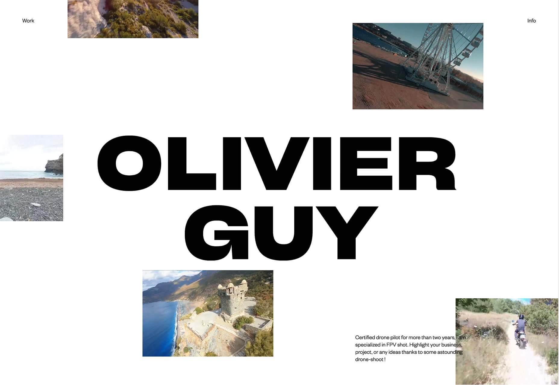
Oliver Guy uses a combination of video images on his website, which makes perfect sense for his industry of drone photography. There’s some interesting hover animation happening that allows you to see additional video clips without leaving the homepage. The contrast of small video on the white background makes this design easy to understand.


2. Big Detail Photography

Photographic details in all their glory. Images and elements that are so in your face that you can see every detail. That’s majorly trending in website design.

Big detail photography and videography is one of those image trends that can be so visually interesting that you can’t look away. It has other benefits, too, such as facilitating decision-making for e-commerce or helping someone better understand what an item is or the overall messaging.

Each of these examples shows something larger than life-size.

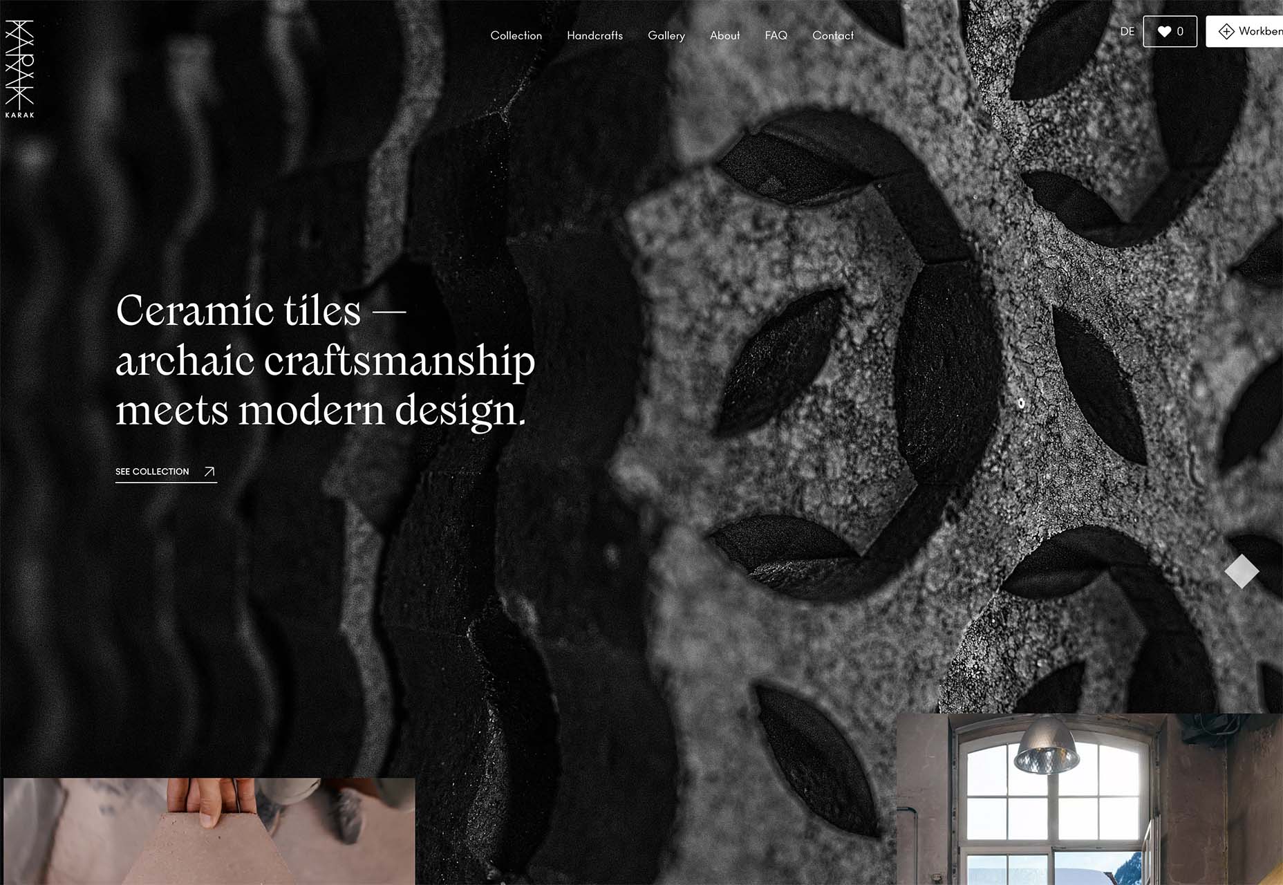
Karak creates ceramic tiles. The primary background image is so big and with such detail that it almost only serves as texture for the design. But it is paired with a smaller image and video that pull everything together for a complete understanding. The big detail image is beautiful and exciting and provides an extra layer of information.

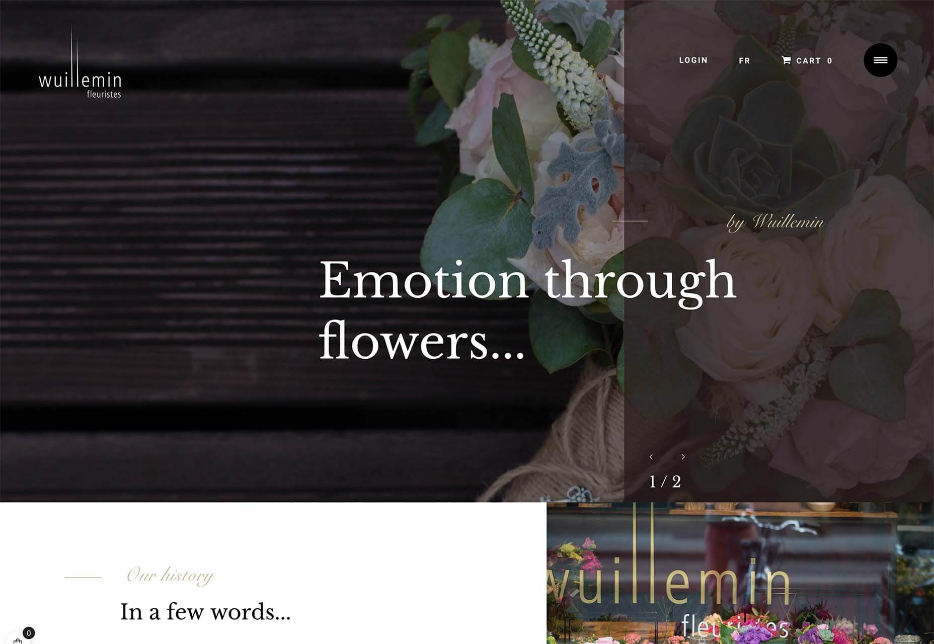
Wuillemin Fleuristes features an off-balanced hero image with a large floral detail. What’s interesting about this design choice for a detail image is that it is the only image on the screen and partially obscured by a tinted box and text element. The overall design draws the eye but may leave the user wanting to see a little more of the image.

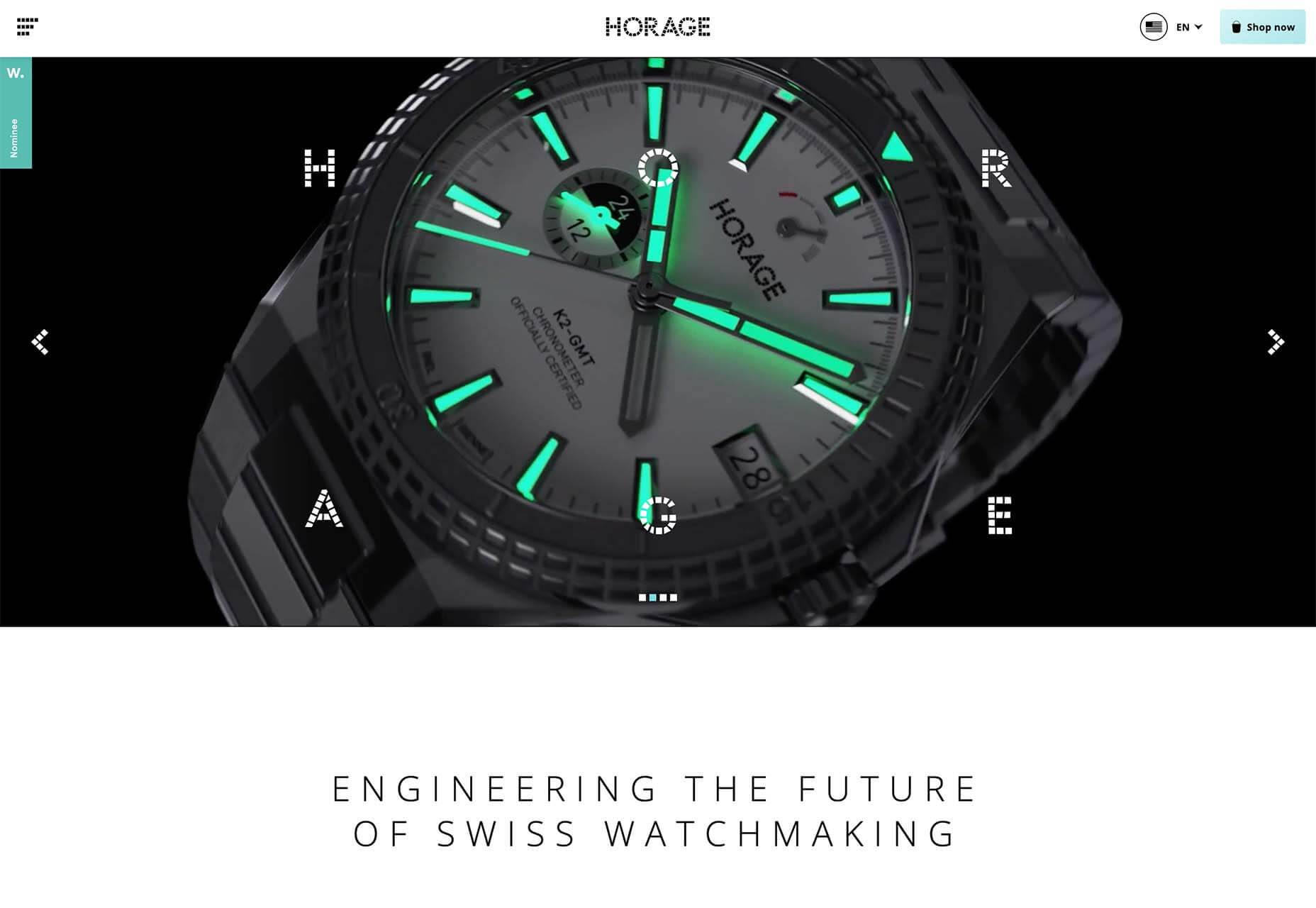
Horage pushes its watch in your face with motion in a video that zooms the product closer and closer into view. The combination of detailed video with very little text is a bold choice for e-commerce and might work because this item is still in the preorder phase. Detailed imaging is designed to help create a desire for the product.


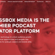
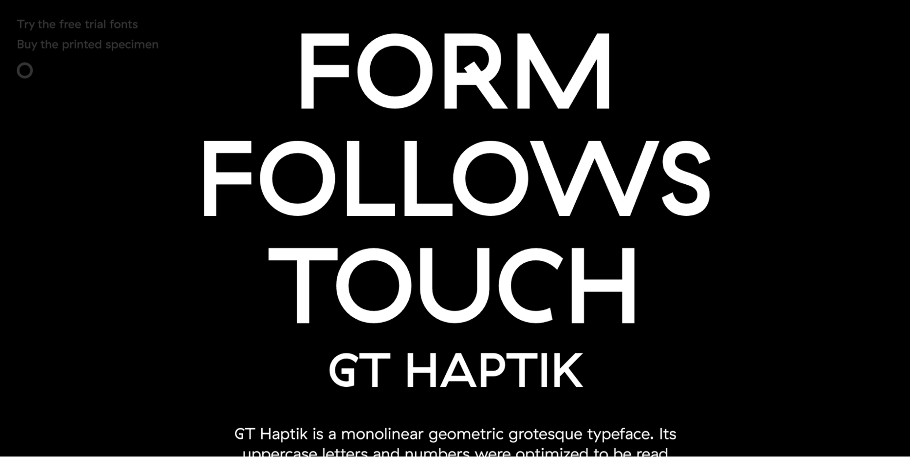
3. Big Faces are Back

After two years of not having that many faces in design projects, designers are going big and bold and showing people again.

One of the reasons we haven’t seen as many faces in design projects is because there was concern over how to show people – masked or maskless, alone or in crowds – and it caused more concern than was worth just going another way.

But projects with big faces are back in a major way. And it’s refreshing to make virtual eye contact again.

There are plenty of ways to do it, as outlined in each of these examples.

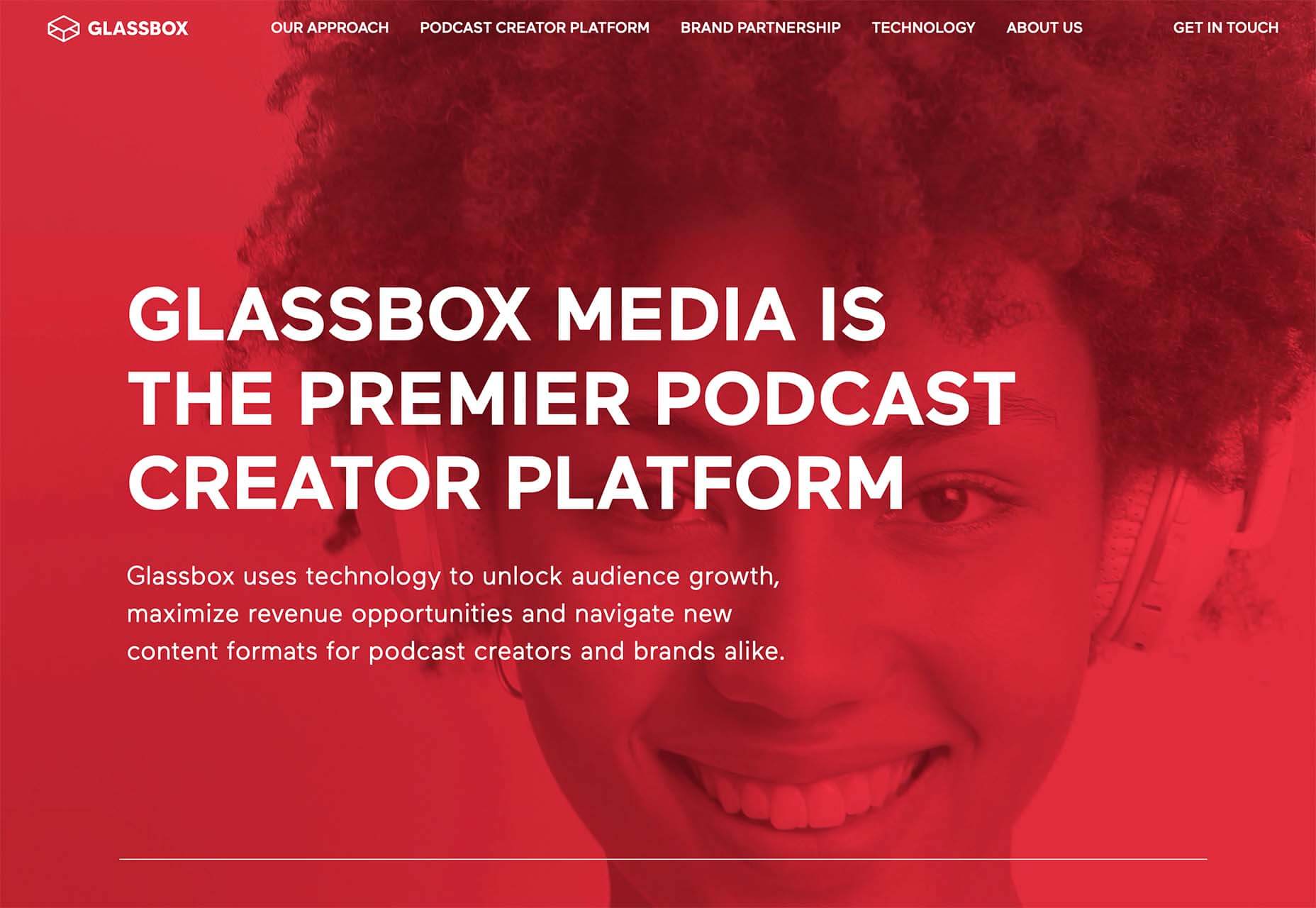
Glassbox Media uses a full-screen oversized video on the homepage. You can see the subject’s eyes and feel engaged with the person on the screen. She seems happy, and the size and scale of the face make you feel almost like you are in a room with her, ready to have a conversation.

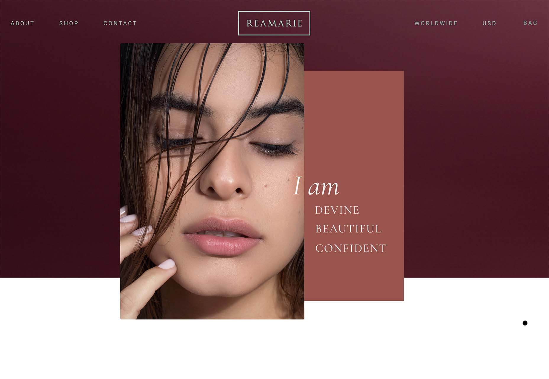
Reamarie uses smaller still images with tight crops to bring you into the faces on the screen. There are more, bigger faces throughout the scroll as well so that the user feels connected to the people and product. Even if an image isn’t super large, a tight crop can make it feel bigger and create the same level of engagement as something that has more size on the screen.

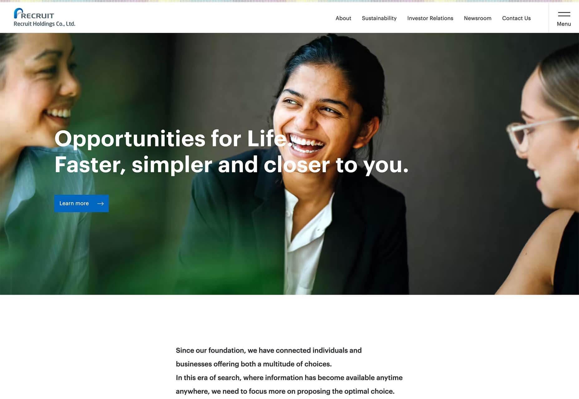
Recruit Holdings Co. uses a trio of people together, happy and smiling, to establish a connection with website visitors. The entire design features similar images throughout and makes you feel like you want to be a part of what they are offering. Note that the people are close together and without masks; that’s a culture shift we are starting to see in a lot of imagery.


Conclusion

Photography, videography, and image trends can be driving factors for website design projects. The types of images selected can set the tone for projects, relate to brand identity, and help engage users.

Source

The post 3 Essential Design Trends, March 2022 first appeared on Webdesigner Depot.

Source de l’article sur Webdesignerdepot

Creating and sending business proposals can be a lot of work. However, if you have the right tools and knowledge, you can quickly create and send high-converting proposals that your clients will love. 
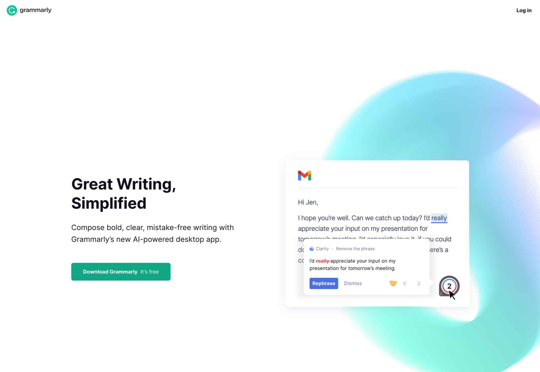
This article will explain how to create a fantastic business proposal that looks great and gets signed quickly. Although we’re focussed on design, our tips apply to every industry and type of business.

1. Know When to Talk About Yourself

One of the most common mistakes people make is starting the proposal by talking about themselves. 

You might be surprised to know that clients spend the most time on the introduction chapter, so it’s essential to use it right. You need to set the right tone by explaining to your clients how your solution will help them achieve their goals. 

They want to hear the benefits and feel assured that you’re the best choice for them. If you start the proposal by talking about your company and the values you believe in, you’ll lose the attention of your clients. 

In most cases, the clients have already researched you and know the points you make in your PR releases.

Once you explain your process and the time scales, you can introduce your team and talk about the company. Just make sure it’s short and sweet. 

2. Divide Your Proposal into 6 Sections

Sending a one-page proposal will only confuse your clients and won’t incentivize them to reach out. The best way to format your proposal is to create six sections. 

This should include:

  • Introduction
  • Process
  • Timescales
  • Pricing
  • Next steps
  • Terms and Conditions

You need to showcase what their future could look like if they work with you, listing all the benefits as well as explaining the next steps. You need to write down what happens if they don’t agree with some parts of the proposal, what will happen when you reach an agreement, how much they have to pay, and more. 

Be clear on your follow-up process to speed things up. 

3. Use a Dedicated Proposal App

If you’re someone who fires up MS Word and hopes for the best, your proposals probably don’t get a lot of traction. That’s because you’re spending too much time reinventing the wheel. The best jumping-off point for your proposal strategy is choosing the right app. It will help you automate and speed up the whole process. 

Different solutions suit different people, but some of the features you might want include: 

Digital Signatures

The digital signature option helps you get your proposals signed faster and turns your proposals into legally binding documents. This significantly reduces the agreement time since your clients no longer have to print out your documents, scan them and send them back.

Integrated Payment Methods

Speed up your payment process by choosing the proposal software that has a payment option that allows clients to pay as soon as they agree to your terms and conditions. It can significantly decrease the time it takes to get paid. 

Sales Tool Integration

For an even more straightforward sales process, select a proposal tool that has native integrations with your sales CRM and other sales tools. 

Proposal Analytics

Proposal analytics can help you in the follow-up process. They show when your proposal was opened, on which device, and how much time the client spent on each of the sections. 

Content Library

The content library lets you save any part of the content (text, pictures, videos, terms and conditions, pricing table) for easier access in the future—no more copy and pasting huge chunks of text. 

An Easy-To-Use Editor

In order to be able to create any documents with your proposals software, their editor needs to be very easy to use. If the editor requires design experience, look for a better one.

4. Let’s Talk About Price

When it comes to the price section, there are two significant things you need to look out for: the name of the section and the format of your price.

Naming your pricing section pricing, expenses, or something along those lines cheapens your proposals and makes it seem like a regular invoice. Try naming the section ROI or Investment. It will evoke positive feelings with your clients because if they think of working with you as an investment, they will know that a return on investment is a part of the deal. 

The way you format your prices won’t make or break your deal but can help you speed up the proposal process. Firstly, you need to figure out if you’re going to charge by the hour, based on the value of the project, based on the commission, or something else. 

Once you reach a decision, you have to format the prices in an easy-to-understand and short way. Many companies try to upsell their clients at the very start of their business relationship and create proposals with three different packages. 

We believe that the way you present your prices should be the same as the way doctors prescribe medicine. You need to be the authority on your prices and tell the client what type of package fits their needs. If you leave it up to your client to pick the right package, it will just lead to confusion, and you’ll have to do the extra work to explain the difference to them.

Bonus Tips

Web-based business proposals speed up the signing process. If you make your proposals printable, it will lengthen the time your clients take to agree to your terms and sign them. Make sure your proposals are web-based and have a digital signature option. 

Another tip is to send your proposal as quickly as possible. As soon as you meet with your client and hear them out, start working on your proposal. 

Our last tip is to send your proposal at the beginning of the week. If you send it on a Friday, it will negatively impact the time it takes to get your proposal signed.


Featured image via Pexels.

Source

The post 4 Tips For Getting Design Proposals Signed Faster first appeared on Webdesigner Depot.

Source de l’article sur Webdesignerdepot

Yulia: Hi, guys! Thank you for agreeing to meet me today. Let’s start with a simple question. How would you describe Reface in a few words? 

Ivan: Everything started with a face-swap. We created state-of-the-art technology and made it possible to provide it to more than 180 million people. Reface is an app that allows users to swap faces in images, GIFs, and videos in seconds and with high accuracy. Moreover, in 2021 we developed more AI tools for personalized content, which allow us to animate faces, place faces on objects, and voice over them), empowering users to generate completely new and viral content. 

Source de l’article sur DZONE

Private, public, or hybrid, cloud solutions for any business domain are designed to provide the freedom to grow and security for the organization and customer data. For cloud-based multimedia solutions, there is cloud-based custom transcoder IP that supports automated Video-On-Demand (VOD) pipelines. Cloud services offer solutions that ingest source videos, processes video for playback on a wide range of devices using cloud media converter, and store transcoded media files for on-demand delivery to end-users.  

Custom IP integration along with other cloud services showcases better feasibility of using Open-Source codec, to use one’s transcoder instead of cloud media-converter for multimedia solutions. In this blog, we will see how an Open-Source codec like AV1 is selected as a custom IP for encoding to integrate over the cloud as a service.  

Source de l’article sur DZONE

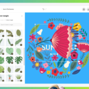
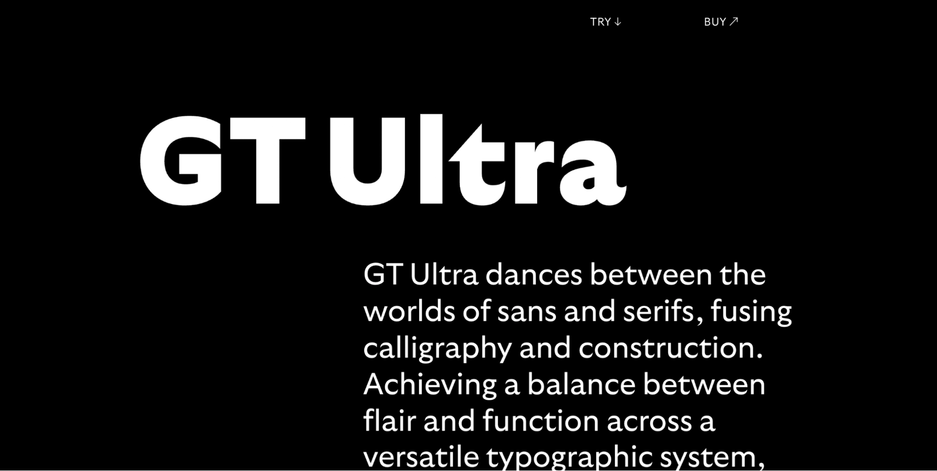
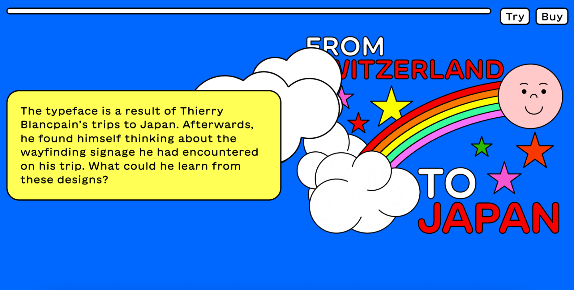
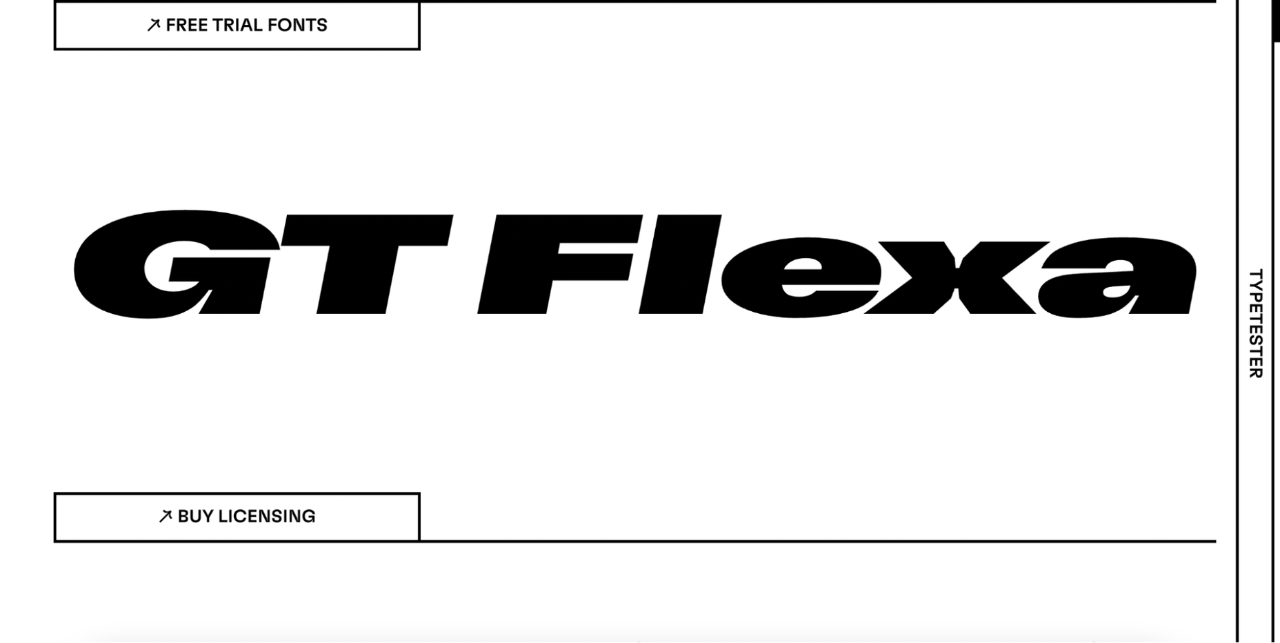
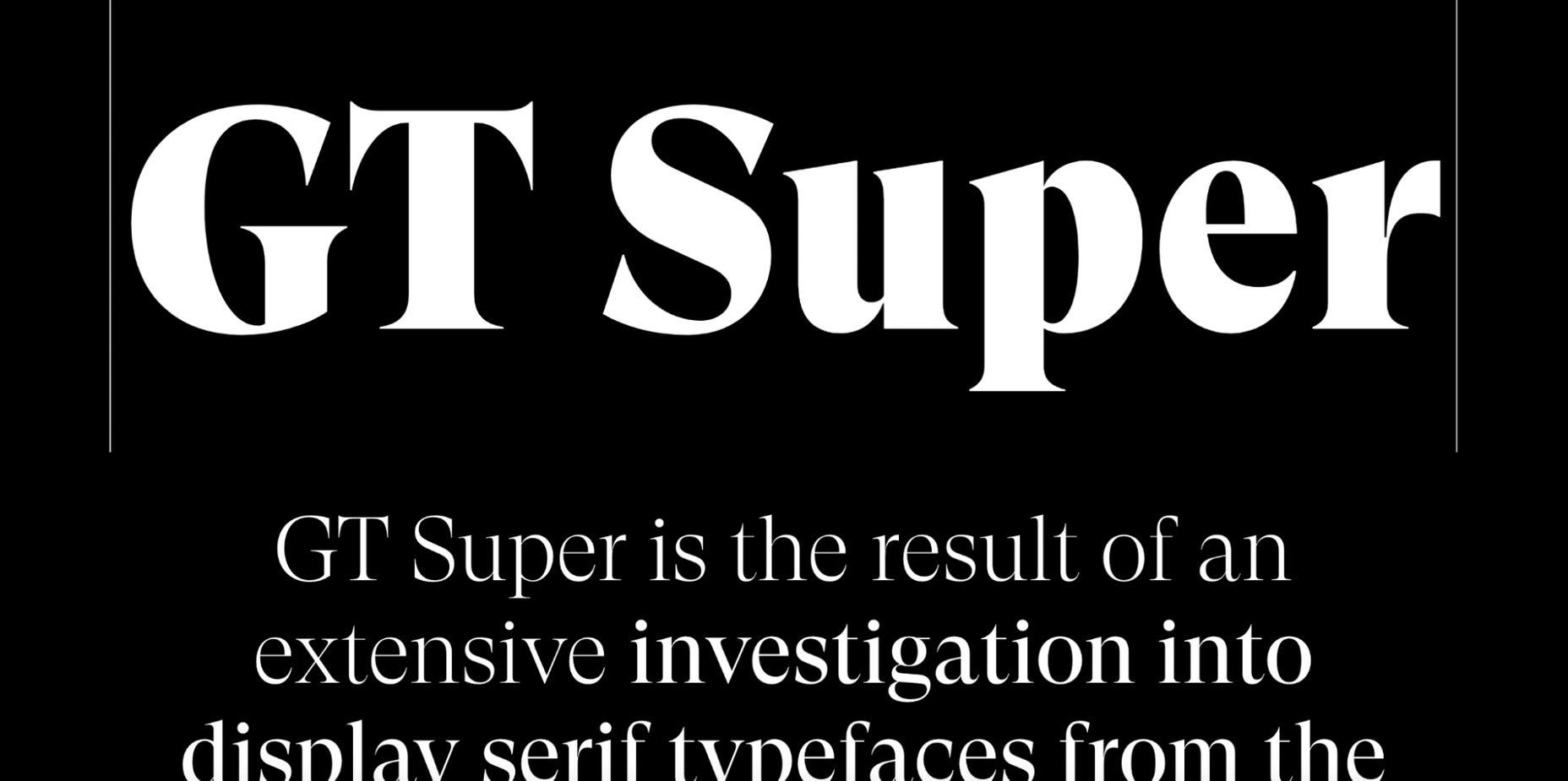
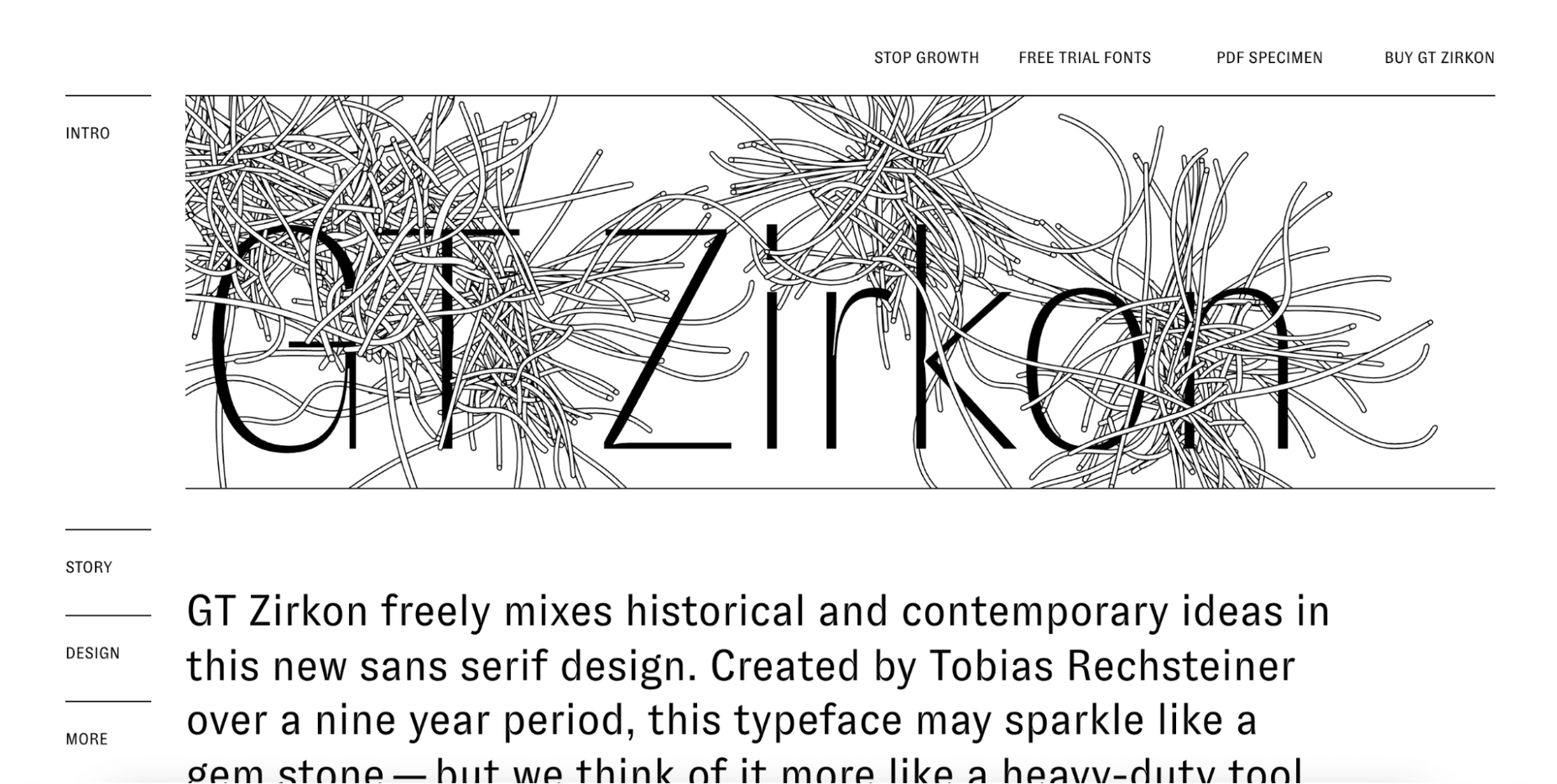
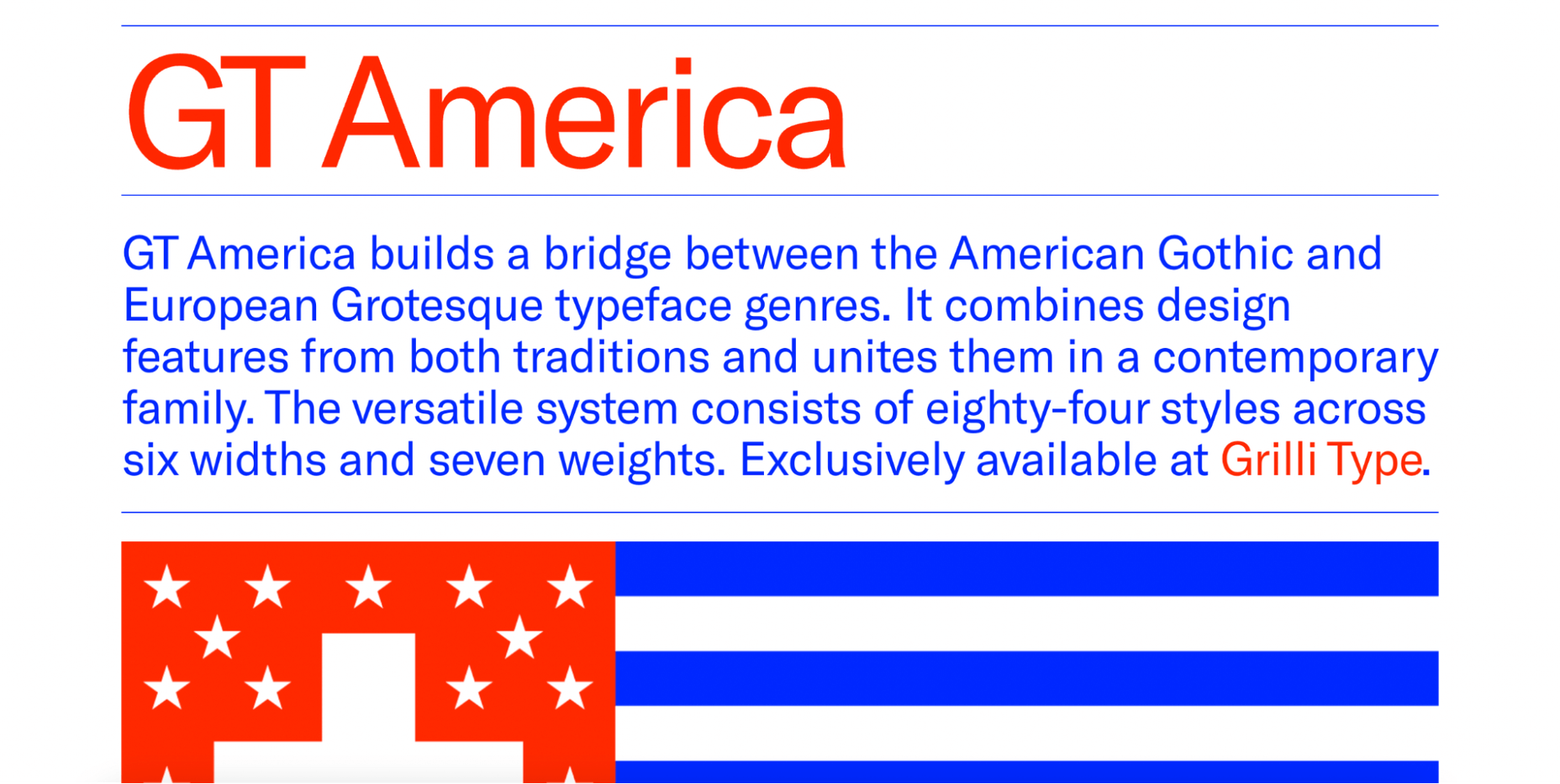
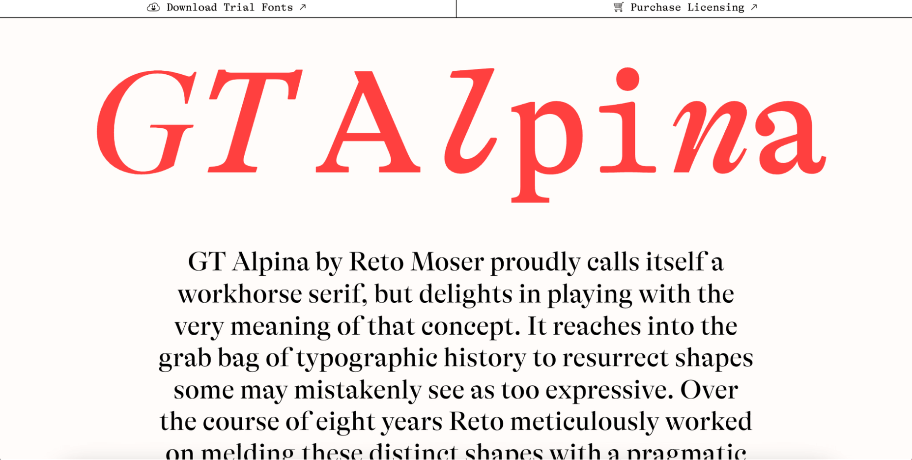
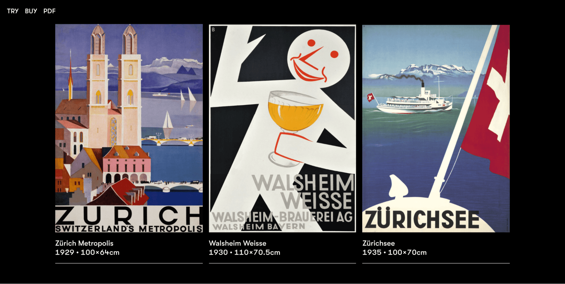
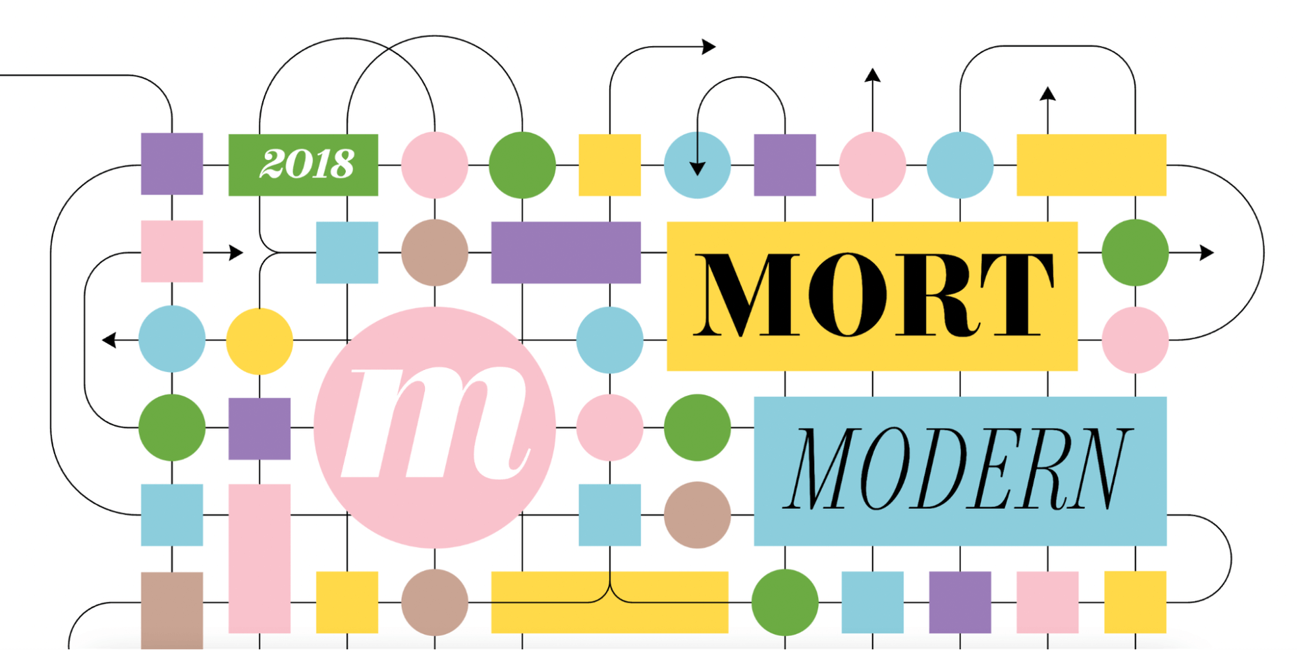
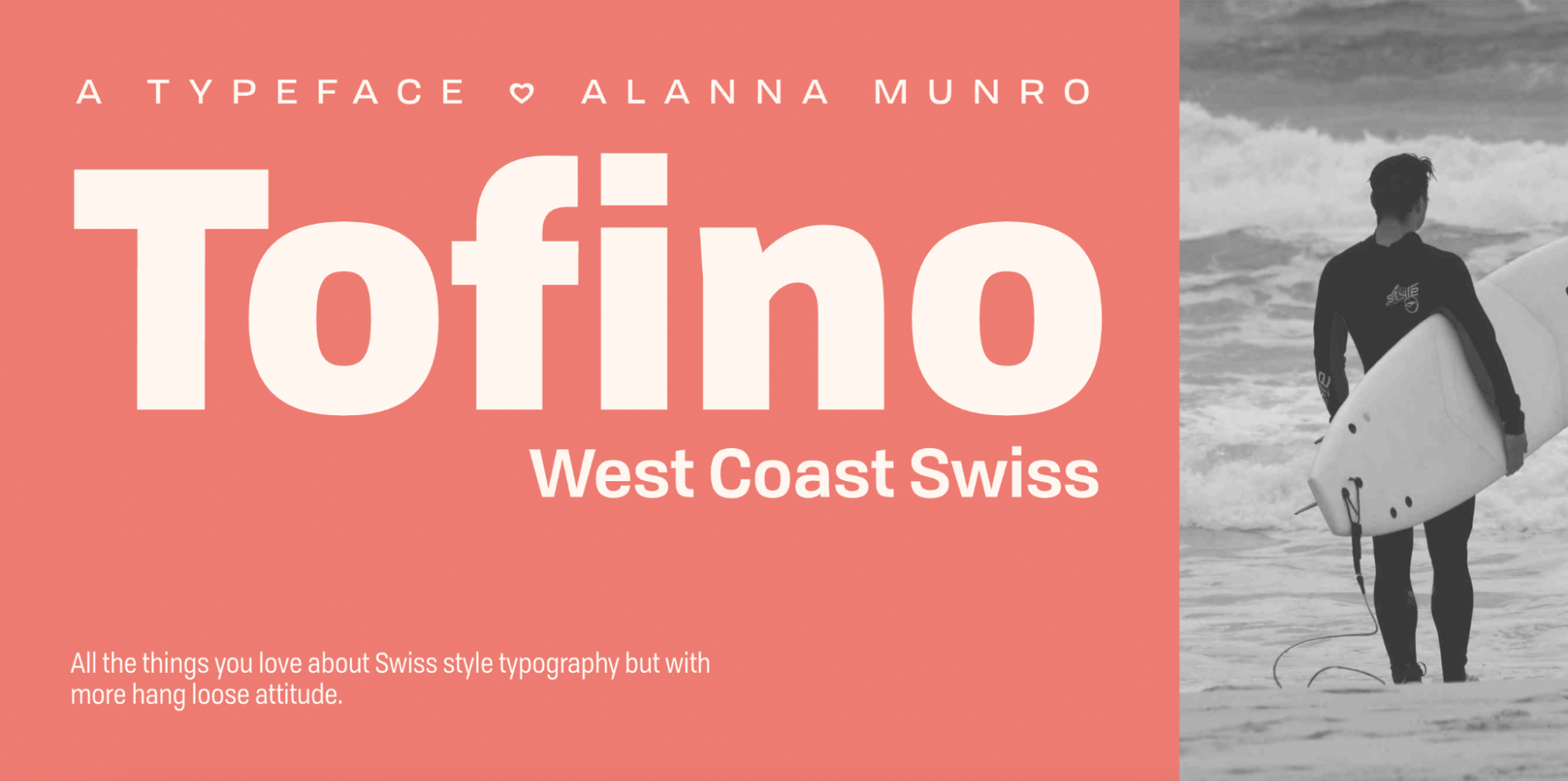
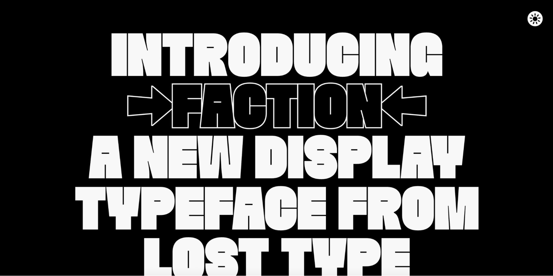
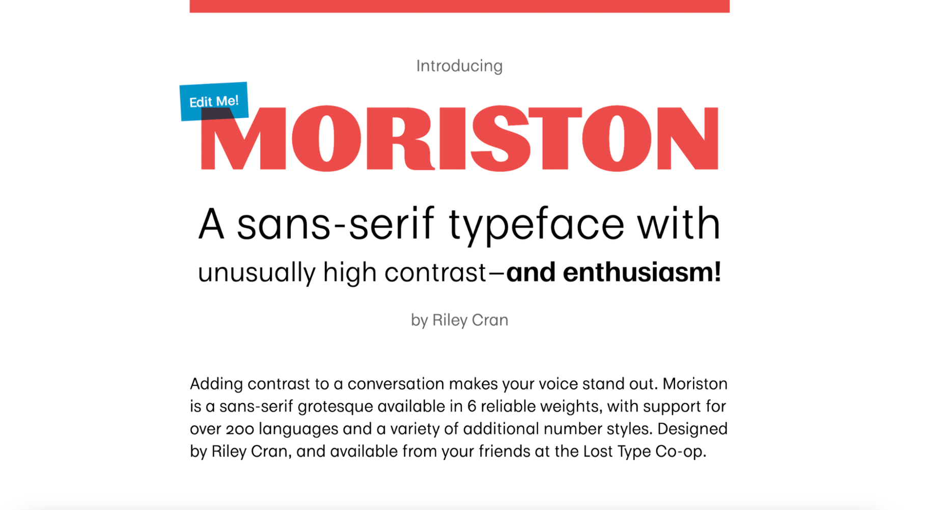
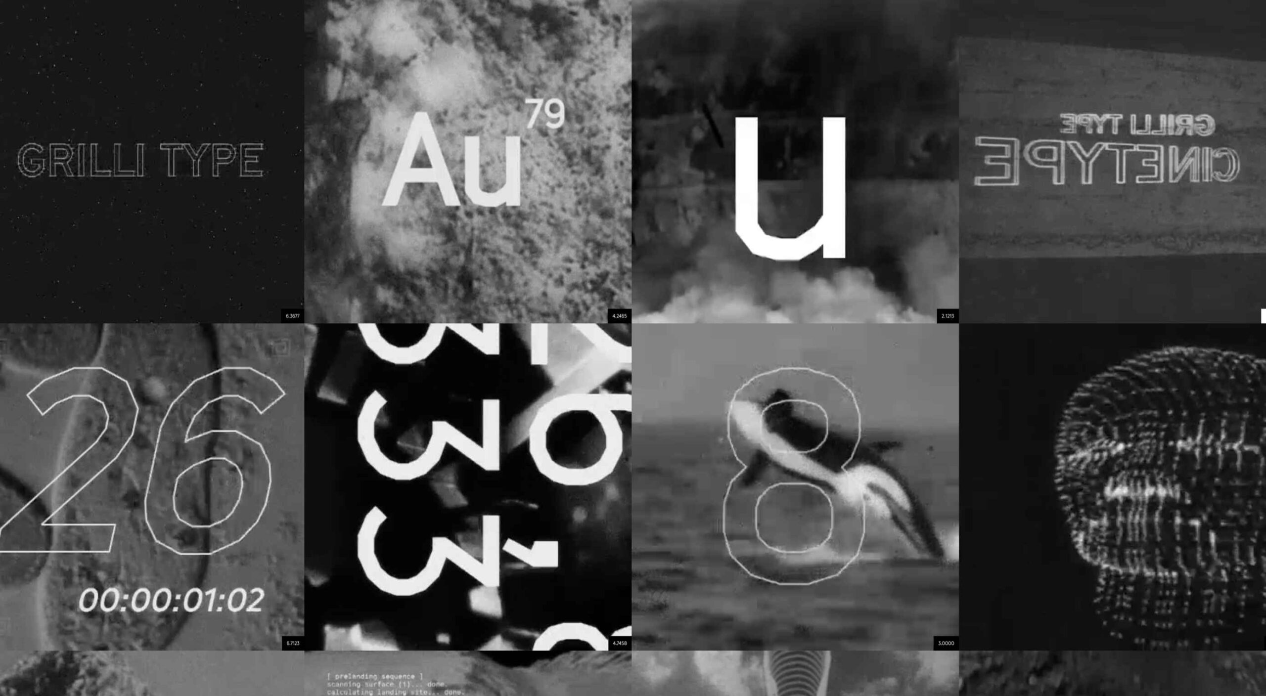
Are you looking for a unique font that will make your next project shine? Or maybe you need a typeface with a beautiful design and rich history behind it. Luckily, mini-sites for fonts allow us to creatively explore a font’s origins and history. We know (from our own experience) how important it is for UI and UX designers to have a variety of fonts for our designs.

Now that 2022 is here, it’s time to expand our font collection. That’s why, after extensive research, we have created the ultimate list of the best 16 creative mini websites for fonts.

Are you ready to take a look at the most creative, cute, and fun font websites available on the market?

1. GT Eesti

This website is about the history of one of the most popular fonts on the market, GT Eesti. As you will notice, the typeface has a long history (more than 80 years) and was recently reborn in Switzerland.

As for the font, GT Eesti is a flexible geometric sans serif that can be used in almost any project. As one of the most creative websites for fonts, full of animations and interesting information, GT Eesti quickly made it onto our list.

2. Ultra Font

Are you looking for a font that combines calligraphy and elegance and sits between the sans and serif styles? 

Then GT Ultra is just what you need. We loved how the creator tells the story and structure of Ultra with beautiful animations on this unique, one-page website.

3. Maru Typeface

Maru is by far the cutest design on this list. The website is a vertical narrative of the typeface’s history. 

The typeface was inspired by the designer’s travels to Japan, and the mini-site fully reflects that. Best of all, Maru also includes a great collection of cute emojis and stickers.

4. GT Flexa

GT Flexa is a very flexible font that you can easily use for a responsive UI design. We enjoyed navigating through the minimalist mini-site and exploring the creation and history of Flexa. 

Flexa also offers a free trial that allows you to try the font before you buy.

5. Super

Super’s mini-site reminded us of earlier decades. GT Super is a vintage typeface inspired by the serif fonts of the 70s and 80s. 

Therefore, it can beautifully frame nostalgic designs. The font was designed by Noel Leu and is available in two styles (text and display).

6. GT Zirkon

GT Zircon is located in a place where creativity meets minimalism. This is one of our favorite mini-sites for fonts. 

The site showcases Zirkon’s history and design process through creative graphics, videos, and animations.

7. America Font 

This mini-site allows you to explore the history, style, and character overview of GT America, a contemporary font family. 

The designer has used elements from American Gothic and European Grotesque to create one of the most flexible typefaces available.

8. Alpina

Reto Moser recently designed one of the most popular GT typefaces, the Alpina “Workhorse” serif. 

This innovative, one-page website tells us the story of Alpina and explains how the designer jazzed up, posed, and flexed the classic book typography to create a wide range of typeface variations.

9. Cinetype

As the name suggests, this mini-site is inspired by classic cinematic movie reels. If you’re looking for a font inspired by the fascinating world of cinemas, Cinetype is simply the best choice. And on this creative website, you will learn all the reasons why.

10. Haptik Typeface

When it comes to monolinear geometric typefaces, Haptik is one of the best. This innovative mini-website tells how the Haptik font came to be and highlights the history of the font. 

The hand gesture gifs at the bottom of this one-page site are some of the most creative mini-videos we have seen in a long time.

11. Walsheim

Walsheim is a typeface designed by Noel Leu. This mini-site explains how the designer was inspired by the fascinating poster designs of Otto Baumberger, a successful Swiss painter of the 20th century (1889-1961). If you like fonts with a deep backstory, Walsheim is a must-have for you.

12. Prospectus

The Prospectus mini-site is specially designed to look like a newspaper. And let us say: the result is extraordinary. 

This one-page website explores the origins, construction phase, and classifieds of the Prospectus typeface, allowing us to experiment in real-time with the weight, height, tracking, and size of the typeface.

13. Mort Modern

Mort Modern is a unique serif typeface designed by Riley Cran in 2018. The mini-site provides information about the typeface in a creative, cartoon-like way. 

We really liked this responsive, one-page website because it is elegant and colorful at the same time. The font is available in 56 (!) styles and promises to beautifully frame any kind of modern design.

14. Tofino

The Tofino mini-site is a creative, one-page portal that allows us to discover one of the most adventurous Swiss-style fonts on the market. 

Tofino is a top choice for any travel-related project and comes in 75 unique styles. When it comes to creating a well-crafted report on a font, there’s nothing better than this.

15. Faction Typeface

We love websites that offer both a dark and light theme. And the Faction mini-site is one of them. 

In this mini-site, you’ll learn how the Faction typeface was created and why it’s one of the most popular display typefaces for modern designs.

16. Moriston

If you’re looking for a unique sans serif font with extended multilingual support, Moriston is the font for you. 

In this one-page mini-site, Riley Cran tells the story behind this typeface and explains why Moriston is the best choice for Risograph posters, monograms, and more. 

Source

The post 16 Best Typeface Micro-Sites first appeared on Webdesigner Depot.

Source de l’article sur Webdesignerdepot

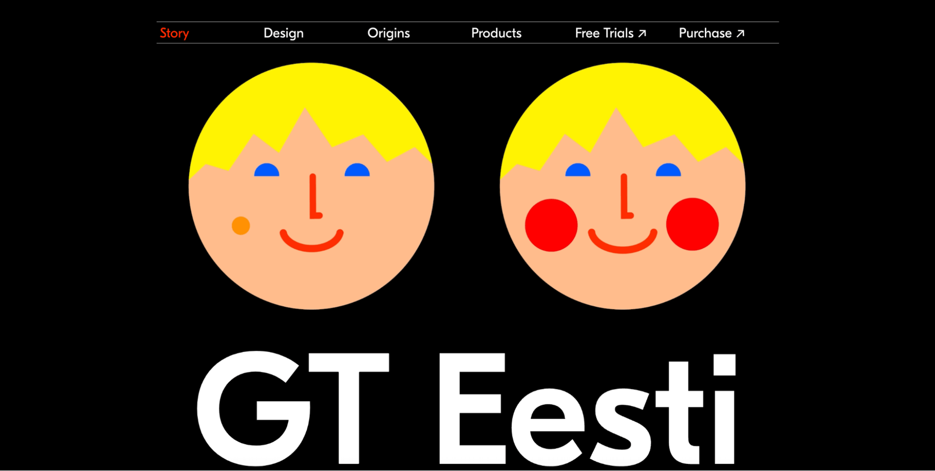
What stands out as an incredible web design project for you? Do you count your creation as a success if it’s modern, minimal, and accessible? Maybe you’re the kind of designer that’s constantly experimenting with the latest dynamic design tools or state-of-the-art technology. Perhaps your websites are vivid, animated, and brimming with unique components?

Sometimes, creating the ideal design means thinking carefully about what you want to accomplish for your client. The purpose of your web creation has a significant impact on the components that you need to consider. For instance, if you’re hoping for a highly emotive and human design, it may be worth combining some of your sleek lines and graphics with hand-drawn elements. 

The Value of Hand-Drawn Graphics in Web Design

Hand-drawn elements are just like the other components of web design; that way may use to express individuality in a cluttered digital environment. In a world where everyone focuses on futuristic and virtual creations, hand-drawn elements can pull attention back to the importance of humanity in your content. 

As web designers, we know that visual components often impact people more than text-based content. Illustrations are highly engaging functional elements that capture audience attention and convey relevant information. 

The main difference between hand-drawn elements and graphics built with vectors and other digital components is that one appears to be more influenced by the human hand than the other. Even if your illustrations are created on a screen, just like any other web design component, it pushes an audience to see something more straightforward, more natural, and authentic. 

For a brand trying to convey innocence and humanity in its personality, hand-drawn design can speak to the part of the human psyche that’s often unappreciated by web design. Perhaps more than any other visual, the content reminds your audience that there’s a human behind the web page

The Value of Hand-Drawn Features in Web Design

Any image can have a massive impact on the quality of your web design. Visuals deliver complex information in an easy-to-absorb format. In today’s world of fast-paced browsing, where distractions are everywhere, visuals are a method of capturing attention and delivering value fast. 

However, with hand-drawn elements, you go beyond the basic functionality of images to embrace the emotional side of the content. Benefits include:

  • A memorable experience: Web illustrations are becoming more popular among leading brands like Innocent Smoothies and Dropbox. However, the time that goes into these components means that they’re still scarce. If you want to stand out online, illustrations can help you do that. 
  • Brand personality: One of the most significant benefits of hand-drawn web design is showcasing your brand personality. The blocky lines of imperfect content that go into illustrated images highlight the human nature of your company. So many businesses are keen to look “perfect” today to make the human touch much more inviting. 
  • Differentiation: As mentioned above, hand illustrations are still rare in the digital design landscape. If you’re struggling to find a way to make your brand stand out, this could be it. Although there needs to be meaning behind your design, the result could be a more unique brand if you can convey that meaning properly. 

Tips for Using Hand Drawn Elements in Web Design 

Hand-drawn components, just like any other element of visual web design, demand careful strategy. You don’t want to overwhelm your websites with these sketches, or you could end up damaging the user experience in the process. 

As you work on your web designs, pulling hand-drawn elements into the mix, think about how you can use every illustration to accomplish a crucial goal. For instance:

Create Separation

Hand-drawn design components can mix and match with other visual elements on your website. They work perfectly alongside videos and photos and help to highlight critical points. 

On the Lunchbox website, the company uses hand-drawn elements. This helps make the site stand out, and it provides additional context for customers scanning the website for crucial details.

Engage Your Audience

Sometimes, hand-drawn elements are all about connecting with end-users on a deeper, more emotional level. One of the best ways to do this is to make your hand-drawn elements fun and interactive pieces in the design landscape. 

One excellent example of this is in the Stained Glass music video here. This interactive game combines an exciting web design trend with creative interactive components so that users can transform the web experience into something unique to them.

Highlight Headers with Typography

Sometimes, the best hand-drawn elements aren’t full illustrations or images. Hand-drawn or doodle-like typography can also give depth to a brand image and website design. 

Typography styles that mimic natural, genuine handwriting are excellent for capturing the audience’s attention. These captivating components remind the customer of the human being behind the brand while not detracting from the elegance of the website. 

This example of hand-drawn typography from the Tradewinds hotel shows how designers can use script fonts to immediately capture customer attention. Notice that the font is still easy to read from a distance, so it’s not reducing clarity. 

Set the Mood

Depending on the company that you’re designing for, your website creation choices can have a massive impact on the emotional resonance that the brand has with its audience. Hand-drawn elements allow websites to often take on a more playful tone. They can give any project a touch of innocence and friendliness that’s hard to accomplish elsewhere. 

A child-like aesthetic with bright colors and bulky fonts combines with hand-drawn elements on the Le Puzz website. This is an excellent example of how web designers can use hand-drawn elements to convey a mood of creativity and fun.

Animated Elements

Finally, if you want to combine the unique nuances of hand-drawn design with the modern components of what’s possible in the digital world today, why not add some animation. Animated elements combined with illustrations can help to bring a website to life. 

In the Kinetic.com website, the animated illustrated components help to highlight the punk-rock nature of the fanzine. It’s essential to ensure that you don’t go too over-the-top with your animations here. Remember that too many animations can quickly slow down a website and harm user-friendliness.

Finishing Thoughts on Hand-Drawn Elements

Hand-drawn elements have a lot to offer to the web-design world. 

Even if you’re not the best artist yourself, you can still simulate hand-drawn components in your web design by using the right tools and capabilities online. 

Although these features won’t fit well into every environment, they can be perfect for businesses that want to show their human side in today’s highly digitized world. Hand-drawn components, perhaps more than any other web design feature, showcase the innocence and creativity of the artists that often exist behind portfolio pages and startup brands. 

Could you experiment with hand-drawn design in your next project?

Source

The post How to Use Hand-Drawn Elements in Web Design first appeared on Webdesigner Depot.

Source de l’article sur Webdesignerdepot

According to Klipfolio research, users spend on average 52 seconds on a webpage. With minimal time to impress, you must consider how to best help your consumers understand what your product or service does and why they should care about it. It’s not enough to describe your value – great landing pages will go the extra step and show this as well.

One powerful method to do this is by providing a real-life, responsive teaser to show what your product looks like, how it works, and what value it can create. This means incorporating specific elements from your functional, responsive product into the landing page. However, this should be a “mini-product experience” that users can experiment with rather than a freemium version of your product. If done well, the dynamics will pay off in captivating users for longer, increasing their consideration time, and driving your conversion rate as a result.

Building more dynamic landing pages through product experience can change the game completely. These are some strategies to consider.

“Ask & Alter” for Greater Personalization

“Ask & alter” is valuable for services with multiple potential value propositions for different audiences. The simple fix here is to have a pop-up box that asks the visitor which profile they are (and alternatively a few more questions). You can then trigger the page to alter according to their input, ensuring a more customized experience and increasing their chance of conversion. By doing this, you’re taking the onus off the consumer to figure out what’s relevant to them, eliminating any potential confusion.

A great example of this is the Penn Foster University website. It has a developed UX optimized for organizations, high school degree seekers, and upskillers alike. Each has an entirely different, carefully designed interface, matching the diverse needs of visitors. For example, while a high schooler might enjoy browsing the career pathways section, an upskiller is likely to search specific career fields. Such distinction is key to consider, as intentional and strategic user experience can raise conversion rates by as much as 400%.

Real-Time Demos to Hook the User

Real-time demos mean that you take a full instance or version of your product that is clickable and responsive and embed it into the flow of your landing page. This way, the user can get a quick “test drive,” and you easily communicate the value that would otherwise be abstract or difficult for the user to imagine or even visualize. Additionally, users always want to know how a product could personally impact them, and live demos offer them a hands-on experience.

Companies incorporating live demos have proven the power to engage a user’s curiosity and create a strong link with their products or services. Notion, for instance, uses a “templates” section with pre-built pages that can be easily opened and browsed through without needing to register or download anything. This product’s beauty lies in the simplicity and efficiency it offers, rather than overwhelming a user with a self-promotional copy. Even a simple live demo like that can help build considerable trust in the product and encourage users to make a high-value purchase.

Calculators Provide Value

Despite their simplicity, calculators can increase audience engagement by 38%. Their main benefit is undoubtedly providing a personalized solution to users’ actual needs and expectations. ROI and savings calculators can be particularly interesting, especially when they speak of value that isn’t easy to calculate or when the user wouldn’t intuitively know that there are savings to be had by using a particular product.

Butter Payment, uses this tool very effectively. As its customers necessarily don’t know they have an involuntary churn problem that is worth solving for, it uses a calculator on its site to demonstrate the problem and enumerate the value-add to potential customers.

HubSpot, too, has mastered the tool: Its Ad ROI Calculator visually presents the results that its software can bring. Then, HubSpot’s interactive website grader directs the user towards its comprehensive marketing offerings. It is this graphic visualization that companies must adopt to communicate real value.

The Charm of Experiential Interaction

Interactive design is said to drive the responsiveness and real-time interaction of a site through the roof. By incorporating an interactive or experiential page, even if it’s not directly on your landing page, you can craft a unique experience aimed at leaving a lasting, meaningful impression of your product or service.

Calm’s “Do Nothing for two minutes” is a simple yet effective way to show users the value of meditation in their daily life and lead them to download the app.

But it works great for consumer products, too: Nike’s Digital Foot Measurement tool is another excellent feature, allowing users to “try shoes on” with their cameras and scan their feet for the right measurement through AR.

Videos are Attention Magnets

Considering that viewers absorb some 95% of the message while watching videos, compared to only 10% when reading text, there’s no reason why you should avoid incorporating videos into your landing pages. Beyond that, videos can be incredibly straightforward: Insert a graphic illustration or real imagery to explain the product, show the step-by-step process, and convey value with raw, unfiltered footage.

Calendly, for example, has various videos on its landing page, including a 56-second, upbeat, colorful clip showing how simple it is to get started with the product.

Guiding GIFs to Visualize Product Features

As small animations, GIFs represent the perfect middle ground between images and videos. They allow you to show users the value your product adds, providing an engaging glimpse into the actual interface. The small scope of GIFs is both a limitation and a benefit: You can only show a particular feature of your product but can also focus on triggering an exact user emotion.

Grammarly, a grammar correction tool, relies on GIFs to give users a taste of their UX. With a quick overview of the product’s functionality across popular platforms, including email and social media, users can see exactly how the product can make their everyday lives easier. And by incorporating GIFs into the right side of the landing page, the scrolling experience of the user isn’t disrupted.

Interactive product experiences can both entertain and tackle pain points, adding dynamics to an otherwise static page. Particularly when customizing based on user attributes, the key benefit of these features is that the users engaging with them are likely the same people interested in the paid product. To ensure that the product experience doesn’t directly compete with the primary offering, clearly differentiate it and guide the user towards a direct call to action.

Source

The post The Case for Building More Dynamic Landing Pages first appeared on Webdesigner Depot.

Source de l’article sur Webdesignerdepot

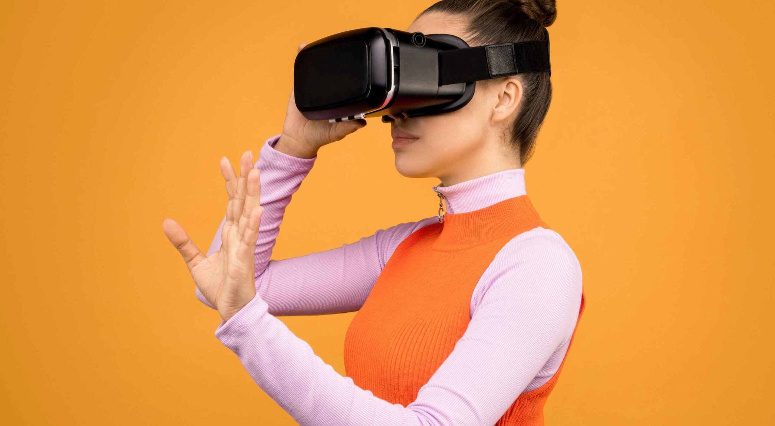
Websites as we know them are going to change very soon. The days of text, images, and basic interactions in a 2D browser window have served us well, but virtual, augmented, and mixed reality experiences are getting better all the time. Developers and designers need to think beyond the browser window and prepare for an immersive future.

Many have been very skeptical about VR and AR in the past because despite grand promises about what they would achieve, they’ve mostly failed to deliver on the scale that the industry hoped for.

But it’s different this time: industry leaders like Meta, Apple, and Microsoft are pursuing a range of different mixed reality projects; they see the opportunity and are dropping hints about what’s next.

In a survey from Perkins Coie LLP and the XR Association, nearly 9 in 10 respondents said that by the year 2025, immersive technologies—including augmented reality, virtual reality, and mixed reality — will be as ubiquitous as mobile devices.

That’s a bold prediction, but it could be our new reality.

Use Cases

VR and AR aren’t a logical fit for every website, and that’s fine. There’s no need to force an immersive experience on something better suited to a standard viewing experience.

But when they’re done right, 3D experiences can add a lot to your website. Check out the demo experience from Mozilla, the 3D tours from Matterport, and the immersive storytelling from Within.

Here are a few areas where these technologies shine:

  • Retail – VR can be used to provide a virtual showroom where customers browse through products. AR can even bring the products into your home by showing you how a piece of furniture will fit in your room, what a painting will look like on your wall, or in Apple’s case, how a product will look on your desk.
  • News – Coverage of events can be enriched by providing a 360-degree view and placing viewers in the center of the story.
  • Training – AR can generate virtual overlays over physical equipment so employees can have hands-on training that’s more effective.

Define Your Platform

Adding immersive experiences to your website will require various skills based on what you’re trying to create. Whether you’re new to web development or are a seasoned developer with many years of experience, the main difference from classic web development is that you’re switching from a 2D to a 3D experience. Development in VR/AR is much closer to developing 3D video games than creating web applications.

First of all, you need to decide on the hardware that you’re building for. Are your viewers mainly using computers, smartphones, or a headset like the Oculus Quest? Each hardware category offers a different set of capabilities for what’s possible.

Next, when we look at 3D engines and frameworks on the market, some big names like Unity, Unreal Engine, and CRYENGINE stand out. Most of these engines were spun out of game development and are based on programming languages like C, C++, or C#. While very powerful, they’re overkill for anyone trying to create a basic immersive web experience.

The good news for web developers is that the WebXR Device API is an open standard specified by the W3C with a JavaScript API that makes immersive experiences possible in the browser. So if you already have a background in web development, you can use your knowledge of JavaScript to get started.

There are some useful frameworks and platforms that make working with WebXR more convenient:

  • A-Frame – A web framework for building 3D experiences.
  • React 360 – A framework for the creation of interactive 360-degree experiences that run in the web browser. As the name already suggests, it builds on React and reuses the concepts you already know.
  • Amazon Sumerian – A managed service that lets you create and run 3D, AR, and VR applications. Since it’s integrated into the AWS ecosystem, it’s also possible to add AI-enabled elements into your generated world.

Create Your Content

No one wants to read long blocks of text in 3D. Since we’re talking about visual experiences, it’s logical that the emphasis should be on creating content that is pleasing to the eye and interesting to look at. What works on a normal website probably isn’t going to feel natural in a 3D environment, so you need to decide what visuals you should create to suit the format.

What high-resolution images and assets do you need? Can you add videos? How about 360-degree videos? Will viewers just be looking at something, or will they be able to interact with it?

You also can’t forget about sound because it’s a critical part of immersive experiences. What music and sounds should you create to make the content come alive?

Not everyone is going to have the latest and greatest device or 5G coverage. The requirements for bandwidth and transmission quality are much higher with 3D content. A few milliseconds of latency can go unnoticed on a typical website, but in a VR/AR setting, it can make the experience laggy or unusable.

Try to optimize your content to be the highest quality it can be within a reasonable file size. If the experience starts to suffer from too many assets downloading at the same time, it’s better to create a more streamlined experience that maintains a high performance rate.

It’s important to consider your hosting infrastructure, as well. This shouldn’t be a big problem, but it is worth mentioning that you need to add new content types to your configurations, and your CDN needs to support these new types, too.

Make Your Content Flexible

When we’re talking about getting your website ready for immersive experiences, we’re not just talking about having people scroll through your regular website in VR. That isn’t compelling for your audience.

The idea is to take some content that’s already on your website and separate it from the presentation layer so you can use it in a 3D environment or any other platform that you want. Classic content management takes place in silos, which means you cannot easily reuse the content from your website.

This separation can be achieved by using a classic database, but if you want developers and content teams to collaborate, a headless CMS is front-end agnostic and more user friendly.

Start Experimenting Today

Building 3D content experiences may seem intimidating, but as we’ve seen, you likely already have the web development skills necessary to get started and try out some different ideas.

What you build today will prepare you for the 3D future of tomorrow.


Featured image via Pexels.

Source

The post How to Prepare for the Immersive Web first appeared on Webdesigner Depot.

Source de l’article sur Webdesignerdepot

As a UX designer, you get to work on creative, rewarding, even life-changing projects. It’s an industry with flexible working and countless opportunities. All this, and you get paid well too.

It doesn’t matter if you’re not a creative prodigy, or a tech grandmaster; you can learn to become a UX designer with the right mindset, a few tools you pick up along the way, and some committed learning.

By the time you’ve finished reading this post, you’ll be well on your way to designing your new career.

You can do this, let’s get started…

What is a Career in UX like?

Every career is different, but generally speaking, a UX designer works on making a user’s interaction with a product or service (normally websites) as intuitive as possible.

Just as a golf architect designs the layout of a golf course to flow through greens, tees, and holes, with buggy paths for access, and the odd bunker to add a challenge; so a UX designer creates the optimum experience for a site. A golf architect doesn’t need to reinvent the game of golf, and neither does a UX designer need to reinvent websites.

A golf architect will not design a course with a 360-degree sand bunker surrounding a tee (well, they might, but they really really shouldn’t), or a hole too small for a golf ball. In the same way as a UX designer, you’re not going to design an ecommerce site with a cart in the bottom left, a non-existent search feature, or hidden pricing.

The best thing about being a UX designer is that you don’t need to spend years in formal education to get qualified. The flipside is that if you want to be a great UX designer, it’s not a walk in the park.

Every designer is different, but some of the main traits of successful UX designers are: an enjoyment of problem-solving; good listening skills; curiosity; open-mindedness; attention to detail; creativity; communication skills; process-driven; and adaptability.

Before committing to this career path, check out a few podcasts, and read a few blog posts, to dip your toe in the water.

Still interested? Excellent, the next step is…

Getting Certified as a UX Designer

UX design is a practical skill. It’s all well and good knowing the theory, but without practice putting the theory into action no one will give you a chance to prove what you can do. So how do you get practical experience? You get certified, and there are three popular options: online, in-person training, or self-taught.

A good UX syllabus will include portfolio-building projects, tool mastery, networking opportunities, and even 1-2-1 mentorship. As well as learning the fundamentals of UX, you’ll cover user research and strategy, analysis, UI design, and more.

Option A: Online Course

Online courses tend to be much easier on the bank balance, as well as being flexible, which means you can fit them around your current job. You can work at your own pace, and in many cases choose modules that interest you, once you’ve completed the basic introduction.

There are many online course providers, including Coursera, Udemy, Skillshare, and Career Foundry.

Whatever option you choose, it is a good idea to get as broad a perspective as possible, so consider following more than one course — perhaps mix and match a paid course with a free one.

Option B: In-Person Training

This could be a university course, or a local boot camp where you physically sit in with an instructor and classmates.

This is more expensive, but it provides benefits that nothing else does. Firstly, you’ll have classmates you can bounce ideas off, collaborate with, keep motivated, inspired, and accountable. You can also get real-time, intensive coaching and advice from someone who’s been there, done that, bought the T-shirt (and redesigned it so it fits better).

Seach local boot camps and workshops, check out workshops at local conferences, and ask your local college what courses they offer.

Option C: Self-Taught

Being self-taught is the cheapest of all options. Work at your own pace, where, and when you want to. Watch YouTube videos, read blogs, garner information anywhere you can find it.

This option involves a lot of stumbling around in the dark. The biggest challenge is that you don’t know what it is that you don’t know. For this reason, it can pay to follow the syllabus of a local college course, even if you’re not enrolled and don’t attend lectures.

In reality, all education is self-taught to an extent, even the most prescribed courses need self-motivation.

Some of the most in-demand UX designers in the world are self-taught, so why not? Start exploring UX blogs like Nielsen Norman Group articles, Google Design,  UX Planet, and UX Matters.

Mastering UX Tools

Recruiters and hiring managers will seek your technical ability and your experience using popular tools from user research, to wireframing, to prototyping. When you get your first job in UX, the tools you use will be determined by your project manager, so it’s a good idea to have a passing familiarity with the most popular. These will include Maze, Userzoom, Sketch, XD, Figma, Marvel, and Hotjar.

If you’re following a guided course you should get an introduction to at least a couple of important tools. Once you understand one, you can probably pick the others up quite quickly… because, after all… they should be intuitive.

You do not need to know how to code, but understanding the roles, and restrictions of HTML, CSS, and JavaScript is very beneficial. When you get your first UX job, you’ll need to be able to talk about how technologies fit into the plan.

Building a UX Portfolio

Your portfolio is your résumé. The golden ticket. The silver bullet. Amassing a content-rich portfolio is paramount. You don’t need a real-world job to build your portfolio, and you should already have content to add from your course.

You need to demonstrate knowledge of UX tools and processes (what future employers will look for). Case studies that incorporate research, problem-solving, strategy, imagination, and (if possible) results are the best way to do this.

There are a variety of ways of building a portfolio, but the best is taking a real website, and redesigning it. Don’t worry if your first few projects aren’t the best; as long as you demonstrate improvement and growth, that counts for something.

You can showcase your portfolio on sites such as Behance, Dribbble, or preferably create your website.

Landing Your First Job in UX

Start combing the job boards to see which companies are looking for UX designers. There’s a global shortage of qualified UX designers, so if you can’t find anything you’re looking in the wrong place! Make sure your whole network, from your Mom’s hairdresser to the barista at your favorite coffee place know that you’re looking; you never know where a good lead will come from.

Some companies are looking for UX skills as part of other roles. Others are looking for full-time UXers.

Don’t be disheartened if “Junior UX Designer” positions require 2 years of experience; HR just throws this in as a pre-filter. If you think you can do the job, apply anyway, if your portfolio’s good you might get an interview regardless, and if you get an interview they think you’re worth taking the time to meet.

If you don’t get the job, don’t be downhearted. Remember: every time someone else gets a job, that’s one less person you’re competing with for the next job.

Quick Prep on Some Common UX Interview Questions:

  • What’s your interpretation of a UX Designer?
  • What has inspired you to become a UX Designer?
  • How do you take constructive feedback and non-constructive feedback?
  • Who, or what companies, do you look up to in this industry, and why?
  • What’s your process with a new project?

Good Luck!

So, now you know what it takes to get into the field, it’s time to start applying yourself to this newfound and richly rewarding career. As the great writer Anton Chekov said, “Knowledge is of no value unless you put it into practice.” So get out there and practice, practice, practice. Add and add and add to your portfolio.

To become a UX Designer, enroll in a great course, build your portfolio, network, apply for roles, and always be learning. Always be open to new ideas and suggestions. There’s a lot of leg work, but the juice will be worth the squeeze.

Featured image via Unsplash.

The post How to Kickstart Your UX Career in 2022 first appeared on Webdesigner Depot.

Source de l’article sur Webdesignerdepot

_____________________________________________

Another excellent guide to help people to prepare for job interviews to give them the best possible chances of success and not make some common mistakes can be find here : https://www.ireviews.com/interview-resources/