Articles

Web2 software engineers have benefitted from design standards, mature programming languages, and vulnerability tools to minimize the risks of an attack. Failure to do so can result in a situation similar to my “Equifax Attack: Only a Matter of Time” publication back in 2017.

Those working in Web3 projects find themselves at an exciting stage. Initiatives like bounties and Decentralized Autonomous Organizations (DAOs) drive new opportunities for these pioneers to explore. Unfortunately, the Web3 landscape is not as mature or defined as earlier phases in the web frontier. Compounding the situation is the risk those challenges impose in a decentralized environment — where exploitation can result in losing a large volume of assets, as well as the time it takes to secure an auditing service for smart contract code and the duration of the audit itself

Source de l’article sur DZONE

Ktor is an asynchronous web framework written in and designed for Kotlin, leveraging coroutines and allowing you to write asynchronous code without having to manage any threads yourself.

Here is a bit more background information on Ktor. It is backed by Jetbrains, who are also the creators of Kotlin itself. Who better to make a Kotlin web framework than the people that work on the language?

Source de l’article sur DZONE

API management solutions, also known as API gateways, are a must in the day and age of APIs. However, once you’ve set up such a gateway, you can use it for different purposes unrelated to APIs. Today, I want to show you how to improve the security of web apps.

Prevent Sniffing

Browsers are fantastic pieces of technology that try to make the life of users as comfortable as possible. However, the balance between ease of use and security may sometimes tip on the former to the latter’s detriment. For example, if an HTTP response doesn’t set the content type, the browser may try to infer it:

Source de l’article sur DZONE

In the early days of the internet, security was little but an afterthought. Then as hackers started to exploit businesses’ lax security postures, things gradually started to change. At first, nonprofits like the Electronic Frontier Foundation started pushing web users to embrace HTTPS Everywhere. In response, certification authorities began offering free SSL certificate variations to any site admin that wanted one. As a result, at least 79.6% of all active websites now use SSL.

That was only the beginning. In the ensuing years, developers and web application administrators gradually started to harden their apps against all manner of attacks. They rolled out more complex password requirements. They started to add two-factor authentication as a default measure. They even started putting public-facing services behind high-performance web application firewalls.

Source de l’article sur DZONE

Alert windows are widely used across websites where an alert message acts as a mode to ‘interrupt’ the current flow of the user journey. A simple example of a JavaScript alert would be someone filling in details on the sign-up page and submitting the details without entering some mandatory information. This user flow also needs to be verified when Selenium automation testing is performed on the web product. 

Handling pop-ups and alerts are one of the common test scenarios that should be tested using Selenium WebDriver. In this post of the Selenium Python tutorial series, we look at how to handle JavaScript alerts in Python. It is worth mentioning that the core fundamentals of JavaScript alerts and popups remain unchanged irrespective of the programming language used for Selenium.

Source de l’article sur DZONE

Every day design fans submit incredible industry stories to our sister-site, Webdesigner News. Our colleagues sift through it, selecting the very best stories from the design, UX, tech, and development worlds and posting them live on the site.

The best way to keep up with the most important stories for web professionals is to subscribe to Webdesigner News or check out the site regularly. However, in case you missed a day this week, here’s a handy compilation of the top curated stories from the last seven days. Enjoy!

Advanced CSS Tricks that You Have to Know

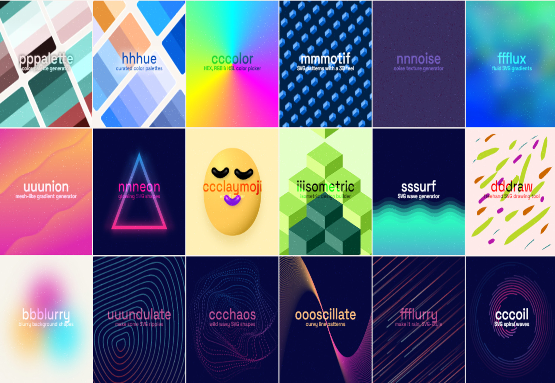
Nnneon – SVG Generator for Futuristic-looking Glowing Shapes

The Best New CSS Features for 2022

Avatarg – Generate Beautiful Types of Avatar in One Click

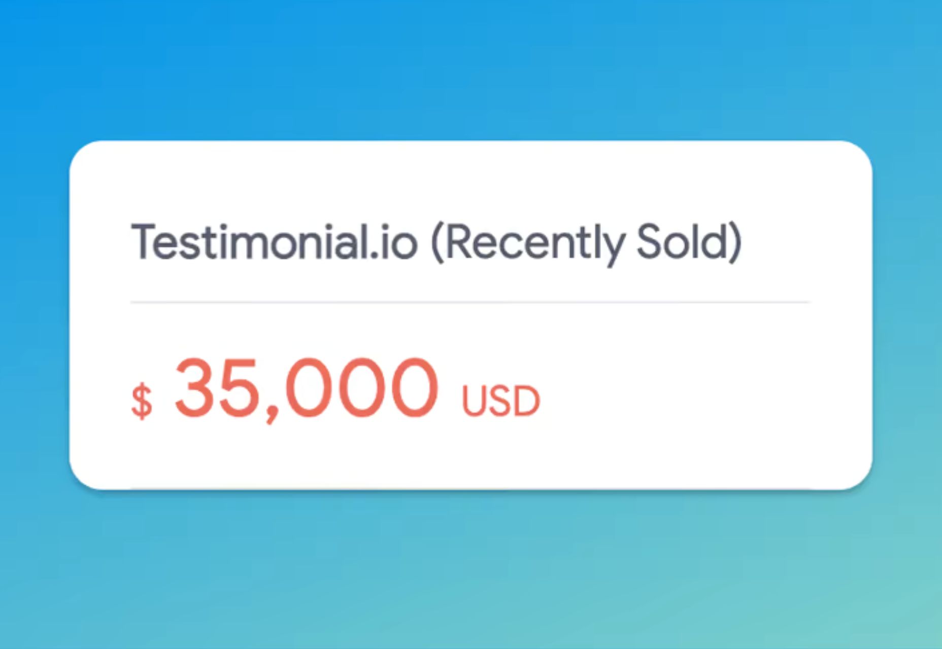
I Just Spent $35,000 on a Domain. Here is Why!

10 Useful CSS Layout Generators (Grid & Flexbox)

Fffuel – A Mighty Collection of SVG Generators

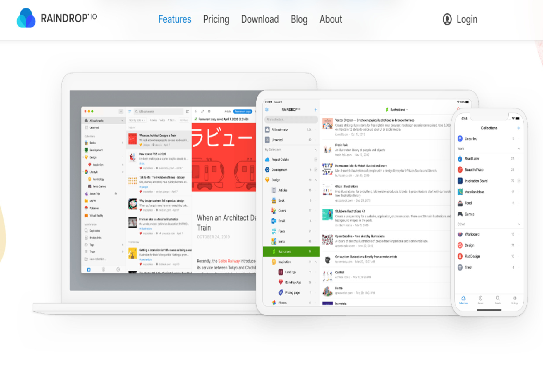
Raindrop.io — All in One Bookmark Manager

My Wonderful HTML Email Workflow

3 Essential Design Trends, July 2022

My Dumbest CSS Mistakes

Source

The post Popular Design News of the Week: June 27, 2022 – July 3, 2022 first appeared on Webdesigner Depot.

Source de l’article sur Webdesignerdepot

An unreliable, semi-broken and unresponsive website is an excellent way to lose leads and visitors — regardless of how aesthetically pleasing or well-designed, the visual elements are.

Over the past decade, we’ve seen more initiative to deliver faster internet to regions of the world that were previously devoid of it. With online communities expanding and more people becoming receptive to online shopping, ensuring your site’s dependability is now more important than ever. 

One way to achieve this is by employing uptime and downtime monitoring tools. This guide will examine the best ways to get alerts when something goes wrong and your website falters.

Why Is Website Uptime Monitoring Important?

Downtime is bound to occur occasionally. Nonetheless, the goal is to minimize it. The longer the downtime occurs, the more traffic and potential clients you lose. A dysfunctional website is also detrimental to your credibility and reputation. People may associate your website’s unreliability with your real-world products or services.

With web developers charging an average of $200 per hour, high-quality websites can be expensive to build and maintain. Nevertheless, it’s often worth the investment. However, an unreliable website can backfire on you. Instead of attracting more customers, it could potentially repel them. This can result in lost revenue.

An uptime monitoring solution can help you prevent or reduce these losses. It verifies if your website is up and functional and notifies you if it’s not. This allows you to troubleshoot the issue and get your website back up and running as soon as you’re alerted. The most common issues behind your website’s downtime include: 

  • Server faults;
  • Network outages;
  • Power outage;
  • Traffic spikes;
  • Cyberattacks;
  • Domain name issues;
  • An erroneous web application deployment;
  • Increased server loads;
  • DNS Resolve issues;
  • Human error.

Thus, you must employ a dependable tool that detects downtime or any interruptions related to your website as soon as they occur. They are must-have tools for web designers, developers, and network administrators. However, not all of them are built the same. So how do you identify the best uptime monitoring tools?

Essential Features of Uptime Monitoring Tools

Uptime monitoring tools typically detect interruptions by running network tests such as pings and trace routes. You could practically monitor your website’s uptime by constantly running these tests yourself. 

However, this isn’t an efficient way to monitor your website’s uptime. A comprehensive uptime monitoring tool will automatically monitor your website’s uptime in the background. It will then alert you through various channels as soon as it senses that your website may be down. 

Furthermore, high-quality uptime monitoring solutions tend to offer additional information regarding your website’s uptime/downtime and its performance. These tools commonly feature dashboards, status pages, badges, exportable records, etc., to help you keep track of your site’s overall health.

9 Best Features of an Uptime Monitoring Solution

The ideal uptime monitoring tool or service should feature: 

  1. Website security features that notify of and repel potential cyber attacks;
  2. 24/7 uninterrupted background website monitoring;
  3. Multi-channel alerts (email, SMS, push notifications, instant messages, social media, etc.);
  4. Report generation;
  5. 24/7 customer support available through different channels (email, phone, chat, etc.);
  6. Be capable of monitoring multiple websites and proxies at the same time;
  7. Offer insights and suggestions to improve your website’s performance;
  8. Be affordable;
  9. High customizability should allow you to choose which features to enable and disable.

Another optional feature to look out for is public status pages that your clients can access to determine if all your services are up and running. GetWeave is an excellent example of this. The website features a well-organized systems status page where customers can check if all of Weave’s services are functional. 

Nevertheless, you can use the above information as a buying guide when assessing potential uptime monitoring tools. The rest of this guide will supply a few suggestions as to which tools you should use for your website.

3 Best Website Uptime Monitoring Tools 

Some of the best uptime monitoring tools for website downtime alerts include:

1. Uptrends

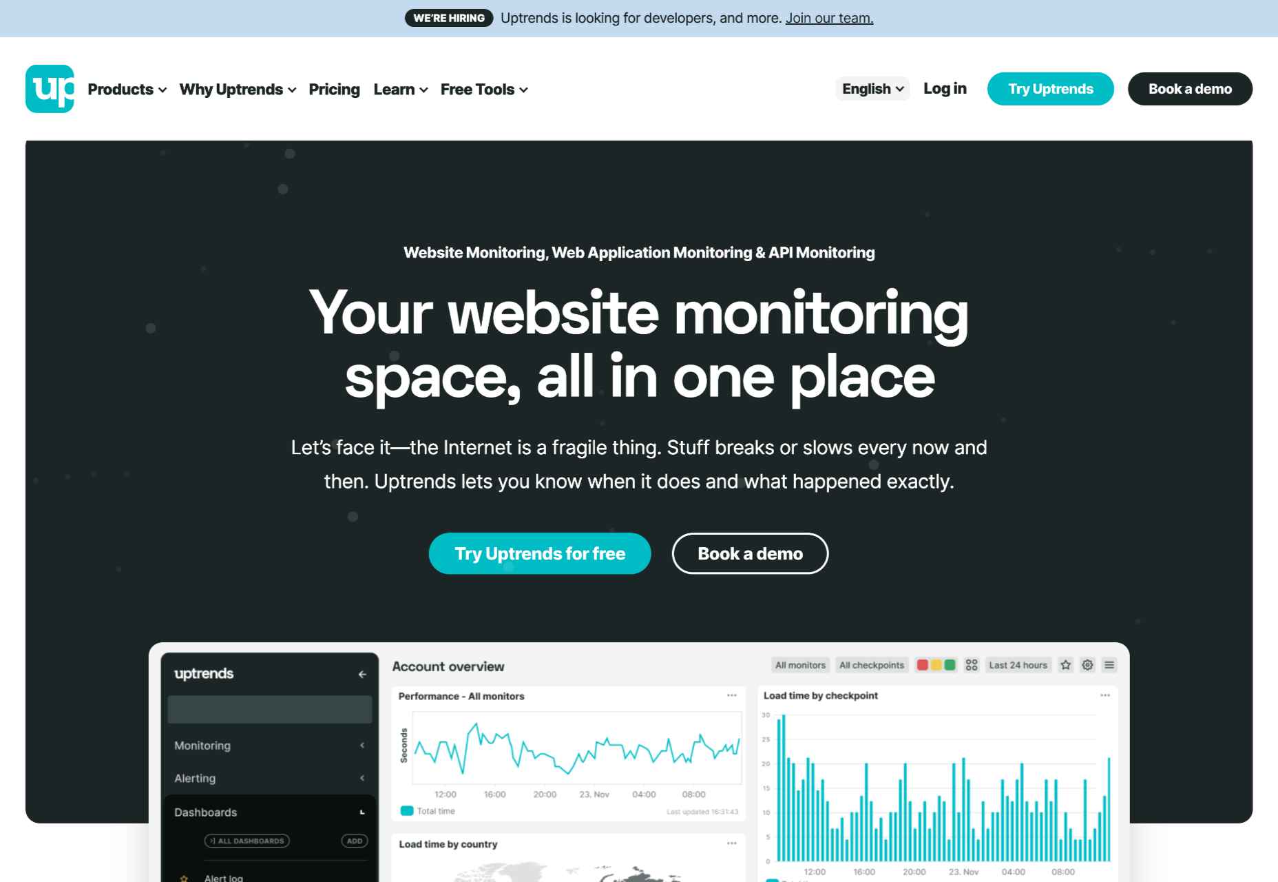
Uptrends isn’t just a downtime detection tool; it’s a complete web performance monitoring solution. It will notify you as soon as it detects any disturbance in your website’s performance. It features highly customizable checks. For instance, you can set performance check limits for load times. Uptrends will notify you instantly if your website takes too long to load.

You can also configure from which locations you want it to monitor your website. Uptrends will then point you to where your website usually suffers performance dips in the real world. 

The service uses multiple communication channels to send users notifications: email, phone calls, and SMS. Alternatively, you can download one of Uptrend’s mobile applications and receive push notifications. Additionally, you can integrate Uptrends with messaging and communication applications such as PagerDuty, Slack, and Microsoft Teams.   

Another impressive Uptrend feature is its ability to emulate your website’s performance on different browsers. It runs Google Chrome, Mozilla Firefox, and Microsoft Edge on its servers. Thus, you can compare how your website runs on these web browsers without installing them on your servers or computer. 

Uptrends supplies users with various charts, reports, and graphs to help identify sudden spikes or dips. Waterfall reports display the complete page-load from the initial request to the last download. This allows you to compare the history of your website’s performance element by element. It comes with three price plans whose costs depend on the number of monitors you would like. Starting at $16.21 (at the time of writing) the Starter Plan is the most affordable.

2. Oh Dear

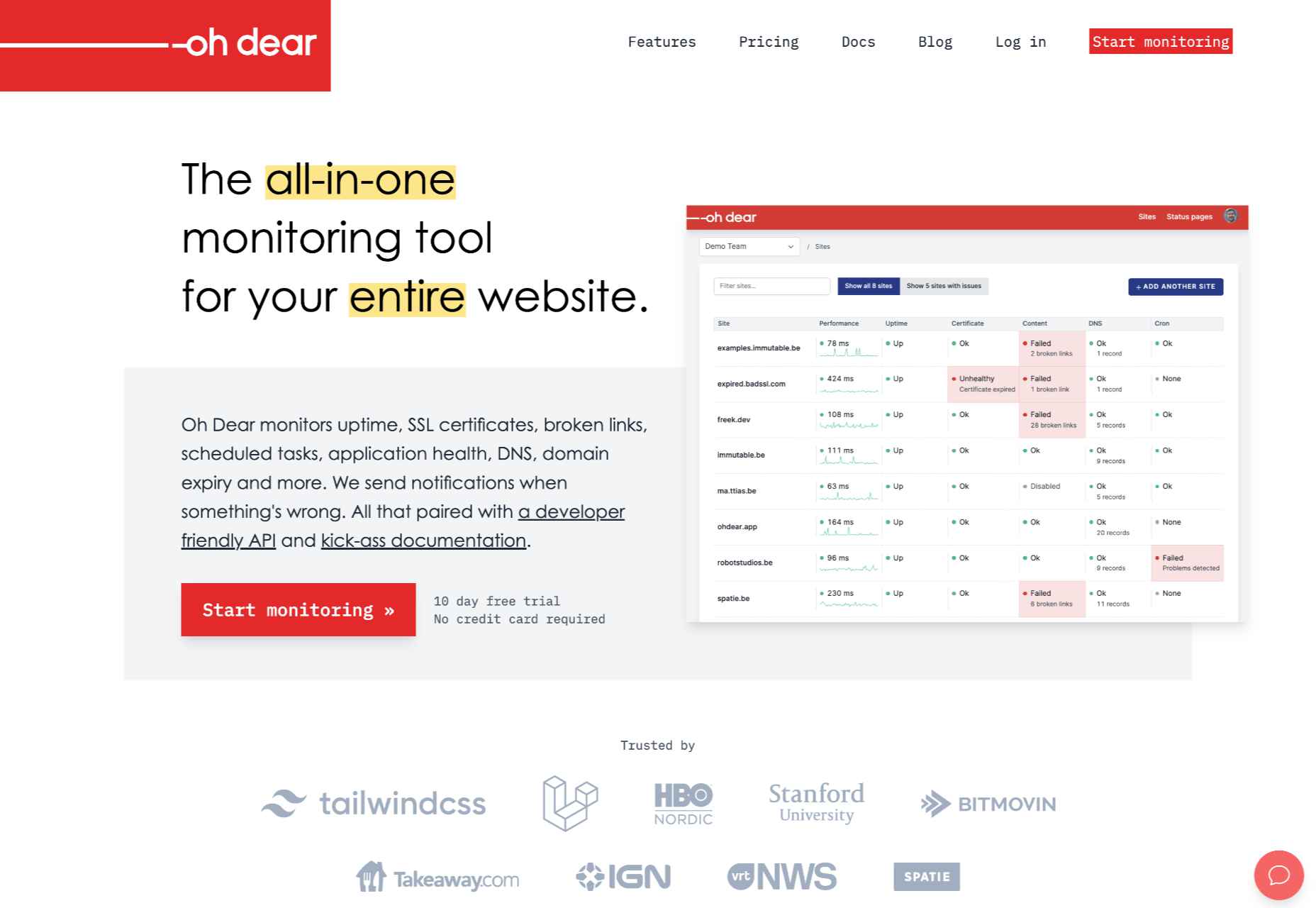
Oh Dear is a slightly cheaper option than Uptrends, with the most affordable plan starting at $12 per month (at the time of writing). However, while Uptrends offers a 30-day free trial, Oh Dear only provides a 12-day trial period. Nevertheless, Oh Dear’s interface is a lot cleaner and more minimal. 

Since Oh Dear runs servers in different locations across the globe, it can track how your website performs in various regions. Oh Dear will scan through your website and index all the pages. If it detects any issues, it will alert you immediately. 

Oh Dear also features a continuous certificate monitoring function. Site owners who are concerned with their website’s security may find this feature to be especially useful. It will verify your SSL certificate expiration dates and alert you of any changes.  

Oh Dear’s public status page enables your clients to keep track of your website’s availability.

Oh Dear uses email and SMS text messages to alert site owners of any issues. It also features integrations with communications and social media applications such as Telegram, Discord, Slack, Microsoft Teams, etc. Oh Dear ensures that messages are as detailed and user-friendly. This makes it easier to troubleshoot and find the origin of your problem. Oh Dear is more than a worthy alternative to Uptrends. 

3. WP Umbrella

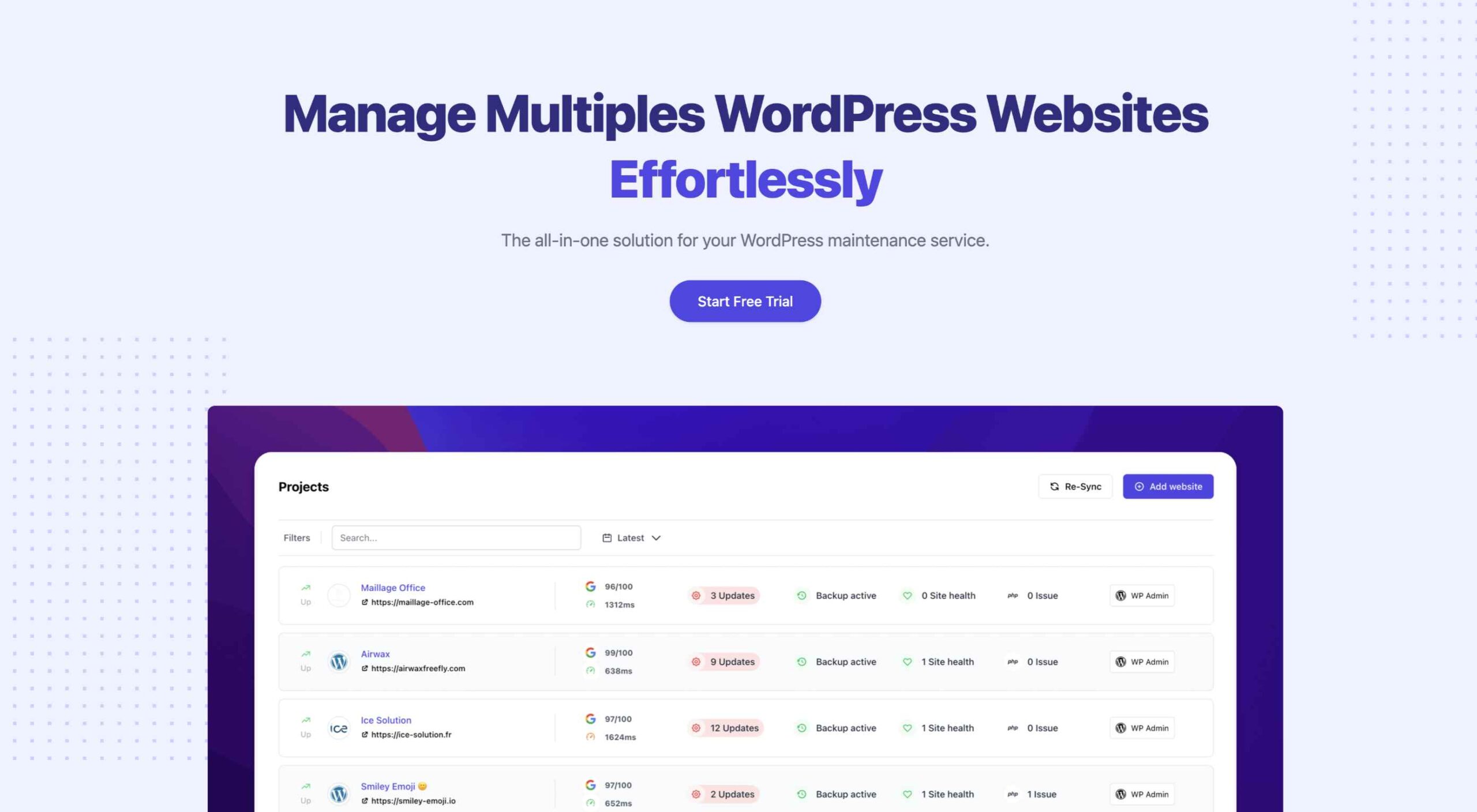
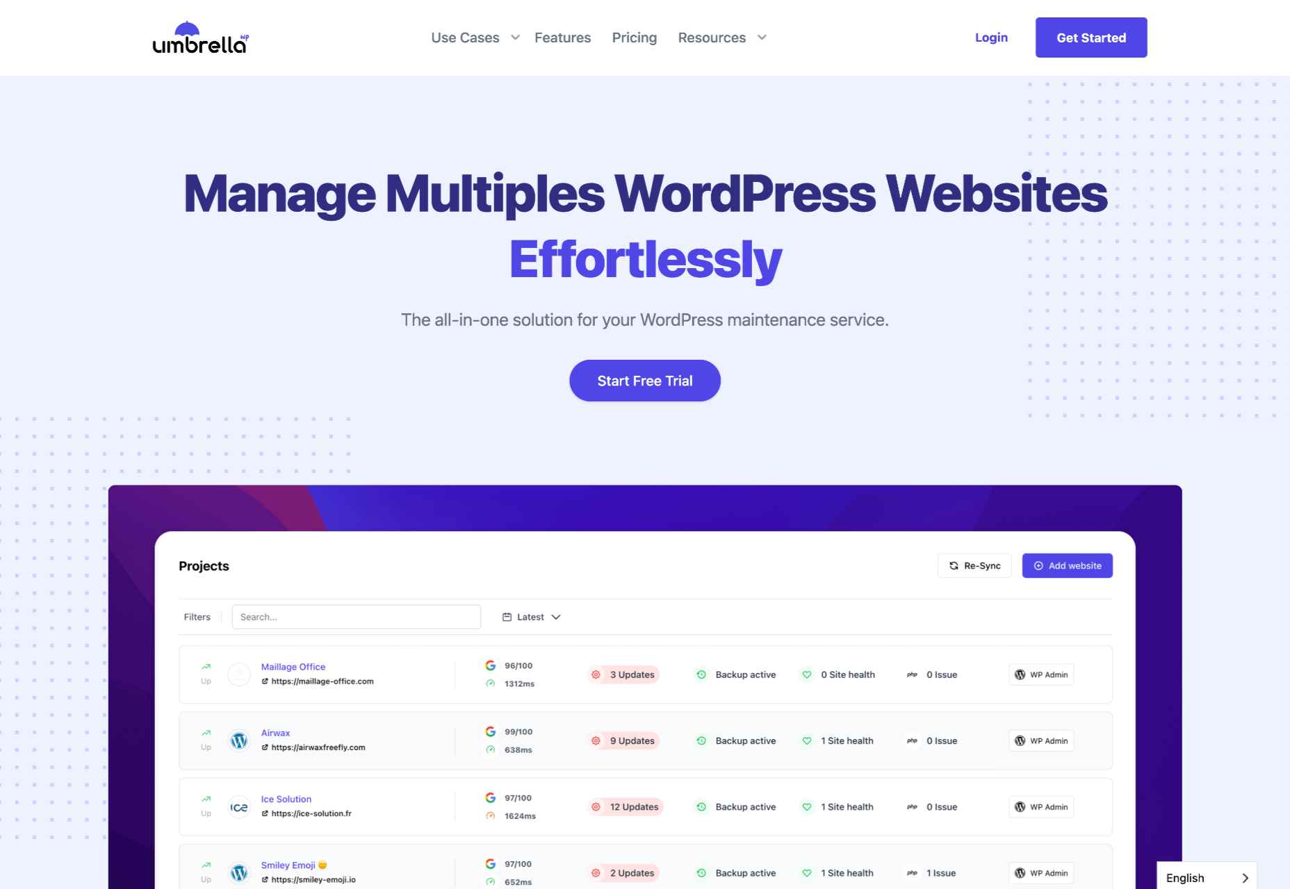
WP Umbrella is a little different from the previous entries. It’s intended to help users manage and monitor multiple WordPress sites. Thus, it is far more particularized in its approach to website uptime monitoring. Again, as is the primary function of the uptime monitoring tool, it offers a real-time alert system that will contact you through email, SMS, Slack, etc. 

WP Umbrella employs a simple minimal UI. Its main screen consists of a dashboard that allows you to view all your WordPress websites. By default, this dashboard features four columns: Site, Uptime, Speed, and Issues.

WP Umbrella will alert you of any outdated or erroneous plugins or themes. While it doesn’t offer dedicated public status pages, it does have a client report generation feature. You can automatically send these reports to your various subscribers or clients when your website is down. 

WP Umbrella is the most affordable option on this list. Users are charged $1.99 per month (at the time of writing) for each website monitored. In addition, WP Umbrella offers a 14-day trial and does not require your credit card details. It’s an excellent option for anyone running a WordPress website or two.

Conclusion

This guide has only explored three possible uptime monitoring solutions. They won’t only assist you in detecting downtimes, they can also help you find the reason your site may be slow.

These solutions are an excellent place to start. But there are many other options coming to market all the time. You may find that this is the first step to converting more leads and reducing your bounce rate. 

Source

The post 3 Best Website Uptime Monitoring Tools  first appeared on Webdesigner Depot.

Source de l’article sur Webdesignerdepot

There are a lot of dark, retro vibes trending in website design right now. Although there are still some light projects popping up – including a pastel trend below – a lot of what we are seeing has a quite moody feel.

Here’s what’s trending in design this month.

Pastel Color Palettes

Let’s start with the trend with a lighter feel – pastel color palettes. While much of the web is trending toward dark aesthetics, there’s a segment that’s going in the exact opposite direction. Those sites feature soft, pastel color palettes that serve as a balance to all the super dark websites out there.

One thing about this website design trend is that it jumps out because of the stark contrast with all of the dark color palettes out there.

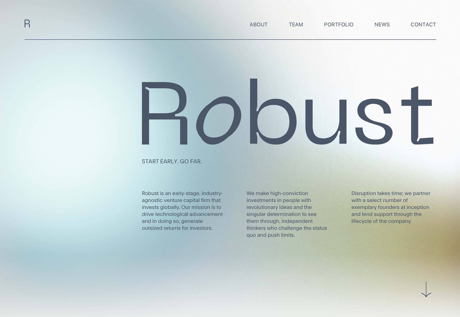
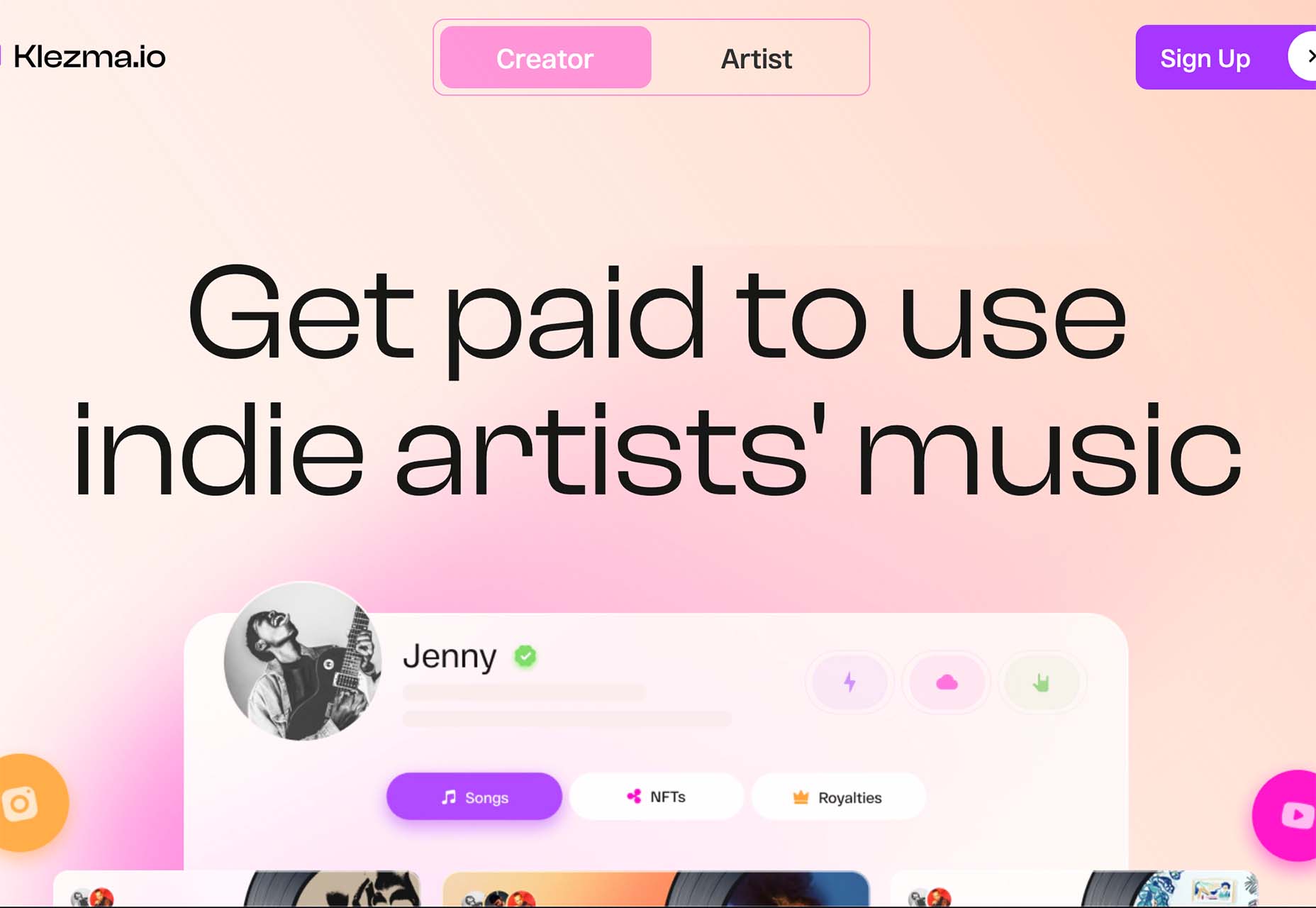
Each of these designs seems to use a pastel color palette as the basis for a background. A blur effect is paired with the colors to use pastels in a way that has a natural feel without appearing too feminine or light.

Robust uses blue and earth tones for a pastel background that feels modern and strong when paired with the hard-edged headline font.

Atmos uses a light pastel theme that takes you through the clouds with blues, and pinks, and purples. The pastel color scheme works well with the content which is airline-themed and makes you feel like you are flying through the sky. The colors are also soft enough to provide an easy reading experience.

Klezma is another design with the same pastel background with graduated color. The peach tones are fairly neutral and give plenty of room to the content.

Fonts with a Distinct Retro Look

Every one of these websites uses a typeface with a similar look and feel. This retro headline style is trending in a major way.

The best way to use this design element is for short words. This typeface design isn’t meant for a lot of words or when readability is a high priority.

This style is all about creating a specific kind of vibe for your website. The typefaces in this trend have a quite retro look and feel with an almost 1960s or ’70s feel to them. The rest of the design mimics this feel as well with colors and surrounding elements that contribute to the overall look.

A couple of common elements here include the use of all capitals font sets and letterforms that include odd shapes and lines.

Sretks not only uses a retro typeface but bends and twists it a bit too to add to the old-school feel. The background color helps add to the groovy vibe.

Barge 166 uses a retro typeface with the same design feel as the other examples but with a sharper, more serif-style edge. It’s easier to read but still carries a retro look and feel. Use a typeface similar to this if you want to capture that retro font style for a trending look while maintaining as much readability as possible. This option works best for multiple lines of words in a large size.

Picky Joe uses a retro typeface with rounded letters and a bit of a tilt to the characters to create a distinct feel. This is definitely a style that has to be used sparingly but can be a fun option, depending on the content of your website design.

Dark “Product” Sites

Dark mode design is probably the biggest design trend of 2022. Everywhere you look, websites are using dark color palettes and styles. Designers are creating more projects with a dark/light toggle so users can control their experience.

This visual concept is carried over to website designs that feature products as well. This is one of the last places the dark aesthetic had not touched. It’s been a bit of an unwritten rule that product images should be on white or light backgrounds to help make them easy to see and inspect digitally.

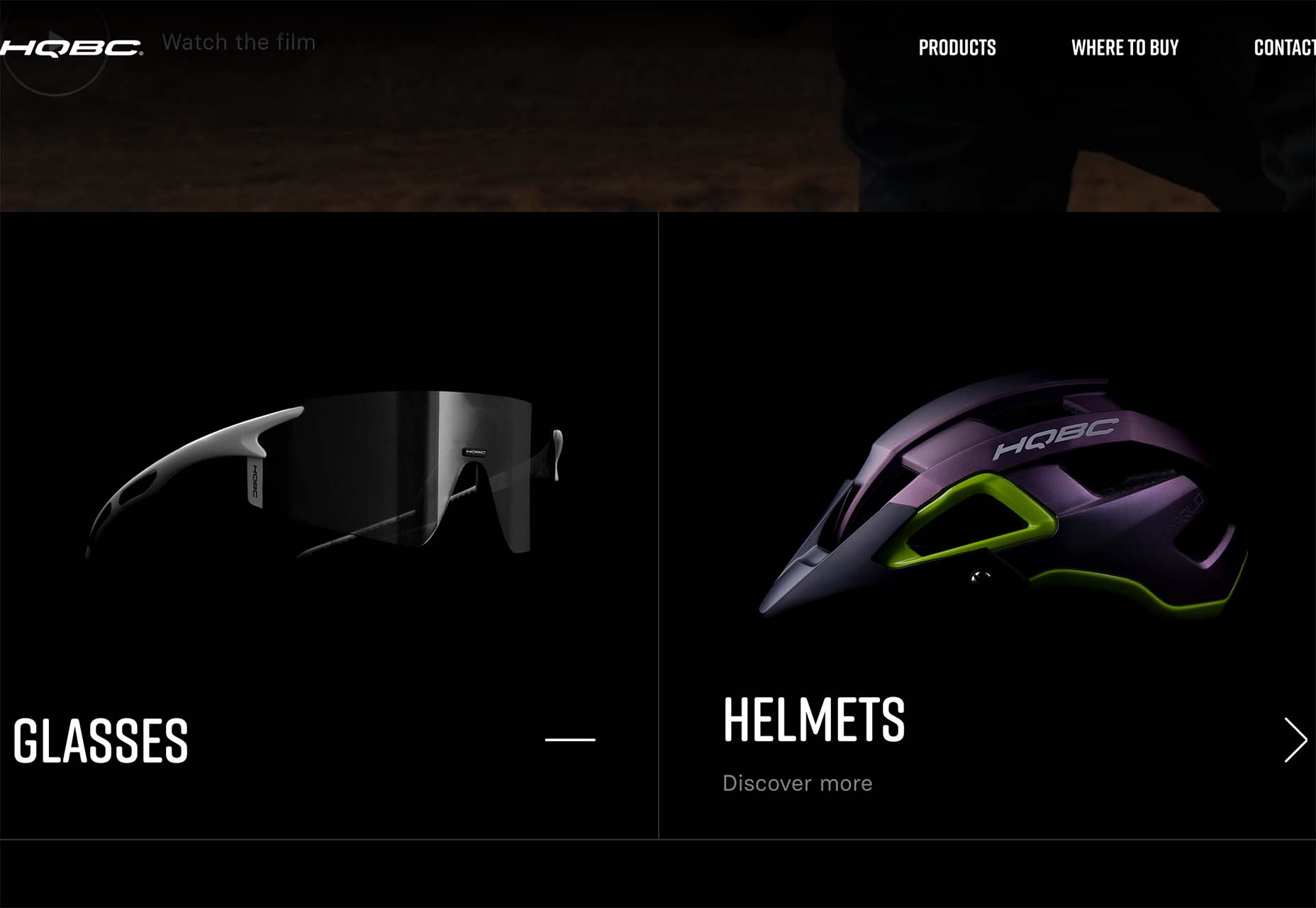
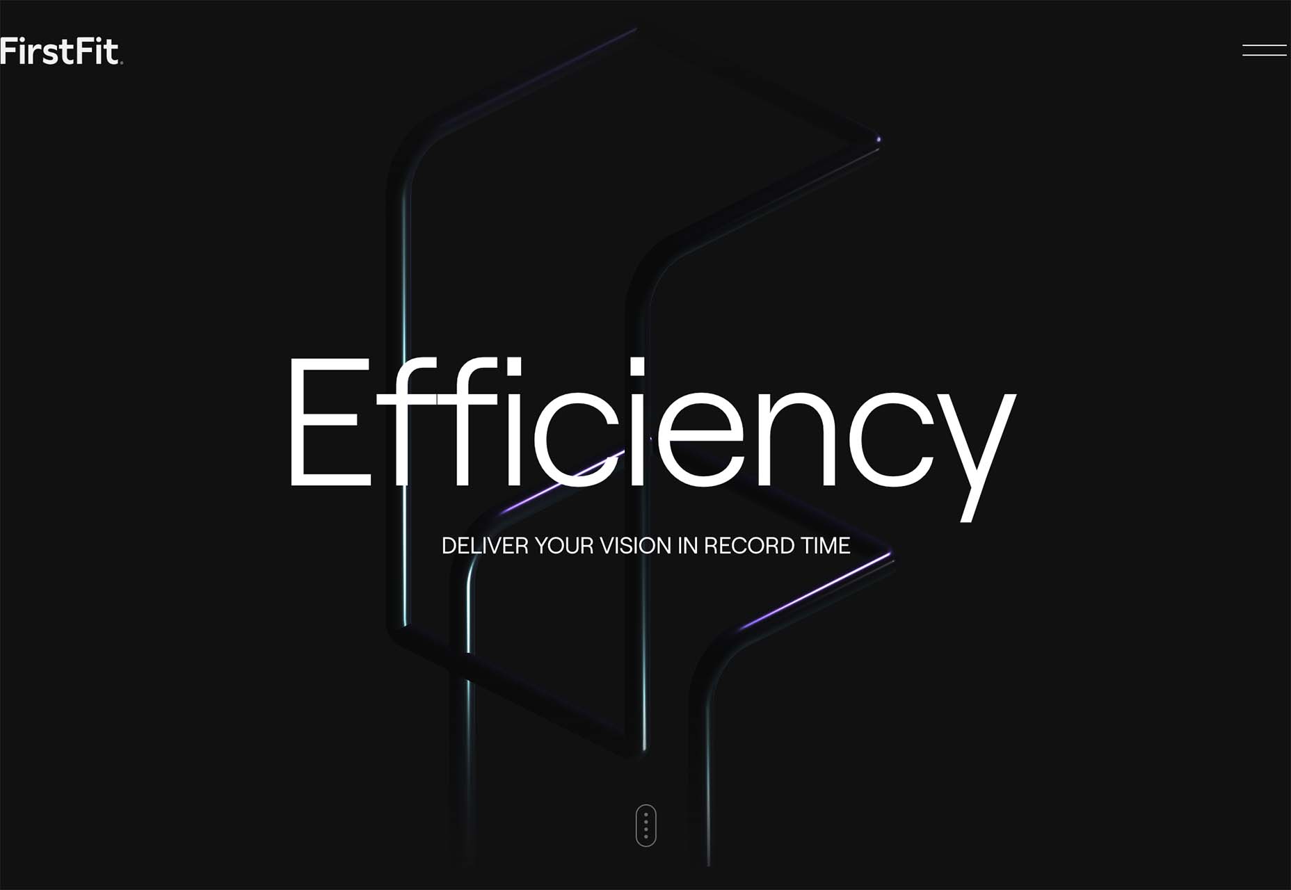
This design trend bucks that idea and features products on dark backgrounds – some with so little contrast that you almost have a hard time seeing the products. (Maybe these brands are banking on the idea that you already know them or are selling a lifestyle product.)

HQBC sells bike accessories such as glasses and helmets and the site has a sleek look and feel. You know it is cool from the second you land on it. The question though – is there enough visual information with the dark background to help you make a purchase? This design probably works because it only encourages you to find a physical location to make a purchase rather than buy online.

Doggystyle Shop also banks on the idea of you knowing the shopping experience or brand when you arrive. What the design does do though is put products on white backgrounds after you have clicked through far enough to make a commitment to buy. This helps you see the product well one final time before making a purchase. (The challenge is that it is three to four clicks in for the most part.)

FirstFit uses the design trend in a way that’s similar to the first example. They are showing a product, but not actually trying to convert sales on the website. Other links take you to more product information and content – using a lighter background and color scheme – and the dark background with the product serves mostly as a highly visual landing page that will help entice users to learn more. When it comes to dark mode and products, this seems to be the best option for most website designs.

Conclusion

The state of the world around us and our emotions can play hard into websites and other design projects. Some of the darker elements that are popular now may be a reflection of that or it could be more of a lean into dark mode schemes.

Either way, the web has a pretty dark feel right now.

Source

The post 3 Essential Design Trends, July 2022 first appeared on Webdesigner Depot.

Source de l’article sur Webdesignerdepot

Every day design fans submit incredible industry stories to our sister-site, Webdesigner News. Our colleagues sift through it, selecting the very best stories from the design, UX, tech, and development worlds and posting them live on the site.

The best way to keep up with the most important stories for web professionals is to subscribe to Webdesigner News or check out the site regularly. However, in case you missed a day this week, here’s a handy compilation of the top curated stories from the last seven days. Enjoy!

How to Create Simple CSS Grid System

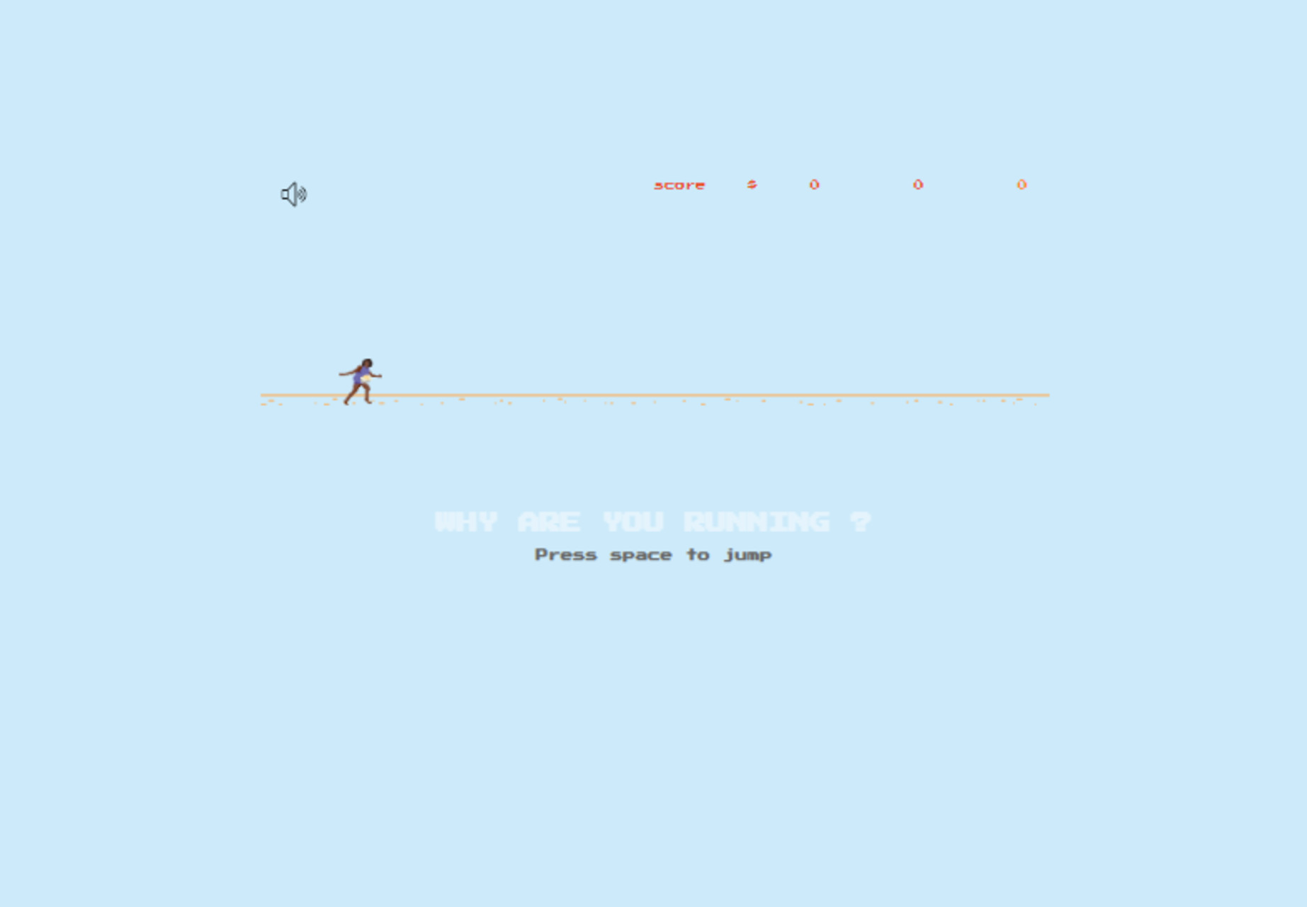
Why are You Running?

15+ VS Code Extensions for Web Developers

10 of the Biggest SEO Mistakes [Infographic]

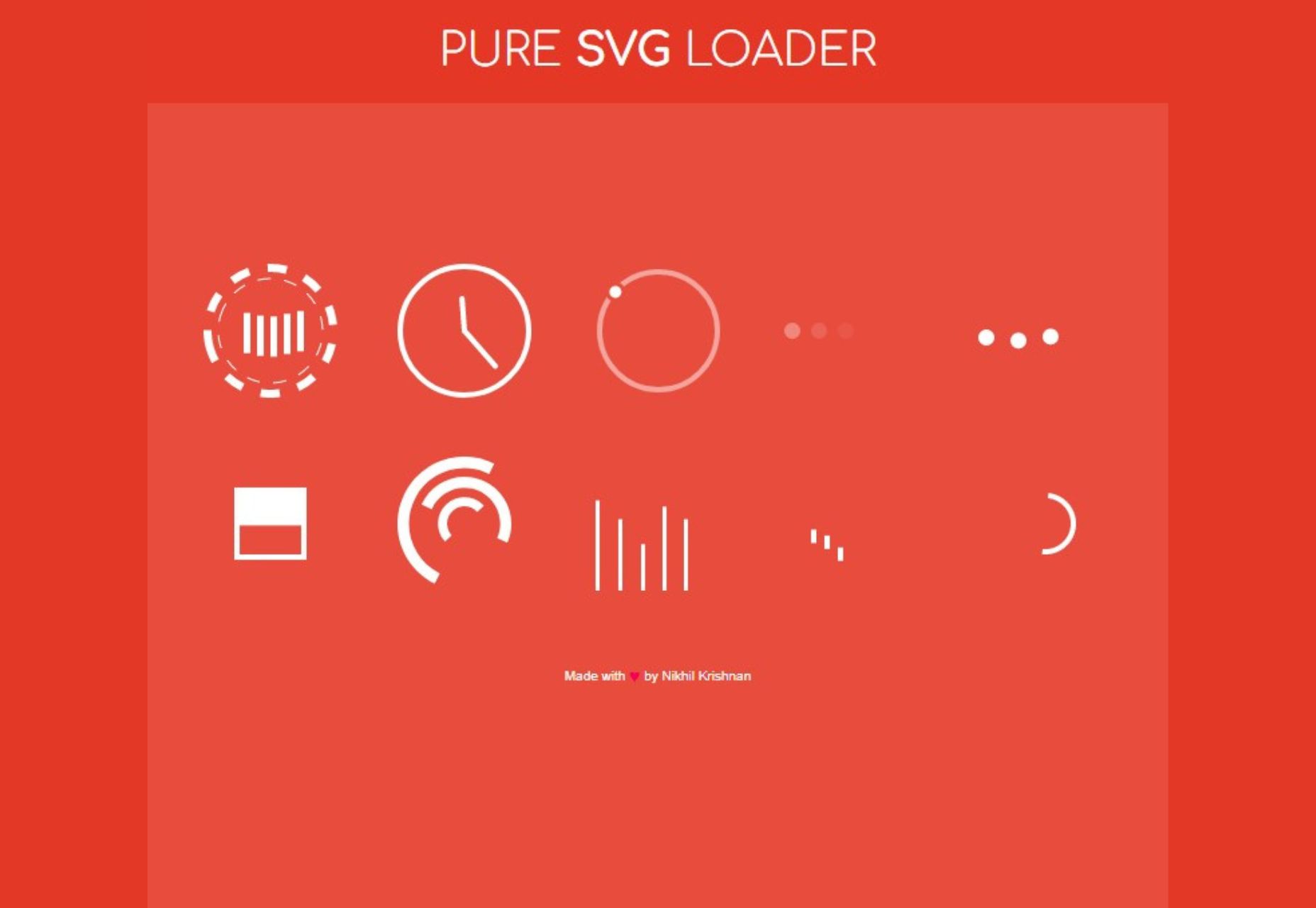
SVG Loading Animations

AI Pixel Art Human Face

VSLook – Customize the Look of your VSCode

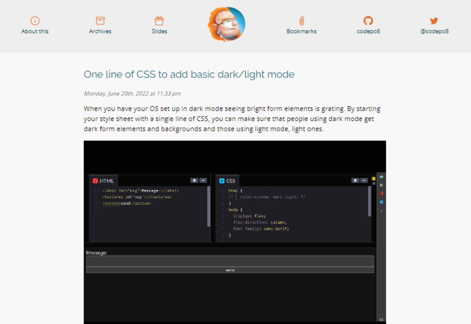
One Line of CSS to Add Basic Dark/light Mode

Basicons – Basic Icons for Product Design & Development

Touch-first Cursor: Round Pointers Vs Mouse Arrows

7 UX Laws You’re Probably Getting Wrong

“Google” Programmers – How One Idiot Hired a Couple More Idiots

Bunny Fonts – Privacy Respecting Drop-in Replacement for Google Fonts

Source

The post Popular Design News of the Week: June 20, 2022 – June 26, 2022 first appeared on Webdesigner Depot.

Source de l’article sur Webdesignerdepot