
In the video below, we explore RESTful Web Services with Spring Boot and take a closer look at reading HTTP POST Request Body using @RequestBody annotation. Let’s get started!
In the video below, we explore RESTful Web Services with Spring Boot and take a closer look at reading HTTP POST Request Body using @RequestBody annotation. Let’s get started!

No-code facilitates the reuse of predefined components, typically using a drag and drop interface or a web form. Such platforms always include things like identity and access management, and most importantly don’t require any code to stitch components together, therefore reducing the need for engineers to spend time architecting databases, APIs, or internal workflows. They are always related to one particular task and audience, like web development, spreadsheets, analytics, market automation, etc. Airtable, Zapier, Webflow, Retool, Waylay Digital Twin solution, and similar apps can be found in this category.
On the other hand, low-code has a different set of goals and user personas in mind. The major misconception about low-code is that the “low” in low-code means that a person with hardly any knowledge of coding is the user of such a platform.

 The WordPress themes and plugins you choose for your clients’ sites don’t just impact how the interface looks or how well it works. They also impact your ability to build them.
The point in using WordPress themes and plugins is to make your life easier, not to create more work for yourself or limit what you’re able to do. If you’ve struggled to find WordPress tools you can rely on from job to job, BeTheme might just be the total package you’ve been looking for.
BeTheme has it all:
There’s nothing extra to pay with BeTheme. One fee gets you all the tools you need to easily build professional-grade websites for your clients.
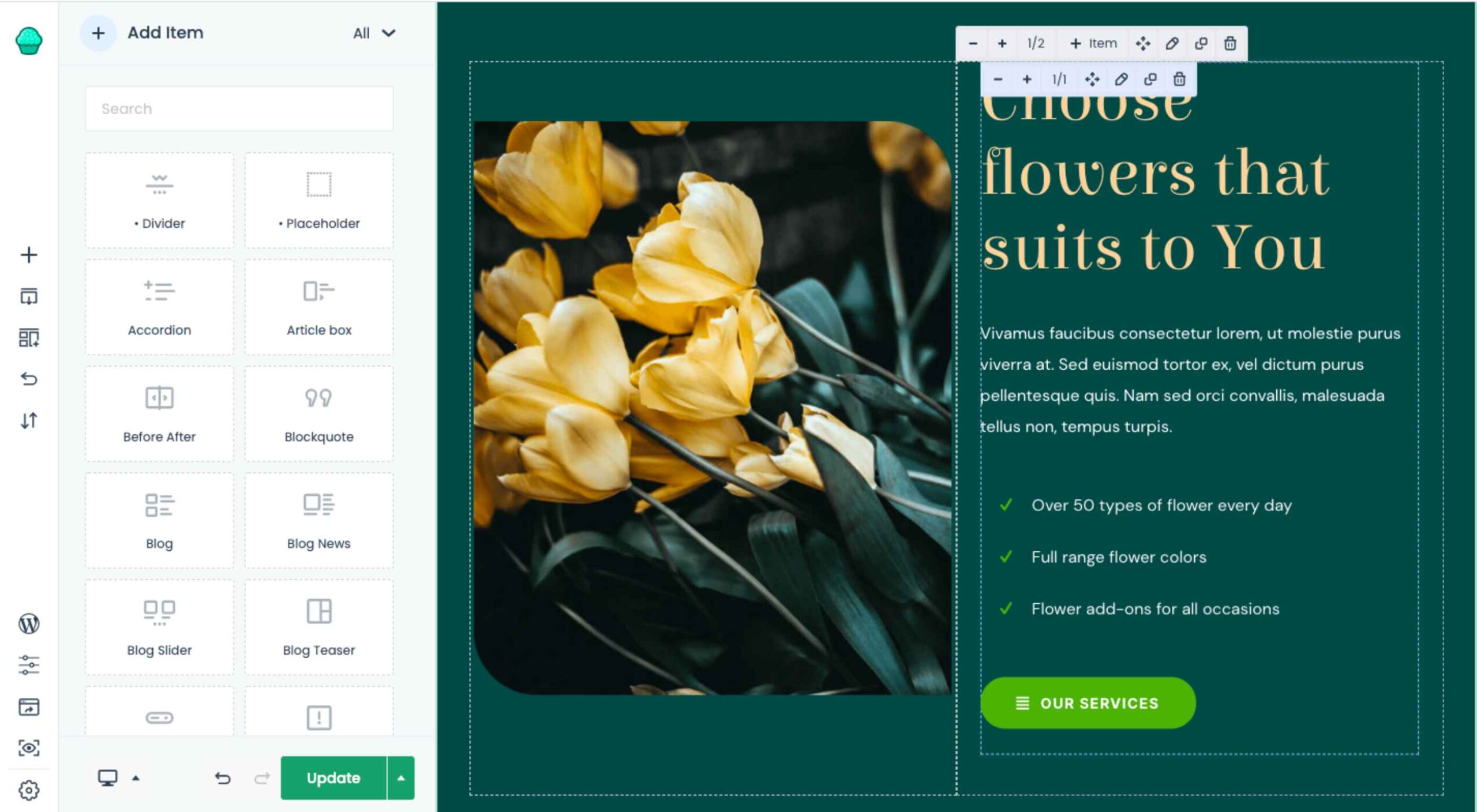
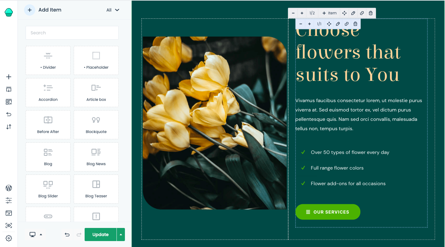
Want to see how the BeTheme powerhouse works? Check it out:
Let’s be honest, WordPress page builder plugins leave something to be desired. While they all have their strengths, it’s hard to find one that offers different tools for how you want to work.
Many of them offer a visual drag-and-drop builder, leaving designers with little flexibility in how they build websites. With BeTheme, you don’t have to compromise.
Muffin Builder 3 is the intuitive backend editor that gives you full control. And if you want to code it all by hand? You can. If you’d prefer to tap into BeTheme’s wide array of templates, pre-built sections, and predefined settings? You can do that as well.
What’s more, the backend builder makes it easy to add sliders to your website, optimize your pages for search, and more.
One of the reasons why drag-and-drop website builders have become so popular in recent years is because they empower everyone — from the DIY business owner to the professional web designer — to build websites visually. There’s just one problem:
While it’s great that developers both inside and outside of the WordPress ecosystem are creating these intuitive builders, they sometimes come at a cost.
One thing that tends to get sacrificed is speed. Because they take the editing out of the WordPress dashboard and onto the frontend of the website, many of them can take a while to load. (Some of them are known for stalling out on occasion, too.)
Another thing that gets sacrificed is how much you’re allowed to customize. You either have to design your website with the features and settings available from your page builder plugin or you have to do all the work inside of WordPress.
Muffin Live Builder doesn’t suffer from these issues.
For starters, the visual builder is lightweight, so it won’t keep you waiting around for pages to load or changes to reflect on the frontend.
Also, you don’t have to choose which builder you want to use. If you want to primarily build sites with the backend editor and then perfect the designs on the frontend, you can. With BeTheme, you don’t have to pick-and-choose which editor you want to use.
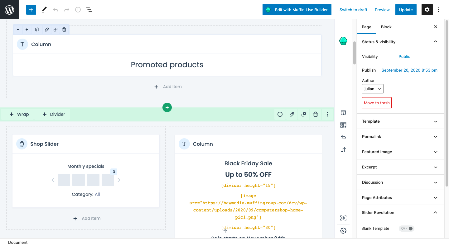
Many page builders are built for one purpose: To help WordPress users visually design websites so they can see their work reflected on the site in real-time.
That said, many page builder plugins haven’t accounted for the ecommerce piece.
Users can design and customize the regular pages on their websites with the visual builder, like the Home, About, and Contact pages. However, their ecommerce pages — Shop, Products, Cart, Checkout, and more — have to be managed through WooCommerce’s interface.
WooCommerce is a great ecommerce plugin. However, it’s not ideal having to design different parts of your site with different tools.
Be now has a solution for this: Muffin Woo Builder.
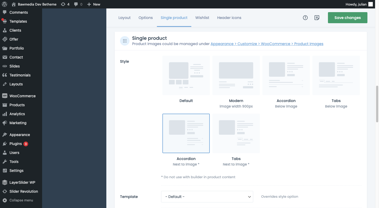
The Muffin Woo Builder allows designers to build their own single product and shop templates instead of just customizing the default ones provided by WooCommerce or the theme.
It also gives you design editing capabilities that no other page builder plugin can. For example:
If you want this level of control over the layout and look of your ecommerce pages, you have to install other plugins or custom-code those changes into the backend. So, this is definitely a unique feature amongst page builders.
BeTheme isn’t just the fastest WordPress builder because it’s lightweight or because there are various builder options that allow you to work the way that’s best for you.
BeTheme also comes jam-packed with 600+ pre-built websites, with new ones released every week.
When you install a pre-built site, BeTheme is going to do a number of things for you:
That’s going to save you a lot of time. Think about the cost savings, too. You get access to more than 600 pre-built websites without having to pay anything extra for them.
Is BeTheme the total design package? You bet it is!
It can’t be overstated what a game-changer BeTheme is for WordPress designers. Two page builders, one WooCommerce builder, and 600+ pre-built sites all rolled into one?
Everything you need to design high-quality websites is baked in.
That’s something you rarely see in any product or service, let alone in WordPress.
If you’re ready to say “Goodbye!” to page builder plugins and transform the way you work, get the BeTheme powerhouse now.
The post Design Faster & Smarter with BeTheme’s 3 Builders & 600+ Pre-Built Sites first appeared on Webdesigner Depot.

 Every day design fans submit incredible industry stories to our sister-site, Webdesigner News. Our colleagues sift through it, selecting the very best stories from the design, UX, tech, and development worlds and posting them live on the site.
The best way to keep up with the most important stories for web professionals is to subscribe to Webdesigner News or check out the site regularly. However, in case you missed a day this week, here’s a handy compilation of the top curated stories from the last seven days. Enjoy!


The post Popular Design News of the Week: September 6, 2021 – September 12, 2021 first appeared on Webdesigner Depot.

 Metadata is an essential component of any website. It clarifies the meaning behind your content in a way that search engines, and browsers are able to understand.
Using metadata effectively can mean the difference between a successful site, and a total flop. So, how well do you understand this critical web design tool? Take our maddeningly difficult metadata quiz and find out!
Featured image via Unsplash.
The post Quiz: The Maddeningly Difficult Metadata Quiz first appeared on Webdesigner Depot.

 We all want a little more fun and games in our lives. So, why not add some gamification to your next interactive content campaign?
By 2025, the gamification market is expected to witness a massive 30.1% growth rate, with global sales revenue reaching around $32 billion.
That’s because gamification adds more entertainment to the website experience and gets audiences engaged. The idea behind gamification is to bring game mechanics into the design of a website or piece of content. There are many different ways to do this.
Some companies add hidden achievements and bonuses to their blogs that customers can collect by visiting every page and reading their content. Others allow readers to collect points for leaving comments or play games to win potential prizes.
Used correctly, gamification is a fantastic way to connect with your audience and increase engagement levels. So, how can you use gamification in interactive content?
Elements of gamification have appeared in everything from marketing campaigns to web design and even eCommerce strategies.
In 2014, an Apple App Store review of more than 100 health apps even found that gamification elements in applications led to greater participation and higher user ratings. In other words, customers are more likely to get involved with an activity that includes gamification components.
While gamification can take on many different forms, the aim for most companies is to create an environment where customers can feel more invested in their interactions with the website. For example, if you win a point every time you comment on a blog post, and you can trade those points in for prizes, you have more of a desire to keep commenting.
The promise of being able to “accomplish” things with pieces of interactive content and websites also appeals to the competitive part of our psychology that pushes us to keep doing things in exchange for the promise of a kind of reward.
Many companies have generated a lot of enthusiasm for their brands through leaderboards, time events, and similar experiences. For example, just look at how popular McDonalds becomes each year when the monopoly game rolls out as part of the purchasing experience.
People buy more items than they usually would during McDonald’s Monopoly just for the opportunity to win. This same boost in engagement benefits your content strategy too.
There’s no one right way to gamify your website or your marketing content. The method you choose will depend heavily on your audience and the kind of experience they respond best to.
The key to success is finding a way to grab your customer’s attention and hold onto it. Here are some of the tried and tested strategies to explore:
When it comes to incorporating gamification into your website design and content, you don’t necessarily need to be clever. You can be extremely straightforward and just design an actual game. For instance, to help attract more people to the American Army, the US created a war simulator that potential applicants could play on Steam.

The game aimed to introduce young people who might consider a career in the military to what that job might be like. If the kids liked what they saw on Steam, they could visit the military website and learn more.
For companies who can’t afford to build an entire fully-featured game, something a little smaller can be just as engaging. For instance, rather than using a standard pop-up with a discount code to entice customers to buy the rental service, Gwynnie Bee created a scratch card. People could scratch the spaces using their smartphone or computer cursor and win money off.
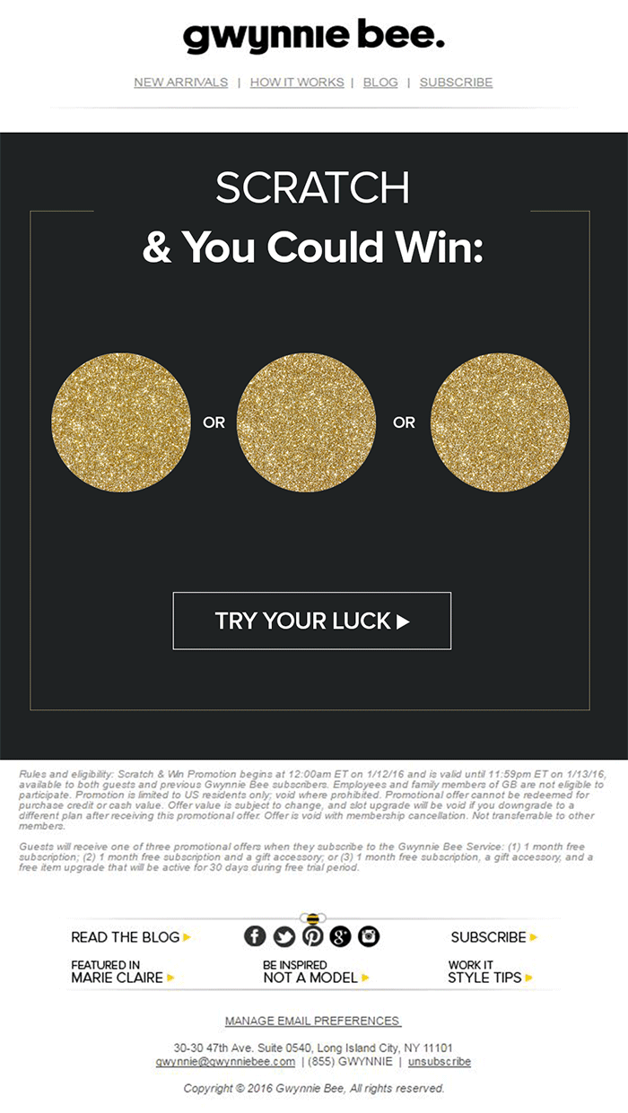
The great thing about the interactive content from Gwynnie Bee is that it encouraged potential visitors to connect with the business in a lucrative way. To use the scratch card, you first had to give your email address. This meant the company could build its email list while delighting consumers.
When designing a game experience for your marketing campaign, remember:
Loyalty is one of the most valuable things your audience can give you. So why not reward them for it? Loyalty programs are fantastic tools for business growth and engagement. They give you a way to turn one-off clients into repeat customers and advocates for your brand.
How you choose to reward your customers (and when) is up to you. Some companies might give customers points every time they share a post on social media or comment on a blog. This encourages more engagement with your brand.
On the other hand, you might just let your customers earn rewards for every purchase they make. This is a strategy that Starbucks uses with its reward program.
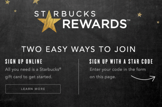
As customers increase their spending with Starbucks, they get the reward of extra points that they can put towards future purchases. This keeps customers coming back for more and may even entice some clients to buy Starbucks when they otherwise wouldn’t.
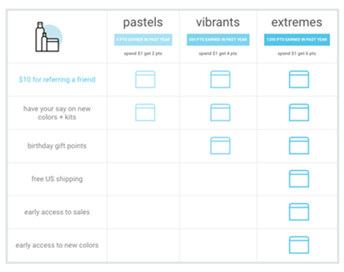
The oVertone company is another excellent example of a brand using gamified rewards with its marketing strategy. The loyalty program breaks down into tiers, where users can see how much they need to spend to ascend to the next level. New rewards and perks appear with each level.
Remember, when building a loyalty program:
The biggest benefit of gamification is that it encourages and increases customer interaction. You can give rewards to participants that comment on your blog posts, for instance, or share your posts on social. The customer benefits from the reward, while you get the advantage of a better business presence.
Samsung drives interaction with gamification with a function on its website that allows customers to discuss issues and watch videos. The most active participants get a badge for their efforts.
If your business structure requires a lot of engagement from your audience, then using gamification elements can encourage them to stick with you for longer rather than losing interest. For instance, language learning software Duolingo has a four-point gamification strategy for its users.
Duolingo knows that learning a new language takes a lot of time, so it asks users to set small specific goals instead. The smaller tasks bring users back regularly, and consistent users gain rewards. There’s even a progress bar to help you track your progress compared to other customers.
Gamification gives your customers another reason to keep coming back and connecting with your brand. That makes a lot of sense for companies that rely on long-term relationships with customers, like Duolingo and other teaching brands, for instance. Remember:
Probably one of the easiest ways to use gamification in your advertising campaigns is with a competition. Contests and competitions have been around since the dawn of business. They’re a useful way for companies to collect information from customers, particularly if you ask your clients to sign up to your site with an email address to get involved.
Competitions are also a way to push your audience into doing positive things for your company. For instance, you could run a competition where consumers share a social media post and tag a friend to enter. Or you could have a competition that asks your clients to refer a friend to get involved.
When KIND, a healthy snack company, wanted to connect with its customers and create a new product, it didn’t just do market research. Instead, the company created the “Raise the Bar” contest to let customers cast a vote for which flavor they wanted to see next.
When 123ContactForm wanted to engage its audience, it gave people the chance to win one of three platinum subscriptions for 6 months.
Contests are naturally exciting and fun to take part in. They’re an opportunity to get your audience excited, and you don’t need to give anything huge away either. Just make sure that the prize you offer is something that your audience will be interested in.
A few more pro tips include:
No matter how much they might deny it, most people are at least a little competitive. So when you’re implementing a gamification campaign into your content and marketing efforts, it pays to tap into that sense of competition. All you need to do is find a way to encourage your followers to compete.
The best example of a company that did this particularly well is Nike. Nike and the Run Club app teamed up to motivate people to get involved with healthy activities. The app allowed users to customize and build their ideal training program based on their athletic level.
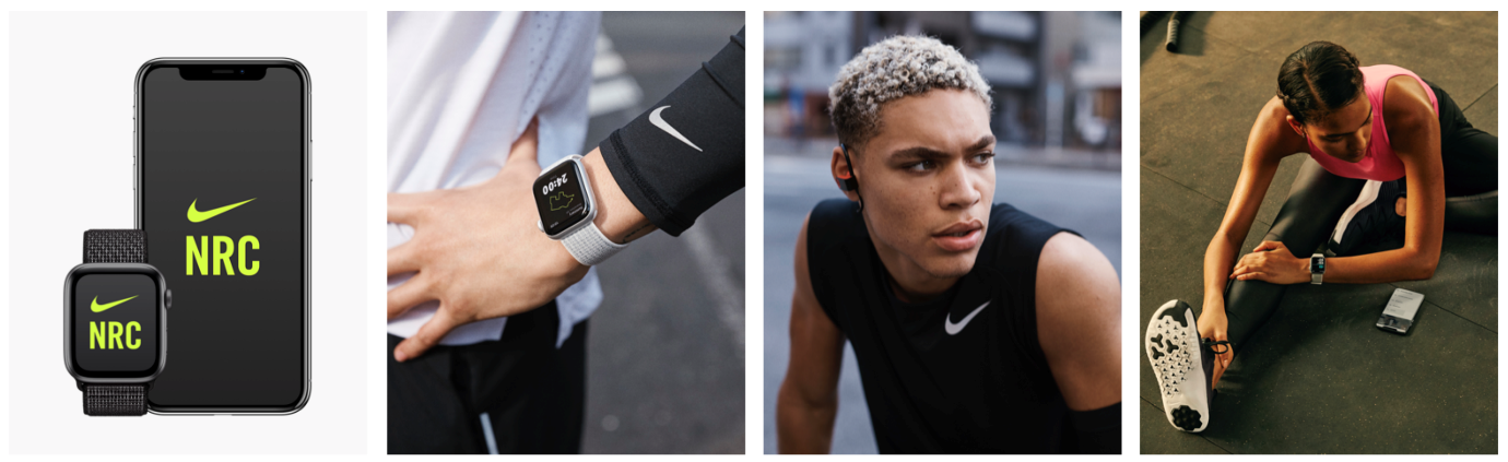
At the same time, you could also win badges and trophies to share with your running community. The more you took part in challenges on the app, the more you could potentially win.
The Fitbit application has a similar way of keeping customers engaged. When you download Fitbit, you can access information about your exercise strategies and potentially track your progress towards your goals. However, there are also measurable achievements to earn – like a badge when you first walk 500 miles.
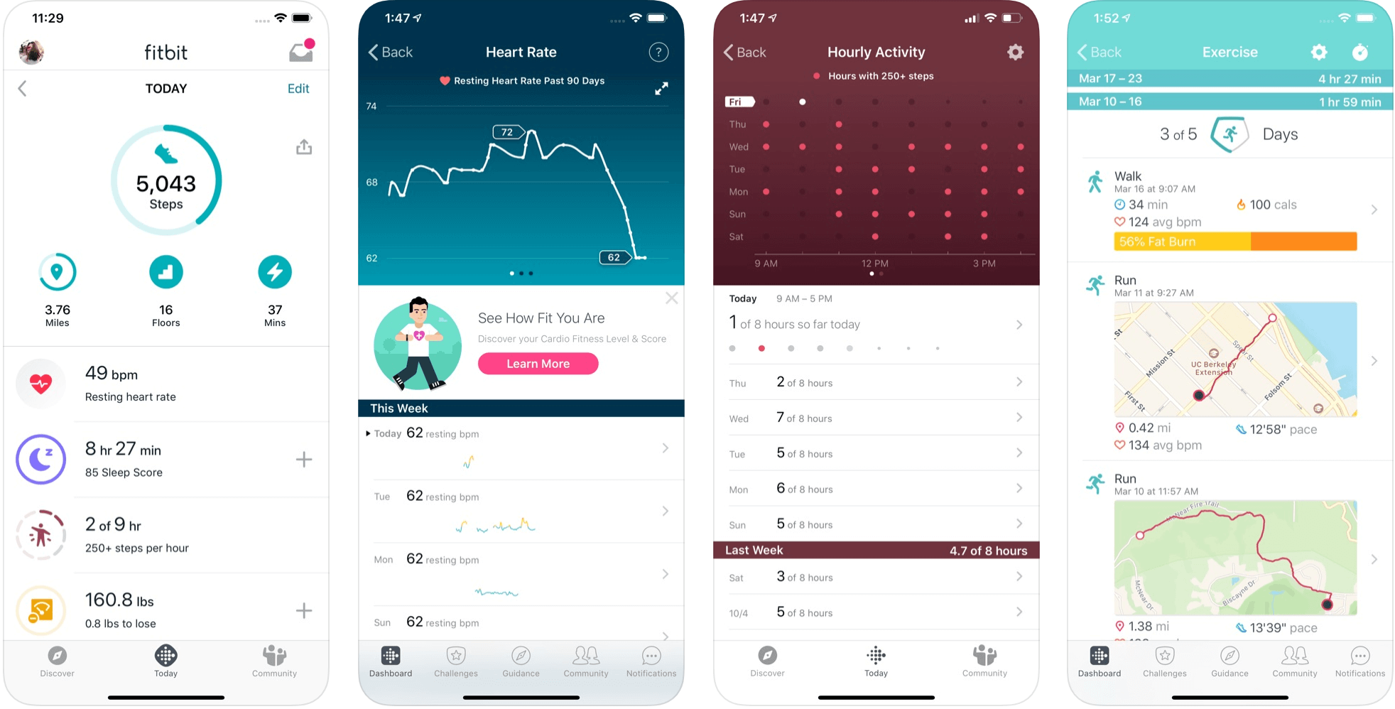
Users on Fitbit can also find their friends using the same app and compete with them in various challenges.
To successfully add a competition to your gamification strategy, remember:
Some content is naturally more engaging than others. If you want to showcase some important information or data, you might create a whitepaper or a report. Unfortunately, the result can be a relatively bland piece of content.
With elements of gamification, you can make the experience a lot more engaging and interesting. Sites like Daytum.com allow users to turn personal stats and information into charts that showcase information in engaging ways. You can allow your users to track their progress through the report and rack up points as they go.
Adding subtle elements to otherwise clinical and less interesting information is a wonderful way to make the experience more exciting. The more enticed your customers are by your content, the more likely it is that you’ll sell them on your business.
Gamification isn’t a new concept, but it’s one that many companies and designers can begin to take advantage of these days. Thanks to more advanced browsers and smartphones, customers can more fully enjoy the interactive elements of websites and content campaigns.
As your audience dives deeper into the digital world, they expect more unique experiences from you. Gamification can make any website or marketing experience more memorable. It’s time to take advantage.
The post 7 Ways to Use Gamification in Marketing Campaigns first appeared on Webdesigner Depot.

 Since school is back in session, this month’s roundup has a learning focus. In addition to tools, many of the resources include guides, tutorials, and cheat sheets to help make design work easier.
Here’s what’s new for designers this month.
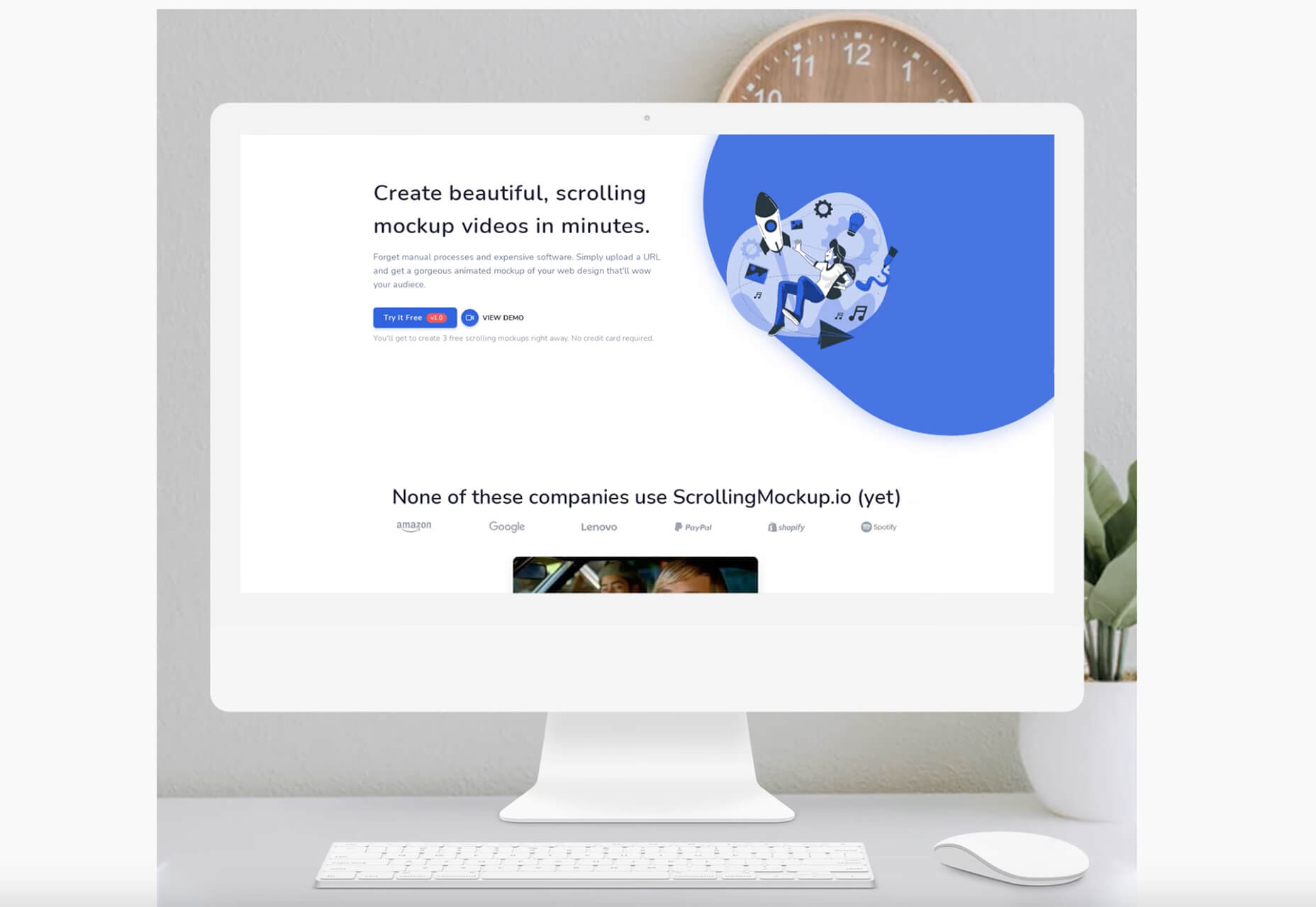
ScrollingMockup.io generates high-definition, animated scrolling mockups in minutes. All you have to do is paste your website URL, select from the expanding template gallery, add some music and post. You can create three mockups for free, and then this tool comes with a subscription model. The paid model allows for custom branding for mockups and more.
FilterSS is a curated collection of CSS image filters for use in projects. Upload an image, sort through the list, and then copy the code for the filter you want to use. It’s that easy!
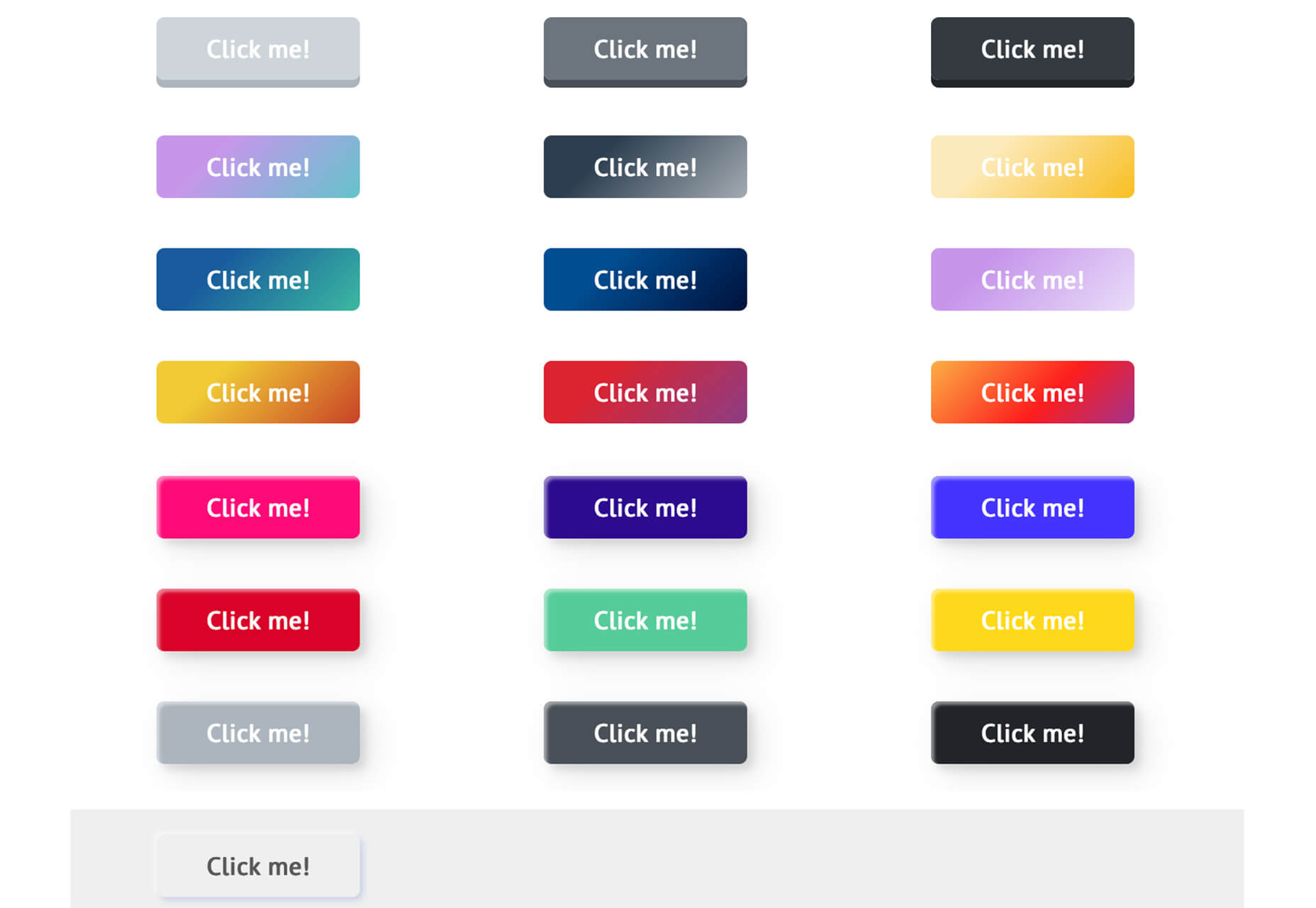
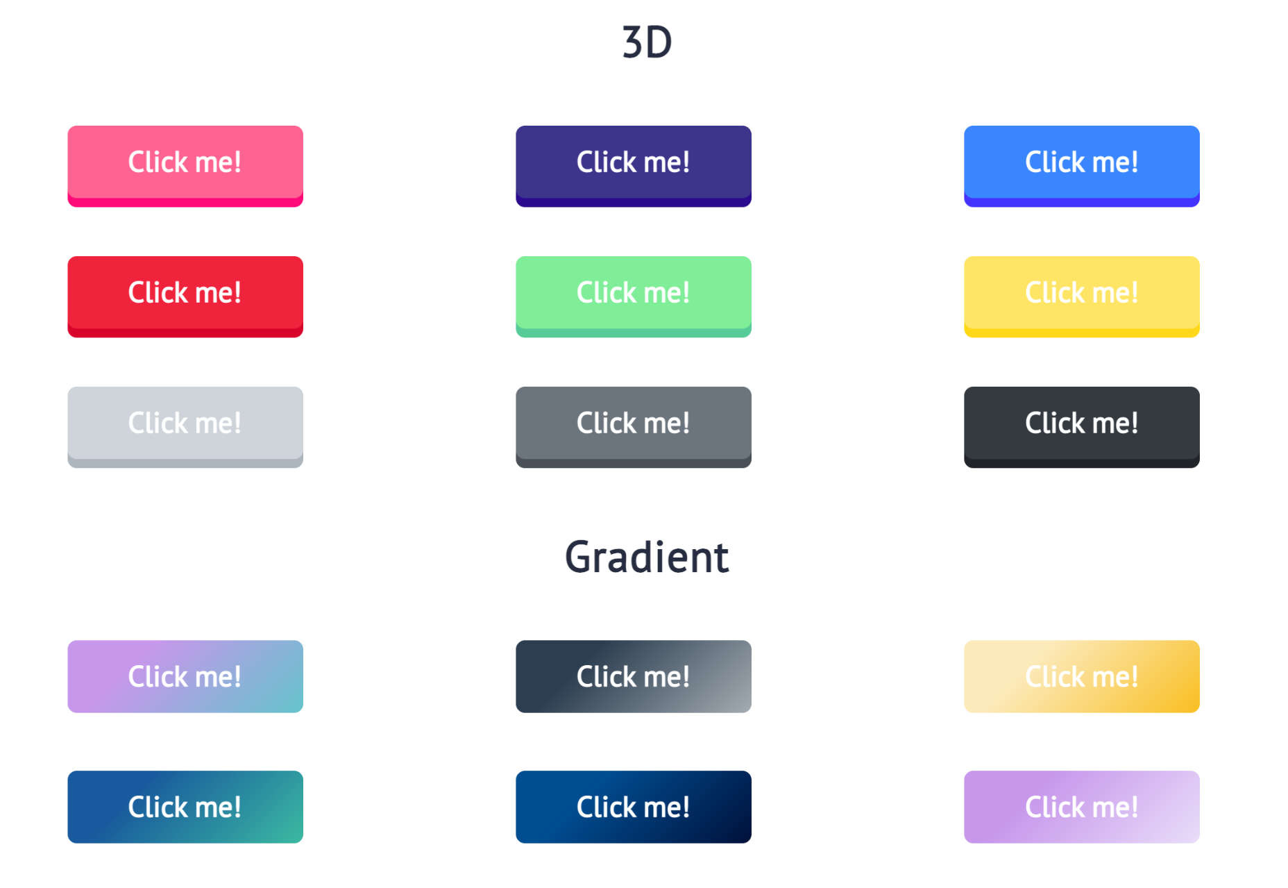
Buttons Generator is a fun tool with so many button options in one place. Choose from three-dimensional, gradient, shadow borders, neumorphic, retro, animated, ghost, with arrows, and more all in one place. Click the one you like, and the code is copied right to your clipboard and ready to use in projects.
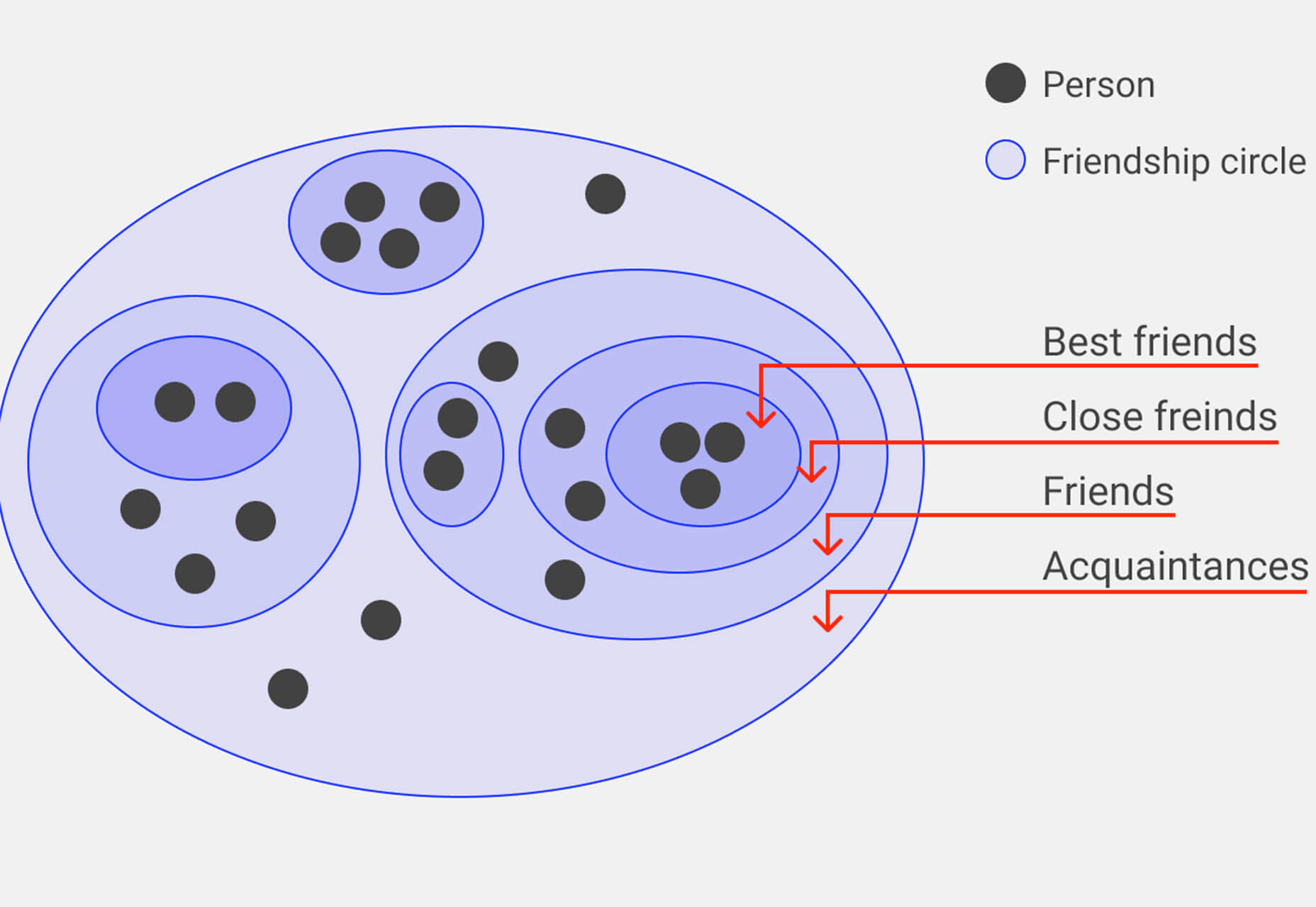
UI Cheat Sheet: Spacing Friendships is a fun – and memorable approach to figuring out spacing. This guide shows how close or far away elements should be based on “friend” circles with a couple of relatable instances. It’s one of the most relatable examples of this concept out there while emphasizing the importance of spacing in design.
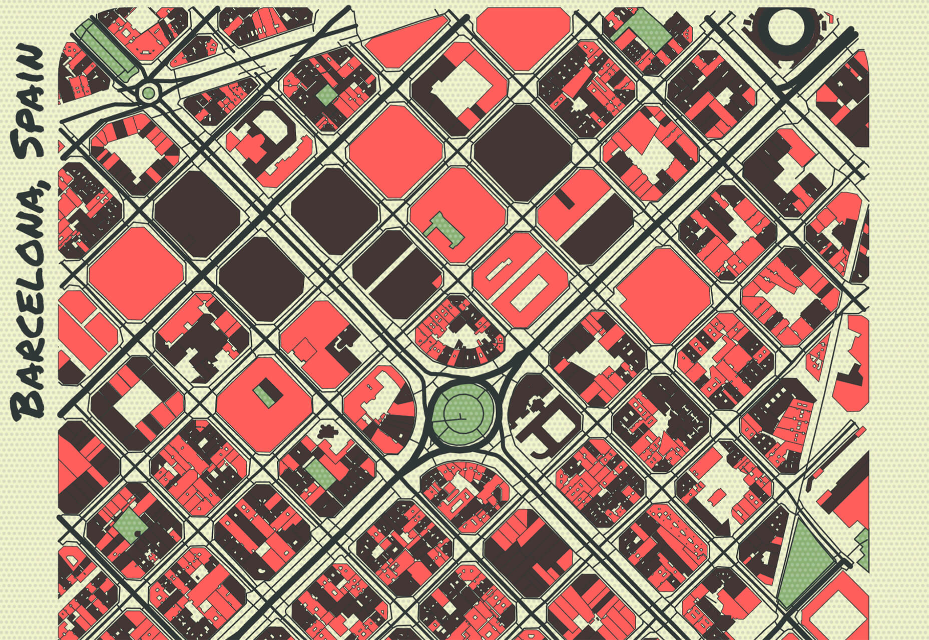
PrettyMaps is a minimal Python library that allows you to draw customized maps from OpenStreetMap data. This tool can help you take online map design to the next level with cool, unique map visuals. It’s based on osmnx, matplotlib, shapely, and vsketch libraries.
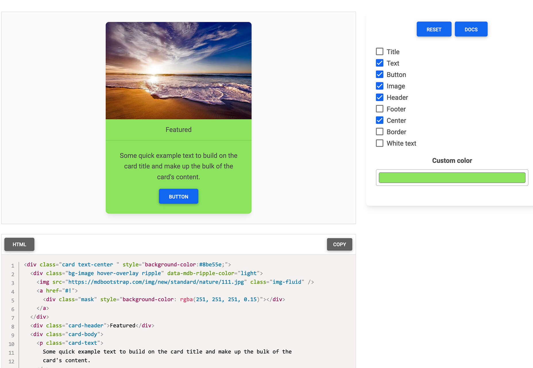
Card.UX/UI is a card-style generator with more than 20 templates and elements to create custom cards. Use the on-screen tools to design it the way you want and then copy the code for easy use.
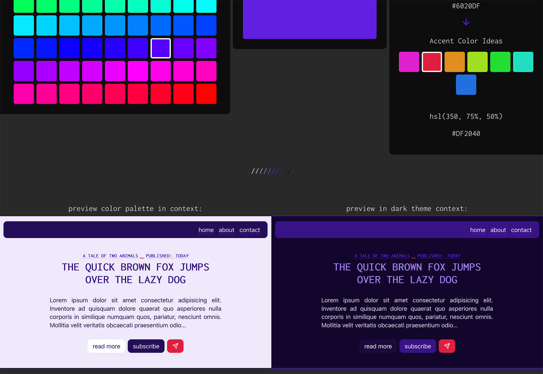
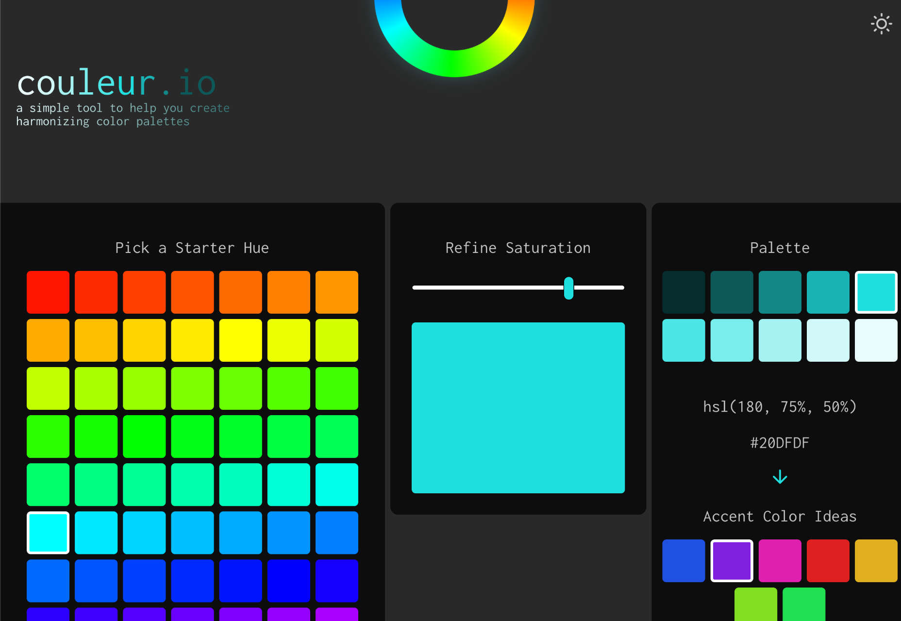
Couleur.io is a simple color palette builder tool that lets you pick a starting color and build a scheme around it. One of the best elements of the tool might be the quick preview, which shows your choices using the palette in context and in dark mode. Get it looking the way you want, and then snag the CSS to use in your projects.
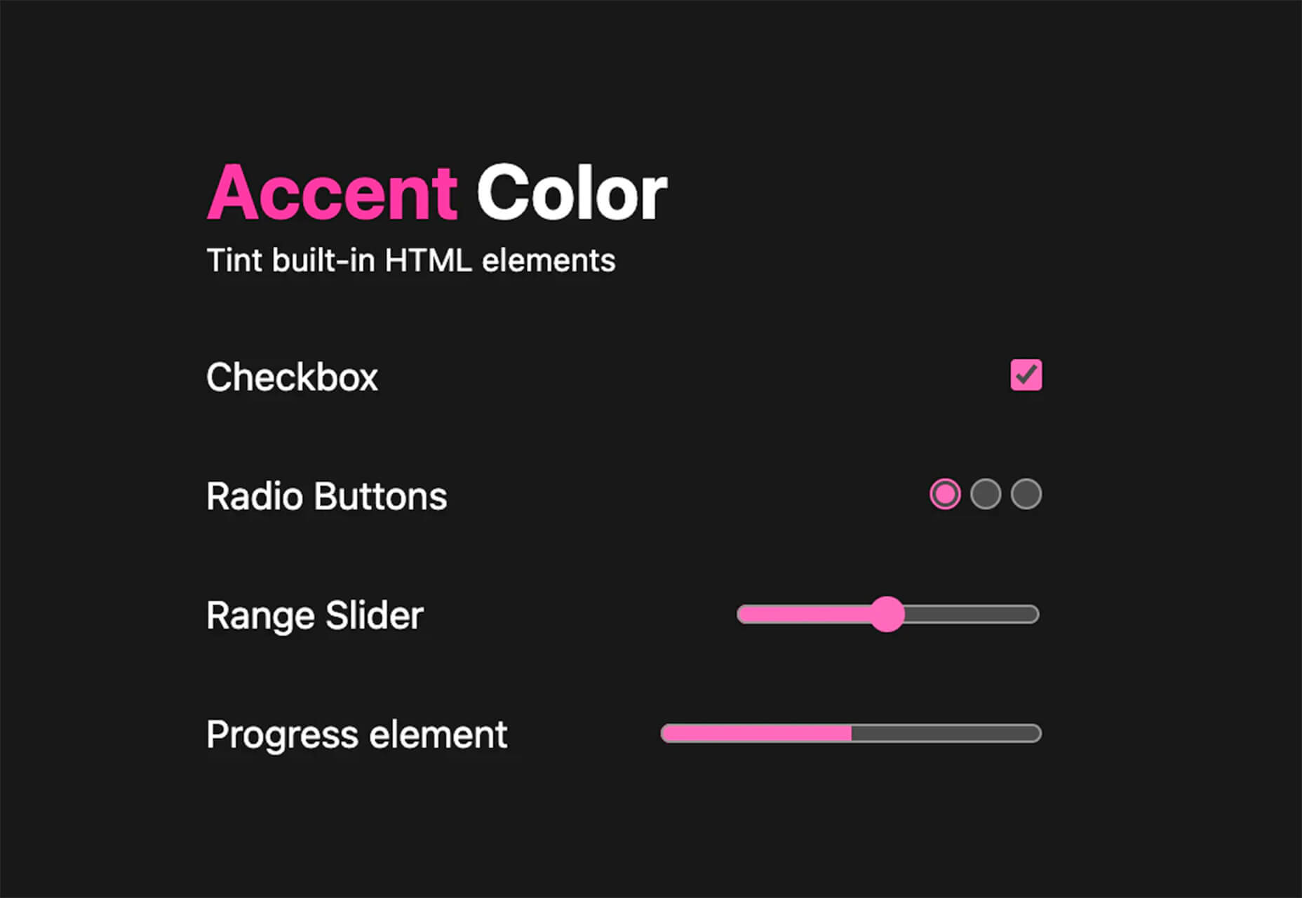
CSS Accent-Color can help you tint elements with one line of CSS. It’s a time-saving trick that allows for greater customization for your brand in website design projects. Plus, it works equally well in dark or light color schemes. It supports checkboxes, radio, range, and progress bars.
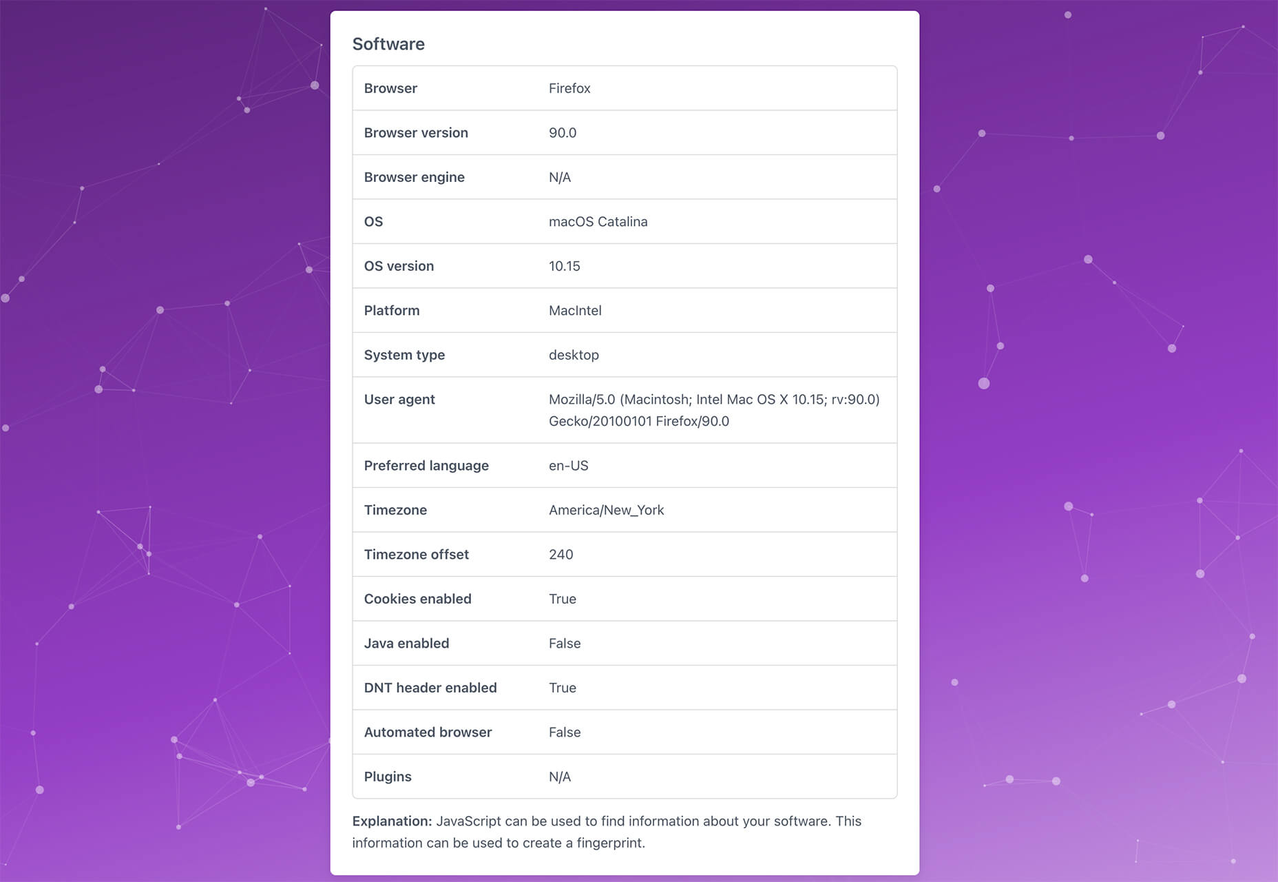
Vytal shows what traces your browser leaves behind while surfing the web. This scan lets you understand how easy it is to identify and track your browser even while using private mode. In addition, it scans for digital fingerprints, connections, and system info.
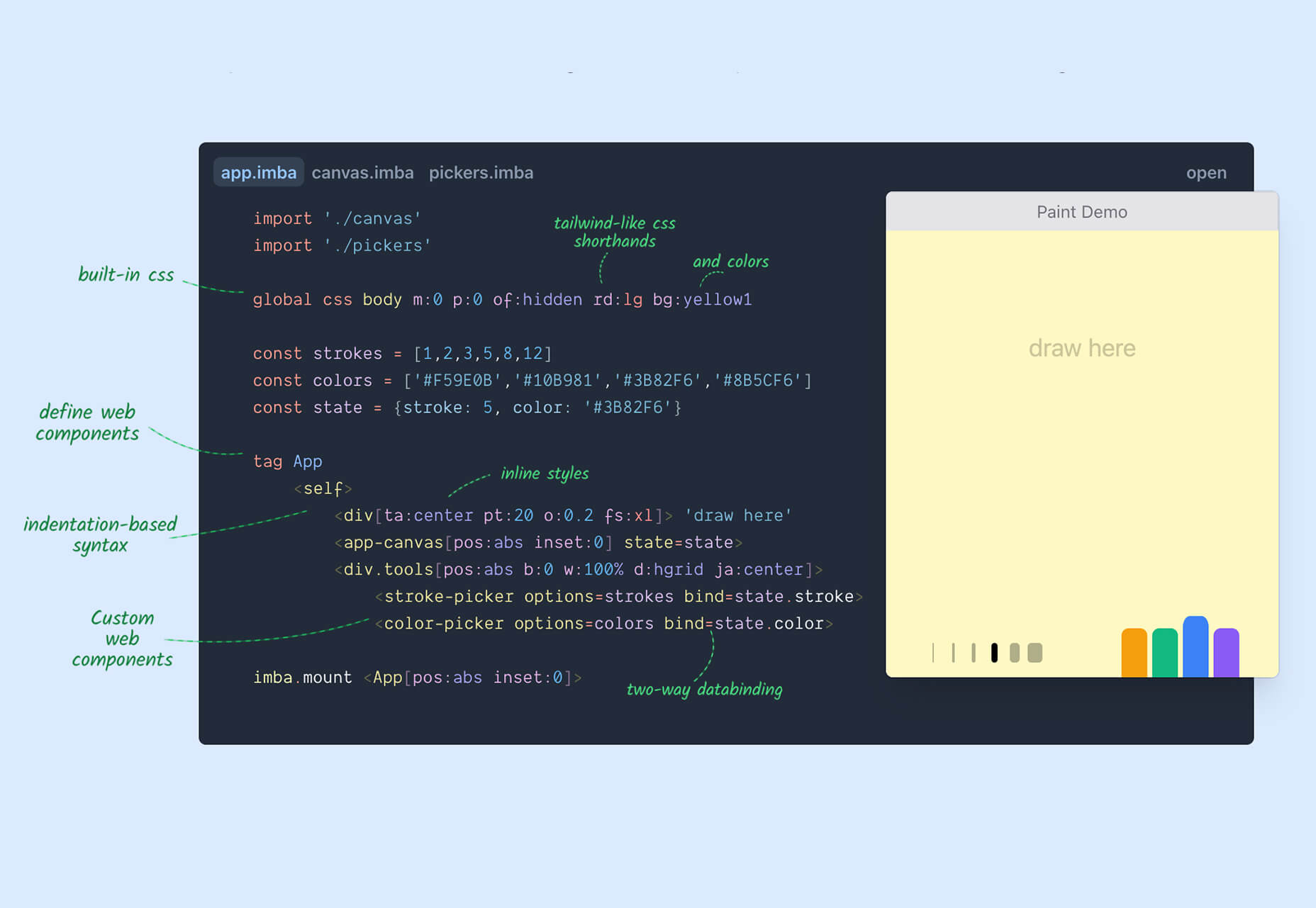
Imba is a programming language for the web that’s made to be fast. It’s packed with time-saving syntax tags and a memorized DOM. Everything compiles to JavaScript, works with Node and npm, and has amazing performance. While the language is still in active development, the community around it is pretty active and growing.
SVG Shape Dividers Creator is a tool that allows you to create interesting shapes with SVG so that your colors and backgrounds aren’t always rectangles. You can adjust and side, change the color, axis, and flip or animate it. Then snag the CSS, and you are ready to go.
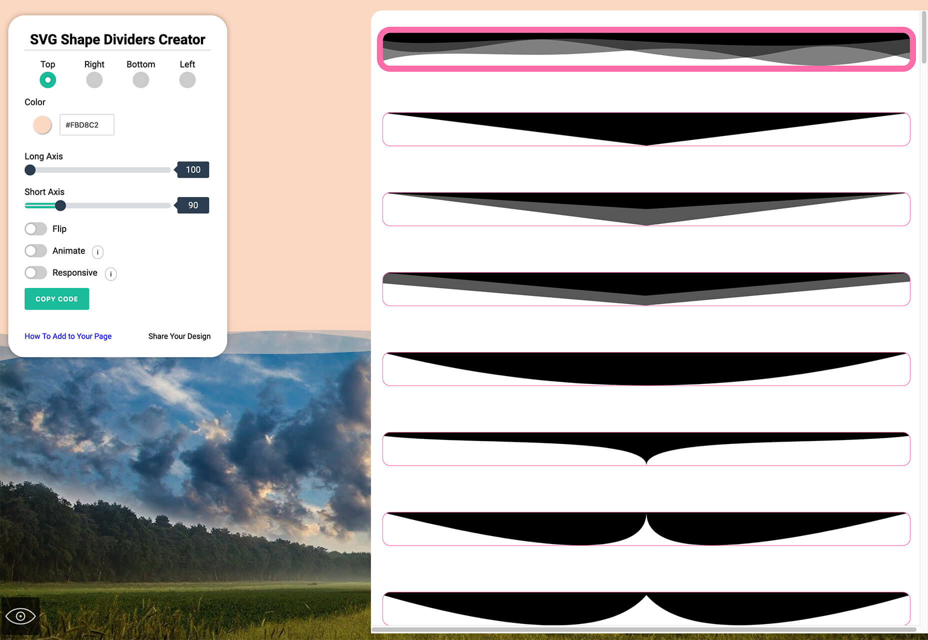
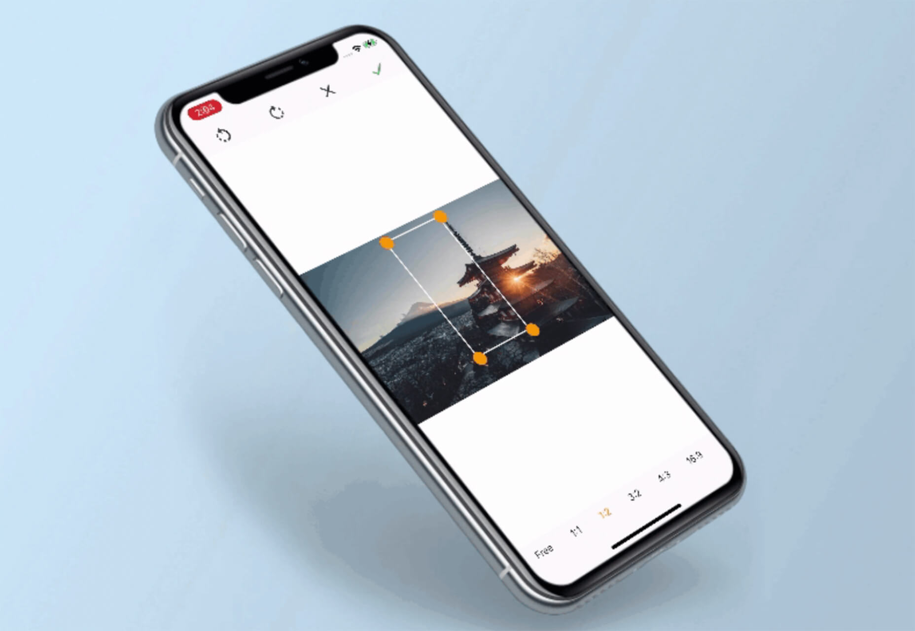
Image Cropper is a tool that allows you to crop and rotate images using the flutter plugin. It works for Android and IOS.
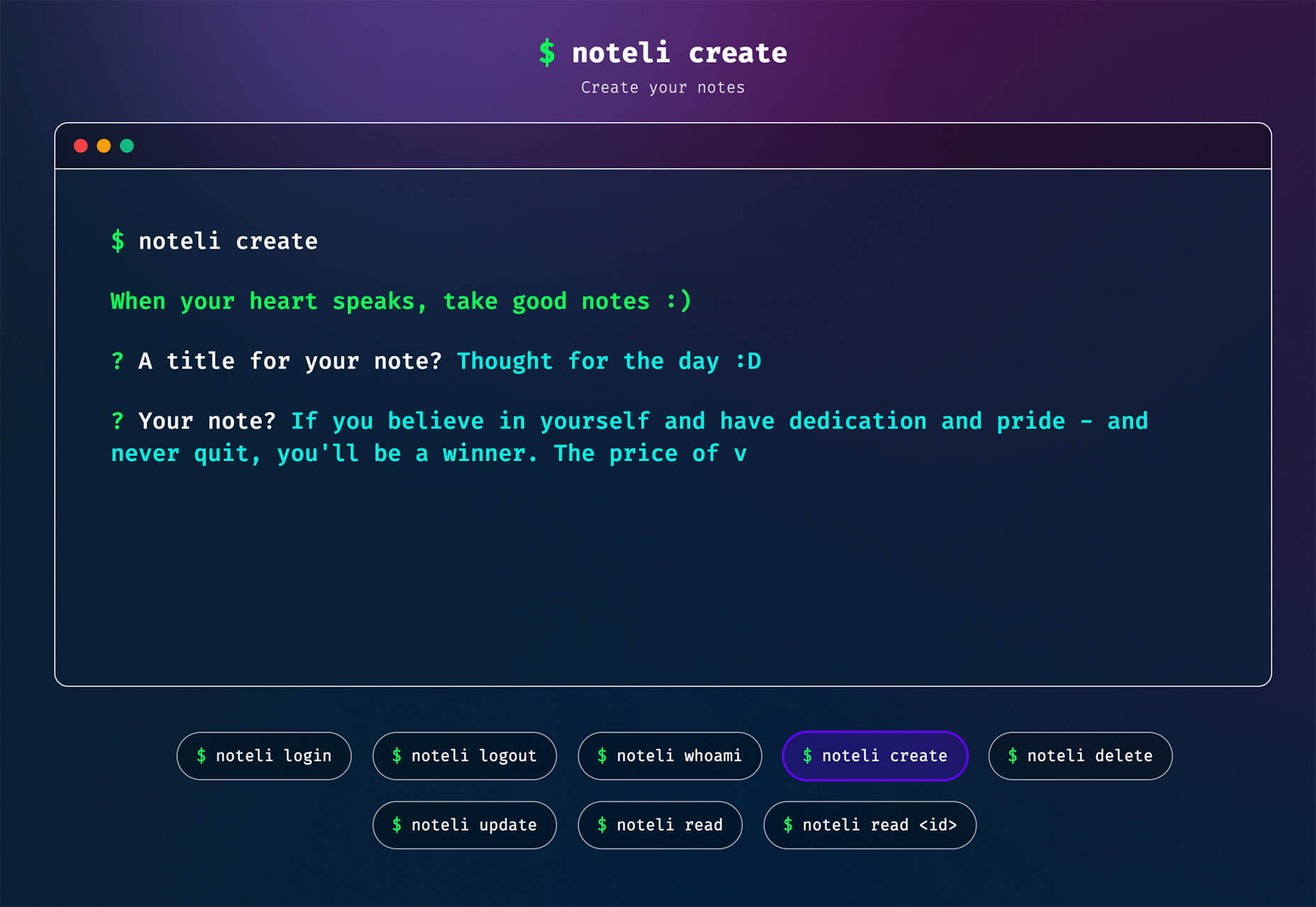
Noteli is a CLI-based notes application that uses TypeScript, MongoDB, and Auth0. The tool is just out of beta.
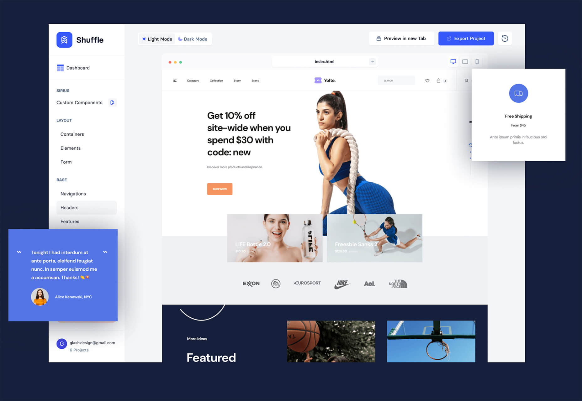
Yofte is a set of components for Tailwind CSS that help you create great e-commerce stores. The UI Kit is packed with components with clean and colorful designs that are customizable. The code is easy to export and clean. This premium kit comes with a lifetime license or a monthly plan.
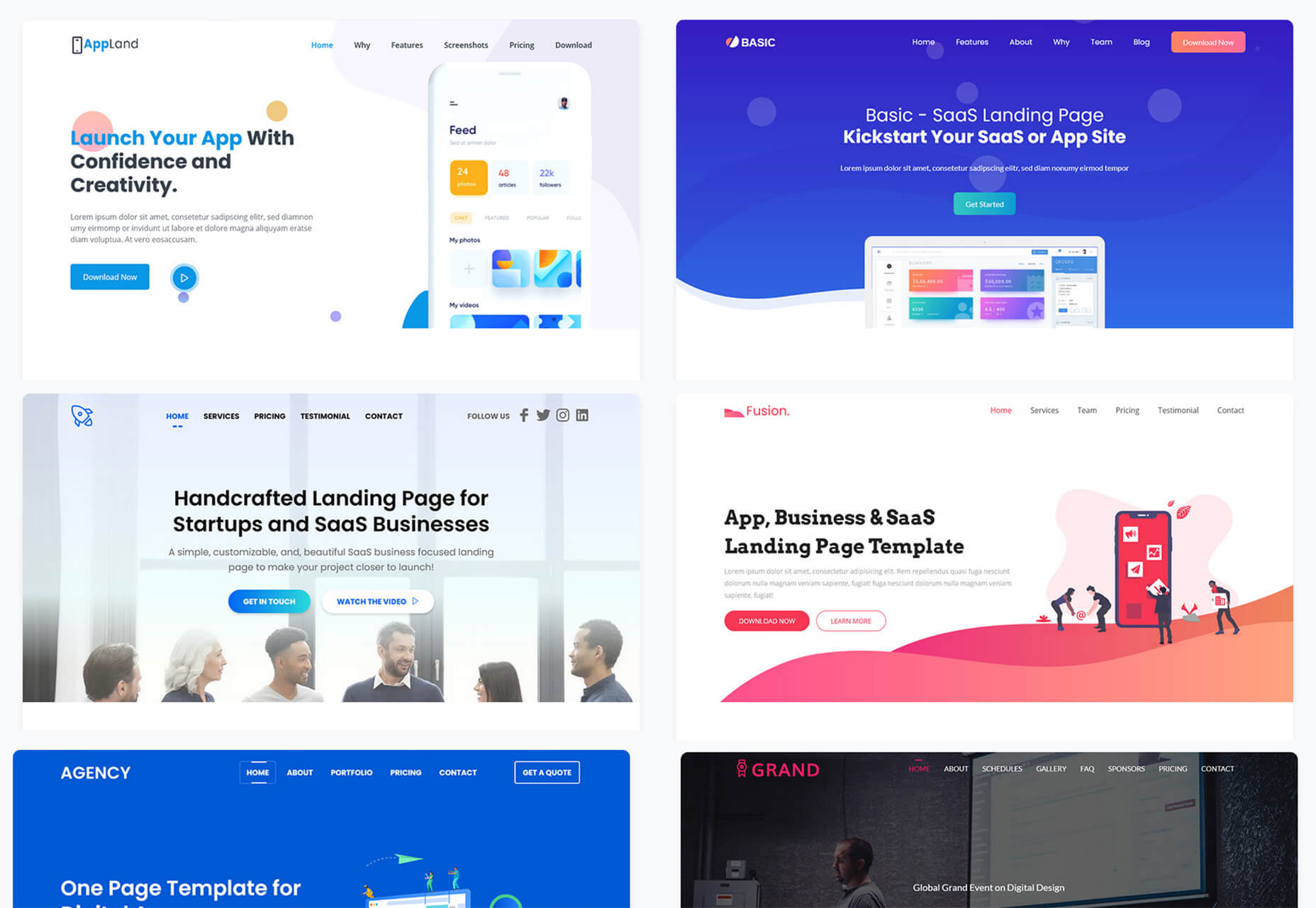
UI Deck is a collection of free and premium landing page templates, themes, and UI kits for various projects. This is a premium resource with paid access to all of the tools. It includes access to more than 80 templates.
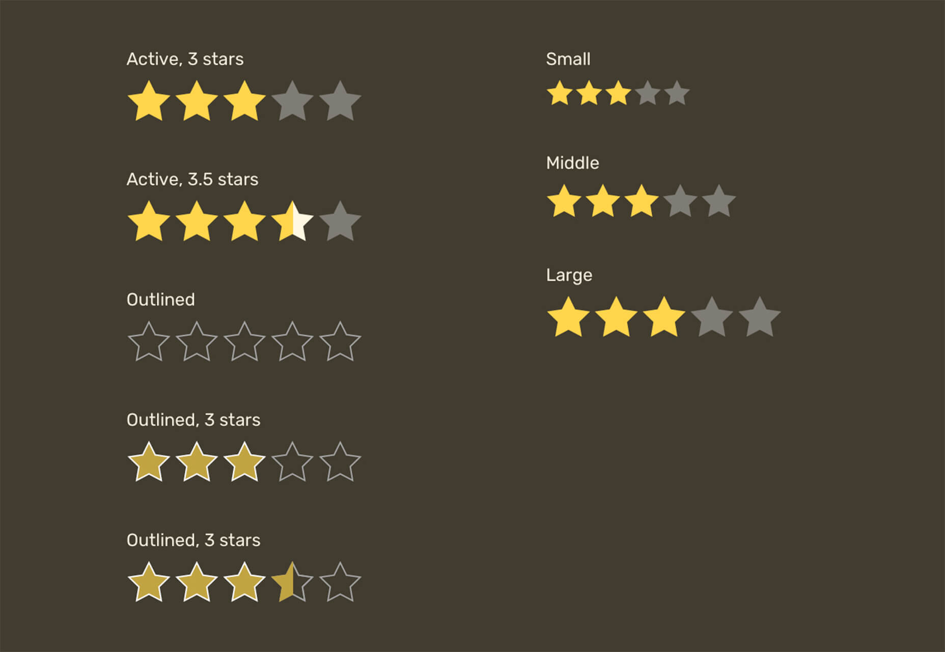
Star Rating: An SVG Solution is a tutorial that solves a common design dilemma: How to create great star rating icons for pages. This code takes you through creating an imageless element that’s resizable, accessible, includes partial stars, and is easy to maintain with CSS. It’s a great solution to a common design need.
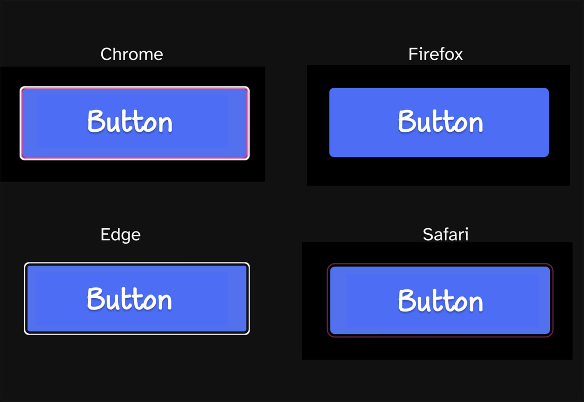
Designing Accessible WCAG-Compliant Focus Indicators is another convenient guide/tutorial for an everyday application. Here’s why it is important: “By designing and implementing accessible focus indicators, we can make our products accessible to keyboard users, as well as users of assistive technology that works through a keyboard or emulates keyboard functionality, such as voice control, switch controls, mouth sticks, and head wands, to mention a few.”
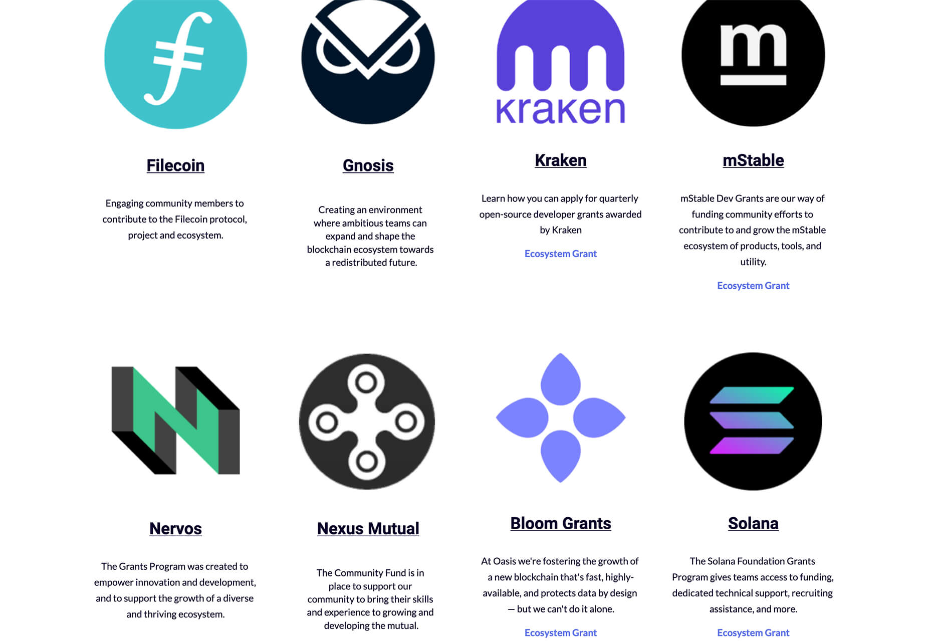
Blockchain Grants is a tool for anyone developing blockchain applications and in need of funding. It’s a database of grants from a variety of organizations for different applications. Start looking through this free resource to help secure additional funding for your projects.
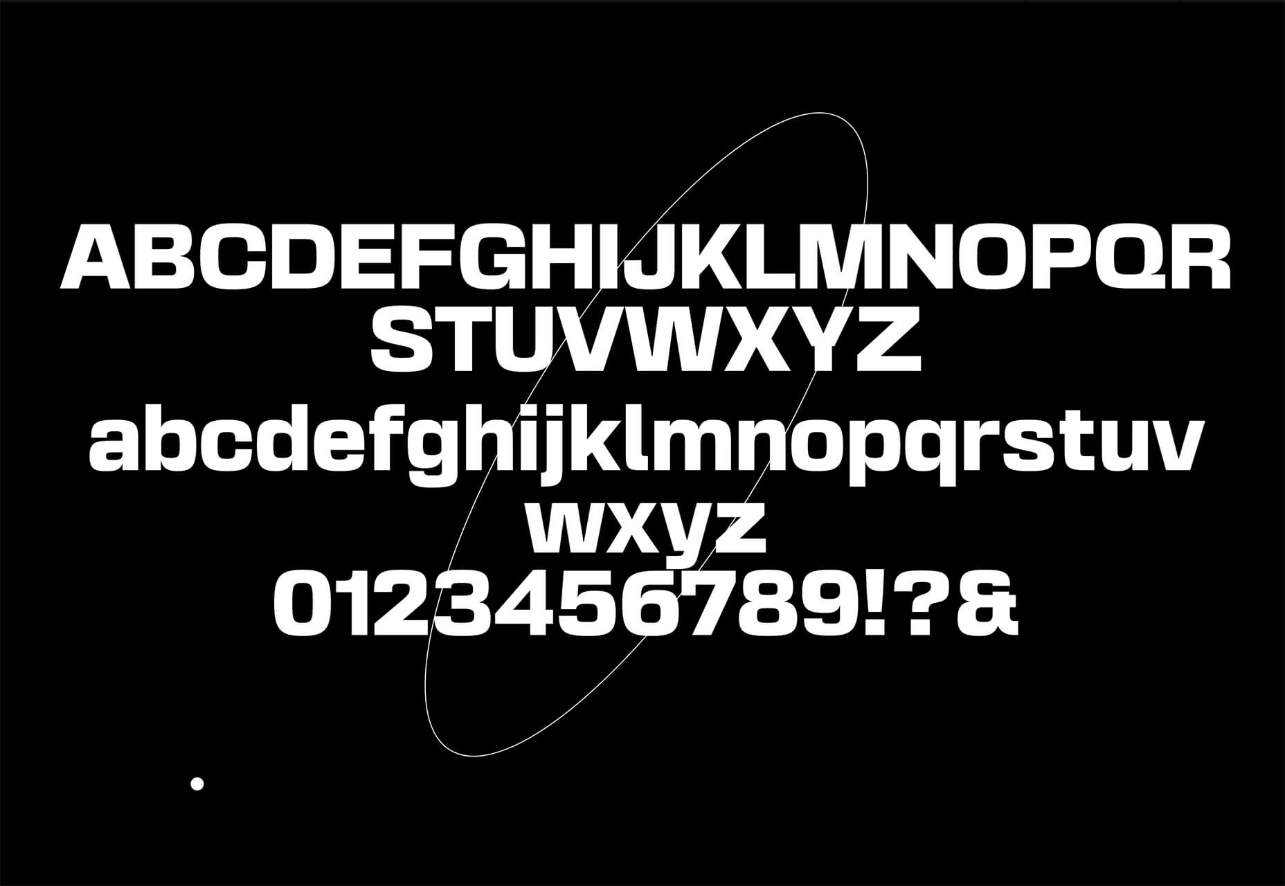
Basement Grotesque is a beautiful slab with a great heavy weight and plenty of character. There are 413 characters in the set with plenty of accents, numbers, and variable capitals.
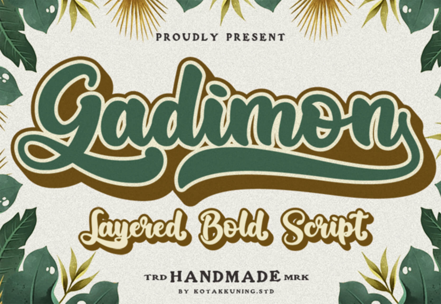
Gadimon is a fun, almost comic book-style layered script. The font package includes a regular and extrude style.
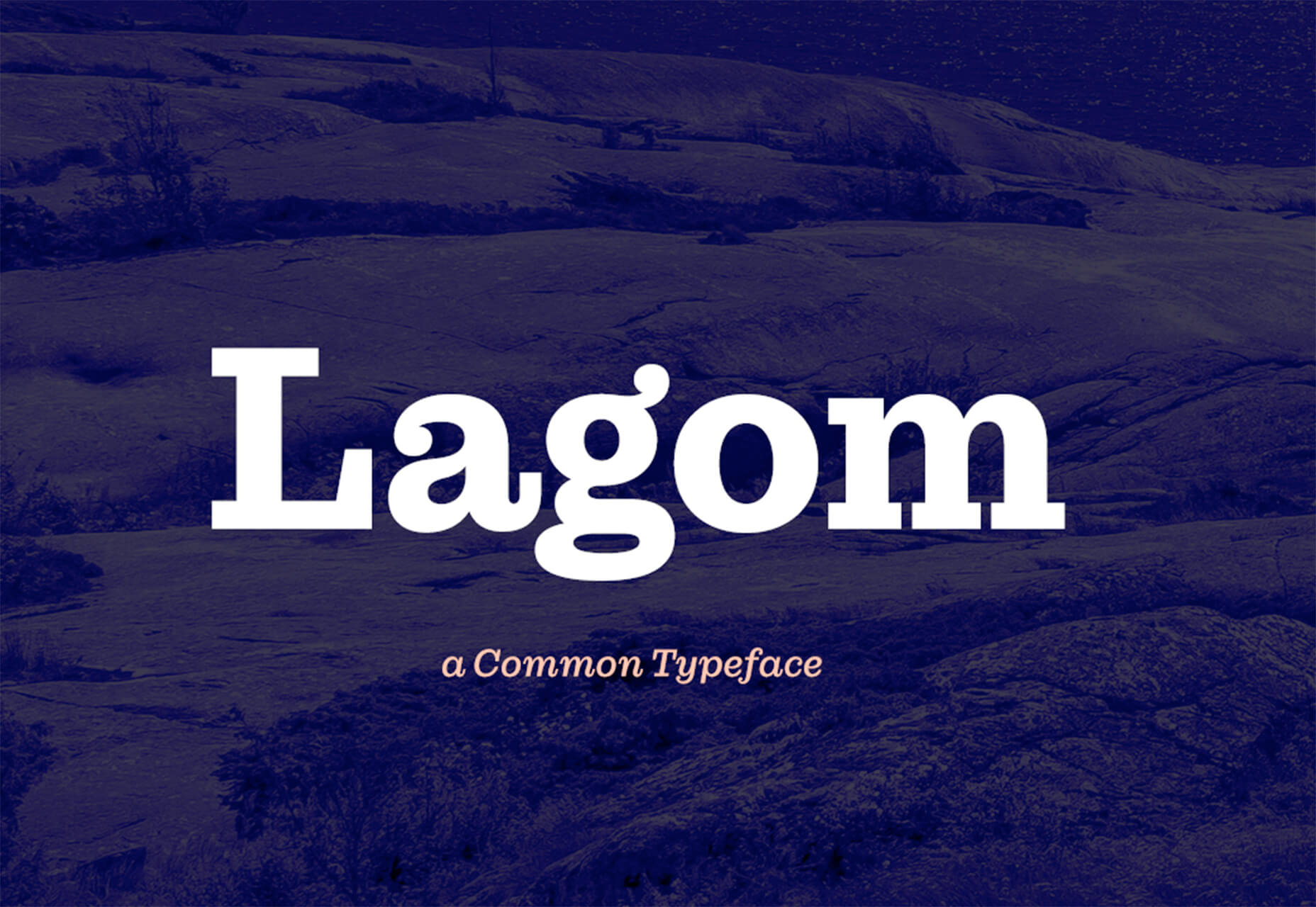
Lagom is a sleek and functional serif typeface with 16 styles in the robust family from ultralight to extra bold italic. It’s readable and has a lot of personality.
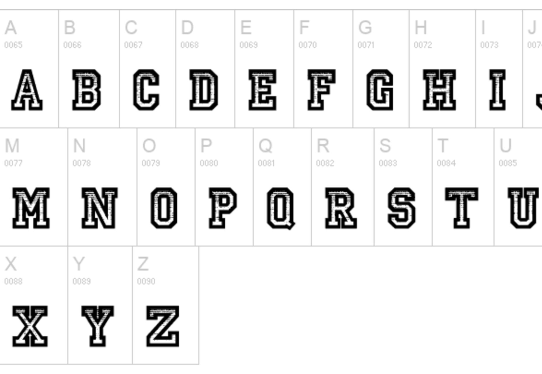
Striped Campus fits our back-to-school theme with a fun, scholastic look and feel. The block letters have a thick outline stroke and some fun inline texture.
The post Exciting New Tools for Designers, September 2021 first appeared on Webdesigner Depot.

 Every day design fans submit incredible industry stories to our sister-site, Webdesigner News. Our colleagues sift through it, selecting the very best stories from the design, UX, tech, and development worlds and posting them live on the site.
The best way to keep up with the most important stories for web professionals is to subscribe to Webdesigner News or check out the site regularly. However, in case you missed a day this week, here’s a handy compilation of the top curated stories from the last seven days. Enjoy!


The post Popular Design News of the Week: August 30 2021 – September 5, 2021 first appeared on Webdesigner Depot.

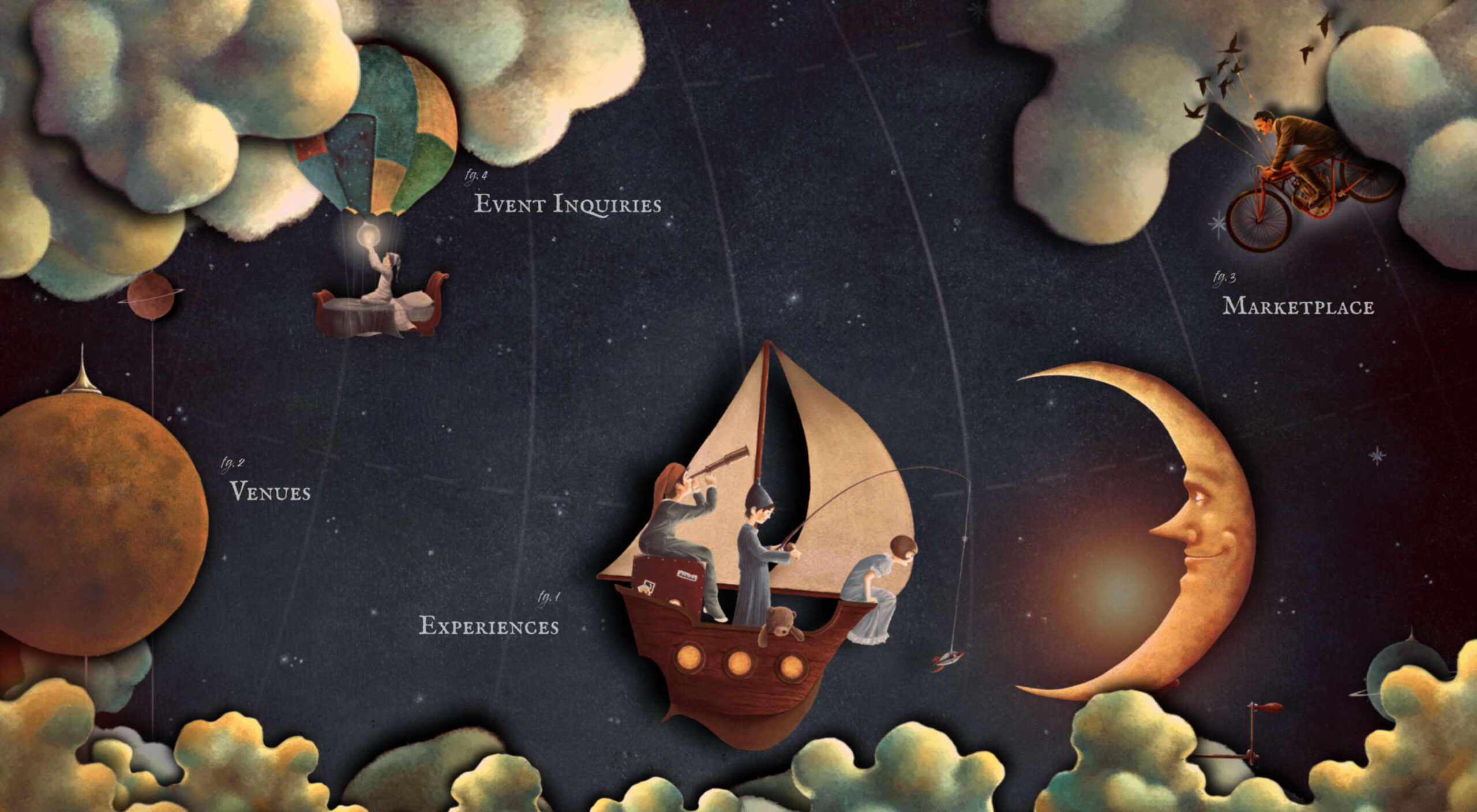 From 45,000-year-old cave paintings to 21st-century space rocket diagrams, illustrations have long played a significant role in human communication.
Pictures cross-language and literacy barriers, allowing people to understand and communicate complex moods and feelings that they cannot in words. When we were little, we could understand and appreciate E.H. Shepard’s illustrations of Winnie the Pooh and friends long before we could read A.A. Milne’s words.
The word ‘to illustrate’ has two main meanings: to create a picture of; and to demonstrate or provide an example of. In the context of the web, illustration is part decoration, part emotional signal, helping to create a particular impression to the user by painting a metaphorical picture.
Illustrations provide a useful shorthand means to convey mood or tone, the voice of a brand.
You could argue that icons are illustrations because they are pictorial, but they are symbols. Icons may, and usually should, fit stylistically with illustrations, but they are not illustrations themselves. A symbol is a simplified representation of an object, idea, or action. For example, ‘search’ is usually represented by a magnifying glass shape.
Illustrations, on the other hand, are more complex. They transmit an underlying emotional quality that connects with the intended audience. Illustrations can create a narrative about the subject without the need to add more text. It gives even the most basic, functional website a sense of personality when used properly.
Illustration styles are many and varied, ranging from simple outlines to detailed, full color, realistic images. And the amount of illustration used varies greatly across sites.
Different styles evoke different feelings and provoke different responses, so it is important to think carefully when choosing an illustration style. There are two major factors to consider: what the site is for and what sort of character do you want to give it.
It is possible to break things down into broad categories to see what works best in different areas. We’re going to look at how designers can use illustration to good effect across four categories…
Financial services, fintech, enterprise software, and larger corporate sites tend to use illustration as a way to humanize themselves.
The style tends to be minimal, using simple shapes and sparingly. Acorns uses a simple oak leaf motif to go with its acorn logo. Other illustrations are tied in by keeping to shades of green.
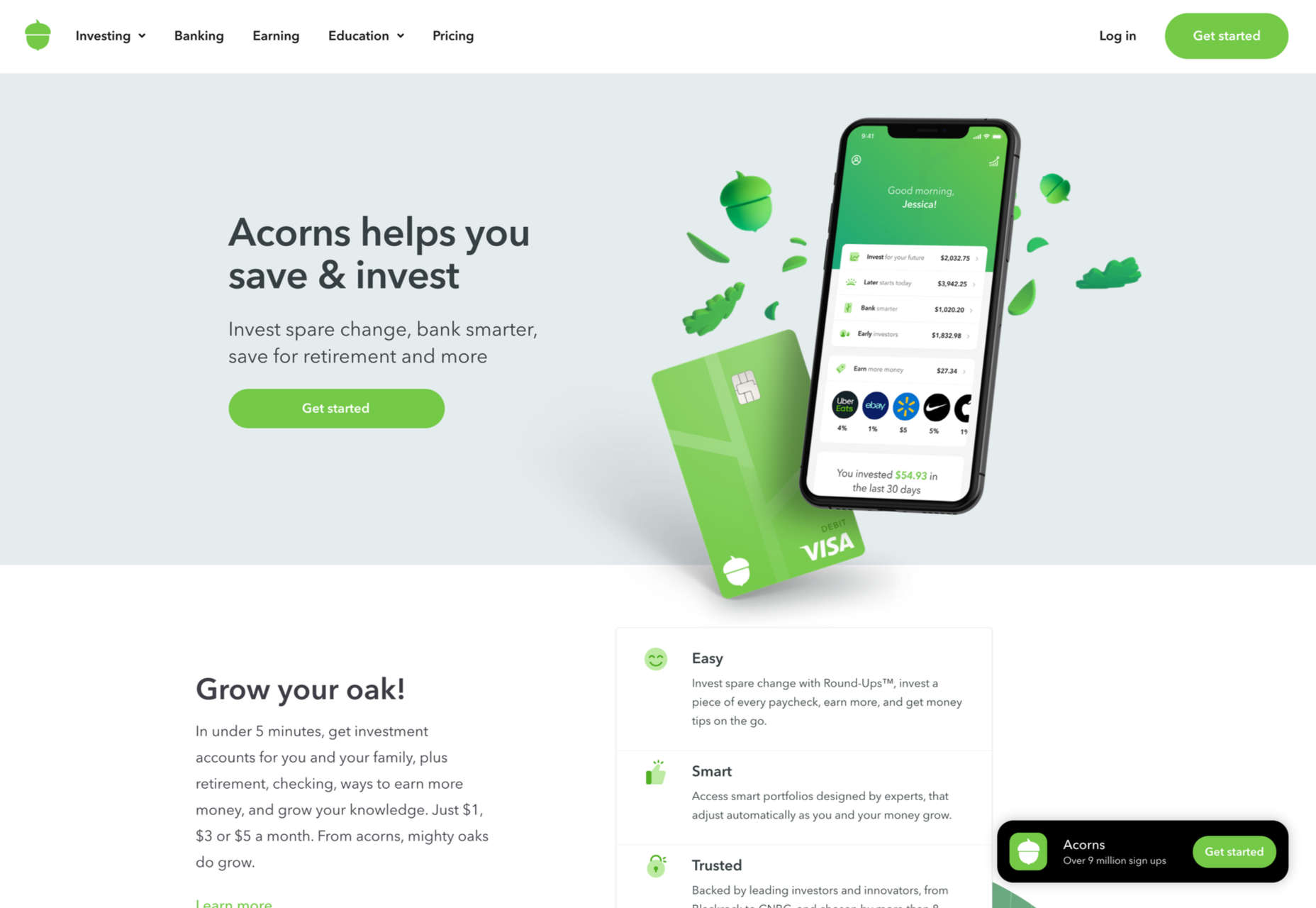
This creates a feel typical of newer companies (Acorns was founded in 2014), especially those that are primarily web-based.
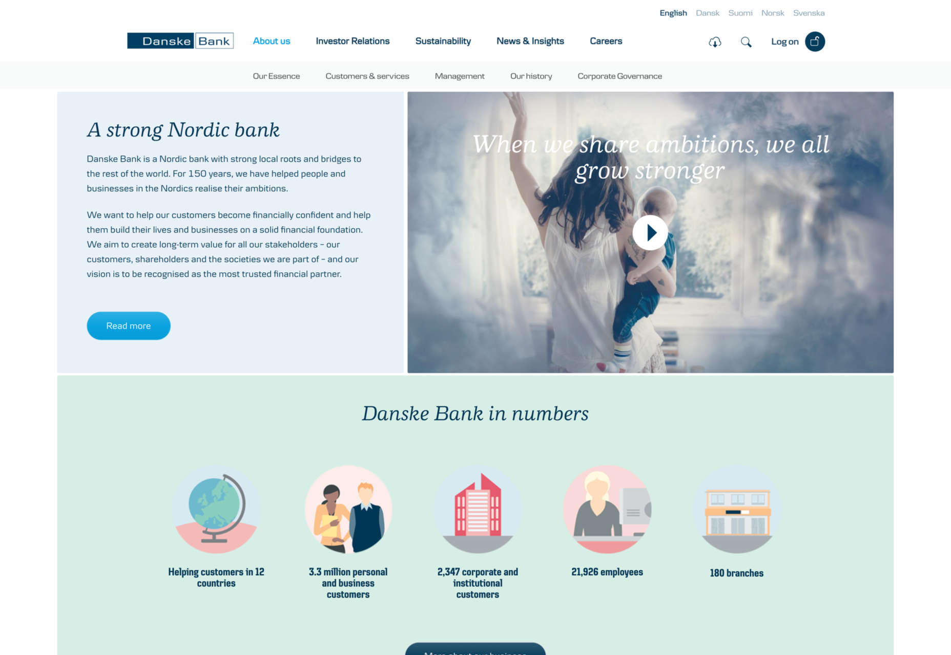
Longer established, more traditional organizations use illustration for the same purposes, although they may be restricted to certain areas only, where they want to emphasize approachability. Danske Bank, for example (founded in 1871), has illustration on its corporate site in the ‘About’ and ‘Sustainability’ sections.
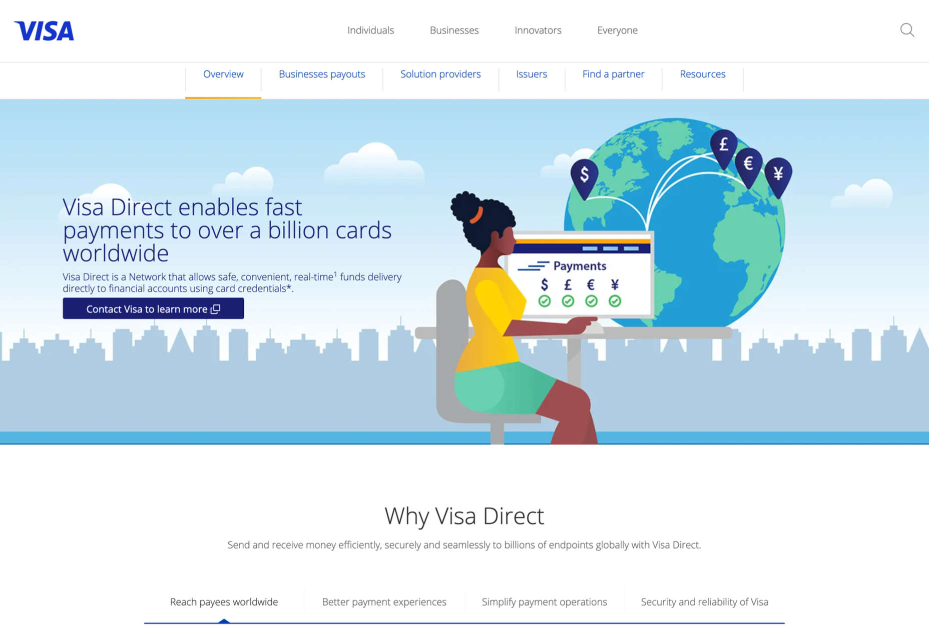
Visa also limits illustration to a specific area, the section on Visa Direct. This has the effect of separating this particular (newer) service from the rest of what Visa offers.
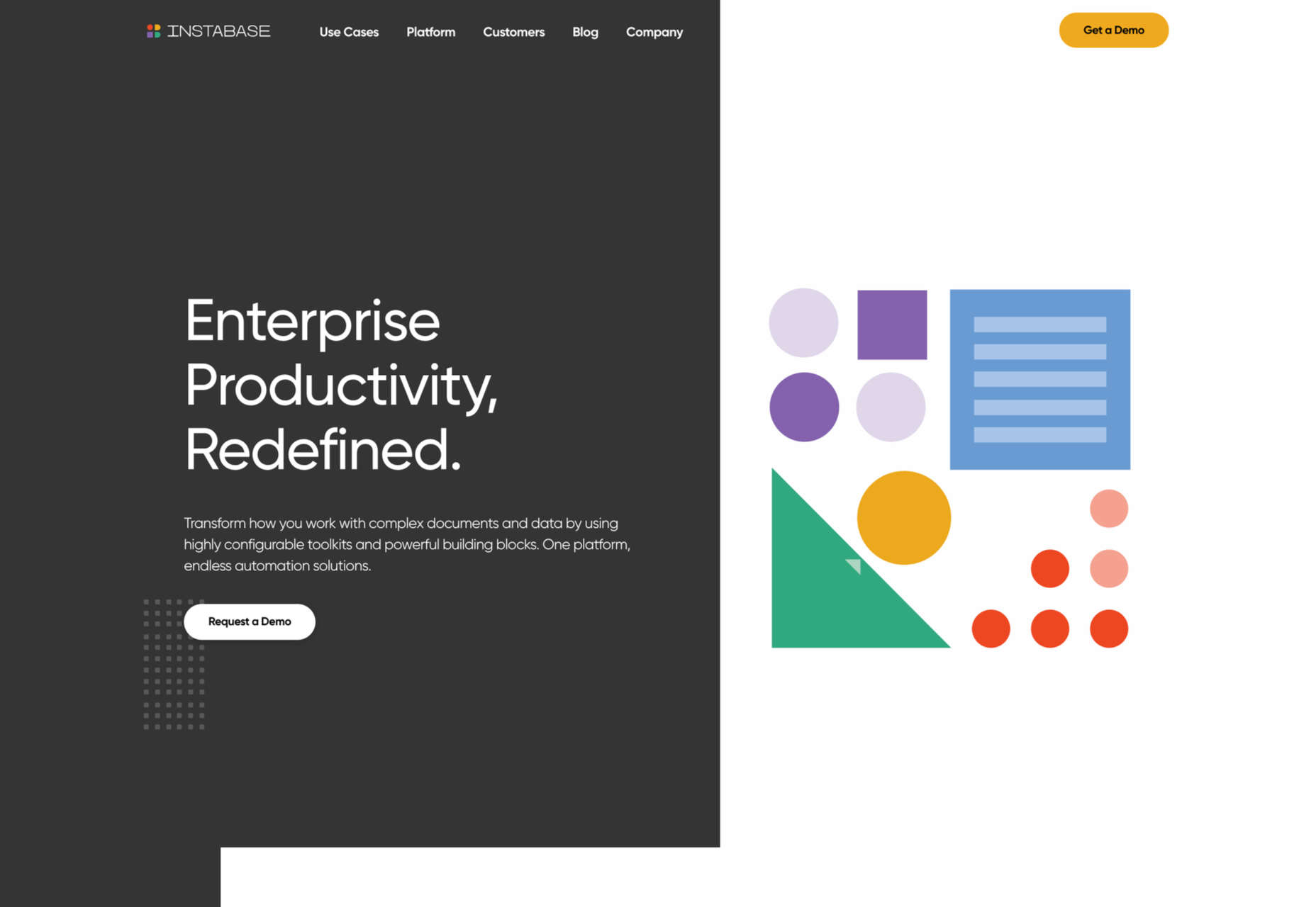
Another increasingly popular approach in this category is abstract graphics. This is particularly useful when it is difficult to show what is being promoted. For example, Instabase adds arrangements of geometric shapes for visual interest, using the same color palette as the site icons.
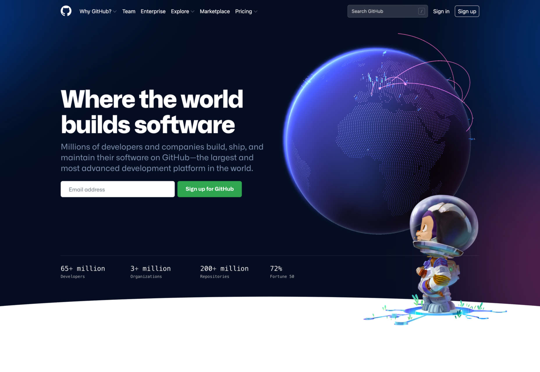
One of the key points with illustration in these types of sites is getting the balance right between friendly, human and approachable on the one hand and serious, trustworthy, and secure on the other. Get too cutesy, and potential customers won’t take you seriously. Github’s enterprise page does have some illustration, but the color is less vivid, and Octocat is only alluded to, unlike the home page which is illustration-rich.
Things get a little freer when it comes to food and drink. Styles vary much more, and the personality conveyed can be stronger and more individual. Some still go for a light peppering of illustration, with aspects such as color and type made stronger, while in other cases, the illustration becomes much more prominent.
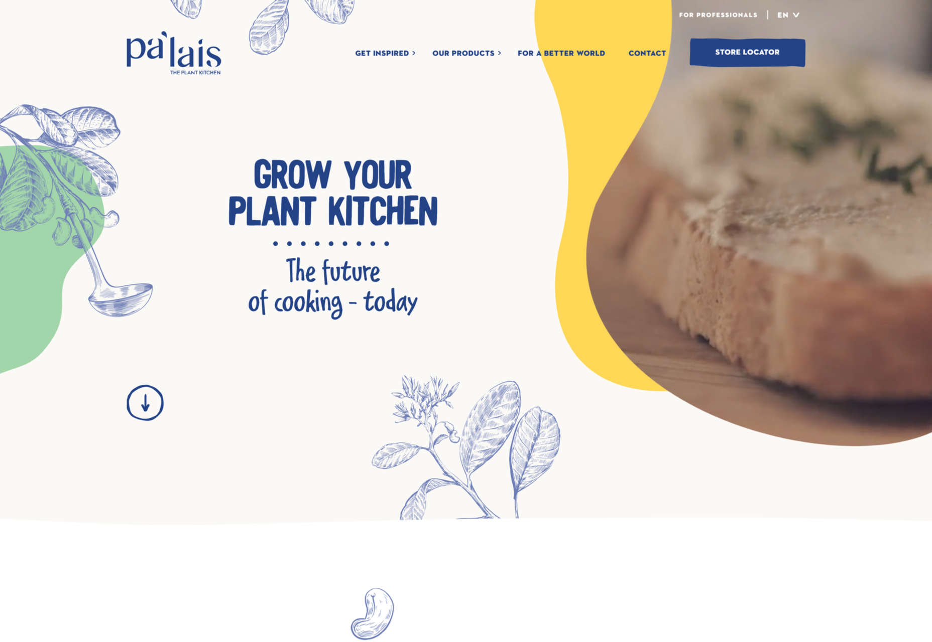
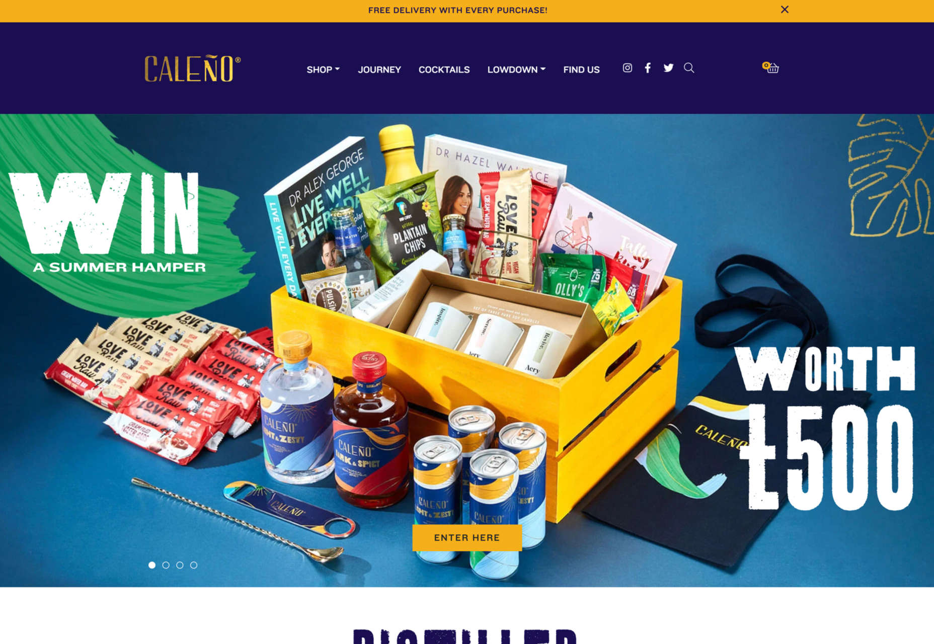
Palais Kitchen and Caleño both do the former, with brand-appropriate line drawings.
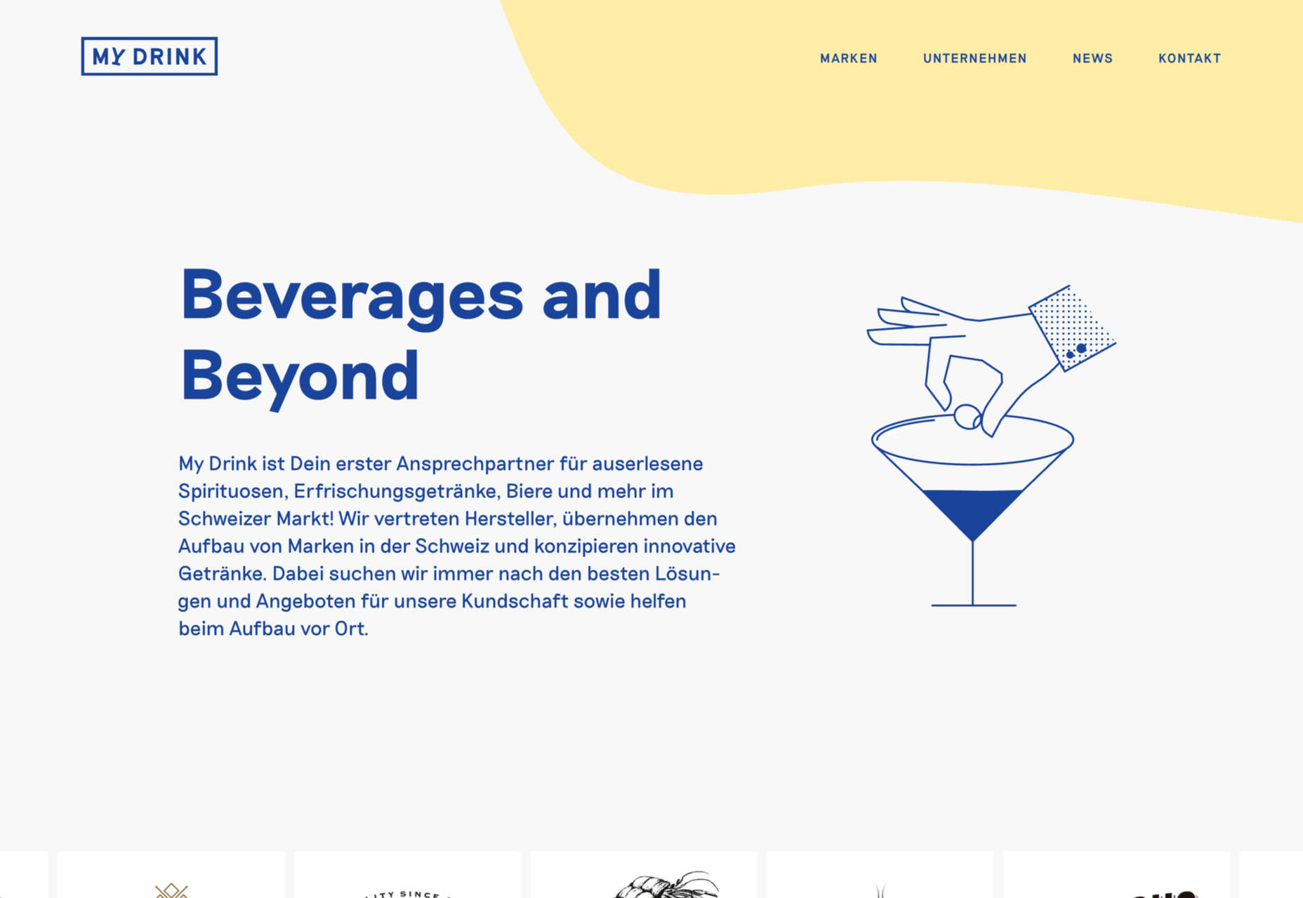
My Drink’s vintage-style animated illustrations take the place of photographs to balance the text on its home page.
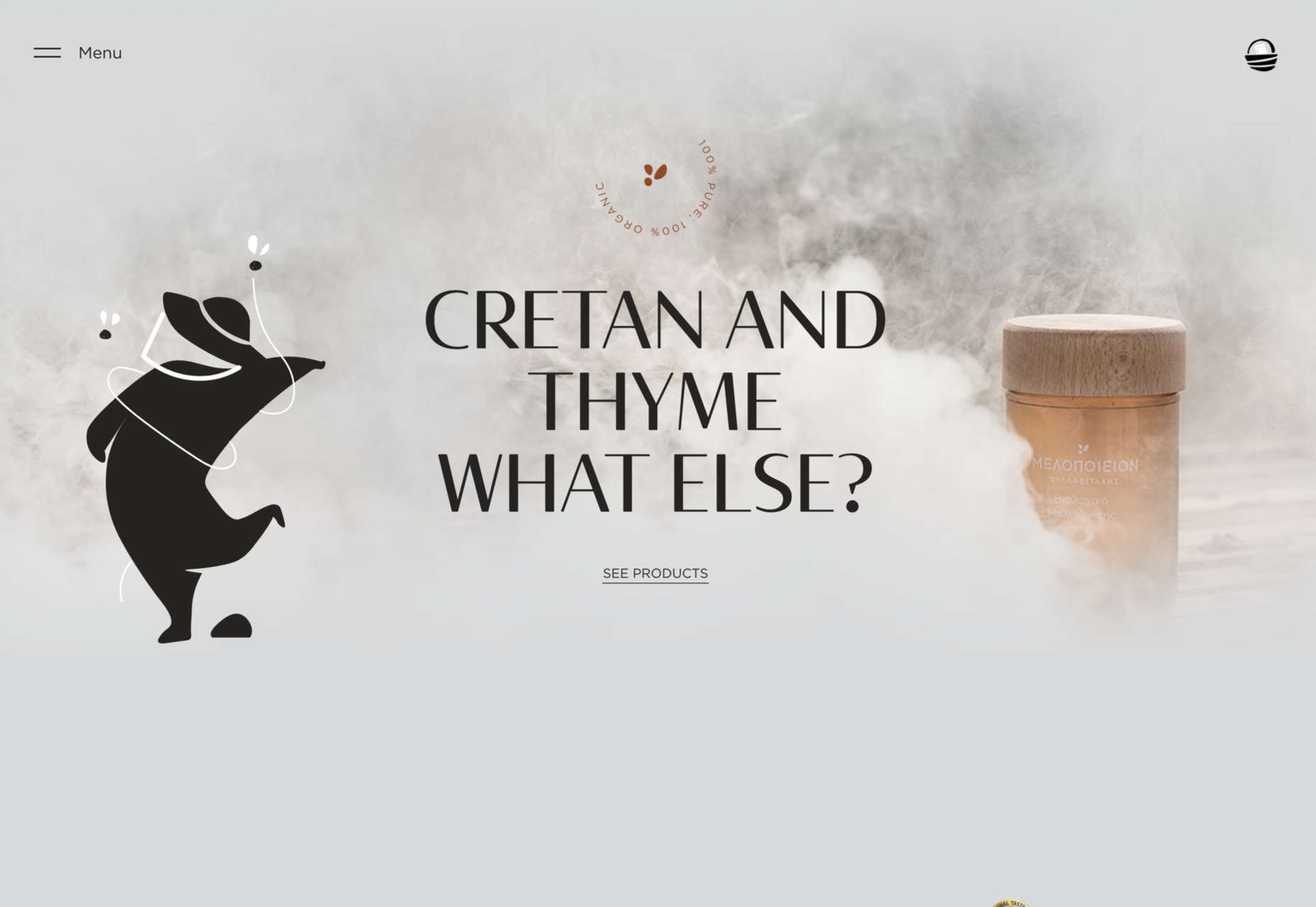
Melopeion Honey doesn’t use very many illustrations, but what it does use is large.
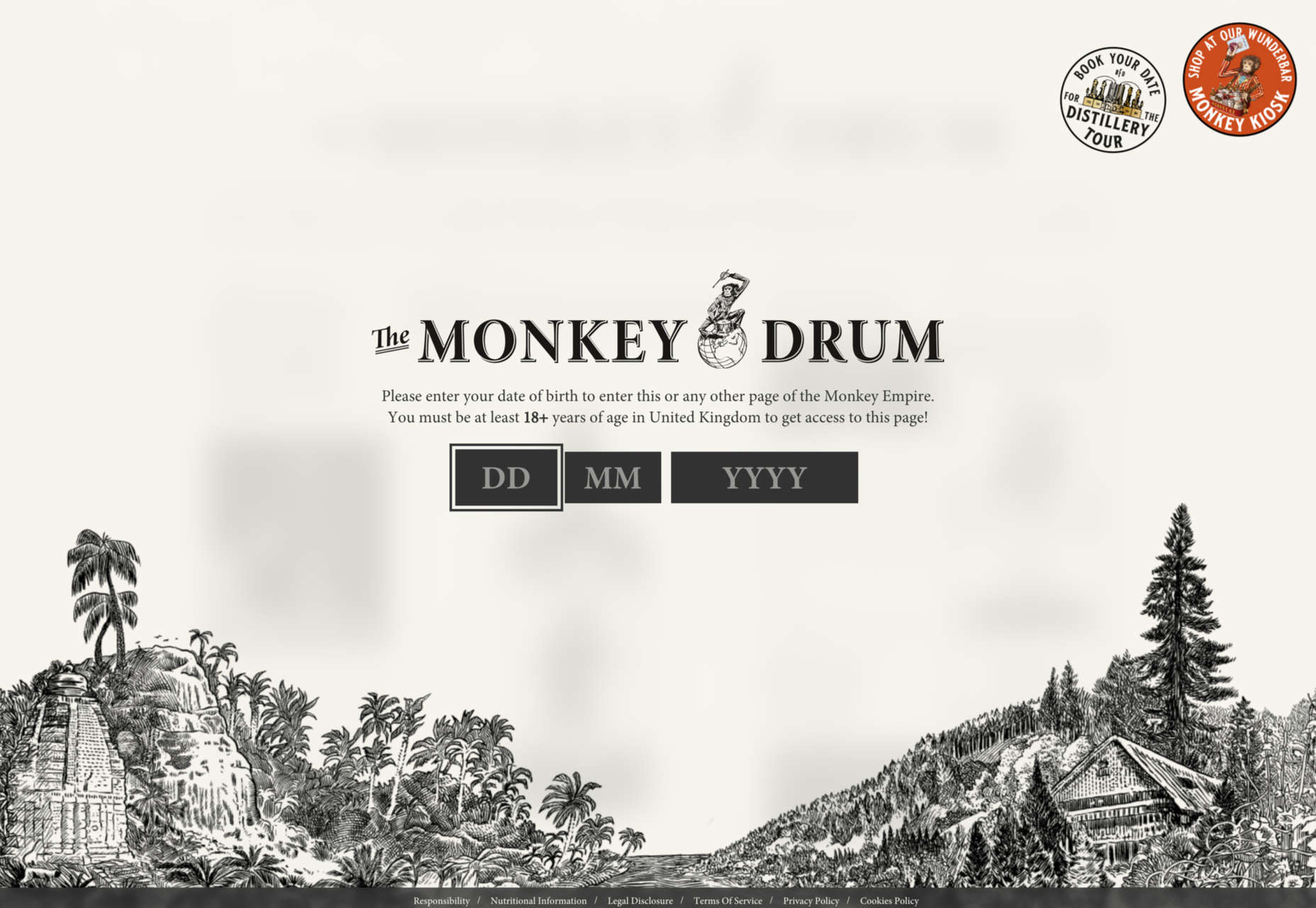
Monkey47 could be described as a concept website, and the illustrations play a key role. (The social media menu is really rather charming.)
In this category, what users really want to see is photographs, but illustration can help too. A photograph can only show what something looks like, while illustration can add the extra emotional dimension connected to an experience.
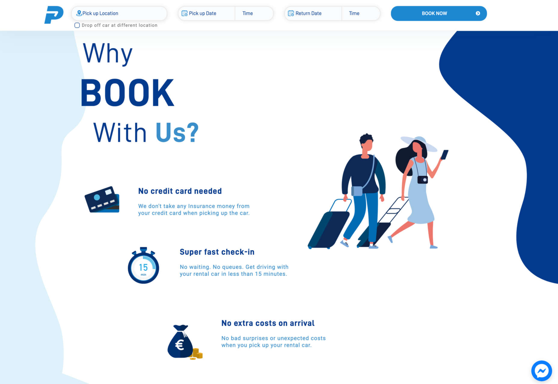
At the minimal end of the scale, Protos Car Rental uses some nice, simple illustrations to emphasize the holiday aspect of its business.
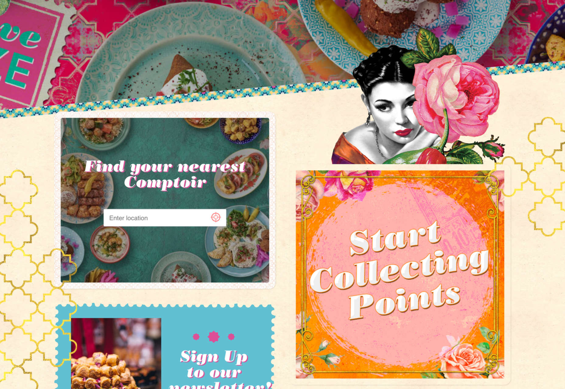
Comptoir Libanais blends photographs with illustration to create a very distinct identity.
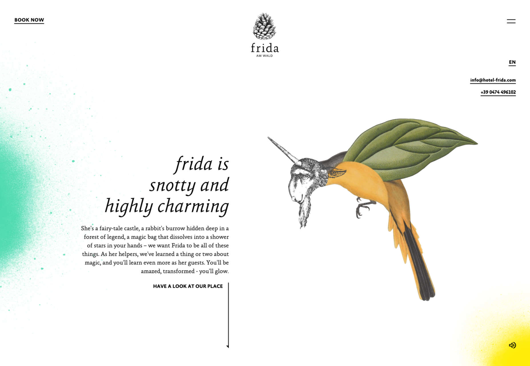
Hotel Frida is also about character, and the victorian-style fantastical animal illustrations help create a quirkiness.
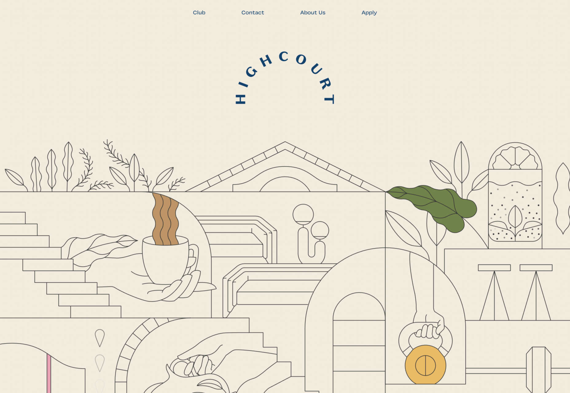
Highcourt uses simplified and stylized layout illustrations to give a complete overview of the building’s interior than photographs could.
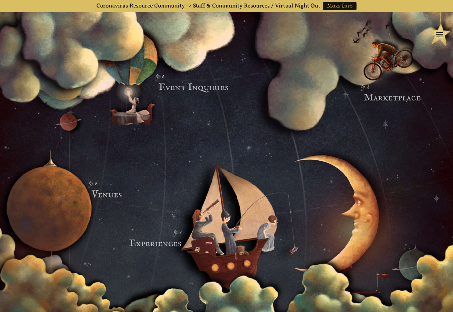
The Neverlands doesn’t just use illustration; the whole site is an immersive experience based on illustration.
Sites promoting ethical and or sustainable companies, natural skincare, natural and/or organic food and drink, vegan products, social responsibility, and so forth tend to rely heavily on illustration, particularly if they are reasonably new.
Quite often, this is in the form of plant drawings that make a lazy allusion to nature, but it can also involve conveying information in a way that doesn’t come across as lecturing.
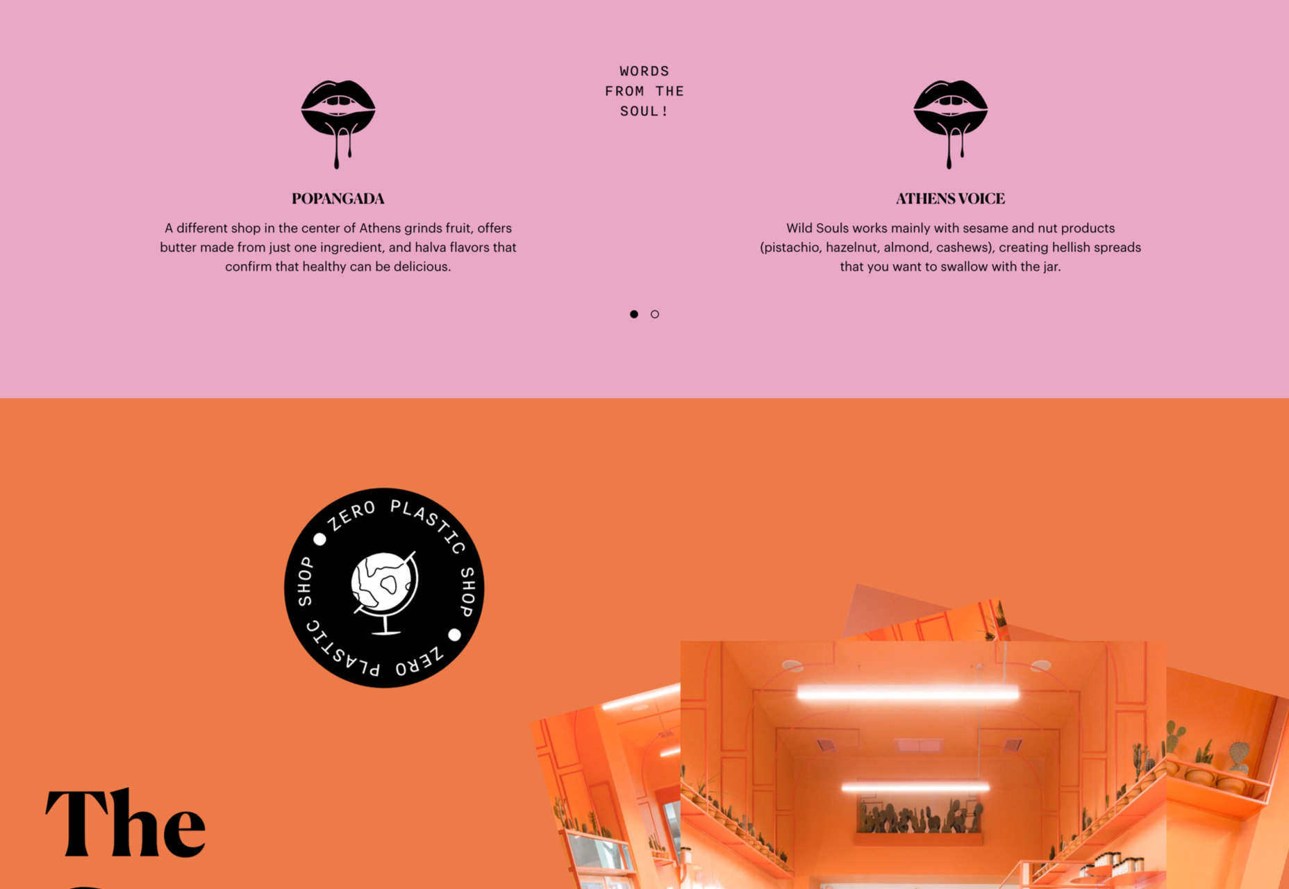
Wild Souls steers clear of any hint of hippiness, with a sense of randomness to its illustration placement.
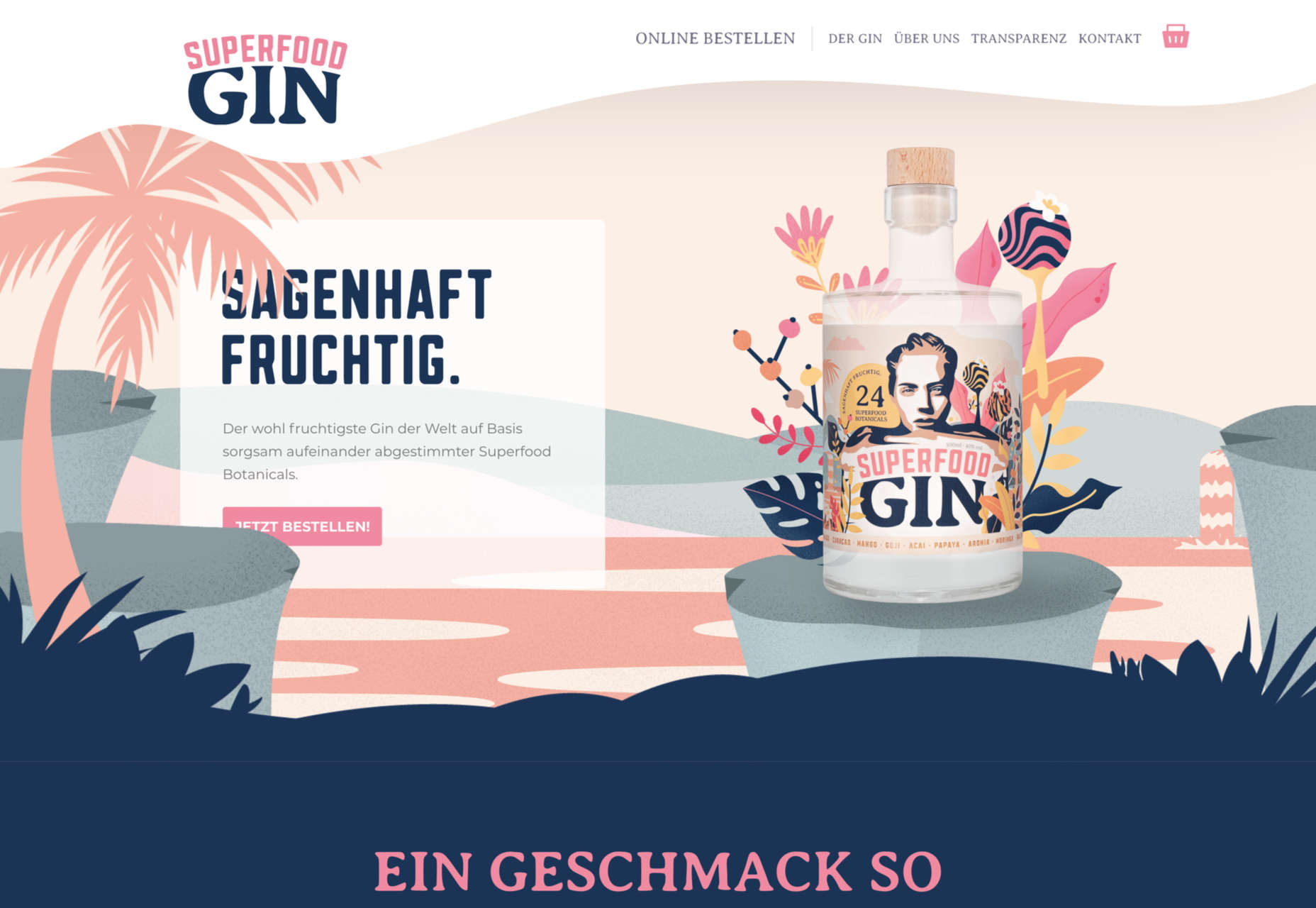
Superfood Gin does the plant thing, but it is in reference to the botanical ingredients here, so it is very relevant.
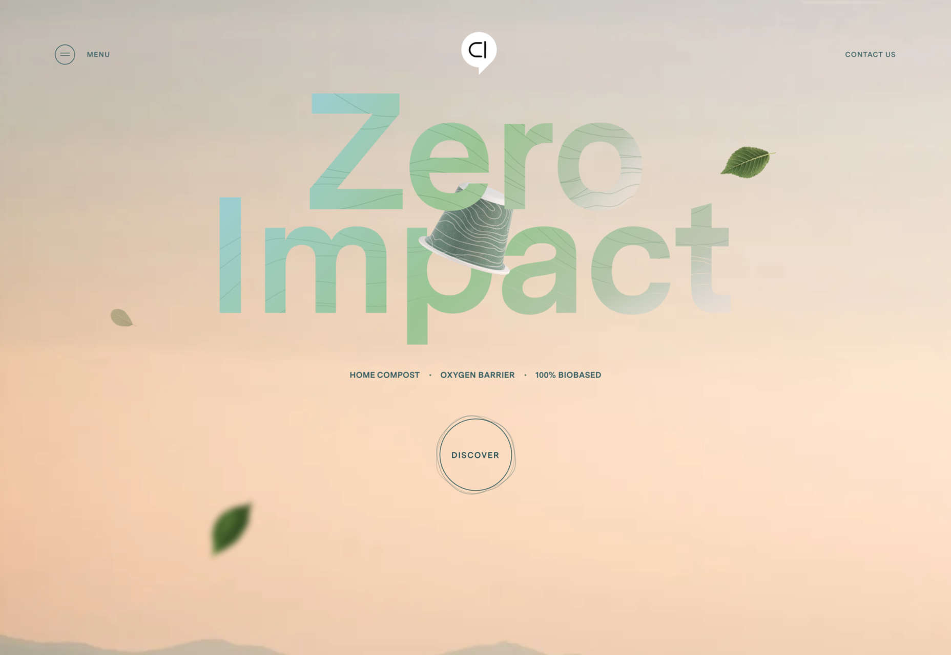
Capsul’in’s main company page is a fairly standard offering, but for its Zero Impact product, it has a separate section with illustrations to help explain the product’s features.
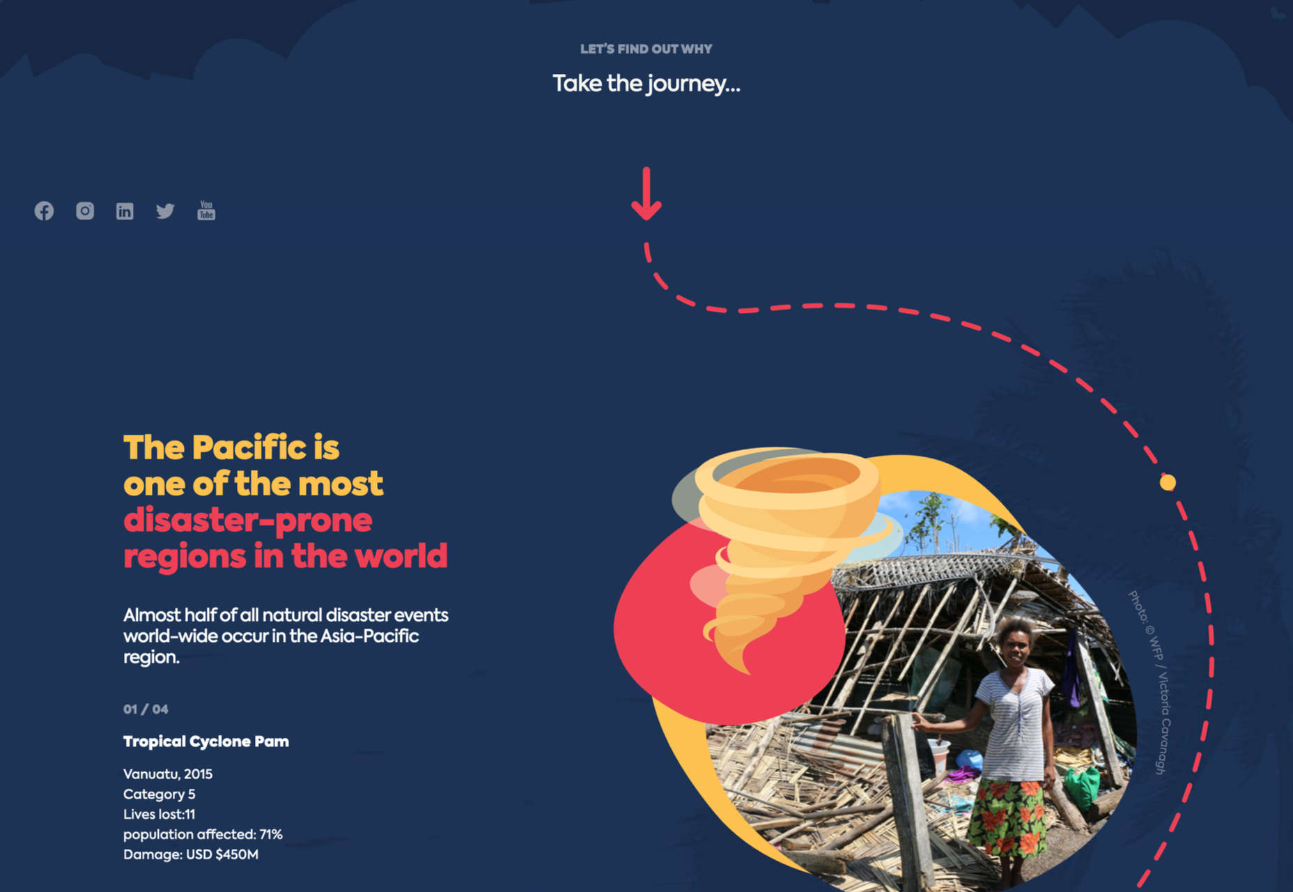
Donate Responsibly uses illustration to explain how well-meant action can be inadvertently damaging without appearing to scold or patronize.
A variety of children’s brands will use illustration — even when it is parents or guardians who are really the target — and Little Yawn Collective combines the child-friendly, and natural product approaches with its sleepy animal illustrations.
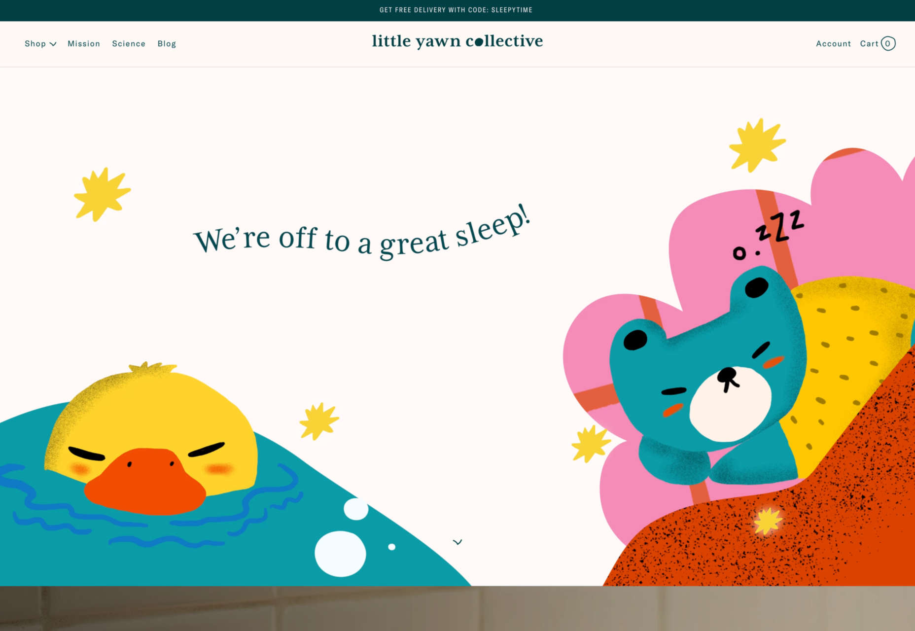
Illustration can be a powerful tool in a designer’s arsenal, but it can be difficult to get right because it invokes emotion, and emotion is subjective.
Just like type or color, it needs to be used appropriately and with care. Sometimes less is more, and sometimes getting the placement absolutely right can make the difference between a successful design and a flop.
This is just a selection of the wide range of illustration styles and usages out there on the web, but we hope it will give you a starting point when you are considering whether and how to use illustrations in your next project.
The post How Illustration Adds Emotion To UX first appeared on Webdesigner Depot.

Advanced portable applications accomplish a great deal. They convey information between various back-ends through network APIs. They store and recover information from the local database, process substantial amounts of media, and communicate with web sockets. It’s difficult to monitor all the data from various asynchronous data sources, particularly realizing that the users are used to a simple, fluid user experience.
At the beginning of Android, designers utilized the class AsyncTask from the Android system to accomplish everything outside the primary UI thread. Although async tasks did what they should, utilizing them wasn’t the most charming experience in light of all the standard code you would eventually end up writing due to adaptability issues. If you had a further developed use case (i.e., introducing information from a neighborhood data set on the UI while making an API solicitation to get the most recent information from the backend, refreshing the nearby data set, and introducing the most recent information on the UI), things would quickly spiral. You would wind up with code that is difficult to comprehend and keep up with.
