Articles

As a web designer, you’re constantly being bombarded with messages that tell you to acquire new skills, try new tools, and keep on hustling.

But if you’re constantly changing things up, does it do the opposite of what you originally set out to do? In other words, if you always have to start over, is it possible to ever really achieve anything?

I think it ultimately depends on why you’re making the change.

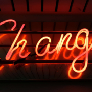
When Change Is the Right Move for Web Designers

One of the reasons I despise New Year’s resolutions is because it’s change for the sake of change:

It’s a new year, so it’s time to get all hyped up about this one thing I need to change about myself!

There’s a reason why so many resolutions fail by February. When you force a change, it’s really hard to stay invested in it, especially if it’s something you’ve chosen to do because everyone else has.

Change should be driven by necessity.

That said, when it comes time to make changes as a web designer, is it ever really necessary? Or are you learning new skills, trying new tools, or switching up your client list simply because it’s what you believe you have to do?

It’s important to be open to change, but you should only invest your time, money, or effort when it’s the absolute right move for you. Here are some ways you’ll know when that’s the case:

Learn New Skills To…

…Round Out the Basics

If you’re a new designer and there are gaps in your education and training (and I don’t mean formally, just in general), then there’s no reason to hesitate in spending time to acquire those skills.

This doesn’t just go for basic skills as a web designer or as a coder. This also goes for skills you need to become a successful freelancer.

…Add Evergreen Skills to Future-Proof Your Position

As you move up in your career, you’ll eventually find other skills worth learning. Just make sure they’ll help you move the needle.

The best way to do that is to focus on acquiring evergreen skills that’ll always be useful to you, no matter what stage you’re at in your career or how the design landscape changes. They should also go beyond the average skill set of a designer, so they help you stand out further from the pack.

… Create a Better Situation for Yourself

The web is constantly evolving, which means that your responsibilities and skills as a web designer will have to change in order to adapt. Whenever one of these shake-ups occurs, you should either be ready to master the needed skill right away or, better yet, have been working on it beforehand.

Take, Google’s mobile-first indexing, for instance. It announced it was going to be making this shift years before website rankings were impacted. Designers had plenty of time to not only learn what was needed to design for the mobile-first web, but to get all their existing clients’ sites in shape for it.

Adopt New Tools When…

…Your Existing Ones Are Slowing You Down

If you’re doing a lot of things from-scratch (like writing emails to clients or creating contracts), that’s a good sign your toolbox needs some improvement.

As a web designer, you should be focused on creating, not on the tedious details involved in running a business or communicating with clients. That’s just not a good use of your time. A lot of this stuff can easily be automated with tools and templates.

…You’re Turning Down Business

In some cases, it’s the right thing to say “no” to prospective clients — like when they’re a bad fit or can’t afford your rates. However, there are other times when you desperately want to be able to say “yes”, but you don’t have the capacity for the job or you’re unable to cover the full scope of what they need.

This is where new tools come in handy. For instance, let’s say you’ve been approached by a ecommerce company that not only wants you to build a new store, but also needs it fully optimized for search (it’s not the first time this has happened either). Rather than turn something like that down, you may find that the addition of an SEO tool to your toolbox is all you need to be able to say “yes”.

…You Have Extra Room in Your Budget

Obviously, you don’t want to throw away money on a bunch of tools simply because a ton of people are talking about them. But you’ll eventually get to a point where the tools that served you well in the first year of business need to be replaced.

If you get to a point where you have extra time to experiment and there’s room in your budget for upgraded tools, go ahead and assess what you currently have and test out replacement solutions that will help you work better, faster, and smarter.

Look for New Business Opportunities If…

…You’re Not Doing Well

“Well” here is subjective. For instance:

  • If you’re not doing well financially, you probably need to look for more clients;
  • If you’re not doing well in terms of how you get along with clients, you should explore a niche that’s a better fit;
  • If you’re not happy with your job because burnout and stress have overtaken your life, then you might consider exploring other avenues of work.

When something has been amiss for awhile, the last thing you should do is lean into it and hope it gets better.

…The Web is Changing

Notice a trend here? Each of these changes (skills, tools, and now business opportunities) is often driven by the fact that the web is always changing. And as the web changes, you have to be ready to evolve.

In terms of business opportunities, what you’ll realistically need to do is look for new kinds of design work as technologies make your job obsolete. Take website builders like Wix or Shopify, for example. As business owners and entrepreneurs take it upon themselves to build their own websites, more and more web designers will need to find other kinds of clients and jobs to take on.

…You Want to Diversify Your Income

This is something many web designers are doing already as they’ve discovered how beneficial it is to have predictable recurring revenue streams.

But even if you’ve already found one way to diversify and stabilize your income (like by offering website maintenance services), you may become interested in exploring other opportunities along the way. If you have the capacity to pursue them, then go for it.

Is Change a Good Idea?

As you can see, change can be a very good thing for a web designer, their business, and their clients. However, there should be a very good reason for the change and you need to prepare yourself for how it’s going to impact what you’re doing now before implementing it. No amount of change can happen without some level of sacrifice.


Featured image via Unsplash.

Source


Source de l’article sur Webdesignerdepot

Dans des moments comme celui-ci, la raison d’être n’est pas seulement un mot, c’est une responsabilité. Chez SAP, nous tirons parti de nos ressources et de notre réseau pour des solutions pragmatiques et innovantes, sur la base de valeurs et d’un objectif communs, mais nous vivons également notre raison d’être à travers nos propres actions pour aider le monde à mieux fonctionner et améliorer la vie des gens.


Les employés et les équipes de l’entreprise se sont engagés de manière utile pour répondre à la crise actuelle et montrer que l’objectif est de vivre au-delà des revenus et des bénéfices. En mettant l’accent sur la santé, le bien-être, la main-d’œuvre qualifiée et la promotion de l’entrepreneuriat social et inclusif, notre raison d’être ne répond pas seulement aux objectifs de développement durable des Nations Unies (ODD des Nations Unies), mais permet également de prendre soin des personnes dont nous nous soucions le plus.
Les employés de SAP dans les pays nordiques et au Royaume-Uni ont développé diverses idées sur la manière de se soutenir mutuellement pendant la pandémie – en tant que collègues, clients, partenaires ou bénévoles pour les personnes dans le besoin. Que ce soit pour un usage interne, local ou international, leur aide ainsi que leur créativité n’ont pas connu de frontières.
Poussé par l’envie de renforcer sa communauté locale Ottershaw, l’employé de SAP Mark French a puisé dans son expérience et son savoir-faire technique et a créé un site Web qui relie les personnes dans le besoin avec des voisins et des bénévoles. Grâce à www.ottershawsupport.com , chaque résident peut s’inscrire facilement pour obtenir de l’aide ou en donner, en recueillant des ordonnances, en faisant les achats essentiels ou en fournissant une assistance et des informations par téléphone.
Un autre exemple de dévouement sans limite a été la mise en place par un autre collègue de SAP qui a soutenu l’idée de son ami de longue date et artiste graffeur Keith Hopewell ( SP: zéro ). SP:zero voulait créer une pièce de collaboration sous forme d’illustrations avec des artistes du monde entier, démontrant la croissance du virus sous son titre « Spread art, not the ‘Rrona ». Ils se sont vite rendu compte que cette collaboration pouvait également apporter une aide financière.
«J’ai eu l’idée de vendre les tirages et de les donner aux hôpitaux britanniques qui nous soutiennent», explique Jago Livingstone. Sous le nom de «No Toys Allowed», il a conçu une boutique en ligne pour faciliter l’accès à leurs dons de charité. Les résultats ont été étonnants : de plus en plus d’artistes se sont impliqués, avec un pic à 163 artistes dans 21 pays sur tous les continents.
Les employés de SAP dans les pays nordiques et baltes ont utilisé leur créativité pour promouvoir la santé, le bien-être et l’inséparabilité, malgré la distance sociale. Vingt-deux collègues SAP d’une équipe de prévente ont livré une vidéo thématique en tant que contribution du Nordic Customer Solution Advisory à un événement à venir sur le thème «We Rise Up». La vidéo révèle une histoire personnelle sur la façon dont ils gèrent la situation actuelle et sur la façon dont chaque individu « se relève » ensemble pour ses collègues, clients et partenaires.
«Parce que c’est ce que nous faisons en ces temps difficiles, c’est dans notre ADN», dit Gitte Winther Bruhn, résumant l’essence de leur idée et montrant une fois de plus que chacun peut agir pour le bien commun, même avec les actions les plus simples.

Article posté pour la première fois en anglais sur news.sap.com

The post Les employés SAP face à la crise du Covid19 appeared first on SAP France News.

Source de l’article sur sap.com

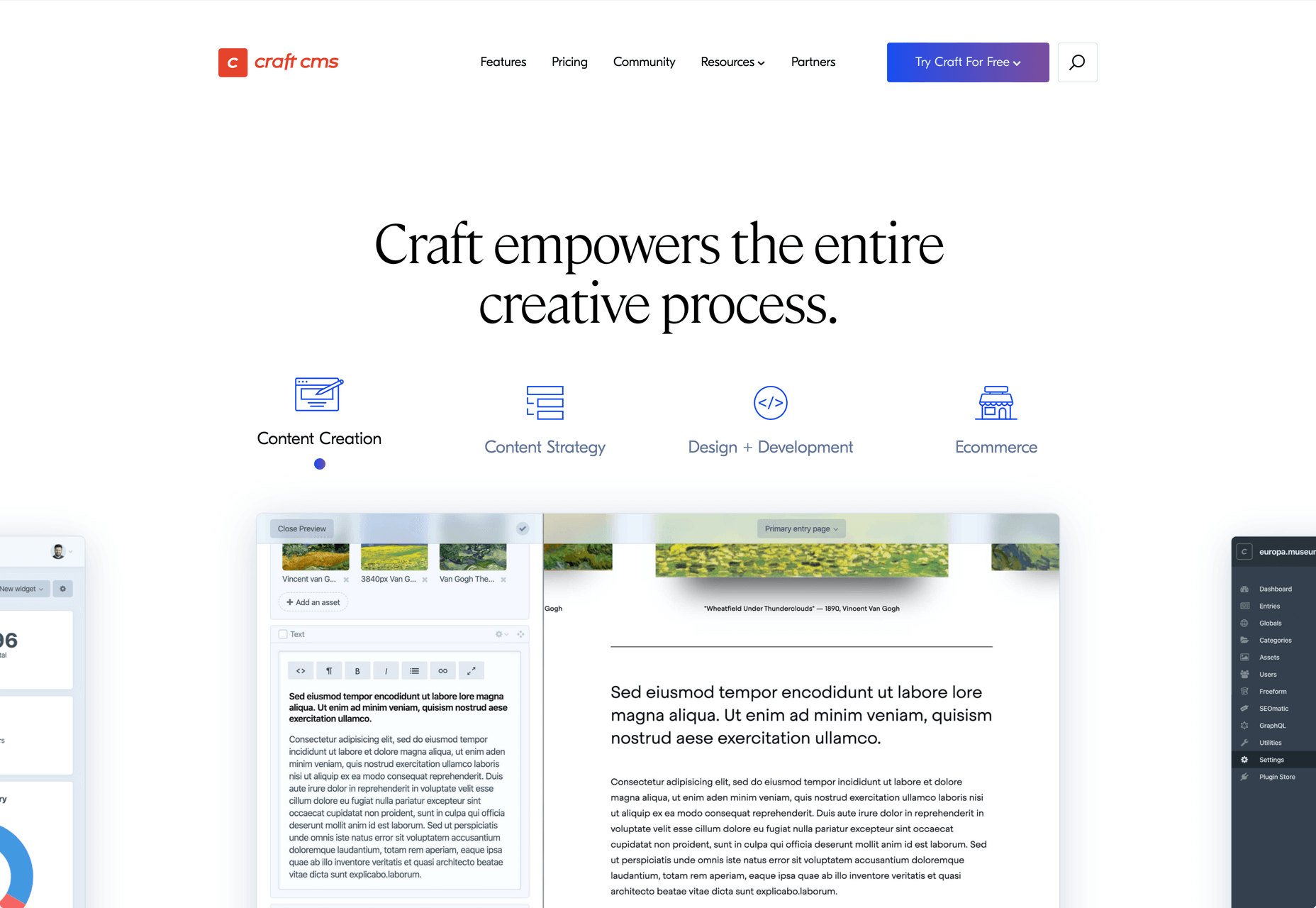
I think of a creative practice as a combination of an approach (a design philosophy) and a series of techniques (craft skills); a good tool facilitates a technique, which in turn supports an approach.
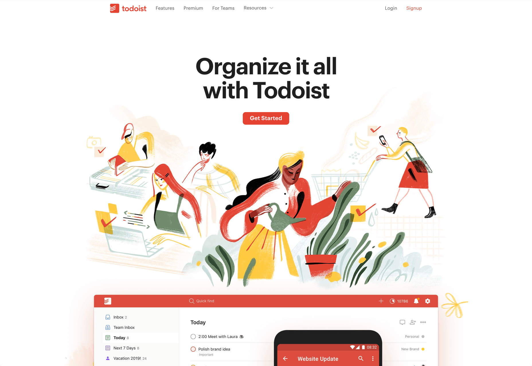
It wasn’t until I sat down to write a list of tools I can’t design without, that I realized just how many tools I rely on as an integral part of my creative process. The danger of tools is that they promote certain techniques, and that bias can alter your approach.

First and foremost a good tool does no harm, it does not dictate, or obstruct your approach. Secondly, a good tool offers flexibility in the techniques you choose. Thirdly a good tool is invisible, it leaves no marks on the end product.

If I’d written this post a year ago the list would have been different, and I hope that in a year it will be different again. These are the tools that I currently find enabling, that have contributed to my craft, and supported my approach.

Affinity Designer

I’ve always used Adobe products. Photoshop and Illustrator were the de facto graphic tools for half my life. I’ve never had an issue with the subscription licensing of Creative Cloud, which I think is proportionate for a professional set of tools. Then, around 18 months ago I got very frustrated with how sluggish Illustrator had become.

I’d written an early review of Affinity Designer, I’d been impressed at the time, so I decided to give it another try expecting the sojourn to last an hour or two before I gravitated back to Illustrator. Running the latest version of Affinity Designer was a revelation, I’ve simply never wanted to switch back.

Why not Sketch? Well, I do occasionally jump into Sketch, especially for pure vector wireframing. I was an early adopter of Sketch, but the reliability issues (long since resolved) poisoned my relationship with it. Why not Figma? Well, Figma’s real strength is in collaboration, something that I get with Sketch, and personally I find some of Figma’s features unintuitive.

Affinity Designer isn‘t perfect. I dislike the color tools, especially the gradient tool, which I find clunky. But it’s the first design app I’ve used in years that syncs closely with my creative process.

Affinity Photo

I don’t do a lot of photo manipulation, so when I switched away from Creative Cloud for design work, I was relaxed about switching from Photoshop to Affinity Photo.

In my experience, Affinity Photo is stronger than Photoshop in some areas, and weaker in others. Affinity Photo’s bitmap scaling is much better than Photoshop’s, largely due to Lanczos 3 sampling.

Affinity Photo also solves a lot of little irritations that Adobe has chosen not to address for legacy or philosophical reasons, such as the toggleable ratio setting when resizing the canvas — I’ve lost track of the hours I’ve spent in Photoshop manually calculating vertical whitespace so that it’s proportionate to the horizontal.

TinyPng

Both Affinity Photo and Photoshop are poor at web format optimizations. Photoshop perhaps has the edge, but its output certainly isn’t acceptable for production.

I run bitmaps through TinyPng, which on average halves the size of the file without any appreciable loss of quality. (It stripped 66% off the images for this post.)

Fontstand

When I started to drift away from Creative Cloud, the one service that delayed me was Adobe Fonts (née Typekit). Not so much for the webfonts — which are faster and more reliable self-hosted — but for the ability to sync desktop fonts into my design apps.

I tried Fontstand when it was first released, and I loved the concept, but was worried about the small library. When I took a second look and discovered the library is now substantial for both workhorses and experimental typefaces, it was an easy decision to switch.

Fontstand is a desktop font rental service. Once you’ve found a typeface you’re interested in, you can activate an hour-long trial, then choose to rent the font for a small fee. You can auto-renew the rental if you need to, and if you rent the font for 12 months it’s yours forever.

If there’s one tool on this list I genuinely could not design without it’s this one. Fontstand makes working with fonts from independent foundries affordable for freelancers, and it’s enriched the typographic palette available to me.

Khroma

Every designer has strengths and weaknesses. Since day one of art school, my weakness has been color. It just doesn’t come naturally to me, and I have to work quite hard at it.

An incredibly helpful tool that I’ve been using for a few months is Khroma. It helps my eyes warm up before approaching color, and helps me find a starting point that I can then refine. Comparing my design work before, and after Khroma, the latter color choices are cleaner, more vibrant, and more interesting.

Atom

A good code editor is essential, and I’ve never found one that I’m completely happy with. For years I’ve flitted back and forth between Brackets, Sublime Text, and BBEdit. I think that probably reflects the changes in the type of coding I’m doing.

For now, I’ve settled on Atom. It’s fast, reliable, and it’s not biased to front or back-end code.

CodeKit

I held out on compilers longer than I should have, using apps like Minify to minify CSS and JavaScript, and the command line to process Sass (see below). Then I found CodeKit and it’s been essential to my workflow ever since.

What I like best about CodeKit is that it’s a GUI. Which means I can change settings while coding, like toggling off the JavaScript linting, without switching mental gears into another language.

MAMP

MAMP is a tool that allows you to run a local server environment, meaning I can run PHP and MySQL without the tedious process of FTPing to a server to test a change. Mac comes with Apache, so this isn’t strictly necessary, but it’s simple to use and works well with both CodeKit and Craft (see below).

There’s a pro version of MAMP, which allows you to switch seamlessly between projects, but it’s heavily geared towards WordPress. I’m still trying to find the time to evaluate Laravel Valet.

Dash

When you first start coding you try and memorize the entire language. It’s very possible to become fluent in the core of a language, but there are always nuances, defaults, and gotchas that you miss. As you grow more experienced, you realize that all professional coders Google the answer at least once per day.

When I got tired of Googling I started using Dash which is a superb app that combines the docs of numerous different languages into a searchable window. I use it daily for everything from SVG to Twig.

LambdaTest

It doesn’t really matter what you’re building, even the indy-web needs to be tested. Ideally you’ll test on real devices, but if you can’t afford a device library — and who but the largest agencies can — you need a live testing solution.

There are a few upstarts, but your choice is basically between BrowserStack and LambdaTest. I went for LambdaTest because I prefer the style of the UI, but that’s entirely subjective. If you’re not sure, toss a coin, you’ll get the same results with both.

Sass

I can’t write CSS without Sass — and I mean that literally. If I try and write vanilla CSS I guarantee I’ll nest something with @at-root and it will throw an error.

Craft CMS

Stating any preference for a CMS online that is not WordPress inevitably invites impassioned protests from developers whose career is built on the WordPress platform. So let me say preface this by saying: if WordPress works for you, and more importantly for your clients, then more power to you; I think it’s a dog.

Shopping around for a CMS is challenging, and I’ve gone through the process several times. A good CMS needs to be in sync with your mindset, and it needs to be appropriate for your clients — all of them, because unless you’re in a large agency with multiple coders, you need to commit to a single solution in order to master it.

I have looked and looked, and finally settled on Craft CMS. Craft makes it easy to build and maintain complex, high-performance sites. It has a shallow learning curve that grows exponentially steeper, making it easy to get started with plenty of room to grow.

Vue.js

Way back when Flash went kaput I switched to jQuery, and that was a really easy route into JavaScript — ignore the people who tell you to master the core language first, do whatever it takes to start using a language, that’s how you learn. But jQuery is heavy, and I found I needed it less and less.

These days 90% of the JavaScript I write is progressive enhancements in vanilla JavaScript to keep the dependencies low. Occasionally I encounter a job that requires complex state management, and then I fall back on Vue.js. JavaScript developers are as partisan as CMS aficionados, so let’s just say I favor Vue.js because it’s not controlled by a mega-corp and leave it at that.

Ulysses

As editor at WDD, I cannot emphasize enough that the right way to write copy for the web is markdown.

Markdown is faster to write so you don’t lose the thread of your thought process, and it doesn’t impose formatting so you can easily migrate to a CMS. If you’ve ever spent 20 minutes stripping the class, id, and style tags out of a file created in Word, Pages, or (by far the worst offender) Google Docs, then you don’t need to be sold on this point.

There are a few markdown-based writing apps available, I tested half a dozen, and the one I settled on was Ulysses. I like its distraction-free mode, I love its clean exports. Everything I write, I write in Ulysses.

Screenshot Plus

Much like markdown editors, there’s no shortage of screenshot apps. My current favorite is Screenshot Plus.

Screenshot Plus has one feature that makes it standout for me, and that is its Workflows. It sounds like a small problem, but when you’re taking screenshots of a dozen sites, the extra clicks to save, switch to your editor, and open the file are laborious. I have several workflows setup in Screenshot Plus that allow me to take a screenshot, save it to a specified folder on my local machine, and then open it in Affinity Photo, all with a single click.

Spark

I get a lot of email, a lot. At one point the influx was so bad I was using multiple email apps to segment it. Yes, I use Slack daily, but it doesn’t eliminate the need for email.

I‘ve been using Spark for around six months and it’s radically sped up my workflow. I’m a big fan of the smart inbox that allows me to compartmentalize email like newsletters, and email that warrants a reply. I like that I can switch to a chronological list if I’m looking for something specific. I love the ability to pin, or snooze messages, which helps me triage my inbox.

Todoist

I’m one of those people who can’t make it through the day without being organized. I need lists and sublists, and I need something native that opens automatically when I boot my Mac, and something that sits on the home screen of my Android.

There are as many to-do apps as there are things to do. When I’m working in a team I’ll use whichever task-tracking system it prefers. But by choice I always use Todoist thanks to its balance of simplicity and power. At this point it’s something of a meta-tool, and the app I open first every morning.

Source


Source de l’article sur Webdesignerdepot

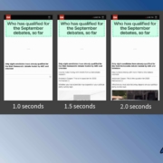
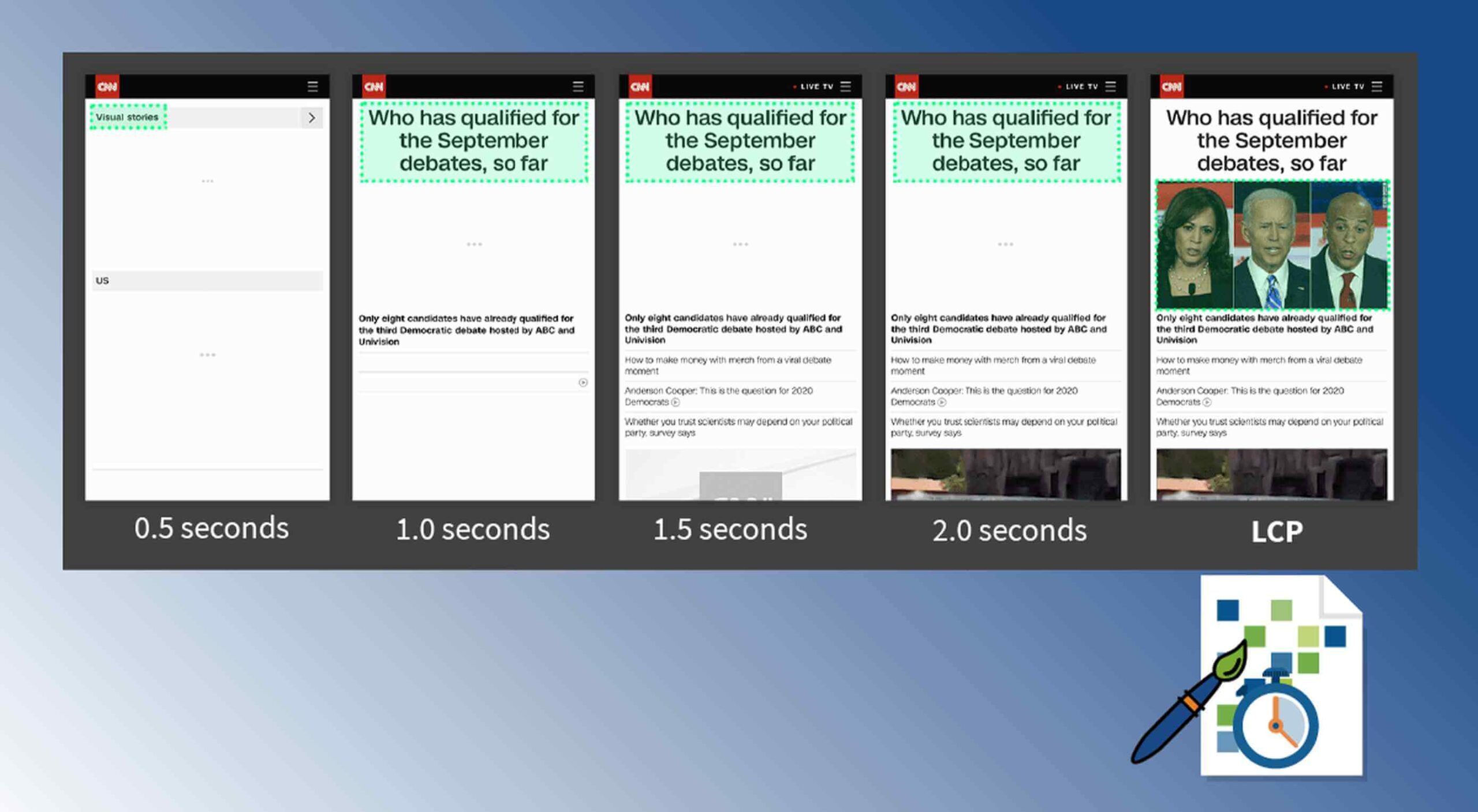
Contentful; Webster’s Dictionary defines “contentful” as… not found. Clearly someone made up this word, but that is not necessarily a bad thing.
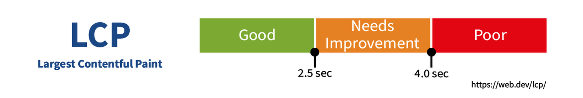
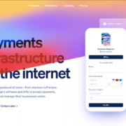
The world of user experience metrics is moving quickly, so new terminology is needed. Largest Contentful Paint (LCP) is one of a number of metrics measuring the render time of content on a web page.

What is Largest Contentful Paint?

Google defines LCP as “the render time of the largest content element visible within the viewport.” For what we are talking about in this blog, we will consider “content” to be an image, typically a JPEG or PNG file. In most cases, “largest” points to a hero image that is “above the fold” and is one of the first images people will notice when loading the page. Applying optimization to this largest content is critical to improving LCP.

It is probably more instructive to view LCP relative to other metrics. For example, First Contentful Paint (FCP) and Visually Complete book end LCP.

Each metric has its pros and cons, but LCP is a happy medium. LCP marks when web page loading starts to have a substantial impact on user experience.

In Google’s opinion, to provide a good user experience, LCP should occur within 2.5 seconds of when the page first starts loading. Poor values are anything greater than 4 seconds.

How Does Largest Contentful Paint Impact Lighthouse Scores and SEO?

LCP is now part of several “Core Web Vitals” scores that Google will measure in its ranking algorithm. Each of the Core Web Vitals represents a distinct facet of the user experience, is measurable in the field, and reflects the real-world experience of a critical user-centric outcome.

In the case of the overall Google Lighthouse score, LCP represents 25% weighting on the performance score of Lighthouse version 6.0. This makes LCP the most important Core Web Vitals metric in determining the performance score.

While Google has indicated that content is still the most important factor in SEO ranking, a better user experience (as measured by Core Web Vitals) will generate higher rankings in a crowded field. If there are many websites competing for the top search engine spots, then Largest Contentful Paint will play a critical factor in rankings.

How to Improve Largest Contentful Paint

Now that you know that LCP is important, what can you do to improve it by making content load faster? Google provides a number of suggestions, but the most effective technique is to optimize content for the device requesting it.

For example, a website includes an 800kb JPEG image that is intended for high resolution desktops. On a smartphone, that would be optimized down to less than 100kb, with no perceptible impact on quality. LCP can improve by more than 60% — or several seconds — through this single optimization.

Find Savings in Largest Contentful Paint by using Image Speed Test

Image Speed Test is a great tool offered by ImageEngine.io that provides an analysis of LCP improvement opportunities. Just paste in the URL of the web page you are interested in optimizing, and the test will show you:

  • Image Payload Reduction
  • Speed Index
  • Largest Contentful Paint
  • Page Load Time (Visually Complete)

It also provides a video of the web page loading with and without optimizations. Finally, it analyses each image to provide an estimate of payload savings. In this case, the “largest content” on the page is this image. With optimizations, the image payload is reduced by 94%. That delivers a huge improvement in LCP.

How Does ImageEngine Improve LCP

ImageEngine is an image content delivery network (CDN) service that makes image optimization simple. Basically, for each image on the page, the image CDN will:

  1. Detect the device model requesting the web page;
  2. Optimize the image in terms of size, compression, image format;
  3. Deliver via a CDN edge server that is geographically closest to the user.

ImageEngine improves web performance for every image on the page, including the largest. You can learn more about ImageEngine here, and also sign up for a free trial.

Best Practices: Preconnect

In addition to using an image CDN like ImageEngine, a few other best practices can improve LCP. Using the resource hints to provide a preconnect for your content can streamline the download process.

For example, putting the following link statement in the HTML will accelerate the download process. The link statement will make the browser connect to the third party as early as possible so that download can start sooner. ImageEngine’s optimizations make each image download smaller and faster, but preconnect save time in the connection phase.

Best Practices: Minimize Blocking JavaScript and CSS

When JavaScript or CSS is “blocking” it means that the browser needs to parse and execute CSS and JavaScript in order to paint the final state of the page in the viewport.

Any website today relies heavily on both JavaScript and CSS, which means that it is almost impossible to avoid some render blocking resources. On a general note: be careful with what kind of CSS and JavaScript is referenced inside the <head> element. Make sure that only the strictly necessary resources are loaded in <head>. The rest can be deferred or loaded asynchronously.

When looking to improve the LCP specifically, there are some practices worth looking into more deeply.

Inline Critical CSS

It is not an easy task, but if the browser can avoid making a request to get the CSS needed to render the critical part of the page – usually the “above the fold” part – the LCP is likely to occur earlier. Also you will avoid content shifting around and maybe even a Flash of Unstyled Content (FOUC).

The critical CSS — the CSS needed by the browser to set up the structure and important styles of the part of the page shown above the fold — should in-inlined. This inlined CSS may also refer to background images, which of course should also be served by an Image CDN.

Do Not Use JavaScript to (lazy) Load Images

Many modern browsers natively support lazy loading, without the use of JavaScript. Because images usually are heavily involved in the performance of LCP, it is best practice to leave image loading to the browser and avoid adding JavaScript in order to lazy load images.

Lazy loading driven by JavaScript will add additional latency if the browser first has to load and parse JavaScript, then wait for it to execute, and then render images. This practice will also break the pre-parser in the browser.

If an image CDN is used to optimize images, then the benefits of lazy loading become much smaller. Especially large hero images that are above the fold have a large impact on LCP and will not benefit from being lazy loaded with JavaScript. It is best not to make JavaScript a blocking issue for rendering images, but rather rely on the browser’s own ability to select which images should be lazy loaded.


[– This is a sponsored post on behalf of ImageEngine –]

Source


Source de l’article sur Webdesignerdepot

I must have seen dozens of implementations of this exact same web app during my 25 years as an Enterprise developer. And to be honest with you, I’m tired of implementing the exact same app, over and over again. "Don’t reinvent the wheel" comes to mind. Hence, I decided I wanted to create a "micro service web app", providing me with all translation features I could possibly need in the future. And more interestingly, I will create the entire app, in 1 second, by simply clicking a button. If you don’t believe me, feel free to watch the following YouTube video, where I demonstrate how I solve all my translations needs, for the rest of my life, in 1 second.

The SQL script I am starting out with can be found below.

Source de l’article sur DZONE

If a product has a web and a mobile version of an application, their functionality is almost identical. The app QA process, however, will flow differently for each platform due to their particularities.

A mobile application has become an umbrella term that covers three different types of apps – native, PWA, and hybrid. Each is coded in a specific way and has some distinctive features. 

Source de l’article sur DZONE

We are gathered here today….

Today I write in memory of Adobe Flash (née Macromedia), something that a bunch of people are actually too young to remember. I write this with love, longing, and a palpable sense of relief that it’s all over. I have come to praise Flash, to curse it, and finally to bury it.

We’ve been hearing about the death of Flash for a long time. We know it’s coming. December 2020 has been announced as the official timeframe for removal, but let’s be real about this: it’s dead. It’s super-dead. It’s people-are-selling-Flash-game-archives-on-Steam dead.

That last bit actually makes me happy, because Flash games were a huge part of my childhood, and the archives must be preserved. Before I’d ever heard of video cards, frames per second, and “git gud”, I was whiling away many an hour on disney.com, cartoonnetwork.com, MiniClip, Kongregate, and other sites, looking for games.

I think we’ve established in my previous work that even as a missionary kid, I did not have a social life.

The Internet itself gave me a way to reach out and see beyond my house, my city, and my world, and it was wonderful. Flash was a part of that era when the Internet felt new, fresh, and loaded with potential. Flash never sent anyone abuse, or death threats. Flash was for silly animations, and games that my parent’s computer could just barely handle, after half an hour of downloading.

I even built my first animated navigation menus in Flash, because I didn’t know any better. At all. But those menus looked exactly like the ones I’d designed in Photoshop, so that’s what mattered to me, young as I was.

That was a part of Flash’s charm, really.

What Flash Got Right

Flash Brought Online Multimedia into the Mainstream

Funny story, JavaScript was only about a year old when Flash was released. While HTML5 and JS are the de-facto technologies for getting things done now, Flash was, for many, the better option at launch. JS had inconsistent support across browsers, and didn’t come with a handy application that would let you draw and animate whatever you wanted.

It was (in part) Flash that opened up a world of online business possibilities, that made people realize the Internet had potential rivalling that of television. It brought a wave of financial and social investment that wouldn’t be seen again until the advent of mainstream social networks like MySpace.

The Internet was already big business, but Flash design became an industry unto itself.

Flash Was Responsive

Yeah, Flash websites could be reliably responsive (and still fancy!) before purely HTML-based sites pulled it off. Of course, it was called by other names back then, names like “Liquid Design”, or “Flex Design”. But you could reliably build a website in Flash, and you knew it would look good on everything from 800×600 monitors, to the devastatingly huge 1024×768 screens.

You know, before those darned kids with their “wide screens” took over. Even then, Flash still looked good, even if a bunch of people suddenly had to stop making their sites with a square-ish aspect ratio.

Flash Was Browser-Agnostic

On top of being pseudo-responsive, the plugin-based Flash player was almost guaranteed to work the same in every major browser. Back in a time when Netscape and Internet Explorer didn’t have anything that remotely resembled feature parity, the ability to guarantee a consistent website experience was to be treasured. When FireFox and Chrome came out, with IE lagging further behind, that didn’t change.

While the CSS Working Group and others fought long and hard for the web to become something usable, Flash skated by on its sheer convenience. If your site was built in Flash, you didn’t have to care which browsers supported the <marquee> tag, or whatever other ill-conceived gimmick was new and trendy.

Flash Popularized Streaming Video

Remember when YouTube had a Flash-based video player? Long before YouTube, pretty much every site with video was using Flash to play videos online. It started with some sites I probably shouldn’t mention around the kids, and then everyone was doing it.

Some of my fondest memories are of watching cartoon clips as a teenager. I’d never gotten to watch Gargoyles or Batman: The Animated Series as a young kid, those experience came via the Internet, and yes… Flash. Flash video players brought me Avatar: The Last Airbender, which never ever had a live action adaptation.

Anyway, my point: Flash made online video streaming happen. If you’ve ever loved a Netflix or Prime original show (bring back The Tick!), you can thank Macromedia.

What Flash Got Wrong

Obviously, not everything was rosy and golden. If it was, we’d have never moved on to bigger, better things. Flash had problems that ultimately killed it, giving me the chance, nay, the responsibility of eulogizing one of the Internet’s most important formative technologies.

Firstly, it was buggy and insecure: This is not necessarily a deal-breaker in the tech world, and Microsoft is doing just fine, thank you. Still, as Flash matured and the code-base expanded, the bugs became more pronounced. The fact that it was prone to myriad security issues made it a hard sell to any company that wanted to make money.

Which is, you know, all of them.

Secondly, it was SEO-unfriendly: Here was a more serious problem, sales-wise. While we’re mostly past the era when everyone and their dog was running a shady SEO company, search engines are still the lifeblood of most online businesses. Having a site that Google can’t index is just a no-go. By the time Google had managed to index SWF files, it was already too late.

Thirdly, its performance steadily got worse: With an expanding set of features and code, the Flash plugin just took more and more resources to run. Pair it with Chrome during that browser’s worst RAM-devouring days, and you have a problem.

Then, while desktops were getting more and more powerful just (I assume) to keep up with Flash, Apple went and introduced the iPhone. Flash. Sucked. On. Mobile. Even the vendors that went out of their way to include a Flash implementation on their smartphones almost never did it well.

It was so much of a hassle that when Apple officially dropped Flash support, the entire world said, “Okay, yeah, that’s fair.”

Side note: Flash always sucked on Linux. I’m just saying.

Ashes to Ashes…

Flash was, for its time, a good thing for the Internet as a whole. We’ve outgrown it now, but it would be reckless of us to ignore the good things it brought to the world. Like the creativity of a million amateur animators, and especially that one cartoon called “End of Ze World”.

Goodbye Flash, you sucked. And you were great. Rest in peace. Rest in pieces. Good riddance. I’ll miss you.


Featured image via Fabio Ballasina and Daniel Korpai.

Source


Source de l’article sur Webdesignerdepot

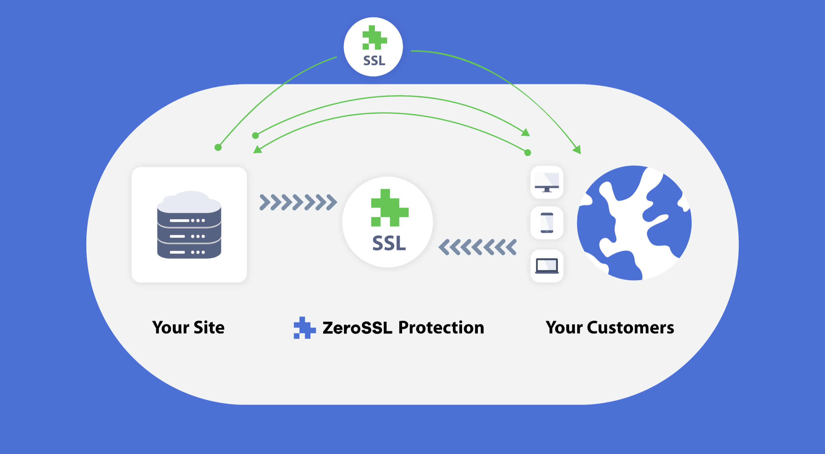
Like it or not, we’re slowly edging towards a two-tier web: those sites that are secure, and…everything else.

There was a time on the web, when we didn’t have SSL certificates, and lots of people’s data got stolen. To address the problem, and regain users’ trust SSL certificates were introduced to secure sites handling sensitive data. And because they were initially a niche technology, you paid through the nose for them.

(An SSL certificate, for those that don’t know, is the difference between http:// and https://)

Then, thanks in part to privacy initiatives, and in part to high-profile data breaches, a few big players decided that all data should be protected. And the next thing you know, Google’s using SSL certificates as a ranking factor. And then suddenly browsers are warning people that non-SSL certified sites are insecure and they should “Get Out of Here!” And before long your hobby blog about cat-friendly board games is being billed hundreds of dollars a year just to be seen on the web.

Choosing whether to jump on the SSL bandwagon is simple: you have to have one. Finding an affordable SSL certificate, now that’s a challenge.

Most hosting companies will provide you with an SSL certificate as an add-on, and they’ll charge you anything up to $200 per year for it.

That’s why we’re blown away by ZeroSSL, because ZeroSSL is the first practical opportunity to grab an SSL certificate for your site, for free!

Get an SSL Certificate for Free

Now, it must be said that ZeroSSL isn’t the first place to offer a free SSL certificate. Plenty of hosts offer a “free” SSL certificate for the first year, when you pay for premium hosting. And there’s Let’s Encrypt which offers free certificates if you can work out how to access them.

ZeroSSL is just the first place to offer a genuinely free SSL certificate that you don’t need a post-grad degree in server engineering in order to use.

Get a Free SSL Certificate from ZeroSSL

Using ZeroSSL’s free-forever plan you can register three 90-day certificates entirely free. You’ll never need to pay for them, just renew every few months.

ZeroSSL also offers a variety of packages for simplifying your SSL management. The Basic package for example starts at $8/month and offers unlimited 90-day certificates, and even three 1-year certificates so you can renew annually and forget about them the rest of the time.

ZeroSSL also scales; if you need unlimited 1-year certificates — because you have, erm, unlimited websites? — that’s possible too.

Where ZeroSSL Excels

ZeroSSL offers a number of benefits over its competitors.

Firstly there’s the full-featured management console, that makes SSL management transparent. It sounds like a little thing, but with many other suppliers the first thing you know about your SSL certificate expiring is your site breaking.

ZeroSSL…makes managing your certificates…insanely easy.

ZeroSSL has an easy-to-use REST API, which can be used with the language of choice: PHP, Ruby, ASP, anything. It makes managing your certificates for multiple sites insanely easy.

Verifying SSL certificates can be confusing, and technically difficult. But ZeroSSL streamlines the process with automatic CSRs and one-step email validation (even for multiple domains) — considerably faster and easier than industry standard DNS validation. There’s even a one-click check to make sure your certificate is installed correctly.

Most importantly, ZeroSSL offers superb technical support on all of its paid plans. So if you’re one of the many people who started reading this post without fully understanding what an SSL certificate is, you can be confident that if you run into difficulties getting set up, there’s someone available 24/7 to dig you out of the hole.

Getting Started with ZeroSSL

If by now you’re planning to try ZeroSSL, the best place to start is the free-forever plan. ZeroSSL allows you to upgrade, downgrade, or cancel at any time, so it makes sense to start with the no-credit-card option and upscale if you need it.

Using ZeroSSL’s dashboard you can create a free 90-day SSL certificate in minutes, and the step-by-step installation instructions will guide you all the way through.

ZeroSSL’s 1-year certificates are the gold-standard of SSL protection

ZeroSSL auto-generates certificates in different formats depending on your choice of platform, to speed up installation.

You can register certificates for multiple domains — you will have to verify each domain individually, but it’s simple to setup. Premium plan users can even use wildcards, allowing you to secure a site with multiple sub-domains, from a single certificate.

ZeroSSL’s 1-year certificates are the gold-standard of SSL protection and are the option that most site owners will come to rely on.

If you’re running an agency and you’re responsible for maintaining multiple client sites, ZeroSSL is made for you. ZeroSSL’s dashboard gives you one central location to monitor the status of all of your SSL certificates, and you can set expiry reminders to notify you by email when a certificate is about to expire.

Automated SSL Renewal with ZeroSSL

If that sounds too much work, and you’d like to automate your SSL certificates, ZeroSSL has you covered.

ZeroSSL works with both its own dedicated ACME Certbot, and more than ten other third-party ACME clients to fully automate your SSL certificates absolutely free, on a rolling 90-day schedule.

If you really know what you’re doing, you might even consider the ZeroSSL’s REST API. It enables certificate creation, validation, renewal, and management using HTTPS Get calls and JSON responses. The API handles millions of requests per month using 256-bit bank-level HTTPS encryption. You can access the API for free, and the Pro plan offers unlimited access.

Go Get Certified

There are millions of sites that drop traffic every month because they lack an SSL certificate.

Whatever your site, it’s not a question of whether you need an SSL certificate, it’s how you can affordably manage to create, install, and monitor a certificate.

ZeroSSL solves all of the problems of SSL certificate management, and for the majority of users, its free-forever plan is all you’ll ever need.

Head over to zerossl.com today to boost your traffic with a free SSL certificate.


[– This is a sponsored post on behalf of ZeroSSL –]

Source


Source de l’article sur Webdesignerdepot