Articles

Experienced web designers are always on the lookout for tools or resources that will (1) introduce them to the latest design trends, (2) enable them to incorporate features and functionalities that will make their products more competitive, (3) allow them to improve their workflows or all the above.

Apply one or more of these new design tools and resources. Then you could realize anything from incremental to game-changing improvements. The better the tool or resource, the more you are apt to realize your investment.

The 15 tools and website design resources selected for this article are the best in their respective categories. The degree of improvement you can realize when using one or more of them may depend on your own business needs. Or on the actual needs and wants of your clients as opposed to what you are currently able to deliver.

Browse the list, and you should be able to put your finger on one or more of these products or services. They could lead to improvement in one or more areas of your work. Look closer, and you might come across a genuine game-changer.

Happy shopping!

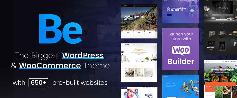
1. Be – The Biggest WordPress and Portfolio WordPress Theme

If your website design activities are proving to be exercises in tediousness, or you’re tired of working around a design tool’s limitations, you need BeTheme.

BeTheme can be a game-changer in that it gives you the flexibility to design what you want. Be makes building a complex high-performance website quick, smooth, and easy.

  • BeTheme’s 650+ customizable pre-built websites are designed to get your website-building project off to a rapid start. They are responsive, UX-ready, importable with a single click, and incorporate the latest design trends.
  • You’ll love working with the recently launched BeBuilder, the fastest and most flexible page builder for WordPress with which you can import from Be’s pre-built website’s 1000+ pages.
  • There’s an absolute gem of a BeBuilder Woo you can work with to create your shop or single product layouts.
  • BeTheme features a wealth of design aids, options, and settings to work with.

BeTheme is Elementor ready and is regularly updated. Click on the banner to find out more about Be’s 40+ powerful core features.

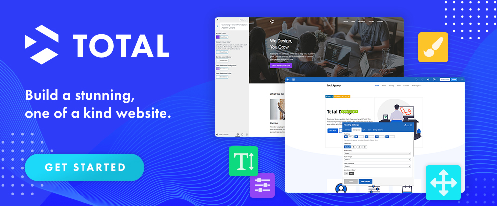
2. Total WordPress Theme

Put Total to work, and 2022 could be a very good year for your website design undertakings.

Total has it all insofar as design aids and options, website-building tools, and design flexibility are concerned regardless of the type or style of website you plan to build:

  • Pick any of Total’s 45+ customizable quick import theme demos, and you are off to a quick start.
  • 90+ section templates, 75+ pre-styled post entry cards, and more than 500 live customer settings give you more design flexibility than you are ever likely to need. 
  • The page builder of choice is an extended version of WPBakery. With it at your fingertips, you can easily drag and drop your way to building precisely the website you have in mind.

Click on the banner to discover everything Total can do for you.
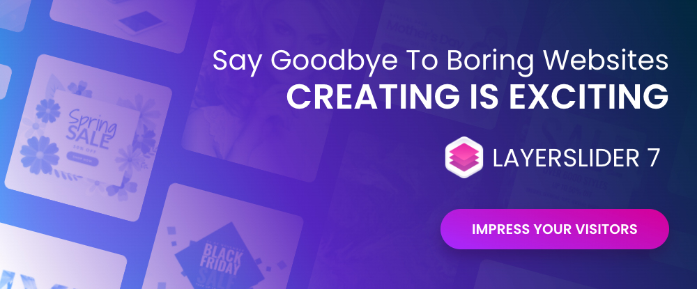
3. LayerSlider

What could LayerSlider do for you to help make 2022 a banner year? Look over any of your past website designs to see if any of them could profit from adding a little spice or pizzazz because that’s what LayerSlider does best. 

LayerSlider is an animation and website-building tool that can be used on any website to transform its look & feel with modern graphics, eye-catching animations, and interactive features. LayerSlider is one of the most established and popular products with millions of active monthly users.

  • LayerSlider has 150+ website, slider, and popup templates. Templates are a great way to learn as well as an ideal starting point for new projects.
  • LayerSlider comes with a very easy-to-use and modern editor interface similar to professional desktop applications. Anyone can use it without prior experience.
  • LayerSlider is not just for sliders. It can also create image galleries, popups, landing pages, animated page blocks, or even full websites.

Click on the banner to see what LayerSlider could do for you.
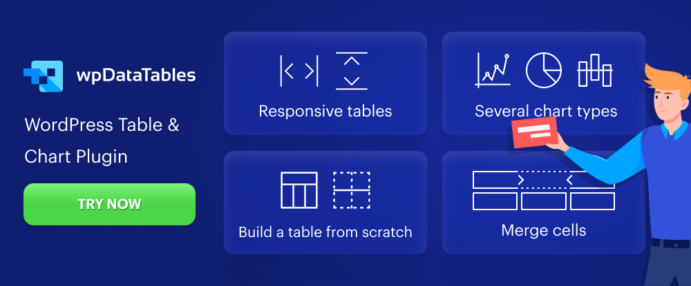
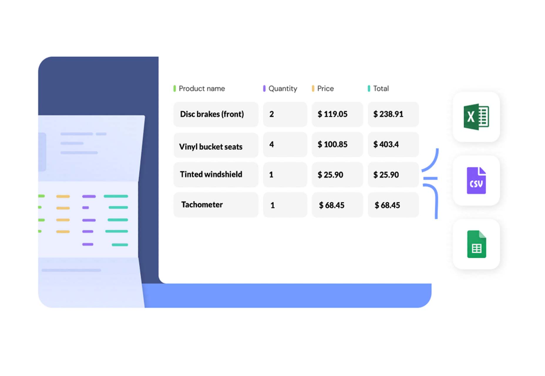
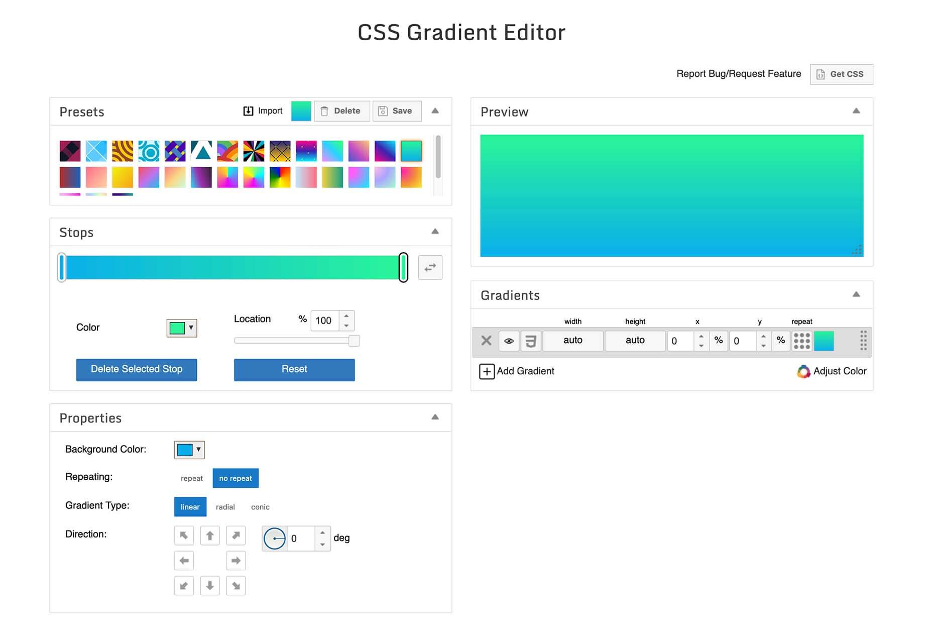
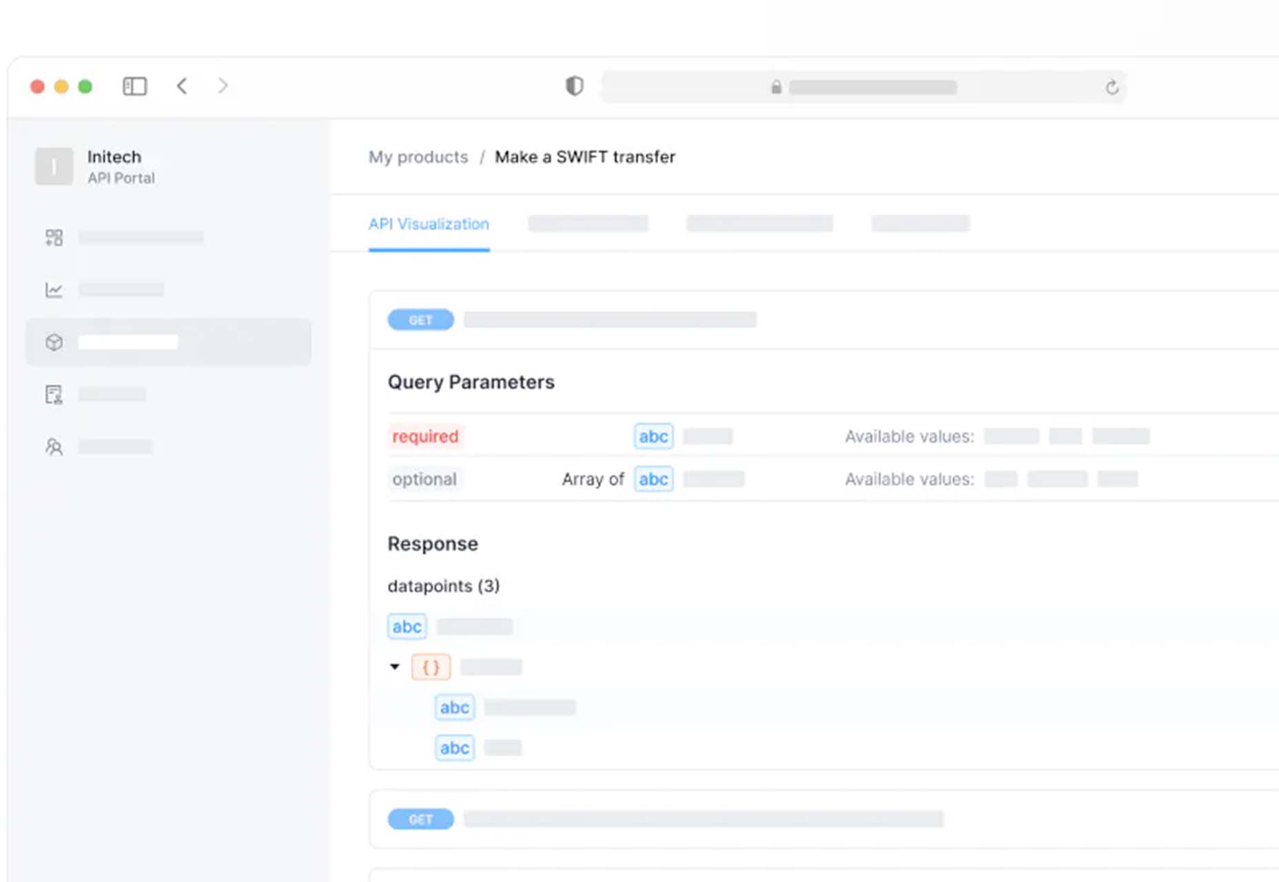
4. wpDataTables

Most table or chart building table plugins on the market either limit the amount of data that can easily be processed or the types of tables or charts that can be produced. wpDataTables has neither of these limitations.

With the wpDataTables premium WordPress plugin, you can –

  • create responsive, interactive, and frontend editable tables and charts
  • process huge amounts of data from various sources and in various formats
  • highlight or color code key data.

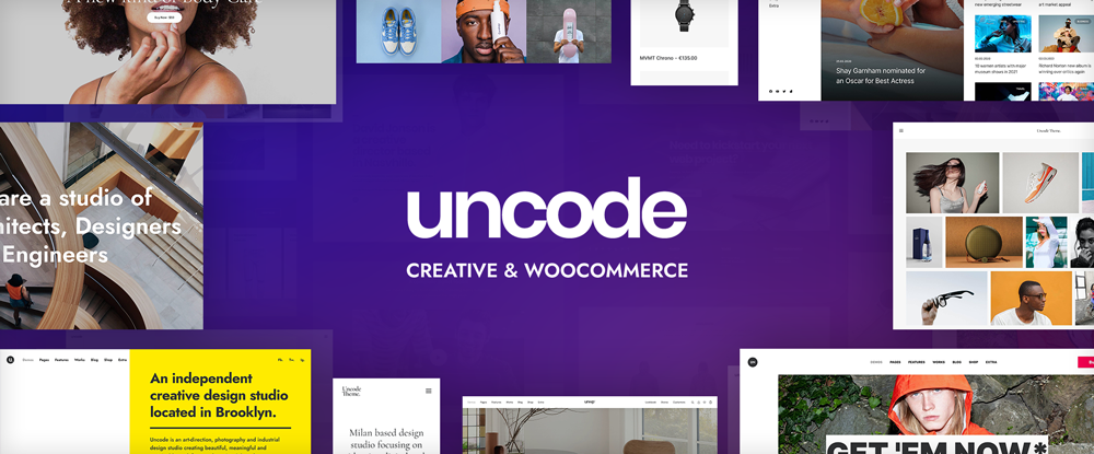
5. Uncode – Creative & WooCommerce WordPress Theme

Uncode is a top-selling pixel-perfect creative and WooCommerce theme. More than 80,000 sales have been made to date to freelancers, bloggers, agencies, and small businesses.

Uncode’s key features include –

  • a suped-up Frontend Page Builder.
  • an advanced WooCommerce builder with supporting capabilities that include a Single Product builder and a host of customer-centric design elements and options.
  • a Wireframes Plugin and 550+ section templates.
  • a gallery of inspirational user-created websites.

6. Trafft

With Trafft, you can schedule meetings, events, on-site and virtual appointments, manage staff schedules, send reminders, and accept payments — all from a single platform.

  • Special features include custom domains, coupons, and custom fields.
  • Trafft also manages group bookings and can serve multiple locations.

This game-changer integrates seamlessly with Google Calendar, Google Meet, Outlook Calendar, Apple Calendar, Zoom, and Mailchimp.
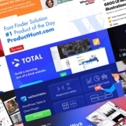
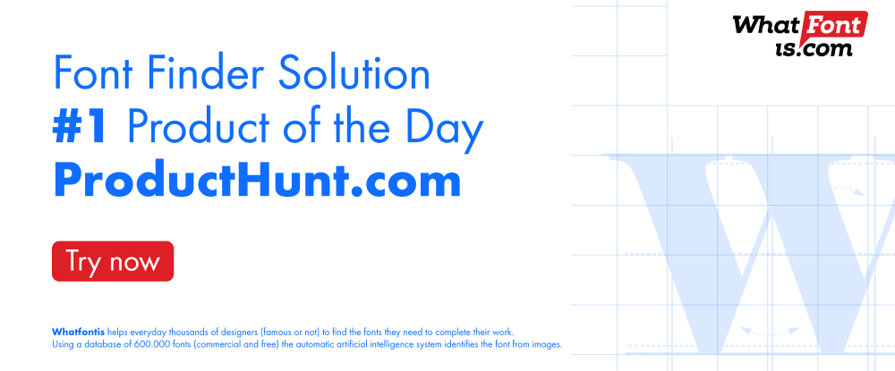
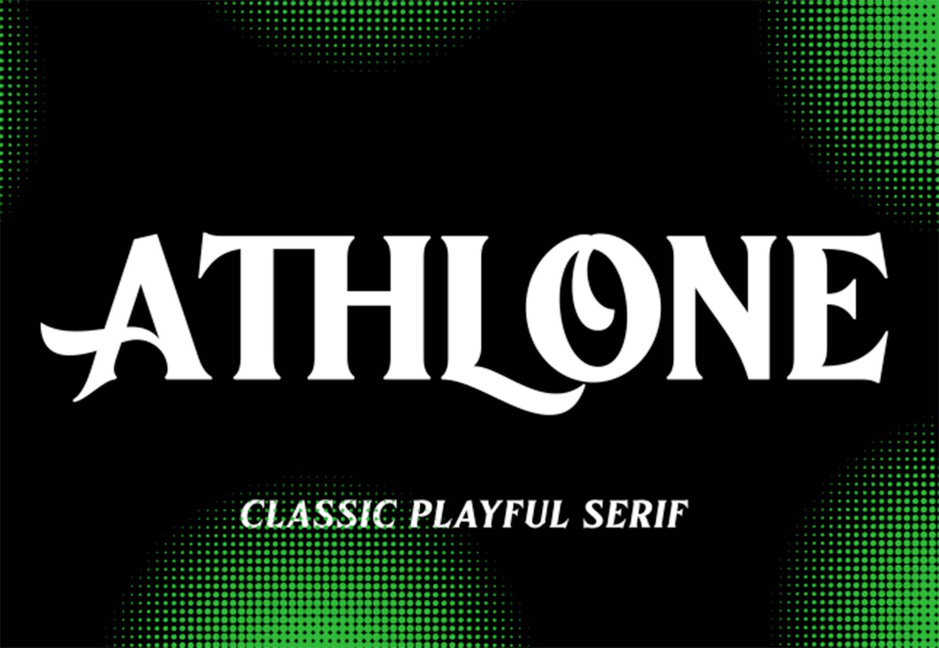
7. WHATFONTIS 

WHATFONTIS is a hidden gem in the world of font identifiers that allows you to find a font from your uploaded image in a matter of seconds.

  • Powerful AI algorithms and a database of 850K+ fonts provide the basis for this app’s impressive search capabilities.
  • Positive identification is achieved 90% of the time. Premium support is on hand should AI yield an awkward result.
  • Cursive fonts can be identified once the letters are separated.

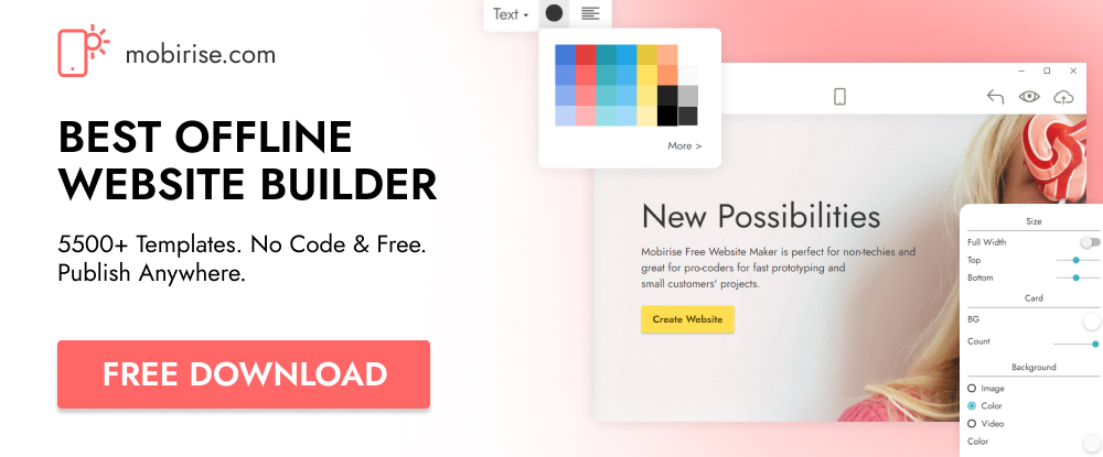
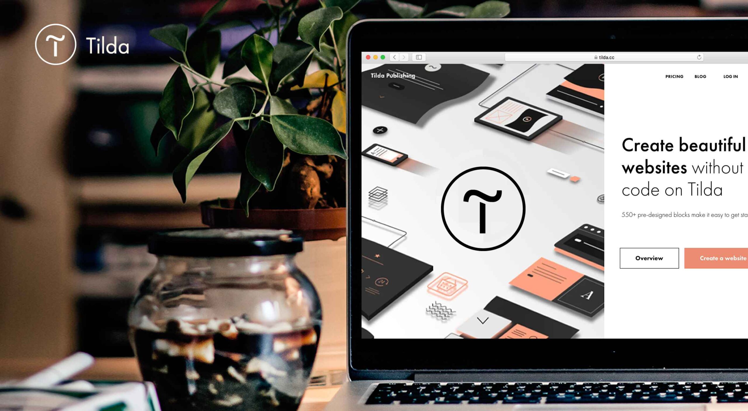
8. Mobirise Website Builder Software

Mobirise is fast, easy to use, and the best offline website builder on the market.

  • Mobirise does not tie you to a specific platform; you can edit your site locally and host it wherever you want.
  • Full access to HTML allows you to code.
  • 4,000+ website blocks and 300+ elegant home page templates are guaranteed to make your website-building adventures short and sweet.

The Mobirise website builder is free for both personal and commercial use.

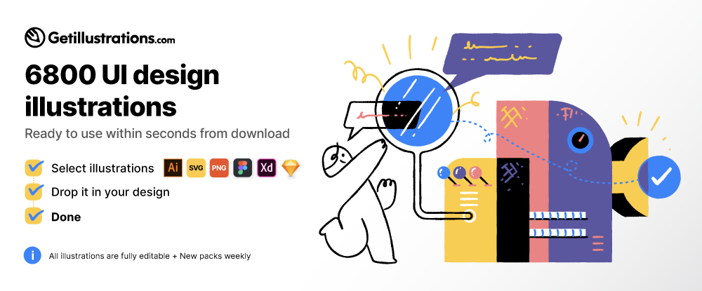
9. GetIllustrations’ Stock Illustrations Bundle

Downloads from this library of premium illustrations can change the way you go about designing your websites, apps, and presentations.

  • GetIllustrations, with its 10,000+ illustrations library, is the biggest of its kind.
  • Featured formats include Vector AI, PNG, Sketch, SVG, Figma, and Adobe XD.

Illustrations you download come with a commercial license and are yours to keep without limitations.

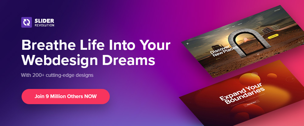
10. Slider Revolution

If you have trouble bridging the gap between what your clients want and what you can provide, Slider Revolution could be exactly what you need to fix the problem.

Slider Revolution is THE cutting-edge WordPress plugin for addressing today’s over-the-top web designs. It features –

  • 200+ awesome website and slider templates.
  • eye-catching WebGL slide animations.
  • 25+ powerful addons.
  • the ability to import dynamic content from social media outlets.
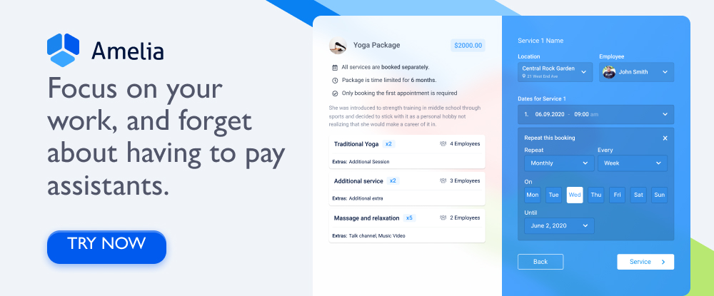
11. Amelia

Amelia offers an automated, highly customizable solution to any business that relies on a manual or semi-automated operation for booking client appointments.

  • Amelia is an excellent choice for beauty, healthcare and fitness, and educational and training enterprises.
  • Clients can make or change appointments online 24/7.
  • Amelia can manage individual and group bookings, events, and employee schedules at multiple locations.
  • Amelia integrates seamlessly with Google Calendar, WooCommerce, and Zoom.

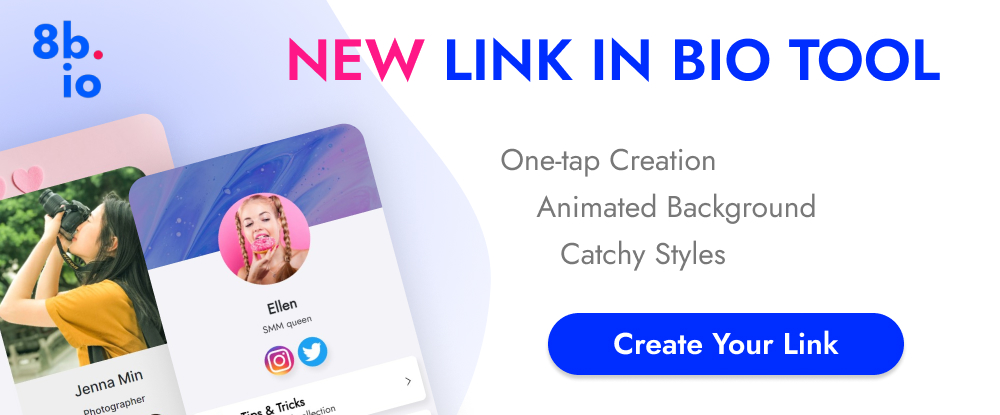
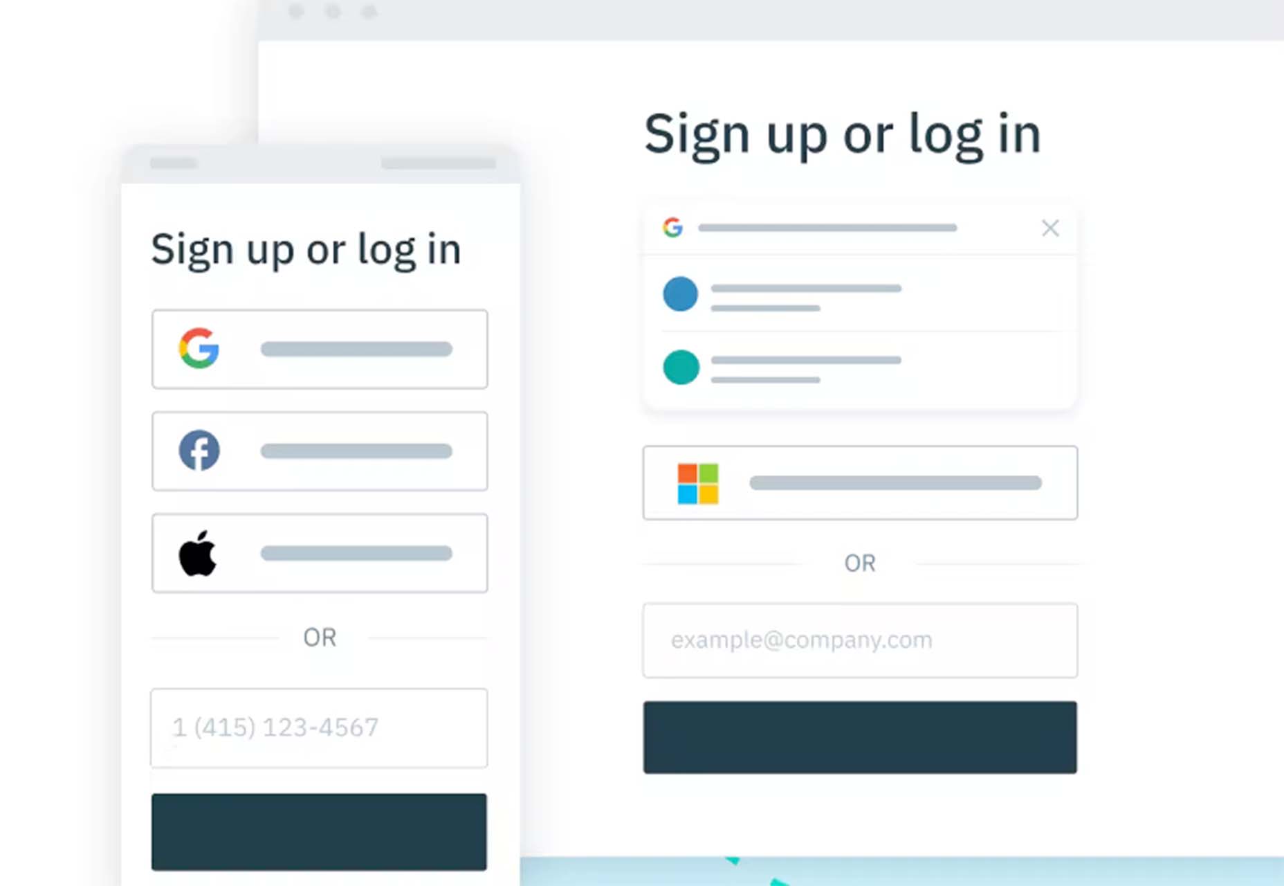
12. 8bio – Link in Bio Tool 

Many social media platforms allow you to include a link that allows followers to visit your website or an important landing page. With 8bio, you can create a link that a visitor can’t resist clicking on.

Your link can – 

  • Present a brief biographical profile of your business or yourself.
  • Feature an image or catchy animated background.
  • Showcase your product or service at no cost.
  • Use your existing domain or a “yourname” .8b.io domain.
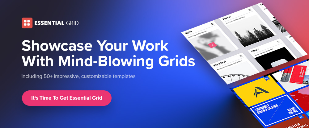
13. Essential Grid

The premium Essential Grid WordPress gallery plugin developers assembled a collection of aesthetic, easy-to-customize plug-and-play templates that make creating a breathtaking portfolio gallery a fun and easy task.

  • Your galleries will load lightning fast.
  • They will display perfectly on all devices.
  • You can choose from a variety of layouts and mix and match adjustable grids to get precisely what you want.

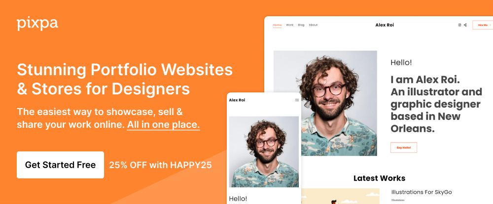
14. Pixpa – Portfolio Websites for Designers

Pixpa provides an all-in-one platform from which creatives can manage their online portfolios, blogs, galleries, and eCommerce sites.

  • Choose among Pixpa’s beautiful and mobile-friendly customizable templates and customize them to achieve exactly what you want. 
  • Put Pixpa’s drag and drop website builder into play to tie everything together, exactly as you want.
  • Add content, connect with your custom domain, and into your social profiles, and you are good to go.

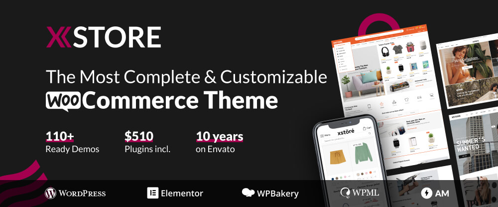
15. XStore – Best WordPress WooCommerce Theme for eCommerce

XStore is a feature-packed Envato WooCommerce theme that is incredibly simple to work with has acquired more than 30,000 enthusiastic customers.

  • XStore’s 110+ customizable shops make creating your own shop as easy as can be.
  • XStore integrates seamlessly with the premium Elementor and WPBakery page builders.
  • $510 worth of carefully handpicked “must-have” premium plugins are included.

There are plenty of tools and resources for designers on the market. You could use them to create websites that are a little better than the ones you have already built or are using.

What you should really be looking for is a special design tool or resource. When using it for a small investment could markedly improve both your productivity and your design efforts to make 2022 by far your best year ever.

That’s the reasoning for publishing this selection of top 15 design tools and resources. Selecting one or more could make your day.


[- This is a sponsored post on behalf of Be -]

Source

The post 15 Instantly Helpful Tools and Resources for Designers and Agencies (Updated for 2022 ) first appeared on Webdesigner Depot.

Source de l’article sur Webdesignerdepot

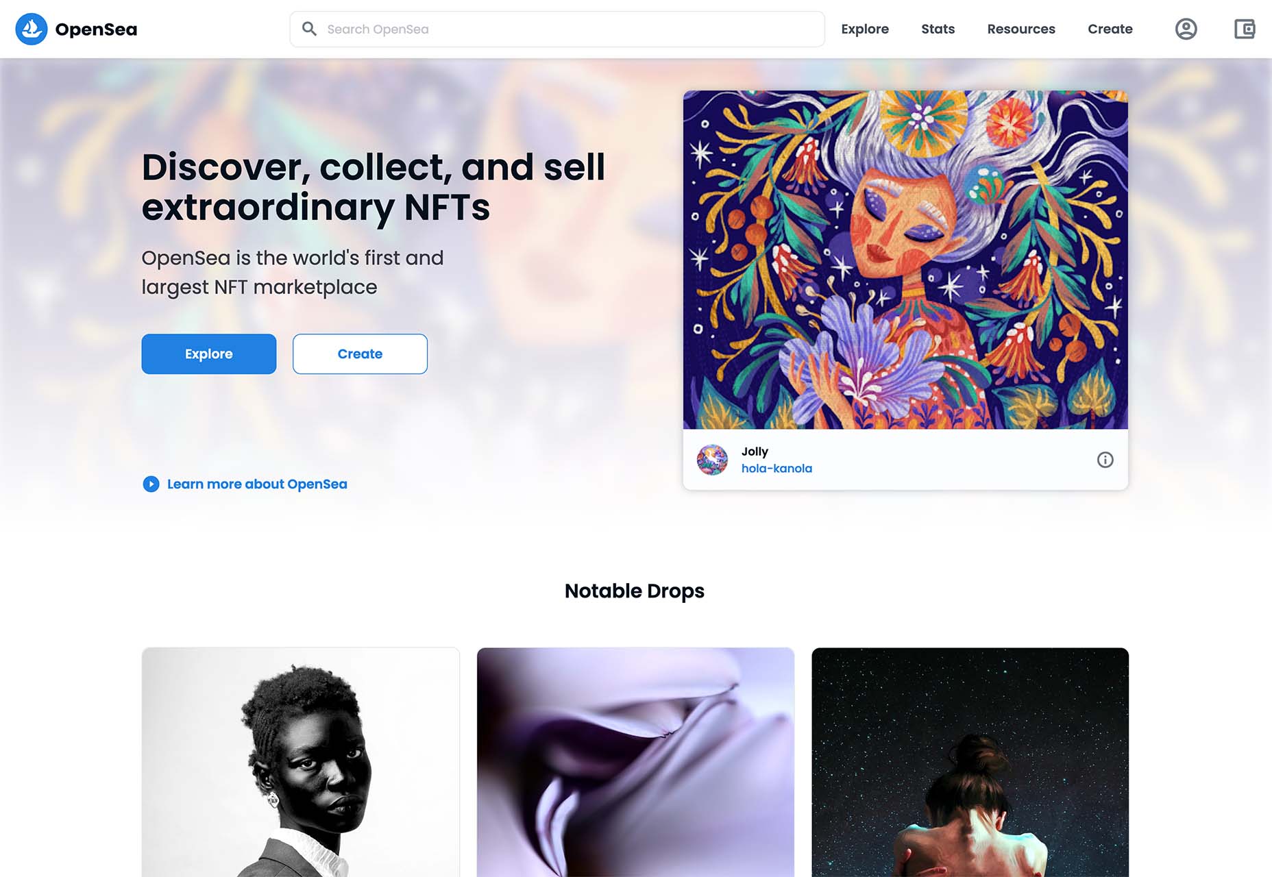
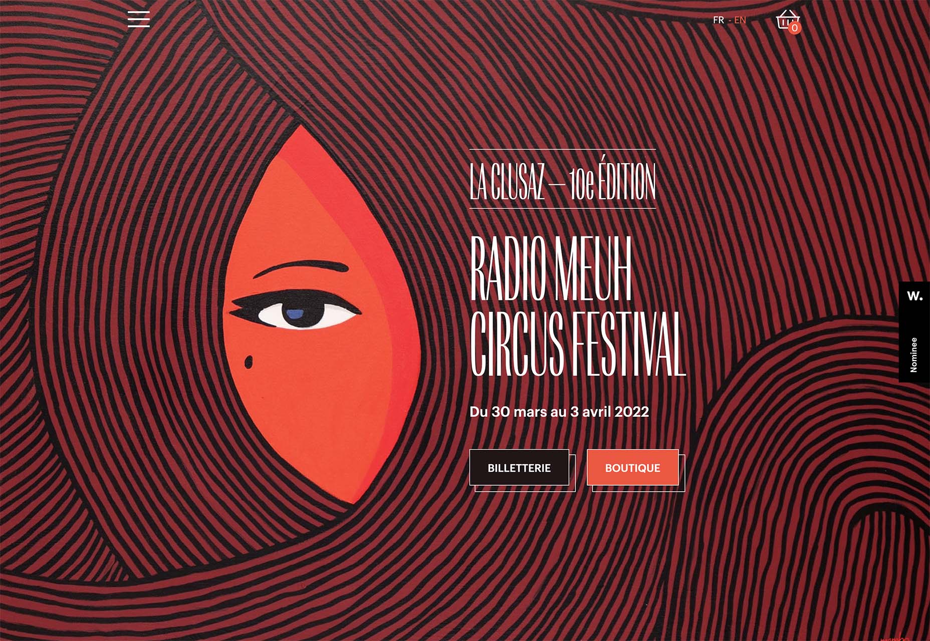
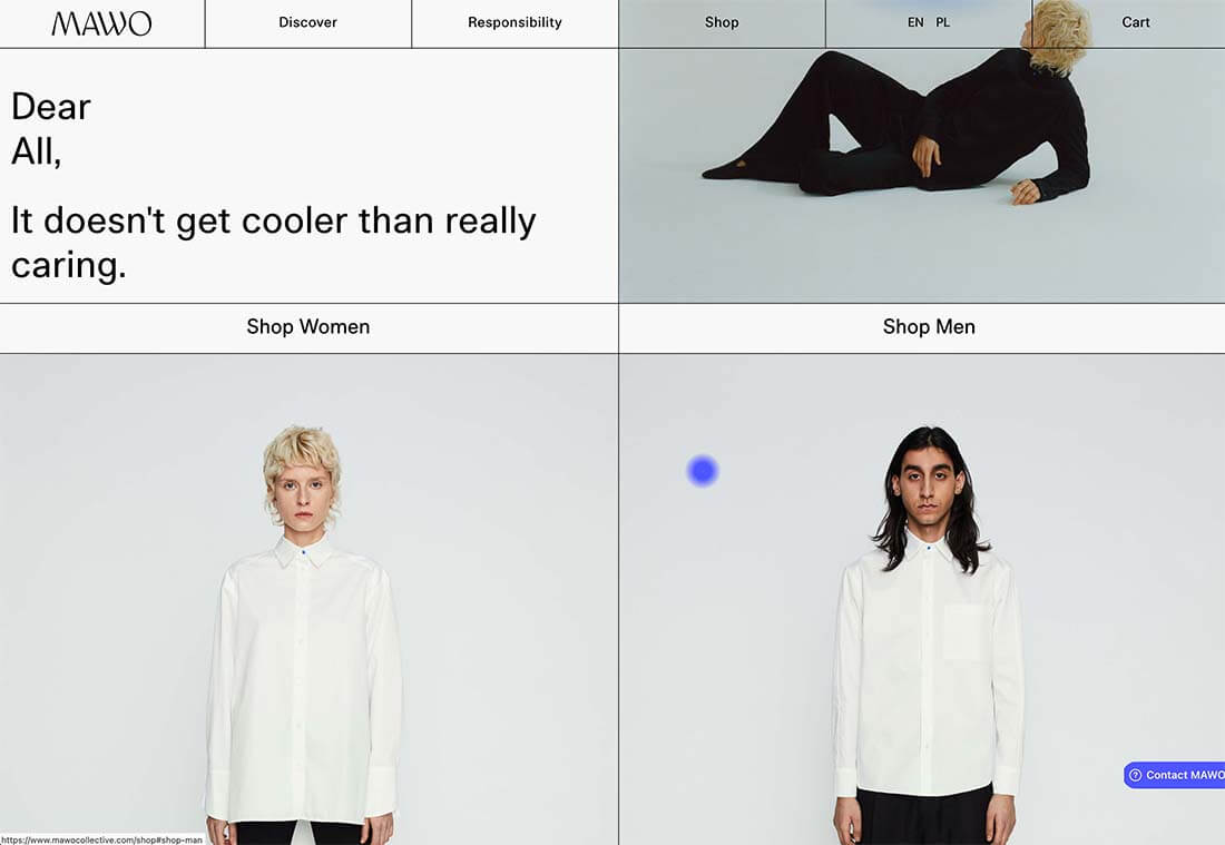
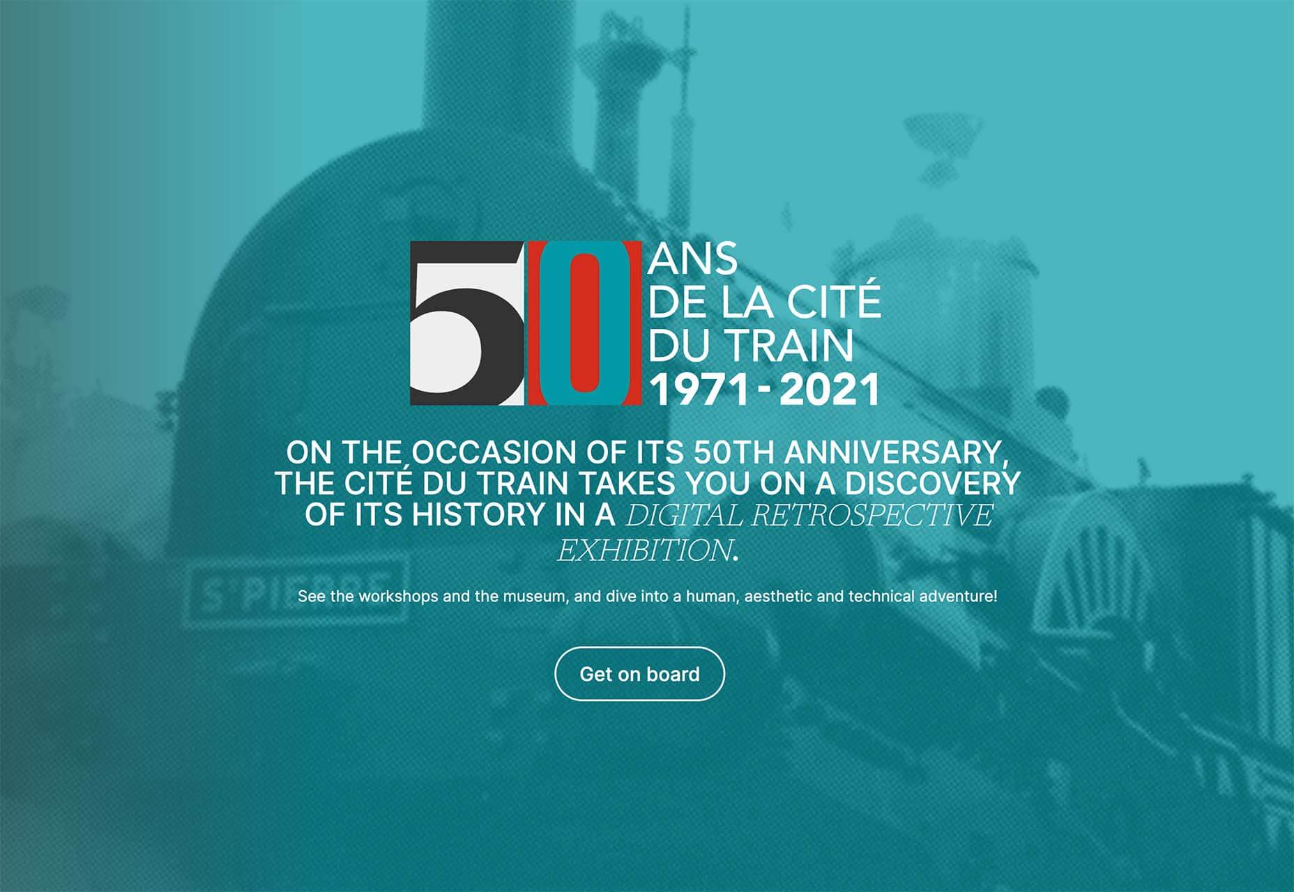
What stands out as an incredible web design project for you? Do you count your creation as a success if it’s modern, minimal, and accessible? Maybe you’re the kind of designer that’s constantly experimenting with the latest dynamic design tools or state-of-the-art technology. Perhaps your websites are vivid, animated, and brimming with unique components?

Sometimes, creating the ideal design means thinking carefully about what you want to accomplish for your client. The purpose of your web creation has a significant impact on the components that you need to consider. For instance, if you’re hoping for a highly emotive and human design, it may be worth combining some of your sleek lines and graphics with hand-drawn elements. 

The Value of Hand-Drawn Graphics in Web Design

Hand-drawn elements are just like the other components of web design; that way may use to express individuality in a cluttered digital environment. In a world where everyone focuses on futuristic and virtual creations, hand-drawn elements can pull attention back to the importance of humanity in your content. 

As web designers, we know that visual components often impact people more than text-based content. Illustrations are highly engaging functional elements that capture audience attention and convey relevant information. 

The main difference between hand-drawn elements and graphics built with vectors and other digital components is that one appears to be more influenced by the human hand than the other. Even if your illustrations are created on a screen, just like any other web design component, it pushes an audience to see something more straightforward, more natural, and authentic. 

For a brand trying to convey innocence and humanity in its personality, hand-drawn design can speak to the part of the human psyche that’s often unappreciated by web design. Perhaps more than any other visual, the content reminds your audience that there’s a human behind the web page

The Value of Hand-Drawn Features in Web Design

Any image can have a massive impact on the quality of your web design. Visuals deliver complex information in an easy-to-absorb format. In today’s world of fast-paced browsing, where distractions are everywhere, visuals are a method of capturing attention and delivering value fast. 

However, with hand-drawn elements, you go beyond the basic functionality of images to embrace the emotional side of the content. Benefits include:

  • A memorable experience: Web illustrations are becoming more popular among leading brands like Innocent Smoothies and Dropbox. However, the time that goes into these components means that they’re still scarce. If you want to stand out online, illustrations can help you do that. 
  • Brand personality: One of the most significant benefits of hand-drawn web design is showcasing your brand personality. The blocky lines of imperfect content that go into illustrated images highlight the human nature of your company. So many businesses are keen to look “perfect” today to make the human touch much more inviting. 
  • Differentiation: As mentioned above, hand illustrations are still rare in the digital design landscape. If you’re struggling to find a way to make your brand stand out, this could be it. Although there needs to be meaning behind your design, the result could be a more unique brand if you can convey that meaning properly. 

Tips for Using Hand Drawn Elements in Web Design 

Hand-drawn components, just like any other element of visual web design, demand careful strategy. You don’t want to overwhelm your websites with these sketches, or you could end up damaging the user experience in the process. 

As you work on your web designs, pulling hand-drawn elements into the mix, think about how you can use every illustration to accomplish a crucial goal. For instance:

Create Separation

Hand-drawn design components can mix and match with other visual elements on your website. They work perfectly alongside videos and photos and help to highlight critical points. 

On the Lunchbox website, the company uses hand-drawn elements. This helps make the site stand out, and it provides additional context for customers scanning the website for crucial details.

Engage Your Audience

Sometimes, hand-drawn elements are all about connecting with end-users on a deeper, more emotional level. One of the best ways to do this is to make your hand-drawn elements fun and interactive pieces in the design landscape. 

One excellent example of this is in the Stained Glass music video here. This interactive game combines an exciting web design trend with creative interactive components so that users can transform the web experience into something unique to them.

Highlight Headers with Typography

Sometimes, the best hand-drawn elements aren’t full illustrations or images. Hand-drawn or doodle-like typography can also give depth to a brand image and website design. 

Typography styles that mimic natural, genuine handwriting are excellent for capturing the audience’s attention. These captivating components remind the customer of the human being behind the brand while not detracting from the elegance of the website. 

This example of hand-drawn typography from the Tradewinds hotel shows how designers can use script fonts to immediately capture customer attention. Notice that the font is still easy to read from a distance, so it’s not reducing clarity. 

Set the Mood

Depending on the company that you’re designing for, your website creation choices can have a massive impact on the emotional resonance that the brand has with its audience. Hand-drawn elements allow websites to often take on a more playful tone. They can give any project a touch of innocence and friendliness that’s hard to accomplish elsewhere. 

A child-like aesthetic with bright colors and bulky fonts combines with hand-drawn elements on the Le Puzz website. This is an excellent example of how web designers can use hand-drawn elements to convey a mood of creativity and fun.

Animated Elements

Finally, if you want to combine the unique nuances of hand-drawn design with the modern components of what’s possible in the digital world today, why not add some animation. Animated elements combined with illustrations can help to bring a website to life. 

In the Kinetic.com website, the animated illustrated components help to highlight the punk-rock nature of the fanzine. It’s essential to ensure that you don’t go too over-the-top with your animations here. Remember that too many animations can quickly slow down a website and harm user-friendliness.

Finishing Thoughts on Hand-Drawn Elements

Hand-drawn elements have a lot to offer to the web-design world. 

Even if you’re not the best artist yourself, you can still simulate hand-drawn components in your web design by using the right tools and capabilities online. 

Although these features won’t fit well into every environment, they can be perfect for businesses that want to show their human side in today’s highly digitized world. Hand-drawn components, perhaps more than any other web design feature, showcase the innocence and creativity of the artists that often exist behind portfolio pages and startup brands. 

Could you experiment with hand-drawn design in your next project?

Source

The post How to Use Hand-Drawn Elements in Web Design first appeared on Webdesigner Depot.

Source de l’article sur Webdesignerdepot

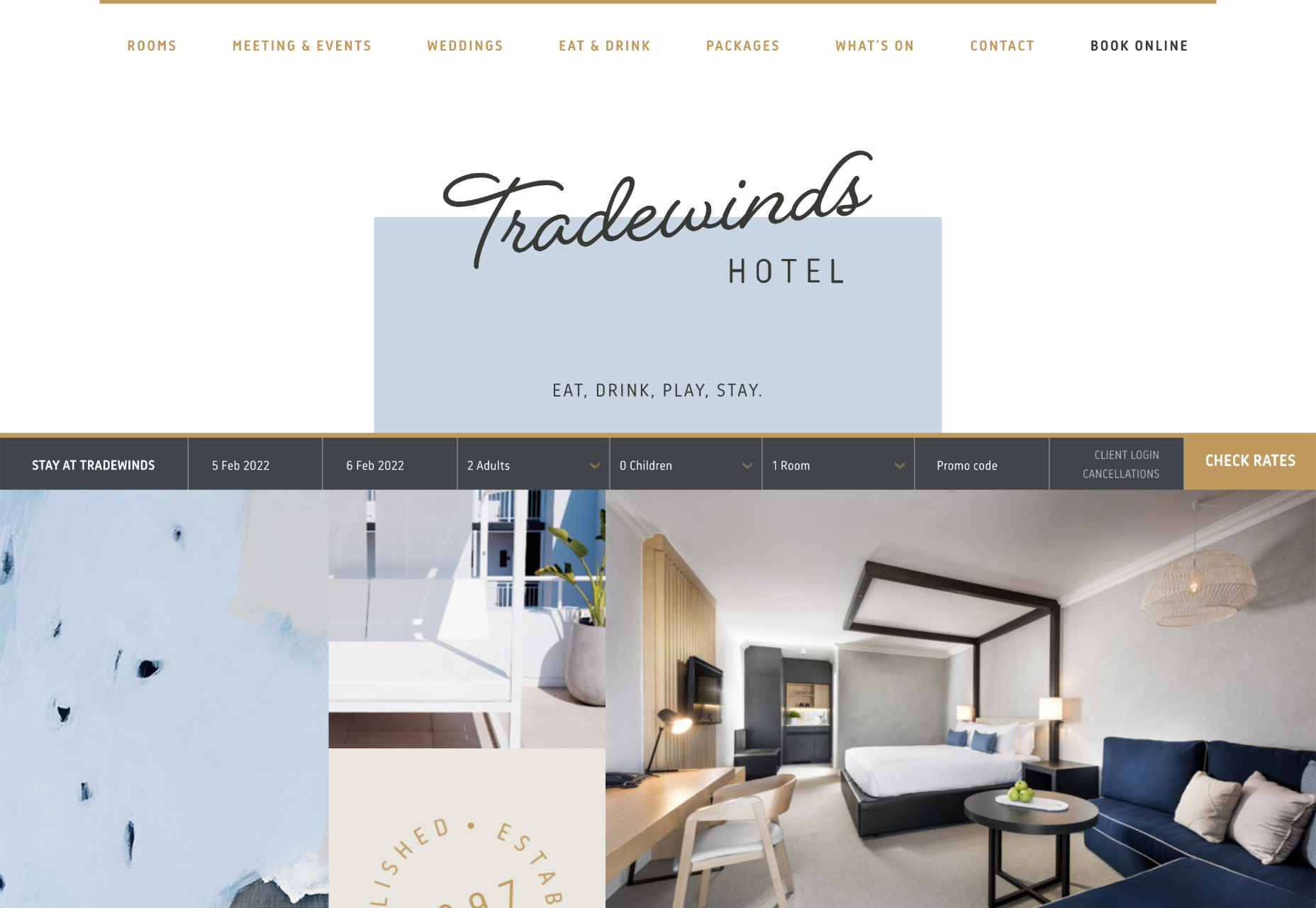
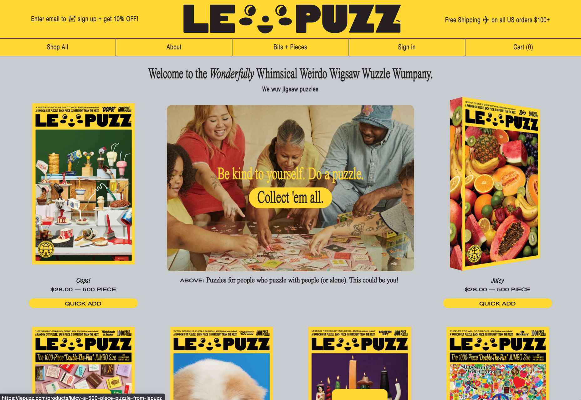
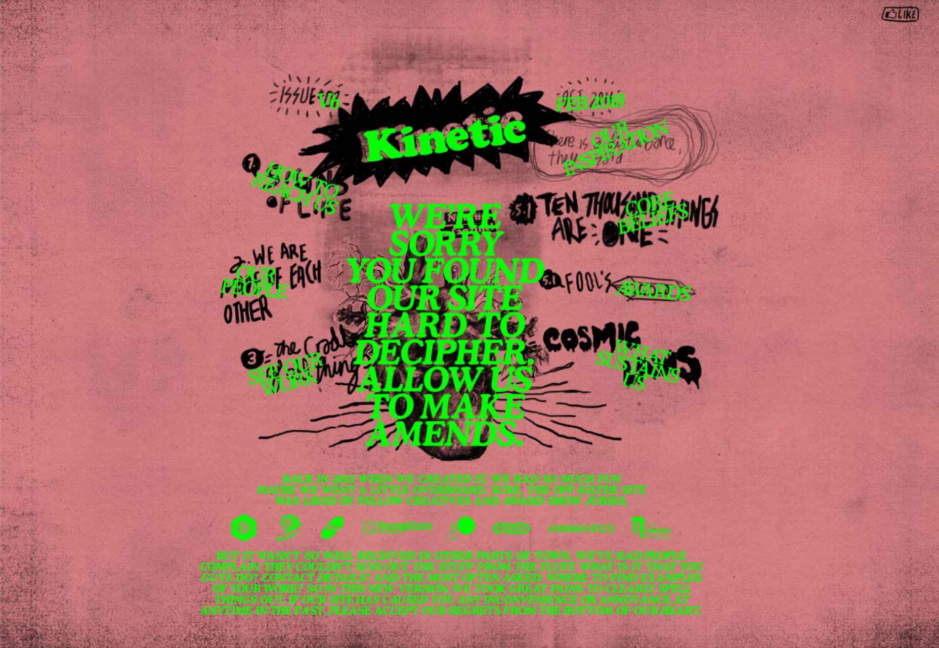
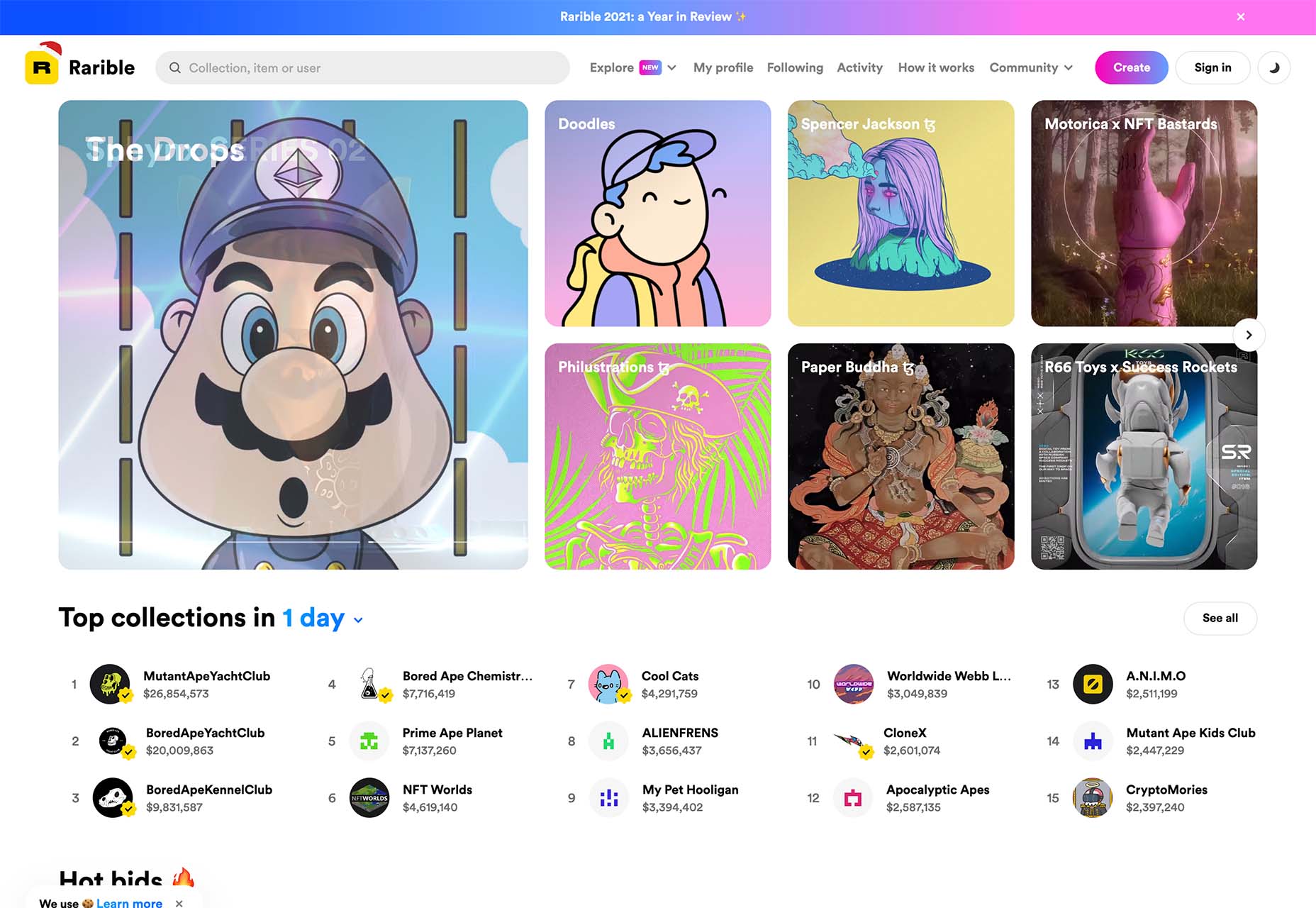
Happy New Year, fabulous new website design trends!

This month’s design trends are a collection of the somewhat unexpected – from NFT website design to large text to illustrations; you won’t see a single photo or video here. Here’s what’s trending in design this month.

NFT Websites

This website design trend has more to do with the greater trends in digital marketplaces and commerce but has value in the design space as well. NFT websites are popping up everywhere.

Marketplaces for non-fungible tokens use modern design effects to draw users in and help them make purchases and view available images. If you haven’t delved into the world of NFTs, they are data units – often in the form of gifs – stored on a blockchain digital ledger. You can buy, sell, and trade these digital nuggets on various marketplaces.

The designs of NFTs could be explained as a trend of their own. Here, we’re focusing on the look and feel of the websites surrounding them. While some designs are relatively primitive, the best marketplaces have a full e-commerce feel with easy-to-use interfaces and a modern design.

Each of these three NFT marketplaces does it a little differently.

Styllar puts a focus on NFT avatars with a minimal aesthetic that gives plenty of room to individual NFTs. Sit on the website too long, though, and hundreds of options begin to cover the screen. Each visual element has a small text element to match that explains each image. It feels like a modern e-commerce experience that instills trust with users because of clean visual patterns. The site itself is just a gateway to a more traditional marketplace, but the calls to action are large, clear, and easy to follow.

OpenSea treats the NFT marketplace more like an art gallery with card-style buttons to look at different elements and images. Everything about the website design is tailored for the mobile user and quick browsing with large areas to click in the card format and easy-to-read headers that help you find your way through the NFT space, whether you want to buy, create, or sell. The site also does one more thing that’s not as common with e-commerce – it explains how to get started in this new digital territory with plenty of resources.

Rarible has an almost social media feel with lots of small blocks showing different NFTs. Digestible content in a grid-based design helps you navigate from images to rankings to what’s trending in NFTs. This site design is set up for high interaction and engagement, also featuring card-style elements and the ability to favorite items before bidding.

The key commonality with NFT website designs is that they are made for mobile users. These sites look good on desktops, but they are highly focused on a mobile, instant gratification user.


Text-Based Hero Headers

A trend in website design from 2021 is bleeding into 2022 with a lot of popularity: Hero headers that are mostly text. These designs have background texture and color, but for the most part, they don’t have a lot of other visuals.

These designs often rely on powerful language or messaging to help get user engagement. A secondary theme is the use of bright colors to help add focus and attention to the typography.

Font choices seem to be fairly neutral, with a lot of thicker sans serifs for the main headline and something a little lighter for secondary text options.
WeTransfer uses a smaller text block with multiple lines to create weight. The off-center placement draws the eye and is interesting even with the neutral background. Stacking elements create a nice focal area that encourages reading.

Halborn Blockchain Security goes with a less traditional font option and flips the color to the text to enhance the visual display. This design also uses an off-center, asymmetrical approach to create focus on the text element. The dark counterweight on the screen is an excellent guide to draw you back to the main hero headline.

FWD goes with giant oversized text elements to create a strong visual focus with this design. Other than the faint animation of the arrows next to “Here’s what they said,” everything is still and static. The color and blocky depth of the background help draw the eye through the text and to clickable elements so that you know what to do next.


Intricate Illustrations

Another trending design element is the use of intricate illustrations on homepages. These highly detailed images can tell a visual story, help add meaning to messaging, or serve as a remarkable visual element when you don’t have a photo or video.

The great thing about this trend is that the only limitation is your imagination.

Once you find someone to create the illustration (if you can’t do it yourself), the world is open to interpretation.

We are seeing three major themes within this trend, as showcased in the examples.

Multi-layer illustrations with hints of animation, such as the one from Highvibe Network. This illustration used lots of colors, layers, unexpected elements within outlines, and a little animation to pull it all together. The effect is rather stunning and provides a lot of interest for the user.

Realistic, painting-style illustrations, such as the one from Healthline, bring the content to life without real people or images. This technique is especially nice for industries where you may want to anonymize people in images. (Perfect for a healthcare website design because you don’t know if the illustrations are of real people or not.)

Detailed geo shapes and lines, such as the design from Radio Meuh Circus Festival. With great color and lines that draw the eye, this design can keep you looking and finding new depth for a long time. Color also helps draw you into the striking imagery.


Conclusion

What’s nice about all these design trends is that they have flexible elements that you can use and replicate across industries and projects. The common factor is that they lack traditional dominant imagery, which works exceptionally well.

These trends are likely a result of the worldwide pandemic as well. With less social contact, creating without conducting photo or video shoots is an ideal situation. Good luck trying some of these trending design elements on your own.

Source

The post 3 Essential Design Trends, January 2022 first appeared on Webdesigner Depot.

Source de l’article sur Webdesignerdepot

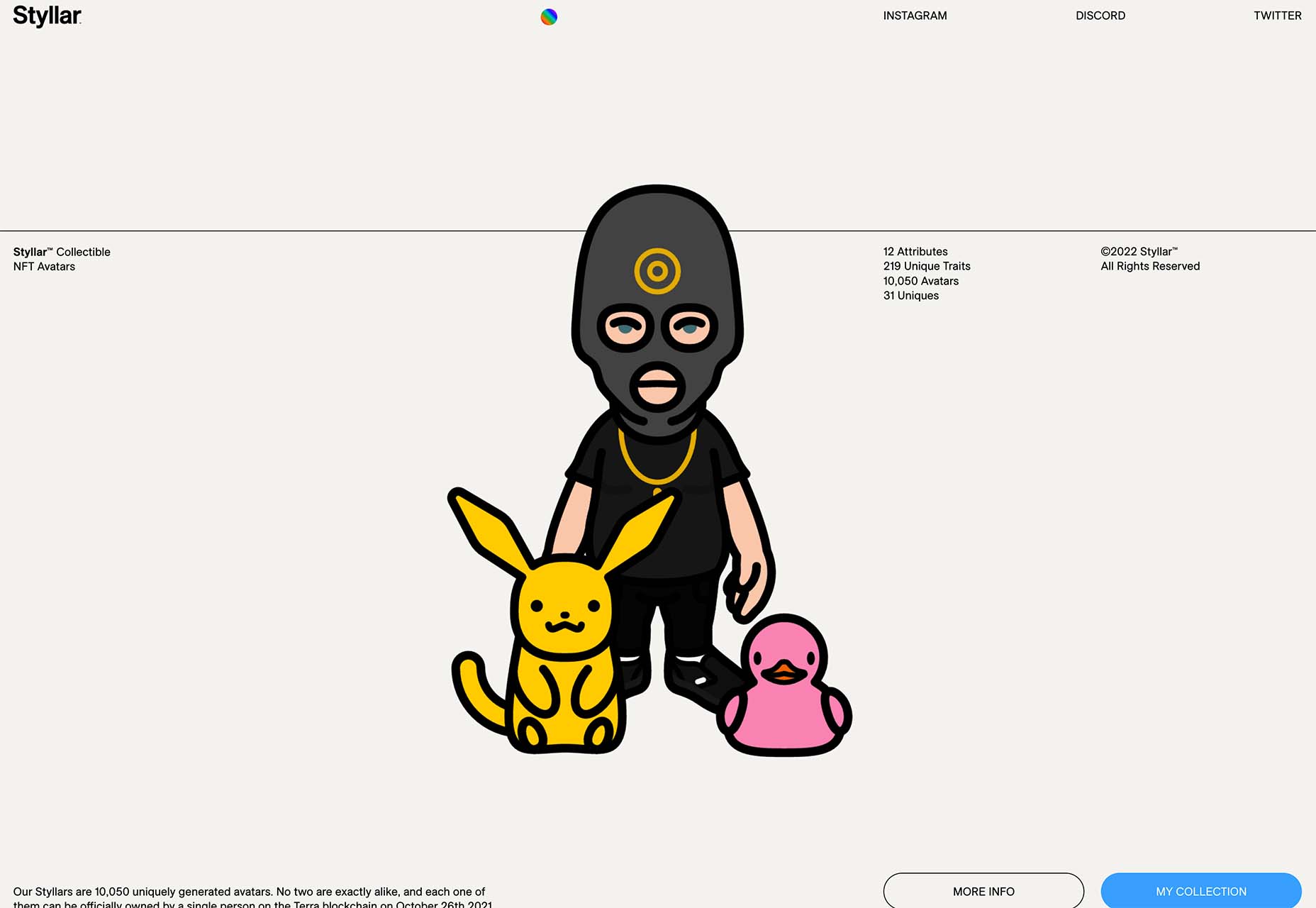
The year’s winding down as everyone segues into a much-needed holiday R&R. But that doesn’t mean there aren’t some awesome new tools and resources for website design projects.

Check them out, and hit the ground running in January. Here’s what’s new for designers this holiday period. Enjoy!

Fancy Border Radius Generator

Fancy Border Radius Generator is a fun tool that allows you to create exciting shapes for elements. Use the included templates or create your own border shapes and then export the CSS/HTML for a variety of uses.

Pulsetic

Pulsetic answers the question: “Is your website down?” Get website downtime alerts by phone call, SMS, email, or Slack. Create beautiful status pages and incident management reports and keep visitors (and your team) updated.

Ffflux SVG Generator

Ffflux SVG Generator makes it easy to generate fluid and organic-feeling gradients. You can use the resulting graphics as backgrounds to elements on a page to give a colorful fluid look to page elements. Choose colors and styles, then save or copy your SVG for use.

Fable

Fable is a web-based motion design platform to help you tell moving stories. It’s designed to be easy enough for beginners to use but has tools that even the most experienced motion designers can appreciate. This is a premium tool, but you can try it free.

Modern Fluid Typography Editor

Modern Fluid Typography Editor takes the guesswork out of sizing and scale for type sizes on different screens. Set a few preferences and see ranges your type styles should fall in. This typography calculator is visual and easy to use.

Emoji to Scale

Emoji to Scale is a fun look at emojis in a real-world relationship to each other. Make sure to also note the Pokemon to Scale project, which is just as much fun.

Page Flip Text Effect

Page Flip Text Effect is a fun and straightforward PSD asset that adds a nice element to design projects. Everyone can use some fun, colorful animation, right?

Nanonets

Nanonets is a practical tool for automated table extraction. You can snag tables from PDFs, scanned files, and images. Then capture relevant data stored in tabular structures on any document and convert to JSON Excel, or CSV and download.

Browsers.page

Browsers.page shows browser name and version, matched with a list of the browsers you support as a company or project. It’s a visual reminder to update if you are working with some browser lag. It’s a free tool and includes a frontend API.

UKO UI

UKO UI is a Figma dashboard and design system bundle packed with components and pages to build from. It’s free for personal use.

Floating UI

Floating UI is a low-level library for positioning “floating” elements like tooltips, popovers, dropdowns, menus, and more. Since these types of elements float on top of the UI without disrupting the flow of content, challenges arise when positioning them. It exposes primitives, which enable a floating element to be positioned next to a given reference element while appearing in view for the user.

Style-Dictionary-Play

Style-Dictionary-Play lets you experiment with a style dictionary in your browser with a live preview and mobile and desktop views. It’s an open-source tool and allows for URL project sharing, and you can use it without logging in or signing up.

Airplane Runbooks

Airplane Runbooks makes it easy to turn small amounts of code into complex internal workflows. Model onboarding flows, admin operations, cron-like schedules, and more and share with your team. It’s like Zapier but for first-party operations that touch prod data.

Shoelace

Shoelace is a forward-thinking library of web components that works with any framework. It’s fully customizable – and has a dark mode. It’s built with accessibility in mind, and the open-source tool is packed with components.

Tutorial: Coloring with Code

Coloring with Code is an excellent tutorial by the team at Codrops that will help you create beautiful, inspiring, and unique color palettes/combinations, all from the comfort of your favorite text editor. It’s practical and easy to follow along as you work through the steps on your own.

Stytch

Stytch is a full-stack authentication and authorization platform whose APIs make it simple to seamlessly onboard, authenticate and engage users. Improve security and user experience by going passwordless with this premium tool.

Highlight

Highlight keeps web apps stable. With pixel-perfect session replay, you’ll get complete visibility into issues and interactions that are slowing down users. You can start using this premium tool in minutes, and it works on every framework.

Source

The post Exciting New Tools For Designers, Holidays 2021 first appeared on Webdesigner Depot.

Source de l’article sur Webdesignerdepot

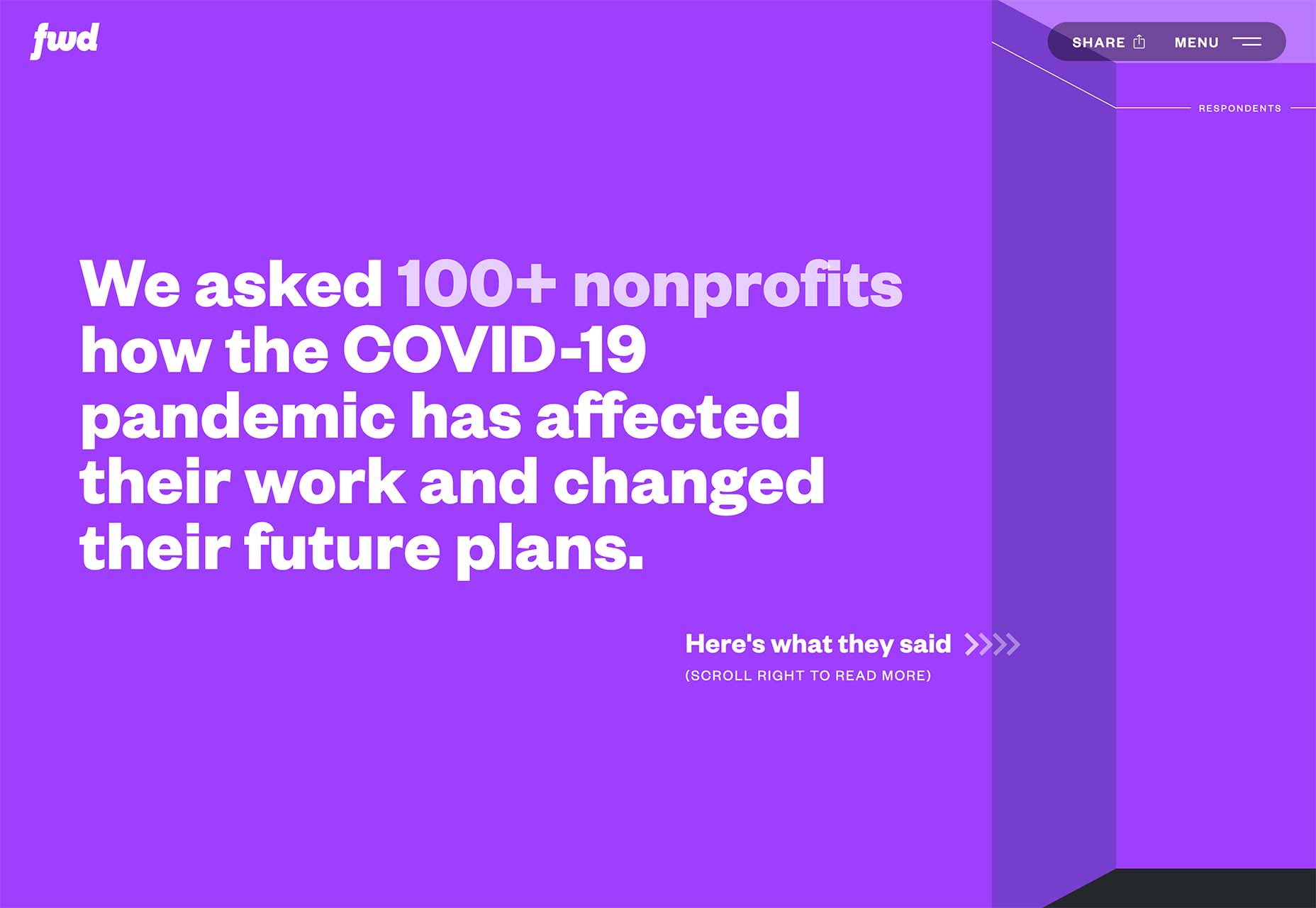
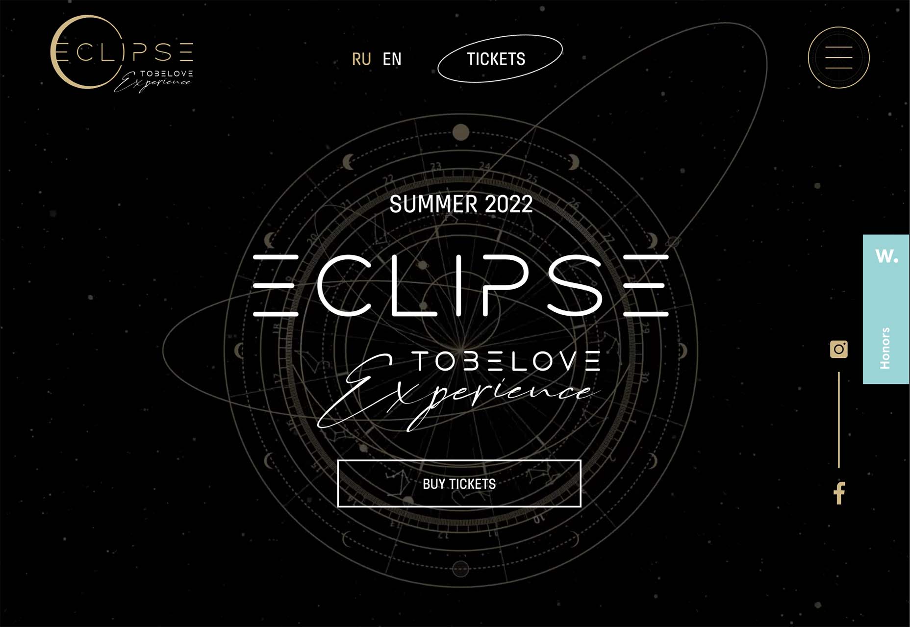
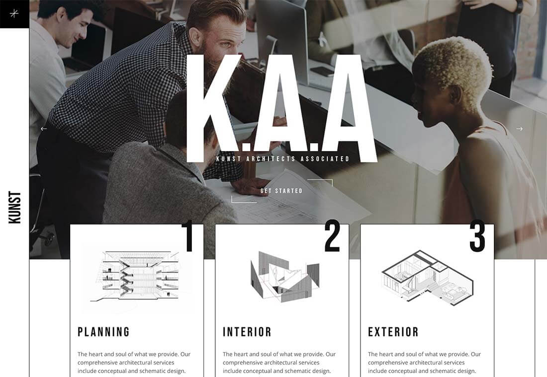
The year might be coming to an end, but plenty of design trends are still beginning to emerge. It’ll be interesting to see how many of these website design elements remain popular into the new year. From vintage elements to circles to happier feelings, there’s a lot to play with here.

Here’s what’s trending in design this month…

Old-School Print Inspired

Vintage design elements seem to circle back in new iterations at a pretty frequent pace. This time website designers are finding inspiration from old-school print design.

These projects mimic the look of old newspapers and magazines with styles that look like news or advertising content. One of the most exciting takeaways might be color, with beige backgrounds that almost seem like aged paper.

Note the font choices, scale, and imagery as well. All of these things have an old-school feel that’s modern enough to help encourage interaction.

Each of these designs keeps visitors engaged with trendy effects that pair with the vintage aesthetic so that while there’s an old-school look, the overall design is modern and fresh.

The portfolio of Niccolo Miranda feels like a “WAR” day on the front page of a major newspaper, but with modern touches – computer illustrations, animated images, and button-style icons.

Enfant Sauvage Music takes on the feel of an old-style newspaper or magazine ad with a single color design and grainy imagery. An oversized funky pointer on hover and side navigation keeps the design interesting.

Kalso uses a giant timeline with typography and effects that mimic the era on the screen. Animation and motion keep the design with the times and on-trend.

Center-Screen Circles

Circles seem to be a website design trend that just never goes out of style – it only evolves.

The newest iteration includes center-screen circles. And you can use them in all kinds of different ways. The nice thing about a circle is the shape is innately harmonious and can pull a design together and make everything feel together and unified.

They can be an excellent container for text or other elements or serve as a button.

Circles work with almost any overall design pattern, in any color, and with virtually any type of image or video. The shape is practically perfect! (That’s why it’s a trend that never really gets old.)

Each of these examples uses a center-screen circle in a slightly different way.

Aflote uses a center circle as part of its overall branding effort and to help draw the eye from the split-screen images to the center arrow, encouraging users to scroll to the next bit of content. Color helps here, and the circle is a container for brand and some other content with a nice layer on top of the images.

One Ocean Science uses one of the oldest circles we know – the globe – as a dominant art element that rotates in the center of the screen. The layer on top – the exact text in multiple languages – gets extra attention thanks to the center placement. The design also uses a top left corner circle for branding and a bottom right corner circle as a CTA, helping create a visual flow through the design from top to center to bottom to click.

To Be Love uses a fantastic animated set of concentric circles to pull together the name of the event and draw interest to the CTAs. The circle is just the right size in a sea of black sky to draw the eye to the content in the middle of the screen.

Lighter, Happier Designs

After a couple of years of pandemic life and a world that’s just been a little less than cheery, website designers include lighter, happier elements to projects. This might just be the design trend we all need right now.

This effect can be designed in several ways, including color, imagery, animation, scale, and even typography. It’s hard to pinpoint what makes a design lighter and happier until you see it, but when you do, you’ll know it. (It might just be that little grin at the corner of your mouth when you see it.)

Meanpug uses fun, animated illustrations as a load screen with a full-text homepage (you’ll have to click through to see it). Between color and animation, you can’t help but feel good looking at the design. What might be most interesting is that the website is for a marketing agency that works with law firms. (Probably not what you expected at all.)

Happy smiling faces are hard not to feel good about. Even the devil emoji seems somewhat joyful. Add in big, bold typography and the yellow smiley, and the world just feels a little less dark.

Oatly uses lots of small elements in a cartoon-style aesthetic that is light and interesting. In addition to fun fonts and animation, all of the words on the website also contribute to a feeling of ease and happiness. It’s a solid strategy for sales; make people feel good about what they are thinking of buying to help propel them toward a purchase.


Conclusion

One of the most exciting things that we’ve seen with design trends in the past year is how world events – from the pandemic to isolation to working remotely – have impacted design projects as a whole.

We’ve seen fewer faces, more illustrations and typography, and an overall shift in feeling to some of the lighter, happier design elements featured here. Cheers to 2022!

Source

The post 3 Essential Design Trends, December 2021 first appeared on Webdesigner Depot.

Source de l’article sur Webdesignerdepot

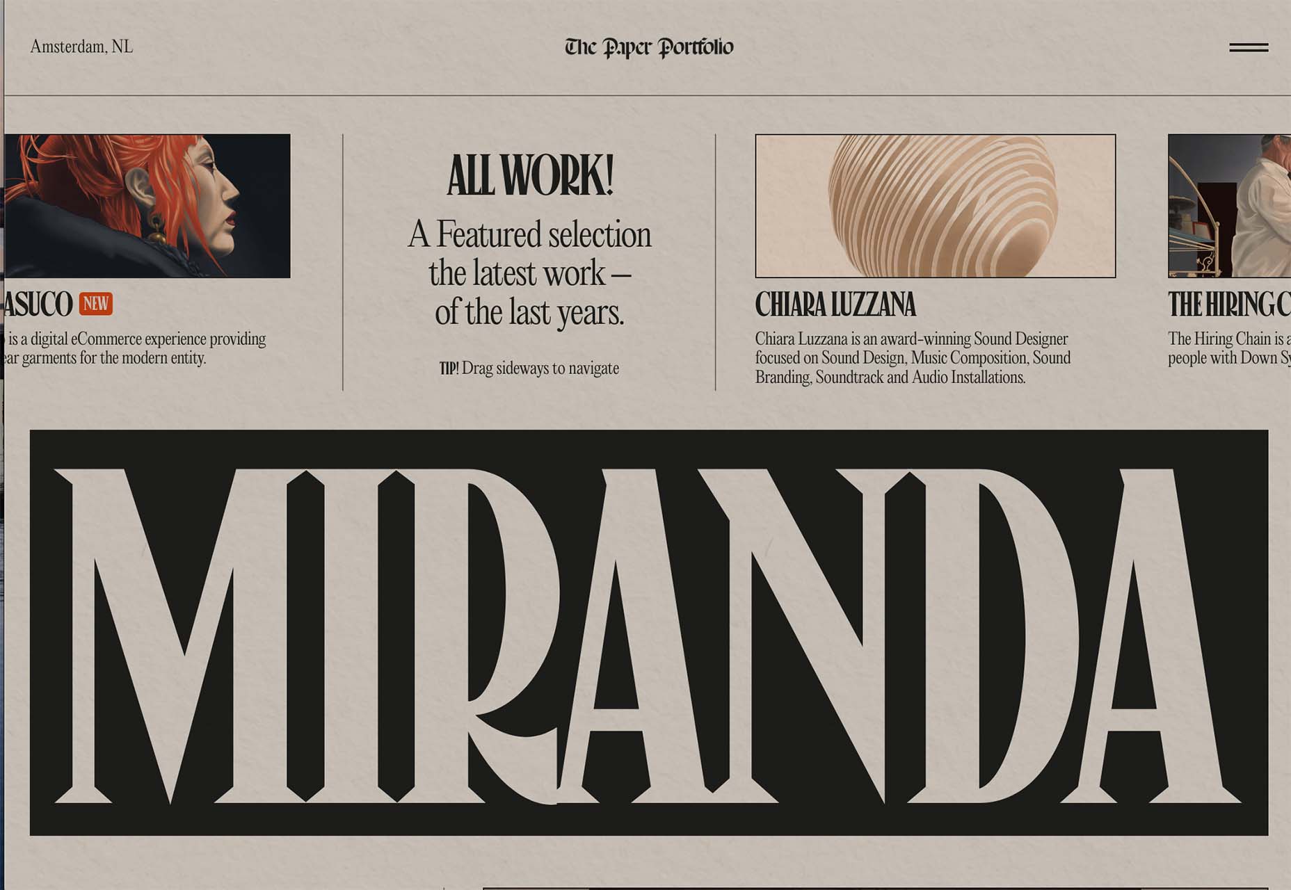
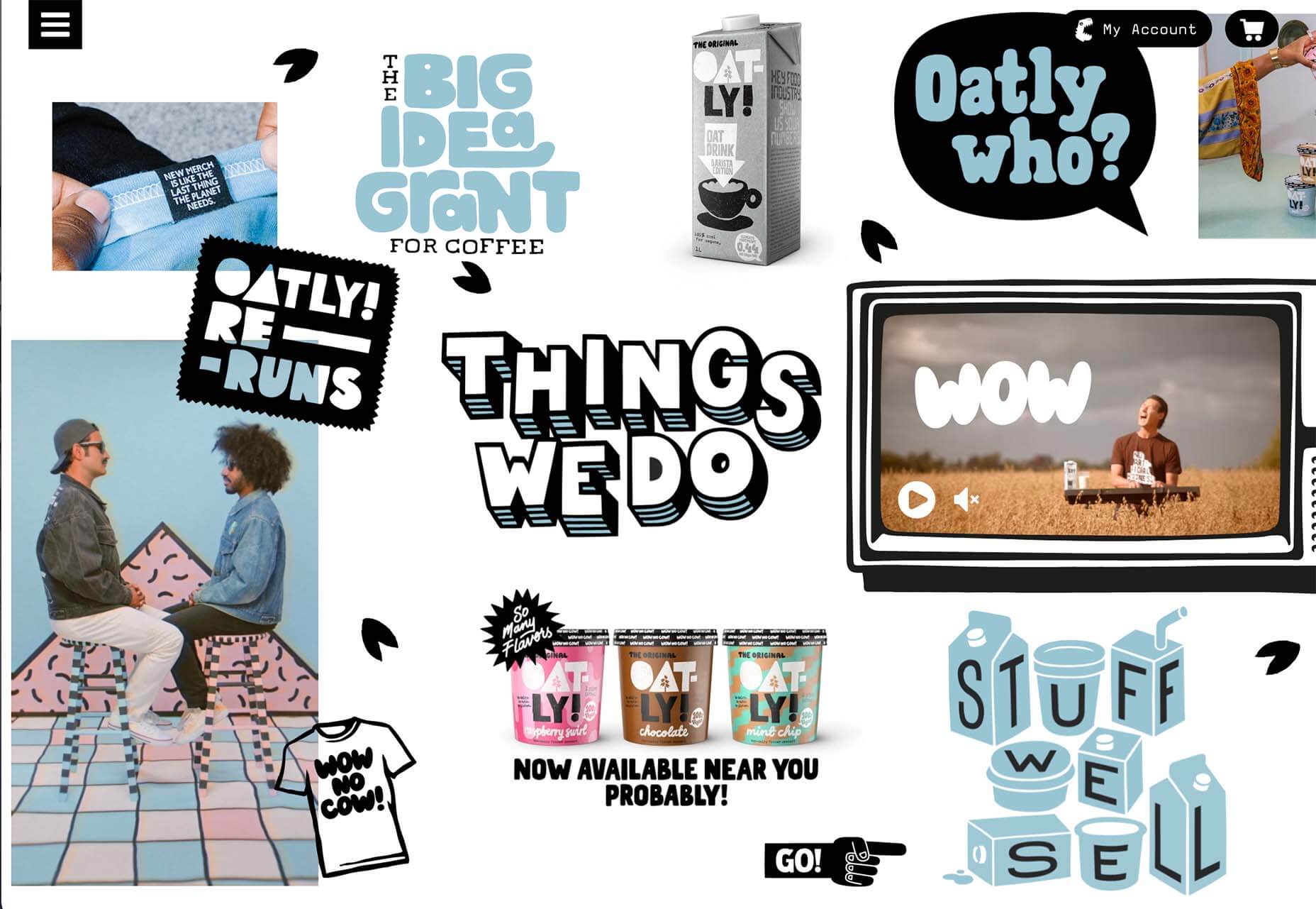
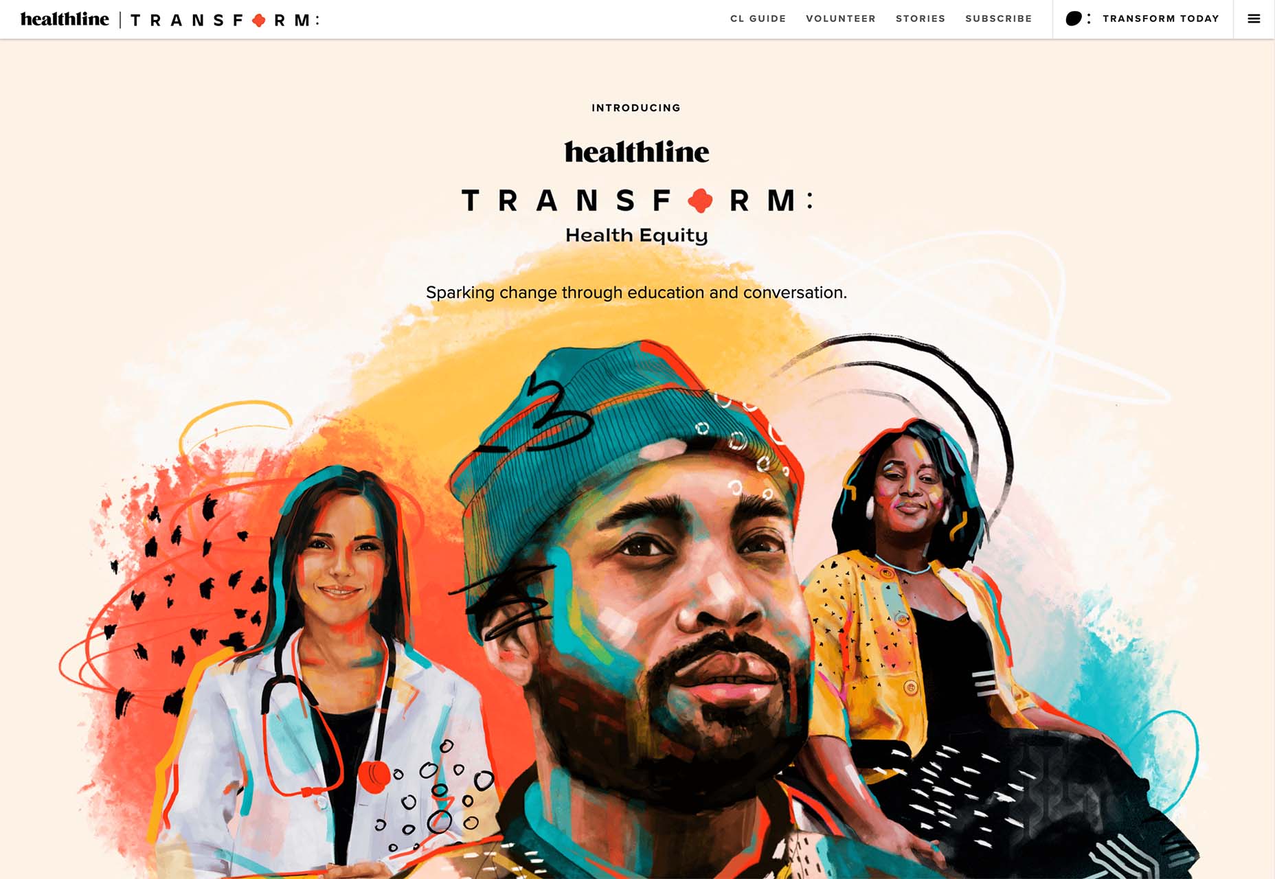
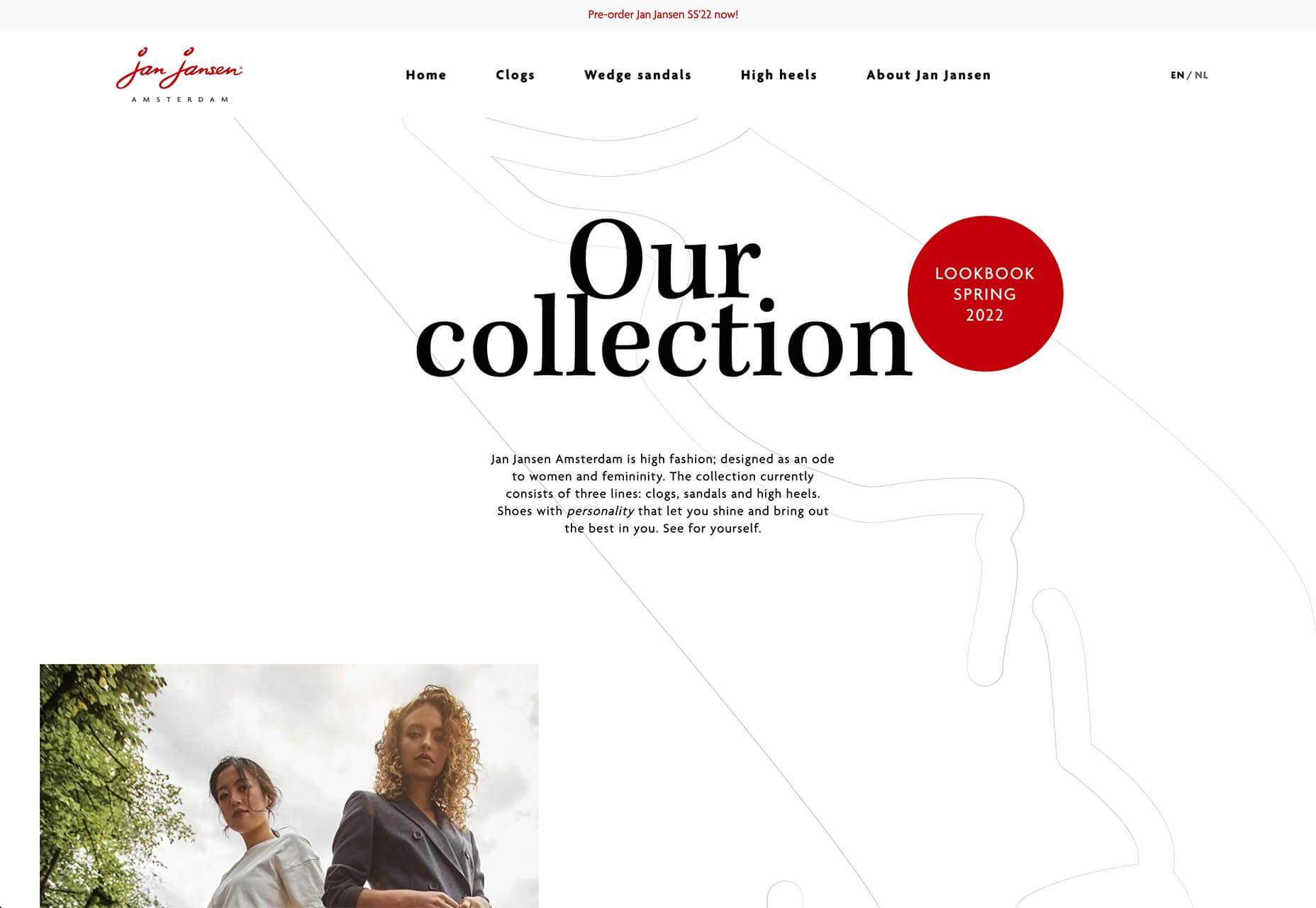
As the year begins to wind down, there are still plenty of new and evolving website design trends going strong. Much of what you’ll see this month carries over from things we’ve been seeing all year but with fresh touches.

From peek-a-boo designs with neat animated elements to vertical bars to brutalist blocks, there are a lot of highly usable trends to work with.

Here’s what’s trending in design this month.

Peek-a-Boo with Animation

Designers have been experimenting with cut-out and layering elements with animation for some time, which has evolved into full peek-a-boo styles with a lot of visual interest.

How each design comes together is a little different. Some have the animation in the back, others in the front, and some include text as part of the style. There’s almost no set of actual rules to how to make this design trend work.

Each of the examples below does it somewhat differently with varying degrees of success. The commonality here is that it is almost one of those visuals that you either see and love or hate.

Jatco Insurance is the most stunning example here, with a bold color choice and a peek-a-book element inside the oversized “J.” The overall effect is soothing and interesting and naturally draws the user across the screen from the top left to the background video layer. The small tagline, “Individual attention you deserve,” is perfectly placed.

Liron Moran Interiors takes a different approach with the peek-a-boo concept with the letters peeking out from behind an image. The animation is restricted to a hover and scroll effect that adds a liquid element to the image as well as changes to the image and color background. The challenge here is in readability. More of the words show on wider screens, but is it enough?

Melon Fashion also layers text and animated effects for a neat peek-a-book style that almost seems cut out from the background. The overall look appears to have three layers: background video, middle layer for the yellow color block, and text on top. The opacity of text elements with the peeking video is interesting and well pulled together without sacrificing too much readability.

Vertical Bars

Vertical color bars are a design element that keeps popping up in different ways. Designers can use it as a standalone element or container for content, such as navigation or other click actions.

Vertical elements are helpful because they can help create a more consistent and unified user experience from desktop to mobile screens. This shape can also be somewhat disruptive because you don’t see it featured that often. (Although with this style trending that might become less true over time.)

New Classrooms uses a vertical color bar on the left to help you move through the design. The color actually changes as each slide progresses on the homepage.

Serving uses multiple vertical bars as links to different content entry points. Clickability is emphasized with a change from a red overlay to a full-color image. The navigation is also tucked inside a white bar on the left side of the screen with a hamburger menu therein.

TechnoAlpin goes with a skinny vertical navigation menu on the right side of the screen. The icons with menu elements make navigation highly visual and intuitive. The color, which significantly contrasts with the rest of the design, also helps.

Brutalist Blocks

Not many people thought brutalism would stick around when it started trending. Elements of brutalism keep sneaking in, though, although they are much less stark and harsh than some of those original trending website designs.

This version of brutalism focuses on block elements that contain images or text and often click to other pages in the design. The blocks themselves are essentially the buttons that help you navigate to additional content.

The critical question about this design technique is whether this click action is intuitive enough. Will users interact without buttons?

The answer likely depends on your audience base, but if you opt for a style like this, it is essential to keep a close eye on analytics to ensure that users know and understand how to engage.

Milli Agency might be the most intuitive example of the brutalist blocks trend. The homepage is essentially a giant navigation menu. Each block changes from white to yellow on hover and expands, further encouraging clicks.

Sick Agency uses brutalist blocks with experimental typefaces and bold color for an in-your-face design. You can’t help but look at all the different things happening here. The biggest question might be, where should you focus and click next? The cursor provides some visual cues, but it’s not quite as intuitive as you might want it to be.

Mawo mixes brutalist blocks with a big blue cursor to help users click through the design to see more clothing options. Even the images here have a rather stark feel, which isn’t typical for e-commerce. Every block element above the scroll on the homepage includes a click action from the navigation blocks across the top to the “Shop Women” and “Shop Men” images. Further, the blue cursor dot helps show where users can click, and text buttons change to blue on hover as well.

Conclusion

Most of the examples here show trends as homepage elements, but you aren’t limited to that application. Try some of these techniques on landing pages or interior pages that you want to add a little something special to.

This can be an excellent way to test the design and see if your users like the style and know-how to interact with it. If it works, then you can extend the aesthetic to more of the design.

Source

The post 3 Essential Design Trends, November 2021 first appeared on Webdesigner Depot.


Source de l’article sur Webdesignerdepot

Tilda website builder combines everything we liked so much about constructors when we were kids – you can experiment, test out and build myriads of new creative ideas out of ready-to-use blocks. Tilda is that type of constructor that allows you to own your creative process and create pretty much any website: landing page, business website, online store, online course with members area, blog, portfolio, or event promo page.

Founded seven years ago, Tilda is a website builder that completely revamped the way we create websites. Tilda has been the first website builder to introduce block mechanics that allows users to create websites out of pre-designed pieces. This breakthrough technology allowed all users – not only designers – to create professional-looking websites. Just like in kid constructors, you can drag-and-drop and mix-and-match blocks on Tilda to let your creativity flow and build a dazzling website, at extraordinary speed. 

When you ask designers why they love Tilda, they usually say it’s because the platform provides the ultimate balance between choosing from templates and being able to fully customize and create from scratch to bring any creative idea to life. Here’s what else they say:

Tilda has been a game-changer for us. It allows our team to quickly spin up new web pages, make edits, and ship new programs. We left WordPress for Tilda and after being with Tilda for 2 years, I don’t ever want to go back.

~ Andy Page, Executive Director, Forge.

I built my first website in 2001. Since then I’ve used countless platforms and website builders for customer websites and my own business. Tilda is the perfect combination of ease of use with powerful features at an unbeatable value.

~ Robby Fowler, Branding and Marketing Strategist, robbyf.com & The Brand ED Podcast.

Let’s dive deeper into core functionalities you can leverage on Tilda. 

#1 Cut Corners With 550+ Pre-Designed Blocks And 210+ Ready-Made Templates

The beauty of Tilda is that it provides 550+ blocks in the ever-growing Block Library designed by professional designers. Thus, you can quickly build a website out of pre-designed blocks that encompass virtually all elements you might need for your website: menu, about us page, features, contact, pricing, etc. 

Customizing each block is a breeze with Tilda: You can drag-and-drop images, edit text right in the layout, alter block height, background color, padding, select the style of buttons, use custom fonts, and assign ready-made animation effects to specific parts of it. Also, Tilda provides a built-in free image library with 600K+ images, so you can find images that are just right for you without leaving Tilda, add them to your website with just one click, and use them for free.

Finally, all blocks fit together so well that it’s almost impossible to create a bad design on Tilda – even if you are a stranger to website building.

For a quick take-off, you can use 210+ ready-made templates for different kinds of websites and projects: online stores, landing pages, webinar promo pages, multimedia articles, blogs, and more. Each template is a sample of modern web design and consists of blocks. It means that templates don’t limit your creativity: you can modify them to your liking by playing with settings, adding extra or removing existing blocks, and embedding images and text. 

Each of the templates and blocks covers over 90% of use cases you’ll ever require and is mobile-ready, meaning that your website will look great on desktop computers, tablets, and smartphones by default.

#2 Jazz Up Your Site With Zero Block: Professional Editor For Web Designers 

To better meet the demands of a creative brief and unleash your creativity, you can use Tilda’s secret weapon called Zero Block. It is a tool for creating uniquely designed blocks on Tilda.

You can control each element of the block, including text, image, button, or background, and decide on their position, size, and screen resolution on which they’ll appear. For example, you can work with layers to create depth with overlay and opacity techniques or set a transparency level on any element and shadow effects below them. Additionally, you can also insert HTML code to add more complex elements, such as calendars, paywall, comments, social media posts, and so much more.  

Finally, Zero Block allows you to fool around with basic and more advanced step-by-step animation for a more individual look. Here’re some animation examples that you can make on Tilda:

Animation on scroll (position of elements is changing on scroll).

Trigger animation (animation is triggered when pointing at or clicking on an object).

Infinite scrolling text.

#3 Import Designs From Figma To Tilda In Minutes

Creators love using Figma for prototyping, but when you have to transfer every element and rebuild your website design from scratch – that’s what’s killing the party. With Tilda, you can easily turn your static designs into an interactive website in no time. 

All it takes is to prepare your Figma design for import with a few easy steps, paste the Figma API token and your layout URL to Tilda, click import and let the magic happen. Once your design is imported, you can bring your project online just by clicking publish.

#4. Make Search Engines Love Your Website With Built-In SEO Optimization

Thanks to the consecutive positioning of blocks on the page, websites designed on Tilda are automatically indexed well by search engines. There is also a set of SEO parameters you can fine-tune right inside the platform to ensure that your web pages rank high even if you don’t have an SEO specialist in-house. These parameters include the title tag, description and keywords meta tags, reader-friendly URLs, H1, H2, and H3 header tags, alt text for images, and easily customizable social media snippets. 

As an additional value, Tilda provides an SEO Assistant that will show you what errors are affecting the indexing of your website and will help test the website for compliance with the search engines’ main recommendations.

#5. Turn Visitors Into Clients

Tilda gives you the power to set up data capture forms and integrate them with 20+ data capture services, such as Google Sheets, Trello, Notion, Salesforce, Monday.com, etc., to ensure seamless lead generation.

For more fun, Tilda developed its CRM to manage your leads better and keep your business organized right inside of a website builder. This is a very easy-to-use tool that automatically adds leads from forms and allows you to manually add leads you captured outside of the website. There is a kanban board that gives you an overall view of how leads are moving through your sales funnel and allows you to move leads between stages easily.

#6. Build A Powerful Online Store In One Day

Tilda provides a set of convenient features to create a remarkable online shopping experience. The platform gives you the power to sell online using ready-made templates or build an online store completely from scratch, add a shopping cart and connect a payment system of choice — Stripe, PayPal, 2Checkout, etc. — to accept online payments in any currency.

If you are looking to run a large ecommerce business, you should also consider Tilda. Thanks to the built-in Product Catalog, you can add up to 5000 items, import and export products in CSV files, easily manage stock, orders, and keep track of store stats.

And thanks to adaptive design, your store will look good across all devices, including tablets and smartphones. 

#7. Bring Your Project Online For Free

Tilda offers three subscription plans: Free, Personal ($10/month with annual subscription), and Business ($20/month with annual subscription). When you sign up for Tilda, you get a lifetime free account. It allows you to publish a website with a free subdomain and gives you access to a selection of blocks and a limited number of features that offer enough to create an impressive website. 

Personal and Business tariffs allow more advanced options, such as connecting custom domains, adding HTML code, receiving payments, and embedding data collection forms. The business plan also allows users to export their website and create five websites (while personal and free plans allow one website per account). 

To discover all features and templates on Tilda, activate a two-week free trial – no credit card required.

Source

The post Tilda – The Website Builder That Disrupted The Way We Create Websites first appeared on Webdesigner Depot.


Source de l’article sur Webdesignerdepot

There are some spook-tacular finds in this month’s October collection of resources and tools for designers and developers. From interesting tools that can help in the design process to boo-tiful typefaces, there’s something for everyone here.
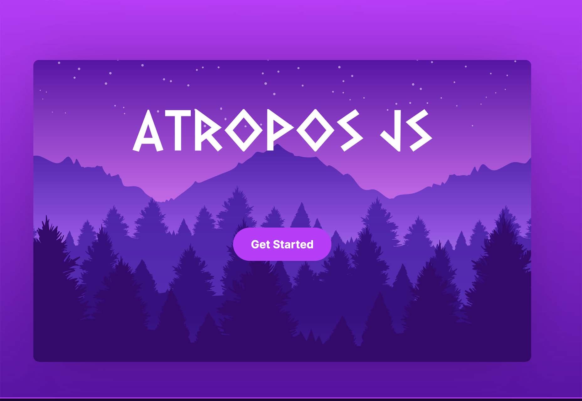
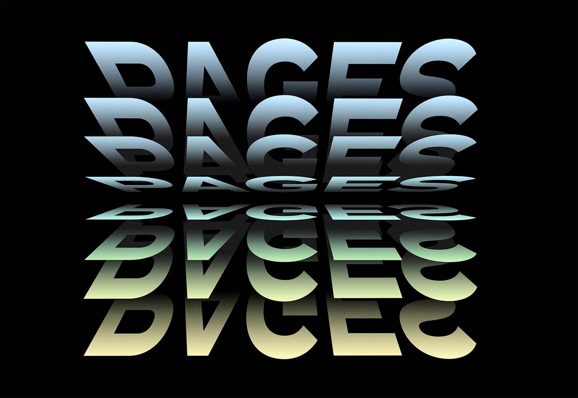
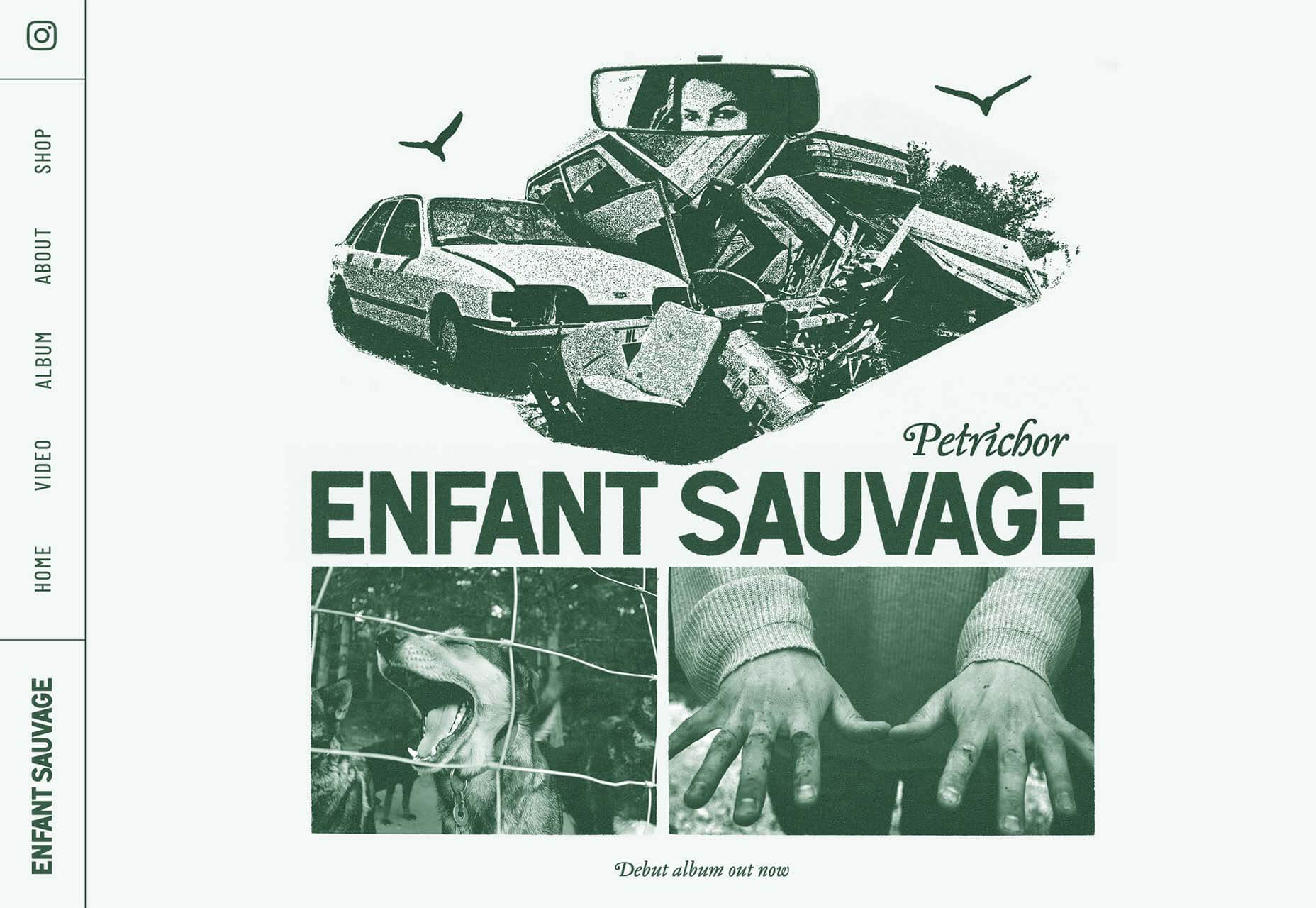
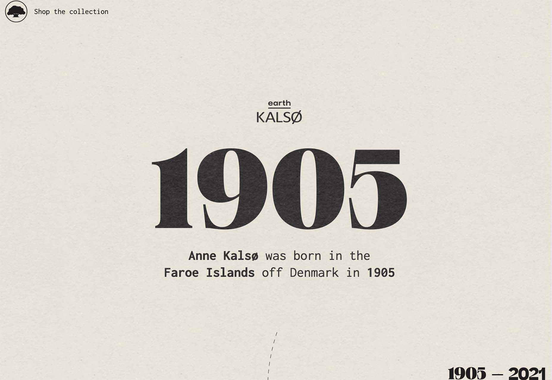
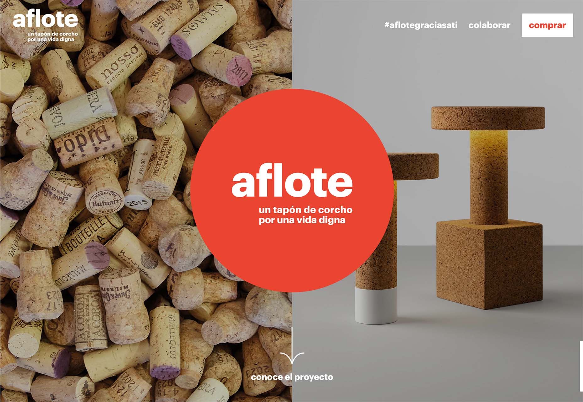
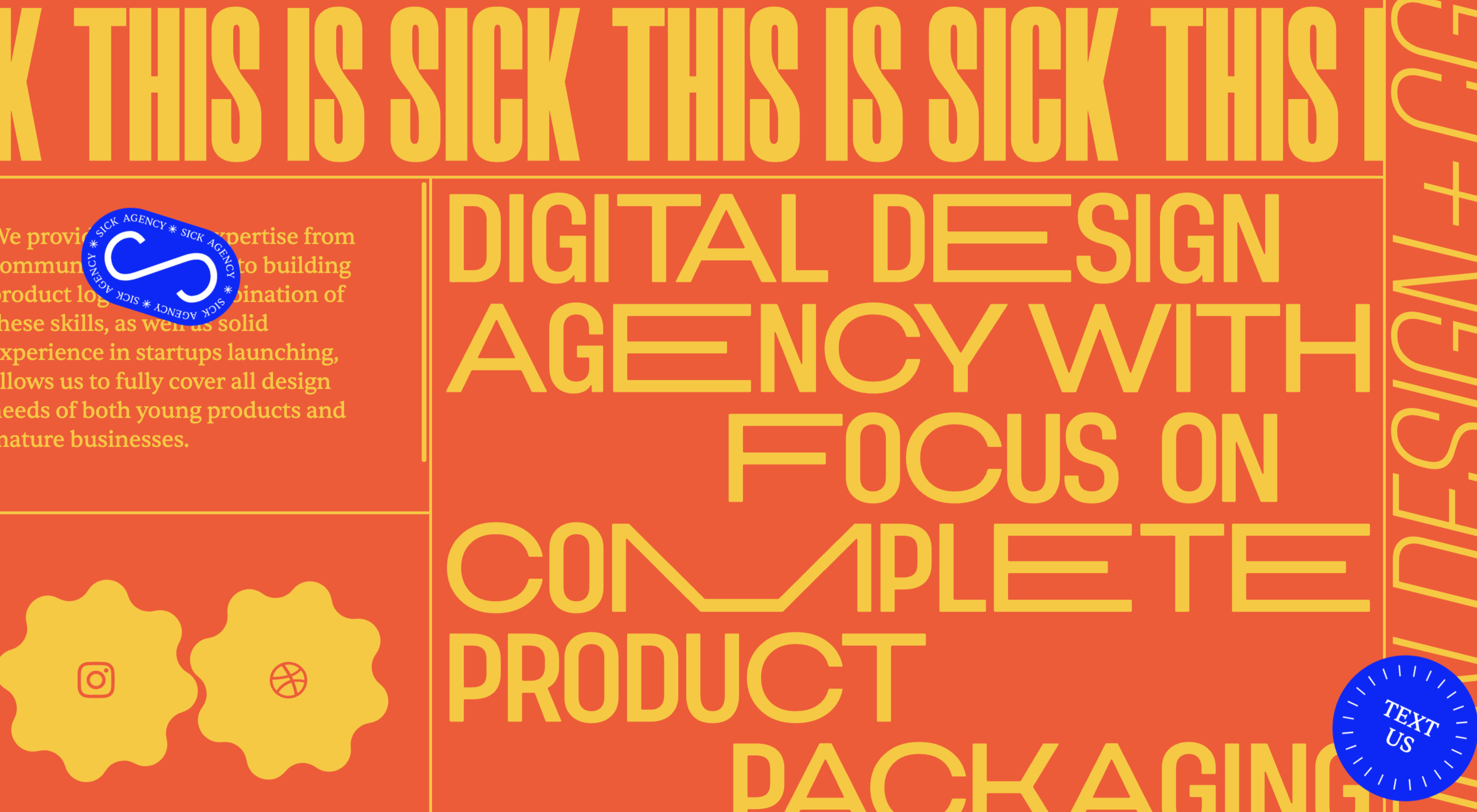
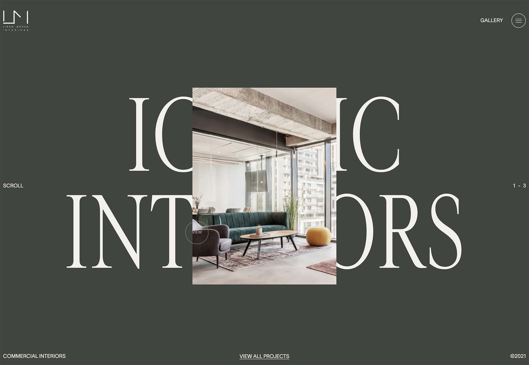
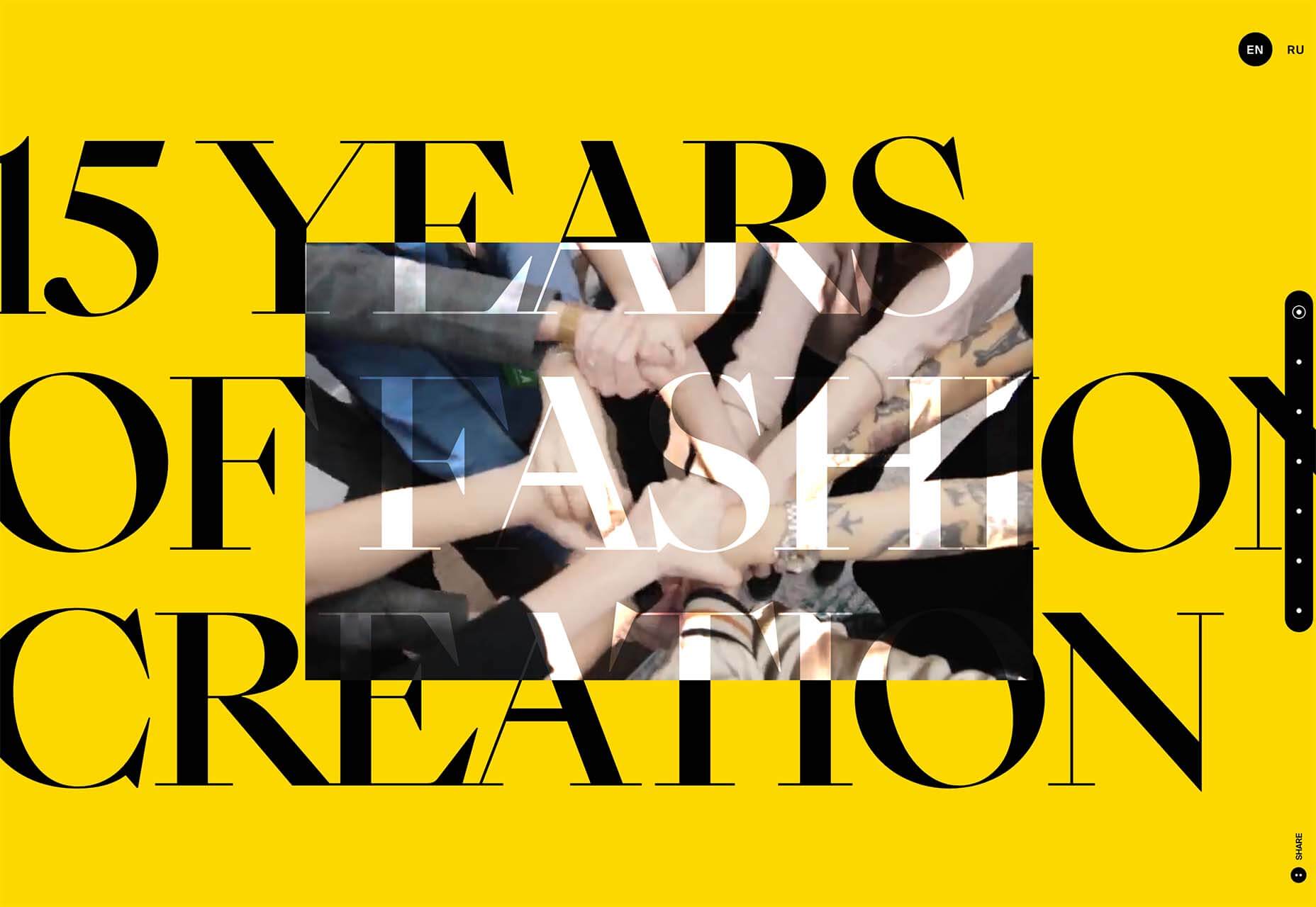
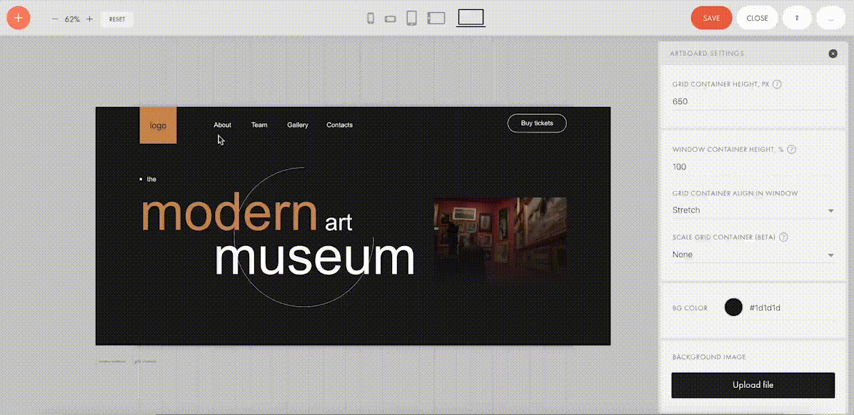
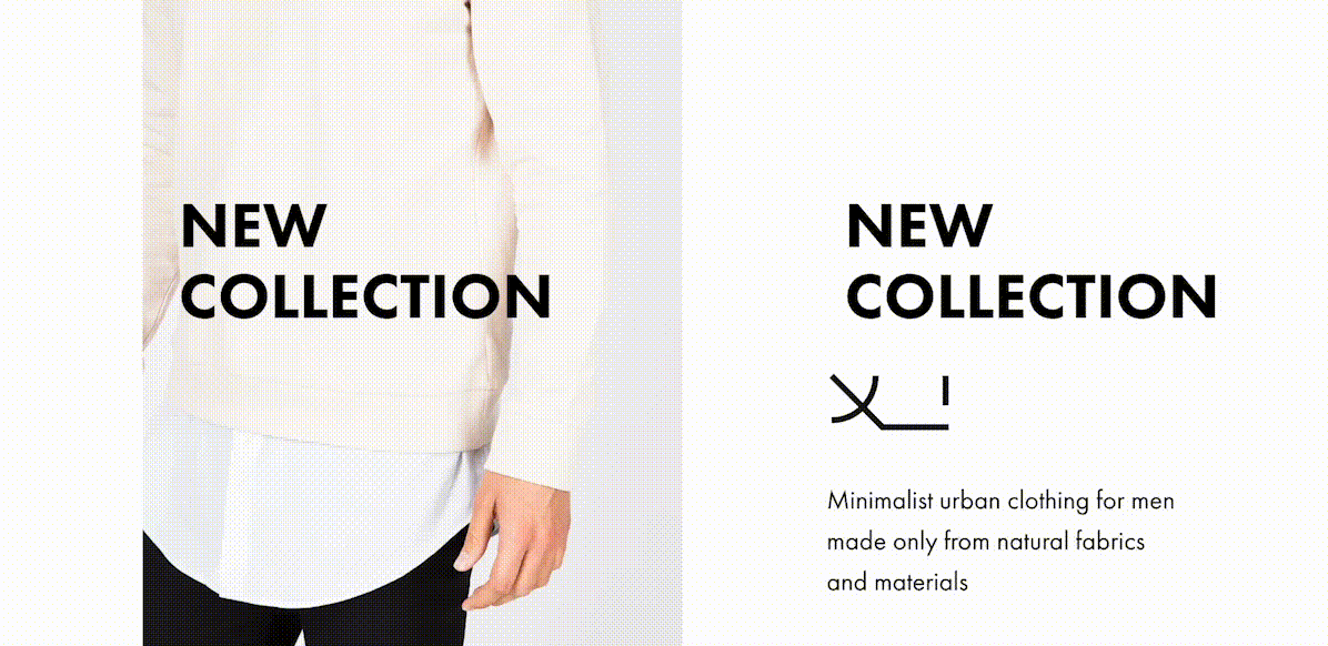
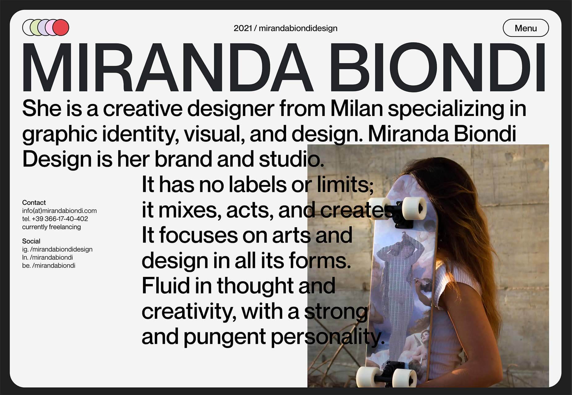
Here’s what is new for designers this month…

Atropos

Atropos is a lightweight, open-source JavaScript library to create touch-friendly, three-dimensional hover effects. The results are stunning and have a nice parallax style. Everything is highly configurable and customizable. It’s available for JavaScript, React, and Vue.js and has zero dependencies.

CSS Gradient Editor

CSS Gradient Editor helps you create the perfect gradient style – you can start from presets – that you can use in projects. Design a background, fill, or almost any other gradient element you might need, make adjustments or customizations, and then get the CSS with one click so you can use it right away.

Octopus.do

Octopus.do is a fast visual sitemap builder that lets you work in real-time using the content brick method. Share and collaborate in real-time and there’s no signup required to use it.

Pirsch Analytics

Pirsch Analytics is a privacy-friendly, open-source alternative to Google Analytics — lightweight, cookie-free, and easily integrated into any website or directly into your backend. It includes filters to see metrics in the way you want and light and dark modes.

Basic Pattern Repository

Basic Pattern Repository is a collection of simple SVG patterns for projects. Everything is rooted in a simple style to help push projects along quicker. You can get it via GitHub or as a Figma Library.

Blobr

Blobr is a way to get a branded API portal, manage access, and monitor usage all in one place. Customize everything to fit your brand and the tool grows as you do with the ability to increase or change capacity. Plus, it is easy to set up and free to use.

HEXplorer

HEXplorer helps you better understand something you use all the time – HEX colors. This pen by Rob DiMarzo shows how the values for different colors come together to provide greater comprehension when it comes to this color format.

CCCreate

CCCreate is a curated collection of tools and resources for web creators. It includes some tools that have been around for a while as well as some newbies. Everything is grouped and sorted by type of resources – color, icons, type, layouts, animation, shapes, docs, and miscellaneous so you can find what you are looking for faster.

Glass

Glass is a photo-sharing app for photographers. It’s a social network of sorts that lets you share images with the greater photography community without “likes.” Just great images.

Revolt

Revolt is a chat app that’s still in beta and designed for easy communication without having to download apps. It’s an open-source project that is customizable and with an intuitive and recognizable interface. The thing that’s different about this app is that it is built on a privacy-first model.

Doodle Ipsum

Doodle Ipsum is the illustrated version of placeholder elements. Customize your doodles, grab the code, and use them on your web prototypes, landing pages, or no-code tools.

Mechanic

Mechanic is an open-source framework that helps you create custom, web-based tools that export design assets in your browser. The best part is you can try it right on screen using the “poster generator.” If you like what you see, there’s plenty of documentation to help you along the way.

Medio Website Template

Medio is an agency-style website design template for Bootstrap 5. The layout is perfect for a design agency or marketing group but can be adjusted for almost any multi-purpose design. The free template includes a minimal design and includes features such as parallax, popup video, and more.

Tutorial: Simplifying Form Styles with Accent Color

This tutorial is a life-saver when it comes to using and understanding the new CSS accent-color property. This quick lesson will help make your life easier and is simple to use. It starts with setting an accent-color property on the root element and then applying it.

Houdini.how

Houdini.how is a worklet library that is full of CSS and code examples to help you work smarter. See how different elements look cross-browser and learn to adjust the code and put them together in just the way you want. Houdini is a set of low-level APIs that exposes parts of the CSS engine, giving developers the power to extend CSS by hooking into the styling and layout process of a browser’s rendering engine.

Chainstarters

Chainstarters is a powerful, rapid, Web3-enabled platform for software developers. It eliminates the burden of setting up and maintaining a secure and scalable infrastructure, allowing you to focus on creating amazing technology.

Web Vitals Robot

Web Vitals Robot is a search optimization tool that monitors SEO metrics for you – so you can prevent your business from disappearing from Google.

Searchable

Searchable is a unified search tool that looks at local, cloud storage, and apps to find the files you are looking for. It returns results in a jiffy with previews so you don’t have to open every file to find what you are looking for.

Athlone

Athlone is a fun serif with lots of personality. The free demo version includes a limited character set for personal use only and the full version has everything you need for fun display or branding with this typeface.

Capitana

Capitana is a Geometric Sans typeface with humanistic proportions and open apertures. This means that all shapes are constructed from basic forms, the circle, triangle, and square, and are designed according to the classic proportions of the Roman Antiqua. Distinct ascenders and pointed apexes with deep overshoot give it a cool beauty and classic elegance. It includes 784 characters per style in nine weights from Thin to Black, it offers both light and extremely heavy weights for striking headlines.

Colours

Colours is a funky script with just enough texture to keep it interesting. The free version includes a partial character set and is for personal use only.

Flexible

Flexible is a variable typeface that includes 18 styles in the family. It’s made for creativity and display use. This typeface is made for experimenting because there are so many things you can do with this single family.

Singo Sans Serif

Singo Sans Serif is a simple and strong typeface that would make an excellent display option. The free version is for personal use only. Fun fact: Singo means Lion in Indonesia, which is where the name of this strong font comes from.

Source

The post Exciting New Tools For Designers, October 2021 first appeared on Webdesigner Depot.


Source de l’article sur Webdesignerdepot

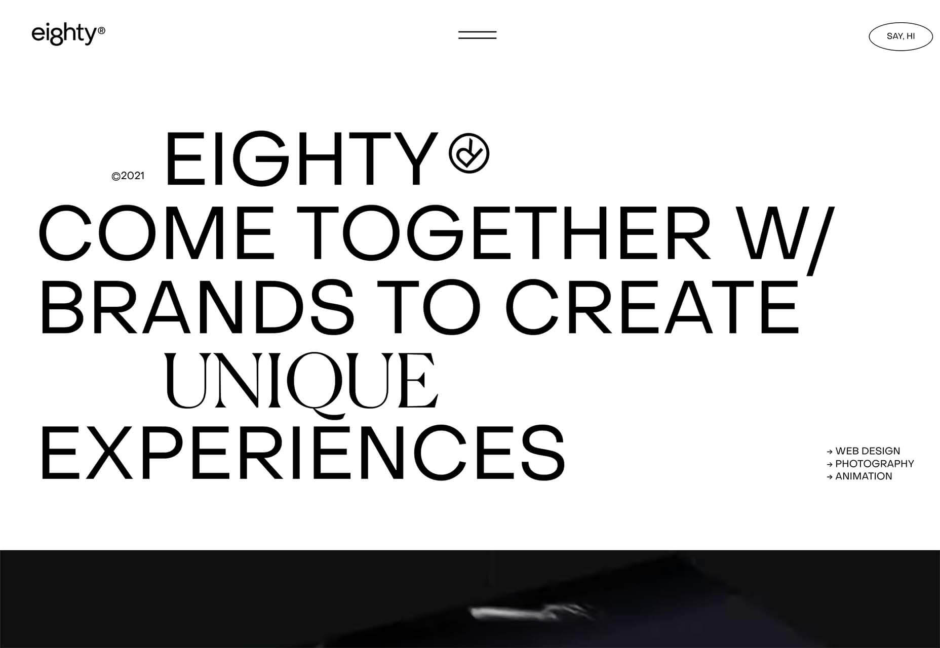
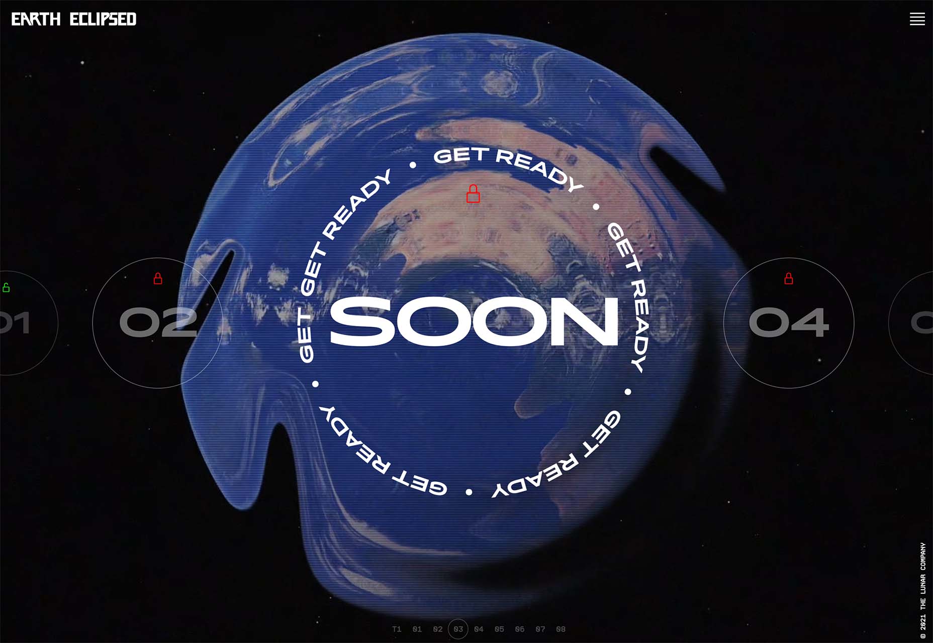
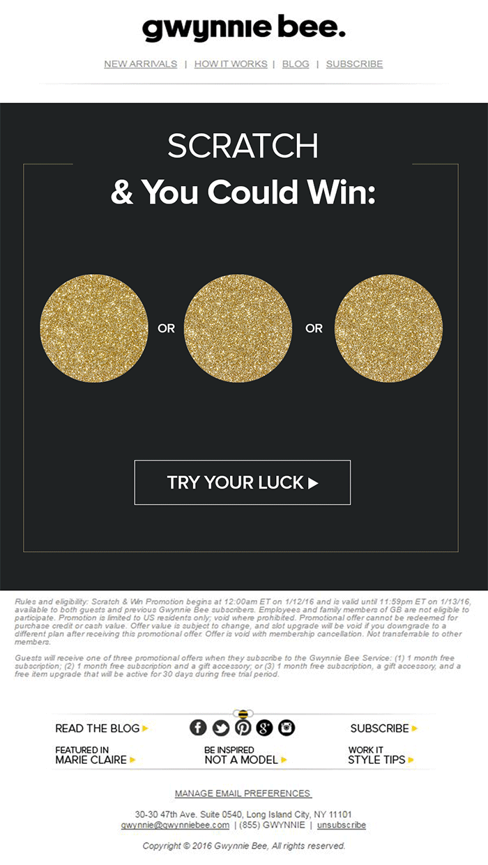
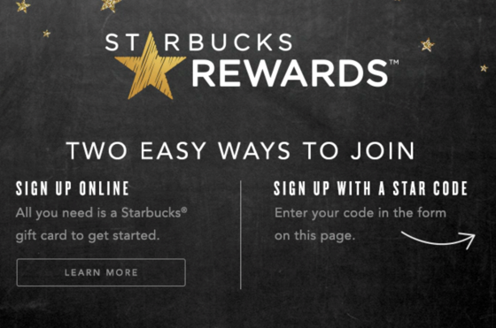
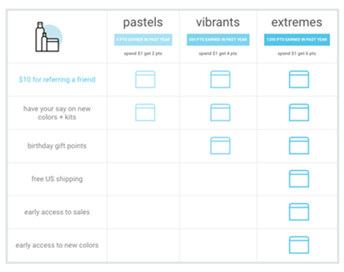
We all want a little more fun and games in our lives. So, why not add some gamification to your next interactive content campaign?

By 2025, the gamification market is expected to witness a massive 30.1% growth rate, with global sales revenue reaching around $32 billion

That’s because gamification adds more entertainment to the website experience and gets audiences engaged. The idea behind gamification is to bring game mechanics into the design of a website or piece of content. There are many different ways to do this. 

Some companies add hidden achievements and bonuses to their blogs that customers can collect by visiting every page and reading their content. Others allow readers to collect points for leaving comments or play games to win potential prizes. 

Used correctly, gamification is a fantastic way to connect with your audience and increase engagement levels. So, how can you use gamification in interactive content?

The Evolution of Gamification 

Elements of gamification have appeared in everything from marketing campaigns to web design and even eCommerce strategies. 

In 2014, an Apple App Store review of more than 100 health apps even found that gamification elements in applications led to greater participation and higher user ratings. In other words, customers are more likely to get involved with an activity that includes gamification components. 

While gamification can take on many different forms, the aim for most companies is to create an environment where customers can feel more invested in their interactions with the website. For example, if you win a point every time you comment on a blog post, and you can trade those points in for prizes, you have more of a desire to keep commenting. 

The promise of being able to “accomplish” things with pieces of interactive content and websites also appeals to the competitive part of our psychology that pushes us to keep doing things in exchange for the promise of a kind of reward. 

Many companies have generated a lot of enthusiasm for their brands through leaderboards, time events, and similar experiences. For example, just look at how popular McDonalds becomes each year when the monopoly game rolls out as part of the purchasing experience. 

People buy more items than they usually would during McDonald’s Monopoly just for the opportunity to win. This same boost in engagement benefits your content strategy too. 

6 Ways to Add Gamification to Your Content

There’s no one right way to gamify your website or your marketing content. The method you choose will depend heavily on your audience and the kind of experience they respond best to. 

The key to success is finding a way to grab your customer’s attention and hold onto it. Here are some of the tried and tested strategies to explore:

1. Create an Actual Game Experience 

When it comes to incorporating gamification into your website design and content, you don’t necessarily need to be clever. You can be extremely straightforward and just design an actual game. For instance, to help attract more people to the American Army, the US created a war simulator that potential applicants could play on Steam. 

The game aimed to introduce young people who might consider a career in the military to what that job might be like. If the kids liked what they saw on Steam, they could visit the military website and learn more. 

For companies who can’t afford to build an entire fully-featured game, something a little smaller can be just as engaging. For instance, rather than using a standard pop-up with a discount code to entice customers to buy the rental service, Gwynnie Bee created a scratch card. People could scratch the spaces using their smartphone or computer cursor and win money off. 

The great thing about the interactive content from Gwynnie Bee is that it encouraged potential visitors to connect with the business in a lucrative way. To use the scratch card, you first had to give your email address. This meant the company could build its email list while delighting consumers. 

When designing a game experience for your marketing campaign, remember:

  • Get the right support: Designing a great game is tough, particularly if you want something more complicated than a scratch card. Don’t take the risk of creating something that doesn’t work properly; hire a developer. 
  • Promote the experience: Make sure everyone knows about your new game. Share screenshots on social media and talk about it in your email campaigns. 
  • Focus on fun: Remember, games are supposed to be fun. Measure the reactions of your audience to ensure they’re having a good time. 

2. Design a Loyalty or Reward Program

Loyalty is one of the most valuable things your audience can give you. So why not reward them for it? Loyalty programs are fantastic tools for business growth and engagement. They give you a way to turn one-off clients into repeat customers and advocates for your brand. 

How you choose to reward your customers (and when) is up to you. Some companies might give customers points every time they share a post on social media or comment on a blog. This encourages more engagement with your brand. 

On the other hand, you might just let your customers earn rewards for every purchase they make. This is a strategy that Starbucks uses with its reward program.

As customers increase their spending with Starbucks, they get the reward of extra points that they can put towards future purchases. This keeps customers coming back for more and may even entice some clients to buy Starbucks when they otherwise wouldn’t. 

The oVertone company is another excellent example of a brand using gamified rewards with its marketing strategy. The loyalty program breaks down into tiers, where users can see how much they need to spend to ascend to the next level. New rewards and perks appear with each level. 

Remember, when building a loyalty program:

  • Make your customers feel special: Ensure that your audience feels good about being one of the lucky few in your loyalty program. Give discounts and offers they can’t get elsewhere.
  • Keep them informed: Make it easy for your customers to see what they need to do to get their next reward, so they keep coming back for more. 
  • Mix things up sometimes: To stop the experience from getting boring, roll out things like “double points” days and bonuses for your most active customers. 

3. Encourage Customer Interaction

The biggest benefit of gamification is that it encourages and increases customer interaction. You can give rewards to participants that comment on your blog posts, for instance, or share your posts on social. The customer benefits from the reward, while you get the advantage of a better business presence. 

Samsung drives interaction with gamification with a function on its website that allows customers to discuss issues and watch videos. The most active participants get a badge for their efforts. 

If your business structure requires a lot of engagement from your audience, then using gamification elements can encourage them to stick with you for longer rather than losing interest. For instance, language learning software Duolingo has a four-point gamification strategy for its users.

Duolingo knows that learning a new language takes a lot of time, so it asks users to set small specific goals instead. The smaller tasks bring users back regularly, and consistent users gain rewards. There’s even a progress bar to help you track your progress compared to other customers. 

Gamification gives your customers another reason to keep coming back and connecting with your brand. That makes a lot of sense for companies that rely on long-term relationships with customers, like Duolingo and other teaching brands, for instance. Remember:

  • Make it simple: People will only want to interact with your brand if it’s easy to do so. Make it clear what you want your customer to do and what they need to do next. 
  • Reward every action: Keep people coming back for more by rewarding them for their actions, even if it’s just with a gold star or digital sticker. 
  • Nudge inactive customers: If a client gets involved in your interactive content, then stops participating, send an email reminding them why they should come back. 

4. Run Contests and Offer Prizes

Probably one of the easiest ways to use gamification in your advertising campaigns is with a competition. Contests and competitions have been around since the dawn of business. They’re a useful way for companies to collect information from customers, particularly if you ask your clients to sign up to your site with an email address to get involved. 

Competitions are also a way to push your audience into doing positive things for your company. For instance, you could run a competition where consumers share a social media post and tag a friend to enter. Or you could have a competition that asks your clients to refer a friend to get involved. 

When KIND, a healthy snack company, wanted to connect with its customers and create a new product, it didn’t just do market research. Instead, the company created the “Raise the Bar” contest to let customers cast a vote for which flavor they wanted to see next.

When 123ContactForm wanted to engage its audience, it gave people the chance to win one of three platinum subscriptions for 6 months. 

Contests are naturally exciting and fun to take part in. They’re an opportunity to get your audience excited, and you don’t need to give anything huge away either. Just make sure that the prize you offer is something that your audience will be interested in. 

A few more pro tips include:

  • Generate hype first: Don’t just launch a contest out of nowhere; get people excited about the idea with announcement blogs, social media posts, and emails. 
  • Give people a lot of ways to get involved: If people can’t take part in the competition on social media, let them do something on your website instead. 
  • Follow up after the win: When someone does win something from your website, follow up with that winner and post pictures in the form of a blog/case study. This will generate more hype for your brand and get people excited about the next event. 

5. Get Your Audience Feeling Competitive

No matter how much they might deny it, most people are at least a little competitive. So when you’re implementing a gamification campaign into your content and marketing efforts, it pays to tap into that sense of competition. All you need to do is find a way to encourage your followers to compete. 

The best example of a company that did this particularly well is Nike. Nike and the Run Club app teamed up to motivate people to get involved with healthy activities. The app allowed users to customize and build their ideal training program based on their athletic level. 

At the same time, you could also win badges and trophies to share with your running community. The more you took part in challenges on the app, the more you could potentially win. 

The Fitbit application has a similar way of keeping customers engaged. When you download Fitbit, you can access information about your exercise strategies and potentially track your progress towards your goals. However, there are also measurable achievements to earn – like a badge when you first walk 500 miles. 

Users on Fitbit can also find their friends using the same app and compete with them in various challenges. 

To successfully add a competition to your gamification strategy, remember:

  • It needs to be social: People will be more inclined to get involved if they show off their achievements. So make sure that people can showcase their accomplishments. 
  • Make people want to win: There needs to be a reason to get to the top of the leaderboard. You might offer people discounts or exclusive prizes if they accomplish certain goals. 
  • Show progress: Prompt people to keep working on reaching their targets by showing them how close they are to success. 

6. Make Boring Content Seem More Interesting

Some content is naturally more engaging than others. If you want to showcase some important information or data, you might create a whitepaper or a report. Unfortunately, the result can be a relatively bland piece of content.

With elements of gamification, you can make the experience a lot more engaging and interesting. Sites like Daytum.com allow users to turn personal stats and information into charts that showcase information in engaging ways. You can allow your users to track their progress through the report and rack up points as they go. 

Adding subtle elements to otherwise clinical and less interesting information is a wonderful way to make the experience more exciting. The more enticed your customers are by your content, the more likely it is that you’ll sell them on your business. 

Gamify Your Marketing Strategy

Gamification isn’t a new concept, but it’s one that many companies and designers can begin to take advantage of these days. Thanks to more advanced browsers and smartphones, customers can more fully enjoy the interactive elements of websites and content campaigns. 

As your audience dives deeper into the digital world, they expect more unique experiences from you. Gamification can make any website or marketing experience more memorable. It’s time to take advantage. 

Source

The post 7 Ways to Use Gamification in Marketing Campaigns  first appeared on Webdesigner Depot.


Source de l’article sur Webdesignerdepot