WordPress is by far the world’s most popular CMS. Not only does it dominate the CMS market with a 64% market share, but it also powers 39.6% of all websites. It has taken the internet by storm by democratizing the web for all. Now, anyone can build, manage, and host a successful website without needing a college degree or coding expertise.
However, while WordPress is great at managing many technical aspects, it still can’t do everything for you. Built mostly on PHP, there are often concerns regarding how performant WordPress is. And, with performance impacting everything from bounce rates to SEO rankings to conversions, it’s something that should be on your radar too.
If you don’t know it yet, images are one of the main causes of slow-loading websites. In recent years, WordPress has stepped up its efforts to try and help users with image optimization out-of-the-box.
Still, as we’ll show, it’s not a total solution, and there is still plenty you can do to deliver better experiences on your WordPress website through image optimization.
What is WordPress Image Optimization? Why is it Important?
Simply put, image optimization is anything you do to make images load faster on your website pages. Almost all websites that use images can benefit from some form of image optimization, even those using WordPress.
Why?
Well, performance is a hugely significant factor when it comes to the competitiveness of your website today.
Google has also made performance an increasingly important factor when it comes to SEO rankings. In fact, performance is a direct ranking signal that carries significant weight.
Google’s Page Experience Update that went live in 2021 has been the biggest move in that direction yet. Soon, Google might even use visual indicators in SERP results to distinguish high-performing websites from the rest.
In Google’s own words, “These signals measure how users perceive the experience of interacting with a web page and contribute to our ongoing work to ensure people get the most helpful and enjoyable experiences from the web.”
So, Why Should We Target Images For Performance Optimization?
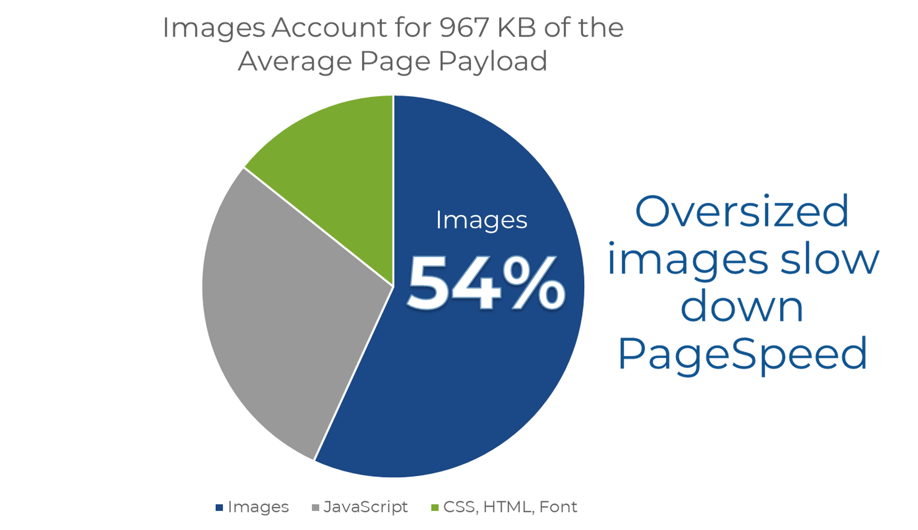
According to Google, images are the largest contributor to page weight. Google has also singled out image optimization specifically as the factor with the most untapped potential for performance optimization.
This problem isn’t going away soon. According to data by the HTTP Archive, there are roughly 967.5 KB bytes of image data on desktop web pages and 866.3 KB of image data on mobile pages. This is an increase of 16.1% and 38.8%, respectively, over the last five years.
Thanks to popular e-commerce tools like Woocommerce, it’s estimated that up to 28% of all online sales happen on WordPress websites.
And don’t forget, images are both a key part of conveying information to the user and integral to the design of your website. If they take significantly longer to load than your text, for example, it will negatively impact the user experience in a variety of ways.
In summary, optimized images help your WordPress website by:
- Improving user satisfaction.
- Improving various traffic metrics, like bounce rates, time-on-page, etc.
- Boosting your SEO rankings.
- Contributing to higher conversions (and sales).
How Does Image Optimization in WordPress Work?
WordPress is so popular because it’s a CMS (content management system) that allows anyone to build, design, and manage a website without any coding or advanced technical experience. Advanced features can be installed with just a few clicks, thanks to plugins, and you rarely have to touch the code behind your website unless you want to make some unique modifications.
In short, using a CMS like WordPress shields you from many of the day-to-day technicalities of running a website.
WordPress Image Optimization: What It Can Do
As we mentioned, one of the main reasons WordPress is so popular is because it takes care of many of the technical aspects of running a website. With that in mind, many think that WordPress should also automatically take care of image optimization without them having to get involved at all.
Unfortunately, that’s not really the case.
True, WordPress does offer some built-in image optimization. Whenever you upload an image to WordPress, it currently compresses the quality to about 82% of the original (since v4.5).
In v4.4, WordPress also introduced responsive image syntax using the srcset attribute. This creates four breakpoints for each image you upload according to the default WordPress image sizes:
- 150px square for thumbnails
- 300px width for medium images
- 768px max-width for medium_large images
- 1024px max-width for large images.
Here you can see an example of the actual responsive syntax code generated by WordPress:
<img loading="lazy" src="https://bleedingcosmos.com/wp-content/uploads/2021/12/33-1024x683.jpg" alt="" class="wp-image-9" width="610" height="406" srcset="https://bleedingcosmos.com/wp-content/uploads/2021/12/33-1024x683.jpg 1024w, https://bleedingcosmos.com/wp-content/uploads/2021/12/33-300x200.jpg 300w, https://bleedingcosmos.com/wp-content/uploads/2021/12/33-768x512.jpg 768w, https://bleedingcosmos.com/wp-content/uploads/2021/12/33-1536x1024.jpg 1536w" sizes="(max-width: 610px) 100vw, 610px">
Depending on the screen size of the device from which a user visits your webpage, WordPress will let the browser pick the most appropriately sized image. For example, the smallest version for mobile displays or the largest for 4K Retina screens, like those of a Mac.
While this may seem impressive, it’s only a fraction of what can be achieved using a proper image optimization solution, as we’ll show later.
Lastly, WordPress implemented HTML native default lazy loading for all images starting with version 5.5.
So, in short, WordPress offers the following image optimization capabilities baked-in:
- Quality compression (limited)
- Responsive syntax (up to 4 breakpoints)
- Lazy loading
WordPress Image Optimization: What it Cannot Do
There are other issues many have with both the implementation of image compression and responsive syntax as it’s used by WordPress. This leads to some users even purposefully deactivating WordPress’ built-in image optimization so they can fully take control of it themselves.
Here are some of the reasons why:
- WordPress uses a very basic form of quality compression. It does not use advanced technologies like AI and machine learning algorithms to compress images while maintaining maximum visual quality. It’s also lossy compression, so the quality is lost for good. You can clearly see the difference between an original HD image and the compressed version created by WordPress.
- WordPress only compresses most images by up to 20%, while advanced image optimization tools can reduce all image sizes intelligently by up to 80%.
- Responsive syntax can provide significant performance improvements over simply uploading a single HD image to be served on all devices and screens. However, it’s still only limited to a set number of breakpoints (typically 3 or 4). Since it’s not dynamic, a whole spectrum of possible image sizes is not created or used.
- Responsive syntax code is not scalable and can quickly lead to code that’s bloated, messy, and hard to read.
- WordPress doesn’t accelerate image delivery by automatically caching and serving them via a global CDN, although this can be done using other tools.
Another important optimization feature that WordPress does not have is auto-conversion to next-gen image file formats. Different image formats offer different performance benefits on different devices. Some formats also enable higher levels of compression while maintaining visual fidelity.
Next-gen formats like WebP, AVIF, and JPEG-2000 are considered to be the most optimal formats on compatible devices. For example, until recently, WebP would be the optimal choice on Chrome browsers, while JPEG-4000 would be optimal on Safari browsers.
However, WordPress will simply serve images in the same formats in which they were originally uploaded to all visitors.
How to Measure the Image Performance of a WordPress Website?
As the undisputed king of search engines, we’ll base most of our performance metrics on guidelines established by Google.
Along with its various performance updates, Google has released a number of guidelines for developers as well as the tools to test and improve their websites according to said guidelines.
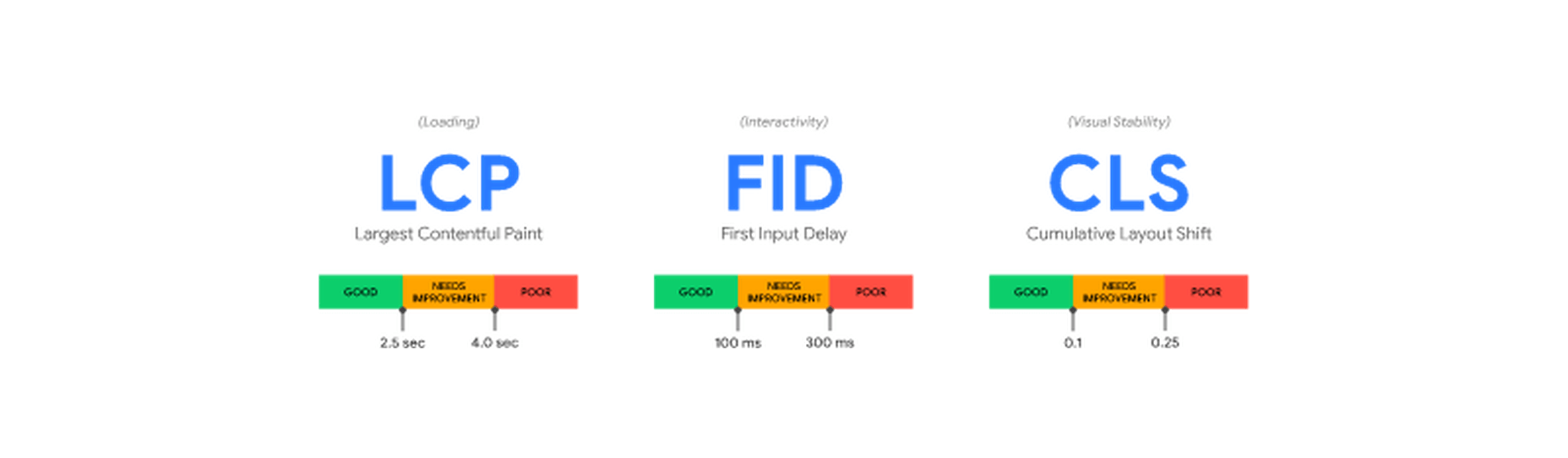
Google introduced Core Web Vitals as the primary metrics for measuring a web page’s performance and its effect on the user experience. Thus, Core Web Vitals are referred to as “user-centric performance metrics.” They are an attempt to give developers a testable and quantifiable way to measure an elusive and abstract concept such as “user experience.”
Combined with a number of other factors, Core Web Vitals constitute a major part of the overall page experience signal:
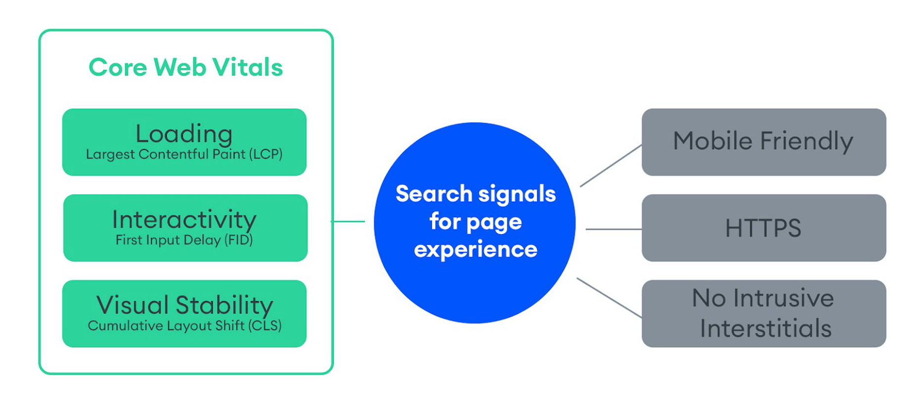
You can find a complete introduction to Core Web Vitals here. However, they currently consist of three main metrics:
- LCP (Largest Contentful Paint): The time it takes the largest above-the-fold element on your page to load. This is typically a full-sized image or hero section.
- FID (First Input Delay): The delay from the moment a user first interacts with an element on the page until it becomes responsive.
- CLS (Cumulative Layout Shift): The visual stability with which the elements on a page load.
Here is an illustration of how these metrics are scored:
While these are the three most important metrics to optimize, they are not the only ones. Google still measures other metrics like the FCP (First Contentful Paint), SI (Speed Index), as well as the TTFB (Time to First Byte), TBT (Total Blocking Time), and TTI (Time to Interactive).
A number of these metrics are directly affected by the images used on your web pages. For example, LCP, FCP, and SI are direct indicators of how fast the content of your web page loads and depends on the overall byte size of the page. However, it can also indirectly affect FID by keeping the main thread busy with rendering large amounts of image content or the perceived CLS by delaying the time it takes large images to load.
These metrics apply to all websites, whether they are custom-made or built using a CMS like WordPress.
When using tools like Lighthouse or PageSpeed Insights, you’ll also get scored based on other flags Google deems important. Some of them are specific to images, such as properly sizing images and serving images in next-gen formats.
If you only use built-in WordPress image optimization, you’ll get flagged for the following opportunities for improvement:
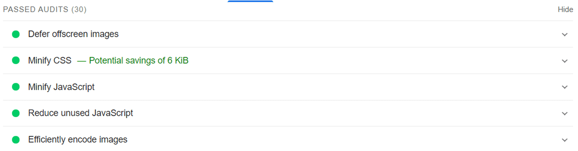
Some of the audits it will pass, however, are deferring offscreen images (lazy loading) and efficiently coding images (due to compression):
A Better Way to Optimize WordPress Images: ImageEngine
Billions of websites are all vying for prime real estate on Google SERPs, as well as the attention of an increasingly fussy internet-using public. Every inch matters when it comes to giving your website a competitive advantage.
So, how can you eliminate those remaining performance flags and deliver highly optimized images that will keep both your visitors and Google happy?
Sure, you could manually optimize images using software like PhotoShop or GIMP. However, that will take you hours for each new batch of images. Plus, you still won’t benefit from any automated adaptive optimization.
A more reasonable solution in today’s fast-paced climate is to use a tool developed specifically for maximum image optimization: an image CDN like ImageEngine.
ImageEngine is an automated, cloud-based image optimization service using device detection as well as intelligent image compression using the power of AI and machine learning. It can reduce image payloads by up to 80% while maintaining visual quality and accelerating delivery around the world thanks to its CDN with geographically dispersed PoPs.
Why is ImageEngine Image Optimization Better Than WordPress?
When making a head-to-head comparison, here are the reasons why ImageEngine can deliver better performance:
- Device Detection: ImageEngine features built-in device detection. This means it picks up what device a visitor to your website is using and tailors its optimization strategy to what’s best for that specific device.
- Client hints: By supporting client hints, ImageEngine has access to even more information regarding the device and browser to make better optimization decisions.
- Next-gen formats: Based on optimal settings, ImageEngine automatically converts and serves images in next-gen formats like WebP, AVIF, JPEG2000, and MP4 (for GIFs).
- Save data header: When a Chrome user has save-data mode enabled, ImageEngine will automatically compress images more aggressively to save on data transfer.
- CDN with dedicated edge servers: ImageEngine will automatically cache and serve your optimized image assets using its global CDN. Each edge server has device awareness built-in to bring down latency and accelerate delivery. You can also choose to prioritize specific regions.
So, the key differentiator is that ImageEngine can tailor optimizing images for what’s optimal for each of your visitors. ImageEngine is particularly good at serving mobile visitors thanks to WURFL device detection, which can dynamically resize images according to most devices and screen sizes in use today. As of now, this is a completely unique capability that none of its competitors offer.
It allows for far better and more fine-tuned optimization than WordPress’ across-the-board approach to compression and responsive syntax.
If you want, you could turn off WordPress responsive syntax and compression, and you would still experience a performance increase using ImageEngine. However, ImageEngine also plays nice with responsive syntax, so it’s not completely necessary unless you want to serve the highest-fidelity/low-byte-size images possible.
How Does ImageEngine Work with WordPress?
The process ImageEngine uses to integrate with WordPress can be broken down into a few easy steps:
- Sign up for an ImageEngine account: ImageEngine offers three pricing plans depending on the scale and features you need as well as a no-commitment 30-day free trial.
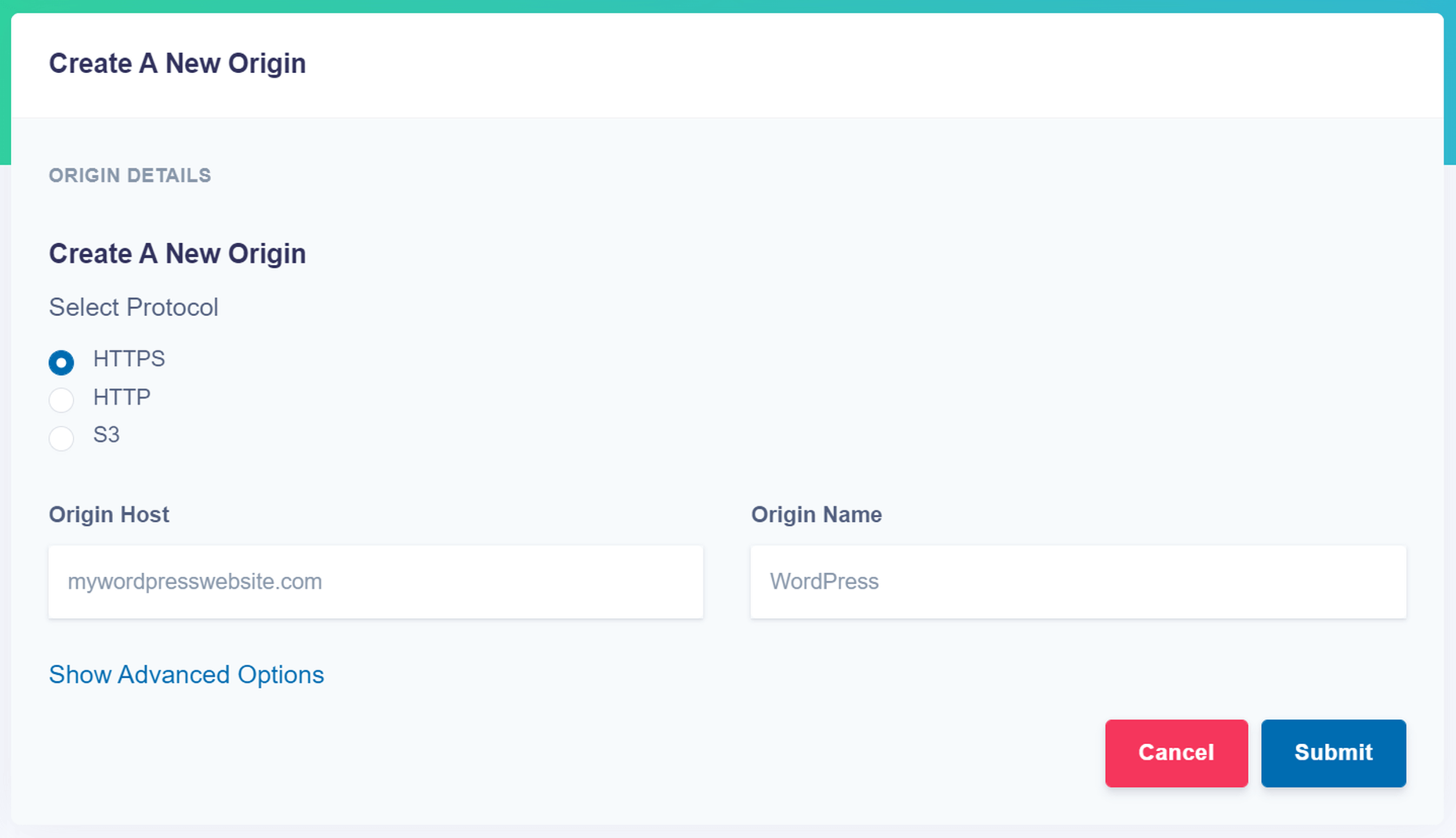
- Specify your image origin: This tells ImageEngine where to find the original versions of your images. For a WordPress website, you can just use your domain, e.g., https://mywordpresswebsite.com. ImageEngine will then automatically pull the images you’ve uploaded to your WordPress website.
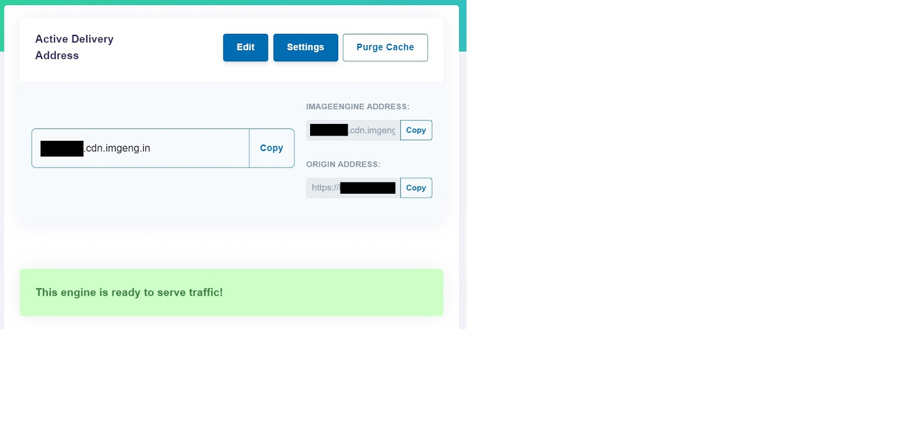
- Copy the Delivery Address: After you create an account and specify your image origin, ImageEngine will provide you with a Delivery Address. A Delivery Address is your own unique address that will be used in your <img> tags to point back to the ImageEngine service. Delivery Addresses may be on a shared domain (imgeng.in) or customized using a domain that you own. A Delivery Address typically looks something like {random_string}.cdn.imgeng.in. If your images are uploaded to the default WordPress folder /wp-content/uploads/, you can access your optimized images from ImageEngine simply by changing your website domain. For example, by typing {imageengine_domain}.cdn.imgeng.in/wp-content/uploads/myimage.jpg into your browser, you’ll see the optimized version of that image. Just press the copy button next to the Delivery Address and use it in the next step configuring the plugin.
- Install the ImageEngine Optimizer CDN plugin: The plugin is completely free and can be installed just like any other plugin from the WordPress repository.
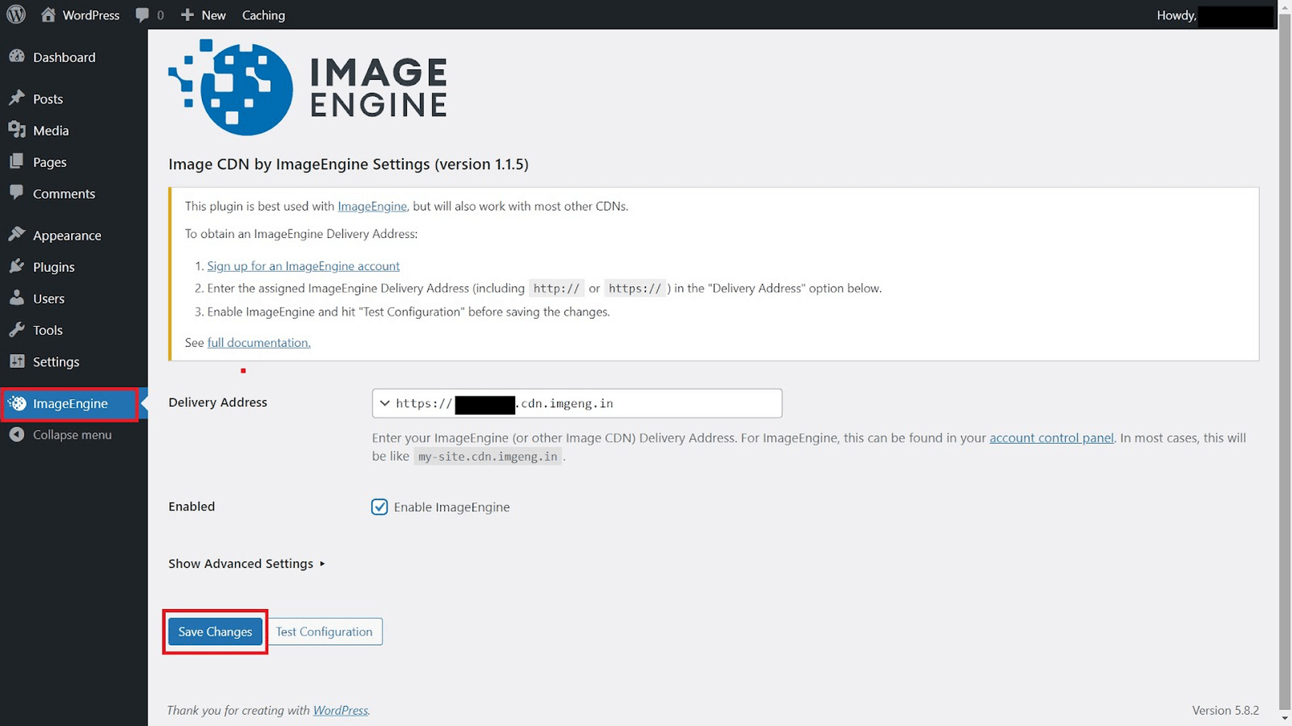
- Configure and enable ImageEngine Plugin in WordPress: Just go to the plugin under “ImageEngine” in the main navigation menu. Then, copy and paste in your ImageEngine “Delivery Address,” tick the “Enabled” checkbox, and click “Save Changes” to enable ImageEngine:
Now, all ImageEngine basically does is replace your WordPress website domain in image URLs with your new ImageEngine Delivery Address. This makes it a simple, lightweight, and non-interfering plugin that works great with most other plugins and themes. It also doesn’t add unnecessary complexity or weight to your WordPress website pages.
ImageEngine vs Built-in WordPress Image Optimization
So, now let’s get down to business by testing the performance improvement you can expect from using ImageEngine to optimize your image assets.
To do this test, we set up a basic WordPress page containing a number of high-quality images. I then used PageSpeed Insights and the Lighthouse Performance Calculator to get the performance scores before and after using ImageEngine.
Importantly, we conducted this test from a mobile-first perspective. Not only has mobile internet traffic surpassed desktop traffic globally, but Google themselves have committed to mobile-first indexing as a result.
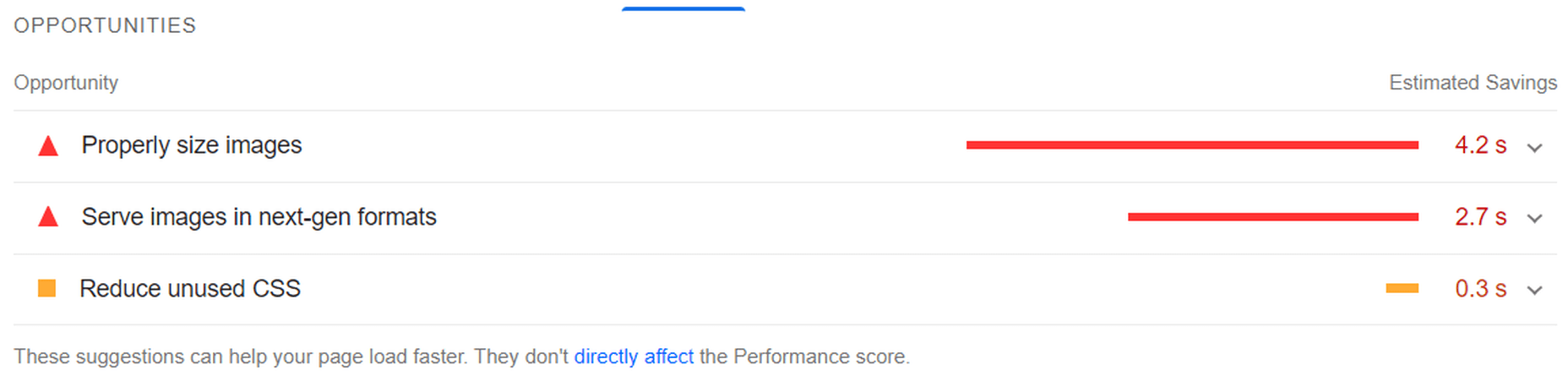
Here is a PageSpeed score using the Lighthouse calculator for WordPress with no image optimization:
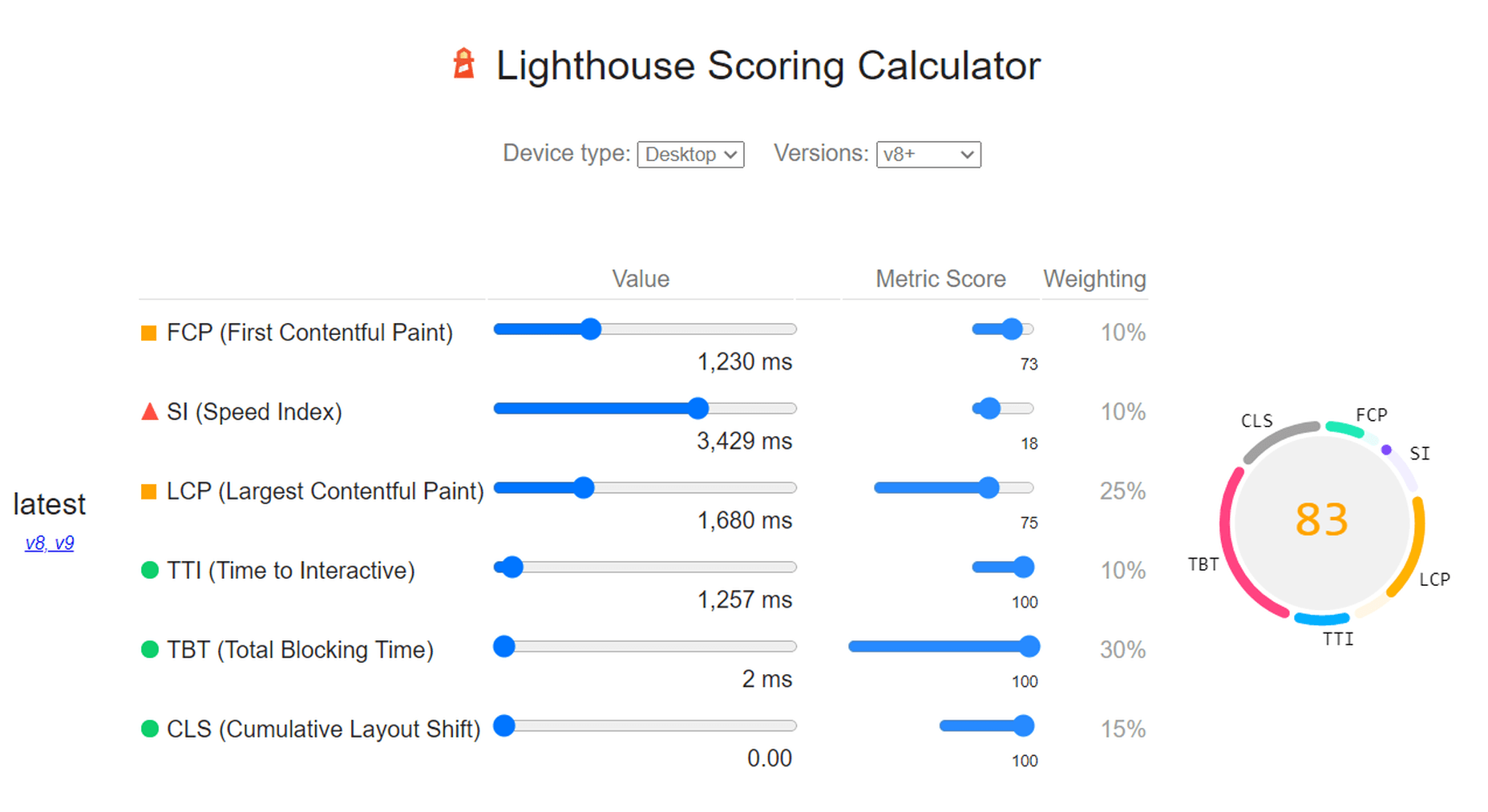
As we can see, both Core Web Vitals and other important metrics were flagged as “needs improvement.” Specifically, the LCP, FCP, and TBT. In this case, both the LCP and FCP were a high-res featured image at the top of the page.
If we go to the opportunities for improvement highlighted by PageSpeed, we see where the issues come from. We could still save as much as 4.2s of loading time by properly resizing images and a further 2.7s by serving them in next-gen formats:

So, now let’s see how much ImageEngine can improve on that.
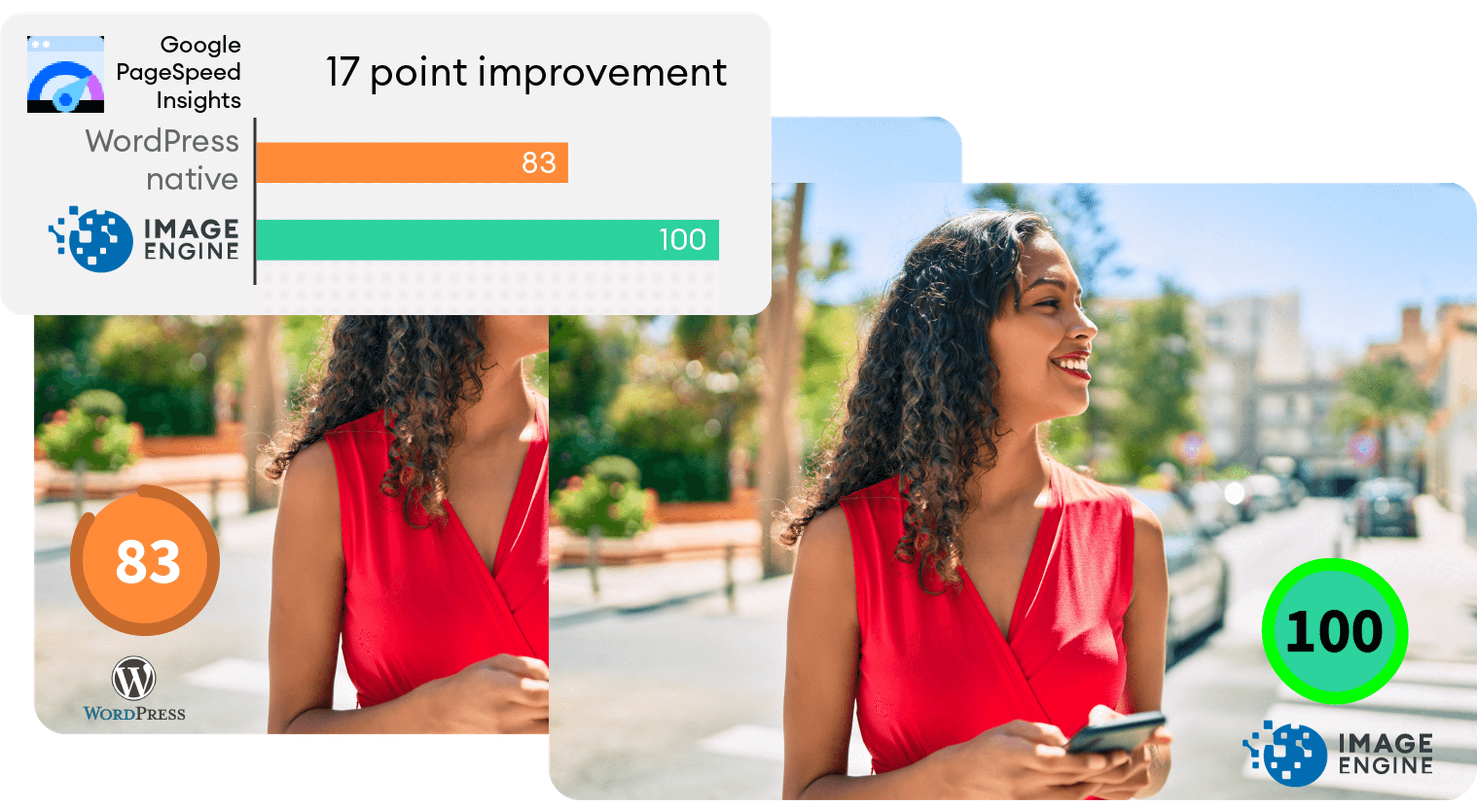
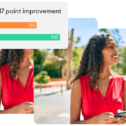
The same test run on my WordPress website using ImageEngine got the following results:
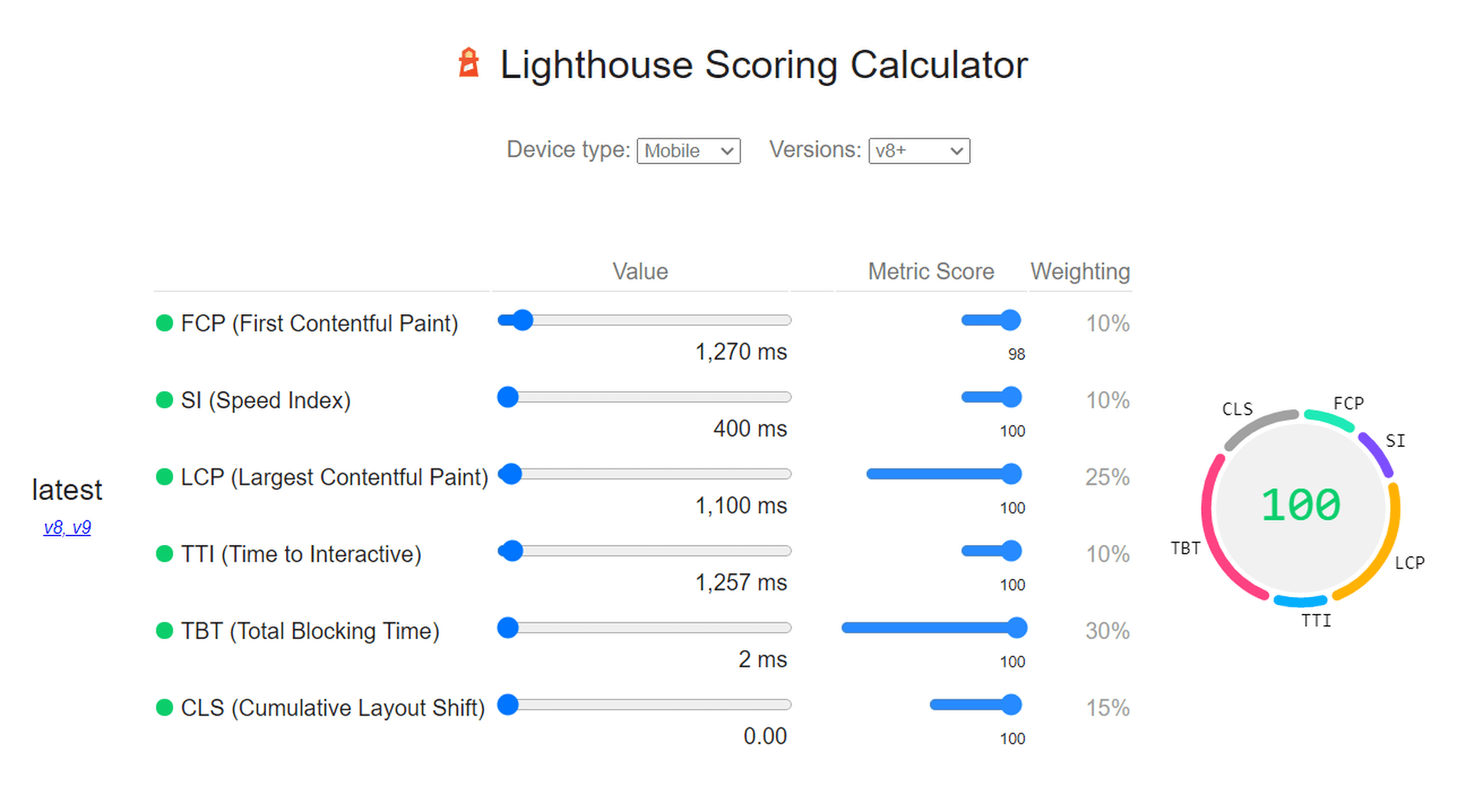
As you can see, we now have a 100 PageSpeed score. I saved roughly 2.5s on the SI (~86%) as well as roughly 1.7s on the LCP (~60%). There was also a slight improvement in the FCP.
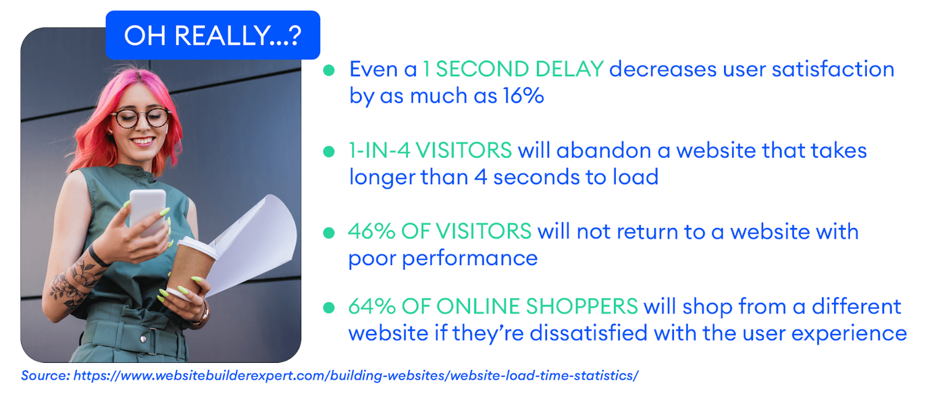
Not only will you enjoy a stronger page experience signal from Google, but this represents a tangible difference to visitors regarding the speed with which your website loads. That difference will lead to lower bounce rates, increased user satisfaction, and more conversions.
There was also a 53% overall reduction in the total image payload. This is impressive, considering that it’s on top of WordPress’ built-in compression and responsive syntax.
Conclusion
So, as someone with a WordPress website, what can you take away from this?
Well, first of all, WordPress does feature some basic image optimization. And while not perfect, it should help you offer reasonable levels of performance, even if you use a lot of image content.
However, the caveat is that WordPress applies aggressive, across-the-board compression, which will lead to a noticeable reduction in visual quality. If you use WordPress for any type of website where premium quality images are important, this is a concern — for example, as a photography portfolio, exhibition, or image marketplace like Shutterstock.
By using ImageEngine, you can reduce image payloads and accelerate delivery even further without compromising too harshly on visual quality. What’s more, ImageEngine’s adaptive image optimization technology will provide greater improvements to more of your visitors, regardless of what device(s) they use to browse the web.
Whether or not you still want to use WordPress’ built-in optimizations, ImageEngine will deliver significant improvements to your user experience, traffic metrics, and even conversions.
Plus, true to the spirit of WordPress, it’s extremely simple to set up without any advanced configuration. Just sign up for ImageEngine in 3 easy steps, install the plugin, integrate ImageEngine by copy/pasting your image domain, and you’re good to go.
[ This is a sponsored post on behalf of ImageEngine ]
Source
The post WordPress Website Analysis: Before & After ImageEngine first appeared on Webdesigner Depot.
Source de l’article sur Webdesignerdepot

 If you want to know how well-dressed someone is, look at their shoes. Shoes tell you a lot about a person’s style, activities, and choices. We often choose clothes to deceive people about who we are — we want to be brighter, more successful, more relaxed, more adventurous than we actually are. But, our shoes paint an honest picture and offer endless insights into who the wearer is.


 Every day design fans submit incredible industry stories to our sister-site, Webdesigner News. Our colleagues sift through it, selecting the very best stories from the design, UX, tech, and development worlds and posting them live on the site.


 As we move closer to spring, we’re going to see a change in typography styles come with it. While we always need new serifs and sans serifs to design with, in the spring, it’s not uncommon to use more nature-inspired and whimsical fonts to usher in the warmer temps, wedding season, and holidays like Earth Day and Mother’s Day.


 Every day design fans submit incredible industry stories to our sister-site, Webdesigner News. Our colleagues sift through it, selecting the very best stories from the design, UX, tech, and development worlds and posting them live on the site.


 The email channel is known for multiple advantages. It is convenient to implement practically, offers many options, and has a fantastic
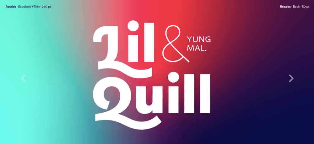
 Welcome to the latest edition of our top 20 sites of the month. In this February’s collection, the overall feel is lighthearted and optimistic, as we are seeing the positivity of a new year persisting across the web.


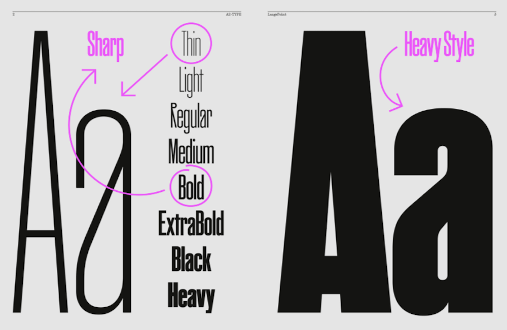
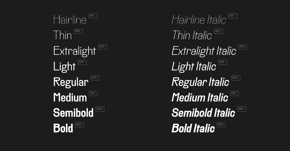
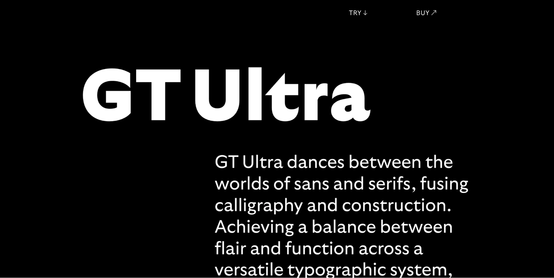
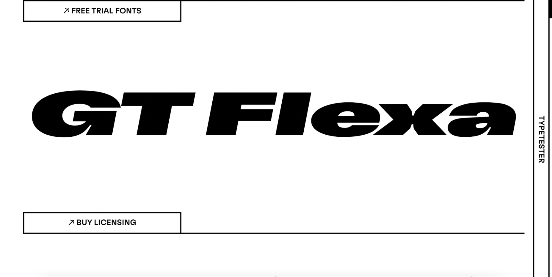
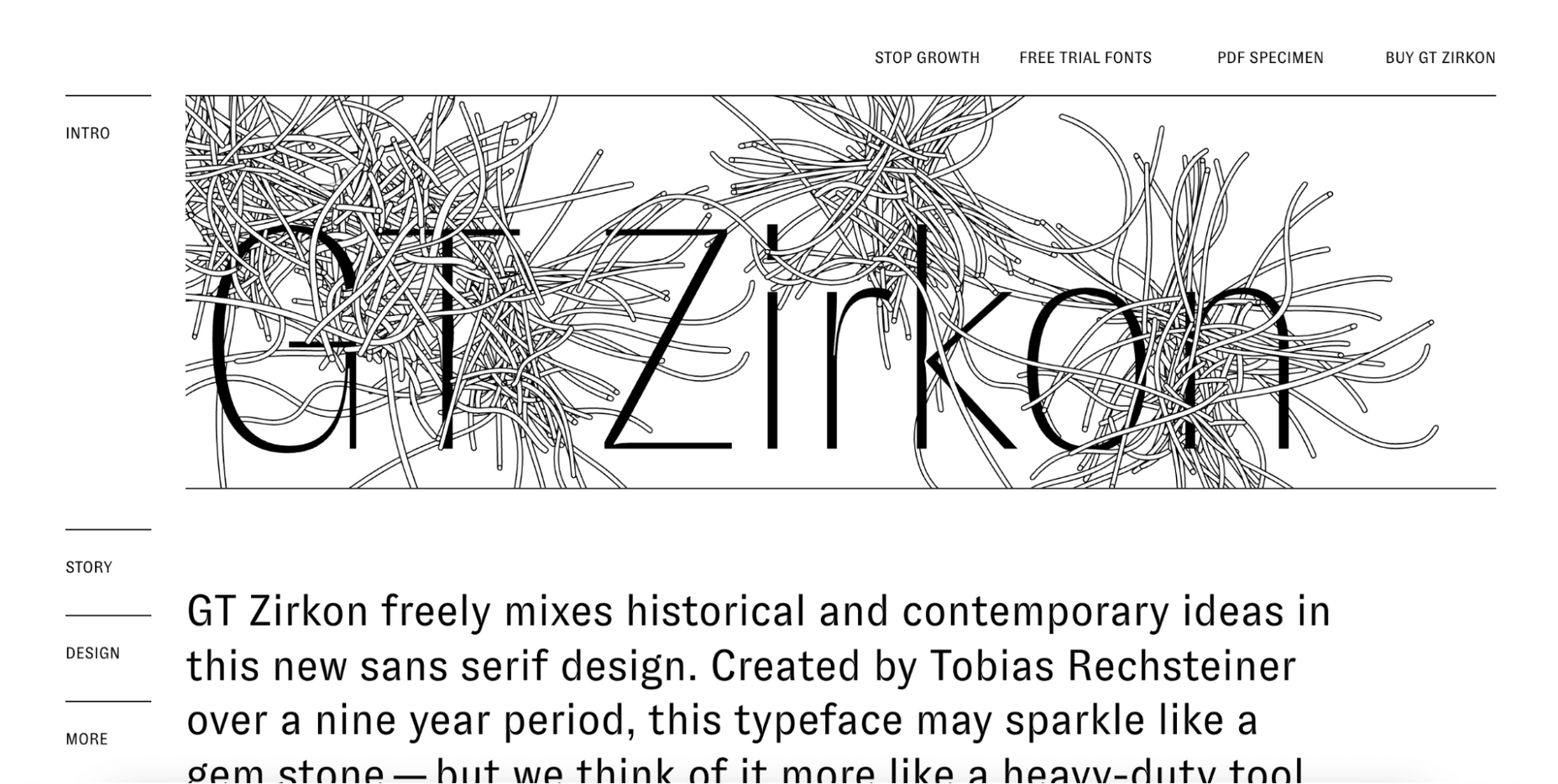
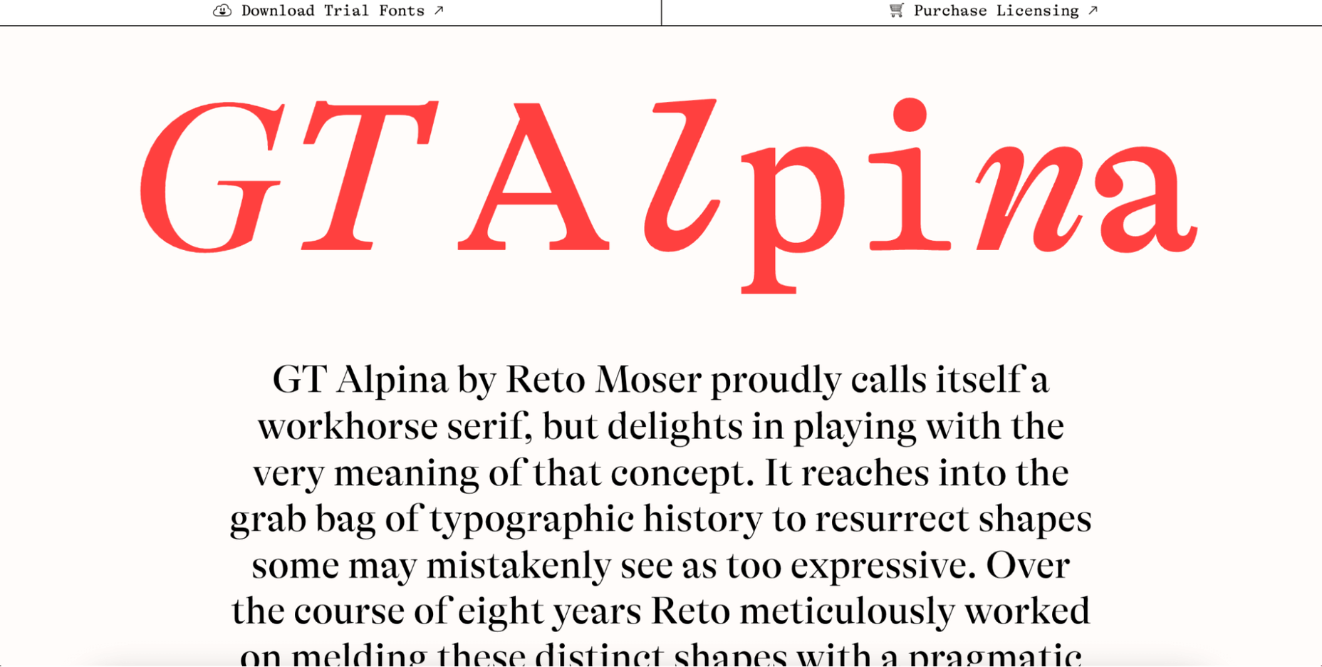
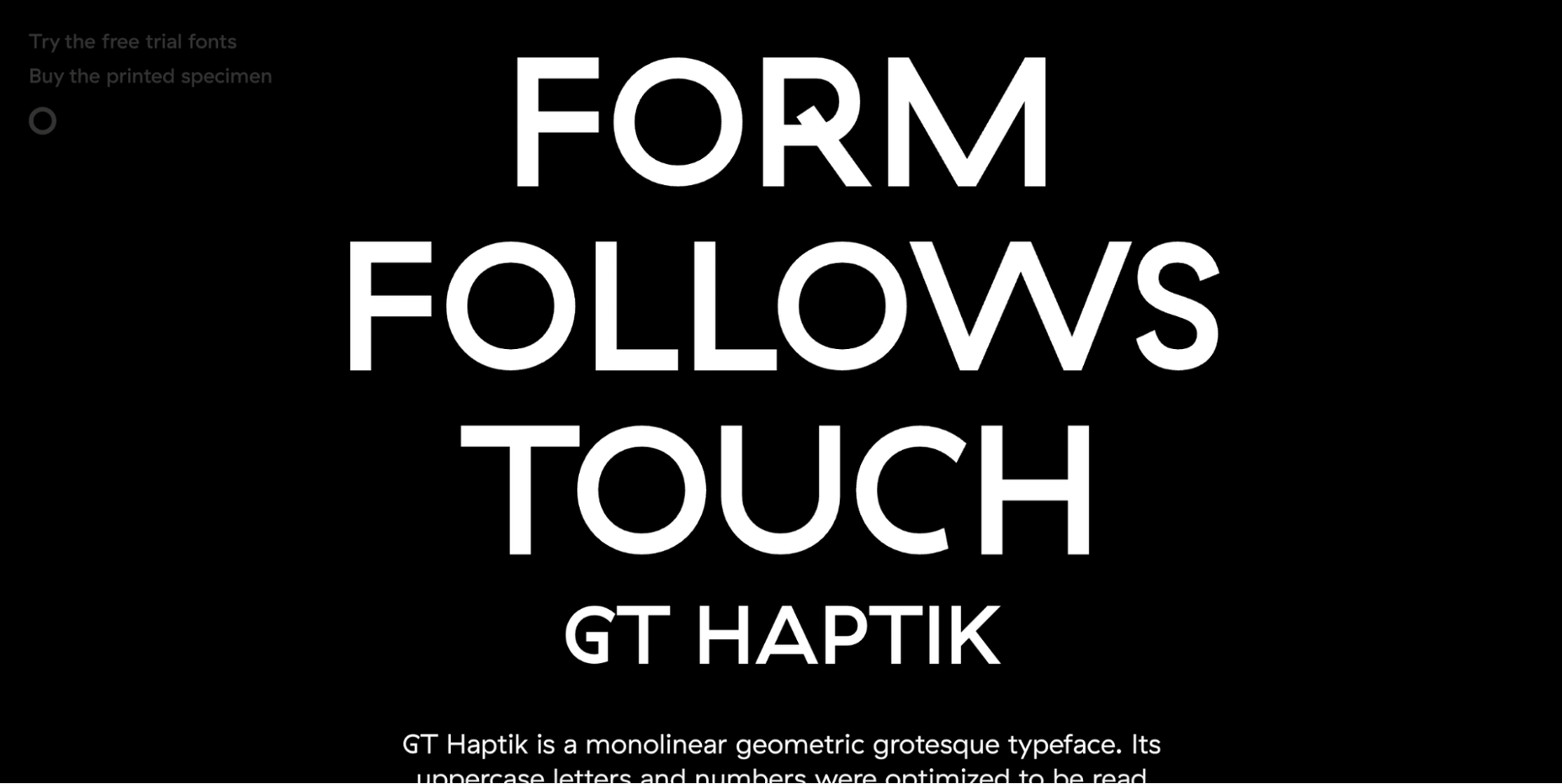
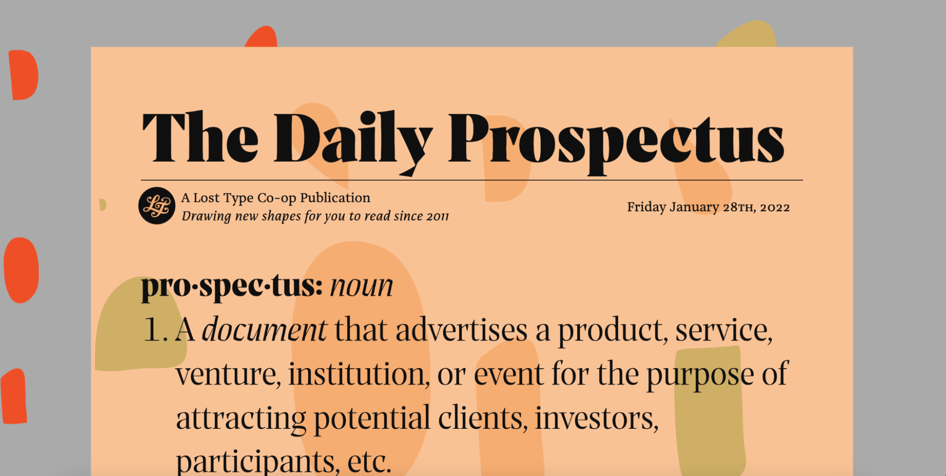
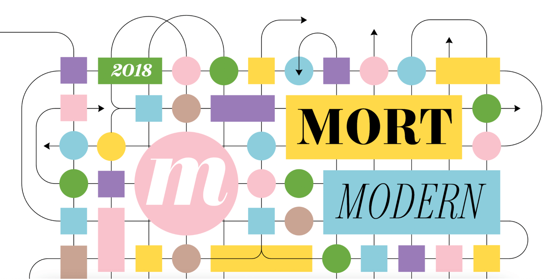
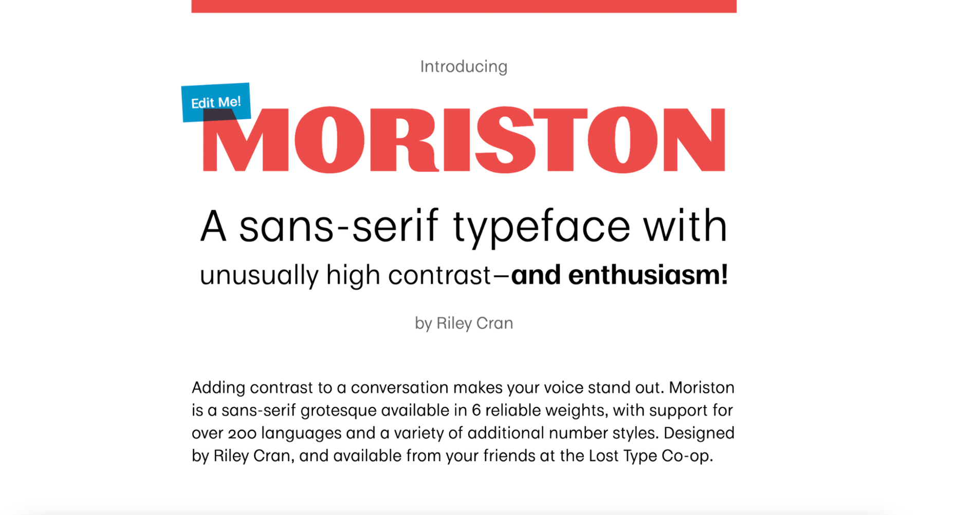
 Are you looking for a unique font that will make your next project shine? Or maybe you need a typeface with a beautiful design and rich history behind it. Luckily, mini-sites for fonts allow us to creatively explore a font’s origins and history. We know (from our own experience) how important it is for UI and UX designers to have a variety of fonts for our designs.
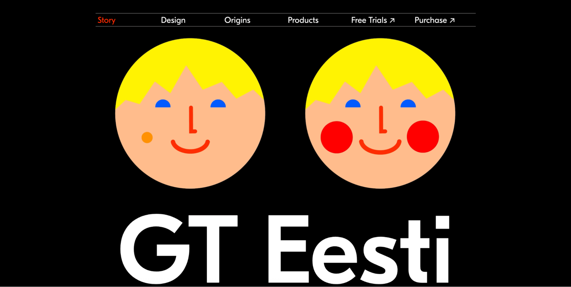


 What stands out as an incredible web design project for you? Do you count your creation as a success if it’s modern,


 User Experience (UX) design and User Interface (UI) design are two terms people sometimes mistakenly use interchangeably. While aspects of each are interconnected, there are distinct differences between UI/UX design.