Articles

Every day design fans submit incredible industry stories to our sister-site, Webdesigner News. Our colleagues sift through it, selecting the very best stories from the design, UX, tech, and development worlds and posting them live on the site.

The best way to keep up with the most important stories for web professionals is to subscribe to Webdesigner News or check out the site regularly. However, in case you missed a day this week, here’s a handy compilation of the top curated stories from the last seven days. Enjoy!

The 9 Best XAMPP Alternatives for Hosting your Website Locally

Exciting New Tools for Designers, November 2021

Why Developers are so Divided Over WordPress

Step-by-Step Guide: How to Design a Website Homepage

How to Build F and Z-Patterns Using HTML and CSS

UX Design Psychology Tricks for Design Excellence

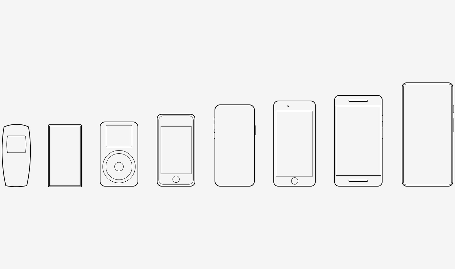
What if Phones were Actually Designed for Hands?

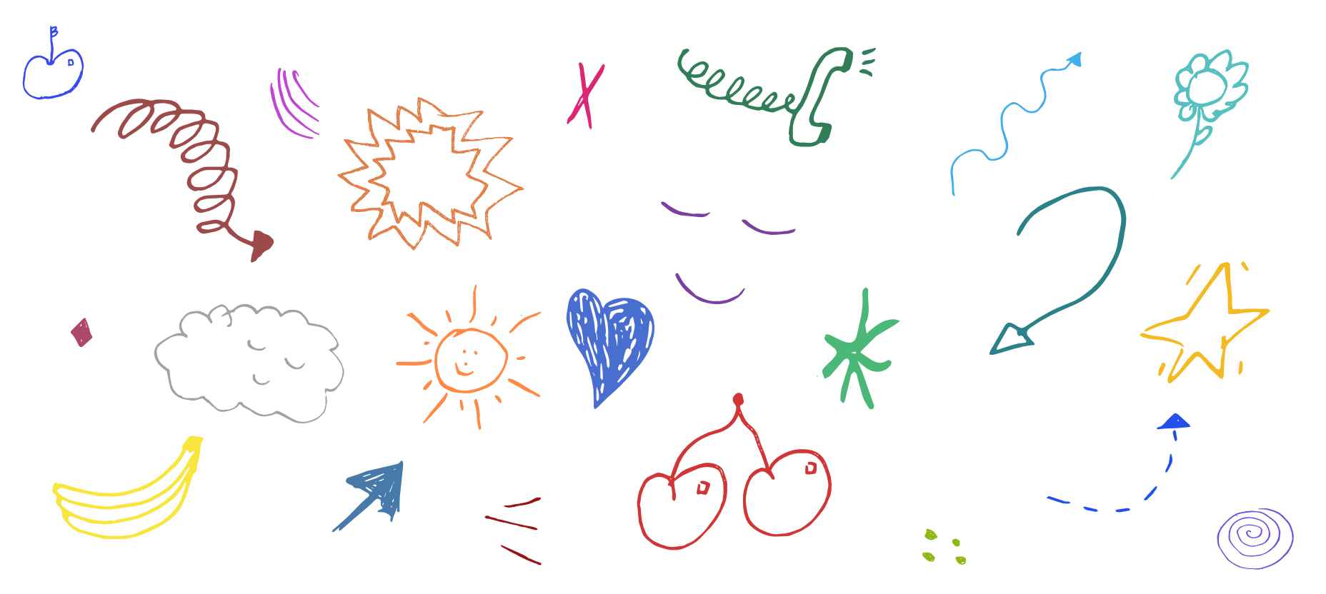
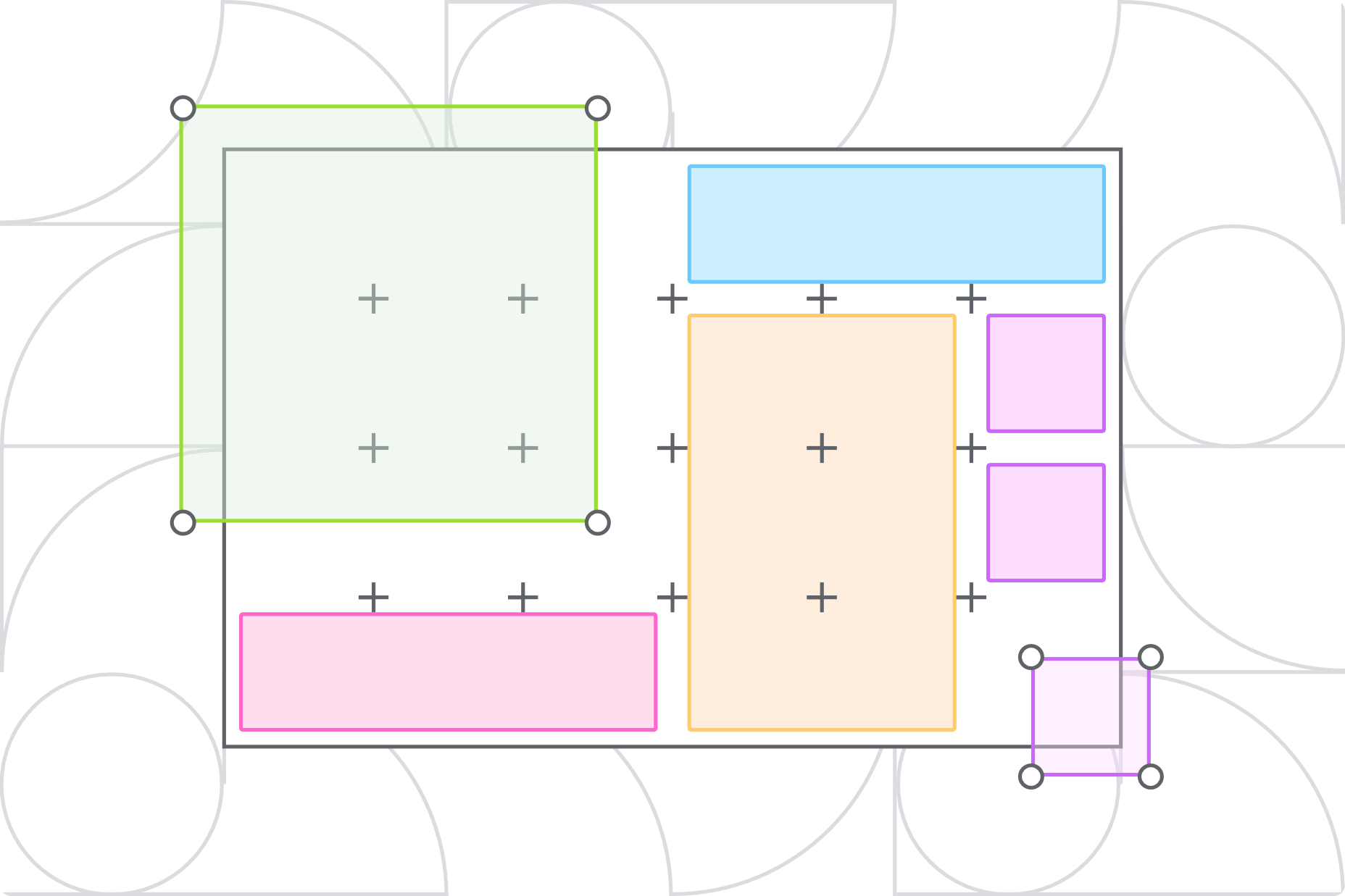
Dddoodle – Collection of Fun Hand-Drawn Illustrations in SVG Format

Layout Patterns – Collection of Layout Patterns Built Using CSS

22 Impressive Web Design Concepts for Various Business Objectives

Source

The post Popular Design News of the Week: November 15, 2021 – November 21, 2021 first appeared on Webdesigner Depot.

Source de l’article sur Webdesignerdepot

With the holidays fast approaching, there are plenty of fun gifts for you in this roundup of new tools and resources for web designers. Make sure to share anything you find helpful with others to spread additional holiday cheer.

Here’s what is new for designers this month…

Volley

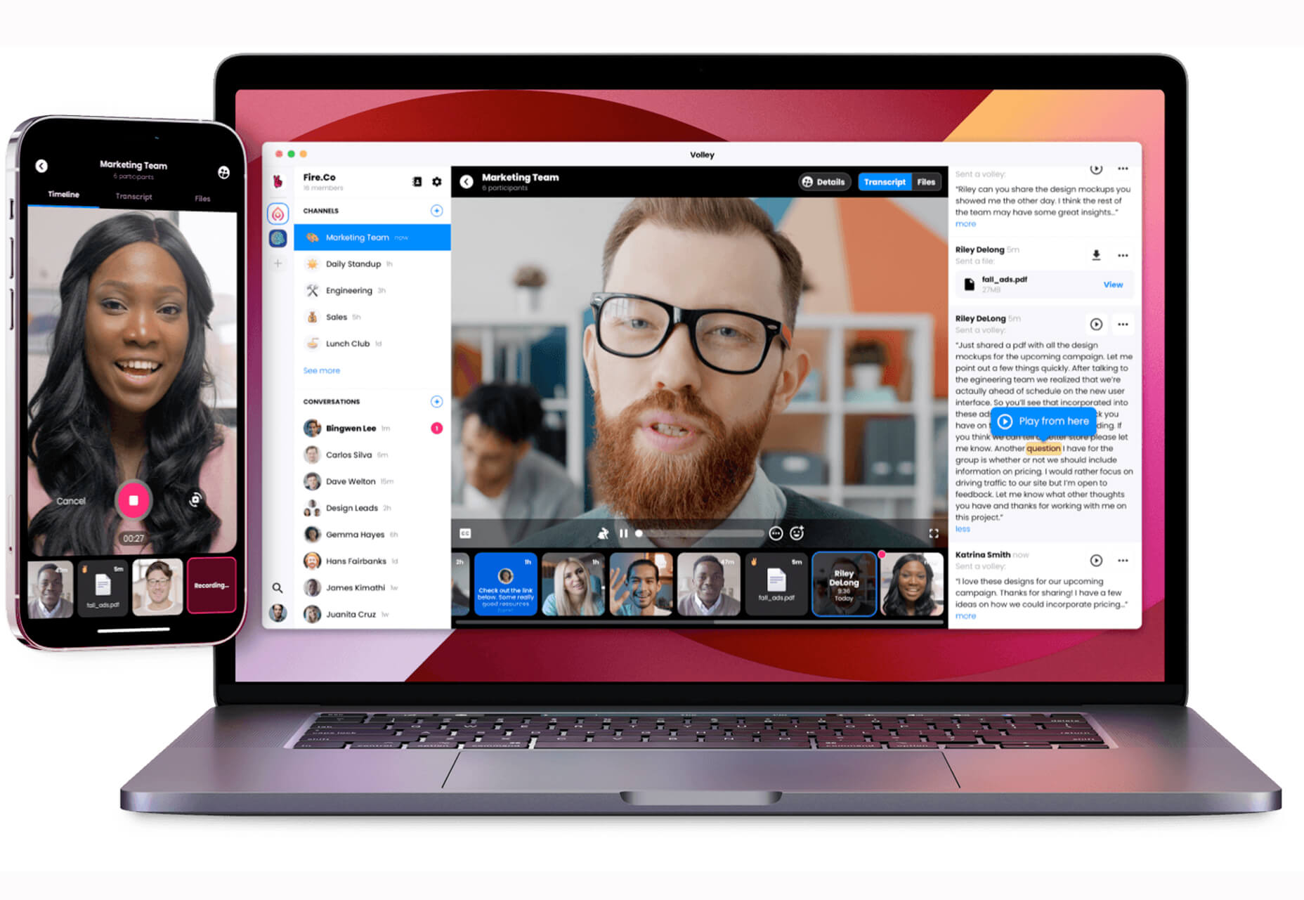
Volley, billing itself as Snapchat for work, is a new way to collaborate with remote teams. The tool addresses the two main problems of remote teams (lack of communication and loneliness) with an async video messaging app with interactive transcriptions neatly organized into workspaces. Volley emphasizes talking over typing (76% of volleys sent are video), doesn’t require you to coordinate schedules (it’s 100% asynchronous), and lives in a threaded conversation with context that’s neatly organized. Plus, the tool is free to use.

Upnext

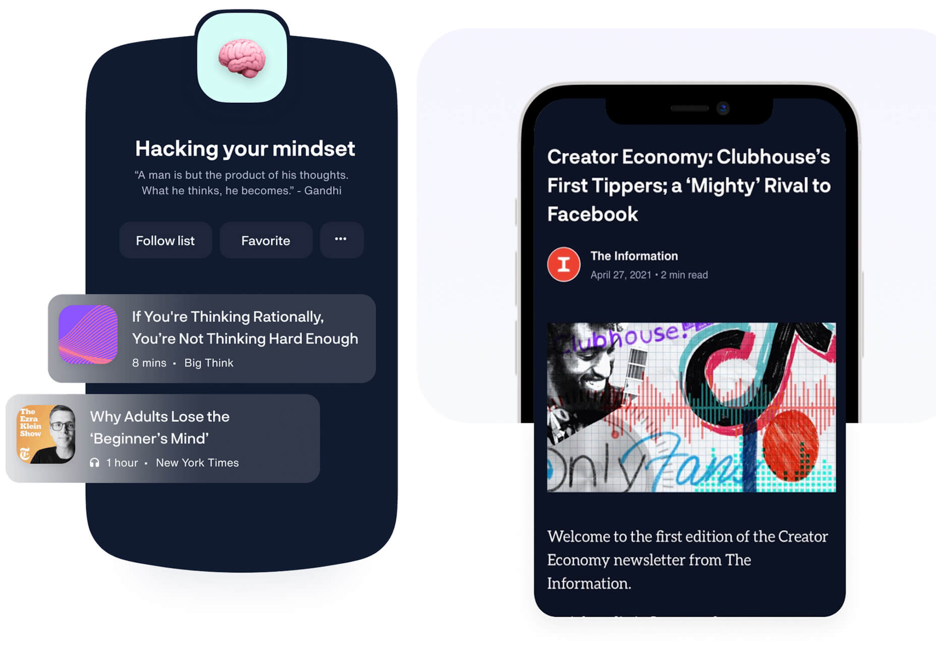
Upnext is a new type of reading list. It’s designed to help you save, organize, and focus on fantastic content while expanding your knowledge on your favorite topics. You can create playlists with almost any type of content that you can refer to later and follow “thinkers” that you love. Search and filter content, focus on reading, integrate videos, and even highlight and note specific content in your customized library. This brand-new web app has a waitlist that you can join to get access soon.

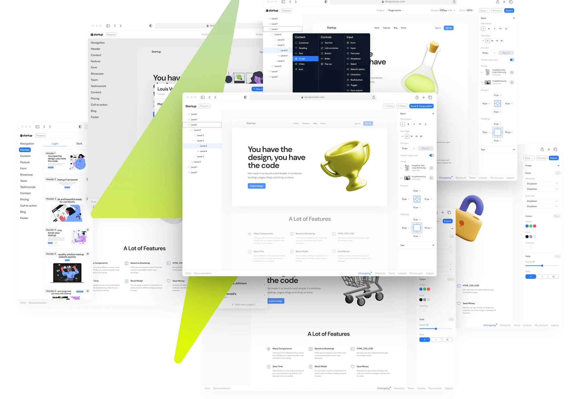
Startup 5

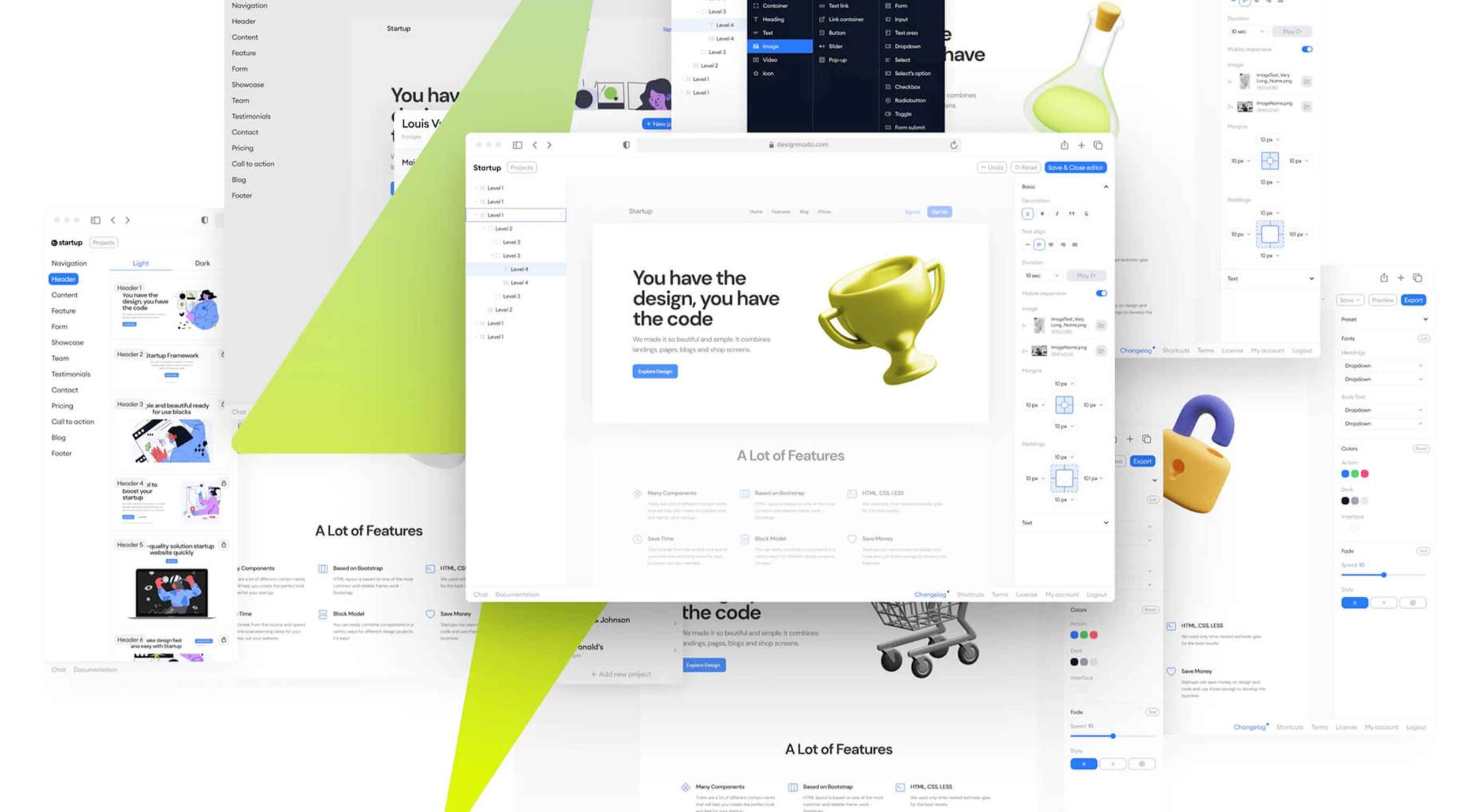
Startup 5 is a new version of the popular website builder, and it’s a perfect tool to create your online presence. With Startup, it’s fast and easy to get your business online with pre-designed blocks. It includes a visual editor with 150+ blocks with pre-designed and pre-coded elements and styles you can easily customize in a drag and drop interface. It’s an easy tool for building a website quickly without a coding background. Most users can publish a website quickly and easily.

Flatmap

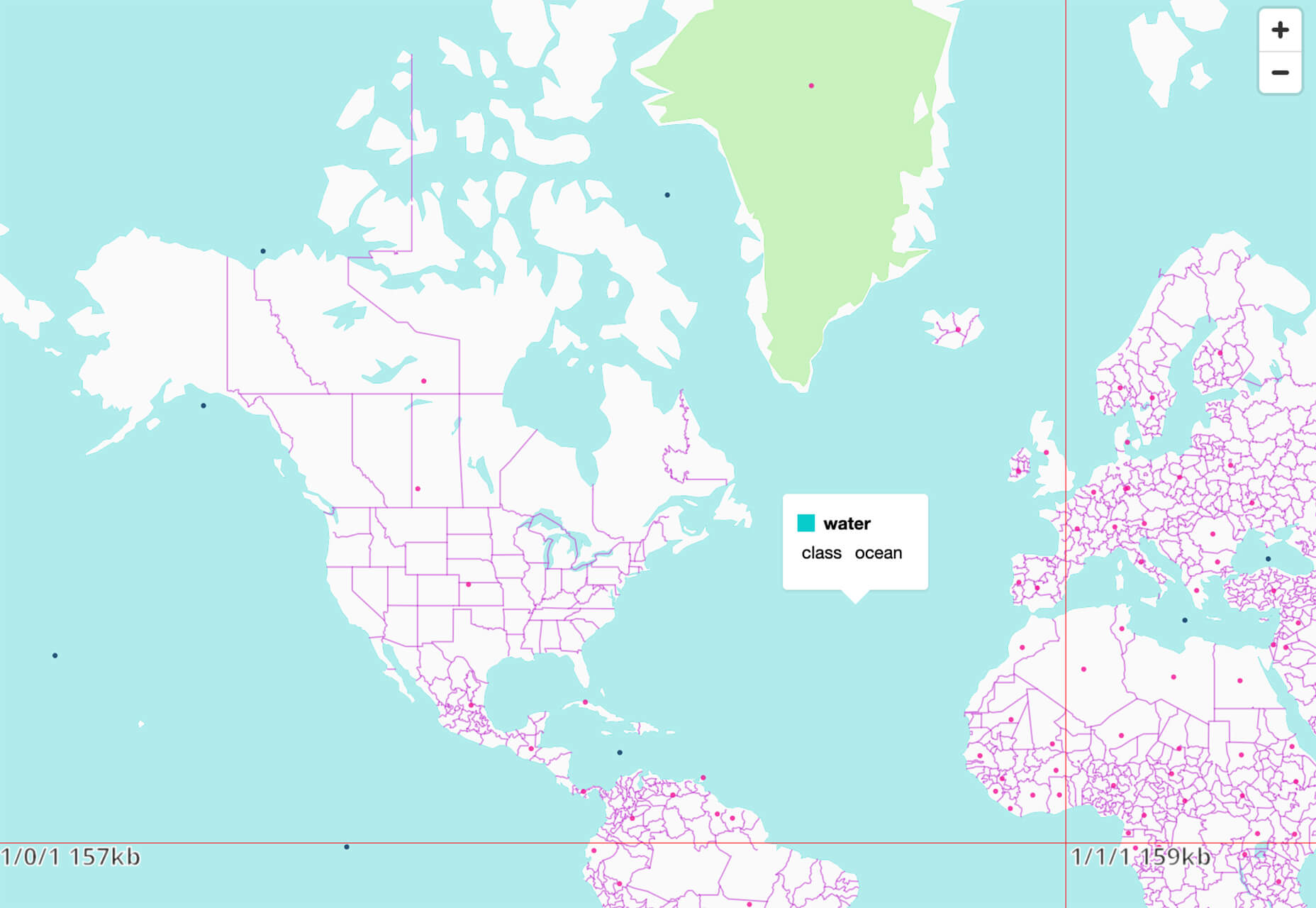
Flatmap generates Mapbox Vector Tiles from geographic data sources like OpenStreetMap. It is memory-efficient so that you can build a map of the world in a few hours on a single machine without any external tools or database. Vector tiles contain raw point, line, and polygon geometries that clients like MapLibre can use to render custom maps in the browser, native apps, or a server. Flatmap packages tiles into an MBTiles (SQLite) file that can be served using tools like TileServer GL or even queried directly from the browser.

Cleanup.Pictures

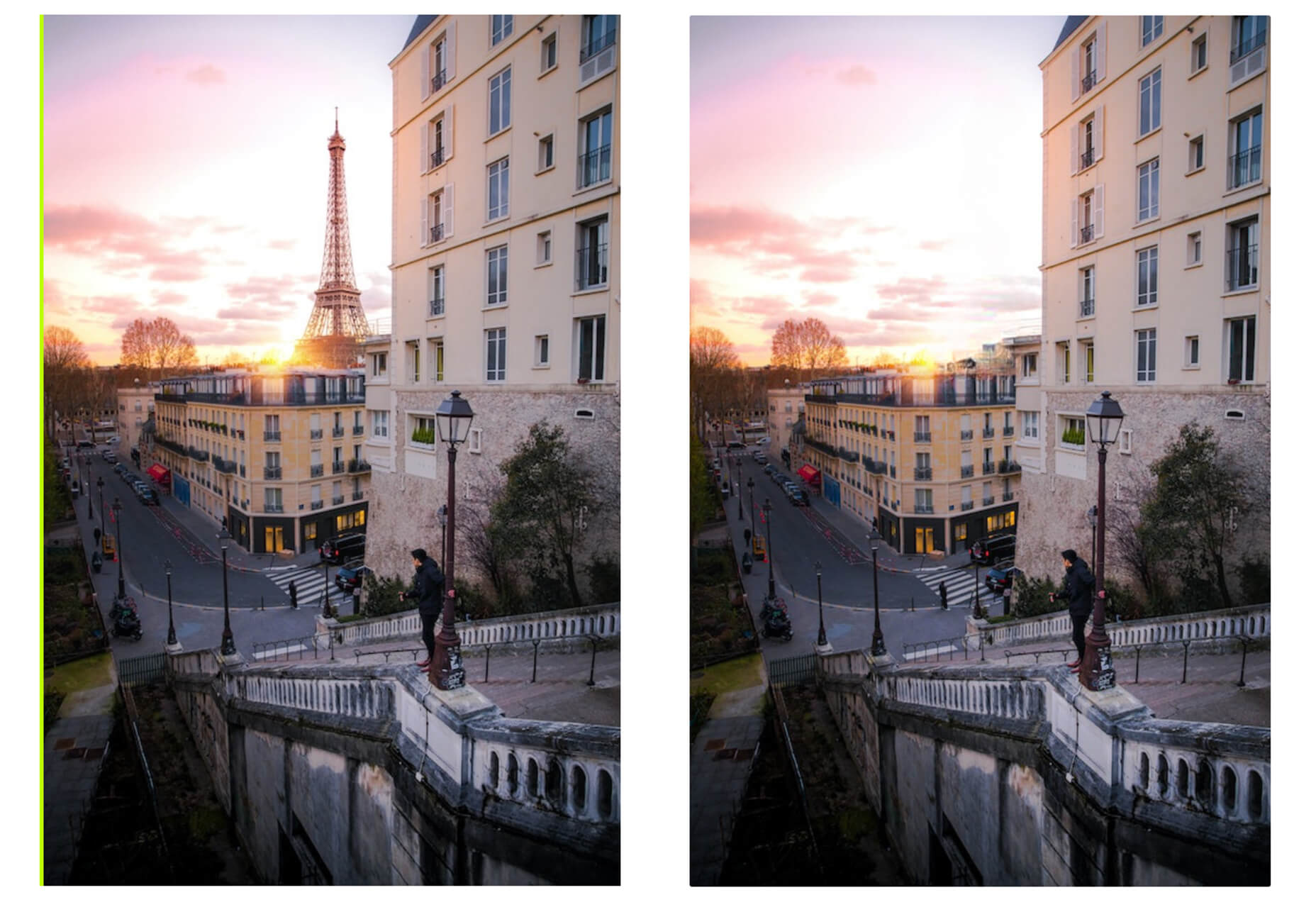
Cleanup.Pictures is a web-based tool to remove objects, people, text, or other defects from your images before using them in projects. It’s an AI-based alternative to other photo-editing software.

Linkz.ai

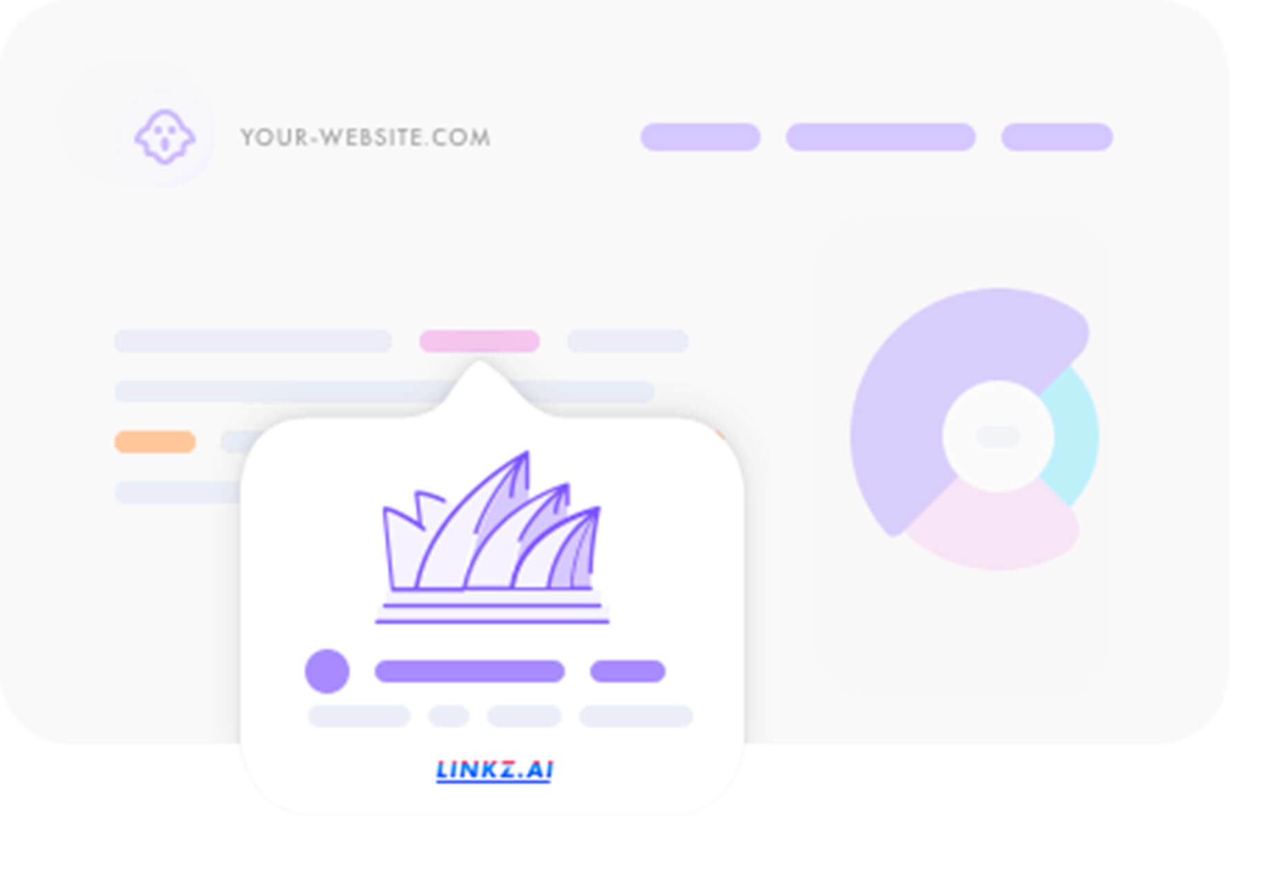
Linkz.ai helps you make smart link preview popups for your website to help encourage greater engagement and interaction for links. It works with a line of code you can install quickly and easily, and then you get smart link previews (in two style options) for every link on your site.

Llline

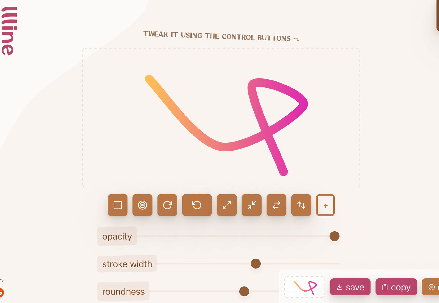
Llline is an SVG generator that helps you create smooth and organic lines and strokes with plenty of customization options for almost any application. This tool helps create graphic elements in just a few clicks, allowing you to add a few points to a canvas and then draw a smooth curve using these points. You can then tweak the resulting SVG graphic by rotating it, changing its color, giving it a gradient, making it a dashed line, and then you can download or copy the SVG markup.

Lorem.Space

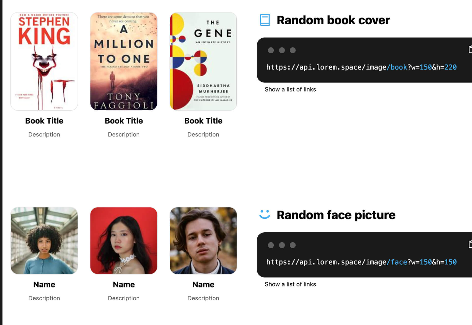
Lorem.Space is a valuable placeholder image tool. With just a little bit of code, you can pop cool placeholder images – from movie posters to shoes – right in your website mockup so that the design is easier to visualize. It’s a great solution that’s fun and keeps you from having to put empty boxes throughout the design. And everything can be randomized, so you don’t spend time looking for placeholders.

Huetone

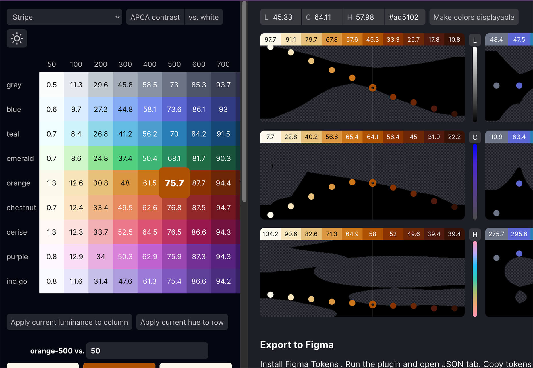
Huetone can help you create more accessible color palettes by making use of the Advanced Perceptual Contrast Algorithm. The contrast ratios and color combinations show on one screen to help you quickly develop palettes and combinations. Plus, the tool has hotkeys that make it easy to change hues, toggle, and adjust quickly. Then you can export everything to Figma.

Rowy

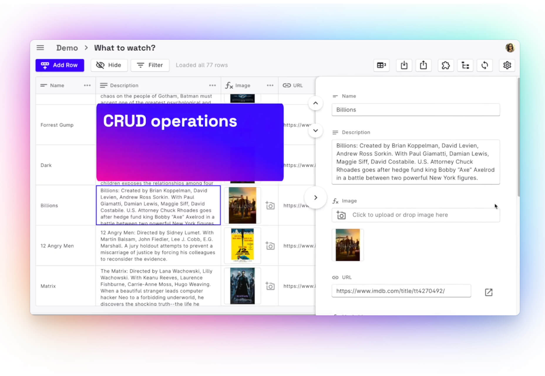
Rowy is an open-source tool to build on the Google Cloud Platform. You can manage Firestore data in a spreadsheet-style user interface, write Cloud Functions in the browser, and connect to third-party platforms.

AdCreative.ai

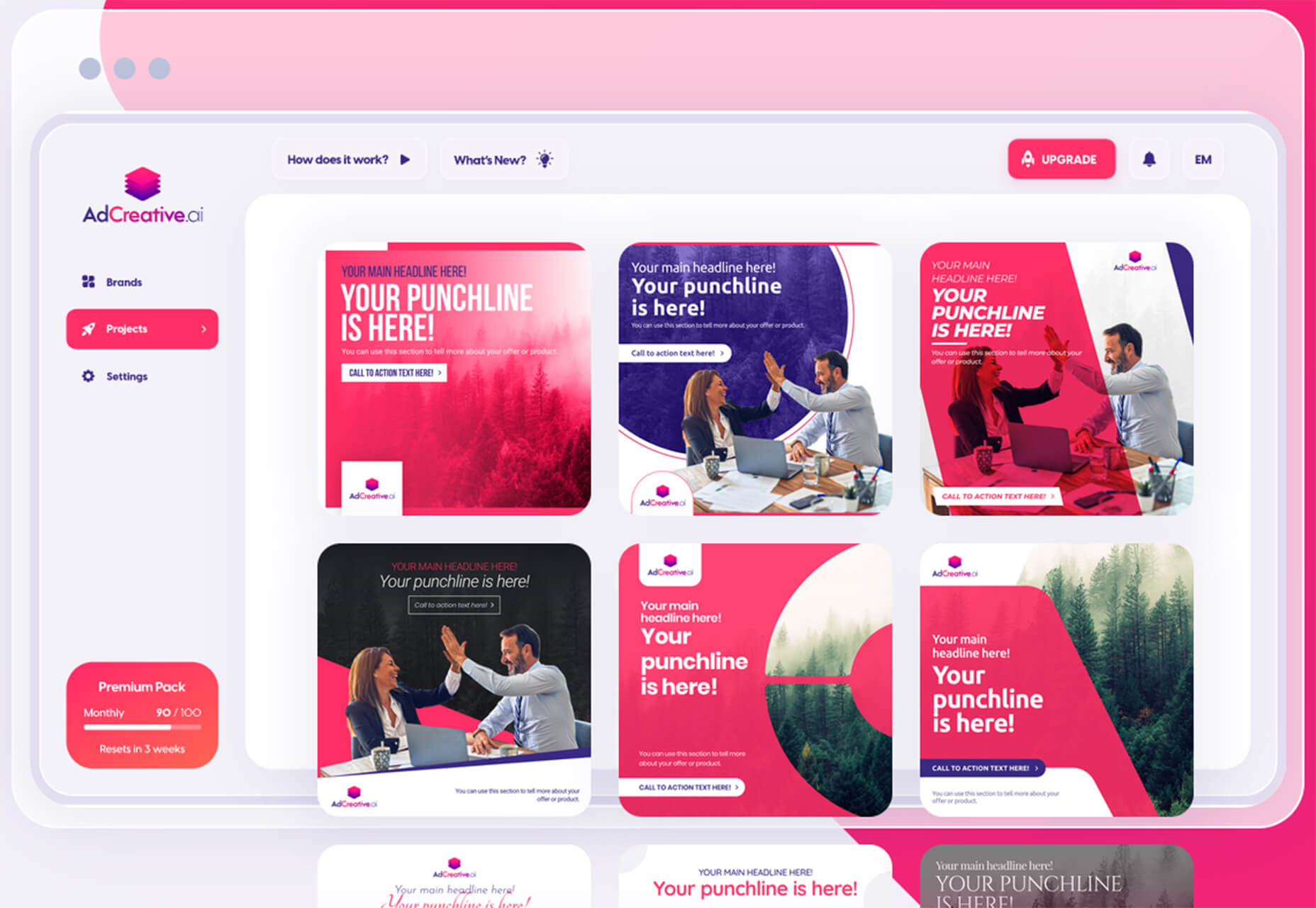
AdCreative.ai uses artificial intelligence to help create better ad creative. To get started, you upload logos and color files, connect social and other accounts, pick the sizes you need, write text, pick a background, and upload product images, and let the AI do the work. Once you have the creative you like, you can connect to your online ad accounts for easy use. This is a premium tool that’s free to try.

Flowrift

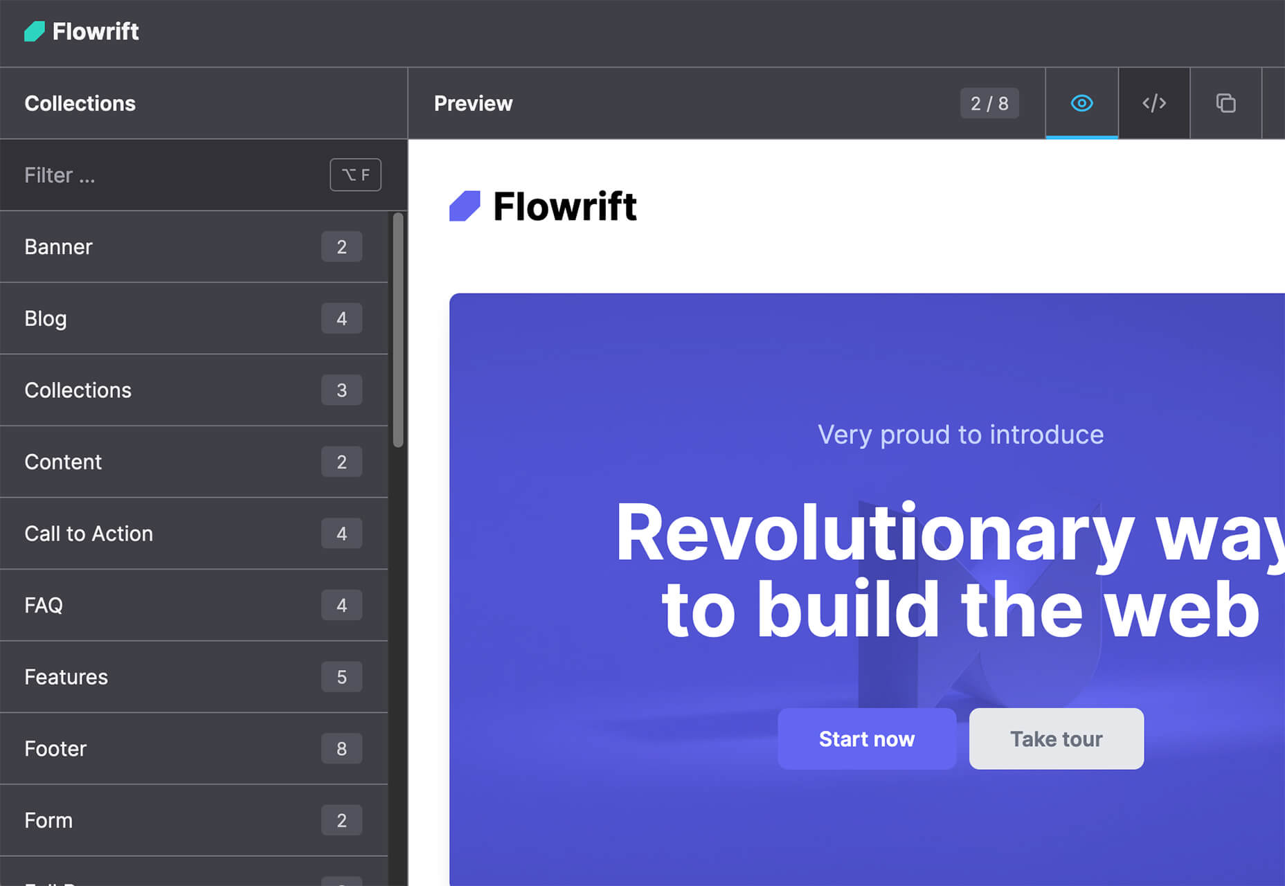
Flowrift is a tool to browse and then copy and customize Tailwind CSS blocks in groups of collections. Filter by block type and then experiment with the options. It even has e-commerce blocks.

Layout Patterns

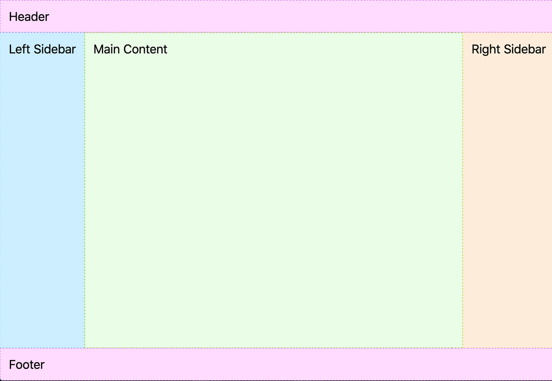
Layout Patterns is a collection of layout patterns built using modern CSS APIs to help you build common interfaces such as cards, dynamic grid areas, and full-page layouts.

You.com

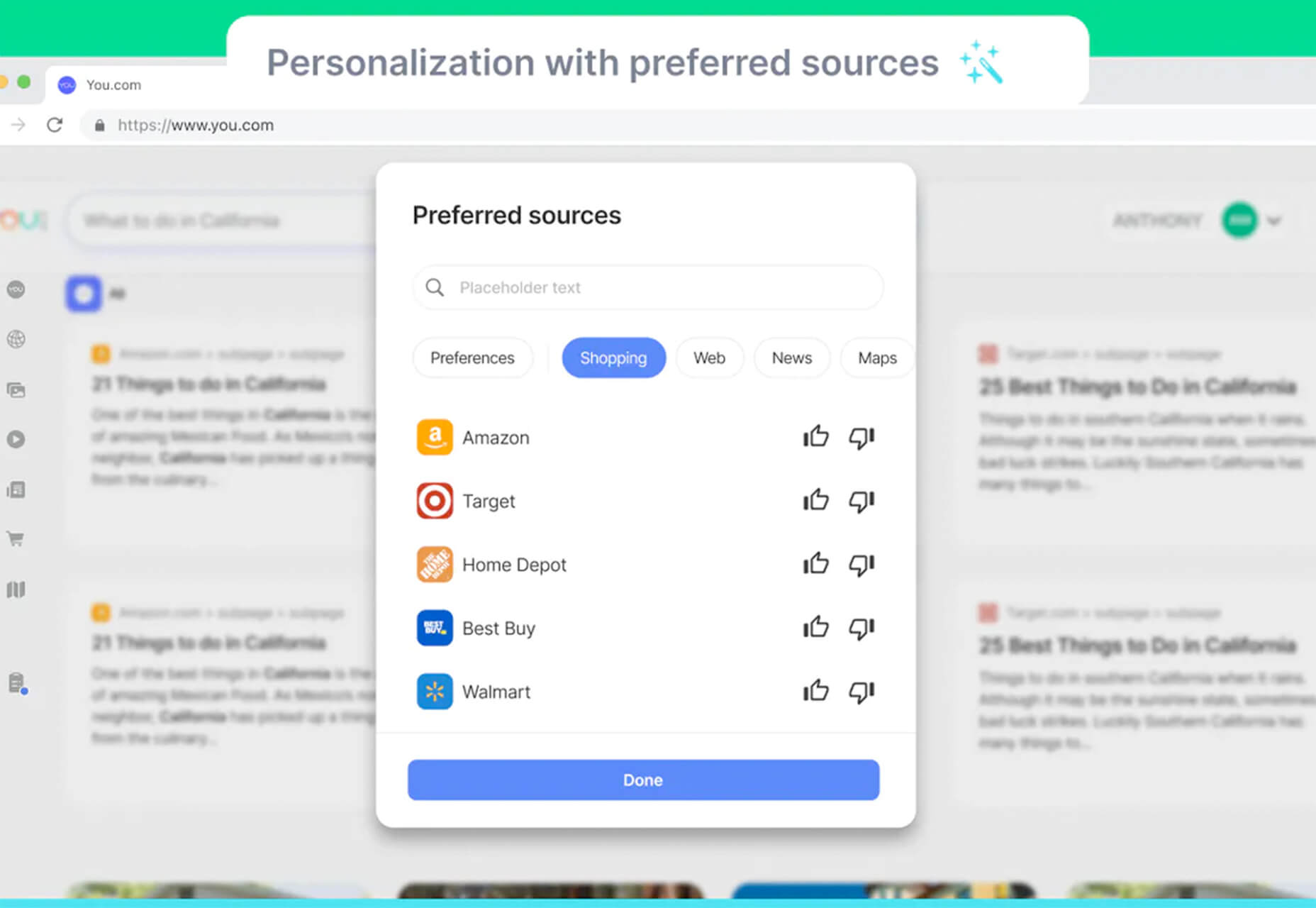
You.com is a new private search engine that summarizes the web. The tool is in open beta and includes superior privacy choices, actionable results, extensible apps, and personalization through preferred sources.

3D Icons

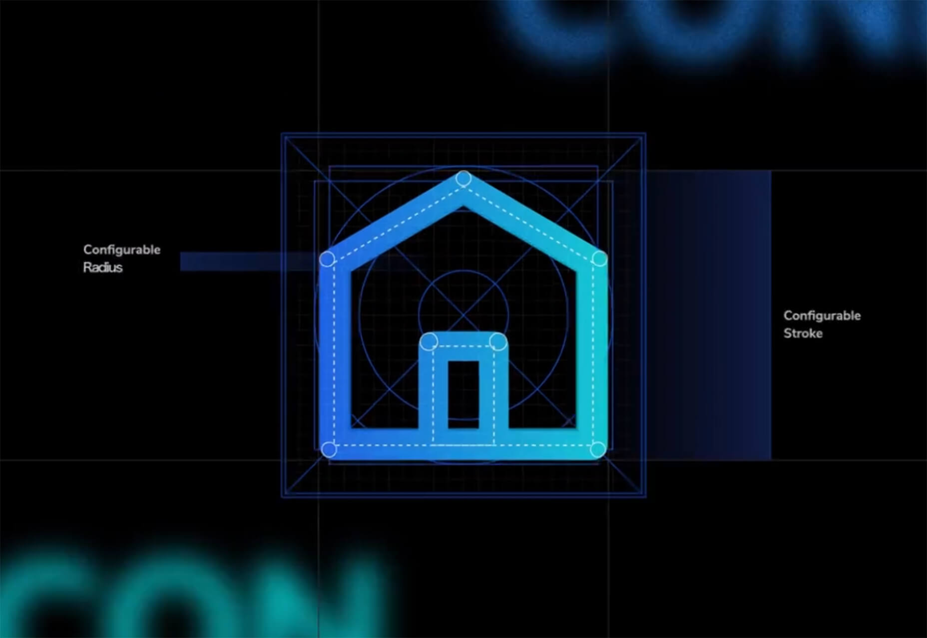
3D Icons is a fun set of three-dimensional, full-color icons that are free for all uses. (Donations are accepted.) They integrate with pretty much any web design tool you are using and come in four color styles – clay, gradient, color, and premium – so you can get just the right look for your project. Each icon also includes three rendering views – dynamic, side, and isometric.

Arco Design

Arco Design is a comprehensive React UI components library based on the Arco Design system. It includes a customizable theme and more than 60 crafted components that you can use out of the box.

Seekvectors.com

Seekvectors.com is a search tool to find free resources in five different formats, PNG, SVG, JPG, EPS, and AI.

Outline to Single Stroke

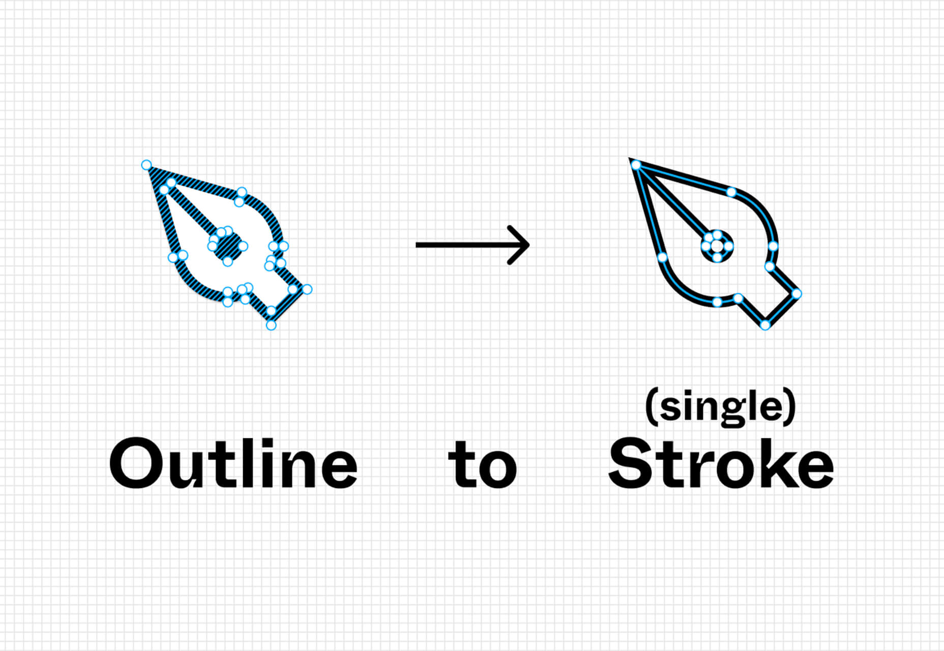
Outline to Single Stroke is a tool in the Figma community that works just like the name implies. Select a filled vector on the canvas, and then you can outline it to a single stroke and adjust the line weight if you like.

Codeamigo

Codeamigo is a new self-paced platform to help you learn coding skills. It’s packed with various lessons for different languages and templates and has something for every level from beginner to advanced.

Sizze

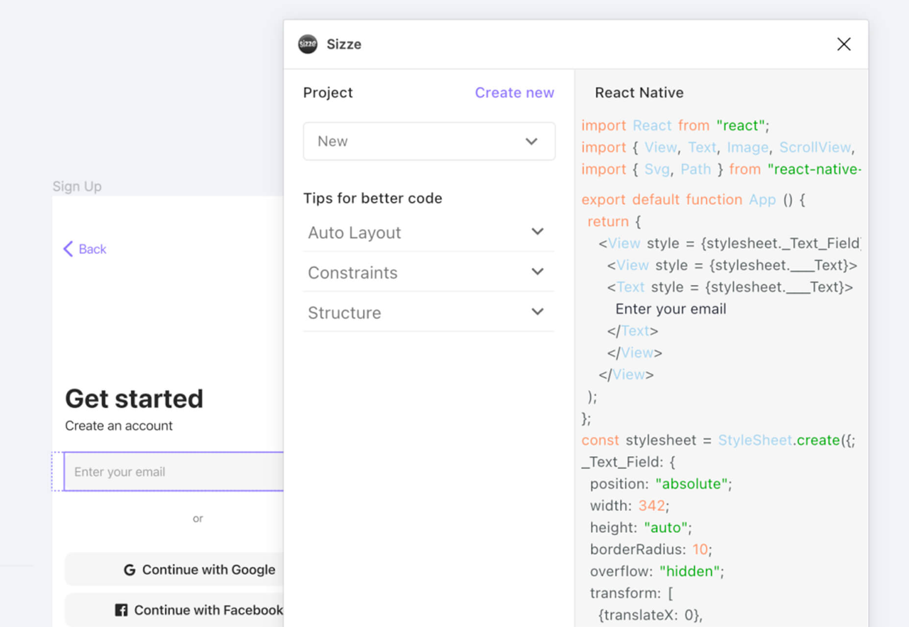
Sizze is a Figma to React Native export tool to create app prototypes and instantly export to code.

CodingFont

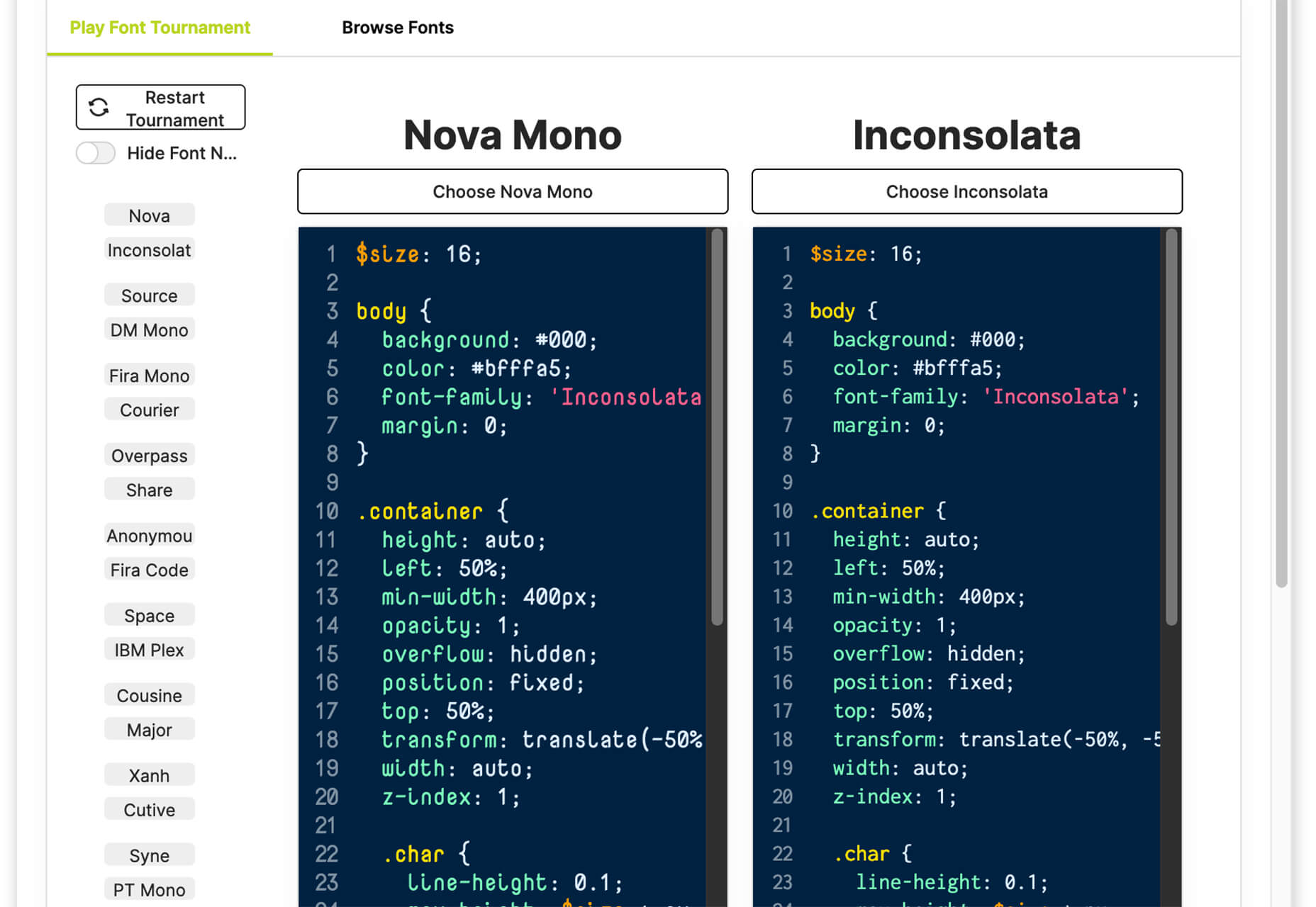
CodingFont is an excellent game that can help you pick a font to use for coding that you like! If you spend a lot of time looking at code each day, the right font can help reduce eye strain and make the work a little easier to see.

Christmas Revue

Christmas Revue is the first in a trio of holiday typefaces that you can use this season. This SCG color font is fun and perfect for the holidays with exciting glyphs. It is free for personal use only.

Hotsnow

Hotsnow is a fun display font that has interesting fills and shapes in an all-caps character set. It is free for personal use.

Marlwich

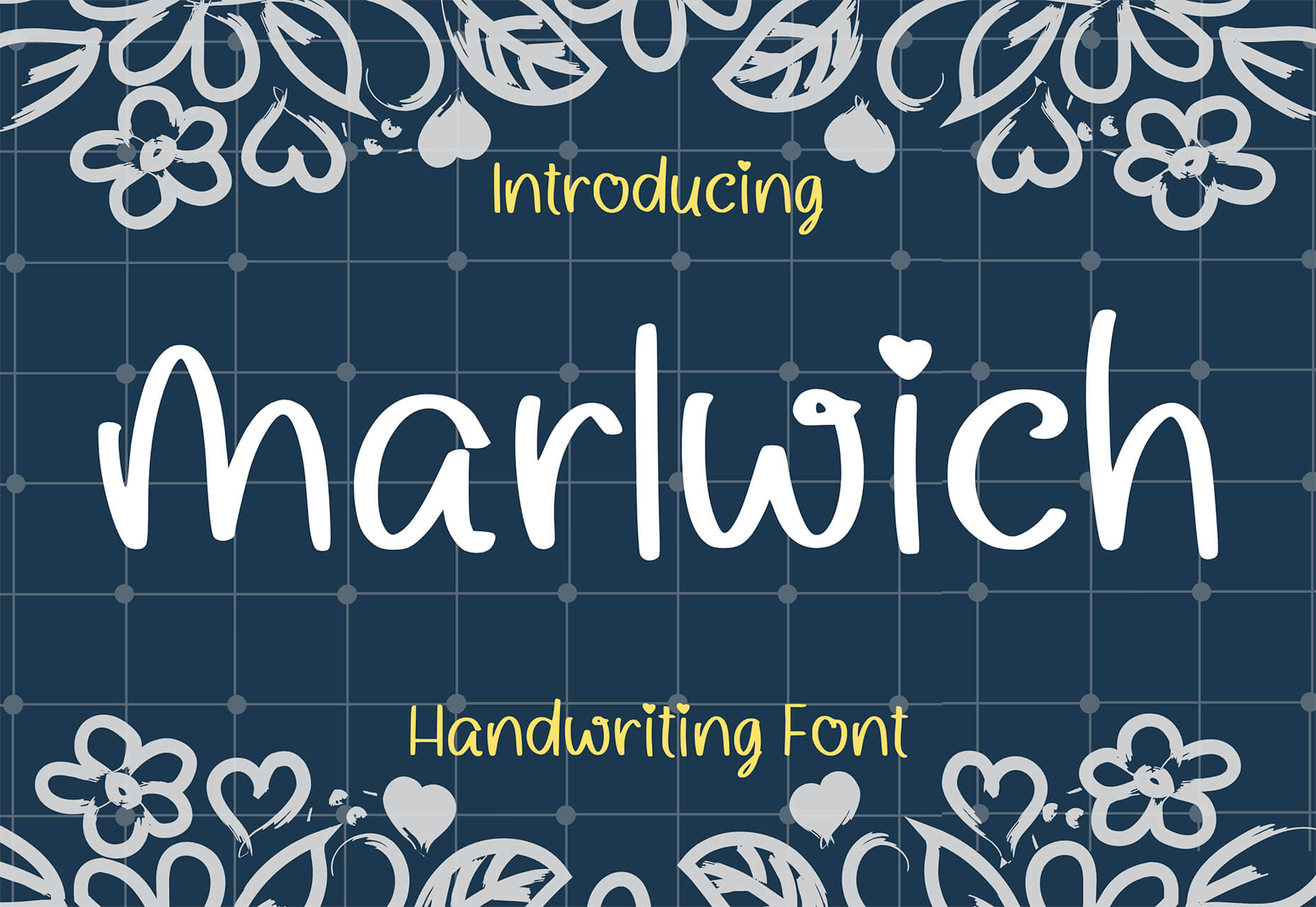
Marlwich is a feminine handwriting-style typeface that has the feel of signing a holiday letter or card. It contains upper- and lower-case characters and is only for non-commercial use for free. (A paid option is available for commercial projects.)

Source

The post Exciting New Tools For Designers, December 2021 first appeared on Webdesigner Depot.

Source de l’article sur Webdesignerdepot

Wireframes are a powerful tool, especially for UX designers; whether you are developing a new app, a website, or anything else, the initial steps of any project can be tackled with this robust approach.

There are many occasions when we get stuck or overwhelmed for hours in front of a new project. This is where creating wireframes can be beneficial. A wireframe is nothing more than a diagram of your ideas for the flow of a project.

This post will analyze what wireframes are, and why they are so crucial for user mapping. Then, we will reveal the steps you need to follow to create an efficient wireframe. Let’s dive in…

What Is A Wireframe?

In a few words, a wireframe is a drawing created in the early stages of a UX project. Wireframes are a brilliant and effortless way to create a blueprint for the structure of a page.

In such a drawing, you can include valuable information about the UI and UX of the page you want to design.

You can think of wireframing as a process of visualizing the initial ideas you have about a project. It does not matter if you are comfortable with drawing; you can design wireframes on paper or digitally.

In either case, drawing a wireframe is not about your artistic skills. Instead, wireframes are about structuring your project and identifying the fundamental interactions you want to build out.

Why Is Wireframing Important For UX Designers? 

If you are an experienced UX designer, you have already come across concepts like user mapping and user journeys. Mapping the entire user experience is crucial. And that’s the main reason why wireframing is a must for a UX project.

Since you need to provide a top-notch user experience, wireframing is a great way to ensure this from the earliest stages of your design. But what is the process you need to follow when designing wireframes?

And how can you ensure that your wireframes are efficient? Let’s find out…

Creating An Effective Wireframe In 5 Simple Steps

Creating a good wireframe will allow you to construct your project. You will think it through, prioritize some fundamental interactions and consider alternatives.

1. Research

Although this is not a wireframing step per se, it is critical to the efficiency of your wireframes. How can you start drafting without doing user research? Well, you can not. That’s why the first thing you need to do is analyze your project.

All you have to do is seek similar products/services and check them out. Look at what your competitors are doing right and what they are doing wrong. This way, you will be ready for the next step.

2. Create Personas

You have already selected the best practices and ruled out other guidelines you believe will not be effective on this project. Now it’s time to think about user flow: How many screens will you put on a page? Where are users coming from, and where do you want them to go after reading this page?

By mapping your user flow, you can create a user persona. Then all you have to do is figure out what information to include. 

Mapping the information correctly is crucial because it will help you ensure that users do not get frustrated or overwhelmed when they visit your final page.

Once you do that, you are good to go. 

3. Start Sketching

It’s time to reach for your fine pen, pencil, eraser, and paper. Visualizing your ideas needs to be quick and efficient. Try to avoid fine details because this step is not about creating a high-fidelity wireframe on paper. 

All you need to do here is sketch out basic features and formats.

Since most of us designers are perfectionists, you can use a timer. Set the timer to 4-5 minutes and force yourself to finish the wireframe by that time. Repeat this step until you have created a few wireframes with which you are happy.

Finally, expand and polish your favorite mockups for a few minutes and prepare for the hard part.

4. Ask for Feedback

There is nothing more important than feedback when it comes to wireframing. Discuss your project with your colleagues. Just let them know how each mockup helps you with the project and what idea it visualizes.

Try to sincerely listen to what they have to say about your designs. Once you have gathered all the information and advice, start modifying the wireframe accordingly.

5. Add Details and Create Prototypes

It’s been a long road, but you are now at the point where you feel most comfortable as a UX designer: prototyping. Plenty of software (Adobe XD, Framer, Proto.io, etc.) can help you with this step. 

Start by turning your low-fidelity sketch into a high-quality prototype. Once you are happy with the result, test your prototype’s screens and see if the result serves the user flow. Platforms like UsabilityHub and Prott can help you with this.

Valuable Tips to Keep in Mind While Creating a Wireframe

Keep your Wireframes Simple: Creating a wireframe is not about fine details; try to manage the time you spend on it well. All you need is a clear and simple visualization of your page. You will have all the time you need for prototyping.

Don’t Worry About Your Artistic Skills: Anyone can draw. It’s as simple as that. You do not have to be an artist to create a clear wireframe to help you visualize your ideas. Be confident and make sure you include all the information you need.

Always Think of the User Personas You Created: Creating a wireframe is a smart way to ensure that the page you create meets the user’s needs. Therefore, you should always keep in mind what users will do when they open this page and whether it meets their needs and goals.

The Bottom Line

Creating a wireframe is not as difficult as you might think. All you need to do is research, find out what users need from this page, and create a map. By following these simple steps, you’ll ensure that the wireframes you design deliver a top-notch user experience.


Featured image via Pexels.

Source

The post 5 Simple Steps To Effective Wireframing first appeared on Webdesigner Depot.

Source de l’article sur Webdesignerdepot


Introduction

In a previous post on this topic, we learned some basics about AWS CLI and how to install it on your machine. In this post, we will learn a few AWS CLI commands and we will also set up an s3 bucket as a static website that is publicly accessible.

AWS CLI Syntax

The following picture shows AWS CLI commands Syntax:

Source de l’article sur DZONE

Many websites today use some type of traditional Content Delivery Network (CDN), which means improvements in website load times, decreases in bandwidth, and better redundancy and security. But not everything is optimized, specifically when it comes to images, and image CDNs can help with that! 

Traditional vs. Image CDNs

A traditional CDN treats images as static. If you want to tailor images to better match various mobile device types, then you need to create many variants of each image and upload them to your web server. It also means you must develop responsive code that will tell the server and CDN which image variant to deliver. This is clunky, time-consuming, and inefficient. For a large website, the amount of code needed can be astronomical. Using this static image model, there’s just no realistic way for each image to be effectively sized and compressed for every possible device model – at this point, there are thousands of them. The combination of these two unfortunate factors leads to potentially slow load times and poor UX caused by oversized images delivered to mobile devices.

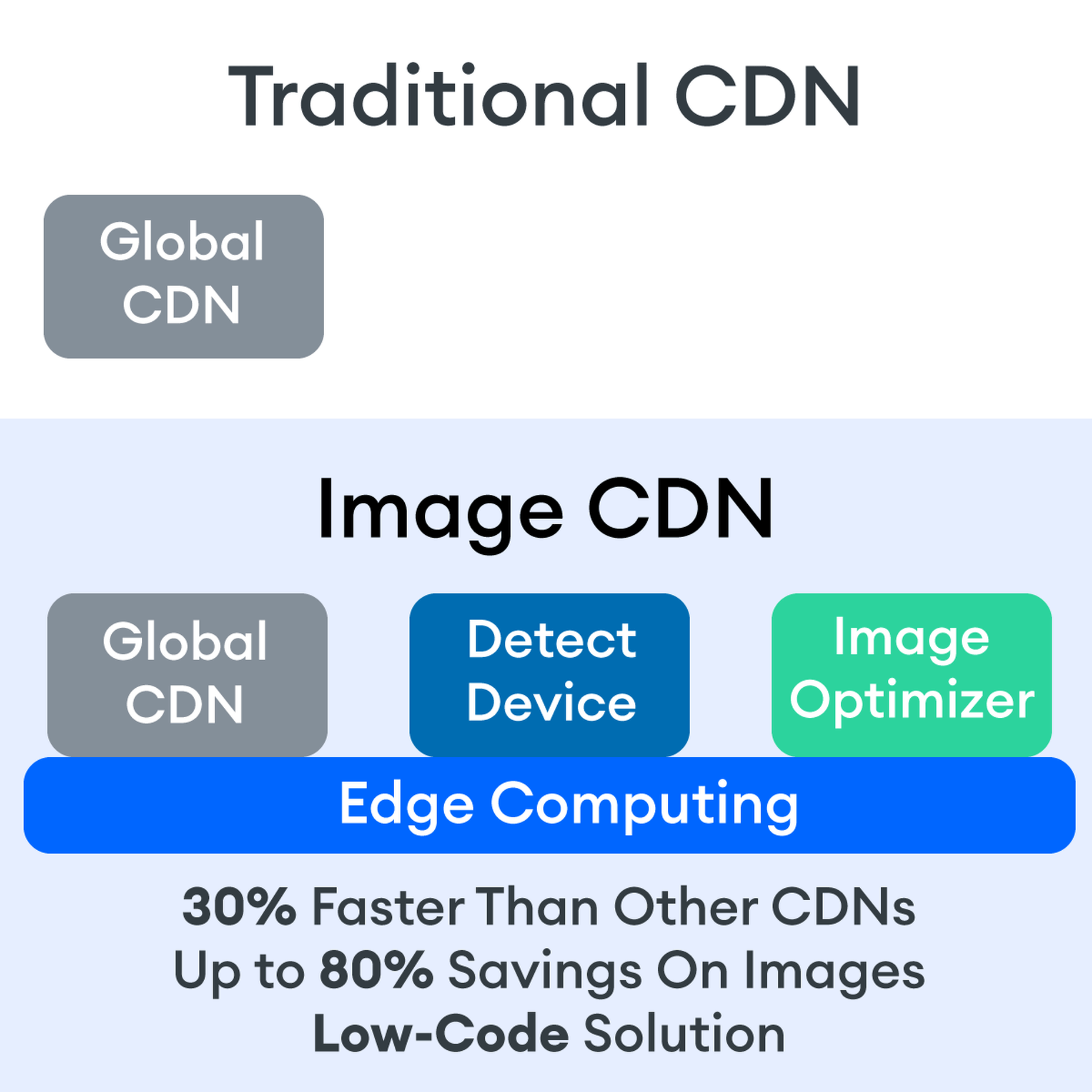
So what is an image CDN? An image CDN builds on the traditional CDN model with the addition of device detection and image optimization. Instant detection of the device model and browser requesting the images is done right at the device-aware edge server (true edge computing!) Additional information, including screen resolution and dimension, pixels per inch, and support for next-gen image formats (such as WebP, JPEG 2000/JP2, and AVIF), provides even more details crucial for superior image optimization. Using this information derived from device-aware edge servers, the image CDN optimizes each image and serves the perfect version for each device and resolution, meaning users get the finest webpage experience faster.

A Bit About the Edge (Whoa, Living on the Edge?)

With a single server website, a web request would have to travel from the requestor, back to the origin server (wherever that was geographically located), be processed, and then travel back to the requestor. Depending on the physical distance between the requestor and the origin server, this could introduce a great deal of latency, which means lag time on page loads. 

A traditional content delivery network (CDN) is a global network of servers that optimizes web performance by using the node geographically closest to the user for faster delivery of assets. It takes static content like images and stores them on the edge. But usually, these edge servers are relatively simple in terms of their role in business processes. They mostly index, cache, and deliver content. And traditional CDNs like to keep edge servers simple because of concerns over CPU usage, storage, and scalability.

But what if these edge servers could also provide computing power that enhances performance and business processes? This is called edge computing. Slowly, CDNs are starting to open their edge servers to allow enterprises to deploy apps/services on the edge. Likewise, Cloud computing networks (e.g., AWS, Azure, Google Cloud) provide virtualized server capacity around the world for those who want to use geographically distributed servers. In a sense, Edge Computing is a marriage of the CDN (where edge servers synchronize/work with each other) and Cloud computing (where servers are open to applications). 

Edge computing is a fascinating concept, but what is the killer app that will enhance business processes and improve website performance? The addition of device detection to edge computing provides the ability to transform from delivery of static images to a new model where images are dynamic and tailored exactly to devices. 

Edge computing is computing that is done in a geographically distributed space, with many servers located at or near the source of the web request. This reduction in bandwidth and latency leads to fast processing times, increased site speed, and improved customer experience. And edge computing doesn’t require new infrastructure — it leverages the networks of existing providers to create Points of Presence (POP) around the globe. 

The Edge Servers are…Aware?

Device-aware edge servers, like those used by the ImageEngine image CDN, take edge computing to a new level. Device detection is actually one of the use cases where edge computing really shines. Normally, the edge server would have to send a Javascript query to the device to figure out any information about a requesting device’s model, browser, operating system. But with a device-aware edge server, the User Agent string is captured and decoded. This contains all of the information necessary for device detection without the need for any back and forth – a definite speed improvement. So you’re starting ahead of the game! 

Each time a new request comes to the device-aware edge server, the image is processed by that server (meaning optimized for that specific device parameters) and stored right there in cache, primed for future use. This is done in three stages: changing image size based on device resolution, compressing the image using an image optimization tool, and selecting the most efficient file format for the device. 

If the device-aware edge server has already processed a request from a similar device model before, then it can serve the device-optimized image from its edge cache, leading to a lightning-fast server response — and ImageEngine’s device-aware edge servers can serve up cached images 98% of the time! Not only is there geographical proximity because of the distributed global POP network, but the smaller size of the optimized image compared to the full-sized original cuts up to 80% off the image payload. This can cut up to several seconds off page load times. When almost 70% of people say that page speed influences their likelihood of making a purchase, every single second counts! 

Some image CDNs detect the device information and group the devices into “buckets” of similar types and serve an image based on that type. While this is certainly an advancement over a traditional CDN, and works passably well for some common devices, it still isn’t a truly optimal solution. There are so many variants of browser, screen size,  resolution, etc., even among very similar devices, that images are still often oversized (too large payloads) and lead to poor load speed. A true image CDN, such as ImageEngine, serves the perfect image for every device, every time.

So Now You Want To Get Started (Don’t Worry, It’s Really Simple)

One of the best things about the ImageEngine image CDN is the ease of integration – and it can integrate into any platform that supports a 3rd-party CDN. All you need is to sign up for an account and receive a delivery address during your two (yes, 2!) minute signup process. This delivery address is used to redirect image traffic for optimization and superior delivery performance. Next, you’ll have to make some slight adjustments to img tags on your website, but that’s really all the work you’ll need to do. There are no DNS changes during a standard (generic delivery address) integration. You read that right, none at all. Contrast that to a traditional CDN integration, where there is just no way around some messing around in the DNS – in fact, usually some fairly extensive DNS changes. 

This low-code, virtually no code, integration saves you time. It saves you money. It saves you the hassle of putting multiple team members on a new project. And it means that you can be up and running in about 15 minutes with a standard install. You can be serving optimized images to your site visitors at blazing fast speeds before lunch! And don’t worry, ImageEngine has an experienced integration support team available to answer any questions you might have. 

There’s also no issue with adding the ImageEngine image CDN on top of an existing CDN. Traditional CDNs may have security features that you may prefer to keep for your site. It requires slightly more integration but provides the same benefits of a solo ImageEngine implementation — screaming fast image load times and perfectly optimized images from device-aware edge servers. All that is recommended is that the ImageEngine image CDN actually serve the images directly, not simply process them, to get maximum benefits.

Adopt an Image CDN and See The Benefits

We’ve learned that image CDNs bring numerous benefits to your site AND your business. Using device-aware edge servers, image CDNs provide measurably better UX to your visitors. Pages load potentially seconds faster with perfectly optimized images, meaning your customers get to the heart of your message right away, and you don’t lose potential sales. 

Image CDNs are actually 30%+ faster than most traditional CDNs, improving site speed accordingly. From an SEO perspective, that’s huge! And your SEO gets an additional boost from the improvement to your Largest Contentful Paint scores (which can help you gain valuable rank on Google’s SERPs). Implementation is simple and fast. You get all this, plus cost savings: since you have smaller payloads because of the fully optimized images, you’re delivering fewer gigabytes of data.

Source

The post Image CDNs: How Edge Computing Provides a Faster Low Code Image Solution first appeared on Webdesigner Depot.

Source de l’article sur Webdesignerdepot

As a web designer, you’re responsible for a lot of things. Your client is relying on you to ensure that their website is user-friendly, accessible, eye-catching, and even good enough on the back-end to capture the attention of the search engines. 

However, what many business leaders and clients don’t realize is that they also have a part to play in ensuring that they get the right results from their site; there’s more to the client and contractor relationship than an exchange of funds. 

Today, we’re going to examine some of the most common mistakes that clients make when they begin working with a website designer for the first time. After all, when a client makes a mistake, it’s up to you to show them how to get back on track. 

Client Mistake 1: Providing Minimal Insight

Creativity, for the most part, is the responsibility of the designer in any web-building project. You know best what you can do for a client. 

When you’re discussing an upcoming project with a business owner, you can walk them through concepts like dark mode design or strategies for digital accessibility. However, you’re still reliant on your client to let you know if there’s anything specific they need. 

An insufficient brief in a web design project usually means that you waste time on a project because you have to go back and forth multiple times, making updates and edits. Getting a brief ironed out properly from day one can reduce misunderstandings and mistakes. 

To get your client started, ask them to share some details like:

  • Who’s the target audience? Do they have a user persona they can share?
  • What specific features does the site need? Landing pages, forms, widgets, etc.?
  • Competitor sites they like: What do they appreciate about those designs?
  • Brand colors and assets: What kind of hues and shades should you use?
  • Technical feature requirements: Does the site need to have its own app, integrate with APIs, or have a checkout solution, for instance?

Client Mistake 2: Underestimating The Workload

Perhaps one of the most common mistakes that clients make when seeking help from a designer is that they have no idea how much work it will take to create the kind of site they want. If they haven’t provided a great brief in the first place, they might not have had a chance to see all the work they’re asking for written down. Walking your client through the brief process can help here. 

On the other hand, if your client has already provided a brief, along with an unrealistic deadline for completion, you might need to have a discussion with them about what you need to do. Walking your client through some of the processes involved in creating their website could give them an insight into how long it will realistically take to bring their ideas to life. 

Additionally, ensuring that your customers fully understand the amount of work you’re taking on could also mean that they can better grasp why you’re charging a certain price for your services. That brings us neatly to the next mistake…

Client Mistake 3: Not Having The Right Budget

Pricing your design services can be a complicated process for web designers. You need to make sure that you’re charging enough to cover the cost of things like essential software and hardware for your company. At the same time, with so many other designers out there, you also need to ensure that your costs are competitive. 

After you’ve gone through the hard work of figuring out what your pricing structure should be, you also need to be capable of justifying that expense to your client. It’s common for many customers to go into their work with a web designer expecting that they’ll be able to get an entire website, blog, and app for less than a couple of hundred dollars. 

Make sure that your client is aware of your pricing immediately to avoid any confusion. If possible, have a pricing page on your website or portfolio which highlights the cost of different packages and precisely what your clients are going to get. 

If your customers can see the value in your services and even equate to an hourly workload or skillset, they might be better equipped to set the proper budget. 

Client Mistake 4: Making Too Many Technology Decisions

You’ll find that you work with many different types of client during your time as a web designer. Sometimes, you’ll have people who come to you not really knowing what they want or need. This means that you may need to spend some time speaking to them about their expectations and discussing what’s possible. 

On the other hand, there’s always a chance that you could work with a client who thinks that they should be making all of the decisions themselves. While it’s true that your client should have some control over things like the style of their website and what features it has, it’s up to you to make technical decisions like what kind of tools you’re going to use. 

If your client tries to dictate everything you do and how you’re going to do it, this could make it difficult for you to deliver your best work. Explain your processes to your customer in advance and find out why they want you to use specific technology. 

For instance, if your client wants to use a specific kind of website builder because they’ve heard it’s “the best,” you can explain what you like most about the product you’re already using. 

Client Mistake 5: Being Too Attached To An Idea

This is a problem that happens in a lot of creative industries. A client goes out and finds something that they like on another website. It might be an attractive landing page or a specific checkout process. They’re so excited by what they see there that they refuse to compromise on that idea when working with their designer – even if the concept isn’t suitable. 

For instance, your client might come to you wanting a website that’s full of dynamic animations and videos. However, if they only have a limited amount of bandwidth from their hosting provider, this could mean that they end up with a slow site that aggravates their customers. 

The best thing you can do when this happens is to present the issue to your client in a way that they can understand. For instance, if you’re worried something will slow down their website, talk to them about how speed is essential to good customer experience. You could even share some page speed stats like: if a page takes more than 3 seconds to load, over half of all visitors will abandon it. 

Seeing the stats for themselves could mean that your clients are more likely to change their minds. 

Client Mistake 6: Working With The Wrong Designer

Finally, one of the biggest mistakes any client can make is working with the wrong website designer. There are a lot of professionals out there, each with their unique skills to offer in things like UX design, ecommerce page creation, and so much more. However, it’s not always easy to know what you need as a business owner getting online for the first time. 

The good news for web design clients is that there’s a lot of information out there that you can use to get informed fast. The bad news for designers is that this means you’re going to need to work at keeping your skills on the cutting edge if you want to attract the widest selection of customers. 

To ensure that you’re more likely to be the right designer for your customers, stay up to date with the latest web design standards, and check out what’s trending in your industry. Webinars, articles, and even TED talks can be an excellent way to brush up your knowledge and make your portfolio much more appealing. 

Strengthen Your Client/Designer Relationships 

Succeeding as a web designer isn’t just about building a robust portfolio full of excellent websites where you can showcase your skills. While it’s true that you need to stay on the cutting edge with your design talents, you also need to make sure that you can create positive relationships with every client that comes to you. 

Like designers, clients can make mistakes too, but not knowing what they want, trying to take too much control, or simply failing to understand the scope of a product. Rather than letting those mistakes hold you back, prove your mettle as a designer by helping your clients navigate these issues. The result will be more streamlined project experiences, happier customers, and better reviews for your company. 


Featured image via Unsplash.

Source

The post Protect Your Design Clients From These 6 Easy Mistakes first appeared on Webdesigner Depot.


Source de l’article sur Webdesignerdepot

As the year begins to wind down, there are still plenty of new and evolving website design trends going strong. Much of what you’ll see this month carries over from things we’ve been seeing all year but with fresh touches.

From peek-a-boo designs with neat animated elements to vertical bars to brutalist blocks, there are a lot of highly usable trends to work with.

Here’s what’s trending in design this month.

Peek-a-Boo with Animation

Designers have been experimenting with cut-out and layering elements with animation for some time, which has evolved into full peek-a-boo styles with a lot of visual interest.

How each design comes together is a little different. Some have the animation in the back, others in the front, and some include text as part of the style. There’s almost no set of actual rules to how to make this design trend work.

Each of the examples below does it somewhat differently with varying degrees of success. The commonality here is that it is almost one of those visuals that you either see and love or hate.

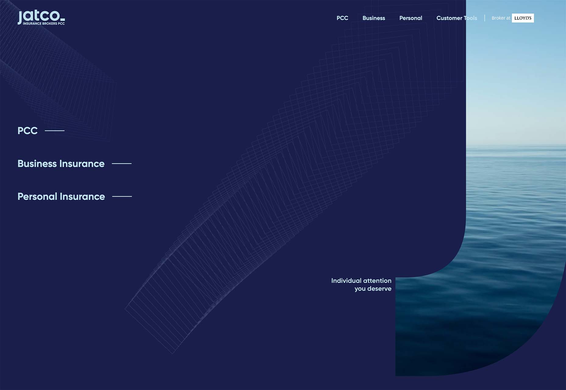
Jatco Insurance is the most stunning example here, with a bold color choice and a peek-a-book element inside the oversized “J.” The overall effect is soothing and interesting and naturally draws the user across the screen from the top left to the background video layer. The small tagline, “Individual attention you deserve,” is perfectly placed.

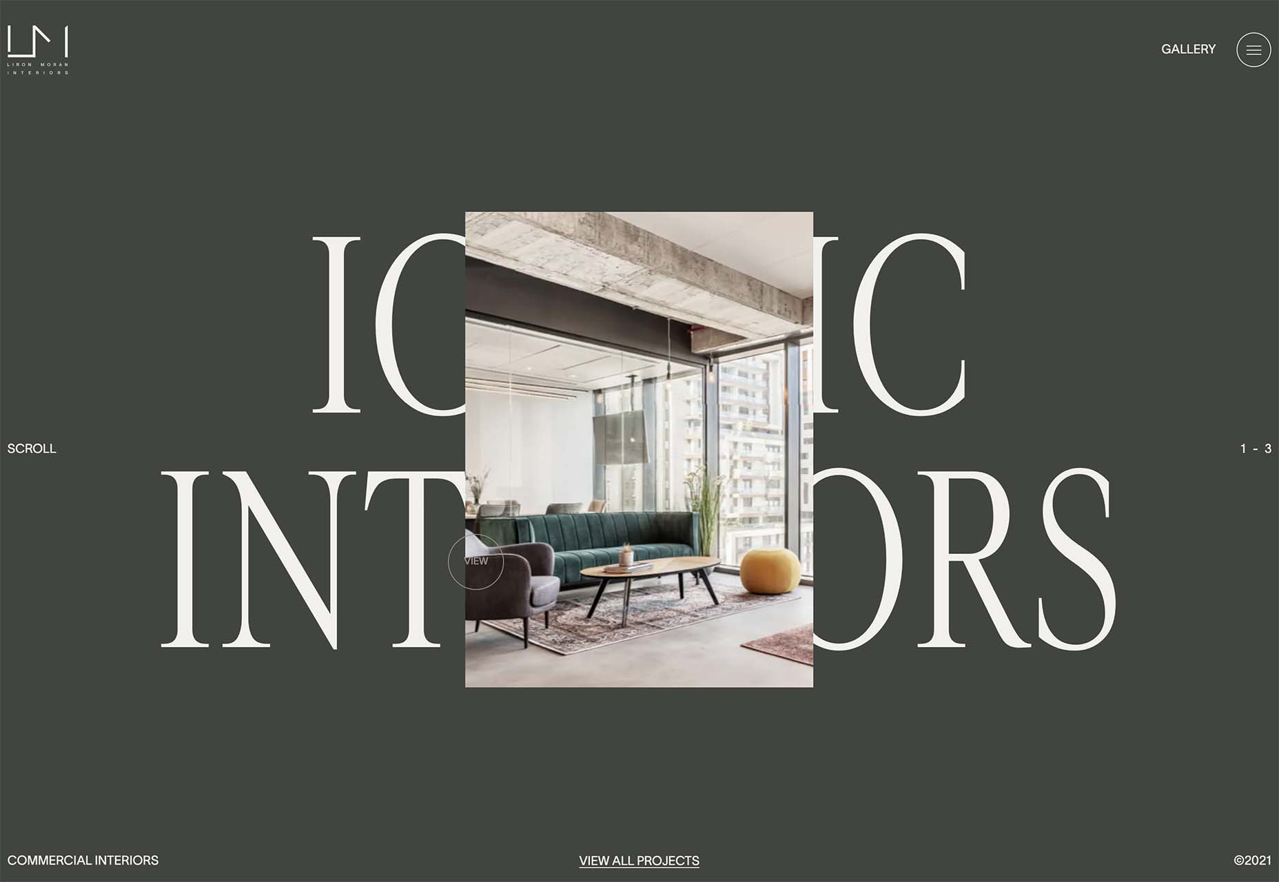
Liron Moran Interiors takes a different approach with the peek-a-boo concept with the letters peeking out from behind an image. The animation is restricted to a hover and scroll effect that adds a liquid element to the image as well as changes to the image and color background. The challenge here is in readability. More of the words show on wider screens, but is it enough?

Melon Fashion also layers text and animated effects for a neat peek-a-book style that almost seems cut out from the background. The overall look appears to have three layers: background video, middle layer for the yellow color block, and text on top. The opacity of text elements with the peeking video is interesting and well pulled together without sacrificing too much readability.

Vertical Bars

Vertical color bars are a design element that keeps popping up in different ways. Designers can use it as a standalone element or container for content, such as navigation or other click actions.

Vertical elements are helpful because they can help create a more consistent and unified user experience from desktop to mobile screens. This shape can also be somewhat disruptive because you don’t see it featured that often. (Although with this style trending that might become less true over time.)

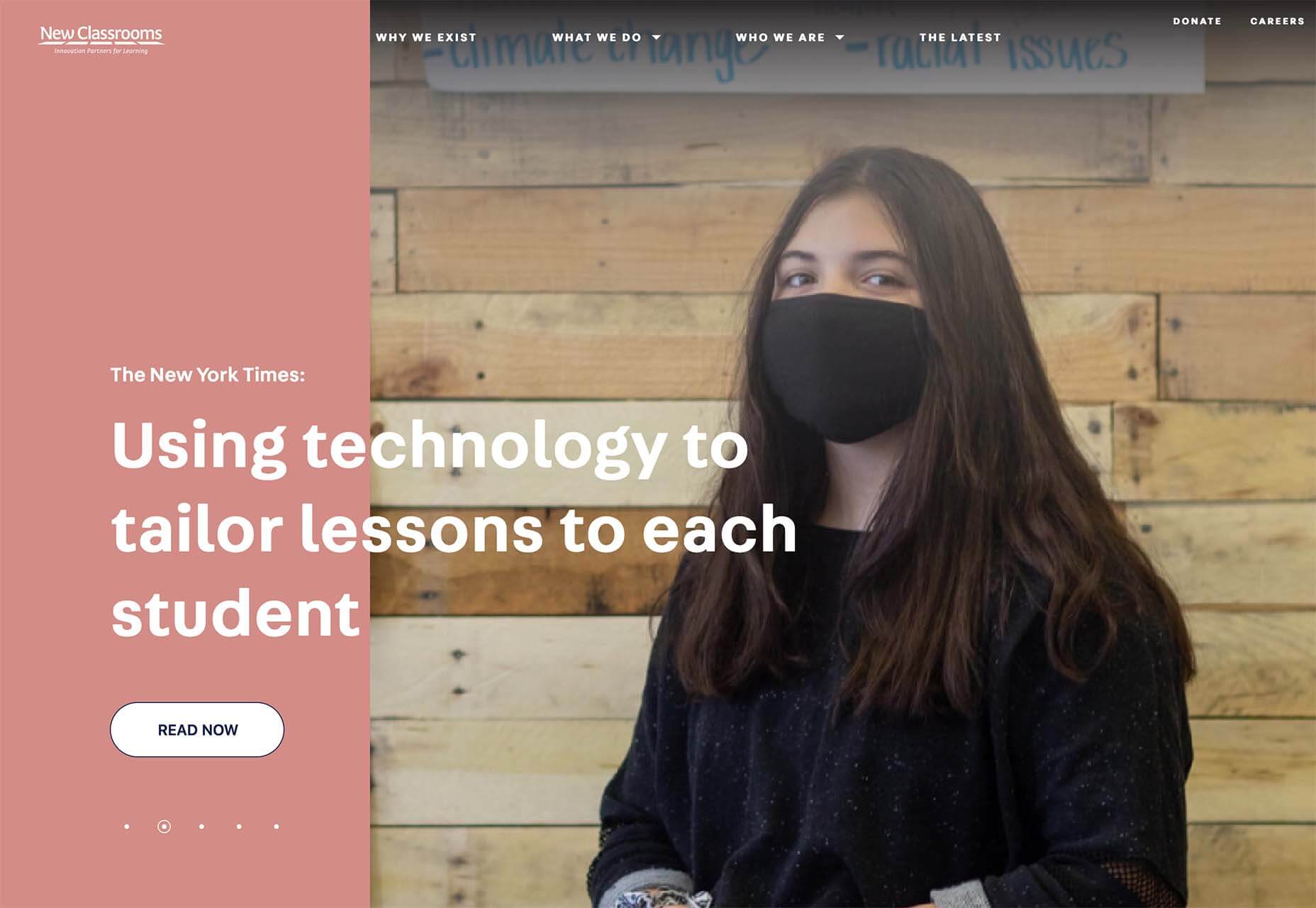
New Classrooms uses a vertical color bar on the left to help you move through the design. The color actually changes as each slide progresses on the homepage.

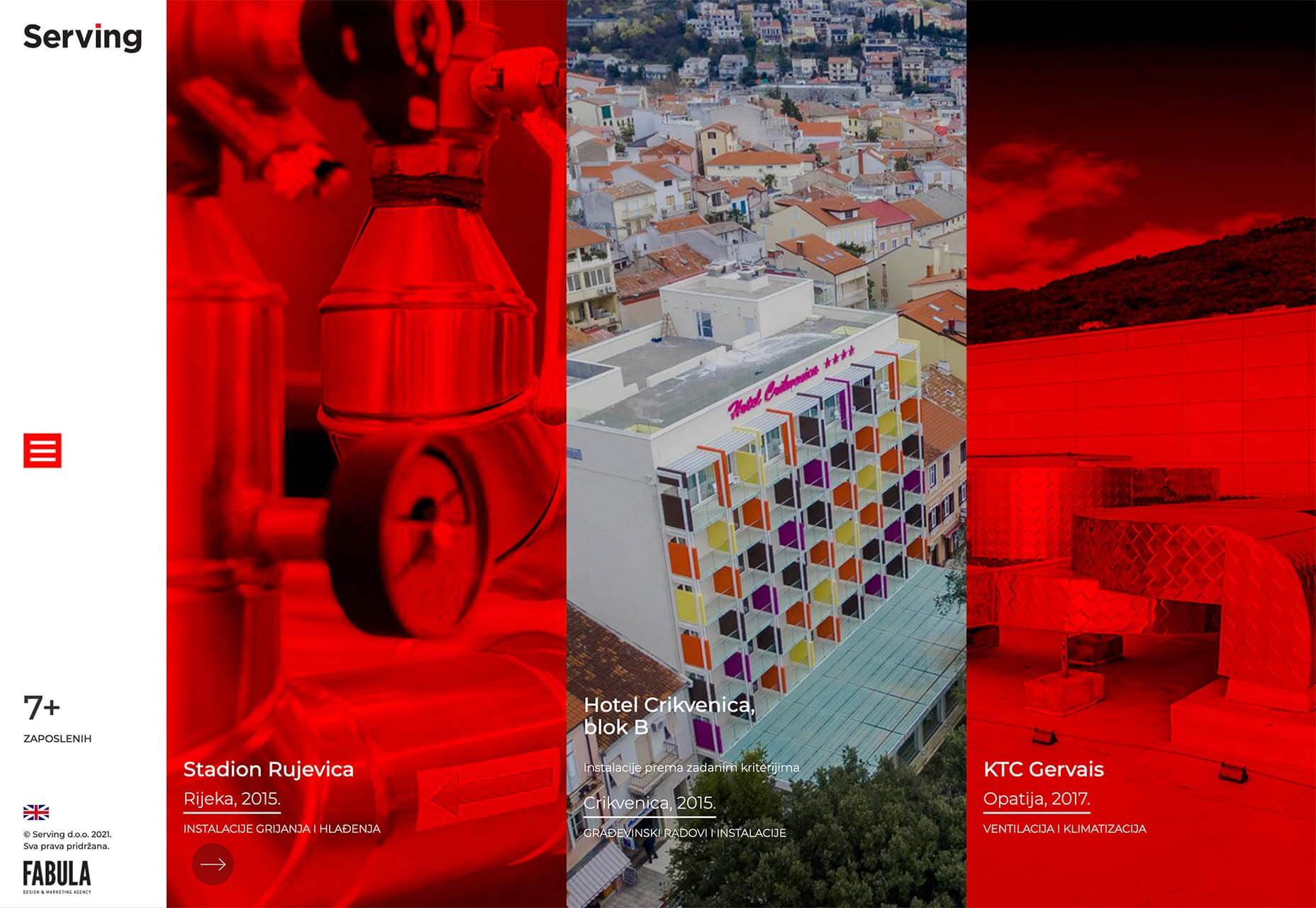
Serving uses multiple vertical bars as links to different content entry points. Clickability is emphasized with a change from a red overlay to a full-color image. The navigation is also tucked inside a white bar on the left side of the screen with a hamburger menu therein.

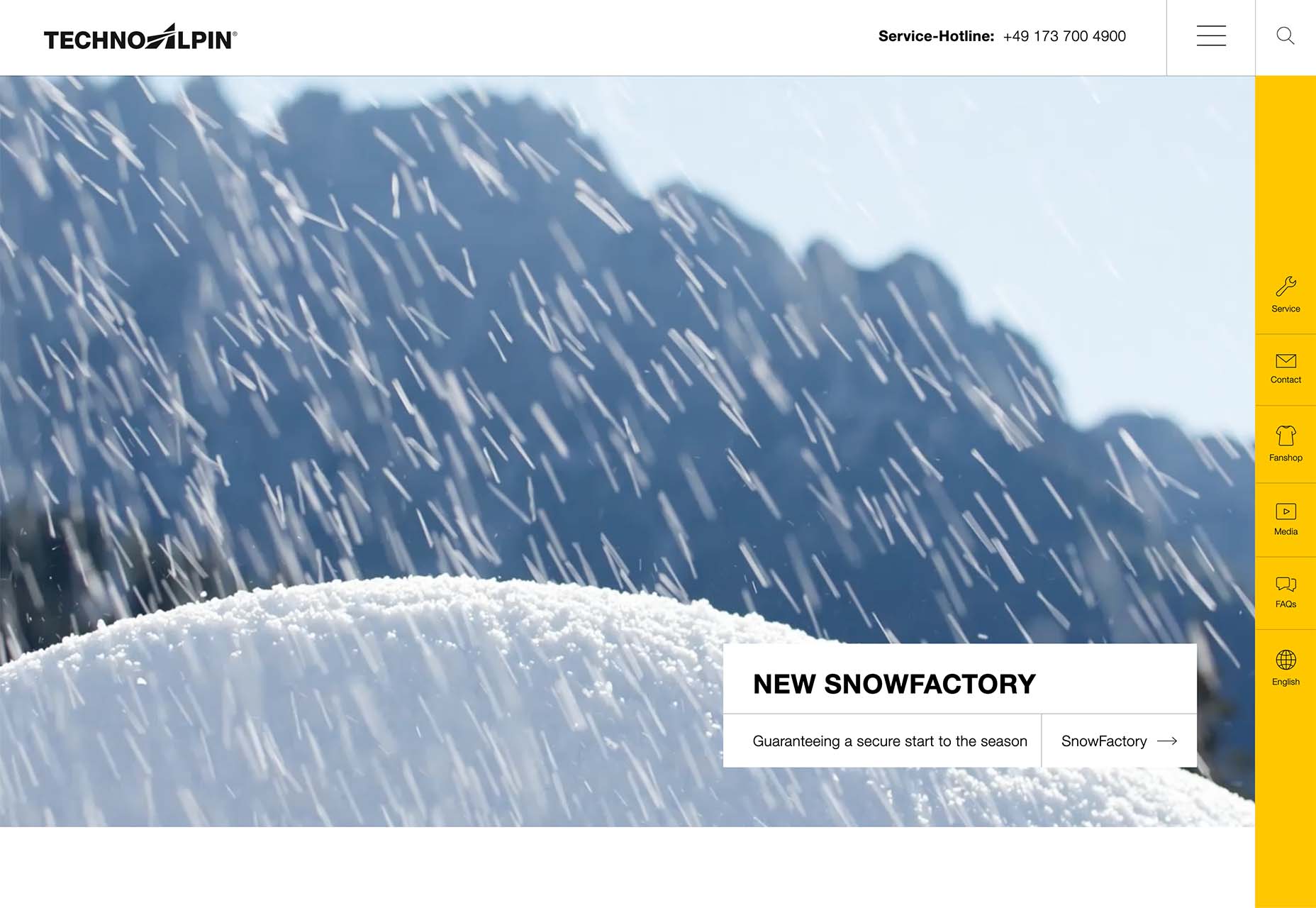
TechnoAlpin goes with a skinny vertical navigation menu on the right side of the screen. The icons with menu elements make navigation highly visual and intuitive. The color, which significantly contrasts with the rest of the design, also helps.

Brutalist Blocks

Not many people thought brutalism would stick around when it started trending. Elements of brutalism keep sneaking in, though, although they are much less stark and harsh than some of those original trending website designs.

This version of brutalism focuses on block elements that contain images or text and often click to other pages in the design. The blocks themselves are essentially the buttons that help you navigate to additional content.

The critical question about this design technique is whether this click action is intuitive enough. Will users interact without buttons?

The answer likely depends on your audience base, but if you opt for a style like this, it is essential to keep a close eye on analytics to ensure that users know and understand how to engage.

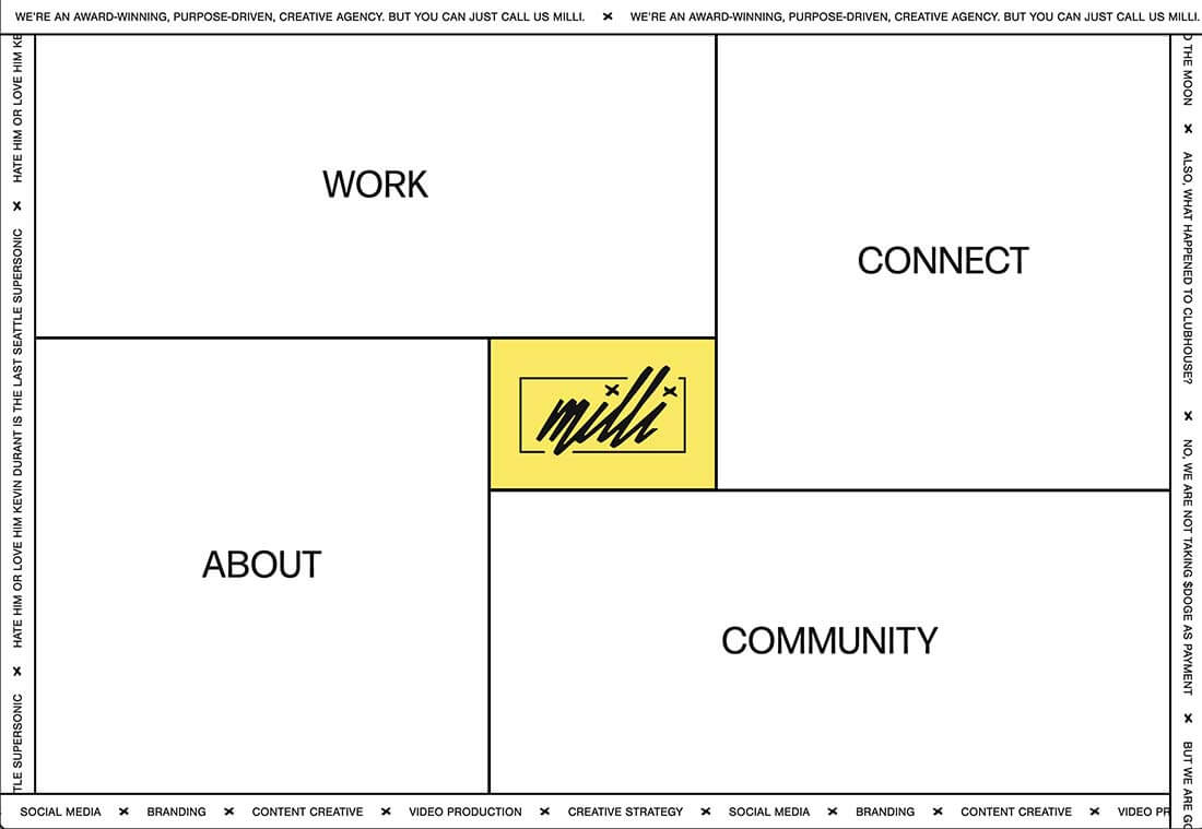
Milli Agency might be the most intuitive example of the brutalist blocks trend. The homepage is essentially a giant navigation menu. Each block changes from white to yellow on hover and expands, further encouraging clicks.

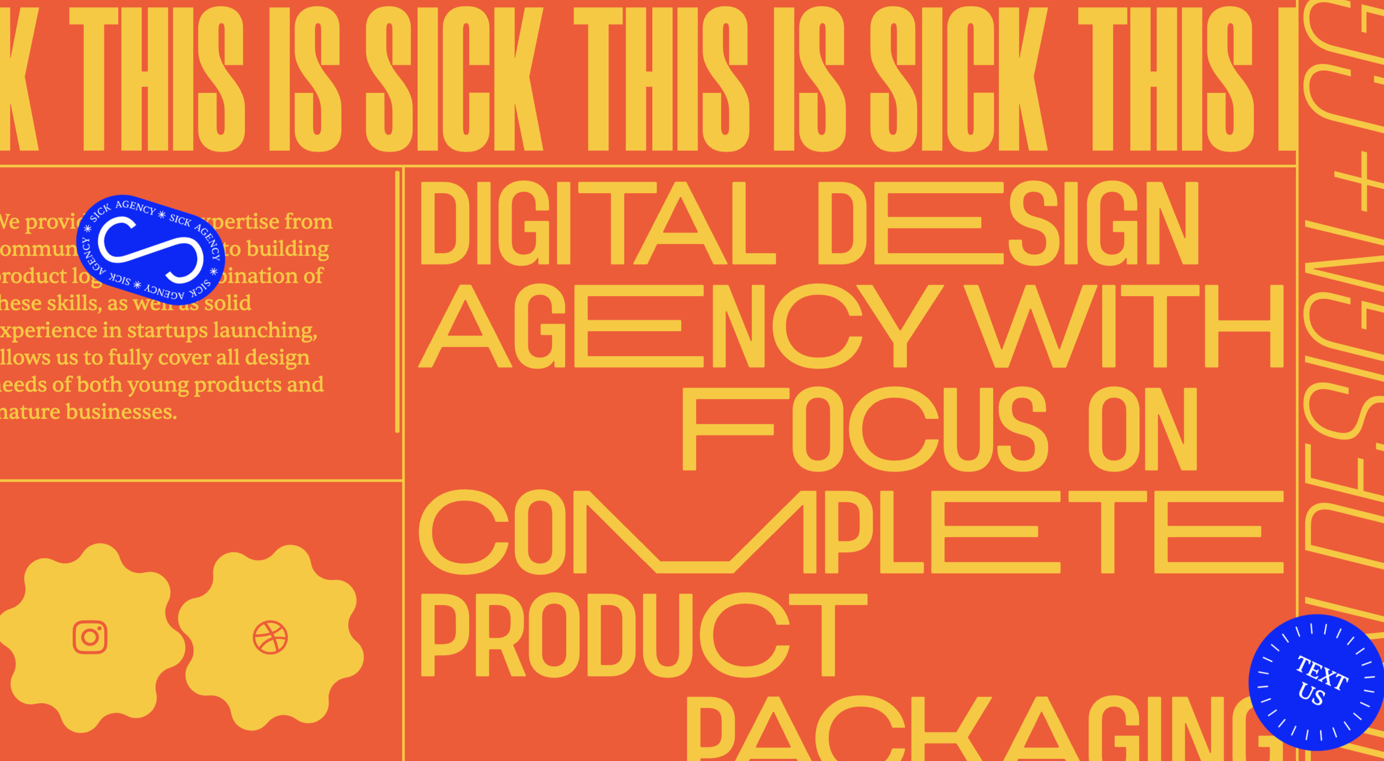
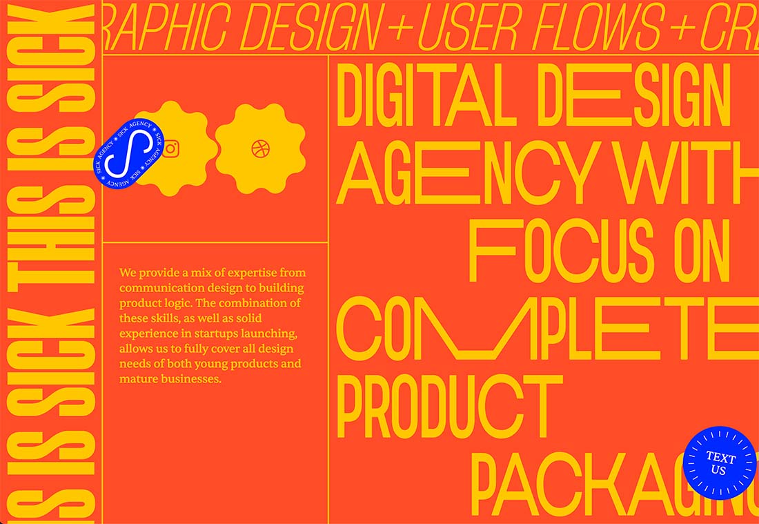
Sick Agency uses brutalist blocks with experimental typefaces and bold color for an in-your-face design. You can’t help but look at all the different things happening here. The biggest question might be, where should you focus and click next? The cursor provides some visual cues, but it’s not quite as intuitive as you might want it to be.

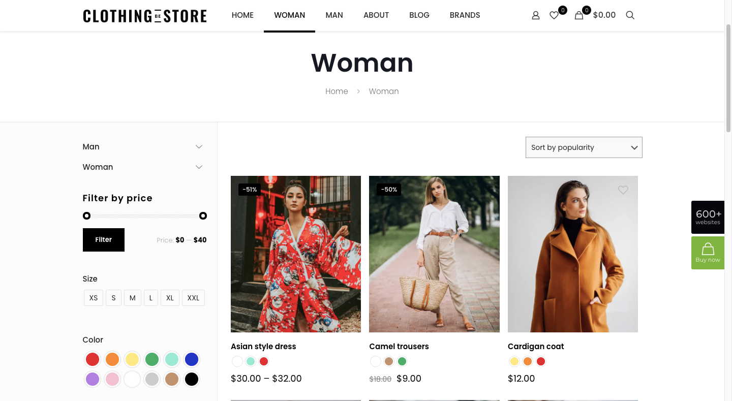
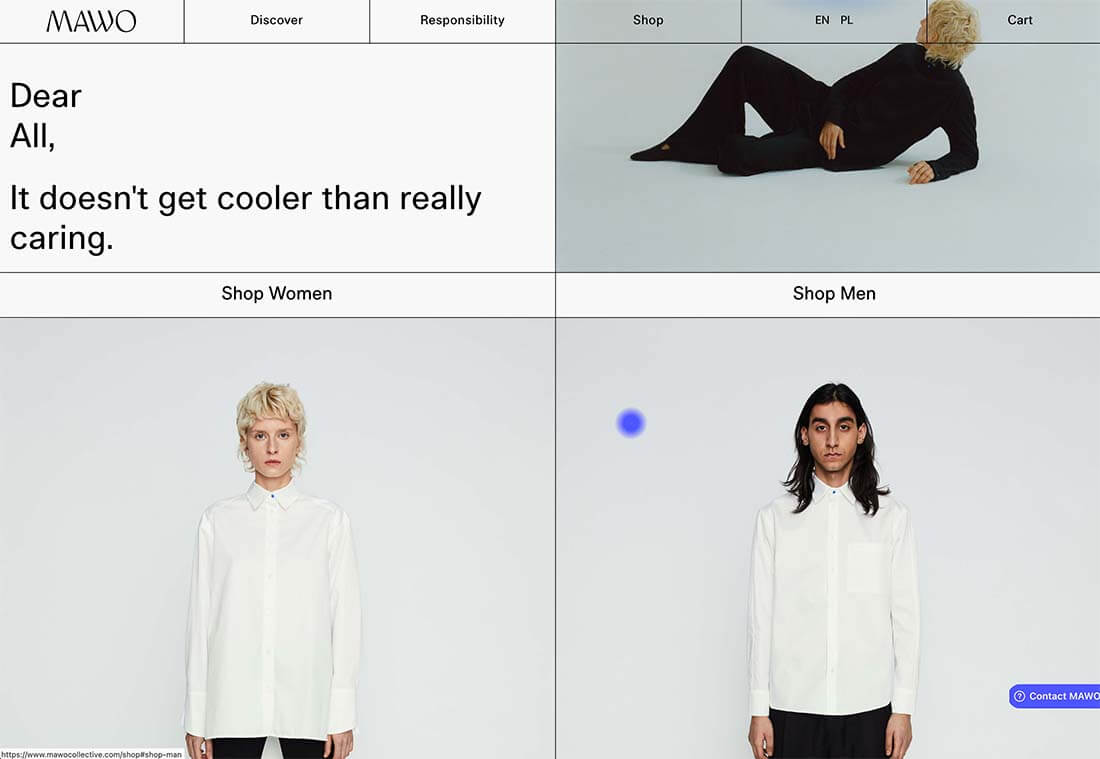
Mawo mixes brutalist blocks with a big blue cursor to help users click through the design to see more clothing options. Even the images here have a rather stark feel, which isn’t typical for e-commerce. Every block element above the scroll on the homepage includes a click action from the navigation blocks across the top to the “Shop Women” and “Shop Men” images. Further, the blue cursor dot helps show where users can click, and text buttons change to blue on hover as well.

Conclusion

Most of the examples here show trends as homepage elements, but you aren’t limited to that application. Try some of these techniques on landing pages or interior pages that you want to add a little something special to.

This can be an excellent way to test the design and see if your users like the style and know-how to interact with it. If it works, then you can extend the aesthetic to more of the design.

Source

The post 3 Essential Design Trends, November 2021 first appeared on Webdesigner Depot.


Source de l’article sur Webdesignerdepot

1, 2, 3 – That’s exactly how long it takes you to start losing visitors if you have a slow-loading website.

Hold on! Surely, the only thing that matters to users is that your website works flawlessly and looks great… right? Wrong!

The fact of the matter is that we’ve all become accustomed to instant access to information and content. The average internet user today places a lot of value on speed, and the bar is continually being raised.

If you are like most people, you probably feel an immediate sense of dread at the thought of optimizing your website. Where do you start? How can you make the most impactful improvements? What makes your website slow in the first place?

Have no fear, as we’ll be answering all of your questions below as well as putting you on your way to a website that loads with blazing speed.

Why Should You Be Worried About A Slow-Loading Website?

Good question!

As many as 53% of visitors abandon a site that takes more than 3 seconds to load. Even worse, 1 in 3 shoppers will leave a website if it takes longer than 5 seconds to load.

So, performance plays a huge role in the user experience of your website and whether your visitors will stay on your website or be converted into customers.

For some time, Google has been keenly aware of this fact. As a search engine, Google knows that it’s counterproductive to recommend content to users if they won’t stick around to consume it.

That’s why they’ve continually been increasing the role performance plays when ranking websites for their SERPs (search engine results pages).

In recent years, Google has introduced core web vitals. These are metrics they hope will help quantify how performance affects the user experience. In general, they measure how fast, stable, and interactive a page is while loading. This will be more important than ever after Google announced its Page Experience update, which started its global rollout in June 2021.

As you may know, ranking highly for Google is vital for your website’s visibility. For one, 68% of online experiences begin with a search engine, of which Google has a 92.7% market share. Even if you manage to land on the coveted first page of Google, the first five results get over 70% of all clicks (28% to the first result alone).

So, to recap why a fast loading website is so desirable:

  • It directly affects your ability to keep, satisfy, and even convert visitors to your website.
  • It impacts your search engine rankings which impacts your “findability” and organic traffic.

8 Reasons Your Site Is Slow + How to Fix Them

O.K., so now that we’re all on the same page regarding the importance of your website performance, let’s look at common issues slowing down your website + how to fix them.

1. You’re Using A Sub-Par Hosting Service

As the party responsible for making your website available to the outside world, your hosting service can be a make-or-break factor. Not only should you pick a host that has a good track record when it comes to uptime a performance, but also one that’s suitable according to your needs.

Even if you take all the steps below to optimize your website’s performance, it may still load slowly if traffic to your website is overwhelming your available bandwidth or your host’s server capacity. If that happens, some users may experience extremely slow loading times, broken features, or even complete unavailability.

For most personal, blog, or local/small business sites, a respectable hosting provider like Bluehost or GoDaddy should be good enough. However, if you plan on running any type of large-scale, high-traffic webstore, business portal, or other type of website, you’ll want premium hosting, such as WPEngine (for WordPress), VPS hosting, or even a dedicated server.

2. You’re Not Optimizing Your Media Assets
As you probably know, media like images and videos take up significantly more space than most other types of content, such as text, code, stylesheets, or other static files. Even a single image has the potential of consisting of more data than dozens of website pages containing nothing but the underlying HTML and text.

In a Speed Essentials presentation, the Google team identified images as the largest contributor to page weight. In fact, they have the potential to consume a website’s entire performance budget if left unoptimized. Images can also directly impact all three of Google’s core web vitals – key metrics Google uses to measure the performance of a website.

However, the use of images and video is likely to continue growing, heightening the importance of finding a sustainable solution. According to HTTPArchive, images have increased by 19.3% on desktop and 42.7% on mobile.

For now and the foreseeable future, optimizing your images carries the greatest potential for improving performance.

The problem is that optimizing image assets requires multiple steps. Most importantly:

  • Using the appropriate next-gen formats which can differ depending on the user’s device, OS, or browser.
  • Appropriately compressing the size and quality of images to reduce payload without affecting visual quality too badly.
  • Using the optimal display size and density based on the accessing device to reduce payloads further.
  • Using lazy loading to only load images as needed.

As you can see, manually going through these steps for every single image on your website can be extremely labor-intensive. This is especially true if you consider that you somehow need to create the optimal variants for different users based on what device, OS, or browser they are using.

In-code strategies, like a JS plugin, responsive images, or CSS media queries tend to bloat your code and lead to other performance issues we’ll discuss below.

Luckily, there are plenty of CDN services available designed specifically for providing some degree of automated image optimization. These platforms analyze the context (i.e., a specific mobile device model, OS version, and browser version) of the user trying to load one of your images and try to serve them a version of the image that’s ideally optimized for them.

However, any media optimization platforms still require installing a small JavaScript plugin to dramatically improve the image and video optimization capabilities. 

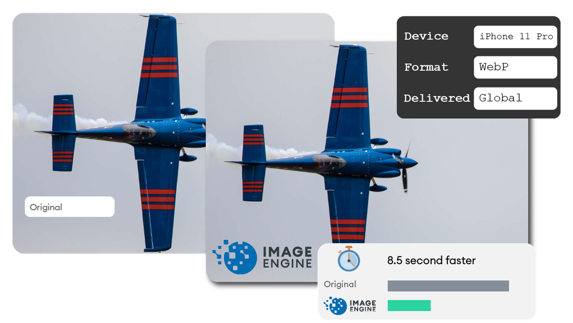
The one exception here is ImageEngine. ImageEngine uses WURFL device-detection to pick up every possible detail of the user’s device. The logic is built into their device-aware edge servers and doesn’t rely on you adding any additional code or markup to your website pages.

So, not only does it reduce your image payloads by up to 80% and serve them via a global CDN, but it doesn’t leave a footprint in your website’s code. As a bonus, it also happens to support the widest range of image/video formats, including animated GIFs, as well as client hints and save-data mode.

3. Render-Blocking JavaScript And CSS Is Delaying Page Loads

JavaScript is the de facto programming language for adding interactivity and advanced features to websites today. Likewise, CSS is the standard for adding styling. Both are critical components for almost any modern website.

However, nothing good comes free, and both may impact the performance of your website, particularly when used carelessly. 

The following are some steps you can take to minimize the impact of these assets on your website performance:

  • Minify your JavaScript and CSS files.
  • Combine a large number of JS/CSS files into fewer files.
  • Replace some of your external JS and CSS files with inline JS/CSS. (Don’t overdo this! Inline JS and CSS is only suitable for small code snippets).
  • Defer loading JavaScript until after all your content is loaded and use media queries for CSS files.

Because media can have a more significant impact on your page weight, this leads some to believe that adding more JavaScript is the lesser of two evils. 

However, depending on whether you already have render-blocking JS, Google might flag this as a completely new issue. Regardless, it will negatively impact your performance score in tools like PageSpeed Insights:

You can avoid it altogether by using an optimization engine like ImageEngine that doesn’t require any JavaScript.

4. You’re Not Using A Content Delivery Network (CDN)

A CDN is a network of servers spread across various regions all over the globe. What it basically does is store a copy of your website on each of these servers. When an internet user visits your site, the CDN automatically serves your website from the nearest server to that user.

What this does is allow your website to load faster, no matter where in the world people are visiting it from. If your website was only hosted on a single server, say somewhere in the U.S., then it could take much longer to load for a visitor located in Asia than one in the U.S.

While they all basically do the same thing, different CDNs are better at handling different types of content. Cloudflare, Fastly, and Akamai are just some of the most popular general-purpose CDNs around. Image CDNs like ImageEngine are purpose-built to not only serve image and video assets but to also optimize them using compression, formatting, etc.

So, the two main factors to consider are the type of content you want to deliver via the CDN and its global coverage. However, it’s usually possible to use multiple CDNs in tandem to cover different types of content and reach a wider area.

5. There’s Excessive Overhead In Your Database

If you have a website with any type of complexity, you probably have a corresponding database. In fact, all WordPress websites require a database to function.

Over the years, a lot of information moves in and out of the database. Sometimes, the data can get lost along the way or become obsolete. If you don’t regularly spring-clean your database, then this can really start to add up. Not only will it bloat the storage size of your database, but it will start to impact the speed of database queries and requests.

CMS users are especially prone to racking up these kinds of artifacts from plugins and themes that have been installed and removed over the years.

Unfortunately, there aren’t many easy fixes for this issue available. With most hosting providers, you’ll probably need to use phpMyAdmin to manually check and scrub your data. If you have a managed hosting solution, the host’s support team might be able to help you out. In the event that you have a locally installed database, there are some tools you can use, although they’re not 100% effective.

The best way to avoid any issues is to make database maintenance part of your routine and to learn the basics of how databases work.

6. You Have Too Many Plugins Or Themes Installed

For CMS users, plugins or themes offer near-limitless potential to spruce up the design and functionality of their website. However, each plugin or theme comes with additional code and content that add to the overall complexity and size of your website.

If you have a hand-coded website, the same goes for any additional applets or libraries you want to add to your site. 

The best way to combat this is to be conscientious when adding any extras to your website. Only install what you really need or want, and make sure to uninstall and properly remove them if you don’t need them anymore.

As mentioned, they might leave various transients or artifacts behind, so you should keep an eye out for them throughout your website files (not just the database) whenever you do some spring cleaning.

7. You Aren’t Utilizing Caching

Caching is often one of the most effective yet ignored techniques for improving website performance. Caching stores your website content in fast-access memory in the user’s browser, allowing it to be loaded near-instantaneously by users. This can include everything from text to stylesheets to images to JavaScript files.

Without caching, a user will need to redownload everything when they navigate to or reload a page — whether or not anything has changed.

However, not properly configuring caching on your website can lead to issues, such as users only loading out-of-date content. Most high-quality caching tools have built-in features that automatically clear the cache when you make changes to a specific website page or content. So, users will only reload content once it has been modified.

Some hosts offer out-of-the-box caching tools with their hosting service. CMS can also usually find plugins for this, such as WPRocket for WordPress.

8. Ads Are Dragging You Down

In the end, ads are just another form of media that increases the overall weight of your website pages. While they are typically small and lightweight, multiple ad placements can really start to add up.

What aggravates the issue is that ads are loaded from external sources. This means they’ll take longer to render, generate more requests, and may mess with how stable your pages load — affecting your core web vitals.

Depending on how important ads are to your revenue stream, you’ll want to carefully consider how many ads you use on your site, where to position them, and when they load. If possible, avoid loading ads at the same time as the rest of your page, especially interstitials.

Conclusion

As you can see, website performance is a multi-faceted subject. Although some may be worse than others, you can’t just address one area and expect your website to suddenly be performant.

However, some general principles apply:

  • Keep HTTP requests low by limiting the number of files required for each of your website pages.
  • Maintain proper code hygiene and spring clean transients and leftover artifacts.
  • Invest in proper hosting infrastructure as well as a CDN for your website.
  • Optimize your media assets to significantly bring down payloads without sacrificing engagement.

The final point deserves another shoutout. As we’ve pointed out, finding an optimization solution for your media, particularly images, is probably the best thing you can do to improve your website performance. From purely a performance perspective, there is no service quite as effective as ImageEngine. It’s also the one that requires the least amount of technical expertise and ongoing maintenance.

Regardless, you’ll want to run some tests using tools like PageSpeed Insights so you can gather data on what issues your website is facing. From there, you can prioritize fixes to make your website more competitive.


[– This is a sponsored post on behalf of ImageEngine –]

Source

The post 8 Reasons Your Site Is Slow + How To Fix Them first appeared on Webdesigner Depot.


Source de l’article sur Webdesignerdepot
When planning the creation of a website or web app, underestimating the time needed to deliver can sink a project. The longer the project is in development the more money, time, and other resources are required to see it to delivery. Also, the longer it is developed, the more that excitement for the project wanes and it might just be cast to the rubbish heap of other discarded projects.

Fortunately, over the years with advancements in tech stacks and the development of best practices, development times can be significantly reduced. This article looks at 10 easy-to-adopt practices that will reduce development time.

Source de l’article sur DZONE