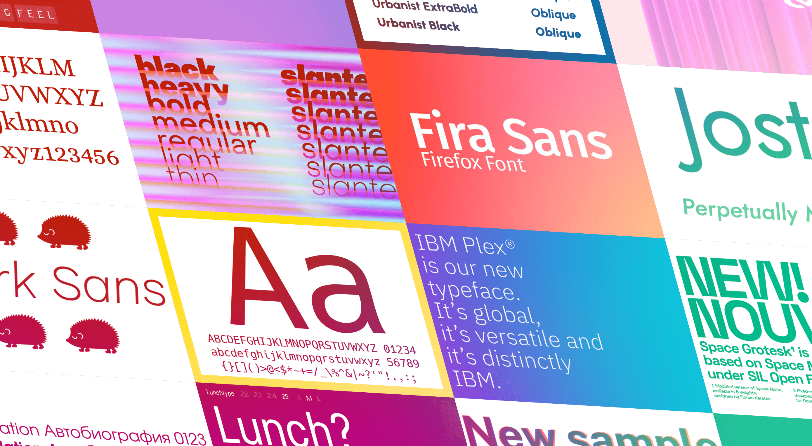
 The right typeface can make or break your website. As designers, we will always be naturally drawn towards the premium fonts such as Circular, DIN, or Maison Neue; Before you know it, your website is racking up a font bill larger than your hosting bill.
We’ve put together a list of open-source fonts that will rival your fancy fonts, and might even persuade you to switch them out. All the fonts listed here are completely open-source, which means they’re free to use on both personal and commercial projects.
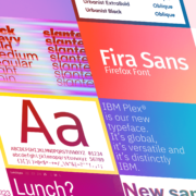
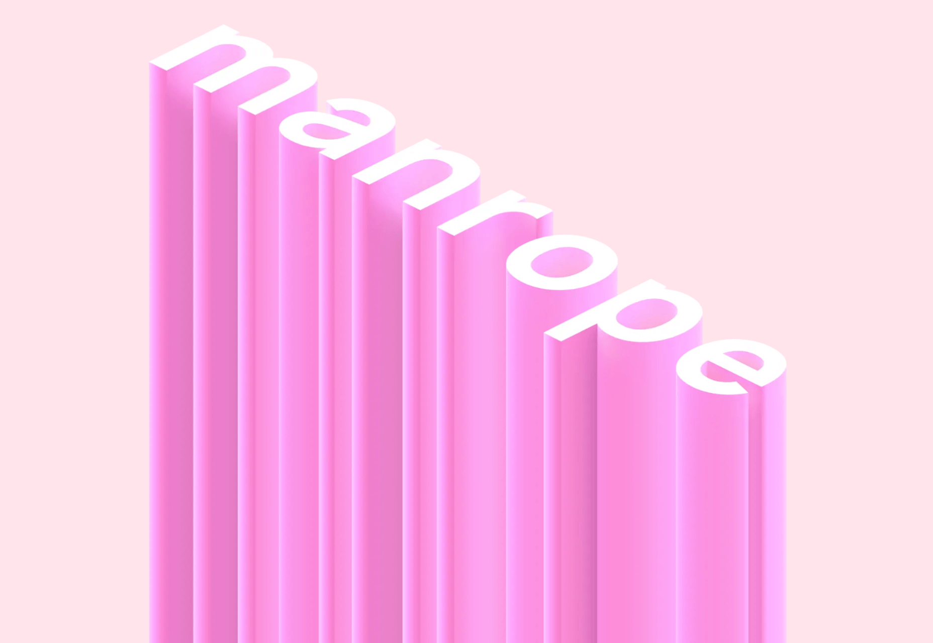
Manrope
Manrope has sprung onto the font circuit in style, with a website better than most early startups. It’s a variable font, which means you have a flexible range of font weights to choose from in a single font file. Manrope is a personal favorite of mine, it has every ligature you could want, and is fully multi-lingual. It’s a lovely bit of everything as it states on the website: it is semi-condensed, semi-rounded, semi-geometric, semi-din, semi-grotesque.
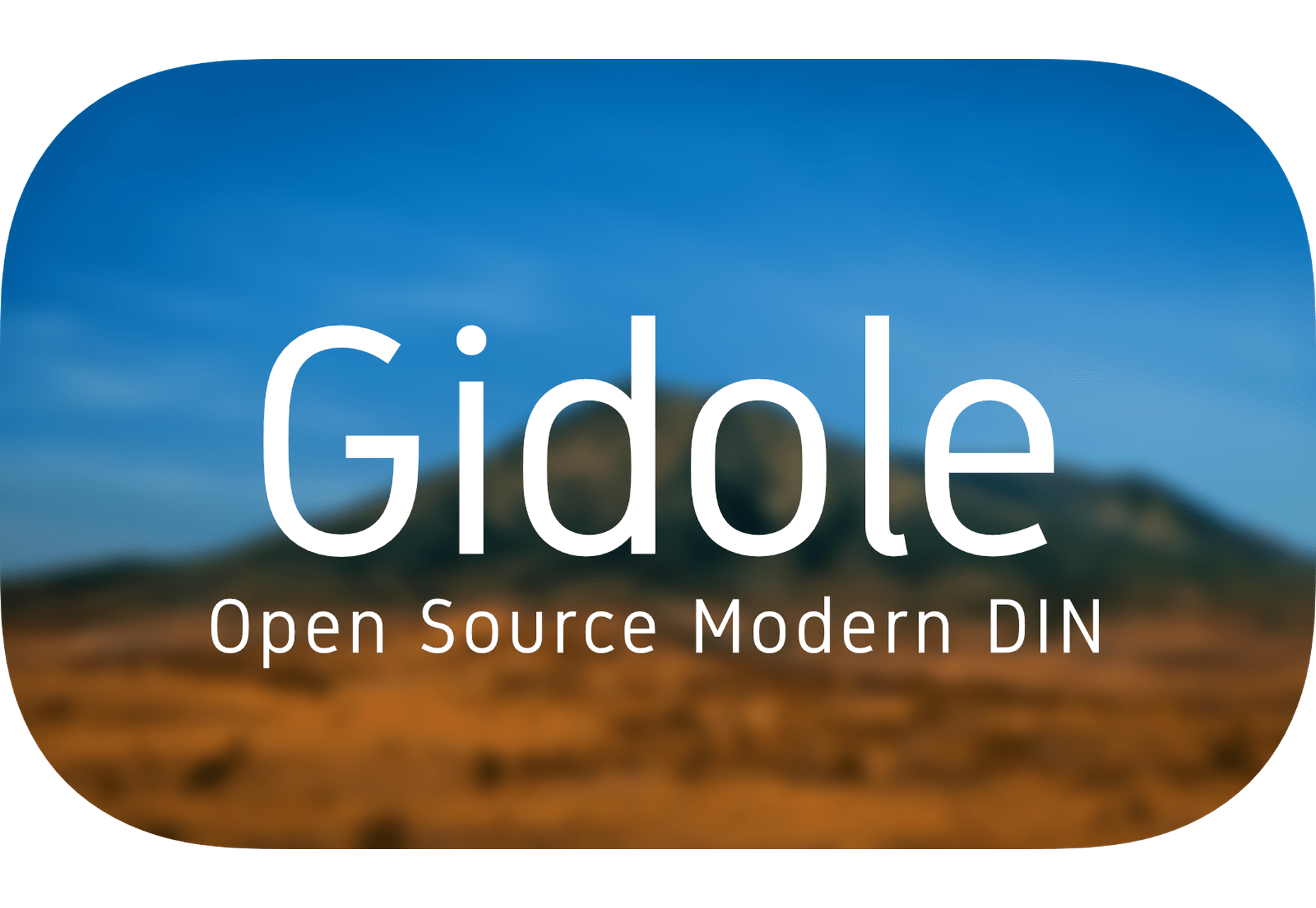
Gidole
DIN – the font we all love, the font that looks great at every size, and the font that costs quite a bit, especially with a large amount of traffic. Gidole is here to save the day, it’s an open-source version of our favorite – DIN. It’s extremely close to DIN, but designers with a keen eye will spot very few minor differences. Overall, if you’re looking to use DIN, try Gidole out before going live. (There is also a very passionate community around the font on Github)
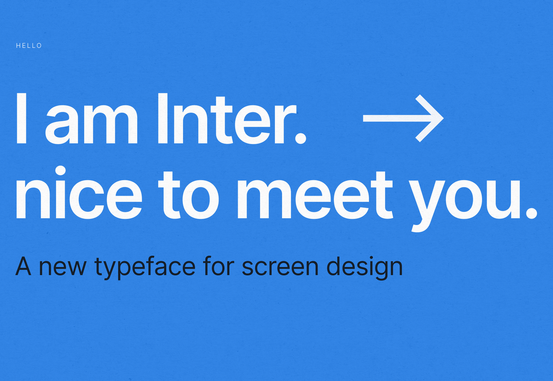
Inter
Inter is now extremely popular, but we wanted to include it as it’s become a staple in the open-source font world — excellent releases, constant updates, and great communication. If you’re looking for something a bit fancier than Helvetica and something more stable than San Francisco, then Inter is a great choice. The font has now even landed on Google Fonts, making it even easier to install. As of today: 2500+ Glyphs, Multilingual, 18 Styles, and 33 Features… do we need to say more?
Overpass
Overpass was created by Delvefonts and sponsored by Redhat, it was designed to be an alternative to the popular fonts Interstate and Highway Gothic. It’s recently cropped up on large ecommerce sites and is growing in popularity due to its large style set and ligature library. Did we mention it also has a monospace version? Overpass is available via Google Fonts, KeyCDN, and Font Library.
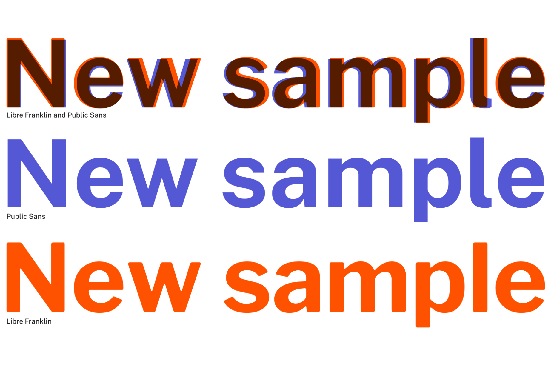
Public Sans
Public Sans is a project of the United States Government, it’s used widely on their own department websites and is part of their design system. The font is based on the popular open-source font Libre Franklin. Public Sans has great qualities such as multilingual support, a wide range of weights, and tabular figures. The font is also available in variable format but this is currently in the experimental phase of development.
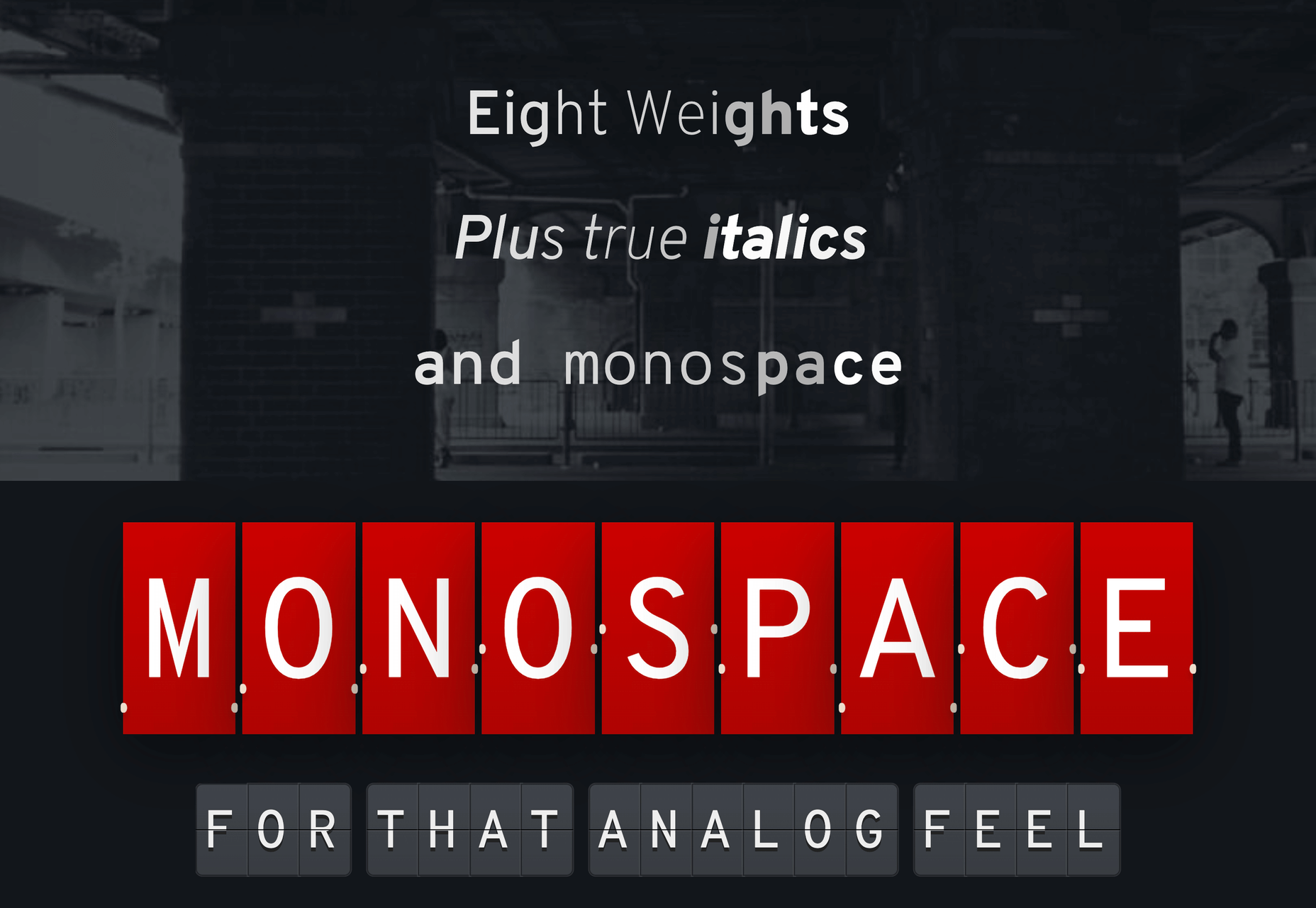
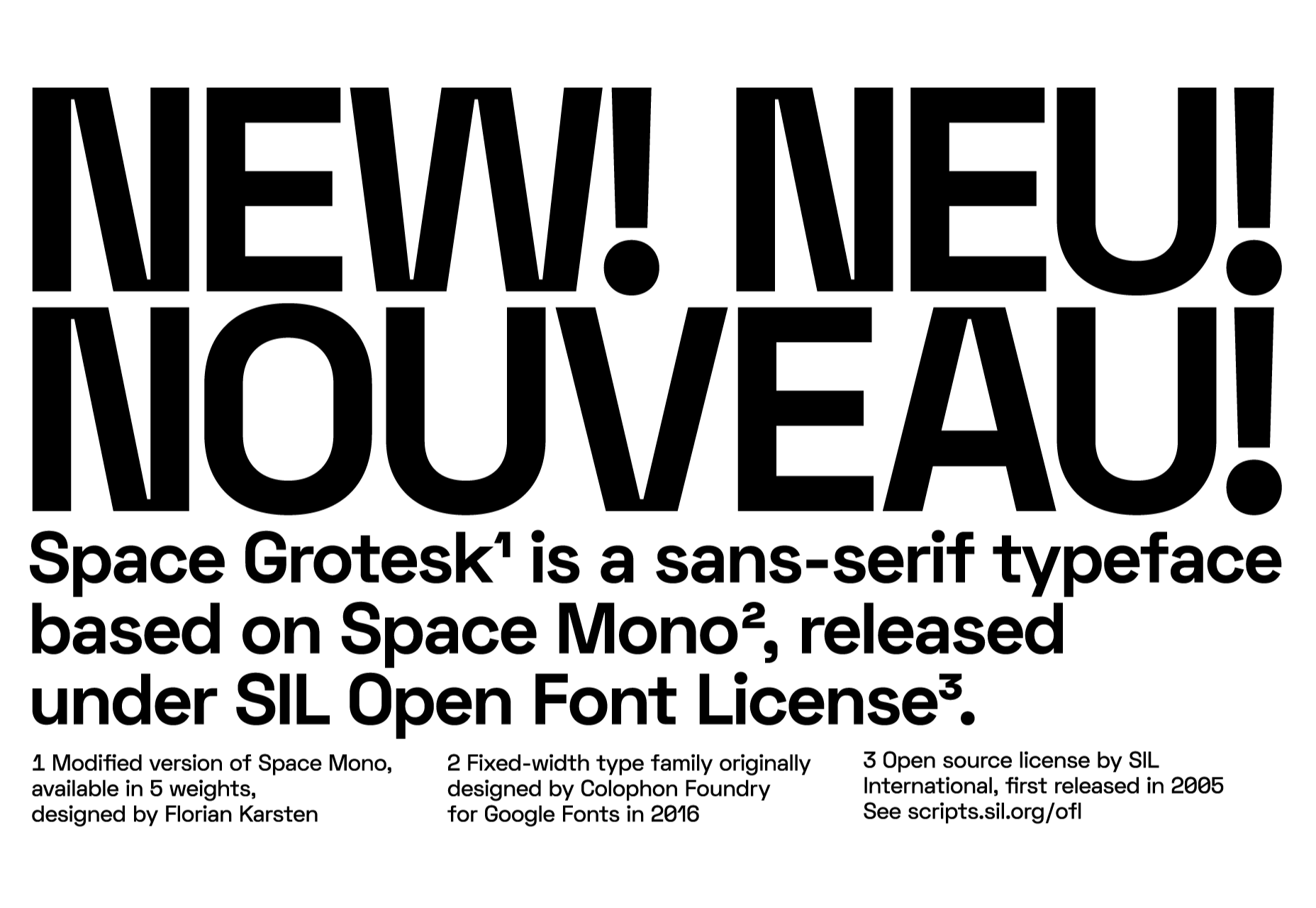
Space Grotesk
Space Grotesk isn’t widely known yet, but this quirky font should be at the forefront of your mind if you’re looking for something “less boring” than good old Helvetica. Space Grotesk has all the goodies you can expect from a commercial font such as multiple stylistic sets, tabular figures, accented characters, and multilingual support.
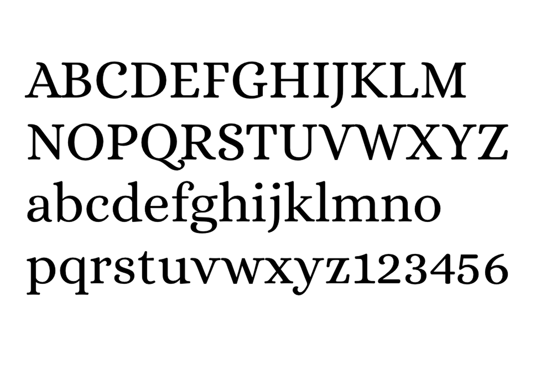
Alice
Alice is a quirky serif font usually described as eclectic and quaint, old-fashioned — perfect if you’re looking to build a website that needs a bit of sophistication. Unfortunately, it only has one weight, but it is available on Google Fonts.
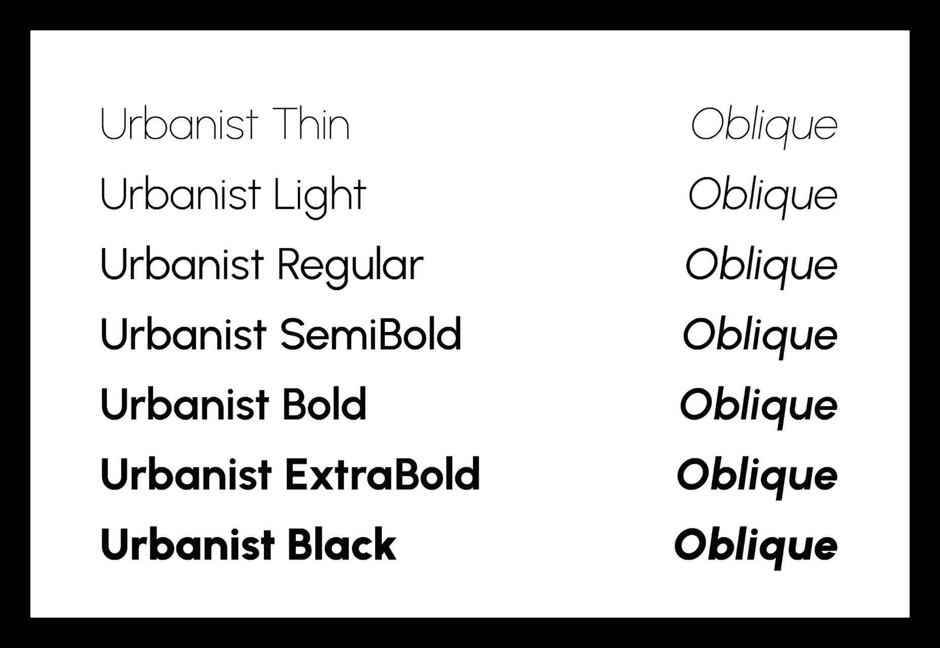
Urbanist
Urbanist is an open-source variable, geometric sans serif inspired by Modernist typography. Designed from elementary shapes, Urbanist carries intentional neutrality that grants its versatility across a variety of print and digital mediums. If you’re looking to replace the premium Sofia font, then Urbanist is your best bet.
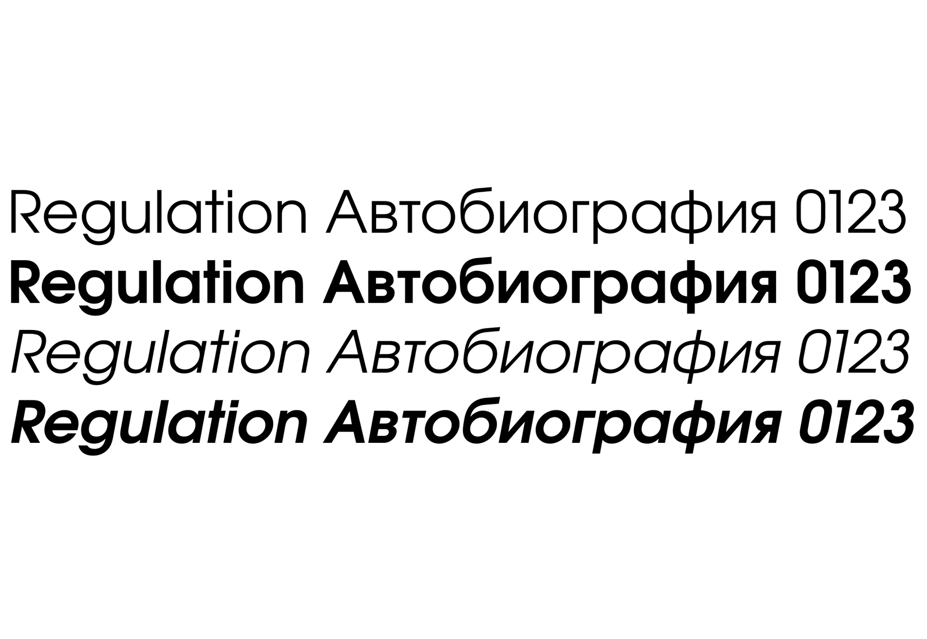
Evolventa
Evolventa is a Cyrillic extension of the open-source URW Gothic L font family. It has a familiar geometric sans-serif design and includes four faces. Evolventa is a small font family, generally used across the web for headlines and bold titles.
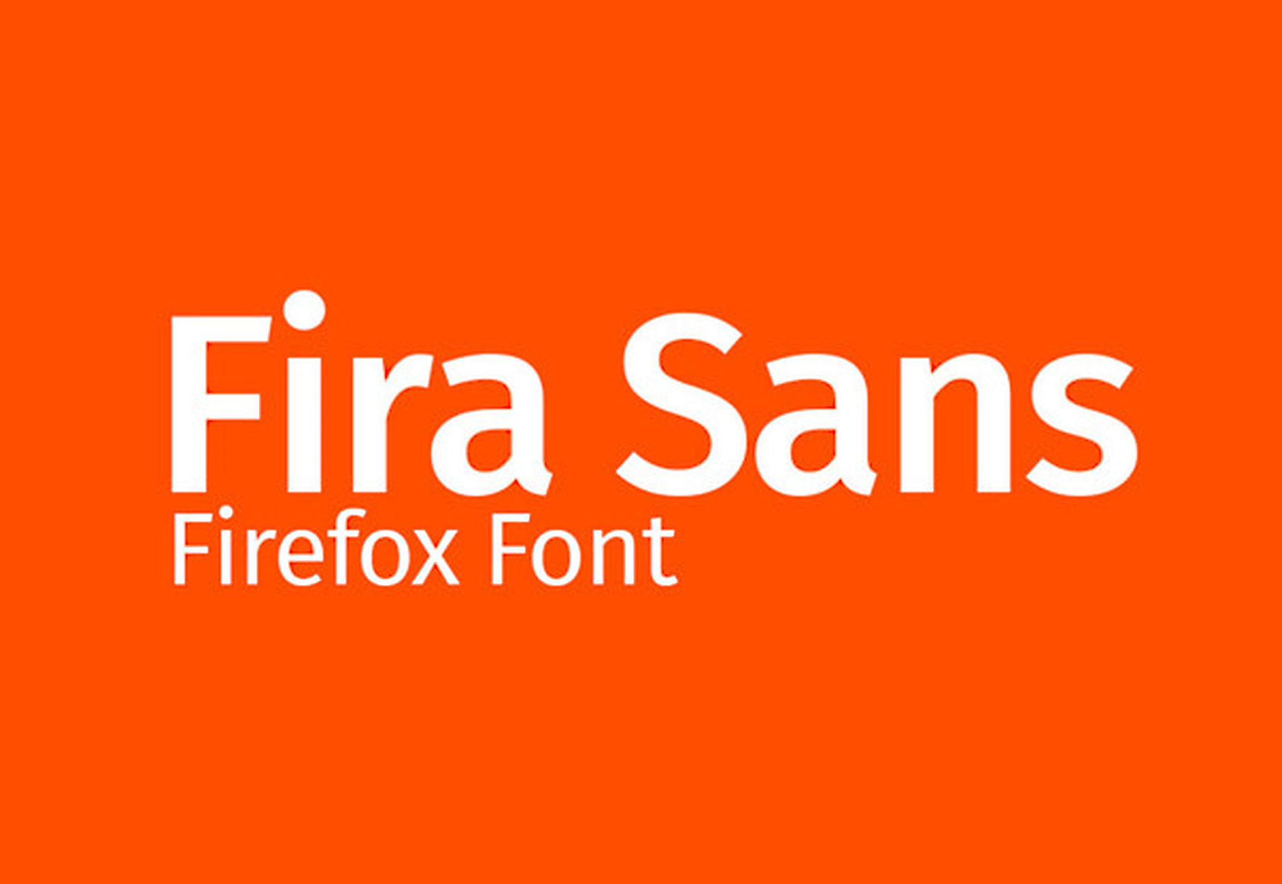
Fira Sans
Fira Sans is a huge open source project, brought to you, and opened sourced by the same team that makes Firefox. It’s Firefox’s default browser font and the font they use on their website. The font is optimized for legibility on screens. (And it’s on Google Fonts!)
Hack
Building a development website, or need a great code font to style those pesky code-blocks? Then Hack is the font for you. Super lightweight and numerous symbols and ligatures. The whole font was designed for source code and even has a handy Windows installer.
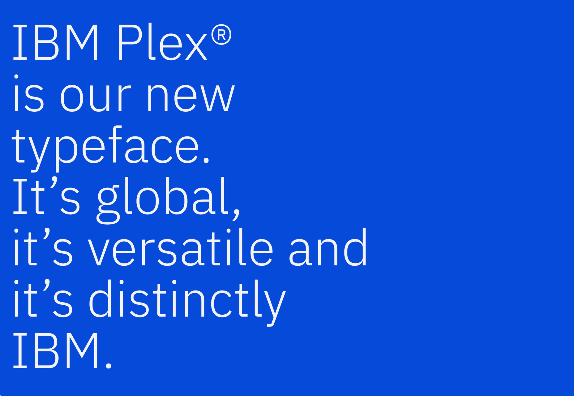
IBM Plex
IBM needs no introduction. Plex is IBM’s default website font and is widely used around the web in its numerous formats Mono, Sans, Serif, Sans-Serif, and Condensed – it has everything you’d need from a full font-family. The whole font family is multi-lingual, perfect for multi-national website designs. (It’s fully open-source!)
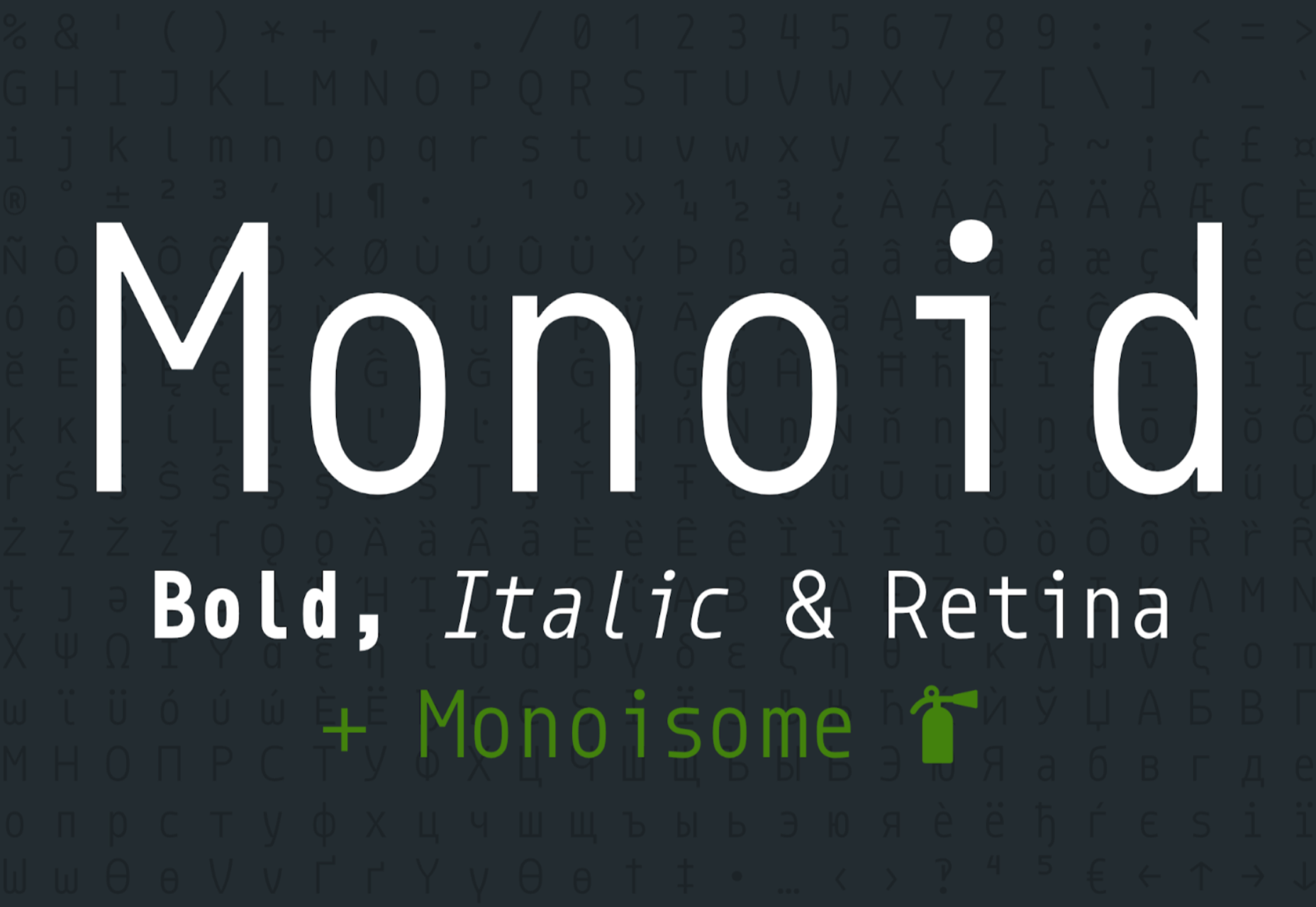
Monoid
Another great coding font, Monoid is a favorite of mine for anything code. The clever thing about Monoid is that it has font-awesome built into it, which they call Monoisome. This means when writing code, you can pop a few icons in there easily. Monoid looks just as great when you’re after highly readable website body text.
Object Sans
Object Sans (formally known as Objectivity) is a beautiful geometric font family that can be used in place of quite a few premium fonts out there. The font brings together the top qualities of both Swiss neo-grotesks and geometric fonts. The font works beautifully as large headings but can be used for body content as well.
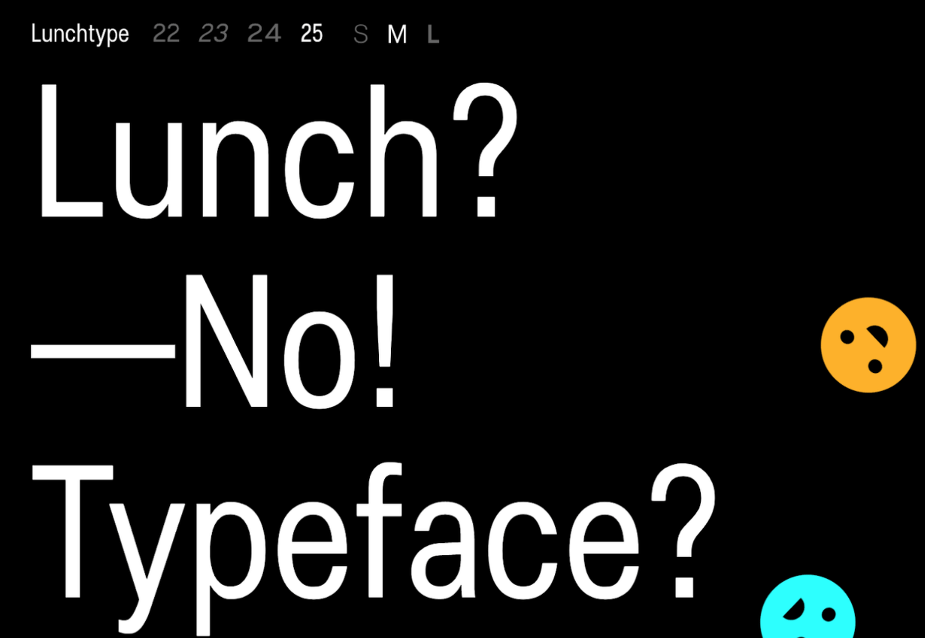
Lunchtype
Lunchtype has a very interesting back-story, originally designed during the creator’s daily lunchtime during a 100-day project. If you’re looking for something a bit “jazzier” than the typical Helvetica for your project, then Lunchtype is a perfect choice. The family comes with numerous weights as well as a condensed version — enough to fill any lunchbox.
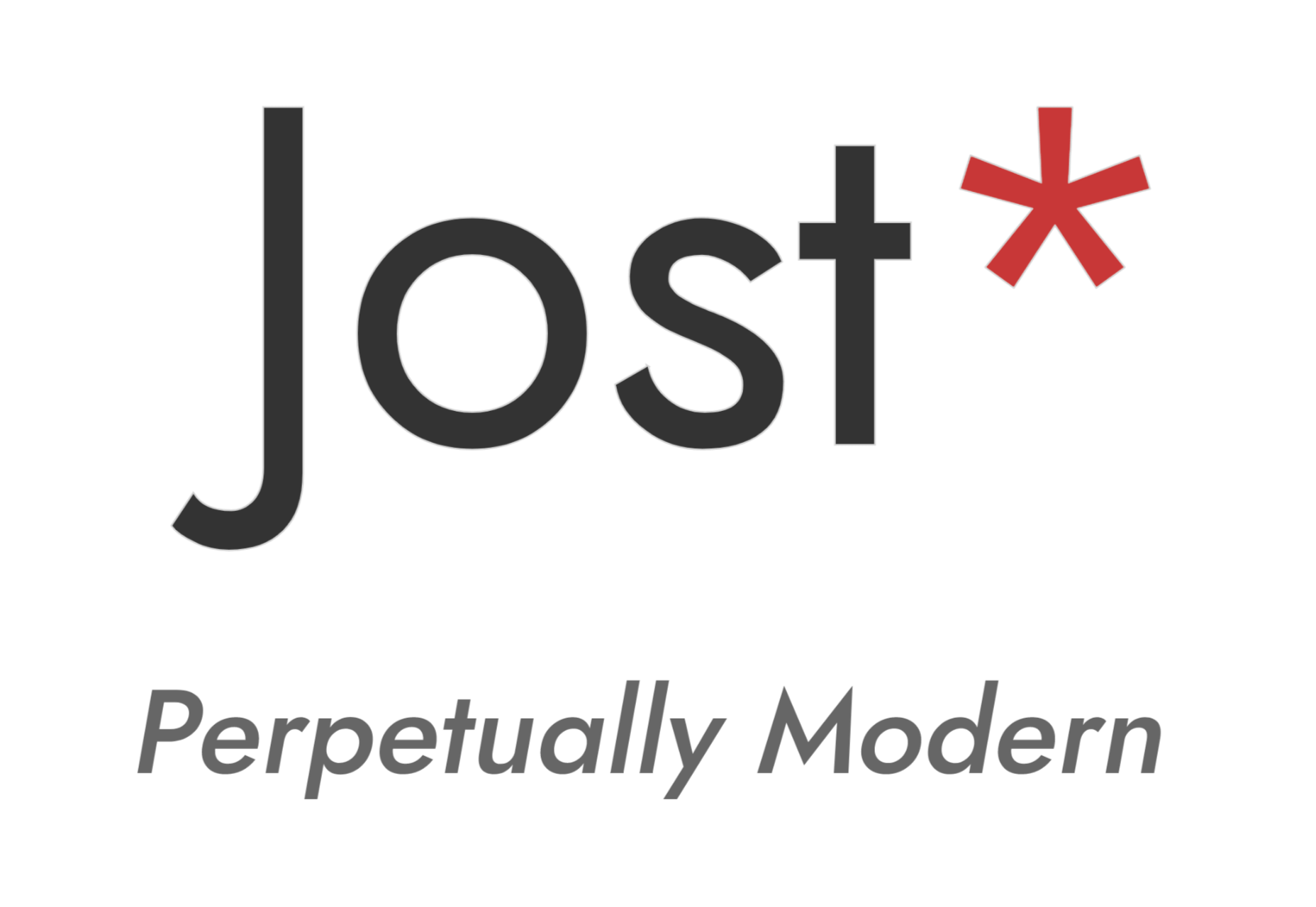
Jost
Inspired by the early 1920’s German sans-serif’s, Jost is a firm favorite in the open-source font world. Jost brings a twist to its closest web designer favorite Futura. When you want a change from the typical Futura, then Jost is a great option with its variable weighting as well as multilingual support.
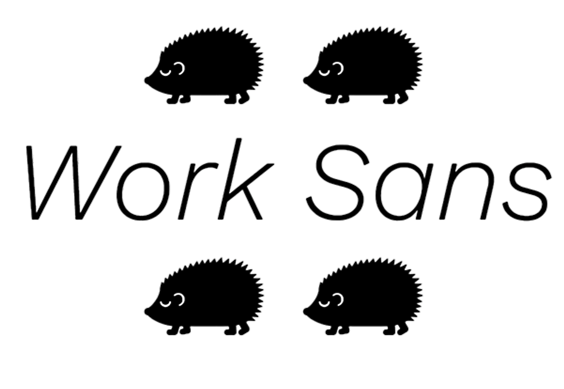
Work Sans
Work Sans is a beautiful grotesk sans with numerous little eccentricities that may delight or annoy some designers. The font has variable weighting, multilingual support and is optimized for on-screen text use but works perfectly well for print also.

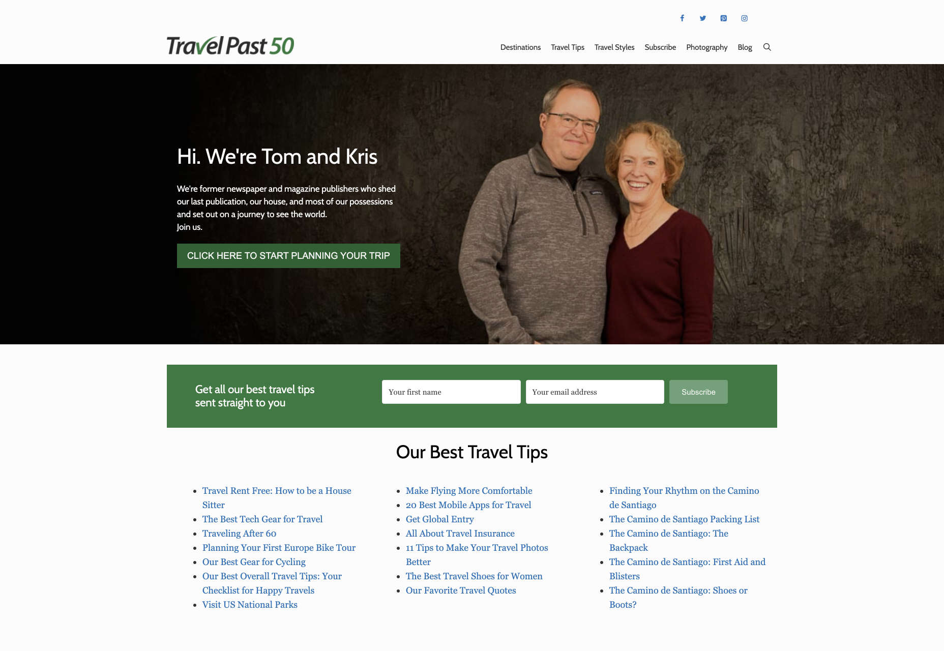
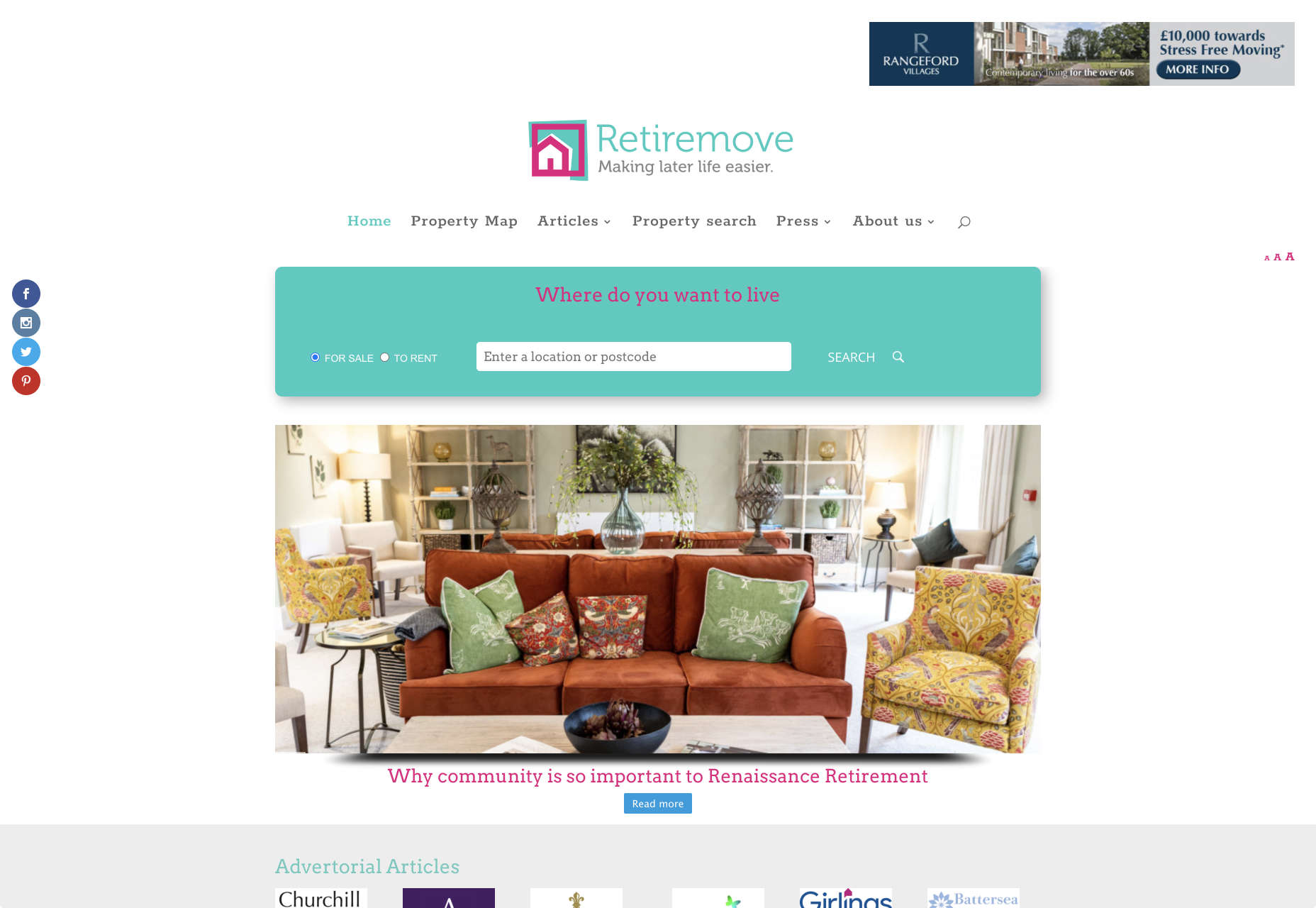
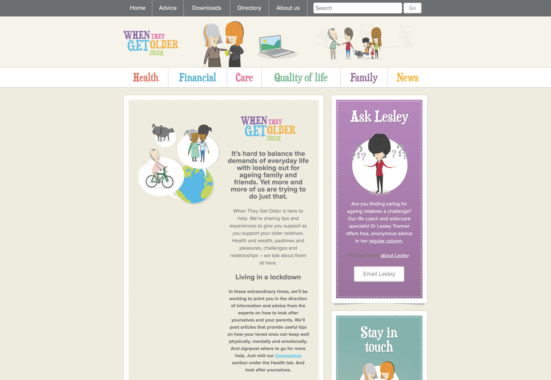
 It’s no secret that the senior population is growing. By 2030, people over the age of 65 are predicted to make up
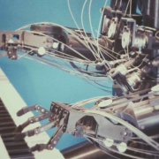
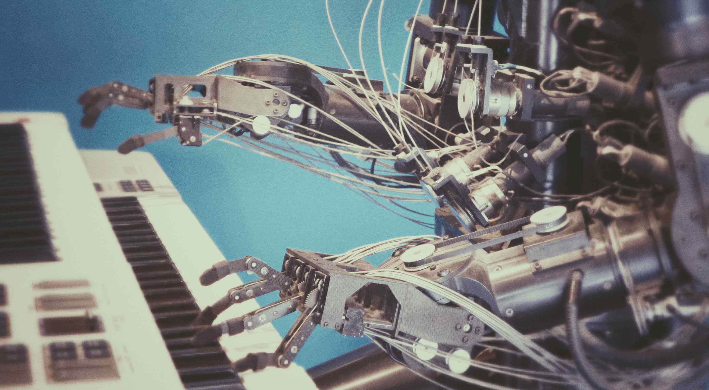 Artificial Intelligence is the use of computers or machines that have been created to work and react like humans. Some of the computers that have AI, are designed to include speech recognition, and learn user behaviours so they can predict activities or decisions before they happen.
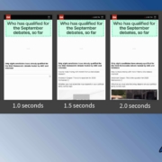
 Do the lazy days have you longing for a new design technique to try? You are in luck.

 As a web designer, you’re constantly being bombarded with messages that tell you to acquire new skills, try new tools, and keep on hustling.
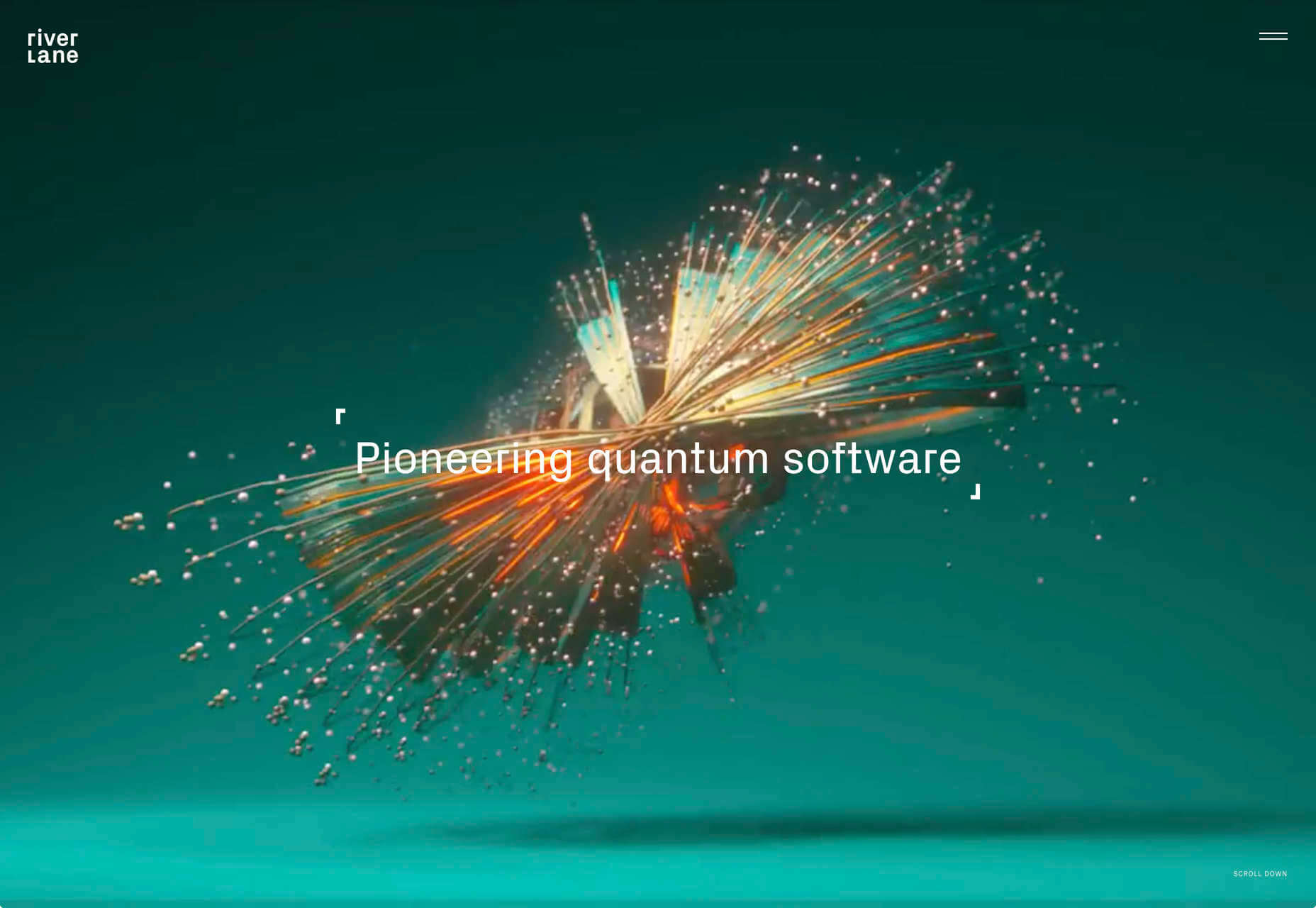
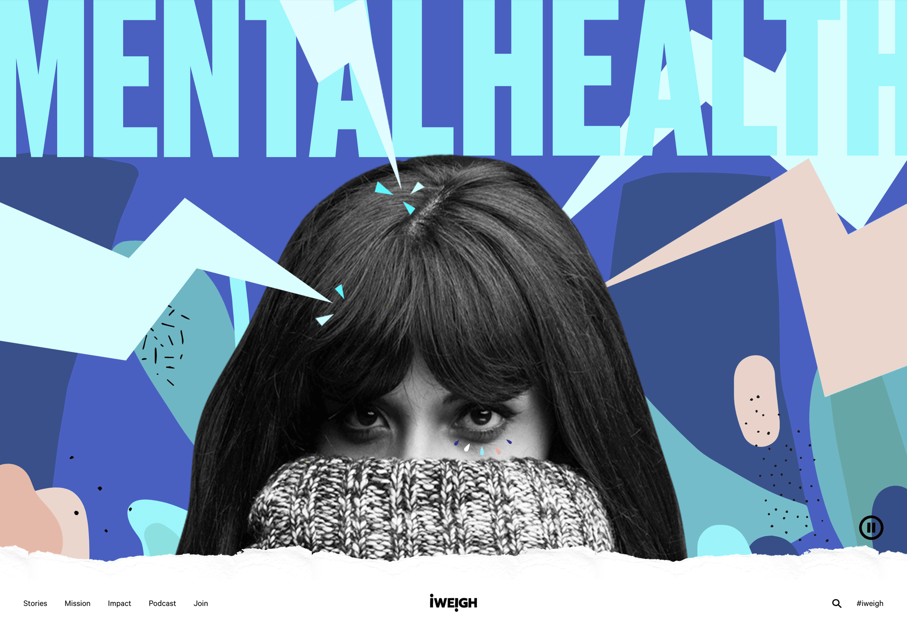
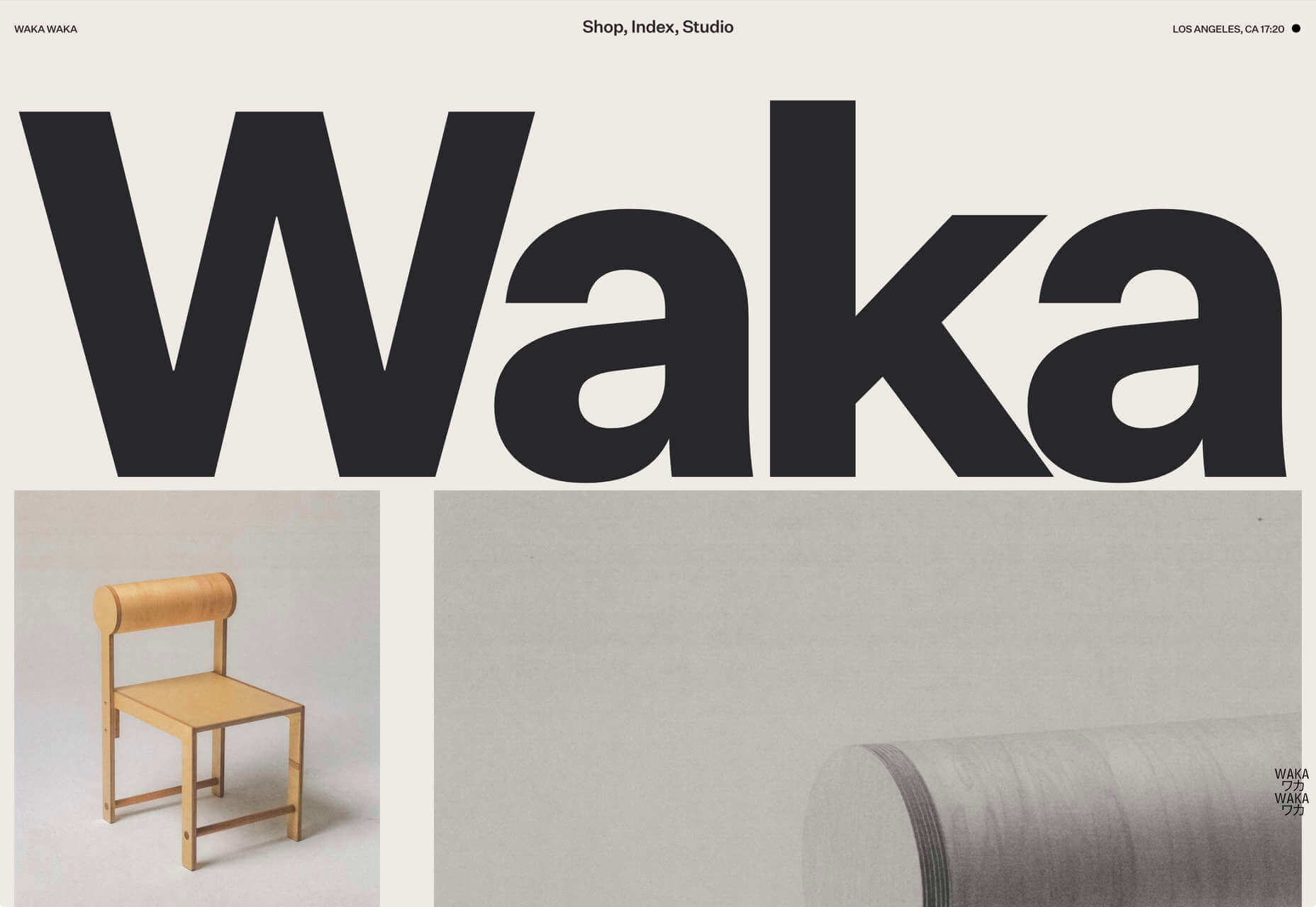
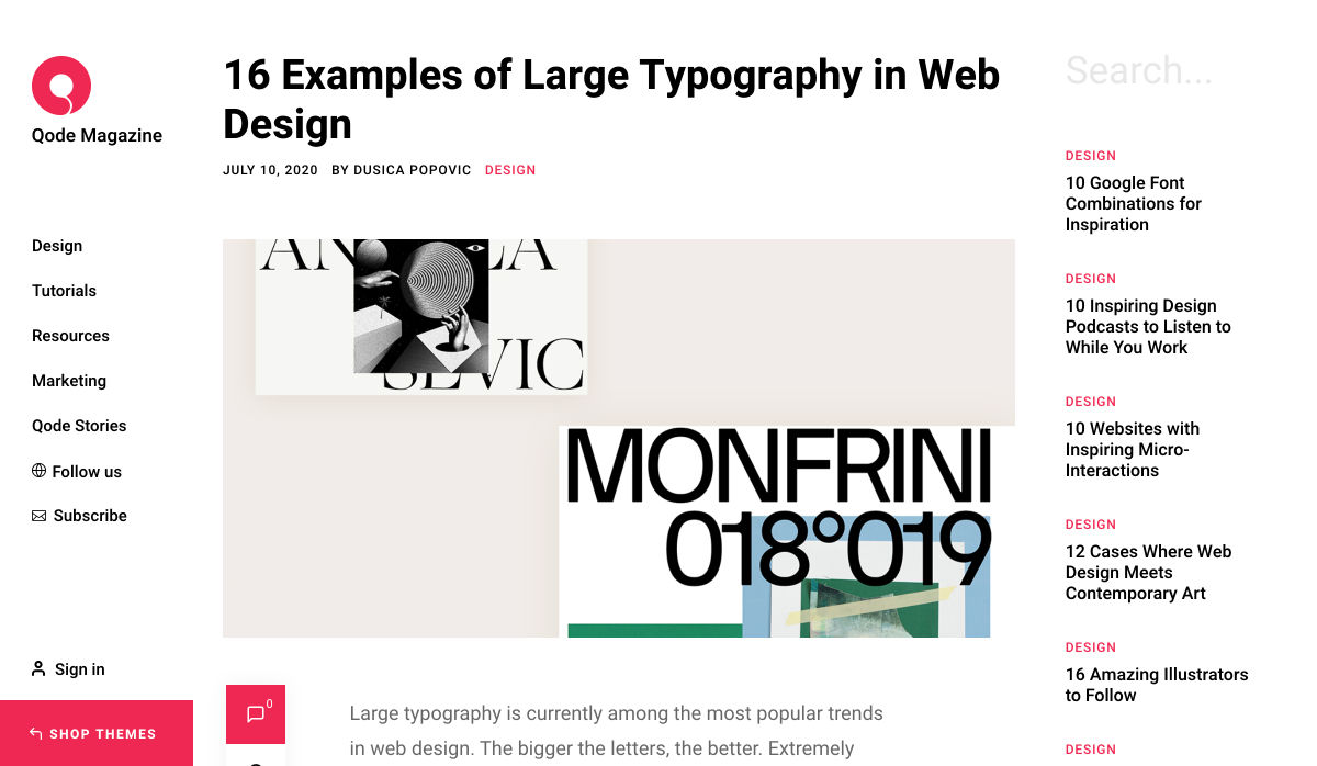
 After six months of uncertainty 2020 is finally beginning to find a style of its own. There are nods to Brutalism, a delightful blending of 80s pastels with 90s primaries, and the font style of choice is anything but geometric sans-serif.
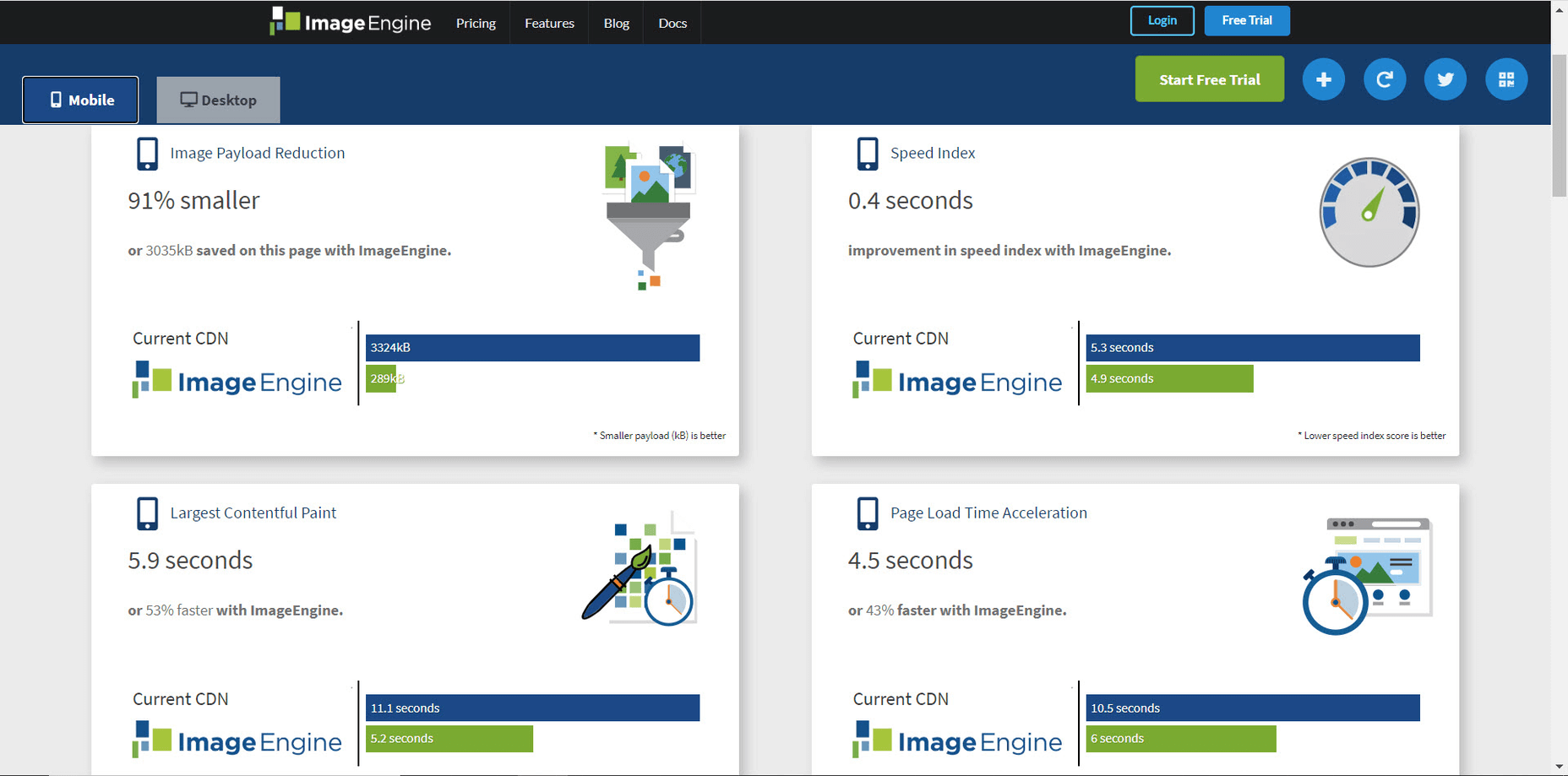
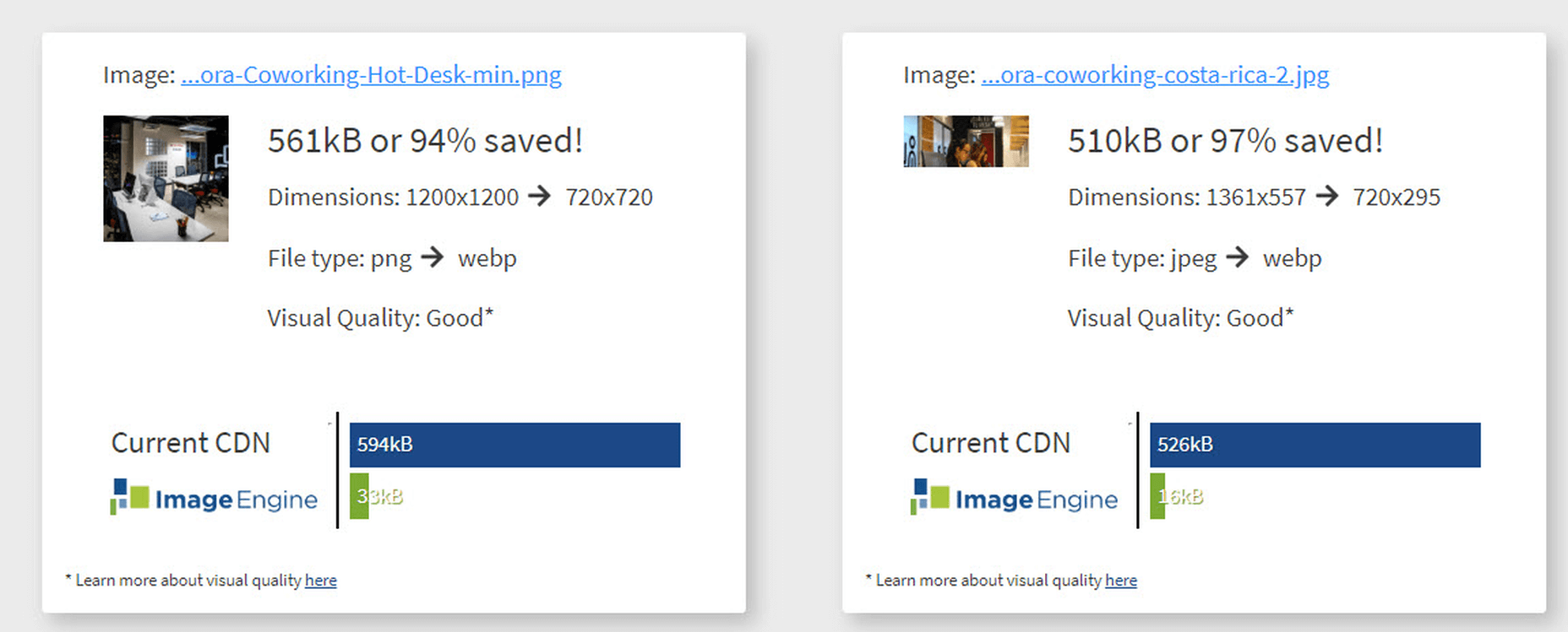
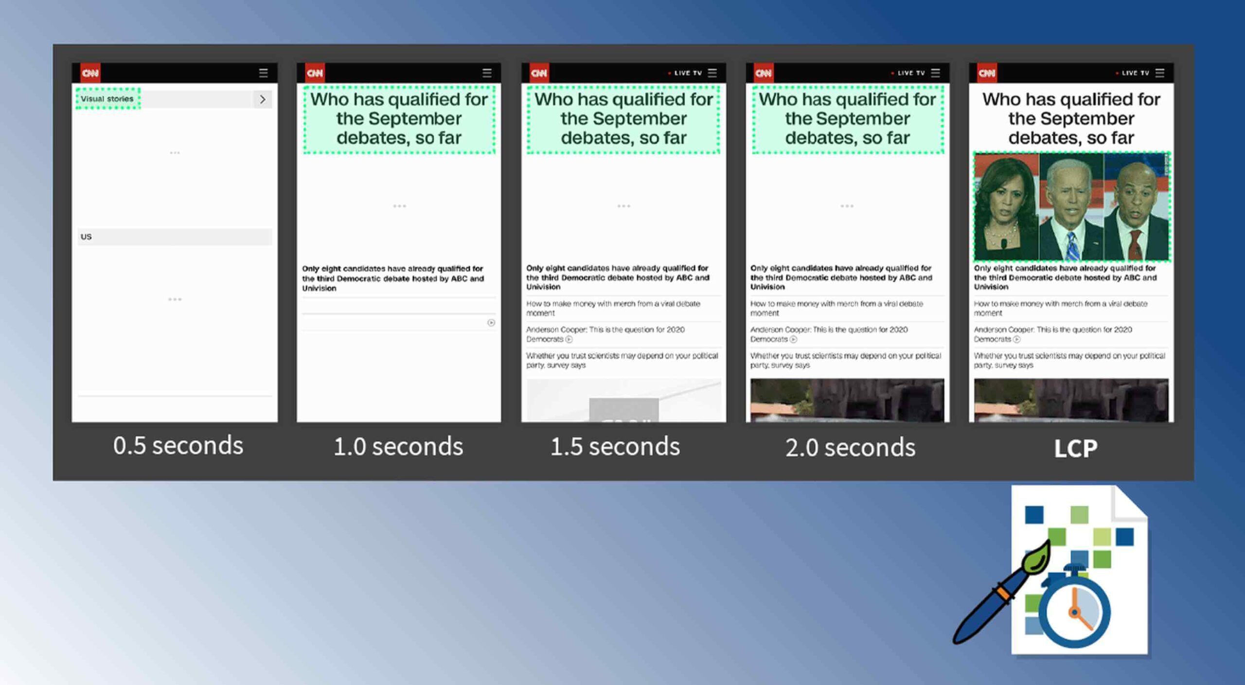 Contentful; Webster’s Dictionary defines “contentful” as… not found. Clearly someone made up this word, but that is not necessarily a bad thing.
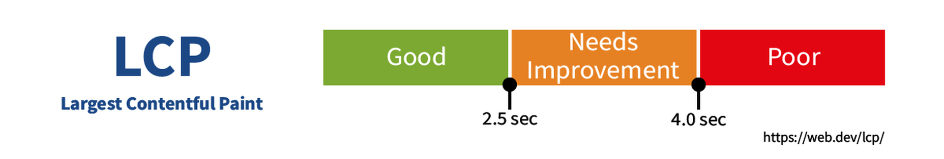

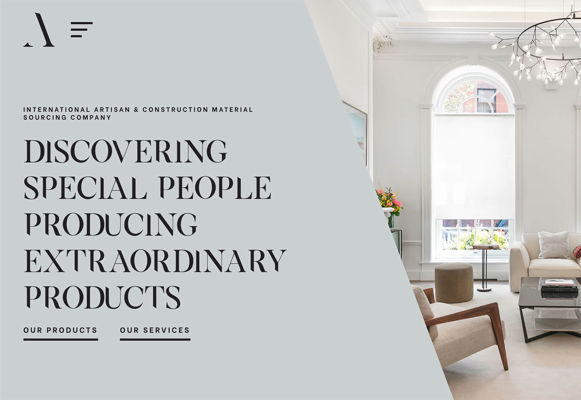
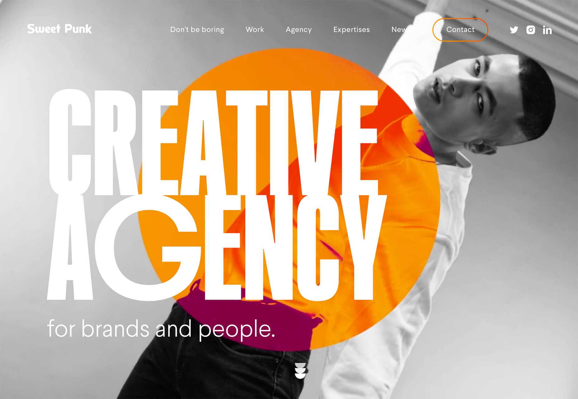
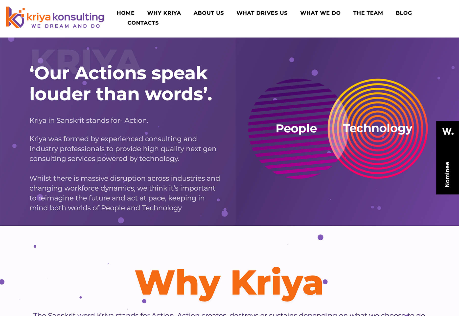
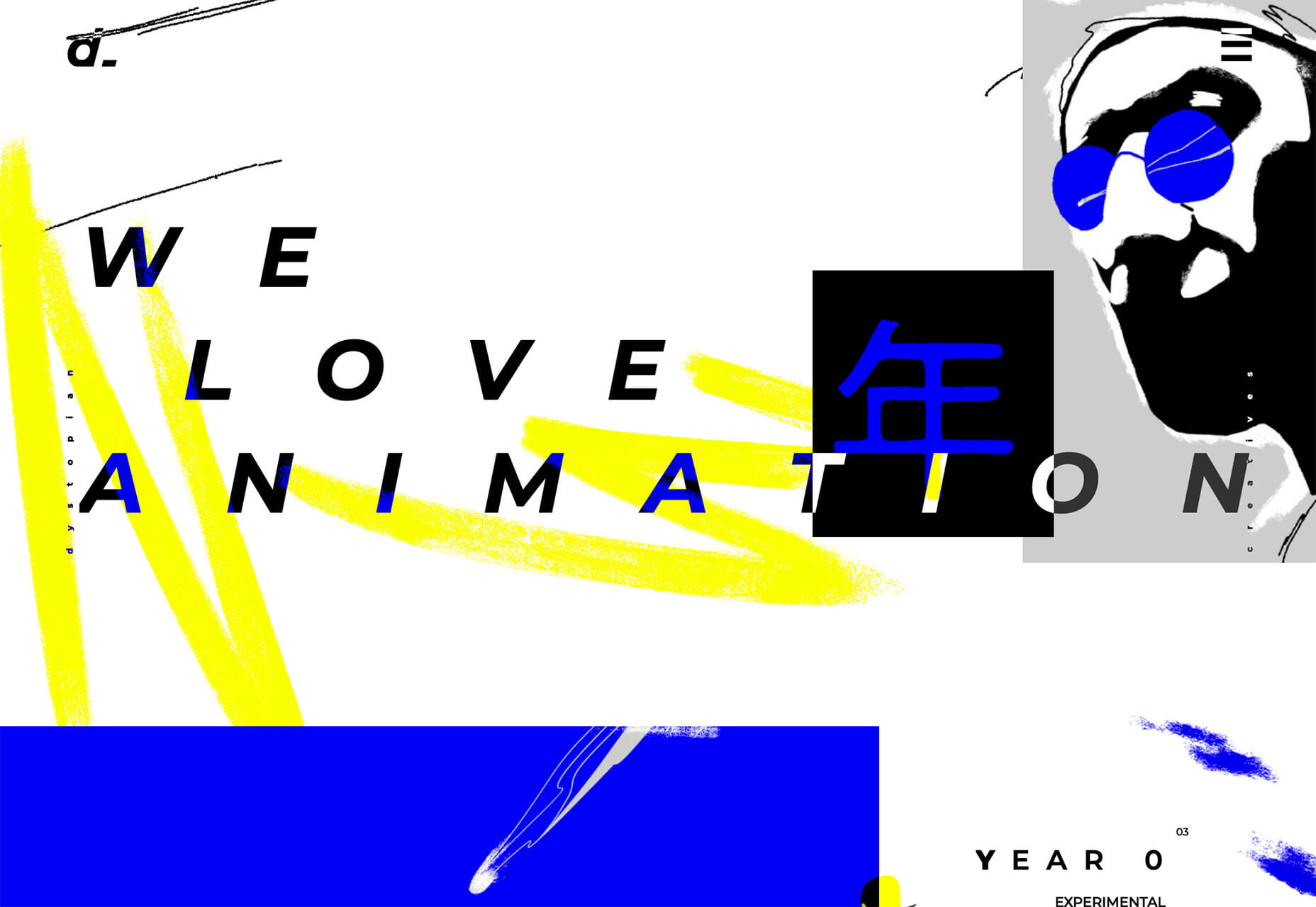
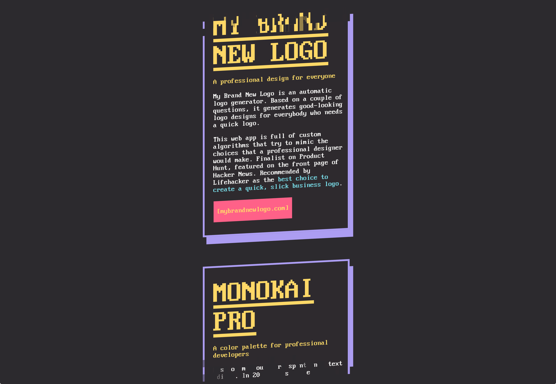
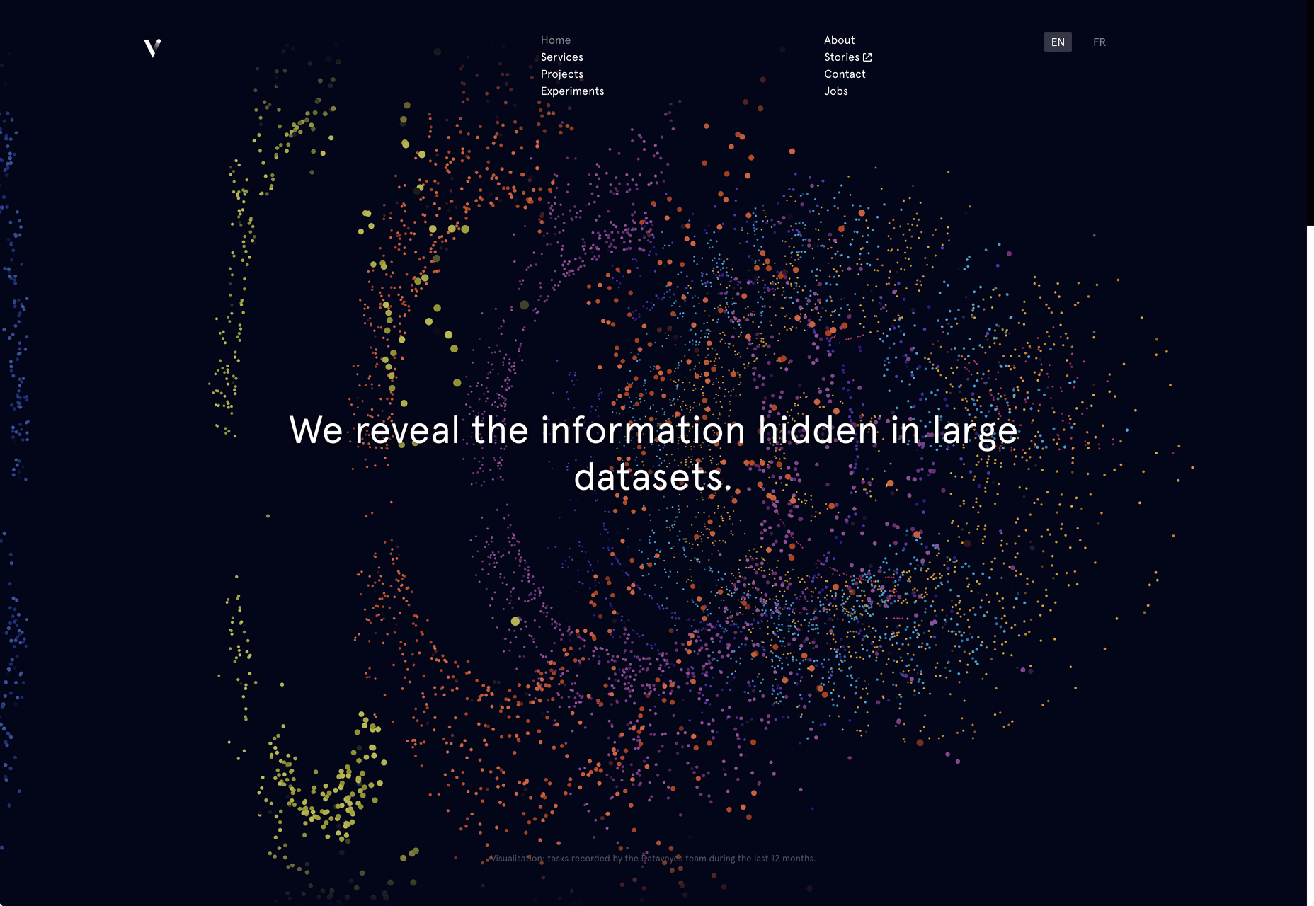
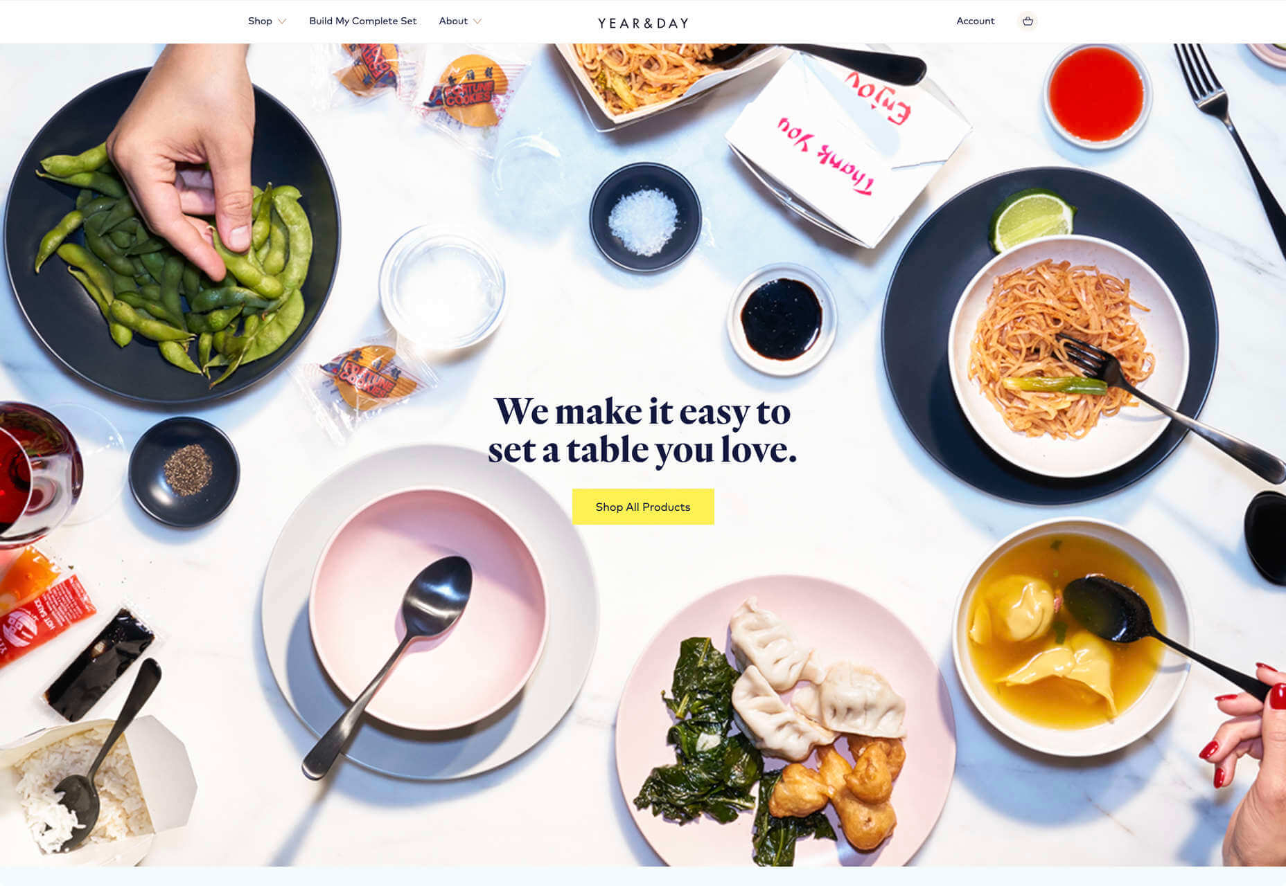
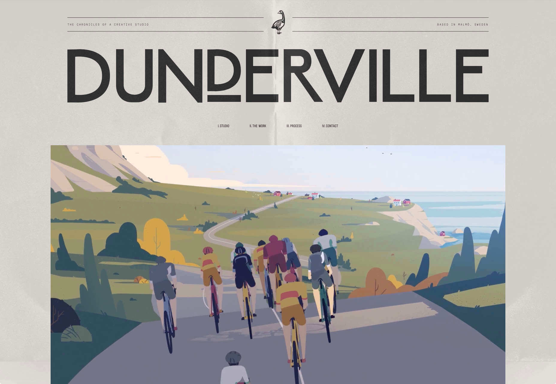
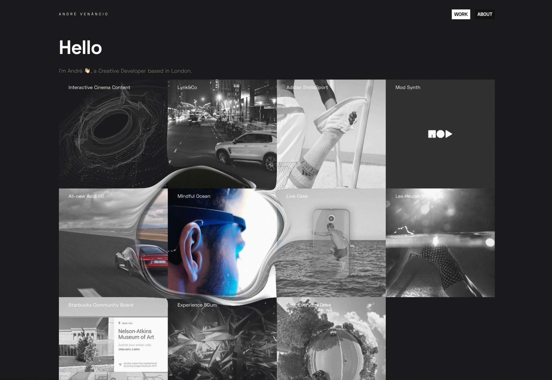
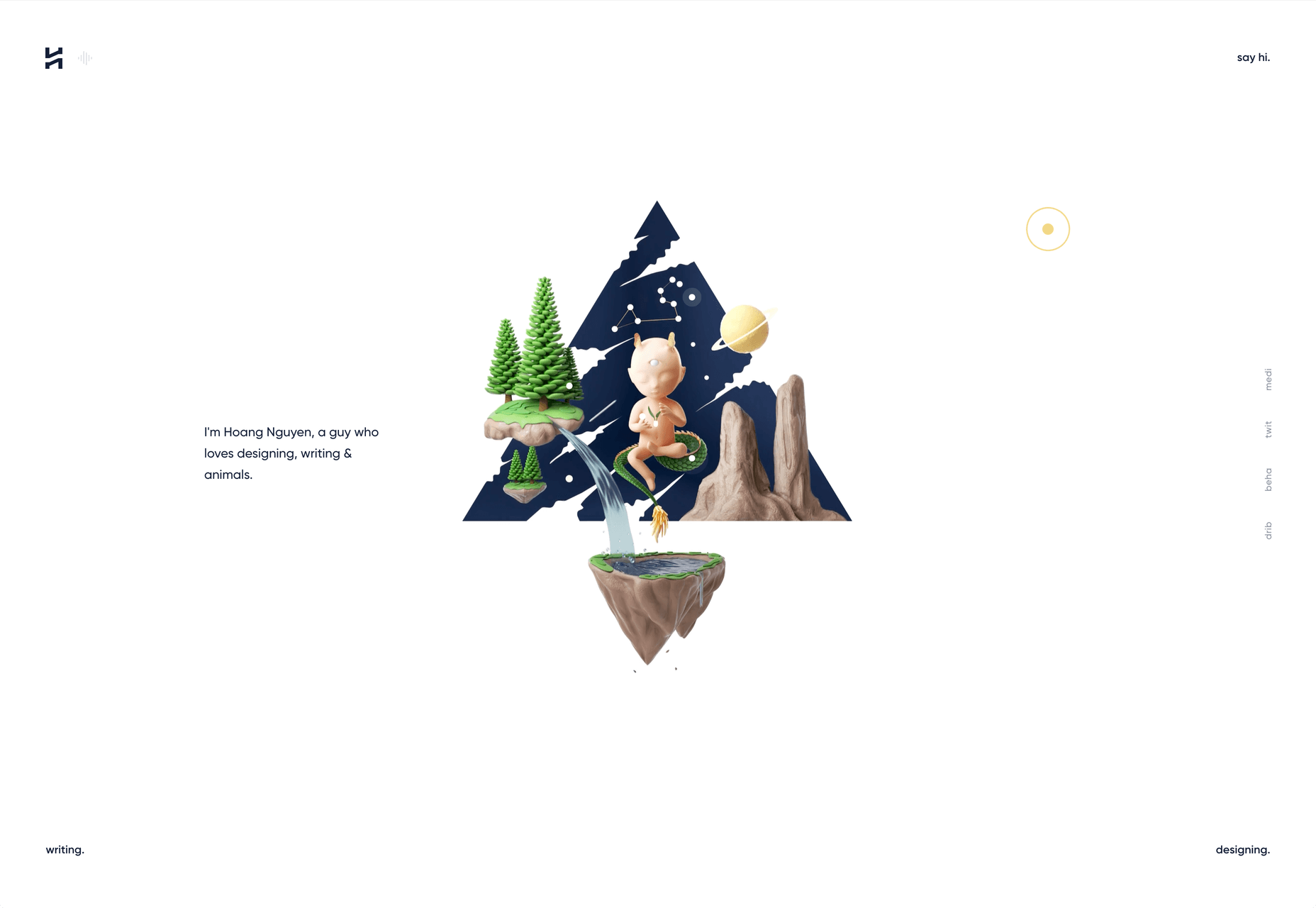
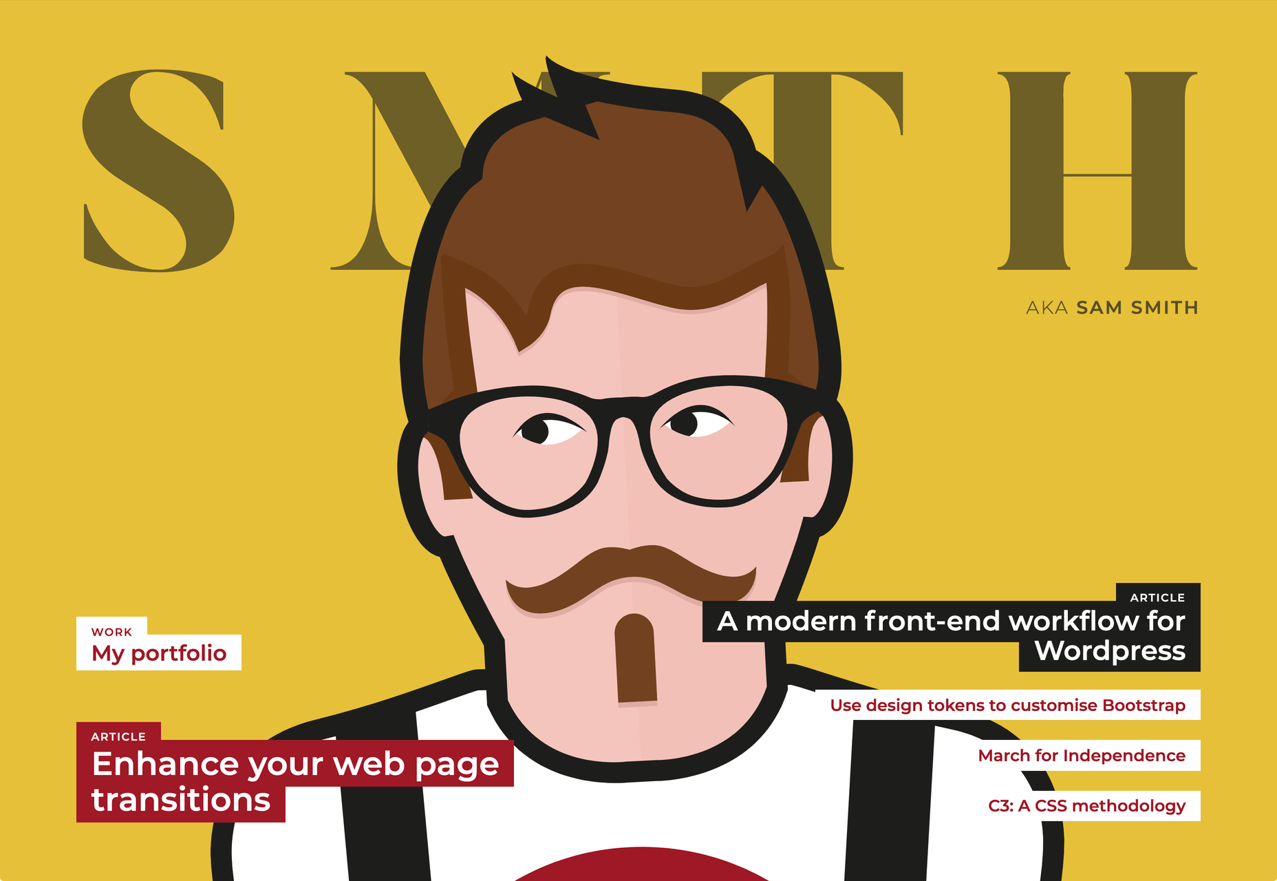
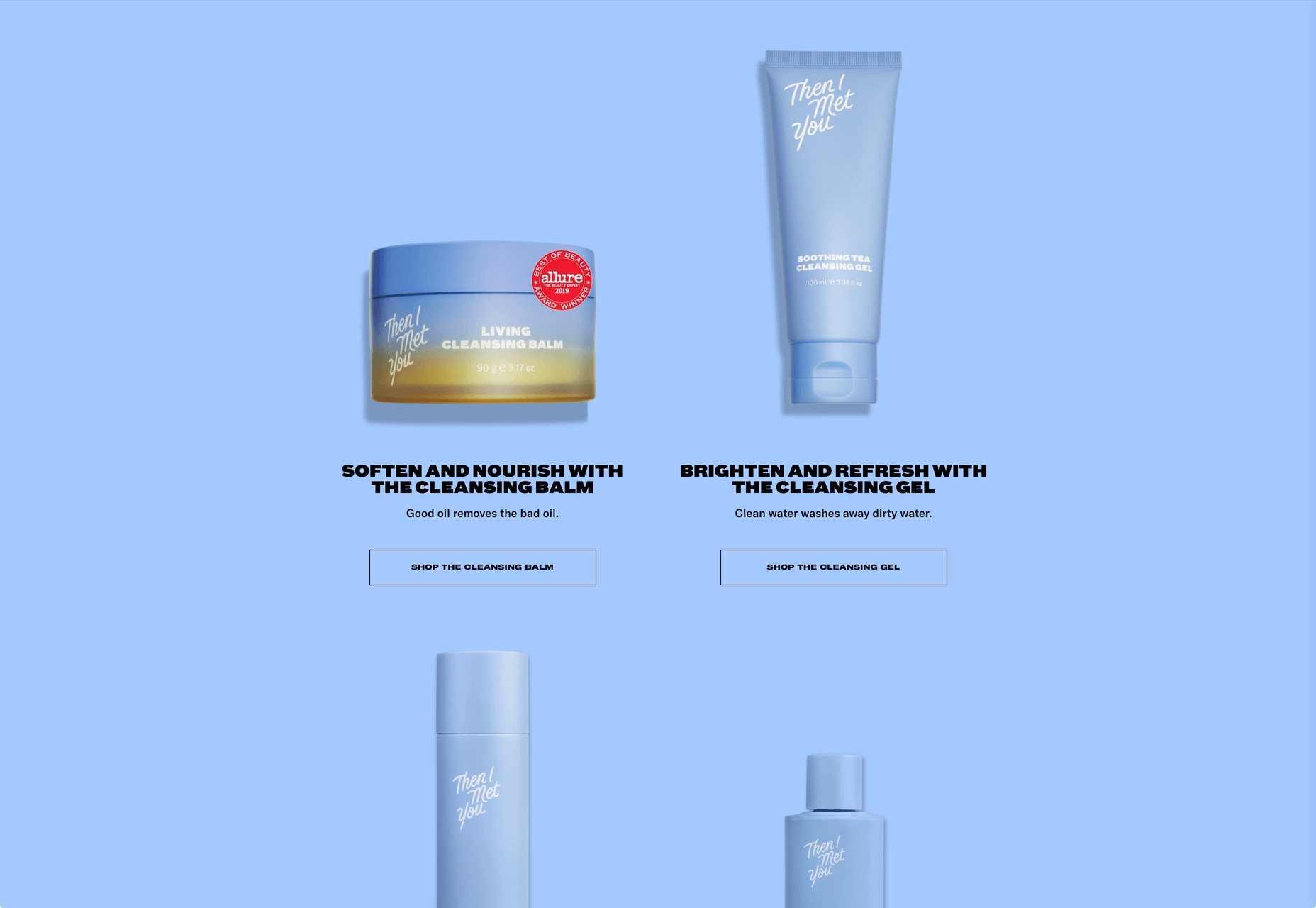
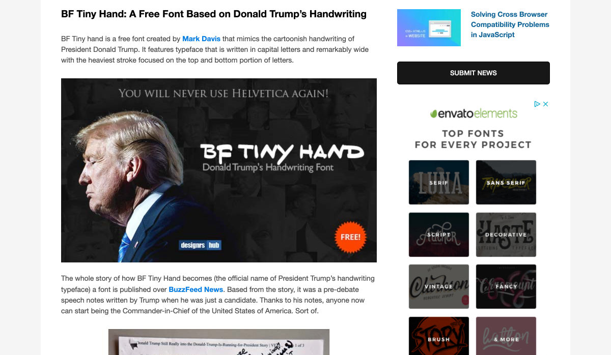
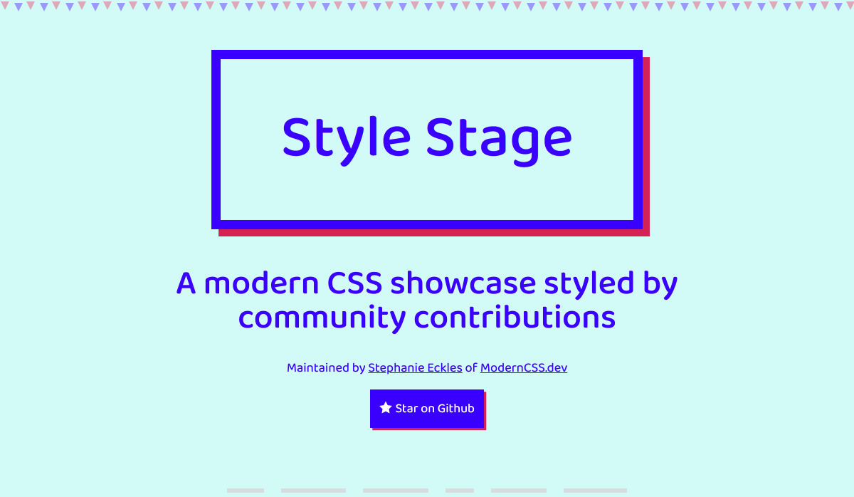
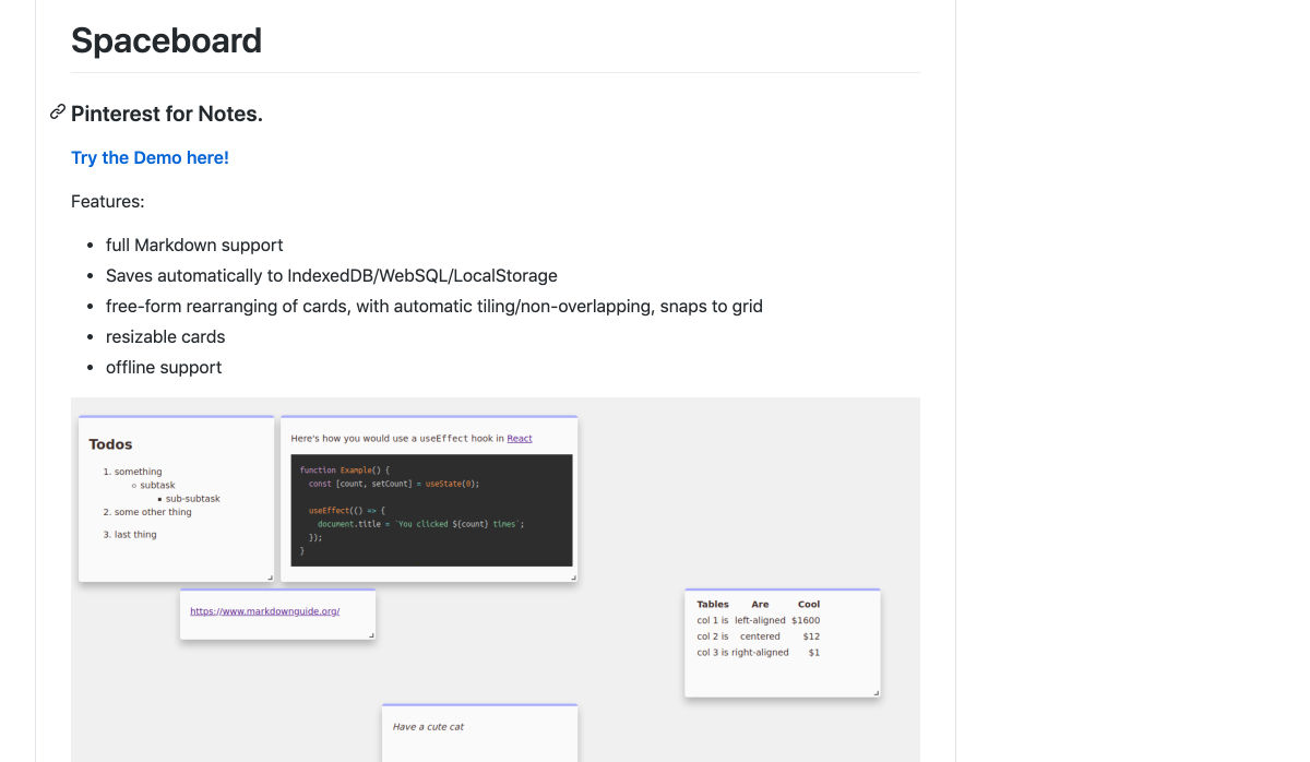
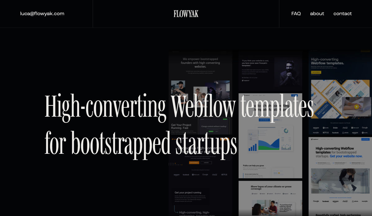
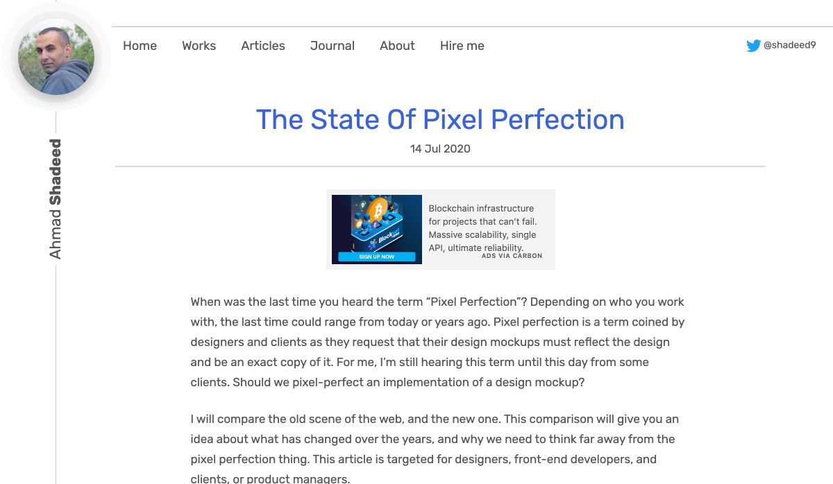
 Every week users submit a lot of interesting stuff on our sister site Webdesigner News, highlighting great content from around the web that can be of interest to web designers.

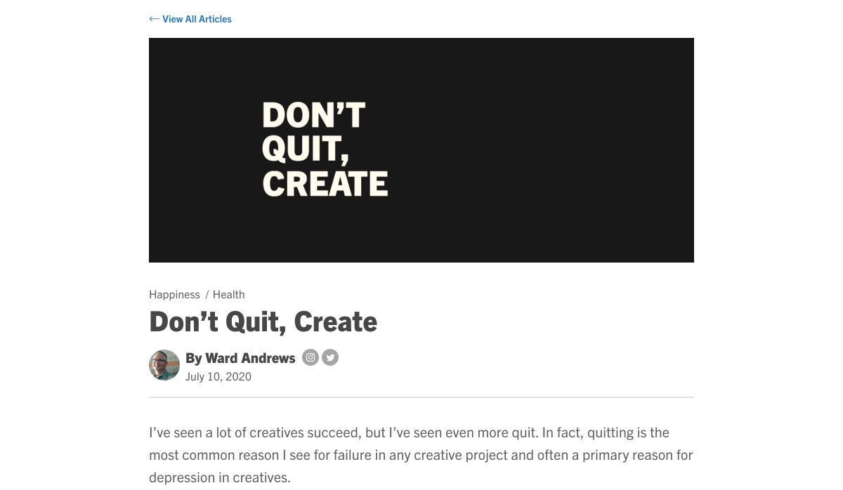
 We are gathered here today….
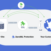
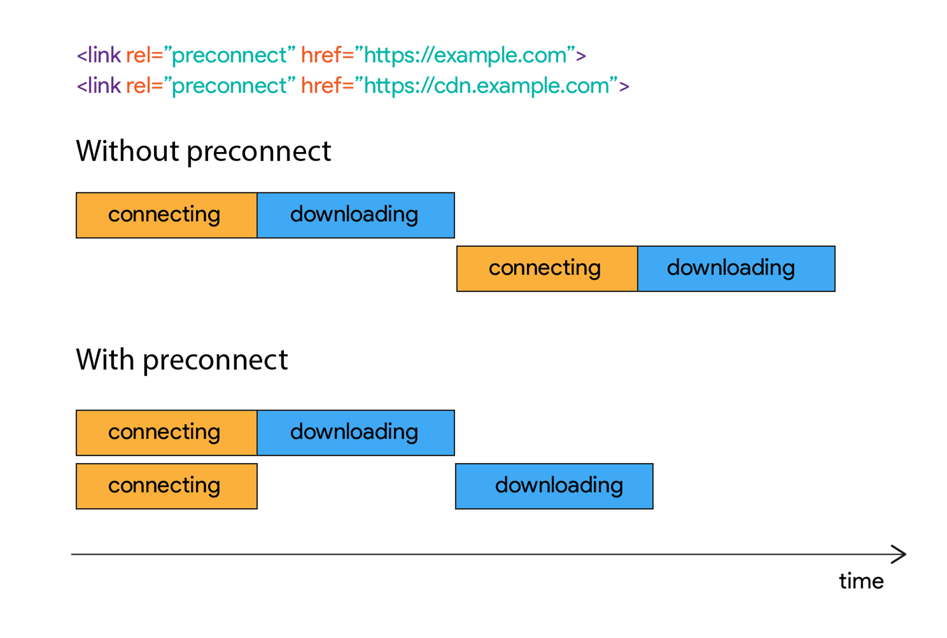
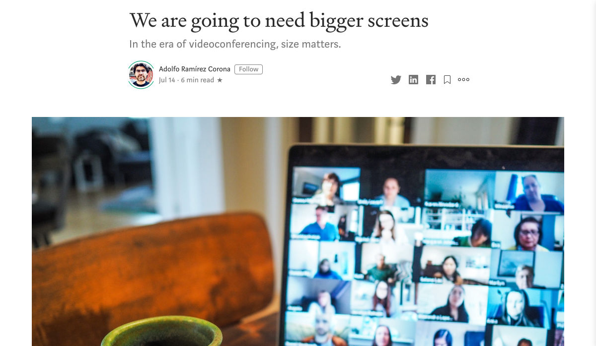
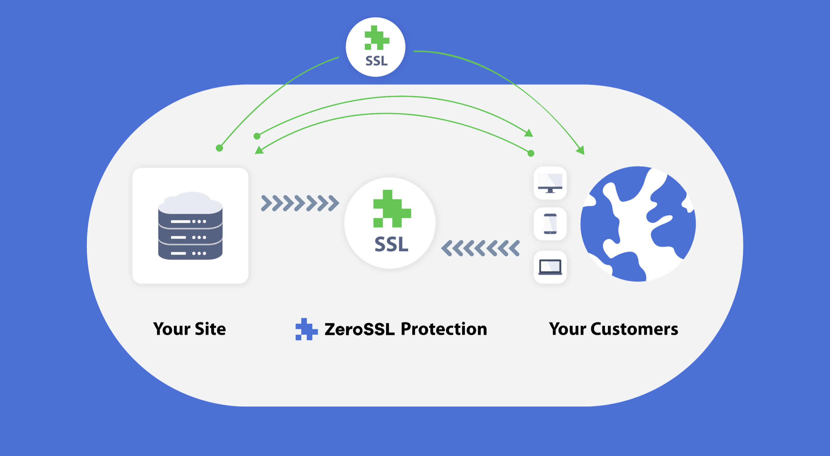 Like it or not, we’re slowly edging towards a two-tier web: those sites that are secure, and…everything else.