Articles

If you don’t keep in touch with your customer base, it can become easy for them to drift away. Newsletters are an affordable and effective way to check in with your audience occasionally.

However, you will need to craft well-designed newsletters to have the desired impact. Your newsletters should include engaging content, including images and written content. They should look highly professional and aesthetically appealing, so people are encouraged to read them. Another thing to consider is the method you want to send the newsletters. Picking the right platform can save you time and energy, especially if you have a large readership. 

The good news is that there are a variety of available platforms that can help you make great-looking emails. These services can also make it easier for you to send newsletters.

Let’s take a look at some of the best newsletter platforms available:

1. HubSpot

This is a name that needs no introduction among digital marketers. HubSpot offers several powerful marketing platforms with valuable tools and features to help any marketing campaign succeed.

HubSpot’s email marketing tool includes easy drag-and-drop tools that make it simple even for novices to write killer newsletters.

When you choose HubSpot’s email marketing tool, you will also have access to its powerful customer relationship management (CRM) platform. HubSpot’s CRM platform includes various email automation tools like follow-up email tools and helps you personalize your newsletters.

HubSpot’s marketing tool includes a free plan that provides access to some of the platform’s powerful email marketing features. The free plan limits users to sending 2,000 emails/month, and paid plans start from $50/month.

2. Mailchimp

Here’s another name that is well known among marketers – particularly concentrated marketers that focus on email campaigns. Mailchimp uses a drag-and-drop email editor that helps just about anybody create professional-looking newsletters and emails.

Mailchimp also has A/B testing tools to help you fine-tune your campaigns and cross-device tools that ensure your newsletters look great on any platform.

The platform offers a selection of newsletter templates to help you get started and make it easy to manage your contact list. The platform allows you to automatically resend newsletters using different subject lines if the recipient didn’t open previous emails.  

Mailchimp offers a free plan that manages up to 2,000 contacts and sends up to 12,000 emails/month with limited access to other features. Paid plans start at just $11/month per 500 contacts with access to more services. Other plans range from $17/month per 500 users to $299/month per 500 users, increasing access to Mailchimp’s tools.

3. AWeber

AWeber is a popular choice because it is so easy to use. It’s another platform that uses drag-and-drop design technology that requires no coding knowledge. The software allows users to add carousels for a truly professional look.

The platform also includes tools that simplify list management and segmentation. AWeber features 6,000 royalty-free stock photos, and it can be integrated with other platforms, including WordPress.

Some people might find that AWeber isn’t as advanced as other options and doesn’t have some of the features they need. However, the platform is ideal for smaller companies and people just getting started with newsletter software applications.

AWeber offers a free plan that lets you add up to 500 contacts. Paid plans start from $16.15/month, and other pricing plans are available to users who need to manage more contacts.

4. Sendinblue

With an expansive template gallery and efficient drag-and-drop design technology, Sendinblue is another platform that helps people create professional, aesthetically pleasing newsletters. It lets users select display conditions that determine which content recipients see.

The software offers a range of features that help automate sending numerous newsletters, including the ability to send according to the recipients’ time zones. It also provides analytical tools to show how well your newsletters are performing.

Sendinblue offers a free plan that allows you to send up to 300 emails/day. Paid plans start from $25/month for the Lite plan and $65/month for the Premium plan with 20,000 emails/month. Each tier gives you access to more features, and prices increase if you want to send more emails.

5. GetResponse

GetResponse has been around for longer than most other newsletter options, so they’ve had plenty of time to get it right. With the platform’s fluid design features, it’s easy to create impressive newsletters and emails that look professional. 

Other features from GetResponse include segmentation and lead scoring features, autoresponders, and automation workflows. In addition, you can have your newsletters sent at optimal times and take advantage of A/B testing tools.

The platform’s free plan lets you manage up to 500 contacts with unlimited newsletters.

GetResponse also provides a Basic plan from $12.30/month, a Plus plan from $40.18/month, and a Professional plan from $81.18/month, each of which lets you have up to 1,000 contacts. Each plan gives access to more features than the other, and you can pay more to manage more contacts.

Start Sending Professional Newsletters Today

Choosing the best newsletter software for you depends on various factors. These factors include which tools you need from the software, your technical ability, and how much you can afford to spend.

As with any product, it’s a good idea to shop around before making any decisions. Most platforms offer free plans, allowing you to try them out first without paying a penny. If you need more advanced features or hope to scale up at some point in the future, it’s probably best to look at platforms that can do more for you.


Featured image via Pexels.

Source

The post 5 Best Newsletter Platforms for Startups in 2022 first appeared on Webdesigner Depot.

Source de l’article sur Webdesignerdepot

Every day design fans submit incredible industry stories to our sister-site, Webdesigner News. Our colleagues sift through it, selecting the very best stories from the design, UX, tech, and development worlds and posting them live on the site.
The best way to keep up with the most important stories for web professionals is to subscribe to Webdesigner News or check out the site regularly. However, in case you missed a day this week, here’s a handy compilation of the top curated stories from the last seven days. Enjoy!”

3 Essential Design Trends, March 2022

40 Impressive Design Agency Websites

7 Web Design Trends for 2022

Hermes Rebrands with 194,481 Logos

We Need More Calm Design

Write HTML, the HTML Way (Not the XHTML Way)

Those HTML Attributes You Never Use

How to Use CSS Math Functions

5 Tips to Help You Improve WordPress Security

Sol – Open Source MacOS Command Palette

Kodezi – Grammarly for Programmers

Source

The post Popular Design News of the Week: March 21, 2022 – March 27, 2022 first appeared on Webdesigner Depot.

Source de l’article sur Webdesignerdepot

Experienced web designers are always on the lookout for tools or resources that will (1) introduce them to the latest design trends, (2) enable them to incorporate features and functionalities that will make their products more competitive, (3) allow them to improve their workflows or all the above.

Apply one or more of these new design tools and resources. Then you could realize anything from incremental to game-changing improvements. The better the tool or resource, the more you are apt to realize your investment.

The 15 tools and website design resources selected for this article are the best in their respective categories. The degree of improvement you can realize when using one or more of them may depend on your own business needs. Or on the actual needs and wants of your clients as opposed to what you are currently able to deliver.

Browse the list, and you should be able to put your finger on one or more of these products or services. They could lead to improvement in one or more areas of your work. Look closer, and you might come across a genuine game-changer.

Happy shopping!

1. Be – The Biggest WordPress and Portfolio WordPress Theme

If your website design activities are proving to be exercises in tediousness, or you’re tired of working around a design tool’s limitations, you need BeTheme.

BeTheme can be a game-changer in that it gives you the flexibility to design what you want. Be makes building a complex high-performance website quick, smooth, and easy.

  • BeTheme’s 650+ customizable pre-built websites are designed to get your website-building project off to a rapid start. They are responsive, UX-ready, importable with a single click, and incorporate the latest design trends.
  • You’ll love working with the recently launched BeBuilder, the fastest and most flexible page builder for WordPress with which you can import from Be’s pre-built website’s 1000+ pages.
  • There’s an absolute gem of a BeBuilder Woo you can work with to create your shop or single product layouts.
  • BeTheme features a wealth of design aids, options, and settings to work with.

BeTheme is Elementor ready and is regularly updated. Click on the banner to find out more about Be’s 40+ powerful core features.

2. Total WordPress Theme

Put Total to work, and 2022 could be a very good year for your website design undertakings.

Total has it all insofar as design aids and options, website-building tools, and design flexibility are concerned regardless of the type or style of website you plan to build:

  • Pick any of Total’s 45+ customizable quick import theme demos, and you are off to a quick start.
  • 90+ section templates, 75+ pre-styled post entry cards, and more than 500 live customer settings give you more design flexibility than you are ever likely to need. 
  • The page builder of choice is an extended version of WPBakery. With it at your fingertips, you can easily drag and drop your way to building precisely the website you have in mind.

Click on the banner to discover everything Total can do for you.

3. LayerSlider

What could LayerSlider do for you to help make 2022 a banner year? Look over any of your past website designs to see if any of them could profit from adding a little spice or pizzazz because that’s what LayerSlider does best. 

LayerSlider is an animation and website-building tool that can be used on any website to transform its look & feel with modern graphics, eye-catching animations, and interactive features. LayerSlider is one of the most established and popular products with millions of active monthly users.

  • LayerSlider has 150+ website, slider, and popup templates. Templates are a great way to learn as well as an ideal starting point for new projects.
  • LayerSlider comes with a very easy-to-use and modern editor interface similar to professional desktop applications. Anyone can use it without prior experience.
  • LayerSlider is not just for sliders. It can also create image galleries, popups, landing pages, animated page blocks, or even full websites.

Click on the banner to see what LayerSlider could do for you.

4. wpDataTables

Most table or chart building table plugins on the market either limit the amount of data that can easily be processed or the types of tables or charts that can be produced. wpDataTables has neither of these limitations.

With the wpDataTables premium WordPress plugin, you can –

  • create responsive, interactive, and frontend editable tables and charts
  • process huge amounts of data from various sources and in various formats
  • highlight or color code key data.

5. Uncode – Creative & WooCommerce WordPress Theme

Uncode is a top-selling pixel-perfect creative and WooCommerce theme. More than 80,000 sales have been made to date to freelancers, bloggers, agencies, and small businesses.

Uncode’s key features include –

  • a suped-up Frontend Page Builder.
  • an advanced WooCommerce builder with supporting capabilities that include a Single Product builder and a host of customer-centric design elements and options.
  • a Wireframes Plugin and 550+ section templates.
  • a gallery of inspirational user-created websites.

6. Trafft

With Trafft, you can schedule meetings, events, on-site and virtual appointments, manage staff schedules, send reminders, and accept payments — all from a single platform.

  • Special features include custom domains, coupons, and custom fields.
  • Trafft also manages group bookings and can serve multiple locations.

This game-changer integrates seamlessly with Google Calendar, Google Meet, Outlook Calendar, Apple Calendar, Zoom, and Mailchimp.

7. WHATFONTIS 

WHATFONTIS is a hidden gem in the world of font identifiers that allows you to find a font from your uploaded image in a matter of seconds.

  • Powerful AI algorithms and a database of 850K+ fonts provide the basis for this app’s impressive search capabilities.
  • Positive identification is achieved 90% of the time. Premium support is on hand should AI yield an awkward result.
  • Cursive fonts can be identified once the letters are separated.

8. Mobirise Website Builder Software

Mobirise is fast, easy to use, and the best offline website builder on the market.

  • Mobirise does not tie you to a specific platform; you can edit your site locally and host it wherever you want.
  • Full access to HTML allows you to code.
  • 4,000+ website blocks and 300+ elegant home page templates are guaranteed to make your website-building adventures short and sweet.

The Mobirise website builder is free for both personal and commercial use.

9. GetIllustrations’ Stock Illustrations Bundle

Downloads from this library of premium illustrations can change the way you go about designing your websites, apps, and presentations.

  • GetIllustrations, with its 10,000+ illustrations library, is the biggest of its kind.
  • Featured formats include Vector AI, PNG, Sketch, SVG, Figma, and Adobe XD.

Illustrations you download come with a commercial license and are yours to keep without limitations.

10. Slider Revolution

If you have trouble bridging the gap between what your clients want and what you can provide, Slider Revolution could be exactly what you need to fix the problem.

Slider Revolution is THE cutting-edge WordPress plugin for addressing today’s over-the-top web designs. It features –

  • 200+ awesome website and slider templates.
  • eye-catching WebGL slide animations.
  • 25+ powerful addons.
  • the ability to import dynamic content from social media outlets.

11. Amelia

Amelia offers an automated, highly customizable solution to any business that relies on a manual or semi-automated operation for booking client appointments.

  • Amelia is an excellent choice for beauty, healthcare and fitness, and educational and training enterprises.
  • Clients can make or change appointments online 24/7.
  • Amelia can manage individual and group bookings, events, and employee schedules at multiple locations.
  • Amelia integrates seamlessly with Google Calendar, WooCommerce, and Zoom.

12. 8bio – Link in Bio Tool 

Many social media platforms allow you to include a link that allows followers to visit your website or an important landing page. With 8bio, you can create a link that a visitor can’t resist clicking on.

Your link can – 

  • Present a brief biographical profile of your business or yourself.
  • Feature an image or catchy animated background.
  • Showcase your product or service at no cost.
  • Use your existing domain or a “yourname” .8b.io domain.

13. Essential Grid

The premium Essential Grid WordPress gallery plugin developers assembled a collection of aesthetic, easy-to-customize plug-and-play templates that make creating a breathtaking portfolio gallery a fun and easy task.

  • Your galleries will load lightning fast.
  • They will display perfectly on all devices.
  • You can choose from a variety of layouts and mix and match adjustable grids to get precisely what you want.

14. Pixpa – Portfolio Websites for Designers

Pixpa provides an all-in-one platform from which creatives can manage their online portfolios, blogs, galleries, and eCommerce sites.

  • Choose among Pixpa’s beautiful and mobile-friendly customizable templates and customize them to achieve exactly what you want. 
  • Put Pixpa’s drag and drop website builder into play to tie everything together, exactly as you want.
  • Add content, connect with your custom domain, and into your social profiles, and you are good to go.

15. XStore – Best WordPress WooCommerce Theme for eCommerce

XStore is a feature-packed Envato WooCommerce theme that is incredibly simple to work with has acquired more than 30,000 enthusiastic customers.

  • XStore’s 110+ customizable shops make creating your own shop as easy as can be.
  • XStore integrates seamlessly with the premium Elementor and WPBakery page builders.
  • $510 worth of carefully handpicked “must-have” premium plugins are included.

There are plenty of tools and resources for designers on the market. You could use them to create websites that are a little better than the ones you have already built or are using.

What you should really be looking for is a special design tool or resource. When using it for a small investment could markedly improve both your productivity and your design efforts to make 2022 by far your best year ever.

That’s the reasoning for publishing this selection of top 15 design tools and resources. Selecting one or more could make your day.


[- This is a sponsored post on behalf of Be -]

Source

The post 15 Instantly Helpful Tools and Resources for Designers and Agencies (Updated for 2022 ) first appeared on Webdesigner Depot.

Source de l’article sur Webdesignerdepot

We’re going to have some fun this month. There are so many new tools and resources out there for designers that make life easier, and others are simply enjoyable.

Here’s what is new for designers this month …

Polka Dot Generator

Polka Dot Generator is exactly what you think. Adjust colors, dot size, shadow, and fuzziness, and then export the CSS for use in your projects. This could make for fun effects or backgrounds.

Design Memes

Design Memes is just a lot of fun. It’s a collection of memes based on design culture updated daily. It’s a little silly and a little reflective. Yes, it’s completely ok to laugh at yourself.

Pppointed

Pppointed is an SVG arrow-making tool that helps you create cool pointers without a lot of effort. Just pick a color, shape, and style, and you are ready to go. Save your custom arrows as SVG files or copy the code and use them on the web whenever you want to point at things visually.

Open Source Color System

Open Source Color System is a set of palettes that include carefully picked colors to help you overcome interface challenges. For example, it is one of the only color tools out there that includes palettes for light and dark modes. It’s also designed with accessibility in mind to help you create a complete and usable system.

Cowsay

Cowsay is a nifty little web interface of the same name made with Svelte and HTML Canvas. Play with it and then copy your art as ASCII or an image.

Minze

Minze is a simple JavaScript framework for native web components. It’s tiny and fast, modern, shareable, framework agnostic, and uses TypeScript to scale your component library. Plus, you can get started with it right away.

Tally

Tally is a simple – and free – online form builder. You can use it without coding, and it works like a document file, so there’s no learning curve. You can create unlimited forms, integrate with other tools, set logic, collect payments, and more. There’s a pro version as well if you need even more features.

Hue.Tools

Hue.Tools is another color tool to help you maximize effort when creating palettes. Generate a color you like, see specs and values in all the different color spaces, inspiration from design sites, and colors that work with it. It’s fun and functional.

Sturdy

Sturdy is a low overhead code collaboration platform for fast-moving teams. With Sturdy, you work in the open with your team. Discover and interact with draft code as it is written. Those team drafts are like live pull requests (Figma or Google Docs) but using your local editor.

Mage

Mage is a tool that transforms your data into predictions. Build, train, and deploy predictive models in minutes with no AI experience required. This is a premium tool, but you can try it for free.

Huemint

Huemint is a machine-learning-based color scheme generator for websites, graphics, and branding. There are many options to play with, and you can generate some pretty interesting combinations that ordinarily you might not think of.

CSSUI

CSSUI is another tool you’ll love because it includes pure CSS interactive components without any JavaScript. It’s easy to customize, uses standard HTML, is easy for all levels to use, is tiny and fast, and supports pretty much all modern browsers. It’s an open-source tool that you can download and use immediately.

UI Icons Line – Free

UI Icons Line – Free is a set of 1,000 free vectors for use in your projects. Who doesn’t need a robust set of icons?

Skill Icons

Skill Icons is a set of icons to help you showcase your design and development skills on your resume or GitHub. They all look great and match.

Ambient Design

Ambient Design is a mobile app design market where you can get mobile UI kits for Figma. Purchase kits separately, or buy quarterly or yearly plans to access all current and future UI kits.

TextFrame

TextFrame lets you create animated tutorials for your users to get the help they need. It integrates directly with WordPress or any other website with just a couple of lines of code and includes plenty of customizable options to make it easy for you to help others understand how to use the website. The tool is free for one site and just a few bucks per month for additional sites.

Booqsi

Booqsi is a fun new social media network for book lovers. The platform is still in beta and lets you save and share books, create shelves for reading, and doesn’t force a connection to Amazon. It’s just all about the books. And there’s a bonus: every link from the site goes back to bookshop.org to help you find and support local bookstores.

Stylo

Stylo is an open-source WYSIWYG interactive editor for JavaScript. It is made to bring great user experience and interactivity to the web, for everyone, with no dependencies. It has an interactive design, is customizable, and is future-proof.

Tutorial: How to Favicon in 2022

How to Favicon in 2022 is an excellent lesson on the five icon files every website needs (plus one JSON file). If you are creating more than that, this is a must-read.

Tutorial: Creating Generative SVG Grids

Creating Generative SVG Grids is an in-depth, step-by-step tutorial for anyone who wants to create a more artistic SVG. It uses a handful of tools, including SVG.js, Generative Utils, TinyColor, and GSAP.

Fromage

Fromage is a new and beautiful premium typeface family from Adam Ladd. It includes 14 styles with an interesting serif and alternative sans option. The high-contrast design is great for a variety of projects.

HD Colton

HD Colton is a premium super sans serif typeface with a whopping 91 styles and family package options. It would make a bold statement as a display option.

Source

The post Exciting New Tools For Designers, March 2022 first appeared on Webdesigner Depot.

Source de l’article sur Webdesignerdepot

Every day design fans submit incredible industry stories to our sister site, Webdesigner News. Our colleagues sift through it, selecting the very best stories from the design, UX, tech, and development worlds and posting them live on the site.

The best way to keep up with the most important stories for web professionals is to subscribe to Webdesigner News or check out the site regularly. However, in case you missed a day this week, here’s a handy compilation of the top curated stories from the last seven days. Enjoy!”

4 Examples of Headless WordPress ECommerce Websites

Laravel 9 is Now Released

Free Web Development Courses for Beginners

15 Best New Fonts, February 2022

Illustrator Tutorial: Sketch to Vector Character Illustration

Replace JavaScript Dialogs with the New HTML Dialog Element

Pixel Editor – Generate Dynamic Pixel Grid

ToolJet – Open-source Low-code Platform to Build Internal Tools

Why do We Round Corners?

Design Memes!

9 Web Design Trends to Watch in 2022 [Infographic]

Top 10 Graphic Design Trends to Inspire your Work in 2022

Source

The post Popular Design News of the Week: February 7, 2022 – February 13, 2022 first appeared on Webdesigner Depot.

Source de l’article sur Webdesignerdepot


WordPress is by far the world’s most popular CMS. Not only does it dominate the CMS market with a 64% market share, but it also powers 39.6% of all websites. It has taken the internet by storm by democratizing the web for all. Now, anyone can build, manage, and host a successful website without needing a college degree or coding expertise.

However, while WordPress is great at managing many technical aspects, it still can’t do everything for you. Built mostly on PHP, there are often concerns regarding how performant WordPress is. And, with performance impacting everything from bounce rates to SEO rankings to conversions, it’s something that should be on your radar too.

If you don’t know it yet, images are one of the main causes of slow-loading websites. In recent years, WordPress has stepped up its efforts to try and help users with image optimization out-of-the-box.

Still, as we’ll show, it’s not a total solution, and there is still plenty you can do to deliver better experiences on your WordPress website through image optimization.

What is WordPress Image Optimization? Why is it Important?

Simply put, image optimization is anything you do to make images load faster on your website pages. Almost all websites that use images can benefit from some form of image optimization, even those using WordPress.

Why?

Well, performance is a hugely significant factor when it comes to the competitiveness of your website today.

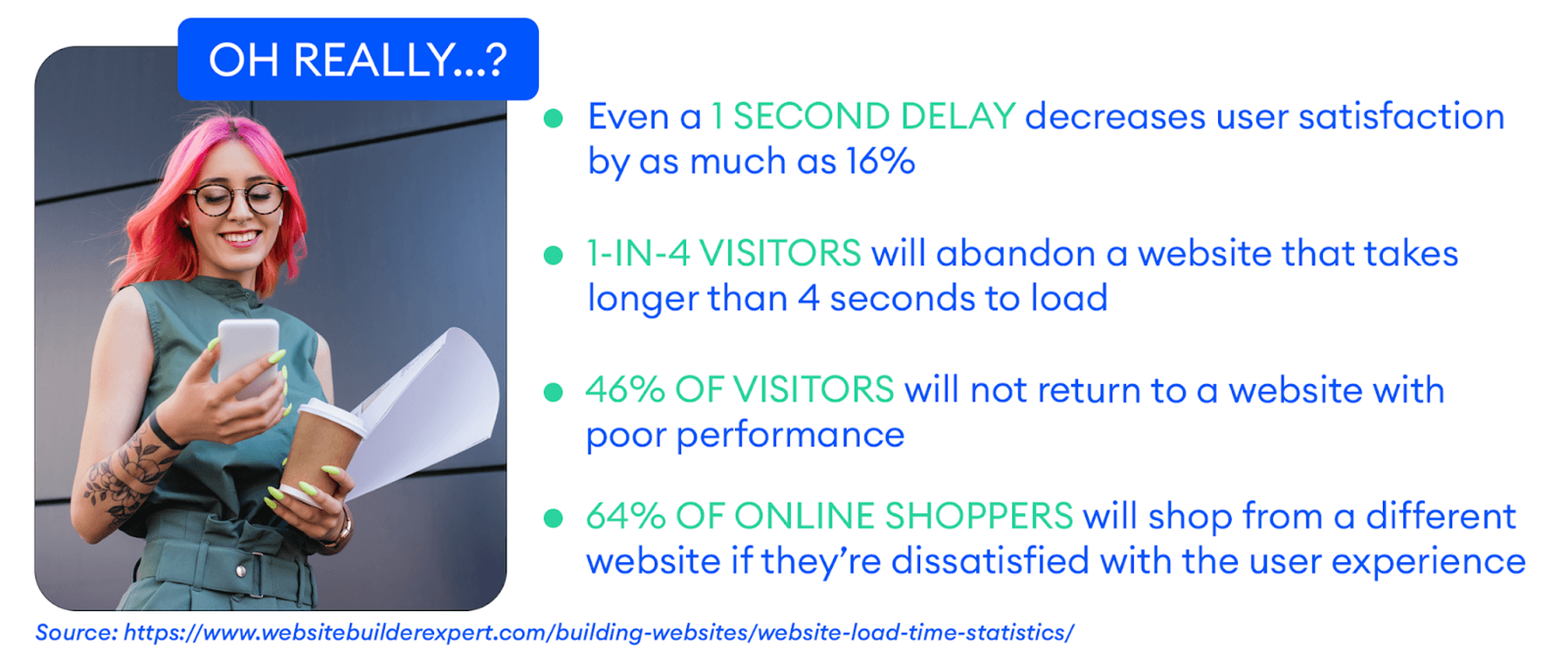
Google has also made performance an increasingly important factor when it comes to SEO rankings. In fact, performance is a direct ranking signal that carries significant weight.

Google’s Page Experience Update that went live in 2021 has been the biggest move in that direction yet. Soon, Google might even use visual indicators in SERP results to distinguish high-performing websites from the rest.

In Google’s own words, “These signals measure how users perceive the experience of interacting with a web page and contribute to our ongoing work to ensure people get the most helpful and enjoyable experiences from the web.”

So, Why Should We Target Images For Performance Optimization?

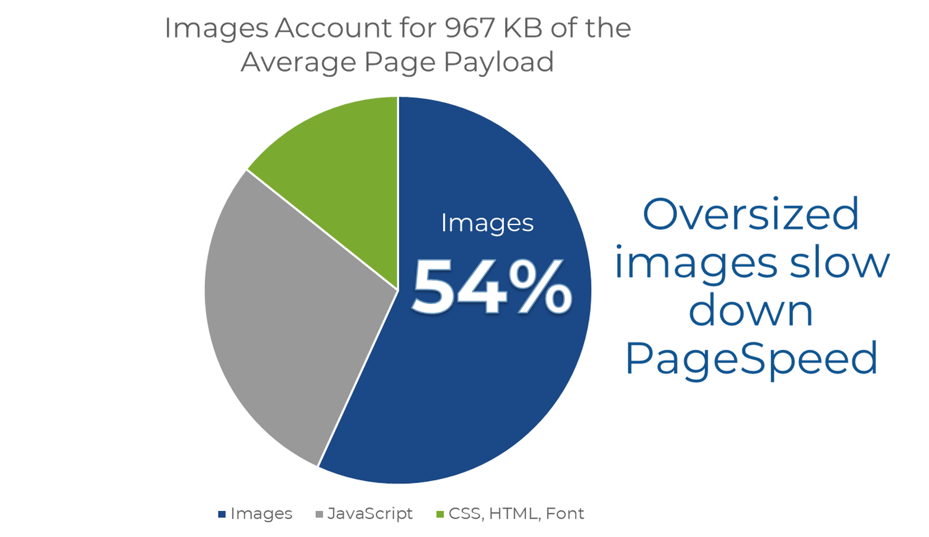
According to Google, images are the largest contributor to page weight. Google has also singled out image optimization specifically as the factor with the most untapped potential for performance optimization.

This problem isn’t going away soon. According to data by the HTTP Archive, there are roughly 967.5 KB bytes of image data on desktop web pages and 866.3 KB of image data on mobile pages. This is an increase of 16.1% and 38.8%, respectively, over the last five years.

Thanks to popular e-commerce tools like Woocommerce, it’s estimated that up to 28% of all online sales happen on WordPress websites.

And don’t forget, images are both a key part of conveying information to the user and integral to the design of your website. If they take significantly longer to load than your text, for example, it will negatively impact the user experience in a variety of ways.

In summary, optimized images help your WordPress website by:

  • Improving user satisfaction.
  • Improving various traffic metrics, like bounce rates, time-on-page, etc.
  • Boosting your SEO rankings.
  • Contributing to higher conversions (and sales).

How Does Image Optimization in WordPress Work?

WordPress is so popular because it’s a CMS (content management system) that allows anyone to build, design, and manage a website without any coding or advanced technical experience. Advanced features can be installed with just a few clicks, thanks to plugins, and you rarely have to touch the code behind your website unless you want to make some unique modifications.

In short, using a CMS like WordPress shields you from many of the day-to-day technicalities of running a website.

WordPress Image Optimization: What It Can Do

As we mentioned, one of the main reasons WordPress is so popular is because it takes care of many of the technical aspects of running a website. With that in mind, many think that WordPress should also automatically take care of image optimization without them having to get involved at all.

Unfortunately, that’s not really the case.

True, WordPress does offer some built-in image optimization. Whenever you upload an image to WordPress, it currently compresses the quality to about 82% of the original (since v4.5).

In v4.4, WordPress also introduced responsive image syntax using the srcset attribute. This creates four breakpoints for each image you upload according to the default WordPress image sizes:

  • 150px square for thumbnails
  • 300px width for medium images
  • 768px max-width for medium_large images
  • 1024px max-width for large images.

Here you can see an example of the actual responsive syntax code generated by WordPress:

<img loading="lazy" src="https://bleedingcosmos.com/wp-content/uploads/2021/12/33-1024x683.jpg" alt="" class="wp-image-9" width="610" height="406" srcset="https://bleedingcosmos.com/wp-content/uploads/2021/12/33-1024x683.jpg 1024w, https://bleedingcosmos.com/wp-content/uploads/2021/12/33-300x200.jpg 300w, https://bleedingcosmos.com/wp-content/uploads/2021/12/33-768x512.jpg 768w, https://bleedingcosmos.com/wp-content/uploads/2021/12/33-1536x1024.jpg 1536w" sizes="(max-width: 610px) 100vw, 610px">

Depending on the screen size of the device from which a user visits your webpage, WordPress will let the browser pick the most appropriately sized image. For example, the smallest version for mobile displays or the largest for 4K Retina screens, like those of a Mac.

While this may seem impressive, it’s only a fraction of what can be achieved using a proper image optimization solution, as we’ll show later.

Lastly, WordPress implemented HTML native default lazy loading for all images starting with version 5.5.

So, in short, WordPress offers the following image optimization capabilities baked-in:

  • Quality compression (limited)
  • Responsive syntax (up to 4 breakpoints)
  • Lazy loading

WordPress Image Optimization: What it Cannot Do

There are other issues many have with both the implementation of image compression and responsive syntax as it’s used by WordPress. This leads to some users even purposefully deactivating WordPress’ built-in image optimization so they can fully take control of it themselves.

Here are some of the reasons why:

  • WordPress uses a very basic form of quality compression. It does not use advanced technologies like AI and machine learning algorithms to compress images while maintaining maximum visual quality. It’s also lossy compression, so the quality is lost for good. You can clearly see the difference between an original HD image and the compressed version created by WordPress.
  • WordPress only compresses most images by up to 20%, while advanced image optimization tools can reduce all image sizes intelligently by up to 80%.
  • Responsive syntax can provide significant performance improvements over simply uploading a single HD image to be served on all devices and screens. However, it’s still only limited to a set number of breakpoints (typically 3 or 4). Since it’s not dynamic, a whole spectrum of possible image sizes is not created or used.
  • Responsive syntax code is not scalable and can quickly lead to code that’s bloated, messy, and hard to read.
  • WordPress doesn’t accelerate image delivery by automatically caching and serving them via a global CDN, although this can be done using other tools.

Another important optimization feature that WordPress does not have is auto-conversion to next-gen image file formats. Different image formats offer different performance benefits on different devices. Some formats also enable higher levels of compression while maintaining visual fidelity.

Next-gen formats like WebP, AVIF, and JPEG-2000 are considered to be the most optimal formats on compatible devices. For example, until recently, WebP would be the optimal choice on Chrome browsers, while JPEG-4000 would be optimal on Safari browsers.

However, WordPress will simply serve images in the same formats in which they were originally uploaded to all visitors.

How to Measure the Image Performance of a WordPress Website?

As the undisputed king of search engines, we’ll base most of our performance metrics on guidelines established by Google.

Along with its various performance updates, Google has released a number of guidelines for developers as well as the tools to test and improve their websites according to said guidelines.

Google introduced Core Web Vitals as the primary metrics for measuring a web page’s performance and its effect on the user experience. Thus, Core Web Vitals are referred to as “user-centric performance metrics.” They are an attempt to give developers a testable and quantifiable way to measure an elusive and abstract concept such as “user experience.”

Combined with a number of other factors, Core Web Vitals constitute a major part of the overall page experience signal:

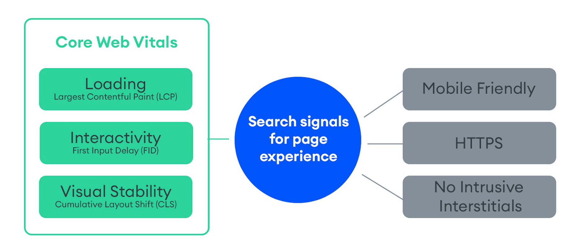
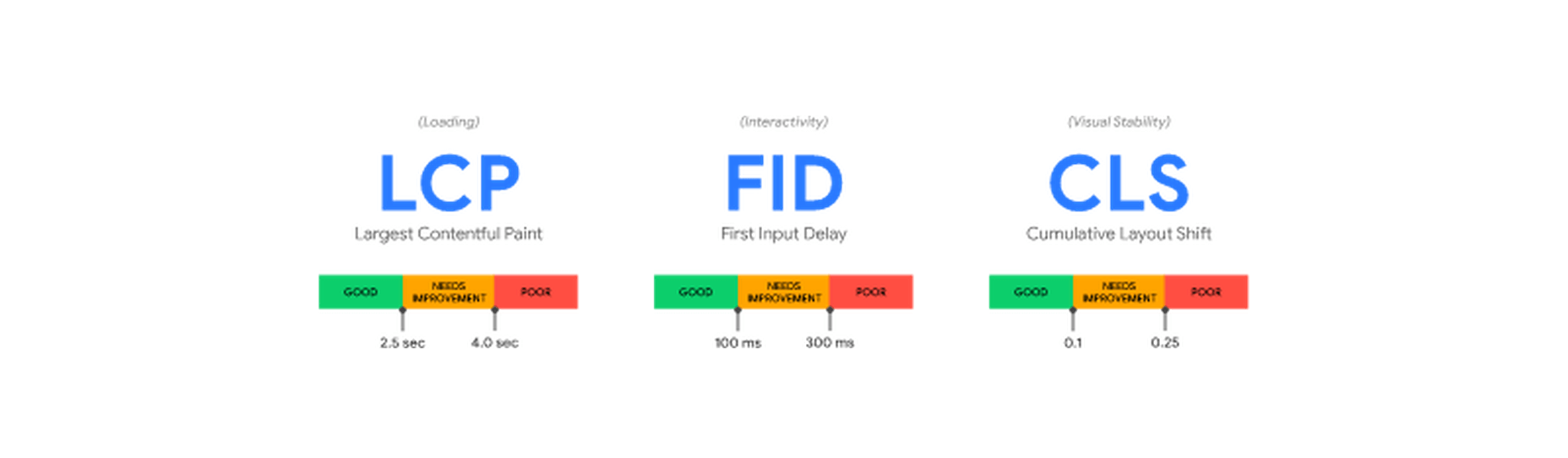
You can find a complete introduction to Core Web Vitals here. However, they currently consist of three main metrics:

  • LCP (Largest Contentful Paint): The time it takes the largest above-the-fold element on your page to load. This is typically a full-sized image or hero section.
  • FID (First Input Delay): The delay from the moment a user first interacts with an element on the page until it becomes responsive.
  • CLS (Cumulative Layout Shift): The visual stability with which the elements on a page load.

Here is an illustration of how these metrics are scored:

While these are the three most important metrics to optimize, they are not the only ones. Google still measures other metrics like the FCP (First Contentful Paint), SI (Speed Index), as well as the TTFB (Time to First Byte), TBT (Total Blocking Time), and TTI (Time to Interactive).

A number of these metrics are directly affected by the images used on your web pages. For example, LCP, FCP, and SI are direct indicators of how fast the content of your web page loads and depends on the overall byte size of the page. However, it can also indirectly affect FID by keeping the main thread busy with rendering large amounts of image content or the perceived CLS by delaying the time it takes large images to load.

These metrics apply to all websites, whether they are custom-made or built using a CMS like WordPress.

When using tools like Lighthouse or PageSpeed Insights, you’ll also get scored based on other flags Google deems important. Some of them are specific to images, such as properly sizing images and serving images in next-gen formats.

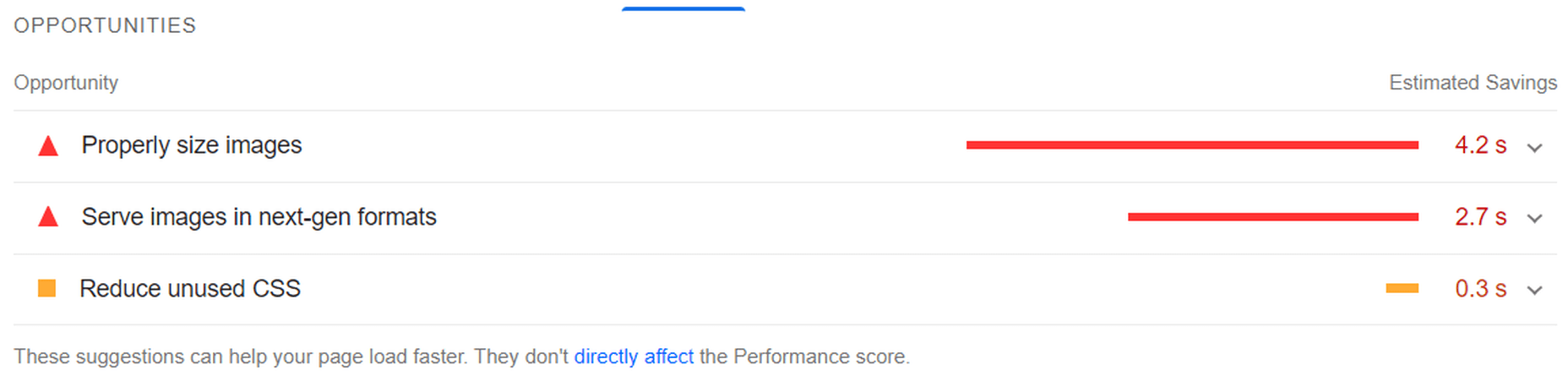
If you only use built-in WordPress image optimization, you’ll get flagged for the following opportunities for improvement:

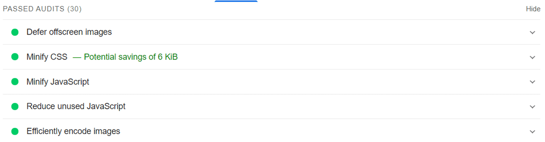
Some of the audits it will pass, however, are deferring offscreen images (lazy loading) and efficiently coding images (due to compression):

A Better Way to Optimize WordPress Images: ImageEngine

Billions of websites are all vying for prime real estate on Google SERPs, as well as the attention of an increasingly fussy internet-using public. Every inch matters when it comes to giving your website a competitive advantage.

So, how can you eliminate those remaining performance flags and deliver highly optimized images that will keep both your visitors and Google happy?

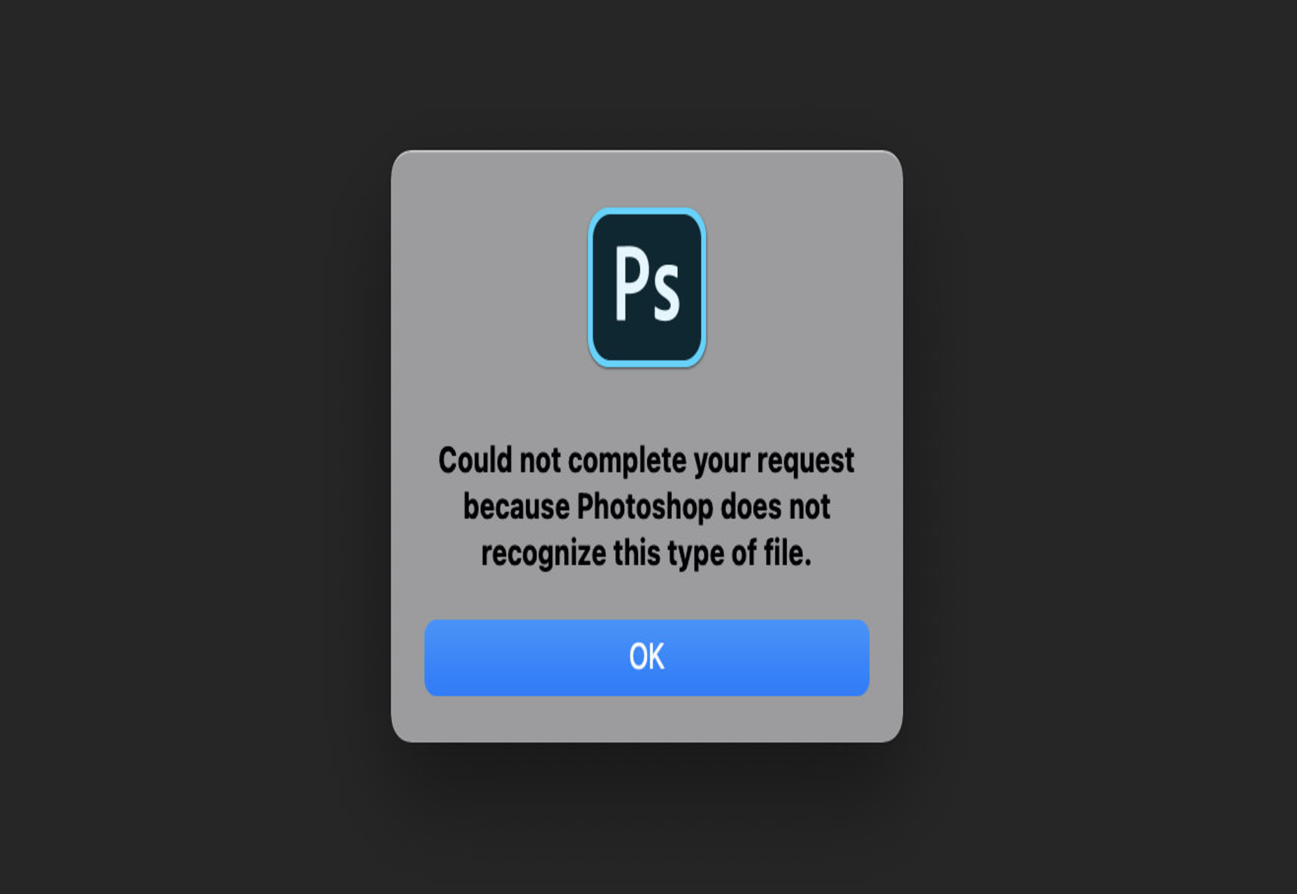
Sure, you could manually optimize images using software like PhotoShop or GIMP. However, that will take you hours for each new batch of images. Plus, you still won’t benefit from any automated adaptive optimization.

A more reasonable solution in today’s fast-paced climate is to use a tool developed specifically for maximum image optimization: an image CDN like ImageEngine.

ImageEngine is an automated, cloud-based image optimization service using device detection as well as intelligent image compression using the power of AI and machine learning. It can reduce image payloads by up to 80% while maintaining visual quality and accelerating delivery around the world thanks to its CDN with geographically dispersed PoPs.

Why is ImageEngine Image Optimization Better Than WordPress?

When making a head-to-head comparison, here are the reasons why ImageEngine can deliver better performance:

  • Device Detection: ImageEngine features built-in device detection. This means it picks up what device a visitor to your website is using and tailors its optimization strategy to what’s best for that specific device.
  • Client hints: By supporting client hints, ImageEngine has access to even more information regarding the device and browser to make better optimization decisions.
  • Next-gen formats: Based on optimal settings, ImageEngine automatically converts and serves images in next-gen formats like WebP, AVIF, JPEG2000, and MP4 (for GIFs).
  • Save data header: When a Chrome user has save-data mode enabled, ImageEngine will automatically compress images more aggressively to save on data transfer.
  • CDN with dedicated edge servers: ImageEngine will automatically cache and serve your optimized image assets using its global CDN. Each edge server has device awareness built-in to bring down latency and accelerate delivery. You can also choose to prioritize specific regions.

So, the key differentiator is that ImageEngine can tailor optimizing images for what’s optimal for each of your visitors. ImageEngine is particularly good at serving mobile visitors thanks to WURFL device detection, which can dynamically resize images according to most devices and screen sizes in use today. As of now, this is a completely unique capability that none of its competitors offer.

It allows for far better and more fine-tuned optimization than WordPress’ across-the-board approach to compression and responsive syntax.

If you want, you could turn off WordPress responsive syntax and compression, and you would still experience a performance increase using ImageEngine. However, ImageEngine also plays nice with responsive syntax, so it’s not completely necessary unless you want to serve the highest-fidelity/low-byte-size images possible.

How Does ImageEngine Work with WordPress?

The process ImageEngine uses to integrate with WordPress can be broken down into a few easy steps:

  • Sign up for an ImageEngine account: ImageEngine offers three pricing plans depending on the scale and features you need as well as a no-commitment 30-day free trial.
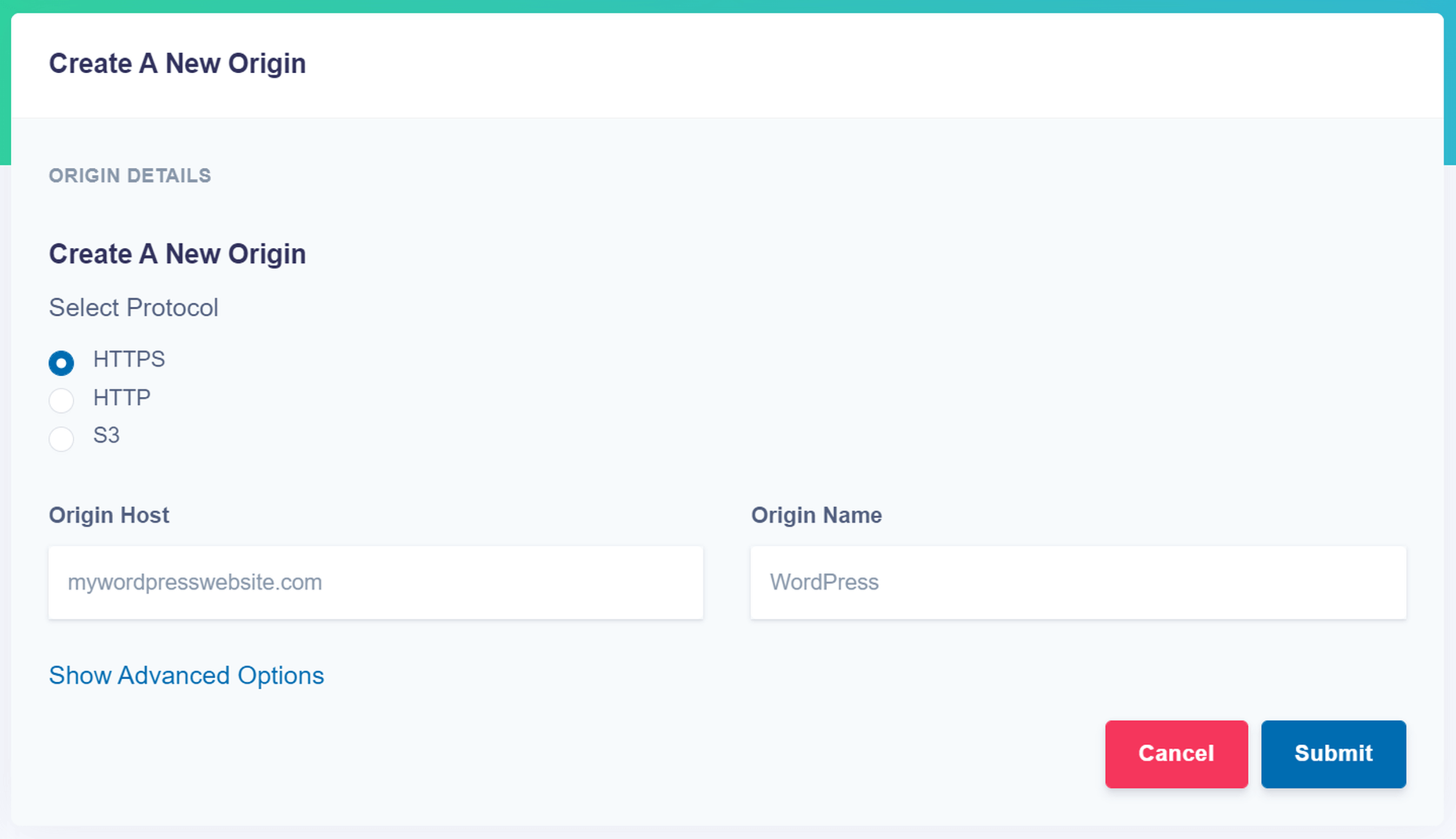
  • Specify your image origin: This tells ImageEngine where to find the original versions of your images. For a WordPress website, you can just use your domain, e.g., https://mywordpresswebsite.com. ImageEngine will then automatically pull the images you’ve uploaded to your WordPress website.

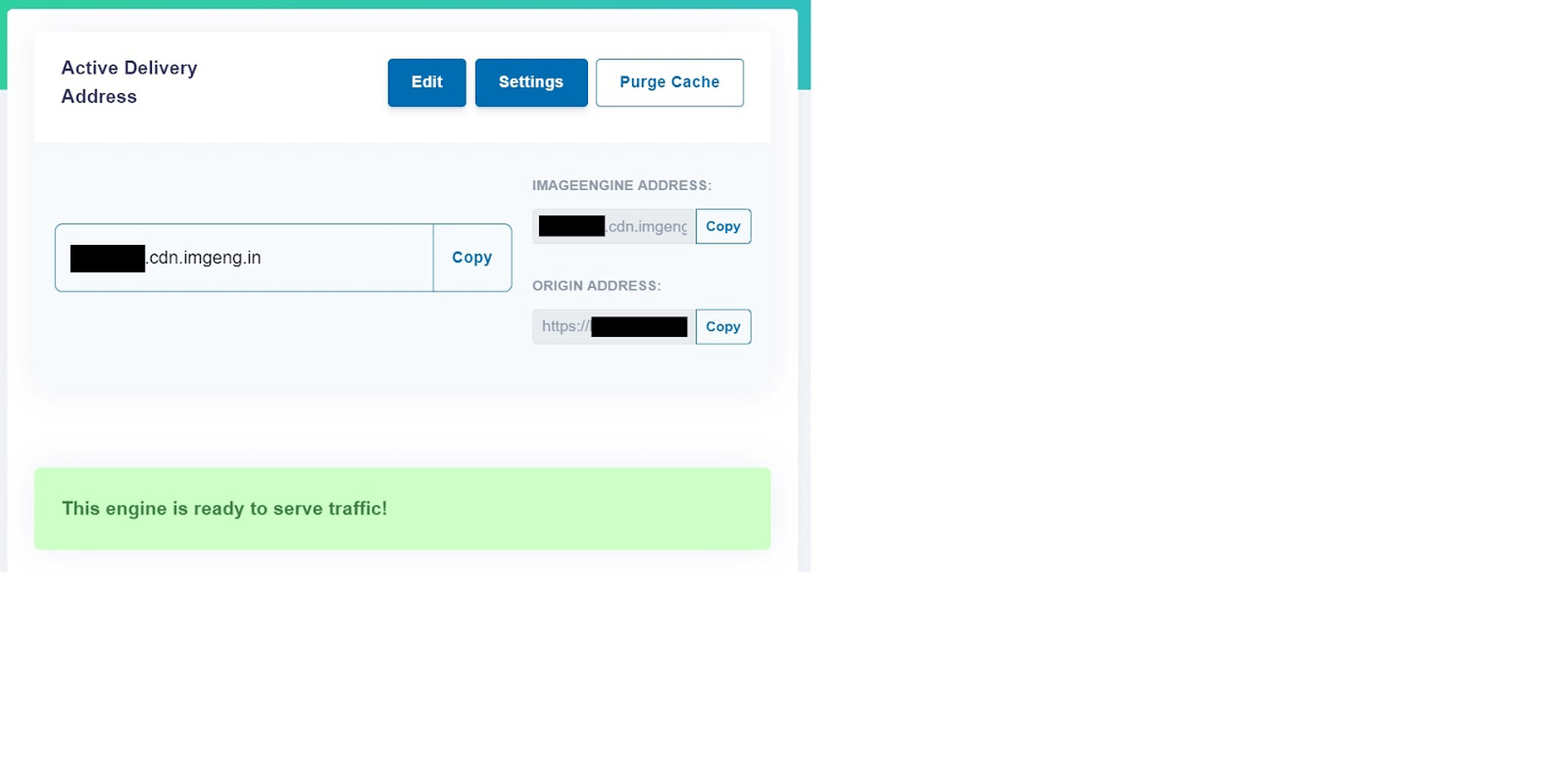
  • Copy the Delivery Address: After you create an account and specify your image origin, ImageEngine will provide you with a Delivery Address. A Delivery Address is your own unique address that will be used in your <img> tags to point back to the ImageEngine service. Delivery Addresses may be on a shared domain (imgeng.in) or customized using a domain that you own. A Delivery Address typically looks something like {random_string}.cdn.imgeng.in. If your images are uploaded to the default WordPress folder /wp-content/uploads/, you can access your optimized images from ImageEngine simply by changing your website domain. For example, by typing {imageengine_domain}.cdn.imgeng.in/wp-content/uploads/myimage.jpg into your browser, you’ll see the optimized version of that image. Just press the copy button next to the Delivery Address and use it in the next step configuring the plugin.

  • Install the ImageEngine Optimizer CDN plugin: The plugin is completely free and can be installed just like any other plugin from the WordPress repository.
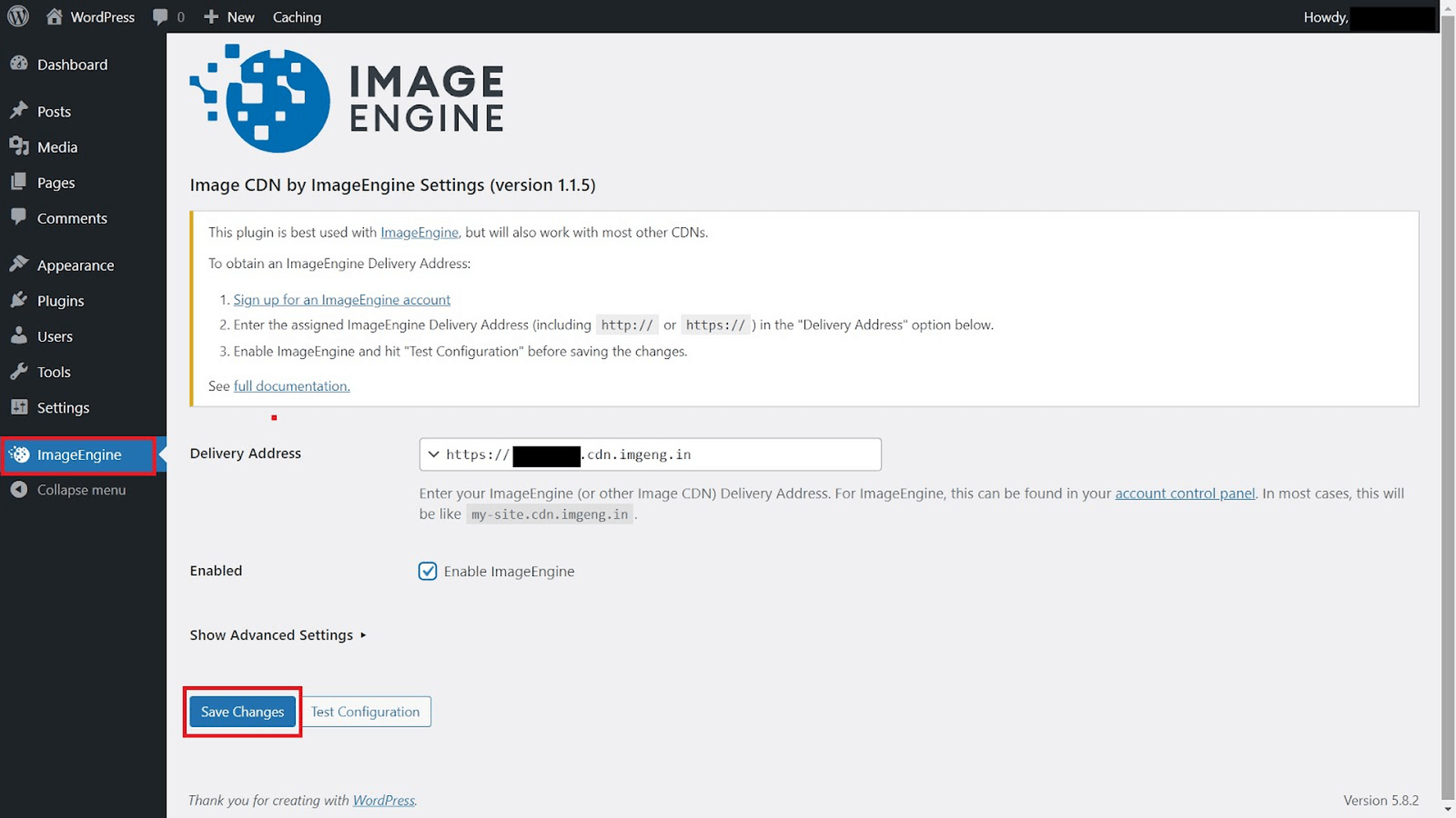
  • Configure and enable ImageEngine Plugin in WordPress: Just go to the plugin under “ImageEngine” in the main navigation menu. Then, copy and paste in your ImageEngine “Delivery Address,” tick the “Enabled” checkbox, and click “Save Changes” to enable ImageEngine:

Now, all ImageEngine basically does is replace your WordPress website domain in image URLs with your new ImageEngine Delivery Address. This makes it a simple, lightweight, and non-interfering plugin that works great with most other plugins and themes. It also doesn’t add unnecessary complexity or weight to your WordPress website pages.

ImageEngine vs Built-in WordPress Image Optimization

So, now let’s get down to business by testing the performance improvement you can expect from using ImageEngine to optimize your image assets.

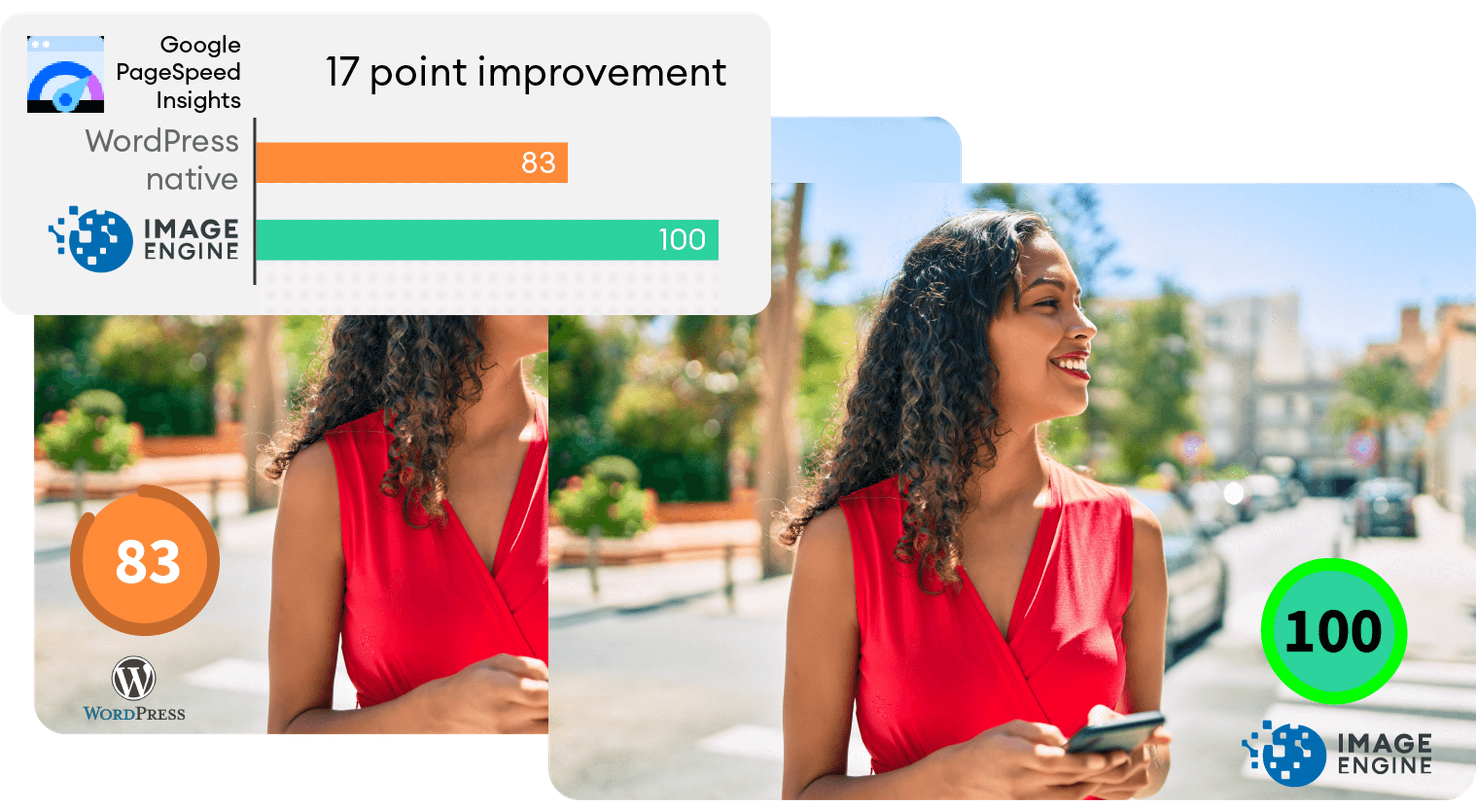
To do this test, we set up a basic WordPress page containing a number of high-quality images. I then used PageSpeed Insights and the Lighthouse Performance Calculator to get the performance scores before and after using ImageEngine.

Importantly, we conducted this test from a mobile-first perspective. Not only has mobile internet traffic surpassed desktop traffic globally, but Google themselves have committed to mobile-first indexing as a result.

Here is a PageSpeed score using the Lighthouse calculator for WordPress with no image optimization:

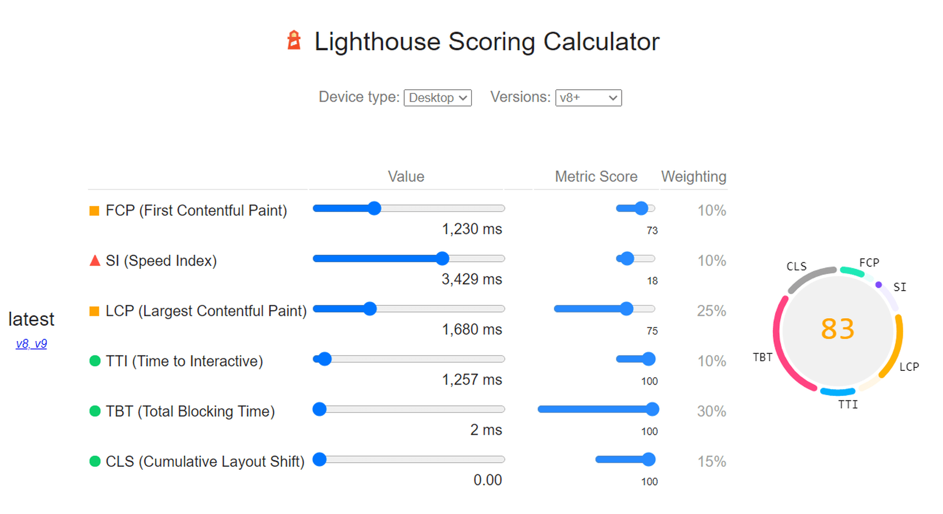
As we can see, both Core Web Vitals and other important metrics were flagged as “needs improvement.” Specifically, the LCP, FCP, and TBT. In this case, both the LCP and FCP were a high-res featured image at the top of the page.

If we go to the opportunities for improvement highlighted by PageSpeed, we see where the issues come from. We could still save as much as 4.2s of loading time by properly resizing images and a further 2.7s by serving them in next-gen formats:

So, now let’s see how much ImageEngine can improve on that.

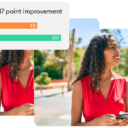
The same test run on my WordPress website using ImageEngine got the following results:

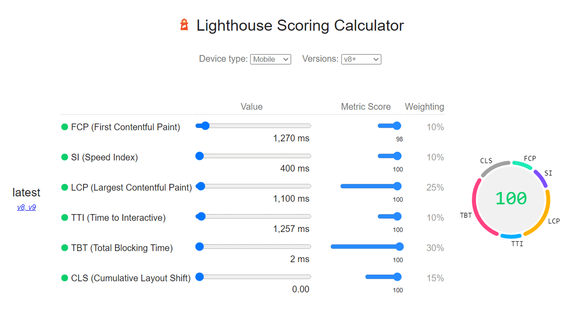
As you can see, we now have a 100 PageSpeed score. I saved roughly 2.5s on the SI (~86%) as well as roughly 1.7s on the LCP (~60%). There was also a slight improvement in the FCP.

Not only will you enjoy a stronger page experience signal from Google, but this represents a tangible difference to visitors regarding the speed with which your website loads. That difference will lead to lower bounce rates, increased user satisfaction, and more conversions.

There was also a 53% overall reduction in the total image payload. This is impressive, considering that it’s on top of WordPress’ built-in compression and responsive syntax.

Conclusion

So, as someone with a WordPress website, what can you take away from this?

Well, first of all, WordPress does feature some basic image optimization. And while not perfect, it should help you offer reasonable levels of performance, even if you use a lot of image content.

However, the caveat is that WordPress applies aggressive, across-the-board compression, which will lead to a noticeable reduction in visual quality. If you use WordPress for any type of website where premium quality images are important, this is a concern — for example, as a photography portfolio, exhibition, or image marketplace like Shutterstock.

By using ImageEngine, you can reduce image payloads and accelerate delivery even further without compromising too harshly on visual quality. What’s more, ImageEngine’s adaptive image optimization technology will provide greater improvements to more of your visitors, regardless of what device(s) they use to browse the web.

Whether or not you still want to use WordPress’ built-in optimizations, ImageEngine will deliver significant improvements to your user experience, traffic metrics, and even conversions.

Plus, true to the spirit of WordPress, it’s extremely simple to set up without any advanced configuration. Just sign up for ImageEngine in 3 easy steps, install the plugin, integrate ImageEngine by copy/pasting your image domain, and you’re good to go.


[ This is a sponsored post on behalf of ImageEngine ]

Source

The post WordPress Website Analysis: Before & After ImageEngine first appeared on Webdesigner Depot.

Source de l’article sur Webdesignerdepot

Every day design fans submit incredible industry stories to our sister-site, Webdesigner News. Our colleagues sift through it, selecting the very best stories from the design, UX, tech, and development worlds and posting them live on the site.

The best way to keep up with the most important stories for web professionals is to subscribe to Webdesigner News or check out the site regularly. However, in case you missed a day this week, here’s a handy compilation of the top curated stories from the last seven days. Enjoy!

Web 3.0: How Web Design will Change Forever

Cookie Notice for Websites

The Most Popular JavaScript Frameworks of 2022

Exciting New Tools for Designers, February 2022

The CSS From-font Value Explained in 4 Demos

A UX Designer Walks into a Tesla Bar

Looking Ahead to WordPress 6.0: The Early Roadmap

What’s the Difference Between Good UI and Good UX?

22+ CSS Dropdown Menus

Famous Logos in the Grotesque Art Style Typical for the Middle Ages

Source

The post Popular Design News of the Week: January 31, 2022 – February 6, 2022 first appeared on Webdesigner Depot.

Source de l’article sur Webdesignerdepot

Every day design fans submit incredible industry stories to our sister-site, Webdesigner News. Our colleagues sift through it, selecting the very best stories from the design, UX, tech, and development worlds and posting them live on the site.

The best way to keep up with the most important stories for web professionals is to subscribe to Webdesigner News or check out the site regularly. However, in case you missed a day this week, here’s a handy compilation of the top curated stories from the last seven days. Enjoy!

16 Leading UI/UX Design Trends to Dominate in 2022

Unused Nintendo Wii Logos Include Some Serious Design Crimes

The Baseline for Web Development in 2022

60 Bootstrap Examples for Website Design

M&M’s Redesign by JKR

Frontend Predictions for 2022

Minze – Dead-Simple JS Framework for Native Web Components

Cheet – Create Developer Cheatsheets

What’s New in WordPress 5.9 (Features and Screenshots)

20 Best New Websites, January 2022

Source

The post Popular Design News of the Week: January 24, 2022 – January 30, 2022 first appeared on Webdesigner Depot.

Source de l’article sur Webdesignerdepot

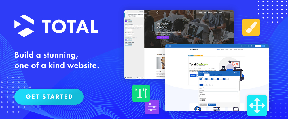
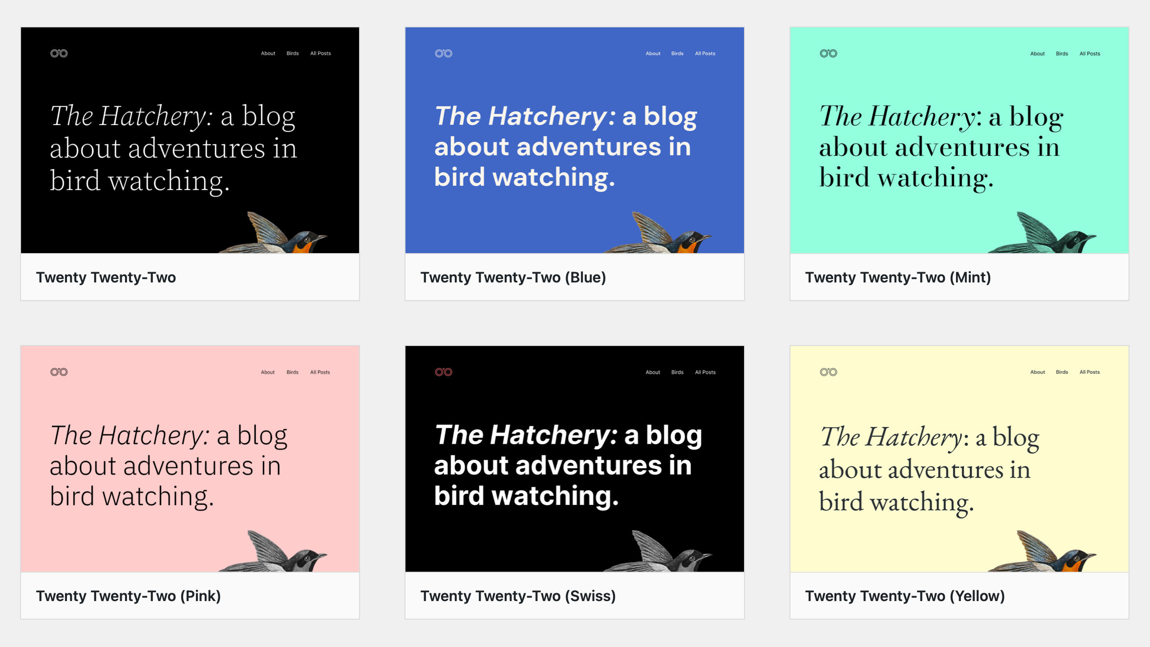
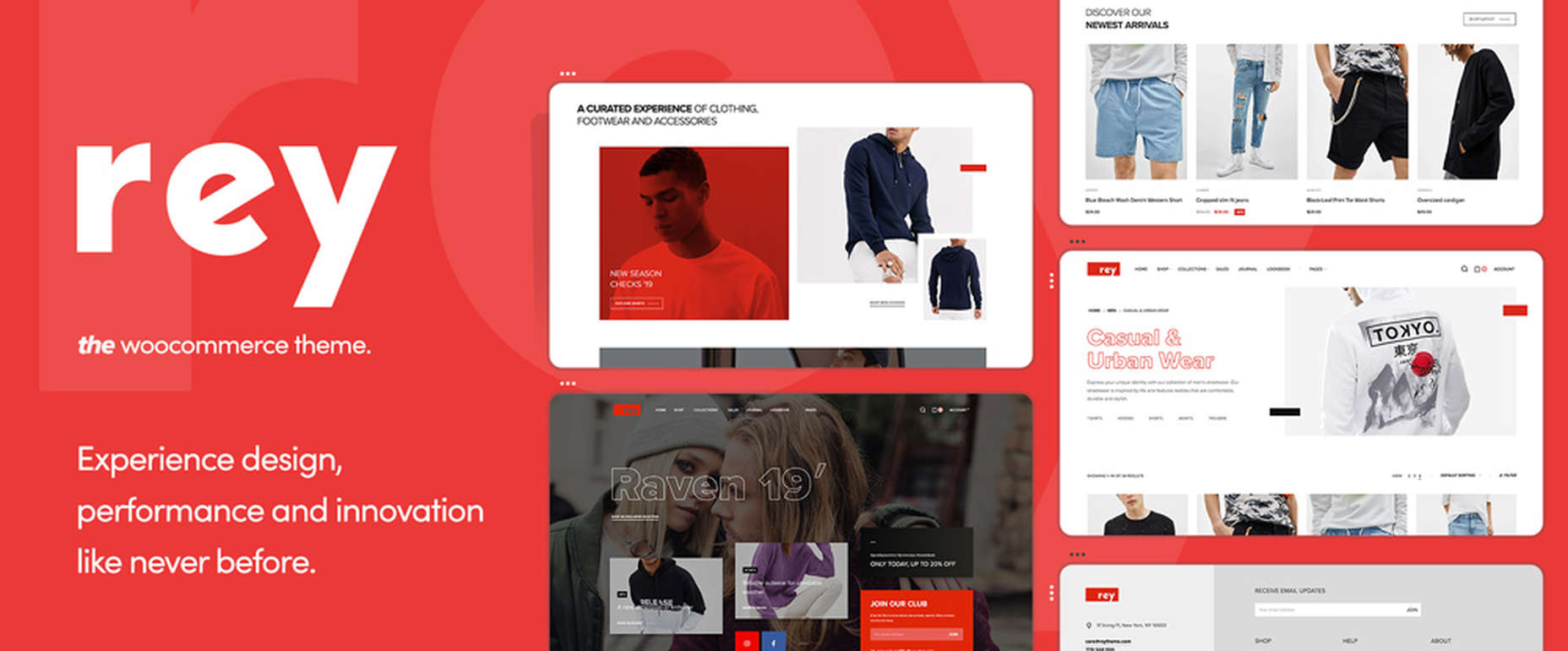
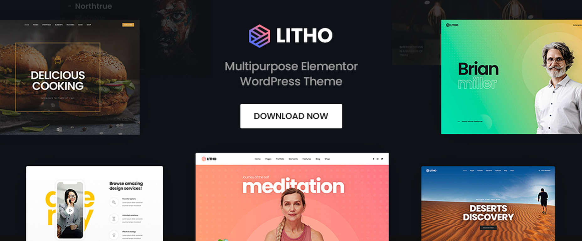
If you’re looking for a WordPress theme for your 2022 projects, it never hurts to see what the experts consider to be the best of the bunch. That’s not to say that experts don’t have their favorites. They often do, and we are no different.

We’ve tried, successfully, we believe, to avoid any biases we may have in compiling what we believe to be the 10 top WordPress themes going into 2022.

Working with a WordPress theme has the advantage of giving you a great starting point. It makes it much easier to create an attractive website that will charm any visitors who stop by and convince them to linger awhile.

Another advantage of using a theme can be its cost-effectiveness. Most of the popular WordPress themes are reasonably priced, they save you time, and they can save you money as well.

The main problem you’re apt to encounter is finding the right one since many of them are out there. You could spend hours and hours making comparisons among a host of candidates that appear to be reliable and easily customizable. Or you could select from among the following 10 top WordPress themes, all of which are guaranteed to give you your money’s worth and more. 

1. BeTheme – The Biggest Multipurpose WordPress Theme with 650+ Pre-Built Websites

BeTheme justifiably lays claim to being the biggest WordPress and WooCommerce theme of all for several reasons.

  • BeTheme’s 40+ core features give its users a complete tool kit to work with that includes 650+ pre-built websites and tons of design elements, aids, and options.
  • A 240,000+ customer base also contributes to making this the biggest WordPress theme of them all.

It’s not just about size, of course. Performance is all-important, and BeTheme has it in spades thanks to:

  • The Muffin Live Builder lets users edit live content visually and create, save, and restore design elements, blocks, and sections.
  • The WooCommerce Builder helps users design engaging shop and single product layouts and is packed with customer-centric features and options.
  • Full Elementor compatibility, with 30+ unique design elements and 120+ dedicated pre-built websites.
  • Assurance that every website is 100% responsive.
  • The Muffin Builder: this old standby is more intuitive than any other page builder on the market.
  • Regular Updates, plus BeTheme purchasers also receive free lifetime updates.

Click on the banner. There’s much, much more to see.

2. Total WordPress Theme

Total is aptly named because of the tools it gives its users; tools that include a premium page builder, demo and template libraries, an assortment of design and layout options, and cool navigation features.

  • The premium page builder is an extended version of the popular WPBakery frontend drag and drop page builder. Slider Revolution, another premium design aide, also comes with the package.
  • Design options include more than 500 live customizer options and 100+ customizable builder blocks, page builder block animation capabilities, custom backgrounds, and custom title backgrounds.
  • Layout options range from boxed and full-width and dynamic layouts to page and post designs and one-page site layouts.
  • Header styles, local scroll menus, and mobile menu styles contribute to website navigation capabilities.

Total is easy to set up and work with, plus it is 100% responsive. Click on the banner to find out more.

3. WoodMart

WoodMart is a premium WordPress theme that has been designed from the ground up to enable its users to create superlative WooCommerce online stores. WoodMart doesn’t require the use of multiple plugins as the most important tools, and features users simply must have come right out of the box.

They include:

  • For starters, a supply of 70+ demo layouts, 370 premade sections, plus an extensive template library for Elementor and WP Bakery.
  • A powerful Theme Settings Panel with a graphics interface to make changes quickly and easily.
  • AJAX techniques that guarantee the super-fast loading that is so important with multi-product pages and galleries.

WoodMart-built websites are search engine friendly, multilanguage ready, 100% responsive, and RTL and retina ready, and GDPR compliant.

Click on the banner to see what your WooCommerce store could look like.

4. TheGem – Creative Multi-Purpose & WooCommerce WordPress Theme

TheGem is the best-selling theme on ThemeForest, which isn’t surprising since its multiplicity of features has led to it being called the Swiss Army Knife of WordPress themes.

Key features include –

  • 400+ beautiful websites and templates for any purpose or niche.
  • TheGem Blocks with its 300+ pre-designed section templates to speed up your workflow – a genuine game-changer.
  • Elementor and WPBakery page builders.
  • An outstanding collection of WooCommerce templates for any shop type.

5. Uncode – Creative & WooCommerce WordPress Theme 

Uncode is a pixel-perfect theme packed with dozens of advanced and unique features designed to produce a pixel-perfect website.

These features include:

  • An enhanced Page Builder with a juiced-up Frontend editor
  • A WooCommerce Custom Builder
  • A wireframes plugin for importing 550+ professionally designed section templates

Uncode has sold more than 85,000 copies to date. It is the ideal WordPress theme for building an impressive blog, portfolio, eCommerce, and magazine sites.

6. Rey Theme for WooCommerce

eCommerce is said to rest on four pillars – filtering, search, navigation, and presentation. This WooCommerce-oriented WordPress theme fully addresses each one. Rey lets you experience design, innovation, and performance in ways you could only dream of before.

There’s:

  • The powerful and popular Elementor page builder with built-in features supplemented with Rey’s extra spices.
  • Ajax navigation, including infinite loading.

Rey is multilanguage-ready, obviously responsive, SEO friendly, developer-friendly, and performance-oriented.

7. Avada Theme

One easy way to know you’ve picked the right theme is to select Avada, the #1 best-selling theme of all time, a popular theme that is loved by 450,000+ happy users.

  • Avada’s Fusion Theme Options, Fusion Page Options, and Fusion Builder will give you more than enough flexibility, while its 40+ free eye-candy demos provide the inspiration.
  • Avada also gives you easy access to some of the most popular premium plugins.

And that’s just the beginning.

8. Impeka – Creative Multipurpose WordPress Theme

This simply impeccable WordPress theme is filled with potential for the advanced user and, at the same time, easy for a beginner to use. Using Impeka simply involves:

  • Selecting Elementor, Gutenberg, or an enhanced WPBakery as your page builder.
  • Using WooCommerce to build your online shop.
  • Sifting through a multitude of features that include the Mega Menu and Footer and Popup builders.

Your website will be super-attractive, lightning-fast, fully responsive, and SEO perfected.

9. Litho – Multipurpose Elementor WordPress Theme

This popular multipurpose WordPress theme is built with Elementor, the world’s #1-page builder.

  • Litho can be used to build websites of any type and for any business niche.
  • It is excellent for building portfolio, blog, and eCommerce websites.
  • There are 37+ home pages, 200+ creative elements, and 300+ templates to get you started and assist you along the way.

Litho-built websites are fast loading and deliver healthy SEO results.

10. XStore – Best Premium WordPress WooCommerce Theme for eCommerce

You can start with one of XStore’s more than 110 amazing pre-built shops, or start from scratch and let Elementor or WPBakery and more than 550 pre-built blocks help you along the way, together with:

  • $559 worth of premium plugins.
  • A Live Ajax theme option.
  • A header builder and a single product page builder.
  • A built-in WooCommerce email builder.

You can get this complete and highly customizable WooCommerce theme for an amazing $39.

One of the benefits of using WordPress is the number of great WordPress themes you can work with. Whatever your niche, your target audience, or your skill level may be, there’s a premium WordPress theme out there that looks and feels as though it was made, especially with you in mind.

If you’re planning to create a fresh and beautiful website for 2022, or you want to completely rebuild an existing one, or simply make some design changes, this roundup of the most popular and the best WordPress themes in the market is meant for you. And we really mean it!


This is a sponsored post.

Source

The post 10 Top WordPress Themes for 2022 first appeared on Webdesigner Depot.

Source de l’article sur Webdesignerdepot