Articles

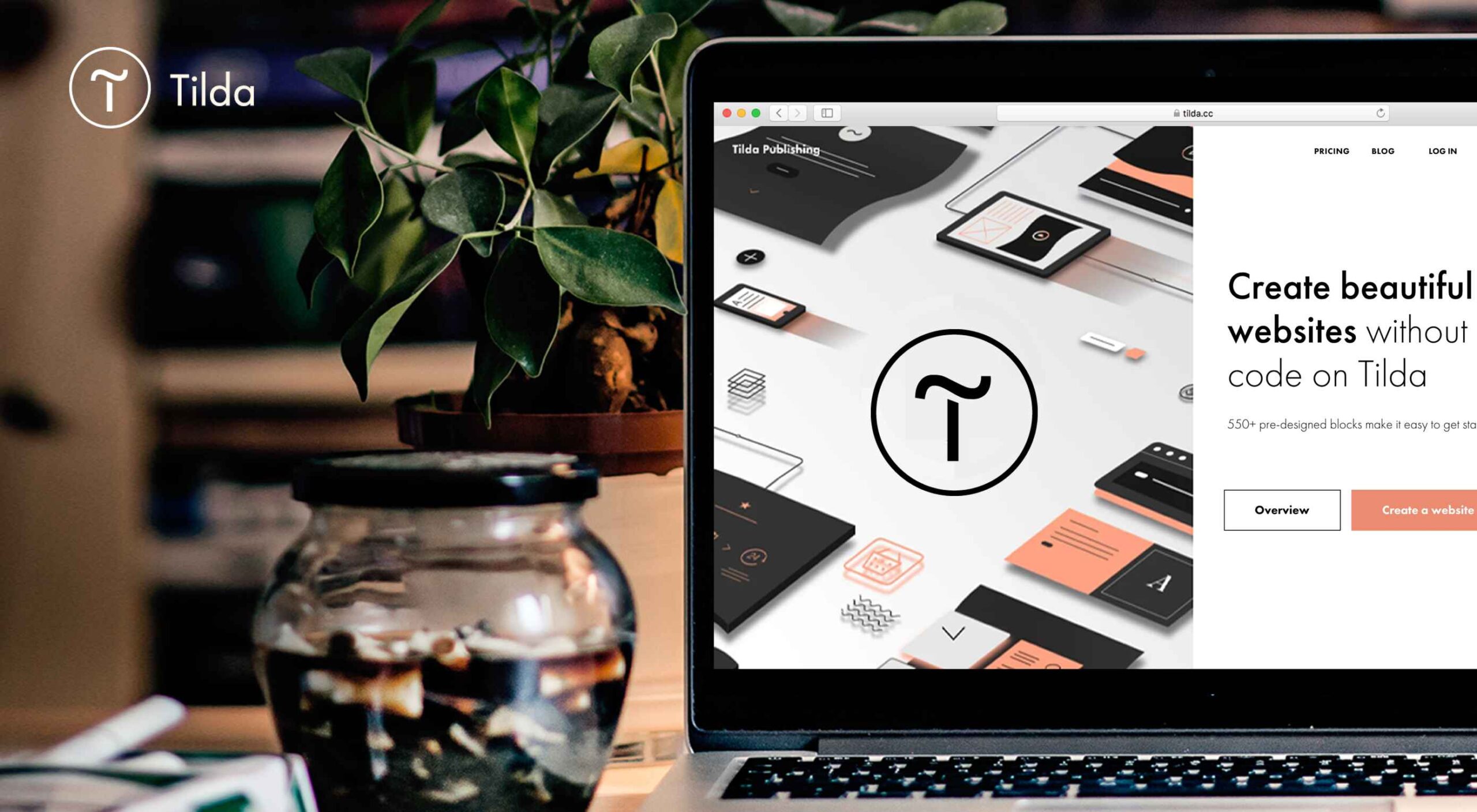
Tilda website builder combines everything we liked so much about constructors when we were kids – you can experiment, test out and build myriads of new creative ideas out of ready-to-use blocks. Tilda is that type of constructor that allows you to own your creative process and create pretty much any website: landing page, business website, online store, online course with members area, blog, portfolio, or event promo page.

Founded seven years ago, Tilda is a website builder that completely revamped the way we create websites. Tilda has been the first website builder to introduce block mechanics that allows users to create websites out of pre-designed pieces. This breakthrough technology allowed all users – not only designers – to create professional-looking websites. Just like in kid constructors, you can drag-and-drop and mix-and-match blocks on Tilda to let your creativity flow and build a dazzling website, at extraordinary speed. 

When you ask designers why they love Tilda, they usually say it’s because the platform provides the ultimate balance between choosing from templates and being able to fully customize and create from scratch to bring any creative idea to life. Here’s what else they say:

Tilda has been a game-changer for us. It allows our team to quickly spin up new web pages, make edits, and ship new programs. We left WordPress for Tilda and after being with Tilda for 2 years, I don’t ever want to go back.

~ Andy Page, Executive Director, Forge.

I built my first website in 2001. Since then I’ve used countless platforms and website builders for customer websites and my own business. Tilda is the perfect combination of ease of use with powerful features at an unbeatable value.

~ Robby Fowler, Branding and Marketing Strategist, robbyf.com & The Brand ED Podcast.

Let’s dive deeper into core functionalities you can leverage on Tilda. 

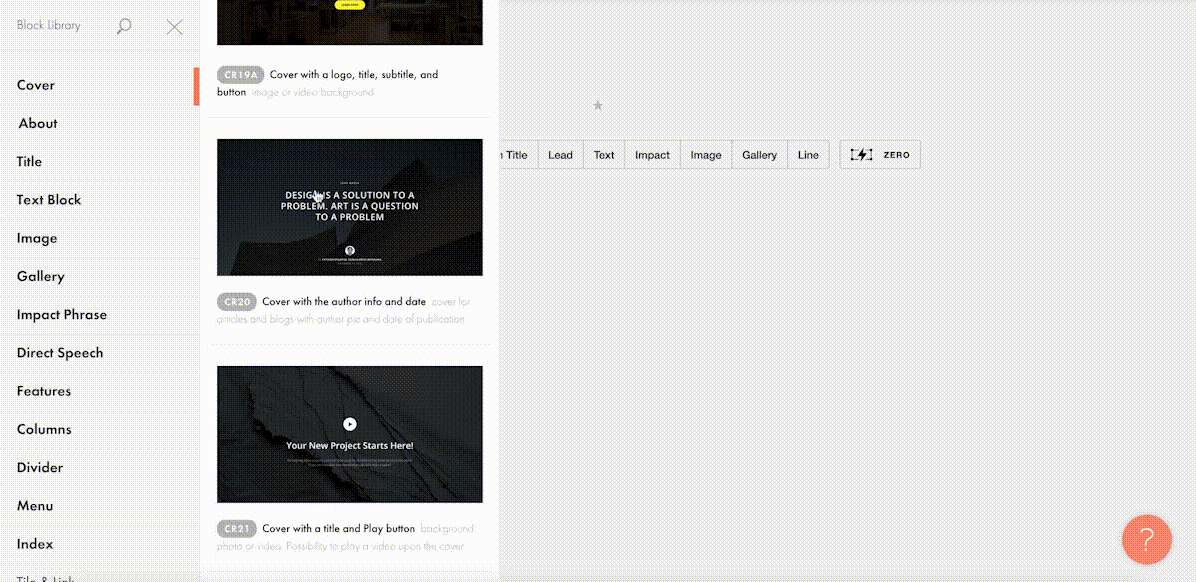
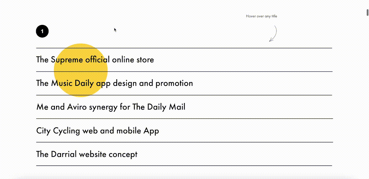
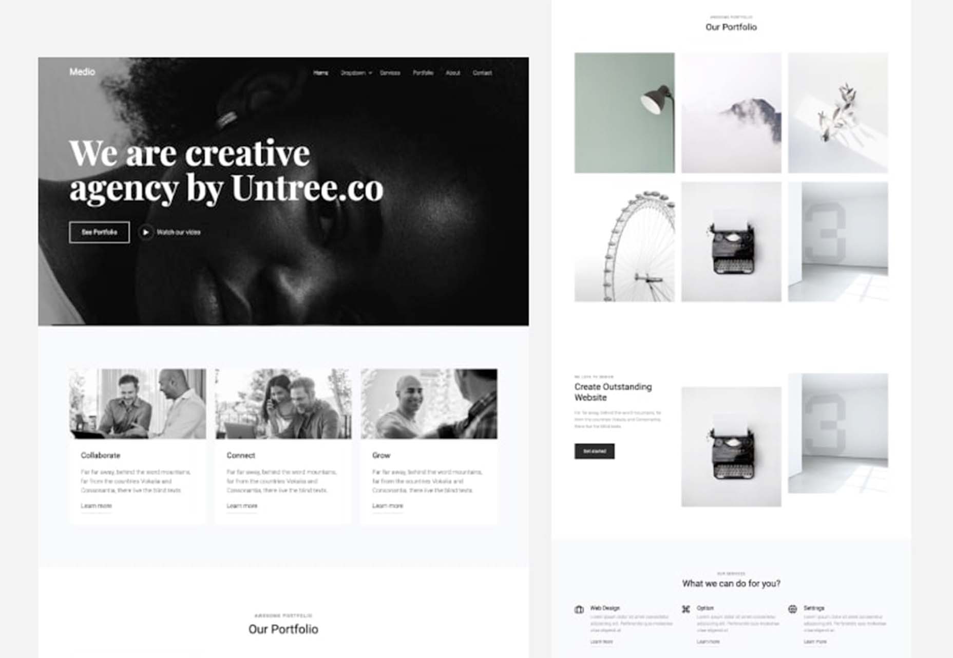
#1 Cut Corners With 550+ Pre-Designed Blocks And 210+ Ready-Made Templates

The beauty of Tilda is that it provides 550+ blocks in the ever-growing Block Library designed by professional designers. Thus, you can quickly build a website out of pre-designed blocks that encompass virtually all elements you might need for your website: menu, about us page, features, contact, pricing, etc. 

Customizing each block is a breeze with Tilda: You can drag-and-drop images, edit text right in the layout, alter block height, background color, padding, select the style of buttons, use custom fonts, and assign ready-made animation effects to specific parts of it. Also, Tilda provides a built-in free image library with 600K+ images, so you can find images that are just right for you without leaving Tilda, add them to your website with just one click, and use them for free.

Finally, all blocks fit together so well that it’s almost impossible to create a bad design on Tilda – even if you are a stranger to website building.

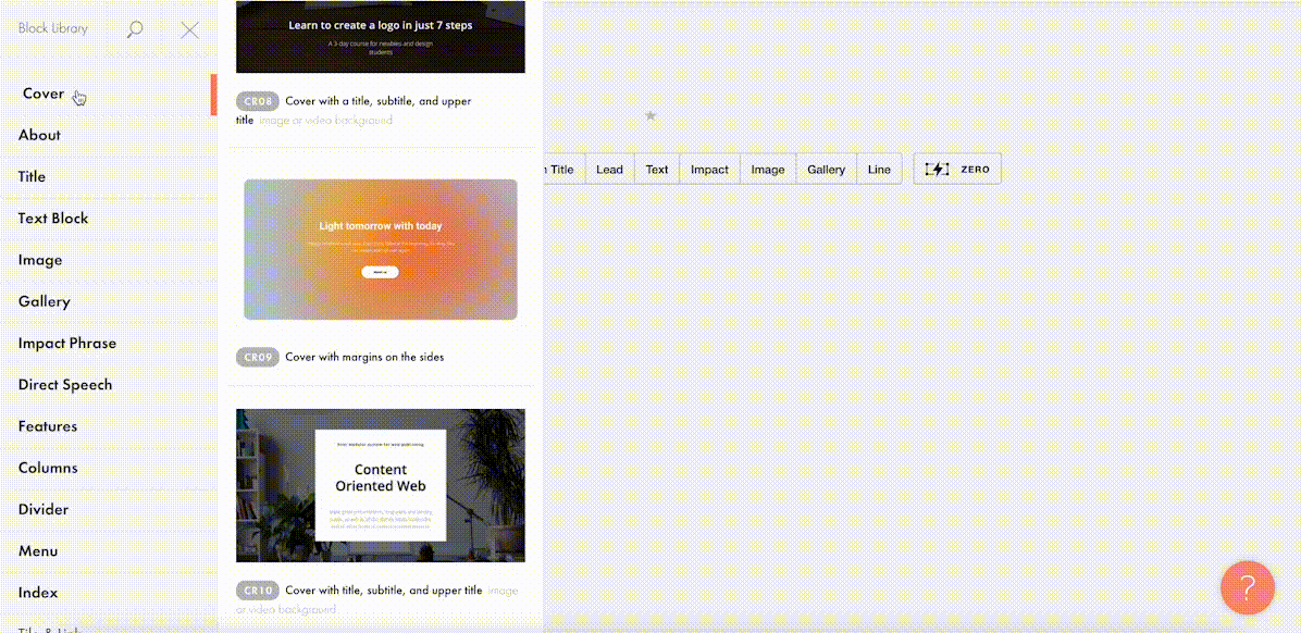
For a quick take-off, you can use 210+ ready-made templates for different kinds of websites and projects: online stores, landing pages, webinar promo pages, multimedia articles, blogs, and more. Each template is a sample of modern web design and consists of blocks. It means that templates don’t limit your creativity: you can modify them to your liking by playing with settings, adding extra or removing existing blocks, and embedding images and text. 

Each of the templates and blocks covers over 90% of use cases you’ll ever require and is mobile-ready, meaning that your website will look great on desktop computers, tablets, and smartphones by default.

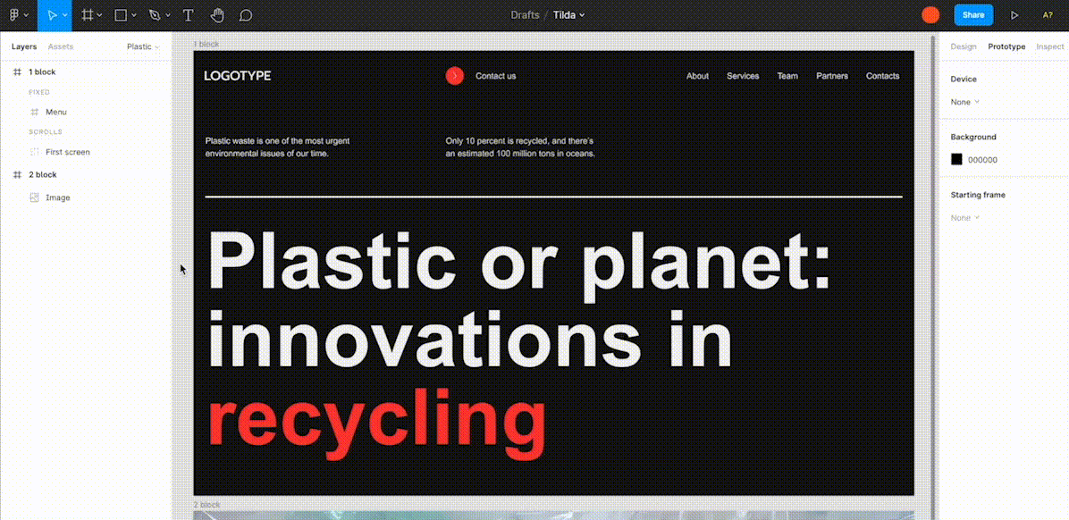
#2 Jazz Up Your Site With Zero Block: Professional Editor For Web Designers 

To better meet the demands of a creative brief and unleash your creativity, you can use Tilda’s secret weapon called Zero Block. It is a tool for creating uniquely designed blocks on Tilda.

You can control each element of the block, including text, image, button, or background, and decide on their position, size, and screen resolution on which they’ll appear. For example, you can work with layers to create depth with overlay and opacity techniques or set a transparency level on any element and shadow effects below them. Additionally, you can also insert HTML code to add more complex elements, such as calendars, paywall, comments, social media posts, and so much more.  

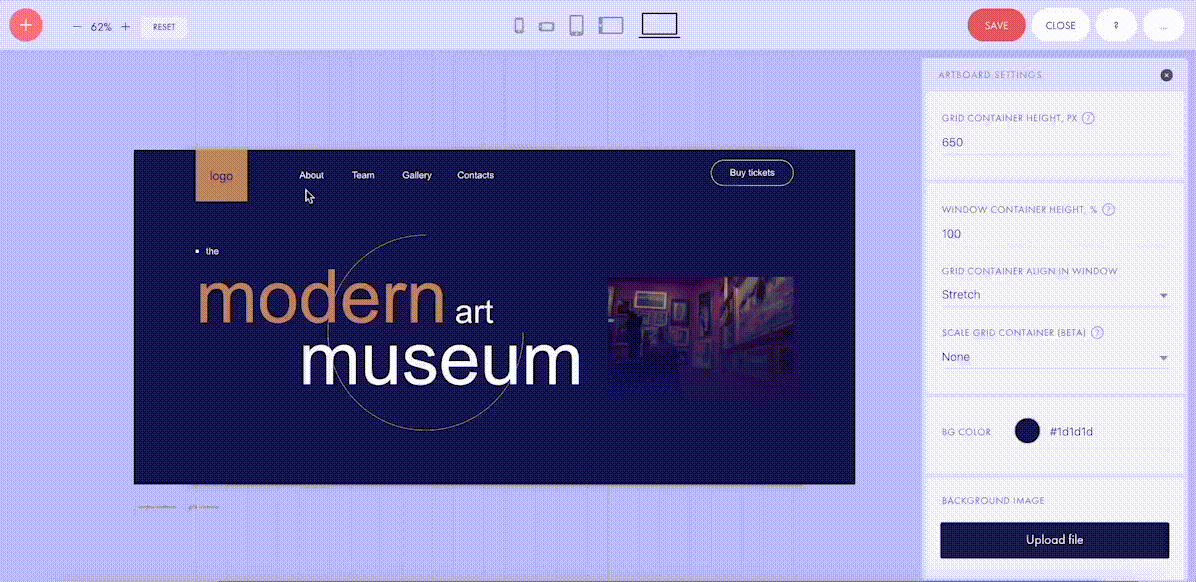
Finally, Zero Block allows you to fool around with basic and more advanced step-by-step animation for a more individual look. Here’re some animation examples that you can make on Tilda:

Animation on scroll (position of elements is changing on scroll).

Trigger animation (animation is triggered when pointing at or clicking on an object).

Infinite scrolling text.

#3 Import Designs From Figma To Tilda In Minutes

Creators love using Figma for prototyping, but when you have to transfer every element and rebuild your website design from scratch – that’s what’s killing the party. With Tilda, you can easily turn your static designs into an interactive website in no time. 

All it takes is to prepare your Figma design for import with a few easy steps, paste the Figma API token and your layout URL to Tilda, click import and let the magic happen. Once your design is imported, you can bring your project online just by clicking publish.

#4. Make Search Engines Love Your Website With Built-In SEO Optimization

Thanks to the consecutive positioning of blocks on the page, websites designed on Tilda are automatically indexed well by search engines. There is also a set of SEO parameters you can fine-tune right inside the platform to ensure that your web pages rank high even if you don’t have an SEO specialist in-house. These parameters include the title tag, description and keywords meta tags, reader-friendly URLs, H1, H2, and H3 header tags, alt text for images, and easily customizable social media snippets. 

As an additional value, Tilda provides an SEO Assistant that will show you what errors are affecting the indexing of your website and will help test the website for compliance with the search engines’ main recommendations.

#5. Turn Visitors Into Clients

Tilda gives you the power to set up data capture forms and integrate them with 20+ data capture services, such as Google Sheets, Trello, Notion, Salesforce, Monday.com, etc., to ensure seamless lead generation.

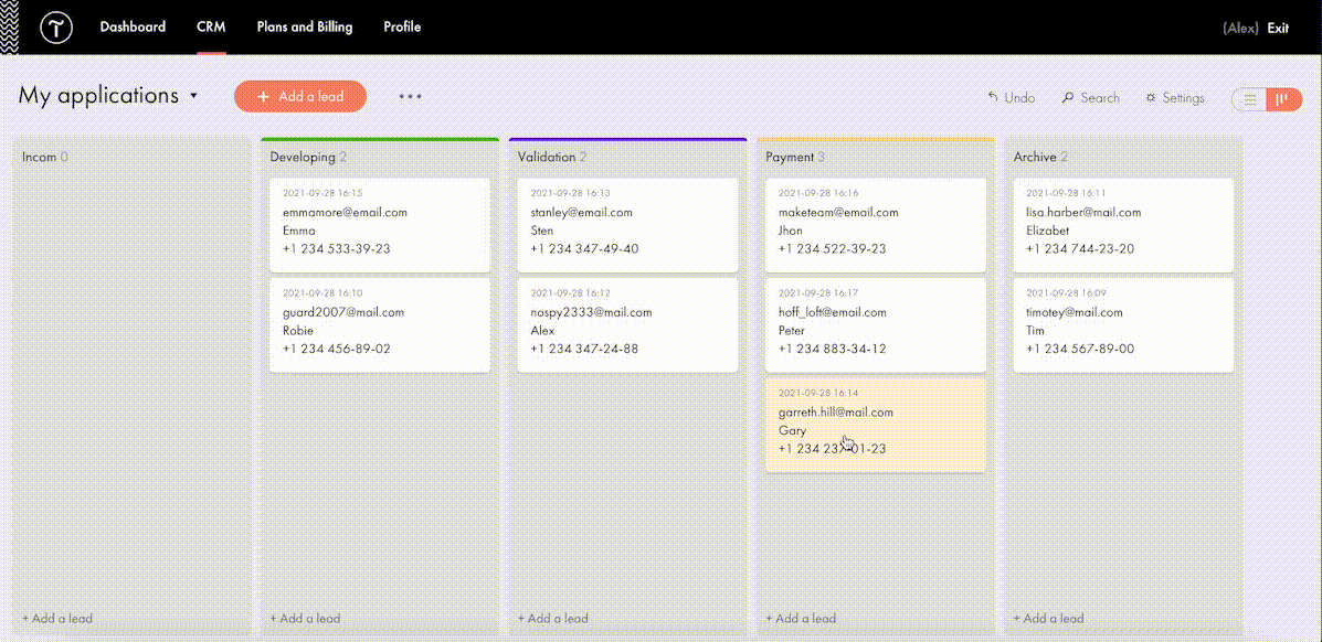
For more fun, Tilda developed its CRM to manage your leads better and keep your business organized right inside of a website builder. This is a very easy-to-use tool that automatically adds leads from forms and allows you to manually add leads you captured outside of the website. There is a kanban board that gives you an overall view of how leads are moving through your sales funnel and allows you to move leads between stages easily.

#6. Build A Powerful Online Store In One Day

Tilda provides a set of convenient features to create a remarkable online shopping experience. The platform gives you the power to sell online using ready-made templates or build an online store completely from scratch, add a shopping cart and connect a payment system of choice — Stripe, PayPal, 2Checkout, etc. — to accept online payments in any currency.

If you are looking to run a large ecommerce business, you should also consider Tilda. Thanks to the built-in Product Catalog, you can add up to 5000 items, import and export products in CSV files, easily manage stock, orders, and keep track of store stats.

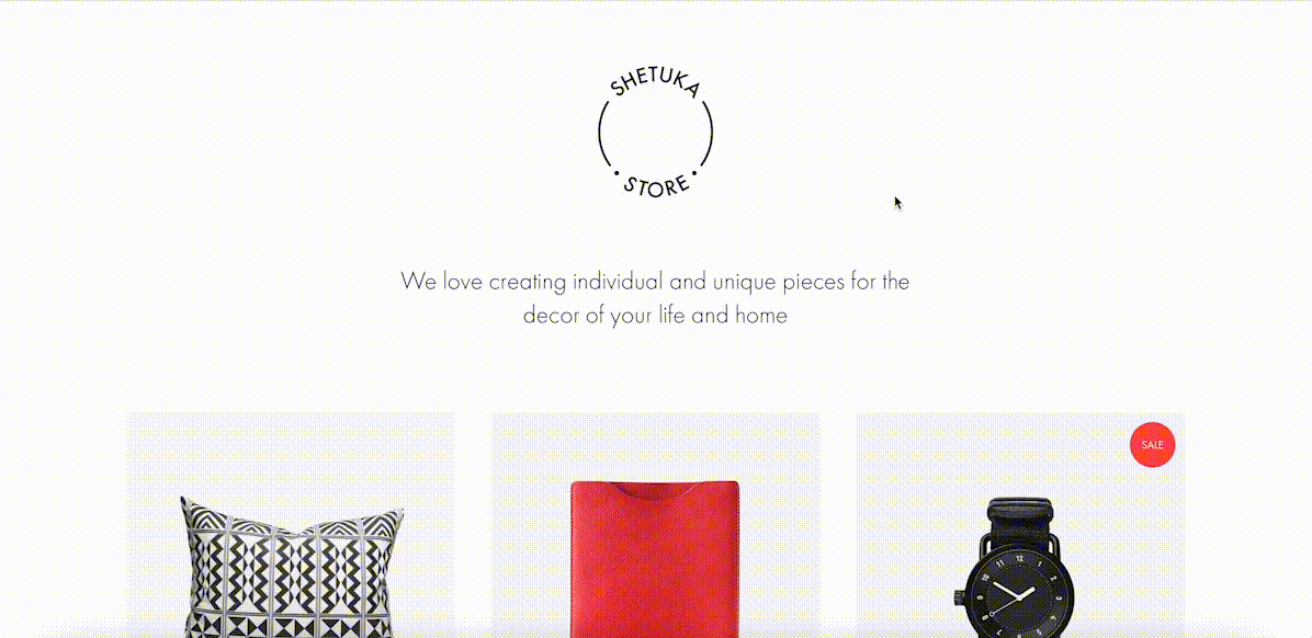
And thanks to adaptive design, your store will look good across all devices, including tablets and smartphones. 

#7. Bring Your Project Online For Free

Tilda offers three subscription plans: Free, Personal ($10/month with annual subscription), and Business ($20/month with annual subscription). When you sign up for Tilda, you get a lifetime free account. It allows you to publish a website with a free subdomain and gives you access to a selection of blocks and a limited number of features that offer enough to create an impressive website. 

Personal and Business tariffs allow more advanced options, such as connecting custom domains, adding HTML code, receiving payments, and embedding data collection forms. The business plan also allows users to export their website and create five websites (while personal and free plans allow one website per account). 

To discover all features and templates on Tilda, activate a two-week free trial – no credit card required.

Source

The post Tilda – The Website Builder That Disrupted The Way We Create Websites first appeared on Webdesigner Depot.


Source de l’article sur Webdesignerdepot

Many markets are saturated with competition; it’s no surprise that customers are expecting top-of-the-line experiences. Businesses must keep up with these ever-changing demands to remain competitive and drive forward.

One way to ensure customers have positive experiences is to take a look at your website. Your website is like your digital headquarters, where customers can browse through products or services, have frequently asked questions answered, and be able to reach you if they need direct support.

Making a site user-friendly and customer-centric will assist businesses while they work to build a loyal customer base. Customer happiness is more important now than ever and has the potential to make or break your business. We all know that happier customers spend more, and delighted customers will always come back for more.

Let’s explore some ways you can level up the customer experience on your website to foster customer loyalty and retention, as well as garner brand advocates for your business.

How Important Is CX?

As a site manager, your goal should be to meet customers’ needs. Creating a website is no simple task but can transform CX (customer experience).

Suppose a customer visits your site only to see a buffering symbol or a lag on their desktop or mobile device. This wouldn’t make for a positive experience, would it?

When customers have to spend extra time navigating your website to find what they’re looking for, it can directly lead to site abandonment, where customers leave the site before browsing. It’s vital to consistently monitor your website metrics to see if abandonment rates impact your overall traffic.

Customers who have enjoyable experiences browsing through your site are more likely to appreciate your brand and strongly consider purchasing whatever offerings you have.

Additionally, positive customer reviews can help your business gain new customers — word-of-mouth marketing is still relevant in 2021’s digital marketing landscape. Earning those 5-star reviews can help other potential customers see that they too could have a positive experience with your brand.

As you can see, CX is just as important as the products or services you offer, so keep that in mind as you set out on the journey to improve your website to advocate for your customer base.

Below, we’ll cover some of the most important elements and features of a strong business site so you can implement them.

Valuable Features to Include on Your Website

The features of your website are the foundation of your business. One of the best parts of building a killer website is that you can get as creative as you’d like with all of the features at your disposal.

Whether you use WordPress or another platform to host your website, you can always explore other paid services or offerings online to bring your site to the next level.

For example, the WooCommerce WordPress extension allows e-commerce sites to improve the overall appearance of their site, add customizations and, generally speaking, create a high-quality e-commerce store.

Below are some examples of elements you should consider incorporating into your web design. Offering these features will surely keep your site visible, relevant, and attractive to all types of customers.

1. Add Personalization

Every type of customer can benefit from a personalized experience, and it helps you turn them into loyal customers.

Personalization is becoming more prevalent in web design, whether it’s including past products they’ve viewed on your landing page or making it simple for them to log in to their account.

Maybe you allow your customers to create a wishlist, just as Amazon does. You could also make personalized deals or recommendations for your customers based on their past purchases or search history. When customers see this level of personalization, it may influence their purchasing decisions and make it simpler for them to order products.

2. Include Compelling and Unique Content

Every professional in the digital marketing space knows that content is king. The companies that include the most compelling content garner the most attention and increase the number of customers who make up their customer base. Here are some examples of what your content should look like:

  • Comprehensive
  • Useful
  • Accurate
  • Visually appealing
  • Helpful
  • A direct answer to a search engine query

By following these descriptions, your content will improve. Whether it’s a blog post or a photo or video, quality content is a driving factor in your user engagement. It helps to support your SEO strategy and will undoubtedly keep customers coming back.

3. Prioritize Speed and Usability

Because technology is an integral part of most people’s lives, customers expect to visit a fast, reliable website. No longer will customers wait patiently for a site to load. The dreaded buffering symbol is a clear indicator that your business is not taking customer experience into account.

It’s critical to create a website that loads quickly and is easy to use. Avoid organizing any tabs in a confusing way. Ensure that your website is visually attractive without overwhelming color schemes or photos that take up too much space.

Go for a more modern, contemporary look that’s easy on the eyes. Customers will appreciate this and will likely spend more time browsing your various website pages.

4. Focus on Navigation

Users should be able to access any page on your website with ease. They shouldn’t have to search for the right drop-down menu or type into the search bar unless they’re searching for a specific product or service.

The majority of users on a site, 70% to be exact, spend most of their time navigating freely without using the search bar. This should tell you how vital good navigation is to your business website. Placing menus on the top of your site is common practice — if you would rather place your drop-down menu somewhere else, make sure you’re putting it in a section where it’s easy to find.

Put yourself in your customers’ shoes. See what types of designs you can incorporate into your site to elevate UX and make browsing simple.

5. Make Sharing Simple

One of the best ways to grow your customer advocates is by leveraging your existing customers. Your customers should be able to easily send your product or service descriptions to their friends and family.

Rather than copying a link, include a share feature. If something on your site is worth sharing with other potential customers, make it easy for them to send it.

Social sharing plays a significant role in digital marketing — it helps to garner organic traffic to your website. You can reach a larger number of people than originally intended, which is the most important benefit to reap by making it easy to share links from your site.

6. Incorporate Chatbots

Offering customer support by using chatbots is something major companies are incorporating into their website designs.

Suppose your customer is trying to complete a purchase but runs into a problem with a coupon they’d like to use. Rather than wait on hold on the phone or for an email in their inbox a few days later, an automated chatbot can step in and assist them.

Chatbots are on the rise, and it’ll be critical for your business to include them on your site. Proactive web actions can increase your site’s conversion rates and improve the overall customer experience.

7. Allow Customer Feedback

It shouldn’t come as a surprise that allowing your customers to share their experience with your brand can help you better understand them and the solutions they’re looking for from you.

Did you know that brands with superior customer service can generate 5.7 times more revenue than their competitors? When you’re in touch with your audience, you’re better able to include features they want and need to have a positive experience. By taking advantage of customer feedback, you can make necessary changes to your site to better serve your customers.

Advocate for Your Customer Base

All of the examples listed above can help elevate your site and improve the overall experience for existing and potential customers. Isn’t that the goal of any business, regardless of industry?

To serve your customers effectively means they’ll feel valued and come back for more. Whether that’s ordering more products or requesting more services, you’ll see the benefits of including the elements we’ve covered in this post.

As a recap, here are some steps you can take to advocate for your loyal customers:

  1. Add personalization
  2. Include unique content
  3. Make your site fast and usable
  4. Provide easy navigation
  5. Allow for easy sharing
  6. Leverage chatbots
  7. Be open to feedback

Overall, customer experience will become more important in the future as customer expectations change. Standing out from your competitors is no longer an option but a necessity. So many markets are struggling to do just that — so if you’re able to offer unique features on your site, it could potentially draw more customers in and drive them to purchase.


Featured image via Unsplash.

Source

The post 7 Simple Ways to Boost Your Website’s CX first appeared on Webdesigner Depot.


Source de l’article sur Webdesignerdepot


3D buttons

Recently I was toying with the idea of a 3D button that moves as the user moves their mouse around it. To further this effect, I added some 3D shadows which move in tandem to give the illusion of a 3D button that is sitting off the page and moves with the user’s mouse movements.

Demo


How Does It Work?

The fundamental concept behind these buttons is that we need to track when the user mouses over the button, moves, and mouses out. On mouseover, we will move the button so it appears 3D. On mouse out, we will reset it.

Source de l’article sur DZONE

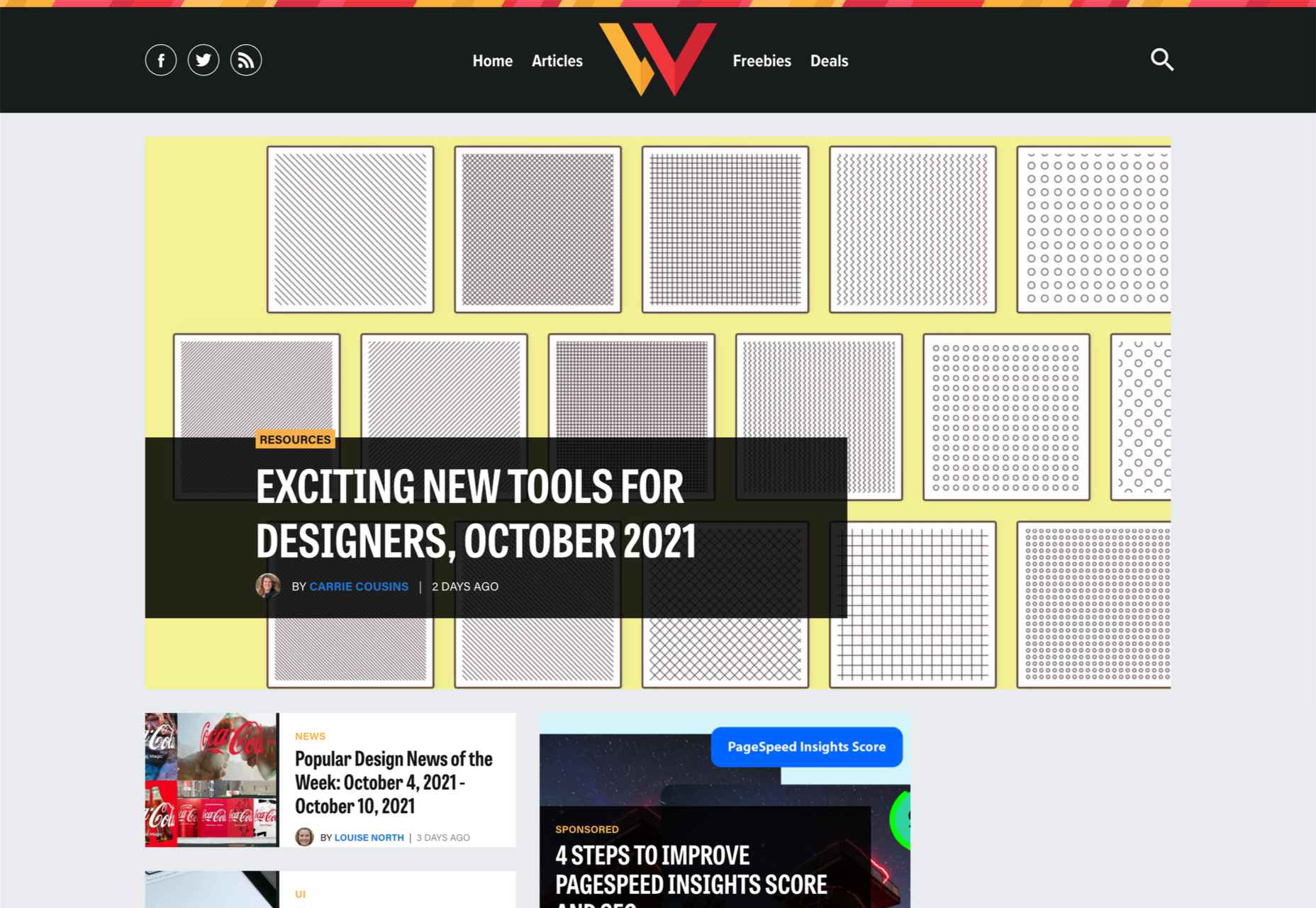
There are some spook-tacular finds in this month’s October collection of resources and tools for designers and developers. From interesting tools that can help in the design process to boo-tiful typefaces, there’s something for everyone here.

Here’s what is new for designers this month…

Atropos

Atropos is a lightweight, open-source JavaScript library to create touch-friendly, three-dimensional hover effects. The results are stunning and have a nice parallax style. Everything is highly configurable and customizable. It’s available for JavaScript, React, and Vue.js and has zero dependencies.

CSS Gradient Editor

CSS Gradient Editor helps you create the perfect gradient style – you can start from presets – that you can use in projects. Design a background, fill, or almost any other gradient element you might need, make adjustments or customizations, and then get the CSS with one click so you can use it right away.

Octopus.do

Octopus.do is a fast visual sitemap builder that lets you work in real-time using the content brick method. Share and collaborate in real-time and there’s no signup required to use it.

Pirsch Analytics

Pirsch Analytics is a privacy-friendly, open-source alternative to Google Analytics — lightweight, cookie-free, and easily integrated into any website or directly into your backend. It includes filters to see metrics in the way you want and light and dark modes.

Basic Pattern Repository

Basic Pattern Repository is a collection of simple SVG patterns for projects. Everything is rooted in a simple style to help push projects along quicker. You can get it via GitHub or as a Figma Library.

Blobr

Blobr is a way to get a branded API portal, manage access, and monitor usage all in one place. Customize everything to fit your brand and the tool grows as you do with the ability to increase or change capacity. Plus, it is easy to set up and free to use.

HEXplorer

HEXplorer helps you better understand something you use all the time – HEX colors. This pen by Rob DiMarzo shows how the values for different colors come together to provide greater comprehension when it comes to this color format.

CCCreate

CCCreate is a curated collection of tools and resources for web creators. It includes some tools that have been around for a while as well as some newbies. Everything is grouped and sorted by type of resources – color, icons, type, layouts, animation, shapes, docs, and miscellaneous so you can find what you are looking for faster.

Glass

Glass is a photo-sharing app for photographers. It’s a social network of sorts that lets you share images with the greater photography community without “likes.” Just great images.

Revolt

Revolt is a chat app that’s still in beta and designed for easy communication without having to download apps. It’s an open-source project that is customizable and with an intuitive and recognizable interface. The thing that’s different about this app is that it is built on a privacy-first model.

Doodle Ipsum

Doodle Ipsum is the illustrated version of placeholder elements. Customize your doodles, grab the code, and use them on your web prototypes, landing pages, or no-code tools.

Mechanic

Mechanic is an open-source framework that helps you create custom, web-based tools that export design assets in your browser. The best part is you can try it right on screen using the “poster generator.” If you like what you see, there’s plenty of documentation to help you along the way.

Medio Website Template

Medio is an agency-style website design template for Bootstrap 5. The layout is perfect for a design agency or marketing group but can be adjusted for almost any multi-purpose design. The free template includes a minimal design and includes features such as parallax, popup video, and more.

Tutorial: Simplifying Form Styles with Accent Color

This tutorial is a life-saver when it comes to using and understanding the new CSS accent-color property. This quick lesson will help make your life easier and is simple to use. It starts with setting an accent-color property on the root element and then applying it.

Houdini.how

Houdini.how is a worklet library that is full of CSS and code examples to help you work smarter. See how different elements look cross-browser and learn to adjust the code and put them together in just the way you want. Houdini is a set of low-level APIs that exposes parts of the CSS engine, giving developers the power to extend CSS by hooking into the styling and layout process of a browser’s rendering engine.

Chainstarters

Chainstarters is a powerful, rapid, Web3-enabled platform for software developers. It eliminates the burden of setting up and maintaining a secure and scalable infrastructure, allowing you to focus on creating amazing technology.

Web Vitals Robot

Web Vitals Robot is a search optimization tool that monitors SEO metrics for you – so you can prevent your business from disappearing from Google.

Searchable

Searchable is a unified search tool that looks at local, cloud storage, and apps to find the files you are looking for. It returns results in a jiffy with previews so you don’t have to open every file to find what you are looking for.

Athlone

Athlone is a fun serif with lots of personality. The free demo version includes a limited character set for personal use only and the full version has everything you need for fun display or branding with this typeface.

Capitana

Capitana is a Geometric Sans typeface with humanistic proportions and open apertures. This means that all shapes are constructed from basic forms, the circle, triangle, and square, and are designed according to the classic proportions of the Roman Antiqua. Distinct ascenders and pointed apexes with deep overshoot give it a cool beauty and classic elegance. It includes 784 characters per style in nine weights from Thin to Black, it offers both light and extremely heavy weights for striking headlines.

Colours

Colours is a funky script with just enough texture to keep it interesting. The free version includes a partial character set and is for personal use only.

Flexible

Flexible is a variable typeface that includes 18 styles in the family. It’s made for creativity and display use. This typeface is made for experimenting because there are so many things you can do with this single family.

Singo Sans Serif

Singo Sans Serif is a simple and strong typeface that would make an excellent display option. The free version is for personal use only. Fun fact: Singo means Lion in Indonesia, which is where the name of this strong font comes from.

Source

The post Exciting New Tools For Designers, October 2021 first appeared on Webdesigner Depot.


Source de l’article sur Webdesignerdepot

One of the core things I’ve been working on for the past 10 years is APIs — everything from simple APIs that are used by one client to multi-device and multi-purpose APIs. During those years, I’ve also had the opportunity to work with many third-party APIs like Stripe, Twilio, and others who are less popular and glamorous. Almost all of those APIs were REST-based and unique in some way. 

There are many reasons why REST is so popular. It’s simple to understand, it’s flexible, it works on any scale, it has a great community and tools built around it. But besides those, I’d also say that a lot of popularity came from the fact that’s its oldest rival, SOAP, is just horrible.

Source de l’article sur DZONE

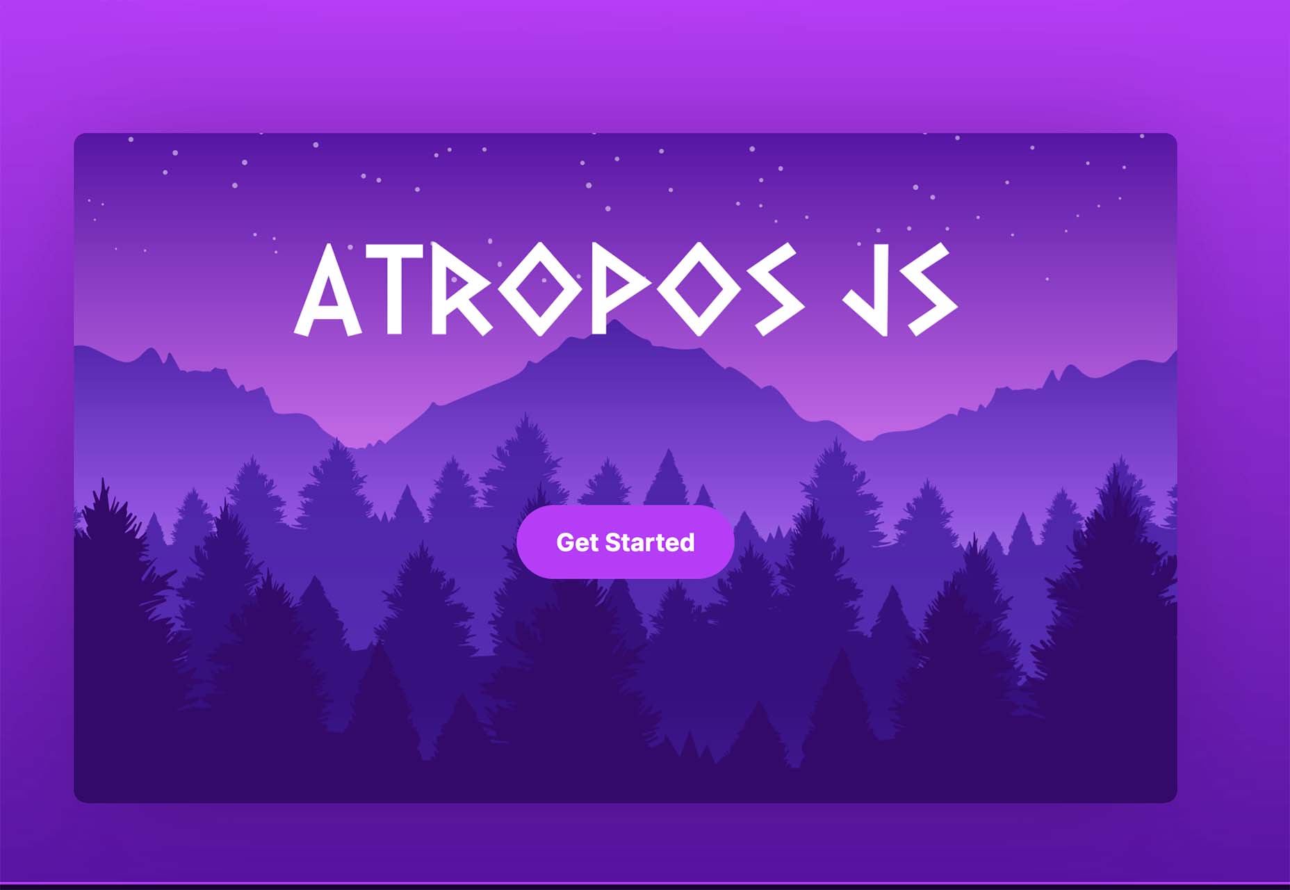
User experience is one of the most important principles of web design. There’s no doubt that you focus on UX with every page you design on the web, whether it’s
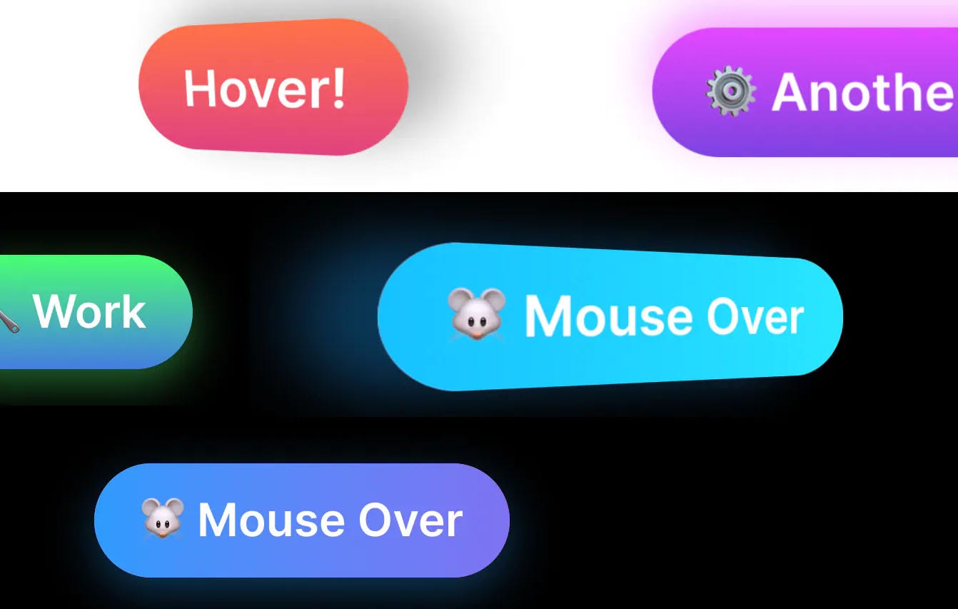
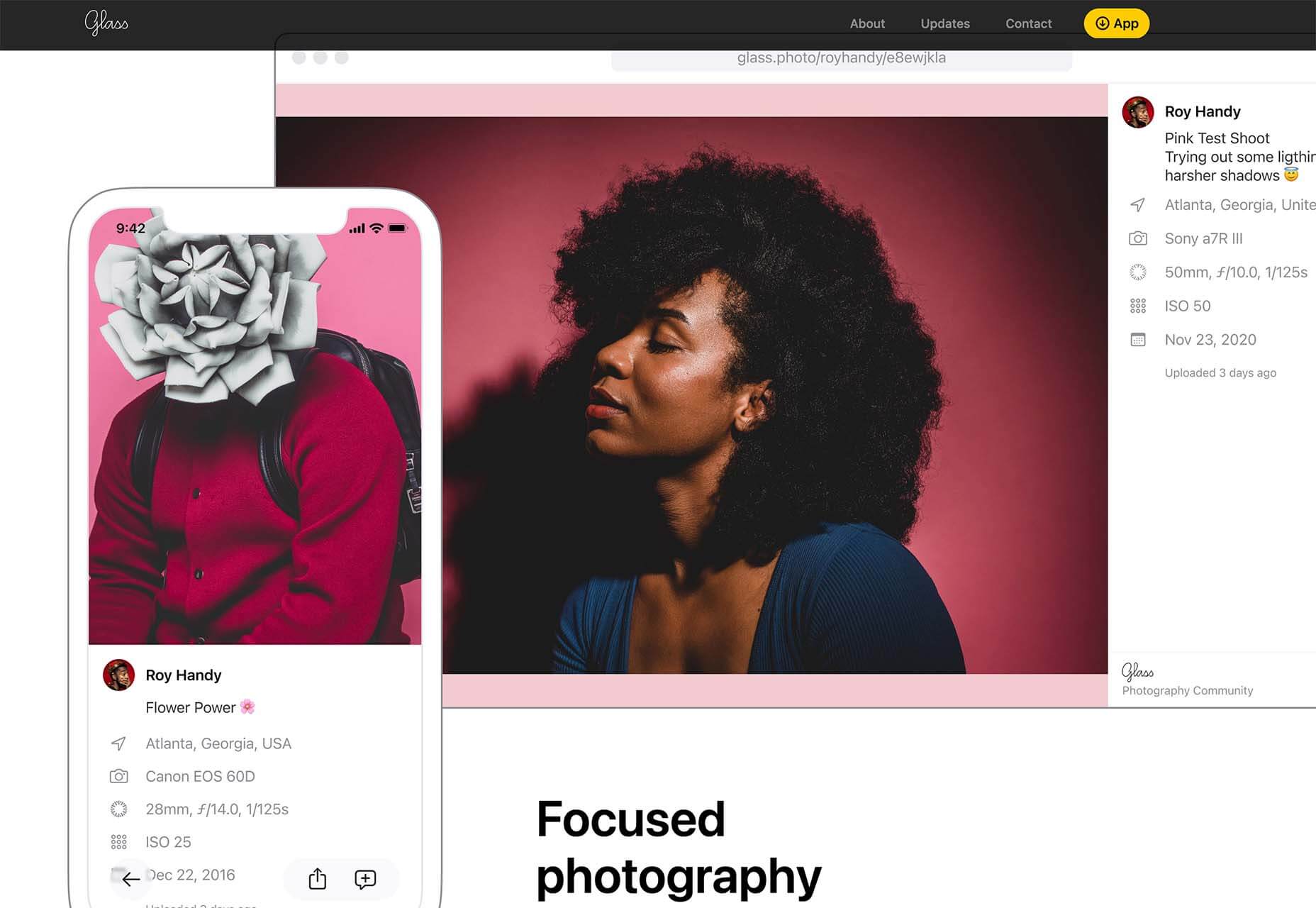
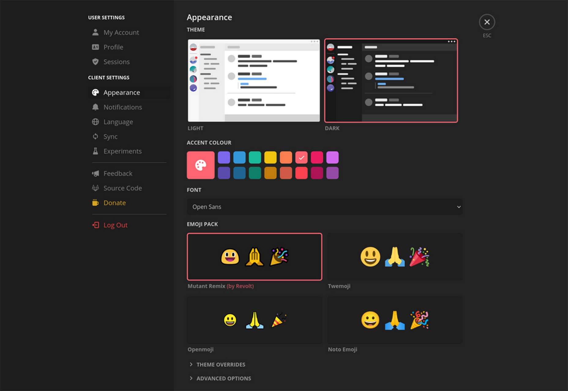
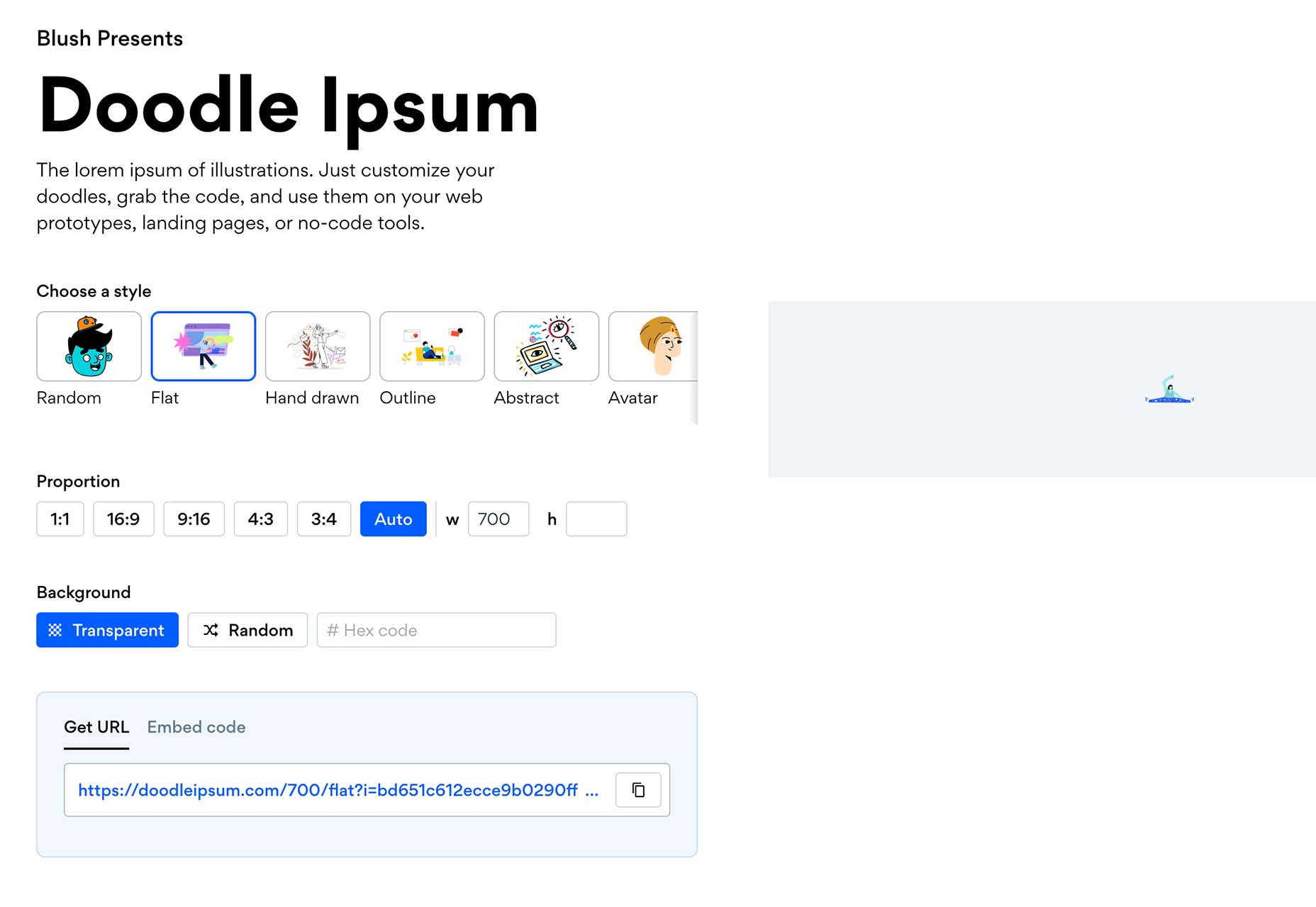
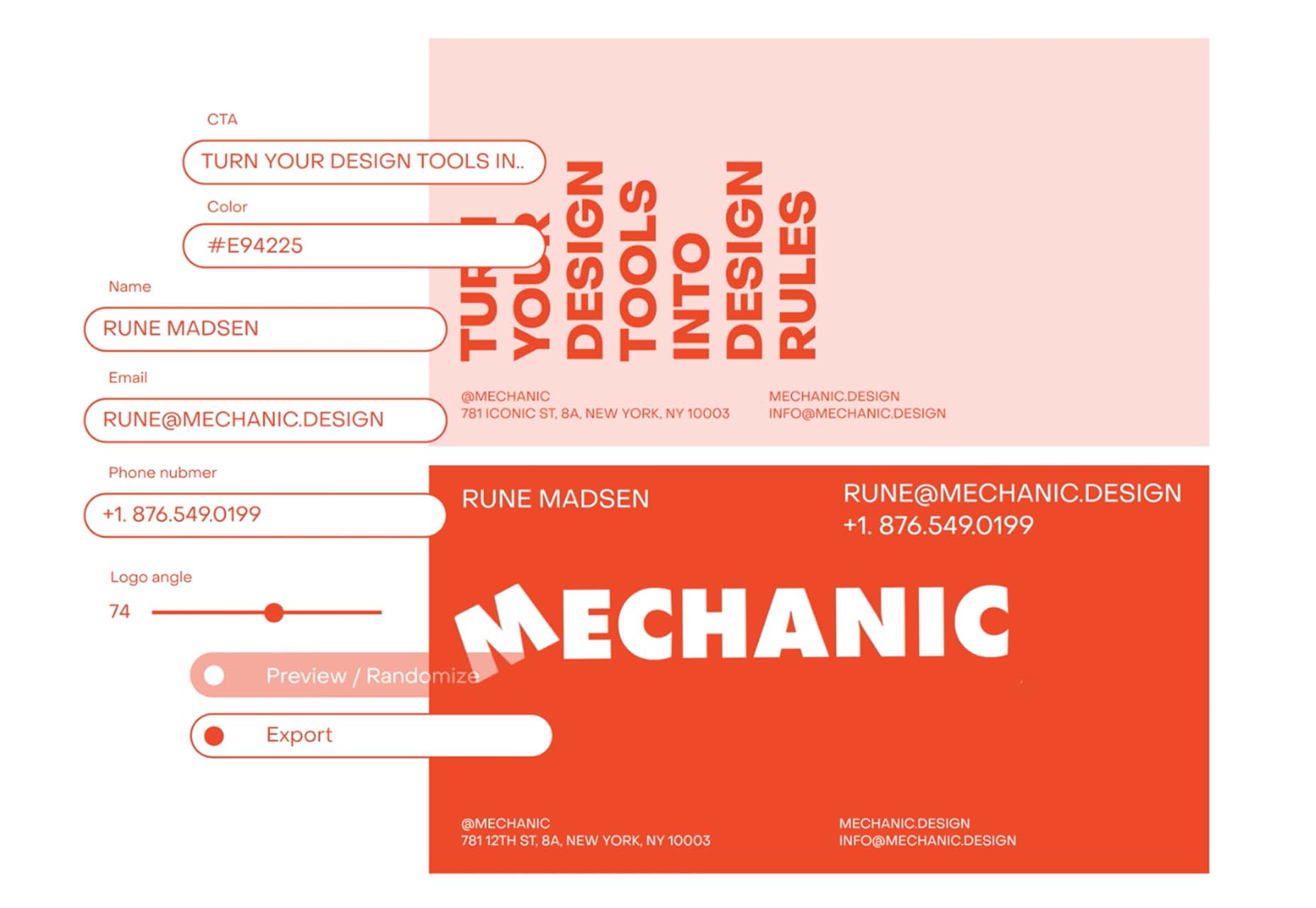
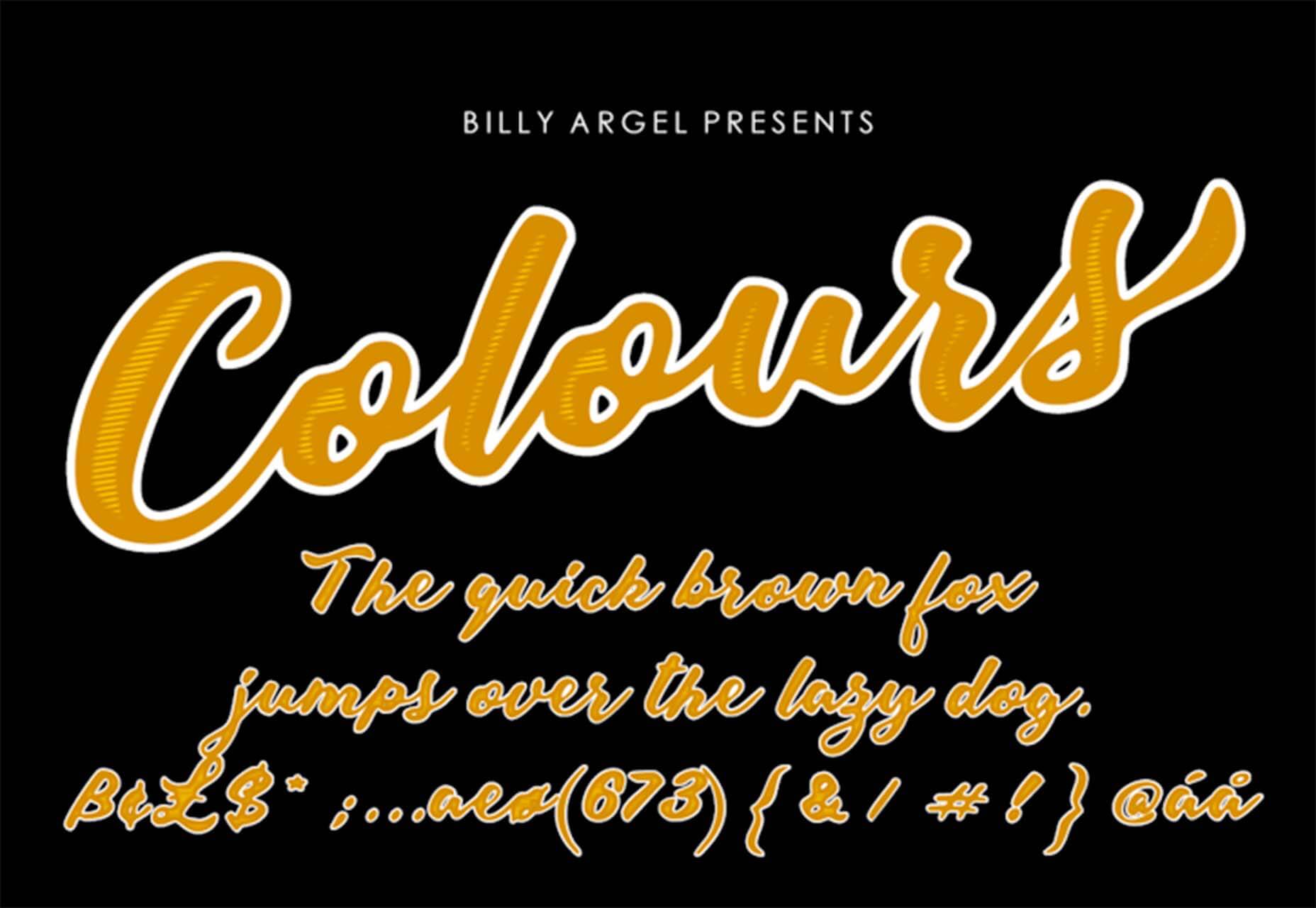
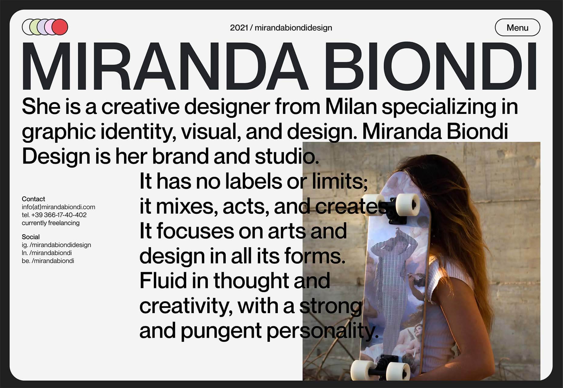
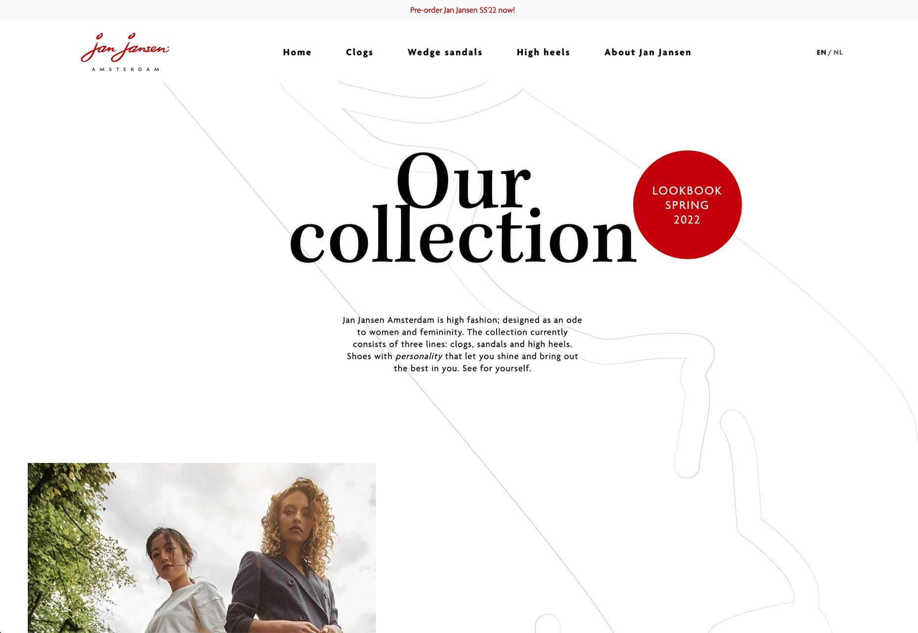
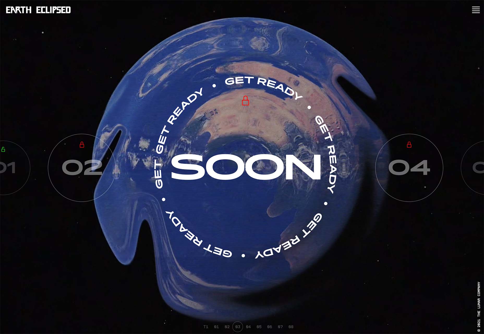
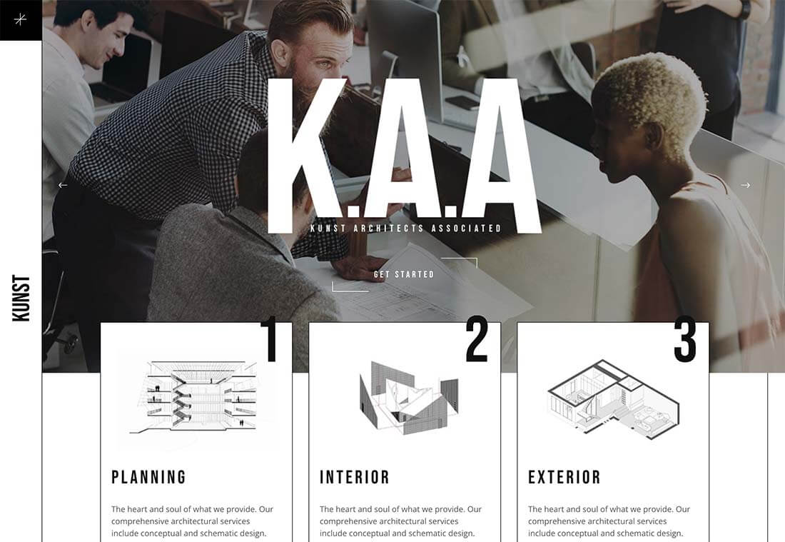
 a portfolio, a profile page, or an entire website. 

Unfortunately, what many experts forget is that UX doesn’t just apply to digital pages. That means that you need to discover the right UX strategies for everything from your website homepages to your email marketing messages and even your listings on Google. 

Today, we’re going to explore ways you can apply UX principles to your client’s image on search engines. 

Why Your Search Engine Listing Matters

Let’s start with the basics…

89% of customers start their purchasing process with a search engine. 

That means that whether you’re creating a portfolio to sell your services or building a website for a client, the first connection a customer has with your design isn’t on the homepage.

Developers and designers know that first impressions count when it comes to succeeding online. However, they assume that those first impressions happen on a social media channel, a landing page, or a home page. 

The truth is that most of the time, you’re driving a specific experience for an end-user before you even realize it. Before you can wow an audience with a beautiful site design or a fantastic CTA offer, you need to convince them to click on your Google link.

Just as UX on a website is all about giving your audience what they need in an informed and strategic manner, UX in search engine results works the same way. 

How to Make Your Search Listing Stand Out with UX

So, how do you begin to apply the principles of UX to your Google Search results?

It’s much easier than you’d think. 

Step 1: Show Immediate Value 

Delivering an excellent experience on a website often means providing end-users with the information they need as quickly as possible. Imagine designing a landing page; you wouldn’t want your audience to scroll forever to find what they need. Instead, you’d make sure that the value of the page was immediately apparent. 

When creating an image for your search engine listing, you’ll need to take the same approach. This often means thinking carefully about two things:

  • Your headline
  • Your meta description

Around 8 out of 10 users say that they’ll click a title if it’s compelling. That means that before you do anything else to improve your SEO strategy, you need to make sure that the title of your web page is going to grab the audience’s attention. 

The best titles deliver instant value.

Immediately, these titles tell the audience exactly what they’re going to get when they click onto the page. The promise drives action, while clarity highlights the informed nature of the brand. 

The great thing about using an excellent title for a page is that it doesn’t matter where you’re ranked on the search results. Whether you’re number 2 or number 5, your customers will click if they find something they want. 

It’s just like using a CTA on a landing page. Make sure your titles are:

  • Informative: Show your audience value immediately
  • Optimized for mobile: Remember, your audience might not see your full title on some screens. That means that you need to make the initial words count.
  • Easy to read: Keep it short, simple, and straightforward. Speak the end-user’s language

Step 2: Build Trust with Your URLs

Trust factors are another essential part of good UX

When designing a website for a new brand, you know that it’s your job to make visitors feel at ease. Even in today’s digital world, many customers won’t feel comfortable giving their money or details to a new company. 

Within the website that you design, you can implement things like trust symbols, reviews, and testimonials to enhance brand credibility. In the search engines, it all starts with your URL. 

Search-friendly URLs that highlight the nature of the page will put your audience’s mind at ease. When they click on a page about “What is SEO” in the SERPs, they want to see an URL that matches, not a bunch of numbers and symbols

Use search-friendly permalink structures to make your listing seem more authoritative. This will increase the chances of your customer clicking through to a page and make them more likely to share the link with friends. 

Once you decide on a link structure, make sure that it stays consistent throughout the entire site. If a link doesn’t appear to match the rest of the URLs that your audience sees for your website, they may think they’re on the wrong page. That increases your bounce rate. 

Step 3: Be Informative with Your Meta Description

To deliver excellent UX on a website, you ensure that your visitor can find all the answers to their most pressing questions as quickly as possible. This includes providing the right information on each page and using the correct navigational structure to support a visitor’s journey. 

In the SERPs, you can deliver that same informative experience with a meta description. Although meta descriptions often get ignored, they can provide a lot of value and help you or your client make the right first impression. 

To master your meta descriptions:

  • Use the full 160 characters: Make the most of your meta description by providing as much useful information as you can within that small space. 
  • Include a CTA: Just as CTAs help guide customers through the pages on a website, they can assist with pulling in clicks on the SERPs. A call to action like “read about the” or “click here” makes sense when you’re boosting your search image. 
  • Focus on value: Concentrate on providing your customers with an insight into what’s in it for them if they click on your listing.

Don’t forget that adding keywords to your meta description is often helpful too. Keywords will boost your chances of a higher ranking, but they’ll also show your audience that they’re looking at the right result. 

Step 4: Draw the Eye with Rich Snippets

You’ve probably noticed that the search engine result pages have changed quite a bit in the last couple of years. As Google strives to make results more relevant and informative, we’ve seen the rise of things like rich snippets. Rich snippets are excellent for telling your audience where to look. 

On a website, you would use design elements, like contrasting colors and animation, to pull your audience’s attention to a specific space. In search engines, rich snippets can drive the same outcomes. The difference is that instead of telling a visitor what to do next on a page, you’re telling them to click on your site, not a competitor’s. 

When Google introduced rich snippets, it wanted to provide administrators with a way of showcasing their best content. Rich snippets are most commonly used today on product and contact pages because they can show off reviews. 

Install a rich snippet plugin into your site if you’re a WordPress user or your client is. When you enter the content that you need into the website, use the drop-down menu in your Rich snippet tool to configure the snippet.

Ideally, you’ll want to aim for the full, rich snippet if you want to stand out at the top of the search results. Most featured snippets have both text and an image. You need to access both of these by writing great content and combining it with a relevant image. 

Step 5: Provide Diversity (Take Up More of the Results)

As a website designer or developer, you’ll know that different people will often be drawn to different things. Some of your visitors might immediately see a set of bullet-points and use them to search for the answer to their question. Other visitors will want pictures or videos to guide them. So, how do you deliver that kind of diversity in the SERPS?

The easiest option is to aim to take up more of the search result pages. Google now delivers a bunch of different ways for customers to get the answers they crave. When you search for “How to use Google my Business” on Google, you’ll see links to blogs, as well as a list of YouTube Videos and the “People Also Ask” section. 

Making sure that you or a client has different content rankings for the same keywords can significantly improve any customer’s experience on the search engines. Often, the process of spreading your image out across the SERPs is as simple as creating some different kinds of content. 

To access the benefits of video, ask your client to create YouTube videos for some of their most commonly asked questions or most covered topics. If you’re helping with SEO marketing for your client, then make sure they have an FAQ page or a way of answering questions quickly and concisely on articles, so they’re more likely to appear in “People Also Ask”.

Step 6: Add Authority with Google My Business

Speaking of Google My Business, that’s another excellent tool for improving UX in the search results. It allows business owners to manage how information appears in the search results. 

With this service, you can manage a company’s position on Google maps, the Knowledge Graph, and any online reviews. Establishing a company’s location is one of the most important things you can do to help audiences find a business quickly. Remember, half of the customers that do a local search on a smartphone end up visiting the store within the same day. 

Start by setting up the Google Business listing for yourself or your client. All you need to do is hit the “Start Now” button and fill out every relevant field offered by Google. The more information you can add to Google My Business, the more your listing will stand out. Make sure you:

  • Choose a category for a business, like “Grocery store.”
  • Load up high-quality and high-resolution images
  • Ensure your information matches on every platform
  • Use a local number for contact
  • Encourage reviews to give your listing a five-star rating

Taking advantage of a Google My Business listing will ensure that your audience has all the information they need to make an informed decision about your company before they click through to the site. This means that you or your client gets more warm leads and fewer people stumbling onto your website that might not want to buy from you. 

Step 7: Use Structured Data Markup to Answer Questions

If you’re already using rich snippets in your Google listings, you should also have a plan for structured schema markup. Schema markup on Google tells the search engines what your data means. This means that you can add extra information to your listings that will more accurately guide your customers to the support they need. 

Providing additional schema markup information to your listings gives them an extra finishing touch to ensure that they stand out from the competition. For example, you might add something like a “product price” to a product page or information about the product’s availability.

Alternatively, you could provide the people who see a search result with other options. This could be an excellent option if you’re concerned that some of the people who might come across your listing might need slightly different information. 

For instance, you can ask Google to list other pages along with your search results that customers can “jump to” if they need additional insights.

Baking structured data into your design process when you’re working on a website does many positive things. First, it makes the search engine’s job easier so that you can ensure that you or your client ranks higher. Additionally, it means that your web listings will be more thorough and valuable.

Since UX is all about giving your audience the best possible experience with a brand, that starts with making sure they get the information they need in the search results. 

Constantly Improve and Experiment

Remember, as you begin to embed elements of UX into your search engine listings, it’s essential to be aware of relevant evolutions. Ultimately, the needs of any audience can change very rapidly. Paying attention to your customers and what kind of links they click on the most will provide you with lots of valuable data. You can use Google analytics to A/B test things like titles, pictures, featured snippets, and other things that may affect UX. 

At the same time, it’s worth noting that the Google search algorithms are constantly changing too. Running split tests on different pages will give you an insight into what your customers want. However, you’ll need to keep an eye on the latest documentation about Google Search if you want to avoid falling behind the competition. 

Like most aspects of exceptional UX, mastering your SERP position isn’t a “set it and forget it” strategy. Instead, you’ll need to work on constantly expanding your knowledge if you want to show clients that you can combine UX and SEO effectively. 

Make sure you have plenty of tools set up to offer reports and insights into the kind of changes that you may need to make to align with search engine expectations. 

Making the Most of UX in the SERPS

It’s easy to forget that there’s more to UX than making your buttons clickable on mobile devices or ensuring that scrolling feels smooth. For a designer or developer to deliver excellent UX for a brand, they need to consider every interaction that a company and customer has. 

This means starting with the way a website appears when it’s listed on the search engines most of the time. Getting your SEO listing right doesn’t just boost your chances of a good ranking. This strategy also improves your reputation with your audience and delivers more meaningful moments in the buyer journey. 

Don’t underestimate the power of UX in SERPs. 


Featured image via Pexels.

Source

The post 7 UX Principles to Boost SERPs first appeared on Webdesigner Depot.


Source de l’article sur Webdesignerdepot

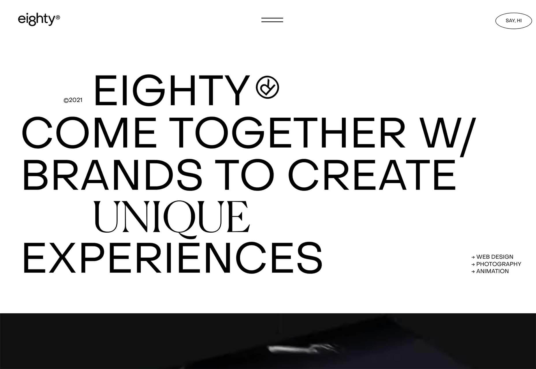
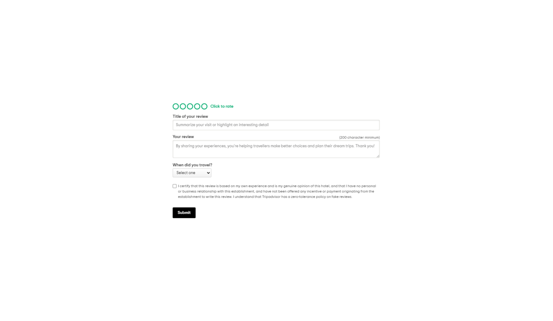
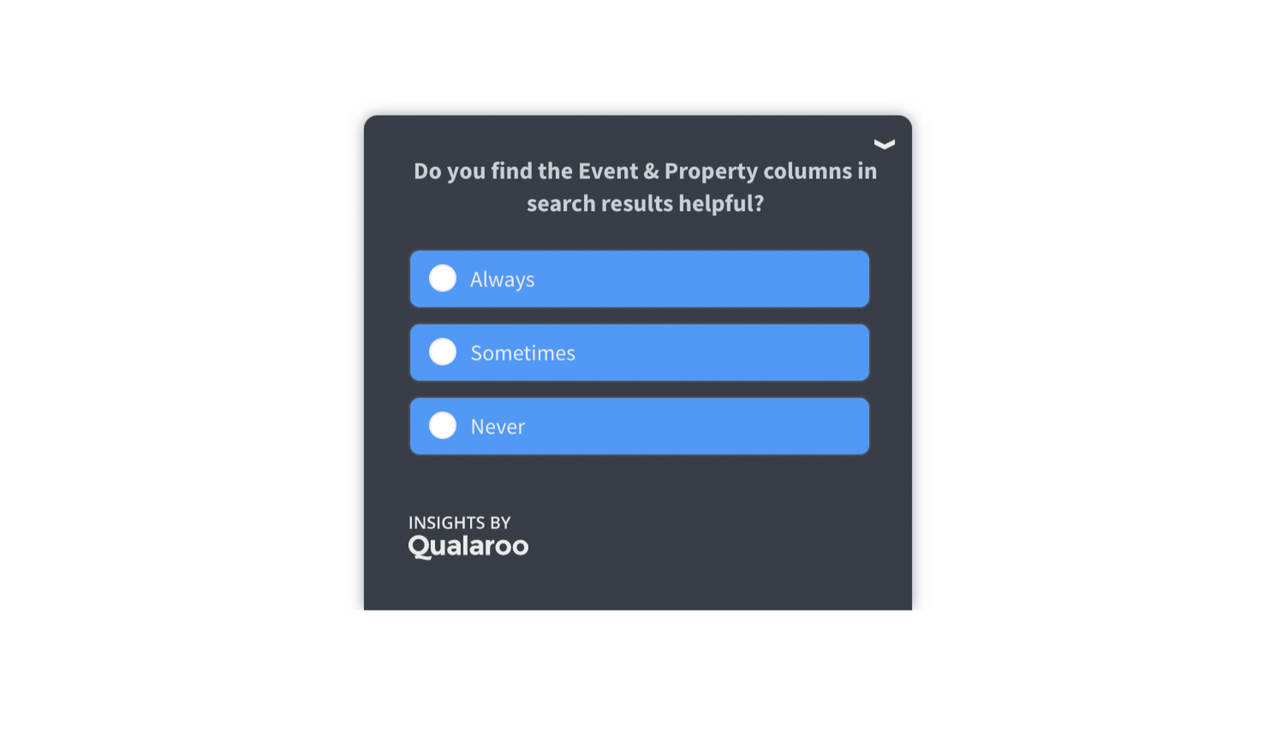
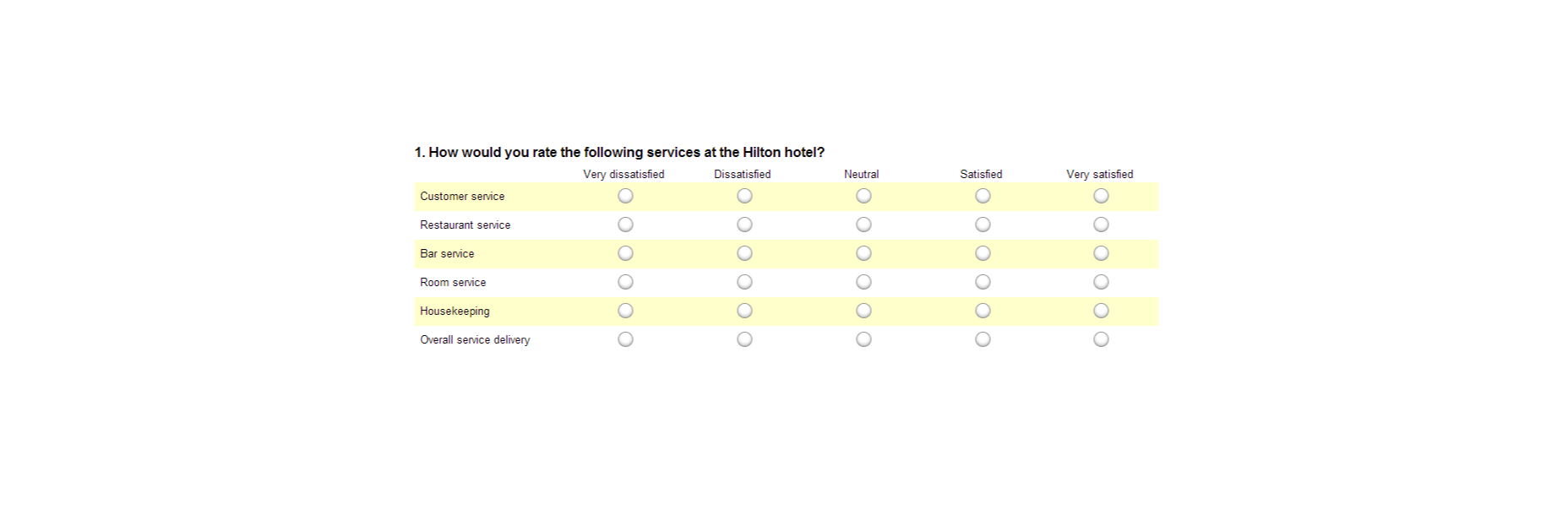
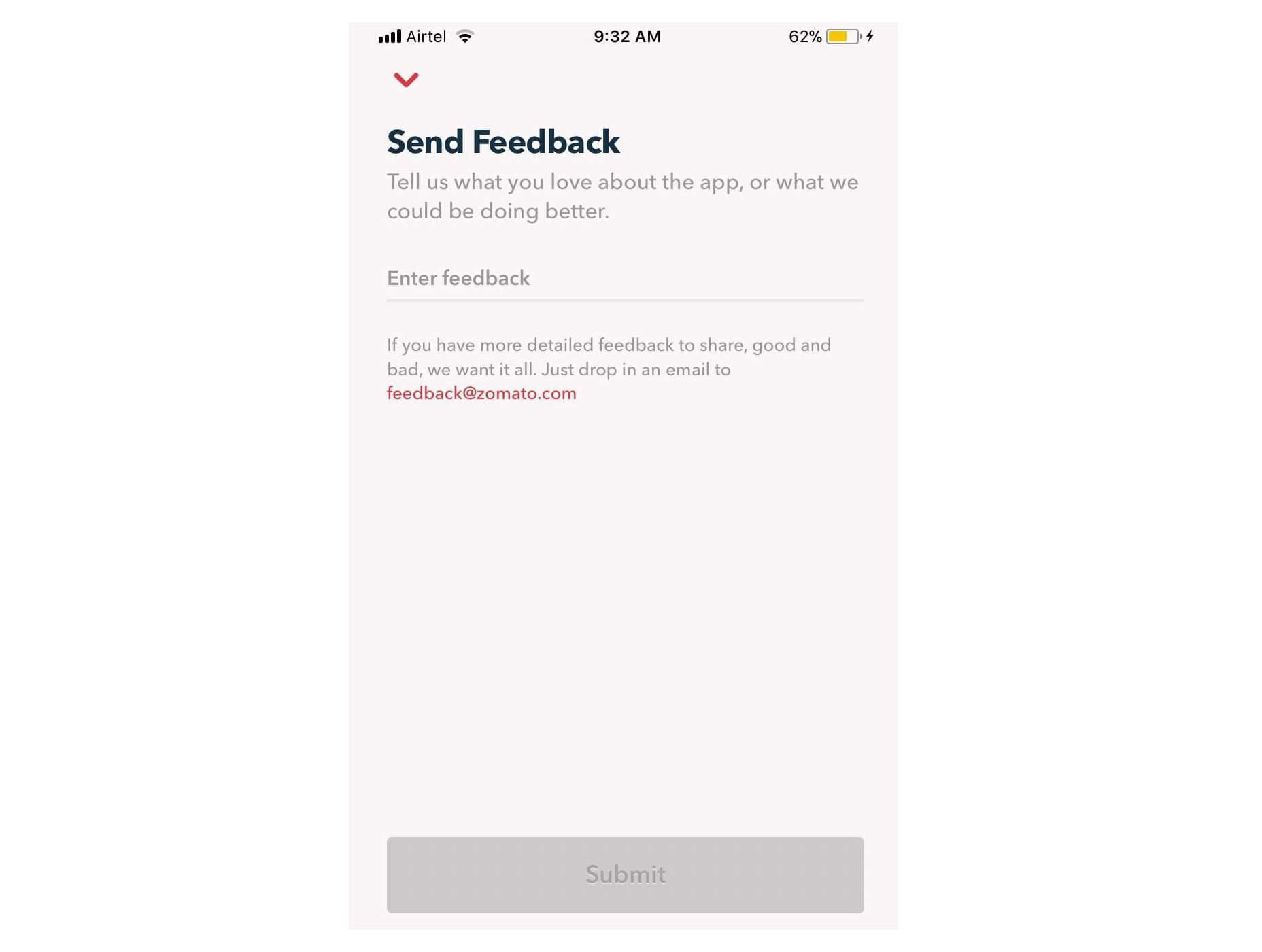
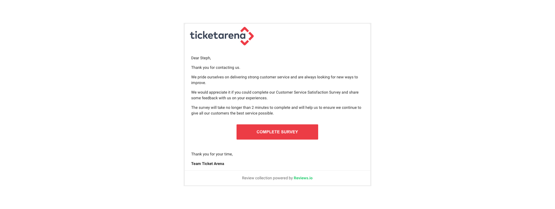
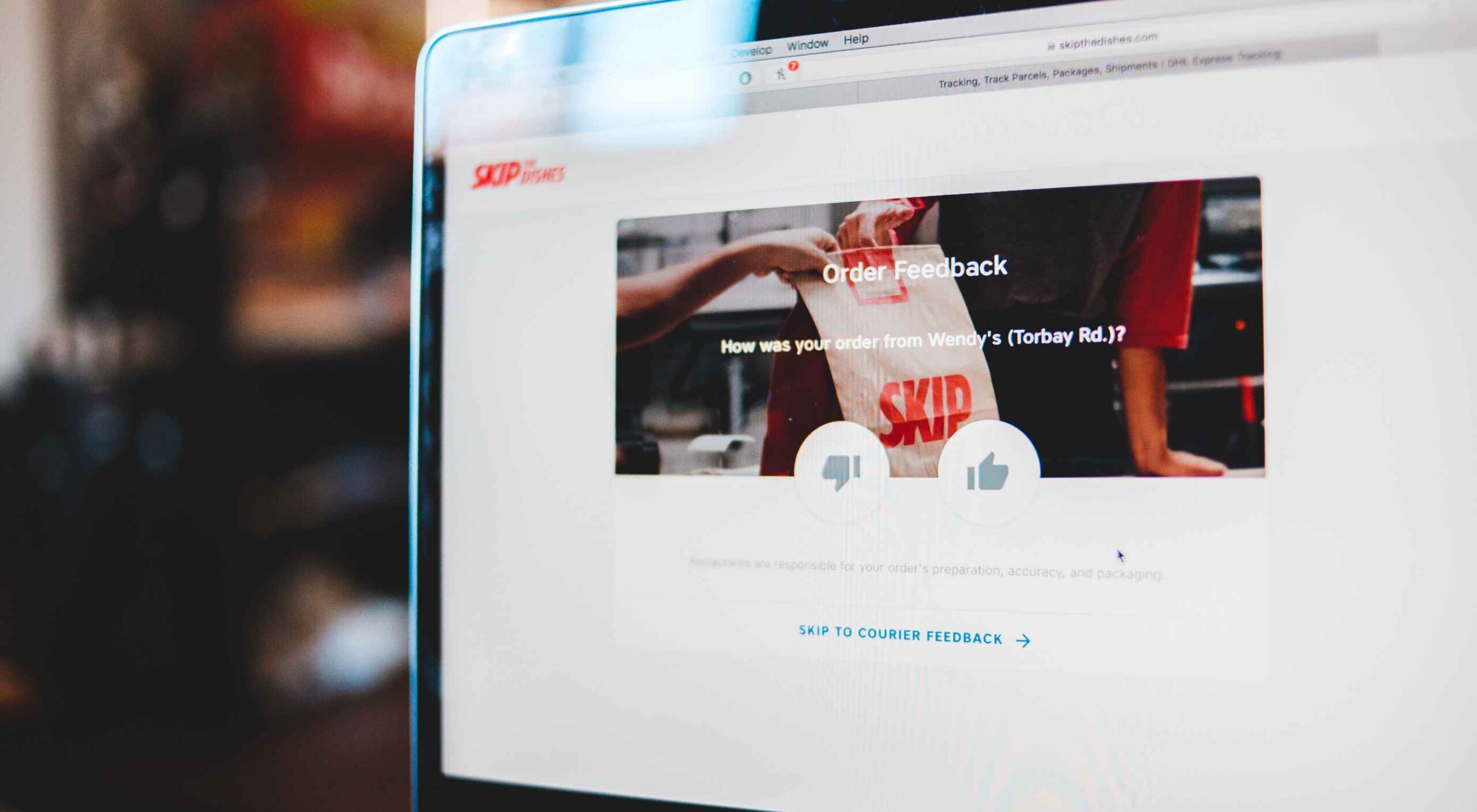
Feedback is one of the most valuable resources for any business. Informative messages from your customers can tell you a lot about your company. They’re a way to check that your service strategies are paying off and a chance to learn which parts of your product need an upgrade.

Reviews and testimonials can also help you better understand your audience and the kind of solutions they’re looking for with your brand. 

Solid feedback is also how you improve your chances of gaining more customers in the long term. Brands with superior customer service generate about 5.7 times more revenue than their competitors. 

Of course, before you can begin tackling challenges like pulling trends from feedback or using your reviews to upgrade your business, you have one essential task to consider: How are you going to collect the valuable information your customers have to share?

There are a lot of options to choose from. You can reach out to clients individually with email messages or set up a feedback form on your website. You could even consider working with a review site to give your audience more options. 

Today, we will look at the steps you can take to collect customer feedback the right way.

Unlocking the Benefits of Customer Feedback

Customer feedback is the information and input shared by your community. It provides a behind-the-scenes view of people’s interactions with your team and shows you where you need to focus on beginning driving new opportunities. 

Customer feedback becomes a guiding compass for your organization when used correctly. It shows you what you’re getting right and wrong from your customer’s perspective. Positive feedback can even become part of your marketing campaigns. User-generated content in the form of reviews and testimonials makes for excellent tools to encourage new people to purchase your products. 

Case studies and in-depth reviews from your clients can also help generate trust among potential customers, so you’re more likely to earn crucial sales. 

Only around 3% of customers say that they find marketers and salespeople “trustworthy.” This means that no matter how good your marketing messages might be, you’re only going to be able to accomplish so much with the claims you make about your brand. Ultimately, your clients will turn to other customers like them to determine who they should buy from.

On average, buyers read around seven reviews before they’ll even consider trusting a business. 

The good news is that around two-thirds of customers will share their personal information with a brand. Clients are happy to provide feedback in the right circumstances. It’s your job to ensure that the process is as easy as possible for your customers.

So, how do you get customer reviews?

1. Design an Effective Feedback Survey

The most obvious way to encourage feedback from your customers is to ask for it. Unfortunately, designing a good customer survey isn’t always as simple as it seems. 

On the one hand, you’re keen to gather as much information as possible from your customer, which could mean that you want to ask many questions. On the other hand, asking too many questions could easily scare your audience away. 

To improve your audience’s chances of actually sharing information, keep the feedback requests as simple as possible.

One or two questions at a time should be enough to give you some helpful information about customer preferences and expectations. When choosing what to include in your survey, remember:

  • Only ask essential questions: If the answer to a question isn’t going to help you achieve your goals, don’t ask it. You don’t need to know someone’s age if you want to know if they had a good experience with your service reps. Keep it relevant. 
  • Make the questions thoughtful: Yes or no questions are great for collecting quick information. However, if you want more valuable feedback, leave your queries open-ended, and give customers room to explain themselves. 
  • Use rating scales: If your customer doesn’t have time to respond to a question in your survey with a complete answer, a rating scale can give you some helpful insights with minimal effort from the client. 

Ensure none of the questions on your survey are leading or loaded. Customers don’t want to feel like you’re answering questions for them. It might also be worth showing your audience how much you value their data with a quick response. Hilton Hotels always responds to any adverse reactions to surveys within days of receiving the information. 

Customers can even see how their reviews contribute to the overall rating of the business. 

2. Master Your Emails and Customer Contact Forms

Email is one of the easiest and most effective ways to gather customer feedback. Because this is a standard support channel for most businesses, there are plenty of opportunities to generate feedback. 

The first step in using emails for feedback is to send a message thanking your customer for their recent interaction with you. If someone purchased a product from your company, immediately follow up to let them know you appreciate their custom. A couple of days after, when your customer has had a chance to use your product or service, that’s when you follow up with your feedback request. 

Ideally, your email request should be as short and straightforward as possible, with a clear call to action that tells your customer what to do next. This example from Papier keeps things as detailed as possible.

If you want to boost your chances of engagement, you can add elements to your email that might encourage a positive response, for instance:

  • Remind them of what they bought: Remind your customer of the item they purchased with a picture and a bit of information. Highlight the key features and benefits of that product, so they have some inspiration on what to write about in their review. 
  • Offer them a reward: If you want to boost your chances of your customers doing something for you, you need to offer something in return. This could be a discount on their next order, a chance of winning something, or even just free shipping on their next purchase. 
  • Personalize the message: Make your customer feel special by personalizing the message. Use their name and reference their previous interactions with your company. If they’ve been with your business for a while, mention that in the email.  

Remember, many of your customers are likely to check their emails on the go. That means that giving feedback should be as simple as possible, regardless of the tech your customer is using. For instance, in this Zomato example, users can choose to drop an email to the company or send feedback straight from the app. 

3. Create App Usability Tests

If you want some in-depth insights into your company, and your business processes, then a usability test could be the best way to generate valuable feedback. If you have your app, ask your customer to submit some information right there and then, after they’ve finished using the service. The great thing about this kind of input is it’s fresh.

Unlike other customer reviews that might come a day or two after your customer has used a product, usability tests allow you to get feedback at the moment. There’s a much better chance that you’re going to get some relevant and detailed responses here. 

For instance, in this Skype lab feedback request, customers can tick boxes for any video or audio issues they had and leave a starred review. 

If there’s extra information to share, the customer can tap on the comment box to elaborate. However, they don’t need to do this part unless they want to. 

With usability tests, it’s a good idea to focus on a few key things that you want to learn about. For instance, Skype’s example above demonstrates that the company wants to check at least five user experience issues for both video and audio. 

Giving your customers options that they can choose from reduces the amount of work they need to put into leaving a review. It also means that you can get actionable information on which parts of your app or site need the most improvement. 

You can get the same kind of instant feedback on your website, too, mainly if you’re using a live chat app for customer service. 

Live chat is quickly becoming an essential part of the customer experience environment because it’s fast, easy to use, and efficient. It’s also highly affordable for most companies, thanks to evolving technology. Set up your Live Chat app to immediately request a review from your customer when the interaction is over.

For instance, SiteGround asks customers to rate their service provider with a picture of the employee they spoke to. The image lets the customer see that they were talking to a real person, which improves the relationship with the company. The statement about feedback improving the customer service and support that SiteGround can offer shows the customer how valuable their reviews are. 

4. Conduct Customer Interviews

Conducting a customer interview is a lot like sending out a survey. The main difference is that you ask the client to engage in a much more in-depth conversation. Usually, these interviews will be the initial research required for a published case study on a B2B website. 

Reaching out to valuable and loyal customers can give you a fantastic source of in-depth information to learn from. You’ll need to make sure that you have a good relationship with the customer in question before you attempt this, however. Most one-time clients won’t want to get involved with a time-consuming interview. 

Look at your CRM technology and find out who your most impressive VIP customers are. Reach out to them with a request for feedback, and make sure you offer something in return. For instance, tell them that you’d like to interview for a case study that you can display on your website. If they’re happy for you to do this, you can reward them with a discount on their next purchase or some gifts. 

You could also follow up with a customer who recently contacted your team for an interview, like Ticket Arena does here. With this message, they promise the customer that their insights will make the customer experience better for future clients:

When requesting long-form qualitative feedback, remember to think through your questions carefully. In-depth stories from customers bring nuance and color to your quantitative data. They could even guide your business to making some crucial future decisions. 

When talking to your customers:

  • Start with an open-ended dialogue: Remember that open-ended questions are crucial to get as much detail as possible from your customers. These queries give your customers more flexibility to cover the details of their experiences.
  • Get more specific as you go: Start with simple questions, then build on them as your conversation evolves. Use the things you learn from your customers to dive into topics that are relevant to them. For instance, if a customer mentions your live chat app, go into a deeper discussion about the channels they prefer to use. 
  • Practice active listening: Make sure that you’re open and receptive to the information you’re given. Actively listen to customers, even if you’re not in the same room, by acknowledging what they say and providing valuable responses. 

5. Use Social Media

Sometimes, people are reluctant to give feedback for your business on your website because they’re not in the frame of mind. When customers come to your site, there’s a good chance they’re looking for information from you or want to check out a new product. 

They’re probably not in the right mood to start sharing their opinions. 

However, if you capture your customers on social media, there’s a good chance they’ll be feeling a lot more talkative. After all, social media platforms are where most customers discuss their issues with companies, talk about purchases with friends, and make their voices heard. 

Simply paying attention to when people talk about your company on social media can give you a lot of helpful feedback. Social listening tools allow you to collect post information every time someone mentions your business name or product. 

Alternatively, you can actively use the tools on social media to gather data from customers. For instance, Instagram has its own “poll” feature on Stories that allows companies to collect opinions. 

If you’re collecting feedback on social media, remember that you shouldn’t be asking any questions that are too complicated. Although people are more willing to share their opinions on social, they’re still looking for a relatively laid-back and casual experience.

Polls, where people can vote for their preferences with a single click, are more likely to garner engagement than a post asking people to tell you about the best purchasing experience they ever had with your brand. 

If you do want to encourage more in-depth feedback, the best option is to promise a reward in return for your follower’s effort. 

Make the experience fun by transforming it into a competition. 

For instance, ask your customers to share their favorite story involving your brand for a chance to win an impressive prize. You can ask each customer to tag their response with a branded hashtag so that relevant answers are easier to find. You could even add users to tag their friends in their posts too, to increase brand reach while you collect feedback:

With gifts and rewards to incentivize them, people will be much more likely to interact with your brand and put effort into the reviews they leave. You could even gather some user-generated content to put into your subsequent ad campaigns. 

6. Create a Dedicated Website Page

Finally, if you want to make it as simple as possible for people to leave feedback on your website and for you to collect all of that information into one space, then create a review page on your website. This can double up as social proof for people who need additional evidence to buy from your brand. 

A review page could be as simple as a page on your website listing the latest comments that your customers have left. You can include a form at the bottom of the page where people can add their thoughts. Just make sure that you carefully review these posts before they’re submitted to your website if you want to prevent spam from getting through. 

You could also create a case study or portfolio page that showcases the work you’ve done with other companies like Fabrik Brands does here:

At the bottom of each case study, give your customers a unique email address they can reach out to if they want to be featured as your following case study. Or include a contact form where people can get in touch to discuss their own experiences. 

Having a dedicated review, case study, or testimonial page on your website could be enough to inspire more feedback from your customers. It’s also a fantastic way to demonstrate how credible your company is to potential buyers. 

Still, Struggling? Take the Customer Out of the Equation

If, even with all the suggestions above, you still can’t seem to convince your audience to give you some decent feedback, then take them out of the equation. You can learn things about your audience without asking them for information. Google Analytics and other tools will give you valuable insights into which of your blog pages get the most engagement and how many people click on individual buttons throughout your site. 

These fundamental insights might not be as good as valuable, contextual feedback from your audience, but they’re an excellent way to start figuring out how to invest in your future growth. 

Remember, feedback of any kind – even if it’s just statistics and numbers – gives your business the ability to grow and make informed decisions.

Gather as much feedback as you can, and make sure you use it!


Featured image via Pexels.

Source

The post 6 Tips for Collecting Customer Feedback (The Right Way) first appeared on Webdesigner Depot.


Source de l’article sur Webdesignerdepot