Articles

An unreliable, semi-broken and unresponsive website is an excellent way to lose leads and visitors — regardless of how aesthetically pleasing or well-designed, the visual elements are.

Over the past decade, we’ve seen more initiative to deliver faster internet to regions of the world that were previously devoid of it. With online communities expanding and more people becoming receptive to online shopping, ensuring your site’s dependability is now more important than ever. 

One way to achieve this is by employing uptime and downtime monitoring tools. This guide will examine the best ways to get alerts when something goes wrong and your website falters.

Why Is Website Uptime Monitoring Important?

Downtime is bound to occur occasionally. Nonetheless, the goal is to minimize it. The longer the downtime occurs, the more traffic and potential clients you lose. A dysfunctional website is also detrimental to your credibility and reputation. People may associate your website’s unreliability with your real-world products or services.

With web developers charging an average of $200 per hour, high-quality websites can be expensive to build and maintain. Nevertheless, it’s often worth the investment. However, an unreliable website can backfire on you. Instead of attracting more customers, it could potentially repel them. This can result in lost revenue.

An uptime monitoring solution can help you prevent or reduce these losses. It verifies if your website is up and functional and notifies you if it’s not. This allows you to troubleshoot the issue and get your website back up and running as soon as you’re alerted. The most common issues behind your website’s downtime include: 

  • Server faults;
  • Network outages;
  • Power outage;
  • Traffic spikes;
  • Cyberattacks;
  • Domain name issues;
  • An erroneous web application deployment;
  • Increased server loads;
  • DNS Resolve issues;
  • Human error.

Thus, you must employ a dependable tool that detects downtime or any interruptions related to your website as soon as they occur. They are must-have tools for web designers, developers, and network administrators. However, not all of them are built the same. So how do you identify the best uptime monitoring tools?

Essential Features of Uptime Monitoring Tools

Uptime monitoring tools typically detect interruptions by running network tests such as pings and trace routes. You could practically monitor your website’s uptime by constantly running these tests yourself. 

However, this isn’t an efficient way to monitor your website’s uptime. A comprehensive uptime monitoring tool will automatically monitor your website’s uptime in the background. It will then alert you through various channels as soon as it senses that your website may be down. 

Furthermore, high-quality uptime monitoring solutions tend to offer additional information regarding your website’s uptime/downtime and its performance. These tools commonly feature dashboards, status pages, badges, exportable records, etc., to help you keep track of your site’s overall health.

9 Best Features of an Uptime Monitoring Solution

The ideal uptime monitoring tool or service should feature: 

  1. Website security features that notify of and repel potential cyber attacks;
  2. 24/7 uninterrupted background website monitoring;
  3. Multi-channel alerts (email, SMS, push notifications, instant messages, social media, etc.);
  4. Report generation;
  5. 24/7 customer support available through different channels (email, phone, chat, etc.);
  6. Be capable of monitoring multiple websites and proxies at the same time;
  7. Offer insights and suggestions to improve your website’s performance;
  8. Be affordable;
  9. High customizability should allow you to choose which features to enable and disable.

Another optional feature to look out for is public status pages that your clients can access to determine if all your services are up and running. GetWeave is an excellent example of this. The website features a well-organized systems status page where customers can check if all of Weave’s services are functional. 

Nevertheless, you can use the above information as a buying guide when assessing potential uptime monitoring tools. The rest of this guide will supply a few suggestions as to which tools you should use for your website.

3 Best Website Uptime Monitoring Tools 

Some of the best uptime monitoring tools for website downtime alerts include:

1. Uptrends

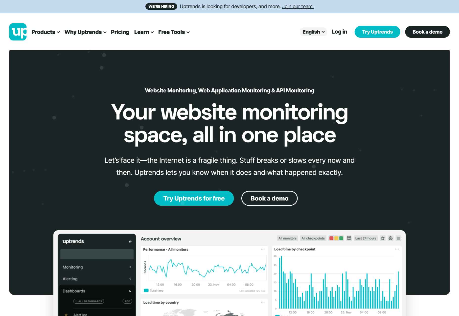
Uptrends isn’t just a downtime detection tool; it’s a complete web performance monitoring solution. It will notify you as soon as it detects any disturbance in your website’s performance. It features highly customizable checks. For instance, you can set performance check limits for load times. Uptrends will notify you instantly if your website takes too long to load.

You can also configure from which locations you want it to monitor your website. Uptrends will then point you to where your website usually suffers performance dips in the real world. 

The service uses multiple communication channels to send users notifications: email, phone calls, and SMS. Alternatively, you can download one of Uptrend’s mobile applications and receive push notifications. Additionally, you can integrate Uptrends with messaging and communication applications such as PagerDuty, Slack, and Microsoft Teams.   

Another impressive Uptrend feature is its ability to emulate your website’s performance on different browsers. It runs Google Chrome, Mozilla Firefox, and Microsoft Edge on its servers. Thus, you can compare how your website runs on these web browsers without installing them on your servers or computer. 

Uptrends supplies users with various charts, reports, and graphs to help identify sudden spikes or dips. Waterfall reports display the complete page-load from the initial request to the last download. This allows you to compare the history of your website’s performance element by element. It comes with three price plans whose costs depend on the number of monitors you would like. Starting at $16.21 (at the time of writing) the Starter Plan is the most affordable.

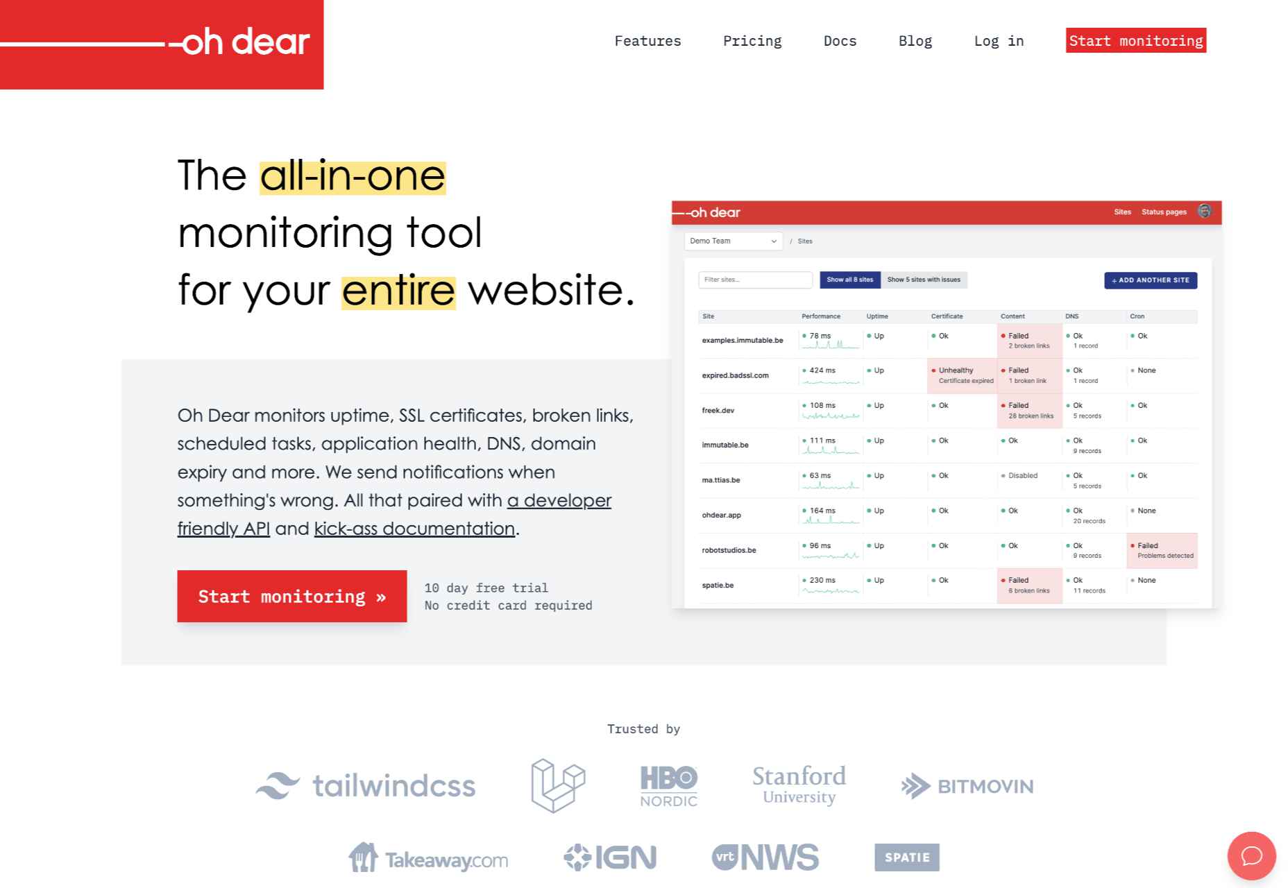
2. Oh Dear

Oh Dear is a slightly cheaper option than Uptrends, with the most affordable plan starting at $12 per month (at the time of writing). However, while Uptrends offers a 30-day free trial, Oh Dear only provides a 12-day trial period. Nevertheless, Oh Dear’s interface is a lot cleaner and more minimal. 

Since Oh Dear runs servers in different locations across the globe, it can track how your website performs in various regions. Oh Dear will scan through your website and index all the pages. If it detects any issues, it will alert you immediately. 

Oh Dear also features a continuous certificate monitoring function. Site owners who are concerned with their website’s security may find this feature to be especially useful. It will verify your SSL certificate expiration dates and alert you of any changes.  

Oh Dear’s public status page enables your clients to keep track of your website’s availability.

Oh Dear uses email and SMS text messages to alert site owners of any issues. It also features integrations with communications and social media applications such as Telegram, Discord, Slack, Microsoft Teams, etc. Oh Dear ensures that messages are as detailed and user-friendly. This makes it easier to troubleshoot and find the origin of your problem. Oh Dear is more than a worthy alternative to Uptrends. 

3. WP Umbrella

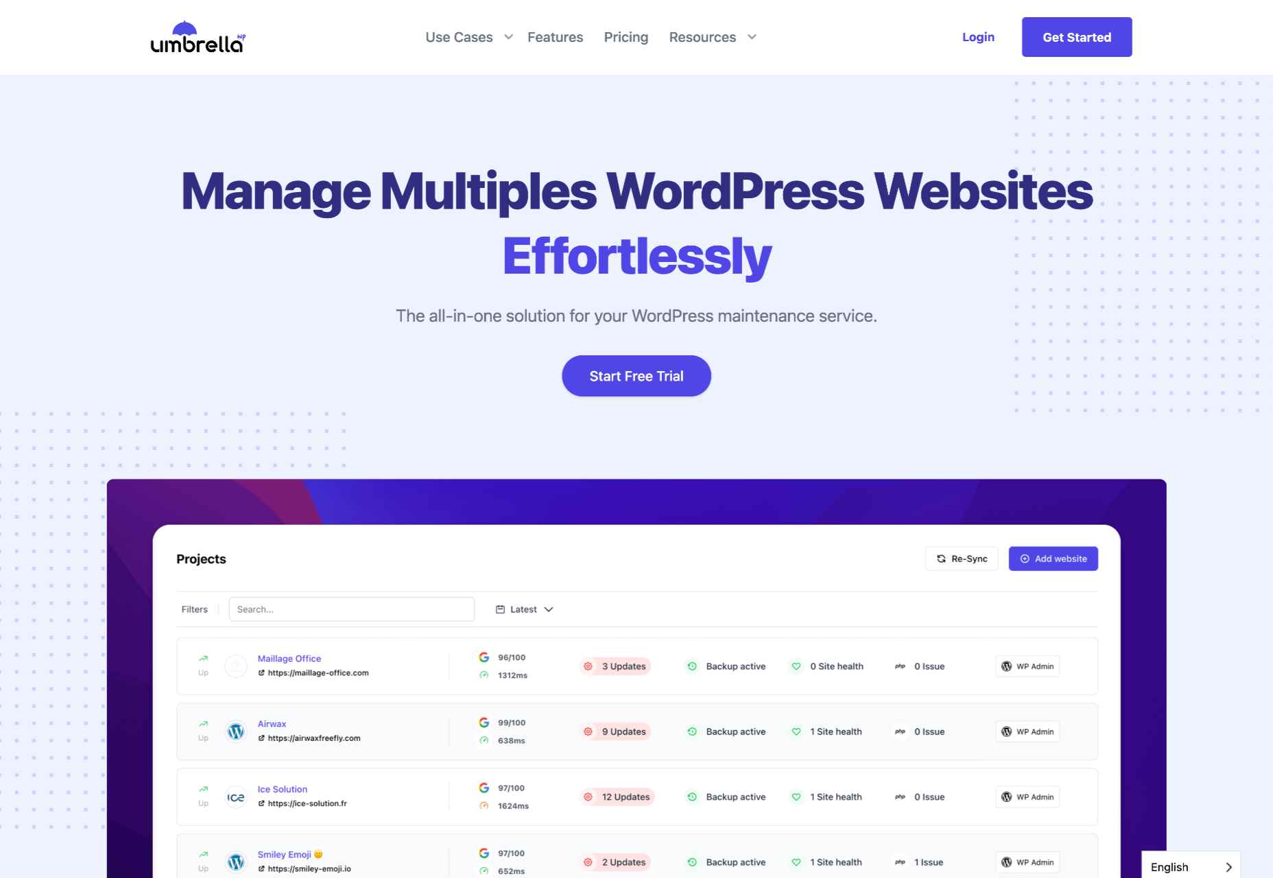
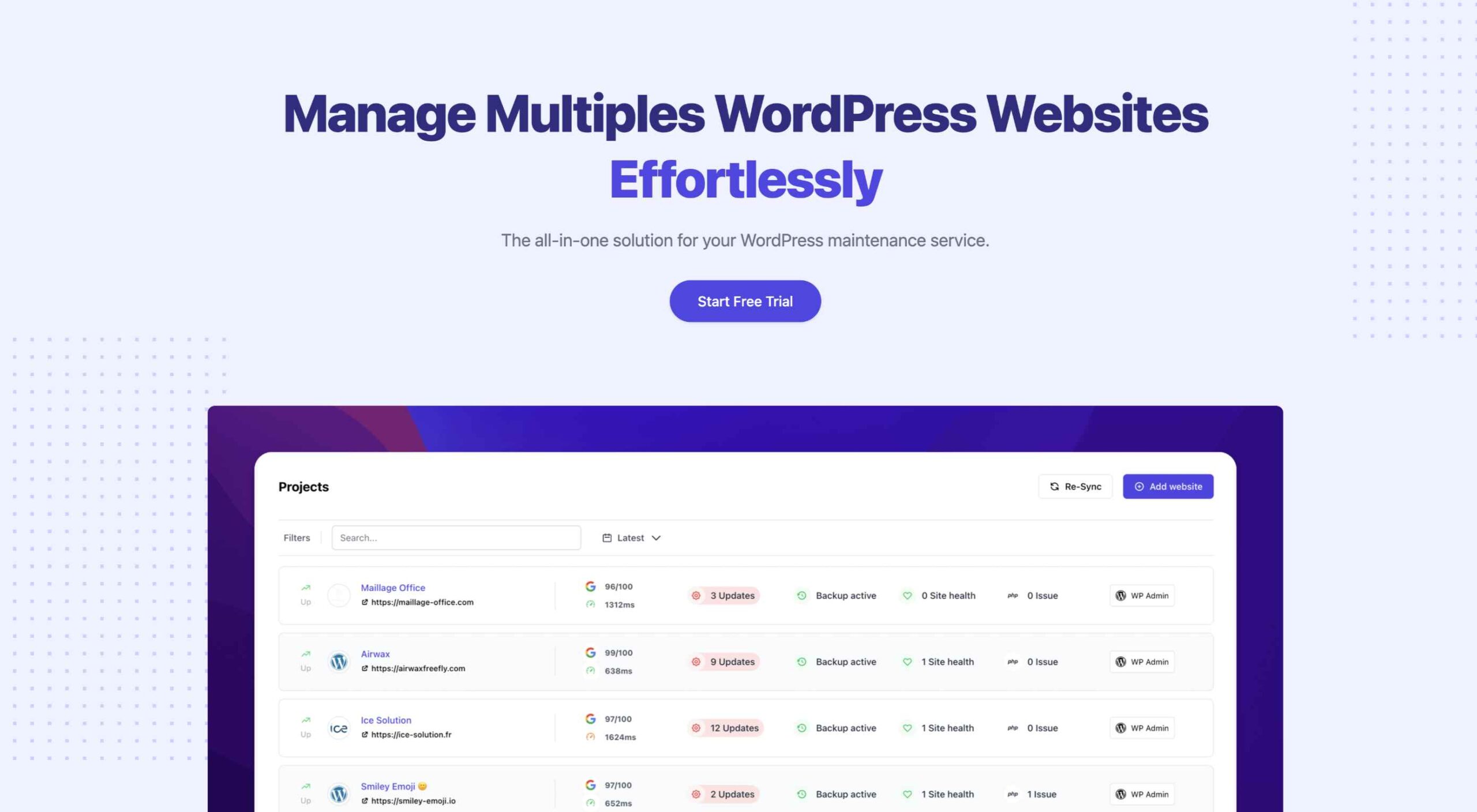
WP Umbrella is a little different from the previous entries. It’s intended to help users manage and monitor multiple WordPress sites. Thus, it is far more particularized in its approach to website uptime monitoring. Again, as is the primary function of the uptime monitoring tool, it offers a real-time alert system that will contact you through email, SMS, Slack, etc. 

WP Umbrella employs a simple minimal UI. Its main screen consists of a dashboard that allows you to view all your WordPress websites. By default, this dashboard features four columns: Site, Uptime, Speed, and Issues.

WP Umbrella will alert you of any outdated or erroneous plugins or themes. While it doesn’t offer dedicated public status pages, it does have a client report generation feature. You can automatically send these reports to your various subscribers or clients when your website is down. 

WP Umbrella is the most affordable option on this list. Users are charged $1.99 per month (at the time of writing) for each website monitored. In addition, WP Umbrella offers a 14-day trial and does not require your credit card details. It’s an excellent option for anyone running a WordPress website or two.

Conclusion

This guide has only explored three possible uptime monitoring solutions. They won’t only assist you in detecting downtimes, they can also help you find the reason your site may be slow.

These solutions are an excellent place to start. But there are many other options coming to market all the time. You may find that this is the first step to converting more leads and reducing your bounce rate. 

Source

The post 3 Best Website Uptime Monitoring Tools  first appeared on Webdesigner Depot.
Source de l’article sur Webdesignerdepot

Perimeter security has been dying a slow death over the better part of a decade, as breaches of the corporate network have become commonplace. Most organizations now find it obvious that trusting devices and users merely for being « on the corpnet » is insufficient to maintain security in the face of evolving threats.

At the same time, the re-platforming of business applications to a SaaS model, coupled with a more mobile and distributed workforce, has made the need to « VPN into a corpnet » feel archaic and cumbersome. The pandemic created the perfect storm around these two long-term trends, accelerating this slow death into a fast one. Adopting a zero-trust architecture is no longer negotiable for any organization that wants to stay alive.

Source de l’article sur DZONE

A good application lifecycle management (ALM) package has software that is able to carefully manage and monitor all aspects of software development.  ALM applications provide tools for managing and completing the phases of design, development, testing, deployment, and ongoing enhancements.   With an ALM solution in place, organizations can significantly improve the way they design, build, test, and adapt their software.  Greater customer satisfaction, speed of development, and reduction of cost is the often the result.

Top ALM Tools:

VersionOne

Source de l’article sur DZONE


Introduction

Anypoint CLI is a scripting and command-line tool for both Anypoint Platform and Anypoint Platform PCE. We will be using Anypoint CLI commands for Anypoint Platform accounts, API Manager, CloudHub applications, design center projects, and exchange assets.

Prerequisites

Installation

  • Verify the npm version with the command npm -version
  • Anypoint CLI installation npm install -g anypoint-cli@latest

Authentication

You can configure Anypoint CLI authentication with username and password, client ID and client secret, or a bearer token. At least one method is required.

Source de l’article sur DZONE

Any typical enterprise-grade application deployed on Kubernetes comprises several API resources that need to be deployed together. For example, the WordPress application, which is one of the example applications available on the Kubernetes GitHub repository, includes:

  • a wordpress frontend pod,
  • a wp-pv-claim persistent volume claim mounted to the frontend pod,
  • a wordpress-mysql MySQL database pod,
  • a mysql-pv-claim persistent volume claim mounted to the MySQL database pod,
  • two persistent volumes: wordpress-pv-1 and wordpress-pv-2 to serve the persistent volume claims,
  • services for the database and frontend pods.

Application (or app) is not a native construct in Kubernetes. However, managing applications is the primary concern of the developers and operations. Application delivery on Kubernetes involves upgrading, downgrading, and customizing the individual API resources. Kubernetes allows you to restrict the spread of your application resources through namespaces such that you can deploy an entire app in a namespace that can be deleted or created. However, a complex application might consist of resources spread across namespaces, and in such cases answering the following questions might be a challenge:

Source de l’article sur DZONE

Workflows are great for orchestrating services, functions, or events. They provide out-of-the-box features to make your applications resilient, reliable, and simple.

But currently, each cloud vendor has its workflow solution. AWS has Step Functions, Google has Google Workflows, Microsoft has Azure Durable functions, and so on. The lack of a common way to define workflows becomes an issue when you need to migrate or host your applications on more than one cloud vendor. It also limits the potential for creating tools and infrastructures that support several platforms. This is what the Serverless Workflow specification addresses.

Source de l’article sur DZONE

Many software developers can attest that some of the most significant issues in their applications arise from database performance. Though many developers prefer to use a relational database for enterprise applications, typical logging and monitoring solutions provide limited signals to detect database performance issues. Rooting out common bad practices such as chatty interactions between the application code and the database is non-trivial.

As developers, we need to understand how our database is performing from the context of user transactions. Ideally, we would have a common tool that can monitor the performance of both the application and the database concerning user transactions. OpenTelemetry has emerged as a popular tool for application monitoring, but it can also be extended for monitoring databases.

Source de l’article sur DZONE

Levallois-Perret, le 2 juin 2021 — Responsage, service spécialisé dans le conseil et l’orientation des salariés aidants et Tilia, start-up dédiée à l’accompagnement des aidants soutenue par BNP Paribas Personal Finance, annoncent que SAP, leader du marché des logiciels d’application d’entreprise, a choisi leurs solutions pour accompagner et soulager ses collaborateurs aidants dans leur quotidien.

L’aidance : un sujet majeur de l’accord inter-générationnel de SAP

C’est dans le cadre de l’accord intergénérationnel signé en fin d’année que SAP a choisi d’accompagner ses salariés aidants avec les services de Responsage et Tilia.

« De plus en plus de salariés doivent prendre soin d’un parent âgé, d’un enfant ou d’un conjoint malade ou en situation de handicap, affirme Sandra Lotode, Directrice des relations sociales. Cela a donc été une évidence de proposer aux aidants, au sein de nos dispositifs de qualité de vie au travail, une solution qui les soulage et préserve l’équilibre vie privée/vie professionnelle. »

Responsage-Tilia : la réponse idéale à la problématique de l’aidance

Expert reconnu de l’accompagnement des salariés aidants depuis 2013, Responsage accompagne les salariés tout au long de leur parcours d’aidant : entretien téléphonique/visio  pour hiérarchiser les problématiques, réponse écrite documentée en 3 jours ouvrés, calendrier de suivi personnalisé pour le montage des dossiers…. L’application Tilia offre un accès digital au service Responsage. De plus, Tilia assure la mise en œuvre et la coordination des différents prestataires nécessaires à la personne aidée.

« Le dispositif d’aide aux salariés aidants s’inscrit dans le volet social de la RSE, souligne Joël Riou, Président-Fondateur de Responsage. Soutenu par un accompagnement expert, le salarié préserve sa santé physique et mentale. Par ailleurs, grâce aux bilans anonymisés fournis par Responsage, SAP dispose d’une vision objectivée de la problématique dans l’entreprise. »

« Tilia se réjouit d’accompagner des entreprises qui inscrivent l’humain au cœur de leurs ambitions et qui font de l’aidance une priorité de leur stratégie de bien-être au travail, » indique Christine Lamidel, Fondatrice et Directrice Générale de Tilia. « Le dispositif Responsage-Tilia simplifie le quotidien des aidants et les rassure sur le bien-être de leur proche. Cela participe in fine au maintien de leur engagement professionnel, une nécessité pour rompre l’isolement auquel les aidants sont souvent confrontés. »

À propos de Responsage

Responsage accompagne les salariés aidants depuis 2013. L’entreprise compte plus de 100 clients (Danone, L’Oréal, Pernod-Ricard, Crédit Agricole, France Télévisions, Pôle emploi…) et couvre plus de 250 000 ayants droit. Responsage s’appuie sur une équipe d’assistants sociaux expérimentés, des bases de données de plus de 70 000 contacts et un outil d’aide à la rédaction expert. Les outils collectent et anonymisent dans des bilans les données sur les salariés accompagnés. L’entreprise peut ainsi orienter ses politiques sociales.

Le service est désormais élargi à l’accompagnement social global. Responsage compte parmi ses actionnaires, Bayard Presse, Danone, Babilou et le fonds d’investissement à impact social PhiTrust. Plus d’informations sur le site de Responsage.

À propos de Tilia

Tilia est un dispositif clé en main qui accompagne les entreprises et directions des ressources humaines désireuses d’épauler leurs collaborateurs confrontés à la situation d’un proche en état de dépendance. Cet accompagnement s’effectue par le biais d’une approche collective comprenant des cycles de conférences de sensibilisation à destination de tous les acteurs de l’entreprise, et d’une approche individuelle dédiée aux aidants. Le service proposé par Tilia a été élaboré dans le but d’apporter du répit aux collaborateurs contraints de conjuguer activité professionnelle et rôle d’aidant, et participer ainsi au maintien des équilibres de temps de vie au quotidien. Tilia assiste toutes les fragilités — maladie, handicap, grand-âge ou suite à un accident de la vie — en vue de faciliter le bien vivre à domicile, d’alléger le quotidien des aidants et de les rassurer quant au bien-être de leur proche fragilisé.

Tilia est une startup engagée (social business), issue d’un programme d’intrapreneuriat du Groupe BNP Paribas, développée par sa Directrice Générale et Fondatrice Christine Lamidel suite à son expérience familiale personnelle, et aujourd’hui accélérée par BNP Paribas Personal Finance. Plus d’informations sur le site Internet et le blog de Tilia. @TiliaOaidants | LinkedIn

À propos de SAP

La stratégie de SAP vise à aider chaque organisation à fonctionner en “entreprise intelligente”. En tant que leader du marché des logiciels d’application d’entreprise, nous aidons les entreprises de toutes tailles et de tous secteurs à opérer au mieux : 77 % des transactions commerciales mondiales entrent en contact avec un système SAP®. Nos technologies de Machine Learning, d’Internet des objets (IoT) et d’analytique avancées aident nos clients à transformer leurs activités en “entreprises intelligentes”. SAP permet aux personnes et aux organisations d’avoir une vision approfondie de leur business et favorise la collaboration afin qu’elles puissent garder une longueur d’avance sur leurs concurrents. Nous simplifions la technologie afin que les entreprises puissent utiliser nos logiciels comme elles le souhaitent – sans interruption. Notre suite d’applications et de services de bout en bout permet aux clients privés et publics de 25 secteurs d’activité dans le monde de fonctionner de manière rentable, de s’adapter en permanence et de faire la différence. Avec son réseau mondial de clients, partenaires, employés et leaders d’opinion, SAP aide le monde à mieux fonctionner et à améliorer la vie de chacun. Pour plus d’informations, visitez le site www.sap.com.

The post SAP choisit le tandem Responsage-Tilia pour accompagner ses salariés aidants appeared first on SAP France News.

Source de l’article sur sap.com

Websites haven’t always been as adaptable as they are today. For modern designers, “responsivity” is one of the most significant defining factors of a good design. After all, we’re now catering to a host of users who frequently jump between mobile and desktop devices with varying screen sizes. 

However, the shift to responsive design didn’t happen overnight. For years, we’ve been tweaking the concept of “responsive web design” to eventually reach the stage we’re at today. 

Today, we’re going to take a closer look at the history of responsive web design.

Where Did Web Design Begin?

When the first websites were initially created, no one was worried about responsivity across a range of screens. All sites were designed to fit the same templates, and developers didn’t spend a lot of time on concepts like design, layout, and typography.  

Even when the wider adoption of CSS technology began, most developers didn’t have to worry much about adapting content to different screen sizes. However, they still found a few ways to work with different monitor and browser sizes.

Liquid Layouts

The main two layout options available to developers in the early days were fixed-width, or liquid layout. 

With fixed-width layouts, the design was more likely to break if your monitor wasn’t the exact same resolution as the one the site was designed on. You can see an example here

Alternatively, liquid layouts, coined by Glenn Davis, were considered one of the first revolutionary examples of responsive web design. 

Liquid layouts could adapt to different monitor resolutions and browser sizes. However, content could also overflow, and text would frequently break on smaller screens. 

Resolution-Dependent Layouts

In 2004, a blog post by Cameron Adams introduced a new method of using JavaScript to swap out stylesheets based on a browser window size. This technique became known as “resolution-dependent layouts”. Even though they required more work from developers, resolution-dependent layouts allowed for more fine-grained control over the site’s design. 

The resolution-dependent layout basically functioned as an early version of CSS breakpoints, before they were a thing. The downside was developers had to create different stylesheets for each target resolution and ensure JavaScript worked across all browsers.

With so many browsers to consider at the time, jQuery became increasingly popular as a way to abstract the differences between browser options away.

The Rise of Mobile Subdomains

The introduction of concepts like resolution-dependent designs was happening at about the same time when many mobile devices were becoming more internet-enabled. Companies were creating browsers for their smartphones, and developers suddenly needed to account for these too.

Though mobile subdomains aimed to offer users the exact same functions they’d get from a desktop site on a smartphone, they were entirely separate applications. 

Having a mobile subdomain, though complex, did have some benefits, such as allowing developers to specifically target SEO to mobile devices, and drive more traffic to mobile site variations. However, at the same time, developers then needed to manage two variations of the same website.

Back at the time when Apple had only just introduced its first iPad, countless web designers were still reliant on this old-fashioned and clunky strategy for enabling access to a website on every device. In the late 2000s, developers were often reliant on a number of tricks to make mobile sites more accessible. For instance, even simple layouts used the max-width: 100% trick for flexible images.

Fortunately, everything began to change when Ethan Marcotte coined the term “Responsive Web Design” on A List Apart. This article drew attention to John Allsopp’s exploration of web design architectural principles, and paved the way for all-in-one websites, capable of performing just as well on any device. 

A New Age of Responsive Web Design

Marcotte’s article introduced three crucial components developers would need to consider when creating a responsive website: fluid grids, media queries, and flexible images. 

Fluid Grids

The concept of fluid grids introduced the idea that websites should be able to adopt a variety of flexible columns that grow or shrink depending on the current size of the screen. 

On mobile devices, this meant introducing one or two flexible content columns, while desktop devices could usually show more columns (due to greater space). 

Flexible Images

Flexible images introduced the idea that, like content, images should be able to grow or shrink alongside the fluid grid they’re located in. As mentioned above, previously, developers used something called the “max-width” trick to enable this. 

If you were holding an image in a container, then it could easily overflow, particularly if the container was responsive. However, if you set the “max-width” to 100%, the image just resizes with its parent container. 

Media Queries

The idea of “media queries” referred to the CSS media queries, introduced in 2010 but not widely adopted until officially released as a W3 recommendation 2 years later. Media queries are essentially CSS rules triggered based on options like media type (print, screen, etc), and media features (height, width, etc). 

Though they were simpler at the time, these queries allowed developers to essentially implement a simple kind of breakpoint – the kind of tools used in responsive design today.  Breakpoints refer to when websites change their layout or style based on the browser window or device width.

Viewport Meta tags need to be used in most cases to ensure media queries work in the way today’s developers expect. 

The Rise of Mobile-First Design

Since Marcotte’s introduction of Responsive Web Design, developers have been working on new ways to implement the idea as effectively as possible. Most developers now split into two categories, based on whether they consider the needs of the desktop device user first, or the needs of the mobile device user. The trend is increasingly accelerating towards the latter. 

When designing a website from scratch in an age of mobile-first browsing, most developers believe that mobile-first is the best option. Mobile designs are often much simpler, and more minimalist, which matches a lot of the trends of current web design.

Taking the mobile first route means assessing the needs of the website from a mobile perspective first. You’d write your styles normally, using breakpoints once you start creating desktop and tablet layouts. Alternatively, if you took the desktop-first approach, you would need to constantly adapt it to smaller devices with your breakpoint choices.

Exploring the Future of Responsive Web Design

Responsive web design still isn’t perfect. There are countless sites out there that still fail to deliver the same incredible experience across all devices. What’s more, new challenges continue to emerge all the time, like figuring out how to design for new devices like AR headsets and smartwatches. 

However, it’s fair to say we’ve come a long way since the early days of web design. 


Featured image via Pexels.

Source

The post A Brief History of Responsive Web Design first appeared on Webdesigner Depot.
Source de l’article sur Webdesignerdepot

The dreaded part of every site reliability engineer’s (SRE) job eventually: capacity planning. You know, the dance between all the stakeholders when deploying your applications. Did engineering really simulate the right load and do we understand how the application scales? Did product managers accurately estimate the amount of usage? Did we make architectural decisions that will keep us from meeting our SLA goals? And then the question that everyone will have to answer eventually: how much is this going to cost? This forces SREs to assume the roles of engineer, accountant, and fortune teller.

The large cloud providers understood this a long time ago and so the term “cloud economics” was coined. Essentially this means: rent everything and only pay for what you need. I would say this message worked because we all love some cloud. It’s not a fad either. SREs can eliminate a lot of the downside when the initial infrastructure capacity discussion was maybe a little off. Being wrong is no longer devastating. Just add more of what you need and in the best cases, the services scale themselves — giving everyone a nice night’s sleep. All this without provisioning a server, which gave rise to the term “serverless.”

Source de l’article sur DZONE