Websites as we know them are going to change very soon. The days of text, images, and basic interactions in a 2D browser window have served us well, but virtual, augmented, and mixed reality experiences are getting better all the time. Developers and designers need to think beyond the browser window and prepare for an immersive future.
Many have been very skeptical about VR and AR in the past because despite grand promises about what they would achieve, they’ve mostly failed to deliver on the scale that the industry hoped for.
But it’s different this time: industry leaders like Meta, Apple, and Microsoft are pursuing a range of different mixed reality projects; they see the opportunity and are dropping hints about what’s next.
In a survey from Perkins Coie LLP and the XR Association, nearly 9 in 10 respondents said that by the year 2025, immersive technologies—including augmented reality, virtual reality, and mixed reality — will be as ubiquitous as mobile devices.
That’s a bold prediction, but it could be our new reality.
Use Cases
VR and AR aren’t a logical fit for every website, and that’s fine. There’s no need to force an immersive experience on something better suited to a standard viewing experience.
Here are a few areas where these technologies shine:
Retail – VR can be used to provide a virtual showroom where customers browse through products. AR can even bring the products into your home by showing you how a piece of furniture will fit in your room, what a painting will look like on your wall, or in Apple’s case, how a product will look on your desk.
News – Coverage of events can be enriched by providing a 360-degree view and placing viewers in the center of the story.
Training – AR can generate virtual overlays over physical equipment so employees can have hands-on training that’s more effective.
Define Your Platform
Adding immersive experiences to your website will require various skills based on what you’re trying to create. Whether you’re new to web development or are a seasoned developer with many years of experience, the main difference from classic web development is that you’re switching from a 2D to a 3D experience. Development in VR/AR is much closer to developing 3D video games than creating web applications.
First of all, you need to decide on the hardware that you’re building for. Are your viewers mainly using computers, smartphones, or a headset like the Oculus Quest? Each hardware category offers a different set of capabilities for what’s possible.
Next, when we look at 3D engines and frameworks on the market, some big names like Unity, Unreal Engine, and CRYENGINE stand out. Most of these engines were spun out of game development and are based on programming languages like C, C++, or C#. While very powerful, they’re overkill for anyone trying to create a basic immersive web experience.
The good news for web developers is that the WebXR Device API is an open standard specified by the W3C with a JavaScript API that makes immersive experiences possible in the browser. So if you already have a background in web development, you can use your knowledge of JavaScript to get started.
There are some useful frameworks and platforms that make working with WebXR more convenient:
A-Frame– A web framework for building 3D experiences.
React 360 – A framework for the creation of interactive 360-degree experiences that run in the web browser. As the name already suggests, it builds on React and reuses the concepts you already know.
Amazon Sumerian – A managed service that lets you create and run 3D, AR, and VR applications. Since it’s integrated into the AWS ecosystem, it’s also possible to add AI-enabled elements into your generated world.
Create Your Content
No one wants to read long blocks of text in 3D. Since we’re talking about visual experiences, it’s logical that the emphasis should be on creating content that is pleasing to the eye and interesting to look at. What works on a normal website probably isn’t going to feel natural in a 3D environment, so you need to decide what visuals you should create to suit the format.
What high-resolution images and assets do you need? Can you add videos? How about 360-degree videos? Will viewers just be looking at something, or will they be able to interact with it?
You also can’t forget about sound because it’s a critical part of immersive experiences. What music and sounds should you create to make the content come alive?
Not everyone is going to have the latest and greatest device or 5G coverage. The requirements for bandwidth and transmission quality are much higher with 3D content. A few milliseconds of latency can go unnoticed on a typical website, but in a VR/AR setting, it can make the experience laggy or unusable.
Try to optimize your content to be the highest quality it can be within a reasonable file size. If the experience starts to suffer from too many assets downloading at the same time, it’s better to create a more streamlined experience that maintains a high performance rate.
It’s important to consider your hosting infrastructure, as well. This shouldn’t be a big problem, but it is worth mentioning that you need to add new content types to your configurations, and your CDN needs to support these new types, too.
Make Your Content Flexible
When we’re talking about getting your website ready for immersive experiences, we’re not just talking about having people scroll through your regular website in VR. That isn’t compelling for your audience.
The idea is to take some content that’s already on your website and separate it from the presentation layer so you can use it in a 3D environment or any other platform that you want. Classic content management takes place in silos, which means you cannot easily reuse the content from your website.
This separation can be achieved by using a classic database, but if you want developers and content teams to collaborate, a headless CMS is front-end agnostic and more user friendly.
Start Experimenting Today
Building 3D content experiences may seem intimidating, but as we’ve seen, you likely already have the web development skills necessary to get started and try out some different ideas.
What you build today will prepare you for the 3D future of tomorrow.
https://ankaa-pmo.com/wp-content/uploads/2021/12/how-to-prepare-for-the-immersive-web.jpg14082560Service comm.https://ankaa-pmo.com/wp-content/uploads/2017/04/Logo-Ankaa-engineering.pngService comm.2021-12-08 15:45:512021-12-08 15:45:51How to Prepare for the Immersive Web
The world of web design is incredibly dynamic. Every year, new trends and opportunities emerge, primarily driven by the arrival of modern technology.
In recent years, we’ve seen various updates to the web design landscape, such as the arrival of AR and VR solutions for making mixed media. Video content has increased in quality, while the demand for inclusivity and usability has transformed the way that we build everything from websites to apps.
Yet, for the most part, web design trends have continued to focus on the visual.
When we hear the word “interface,” we often think of the graphical user interface – the ultimate way to connect users with sites. However, now we have a new, more natural way for customers to interact with their digital tools… The era of voice is here.
Designing for the Age of Voice
The technology sector has made incredible progress in the development of things like Automated Speech Recognition and Natural Language Understanding.
Thanks to updates in the way that machines process and understand human language, voice recognition accuracy is now at 90% and above. More than ever before, users can speak to a smart assistant, speaker, or phone-based application, and get the results that they’re looking for without error.
The simplicity of communicating with technology via voice means that users have adopted this technology at an incredible pace. Half of all searches will be made with voice by the end of this year.
We’re standing on the edge of a fundamental shift in the way that we interact with computers and critical tools. As designers and developers, we need to be ready to embrace this new medium.
With that in mind, here’s what designers need to think about when designing for voice UI.
1. Decide How to Experiment with Voice
There are various steps involved in making a website more “conversational.” One of the first steps for any designer or developer is to think about the kind of voice-based interactions they’re going to enable for an app or website.
For instance, rather than embedding voice technology into a website, you might decide to create a separate Amazon Alexa “Skill” for devices like the Echo. Companies like Capital One have already invested in this technology so that users can ask their smart speaker about their balance, rather than opening a laptop and logging into the site.
To determine what kind of voice experiences you should be creating for your client, work with them on a customer journey map. Using this map of interactions that the customer has with your client on a regular basis, you can highlight areas where voice interactions might fit into the user flow.
For instance, if customers are constantly asking questions about a brand or its service, an FAQ page that’s equipped with a bot that can respond to voice queries could be an excellent choice.
UI design should always solve problems. Examining the frictions and frustrations that your client’s end-users encounter during their journey will help you to decide which direction to take with your voice UI experience.
2. Examine the Anatomy of Voice Commands
Before designers can create a dialog flow for their voice UI, they need to understand how voice commands work. The key to success in a successful design for voice is understanding the objective of the interaction. A voice consists of three crucial factors for designers to consider:
Intent: Intent represents the subject and context of the voice command. A high utility interaction involves a request for a specific task. For instance, your users might request that your app gives them a list of five-star hotels in a specific area. Designing for these requests is often straightforward because what the voice algorithm needs to do is clear. However, low-utility requests can be harder to decipher, such as “hotels near me,” because there’s less specificity for the bot to work with.
Utterance: Utterance refers to how a user phrases a command. For instance, in the case of looking for five-star hotels in Amsterdam, the customer might say “show me hotels,” or they might ask for “places to stay”. Designers must consider every variation of an utterance for their voice command UI.
Optional variables: This refers to the extra filters that your voice UI needs to be aware of. In the case of five-star hotels in Amsterdam, the descriptor “five stars” is optional. The optional input needs to overwrite default values and bring more detail to the search.
SideChef, for instance, is a voice-activated recipe app that offers narrated guidance to users and allows customers to search for recipes based on their specific needs. The app comes with a wide range of variables built-in, allowing users to customize their searches according to descriptors like “vegetarian” or “quick” meals.
3. Learn How to Prototype with Dialog Flows
Learning how to leverage a complex UI strategy like VUI takes time and practice. Prototyping designers will often have to think like scriptwriters, designing various dialog flows to suit the different needs of customers, and the numerous interactions they might face.
Dialog flows will outline:
Keywords that lead to the interaction
Branches that represent where the conversation might lead
Example dialogs for the user and the voice assistant.
Practicing your dialog flows with scripts that illustrate the back-and-forth between the voice assistant and user will help designers and developers to understand the various nuances that can appear in a customer to robot interaction.
Remember, while a crucial part of good voice UI design is keeping the communication conversational and straightforward, you will need to ensure that there is a dialog flow in place for every discussion that may occur between end-users and their apps, website, or digital tools. Users don’t want to feel overloaded and overwhelmed, but they need to ensure that they can complete their tasks too.
The developers behind this app allowed players to speak with other in-game characters and use commands like “pull the lever” or “open the chest.” In designing the playable components of the game, the designers needed to think about every possible interaction that a player might have with different parts of the story while ensuring that users didn’t stray off track.
A Few Tips for Voice UI Design
Voice UI design can be very complex, mainly if you’ve never created something using voice as your only input before. However, once you get used to creating dialog flows, the whole process starts to feel a lot easier.
As you’re designing, remember to:
Always confirm when a task is complete: When designing a checkout flow for an eCommerce page, one of the most crucial screens for a designer is the confirmation page. It shows the customer that the transaction has successfully been completed and stops them from worrying whether they’ve done the right thing. The same concept applies to Voice UI design. If your client’s end-user asks a voice-activated app to book an appointment with their therapist, for instance, they want to know that the appointment has been successfully booked and added to their calendar. Determine how you’re going to deliver the peace of mind your customers need.
Create a strong strategy for errors: Designers and developers are still in the very early stages of experimentation with voice UI. This means that there’s a good chance that something could go wrong with your applications and tools from time to time. Having a strong error strategy in place is crucial. Always design a dialog flow scenario that allows the assistant to respond if they don’t understand a request, or don’t hear anything at all. You can also implement analytics into these situations to identify misinterpretations and improve usability in the future.
Add extra layers of security: Various Voice UI solutions like Google Assistant and Alexa can now recognize individual voices. This is a kind of biometric security that’s similar to face or touch ID. As voice recognition continues to improve, it’s essential to ensure that you’re adhering to the latest guidelines in security. Additional authentication may be required for some companies. For instance, passwords, face recognition, or fingerprints might be needed for things that require payments and transactions. For instance, the Duer voice assistant uses face recognition to both approve payments, and make meal recommendations based on previous purchases.
Are You Ready for the Voice UI Revolution?
Voice-based user interfaces are here to stay.
In the years to come, the chances are that developers and designers will need to learn how to use voice more consistently as part of their interface strategies.
The good news is that although voice takes some getting used to as a design tool, it’s easy enough to make sure that your projects are moving in the right direction. Just like any other kind of design, implementing voice means thinking about whether the interactions and experiences that you’re delivering to end-users are seamless, effective, and valuable.
Succeeding in voice UI isn’t just about adding the capacity for voice into your designs. It’s a matter of learning how to make user’s lives easier with the power of voice.
https://ankaa-pmo.com/wp-content/uploads/2021/08/designing-ui-for-the-voice-era.jpg14082560Service comm.https://ankaa-pmo.com/wp-content/uploads/2017/04/Logo-Ankaa-engineering.pngService comm.2021-08-13 16:45:142021-08-13 16:45:14Designing UI for the Voice Era
This month, you will either love or hate the featured design trends.
The common theme among them is a strong design element that can create distinct emotional connections. They range from interesting monotone color choices to brutalist examples to AI-inspired faces and design elements.
Here’s what’s trending in design this month.
1. Interesting Monotone Color Palettes
Monotone color palettes aren’t something that we usually call a trending design theme because mono patterns are almost always in style. What makes these monotone website designs interesting is color choice.
The trend is to use a pretty unconventional color choice for monotone color palettes. For example, would you start the design process thinking of an all-mauve, canary yellow, or purple aesthetic?
For most designers, those probably aren’t the first choices. But, conversely, the outcome of those decisions is rather stunning in each of the examples below, whether you love the color choices or not.
What works (and what might fall short) with each of these trending examples:
Wookmama: This mauve color scheme might be the first one you’ve encountered? It uses varying hues that are pretty in-your-face. It works because the concept behind the website is to create custom color schemes. The challenge lies in contrast and that there’s not a lot of distinction between hues in the mono scheme.
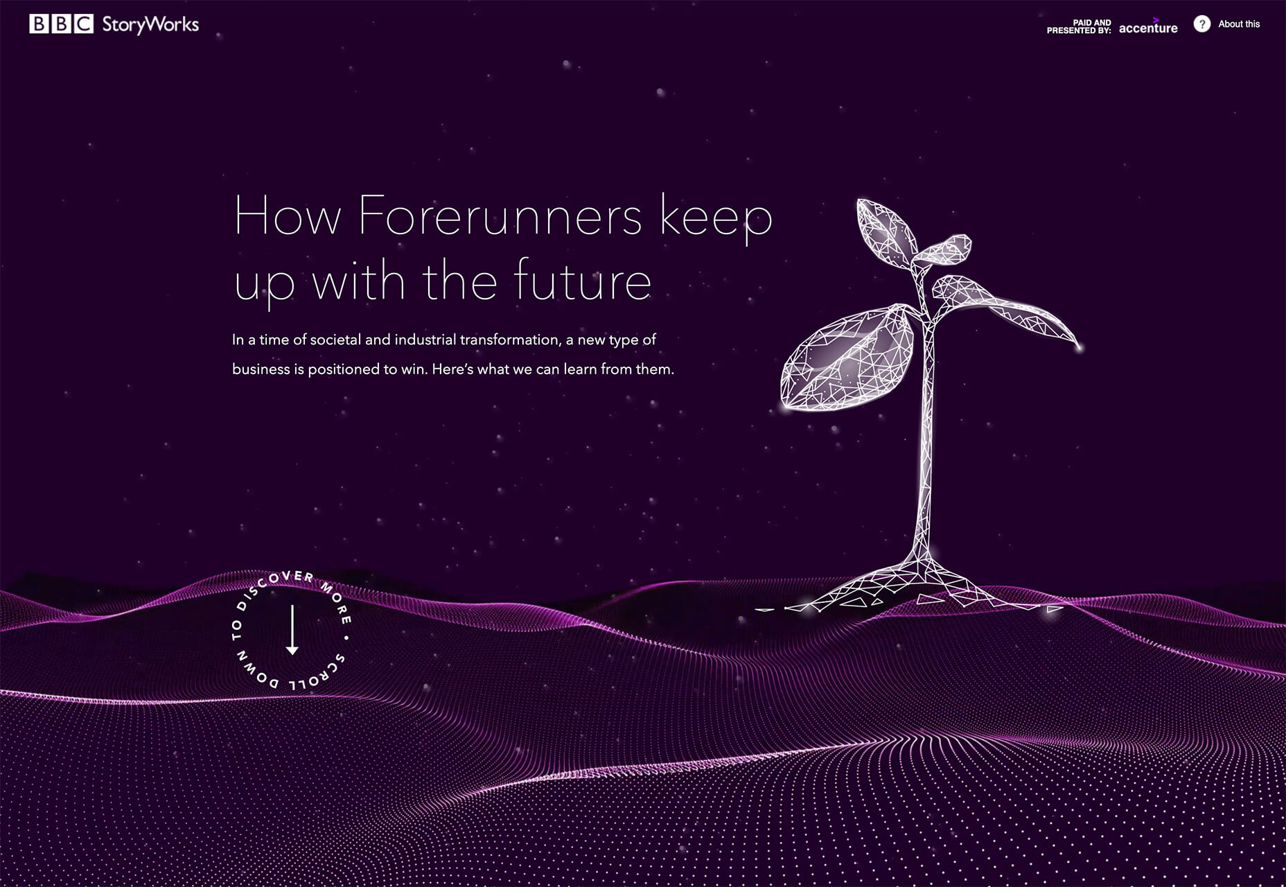
BBC Storyworks: The deep purple color palette with pinkish highlights is bright and readable, despite the dark background. White text and elements with smooth animation bring out the regality of the color choice. The challenge with this color is that purple often has strong emotional associations for individuals (good and bad), and you don’t know what “baggage” users might bring to the design.
Yellow Pony: This design is incredibly bright and has some brutalist undertones. What makes this color choice work is that it stops you in your tracks. You can’t help but look at the bright yellow and oddly-colored pony. The challenge, like with Wookmama, is contrast. There’s also a lot going on here with the bright color.
2. Fairly Brutal Black and White
Brutalism and brutalist design themes seem to keep ebbing and flowing. Understandably, it seems like, as a whole, designers can’t quite decide how they feel about this overall visual theme.
This trio of fairly brutal designs shares more than starkness in technique. They also feature distinct black and white color schemes and animation.
Put it all together, and the overall theme is maybe more “fairly brutal” than straight brutalist, re-emphasizing the hesitancy with the trend.
What’s nice about each of these designs is that they feel special and content-focused. This is a little in contrast with some other brutalist designs that are so stark and harsh that it can be hard to figure out what you are supposed to do with the website or what information is most important.
The other interesting thing here is that while all three websites have a similar design theme, they are nothing alike. (Personally, I find this type of brutalism and the included animation a lot easier to understand and digest. It uses the harsh feeling that you want to associate with the style but adds an element of comprehension that’s incredibly valuable.)
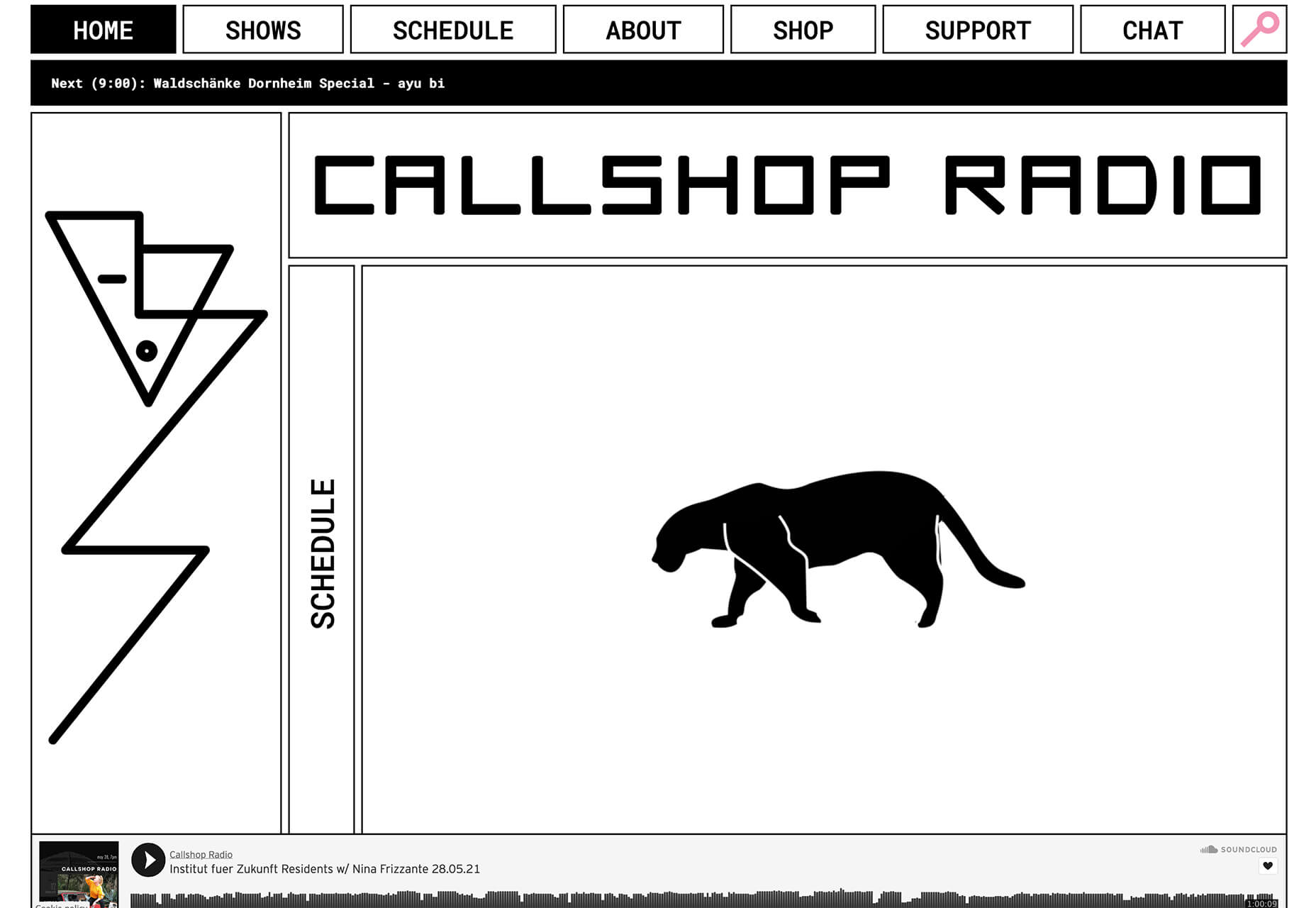
Callshop Radio uses an almost magazine theme style, block design with big buttons, a simple animation, and flash of color.
BCKDRP features a more subtle richer, almost black background with blocky type and accented color without the harshness often associated with brutal styles.
Vision Get Wild may be the closest to true brutalism, but the animated element in the center of the screen has a simple softness that lightens the entire feel.
3. Futuristic Faces
The final trending design element this month is a fun take on faces. There’s a movement happening with a futuristic or artificial intelligence/cyborg-inspired look to the people featured in the designs.
It’s hard to say where this design inspiration is coming from, but it is fun to look at with so many ways to play the style. The other commonality seems to be the dominant use of female faces.
These computer-generated images start with photos that are brightened and smoothed so that all imperfections are lost. The faces have no lines, color that might not look 100% natural, and enhanced features that may or may not be realistic.
You aren’t quite sure if you are looking at a face from a video game or image in many instances.
The types of websites that are using this design trend are similar in content and fashion, art, gaming, portfolios, and AI themes, among the most popular.
The true common thread is imagination. This type of design element can’t come to fruition without a strong vision and the ability to see the vision through creation.
These examples use progressively more futuristic variations of the trend:
HueLe Museum: The least AI-looking of the examples, has imagery with super bright light on faces to remove lines and imperfections so that the models almost the look of mannequins.
Jenny Lin: The portfolio design shows the designer in a style representing her work with a headshot that features an augmented reality, or digital design feel with an almost plastic-looking, on-the-verge of cartoon style.
Ruby9100m: The imagery here is full-on futuristic. From coloring to facial features to an almost Frankenstein-pieced-together look, nothing about this image insists on reality. (Did you notice the blue hand?)
Conclusion
This month’s design trends are a lesson in experimentation and evolution of other visual concepts. They also create an immediate impact on you in terms of emotion because of strong design choices.
Trends like these tend to come and go quickly; nevertheless, it will be interesting to see how they evolve.
Have you ever wondered why we’re so amazed by motion? A moving image is more likely to grab your attention than a static one. Motion is exciting and attention-grabbing – plus, it allows us to access more information in a short space of time.
For a while now, companies have been experimenting with all kinds of motion and animation in their design choices. We’ve seen the rise of animated website backgrounds or live-playing videos instead of images on a home page. There are videos and 360-degree pictures on product pages to help people get a better view of certain items and immersive AR experiences on apps.
So why has the power of motion not made its way into the logo design landscape yet?
Sure, there are a few examples of animated logos out there, but they haven’t had the same long-lasting impact as animated websites. Perhaps that’s because people don’t have the right tools to bring their animated logos to life?
Today, we’re going to cover some top tips for live logo design.
1. Understand What “Live Logo” Means
An animated logo or live logo can be a powerful tool in a company’s branding strategy. Although there’s more to a company’s identity than its logo, it’s fair to say that logos make a huge difference to how we feel about brands and their identity.
A powerful logo can make an emotional connection with your target audience and help your brand to thrive in virtually any environment. Live logos, or animated logos, bring more attention to the brand image, by helping a customer to focus on the logo’s action. A live logo might tell a story about what the business does through motion, or just be eye-catching.
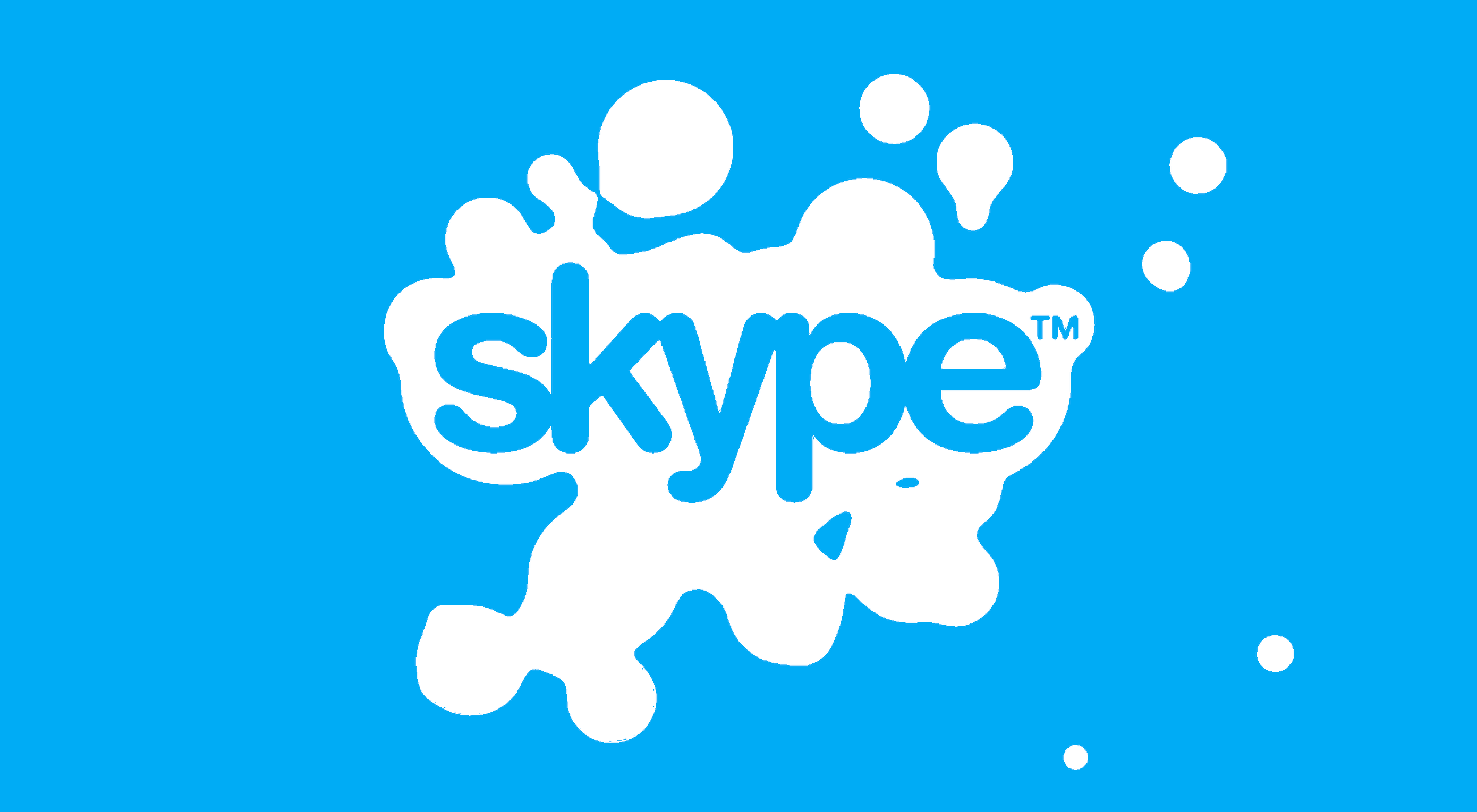
The level of animation varies depending on the designer, but it can go all the way from a short video presentation to a few simple moves. The Skype logo is an excellent example of something simple, that multiple designers have played with to great effect.
Today, there are plenty of open-access tools helping to create more immersive animated graphics in the logo design world. Additionally, the types of animation available are becoming more impressive all the time.
2. Explore the Types of Logo Animation
The next stage of properly leveraged live logos, is knowing what kinds of logo animation are available. There are plenty of different styles of animation to explore today, depending on the kind of impact you want to have.
For instance, sometimes the animation you choose will be connected to your business. A vehicle company might have a logo that seems to “drive” into the central space on the screen. An electricity company might choose a logo that pulses like an electric charge. This animated FedEx logo is an excellent example of how animation can show what a business does.
Options for animation might include:
Rotation: Make an emblem stand out by moving it to the sides or allowing it to move on its axis. Rotation gives a logo a sense of 3D space.
Appearance/Disappearance: You can make a logo grow on the screen by bringing to life one pixel at a time, or have it dissolve and disappear in a similar way.
Transformation: Your logo doesn’t have to start out in the shape it’s going to achieve. You might start with a seed that gradually grows into a tree-shaped logo for a gardening company, for example.
Replacement: Another great way to tell a story is to replace a graphic related to the company in question with the logo through an immersive animated experience.
3. Set Goals for the Live Logo
If you’re not sure what kind of animations to experiment with, then it’s a good idea to start with some solid goals. Your goals will give you a direction to move in with your logo choices. An animated logo can be a dynamic and modern way to present a brand to an audience, but it’s only going to be effective when implemented carefully.
Let’s look at some of the goals you can choose for your live logo:
Differentiation: While it’s true that animation and live content is gaining more attention lately, it’s still relatively new as an overall concept. With an animated logo, you could help a brand to create a more unique image for themselves, which sets them apart from the other organisations in the same space.
Storytelling: As mentioned above, animated logos can tell a story about what the company or product actually does. In this example for Firefox, for instance, the logo mimics a loading wheel to demonstrate a speedy internet browser.
Brand awareness: Dynamic logos and animations are more likely to capture your audience’s attention than static images. They’re also more of a novel experience, which means that customers might want to share them with other people too.
Memorability: Today’s customers are bombarded by hundreds, if not thousands of logos all the time. They need something special to convince them that one image deserves a spot at the front of their mind. Animation can help to make a business more memorable.
4. Do Your Research
Doing your own research is an excellent way to get some inspiration for a live logo or animation. Ideally, you’ll want to focus on the industry you’re already working in, as this will give you some guidance as to the kind of movement that can attract the most attention from the correct audience.
Watch as intros to brand videos and check out as many live logos as you can. Check out the kind of animations that people use in their videos when they’re showcasing products online. You can learn a lot about what works just by evaluating what other people have done before. Just be careful not to simply copy what you’ve found elsewhere.
The aim of your live animation should be to tell a unique story about the company
The aim of your live animation should be to tell a unique story about the company in question. If you’re not sure how to start with differentiating the image, check out the brand guidelines for the company in question. The guidelines that the company used to choose the right brand colors, fonts, and other visual assets can work just as well for your animation strategy.
Remember, the aim here is to tell a specific story, send a message, or evoke a certain emotion. Don’t make the mistake of designing something that looks cool but doesn’t have much of a purchase. Most human beings will naturally look for the meaning behind the content that they see. If there isn’t anything there, it’ll just lead to confusion.
5. Use Live Logos on Brand Websites
The most obvious way to begin experimenting with animated logos in web design, is to implement live logos into a client’s website. Some companies have a “welcome screen” for their site which uses an animation to introduce visitors to the home page and other navigation options. There are also brands out there who love the impact that animation can have but want to use it more subtly.
In these cases, live logos can be an excellent way to draw the eye to a specific spot on a website, perhaps the area just above the “contact” button that encourages a client to reach out. Crucially, to avoid weighing down the website and distracting visitors, companies and designers will need to make some important choices.
Although it might be tempting to keep the animation looping at all times, just in case someone misses the first round, this requires a lot of extra processing power. Too much animation also makes it harder for businesses to push the focus of their visitors to other points on the website, like landing pages for products, or testimonial pages.
Often, as with most innovative decisions in web-design, the best bet is usually to start small and work your way up. Don’t over-do it with animation on day one. See how the visitors to the website respond first.
6. Find the Right Balance
Animations in a live logo are there to grab attention quickly, and effectively. They shouldn’t go on for too long, or you risk overwhelming your audience before they have a chance to browse the rest of the website or check out other content. A live logo should only be active for a few seconds at most, and in that time, it needs to say something valuable.
Often, the best strategy is to start by building up curiosity, and getting your viewer engaged so that they’re keen to see more. Every frame will count to pull the customer in and make them feel connected to the brand in question.
Make sure that the logo animation is dynamic so that it doesn’t just capture the attention of the viewer but maintain their interest for the full time required. During the motion, the viewer’s brain should be working to figure out what’s going to happen next.
Just like most logo design and graphic animation strategies, the key to success is finding the right balance between clever experiences, and simplicity. You want to do something meaningful that earns your viewer’s attention, but you need to compete with the fact that attention spans are plummeting all the time.
7. Explore Logo Animation in Video
One of the best ways to use logo animation, is to draw interest for a company at the beginning of a video. Video is gaining incredible levels of popularity lately, particularly in a world where you can view video content almost anywhere. Companies are adding videos to their product pages, social media accounts, applications, websites, and so much more .
For the majority of companies, a live logo at the start of a video can help their brand to seem more professional. It’s a reminder to viewers of the brand that they’re learning about with that video content. Plus, a logo at the beginning of a piece of video content can also build on the consistency that companies attempt to create by using the same brand assets in various mediums online.
(Starting a video with an animated logo is great for presentation, but it can also be frustrating to customers in certain pieces of content where they’re looking for quick answers to questions. If an animated logo is more than a couple of seconds long, it may be better placed at the back of a video instead.)
With videos for news reports or announcements where you want to get straight to the point and generate excitement about a new product or service, it can be better to jump straight into action. Ending a video with a live logo keeps the brand image front of mind for the customer for longer, even after the message has ended. On the other hand, ending a video with a logo could increase the chances that customers miss the animation, because they click away from the content too quickly.
If you’re new to adding live logos into videos, consider experimenting with different strategies to see which works best. Different companies might get unique results.
8. Bring Logo Animation to the Real World
Another interesting option for live logo design, could be to step outside of the computer screen for a while. In today’s digitally transforming landscape, it’s becoming more common to see the real and digital worlds converging. Most events and trade-shows come with presentations that rely on digital content, like animated presentations and slide shows.
Depending on the signage solutions available at industry events, companies could even use an animated logo above their booth to draw attention in a cluttered environment. Around 48% of exhibitors agree that a more eye-catching stand or booth is often the most effective way to attract visitors and customers at an event.
Animation and live logos may have started life on the computer screen, but they can appear in much more diverse environments today. Offices could use a live logo in the reception room or lobby to make their on-premises environment more appealing. Retail locations could display ads on digital signage, followed by live logos that work to both separate messages, and keep shoppers entertained when they’re enjoying the bricks-and-mortar experience.
9. Include Live Logos in Brand Signatures
Remember, a live logo doesn’t just have to sit on a company’s app or website until someone discovers it. Sometimes, the right logo can also be a powerful way to “sign off” on a message from a brand or its management team. For instance, email remains to be one of the most valuable tools for business marketing and customer relationship building today.
It’s the third most influential source of content and news for a lot of B2B audiences, and yet, most companies aren’t taking full advantage of what their email marketing software solutions are capable of. If you can display gifs and animated videos in an email (which most software solutions can), then you can also add a live logo to the brand signature.
The important thing to remember is that if you’re going to be adding a signature to a lightweight thing, like an email, it needs to be lightweight too. Don’t make the live logo too long and complicated, or it might prevent the email from loading properly.
Outside of email, don’t forget to consider options for live logos in things like social media profile pictures too. According to experts, around 80% of companies use visual assets in their social media marketing. A live logo is a great way to go beyond the basics with a company’s imagery. Motion grabs attention, and video content is quickly gaining steam on a lot of social media platforms.
Embracing a New World of Live Animation
Designers are only just beginning to scratch the surface of what’s possible with animated logos. For many companies, live logos are an excellent way to capture audience attention and encourage engagement with a brand.
A live logo at the beginning of a video, at the start of an app loading screen, or even at the top of a website can differentiate a company and make them stand out. As technology continues to evolve, and customer expectations continue to expand, the options for live animation could continue to grow. You might even be able to infuse live logos with elements of VR and AR, to impart brand essence in a brand-new digital world.
If you haven’t begun experimenting with live logo design yet, now could be the time to start.
https://ankaa-pmo.com/wp-content/uploads/2021/04/9-tips-for-better-live-logo-design.png15292780Service comm.https://ankaa-pmo.com/wp-content/uploads/2017/04/Logo-Ankaa-engineering.pngService comm.2021-04-14 16:45:092021-04-14 16:45:099 Tips for Better Live Logo Design
L’upskilling des effectifs est depuis longtemps une priorité pour les organisations. Aujourd’hui, alors que les dirigeants réagissent aux perturbations mondiales, avec pour beaucoup un personnel en télétravail, ils s’appuient plus que jamais sur les technologies et les systèmes de gestion de la formation (LMS).
La crise mondiale du COVID-19 et l’instabilité économique obligent de nombreuses entreprises à « faire plus avec moins » en matière de reskilling et d’upskilling. Heureusement, les technologies de formation sont suffisamment matures pour que les entreprises puissent choisir parmi une gamme de fonctionnalités adaptées à leurs besoins et à leur budget.
Lorsque Discovery, compagnie d’assurance multinationale est passée au travail à distance, les RH ont identifié qu’environ 500 de ses collaborateurs n’étaient pas productifs. Plutôt que de chercher des solutions de court terme pour améliorer la productivité, la compagnie s’est focalisée sur la préparation du personnel aux métiers de l’avenir, par le reskilling. La priorité de l’entreprise reste ses salariés – et cela inclut de les équiper pour demain.
En période de croissance comme de crise les dirigeants s’efforcent de trouver les meilleures solutions pour leurs collaborateurs. Par exemple, les hôpitaux, les instituts de recherche et les organismes de santé répondent aux besoins du personnel de première ligne en créant des technologies de formation et des ressources éducatives visant à prévenir et limiter l’exposition au COVID-19.
Bien que les dernières avancées changent la donne pour les LMS, tous les investissements technologiques ne conviennent pas nécessairement à toutes les entreprises. Voici les éléments que les entreprises peuvent considérer lorsqu’elles investissent dans une nouvelle solution.
1. Des fonctionnalités liées à vos objectifs
Lorsqu’on choisit parmi toutes les options proposées par les technologies de formation, la première chose à vérifier est que les fonctionnalités répondent aux besoins, aux objectifs et à la stratégie des effectifs de l’entreprise. Pour beaucoup d’organisations, des plates-formes flexibles et ouvertes peuvent être nécessaires pour prendre en charge les nombreux éléments critiques.
Par exemple, une entreprise énergétique pourrait limiter l’accès à une zone particulière d’une installation nucléaire aux employés ayant complété une formation obligatoire et certifiante. L’entreprise aurait alors besoin d’un système de gestion de la formation (LMS) capable d’intégrer la certification des employés à ses formations et opérations sensibles.
De même, une entreprise pharmaceutique pourrait avoir besoin de valider l’apprentissage pour se conformer aux réglementations nationales sur les médicaments. Une solution qui offre de l’innovation au niveau de l’écosystème, y compris des applications partenaires, peut fournir des fonctionnalités supplémentaires et flexibles tout au long du cycle de vie des collaborateurs (y compris lors du recrutement, de l’onboarding, du développement et de la gestion de la succession). Si certaines grandes entreprises peuvent avoir besoin de solutions ouvertes qui prennent en charge divers cas d’utilisation, d’autres peuvent vouloir une solution adaptée à un secteur spécifique, comme l’éducation ou la santé. Quoi qu’il en soit, les entreprises devrait prendre le temps de rechercher la technologie pouvant soutenir au mieux leurs objectifs.
2. Flexibilité
De nombreuses entreprises ayant des sites multiples ou un important personnel auront besoin d’un LMS orienté entreprise si elles s’engagent dans le reskilling de centaines voire de centaines de milliers d’employés.
Avec la généralisation du télétravail, les PME/ETI peuvent également avoir besoin d’un LMS qui puisse être étendu au domicile de leurs employés de manière sûre et efficace. Les technologies d’apprentissage mobiles accessibles en déplacement, y compris sur smartphones, pourraient améliorer l’adoption par les télétravailleurs et les employés qui manquent de temps de formation dédié, comme les commerciaux terrain.
Si les outils qui intègrent des formations en réalité virtuelle (VR) ou en réalité augmentée (AR) ne sont peut-être pas adaptés à toutes les situations, ils peuvent être utiles pour préparer les collaborateurs à des situations d’urgence ou à des scénarios uniques. Ces technologies émergentes sont un excellent exemple de la manière dont les outils de formation modernes peuvent aider les entreprises à relever de nouveaux défis et aider les collaborateurs à se perfectionner et se requalifier.
Walmart, par exemple, a formé plus d’un million d’employés en 2019 à la réalité virtuelle afin de proposer un apprentissage immersif. L’entreprise a également envoyé des casques VR dans les magasins pour entraîner les employés à la mise en place d’une machine qui récupère les commandes passées en ligne. Se libérant ainsi de la nécessité d’envoyer plusieurs personnes pour l’assembler, l’entretenir et dispenser une formation.
Qu’ils travaillent dans le retail, sur des plateformes pétrolières ou dans des exploitations agricoles, de nombreux employés pourraient atteindre de nouveaux niveaux de productivité et d’engagement grâce à des solutions personnalisables et flexibles.
3. Collaboration entre les employés – et les employeurs
Dans de nombreux cas, permettre aux collaborateurs de piloter leur apprentissage peut améliorer l’adoption des programmes, l’engagement et la culture de l’apprentissage. De nombreux employés réagiront positivement à l’upskilling itératif. Lequel leur apporte un sentiment d’appartenance et de fierté. Cet upskilling itératif peut par exemple prendre la forme de vidéos produites par les collaborateurs et partagées avec leurs collègues.
L’apprentissage social peut apporter des avantages à un personnel en télétravail. En atténuant l’isolement, l’anxiété et le manque de motivation auxquels les équipes peuvent être confrontées. Les social boards, chats et « missions » gamifiées sont quelques-unes des caractéristiques des LMS qui peuvent améliorer la collaboration tout en maintenant la distanciation physique. Les managers peuvent également utiliser ces fonctionnalités pour cibler les compétences qui correspondent aux nouvelles priorités et encourager les équipes à atteindre leurs objectifs.
4. La gestion du changement en support
Intégrer un programme d’upskilling dans toute l’entreprise est une initiative majeure qui relève de la gestion du changement. L’alignement des valeurs, des personnes et de la culture d’entreprise pour atteindre un résultat souhaité ne viendra pas uniquement de l’adoption d’une nouvelle technologie. La gestion du changement occupe une place essentielle dans les discussions relatives à l’expérience de formation. Et ce pour au moins trois raisons.
Premièrement, s’assurer que la technologie est adaptée à l’organisation et au personnel permet d’augmenter son taux d’adoption et d’en tirer meilleur parti.
Deuxièmement, une gestion du changement réactive et basée sur les données permet de prolonger la durée de vie de la technologie.
Troisièmement, l’intégration d’une technologie de formation dans une organisation requiert une gouvernance. Elle nécessite notamment d’affecter la responsabilité sur les rôles et les données segmentées que vous pouvez collecter. De nombreux experts du reskilling vous diront que la gouvernance est toute aussi importante, si ce n’est plus, que la technologie de formation elle-même.
Les RH ne sont pas les seuls à investir dans ces solutions. La majorité des utilisateurs sont rattachés à la sécurité, conformité et formation à la vente. Alors que les budgets restent serrés et que des tensions peuvent surgir entre les services pour savoir qui doit avoir le contrôle des priorités en matière de reskilling et d’upskilling, les fonctionnalités des LMS devraient fournir un vrai retour sur investissement (ROI). Les bénéfices peuvent inclure le gain de temps lié à la recherche et au partage d’informations ; ou l’augmentation des revenus (ou réduction des coûts) résultant de la normalisation des technologies et du soutien à la formation. Par exemple, une étude indépendante sur SAP Jam, réalisée par Forrester Consulting, a révélé que le ROI moyen a augmenté de 18,5 % entre 2016 et 2018, les clients ayant trouvé davantage de façons d’utiliser la plateforme de collaboration.
Pour soutenir la gestion du changement qui accompagne l’introduction d’une nouvelle technologie, les entreprises doivent chercher des solutions qui offrent la possibilité de bêta-tester, d’itérer et d’adapter cette technologie aux besoins des collaborateurs. Les logiciels d’entreprise doivent offrir un support client aux dirigeants et aux employés pour une expérience d’apprentissage sans faille.
« De nombreux experts du reskilling vous diront que la gouvernance est toute aussi importante, si ce n’est plus, que la technologie de formation elle-même »
5. Méfiez-vous des mots à la mode et restez concentré sur vos collaborateurs
Les LMS d’aujourd’hui peuvent utiliser des technologies de pointe comme l’intelligence artificielle (IA) et le machine learning pour fournir tout ce qui est nécessaire, du coaching aux plans de développement des collaborateurs. Et ce à une échelle jamais atteinte auparavant. Mais alors que les dirigeants évaluent les options de LMS qui offrent ces nouvelles technologies et ces mots à la mode, il est important qu’ils restent d’abord engagés dans une stratégie des effectifs axée sur les objectifs de l’entreprise.
Si des fonctions comme la gamification et l’apprentissage social peuvent avoir un impact majeur pour certaines organisations, elles peuvent manquer de pertinence pour d’autres. Pour de nombreuses organisations, l’apprentissage classique en salle avec un formateur pourrait encore avoir toute sa place à l’avenir. L’écoute continue des collaborateurs fournira des informations utiles pour répondre à leurs besoins et concevoir une expérience d’apprentissage efficace.
De nombreux experts de l’upskilling conviendront que la formation et l’upskilling est un défi pour les employés et les employeurs. Alors que les entreprises investissent massivement dans les nouvelles technologies, l’objectif premier est d’investir efficacement dans le personnel.
La stratégie à long terme d’une entreprise en matière d’effectifs ne se limite pas au système de gestion de la formation (LMS) qu’elle a choisi. La gestion de l’expérience de formation inclut les nouvelles compétences et connaissances que les personnes vont acquérir ainsi qu’une méthode de travail efficace et agile. Un excellent programme d’upskilling aidera les collaborateurs à pivoter vers les nouveaux rôles qu’ils devront occuper demain et à soutenir l’innovation de rupture dans toute l’entreprise.
https://ankaa-pmo.com/wp-content/uploads/2017/04/Logo-Ankaa-engineering.png00Service comm.https://ankaa-pmo.com/wp-content/uploads/2017/04/Logo-Ankaa-engineering.pngService comm.2021-02-11 09:29:582021-02-11 09:29:58Comment les technologies de formation et les LMS supportent l’upskilling
Ecommerce design may seem fairly straight-forward; you build an online store that showcases a company’s products or services and gives customers a quick and pain-free way to purchase them.
While that formula will always hold true, ecommerce is undergoing some big changes, and web designers need to be prepared to keep up with them. This monthly ecommerce trends roundup will explore these new and evolving design, sales, and marketing trends.
1. Calmer Color Palettes
Although we’re not likely to see this trend go near the sites for big box stores, it’s something smaller ecommerce companies are adopting. And with good reason.
As consumers become wary about how much money they’re spending, they don’t need to feel pressured or rushed into a purchase. And ecommerce sites that employ calmer color palettes — like pastels and earth tones — will do a better job of putting their customers at ease.
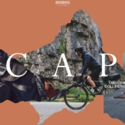
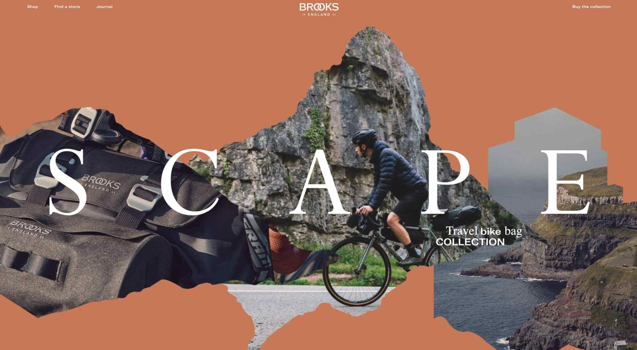
Bicycle saddle manufacture Brooks England shows how this trend plays out in ecommerce design:
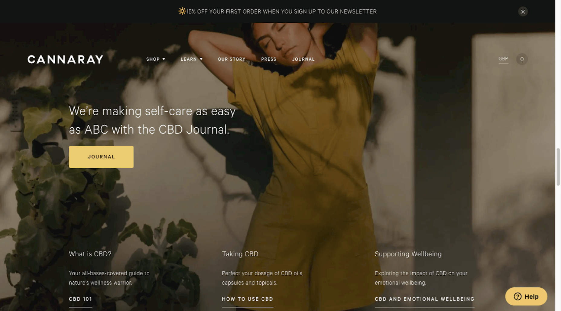
It’s not just outdoors or sporting goods companies that can use more natural-looking colors, either. CBD product vendor Cannaray is another company that uses a more subdued color palette:
Really, any store that wants to do a better job creating satisfying experiences for customers and gaining their long-time loyalty should consider toning things down with color.
2. No-rush Shipping Rewards
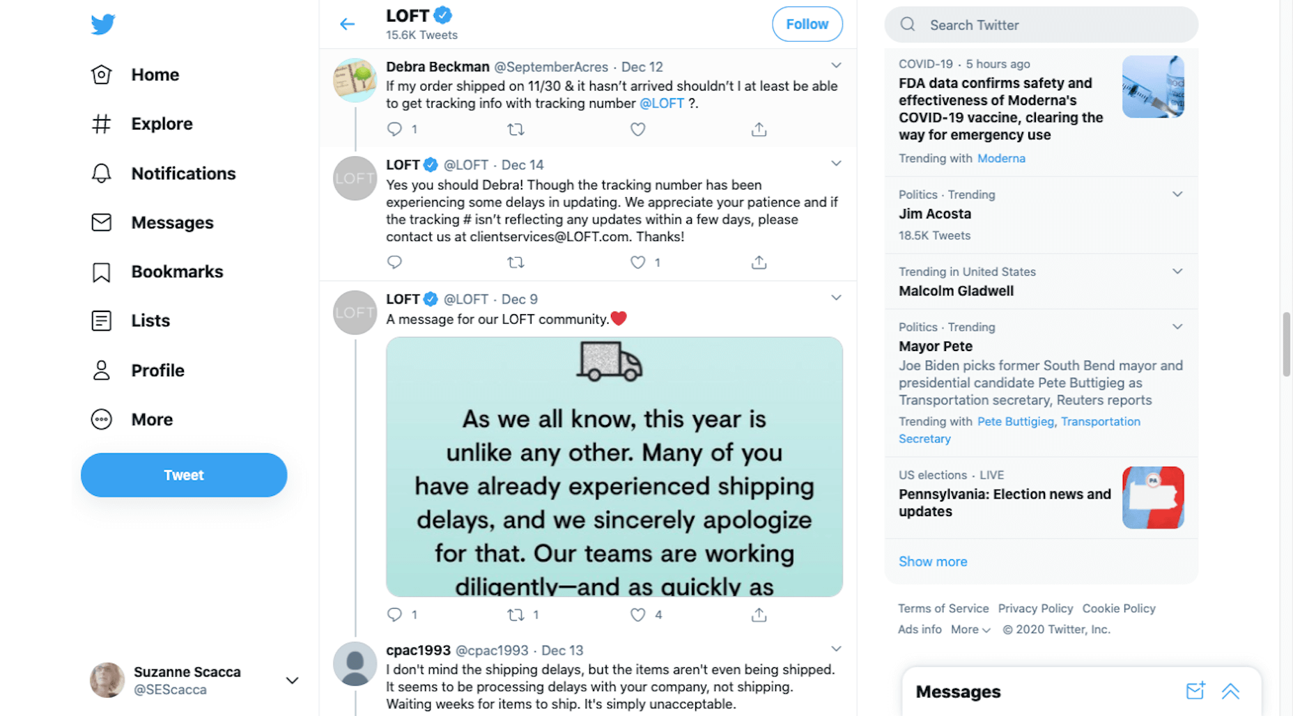
For years, we’ve seen consumers go crazy for brands that offer free and fast shipping. But thanks to the surge in online shopping in 2020, ecommerce companies, their shipping partners, and delivery service providers just haven’t been able to keep up with the pace.
When customers are unhappy with slow deliveries, they’re going to go to social media and review sites to bombard brands with complaints, as has been happening with Loft since November:
Although many ecommerce stores still don’t inform customers ahead of time about these delays, we’re starting to see a new checkout trend.
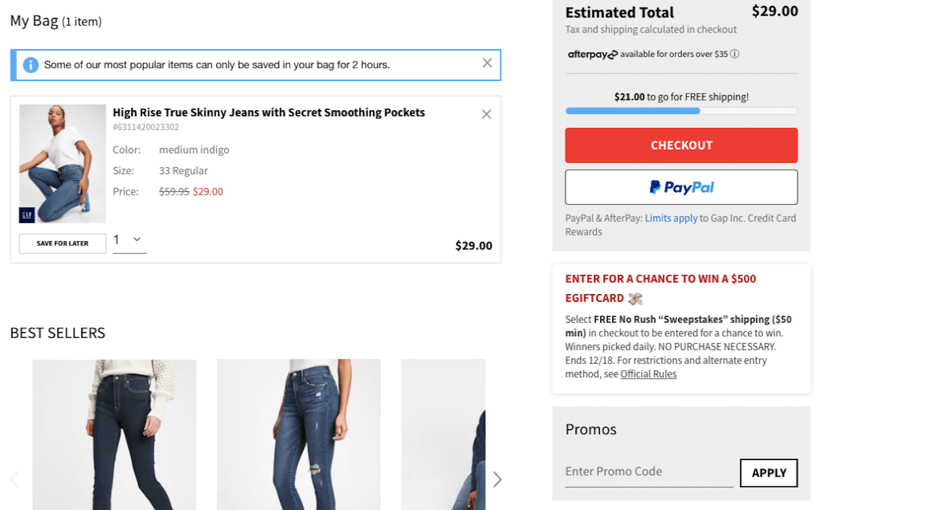
Here’s how Gap is encouraging and rewarding customers for choosing no-rush shipping:
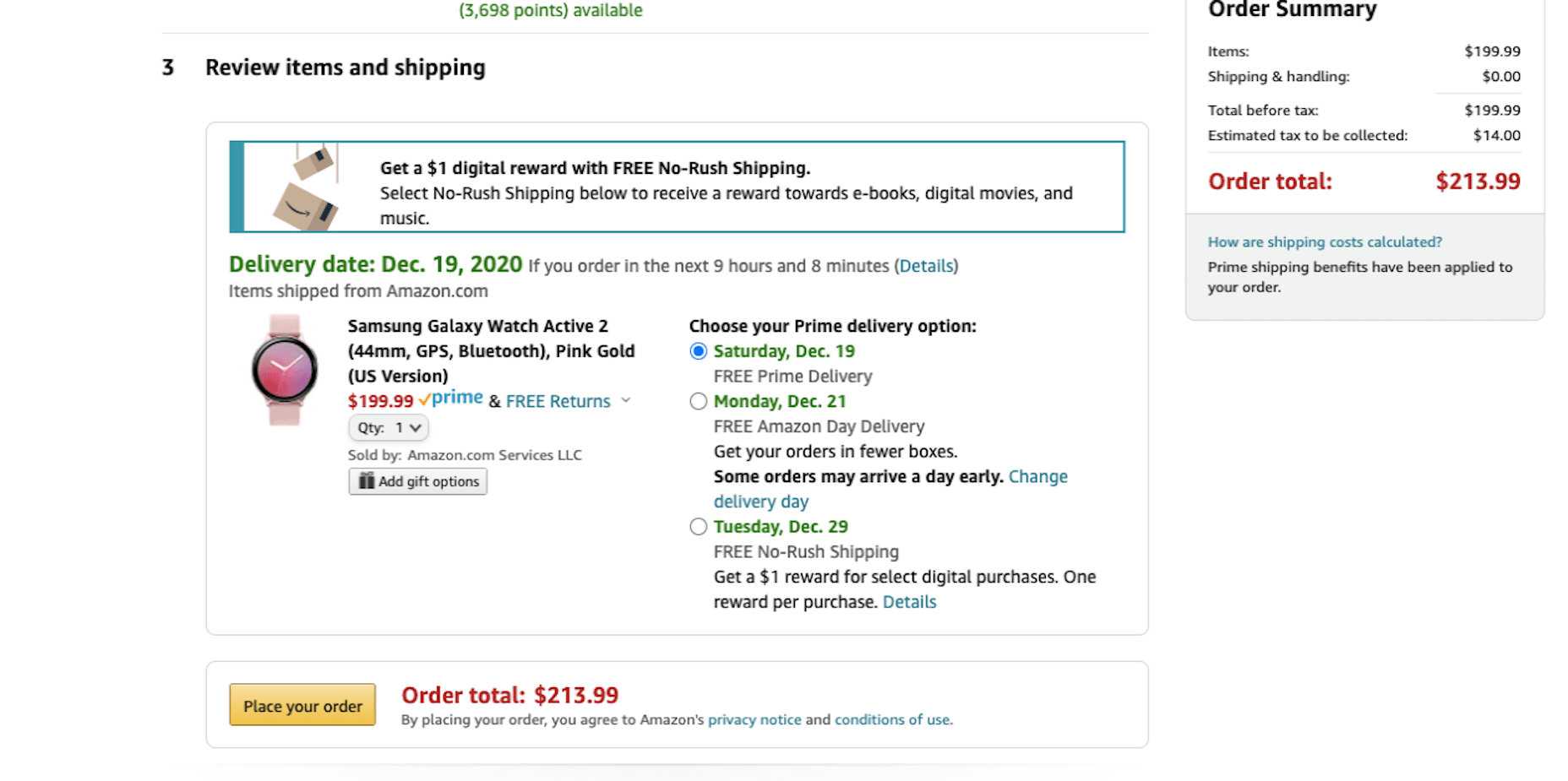
Amazon is another ecommerce site that encourages no-rush shipping at checkout with a reward:
Not only does this set better expectations for customers before they finish their purchases, but it encourages everyone to slow down a bit so that ecommerce companies and their shipping/delivery partners can keep up.
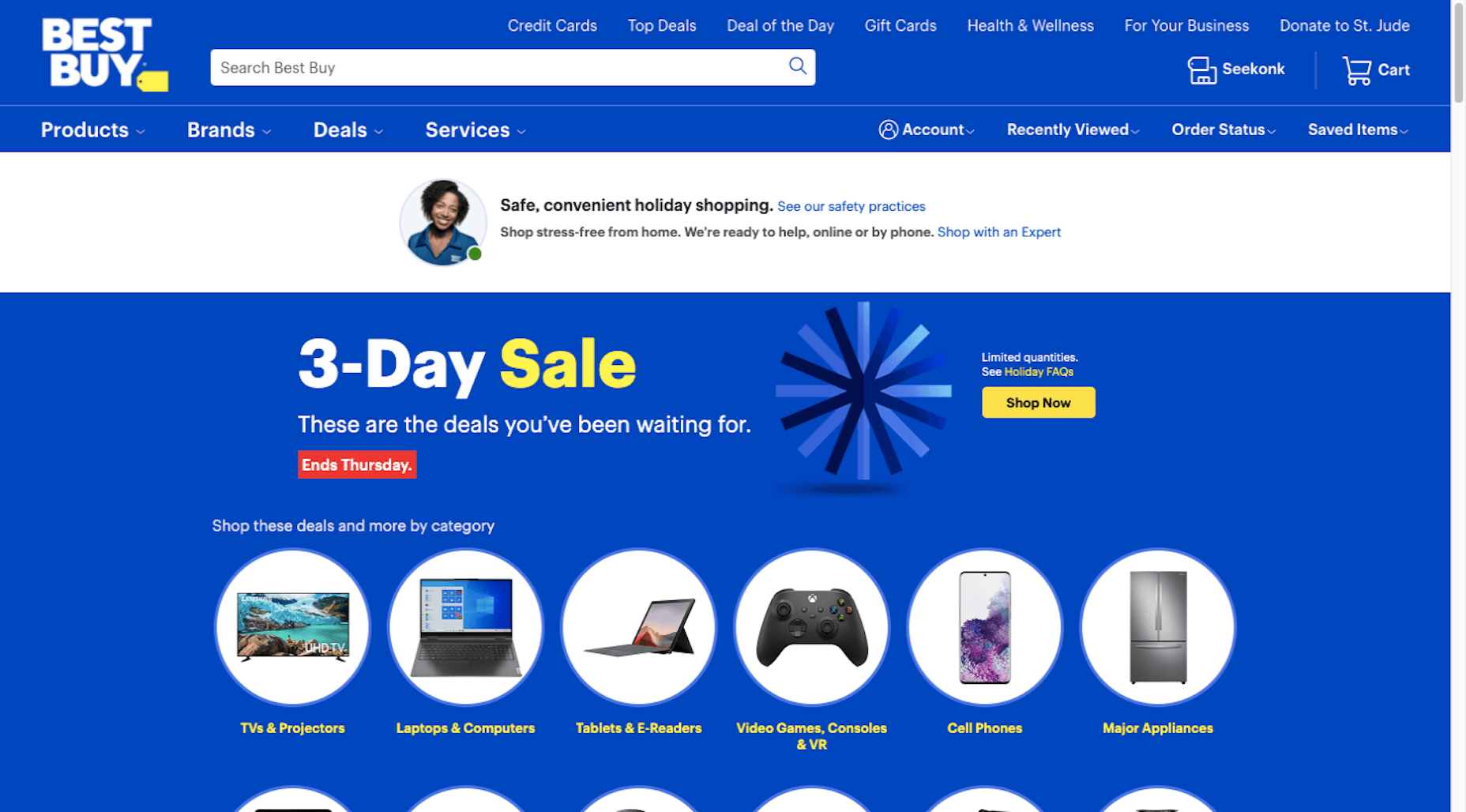
3. More Human and Empathetic Assistance
Each year, design trend roundups suggest that AI will play a greater role in web design.
While that may be true for things like the search bar or personalized recommendations, ecommerce sites are pulling back the reins on automated support and assistance.
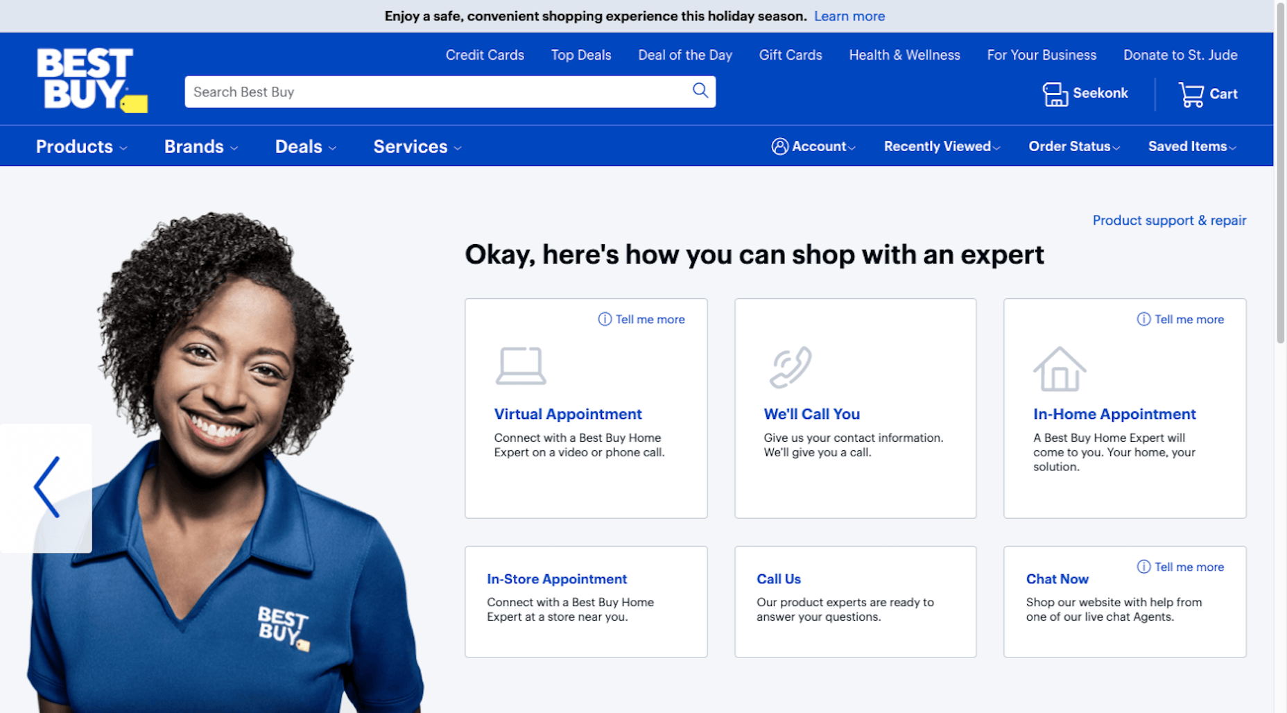
Best Buy, for instance, offers customers the option to “Shop with an Expert”:
After shoppers go through a quick survey, they’re given a variety of options — based on their own level of comfort and convenience — to work with the expert:
Something that might’ve been left in the hands of a self-service quiz or automated chatbot is being given the human touch once more.
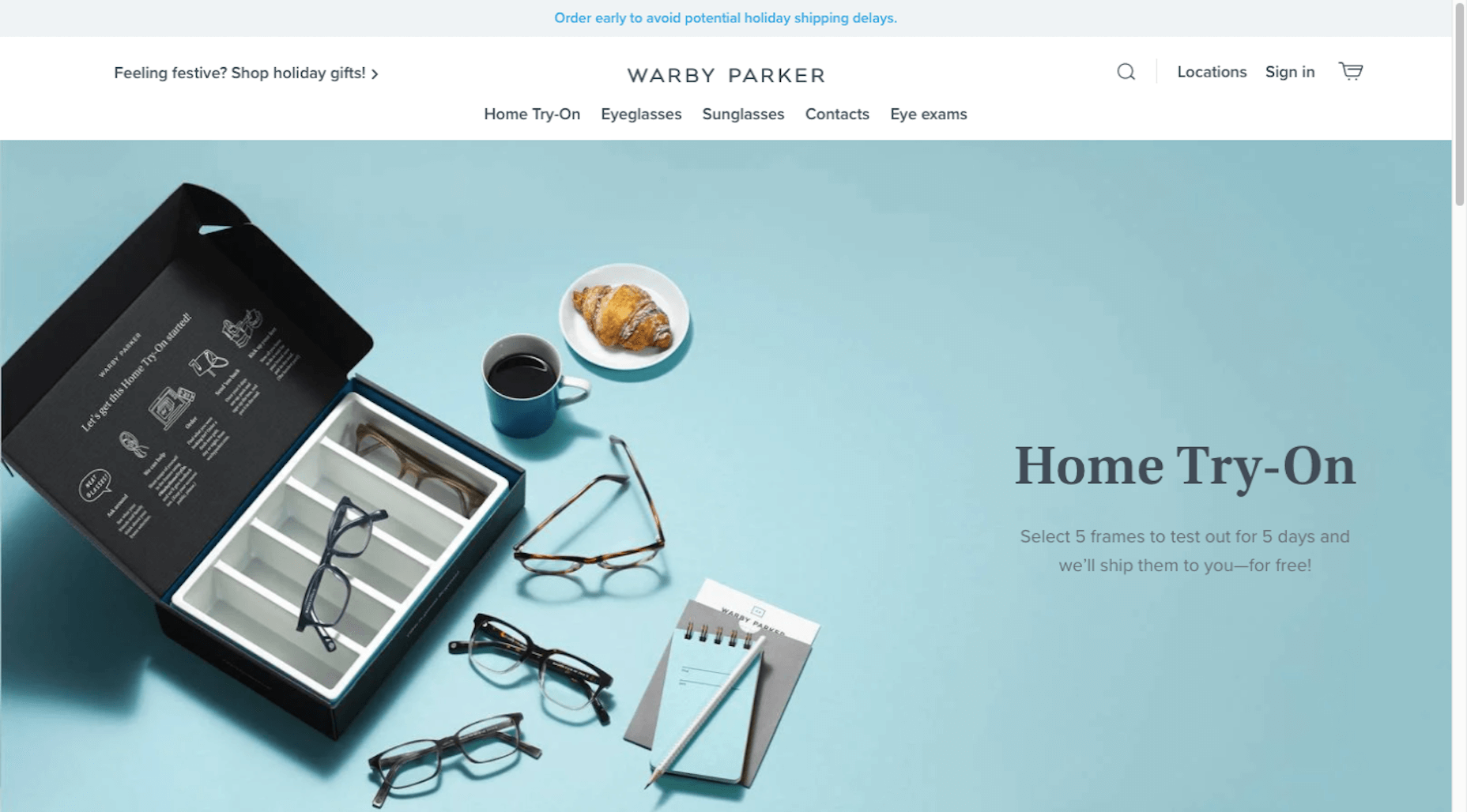
We’re seeing a similar trend with retailers like Warby Parker. While it still offers a virtual AR try-on, the main navigation actually emphasizes the home try-on option:
Again, this is another example of ecommerce companies becoming less reliant on automated support to give their customers a better and more confident shopping experience.
Wrap-Up
Ecommerce trends are always evolving. Sometimes it’s due to new technologies. Other times it has to do with what’s happening in the world around us. And sometimes it’s simply to keep up with changing consumer expectations.
Stay tuned as we explore new and emerging ecommerce trends in the coming months…
https://ankaa-pmo.com/wp-content/uploads/2021/01/whats-new-in-ecommerce-january-2021.jpg14072560Service comm.https://ankaa-pmo.com/wp-content/uploads/2017/04/Logo-Ankaa-engineering.pngService comm.2021-01-13 11:45:522021-01-13 11:45:52What’s New in Ecommerce, January 2021
Over the years, experts have repeatedly discussed the possible impact of mixed realities on web design. Concepts like AR and VR are expected to have the potential to change the way that we interact with websites on a fundamental level.
Now that we’re in the year 2021, however, discussions about AR aren’t just observational anymore. The age of mixed-reality interfaces is here, in everything from Pokémon Go, to Snapchat filters.
The question is, how do web designers create incredible user experiences in a world where there are now multiple digital realities to consider?
The Benefits of Experimenting with AR
Before we look at some of the steps that web designers can take to enhance their projects with AR, it’s worth examining the benefits of interacting with augmented reality in the first place.
While virtual reality replaces the typical world around us completely with digital components, AR augments it. This means that developers and designers need to learn how to thrive in an environment where the real world and the digital one work together.
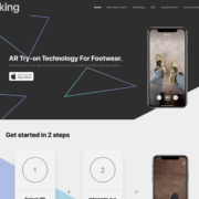
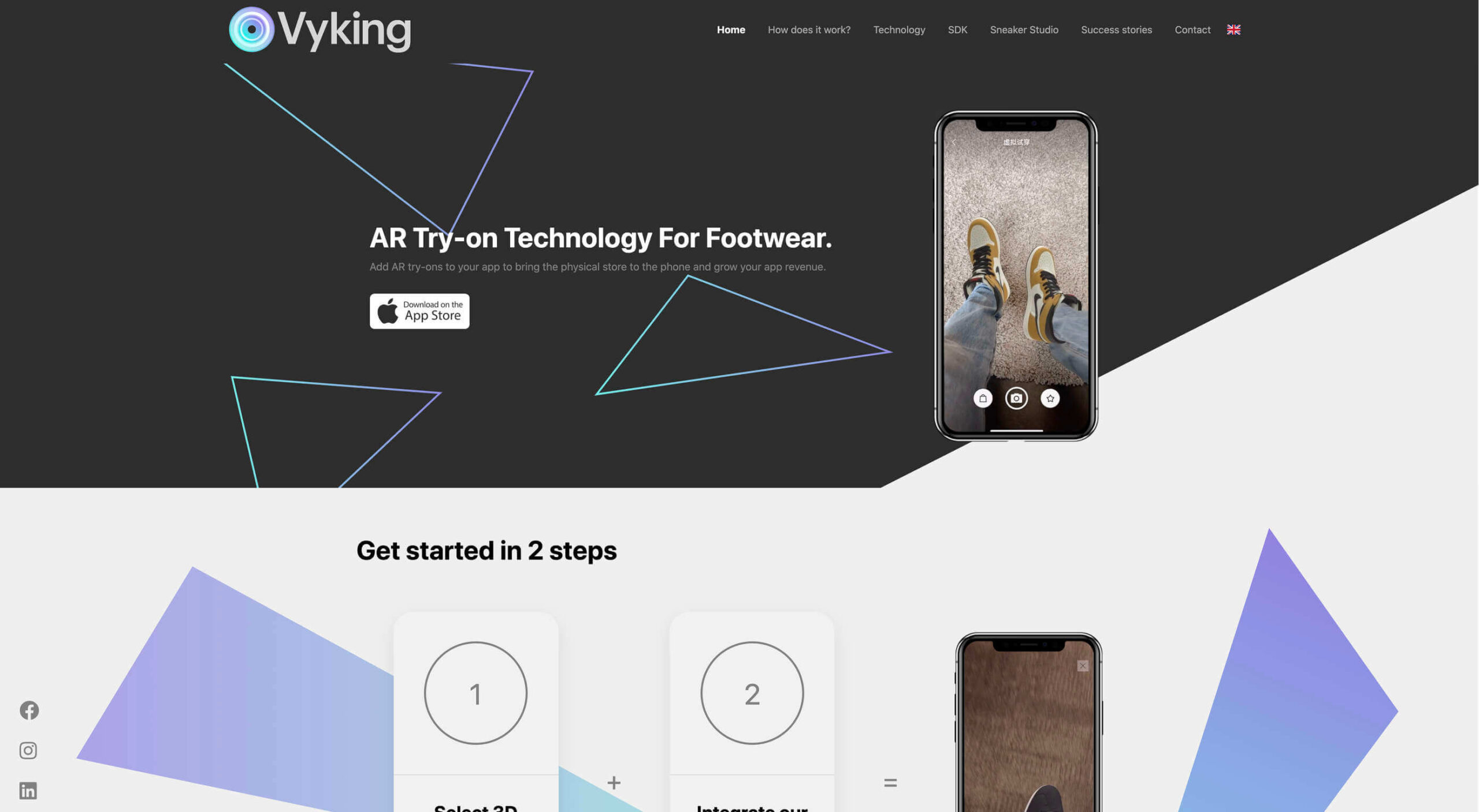
The most common AR application for website owners is to provide a solution for real-time and remote product visualization. Imagine being able to try on a pair of shoes before you buy them online. That’s a service that the Vyking brand can deliver by creating technology that “reinvents” the digital shopping experience.
This test functionality plays a massive role in purchasing decisions. In a world where people can’t see a shade of make-up in person when they’re shopping online, or check how an item of furniture looks in their home, AR has a crucial role to play.
Here’s how you can use augmented reality to deliver incredible UX.
1. Focus on Real-Time Feedback
Augmented reality is all about connecting the real world to the virtual world.
Doing this provides users a unique experience – one that’s filled with real-time feedback that can deliver crucial and insightful information. For instance, an augmented reality system in a GPS app can calculate the average time before reaching a destination based on previous trips.
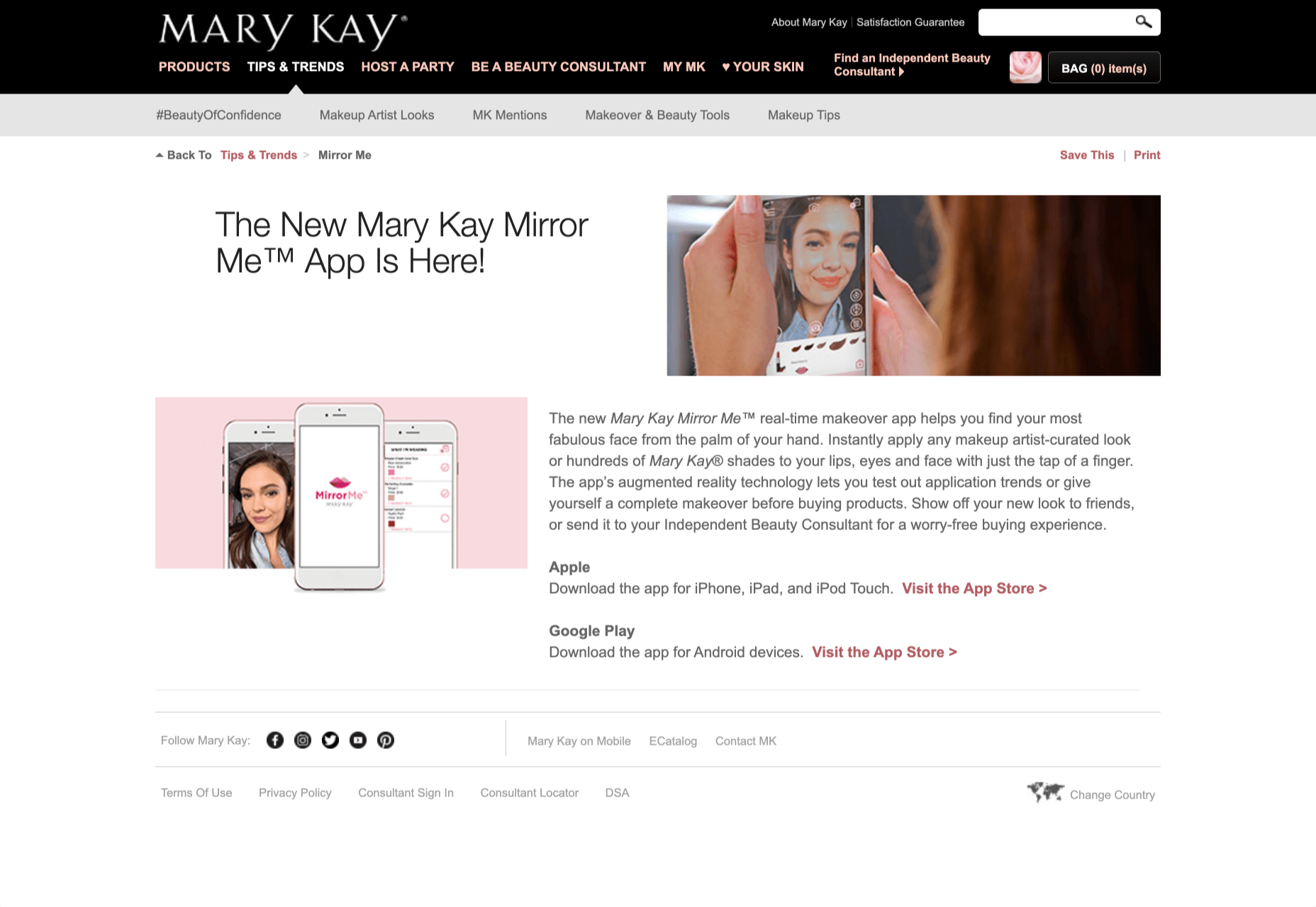
Another option is for an augmented reality to use solutions like face-mapping to help customers determine how a certain makeup product will look before they buy it. For instance, that’s the case for the Mary Kay Mirror Me app, which simplifies the process of shopping for make-up.
When designing for AR, experts need to consider how they can provide customers with real-time information that they can use to make better purchasing decisions.
2. Define input and output
Although you’ve probably performed similar exercises when designing for traditional websites and applications in the past, defining inputs and outputs of UX in AR environments can be tough.
Defining inputs and outputs allows you to determine which elements of an interface your user can actually interact with, in your interface. This gives you a better idea of what to “augment.” For instance, you might decide that physical gestures like a swipe of the hand will be essential for AR inputs. However, you’ll also need to consider how each mobile device offers different input possibilities.
Outputs are a little simpler. For instance, you could offer a three-dimensional model of a product that your customers are interested in. Once you have that output, you can think about how the customer will interact with it by changing colors or position.
3. Embrace Customer-Friendly Performance
Another feature at the heart of AR applications is interactivity.
Good designs in the augmented reality world need to be simple to access and use, otherwise customers will end up avoiding them. For instance, 60% of customers say they want to use AR when they’re shopping for furniture. However, they’re only going to use your app if it actually works.
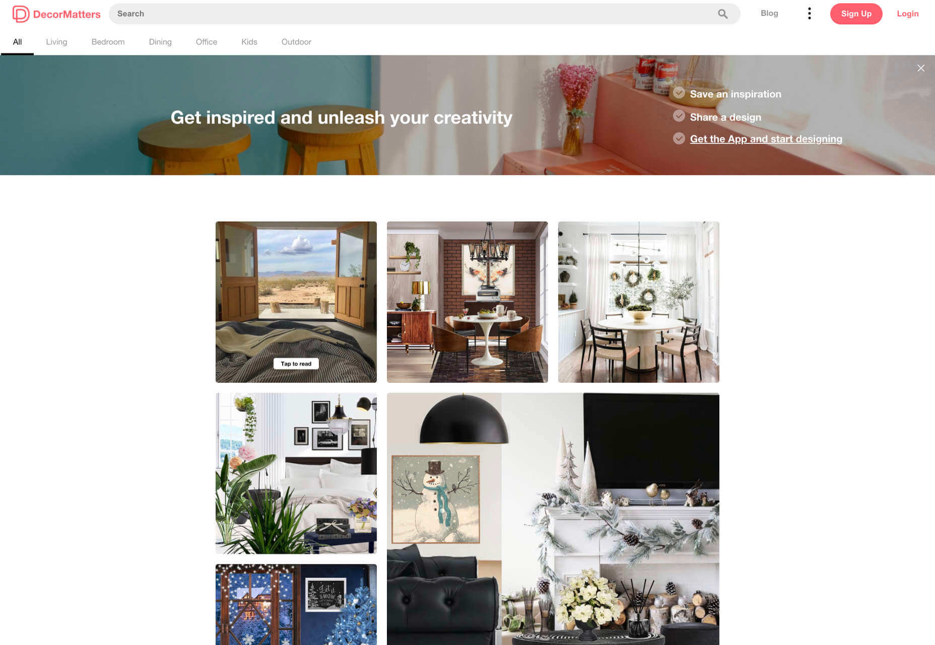
The Décor Matters website and app mix gamification with home decorating features that help customers get a better view of the home goods they’re planning on buying. The website even has inspiration pages available to help users find and try new design options with their AR technology.
When designing for AR, think about how you can make your applications or technology as simple to use as possible, so customers actually want to interact with it.
4. Address the Environment
In augmented and virtual reality applications, it’s important to remember that interfaces aren’t bound by physical screens. The viewport will move with the user, shifting perspectives in response. Most AR designers will use four different signifiers to describe AR environments:
Public environment: The entire body of the user is involved as a controller, like with the Xbox Kinect or Nintendo Wii;
Intimate environment: Where a user can be seated – often in a desktop environment;
Personal environment: AR on smartphones, mobile devices, and tablets, like Pokémon Go;
Private environments: Completely private spaces, such as with wearable technology like the Google Glass solution.
The environment that you’re designing for will be crucial for your project outcomes. Remember, spatial considerations need to be carefully considered when accounting for how users will interact with objects in a frame.
5. Remember User Fatigue
Another thing to keep in mind when designing for AR technology is that user fatigue is likely to be a much more significant consideration. After all, people interact with websites and applications in a much more intimate and in-depth way when AR is involved.
AR applications can often use the entire body of a customer as a controller. Because of this, designers need to be careful about exhausting interactions. High-effort and repetitive interactions could tire the user out mentally and physically, causing them to give up on the interaction.
When designing, you’ll need to consider how you might over-stimulate the user with too many interaction-focused elements at once. Keep it simple.
6. Remember the Essential Principles of UX Design
Remember, just because you’re tapping into a relatively new technology doesn’t mean that you should abandon all the basic tenets of user experience design that you’ve come to understand over the years. Although UX is constantly evolving and changing, it’s always going to keep a few fundamental principles in mind.
For instance, you’ll always strive to give users the best digital experience in exchange for the lowest amount of effort on their part. Additionally, you’ll need to think about how you can make end-users as comfortable as possible when they’re interacting with new types of technology on websites and apps.
For instance, since AR is most commonly associated with gaming in the current environment, it might be a good idea to implement gamification concepts into your AR design. What can you do to make sure your customers are having fun?
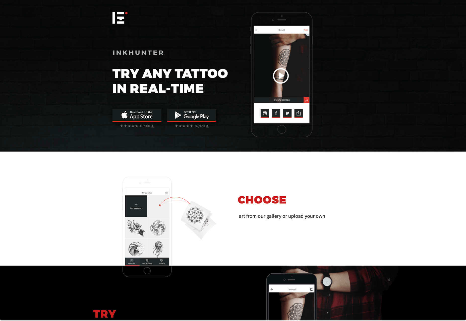
For instance, Inkhunter is an app that allows users to try on tattoos just like using a filter on Snapchat. The experience feels familiar, comfortable, and exciting.
Unlocking the Potential of AR Web Design
Augmented Reality technology has come a long way over the years. Today, developers and designers can access simple plug-in tools like WordPress VR, allowing designers to upload 360-degree videos into WordPress sites and other unique web extensions.
Augmented reality is becoming much more readily available on sites and apps of all shapes and sizes. Additionally, customers are accessing more ways to unlock AR’s power through everything from headsets to mobile interfaces.
However, just like any new technology in the web design world, designers need to think carefully about how they will overcome the challenges in user experience that AR can present. For instance, though AR can offer more information for a customer and help them make purchasing decisions faster, there are also risks. For instance, add too many interactive features to a single website or application, and you could scare users off with too much information.
In the short-term, web designers need to explore the new tools that are available to them and think about the customers they’re designing for. Only this way will we be able to make any considerable advances in the possibilities of AR.
Are You Ready to Embrace AR?
Designing for augmented reality applications and websites can be an intimidating concept – even for seasoned designers. However, this is just another technology that creatives can use to drive better experiences for end-users.
Learn how the latest technology works and get an insight into your customers’ needs, and you’ll be amazed at what you can accomplish in the AR world.
https://ankaa-pmo.com/wp-content/uploads/2020/12/the-potential-of-ar-in-web-design.jpg14072560Service comm.https://ankaa-pmo.com/wp-content/uploads/2017/04/Logo-Ankaa-engineering.pngService comm.2020-12-31 11:45:302020-12-31 11:45:30The Potential of AR in Web Design
By the end of the year, the number of global smartphone users is expected to reach 3.5 billion. That’s a significant 9.3% increase over the last 12 months.
In a world where everyone is constantly connected to their mobile devices, it makes sense that web developers and designers would need to consider new rules for how they create engaging experiences. After all, most of us find browsing from our smartphones to be much more convenient than sitting down at a laptop each day.
With a little luck, you’re already taking steps to mobile optimize your website but standards are changing all the time. To make sure your website is up to scratch, here’s your guide to prioritizing your site for mobile, ready for the new year.
Understanding Mobile-First Design
The first step in updating your web design and development principles, is understanding the concept of mobile first design, and how it’s changed.
With a responsive website, you create something that adjusts to the screen size of any device; with a mobile-first site, you’re focusing first-and-foremost on the user experience that people get when they’re on mobile, taking that as your starting point, and building from there. Instead of building your website for the desktop and using mobile as an afterthought, you start with a consideration of mobile.
Even Google is highlighting the demand for this process lately, with the mobile-first indexing algorithm. If you can’t design for mobile-first, then you could risk your clients being unable to rise up the search engine ranks.
So, how do you get started?
1. Start With the Right Tools
Web developers and designers are nothing without a great toolkit.
The good news is that there are solutions out there that can help you to master the right skills for a mobile-focused user experience. For instance, Skeleton is excellent for small-scale projects that require fluid grids and minimal compiling.
Alternatively, Bootstrap can offer a one-size-fits-all solution for the front-end development for mobile devices. There’s a default grid system available, plenty of components, and JavaScript plugins to work with.
With the right tools, you can minimize and prioritize the content that’s most valuable for your website projects. This is crucial for maximizing website speed and creating clarity when it comes to content and imagery.
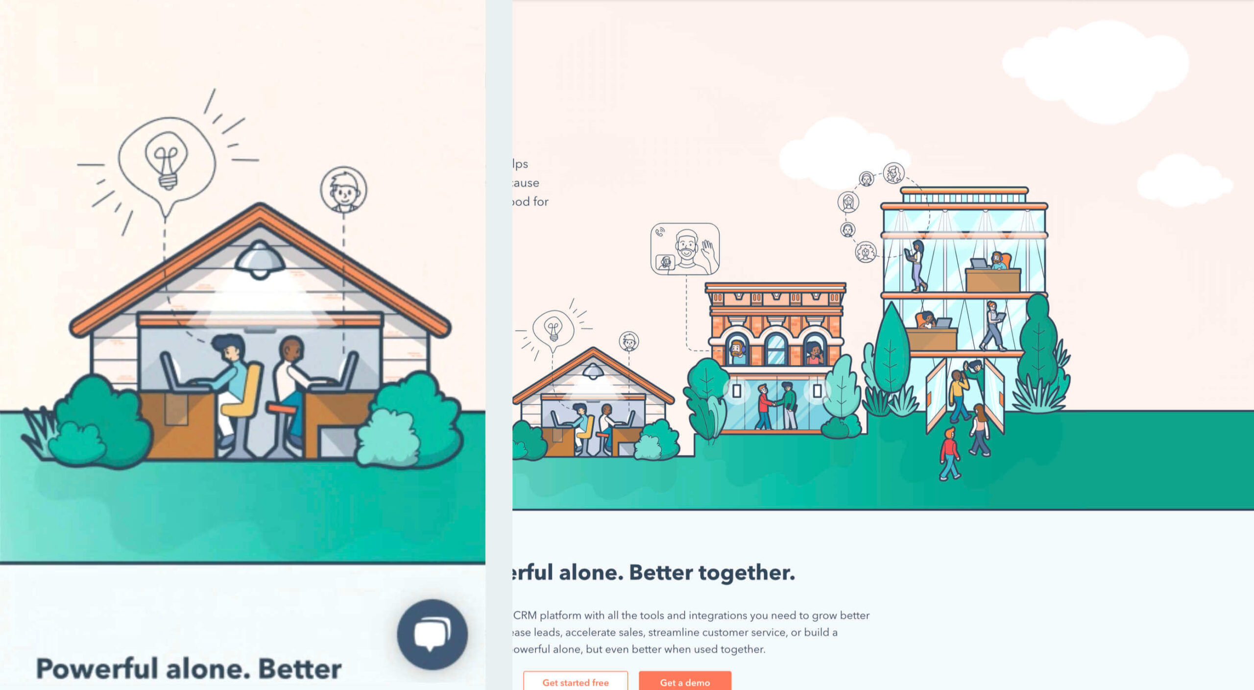
For instance, check out the ESPN website; it’s split into very easy-to-follow categories of content that are perfect for scrolling on a smartphone. The grid of videos makes it feel like you’re using a tool like YouTube.
2. Prioritize Mobile-First Elements
Once you have the right tools to assist you, it’s time to begin building your mobile-first website from the ground up. Rather than jumping straight into considerations of the latest design trends, it’s important to start with the foundations.
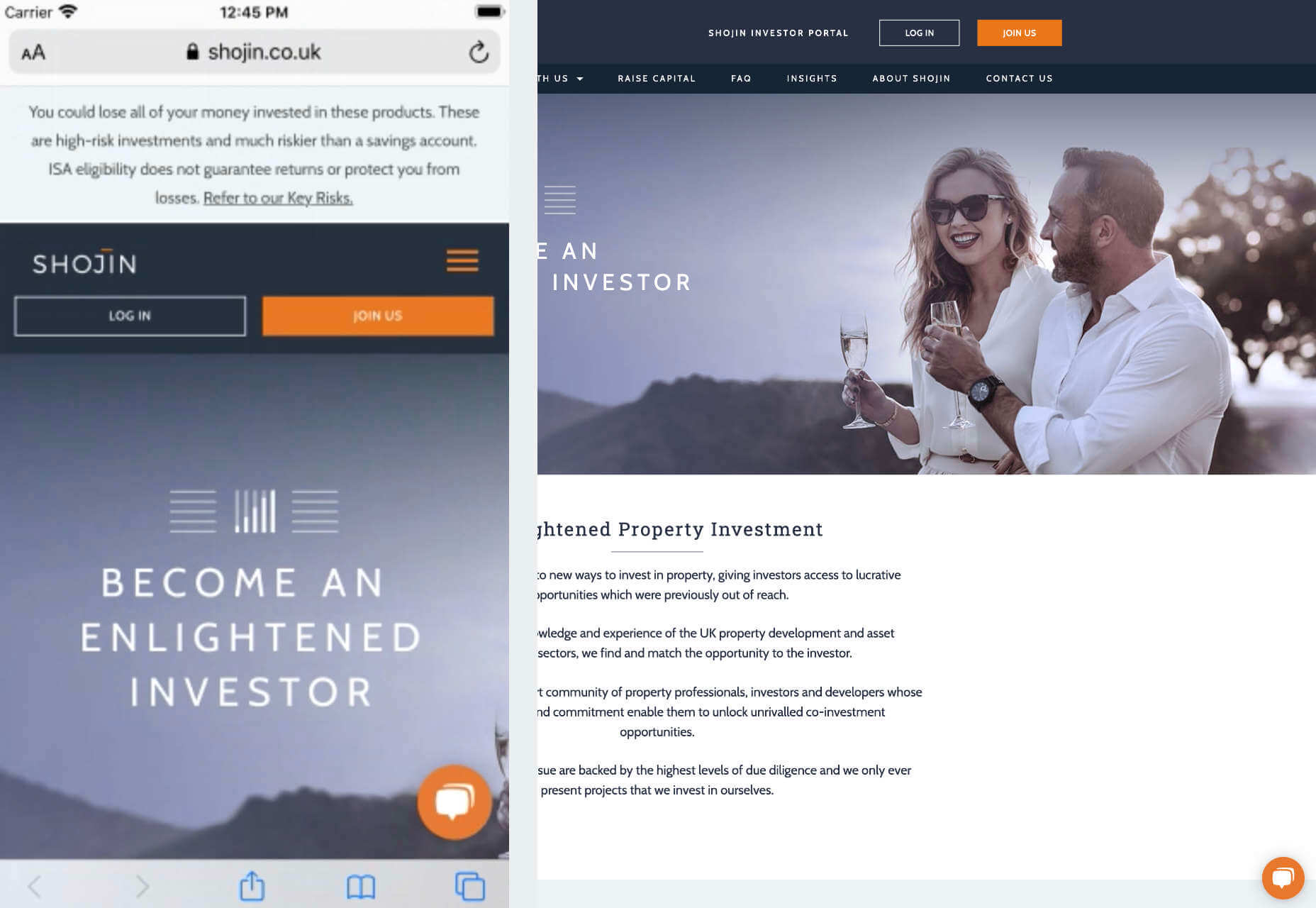
For instance, navigation within a mobile page is usually hidden under a hamburger button. However, you can take this concept to the next level too. For example, the Shojin mobile website only demonstrates the most important website options within the navigation bar to avoid overwhelming users.
The key here is to keep things as simple as possible, without restricting what your audience can do when they visit your website. Although you want to keep the number of interactive elements on your site small, you also need to ensure that those elements are easy to find and use.
All buttons and CTAs should be clear and tappable. Fonts need to be large enough to read from any screen, and your navigation system needs to be 100% simple, without slowing anything down.
On average, we recommend making all clickable elements at least 48 pixels in height.
3. Use Responsive Imagery and SVGs
Images are a crucial part of any website. They add context and appeal to your design. However, they can also seriously slow down your website if you’re not careful.
Remember, different devices have different demands when it comes to imagery. A desktop page may need a 1200px wide image, while a mobile-only needs the image to be 400px wide at most. The old way of making your images work was to load a large resolution image and use the same file on every platform. Unfortunately, this slows downloading time significantly.
Instead, it’s better to have at least two different versions of the same image for your mobile and desktop solutions. You can also consider SVG.
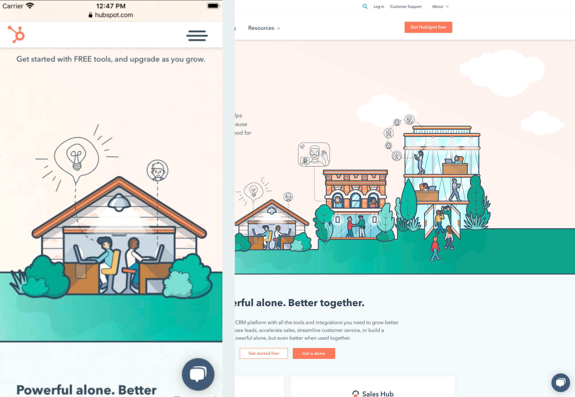
SVGs are incredibly scalable – more so than bitmaps. With SVG, you can ensure any icon or graphic continues to look sharp and clickable across all devices. Because these files are often smaller, your site loads quicker too! Hubspot is great at using SVGs.
Intricate illustrations are a massive component of HubSpot’s brand. If those images were saved as PNGs or other alternative files, then they would take forever to load. Because they’re all SVGs, you can enjoy the same consistent experience across desktop and mobile.
4. Get the Typography Right
It’s not just the big graphics and images that make a huge difference to your website when it comes to mobile-first design. You also need to think about the legibility and clarity of your website across all devices and platforms. If people can’t read the value proposition of the company that you’re designing for, you’re going to have a major problem.
Focus on making your content as easy to read as possible. Look into the typefaces that seem most appealing on a range of devices.
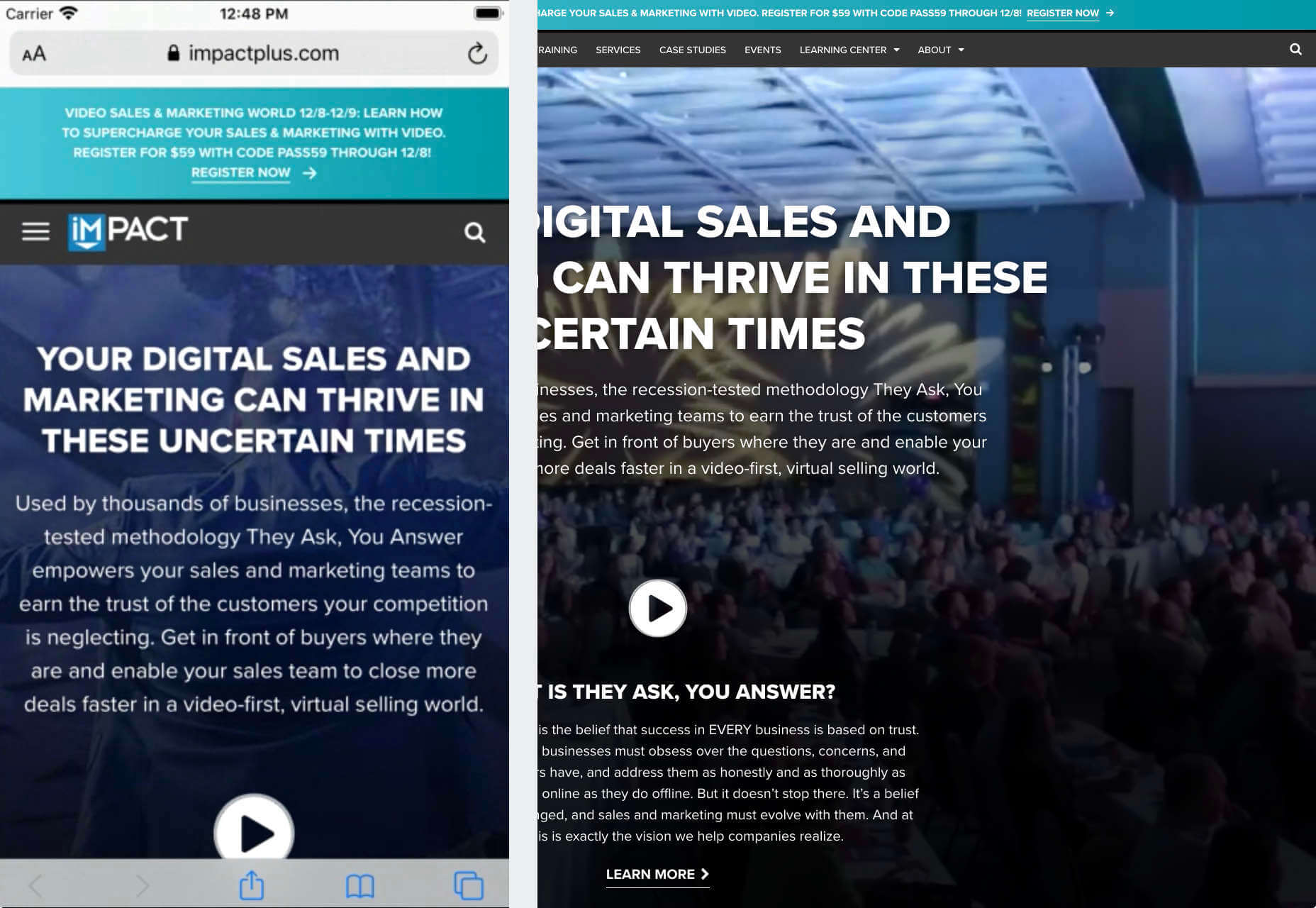
Remember to balance the body and heading font sizes for the device size too. You’ll need to ensure that the experience feels consistent and smooth as your users scroll through each page. Just take a look at the mobile version of the IMPACT website, for instance.
The headings aren’t as huge as they are on the desktop version of the website, and they’re displayed below, rather than above the featured image. However, this helps to give a more immediately eye-catching and structured experience to mobile users.
There’s even a handy “Search Engine Optimization” tag included, that users can click on if they want to find more related articles.
When it comes to typography, remember that it’s not just size and clarity that matter, but how things are structured throughout your website too. Your type should naturally guide your visitors along the page.
5. Master Available Device Features
Finally, on smartphones, you can accomplish a range of amazing things that you might not be able to do when using a desktop device. Your users can make calls, open apps, send messages, and more, all from within their mobile browser. They can also move their smartphone around a room, taking advantage of concepts like AR and VR.
Taking advantage of the unique capabilities that smartphone design can offer gives you a chance to get unique with your user experience.
Making the most of the mobile experience can be much simpler than you’d think. For instance, on a desktop site, you could list your phone number on a contact page. On a mobile site, the number can begin a call when clicked. You can also take the same approach with email addresses, and social media icons too.
Depending on how experimental you feel, there’s also plenty of opportunities to go above and beyond with your mobile features. You may decide to create a mobile app version of a website that your customers can download onto their phones.
Alternatively, you can look into things like AR technology. This could allow your users to practice placing items of furniture that they may be thinking of buying from an online retailer into their house, so they can see how well they work with their other interior design choices.
Making the Most of Mobile-First Design
Ultimately, having a responsive website that works on both mobile and desktop devices is mandatory in the modern world. However, going above and beyond with mobile-first design is a great way to get ahead of the game.
If you can focus on building a website that puts the experiences of mobile users first, then you can create something that’s much more likely to grab audience attention and deliver amazing experiences.
If nothing else, showing your clients that you have what it takes to design for mobile is an excellent way to ensure that you can gain as many new project opportunities as possible.
https://ankaa-pmo.com/wp-content/uploads/2020/12/how-to-prioritize-speed-with-a-mobile-first-design.jpg14082560Service comm.https://ankaa-pmo.com/wp-content/uploads/2017/04/Logo-Ankaa-engineering.pngService comm.2020-12-09 11:45:352020-12-09 11:45:35How to Prioritize Speed with a Mobile-First Design
Every week users submit a lot of interesting stuff on our sister site Webdesigner News, highlighting great content from around the web that can be of interest to web designers.
The best way to keep track of all the great stories and news being posted is simply to check out the Webdesigner News site, however, in case you missed some here’s a quick and useful compilation of the most popular designer news that we curated from the past week.
How to Make a Cool Looking Bokeh CSS Effect
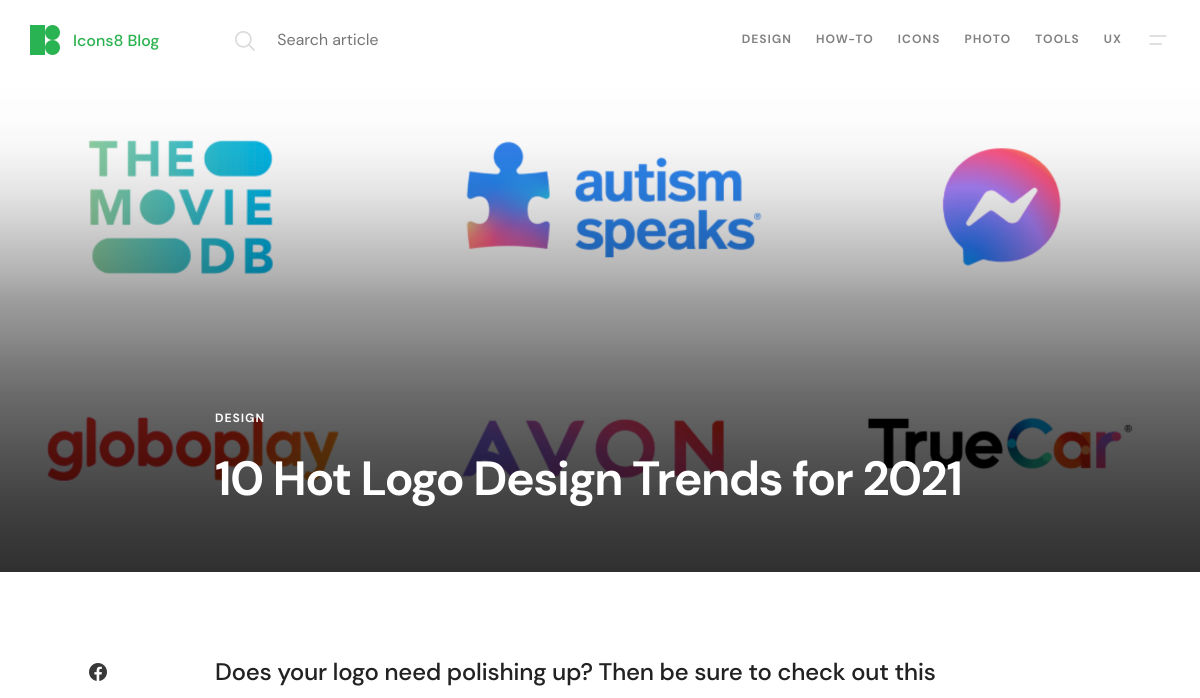
10 Hot Logo Design Trends for 2021
Tailwind Builder 2.0 – Online Editor & Visual Studio Code Extension for TailwindCSS
Sidemail.io – Email Delivery Made Simple for Startups
Headless CMS: What and Why
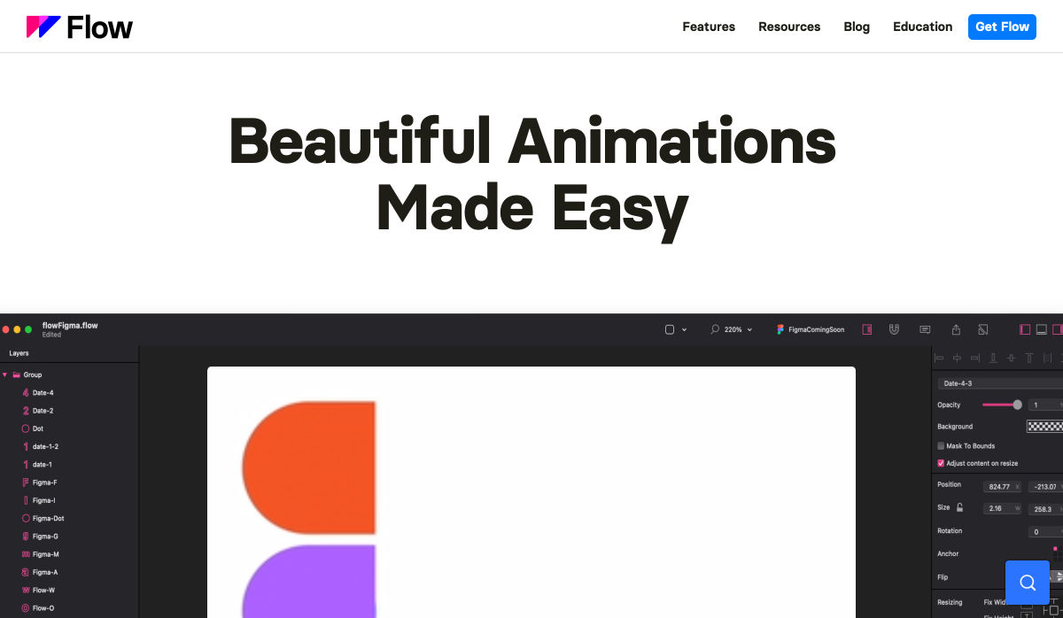
Flow – Beautiful Animations Made Easy
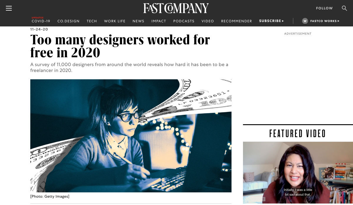
Too Many Designers Worked for Free in 2020
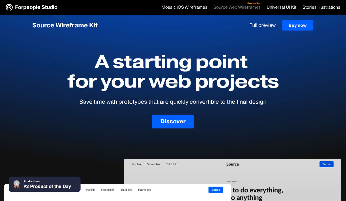
Source Wireframe Kit 2.0 – A Huge Set of Blocks for Desktop and Mobile
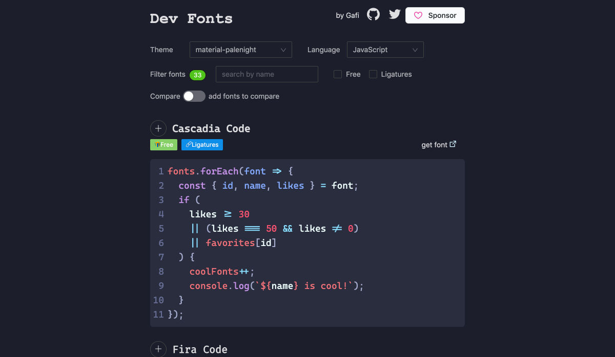
Dev Fonts
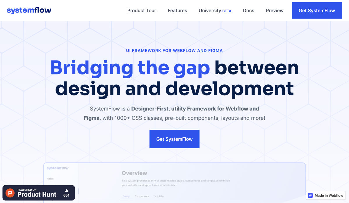
SystemFlow – Like Tailwind, but for Webflow and Figma
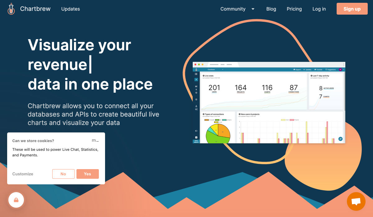
Chartbrew – One Dashboard to View, Create and Share your Data
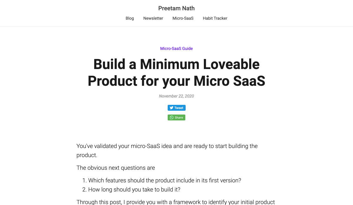
Build a Minimum Loveable Product
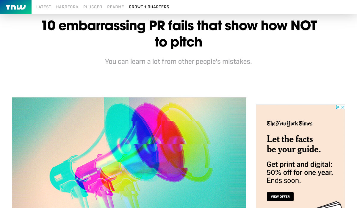
10 Embarrassing PR Fails that Show How not to Pitch
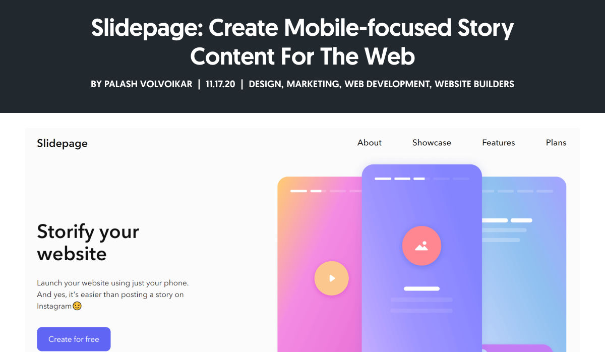
Slidepage: Create Mobile-focused Story Content for the Web
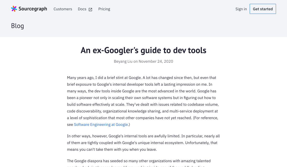
An Ex-Googler’s Guide to Dev Tools
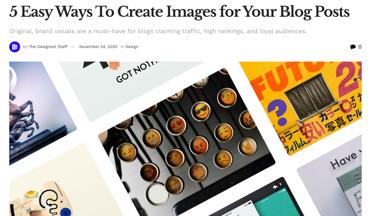
5 Easy Ways to Create Images for your Blog Posts
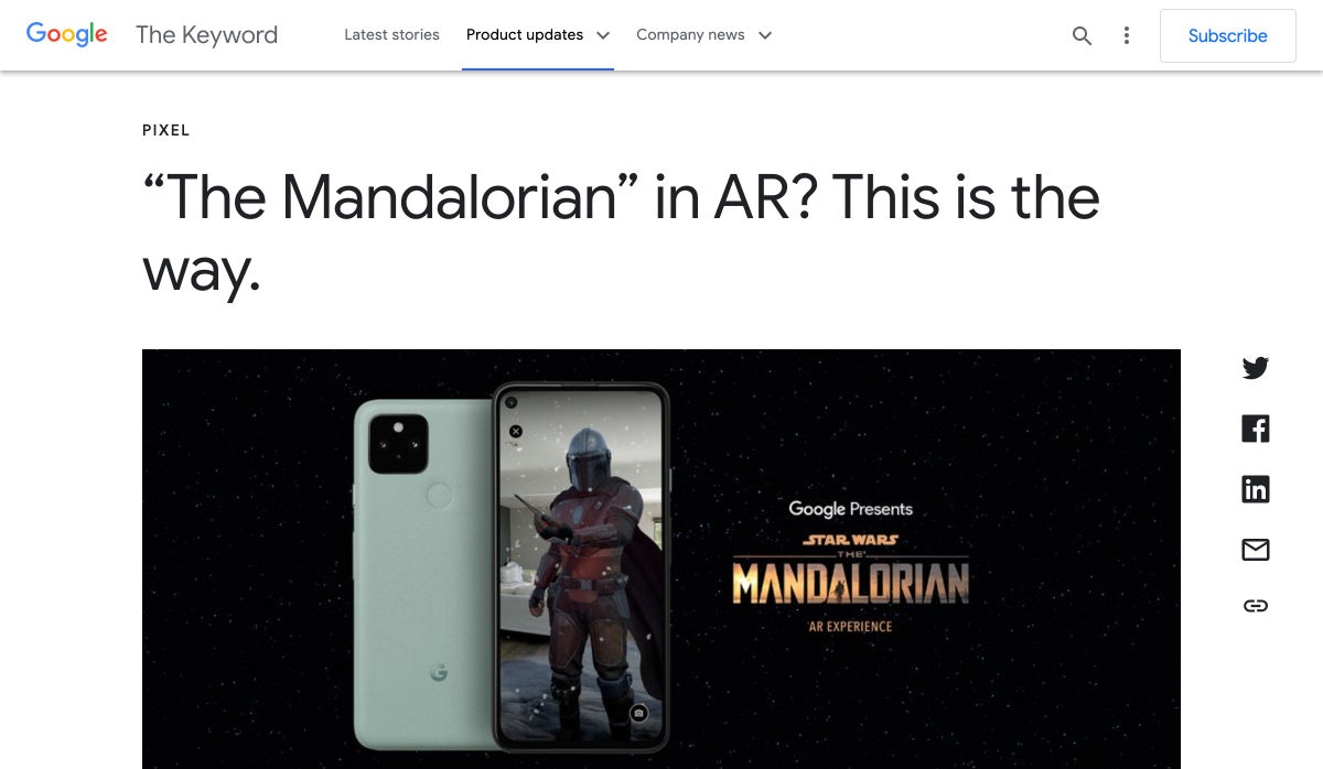
“The Mandalorian” in AR? This is the Way.
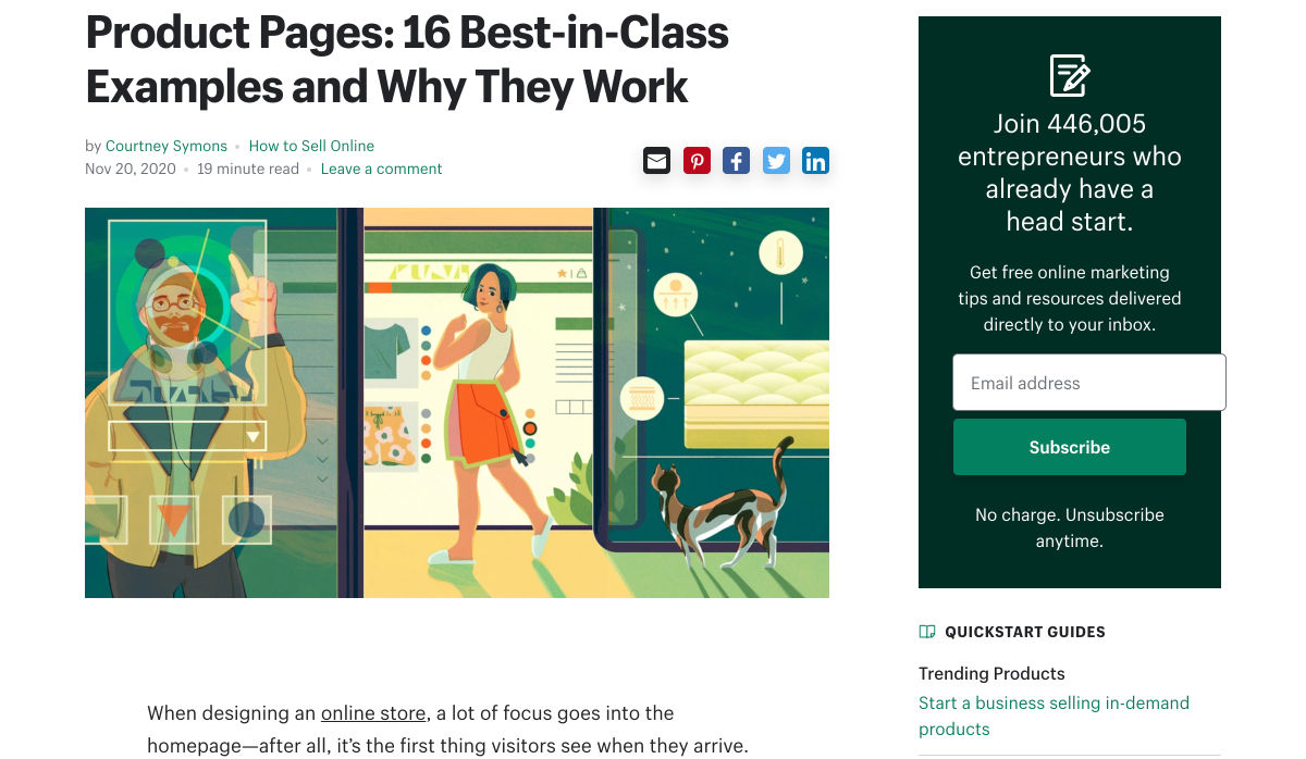
Product Pages: 16 Best-in-Class Examples and Why They Work
Boop!
7 Signs It’s Time to Fire your Clients (For Freelancers)
Top Tips on Running a Healthier Design Agency
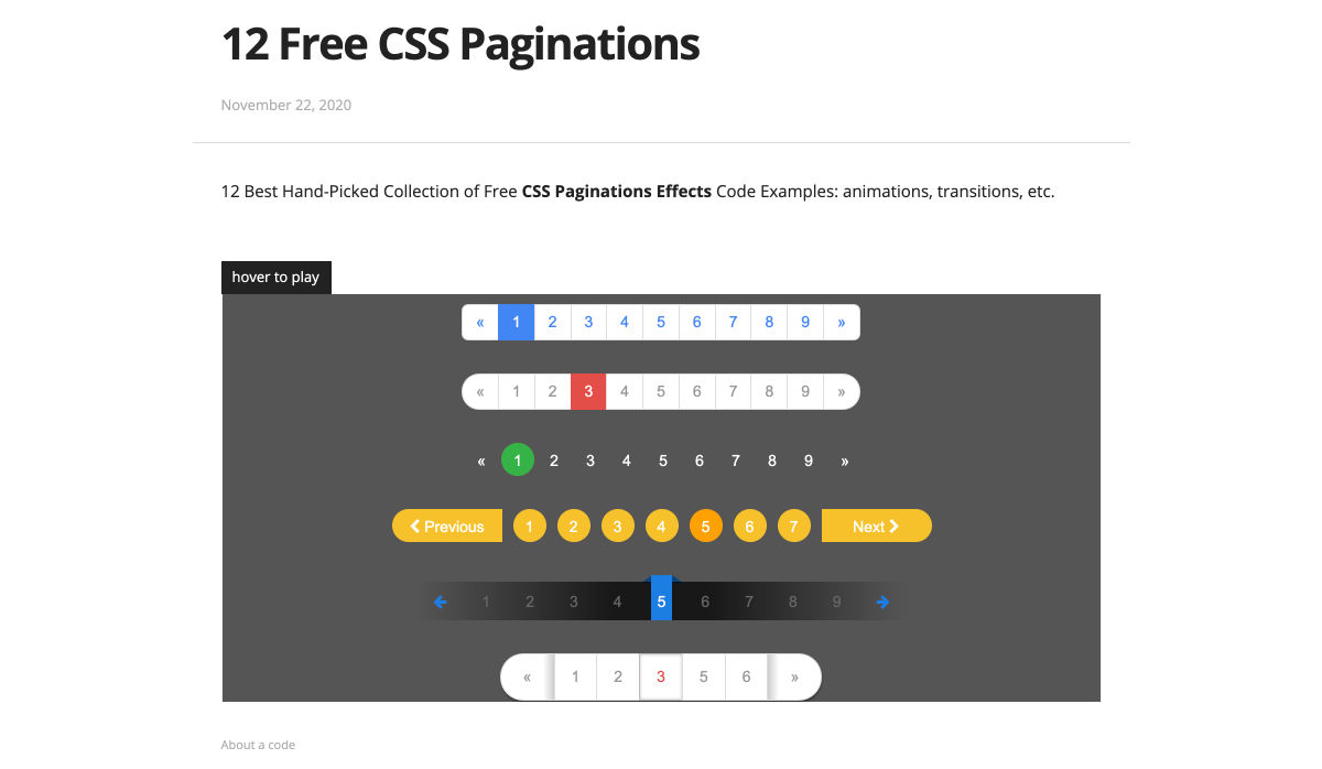
12 Free CSS Paginations
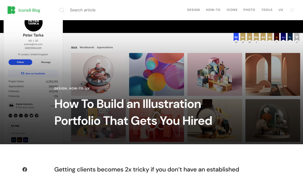
How to Build an Illustration Portfolio that Gets You Hired
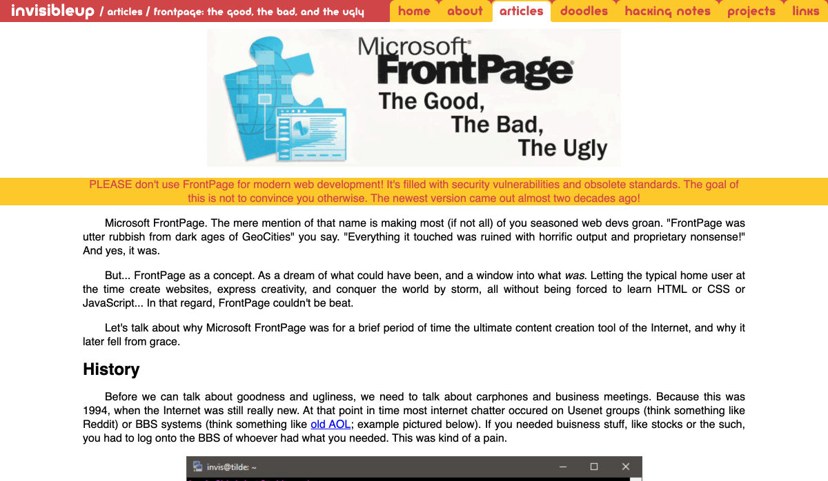
FrontPage: The Good, the Bad, and the Ugly
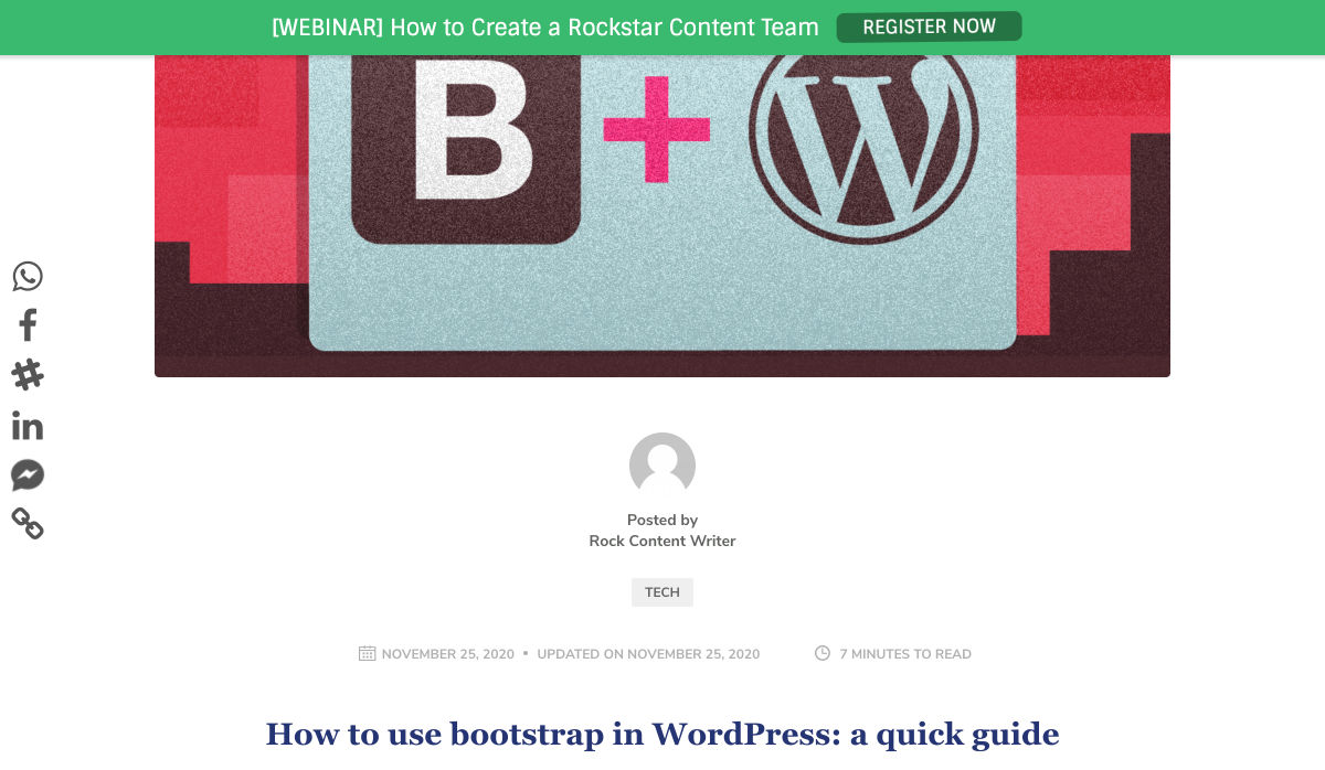
How to Use Bootstrap in WordPress: A Quick Guide
Want more? No problem! Keep track of top design news from around the web with Webdesigner News.
https://ankaa-pmo.com/wp-content/uploads/2020/11/popular-design-news-of-the-week-november-23-2020-november-29-2020.jpg7051237Service comm.https://ankaa-pmo.com/wp-content/uploads/2017/04/Logo-Ankaa-engineering.pngService comm.2020-11-29 11:45:542020-11-29 11:45:54Popular Design News of the Week: November 23, 2020 – November 29, 2020
Paramètres des cookies et politique de confidentialité
Comment nous utilisons les cookies
Nous utilisons les cookies pour nous faire savoir quand vous visitez nos sites Web, comment vous interagissez avec nous, pour enrichir votre expérience utilisateur et pour personnaliser votre relation avec notre site Web.
Cliquez sur les différents titres de catégories pour en savoir plus. Vous pouvez également modifier certaines de vos préférences. Notez que le blocage de certains types de cookies peut avoir un impact sur votre expérience sur nos sites Web et les services que nous sommes en mesure d'offrir.
Cookies essentiels sur ce site
These cookies are strictly necessary to provide you with services available through our website and to use some of its features.
Because these cookies are strictly necessary to deliver the website, you cannot refuse them without impacting how our site functions. You can block or delete them by changing your browser settings and force blocking all cookies on this website.
Cookies Google Analytics
Ces cookies recueillent des renseignements qui sont utilisés sous forme agrégée pour nous aider à comprendre comment notre site Web est utilisé ou l'efficacité de nos campagnes de marketing, ou pour nous aider à personnaliser notre site Web et notre application pour vous afin d'améliorer votre expérience.
Si vous ne voulez pas que nous suivions votre visite sur notre site, vous pouvez désactiver le suivi dans votre navigateur ici :
Autres services
Nous utilisons également différents services externes comme Google Webfonts, Google Maps et les fournisseurs externes de vidéo. Comme ces fournisseurs peuvent collecter des données personnelles comme votre adresse IP, nous vous permettons de les bloquer ici. Veuillez noter que cela pourrait réduire considérablement la fonctionnalité et l'apparence de notre site. Les changements prendront effet une fois que vous aurez rechargé la page.
.
Paramètres de Google Webfont Settings :
Google Map :
Vimeo et Youtube :
Politique de confidentialité
Vous pouvez lire nos cookies et nos paramètres de confidentialité en détail sur la page suivante

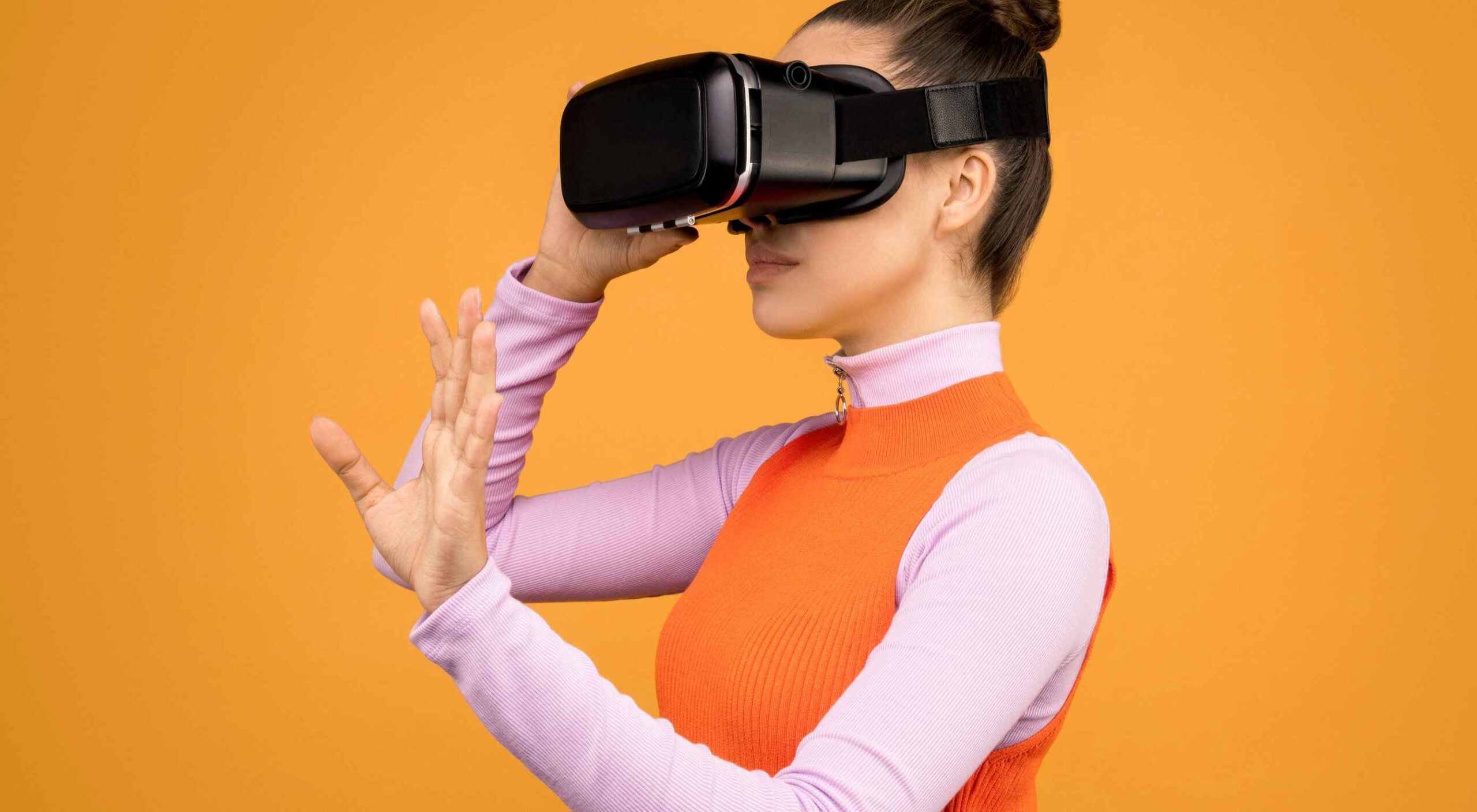 Websites as we know them are going to change very soon. The days of text, images, and basic interactions in a 2D browser window have served us well, but virtual, augmented, and mixed reality experiences are getting better all the time. Developers and designers need to think beyond the browser window and prepare for an immersive future.
 The world of web design is incredibly dynamic. Every year, new trends and opportunities emerge, primarily driven by the arrival of modern technology.
 This month, you will either love or hate the featured design trends.


 Have you ever wondered why we’re so amazed by motion? A moving image is more likely to grab your attention than a static one. Motion is exciting and attention-grabbing – plus, it allows us to access more information in a short space of time.

 Ecommerce design may seem fairly straight-forward; you build an online store that showcases a company’s products or services and gives customers a quick and pain-free way to purchase them.
 Over the years, experts have repeatedly discussed the possible impact of mixed realities on web design. Concepts like AR and VR are expected to have the potential to change the way that we interact with websites on a fundamental level.
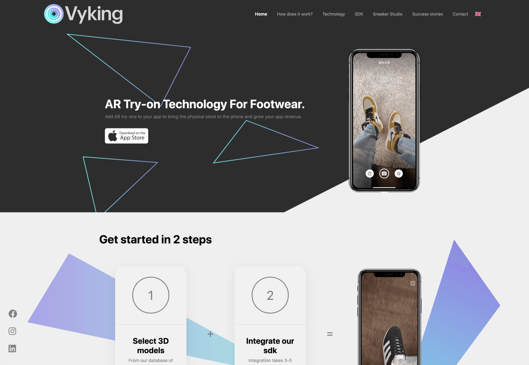
 By the end of the year, the number of global smartphone users is

 Every week users submit a lot of interesting stuff on our sister site Webdesigner News, highlighting great content from around the web that can be of interest to web designers.