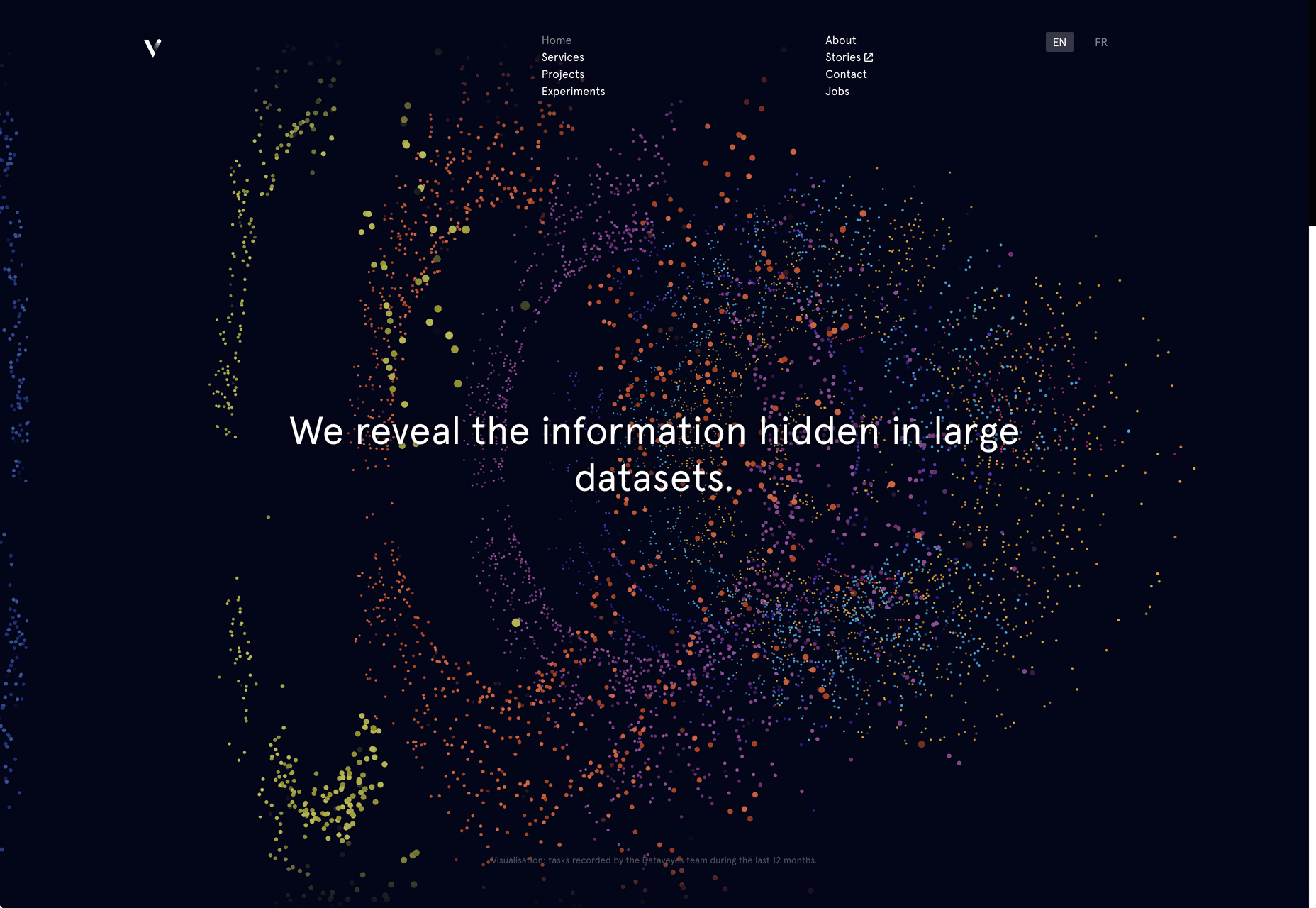
 Artificial Intelligence is the use of computers or machines that have been created to work and react like humans. Some of the computers that have AI, are designed to include speech recognition, and learn user behaviours so they can predict activities or decisions before they happen.
AI creates a bridge to a new kind of interface, making work processes easier for businesses and customers alike.
Why is AI Important?
There are constant AI technological advances being made, so why not make the most of them and start integrating them into your toolset today? Read on to find out just why AI is important and how you can benefit from it in your work too.
Lower Costs
By integrating Artificial Intelligence into your toolset, you can stand to both save and earn more money. AI will leave you spending less time on various aspects of website management and development, freeing some of your time up and allowing you to finish websites faster. It will also leverage your set of skills and allow you to build greater sites that people will be willing to pay more money for.
Improve Customer Experience
Artificial Intelligence can be used to analyse data in much more depth than the human eye, so will greatly improve the customer experience. It will allow a more personalised and streamlined experience that users will be grateful for. By integrating AI into your toolset, you will soon learn about certain trends and patterns that AI picks up and utilise this with future sites you build, as well as being able to make suggestions to improve the customer journey on the site.
It’s The Future
With so many devices in our everyday lives tuning in to AI, it’s important websites are no different. Just look around many homes and you will likely see a device such as Amazon’s Alexa or Google Home. Phone’s have Siri or Bixby and many laptops have AI systems such as Cortana. As our technology continues to develop, websites need to do this too. Soon we will expect everything to be integrated and be able to control websites in a similar way to our AI devices with voice control and recognition.
How To Integrate AI Into Your Toolset
Chat Bots
One popular example of AI that is integrated into many different websites now, is the chat bot. A feature on a number of major sites, chat bots allow customers to ask and receive answers to questions without an employee having to take time out of their day to answer menial questions that they get asked all the time. The use of AI cuts out the middleman and recognises certain phrases and words to give the most relevant and comprehensive answer.
The first chatbots used to rely on simple, pre-programmed conversational pathways, but these had disappointing and often irrelevant results. More recently they use sophisticated natural language processing (NLP) systems which are a lot more complex and don’t follow just a scripted path, but allow for more meaningful conversations.
Sketch to Code
If you’ve just started in web design, or there are certain elements you are still learning about, AI can help with “sketch to code”. This clever piece of AI can transform a handwritten note, sketch or diagram into a valid HTML mark-up code that maintains itself. This can work from something as simple as a new design for a quote system, to something more complex.
Background Systems
AI can work in the background of a site in the run up to events and collect key aspects such as website analytics. Once this data is complete, the AI can take final instructions from you such as the content, theme and color preference and create a design from scratch that it thinks will perform the best due to the intelligence and knowledge it has been gathering in the background.
Voice Recognition
Back in 2012, the W3C Community introduced the Web Speech API specification with the aim of enabling speech recognition and synthesis in modern browsers. At present, Google Chrome is the only browser that has introduced this, however there is a HTML5 Speech Recognition API will allows JavaScript to have access to a browser’s audio stream and to convert it into text.
It’s important to get up to speed with voice recognition API’s as it’s predicted voice control will be huge in the future. If populating websites, think about how people speak and be sure to include some long-tail keywords that sound more natural. This will help those sites to rank when voice control is adopted more widely.
Adobe Sensei
Adobe Sensei is an AI and machine learning framework that is powering Adobe tools. It is a handy option to add to your toolkit to manage and work on your files.
If you are sourcing images for a website in Adobe Stock, there are over 100 million assets to sift through. Adobe Sensei uses AI and deep learning to understand what exact objects are within an image as well as deeper components such as the aesthetic quality, composition, color palette and even the emotional concept behind the images. This means it can quickly find the image most matched to your needs, saving you hours of time you would have spent sorting through to find the image you want.
Yossarian
Yossarian is a great tool that allows you to craft mood boards. With an aim to generate new ideas faster, it cites itself as “discovery with a twist.” Yossarian uses AI when creating mood boards to return “diverse and unexpected concepts” that share loose associations with what you have searched for, allowing you to be more creative. It will source different ideas and inspiration around what you are searching for, including many you might not have thought of associating with your initial search term.
Brandmark
If you create logos and design templates within your work, Brandmark logo maker is a great AI tool to add to your library. They cite themselves as the most advanced AI logo design tool on the market at the moment. Whether logo creation is something you currently offer, or something you are looking to do, this AI tool can make it easier.
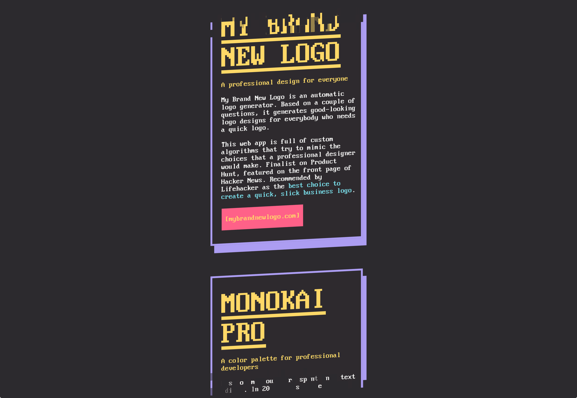
Autodraw
Autodraw is another useful tool you can use for design jobs, where you draw a rough sketch and it will turn it into a neat graphic. This is a handy one to use in association with the concept of sketch to code above. It pairs the magic of machine learning with drawings to help you create professional looking graphics and visuals, quickly.
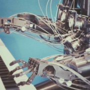
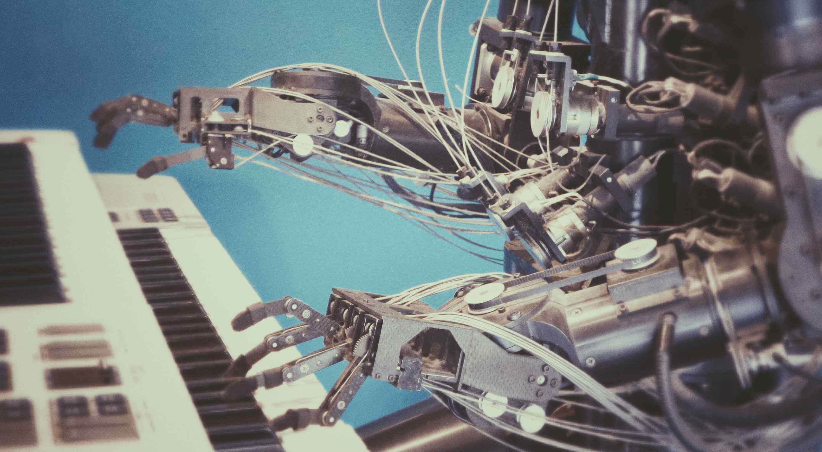
Featured image via Unsplash.
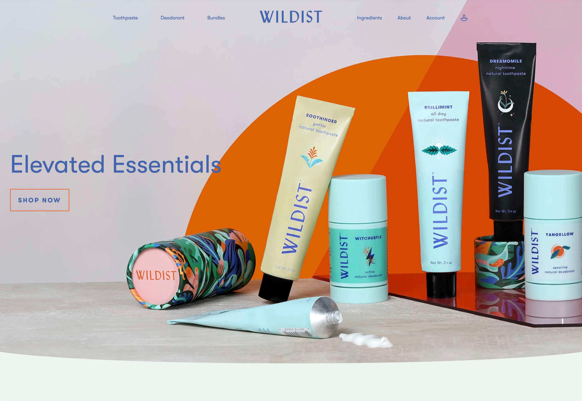
 After six months of uncertainty 2020 is finally beginning to find a style of its own. There are nods to Brutalism, a delightful blending of 80s pastels with 90s primaries, and the font style of choice is anything but geometric sans-serif.
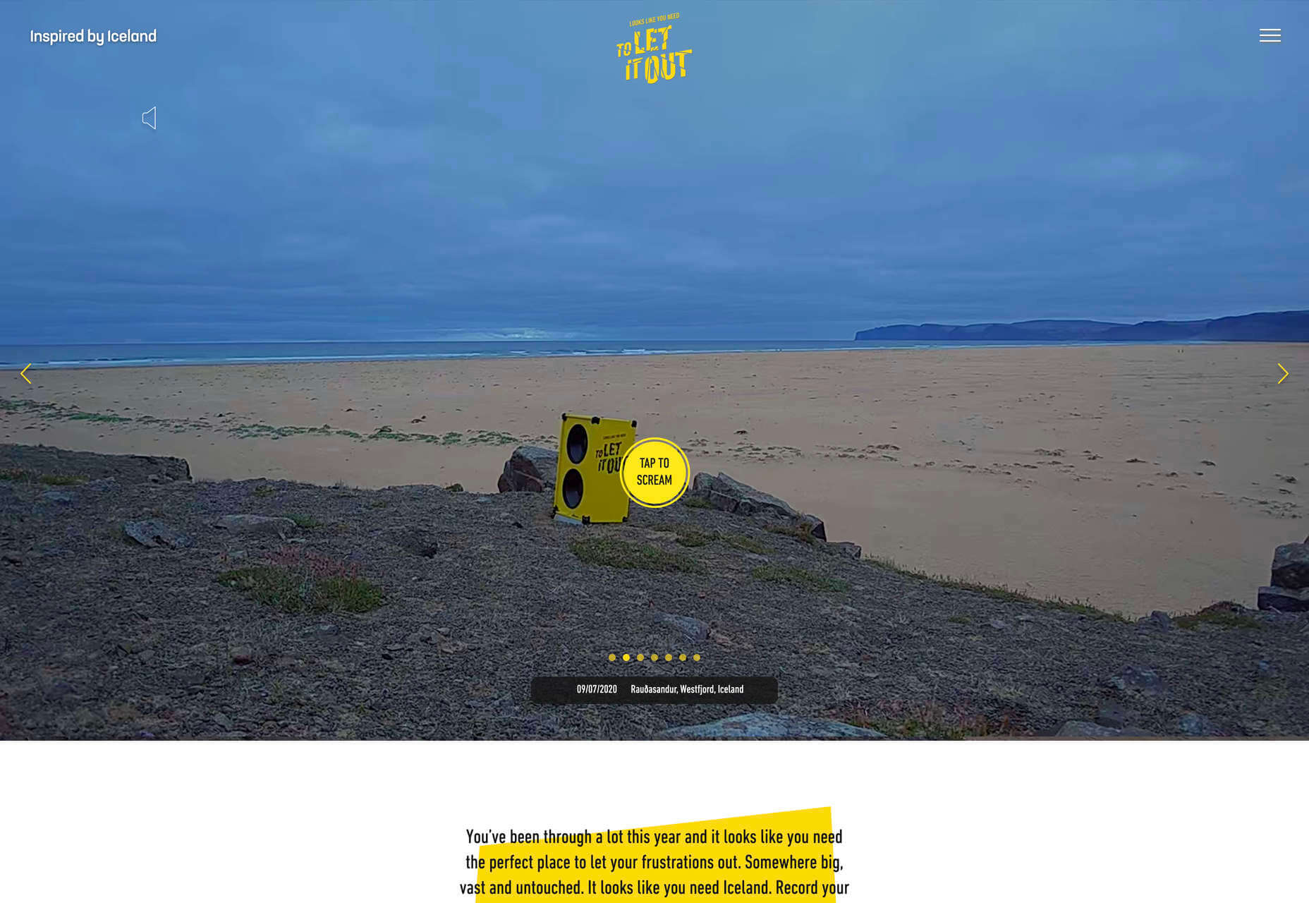


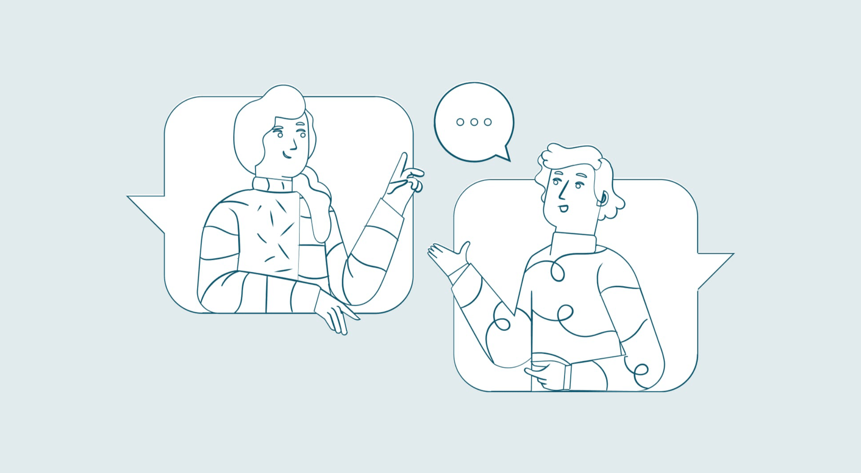 You’ve been working away at your latest design project, and the client has given the go-ahead on your lovingly created digital concepts. Now it’s time to bring those designs to life, and you have a developer queued up to do just that.


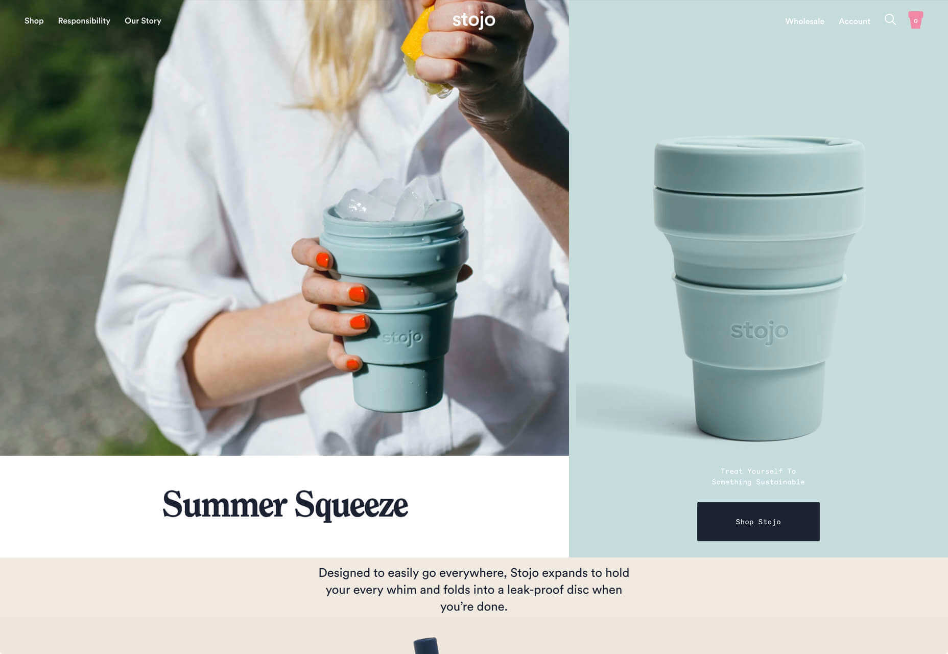
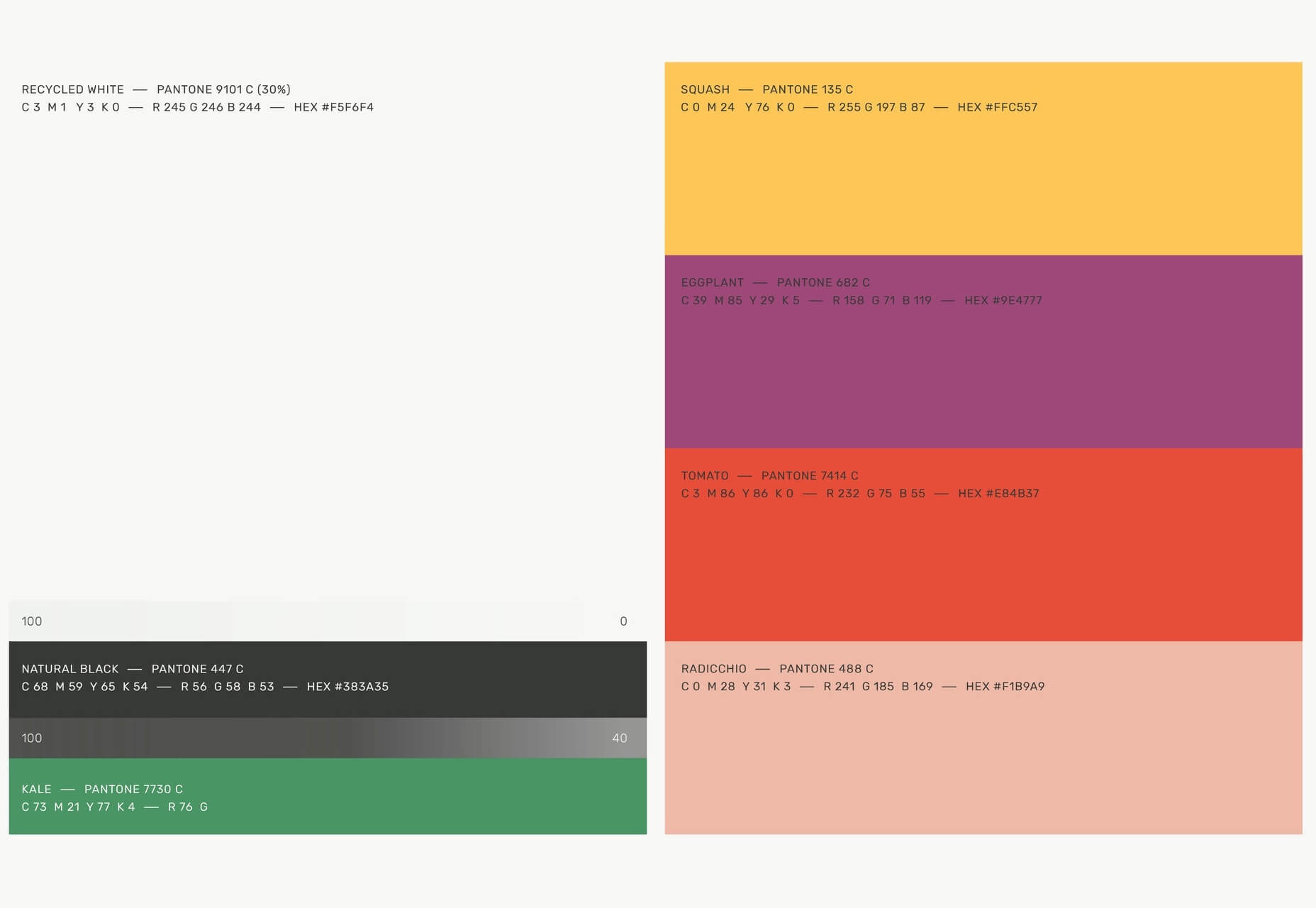
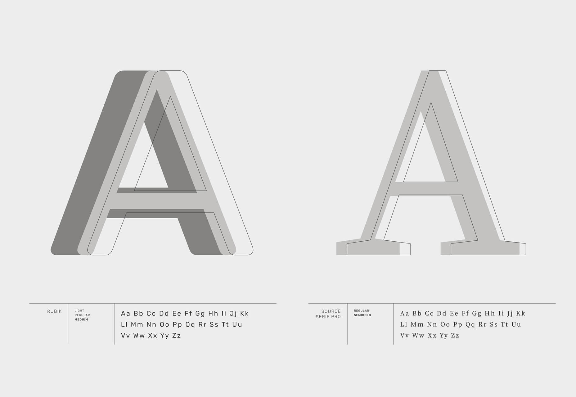
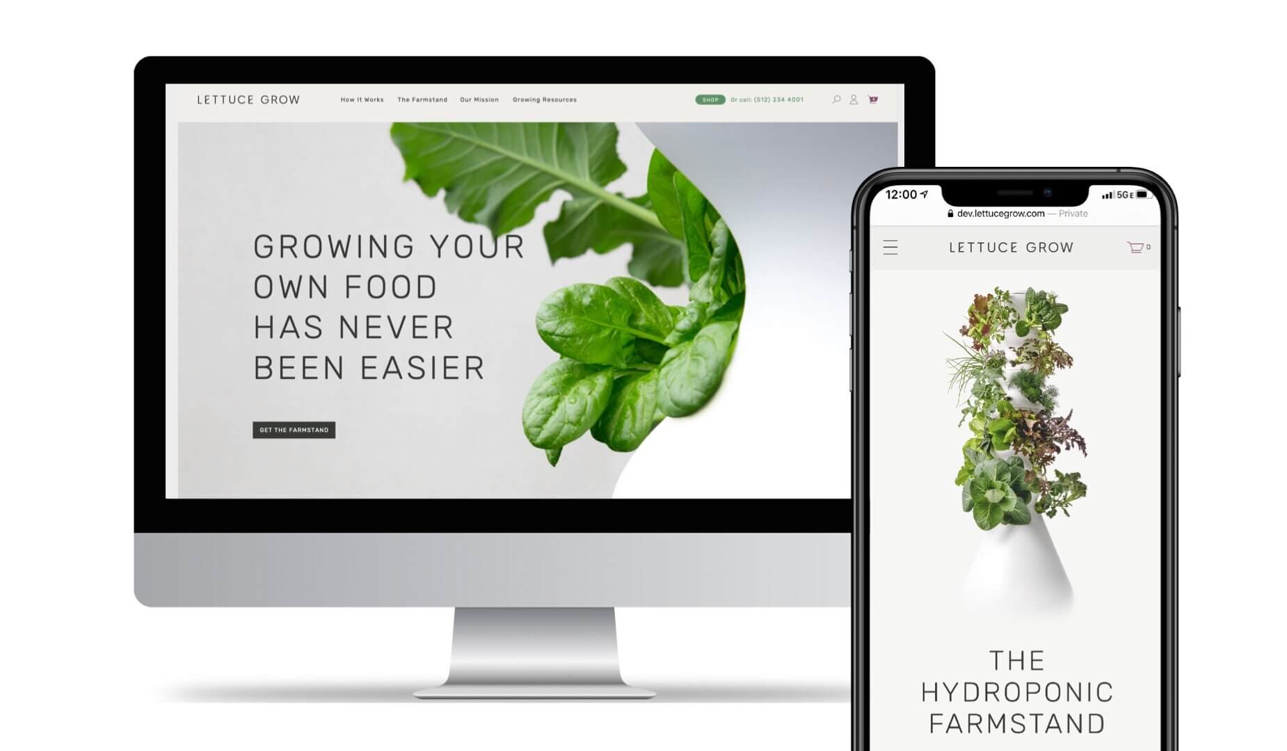
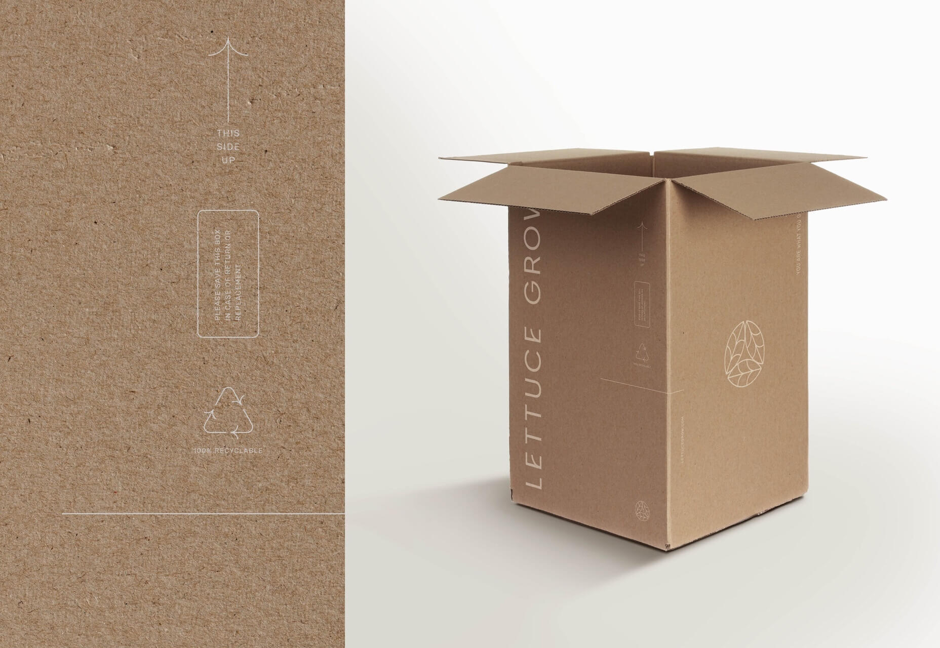
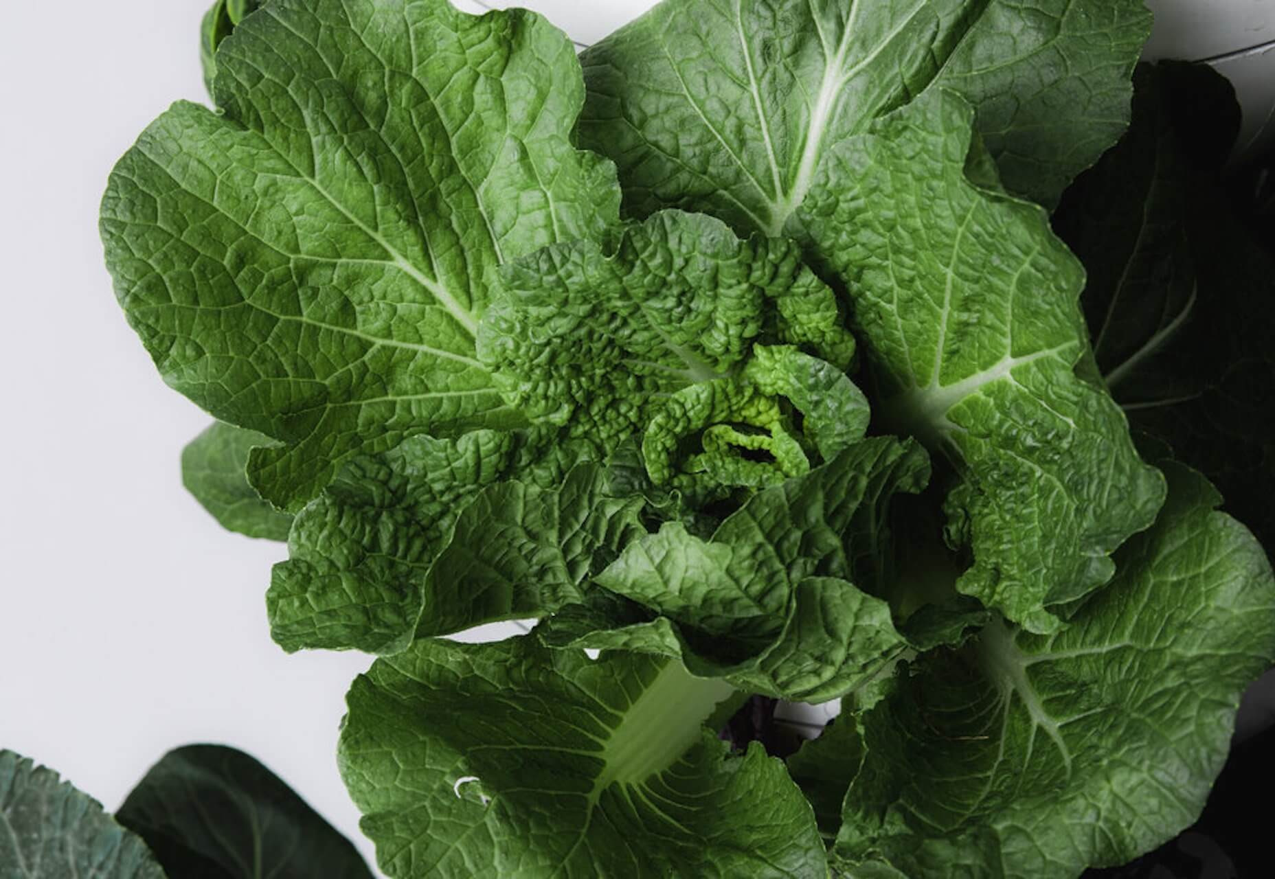
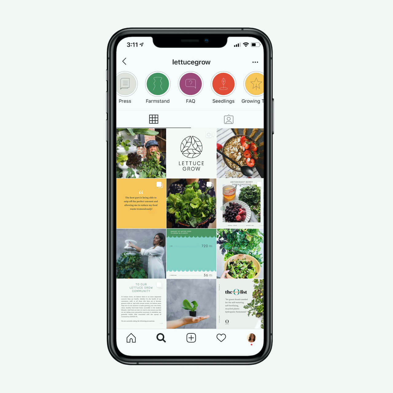
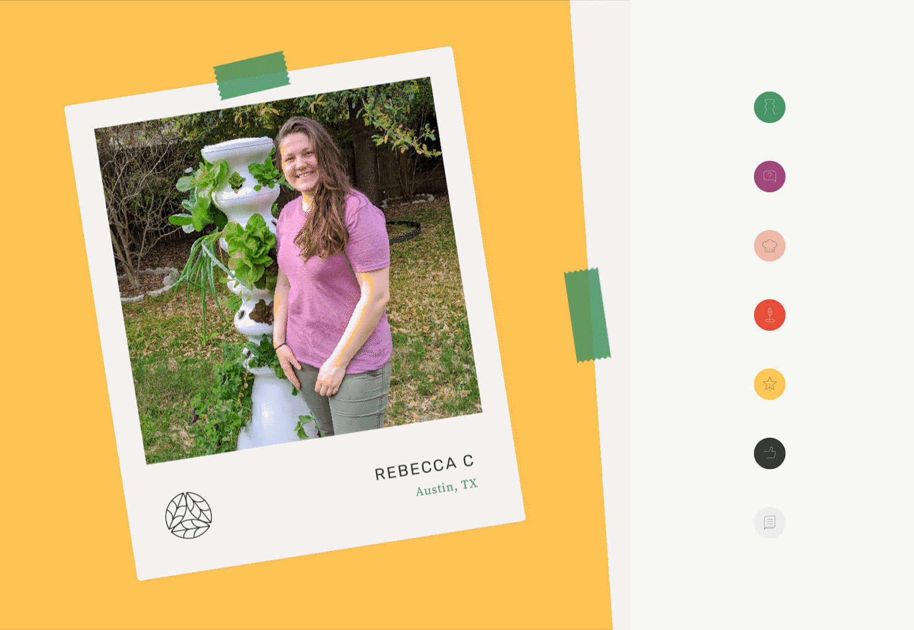
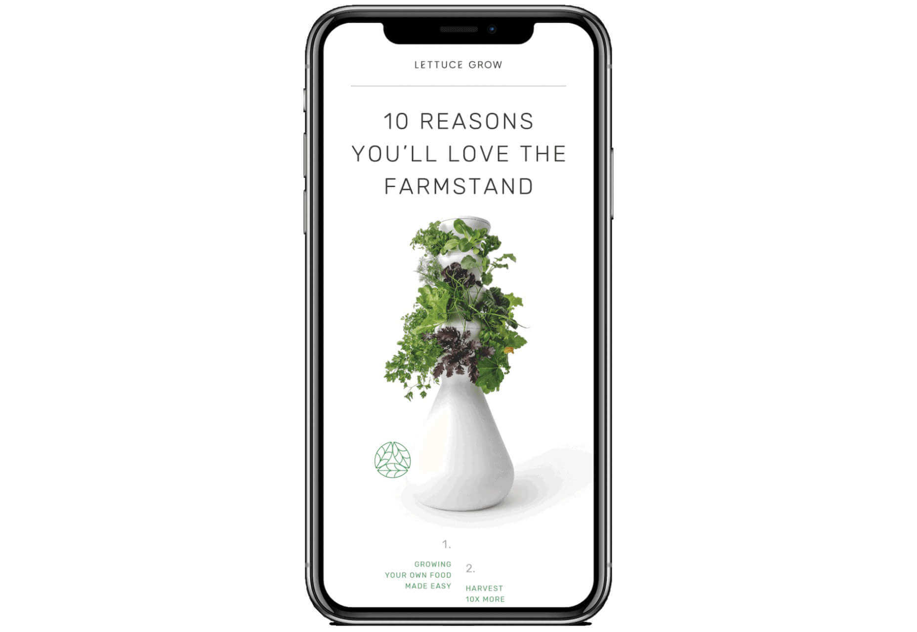
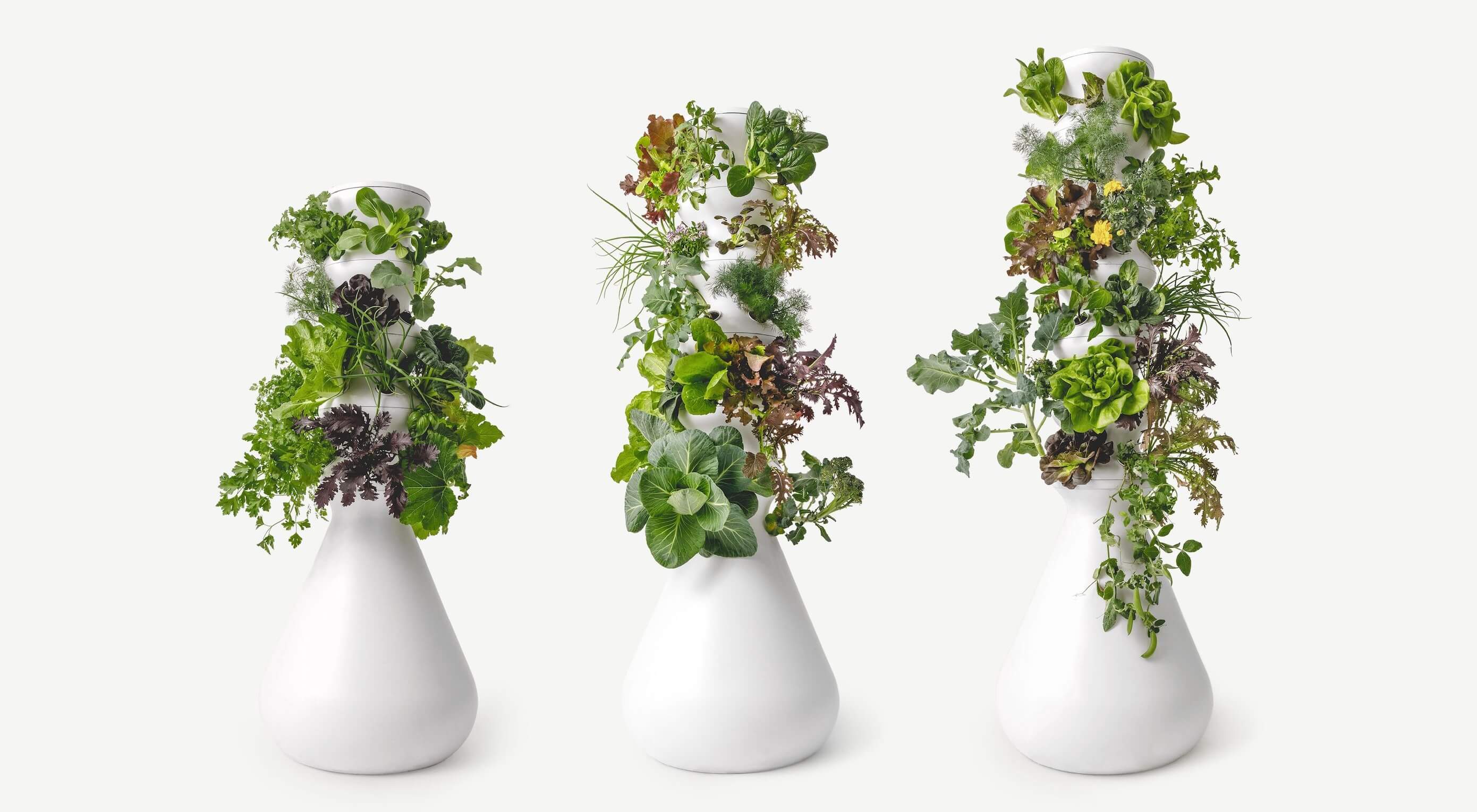 A successful rebrand goes far beyond flashy graphics and high-res photos. It tells a story. It positions a product to fulfill the wants and needs of the consumer. Following the rebrand journey of Lettuce Grow, take a look at how visual elements can enforce the mission of your brand, engage your consumer and cultivate incredible results.
