 The year’s winding down as everyone segues into a much-needed holiday R&R. But that doesn’t mean there aren’t some awesome new tools and resources for website design projects.
Check them out, and hit the ground running in January. Here’s what’s new for designers this holiday period. Enjoy!
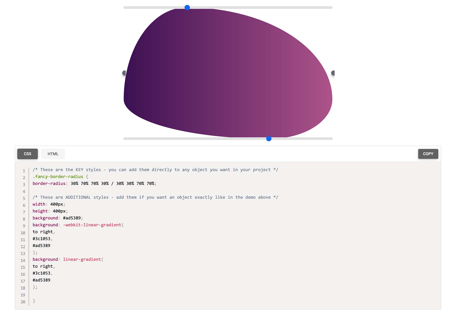
Fancy Border Radius Generator
Fancy Border Radius Generator is a fun tool that allows you to create exciting shapes for elements. Use the included templates or create your own border shapes and then export the CSS/HTML for a variety of uses.
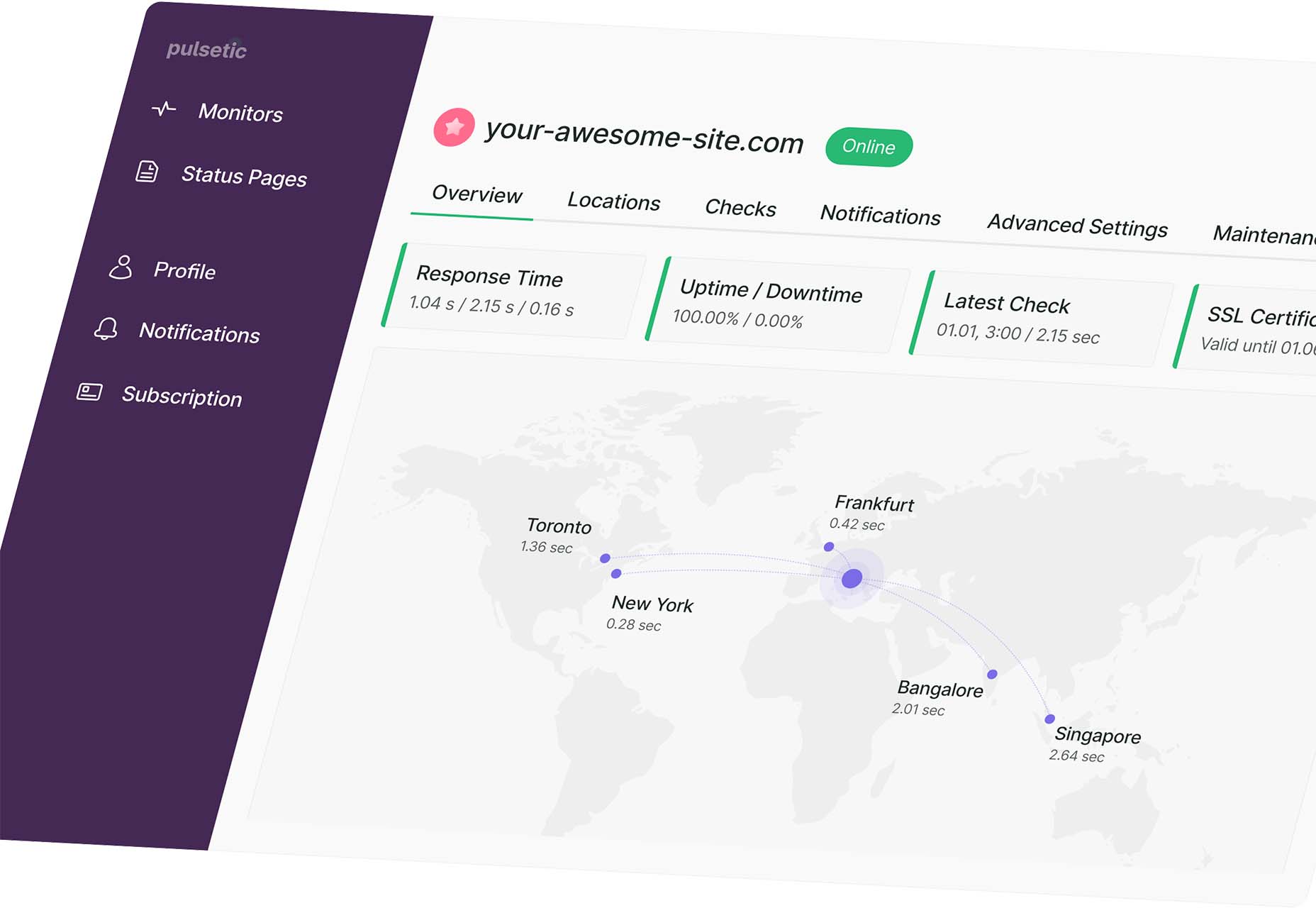
Pulsetic
Pulsetic answers the question: “Is your website down?” Get website downtime alerts by phone call, SMS, email, or Slack. Create beautiful status pages and incident management reports and keep visitors (and your team) updated.
Ffflux SVG Generator
Ffflux SVG Generator makes it easy to generate fluid and organic-feeling gradients. You can use the resulting graphics as backgrounds to elements on a page to give a colorful fluid look to page elements. Choose colors and styles, then save or copy your SVG for use.

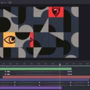
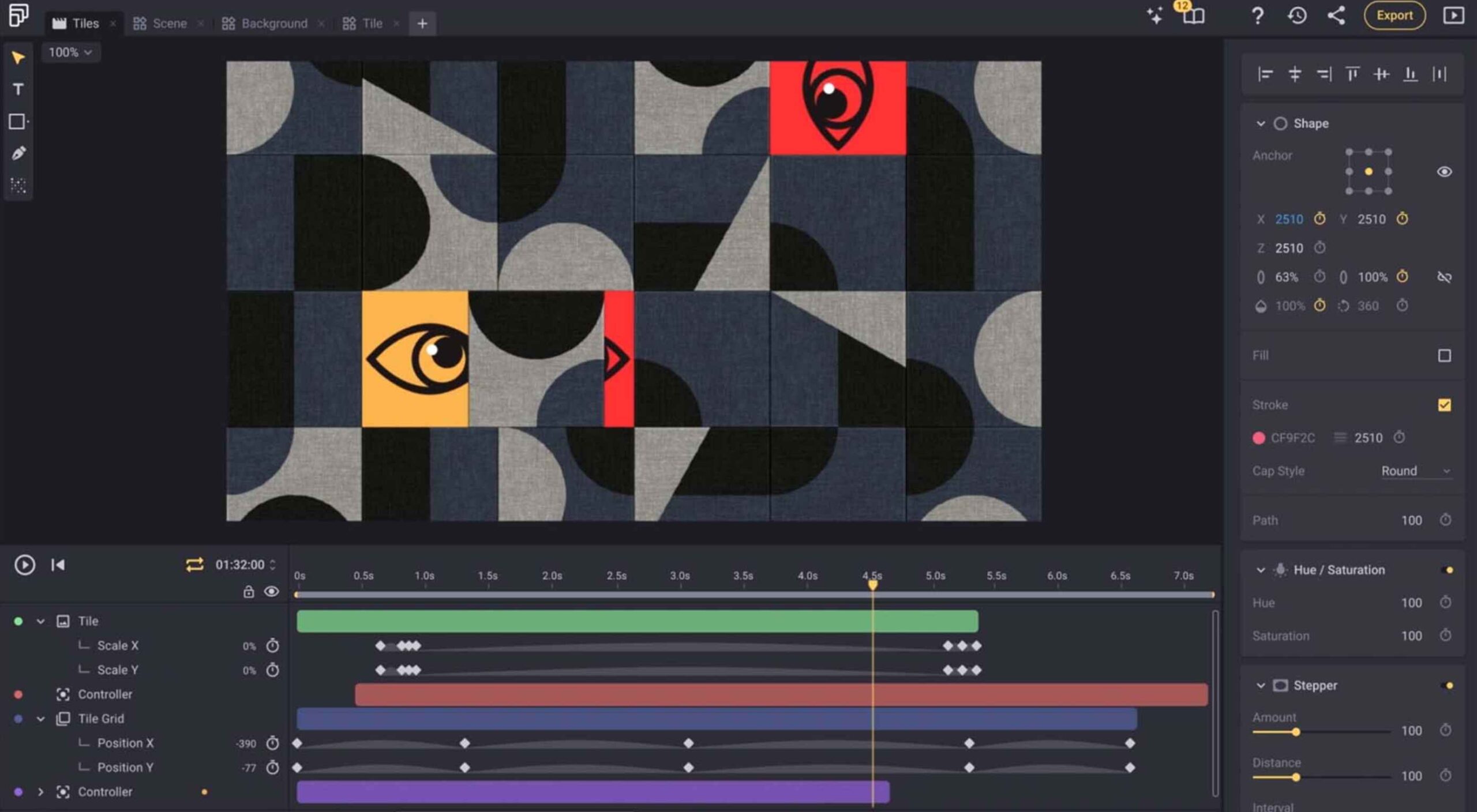
Fable
Fable is a web-based motion design platform to help you tell moving stories. It’s designed to be easy enough for beginners to use but has tools that even the most experienced motion designers can appreciate. This is a premium tool, but you can try it free.
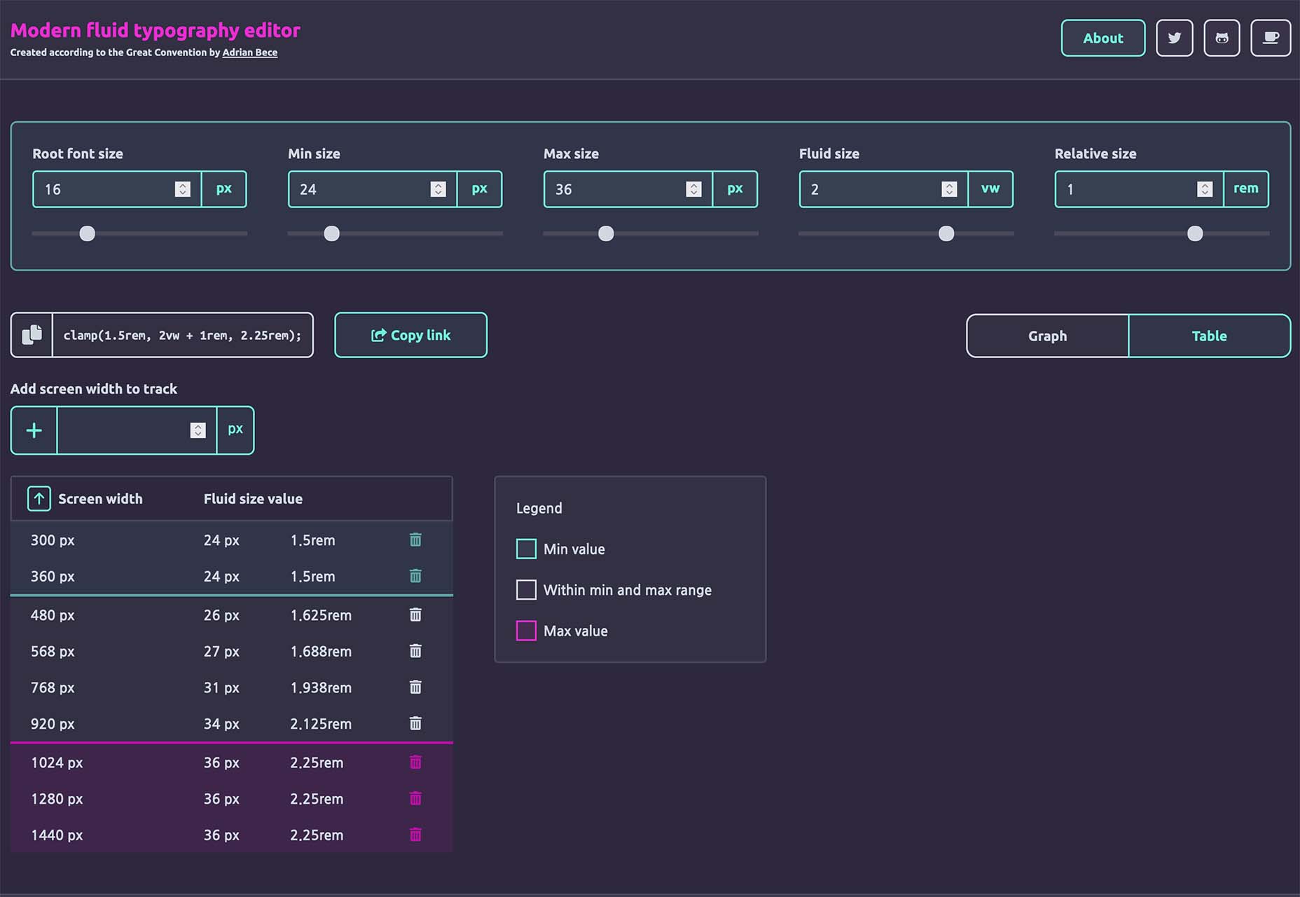
Modern Fluid Typography Editor
Modern Fluid Typography Editor takes the guesswork out of sizing and scale for type sizes on different screens. Set a few preferences and see ranges your type styles should fall in. This typography calculator is visual and easy to use.
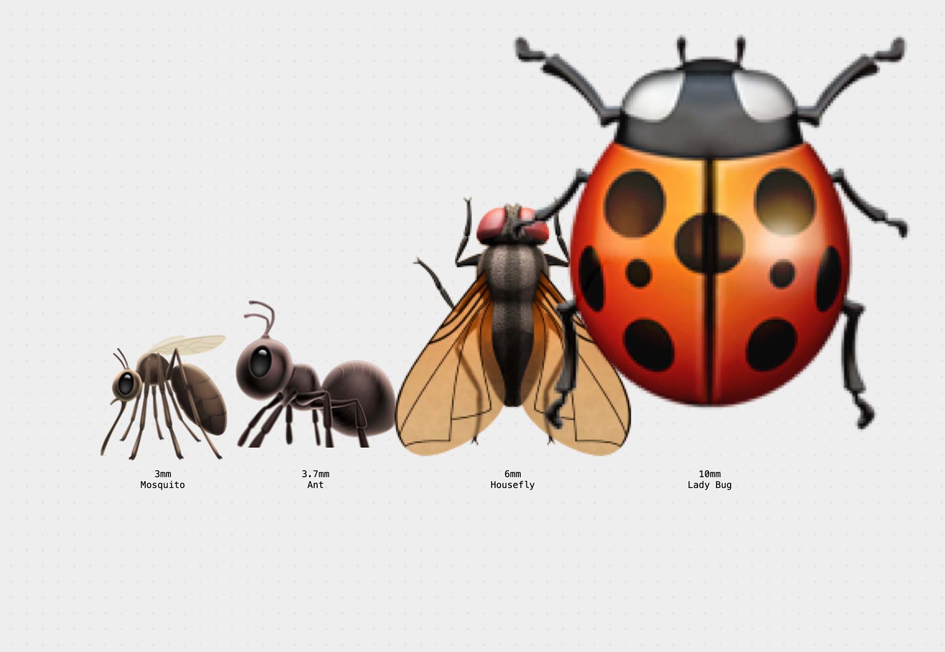
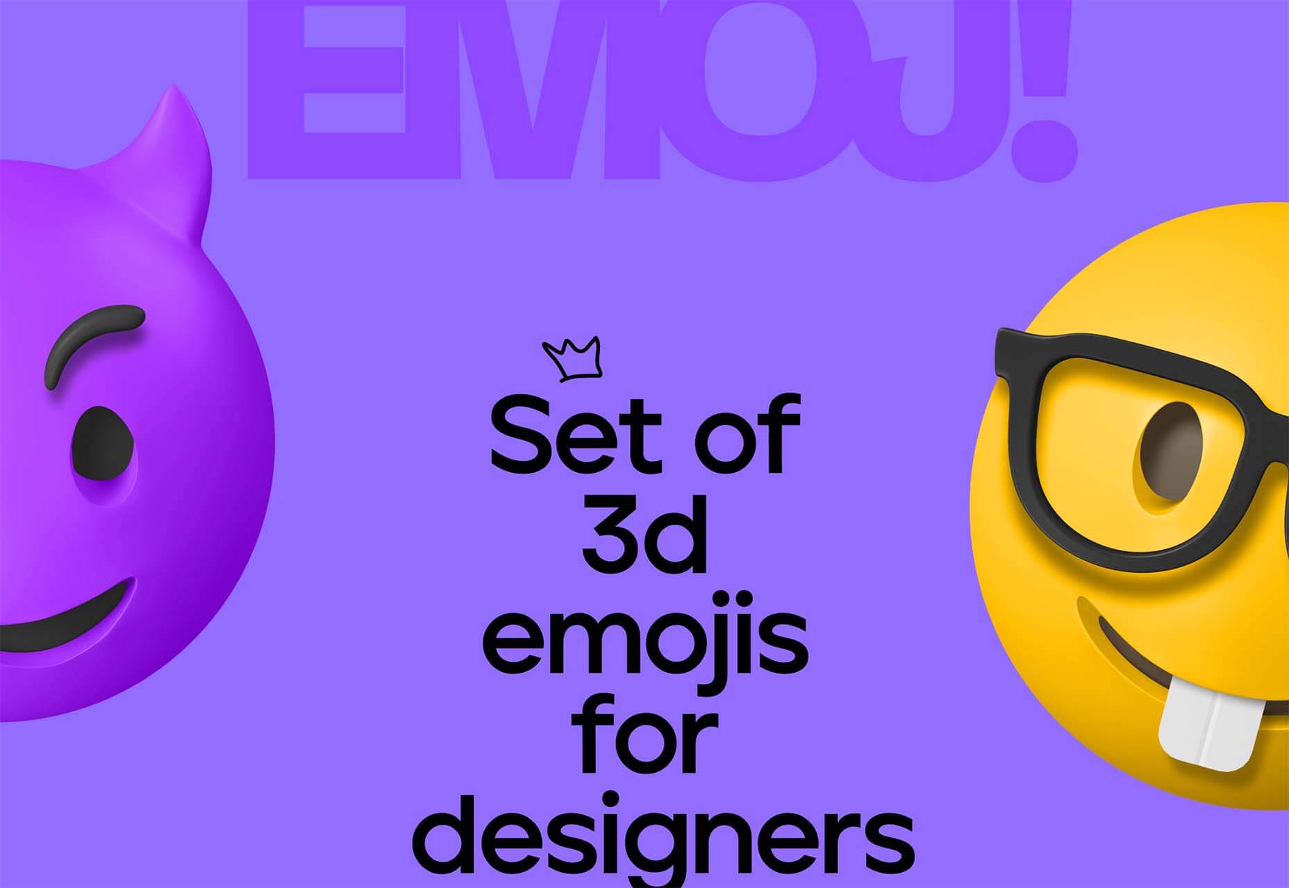
Emoji to Scale
Emoji to Scale is a fun look at emojis in a real-world relationship to each other. Make sure to also note the Pokemon to Scale project, which is just as much fun.
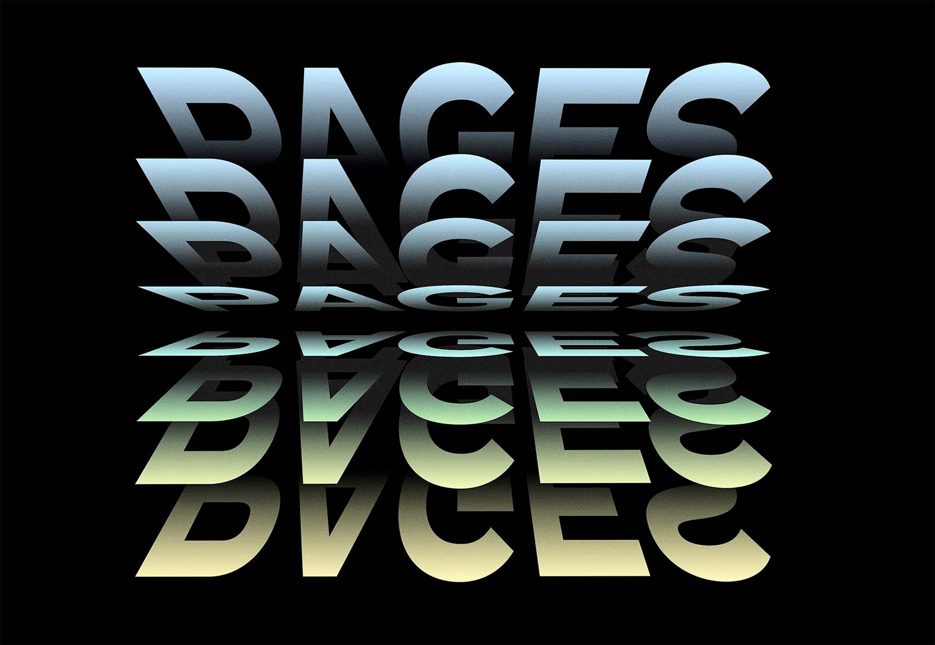
Page Flip Text Effect
Page Flip Text Effect is a fun and straightforward PSD asset that adds a nice element to design projects. Everyone can use some fun, colorful animation, right?
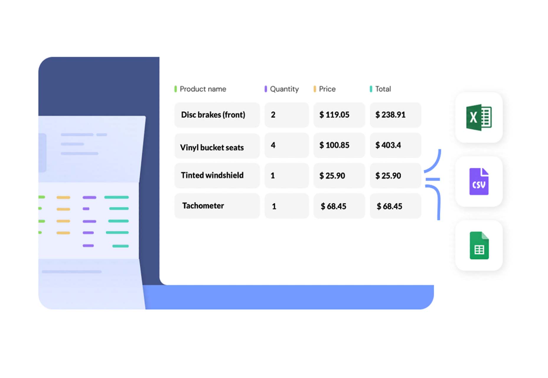
Nanonets
Nanonets is a practical tool for automated table extraction. You can snag tables from PDFs, scanned files, and images. Then capture relevant data stored in tabular structures on any document and convert to JSON Excel, or CSV and download.
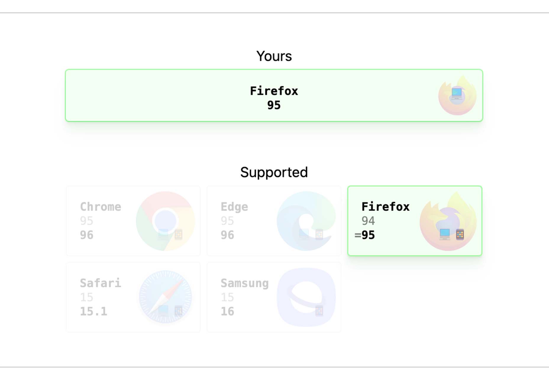
Browsers.page
Browsers.page shows browser name and version, matched with a list of the browsers you support as a company or project. It’s a visual reminder to update if you are working with some browser lag. It’s a free tool and includes a frontend API.
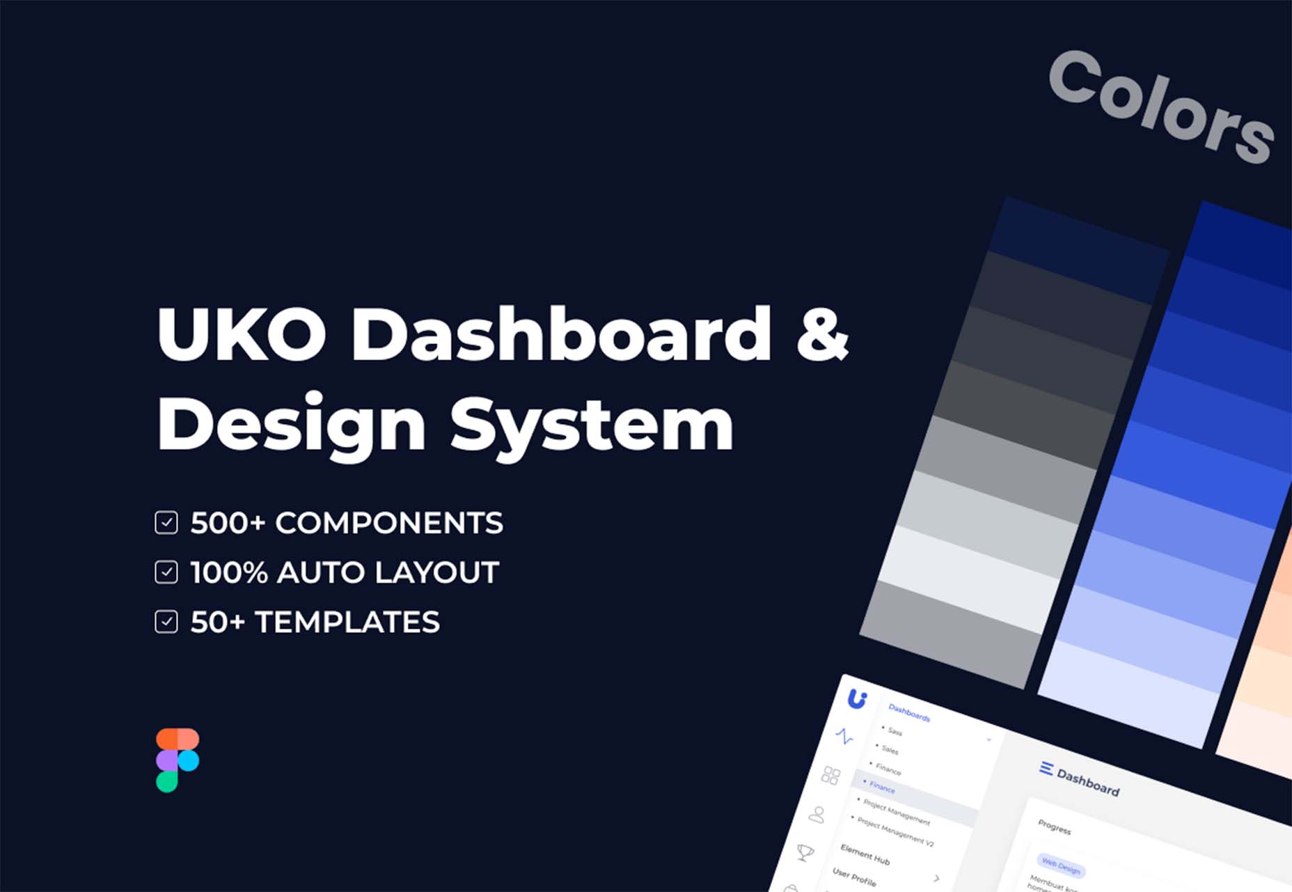
UKO UI
UKO UI is a Figma dashboard and design system bundle packed with components and pages to build from. It’s free for personal use.
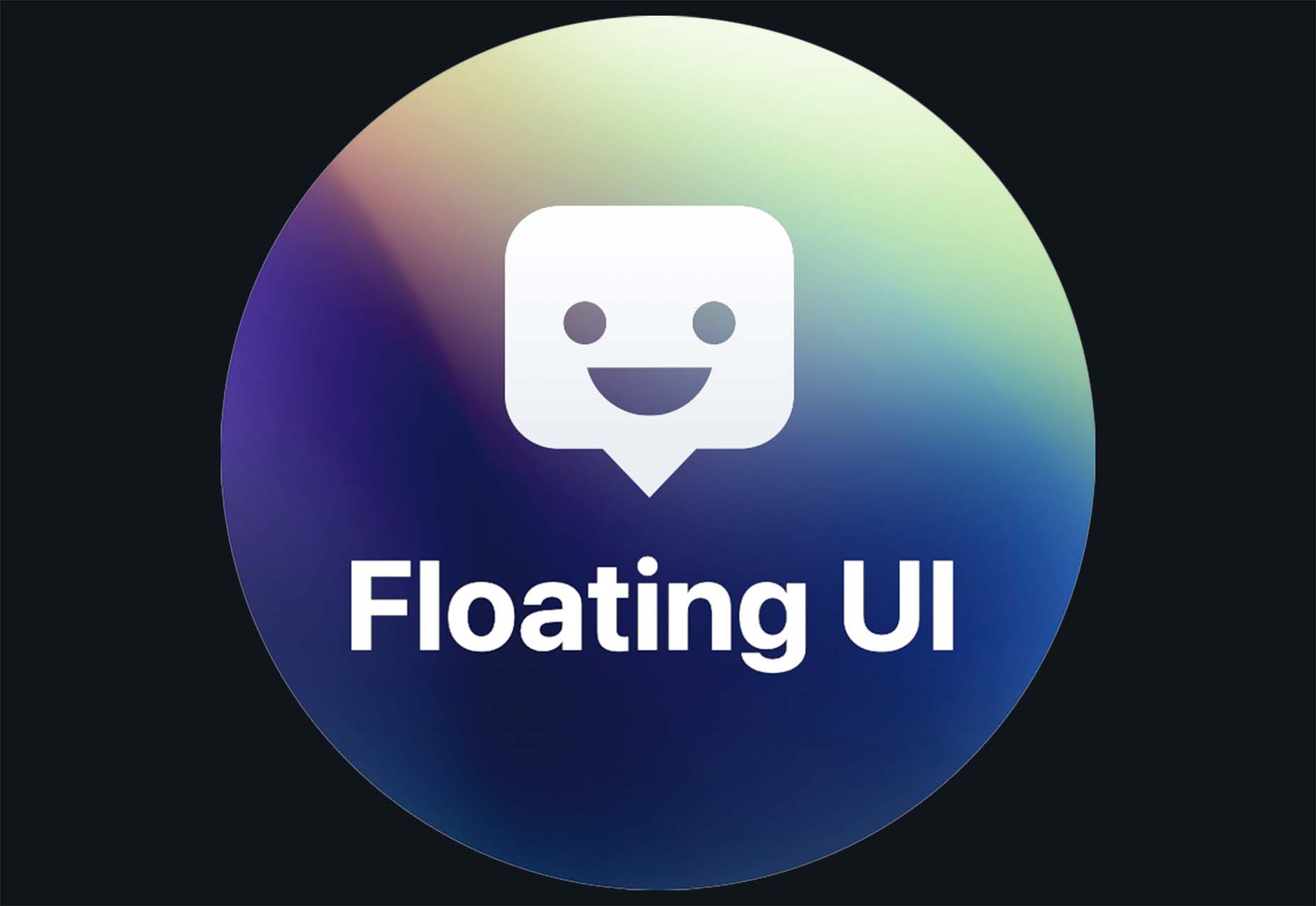
Floating UI
Floating UI is a low-level library for positioning “floating” elements like tooltips, popovers, dropdowns, menus, and more. Since these types of elements float on top of the UI without disrupting the flow of content, challenges arise when positioning them. It exposes primitives, which enable a floating element to be positioned next to a given reference element while appearing in view for the user.
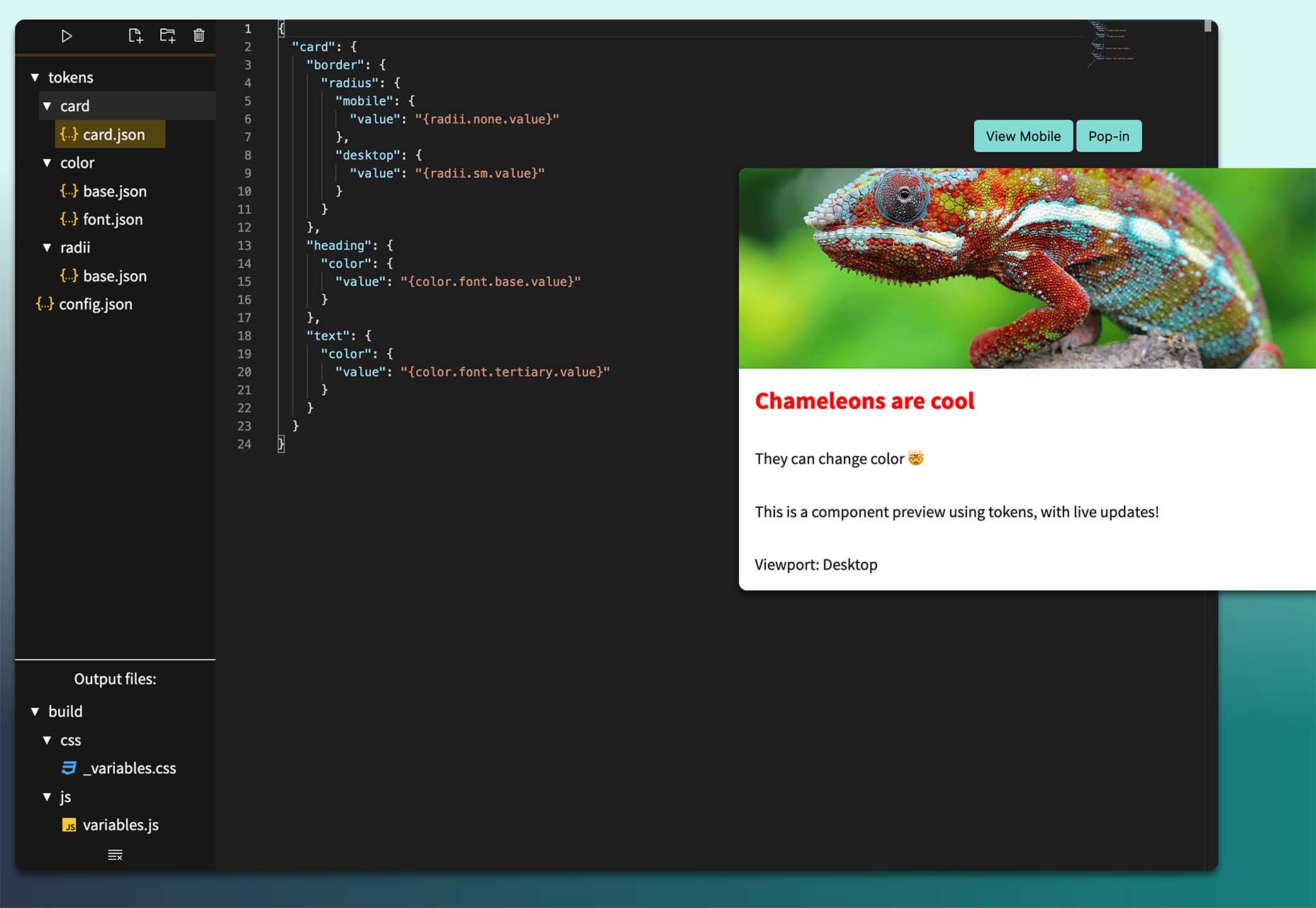
Style-Dictionary-Play
Style-Dictionary-Play lets you experiment with a style dictionary in your browser with a live preview and mobile and desktop views. It’s an open-source tool and allows for URL project sharing, and you can use it without logging in or signing up.
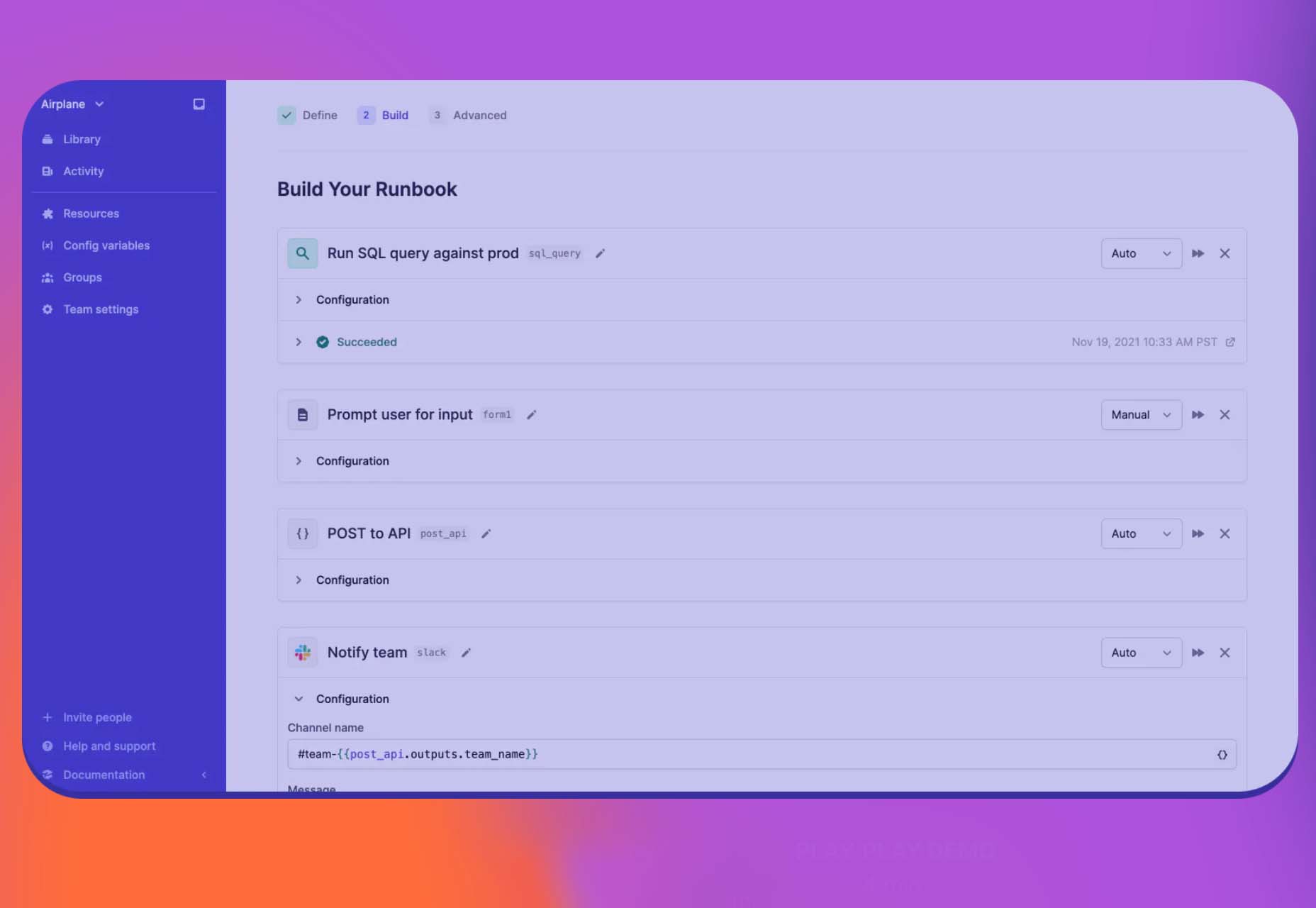
Airplane Runbooks
Airplane Runbooks makes it easy to turn small amounts of code into complex internal workflows. Model onboarding flows, admin operations, cron-like schedules, and more and share with your team. It’s like Zapier but for first-party operations that touch prod data.
Shoelace
Shoelace is a forward-thinking library of web components that works with any framework. It’s fully customizable – and has a dark mode. It’s built with accessibility in mind, and the open-source tool is packed with components.
Tutorial: Coloring with Code
Coloring with Code is an excellent tutorial by the team at Codrops that will help you create beautiful, inspiring, and unique color palettes/combinations, all from the comfort of your favorite text editor. It’s practical and easy to follow along as you work through the steps on your own.
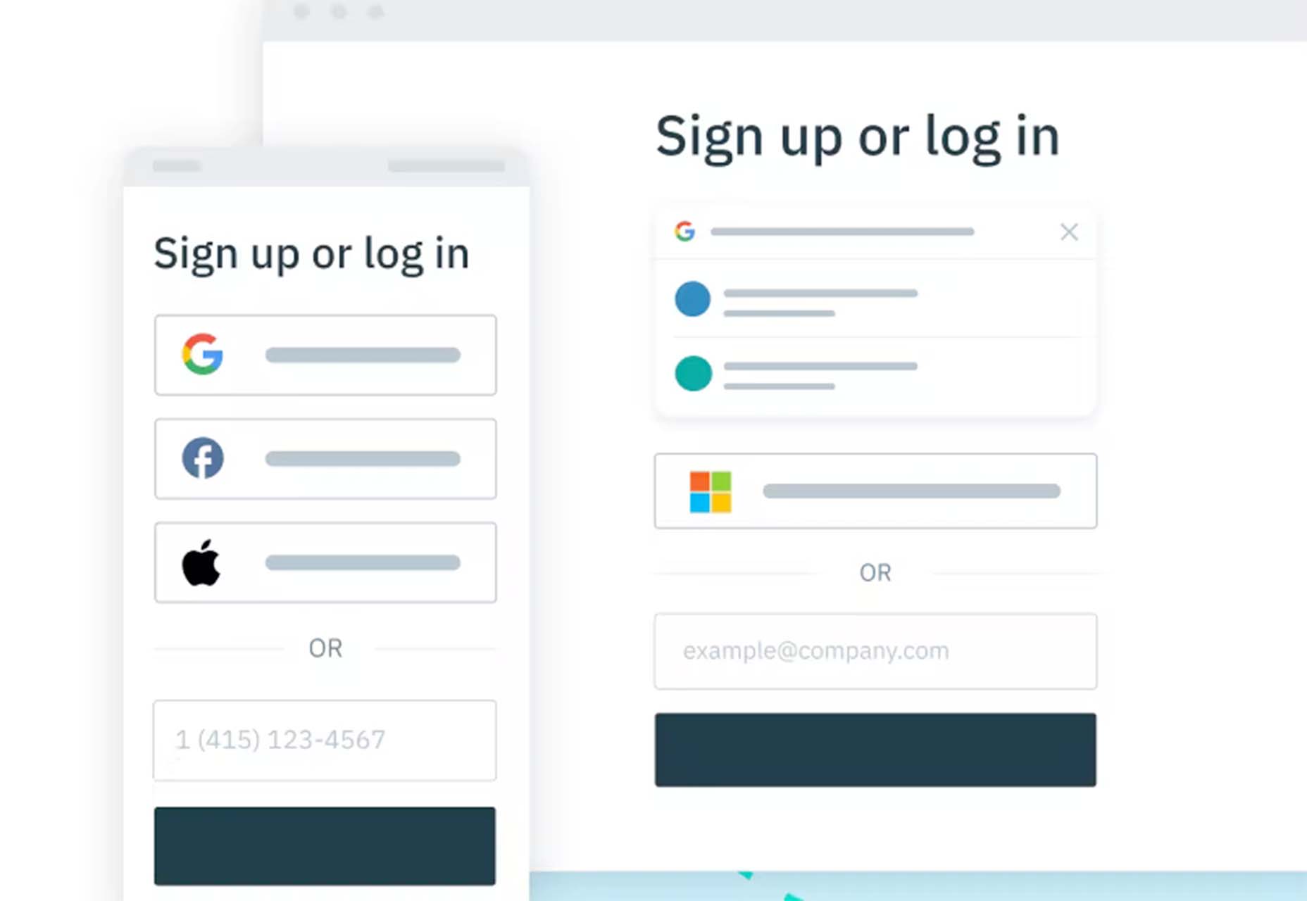
Stytch
Stytch is a full-stack authentication and authorization platform whose APIs make it simple to seamlessly onboard, authenticate and engage users. Improve security and user experience by going passwordless with this premium tool.
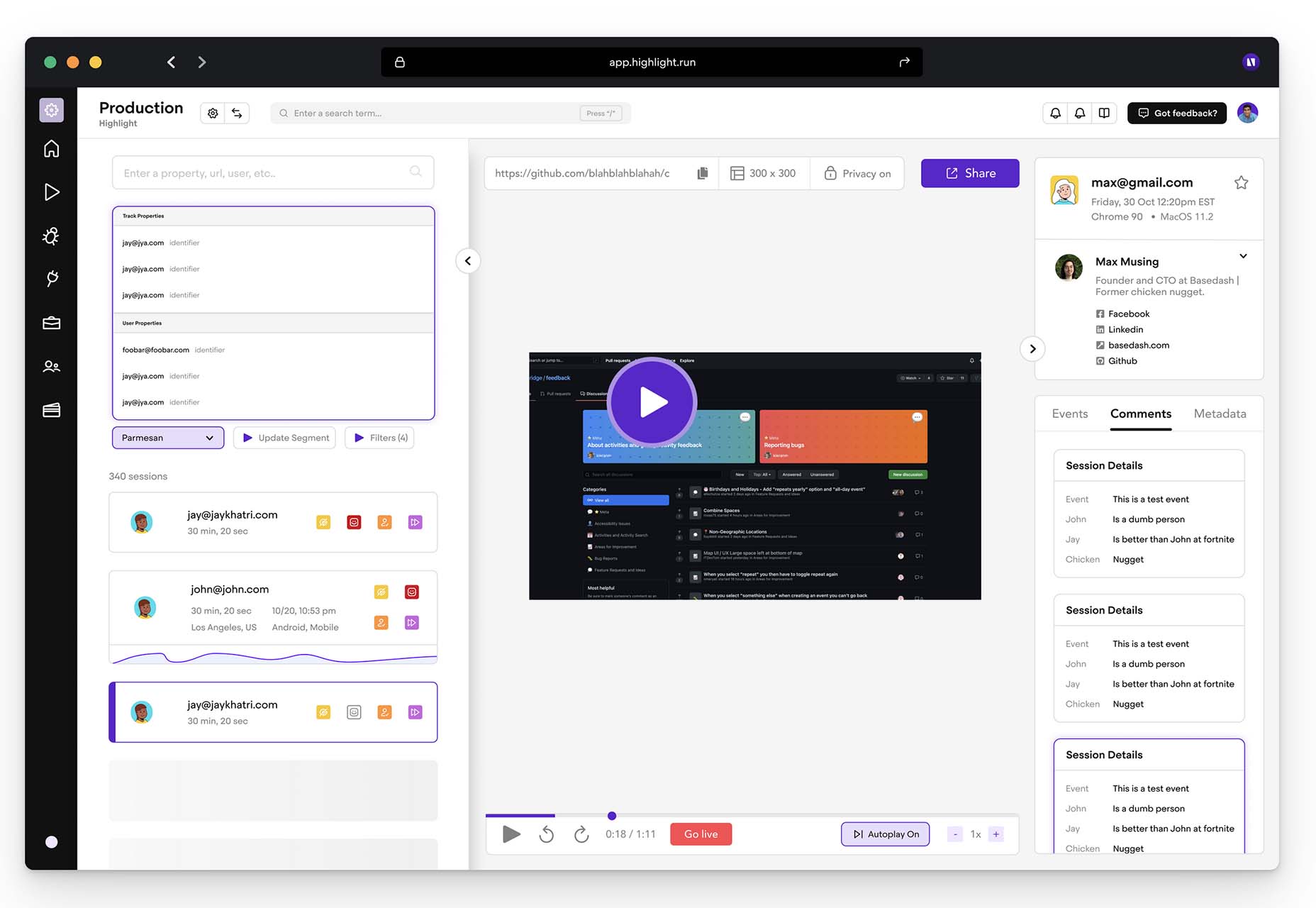
Highlight
Highlight keeps web apps stable. With pixel-perfect session replay, you’ll get complete visibility into issues and interactions that are slowing down users. You can start using this premium tool in minutes, and it works on every framework.
The post Exciting New Tools For Designers, Holidays 2021 first appeared on Webdesigner Depot.
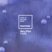
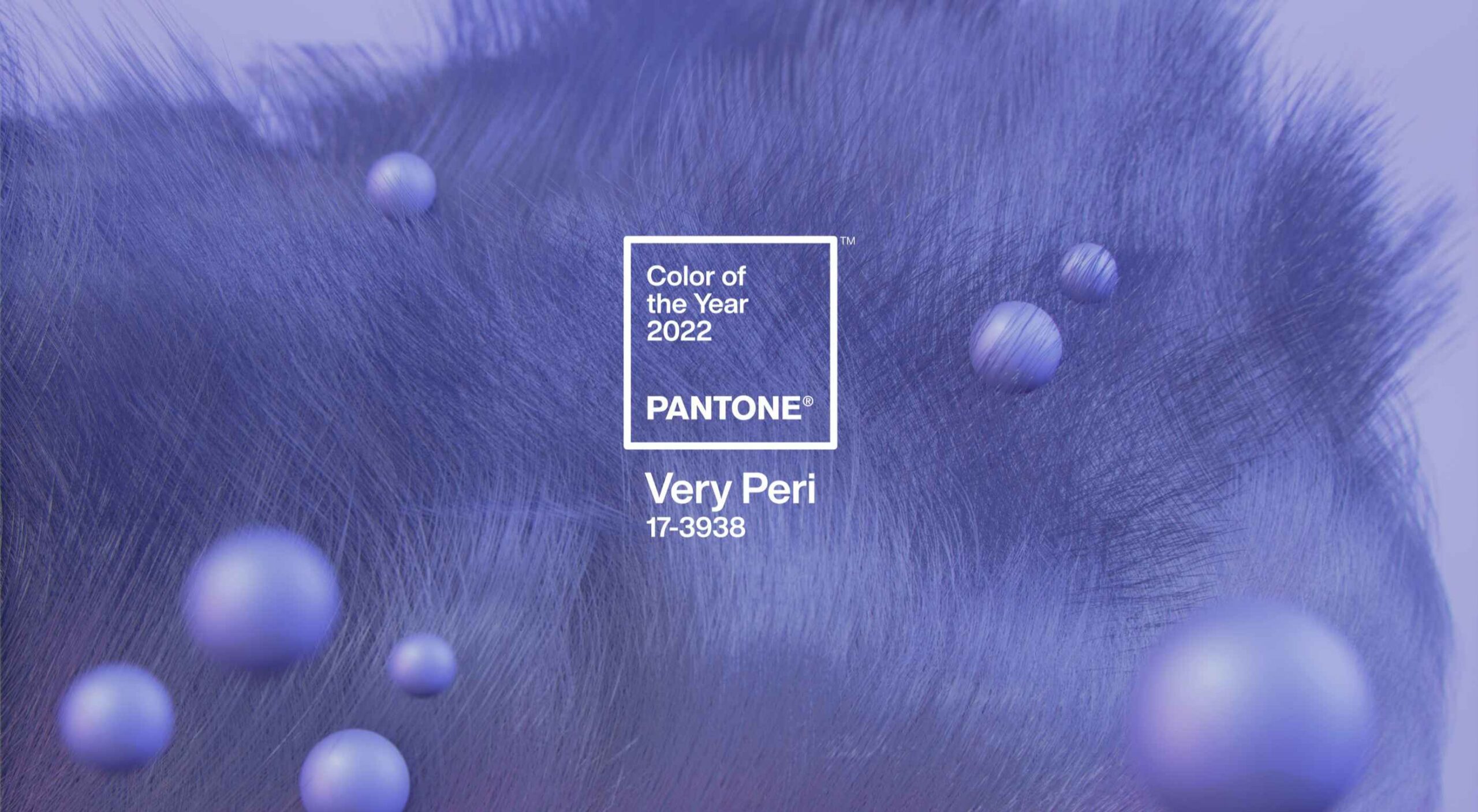 At this time every year, Pantone announces its choice for Color of the Year for the coming 12 months. The last year has been uncertain, to say the least, and although a tentative optimism seems to be piercing the general gloom, it’s difficult to see how that can be expressed in color.
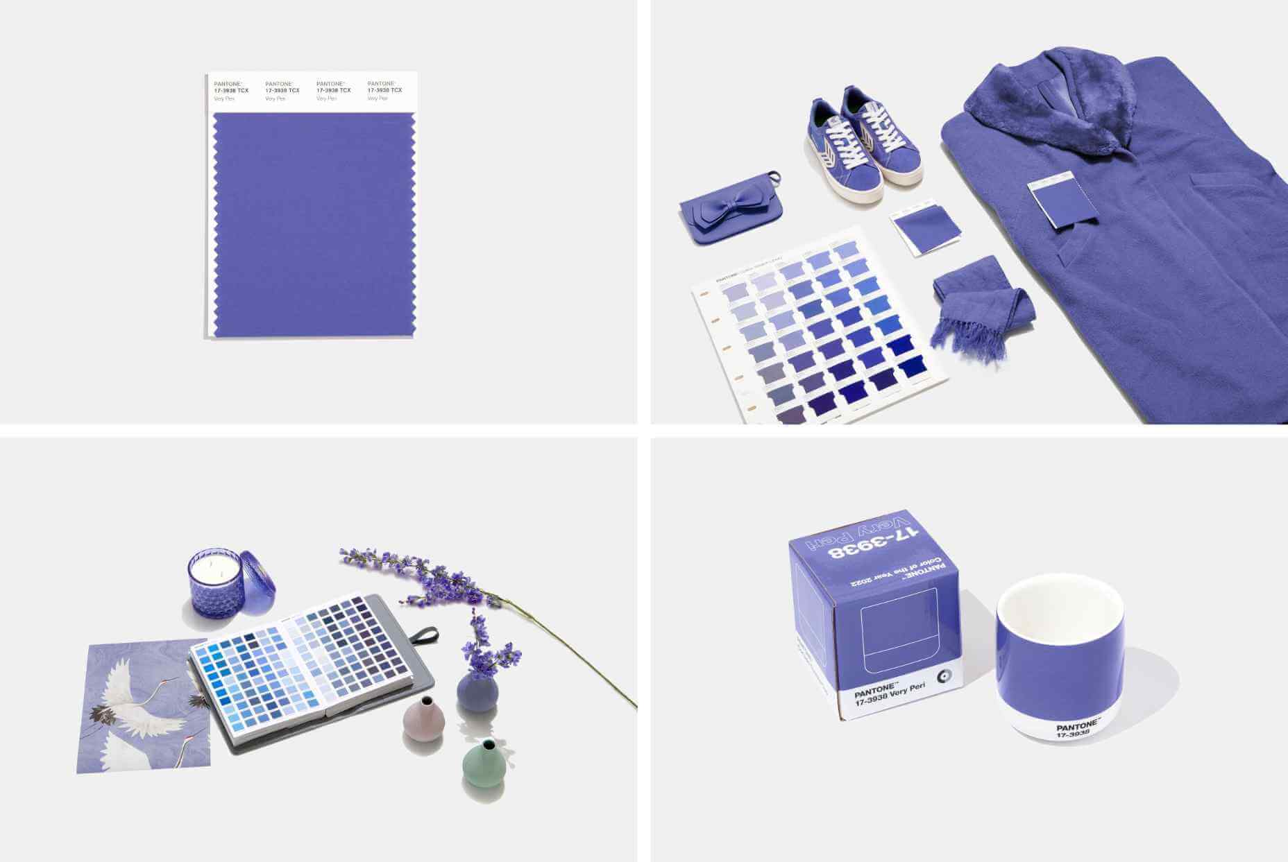

 Websites as we know them are going to change very soon. The days of text, images, and basic interactions in a 2D browser window have served us well, but virtual, augmented, and mixed reality experiences are getting better all the time. Developers and designers need to think beyond the browser window and prepare for an immersive future.
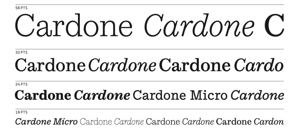
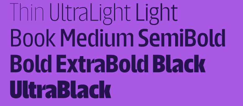
 Are you tired of using the same old Google fonts from website to website? You’re in luck!


 A few days ago, the big tech news was that Jack Dorsey was stepping down from his role as Twitter CEO to focus on Square, the payment processor he founded in 2009.


 As a UX designer, you get to work on creative, rewarding, even life-changing projects. It’s an industry with flexible working and countless opportunities. All this, and you get paid well too.
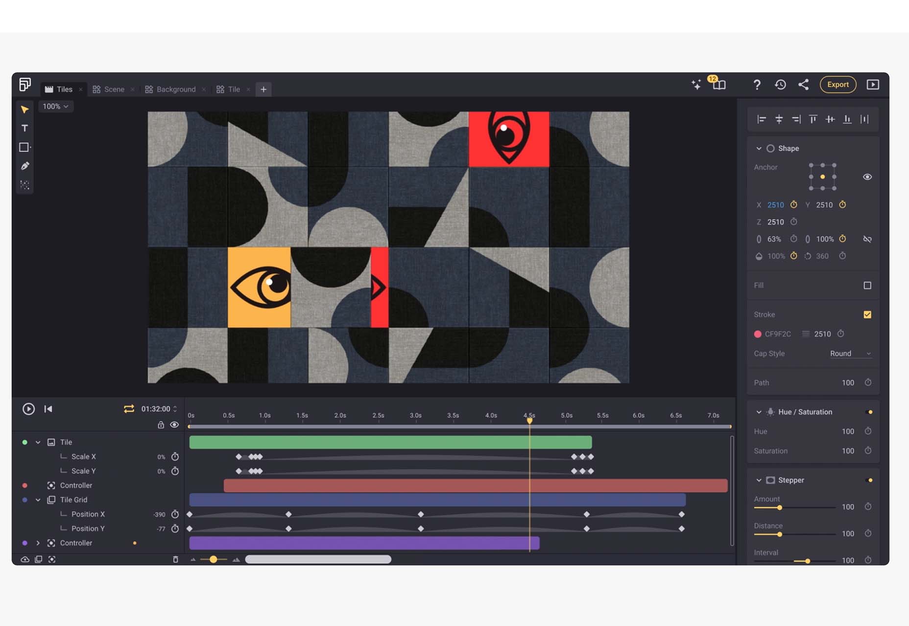
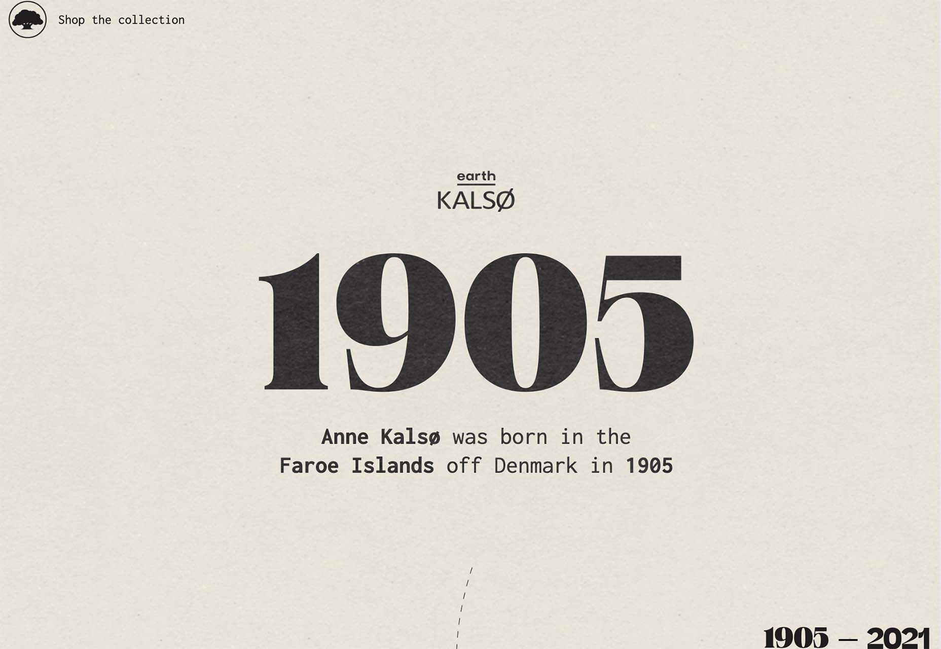
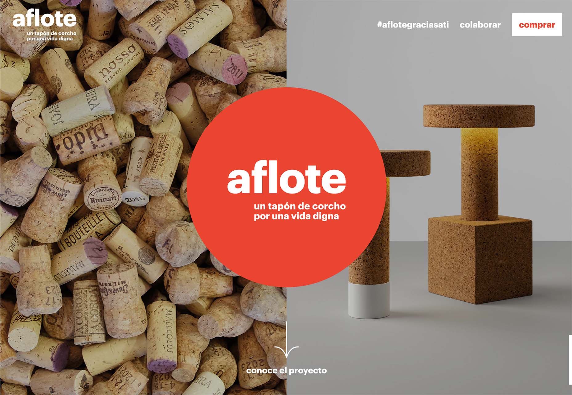
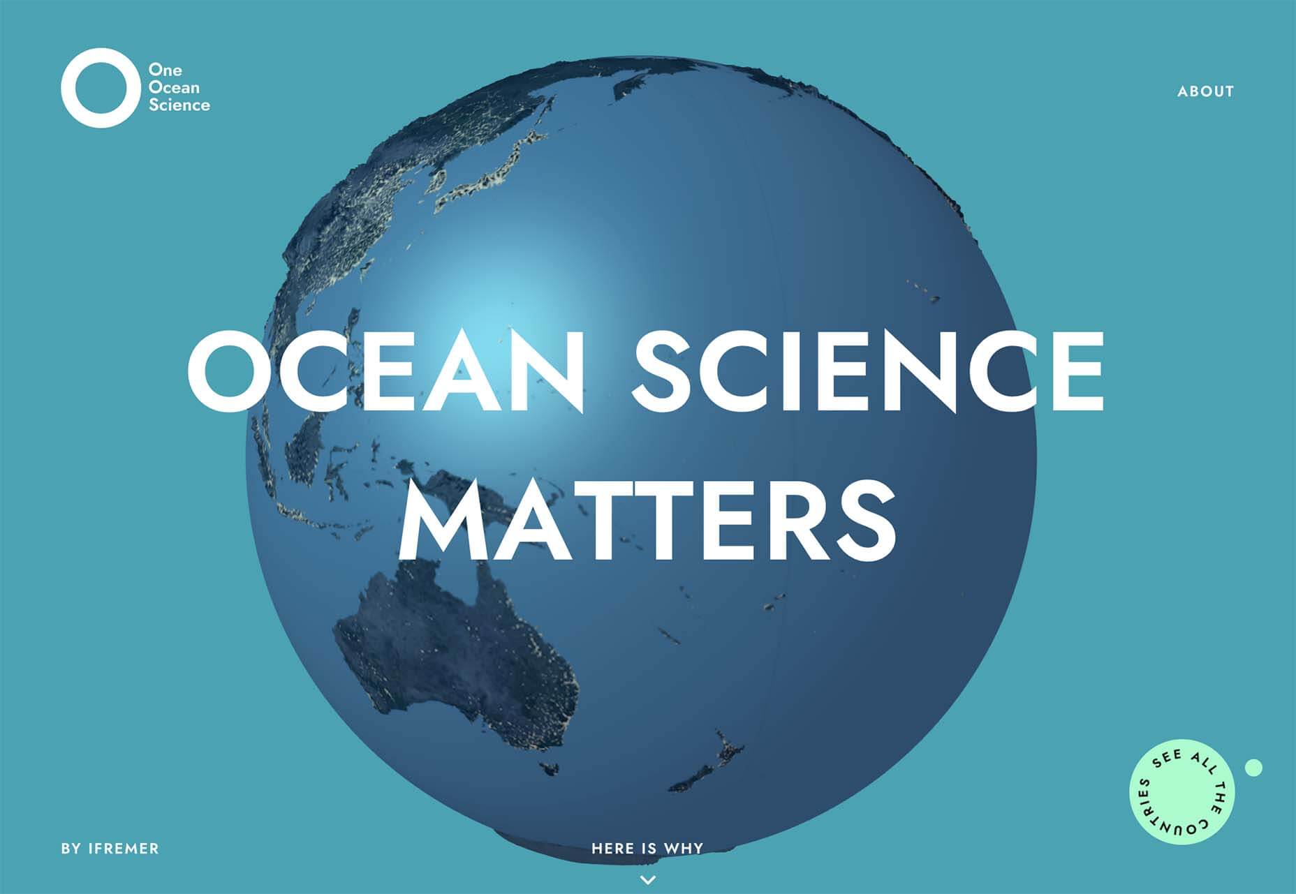
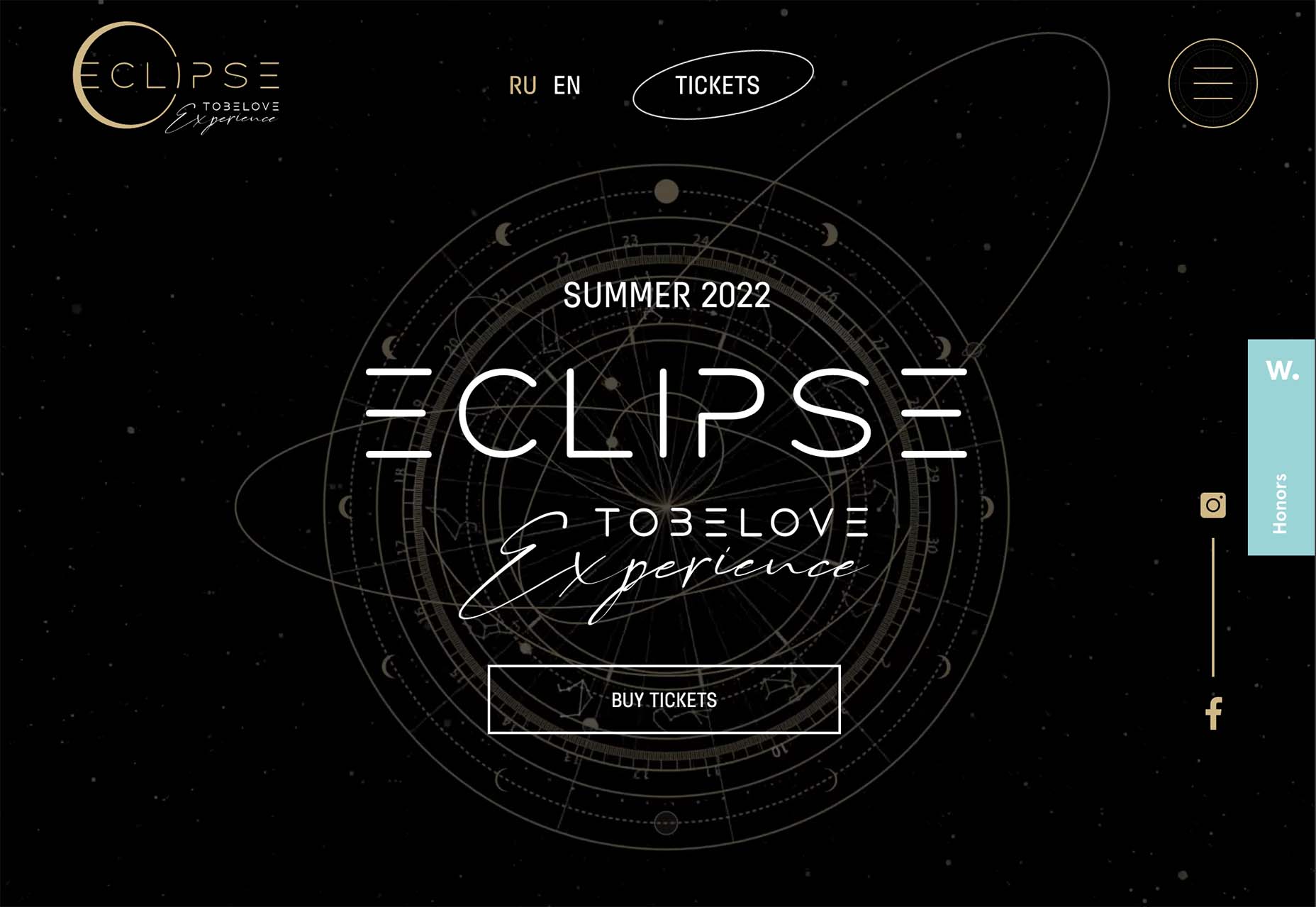
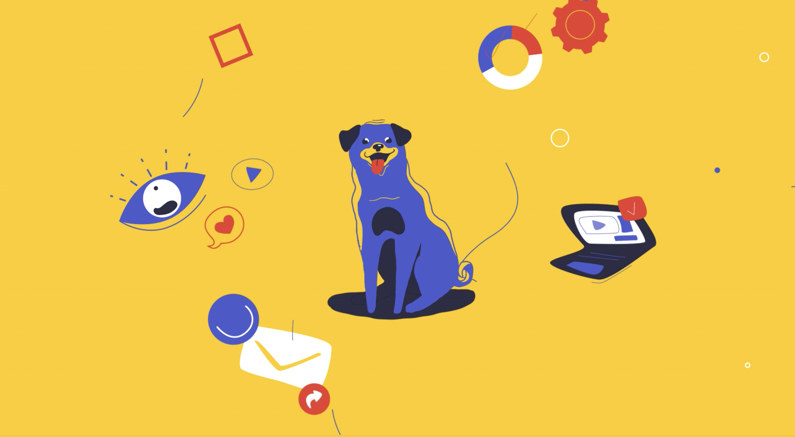 The year might be coming to an end, but plenty of design trends are still beginning to emerge. It’ll be interesting to see how many of these website design elements remain popular into the new year. From vintage elements to circles to happier feelings, there’s a lot to play with here.
