
 The web industry is beset by competing ideals and goals so that the simplicity of numbers makes sense to us: one is more than zero, two is more than one.
When it comes to any metric, there is an understandable temptation to focus on volume. In some cases, absolute metrics make more sense than others. If your goal is to make money, then $1 is marginally better than $0, and $2 is marginally better than $1.
However, even in ecommerce, some conversions are worth more than others; high-value items or items that open up repeat sales are inherently more valuable in the long term.
SEO (Search Engine Optimization) has traditionally been built around a high-traffic numbers game: if enough people visit your site, then sooner or later, someone will convert. But it is far more effective to attract the right type of visitor, the high-value user that will become a customer or even a brand advocate.
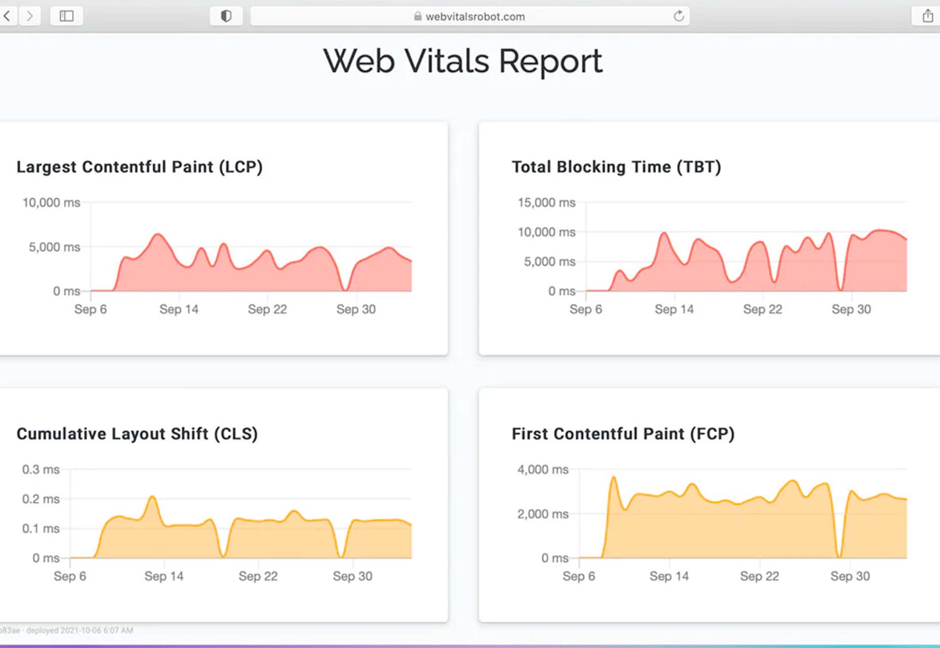
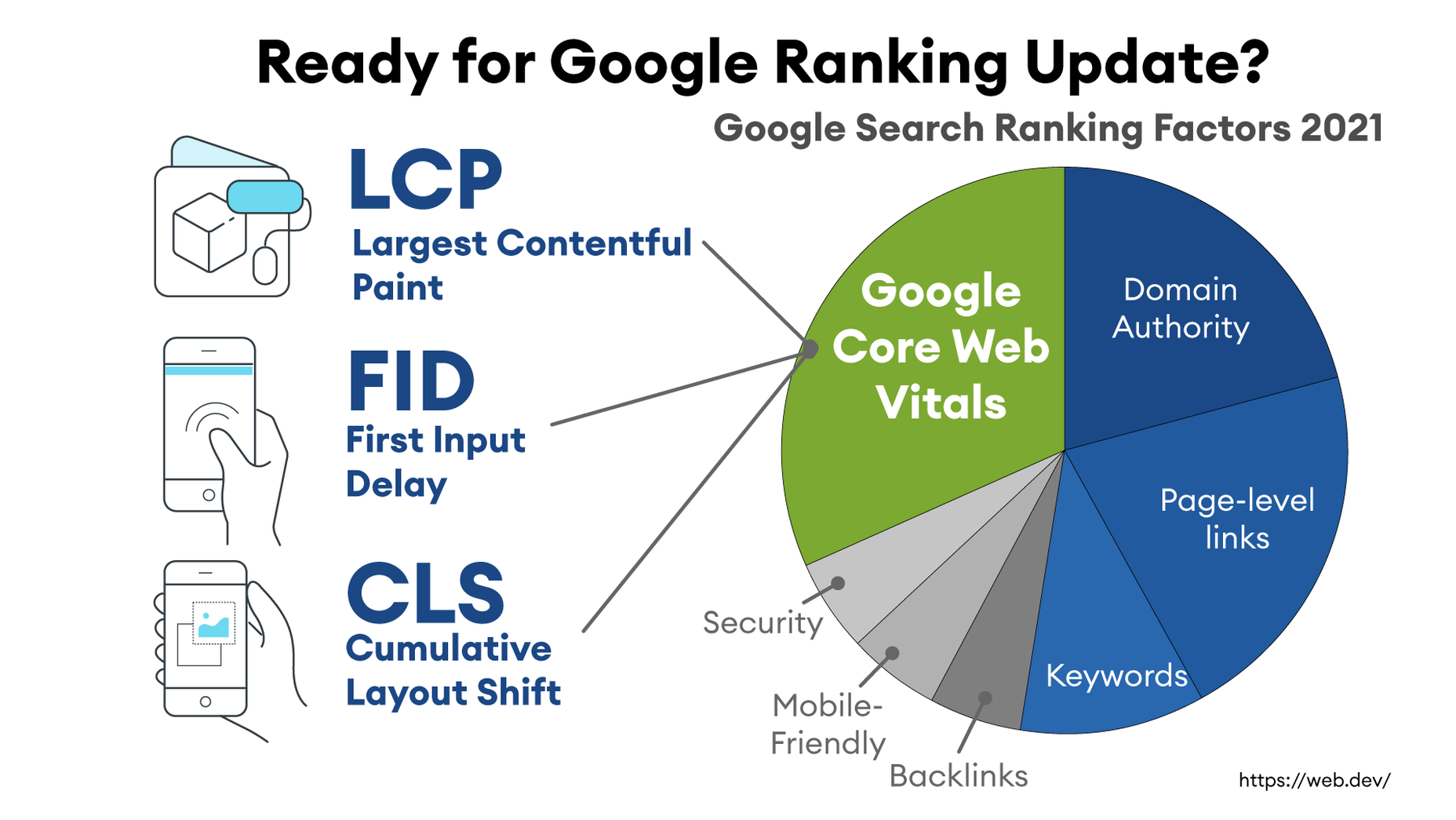
The best content does not guarantee success on Google, and neither does good UX or even Core Web Vitals. Content is no longer king. What works is brand recognition.
SERPs Look Different in 2021+
Traditional SEO strategies would have you pack content with keywords. Use the right keywords, have more keywords than your competitor, and you’ll rank higher. SERPs (Search Engine Results Pages) used to be a league table for keywords.
Unfortunately, it’s simply not that easy any longer, in part because Google has lost its self-confidence.
Even before the recent introduction of dark mode for Google Search, its SERPs had started to look very different. [We tend to focus on Google in these articles because Google is by far the biggest search engine, and whatever direction Google moves in, the industry follows — except for FLoC, that’s going down like a lead balloon on Jupiter.]
Google’s meteoric success has been due to its all-powerful algorithm. Anything you publish online is scrutinized, categorized, and archived by the all-seeing, all-knowing algorithm. We create quality content to appeal to the algorithm. We trust in its fairness, its wisdom…
…all of us except Google, who have seen behind the curtain and found the great and powerful algorithm, may as well be an old man pulling levers and tugging on ropes.
Content Is President
Google has never been coy about the inadequacies of the algorithm. Backlinks have been one of the most significant ranking factors of the algorithm for years because a backlink is a human confirmation of quality. A backlink validates the algorithm’s hypothesis that content is worth linking to.
One hundred words or so of keyword dense text requires less processing and has fewer outliers, and so is relatively simple for an algorithm to assess. And yet content of this kind performs poorly on Google.
The reason is simple: human beings don’t want thin content. We want rich, high-quality content. Thin content is unlikely to be validated by a human.
The key to ranking well is to create content to which many people want to link. Not only does this drive traffic, but it validates the page for Google’s algorithm.
There Can Be Only One
One of the key motivating factors in the recent changes to search has been the evolution of technology.
Siri, Bixby, and all manner of cyber-butler are queueing up to answer your question with a single, authoritative statement. Suddenly, top-ten on Google is a lot less desirable because it’s only the top answer that is returned.
Google, and other search engines, cannot afford to rely on the all-seeing, all-knowing algorithm because the all-powerful algorithm is just an educated guess. It’s a very good educated guess, but it’s an educated guess nonetheless.
Until now, an educated guess was sufficient because if the top result were incorrect, something in the top ten would work. But when it’s a single returned result, what search engines need is certainty.
The Single Source of Truth
As part of the push towards a single, correct answer, Google introduced knowledge panels. These are panels within search results that present Google’s top answer to any given question.
Go ahead and search for “Black Widow” and you’ll see a knowledge panel at the top of the results hierarchy. Many searchers will never get beyond this.
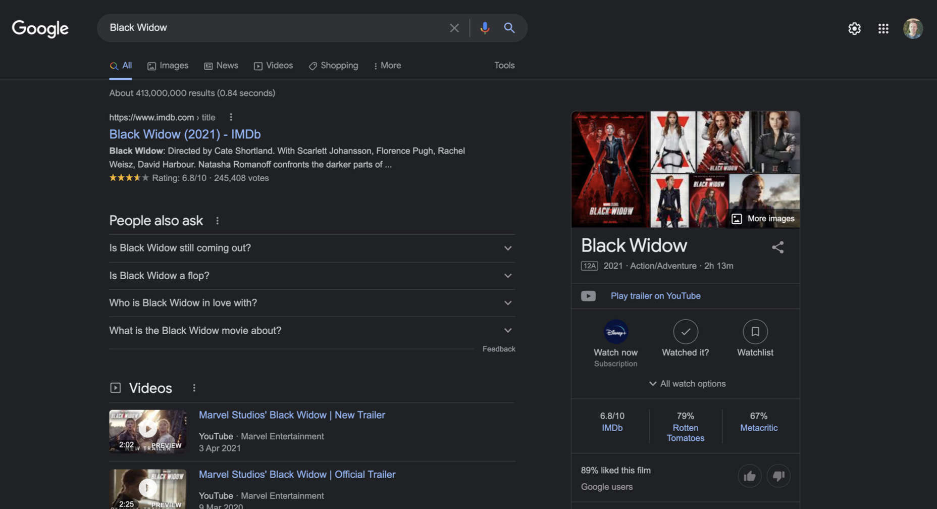
Knowledge panels are controversial because Google is deferring to a third authority on the subject — in the case of Black Widow, Google is deferring to Marvel Studios. If someone at Marvel decided to redefine Black Widow from action-adventure to romantic comedy, Google would respect that [bizarre] decision and update the knowledge panel accordingly.
Whether we approve of the move towards single results, knowledge panels, and whatever else develops in the next few years, it’s a moot point. It’s happening. Most of us don’t have the pull of Marvel Studios. So the question is, how do we adapt to this future and become the authority within our niche.
Making Use of sameAs
One of the most significant developments in recent years has been structured data. Structured data is essentially metadata that tells search engines how to interpret content.
Using structured data, you can specify whether content refers to a product, a person, an organization, or many other possible categories. Structured data allows a search engine to understand the difference between Tom Ford, the designer, Tom Ford, the corporation, and Tom Ford, the perfume.
Most structured data extends the generic “thing”. And thing contains a valuable property: sameAs.
sameAs is used to provide a reference to other channels for the same “thing”. In the case of an organization, that means your Facebook page, your Twitter profile, your YouTube channel, and anything else you can think of.
Implementing sameAs provides corroboration of your brand presence. In effect, it’s backlinking to yourself and providing the type of third-party validation Google needs to promote you up the rankings.
Be a Brand
Google prefers established brands because people are more likely to trust them, and therefore consider the result that Google returned as high-quality. They will, in turn, come back to Google the next time they need something, and Google’s business model survives another day.
Google’s results are skewed towards brands, so the best strategy is to act like a brand.
Brands tend to be highly localized entities that dominate a small sector. There’s no benefit to spreading out keywords in the hope of catching a lot of traffic. Instead, identify the area that you are an expert in, then focus your content there.
Develop a presence on social media, but don’t sign up for every service available unless you have the time to maintain them properly; a suspended or lapsed account doesn’t corroborate your value.
Big Fish, Flexible Pond
There’s a pop-psychology question that asks whether you would prefer to be a big fish in a small pond or a small fish in a big pond. The direction that search is moving the correct answer is “Big fish, small pond”.
The problem with metaphors is that they carry irrelevant limitations with them. In that question, we assume that there is the choice of two ponds, both a fixed size. There is no reason the pond cannot be flexible and grow with you as you increase in size.
What matters from an SEO point of view is that you dominate your niche. You must become the single source of truth, the number one search result. If you find that you aren’t number one, then instead of competing for that top spot, reduce your niche until you are the number one authority in your niche.
Be the single source of truth that Google defers to, and the all-powerful algorithm can clamber into its balloon and float away.
The post Fighting Your Corner: Assertive SEO in 2021+ first appeared on Webdesigner Depot.


 Need inspiration for an upcoming web design project? Want to learn how to add live chat functionality to your site, or which trends you should be aware of as you pursue new projects? Leading web design blogs could be the solution to your problems.


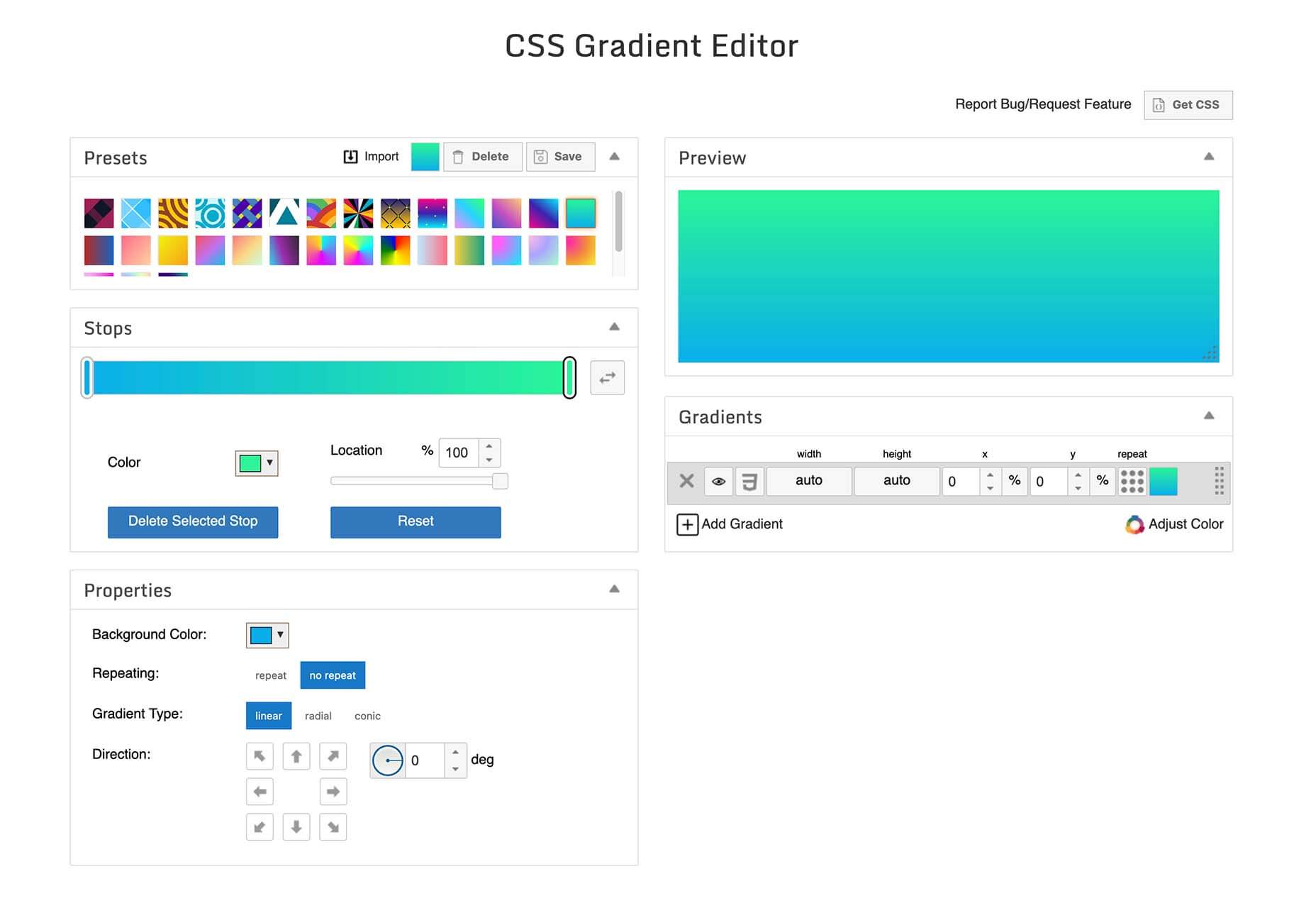
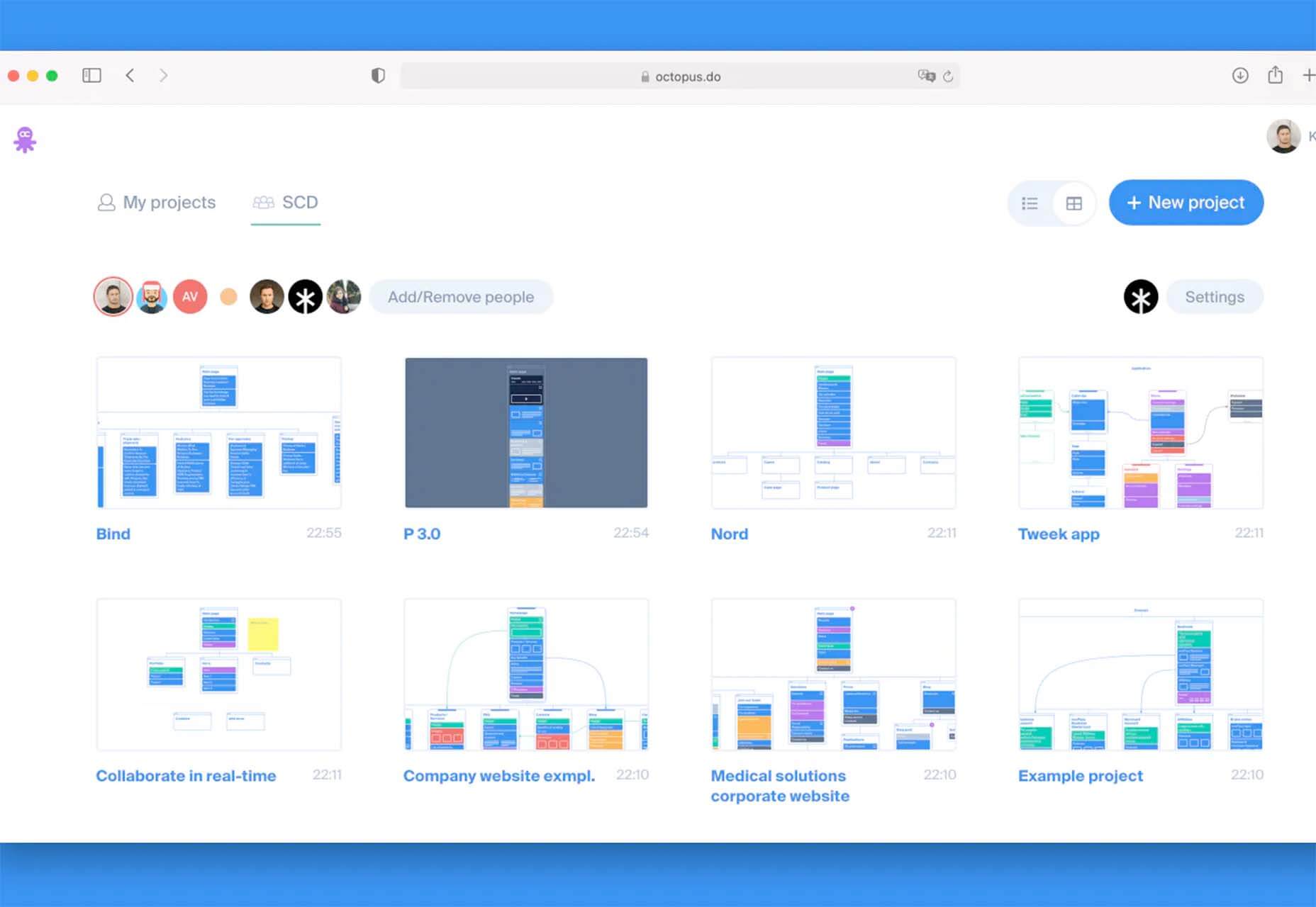
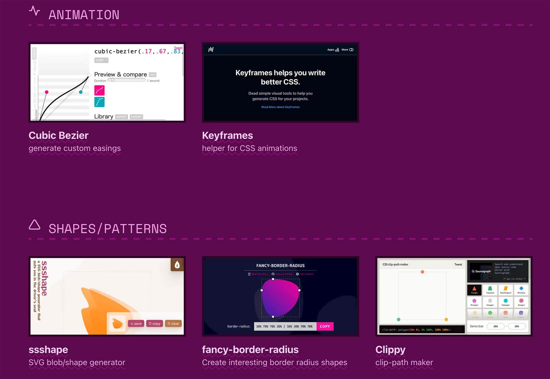
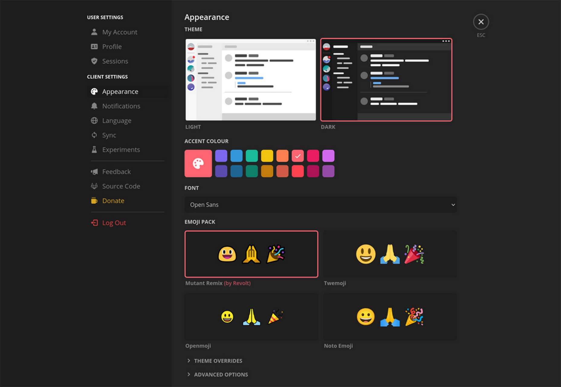
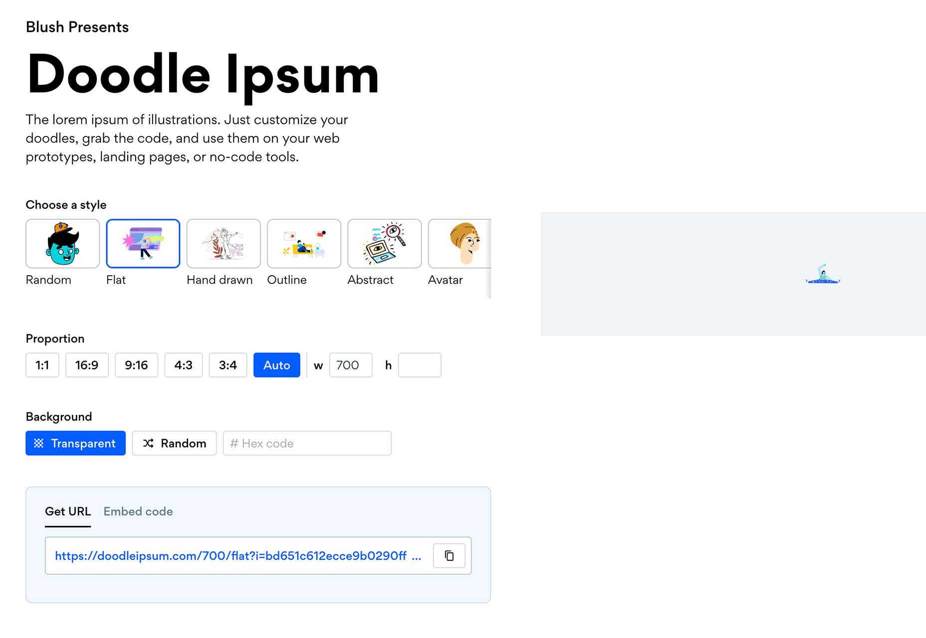
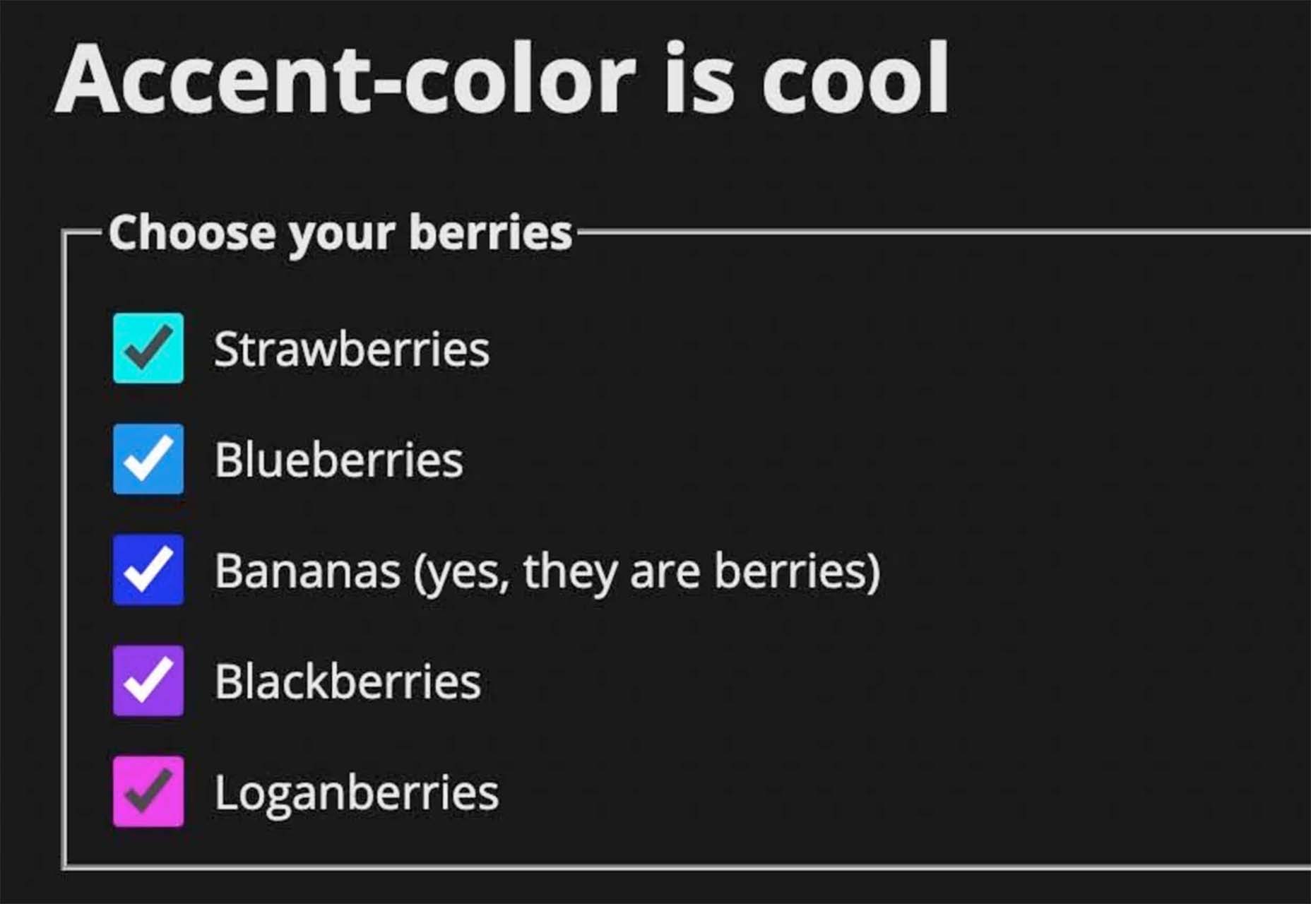
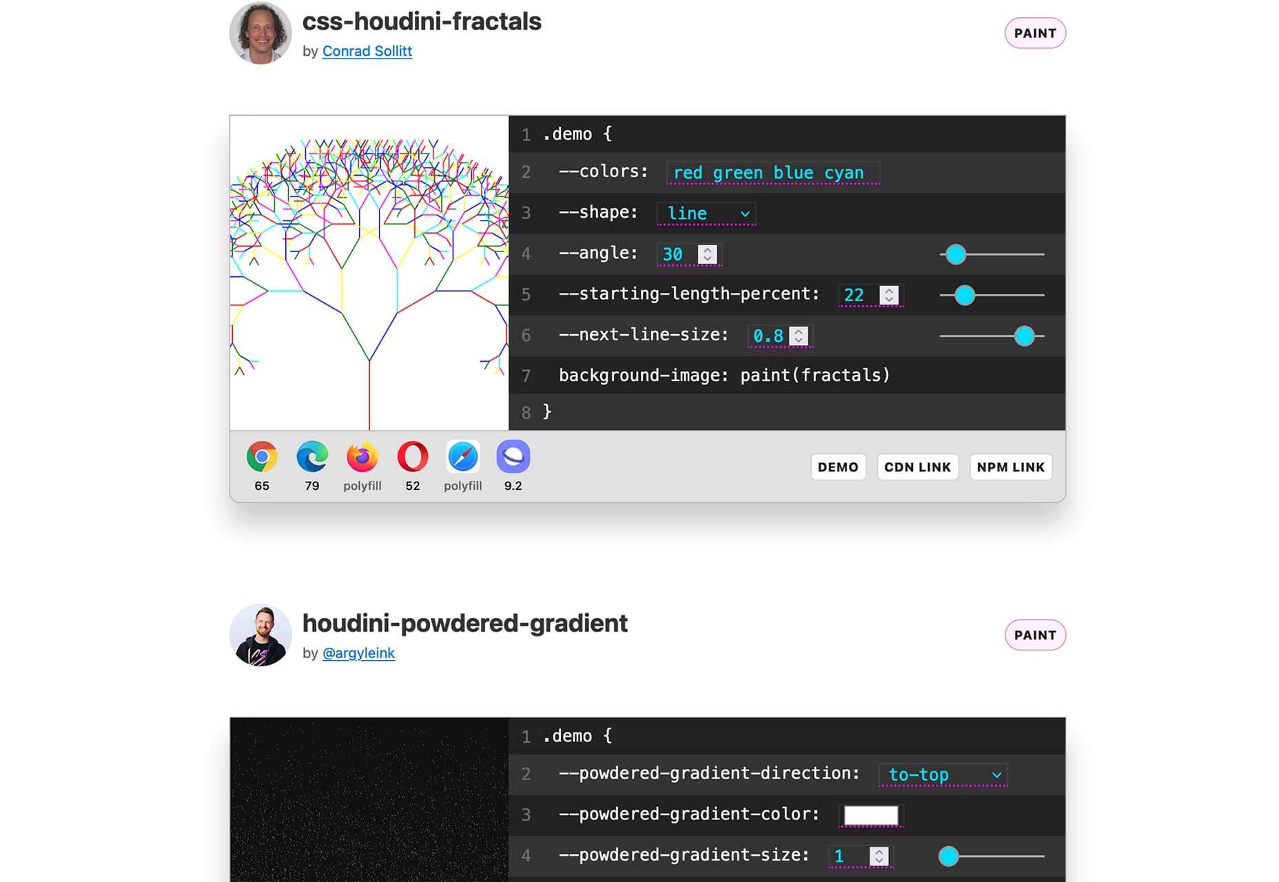
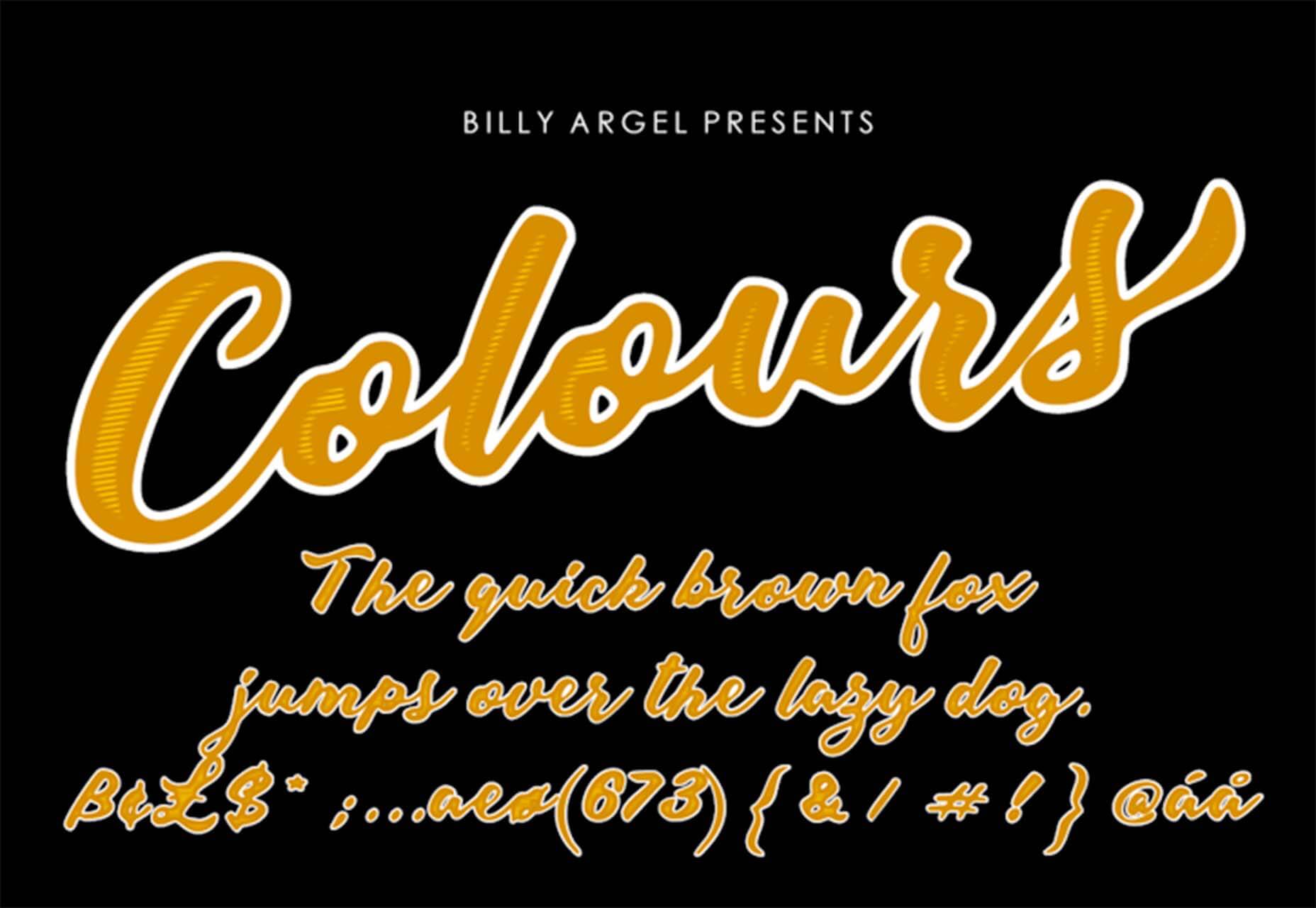
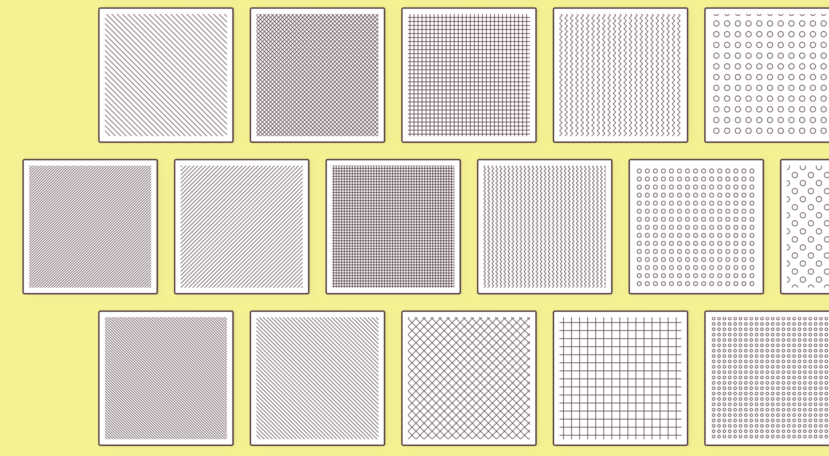 There are some spook-tacular finds in this month’s October collection of resources and tools for designers and developers. From interesting tools that can help in the design process to boo-tiful typefaces, there’s something for everyone here.
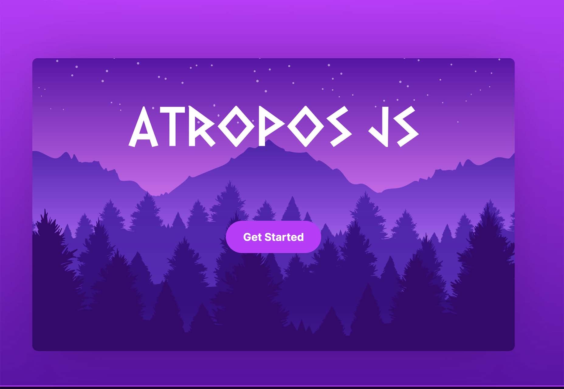


 User experience is one of the most important principles of web design. There’s no doubt that you focus on UX with every page you design on the web, whether it’s

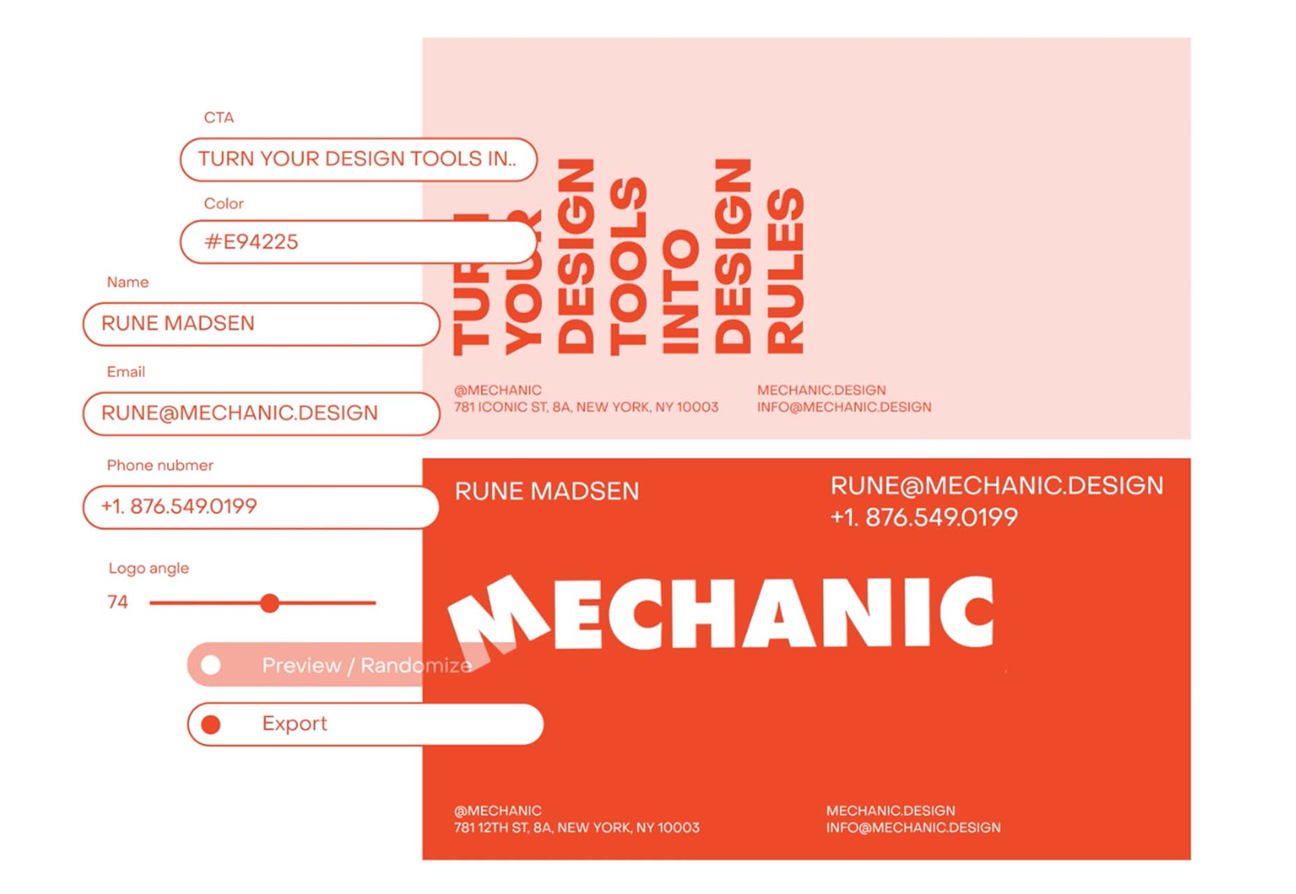
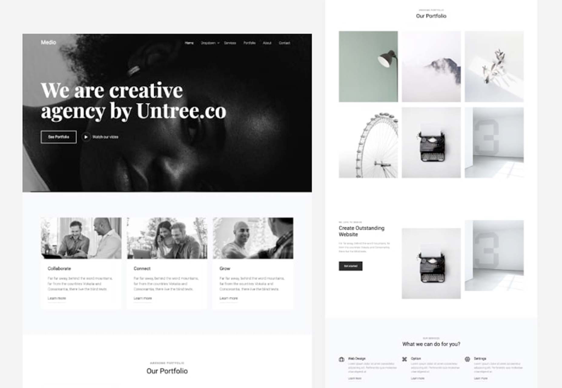
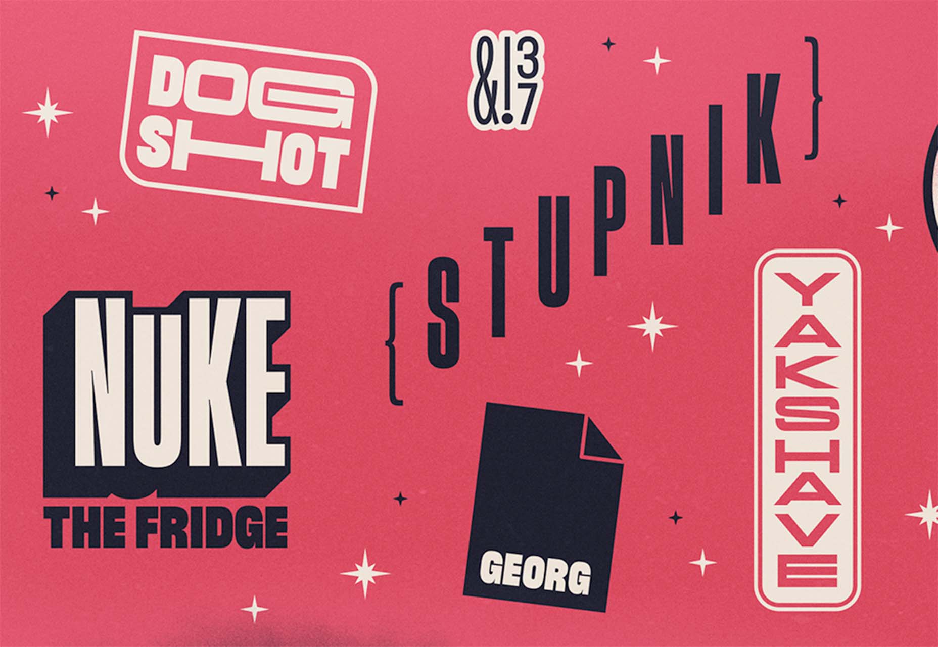
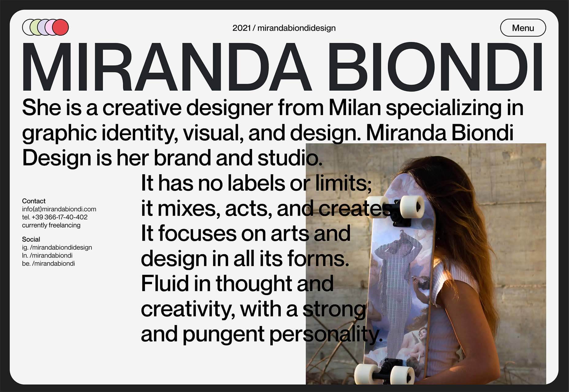
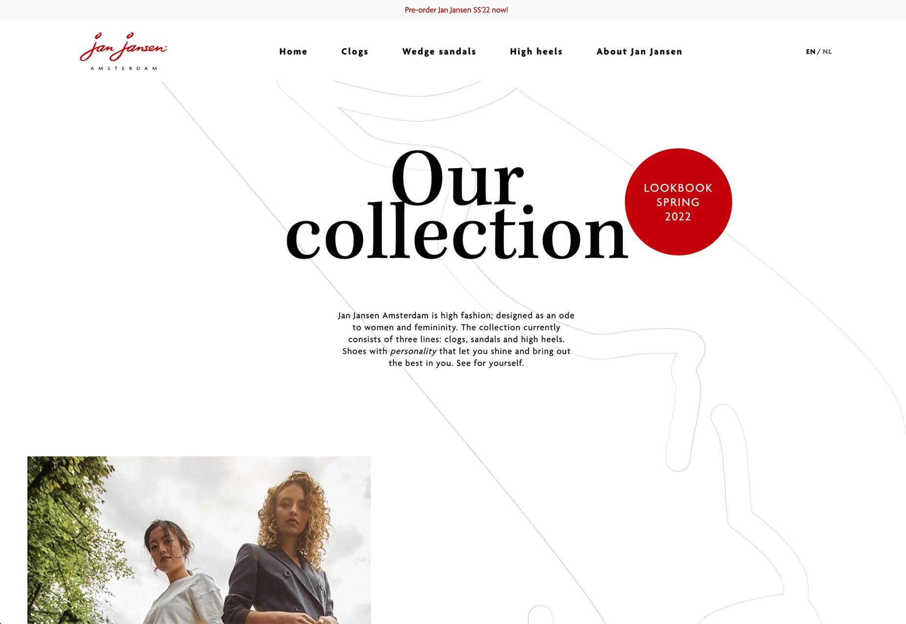
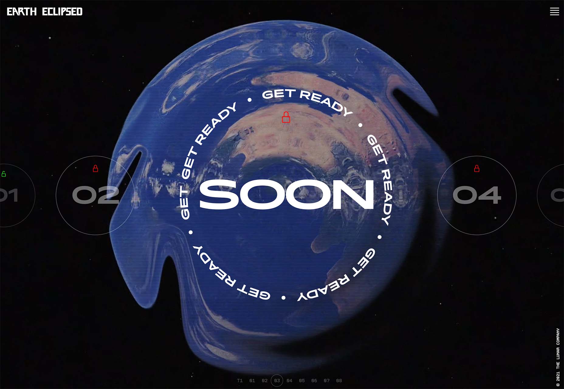
 Design trends on top of design trends. This theme of this month’s collection is trends that seem to build on each other. These examples use multiple trends listed here: hero typography, round buttons, and big branding.
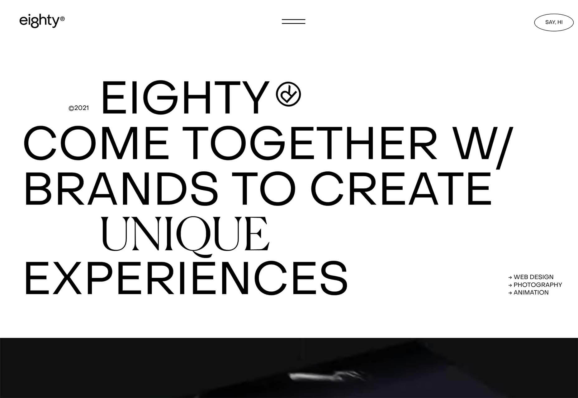


