Articles

Nothing breathes life into your designs like the typefaces you choose, so every month, we put together this roundup of the best new fonts we’ve found online.

This month, a distinctly medieval aesthetic permeates some of the designs. You’ll find plenty of rebellion in fonts that break the rules for fun. And as always, we’ve included some excellent practical options. Enjoy!
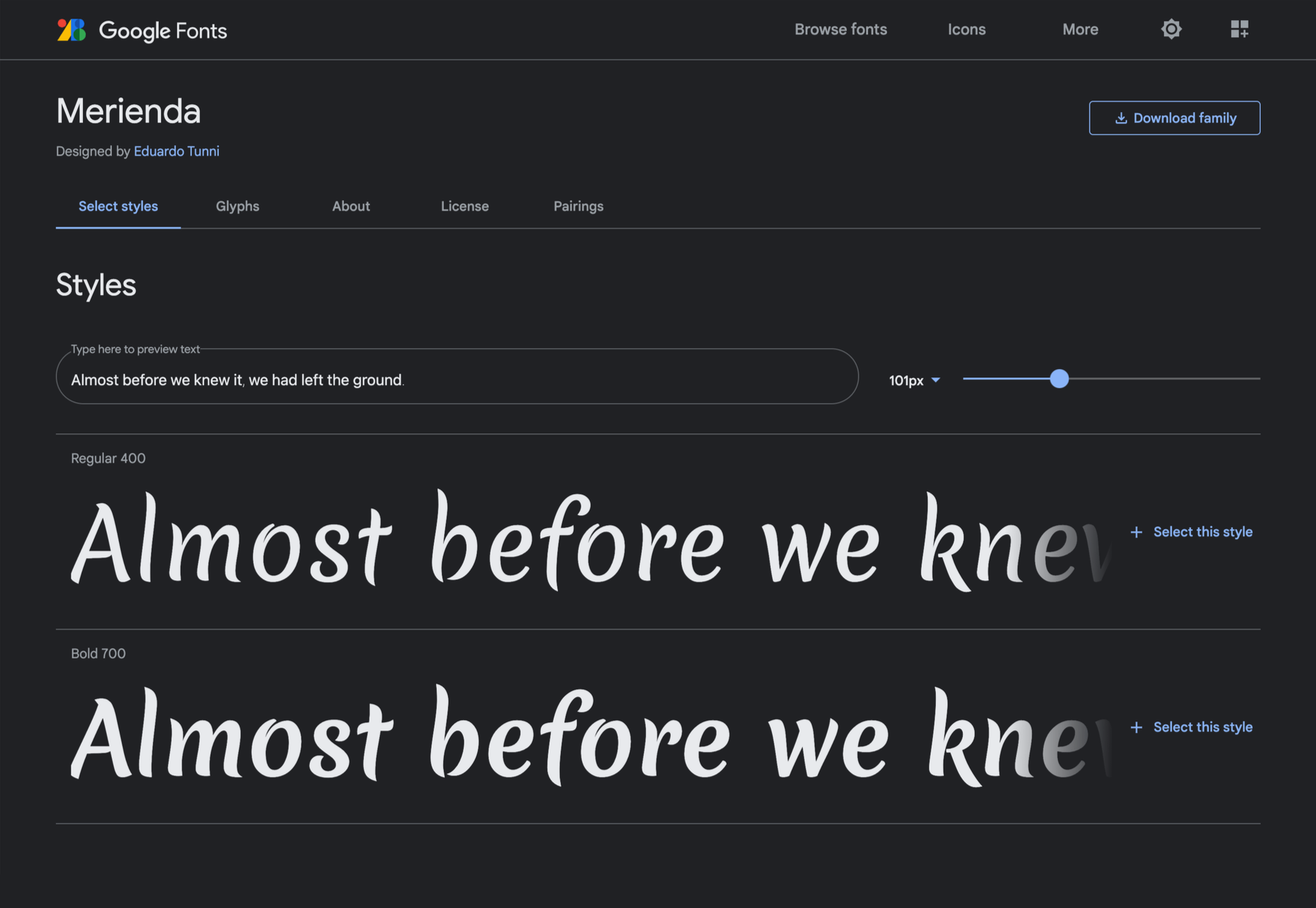
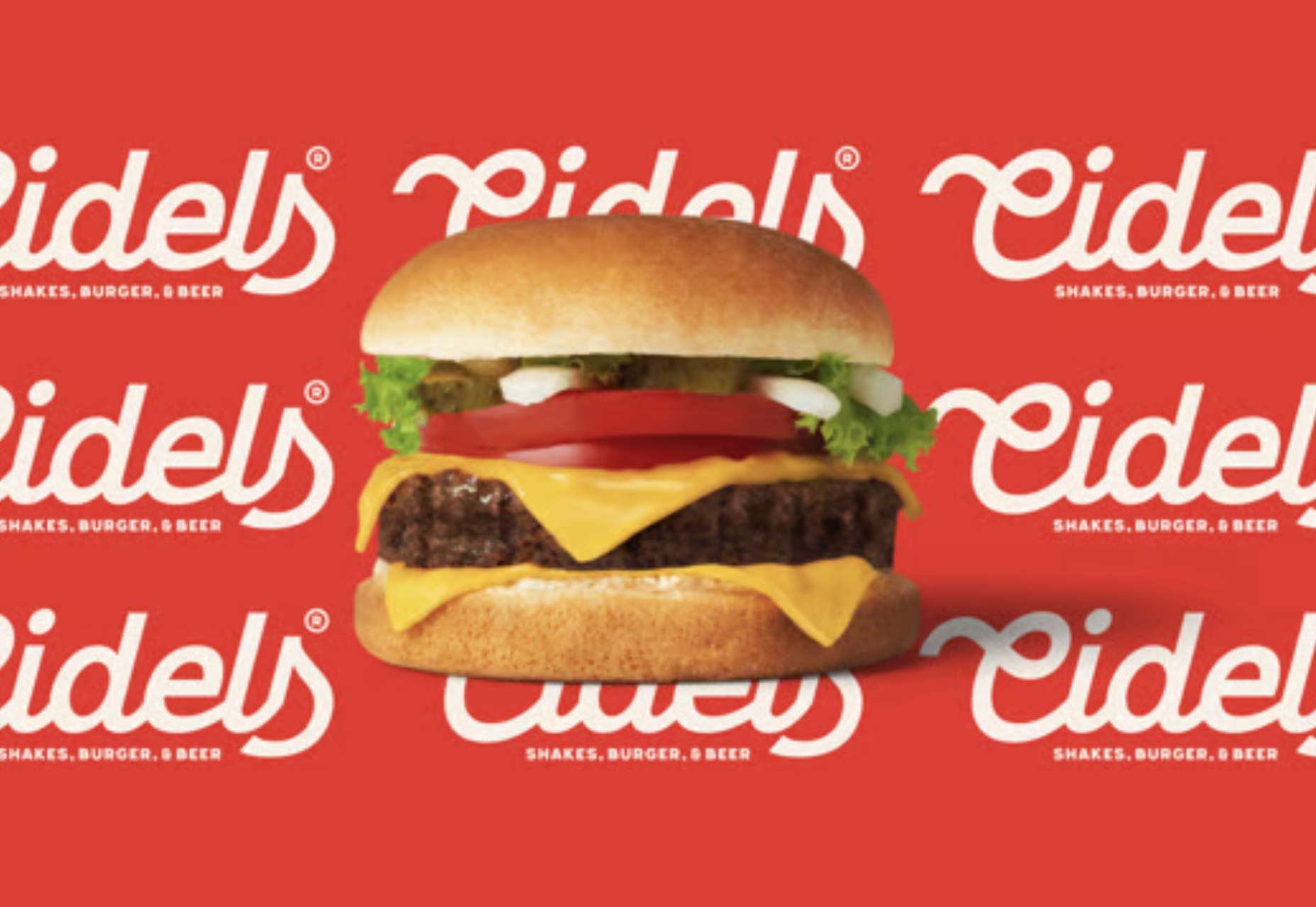
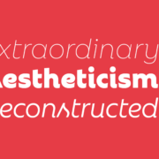
Arnika

Arnika is a relaxed typeface with much more character than typical sans-serifs. Its strokes flare to the point that it’s almost a serif, and the oversized x-height gives it an almost medieval sensibility. There are four weights crying out to be used in a branding project.
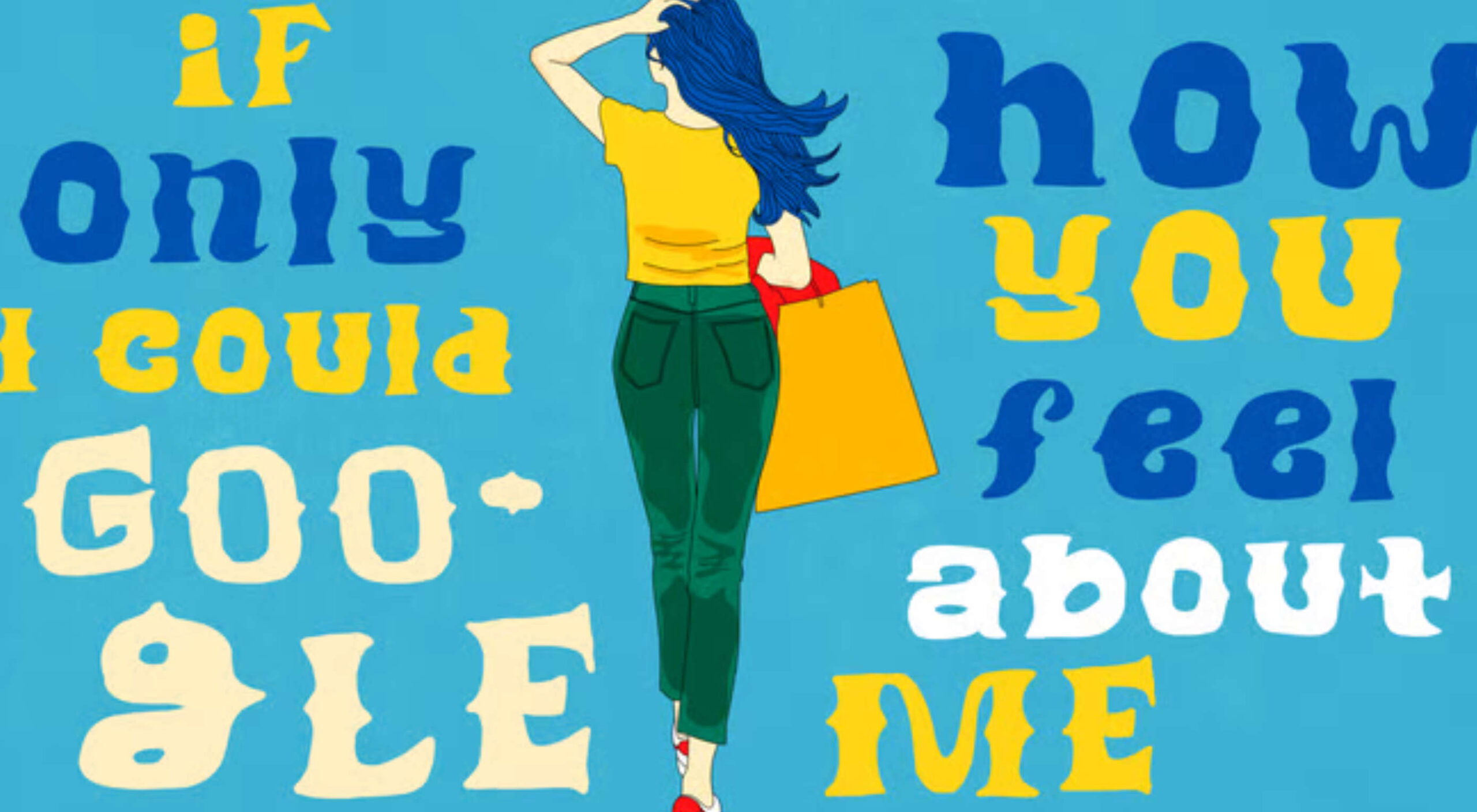
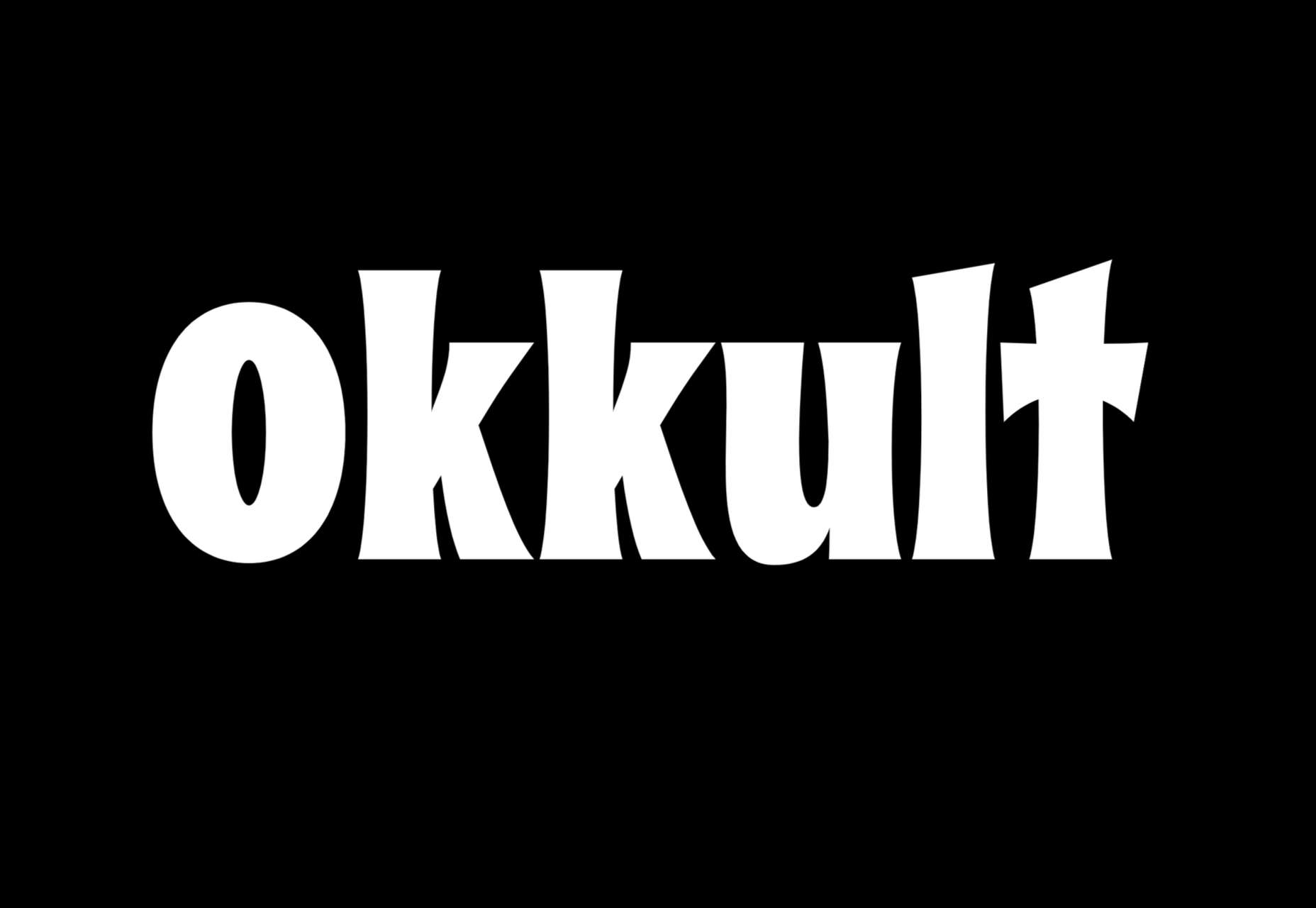
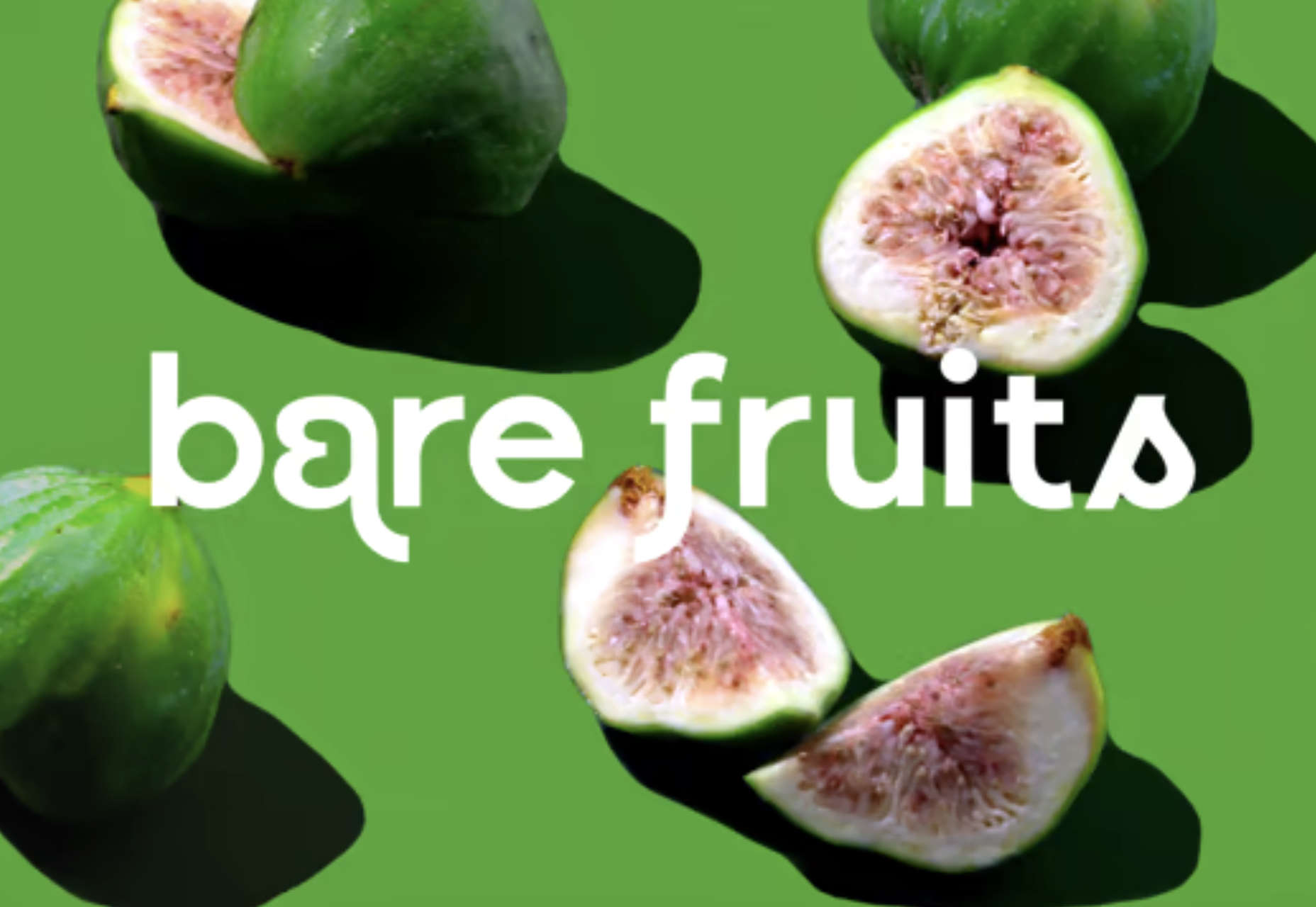
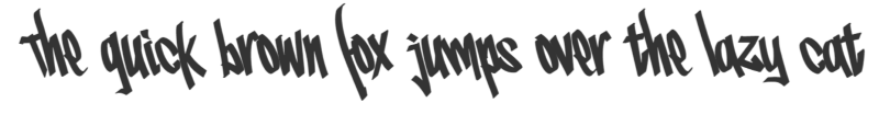
Nosi

Nosi is an irreverent typeface that does an excellent job of evoking the spirit of music fanzines, French cinema, and teenage dramas. It’s a great choice for editorial display work if used sparingly.
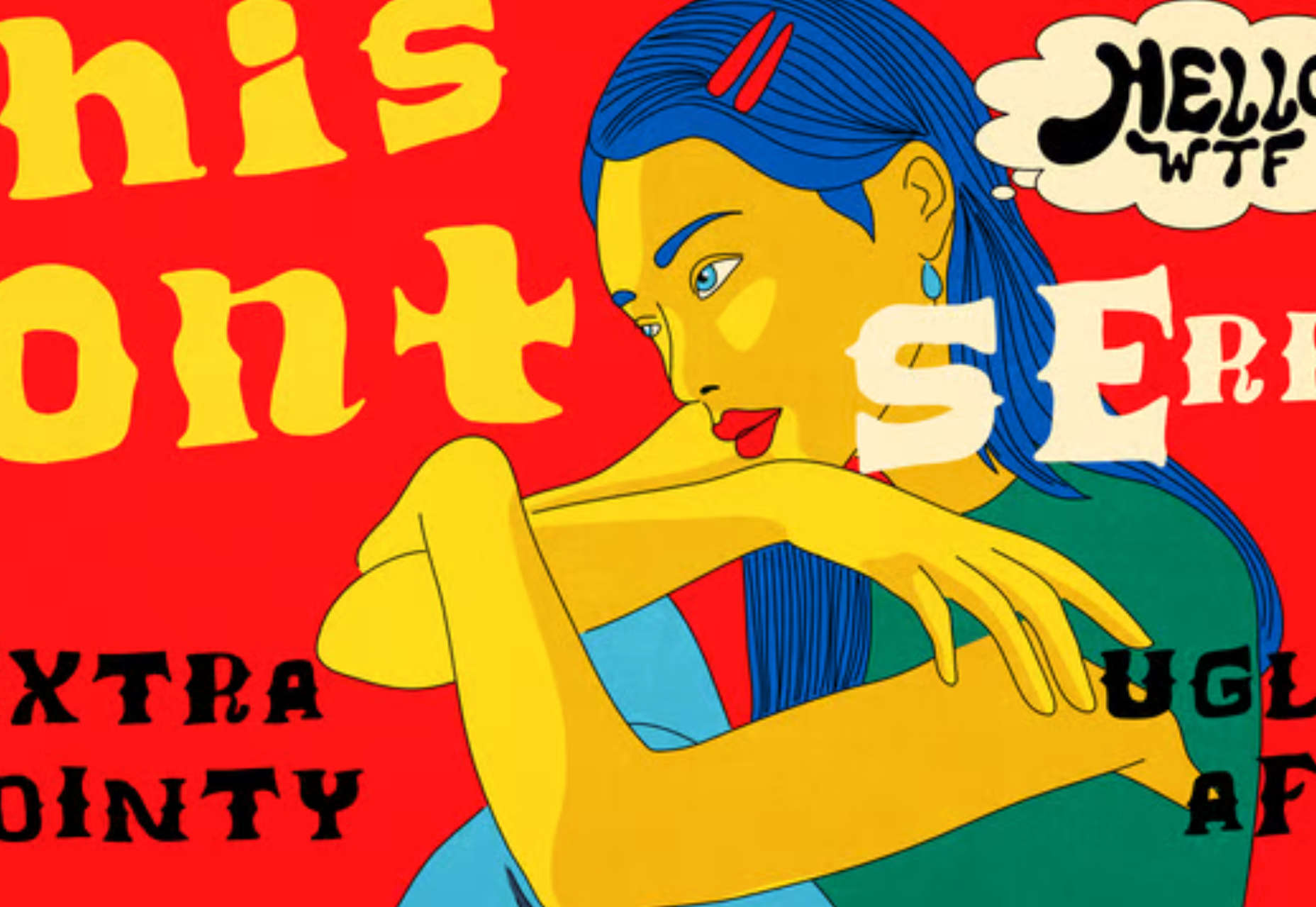
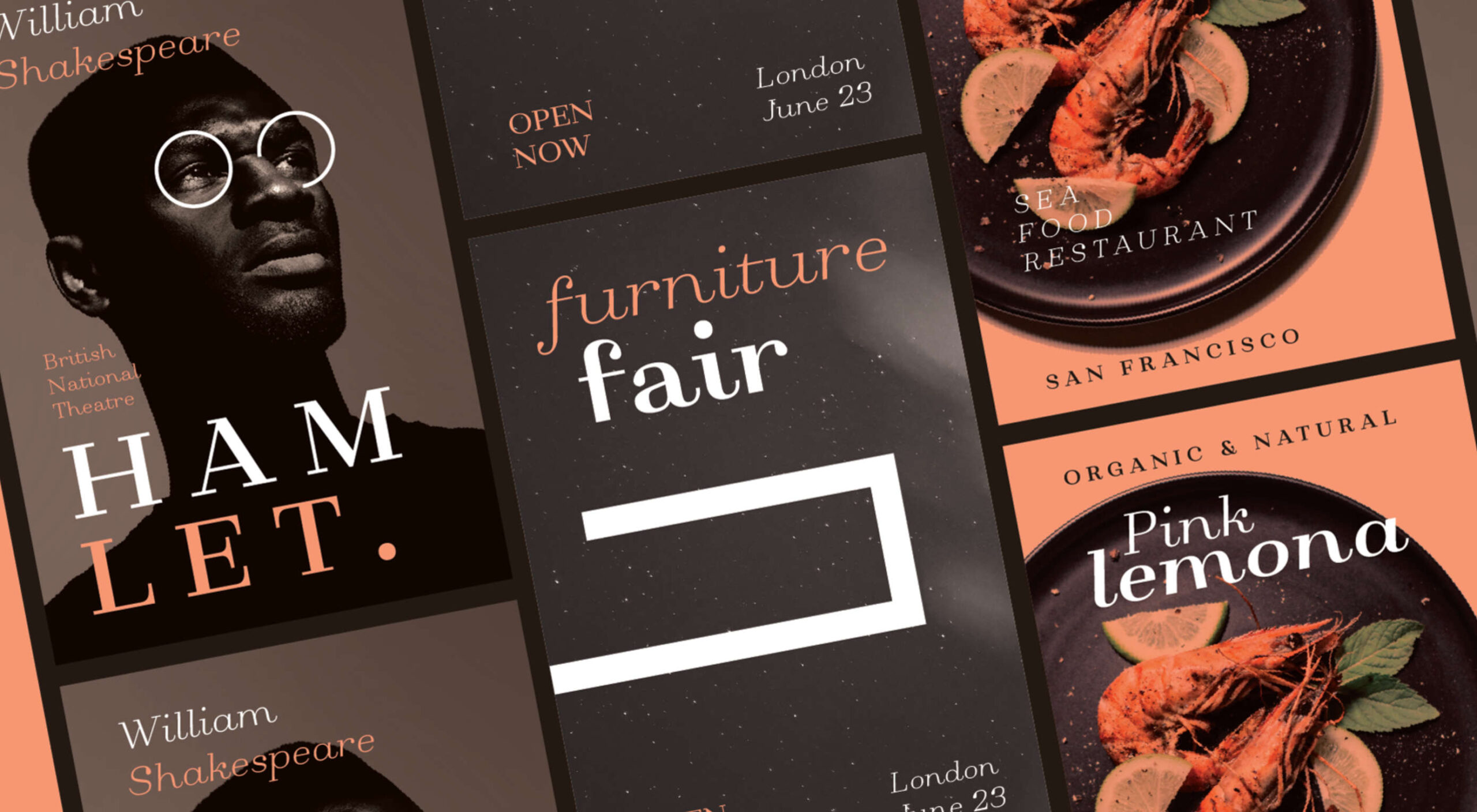
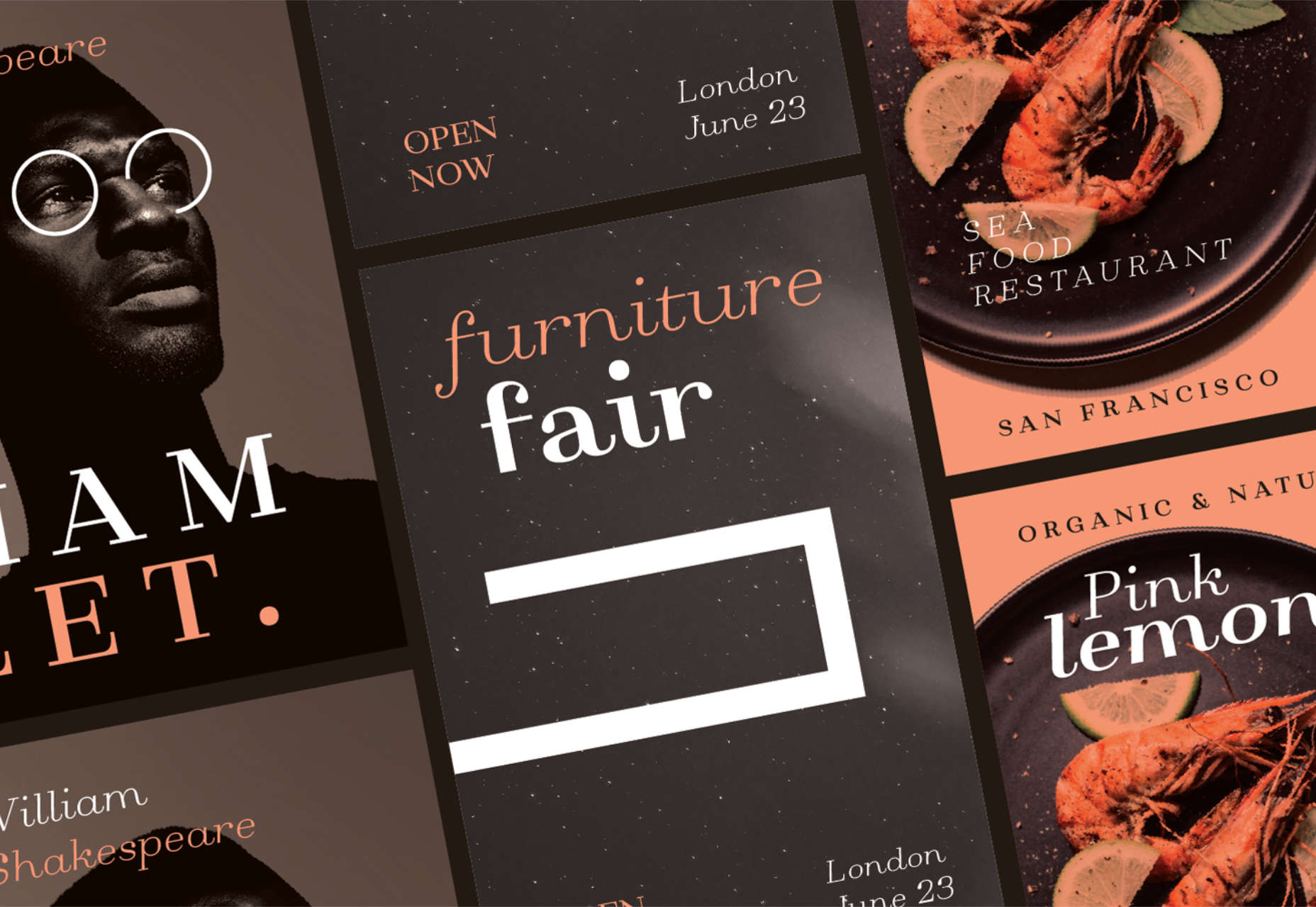
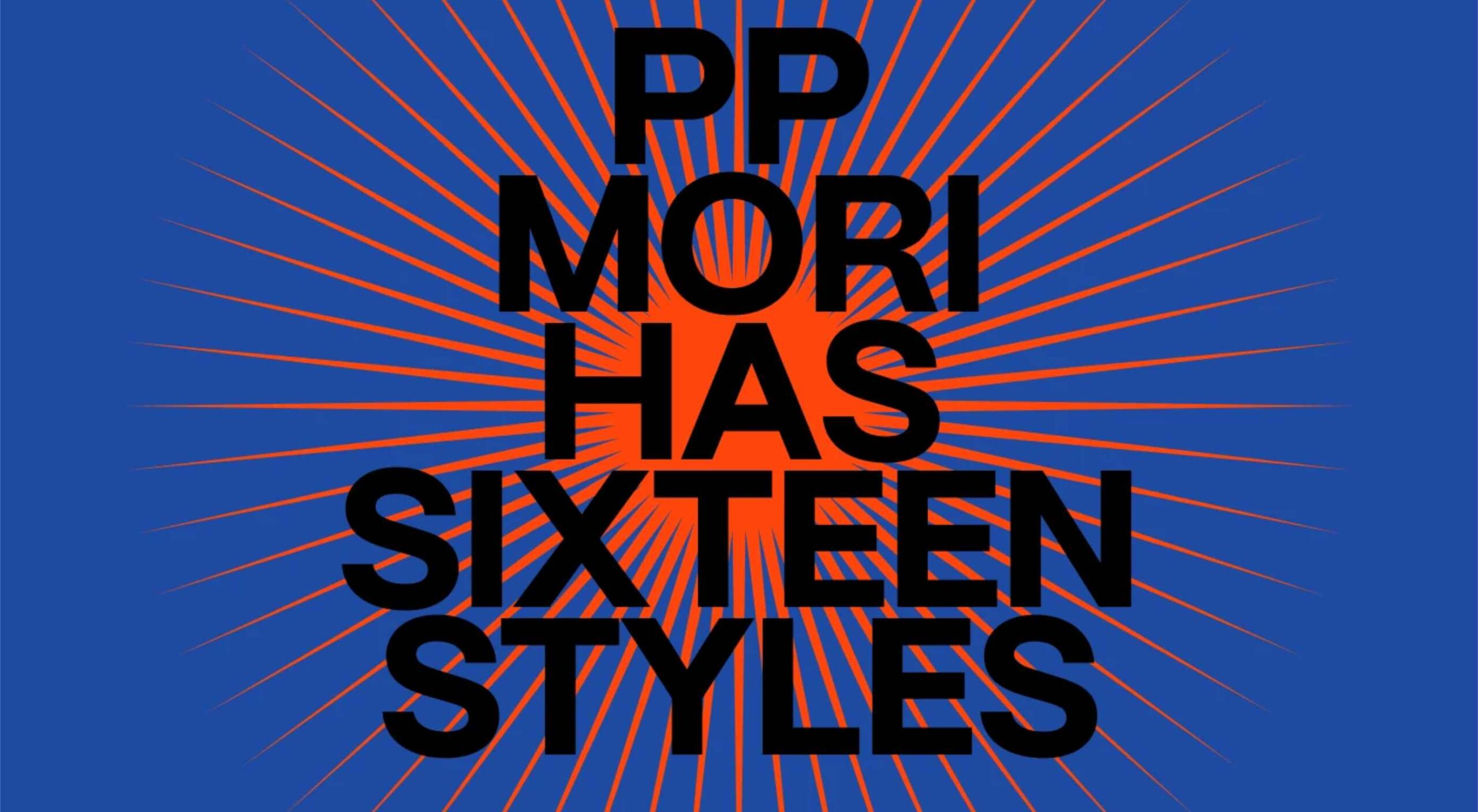
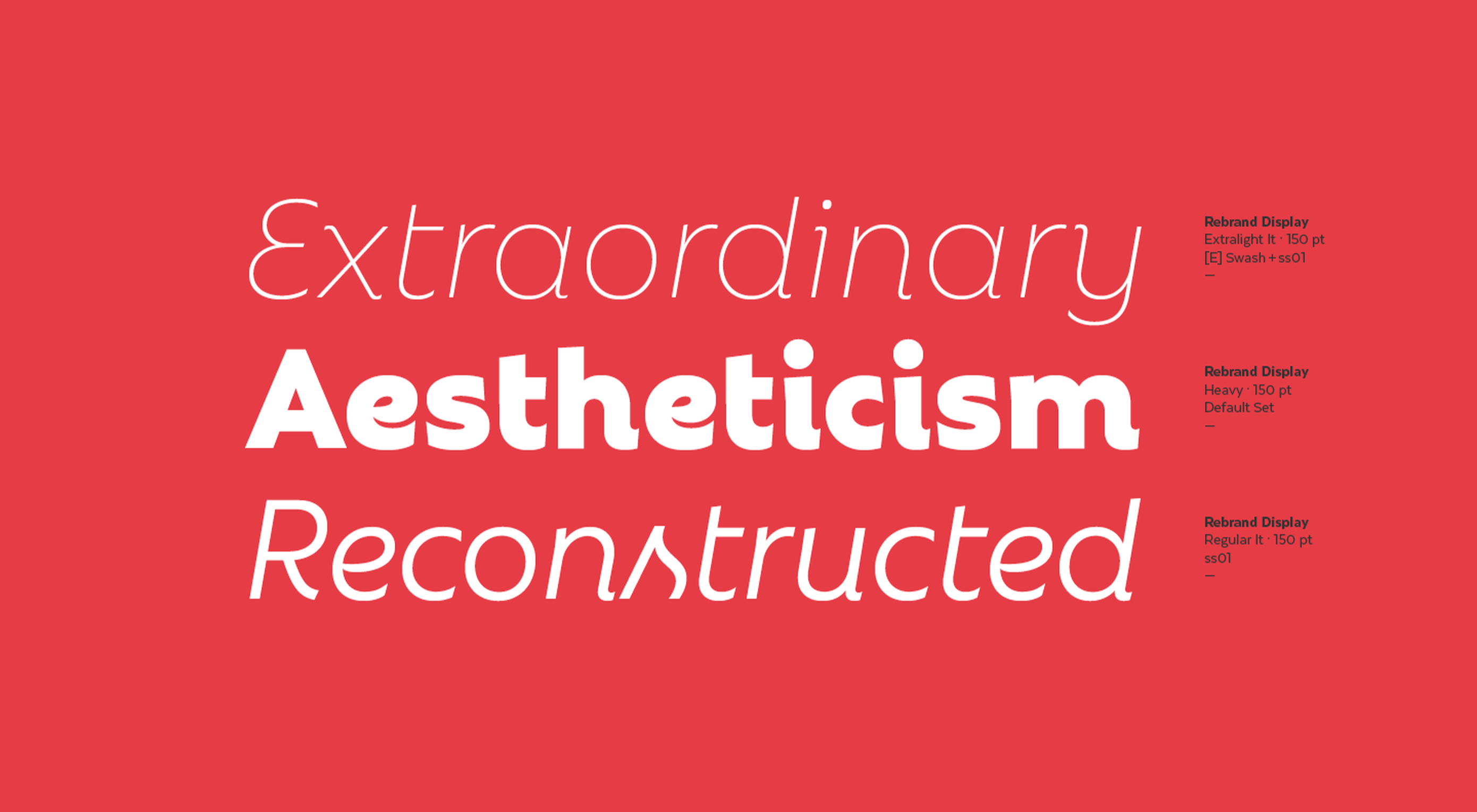
Parabole

Parabole Display is what happens when you join the wrong points on your outlines: outer curves become inner curves creating an engaging and very usable display font. Parabole Text is the simplified sans-serif. It’s an exciting pairing for editorial work.
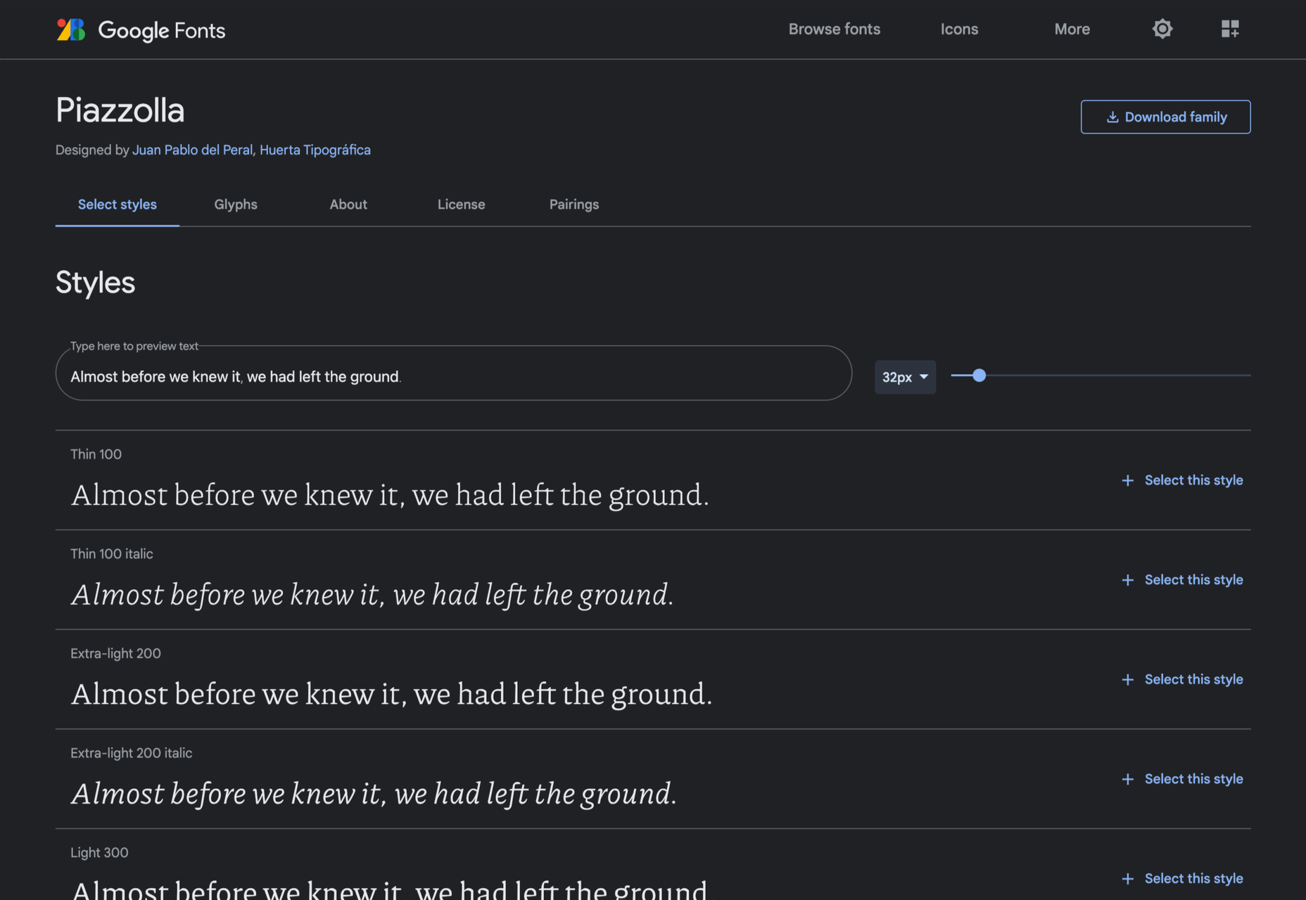
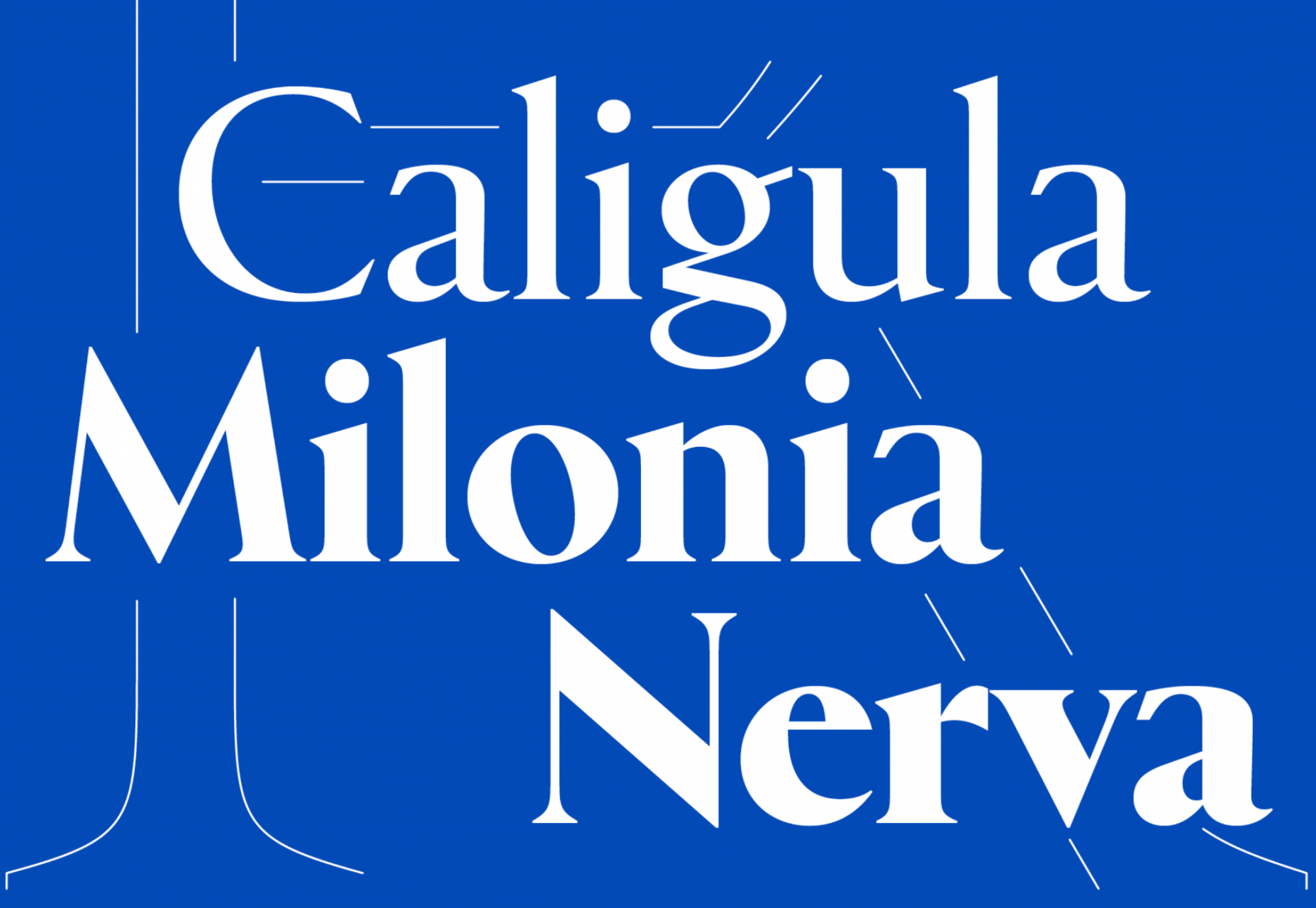
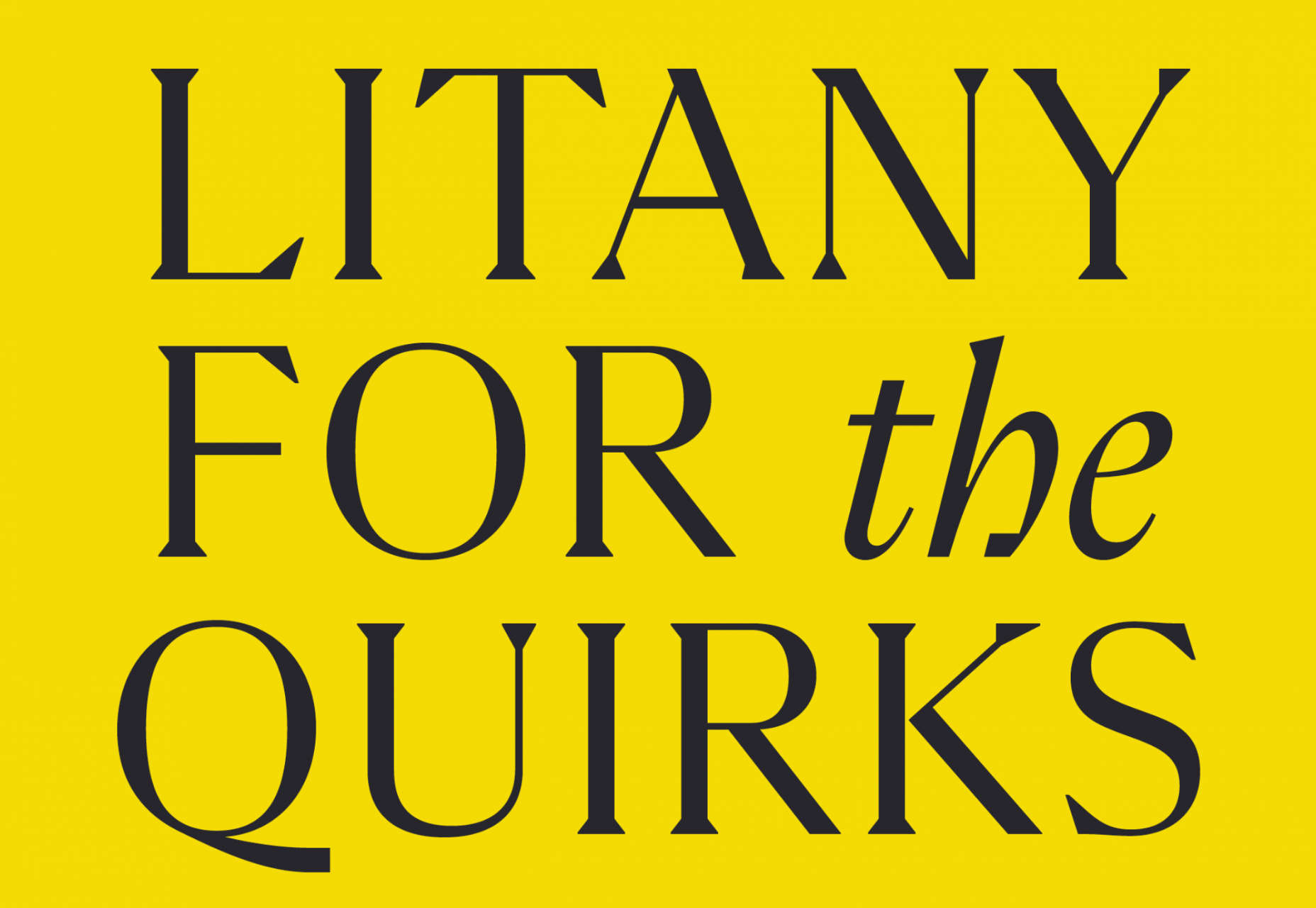
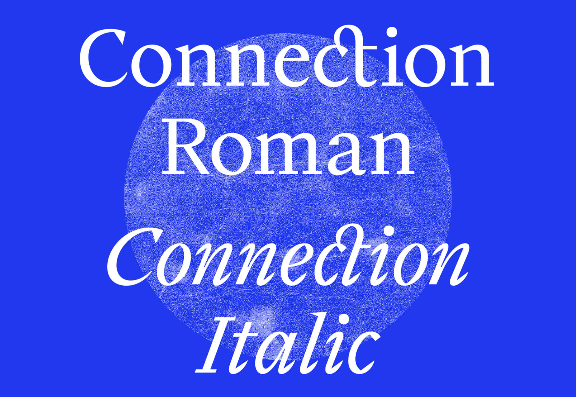
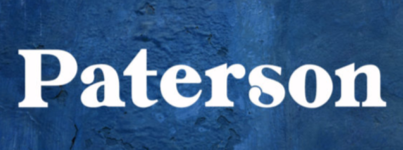
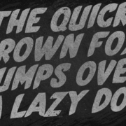
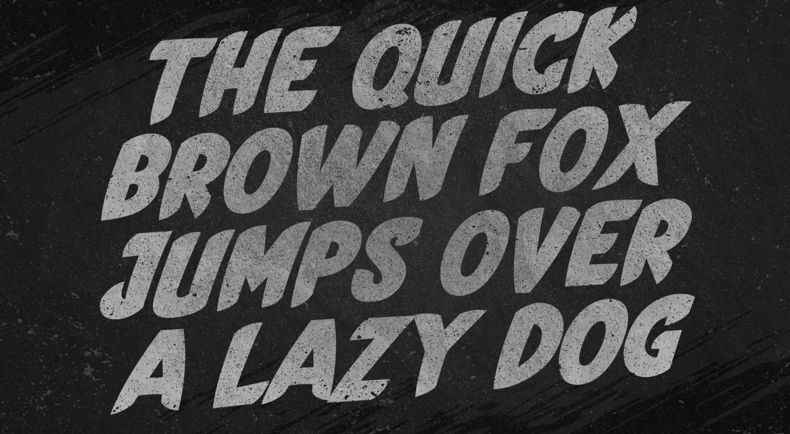
Rizoma

There aren’t enough new serif fonts, perhaps because they are harder to draw than the more popular sans-serif. Rizoma is a welcome exception. Based on Roman inscription letters, it is confident, modern, and highly usable.
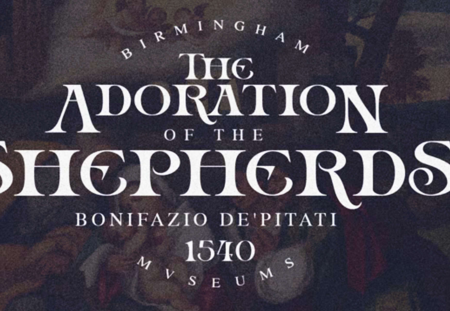
Guacheva

If you’re shopping for a festive typeface and want to avoid the usual brush scripts, look at Guacheva. The all-caps serif is elegant and feminine, with a clear sense of calligraphy.
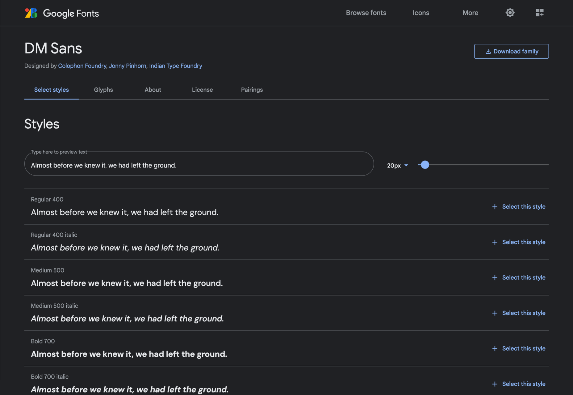
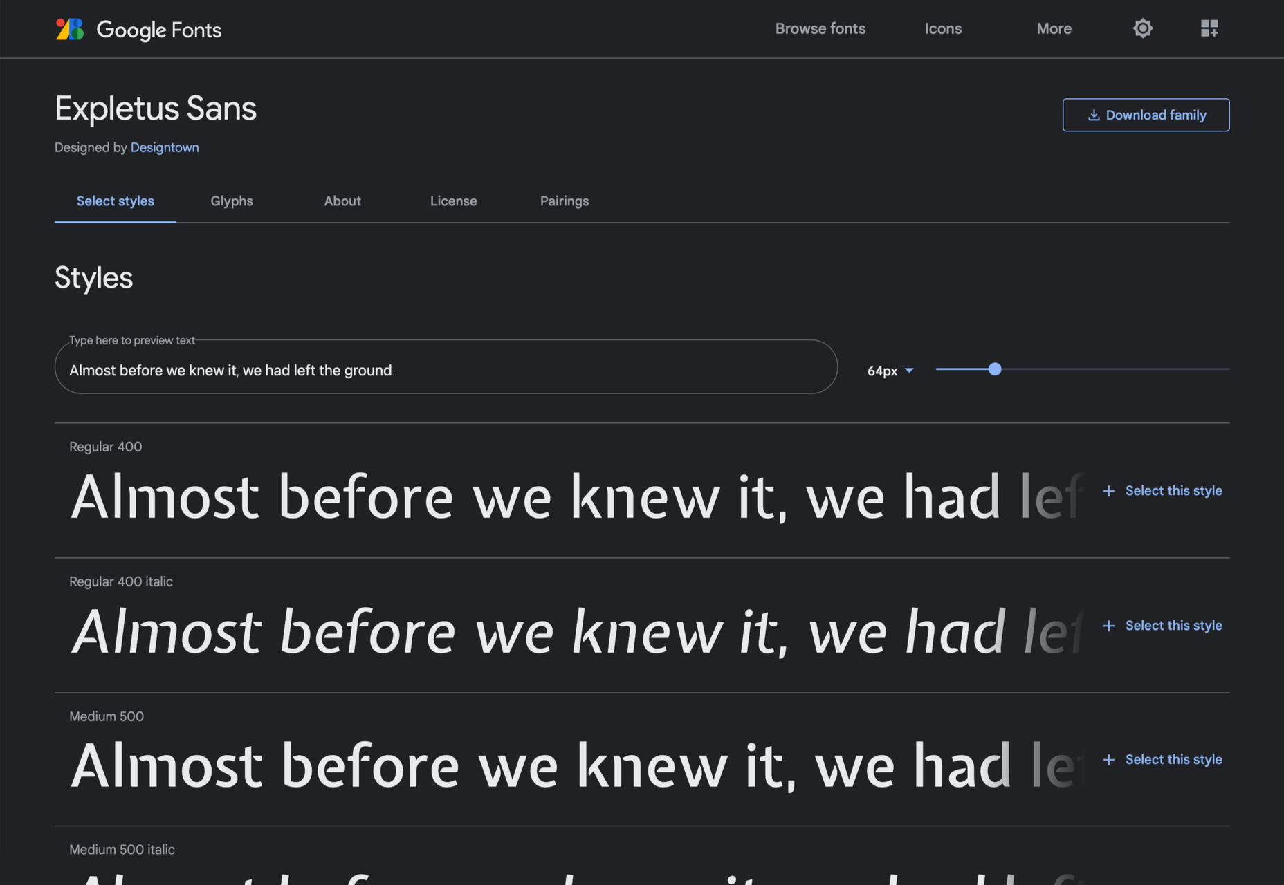
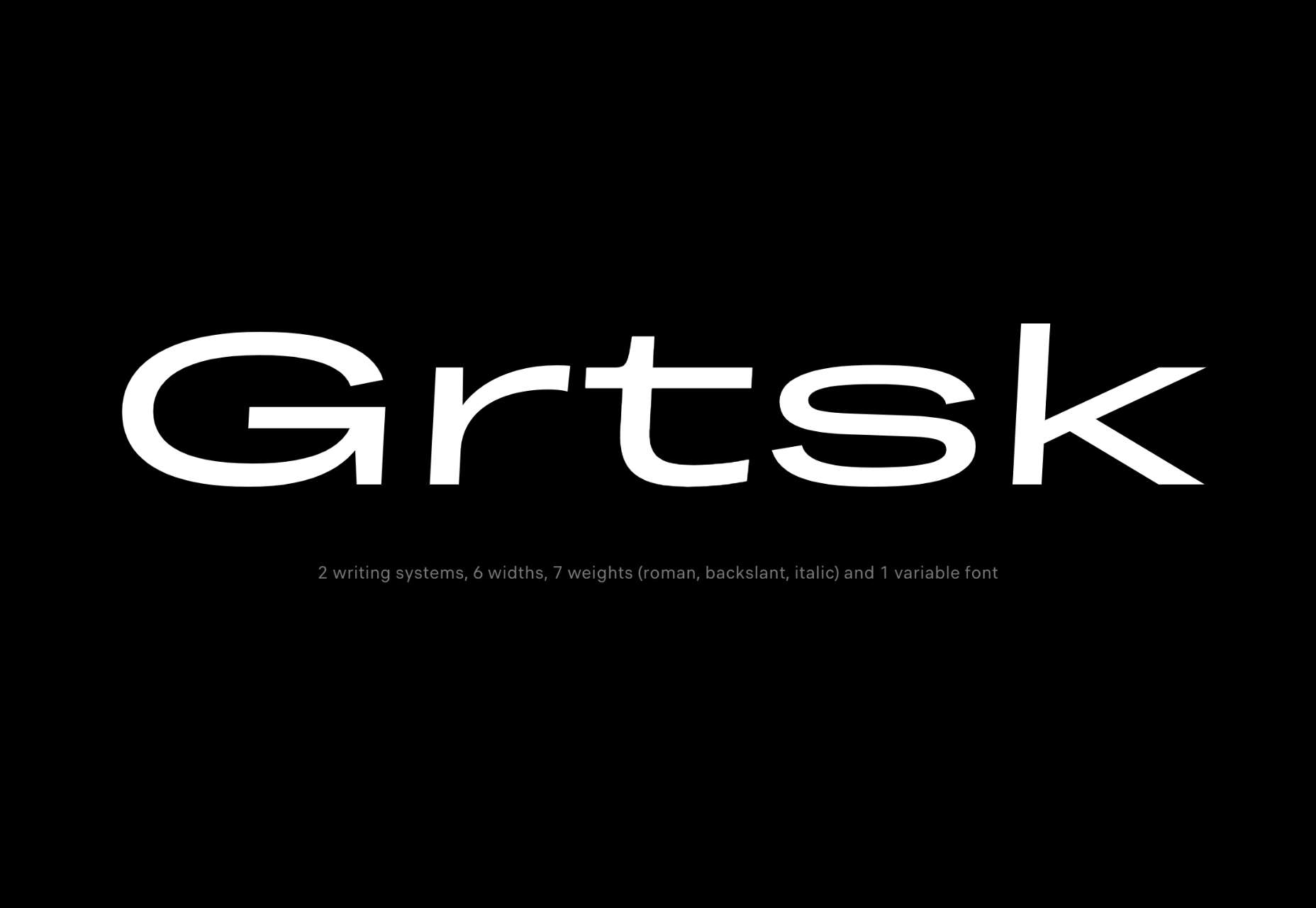
Axios Pro

Axios Pro is a good solid workhorse of a sans-serif. Based on early 20th-century grotesques, it will feel familiar to anyone interested in western architectural type design. It’s available in 10 weights and two variable fonts, with extensive OpenType support.
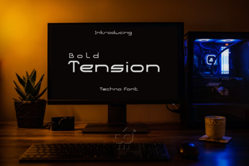
GT Pressura

GT Pressura brings the warmth of print to the web by simulating the effect of ink spreading over paper. The subtle rounding of the sans typeface adds a unique visual interest to the mono, standard, and extended fonts.
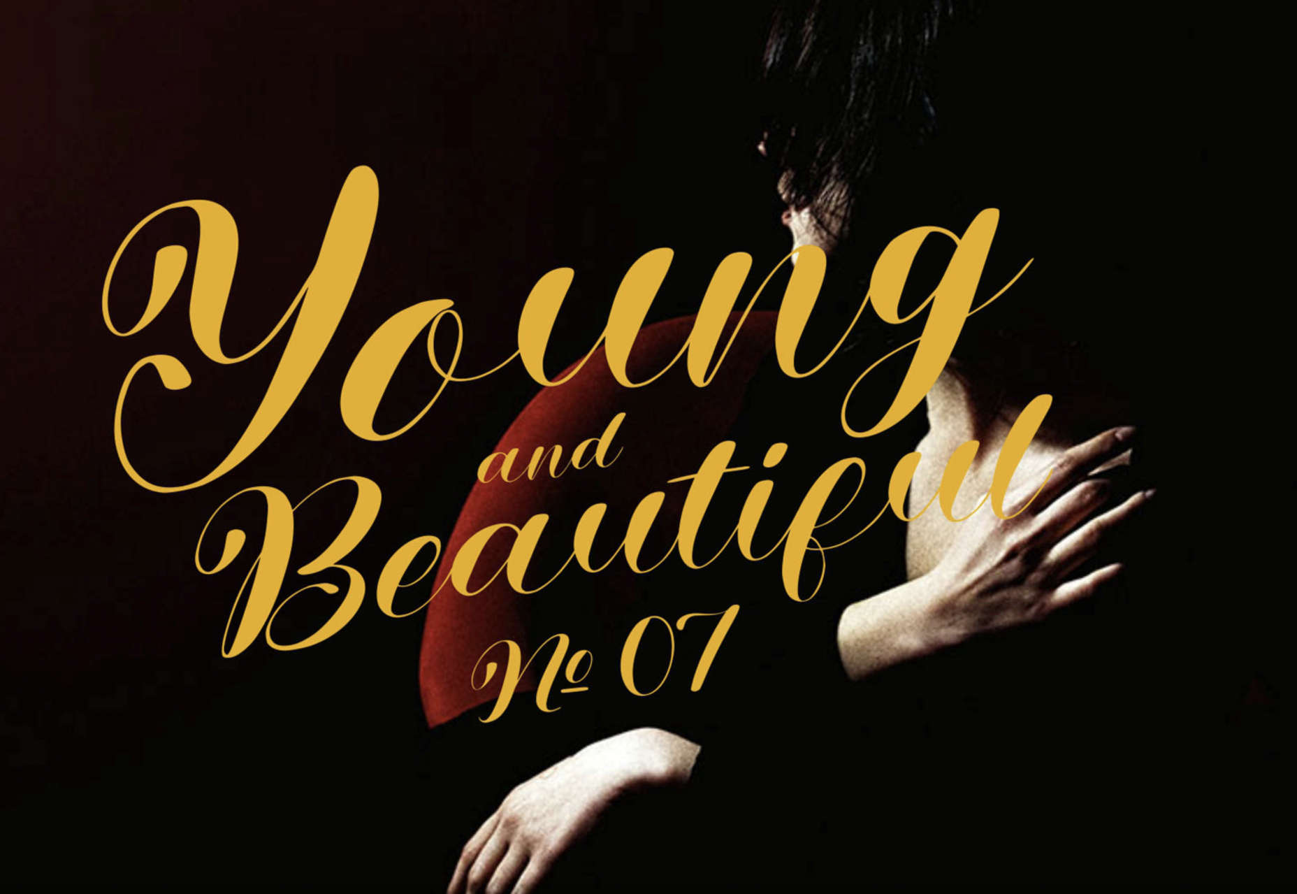
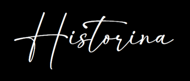
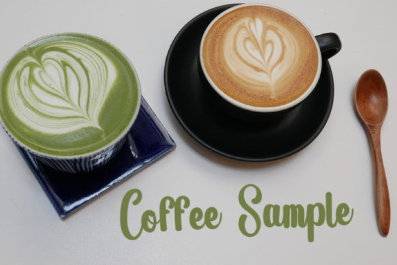
Galdy

Script fonts are almost always based on a brush or a pen, traced into vectors. So it’s refreshing to see Galdy, a refined retro script. With a distinctly americana feel, it’s perfect for branding projects.
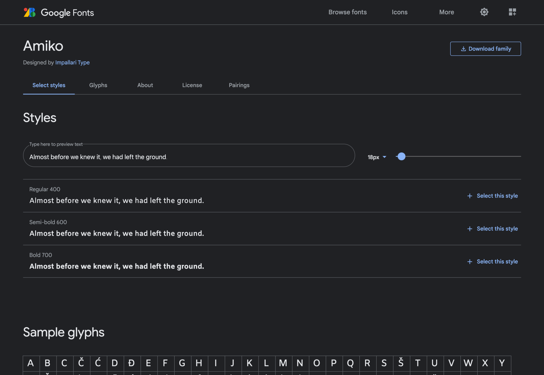
Nitido

Nitido is a humanist sans-serif typeface designed as a companion for Nitida. It is an expertly realized font family with seven weights and seven accompanying italics. As a result, it‘s ideally suited to corporate design work.
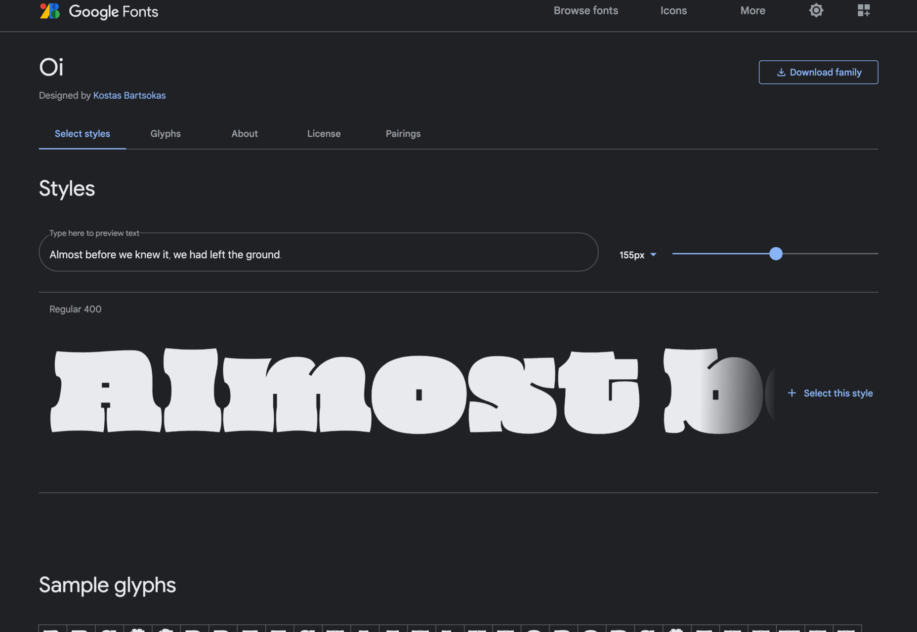
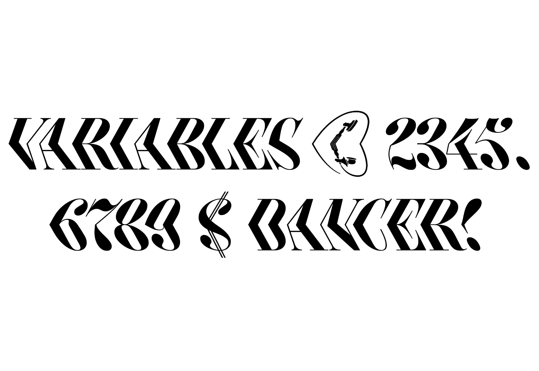
Kinckq

Kinckq is an intriguing experiment with variable font techniques. Inspired by a 19th-century woodcut font, Kinckq is a didone that bends through its middle, creating a 3D effect that’s made for large sizes.
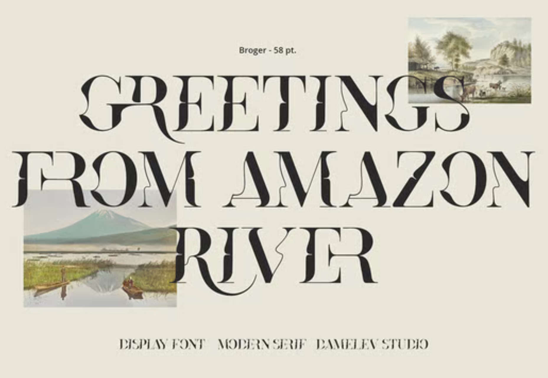
Broger

Broger is another distorted typeface, this time twisting shapes and tying them together with elegant ligatures. It’s an excellent choice for branding in the health & beauty market.
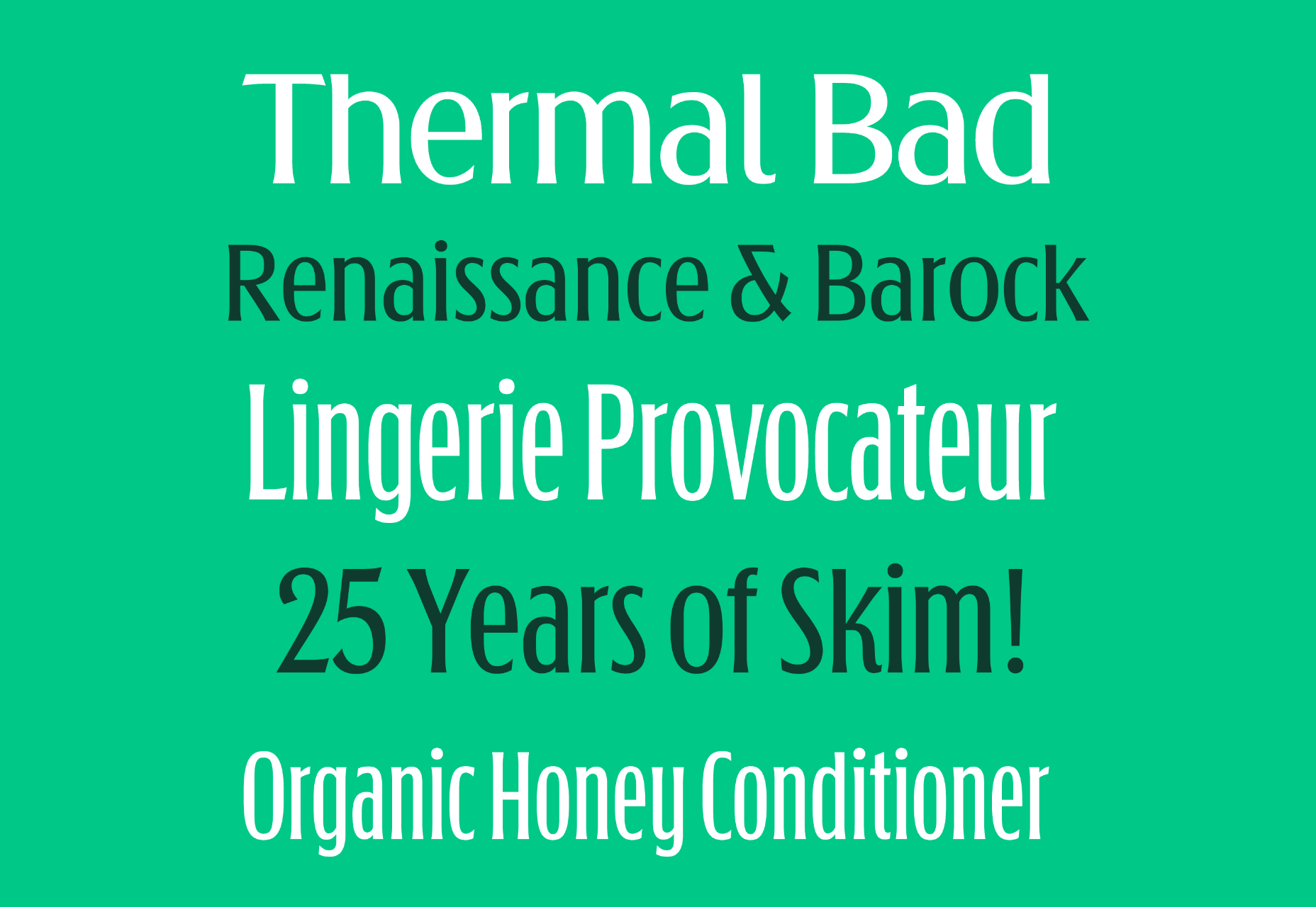
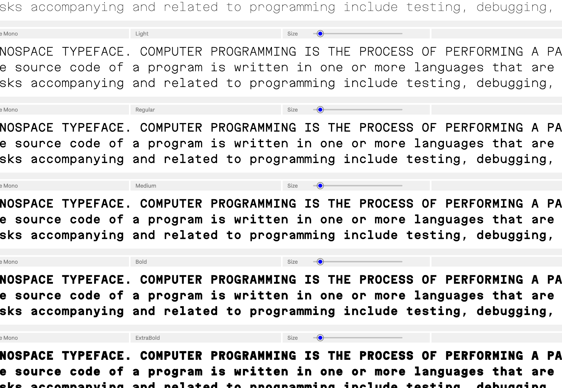
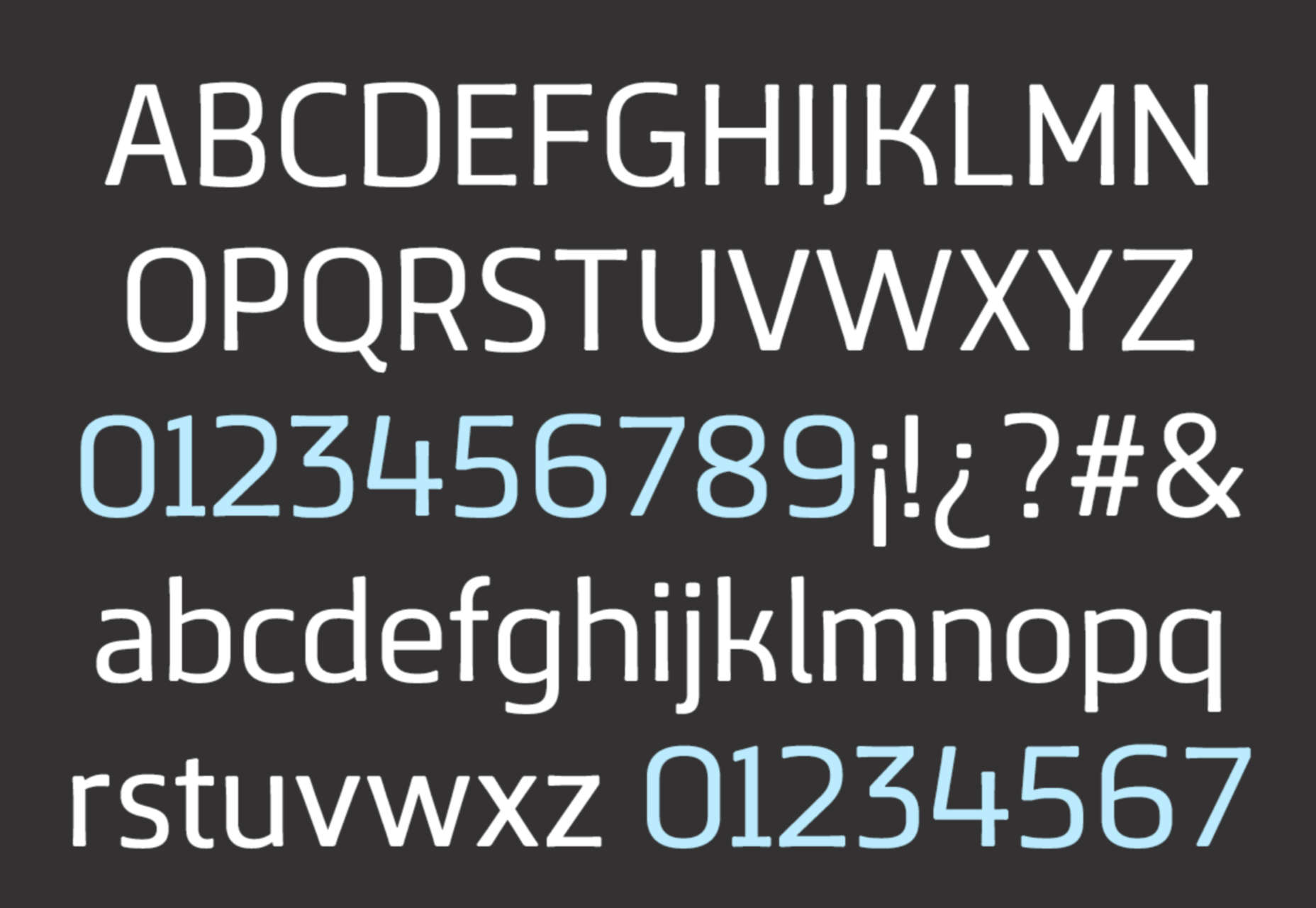
Charte Mono

Charte Mono is another attempt to solve the unsolvable — the Latin alphabet is not monosized. However, when resolved as well as Charte Mono, monospaced fonts are excellent for user interface design, charts, and signage systems.
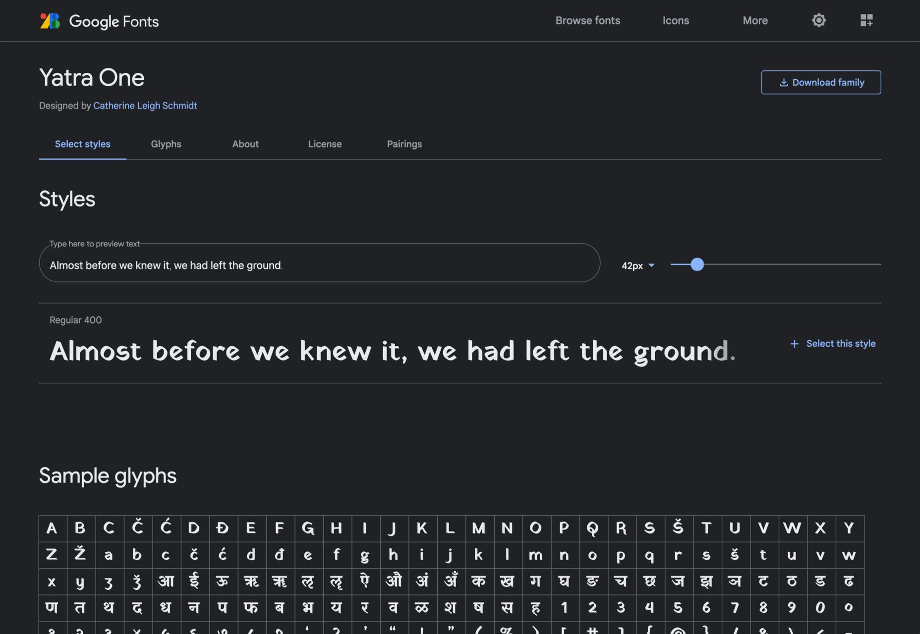
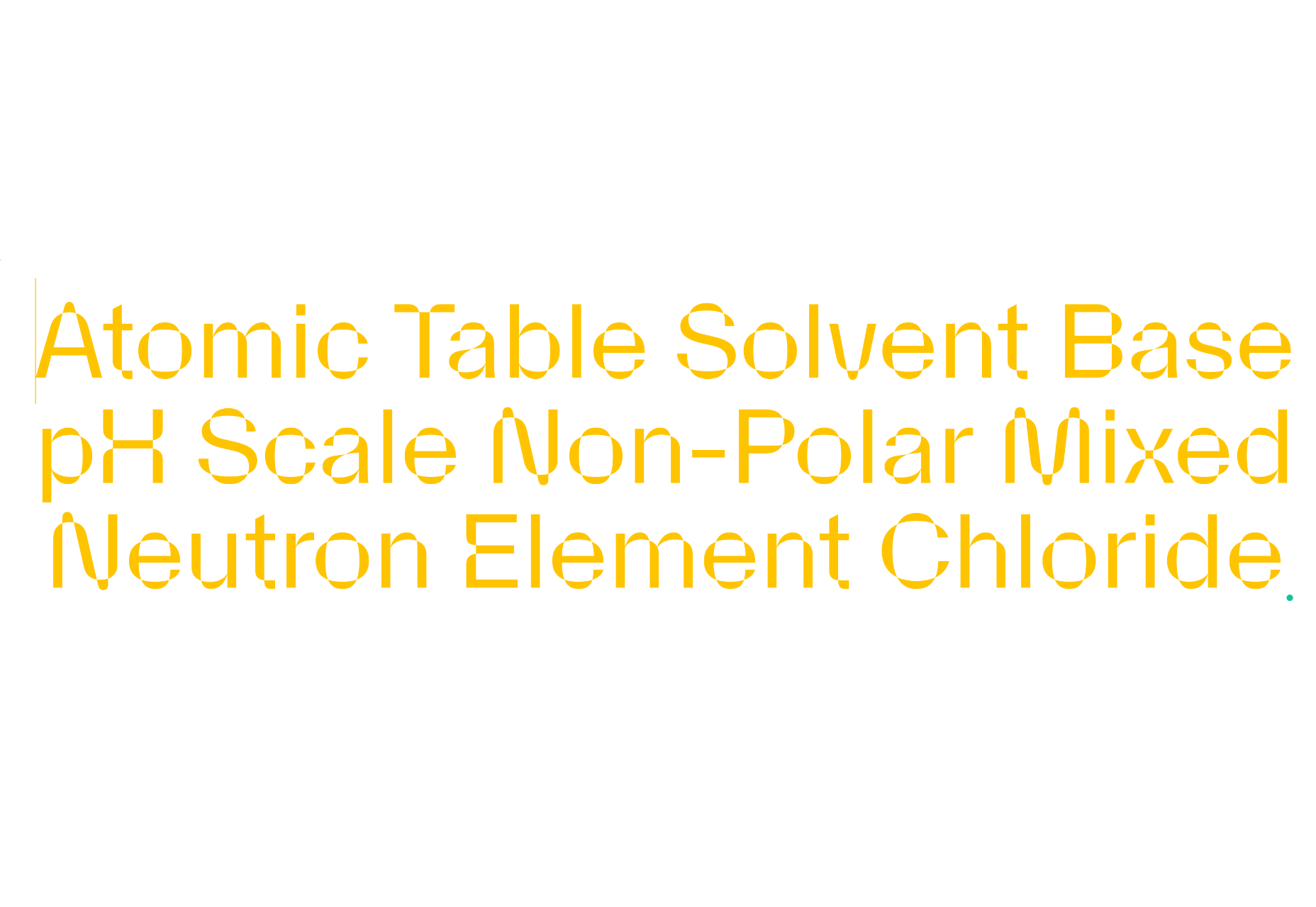
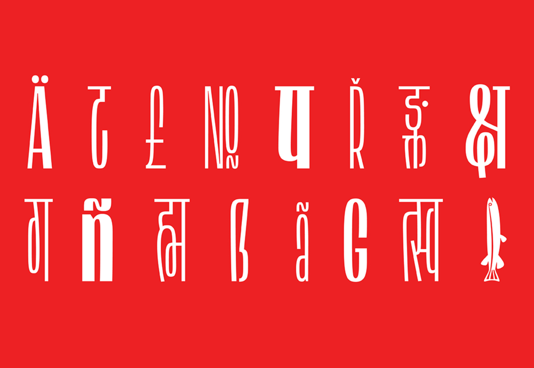
Lini

Lini is designed to be as compressed as possible while remaining highly legible. It supports Latin and Devanagari languages and works equally well in both forms. Lini is still in beta but is already award-winning.

Rotulo Variable

Rotulo is a variable font with huge contrast between its thick and thin strokes. Inspired by hand-lettering on signs, it’s a chunky option for branding or display type on websites.
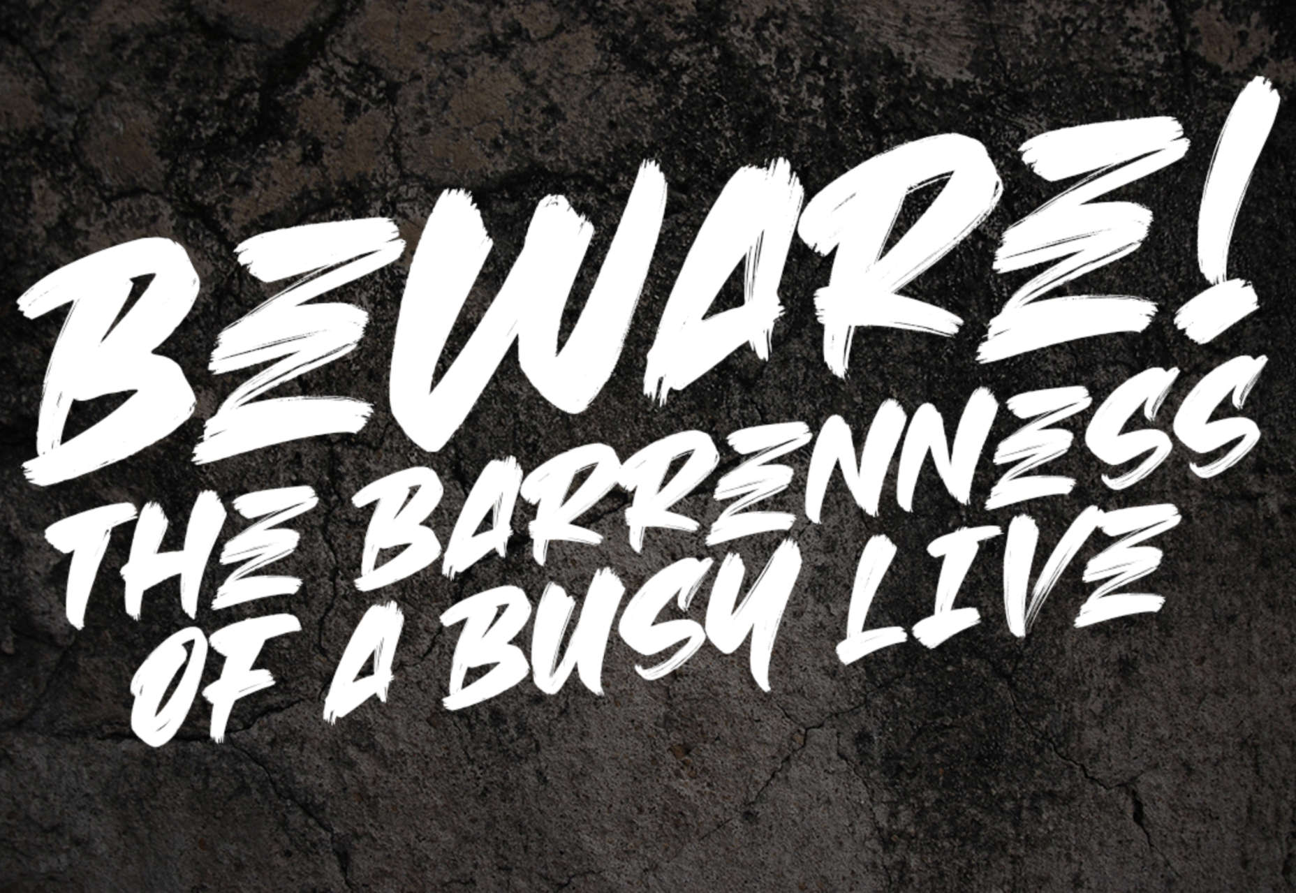
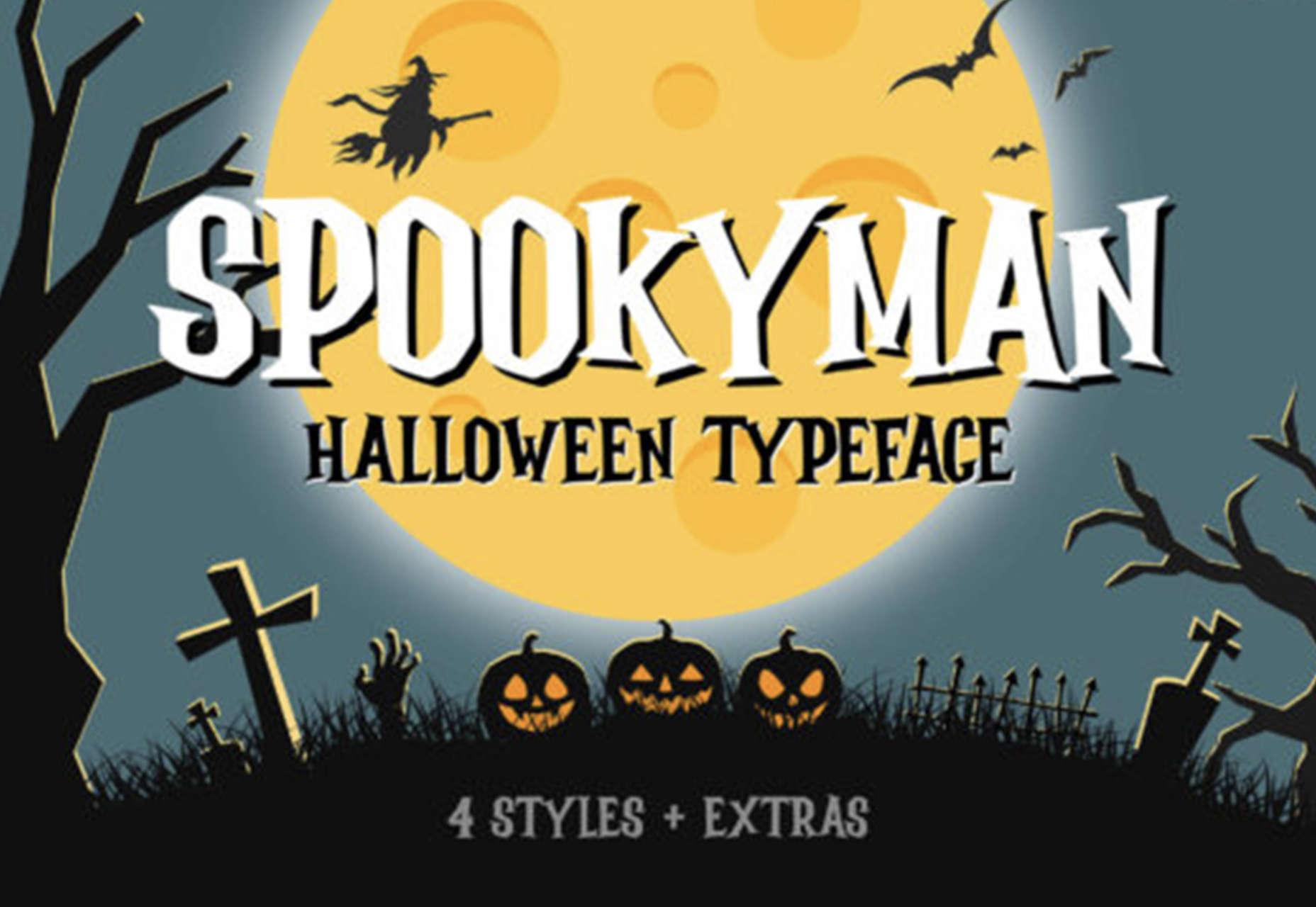
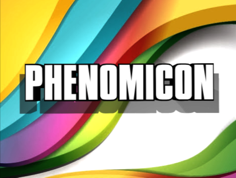
Bouuuuuh

OK, so we’re a month late for Halloween, but Bouuuuuh is still worth a mention. Its cartoonish shapes are perfect for poster design, T-shirts, brand design, and, yes, next year’s Halloween marketing.

Source

The post 15 Best New Fonts, November 2022 first appeared on Webdesigner Depot.

Source de l’article sur Webdesignerdepot

Typefaces give expression to text, communicating personality in a way that no other design element can. And so, we put together this collection of the best new fonts we’ve seen on the web each month.

This month’s collection of fresh new fonts includes some typefaces that push boundaries in subtle but irresistible ways, a few retro fonts that evoke specific eras, and some exceptionally well-drawn examples of classic themes.

Gazzetta

Gazzetta is a condensed typeface with soft curves and sharp joins that gives it plenty of personality at display sizes while still being highly practical.

Bacalar

Bacalar is an intriguing variable font inspired by the Yucatan peninsula in Mexico. The bold, simple shapes are contrasted by extreme tapers that create dynamic shapes.

Monden

Monden is a high-contrast serif with an interesting slant applied to the lowercase h, m, and n. This “kick” adds a modern richness to blocks of text.

Flecha

Flecha is a sharp typeface with precise, simplified shapes that make it ideal for digital use. There is a range of styles and weights that provide flexibility.

Wonder Varelia

Countless calligraphic script fonts are available, but few are executed with the same elegance as Wonder Varelia. It works best as concise display text.

Okkult

Okkult is inspired by 70s horror films. It’s a great alternative choice for Halloween, Stranger Things-style retro designs, and hard-rock bands.

Southern Beach

Southern Beach is a classy script typeface that feels carefree and optimistic. It would work well as the logotype for a hotel, a travel company, or a restaurant.

Connection

Connection is a beautifully drawn typeface that makes unexpected decisions to create interest in what is otherwise a traditional design.

Lokeya

Lokeya is a playful sans-serif with a distinctly modern-French style. It includes several stylistic alternatives to enliven word shapes and is excellent for brand work.

Grtsk

Grtsk is an exceptionally flexible set of fonts with two writing systems, six widths, and seven weights that are also available as one highly-practical variable font.

Beast Head

Beast Head is an expressive brush script packed with energy. It’s a great branding option for gyms, workout clothing, energy drinks, and music events.

Happy Monday

Happy Monday is a retro script font that evokes the late-60s and early-70s. It’s a laid-back option for T-shirts, branding, and editorial work.

TT Espina

TT Espina is a serif face with extreme contrasts and particularly large serifs. The bold weight swells unevenly on the counters, creating a unique aesthetic.

Spookyman

Horrifyingly, Halloween is just around the corner, and if you’re looking for a spooky font for seasonal promotions, look no further than Spookyman.

Quebra

Quebra is a useful sans-serif for projects that need a range of widths. At small sizes, it feels corporate and reserved; at larger sizes, more human details begin to emerge.

Source

The post 15 Best New Fonts, September 2022 first appeared on Webdesigner Depot.

Source de l’article sur Webdesignerdepot

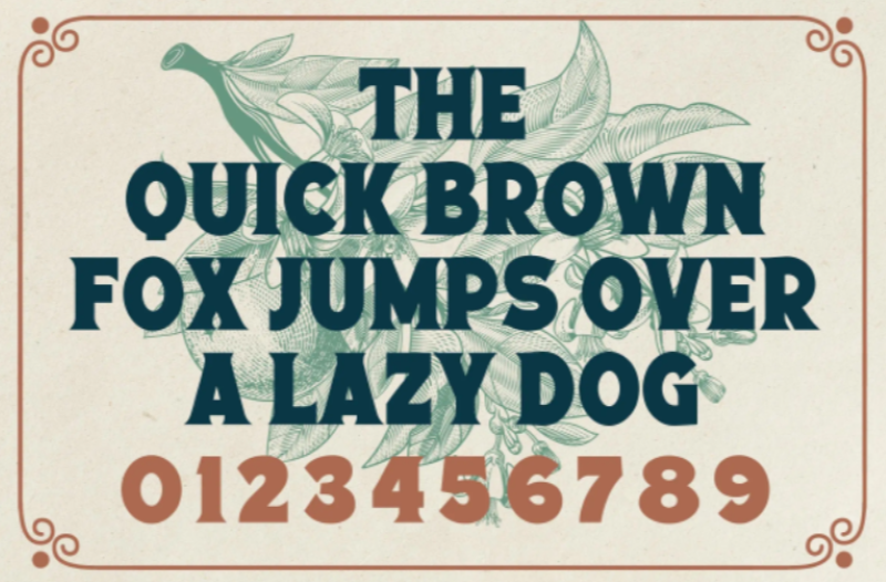
This month’s collection of the best new fonts is headed in a lighter and quirkier direction than previous months. What’s more, font foundries seem to be getting more creative with their designs as many of these fonts come with alternative stylistic sets, giving you more control over the resulting typeface.

If you’re looking for some fun new fonts to spice up your web designs with, start here:

1. Beauty Rose

Beauty Rose is a whimsical script font that can add a touch of romance and warmth to header text and hero images. It would also look great when promoting holidays and events like Mother’s Day, Valentine’s Day, and weddings.

2. Black Sharp

Black Sharp is a bold display font that works equally well for website logos as it does for physical products (e.g., signage, packaging, book covers, etc.). What’s especially neat about this font is how it transforms when you change its texture. It takes on a very different tone with a grainy look instead of a shiny one, for instance.

3. Goat & Qalvigo

Goat & Qalvigo is a classic serif font with a modern twist. While many of the examples provided by the type designer show off the funky side of the font, thanks to the additional ligatures and alternative styles, you can always use the regular character sets. Either way, you’ll have a classy new font to use all over your website.

4. Happy Comic

Happy Comic is a font filled with personality. Looking at it makes me think of a goofy cartoon character or maybe even an older Adam Sandler movie. This would be a good font for branding lighthearted and humorous brands or publications.

5. Helsa Display

Helsa Display is a slim and compact serif. While serifs usually work pretty well for paragraph text, this one belongs in headlines and sub-headlines because of how thin the characters are. It also has a bit of a dark side (see the examples at the link to see what I mean), so reserve this font for boundary-pushing brands and personalities.

6. Lab Antiqua Variable

Lab Antiqua is a font that took years to create. The most recent release for this font family is called Lab Antiqua Variable. Like other variable fonts, Lab Antiqua will effortlessly transition through a range of font sizes without losing the characteristics that make this serif font so unique.

7. Monomorium

Monomorium is a monospaced typeface with open apertures and a flowing style. In addition, this quirky font comes with additional ligatures, stylistic alternates, parentheses, and more, depending on how fun or buttoned-up you want it to look.

8. Neumond

Neumond is a serif font that pushes the boundaries of legibility. This font gives you the ability to equip the characters with razor-sharp lines, overlap the letters, and push them towards extreme angles. If you have a brand that’s challenging the norm, a font like this that does the same will go really well with it.

9. Pratico Slab UI

Pratico Slab UI is a slab serif font that would add strength and character to the text of a website. You can also experiment with the weight and size if you’re looking for a not-so-boring but highly legible header font.

10. PT Nature

PT Nature is an exciting collection of script fonts. While they all technically belong to the PT Nature family, each font is modeled after different people’s handwriting. So this font family could be really useful if you use a lot of script fonts in your work. Or if you want to make one site and brand look like it has multiple personalities.

11. Rosehot Typeface

Rosehot Typeface is a pretty font that straddles the line between serif and sans serif. With its elegant curves, unexpected twists, and additional angles, this font would beautifully elevate designs for high-end retailers, fashionistas, and others with luxury offerings or services.

12. Shorai Sans

Shorai Sans is a sans serif font inspired by both calligraphic brushstrokes as well as geometric outlines. You can use it to style Latin text as well as Japanese. The font’s creators suggest pairing it with Avenir Next for greater harmony in your designs.

13. Shoutyperson

Shoutyperson is a bold all-caps font. Because of the grungy, stenciled style of the font, it’s not really applicable for many projects. That said, Shoutyperson would be an effective font choice for military, ammunition companies, or brands or personalities associated with a strict, regimented lifestyle (like personal trainers).

14. Simple Farmhouse

Simple Farmhouse is a basic handwriting font that’s highly legible. It resembles the style of writing you’d use to jot down notes on a whiteboard or in a notebook, so it would work well for brands that want to convey a casual and low-key vibe.

15. Sweet Pancakes

Sweet Pancakes is a fun font with full-bodied characters. Most of the examples provided frame the font against food, so this could be used on restaurant websites or food blogs. However, that’s not to say it couldn’t be used elsewhere. It’s a lighthearted and easy-to-read font, so it could just as well be used to style websites and branding for companies and personalities with a bubbly personality and/or positive mission.

Source

The post 15 Best New Fonts, April 2022 first appeared on Webdesigner Depot.

Source de l’article sur Webdesignerdepot

Type foundries have been putting out some really interesting fonts these last few months. Based on the collection of the best new fonts for February 2022, it looks like we’re going to see lots of throwbacks to the ‘70s in the coming year.

Do we have Burger King’s most recent and successful rebranding campaign to thank for that? I don’t know, but it looks like many font designers are going to try and emulate those fun retro vibes going forward.

1. Crafty Signs

Crafty Signs is a display font that draws inspiration from old game shows — think Family Feud or anything on Nickelodeon in the ‘90s. This playful bubble font would work well for brands targeting children or ones that have a big personality and old school vibe.

2. Epicene Collection

Epicene is a Baroque font with beautifully exaggerated calligraphic details (like swirls and strokes). There are two families within Epicene — one for Display and one for Text — so you can use this single font collection to style your entire site.

3. Kingsad

It’s hard to call Kingsad a sans serif font when it has such a distinctly unique design to it. The font’s creator suggests using Kingsad for branding. I’d add that the curious structure of the characters would make this font perfect for branding in the science and tech spaces.

4. Lucius

Lucius is a lively-looking font, combining serif and sans serif characteristics. There are eight weights in this font family, which can be used both for display and text purposes.

5. Manju

Manju is a retro font that the designer describes as “soft and chewy”. You don’t see it as much in the thinner styles, but the bolder, thicker styles definitely feel like the kinds of fonts you’d see on food packaging and candy wrappers in the ‘70s and ‘80s.

6. Midnight Sans

Midnight Sans is a font that comes in a single weight (Black) and also has two variants: Midnight Sans RD and Midnight Sans ST. It was originally designed for When Midnight Comes Around, a book about the emerging punk music scene in NYC in the ‘70s, so it has a somewhat grungy, nostalgic feel to it.

7. Nagel

Nagel is technically still in beta, so this may not end up being the finished font when it’s done. For instance, they still have the italic and variable styles to develop. That said, it’s a neat-looking sans serif font — easy to read, but has a bit of an edge to it as well.

8. Painless

What you see is what you get with Painless. It has just one style — a textured, bold sans serif. Because of its casual, hand-brushed feel, it won’t fit well with just any brand. Where it would look cool is on websites for brands that sell hardware, furniture, and other DIY products.

9. Recipient

Recipient is a monospaced font inspired by the typefaces that appeared on old typewriters. With five weights and a set of matching italics, this font can be used for standard paragraph text as well as for smaller headlines.

10. Sea Angel

Sea Angel is a beautiful serif font with elegant curves. This easy-on-the-eyes font would look great on websites for high-end retailers, luxury magazines, museums, fashion brands, beauty companies, and more.

11. Smack Boom

Comic books and graphic novels will never go out of style. Especially as their stories branch out into other channels, like TV and movies. Smack Boom will enable you to bring that exciting and heroic look to your logos and web designs.

12. Stoner Sport

Stoner Sport is an outline display font that brings a modern touch to a retro sporty style. This font would work especially well for sporting industries as well as businesses that are associated with them—retailers, sports complexes, automakers, publications, and so on.

13. Stormland

Stormland is a good example of what makes Scandinavian design so striking. The lettering is clean and simple, built using uniformly sized lines. However, the characters are wide, which gives them a sturdy and strong feeling as well.

14. Tellumo

Tellumo is a humanist sans serif font family, ranging in styles from Thin to Extra Bold. What you see in the example below demonstrates some of the charm and warmth you can add to branding and designs with Tellumo’s swash caps. However, if you want to keep things simple and reap the benefits of the font’s clean and tidy design, you can use the regular character set.

15. Yamet Kudasi

Yamet Kudasi is a script font that comes in just the one style. Based on where it’s used (like in a signature line vs. a hero image) and the background it’s framed against, this versatile font can be used in a variety of ways and for various niches.

Source

The post 15 Best New Fonts, February 2022 first appeared on Webdesigner Depot.

Source de l’article sur Webdesignerdepot

With a new year here, it’s time to try out some new fonts.

Whether you’re designing a brand new website or redesigning an existing one, the following list of fonts has you covered. In addition to the dependable serifs and sans serifs we use to create attractive and readable content, this roundup also has some fun additions, including one you can use for websites advertising Valentine’s Day deals next month.

Antona

Antona is a geometric sans serif font family with 16 different styles. The solid structures and ample white space within the characters give off a safe and friendly vibe.

Aromanis

Aromanis is a small font family with just two variations: Regular and Shadow. This new font supports nearly 70 languages and has an extensive Latin character set with localized forms. This font works best in branding for youthful companies with a playful vibe — from logos to posters and everything in between.

Black Coopy

Black Coopy is an edgy display typeface that would work well for sporty brands. In addition to the standard alpha, numeric, and punctuation sets, the font also comes with a variety of “swash” characters that can be used to frame your bold headlines.

Cimory Love

Don’t wait until February to start thinking about how to infuse a little romance into your designs. Cimory Love is a script font that comes in two styles: Regular and Italic. In addition to using it to promote Valentine’s Day sales, this could also be a cute font to use on websites for small gift shops, bakeries, and so on.

Cotford

Cotford is a contemporary serif font with a ton of flexibility built into it. It comes with eight variations — three text and five display weights. Designers can use one of the many pre-designed styles or they can modify this dynamic font set to make it suit their specific needs.

Digno

Digno is a beautiful, informal serif font that’s easy on the eyes. The font family comes with 14 weights covering a wide spectrum — lights, mediums, heavies, and even a couple of “Book” weights are thrown in if you want to add some personality to those text-dense pages of yours.

Dogly Comika

Dogly Comika is a rounded display font with two styles: Regular and outline. While it’s promoted as a font for animals and pets, you could use it for any type of website hero image, mobile app splash screen, video game, or social media graphic for brands with a fun vibe.

Guzzo

Guzzo is a nostalgic typeface inspired by mid-century grotesques. With 24 styles ranging from Condensed Thin to Extended Black and unexpected character variations (like the random cursives in the italics), you could realistically create interesting font pairings right from within this family.

Idem

Idem is a contemporary serif with nine wide-ranging styles that would work well for headers and text alike. Inspired by literary publications and commercial artists from the earlier part of the 20th century, this font family has a highly legible structure with a bold flare.

Jantur Type

Jantur Type is a geometric sans font that supports over 200 Latin-based languages. While you could use one of the Thin or Regular weights for editorial content, this font will be most effective in shorter headers and paragraphs where it can make a greater impact on messaging.

Loretta

Loretta is an elegant serif designed specifically for the body of your web pages. Because of its calligraphic roots, this particular font would work great for high-end digital publications or blogs that promote luxury lifestyles and goods.

Rebrand

Rebrand is an exciting take on geometric sans. There are two sub-families in Rebrand: Display comes with nine weights as well as alternative characters and dingbats; Text comes with seven weights that cover a broad spectrum of styles. Because of the size and variety of this font family, you could easily make this the go-to font for a company’s branding, headers, and body type.

Royal Grotesque

Royal Grotesque is a resurrection of a 1914 sans serif font called Wotan. Only one version of this font is available (Regular) and it would work great pretty much anywhere on the web with its clean and neutral design.

Selva

Selva is an attractive Scotch typeface that has a traditional Roman serif family, an italicized version of each Roman, as well as a script family. If you’re considering using a script font for branding or headlines, the classic and delicate details of this particular font would make for an interesting choice.

Sunset Gothic

Sunset Gothic is a sans serif inspired by signage found near and around Los Angeles. Because this signage was often painted directly onto shop windows and building facades, the letterforms had to be extremely legible for passersby and drivers alike. This font draws upon the hand-painted, vector-based styling of those painted promotions.

Source

The post 15 Best New Fonts, January 2022 first appeared on Webdesigner Depot.

Source de l’article sur Webdesignerdepot

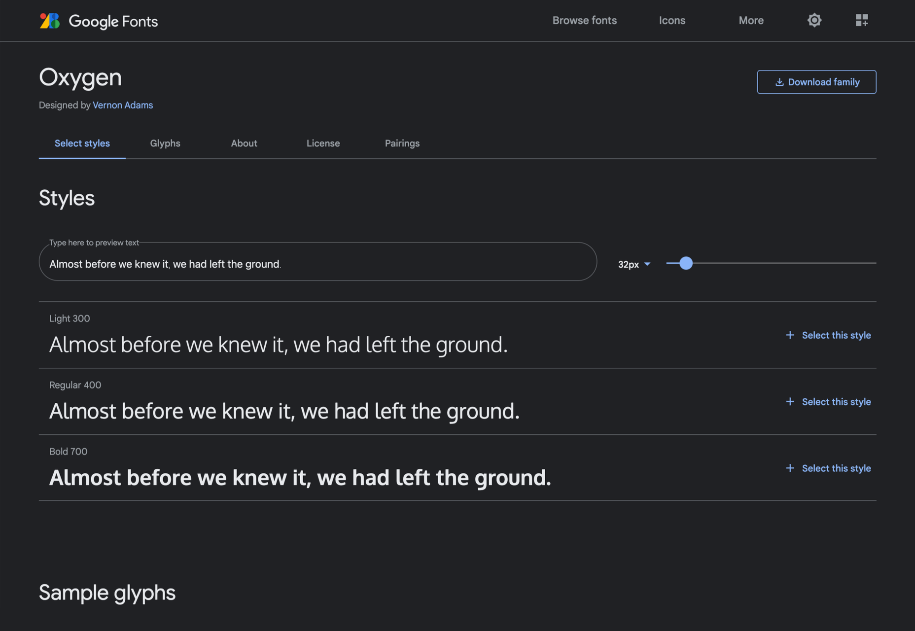
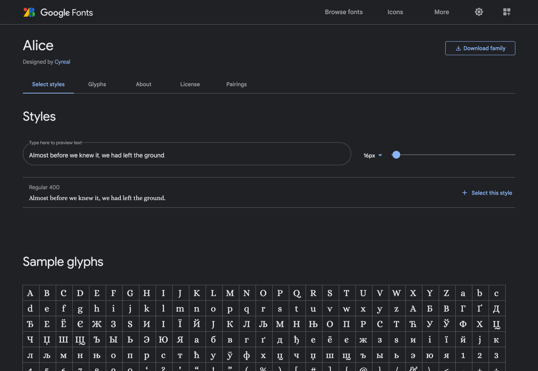
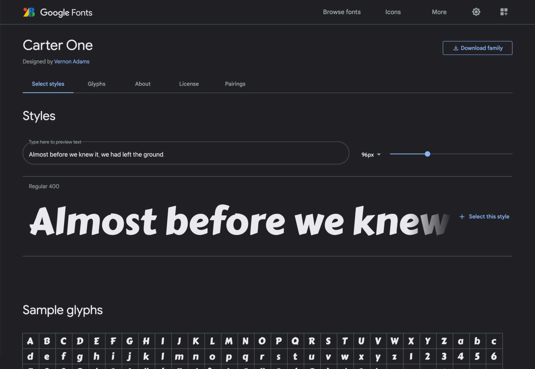
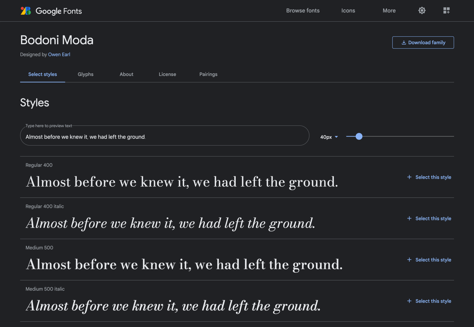
Google Fonts may be the single most significant contribution Google has made to the evolution of the web — yes, more significant than search, advertising, or analytics.

Google Fonts gives every business access to a visual voice with which to distinguish itself. Fonts can be downloaded for use in design software and then embedded using best practices for a consistent experience on the web.

If there’s anything wrong with Google Fonts, it’s that its default listings are based on “Trending,” a self-fulfilling criterion that keeps Noto Sans high up the list, destined to be over-used.

But if you spend a little time lower down the listings, you’ll find some exceptional typefaces that are hardly used. Yes, some of them are highly stylized, but there are also usable sans, serifs, and display fonts worthy of your consideration.

All you have to do is scroll; here’s a selection of some of the treasures you’ll find if you do…

Piazzolla

Piazzolla features dramatic and expressive angular shapes when previewed in large sizes, but its real strength is in setting large amounts of body text.

Mulish

If you’re looking for a solid workhorse sans, look no further than Mulish. Halfway between a humanist and geometric sans, there’s even a variable font version.

Ceviche One

Reminiscent of the cool lettering of 60s advertising, Ceviche One is packed with energy, thanks to the dramatic zig-zag formed along its baseline.

Vollkorn

Released by Friedrich Althausen in 2005, Vollkorn is an excellent typeface for body copy, excelling at small sizes. It now boasts a variable font option.

Merienda

Merienda is a delightfully energetic display script. The bold weight feels more confident, but both weights have a dancing rhythm that brings the page alive.

Raleway Dots

Raleway is a hugely popular — and perhaps overused font — but this dotted version is less known. It’s a simple geometric sans that functions as a display face.

Kenia

Kenia is a wonderful, uncategorizable typeface. The stencil forms result in entirely original letter constructions, and the lowercase s is magnificent.

DM Sans

DM Sans is a low-contrast geometric sans-serif that performs wonderfully well at smaller sizes. It only has three weights, but each comes with a matching italic.

Oxygen

Designed by Vernon Adams as part of the KDE project for GNU+Linux, Oxygen is a very readable sans-serif, with a generous x-height and a hint of pen stroke.

Alice

Ksenia Erulevich’s Alice was inspired by Lewis Carrol’s novel Alice’s Adventures in Wonderland. It presents itself as an Edwardian serif with fanciful flourishes.

Carter One

Carter One uses bold strokes, with a medium amount of contrast, to create a sans-style script. It has dozens of beautiful details like the notch on the lowercase o.

Bodoni Moda

Bodoni Moda is a didone-style serif with strong vertical strokes and high-contrast slab-like serifs. It’s the best variable font in this genre that I’ve found.

Ultra

Ultra is a slab-serif that you won’t even consider for body text. Its sculptural shapes are almost American-western. The counter on the lowercase n is charming.

Azeret Mono

Most mono-spaced fonts fail to inspire; practical they can be, charming they are not. But Azeret Mono bucks that trend, its bold weights being particularly fantastic.

Nunito

It’s tough to find a serious sans-serif with rounded terminals, but Nunito is it. There’s also a Nunito Sans with square terminals, but I love the rounded tips.

Bungee Inline

Designed for signage, Bungee is great for display sizes and works well vertically. There are several versions, but my favorite is this classy inline version.

Oi

Oi is unapologetically loud. A slab-serif that swallows its own detail, the counters and ink traps give it a 3D quality, and the curves feel almost nautical.

Expletus Sans

One of the significant trends in typography is the angled clip of adjoining strokes, creating the effect of shadow. This effect is brilliantly achieved in Expletus Sans.

Lustria

It’s comparatively unusual to find a serif face designed to work well at display sizes. At large sizes, Lustria’s rounded terminals evoke ink spread delightfully.

Yatra One

Yatra One is a Devanagari and Latin typeface that uses the Devanagari brush angle for its strokes, giving the Latin text an unusually slanted, stand-out character.

Amiko

Amiko is a highly legible typeface and excellent at tiny font sizes. It’s perfect as a secondary font if your main font is too fancy for elements like legal notices.

Keep Scrolling

It’s always tempting to leap at the first typeface you find that meets your needs, but if you dig a little deeper into Google Fonts, you’ll find a vast range of typefaces that offer both practicality and character.

Source

The post 21 Exceptional Google Fonts You Probably Haven’t Discovered Yet first appeared on Webdesigner Depot.


Source de l’article sur Webdesignerdepot