
 Google Fonts may be the single most significant contribution Google has made to the evolution of the web — yes, more significant than search, advertising, or analytics.
Google Fonts gives every business access to a visual voice with which to distinguish itself. Fonts can be downloaded for use in design software and then embedded using best practices for a consistent experience on the web.
If there’s anything wrong with Google Fonts, it’s that its default listings are based on “Trending,” a self-fulfilling criterion that keeps Noto Sans high up the list, destined to be over-used.
But if you spend a little time lower down the listings, you’ll find some exceptional typefaces that are hardly used. Yes, some of them are highly stylized, but there are also usable sans, serifs, and display fonts worthy of your consideration.
All you have to do is scroll; here’s a selection of some of the treasures you’ll find if you do…
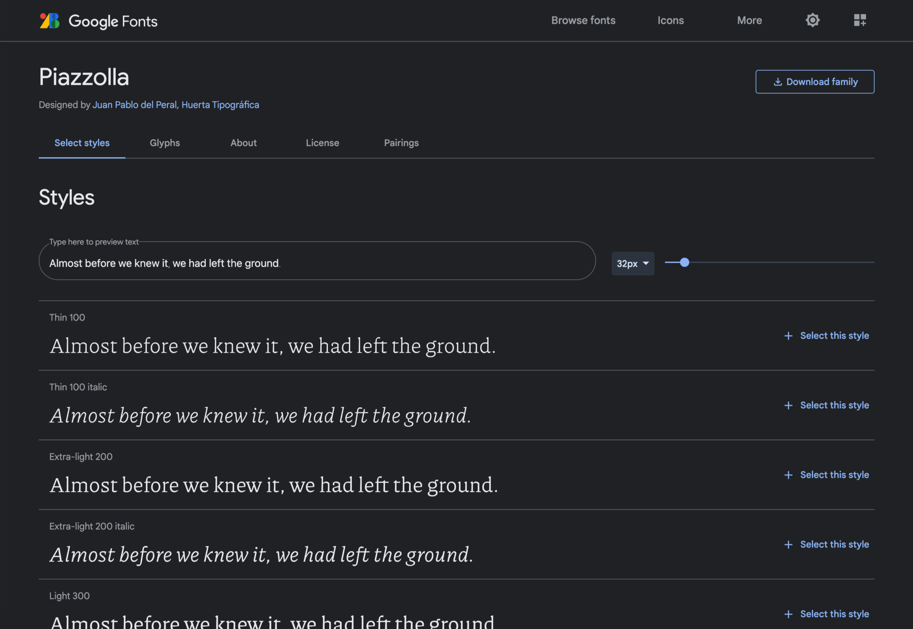
Piazzolla
Piazzolla features dramatic and expressive angular shapes when previewed in large sizes, but its real strength is in setting large amounts of body text.
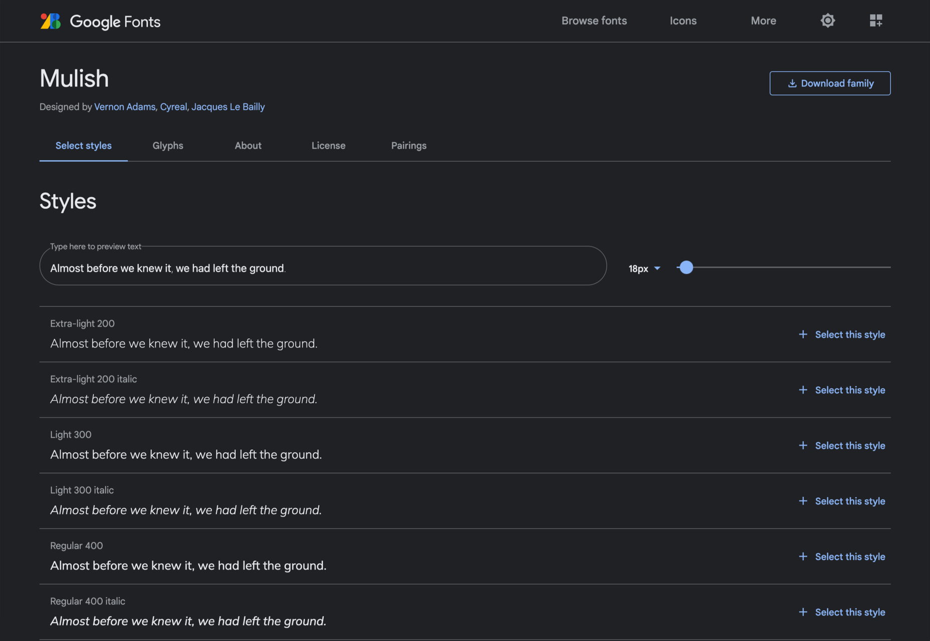
Mulish
If you’re looking for a solid workhorse sans, look no further than Mulish. Halfway between a humanist and geometric sans, there’s even a variable font version.
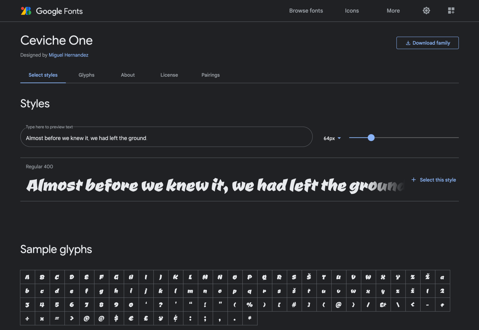
Ceviche One
Reminiscent of the cool lettering of 60s advertising, Ceviche One is packed with energy, thanks to the dramatic zig-zag formed along its baseline.
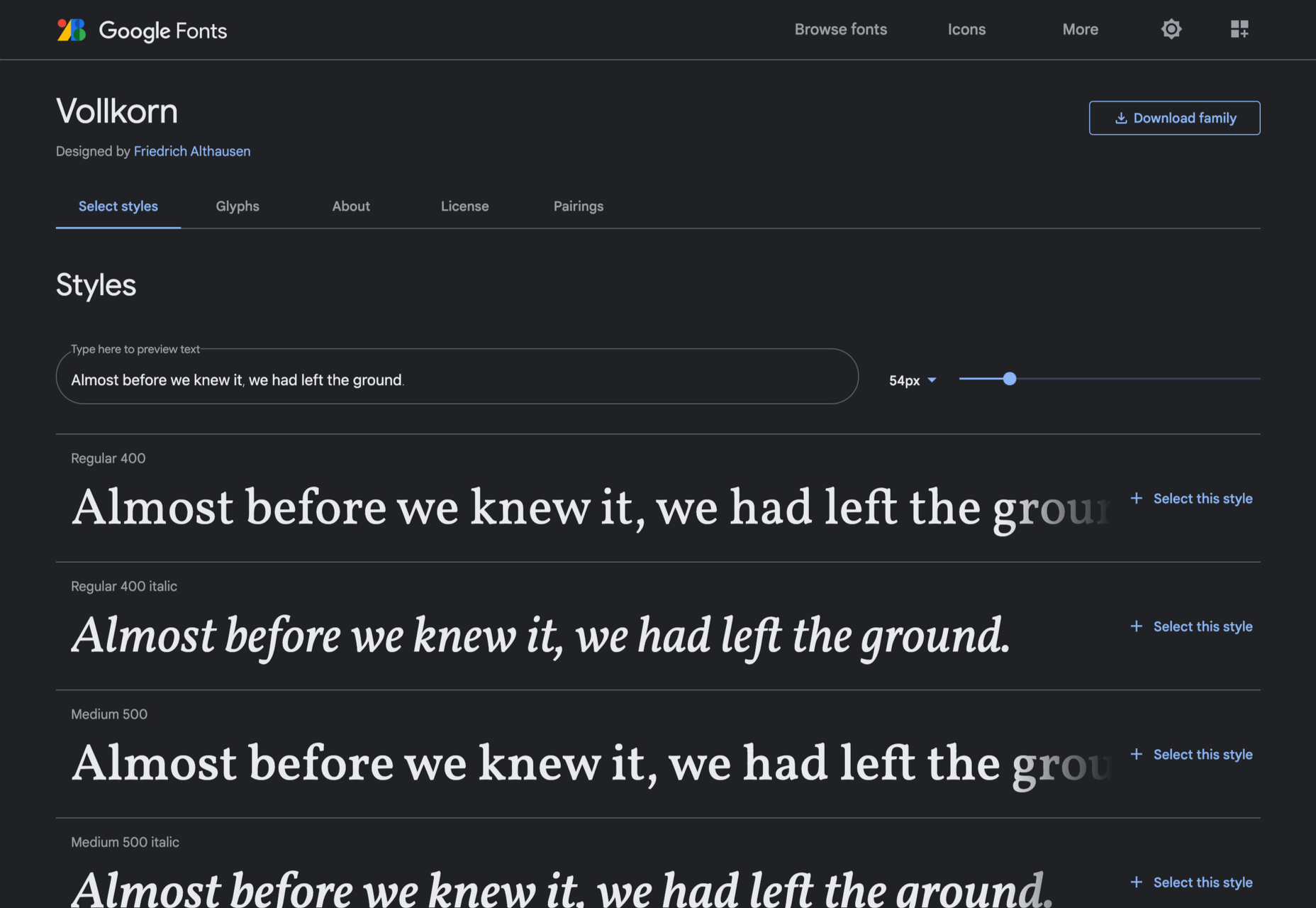
Vollkorn
Released by Friedrich Althausen in 2005, Vollkorn is an excellent typeface for body copy, excelling at small sizes. It now boasts a variable font option.
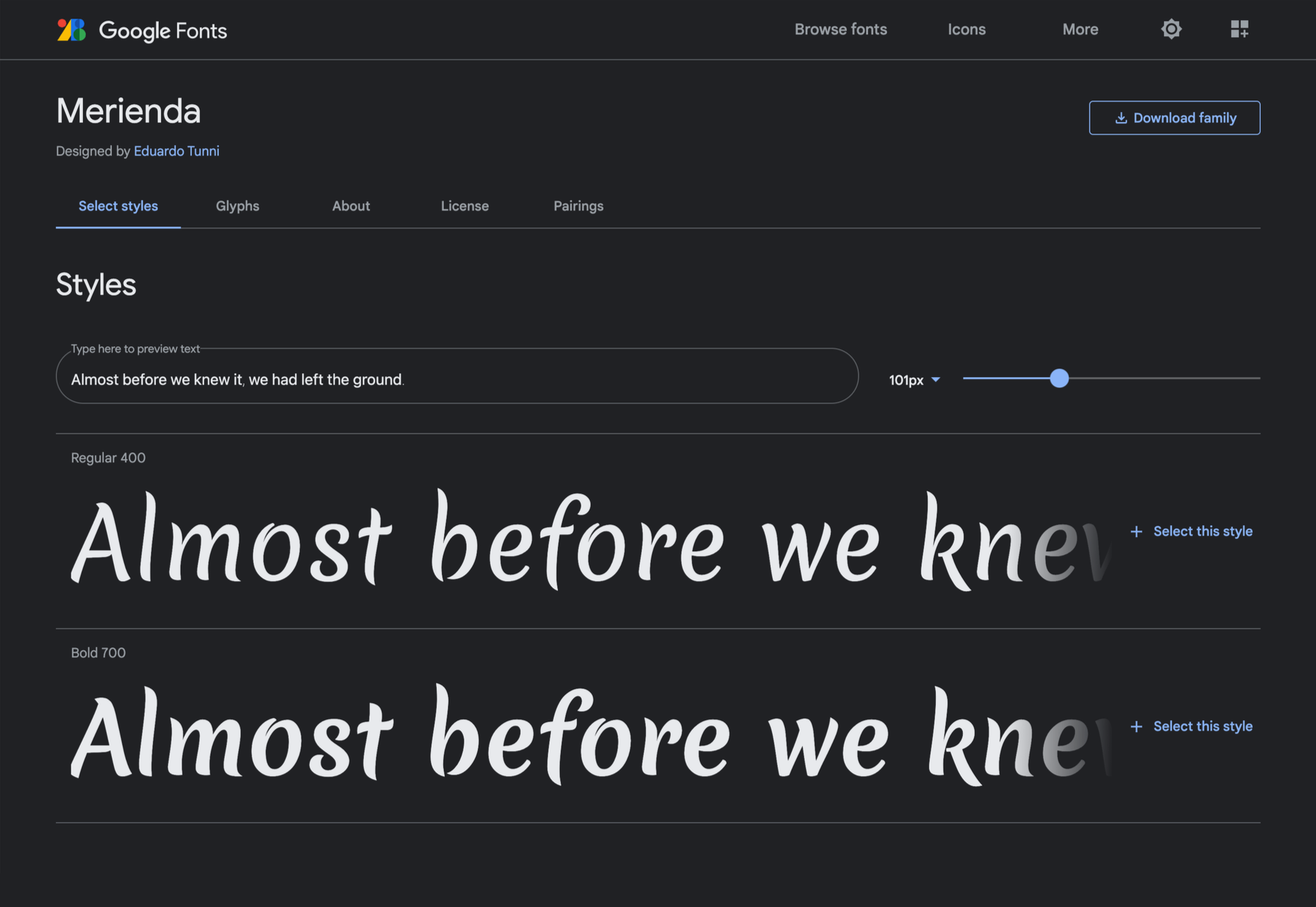
Merienda
Merienda is a delightfully energetic display script. The bold weight feels more confident, but both weights have a dancing rhythm that brings the page alive.
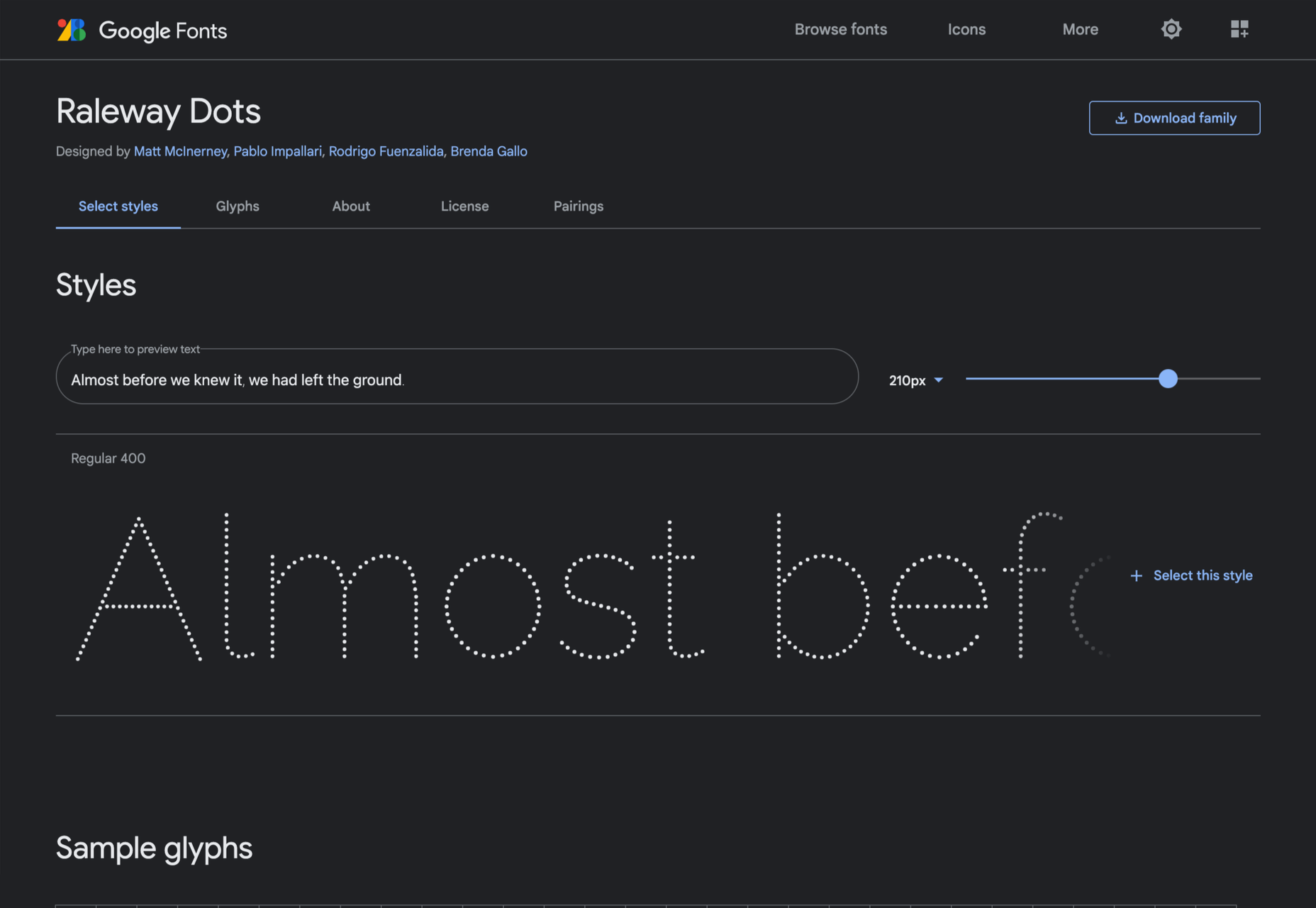
Raleway Dots
Raleway is a hugely popular — and perhaps overused font — but this dotted version is less known. It’s a simple geometric sans that functions as a display face.
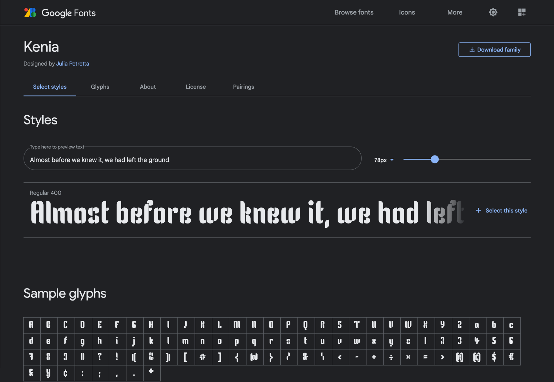
Kenia
Kenia is a wonderful, uncategorizable typeface. The stencil forms result in entirely original letter constructions, and the lowercase s is magnificent.
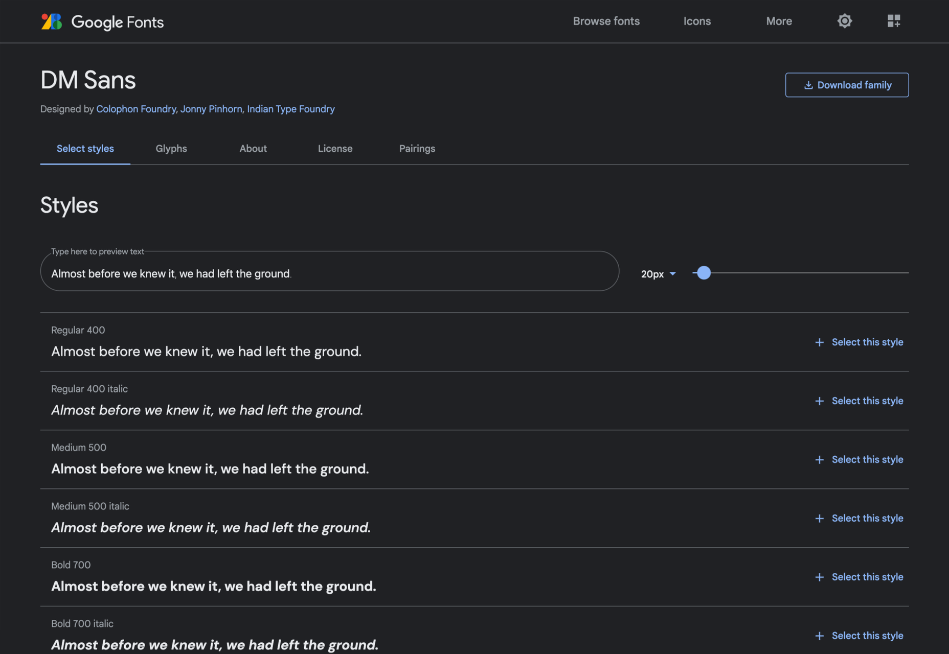
DM Sans
DM Sans is a low-contrast geometric sans-serif that performs wonderfully well at smaller sizes. It only has three weights, but each comes with a matching italic.
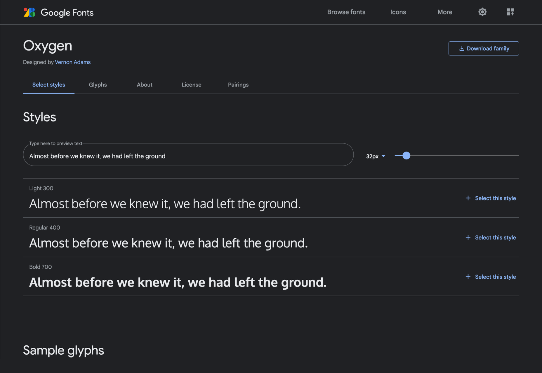
Oxygen
Designed by Vernon Adams as part of the KDE project for GNU+Linux, Oxygen is a very readable sans-serif, with a generous x-height and a hint of pen stroke.
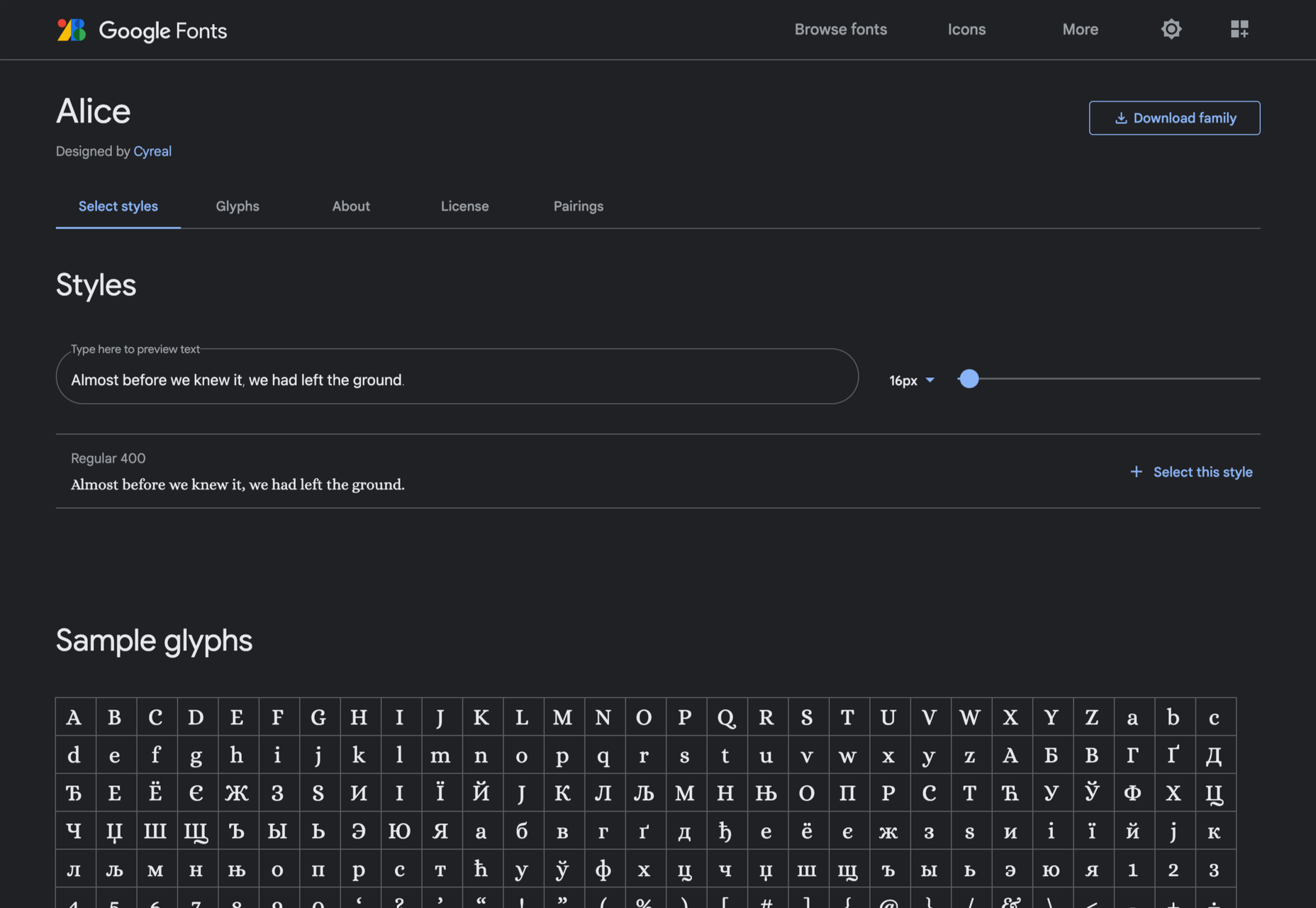
Alice
Ksenia Erulevich’s Alice was inspired by Lewis Carrol’s novel Alice’s Adventures in Wonderland. It presents itself as an Edwardian serif with fanciful flourishes.
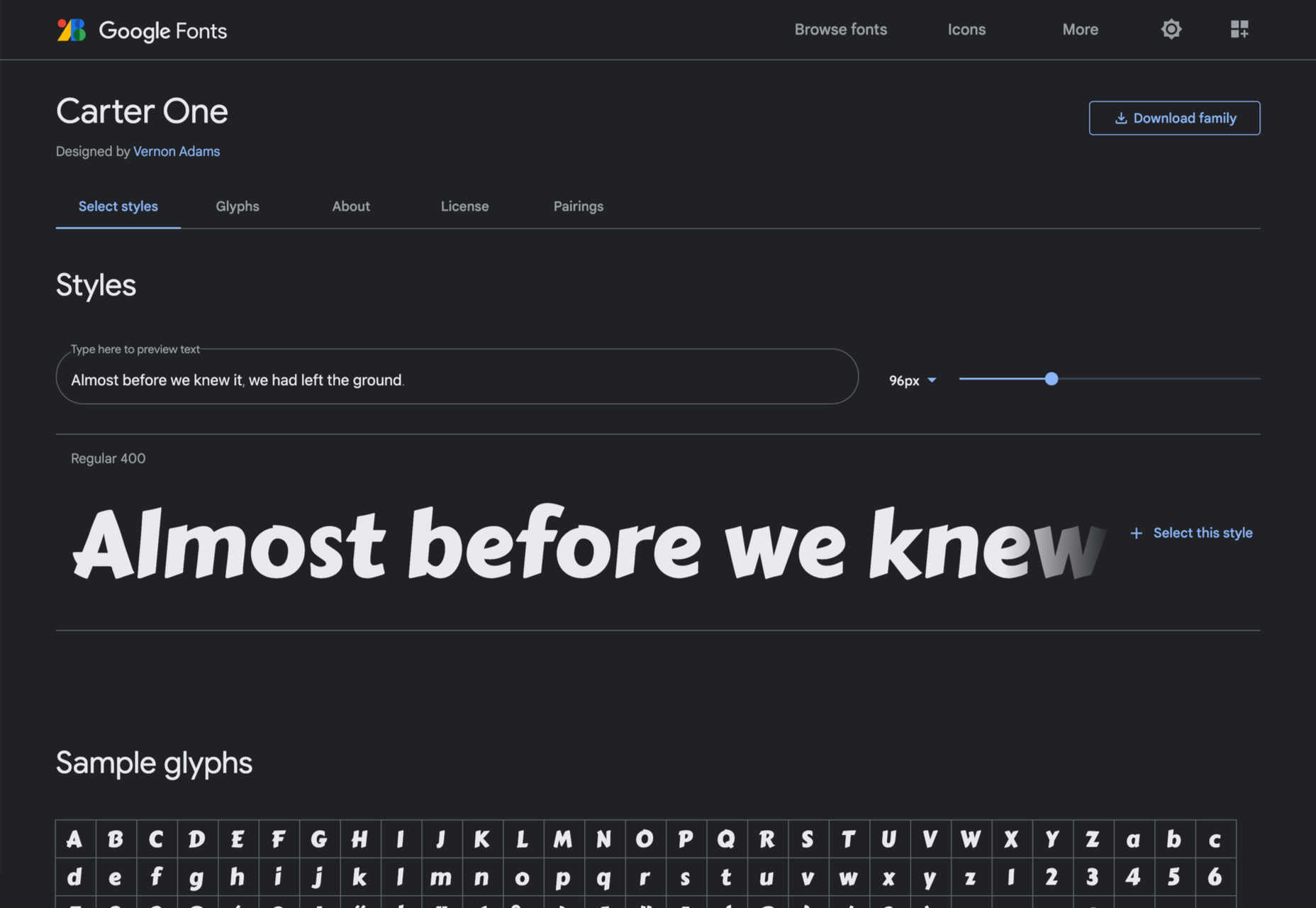
Carter One
Carter One uses bold strokes, with a medium amount of contrast, to create a sans-style script. It has dozens of beautiful details like the notch on the lowercase o.
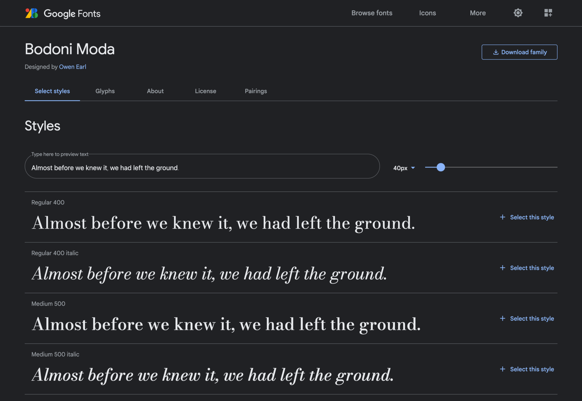
Bodoni Moda
Bodoni Moda is a didone-style serif with strong vertical strokes and high-contrast slab-like serifs. It’s the best variable font in this genre that I’ve found.
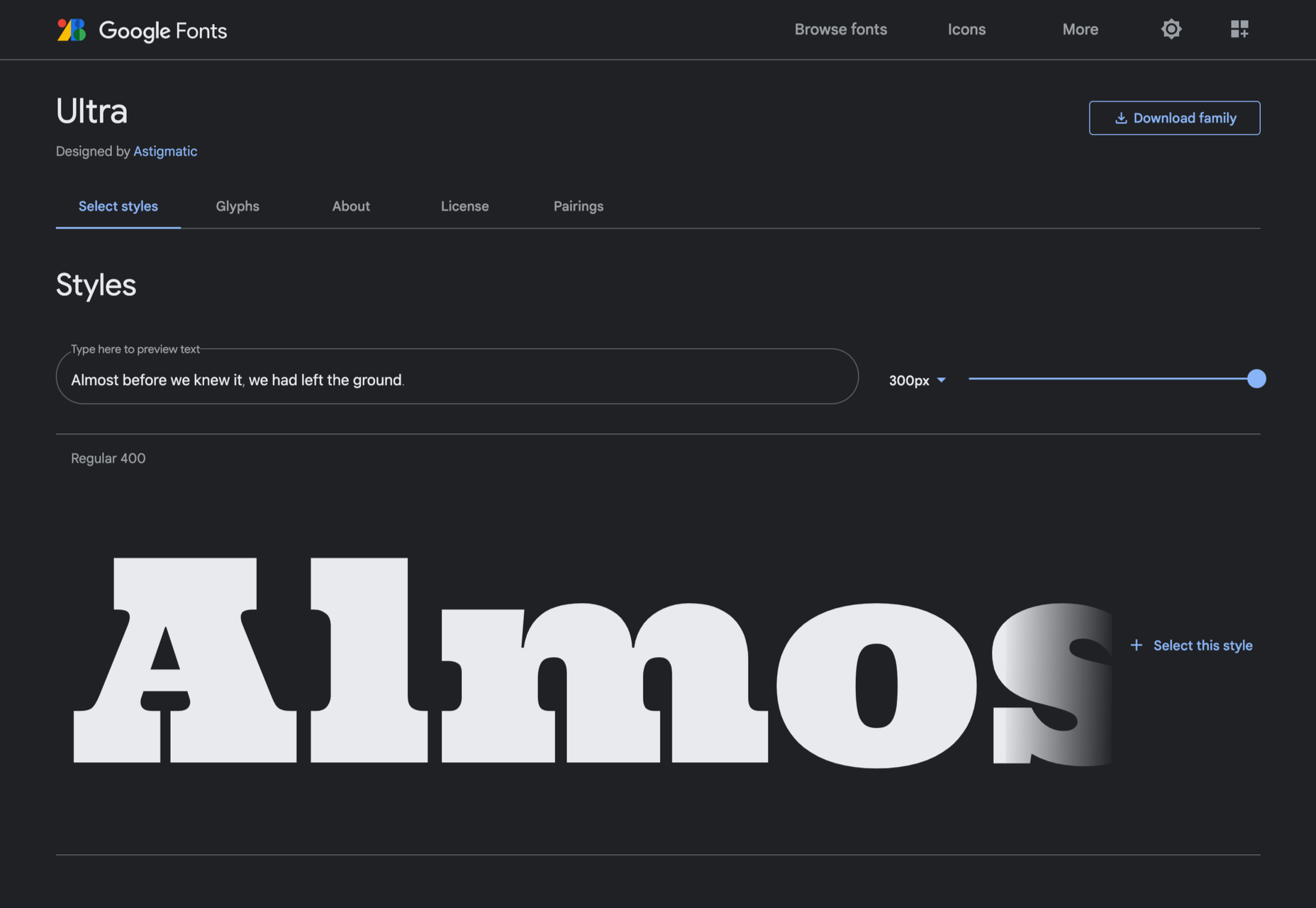
Ultra
Ultra is a slab-serif that you won’t even consider for body text. Its sculptural shapes are almost American-western. The counter on the lowercase n is charming.
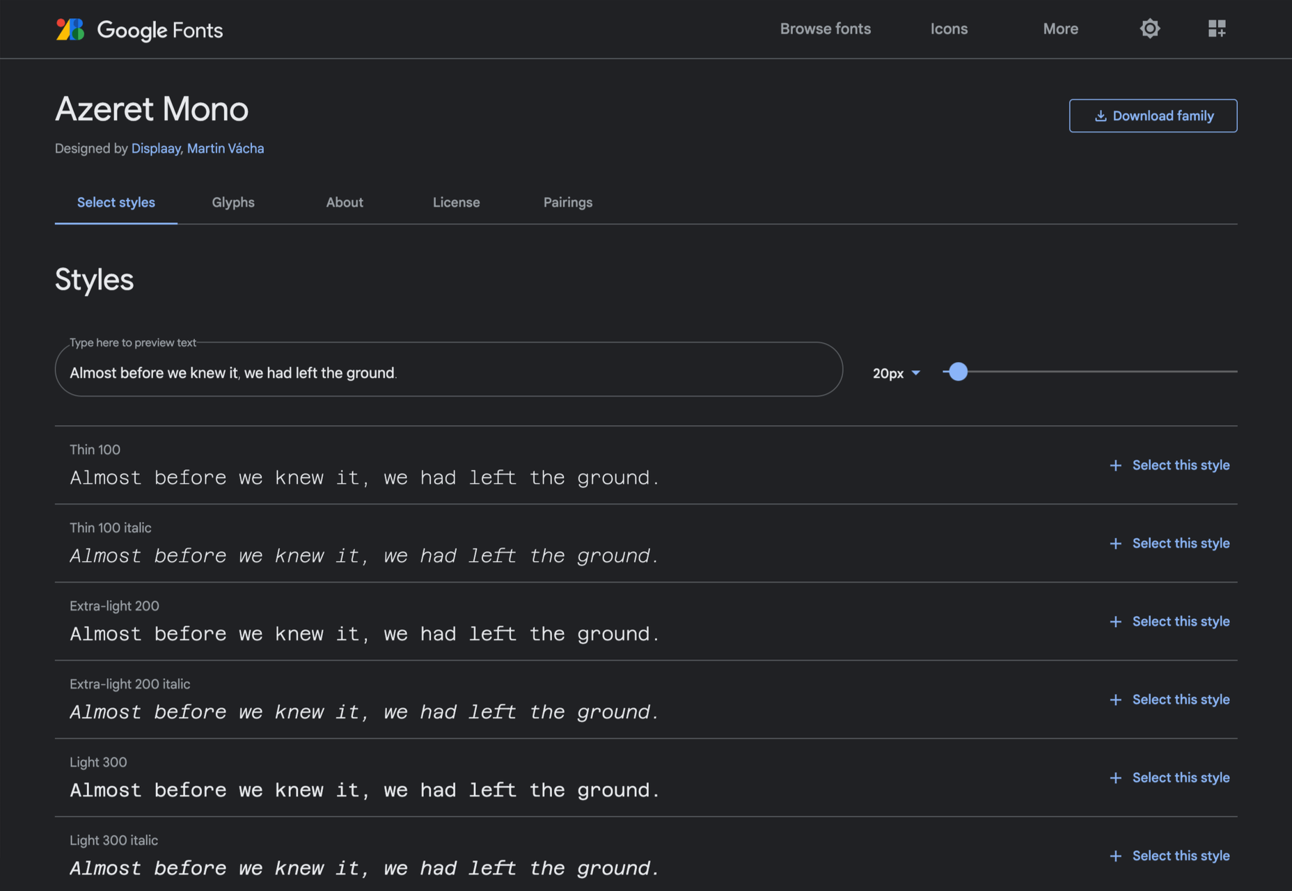
Azeret Mono
Most mono-spaced fonts fail to inspire; practical they can be, charming they are not. But Azeret Mono bucks that trend, its bold weights being particularly fantastic.
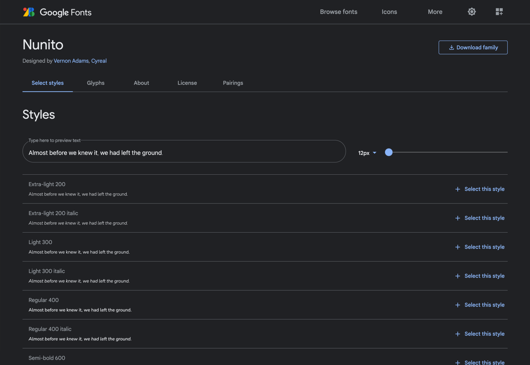
Nunito
It’s tough to find a serious sans-serif with rounded terminals, but Nunito is it. There’s also a Nunito Sans with square terminals, but I love the rounded tips.
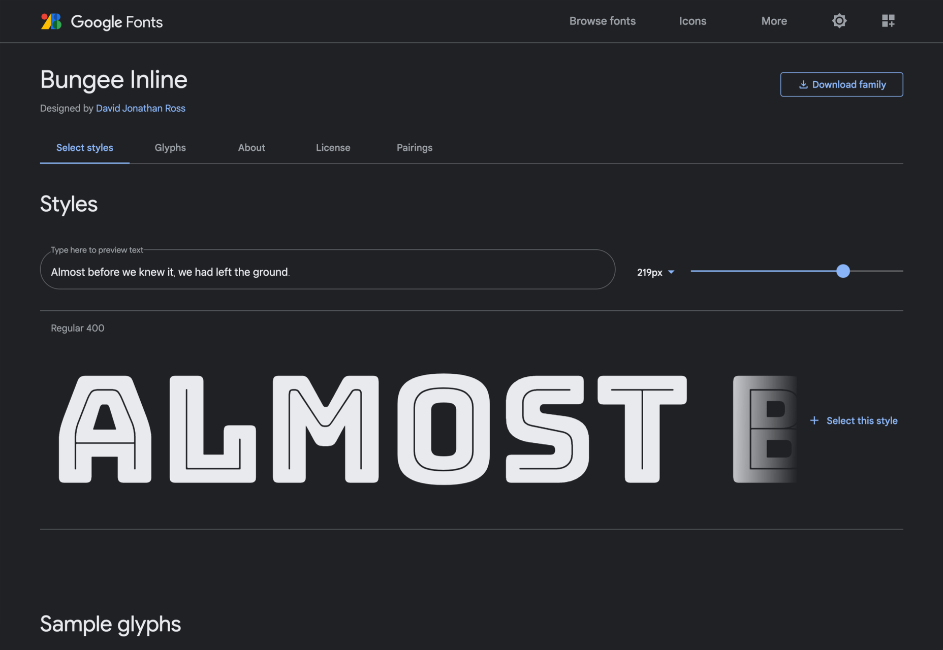
Bungee Inline
Designed for signage, Bungee is great for display sizes and works well vertically. There are several versions, but my favorite is this classy inline version.
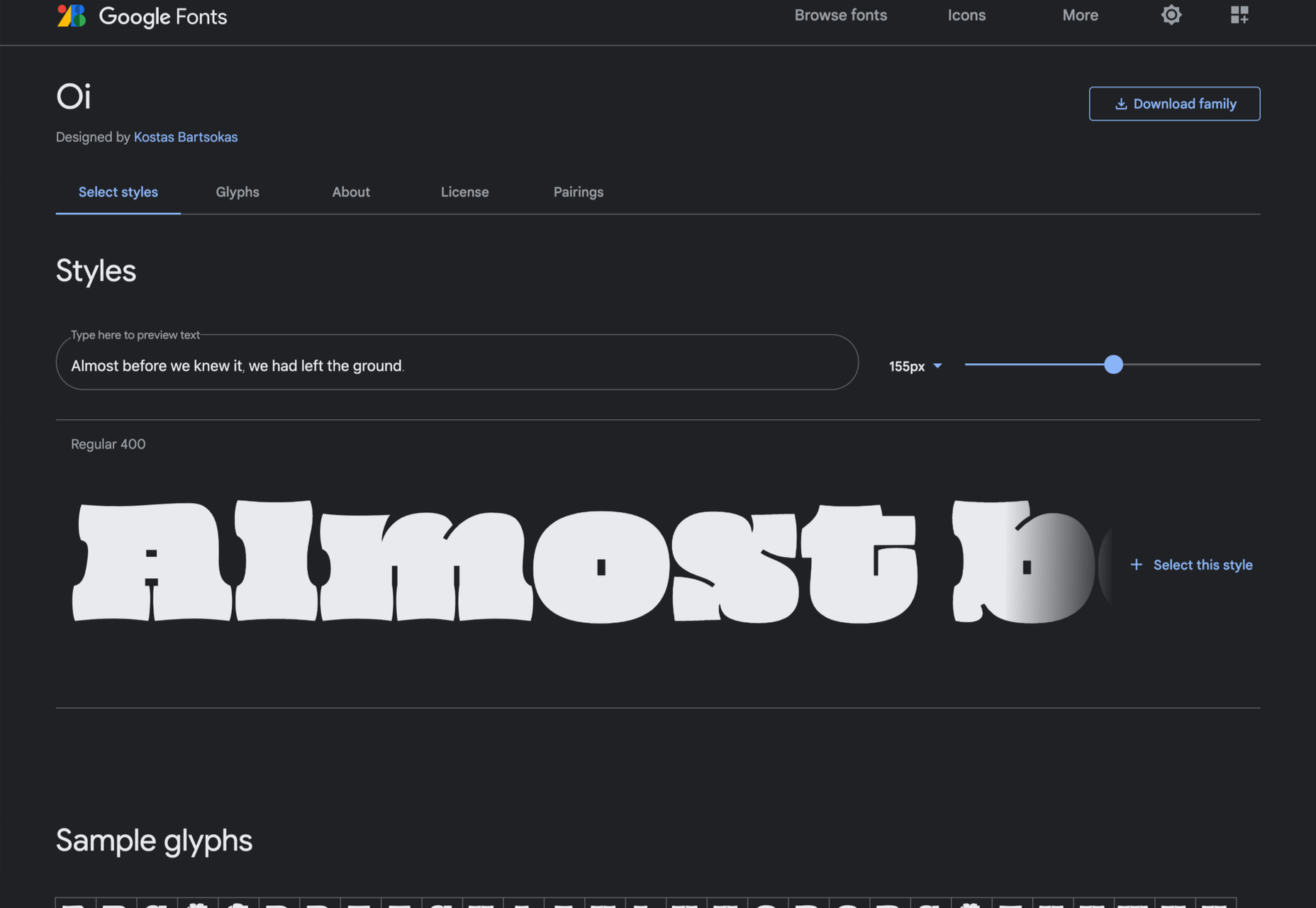
Oi
Oi is unapologetically loud. A slab-serif that swallows its own detail, the counters and ink traps give it a 3D quality, and the curves feel almost nautical.
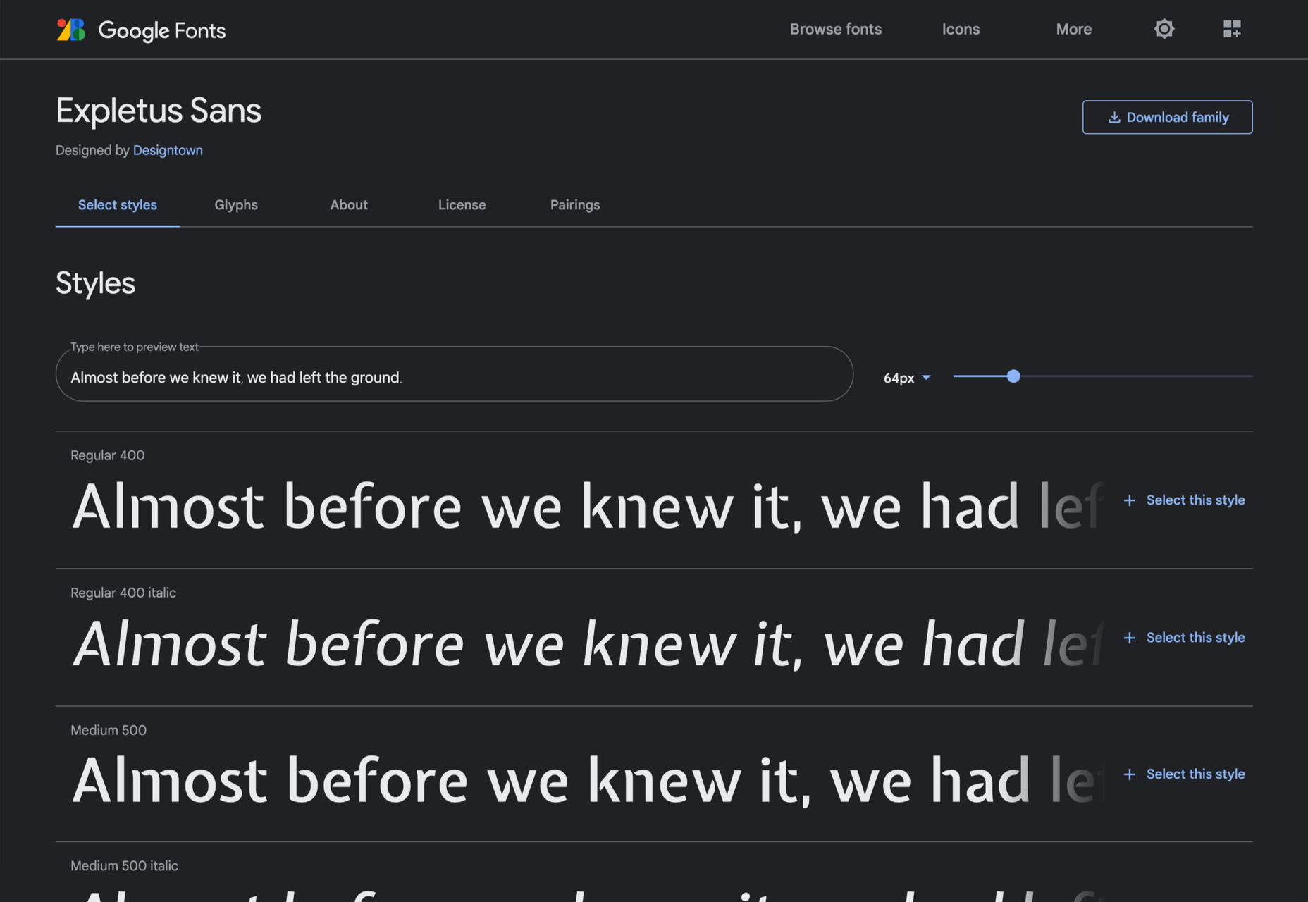
Expletus Sans
One of the significant trends in typography is the angled clip of adjoining strokes, creating the effect of shadow. This effect is brilliantly achieved in Expletus Sans.
Lustria
It’s comparatively unusual to find a serif face designed to work well at display sizes. At large sizes, Lustria’s rounded terminals evoke ink spread delightfully.

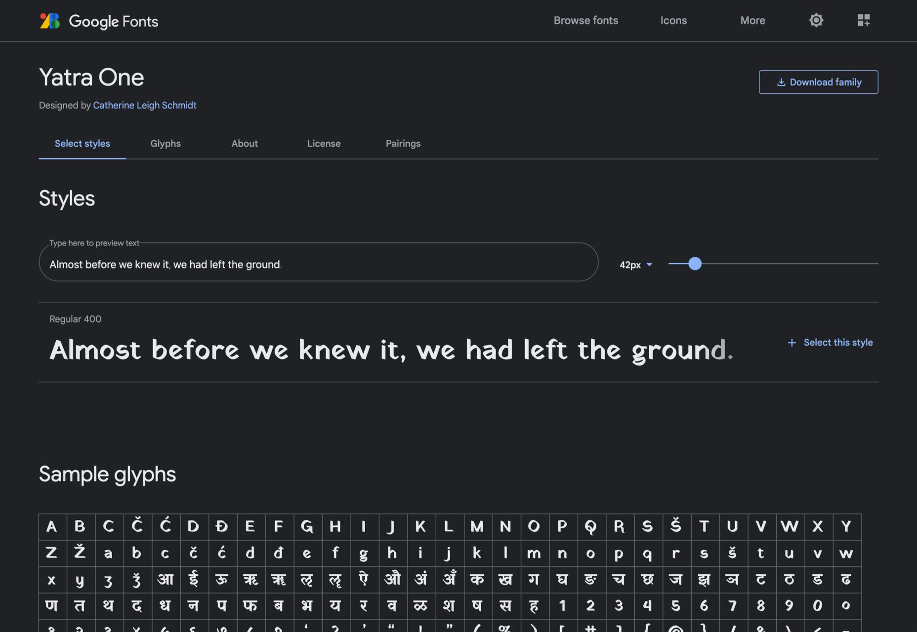
Yatra One
Yatra One is a Devanagari and Latin typeface that uses the Devanagari brush angle for its strokes, giving the Latin text an unusually slanted, stand-out character.
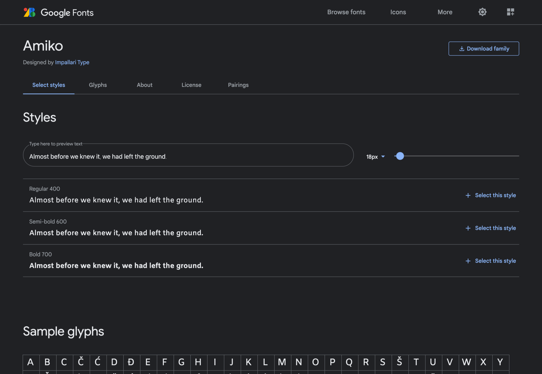
Amiko
Amiko is a highly legible typeface and excellent at tiny font sizes. It’s perfect as a secondary font if your main font is too fancy for elements like legal notices.
Keep Scrolling
It’s always tempting to leap at the first typeface you find that meets your needs, but if you dig a little deeper into Google Fonts, you’ll find a vast range of typefaces that offer both practicality and character.
The post 21 Exceptional Google Fonts You Probably Haven’t Discovered Yet first appeared on Webdesigner Depot.


